#🎨-theme-development
1 messages · Page 43 of 1
I just forgor syntax
iirc vencord doesnt have theme settings, but i might be wrong
No, not yet
Iirc it was in the pipeline, but I'm unsure if and when it might be added
But that would be cool
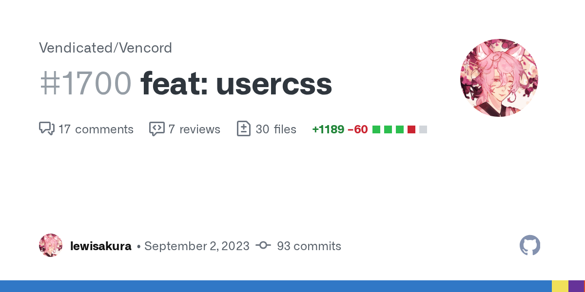
GitHub
Full UserCSS support for Vencord, featuring a settings dialogue, compilers for stylesheets (LESS and Stylus supported), and hot-reload (both for variable changes and when the stylesheet code is upd...
no updates in 3 months :(

aren’t plugin requests closed?
They are
But there's some of them that might actually be useful
Ngl I would code my requests myself but I know nothing about JS 
ts actually
Even better!
TS is just JS with types

so I finally found the css code that was destroying my performance. It wasn't the amount of snippets, nor the selectors, but just this piece of shit code in my custom theme:
/* USER PANEL */
/* 1st div of the users bar */
/* In channels */
/*div[class*="container_"]:has(> aside[class*="membersWrap_"]),*/
/* In threads (full view) and DM groups */
/*div[class*="content_"] > div[class*="membersWrap_"] */
.container_cbd271:not(:has(membersWrap_cbd271)) {
    margin: 0px 0px 0px 5px;
    border-radius: 8px;
    margin-top: -48px;
    min-width: 240px;
    height: calc(100% + 48px);
}
:root:not(:has(.container_cbd271)) .membersWrap_cbd271 {
    margin: 0px 0px 0px 5px;
    border-radius: 8px;
    margin-top: -48px;
    min-width: 240px;
    height: calc(100% + 48px);
}

/* CHANNEL DESCRIPTION */
/* Channel description sized to match the main chat */
/*div[class^="subtitleContainer_"]*/
.subtitleContainer_a7d72e {
    width: calc(100% - 12px);
}
/* With user list */
/*div[class^="chat_"]:has([class^="membersWrap_"]) div[class^="subtitleContainer_"]*/
.chat_a7d72e:has(.membersWrap_cbd271) .subtitleContainer_a7d72e {
    width: calc(100% - 257px);
}
/* With user list in Forums or Server Guide */
/*div[class^="chat_"]:has([class^="membersWrap_"]) div[class^="subtitleContainer_"]*/
.chat_a7d72e:has(.membersWrap_cbd271) .subtitleContainer_a7d72e:has(.forumOrHome_ff5f90) {
    width: calc(100% - 245px);
}
/* With user profile in DM */
/*div[class^="chat_"]:has([class^="userPanelOuter_"]) div[class^="subtitleContainer_"]*/
.chat_a7d72e:has(.inner_c69a7b.panel_c69a7b) .subtitleContainer_a7d72e {
    width: calc(100% - 357px);
}
/* With search panel */
/*div[class^="chat_"]:has([class^="searchResultsWrap_"]) div[class^="subtitleContainer_"]*/
.chat_a7d72e:has(.searchResultsWrap_c2b47d) .subtitleContainer_a7d72e {
    width: calc(100% - 437px);
}
Could someone tell me why it affects so much? Or if there is a way to fix it? This code is quite important for my theme

That's a lot of :has
:has and attribute selectors
attribute selector don’t really slow down all that much, the problem here is the over excessive use of :has
:has selector on root 
still tho attribute selectors isnt the problem, its the overuse them (which can still happen with hashes) and the overuse of :has
plus yeah if you put them on root it also going to be problematic
oka, so I can change the root thing to a more specific selector, tbh idk why I used root, but how can I replace the :has without losing the functionality?
who ghosted pinged me
Idk
how is it not merged, that's so cool
they have more important things to worry about i guess
i bet that once bd gets theme settings then that pr will be more of a priority
but like to be fair, every PR i see hasnt been reviewed
like somehow Vendicated/Vencord #376 still isnt merged
Timedones 😔
i don't think it's dones 😔
visual refresh broke everything ofc

im p bad at frontend crap, so if anyone could comment on if this seems fine id be thankful <3
#1265097724521615473 message

Restore old reaction size
Made this for myself. Don't have access to #🎨-css-snippets so posting this here. CC0 licensed.
.reaction_ec6b19 .reactionLarge {
    width: 1rem;
    height: 1rem;
}

.largeReactionBtn_ec6b19 {
    width: 1rem;
    height: 1rem;
}

.largeIcon_ec6b19 {
    width: 1rem;
    height: 1rem;
}

.largeReactionBtn_ec6b19.forceShowLook_ec6b19 {
    padding: .25rem .375rem;
}
(I could've just unset all that but I have a feeling this is going to change soon so I wanted to have the old values to work with)
you can get the access by submitting a ticket btw
there is a dedicated ticket category for that
gonna do that, thanks
Is it possible to add a transparent animated gif ||(gif used not quite literally here since gifs aren't transparent)|| with just css
(e.g. snowflakes)
Sure? Set a bg on ::after on :root or something
yeah but idk where to find an image for that
or if a video works
maybe not worded the best way
And gifs do support transparency, but only binary such

A very important one
yes
cane
ok just need a gif
a good gif*

The css btw
can't find a very good gif though, and idrk how to make one myself
#app-mount::after {
  content: '';
  width: 100%;
  height: 100%;
  z-index: 1000;
  position: absolute;
  pointer-events: none;
  background-image: url(https://www.animationsoftware7.com/img/agifs/snow02.gif);
  background-size: cover;
}```my channel list collapse when not hovered CSS from #🎨-css-snippets got borked in the update, anyone got a snippet that still works? ill make one myself if need be
then make one
they didn't like my hardcoded classes
feel free to submit it under your own name using attribute selector
does anyone know where the hell i can change this obnoxious blue i keep seeing everywhere in my theme? ive dealt with it for far too long but i cant find a quick way to sort through my css to find it.

Alright discord updated and suddenly moving the mute buttons broke
ugh i hate these container names because theyre just dumb and now i cant find just the buttons before id just use
[class*="panels_"] [class*="avatarWrapper_"] + div {
    position: fixed;
    height: 30px;
    /* border: var(--borders); */
    left: 250px;
    bottom: 220;
    align-items: left;
    margin-left: 0;
}```but that pushes the mute buttons to the right and they just vanish
what the hell why is there a background now

I dont know but it pissed me off seeing it
luckily they use the same colour i use for my darkmode anyway so unless its a non transparent gif i dont see it
the background was added to account for the fact that you can't see the white star when the stuff behind it is white
idk
I forgot to remove it though :(
[class*=gifFavoriteButton_] {
  background-color: transparent;
}
i honestly thought it was OpenDyslexic, but idk
idk did you find it preinstalled on a samsung device?
discord but bad (ngl)

looks like ripoff version of some font that i forgot it but i remember the letter W and M is half
what font?
the real one W is in middle?
but you using different font
this W in different font in full
and number 9
the 9 real one isnt supposed to be like that
that font ur using
the letter 9 looks like 9 in g
i mean
g shaped 9
change the accent color
it’s a css variable


huh
those are the only bits i can find of --accent being defined
lemme check the vars on pc rq
kk thx for the help btw
ctrl + f search for "75d2e9" and/or "117, 210, 233" 
tried already

worth a shot
ok i found its this stupid line:
--accent-hsl: var(--accent-hue),calc(var(--accent-saturation) * var(--saturation-factor)),var(--accent-lightness);
thing is none of the variables i edit change teh color
and --saturation-factor does not exist
it seems fully intent on staying that stupid blue
ive tried using rbg, hex and hsl
setting it to anything other than those vars makes it invis
ok update hsla was never needed
--accent-hsl: 334,54%,57%;
something as simple as that works
now time to find a good color for this
tsym for the hint
does anyone know by chance what the Theme class is to change the colour of DM Channels? I find them a bit to gray-ish and want to make them a bit brighter
open devtools (ctrl+shift+i) press inspect element (top left in devtools or ctrl+shift+c) and click what you want to change
there should be a background: var(--example-var-name)
then you can put in your quickcss:
:root {
  --example-var-name: [color here];
}
thanks!
so, it doesn't come up with anything like that
Basically what I want to change specifically is the colour of the text
oh text color would be color: var(...)
yeah, it's not showing that in my Devtools
but also the variable it uses will probably affect other things as well
you're wanting to change this text color right?

but only for dms?
(i just changed it to red for the example
yep
yep
well you can change this variable in :root for read dms (hovered and unread are different colors), but it will also affect a lot of other stuff so ig you don't want that


do you want the friends nitro and shop tabs to also be changed
if you do, it's just ```css
[data-list-id^=private-channels-uid_] {
--channels-default: red;
}
honestly, I been considering getting rid of those tabs in general. already got rid of the Nitro, Library and Shop tab
Friends can be accessed elsewhere
and Message Requests I do not read anyways 
Thanks
if you don't want it to affect those tabs, this should work
[data-list-id^=private-channels-uid_] [class*=dm_] {
  --channels-default: red;
}
fun fact, that did not change the main text on my end
wait what
QuickCSS ignores it completely due to my theme, so I added it to my theme file and it only changes the "playing <insert whatever>" or the custom status to red
it does not change the text itself
yeah, let me quickly privatize some links
i don't think that will fix it in this case
because the variable is getting set because they said it's applying to the status
so i think it's that their theme is using a different variable/hardcoding the color for dm titles
@echo frost would you be okay with a screenshot of the color variables instead?
fully custom for someone, problem is, it's NSFW tinted, so I can't just share it into the chat without removing certain parts of it 🤣

these are all the colour options within the theme
it's based on clearvision?
I took small bits of clearvision
it's a mega mix and match of different themes and CSS snippets
thing is, I can change the server channel colour, the default text colour of text messages
eww clearvision
I don't think the colour of the user list in DMs is changed or touched anywhere in the theme file from what I can see

oh
imma sit in the corner of stupidity now
Accidentally having another theme open that is higher prio then the theme I am modifying..
oops
I think that is an indicator to go to bed ROFL
lol
thanks for the help though, I appreciate it 
also
for future reference for anyone else
[class*="nameAndDecorators_ec8679"] > div > [class="overflow_a82120"] {
    color: white !important
}
this will change the member name colour in your DMs list
use .class if you're going to include their id
also that'll override read/hover colors
and i don't think !important is needed unless it's for a theme conflict
it did not for me on a non themed version
only changed the name colour
what happened to my discord?

does pressing try again fix it?
sometimes it's just your internet
but if your internet is fine and restarting discord doesn't fix it, then check https://discordstatus.com/
Welcome to Discord's home for real-time and historical data on system performance.
doesn't look like there's any problems rn though
(also this isn't the best channel to ask about this in)
how good is my theme?

can somebody tell me how to make the sidebar_a4d4d9 smaller or chat_a7d72e bigger
i tried using width: but doesn't work
okay i think i found out the problem
i want to remove this gray area, i've tried moving .chatContent to the left and z-indexing it to be onfront, but it doesn't work

does anyone know what that gray area is?
it's not part of .privateChannels
okay so i fixed that
anything to send this thing into the next dimension?

[class^=entryPointButtonContainer_] {
  display: none;
}
thank you
Works for me
Apologies for the ping but were you able to figure this out
I’m reworking my theme and my former right align isn’t workin no mo
i've had it worked before but discord seems to have changed something unfortunately
using theme attributes is is possible to right align self messages in compact mode
i tried using [data-author-id*="117126234588184582"] but it didnt work :<
why are you using selector based on the author of a message
im trying to target myself to flex align them to the right instead of left and thought that would target my user
i have [data-author-username=".voidbbg"] actually how would i left align my messages
ok i have stuff duck taped together
[data-author-username=".voidbbg"][class*=messageListItem_] {
    padding-left: 15px;
    display: flex;
    flex-wrap: wrap;
    flex-direction: row-reverse;
    justify-content: flex-start;
}

[data-author-username=".voidbbg"] .username_f9f2ca {
    font-size: 1rem;
    font-weight: 500;
    line-height: 1.375rem;
    color: var(--header-primary);
    display: flex;
    vertical-align: baseline;
    position: relative;
    overflow: hidden;
    flex-shrink: 0;
    flex-direction: row-reverse;
    flex-wrap: wrap;
}
but long messages get cut off, any ideas on a fix?

cap the max-width?
i cant seem to figure that part out
any thoughts:
https://prnt.sc/yRzTAkyBB4cw

i fw it heavy
i was able to fix my old right align code (though it still has the same bugs as it initially had)

what
this looks great
do you mind sharing how you got it working? my ver still has bugs
I can’t quite explain it but i changed ^=messageListItem to *=messageListItem and it was all said n done
Here is the repo
https://github.com/its-x3non/DiscordSnippets/tree/main/CSS Addons/Right Align Self Messages
I don’t take all the credit of course as it isn’t really my own code, I just modified it to work with vencord.
Plus it’s made with my midnight theme in mind so i’m unsure what it’ll look like in others
There might be bugs n stuff that look odd but I’m too lazy to find them so I just tend to fix them whenever I see them

GitHub
Contribute to its-x3non/DiscordSnippets development by creating an account on GitHub.
^= matches class starting with the value *= is matching the value anywhere in class
so for example if you want to match message_ here, use ^= if you want to match cozy_ use *=

@tight fable ^
ooh oke
MDN Web Docs
The CSS attribute selector matches elements based on the element having a given attribute explicitly set, with options for defining an attribute value or substring value match.
tyty
there is a problem i'm facing
i want to create a box that if a person sends an image it shows the nick name and the image inside the box, but i can't manage to do that

what happens when i select
#app-mount .message_d5deea.cozyMessage_d5deea:has(.header_f9f2ca):has(.container_b558d0 div)
is this
the box includes the icon, now how can i select instead both the header_f9f2ca and the container_b558d0 but not its parent
or how can i make a bbox that surrounds them both in another way
you don't need that #app-mount btw
its not the point though
Yeah, i'm not really sure what you mean though
#app-mount .message_d5deea.cozyMessage_d5deea contains the whole message, if u wrap it in a box it wraps also the icon of the pfp and u can't select 2 elements and wrap them in a single box
you just want to select header and container?
yes and wrap them in a single box
You can use :is() to select both header and container
.message_d5deea.cozyMessage_d5deea :is(.header_f9f2ca, .container_b558d0)
its not selecting them as a single element
its just applying whatever u apply to both elements
What are you trying to do?
when a user sends an image its both his nick name and the image
i want them to appear as if they're a single box
i've managed to do something bbut its still lousy
using the :before
you want to do it with all messages though right?
with normal messages it works since both the header and the message text under contents_f9f2ca
but if its nick name and image the image isn't under contents

#app-mount .message_d5deea.cozyMessage_d5deea .contents_f9f2ca:has(.messageContent_f9f2ca span) {  /* any message with a header gets a box always, worst case scenario only the header is boxed (can happen when sending an image as your first message) */
           background-color: rgba(255, 255, 255, 0.8);
           padding: 7px 9px 7px 16px;
           border-radius: 4px;
           box-shadow: 1px 1px 4px 1px rgba(104, 104, 104, 0.2);
           max-width: max-content;
           margin-bottom: 1px;
       }

thats for messages
Is this doing what you want?
.message_d5deea.cozyMessage_d5deea :is(
  .contents_f9f2ca:has(.messageContent_f9f2ca span),
  [id^=message-accessories]
) {
  background-color: rgba(255, 255, 255, 0.8);
  padding: 7px 9px 7px 16px;
  border-radius: 4px;
  box-shadow: 1px 1px 4px 1px rgba(104, 104, 104, 0.2);
  max-width: max-content;
  margin-bottom: 1px;
}

it does for me


Are you fine with this?
honestly no
ah
nope
potential approach:
.message_d5deea.cozyMessage_d5deea {
  background-color: rgba(255, 255, 255, 0.8);
  padding-left: 10px;
  margin-left: 60px;
  border-radius: 4px;
  box-shadow: 1px 1px 4px 1px rgba(104, 104, 104, 0.2);
  max-width: max-content;
  margin-bottom: 1px;
}
.contents_f9f2ca > img {
  position: absolute;
  translate: -65px;
}
But I need to go to bed now, so can't work on it anymore
i'm working on something that involves your suggestion obsidian, i like that approach

Hey ive been messing around with theme editing and im wondering if any of you guys know how to get rid of these ugly highlights on embeds. I would be fine with them being a grey or black or something.
oh i should have been more clear. I want to change the red background highlight on the entire embed
but the green titles aren't amazing either, i suppose i could change that too 😆
Should i put these wherever under the theme .css?
i did this, but it doesn't seem to work

yeah i closed and reopened discord. ill try that!
no dice :/
should i be using some other editor?
it seems to work perfectly when i disable the theme and use the quickcss editor. It doesnt work if i enable the theme even if i use the quickcss editor.
there's something about the theme overwriting it. even with the !important
Ill try process of elimination with the code.
I deleted everything outside of the import url and it doesn't seem to affect the embed color.
I cant access the import url it 404s. I may just try to replicate the aspects of the theme i like, which is mainly the ability to collapse the channel bar and go super compact.
I have absolutely no idea where to start on that front 😆
hello guys... after the resent update one part of my themes is not working.. or not appear to be working. I tried using the website that changes the classes but it didn't fix it ... I'm using the following code, and what it does it actully makes the channels section wider. Maybe there is a class missing (?) or I don't know.
.sidebar_a4d4d9,
.bannerImg_fd6364,
.bannerImage_fd6364 {
  width: 320px;
}```here's the problem
discord has some high specificity css with !important
I think the best way to add specificity and fix it is like this
/* Channels Width */
#app-mount .sidebar_a4d4d9,
.bannerImg_fd6364,
.bannerImage_fd6364 {
  width: 320px !important;
}```
Yes it worked... Thank you very much! And how about the #app-mount? What is that for?
added it to my chat bubbles and now we're getting somewhere! decided to take it out of my quickcss finally lol

to increase specificity, just say please to it
it works for me
To increase specificity
https://developer.mozilla.org/en-US/docs/Web/CSS/Specificity#id_column
id selectors give 1-0-0 specificity which is more than discord's css has
MDN Web Docs
Specificity is the algorithm used by browsers to determine the CSS declaration that is the most relevant to an element, which in turn, determines the property value to apply to the element. The specificity algorithm calculates the weight of a CSS selector to determine which rule from competing CSS declarations gets applied to an element.
what if I'm incapable of being polite :(
"Fuckin'" works just as well as "please"
when extra important coming to css :(
i wish i could just do !!important or something
obsidian, i've succeed
nice
what's the css you're using?
I've adjusted like every possible option, whether someone mentions me or not, if it has an image, etc etc
i've started by using your idea to cover the entire message and then adjusted every option


i meant can you send the css?
i'm kinda interested
want me to send it to u in private
its not 100% complete yet, but about to be...
close to it
actually i can post it as code
good night, if u need something or want to comment on it you can ping me
i could keep this as a debug version and bulk the similar entities in the release version
who want this font?

I think I'd rather have Wingdings
do u have a font name?
HANDWRITING_TEXT
thats the name of the font
do you want the font pack? @sour beacon
where?
wait ill send it
this font reminds me....
the w in that font isn't supposed to be like that
tf
that w is in half
yoooo this is cool


when the #🎨-theme-development message
redditors discord users internet users when they have to use a font that isnt just a clone of sans serif
would anyone like to help me figure out a piece of code since im not a dev and im just searching thru a css file changing values until i figure out which value is the correct one. dm me or ping me if u would like to help me and ill send u the file and tell u what im trying to figure out
Don't ask to ask 
just coz its a whole ass file
like 5k lines long so i thought sending it in dms mightbe been easier
thats the file anyway
and this is all the quick css i used to fix/make better i also changed channel bar width to fix the user modal
--cyan-channelbar-width: 300px;
/* Hide Discovery */
@import url("https://raw.githubusercontent.com/KrstlSkll69/vc-snippets/main/OtherStuff/hideGlobalDiscovery.css");

/* Member List Hover */
[class^=membersWrap] {
  min-width: 0;
  >[class^=members_] {
    transition: width 0.25s ease;
    &:not(:hover) {
      width:60px;
    }
  }
}

/* remove gift and apps button */
button[aria-label|="Send a gift"]{
    display:none;
}
button[aria-label|="Apps"]{
    display:none;
}

/* remove stuff no one uses */
a[href="https://support.discord.com"], /* help button */
.nowPlayingColumn_f5023f, /* active now sidebar */
.newChannel_f99b92, /* the "NEW" text thats next to channels */
.iconWrapper_af9215:has([d^="M12 22C12.4883"]), /* User Profile Button*/
.buttons_ce5b56 > .button_afdfd9 /* send gift button */
{
  display: none;
}

/* Channel/DM List Width */
:root {
    --width: 305px;
}
div[class^="sidebar_"]:has(nav) {
    min-width: var(--width) !important;
    max-width: var(--width);

/* Scroll Bar (only works with vencord quick css not OpenAsar) */
/* *{
    scrollbar-width: unset !important;
    scrollbar-color: unset !important;
} */

/* Hide Active Now (only works with vencord quick css not OpenAsar) */
/* [class*="nowPlayingColumn_"] {
  display: none;
} */
u can take a guess at the part im tryna fix by this image

looks like this after a quick reload

I see many things gone wrong
mainly the bottom left im talking about

as long as i can make that bottom left part just match the radius of the add server button i should be fine at least thats my thought process
The snippet that changes memberlist width on hover, I believe that also resizes the chat, right?
thats what it looks like with hover

So the text is affected as it has to wrap differently
Yes, I know
But it's a bit of wasted resources
Because of the resizing that occurs every time you hover
its just coz i use it on a vertical monitor so that member hover is pretty useful to me
The version I have uses a translate(x) instead of width
So the chat area width stays the same and the memberlist just covers it a bit when you hover the area
oo that sounds better tbh
if you could pass that along to me id greatly appreciate it
but all the quick css i sent is all from #🎨-css-snippets
Sure, I'd just have to adapt it to your theme a bit as it's currently kinda customised for the one I'm using
oh its all good if u dont want to im fine with using it how it is i dont wanna greatly bother u
It also makes membercount numbers disappear when the memberlist is not hovered
So you don't get the weird numbers at the top right all the time
thats rlly nice
It's not an issue
but as i say the main thing thats a bother is just that bottom left part coz im pretty sure the reason that this happens is because of that
also this is the original theme file that is the downloadable version
i just went on the github and grabbed all the source code (and all this information is probably useless lol)
:root {
  --hover-animation-speed: 0.25s;
}

.container_cbd271 [class^="membersWrap_"] {
  justify-content: unset;
  min-width: unset;
  width: 60px;
  right: 0;

  & [class^="members_"] {
    transition: transform var(--hover-animation-speed);
  }

  & [class^="membersGroup_"] {
    cursor: default;
    transform: translateX(45px);
    transition: transform var(--hover-animation-speed);
    overflow: visible;

    &::after {
      content: "";
      width: 32px;
      height: 3px;
      border-radius: var(--avatar-radius);
      background-color: var(--text-normal);
      position: absolute;
      left: -38px;
      top: 29px;
      margin-left: 8px;
    }
  }
}

[class^="membersWrap_"],
.container_cbd271 {
  &:hover [class^="members_"] {
    transform: translateX(-179px);
  }

  &:hover [class^="membersGroup_"] {
    transform: translateX(-3px);
  }
}

[class^=memberInner_] {
  position: relative;
  left: -14px;
}

/* Membercount Tweaks */
.vc-membercount-widget {
  display: flex;
}

[class^="membersWrap_"],
.container_cbd271 {
  &:not(:hover) {

    & .vc-membercount-online,
    & .vc-membercount-total {
      display: none;
    }
  }
}```a warning, it's currently kinda bugged in threads and forum posts
I'm probably missing some selectors for that so they're currently not supported yet (sorry about that)
question can quick css just be put on the main file or does it have to be in the Vencord/OpenAsar quick css (sorry if its a sutpid question lol)
its the same thing as the vencord one
I just put snippets in my quickcss or themes folder
as for this, it's due to the latest update which messed up a lot of stuff
all my quick css is in here atm

but the 2 uncommented ones on the vencord ones dont work in OpenAsar for some reason
I see errors in there
yep
what even is [aria-label|="Apps"] ?
no idea
remove the |
it was in #🎨-css-snippets so i just grabbed it

this has errors too but it still works perfectly so atp the errors mean nothing
does it show you the errors if you hover the code?
its pretty much always that

everything apart from the stuff in vencords quick css works
I think it's running an old version of Monaco (the text editor even Vencord uses) which used to give these issues
ah
but do they work in Vencord's quickcss?
ive edited the member hover ever so slightly so i cant see usernames at all 
well all of that quick css in OpenAsar was originally in vencords quick css so yea
oh yeah, as I said these values were for the theme I'm using
so good job
and what if you put everything in there instead of using the OpenAsar one?

be sure to place imports at the top of the code
yep
i realised
life would be great if i could keep discovery but get rid of that gradient thats behind it
btw I too have the same issues due to the latest update, so I can't really give you a quick fix right now


I think it's an ::after pseudo, let me check
wheres this at?
Bottom left, it's the user area
i have no issue with the user area thankfully at least when i use the quick css

however...
this is fkd up

but its because the settings window isnt made for vertical monitors so its all just squished
sorry for the sudden disappearance, I got busy with other irl stuff but I'm back
.guilds_a4d4d9::before is the pseudo I was talking about, so
.guilds_a4d4d9::before {
  display: none;
}```
should get rid of it easily if you want to keep the discovery buttonor you could set its background: transparent, it does the same thing
all good dont worry about it
do i just paste that into quick css or into the theme css?
I mean, it's the same
quickcss just updates faster without having to reload
since your theme file is pretty long
either im an idiot or im an idiot

well
it looks like your theme has a custom color at the bottom, so removing the ::before pseudo is making it worse
im gonna annoy u and say can u explain further coz i have no idea what ur talking about lol
sure, one sec
the .guilds_a4d4d9::before we removed was making the 2 background colors behind the "add server" and "discovery" buttons match

now, what did you want to do exactly?
completely remove the black thing behind the buttons?
or just remove the slight blur caused by the discovery button?
ok so 1 of 2 things either remove that weird gradient behind the discovery button or just remove the discovery button whilst fixing the box that the buttons are contained in so it isnt going below the visible screen?
gotcha, let me just check your theme file
thanks
jesus why is this theme lagging my pc so much lmao
tell me about it
i just sucked it up
as long as im not clicking things every 2 seconds im fine
and OpenAsar helps with the performance a good chunk
ok so
with the same snippet that hides the discovery tab, I'm not having any issues with the box going below the screen
unless you mean having it that wraps around the bottom part of the button as well

yea that bottom part exists below the visible screen as per this image
.
like u can see that it randomly pushes the chat area upwards
and u just have to Ctrl + R to fix it
id tell you how to make it push the chat area upwards but i have no idea how it happens
.tutorialContainer_c96c45::before {
  height: calc(100% + 15px) !important;
}```try putting this in your quickcss
that works perfectly
I remember reading about it a few days ago
so its a common-ish thing?
mines not exactly like that
but it never happened to me so idk about it
glad to hear that
I kinda eyeballed the height, but it should be the same as the top part
yea give or take it is but it doesnt need to be perfect
yeah it was for me as well
I wonder if the height I set will be affected by this bug ngl
guess we will find out
if something happens ill let u know
oh actually do u know how to make the settings menu wider
perchance
.layer_d4b6c5:has(>.standardSidebarView_c25c6d) > .standardSidebarView_c25c6d {
  max-width: change to a % higher than 70;
}```it's going to mess things up, as the theme is based off the 70% max-width value
but it should widen the settings menu
(and probably some other menus if they use the same selector)
do i need to change any values coz it doesnt seem to have changed anything
what did you put?
nvm im an idiot lol

everything good now?
yep perfect now thanks so much
np
i killed god to do this!
that's rough buddy
can i see the css?
did you do something like this?
.toolbar_fc4f04:not(:hover) {
  >div {
    display: none;
  }

  &::after {
    content: 'svg'
  }
}```the horizontal server list would make it so much harder
but it would make it a lot more seamless imo
because the buttons are moved away from the channel top bar, so that has space, the members list has space, you arent taking as much space on the server list as the pinned discovery icon would while being more useful than the discovery icon
bruh this stupid update is making me upset today

ive gotten a rough position of the toolbar, not sure how he attached the menu icon tho
.toolbar_fc4f04 {
    position: fixed;
    right: 0;
    top: 0;
    margin: 16px 13px;
}
never mind, position fixed is scuffed
I uhh stole the closing top buttons and made severe modifications to it. The css is hell
Not at my PC rn but when I am I'll send it
wdym macos based
one with the traffic lights?
quite a few of those in #🎨-css-snippets
note that this is designed for system24 theme and i have not tested it on stock. i may adapt this for stock and release in #🎨-css-snippets
  [class^="title_"] {
    max-height: 0px !important;
      min-height: 0px !important;
      height: 0px !important;
      padding: 0px;
      border: 0px;

      &::after {
        display: none;
      }

      div:not([class^="topic_"]) {
        overflow: visible !important;
      }

      [class^="children_"]::after {
        display: none;
      }
    }

    [class^="titleWrapper_"],
    [class^="title_"] [class^="divider_"] {
      display: none;
    }

    [class^="topic_"] {
      position: absolute;
      top: calc(100vh - 144px);
      left: calc(100% - 244px - 200px - 30px);
      width: 200px;
      overflow: hidden !important;
      background-color: var(--bg-0);
    }

    [class^="toolbar_"] {
      position: absolute;
      top: -46px;
      left: calc(100% - 12px);
      height: 32px;
      background-color: red;
      width: 0px;

      &::before {
        position: absolute;
        top: -2px;
      }

      &:hover::before {
        padding: 12px;
        padding-left: 444px !important;
      }
    }

    [class^="footer_"] {
      height: 56px;
      transition: height 150ms ease 0s;
    }

    html:has([class^="toolbar_"]:hover) [class^="footer_"] {
      height: 444px !important;
      max-height: 444px !important;
      min-height: 444px !important;
    }

    [class^="footer_"] {
      border-radius: 8px;
    }

    [class^="footer_"] [class^="listItem_"] {
      display: none;
    }

    [class^="unreadMentionsIndicatorBottom_"] {
      transition: padding-bottom 150ms ease 0s;
    }

    html:has([class^="toolbar_"]:hover) [class^="unreadMentionsIndicatorBottom_"] {
      padding-bottom: 420px !important;
    }

    [class^="children_"]:has(div>[class^="avatar_"]) {
      display: none;
    }
there you go @echo frost
compatible with stock, now just need to iron out a few things
I think i need the horizontal server list for it to work
check #🎨-css-snippets
I noticed that there is a setting "Show Voice Users". If you enable it, these two buttons disappear if there are people in the voice channel. I fixed and changed it. Does it look good?


how would I hide an element based on it's next sibling
:has(+ something)
thanks
how can i change the transparancy of the emojis in the quick emojis selection

of the emojis themselves
managed to do it... using opacity

use something like f8 break to freeze discord while that is up it to help you select it
f8 break?
any help i can't seem to get f8 to do anything
its a plugin
i downloaded the tempermonkey one and it doesn't do anything, for chromef8 break
even after debugging i can't manage to click it
even after doing f8 and stopping it and then selecting i can't manage to select it

and its not anywhere to be found in the message either
that popup
nice, i've found it
.layer_cd0de5 .tooltip_b6c360 .tooltipContent_b6c360
yeah, you can't select it because it has pointer-events: none:
using this actually seems to work for most things
[class*=disabledPointerEvents_] {
  pointer-events: all !important;
}
obviously would only want it active when trying to find stuff like these
why not just
div {
  pointer-events: all !important
}
I tried * and it made things in front block it
and yeah, just tried and div has the same problem
thanks
this seems to work as well
i searched it by hand though
yeah that's what i've always done
usually with ctrl+f
i actually copied the outer html to notepad
but on second thought ctrl+f would be better
i usually dont use ctrl+f
how to search by aria-label?
Same as any other attribute selector
figured thanks


very possibly
what's the css
created a modmail, no response yet on whether it is accepted or not
:root {
    /*--channeltextarea-background: var(--backgroundColor01) /* use if your theme overwrites this*/
}
[class^=chatContent] > [class^=form] {
    margin-top: -20px; /* if no bar */
    /* added the extra `_` because it can target typingDots */
    [class^=typing_] {
        /* moves to above chat bar */
        top: 0;
        transform: translateY(-100%);
        /* the `slow mode is enabled` thing */
        [class^=cooldownWrapper] {
            background-color: var(--channeltextarea-background);
            border-radius: 5px 5px 0px 0px;
            padding: 2.5px 7.5px 2.5px 7.5px;
            /* remove line if you removed app launcher */
            transform: translateX(-52px);
        }
        /* the `<x> is typing` thing */
        [class^=typingDots] {
            background-color: var(--channeltextarea-background);
            border-radius: 5px 5px 0px 0px;
            padding-right: 7.5px; /* equal spacing */
        }
    }
    > [class^=channelTextArea] {
        margin-bottom: calc(var(--custom-chat-input-margin-bottom)/2);
        /* sometimes bar breaks, force-set the radius */
        border-radius: 8px;
        /* the default theme shows up, make it disappear */
        [class^=stackedBars] {
          background: transsparent
        }
    }
}
[class^=chatContent] > [class^=form]:has(> [class^=typing]) {
    margin-top: 0; /* adds space above chat bar */
    /* check if the `<x> is typing` exists and change border radius */
    &:has([class^=typingDots] > svg) [class^=scrollableContainer] {
        border-top-left-radius: 0px
    }
    /* check if the `slowmode is enabled` exists and change border radius */
    &:has([class^=cooldownWrapper]) [class^=scrollableContainer] {
        border-top-right-radius: 0px;
    }
}
i think a lot if it can be done improving it, but it is kinda good enough ngl
better than a lot of the css snippets in there
those are minor tweaks though
setting the correct border radius was painful as well, because the chat bar's wrapper also has a border radius that is used when i have nocturnal (the theme i use) enabled, so i had to support it with a hard-coded theme (the comment which said "sometimes bar breaks, force-set the radius")
my first iteration had a lot of > selectors because i felt it would break if the DOM included the starting class name (like the .typing-xxxxxx and .typingDots-xxxxxx where if i use [class^=typing], it would select both)
I kinda did this before
But separated them into individual pills
My implementation is horrible though, could use some of your code instead
i just found out that the you are viewing older messages exists
updated
the bar shouldnt be under the pills but rather be part of it
(need to set box shadow to none, forgot and i have to go slep now)

for anyone interested on disabling pointer events (and hiding an element), i've combined some stuff i've tried and come up with this:
            pointer-events: none;
            opacity: 0;

            padding: 0px 0px 0px 0px;

            width: 0px;
            height: 0px;
seems to work
note that sometimes it fails and you have to do more situational stuff
Yep, patches is better
to be honest, in that case, it probably is lol
but not always, only in this specific case
most of the times i suggest using just:
pointer-events: none;
opacity: 0;
reason is that turning the display off for an item can effect the arrangement of the other items
but if pointer events seem to not work or that it doesn't effect other elements, display off/my solution are better
i guess pointer events + opacity is the best solution if it works
display off is just very unpredictable
so as the solution i suggested at first^ best to try first pointer events and opacity only
never experienced that personally, but fair
i'll find you an example in a sec
let me just find one lol
ok so
#app-mount .message_d5deea.cozyMessage_d5deea .operations_baf0d6
oh
well, it depends on the position of the element...
let me arrange the pictures since its a mess though

i've experienced it as an issue few times so, just beware i guess...
hence why i didn't think of display: none, because i dont use it...
(referred from #🏥-vencord-support-🏥)
ok here's my predicament, the custom font i'm using (JetBrainsMono Nerd Font) seems to always be resolving to the bold version. here is the relevant part of the config (i say relevant because without this bit everything goes back to default re: fonts, including font weight):
:root {
  /* Font change */
  --font: "JetBrainsMono NF";
  --font-primary: var(--font);
  --font-display: var(--font);
  --font-header:  var(--font);
  --webkit-font-smoothing: antialiased;
  --moz-os-x-font-smoothing: grayscale;
}
this behavior happens regardless of whether anything else is in my css.
i've also attached a screenshot showing that it's grabbing the bold variant instead of regular. setting font-weight doesn't do anything. any ideas?

looks interesting, but i decided to sneak in the view older messages between the chat bar and slowmode/x is typing thing because it looks odd as another 'tab' in the center that may be overwritten by 'x is typing' (z-index: 9999 doesnt fix it)
how to fix this "jump to present" not fully fill the bar due to hiding app launcher?


Are you using this?
#🎨-css-snippets message
yes and combining it with this snippet (forgot where it came from
div[class^=jumpToPresentBar] {
  border-radius: 8px 8px 0px 0px;
  background-color: var(--channeltextarea-background);
  > button[class^=barButtonMain] {
    flex: 0 0 auto;
    display: none;
  }
}
tried remove the snippet (both) and still the same. its due to the app launcher ig
Yes, did you follow the instructions in the snippet I linked?

oh shit thanks. sry for not reading throughly
np
yeah having it set to just 0 instead of 0px breaks the calculation involved in the theme
how can i detect if there's a text written in a comment
for example if just sending a file or an image there's no text
message-content and checking if it has span seems to work, bbut is there a more accurate way
a more specific way to check if message-content has actual text in it
something like [id^="message-content-"]:empty should work
combine that into your selectors depending on what you want to achieve like [class*=cozyMessage_]:has([id^="message-content-"]:empty) { background:red !important; }

i remember a message here showing a snippet that allows you to control the width of the channel bar, where is it
^
tanks
Np
moved this thing back to the top

its a pain maintaining it
and overlapping with typing indicators
Can someone explain to me how to use the f8 plugin
Open devtools and press f8
press ctrl+shift+i and press f8
this font is very small relative to the size of the container it's in (I believe it's all the same height as what e.g. a lowercase "a" would be) but I'd like it to take up all the space it has available. if I make the text bigger it increases the size of the container it's in, which I don't want. how can I do this? or do I need to edit the font itself?

you might be able to increase font-size and decrease line-height
how wouldI increase font size for everything by some multiplier?
same with line height actually
well most font-sizes are inherited/calculated from html/body
as for line-heights some elements force their own for whatever reasons
what I would optimally have is a way to just multiply the existing value, something like *= in python
but assuming you haven't messed with font-sizes with css yet, most elements will scale accordigly if you change the font-size of html and/or body, and you can also change line-height there but it will not effect every element (or actually might since most elements also use relative units for line-height)
not a thing that exists in css
changing the font size of both html and body, even with !important, only changes the size for chat messages
changes size of everything for me once I disable another css that I use to force fontsizes
I could do it like this:
* {
    font-size: 25px !important;
    line-height: 24px !important;
}```

it seems to work but I don't know whether that has bad performance or anythingthe only other CSS I have is the one that sets the font, which just sets variables like --font-primary to the name of the font
it can have an impact but not sure how big it would be
the other issue here is that monospace text (which is unaltered) also becomes massive, is there a way I could make it not apply for things that are the monospace font?
not easily, you'd have to find selectors that use monospace and override those
also there is another approach
if you're using @font-face to load your font you can use things like font-stretch, size-adjust, ascent-override in it
is it me or has discord made stuff big recently ?
the size between messages, the size of reactions button, the size of message actions all seem to be bigger
i kinda noticed it when trying to start work on a custom theme
You're not going insane. Set this experiment to 0 or control bucket and watch the reactions become smaller again

I have no idea how to fix such a thing. When I skip a line the message bar jumps up once (and doesnt again for the next line skip), layout is reset when I change channels


no idea what caused it either
@mortal mantle aoii
hiiiii
can't really help without your theme
wdym by "skip a line"
what exactly is "skip a line"
the only difference i see os pic 1 has the message bar not focussed (maybe not, i cant see the cursor there), pic 2 has message bar focussed because it has the cursor there
Nah download
https://archive.org/details/unregistered-hypercam-2

No, no, she’s got a 
this is what I meant
guhhh mkv
.form_a7d72e {
  margin-bottom: -24px;
  padding: 16px 0 0;
If I set the margin back to -24px manually the message bar will be reset


Hello! I'm developing a custom theme with my own custom font for a custom language that I'm making!
I was meaning to ask whether it's possible to somehow import a custom font into a theme! I already have the font files and stuff! But I heard that I need to somehow upload the font somewhere.. But I don't know how and where exactly!
dato chel! ||<-- means thank you||
i experienced a different form of the issue lol
while making [SeamlessChatBar](#🎨-css-snippets message), I wanted the chat bar to move down to occupy the space that was originally taken by the stuff. but then when i went to set the margin-bottom to 0, there wasnt any changes. but if i add a new line to the message bar, the message bar magically goes down to where it should have been when the margin was set to 0
as said in #🏥-vencord-support-🏥, you cant use themes that are on your laptop/pc
you need to upload the ttf/otf to an online place like github or something before you can use url() to retrieve it in css
lmao real
why wouldn't they be able to use a locally installed font
am I missing something
That's what I'm thinking
an url() just seems like a hassle, why can't I just grab the files internally?
Websites do not have access to your local files
your browser (or electron) enumerates all installed fonts on launch
just have to know the font family name and plug that into font:"" or font-family:""
or into :root {--font-primary:"" !important}
as long as font is installed to system and discord/browser/vesktop/whatever has been relaunched after installing font it should just work
for more control you can also use local fonts in a @font-face declaration if necessary
tell the user to install the font and use it locally
.channelAppLauncher_df39bd{
    margin-bottom: 0;
    padding: 16px 0 0;
}``` this works for methis is legit my first time making a theme

share heheh
I'm working on a github action to update class names inspired by Saltssaumure's class updater
currently in preview, but I've been using it in my theme repo and it seems stable so should be out soon™️
if you end up using it, let me know if you have any issues
https://github.com/marketplace/actions/discord-class-updater
I'm deleting it and redoing it cause the code was a mess
pretty solid, but why would you use class names when you can use attribute selectors
Attributes are slow, ugly, and imprecise
why imprecise? just get the previous element's attribute and run like a [class^=blah_] > [class^=blahblah_]
I didn't make the theme, and with some recent changes, I think attributes would've been messed up too 🤷♂️
I'm just making tools to maintain the theme I use
It's not always that easy
And there we get the slow and ugly parts
Wow so rude
attribute selectors are best
whoa...

now it looks like this

but yes the problem is partly fixed
removing the padding line completely fixed the issue
tyyyy
maybe change the flex-direction?
yeah not possible really
I tried a bunch of stuff but can't make discord not unload some of the contents of the element
it's possible and there are snippets for it but don't have one on hand rn
What other arc is there?
what exactly do you mean by that
There's the arc theme , maybe that's relevant https://github.com/jnsh/arc-theme
idk, I don't think there's anything else like that, that's called "arc" no?
do you mean by something related to the browser or vencord?
the browser
If someone asks about an arc theme, my first thought is the arc theme, not the arc browser
is there a way to know if a message was sent by me using css
on a second message the user name isn't mentioned^
and there's no element containing the user id in it, only in a message with a header there's the user id
vp themeattr
if there is one, I didn't know there was one x)
I linked to it just above https://github.com/jnsh/arc-theme
data-is-self="true" iirc
From the ThemeAttributes plugin
i'll look into it later
to be fair i thought no one would be able to solve it in here

since there isn't much use to know if it's a message sent by me
and i couldn't find anything for it in the elements xD
It could be used for having your messages on the right as seen in a few themes
thats interesting
i will definitely be messing with it
thank god someone before me already worked on it, to create that plugin
xD
Real
Tbh you could remove everything but the avatar from header, move them on the side and have the chat more similar to other messaging platforms
And that would already remove plenty of things to align
I think it works best with message bubbles
can you mention those themes, i would like to see their code
here's one
for example
i assume to make everything work properly u need to transform x all the elements to their size negatively
You probably don't want the text to be flipped though
that way their starting point wouldnt be on the left but on the right
it wouldnt flip the text
just the way an element is expAnding
because margin left is from its most left side
Actually sec let me think...
let me explain
lets say left to right
if an element margin left is on its right, it'd align it based on its most right point
so u need it to start from left to right
if you move it right u maybe want to start it from right to left but im not sure
its a little confusing i guess... but nvm its not needed
in left the starting point needs to be the left side, in right the right side
but since u dont want the text backwards, i guess i understand what he meant now
a bit confusing
If anyone could help it'd be greatly appreciated!
I want to make a theme or plugin that makes the chat in VC's full screen similar to a normal text channel with the members hidden.
I have a theme that sets the video and slider to display: none and stretches the chat to the pixel. However, this obviously doesn't work with any other monitor and isn't as fluid as I'd like. What I'm wanting to ask is:
-
How would I add a checkbox to the VC option in the first picture to enable/disable my CSS code?
-
How would I make it universal without having people manually set their width value?<- Never mind! I set the width to 83.8vw and it seems to work fine unless it's windowed!
Sorry if this is the wrong channel again. And if this is a silly question my experience is only with C++ so far. QuickCSS is helpful with teaching!
- How would I add a checkbox to the VC option
not really possible to inject stuff, the closes thing to a checkbox/toggle is using CSS variables with 0 being off and 1 being on, but that only works on integer values
No? I know people edit the layout heavily. Would it be possible with TS? It's mostly just a convenience toggle but it would be nice
I was imagining more of like how the Silent Typing plugin has a toggle but in that little VC menu
yeah with TS is possible, im talking from a theme perspective because this is the #🎨-theme-development channel
oh, well, good to know! I was hoping CSS would be able to but I guess I'll have to look into ts as well
thank you!
CSS and TS is possible, but CSS alone isnt
There is no way to store a value with just CSS on an interface, only with variables can you do that
I'll look into TS for it. Hopefully it's not too difficult of a language lol. Thank again
can you not nest :has's? cant get this to work (dont ask what im doing, it should just have a banner at the top of the sidebar)
body:has([class^="listItem_"]:has(div[data-list-item-id="guildsnav___867910037543215145"]) [class^="upperBadge_"])
div[class^="sidebar_"]::before {
    content: 'asdf';
    padding: 10px;
    align-self: center;
    border-radius: 10px;
    background-color: red;
}
to check for 2 things at once
You are probably looking for the :is selector
...dont think so, at lease in the way im doing it
body:has(div:is([class^="listItem_"] div:is([data-list-item-id="guildsnav___867910037543215145"]) [class^="upperBadge_"])) div[class^="sidebar_"]::before {
    content: 'asdf';
    padding: 10px;
    align-self: center;
    border-radius: 10px;
    background-color: red;
}
do you need those :is? i should've said you can use :is to group multiple selectors into 1 inside of the :has
lemme break down what im trying:
im looking for:
if there is
- this specific server
-
- with a badge
-
-
- then
-
-
-
-
- before the sidebar
-
-
-
-
-
-
- show a thingamajiger
-
-
-
i've cleaned the excess up selectors up
try body:has([class^="listItem_"] [data-list-item-id="guildsnav___867910037543215145"] [class^="upperBadge_"]) div[class^="sidebar_"]::before
hang on
no
okay
i get the use of the nested :has now
yeah, to check is the item has that server id, and then to check if that server has that badge
body:has([class^="listItem_"]:has([data-list-item-id="guildsnav___867910037543215145"]) [class^="upperBadge_"]) div[class^="sidebar_"]::before
this is what i've got now, which is pretty much what you originally had...?
so what is the problem?
yeah not workies, css dont support nested :has

don't just use chatgpt
can chatgpt give you a reference to where it found that
but it seems to be true
ughhhh
there's probably a way to do it
The information I provided about the limitations of :has() in CSS comes from the CSS Selectors Level 4 Specification published by the W3C (World Wide Web Consortium) and practical testing across modern browsers. Here's a summary of the sources and reasoning:
- CSS Selectors Level 4 Spec (W3C):
The official spec outlines :has() as a relational pseudo-class for selecting a parent based on its children but does not mention support for nesting.
Source: W3C Selectors Level 4
- Browser Compatibility Testing:
As of 2024, Chrome (v105+) and Edge support :has() with limited scope.
Firefox and Safari still lack full support.
Tools like Can I Use help verify browser compatibility for CSS features.
- Practical CSS Behavior:
CSS is a declarative language and lacks recursion support, so selectors like :has() can't be nested.
The specification defines :has() as a parent-aware selector, but not designed for complex recursive logic like nested queries.
Would you like me to check for any updates on this topic using live data?
Can't you do it in reverse?
E.g.
[data-list-item-id="guildsnav___etc"] {
  [class^=listItem_]:has(&) {
    body:has(&) {
    }
  }
}```That looks stupid though
is there someone knowledgeable on custom css, that could perhaps help me make one to hide specific users profile pictures? i would be very grateful
I'm looking to enable "overlay scrollbars", e.g. scrollbars that only appear while scrolling, but i'm not sure how to css this in Electron. Does anyone perhaps have a tip?
(recording is from firefox)
Just replace their pfp with something else
#🎨-css-snippets message
yeah but how do i do that
is there a baldur's gate 3 inspired discord theme?
div:has(.hi) is basically div .hi but themes div instead
if you have div:has(.hi:has(.bye)), you are essentially checking whether div has .hi .bye without themeing .hi or .bye which essentially means div:has(.hi .bye) is literally the same as div:has(.hi:has(.bye))

body:has([class^="listItem_"] div[data-list-item-id="guildsnav___867910037543215145"] [class^="upperBadge_"])
div[class^="sidebar_"]::before {
    content: 'asdf';
    padding: 10px;
    align-self: center;
    border-radius: 10px;
    background-color: red;
}
is there a custom css that would allow me to hide any and all messages where someone is @'ed or mentionned?
doubt one exists but it's easy to make
how would i make it
I'm at work so can't help atm
someone specific
preferably using ID so i can add more people if possible
if that is possible
i would be eternally gratefull
i don't think it would be possible to hide only specific people who are mentioned
with just css
i see
thank you in anycase :)
would you know of any guide to learn how to make my own css?
if that exists?
using mentionavatars maybe? if there is no other attribute
the mention doesn't contain the id

oh is that a plugin?
yeah
thank you
this sort of works, but this msg with the rectangle around it is mine

Maybe collapse the text
Instead of display: none
So you still have the user avatar and name
this just display none's the messagecontent

@faint sluice test again
@echo frost test
test
@simple frigate
This is extremely scuffed
[id^=message-content-]:has(.mention img[src*="683171006717755446"]) {
  display: none;
}
[class*=groupStart_] {
  min-height: unset !important;
}

that's with my id
and needs the mentionavatars plugin
okayy i'll do that
thank you
that worked
thank you sm
what do you even need it for?
theres a certain user i blocked
but we share servers
the blockuser thing plugin hides all their messages
but doesnt hide when they're mentionned
why do you even want to hide when they're mentioned?
i do not understand that lol

if you want to block multiple you can do it like this
[id^=message-content-]:has(.mention img:is(
  [src*="683171006717755446"],
  [src*="789761307125612544"],
  [src*="ID HERE"]
)) {
  display: none;
}```you know how when you block someone and they send a message in a shared server it says "5 blocked messages" or whatever?
yeah
yeah
yeah i understand
by this i meant i don't understand that reason of blocking people
but any messages with @poopypants still shows up
ooh
they just were horrible to me
thats all
unfortunately we have tons of mutual friends
so its not like i can just never see them again
and we share lots of servers and such
i only block spam bots when i report them and sometimes press the block button
or there was one time where a server without moderators i'm in got spammed by some people sending disturbing images
oh also if you don't like the avatar in the mention but you still want this css, you can use this to hide the avatar
.vc-mentionAvatars-icon {
  display: none;
}```thank youu
you've been such a big help
would it be okay to ask for one more thing? i feel like i've already asked for too much from you
don't ask to ask, just ask
i have figured it out somehow LOL
[class^='search'] {
display: none !important;
}
but that removes it from everywhere, not just the server one
[class^='searchBar_a46bef'] {
display: none !important;
}
this one is what i was looking for
if you're using the whole classname like that, just make it .searchBar_a46bef {} instead of an attribute selector
okayy thank you
attribute selectors have advantages like the ^ operator you had there, allows you to select elements where class string starts with whatever you put in, I use them exclusively to survive discord classname changes that happen sometimes
i've never touched coding in my life and i'm nowhere close so i'm just faking it till i make it LOL
i see, thank you
there is a marginal perf penalty when using attribute selectors instead of the oldschool #id and .class type and it can be easy to select things that you didn't want
but yeah best way to learn is to just try things and see what works, you'll find your preferred/best practices along the way
I have yet to see proof that attribute selectors are as fast as class or id
Common sense says that the real selectors would be more optimizable
they're definitely not as fast, but the perf hit shouldn't be too big
or
[src*="683171006717755446"],
[src*="789761307125612544"],
[src*="ID HERE"] {
  [id^=message-content-]:has(.mention img:is(&)) {
    display: none;
}```for easier customisation
you just add a new line
hihi I'm trying to edit this theme (https://github.com/SlippingGittys-Discord-Themes/WinClassic) to remove the scroll bar on the server list, I don't have enough servers to need it and it crops out some of them. Does anyone know how I would go about doing that? The original theme imports everything from github but I edited it to be in the css file in my theme folder instead [idk if that's bad]

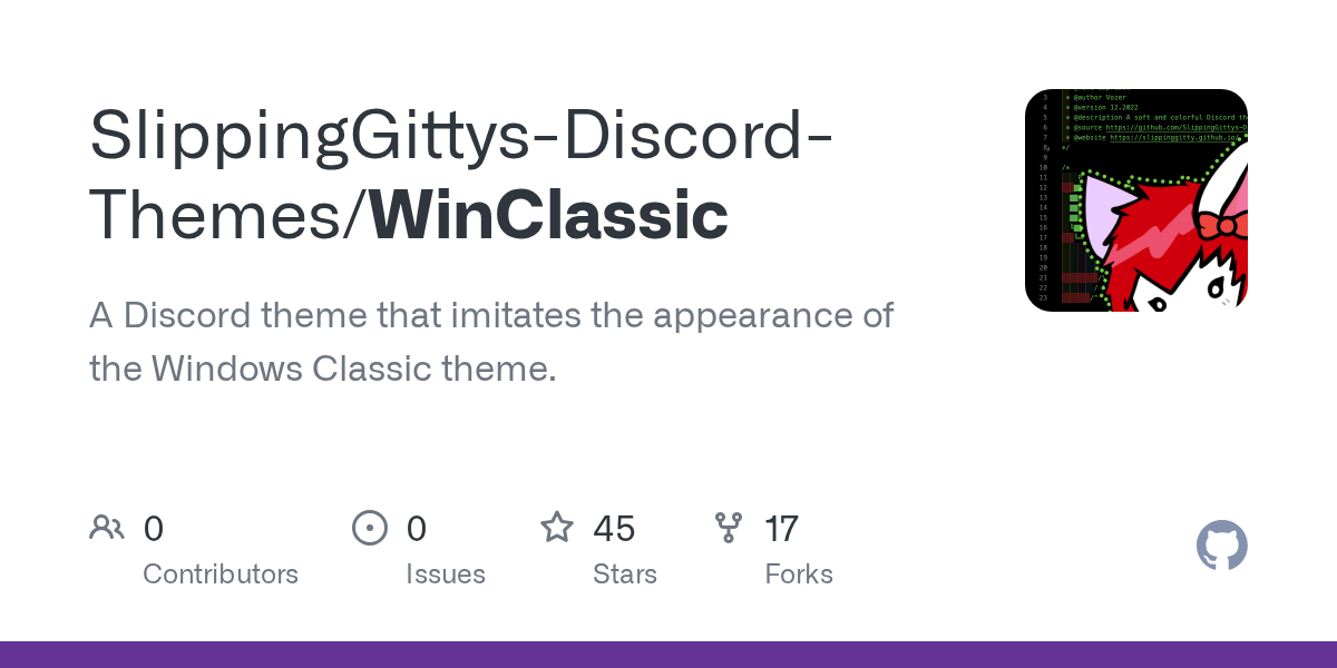
GitHub
A Discord theme that imitates the appearance of the Windows Classic theme. - SlippingGittys-Discord-Themes/WinClassic
invite for the server linked on github is invalid so I thought i'd ask here
data-list-item-id was fucking it. dunno why. figured out another method to do it tho.
something like this, it might mess with other things though
[class*="guilds_"] [class*="scroller_"] {
    scrollbar-width: none;
}
no :is() required there
I think this might be a bit better. doing that leaves a bit of a gap
[class^=toolbar_]>[class^=search_] {
  display: none;
}
also you can make that a code block by using triple ` around the css (with an optional language name for syntax highlighting) like this
```css
code here
```
this worked perfectly!!! TYSM!!
thank you sm
anyone got a good theme I don't care about the colors and stuff i js need a theme that works.
that's not the answer I want
but wtv
Unless you have any needs, what's wrong with default theme
i'm trying to swap places between replied message and nick name
i've used transform y to do so and it works, wondering if there's a bbetter option
wdym
like move this here?

guess what theme is this?

that's honestly a really bad theme
how is it bad?
Canva Discord
the font is annoyingly thin and uneven, you cant properly see an unread channel until you squint hard, the channel subicons literally blend in, i doubt normal discord is that small
the font looks like canva sans im pretty sure
look at the letter 9 and M
oh
because the letter M is supposed to be in half, but why this in full M?
its just a whole font
you mean like this

oh that makes so much more sense
no

/* move replied message below header and restyle */
[class^=repliedMessage_]
{ position: relative;
  top: 2.2em;
  font-style: italic; }
[class^=repliedMessage_]::before
 { border: none; }
[class^=repliedMessage_] + [class^=contents_] > [class^=header_]
 { top: -20px; }
[class*=hasReply_] > [class^=contents_] > [class^=avatar_]
 { margin-top: -20px !important; }
[class*=hasReply_] [class^=avatarDecoration_]
 { margin-top: calc(-20px - 4px); } /*accounting for size diff of 40px avatar and 48px decoration*/
this is how I did it
it's part of my theme so ymmv
and there's some edge cases where it screws things up I haven't bothered to fix