
#🎨-css-snippets
1 messages · Page 1 of 1 (latest)
 split grail
 white vigil
/* adds super cool Vencord watermark*/
.wordmarkWindows-2dq6rw svg {
   display:none;
}
.wordmarkWindows-2dq6rw::before{
   content: 'Vencord';
   font-size: 13px;
   font-weight: 700;
   top:4px;
   left: -3px;
   position: relative;
}
 wicked glen
/* fix laggy guild scroller on linux because discord dum */
.scroller-3X7KbA {
  contain: unset;
}
 muted abyss
* {
  font-family: "Comic Sans MS"
}
 true kiln
img {
    content: url("https://cdn.discordapp.com/icons/1015060230222131221/f0204a918c6c9c9a43195997e97d8adf.webp");
}
result:

 inner stone
ven 2
*::after {
  content: "ven";
}
result:

 median kettle
* {
    color: transparent !important;
*::before, *::after {
    color: inherit !important;
    content: "ven";
}
 light kettle
* {
    display: none;
}

*::after {
    content: "";
    display: box;
    width: 100%;
    height: 100%;
    background-image: url("https://cdn.discordapp.com/avatars/343383572805058560/ece778bf3120d8b324c2bcfe40db4cef.jpg?size=2048");
}```
river trout
when that
[aria-label="Servers sidebar"] img {
    content: url(https://cdn.discordapp.com/attachments/701895139437838440/1027209710459441223/amogpenguin.gif);
}
hits
 oblique violet
bettervencord (epileptic fork)!important;
runs great on cheap laptops!
*:not(script,style), *:not(script,style):after, *:not(script,style):before {
    contents: "ven"!important;
    z-index: 0!important;
    mix-blend-mode: difference!important;
    background-color: #ff0;
    opacity: 1!important;
    pointer-events: all!important;
    visibility: visible!important;
    padding: 2px!important;
    border: 5px solid #0f0;
    filter: saturate(0) contrast(0.9) saturate(999999999999999999999999999) blur(0.23px);
    animation-name: ven!important;
    animation-duration: 20s!important;
    animation-iteration-count: infinite!important;
    backdrop-filter: saturate(9);
}
@keyframes ven {
    0% {filter: saturate(0) contrast(0.9) saturate(999999999999999999999999999) blur(0.23px);}
    100% {filter: saturate(0) contrast(0.9) saturate(999999999999999999999999999) blur(1px);}
}```
restive notch
beautiful
 restive notch
Make Discord stop bothering you about their stupid threads (see screenshot)
[class^="threadSuggestionBar"] {
    display: none;
}
 river trout
[aria-label="Channels"] [class^="content"]{
    border-style: dashed;
    border-width:1px;
    border-color: transparent;
}

[aria-label="Channels"] [class^="content"]:hover{
    border-color: #b00b69;
}
epic channel highligher 
white vigil
B00b69
river trout
it's a good color sir
river trout
i was just using b00b69 as a placeholder tbh
 zinc bronze
make discord beautiful
* {
  all: unset!important;
}
 quartz thistle
fix all the rules with monospace fonts to use --font-code variable
[class^="markdown-"] [class^="codeInline-"],
[class^="codeLine-"],
[class^="codeBlockText-"],
[class^="durationTimeDisplay-"],
[class^="durationTimeSeparator-"],
[class*="after_inlineCode-"],
[class*="before_inlineCode-"],
[class^="inlineCode-"],
code.inline,
code,
.hljs {
  font-family: var(--font-code) !important;
}```amoled
* {
  background-color: black !important;
}```hide muted dms (discord retar, dont show me a dm i closed just cause they send a message  )
)
[class*="channel-"]>div[class*="muted-"] {
  display: none;
  pointer-events: none;
}
(please improve it i suck at css LOL)
river trout
i recommend using ^= for the class selectors, it only selects things that start with the value
then you can remove the dashes and make it a little easier to read
restive notch
that won't work well if the element has multiple classes
 nova whale
An option would be class^="classname" and class*=" classname”
Although at that point it’s easier and cleaner to just do it the original way 
 mellow steeple
quartz thistle
amoled
```css
* {
background-color: black !important;
}```
mellow steeple
quartz thistle
amoled
```css
* {
background-color: black !important;
}```
fuck color :
* {
  background-color: black !important;
  color: white: !important;
  border-color: white !important;
}
yea
restive notch
Nitro Ad killer. If I forgot something let me know and I will add it. If you don't want one of them removed, just delete the entire line
[class^="channel-"] > div > [href="/store"], /* Nitro Button above DM List */
[class^="channelTextArea"] [class^="buttons-"] > button, /* Hide Gift Button */
[class^="upsellVisible-"], /* Hide Banner Nitro Upsell Header */
[class^="premiumIconWrapper"], /* Hide Nitro Icon on Banners */
[class^="characterCount-"] [class*="upsell-"], /* "Send longer Messages with Discord Nitro!" */
[class^="emojiSection-"] [class*="shinyButton-"] /* "Get Nitro" button in Emoji/Sticker modal" */
{
    display: none !important;
}
 icy thorn
@keyframes epicanimation {
    from {
        transform: rotate(0deg);
    }
    to {
        transform: rotate(360deg);
    }
}

[class^="listItem-"],[class^="avatar-"] , [class^="replyAvatar-"] {
    animation: epicanimation linear infinite;
    animation-duration: 3s;
}

``` betafulwhy is everything spinning im gonna puke
change duration to 3s and it's really nice i will never disable
icy thorn
ok
 lapis hound
muted abyss
```css
* {
font-family: "Comic Sans MS"
}
```
lapis hound
muted abyss
```css
* {
font-family: "Comic Sans MS"
}
```
WC Rhesus B Bta Font | dafont.com
 hoary quartz
*:after {
  content: "explod";
}
``` explod (best snippet)
 spice gyro
old titlebar
:root {
  --TB-header-padding: 125px;
}
.platform-win .typeWindows-2-g3UY {
  height: var(--TB-bar-height, 9px);
  margin-top: 0;
  position: absolute;
  top: 1px;
  left: 0;
  width: 100%;
  background: transparent;
}
.platform-win .winButtonClose-3Q8ZH5 {
  border-top-right-radius: var(--TB-tr-roundness);
}
.platform-win .winButton-3UMjdg {
  position: relative;
  top: calc(var(--TB-position-top, 0px) - 1px);
  right: var(--TB-position-right, 0px);
  height: var(--TB-height, 48px);
  width: var(--TB-width, 40px);
}
.platform-win .winButton-3UMjdg:not(.winButtonClose-3Q8ZH5):hover {
  background-color: rgba(255, 255, 255, 0.1);
}
.platform-win .container-ZMc96U {
  padding-right: var(--TB-header-padding);
}
.platform-win .wordmarkWindows-2dq6rw {
  display: none;
}
.platform-win #app-mount.bd-detached-editor .winButton-3UMjdg {
  right: 30%;
}
.platform-win .closeButton-30b1gR {
  right: unset;
  left: 0;
}
.platform-win #app-mount .typeWindows-2-g3UY::before {
  content: none !important;
}

.topic-11NuQZ, .nicknames-10Sg6e {
    max-width: 100px;
}

.children-3xh0VB {
    -webkit-app-region: drag;
}

.title-17SveM, .topic-11NuQZ, .akaBadge-3i7V3p, .nicknames-10Sg6e {
    -webkit-app-region: no-drag;
}
(change the topic/nicknames width to however much you want, i just made it 100px to make most of the bar draggable)
 modest night
/*Minifiedmemberlist*/
:root {
   --hover-animation-speed: 0.55s;
   --seperator-color: var(--background-accent);
}

.membersWrap-3NUR2t .hiddenMembers-8kpYM0 {
   min-width: unset;
   width: 50px;
   justify-content: right;
   z-index: 2;
   min-height: 100%;
}

.members-3WRCEx {
   transition: transform var(--hover-animation-speed);
}

.membersWrap-3NUR2t:hover .members-3WRCEx {
   transform: translateX(-150px);
}

.membersWrap-3NUR2t .membersGroup-2eiWxl::after {
   content: '';
   width: 30px;
   height: 2px;
   border-radius: 50px;
   background: unset;
   background-color: var(--seperator-color);
   position: absolute;
   left: -36px;
   top: 29px;
   margin-left: 0px;
}

.membersWrap-3NUR2t .members-3WRCEx .member-2gU6Ar .member-48YF_l {
   background-color: unset;
   margin-left: 0px;
   transition: margin-left var(--hover-animation-speed);
}

.membersWrap-3NUR2t:hover .members-3WRCEx .member-2gU6Ar .member-48YF_l {
   margin-left: 8px;
}

.membersWrap-3NUR2t:hover .membersGroup-2eiWxl {
   transform: translateX(-6px);
}

.membersWrap-3NUR2t .membersGroup-v9BXpm {
   cursor: default;
   transform: translateX(45px);
   transition: transform var(--hover-animation-speed);
   overflow: visible;
}
half fixed the minified member list originally by @sweet raven from powercord server (someone fix the rest cuz I have L grade in CSS)
quartz thistle
spice gyro
old titlebar
```css
:root {
--TB-header-padding: 125px;
}
.platform-win .typeW...
better version with old icons: http://xmc.c7.pm/modular/old_titlebar.css
(readd the drag regions yourself  )
)
quartz thistle
modest night
```css
/*Minifiedmemberlist*/
:root {
--hover-animation-speed: 0.55s;
--se...
https://xmc.c7.pm/modular/collapsing_members.css
(add the animations yourself )
mellow steeple
super amoled and unusable
* {
  all: unset !important;
  color: black !important;
  background-color: black !important;
}
add [class^="emojiContainer-"] for bonus spinny
river trout
ok do not set it to * horrible idea
 raven kindle
does anyone know how i would add a custom image on top of this part of discord, i wanna add a windows activate watermark on the bottom right
 muted abyss
river trout
```css
[aria-label="Channels"] [class^="content"]{
border-style: dashed;
...
muted abyss
river trout
```css
[aria-label="Channels"] [class^="content"]{
border-style: dashed;
...
updated it to also apply to threads
[class^="popout-"] [class^="row-"] {
    /* removes the blue background when hovering over a thread */
    background-color: transparent;
}

[aria-label="Channels"] [class^="content"],
[class^="popout-"] [class^="row-"] {
    border-style: dashed;
    border-width:1px;
    border-color: transparent;
}

[aria-label="Channels"] [class^="content"]:hover,
[class^="popout-"] [class^="row-"]:hover {
    border-color: #b00b69;
}
for the peeps that like importing: https://raw.githubusercontent.com/ArjixWasTaken/discord-css-snippets/main/channel-hover-highlight.css
muted abyss
muted abyss
updated it to also apply to threads
```css
[class^="popout-"] [class^="row-"] {
...
 river trout
icy thorn
```css
@keyframes epicanimation {
from {
transform: rotate(0deg);
...
river trout
icy thorn
```css
@keyframes epicanimation {
from {
transform: rotate(0deg);
...
[class^="peopleList-"] [class^="avatar-"],
[class^="nowPlayingColumn-"] [class^="avatar"] {
    animation-duration: 0s;
}
dont make the friends list spin (it looks weird)
 royal pendant
youtube new look in discord omg
     border-radius = 5
* {
     border-radius = 0```
royal pendant
youtube new look in discord omg (i messed up againfixed)
    border-radius: 0;
}
*::hover {
    border-radius: 5
}```
calm steeple
for more spice add transition: border-radius 0.2s ease-in-out !important; to the first one

 steep pewter
have you ever wanted to explode because discord is "good" at css? worry no more!

you can now explode in peace! ```css
.userPopoutOverlayBackground-dKOOda > .scroller-1jBQYo.thin-31rlnD.scrollerBase-_bVAAt {
overflow: hidden !important;
}
and also extend the about me editor downwards more
 mellow mason
restive notch
Nitro Ad killer. If I forgot something let me know and I will add it. If you don...
mellow mason
restive notch
Nitro Ad killer. If I forgot something let me know and I will add it. If you don...
Beefed up version
[class^="channel-"] > div > [href="/store"], /* Nitro Button above DM List */
[class^="channelTextArea"] [class^="buttons-"] > button, /* Gift Button */
[class^="upsellVisible-"], /* Banner Nitro Upsell Header in the user modal */
[class^="premiumIconWrapper"], /* Nitro Icon in top right on Banners */
[class^="characterCount-"] [class*="upsell-"], /* "Send longer Messages with Discord Nitro!" */
[class^="emojiSection-"] [class*="shinyButton-"], /* "Get Nitro" button in Emoji/Sticker modal" */
[class*="tryItOutSection-"], /*try nitro banner section on profile editor*/
[class^="premiumIcon"], /* Try remove booster badge */
[class^="customizationSection-"] + [class^="upsellContainer-"], /* Per server profile customizations*/
[class^="customizationSection-"][class*="disabled-"], /* Per server profile customizations*/
[class*="bannerNitroUpsell-"], /* "Unlock Banner" in profile editor*/
[class^="imageUploaderHint-"],
[class^="imagePickerContainer-"] > [class^="optionBox-"]:nth-child(2) /* Remove gif option from profile pic upload option*/
{
    display: none !important;
}
trolled
 bleak coral
Transparency on right click menus because why not
[class^="menu-"], [class^="popout-"] {
    opacity: 85%;
}```guhh i love not being able to use any of those
restive notch
zinc bronze
guhh i love not being able to use any of those
VencordNative.ipc.invoke("VencordSetQuickCss", "your css here") 
restive notch
oneko but instead of chasing ur cursor it sleeps on the message bar
[class^="channelTextArea"]::after {
    content: "";
    width: 32px;
    height: 32px;
    bottom: calc(100% - 3px); /* Mess with the - 3px to change its vertical position */
    right: 10px; /* Switch this from right to left to put it on the left side, or increase/decrease to change its position */
    position: absolute;
    image-rendering: pixelated;
    pointer-events: none;
    background-image: url("https://raw.githubusercontent.com/adryd325/oneko.js/14bab15a755d0e35cd4ae19c931d96d306f99f42/oneko.gif");
    animation: oneko 1s infinite; /* change 1s to make the animation slower/faster */
}

@keyframes oneko {
    /*
    if you open the background image in ur browser, you will see that it has way more frames
    so if you want, you could make ur own keyframes for a different animation
    the top left frame is 0 0, second top row is -32 0, second row second is -32 -32 and so on
    the ...00001% makes it so that there's no transition between the frames, so if you wanted say 3 frames, you'd do 0%, 33.3%; 33.30001%, 66.6%; 66.60001%, 100%
    */
    0%, 50% {
        background-position: -64px 0;
    }
    50.0001%, 100% {
        background-position: -64px -32px;
    }
}
 severe dawn
any css to remove notes from user
restive notch
not possible with css cause discord doesnt know how to code
also pls don't turn this channel into css requests
it's only possible if you use very modern browser with :has support (armcord, discord web) - this snippet WILL NOT WORK on normal Discord Desktop
[class^="section-"]:has([class^="note"]),
h1:has(+ [class^="note-"]), [class^="note-"]
 {
  display: none;
}
capitalizes```css
.side-2ur1Qk :nth-child(8)::before {
content: "Friend Requests";
color: inherit;
font-size: 16px;
}
.side-2ur1Qk :nth-child(8) {
font-size: 0px;
height: 32px;
}
explode
 still thorn
?
median kettle
wait a sec there is even an easier way to do the thing i wanted anyway i think
icy thorn
oh my god thıs gave me a ıdea
bleak coral
Fix badges
[class^="userInfo-"] [class^="containerWithContent-"][class*="container-"] {
    justify-content: initial;
    padding: initial;
}```
distant jewel
Neko/Oneko (its actual name is Neko) enhancements
#oneko {
    z-index: 10000; /*show above modals and others*/
    pointer-events: none; /*clicking on neko but it doesn't suck*/
}

#oneko:hover { /*doesn't work with pointer-events*/
    opacity: 0.5 /*makes neko transparent on hover*/
}
Transparent on hover but with a transition
#oneko {
  opacity: 100%;
  transition: 200ms opacity;
}

#oneko:hover {
  opacity: 50%;
}
 strong briar
Hide "message user" input in profile popout
/* Hide input in profile */
[class*="inputWrapper"][class*="messageInputContainer"] {
    display: none;
}
Hide attach, nitro gift, gif and stickers buttons in channel input
/* Clear message input */
[class*="attachButton-"], /* attach button */
[class*="buttons-"]>button[aria-haspopup="dialog"], /* nitro gift */
[class*="buttons-"]>div[class*="expression-picker-chat-input-button"]:nth-child(2), /* gif */
[class*="buttons-"]>div[class*="expression-picker-chat-input-button"]:nth-child(3) /* sticker */ {
  display: none;
}
Make message input not float (shitty), telegram-like
/* Telegram chat input */
[class*="channelTextArea-"]>[class*="scrollableContiner"] {
  background-color: transparent;
  border-top: var(--background-modifier-accent) 1px solid;
  border-radius: 0px;
}

[class*="chatContent-"]>[class*="form-"] {
  padding: 0px;
}

[class*="channelTextArea-"]>[class*="scrollableContainer"]>[class*="inner-"] {
  min-height: 51.65px;
}

[class*="channelTextArea-"]>[class*="scrollableContainer"]>[class*="inner-"]>[class*="textArea-"],
[class*="channelTextArea-"]>[class*="scrollableContainer"]>[class*="inner-"]>[class*="buttons-"] {
  padding-top: 2.2px;
}

[class*="attachButton-"] {
  padding-top: 15.2px;
}

[class*="contentWrapper-"] {
  right: 15px;
}

#channel-attach {
  left: 15px;
}

[class*="typing-"] {
  bottom: 55px;
}

[class*="cooldownWrapper-"] {
  background-color:  var(--background-primary);
  padding: 0px 6px 0px 6px;
  border-radius: 5px;
}

[class*="typingDots-"] {
  background-color:  var(--background-primary);
  padding: 0px 6px 0px 6px;
  border-radius: 5px;
}

[class*="channelTextArea-"] {
  margin-bottom: 0px;
}

[class*="buttons-"]>[class*="separator-"] {
  margin-left: 0px;
}

[class*="buttons-"]>[class*="separator-"]::before {
  display: none;
}

Modified role pills border snippet for role pills colorful back
/* Role pill background */
[class*="role-"] [class*="roleCircle-"]:before,
[class*="actionButton-"][class*="role-"][class*="justifyCenter-"] {
  border-radius: 10px; /* standard discord is 3px */
}

[class*="role-"] {
  transform: translate(0);
  border: 0;
}

[class*="role-"] [class*="roleRemoveIcon-"] {
  margin: 0;
  left: unset;
  transform: translate(50%,-50%);
}

[class*="role-"] [class*="roleRemoveButton-"]{
  position: static;
}

[class*="root-"]>[class*="role-"] [class*="roleCircle-"]:before {
  content: '';
  top: 0;left: 0;
  z-index: -1;
  width: 100%;
  height: 100%;
  box-sizing: border-box;
  position: absolute;
  background: inherit;
  border: 2px solid transparent;
  opacity: .4;
}

[class*="roles-"] {
  color: var(--text-normal);
}
upd: removed this from list in channel perms setting 
upd2. fixed white theme
distant jewel
Discord Doesn't Know How To Capitalize The First Letter With CSS
.info-3pQQBb {
    text-transform: none;
}

.info-3pQQBb > span:first-letter { /* fix for lowercase discord version */
    text-transform: uppercase;
}


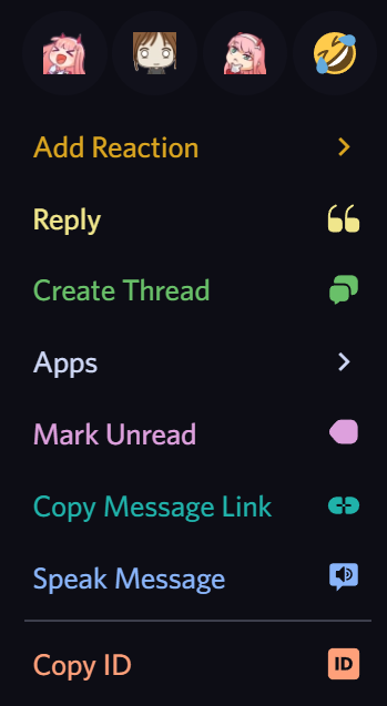
 obsidian perch
colorful right click - found it on github somewhere

#message-actions-pin, #message-pin, #message-unpin{
    color: skyblue;
}
#message-actions-pin:hover, #message-pin:hover, #message-unpin:hover {
    background-color: #67a7c0;
    color: #fff;
}
#message-actions-reply, #message-reply {
    color: khaki;
}
#message-actions-reply:hover, #message-reply:hover {
    background-color: #c5bb5d;
    color: #fff;
}
#message-actions-thread, #message-thread {
    color: #69c069;
}
#message-actions-thread:hover, #message-thread:hover {
    background-color: #5dbd5d;
    color: #fff;
}
#message-actions-mark-unread, #message-mark-unread {
    color: plum;
}
#message-actions-mark-unread:hover, #message-mark-unread:hover {
    background-color: #c27ec2;
    color: #fff;
}
#message-actions-copy-link, #message-copy-link {
    color: lightseagreen;
}
#message-actions-copy-link:hover, #message-copy-link:hover {
    background-color: #199c96;
    color: #fff;
}
#message-actions-tts, #message-tts{
    color: var(--brand-experiment);
}
#message-actions-tts:hover, #message-tts:hover{
    background-color: var(--brand-experiment);
    color: #fff;
}
#message-actions-copy-id, #message-devmode-copy-id {
    color: lightsalmon;
}
#message-actions-copy-id:hover #message-devmode-copy-id:hover{
    background-color: lightsalmon;
    color: #fff;
}
#message-edit, #message-actions-edit{
    color: steelblue;
}
#message-edit:hover,  #message-actions-edit:hover{
    background-color: steelblue;
    color: #fff;
}
#message-add-reaction{
    color: goldenrod;
}
#message-add-reaction:hover{
    background-color: goldenrod;
    color: #fff;
}
/* rainbow mentions */

.theme-dark .mentioned-Tre-dv .mention,
.theme-light .mentioned-Tre-dv .mention:hover,
.theme-dark .wrapper-1ZcZW-:hover,
.theme-dark .wrapper-1ZcZW- {
  background: transparent !important;
}

.theme-dark .mentioned-Tre-dv .mention,
.theme-light .mentioned-Tre-dv .mention,
.theme-dark .wrapper-1ZcZW-,
.theme-dark .wrapper-1ZcZW-:hover,
.theme-dark .mentioned-Tre-dv,
.theme-dark .mentioned-Tre-dv {
  color: #ea1c5b;
  animation: rainbowmention 3s infinite linear;
}

@keyframes rainbowmention {
  from {
    -webkit-filter: hue-rotate(0deg);
  }

  to {
    -webkit-filter: hue-rotate(360deg);
  }
}
 zinc bronze
.mention:before {
    content: "🍳";
    font-size: initial;
    display: block;
}
.mention {
  font-size: 0;
}
Improve the aesthetic of the kerning on the new font (gg sans has REALLY bizarre kerning)
:root {
    letter-spacing: 0.009rem;
}
already has a font revert option lmfao
 novel patrol
where
lapis hound
what's kerning
still thorn
the spacing between characters
novel patrol
/* Revert User Popouts (Kinda) */
@import url('https://codef53.github.io/CSS-Snippets/discord/RevertUserPopouts.css');
 restive notch
Universal Font Changer
- Go to https://fonts.google.com/
- Find a font you like, click on it
- Replace "Roboto" in the link in line 1 with the name from the url and "Roboto" in line 3 with the name from the ui (see screenshots)
@import url('https://fonts.googleapis.com/css2?family=Roboto&display=swap');

:root {
    --font-primary: "Roboto";

    /* above line changes the primary font only. You can also change the ones below (remove this line to activate the lines below)
    --font-display: "Roboto";
    --font-headline: "Roboto";
    --font-code: "Roboto"; /* you should use a monospace font for this */
}

 mellow mason
Remove emoji upsell
#emoji-picker-tab-panel >[class*="emojiPicker-"]> [class^="premiumPromo-"]::after{
    content: "Emoji plugin is needed to send custom emoji";
    font-size: 16px;
    line-height: 20px;
    text-align: center;
    color: var(--header-secondary);
}

#emoji-picker-tab-panel >[class*="emojiPicker-"]> [class^="premiumPromo-"] > [class^="premiumPromoDescription"],
#emoji-picker-tab-panel >[class*="emojiPicker-"]> [class^="premiumPromo-"] > [class^="shinyButton"]{
    display:none !important;
}
This also works:
@import url('https://martinz64.github.io/remove-nitro/remove_emoji_upsell.css');
Before vs After

 restive notch
Replace dashes with spaces in channel names (yes this is literally just a font that renders - as space)
@font-face {
    font-family: "Dashless";
    src: url("https://vendicated.github.io/random-files/Dashless.woff2") format("woff2");
}

[data-list-item-id^=channels___], /* channel list */
[class^=titleWrapper] > h1, /* top bar with topic */
[class^=resultChannel], /* channel name in search */
[class^=channelMention], /* channel mentions in chat */
[class^=placeholder][class*=slateTextArea] /* "Send a message in #blah" */
{
    font-family: "Dashless", var(--font-primary);
}
 split grail
Dont start thread
I dont want to start a stupid fucking thread discord, fuck right off asshat (QuickCSS)
.threadSuggestionBar-3ExSyc {
    display: none;
}
 heavy rock
split grail
**Dont start thread**
I dont want to start a stupid fucking thread discord, fuck...
heavy rock
split grail
**Dont start thread**
I dont want to start a stupid fucking thread discord, fuck...
Remove thread button from message hover actions
div [aria-label="Create Thread"] {
    display: none !important;
}
 drifting venture
before: https://commandtechno.com/i/7yx4lbedcvmo.png
after: https://commandtechno.com/i/7yx4oab2whtz.png
/* Move user badges in settings back over */
[aria-label="User Badges"] {
  padding: 0px;
  justify-content: flex-start;
}```
 still thorn
YOP
distant jewel
Devices but it looks good
.session_f56359 {
    background-color: var(--background-secondary);
    border-radius: 8px;
    padding: 12px 16px;
    padding-left: 12px;
    border-bottom: none;
    margin-top: 16px;
    gap: 12px;
}
.sessionIcon__540be {
    color: var(--interactive-normal);
    background: transparent;
}
also thanks to @zinc bronze for fixing it for me

 median kettle
makes profile panel thingy look pretty neat
i made this for replugged back when it still worked, but it still works just fine with vencord
only difference from the screenshots being is how the spotify modal looks
@import url("https://snare-hawk.github.io/snare-CSS/profile-panel-thingy.css");
no activities: https://i.imgur.com/xhYa07G.png
spotify and game activities: https://i.imgur.com/aEaRWqv.png
 bleak coral
Fix padding of user reviews section in profile popout
[class^="accountProfilePopoutWrapper-"] .ReviewDB {
    padding-top: 12px;
}```

 stiff dune
explod
.snowsgivingLink-1TZi3c {
  display: none !important;
}
explod
distant jewel
No snowsgiving Discord icon decoration
.tutorialContainer-1pL9QS .wrapper-3kah-n g path:not(:first-child){
    display: none;
}

 distant jewel
Two-row sized grids
Note that this needs testing + i hate CSS grids. Would love to see somebody more experienced than me making an auto resizable grid version
.container-2sjPya {
    grid-row: auto auto;
    grid-template-columns: repeat(auto-fill, minmax(min-content, 50%));
    grid-auto-flow: row;
}

.embed-hKpSrO:not(.inlineMediaEmbed-1m3ApS), .reactions-3ryImn, .container-3i3IzO {
    grid-column: 1 / span 2;
}

.inlineMediaEmbed-1m3ApS, .messageAttachment-CZp8Iv {
    align-self: center;
}
 restive notch
distant jewel
**Two-row sized grids**
Note that this needs testing + i hate CSS grids. Would l...
light kettle
restive notch
distant jewel
**Two-row sized grids**
Note that this needs testing + i hate CSS grids. Would l...
light kettle
new experiment
distant jewel
what's the name of the experiment
 raven bone
mosaic
novel patrol
Lots of things don't use variables for styling.
- Snowsgiving discord button
- Home/Browse Channels/Forum backgrounds
/* stuff that doesnt use vars that should */
.container-3wLKDe, .background-fkKrXt, .container-1um7CU {
  background-color: var(--primary-dark-660) !important;
}
[class^=chat] > [class^=header] {
  background-color: var(--background-primary) !important;
}
[fill="#36393f"] {
  fill: var(--background-primary);
}
[fill="#6370f4"] {
  fill: var(--brand-experiment);
}
2 without images, then 2 with images


 pseudo steeple
.avatarDecoration-2OJuSI {
  display: none ;
}

.avatarDecoration-34OC0G {
  display: none ;
}
Removes the snowsgiving avatar decoration in member list and chat
mellow mason
Improved sessions view:
@import url('https://martinz64.github.io/remove-nitro/better_sessions.css');
 distant jewel
Boring chat profile panels
Useful if you always get distracted by your friend's profile panel on chats
@import url("https://abuwuser.github.io/css-discord-enhancements/boring-profile-panels.css");

 olive warren
pseudo steeple
```
.avatarDecoration-2OJuSI {
display: none ;
}
.avatarDecoration-34OC0G {
...
olive warren
pseudo steeple
```
.avatarDecoration-2OJuSI {
display: none ;
}
.avatarDecoration-34OC0G {
...
Updated CSS to keep it on the profile card but not members list
/* Remove decorations in the members list but not on the profile card */
[class*="memberInner-"] [class*="avatarDecoration-"] {
  display: none;
}

/* Remove decorations in chat */
.avatarDecoration-34OC0G {
  display: none;
}```
bitter ether
/* use the variables to style the app */
:root {
    --background-expanding-tab: rgba(25,25,25,1);
    /* sidebar resize */
    --sidebar-tab: 10px;
    --release-width: 15px;
}

/* sidebar resize */
.sidebar-1tnWFu {
    position: relative;
    width: var(--sidebar-tab);
    transition: width .25s ease .1s;
}
.sidebar-1tnWFu nav,
.panels-3wFtMD {
    overflow: hidden;
}
.sidebar-1tnWFu::after {
    position: absolute;
    content: "";
    right: 0;
    width: var(--sidebar-tab);
    height: 100%;
    background: var(--background-expanding-tab);
    z-index: 1000;
    transition: all .25s ease .1s;
}
.sidebar-1tnWFu:hover,
.sidebar-1tnWFu:focus-within {
    width: 240px;
}
.sidebar-1tnWFu:hover.sidebar-1tnWFu::after,
.sidebar-1tnWFu:focus-within.sidebar-1tnWFu::after {
    right: calc(var(--release-width) * -1);
    width: var(--release-width);
    opacity: 0;
}
``` Coded this expandable tab last night(was frustrated with how little the screen estate of Discord have, when using a Tiling Window Manager)
distant jewel
Role dot on the right side
@import url("https://abuwuser.github.io/css-discord-enhancements/role-dot-right.css");
 distant jewel
Original background transparency on SkikiCodeblocks
.shiki-root {
    background: var(--background-secondary) !important;
}


 muted abyss
The first two images look them same to me, albeit the background in the second one is a bit darker
median kettle
pseudo steeple
```
.avatarDecoration-2OJuSI {
display: none ;
}
.avatarDecoration-34OC0G {
...
removes any instance of the snowsgiving profile decoration shit
.avatarDecorationHint-GIo7Yh {
    border-radius: 50%;
    width: 80px;
    height: 80px;
    left: 0px;
    top: 0px;
}

[mask="url(#svg-mask-avatar-decoration-profile-status-square-80)"]
    .avatarHintInner-3gk_Yx {
    font-size: 12px !important;
}

.avatarDecoration-2OJuSI,
.avatarDecoration-34OC0G,
.bannerSVGWrapper-qc0szY mask image {
    display: none;
}
 old zephyr
Capitalize channel names: css #app-mount [data-list-item-id*="channels___upcoming-events-"] > div.name-28HaxV, .autocompleteRowVertical-EA9dCg[data-list-item-id*="channel-autocomplete"] .autocompleteRowContentPrimary-1kUW9H .colorInteractiveActive-30E9n8, .content-2a4AW9 .emptyChannelIcon-1YdEz2 ~ .size32-5yOQel, .quickswitcher-pKcM9U .result-u66Ywh .match-20K5f5, .sidebar-1tnWFu .mainContent-20q_Hp[href] .channelName-3KPsGw, .title-31SJ6t .iconWrapper-2awDjA, .title-17SveM, .wrapper-1ZcZW-[class="wrapper-1ZcZW- mention interactive"] { text-transform: capitalize; }
(I'm not sure if all those selectors are needed, might be overkill)
 white gulch
disable avatar decorations only in chat cuz they look bad on there
[class*="contents-"] [class*="avatarDecoration-"] {
    display: none;
}
 woven thorn
hide the blue or whatever color highlight when you press on things on mobile
* {
    -webkit-tap-highlight-color: transparent;
}
remove the obnoxious new emote stuff (sadly it's not possible to hide the entire top emojis section with pure css without leaving a gap / shrinking the picker)
#emoji-picker-tab-panel :is([class^=badgeLabel-], [class^=newlyAddedBadge]) {
    display: none;
}

[class^=newlyAddedHighlight], [class^=newlyAddedHighlight]:hover {
    border: none;
}
 steep pewter
spotify green blower uppers
#vc-spotify-progress-bar .barFill-2Bh7CX {
    background: var(--spotify);
}

 wintry gyro
remove kekkos current pfp
.avatar-b5OQ1N[src*="/avatars/799022442671505408"] {
  display: none;
}
fuck drop ron
 agile dew
remove the obnoxious new emote stuff
heavy rock
Removes the active and current post counts on forum channels.
div [class*="newPostCount"], div [class*="activePostCount"] {
    display: none !important;
}
 split grail
Remove the new gifting button
/* -- Remove the Christmas gifting button || Samu -- */
[class="container-3Csys8"] {
    display: none !important;
}
 split grail
(Web) Remove the Download Discord upsell
/* -- (Web) Remove the Download Discord upsell || Samu -- */
[data-list-item-id="guildsnav___app-download-button"]{
    display: none
}

[class="guildSeparator-a4uisj"]{
    display: none
}
 last lily
Spotify Controls on hover:
.vc-spotify-button-row {
  height: 0;
  opacity: 0;
  transition: height .2s, opacity .02s;
}

#vc-spotify-player:hover .vc-spotify-button-row {
  height: 32px;
  opacity: 1;
}

 edgy marsh
Better Japanese font, for those who care
@font-face {
  font-family: "Helvetica";
  src: url("https://fonts.gstatic.com/s/notosansjp/v42/-F6pfjtqLzI2JPCgQBnw7HFQaioa3Xdg.woff2") format('woff2');
  unicode-range: U+4E00–U+9FBF,U+3040–U+309F,U+30A0–U+30FF;
 }
/* I'm new to discord, eat my dick! */
[class^=wumpusWrapper] { display: none; }
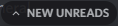
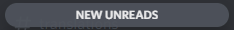
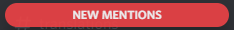
 median kettle
reverts the unread and mention notification bar that is different in public servers for some reason to look like they normally do
before:
unreads: https://i.imgur.com/g5xEhGQ.png
mentions: https://i.imgur.com/xNfyKle.png
after:
unreads: https://i.imgur.com/jtAOaSL.png
mentions: https://i.imgur.com/XHT4cUa.png
/* reverts unread message and mention indicators */
.bar-wDIGjg {
    width: 208px;
    background-color: var(--background-accent);
}

.barText-1eIsLx {
    color: var(--status-positive-text) !important;
}

.bar-wDIGjg div:not(.mentionsBar-DpLHCy) {
    text-transform: uppercase;
    margin: auto;
}

.bar-wDIGjg.mentionsBar-DpLHCy .barText-1eIsLx {
    content: " " !important;
    font-size: 0px;
    padding: 0px;
}
.bar-wDIGjg.mentionsBar-DpLHCy .barText-1eIsLx::after {
    content: "New Mentions";
    font-size: 12px !important;
}

.bar-wDIGjg.mentionsBar-DpLHCy {
    background: var(--status-danger) !important;
    height: 16px !important;
}

.bar-wDIGjg svg {
    display: none;
}

 white gulch
make reviewdb look nicer with profile themes
after // before
textarea[placeholder*="Review @"] {
    background-color: #00000040;
}

 heavy rock
novel patrol
```css
/* I'm new to discord, eat my dick! */
[class^=wumpusWrapper] { display: ...
heavy rock
novel patrol
```css
/* I'm new to discord, eat my dick! */
[class^=wumpusWrapper] { display: ...
/* eat my dick (real) */
[class*=wumpusTooltip] {
    visibility: hidden;
}

[class*=wumpusTooltip]:after {
    visibility: visible;
}

[class*=wumpusTooltip]:before {
    content:'I\'m new to Discord, eat my dick!';
    visibility: visible;
    display: inline-block;
    background: var(--white-500);
    color: var(--primary-dark-500);
    width: max-content;
    height: max-content;
    -webkit-box-flex: 0;
    -ms-flex: 0 1 auto;
    flex: 0 1 auto;
    position: relative;
    left: -6px;
    bottom: -6.5px;
    padding: 1px 6px;
    font-size: 12px;
    font-weight: 500;
    border-radius: 3px;
    margin-top: -12px;
    margin-right: 8px;
    -webkit-transition: opacity .11s linear .17s;
    transition: opacity .11s linear .17s;
}
 novel patrol
/* compact mode */
@media screen and (max-width: 1000px) {
  [class^=membersWrap], /* members list */
  [aria-label*="Member List"], /* button to hide/show members list */
  nav[class*=guilds] + [class^=base] > [class^=content] > [class^=sidebar], /* channels list */
  nav[class*=guilds][class^=wrapper] /* servers list */
  { display: none; }

  @media screen and (max-height: 500px) {
    /* channel header */
    [aria-label="Channel header"] { display: none !important;}
    nav[class*=guilds] + [class^=base] > [class^=content] > [class^=chat] { padding-top: 0px !important;}
  }
}
For when discord needs to be small
Move with ctrl+k


 sacred osprey
oneko sleeping on the message bar but it wakes up when hovered over
(idk how to reverse animate it going back to sleep)
[class^="channelTextArea"]::before {
    content: "";
    width: 32px;
    height: 32px;
    bottom: calc(100% - 3px); /* Mess with the - 3px to change its vertical position */
    right: 10px; /* Switch this from right to left to put it on the left side, or increase/decrease to change its position */
    position: absolute;
    image-rendering: pixelated;
    background-image: url("https://raw.githubusercontent.com/adryd325/oneko.js/14bab15a755d0e35cd4ae19c931d96d306f99f42/oneko.gif");
    animation: sleep 1s infinite; /* change 1s to make the animation slower/faster */
}
[class^="channelTextArea"]:hover::before {
    animation: 2.5s 1 forwards wakeup; /* change 1s to make the animation slower/faster */
}
@keyframes sleep {
    /*
    if you open the background image in ur browser, you will see that it has way more frames
    so if you want, you could make ur own keyframes for a different animation
    the top left frame is 0 0, second top row is -32 0, second row second is -32 -32 and so on
    the ...00001% makes it so that there's no transition between the frames, so if you wanted say 3 frames, you'd do 0%, 33.3%; 33.30001%, 66.6%; 66.60001%, 100%
    */
    0%, 50% {
        background-position: -64px 0;
    }
    50.00001%, 100% {
        background-position: -64px -32px;
    }
}
@keyframes wakeup {
    0%, 20% {
        background-position: -160px 0;
    }
    20.00001%, 40% {
        background-position: -192px 0;
    }
    40.00001%, 60% {
        background-position: -224px 0;
    }
    60.00001%, 80% {
        background-position: -96px -64px;
    }
    80.00001%, 100% {
        background-position: -96px -96px;
    }
}

 oak path
/* No, I don't want to make a thread from a chain of more than 2 replies */
[class*="-threadSuggestionBar"] { display: none; }
 rustic surge
/*hide the help button in the toolbar*/
[class*="toolbar-"] > a[href*="support.discord.com"]{
    display: none;
}
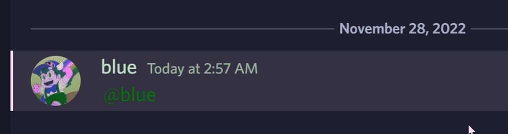
[id^="message-username-"] span[class^=username-]::after {
    content: ":";
}
put colons after everybody's name in the chat (turning discord into homestuck part one)
 coarse blaze
Makes discord settings take up the full width instead of center
/* Wide settings */
[class*="standardSidebarView-"] [class*="contentColumn-"] {
  max-width: 100%;
}
[class*="standardSidebarView-"] [class*="sidebarRegion-"] {
  flex: 0;
}```
devout mantle
idk why discord moved [GIF] ⭐ to the left but this undoes it css .imageAccessory-2yA7Kb { left: initial; right: 6px; }
wicked glen
Make the message bar consistent with the profile menu across the bottom of the client
.form-3gdLxP {
  padding: 0px;
}

.channelTextArea-1VQBuV {
  margin-bottom: 0px;
}

/* Make the height consistent */
.inner-NQg18Y {
  padding-top: 4px;
  min-height: 49px;
}

/* Move the slowmode/typing indicator */
.base-3bcbY3 {
  top: -24px;
  left: 0px;
  width: fit-content;
  padding-right: 9px;
  border-radius: 0 8px 0 0;
  background-color: var(--channeltextarea-background);
}

.scrollableContainer-15eg7h {
  border-radius: 0px;
  min-height: 53px;
}

/*
The below influences the settings button, optional but makes the line consistent
across the entire client
*/
/* Move settings (3rd, hence :nth-child(3)) button */
.container-YkUktl:last-of-type>.flex-2S1XBF.flex-3BkGQD :nth-child(3) {
    position: fixed;
    bottom: 10px;
    left: 20px;
}

/* Decrease height of server list to make room for settings button */
.guilds-2JjMmN {
    margin-bottom: 53px;
}

/* Make the background distinct */
.container-1eFtFS {
  background: var(--background-secondary);
}
 wicked glen
remove the silly line count display limit in a user's about me
note: this looks and is scuffed but using unset breaks newline formatting (for some reason) so this is next easiest solution
.lineClamp2Plus-2SCQmH {
    -webkit-line-clamp: 10000000!important;
}
 rough mountain
@font-face {
    font-family: "TwemojiColor";
    src: url("https://vendicated.github.io/random-files/Twemoji.Mozilla.ttf");
}
:root {
    --font-primary: "gg sans", sans-serif, "TwemojiColor";
}
use twemoji in places where it doesnt usually use twemoji
rough mountain
make attachments/embeds/sticker flow horizontally (and wrap if needed) rather than just vertically
[id^="message-accessories-"] {
    display: flex;
    column-gap: 2rem;
    flex-wrap: wrap;
}
[id^="message-accessories-"] > [role="group"] {
    flex-basis: 100%;
}
 misty ridge
coarse blaze
Makes discord settings take up the full width instead of center
```css
/* Wide s...
misty ridge
coarse blaze
Makes discord settings take up the full width instead of center
```css
/* Wide s...
/* fix broken wide profile card */
.accountProfileCard-lbN7n- {
    width:35%;
}```semi-mostly-fixed reverse anim
/* oneko above msg bar */
[class^="channelTextArea"]::before {
    content: "";
    width: 32px;
    height: 32px;
    bottom: calc(100% - 3px); /* Mess with the - 3px to change its vertical position */
    right: 10px; /* Switch this from right to left to put it on the left side, or increase/decrease to change its position */
    position: absolute;
    image-rendering: pixelated;
    background-image: url("https://raw.githubusercontent.com/adryd325/oneko.js/14bab15a755d0e35cd4ae19c931d96d306f99f42/oneko.gif");
  /*animation: sleep 1s infinite;*/
    animation: sleep, init;
    animation-duration: 1s, 2s;
    animation-iteration-count: infinite, 1;
    animation-delay: 2s, 0s;
}
[class^="channelTextArea"]::after {
  animation: reverse wakeup 1s 1;
}
[class^="channelTextArea"]:hover::before {

    animation: 2s 1 forwards wakeup;
}
@keyframes sleep {
/* i had to remove the instruction comment bc message limit :sobbing: */
    0%, 50% {
        background-position: -64px 0;
    }
    50.00001%, 100% {
        background-position: -64px -32px;
    }
}
@keyframes wakeup {
    0%, 20% {
        background-position: -160px 0;
    }
    20.00001%, 40% {
        background-position: -192px 0;
    }
    40.00001%, 60% {
        background-position: -224px 0;
    }
    60.00001%, 80% {
        background-position: -96px -64px;
    }
    80.00001%, 100% {
        background-position: -96px -96px;
    }
}

@keyframes init {

    0%, 14.28% {
        background-position: -96px -96px;
    }
    14.280001%, 28.56% {
        background-position: -96px -64px;
    }
    28.560001%, 42.84% {
        background-position: -224px 0;
    }
    42.840001%, 57.12% {
        background-position: -192px 0;
    }
    57.120001%, 71.40% {
        background-position: -160px 0;
    }
    71.400001%, 85.68% {
        background-position: -64px 0;
    }
    85.680001%, 99.999999% {
        background-position: -64px -32px;
    }
}```no oneko on edit box
.messagesWrapper-RpOMA3 [class^="channelTextArea"]::before {
    display:none
}
.messagesWrapper-RpOMA3 [class^="channelTextArea"]:hover::before {
    display:none
}```
bitter sand
steep pewter
spotify green blower uppers
```css
#vc-spotify-progress-bar .barFill-2Bh7CX {
...
bitter sand
steep pewter
spotify green blower uppers
```css
#vc-spotify-progress-bar .barFill-2Bh7CX {
...
class name update i guess? btw fixed
#vc-spotify-progress-bar .barFill-3RgCsY {
    background: var(--spotify);
}```you will ```css
#vc-spotify-progress-bar [class|=barFill] {
background: var(--spotify);
}
no oneko on about me edit box
#profile-customization-tab [class^="channelTextArea"]::before {
    display:none;
}
#profile-customization-tab [class^="channelTextArea"]:hover::before {
    display:none;
}```Hide start activity and emoji button (i'm bad at css)
.buttonContainer-1sjtPU{
  display: none;
}```
novel patrol
Hide messages that use default welcome stickers, REQUIRES :has, use mu to increase discord electron version or use in a browser
/* hide prompt to send a sticker when someone joins a server */
[class*="welcomeCTA"] { display:none; }

/* hide messages replying to system join messages (only stickers) */
[class^=messageListItem]:has([id^=message-reply-context] > svg[class^=userJoinSystemMessageIcon]) {
  display: none;
}


Hide almost all default discord stickers.
The only thing this doesn't work for is the bird one, because discord didn't use their intermediary div to label that one.
Don't worry, this doesn't break normal stickers, only discord default stickers 
/* hide prompt to send a sticker when someone joins a server */
[class*="welcomeCTA"] { display:none; }

/* hide stickers with a label on intermediary div, (only discord default stickers) */
[class*="clickableSticker"] > div[aria-label] > [class*="assetWrapper"] {
  display: none;
}
[class*="clickableSticker"] > div[aria-label]::after {
  content: "A sticker was hidden.";
  color: gray;
  font-weight: 500;
}
This includes the welcome stickers


Unrestrict max width of message link previews, and probably a lot of other stuff I don't care
[class^=embedFull] > [class^=gridContainer] {
  max-width: 100%;
}

 oak path
/* Modify display of edited tags from MessageLogger */
.messagelogger-edited time span {
    font-size: 0;
    line-height: 1;
    user-select: none;
}
.messagelogger-edited time span:before {
    font-size: 0.625rem;
    content: "✏️  ";
    filter: grayscale();
    display: inline-block;
    transform: scaleX(-1);
}
[class*="baseLayer-"] > [class*="container-"],
[class*="content-"],
[class*="title-"], [class*="title-"] > *
{
  flex-direction: row-reverse;
}

[class*="content-"] > [class*="sidebar-"],
[class*="sidebar-"] > [class*="container-"]
{
  display: flex;
  flex-direction: column-reverse;
}

[class*="animatedContainer-"],
ul[class*="content-"] > div:first-child
{
  display: none;
}

[class*="scrollerContent-"] > [class*="scrollerInner-"] {
  width: 100%;
}```
zinc bronze
blurred context menus
[class^=menu-],[class^=submenu-] {
  background: none;
}
[class^=submenu-] {
  margin: 0 -8px;
}
.theme-dark [class^=menu-]::after,.theme-dark [class^=submenu-]::after {
  content: '';
  position: absolute;
  inset: 0;
  z-index: -1;
  border-radius: 5px;
  background: rgba(10, 10, 10, 0.7);
  backdrop-filter: blur(10px);
  box-shadow: 0 0 3px 1px rgba(0, 0, 0, 0.4);
}
.theme-light [class^=menu-]::after,.theme-light [class^=submenu-]::after {
  content: '';
  position: absolute;
  inset: 0;
  z-index: -1;
  border-radius: 5px;
  background: rgba(245, 245, 245, 0.7);
  backdrop-filter: blur(10px);
  box-shadow: 0 0 3px 1px rgba(0, 0, 0, 0.4);
}
[class^=backdrop-] ~ .theme-light[class*=layer-]>[class^=menu-] {
  background: rgba(245, 245, 245, 0.7);
}
[class^=backdrop-] ~ .theme-dark[class*=layer-]>[class^=menu-] {
  background: rgba(10, 10, 10, 0.7);
}
[class^=backdrop-] ~ [class*=layer-]>[class^=menu-]::before {
  content: '';
  position: absolute;
  inset: 0;
  z-index: 0;
  backdrop-filter: blur(10px);
  border-radius: 5px;
  box-shadow: 0 0 3px 1px rgba(0, 0, 0, 0.4);
}
.section-3FmfOT, .divider-1tWBgZ, .scroller-1jBQYo {
  z-index: 2;
}
 zinc bronze
ven home/discord button
[data-list-item-id="guildsnav___home"]>.childWrapper-1j_1ub {
  background: url("https://cdn.discordapp.com/icons/1015060230222131221/f0204a918c6c9c9a43195997e97d8adf.webp") center/cover;
}
.homeIcon-r0w4ny {
  display: none;
}

 last lance
better react icon

 quick ingot
last lance
better react icon
quick ingot
last lance
better react icon
/* CamouExperiments.css v1.0.5
 Camouflage the Vencord Experiments plugin (`isStaff`) icon
 with the icon that’s regularly at that position (circled question mark).

 “homepage”: <[#🎨-css-snippets message](/guild/1015060230222131221/channel/1028106818368589824/)>
 */
[class|=recentsIcon] + div path {
    d: path('M12 2C6.486 2 2 6.487 2 12C2 17.515 6.486 22 12 22C17.514 22 22 17.515 22 12C22 6.487 17.514 2 12 2ZM12 18.25C11.31 18.25 10.75 17.691 10.75 17C10.75 16.31 11.31 15.75 12 15.75C12.69 15.75 13.25 16.31 13.25 17C13.25 17.691 12.69 18.25 12 18.25ZM13 13.875V15H11V12H12C13.104 12 14 11.103 14 10C14 8.896 13.104 8 12 8C10.896 8 10 8.896 10 10H8C8 7.795 9.795 6 12 6C14.205 6 16 7.795 16 10C16 11.861 14.723 13.429 13 13.875Z');
    transform: scale(4);
}
screenshots without & with CamouExperiments.css:


 novel patrol
My best attempt at reviving the old Client Theme experiment using css
Get the HSL color values of your old Client Theme Experiment Colors and set the --theme-h --theme-s and --theme-l variables in your Custom CSS accordingly
The --primary-dark and --primary-light vars will be calculated relative to this inputted color.
This one is BIG because it covers all the primary-dark and primary-light colors
You can either import it from my github pages:
@import url(https://codef53.github.io/CSS-Snippets/discord/ClientTheme.css);
:root {
  --theme-h: 0;
  --theme-s: 0%;
  --theme-l: 11%;
}
Or put the whole fat theme file in your CustomCSS:
 zinc bronze
makes the home icon similar to the one on the mobile app
svg[class^="homeIcon"] path {
    d: path('M 2 0 a 2 2 90 0 0 -2 2 v 12 a 2 2 90 0 0 2 2 h 2 l 0 4 l 4 -4 H 18 a 2 2 90 0 0 2 -2 V 2 a 2 2 90 0 0 -2 -2 z');
}
svg[class^="homeIcon"] {
    margin-left: 8px;
}
 novel patrol
My best attempt at reviving the old Client Theme experiment using css
Get the H...
novel patrol
novel patrol
My best attempt at reviving the old Client Theme experiment using css
Get the H...
Discord decided to change all the variable names from --primary-THEME-XXX-hsl to --primary-XXX-hsl the day after I wrote this.
Attached is a fixed version, the one on css.f53.dev has been updated aswell
quick ingot
/* HideSidebars.css v1.1.2
 Hides the servers and(/or) channels lists.
 Toggle each  by deleting (/re-adding)  one of the two asterisks in front of its selector.

 “homepage”: <[#🎨-css-snippets message](/guild/1015060230222131221/channel/1028106818368589824/)>
 */

/* servers&DMs column */
/**/ [aria-label="Servers sidebar"],
/* channel list, server header, user panel */
/**/ [class^=sidebar-], [class^=unreadMentionsIndicatorBottom-], /**/ dummy_selector_to_keep_syntax_valid_when_all_other_selectors_are_commented_out {
    width: 0px !important;

    /*display: none;/**/
        /* (with display:none after a while the server columns won’t reappear anymore) */
}```
see also:
• search this channel (<ctrl>+<f>) for `sidebar`
  • Maybe i’ll index the results here at some point.
• Here’s a related snippet which is not found by that search:
> autohide member list at a [window width] breakpoint
<[#🎨-css-snippets message](/guild/1015060230222131221/channel/1028106818368589824/)>Hide the emoji links
a[href^="https://cdn.discordapp.com/emojis/"] {
    display: none;
}
Before and after:


 fierce spear
kill super reaction button
div[aria-label="Add Super Reaction"] { display: none; }
autohide member list at a breakpoint
@media (max-width: 1200px) {
  aside[class*="membersWrap-"] { display: none; }
}```
grave cairn
in case you dont want the image on the donation card, you heretic
.vc-settings-card > img {
  display: none;
}
 pseudo night
more compact embeds for MessageLinkEmbeds (rich embeds only, tested only with cozy mode)
(2023-10-26 - update for the new version)
/* Smaller discord.com URL embeds */
article[class^="embedFull_"] > div[class^="gridContainer_"] > div[class^="grid_"] {
  padding: .5rem .5rem .5rem !important;
}

article[class^="embedFull_"] > div[class^="gridContainer_"] > div[class^="grid_"] > div[class*="embedMargin_"] {
  margin-top: 0px !important;
  padding: 0px !important;
}
article[class^="embedFull_"] > div[class^="gridContainer_"] > div[class^="grid_"] > div[class*="embedMargin_"] > div[class^="message_"] {
  padding: 0px !important;
}
article[class^="embedFull_"] > div[class^="gridContainer_"] > div[class^="grid_"] > div[class*="embedMargin_"] > div[class^="message_"] > div[class^="wrapper_"] > div[class^="contents_"] > div[class*="messageContent_"] {
  padding-left: 0px !important;
}

article[class^="embedFull_"] > div[class^="gridContainer_"] > div[class^="grid_"] > div[class*="embedMargin_"] > div[class^="message_"] > div[class^="wrapper_"] > div[class^="contents_"] > img[class^="avatar_"] {
  left: 0px;
  margin-top: -8px;
  width: 32px !important;
  height: 32px !important;
}

/* Hide embeds from the original message */
article[class^="embedFull_"] > div[class^="gridContainer_"] > div[class^="grid_"] > div[class*="embedMargin_"] > div[class^="message_"] > div[class^="wrapper_"] > div[id^="message-accessories_"] {
  display: none !important;
}

article[class^="embedFull_"] > div[class^="gridContainer_"] > div[class^="grid_"] > div[class*="embedMargin_"] > div[class^="message_"] > div[class^="wrapper_"] > div[class^="contents_"] > h3[class^="header_"] {
  margin-left: -30px !important;
  margin-top: 15px !important;
  margin-bottom: 8px !important;
}
/* */

 river trout
make compact mode messages line up vertically
[id^="chat-messages"] > div:not([aria-labelledby^="message-content"]) > div[class^="contents-"] {
  display: flex;
}
(the first bit makes sure it isn't selecting reviews, and the second one denies system messages)
zinc bronze
shiggycord
* {
    background-image: url('https://media.discordapp.net/stickers/1039992459209490513.png');
}
macos/linux like window controls for windows
.withFrame-2dL45i {
   height: 20px;
}
.typeWindows-2-g3UY .winButton-3UMjdg > svg {
    display: none;
}
.typeWindows-2-g3UY .winButton-3UMjdg {
    top: 0;
    width: 12px;
    height: 12px;
    margin: 2px 12px 0px 0px;
    border-radius: 12px;
}
.typeWindows-2-g3UY .winButton-3UMjdg::after {
    content: '';
    height: 12px;
    width: 12px;
    border-radius: 12px;
}
.typeWindows-2-g3UY .winButtonClose-3Q8ZH5::after {
    background-color: hsl(0, 50%, 50%) !important;
}
.typeWindows-2-g3UY .winButtonMinMax-3RsPUg:nth-child(3)::after {
    background-color: hsl(120, 50%, 50%) !important;
}
.typeWindows-2-g3UY .winButtonMinMax-3RsPUg:nth-child(4)::after {
    background-color: hsl(50, 50%, 50%) !important;
}
.typeWindows-2-g3UY > div:hover::after {
    transform: scale(1.1);
}
.typeWindows-2-g3UY > div:active::after {
    transform: scale(1);
}
 distant jewel
increase PiP's size
:root .pipModeShort-2NBL3P{
    width: 420px;
    height: 236px;
}
useless css thing that makes the SpotifyControls look even worse! so fancy!
For the themes thing:https://raw.githubusercontent.com/s6rp/DiscordAddons/main/VencordSpotifyControl.css
/* im losing my sanity */

#vc-spotify-player {
    font-family: 'Noto Sans';
    margin: 7px;
}

#vc-spotify-album-image {
    border-radius: 5px;
}

#vc-spotify-song-title {
    margin: 1px;
}

 tepid tiger
Theme for discord based on GitHub's dark theme
https://raw.githubusercontent.com/LordEliasTM/GitHub_Dark_Continued_Further/main/betterdiscord/GitHub-Dark-Revival.theme.css
novel patrol
@icy carbon Fix rotation of server-list-indicators and read all notifications button in combination with Horizontal Server List
[data-list-id="guildsnav"] > [class*=scroller] > [aria-label] > button {
  transform: rotate(90deg) translate(0, 23px);
  margin-bottom: -25px !important;
  z-index: 20;
}
[data-list-id="guildsnav"] > [class*=scroller] > [class*="tutorialContainer"] + [style="margin-bottom: 4px;"] {
  margin-bottom: -25px !important;
}
[data-list-id="guildsnav"] > [class*=scroller] #vc-friendcount {
  transform: rotate(90deg) translate(-50%, 20px);
}
you may want to play around with the values in the translate properties if you are unhappy with where they are located, did my best for now, pretty late
 novel patrol
hypesquads mean nothing
/* yeet stupid profile badges */
[class^=profileBadges] > [aria-label^=HypeSquad] {
  display: none;
}
remove hypesquad badges from user profiles
rustic surge
Remove super reactions
@import url('https://martinz64.github.io/remove-nitro/remove_super_reactions.css');``` proud ravine
For those annoying buttons next to channel names (based on @split grail's earlier version)
/*Remove Invite Button next to channel name*/
.actionIcon-2sw4Sl {
    display: none;
}```
tepid tiger
Gives the update notification it's green tint back.
I always forget to update because i don't see the notification.
.vc-notification-root {
  background-color: #248046 !important;
}
.vc-notification-close-btn {
  color: white !important;
}

 quiet dust
🏓 No New Message on Unfocus
A QOL snippet for anyone that has multiple monitors. You don't really need Discord telling you there's new messages if you can already see them on your other monitor.
/* Hide New Message Stuff When Unfocused */
/* Red New Message Bar */
html:not(.app-focused) .isUnread__908e2 {
    border-color: transparent;
}
.isUnread__908e2 {
    transition: .15s;
}```
Preview: https://cdn.discordapp.com/attachments/558067831791419448/1001213349398331543/unfocus.gif
 Re-round Spotify Status Images
Rounds Spotify covers like how they used to do it before.
/* Re-round Spotify Status Images */
[class*=assetsLargeImageSpotify]{border-radius:8px;}
[class*=largeImage]{border-radius:4px !important;}```
Preview: https://cdn.discordapp.com/attachments/558067831791419448/1009112757867663491/SpotifyAfter.png
 digital cove
Removes the login artwork (it looks bad, especially with themes)
/* remove login artwork */
svg.artwork-L5TAwQ {
    display: none !important;
    visibility: hidden !important;
}
 white gulch
Better alignment between user info panel and channel text area: https://gist.github.com/aaxyria/f48953bb921da910add776425942575d

 raven geode
change the banner on this server to something that isn't horrorcss img[src*="https://cdn.discordapp.com/banners/1015060230222131221/5916cb7d6b35c83b43eb883110b46969.webp"] { content: url("https://cdn.discordapp.com/emojis/1024751352028602449.webp?size=96&quality=lossless"); }

 fallow copper
Description
xchat-like aligned nick gutter
gives an irc like feeling to compact & cozy mode
Notes
inspired by https://gist.github.com/ivan/3cfa15b854103690f266ecacf4f81504
see also https://gitlab.com/Grzesiek11/compactplusplus-discord-theme and https://github.com/foxf4ce/discord-css/
you can add that to have <username> instead of username
[class*="username"]:before {content: '<';}
[class*="username"]:after {content: '>';}
[class*="username"] > [class*="username"]:before,
[class*="username"] > [class*="username"]:after,
[class*="usernameSection"]:before,
[class*="usernameSection"]:after {content: initial;}
Source code
@import url('https://gist.github.com/anakojm/2f4c6f78331b5691d6df05a8475980b2/raw/dircord.user.css');
 grave cairn
Anti-Theme Link Box Destroyer (for broken themes like Spoticord)
textarea[placeholder="Theme Links"] {
    display: inline-block !important;
    color: var(--text-normal) !important;
}
All this does is just reinforce the display styles so that you have a chance of removing the broken theme. It does not guarantee it will be rendered correctly.
sacred osprey
change the "discord" text in the top left corner on windows
.wordmarkWindows-2dq6rw svg {
    display: none;
}
.wordmarkWindows-2dq6rw::after {
    content: 'Midnight';
    display: block;
    position: relative;
    width: 200px;
    height: 16px;
    line-height: 16px;
    font-family: var(--font-headline);
    font-size: 11px;
    font-weight: 600;
    color: var(--muted-text);
}```
 vestal lintel
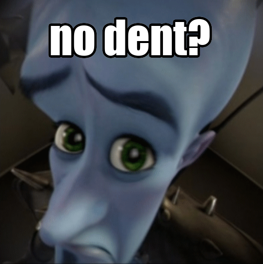
remove all profile badges
/* no badges */
[class^=userPopoutInner] > [aria-label^=User] {
  display: none;
}
does leave an ugly "dent" in profiles
 vestal lintel
hide server
requires you to enter the name of the server (not full)
[data-dnd-name^=VenchOrd] {
  display: none;
}
 inner stone
do you hate kids?
a[href='/family-center'] {
  display: none;
}
revert whatever the fuck these new pleading emotes are (see image) to the old ones
.emoji[alt="🥹"] {
  content: url("https://vendicated.github.io/random-files/face_holding_back_tears.svg");
}

.emoji[alt="🥺"] {
  content: url("https://vendicated.github.io/random-files/pleading_face.svg");
}
 quiet dust
🧌
.emoji[alt="🧌"], img[src$="1ed674c3f621791d6a0d.svg"] {
  content: url("https://upload.wikimedia.org/wikipedia/en/7/73/Trollface.png");
}```🔫 css .emoji[alt="🔫"] { content: url("https://cdn.discordapp.com/emojis/808512495794520114.webp?size=1024&quality=lossless") }
 hushed rampart
fix whatever the fuck causes this on some fonts
[class*="headerText-"]{
   overflow-y: hidden;
}```
raven geode
better version of all current emoji changing snippets (+ a 💀 = sans one)
this replaces every instance of the emoji, so even in emoji picker (i hate discord css) etc
it's too long for discord, so using github pages (which means auto updating 😉)```css
@import url('https://captain8771.github.io/discordstyles/betterBuiltinEmojis.css');
🧌 🔫 💀
🥺 🥹

before & after:
https://media.discordapp.net/attachments/1015060231060983891/1090906174506930247/image.png
https://media.discordapp.net/attachments/1015060231060983891/1090906126570242078/image.png
 proud ravine
For when you want to pause invites but don't want an annoying badge on the server icon (with input from @sharp raptor in #🏥-vencord-support-🏥):
/*Paused Invites, who cares?*/
#app-mount .svg-2ifYOU mask use[href*="lower_badge_masks"], .pauseBackground-1zgiN0, .invitesDisabledTooltip-8eEi8C {
    display: none;
}```
https://media.discordapp.net/attachments/1026515880080842772/1090950547777007617/image.png
oak path
restive notch
revert whatever the fuck these new pleading emotes are (see image) to the old on...
oak path
restive notch
revert whatever the fuck these new pleading emotes are (see image) to the old on...
this but better ```css
/* Revert face_holding_back_tears to jdecked/twemoji@14.1.1 /
[src^="/assets/5df2da052fc1ddc6.svg"] {
content: url("https://raw.githack.com/jdecked/twemoji/v14.1.1/assets/svg/1f979.svg");
}
[style="background-position: -200px 0px;"][style*='background-image: url("/assets/668ed2f8f314c3b7.png");'] {
background: url("https://raw.githack.com/jdecked/twemoji/v14.1.1/assets/svg/1f979.svg") no-repeat center/contain!important;
}
/* Revert pleading_face to jdecked/twemoji@14.1.1 /
[src^="/assets/059679850d492e83.svg"] {
content: url("https://raw.githack.com/jdecked/twemoji/v14.1.1/assets/svg/1f97a.svg");
}
[style="background-position: -200px -40px;"][style*='background-image: url("/assets/668ed2f8f314c3b7.png");'] {
background: url("https://raw.githack.com/jdecked/twemoji/v14.1.1/assets/svg/1f97a.svg") no-repeat center/contain!important;
}
Verical golive screen selection
.sourceContainer-1uqUbz {
    flex-direction: column;
}
.sourceName-3Wf8QG {
    width: unset;
}
.tile-3POX2m > .flex-2S1XBF {
    flex-direction: row;
    justify-content: start;
}
.tile-3POX2m > .flex-2S1XBF > .flex-2S1XBF {
    flex: unset !important;
    margin-right: 16px;
}
 split grail
Pulverize the Other active threads thing because its so fucking ANNOYING
.popout-TdhJ6Z {
  display: none
}
 feral pawn
Snippet to literally only reveal the timestamp on messages when you hover over the place
im very bad at css but i made this cause it looks better while taking ss
span.timestampInline-_lS3aK {
  opacity: 0.01;
}

span.timestampInline-_lS3aK:hover {
  opacity: 1;
}
Same thing but with a transition and shows if you hover anywhere on the message instead of only the timestamp itself
[class*=timestampInline-] {
  opacity: 0;
  transition: 0.2s opacity ease-in-out;
}

[class^=message-]:hover [class*=timestampInline-] {
  opacity: 1;
}
no one cares about your stupid leaf badge
[class^="newMemberBadge"] { display: none }
https://api.no-bitch.es/no dent%3F css [class^=userPopoutInner] > [aria-label^=User] { visibility: hidden; /* display: none; but it still affects positioning }
 feral pawn
makes messages slide smoothly into chat
/* Makes messages slide into chat
Try changing the second value '0.6s' and fiddle around with it to change the speed*/
@keyframes slide-up {
    0% {
        opacity: 0;
        transform: translateX(20px);
    }
    100% {
        opacity: 1;
        transform: translateX(0px);
    }
}
.message-2CShn3 {
  animation: slide-up 0.6s ease;
}
(also if anyone can fix your messages sliding twice cause of delay feel free to do so and reupload)
feral pawn
adds a animation to your user pannel/setting pannel whatever you call it and hides voice controls until hover
credits to someone from bdc server just found it in my files and yes i did change it a bit
/* You can change around the settings for the delay and stuff */

.panels-3wFtMD > .container-YkUktl .flex-2S1XBF > :not(:last-child) {
    opacity: 0% !important;
    width: 0px;
    transition: all 0.2s ease-in-out;
}

.panels-3wFtMD > .container-YkUktl:hover .flex-2S1XBF > :not(:last-child) {
    opacity: 100% !important;
    width: 32px;
}
```mess around with it if you wanna change itRemoves the Jump To Present Bar and adds a cool animated button instead
@import url('https://raw.githubusercontent.com/U8K50/randomDiscordThemesSnippets/main/finished-making/jumpToPresent.css');
```just fork the repo and edit the values to change the color according to your theme  rich veldt
Floating Folders — stolen from Disease#5663 on BetterDiscord
/* Floating Folder */
.wrapper-38slSD:active {
    -webkit-transform: unset;
    transform: none;
}

[id^="folder-items-"] {
    position: fixed;
    top: 0;
    bottom: 0;
    z-index: 99;
    overflow-y: auto;
    max-height: calc(100vh - 72px);
    margin: auto auto auto calc(72px + 8px);
    padding-top: 8px;
    border-radius: 8px;
    background: var(--background-floating);
    -webkit-box-shadow: var(--elevation-high);
    box-shadow: var(--elevation-high);
}

[id^="folder-items-"]::-webkit-scrollbar {
    display: none;
}

.folderIconWrapper-1oRIZr {
    transform: rotate(-90deg);
}

.closedFolderIconWrapper-3tRb2d .icon-1zKOXL,
.expandedFolderIconWrapper-3RwQpD svg {
    transform: rotate(90deg);
}
 shell plank
/* Comfy-Style Spotify Player
 * Kanged and modified code from https://github.com/Comfy-Themes/Discord
 */
#vc-spotify-player {
  --spotify-wave-width: 240px;
  --spotify-vencord-color: #EBCB8B;
  --spotify-vencord-text: var(--background-primary);
}
@keyframes spotifywave {
  0% {
    -webkit-mask-position-x: var(--spotify-wave-width);
  }

  100% {
    -webkit-mask-position-x: 0;
  }
}
#vc-spotify-player::before {
  content: "";
  position: absolute;
  height: 25px;
  z-index: 1;
  width: var(--spotify-wave-width);
  margin-top: -29px;
  left: 0;
  background: var(--spotify-vencord-color);
  -webkit-mask-image: url('data:image/svg+xml;utf8,<svg xmlns="http://www.w3.org/2000/svg" width="240" height="25" viewBox="0 0 284 25"><path d="M283.999 15.2776C228.798 15.2776 211.243 -0.0317305 140.048 -0.000164877C69.0475 -0.000164877 51.2975 15.2776 8.58307e-06 15.2776V24.9998H284C284 24.9998 283.999 18.9392 283.999 15.2776Z"/></svg>');
  animation: spotifywave 8s linear infinite;
  animation-delay: 0s;
  opacity: 1;
}
#vc-spotify-player#vc-spotify-player  {
  background: linear-gradient(var(--spotify-vencord-color) 20%, var(--bg-overlay-1, var(--background-secondary-alt)));
  border-bottom: none;
}
#vc-spotify-song-title#vc-spotify-song-title,
.vc-spotify-ellipoverflow.vc-spotify-ellipoverflow,
.vc-spotify-artist.vc-spotify-artist,
.vc-spotify-album.vc-spotify-album
/* , .vc-spotify-time-right, .vc-spotify-time-left */  {
  color: var(--spotify-vencord-text);
}
#vc-spotify-player [class*="bar-"] {
  background: hsl(var(--primary-700-hsl)/0.3);
}
#vc-spotify-player [class*="barFill"] {
  background: var(--spotify-vencord-color);
}
[class*=wrapper-]:not(:empty) + #vc-spotify-player {
  margin-top: 27px;
}
[class*=panels-] [class*=wrapper-] [class*=container-] {
  border-bottom: none;
}

/* The code below isn't really needed but it looks pretty :3 */
.vc-spotify-shuffle-on.vc-spotify-shuffle-on,
.vc-spotify-repeat-context.vc-spotify-repeat-context,
.vc-spotify-repeat-track.vc-spotify-repeat-track,
.vc-spotify-shuffle-on.vc-spotify-shuffle-on:hover,
.vc-spotify-repeat-context.vc-spotify-repeat-context:hover,
.vc-spotify-repeat-track.vc-spotify-repeat-track:hover {
  color: var(--spotify-vencord-color);
}
.vc-spotify-button.vc-spotify-button {
  transition: background 0.3s;
}
.vc-spotify-button.vc-spotify-button:hover {
  background: hsl(var(--primary-700-hsl)/0.3);
}

 gritty blaze
changes the "new user" leaf to shiggy
/*i'm new here, say hi!*/
[class*=newMemberBadge]:before {
    content: url(https://cdn.discordapp.com/emojis/1024751291504791654.gif?size=64&quality=lossless);
    transform: scale(0.32) translate(-100%, -110%);
    display: inline-block;
}
 restive notch
Show full bio in the user popout instead of cutting it off after 6 lines
[class|=userPopoutInner] [style*="-webkit-line-clamp"] {
    -webkit-line-clamp: 99999 !important;
}
Before: https://cdn.discordapp.com/attachments/1032770730703716362/1093581626535055541/image.png
After: https://cdn.discordapp.com/attachments/1032770730703716362/1093581626816077967/image.png

 shell plank
no more shitty super reaction effect
[class*=effectsWrapper] {
  display: none;
}
[class*="hideEmoji-"][class*="hideEmoji-"][class*="hideEmoji-"] {
    opacity: 1;
}
Show full user note in popout, without scroll
[class^="note-"] > [class^="textarea-"] {
    max-height: unset;
}
 tidal rose
Allow chat messages to appear behind the text field when you scroll up (Ofc text field itself needs to be transparent/translucent, and it is to be noted that I have not tested this very thoroughly with different window/screen dimensions, not to mention it kinda breaks message editing rn-)
Update, it kinda sucks lmao. Feel free to test it and try to fix it if you want to tho, idunno
.messagesWrapper-RpOMA3 {
    margin-bottom: -690px;
}
.scrollerInner-2PPAp2 {
    transform: translateY(calc(-666px /* Replace the spacing var with however much margin you want- also oh hey look funni deval numba happened to be what works lol */ - var(--spacing)));
}
(due to popular request)
Edit your own profile picture locally, for example to get an animated avatar. Only you can see this, everyone else still sees your regular pfp. You need to change YOUR_ID to your discord user id (enable developer mode in discord advanced settings then right click urself and copy id), and IMAGE_LINK to an image link. Also works for other users than yourself, just use their id instead of yours
[src^="https://cdn.discordapp.com/avatars/YOUR_ID/"] {
    content: url(IMAGE_LINK);
}
Example with my own id and as image:
[src^="https://cdn.discordapp.com/avatars/343383572805058560/"] {
    content: url(https://cdn.discordapp.com/emojis/1024751291504791654.gif?size=512);
}
 tardy sparrow
Replace Tada Icon when the Server Has Unlocked All Boosting Perks with one from Twemoji.
.tadaIcon-313rPm {
    color: transparent;
    background-image: url("https://abs.twimg.com/emoji/v2/svg/1f389.svg");
    height: 16px;
    width: 16px;
    position: relative;
    bottom: 8px;
    left: 200px;
}
 novel patrol
My best attempt at reviving the old Client Theme experiment using css
Get the H...
novel patrol
novel patrol
My best attempt at reviving the old Client Theme experiment using css
Get the H...
Updated version of this
No longer works with light mode because discord hates me.
:root {
  --theme-h: 222.85714285714283;
  --theme-s: 6.666666666666663%;
  --theme-l: 20.588235294117645%;
}

:root:root {
  --primary-500-hsl: var(--theme-h) var(--theme-s) calc(var(--theme-l) + 11.90%);
  --primary-530-hsl: var(--theme-h) var(--theme-s) calc(var(--theme-l) + 6.70%);
  --primary-560-hsl: var(--theme-h) var(--theme-s) calc(var(--theme-l) + 2.90%);
  --primary-600-hsl: var(--theme-h) var(--theme-s) calc(var(--theme-l) + 0.00%);
  --primary-630-hsl: var(--theme-h) var(--theme-s) calc(var(--theme-l) - 2.60%);
  --primary-645-hsl: var(--theme-h) var(--theme-s) calc(var(--theme-l) - 3.70%);
  --primary-660-hsl: var(--theme-h) var(--theme-s) calc(var(--theme-l) - 5.90%);
  --primary-700-hsl: var(--theme-h) var(--theme-s) calc(var(--theme-l) - 8.10%);
  --primary-730-hsl: var(--theme-h) var(--theme-s) calc(var(--theme-l) - 9.60%);
  --primary-760-hsl: var(--theme-h) var(--theme-s) calc(var(--theme-l) - 11.40%);
  --primary-800-hsl: var(--theme-h) var(--theme-s) calc(var(--theme-l) - 13.30%);
  --primary-830-hsl: var(--theme-h) var(--theme-s) calc(var(--theme-l) - 15.70%);
  --primary-860-hsl: var(--theme-h) var(--theme-s) calc(var(--theme-l) - 18.10%);
  --primary-900-hsl: var(--theme-h) var(--theme-s) calc(var(--theme-l) - 19.80%);
}
Pick a color, convert it to HSL (ideally with decimal precision), adjust the --theme- vars. Default values are discord default.
I have made a plugin that has the color picker the original experiment had, its currently still waiting approval.
novel patrol
/* Bluwu */
:root {
  --theme-h: 223.5;
  --theme-s: 46.51162790697674%;
  --theme-l: 16.862745098039216%;
}
 tidal rose
gritty blaze
changes the "new user" leaf to shiggy
```css
/*i'm new here, say hi!*/
[class*=n...
tidal rose
gritty blaze
changes the "new user" leaf to shiggy
```css
/*i'm new here, say hi!*/
[class*=n...
Replace new member leaf in chat with wide baby. Why? Uhh, yes.
/*I'm new here, say hi! - Original by PATXS#0030, edited from shiggy to wide baby emoji. Why? I have no clue, it's just funny... I think-*/
/*Oh yeah, kinda edited by DeadVoxels but then became mostly stuff by aaav#7262*/
[class|=newMemberBadge] {
    content: url(https://discord.com/assets/7d4ab5c9735709184c38ef242f689647.svg);
    transform: scaleX(200%);
    margin: 0 0.3em 0 0.75em;
}
 fathom escarpBOT
Hide avatar decorations box because the nitro upsell snippet doesn't for some reason
.customizationSection-IGy2fS.showBorder-2hbqaq {
    display: none;
}
```we *would* pr it but the file looks nicely formatted and we're too lazy to not ruin it/* Replace the new pleading face emoji and face holding back tears emoji with the old one in the discord chat bar emoji button */
.sprite-2lxwfc {
background-image: url('https://raw.githubusercontent.com/Poki-Pancake/junkyard/main/look-what-they-took-from-us.png')
}
Replace the chat bar emoji button :pleading-face: and :face-holding-back-tears: with the old one  .
.
This only replace the emoji in the emoji button (doesn't affect chat emojis)

 tidal rose
Match bottom border of the user profile container with your status. Is it useful? Nope. Does it look cool? Y e s .
/* Match bottom border on user profile container with their status - Border change by DeadVoxels#3520, colour vars left over from Jaegerwald#4833's attempt to help me with this. Thanks a ton for getting me into advanced selectors so I could make this though, Jaeger! */
:root {
    --online-color: #23a559;
    --idle-color: #f0b132;
    --dnd-color: #f23f42;
    --offline-color: #80848e;
}
.container-YkUktl:has(.avatar-1EWyVD[aria-label*="Online"]) {
    border-bottom: 3px solid var(--online-color)!important;
}
.container-YkUktl:has(.avatar-1EWyVD[aria-label*="Idle"]) {
    border-bottom: 3px solid var(--idle-color)!important;
}
.container-YkUktl:has(.avatar-1EWyVD[aria-label*="Do Not Disturb"]) {
    border-bottom: 3px solid var(--dnd-color)!important;
}
.container-YkUktl:has(.avatar-1EWyVD[aria-label*="Invisible"]) {
    border-bottom: 3px solid var(--offline-color)!important;
}
/* Transition + fallback colour */
.container-YkUktl {
    transition: border 100ms ease-in;
    border-bottom: 3px solid var(--blurple);
}
removes any instance of any profile decoration
[mask="url(#svg-mask-avatar-decoration-profile-status-square-80)"] {
    mask: url("#svg-mask-avatar-status-round-80") !important;
}

[mask="url(#svg-mask-avatar-decoration-profile-status-mobile-square-80)"] {
    mask: url("#svg-mask-avatar-status-mobile-80") !important;
}

svg[class*="avatarDecorationHint"] {
    left: 0px;
    top: 0px;
    height: 80px;
    width: 80px;
}

[class^="userPopoutInner"] [class^="wrapper"] [class^="banner"],
[class^="avatarDecoration"],
[mask^="url(#svg-mask-avatar-decoration-status"],
[class*="bannerSVGWrapper"] mask image {
    display: none;
}

[mask^="url(#svg-mask-avatar-decoration-profile"] [class*="avatarHintInner"] {
    font-size: 12px !important;
}
this but less aggressive ```css
/* Hide avatar decorations outside of personal DMs and profiles /
[class="-chat"]:has([aria-label$="Member List"]),
[aria-label="Thread header"]+[class*="-chat"],
[aria-label="Direct Messages"] {
& [class*="-avatarDecoration"] { display: none; }
}
Funny button css
.button-12Fmur .contents-3NembX {
    transform: rotate(0deg);
    transition: transform 0.3s;
}
.button-12Fmur:hover .contents-3NembX {
    transform: rotate(30deg);
}
.button-12Fmur:hover .contents-3NembX svg {
    height: 28px !important;
    width: 28px !important;
}
.button-12Fmur .contents-3NembX svg {
    transition: width 0.3s, height 0.3s;
}

 rare nova
hides the stupid 2fa notice
.channelNotice-Bfew9I {
    display: none;
}
 onyx oracle
User Panel
/*User Panel*/
.withTagAsButton-OsgQ9L, .withTagless-10ooWt{
    min-width: 212px!important;
    max-width: 60px;
    position: fixed;
    margin-top: -80px;
    margin-left: 5px;
    border-radius: 5px;
}
.container-YkUktl button {
    width: 48px;
    background: var(--bg-overlay-4,var(--background-primary));
    margin: 4px;
    border-radius: 5px;
}
.container-YkUktl{
    padding-top: 40px;
}```
 heady zinc
blur out the email and phone number in settings (\w reveal on hover)
[class^="accountProfileCard"] [class^="field"]:nth-child(n+3) [class^="text-md-normal"] {
    filter: blur(6px);
    transition: filter 0.2s ease-in-out;
}
[class^="accountProfileCard"] [class^="field"]:nth-child(n+3) [class^="text-md-normal"]:hover {
    filter: none;
}
[class*="formText"]:has(> [class*="phoneRevealer"]) {
    visibility: hidden;
    margin-bottom: -4px;
}
 tall storm
/*show folder names by ddyo#9254*/
[data-list-id=guildsnav]
[class*=expandedFolderBackground]+[class*=listItem]
[data-dnd-name][draggable] {
    margin: 0 auto;
}
[data-list-id=guildsnav]
[class*=expandedFolderBackground]+[class*=listItem]
[data-dnd-name][draggable] div:only-child {
    margin: 0 auto;
}
[data-list-id=guildsnav]
[class*=expandedFolderBackground]+[class*=listItem]
[data-dnd-name][draggable]:before {
    content: attr(data-dnd-name);
    color: #fff;
    z-index:1;
    font-weight: bold;
    font-size:14px;
    display: block;
    margin: 0 auto;
    min-width:100%;
    padding-top: 10px;
    margin-bottom: 2px;
    text-align: center;
}
/* Hide Super Reaction Button */
[id="message-add-reaction-1"] {
  display: none;
}
 rough relic
/* Block Leave Server on mouse over only */
#guild-header-popout-leave, #guild-context-leave-guild {
  pointer-events: none;
}
this for horizontal serverlist
/*show folder names by ddyo#9254*/
[data-list-id=guildsnav]
[class*=expandedFolderBackground]+[class*=listItem]
[data-dnd-name][draggable] {
    margin: 0 auto;
}
[data-list-id=guildsnav]
[class*=expandedFolderBackground]+[class*=listItem]
[data-dnd-name][draggable] div:only-child {
    margin: 0 auto;
}
[data-list-id=guildsnav]
[class*=expandedFolderBackground]+[class*=listItem]
[data-dnd-name][draggable]:after {
    content: attr(data-dnd-name);
    color: #fff;
    z-index:999999999;
    font-weight: bold;
    font-size:14px;
    display: block;
    margin: 0 auto;
    min-width:100%;
    text-align: center;
}

 solid schooner
makes spotify player buttons rotate and stuff when hovered
/*rotate spotify buttons*/
.vc-spotify-button .vc-spotify-button-icon {
    transform: rotate(0deg);
    transition: transform 0.3s;
}
.vc-spotify-button:hover .vc-spotify-button-icon {
    transform: rotate(35deg);
}
.vc-spotify-button-row:hover .vc-spotify-button:not(:hover) .vc-spotify-button-icon{
    transform: rotate(8deg);/*put this value to 0 if you think it looks shit :( */
}
My first time doing css, copied a lot from that other rotate thing
solid schooner
median kettle
makes profile panel thingy look pretty neat
i made this for replugged back when ...
fix (kind of) for profile panel thingy^^ with discords new color themes```css
/* makes profile panel thingy look very neat*/
:root .panels-3wFtMD {
background: transparent;
border-radius: calc(15px - 5px);
box-shadow: 0 2px 10px 0 rgba(0, 0, 0, 0.2),
0 0 0 1px rgba(56, 31, 31, 0.11);
overflow: hidden;
}
.container-YkUktl {
display: grid;
grid-template-columns: auto 1fr;
grid-template-rows: 1fr 1fr;
height: 80px;
padding: 0px;
margin: 0px;
}
.container-YkUktl button:hover {
color: var(--interactive-hover);
background-color: var(--background-modifier-selected) !important;
}
.container-YkUktl .flex-2S1XBF {
grid-column: 1/-1;
}
.container-YkUktl button {
background: #3333;
border-radius: var(--radius-secondary);
width: 100%;
height: 35px;
}
.container-YkUktl .avatarWrapper-1B9FTW {
width: 220px;
height: 38px;
margin: 3px;
padding-left: 4px;
border-radius: 10px;
}
before: https://imgur.com/VnLN741
after: https://imgur.com/i0ZYipu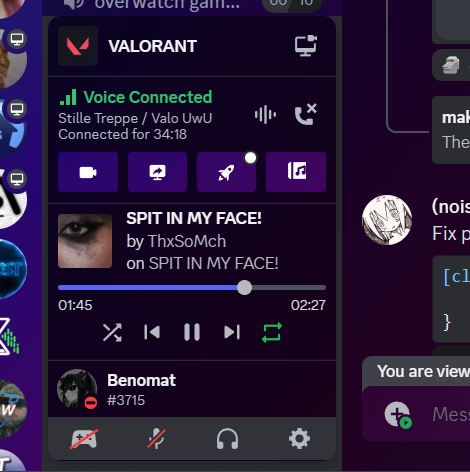
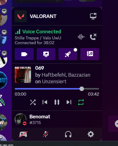 solid schooner
steep pewter
spotify green blower uppers
```css
#vc-spotify-progress-bar .barFill-2Bh7CX {
...
solid schooner
steep pewter
spotify green blower uppers
```css
#vc-spotify-progress-bar .barFill-2Bh7CX {
...
fix to this^^ ```css
/green spotify progress bar/
#vc-spotify-player .bar-2H7Q9u .barFill-3RgCsY{background:var(--spotify)}
/*search bar minimized until hover*/
:root {
  --transitionspeed: 0.25s;
}
.search-2Mwzzq:not(.open-1F8u2c) .searchBar-jGtisZ {
  width: 27px;
  transition: var(--transitionspeed);
  background-color: transparent;
}
.search-2Mwzzq:not(.open-1F8u2c):hover .searchBar-jGtisZ {
  width: 170px;
  background-color: var(--background-tertiary);
}
.search-2Mwzzq:not(.open-1F8u2c) .iconContainer-1RqWJj {
  transform: scale(1.3);
  transition: var(--transitionspeed);
}
.search-2Mwzzq:not(.open-1F8u2c):hover .iconContainer-1RqWJj {
  transform: scale(1);
}
.search-2Mwzzq:not(.open-1F8u2c) .icon-18rqoe {
  color: var(--text-normal);
}
.search-2Mwzzq:not(.open-1F8u2c):hover .icon-18rqoe {
  color: var(--text-muted);
}
 tidal rose
Match bottom border of the user profile container with your status. Is it useful...
tidal rose
tidal rose
Match bottom border of the user profile container with your status. Is it useful...
Updated this to darken profile related elements when status is set to invis. Why? No clue, but it looks cool and fits ig (To clarify, this only works with the language set to English, however it shouldn't be hard for anyone change the aria-label attribute selector to work with your language)
/* Match bottom and left borders on user profile container with their status - Border change by DeadVoxels, colour vars left over from Jaegerwald#4833's attempt to help me with this. Thanks a ton for getting me into advanced selectors so I could make this though, Jaeger! */
:root {
    --online-color: #23a559;
    --idle-color: #f0b132;
    --dnd-color: #f23f42;
    --offline-color: #80848e;
}
.container-YkUktl:has(.avatar-1EWyVD[aria-label*="Online"]) {
    border-bottom: 3px solid var(--online-color)!important;
}
.container-YkUktl:has(.avatar-1EWyVD[aria-label*="Idle"]) {
    border-bottom: 3px solid var(--idle-color)!important;
}
.container-YkUktl:has(.avatar-1EWyVD[aria-label*="Do Not Disturb"]) {
    border-bottom: 3px solid var(--dnd-color)!important;
}
.container-YkUktl:has(.avatar-1EWyVD[aria-label*="Invisible"]) {
    border-bottom: 3px solid var(--offline-color)!important;
}
/* Darken pfp, name, and status text when in invis because why not */
.container-YkUktl:has(.avatar-1EWyVD[aria-label*="Invisible"]) .avatar-1EWyVD > svg > foreignObject, .container-YkUktl:has(.avatar-1EWyVD[aria-label*="Invisible"]) .title-338goq, .container-YkUktl:has(.avatar-1EWyVD[aria-label*="Invisible"]) .subtext-2HDqJ7 {
    filter: brightness(0.5);
}
.avatar-1EWyVD > svg > foreignObject, .title-338goq, .subtext-2HDqJ7, .container-YkUktl {
    transition: all 100ms ease-in;
}
Hide chat textfield buttons in a drawer, reveal upon hovered over
/* Chat textfield buttons (emoji, gif, etc) hidden in a drawer menu until hovered over - CSS snippet by DeadVoxels#3520 */
.buttons-uaqb-5 {
    overflow: hidden;
    position: absolute;
    justify-content: flex-end;
    background: rgba(23, 24, 26, 0.25);
    border-radius: 8px;
    transition: all 350ms;
}
.buttons-uaqb-5:where(:not(:hover)){
    max-width: 35px;
    right: -0px;
}
.buttons-uaqb-5::before {
    opacity: 0%;
    transition: opacity 150ms;
    position: absolute;
    top: 4px;
    content: url("data:image/svg+xml,%3Csvg xmlns='http://www.w3.org/2000/svg' viewBox='0 0 512 512'%3E%3Crect width='352' height='42' x='80' y='96' fill='rgb(181, 186, 193)' class='ci-primary'/%3E%3Crect width='352' height='42' x='80' y='240' fill='rgb(181, 186, 193)' class='ci-primary'/%3E%3Crect width='352' height='42' x='80' y='384' fill='rgb(181, 186, 193)' class='ci-primary'/%3E%3C/svg%3E");
    display: block;
    object-fit: cover;
    height: 44px;
    width: 35px;
}
.buttons-uaqb-5:where(:not(:hover))::before {
    opacity: 100%;
    transition: opacity 350ms;
}
.buttons-uaqb-5:hover {
    padding-left: 5px;
    padding-right: 5px;
    border-radius: 16px;
    max-width: 20%;
    right: 0px;
    background: rgba(23, 24, 26, 0.5);
    transition: all 150ms;
}
.buttons-uaqb-5 > div, .buttons-uaqb-5 > button {
    transform: scaleX(0%) !important;
    opacity: 0%;
    transition: all 0.3s;
}
.buttons-uaqb-5:hover > div, .buttons-uaqb-5 > button {
    transform: scaleX(100%) !important;
    opacity: 100%;
}

 round flame
.linkButton-2NshQj > a[href="/store"] {
    display: none;
}
removes the "Nitro" tab in the "Direct Messages" page
round flame
/* Remove the "Active Now" section from the "Friends" tab */
[class*="nowPlayingColumn-"] {
    display: none;
}
 umbral torrent
shell plank
```css
/* Comfy-Style Spotify Player
* Kanged and modified code from https://gi...
umbral torrent
shell plank
```css
/* Comfy-Style Spotify Player
* Kanged and modified code from https://gi...
personal half-fix of that for me, as it just makes the thing unreadable, and profile themes and it mixed together is super annoying to make. enjoy!
/* Comfy-Style Spotify Player
 * Kanged and modified code from https://github.com/Comfy-Themes/Discord
* fixed with my terrible css knoledge to be actually readable
 */
#vc-spotify-player {
  --spotify-wave-width: 240px;
  --spotify-vencord-color: #364270;
  --spotify-vencord-text: white
}
@keyframes spotifywave {
  0% {
    -webkit-mask-position-x: var(--spotify-wave-width);
  }

  100% {
    -webkit-mask-position-x: 0;
  }
}
#vc-spotify-player::before {
  content: "";
  position: absolute;
  height: 25px;
  z-index: 1;
  width: var(--spotify-wave-width);
  margin-top: -29px;
  left: 0;
  background: var(--spotify-vencord-color);
  -webkit-mask-image: url('data:image/svg+xml;utf8,<svg xmlns="http://www.w3.org/2000/svg" width="240" height="25" viewBox="0 0 284 25"><path d="M283.999 15.2776C228.798 15.2776 211.243 -0.0317305 140.048 -0.000164877C69.0475 -0.000164877 51.2975 15.2776 8.58307e-06 15.2776V24.9998H284C284 24.9998 283.999 18.9392 283.999 15.2776Z"/></svg>');
  animation: spotifywave 8s linear infinite;
  animation-delay: 0s;
  opacity: 1;
}
#vc-spotify-player#vc-spotify-player  {
  border-bottom: none;
background: var(--spotify-vencord-color); /* the best i could do :/ */
  }

#vc-spotify-song-title#vc-spotify-song-title,
.vc-spotify-ellipoverflow.vc-spotify-ellipoverflow,
.vc-spotify-artist.vc-spotify-artist,
.vc-spotify-album.vc-spotify-album
/* , .vc-spotify-time-right, .vc-spotify-time-left */  {
  color: var(--spotify-vencord-text);
}
#vc-spotify-player [class*="bar-"] {
  background: hsl(var(--primary-700-hsl) / 0.3);
}
#vc-spotify-player [class*="barFill"] {
  background: hsl(var(--primary-700-hsl) / 0.3);
}
[class*=wrapper-]:not(:empty) + #vc-spotify-player {
  margin-top: 27px;
}
[class*=panels-] [class*=wrapper-] [class*=container-] {
  border-bottom: none;
}

 vagrant dome
Stained glass update. Works best with a tabbed theme. Super fast and totally won't produce lag <3
/* stained glass update*/
.sidebar-1tnWFu,
.container-2o3qEW,
.userPopoutOuter-1OHwPL,
.scrollableContainer-15eg7h,
.messageListItem-ZZ7v6g,
.title-31SJ6t,
.container-30bdan,
[class^="menu-"],
[class^="scroller-"]:not([class^="scroller-kQ"]),
[class*="RegionScroll"] {
    1backdrop-filter: blur(5px);
}
.bannerImage-ubW8K- {
    z-index: 1000;
}
 river trout
body {
  transform: rotate(2deg);
}
Slantcord
 spare crag
solid schooner
fix (kind of) for profile panel thingy^^ with discords new color themes```css
/*...
spare crag
solid schooner
fix (kind of) for profile panel thingy^^ with discords new color themes```css
/*...
this but not rounded
/* makes profile panel thingy look very neat*/
:root .panels-3wFtMD {
    background: transparent;
    border-radius: calc(0px - 0px);
    box-shadow: 0 2px 10px 0 rgba(0, 0, 0, 0.2),
        0 0 0 1px rgba(56, 31, 31, 0.11);
    overflow: hidden;

}
.container-YkUktl {
    display: grid;
    grid-template-columns: auto 1fr;
    grid-template-rows: 1fr 1fr;
    height: 80px;
    padding: 0px;
    margin: 0px;
}

.container-YkUktl button:hover {
    color: var(--interactive-hover);
    background-color: var(--background-modifier-selected) !important;
}

.container-YkUktl .flex-2S1XBF {
    grid-column: 1/-1;
}

.container-YkUktl button {
    background: #3333;
    border-radius: var(--radius-secondary);
    width: 100%;
    height: 35px;
}

.container-YkUktl .avatarWrapper-1B9FTW {
    width: 220px;
    height: 38px;
    margin: 3px;
    padding-left: 4px;
    border-radius: 0px;
}
When using #🎨-css-snippets message and #🎨-css-snippets message, use this to make the buttons just a bit fatter.
.button-12Fmur .contents-3NembX {
   margin: 16px !important;
}
IMG 1: after
IMG 2: before

 novel patrol
/* Reduced enhanced markdown margins */
[class^=message] [id^=message-content] :is(h1, h2, h3, li) {
  margin: 0px;
}
[class^=message] [id^=message-content] :is(ol, ul) {
  margin-top: 0px;
}

 novel patrol
/* compact embeds */
[id^=message-accessories] [class^=gridContainer] > [class^=grid] {
  padding: 8px;
}
[id^=message-accessories] [class^=gridContainer] > [class^=grid] > * {
  margin-top: 2px;
}
[id^=message-accessories] [class^=gridContainer] > [class^=grid] [class^=message] {
  margin-bottom: 4px;
}
[id^=message-accessories] [class^=gridContainer] > [class^=grid] [class^=message] h3[class*=header] {
  margin-top: 0px;
}
https://codef53.github.io/CSS-Snippets/discord/CompactEmbeds.css

 novel patrol
Aligned Chatbox
I didn't originally make this, I just ported it forward to generic, lag friendly selectors
/* ----- Aligned Chatbox ----- */
/* align edges of chatbox to sides */
:is(main,section)[class^=chatContent] > form { padding: 0px;  }

/* align chatbox to bottom */
:is(main,section)[class^=chatContent] > form > *:first-child { margin-bottom: 0px; }

/* center chatbox contents, no border radius */
:is(main,section)[class^=chatContent] > form > *:first-child > * {
  padding-top: 4px;
  min-height: 49px;
  border-radius: 0px;
}

/* slowmode/typing indicator */
:is(main,section)[class^=chatContent] > form > *:last-child[class^=typing] {
  top: -24px;
  right: 0px;
  margin-left: auto;
  width: fit-content;
  padding-left: 2px;
  padding-right: 9px;
  border-top-left-radius: 8px;
  background-color: var(--channeltextarea-background);
}

/* jump to presz */
[class^=jumpToPresentBar] {
  left: 0;
  border-radius: 0px;
  border-top-right-radius: 8px;
  opacity: 1;
  background-color: var(--channeltextarea-background);
  right: unset;
}
[class^=jumpToPresentBar] > [class^=barButtonMain] {
  flex: 0 0 auto;
  display: none;
}
https://codef53.github.io/CSS-Snippets/discord/AlignedChatBox.css

 novel patrol
body {
  animation: boat linear infinite 12s;
}

@keyframes boat {
  from {
    transform: rotate(-10deg) translate(-10%, 5%);
  }
  50% {
    transform: rotate(10deg) translate(10%, -5%);
  }
  to {
    transform: rotate(-10deg) translate(-10%, 5%);
  }
}
seasick
round flame
/* Make quotes look nicer */
:root {
    --quote-divider-color: green;
    --quote-vertical-spacing: 4px;
    --quote-horizontal-spacing: 10px;
    --quote-background-color: rgba(0, 0, 0, 0.25);
    --quote-border-radius: 6px;
}

[class*="blockquoteDivider-"] {
    background-color: var(--quote-divider-color);
}

[class*="markup-"] blockquote {
    padding: var(--quote-vertical-spacing) var(--quote-horizontal-spacing);
    background-color: var(--quote-background-color);

    border-top-right-radius: var(--quote-border-radius);
    border-bottom-right-radius: var(--quote-border-radius);
}
Always have Shiggy on the Vencord Settings Card
/* Always have Shiggy on the Vencord Settings Card - Jaegerwald#4833 */
.vc-settings-card > img {
    display: none;
}
.vc-settings-card::after {
    background-image: url(https://media.discordapp.net/stickers/1039992459209490513.png);
    height: 128px;
    margin-left: auto;
    width: 128px;
    content: "";
    background-size: 128px;
}
Custom accent color
This changes Discord's default blurple account color to a custom color (in most places).
(Thanks to @safe mantle for providing a better method compared to my initial one.)
:root {
    --brand-500-hsl: H calc(var(--saturation-factor, 1)*S) L;  /* only need to edit this line */
    --brand-experiment-560: var(--brand-experiment-85a);
    --brand-experiment-600: var(--brand-experiment-70a);
    --mention-background: var(--brand-experiment-20a);
    --mention-foreground: var(--brand-500);
}
Use https://hslpicker.com/ or https://www.rapidtables.com/convert/color/rgb-to-hsl.html and substitute the values in --brand-500-hsl.
Example for Discord's "fuchsia" color (which is basically like hot pink):
--brand-500-hsl: 328 calc(var(--saturation-factor, 1)*80.6%) 59.6%;
Updated version with improved support for smaller window width as well as for differing amounts of buttons in the button bar through plugins. To update it, just replace the old version entirely with this 
/* Chat textfield buttons (emoji, gif, etc) hidden in a drawer menu until hovered over - CSS snippet by DeadVoxels#3520 */
.buttons-uaqb-5 {
    overflow: hidden;
    position: absolute;
    justify-content: flex-end;
    background: rgba(23, 24, 26, 0.25);
    border-radius: 8px;
    transition: all 350ms;
}
.buttons-uaqb-5:where(:not(:hover)){
    max-width: 35px;
    right: -0px;
}
.buttons-uaqb-5::before {
    opacity: 0%;
    transition: opacity 150ms;
    position: absolute;
    top: 4px;
    content: url("data:image/svg+xml,%3Csvg xmlns='http://www.w3.org/2000/svg' viewBox='0 0 512 512'%3E%3Crect width='352' height='42' x='80' y='96' fill='rgb(181, 186, 193)' class='ci-primary'/%3E%3Crect width='352' height='42' x='80' y='240' fill='rgb(181, 186, 193)' class='ci-primary'/%3E%3Crect width='352' height='42' x='80' y='384' fill='rgb(181, 186, 193)' class='ci-primary'/%3E%3C/svg%3E");
    display: block;
    object-fit: cover;
    height: 44px;
    width: 35px;
}
.buttons-uaqb-5:where(:not(:hover))::before {
    opacity: 100%;
    transition: opacity 350ms;
}
.buttons-uaqb-5:hover {
    padding-left: 5px;
    padding-right: 5px;
    border-radius: 16px;
    max-width: 100%;
    right: 0px;
    background: rgba(23, 24, 26, 0.5);
    transition: all 150ms;
}
.buttons-uaqb-5 > div, .buttons-uaqb-5 > button {
    transform: scaleX(0%) !important;
    opacity: 0%;
}
.buttons-uaqb-5:hover > div, .buttons-uaqb-5:hover > button {
    transform: scaleX(100%) !important;
    opacity: 100%;
}
.buttons-uaqb-5 > div:hover svg, .buttons-uaqb-5 > button:hover svg {
    height: 28px !important;
    width: 28px !important;
    margin-right: -2px;
    margin-left: -2px;
}
.buttons-uaqb-5 > div:nth-last-child(2):hover > button > div > div > svg {
    margin-right: -4px;
    margin-left: -4px;
}
.buttons-uaqb-5 > div svg, .buttons-uaqb-5 > button svg {
    transition: all 0.3s;
}
 deft cradle
fixes discords badly chosen spacing on the new markdown elements
/* fix markdown styles */
[class*=markup-] h1 {
    margin: 25px 0 7px;
}
[class*=markup-] h2 {
    margin: 20px 0 7px;
}
[class*=markup-] li {
    margin: 0;
}
Hides many of the Vencord plugin stuff, send a message in the thread (create if it doesnt exist) if theres something not hidden. This is mostly for servers which ban for Vencord and other client mods. This also hides the openasar button, but it's possible to remove if you copy the source into quickcss and remove the line that says /* OpenAsar */,.side-1lrxIh > :nth-child(36) css @import url('https://captain8771.github.io/discordstyles/hideVencordMostly.css');
novel patrol
novel patrol
Aligned Chatbox
I didn't originally make this, I just ported it forward to gener...
Aligned Chatbox
I didn't originally make this, I just ported it forward to generic, lag friendly selectors
Now with replies that make sense!
/* ----- Aligned Chatbox ----- */
/* align edges of chatbox to sides */
:is(main,section)[class^=chatContent] > form { padding: 0px;  }

/* align chatbox to bottom */
:is(main,section)[class^=chatContent] > form > *:first-child { margin-bottom: 0px; }

/* center chatbox contents, no border radius */
:is(main,section)[class^=chatContent] > form > *:first-child > * {
  padding-top: 4px;
  min-height: 49px;
  border-radius: 0px;
}

/* slowmode/typing indicator */
:is(main,section)[class^=chatContent] > form > *:last-child[class^=typing] {
  top: -24px;
  right: 0px;
  margin-left: auto;
  width: fit-content;
  padding-left: 2px;
  padding-right: 9px;
  border-top-left-radius: 8px;
  background-color: var(--channeltextarea-background);
}

/* Fix replies */
main[class^=chatContent] > form > * > [class^=attachedBars] {
  min-height: unset !important;
  padding-bottom: 4px;
}

/* jump to present */
[class^=jumpToPresentBar] {
  left: 0;
  border-radius: 0px;
  border-top-right-radius: 8px;
  opacity: 1;
  background-color: var(--channeltextarea-background);
  right: unset;
}
[class^=jumpToPresentBar] > [class^=barButtonMain] {
  flex: 0 0 auto;
  display: none;
}
Also updated at https://codef53.github.io/CSS-Snippets/discord/AlignedChatBox.css
Images are a before/after

 deft cradle
fixes the stupid sizing of the publish button (seems like a bug to me, because the separator went inside there)
/* fix publish button */
[class^=button-][aria-label^=Publish] > [class^=separator-] {
    display: none;
}
/* hide voice control buttons until hover */
[class^=sidebar-] [class^=panels-] [class^=container-] > [class^=avatarWrapper-] {
    flex: 1;
}
[class^=sidebar-] [class^=panels-] [class^=container-] > [class*=flex-][class*=horizontal-] {
    background-color: var(--background-secondary-alt);
    box-shadow: none;
    display: grid;
    grid-auto-flow: row;
    box-sizing: border-box;
    border-radius: 4px;
    align-items: center;
    justify-content: flex-start;
    -webkit-user-select: none;
    -moz-user-select: none;
    -ms-user-select: none;
    user-select: none;
    transition: box-shadow .22s ease, background-color .22s ease, max-height .22s ease;
    position: relative;
    overflow: hidden;
    margin-bottom: 10px;
    direction: rtl;
    align-self: flex-end;
    justify-self: flex-end;
    width: 32px;
    max-height: 32px;
}
[class^=sidebar-] [class^=panels-]:hover [class^=container-] > [class*=flex-][class*=horizontal-] {
    background-color: var(--background-primary);
    box-shadow: var(--elevation-stroke), var(--elevation-medium);
    max-height: 100vh; /* hack */
}
[class^=sidebar-] [class^=panels-] [class^=container-] > [class*=flex-][class*=horizontal-] button {
    border-radius: 0;
    direction: ltr;
}
[class^=sidebar-] [class^=panels-] [class^=container-] > [class*=flex-][class*=horizontal-] button:not(:last-child) {
    height: 0;
    overflow: hidden;
    transition: height .22s ease;
}
[class^=sidebar-] [class^=panels-]:hover [class^=container-] > [class*=flex-][class*=horizontal-] button {
    height: 32px;
}

 whole geyser
Have you ever wanted to see a random voice channel's full name but you couldn't? Me neither
/*Resizable Channel/DM List But It Looks Bad Sometimes*/
:root {
--sidebar-initial-width: 240px;
}
.sidebar-1tnWFu {
resize: horizontal;
width: var(--sidebar-initial-width);
}
.sidebar-1tnWFu .channel-2QD9_O {
max-width: unset;
}
.bannerImage-3KhIJ6 {
width: 100%;
}```
zinc bronze
Ever wanted to change the color of those 2 spotify controller buttons whenever you enable shuffle/repeat? Well here it is :p
/* Change Vencord's Spotify Controller's Shuffle/Repeat Button Color */
.vc-spotify-button {
    background: none;
    color: var(--background-modifier-accent);
    --vc-spotify-green: #1727b9; /* Change the value here */
    padding: 0;
    width: 32px;
    height: 32px;
    border-radius: 100%;
    display: flex;
    justify-content: center;
    align-items: center;
}


 junior mesa
Actually remove Notes from the User Popout for a more clean look
.section-28YDOf:has(.note-1NN2aP) {
    display: none;
    padding-bottom: 23px;
}

[class*=memberSinceContainer-] {
    margin-bottom: 14px;
}
 shell plank
[class^=userPopoutOuter-]:has([src*="1038809506899042445"]) [class^=profileBadges-]::after {
    content: '';
    height: 22px;
    width: 22px;
    background: url('https://cdn.discordapp.com/avatars/1038809506899042445/7df6567e967398b21895e7afa8ca6846.webp?size=160');
    margin: 4px;
    background-size: contain;
    border-radius: 2px;
}
[class^=userPopoutOuter-] [class^=profileBadges-][class*=containerWithContent-]::after {
  margin: 0 !important;
}

 solar hamlet
onyx oracle
User Panel
```css
/*User Panel*/
.withTagAsButton-OsgQ9L, .withTagless-10ooWt{
...
solar hamlet
onyx oracle
User Panel
```css
/*User Panel*/
.withTagAsButton-OsgQ9L, .withTagless-10ooWt{
...
This but for the SpotifyControls plugin
/* Spotify panel */
.vc-spotify-button-row {
  padding: 0;
  margin-top: 10px;
  justify-content: left !important;
}
.vc-spotify-button-row button {
  width: 50px;
  background: var(--bg-overlay-4, var(--background-primary));
  margin-right: 8px;
  border-radius: 5px;
}
.vc-spotify-button-row button:last-child {
  margin-right: 0;
}
.vc-spotify-button-row button:hover {
  background: var(--bg-overlay-4, var(--background-secondary)) !important;
}
 shell plank
goes hard (enable channel name emojis - treatment 1 in experiments)
[id="channels"] [class^=iconContainer-] {
  display: none;
}
[id="channels"] [class^=iconContainer-] + [class^=channelEmoji-] {
  margin-left: -4px;
}
/* Overlay color on text */
[id="channels"] [class^=emojiColorFill-] {
  z-index: 1;
}

 left arrow
make pings slightly less annoying, i don't know whether anyone likes it but i do!
[class^=numberBadge] {
    background: #666666 !important;
}

[class*=unreadMentionsBar], [class*=mentionsBar] {
    display: none;
}
instead of having icons indicate what type a channel is, have colors! feel free to customize them to fit in with the theme you have. it's in the file due to being too long
P.S. You need to have the Channel Name Emoji experiment (treatment one (1)) enabled.


 weary flicker
Remove these annoying channel emojis ```css
/* remove channel emojis */
.channelEmoji-NJOZuV {
display: none;
}
.channelName-3KPsGw {
padding: 2px;
}

 vagrant dome
```css
instead of having icons indicate what type a channel is, have colors! fee...
vagrant dome
vagrant dome
```css
instead of having icons indicate what type a channel is, have colors! fee...
made to go with this. makes all channels with unread messages be less in your face while also being easily differentiable
.unread-36eUEm {
    background-color: white;
    width: 1px;
    height: 20px;
    top: 7px;
    margin-left: 14px !important;
    margin: 0px;
    border-radius: 20%;
}

 river trout
add indicators for voice channels (channel emoji experiment)
[id="channels"] [class^=iconContainer-]:not([aria-label^=Voice]) { display: none }
[id="channels"] [class^=iconContainer-][aria-label^=Voice] {
  scale: 75%;
  position: absolute;
  left: -5px
}
 runic sedge
makes server icons rotate a little
@keyframes servericonsanimation {
    from {
        transform: rotate(5deg);
    }
    50% {
        transform: rotate(-5deg);
    }
    to {
        transform: rotate(5deg);
    }
}

[class^="listItem-"] {
    animation: servericonsanimation linear infinite;
    animation-duration: 5s;
}
 foggy marsh
runic sedge
foggy marsh
runic sedge
gaycord (turns almost everything rainbow)
/* gaycord */
.theme-dark,
.theme-light{
  background: transparent !important;
}
.theme-dark,
.theme-light,
.contents-3NembX {
  color: #ea1c5b;
  animation: rainbow 5s infinite linear;
}
@keyframes rainbow {
  from {
    -webkit-filter: hue-rotate(0deg);
  }
  to {
    -webkit-filter: hue-rotate(360deg);
  }
}
GayCord (makes background the gay pride flag). gradient sourced from https://codepen.io/charliewilco/pen/BzrJzE ```css
[class^="app-"] {
opacity: 0.85;
}
#app-mount {
--g-red: #d04b36;
--g-orange: #e36511;
--g-yellow: #ffba00;
--g-green: #00b180;
--g-blue: #147aab;
--g-indigo: #675997;
background-image: linear-gradient(
var(--g-red) 0%,
var(--g-red) 16.6666%,
var(--g-orange) 16.6666%,
var(--g-orange) 33.333%,
var(--g-yellow) 33.333%,
var(--g-yellow) 50%,
var(--g-green) 50%,
var(--g-green) 66.6666%,
var(--g-blue) 66.6666%,
var(--g-blue) 83.3333%,
var(--g-indigo) 83.3333%,
var(--g-indigo) 100%
);
background-repeat: no-repeat;
background-position: center;
background-size: cover;
}
preview: https://media.discordapp.net/attachments/1015060231060983891/1099437736076783686/image.png?width=1159&height=652 vagrant dome
While we're at it - gayification
.progressBar-2yl2pi, .guildSeparator-a4uisj, .anchor-1X4H4q:not(:has(span))  {
    background: linear-gradient(to right, #E40303, #FF8C00, #FFED00, #008026, #004DFF, #750787) !important;
    animation: rainbowText 300s infinite linear;
}

.anchor-1X4H4q:not(:has(span)) {
    background-clip: text !important;
    -webkit-text-fill-color: transparent !important;
    -webkit-background-clip: text !important;
    color: transparent !important;
}

@keyframes rainbowText {
  from {
    -webkit-filter: hue-rotate(0deg);
  }
  to {
    -webkit-filter: hue-rotate(360deg);
  }
}
 misty ridge
rainbow mentions too :3
https://cdn.discordapp.com/attachments/1064962691560652800/1099446409457061898/uwu.gif
/* edited from some css from a few months ago idk */
/* L light theme users ig /*
/* rainbow mentions */
.theme-dark .mentioned-Tre-dv .mention,
.theme-dark .wrapper-1ZcZW- {
  transition-duration: 250ms;
  background: #0000002A !important;
}
.theme-dark .mentioned-Tre-dv .mention,
.theme-dark .wrapper-1ZcZW-:hover{
  transition-duration: 250ms;
  background: #00000014 !important;
}
.theme-dark .mentioned-Tre-dv .mention,
.theme-dark .mention,
.theme-dark [class*="messageListItem"] .username-u-ebrn ,
.theme-dark [class*="repliedMessage"] .desaturateUserColors-1O-G89{ /* :3 */
  color: #f3789d;
  animation: rainbowmention 3s infinite linear;
  font-weight: bold;
}
.theme-dark [class*="messageListItem"] .content-vSHmMD{
    color: var(--text-normal);
}
@keyframes rainbowmention {
  from {
    -webkit-filter: hue-rotate(0deg);
  }
  to {
    -webkit-filter: hue-rotate(360deg);
  }
}```
 strange hawk
Disable
• activities™ — most buttons & banner
• (also tries to center people in voice chat)
• chat buttons — donate nitro, stickers
[class^=callContainer-]
[class^=row-]:not(:has(
    [class^=voiceChannelEffectsContainer-])
) {
    display: none;
}

[class^=callContainer-]
[class^=listItems-] {
    display: flex;
    flex-direction: row;
    flex-wrap: wrap;
    gap: 1ex;
    justify-content: center;
}

[class^=callContainer-]
[class^=bottomControls-]
>div>div
>[class^=buttonContainer-]:nth-child(3) {
    display: none;
}

[class^=actionButtons-]
>:is(button:nth-child(3)) {
    display: none;
}

[class^=channelTextArea-]
[class^=buttons-]
>:is(
  button:nth-child(1),
  div:has([class^=sticker])
) {
    display: none;
}
Where did the channels go?
(makes channels ||99%|| invisible, and only ||100%|| visible if hovered over them. Also makes the notification symbol bigger (and visible at all times), so you still know where you got a notification)
/* Where did the Channels go */
:root {
--transitionspeed: 0s;
--transitionspeedleave: 1s;
}
.mainContent-20q_Hp:hover {
opacity: 100%;
transition: var(--transitionspeed);
}
.mainContent-20q_Hp {
opacity: 1%;
transition: var(--transitionspeedleave);
}
.unread-36eUEm {
background-color: white;
width: 3px;
height: 20px;
top: 7px;
margin-left: 5px !important;
margin: 0px;
border-radius: 25%;
}
 nova grail
hide spotify progress bar grabber (dot) when its not hovered(updated)
/*hide spotify progress bar grabber*/
#vc-spotify-progress-bar>[class^=slider] [class^=grabber] {
background-color: #00000000 !important;
border-color: #00000000 !important;
box-shadow: none !important;
}
#vc-spotify-progress-bar>[class^=slider] [class^=grabber]:hover {
background-color: #bbb !important;
border-color: #bbb !important;
box-shadow: 0 3px 1px 0 hsl(var(--black-500-hsl)/.05),0 2px 2px 0 hsl(var(--black-500-hsl)/.1),0 3px 3px 0 hsl(var(--black-500-hsl)/.05) !important;
}

 vagrant dome
more visible spoilers so that you can spot where the tea is at asap
.spoilerText-2G40u0.hidden-2lQZ5q {
border-radius: unset !important;
background-color: #ff00d133 !important;
box-shadow: 0px 0px 16px 3px rgba(255, 119, 182, .16);
}
.spoilerText-2G40u0[aria-expanded="true"] {
background-color: #ff74ae2b !important;
}

 runic sedge
gaycord (turns almost everything rainbow)
```css
/* gaycord */
.theme-dark,
.the...
runic sedge
runic sedge
gaycord (turns almost everything rainbow)
```css
/* gaycord */
.theme-dark,
.the...
ultimate gaycord (makes everything that I could find rainbow) (can't find anything that is not rainbow rn)
@import url('https://pastebin.com/raw/xYYyp4v5');
Gay Text
/* Rainbow Text */
@keyframes rainbowText {
from {
-webkit-filter: hue-rotate(0deg);
}
to {
-webkit-filter: hue-rotate(360deg);
}
}
.messageContent-2t3eCI {
color: #1727b9;
animation: rainbowText 5s infinite linear;
}
 tulip scroll
vagrant dome
made to go with this. makes all channels with unread messages be less in your fa...
tulip scroll
vagrant dome
made to go with this. makes all channels with unread messages be less in your fa...
In case you want the channel indicators to look like little dots
/* In case you want to change the shape of channel indicators */
.iconContainer-21RCa3 {
width: 6px;
height: 6px;
margin-right: 10px !important;
margin-left: 8px !important;
margin: 0px;
border-radius: 100%;
}
/* Color for unread channels */
.unread-36eUEm {
background-color: #f3d56a; /* Change color here */
width: 6px;
height: 6px;
top: 12px;
margin-left: 10px !important;
margin: 0px;
border-radius: 100%;
}
 tulip scroll
umbral torrent
personal half-fix of that for me, as it just makes the thing unreadable, and pro...
tulip scroll
umbral torrent
personal half-fix of that for me, as it just makes the thing unreadable, and pro...
(Part 1 of 2) My take on Blade0's version, now with matching text, fill bar and player button color
/* -- Spotify Mod -- */
/* Spotify Color Theme */
#vc-spotify-player {
--spotify-wave-width: 240px;
--spotify-vencord-color: #72286b; /* change wave and player color */
--spotify-vencord-text: #ffc8a0; /* change text and barfill color */
}
/* Magic work by AkiraSimplex, Blade0, Rhombus */
@keyframes spotifywave {
0% {
-webkit-mask-position-x: var(--spotify-wave-width);
}
100% {
-webkit-mask-position-x: 0;
}
}
#vc-spotify-player::before {
content: "";
position: absolute;
height: 25px;
z-index: 1;
width: var(--spotify-wave-width);
margin-top: -29px;
left: 0;
background: var(--spotify-vencord-color);
-webkit-mask-image: url('data:image/svg+xml;utf8,<svg xmlns="http://www.w3.org/2000/svg" width="240" height="25" viewBox="0 0 284 25"><path d="M283.999 15.2776C228.798 15.2776 211.243 -0.0317305 140.048 -0.000164877C69.0475 -0.000164877 51.2975 15.2776 8.58307e-06 15.2776V24.9998H284C284 24.9998 283.999 18.9392 283.999 15.2776Z"/></svg>');
animation: spotifywave 3s linear infinite;
animation-delay: 0s;
}
#vc-spotify-player#vc-spotify-player {
border-bottom: none;
background: var(--spotify-vencord-color);
}
#vc-spotify-song-title#vc-spotify-song-title,
.vc-spotify-ellipoverflow.vc-spotify-ellipoverflow,
.vc-spotify-artist.vc-spotify-artist,
.vc-spotify-album.vc-spotify-album, .colorStandard-1Xxp1s
{
color: var(--spotify-vencord-text);
}
#vc-spotify-player [class*="barFill"] {
background: var(--spotify-vencord-text);
}
[class*=wrapper-]:not(:empty) + #vc-spotify-player {
margin-top: 27px;
}
[class*=panels-] [class*=wrapper-] [class*=container-] {
border-bottom: none;
}


(Part 2 of 2) Rhombus' hide progress bar grabber added
.vc-spotify-shuffle-off.vc-spotify-shuffle-off,
.vc-spotify-pause,
.vc-spotify-play,
.vc-spotify-next,
.vc-spotify-previous,
.vc-spotify-repeat-off.vc-spotify-repeat-off
{
color: whitesmoke;
mix-blend-mode: overlay;
}
.vc-spotify-shuffle-on.vc-spotify-shuffle-on,
.vc-spotify-repeat-context.vc-spotify-repeat-context,
.vc-spotify-repeat-track.vc-spotify-repeat-track,
.vc-spotify-shuffle-on.vc-spotify-shuffle-on:hover,
.vc-spotify-repeat-context.vc-spotify-repeat-context:hover,
.vc-spotify-repeat-track.vc-spotify-repeat-track:hover
{
color: var(--spotify-vencord-text);
}
.vc-spotify-button.vc-spotify-button {
transition: background 0.3s;
}
.vc-spotify-button.vc-spotify-button:hover {
background: hsl(var(--primary-700-hsl)/0.3);
}
/* hide spotify progress bar grabber */
#vc-spotify-progress-bar>[class^=slider] [class^=grabber] {
background-color: #00000000 !important;
border-color: #00000000 !important;
}
#vc-spotify-progress-bar>[class^=slider] [class^=grabber]:hover {
background-color: #bbb !important;
border-color: #bbb !important;
}
Ultra hyper riced comfy player css
Copy and paste the css in or whatever and then paste any config in ur QuickCSS
Pic 1: Default
#vc-spotify-player, #vc-spotify-player + [class*=container-] {
--spotify-vencord-wave-width: 240px;
--spotify-vencord-color: var(--spotify);
/* Use HSL for the next variable */
--spotify-vencord-text: var(--primary-600-hsl);
}
Pic 2: Nordish Yellow
#vc-spotify-player, #vc-spotify-player + [class*=container-] {
--spotify-vencord-wave-width: 240px;
--spotify-vencord-color: #EBCB8B;
/* Use HSL for the next variable */
--spotify-vencord-text: 220deg 16% 22%;
}
Pic 3: Cattpuccin (🤮) Lavender
#vc-spotify-player, #vc-spotify-player + [class*=container-] {
--spotify-vencord-wave-width: 240px;
--spotify-vencord-color: #b4befe;
/* Use HSL for the next variable */
--spotify-vencord-text: 240deg 21% 15%;
}
Pic 4: No music playing
Grabber fix for light mode
#vc-spotify-progress-bar>[class^=slider] [class^=grabber][class^=grabber] {
border-color: hsla(var(--spotify-vencord-text)/1) !important;
}
.vc-spotify-comma.vc-spotify-comma {
color: hsla(var(--spotify-vencord-text)/1);
}


 nova grail
hide spotify progress bar grabber (dot) when its not hovered(updated)
```css
/*h...
nova grail
nova grail
hide spotify progress bar grabber (dot) when its not hovered(updated)
```css
/*h...
updated to remove grabber's shadow because I just noticed
/*hide spotify progress bar grabber*/
#vc-spotify-progress-bar>[class^=slider] [class^=grabber] {
background-color: #00000000 !important;
border-color: #00000000 !important;
box-shadow: none !important;
}
#vc-spotify-progress-bar>[class^=slider] [class^=grabber]:hover {
background-color: #bbb !important;
border-color: #bbb !important;
box-shadow: 0 3px 1px 0 hsl(var(--black-500-hsl)/.05),0 2px 2px 0 hsl(var(--black-500-hsl)/.1),0 3px 3px 0 hsl(var(--black-500-hsl)/.05) !important;
}
delete super reactions out of existence
works after the mega break of october 25th
[aria-label^="Add Super Reaction"],
#message-add-reaction-1,
#super-reaction-picker-tab,
[class^="burstEmojiSection_"],
[aria-label^="Reaction Picker Categories"],
[class^="reactionDefault_"][aria-label*="super reaction"],
[class^="reactionSelected_"][aria-label*="super reaction"],
[class^="reactions_"] > div > [style*="background:"] {
display: none !important;
}
 fluid wasp
uh, so I made this, there is probably a million ways to make it better but this is what I got
/* makes the activities button less anoying, in my opinion (the only problem is the time it takes for the button to become white, I haven't looked at that) - updated! but you can change it the way you want */
[class^="dot-SviNJC"], [class^="sparkles-2G5lq5"], [class^="container-1jQZ2U"] { display: none; }

 onyx oracle
Reactions Fixed! Thanks @surreal walrus
/*Reactions*/
.reactionCount-26U4As {
opacity: 0;
transition: opacity .2s ease-in-out;
}
.reaction-3vwAF2:hover .reactionCount-26U4As, .reaction-3vwAF2.reactionMe-1PwQAc {
opacity: 1;
}
.reaction-3vwAF2 .emoji {
zoom: 180%;
}
.reactionInner-YJjOtT {
overflow: hidden;
position: relative;
height: 50px;
width: 48px;
padding: 0px;
}
.reactionInner-YJjOtT > div:nth-child(2) {
position: absolute;
left: 50%;
transform: translateX(-50%);
transition: transition 1s;
}
.reactionInner-YJjOtT > div:last-child {
transform: translateX(200%);
margin: auto;
transition: transition 1s;
}
.reactionInner-YJjOtT:hover > div:nth-child(2) {
transform: translateX(-250%);
}
.reactionInner-YJjOtT:hover > div:last-child {
transform: translateX(0);
}
.reaction-3vwAF2{
border: none!important;
box-shadow: 0px 0px 0px 0px rgba(250, 249, 249, 0);
background: var(--scrollbar-thin-thumb)!important;
}
.reaction-3vwAF2.reactionMe-1PwQAc {
border: none!important;
box-shadow: 0px 0px 0px 2px var(--brand-experiment);
}```Better stafftags (color of bg, font color) 🥸
/*Changes the staff tag background color and also font color - Use with MoreUserTags*/
/*xq37*/
span[data-tag="owner"] {
background-color: #f09f19; /* gold */
color: black;
}
span[data-tag="admin"] {
background-color: #c0c0c0; /* silver */
color: black;
}
span[data-tag="staff"] {
background-color: #88540b; /* brown */
color: white;
}
span[data-tag="mod"] {
background-color: #6e7279; /* grey */
color: white;
}
span[data-tag="vc mod"] {
background-color: #0b6623; /* green */
color: white;
}
.ownerIcon-255uKo {
display: none;
}
jesus christ this took a stupid amount of hours to make (I know it doesn't look like it). at least know I know more css stuff. anyway, lookatit, it looks cute
 restive notch
Add missing Favourite/Unfavourite Emote context menu icon because it's infuriating
Before and after attached
:is(#message-favorite, #message-unfavorite) [class|=label]::after {
display: inline-block;
content: "";
width: 18px;
height: 18px;
background-color: var(--interactive-normal);
-webkit-mask: url(/assets/141d49436743034a59dec6bd5618675d.svg);
mask: url(/assets/141d49436743034a59dec6bd5618675d.svg);
position: absolute;
right: 8px;
}

 restive notch
Add missing Favourite/Unfavourite Emote context menu icon because it's infuriati...
restive notch
restive notch
Add missing Favourite/Unfavourite Emote context menu icon because it's infuriati...
the same but for Remove All Reactions
#message-remove-reactions [class|=label]::after {
display: inline-block;
content: "";
width: 18px;
height: 18px;
background-color: currentColor;
-webkit-mask: url('data:image/svg+xml;utf8,<svg xmlns="http://www.w3.org/2000/svg" viewBox="0 0 24 24"><path fill="black" fill-rule="evenodd" clip-rule="evenodd" d="M2 12C2 6.477 6.477 2 12 2C17.523 2 22 6.477 22 12C22 17.522 17.523 22 12 22C6.477 22 2 17.522 2 12ZM6.375 12.8713C7.41054 12.8713 8.25 12.0318 8.25 10.9963C8.25 9.96073 7.41053 9.12128 6.375 9.12128C5.33947 9.12128 4.5 9.96073 4.5 10.9963C4.5 12.0318 5.33946 12.8713 6.375 12.8713ZM19.5 10.9963C19.5 12.0318 18.6605 12.8713 17.625 12.8713C16.5895 12.8713 15.75 12.0318 15.75 10.9963C15.75 9.96073 16.5895 9.12128 17.625 9.12128C18.6605 9.12128 19.5 9.96073 19.5 10.9963ZM10.4867 14.825C10.3576 14.3236 9.8465 14.0217 9.34508 14.1508C8.84365 14.2798 8.54179 14.791 8.67085 15.2924C9.0524 16.7748 10.397 17.8712 12 17.8712C13.603 17.8712 14.9476 16.7748 15.3291 15.2924C15.4582 14.791 15.1563 14.2798 14.6549 14.1508C14.1535 14.0217 13.6424 14.3236 13.5133 14.825C13.3398 15.4991 12.7268 15.9962 12 15.9962C11.2732 15.9962 10.6602 15.4991 10.4867 14.825Z"></path></svg>');
mask: url('data:image/svg+xml;utf8,<svg xmlns="http://www.w3.org/2000/svg" viewBox="0 0 24 24"><path fill="black" fill-rule="evenodd" clip-rule="evenodd" d="M2 12C2 6.477 6.477 2 12 2C17.523 2 22 6.477 22 12C22 17.522 17.523 22 12 22C6.477 22 2 17.522 2 12ZM6.375 12.8713C7.41054 12.8713 8.25 12.0318 8.25 10.9963C8.25 9.96073 7.41053 9.12128 6.375 9.12128C5.33947 9.12128 4.5 9.96073 4.5 10.9963C4.5 12.0318 5.33946 12.8713 6.375 12.8713ZM19.5 10.9963C19.5 12.0318 18.6605 12.8713 17.625 12.8713C16.5895 12.8713 15.75 12.0318 15.75 10.9963C15.75 9.96073 16.5895 9.12128 17.625 9.12128C18.6605 9.12128 19.5 9.96073 19.5 10.9963ZM10.4867 14.825C10.3576 14.3236 9.8465 14.0217 9.34508 14.1508C8.84365 14.2798 8.54179 14.791 8.67085 15.2924C9.0524 16.7748 10.397 17.8712 12 17.8712C13.603 17.8712 14.9476 16.7748 15.3291 15.2924C15.4582 14.791 15.1563 14.2798 14.6549 14.1508C14.1535 14.0217 13.6424 14.3236 13.5133 14.825C13.3398 15.4991 12.7268 15.9962 12 15.9962C11.2732 15.9962 10.6602 15.4991 10.4867 14.825Z"></path></svg>');
position: absolute;
right: 8px;
}
 umbral torrent
get rid of this little pings thing for use with floating folder
/* i took the red pill */
.unreadMentionsBar-ZXXoOH {
display: none;
}
 tulip scroll
Change Discord DM and Add Server/Public Server buttons to match your** Spotify Vencord theme** (I'm too addicted)
.wrapper-3kah-n.selected-1Drb7Z .childWrapper-1j_1ub, .wrapper-3kah-n:hover .childWrapper-1j_1ub {
background-color: hsla(var(--spotify-vencord-text)/1);
color: var(--spotify-vencord-color);
}
.circleIconButton-1VxDrg {
color: hsla(var(--spotify-vencord-text)/1);
}
.circleIconButton-1VxDrg:hover {
background-color: hsla(var(--spotify-vencord-text)/1);
color: var(--spotify-vencord-color);
}


 dusty gorge
SplitMessageBars: Positions both the new messages and viewing old messages bars on top of the channel text area.
@import url(https://minidiscordthemes.github.io/Snippets/SplitMessageBars/main.css);

EfficientSettings: Shortens the right-click settings menu by hiding all options that only open the full settings menu.
@import url(https://minidiscordthemes.github.io/Snippets/EfficientSettings/main.css);

ModeIndicator: Adds a light / dark mode indicator on the title bar. Especially useful for theme development.
@import url(https://minidiscordthemes.github.io/Snippets/ModeIndicator/ModeIndicator.css);

SettingsAsOverlay: Displays settings as a thread-like overlay on the right side of the main window.
@import url(https://minidiscordthemes.github.io/Snippets/SettingsAsOverlay/main.css);

ShowOriginalLink: Shows the original URL of Markdown-masked links, if Discord brings it back.
@import url(https://minidiscordthemes.github.io/Snippets/ShowOriginalLink/main.css);
Squared: Removes rounded corners.
@import url(https://minidiscordthemes.github.io/Squared/sq.min.css);
 tidal rose
Desaturate pfps in dms list when they're offline
/* Desaturate member list pfps when offline - Snippet by DeadVoxels#3520 */
.wrapper-3Un6-K[aria-label*="Offline"] > .svg-1G_H_8 {
filter: grayscale(70%);
}
.svg-1G_H_8 {
transition: filter 250ms;
}
CRT Monitor Effect: Adds CRT monitor effect overlay. See thread for customisation options.
@import url(https://minidiscordthemes.github.io/CRT/crt.min.css);
 dusty gorge
Increase height of Themes textarea
.vc-settings-theme-links {
max-height: unset;
height: 10rem;
}```
 safe mantle
Change Discord's Accent Color
https://gist.github.com/llsc12/16c7067f97867fafde2d2c6c0dd5cd1d/raw/discord-accent-color.css
Add this to your Quick CSS and edit the two lines to change the accent color.
Glass/Acrylic Menus
https://raw.githubusercontent.com/llsc12/discord-acrylic/main/Acrylic.theme.css
Add this to your themes for an acrylic effect on menus, tooltips and more!
:root {
/* You can change this blur to anything */
--glass-menu-bg-blur: 20px;
}
Add this to your Quick CSS file to modify the blur strength.
This CSS also fixes random inconsistencies with file uploads and other anomalies where normal dark mode theme shines through discord's own nitro themes.


 versed stirrup
makes the image for the vencord toolbox plugin more like a discord svg and not just the logo copy and pasted
code stolen edited from vee's local pfp snippet
UPDATED: no blur + animated
[src="https://raw.githubusercontent.com/Vencord/Website/main/public/assets/favicon.png"] {
content: url(https://i.ibb.co/NjdTQxq/ambient.gif);
width: 24px;
height: 24px;
}
[src="https://raw.githubusercontent.com/Vencord/Website/main/public/assets/favicon.png"]:hover {
content: url(https://i.ibb.co/RzMdYJp/hover2.gif);
width: 24px;
height: 24px;
}```
~~before left, after right~~
 tulip scroll
If you are in a server that has NQN bot enabled, do this to hide the bot tag, as well as change the name color (supposing you haven't already got any color roles) to something else
span[data-tag="webhook"], .edited-1v5nT8 {
display: none;
}
.username-h_Y3Us.clickable-31pE3P {
color: var(--spotify-vencord-color); /* Change color here */
}

 vagrant dome
removes the nitro booster icon next to usernames because it ugly. instead, it does a dot. and if you have the MoreUserTags plugin enabled, it will paint the tag instead of doing a dot
/* Better Booster Indicator */
.memberInner--L4X2b:has([aria-label*="Server boosting"]) .botTag-2mryIa,
.memberInner--L4X2b [aria-label*="Server boosting"]
{ background-color: magenta; }
.memberInner--L4X2b:has(.botTag-2mryIa) [aria-label*="Server boosting"],
.memberInner--L4X2b [aria-label*="Server boosting"] > path
{ display: none; }
.memberInner--L4X2b [aria-label*="Server boosting"] {
width: 5px;
height: 5px;
border-radius: 50% !important;
margin-bottom: 50%;
}

 vestal lintel
i dont like this profile pencil
[class^=pencilContainer] {
display: none;
}
 tall storm
/*home icon hover effect*/
.homeIcon-r0w4ny > path {
d: path(
"M23.0212 1.67671C21.3107 0.879656 19.5079 0.318797 17.6584 0C17.4062 0.461742 17.1749 0.934541 16.9708 1.4184C15.003 1.12145 12.9974 1.12145 11.0283 1.4184C10.819 0.934541 10.589 0.461744 10.3368 0.00546311C8.48074 0.324393 6.67795 0.885118 4.96746 1.68231C1.56727 6.77853 0.649666 11.7538 1.11108 16.652C3.10102 18.1418 5.3262 19.2743 7.69177 20C8.22338 19.2743 8.69519 18.4993 9.09812 17.691C8.32996 17.3997 7.58522 17.0424 6.87684 16.6135C7.06531 16.4762 7.24726 16.3387 7.42403 16.1847C11.5911 18.1749 16.408 18.1749 20.5763 16.1847C20.7531 16.3332 20.9351 16.4762 21.1171 16.6135C20.41 17.0369 19.6639 17.3997 18.897 17.691C19.3052 18.4993 19.7718 19.2689 20.3021 19.9945C22.6677 19.2689 24.8929 18.1364 26.8828 16.6466H26.8893C27.43 10.9731 25.9665 6.04728 23.0212 1.67671ZM9.68041 13.6383C8.39754 13.6383 7.34085 12.4453 7.34085 10.994C7.34085 9.54272 8.37155 8.34973 9.68041 8.34973C10.9893 8.34973 12.0395 9.54272 12.0187 10.994C12.0187 12.4453 10.9828 13.6383 9.68041 13.6383ZM18.3161 13.6383C17.0332 13.6383 15.9765 12.4453 15.9765 10.994C15.9765 9.54272 17.0124 8.34973 18.3161 8.34973C19.6184 8.34973 20.6751 9.54272 20.6543 10.994C20.6543 12.4453 19.6184 13.6383 18.3161 13.6383Z"
);
transform: scale(1.1) translate(-1.5px, -1px);
transition: all 0.2s ease-in-out;
}
.wrapper-3kah-n.selected-1Drb7Z:has([d^="M23.0212"]) .homeIcon-r0w4ny path {
fill: #2b7cf6;
}
.wrapper-3kah-n.selected-1Drb7Z:has([d^="M23.0212"]) .childWrapper-1j_1ub {
background: var(--background-primary) !important;
}
.wrapper-3kah-n.selected-1Drb7Z:has([d^="M23.0212"])
.childWrapper-1j_1ub::after {
background-color: #2b7cf6;
content: "";
position: absolute;
width: 20px;
height: 20px;
filter: blur(10px);
opacity: 0.4;
}
/*heart icon favorites hover effect*/
.favoriteIcon-2kWmTP > path {
d: path(
"M16.44 3.10156C14.63 3.10156 13.01 3.98156 12 5.33156C10.99 3.98156 9.37 3.10156 7.56 3.10156C4.49 3.10156 2 5.60156 2 8.69156C2 9.88156 2.19 10.9816 2.52 12.0016C4.1 17.0016 8.97 19.9916 11.38 20.8116C11.72 20.9316 12.28 20.9316 12.62 20.8116C15.03 19.9916 19.9 17.0016 21.48 12.0016C21.81 10.9816 22 9.88156 22 8.69156C22 5.60156 19.51 3.10156 16.44 3.10156Z"
);
transform: scale(1.1) translate(-1.5px, -1px);
transition: all 0.2s ease-in-out;
}
.wrapper-3kah-n.selected-1Drb7Z .favoriteIcon-2kWmTP path {
fill: #f62b30;
}
.wrapper-3kah-n.selected-1Drb7Z .childWrapper-1j_1ub {
background: var(--background-primary) !important;
}
.wrapper-3kah-n.selected-1Drb7Z .childWrapper-1j_1ub::after {
background-color: #f62b30;
content: "";
position: absolute;
width: 20px;
height: 20px;
filter: blur(10px);
opacity: 0.4;
}
 vagrant dome
I know how it looks, but hear me out-
 onyx oracle
Make a theme using discord themes, works best with discord neon nights.

 calm token
Hide avatar decorations
/* hide avatar decorations */
[class^=avatarDecoration-] {
display: none;
}
svg[class^=bannerSVGWrapper-] > mask > image {
display: none;
}
svg[class*=avatarDecorationHint-] {
top: 0;
left: 0;
}
svg[class*=avatarDecorationHint-] > foreignObject {
width: 80px;
height: 80px;
mask: url(#svg-mask-avatar-status-round-80);
}
replace the ugly pill with this. I'd recommend having square server icons.....
.pill-2RsI5Q { visibility: hidden; }
.listItem-3SmSlK:has(.item-2LIpTv) .blobContainer-ikKyFs:not(:hover):not(.selected-3c78Ai) { outline: 1.5px solid #86dc86; }
.blobContainer-ikKyFs:not(.selected-3c78Ai):hover { outline: 2px solid #86dc86; }
.blobContainer-ikKyFs.selected-3c78Ai { outline: 3px solid #86dc86; }
.blobContainer-ikKyFs.selected-3c78Ai:hover { outline: 4px solid #86dc86; }
 shell plank
.message-2CShn3 {
-webkit-animation: shake-2By5IS 0.5s infinite;
}
the trollening
tulip scroll
Le epic gradient background
:root{
/* Floating client */
--spacing: 8px; /*put whatever you want in these, imo 8px works best tho */
--radius: 12px;
/* Gradient from Frosted Glass */
--gradient-1: 33,18,28;
--gradient-2: 74,79,88;
--gradient-3: 141,133,126;
--gradient-4: 219,189,209;
--gradient-direction: 45deg;
}
/* Cozy spacing around everything in the app (basically turns everything into a floating window type thing over a background you can then figure out how to style, or you can see it as adding a border around the whole app, idunno. Anyway snippet by DeadVoxels */
.bg-1QIAus, .app-2CXKsg, .appMount-2yBXZl {
background: none;
}
/* Floating Background */
.bg-1QIAus {
top: 0;
right: 0;
bottom: 0;
left: 0;
}
body,.bg-1QIAus{
background: linear-gradient(var(--gradient-direction), rgb(var(--gradient-1)), rgb(var(--gradient-1)), rgb(var(--gradient-4)), rgb(var(--gradient-4)));
background-size: 800% 800%;
animation: Gradient 15s ease infinite;
height: 100vh;
}
@keyframes Gradient {
0% {
background-position: 0% 50%;
}
50% {
background-position: 100% 50%;
}
100% {
background-position: 0% 50%;
}
}
.base-2jDfDU {
margin: var(--spacing);
border-top-right-radius: var(--radius);
border-bottom-right-radius: var(--radius);
border-bottom-left-radius: 0px;
border-top-left-radius: 0px;
}
.container-1eFtFS {
margin: var(--spacing);
width: calc(100vw - calc(var(--spacing) * 2));
background: var(--background-tertiary-alt);
border-radius: calc(var(--radius) * 2);
}
.guilds-2JjMmN {
margin-top: var(--spacing);
margin-bottom: var(--spacing);
margin-left: var(--spacing);
margin-right: calc(var(--spacing)*-2);
background: var(--background-primary);
border-top-left-radius: var(--radius);
border-bottom-left-radius: var(--radius);
}
 ruby crystal
hides billing settings from discord settings
/* Hides the Billing Settings stuff from discord settings */
div.header-2F5_LB:nth-of-type(10),
div.themed-qqoYp3.item-2GWPIy:nth-of-type(12),
div.themed-qqoYp3.item-2GWPIy:nth-of-type(13),
div.themed-qqoYp3.item-2GWPIy:nth-of-type(14),
div.themed-qqoYp3.item-2GWPIy:nth-of-type(15),
div.separator-2N511j:nth-of-type(9),
div.background-Gjdjzm,
div.themed-qqoYp3.item-2GWPIy.premiumTab-39eQzY {
display: none;
}
same but works regardless of how many items you have previously (so it will also work on Vencord Web/Desktop or other mods)
/* Hides the Billing Settings stuff from discord settings */
.header-2F5_LB:has(+ .premiumTab-39eQzY) /* Payment Settings */,
.premiumTab-39eQzY /* Nitro */,
.premiumTab-39eQzY + .item-2GWPIy /* Server Boost */,
.premiumTab-39eQzY + .item-2GWPIy + .item-2GWPIy /* Subscriptions */,
.premiumTab-39eQzY + .item-2GWPIy + .item-2GWPIy + .item-2GWPIy /* Gift Inventory */,
.premiumTab-39eQzY + .item-2GWPIy + .item-2GWPIy + .item-2GWPIy + .item-2GWPIy /* Billing */,
.premiumTab-39eQzY + .item-2GWPIy + .item-2GWPIy + .item-2GWPIy + .item-2GWPIy + .separator-2N511j /* Divider */ {
display: none;
}
https://files.catbox.moe/zxaprh.gif
/*sussy folder(s)*/
/*more icons available on "https://tabler-icons.io/"*/
/*copy the icon Data URI and paste it into background-image*/
.folder-241Joy[aria-label*="YOUR FOLDER NAME HERE"] .folderIconWrapper-1oRIZr {
background-image: url("data:image/svg+xml,%3Csvg xmlns='http://www.w3.org/2000/svg' class='icon icon-tabler icon-tabler-brand-among-us' width='24' height='24' viewBox='0 0 24 24' stroke-width='1.5' stroke='currentColor' fill='none' stroke-linecap='round' stroke-linejoin='round'%3E%3Cpath stroke='none' d='M0 0h24v24H0z' fill='none'/%3E%3Cpath d='M10.646 12.774c-1.939 .396 -4.467 .317 -6.234 -.601c-2.454 -1.263 -1.537 -4.66 1.423 -4.982c2.254 -.224 3.814 -.354 5.65 .214c.835 .256 1.93 .569 1.355 3.281c-.191 1.067 -1.07 1.904 -2.194 2.088z' /%3E%3Cpath d='M5.84 7.132c.083 -.564 .214 -1.12 .392 -1.661c.456 -.936 1.095 -2.068 3.985 -2.456a22.464 22.464 0 0 1 2.867 .08c1.776 .14 2.643 1.234 3.287 3.368c.339 1.157 .46 2.342 .629 3.537v11l-12.704 -.019c-.552 -2.386 -.262 -5.894 .204 -8.481' /%3E%3Cpath d='M17 10c.991 .163 2.105 .383 3.069 .67c.255 .13 .52 .275 .534 .505c.264 3.434 .57 7.448 .278 9.825h-3.881' /%3E%3C/svg%3E");
background-size: 100%;
}
.folder-241Joy .folderIconWrapper-1oRIZr {
background-repeat: no-repeat;
background-blend-mode: color-dodge;
background-position: center;
}
.closedFolderIconWrapper-3tRb2d {
display: none;
}
.folderIconWrapper-1oRIZr:not([style=""])::before {
position: absolute;
content: "";
width: 18px;
height: 18px;
top: 0;
left: 0;
right: 0;
bottom: 0;
margin: auto;
background-color: inherit;
-webkit-mask: url(https://capnkitten.github.io/BetterDiscord/Themes/Material-Discord/files/icons/solid/folder.svg) no-repeat;
mask: url(https://capnkitten.github.io/BetterDiscord/Themes/Material-Discord/files/icons/solid/folder.svg) no-repeat;
transform: scale(1.3335);
filter: brightness(1.5) saturate(1.5);
}
 shell plank
Darken role colors in light mode
.theme-light .username-h_Y3Us[style],
.theme-light .username-3_PJ5r[style],
h3.membersGroup-2eiWxl > span > span[style] {
filter: invert(1) hue-rotate(180deg);
}
I committed a sin twice so I have to do this
#user-context-invite-to-server,
#user-context-apps,
#user-context-note,
#user-context-call
{
display: none !important;
}
Funny spotify vencord icons
#vc-spotify-titles {
margin-left: 12px;
}
#vc-spotify-song-title::before,
#vc-spotify-song-title + div::before,
#vc-spotify-song-title + div + div::before {
-webkit-mask-repeat: no-repeat;
-webkit-mask-size: contain;
padding: 7px;
margin-left: -17px;
margin-top: 2px;
content: '';
background-color: var(--header-primary);
/* Spotify wave thingy fix */
/*background-color: hsla(var(--spotify-vencord-text)/1);*/
position: absolute;
}
#vc-spotify-song-title + div::before,
#vc-spotify-song-title + div + div::before {
background-color: var(--header-secondary);
/* Spotify wave thingy fix */
/*background-color: hsla(var(--spotify-vencord-text)/1);*/
}
#vc-spotify-song-title::before {
-webkit-mask-image: url("data:image/svg+xml,%3Csvg xmlns='http://www.w3.org/2000/svg' width='100%' height='100%' viewBox='0 0 24 24' fill='none' stroke='currentColor' stroke-width='3' stroke-linecap='round' stroke-linejoin='round' class='lucide lucide-music-4'%3E%3Cpath d='M9 18V5l12-2v13'%3E%3C/path%3E%3Cpath d='m9 9 12-2'%3E%3C/path%3E%3Ccircle cx='6' cy='18' r='3'%3E%3C/circle%3E%3Ccircle cx='18' cy='16' r='3'%3E%3C/circle%3E%3C/svg%3E");
}
#vc-spotify-song-title + div::before {
-webkit-mask-image: url("data:image/svg+xml,%3Csvg xmlns='http://www.w3.org/2000/svg' width='24' height='24' viewBox='0 0 24 24' fill='none' stroke='currentColor' stroke-width='2' stroke-linecap='round' stroke-linejoin='round' class='lucide lucide-mic'%3E%3Cpath d='M12 2a3 3 0 0 0-3 3v7a3 3 0 0 0 6 0V5a3 3 0 0 0-3-3Z'%3E%3C/path%3E%3Cpath d='M19 10v2a7 7 0 0 1-14 0v-2'%3E%3C/path%3E%3Cline x1='12' x2='12' y1='19' y2='22'%3E%3C/line%3E%3C/svg%3E");
}
#vc-spotify-song-title + div + div::before {
-webkit-mask-image: url("data:image/svg+xml,%3Csvg xmlns='http://www.w3.org/2000/svg' width='24' height='24' viewBox='0 0 24 24' fill='none' stroke='currentColor' stroke-width='2' stroke-linecap='round' stroke-linejoin='round' class='lucide lucide-disc-2'%3E%3Ccircle cx='12' cy='12' r='4'%3E%3C/circle%3E%3Ccircle cx='12' cy='12' r='10'%3E%3C/circle%3E%3Cline x1='12' y1='12' x2='12' y2='12.01'%3E%3C/line%3E%3C/svg%3E");
}
 shell plank
/* Kanged from https://gitlab.com/Cynosphere/Customizations/-/blob/master/discord/xmc/misc/nyantro_progress_bar.css */
 tulip scroll
Changes the album art of Spotify player into a spinning circle that also has a border color (because I like). The spin and border color changes when you pause the track
/* Spotify Covers Go Wheeeee by frog machine/Overimagine#0001 */
/* profile */
#vc-spotify-player #vc-spotify-album-image {
border-radius: 50%;
border: 2px solid red; /* Add any color you like */
}
/* epic :has() function by AkiraSimplex */
body:has(.vc-spotify-pause) #vc-spotify-player #vc-spotify-album-image {
animation: spin 20s linear infinite;
border: 2px solid green; /* Add any color you like */
}
/* the animation */
@keyframes spin {
from {
transform: rotate(0);
}
to {
transform: rotate(360deg);
}
}
```cssHideAKA
Hides AKA nicknames until username is hovered.
/* Choose one: */
@import url(https://minidiscordthemes.github.io/Snippets/HideAKA/HideAKA-blur.css);
@import url(https://minidiscordthemes.github.io/Snippets/HideAKA/HideAKA-badge.css);

 analog stratus
dusty gorge
**HideAKA**
Hides AKA nicknames until username is hovered.
```css
/* Choose one:...
analog stratus
dusty gorge
**HideAKA**
Hides AKA nicknames until username is hovered.
```css
/* Choose one:...
If you want to entirely hide AKA, you can use this:```css
/* Entirely hide AKA */
div.container-mAkQVR {
display: none;
}
low effort snippet
who cares about discord's birthday
/*No birthday in DM*/
ul[aria-label="Direct Messages"] li:nth-child(4) {
display: none;
}
or disable the experiment
restive notch
zinc bronze
low effort snippet
who cares about discord's birthday
```css
/*No birthday in D...
this but not english only and no hardcoded index
.channel-1Shao0:has([href="/activities"]) {
display: none;
}
nicer folders
path[d="M20 7H12L10.553 5.106C10.214 4.428 9.521 4 8.764 4H3C2.447 4 2 4.447 2 5V19C2 20.104 2.895 21 4 21H20C21.104 21 22 20.104 22 19V9C22 7.896 21.104 7 20 7Z"] {
fill: none;
stroke: currentColor;
stroke-width: 2;
d: path("m6 14 1.45-2.9A2 2 0 0 1 9.24 10H20a2 2 0 0 1 1.94 2.5l-1.55 6a2 2 0 0 1-1.94 1.5H4a2 2 0 0 1-2-2V5c0-1.1.9-2 2-2h3.93a2 2 0 0 1 1.66.9l.82 1.2a2 2 0 0 0 1.66.9H18a2 2 0 0 1 2 2v2");
}
 tall storm
/*titlebar background*/
.bg-1QIAus {
background-image: url("https://i.imgur.com/COlYGvI.gif"); /* source: https://vimeo.com/309240312 */
background-size: contain;
background-repeat: no-repeat;
}
 tulip scroll
Nicer channel and member headers
:root {
--global-1: var(--brand-500); // change color here
--global-2: var(--white-500); // change color here
}
.membersGroup-2eiWxl {
color: var(--global-2) !important;
background-color: var(--global-1);
border-radius: 6px;
margin-top: 10px;
margin-bottom: 10px;
margin-left: 8px;
padding: 2px;
font-size: 12px;
height: 2.5vh;
/*font-weight: bold; Use if your font is too light*/
text-align: center;
}
.containerDefault-3TQ5YN .overflow-1wOqNV {
color: var(--global-2) !important;
background-color: var(--global-1);
border-radius: 6px;
padding: 3px;
margin-bottom: 10px;
margin-left: 6px;
font-size: 14px;
/*font-weight: bold; Use if your font is too light*/
text-align: center;
}
.arrow-2HswgU {
top: 0px;
zoom: 125% ;
}

 tulip scroll
This but gradient because it looks so cool
Please enable ShowMeYourName plugin to see the name in brackets
:is([class*=contents-], [class*=memberInner]):has([src*="518795791318384647"]) [class*=username] {
background: -webkit-linear-gradient(45deg,#00eeff,#d53965);
-webkit-background-clip: text;
-webkit-text-fill-color: transparent;
}
 tulip scroll
shell plank
**Ultra hyper riced comfy player css**
Copy and paste the css in or whatever and...
tulip scroll
shell plank
**Ultra hyper riced comfy player css**
Copy and paste the css in or whatever and...
Comfywave 2.0 for Spotify Controls by me and AkiraSimplex (:3) (did 99% of the work).
Update: (more demo in the video)
- Has icons before track title and artist
- Album art changes to a spinning disc (stops spinning when paused)
- Spotify controls flip color when paused
- Wave stops flowing when paused
To get a color like the image, change the HSL values to this:
:root {
/* Change colors here (in HSL) */
--spotify-vencord-color: 260deg 60% 30%;
--spotify-vencord-text: 50deg 50% 80%;
/* Spotify Vencord color theme */
--spotify-vencord-wave-width: 240px;
}

 warm cobalt
tall storm
```css
/*titlebar background*/
.bg-1QIAus {
background-image: url("https://i.i...
warm cobalt
tall storm
```css
/*titlebar background*/
.bg-1QIAus {
background-image: url("https://i.i...
no background version to match the colors of any theme
/*titlebar background*/
.bg-1QIAus {
background-image: url("https://i.imgur.com/3jQ5Ufn.gif"); /* source: https://vimeo.com/309240312 */
background-size: contain;
background-repeat: no-repeat;
}
 raven geode
readd the @ for usernames because discord stimky css :is( [class*="userTagUsernameBase"], [class*="username"][class*="discriminator"], [class*="nameTag"] [class*="subtext"]:has([class*="hoverRoll"]) [class*="hovered"], [class*="nameTag"] [class*="subtext"]:not(:has([class*="hoverRoll"])) )::before { content: "@"; }
this snippet has grown in size, blame @median kettle
zinc bronze
/* no more messages (code is completely stolen from VencordEnjoyer#9786 then modified) */
:root {
--transitionspeed: 0s;
--transitionspeedleave: 1s;
}
/* .mainContent-20q_Hp:hover { */
.message-2CShn3:hover {
opacity: 100%;
transition: var(--transitionspeed);
}
/* .mainContent-20q_Hp { */
.message-2CShn3 {
opacity: 1%;
transition: var(--transitionspeedleave);
}
theme vencord plugin cards (plus extra animations)
example: https://cdn.discordapp.com/attachments/1035659494753062992/1108455669402697849/p56J7PQ.png
 tulip scroll
**Comfywave 2.0 for Spotify Controls** by me and **AkiraSimplex (:3) (did 99% of...
tulip scroll
tulip scroll
**Comfywave 2.0 for Spotify Controls** by me and **AkiraSimplex (:3) (did 99% of...
Add this CSS snippet to fix the shenanigans when you join a VC:
 real inlet
Make context menu corners round
/* Rounded Context Menu */
.menu-2TXYjN {
border-radius: 10px;
}
[aria-label="Explore Public Servers"] svg {
transform: rotate(0deg);
transition: transform 1s ease-in-out;
}
[aria-label="Explore Public Servers"]:hover svg {
transform: rotate(720deg);
}
discover serves icon spinny idk its low effort sorry
 tawdry kelp
/* glowing current speaker rings */
.avatarSpeaking-2pCGrZ {
border: 2.5px solid rgb(44, 200, 106);
box-shadow: 0px 0px 6px rgb(0, 16, 3), 0px 0px 50px rgb(44, 200, 106), 0px 0px 6px rgba(0, 0, 0, 0.953);
border-radius: 16px;
margin-left: 6px;
margin-top: 1px;
}```
Before/After

 finite yacht
shell plank
```css
[aria-label="Explore Public Servers"] svg {
transform: rotate(0deg);
...
finite yacht
shell plank
```css
[aria-label="Explore Public Servers"] svg {
transform: rotate(0deg);
...
multilang/without aria:
[data-list-item-id*="guild-discover-button"] svg {
transform: rotate(0deg);
transition: transform 1s ease-in-out;
}
[data-list-item-id*="guild-discover-button"]:hover svg {
transform: rotate(720deg);
}
make discord's bday icon more akin to the other icons (grey, blue when hovered/selected, yellow when clicked)
[class*=activitiesBirthdayIcon] {
transition: 0.1s ease-in-out;
color: var(--channels-default);
}
[class*=interactive]:hover [class*=activitiesBirthdayIcon], [class*=interactiveSelected] [class*=activitiesBirthdayIcon] {
color: var(--discord-8th-bday-blue);
}
[class*=interactive]:active [class*=activitiesBirthdayIcon] {
color: var(--discord-8th-bday-yellow);
}
CompactCord:
@import url(https://captain8771.github.io/discordstyles/CompactCord.css)```this but doesn't scuff the channels: css [class^="channelEmoji-"] { visibility: hidden; } :has([class^="channelEmoji-"]) > [class*="channelName-"] { right: 34px; }
tall storm
Profile Banner Skins (Updated)
Uses the banner color of profile popout as background (ignores nitro profiles).
Original snippet by Disease#5663.
@import url("https://rejdesu.github.io/discordCSS/ProfileBannerSkins/profileBannerSkinsUpdated.css");

 vestal lintel
removes this gray thing from profile popouts (looks nicer i think)
/* transparent user popout (works great with colors) */
[class^=userPopoutOverlayBackground] {
background: transparent;
}

 tulip scroll
The original PlatformIndicator felt too big and distracting on the member list for me
span.vc-platform-indicator > svg {
width: 15px !important;
height: 15px !important;
fill: var(--brand-500) !important; /* whatever color */
margin-left: 1px;
margin-right: 1px;
}
div.profileBadges-2pItdR.containerWithContent-2Yws8V.container-1gYwHN > span.vc-platform-indicator > svg {
width: 20px !important;
height: 20px !important;
fill: var(--brand-500) !important; /* whatever color */
}


 whole trellis
Properly remove channel emojis/icons
/* Remove channel emojis */
[class*="channelEmoji-"] {
display: none;
}
[data-list-item-id*="channels___"] {
padding-top: 6px;
padding-bottom: 6px;
}
Emoji reacts glow when you react to them
/* emojis reacts glow when you react */
.reactionMe-1PwQAc
{
box-shadow: 0px 0px 6px rgb(0, 89, 255), 0px 0px 50px rgb(0, 153, 255);
filter: saturate(1.5);
filter:blur(0.3px);
}```body::after {
font-size: 20px;
content: "Activate Discord";
position: absolute;
font-family: 'Noto Sans';
color: white;
opacity: 0.6;
bottom: 40px;
right: 82px;
pointer-events: none;
}
div#app-mount::after {
font-size: 14px;
content: "Go to settings to activate Discord.";
position: absolute;
font-family: 'Noto Sans';
color: white;
opacity: 0.6;
bottom: 20px;
right: 21px;
pointer-events: none;
}
 heavy rock
raven geode
readd the @ for usernames because discord stimky ```css
:is(
[class*="us...
heavy rock
raven geode
readd the @ for usernames because discord stimky ```css
:is(
[class*="us...
only put @s before pomelo usernames
:is([class*=userTagWithNickname], [class*=nameTagSmall]) span:only-child:before {
content: '@';
}
 shell plank
.header-2F5_LB + [aria-label="Nitro"],
.header-2F5_LB + [aria-label="Nitro"] + div,
.header-2F5_LB + [aria-label="Nitro"] + div + div,
.header-2F5_LB + [aria-label="Nitro"] + div + div + div,
.header-2F5_LB + [aria-label="Nitro"] + div + div + div + div {
max-height: 0;
padding: 0;
overflow: hidden;
transition: max-height 0.5s 2s, padding 0.5s 2s, margin-bottom 0.5s 2s;
margin-bottom: 0;
}
.header-2F5_LB:hover + [aria-label="Nitro"],
.header-2F5_LB:hover + [aria-label="Nitro"] + div,
.header-2F5_LB:hover + [aria-label="Nitro"] + div + div,
.header-2F5_LB:hover + [aria-label="Nitro"] + div + div + div,
.header-2F5_LB:hover + [aria-label="Nitro"] + div + div + div + div,
.header-2F5_LB + [aria-label="Nitro"]:is(:hover, [aria-selected="true"]),
.header-2F5_LB + [aria-label="Nitro"] + div:is(:hover, [aria-selected="true"]),
.header-2F5_LB + [aria-label="Nitro"] + div + div:is(:hover, [aria-selected="true"]),
.header-2F5_LB + [aria-label="Nitro"] + div + div + div:is(:hover, [aria-selected="true"]),
.header-2F5_LB + [aria-label="Nitro"]+ div + div + div + div:is(:hover, [aria-selected="true"])
{
transition: max-height 0.5s, padding 0.5s, margin-bottom 0.5s;
margin-bottom: 2px;
overflow: visible;
max-height: 32px;
padding: 6px 10px;
}
 median kettle
adds bandicam watermark to discord
(using the same elements as the inspiration snippet's caused errors so i used the title bar)
inspired by #🎨-css-snippets message
[class*="titleBar"]::before {
font-size: 24px;
content: "www.Bandicam.com";
font-family: Tahoma, Verdana, Segoe, sans-serif;
color: white;
opacity: 0.6;
font-weight: bold;
text-shadow: 0px 0px 10px black;
margin: auto;
margin-top: 2px !important;
pointer-events: none;
left: 832px !important;
position: absolute;
}

 ornate iris
add a shutterstock watermark across the entire screen
inspired by (and compatible!) with the other two watermarks #🎨-css-snippets message #🎨-css-snippets message
div#app-mount::before {
position: absolute;
background-size: contain;
background-position: center;
background-repeat: no-repeat;
background-image: url(https://i.imgur.com/rBFOL9I.png);
content:'';
left:50%;
top: 50%;
width: 90%;
height: 90%;
z-index: 999;
transform: translate(-50%, -50%);
pointer-events: none;
}
 median kettle
adds unregistered hypercam 2 to discord
(using the same elements as the inspiration snippet's caused errors so i used the title bar)
(inspired by all the other snippets)
(i am loving all these watermark snippets)
@font-face {
font-family: "Supertext";
src: url("https://cdn.discordapp.com/attachments/666436193898201109/1110271813071683594/st03b.ttf"); /* lol */
}
[class*="titleBar"]::after {
content: "Unregistered Hypercam 2";
font-family: "Supertext";
background-color: white;
display: flex;
padding-left: 2px;
top: 0px;
left: 0px;
font-size: 16px;
height: 19px;
position: absolute;
width: max-width;
}
 versed stirrup
inspired by the others
gettyimages
edited from the stutterstock snippet, but i manually typed out most of the thing anyways
background-image: url(https://i.imgur.com/EJxRD1m.png);
content: "";
left: 73%;
top: 55%;
width: 29%;
height: 26%;
z-index: 999;
position: absolute;
background-size: contain;
background-position: center;
background-repeat: no-repeat;
pointer-events: none;
}``` ornate iris
funny dvd logo
@keyframes dvd-x {
from {left: 0px;}
to {left: calc(100% - 110px);}
}
@keyframes dvd-y {
from {top: 0px;}
to {top: calc(100% - 50px);}
}
@keyframes dvd-cx {
from {--cx: 0deg;}
to {--cx: 80deg;}
}
@keyframes dvd-cy {
from {--cy: 0deg;}
to {--cy: 140deg;}
}
.notAppAsidePanel-3yzkgB::before {
background-image: url(https://cdn.discordapp.com/attachments/714888484565024844/1110313146347954256/dvd-logo-png-33.png);
content: "";
width: 110px;
height: 50px;
z-index: 999;
position: absolute;
background-size: contain;
background-position: center;
background-repeat: no-repeat;
pointer-events: none;
filter: hue-rotate(calc(var(--cx) + var(--cy)));
animation: dvd-x infinite linear 11s alternate-reverse,
dvd-y infinite linear 7s alternate-reverse,
dvd-cx infinite steps(2, jump-both) 22s,
dvd-cy infinite steps(2, jump-both) 14s;
}
Little update to get rid of more channel emojis ```css
/* remove channel emojis */
.channelEmoji-NJOZuV {
display: none;
}
.channelName-3KPsGw {
padding: 2px;
}
.channelEmoji-KaXu_c {
display: none;
}

 umbral torrent
Make the bot tag look more similar to the new OP tag. thanks @heady zinc for the original styles from discord!
.botTag-7aX5WZ:not(.botTagOP-3pUTXu) {
color: var(--brand-560);
background-color: var(--brand-260);
height: 0.9375rem;
padding: 0 0.275rem;
border-radius: 0.4rem;
margin-top: 0.25em;
}
.botTag-7aX5WZ.botTagCozy-3NTBvK:not(.botTagOP-3pUTXu) {
margin-left: 0.25rem;
}
 whole geyser
/*Hiding Useless Discoverable Badge*/
.communityInfo-3YsNIn{
display: none;
}


/*Disabling Library & Nitro & Birthday Buttons on DM*/
.privateChannels-oVe7HL [href="/store"],[href="/library"],[href="/activities"] {
display: none;
}

 shell plank
.stickerAsset-4c7Oqy[data-id="749054660769218631"] {
height: 0;
width: 0;
padding: 50%;
background: url(https://media.tenor.com/C8MpzwDxl40AAAAC/ltg-low-tier-god.gif);
background-size: contain;
}
.stickerAsset-4c7Oqy[data-id="781291131828699156"] {
height: 0;
width: 0;
padding: 50%;
background: url(https://media.tenor.com/EYUlar2QIe4AAAAC/plink.gif);
background-size: contain;
}
.stickerAsset-4c7Oqy[data-id="819128604311027752"] {
height: 0;
width: 0;
padding: 50%;
background: url(https://media.tenor.com/dUfesuiMetgAAAAC/ven-aliucord.gif);
background-size: contain;
}
 shell plank
small snippet to make locked channel icons responsive when u click on them like it jangles when u try to open
@keyframes lockjangle {
from { transform: rotate(0deg) }
33% { transform: rotate(-20deg) }
66% { transform: rotate(20deg) }
to { transform: rotate(0deg) }
}
.containerDefault-YUSmu3.selected-2TbFuo [aria-label="Text (Limited)"] svg {
animation: lockjangle .3s;
animation-iteration-count: 2;
}
just makes every fucking welcome sticker i know of into lowtiergod
height: 0;
width: 0;
padding: 50%;
background: url(https://media.tenor.com/C8MpzwDxl40AAAAC/ltg-low-tier-god.gif);
background-size: contain;
}
.stickerAsset-4c7Oqy[data-id="781291131828699156"] {
height: 0;
width: 0;
padding: 50%;
background: url(https://media.tenor.com/C8MpzwDxl40AAAAC/ltg-low-tier-god.gif);
background-size: contain;
}
.stickerAsset-4c7Oqy[data-id="819128604311027752"] {
height: 0;
width: 0;
padding: 50%;
background: url(https://media.tenor.com/C8MpzwDxl40AAAAC/ltg-low-tier-god.gif);
background-size: contain;
}
.stickerAsset-4c7Oqy[data-id="751606379340365864"] {
height: 0;
width: 0;
padding: 50%;
background: url(https://media.tenor.com/C8MpzwDxl40AAAAC/ltg-low-tier-god.gif);
background-size: contain;
}
.stickerAsset-4c7Oqy[data-id="783787234091466793"] {
height: 0;
width: 0;
padding: 50%;
background: url(https://media.tenor.com/C8MpzwDxl40AAAAC/ltg-low-tier-god.gif);
background-size: contain;
}
.stickerAsset-4c7Oqy[data-id="816087792291282944"] {
height: 0;
width: 0;
padding: 50%;
background: url(https://media.tenor.com/C8MpzwDxl40AAAAC/ltg-low-tier-god.gif);
background-size: contain;
}
.stickerAsset-4c7Oqy[data-id="754108890559283200"] {
height: 0;
width: 0;
padding: 50%;
background: url(https://media.tenor.com/C8MpzwDxl40AAAAC/ltg-low-tier-god.gif);
background-size: contain;
}``` nova surge
versed stirrup
just makes every fucking welcome sticker i know of into lowtiergod
```.stickerA...
nova surge
versed stirrup
just makes every fucking welcome sticker i know of into lowtiergod
```.stickerA...
just makes every fucking welcome sticker i know of into lowtiergod ```css
.stickerAsset-4c7Oqy {
height: 0;
width: 0;
padding: 50%;
background: url(https://media.tenor.com/C8MpzwDxl40AAAAC/ltg-low-tier-god.gif);
background-size: contain;
}
 sweet basalt
⚠️ Use this with caution ⚠️
fathom escarpBOT
Moves the profile thing to the side and makes it more compact. I've seen several themes have that, so I recreated it. It's done in a very shitty way and definitely doesn't work with most themes out of the box, I highly encourage you to readjust the values. It's probably really buggy as well, I had to do a lot under the surface to make it happen lol yet to see what unintended stuff was messed up
anyway
@import url(https://raw.githubusercontent.com/Philipuss1/userstyles/main/compact%20profile%20thing.css);
or just copy the file's content - https://raw.githubusercontent.com/Philipuss1/userstyles/main/compact profile thing.css
please do let me know about non-visual bugs though

 sweet basalt
Centered usernames:
Centers the usernames for a more "clean" look
/* Centered usernames */
.usernameSection-3FppkT,
.container-3g15px {
text-align: center;
}
.customStatus-19KW6v {
display: flex;
}
.nameTag-35jqbZ,
.customStatus-19KW6v,
.tabBar-2hXqzU {
justify-content: center;
}
Github link: https://github.com/RoboXL/CSS-Things/tree/main/Centered Usernames
https://github.com/RoboXL/CSS-Things/assets/105053104/3405d782-f5e0-4983-9760-1936c4d34de6
 ornate iris
Server selector from tabs v2
(totally didn't work on this the whole day)
(only english is supported and does not work on firefox: https://caniuse.com/css-has)
@import url('https://gist.githubusercontent.com/thenml/d8fcad4499c3c3879aba8f9456b1c141/raw');
animated roles on hover
@keyframes rolecircle {
0% { -webkit-mask-size: 0%; opacity: 0.6; }
100% { -webkit-mask-size: 700%; opacity: 0; }
}
.role-2TIOKu:hover .roleCircle-3TFUOr::before {
height: 100%;
width: 100%;
z-index: -1;
content: '';
position: absolute;
left: 0;
top: 0;
-webkit-mask-image: url("data:image/svg+xml,%3Csvg xmlns='http://www.w3.org/2000/svg'%3E%3Ccircle cx='50%' cy='50%' r='10%' /%3E%3C/svg%3E");
background: inherit;
-webkit-mask-position: center;
-webkit-mask-repeat: no-repeat;
animation: rolecircle 2s infinite;
}
/* Stolen from BD and GracefulLion#9559 */
.role-2TIOKu {
transform: translate(0);
overflow: hidden;
border: 0;
--transparency: .4;
border-radius: 5px;
}
.role-2TIOKu .roleRemoveIcon-387wKV {
margin: 0;
left: unset;
transform: translate(50%, -50%);
}
.role-2TIOKu .roleRemoveButton-17oXnT {
position: static;
}
.role-2TIOKu .roleCircle-3TFUOr:after {
content: '';
top: 0;
left: 0;
z-index: -1;
width: 100%;
height: 100%;
position: absolute;
background: inherit;
opacity: var(--transparency);
}


 nimble sage
Slightly changes size of Spotify Player to make it more clean? It looks better for me tho
#vc-spotify-player {
padding: 0.875rem 0.5rem !important;
}
Before and after below

 last lance
kina from webneko.net
div#oneko {
background-image: url(https://cdn.discordapp.com/attachments/1072595314021761084/1112041754200379402/bIiMux1.png) !important;
}
 tulip scroll
Hotfix for the 9104th time, this time also taking care of the Screen Share function (thank you Discord for having crashed the client multiple times)
Sorry for pinging multiple times but thank you @shell plank for the support
Notes:
- Inverting logic still persists, because I like it. If you don't, try changing the color values / deleting selectors that contain
body:has(.vc-spotify-pause) <something> - Otherwise, just change the colors (in HSL and no commas) to whatever suits you the best!

 heady zinc
smol member list platform indicators to fit longer names
[class^="nameAndDecorator"] .vc-platform-indicator {
flex-direction: column;
margin-left: 2px !important;
margin-right: -2px;
max-height: 20px;
}
[class^="nameAndDecorator"] .vc-platform-indicator svg {
width: 12px;
}
[class^="nameAndDecorator"] .vc-platform-indicator :only-child {
height: 10px;
}
[class^="nameAndDecorator"] .vc-platform-indicator :nth-child(3) {
position: absolute;
height: 10px;
margin-left: 20px;
}
[class^="nameAndDecorator"]:has(> .vc-platform-indicator :nth-child(3)) [class^="botTag"] {
margin-left: 12px;
}
 muted abyss
shell plank
```css
.header-2F5_LB + [aria-label="Nitro"],
.header-2F5_LB + [aria-label="Nitr...
muted abyss
shell plank
```css
.header-2F5_LB + [aria-label="Nitro"],
.header-2F5_LB + [aria-label="Nitr...
This but for more categories
@import url(https://raw.githubusercontent.com/ArjixWasTaken/discord-css-snippets/main/compact-setting-categories.css);
turn vencord based css /* start pride month early */ img[src^="https://cdn.discordapp.com/icons/1015060230222131221/d3f7c37d974d6f4f179324d63b86bb1c.webp"] { content: url(https://media.discordapp.net/attachments/1026504914131759104/1112630905396264960/image.png); }
this snippet is designed to break when ven sets the actual server picture to gay mode
what i mean is, this is a temporary snippet until vencord turns based for real
 raven geode
trans oneko css #oneko { background-image: url(https://media.discordapp.net/attachments/1026504914131759104/1112671605395566613/image.png) !important; }
also see #1112672200806375434 message for more than just trans oneko
 oak path
/* Hide invalid Spotify listen along interactions */
[role="separator"] + [role="group"]:has(#user-context-spotify-play-undefined),
[role="separator"] + [role="group"]:has(#user-context-spotify-play-undefined) + [role="separator"],
[class*="buttonsWrapper_"]:has([class^="disabledButtonWrapper_"] [class^="spotifyButtonLogo_"]) {
display: none;
}
@heady geode theme
* {
color:pink;
--bg-overlay-app-frame:pink;
--background-tertiary:pink;
--bg-overlay-chat:pink;
--background-primary:pink;
--background-accent:pink;
--background-secondary-alt:pink;
--background-secondary:pink;
}
.scrollableContainer-15eg7h {
background-color: pink;
}
 oak path
shell plank
```css
body::after {
font-size: 20px;
content: "Activate Discord";
p...
oak path
shell plank
```css
body::after {
font-size: 20px;
content: "Activate Discord";
p...
this but: segoe ui, modified spacing, show over everything ```css
/* Activate Discord */
body::after, div#app-mount::after {
position: absolute;
font-family: 'Segoe UI';
color: white;
opacity: 0.6;
pointer-events: none;
z-index: 1337;
}
body::after {
font-size: 20px;
content: "Activate Discord";
bottom: 111px;
right: 167px;
}
div#app-mount::after {
font-size: 15px;
content: "Go to Settings to activate Discord.";
bottom: 90px;
right: 85px;
}
Better channel highlighter and thread highlighter, originally from HadeanMachine and ArjixWasTaken (with very epic color !!!11!!)
- Selected channel: border, icon, background colored
- Hovered channel: border, icon colored
- Unread channel: icon colored
- Read channel: nothing
/* Original code from hadeanMachine and ArjixWasTaken */
#app-mount .containerDefault-YUSmu3.selected-2TbFuo .content-1gYQeQ {
background: #b00b6925;
border: 2px solid #b00b69;
}
.icon-2W8DHg {
width: 15px;
height: 15px;
}
[aria-label="Channels"] [class^="content"],
[class^="popout-"] [class^="row-"]
{
border-style: solid;
border-width: 2px;
border-color: transparent;
background-color: transparent;
}
[aria-label="Channels"] [class^="content"]:hover,
[class^="popout-"] [class^="row-"]:hover
{
border-color: #b00b69 !important;
}
.unread-36eUEm {
display: none;
}
.modeUnread-3Cxepe .icon-2W8DHg,
#app-mount .containerDefault-YUSmu3.selected-2TbFuo .content-1gYQeQ .icon-2W8DHg,
#app-mount .containerDefault-YUSmu3:hover .content-1gYQeQ .icon-2W8DHg
{
color: #b00b69 !important;
}

 zinc bronze
"wait where is it going??"
@keyframes waitwhat {
0% {
transform: translate(0%, 0%);
}
1%, 100% {
transform: translate(0, 100%);
}
}
body {
animation: 7200s linear 1s infinite waitwhat;
}
remove download apps button in browser
@supports selector(:has(*)) {
[class^="listItem-"]:has([aria-label="Download Apps"]),
[class^="listItem-"]:has([aria-label^="Explore"]) + [class^="listItem-"]:has([class^="guildSeparator-"]) {
display: none;
}
}
/* user panel buttons hidden until hover */
.button-12Fmur:not(.vc-plugins-info-button) {
opacity: 0;
transition: 0.3s opacity ease-in-out;
}
.button-12Fmur:hover {
opacity: 1;
}
 tulip scroll
rich veldt
**Floating Folders** — stolen from Disease#5663 on BetterDiscord
```css
/* Float...
tulip scroll
rich veldt
**Floating Folders** — stolen from Disease#5663 on BetterDiscord
```css
/* Float...
Floating folders but more compact. Code stolen from Disease#5663 and GracefulLion#9559
/* Floating Folder */
.wrapper-38slSD:active {
-webkit-transform: unset;
transform: none;
}
[id^="folder-items-"] {
position: fixed;
top: 0;
bottom: 0;
z-index: 99;
overflow-y: auto;
max-height: calc(100vh - 73vh);
margin: 22px auto auto 72px;
border-bottom-right-radius: 0.75em;
background: var(--background-tertiary);
box-shadow: var(--elevation-high);
}
[id^="folder-items-"]::-webkit-scrollbar, .item-2LIpTv {
display: none;
}
 umbral torrent
** Sign It**
add your name to stuff you made. ||Or just for screenshots||
/*Choose one */
@import url(https://blade04208.github.io/css/SignIt/settings.css); /* bottom of settings */
@import url(https://blade04208.github.io/css/SignIt/titlebar.css); /* in titlebar WINDOWS DESKTOP ONLY */
/* Vars */
:root {
--sign-text:'Made by Blade0'; /*Replace me */
--sign-color: var(--text-muted); /* I suggest this */
}

 ornate iris
compact members bar (and direct messages)
:is(.membersWrap-3NUR2t, .privateChannels-oVe7HL) .layout-1LjVue { height: 24px }
:is(.membersWrap-3NUR2t, .privateChannels-oVe7HL) .wrapper-3Un6-K svg,
.membersWrap-3NUR2t .avatar-6qzftW,
.privateChannels-oVe7HL .avatar-1HDIsL { width: 16px; height: 24px }
:is(.membersWrap-3NUR2t, .privateChannels-oVe7HL) .layout-1qmrhw,
:is(.membersWrap-3NUR2t, .privateChannels-oVe7HL) .wrapper-3Un6-K { height: 20px !important }
:is(.membersWrap-3NUR2t, .privateChannels-oVe7HL) .wrapper-3Un6-K svg[width="40"] { width: 24px; height: 24px; }
:is(.membersWrap-3NUR2t, .privateChannels-oVe7HL) .wrapper-3Un6-K svg[width="32"] { width: 20px; height: 20px; }
.subText-OGOWMj, .subText-3Sk0zy { display: none }
.container-2o3qEW, .membersWrap-3NUR2t { overflow: hidden }
.membersWrap-3NUR2t,
.scroller-WSmht3 {
max-height: 200%;
min-height: 160%;
}
:is(.membersWrap-3NUR2t, .privateChannels-oVe7HL) .avatarDecoration-2Wb1Au {
left: calc((.5 - var(--decoration-to-avatar-ratio))*100%);
}
compact channels
.container-1NXEtd {
max-height: 200%;
min-height: 110%;
}
.container-1NXEtd ~ .panels-3wFtMD {
position: absolute;
width: 240px;
bottom: 0;
}
.container-1NXEtd .mainContent-20q_Hp,
.iconItem-1EjiK0 { padding: 2px 0 }
.container-1NXEtd .wrapper-NhbLHG,
.container-1NXEtd .content-1gYQeQ { padding: 0 }
.containerDefault-3TQ5YN { padding-top: 8px }
sperm player

 umbral torrent
nimble sage
Slightly changes size of Spotify Player to make it more clean? It looks better f...
umbral torrent
nimble sage
Slightly changes size of Spotify Player to make it more clean? It looks better f...
Kind of my take on the whole player saga. inspired by the replied post, just messed around and made this. most likely does not work with the other player snippets. :)
#vc-spotify-player {
padding: 0.85rem 0.5rem !important;
margin: 7px;
margin-top: 8px !important;
border-radius: 7px;
background-color: var(--background-primary) !important;
}

 proper escarp
This but worse :)
.app-2CXKsg * {
background: linear-gradient(
to right,
#e40303,
#e40303 16.67%,
#ff8c00 16.67%,
#ff8c00 33.33%,
#ffed00 33.33%,
#ffed00 50%,
#008026 50%,
#008026 66.67%,
#004dff 66.67%,
#004dff 83.33%,
#750787 83.33%,
#750787
);
}
 inner stone
Get rid of this ugly ass icon in the server name tooltip (before|after)
[class*="rowGuildName-"] [class^="flowerStarContainer-"] {
display: none;
}
i flipped them on accident, should work now

 shell plank
I am unhinged
@keyframes star-fly {
0% {
opacity: 0;
transform: rotate(20deg) translateX(10px) translateY(10px);
}
30% {
opacity: 1;
}
60% {
opacity: 1;
}
100% {
opacity: 0;
transform: rotate(100deg) translateX(-10px) translateY(-10px);;
}
}
.message-2CShn3[class*="selected-"] .contents-2MsGLg::after {
content: "";
height: 10px;
width: 10px;
background-color: var(--brand-experiment);
position: absolute;
top: 4px;
left: 4px;
-webkit-mask-image: url("data:image/svg+xml,%3Csvg xmlns='http://www.w3.org/2000/svg' width='36' height='36' viewBox='0 0 24 24' fill='currentColor' stroke='currentColor' stroke-width='2' stroke-linecap='round' stroke-linejoin='round' class='lucide lucide-star'%3E%3Cpolygon points='12 2 15.09 8.26 22 9.27 17 14.14 18.18 21.02 12 17.77 5.82 21.02 7 14.14 2 9.27 8.91 8.26 12 2'/%3E%3C/svg%3E");
-webkit-mask-size: contain;
opacity: 0;
animation: star-fly 0.6s linear;
}
 umbral torrent
Kind of my take on the whole player saga. inspired by the replied post, just mes...
umbral torrent
umbral torrent
Kind of my take on the whole player saga. inspired by the replied post, just mes...
Fix when joining VC (does also affect when not playing music but i think it looks nicer)
.container-YkUktl {
background-image: linear-gradient( var(--background-primary) ,var(--background-primary), var(--background-secondary)) !important;
}
.container-1zzFcN {
background-color: var(--background-primary) !important;
padding-bottom: 10px !important;
padding: 0.875rem !important;
}
.buttonColor-3bP3fX {
background-color: var(--background-secondary-alt) !important;
}``` novel patrol
/* disable sending super reactions */
[class^="reactionInner-"]:is([aria-label*=" super " i]) { pointer-events: none; }
#message-actions-add-reaction-1, #message-add-reaction-1 { display: none; }
This but better 
/* Better rainbow text */
@keyframes rainbowText {
from {
filter: hue-rotate(0deg);
}
to {
filter: hue-rotate(360deg);
}
}
.messageContent-2t3eCI {
color: #00ffaa;
animation: rainbowText 5s infinite linear;
text-shadow: 0 0 10px rgba(0, 255, 170, 0.8),
0 0 20px rgba(0, 255, 170, 0.6),
0 0 30px rgba(0, 255, 170, 0.4),
0 0 40px rgba(0, 255, 170, 0.2),
0 0 50px rgba(0, 255, 170, 0.1);
}
Hides the timestamp and pronouns until a message is hovered. Also deletes the timestamp on the left side because it is ugly
.contents-2MsGLg > h3 > span:nth-child(4),
.cozy-VmLDNB .timestamp-p1Df1m
{
opacity: 0;
}
.cozy-VmLDNB.wrapper-30-Nkg:hover .contents-2MsGLg > h3 > span:nth-child(4),
.cozy-VmLDNB.wrapper-30-Nkg:hover .timestamp-p1Df1m
{
opacity: 1;
}
.cozy-VmLDNB .timestamp-p1Df1m.alt-1dvXnH {
display: none;
}
 zinc bronze
you will
@keyframes gay {
0% {filter: sepia(100%) hue-rotate(0deg);}
100% {filter: sepia(100%) hue-rotate(360deg);}
}
body {
animation: 2s infinite gay linear;
}
Better toolbox icon (totally not a gif)
/* Vencord toolbox Logo */
.vc-toolbox-btn svg path {
display: none;
}
.vc-toolbox-btn::before {
content: "";
position: absolute;
top: 0;
left: 0;
width: 100%;
height: 100%;
background-image: url("https://cdn.discordapp.com/attachments/1025149631253991475/1117030250786848878/T00gKRsY.gif");
background-size: cover;
background-position: center;
opacity: 0.6;
z-index: -1;
}
:is(.vc-toolbox-btn:hover, .vc-toolbox-btn[class*="selected"]) svg path {
display: none;
}
:is(.vc-toolbox-btn:hover, .vc-toolbox-btn[class*="selected"])::before {
content: "";
position: absolute;
top: 0;
left: 0;
width: 100%;
height: 100%;
background-image: url("https://cdn.discordapp.com/attachments/1025149631253991475/1117030391694508093/dPXyPZUT.webp");
background-size: cover;
background-position: center;
opacity: 0.6;
z-index: -1;
}
 tulip scroll
profile links that have their checkmarks and backgrounds change according to the profile color theme
.connectedAccountContainer-3aLMHJ {
border-width: 2px;
border-top-left-radius: 0.75em;
border-bottom-right-radius: 0.75em;
border-top-right-radius: unset;
border-bottom-left-radius: unset;
}
.connectedAccountContainer-3aLMHJ:has(.connectedAccountOpenIcon-3i81Tz:hover) {
background-color: var(--profile-body-divider-color);
}
.flowerStarContainer-1QeD-L.connectedAccountVerifiedIcon-3EPFPC > svg > path
{
fill: var(--profile-body-divider-color);
filter: brightness(1) contrast(2);
}

 zinc bronze
I don't know if anyone wanted this but here it is!
Centered user profile and popout
Modified #🎨-css-snippets message
/* Centered user profile */
.usernameSection-3FppkT,
.container-3g15px,
.textarea-_59yqs,
.inputDefault-Ciwd-S,
.userInfoSectionHeader-2mYYun,
.text-sm-normal-AEQz4v,
.content-tXPNDw,
.section-28YDOf {
text-align: center;
}
.listName-PwbeHL {
text-align: right;
}
.customStatus-19KW6v,
.eyebrow-1Shfyi {
display: flex;
}
.eyebrow-1Shfyi,
.memberSinceContainer-2CBD23,
.section-28YDOf > div,
.nameTag-35jqbZ,
.customStatus-19KW6v,
.tabBar-2hXqzU,
.headerContainer-1wJjOa {
justify-content: center;
}
.guildNick-fe8oPN {
justify-content: right;
}
If I missed anything let me know
- Before and after ss


 fluid wasp
I think it looks pretty cool, probably not the best way to do it anyways, may not be aligned properly
/* unread pill (updated)*/
[class*="unreadRelevant"] {
padding-top: 10px;
margin-top: -4%;
margin-left: 4%;
border-radius: 1rem;
opacity: 50%;
}
 zinc bronze
What the hell even is this
@keyframes weeeee {
0% {
transform: rotate(0) scale(1);
}
50% {
transform: rotate(180deg) scale(1.2);
}
100% {
transform: rotate(360deg) scale(1);
}
}
.appMount-2yBXZl {
background-color: black;
position: relative;
overflow: hidden;
animation: weeeee 5s linear infinite;
animation-name: weeeee, woahhh, ahhh;
animation-duration: 5s, 3s, 4s;
animation-timing-function: linear, ease-in-out, ease-in-out;
animation-iteration-count: infinite;
}
@keyframes woahhh {
0%, 100% {
transform: scale(1);
}
50% {
transform: scale(1.2);
}
}
@keyframes ahhh {
0% {
transform: perspective(400px) rotateX(0) rotateY(0);
}
25% {
transform: perspective(400px) rotateX(360deg) rotateY(0);
}
50% {
transform: perspective(400px) rotateX(360deg) rotateY(180deg);
}
75% {
transform: perspective(400px) rotateX(360deg) rotateY(360deg);
}
100% {
transform: perspective(400px) rotateX(0) rotateY(360deg);
}
}
Do not this css
quiet dust
Simple HypeSquad
Makes HypeSquad badges simpler by taking the old icon and giving it the new one's colors. A revival of my old snippet.
img[src$="3aa41de486fa12454c3761e8e223442e.png"]{content:url("data:image/svg+xml;base64,PHN2ZyB4bWxucz0iaHR0cDovL3d3dy53My5vcmcvMjAwMC9zdmciIHdpZHRoPSIyNCIgaGVpZ2h0PSIyNCIgeG1sbnM6dj0iaHR0cHM6Ly92ZWN0YS5pby9uYW5vIj48cGF0aCBkPSJNMjEuNTkxIDUuMzE4bC03Ljg3IDUuMTY2YS45MTQuOTE0IDAgMCAwLS4zMTYuMzU0bC0xLjIgMi40MDVhLjIyNC4yMjQgMCAwIDEtLjQxIDBsLTEuMi0yLjQwNWEuOTE0LjkxNCAwIDAgMC0uMzE3LS4zNTRsLTcuODctNS4xNjZhLjIzMi4yMzIgMCAwIDAtLjM1NC4yOThsMy4yODkgNi4zOTdhLjIzNi4yMzYgMCAwIDEtLjE4LjMzNUgzLjE4NWEuMjMuMjMgMCAwIDAtLjEzNy40MTdsOC44MTQgNi4zMTVhLjI0My4yNDMgMCAwIDAgLjI3NCAwbDguODE0LTYuMzE1YS4yMy4yMyAwIDAgMC0uMTM3LS40MTdoLTEuOTc2YS4yMzcuMjM3IDAgMCAxLS4yMDYtLjMzNWwzLjMxNC02LjM5N2EuMjMyLjIzMiAwIDAgMC0uMzU1LS4yOThoLjAwMXoiIGZpbGw9IiM0NWRkYzAiLz48L3N2Zz4=")}img[src$="8a88d63823d8a71cd5e390baa45efa02.png"]{content:url("data:image/svg+xml;base64,PHN2ZyB4bWxucz0iaHR0cDovL3d3dy53My5vcmcvMjAwMC9zdmciIHdpZHRoPSIyNCIgaGVpZ2h0PSIyNCIgeG1sbnM6dj0iaHR0cHM6Ly92ZWN0YS5pby9uYW5vIj48cGF0aCBmaWxsPSIjOWM4NGVmIiBkPSJNMjEuNTkxIDUuMzE4bC03Ljg3IDUuMTY2YS45MTQuOTE0IDAgMCAwLS4zMTYuMzU0bC0xLjIgMi40MDVhLjIyNC4yMjQgMCAwIDEtLjQxIDBsLTEuMi0yLjQwNWEuOTE0LjkxNCAwIDAgMC0uMzE3LS4zNTRsLTcuODctNS4xNjZhLjIzMi4yMzIgMCAwIDAtLjM1NC4yOThsMy4yODkgNi4zOTdhLjIzNi4yMzYgMCAwIDEtLjE4LjMzNUgzLjE4NWEuMjMuMjMgMCAwIDAtLjEzNy40MTdsOC44MTQgNi4zMTVhLjI0My4yNDMgMCAwIDAgLjI3NCAwbDguODE0LTYuMzE1YS4yMy4yMyAwIDAgMC0uMTM3LS40MTdoLTEuOTc2YS4yMzcuMjM3IDAgMCAxLS4yMDYtLjMzNWwzLjMxNC02LjM5N2EuMjMyLjIzMiAwIDAgMC0uMzU1LS4yOThoLjAwMXoiLz48L3N2Zz4=")}img[src$="011940fd013da3f7fb926e4a1cd2e618.png"]{content:url("data:image/svg+xml;base64,PHN2ZyB4bWxucz0iaHR0cDovL3d3dy53My5vcmcvMjAwMC9zdmciIHdpZHRoPSIyNCIgaGVpZ2h0PSIyNCIgeG1sbnM6dj0iaHR0cHM6Ly92ZWN0YS5pby9uYW5vIj48cGF0aCBmaWxsPSIjZjQ3YjY3IiBkPSJNMjEuNTkxIDUuMzE4bC03Ljg3IDUuMTY2YS45MTQuOTE0IDAgMCAwLS4zMTYuMzU0bC0xLjIgMi40MDVhLjIyNC4yMjQgMCAwIDEtLjQxIDBsLTEuMi0yLjQwNWEuOTE0LjkxNCAwIDAgMC0uMzE3LS4zNTRsLTcuODctNS4xNjZhLjIzMi4yMzIgMCAwIDAtLjM1NC4yOThsMy4yODkgNi4zOTdhLjIzNi4yMzYgMCAwIDEtLjE4LjMzNUgzLjE4NWEuMjMuMjMgMCAwIDAtLjEzNy40MTdsOC44MTQgNi4zMTVhLjI0My4yNDMgMCAwIDAgLjI3NCAwbDguODE0LTYuMzE1YS4yMy4yMyAwIDAgMC0uMTM3LS40MTdoLTEuOTc2YS4yMzcuMjM3IDAgMCAxLS4yMDYtLjMzNWwzLjMxNC02LjM5N2EuMjMyLjIzMiAwIDAgMC0uMzU1LS4yOThoLjAwMXoiLz48L3N2Zz4=")}```Preview:
https://i.ibb.co/VNG5Rth/Simple-Hypesquad1.png
https://i.ibb.co/qyCdstV/Simple-Hypesquad2.png
Old Hypesquad
Ever wondered what Hypesquad back in the day looked like? Wanna relive that? Here's a snippet!
(ik hovering over it shows the new hypesquad text, but there's no good (css) solution for this)
img[src$="3aa41de486fa12454c3761e8e223442e.png"],img[src$="8a88d63823d8a71cd5e390baa45efa02.png"],img[src$="011940fd013da3f7fb926e4a1cd2e618.png"]{content:url("data:image/svg+xml;base64,PHN2ZyB3aWR0aD0iMjQiIGhlaWdodD0iMjQiIHhtbG5zPSJodHRwOi8vd3d3LnczLm9yZy8yMDAwL3N2ZyI+PHBhdGggZmlsbD0iI2ZiYjg0OCIgZD0ibTIxLjU5MSA1LjMxOC03Ljg3IDUuMTY2YS45MTQuOTE0IDAgMCAwLS4zMTYuMzU0bC0xLjIgMi40MDVhLjIyNC4yMjQgMCAwIDEtLjQxIDBsLTEuMi0yLjQwNWEuOTE0LjkxNCAwIDAgMC0uMzE3LS4zNTRsLTcuODctNS4xNjZhLjIzMi4yMzIgMCAwIDAtLjM1NC4yOThsMy4yODkgNi4zOTdhLjIzNi4yMzYgMCAwIDEtLjE4LjMzNUgzLjE4NWEuMjMuMjMgMCAwIDAtLjEzNy40MTdsOC44MTQgNi4zMTVhLjI0My4yNDMgMCAwIDAgLjI3NCAwbDguODE0LTYuMzE1YS4yMy4yMyAwIDAgMC0uMTM3LS40MTdoLTEuOTc2YS4yMzcuMjM3IDAgMCAxLS4yMDYtLjMzNWwzLjMxNC02LjM5N2EuMjMyLjIzMiAwIDAgMC0uMzU1LS4yOTh6Ii8+PC9zdmc+");}```Previews:
https://cdn.discordapp.com/attachments/558067831791419448/1009110538397171812/OGHypesquadd.png
https://cdn.discordapp.com/attachments/558067831791419448/1009107372507156551/OGHypesquad.png
 umbral torrent
Color accent
add a custom color accent to servers you want.
NOTE: make sure you have (server) at the end of the second snippet or it will not work!
/* do me once*/
.animatedContainer-2laTjx{
opacity: 0.35 !important;
}``` ```css
/*and me as many times as you want (Change the word Cheeseburger) */
.container-1NXEtd[aria-label='Cheeseburger (server)'] {
background-image: linear-gradient(135deg, rgba(255, 0, 187, 0.184), var(--background-secondary), var(--background-secondary));
}


 deft wigeon
or apply to all ```css
[class*="animatedContainer-"] {
opacity: 0.35 !important;
}
[class*="container-"][aria-label*=" (server)"] {
background-image: linear-gradient(135deg, rgba(155, 0, 187, 0.184), var(--background-secondary), var(--background-secondary)) !important;
}
I'm insane
span[class*=username-][class*=desaturateUserColors-][class*=clickable] {
font-weight: 1000;
font-style: italic;
}
[class*=markup-][class*=messageContent-]:not([class*=repliedTextPreview-][class*=clickable-] > div) {
margin: 5px 0 5px 0;
padding: 5px 10px 5px 10px;
width: fit-content;
border-style: solid;
border-width: 2px;
border-radius: 0.75em;
border-color: #0c6f88;
background: linear-gradient(to right, #0c6f88, #0c6f8825);
box-shadow: -6px 6px 0px 0px #00000025;
}

 cursive kite
makes emotes rounded 
.emoji {
border-radius: 5px;
}
please improve if you can 🙏
zinc bronze
Are ya blind?
.container-q97qHp {
font-size: 16px;
font-weight: bold;
}
Just makes categorys slightly bigger
(note - does effect pinned dms and direct messages titles)
 restive notch
discord doesn't know how to center stuff with css confirmed
/* Fix ping & channel typing indicator alignment */
.content-yjf30S .content-1gYQeQ {
align-items: center;
}
.content-yjf30S .children-1MGS9G {
padding-top: 0;
}

 zinc bronze
proper escarp
This but worse :)
```css
.app-2CXKsg * {
background: linear-gradient(
...
zinc bronze
proper escarp
This but worse :)
```css
.app-2CXKsg * {
background: linear-gradient(
...
This but trans 🙏
.app-2CXKsg * {
background: linear-gradient(
to right,
#5BCEFA,
#5BCEFA 20%,
#F5A9B8 20%,
#F5A9B8 40%,
#FFFFFF 40%,
#FFFFFF 60%,
#F5A9B8 60%,
#F5A9B8 80%,
#5BCEFA 80%,
#5BCEFA
);
}``` rustic surge
Menus but better for touchscreen users
@import url("https://martinz64.github.io/remove-nitro/better_touchscreen_menu.css");
Also supports images and links

 umbral torrent
Color channels with a keyword in them.
(Useful if you have a favourites server like this)
.mainContent-20q_Hp[aria-label*='support'] {
background-color: rgba(255, 0, 98, 0.1);
border-radius: 4px;padding-left: 10px;
margin-left: -10px;
margin-right: -50px !important;
}
 tulip scroll
I'm insane
```css
span[class*=username-][class*=desaturateUserColors-][class*=cl...
tulip scroll
tulip scroll
I'm insane
```css
span[class*=username-][class*=desaturateUserColors-][class*=cl...
better version of this nonsense:

 umbral torrent
i have too much free time
.channel-1Shao0[aria-posinset="1"] {
background-color: var(--background-primary);
border-radius: 0px;
border-top-left-radius: 7px!important;
border-top-right-radius: 7px!important;
padding-bottom: 0px;
}
.channel-1Shao0[aria-posinset="2"] {
background-color: var(--background-primary);
border-radius: 0px;
padding-bottom: 0px;
}
.channel-1Shao0[aria-posinset="3"] {
background-color: var(--background-primary);
border-bottom-left-radius: 7px!important;
border-bottom-right-radius: 7px!important;
border-radius: 0px;
margin-bottom: 7px;
padding-bottom: 0px;
}
.channel-1Shao0[aria-posinset="4"]{
border-radius: 7px;
background-color: var(--background-primary);
margin-bottom: 0px;
}
.channel-1Shao0[aria-setsize="112"]:not([aria-posinset="4"]):not([aria-posinset="3"]):not([aria-posinset="2"]):not([aria-posinset="1"]){
background-color: var(--background-primary);
border-radius: 0px;
}
.channel-1Shao0[aria-setsize="112"][aria-posinset="7"]:not([aria-posinset="4"]):not([aria-posinset="3"]):not([aria-posinset="2"]):not([aria-posinset="1"]) {
background-color: var(--background-primary);
border-radius: 0px;
border-top-left-radius: 7px!important;
border-top-right-radius: 7px!important;
}
.privateChannelsHeaderContainer-1UWASm {
padding-top: 13px;
}
.searchBar-3TnChZ {
background-color: var(--background-secondary);
border-bottom-left-radius: 7px;
border-bottom-right-radius: 7px;
}
 fluid wasp
user panel but is not boring, I originally wanted to do this for myself with the yuudachi gif I found, but I decided to upload it here, change it a bit and add two more.
note: if you know a better way to do this, tell me, I even forgot margin existed thats why I deleted it before, part of the code by ven and I forgor if I used more
picture 1: yuudachi from kancolle (helltaker ig)
picture 2: oneko from this server's emotes
picture 3: shiggy, you know it
/* poi forever */
[class^="panels-3wFtMD"]::before {
content: "";
width: 47px;
height: 47px;
left: 185px;
margin-top: -47px;
position: absolute;
background-image: url('https://cdn.discordapp.com/emojis/1120365974466596955.gif?size=48&name=poi&quality=lossless');
}
/* oneko, looks kinda odd with 47px */
[class^="panels-3wFtMD"]::before {
content: "";
width: 47px;
height: 47px;
left: 185px;
margin-top: -47px;
position: absolute;
background-image: url('https://cdn.discordapp.com/emojis/1091853954045972530.gif?size=48&name=oneko_zzz&quality=lossless');
}
/* shiggy the shigger */
[class^="panels-3wFtMD"]::before {
content: "";
width: 47px;
height: 47px;
left: 185px;
margin-top: -47px;
position: absolute;
background-image: url('https://cdn.discordapp.com/emojis/1024751291504791654.gif?size=48&name=shiggy%7E1&quality=lossless');
}


 last lance
[class^=pomeloWarning], .accountWarningBodyText-2DEVPu, .sidebar-nqHbhN [fill="var(--status-warning)"] {
display: none;
}
button [class^=hasBuildOverride][style="background-color: var(--status-danger);"] {
background-color: var(--interactive-normal) !important;
}
kill pomelo warning
wicked glen
Show full bio in user popout, full user profile, and DM user sidebar.
This superceeds snippets made previously by ven and I. Thanks to @safe smelt for showing that display: block could be used instead of whacky numbers (-webkit-box sucks).
div[class*="lineClamp2Plus"] {
display: block;
}
actually check what you are selecting, very useful for trying to select a certain element. Only meant to be temporary.
:hover {
color: rgba(87, 242, 136, 0.7)!important;
background-color: rgba(237, 66, 69, 0.5)!important;
transition: ease-in 70ms;
}
 dusty gorge
based and bluepilled
@import url("https://minidiscordthemes.github.io/Snippets/PillVC/main.css");
:root {
--pill-background: #56b8ac;
--piil-text: #47837b;
--pill-border-dark: #5a978f;
--pill-border-light: #8debde;
--pill-border-width: 3px;
}
 river trout
ul[aria-label="Channels"] li[class^="containerDefault"] {height: 25px}
compact channel list 👍
 fringe saddle
I'm using discord on a vertical monitor and got tired of either not seeing the member list or it squishing the main chat so i did this (edited version, original is in the thread)
/* member list thingy */
@media only screen and (max-width: 1080px) {
[class*="membersWrap"] {
position: absolute;
opacity: 75%;
right: -180px;
transition: all 300ms cubic-bezier(0.22, 1, 0.36, 1);
z-index: 1;
box-sizing: border-box;
-webkit-box-sizing: border-box;
}
[class*="membersWrap"]>[class*="members-"] {
border-radius: 0 0 0 8px;
}
[class*="membersWrap"]:hover>[class*="members-"] {
border-radius: 0 0 0 8px;
}
[class*="membersWrap"]:hover {
opacity: 100%;
right: 0;
z-index: 2;
box-sizing: border-box;
-webkit-box-sizing: border-box;
border: 1px solid var(--background-modifier-accent);
border-width: 0 0 2px 2px;
border-radius: 0 0 0 8px;
}
main form {
z-index: 2;
width: calc(100% - 9vw);
}
}``` fringe saddle
I also like seeing the active now thingy on the friends tab so
/* Active Now vertical monitor */
@media only screen and (max-width: 1080px) {
[class*="tabBody"] {
display: flex;
flex-direction: column;
}
[class*="nowPlayingColumn"] {
display: block;
max-width: unset;
order: 0;
max-height: 50%;
border-bottom: 5px solid var(--background-modifier-accent);
flex: 0;
}
[class*="nowPlayingColumn"]>aside>div {
border-left: none;
margin-left: 0;
}
[class*="nowPlayingColumn"]:has(div[class*="emptyCard"]) {
display: none;
}
[class*="peopleColumn"] {
order: 1;
max-height: 50%;
}
}```
 safe anchor
fringe saddle
I'm using discord on a vertical monitor and got tired of either not seeing the m...
safe anchor
fringe saddle
I'm using discord on a vertical monitor and got tired of either not seeing the m...
This but for channels instead (poorly ported over, but it works
@media only screen and (max-width: 1080px) {
[class*="sidebar-"] {
position: absolute;
left: -180px;
transition: all 0.1s cubic-bezier(0.22, 1, 0.36, 1);
z-index: 2;
box-sizing: content-box;
-webkit-box-sizing: content-box;
border: 1px solid var(--background-modifier-accent);
border-width: 0 2px 2px 0;
max-height: 100%;
}
[class*="sidebar-"] > [class*="sidebar-"] {
border-radius: 0 0 0 8px;
}
[class*="sidebar-"]:hover > [class*="sidebar-"] {
border-radius: 0 0 0 8px;
}
[class*="sidebar-"]:hover {
opacity: 100%;
left: 0;
z-index: 3;
box-sizing: border-box;
-webkit-box-sizing: border-box;
border: 1px solid var(--background-modifier-accent);
border-width: 0 2px 2px 0;
border-radius: 0 0 0 8px;
}
main form {
z-index: 2;
width: calc(100% - 9vw);
}
}
Hide the broadcasting thing
.tutorialContainer-1pL9QS + div > .listItem-3SmSlK {
display: none;
}
this but simpler and not too intrusive ```css
/* Add yellow warning colour to masked links on hover /
a[href][title="\a("]:hover { color: var(--text-feedback-warning); }
Addon for this, makes the Voice Channel panel also slide out.
.container-1zzFcN > div:nth-child(2) {
justify-content: space-between;
max-height: 0;
overflow: hidden;
transition-property: max-height;
transition-duration: 0.3s;
transition-timing-function: ease-in-out;
}
.container-1zzFcN:hover > div:nth-child(2) {
max-height: 32px;
}
.container-1zzFcN > div:nth-child(2) > button {
width: 100%;
}

GLiTCH has posted a file
Taken on 2023-06-29 10:16:32 am
 tall lynx
Hide the nitro button (gift box) in your typing area.
.buttons-uaqb-5 > .button-ejjZWC:first-child{
display: none;
}
THIS VERSION IS INCREDIBLY LAGGY, USE ONE BELOW ~~```css
/* Hide Discord account information /
[class^="accountProfileCard"] [class="fieldSpacer"] h3+div:has(button) * { color: transparent!important; }
[class^="accountProfileCard"] [class*="fieldSpacer"]:hover h3+div * { color: var(--header-primary)!important; }
[class^="accountProfileCard"] [class*="fieldSpacer"]:hover h3+div button * {
color: var(--text-link)!important;
-webkit-text-security: none; }
[class^="accountProfileCard"] [class*="fieldSpacer"]:hover span:has(button[aria-label^="Reveal"]) { -webkit-text-security: disc; }
[class^="accountProfileCard"] [class*="fieldSpacer"] span:has(button):before {
color: var(--header-secondary);
content: "[redacted]";
font-size: initial; }
[class^="accountProfileCard"] [class*="fieldSpacer"]:hover span:before, [class^="userSettingsSecurity-"] [class*="description-"] { display: none; }
https://the.yog.zone/9LehSoA.png

simpler version without redacted until selected, less laggy ```css
/* Hide Discord account information, simpler /
#account_security_tab-tab {
[class="-fieldSpacer"] span {
&:has(button[aria-label^="Reveal"]) { -webkit-text-security: disc; }
& button { -webkit-text-security: none; }
}
& [data-text-variant="text-sm/normal"]:has([class*="-phoneRevealer"]) { display: none; }
}
new version for new layout https://shit.post.in/8ivohri.png ```css
/* Hide Discord account information, new layout */
[data-nav-anchor-key="account_info_category"] div:has(+ button[aria-label^="Reveal"]) { -webkit-text-security: disc; }
 frigid glade
fringe saddle
I'm using discord on a vertical monitor and got tired of either not seeing the m...
frigid glade
fringe saddle
I'm using discord on a vertical monitor and got tired of either not seeing the m...
This memberlist but revamped in my own version. I don't like how it layered on top of chat as it covers some elements like button and scrollbar. I want it to be as where it was but still do the same behavior as what this looks like.
@import url("https://lazuee.github.io/css-snippets/discord/member-list/import.css");
https://github.com/lazuee/css-snippets/tree/main/discord/member-list
preview: https://i.imgur.com/hGPnu7m.gif
 wooden mortar
tulip scroll
Better channel highlighter and thread highlighter, originally from HadeanMachine...
wooden mortar
tulip scroll
Better channel highlighter and thread highlighter, originally from HadeanMachine...
this but for message actions I suck at css so please fix if you see something you don't like
/* message actions */
#app-mount .wrapper-2vIMkT {
background: linear-gradient(145deg, #653a86 45%, #b00b68);
border: 2px solid #4fb0b5;
border-radius: 15px;
height: 35px;
}``` cobalt nexus
For the plugin ShowMeYourName, this changes the parentheses which surrounds your username, to an "@".
/* ShowMeYourName but @ instead of parentheses */
.vc-smyn-suffix:before {
content: "@" !important;
}
.vc-smyn-suffix:after {
content: "" !important;
}``` zinc bronze
hide a bunch of random things that 99% of people dont even use
a[href="https://support.discord.com"], /* help button */
.recentsIcon-F3eO1o, /* inbox button */
.nowPlayingColumn-1eCBCN, /* active now sidebar */
.newChannel-3q3LPr, /* the "NEW" text thats next to channels */
div[aria-label*="Show User Profile"], /* user profile button */
button[aria-label="Send a gift"] /* send gift button */
{
display: none;
}
The above but it doenst rely on you being english
a[href="https://support.discord.com"], /* help button */
.recentsIcon-F3eO1o, /* inbox button */
.nowPlayingColumn-1eCBCN, /* active now sidebar */
.newChannel-3q3LPr, /* the "NEW" text thats next to channels */
.iconWrapper-2awDjA:has([d^="M12 22C12.4883"]), /* User Profile Button*/
.buttons-uaqb-5 > .button-ejjZWC /* send gift button */
{
display: none;
}
Poorly done right aligned members list because I'm insane
.members-3WRCEx{
direction: rtl;
}
.activity-2EQDZv{
position: absolute;
direction: ltr;
margin-right: 15px;
margin-top: 5px;
}
.nameAndDecorators-3ERwy2{
position: absolute;
direction: ltr;
margin-right: 15px;
margin-top: -15px;
}
might need some touching up but I cant figure it out 
 safe anchor
if you have the channel emoji experiment, use this to remove the channel icons for a cleaner look.
Yes I know custom emojis are broken. Deal with it.
/*Remove the channel icons. Remember to enable the channel emoji experiments*/
.icon-2W8DHg {
display: none;
}

 ocean fable
nuke boost status goal thing idk
div.container-2giAcK:has(div.progressBarContainer-1efroK) {
display: none;
}


 orchid bane
No Light mode in Dark mode
Resolvers the issue with out of place light mode modals and menus on dark mode. Works with most, if not all themes, as well as colorways.
Importing:
@import url(https://dablulite.github.io/css-snippets/NoLightInDark/import.css);
 dark escarp
Banners Begone!
Do note that The User Profile settings avatar and full profile is broken due to discord's cropping of stuff.
Fixed for new discord framework shit!  (i think)
.bannerSVGWrapper__3e7b0{
display: none;
}
[class*="avatarPosition"] {
top: -30px!important;
}
[class*="avatarUploader"] {
top: -30px!important;
}
[class*="avatar__"] {
top: 0px!important;
}
 ocean fable
violent impulses on hover (might be buggy)
@keyframes shake {
0% { transform: translate(1px, 1px) rotate(0deg); }
10% { transform: translate(-1px, -2px) rotate(-1deg); }
20% { transform: translate(-3px, 0px) rotate(1deg); }
30% { transform: translate(3px, 2px) rotate(0deg); }
40% { transform: translate(1px, -1px) rotate(1deg); }
50% { transform: translate(-1px, 2px) rotate(-1deg); }
60% { transform: translate(-3px, 1px) rotate(0deg); }
70% { transform: translate(3px, 1px) rotate(-1deg); }
80% { transform: translate(-1px, -1px) rotate(1deg); }
90% { transform: translate(1px, 2px) rotate(0deg); }
100% { transform: translate(1px, -2px) rotate(-1deg); }
}
button:not(.shiki-btn):hover, [role="button"]:hover, [role="listitem"]:hover, div[class*="reaction-"]:hover, div[class*="popout"]:hover, div[class*="clickable"]:hover, div[class*="listItem-"]:hover, li[class*="containerDefault"]:hover, [class*="item"]:not([class*="tabBarItem"], [class*="Items"]):hover, [class*="channel-"]:hover {
animation: 1s shake infinite;
}
instead of all banners gone, just the pictures (fades from banner color to accent profile color (for non-nitro, background-secondary-alt)
.banner-1YaD3N {
background-image: linear-gradient(transparent, var(--profile-gradient-secondary-color))!important;
}
 tulip scroll
Better channel highlighter and thread highlighter, originally from HadeanMachine...
tulip scroll
tulip scroll
Better channel highlighter and thread highlighter, originally from HadeanMachine...
Changed to attribute selectors since discord broke the hardcoded classes:
:root {
--channel-bg: #b00b6925;
--channel-border: #b00b69ff;
--channel-curve: 0.75rem;
--channel-border-thickness: 2px;
}
:not([class*=container-]) > ul > [class*=containerDefault-][class*=selected-] > div > div > [class*=link],
[class*=container-] > ul > [class*=containerDefault-][class*=selected-] > [class*=wrapper-] > [class*=link-],
[class*=iconVisibility-][class*=wrapper-][class*=modeSelected-] > div > [class*=link-]
{
background: var(--channel-bg);
border: var(--channel-border-thickness) solid var(--channel-border);
border-radius: var(--channel-curve);
}
[class*=containerDefault] > div > div > a > div > div > svg { width: 15px; height: 15px; }
:not([class*=container-]) > ul > [class*=containerDefault-] > div > div > [class*=link],
[class*=container-] > ul > [class*=containerDefault-] > [class*=wrapper-] > [class*=link-],
[class*=modeConnected-] > div > [class*=link-],
[class*=iconVisibility-][class*=wrapper-] > div > [class*=link-],
[class*=containerDefault-] > [class*=list-] > div > div > div
{
border: var(--channel-border-thickness) solid transparent;
background-color: transparent;
border-radius: var(--channel-curve);
}
:not([class*=container-]) > ul > [class*=containerDefault-]:hover > div > div > [class*=link],
[class*=container-] > ul > [class*=containerDefault-]:hover > [class*=wrapper-] > [class*=link-],
[class*=iconVisibility-][class*=wrapper-]:hover > div > [class*=link-],
[class*=containerDefault-] > [class*=list-] > div:hover > div > div
{
border-color: var(--channel-border) !important;
}
[class*=unread-] { display: none; }
[class*=modeUnread] [class*=icon-],
[class*=containerDefault-][class*=selected-] [class*=icon-], [class*=modeSelected-] [class*=icon-],
[class*=containerDefault-]:hover [class*=icon-] { color: var(--channel-border) !important; }
 dusk brook
whole trellis
Properly remove channel emojis/icons
```css
/* Remove channel emojis */
[class*=...
dusk brook
whole trellis
Properly remove channel emojis/icons
```css
/* Remove channel emojis */
[class*=...
remove channel emojis fixed for threads
original snippet by @.rushii
/* Original snippet by @.rushii (NopMachine)
** Fixed sizing for threads - by panniku
*/
[class*="channelEmoji-"] {
display: none;
}
[class*="link-1_kTxV"]{
padding-top: 6px;
padding-bottom: 6px;
}
to fix the rounded channel selection (same css from the one above)
[class*="link-1_kTxV"]{
border-radius: 0px;
}
I'm addicted to this style :3
for colors just change the hex codes
please improve if you can
/* Colored context menus */
.menu-2TXYjN {
background: linear-gradient(145deg, #2a2465 35%, #0a0818);
border: 2px solid #493fb1;
border-radius: 15px;
}```
 storm tangle
RoundedDiscord:
As quickcss:
@import url(https://MarkChan0225.github.io/RoundedDiscord/src/roundeddiscord.css);
/* To enable experimental css, delete the / and * in the @import */
/* @import url(https://MarkChan0225.github.io/RoundedDiscord/src/experimental.css); */
:root {
--radius: 16px;
} /* Custom your radius here */
As theme:
Link: https://markchan0225.github.io/RoundedDiscord/RoundedDiscord.theme.css
For those who use Nitro theme which have user panel broken problem:
.container-1NXEtd,
.privateChannels-oVe7HL {
border-radius: 16px;
margin-bottom: 5px;
}
.sidebar-1tnWFu {
background: unset;
}
.panels-3wFtMDvar {
background: var(--bg-overlay-1, var(--background-secondary-alt));
}
or just enable experimental css.

GitHub
A theme which make your Discord rounded. Contribute to MarkChan0225/RoundedDiscord development by creating an account on GitHub.
frigid glade
frigid glade
This memberlist but revamped in my own version. I don't like how it layered on t...
Another version but on Direct Messages nav thingy with icons only then back to original when focused.
If you're using discord web, make sure your browser supports :has selector.
This does not affect on channel list from server's because of :has([aria-label*="Private"]) when selecting sidebar. This can be seen when visiting to Direct Messages.
@import url("https://lazuee.github.io/css-snippets/discord/sidebar-dm/import.css");
https://github.com/lazuee/css-snippets/tree/main/discord/sidebar-dm
preview: https://i.imgur.com/9cmmpYZ.gif
 hazy matrix
/* Rounded Spotify Cover */
.assetsLargeImageSpotify-17ME3M {
border-radius: 5px;
}
 flint heart
Get rid of the Learn more link in the Quick Switcher, because I keep somehow opening it
[class*="quickswitcher-"] [class*="protip-"] [class*="tip-"] [class*="anchor-"] {
display: none;
}
 safe anchor
kill family centre. Only works on UK english discord for now. There is a US version in the thread though. I cant be assed to figure out the correct selector.
/*DIE, FAMILY CENTRE*/
*[aria-label="Family Centre"] {
display: none;
}
 queen bone
make the pronouns in your profile select- and copyable:
[class*="pronouns-"] {
user-select: text;
}
make everything in the user popout selectable:
[class*="userPopoutOverlayBackground-"] {
user-select: text;
}
make everything on your big profile selectable as well:
[class*="userProfileInner-"] {
user-select: text;
}
 safe smelt
Fix discords strange ordered lists when the number goes into double digits
10. bruh
11. why
div[class|="message"] div[class|="markup"] ol {
margin-left: unset;
list-style-position: inside !important;
}
a simple fix
edit: dont use this, discord fixed the problem on the newest update
/* Discord is bad at css */
.attachButton-1ijpt9 {
margin-left: unset;
}
 orchid bane
Better "Authorized Apps" Tab
@import url(//dablulite.github.io/css-snippets/BetterAuthApps/import.css);
Just an overall improvement on an overall useless tab
https://user-images.githubusercontent.com/73998678/253537521-d403610f-70b2-46f1-a974-d712a5597d2c.png

TabsV2 Home Icon
@import url(//dablulite.github.io/css-snippets/TabsV2HomeIcon/import.css);

Better Windows Titlebar
A redesign to the original Windows titlebar, making it bigger, as well as giving it the functionality of displaying custom tags.
@import url(//dablulite.github.io/css-snippets/BetterTitlebar/import.css);
https://user-images.githubusercontent.com/73998678/253539203-e5fe7d6f-0884-4f62-924c-99c40ab82505.png
https://user-images.githubusercontent.com/73998678/253539269-f4e86421-2d91-4906-b7a9-7045d1068d40.png


Account Details Grid
A refresh to the now archived "account details columns" snippet. Basically a redesign of the account area in settings.
@import url(//dablulite.github.io/css-snippets/AccountDetailsGrid/import.css);
 frigid glade
Another version but on Direct Messages nav thingy with icons only then back to o...
frigid glade
frigid glade
Another version but on Direct Messages nav thingy with icons only then back to o...
Another version but on Channel list with icons only then back to original when focused.
If channel emoji feature is enabled. Channel icons will be removed, so that emoji can only be seen beside channel names.
@import url("https://lazuee.github.io/css-snippets/discord/channel-list/import.css");
https://github.com/lazuee/css-snippets/tree/main/discord/channel-list
preview: https://i.imgur.com/WgNWyFm.gif
 humble robin
comically large emojis ```css
.emoji.jumboable {
/* 96px is the size of the actual image, anything higher will be blurry */
width: 96px;
height: 96px;
}
 orchid bane
Hotfix for the Nitro Themes
Hotfix that styles the previously unstyled areas when using Nitro Themes (frequently updated)
@import url(//dablulite.github.io/css-snippets/NitroThemesFix/import.css);
https://github.com/DaBluLite/css-snippets/assets/73998678/a60edaf6-2a1a-46f6-b0d8-e31a76dbc484
 astral viper
Read All plugin button color fix for dark themes (AMOLEDcord)
.button-ejjZWC.lookFilled-1H2Jvj.colorBrand-2M3O3N.sizeMin-3Yqxk5.grow-2T4nbg{
background-color: #111214 !important;
color: #a5abb3 !important;
font-weight: lighter !important;
text-align: center !important;
transition: color 0.2s,background-color 0.2s;
}
.button-ejjZWC.lookFilled-1H2Jvj.colorBrand-2M3O3N.sizeMin-3Yqxk5.grow-2T4nbg:hover{
background-color: red !important;
color: white !important;
}```
https://media.discordapp.net/attachments/964640261068173415/1130623683732439121/dF32dmT.gif nova surge
humble robin
comically large emojis ```css
.emoji.jumboable {
/* 96px is the size of the ...
nova surge
humble robin
comically large emojis ```css
.emoji.jumboable {
/* 96px is the size of the ...
Related: Comically large emoji popout
.emojiSection-3QtaWO > div > img {
/* bigger reaction image */
width: 128px !important;
height: 128px !important;
}
 solar hamlet
Bring back the rounded corner in the top left on Vesktop (Vencord Desktop) ```css
/* Vesktop rounded corner */
.base-2jDfDU {
border-top-left-radius: 5px;
}


Make the background color of the server list the same as the titlebar in Vesktop ```css
/* Side bar match top bar */
.theme-dark .guilds-2JjMmN {
background-color: #202020;
}

 dark escarp
fuck profile themes
* {
--profile-gradient-primary-color: var(--background-secondary-alt)!important;
--profile-gradient-secondary-color: var(--background-secondary-alt)!important;
--profile-gradient-overlay-color: transparent!important;
--profile-gradient-button-color: var(--button-secondary-background)!important;
--profile-avatar-border-color: var(--background-secondary-alt)!important;
--profile-message-input-border-color: var(--background-modifier-accent)!important;
--profile-body-background-color: var(--background-floating)!important;
--profile-body-background-hover: var(--background-modifier-hover)!important;
--profile-body-divider-color: var(--background-modifier-accent)!important;
--profile-role-pill-background-color: var(--background-secondary-alt)!important;
--profile-role-pill-border-color: var(--interactive-normal)!important;
}
.userProfileOuterThemed-2BgJCM {
padding: 0px!important;
}
Removes unnecessary things from the user popout:
[class*=accountProfilePopoutWrapper-] > div > div > [class*=userPopoutOverlayBackground-] > div:nth-child(1),
[class*=accountProfilePopoutWrapper-] > div > div > [class*=userPopoutOverlayBackground-] > div:nth-child(2),
[class*=accountProfilePopoutWrapper-] > div > div > [class*=userPopoutOverlayBackground-] > div:nth-child(3),
[class*=accountProfilePopoutWrapper-] div[role=separator]
{
display: none;
}

 blazing sail
Removes every unnecessary things from the user popout, without removing every single divider and separator in the app like the script above:
*/ Clean user popout */
@import url(//raw.githubusercontent.com/lumap/css-snippets/main/clean-user-popout-final-v2.css);``` orchid bane
Better Modals
A redesign to the classic Discord modals, giving them a new breath of life. Looks better with "No Light in Dark" snippet.
Importing:
@import url(//dablulite.github.io/css-snippets/BetterModals/import.css);
Screenshots:
https://github.com/DaBluLite/css-snippets/assets/73998678/a78462b5-f9b7-402e-9875-c90203d09689
https://github.com/DaBluLite/css-snippets/assets/73998678/2dbce4eb-5ea1-448e-9d00-e1c4f8e944d5

 tulip scroll
Make pronouns stand out more (part of the coming soon™️ profile mod)
/* Make pronouns stand out more */
[class*=pronouns] {
text-transform: lowercase;
color: var(--text-normal);
font-size: 16px; font-weight: 800;
background: #ff2a2aaa;
animation: 3s infinite gay linear;
padding: 0.25rem 0.375rem; margin: 0.25rem 0 0 0;
border-radius: 0.5rem;
}
@keyframes gay {
0% {filter: hue-rotate(0deg);}
100% {filter: hue-rotate(360deg);}
}
 dark escarp
tulip scroll
Make pronouns stand out more (part of the coming soon™️ profile mod)
```css
/* M...
dark escarp
tulip scroll
Make pronouns stand out more (part of the coming soon™️ profile mod)
```css
/* M...
that but not gay and a bit smaller
/* Make pronouns stand out more */
[class*=pronouns] {
color: var(--text-normal);
font-size: 12px; font-weight: 800;
background: #ffffff20;
padding: 0.10rem 0.5rem; margin: 0.25rem 0 0 0;
border-radius: 1rem;
}
 frigid glade
orchid bane
**Better Modals**
A redesign to the classic Discord modals, giving them a new br...
frigid glade
orchid bane
**Better Modals**
A redesign to the classic Discord modals, giving them a new br...
Another version? but with add-server-modal only. No changes on modal's header. Re-aligned button's text to left and removed right arrows. Uses grid instead of flexbox for button list to minimize lengthy code.
@import url("https://lazuee.github.io/css-snippets/discord/modal/add-server/import.css");
 ornate iris
i'm back with more CSS magic
i injected the comet animation from super reactions into free reactions
also adds shake and glow
@import url(https://thenml.github.io/css-snippets/free-comet-react/src.css)
this took 3 days to make, and i may in the future port all of the others
flint heart
Make blocked messages smaller until expanded (I sometimes need to read blocked messages for context)
:not([class*="messageListItem-"]) [class^="groupStart-"]:not([class*="expanded-"]) {
max-height: 1px;
}
[class^="groupStart-"] {
margin-top: 0 !important;
margin-bottom: 25px;
}
i like this style too much
.userPopoutOverlayBackground-3A0Pcz {
background-color: rgba(0, 0, 0, 0.352);
border-radius: 1rem!important;
}
.messageInputContainer-24qqTx {
border-radius: 1rem!important;
}
.messageInput-1enlaJ {
border-radius: 1rem!important;
}
.memberSinceContainer-2CBD23 {
padding-left: 2rem;
}
.eyebrow-1Shfyi {
padding-left: 0.5rem;
text-transform: unset!important;
background-color: #ffffff05;
border-radius: 1rem;
}
 orchid bane
dark escarp
that but not gay and a bit smaller
```css
/* Make pronouns stand out more */
[cl...
orchid bane
dark escarp
that but not gay and a bit smaller
```css
/* Make pronouns stand out more */
[cl...
this snippet but with a stylesheet more on-par with discord's
.pronouns-17_QV6 {
color: var(--text-normal);
background: linear-gradient(var(--profile-gradient-primary-color),var(--profile-gradient-primary-color) 60px,var(--profile-gradient-secondary-color));
padding: 2px 8px;
margin-top: 3px;
border-radius: 4px;
}
 dusk brook
cool channel selector thing
im bad at css, so im not sure how to mask it only for channels and not for categories
(please improve)
/* bar like channel selector */
:root {
--color-h: 4;
--color-s: 0%;
--color-l: 100%;
/* */
--size: 3px;
--radius: 0px;
/* */
--bg-color: calc(var(--color-h)) calc(var(--color-s)) calc(var(--color-l));
}
/* the bar HOVER*/
:not([class*=container-]) > ul > [class*=containerDefault-]:hover{
/* background-color: hsl(40, 40%, 40%); */
/* background-color: var(--bg-color); */
background-color: hsla(0, 100%, 100%, 10%);
border-left: var(--size) solid hsla(0, 100%, 100%, 25%);
border-radius: 0px;
}
/* the bar SELECTED */
:not([class*=container-]) > ul > [class*=containerDefault-][class*=selected-]{
/* background-color: hsla(0, 100%, 100%, 20%); */
border-left: var(--size) solid hsla(0, 100%, 100%, 25%);
border-radius: 0px;
}
:not([class*=container-]) > ul > [class*=containerDefault-][class*=selected-] > div > div > [class*="link-"] > [class*="emojiColorFill-"]
{
margin-left: -30px;
margin-top: 0px;
}
:not([class*=container-]) > ul > [class*=containerDefault-] > div > div > [class*="link-"]
{
background: none;
}
:not([class*=container-]) > ul > [class*=containerDefault-] > div > div > div > [class*="link-"] {
background: none;
}
:not([class*=container-]) > ul > [class*=containerDefault-][class*="wrapper-"],
[class*=container-] > ul > [class*=containerDefault-][class*="wrapper-"] > [class*="link-"]
{
background: none;
}
first one is hover, second is selected/current channel
 orchid bane
dusk brook
cool channel selector thing
im bad at css, so im not sure how to mask it only fo...
orchid bane
dusk brook
cool channel selector thing
im bad at css, so im not sure how to mask it only fo...
this but cleaner (works with colorways too)
.containerDefault-YUSmu3:hover {
background-color: var(--primary-560);
border-left: 3px solid var(--primary-500);
border-radius: 0px;
}
.containerDefault-YUSmu3.selected-2TbFuo {
background-color: var(--primary-660);
border-left: 3px solid var(--primary-560);
border-radius: 0px;
}
.containerDefault-YUSmu3.selected-2TbFuo > div > div > .link-1_kTxV > [class*="emojiColorFill-"] {
margin-left: -30px;
margin-top: 0px;
}
.link-1_kTxV {
background: none !important;
}
 dusk brook
dimmed channels, member list, servers and dms
you can change the percentage values for your own preference
:root {
--dim-channels: 50%;
--dim-members: 50%;
--dim-serverlist: 50%;
--dim-dms: 50%
}
/* dimmed channel list */
.link-1_kTxV {
opacity: var(--dim-channels);
}
/* dimmed member list */
.members-3WRCEx {
opacity: var(--dim-members)
}
/* dimmed server list */
.scroller-3X7KbA {
opacity: var(--dim-serverlist);
}
/* dimmed dms */
.scroller-WSmht3 > ul {
opacity: var(--dim-dms);
}

 deft fossil
expandable user panel
user panel buttons (mute/deafen) hide behind user settings button, auto-expand on hover
edit: doesn't affect voice channel controls anymore
.panels-3wFtMD .container-YkUktl .flex-2S1XBF {
width: fit-content !important;
}
.panels-3wFtMD .container-YkUktl .avatarWrapper-1B9FTW {
width: 194px;
margin-right: 0px !important;
}
.panels-3wFtMD .container-YkUktl .avatarWrapper-1B9FTW:hover {
margin-right: 8px !important;
}
.panels-3wFtMD .container-YkUktl .flex-2S1XBF button[role="switch"] {
width: 0px;
overflow: hidden;
transition: all 0.3s;
left: 16px;
}
.panels-3wFtMD .container-YkUktl .flex-2S1XBF:hover button[role="switch"] {
width: 32px;
overflow: visible;
transition: all 0.3s;
left: 0px;
}
.panels-3wFtMD .container-YkUktl .flex-2S1XBF:not(:hover) button:not([role="switch"]) svg {
rotate: 360deg;
transition: rotate 0.3s;
background-color: var(--background-secondary-alt); /* might look off with some themes */
}
.panels-3wFtMD .container-YkUktl .flex-2S1XBF:hover button:not([role="switch"]) svg {
rotate: 0deg;
transition: rotate 0.3s;
}``` dusk brook
customize channel icons
/* Change channel icon colors */
:root {
/* CUSTOMIZABLE */
--rules-channel: #234df0;
--announce-channel: #2584ec;
--text-channel: #1d9aa9;
--voice-channel: #1ca7ab;
--forum-channel: #1d5f89;
}
.link-1_kTxV > div > div[aria-label*="Rules"] > svg > path {
fill: var(--rules-channel);
}
.link-1_kTxV > div > div[aria-label*="Announcements"] > svg > path {
fill: var(--announce-channel);
}
.link-1_kTxV > div > div[aria-label*="Text"] > svg > path {
fill: var(--text-channel);
}
.link-1_kTxV > div > div[aria-label*="Voice"] > svg > path {
fill: var(--voice-channel);
}
.link-1_kTxV > div > div[aria-label*="Forum"] > svg > path {
fill: var(--forum-channel);
}
 dusk brook
customize channel icons
```css
/* Change channel icon colors */
:root {
/* ...
dusk brook
dusk brook
customize channel icons
```css
/* Change channel icon colors */
:root {
/* ...
this but for everything
/* Change channel icon and text colors */
:root {
/* CUSTOMIZABLE - ICON COLORS*/
--rules-icon: #150734;
--announce-icon: #285591;
--text-icon: #fcc133;
--voice-icon: #ee7879;
--forum-icon: #e42c6a;
--topchannel-icon: #db3d3d;
/* CUSTOMIZABLE - TEXT COLORS*/
--category-text: #32064a;
--rules-text: #0f2557;
--announce-text: #3778c2;
--text-text: #fcd02c;
--voice-text: #f4abaa;
--forum-text: #e12b38;
--threadother-text: #3eb650;
--topchannel-text: #b93f3f;
}
/* category */
.name-3BUDLf > div,
[class*="arrow-2HswgU"] > path
{
color: var(--category-text);
fill:var(--category-text);
}
/* rules channel */
.link-1_kTxV > div > div[aria-label*="Rules"] > svg > path,
.link-1_kTxV > div > div[aria-label*="Rules"] + div[class^="name-28HaxV"]
{
fill: var(--rules-icon);
color: var(--rules-text);
}
/* announcement channel */
.link-1_kTxV > div > div[aria-label*="Announcements"] > svg > path,
.link-1_kTxV > div > div[aria-label*="Announcements"] + div[class^="name-28HaxV"] {
fill: var(--announce-icon);
color: var(--announce-text);
}
/* text channel */
.link-1_kTxV > div > div[aria-label*="Text"] > svg > path,
.link-1_kTxV > div > div[aria-label*="Text"] + div[class^="name-28HaxV"] {
fill: var(--text-icon);
color: var(--text-text);
}
/* voice channel */
.link-1_kTxV > div > div[aria-label*="Voice"] > svg > path,
.link-1_kTxV > div > div[aria-label*="Voice"] + div[class^="name-28HaxV"] {
fill: var(--voice-icon);
color: var(--voice-text);
}
/* forum channel */
.link-1_kTxV > div > div[aria-label*="Forum"] > svg > path,
.link-1_kTxV > div > div[aria-label*="Forum"] + div[class^="name-28HaxV"] {
fill: var(--forum-icon);
color: var(--forum-text);
}
/* thread */
.link-1_kTxV > div > div[class*="name-28HaxV"]
{
color: var(--threadother-text);
}
/* server guide/browse roles channels/events */
.link-1_kTxV > div[class*="content-2V2neN"] > div,
.link-1_kTxV > div[class*="content-2V2neN"] > div[class*="iconContainer-21RCa3"] > svg > path,
.link-1_kTxV > div[class*="content-2V2neN"] > div[class*="iconContainer-21RCa3"] > svg > g > path
{
color: var(--topchannel-text);
fill: var(--topchannel-icon);
}```
please improve if you can
also, thread channel color does not appear when hover
also breaks muted channels
 mossy phoenix
/* Remove ReviewDB system messages */
.vc-rdb-view > div[class*="cozyMessage-"]:has(span[class*="botTag"]) {
display: none;
}
Update on Chat Bubbles:
- Now supports code blocks, media attachments and embeds as bubbles
- Removed support for chat bubble border and shadow (I may add them again if there is demand)
Please let me know if anything needs improvement.
Bumped to v3.0, now uses HSLA for best support:
Use--test-colorto choose the preferred color, then replace the colors in other variables (in the correct format)
@import url(https://seele1306.github.io/Snippets/ChatBubbles/import.css);
:root {
/* HSLA */
--test-color: hsl(0, 75%, 62%);
--chat-bubble-default: 0deg 0% 50%;
--chat-bubble-replying: 180deg 100% 50%;
--chat-bubble-mentioned: 39deg 100% 50%;
--chat-bubble-automod: 9deg 100% 50%;
--chat-bubble-border-radius: 8px;
--chat-bubble-transparency: 25%;
}


 fair ferry
fluid wasp
**user panel but is not boring**, I originally wanted to do this for myself with...
fair ferry
fluid wasp
**user panel but is not boring**, I originally wanted to do this for myself with...
/* MEOWW */
[class^="panels-3wFtMD"]::before {
content: "";
width: 30px;
height: 47px;
left: 200px;
margin-top: -48px;
position: absolute;
background-image: url('https://cdn.discordapp.com/emojis/1086739148582436964.webp?size=48&quality=lossless');```
cat (it watches your soul) frigid glade
Redacted
hide everything that might track you!
https://github.com/lazuee/css-snippets/tree/main/discord/redacted
^ See previews
@import url("https://lazuee.github.io/css-snippets/discord/redacted/blur/import.css");
better consistent message bar (slightly broken)
/* consistent message bar */
/* overall form */
.form-3gdLxP {
padding: 0px;
margin-top: -24px;
}
/* typing bar */
.typing-2J1mQU {
background-color: var(--background-secondary);
margin-bottom: 52px;
left: 0px;
right: 0px;
}
/* scroll container */
/* the actual message and everything */
.scrollableContainer-15eg7h {
margin-bottom: -24px;
border-radius: 0px;
/* background-color: aliceblue; */
}
/* */
.scrollableContainer-15eg7h .inner-NQg18Y {
padding-top: -5px;
height: 53px;
}
.scrollableContainer-15eg7h .inner-NQg18Y > div,
.scrollableContainer-15eg7h .inner-NQg18Y > div[class*="attachWrapper-"] > button
{
top:5px;
}
/* messages NOT THE SCROLLBAR*/
.scrollerContent-2SW0kQ {
/* background-color: black; */
/* padding-bottom: -96px; */
/* margin-bottom: 300px; */
}
.messagesWrapper-RpOMA3 {
margin-bottom: -48px;
}
.managedReactiveScroller-1LjJZ5 {
padding-bottom: 0px;
}
.scroller-kQBbkU {
margin-bottom: 96px;
}
/* affects every other "scroll". WARNING */
.scrollerBase-1Pkza4 {
/* margin: 20px; */
}
/* */
/* scroller-kQBbkU customTheme-3QAYZq auto-2TJ1RH scrollerBase-1Pkza4 disableScrollAnchor-3Jzgzl managedReactiveScroller-1LjJZ5 */
- the "typing bar" is glued to one place
- idk how to change the size of scrollbar without changing the content size
- weird chat spacing in channels without slowmode
 orchid bane
dusk brook
better consistent message bar (slightly broken)
```css
/* consistent message bar...
orchid bane
dusk brook
better consistent message bar (slightly broken)
```css
/* consistent message bar...
this but fixed
@import url(//dablulite.github.io/css-snippets/ConsistentChatbar/import.css);
Oneko eeping and waking up instead of Discord DM logo
@import url(https://seele1306.github.io/Snippets/OnekoDM/import.css);

 true shell
shell plank
sperm player
true shell
shell plank
sperm player
When changing pfp, there is a zoom bar. With this snippet it also gets the sperm effect. Replace that snippet with this to fix it.
Before After

 frigid glade
Remove buy 1, get 1
/*
nitroTabBadgeContainer-
badgeContainer-
*/
[class*="badgeContainer-"]:has([class*="bogoTrialBadge-"]) {
display: none;
}

 frigid glade
Free Nitro?! 
[class*="bogoTrialBadge-"] {
font-size: 0;
line-height: 0;
}
[class*="bogoTrialBadge-"]::after {
content: "FREE Nitro";
-webkit-box-align: center;
-ms-flex-align: center;
align-items: center;
display: -webkit-box;
display: -ms-flexbox;
display: flex;
border-radius: 12px;
font-size: 12px;
font-weight: 600;
line-height: 12px;
margin-left: auto;
pointer-events: all;
text-transform: uppercase;
background-image: -webkit-gradient(linear,left top,right top,from(var(--premium-tier-2-purple-for-gradients)),to(var(--premium-tier-2-pink-for-gradients)));
background-image: linear-gradient(90deg,var(--premium-tier-2-purple-for-gradients),var(--premium-tier-2-pink-for-gradients));
color: var(--white-500);
}
 mossy phoenix
frigid glade
Free Nitro?! <:WHAT:1082407334510350368> <:thumbsup:1109900336912662538>
```css...
mossy phoenix
frigid glade
Free Nitro?! <:WHAT:1082407334510350368> <:thumbsup:1109900336912662538>
```css...
this but less cursed because this it made me really mad that you did it like that holy shit how
.bogoTrialBadge-2-iWF2 {
font-size: 0;
}
.bogoTrialBadge-2-iWF2::after {
font-size: 12px;
content: "Free Nitro";
}
Vesktop Mica
A basic transparency import to make Acrylic/Mica/Tabbed effects visible
(Seems like I will have to make this more specific, but)
This snippet only works with Vesktop, not normal vencord or vencord web
Importing:
@import url(//dablulite.github.io/css-snippets/VesktopMica/import.css);
As theme URL:
https://dablulite.github.io/css-snippets/VesktopMica/import.css
Screenshots:
https://github.com/DaBluLite/css-snippets/assets/73998678/c6352358-3d9f-4ddf-b859-79d6d0ea7bfb
https://github.com/DaBluLite/css-snippets/assets/73998678/9cd6977b-01bf-4604-b510-7269d0f8e511
https://github.com/DaBluLite/css-snippets/assets/73998678/b8f645d8-3a9d-44d9-b3a4-5292e1a9998d
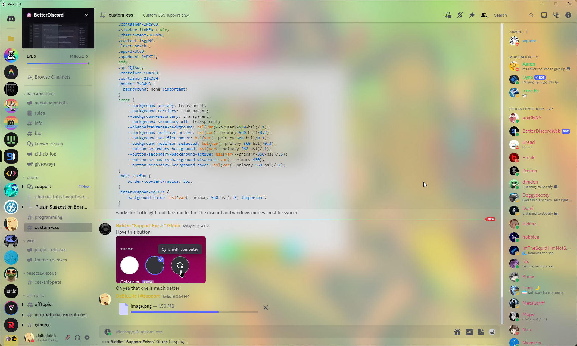
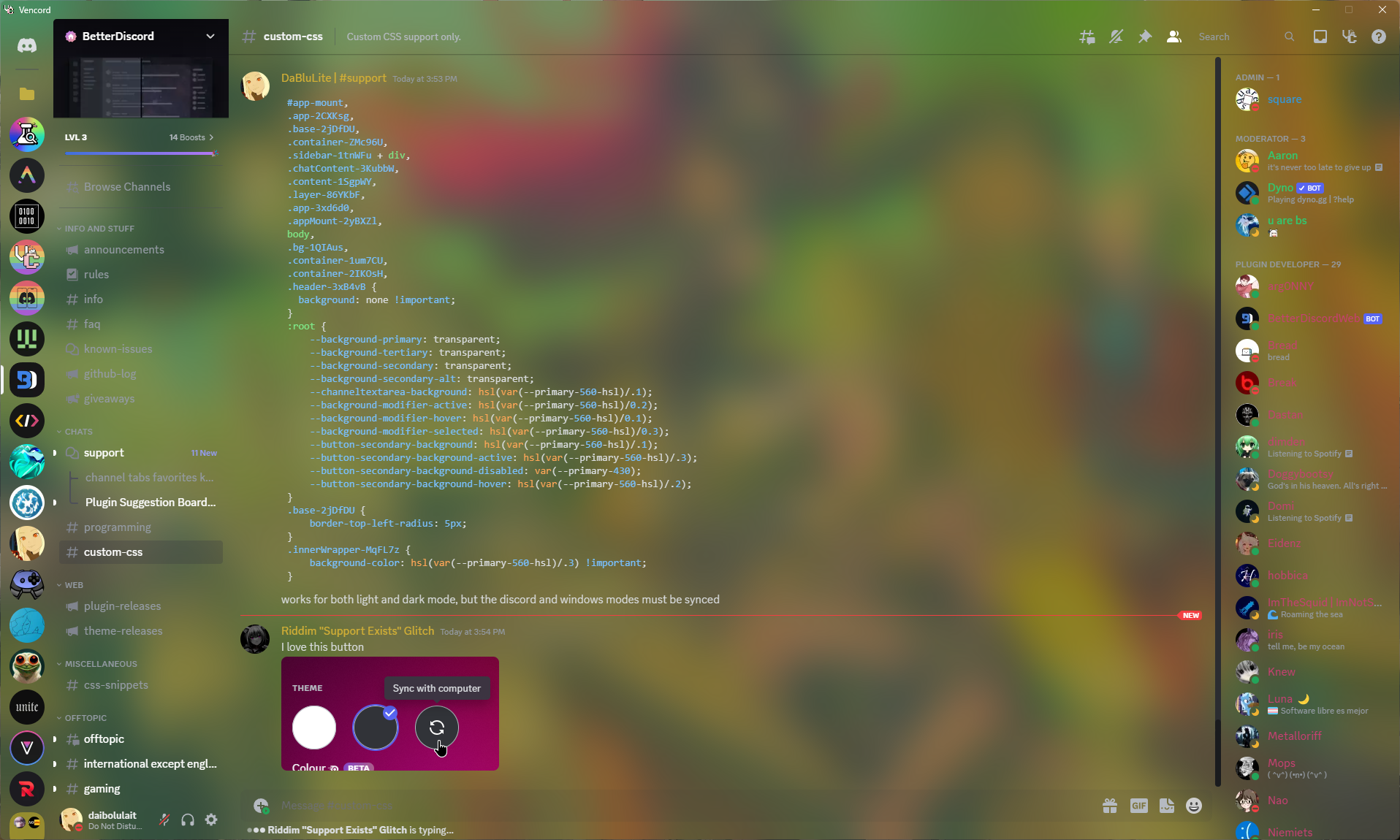
 trail token
make the member count smaller like it should be
#vc-membercount {
margin-top: 0.5em !important;
margin-bottom: -1em !important;
}```
round the message hover background & align it with the chat box
.message-2CShn3 {
margin-left: 16px;
border-radius: 10px;
}
.mentioned-Tre-dv:before {
width: 5px;
border-top-left-radius: 10px;
border-bottom-left-radius: 10px;
}```*edit: fix mention bar*
before, after:
 novel patrol
/* not circle */
[class^="avatar-"] {
border-radius: 25%;
}
Square icons
Adjust 25% up/down for desired level of not circleness
trail token
hide annoying nitro promos (nitro on homepage, gift button, bogo badge, boost bar, gift embeds, etc) (doesnt get rid of super reactions, im too lazy)
.buttons-uaqb-5>.button-ejjZWC:first-child,
.link-39sEB3[href="/store"],
[class*="badgeContainer-"]:has([class*="bogoTrialBadge-"]),
[class*="giftCodeContainer-"]:first-child,
[aria-label="Customize your own profile theme, banner, animated avatar, and more with Nitro!"],
.containerWithMargin-1CVXAM {
display: none;
}```Oneko Skins for the oneko plugin (by @zinc bronze)
https://cdn.discordapp.com/attachments/1131094081301381190/1133903238089941072/ace.png
https://cdn.discordapp.com/attachments/1131094081301381190/1133903238303862854/black.png
https://cdn.discordapp.com/attachments/1131094081301381190/1133903238622613604/calico.png
https://cdn.discordapp.com/attachments/1131094081301381190/1133903238857498715/ghost.png
https://cdn.discordapp.com/attachments/1131094081301381190/1133903240182894662/gray.png
https://cdn.discordapp.com/attachments/1131094081301381190/1133903240484888670/jess.png
https://cdn.discordapp.com/attachments/1131094081301381190/1133903240707199117/kina.png
https://cdn.discordapp.com/attachments/1131094081301381190/1133903241000783982/lucy.png
https://cdn.discordapp.com/attachments/1131094081301381190/1133903241248251974/mike.png
https://cdn.discordapp.com/attachments/1131094081301381190/1133903241491533996/moka.png
https://cdn.discordapp.com/attachments/1131094081301381190/1133903249234198591/silver.png
https://cdn.discordapp.com/attachments/1131094081301381190/1133903249490059364/silversky.png
https://cdn.discordapp.com/attachments/1131094081301381190/1133903249724948540/spirit.png
https://cdn.discordapp.com/attachments/1131094081301381190/1133903249930452992/valentine.png
https://cdn.discordapp.com/attachments/1131094081301381190/1133903250173730879/white.png
How to Use: Replace LINK_GOES_HERE with one of the above links
#oneko {
background-image: url(LINK_GOES_HERE) !important;
}
BetterProfiles, a little redesign to make profile panels look a bit more cozy:
(constantly updated so you might wanna refresh the link once in a while)
Bumped to v2.0, now uses HSLA for best support:
Use --test-color to choose the preferred color, then replace the colors in other variables (in the correct format)
@import url(https://seele1306.github.io/Snippets/BetterProfiles/import.css);
:root {
--test-color: hsl(250, 45%, 45%);
--section-thickness: 1px; /* must be in pixels */
--profile-accent-color: 250deg 45% 45%;
--profile-transparency: 25%;
--profile-border-radius: 8px;
}


 blazing sail
Fix whatever the hell this is (happens if your screen isn't tall enough to fit the whole user's profile)
Put the following URL in the online themes section
https://raw.githubusercontent.com/lumap/css-snippets/main/double-row-badges-fix.css
 orchid bane
User Areas Reimagined
A fresh idea for a user area.
Importing:
Normal:
@import url(//dablulite.github.io/css-snippets/UserReimagined/import.css);
Themes tab: https://dablulite.github.io/css-snippets/UserReimagined/import.css
Condensed:
@import url(//dablulite.github.io/css-snippets/UserReimagined/condensed.css);
Themes tab: https://dablulite.github.io/css-snippets/UserReimagined/condensed.css
User Area on top:
@import url(//dablulite.github.io/css-snippets/UserReimagined/import-ua-top.css);
Themes tab: https://dablulite.github.io/css-snippets/UserReimagined/import-ua-top.css
Screenshots:
https://github.com/DaBluLite/css-snippets/assets/73998678/d5e8b782-a4d2-4007-858d-335ea332da71
 blazing sail
Shiggycord
Replaces every single emoji in the client with
Notes:
- This does not replace escaped emojis, such as:
-
- The ones in channel names
-
- The ones in custom status after the one you can freely set
-
- Default emojis sent in chat with a backslash before then
-
- This is because those are sent as pure text and interpreted by your client to render as a unicode emoji, and I don't think it's even possible to change those to a gif with pure CSS
- I left the emoji preview in the bottom left on the emoji picker intact intentionally, so you can actually know what you're sending
- Stickers are not changed to . If I ever manage to replace default stickers to whatever I want I will update this script to include them.
Put the following URL in the online themes section:
https://raw.githubusercontent.com/lumap/css-snippets/main/shiggycord.css
 humble robin
every so often i try to click on a member and i get jumpscared by clicking the boost icon so this makes it not do anything
div[class|=nameAndDecorators] div[role="button"]:has(svg[aria-label^="Server Boosting since"]) {
pointer-events: none;
}
Nickname for Clyde
A simple snippet to add a nickname to Clyde
Importing:
QuickCSS Method:
@import url(//dablulite.github.io/css-snippets/ClydeNickname/import.css);
:root {
--clyde-nickname: "Clyde";
}
Themes tab:
In the themes tab add https://dablulite.github.io/css-snippets/ClydeNickname/import.css
You can change the name in quick css:
:root {
--clyde-nickname: "Clyde";
}
Screenshots:
https://github.com/DaBluLite/css-snippets/assets/73998678/17ba9966-5069-496c-a13e-156b9d412dac
https://github.com/DaBluLite/css-snippets/assets/73998678/ea9943fa-54da-475d-85c1-017404faf164

 sacred osprey
oneko on message bar v2
now with an extra animation when focused (typing) in message bar
also fixed the positioning so it should always sit on top even with multi line messages
and there are variables for customizing animation speed
 blazing sail
Make user bios show their full content without messing with anything else in the app (hopefully).
Put the following link in the online themes section
https://raw.githubusercontent.com/lumap/css-snippets/main/make-bios-long.css
orchid bane
Servers List
A fully working server list with labels
Importing:
QuickCSS:
@import url(//dablulite.github.io/css-snippets/ServersList/import.css);
:root {
--guild-list-width: 290px;
--guild-list-height: 48px;
--guild-item-radius: 50px;
--guild-item-spacing: 8px;
--guild-item-font-size: 16px;
}
Online Themes method:
the url: https://dablulite.github.io/css-snippets/ServersList/import.css
(Optional) You can change the width/height of the items by copying and changing these values in QuickCSS:
:root {
--guild-list-width: 290px;
--guild-list-height: 48px;
--guild-item-radius: 50px;
--guild-item-spacing: 8px;
--guild-item-font-size: 16px;
}
Screenshots:
https://github.com/DaBluLite/css-snippets/assets/73998678/c61e6921-c20b-40cf-a5aa-fb42833f30e4
Didn't think I would have to mention this, but: This will only work properly with the default theme, do not complain for other themes not working with this
 orchid bane
DaBluLite's Horizontal Server List
A different impementation of Gibbu's original HSL snippet
Importing (Bottom):
Normal:
@import url(//dablulite.github.io/css-snippets/HorizontalServerList/import.css);
Unified With User Area:
@import url(//dablulite.github.io/css-snippets/HorizontalServerList/unified-import.css);
Importing (Top):
Normal:
@import url(//dablulite.github.io/css-snippets/HorizontalServerList/import-topbar.css);
Unified With User Area:
@import url(//dablulite.github.io/css-snippets/HorizontalServerList/unified-import-topbar.css);
Screenshots:
Bottom:
https://github.com/DaBluLite/css-snippets/assets/73998678/7e79e017-babd-4c08-877e-12a6cabe4701
Top:
https://github.com/DaBluLite/css-snippets/assets/73998678/303120a3-a2f3-4ac4-82a0-f8db9ed526af
Unified:
https://github.com/DaBluLite/css-snippets/assets/73998678/c288a3a9-9eca-4c39-b78d-5698bf2f4896
Didn't think I would have to mention this, but: To scroll, hold shift, then scroll (mouse only, trackpads have directional scrolling)
Also didn't think I would have to mention this, too, but: This will only work properly with the default theme, do not complain for other themes not working with this

 tulip scroll
I took dablulite's Server List snippet and removed the names part, but fixed some other things.
Colored pills with variable heights beside the server will indicate whether a server/folder is unread/selected.
May not work with BetterFolders plugin
@import url(https://seele1306.github.io/Snippets/GuildList/import.css);
:root {
--guild-item-radius: 4px; /* 50px for round */
--guild-item-spacing: 4px;
}
Online themes method:
Place this url: https://seele1306.github.io/Snippets/GuildList/import.css
Change the values within QuickCSS:
:root {
--guild-item-radius: 4px; /* 50px for round */
--guild-item-spacing: 4px;
}

 eager rivet
replace the fucking twitter logo with the one it should have.
img[src*="/assets/4643b9da67226d176c1c988a94b1f1ec.svg"] {
content:url("https://discord.com/assets/85cf2b49d2a185c98ec8e383ad5a05d6.svg");
}
(it looks slightly off, maybe I just don't remember how it was supposed to look originally)
Fixed, thanks @sharp raptor
The twitter logo is no longer stretched. please read above, it was fixed.
You can set it to anything you like, realistically. I personally replaced it with the X11 colored logo
Additionally, you can keep the easter egg where you push shift and the twitter logo returns to normal by adding this snippet
This will make it when you press shift the X logo appears.
img[src="/assets/85cf2b49d2a185c98ec8e383ad5a05d6.svg"] {
content: url(/assets/4643b9da67226d176c1c988a94b1f1ec.svg);
}
 dusty gorge
RoleTint
User role colour displayed as a tint overlay rather than a dot.
@import url("https://minidiscordthemes.github.io/Snippets/RoleTint/main.css");

 empty plaza
make it look like a promotional image for some reason:
#app-mount {
transform: rotate(10deg) skew(10deg) scale(0.7);
}```the above but now it's a full on billboard
@import url("https://minidiscordthemes.github.io/Snippets/Billboard/main.css");
 blazing sail
Tired of badges? May I introduce you to Shiggy badges!! It replaces every single badge with
/* Shiggy badges */
@import url(https://raw.githubusercontent.com/lumap/css-snippets/main/shiggy-badges.css);``` dusty gorge
UnreadShake
Servers and channels with unread messages will shake.
@import url("https://minidiscordthemes.github.io/Snippets/UnreadShake/main.css");

 prime forge
Thanks to @quick ingot for making when I wanted it 
removes the "gif" text and "exclusive to nitro" icon in someone's profile banner if it's a gif
/* "Exclusive To Nitro" in profile banner GONE */
[class*=premiumIconWrapper] {
display: none;
}```
&
```CSS
/* "GIF" text in profile banner GONE*/
[class*=gifTag] {
display: none;
}```made by @calm token
@property --rainbow {
syntax: '<color>';
initial-value: #ff000033;
inherits: false;
}
@keyframes rainbow {
16.7% { --rainbow: #ffa50033; }
33.3% { --rainbow: #ffff0033; }
50% { --rainbow: #00800033; }
66.7% { --rainbow: #0000ff33; }
73.3% { --rainbow: #ee82ee33; }
100% { --rainbow: #ff000033; }
}
#app-mount {
transform: rotate3d(2, -1, -1, -0.2turn) scale(0.9);
box-shadow: 8px 8px 8px var(--rainbow),
16px 16px 16px var(--rainbow),
32px 32px 32px var(--rainbow),
64px 64px 64px var(--rainbow),
128px 128px 128px var(--rainbow);
animation: rainbow 5s linear infinite;
}```MinimalAddonCards
A heavily minimised look for theme and plugin cards.
@import url("https://minidiscordthemes.github.io/MinimalAddonCards/MinimalAddonCards.theme.css");
 orchid bane
Omnibar
A combined Guild bar and User area
Importing:
@import url(//dablulite.github.io/css-snippets/Omnibar/import.css);
Screenshots:
https://github.com/DaBluLite/css-snippets/assets/73998678/5f49f6f1-b328-4896-99ca-a93ed06f65fb
 blazing sail
Make those two tabs clickable in Vesktop
.topPill-2vcLsa .item-2GWPIy {
-webkit-app-region: no-drag;
}``` tulip scroll
A lil redesign on the Messages bar (with a bonus Shiggy):
Update: 23.08.: Please enable "Show Send Message Button" in Settings > Accessibility for the snippet to work!
@import url(https://seele1306.github.io/Snippets/MessageSection/import.css);
/* accent colour option has been removed */

idk looks cooler than default one
@import url(https://seele1306.github.io/Snippets/GuildBoost/import.css);
:root {
--test-color: hsl(88, 74%, 52%);
--guildboost-accent-color: 88deg 74% 52%;
--guildboost-transparency: 25%;
}

 restive notch
make markdown headers and bold text pop more
[class*=messageContent] :is(h1, h2, h3) {
color: salmon;
}
[class*=messageContent] strong {
color: lightsalmon;
}
 dusty gorge
Image Link
Transforms the image modal into a clickable link to its source. Note that this disables right-click options.
@import url("https://minidiscordthemes.github.io/Snippets/ImageLink/main.css");
 tulip scroll
Enable Radial statuses for messages (please enable PlatformIndicators plugin in Settings!)
.contents-2MsGLg .avatar-2e8lTP {
scale: 0.85;
margin-top: -0.25em;
border: 4px solid transparent;
box-shadow: 0 0 0 2px #747f8d
}
.contents-2MsGLg .vc-platform-indicator>svg {
display: none
}
.contents-2MsGLg:has(svg[fill="var(--green-360"]) .avatar-2e8lTP {
box-shadow: 0 0 0 2.5px #43b581
}
.contents-2MsGLg:has(svg[fill="var(--yellow-300"]) .avatar-2e8lTP {
box-shadow: 0 0 0 2.5px #faa61a
}
.contents-2MsGLg:has(svg[fill="var(--red-400"]) .avatar-2e8lTP {
box-shadow: 0 0 0 2.5px #f04747
}
.contents-2MsGLg:has(span[data-tag="bot"]) .avatar-2e8lTP {
box-shadow: 0 0 0 2.5px #5865f2
}
 misty ridge
Forum-style name backgrounds
||probably broken or has unintended matches, i am not going to fix this||
https://raw.githubusercontent.com/dwnas/assets/main/snippets/nameBackground/preview1.gif
https://github.com/dwnas/assets/tree/main/snippets/nameBackground
Applies a background to a chosen user's name, commonly a paid feature on many forums and services.
Requires a profile picture to be set.
Remember to change [src*="589322754470445057"] to include your ID!
:root {
--username-bg: url(//raw.githubusercontent.com/dwnas/assets/main/snippets/nameBackground/3.gif); /*
To change the background, please edit the number. (1-16)
*/}
/* chat field */
[class*=contents]:has(img[src*="589322754470445057"]) [class*=username],
/* memberlist */
[role=listitem] :has(img[src*="589322754470445057"]) [class*=name-],
/* settings profile card */
[class*=profileCard] span,
/* reviewdb */
.vc-rdb-view :has(img[src*="589322754470445057"]) [class*=username],
/* replies */
[class*=repliedMessage]:has(img[src*="589322754470445057"]) [class*=username]
/* elements that aren't sized correctly, uncomment below if you want */
/*,[class*=nameTag] [data-text-variant="text-sm/normal"],
[class*=userPopoutInner]:has(img[src*="589322754470445057"]) [class*=nickname],
[class*=voiceUser]:has([style*="589322754470445057"]) [class*=username]*/
{
background-image: var(--username-bg) !important;
text-shadow: 1px 1px 4px;
}```
 restive notch
Hide the chat bar buttons when chat gets too narrow. tweak the 500px to your liking (increase to hide buttons earlier)
(this is very new syntax to the custom css editor will tell you this code isn't valid, but it is)
.chatContent-3KubbW {
container-type: inline-size;
container-name: chat;
}
@container chat (max-width: 500px) {
.chatContent-3KubbW .buttons-uaqb-5 {
display: none;
}
}
Make the forum post action bar actually sticky, like Discord intended but they forgor to put this line:
.scrollerInner-2PPAp2 {
overflow: unset;
}
 dusty gorge
FluentStatusIcons
Applies Fluent UI icons to user status.
@import url("https://minidiscordthemes.github.io/FluentStatusIcons/FluentStatusIcons.theme.css");
(or theme direct download)
 dusty gorge
In Reduced Motion mode, settings shiggy only shiggs on hover/focus
.reduce-motion .vc-settings-card:not(:hover, :focus-within) img[src*="1039992459209490513"] {
content: url("https://media.discordapp.net/stickers/1039992459209490513.png?size=160&passthrough=false");
}``` novel patrol
Classic Client Theme for people who can't use third-party-plugins
/* Classic Client Theme */
:root:root {
/* use https://hslpicker.com/ to help pick your theme color */
--theme-h: 0;
--theme-s: 0%;
--theme-l: 5%;
--primary-500-hsl: var(--theme-h) var(--theme-s) calc(var(--theme-l) + 11.90%);
--primary-530-hsl: var(--theme-h) var(--theme-s) calc(var(--theme-l) + 6.70%);
--primary-560-hsl: var(--theme-h) var(--theme-s) calc(var(--theme-l) + 2.90%);
--primary-600-hsl: var(--theme-h) var(--theme-s) calc(var(--theme-l) + 0.00%);
--primary-630-hsl: var(--theme-h) var(--theme-s) calc(var(--theme-l) - 2.60%);
--primary-645-hsl: var(--theme-h) var(--theme-s) calc(var(--theme-l) - 3.70%);
--primary-660-hsl: var(--theme-h) var(--theme-s) calc(var(--theme-l) - 5.90%);
--primary-700-hsl: var(--theme-h) var(--theme-s) calc(var(--theme-l) - 8.10%);
--primary-730-hsl: var(--theme-h) var(--theme-s) calc(var(--theme-l) - 9.60%);
--primary-760-hsl: var(--theme-h) var(--theme-s) calc(var(--theme-l) - 11.40%);
--primary-800-hsl: var(--theme-h) var(--theme-s) calc(var(--theme-l) - 13.30%);
--primary-830-hsl: var(--theme-h) var(--theme-s) calc(var(--theme-l) - 15.70%);
--primary-860-hsl: var(--theme-h) var(--theme-s) calc(var(--theme-l) - 18.10%);
--primary-900-hsl: var(--theme-h) var(--theme-s) calc(var(--theme-l) - 19.80%);
}
THIS WILL BREAK if discord changes their color system again or adds new colors
The third party plugin will NEVER BREAK due to it generating the CSS programmatically.
The only exception to this is if discord does a total overhaul of their color system
orchid bane
novel patrol
[Classic Client Theme](<https://discord.com/channels/1015060230222131221/1032200...
And to go alongside it:
@import url(//dablulite.github.io/css-snippets/AccentSwap/import.css);
:root:root {
--accent-h: 235;
--accent-s: 86%;
--accent-l: 65%;
}
https//dablulite.github.io/css-snippets/AccentSwap/import.css
oak path
https://shit.post.in/8ZsyrWj.png ```css
/* Add danger colours to dangerous user actions /
#user-context-close-dm, #user-context-remove-friend {
&:is(:active, [class="-focused"]) {
background-color: var(--background-feedback-critical);
}
& div { color: var(--text-feedback-critical); }
}
 dusty gorge
Discord --> Vencord or Vesktop
@import url("https://minidiscordthemes.github.io/Snippets/ModTitle/main
.css");
 orchid bane
Declutter Bar
A modified version of the "Better Titlebar" snippet, that moves the channel actions (the bar above the chat) inside the titlebar
Importing (Normal):
@import url(//dablulite.github.io/css-snippets/DeclutterBar/import.css);
Importing (With macOS Traffic Lights):
@import url(//dablulite.github.io/css-snippets/DeclutterBar/import-trafficlights.css);
Screenshots:
https://github.com/DaBluLite/css-snippets/assets/73998678/4c1a6fb0-803d-451d-9cf6-df1fbe84122c
https://github.com/DaBluLite/css-snippets/assets/73998678/e6c9bcb0-16d4-4645-8b7c-fec547839c93
https://github.com/DaBluLite/css-snippets/assets/73998678/00c01232-6596-42ec-9301-f94317deaf73


 orchid bane
QuickSwitch on DMs as guild item
.searchBar-3TnChZ {
padding: 0;
box-shadow: none;
width: 72px;
height: 48px;
margin-bottom: 8px;
max-height: unset;
display: flex;
justify-content: center;
position: absolute;
left: -72px;
top: 60px;
}
.searchBar-3TnChZ > .searchBarComponent-3N7dCG {
border-radius: 50px;
height: 48px;
width: 48px;
background-color: var(--background-primary);
color: var(--text-normal);
transition: background-color .15s ease-out,color .15s ease-out, border-radius .15s ease;
font-size: 0;
line-height: 0;
}
.searchBar-3TnChZ > .searchBarComponent-3N7dCG:hover {
border-radius: 16px;
color: var(--white-500);
background-color: var(--brand-experiment);
}
.searchBar-3TnChZ > .searchBarComponent-3N7dCG::before {
content: "";
clip-path: path("M21.707 20.293L16.314 14.9C17.403 13.504 18 11.799 18 10C18 7.863 17.167 5.854 15.656 4.344C14.146 2.832 12.137 2 10 2C7.863 2 5.854 2.832 4.344 4.344C2.833 5.854 2 7.863 2 10C2 12.137 2.833 14.146 4.344 15.656C5.854 17.168 7.863 18 10 18C11.799 18 13.504 17.404 14.9 16.314L20.293 21.706L21.707 20.293ZM10 16C8.397 16 6.891 15.376 5.758 14.243C4.624 13.11 4 11.603 4 10C4 8.398 4.624 6.891 5.758 5.758C6.891 4.624 8.397 4 10 4C11.603 4 13.109 4.624 14.242 5.758C15.376 6.891 16 8.398 16 10C16 11.603 15.376 13.11 14.242 14.243C13.109 15.376 11.603 16 10 16Z");
height: 24px;
width: 24px;
display: flex;
background-color: var(--white-500);
margin: 0 auto;
}
.container-1eFtFS:has(.searchBar-3TnChZ) .tutorialContainer-1pL9QS .listItem-3SmSlK:first-child {
margin-bottom: calc(56px + 8px) !important;
}
.sidebar-1tnWFu,
.privateChannels-oVe7HL,
.content-1SgpWY,
.base-2jDfDU {
overflow: visible !important;
}
.sidebar-1tnWFu,
.privateChannels-oVe7HL,
.sidebar-1tnWFu .scroller-WSmht3,
.header-3OsQeK,
.container-1-ERn5,
.container-1NXEtd {
border-top-left-radius: 8px;
}
 orchid bane
SUA (Super User Area)
Yet another User area redesign, this time aiming to unify Discord's main actions (Home, Account, Settings, etc...)
Importing:
@import url(//dablulite.github.io/css-snippets/SuperUserArea/import.css);
Screenshots:
https://github.com/DaBluLite/css-snippets/assets/73998678/d8011e75-6d2c-4f00-b81b-0585c31228cf
 orchid bane
Actual Custom roles
Turn "self roles" into realistic looking roles
Importing:
.overlayBackground-2aa7wt code.inline {
font-family: var(--font-primary);
align-items: center;
font-size: 12px;
font-weight: 500;
background: var(--profile-role-pill-background-color);
border-radius: 4px;
box-sizing: border-box;
height: 22px;
margin: 0 4px 4px 0;
padding: 4px;
padding-right: 8px;
display: inline-flex;
line-height: 16px;
color: var(--text-normal);
}
.overlayBackground-2aa7wt code.inline::before {
content: "";
margin: 0 4px;
width: 12px;
height: 12px;
border-radius: 50px;
background-color: var(--brand-500);
}
.userProfileInnerThemedPremiumWithoutBanner-lZ9inp .overlayBackground-2aa7wt code.inline {
border: 1px solid var(--profile-role-pill-border-color);
}
 feral pawn
Jump to Present Button Revamp (from an earlier snippet i posted) (now works with any theme)
/* Jump To Present Bar Revamp */
[class*="jumpToPresentBar"] {
display: contents;
}
[class*="jumpToPresentBar"] > button:first-child {
display: none;
}
[class*="jumpToPresentBar"] > button:last-child {
position: absolute;
z-index: 1;
bottom: 24px;
right: 22px;
padding: 8px !important;
height: auto;
background-color: #2e353b20;
box-shadow: var(--elevation-high);
border-radius: 100px;
display: flex;
font-size: 0px;
color: transparent;
transition: font-size .2s .1s, color .2s, padding .4s .1s;
}
[class*="jumpToPresentBar"] > button svg {
order: -1;
margin: 0px;
height: 24px;
width: 24px;
top: auto;
margin-right: 0px;
margin-left: 0px;
color: #FFFFFF;
transition: margin .6s;
}
[class*="jumpToPresentBar"]:hover > button {
padding: 8px 18px !important;
font-size: 14px;
color: #FFFFFF;
transition: font-size .2s, color .2s .1s, padding .4s;
}
[class*="jumpToPresentBar"]:hover > button svg {
margin-right: 2px;
margin-left: -6px;
}
BEFORE: Bar
AFTER:
With Theme
Without Theme


 feral pawn
Blurs the tab when the window is not in focus (might become laggy)
/* Blur */
html:not(.app-focused) {
filter: blur(4px);
transition: filter 400ms ease-in, filter 550ms ease-in;
}
html:not(.app-focused) #app-mount::after {
content: "";
z-index: 200;
position: fixed;
background: rgba(0, 0, 0, 0.5);
width: 100%;
height: 100%;
}
html.app-focused {
filter: blur(0);
transition: filter 400ms ease-out, filter 550ms ease-out;
}
DiscordThemeFix, Fixes the inconsistent areas which the discord themes don't usually change.
For everyone who uses nitro themes.
This snippet was originally made by dablulite, I just fixed it and made it work for the newer version of discord.
@import url(https://raw.githubusercontent.com/U8K50/randomDiscordThemesSnippets/main/DiscordThemeFix.css);
- Example Screenshots:
ps: if the images aren't loading for you just click the hyperlink

 orchid bane
Pretty Folder Icons
Makes the expanded folder icons white and their backgrounds colored
Importing:
@import url(//dablulite.github.io/css-snippets/PrettyFolderIcons/import.css);
Screenshots:
https://github.com/DaBluLite/css-snippets/assets/73998678/53d0defb-0245-49cb-a517-b610ef7f5261
 orchid bane
Better Windows Titlebar w/ macos traffic lights buttons (Snippet Bump)
snippet bump + new import
Import (Normal):
@import url(//dablulite.github.io/css-snippets/BetterTitlebar/import.css);
Import (With macOS Traffic Lights):
@import url(//dablulite.github.io/css-snippets/BetterTitlebar/import-trafficlights.css);
Screenshots:
https://github.com/DaBluLite/css-snippets/assets/73998678/8448bb73-05e6-4d13-8044-a7c74e482401
 mossy phoenix
gives zt (@coarse blaze) a pfp (originally courtesy of @restive notch)
img[src*="289556910426816513"] {
content: url("https://cdn.discordapp.com/attachments/845052403802964019/1155581128657350717/20230923_061105.jpg");
}
rewritten to be noticably worse by me
tulip scroll
Improves visibility for usernames and adds suffixes to differentiate message types:
/* ShowMeYourName plugin */
.vc-smyn-suffix:before {
content: "| @" !important
}
.vc-smyn-suffix:after {
content: "" !important
}
.vc-smyn-suffix {
color: currentColor !important;
opacity: 0.5
}
/* Username */
.username-h_Y3Us,
.base-3bcbY3 .text-3S7XCz strong,
.name-3DDHNY {
background: color-mix(in srgb, currentColor 25%, rgba(0, 0, 0, 0.25));
text-shadow: 0 0 5px color-mix(in srgb, currentColor 25%, rgb(0, 0, 0));
filter: brightness(1.25);
margin-right: 4px;
padding: 0 4px;
border-radius: 4px;
}
.username-h_Y3Us::after {
position: relative;
margin: 0 0 0 8px;
color: inherit;
text-shadow: 0 0 5px black;
}
.contents-2MsGLg .username-h_Y3Us::after {
content: "wrote:"
}
.message-2CShn3:has(.edited-1v5nT8) .contents-2MsGLg .username-h_Y3Us::after {
content: "wrote and edited:";
}
.message-2CShn3:has(.mediaAttachmentsContainer-1WGRWy, .embed-hKpSrO) .contents-2MsGLg .username-h_Y3Us::after {
content: "sent attachment(s):"
}
.message-2CShn3:has(.stickerAsset-4c7Oqy) .contents-2MsGLg .username-h_Y3Us::after {
content: "sent a sticker:"
}
.message-2CShn3:has(.emoji.jumboable) .contents-2MsGLg .username-h_Y3Us::after {
content: "sent emoji(s):"
}
.hasReply-2Cr4KE .contents-2MsGLg .username-h_Y3Us::after {
content: "replied:"
}
.mentioned-Tre-dv .contents-2MsGLg .username-h_Y3Us::after {
content: "mentioned:"
}
 orchid bane
SpotifyActivityRedesign
A simple redesign for the Spotify activity portions in user popouts to match the actual Spotify UI
Importing:
@import url("https://dablulite.github.io/css-snippets/SpotifyActivityRedesign/import.css");
Screenshots:
https://github.com/DaBluLite/css-snippets/assets/73998678/21b9a770-3c42-47cd-8d58-1caa66a91341
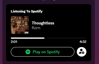
BetterStatusPicker
A redesign to the simple status picker that gives each button an accent that matches the status, as well as condensing the UI
Importing:
@import url("https://dablulite.github.io/css-snippets/BetterStatusPicker/import.css");
Screenshots:
https://github.com/DaBluLite/css-snippets/assets/73998678/ce55d41b-f55d-4d91-8e38-562fc518de17
https://github.com/DaBluLite/css-snippets/assets/73998678/a54f624e-3a50-4a8a-af8e-0fc71b64aa32

 river trout
RAVE TIME !!
@keyframes rave {from{filter:brightness(20)}to{filter:brightness(0)}}
body{animation:infinite alternate rave 0.5s}
```(flashing lights warning)Avatar Decoration Checkmark (#1000955966520557689 message)
Adds the Twitter Verified checkmark after the username of anyone using a paid avatar decoration.
@import url("https://minidiscordthemes.github.io/Snippets/AvatarDecorationCheckmark/main.css");
To change the checkmark to some other image or svg:
:root {
--adc-badge: url("https://upload.wikimedia.org/wikipedia/commons/thumb/8/85/Smiley.svg/180px-Smiley.svg.png");
}
 orchid bane
Better Nitro Profile Borders
Gets rid of the unsightly outer 4px border/padding and replaces it with a gradient border around the user info area, like in Discord RN
Importing:
@import url("https://dablulite.github.io/css-snippets/BetterNitroProfileBorder/import.css");
Screenshots:
https://github.com/DaBluLite/css-snippets/assets/73998678/dcf49d77-8b2f-4ef4-bc01-13cd8c3af3ba
https://github.com/DaBluLite/css-snippets/assets/73998678/5ea982e9-d22b-4e19-9a41-047cf8174d81
 dark escarp
*very smol hover-to-open for channels and servers with customization :)*
Thank you @full herald for unfucking discords css havoc U G H
Server:
@import url("https://blade04208.github.io/css/stacked/server.css");
:root {
--guild-mini: 24px;
--guild-max: 72px; /* normal server list size */ }
Channel:
@import url("https://blade04208.github.io/css/stacked/channel.css");
:root {
--channel-mini: 36px;
--channel-max: 240px; /* normal channel list size */}
 dark escarp
No profile effects, i dont want my eyes to implode when i see someone's profile.
thank you @muted abyss for teaching me future-proofing!
[class*="profileEffects"] {
display:none;
}
replace blurple, unread red, ping yellow, and/or green with a set of accent colors
remove a section to not replace a specific color
https://raw.githubusercontent.com/refact0r/css-snippets/main/accent.css


 tulip scroll
Actually removes unnecessary things from the user panel (might have been done before but whatever)
[class^=accountProfilePopoutWrapper] {
left: 0
}
[class^=accountProfilePopoutWrapper] [class*=userPopout] {
margin: 0;
width: fit-content
}
[class^=accountProfilePopoutWrapper] .section-28YDOf,
.userPopoutInner-nv9Y92:has(#account) > *:not(:has(#account)),
.userPopoutOverlayBackground-3A0Pcz:has(#account) > *:not(#account) {
display: none;
}
 last lily
Rounded User Panel
[class^="sidebar_"] [class^="panels_"] {
margin-right: 5px;
margin-bottom: 5px;
margin-left: 5px;
border: 1px solid var(--background-modifier-accent);
border-radius: 20px;
box-shadow: 0 0 3px 1px rgba(0, 0, 0, 0.45);
}
[class^="sidebar_"] [class^="panels_"] [class^="container_"],
[class^="sidebar_"] [class^="panels_"] [class^="panel_"] {
background: transparent !important;
}
[class^="sidebar_"] [class^="panels_"] [class^="container_"] [class^="avatarWrapper_"] + [class^="flex_"] {
margin-left: -10px;
}
#vc-spotify-player {
border-top-left-radius: 20px;
border-top-right-radius: 20px;
}
/* Nitro Theme Shit */
html.custom-theme-background [class^="sidebar_"] {
background: var(--bg-overlay-3);
}
html.custom-theme-background [class^="sidebar_"] [class^="panels_"] {
background: var(--bg-overlay-1);
}

 atomic olive
replaces home icon with image :3c
/* home icon */
.childWrapper-1j_1ub{
background: url(REPLACE THIS WITH YOUR IMAGE URL!!!! IMAGE HERE PUT IMAGE HERE!!!!! IMAGE !!!!!!1!!);
background-size: contain;
visibility: hidden;
}
[aria-label='Direct Messages'].wrapper-3kah-n {
background: url(REPLACE THIS WITH YOUR IMAGE URL!!!! IMAGE HERE PUT IMAGE HERE!!!!! IMAGE !!!!!!1!!);
background-size: contain;
}
[class*="acronym"] {
visibility: visible !important;
}
fix for the new update (thanks to spaceenergy):
.wrapper_d281dd[data-list-item-id="guildsnav___home"] .childWrapper__01b9c {
background: url("REPLACE THIS WITH YOUR IMAGE URL!!!! IMAGE HERE PUT IMAGE HERE!!!!! IMAGE !!!!!!1!!") no-repeat center !important;
background-size: cover !important;
}
.wrapper_d281dd[data-list-item-id="guildsnav___home"] .childWrapper__01b9c svg {
display: none;
}```
if you use favourites (don't) (thanks to spaceenergy):
```css
/* home icon */
.wrapper-3kah-n[data-list-item-id="guildsnav___home"] .childWrapper-1j_1ub {
background: url("REPLACE THIS WITH YOUR IMAGE URL!!!! IMAGE HERE PUT IMAGE HERE!!!!! IMAGE !!!!!!1!!") no-repeat center !important;
background-size: cover !important;
}
.wrapper-3kah-n[data-list-item-id="guildsnav___home"] .childWrapper-1j_1ub svg {
display: none;
}```
get a webp from the icon previews or replace it with a picture of hanzo overwatch's boobs i really dont care this was made w duct tape
**known bugs**
none. hopefully restive notch
fix the terrible profile overflow bug discord added recently (discord please....)
.userPopoutOverlayBackground-3A0Pcz {
max-height: 60vh;
}
 sacred osprey
i have no idea who the original author is but i fixed minifiedmemberlist to work after the latest class update
/*Minifiedmemberlist*/
.members-2y1nVj,
.container-2vWgD2 {
width: 64px;
transition: 0.3s ease;
}
.membersWrap-3GwLFp {
min-width: 0;
width: min-content;
}
.container-2vWgD2:hover,
.container-2vWgD2:hover .members-2y1nVj {
width: 400px;
}
.member-2gU6Ar {
max-width: unset;
}```[class^=channelTextArea] {
display: none;
}
[class^=typing] {
background-color: var(--background-primary);
margin: -1px;
}
[class^=section]:has([aria-label^="Message @"]) {
display: none;
}
#user-context-invite-to-server {
display: none;
}
lurking mode
novel patrol
/* No, I don't want to make a thread from a chain of more than 2 replies */
[class*="threadSuggestionBar_"] {
display:none;
}
/* show full about me */
[style="-webkit-line-clamp: 6;"] {
-webkit-line-clamp: 10000000 !important;
}
/* not circle */
[class^="avatar_"] {
border-radius: 25%;
}
Fixed versions of several snippets that broke for me today
wicked glen
a fancy fixed snippet that makes the channel text area line up nicely with the profile container thing 
/* Match channel text area to user container */
[class^="chatContent_"] form {
padding: 0;
}
[class^="channelTextArea_"] {
margin: 0;
}
[class^="channelTextArea_"] [class^="scrollableContainer_"] {
border-radius: 0;
}
[class^="channelTextArea_"] [class^="scrollableContainer_"] [class^="inner_"] {
min-height: 48px;
padding-top: 4px;
margin-right: 4px;
}
/* Move typing indicators */
[class^=typing_] {
top: -24px;
left: 0px;
width: fit-content;
padding-right: 9px;
border-radius: 0 8px 0 0;
background: var(--bg-overlay-3,var(--channeltextarea-background));
}
/* Remove single pixel padding from user container */
[class^="panels_"] [class^="container_"] {
padding-bottom: 0;
}
/* End Match channel text area to user container */


 small heath
[class*="none_"]::-webkit-scrollbar {
width: 5px;
background: transparent;
border: none;
}
[class*="none_"]::-webkit-scrollbar-thumb {
background: #101115;
}
server list scrollbar, used this when i didn't have a scroll wheel years ago. i still maintain this snippet however
 inner stone
Icons on listening status fix
.activityUserPopoutV2__32328:has([class^=timeBarUserPopoutV2_]) .contentImagesUserPopoutV2__04250 {
margin-left: 22px;
}
.activityUserPopoutV2__32328:has([class^=timeBarUserPopoutV2_]) .contentImagesUserPopoutV2__04250 > div:first-child::before,
.activityUserPopoutV2__32328:has([class^=timeBarUserPopoutV2_]) .contentImagesUserPopoutV2__04250 > div:nth-child(2)::before,
.activityUserPopoutV2__32328:has([class^=timeBarUserPopoutV2_]) .contentImagesUserPopoutV2__04250 > div:nth-child(3)::before {
-webkit-mask-repeat: no-repeat;
-webkit-mask-size: contain;
padding: 7px;
margin-left: -17px;
margin-top: 2px;
content: '';
background-color: var(--header-primary);
/* Spotify wave thingy fix */
/*background-color: hsla(var(--spotify-vencord-text)/1);*/
position: absolute;
}
.activityUserPopoutV2__32328:has([class^=timeBarUserPopoutV2_]) .contentImagesUserPopoutV2__04250 > div:first-child::before {
-webkit-mask-image: url("data:image/svg+xml,%3Csvg xmlns='http://www.w3.org/2000/svg' width='100%' height='100%' viewBox='0 0 24 24' fill='none' stroke='currentColor' stroke-width='3' stroke-linecap='round' stroke-linejoin='round' class='lucide lucide-music-4'%3E%3Cpath d='M9 18V5l12-2v13'%3E%3C/path%3E%3Cpath d='m9 9 12-2'%3E%3C/path%3E%3Ccircle cx='6' cy='18' r='3'%3E%3C/circle%3E%3Ccircle cx='18' cy='16' r='3'%3E%3C/circle%3E%3C/svg%3E");
}
.activityUserPopoutV2__32328:has([class^=timeBarUserPopoutV2_]) .contentImagesUserPopoutV2__04250 > div:nth-child(2)::before {
-webkit-mask-image: url("data:image/svg+xml,%3Csvg xmlns='http://www.w3.org/2000/svg' width='24' height='24' viewBox='0 0 24 24' fill='none' stroke='currentColor' stroke-width='2' stroke-linecap='round' stroke-linejoin='round' class='lucide lucide-mic'%3E%3Cpath d='M12 2a3 3 0 0 0-3 3v7a3 3 0 0 0 6 0V5a3 3 0 0 0-3-3Z'%3E%3C/path%3E%3Cpath d='M19 10v2a7 7 0 0 1-14 0v-2'%3E%3C/path%3E%3Cline x1='12' x2='12' y1='19' y2='22'%3E%3C/line%3E%3C/svg%3E");
}
.activityUserPopoutV2__32328:has([class^=timeBarUserPopoutV2_]) .contentImagesUserPopoutV2__04250 > div:nth-child(3)::before {
-webkit-mask-image: url("data:image/svg+xml,%3Csvg xmlns='http://www.w3.org/2000/svg' width='24' height='24' viewBox='0 0 24 24' fill='none' stroke='currentColor' stroke-width='2' stroke-linecap='round' stroke-linejoin='round' class='lucide lucide-disc-2'%3E%3Ccircle cx='12' cy='12' r='4'%3E%3C/circle%3E%3Ccircle cx='12' cy='12' r='10'%3E%3C/circle%3E%3Cline x1='12' y1='12' x2='12' y2='12.01'%3E%3C/line%3E%3C/svg%3E");
}
and for spotifycontrols (this hasnt changed since the original author posted it)
@import url("https://raw.githubusercontent.com/nyakowint/theme-stuff/main/vencord_sc_icons.css");
 oak path
never posted this apparently
before: https://the.yog.zone/9uvRhB4.png
after: https://the.yog.zone/EMg5vhz.png ```css
/* Revert transforms on settings info that isn't Discord version /
[aria-label="User Settings"] [class="-info"] :not(:has([class*="-versionHash"])) { text-transform: none; }

 wicked glen
Make unread message/jump to present bars smaller and hug the right
/* Make jump to present/jump to original/mark as read bars smaller and hug the right */
.barBase__4e0ba {
width: fit-content;
margin-left: auto;
}
/* End make jump to present/jump to original/mark as read bars smaller and hug the right */

 obtuse plover
Funny shiggy throbber for discord! (replaces the reload animation)
Put this at the beginning of your quickcss/theme file to use it: ```css
@import url(https://raw.githubusercontent.com/Blisterexe/shiggy-loader/main/main.css);
show the url masked links take you to in the message (for very long links the preview will also be very long)
.anchor_c8ddc0[title$=")"]::after {
font-size: 0.7rem;
content: " (" attr(href) ")";
filter: grayscale(0.4);
}
 zinc bronze
sacred osprey
i have no idea who the original author is but i fixed minifiedmemberlist to work...
zinc bronze
sacred osprey
i have no idea who the original author is but i fixed minifiedmemberlist to work...
This, but fixed with new classes
/*Minifiedmemberlist*/
:root{
--hidden-user-width: 60px;--user-width: 240px
}
.container_b2ce9c,
.membersWrap__90226{
transition-duration:var(--transition-time);
justify-content:unset;
min-width:unset;
width:var(--hidden-user-width)
}
.membersGroup__85843{
height:0px;
transition-duration:var(--transition-time);
padding-top:0px
}
.container_b2ce9c:hover
.membersGroup__85843,
.membersWrap__90226:hover
.membersGroup__85843{
height:40px;
padding-top:24px
}
.container_b2ce9c:hover,
.membersWrap__90226:hover{
width:var(--user-width)
}
.profilePanel-2PWEok{
transition-duration:var(--transition-time)
}
Animated Discord Title Bar and Guild List
Bring a nice and aesthetic touch to your discord with this minimal snippet which will animate your title bar and guild list to have falling snow, it's not too distracting but it is peaceful.
- If there's any issues, please make a thread and I will attempt to fix/update.
- Thank you autumn, coolesding, nvhhr and aoi

- Thank you autumn, coolesding, nvhhr and aoi
[class^=bg_] {
background: url("https://raw.githubusercontent.com/coolesding/shiggycord/v3/img/snow.gif") !important; /* You can use any GIF/PNG/JPEG Link */
background-repeat: repeat; /* Adjust if needed (depending on media used) */
}
/* Additional Transparency */
[class^=childWrapper_], /* Discord Home Icon */
[class*=guilds_], /* Guild List Bar */
[class^=circleIconButton_], /* Add Server and Server Discovery */
[class^=scroller_], /* Overrides Nitro Themes (for Guild List) */
[class^=typeWindows_], /* Overrides Nitro Themes (for Title Bar) */
[class^=folder_], [class^=folderIconWrapper_], [class^=expandedFolderBackground_] /*Folders*/
{
background: none !important;
}
/* Additional Recolouring */
[class^=wordmarkWindows_], /* "Discord" Text */
[class^=winButton], /* Close Discord Button" Text */
[class^=circleIcon_] /* Add Server and Server Discovery SVG'S */ {
color: #ffffff;
}
/* Cleanup */
body, #app-mount/* Overrides Gradient (for Title Bar */ {
background: var(--background-tertiary) !important;
}
Thank @tawdry sundial again for being super cute <33
tulip scroll
From now on, snippets will be updated here !
You can check out which snippets you want to apply. The format will always be https://raw.githubusercontent.com/SEELE1306/CSS-Snippets/main/SnippetName(/SnippetSubfolder)/import(-legacy).css
Add some flair to the message header by combination of any of these following snippets:
- Message Types:
@import url(https://raw.githubusercontent.com/SEELE1306/CSS-Snippets/main/MessageUltilities/MessageTypes/import.css); - Timestamp and pronouns bubbles:
@import url(https://raw.githubusercontent.com/SEELE1306/CSS-Snippets/main/MessageUltilities/TimestampBubbles/import.css); - Username styling (including the ShowMeYourName plugin):
@import url(https://raw.githubusercontent.com/SEELE1306/CSS-Snippets/main/MessageUltilities/Username/import.css);


GitHub
A compilation of CSS snippets for Vencord / Vesktop. - GitHub - SEELE1306/CSS-Snippets: A compilation of CSS snippets for Vencord / Vesktop.
orchid bane
I guess this is allowed, so here's mine too:
All of my snippets and their respective imports can be found in this repo, with the URL format always being https://dablulite.github.io/css-snippets/<SnippetNameCaseSensitive>/import.css (or any other variation of the file)
GitHub
A repo with all of my Discord CSS snippets. Contribute to DaBluLite/css-snippets development by creating an account on GitHub.
ImmersiveMode
A snippet combining the minimalistic approach of DeclutterBar's titlebar, and the lack thereof.
Importing
Normal:
@import url("https://dablulite.github.io/css-snippets/ImmersiveMode/import.css");
Traffic Lights:
@import url("https://dablulite.github.io/css-snippets/ImmersiveMode/import-trafficlights.css");
https://github.com/DaBluLite/css-snippets/tree/master/ImmersiveMode
novel patrol
bouncy buttons
button,
[role="button"],
a[href^='/channels'],
[aria-label="Servers"] [class^=listItem] {
&:hover { filter: brightness(0.95); scale: 0.95; }
&:active { filter: brightness(0.9); scale: 1.05; }
transition: scale 0.6s cubic-bezier(0.34, 5, 0.64, 1);
}
vesktop/browser only probably because of & selector
light kettle
minky
* {
background: url("https://minky.materii.dev/");
}
em .emoji {
transform: skew(-14deg);
}
 blazing sail
Fixed my previous non-memey css snippets, posting them again for convenience. Use whichever method you want to import the snippets, using both is unnecessary.
Remove 6 lines limit in bios:
- Online themes: add
https://raw.githubusercontent.com/lumap/css-snippets/main/make-bios-long.css - QuickCSS:
@import url(https://raw.githubusercontent.com/lumap/css-snippets/main/make-bios-long.css);
Fix badges clipping out of their container in mini profiles:
- Online themes: add
https://raw.githubusercontent.com/lumap/css-snippets/main/double-row-badges-fix.css - QuickCSS:
@import url(https://raw.githubusercontent.com/lumap/css-snippets/main/double-row-badges-fix.css);
Mini user popout:
- Online themes: add
https://raw.githubusercontent.com/lumap/css-snippets/main/clean-user-popout.css - QuickCSS:
@import url(https://raw.githubusercontent.com/lumap/css-snippets/main/clean-user-popout.css);


 blazing sail
looks like it started to roll out, so...
Hide the Nitro badge in chat
- Online themes: add
https://raw.githubusercontent.com/lumap/css-snippets/main/hide-nitro-in-chat.css - QuickCSS:
@import url(https://raw.githubusercontent.com/lumap/css-snippets/main/hide-nitro-in-chat.css);
white gulch
Discord is now Twitter Blue
Needs the [Social Proofing Message Nitro Badge] experiment enabled.
[class^=nitroBadgeSvg__] {
content: url("data:image/svg+xml,%3Csvg xmlns='http://www.w3.org/2000/svg' viewBox='0 0 22 22'%3E%3Cg%3E%3Cpath d='M20.396 11c-.018-.646-.215-1.275-.57-1.816-.354-.54-.852-.972-1.438-1.246.223-.607.27-1.264.14-1.897-.131-.634-.437-1.218-.882-1.687-.47-.445-1.053-.75-1.687-.882-.633-.13-1.29-.083-1.897.14-.273-.587-.704-1.086-1.245-1.44S11.647 1.62 11 1.604c-.646.017-1.273.213-1.813.568s-.969.854-1.24 1.44c-.608-.223-1.267-.272-1.902-.14-.635.13-1.22.436-1.69.882-.445.47-.749 1.055-.878 1.688-.13.633-.08 1.29.144 1.896-.587.274-1.087.705-1.443 1.245-.356.54-.555 1.17-.574 1.817.02.647.218 1.276.574 1.817.356.54.856.972 1.443 1.245-.224.606-.274 1.263-.144 1.896.13.634.433 1.218.877 1.688.47.443 1.054.747 1.687.878.633.132 1.29.084 1.897-.136.274.586.705 1.084 1.246 1.439.54.354 1.17.551 1.816.569.647-.016 1.276-.213 1.817-.567s.972-.854 1.245-1.44c.604.239 1.266.296 1.903.164.636-.132 1.22-.447 1.68-.907.46-.46.776-1.044.908-1.681s.075-1.299-.165-1.903c.586-.274 1.084-.705 1.439-1.246.354-.54.551-1.17.569-1.816zM9.662 14.85l-3.429-3.428 1.293-1.302 2.072 2.072 4.4-4.794 1.347 1.246z' fill='rgb(29, 155, 240)'%3E%3C/path%3E%3C/g%3E%3C/svg%3E");
width: 1rem;
height: 1rem;
}

 potent nacelle
Icons in settings by Mwittrien updated by SyndiShanX
@import url("https://syndishanx.github.io/Discord-Dark/Imports/SettingsIcons.css");```^ this is really shit use https://github.com/MiniDiscordThemes/SettingsIcons#installation instead
GitHub
Adds icons to Discord settings, for use with Vencord plugin ThemeAttributes. - GitHub - MiniDiscordThemes/SettingsIcons: Adds icons to Discord settings, for use with Vencord plugin ThemeAttributes.
wicked glen
kill this ("x in voice" scroll indicator) because it's silly and no one likes it
[class^=bar__]:has([class^=voiceChannelsIcon__]) {
display: none;
}
 oak path
before: https://shit.post.in/45Uwqu1.png
after: https://shit.post.in/7J8xuKJ.png ```css
/* Compact experiment server config warning /
#vc-experiments-warning-card ~ div [class="-description"] div {
font-size: 0;
line-height: 0;
float: right;
&:after {
filter: grayscale();
content: "⚠ No server configuration";
line-height: 20px;
font-size: 14px;
}
}

 proven harbor
the best QoL snippet (before|after)
#vc-spotify-player {
margin-top: 4px;
}
Edit: The CSS code snippet targets an element with the ID of vc-spotify-player. It applies a top margin of 4 pixels to this element. Essentially, it creates a vertical spacing of 4 pixels from the top edge of the element to its surrounding content.

 dark escarp
wicked glen
kill this ("x in voice" scroll indicator) because it's silly and no one likes it...
dark escarp
wicked glen
kill this ("x in voice" scroll indicator) because it's silly and no one likes it...
this but this
.voiceChannelsButton__46c37 {
display:none;
}

 static granite
Revert New Icons
If you can, set the "redesigned icons" experiment to "not eligible" which will fix all of the icons, otherwise use this. Discord will eventually remove this experiment but it’s much better than this
Discord made these ULGY new icons that deserve to not live anymore, so this fixes it. Use the thread to notify me of any I missed
QuickCSS (make sure it is at the top of the file):
@import url(https://raw.githubusercontent.com/MrDiamondDog/noUglyIconsTheme/master/theme.css);
Online Theme:
https://raw.githubusercontent.com/MrDiamondDog/noUglyIconsTheme/master/theme.css


 dusk brook
before / after
(fix id:customize, id:browse)
.container__10dc7, .header__60bef, .scrollerContainer_bf5dbd .container__7590f {
background-color: var(--background-primary) !important;
}```
*see thread for fixed
 restive notch
New Rule
imports must specify the https protocol. do not omit it.
- good:
@import url(https://readif.cute/snippet.css) - not allowed:
@import url(//readif.cute/snippet.css)
such links are stupid and don't work with vencord's local themes because they use the vencord:// protocol. your import will thus also inherit the vencord protocol and 404 (that's what omitting it does).
zinc bronze
Improved Social Links
@import url(https://stevencaior.github.io/discord_themes/addons/SocialLinks_SourrR34.css);``` sacred osprey
oneko wave button 
USE UPDATED ONEKOCORD VERSION: https://github.com/coolesding/onekocord
old snippet if you just want to use it by itself:
.welcomeCTASticker_ee7523 .assetWrapper_f2e406 .lottieCanvas__86b06 {
display: none;
}
.welcomeCTASticker_ee7523 .assetWrapper_f2e406 {
transform: scale(80%);
background-image: url(https://raw.githubusercontent.com/vencordcss/onekocord/main/onekoskins/default.png);
animation: alert 1s infinite;
image-rendering: pixelated;
width: 32px !important;
height: 32px !important;
}
@keyframes alert {
0%,
50% {
background-position: -224px -96px;
}
50.00001%,
100% {
background-position: -96px -96px;
}
}```
 tacit pond
Make decors vanish on hover to see the avatar behind it
[class^=avatar_]:hover + [class^=avatarDecoration_],
[class^=avatar_]:hover [class^=avatarDecoration_]
{ opacity: 0 !important; }
[class^=avatarDecoration_]
{ transition: .3s opacity; }
fixes the activity/app button in chatbar moving with the message content.
discord come on 
.activityButton__14226 {
position: sticky;
top: 0px !important;
}
TabsV2 (Unofficial)
Recreates the new mobile discord UI for Desktop clients, with a mobile feeling
Online import:
https://raw.githubusercontent.com/Panniku/vc-snippets/main/tabsv2_desktop.css
QuickCSS import:
@import url(https://raw.githubusercontent.com/Panniku/vc-snippets/main/tabsv2_desktop.css);
 orchid bane
Small fix with the back button in the "add server" modal
(Discord for god's sake) fixes the back button in some modals, mainly the "add server" one, not having the proper color
.theme-dark .backButton__576ea {
color: var(--white-500);
}
 smoky spoke
NSFW channel tag/marker
Adds a small RED text box {unless you have something that might overwrite that}, that says ** NSFW** next to those type channels
NEW: recolors the small triangle in the icon, LOOK IN THE TREAD FOR A NEW PHOTO OF IT
[The red in the Quick Css editor is just syntax highlighter error, but please the one with the link if you are going to use it in the Quick Css. Might not work if you have a custom theme that changes that icon.]
@import url(https://raw.githubusercontent.com/KrstlSkll69/vc-snippets/main/NSFWtag.css);
for online theme
https://raw.githubusercontent.com/KrstlSkll69/vc-snippets/main/NSFWtag.css
BEFORE AND AFTER;
(Hopefully you can tell which one is before and after)
afterrecoloandmarkerrNSFW
 frigid glade
Another version but on Channel list with icons only then back to original when f...
frigid glade
frigid glade
Another version but on Channel list with icons only then back to original when f...
I've tried to replicate the mobile version of channel list sidebar that expands whenever the menu icon is clicked then collapsed when the sidebar isn't focused.
@import url("https://lazuee.github.io/css-snippets/discord/channel-list-toggle/import.css");
https://github.com/lazuee/css-snippets/tree/main/discord/channel-list-toggle
preview: https://i.imgur.com/zZJISCf.gif
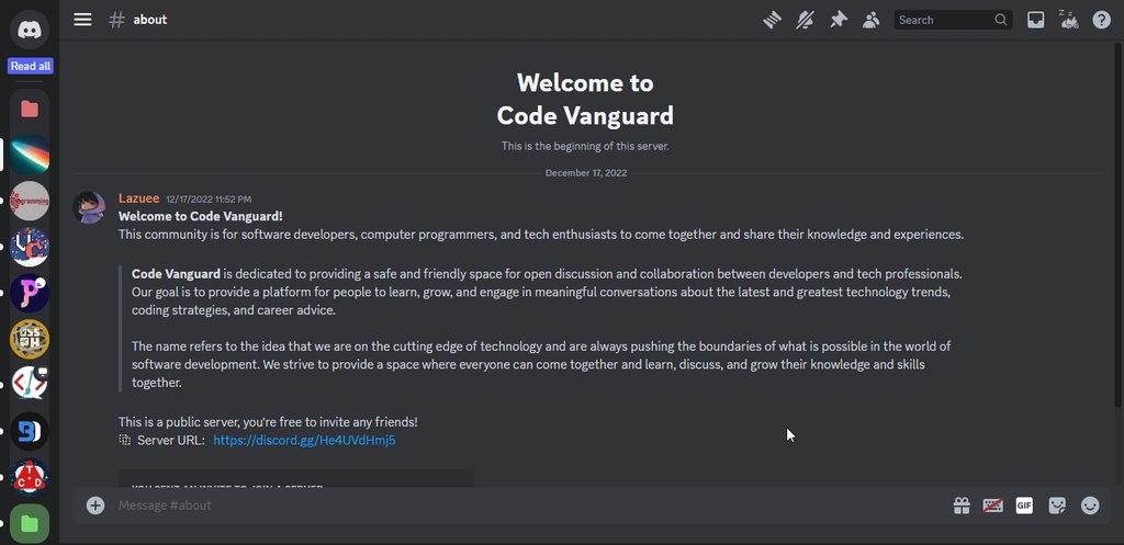
 brisk cloud
Server list collapse animation
[class*=" guilds__"] {
width: 10px;
transition: width 0.2s ease 0.1s, opacity 0.2s ease 0.1s;
opacity: 0;
}
[class*=" guilds__"]:hover {
width: 65px;
opacity: 1;
}
Preview
 brisk cloud
Hides profile effects (everywhere afaik)
tiny snippet but i use it all the time so thought id post it here.
[class^="profileEffects"]
{
display: none;
}
Modal settings window
https://github.com/nvhhr/discordcss/blob/main/snippets/modalsettings.theme.css

GitHub
Discord css stuff. Contribute to nvhhr/discordcss development by creating an account on GitHub.
shell plank
Nuke discords stupid animations when opening settings
#app-mount .baseLayer_d4b6c5 {
opacity: 1 !important;
transform: scale(1) !important;
}
.baseLayer_d4b6c5[aria-hidden="true"] {
pointer-events: none;
}
.standardSidebarView_c25c6d {
opacity: 1 !important;
}
.layer_d4b6c5 + .layer_d4b6c5 {
opacity: 1 !important;
transform: unset !important;
}
.layer_d4b6c5[aria-hidden="false"] + .layer_d4b6c5[aria-hidden="false"] {
display: none;
}
.baseLayer_d4b6c5[aria-hidden="true"] {
pointer-events: none;
}
.layers_d4b6c5>.layer_d4b6c5.animating_d4b6c5 {
will-change: unset !important;
}
Introducing.... The Shiggy cursor!!
If you would like the change cursor image change the link to a .cur link
html {
cursor: var(--cursor), default;
}
:root {
--cursor: url('https://schizophrenic.lol/assets/shiggy.cur');
}

 quartz nacelle
/* Make My Mention Different From Other Mentions without affecting #CHANNEL */
.theme-dark .mentioned__58017 .mention {
color: red !important;
}
.theme-dark .mention {
color: grey;
background-color: transparent;
}
/* Better Mentions Pulse (after fix) */
.mentioned__58017 .mention {
background-color: transparent !important;
}
.theme-dark .mentioned__58017 .mention {
cursor: pointer;
box-shadow: 0 0 0 red;
animation: pulse 1.6s infinite;
}
.cozy_f5c119 .messageContent__21e69
{
padding-top: 1px;
}
@-webkit-keyframes pulse {
0% {
-webkit-box-shadow: 0 0 2px 2px transparent;
}
70% {
-webkit-box-shadow: 0 0 2px 2px red;
}
100% {
-webkit-box-shadow: 0 0 0 0 transparent;
}
}
@keyframes pulse {
0% {
-moz-box-shadow: 0 0 0 0 transparent;
box-shadow: 0 0 0 0 transparent;
}
70% {
-moz-box-shadow: 0 0 2px 2px red;
box-shadow: 0 0 2px 2px red;
}
100% {
-moz-box-shadow: 0 0 0 0 transparent;
box-shadow: 0 0 0 0 transparent;
}
}
some simple channel/settings/dms/member list hover animations
.wrapper__7bcde .link__95dc0 /* channels */,
.container__4f20e /* members */,
.channel_c21703 /* dms */,
.side_b4b3f6 .item__48dda /* settings */ {
transition: margin-left 0.2s ease;
}
.wrapper__7bcde:hover .link__95dc0,
.side_b4b3f6 .item__48dda:hover {
margin-left: 10px;
}
.container__4f20e:hover,
.channel_c21703:hover {
margin-left: 18px;
}```
https://cdn.discordapp.com/attachments/1175897848412389488/1179624460601524244/Animation3.gif?ex=65b1d4e3&is=659f5fe3&hm=c20854ef84bdf9fd6d34599d68165f4170ecc6a50e09be49a46458d79ca3542a& sacred osprey
some more silly hover animations
button.button__4f306 /* make user panel buttons round */ {
border-radius: 50%;
}
.button__4f306:last-child /* settings button */,
.attachButton_b1db83 .attachButtonInner__3ce2b /* upload button */,
.emojiButton__30ec7 .contents_fb6220 /* emoji button */,
.closeButton__34341 /* settings exit button */ {
transition: transform 1s ease;
}
.button__4f306:last-child:hover,
.attachButton_b1db83:hover .attachButtonInner__3ce2b,
.emojiButton__30ec7:hover .contents_fb6220,
.closeButton__34341:hover {
transform: rotate(360deg);
}``` sacred osprey
hide new messages bar until hovered
.messagesWrapper_ea2b0b {
overflow: hidden;
}
.newMessagesBar__8b6d7 {
top: -48px;
height: 72px;
transition: top 0.2s ease;
background: none;
box-shadow: none;
border-radius: 0;
}
.newMessagesBar__8b6d7::before {
content: '';
background: var(--brand-experiment);
box-shadow: var(--elevation-low);
width: 100%;
position: absolute;
height: 32px;
border-radius: 12px;
}
.newMessagesBar__8b6d7:hover {
top: -12px;
}``` tacit pond
Improved dashless channelnames with added selectors, with flag emoji support for platforms that lack them (original dashless code not mine), thought I'd post it here too
@font-face
{ font-family: "Twemoji Mozilla";
src: url("https://vendicated.github.io/random-files/Twemoji.Mozilla.ttf") format("truetype");
unicode-range: U+1F1E6-1F1FF; }
@font-face
{ font-family: "dashless";
size-adjust: 100%; /*adjust this to change word spacing*/
src: url("https://vendicated.github.io/random-files/Dashless.woff2") format("woff2");
unicode-range: U+002D; }
[data-list-item-id^=channels___]:not([role=button]), /* channel list */
[class^=titleWrapper] > h1, /* top bar with topic */
[class^=titleWrapper] > h2, /* top bar in thread view */
[id^=":r"] > h1, /* topic popup */
[class^=resultChannel], [class^=channelNameContainer_], [class^=searchAnswer_], /* search */
[class^=autocompleteRowContent_] [class*=autocompleteRowHeading_], /* chat autocomplete */
.channelWithIcon, /* channel mentions in chat */
[class^=emptyChannelIcon_] + h3, /* start of new channel */
[class^=emptyChannelIcon_] ~ [class*=description_],
[class^=browser_] [class*=channelText_], /* channel browser*/
[class^=returnButton_] [class^=text-], /*return button in channel browser*/
[class^=placeholder][class*=slateTextArea], /* chat input placeholder text */
[class^=auditLog_] [class^=overflowEllipsis_] strong, /* audit log */
.vc-permviewer-perms-title, /* permissionsviewer */
[class^=headerChannelContainer_] > div, /* invite to channel dialog */
[class^=uploadDropModal_] strong, /* file drag upload */
[class^=channelNameSpan_], /* inbox */
[class^=quickswitcher_] [class^=name_] /* ctrl+k */
{ font-family: "Twemoji Mozilla", "dashless", var(--font-primary); }
[class^=emptyChannelIcon_] ~ [class*=description_] > *
{ font-family: var(--font-primary); }
 fallow copper
show timestamp when hovering it’s message
[class*="timestamp"][class*="CompactTimeStamp"] {
opacity: 0;
will-change: opacity;
}
[class*="messageListItem"] > [class*="message"]:hover [class*="timestamp"][class*="CompactTimeStamp"] {
opacity: 1;
}
Restore old attachment sizing behavior
(This doesn't work anymore without having a plugin to remove the width and height parameters from the image URL 😔)
[class^="messageAttachment_"] [class^="lazyImg_"] {
object-fit: contain !important;
}
 twilit moon
Stylize the user account appear animation a bit
.accountProfilePopoutWrapper_af829a {left: 708px; top: 50px;}
.layerContainer_d5a653:has([class^="userPopoutOuter_"])
{ backdrop-filter: blur(10px) !important; }
.accountProfilePopoutWrapper_af829a {
animation: 0.5s ease-out slide;
}
@keyframes slide {
from {
transform: translate(0, -1600px);
}
to {
transform: translate(0, 0px);
}
}``` twilit moon
Shrimply changes the Sepia theme to a trans flag (if you don’t have nitro to use the themes use freenitro)
Perfect theme for cute people :3
:root {
--bg-gradient-sepia-1: #73cff4;
--bg-gradient-sepia-2: #73cff4, #73cff4, #73cff4, #eeafc0, #fff, #eeafc0, #73cff4;
}
 shell plank
Disable the super reaction ad pop up when u click on one:
.reaction_fef95b[style*="background"] {
pointer-events: none;
}
Linked images same max width as attachments
:is([class^="inlineMediaEmbed_"], [class^="messageAttachment_"]) {
max-width: 550px !important;
max-height: 550px !important;
}
:is([class^="inlineMediaEmbed_"], [class^="messageAttachment_"]) [class^="imageWrapper_"] {
max-width: 550px !important;
max-height: 550px !important;
width: max-content !important;
height: max-content !important;
aspect-ratio: unset !important;
}
:is([class^="inlineMediaEmbed_"], [class^="messageAttachment_"]) [class^="imageWrapper_"] :is(img, video) {
max-width: 550px !important;
max-height: 550px !important;
width: max-content !important;
height: max-content !important;
}
:is([class^="inlineMediaEmbed_"], [class^="messageAttachment_"]) [class^="imageWrapper_"] [class^="loadingOverlay_"] {
aspect-ratio: unset !important;
}
[class^="oneByOneGrid_"] {
max-height: 550px !important;
}
[class^="imageContainer_"]:has([aria-label="GIF"]) + [class^="altText_"] {
display: none;
}
Bigger YouTube embeds
(too lazy to unnest, will only work on canary, dev and vesktop for now)
[class^="embedWrapper_"]:has(iframe),
[class^="embedWrapper_"]:has(img[src*="i.ytimg.com"]) {
max-width: 550px !important;
[class^="gridContainer_"] {
max-width: 550px !important;
}
[class*="embedMedia_"] {
max-width: 550px !important;
max-height: unset !important;
[class^="imageWrapper_"] {
max-width: 550px !important;
aspect-ratio: 16/9 !important;
img {
max-width: 550px !important;
max-height: unset !important;
aspect-ratio: 16/9 !important;
}
}
& > [class^="embedVideo_"] {
max-width: 550px !important;
aspect-ratio: 16/9;
padding: 0 !important;
& > iframe {
max-width: unset !important;
max-height: unset !important;
width: 100% !important;
height: 100% !important;
}
}
}
}
 twilit moon
Fixes discords mention color oopsie.
(discord come the fuck on dude.)
THIS IS OBSOLETE, AS THIS HAS BEEN FIXED FOR A WHILE NOW.
.mentioned__58017:hover {
background-color: hsl(var(--yellow-300-hsl)/0.08) !important;
}```
https://files.catbox.moe/qluw67.mp4Remove annoying playing game in VC icon
(170 employees were laid off for this)
[class^="upperBadge_"] [class^="iconBadge_"]:has(> svg > path[d^="M5.66493"][d$="7V9Z"]),
[class^="upperBadge_"] [class^="iconBadge_"]:has(> svg > path[d^="M20.97"][d$="0-2h1V7Z"]) {
display: none;
}
Cheapman/woman's Icon Highlighter
/* Change the value of "--fill-color" to set the icons to desired color */
:root {
--fill-color: rgb(255, 255, 0);
--green-360: var(--fill-color);
--primary-400: var(--fill-color)
}
[fill*="#"], [fill*="var("], [fill*="c"], svg, image, img, .vc-membercount {
fill: var(--fill-color) !important;
color: var(--fill-color) !important;
}
.sprite__294b3 {
background: var(--fill-color);
}
[fill*="#"]:hover, [fill*="var("]:hover, [fill*="c"]:hover, svg:hover, image:hover, img:hover, .vc-membercount:hover {
fill: var(--fill-color) !important;
color: var(--fill-color) !important;
}```
Emulates the function of this [ https://files.catbox.moe/z6upaw.png ], but for people who are too scared to enable devtools/people who theme. This one effects nearly all icons however, and the color is customizable.
||DON'T EXPECT THIS TO NOT HAVE ITS FUNNY BUGS, THIS IS SPAGHETTI CODE BUT USEFUL SPAGHETTI CODE|| dark escarp
make pings the same color as activity icons so they don't seem so "immediate" and piss you off
.numberBadge__50328 {
background-color: var(--background-accent)!important;
}
 twilit moon
Customize the colors of the spotify controls to your hearts desire!
/* left area */
.barFill__30e17 {
background: red;
}
/* right area */
.bar_e58961 {
background: blue !important;
}
/* Spotify grabber circle (music slider) */
#vc-spotify-progress-bar>[class^=slider] [class^=grabber] {
background-color: red !important;
border-color: yellow !important;
}```
https://files.catbox.moe/k3egs4.png
 twin shadow
Resize the emoji/gif/sticker picker vertically as you resize it horizontally (so you can browse your massive gif library easier)
/* Automatically resizing gif picker */
:root {
/* Change me! */
--expression-picker-aspect-ratio: 1.125 / 1;
}
[class*="expressionPickerPositionLayer_"] [class*="positionContainer_"] {
height: calc(100vh - 128px);
}
[class*="expressionPickerPositionLayer_"] [class*="drawerSizingWrapper_"] {
max-height: 100%;
bottom: 0px;
height: auto;
aspect-ratio: var(--expression-picker-aspect-ratio);
}
/* Fixes soundmoji picker which has a hardcoded height */
[class*="expressionPickerPositionLayer_"] [class*="soundboardContainer_"] [class*="picker_"] {
height: 100%;
}
Use album cover as SpotifyControls background
You can customise the values in the first block to change how it looks. First screenshot uses no blur, second uses 3px
#vc-spotify-player {
--blur-amount: 2px; /* higher px = stronger blur, 0 = no blur */
--darken-percent: 0.8; /* 0 = album cover is not darkened, 1 = album cover is darkened fully (black) */
}
#vc-spotify-player {
background: transparent !important;
position: relative;
}
#vc-spotify-player > * {
position: relative;
z-index: 1;
}
#vc-spotify-player::after {
content: "";
position: absolute;
display: block;
height: 100%;
width: 100%;
top: 0;
left: 0;
background: linear-gradient(rgba(0, 0, 0, var(--darken-percent)),
rgba(0, 0, 0, var(--darken-percent))), var(--vc-spotify-track-image);
background-size: cover;
filter: blur(var(--blur-amount));
clip-path: inset(0);
}

 nova whale
restive notch
**Use album cover as SpotifyControls background**
You can customise the values ...
nova whale
restive notch
**Use album cover as SpotifyControls background**
You can customise the values ...
Does the same thing as this but works better with intense blur
#vc-spotify-player {
--blur-amount: 80px;
--brightness: 50%;
background: transparent !important;
position: relative;
}
#vc-spotify-player::before,
#vc-spotify-player::after {
z-index: -1;
content: "";
position: absolute;
height: 100%;
width: 100%;
top: 0;
left: 0;
}
#vc-spotify-player::after {
backdrop-filter: blur(var(--blur-amount)) brightness(var(--brightness));
}
#vc-spotify-player::before {
background: var(--vc-spotify-track-image);
background-size: 100% 100%; /* replace with "cover" in case your blur is small enough to see that it's stretched */
}
```(blur is set to 80px in both preview images) restive notch
**Use album cover as SpotifyControls background**
You can customise the values ...
restive notch
restive notch
**Use album cover as SpotifyControls background**
You can customise the values ...
alternative version that also shows the cover below the user panel:
- in the original snippet, change
height: 100%;toheight: 200%; - add this css:
#vc-spotify-player + [class^="container"] {
background: transparent;
}
 twilit moon
Change the Unread Bar text
.text-xs-semibold_a3a2b4.barText__1a44f {font-size: 0px;}
.text-xs-semibold_a3a2b4.barText__1a44f:before {font-size:12px; content: /*CHANGE TO WHATEVER*/ "LOOK AT THIS!"; position: absolute; top: 4px;}
.bar__004d9 {width: 100px;} /* adjust if needed for bar width, incase the text goes off the bar*/```
https://files.catbox.moe/k9efhu.png last lily
Fix Mosaic Zoom
For People who want to use the new Style but without the images being zoomed in
[class^="imageWrapper_"] img[class^="lazyImg"] { object-fit: contain !important; }
 orchid bane
Cyan 2 UI Ports
A sub-repo containing any and all ports of pieces of the Can 2 UI for vanilla Discord
Available right now:
- UserArea2

GitHub
A repo with all of my Discord CSS snippets. Contribute to DaBluLite/css-snippets development by creating an account on GitHub.
left arrow
pretty simple but I think a lot of people would appreciate this
(please ignore bad formatting, I used gnome text editor)
/**
* @name Old Profile Tabs
* @description Revert the swap of Mutual Friends and Mutual Servers.
* @author TheKodeToad
* @version 2
* @authorId 706152404072267788
*/
[class^=userProfileModalOverlayBackground_]:not(:has([class^=bot_])) [class^=tabBar_] :nth-last-child(2) {
order: 1;
}
Edit: use [this](#1215680021679702107 message) if you have ThemeAttributes enabled
 scarlet cove
Hiding the scrollbar backgrounds (track),
::-webkit-scrollbar-track {
visibility: hidden;
}
got inspired by this and oneui6's new music player
@import url(https://raw.githubusercontent.com/Panniku/vc-snippets/main/BetterSpotifyPlayer.css);
 waxen badge
Make size-changing videos work as they used to before discord fixed them. ```css
.attachmentContentItem_ef9fc2 { width: unset !important; height: unset !important; }
.loadingOverlay__4d818 { aspect-ratio: unset !important }
temporary fix for discord using default chrome scrollbars on latest chrome / vesktop until they fix their css
* {
scrollbar-width: unset !important;
scrollbar-color: unset !important;
}
OS Accent colored titlebar and server bar
I tried to make it to blend with the Windows titlebar option too, that's why I added a light gray undercolor to the semi transparent accent-color variable.
body, #app-mount,.typeWindows__5fa63,.app_de4237,
.bg__12180,.guilds__2b93a,.scroller__3d071 {
background: linear-gradient(var(--os-accent-color), var(--os-accent-color)), rgb(240, 240, 240) !important;
}```
 opal venture
This CSS snippet hides the emoji autocomplete annoying purple background, and anything nitro related in the emoji autocompleter.
For now you can just disable the Emoji Autocomplete Upsell experiment, but in case discord explodes it, here's the css:
You do need to have the experiment on to use these
Fixed version by @lost tapir #1218149867608870992 message
screenshots in threads
twilit moon
Chats can be a lot.<<
Take a moment to relax with shiggy.
.wumpus__3d214 {
scale: 1;
content: url(https://media.discordapp.net/stickers/1039992459209490513.png);
}
.focusLock__10aa5 .text-md-normal__4afad {
font-size: 0;
}
.focusLock__10aa5 .text-md-normal__4afad::after {
font-size: 16px;
content: "Relax with Shiggy for as long as you need."
}``` twilit moon
>>**Chats can be a lot.**<<
Take a moment to relax with shiggy.
```css
.wumpus__...
twilit moon
twilit moon
>>**Chats can be a lot.**<<
Take a moment to relax with shiggy.
```css
.wumpus__...
Alternative Viggy Version<<
.wumpus__3d214 {
scale: 1;
content: url(https://media.discordapp.net/stickers/1217112512374505613.png?size=160&passthrough=true);
}
.focusLock__10aa5 .text-md-normal__4afad {
font-size: 0;
}
.focusLock__10aa5 .text-md-normal__4afad::after {
font-size: 16px;
content: "Relax with Viggy for as long as you need."
}```
Raging Viggy<<
[src="/assets/b3f7e22e48bfd5292636.svg"] {
content: url(https://media.discordapp.net/stickers/1217112512374505613.png?size=160&passthrough=true);
}
.animate_b7b804 {
content: url(https://media.discordapp.net/stickers/1217112512374505613.png?size=160&passthrough=true);
animation: viggy ease .8s;
}
@keyframes viggy {
0% {opacity:0%}
50% {opacity:100%}
100% {opacity: 0%}
}
 coral mauve
This snippet hides the annoying "NEW" badge for the shop:
.textBadge__45d79{
display: none;
}
The shop will still be visible, just not the badge.
tacit pond
Discord's "lottie" format stickers are ugly and cringe and , this makes them small and thus less annoying (while keeping other stickers normal)
[class^=clickableSticker_] [class^=assetWrapper_]:has([class^=lottieCanvas_])
{ width: 48px !important;
height: 48px !important; }
A more tabular approach? I'm not sure, I was bored
You need to change the values yourself depending on how much border-radius, margin spaces you want.
@import url(https://ukrioo.github.io/cssCord/Other/TabCord.css);
/* If you haven't changed to the import already, do it as I've fixed many things */
Preview:
1st Attachment: Before
2nd Attachment: After

 brisk cloud
Hide the call buttons in a dm so you don't accidentally call someone #🏥-vencord-support-🏥 message
[aria-label="Start Voice Call"], [aria-label="Start Video Call"]
{
display: none !important;
}
collapse chat bar buttons to take up less space when writing long messages (requested by @full wigeon)
may also fix some padding issues on the right side of the chat bar
set the values in the code for the number of icons!!
.buttons_ce5b56 {
margin: 6px 6px 6px auto !important;
margin-left: auto;
max-width: calc(40px * 6); /* CHANGE HERE: 6 columns when expanded */
min-width: calc(40px * 2); /* CHANGE HERE: 2 columns when collapsed */
width: min-content;
display: flex;
gap: 6px 0;
flex-wrap: wrap-reverse;
flex-grow: 1;
height: fit-content;
justify-content: right;
}
.buttons_ce5b56 .buttonContainer__8b164,
.buttons_ce5b56 > .button_afdfd9 {
width: 40px;
}
.separator__8424b {
margin: 0;
justify-content: center;
width: 40px;
}
.separator__8424b::before {
display: none;
}
.separator__8424b .innerButton_debeee {
margin: 0;
}
.textArea__74543 {
width: fit-content;
flex-grow: 1.01;
}```/* i messed up the image oops */
 feral pawn
SparrowChord :3
A not so well done theme snippet cause I was bored!
also cause sparrow
@import url(https://raw.githubusercontent.com/ukrioo/cssCord/main/Themes/Sparrow/SparrowCord.css);
There may be some bugs, Just let me know if you find any.
- Attachments:
- 1: Startup
- 2: Server View
- 3: Home Button
Happy Chirping


 orchid bane
QuickSwitch V2
A redesign to Discord's quickswitch popup, making it look more like spotlight and simillar search bars
Importing:
@import url("https://dablulite.github.io/css-snippets/QuickSwitchV2/import.css");
Screenshots:
https://github.com/DaBluLite/css-snippets/assets/73998678/90e0ed90-ae04-4f2c-9278-379f3d50b85a
https://github.com/DaBluLite/css-snippets/assets/73998678/4cbeef4a-6605-4006-9305-28c846f8b1c9

 undone knot
css to fix the awful activities list on the member list
all done
.container_c64476 {
height: 42px;
}
.contentImage_a3b998[style="max-width: 48px; height: 48px;"] {
width: 34px !important;
height: 34px !important;
}
.userName_c64476 {
display: none;
position: absolute;
}
.badgeContainer_d60c6d {
display: none;
position: absolute;
}
.userSection_c64476 {
position: absolute;
font-size: 0;
}
.contentTitle_c64476 {
padding-left: 20px;
}
 dusty gorge
Replace message bar placeholder's colour emojis with outline only emojis
@import url("https://minidiscordthemes.github.io/Snippets/MessageBarGreyEmoji/main.css");

 dusty gorge
Improves the image alt text experience.
- Restyles and moves alt text button below the image.
- Restyles alt text tooltip to be consistent with other tooltips.
- Allows alt text to be selected and copied.
@import url("https://minidiscordthemes.github.io/Snippets/AltTextImprovements/main.css");
 scarlet cove
Acrylic popups
I tried to make every popup transparent
@import url('https://s-k-y-l-i.github.io/discord-themes/Theme%20code/transparent-popups.css');
/* Config */
:root{
--blur-popup: 40px; /*Popup blur size*/
--opacity-popup: 0.6; /*Popup background opacity*/
--radius-popup: 40px; /*Popup border radius*/
--radius-context: 20px; /*Context menu popups radius*/
/*--pop-up-color: black; /*uncomment for custom Popup color*/
/*--context-menu-border: 1px solid red; /*uncomment for custom border*/
}```

 twin shadow
Make ❎ red (someone wished for this in #🧊-off-topic-iceman-only earlier)
img[src="/assets/5cdb518bb425d85a0f51.svg"], div[style="background-image: url(\"/assets/eb34899f42bbb8c0cf9c.png\"); background-position: -1344px -1248px; background-size: 2016px 1872px; height: 48px; width: 48px;"] {
--red-negative_squared_cross_mark: url('data:image/svg+xml;base64,PHN2ZyB4bWxucz0iaHR0cDovL3d3dy53My5vcmcvMjAwMC9zdmciIHZpZXdCb3g9IjAgMCAzNiAzNiI+PHBhdGggZmlsbD0iI0REMkU0NCIgZD0iTTM2IDMyYzAgMi4yMDktMS43OTEgNC00IDRINGMtMi4yMDkgMC00LTEuNzkxLTQtNFY0YzAtMi4yMDkgMS43OTEtNCA0LTRoMjhjMi4yMDkgMCA0IDEuNzkxIDQgNHYyOHoiLz48cGF0aCBmaWxsPSIjRkZGIiBkPSJNMjEuNTI5IDE4LjAwNmw4LjIzOC04LjIzOGMuOTc3LS45NzYuOTc3LTIuNTU5IDAtMy41MzUtLjk3Ny0uOTc3LTIuNTU5LS45NzctMy41MzUgMGwtOC4yMzggOC4yMzgtOC4yMzgtOC4yMzhjLS45NzYtLjk3Ny0yLjU2LS45NzctMy41MzUgMC0uOTc3Ljk3Ni0uOTc3IDIuNTU5IDAgMy41MzVsOC4yMzggOC4yMzgtOC4yNTggOC4yNThjLS45NzcuOTc3LS45NzcgMi41NTkgMCAzLjUzNS40ODguNDg4IDEuMTI4LjczMiAxLjc2OC43MzJzMS4yOC0uMjQ0IDEuNzY4LS43MzJsOC4yNTgtOC4yNTkgOC4yMzggOC4yMzhjLjQ4OC40ODggMS4xMjguNzMyIDEuNzY4LjczMnMxLjI3OS0uMjQ0IDEuNzY4LS43MzJjLjk3Ny0uOTc3Ljk3Ny0yLjU1OSAwLTMuNTM1bC04LjI0LTguMjM3eiIvPjwvc3ZnPg==');
}
img[src="/assets/5cdb518bb425d85a0f51.svg"] {
content: var(--red-negative_squared_cross_mark);
}
div[style="background-image: url(\"/assets/eb34899f42bbb8c0cf9c.png\"); background-position: -1344px -1248px; background-size: 2016px 1872px; height: 48px; width: 48px;"] {
background-image: var(--red-negative_squared_cross_mark) !important;
background-position: unset !important;
background-size: unset !important;
}
 shadow citrus
Blue Icons (Almost) Everywhere
When you're feeling blue dabodedaboda
Source: https://github.com/byeoon/VencordCSS/blob/master/BlueIcons.css
@import url('https://raw.githubusercontent.com/byeoon/VencordCSS/master/BlueIcons.css');
 sacred osprey
true chomik
.svg__34dd4:hover:has([data-list-item-id="guildsnav___1015060230222131221"]) {
transition: 20s;
transform: scale(10);
z-index: 100000000;
}```
 final frost
RadialStatus needs to update the classes
feral pawn
shadow citrus
**Blue Icons (Almost) Everywhere**
When you're feeling blue dabodedaboda
Source:...
Same thing, but customizable!
@import url("https://ukrioo.github.io/cssCord/Other/iconColors.css");
:root {
--icon-normal: DarkOrchid;
--icon-hover: DarkSlateBlue;
--icon-muted: grey;
--interactive-muted: var(--icon-muted);
}
/* Change the colors above to any hex, rgba, etc value. */
``` The default colors are black & white, so if you fail to define/accidently remove those var values, they will turn into those. feral pawn
Vennie on top of very popout :3
[id*="popout_"]::after, [class*=menu]::after {
content: "";
position: absolute;
top: -50px;
right: 0;
width: 50px;
height: 50px;
background-image: url('https://media.discordapp.net/stickers/1217112512374505613.png');
background-size: cover;
}
/* Alternate Shiggy Link: https://media.discordapp.net/stickers/1039992459209490513.png */


 feral pawn
Vennie on top of very popout :3
```css
[id*="popout_"]::after, [class*=menu]::af...
feral pawn
feral pawn
Vennie on top of very popout :3
```css
[id*="popout_"]::after, [class*=menu]::af...
Alternate: vinne army!!!
[id*="popout_"]::after, [class*=menu]::after {
content: "";
position: absolute;
top: -40px;
left: 5%;
right: 5%;
width: 90%;
height: 40px;
background-image: url('https://media.discordapp.net/stickers/1217112512374505613.png');
background-size: contain;
background-repeat: repeat-x;
}

 cobalt osprey
** Connections glow on hover. **
@import url('https://raw.githubusercontent.com/Vortex-Chaos/Discord-Connections-Glow/main/Code.css');```
made originally with the help of callme_h and huderon.
 zinc bronze
Connection glow
 alpine spire
show the url masked links take you to in
sacred osprey
viggy loader
.container__827e6 video.ready__61f2f {
display: none;
}
.content_de05de::before {
visibility: visible;
content: '';
display: block;
background: url(https://media.discordapp.net/stickers/1217112512374505613.png?size=240);
background-size: contain;
background-position: center;
background-repeat: no-repeat;
width: 128px;
height: 128px;
margin: auto;
margin-bottom: 48px;
}``` potent nacelle
Clyde to Viggy
.avatar__991e2[src="https://cdn.discordapp.com/avatars/1081004946872352958/a_6170487d32fdfe9f988720ad80e6ab8c.gif?size=80"] {
content: url(https://media.discordapp.net/stickers/1217112512374505613.png);
width: 90px !important;
height: 90px !important;
}
.avatar__991e2[src="https://cdn.discordapp.com/avatars/1081004946872352958/a_6170487d32fdfe9f988720ad80e6ab8c.webp?size=32"] {
content: url(https://media.discordapp.net/stickers/1217112512374505613.png);
}
.avatar__991e2[src="https://cdn.discordapp.com/avatars/1081004946872352958/a_6170487d32fdfe9f988720ad80e6ab8c.webp?size=80"] {
content: url(https://media.discordapp.net/stickers/1217112512374505613.png);
}
.avatar__991e2[src="https://cdn.discordapp.com/avatars/1081004946872352958/a_6170487d32fdfe9f988720ad80e6ab8c.gif?size=32"] {
content: url(https://media.discordapp.net/stickers/1217112512374505613.png);
}
[aria-label="clyde"] .userTagUsernameNoNickname__0513b {
visibility: hidden
}
[aria-label="clyde"] .userTagUsernameNoNickname__0513b::before {
content: "Viggy";
visibility: visible;
width: 10px;
}
[aria-label="clyde"] .headerBotTag_b741ff {
display: none;
}
[aria-label="clyde"] .popoutBannerPremium__84487 {
visibility: visible;
content: url(https://media.discordapp.net/stickers/1217112512374505613.png);
}
[aria-label="clyde"] .textBadge_f05120 {
visibility: visible;
content: url(https://media.discordapp.net/stickers/1217112512374505613.png);
}
[aria-label="clyde"] .textBadge_f05120 {
min-width: 30px !important;
min-height: 30px !important;
height: 30px !important;
padding: 0px;
}
[aria-label="clyde"] .base__5ed84 {
background-color: transparent !important;
}```
 fickle jasper
Make your Discord as shiggy as possible
[class] {
color: black;
}
[class^="wrapper_"] {
content: url(https://media.discordapp.net/stickers/1039992459209490513.png?size=96&passthrough=false)
}
 dusty gorge
Improved customisable channel list width and header height
- Banners stretch/shrink correctly to fit any channel list width and header height.
- User panel buttons reposition above user info when channel list is narrow, and spread out when channel list is wide.
Import goes at the top:
@import url("https://minidiscordthemes.github.io/Snippets/ChannelListWidth/main.css");
Edit variable values as desired, below shown are discord defaults:
:root {
--channellist-width: 240px;
--channellist-header-height: 48px;
}

 novel patrol
.layerContainer_a2fcaa:has(.openedItemTextOpened__2afcd) {
display: none;
}
open loot boxes quicker by reducing time it shows the loot you got
brisk cloud
"Help i need my glasses"
[aria-label]
{
opacity: 0.9 !important;
}
 potent violet
:root {
--clown-decoration: url('https://cdn.discordapp.com/avatar-decoration-presets/a_5e1210779d99ece1c0b4f438a5bc6e72.png?size=160&passthrough=true')
}
[class^="avatarDecoration"] img {
content: var(--clown-decoration) !important;
}
img[class^="avatarDecoration"] {
content: var(--clown-decoration) !important;
}
Make every avatar decoration the clown one
 lost tapir
replace your emoji button
any gif or image works as long as its 1:1 ratio
comes with a shiggy out of the box! 
/* Custom Emoji Button */
.sprite__294b3.spriteColored__9a869 {
background-image: url(https://cdn.discordapp.com/emojis/1024751291504791654.gif?size=128&quality=lossless);
background-size: 24px;
}
.sprite__294b3.spriteGreyscale__750f4 {
mask-image: url(https://cdn.discordapp.com/emojis/1024751291504791654.png?size=128&quality=lossless);
mask-size: 24px;
}
||note: if you're using a emoji gif as a emoji button you can replace .gif with .png to make the grayscale stationary.||
smoky spoke
/*Give TheKodeToad a better avatar*/
/*You can change the UserID after src*=""to affect other people not just TheKodaToad*/
/*You can also change the link to anything you want*/
/*Default link is 4k nerd emoiji*/
img[src*="706152404072267788"] {
content: url('https://cdn.discordapp.com/emojis/1228049054303391868.webp?size=96&quality=lossless') !important;
}
Minimal Authorised Apps
A minimised look for authorised app cards. Slides open on hover to reveal full info.
@import url("https://minidiscordthemes.github.io/Snippets/MinimalAuthApps/main.css");
 lost tapir
Replace the settings donation banner
simply replace the link, comes with a  out of the box.
/* Replace the settings donation banner image */
img[role="presentation"] {
content: url('https://cdn.discordapp.com/emojis/1161713157794963536.webp?size=128&quality=lossless') !important;
transform: rotate(0deg) !important;
}
 scarlet cove
Hide this and future signups
[data-list-id="guildsnav"]>div>div>div:has(>div[style*="background: url(\"https://cdn.discordapp.com/assets/signups"]) {display:none}
 opal venture
Hide clown decor
That's a basic snippet, but since a lot have requested it, I'm sending it here
img[class*="avatar"][src^="https://cdn.discordapp.com/avatar-decoration-presets/a_5e1210779d99ece1c0b4f438a5bc6e72.png"] {
display: none;
}
You can also use this version to replace all clown decors by Winclown
img[class*="avatar"][src^="https://cdn.discordapp.com/avatar-decoration-presets/a_5e1210779d99ece1c0b4f438a5bc6e72.png"] {
content: url("https://ugc.decor.fieryflames.dev/fcccab065609b6208d3fe34c102d0daa.png")
}
Search as a button 
🔍👆
https://i.imgur.com/VvNzy2P.mp4
.search_ac353c:not(.open_d3ab4e) > .searchBar__5a20a {
width: 22px;
background: transparent;
}
.searchBarComponent__8f95f{
background: transparent;
}
.search_ac353c:not(.open_d3ab4e) .iconLayout__9d9a4 {
cursor: pointer;
}
.search_ac353c:not(.open_d3ab4e) .iconContainer__9f124 {
transform: scale(1.4);
}
.search_ac353c:not(.open_d3ab4e) .icon__5c8c7 {
color: var(--interactive-normal);
}
.search_ac353c:not(.open_d3ab4e):hover .icon__5c8c7 {
color: var(--interactive-active);
}``` river trout
add a sidebar image to your discord
#app-mount {
--image-width: 30%;
width: calc(100% - var(--image-width)) !important;
}
#app-mount::after {
background-image: url(https://deltarune.com/assets/images/dog-maraca.gif);
content: "";
height: 100%;
width: var(--image-width);
right: 0;
position: fixed;
background-size: cover;
image-rendering: pixelated;
}
 tame lily
Hides the channel list, but shows it on hover
:root {
--channel-list-width: 0px;
}
:root:has([aria-label="Thread Actions"], [aria-label="Channel Actions"]) {
--channel-list-width: 240px !important;
}
:root:has(div[class^=sidebar]:hover, [aria-label="Servers sidebar"]:hover) {
--channel-list-width: 240px !important;
}
div[class^=base] > div[class^=content__] > div[class^=sidebar] {
width: var(--channel-list-width);
transition: width 0.4s ease;
}
Better Betterfolders
.expandedFolderBackground_b1385f ~ .listItem__48528:nth-child(2)>div:before {
content: attr(data-dnd-name);
position: absolute;
bottom: 8px;
left: 50%;
transform: translateX(-50%);
padding: 1px 1.5px;
font-size: 10px;
color: #ffffff;
z-index: 1;
pointer-events: none;
width: 38px;
max-height: 27px;
text-align: center;
margin-left: -0.7px;
overflow:hidden;
letter-spacing: -0.2px;
line-height: 0.9;
}
.expandedFolderIconWrapper__324c1 svg {
width: 48px;
height: 48px;
}
.folderIconWrapper__11165, .folder__17546,
.collapsed__98ad5 {
background: none!important;
}``` smoky spoke
**NSFW channel tag/marker**
*Adds a small **RED** text box {unless you have some...
smoky spoke
smoky spoke
**NSFW channel tag/marker**
*Adds a small **RED** text box {unless you have some...
Recolors the Private Channel Lock icon so it more noticeable
@import url("https://raw.githubusercontent.com/KrstlSkll69/vc-snippets/main/PrivateChannelRecolor.css");
for online theme
https://raw.githubusercontent.com/KrstlSkll69/vc-snippets/main/PrivateChannelRecolor.css
Before and After:
(hopefully you can tell which one is before and after)
 smoky spoke
**NSFW channel tag/marker**
*Adds a small **RED** text box {unless you have some...
smoky spoke
smoky spoke
**NSFW channel tag/marker**
*Adds a small **RED** text box {unless you have some...
Alternate of version of this that just recolors icon so that it is more noticeable
@import url("https://raw.githubusercontent.com/KrstlSkll69/vc-snippets/main/NSFWChannelRecolor.css");
for online theme
https://raw.githubusercontent.com/KrstlSkll69/vc-snippets/main/NSFWChannelRecolor.css
Before and After:
(hopefully you can tell which one is before and after)
AfterRecolor
 left arrow
Revert the change to codeblock font
:root {
--font-code: "Consolas", "Andale Mono WT", "Andale Mono",
"Lucida Console", "Lucida Sans Typewriter", "DejaVu Sans Mono",
"Bitstream Vera Sans Mono", "Liberation Mono", "Nimbus Mono L", "Monaco",
"Courier New", "Courier", "monospace";
}
Edit: updated it to use the actual old fonts 
river trout
how to theme polls (for anyone with unupdated themes)
/* badge icon */
div[class^=pollBadgeDefault] svg path {
fill: COLOUR !important;
}
/* badge text */
div[class^="pollBadgeDefault"] div[class^="text"] {
color: COLOUR !important;
}
/* background */
div[class*="pollContainer"] {
background-color: COLOUR !important;
}
/* answer bubble */
div[class*="pollContainer"] div[class^="answer"] {
background-color: COLOUR;
}
Make Threads hidden by default and slide down on hover.
.containerDefault_ae2ea4:hover + .container__342a0, .container__342a0:hover {
max-height: 1000px; /* Make the threads Slide down */
transition: max-height 1s ease; }
.container__342a0 {
max-height: 0; /* Initially hide the threads by setting their max-height to 0 */
overflow: hidden;
transition: max-height 0.25s ease; }
Adjust the timing as you see fit. (Fixed a small problem)
(Actually use this one instead it's better #1228489679062433823 message)

Discord
Discord is the easiest way to communicate over voice, video, and text. Chat, hang out, and stay close with your friends and communities.
lost tapir
Transparent discord loading:
simply loads discord with a blurred background, I think it looks nicer
/*discord loading page*/
.container_e40c16.fixClipping_c7e9c6 {
background: 0 0;
backdrop-filter: blur(5px);
}
 brisk cloud
Simple floating theme
Makes the discord body slightly smaller with a background image (shouldn't clash with any other themes i think?)
#app-mount
{
/*you can change these to fit your theme*/
transform: scale(0.95);
border-radius: 20px;
opacity: 0.975;
}
body
{
/*put image url here (if it wasn't obvious)*/
background-image: url("https://files.catbox.moe/584kze.jpg");
background-size: cover;
}

 soft wagon
avoid agreeing to discord's new tos :3
.layerContainer_a2fcaa {
display: none;
}
keep in mind this does break user prompts like viewing a friend request or viewing a user profile
 feral pawn
brisk cloud
**Simple floating theme**
Makes the discord body slightly smaller with a backgr...
feral pawn
brisk cloud
**Simple floating theme**
Makes the discord body slightly smaller with a backgr...
A bit more float-ey
I think this kinda makes it better, the first ss is with a theme while the second is how it would look by default
(You obviously will need to use it with your own theme)
@import url("https://ukrioo.github.io/cssCord/Other/TabCord.css");
.appMount_c99875, .app_de4237, .bg__12180 {background: transparent;}
/* Change these values */
#app-mount {
transform: scale(0.95);
text-rendering: optimizeLegibility;
opacity: 0.98;
border-radius: 16px;
}
body {
background-image: url("https://files.catbox.moe/584kze.jpg");
background-size: cover;
}


 balmy ledge
Compress bot messages
/**** Compress GitHub Bot's star and fork messages ****/
[class^="grid_"]:has(> :last-child:nth-child(2)) {
display: flex;
flex-wrap: wrap;
padding: 0.1rem 1rem 0.6rem 0.75rem;
}
/* add padding between username and link */
[class^="grid_"]:has(> :last-child:nth-child(2)) [class^="embedTitle_"],
[class^="grid_"]:has(> :last-child:nth-child(2)) [class^="embedDescription_"] {
padding-left: 12px;
}
/* Hide the extra GitHub bot avatars */
[class^="messageListItem_"]:has([class^="botText_"]):has([class^="grid_"] > :last-child:nth-child(2)) [class^="contents_"] {
display:none;
}
/* Reduce padding between selected bot messages */
[class^="messageListItem_"]:has([class^="botText_"]):has([class^="grid_"] > :last-child:nth-child(2)) [class*="groupStart_"] {
margin-top: -12px;
}
.container__62863:has([class^="grid_"] > :last-child:nth-child(2)) {
padding-top: 0rem;
padding-bottom: 0rem;
top: 12px;
}
/* I do some weird offseting, it just looks better to not have a misaligned hover overlay */
.message_ccca67:has([class^="grid_"]):hover {
background-color: #00000000 !important;
background: #00000000 !important; /* Why do you do this, Discord Nitro themes.. */
}
/* Align small bot messages with large ones */
/* Alternately, you could remove their background color or just live with mismatched lengths */
[class^="gridContainer_"], [class^="embedWrapper_"] {
min-width: 525px;
}
 shadow citrus
Old Bot Tags (NO MORE APPS!!!)
Clyde tag is still a little broken, I'm looking to fix it.
.botText_daff56 {
font-size: 10px;
visibility: hidden;
position: relative;
}
.botText_daff56::before {
content: 'BOT';
visibility: visible;
font-size: 10.5px;
position: absolute;
}```fix weird looking commands
.appLauncherOnboardingCommandName_bf880c.clickable__09456 {
background: 0 0;
padding-left: 0;
}
.appsIcon_ed21e9 {
display: none;
}
.executedCommand__4fb1a .appLauncherOnboardingCommandName_bf880c:hover {
background: 0 0;
}
before and after
 restive notch
Turns the special tabs on top of your dm list into an icon grid. Could definitely use some improvements but i'm not sure how to make it look better
The way this works is incredibly hacky, hopefully this won't cause lag / glitches 
[class^=privateChannels_] [class^=content_] {
display: grid;
height: unset !important;
grid-template-columns: 1fr 1fr;
&> * {
overflow: hidden;
grid-column: 1 / 3;
}
}
[class^=channel_]:has(
[href="/channels/@me"],
[href="/library"],
[href="/shop"],
[href="/store"],
[href="/family-center"],
[href="/message-requests"]
) {
grid-column: auto;
[class*="link_"] {
gap: 0;
justify-content: center;
position: relative;
&> :not([class*="avatarWithText_"]) {
position: absolute;
left: 5.5em;
}
}
[class*="avatar_"] {
margin: 0;
width: unset;
}
[class*="avatarWithText_"] {
flex-grow: unset;
}
[class*="content_"] {
display: none;
}
}
better version: <#1230657631543234560 message>
 lost tapir
hide any direct message/group chat from your direct messages list:
.channel__0aef5 > .interactive__0786a > .link__3a950[href="/channels/@me/DMID"]{
display: none;
}
replace DMID with the actual direct message id.
How to get dm id:
 potent nacelle
Better Connected Accounts
@import url('https://raw.githubusercontent.com/Krekevyks/BetterConnectedAccounts/main/ConnectedAccounts.css');``` balmy ledge
Bot Icons
.botTag__11e95:not([class*="botTagOP"]) {
/* Feel free to replace with any SVG */
content: url("data:image/svg+xml,%3C%3Fxml version='1.0' encoding='utf-8'%3F%3E%3Csvg fill='%23ffffff' width='15px' height='15px' viewBox='1 -2 32 32' xmlns='http://www.w3.org/2000/svg'%3E%3Cpath d='M 16 1 C 14.894531 1 14 1.894531 14 3 C 14 3.738281 14.402344 4.371094 15 4.71875 L 15 7 L 10 7 C 7.25 7 5 9.25 5 12 L 5 14 L 2 14 L 2 22 L 5 22 L 5 27 L 27 27 L 27 22 L 30 22 L 30 14 L 27 14 L 27 12 C 27 9.25 24.75 7 22 7 L 17 7 L 17 4.71875 C 17.597656 4.371094 18 3.738281 18 3 C 18 1.894531 17.105469 1 16 1 Z M 10 9 L 22 9 C 23.667969 9 25 10.332031 25 12 L 25 25 L 23 25 L 23 20 L 9 20 L 9 25 L 7 25 L 7 12 C 7 10.332031 8.332031 9 10 9 Z M 12 13 C 10.894531 13 10 13.894531 10 15 C 10 16.105469 10.894531 17 12 17 C 13.105469 17 14 16.105469 14 15 C 14 13.894531 13.105469 13 12 13 Z M 20 13 C 18.894531 13 18 13.894531 18 15 C 18 16.105469 18.894531 17 20 17 C 21.105469 17 22 16.105469 22 15 C 22 13.894531 21.105469 13 20 13 Z M 4 16 L 5 16 L 5 20 L 4 20 Z M 27 16 L 28 16 L 28 20 L 27 20 Z M 11 22 L 13 22 L 13 25 L 11 25 Z M 15 22 L 17 22 L 17 25 L 15 25 Z M 19 22 L 21 22 L 21 25 L 19 25 Z'/%3E%3C/svg%3E%0A");
}
.botTag__4211a {
padding: 0 0.1rem !important;
}
 novel patrol
potent nacelle
Better Connected Accounts
```css
@import url('https://raw.githubusercontent.com/...
novel patrol
potent nacelle
Better Connected Accounts
```css
@import url('https://raw.githubusercontent.com/...
Better Connected Accounts (generic selectors and shorter css using nesting)
@import url(https://cdn.discordapp.com/attachments/1008439556619636777/1232284525363724329/NewIcons.css?ex=6628e5e5&is=66279465&hm=c3ad6679a86ad4babc59f4df753de1727d4f847cc5f53a049a639848b291452c&); /* if you dont want use new icons remove this line */
:root {
--tiktok: #ff0050;
--instagram: #f09433;
--theme-name: "BetterConnectedAccounts";
--theme-version: "(0.4.1)";
--radius: 4px; /* if you dont want rounded corners change 4px to 0 */
}
[class^=connectedAccountContainer] {
border: none;
background: var(--color);
box-shadow: 0 0 10px 0 rgba(0,0,0,0.5) inset;
border-radius: var(--radius);
padding-top: 15px;
padding-bottom: 15px;
&:has([aria-label="Spotify"]) { --color: var(--spotify) }
&:has([aria-label="Twitch"]) { --color: var(--twitch) }
&:has([aria-label="YouTube"]) { --color: var(--youtube) }
&:has([aria-label="Reddit"]) { --color: var(--reddit) }
&:has([aria-label="PayPal"]) { --color: var(--paypall) }
&:has([aria-label="TikTok"]) { --color: var(--tiktok) }
&:has([aria-label="Steam"]) { --color: var(--steam) }
&:has([aria-label="Crunchyroll"]) { --color: var(--cruchyroll) }
&:has([aria-label="eBay"]) { --color: var(--ebay) }
&:has([aria-label="Xbox"]) { --color: var(--xbox) }
&:has([aria-label="Battle.net"]) { --color: var(--battlenet) }
&:has([aria-label="PlayStation Network"]) { --color: var(--playstation) }
&:has([aria-label="Epic Games"]) { --color: var(--epic-games) }
&:has([aria-label="GitHub"]) { --color: var(--github) }
&:has([aria-label="X"]) { --color: var(--twitter) }
&:has([aria-label="League of Legends"]) { --color: var(--lol) }
&:has([aria-label="Twitter"]) { --color: var(--twitter) }
&:has([aria-label="Instagram"]) { --color: var(--instagram) }
&:has([aria-label="Riot Games"]) { --color: var(--riot-games) }
&:has([aria-label="Skype"]) { --color: var(--skype) }
&:has([aria-label="Facebook"]) { --color: var(--facebook) }
/* turn the verified check black */
[class^=flowerStar_] path {
fill: rgb(0 0 0 / 1);
}
}
[class^=connectedAccountOpenIcon],
[class^=connectedAccountNameText],
[class^=connectedAccountIcon] {
filter: drop-shadow(3px 2px 1px rgb(25 41 35 / 0.5));
color: white !important;
}
[aria-label="User Settings"] [class^=info] > :first-child::before { /* adds theme info to the bottom of options screen, feel free to remove */
all: inherit;
content: var(--theme-name) " " var(--theme-version);
}
Fix mod view extending off the screen
(thanks Discord /s)
[style="width: 480px;"] [class*="userProfileModalOuter_"] { width: unset !important }
dim server muted/server deafened icons
[aria-label="Mute"] [aria-hidden="true"],
[aria-label="Deafen"] [aria-hidden="true"]{
opacity: 0.4;
}``` tacit pond
You know users that have unreadable dark usernames especially with some themes? (or bright usernames on lightmode; this can be adjusted to that scenario too, play around with it)
Here's a janky fix ||janky until maybe some day currentColor works with relative colors like hsl(from currentcolor h s 50%) or color-mix() and this can be done proper||
it will alter the colors for everyone a bit by trying to achieve a somewhat uniform contrast and raising the black level, then resaturating, maybe dialing in the values produces nicer results but it also depends on the theme/monitor/eyes you might have.
edit: added mentioned users and memberlist categories to selectors
[class*=username_][style],
.mention[style],
[class*=membersGroup_] [style]
{ filter:contrast(.2) brightness(1.2) saturate(500%); }
 potent nacelle
Colored Link in About me as profile theme primary color
.overlayBackground__345c9 a {
color: var(--profile-gradient-primary-color);
}```Pretty Connected Accounts
Instead of having specials colors for each brand, it has the colors of the profile gradient.
@import url("https://ukrioo.github.io/cssCord/Other/PrettyCA.css");
/*
Head over to Settings > Accessibility > "Sync profile themes"
And turn on the option.
If your theme is mainly dark/light, change the text/icon color accordingly.
*/
[class*="connectedAccountContainer_"] {
--CA-radius: 16px;
--CA-icon-color: white;
--CA-checkmark-color: rgba(0, 0, 0, 0.65);
--CA-background: var(--profile-gradient-secondary-color);
/* Alternatively, you can have var(--profile-gradient-primary-color), but it might blend in with the profile and not stand out. */
}
``` Note: You can just only have the `@import` in your CSS too, if you want the default settings without any mess :3
- Attachments:
- With Custom Profile Themes
- Without Custom Profile Themes
 sacred osprey
full height gif menu so i can see all my cat gifs at once
note: you can resize horizontally by dragging the edge
[class^="positionContainer_"] {
height: calc(100vh - 180px);
}```
 nocturne pawn
Smol: Small theme that makes Discord actually usable on smaller window widths
https://gist.github.com/ayuxified/c876a58c910f013106393c20e052ba0d
 tacit pond
Move pinged servers (and folders) to top of serverlist
[data-list-id="guildsnav"] [class^=scroller_] > [aria-label],
[id^=folder-items-]
{ display: flex; flex-direction: column; }
[data-list-id="guildsnav"] [class^=scroller_] > [aria-label] :is([class^=listItem_],[class^=wrapper_]):has([class^=numberBadge_])
{ order: -1 }
A way to whitelist/blacklist servers, after :has([class^=numberBadge_]) add (with no space) :has([data-dnd-name*="ServerName Here"]) or :not(:has([data-dnd-name*="ServerName Here"]))
uploaded also here with better instructions for selective use
tame lily
/* hide messages that don't metion you in a channel */
[data-list-id="chat-messages"] li[id^="chat-messages-CHANNELID"]:not(:has(div.mentioned_fa6fd2)) {
display: none;
}
needs the theme attributes plugin enabled
/* hide reactions in a channel */
[data-list-id="chat-messages"] li[id^="chat-messages-CHANNELID"] [id^="message-accessories"] {
display: none;
}
needs the theme attributes plugin enabled
/* hides super reactions */
[class^=reaction_]:has(div > [class^="burstGlow"]) {
display: none;
}
Makes super reactions the same as normal reactions
[class*="reaction"][class*="reactionMe"] {border-color: var(--brand-experiment) !important; background-color: var(--brand-experiment-15a) !important;}
[class*="reactionCount"] {color: var(--interactive-normal) !important;}
[class*="effectsWrapper"] {display: none;}
[class^="burstGlow"], [class*="reaction_"], [class*="reaction"][class*="shakeReaction"] {
box-shadow: none !Important;
background: var(--background-secondary) !important;
animation: none;
}
[class*="hideEmoji"] {opacity: 1;}
UPDATE: Fixed background.
attachment (above message)
 balmy ledge
Attach "Read #1222936386626129920" message to chat bar
that one Vencord bot message should no longer pop in and out of the chat.
/* decouple the Vencord bot "Read #⚠-Known-issues-⚠" message from chat */
[class*="message_"]:has([class*="contents_"] > img[src*="1017176847865352332"]):has(.channelMention) {
position: fixed;
bottom: 48px;
z-index:1;
background-color: var(--bg-overlay-chat, var(--background-primary));
height: 90px;
width: 100%;
}
/* make hovering over fixed bot message not flicker anymore */
[class*="message_"]:has([class*="contents_"] > img[src*="1017176847865352332"]):has(.channelMention):hover {
background-color: var(--bg-overlay-chat, var(--background-primary)) !important;
background: var(--bg-overlay-chat, var(--background-primary)) !important;
}
/* offset main chat window to give room to fixed bot message */
[class*="chatContent_"][aria-label*="🏥-vencord-support-🏥"]:has(img[src*="1017176847865352332"]):has(.contents_d3ae0d > div > h2 > span > .channelMention) {
padding-bottom: 70px;
}
/* move input box back to original position */
[class*="chatContent_"][aria-label*="🏥-vencord-support-🏥"]:has(img[src*="1017176847865352332"]):has(.contents_d3ae0d > div > h2 > span > .channelMention) > [class*="form_"] {
bottom: -70px;
}
moves the hang status and game status in vc to the empty spot on the left side
updated to play nice with resizable channel list
/*moves vc hang status to the left*/
[class*=iconGroup]:has([class*=hangStatusIcon], [d*='M13 3a1'], [class*=gameIcon]) {
display: flex;
position: absolute;
right: 101%;
}

 final bear
Remove Mobile Icons*
- With exception to some random cases of old APIs
/* Replace Member List Mobile Icons */
[mask*="avatar-status-mobile"]{
mask: url(#svg-mask-avatar-status-round-32) !important;
}
[mask*="mask-status-online-mobile)"]{
mask: url(#svg-mask-status-online)!important;
height: 10px !important;
width: 10px !important;
transform: translateY(5px) !important;
}
/* Replace Profile Popout Mobile Status Icons */
[class*=userProfile] [mask*="mask-status-online-mobile)"]{
mask: url(#svg-mask-status-online)!important;
height: 16px !important;
width: 16px !important;
transform: translateY(8px) !important;
}
[class*=userProfile] [mask*="avatar-status-mobile"]{
mask: url(#svg-mask-avatar-status-round-80) !important;
}
[class*=avatar] rect[fill=black], [class*=avatar] rect[fill=white]{
display: none;
}
before and after images below
 you saw nothing about the asterisk fail embed

 feral pawn
## Makes super reactions the same as normal reactions
```css
[class*="reaction"]...
feral pawn
feral pawn
## Makes super reactions the same as normal reactions
```css
[class*="reaction"]...
Sorry for posting this again, I think many people would miss this message it either way.
But this is the an updated version of the snippet with working backgrounds.
[class*="reaction"][class*="reactionMe"] {border-color: var(--brand-experiment) !important; background-color: var(--brand-experiment-15a) !important;}
[class*="reactionCount"] {color: var(--interactive-normal) !important;}
[class*="effectsWrapper"] {display: none;}
[class^="burstGlow"], [class*="reaction_"], [class*="reaction"][class*="shakeReaction"] {box-shadow: none !important; animation: none;}
[class*="reaction_"] {background: var(--background-secondary) !important;}
[class*="hideEmoji"] {opacity: 1;}
``` If you prefer to have something which auto updates when it breaks again (if it breaks), consider adding this instead:
```css
@import url("https://ukrioo.github.io/cssCord/Other/NoSuperReactions.css");
``` Also thanks `@obsidianninja11` telling me that I forgot the background in the first place!Oneko replaced with Eevee [PMD]
div[id*=oneko]{
background-image: url(https://github.com/LuSaffi/VenCordstuff/blob/main/Images/eevee.png?raw=true) !important;
}
Idk kind of a silly one tbh lol
novel patrol
Viggy loading screen
[class^=content]:has(> video[data-testid="app-spinner"]) {
position: relative;
&::after {
content: '';
position: absolute;
top: 0px;
left: 0px;
translate: 25%;
width: 200px;
height: 180px;
background-image: url('https://media.discordapp.net/stickers/1217112512374505613.png?size=320') !important;
background-size: contain;
background-repeat: no-repeat;
background-position: center;
}
video { visibility: hidden; }
}
Recolour based on system colour in var(--os-accent-color)
https://github.com/MiniDiscordThemes/SystemColor
(direct: https://raw.githubusercontent.com/MiniDiscordThemes/SystemColor/main/SystemColor.theme.css)
Setting system colour in Windows:
- Settings > Personalisation > Colours > Choose your accent colour
- Restart Vencord/Vesktop
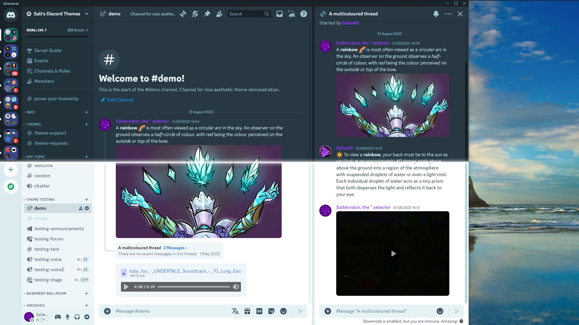
GitHub
Recolours Discord based on your system colour. Contribute to MiniDiscordThemes/SystemColor development by creating an account on GitHub.
final bear
Custom Home Icon
Edit: Condensed code a bit
:root{
--discord-icon: none; /* discord icon */
--home-icon: block; /* moon icon */
--home-icon-url: url('https://cdn.discordapp.com/emojis/1217110775601172591.gif?size=240&quality=lossless');
}
[class*=childWrapper] > svg:not([class*=favoriteIcon]){
display: var(--discord-icon);
}
[class*=childWrapper]:has(svg:not([class*=favoriteIcon]))::after {
display: var(--home-icon);
position: absolute;
background: var(--text-4);
mask: var(--home-icon-url) center/contain no-repeat !important;
}
Should fit any emoji or sticker with  as a default!
 agile prism
hide github star messages
@import url("https://gist.githubusercontent.com/Faf4a/af7411e053a16bcd2164f1d143983a1f/raw/e501ea067030fa75d059595da841aa540d54bd02/hide-star.css");
before | after


 cloud wasp
get rid of clan tags after usernames in chat:
[class*=clanTagChiplet__] {display: none;}
Hide it after usernames in chat and member list:
[class*=clanTagChiplet__], [class*=clanTag_] {display: none;}
(thanks to the people in the thread for telling me about forgetting it lol)
 mystic umbra
custom theme for the "Simplified Profile Experiment" experiment
note that this may (and probably will) break at any time since discord is tweaking the new profile theme often, ill try to keep it up to date via the import
i recommended "more user details" variant since that one shows bios
import via QuickCSS
@import url('https://github.com/rinyafii/theme-stuff/raw/main/discord/snippets/profile-v2-but-better.css')
OR
@import url('https://rinyafii.github.io/theme-stuff/discord/snippets/profile-v2-but-better.css');
they're both the same thing, just depends on what you wanna use lmao
import via Online Themes
https://rinyafii.github.io/theme-stuff/discord/snippets/profile-v2-but-better.css
source
copy from https://github.com/rinyafii/theme-stuff/blob/main/discord/snippets/profile-v2-but-better.css
 strong briar
Modified role pills border snippet for role pills colorful back
```css
/* Role p...
strong briar
strong briar
Modified role pills border snippet for role pills colorful back
```css
/* Role p...
updated my old 2 year old snippet (which for some reason still worked) for new profile, also removed lagging selectors
.role_f9575e,
.role_f9575e {
--transparency: .4;
--role-roundness: 5px;
transform: translate(0);
overflow: hidden;
border: 0;
border-radius: var(--role-roundness);
}
.role_f9575e .roleRemoveIcon_f9575e {
left: 11px;
}
.role_f9575e .roleRemoveIcon_e4010c{
left: 14px
}
.role_f9575e:has(.roleFlowerStar_e4010c) .roleRemoveIcon_e4010c{
left: 15px
}
.role_f9575e .roleRemoveButton_f9575e,
.role_f9575e .roleRemoveButton_f9575e {
position: static
}
.role_f9575e .roleCircle_a26d7b:after,
.role_f9575e .roleFlowerStar_e4010c:after,
.role_f9575e .roleCircle_a26d7b:after,
.role_f9575e .roleFlowerStar_f9575e:after {
content: '';
top: 0;
left: 0;
z-index: -1;
width: 100%;
height: 100%;
border-radius: var(--roles-roundness);
position: absolute;
background: inherit;
opacity: var(--transparency);
}```
i will remove part for old profile when discord release new profile for all users and change it for bots
upd. merged 2 pieces into one
upd2. removed unused code
upd3. updated classesIcon only clan tags
:3
[class*="chipletContainerInner_"] > [class*="text_"] {font-size: 0}
[class*="chipletContainerInner_"] {display: inline; padding: 0 2px 0 4px;}
 feral pawn
# Icon only clan tags
:3
```css
[class*="chipletContainerInner_"] > [class*="tex...
feral pawn
feral pawn
# Icon only clan tags
:3
```css
[class*="chipletContainerInner_"] > [class*="tex...
Same thing but Clan Tags in profile are with text, and tags in chat are not.
[class*="clanTagChiplet_"] > [class*="text_"] {font-size: 0}
[class*="chipletContainerInner_"] {display: inline; padding: 0 2px 0 4px;}
[class*="clanTag"] > [class*="clickable"] > [class*="chipletContainerInner_"] {padding: 0 4px !important;}


 pastel parcel
Rounded Embed Borders
Inspired by the Opera GX Theme
Updated for the recent CSS changes 7/18/2024 by @smoky kettle
#app-mount .embedFull_b0068a {
border: 3px solid;
border-radius: 15px;
}
Examples:

 final bear
No DM Category Collapse
[1] prevents this for the Osu players who click randomly for no reason (guilty)
[class*=privateChannelsHeaderContainer] [class*=header]:not([class*=pindms]){
pointer-events: none;
}
 dusty gorge
Discord Reimagined - #🎨-theme-development message but real
Place at the top of quickcss:
@import url("https://minidiscordthemes.github.io/Snippets/DiscordReimagined/main.css");
Editable vars:
:root {
--reimagine-channellist-width: 360px;
--reimagine-header-height: 60px;
--reimagine-server-size: 54px;
}```
I recommend using with [#🎨-css-snippets message](/guild/1015060230222131221/channel/1028106818368589824/) or ClientTheme for color customisation.
 dusty gorge
Minimal Searchbar
Condenses the searchbar into an icon when not in use.
Place at the top of quickcss:
@import url("https://minidiscordthemes.github.io/Snippets/MinimalSearchbar/main.css");
 dusty gorge
Clippy Status
Turns status in new profiles into Clippy-style speech bubble.
Place at the top of quickcss:
@import url("https://minidiscordthemes.github.io/Snippets/ClippyStatus/main.css");

 dark escarp
**Banners Begone!**
Do note that The User Profile settings avatar and full profi...
dark escarp
dark escarp
**Banners Begone!**
Do note that The User Profile settings avatar and full profi...
but for new profiles (status is a bit shitty, i know)
.header__725f2 {
min-height: 45px!important;
}
.clickable_bf76d2 {
top: -40px;
}
[class*="userProfileOuter"] [class^="bannerSVGWrapper"] {
display: none !important
}
[class*="userProfileOuter"] [class*="avatarPosition"] {
top: -30px !important
}
[class*="avatarUploaderNormal"],
[class*="avatarUploaderPremium"] {
top: -30px !important
}
[class|="customizationSection"] [class|="userPopoutOuter"] {
margin-top: 40px
}
[class|="userPanelInner"] [class*="avatarPosition"] {
top: 12px !important
}
[class|="userPanelInner"]>[class*="scrollerBase"] {
padding-top: 52px
}
[class*="root"][class*="fullscreenOnMobile"],
[class*="userProfileOuter"] {
overflow: visible
}
.visibleContainer_adf761 .biteSize__4396a {
top: -162px!important;
left: -2px!important;
color: var(--primary-600)!important;
}
.statusBubbleOuter__7e51b:before, .statusBubbleOuter__7e51b:after {
display:none;
}
.invisibleContainer__1e05d biteSize__4396a {
display:none !important;
}
 dusty gorge
Adjustable profile banner height - for old and new profiles.
Place at the top of quickcss:
@import url("https://minidiscordthemes.github.io/Snippets/ProfileBannerHeight/main.css");```
Editable vars:
```css
.userProfileInner__8ff35 {
/* Plain colour banner */
&:where(:not(:has(.banner__6d414[style*="background-image"]))) {
--banner-height-desired: 60px;
}
/* Image banner */
&:where(:has(.banner__6d414[style*="background-image"])) {
--banner-height-desired: 70px;
}
/* All banner types in new profile experiment */
&.biteSizeInnerThemed__5cdaf {
--banner-height-desired: 65px;
}
}


 dusty gorge
[UPDATED 27th May, REDOWNLOAD]
Theme for taking theme screenshots - censors identifying images and text.
⚠️ this by default makes text unreadable, please read the customisation notes for safety
Place at the top of quickcss:
@import url("https://minidiscordthemes.github.io/Demonstration/Demonstration.theme.css")
Customisation: https://github.com/MiniDiscordThemes/Demonstration#customisation
:root {
--demo-font-variant: Circular;
--demo-font-emoji: Noto;
--demo-text: censor;
--demo-clientmod: visible;
--demo-emoji-radius: 4px;
--demo-emoji-opacity: 0.5;
--demo-icon-hue: 240;
--demo-image-hue: 270;
--demo-banner-hue: 180;
--demo-self-hue: 300;
}
[UPDATED 27th May, REDOWNLOAD]
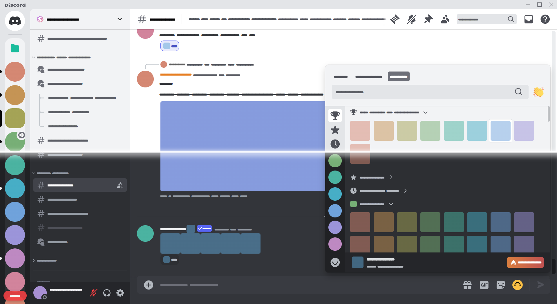
GitHub
A Discord theme for demonstrating Discord themes. Contribute to MiniDiscordThemes/Demonstration development by creating an account on GitHub.
twin shadow
Center the text to the viewport middle in the unread messages bar with the new AI summaries (beta, enabled with a plugin) enabled
Note this doesn't line it up with the center of the chat log, Not having this does some cursed 40-45% left thing (????)
If you can't find the plugin it is coming to main branch Soon™️ it's available in dev branch Now™️
[class*="newTopicsBarContainer_"] {
[class*="newTopicsBarInitial_"] {
position: fixed;
display: flex;
left: 0px;
width: calc(100vw - 24px);
justify-content: center;
> div {
display: flex !important;
position: initial !important;
}
}
[class*="flexEnd_"] {
/* problem? :trolley: */
right: 0;
position: absolute;
}
}
install CSS to fix missing textures
:is(.titleBar__710b0, .titleBar__710b0 *),
#app-mount .baseLayer__2b890 * {
--error-gradient: repeating-conic-gradient(black 0% 25%, magenta 0% 50%) 50% / var(--grid-size) var(--grid-size);
--grid-size: 30px;
background: var(--error-gradient);
&:is(::before, ::after),
.thin_b1c063::-webkit-scrollbar-track,
.thin_b1c063::-webkit-scrollbar-thumb,
.auto__020ac::-webkit-scrollbar-track,
.auto__020ac::-webkit-scrollbar-thumb {
background: var(--error-gradient);
}
}
(spoiler for extreme eye pain)
 fickle jasper
Hide timestamps unless you hover over a message
.timestampInline__430cf {
visibility: hidden;
}
[class*="cozyMessage_"]:hover .timestampInline__430cf {
visibility: visible;
}
.text-md-normal__6e567 .timestampInline__430cf {
visibility: visible;
}
 smoky spoke
Recolors the Private Channel Lock icon so it more noticeable
```css
@import url...
smoky spoke
smoky spoke
Recolors the Private Channel Lock icon so it more noticeable
```css
@import url...
Recolors the Channel&Roles Icon so its more noticeable
———
Update:
- Added some recolours in different places.
every place that now as the recolour
a. Channel list
b. Top of the chat
c. when you mention a channel
———
1/29/25 — Updated for the rehash
@import url("https://raw.githubusercontent.com/KrstlSkll69/vc-snippets/main/Channel%26RolesRecolor.css")
for online theme
https://raw.githubusercontent.com/KrstlSkll69/vc-snippets/main/Channel%26RolesRecolor.css
Before and After
(hopefully you can tell which one is before and after)

 static granite
[class*=botText] {
font-weight: 500;
}
revert discord's dumb new change with bot tags and stuff (made by @restive notch)
quiet dust
 Old Discord Font
Simple CSS to revert Discord's 2022 font change back to Whitney.
- GitHub | Live Preview
- Theme Link:
https://overimagine1.github.io/old-discord-font/source.css - QuickCSS:
@import url(https://overimagine1.github.io/old-discord-font/source.css);```Preview:
https://raw.githubusercontent.com/Overimagine1/old-discord-font/main/images/preview.png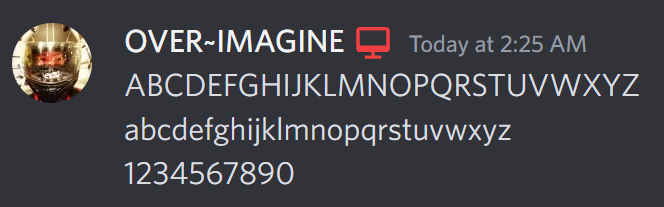 pastel parcel
ModViewNitroless
Removes users' profile colors from the Mod View popout.
Only supports Dark mode.
Quick CSS:
/* Normal Discord */
@import url(https://raw.githubusercontent.com/SeaswimmerTheFsh/VencordThemes/main/Snippets/ModViewNitroless/Stock.css);
/* Catppuccin Mocha */
@import url(https://raw.githubusercontent.com/SeaswimmerTheFsh/VencordThemes/main/Snippets/ModViewNitroless/Catppuccin.css);
Online themes:
/* Normal Discord */
https://raw.githubusercontent.com/SeaswimmerTheFsh/VencordThemes/main/Snippets/ModViewNitroless/Stock.css
/* Catppuccin Mocha */
https://raw.githubusercontent.com/SeaswimmerTheFsh/VencordThemes/main/Snippets/ModViewNitroless/Catppuccin.css
Before and after:

 potent violet
Hide hang statuses:
[class^="iconGroup"]:has([class^="hangStatusIcon"]) {
display: none;
}
/* no line clamp on new profiles */
[class*=descriptionClamp] {
-webkit-line-clamp: 9999999;
}
[class*=viewFullBio] {
display: none;
}
no line clamp on new profile design, and remove "view full bio" button
restive notch
restive notch
fix the terrible profile overflow bug discord added recently (discord please.......
fix this mess. somehow discord broke it again lol, same snippet still works
[class*=userPopoutOverlayBackground] {
max-height: 60vh;
}

 lime hamlet
removes the ugly scrolling arrows beside some text
/*Remove the unnecessary scroll arrows*/
.eyebrow_b3f8ba{
width: 260px;
}
(seems to be a thing on vesktop)
it was related to the theme discord-dyslexia, so basically i solved a problem no one except me had

 raven bone
Hide chat box if you have no permissions to write in the channel
[class*=channelTextAreaDisabled] {
display: none!important;
}
/* or if it doesn't work like because of themes: */
[class*=channelTextAreaDisabled] {
opacity: 0!important;
position: absolute!important;
height: 0px!important;
width: 0px!important;
z-index: 0!important;
}

 raw quest
Make profile popouts round again (because discord made them sharp for some reason, making some profile effects look odd)
[class*=userPopoutOuter_] {
border-radius: var(--radius-sm);
overflow: hidden;
}
 brittle slate
Makes the Summaries dropdown a lot bigger css div[class^=topicsScroller_] { max-height: calc(100vh - 2.5in); } :has(> div[class^=topicsScroller_]) { width: calc(100% - 8q); }
novel patrol
Updated Aligned Chatbox:
Theme URL https://codef53.github.io/CSS-Snippets/discord/AlignedChatBox.css
:is(main,section)[class^=chatContent] > form,
form > div[class^=submitContainer] {
/* align chatbox */
padding: 0px;
> div { margin-bottom: 0px; border-radius: 0px; }
> div[class^=channelTextArea] {
> div { margin: 0px; }
> div > div {
padding-top: 4px;
min-height: 49px;
border-radius: 0px;
}
}
/* move slowmode/typing indicator to match */
> div[class^=typing] {
top: -24px;
right: calc(var(--custom-index-scrollbar-margin) * 2 + var(--custom-index-scrollbar-width));
margin-left: auto;
width: fit-content;
padding-left: 2px;
padding-right: 9px;
border-radius: 8px 8px 0px 0px;
background-color: var(--channeltextarea-background);
}
/* make scrollbar meet chatbox */
&::after { display: none; }
/* fix replies */
> div > div > div[class^=attachedBars] {
min-height: unset !important;
padding-bottom: 4px;
}
}
/* jump to present */
div[class^=jumpToPresentBar] {
left: 0; right: unset;
border-radius: 0px 8px 0px 0px;
background-color: var(--channeltextarea-background);
> button[class^=barButtonMain] {
flex: 0 0 auto;
display: none;
}
}

 warm wind
for when youre streaming and too dumb not to click your dms
[data-list-id="guildsnav"], [aria-label="Direct Messages"] {
display: none;
}``` smoky spoke
Recolors the Channel&Roles Icon so its more noticeable
———
Update:
1. Added so...
smoky spoke
smoky spoke
Recolors the Channel&Roles Icon so its more noticeable
———
Update:
1. Added so...
because @shadow citrus kept asking for it (until they made it themselves)
All-in-one for my three different CSS snippets
(if i ever upload more Css snippets
I’ll update this all-in-one to include it)
@import url('https://krstlskll69.github.io/vc-snippets/IconRecolors.css')
for online themes
https://krstlskll69.github.io/vc-snippets/IconRecolors.css
Check your theme urls for https://css.f53.dev/discord/...
And replace it with https://codef53.github.io/CSS-Snippets/discord/...
This also applies to your custom css
@import url("https://css.f53.dev/discord/...");
/* to */
@import url("https://codef53.github.io/CSS-Snippets/discord/...");
Vencord will eventually add a domain whitelist and that will break all my snippets if you continue to use my domain
dusty gorge
Privacy Screen - Hides Discord behind a screen when tabbed out.
Place at the top of quickcss:
@import url("https://minidiscordthemes.github.io/Snippets/PrivacyScreen/main.css");```
Customisation: https://github.com/MiniDiscordThemes/Snippets/tree/main/themes/PrivacyScreen#customisation
```css
:root {
--privacy-bg-image: var(--privacy-discord-icon);
--privacy-bg-color: var(--background-primary);
}``` lime hamlet
discord in other languages might cut some text-boxes, what this does is, when you hover over the text it sidescrolls revealing the full text
https://cdn.discordapp.com/attachments/644220552554217506/1252792306201788477/image.png?ex=66738141&is=66722fc1&hm=4c3dc05199f1538e149be578a56a39731e626270fdae3dcf796b69350aee83e3&
https://cdn.discordapp.com/attachments/644220552554217506/1252792351034839051/image.png?ex=6673814c&is=66722fcc&hm=62db3d0d0a0494792b1e006af301e03fd9684d70d78b20b8fe8df16e155caf4b&
/*makes it so that when you hover over cropped text it rolls to reveal the full text*/
.header_a0:hover .headerText_a0 {
animation: scrollText 8s linear infinite;
width: 12rem;
}
@keyframes scrollText {
0% {
transform: translateX(0);
}
100% {
transform: translateX(-100%);
}
}

 fickle jasper
Hide timestamps unless you hover over a message
```css
.timestampInline__430cf {...
fickle jasper
fickle jasper
Hide timestamps unless you hover over a message
```css
.timestampInline__430cf {...
Fixed for 18th of Doomsday update:
@import url("https://gist.githubusercontent.com/Kodarru/b5185a06777663906915724563771835/raw/HideTimestamps.css");
Thanks to @delicate acorn for making it future proof :D
fickle jasper
Remove pending applications button:
.container_aa1bff {
visibility: hidden;
height: 5px;
}
Shouldn't break anything.. if it does lmk. You can customize the height to make it a little more spacious like this
 final bear
[Alt Text Improvements](#🎨-css-snippets message) (futureproofed) [credit to Salternator for original]
@import url("https://raw.githubusercontent.com/LuSaffi/VenCordstuff/main/CSS/AltTextImprovements.css");
:root{
--altTextMosaicSize: 25%; /* default 25% */
}
added the ability to change the size of mosaics so you can modify it on the fly... in case you want your images 1% size or something lmao (which for some reason only works on 4 image mosaics 
as always, imports go at the top!
 zinc bronze
Bartender (only mac users will get it)
Hide Discord's toolbar icons until you need them.
@import url("https://aushevahmad.github.io/awesome-css/modules/bartender.css");
:root {
--bartender-width: 4ch; /* Width for displayed icon. Adjust depending on your needs [Default: 4ch] */
}
⚠️ Does NOT work with Vesktop ⚠️

 jagged orbit
make webm files bounce the chat around again [WORKS WITH ALL KINDS OF WEBM VIDEOS NOW!!!]
/* fix webm */
[class*="inlineMediaEmbed"] {
max-height: max-content !important;
max-width: max-content !important;
}
[class*="loadingOverlay"] {
aspect-ratio: unset !important;
}
[class*="imageWrapper"] {
aspect-ratio: unset !important;
width: max-content !important;
height: max-content !important;
}
[class*="oneByOneGrid"] {
max-height: max-content !important;
}
[class*="wrapperPaused"] {
width: max-content;
height: max-content;
}
 zinc bronze
Custom Prompt
Replace the text prompt in the chat bar.
@import url("https://aushevahmad.github.io/awesome-css/modules/custom-bar-prompt.css");
:root {
--prompt-text: "be silly :3"; /* replace --prompt-text with your desired text if you want */
}
 lime hamlet
turns all the messages in discord rgb cycling bc why not
/*turns all messages into rainbow coloring*/
.markup_d6076c {
animation: colorRotate 6s linear 0s infinite;
}
@keyframes colorRotate {
from {
color: #6666ff;
}
10% {
color: #0099ff;
}
50% {
color: #00ff00;
}
75% {
color: #ff3399;
}
100% {
color: #6666ff;
}
}
an update on an old snippet, all the colors can be customized by changing the hex codes in the variables
intended to be used with channel tweaks by @zinc bronze
@import url("https://aushevahmad.github.io/awesome-css/modules/channeltweaks.css");
:root{
--highlight-select: linear-gradient(-45deg, #9366e23d 60%, #deaecf3d);
--highlight-icon: #deaecf;
}
/* channel outlines and highlighted icons */
#app-mount .containerDefault_f6f816.selected_f6f816 .wrapper_d8bfb3 .link_d8bfb3 {
background: var(--highlight-select);
border-radius: 12px;
margin-left: 5px;
}
.icon_d8bfb3 {
width: 18px;
height: 18px;
}
[aria-label="Channels"] [class^="content"],
[class^="popout-"] [class^="row-"] {
border-style: solid;
border-width: 0px;
border-color: transparent;
background-color: transparent;
}
[aria-label="Channels"] [class^="content"]:hover,
[class^="popout-"] [class^="row-"]:hover {
border-color: var(--highlight-icon) !important;
}
.modeUnreadImportant_d8bfb3 .icon_d8bfb3,
#app-mount .containerDefault_f6f816.selected_f6f816 .wrapper_d8bfb3 .icon_d8bfb3,
#app-mount .containerDefault_f6f816:hover .wrapper_d8bfb3 .icon_d8bfb3 {
color: var(--highlight-icon) !important;
}```
*feel free to improve* opal venture
Markdown Header Killer
This kills markdown headers in an elegant way by setting them to a normal size and removing their special formatting, and allowing to add a prefix right before them to show it is a markdown header! 🚀
@import url(https://nin0-dev.github.io/vencord-css/md-header-killer.css);
:root {
/* This'll be the prefix before a markdown header, leave empty to remove */
--header-override-prefix: "🔼 ";
}
 dusty gorge
Forum Improvements - Discord's forums are the most half-assed feature in this whole website. This snippet provides a series of fixes and QoL features to bring forums closer to full-assed.
- Hover to show all tags in post filter bar and new post tagging.
- Switch smoothly between markdown and preview in the post editor.
- View and edit post attachments easily.
- View the whole image without clicking in gallery view.
- No more jittering hovered posts.
- ...and various bug fixes.
Place at the top of quickcss:
@import url("https://minidiscordthemes.github.io/Snippets/ForumImprovements/main.css");

 scarlet silo
 Un-Simplify Bios in Simplified Profiles
to un-simplify roles, see pr #2624
[class^="descriptionClamp_"] {
display: block!important;
}
 crude stratus
Hide unread indicators/highlights of specific channels.
Make sure to replace CHANNELID with the channel ID you want to hide indicators for as well as the channel name (INSERT CHANNEL NAME...)
/* hide unread indicator in a specific channel */
[data-list-item-id$="CHANNELID"] > [class*=linkTop_] > [class*=name_] {
color: var(--channels-default) !important;
}
[data-list-item-id$="CHANNELID"] > [class*=linkTop_] > [class*=name_]:hover {
color: var(--interactive-hover) !important;
}
li[data-dnd-name$="INSERT CHANNEL NAME OR LAST WORD OF CHANNEL NAME HERE"] > [class*=modeUnreadImportant_] > [class*=unread_] {
display: none !important;
}
Before and after:

 agile prism
fix discord insanity
[class^=userPopoutInner_] [class^=blockquoteContainer_] {
max-height: 90px;
}
before | after

 fickle jasper
Why would I want to add you or know I'm your friend?
[class*="biteSize_"] :is([aria-label="Add Friend"], [aria-label="Friends"]) {
display: none;
}
Thanks to @twin shadow for reminding me about the friends tab which useless as fuck\


 oak path
scarlet silo
## <:venniebwaah:1221015075922513990> Un-Simplify Bios in Simplified Profiles
t...
oak path
scarlet silo
## <:venniebwaah:1221015075922513990> Un-Simplify Bios in Simplified Profiles
t...
did this independently of the above snippet, also made one for status bubbles too ```css
/* Unclamp bio length in user popout /
[class="-userPopoutInner"] [class*="-descriptionClamp"] {
-webkit-line-clamp: unset;
max-height: unset;
&+[class*="-viewFullBio"] {
display: none;
}
}
/* Unclamp status bubble size in user popout /
[class="-userPopoutInner"] [class*="-statusBubble"] [class*="-clamp"] {
-webkit-line-clamp: unset;
max-height: unset!important;
}
Aligned Chatbox
Theme URL https://codef53.github.io/CSS-Snippets/discord/AlignedChatBox.css
/**
* @name AlignedChatBox
* @author CodeF53
* @version 3.0
* @description Aligns chat box with the bottom of the screen and user controls
*/
:is(main,section)[class^=chatContent] > form,
form > div[class^=submitContainer] {
/* align chatbox */
padding: 0px;
> div > div[class^=channelTextArea] {
margin: 0px !important;
> div[class^=scrollableContainer] {
min-height: 49px;
padding-top: 4px;
border-radius: 0px;
}
}
/* align forum channel thing */
> div { margin-bottom: 0px; border-radius: 0px; }
/* move slowmode/typing indicator to match */
> div[class^=typing] {
top: -24px;
right: calc(var(--custom-index-scrollbar-margin) * 2 + var(--custom-index-scrollbar-width));
margin-left: auto;
width: fit-content;
padding-left: 2px;
padding-right: 9px;
border-radius: 8px 8px 0px 0px;
background-color: var(--channeltextarea-background);
}
/* make scrollbar meet chatbox */
&::after { display: none; }
/* fix replies */
> div > div > div[class^=attachedBars] {
min-height: unset !important;
padding-bottom: 4px;
}
}
/* jump to present */
div[class^=jumpToPresentBar] {
left: 0; right: unset;
border-radius: 0px 8px 0px 0px;
background-color: var(--channeltextarea-background);
> button[class^=barButtonMain] {
flex: 0 0 auto;
display: none;
}
}

 late loom
Make the appearance tab slightly more bearable to look at (moves controls to where they should be and hopefully removes all nitro upsells)
/* Put the message displays at the top */
/* fear */
div[id="appearance-tab"] div [class*=children] {
/* Move the display preview to the top */
div[tabindex="-1"] {
order: 0;
}
/* Move it's controls below it */
div[class*=marginTop8_]:nth-of-type(3) {
order: 1;
}
/* Nitro upsells */
div[class*=marginTop8_]:nth-of-type(2) {
order: 3;
}
/* the nitro icon */
div[aria-label="Exclusive to Nitro"] svg[class*=nitroWheel] {
display: none;
}
/* The "Only with Nitro." labels */
h3[data-text-variant="text-sm/normal"] {
display: none;
}
/* Redundant title, also blends in themes more */
h3[aria-label="Color"] {
display: none;
}
/* Move chat font scaling, zoom level, etc to where it should be */
div[class*=marginTop20_] {
order: 10;
}
}
/* Make the theme menu slightly more bearable to look at */
div[class^=premiumFeatureBorder] {
/* Disable the border */
border: none;
div[class^=background_] {
padding: 0px;
}
/* Blend in the nitro themes with the rest of the theme selector */
div[class^=title] {
display: none;
}
div[class^=tryItOutButtons] {
display: none;
}
h3[class^=defaultColor] {
display: none;
}
}

 brisk cloud
Pastel Statuses
/*Pastel Statuses*/
rect[fill='#23a55a'], svg[fill='#23a55a'] {
fill: #80c968 !important;
}
rect[fill='#f0b232'], svg[fill='#f0b232'] {
fill: #e7ca45 !important;
}
rect[fill='#f23f43'], svg[fill='#f23f43'] {
fill: #e0526c !important;
}
rect[fill='#80848e'], svg[fill='#80848e'] {
fill: #696e88 !important;
}
rect[fill='#593695'], svg[fill='#593695'] {
fill: #ac7de6 important;
}
 dusty gorge
viggy
:root::after {
content: "";
position: absolute;
z-index: 999999;
height: 20%;
aspect-ratio: 1/1;
background: url(https://media.discordapp.net/stickers/1217112512374505613.png) center / contain no-repeat;
offset: rect(auto auto auto auto round 10%) reverse / bottom;
animation: move 3s linear infinite;
pointer-events: none;
}
@keyframes move {
from { offset-distance: 0%; }
to { offset-distance: 100%; }
}
 red stone
have the Status Bubble color match with Profile Primary Color (applies on custom profiles)!
/* Match Status Bubble color with Profile Primary Color */
.custom-profile-theme [class^=statusBubble_] {
background-color: var(--profile-gradient-primary-color);
}
.custom-profile-theme [class^=statusBubbleOuter_]:before {
background-color: var(--profile-gradient-primary-color);
}
.custom-profile-theme [class^=statusBubbleOuter_]:after {
background-color: var(--profile-gradient-primary-color);
}```
 nimble token
colorblindness filter like #📜-js-snippets message but with pure css
//protanopia correction
body {
filter: url("data:image/svg+xml;utf8,<svg xmlns='http://www.w3.org/2000/svg'><defs><filter id='protanopia-correction'><feColorMatrix type='matrix' values='1.0 0.0 0.0 0 0 0.0 1.0 0.0 0 0 0.0 0.0 1.0 0 0 0 0 0 1 0'/></filter></defs></svg>#protanopia-correction");
}
//deuteranopia correction
body {
filter: url("data:image/svg+xml;utf8,<svg xmlns='http://www.w3.org/2000/svg'><defs><filter id='deuteranopia-correction'><feColorMatrix type='matrix' values='0.625 0.375 0 0 0 0.7 0.3 0 0 0 0 0.3 0.7 0 0 0 0 0 1 0'/></filter></defs></svg>#deuteranopia-correction");
}
//tritanopia correction
body {
filter: url("data:image/svg+xml;utf8,<svg xmlns='http://www.w3.org/2000/svg'><defs><filter id='tritanopia-correction'><feColorMatrix type='matrix' values='1 0 0 0 0 0 0.9 0.3 0 0 0 0 0.9 0 0 0 0 0 1 0'/></filter></defs></svg>#tritanopia-correction");
}```@ symbol before the Username! (Impossible to ignore giving bots the @ symbol in some places)
[ShowMeYourName Plugin Support](#1260835920370991114 message)
@import url("https://raw.githubusercontent.com/ColynOrg/CSS-Snippets/main/UsernameSymbol.css");
ℹ️ didn't find an @ symbol before a name? Mention where in the thread!
 undone knot
the people who need glasses to see emojis from other servers, say no more.
img[class="emoji otherEmoji_e58351"]:hover {
transform: scale(2);
}
you can change the scale if you felt to
 red stone
Reactions hover, this is excluding super reactions since they already have an animation.
/* Reactions Hover */
[class^=reaction_]:not(:has([class^=burstGlow_])):not([class*="reactionMe__"]) .emoji {
transition: transform 0.5s ease;
}
[class^=reaction_]:not(:has([class^=burstGlow_])):not([class*="reactionMe__"]):hover .emoji {
transform: translateY(-10px) scale(1.5);
}``` smoky spoke
Recolors the Stage Icon so its more noticeable
This will be included in the all-in-one
@import url("https://raw.githubusercontent.com/KrstlSkll69/vc-snippets/main/StageRecolor.css");
for online theme
https://raw.githubusercontent.com/KrstlSkll69/vc-snippets/main/StageRecolor.css
Before and After
beforerecolor
afterrecolor


 solemn pond
Reaction hover with flip animation
[class^=reaction_]:not(:has(.burstGlow_ec6b19)) .emoji {
transition: transform 0.6s ease;
transform-style: preserve-3d; /* Enables 3D transformations */
}
[class^=reaction_]:not(:has(.burstGlow_ec6b19)):hover .emoji {
animation: flipAndScale 0.6s forwards;
}
@keyframes flipAndScale {
from {
transform: rotateY(0deg) scale(1);
}
to {
transform: rotateY(360deg) scale(1.5);
}
}
 vocal roost
[class*=buttonContainer] > [class*=buttons_] {
transform: translateY(-50%);
}
moves the message buttons above the message to avoid this issue:
#🧊-off-topic-iceman-only message
raw quest
[class*=repliedTextContentTrailingIcon_] {
position: absolute;
right: 0;
pointer-events: none;
}
[class*=repliedTextPreview_] {
padding-right: 25px;
}
another snippet to make the media icon clickable on replies
fickle jasper
Hide's the channel side bar until you hover over it (this includes the DMs)
[class^=sidebar_]:has([class*=avatarWrapper_]) {
transition: width 0.2s ease;
&:not(:hover) {
width: 5px;
}
}
Thanks to @summer turret for helping out
solemn pond
Custom " i'm new here, say hi " icon change it to what ever you want gif or png
/*i'm new here, say hi!*/
[class*=newMemberBadge]:before {
content: url(https://cdn.discordapp.com/emojis/1024751291504791654.gif?size=64&quality=lossless);
transform: translate(-100%, -110%);
display: inline-block;
scale: 0.32;
}
 frigid glade
Displays the notice bar within the sidebar instead of positioning it at the top of the base container with latin, german, & french translation.
@import url("https://lazuee.github.io/css-snippets/discord/sidebar-notice/import.css");
https://github.com/lazuee/css-snippets/tree/main/discord/sidebar-notice
preview:


 unkempt pivot
Spotify Redesign
A redesign of the Spotify activities in user popouts and profiles, and of Vencord's SpotifyControls to match the actual Spotify UI.
Note: This is a tweaked version of DaBluLite's SpotifyActivityRedesign
Importing:
@import url("https://raw.githubusercontent.com/tom22k/discord-css/main/Themes/SpotifyRedesignV2.css");
Screenshots:

 red stone
have the Status Bubble color match with Profile Primary Color (applies on custom...
red stone
red stone
have the Status Bubble color match with Profile Primary Color (applies on custom...
this but matching it with the profile button colors instead since discord finally themed them on the profile.
/* Brighter Status Text for Custom Profiles */
.custom-profile-theme [class^=statusBubble_] [class^=defaultColor_] {
color: var(--white-500);
}
/* Match Status Bubble Color with Profile Button Color for Custom Profiles */
.custom-profile-theme [class^=statusBubble_],
.custom-profile-theme [class^=statusBubbleOuter_]:before,
.custom-profile-theme [class^=statusBubbleOuter_]:after {
background-color: var(--profile-gradient-button-color);
}```
before and after:
 red stone
Do you use the Mod View from ShowHiddenThings Plugin but dislike seeing actions you can't perform?
/* ShowHiddenThings / Mod View / Remove actions like Kick, Ban, and Timeout if disabled due to insufficient permissions. */
[class^=guildSidebar_] [class^=bottomRow_]:has([class*=bottomRowActionDisabled_]) [class*=bottomRowActionDisabled_] {
display: none;
}```
before and after:
 inner stone
semi-revert the visual refresh on the profile quadrant
(profile panel positioning, insane app padding, and bottom padding)
this will not do anything if you do not have the visual refresh. duh
/* re-edging the corner padding to match pre-refresh */
.visual-refresh [class^=appAsidePanelWrapper] {
padding: 1px;
}
/* Make profile & derivatives stop hogging the entire bottom left corner*/
.visual-refresh [class^=panels_] {
position: unset;
width: unset;
}
/* Fix the dead space padding on the server and channel list */
.visual-refresh [class^=wrapper_], .visual-refresh .container_ee69e0 {
padding-bottom: unset;
}
/* preference, match spotifycontrols to panel tint */
.theme-dark #vc-spotify-player {
background: unset;
}


 wheat belfry
fix visual refresh
this snippet aims to make the visual refresh experiment usable and fix all the issues that come with it
quickcss:
@import url("https://raw.githubusercontent.com/Ta-noshii/discord-css/main/snippets/FixVisualRefresh.css");
online theme:
https://raw.githubusercontent.com/Ta-noshii/discord-css/main/snippets/FixVisualRefresh.css
update 1:
after a request i've split the theme into two versions, one with the outer padding removed and one without, the below screenshots show the version with the padding removed
if you'd still like to use the no padding version then just add NoPadding to the url of as shown above
update 2:
#1265829445214928896 message
update 3:
fix the new update to the visual refresh
You can optionally combine this with the snippet above #🎨-css-snippets message to make your mini profile fit the channel list
if you liked the old outer padding run this version:
@import url("[https://raw.githubusercontent.com/Ta-noshii/discord-css/main/snippets/FixVisualRefresh.css](https://raw.githubusercontent.com/Ta-noshii/discord-css/main/snippets/FixVisualRefreshWithPadding.css)");
(or online theme:)
https://raw.githubusercontent.com/Ta-noshii/discord-css/main/snippets/FixVisualRefreshWithPadding.css
before and after:

 red stone
this but matching it with the profile button colors instead since discord finall...
red stone
red stone
this but matching it with the profile button colors instead since discord finall...
Activities buttons within profiles will match the profile colors alongside the status and message/add friend button!
Use the Snippet from the reply to make the Status Bubble match the profile color better!
/* Match Activity Buttons Color with Profile Button Color for Custom Profiles */
.custom-profile-theme [class^=activityBiteSizePopout_] button,
.custom-profile-theme [class^=activitySimplifiedProfile_] button {
background-color: var(--profile-gradient-button-color)!important;
}```
Preview:
 fickle jasper
Discord Hard Mode
:root {
transform: scale(1.05);
}
[class*=userProfileInner_], [class*=userPopoutOuter_] {
display: none;
}
[class*=tools_c25c6d] {
background-color: #fff;
}
[class*=colorRed_dd4f85] {
border-color: #80c968 !important;
}
[class*=isEnabled_ad4a7c] {
color: #e0526c !important;
}
[class*=sidebar_] {
max-width: 120px;
}
[class*=avatarWrapper_b2ca13], [class^=accountProfileCard_], [class*=changeDetails_] {
display: none;
}
[class*=avatar_f9f2ca] {
background-color: aquamarine;
}
[class*=message_] {
background-color: aquamarine;
}

 vocal roost
Discord Hard Mode too easy?
Now introducing: Discord Hardcore 
html {
filter: blur(1px) saturate(100);
}
[class*=blobContainer_] {
transform: rotate(180deg) scale(0.5);
}
[class*=guilds_] {
width: 40px;
}
[class*=sidebar_] {
width: 120px;
}
[class*=messageContent_] {
opacity: 0.1;
}
[class*=form_] {
transform: translateY(70%);
}

 deft oak
Revert Compact Profiles
Reverts user profiles to the layout before they were simplified.
Incompatible with Inline Custom Status (This already does that)
Features:
- Moves custom statuses below the username and pronouns
- Moves badges above the username
- Unclamps about me to 6 lines from 3
- Re-sorts profile content
- Supports ReUSRBG and notes in profile
Online Theme
https://raw.githubusercontent.com/Bitslayn/RepluggedAddons/main/themes/btw.bitslayn.revertProfiles/raw/main.css
Quick CSS
@import url("https://raw.githubusercontent.com/Bitslayn/RepluggedAddons/main/themes/btw.bitslayn.revertProfiles/raw/main.css");
 balmy ledge
Mute Channel List Emojis
Slightly grays out the emojis in muted channel titles, to better match the text
[class*="modeMuted_"]:has([class^="icon_"]) [class^="name_"] {
color: var(--channel-icon);
opacity: 40%;
}

 west dust
Remove the useless UI from the app homepage
Very overdue snippet since the Library is long dead
/* Remove useless tabs from app homepage */
.channel_c91bad:nth-child(2)[aria-posinset="1"] {
top: 0px;
position: fixed;
z-index: 10000;
background: var(--bg-overlay-3, var(--background-secondary));
width: 14rem;
height: 3.7rem;
}
.channel_c91bad:nth-child(2) > div {
margin-top: 13px;
width: 2.5rem;
height: 2rem;
background: var(--background-tertiary);
padding-left: 0;
margin-left: 6px;
margin-right: 0;
}
.channel_c91bad:nth-child(2) > div > a > div > div.avatar_f9647d > svg.linkButtonIcon_c91bad {
left: 5.8rem;
position: fixed;
}
.channel_c91bad:nth-child(2) > div > a > div > div.content_f9647d {
display: none;
}
.channel_c91bad:nth-child(3) {
display: none;
}
.channel_c91bad:nth-child(4) {
display: none;
}
.privateChannelsHeaderContainer_c47fa9 {
margin-top: 4px;
padding-top: 13.5px;
height: 2rem;
margin-bottom: 10px;
}
.privateChannelsHeaderContainer_c47fa9 > .headerText_c47fa9 {
color: #b9b9b9;
}
.privateChannels_f0963d {
background: rgba(0,0,0,0) !important;
}
.searchBar_f0963d {
background: none !important;
left: 7.15rem;
z-index: 20000;
top: 4px;
box-shadow: none;
position: fixed;
}
.searchBar_f0963d > button {
visibility: hidden;
}
.searchBar_f0963d > button:after {
content: "Find/start a conversation";
visibility: visible;
display: block;
position: absolute;
border-radius: 4px;
background-color: var(--background-tertiary);
color: #dddddd;
padding-left: .5rem;
padding-right: .5rem;
line-height: 2rem;
top: 11px;
}
.listItem_c96c45:nth-child(3) {
margin-top: 11.5px;
}
/* --- */
Before (Attached), and After: https://i.imgur.com/rKUnPdt.png

 west dust
Remove Settings Ads
/* Remove Settings Ads */
div.side_a0 > div.item_a0[data-tab-id="Discord Nitro"] {
display: none !important;
}
div.side_a0 > div.item_a0[data-tab-id="Nitro Server Boost"] {
display: none !important;
}
/* --- */

 solemn pond
Shake animation hover to the text area when you don't have permission because why not :3
/*Shake animation hover to the text area when you don't have permission !*/
/* Define the shake animation */
@keyframes shake {
0%, 100% { transform: translateX(0); }
20%, 60% { transform: translateX(-10px); }
40%, 80% { transform: translateX(10px); }
}
/* Initial state of the element */
[class*=channelTextAreaDisabled] {
position: relative;
transition: transform 0.5s, opacity 0.5s;
}
/* Hover state to trigger the shake animation */
[class*=channelTextAreaDisabled]:hover {
animation: shake 0.5s ease-in-out;
}
 balmy ledge
Detailed Timestamps
Spruce up the header, hover, and edited timestamps.
/* "(edited)" text timestamps */
span[class*="timestamp_"] time::before {
content: '✎ ' attr(aria-label);
font-size: 0.625rem;
font-weight: 400;
}
/* message header timestamps */
span[class*="timestampInline_"] time::before {
content: attr(aria-label);
font-size: 0.75rem;
font-weight: 500;
}
/* header-less multi-line hover timestamps */
span[class*="timestampVisibleOnHover_"] time::before {
content: attr(aria-label);
position: absolute;
font-size: 0.6rem;
line-height: 0.85rem;
width: 65px;
left: -1px;
top: -2px;
}
/* hide the old timestamps */
span[class*="timestampInline_"], span[class*="timestampVisibleOnHover_"] {
font-size: 0rem !important;
}
span[class*="edited_"] {
position: relative;
right: 95px;
color: transparent;
}
 deft oak
**Revert Compact Profiles**
Reverts user profiles to the layout before they were...
deft oak
deft oak
**Revert Compact Profiles**
Reverts user profiles to the layout before they were...
Inline Custom Status
Removes status bubbles and places the status inside the profile.
Part of the rewrite for Revert Compact Profiles
Incompatible with the aforementioned snippet
Online Theme
https://raw.githubusercontent.com/Bitslayn/RepluggedAddons/main/themes/btw.bitslayn.inlineStatus/raw/main.css```
Quick CSS
```css
@import url("https://raw.githubusercontent.com/Bitslayn/RepluggedAddons/main/themes/btw.bitslayn.inlineStatus/raw/main.css");``` brisk cloud
Universal flat theme
Makes most ui background colors the same, for a smoother look
:root
{
--background-secondary: var(--background-primary);
/*You can remove this, but it makes the user area thing look really shitty*/
--background-secondary-alt: var(--background-primary);
--background-tertiary: var(--background-primary);
--background-floating: var(--background-primary);
--background-accent: var(--background-primary);
--background-nested-floating: var(--background-primary);
--background-overlay-1: var(--background-primary);
}
HideNitroUpsellV2
Hide (or limit, where hiding is not possible) all the annoying upsell (in any Discord language).
How to use
Copy link to paste in online themes:
https://raw.githubusercontent.com/tom22k/discord-css/main/Themes/HideNitroUpsellV2.css
Importing in quick CSS:
@import url("https://raw.githubusercontent.com/tom22k/discord-css/main/Themes/HideNitroUpsellV2.css");
Customization
:root {
/* do you want to see your quests/billing/nitro settings? */
/* yes, I want to see it -> --billing: block !important; */
/* no, hide it -> --billing: none; */
--billing: none;
/* do you want to see server boosting/server shop upsell? */
/* yes, I want to see it -> --boosting: block !important; */
/* no, hide it -> --boosting: none; */
--boosting: none;
}
Animated Voice Channel Icon
Adds a simple animation to the volume icon if there is at least one person active in the voice channel. Also colors the icon to match the "Live" bubble if someone is screensharing/live-streaming.
/* Change the first path definition of the volume icon SVG to be the moving part of my new animated SVG */
.containerDefault_f6f816:has([class*="voiceUser_"]) .iconContainer_d8bfb3 svg.icon_d8bfb3 path[d^="M15.16"] {
d: path("M15.1 20.75c-.58.14-1.1-.33-1.1-.92v-.03c0-.5.37-.92.85-1.05a7 7 0 0 0 0-13.5A1.11 1.11 0 0 1 14 4.2v-.03c0-.6.52-1.06 1.1-.92a9 9 0 0 1 0 17.5Z");
animation-name: volume-icon-anim;
animation-duration: 1.25s;
animation-iteration-count: infinite;
}
/* Change the second path definition of the volume icon SVG to be the static part of my new animated SVG */
.containerDefault_f6f816:has([class*="voiceUser_"]) .iconContainer_d8bfb3 svg.icon_d8bfb3 path[d^="M12"] {
d: path("M12 3a1 1 0 0 0-1-1h-.06a1 1 0 0 0-.74.32L5.92 7H3a1 1 0 0 0-1 1v8a1 1 0 0 0 1 1h2.92l4.28 4.68a1 1 0 0 0 .74.32H11a1 1 0 0 0 1-1V3ZM15.16 16.51c-.57.28-1.16-.2-1.16-.83v-.14c0-.43.28-.8.63-1.02a3 3 0 0 0 0-5.04c-.35-.23-.63-.6-.63-1.02v-.14c0-.63.59-1.1 1.16-.83a5 5 0 0 1 0 9.02Z");
}
/* change color of animation to match Discord's "Live" icon when someone is live-streaming */
.containerDefault_f6f816:has([class*="live_"], [class*="baseShapeRound_"]) .iconContainer_d8bfb3 svg.icon_d8bfb3 path[d^="M15.16"] {
animation-name: volume-icon-anim-live;
}
.containerDefault_f6f816:has([class*="live_"], [class*="baseShapeRound_"]) .iconContainer_d8bfb3 svg.icon_d8bfb3 path[d^="M12"] {
color: var(--red-400);
}
/* Animation when there is someone in a voice channel */
@keyframes volume-icon-anim {
0%, 100% {color: transparent;}
50% {color: var(--currentColor);}
}
/* Animation when there is someone live-streaming in a voice channel */
@keyframes volume-icon-anim-live {
0%, 100% {color: transparent;}
50% {color: var(--red-400);}
}
 west needle
Removed App Launcher
Thank me later, removed the new annoying app launcher
[class*=channelAppLauncher_] {
display: none;
}```
 misty token
Reposition the app launcher
for those who use the send message/emoji button and dont want to mess with your muscle memory, but still want to use the app launcher since discord removed it from the attachment menu. Thanks discord!
/* App launcher reposition */
.channelTextArea_a7d72e {
position: relative;
}
.channelAppLauncher_df39bd {
position: absolute;
top: -50px;
right: 16px;;
}
 unkempt pivot
merge app launcher to be part of the chat bar
@import url("https://raw.githubusercontent.com/tom22k/discord-css/main/Themes/Snippets/MergeAppLauncher.css");
/* merge app launcher to be part of the chat bar */
[class^=channelTextArea_] > [class^=scrollableContainer_] {
margin-right: -10px;
&:not(:has(> [class^=inner_][class*=innerDisabled_])) {
border-top-right-radius: 0;
border-bottom-right-radius: 0;
}
}
[class^=channelAppLauncher_] {
margin-left: 0;
min-width: 44px;
background: var(--bg-overlay-3, var(--channeltextarea-background));;
border-top-right-radius: 8px;
border-bottom-right-radius: 8px;
[class^=buttonContainer_] {
top: 0;
position:absolute;
}
}
before/after:

 frigid glade
personal theme
- inspired by the redesigned discord. (not quite complete or pure replica)
@import url("https://lazuee.github.io/css-snippets/discord/themes/redesign/import.css");
How to use?
To use this theme download and install Vesktop.
If you're using Discord Web, install Vencord Web extension or Stylus.
This will not work on discord app with vencord patch because the app itself uses old chromium version and patching it doesn't change the used chromium version.. fyi


 oblique umbra
User Area Redesigned
Allow you to see your name and status
Doesn't look perfect but it's my 1st custom CSS snippet and i'm open for feedback so i can improve it
[class^=panels] > [class^=container] /* User area redesign */
{
height: unset !important; /* Height being dynamic is fine */
align-items: unset !important; /* Don't need that */
padding: 6px 8px !important; /* Let those boxes breathe */
flex-direction: column-reverse !important; /* Instead of going one next to the other, go stacked */
gap: 2px !important; /* Again let them breathe */
> [class^=avatarWrapper] /* Change the user box */
{
margin-right: unset !important; /* Useless */
margin-left: unset !important; /* Useless */
padding-left: 4px !important; /* Make it slightly bigger for consistency with the right side */
+ [class^=buttons] /* Change the quick settings */
{
justify-content: space-evenly !important; /* Let them breathe */
}
}
}
 unkempt pivot
Reveal Dark Usernames
Be able to see dark usernames when hovering over them
@import url("https://raw.githubusercontent.com/tom22k/discord-css/main/Themes/Snippets/RevealDarkUsernames.css");
/* create a list of dark role colors here */
[style^="color: rgb(5, 0, 5);"] /* color chan black */ {
[class*=username_]& {
[id^=chat-messages]:hover &, /* chat messages */
[class^=member_]:hover &, /* members list */
[class^=membersGroup_]:hover & /* members list headers (RoleColorEverywhere plugin) */ {
color: var(--text-normal) !important;
}
}
.mention&:hover /* mentions */,
[class^=channelTextArea_] [class^=wrapper_]&:hover /* mentions in chat bar */ {
color: var(--text-normal) !important;
background-color: color-mix(in srgb, var(--text-normal) 20%, transparent) !important;
}
}
Disable preview of your camera getting mirrored (make it look like it does for everyone else)
.media-engine-video[class*=mirror_] { transform: none }
thanks @twin shadow for simpler css
oblique umbra
Ever been annoyed that the tag in replied messages is before the username ?
Well no more !
[class^=botTagCompact], /* reorder tegs in replies */
[class^=repliedTextPreview], /* reorder message in replies */
[class^=repliedTextContentTrailingIcon] /* reorder icon that can come after the message in replies */
{
order: 1 !important; /* default order is 0 so putting it to 1 put it after */
}
(edit 1 : i forgor trailing icon exist)

 oblique umbra
Do you hate when discord doesn't leave space for the Mutual DMs in the user profile ?
Well no more !
(hold on i think i can see a pattern here)
(also yes ik this one is shitty like the circle around the user avatar is wrong sized and the banner is stretched, but i'm gonna try and fix it and i'm open to feedback and help)
[class^=focusLock]:has([class*=userProfileOuter])
{
--custom-user-profile-width-full-size: min-content !important;
min-width: 600px !important;
}


 grizzled oreBOT
Jeremiah 33:3 - Revised Standard Version (RSV)
<3> Call to me and I will answer you, and will tell you great and hidden things which you have not known.
 BibleBot v9.2-beta by Kerygma Digital
novel patrol
BibleBot v9.2-beta by Kerygma Digital
novel patrol
Larger webcam previews when focusing screenshare
div[class^=callContainer] div[class^=pictureInPictureWindow] {
scale: 2;
translate: 50% -75%;
}
 deft oak
Modernized audio attachments
/* Modernized audio attachments */
[class^="mosaicItem"] > [class^="wrapperAudio"] > [class^="audioMetadata"] {
margin-bottom: 24px;
}
[class^="mosaicItem"] > [class^="wrapperAudio"] > [class^="audioControls"] {
position: absolute;
bottom: 0px;
left: 0px;
border-radius: 0px 0px 8px 8px;
}
```Before and after

Color the message pill with ping and new posts color
/* Blue Pill */
[class^="iconVisibility_"]:has([style="color: var(--text-brand);"]) > [class^="unread_"] {
background-color: var(--text-brand);
}
/* Red Pill */
[class^="iconVisibility_"]:has([class^="mentionsBadge_"]) > [class^="unread_"] {
background-color: var(--status-danger);
}

Inline code blocks
Removes the background of code blocks in messages, the chatbox, and in replies. You can comment out the display: none; if you don't want the copy button hidden.
/* Inline code, not blocks */
[class*="codeContainer_"] > [class*="scrollbarGhostHairline_"] {
font-size: 1rem !important;
line-height: 1.375rem !important;
font-family: var(--font-primary) !important;
background: none !important;
border: none !important;
padding: 0em !important;
}
[class*="codeContainer_"] > [class*="codeActions_"] {
display: none !important;
}
[class="inline"]:is(code) {
font-size: 100% !important;
font-family: var(--font-primary) !important;
background: none !important;
padding: 0em !important;
border: unset;
}
[class*="codeLine_"] {
font-size: 100% !important;
font-family: var(--font-primary) !important;
}
pre:has([class*="codeContainer_"]) {
margin-top: 0px !important;
max-width: 100% !important;
}

Visible server banner while scrolling through channel list
/* Visible Server Banner */
[class^="container_"]:not([class*="bannerVisible_"]) >
[class^="animatedContainer_"] {
top: 3px;
}
[class*="animatedContainer_"] {
opacity: 1 !important;
}
[class*="headerContent_"] {
filter: drop-shadow(0 1px 1px var(--bg-backdrop));
}
/* AMOLEDCord fix */
[class^="sidebar_"] header {
background-color: transparent !important;
}

 deft oak
h1
h2
h3
-# small
/* Remove Message Headers */
div:is([class*=messageContent],[class*=embedDescription]) > :is(h1, h2, h3, small) {
font-size: 100% !important;
font-weight: inherit !important;
margin: unset !important;
color: var(--text-normal) !important;
}
span:is([class*="before_subtext_"],[class^="subtext_"]) {
color: unset;
font-size: unset;
line-height: unset;
font-weight: unset;
}
div:is([class*=messageContent],[class*=embedDescription]) > h1::before {
content: "# ";
}
div:is([class*=messageContent],[class*=embedDescription]) > h2::before {
content: "## ";
}
div:is([class*=messageContent],[class*=embedDescription]) > h3::before {
content: "### ";
}
div:is([class*=messageContent],[class*=embedDescription]) > small::before {
content: "-# ";
}
View both STATUS and USERNAME at the same time
-# This is prolly niche
-# ( I didn't make it, I found a old CSS snippet that didn't work anymore and fixed it to work.julienraptor01 then improved on it to make it better)
@import url("https://raw.githubusercontent.com/KrstlSkll69/vc-snippets/main/OtherStuff/ViewBoth.css");
for online themes
https://raw.githubusercontent.com/KrstlSkll69/vc-snippets/main/OtherStuff/ViewBoth.css

 brisk cloud
Make discord actually usable on low width windows
-# Descendant Selector? What is that
@media (max-width: 1100px)
{
[class*="sidebar_"]
{
width: 200px;
.vc-typing-indicator, .vc-channelemojis-emoji, [class*="guildIconV2Container_"]
{
display: none;
}
[class*="containerDefault_"]
{
[role="img"]
{
display: none;
}
}
}
[class*="chat_"]
{
[class*="membersWrap_"]
{
display: none;
}
}
}
 balmy ledge
Dynamic Server Icons
Move servers with pings or active events to the top of the server list
/* Make servers with active events slide up to the top of the server list */
nav[class^="wrapper_"] div[class^="listItem_"]:has(div > div > div > div[class^="upperBadge_"]),
div[class^="wrapper_"]:has(div > div > div > div[class^="upperBadge_"]) {
order: -1;
}
/* Make servers with pings slide up above the former */
nav[class^="wrapper_"] div[class^="listItem_"]:has(div > div > div > div[class^="lowerBadge_"]),
div[class^="wrapper_"]:has(div > div > div > div[class^="lowerBadge_"]) {
order: -2;
}
nav[class^="wrapper_"] div[class^="listItem_"] + div[aria-label] {
display: flex;
flex-flow: row wrap;
}
And if you wanted, unread servers too:
nav[class^="wrapper_"] div[class^="listItem_"]:has(span[class^="item_"]),
div[class^="wrapper_"]:has(div > div > span[class^="item_"]) {
/*order: whatever you want */
}
continuing the look of Profiles!
/* Match Badges Border Color with Profile Button Color for Custom Profiles */
.custom-profile-theme [aria-label="User Badges"] {
border-color: var(--profile-gradient-button-color);
}
/* Match Full Size Profile Box Border Color with Profile Button Color for Custom Profiles */
.custom-profile-theme [class^=fullSizeOverlayBackground] {
border-color: var(--profile-gradient-button-color)!important;
}
/* Add Panel Profile Box Border Color with Profile Button Color for Custom Profiles */
[class^=userPanelInner_] :is([class^=overlayBackground_], [class^=activityBiteSizePopout_]) {
border: 1px solid var(--profile-gradient-button-color);
}
/* Match Profile Scroller with Profile Button Color for Custom Profiles */
.custom-profile-theme [class*=scrollerBase_]::-webkit-scrollbar-thumb {
background-color: var(--profile-gradient-button-color);
}
/* Match Clan Button Color with Profile Button Color for Custom Profiles */
.custom-profile-theme [class^=chipletContainerInner_] {
background: var(--profile-gradient-button-color);
}
/* Match Show More Roles and View Permissions (Permissions Plugin) Border Color with Profile Button Color for Custom Profiles */
.custom-profile-theme :is([class^=expandButton_], [class^=collapseButton_], .vc-permviewer-role-button) {
border-color: var(--profile-gradient-button-color);
}
/* Add Border to Activities and Match with Profile Button Color for Custom Profiles */
.custom-profile-theme :is([class^=biteSizeOverlayBackground_], [class^=scroller_] [class^=section_] [class*=card_]) {
border: 1px solid var(--profile-gradient-button-color)!important;
}
/* Match Connections Border Color with Profile Button Color for Custom Profiles */
.custom-profile-theme [class^=connectedAccountContainer_] {
border-color: var(--profile-gradient-button-color);
}```
Before/After (top = before, bottom = after):


 unkempt pivot
Status In Chat
Replaces Vencord's Platform Indicator icons with the normal Discord status icons.
⚠️ REQUIRES: Vencord's PlatformIndicators plugin
/* adjust icon sizes to user preference */
:root {
--chat-status-icon-size: 75% !important;
}
@import url("https://raw.githubusercontent.com/tom22k/discord-css/main/Themes/Snippets/StatusInChat.css");
Before | After

 novel patrol
Hide replies to certian users:
li:has(div[aria-label$="replying to USERNAME"], div[aria-label$="replying to USERNAME"]) {
display: none;
}
NoBlockedMessages should really do this
 main beacon
novel patrol
Hide replies to certian users:
```css
li:has(div[aria-label$="replying to USERNA...
main beacon
novel patrol
Hide replies to certian users:
```css
li:has(div[aria-label$="replying to USERNA...
extended/updated version of this:
/* Block replies to a specific user by User ID */
li:has(img[src^="https://cdn.discordapp.com/avatars/USER ID"][class="replyAvatar_f9f2ca clickable_f9f2ca"]) {
display: none;
}
/* Block any message that @s a specific user by User ID (only works with MentionAvatars) */
li:has(img[src^="https://cdn.discordapp.com/avatars/USER ID"]) {
display: none;
}
/* (really simple one) Block any message from a user by User ID (only works with ThemeAttributes) */
[data-author-id="USER ID"] {
display: none;
}
(you can repeat it by stacking img[]s like how they did)
smoky spoke
smoky spoke
Recolors the Stage Icon so its more noticeable
-----
This will be included in th...
Adding people isn't that important Discord
This Snippet fixes the "Add Friend" so it match's the other tabs
-# This is prolly niche too but my brain likes it so maybe yours will too
-# ⚠️Requires the "ThemeAttributes" plugin⚠️
@import url("https://raw.githubusercontent.com/KrstlSkll69/vc-snippets/main/OtherStuff/RecolorAddFriendsTab.css");
for online theme
https://raw.githubusercontent.com/KrstlSkll69/vc-snippets/main/OtherStuff/RecolorAddFriendsTab.css
BeforeRecolor
AfterRecolor
BeforeRecolorWhileTabSelected
AfterRecolorWhileTabSelected


 twilit moon
Changes the server boost gradient to the best flag ever.
/* Transgender Boost Gradient; Recolors the boosting gradient to be the best flag ever */
body {
--guild-boosting-blue: #60d0fa, #f5acba, #ffffff;
--guild-boosting-purple: #ffffff, #f5acba, #60d0fa;
}```
 hollow seal
Make the Delete/Logout Buttons Red
⚠️ Requires ThemeAttributes to be enabled ⚠️
/* Make Delete/Logout Buttons Red */
[class^=item_][data-tab-id="DELETE"],
[class^=item_][data-tab-id="logout"] {
color: var(--info-danger-foreground) !important;
}
[class^=item_][data-tab-id="DELETE"]:hover,
[class^=item_][data-tab-id="logout"]:hover {
background-color: var(--info-danger-background) !important;
}


 main beacon
this makes it trans ^
/* Make Delete/Logout Buttons Trans */
@keyframes transfg {
0% { color: lightblue; }
25% { color: pink; }
50% { color: white; }
75% { color: pink; }
100% { color: lightblue; }
}
@keyframes transbg {
0% { background: lightblue; }
25% { background: pink; }
50% { background: white; }
75% { background: pink; }
100% { background: lightblue; }
}
[class^=item_][data-tab-id="DELETE"],
[class^=item_][data-tab-id="logout"] {
animation: transfg 5s infinite;
}
[class^=item_][data-tab-id="DELETE"]:hover,
[class^=item_][data-tab-id="logout"]:hover {
animation: transbg 3s infinite;
}
 heavy yew
remove bloat in message box
.expression-picker-chat-input-button:not(:last-child):not([class^=buttons]:has([class^=separator])>.expression-picker-chat-input-button:nth-last-child(2)), [aria-label="Send a gift"] {
display: none;
}
(keeps only the emoji one so you can still send emojis and stuff)
version that only activates on smaller window widths & bundles minimalmode theme again only on smaller window widths
@import url('https://smolalli.github.io/Themes/MinimalMode/source.css') (max-width:150vh);
@media (max-width:150vh) {
.expression-picker-chat-input-button:not(:last-child):not([class^=buttons]:has([class^=separator])>.expression-picker-chat-input-button:nth-last-child(2)), [aria-label="Send a gift"] {
display: none;
}
}
 unkempt pivot
Android Media Player
makes the spotify controls look like the android media player
⚠️ REQUIRES: Vencord's SpotifyControls plugin
#vc-spotify-player {
--android-blur-amount: 0.5px !important; /* adjust blur */
--android-darken-percent: 0.85 !important; /* adjust dark fading */
--your-font-here: "Roboto" !important; /* choose a font, Roboto is default android font */
}
@import url("https://raw.githubusercontent.com/tom22k/discord-css/main/Themes/AndroidPlayer.css");
Screenshots:

 quiet dust
🤫
.emoji[alt="🤫"], img[src$="7983a576631eafce8bfb.svg"] {
content: url("https://cdn.discordapp.com/emojis/1040104058733744168.png");
}```
# 🤫: Lucki Edition
```css
.emoji[alt="🤫"], img[src$="7983a576631eafce8bfb.svg"] {
content: url("https://i.imgur.com/wBs1Wk9.jpeg");
}```Don't show me activity
[class^='membersGroup']:has([role=button]),
[class^='member'] [class^='container']:has([class*='badges']) {
display: none;
}
Hides the recent activity in the member list
edit: changed first portion to include anything less than 3 members not showing the expand/collapse icon
static granite
Gay Folders
@keyframes rainbowBackgroundTransparent {
0% { background-color: rgba(255, 0, 0, 0.4); } /* Red */
16% { background-color: rgba(255, 165, 0, 0.4); } /* Orange */
33% { background-color: rgba(255, 255, 0, 0.4); } /* Yellow */
50% { background-color: rgba(0, 128, 0, 0.4); } /* Green */
66% { background-color: rgba(0, 0, 255, 0.4); } /* Blue */
83% { background-color: rgba(75, 0, 130, 0.4); } /* Indigo */
100% { background-color: rgba(238, 130, 238, 0.4); } /* Violet */
}
@keyframes rainbow {
0% { color: rgba(255, 0, 0, 1); } /* Red */
16% { color: rgba(255, 165, 0, 1); } /* Orange */
33% { color: rgba(255, 255, 0, 1); } /* Yellow */
50% { color: rgba(0, 128, 0, 1); } /* Green */
66% { color: rgba(0, 0, 255, 1); } /* Blue */
83% { color: rgba(75, 0, 130, 1); } /* Indigo */
100% { color: rgba(238, 130, 238, 1); } /* Violet */
}
[aria-label*=gay] [class*=folderIconWrapper] {
animation: rainbowBackgroundTransparent 5s infinite;
transition: background-color 0.5s ease;
}
[aria-label*=gay] [class*=folderIconWrapper] svg {
animation: rainbow 5s infinite;
transition: color 0.5s ease;
}
Any folder with "gay" in it's name is now gay
 steel sapphire
After a month of tinkering, I finally present you... StatusHider! (based off this plugin request)
Allows to hide one (or more) user's custom status/ongoing activity from:
- friends & DMs list
- "Active Now" tab
- server member/activity list
- their profile popout/panel
Customization is fairly easy, you just need to copy the user ID and put in the first line. To add more users, simply add a comma and copy [src*="ID"] just like in the example!
[src*="ID"] {
[class^=avatarStack_] > & {
[class^=member_] [class^=memberInner_]:has(&) [class^=content_] [class^=subText_] > [class^=activity_], /* members list */
[class^=privateChannels_] > [class^=scroller_] [class^=content_] > [class^=channel_]:has(&) [class^=subText_], /* DMs list */
[class^=peopleListItem_] [class^=userInfo_]:has(&) [class^=subtext_] { /* friends list */
display: none;
}
[class^=biteSizeInner_] header:has(&), /* popout */
[class^=userProfileModalInner_] header:has(&), /* full popout */
[class^=userPanelInner_] header:has(&) { /* DMs panel */
& div:not([class]) {
& > [class^=invisibleContainer_],
& > [class^=visibleContainer_] {
display: none;
}
}
}
/* now hides their activities as well */
div:not([class]):has([class^=userSection] &) { /* activity tab */
display: none;
}
[class^=biteSizeInner_]:has(&) [class^=body_], /* popout */
[class^=userProfileModalInner_]:has(&) [class^=body_], /* full popout */
[class^=userPanelInner_]:has(&) [class^=body_] { /* DMs panel */
& [class*=card_] {
display: none;
}
}
/* active now tab */
[class^=nowPlayingColumn_] [class^=itemCard_]:has(&) {
& header div:not([class]) > div:nth-child(2), /* activity */
& header [class^=headerIcon_], /* icon */
& [class^=body_] { /* channel */
display: none;
}
}
}
}```


 summer turret
Better Soundboard/Emoji Picker
/**
* @name Better Pickers
* @author obsidianninja11
* @description Makes the soundboard/emoji pickers better and less intrusive.
* @authorId 683171006717755446
*/
[class^=lockedEmoji_]:has(+[class*=emojiLockIconContainer_]),
[class*=categorySectionNitroLocked_] [class*=emojiItem_]>img,
[class*=soundRowNitroLocked_] [class^=soundButton_] {
filter: grayscale(1) brightness(0.75);
}
[class^=emojiLockIconContainer_],
[class^=picker_] [class^=sectionFooter_],
:is(#emoji-picker-tab-panel, [class^=picker_]) :is(
[class^=upsellContainer_],
[class^=nitroBottomDivider_],
[class^=categoryItemLockIconContainer_]
) {
display: none;
}
#emoji-picker-tab-panel [class*=categorySectionNitroLocked_],
[class^=picker_] :is(
[class*=sectionContainerNitroLocked_],
[class*=soundRowNitroLocked_]
) {
background-color: transparent;
}
#emoji-picker-tab-panel [class^=closeButton_] {
padding: 16px 16px calc(100% - 106px) calc(100% - 40px);
margin: 0;
}
[class^=picker_] {
>[class^=container] [class^=closeButton_] {
padding: 16px 16px calc(420px - 106px) calc(100% - 40px);
margin: 0;
}
[class^=buttonOverlayActions_] {
padding: 0;
}
[class^=secondaryButton_] {
padding: 8px;
}
}
#emoji-picker-tab-panel, [class^=picker_] {
[class^=nitroTopDividerShadow_],
[class^=nitroTopDividerLower_] {
visibility: hidden;
}
[class^=nitroTopDividerLock],
[class^=nitroTopDividerLower_] {
background: var(--background-accent);
}
}


 hollow seal
Get rid of the annoying create invite button and always see many pings you've gotten once again
/* Remove the Create Invite button from Channel Lists */
[class^="iconVisibility_"] [aria-label="Create Invite"] {
display: none !important;
}
[class^="iconVisibility_"] [class^="channelInfo_"] {
display: flex !important;
}
Add Icons to your Sidebars
Make your settings easier to navigate by giving them some icons!
⚠️ Requires the "ThemeAttributes" Plugin ⚠️
Edit: The import url has changed due to me restructuring the theme, please double check your import urls!
QuickCSS:
@import url("https://gold-me.github.io/DiscordIcons/main.css");
Online Theme:
https://gold-me.github.io/DiscordIcons/main.css
For documented customization, see the DiscordIcons.theme.css file.
 oblique umbra
Remove the confetti and the weird overlay thingy on the friends tab at the top of DMs
there likely is a better way to do this like reference the class used by other buttons or smth but i don't know it so feel free to give me feedback in the thread so i can learn pls
[class^=confetti] /* remove the confetti animation from the friends thing at the top of the DMs */ {
display: none !important; /* Prevent display */ }
[class*=friendsBadge]:is([class*=selected]), /* replace the selected overlay thingy by the normal stuff */
[class*=friendsBadge]:hover /* replace the selected overlay thingy by the normal stuff */ {
background: var(--bg-overlay-hover,var(--background-modifier-hover)) !important; /* copied from .selected_f5eb4b */ }
[class*=friendsBadge]:not(:is([class*=selected])):not(:hover) /* remove the weird overlay thingy */ {
background: unset !important; /* yeet that shit out */ }

 dark escarp
Centered channel names
a worthy snippet
do i care if its actually centered or not? no!
am i still gonna post it to here? of course!
this is probably the most poorly written shit ever, so uhhh
now futureproofed fully
[class^="children_"]:not(:has([class^="topic_"])) [class^="titleWrapper_"] {
width:100%;
> h1 {
justify-content:center;
}
}
[class^="children_"]:has(.topic_bf3bbb) [class^="titleWrapper_"] {
width:50%;
> h1 {
justify-content: flex-end;
}
}
[class^="title_"] [class^="children_"] [class^="iconWrapper_"] {
display: none;
}

 quiet dust
Make the Vencord server icon better
[data-list-item-id="guildsnav___1015060230222131221"]
[class*=icon] {
content:url("https://files.catbox.moe/39yx8f.jpg");
}```
Preview: 𝕄𝕐 𝕍𝔼ℕℂ𝕆ℝ𝔻 𝕀ℕ 𝔹𝕀𝕆 ✅ VENCORD NITRO BETTERDISCORD IN BIOStop changing <@&1026504932959977532>
every day, i come to vencord, and im so confused because the color of a role changed!11!! i cannot stand for this heinous crime
:root {
--regular-role-color: 128, 163, 255;
--regular-role-text: 'Regular (without change)';
}
[class^=roleIcon_][src*="/1026504932959977532/"] {
content: url('https://cdn.discordapp.com/emojis/1251341798656315402.webp?size=80&quality=lossless');
}
[class^=role_][data-list-item-id$="_1026504932959977532"] {
[class^=roleCircle_]{
background-color: rgb(var(--regular-role-color)) !important;
}
[data-text-variant=text-xs\/medium]::after {
content: var(--regular-role-text);
}
[class^=overflow_] {
display: none;
}
}
[class^=roleMention_] {
color: rgb(var(--regular-role-color)) !important;
background-color: rgba(var(--regular-role-color), 0.1) !important;
&::after {
cursor: text;
content: '@'var(--regular-role-text);
}
>span {
display: none;
}
&:hover {
background-color: rgba(var(--regular-role-color), 0.3) !important;
}
}
[data-slate-node=element]>[class^=wrapper_][style^="color: rgb(11, 218, 81);"] {
overflow: hidden;
display: flex;
flex-direction: column;
height: 21.41px;
color: rgb(var(--regular-role-color)) !important;
background-color: rgba(var(--regular-role-color), 0.1) !important;
&::before {
content: '@'var(--regular-role-text);
}
&:hover {
background-color: rgba(var(--regular-role-color), 0.3) !important;
}
}
[class^=username_][style="color: rgb(11, 218, 81);"] {
color: rgb(var(--regular-role-color)) !important;
}```Hide User Popout buttons
for when you want to see all of someone's pfp background
/* User Popout: Hidden Buttons */
[class^=biteSizeOuter] [class^=wrapper_] button
{
opacity: 0;
transition: opacity var(--custom-button-transition-duration) linear;
}
[class^=biteSizeOuter]:hover [class^=wrapper_] button
{
opacity: 1;
}
 maiden isle
for those too lazy to disable the experiment
div[class^="buttonContainer"]>div>div {
>div[aria-label^="Click to react with"],
>div[aria-label^="Click to remove"]{
display: none;
}
}
updated to also include reactions you've already added
agile prism
paying for bookmarks? i dont think so (this *hides* all bookmark related features)
/* Toolbar */
[class*=toolbar_] [class*=clickable_]:has(path[d^="M4 5a3 3 0 0"]),
/* Message Context Menu */
#message-save-for-later-upsell,
/* Quick Actions */
[class*=buttonContainer_] [class*=button_]:has(path[d^="M17 4H7a1 1 0 0 0-1"]),
/* Inbox */
[class*=tabBar_] div:nth-child(4) {
display: none;
}
edit: better selector
dark escarp
DUDETHISBARKICKSASS
embed the bar into the standard discord header on visual refresh
fucks on collapsed sidebar
im too fucking tired
edit: fixed a few bugs
.visual-refresh [class^="typeWindows_"] {
height: 48px;
pointer-events: none;
}
[class^="bar_"] > [class^="sidebar_"],[class^="bar_"] > [class^="right_"] {
pointer-events: auto;
max-width: min-content;
margin-left: calc(var(--custom-guild-sidebar-width) - 250px);
}
.visual-refresh [class^="center_"] {
display: none;
}
.visual-refresh [class^="sidebar_"]:not([class^="bar_"] > [class^="sidebar_"]) {
padding-top: 48px;
}
[class^="layer_"] > [class^="container_"] {
margin-top: -48px;
}
[class^="layer_"] > [class^="container_"] {
height: calc(100% + 48px)!important;
}
[class^="appAsidePanelWrapper_bd26cc"], [class^="layer_"] > [class^="container_"], [class^="subtitleContainer_"], [class^="layers_"] {
overflow: visible!important;
}
.platform-win [class^="layer_"] {
/* NOW LISTEN TO ME ON THIS ONE */
top: -100px;
padding-top: 100px;
}
[class^="chat_"] > [class^="subtitleContainer_"] > [class^="title_"] {
padding-right: 110px;
height: 48px;
}
[class^="chat_"][class*="threadSidebarOpen"] > [class^="subtitleContainer_"] > [class^="title_"] {
padding-right: 8px;
/* good fuckign luck trying to make this work when the sidebar is collapsed */
}
[aria-label="Thread header"] {
padding-right: 110px;
height: 48px;
}
[id="popout_62"] {
right: 1250px!important;
top: 48px!important;
}
[class*="winButton_"] {
border-radius: 5px;
}
[class^="container_"]:not([aria-label*="(server)"]) > [class*="container_"]:not([aria-label*="(server)"]) {
padding-right: 110px;
height: 48px;
}
 dark escarp
Stop Fucking Pinging Me
removes pings on the server list for a server.
[class^="listItem_"] [data-dnd-name="SERVER-NAME-HERE-VERY-IMPORTANTSIES"] [class^="wrapper_"] {
> [class^="lowerBadge_"] {
display: none!important;
}
> svg > mask > use[href*="lower"] {
display: none;
}
}

 dark escarp
bring old usermabobber into visual-refresh
.visual-refresh [class^="panels_"] {
bottom: 0px;
left: 72px;
width: calc(100% - 72px);
border-radius: 0px;
background-color: var(--background-secondary);
>[class^="container_"] {
padding: 0px;
margin: 0 8px;
height: 57px;
}
}
.visual-refresh [class^="sidebar_"] > [class*="guilds_"] {
margin-bottom: 0px;
}
 dark escarp
aligned chatbox in visual refresh
i did want to polish this more (and futureproof), but people wanted it soooo
[class*="AppLauncher"] {
display: none;
}
.visual-refresh [class^="form_"] {
border: 0px;
border-top: 1px solid var(--border-subtle);
margin: 0px;
border-radius: 0px;
background-color: var(--bg-base-tertiary);
padding: 6px;
> div > div:not(.typingDots_d7ebeb), > div > div > div {
background-color: var(--bg-base-tertiary);
}
}
.attachedBars_d0696b >div >div {
position: relative;
border-radius: 8px!important;
bottom: 20px;
}
.typing_d7ebeb {
bottom: var(--custom-channel-textarea-text-area-height);
background-color: none!important;
}
.typingDots_d7ebeb {
background-color: none!important;
}
 west dust
Fix update to popover/hover when using revert chat
/** Fix update to popover/hover when using revert chat by @mulverinex */
.separator_e986d9 {
/* :concern: */
height: 14.5px;
margin: 1px 4px;
}
.hoverBarButton_e986d9[aria-label^="Click to react with "] {
display: none;
}
.buttonsInner_d5deea {
border: none !important;
}
/** */
HidePinDiscovery
Hides the new pinned Discovery Icon
@import url("https://raw.githubusercontent.com/KrstlSkll69/vc-snippets/main/OtherStuff/hideGlobalDiscovery.css");
for online theme
https://raw.githubusercontent.com/KrstlSkll69/vc-snippets/main/OtherStuff/hideGlobalDiscovery.css
Move forward button so it stops breaking muscle memory
/** Move forward button so it stops breaking muscle memory by @mulverinex */
.buttonsInner_d5deea {
display: flex;
flex-direction: row;
}
.hoverBarButton_e986d9[aria-label="Forward"] {
order: 1;
margin-right: 2px;
}
.hoverBarButton_e986d9[aria-label="Edit"] {
order: 2;
}
.hoverBarButton_e986d9[aria-label="Add Reaction"] {
order: 2;
}
.hoverBarButton_e986d9[aria-label="Reply"] {
order: 3;
}
.hoverBarButton_e986d9[aria-label="More"] {
order: 4;
}
/** */
Gradient Direct Messages
@import url("https://raw.githubusercontent.com/Teeenoob/vc-css/refs/heads/main/dm-gradient.css");```
For Online Themes:
```https://raw.githubusercontent.com/Teeenoob/vc-css/refs/heads/main/dm-gradient.css```
[#🎨-css-snippets message](/guild/1015060230222131221/channel/1028106818368589824/) (a more continued) feral pawn
zinc bronze
**Gradient Direct Messages**
```css
@import url("https://raw.githubusercontent.c...
feral pawn
zinc bronze
**Gradient Direct Messages**
```css
@import url("https://raw.githubusercontent.c...
Gradient Direct Messages
- Now works in all languages
- The second @import is for the Member List colors and the first one is the DM list colors
- Added color customization
@import url('https://ukriu.github.io/cssCord/Other/gradientDM.css');
@import url('https://ukriu.github.io/cssCord/Other/gradientML.css');
:root {
--gDM-online: linear-gradient(to right, rgb(68, 105, 68) , transparent);
--gDM-offline: linear-gradient(to right, rgb(66, 66, 66) , transparent);
--gDM-dnd: linear-gradient(to right, rgb(130,70,70) , transparent);
--gDM-idle: linear-gradient(to right, rgb(135, 105, 75) , transparent);
--gDM-streaming: linear-gradient(to right, rgb(63, 33, 88) , transparent);
--gDM-border-radius: 12px;
}
- Attachments:
- DM List
- Member List

 oblique umbra
Allow the server tooltip to fit the entire server name in one line
i know this one is a simple one, but imo it's still noice
i also know the target is very loose, however while it affect other things, none of the affected things act bad so it's fine
if you find any bad side effect, ping me in the thread and i'll look deeper
[class^=tooltip] /* Allow the server tooltip to fit the entire server name in one line */ {
max-width: unset !important; /* allow it to be larger */ }
Note : it also affect the thread name tooltip which i like so it's not a bug, it's a feature
before after


 balmy ledge
Better Message Buttons
Organize the message buttons in a grid, with with Reply and Edit buttons separated
@import url("https://raw.githubusercontent.com/Andrew6rant/Discord-plugins-and-themes/refs/heads/main/BetterMessageButtons.theme.css");
Online Theme:
https://raw.githubusercontent.com/Andrew6rant/Discord-plugins-and-themes/refs/heads/main/BetterMessageButtons.theme.css
Alternate version (also separates "Forward" button)
@import url("https://raw.githubusercontent.com/Andrew6rant/Discord-plugins-and-themes/refs/heads/main/BetterMessageButtonsAlternate.theme.css");
Online Theme:
https://raw.githubusercontent.com/Andrew6rant/Discord-plugins-and-themes/refs/heads/main/BetterMessageButtonsAlternate.theme.css
You can place and modify
:root {
--msg-solo-button-width: 36px;
--msg-grid-button-padding: 32px;
--msg-grid-columns: 2;
--msg-button-height: 64px;
--msg-button-border-radius: 8px;
--msg-section-spacing: 12px;
}
in your QuickCSS to modify default values
 tacit pond
Make image modal close when clicking outside image when using the Improved Desktop Media Viewer experiment:
/* make closebutton take the whole screen and become invisible */
[class^=carouselModal_] [class^=closeButton_]
{ position: fixed;
width: 100%;
height: 100%;
opacity: 0;}
/* topbar is row-reverse by default, undoing that so name/time is back on the left */
[class^=carouselModal_] [class^=topBar_]
{ flex-direction: row; }
/* pull image onto the top of the stack so it's not blocked by the closebutton */
[class^=carouselModal_] [class^=mediaWrapper_],
[class^=carouselModal_] [class^=galleryContainer_]
{ z-index: 1;
height: auto;
width: auto; }
update: added gallerycontainer (thumbnails when post includes multiple images) z-index
balmy ledge
Slideover Servers
Turns the server list into a grid that slides out on hover.
@import url("https://raw.githubusercontent.com/Andrew6rant/Discord-plugins-and-themes/refs/heads/main/SlideoverServers.theme.css");
Online Theme:
https://raw.githubusercontent.com/Andrew6rant/Discord-plugins-and-themes/refs/heads/main/SlideoverServers.theme.css
Important!!
You almost certainly need to modify the --sos-number-of-rows CSS variable in your QuickCSS, because pure CSS can't count siblings or children without a ridiculous performance penalty.
:root {
--sos-number-of-rows: 10;
}
Collapsible message actions
Improved version with animations coming soon™ (as of 2025-06-23)
Collapse message actions except on hover
[class^=buttonsInner_]:not(:hover)>:is(
[role=button]:not(div:last-of-type), [class^=separator_]
) {
display: none;
}
New alternate version that isn't laggy. Change Copy Message ID to Copy Link if you don't have developer mode turned on
(may have to modify depending on your language)
.buttonsInner__5126c:not(:hover)>div:not(
:last-of-type,
[aria-label="Copy Message ID"]~div,
[aria-label="Copy Message ID"]
) {
display: none;
}
Old ~~Alternate version LAGGY (show fully when holding shift)
[class^=buttonsInner_]:not(:hover, :has([d^="M16.32 14.72a1 1 0 0 1"]))>:is(
[role=button]:not(div:last-of-type), [class^=separator_]
) {
display: none;
}```~~Account Settings Refresh
A fresh take on the "Account Settings" area.
Import:
@import url("https://dablulite.github.io/css-snippets/AccountSettingsRefresh/import.css");
https://github.com/DaBluLite/css-snippets/tree/master/AccountSettingsRefresh


 sly light
irc theme (use compact mode)
@import url("https://raw.githubusercontent.com/foxf4ce/discord-css/refs/heads/main/irc.css");
:root {
--font-code: monospace; /* Optional custom font */
/* Custom indentation, values represent number of blank spaces from the left */
--irc-indent: 3;
--irc-newline-indent: 8;
--irc-reply-indent: 8;
--irc-reply-spine-length: 3;
}
 dark escarp
dual-line chatbox
husk-worthy? abso-fucking-lutely.
useful for like the person with too many toolbar buttons i guess. Send message button reccomended.
[class^="channelTextArea_"] [class^="inner_"] {
flex-direction: column;
[class^="separator_"] {
margin-left: auto;
}
}
[class^="inner_"]:has([class^="attachWrapper_"]) > [class^="buttons_"] {
margin-left: 32px;
}
[class^="attachWrapper_"] {
top: calc(100% - 69px);
position: fixed;
}

 native lark
Mirrored sidebars
Used to switch what side of the screen you want to set the server, channels and members bars.
Server/Guild bar at the right
[class*="wrapper_"][class*="guilds_"]{ /*Server bar*/
order: 1;
}
[class^="listItem_"] [class*="pill_"][class*="wrapper_"]{ /*Server unread mention*/
left:initial;
right:0;
[class^="item_"]{
border-radius: 4px 0 0 4px;
margin-left: 4px;
}
}
Channel bar at the right
Note : Forums are a bit borked with this. You've been warned.
[class^="sidebar_"]{ /*Channel bar*/
order:1;
}
[class^="base_"] [class^="chatLayerWrapper_"] [class^="container_"]{ /*slightly fixes forums when switching channel list*/
margin-right:240px;
}
Member list at the left
[class^="chat_"] [class^="content"]:has([class*="chatContent_"]) { /*Member list*/
flex-direction: row-reverse;
}
[class^="chat_"] [class^="content"]:has([data-list-id*="forum-channel-list"]){ /*channel list*/
flex-direction: row-reverse;
}
[class^="base_"] [class^="content_"] div:not([class]){ /*Slightly fixes forums when switching member list*/
min-width: 0 !important;
}
 maiden isle
Hide Quests
Hides quests here
ping me if it doesnt work
if this was already posted, i didnt notice
section[class^="panels_"]>div[class^="mask_"] {
display: none;
}
 oblique umbra
Change the tab size to 4
Ehm so i was looking at editing the shikicodeblocks plugin to have my tab size to 4 cause the code i do is not yet as important as the Linux Kernel
then i stumbled on this highlightjs/highlight.js#508
which lead me to find that there is a CSS property for it
soooo here it is
imagine all that time lost tinkering while if i had asked ChatGPT or searched better faster i would have found it in half a sec
pre {tab-size: 4;}


Change the maximum modal size
I did this one quite long ago but forgor to post it
It's very nice when writing code that either is trash because of how indented it is (or if using flutter which is trash anyway) or if simply writing long lines of code
also yes i abused of the newfound tab size to do an easy demo
it can also be useful for pictures but i don't have lots of friend to send me those...
[class^=modalRoot] /* Allow the modal stuff that open when you preview a code block to be larger */ {
max-width: unset !important; /* allow it to be larger */
margin: 0 40px !important; /* still limit it */ }


 subtle cipher
Rounded messages
with replies and mentions in mind
/* round messages on hovering, replies, and mentions */
:root {
--round-messages-radius: 8px;
}
[class*=cozyMessage] {
margin-left: 4px;
border-radius: var(--round-messages-radius);
}
[class*=cozyMessage]:before {
width: 4px;
height: calc(100% - 1.5*var(--round-messages-radius));
align-self: center;
border-radius: 2px;
margin-left: calc(0.5*var(--round-messages-radius));
}

 fallow horizon
Cool code blocks w/ animation
Makes code blocks pretty with a customizable snake animation and a pastel gradient for code files.
Optionally, by adding back line 11 that I commented out, you can change the code font. I use and recommend monaspace fonts that are an open source GitHub project. You can find them here:
https://monaspace.githubnext.com/
NOTE: You NEED the "ShikiCodeblocks" plugin for it to work.
quickcss link:
@import url("https://github.com/senshastic/SneshCord/raw/refs/heads/master/Font%20packs/SneshCodeBlocks.css");```
 opal venture
VisualRefreshSpotifyControls
Now merged in upstream. Update Vencord and remove this snippet
Simple snippet that makes the SpotifyControls widget look more in line with the visual refresh. Instead of simply making it fit in the refresh, this also attempts to replicate the new Spotify activity card.
Hopefully you can tell which one is without the snippet and which one is with it.
You should have the Desktop Visual Refresh experiment on before using this.
Import link: @import url(https://raw.githubusercontent.com/nin0-dev/vencord-css/refs/heads/master/visual-refresh-spotify-controls.css);
Online theme: https://raw.githubusercontent.com/nin0-dev/vencord-css/refs/heads/master/visual-refresh-spotify-controls.css
If you'd like to still show the album name under the artist, paste the following in your QuickCSS right under your imports:
:root {
--album-name: inline;
}

 twilit moon
Reverts the GIF Favorite button having color.
[class*='gifFavoriteButton_'] {
background-color: transparent;
}
before and after:


Puts the fav button back to the left in GIF search.
[class*='result_'] [class*='favButton'] {
right: unset;
}
Before and After:

 dark escarp
hell has frozen over
makes the chat header into the server list with horizontal server list, while additionally removing the help and discover button because they are shit
Utilizes @tulip scroll 's Toolbar Hide snippet and Gibbu's Horizontal Server list
||why hell has frozen over? because i killed god to to make this snippet, and he shortly came back stronger than before||
enjoy
undone knot
hide discord nitro ad from your profile
[data-list-item-id*="_get-premium"] {
display: none;
}
[class*="menuDivider_"]:has(+[data-list-item-id*="_get-premium"])
{
display: none;
}


 sage mortar
Seamless Chat Bar
Moves the <x> is typing, slow mode is enabled and You're reading older messages to be above the message bar while making them look as if they are part of the chat bar
Add to Quick CSS
@import url(https://nspc911.github.io/themes/vencord/SeamlessChatBar.theme.css);
```or to Online Themes
https://nspc911.github.io/themes/vencord/SeamlessChatBar.theme.css
Variables:
```css
:root {
/* Use if your theme overwrites the color like Nocturnal
--channeltextarea-background: var(--backgroundColor01);*/
/* set to 0px if no applauncher */
--scb-applauncher-padding: -52px; /* default = -52px */
/* border radius of bar */
--scb-border-radius: 8px; /* default = 8px */
}
If you don't want to remove App Launcher (why), it is recommended to use #🎨-css-snippets message and set --scb-applauncher-padding to 0px anyways
Images:

 sage mortar
Horizontal Server List x Better Folder Sidebar
Moves the extra sidebar that Better Folders creates to be below the original sidebar while using Horizontal Server List
Code:
:root {
--bfhsl-make-folder-hover: 1 /* set to 1 if you want it to hover */
}
[class*=container]:has(> [aria-label="Servers sidebar"]) {
[class^=listItem]:has([class^=guildSeparator]) {
display: none;
}
[class^=folderEndWrapper] {
display: none;
}
> div > nav {
bottom: 100px;
transform: rotate(-90deg) translateX(-55px) !important;
z-index: 200;
box-shadow: calc(-10px * (0 + var(--bfhsl-make-folder-hover))) 0px calc(10px * (0 + var(--bfhsl-make-folder-hover))) 0 black;
}
&:has(> div > nav) > [class^=base] {
margin-top: calc(50px * (1 - var(--bfhsl-make-folder-hover))) !important;
}
}
Images:
Image 1: While --bfhsl-make-folder-hover is set to 0
Image 2: While --bfhsl-make-folder-hover is set to 1
Footnote: This theme may require further modifications when using custom themes like midnight to keep to their themes

 dark escarp
VC Alerter
alerts you when a call is active in a certain server, but not when in the call. useful for uscheduled random get togethers with friends at like 3am
thanks to @sage mortar @twin shadow for beating god for this
body:has([class^="listItem_"] div[data-dnd-name="❗SERVER NAME CHANGE ME❗"] [class^="upperBadge_"] div:not([class*="isCurrentUserConnected_"]) svg path )
div[class^="sidebar_"]::before {
content: '❗TEXT STUFF TO SAY CHANGE ME❗';
text-align: center;
font-weight: 500;
color: white;
padding: 12px;
align-self: center;
background-color: var(--button-danger-background);
width: 100%;
}
 sage mortar
Pin a server
'Replaces' the pinned discovery icon to pin a server of your preference
[aria-label="Servers"] > [class^=listItem]:has([data-dnd-name="<server name>"]) {
position: fixed !important;
z-index: 999;
bottom: 0px;
}
1000 likes and I'll make a version that supports multiple servers
The server of your choice must NOT be in a folder.
 dark escarp
Get Visual Refresh as close as i wanted to make it to Discord Design Experiment 4.
because i preferred design experiment 4
⚠️ ⚠️ ⚠️ ⚠️ FOR VISUAL REFRESH!!!!!!!!!!!!!!!!!!!!!!!! ⚠️ ⚠️ ⚠️ ⚠️
oh yeah you will need themeattributes for the messages to be right-aligned

 summer turret
**Collapsible message actions**
Improved version with animations coming soon™ (...
summer turret
summer turret
**Collapsible message actions**
Improved version with animations coming soon™ (...
Collapsible chat actions
Collapse the chat buttons except when hovering
.textArea__74017 {
margin-right: 32px;
+.buttons__74017 {
position: absolute;
right: 0;
background-color: color(from var(--background-gradient-highest,var(--background-base-low)) srgb r g b / 20%);
backdrop-filter: blur(3px);
border-radius: 8px 0 0 8px;
&:hover {
box-shadow: 0 0 8px #0003;
padding-left: var(--space-8);
}
&:not(:hover)>:not(:last-child) {
display: none;
}
}
}
[class*=dm_]:has([class*=muted_]) {
display: none;
}
Hide Muted & Ignored Users
no description needed
dark escarp
dark escarp
**Get __Visual Refresh__ as close as i wanted to make it to Discord Design Exper...
update: i switched to a import as jesus this is getting big
also: enjoy bug fixes, connected channel to chat and beeg gradient banners!
⚠️ ⚠️ ⚠️ ⚠️ FOR VISUAL REFRESH!!!!!!!!!!!!!!!!!!!!!!!! ⚠️ ⚠️ ⚠️ ⚠️
@import url('https://blade04208.github.io/css/design-experiment-4.css');
/* change USERNAME to your username */
[data-author-username="USERNAME"] [class^=contents_]>[class*=messageContent_]:not(:empty) {
background: var(--brand-500);
-ms-flex-align: end;
color: #ffffff;
}
[data-author-username="USERNAME"] [class^=contents_]:hover>[class*=messageContent_]:not(:empty) {
background: var(--brand-600);
}

 storm herald
Collapsible Sidebars for Desktop Visual Refresh
-# Includes:
- Channel list
- Members list
- Profiles in DMs
@import url('https://raw.githubusercontent.com/rechington/Discord-Mods/main/collapsible_sidebars_refresh.css');
Hide Strinova decor
Hides the new quest avatar decor that gets in the way a bit too much
img[class*="avatar"][src^="https://cdn.discordapp.com/avatar-decoration-presets/a_656d8fd0b54767e784e0463a85d04b60.png"] {
display: none;
}
Visual Refresh Client Theme
Allows the Client Theme plugin to theme the Visual Refresh interface. This is not as accurate as without Visual Refresh as I needed something to change (decided on the Lightness) else discord becomes super flat
May break, I won't fix until you alert me (I hate this)
@zinc bronze, here you go
@import url(`https://nspc911.github.io/themes/vencord/VisualRefreshClientTheme.theme.css`);
Images:
- First: Without Visual Refresh
- Second: With Visual Refresh and this theme

 oblique umbra
Prevent message buttons from going too much on the text
I'm pretty sure i'm not the only one to follow the text i'm reading and discord made the buttons go too far down on the text
[id^=message-accessories] + [class^=buttonContainer] > [class^=buttons] {
top: -27px !important; }
Edit :
Since i see multiple people don't understand, here's a quick example where it overlap the date
before after

 nova whale
Adds padding between messages from the same author in compact mode, like there is in normal mode, for better legibility
li[class*="messageListItem_"] + li[class*="messageListItem_"]:has(> [class*="groupStart_"][class*="compact_"]) {
margin-top: 0.25em;
}
 shadow citrus
Remove the shitass new nitro tooltip (that takes up 40% of whatever profile you are looking at)
No badge should take up that much damn space 💀
.tooltipWordmarkContainer_f240e3 {
display: none;
padding: 0;
}
.tooltipContainer_f240e3 > img {
display: none;
}
.tooltipContainer_f240e3 > h1 {
display: none;
padding: 0;
}
.tooltipContainer_f240e3 {
padding: 0;
margin: 0 auto;
}
.tooltipDescription_f240e3 {
color: white !important;
font-size: 14px;
padding: 0;
}
Before & After


 glossy cave
Pin page switcher to bottom of search results
#search-results+[class*=container_] {
position: sticky;
bottom: 0px;
z-index: 999;
background: var(--bg-overlay-1, var(--background-base-lowest));
}``` sacred osprey
colored role pills
edit: fixed bugs
.role_dfa8b6.pill_dfa8b6 {
position: relative;
background: none;
border: none;
padding-left: 28px;
}
.role_dfa8b6.pill_dfa8b6 > span {
z-index: 1;
}
.role_dfa8b6.pill_dfa8b6 .roleRemoveButton_dfa8b6 {
position: absolute;
top: 0px;
left: 0px;
right: 0px;
bottom: 0px;
margin: 0 !important;
}
.role_dfa8b6.pill_dfa8b6 .roleCircle__4f569 {
margin: 6px 8px;
}
.role_dfa8b6.pill_dfa8b6 .roleCircle__4f569::before {
content: '';
display: block;
position: absolute;
background-color: inherit;
top: 0px;
left: 0px;
right: 0px;
bottom: 0px;
border-radius: var(--radius-xs);
filter: brightness(1.1);
opacity: 0.25;
}
 sage mortar
Favorite Server Icons
While using Favorites Server Treatment 3/4 (Favorites v2), disable the channel icons so you only see the server icons
Pointless, yes, cool, yes
[class^="iconContainerWithGuildIcon"] {
> svg:not([class^=icon]) {
transform: translateY(2px);
> * {
mask: unset;
}
}
> [class^=icon] {
display: none;
}
}

 dark escarp
DM-button-like read all messages button
for the readallmessages plugin
✨enjoy ✨
part of DDEX4
oak path
shadow citrus
**Remove the shitass new nitro tooltip** (that takes up 40% of whatever profile ...
improved version of this, making the tooltip effectively the same as the rest of them (try the second version if you experience lag) ```css
/* Remove Nitro tenure tooltip bloat */
[class^="tooltipContainer_"]:has([class^="tooltipWordmarkContainer_"]) {
padding: initial;
& img, h1, h2, [class^="tooltipWordmarkContainer_"] { display: none; }
& [class*="tooltipDescription_"] {
color: inherit!important;
font: inherit;
margin: inherit;
/* text-transform: lowercase;
&:after, &:before { text-transform: initial; } */
&:before { content: "Nitro "; }
}
& [src="/assets/242f4d0069d97414.svg"] ~ div:after { content: " (Bronze)" }
& [src="/assets/a28ccbd2a55e8413.svg"] ~ div:after { content: " (Silver)" }
& [src="/assets/45bb84c5fd852085.svg"] ~ div:after { content: " (Gold)" }
& [src="/assets/d343a0b3439e81d1.svg"] ~ div:after { content: " (Platinum)" }
& [src="/assets/bb018f1613e8d528.svg"] ~ div:after { content: " (Diamond)" }
& [src="/assets/11a893d07ab86fe4.svg"] ~ div:after { content: " (Emerald)" }
& [src="/assets/2801bd9ef48c1d87.svg"] ~ div:after { content: " (Ruby)" }
& [src="/assets/c20bd44dcc3b5ecb.svg"] ~ div:after { content: " (Opal)" }
}```
/* Remove Nitro tenure tooltip bloat - no extra text, less laggy(?) */
[class^="tooltipContainer_"]:has([class^="tooltipWordmarkContainer_"]) {
padding: initial;
& img, h1, h2, [class^="tooltipWordmarkContainer_"] { display: none; }
& [class*="tooltipDescription_"] {
color: inherit!important;
font: inherit;
margin: inherit;
}
}
 nova whale
Make user profiles larger ```css
div[aria-label="User Profile Modal"] {
transform: scale(1.20);
div[class^="root_"] {
max-height: 60rem;
div {
height: 100%;
}
}
}
 steel sapphire
After a month of tinkering, I finally present you... **StatusHider**! (based off...
steel sapphire
steel sapphire
After a month of tinkering, I finally present you... **StatusHider**! (based off...
Updated version, please let me know if there are any issues 
[src*="ID"] {
[class^=avatarStack_] > & {
[data-list-item-id^="members-"]:has(&) [class^=subText_], /* members */
[data-list-item-id^="private-channels-uid_"]:has(&) [class^=subText_], /* DMs */
[class^=peopleListItem_] [class^=userInfo_]:has(&) [class^=subtext_] { /* friends */
display: none;
}
[class^=inner_] header:has(&) { /* popouts & panel */
& [class^=referenceContainer_],
& [class^=container_] {
display: none;
}
}
/* activities */
[class^=inner_]:has(&) { /* popouts & panel */
& [class^=body_] [class*=card_] {
display: none;
}
}
/* active now tab */
[class^=nowPlayingColumn_] [class^=itemCard_]:has(&) {
& header div:not([class]) > div:nth-child(2), /* activity name */
& header [class^=headerIcon_], /* activity icon */
& [class^=body_] { /* channel name */
display: none;
}
}
}
}
visual refresh custom guild icon size
allows a custom width/height for guild list icons.
welcome to calc() hell...

 sage mortar
australian discord
lets australians use discord the way they love to
suggested by @oblique umbra [here](#🎨-theme-development message)
/* Option 1 */
[class*="appAsidePanelWrapper"] {
transform: rotate(180deg);
}
/* Option 2 */
[class*="appAsidePanelWrapper"] {
transform: scaleY(-1);
}
popup elements (like emoji names and other stuff) will not be affected by it because they are hardcoded by JS (stupid discord)
 sacred osprey
don't ask me why i made this
:root {
--list-item-transition: 0.2s ease;
}
.wrapper__2ea32 .link__2ea32 {
transition: margin-left var(--list-item-transition);
}
.wrapper__2ea32:hover .link__2ea32 {
margin-left: 10px;
}
.unread__2ea32 {
border-radius: 50%;
width: 8px;
height: 8px;
margin-left: -4px;
transition: var(--list-item-transition);
}
.wrapper__2ea32:hover .unread__2ea32 {
width: 12px;
height: 12px;
margin-top: -6px;
margin-left: 3px;
background-color: transparent;
background: url('https://cdn.discordapp.com/emojis/1026533070955872337.webp?size=48');
background-size: 12px;
background-position: center;
}```
https://cdn.discordapp.com/attachments/1026504914131759104/1343832350311845938/anim3.gif?ex=67beb4e7&is=67bd6367&hm=75489505df91fb67ec1290fdae86de9c665eaea2a220a9c8a611388b6decfc98& sage mortar
Activity Status Icon snippets
A couple snippets I quickly made for the new thing discord just made
Change the colors
Super simple one (this doesn't work on your profile's icon (bottom left)
/* Pick any of your choice to change */
/* Playing */
svg path[fill="#23a55a"][d^="M20"] { fill: blue !important }
/* Listening */
svg path[fill="#23a55a"][d^="M18"] { fill: green !important }
/* Watching */
svg path[fill="#23a55a"][d^="M4"] { fill: red !important }
/* Need help */
svg[aria-label^="Streaming"] path { fill: purple !important }
/* There might be more, I'll add them when someone else finds more */
Hide them
[class^=container] > [class^=icon]:has(> path) { display: none }
I'm also cooking up another snippet to make the icons change based on the account's status (Online, Idle, DND, Streaming), will be out soon™️
No screenshots sadly, the icons are way too small to actually be worth screenshots
sage mortar
Status based Activity Status Icon
Change the Activity Status to match with the Status of a person!
Snippet:
[class^=memberInner]:has(> div > [aria-label*="Online"]) [class^=subText] svg > path[fill="#23a55a"] { fill: #43b581 }
[class^=memberInner]:has(> div >[aria-label*=Idle]) [class^=subText] svg > path[fill="#23a55a"] { fill: #f0b232 }
[class^=memberInner]:has(> div > [aria-label*="Do Not Disturb"]) [class^=subText] svg > path[fill="#23a55a"] { fill: #f23f43 }
[class^=memberInner]:has(> div > [aria-label*=Streaming]) [class^=subText] svg > path[fill="#23a55a"] { fill: #643da7 }
[class^=memberInner] [class^=subText] svg > path[fill="#23a55a"] { fill: #747f8d }
Images:


 smoky spoke
## Adding people isn't that important Discord
This Snippet fixes the **"Add Frie...
smoky spoke
smoky spoke
## Adding people isn't that important Discord
This Snippet fixes the **"Add Frie...
Recolors the icon for Channels that are synced with games so they are easier to see/notice.
This will be included in the all-in-one
@import url("https://raw.githubusercontent.com/KrstlSkll69/vc-snippets/main/SyncedWithGameRecolor.css");
for online theme
https://raw.githubusercontent.com/KrstlSkll69/vc-snippets/main/SyncedWithGameRecolor.css
Before and After
beforerecolor
afterrecolor

 dark escarp
revert the new (and much superior) image viewer
a for the ages, but i know someone will ask for this at some point as some people really dont like change
image one: after
image two: before

 sacred osprey
horizontal dm list
for when you have way too many dms.
moves dms only to a horizontal bar at the top. you can use shift+scroll to scroll through if it overflows.
note: will break the serverlist "new" ping indicator
 oak path
[updated for hypesquad removal] staff settings highlight, requires bettersettings + themeattributes
#user-settings-cog-Developer_Only,
#user-settings-cog-Developer_Only--Experiments, #user-settings-cog-Other_options--StartupTimings,
[class^="submenu_"]:has(#user-settings-cog-Developer_Only--Developer_Options)>div>[id],
[aria-label="User Settings"] [data-tab-id="merchandise"]~:not([class^="socialLinks_"], [aria-label="Log Out"]) {
&[class*="focused_"], &[data-tab-id]:is(:hover,[aria-selected="true"]) { background-color: color-mix(in oklab,hsl(25 calc(var(--saturation-factor, 1)*97%) 64%/0.0784313725490196) 100%,hsl(var(--theme-base-color-hsl,0 0% 0%)/0.0784313725490196) var(--theme-base-color-amount,0%)); }
&[class*="focused_"] path, &:active path, :is(path, [class^="label_"]) { fill: #fc964b; color: #fc964b; }
color: #fc964b;
}
replace reorder message with prompt to just open devtools ```css
[aria-label="Open DevTools"] {
cursor: pointer;
font-weight: var(--font-weight-medium);
line-height: 20px;
& span {
font-size: 0;
vertical-align: -2px;
& svg {
width: 16px;
height: 16px;
}
}
&:before { content: "Open DevTools "; }
}
https://shit.post.in/3vwS4Bv.png
https://shit.post.in/8B9a5BZ.png
 dark escarp
DM call UI in VCs
please don't look at this spaghetti code i beg you
only works in grid view
enjoy
newer version in thread!
 sage mortar
Shiggy Loading...
Replace the default loading thing to shiggy 
This css was sponsored by @sharp light
.content_a2f514 {
display: flex;
flex-direction: column;
> .spinner_a2f514 { display: none }
&:before {
display: block;
height: 128px;
position: relative;
content: url(https://raw.githubusercontent.com/Vencord/Vesktop/refs/heads/main/static/shiggy.gif);
image-rendering: pixelated;
align-content: center;
scale: 3.125;
margin-bottom: 96px;
}
}
``` Picture dark escarp
Make settings a window
with an adjusting titlebar that does not break! (probably)
part of my (new) theme, gord, but i feel ye would like this on its own as well, so
✨ enjoy✨

 winter terrace
Compact / Hide Visual Refresh Title Bar
Compacts the title bar (removing the one with the window buttons and moving its buttons down to the channel bar)
Snippets
Make sure to put imports at the top of your QuickCSS!
Desktop
@import url('https://chloecinders.github.io/visual-refresh-compact-title-bar/desktop.css');
Everything that does not include window controls
Includes browser, Vesktop, clients that do not come with the -, X, etc.
@import url('https://chloecinders.github.io/visual-refresh-compact-title-bar/browser.css');
Hide completely
This just hides to title bar completely, also removing the help/devtools button and the inbox
@import url('https://chloecinders.github.io/visual-refresh-compact-title-bar/hidden.css');
Config
Paste this after the import to configure parts of the snippet!
:root {
/* controls the vertical position of the window buttons */
--vr-header-snippet-top: 0px !important;
/* controls the space above the server list */
--vr-header-snippet-server-padding: 16px !important;
/* controls the space the window buttons get on the channel header, experiment around with this if you get gaps or the buttons overlap! */
--vr-header-snippet-space: 230px !important;
/* controls the space to the right of the window buttons, good if you are using themes like midnight which add padding to the bar */
--vr-header-snippet-button-padding: 0 !important;
/* !DESKTOP SNIPPET ONLY! If set to none instead of flex, hides the window control buttons */
--vr-header-snippet-winbuttons: flex !important;
}
For browser the space variable works best around 85px (default for the browser snippet), 200px if you have your scaling set to spacious on desktop! I'd experiment around with the value to your liking.
For MacOS: Use the browser snippet with a server-padding set to around 32px for the best results!
For more information visit https://github.com/surgedevs/visual-refresh-compact-title-bar!
Current Known Issues
- Overlaps with the show chat icon when in VC view
- The spacing looks a bit off due to the download update button

 summer turret
Don't cover server list with panel/Revert user panel area
If you use GameActivityToggle or BetterFolders, uncomment the fix (remove the /* */).
If not, you can delete them.
.visual-refresh section.panels__5e434 {
left: calc(var(--custom-guild-list-width) + var(--space-xs));
width: calc(100% - var(--custom-guild-list-width) - var(--space-xs)*2);
box-sizing: border-box;
.actionButtons_e131a9 button {
padding: 0;
}
/* GameActivityToggle Fix (delete if you don't use) */
/* .container__37e49 {
padding: var(--space-xxs);
gap: var(--space-4);
>.buttons__37e49 {
gap: 0;
}
>.avatarWrapper__37e49 {
min-width: 32px !important;
>.avatar__37e49 {
scale: 0.9;
}
}
} */
}
nav.guilds__5e434 {
margin-bottom: 0 !important;
}
.sidebar__5e434:after {
display: none;
}
/* BetterFolders fix (delete if you don't use) */
/* .vc-betterFolders-sidebar~section.panels__5e434 {
left: calc(var(--custom-guild-list-width)*2 + var(--space-xs));
width: calc(100% - var(--custom-guild-list-width)*2 - var(--space-xs)*2 ) !important;
} */
/* Hide the arrows (creates extra room) */
/* .audioButtonParent__5e764>.buttonChevron__5e764 {
display: none;
}
.audioButtonParent__5e764>.audioButtonWithMenu__5e764 {
border-radius: var(--radius-sm);
} */
Legacy (squared) version in thread #1354331484831354952 message
(Thanks @nova whale for telling me about --custom-guild-list-width)
 sage mortar
Screw stupid masks
Reshapes the wonky border-radius of server icons inside folders to be a normal circle
.icon_f34534.guildIcon__48112 { border-radius: 50% !important }
I have more snippet fixes upcoming, stay tuned...
Images: Before and After

 final bear
[Visual Refresh] Fuck Activity Status
literally just hides the member activity status bar in the memberlist, semi-future proof
[class*='membersGroup']:has([role=button]),
[class*='member'] [class*='container']:has([class*='badges']) {
display: none;
}
 sage mortar
Stacked Server Sidebar
Stacks the BetterFolder's Folder Sidebar to be below the original sidebar
Requires Visual Refresh!!
Best with Revert User Panel!!
.visual-refresh .guilds_c48ade:has( + [style*="betterFoldersSidebar"]) .stack_dbd263 {
height: 50vh;
max-height: 50vh;
& ~ div:not(.stack_dbd263) {
display: none;
}
}
.visual-refresh #app-mount [style*="grid-area: betterFoldersSidebar"] {
position: absolute;
> .guilds_c48ade {
position: absolute;
transform: translateX(-100%) translateY(50vh);
height: 50vh;
max-height: 50vh;
}
}
```Images:
1st: variable set to 0
2nd: variable set to 1
 feral pawn
sage mortar
### Screw stupid masks
Reshapes the wonky border-radius of server icons inside f...
feral pawn
sage mortar
### Screw stupid masks
Reshapes the wonky border-radius of server icons inside f...
same thing, but everywhere
brings back the round server icons
[class*="closedFolderIconWrapper_"] > [class*="guildIcon_"],
[data-list-item-id*="guildsnav_"] > [class*="icon_"] {
border-radius: 50% !important;
}
 fickle jasper
Fix Chatbar spacing & icons. And make the member list have more padding between roles
.visual-refresh .scrollerInner__36d07 {
padding-bottom: 5px;
}
.visual-refresh .membersWrap_c8ffbb .membersGroup_c8ffbb {
padding-bottom: 25px;
}
.visual-refresh .button__74017,.buttonContents_e6e74f:not([class*="enabled__67645"]) {
transform: scale(1.25) !important;
}
.visual-refresh .spriteContainer__04eed {
transform: scale(1.1) !important;
}
Added alt text to the images to tell which one is after & before. Know issues, timestamp and preview messages icon look weird, no fix yet.
You can customize it to your liking


 patent bone
Revert visual refresh server list
⚠️ This is an absolute jankfest ⚠️
@import url("https://scattagain.github.io/VencordStuff/css/GuildbarRevert.css");
:root {
/* Only include this part if you wish to change these variables */
/* You can change the size but only to be less than 48px, you must change the blob scale too */
--guildbar-avatar-size: 48px;
--blob-scale: 48;
--guildbar-folder-size: var(--guildbar-avatar-size);
--folder-blob-scale: var(--blob-scale);
}
Known issues
- Default group icons are broken
- "New" button shows up even if mentioned server is on screen
- Spacing of the divider between dms and servers is wrong
- Upper limit of 48px for icons, its possible to bypass this but its gonna require rewriting alot

 brazen basin
reduces the brightness of the default user profile sidebar and modal in Dark and Onyx so there isn't so much of a contrast; also affects SpotifyControls, making it match the profile panel right below it. ofc you can tweak this
.theme-darker {
--background-secondary-alt: color-mix(in oklab,var(--neutral-82) 100%, var(--theme-base-color,#000) var(--theme-base-color-amount, 0%));
--bg-surface-overlay: color-mix(in oklab, var(--primary-800) 100%, var(--theme-base-color, #000) var(--theme-base-color-amount, 0%));
}
.theme-midnight {
--background-secondary-alt: color-mix(in oklab, var(--neutral-95) 100%, var(--theme-base-color, #000) var(--theme-base-color-amount, 0%));
--bg-surface-overlay: color-mix(in oklab, var(--primary-800) 100%, var(--theme-base-color, #000) var(--theme-base-color-amount, 0%));
}
images are before and after, using the Dark theme

 dark escarp
Don't like Visual Refresh's colors?
fine, do it yourself
Enable a dark discord client theme with fakenitro and then go ham on these vars
✨ enjoy✨
:root {
--custom-theme-background: hsl(0, 100%, 50% ); /* primary theme color */
--custom-theme-primary-color: hsl(42, 100%, 50% ); /* influences border color, dark buttons and like thats it */
--custom-theme-secondary-color: hsl(119, 100%, 50% ); /* also influences border */
--theme-base-color-dark: hsl(216, 100%, 50% ); /* influences everything else not mentioned here */
--theme-base-color-amount: 100%; /* ^ by how much? set this low, like 25% */
--theme-base-color-dark-hsl: 216 100% 50% ; /* make this the same as theme-base-color-dark */
--theme-text-color-dark: hsl(280, 100%, 50% ); /* themes all text on page */
--theme-text-color-amount: 50% ; /* ^ by how much? set this low, like 25% */
--bg-overlay-selected: hsl(302, 100%, 48% ); /* the selected channel/dm */
}
 brazen basin
~~want the SpotifyControls background color to be the same as the nameplate like it was before the refresh? two options that work with any theme: ~~
A: make the controls match the nameplate
#vc-spotify-player {
background: initial !important;
}
or B: make the nameplate match the controls (not recommended)
.visual-refresh .panels_c48ade {
background: var(--bg-overlay-1, var(--background-secondary-alt));
}
the images are using the Ash theme
superseded by https://github.com/Vendicated/Vencord/pull/3312


 dark escarp
fuck off bar
by @ashen hare (had no perms so i posted for him, look at him)
make the server list not cut off at the bar, instead fade away gracefully
.bar_c38106{
z-index: 28371983721897;
}
.title_c38106{
background-color: transparent;
background: linear-gradient(to bottom, var(--background-base-lowest), #00000000);
}
.title_a7d72e{
-webkit-app-region: drag;
}
.sidebar_c48ade{
overflow: visible !important;
position: relative;
}
.sidebarList_c48ade{
margin-left: 72px;
}
.wrapper_ef3116{
position: absolute;
top: -35px;
height: calc(100vh - 65px);
/* padding-top: 10px; */
}
[class^="stack_dbd263 scroller_ef3116"]{
padding-top: 40px !important;
}
 frosty wyvern
FIXNAMEPLATE
reverse the ui refresh for the nameplate
(may not work on some screens. i've had issues where these things only work properly on my screen or something)
.visual-refresh [class^="panels_"] {
border-radius: 0;
left: var(--custom-guild-list-width);
bottom: 0;
width: calc(var(--custom-guild-sidebar-width) - var(--custom-guild-list-width) + 1px);
}

 drifting fjord
Collapsible-on-hover sidebars (For Desktop Visual Refresh)
Something I've been tweaking for a while now (when visual refresh wasn't rolled out to everyone) and finally got to satisfactory results.
Note: (in chromium/electron only, issue is not present in firefox) floating sidebars may look glitchy if you use a nitro (gradient) theme (it can be "fixed" by just scrolling in it)
Note 2: Made with the default UI density option in mind. Might work in Spacious, but will be weird and break with Compact. I will update this to work with those later (though really it's a matter of just changing offsets)
Feedback is appreciated
 sacred osprey
align chat box with user panel
theres probably a better solution but this is literally 14 lines so
.visual-refresh {
--custom-channel-textarea-text-area-height: 56px;
.form_f75fb0 {
display: flex;
flex-direction: column;
}
.channelTextArea_f75fb0 {
margin-bottom: 8px;
}
.base_b88801 {
position: static;
order: -1;
}
}``` sacred osprey
# align chat box with user panel
theres probably a better solution but this is l...
sacred osprey
sacred osprey
# align chat box with user panel
theres probably a better solution but this is l...
fancy version of this
.visual-refresh {
--custom-channel-textarea-text-area-height: 56px;
.form_f75fb0 {
margin: 0 8px 8px 8px;
padding: 0;
--chatbar-border-color: var(--border-faint);
}
.channelTextArea_f75fb0 {
margin: 0;
border-color: var(--chatbar-border-color);
transition: none;
}
.base_b88801 {
top: -24px;
left: 0;
right: 0;
background-color: var(--chat-background-default);
padding: 0 8px;
border-radius: var(--radius-sm) var(--radius-sm) 0 0;
border: 1px solid var(--chatbar-border-color);
border-bottom: none;
transition: none;
box-sizing: border-box;
}
.stackedBars__74017,
.threadSuggestionBar__841c8 {
border-color: var(--chatbar-border-color) !important;
}
.form_f75fb0:has(.base_b88801) {
.channelTextArea_f75fb0 {
border-radius: 0 0 var(--radius-sm) var(--radius-sm);
}
}
.form_f75fb0:has(.channelTextArea__74017:focus-within) {
--chatbar-border-color: var(--border-subtle);
}
.scrollerSpacer__36d07 {
height: calc(24px + 8px);
}
.scroller__36d07::-webkit-scrollbar-track {
margin-bottom: calc(20px + 8px);
}
.bottomBar__0f481 {
margin-bottom: 24px;
}
.wrapper__44df5 {
margin: 0;
border-radius: var(--radius-sm);
}
}```
 meager olive
.sidebar_c48ade,
.sidebarList_c48ade {
margin-top: -34px;
}
/* remove weird top-left corner */
.sidebarList_c48ade {
border-top-left-radius: 0 !important;
border-top: 0px !important;
}
/* fix lack of padding on server container*/
.tutorialContainer__1f388 {
padding-top: 0.66rem;
}
Expand left panel to the top of the viewport
EDIT: better version by @oak path :
/* Force sidebar to be full height */
.bar_c38106 { padding-left: 0px; }
.sidebarList_c48ade, .notice__6e2b9 {
border-top-left-radius: 0px!important;
border-top: 0px!important;
}
.notice__6e2b9 {
border-left: 0px!important;
border-bottom: 1px solid var(--app-border-frame);
}
.tutorialContainer__1f388 {
padding-top: calc(var(--space-xs) * 2); /* Fix padding on home button */
}
.visual-refresh .base_c48ade {
grid-template-rows: [top] min-content [titleBarEnd] min-content [noticeEnd] 1fr [end];
grid-template-areas: "notice notice notice"
"guildsList channelsList titleBar"
"guildsList channelsList page";
}
 sage mortar
Visual Refresh Seamless Chat Bar
Fix of my first snippet, Seamless Chat Bar, to work for Visual Refresh! Bases of @sacred osprey's Aligned Chat Bar snippet.
@import url("https://nspc911.github.io/themes/vencord/RefreshedSeamlessChatBar.theme.css");
:root {
/* change padding of the bar */
--rscb-chat-box-padding: 8px; /* default is 8px for alignment */
/* Whether you want the chat to not move up *\
\* and down when someone starts typing */
--rscb-no-jump-chat: 0;
/* Whether you want the messages to clip through *\
\* the gap between slowmode and typing people */
--rscb-clip-chat-through-typing-bar: 0;
}
```Images:
[Without](https://cdn.discordapp.com/attachments/1227151464581955636/1354737226126201044/cXeHEs9.png?ex=67e660dc&is=67e50f5c&hm=a4b7572042a5f50a6230459637007a84cd92e1dc24de41be59611d3ddbfbb9cb&)
[With](https://media.discordapp.net/attachments/1227151464581955636/1354737226386243644/PWj9MKV.png?ex=67e660dc&is=67e50f5c&hm=e9f18e6262ff92fca435c0a2e0e5b84ec3cb553bf1cd20714630a96bd49da83d&=&format=webp&quality=lossless&width=1930&height=346)
 sage mortar
Chat Related Alerts at Top
Moves chat related alerts like the x+ new messages and you're viewing older messages to blend with each other and have the same styles, part of my new Seamless Suite
@import url(https://nspc911.github.io/themes/vencord/ChatRelatedAlertsAtTop.theme.css);
:root {
/* Set to 1 if you want them to float *\
|* Recommended while using *|
\* Midnight/Rounded Themes */
--craat-popout: 0; /* Default = 0 */
/* Change the border radius *\
\* for the alerts */
--craat-border-radius: 16px; /* default: 16px */
}
Image:

 karmic badger
Smaller user panel
I managed to extend https://discord.com/channels/1015060230222131221/1354331484831354952 and fix the toggle buttons from flowing over.
.nameTag__37e49 {
display: none;
}
[class*="panels"] [class*="avatarWrapper"] {
min-width: unset;
}
.container__37e49 {
gap: var(--space-4) !important;
padding-top: 0 !important;
padding-bottom: 0 !important;
}
[class*="avatarWrapper__"] {
border-radius: 100% !important;
width: min-content;
&:hover {
background-color: transparent !important;
}
& > .avatar__37e49 {
width: 30px !important;
height: 40px;
margin-top: -1px;
& > svg {
width: 39px !important;
}
}
}
.avatarDecoration__44b0c{
margin-left: 1.8px;
}
See before after:


 mortal ibex
two-row slop code
For those who may want the two-row chat bar layout in the event the visual refresh exp. gets removed.
Accessory bar height adjusts based on UI Density option. (Default values are Compact | 32px Default | 44px Cozy | 52px)
-# Gif and Sticker buttons do not appear in the HTML with this snippet on.
Import - ```css
@import url(https://davart154.github.io/Themes/Snippets/Two-Row Chat Bar Layout/TwoRowChatBar.css);
**Raw** - ```https://raw.githubusercontent.com/davart154/Themes/refs/heads/main/Snippets/Two-Row%20Chat%20Bar%20Layout/TwoRowChatBar.css``` final bear
[Visual Refresh] "SMS" style message system
Fixed up and edited from a previous post by X3non
Import Code + variables:
@import url("https://raw.githubusercontent.com/LuSaffi/VenCordstuff/refs/heads/main/CSS/selfMessages.css");
:root{
--selfMessageColor: #73cff475;
--defaultMessageColor: #041c36d2;
}
Before and After below!
*Theme shown is Midnight by Refact0r and is heavily edited
ENABLE THEME ATTRIBUTES PLUGIN REEEEEEEE

 final bear
[OLD UI] Fix cutoff windows (@sleek talon)
Fixes the window being cut on the right side caused by topic overflows and video call overflows
@import url('https://raw.githubusercontent.com/LuSaffi/VenCordstuff/refs/heads/main/CSS/%5BOLD_UI%5DcutoffFixes.css');
for those that prefer local importing, a theme file is in the thread! :D
patent bone
Completed borders
Adds zen/arc browser styled borders around your discord, making it complete
[class*='base_'] > [class*='content_'] {
margin: 0 10px 10px 0;
[class*='page_'] {
border: 1px solid var(--app-border-frame);
border-left: none;
border-radius: 0 var(--radius-md) var(--radius-md) 0;
}
[class*='sidebar_'] {
&::after {
display: none;
}
[class*='sidebarList_'] {
border-bottom: 1px solid var(--app-border-frame);
border-bottom-left-radius: var(--radius-md);
}
}
[class*='chat_'], [class*='callContainer_cb9592'] {
border: none !important;
}
}
 dark escarp
patent bone
# Completed borders
Adds zen/arc browser styled borders around your discord, mak...
dark escarp
patent bone
# Completed borders
Adds zen/arc browser styled borders around your discord, mak...
an extension to this wonderful snippet:
make settings and popout modals inside this "window"
.standardSidebarView__23e6b {
width: calc(100vw - var(--custom-guild-list-width) - 10px);
top: calc(var(--custom-app-top-bar-height) * 1.5 + 2px )!important;
left: var(--custom-guild-list-width);
height: calc(100vh - calc(var(--custom-app-top-bar-height) * 1) - 11px);
overflow: hidden;
border-radius: var(--radius-md);
}
.layerContainer_da8173, .backdrop__78332 {
width: calc(100vw - var(--custom-guild-list-width) - 10px);
top: var(--custom-app-top-bar-height)!important;
left: var(--custom-guild-list-width);
height: calc(100vh - var(--custom-app-top-bar-height) - 11px);
overflow: hidden;
border-radius: var(--radius-md);
}
.submenuPaddingContainer_c1e9c4 {
margin-left: 80px;
}
.layer__960e4 {
background: rgba(0,0,0,0.5);
}
.baseLayer__960e4 {
opacity: 1!important;
transform: scale(1)!important;
z-index: 0;
}
.panels_c48ade {
z-index: 10000!important; /* could not make the user appear over settings or modals, yyyeerrraarrsesssarseaandthgrasssmannpunkyeseyahhavinh */
}

 dark escarp
Horizontal channel list.
this feels like cardinal sin. i am so sorry.


.sidebar_c48ade {
overflow: visible!important;
}
.sidebarList_c48ade {
position: absolute;
width: calc(100vw - var(--custom-guild-list-width))!important;
pointer-events: none!important;
}
.content_c48ade:not(:has(.page_c48ade:hover)) .sidebarList_c48ade {
pointer-events: none!important;
}
.sidebarList_c48ade, .container__2637a {
flex-direction: row!important;
}
.container__2637a {
background: transparent!important;
}
.scroller__629e4 {
overflow: hidden!important;
}
.sidebarList_c48ade .content__99f8c {
display: flex;
flex-direction: row;
overflow: scroll!important;
width: calc(100vw - var(--custom-guild-list-width))!important;
pointer-events: all;
}
.container__5b40b ul {
display: flex;
flex-direction: row;
}
.page_c48ade {
margin-top: 40px;
height: calc(100% - 40px)!important;
}
.content__99f8c > li, .animatedContainer_f37cb1 {
height: 38px!important;
pointer-events: all;
}
.containerDefault__29444, .containerDefault_c69b6d {
padding-top: 0px;
align-content: center;
}
.panels_c48ade .buttons__37e49 {
position: absolute;
bottom: 20px;
left: calc(var(--custom-guild-list-width) + 8px);
}
.popout__76f04 {
margin-top: 44px;
}
.searchBar__35e86 {
display: none;
}
.attachButton__74017 {
padding-left: 164px!important;
}
 dark escarp
For the snippets that do silly things with the channel list, shrink the user panel to just server list width
back to sanity
includes a color change for when in VCs
this snippet also includes logic for when you actually have the channel list, and works with it, jusr remove the width: 300px!important;
.panels_c48ade {
height: 62px;
width: 62px!important;
display: flex!important;
flex-direction: column;
overflow: hidden;
transition: width 0.3s;
z-index: 50000;
pointer-events: all;
border: 1px solid var(--border-subtle)!important;
&:has(.container_e131a9) {
background-color: var(--notice-background-positive);
border: 1px solid var(--border-normal);
}
}
.wrapper_e131a9 {
height: 0;
overflow: hidden;
transition: height 0.5s;
}
.panels_c48ade:hover {
width: 100%!important;
width: 300px!important;
height: auto!important;
.wrapper_e131a9 {
height: auto!important;
}
}
.sidebar_c48ade {
overflow: visible!important;
}
.container__2637a {
padding-bottom: 0px!important;
}
.scroller__99e7c {
margin-bottom: 0px!important;
}
.bottom__7aaec {
bottom: 0px!important;
}
 dark escarp
make @verbal tendon's sticky nicer in #🏥-vencord-support-🏥
WE LOVE VENBOTTO
(will probably break while venbotto's sticky updates between messges, but eh)
.scrollerInner__36d07[aria-label$="🏥-vencord-support-🏥"] {
li:last-of-type[data-author-id="1017176847865352332"] {
background-color: #d3869a4b;
border: 2px solid #d3869a;
margin: 10px 11px 0px;
border-radius: 8px 8px 0px 0px;
.message__5126c {
margin-top: 0px;
padding: 6px 0px 16px 20px;
}
.avatar_c19a55,
.header_c19a55 {
display: none;
}
.messageContent_c19a55>small:last-of-type {
display: none;
}
}
.scrollerSpacer__36d07 {
display: none;
}
}
 oak path
css to hide nameplates (they suck, dont believe the enjoyers) ```css
/* Hide nameplates /
[style^="background: linear-gradient(90deg"]:has([src="/nameplates/"]) { display: none; }
[class*="dm_"]:has([class*="linkPlated_"]) {
& [class*="linkPlated_"] { padding-right: var(--space-16); }
& [class*="closeButtonPlated_"] {
opacity: 0.7;
&:hover { opacity: 1; }
& [class^="innerCloseButtonPlated"] {
opacity: unset;
background: none;
& svg {
color: inherit;
&:is(:hover, :focus-within) { color: var(--interactive-hover); }
}
}
}
}
expand channel list titles
Did i have to refactor the way the channel list works to do this? yes!
do i regret this? No!
will break on other densities
.sidebarList_c48ade:hover .containerDefault_c69b6d:hover {
height: 38px !important;
.unread__2ea32 {
margin: 14px 0px;
}
.link__2ea32 {
position: absolute;
max-width: 50vw !important;
}
}
.containerDefault_c69b6d,
.containerDefault__29444 {
max-width: calc(var(--custom-guild-sidebar-width) - var(--custom-guild-list-width) - var(--space-xs)) !important;
}
.link__2ea32 {
min-width: calc(var(--custom-guild-sidebar-width) - var(--custom-guild-list-width) - var(--space-xs) * 2) !important;
}
.container__5b40b .containerDefault_c69b6d {
max-width: calc(var(--custom-guild-sidebar-width) - var(--custom-guild-list-width) - var(--space-xs)) !important;
.link__2ea32 {
min-width: calc(var(--custom-guild-sidebar-width) - var(--custom-guild-list-width) - var(--space-xs) * 6) !important;
}
}
.container_eff079,
.sectionDivider__629e4,
.refreshVoiceChannelsButton__29444 {
max-width: calc(var(--custom-guild-sidebar-width) - var(--custom-guild-list-width) - var(--space-sm) * 2) !important;
}
.scroller__629e4::-webkit-scrollbar,
.children__2ea32,
.headerEllipseBackdrop_f37cb1,
.headerEllipseForeground_f37cb1 {
display: none;
}
.scroller__629e4 {
pointer-events: none !important;
width: calc(50vw - var(--custom-guild-list-width)) !important;
}
.sidebarList_c48ade:hover .scroller__629e4 {
pointer-events: fill!important;
/* first ever legitimate documented use of pointer-events: fill */
}
.sidebarList_c48ade,
.sidebar_c48ade,
.container__2637a,
.content__99f8c,
.nav__551b0 {
overflow: visible !important;
}
.sidebar_c48ade {
position: fixed !important;
z-index: 5;
height: calc(100% - var(--custom-app-top-bar-height));
display: flex !important;
flex-direction: row;
overflow: visible !important;
}
.page_c48ade {
margin-left: var(--custom-guild-sidebar-width);
width: calc(100% - var(--custom-guild-sidebar-width)) !important;
}

 half valve
Fix form modal height
reduces modal height and centers it so you can actually see the modal title
first image is before, second is after
.visual-refresh [class^="layer_"] > form > [class^="focusLock__"] {
position: relative;
max-height: calc(100vh - var(--space-24) * 3);
top: calc(var(--space-24) / 2);
}

 dark escarp
Aero Title Buttons
-# We have aerochat at home; Aerochat at home:
steals 7.css's aero title buttons and slaps them on to discord with nearly no thought put into it at all
@import url("https://blade04208.github.io/css/aerotitlebuttons.css");
for that extra bit of pizzaz with an aero bg:
#app-mount .bg__960e4 {
border: var(--window-border) var(--window-border-color);
box-shadow: 2px 2px 10px 1px var(--window-border-color), inset 0 0 0 1px #fffa;
background: linear-gradient(transparent 20%, #ffffffb3 40%, transparent 41%), var(--window-background);
background-color: var(--window-background-color);
box-shadow: inset 0 0 0 1px #fffd;
}
as always,
✨ enjoy✨


 sacred osprey
sage mortar
sacred osprey
sage mortar
blurry backdrop
useless? yes, blobcatcozy worthy? also yes
hated the dim backdrop, the blurry loading screen gave me an idea, resulting in this
@import url("https://nspc911.github.io/themes/vencord/BlurryBackdrop.theme.css");
:root {
/* The blur radius, can be *\
\* any types of length */
--blrbg-blur-by: 2px;
/* how dim you want the bg *\
\* aside from the blur */
--blrbg-dimmness: 25;
}
```Images:
Left: Expanded User Panel
Right: Image view panel
This applies to more than the above/below two, it applies to elements like forms and quick switcher as they too have a backdrop element

 granite dust
Overhaul MemberCount indicators
Makes the MemberCount plugin's indicators more compact, and adds "online"/"total" labels next to them.
Requires MemberCount plugin to be installed.
 sage mortar
dark escarp
# Make settings a window
with an adjusting titlebar that does not break! (probab...
sage mortar
dark escarp
# Make settings a window
with an adjusting titlebar that does not break! (probab...
blurry settings
why stop at just blurry backdrops? blur the entire settings :3
(definitely a husk worthy snippet)
@import url("https://nspc911.github.io/themes/vencord/BlurrySettingsModal.theme.css");
/* Use only if the original snippet doesnt work
@import url("https://nspc911.github.io/themes/vencord/SettingsModal.theme.css"); */
:root {
/* The blur radius, can be *\
\* any types of length */
--blrsm-blur-by: 5px;
/* how dim you want the bg *\
\* aside from the blur */
--blrsm-dimmness: 25;
}
Images:
1st: server settings
2nd: general settings


 grim tiger
Second row buttons for message input box
Moves buttons to the second row of the message input box, to mimic the look of experiment treatment of the removed visual refresh experiment that did that.
Useful if you use Discord on a low resolution vertical screen.
https://gist.githubusercontent.com/amozeo/22bba69967d8be82bb4e4766c911cd87/raw/3744068b866a11abd5cd261769b9fc98ed087513/snippet.css
 dark escarp
full screen emoji/sticker/gif picker
so you can have all the emomos
.layerContainer_da8173 .positionLayer__08434 {
width: 100vw;
height: 100vh !important;
left: 0px;
bottom: 0px !important;
align-items: center !important;
align-content: center !important;
background-color: rgba(0, 0, 0, 0.5);
.drawerSizingWrapper__08434 {
justify-self: center !important;
align-self: center !important;
right: 50vw !important;
left: 50vw !important;
top: 50vh !important;
bottom: 50vh !important;
height: 90vh;
width: 90vw !important;
}
}

 sage mortar
# blurry settings
why stop at just blurry backdrops? blur the entire settings :3...
sage mortar
sage mortar
# blurry settings
why stop at just blurry backdrops? blur the entire settings :3...
why stop at settings
blurry quick switcher
blurs the bg of quick switcher. requires blurry backdrop for the, well, blurry backdrop
.quickswitcher_ac6cb0 {
background: 0 0 !important;
padding: 10px;
background-color: transparent !important;
backdrop-filter: blur(20px);
> * {
background: inherit !important;
background-color: inherit !important;
}
.scroller_ac6cb0 {
margin: 0;
border-radius: 0 0 8px 8px;
scrollbar-width: none;
padding: 4px !important;
}
.input_ac6cb0 { height: 50px }
.input_ac6cb0[value=""] { border-radius: 8px }
.input_ac6cb0:not([value=""]) { border-radius: 8px 8px 0 0 }
.protip_ac6cb0 { display: none }
.result__71961 { border-radius: 8px }
.content__99f8c > div:not(.result__71961):not([aria-hidden=true]) > .content__71961 {
height: 20px;
line-height: 20px;
> .header__71961 {
line-height: 20px;
margin-top: 0;
margin-bottom: 4px;
}
}
}
.backdrop__1a911:has(+ .layer_bc663c .quickswitcher_ac6cb0) { opacity: 0 }
```got the base from someone's stylesheet, dunno where, if you want, i can add an attribution here
Images:
 dark escarp
bubles
a (sane) snippet from me-eth
used in DDEX4 's new (non-laggy) rewrite
@import url(https://blade04208.github.io/ddex4/src/bubbles.css);
✨ enjoy✨

 tender topaz
Better bot forms
makes the bot forms prettier by making the container wider, removing the annoying "don't share your password" alert and centering the title
form>div.focusLock__49fc1>div.rootWithShadow__49fc1 {
width: var(--modal-width-medium);
.header__49fc1 {
padding: var(--modal-vertical-padding) var(--modal-horizontal-padding);
margin-bottom: var(--modal-vertical-padding);
border-bottom: var(--border-normal) solid 1px;
.colorHeaderPrimary_c9946a {
text-align: center;
font-weight: var(--font-weight-semibold);
flex-grow: 1;
}
.closeButton_e858dd {
top: unset;
right: var(--modal-horizontal-padding);
margin-bottom: auto;
margin-top: auto;
.contents__201d5 {
height: 24px;
}
}
}
.submissionWarning_e858dd {
display: none;
}
.formItem__1b11b .eyebrow_b717a1 {
margin-bottom: 4px;
.errorMessage_b717a1 {
color: var(--text-danger);
}
}
.input__0f084.error__0f084:focus {
color: var(--text-normal);
transition-property: border-color, color;
}
.footer__49fc1 {
justify-content: space-between;
}
}

 slim prism
Collapse Icon Position Fix
.containerDefault__29444 {
> div {
padding-left: 0.5em;
> div {
display: flex !important;
place-content: start !important;
flex-direction: row-reverse !important;
}
}
}

 final bear
remove Profile Reactions
Why can we react to a status? Discord are you ok?
-# why must we do this feature bloat stuff lmao
semi-Future-proof
/* Remove Profile Reactions */
[class*='statusPopover'], [class*='avatarPopover__'], [class*='activityPopover__'] {display:none;}
Performance ver
.avatarPopover__2d0ab, .statusPopover__2d0ab, .activityPopover__2d0ab{display:none;}

 feral pawn
NoDistractions
Remove all promotions and distractions like avatar decor, profile colors and super reactions while retaining functionality.
(should be compatible with FakeNitro)
@import url("https://ukriu.github.io/cssCord/Other/noDistractions.css");
```(let me know if I missed any)
Here's a before and after: dark escarp
Smol Profile
egg
originally in DDEX4, but removed but still nice so here you go
@import url(https://blade04208.github.io/css/smolprofile.css);

 dark escarp
Favourites V2: gradient server images
this feels like something a plugin would do
✨ enjoy✨
.iconContainerWithGuildIcon__2ea32 {
.icon__2894c {
margin-left: 0px;
margin-top: 0px;
width: 20px;
height: 20px;
background: none !important;
>path {
filter: drop-shadow(-1px 0 0px var(--background-base-lowest)) drop-shadow(1px 0 0px var(--background-base-lowest)) drop-shadow(0px 1px 0px var(--background-base-lowest)) drop-shadow(0px -1px 0px var(--background-base-lowest));
}
}
.svg__2338f {
position: absolute;
top: -6px;
left: -10px;
overflow: visible !important;
width: calc(28px + var(--space-xxs) + var(--space-xxs));
height: calc(28px + var(--space-xxs) + var(--space-xxs));
contain: none;
foreignObject {
mask: none !important;
overflow: hidden !important;
border-radius: var(--radius-sm) 0 0 var(--radius-sm) !important;
width: calc(28px + var(--space-xxs) + var(--space-xxs)) !important;
.channelGuildIcon__2894c {
position: absolute;
top: calc(0px - var(--space-xxs) - var(--space-xxs));
width: calc(28px + var(--space-xxs) + var(--space-xxs)) !important;
height: calc(28px + var(--space-xxs) + var(--space-xxs)) !important;
mask-image: linear-gradient(to right, black 0%, transparent 100%);
border-radius: 0px !important;
}
}
}
}
.modeSelected__2ea32 .iconWithGuildIcon__2ea32 {
color: var(--header-primary)
}
 sage mortar
tender topaz
# Better bot forms
makes the bot forms prettier by making the container wider, r...
sage mortar
tender topaz
# Better bot forms
makes the bot forms prettier by making the container wider, r...
^ makes it transparent
requires both Better Bot Forms and Blurry Backdrop snippets
form > div.focusLock__49fc1 > div.rootWithShadow__49fc1 {
background-color: color-mix(in srgb, transparent 50%, var(--modal-background));
.horizontalReverse__7c0ba {
background-color: color-mix(in srgb, transparent 50%, var(--modal-footer-background))
}
.input__0f084 {
background-color: color-mix(in srgb, transparent 50%, var(--input-background));
}
}
 sacred osprey
kill all round corners
for when you're feelin a bit... square.
*,
*::before,
*::after {
border-radius: 0 !important;
}
.svg_cc5dd2 > mask,
.svg__44b0c > rect,
.svg__44b0c > circle,
.svg__44b0c > g,
.svg__44b0c rect[mask='url(#:rhi:)'],
.avatar__20a53 .status_a423bd {
display: none;
}
.mask__68edb > foreignObject,
.svg__44b0c > foreignObject,
.svg__2338f > foreignObject {
mask: none;
}
.wrapper__44b0c,
.container__1ce5d {
--online-2: #43a25a;
--dnd-2: #d83a41;
--idle-2: #ca9654;
--offline-2: #82838b;
--streaming-2: #9147ff;
}
.wrapper__44b0c:has(rect)::after,
.container__1ce5d:has(.status_a423bd)::after {
content: '';
display: block;
position: absolute;
height: 8px;
width: 8px;
bottom: -4px;
right: -4px;
border: 2px solid var(--background-base-lower);
}
.wrapper__44b0c:has(rect[fill='#43a25a'])::after,
.container__1ce5d:has(.status_a423bd[style='background-color: rgb(67, 162, 90);'])::after {
background: var(--online-2) !important;
}
.wrapper__44b0c:has(rect[fill='#d83a42'])::after {
background: var(--dnd-2) !important;
}
.wrapper__44b0c:has(rect[fill='#ca9654'])::after {
background: var(--idle-2) !important;
}
.wrapper__44b0c:has(rect[fill='#82838b'])::after {
background: var(--offline-2) !important;
}
.wrapper__44b0c:has(rect[fill='#9147ff'])::after {
background: var(--streaming-2);
}
.lowerBadge_cc5dd2 {
border: 2px solid var(--background-base-lower);
bottom: -4px;
right: -4px;
}
.upperBadge_cc5dd2 {
border: 2px solid var(--background-base-lower);
top: -4px;
right: -4px;
}
.folderGroup__48112.isExpanded__48112 > .stack_dbd263 {
overflow: visible !important;
}
.slider__87bf1 > rect[rx='10'] {
rx: 0 !important;
}
::-webkit-scrollbar-thumb {
border-radius: 0 !important;
}``` dark escarp
Compact member list
compact member list, using almost the exact same size as the channel list.
.member__5d473 {
height: 32px!important;
padding: var(--space-xxs) var(--space-xs);
margin: calc(var(--space-xxs) / 2) var(--space-xxs);
&:hover {
background: var(--bg-overlay-hover, var(--background-modifier-hover));
}
}
.memberInner__5d473, .childContainer__91a9d {
padding: 0px!important;
display: flex!important;
align-items: center!important;
align-content: center!important;
max-width: 100%;
}
.avatar__91a9d {
scale: 0.75;
margin-right: 4px;
}
.content__91a9d {
display: flex;
align-items: center;
align-content: center;
gap: 8px;
}
.memberInner__5d473 {
position: absolute;
top: calc(0px - var(--space-xxs) / 3);
left: var(--space-xxs);
max-width: calc(100% - var(--space-sm));
}
.membersGroup_c8ffbb {
padding: var(--space-xs) var(--space-xxs) var(--space-xs) var(--space-sm)!important;
}
 dark escarp
titlebar header
embeds one in the other.
.title_c38106 {
display: none;
}
.title_f75fb0 {
padding: 0px !important;
/* scale: 0.9; */
padding-left: 12px !important;
position: fixed;
left: 0px;
top: 0px;
background: transparent !important;
height: var(--custom-app-top-bar-height) !important;
min-height: 0px;
border: none !important;
width: calc(100vw);
}
.followButton_f75fb0,
.topicClickTarget__6ec1a {
-webkit-app-region: no-drag !important;
}
.base_c48ade:has(.bar_c38106[data-windows="true"]) .title_f75fb0 {
width: calc(100vw - 240px)!important;
}
.children__9293f::after {
background: linear-gradient(to right, transparent 0, var(--bg-base-tertiary) 100%)!important;
}
.topic__6ec1a {
flex: none;
}
✨ enjoy✨
 dark escarp
Scrollable/compact codeblocks
because i want to see what the snippets do, not 2000km of code
:root {
--codeblock-height: 200px;
}
.codeContainer__75297 > code {
max-height: var(--codeblock-height);
overflow-y: scroll;
&::-webkit-scrollbar {
height: 8px;
width: 8px;
}
&::-webkit-scrollbar-corner {
background-color: transparent;
}
&::-webkit-scrollbar-track, &::-webkit-scrollbar-thumb {
/* visibility: hidden; */
}
&::-webkit-scrollbar-thumb {
background-clip: padding-box;
background-color: var(--scrollbar-thin-thumb);
border: 2px solid transparent;
border-radius: 4px;
min-height: 40px;
}
&:hover::-webkit-scrollbar-track, &:hover::-webkit-scrollbar-thumb {
visibility: visible;
}
&::-webkit-scrollbar-track {
background-color: var(--scrollbar-thin-track);
border: 2px solid var(--scrollbar-thin-track);
border-color: var(--scrollbar-thin-track);
}
}
 dark escarp
compact userpanel
its so smol!
not accounting for every case here, but calls work
.panels_c48ade {
position: fixed;
left: 12px !important;
top: calc(0px - var(--custom-app-top-bar-height)) !important;
bottom: auto !important;
background: transparent !important;
border: none !important;
-webkit-app-region: no-drag;
.avatar__37e49 {
scale: 0.6;
}
.container__37e49 {
padding: 0px;
min-height: 0px !important;
}
.nameTag__37e49 {
display: flex;
gap: 8px;
align-items: center;
}
.avatarWrapper__37e49 {
padding: 0px;
height: auto !important;
}
.wrapper_e131a9 {
position: fixed;
bottom: 0px;
left: 0px;
width: var(--custom-guild-sidebar-width);
.container_e131a9 {
background-color: var(--bg-base-tertiary);
}
}
}
.sidebar_c48ade {
overflow: visible;
}
.guilds_c48ade {
margin-bottom: 0px !important;
}
.container__2637a {
padding-bottom: 0px !important;
}
.sidebar_c48ade:has(.container_e131a9) {
.guilds_c48ade {
margin-bottom: 100px !important;
}
.container__2637a {
padding-bottom: 100px !important;
}
}
compat for titlebar header:
.title_f75fb0 {
padding-left: var(--custom-guild-sidebar-width) !important;
}
✨ enjoy✨
 dark escarp
WIDESCREEN DISCORDERS REJOICE
FOR I HAVE BROUGHT YOU SALVATION
makes messages not the whole width of your window and only at max a set size (1000px by default), in one on the simplest snippets i have possibly posted
i am not a widescreen enjoyer, but others are, so...
✨ enjoy✨
.messagesWrapper__36d07>.scroller__36d07>.scrollerContent__36d07,
.form_f75fb0 .channelBottomBarArea_f75fb0 {
width: 100%;
max-width: 1000px; /* <-- change me if you want */
justify-self: center;
}
 feral pawn
sorry for that,
this one completely hide all decorations and makes sure the person exists in all of your peripheral vision
@import url("https://ukriu.github.io/cssCord/Other/blandProfile.css");

 dark escarp
hypercompact channel list
inspired by VSCode.
.unread__2ea32 {
width: 6px;
height: 6px;
border-radius: 50%;
left: auto;
right: 4px;
top: 16px;
}
.modeSelected__2ea32 .link__2ea32 {
background-color: var(--brand-700)!important;
}
.link__2ea32 {
padding-left: 16px;
border-radius: 0px!important;
&::before {
width: 1px;
left: 10px;
background-color: rgba(255, 255, 255, 0.3);
}
&:hover {
background-color: var(--brand-800)!important;
}
.icon__2ea32 {
scale: 0.8;
}
.linkTop__2ea32 {
gap: 4px;
}
}
.wrapper__2ea32 {
margin: 0px;
}
.name__2ea32,
.overflow__82b15 {
font-size: 14px;
font-weight: 500;
line-height: 1.2857142857142858;
}
.wrapper__29444 {
padding: var(--space-xxs) var(--space-xs);
padding-left: 4px;
box-sizing: content-box;
.mainContent__29444 {
flex-direction: row-reverse !important;
flex: none !important;
gap: 8px;
}
.icon__29444 {
scale: 1.25;
}
}
.spine__5b40b {
display: none !important;
}
.spineBorder__5b40b {
left: 10px;
width: 1px;
background: rgba(255, 255, 255, 0.3) !important;
height: 100%;
}
.typeThread__2ea32 {
margin-left: 10px !important;
.link__2ea32 {
padding-left: 20px!important;
}
}
 oak path
cloud wasp
get rid of clan tags after usernames in chat:
```css
[class*=clanTagChiplet__] {...
oak path
cloud wasp
get rid of clan tags after usernames in chat:
```css
[class*=clanTagChiplet__] {...
this, but more robust ```css
/* Hide clan (guild) tags /
[class="chipletContainerInner_"]:has([src*="/clan-badges/"]) { display: none; }
fullscreen settings
pfp broken because e but it doesnt matter
.sidebarRegion__23e6b {
flex: none;
}
.contentColumn__23e6b {
max-width: 100%;
}
 summer turret
Customizable is typing... message
When they won't stop yapping...
.f75fb00fb7356cbe-chat .b8880176888cc928-typingDots > .b8880176888cc928-ellipsis+.b8880176888cc928-text {
font-size: 0;
height: 16px;
>strong {
font-size: 12px;
&::after {
color: var(--text-subtle);
font-weight: 500;
}
&:last-child::after {
content: " is yapping...";
}
&:last-child:not(:first-child)::after {
content: " are yapping...";
}
&:nth-last-child(2)::after {
content: " and "
}
&:nth-last-child(3)::after {
content: ", ";
}
}
&:not(:has(>strong))::after {
font-size: 12px;
content: "Several people are yapping...";
}
}
some help from @sage mortar
requested by @drowsy nimbus
 potent nacelle
dark escarp
# fullscreen settings
pfp broken because e but it doesnt matter
```css
.sidebarR...
potent nacelle
dark escarp
# fullscreen settings
pfp broken because e but it doesnt matter
```css
.sidebarR...
better version of this Fullscreen Settings
without broken avatar
.sidebarRegion__23e6b {
flex: none;
}
.contentColumn__23e6b, .customColumn__23e6b {
max-width: 100%;
min-height: 100%;
}
.accountProfileCard__1fed1 .mask__68edb mask circle {
display: none;
}
.avatar__1fed1 {
top: 210px;
}``` oblique umbra
Top Bar Redesign
Make the top bar look closer to the old one and way more usable by having longer buttons
Also affect the overriden top bar when inside of the image viewer or another layer
-# because discord isn't happy with having a single bar, it actually have two
-# Documented version : #1366397397298839553 message
:root {
--custom-app-top-bar-height: 22px
}
[class^=bar] {
padding: unset;
> [class^=leading]
{
display: none;
}
> [class^=title] {
position: relative;
padding-left: 8px;
> [class^=title] > [class^=icon] {
height: 16px;
width: 16px;
}
}
> [class^=trailing] {
gap: unset;
> [class^=clickable]
{
height: 16px;
width: 16px;
padding: 3px 12px;
margin: unset;
&:hover
{
background-color: var(--background-modifier-hover);
color: var(--interactive-hover);
}
> [class^=badge]
{
height: 5px;
width: 5px;
bottom: 4px;
right: 13px;
}
}
> a[href="https://support.discord.com"] {
display: none;
}
> [class^=winButtons] {
gap: unset;
> [class^=winButton] {
width: calc(var(--custom-app-top-bar-height) * 2);
}
}
}
}


Original Top Bar When In Layers
Make the top bar unaffected by image viewer and other layers
It also make the window buttons appear earlier during the loading
Can be used with the snippet above (Image 2)
-# the trapclicks rule isn't strictly necessary, however it does make things work how one would expect if you open two layers at once such as the inbox and the image viewer by example
-# Documented version : #1366398559905124452 message
-# Additional block to make it work better if you don't use the snippet above : #1366398559905124452 message
[class^=appMount] > [class^=bar] {
display: none;
}
[class^=bar] {
z-index: 3001;
}
[class^=layers] > [class^=layer] {
opacity: unset !important;
padding-top: unset;
top: 0;
background: var(--app-background-frame);
}
[class^=layerContainer] > [class^=backdrop] {
top: var(--custom-app-top-bar-height);
height: calc(100% - var(--custom-app-top-bar-height));
}
[class*=trapClicks] {
pointer-events: none !important;
}

 dark escarp
up top panel
brings the panel up to the top and restyles it to make the pfp bigger and move the buttons in.
you know, this reminds me of something...
.scroller__99e7c {
margin-bottom: 0px !important;
margin-top: calc(var(--custom-app-panels-height));
}
.scroller__629e4 {
margin-bottom: 0px !important;
margin-top: calc(var(--custom-app-panels-height) - var(--custom-channel-header-height) + 6px);
}
.sidebar_c48ade:has(.hasBanner_f37cb1) .scroller__629e4 {
margin-top: calc(var(--custom-app-panels-height) + var(--custom-channel-header-height) + 32px);
}
.panels_c48ade {
border-radius: 0px !important;
bottom: unset !important;
border: none !important;
top: calc(var(--custom-channel-header-height) + 12px) !important;
left: calc(var(--custom-guild-list-width) + 1px) !important;
width: calc(var(--custom-guild-sidebar-width) - var(--custom-guild-list-width)) !important;
flex-direction: column-reverse !important;
background: var(--background-base-lowest) !important;
.container__37e49 {
flex-direction: column !important;
align-items: start !important;
gap: 0px !important;
}
.buttons__37e49 {
height: 16px !important;
margin-left: 75px;
align-items: end;
}
}
.sidebar_c48ade:has(.hasBanner_f37cb1) .panels_c48ade {
top: calc(130px + 12px) !important;
}
.avatarWrapper__37e49 {
width: 100%;
align-items: start;
.avatar__37e49 {
width: 65px !important;
height: 65px !important;
}
.mask__44b0c {
height: 80px !important;
width: 80px !important;
}
.panelTitleContainer__37e49>.title_b6c092 {
font-size: 24px !important;
font-weight: 400 !important;
}
.nameTag__37e49 {
display: flex;
flex-direction: column;
height: 65px !important;
gap: 4px;
}
}
.animatedContainer_f37cb1,
.bannerImage_f37cb1 {
transform: none !important;
}
.container__2637a {
padding-bottom: 0px !important;
}
.guilds_c48ade {
margin-bottom: 0px !important;
}
div[aria-hidden="true"][style="height: 84px;"] {
display: none;
}

 dark escarp
# hypercompact channel list
inspired by VSCode.
```css
.unread__2ea32 {
width:...
dark escarp
dark escarp
# hypercompact channel list
inspired by VSCode.
```css
.unread__2ea32 {
width:...
apparently that wasnt compact enough, so here, enjoy, sunshines
.unread__2ea32 {
width: 2px;
height: 8px;
left: 10px;
right: auto;
top: 14px;
}
.modeSelected__2ea32 .link__2ea32 {
background-color: var(--brand-700)!important;
}
.link__2ea32 {
border-radius: 0px!important;
padding: 0px!important;
padding-left: 16px!important;
&::before {
width: 1px;
left: 10px;
background-color: rgba(255, 255, 255, 0.3);
}
&:hover {
background-color: var(--brand-800)!important;
}
.icon__2ea32 {
scale: 0.6;
}
.linkTop__2ea32 {
gap: 4px;
}
}
.wrapper__2ea32 {
margin: 0px;
}
.name__2ea32,
.overflow__82b15, .username__07f91 {
font-size: 13px;
font-weight: 500;
line-height: 1.2857142857142858;
}
.wrapper__29444 {
padding: var(--space-xxs) var(--space-xs);
padding-left: 4px;
box-sizing: content-box;
.mainContent__29444 {
flex-direction: row-reverse !important;
flex: none !important;
gap: 8px;
}
.icon__29444 {
scale: 1.25;
}
}
.spine__5b40b {
display: none !important;
}
.spineBorder__5b40b {
left: 10px;
width: 1px;
background: rgba(255, 255, 255, 0.3) !important;
height: 100%;
}
.typeThread__2ea32 {
margin-left: 10px !important;
.link__2ea32 {
padding-left: 20px!important;
}
}
.containerDefault__29444, .wrapper__29444, .content__07f91, .list_c3cd7d {
padding: 0px!Important;
}
.list_c3cd7d {
padding-left: 16px!important;
}
.sectionDivider__629e4 {
margin: 4px!important;
margin-top: 8px!important;
width: 100%!important;
}
.linkBottom__2ea32 {
margin-left: 4px;
}
 maiden isle
Folder Scroll Bar
Adds a scroll bar to the folder sidebar
@import url("https://raw.githubusercontent.com/sadan4/discordStyles/refs/heads/main/src/qol/folderScrollBar.css");

 hollow anchor
Compact User Area
Shows the talk and Spotify Control overlay only when you hover over it.
-# The border only appears when you're in a talk (The border looks little buggy when you're not watching the video in fullscreen idk)
Compact User Area (Without Spotify Control)
@import url("https://raw.githubusercontent.com/Augenbl1ck/Discord-Styles/refs/heads/main/userArea.css");
:root {
/* Only include this part if you wish to change these variables */
--user-area-border-width: 1.5px;
--user-area-border-color: rgba(121, 227, 121, 0.5);
}
Compact User Area (Spotify Control)
@import url("https://raw.githubusercontent.com/Augenbl1ck/Discord-Styles/refs/heads/main/userAreaSpotifyControl.css");
:root {
/* Only include this part if you wish to change these variables */
--user-area-border-width: 1.5px;
--user-area-border-color: rgba(121, 227, 121, 0.5);
}
-# In case anyone is wondering: I have updated the import links, but the old ones work too and you dont have to change them
hollow anchor
Stay off the banner, bubble!
Moves the status bubble from the banner, displays a larger bubble in the expanded profile and changes the pre-filled text.
@import url("https://raw.githubusercontent.com/Augenbl1ck/Discord-Styles/refs/heads/main/customStatusBubble.css");
:root {
/* Only include this part if you wish to change these variables */
--add-custom-status-text: "Add custom status";
--add-custom-status-text-margin: 4px;
/* You can hide the bubble if you change this to 'none' */
--add-custom-status-hide: block;
}
-# You can also remove the pre-filled text btw. if you use this:
--add-custom-status-text: "";
--add-custom-status-text-margin: 0px;
/* You can hide the bubble if you change this to 'none' */
--add-custom-status-hide: block;

 dark escarp
Free DM Wallpapers
-# BREAKING: New Nitro Feature Turns Out To Be "Just a css snippet," Eyewitness Says
who needs a plugin when you have css and prayers
this isnt exactly an ordinary one-liner tho, so
Instructions (read before crying for help in thread)
- go to my repo and choose the DM wallpaper you want
-# Want to preview them? Use the experiment2025-03_dm_chat_wallpapers_viewer - Open the file and copy and paste the whole thing into your QuickCSS
- Replace
786127059020808192with the UserID of who you want to have a DM Wallpaper
- Your QuickCSS should look something like this:
@import url(https://blade04208.github.io/css/FreeDMWallpapers/_common.css);
.chat_f75fb0:has(.subtitleContainer_f75fb0 .avatar__44b0c[src*="1237375389513416728"]) .chatContent_f75fb0 {
--theme-base-color-light-hsl: [...]
- ✨ enjoy✨
Also, because of how I made this, you could just replace all the colors and image and make your own DM wallpaper!
https://github.com/Blade04208/css/tree/gh-pages/FreeDMWallpapers
 nova whale
Fancy spotify controls
Utilises the song cover art to set the background and colour the playing bar ```scss
#vc-spotify-player {
--blur-amount: 4px;
--normal-bg-colour: var(--bg-overlay-floating, var(--background-base-low, var(--background-secondary-alt)));
position: relative;
background: linear-gradient(to bottom, transparent 0%, var(--normal-bg-colour) 100%) !important;
overflow: hidden;
transition: all 0.4s ease-out;
> * {
filter: drop-shadow(0 0 10px var(--normal-bg-colour));
}
}
#vc-spotify-player:hover {
--blur-amount: 0px;
}
#vc-spotify-player::before,
#vc-spotify-player::after {
z-index: -1;
content: "";
position: absolute;
height: 100%;
width: 100%;
top: 0;
left: 0;
transition: all 0.4s ease-out;
}
#vc-spotify-player::before {
background: var(--vc-spotify-track-image);
background-position: center top;
background-size: cover;
opacity: 0.5;
}
#vc-spotify-player:hover::before {
opacity: 0.7;
}
#vc-spotify-player::after {
backdrop-filter: blur(var(--blur-amount));
}
#vc-spotify-progress-bar > [class^="slider_"] > [class^="bar_"] > [class^="barFill_"] {
background-color: white !important;
background: var(--vc-spotify-track-image);
background-size: 1px 100%;
}
#vc-spotify-progress-bar > [class^="slider_"] > [class^="bar_"] > [class^="barFill_"]::before {
content: "";
position: fixed;
height: inherit;
width: inherit;
top: inherit;
left: inherit;
border-radius: 4px 0 0 4px;
backdrop-filter: blur(10px) saturate(4) brightness(1.6);
}


 frozen siren
Consistent Chat Bar
Makes the chat bar a little more bearable
.channelBottomBarArea_f75fb0>div {
margin: 10px 6px 9px 6px !important;
min-height: 60px;
}
.channelBottomBarArea_f75fb0>div>div.scrollableContainer__74017 {
position: absolute;
bottom: 0;
transform: translateY(-4px);
width: 100%;
}
.attachWrapper__0923f>button {
margin-left: -9px !important;
}
.stackedBars__74017 {
margin-bottom: 55px;
}
.typing_b88801.base_b88801 {
margin-bottom: 6px;
margin-left: 4px;
}
.typing_b88801.base_b88801 > * {
line-height: 10px !important;
font-size: 10px !important;
}
.typing_b88801.base_b88801 > div > span > strong > div > svg {
height:10px !important;
margin-left: 3px;
margin-top: 3px;
}

 quasi ridge
Mention/Replying Gradient Highlight Colors
@import url("https://raw.githubusercontent.com/BurningStoneDiscord/DiscordHighlightGradient/refs/heads/main/MentionReplyingFancyGradient.css");
The source code is in the link in the import, if you want to customize opacity/color codes/etc., you can copy paste this to your client and change the appropriate values.
enjoy!
https://cdn.discordapp.com/attachments/1368179546767102054/1368190736406941696/image.png

 hollow juniper
Trim long clan tags
[class*=clanTag]>span>span {
max-width: 4em;
display: -webkit-inline-box;
-webkit-line-clamp: 1;
overflow: hidden;
}

 scenic folio
Collapse clan tags to icon (with pazazz)
.chipletContainerInner__10651 > .text__10651 > .tagText__10651 {
display: inline-block;
white-space: nowrap;
overflow: hidden;
max-width: 0;
will-change: max-width, margin;
transition: max-width 0.5s cubic-bezier(0.34, 1.56, 0.64, 1),
margin 0.5s cubic-bezier(0.34, 1.56, 0.64, 1);
}
.chipletContainerInner__10651:hover > .text__10651 > .tagText__10651 {
max-width: 20ch;
margin-right: .3ch;
transition-delay: 0.08s;
}
.chipletContainerInner__10651 > .text__10651 > img.badge__10651 {
margin-right: 0;
transition: transform 0.5s cubic-bezier(0.34, 1.56, 0.64, 1),
margin 0.5s cubic-bezier(0.34, 1.56, 0.64, 1);
}
.chipletContainerInner__10651:hover > span > img.badge__10651 {
transform: rotateZ(360deg);
margin-right: .6ch;
transition-delay: 0.08s;
}
.chipletContainerInner__10651 {
position: relative;
display: inline-block;
background-color: var(--background-mod-subtle);
padding: 0 2px;
margin-left: 0;
}
.chipletContainerInner__10651:hover ~ .tagText__10651 {
display: block;
clear: both;
margin-top: .5ch;
}
 silk marten
Swap clan tag and role icon
[class^="headerText"] {
display: inline-flex;
}
[class^="headerText"] > span:has([class^="roleIcon"]) {
order: 2;
}
[class^="headerText"] > span:has([class^="chipletContainerInner"]) {
order: 3;
}
[class^="headerText"] > span:is([class^="username"]) {
order: 1;
}
[class^="headerText"] > span[style="display: none;"] {
order: 4;
}
[class^="headerText"] > .vc-message-decorations-wrapper {
order: 5;
}
[class^="headerText"] > span:has(> [class^="newMemberBadge"]) {
order: 6;
}
[class^="headerText"] > span:is([class^="botTag"]) {
order: 7;
}

 minor pawn
Remove glow and gradient from usernames
This script removes yet another attention span fatiguing feature, both in chat, replies and user/member list
/* remove gradient glow in chat and user list */
.threeColorGradient_e5de78,
.twoColorGradient_e5de78 {
&.usernameGradient_e5de78 {
color: color-mix(in lab, var(--custom-gradient-color-1), var(--custom-gradient-color-2));
background: none;
-webkit-text-fill-color: initial;
}
&::after,
&.nameGlow__703b9 {
display: none;
}
}
With help from @winter terrace and @patent bone
 minor pawn
Make context menu compact
Since discord updated its UI they increased padding here and there, this fixes it
/* reduce context menu padding */
.layer_da8173 > .menu_c1e9c4 > .scroller_c1e9c4 {
margin: -4px;
.separator_c1e9c4 {
margin: 1px 8px !important;
}
.wrapper_f563df {
padding: 2px !important;
}
.item_c1e9c4{
/* min-height is 32px as default, change value for desired look */
min-height: 32;
/* padding is 4px 8px as default, change value for desired look */
padding: 4px 8px;
}
}
More compact version
/* reduce context menu padding */
.layer_da8173 > .menu_c1e9c4 {
min-width: 0;
width: 171px !important;
.scroller_c1e9c4 {
/* border margin */
margin: -4px;
}
.separator_c1e9c4 {
/* separator margin */
margin: 1px 8px !important;
}
.wrapper_f563df {
/* reactions margin */
padding: 0px !important;
margin: 1px;
}
.item_c1e9c4 {
/* min-height is 32px as default, change value for desired look */
min-height: 0;
/* padding is 4px 8px as default, change value for desired look */
padding: 4px 8px;
}
.icon_f563df {
/* reactions size */
width: 18px;
}
.button_f563df {
/* reactions border size */
width: 36px;
height: 36px;
border-radius: 4px;
}
.icon_c1e9c4 {
/* icons size */
width: 18px;
height: 18px;
}
.iconContainer_c1e9c4 {
display: flex;
justify-content: center;
align-items: center;
}
}
 oblique umbra
Nicer VenBot reminder in support channels
The width thing is a bit cursed but it should work no matter the screen size and resolution
I've tried to design it so that it takes the same space as a one line message
That way once someone send a message and it's not the last message and disappear, then reappear later, it's not too jarring
Requires https://vencord.dev/plugins/ThemeAttributes
[class*=scrollerInner][aria-label*=support] > [data-author-id="1017176847865352332"] {
&:not(:last-of-type) > :not([class*=hasReply]) { display: none; }
&:last-of-type > :not([class*=hasReply]) {
bottom: -12px;
left: 16px;
margin-top: 6px;
border: 2px solid red;
border-bottom: unset;
border-radius: 8px 8px 0 0;
padding-top: 4px;
width: calc(100% - 116px);
background-color: rgba(91, 15, 15, 31);
&:hover { background-color: rgba(127, 31, 31, 63); }
> [class*=contents] {
position: relative;
left: -16px;
> [class*=avatar],
& > [class*=header],
& > [class*=markup] > small:last-of-type {
display: none;
}
}
}
}


 vagrant skiff
Configurable snippet that allows you to remove or tone down many modern frills and instances of excessive padding present in Discord
The default settings below disable all of the newer frills added in the last year or so.
You can easily re-enable things you don't want hidden by finding the corresponding setting below and changing it to false.
There's also a handful of extra settings which aren't enabled by default, like hide-avatar-decorations, which you can enable by flipping them to true.
@import url('https://abbie.github.io/discord-css/import.css');
:root {
--\\--compact-title-bar: true;
--\\--compact-input-box: true;
--\\--compact-context-menu: true;
--\\--compact-user-area: true;
--\\--compact-channel-categories: true;
--\\--compact-server-list: true;
--\\--hide-nameplates: true;
--\\--hide-guild-tags: true;
--\\--hide-profile-effects: true;
--\\--hide-avatar-decorations: false;
--\\--hide-gradient-glow-usernames: true;
--\\--hide-server-boost-goal: true;
--\\--hide-server-activity: true;
--\\--hide-user-activity: true;
--\\--hide-context-menu-quick-reactions: true;
--\\--hide-hover-quick-reactions: false;
--\\--hide-image-edit-button: true;
--\\--hide-gif-button: false;
--\\--hide-sticker-button: false;
--\\--hide-emoji-button: false;
--\\--hide-apps-button: true;
--\\--hide-gift-button: true;
--\\--hide-help-button: false;
--\\--hide-shop-button: false;
--\\--hide-nitro-button: true;
--\\--hide-active-now: true;
--\\--hide-nitro-upsells: true;
--\\--hide-vencord-desktop-platform-indicator: true;
--\\--hide-cluttery-badges: false;
/* ^ hides quest, hypesquad, active dev, and discriminator badges */
--\\--darker-scrollbar: true;
--\\--darker-hovered-message: true;
--\\--prevent-sidebar-resizing: false;
--\\--fix-minor-icon-misalignments: true;
}
 mortal ibex
Simplified Panels Area
Alternate layout that hides panel buttons to offer more room for other content.
@import url(https://davart154.github.io/Themes/Snippets/Simplified%20Panel%20Area/SimplifiedPanelArea.css);
Cozier Profile Popouts 
Because sometimes too big is too much!
@import url('https://raw.githubusercontent.com/Krammeth/css-snippets/refs/heads/main/PopoutsRevamped/PopoutsRevamped.css');
Add the following lines to your quickcss to further customize your experience
:root {
/* change clan tag position */
--tag-order: 0; /* -1 = before username | 0 = default | 1 = after badges */
/* custom status bar */
--status-enabled: false; /* accepted values: true | false */
/* background banner */
--background-width: half; /* accepted values: full | half */
/* right side gradient */
--right-gradient: false; /* accepted values: true | false */
/* show notes section */
--show-notes: true; /* accepted values: true | false */
/* role pills */
--rolepills: true; /* accepted values: true | false */
/* connections */
--connections: true; /* accepted values: true | false */
/* dark/light adjustements */
--theme-is: dark; /* accepted values: dark | light */
/* connection shadows */
--shadows: true; /* accepted values: true | false */
/* bring twitter back */
--replace-x: true; /* accepted values: true | false */
}```
For any issues/suggestions, feel free to comment in the thread below
I hope y'all enjoy 
 crude musk
Animated Message Options
Adds animations to the options you get when you hover over a message. I made 2 versions with more or less animations.
@summer turret mixed both together and made a improved version: #1374819878011277352 message
Fixed:
Added various improvements from @summer turret
Added customizable animation speed
Less Animations:
@import url("https://raw.githubusercontent.com/HeroOfDungeon/snippets/refs/heads/main/Less%20Animations.css");
:root {
--animation-speed: 0.1s;
}
More Animations:
@import url("https://raw.githubusercontent.com/HeroOfDungeon/snippets/refs/heads/main/More%20Animations.css");
:root {
--animation-speed: 0.1s;
}

 hollow anchor
Compact Userinfo Popup
Requires the plugin AlwaysExpandRoles by Chloe
With Animations
@import url("https://raw.githubusercontent.com/Augenbl1ck/Discord-Styles/refs/heads/main/compactUserinfo.css");
:root {
/* Always visible roles -> Max 8; Min 1 */
--row: 1;
/* Maximum of lines in About Me -> Max 11; Min 1 */
--max-lines: 11;
/* "View Full Bio" Button -> Default: none */
--show-profile-text: none;
/* Delay the hover animation. Default: 0.25s */
--delay-t: 0.25s;
/* Animation speed. Default: 0.45s */
--anim-time: 0.45s;
}```
### Without Animations
```css
@import url("https://raw.githubusercontent.com/Augenbl1ck/Discord-Styles/refs/heads/main/compactUserinfoNoAnimation.css");
:root {
/* Always visible roles -> Max 8; Min 1 */
--row: 1;
/* Maximum lines in About Me -> Max 11; Min 1 */
--max-lines: 11;
/* "View Full Bio" Button -> Default: none*/
--show-profile-text: none;
}```Those funny role highlight boost things discord has rolled out
Identical functionality, applies to your own messages
Follows current role color, you can customise it using the :root variables
NOTE: You do need ThemeAttributes for this to work
:root {
--self-gradient-color-1: currentColor;
--self-gradient-color-2: color-mix(in hsl, currentColor, black 20%);
--self-gradient-color-3: color-mix(in hsl, currentColor, black 40%);
}
[data-is-self="true"] .message__5126c {
&:hover .contents_c19a55 .username_c19a55 {
animation: gradientUsernameAnimation_e5de78 1.5s linear infinite;
&:after {
opacity: .7;
transition: opacity .1s ease-in-out;
}
}
.contents_c19a55 .username_c19a55 {
--custom-gradient-color-1: var(--self-gradient-color-1);
--custom-gradient-color-2: var(--self-gradient-color-2);
--custom-gradient-color-3: var(--self-gradient-color-3);
text-decoration-color: var(--custom-gradient-color-1);
background: linear-gradient(to right,var(--custom-gradient-color-1),var(--custom-gradient-color-2),var(--custom-gradient-color-1));
-webkit-background-clip: text;
background-clip: text;
background-size: 100px auto;
-webkit-text-fill-color: transparent;
&:after {
background: inherit;
-webkit-background-clip: text;
background-clip: text;
content: attr(data-text) /"";
inset: 0;
position: absolute;
-webkit-text-fill-color: transparent;
filter: blur(4px);
opacity: 0;
text-indent: 0;
transition: opacity .1s ease-in-out;
z-index: -1;
}
}
}
 dark escarp
Shrinking/growing Friends list
or you can just use it to grid it.
egg
:root {
--friend-row-amount: 4;
}
@media (width < 1300px) {
#app-mount {
--friend-row-amount: 3;
}
}
@media (width < 1100px) {
#app-mount {
--friend-row-amount: 2;
}
}
@media (width < 700px) {
#app-mount {
--friend-row-amount: 1;
}
}
.peopleList__5ec2f >div {
display: flex;
flex-wrap: wrap;
margin: 0px 0px 0px 16px;
.sectionTitle__5ec2f {
width: 100%;
>h2.title__1472a {
margin-left: 0px;
}
}
.peopleListItem_cc6179 {
margin: 0px!important;
width: calc(100% / var(--friend-row-amount));
overflow: visible;
}
.infoSpacing_f4bc97 {
display: none;
}
}


 hollow anchor
# Compact Userinfo Popup
Requires the plugin **AlwaysExpandRoles** by Chloe
##...
hollow anchor
hollow anchor
# Compact Userinfo Popup
Requires the plugin **AlwaysExpandRoles** by Chloe
##...
Scrollable Userinfo Popup
It is not required but I recommend using the plugin AlwaysExpandRoles by Chloe for better functionality
-# Thx for the idea @wild hull
@import url("https://raw.githubusercontent.com/Augenbl1ck/Discord-Styles/refs/heads/main/scrollablePopup.css");
:root {
/* max-height of popup */
--popup-height: 200px;
--popup-margin-top: 5px;
/* If you do not use AlwaysExpandRoles change this to flex */
--popup-pill: none;
}``` wooden jungle
Auto-Hide Floating Sidebar
Very cool and neat and minimal and 10/10 (All bugs resulting from this are features 👍)
nav[class*="guilds"]::-webkit-scrollbar {
display: none !important;
}
nav[class*="guilds"] {
--paddingY: 15px;
position: absolute;
z-index: 100;
top: 50%;
max-height: 70vh;
overflow-y: auto;
transform: translate(-90%, -50%) !important;
transition: all 0.3s ease;
border-radius: 20px;
padding-top: var(--paddingY);
padding-bottom: var(--paddingY);
border: 2.2px solid #242424;
box-shadow: rgba(0, 0, 0, 0.2) 5px 5px 5px 5px;
height: 10vh;
}
nav[class*="guilds"] div {
transform: scale(0);
}
nav[class*="guilds"]:hover {
transform: translate(0%, -50%) !important;
height: auto;
}
nav[class*="guilds"]:hover div {
transform: scale(100%);
}
Collapsible Channel List
yes, the one from pre-refresh-rollout, in css.
you will need to pull out your cursor a bit more than you may expect, but other than that, identical to discord's old implementation.
.sidebar_c48ade {
container-type: size !important;
width: var(--custom-guild-sidebar-width) !important;
}
.density-cozy {
--screw-density-sizing: -38px;
}
.density-default {
--screw-density-sizing: -36px;
}
.density-compact {
--screw-density-sizing: -32px;
}
.guilds_c48ade {
position: relative !important;
left: var(--screw-density-sizing) !important;
height: calc(100vh - var(--custom-app-panels-height) - 8px) !important;
}
.sidebarList_c48ade {
position: relative !important;
right: var(--screw-density-sizing) !important;
}
@container (max-width: 264px) {
.sidebarList_c48ade {
width: 0px !important;
display: none;
}
nav.guilds_c48ade {
left: 0px !important;
}
}
@container style(--custom-guild-sidebar-width: 264px) {
#app-mount {
--custom-guild-sidebar-width: var(--custom-guild-list-width);
}
}
@container style(--custom-guild-sidebar-width: var(--custom-guild-list-width)) {
.chat_f75fb0 {
border-left: 1px solid var(--app-border-frame) !important;
border-top-left-radius: var(--radius-md) !important;
}
.panels_c48ade .buttons__37e49 {
display: none;
}
}
.
✨ enjoy✨
 twilit gate
Transparent DM Button (default theme frosted glass didn't work so I fixed it) ```css
/* Button default state - transparent background /
.actionButton_f8fa06 {
background-color: rgba(18, 36, 116, 0.349) !important; / Ensure background is transparent /
border: none !important;
box-shadow: none !important;
transition: background-color 0.3s, opacity 0.3s !important; / Smooth transition */
}
/* Button hover state - transparent with slight opacity /
.actionButton_f8fa06:hover {
background-color: rgb(32, 34, 136) !important; / Light background on hover /
opacity: 0.7 !important; / Slightly reduced opacity */
}```

 azure arrow
Changes the default control icons to beautiful animated icons. You can watch the video below to see what it looks like. 
-# This snippet was made by me (squeezebtw) & on1felix
.winButton_c38106 {
position: relative !important;
background-color: transparent !important;
margin: 0 !important;
display: flex !important;
align-items: center !important;
justify-content: center !important;
}
.winButtons_c38106 {
gap: 0 !important;
display: flex !important;
align-items: center !important;
}
.winButton_c38106 svg {
opacity: 0 !important;
display: none !important;
}
.winButton_c38106::before {
content: "" !important;
display: flex !important;
align-items: center !important;
justify-content: center !important;
font-weight: bold !important;
width: 14px !important;
height: 14px !important;
transition: color 0.3s ease, text-shadow 0.7s ease, transform 0.7s ease-in-out, filter 0.7s ease !important;
position: absolute !important;
transform: translate(-50%, -50%) !important;
}
.winButtonClose_c38106::before {
content: "✖" !important;
color: #d83a42 !important; /* Red color */
top: 53% !important;
font-size: 20px !important;
left: 50% !important;
font-weight: normal !important; /* Fixed weight */
text-shadow: 0 0 3px #d83a42 !important; /* Light outline for stability */
will-change: transform !important; /* Optimization for animation */
transform: translate(-50%, -50%) !important;
}
.winButtonClose_c38106:hover::before {
color: #d83a42 !important; /* Brighter red on hover */
text-shadow:
0 0 5px #ff3b44cc,
0 0 10px #ff3b4499,
0 0 15px #ff3b4480,
0 0 20px #ff3b4466,
0 0 25px #ff3b444d,
0 0 30px #ff3b4433 !important;
filter: brightness(1.1) !important;
transform: translate(-50%, -50%) rotate(180deg) !important; /* Rotation animation */
}
.winButtonMinMax_c38106:nth-child(1)::before {
content: "⚋" !important;
color: #faa61a !important; /* Yellow color */
top: 55% !important;
font-size: 20px !important;
left: 50% !important;
-webkit-text-stroke: 0.5px #faa61a !important; /* Fix outline */
text-rendering: geometricPrecision !important;
will-change: transform !important; /* Optimization for animation */
text-shadow: 0 0 3px #faa61a !important; /* Light outline for stability */
}
.winButtonMinMax_c38106:nth-child(1):hover::before {
color: #faa61a !important;
text-shadow:
0 0 5px #faa61a,
0 0 10px #b3760f,
0 0 15px #c98105,
0 0 20px #b17307,
0 0 25px #996606b6,
0 0 30px #9663059a !important;
filter: brightness(1.2) !important;
transform: translate(-50%, -50%) rotate(180deg) !important;
}
.winButtonMinMax_c38106:nth-child(2)::before {
content: "⛶" !important;
color: #23a55a !important; /* Green color */
top: 55% !important;
font-size: 20px !important;
left: 50% !important;
-webkit-text-stroke: 0.5px #23a55a !important; /* Fix outline */
text-rendering: geometricPrecision !important;
will-change: transform !important; /* Optimization for animation */
text-shadow: 0 0 3px #23a55a !important; /* Light outline for stability */
}
.winButtonMinMax_c38106:nth-child(2):hover::before {
color: #2ecc71 !important;
text-shadow:
0 0 5px #2ecc71cc,
0 0 10px #2ecc7199,
0 0 15px #2ecc7180,
0 0 20px #2ecc7166,
0 0 25px #2ecc714d,
0 0 30px #2ecc7133 !important;
filter: brightness(1.2) !important;
transform: translate(-50%, -50%) rotate(180deg) !important;
}
@container body style(--custom-window-controls: off) and style(--top-bar-button-position: titlebar) {
.visual-refresh .winButton_c38106 {
border-radius: 0 !important;
}
.visual-refresh .winButtons_c38106 {
gap: 0 !important;
}
}```old invites
thanks to discord giving every server a banner by default this was incredibly easy
.guildInviteContainer__083ae {
width: 400px;
max-width: 100%;
display: flex;
flex-direction: row !important;
flex-wrap: nowrap !important;
align-items: end;
justify-content: space-between;
padding: 8px;
gap: 8px;
height: calc(48px + 72px);
.cardHeightMeasure__083ae {
flex-direction: row !important;
flex-wrap: nowrap !important;
gap: 8px;
flex: 1 1 auto!important;
min-width: 0;
}
.mainContent__083ae,
.established__6e500 {
display: none;
}
.avatarContainer_dca174 {
margin-top: 0px;
padding: 0px;
overflow: hidden;
min-width: 48px;
foreignObject {
mask: none !important;
overflow: hidden;
border-radius: 16px;
}
>svg {
width: 48px;
height: 48px;
}
}
.footer__083ae {
width: fit-content;
flex-shrink: 0 !important;
height: 48px;
align-content: center;
.buttonContainer__083ae {
padding: 0px;
width: fit-content;
.button__201d5 {
width: auto;
}
}
}
.header__6e500 {
width: max-content !important;
padding: 0px;
margin: 0px;
white-space: nowrap;
overflow: hidden;
text-overflow: ellipsis;
.nameContainer__6e500, .members__6e500, .memberCount__6e500{
width: 100%!important;
flex-wrap: nowrap;
}
[data-text-variant] {
white-space: nowrap;
overflow: hidden;
text-overflow: ellipsis;
}
}
.banner__083ae {
position: absolute;
top: 0px;
right: 0px;
width: 100%;
}
}
