ABrecolors
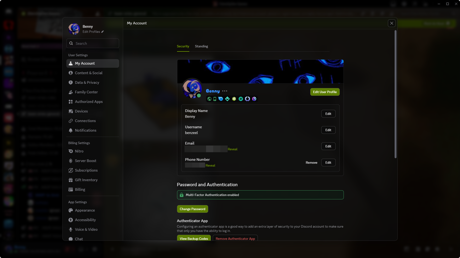
Actually, the CSS snippet was only intended for me. But I have now added variables so the colors can be adjusted. Below is an image showing how it is currently set up for me, but you can configure all the colors yourself or if there are specific aspects you dont want, simply comment them out.
-# Btw I copied the category line theme from blade0 and adapted it for myself
@import url("https://raw.githubusercontent.com/Augenbl1ck/Discord-Styles/refs/heads/main/ABrecolor");

:root {
  --rec-locked: var(--status-danger-background);

  --rec-news-1: rgba(255, 166, 0, 0.811);
  --rec-news-2: rgba(255, 68, 0, 0.811);

  --rec-rules: rgba(0, 128, 0, 0.811);

  --rec-stage: rgba(102, 51, 153, 0.811);
  --rec-mic: rgba(181, 16, 16, 0.811);

  --rec-forum: rgba(51, 144, 153, 0.811);

  --rec-help: rgba(255, 255, 0, 1);
  --rec-delete: var(--status-danger-background);

  --rec-ping-locked: var(--status-danger-background);

  --rec-create-channel-locked: var(--status-danger-background);

  --rec-category: rgb(185, 123, 82);
  --rec-category-effect:  rgb(255, 169, 111);
  --rec-roles-category: rgb(255, 169, 111);

  --rec-channel-lines: rgb(185, 123, 82);
  --rec-channel-selected: rgba(185, 123, 82, 0.72);

  --rec-unread-text-color: rgb(255, 180, 130);
  --rec-unread-circle-color: rgb(185, 123, 82);

  --rec-top-boosting: var(--guild-boosting-pink);
  --rec-top-members: rgb(187, 177, 35);
  --rec-search-channels: rgb(38, 166, 106);
  --rec-top-events: rgb(38, 81, 166);
  --rec-top-pin: rgb(167, 85, 51);
  --rec-top-noti-on: rgb(37, 154, 4);
  --rec-top-noti-off: rgb(154, 4, 4);

  --rec-dm-nitro: rgb(226, 146, 170);
  --rec-dm-friends: rgb(187, 177, 35);
  --rec-dm-shop-1: rgb(187, 15, 15);
  --rec-dm-shop-2: rgb(203, 193, 116);

  --rec-threads: rgba(166, 38, 85, 0.625);
  --rec-threads-line: rgb(111, 24, 56);
  --rec-threads-line-effect: rgb(213, 26, 94);

  --rec-message-delay: var(--status-danger-background);
}```
 small ridge
 azure arrow

 twilit gate


 dark escarp


 oak path
 hollow anchor


 opal venture
 , 💔 into
  and ❤️🩹 into


 mild niche


 nova whale


 sage mortar


 maiden isle


 whole steppe


 shut hull


 mystic lantern


 final bear


 lost tapir

 crude musk


 summer turret

 oblique umbra


 dim badger


 steel ermine


 mortal ibex

 frozen siren
 naive fractal


 rigid heart


 steel sapphire
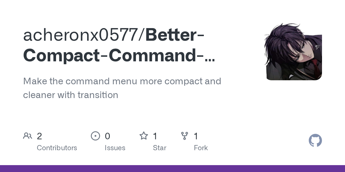
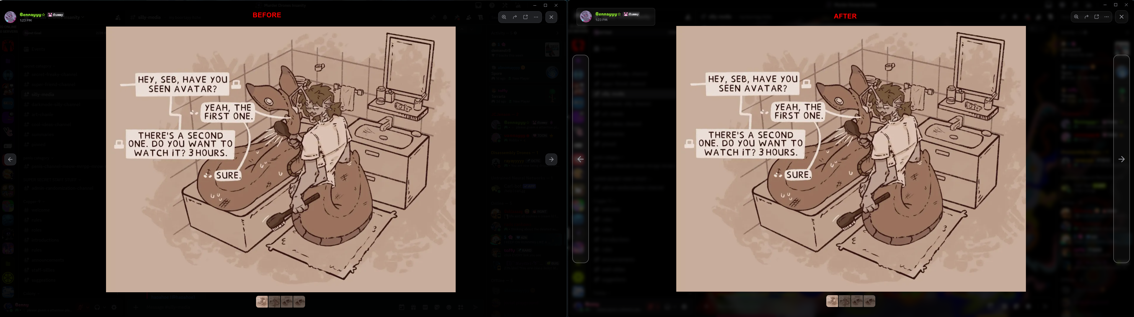
 More compact buttons


 analog loom


 grim tiger


 wheat belfry


 restive notch


 digital crag


 wooden mortar


 cyan bramble


 paper dew

 magic coral


