#📝project-feedback
1 messages · Page 40 of 1
@willow belfry ooh everything about this is gorgeous! How did you create the realistic fruit?
thank you @hearty haven ... 🙂 I used Illustrator .... gradient Mesh
Gave +1 Creative Carma to @hearty haven
recommended by my friend 😅
My new illustration
Personnal project - Posterize my day - Day01
Personnal project - Posterize my day - Day02
,
Fisrt 3 days of my personnal project "Posterize my day"...
Les 3 premiers jours de mon projet personnel " Posterize my day"
#photoshop #posterizemyday

My 90s, nostalgia doodle from yesterday’s Doodle Therapy with @proper shale and Amy. It needs some more work but it’s how far I got 😊
My Character from the stream today!
Posterize My Day - Day 4
Follow my project on Instagram :https://www.instagram.com/beaumefranck
Using some cool color pallets for the Design off today! Gonna pin for use today and tomorrow!
@lime magnet My WIP from todays design off! (getting to know fresco)
Neues Fantasy-Composing
hello all, i've kind of got stuck in another challenge, this time for atomhawk. loads of fresco and photoshopping 😃 https://www.behance.net/gallery/101983649/The-Adventure-begins-

My Design Off work for this week 🙂

In this video I share with you how I created this edit on the occasion of "Eid Al-Adha"
Hope you like it...
في هذا الفيديو أشارك معكم فيديو النصميم الذي نفذته بمناسبة عيد الاضحى
أتمنى أني يعجبكم
You can follow me on:
Youtube: https://www.youtube.com/TartTariq
Instagram: htt...
a photoshop battle
Great composition @lime briar! I really like the contrast of the elements and how the light direction are looking very cohesive. If you want, feel free to share the original assets for us to see how they were before the adjustments 😉 Well done!
Take off! 😄

This is a review on Topaz DeNoise AI. It uses AI to reduce noise in your Head over to thier website using the link below to get a free 30 day trial.
Buy Any Topaz Products (Use code 'DP' to get 15% off):- https://bit.ly/DilipTopaz
(Use this link to purchace Topaz DeNoise ...
@sleek tiger here you go!
it was just cutting out the hill, changing the sky, and placing the dog on the hill, and changing the lightning on the dog. and as final touch a camera raw filter 🙂
Day 7 of my personnal project "Posterize my Day"
@bleak echo I want that on a shirt!!
My last work : https://media.discordapp.net/attachments/371200486566658058/739961243858894858/image0.png?width=1318&height=842 🙂


😍
Combination of RL watercolor (the background) and digital watercolor. I'm pretty pleased with the way this turned out.
another photoshopbattle
Before // After
.
@JaMorant I @memgrizz
.
🔷 Rookie of the year ?
.
#smsports #NBAAwards #KiaROY #GrindCity


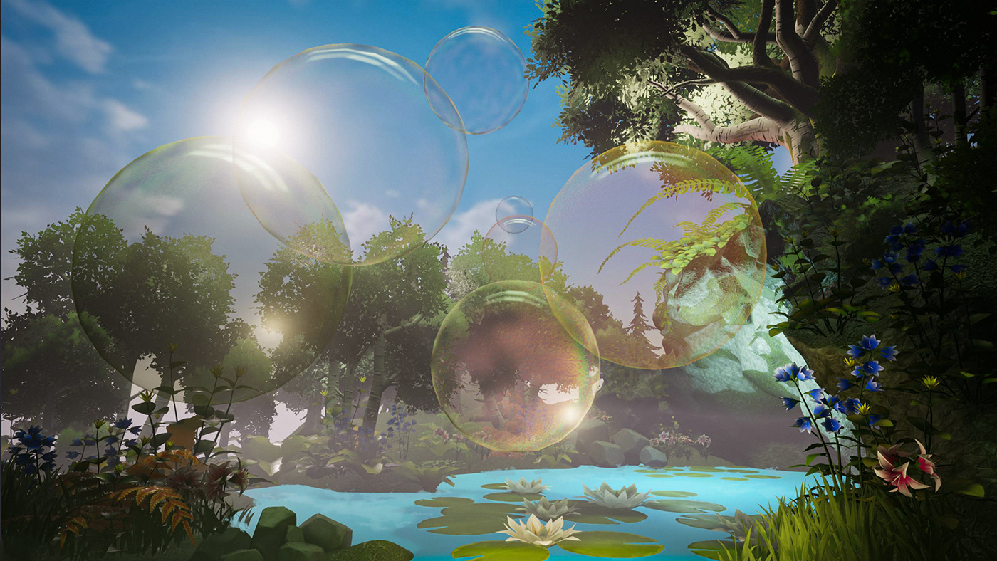
hello all - just wanted to show you the Summer Vibes 3D Challenge i've taken part in ... https://www.behance.net/gallery/102273295/Summer-Bubbles
Day8 of my "Posterize my day" personnal project...
I found a way to use angular gradient in photoshop...
(😉 @midnight glen)
@bleak echo I want that on a shirt!!
@wraith glacier Thanks, I appreciate!
@bleak echo beautiful colors! 😍
Retribution (2020)
Red Riding Hood gets her revenge.
Dragon's Dance 2020
A re-work of something I finished earlier this year.
@crimson canopy awesome job! if this was a book cover....id buy the book. 😆
Hero
@crimson canopy These are great! I really like your use of lighting in both designs, and the color of the red archer in the first one makes for a really nice focal point 👍
how bout this?
@vivid dragon thanks! I’m going to try and sell prints on Displate and see what happens.
Gave +1 Creative Carma to @vivid dragon
@wheat raptor HaHa! Thanks!
Day10 of my "Posterize my day" personnal project
Day11 of my "Posterize my day" personnal project
is there any #❓ask-a-question illustrator group
My last project :) If you like you can see more on my page https://www.instagram.com/rudygraphic
This is my newest Artwork and now this time i made for Gamers
@vast briar here: https://discord.gg/NUmxAP
Any suggestions appreciated!
@fresh sentinel can you try to retain more details in the hill. I mean it's too bright. It might look better if it was less brighter and more detailed
@simple herald I think lessening the blur on the plane might look more better. I mainly like the neon/cyberpunk font style.
[SWIPE] To see the abstract of this little story I am going to tell, and stay tuned to see the rest of it, I will be working on it and releasing troughtout the time and space. I will try to be consistent with it here on Instagram but I won't treat it like it is urgent as devel...

I was browsing through my projects and realized I had forgotten to upload my Space challenges with @lime magnet from February to Behance so here's the finished project now :)
https://www.behance.net/gallery/102443613/PS-DCC-February-2020-in-outer-space

Got inspired by @warm saffron for this composite
Trying to get into more cover art
Welcome back to Instagram. Sign in to check out what your friends, family & interests have been capturing & sharing around the world.

Behance
We had a virtual background design with Shauna Lynn. I chose a volcano theme, and I started on it. I used a specific color palette, which you can use. I'll provide it a few days later. Thanks!
Made a virtual background for the stream that Shauna had a few days ago.
Hope y'all like it
just for fun
Check out this "What we do" brochure for a Short Term Vacation Rentals Company i did a few months back. Do appreciate if you like it.🌴
https://www.behance.net/gallery/102512991/Brochure-for-Roamhome

Pixel Art with Jeremy Lord. I know I sort of copied it, but just added a few things. Hope y'all like it
Hello guys, yesterday night i enjoyed my life making an photo manipulation, trying to transform it in anime style, or comic style haha. Check this out!
https://www.behance.net/gallery/102624119/Historic-center-of-Sao-Paulo-as-anime-style?tracking_source=for_you_feed_user_published
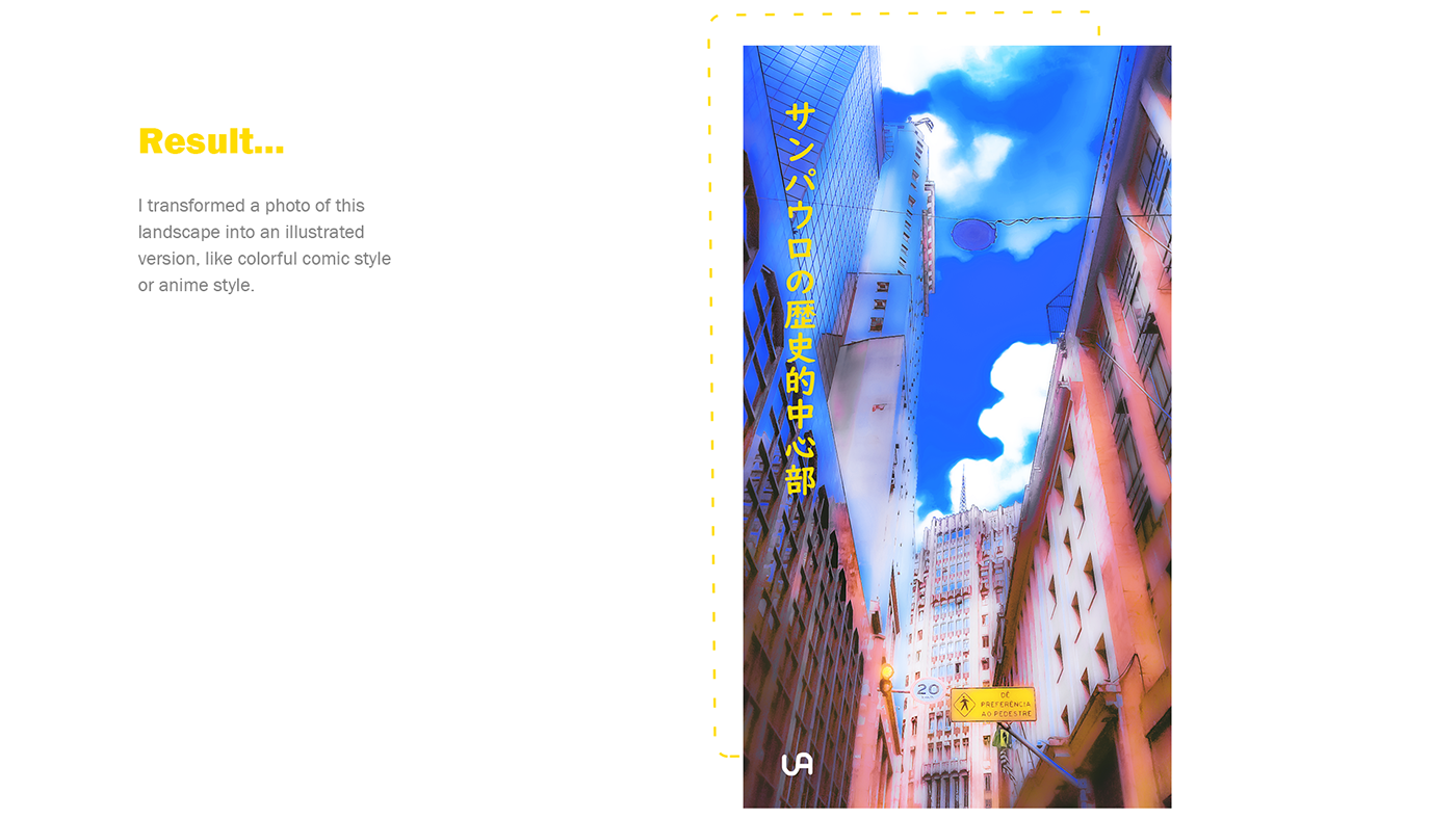
@winged valley That's super cool! I love the presentation and how you showed the before and after images as well as the process. Really fantastic results, it definitely transforms the image and gives me that anime vibe. Very nice work!
Hypocrisy ggoddamit[SWIPE TO READ]
.
.
.
#storytelling #graphicnovel #smallbook #scifistory #scifiartwork #bookcoverart #bookcover #posterart #posterart #cyberpunk #cyberart #empireoffuture #awesomesurreal #awesome_surreal #cyberpunkstyle #retrofuturism #artstationhq #artstati...

Do watch and like
What do we call these creativity???
hi evryone i am new here
istarted photoshop this year and i have learned a lot
here are some of my latest projects
i call it "loving guns" i assumed that it's a comedy
How many of you have practiced blading in another dimension?
.
.
.
#posterart #posterdesign #bookcover #bookcoverdesign #coverart #illustrationhowl #illustragram #cyberpunkstyle #cyberart #cyberpunk #scifiartwork #scifistory #retrofuturism #rollerblade #empireoffuture #mdcommu...

@modest forum looks dope 👌
https://www.behance.net/gallery/102932271/TextMaskingFloral Please like and appreciate this. Thank yo.


If you were an object what would you be?
.
.
Oh this bad boy on the back is available for free on my gumroad, link in bio.
.
.
.
#storytelling #scifiwriting #scifiartwork #scifistory #scifitales #scifiart #bookcoverart #bookcoverdesign #coverart #posterart #posterdesign #criac...

Having some fun with this character design
Having some fun with this character design
@vivid dragon Awesome
first time making social media posters any suggestions???
@waxen crescent The gradient is too harsh/apparent and text is very hard to read with it
i suggest keeping it all red in background
@waxen crescent The gradient is too harsh/apparent and text is very hard to read with it
@modest forum okay thanksssss
Made completely in photoshop, A Recreate This in Your Style challenge for Deviantart's 20th Birthday. This is why I love drawing in photoshop- all the things you can do with the layers
Lady Gaga X Adobe poster (Rain On Me)
oh my god...that's really beautiful! I love the color combination of your choice to create this work,specially the hair it looks really colorful and it works together,Great Job! @sturdy rose
Hey design fellas! Feel free to check out my latest design 😄 https://www.behance.net/gallery/102878989/Wanted-Stranger-Things-Vintage-Poster-Design

Behance
"Wanted" Stranger Things | Vintage Poster Design
hi guys this is my first book cover pleas if you have any critiques or advices help me with them and tnx

Behance
Ani's homemade sweets is a new local business, in Dilijan, Armenia focusing on pastries with middle eastern flavors and recipes, all ofcourse made homemade, and we created her visual identity from scratch to best represent her and her messege through desi…

@marble hinge Wow! I like the cover and the bkgd! Can you show me how ya made it?
I'm a newbie, ya see
2 or 3 months not enough to learn  😦
😦
Hello everyone, Just wanted to show you why we are not getting any visitors from the outer space :P
Hope you like it...
اذا عمرك فكرت ليش ما في زوار بيجونا من الفضاء الخارجي شوف الفيديو و رح تعرف السبب
أتمنى أني يعجبكم
You can follow me on:
Youtube: https://www.youtube.com/T...
@gentle edge Really great composite! The colors and lighting are all looking really natural together. I love that you included all the source images as well. Excellent work with the spaceship thruster effect too. If I had any nitpick it would be that the left wing makes a tangent with the left side of the exit sign which makes the depth of the objects a little unclear. Impressive work!
Was watching a adobe tutorial with Lisa Carney where she was recreating a Stranger Things character poster. So I decided to practice that using an image I took of my grand daughter.
Great concept,but I think you need to blur the background to add a depth of field to your image and also a glow to the fireworks and make the rim lights a bit brighter,but great concept and great composite @weak talon
@young wyvern Thank you for you advice!
Gave +1 Creative Carma to @young wyvern
you are welcome sir @weak talon
@gentle edge Really great composite! The colors and lighting are all looking really natural together. I love that you included all the source images as well. Excellent work with the spaceship thruster effect too. If I had any nitpick it would be that the left wing makes a tangent with the left side of the exit sign which makes the depth of the objects a little unclear. Impressive work!
@vivid dragon
HI Sam, I am actually so glad this got your attention, also very happy you liked it 😊
I'll keep that in mind about the wing...
It is actually really nice to he hear those words from a mentor like you... Many many thanks for the great feedback it really pushes me forward 👍
Buy the chosen dream machine right folks, the recommendation is the 9000 version, believe me!
.
.
.
#storytelling #scifiartwork #scifiwriting #scifistory #scifiart #scifitales #cyberpunkworld #cyberpunkwriting #cyberpunk #cyberart #cyberpunkstyle #retrofuturism #animestyle #an...

@wild sequoia that picture is clean af. Looks like it would be on the cover of a movie. I need to practice more so I can get as good as you all
New slides on IG https://www.instagram.com/p/CEp9V67gTrT/?igshid=166ljd8txp8nq
DAY 892 — Ascension. Balloons made with Adobe Illustrator. Clouds & background made with Adobe Photoshop.
.
.
.
.
.
#juniorartdirector #brandstrategy #brandingexpert #creativeadvertising #designpackaging #trier #empathydesign #contentstrategist #contentstrategie #davidblaineas...

Hey guys, I completed my Design-Off contest. Do let me know how it is! ;)
Please give me feedback, I'm a newbie!
🙏
Anything I can improve?
what is it for?
Design-Off
Look in the #💬chat-general channel. I've made a mock-up!
Converted Windows into this
🤪Starter file😝 😂 🤣
https://www.instagram.com/p/CErqpXzDTGz/ still wip, kinda.

Made upon Adobe Creative Cloud's latest video. It was amazing. Just played around for a few minutes and did this Mockup 🙂
Would love feedback.
Too pricey, eh?
i mean in the nicest way possible
but what did you actually make
the photographs & mockup & font were downloaded
i dislike the colour and layout of the text
seems although it was made in microsoft word
also i would be very careful attempting to sell something like this
as you dont poses the copyright to the images
I made this for the 35th anniversary of Mario. Please share thoughts. Thanks😃
Does it look ok ?

Always take care of the detachment procedure!
.
.
.
#storytelling #graphicnovel #smallbook #scifistory #scifiartwork #scifiwriting #scifiart #scifigeek #cyberpunk #cyberpunknovel #cyberpunkstyle #empireoffuture #mdcommunity #xuxoe #cgart #taxcollector #retrofuturism #retroart ...

Monster Corona

With huge hopes that the Corona (Covid19) virus will be contained, along with many other wishes that humanity will find the cure for it, I wanted to create this photo manipulation art to demonstrate how big the issue is now adays.
May god protect us all, and end this well very...
OK @wild sequoia but no I won't sell it
And thanks anyway
@quiet jetty Looks awesome! What happened to the red part though? Although it's awesome! But the colors are matching the background, but they are the Mario colors! So overall I like it!
@gentle edge Amazing stuff! i like the texture and 3D effect! And thanks for the video, I will need that for compositing!
Gave +1 Creative Carma to @quiet jetty
@quiet jetty Looks awesome! What happened to the red part though? Although it's awesome! But the colors are matching the background, but they are the Mario colors! So overall I like it!
@vast horizon Thanks You much! but can you please explain what you felt wrong with the colours as i didn't really understand. Thanks
@quiet jetty Looks awesome! What happened to the red part though? Although it's awesome! But the colors are matching the background, but they are the Mario colors! So overall I like it!
@gentle edge Amazing stuff! i like the texture and 3D effect! And thanks for the video, I will need that for compositing!
@vast horizon
Thank you I am glad you liked even more happy that you find it useful ☺️ there are more on my YouTube channel... Will be happy to help with any question 😊
Gave +1 Creative Carma to @quiet jetty
Oh thanks @gentle edge!
Gave +1 Creative Carma to @gentle edge
@quiet jetty: look, it's awesome. I want to know why the red part of the controller is lifted.
Also, the text color was matching the bkgd (PTrani style) color. But that's all. It's awesome. And the shadows were awesome too!
@vast horizon the controllers were like that from the image I used as a reference. Thanks for sharing your views
Gave +1 Creative Carma to @vast horizon

just sharing my work, thanks 😬 🙏

ArtStation
Something to get the rust shaken off and get back into habit of making personal art again.
Hi everyone. I recently designed these three book covers for the novel The Fall by Albert Camus.
-
This design is an attempt to lead our eyes to the center of the rectangles. Which, I think, gives a feel of falling, as our eyes are following this spiral and falling into the center.
-
This one also have the same idea. But, a bit different typography.
-
This design tries to express the meaning in typography. The slight italics in name "Albert Camus" is an attempt to show that this word has pushed the word "THE FALL" and then the word is falling.
All the rectangles and typography are in golden ratio. Like (point size of THE FALL / point size of Albert Camus = GR). Also, in the second poster. The point size of "Albert Camus" is the point size of succeeding "THE FALL".
Your feedback would be really helpful. I shall be thankful to you. 🙏🙏🙏
its the golden ratio right
i like the idea of minimalism
but this is without meaning
i think also the font choice
is incredibly boring
if your gonna be minimalist
the few elements you do include
should stand out
@obsidian burrow
also a book has a cover and a back and a spine
you gotta make them all
i designed theese two covers for a competition
and you can see im still being minimalist
but i have more impact
and meaning
thats alot going on
DAY 898 — Snickers x Nasa
.
.
.
.
.
#juniorartdirector #brandstrategy #brandingexpert #creativeadvertising #designpackaging #trier #empathydesign #contentstrategist #contentstrategie #snickersbar #snickers #foodanddrink #foodporn #brandwriter #brandplatform #brandtruth #market...

Hey everyone! Me and my partner's new poster series is on behance now! please check it out let me know what you think! 😄 like and support us if that's something you want 🙂 help alot us creatives! thank you. https://www.behance.net/gallery/100721403/Poster-Series-A-World-without-Curves

Behance
"A World without Curves" is a poster series, where these artworks try to bring an atmosphere and create a mood that you feel close or nostalgic to in your favorite room and space!
@sleek tiger @vivid dragon
Hello, Please I need your Feedback for E-commerce web Design "Homepage" (colors / logo /icons / layout / fonts) . I made it by Photoshop tool and I designed it like Amazon website
Very nice layout, @crimson violet! Is that for a study project?
The contrast and the consistency of colors and frames are looking very on point. Just a few thoughts:
- You can replace the serif font from the second top bar to one of the sans serifs that you already used it. You can also align those menus to the center of the rectangle since there's no extra information, I believe this will make it more balanced;
- I don't know if you're going to prototype but you can add an icon Back to the top so when the user scrolls down to a certain area, this icon will come along on the page as the scrolling down keeps going on. (Discord here has a similar option when you go way up to the older messages, it appears a "Jump to present");
- Since the links on the frames are already in a cyan tone, I believe you don't need the underline on the words, this way, the CTA won't look very heavy for the overall layout;
- I don't know if that's possible according to the brand guidelines or something, but it might be nice to add a subtle color instead of the full black, like the one from Amazon that has a very dark blue tone;
- If you want to create a full experience when you have the other pages or even this one, I strongly recommend that you use Adobe XD, there are a lot of features like components, states, and even creating prototypes (where you can create the dragging experience), that you can take advantage of.
I hope this helps you 🙂
@sleek tiger
Thanks a lot for your feedback💙, yeah it's study project.
I've already used XD but I've tried to make it by Photoshop
Really appreciate your Feedback
Gave +1 Creative Carma to @sleek tiger
How about some girly outfits, @fallguysultimateknockout.game?
#fallguys #fallguysmemes #fallguysoutfits #fallguysskins #powerpuffgirls #fallguysfanart #powerpuffgirlfanart

Ping...pong...ping...pong... ping?
.
.
.
#pingpong #pong #90sart #retrofuturism #retroart #vintagescifi #vintagescifi #banana #scifiartwork #scifiwriting #scifistory #scifiart #cyberpunknovel #cyberpunk #cyberart #cyberpunkwriting #cyberpunkstyle #animestyle #mechdesign #vapor...

what do u think?
what do u think?
@bitter fog Awesome. I love the simplicity and the color grade. Circle in the background add a great focal point.
Great composite! 👍
@bitter fog Awesome. I love the simplicity and the color grade. Circle in the background add a great focal point.
Great composite! 👍
@bleak echo oooh thank you for feedback 😄
I would love to hear your feedback @sleek tiger 😜 😁

Hello everyone. I how you are doing fine. It's kinda huge favor. But if someone can critique this design, I'd be extremely thankful. I created this Brand Development Guide for a startup that's working in Active Journalism. I have submitted it, but wanted to learn, how it could be improved further. 🙏🙏🙏
Hey @toxic dome! Of course! I like how the assets play very well together. My suggestion would be to work on the contrast of the front area where the subjects are standing. You can create a solid color adjustment layer on top of all the layers > choose #808080 as the color, which is 50% of gray > change the blending mode to Color. This will make the overall image black & white allowing you to see just the luminosity values. You'll see that the area of the ground in the front looks a bit faded when compared to the ones on the middle right. You can correct that by using a levels adjustment layer and bring the first and third sliders closer to each other, then you can fill the mask with black and paint with white to reveal the adjustment only on the faded areas. Areas that are closer to the viewer tends to have more contrast than those that are farther. If you see that it saturates the images, just change the blending mode of the levels layer to Luminosity. The other elements on the background are looking very on point.
Also, you might add a little bit of blur to the EVA's shadow, since it's not touching on the ground, some blur would occur on the shadow, it doesn't have to be a strong blur, just a touch.
About the font, I believe that since they are robots, you might play with some font that might suggest a technological vibe (you can use the original from the poster as a reference, it has more of a square shape a is a little wider.
You did an amazing job, Deepu! Keep it up!
@obsidian burrow that's very nice and consistent work, Maroof! I like how you showed some variations of the applications of the Brand assets. My two suggestions are: Make landscape page format the default for the cover and back cover, so if someone is going to print, it won't have format variations. Another thing is that you might add some page numbers to the pages, so the table of contents might be even more helpful for the viewer. If you want to get fancy, you can add links to the pages on the Table of Contents, so if the person wants to jump to a specific page, a single click on the name can lead to the page. Great job! !
Hey @toxic dome! Of course! I like how the assets play very well together. My suggestion would be to work on the contrast of the front area where the subjects are standing. You can create a solid color adjustment layer on top of all the layers > choose #808080 as the color, which is 50% of gray > change the blending mode to Color. This will make the overall image black & white allowing you to see just the luminosity values. You'll see that the area of the ground in the front looks a bit faded when compared to the ones on the middle right. You can correct that by using a levels adjustment layer and bring the first and third sliders closer to each other, then you can fill the mask with black and paint with white to reveal the adjustment only on the faded areas. Areas that are closer to the viewer tends to have more contrast than those that are farther. If you see that it saturates the images, just change the blending mode of the levels layer to Luminosity. The other elements on the background are looking very on point.
Also, you might add a little bit of blur to the EVA's shadow, since it's not touching on the ground, some blur would occur on the shadow, it doesn't have to be a strong blur, just a touch.
About the font, I believe that since they are robots, you might play with some font that might suggest a technological vibe (you can use the original from the poster as a reference, it has more of a square shape a is a little wider.
You did an amazing job, Deepu! Keep it up!
@sleek tiger thanks for this 😁 it really showed me on which parts i have to work more 😅
@obsidian burrow that's very nice and consistent work, Maroof! I like how you showed some variations of the applications of the Brand assets. My two suggestions are: Make landscape page format the default for the cover and back cover, so if someone is going to print, it won't have format variations. Another thing is that you might add some page numbers to the pages, so the table of contents might be even more helpful for the viewer. If you want to get fancy, you can add links to the pages on the Table of Contents, so if the person wants to jump to a specific page, a single click on the name can lead to the page. Great job! !
@sleek tiger Thanks a lot Leonardo. Will take these into account. 👌


Hi! I made a isolation inspired photo manipulation! 😄 Feel free to check it out


check my behance too

Behance
Thank you!
I'm trying a technic that Paul Trani was using in a masterclass 1 year ago but i don't know if i'm doing it right ...
this is my 1st attempt, more will follow ^^
(my objective is to make it look like gold)
@sleek tiger
Hello, Please I need your Feedback for movies web Design "Homepage" (colors / logo /icons / layout / fonts) . I made it again by Photoshop tool and I designed it like Netflix website
Hi @crimson violet! I really like how balanced the homepage looks, the colors express the "cinema" feeling especially with the black as the background. The texts have a nice amount of contrast as well. The only thing that I believe you might adjust is the leading (space among the lines) of the text. You can reduce it a little bit so the reading might be even more comfortable. 🙂
Hey guys! Just posted my first October prompt list if anyone is interested 🐻🎃🍂
https://www.instagram.com/p/CFFNolpjuYL/?igshid=1kofk5wzkcehl
CodiBear's first October prompt list! 🎃🍂
Last year for #inktober, I followed @ragonia_'s lovely list, along with some of my own prompts. This year I will be following my own list, and I hope that you all will join me!
🎃
I decided to make a #drawtober list instead of an Inktobe...

@sleek tiger
Thanks a lot for Helping me.
Really appreciate that🌸🌸🌸
Gave +1 Creative Carma to @sleek tiger
Hi guys, i had some spare time so i challenged myself to create a composite out of random pics so i took over 15 picture & made this < Just masking objects, color & luminocity matching, some dodging and burning & i used blend if to make the background & reflexions >
TRIED TO CREATE SOMETHING ABOUT HOPE .Feedbacks would be much appreciated .

Common just tell me your story real quick
.
.
.
#cyberpunknovel #cyberart #cyberpunkwriting #cyberpunkstyle #cyberpunkworld #cyberpunkboom #cyberpunkaesthetic #cyberpunkart #scifiartwork #scifiwriting #scifiart #mdcommunity #empireoffuture #xuxoe #cgi #psyart #artstationhq #il...

"Beyond Lost"
I got inspired by Codi Bear to try out the gouache technique in Photoshop and here's what I came up with 🙂
playing with lettering and wanting to make a fall GIF

Added in my son's VW GTI using Quick Actions "Remove background". Really amazed at how well it selected the object. Did some blend modes on the city lights. Still not completely happy with it but was fun to see how these tools can be used.
@amber chasm For sure, select subject and remove background can be like magic sometimes, hah. Really great colors in this one. I think it could be nice to match the lighting of the environment on the car a bit more if you wanted to push it further. Maybe a multiply layer with a soft round brush around the bottom to add some shadow, and even a color dodge or screen layer to cast some of the blue light on the car. Maybe something like this? (I also used a levels adjustment on the car to increase the overall contrast to better match the scene).
(Click the image and the click "Open Original" for best quality)
@frigid light Great lighting on this, I really like color range as well, it all fits together very nicely!
@vivid dragon thank you so much.. i am just a beginner in photoshop
Gave +1 Creative Carma to @vivid dragon
@formal talon These are excellent! I especially love the colors, lighting, and textures of the first design. The collage of the planets and galaxy make for a seamless and visually interesting effect. I really love the warm colors on the arm as well, great balance of colors here!
@stable bay Very cool! Great to see taking some inspiration from that stream, those brushes can be a lot of fun. Always fun to work on a toned background too. Looking good!
Thanks @vivid dragon 🙂 It was lots of fun and quite refreshing
Gave +1 Creative Carma to @vivid dragon
@noble gyro That would be great! I can definitely picture some warm fall colors in this design. Animating it would be a great effect 😄
@vivid dragon Thank you so much for such kind feedback 😄 this was my first attempt of creating some kind of composition in Photoshop so your opinion means a lot to me 😃
Gave +1 Creative Carma to @vivid dragon
improved version
@gritty notch I cant really place it but I think there is different lighting for the dog and the man
Hmmmm yes, does appear so, Ill have a go at getting the colours cohesive. Thank you.

Real Vs Mock-up (Just an experiment 😊 )
How can I make it more realistic ?
Blast their faces with brand new tech
.
.
.
#conceptartist #conceptdesign #mechdesign #hardsurfacedesign #indiegamedeveloper #illustrationhowl #illustration_best #illustragram #scifiartwork #scifiwriting #poetryofinstagram #cyberpunk #cyberpunkstyle #animestyle #cellshaded #3...

@toxic dome i think that the shadow is too sharp and because of the light coming in front of the subject and the other light that we can see in the background you should maybe have two shadow opposed. For the blending of the subject, it is good ;)
the black and white reminded of my works in the same filed so here are some of them
actually they were all of them no some of them
i posted them all because i haven't posted anything here
hop you like them

ArtStation
Stuff for practice, UI and dialogue boxes for the funz
@Majesty Thanks for the feedback.😀

Kickstarter
Ultra-compact hybrid magnetic play system that now does 30+ different games and is a 3D constructor, too. But also so much more! SUB!
the black and white reminded of my works in the same filed so here are some of them
@candid rain from black white to colour, wow awesome u made it, how it's work? for me this is difficult
https://www.kickstarter.com/projects/ralev/must-see-the-gemji-game?ref=profile_saved_projects_live
Sorry for posting and not saying what it is!
Kickstarter
Ultra-compact hybrid magnetic play system that now does 30+ different games and is a 3D constructor, too. But also so much more! SUB!
This is a project that we have developed for the last 4 years at Ralev.com.
It is a board game system that is visually impaired friendly by design.
It is a magnetic hybrid taking the best of both worlds - tabletop games & constructors.
Currently, there are 30+ games.
Some retouching I did a while ago 😄 I was still learning this technique of converting b&w photos to the coloured version, so if I were doing the first image today, I would probably do it a bit better and pay more attention to the details.
2 #📝project-feedback, thank you 🙏
@bitter fog I am really in love with this idea and concept, and I especially love how clean and neat implementation is. Love this style, keep going 😄
Gave +1 Creative Carma to @bitter fog
Suggestions, thoughts, questions, epiphanies?
Gotta work on my unending shift guys.
.
.
.
#storytelling #cyberpunk #cyberpunknovel #scifiartwork #scifiwriting #pastels #cyberart #cyberpunkstyle #retrofuturism #gameart #3dartists #cgiart #gamedesigners #xuxoe #artstationhq #indiegameart #indiegamedeveloper #scifiart #illus...

A fake reality photomanipulation
Like ❤️ and retweet 🔁 are highly appreciated

Unsplash + Photoshop. https://www.instagram.com/p/CFk_U6HgtkD/?utm_source=ig_web_button_share_sheet
DAY 915 — Escape.
.
.
.
.
.
#juniorartdirector #brandstrategy #brandingexpert #creativeadvertising #designpackaging #trier #empathydesign #contentstrategist #contentstrategie #covid_19 #quarantine #foodanddrink #foodporn #brandwriter #brandplatform #brandtruth #marketingcollat...

@formal talon Excellent work! Really impressive job on colorizing the B&W photo, that can be tough to get looking natural but this turned out great. I really like the warm/cool contrast in it. The portrait touch up looks really natural, nice job keeping the skin texture in there with the blemish removal. And of course the way you focused the lighting in the last image makes a huge difference. These all came out great!
@bitter fog I am really in love with this idea and concept, and I especially love how clean and neat implementation is. Love this style, keep going 😄
@formal talon thank so much 😊
Suggestions, thoughts, questions, epiphanies?
@wise garnet I love absolutely everything about this one 😃 Great job, especially with the lighting 👍🏼 Very professionally done 😄
Hi, i designed this logo for my friend he has a client asked him to do it but he refer it to me to see if i have designing skills. I need to know if this design is acceptable or not and some advice if you may
He is selling honey that has a reputation of being pure and high quality
@sand drift looks fairly well done. Not sure what the constraints were, and what was taken into consideration; with all that aside it's not bad.
@wise garnet thanks, i think its my artistic eye nothing seems to amaze it
Gave +1 Creative Carma to @wise garnet
That is dope! But i think if you remove the particles in the bottom and make the sand look more real by adding sand texture and light reflected on the ground will be perfect! @wise garnet
@sand drift the particles were an added revision to the original design. It looked too boring and lifeless.
Haha.. thats the point there is no life on space 😝 @wise garnet
Good point.
Can i see the original cover @wise garnet
It's that, without the dust particles
Oh, an original meaning my first copy, not something from Google or whatever.
So, it is without particles and no reflection on the ground
Try the reflection and see how it goes
And if you like the particles you may use it to create a ring around the planet ! @wise garnet
anyone know of a method to add like a light blue glow on the outsides of his hands?
so it appears as if he is interacting with the orb
(had to make a advertisement for adobe photoshop as part of a college project) 👀
and as you can tell im not that great with photoshop
@toxic dome you can first clip a fill layer to the person, set it to a blue, and change the blending later to colour dodge, then hit crtl+i to invert it. And paint back only where the light would be coming from with a brush.
hi guys this is mi furst book cover design plea can you rate it and give me some remarques or advices
Hey! I made a collection of music posters! The first volume is on my behance, feel free to check it out 😄

Today's updates to the advertisement and introduced a glow (went with a different approach, like a water ripple type glow, basically Brush > 500 > Hardness (25) made a splash and then blend mode to ''Bedekken'' in Dutch I think it's Cover in English to make it match the colors below it
And final version 👀 Added a Post Process EXR to the Planet Orb to bring it more in line with the other colors across the poster.
ow that made all the difference. Great work
I'm a beginner to photo manipulations, so it would really be good if someone could point out the mistakes and provide tips to improve..
Okay last time, I swear. (Final FINAL version)
(funfact this is also my first actual proper photoshop project, previous ones were just cutting stuff out or duotone effects)
(i feel like a mini bob ross, this was fun ❤️)
Did this for Community College Photoshop Class today. Blending Modes.
@pallid yacht What was it that you had to do?
Demonstrate the different uses of blending modes?
Suggestions, thoughts, questions, epiphanies?
👀
Yeah, the highlight on the astronaut aren't right, regarding the light source
Yaa @wise garnet
@wise garnet highlights and most of things are sharp
Is that good or bad? Haha
like saturn rings 😁 but very nice one🔥
@wise garnet can u try adding few highlights on small rocks near, source of light
That will look more realll🔥
#fractals
Trying out some composite images today. Any input would be great. I am a beginner!
@dapper parrot I could balance the brightness of the bird, to the deer. Add some occlusion too, to really sell it. Colour match the colour of the bird too.
@wise garnet how do I add occlusion? I am new to this!
Just add a new curves layer, darken it a lot, change the blending mode to multiply, click on the part of the layer that is a white box. Hit ctrl+i and then paint in where the occlusion should be
It just gives it a sense of realism!
Does this look better?
Bird is matched much better. Now try adding some shadow below it, where its feet are.
Does this look better?
@dapper parrot I think u can add some shadows beneath the hedgehog .also u can match the lighting of the hedgehog
^
aight so like-
I wanna make that ball into a glass orb, how difficult is it to acquire that effect?
basically gotta clip the three fingers in middle to behind the orb, clip a shooting sky into the orb image and then i need to cast those reflections on the hand etc is that hard? on scale of 1/10
changed my mind and made it into this 😅 i like it, what do you guys think? it's keeping in line with the other one I posted earlier
Good morning
How is everyone this morning?
I've had 5 cups of coffee
I have some product labels I'd like to get some opinions about.
Has anyone done product labels before? Especially, for cosmetics?

Can someone review? Image is edit from two other images. Image of car and image of the background.
The two images i mentioned
@crisp mason if you transform the image and flip it horizontally, it would make the lighting more congruent, as you can see, the lighting in either image, originates from two different places. The colour matching is very good, but you colour either bring one thing back or forward, in terms of colour, as there's either too much red, or too much green. Great job though 👌
Feedback please 🙂 I am trying to make the guy blend in more, but I don't know if it is quite right yet.
@dapper parrot I'd suggest, clipping a colour, similar to the one in the foreground, and have that affect the solour of the person. You could also add some atmospheric perspective as they're not in the immediate foreground
Thanks for the input! I am going to work on that one later. I did however create this one today for my son's magic group on Facebook!
@crisp mason Very cool! I think this is looking pretty solid. It's kind of a fantasy looking lighting with the green tint but I think you did a nice job of color grading the car to fit the environment. The green reflection in the windshield helps with that quite a bit too. I think there's a bit of a perspective different between the two images but the way the car covers the horizon line of the road helps make that less noticeable. The car makes for a strong focal point too, nice job!
Thank you
hey folks
take a look
did this a while ago, pjoto manipulation!
pretty cool actually
took a lot of fotoz and mushed thm together to get this nice composite.
whaddya think
also this:]
It was Project day yesterday on the Photoshop dev team. "Use the product you work on to make something cool." Here's my result.
@severe sand Haha, I saw this on Twitter, love it! The lighting and color fits together really well.
Thanks @vivid dragon
Gave +1 Creative Carma to @vivid dragon
@sage grail These are great! The lighting and shadows on the girls are looking great and well help set them in the scene. The colors fit together very nicely as well. Really cool concept for the astronaut image! I wonder if a bit more brightness on the astronaut and balloon/planets might help them pop a bit more? Very nice work on these!
@sage grail These are great! The lighting and shadows on the girls are looking great and well help set them in the scene. The colors fit together very nicely as well. Really cool concept for the astronaut image! I wonder if a bit more brightness on the astronaut and balloon/planets might help them pop a bit more? Very nice work on these!
@vivid dragon thanks man! ye the astonaught one need urgent fixing, starting with the low res earth 🙈 and stuff. ye, im gonna try add some pop. thanks tho:))
@severe sand : Nice result!👍
Working on a magazine cover design please designer I need a review on this design
Which is better of the two cover and review
second design
review
Hey everyone, I've been using photoshop for almost 3 months now and few days ago I saw benny production's realistified(where he turns drawings into reality) videos and thought of trying. This is my first time doing something like this. lizard mutant 4k(og drawn by a friend) review please
Thanks @bleak echo
Gave +1 Creative Carma to @bleak echo
@scarlet meteor very cool! Can you post a link to those videos? Maybe blur the shadow a bit?
@severe sand here is a link https://youtu.be/rioc6mTWOZs. and yes shadows are bit darker so I brightened them using curves in the original

Head to https://www.squarespace.com/bennyproductions to save 10% off your first purchase of a website or domain using code ''BENNYPRODUCTIONS''
In this third episode of #realistified! I'm turning YOUR #drawings into realistic artwork using #photoshop! This time I'm doing an e...
Thanks @scarlet meteor
Gave +1 Creative Carma to @scarlet meteor
I really admire Benny's distinct style and process on Photo-Composition. It's very Eye-Catching. Wouldn't mind buying a course from him to be honest.
I gave the crystal ball a shot cuz @lime magnet inspires! First attempt.
@icy slate These are looking really good! For the first design with the snow, I like the second one. The composition feels a bit more balances and the slight tilt to the text gives it a bit more of a dynamic feel. For the second design I kind of like the second one, the background filling the page makes the photo seem a bit more vast and expansive. For the last design I kind of like the second one as well. I think the composition is a bit more balanced and the clouds not being covered by a shape again makes the photo seem a bit more vast and impressive. Nice work on these!
@scarlet meteor Great video. This is looking really cool! The textures are looking really good, and the shadows are looking solid, though I'd probably soften the edges of the cast shadow on the ground a touch more. The main thing I might suggest would be to try and focus the lighting and attention a bit more towards the upper area. I'd try to avoid going too bright on the legs or doing too many highlights outside the focal point of the face/chest area. Also keep in mind the direction of your light source so you can make sure to know where both the shadow and light will be falling. Here's a quick example of some changes I mentioned. Really cool design, very nice work!
(Click the image, then click "Open Original" for best quality.)
@humble kite Very nice, the lighting and color of these images match nicely. The bright white of the crystal ball contrasts the portrait and background very clearly as well. Really great color and ghostly fade to the edges of the portrait. One small thing is It might be worth trying to remove the dark shape across the bottom left side of the face. I'm not sure if that's hair, but in this context it doesn't really read and also creates a really strong point of contrast that seems a bit distracting. Great design! Also feel free to post any DCC challenges in the #✂challenges-feedback or if they're from a past set you can do it in the #💎past-challenge section. Great work!
@vivid dragon thank you for your amazing suggestions. Luckily I still have the PSD where every single thing is done non destructively and can be changed easily. As I said I am still a beginner and have so much left to learn. Thank you for a valuable feedback
Gave +1 Creative Carma to @vivid dragon
hello everyone, I made this photo editingfor halloween and ill be uploading a tutorial on my channel very soon . hope you all support me, thanks!!
cheers as always for great feedback that helps... here's the redux @vivid dragon now a-glowin'
Super cool work, @lone quiver! The design feels very balanced and I like how the fire breaks the invisible square bounds from the texture. The stylized font is looking great as well, I like how its fill gives it a nice personality touch. This would be a great album cover. 💯
Hey, @waxen crescent great job changing the atmosphere of the image. My only suggestion would be to increase the transition from light to dark, so more areas can be shown without losing the spotlight effect. Loved the way that you blended the other elements on the ground. Nicely done!
@sleek tiger i think thats what you meant
@waxen crescent I meant brightening up a bit more the super dark areas to recover some details for the original scene 🙂
@waxen crescent I meant brightening up a bit more the super dark areas to recover some details for the original scene 🙂
@sleek tiger ohhhh got it
Hello I am from the Behance feed
This is a sample of images I make for design
The colors control machine function and define design as well
This is what the design creates.
@icy slate These are looking really good! For the first design with the snow, I like the second one. The composition feels a bit more balances and the slight tilt to the text gives it a bit more of a dynamic feel. For the second design I kind of like the second one, the background filling the page makes the photo seem a bit more vast and expansive. For the last design I kind of like the second one as well. I think the composition is a bit more balanced and the clouds not being covered by a shape again makes the photo seem a bit more vast and impressive. Nice work on these!
@vivid dragon thanks for the feedback

Hello, I recently completed The Haunting of Bly Manor and was really inspired by the opening credits of the show. And made this photo manipulation project on it. Would really appreciate some feedback. Thank you! ☺️https://www.behance.net/gallery/106048549/Project-Inspired-by-The-Haunting-of-Bly-Manor

When you don't know what to do, this is what happens: https://www.instagram.com/p/CGV7x3_Ajz_/?utm_source=ig_web_button_share_sheet
DAY 934 — Style.
.
.
.
.
.
#juniorartdirector #brandstrategy #brandingexpert #creativeadvertising #designpackaging #trier #empathydesign #contentstrategist #contentstrategie #styleoftheday #styleinspo #foodanddrink #foodporn #brandwriter #brandplatform #brandtruth #marketingco...

Unsplash + Photoshop + Texture + using track pad (was to lazy to set up the tablet 🤦♀️)
Made this today for my photoshop class
hey ppl
i need help a sec
whats better:
with the moon in the umbrella, or without?
this is without:
and this is with.
I would say without 😊
@light thorn that's really cool
thanks @deft verge
Gave +1 Creative Carma to @deft verge
Hi All! During the Draw Along today I used a custom brush of mine to shade my Spooky Animal Crossing character! I wanted to post it here for you!
I will pin it to this channel!
Thank you, @lime magnet
Gave +1 Creative Carma to @lime magnet
@fading bobcat thanks!! :)))
Gave +1 Creative Carma to @fading bobcat
@plucky cedar
Excuse me but, can you extend your free trial period of photoshop 2020?
No, I don't think so. You have to purchase it after trial
@plucky cedar So, the "How to extend your trial of photoshop 2020" videos are fake?
probably?
No, they will tell you illegal ways...like crack or path
Ok well, thank you!
your welcome
@plucky cedar Fantastic job! I would love to see the original background photo as well 😯
@plucky cedar That is really impressive!
@potent crater thank u so much
Gave +1 Creative Carma to @potent crater
goood
Just something I made for #✂challenges-feedback but not part of the challenges to to approve that I am #readyformax
@plucky cedar Very impressive work! I like that you included all the source images, everything fits together very nicely in terms of lighting and color. The composition is looking really solid too, with a nice midground foreground and background. The glowing building and jack-o-lanterns make for a really nice focal point. Great job!
@sage grail Great lighting and glow to this design! Very cool lighting effects. It creates some great contrast and a really strong focal point to the image. I think the image without the moon in the umbrella works a bit better, otherwise it almost gets too busy. Really excellent work!
@vivid dragon thank you so much.
Gave +1 Creative Carma to @vivid dragon
"Ethereal Objects in My Style" - I saw the "Ethereal Objects" class on Behance yesterday and then thought....Why not create something similar but not exactly same....and end up creating this....
Another Version ( More ghosty but less realistic)
Raw Images
https://www.behance.net/gallery/106208855/Ethereal-Objects-in-My-Style -Visit for Layer Breakdown(A lots of lighting and Shadows)


In this video we will create a cover art design with the theme of edgy sunset. This design is also included in the cyberpunk style, yet more realistic and warm colors. Download all design materials on the link below. How to Create Edgy Sunset Cover Art Design - Photoshop Tutor...
Hi! I did did photocomposition, would love to hear some thought about how to improve fitting the subject better to the scene
Specially the bottom part. It seems really odd
@vivid dragon hey! thanks! here is the original pic:
Gave +1 Creative Carma to @vivid dragon
@timber mulch Hi! Hey i think that is very well blended. tombs are maybe a little bit too dark, but it can be my screen too. I would think on how the light from the sky can be affecting the ambience light and maybe create some sort of depth field grading the tombs differently. Again, i think as it is is really well blend, just throwing tips
Thank you so much for the feedback
Anytime, great work!!
@tropic garnet The shadows look really good! I think the only issue is the brightness on the bike doesn match the rest of the comp, you could just darken it and add more highlights of the lights behind him.
@void tusk thanks !! Will re-edit and try to make it match, maybe is that what it’s a little it odd. Thanks !
Gave +1 Creative Carma to @void tusk
@tropic garnet no prob! maybe even add some smoke effect to give it a more dramatic atmosphere.
Had no idea today. So I scrolled through unsplash, found the jellyfish ... and 👉 This is what happened 🤷♂️ — Rough, very rough edit but it tells the story. https://www.instagram.com/p/CGf8CuHApgr/?utm_source=ig_web_button_share_sheet
Photos used: All from Unsplash. (Flame below jellyfish from Adobe Stock)
DAY 938 — Wizarding World. — Rough Photoshop Edit.
.
.
.
.
.
#juniorartdirector #brandstrategy #brandingexpert #creativeadvertising #designpackaging #trier #empathydesign #contentstrategist #contentstrategie #storytelling #wizardingworld #foodanddrink #foodporn #brandwriter #b...

hi, everybody , just wanna share my work, wdyt? thanks 😄
@sage grail Very nice, great job transforming the image! That’s a big difference.
@bitter fog Great style to this design, looks really nice! I love the heavily illustrated and sort of surreal look to it. One small suggestion would be that increasing the contrast of the suit, specifically the dark tones might help it match the higher contrast of the rest of the elements a bit more. Looks good!
@lone quiver Great contrast and texture in the origami design! It really has a bold and eye catching look to it. I really like the touch of depth the first design has with the text masked behind the paper, looks great.
@light coral Nice design! I like the strong simple read of the big letters against the clean background gradient. 👍
feedbacks would be much appreciated
@toxic dome its really nice!
@bitter fog Great style to this design, looks really nice! I love the heavily illustrated and sort of surreal look to it. One small suggestion would be that increasing the contrast of the suit, specifically the dark tones might help it match the higher contrast of the rest of the elements a bit more. Looks good!
@vivid dragon thank so much 😄
@grave swift Great work on these designs! I really like the sort of subtly aged look to them, kind of a late 90s vibe almost. Really nice composition work with how you balanced the figures, and there seems to be some nice attention brought to the face in the first one with the contrast being a bit higher in that area. Looks good!
@vivid dragon thank u so much glad u like it!!
Gave +1 Creative Carma to @vivid dragon
Omg so many great designs lately !!!
Ive been working on those lately. It started just to kill some time. But then I got into it ! Will try to finish it by Friday
Hey guys just posted something new on my art page on insta @grave swift check it out!
💯
See my work and press "L" if you like it


@grave swift Nice work!! Love the bold colors 💪
From a distance, the face looks too detailed compared to the rest of the whole illustration. I would love to see a second version with a more simplified face and see if that's any nicer :) Heh, also:
https://tenor.com/view/friends-joey-tribbiani-matt-le-blanc-doesnt-share-food-food-gif-4573039

@potent crater thank u very much!!
Gave +1 Creative Carma to @potent crater
Yea I think that bottom line on the eye makes it more detailed looking
@grave swift It's not as visible when you're looking at the original size of the image, so I wouldn't worry too much about it. I just wanted to mention it :)
@potent crater def thank u for the feedback
Gave +1 Creative Carma to @potent crater
Photo Booth Background
New cover project coming soon
go check out my Behance page ;)
https://www.behance.net/Majesty___

Behance
New post on the gram!!
@amine
Comment your favorite basketball team below 🏀⬇️
#digitalart #digitalcreator #visualart #printwork #posterlabs #printart #visualcollage #photoshopwork #designwork #graphicindex #posterart #edit #photocollage #adobephotoshop #adobemax #eyecandy #graphicdesign #creative...


Just Elliptical Marquee Tool
@wild sequoia I like it 💯 💯
New image composition
With a life message
I love design because it helps me to express what is in my head easily
@rugged meadow Very nice, the textured and colors are looking really nice! There's some nice hue variation and lighting across each shape. Kind of looks like some neon planets at a laser tag arena or something, hah. Very cool!
A texture blending contest sponsored by Matt K one of the instructors from MAX.
@rugged meadow Very nice, the textured and colors are looking really nice! There's some nice hue variation and lighting across each shape. Kind of looks like some neon planets at a laser tag arena or something, hah. Very cool!
@vivid dragon, Thank you!!!
Boats in the water in a notebook
https://www.artstation.com/artwork/L3ElrP more Amnesia Rebirth concepts which got greenlit to share

ArtStation
Concept Artist: Miguel Nogueira
Art Director: Rasmus Gunnarson
Client/>Copyright: Frictional Games
my design for halloween ?
@last spindle Very cool! I like the texture and atmosphere to this design. I also like that sort of "One of these things is not like the other" vibe of the ghost among the tombstones, hah. My only suggestion would be to choose an element of the image to be a more contrasting focal point. Currently everything is a bit dark and it's not completely clear what the main subject of the image is. I think increasing the brightness of the text would look good and really give this image some nice pop and focus with the title text. Looks good!
@solid onyx Very cool collection of concepts here! Are these all done completely in 3D and then textured, or is there also a stage of painting/photo manipulating them afterwards? Great work 👍
pretty much on the spot, 3d model base and overpaint in PS 🙂
@plucky cedar Very nice! I always enjoy seeing people doing these challenges. The textures are looking good, and the rock/background are looking really solid. The silhouette of the werewolf is looking really good, though I think one main thing that could be improved would be the edges of the body. It looks like you used a soft brush on some of the edges and it looks a little unrealistic. I think if you add some areas of fur clumps sticking out like we around the bottom of the arm on the right side, and the bottom of the knee on the left side it'll give it a much more realistic look. You could take photos from other animals where we see that fur texture around the edges and composite it around the werewolf a bit here and there in key areas, or you could even use a brush (or both) to paint it in where you want it. An example of the brush can be found here where Jesus shows how he uses it on a cat image around the 13:30 mark. https://www.youtube.com/watch?v=H6_TmDqomME&t=810s Great job!
Ok, thank you @vivid dragon for your kind suggestions.
Gave +1 Creative Carma to @vivid dragon
@vivid dragon Actually edges are hard...but I tried to add highlights of moonlight on edges....and I am sure it's little too much and that's why the edges are looking soft....but it's clear when I see it in large dimension. Thanks again for your advise....I will do my best next time.
Gave +1 Creative Carma to @vivid dragon
@quasi light Very cool style to the boats in the water image! Though I think it might help if you try and manually create or fill in the part of the sail that's cut off so it doesn't look oddly cropped. Adding a bit of a subtle shadow under the boat on the water with a multiply layer or something similar could help set them convincingly into the scene. 👍
Sir I made a halloween art from sketch , please can you tell me if the color sense is right and the illustration is good or not. This was the initial sketch.
And this was after some progress , its still incomplete can you tell me what is missing or is it good?
Thankyou for the Feed Back @vivid dragon I will give that a try
Hey guys I created this this past weekend what to you guys think Thanks
Did something colourful using illustrator and Photoshop
Check it out on my IG https://instagram.com/ran.domarts?igshid=qu6kzlhdw2eg

ArtStation
Fraction and recap of work done for the Cistern in Amnesia Rebirth.
Concept Artist: Miguel Nogueira
Art Director: Rasmus Gunnarson
Client/Copyright: Frictional Games
@toxic dome Nice Layout, colors (gradients).
If you want/need to include your instagram handle here, make it smaller and align it with one of the two text blocks above.
I‘m not sure about the messaging, but I would make “Colorful” Bold and maybe push it up a little so that it is inbetween the two gradient strokes on the right.
@west orchid I like the compositing work on this image! All the elements fit together nicely. Really interesting look to the whole design, the subject matter is kind of bizarre a little creepy by the bold colors give it a more upbeat feel. The texture adds a lot of mood to it too. Really nice compositing work making everything look cohesive!
I am thinking of adding a motion effect to the image. Combined with some personalized audio track and a mix of colors, the image aims to awaken the pineal gland of the brain. What do you think about it ? ;)
one of maaaaaany color versions
@toxic dome Very cool design, I can definitely picture this being animated. It has a very sort of psychedelic look to it, and I really like how much the center contrasts and stands out. Kind of looks like an eye. Would be really cool to see this with animation and audio, nice work!
@hearty acorn Really cool, I like the simple colors with the sort of blue and green tints. I also like how it's kind of riding the line between representational and abstraction. Cool effect!
@vivid dragon Thank you sir!
Gave +1 Creative Carma to @vivid dragon
'By the Pale Moonlight' (2020) Inspired by a scene from Tim Burton's 1989 Batman movie when Batman turned the Joker's question on him. "Have you ever danced with the Devil by the pale moonlight?"
Happy Halloween! Please like and share! https://www.instagram.com/p/CG_1mnCB1zv/?igshid=1x4du32rv3n1v
Dual Light Effect
😘 🌀 👽

Wow, this is super cool, @lone quiver! I like the way yhat you masked the wheat to create the impression that the subject it's really there. My suggestions would be to introduce more warm tones to the fields and the subject, just to match more the tones from the sky. You can also position the subject a little more to the left. You can use the rule of thirds as a guide, which is a composition rule that guides you to position the elements according to the points of interest (the intersection points). You don't need to place it right in the middle of the line, just a subtle overlap will already help. Great job telling a story with your composite 🙂
thanks you @sleek tiger ❤️
Gave +1 Creative Carma to @sleek tiger
@sage grail Very nice! Adding some hand drawn elements into these photos gives it a lot of personality and the animation is a really great idea to make the whole thing really stand out. Really nice style too this too, well done!
@vivid dragon thanks man! i literally just taught myself to use the timeline window and it was fun, with fun resutls:)))
Gave +1 Creative Carma to @vivid dragon
DAY 952 — Brief of the Day: Advertise the fastest, most powerful Xbox ever. https://www.instagram.com/p/CHEhOAagZJE/ Photoshop x Unsplash
DAY 953 — Brief of the Day: Advertise Jigsaws (Puzzles) https://www.instagram.com/p/CHHAZp4g9xo/
Photoshop x Unsplash
Last Amnesia Rebirth prop concept art batch, I got the ok to post. https://www.artstation.com/artwork/ykKXE3

ArtStation
A fraction of the work done for Amnesia Rebirth's roman excavation.
Concept Artist: Miguel Nogueira
Art Director: Rasmus Gunnarson
Client/Copyright: Frictional Games
photo by Ivana Cajina
https://www.youtube.com/watch?v=LylDFXu85WU

In this video I will teach you about making a cover art design that is inspired by 21 Savege Iam i was album by using Adobe Photoshop. You can visit the original cover art version of the link below.
Original Cover Art: https://21savage.com/
Download Material: https://www.fre...
@light thorn Hah, these are great! I love the Xbox text effect and the coloration you added. The Day 953 is looking really solid too, great mood and contrast. My only suggestion is perhaps softening the "seam" between the road and darkness on the left side sort of like we see on the right side might give it a more natural feel. Very nicely done!
Thanks @vivid dragon
Gave +1 Creative Carma to @vivid dragon
A collage of random images I made for a school assignment
I’m am just now noticing a lot of problems with that image...🤔. If you have some feedback on how it looks, I’d love to hear it!
Photoshop x Unsplash
DAY 955 — Brief of the Day: Advertise Stressballs for Stress Awareness Day. https://www.instagram.com/p/CHMI16ngCw6/
@hearty acorn Very cool! I've only recently been venturing into the wide world of UX/UI design. This is looking really cool, the game has a very MMO style look to it. Kind of fantasy looking but the UI almost looks sort of sci-fi which is really interesting. Would definitely love to see more of this project as it's developed!
Thanks @vivid dragon
Gave +1 Creative Carma to @vivid dragon
The many beautiful faces of Sam Peterson
@vivid dragon the teeth in the 3rd pic omg 😂
@vivid dragon what is the 3rd pic supposed to be?
Hah, I don't even know. I maxed out the smile... and added a bit of anger I think?
That smile! 😃
I look like the Joker
@vivid dragon Thank you for sharing. I think this should be a challenge for everyone to do! If you can't work on yourself, who can you work on?
Gave +1 Creative Carma to @vivid dragon
DAY 957 — US-Election 2020. https://www.instagram.com/p/CHRI8Y6AOTi/
Pexels x Photoshop
Would like some feedback on this poster for a college assignment. TOPIC - SAVE OUR OCEANS
nice I would add some shadow for the figure though. 🙂
E.g.
so it looks a bit more like it belongs
Thanks for the suggestion.
@everyone Suggestion and Feedback Welcome, Photo Restoration on Photoshop 2021, Thanks to Neural Filters
@everyone Suggestion and Feedback Welcome, Photo Restoration and and colorization on Photoshop 2021 , Thanks to Neural Filters
@light thorn : DAY 957 — US-Election 2020. Great concept and well done!👍
@light thorn : DAY 957 — US-Election 2020. Great concept and well done!👍
@bleak echo Thanks
DAY 958 — US-Election 2020. https://www.instagram.com/p/CHTvVC0guJy/
Unsplash x Photoshop
Can I get some feedback on my double exposure.
new poster on November, wdyt? thank you
I edditing this picture and am stuggling to fix the trees in the corner any suggestions on how to tackle it would be wonderful? Thank you
So this morning the YouTube player paused just at the right moment when you made this face. I couldn't help myself, it fit the meme too well @fair lance
Lol
i need to improve my restoration, colorization, retouch skills to next level Please give guidance, feedback and suggestion Thanks

I drew this. Hope y’all like it! ❤️
@vivid dragon : great job on Jesus composite image!🤣
@upper summit Very nice job with the masking and glow effect with this design! The color contrast gives it a really strong visual impact. Very nice sense of depth and perspective. 👍
Added some more layers
hello! with another lockdown here in the uk i've opened a redbubble shop for all your online christmas gifts! would be lovely if you could take a look ... https://www.redbubble.com/people/DesignShed/shop?asc=u&ref=account-nav-dropdown
Redbubble
DesignShed is an independent artist creating amazing designs for great products such as t-shirts, stickers, posters, and phone cases.
i've tried a new technic but it seems like i can't get this gold effect right, any feedback ?
A new thumbnail fro my Youtube Channel
these are 3 logo variations for a fake client i found online. - its for a french pastry shop . they sell healthy, quality Parisian pastries and other baked goods . The client wants warm colours to be used in the logo or possibly some imaginary from Parisian cites . I would like some feedback on these logo ideas as well as which one would be most suitable . thanks in advance for your response .
“How it started.” — “How it’s going.”
#NeuralFilter Edition
#smartportrait #photoshop #unsplash
@sonic swift The logos look more like a sticker with the background. Sure the logo should work on different background in 1 color (black/white/other color)
I’m not sure how many information you have defined around that project but I think not enough to gain clarity around would you actually need to do.
@sonic swift Based on almost 0 information about this projects etc. just a quick logo idea I made.
— Who is the target audience?
— Should the brand be more “cheap” or premium?
— Classic or Modern?
— Is there a long history behind the bakery? Should that be integrated in the logo design?
— Should the logo include food or not? (And why)
— Should it include something about paris/french or should it be different?
...
This is my banner on Behance. www.behance.net/mdtangidulhasan
@sonic swift The logos look more like a sticker with the background. Sure the logo should work on different background in 1 color (black/white/other color)
I’m not sure how many information you have defined around that project but I think not enough to gain clarity around would you actually need to do.
@light thorn Thanks for your feedback and designs, really appreciate it. I'll keep iterating and will post the new designs with more information about the brand / wants of the client so you can judge it better.
I was able to do this easily thanks to photoshop
Discord can break like this thanks to photoshop
Hi, this is my latest illustrator for a book cover.
I learn coloring form Lisk Feng
Can you guys feedback me about this painting.
What I can do for better
Thank you so much 😍
Hi, this is my latest illustrator for a book cover.
I learn coloring form Lisk Feng
Can you guys feedback me about this painting.
What I can do for better
Thank you so much 😍
@barren iron great drawing, great textures. Maybe you could give us some information about the book: whats the audience, what does the drawing need to convey. whats the story of the book, wants of the client, etc.
Gave +1 Creative Carma to @barren iron
Hey everyone! I'm trying to decide on a rebrand design for myself, can I post it here for feedback?
Hey @still gate of course 🙂
@sleek tiger thank you! I graduated with a bachelors in computer science . however , I want to transition into the creative realm, focusing on UX development , designing and developing websites / apps/ etc. with that being said , my old logo has a more playful approach combining these ideas and isn’t as professional and modern as I would like it to be
Gave +1 Creative Carma to @sleek tiger
Old vs new . I tweaked my old color palette for the new one .
The second one has more of a play on my name within the font , breaking the “a” down into an “a” and “c”
feedbacks are appreciated thankyou !!


Double exposure
test in dimension w/ touchup in photoshop https://www.behance.net/gallery/107927501/Adobe-Dimension-Test-1

So i've recently watched the movie Annihilation and i tried to reproduce the shimmer effect. Of course it's my first attempt and i ll keep improving it until i reach a realistic look of the effect
the one in the movie look like this
and i can't manage to find any tutorial on how to do it on photoshop, so if you came across one of it you can send it to me
made this last week 🙂
Hello ! This is my second photomontage ever, what do you think and how can I improve ?
DAY 970 — Printed Stories. https://www.instagram.com/p/CHySDiOANlo/
Made this in procreate, any tips on adding depth to it?
@opaque birch Add light, shadows and texture
Created in illustrator. The image has been optimized for use on a laser cutter to make coasters out of wood. This is a small sample of how Illustrator can be used directly as a CAD tool.
Animation I'm working on for the login screen of my video game I'm making.
👍
Just got a drawing tablet and haven't drawn in years much less directly into Photoshop.
A small composite i've made, it's not much, but i tried my best to match the lights, colors, shadows & even tried to draw the waterfall in the front, any feedback would be appreciated ^^
nice 🙂
Today's sketch
Behance
"A World without Curves" is a poster series, where these artworks try to bring an atmosphere and create a mood that you feel close or nostalgic to in your favorite room and space!
@craggy talon you are seriously amazing
Just playing around with some of my photos.
Hello, can you please tell me what is working and not in this composite?
Please provide feedback
hello guys, i need help with a design, i've been askd to design a post to showcase some medical products and i'm not able to decide on its layout
(its my 1st design and new to this)
@sinful violet : I think you did not post any picture.😉
yes
thats the brief i've been given so far
this is what i managed to do from the info i was given yesterday (half info)
this is the proper info
so i'm struggling to come up wit a layout design
@toxic dome : nothing really wrong but it depends where your main light is coming from. If It,s coming from the right : your speakers highlights and drop shadows looks good but the ground the ground seems to be lit from above. If the main light is coming from the right (to match with speakers hghlights and shadows) the ground on the right should be a bit brighter. Hope it will help.
@waxen gazelle : Nicely done... Don't hesitate playing around!👍
DAY 975 — Brief of the Day: Create posters to say Welcome Home with @mahabis slippers. https://www.instagram.com/p/CH_khkegQo5/
Photoshop x Unsplash
@bleak echo Thanks!
Gave +1 Creative Carma to @bleak echo
@sinful violet grammar mistake. It should read: It’s not Its
It’s implies that something is, while its means possession of something.
“It’s awesome!” Said Tom to John. Its color was forest green.
thanks
@light thorn : Great take on DAY 975! I will follow your IG account 👍
@bleak echo Thank you.
Gave +1 Creative Carma to @bleak echo
So, I made this simple manipulation, ig you guys have seen this on yt, but I made one myself by fetching my own stock, I'd be grateful if you guys rate it
I am starting to learn compositing
Improved lighting a little
@modest forum cool!
You could add a few dust at the bottom of the ship to blend it more into the perspective...
@toxic dome okay for sure 😄
DAY 977 — Today’s Brief of the Day: Create posters to encourage use of the ’Loved Before London’ soft toy adoption agency! https://www.instagram.com/p/CIEjCgUgPsy/
Toy: Loved Before
Background & Lights: Unsplash
Tool: Photoshop
@light thorn Source pics themselves look low res to me
or maybe it's discord's compression
I don’t have any quality issues here @modest forum
@modest forum do u see that line? ur previous SS had same line on the right side but it seem to hav disappeared in this one, i think might have to do with the BG removal
I want this image to be placed inside that rectangle, how do i use that rectangle as a mask
trying to find something similar to track matte feature available in AE, so that i dont have to erase image or anything
oh, figured out, had to create clipping mask
nice
@sinful violet i know, that line is related to source pic of the ship itself xD....i got clumsy when masking/erasing the bg of the ship.
🙂
Slowly starting to feel a bit more comfortable making logos. This one is for my upcoming business.
hi, everyone, how r u? 😊 #📝project-feedback
@narrow pasture this looks amazing, the feathering and compositing is really nice. keep it up 🙂
@faint epoch wow!!!!!
Thanks maan
😁 👍
thank you
😁
@bitter fog : GReat take on your last post! Your behance portfolio looks solid too!
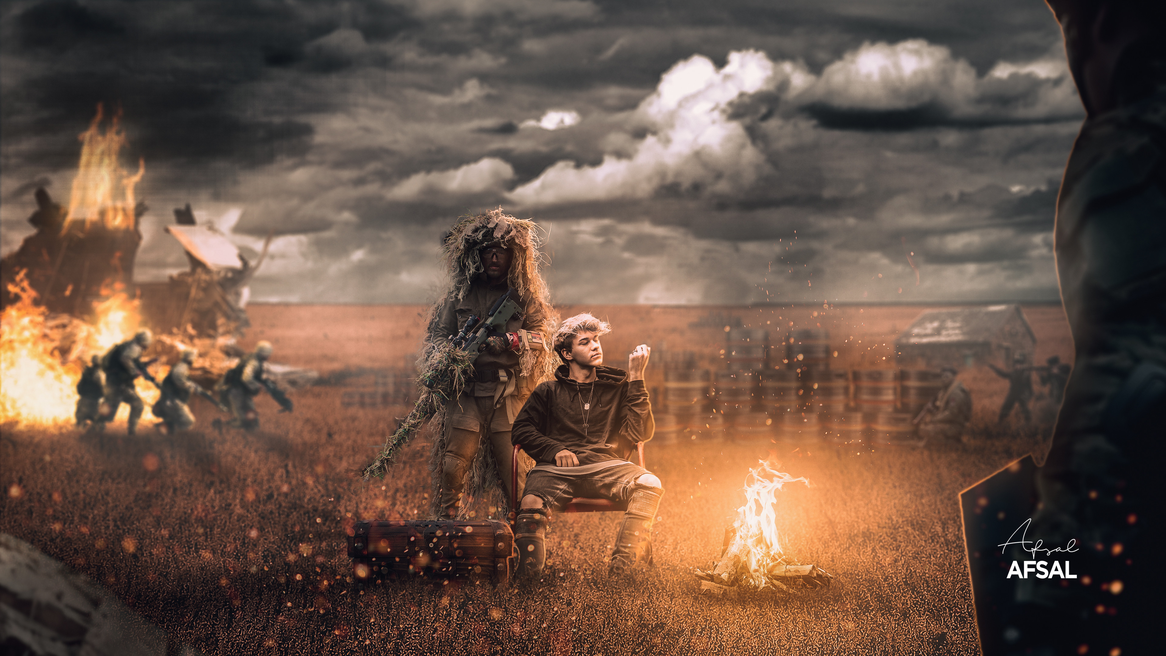
@narrow pasture : Well done Love the overall light and particles. Blur background adds a good depth of field (soldiers are maybe a bit too blured for me... but it's maybe just for me :)) .Really cool image!
thanks maan! Really appreciate that feedback!!
@faint epoch : Nice image, Love how you used man silhouette and lights in this piece. We are in the cave with him trying to escape this cave. Nicely done!
Made this manipulation of a tortoise and some other elements, i did my best to match it with the perspective, your views and comments on this matters as i would consider it as well. ✌️
I think i saw a YouTube tutorial video on this art.. It was by Rafay i guess.! @toxic dome
@narrow pasture yessssssssssss, i did follow the steps and do this, im learning actually...
oh ok.. i guess it have no point sharing others art here..
But u did it well
great
😄
Hey everyone 🙂 I posted the first part for my SAIC portfolio review in Ai section, and here is the Part II - projects, created in Ps. I got inspiration from DCC challenges 🙂 Any feedback or comment?:) https://www.behance.net/gallery/108726285/Fall-Portfolio-Review_II

hi
some advice to find some job to design photos for post for social media
what do u think of this design? any feedback is appreciated.
a bit of context: last week FC Shakhtyor Soligorsk from Belarus won the football league of their country after being positioned second at the beginning of the last round. They've only won the league twice (in 2005 and 2020)
would like some feedback on this project for a college assignment: https://www.behance.net/gallery/108861607/COLORIZING-A-BLACK-WHITE-IMAGE

hey!, its a great design.. maybe you can work more with colors!
thanks! u mean in the title and subtitle right? or maybe the background? @narrow pasture
Gave +1 Creative Carma to @narrow pasture
I mean for whole element
Try going Adobe's color web and find something good and relevant for ur design!
@ashen zenith
ok thanks!
Had some fun with some friends making up a story about the Utah Monolith and wanted to share the "Movie Poster" that was designed.
DAY 983 — Brief of the Day: Show that a can of Pringles is ”A can full of flavour“. https://www.instagram.com/p/CIUNQZiAhlt/ 👈 All Slides on Instagram.
coool... i really liked it. But first thing i notices is if the light is there, the light will be there in floor too.. In your image there is no light in floor.
Thanks for the feedback I will fix that
Gave +1 Creative Carma to @narrow pasture
nice one 😆
Start looking around on Instagram for brands you like and reach out to them.
DAY 984 — Brief of the Day: Advertise Parkour. https://www.instagram.com/p/CIWsre_AW4f/
Please comment constructively. Thank you.
@gritty notch great composition, but you should add some ground shadows for the deers
i mean gazelles
Aah ! Yes I should. I will. Bluddy gazelles, I mean dear's... without shadows!
That be cool...shadows my archilles...
it's important to study lighting, for everything. Whether it's 2D,3D...doesn't hurt to know and will push any composition you do forward
@gritty notch
Theoretically, the sunlight LOOKS like coming from the area i draw on
yes...
so supposedly, the Gazelle shadows should be like that
so shadows should all forward
Okay...i will go work on that... 🙂
in a matter of 1 week, you will be pro in lighting
lol....oh glory above , earth below! I've looked at so many shadow tutorials on Youtube...
it doesn't matter how many tutorials you see, if you don't pratice
don't watch any tutorials
just use your eyes
and senses
I will pay attention that that part of my compositions...
I done a composition yesterday, sure would appreciate your insight...especially regards the shadows
The shadows at the feet should be lowered in size
try using eraser brush
and move the whole shadow slightly to the left
Alright. Much appreciation and thanks. 🙂
I like it. It looks nice. looks as an Aaron Nace piece. I think the ship should have some light
I wanted to know If something's off with the blending .
i think may be the rear paw of the front... Everything else, gorgeous
Oh okay , thanks !
Gave +1 Creative Carma to @limber elm
☺️ thank so much, i still to improve more and more my portfolio
Gave +1 Creative Carma to @bleak echo
Any feedback is appreciated. please tag.
some context: The post is for my IG account specialised in football news. Atlético Madrid is facing their classic rivals Real Madrid next Saturday in a match that can work as a test to see if the team lead by Simeone (top right) has got what it takes to win La Liga.
DAY 990 — All new AirNotesPro. https://www.instagram.com/p/CImBd2zAgFf/
Can someone point out if the blending's gone wrong somewhere ?
I guess its tha same problem i have... the depth of field... It looks a little bit... Crispy is the word? What i Mean... Th back grouend its a little blurried in some around the bear and other are really straight...
Color toning looks great for me...
Shadows looks nice...
CIA style student card
Yea ig you are right, I need to work out the depth of field. Thanks !
Gave +1 Creative Carma to @limber elm
It's my personal opinion.
maybe you can add foreground element and blur the background a bit @deft verge
DAY 991 — Christmas Cookie. https://www.instagram.com/p/CIo0l4vg5Ou/
Cookie made with Photoshop (Layer Styles + Cookie Photo-Texture)
Background Photo from Pixabay.
Yes I was planning on adding a foreground, and maybe add some light snow , thanks for the feedback ❣
Gave +1 Creative Carma to @young wyvern
My Christmas wreath made with brushes & symmerty effects
DAY 992 — Christmas Cookie + Process Video. https://www.instagram.com/p/CIrZwNNAOal/
Made with Photoshop Layer Styles (& PSD Cookie Texture)
DAY 993 — Apple Christmas Cookie. https://www.instagram.com/p/CIt4rg6gBq3/
(Photoshop Layer Styles)
why is the allign option greyed out? i've selected the png image thats in the centre, even when the transform controls are there its still greyed out
Can I get critiques please? I apologize for the noobishness. Gotta start somewhere :)
I made some changes!
Can i get critique on it. its a facebook advertisement banner
@toxic dome I assume the Illustration top left is the logo correct?
yes
@toxic dome i feel like centering the text would look better. let me see what that looks like
also, i dont know the location of Cherry creek but as a design choice i would make the cut away the actual creek formation and make it look like a creek
I would also add a drop shadow to it to give it some depth
but this is just me personally
What do u think of this design? Any feedback is appreciated. please tag.
some context: The post is for my IG account specialised in football news. FC Dinamo Tbilisi a Georgian top flight team has just won the 2020 league. They've been dominating the domestic tournaments (leagues,cups and supercups) since 1990, the year Georgian football separated from Soviet football.
thanks bardon, i actually created drop shadow depth version but acrually that vibe to me
Gave +1 Creative Carma to @tidal prawn
I'm working on making scenes with realistic lighting and would love some feedback on any corrections that could be made.
@autumn patio wonderful!
DAY 997 — The Virus. https://www.instagram.com/p/CI34FxWgxDm/
Working on the Adobe/Disney Art and Soul Challenge. Challenge is to come up with an album cover. This is my third attempt. First was too disconnected from the movie and second looked too much like other entries. Did screen grabs from trailer to have different material to work from.
Had brightened the movie logo above because I thought it was getting lost. Here's the original brightness. Looking for feedback on which works best.
Components used.
Helllo everyone! I was inspired by the star wars universe to create this concept landscape, and I really appreciate all the feedback I will get here. Thanks 🥰
this one looks better noice 👍
i think it should be the same shade cause the surrounding is also dark