#❓ask-a-question
1 messages · Page 53 of 1
ChatGPT can see now. When it can operate Photoshop, you'll be able to tell ChatGPT to "select the nose" in the picture.
Until then, you'll have to draw a line around it. heh
Alright! Thx for your time & help. Save me a lotta trials & errors.
thanks, im stealing this GIF 

Gave +1 Creative Carma to @ripe quest (current: #3 - 2005)
Hello, I had already replied to this exact very question (and you acknowledged the answer) in a different forum a few days ago. I suggest to post a feature request on the official forums if you are wanting it so much. https://community.adobe.com/t5/photoshop-ecosystem/ct-p/ct-photoshop?page=1&sort=latest_replies&filter=all&lang=all&tabid=ideas
https://community.adobe.com
Master Photoshop with the help of our global community.
Your resolution is really small. Remember to post full screen captures as we are answering in the dark without seeing your layers panel. Please also state your end goal. Are you trying to draw chibi version of an existing image?


is ther any way to add our own texture in this place

This is texture in the filter gallery.
I have downloaded few texure rss. where should i put it. so my workflow will be smooth and easy to apply these in my work
Is it only the cloud liberary to save on.(i won't be able to use it if i'm offline!!! so tell me guys
my cc liberary isn't sync/showing up in my PS. this is happens quite often. how to fix this

,,
anyone able to help me invert a picture but keep text in the picture the same ? plss have no idea how to photos shop 🙏🏾
is there's a possible way to do mock up with pen tool?
Hello,
I have problem for create my pfp on Facebook.
I need to stretch the background to cover the white surface, I can't do IT because I can't download Photoshop to my komputer due to an error
Someone help me? Please
Do you need help with do it yourself and understand how it works, or do you ask someone else to have a go for you?
What do you mean exactly by Mock-Up (I know what a mock-up is, but I have trouble to see the context of your question)
Do you have access to Adobe Express? (There is a free version)
You can use the GenAI with adobe express to extend backgrounds
https://www.adobe.com/uk/express/
hmm how can i fit the smart object layer with this curves?
Which curves?
I don't see any example/screenshot
Sorry I didn't see you refered to a previous post
this paper had a lot of curves how to fit a smart object on it
so the flying banner?
yeah
yes you can trace a curve around it even with a smart object.
What do you want to do do exactly? Explain what you want to achive
I generally don't read all the messages written earlier, it would take too much time 🙂
we are using this way right?
box then make it a smart object then disort then fit it with warp

isn't?
but it had 3 curves
i can fit it
Yes, you can use "warp" (CTRL+T on your smart object, right click, then "warp")
You can also use the liquify filter (I don't think it will work here, but just so you know, same with all the "distort" filter)
You will be able to use either custom warp (the choice here) or the presets.
need someone to do it for me if possible 🙏🏾
i did but it can't to 3 curves
Ask in #💬chat-general then, and see if someone can help. Read that one as well!
https://discord.com/channels/547473772727238676/1042833042378592329
It can do as many curves you want, it's up to you to set up the number of rows and columns
https://helpx.adobe.com/uk/photoshop/using/warp-images-shapes-paths.html
I routinely do it for blankets with folds etc, it may be finicky, but it works
can you show me? cause i tried a lot
OK, bear with me a sec, I don't have photoshop open now
take your time
better if you tried with this flag panal
I am just showing you how you can distort more than one curve, adding rows and columns on the fly etc
As I said, it can be finicky to exactly follow the curves you have, but take your time and you will see the results
What I would suggest first is that you apply a perspective transform, before the warp, aligning the 4 corners, because your banner is in perspective, it will then be easier to just follow the curves with the warp
If you think you need to do it all over again because of a mistake, there is handy menu item

Click on the channels tab next the layers one, and click on the composite RGB (CTRL+2). It seemed that you were in quick mask, but it is impossible to say, since you cropped the screenshot. Remember to post the entire interface, it’ll help us help you faster!
can you record a video on how to stretch the background in this application so that I can just start my adventure with editing?
you are right it was quick mask issue
Hi, on your presets user folder: https://helpx.adobe.com/photoshop/using/presets.html in the filter menu, there is a load presets icon , you should see the default folder there as well.
On the top of my head, no, but that would be an excellent idea. (you can add textures as repeat patterns (edit>define pattern) and have them in their specific layers with blending modes, scaling etc) but not here specifically.
On the other hand, I am pretty sure there is a plug-in of some sort that could do that. Did someone think about it? Not sure (I am pretty sure there was a similar option in DxO's Nik Collection)
Have you opened Adobe Express yet? I will show you on your screenshot
yes
So I stand corrected 🙂 @fervent girder Follow what @hushed niche says!
There are textures plugin ins in the marketplace as well (Some free)

Head over to discord.gg/adobeexpress and post it there. It may be even me who answers...:)
This is the Photoshop server here
(And I am not likely to record a video for that, it would take 10 seconds and you'll learn nothing 🙂 )
hey guys , i was painting in PS and I have several files open but colors dont match through files.it shows that both of them are RGB files though
but there is definetley difference between this 2


did you try restarting ps?
there probably isnt a simple way to achieve what I want, but I figure maybe asking it will give me some idea.
I want to replicate the first (real world) picture. Specifically, the way green forest textures give way to barren, alpine textures after a certain altitude. In the second picture I have half a mountain covered in the green texture, but I want the texture to turn barren as height increases like in the first picture.


Pc (windows11).....infact i was facing this on win10 too

can i have some Font for EA sport
EA Font | dafont.com
thx u

nah how u did it its good

just the color
thanks bro
Gave +1 Creative Carma to @ember ridge (current: #201 - 7)
anytime
Hi Do they have a different color profile ? (sRGB…)
ye I think they did
I opened new file and copied all the layers in it
I just dont get how I turned it into different format
a font that resembles to this?

Is it the latest version of PureRef? Do they have a support forum ? Ps has so many ways to display images (full screen, tabbed, windowed; using the CPU/GPU, with old or new code…) that it is difficult to help. You could set the status bar, at bottom left, to check if that happens when the GPU code is not active. https://helpx.adobe.com/photoshop/kb/troubleshoot-gpu-graphics-card.html#Troubleshoot
Tap the TAB key
Hi everyone, i work for my first client for a Airbnb rental house in south of France. I would like to send to him all of pictures but i can't because i use HDR mode in Lightroom so it's not my color editing on export. So I would like to export HDR pic in jpg or something else for have the same colors.

how do I make such "grainy" texture or take the texture from this image if possible to put on my clothing

Thank you brother. ❤️😊🙏
Gave +1 Creative Carma to @vapid flume (current: #8 - 611)
select a grainy texture that you like from the net, play with the blending options and there you go
how do i remove this transparent thingy🙏


ty
Gave +1 Creative Carma to @ember ridge (current: #181 - 8)
here
oh that
buddy you want that ai generated fill right?
right
or all you want is black there
okay so if you want it wait for someone that HAS IT
eyyy
Are you looking for edit>define pattern, once you have a selection ?
like how can I just take the grainy feel from the image then yeah do that
Hi, it is a fake transparent PNG. I’d search a real transparent PNG, but select Subject should work…
Pay attention as well: you have stretched the image vertically.
There are plenty ways to add noise: https://medium.com/@stefanhrlemann/how-to-create-noisy-risograph-style-gradients-and-textures-in-photoshop-in-3-ways-394d6012a93a you’ll also need to play with blending modes and opacity.
Medium
Originally published at Stefan Hürlemann — Designer.
thank you i found one
Gave +1 Creative Carma to @hushed niche (current: #21 - 93)
Hi! Just wondering the most effective way to airbrush pictures so they look professional grade?
This is a bit generic and open-ended... Are you looking for help with something specific?
Yes something like this 😁
Good evening, can anyone help me?
chest go brrrr
@gentle moss hey bro
wsp
Do you use Photoshop?
i use something similar

Can you tell me, how can I do this?
perhaps save it, then use photoshop to draw over it then delete the image behind it so its a sketch?
I don't know how to do this, where do I get the brush to do the sketch?

thanks adam
np
Hey, could I get a little help?
These images appear to be rendered with a generative AI model.
Make a new layer and put it above the photo. Turn down the opacity for the photo layer and start by tracing over the photo to get the basic shapes. Start there.
These are AI generated. I can see it.
There might be filters applied afterwards but they began as generated pixels.
I don't know which models. There are hundreds of different tools now. What exactly are you trying to do?
You just want to make a chest like that? In an illustrative style?
I just made this with Photoshop...

You could try to use Style Reference but its not an exact science. It might take some experimentation with images and text prompts. Try it out.
Its a feature of Adobe Firefly/Generative Fill.
Firefly is an Adobe product. Not Google.
Go to the Firefly website. Sign in with your Adobe Account. Go to the Text-to-Image module... drop your image into the Style Reference section. Type in a prompt...

You can also do this in Photoshop. It just depends on how you want to work.
Firefly might have a few more tools and options for generating things. Photoshop is going to have more tools for editing/manipulation.
What is it that you need help with?
Just click on one of the sample images. Any one will do. You're going to change all of the options anyways.
(That's kind of annoying. They need to change that so it just opens with the GUI ready to go.)
Correct. One for "structure" and another for "style" and then type in a short descriptive prompt.
I would change the Content Type to "Art" instead of Photo if that's the style you're going for.
Its not going to copy the image exactly. It will try to match it up. This isn't an exact science. You should keep that in mind.
The style reference is the style you want to match. Does it not make sense to you?
Structure Reference... Style Reference...
You might want to check out the Firefly Creative Hub and do some of the tutorials so you get a better understanding of how these things work.

YouTube
Dive into the wonderful world of Adobe Firefly. You'll learn tips & tricks to help you generate beautiful images, remove objects using Generative Fill, and integrate the tools into your workflows within Photoshop and Illustrator.
So you have to learn more about how the tools and the technology works. I can't describe all of this for you. I suggest starting with that website and doing some experiments.
It depends. Sometimes. Its not an exact science. As I already said.
Gotta run. Good luck with it.
anyone know how to create effect like these images. It looks very vintage, especially the cocktail one that has it's color manipulated


Try Posterization...
https://www.adobe.com/creativecloud/photography/discover/posterize-photo.html
https://www.photoshopessentials.com/photo-effects/how-to-posterize-a-photo-in-photoshop/

Add a classic posterize effect to any image, fast and easy, in Photoshop!
No. You'll have to work on each image, one by one. Its going to be a similar process as with Firefly. Input a Style Reference, type in a prompt, audit the results.
25.6 currently works on Big Sur. 25.7 is supposed to, but currently won't load. Adobe is aware of the issue and is supposedly working on a fix.
Someone can help me with gradient adjustment tool? I'm trying to replicate first screenshot


The last two screenshots are my attempt, looking at the first screenshot it should start out much blacker and decrease to the smallest opacity "faster", but I am not achieving it, what do you recommend?
Hello, I found a picture of this sword, any idea on how I would recreate the "red aura" around it?

ugh
is it normal that layers highlight when you hover over them?

take the color red , bending option linear dodge, mask it, reveal red where you want
yes, you need that highlight so you know what you chose right

its like asking why there is blue box when i put my mouse on an icon
take the color red?

oh solid color
I opened my photoshop today to do some assignments but it has been like this for an hour, any idea whats wrong and how do I fix it?

tried to force stop?
alt+f4 and restart your program
assuming you saved the program
How do I reveal the red after I mask it? I'm new to ps
aite one sec
is it possible to turn it off or edit the highlight color?

make sure this is black to HIDE the red


make sure you are white, and select that black box and start painting around the kinfe for that affect
effect

soft round brush with less flow or opacity
yes
i think
cuz you see benny prductions has custom purple black for his ps which looks rlly cool
i looked on it back then never tried
thanks @ember ridge ! i'll try to see if I can change it too
Gave +1 Creative Carma to @ember ridge (current: #167 - 9)
cool I figured it out!
best drawing tablet for beginners?


why is mine white instead of black?
oh 💀
it"inverts" the mask
ty
nyes
oooh aite aite cool
how'd he get that scratched effect tho

like he made everything have this scratchy effect

alr


Hi, hit TAB to show hide the tools.
Thanks! That worked!
Are you talking about the seemingly lower detail on the right side images?
it's not even the same image on the right... these chests are a difference colour 🙂
can someone make a cool simple logo with this? thanks 😄

How close does it need to be to that?
Like... something like this might have a bit more distance? - but it may be too different to your original imagew
idk just something similar
its cool
something more lime
any good beginner tutorials for photoshop with a drawing tablet?
hiii anyone able to help me invert a picture but keep text in the picture the same ? plss have no idea how to photos shop 🙏🏾
@sly hawk
You could try with noise, but remove the background. Then some motion blur.
Or draw a few dots on a layer, then do step and repeat: https://youtu.be/k0QBhD-L4LE?si=JOhGeiJwJiTlGCYR

Ever wanted to do a step and repeat in Photoshop like you can in Illustrator? This is how to do it!
Behance: https://www.behance.net/paultrani
Instagram: http://www.instagram.com/ptrani
Twitter: http://twitter.com/paultrani
Facebook: https://www.facebook.com/paulryantrani
LinkedIn: https://www.linkedin.com/in/paultrani
What's the image?
You said invert, but do you mean invert colour? position?
can u do it s little more lime thanks
Gave +1 Creative Carma to @sly hawk (current: #5 - 902)
Likely a combination thereof
You've already posted in the #💬chat-general. That is the appropriate place for project requests. Please don't post these requests multiple times / in multiple channels.
(sorted)
Hey guys i have a doubt
i have this

and i want to do this

but when i click ok nothing changes
The only way you're going to be able to take a given image and convert it into a specific style (AND do this consistently across many images) is to use Stable Diffusion (or SD-based solution) with a specialized model that renders the style you want. I'm assuming its an illustrative style... from the looks of these images you keep posting. This type of solution is not trivial. It will require proper hardware (a good computer with a great GPU) and various technical knowledge, e.g. working with Git, Python, and other a few other things. After you get the system set up, it will require a lot of work and experimentation to get the results you want. These topics are beyond the scope of this server. Thus, you'll have to ask about these things elsewhere.
Just use a Gradient Layer... Layer > New Fill Layer > Gradient...
but when i click in the ok isnt supose to change
and fill w the gradient?
Try changing the "Scale" setting to 100%. Its currently set to 150.
done but stays the same
even
ok forget the gradiant
i have this

Please share a screenshot of your actual Photoshop GUI with the Layers Panel open and the Layer Style settings if you're using that.
Sorry, this was for the spiky images, mixed the posters.
OK. You have an empty canvas. Got it. What is it that you're trying to accomplish?
What exactly are you calling the transition and the effect?
on my canvas i would like to apply that gradiant
This is not what they want. They want to be able to input a bunch of images and get a consistent (cartoony/illustrated) style out of the sausage press.
Main menu: Layer > New Fill Layer > Gradient...
but even if have my empty canvas and i try to change the color on the toll box nothing happens
i cant change the white to red , black or wtv color
Main menu: Layer > New Fill Layer > Color....
You either need to make a selection and fill it with a color. Or you need to make a new Fill Layer and choose a color or a gradient or a pattern...
Its impossible for me to know what you're doing and why it won't work.


Select > All... that selects the entire canvas.
Then Edit > Fill...
does anyone know how I would get the background to have that tear effect like in the picture?


Paint it?
wym paint it
i changed for black but the canvas didnt

Get Brush. Choose color. Start painting.
I replied to the wrong person: #❓ask-a-question message
you think he painted each individual line?
Or maybe they copied and pasted pixels from another image? I don't know. Seems like you could paint it.
i achieved w the way u said
thnx a lot
There might be another unorthodox way to do it without painting it...

ive masked out an entire thing with my pen, how do i remove the background now? (im used to ae, i literally have no clue hwat im doing on photoshop

Open the Paths Panel. Window > Paths... and at the bottom, use "Load Path as a selection" Then add a Layer Mask to the Layer.
ur a goat
how do i fix this?

Fix what exactly?
The path and the mask are separate objects.
You could put an arrow on the part of the image that has an effect.
Go back to the steps D. Humann old you (window>history might help)
The brush might be a line, its options could have scattering.
You could use it as a vector mask. Once you have it, CTRL(Pc)+click on the add a mask icon in the layers panel (the circle in a rectangle)
Thanks for all your contributions @hushed niche - really appreciated:)
Gave +1 Creative Carma to @hushed niche (current: #20 - 94)
Please see: #❓ask-a-question message
And if you don't want to / don't have the hardware or technical knowledge to do this yourself, you could try something like Krea. @ember trout - That can take an input image and with style choices and prompt, you can generate a structurally similar image with a different aesthetic. (You do sacrifice some control when using someone's system.)

I hope that the shotgun approach to answering is not frowned upon. Trying to move the puck forward… Thanks for the vote of confidence.
Gave +1 Creative Carma to @sly hawk (current: #5 - 903)
If you mean about the top images, surface blur or smart blur.m might do something close. Box blur maybe?
I don't think you understand their goal. #❓ask-a-question message
Hello you beautiful people of the internet! I was just wondering does anyone know how you can make your face appear this big and still have good sharp quality on the face? the file size must be 2mb though which is the tricky part.
Image

Saving as a JPEG will keep it small but hi-res
Ok, I really wonder how you understood that from their questions.
Because I attempted to sort through this yesterday. The problem is: this person is insisting that its just some "filter" that can be applied. When its not that at all.
Are you maximizing output quality on the quality slider when you save?
Is this the specific thumbnail?
Are you irritated with the artifacting around the eyes?
Hi, I do not think that they grabbed that image from a video. They took a high-resolution and well lit image, with a lens adequate for portraits. But on mobile, I almost missed the exaggerated blur on the edge of the face.
its just when i try to do that, my face is not as sharp as his and i have my import and export settings all set. Could it just be lighting and a high resolution camera that they had?
Ahhhh gotcha. This isnt the thumbnail in question
Yeah, could be your actual source material
You could always use neural filters or smart sharpen
its the thumbnail of a video from youtube. also yes i just noticed there is blur on the side of the face, do you know what else he seemd to have added to his face to make it stand out more?
also is it gaussian blur?
thank you i will give that a try!
Gave +1 Creative Carma to @true arrow (current: #418 - 3)
Additionally the example couldve used the blur tool and the sharpen tool from the toolbar
Can anyone help a bit?
i just dont understand how someone can resize their face that big in a thumbnail and still keep a good sharp face quality
What is it that you need help with exactly?
you think he used blur around his face and then sharpened the actual face itself?
I'm pretty sure it's a picture he took of himself
i don't have generative fill can you extend one image for me?
yes it is, its just really high quality to be able to put into 2mb file size which is what im trying to figure out how he did 😆
Hi there! Does someone know how i can tell firefly to remove smth for example this hat? :D

Just paint over it with the Remove Tool (in Photoshop)
Hope this channel is right for this type of question
This looks like text to vector from illustrator?
Firefly tho
I'd probably just lasso it in photoshop and gen fill
I'd remove it first. Then Gen Fill.
Again, it does not come from a video, it was a picture of his face, not his entire body.
actually yeah, smart
yes ik
btw @ripe quest my performance problems really got cleared with the Ps Beta :)
Wanna send me the PSD?
i dont have one of the picture.
i just used a youtube thumbnail downloader which downloaded a 720p file of the thumbnail.
Hi there! Does someone know how i can
i wish i could somehow download a higher resolution of it
oh wait im dumb i forgot i can rechange the jpeg to .psd but it will still remain a low quality

No I mean of the one youre trying to make
my bad. This my face that im trying to have detailed on the face like his was.


1.9 mb
Switched it from 16-bit to 8-bit
You can also bring it down to 72 dpi

i thought 16 bit was better than 8 bit?
16 bit is better than 8 bit but it's gonna increase your file size
should i prioritize 2k resolution image over 16bit then? also where do i find dpi and what does it do exactly? sorry if ima newb
also lastly here it is when I used the sharpen tool

im able to fit a 2k resolution into 2mb for higher quality which is what i want.
oh that looks way better. what the. Sharpen tool mode normal with strength at 50%? is that what u used for this
Yup sharpen tool at 50%
ok thank you so much Ryan!
for export did you do jpeg 100% with bicubic sharpener?
Thats the last question then ill shutup

i thought having optimized checked is always a good thing to do?
seems like there is alot i need to learn still. "Just when you thought you had most of it figured out, you notice there is alot more to figure out."
Welcome to Photoshop.

lmfao
I feel like I'm in the top 1% in very good terms of photoshop users regardling skill level, and there is still PLENTY I don't know!
Is that a CHALLENGE
oh wow XD, i guess there is alot that can be learned inside photoshop.
lmao XD
Yes! Helping others for 25+ years, and still learning thanks to workflows I did not try before.
Lol. If you saw the level of ~~ignorance ~~ naivety of many new photoshop users, you'd see that "top 1%" isn't as impressive as it sounds 🙂
For printing on high end printers, yes, but it would be discarded online, just makes the file heavier in your case.
Is that a ROAST
One of your personal characteristics that I respect the most is your humility. :)
It's me doing my best to tell a newer user that photoshop is a big, big program with a lot of features, and nobody knows EVERYTHING about how it all works, and what can be done with it.
Am I going to have to edit my comment to "I'm kinda ok with photoshop" to stop the mockery? 🙂
Just kiddin with ya. You/your work are a TOUR DE FORCE in the PHOTOSHOPS!
Hey Everyone. I'm a complete beginner in photoshop software by using wacom one tab, so would you please like to guide me on how do I create a fuzzy pencil brush in photoshop software a step by step guidance would be appreciated via screenshots and keys? A youtube tutorial link or a video tutorial link by your side would be appreciated to understand the things more clearly.
You could probably download a brush (or many brushes) that Adobe has provided. https://www.adobe.com/products/photoshop/brushes.html - Check out the "Dry Media" set.
Create and enhance your photos, images, and designs with Adobe Photoshop, the world's best imaging and photo editing software.
so in regards for a youtube thumbnail photo, it would be better to do a 8bit and not a 16bit? the quality of the photo itself doesnt change?
I already have the pre-installed brushes. I am talking about the fuzzy paint brush how do I create that like a jingsketch brushes plz read my question carefully
You'd have to provide an example because I don't know what a "fuzzy pencil brush" actually means to you. (I don't know what jingsketch brushes are.)
Some sites might even choke on 16 bits files.
See as I have mentioned above I'm a complete beginner. If I really knew what exactly is a fuzzy pencil ,then I wouldn't have asked my question here.
thanks
Gave +1 Creative Carma to @hushed niche (current: #20 - 95)
Its your term. A fuzzy pencil brush to me might mean something completely different than it does for you. Can you show me a picture of something created with this ideal brush?
I can see these "Jing Sketch" brush sets for Procreate. The sample is very small and difficult to see. Is that what you're referring to?

Here are videos on how to create brushes: https://www.youtube.com/live/n9EMuBFGmS0?si=j3GLoVFtaTYBSBtV .
https://www.youtube.com/live/V6BgnRoURwI?si=KMcS2T48gyMsukX2 .
.

Making decorative borders or designs in your illustrations can be done much more quickly with custom pattern brushes! Kyle will show you how to design some o...

New to Photoshop? No problem! In the third episode of this multi-part series on Photoshop basics for artists - follow along with Kyle as he gives an overview...

Check out how to create custom brushes, like flames and signatures in Adobe Photoshop using stock photos, simple selection methods, and a very handy tool within Photoshop! Make sure to check out my other Photoshop tutorials. Links below!
Tools used in this tutorial:
Custom brushes: Using the Brush panel, found under the Window menu, you're abl...
Yeah maybe I have been referring to a tutorial but unfortunately in that, the fuzzy pencil brush creation is not mentioned how it is going to be created. That's why I am asking you. How is it created? If I really knew how is it created. Then I wouldn't have asked here. As I mentioned already that I am a complete beginner in photoshop. I am asking how to create a fuzzy pencil brush in a photoshop software in wacom one tab?
I'm not asking you how it was created. I'm asking what it means to you. You're using a term "fuzzy pencil brush" which can mean 100 different things.
The link provided gives you access to 1000s of new brushes, in addition to the default ones.
Sir but I am asking particular about FUZZY PENCIL BRUSH? How do I create FUZZY PENCIL BRUSH IN PHOTOSHOP SOFTWARE? I HAVENT asked about the basic brushes or custom brushes? 🤦♀️
Yikes.
Okkk but I have no clue. For me it just means some pencil with this name.
Tysm 4 d links provided.
I guess you have a difficult day. I wish you well in your endeavors. But I would recommend to reconsider your approach to the people giving their time to help you.
THANKS A LOT for helping me out.
Gave +1 Creative Carma to @hushed niche (current: #20 - 96)
I have no clue either... which is why I asked for your definition.
This is what it means to me. Granted I didn't spend a lot of time creating this custom brush. However, its my attempt at a "fuzzy pencil brush." Works better at smaller diameters.
The fuzzy pencil of jingsketch brush looks like this.

I think you've skipped that part on how do I create that brush?
I didn't skip it. I have to first define what it is that you're talking about.
Furthermore, trying to create this is going to be somewhat difficult for a beginner. Thus, you should check this brush pack provided by Adobe. And look at the pencil brushes provided there and see if any of them are close to the style you're interested in. https://www.adobe.com/products/photoshop/brushes.html

is there a way to make the drop shadow smaller? the goal is to make the drop shadow only on the inside, for it to not go outside the circle, just on the inside of it, can you do that in the blending options or? I guess I can just make another smaller circle, make it black put opacity low and apply blur but I'm just asking if there's a way to do it in the blending options

like that, but if there's an option for that in blending options for everything, including glow would be helpful

Instead of doing that, what about just tracing out a new vector shape with the Ellipse Tool and assigning a stroke color that matches that?
Or am I misunderstanding what you already have?
I mean in the 2nd pic I did the thing like I said above, I did use the elipse tool, then made it smaller than the original, centered it, and just put the opacity lower and gausian blur
i guess it's what you tsaid
kk then that's fine, for glow it's the same thing or?
I think that is probably the easier/more controllable way to approach it.
just tried, it's fine, it's just last question, if I wanted it in the future to be bigger, shadow/glow would i need to erase the part going outside of where it's supposed to go, like let's say I put gaussian blur a lot higher than it should be
Hi, you could have selected the central part, jump it to a layer (CTRL+J), then assign an inner glow in a dark color, set to a multiply blend mode. Or an inner shadow, it would only show on the inside. Another solution is to add a layer mask, paint on the outside with black and in the blending options, check « layer mask hides effects. »
sounds interesting and helpful but can you explain what do you mean by selecting the central part?
yeah the 2nd thing is fine but this is easier
but the 1st thing you said sounds interesting so if you can explain would be thankful :v
I see you created a white ellipse to fake the blur; work from there, add an inner shadow, or an inner glow.
ah it's not a white elipse
it's just a stroke
an orange stroke
there no fill in it
so I can't do that I guess
You could create an an Ellispse with a Gradient fill that transitions from grey to white for example, that would probably serve the same purpose. Just another way of looking at it.
kk thx guys!
Hi, how can I keep this locked as default

Yeah. I don't think it will persist across documents or sessions.
You can set that one Pref. ---> Edit > Preferences > General.... Uncheck "Use Legacy Free Transform"
I think that will force it to lock the height and width.
That is a persistent setting.
Does anyone know how to make some part of the background burn? Like the same type of burning you get when burning paper, but this time for the ,wall

Would love to know if someone has the experience to do it and knows where i can learn
What is the goal here? To just have burned paper edges in the background or to actually have the paper burning, like on fire?
There seem to be burnt paper backgrounds that you can download...
Imagine the red circle are spots that are on fire and burning

rly?
Google Image Search shows quite a few... https://www.google.com/search?sca_esv=ff93aeab402caf98&rlz=1C1ONGR_enUS1031US1031&sxsrf=ADLYWII5WMDnDzthxai8kf84PKgndPYHSw:1716243173041&q=burned+paper+background&tbm=isch&source=lnms&prmd=isvnmbt&sa=X&ved=2ahUKEwjXk7WFoJ2GAxWFFzQIHV8RAaoQ0pQJegQIEBAB&biw=2118&bih=1282&dpr=1.25#imgrc=PL3uxiP4I83TTM
This looks interesting... https://resourceboy.com/textures/burnt-edge-paper-textures/
Resource Boy
Immerse your designs in rustic charm with free burnt edge paper textures. Download now for free commercial use and ignite your creativity.
im looking for soemthing like this

so i can just put it on the wall to get the burning effect
instead of actual pager
paper*
If you can find image assets that have the burnt edge and the fire, great. If not, you'd have to create that yourself. So... yeah. heh
ill try and see how it goes
Oh, I thought you meant the background looked too plain... - I'd suggest an actual texture go there,,,,
wdym by texture?
(I faff around in the 2nd half of the video)
And ye to clariy, I want to make it look like the background is on fire
well some parts at least
You could put the "holes" where you need them and then try to add the fire afterwards. Either compositiing image assets or using Gen Fill, perhaps.
Although, I actually like the texture that James was fooling around with. heh
I think the burning paper could end up looking a bit... phoney. :)
Maybe a fire texture then?

we it be possible to pin point that texte on certain parts of the wall?
Since I dont want the whole thing to be bnurning but just certain parts
I still want to showcase the blood splatters, etc.
I have to hop on a meeting. Hopefully, James can help you get it across the finish line. Good luck!
Thanks so much for your help and suggestions! Goodluck with ur meeting
Gave +1 Creative Carma to @ripe quest (current: #3 - 2008)
i dont know why im struggling so hard with making headlights on a car but can someone help me out 😂

if you have any youtube videos that are useful that would help too
yo i recognize that text style
ive seen on insta before
yeah idk what its called

Hello everyone, today I'll be sharing a simple tutorial on how to create illuminated glowing headlights for your car in Photoshop. This technique is particularly useful for enhancing images taken in low-light conditions and can be applied to a variety of future projects.
Subscribe For Future Tutorials ➡️ https://bit.ly/Anthonylam
____________...
but its fire tbh
thank you
Gave +1 Creative Carma to @ripe quest (current: #3 - 2009)
its acc not that hard, just use the pen tool and liquify it after
thats how i do it at least
Maybe something like this?
Obviously feel free to swap out the flames in the back later if you change your mind
I like, but it looks so out of place which is a the problem
But i think i can work with that
thanks for your help!
do the headlights look good

Great improvement over the previous version!
Does anyone know how to change the color of clothing using a hex color code? Im able to change the color of clothing using camera raw plugin and i really like it as well cause it looks natural but i cant pick a specific color on it which really sucks. Thanks to anyone who replies 😄 (trying to do exact colors because i wanna do complimentary colors on two different objects)
Does anyone know how to stretch an image but just in one corner?
Like I have a rectangular image but I am trying to fit it into an irregular quadrilateral
You could try to Warp it. Edit > Transform > Warp...
You could also try making a selection and using Edit > Content-Aware Scale...
Hello. Can you please post this in #📝project-feedback. This channel is really more for help with specific Photoshop issues. @next sphinx
It might be possible with Hue/Saturation Adjustment, if you can make a good selection.
Humann would you happen to know if camera raw plugin has a hex color code? because i couldnt find any
i tried it but i dont like it, i get very very good results with camera raw.
You can't do that in the Camera Raw filter.
"Can't" typo
my bad my bad
No. It was my typo.
How did you try to do this with Adjustment Layers? And why didn't you like it?
Skew tool worked perfectly
why is it not a feature in camera raw? hex color code.
It was designed for photographers/photography. Not web design. :)
ill try it again, i just liked the way camera raw one looks
Hex codes are used in coding.
i feel like using a specific color # would be very useful though :p
Sure, if you're "filling" a selection. You can't really do that in Camera Raw. You're (usually) making adjustments to an entire flattened layer.
mmk makes a little bit of sense
It's generally used for refinement. Not design, really.
aah i see
i like it cause its sooooo whats the word minimalist? idk, its like everything is ez on it and everything i need (except color#) is there.
The Camera Raw Filter is one of my favorite features inside Photoshop.
i would highly agree with you on that 👍
i always use it for every photo.
alright ima give the hue/saturation adjustment thing another try.
You can try making a selection around the thing. Then add a Color Fill Layer. Choose a specific color. Then set the Blend Mode of the Layer to "Color."
how do i turn down the brightness or saturation of it?

oh nvm Levels seemed to do it.
nvm i could add hue/saturation as well to it
You have to realize that while you can choose a specific hue/RGB value, that color will shift based on light/shadow in the scene. So #FF0000 is red but we usually don't see colors that saturated in the real world.
ya ik it was too saturated
So yeah. You can choose #FF0000 but that might not be "realistic" and may look weird in the image depending on various factors.
Did you try trying different Blend Modes for that Layer? Try Hue or Color to see if it helps.
yeah ik XD
yeah thats what i just did rn and its working sort of for the most part
that still looks unnatural or?

is there a reason you cant pick black or white as a color? it seems to just turn grey always, ik in camera raw you cant at all pick black or white as a color.
It's believable. I might make the drawstrings a different color to try and sell the effect.
oh true true ur smart
For the same reason as I mentioned with red. White isn't really white. Black isn't really black. When light shines on the surface there is scattering, you have bounce light, there are many factors. Not sure I have the time to discuss the physics of how light works ATM. :)
A white surface (that is even a bit shiny) sitting next to a blue object will pick up some of that blue. Thus, white isn't really white when you look at it. heh
makes a little bit of sense, but yeah i see what you mean, light can change the color of something. (is what i got)
oooooooooooooooooooh that makes sense, thats why you remember that blue black dress?, some people though it was white and gold while some though it was blue and black or am i dumb.
There are a lot factors that can affect it.

You can look at a certain objects that people will say is "black" but when you look closely, its more blue or red or whatever. Its not #000000. heh
i dont think i have ever in my entire life seen pure black before
irl
did you look at the solar eclipse
nah it wasnt in my area 😦
while wearing glasses, the surrounding film around the sun doesn't absorb light so thats pure black
like if you look through those at the ground
ahh i see
I doubt anyone actually sees R: 0, G: 0, B: 0.
as in a pure black color i mean, lol obviously when i close my eyes i see pure black.
full blind people
yes
How do they know its black?
do people without eyes see black or conceptually nothing
idk bruh dont ask me 😭
Then you don't know what blind people see (in their mind's eye)
😭 im presuming bro chillax
You brought it up.
Update: I doubt anyone actually sees R: 0, G: 0, B: 0. unless they're looking at the value on a screen. heh
How do I make my text (bottom) like the top one. Mine is too sharp

Tiny amount of Blur. Convert it to a Smart Object. Then Filter > Blur > Gaussian Blur. Start with a very small amount and see how it goes.
Thanks
Gave +1 Creative Carma to @ripe quest (current: #3 - 2010)
How would I gaussian blur just the edges of an image?
You could try this... Select it. Make a new Layer. Add a 1 or 2 pixel stroke around the object(s). Convert that to a Smart Object and apply the blur.
Thanks
Gave +1 Creative Carma to @ripe quest (current: #3 - 2011)
is there a way to add 3d photos into adobe photoshop and still rotate them?
maybe a plugin or something
actually nvm im going to sleep, @ me, so tommorow i can scroll upwards for 5 minutes to find the answer.
rotate them in 3d space? nah
Hey all, I'm trying to create a brush that looks like the animation style from the show 'Smiling Friends'. I've tried to use the sample image itself as a brush but that just created a really long line whenever I clicked once. I'm trying to create a brush that as I draw, it automatically creates these slight curves and defects. How can I achieve this? Thanks guys!


Alr this isnt really a question but im challanged to find this yt channel and i literally cannot find out how to make this readable

OK so would you please like to guide me which fuzzy pencil brush is closest to the adobe dry media default brushes? I think I have shared that picture of fuzzy pencil by jingsketch

I don't know which one is most like the JingSketch brush. Anyways, its not for me to say which is most suitable for you. You'll have to install the brushes contained in Adobe's Dry Media Pack and try them out for yourself. I'm sure you can find many brushes in there that you'll like. There are also hundreds of other brushes at the same website.
OK yeah. I already have those brushes installed. Thanks a lot for helping me out. Thanks a gazillion.
Gave +1 Creative Carma to @ripe quest (current: #3 - 2012)
im not sure what happened but the window is different now when i click new

is there a way to revert it back ?
Edit > Preferences > General... Uncheck: "Use Legacy 'New Document' Interface"

Hmm. Not sure whats up with that. You can try that "Reset Preferences on Quit" button and restart Photoshop.
You're going to have to set up any custom prefs again afterwards.
ah that's fine
thanks it worked
But I think you as a professional digital artist you can teach me as a beginner on how to create that fuzzy pencil paint brush?
I don't make a lot of custom brushes. Since I've never used the JingSketch brushes, I doubt I can design a brush exactly like that.
Also, I can't teach you how to do it if you're not familiar with Photoshop. You'll have to start with the basic tutorials that come with the app.
Regardless, I'm not going to do a better job than Kyle Webster from Adobe. You should watch his video on YouTube about brush basics. He goes into great detail about all the settings and teaches how to make new brushes and modify existing brushes. https://www.youtube.com/live/V6BgnRoURwI?si=yTmia4KvXRIX5hvR
New to Photoshop? No problem! In the third episode of this multi-part series on Photoshop basics for artists - follow along with Kyle as he gives an overview...
Lastly, if what you really want are the JingSketch Brushes, you could just go on Gumroad and purchase them. According to the JingSketch page, the "Fuzzy Pencil" brush is in there.
https://jingsketch.gumroad.com/l/JingsketchPhotoshop

the color is set to red? blud gaslithing me into thinking that im colorblind 😭

Blud go to Image in top menu and then Mode and check if you are not working in Grayscale 🥶
ty
Gave +1 Creative Carma to @flat parcel (current: #271 - 5)
I always use GRADIENT MAPS for this - 100%
Hello I have a display problem when I am in Photoshop I only have two layers here is a video (I speak French)
Hey, so after taking plenty of looks at this i feel like i am missing something, the images looks off like as if it was just copy/pasted into the background, yet i cant figure out what i should be doing to make it NOT appear as so


this is the original bottle
If anyone got any ideas with steps on how to go about it, it will be truly appreciated
Yes, the students plan are not different than the standrad ones (except the price) and don't forget that if you still qualify, you got the substance suite for free as well!
That's because your bottle is "flat", as in evenly lighted from the frot
Howeveer
The directlion of light in the original is not from the front (but from the left side)
take cues from other parts of the image to determine that
For example you got other bottles in the cabinet in the back, they should help somehow to guess the direction of light.
You could aslo create a sort of mock bottle in a 3D software, set up lights and cameras and see where the sgdows drop. On the table, on the bottle...
then the bottle is way too light. it doesn't fit the intensity of light from the background (low, soft lighting)
and the reflection on the table is a tad too intense. Again, take cues from the nearby objects (eg: the gloves)
Being a nit picker here: The perspective of the bottle (taken from slighly below eye level) doesn't match the perspective of the background. (slightly above eye level)
It also look like the bottle have been taken with a slight wide angle while the background was more a longer lens, given the shallow depth of field...
*You replied to me, not @ember trout. Anyways here is your answer @ember trout *
Oups, sorry!
Ah yes, that is there
Are you generating the background before integrating the bottle?
You should try to generate a bottle on the background. Just to see what the machine comes up with
It will give you a good reference if it gets things right
Yeah, true the gloves, flowers dont have that much depth in shadow/reflections
of course you'll have to discard it after, but generally the GenAi follow light direction etc
Yeah, unfortunatly that is the only image I was provided with
Gave +1 Creative Carma to @native shard (current: #182 - 8)
Yeah, and then after that i remove the stuff and put in the real bottle
I think you then need to generate another image and indicate the camera parameters, like point of view and lens lengh, possibly the f/ number as well....
This is the original image

As you can see here the reflection is pretty big in depth, thats why i followed, although the lighting is clearly coming from the left, so yeah i gotta fix that in mine
Sometimes backgrounds and foregrounds just don't work at all together. There is really nothing you can do about that, except change one. Also, I think the perspective error is somewaht minor compared to all the rest.
Sorry, I don't
Also, your old message is very far away in the thread, and people ussually don't scroll that far. If you can post it again, maybe that's ll be more helpful for folks willing to give an answer
Do you suggest I create a new background with proper lighting etc etc, or it is indeed possible to fix this?
That said, it really looks slike something done in Illustrator for me. But I may be wrong
The perspective will be very difficult to fix. The rest I think it's possible (if not easy)
Well, fixing the lighting **perfectly **might take around max 20 minutes, although I don't know about the rest.
Have you considered the fact that they may have drawn it by hand?
I mean that looks very much like someone who knows how to draw
or maybe do you mean the slightly posterised effect we see here?
(in that case: image>adjustment>posterise, with a high number of colours, not just 2)
Alright, Understood. Thanks for the nit picker btw, i really appreciate every single detail you pointed out and the tips to figure that out!
Great help as always!
Gave +1 Creative Carma to @vapid flume (current: #8 - 612)
You're most welcome!
which part exactly?
anyone have any tips to making this look retro/vintage (apart from adding noise to it)


this part
That doesn't feel like AI at all. Maybe you should ask them directly?
It's difficult when we don't see the "before"
Which is fair enough 🙂
They said "yourself" 😂 (sorry!)
it really looks like posterise, or any of the filter gallery effects such as paint daubs, or similar
I guess you'll have to test them
Filter> filter gallery
Sorry, not, I don't see how a template would help
Are you sure it's in Photoshop?
Because a Photoshop template will only give you a set size, guides, colour model etc
yes
Not specific filters
Posterise?
I gave you all I could think of, sorry. See if someone else has a solution!
it's an adjustment, I explained where to find it earlier
Also, I really don't use plugins (I only use 1! 🙂 )
So I can't help here
how can i make this look retro/vintage, apart from adding noise to it (which i will do at the end)

If you're sure it's a plug-in, you could do worse than checking in the Adobe Marketplace, and see if there is something for you

None at all! You need to search yourself with the filters (program, keywords, etc...)
POssibly reduce the saturation, see how old adverts were printed, and how the print techniques weren't as colour bright as they are today
this is what i came up with, if anyone has suggestions or improvements, please feel free to tell me

You will need some sort of reference, retro vintage means lots of things
oh yeah, i forgot to reduce saturation
Also the brightness of the headlights, I feel it kills the mood a bit
Depends the kind of era you want to mimic tbh
im not actually sure what vintage or retro even means to me 😂 i kinda just want to replicate that 90's grainy kind of aesthetic
if you get me
im trying to copy paste something into my photoshop and its just making the entire screen black (its doing it to anything i try to insert)

this is what im trying to insert, for reference;

Pinterest!
that's more 80s than 90s, but see how things look washed out a bit.

also you can add a halftone pattern (in the filter gallery) to mimic the printed result
https://www.pinterest.co.uk/pin/31736372358998983/

Pinterest
This Pin was discovered by Rubiconcube77. Discover (and save!) your own Pins on Pinterest
Have you tried to file>place>embed instead? I rarely copy/paste to be honest, if the png (assuming it's a png) is a bit wrong, copy/paste tend to be a pain more than anything else
Better do things properly

heres what I came up with

lowered the brightness of the headlights and lowered the saturation a bit
- its just re-adding the background, whereas i want it to slit off the edge

mb if its a simple fix i dont rly know what im doing
assuming you want to create a new path contain what's in the circle AND the existing one, you need to us this
https://www.youtube.com/watch?v=QCWYKE4RFMY


Tutorial on subtract / combine etc Photoshop shapes. Path operations for Photoshop shapes such as combine, subtract, intersect, exclude - how to apply them to create all kinds of unique shape designs in Photoshop
I highlighted "exclude" while it would be "intersect" if that's what you want to do
Hello, I make skins on photoshop but after while when I click image 10 it’s automatically suppose to show the second layer so I can merge the layer 2 down but it’s not for some reason it keeps popping up with “error occurred” I need help fixing this issue.
Please @ me when you guys have a solution please.

don't COPY AND PASTE it
drag the PNG to your desktop, and then drag and drop the file into your PSD file
Hi, would like to apologize if it is not the correct chat to ask in (It likely isn't but ;p) but, I kinda can't seem to figure out how I should put a small description text in the bottom area so that it is clearly visible and looks good as well in this banner: https://images2.imgbox.com/00/b6/Y0UKvdAi_o.png
any ideas appreciated
any relevant designs to take ideas from will also be helpful, thanks.

Maybe something like this?
https://github.com/rh12503/triangula

GitHub
Generate high-quality triangulated and polygonal art from images. - rh12503/triangula
Where you were placing it looks good!
tysm, I mean kinda like the design of the text
so that it is more readable
colors to be more accurate
Thank you so much!
Gave +1 Creative Carma to @sly hawk (current: #5 - 904)
im starting to realize there is a lot of ways you can change the color of clothing.
ive found though that a mix of color fill, curves,levels and hue/saturation gives me the most natural and realistic results.
hue/saturation can work well, but unless you sit there playing with sliders and 'doing it by eye', it's hard co confidently match to a certain colour.
If you do prefer that route, check out this short video:
https://www.youtube.com/watch?v=-JIZymCmvqU

Apply ANY special shade of color or an exact color to an object in Photoshop using this technique. In this episode of #AskPiX, learn how to change the color of an object to a specific color either defined by hex code, RGB or CMYK values. To do this, all we need is a hue saturation adjustment layer and some brain. Hope this video helps you!
► DO...
does anyone know how much effort or like what these people specifically did as in edits that went into these type of thumbnails? im really really into photoshop rn and wanting to make sick cool looking photos like these, i have a lot on my edit list to learn but just in general what stands out in these photos?


ill give this a try thank you :D!
Gave +1 Creative Carma to @sly hawk (current: #5 - 905)
mostly just the right photo because the left one has too much going on. could they have used 3d photos? because the chairs really pop out for me or create a 3d depth look to them
okay so I did it like this:
any suggestions? thanks bro

Gave +1 Creative Carma to @sly hawk (current: #5 - 906)
It's nice. The font works well. - maybe move the copy a bit further away from the heading. - it's a bit top heavy
also, a typo here and here?

Oh, that wasn't custom made, I connected 2-3 of them together.
I'll try to fix it
Yeah, I assumed it was where they connected
Just use the clone tool
still looks werid lol

See above 🙂 @maiden notch
Hi, proper lighting is key to good photography. Having a portrait lens (85mm) and a high-resolution camera. After that post processing in a raw converter to color balance, selective sharpening. But I’m wondering if the left images do not use Generative AI for the seats.
Hello, I see image base lighting. It is part of the now retired 3D features, see: https://helpx.adobe.com/photoshop/kb/3d-faq.html you might have to download an older version to edit those.
i thought the left images used 3d photos but im not too sure. Also i was thought wondering a portrait lens was 50mm? i guess im wrong. Lastly what do you mean by this "After that post processing in a raw converter to color balance"
Hi, we can only give you the same answers we did yesterday. The closest thing to go from the top left image to the top right is surface blur. There is no one click cartoon effect. Please show more before and after, as the images seem to come from a videogame, this they might be cartoony to begin with.
Taking the properly lit image in raw format, and using camera raw or Lightroom to edit it.
aah ok thats what i do 😄
thank you
Gave +1 Creative Carma to @hushed niche (current: #20 - 97)
At 2 meters, an 85 frames the face, a 50 would be more of a half body. It all depends what you are after.
going for a face and upper body shot like the photo showed. that would require a 85mm? for best high quality details on the face?
Can you send me the older version so I can do it.
nvm i see now
Bonjour! It seems like a graphic card issue, see: https://helpx.adobe.com/be_fr/photoshop/kb/photoshop-cc-gpu-card-faq.html make sure your drivers are up to date, you might try the disable native canvas or old GPU options described on the document
You might need to contact Adobe support, or check in your Creative cloud app: https://helpx.adobe.com/download-install/using/install-previous-version.html
I’ll do this when I get home, and if it doesn’t work I’ll get back to you.
We cannot send you an old installer. Only Adobe support can.
Does anyone know a better way than the quick selection and refine brush method to make a mask selection of the hair? especially for someone who has hair strands that go all over the place. I noticed this is very hard to do and everyone on site recommends the same method but i cant get it perfect.
Try this: https://youtu.be/23fLFEIqGrI?si=d9VUgz-i4pNfc8Qv --- Its all filters.
In today’s Photoshop tutorial I’ll show you a cocktail of adjustments that mimic the outlines, colours, and shading of a digitally painted image automatically, without the need to trace, paint or draw by hand. This effect can be applied to any image to transform a real photograph into an illustrated cartoon graphic.
📺 WATCH THIS NEXT: Cartoon C...
And search YouTube for similar effects tutorials. Then do what we all do, explore and experiment until you find a workflow that works for you.
How do I add highlights to the face like this;

For reference, this is my thumbnail:

Add an Adjustment Layer like Levels and paint on the Layer Mask for the adjustment so it only affects certain areas.
I tried that but for some reason it just make it look like an overlay. I'll try again tho
Hi! I’m looking for some help. Currently making a graphic for car/racing style clothing. I’m trying to crop out the RPM gauge from a S2000 dashboard, but the lasso can’t identify what I’m trying to select. Any suggestions?
Draw a path around it with the Pen Tool. Then you can convert that path into a selection.

one sec
wrong image
That "light" shining down, the edges are WAY too sharp...
alright ill add a guasin blur
This is just quick but this idea...

I'm trying to make it more of a youtube thumbnail. It looks a bit too contrasty
hmm
one sec
I'm working off your pre-edited image with that cone over the face... I'm showing how you might set up the Adjustment Layers and masks. I'm not "doing" this for real. If I was, I would need the original image.
Also, if I was creating this, I would probably do a majority of the work using a Camera Raw filter.
I'm kinda new how would I do that?
This is why I suggested that you use Adjustment Layers. That workflow is probably going to be easier for you to work with.

First, I would just get rid of that cone of light. It is not adding anything to this image. In fact, its making this look worse, IMO.

If you want to add something like that afterwards, for a very subtle effect then maybe.
Yeah, but I like th way you highlighted the face. How would you do it exactly?
I mean, I just showed you. I added Levels Adjustment Layers. Bumped up the lighter values. Fill the entire mask with black. Then, using a soft round brush, I painted over certain spots with white to reveal the effect.
Yeah, the issue is when I follow instructions it's kinda off. Because I'm assuming you're using photoshop. I can't afford photoshop rn so I'm stuck using photopea.
One my image, I had to add one adjustment for the shadows to counteract what you did in the image you posted.
Well, I don't use Photopea so I don't know what to tell ya. Sorry!
no prob, I'll try to do what you said I'll let you know how it goes! thx
Good assumption. We're in the Photoshop server. We're not really here to support Photopea. Perhaps try in the Photopea server and they might have more ideas for you.
Yeah that server is basically dead. no responses lol
btw by bumping lighter values do you mean increase brightness or increase the white?
I don't know what you're using or how it works in Photopea but Levels in Photoshop allows you to adjust intensity levels of image shadows, midtones, and highlights.
Yeah they have that
Color balance right?
Levels.
Yeah, so I increase all of it?
Well, I was mostly focused on the highlights.... Left side of the histogram.
But the whole thing might need to be adjusted.
it was working fine but I don't know what really happened
update: It works fine now after I reset the preferences
How many times are you going to ask the same question?
Did you try the tutorial I suggested? --> #❓ask-a-question message
I just sent you that tutorial this morning...
Nobody knows what "filter" you're referring to. You've been given multiple suggestions to try by various people here.
No. Its someone's workflow which likely combines many different tools, techniques, filters, etc. If the person you've talked to won't tell you how to do that exact effect, then you'll have to investigate all the information you've been given here and then experiment and try things for yourself until you stumble upon the workflow that works for you. This is what we all do.
How do you know that its just filters, templates and plugins?
Thats a shame because sadly after three days of you asking the same question, none of the experts here knows the secret of what your guy did. Best to wait til he’s less busy and ask him again 🙂
Sadly, nobody knows. Wait and ask the guy
Yes, I know them better than you and they dont know
What this person is doing is called "image manipulation." They are doing many different operations to arrive at this. Its not just a "filter" or a plugin. You can tell just by looking at the two images. The colors are completely shifted in parts of the image and not others. The character has a gun strapped to his back that was not there in the original. Its a manipulated image.

I’m sure by now if somone knew they would have helped
Using the tools inside Photoshop.
Many different tools and techniques.
I'd suggest that you start by learning how to actually use Photoshop.
Start with the beginner tutorials that Adobe provides.
Get familiar with the basic tools and operations so you understand what is going on.
Posterization. Gradient Maps. Filter Gallery. Hand painting. Layer Masks.
how can I change the brightness of a single layer?
Add a Brightness/Contrast or Hue/Saturation Adjustment Layer and clip it to the layer below. Add the Adjustment Layer and move it directly above the desired layer. To clip it: right-click on the adjustment layer and choose 'Create Clipping Mask'. Then it will only affect that layer.
Do you need a demo or have you got it under control?
I got it, thank you very much!
Gave +1 Creative Carma to @ripe quest (current: #3 - 2013)
@steep wharf = Please post questions here. #🙏🏼challenges-questions is for questions related to the Ps Creative Challenges.
@steep wharf - Its likely because your photo is not at the same aspect ratio.
Thank you
yo guys where can i find a screen like this? i cant find something like this on the internet but i know its fake pls help i need this

It's probably cobbled together from several GUIs. Individual pieces are cherry-picked and composited together.
how would u do it if u were me
how should i start
i cant do a base screen because i dont have any earnings from yt and my page looks completely different than here
You could still take a screenshot and then modify only those portions that need to be updated.
yeah but look
wait a sec

it looks like this for me
i dont even have the estimated revenue option available
notice how these options are red here

and mine are white so it has to be edited
idk what should i do
i wanted to find a screenshot like this and just edit it
give my pfp in the right corner and change the money
Well, if you can't find one that's close enough to edit, then you'll have to do something else.
what should i do then
Hmm. I dunno. Make something?

how did you do that?
Image manipulation. Image compositing. Pixel pushing.
This didn’t work btw.
It would be probably take a long time to explain everything. However, I can send you my example, if you want to look at it. See what I did. Play around.
Or can you get it from the screen shot?

Yeah. Well, you'll either have to find one somewhere or screen grab the GUI on your phone and manipulate it.
Then I guess you better pay that other guy to give up his secret recipe.
how can i replicate this particle effect. I already tried using the dissolve blend mode and it didnt come out how I wanted.

Can you add dissolve to an outer glow effect?
It looks like you'd need to two layers and a mask to hide a portion of one with the effect and one without.
i tried that, it ended up looking too choppy and inconsistent with how spaced out the particles looked
yeah, do you know if theres anything in the filter gallery or something that could help get the particle look to it
Or the blur gallery filters, then dissolve, then merge with a normal layer, then blur and dissolve again?
maybe the settings im using for the blur are too harsh and thats why the dissolve layer isnt doing what i want it to
ill try it again
this is how the effect looks. i havent tried masking it yet with the orginal but i dont rlly like how the particles look


I need help splitting my image into 4 but not 4 equals or straight lines…it has to make sense to keep minimal visibility of the split lines once revisit on a shirt…
i got it, i just had to play around with the opacity a little after setting the mode to dissolve. thanks for the help
Gave +1 Creative Carma to @sly hawk (current: #5 - 907)
Can you share the image in question?
I don't really understand what you're after, but maybe something from this video clip here would help you...
which version looks better (in terms of the "porsche" text)? i cant tell if the effect looks good or nah


For some reason I like the faded one better so 1st
Just got done learning dual lighting;

Hi, Im trying to make something simple like this but everytime i add a photo it gets blurry

All i know that this card actual size is 6x6 so i set preset to 6x6 cm and ofc the photo is much bigger so when i tried to make it smaller it went blurry
can i make the card on normal preset and when printing it can be converted to 6x6?
also does anyone have that heart emoji?
what is the invite link for the adobe illustrator server ?
Here ya go: Adobe Illustrator - https://www.discord.gg/adobeillustrator
Does anyone have a good video i can watch that will let me learn about lighting? So i know how lighting hits different areas of the object or face and where it hits and etc. If this makes sense.
Is there also somehow so i can see real time how lighting hits a part of something. Idk how to describe it but a fake lighting and then see in detail where it is on the skin or object.
https://www.youtube.com/watch?v=ORUoAVxXxsY&pp=ygUgYmVzdCBwaG90b3Nob3AgbGlnaHRpbmcgdHV0b3JpYWw%3D
https://www.youtube.com/watch?v=fgqQSgX4czI&pp=ygUgYmVzdCBwaG90b3Nob3AgbGlnaHRpbmcgdHV0b3JpYWw%3D could help

In today's video I'm doing an updated highlights tutorial! It's still something that makes my work recognizable, so after still getting requests I thought, why noy?
Download the PSD file here:
►►https://www.bennyproductions.net/downloads
Instagram:
►►https://www.instagr...

Learn how to draw highlights in Photoshop CC 2022. I hope you enjoy my video & don't forget to hit that LIKE button :)
- My premium course (Photo Manipulation Ultimate guide!) ** Limited time discount** :
https://nourdesign.teachable.com/p/photomanipulation-guide
- WhatsApp for any Questions: +201098351575
----------------------------------...
any way to make an easy 4+ point perspective grid in PS?
I'm trying to get my photoshop to rotate my brush as I change direction, but the pen tilt option isn't working.
can someone help me turn a vector into this font

desperately need it for the logo of my clothing brand
do you have a tablet that supports tilt and rotation?
can you clarify your question?
like put that logo in that font
ok, which one is the logo and which one is the font?

Finally happened my G's, first YouTube tutorial, I have a lot more on the way.
I'm open to your feedback please let me know what do you think and what other tutorials would you like.
DOWNLOAD THE FREE TEMPLATE HERE:
https://designsyndrome.gumroad.com/l/chrometut
🞸 DESIGN RESOURCES:
⊹ GRAPHIC DESIGN ASSETS : https://www.design-syndrome.co/
⊹ FR...
in your first message you said 'vector' and 'this font'. please don't be upset about me not reading your mind
oh no im just excited about your help lmao
oh ok! since Photoshop is pixel-based editor, you won't get a vector result you might be looking for. is this important to you?
i dont think so?

i just needed it to be the center piece logo for my shopify website
i believe this was also the source
https://www.youtube.com/watch?v=V5MnJCRNISI here is the video that is from

What's good peeps 🧙♂️, today we're going to be breaking down how to do this really cool chrome 3d liquid metallic text effect on photoshop. We're going to be applying this effect to some Studio Ghibli favorites. Hope you dig it!
👋🏼 0:00 - Intro
🖌 0:19 - Tracing the custom text in Adobe Illustrator
⭐️ 0:58 - Drag into Photoshop
🚨 1:11 - Impor...
it worked on my last pc. I just got a new one, and it displays a:⚠️ next to it
can you answer the question I asked?
I thought I did, but it I'll say it explicitly. Yes it does support it. But now that I'm on a new computer, it no longer works.
Here is an example of how I need it…I do have the SmartCUT software, the issue is that it only does jpeg, png or pdf, and if I import my image as a jpeg it automatically adds a background and the other formats r then in RGB and the colors are off from my CMYK, so I wanna do it in Photoshop


I would like to know if Photoshop is capable of making bulk tickets with QR codes. I have ready PNG Qr Code images and CVS file and I have a ready Ticket template. How may I use adobe photoshop to instantly bulk generate tickets with QR codes.
How do they do this with letters? One part is behind part of the next letter while another os over the same letter

does it work in other programs? do you have the proper drivers installed? It would really help if you described what you have already tried to make it work.
what is your desired output format?
Illustrator has a dedicated tool for this. https://helpx.adobe.com/illustrator/using/intertwine-objects.html
In Photoshop you have to use masks
does your template include texts or images that need to be different on each copy?
I'll have to continue this later.

I want to make a new brush using "define brush preset" but it is not highlighted, im unable to click it. why?
make sure your layer is rasterized

to define brush preset, your layer has to be rasterized and you have to have a selection active

Im pretty new, I was just wondering why I couldnt edit the text in my project
no, all the same
hi! can you clarify what exactly stops you from editing it? attaching a screenshot of the whole screen would be great too!
ok, so the "bulk" is more about placing the ready images on a sheet of paper so you don't have to print them one by one, am I getting it right?

yes, the "bulk" is placing multiple of the same templates with consecutive QR codes on sheet of papers
I can see "EDIT: MAIN TEXT" type layer. if you double click it's thumbnail it will highlight the text for you to change. I can also see "how to use" layer - you might want to enable it (click on the colored square next to it) and see what it says
Thanks so much! I figured it out
ok, so the tickets are not all the same - you have to change the qr code on them, is this right?
Yes, I did mention it on my first message
I have a ready template, a background image, but alot of QR codes that are made consecutively. I am trying to find a way to apply all these ready QR codes on the Template for each various QR cod.
https://helpx.adobe.com/photoshop/using/creating-data-driven-graphics.html
https://youtu.be/6W9C61U5jgU

Welcome to this complete tutorial on how to import and save variable data in Adobe Photoshop CC 2020. We start of with a blank document and a spreadsheet and end up with 20 different data sets which can be saved as .psd .jpeg and .pdf! Make sure to subscribe if it helped you!
(00:00) Start
(00:16) Set up Photoshop document
(01:25) Define the va...

if you need to edit a smart object you can rasterize it. note you'll lose all the editability it offers
Wow, this is really helpful. Thank you very much
is there a way for me to add a window to photoshop where i can add images for like reference or something
like this but where i can add my own images

when working with artboards, you can have images outside of your artboard and they will be visible, just like in Illustrator
I like this software called pureref. It works fantastically, and easier than doing it inside Photoshop as you can have a lot of images and work with it independently.
i just downloaded it and i like it a lot, thanks
Gave +1 Creative Carma to @sweet field (current: #25 - 81)
One other way without external software @hoary locust is to open all your images and use Window > Arrange > float all

Awesome! Glad it worked for you 😄
I have this some what pixelated text and I want to colour each of those rectangles (those are rectangles, not squares!) coloured in differently, like a pixel art, but the whole image and text is in higher resolution. How could I do that more quickly other then selecting each rectangle and coloring it manually?

no. use language models that have vision functionality
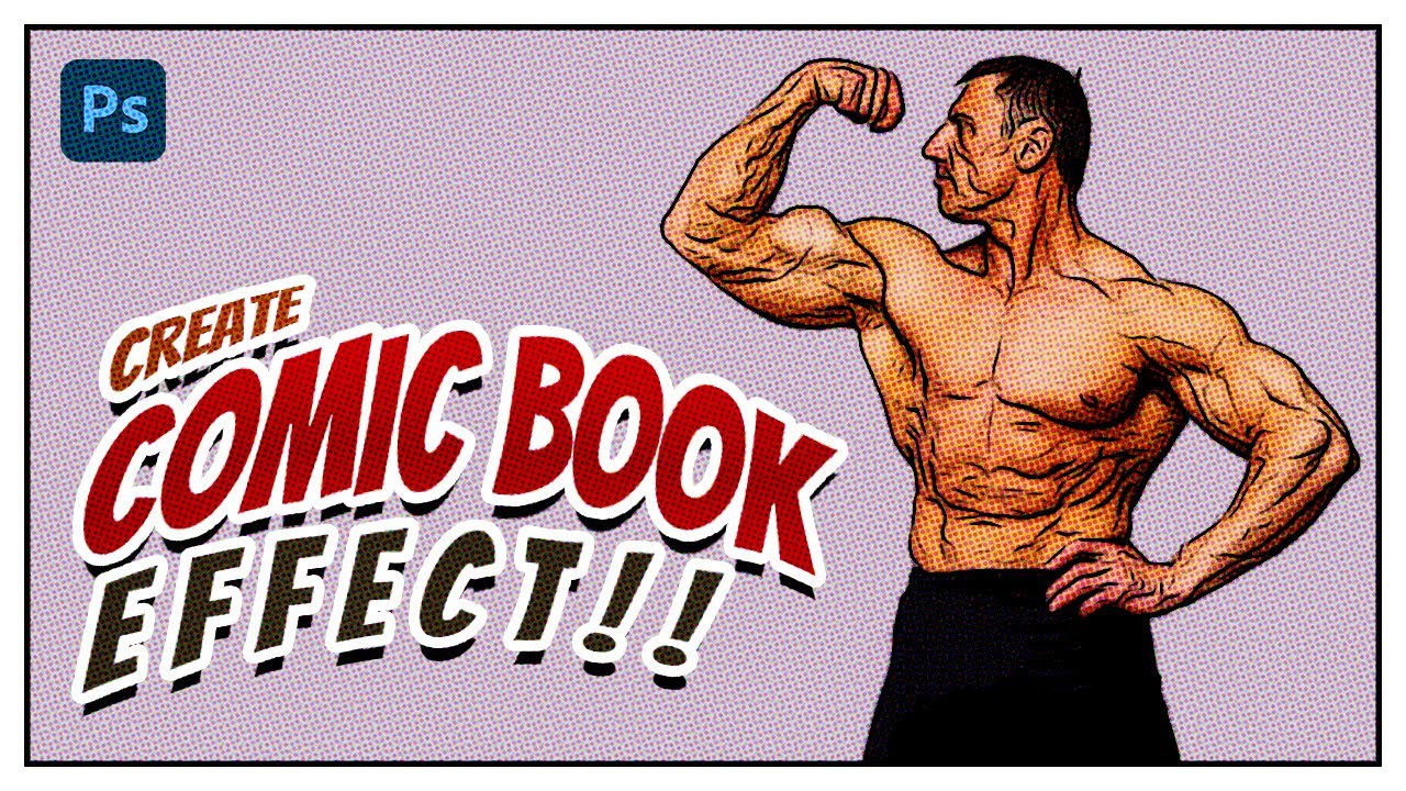
Are you looking for a YouTube video description for a tutorial on how to create a comic book effect in Photoshop? Here's a draft of a potential description:
"In this tutorial, we'll show you how to create a stunning comic book effect in Photoshop in just a few minutes! We'll walk you through the steps to transform your photos into a classic com...
Gave +1 Creative Carma to @serene coral (current: #7 - 861)
The water is different from the other one. I don’t think it is a filter, I do not see matching patterns.
this one looks more like redrawn, not a filter or effect
posterize edges filter. bluring, masking, adjusting colors. that's it
There are hundreds of different filters, as many tools and workflows, thus there are billions of combinations to try. No one can experiment for you.
I did not see you post the results you got with our advices, like the surface blur…
Did you search videos of cartoon effects? there are lots of them!
You also mentioned custom filters, see this commercial plugin with lots of possibilities.
https://filterforge.com
I would suggest to post a thread in the #1223011682012369027 so that you are not monopolizing this place. It seems to me that you are repeatedly asking the very same question, had every expert I know of engage with you, received plenty of suggestions; but I am afraid it might be unfair to others that might see their post buried by the repeat posts.
I suggest also to peruse the reference material : https://helpx.adobe.com/photoshop/using/filter-effects-reference.html there were some books on the topic : search online for: « Photoshop book filters effects »and try to get the book at your local library.
But I think the hive mind here exhausted its resources, and showed lots of patience so far.
You can't turn up every day and ask the same question. You've been given heaps of suggestions and workflows to try. Now its on you to do your own experimentation and find a workflow that works for you.
Hi! When I export my portraits out of photohsop, the quality is defaulted to 6 instead of 7 how I'd like it (maximum). I don't mind doing the extra step of changing it from 6 to 7 each time and waiting for those extra 2 seconds for it to register that I changed it from 6 to 7... but I also wouldnt mind it if it was just already defaulted at 7. Anyone know how I can default it to 7?
You're using the Quick Export feature?

That should persist for the session. I'm not sure why its not. Unless you're changing the format each time... (?)
Not sure what you mean by format, but all I know is that every portrait I've ever exported, the quality is defaulted to.. not the highest. So I have to increase it each time i export
Yeah. I'm just trying it out now. With each new document the Quality is bumped back down to 6.
Happy to hear it's not just a me thing. If you find a solution, I will be immensely grateful ❤️
You could try the "Quick Export" feature. First set your preference... Edit > Preferences > Export.... Quick Export Format

Then to execute that... File > Export > Quick Export...
I realize that it doesn't offer all of the options available in other Export features but it might be useful to you.
that should do it! i'll give it a go. thank you very much (:
how do i make my text look like this

One way is a Layer Style > Gradient Overlay... Make one instance of the text. Convert it to a Smart Object and use a different Layer Style effect for each layer.

how lens distortion, that you can see on this image, is called and how to replicate it? it is some kind of chromatic aberration and a bit of yellow-greenish tint, isn't it? maybe someone a bit more knowleged in this

This is how you might set up the Layers...

Replicate what, exactly? I don't understand what you're asking.
You can add an overall tint to an image in a variety of different ways... Adjustment Layers, LUT, Camera Raw Filter, etc.
do you see an image is a bit distorted in colors?
i mean, in comparison with real life
I see a LUT or something being applied to this image.
does this effect (not lut) in particular has a name? or it is not something specific?
For example...

yeah, i know about luts