#✂challenges-feedback
1 messages · Page 126 of 1
Gave +1 Creative Carma to @sterile berry
Coolio was good. Woolio was better. But "HUGHLIO" is by far the best!
Honestly, I wonder how much Creative Carma you have
Not much. I'm like 12th on the leaderboard. And some of these people, I will never catch up to. lol
They have 1000's more than me. :)
You'll get there @sterile berry! I'm sure 🙂
It's because nobody in #❓ask-a-question ever says "thanks." lol
Gave +1 Creative Carma to @coral stone
Really?
No. I'm using a literary mechanism called "hyperbole."
Thank you Ted, I really appreciate you saying so 😇
Gave +1 Creative Carma to @eternal mica
Thanks again for the idea (some more carma)!!
Gave +1 Creative Carma to @sterile berry
You got it, man. Happy to help. :)
Ahh I understand, Thank you for informing me about this Literary Mechanism that I hope to use alongside my English Essays.
Gave +1 Creative Carma to @sterile berry
Ted her is the update. you wrote __ @hearty quiver Nice effort with the Custom Icon. The colors look great together. The highlights and shadows are applied realistically. The coloration of the cork looks really solid. The extra shadowing on the neck of the bottle is a good touch. Extra Credit: try enhancing the realism by applying cast shadows to the bottle.
Ted here is the update -- you wrote @hearty quiver Great image for your Frosted Glass design. It has real power and intensity. I'd tweak the text in the glass. The size and fill color can be enhanced to improve legibility. If you need to scale up the rectangle size to accommodate larger text, there's plenty of room to do that. A darker fill color might work better.


Another one for Challenge #3 - 3D Made Easy

I really like the blur effect on this. Nice touch…
Photoshop Daily Creative Challenge - Dissolving Portrait


Thank you @compact pecan I was just playing around while making the background and it wasn't until I uploaded it I realized that it was perfect for the word on the sign 😁
Gave +1 Creative Carma to @compact pecan
I decided to try to make another one for Challenge #4 - Creating Concept Art. Free painting isn't my comfort zone so I struggled a lot with this one. It wasn't until I draw the very last it started to "live it's own life". I call this one "Valborg". It's a Swedish tradition on the last day of April to go out and watch big campfires where people have gathered old and dry stuff from their gardens. It's not unusual that it's raining and is pretty cold. Many also sings for the coming spring.

Logo with simple shapes

I think it really helps “sell” the 3D effect, too!
Logo with simple shapes 😎
I proposed a 'Popup Challenge.' See the #💬chat-general channel if you'd like to particapte. :)
Mandala fun.

I've an assignment to complete by Thursday. I'll give this challenge a try after finishing that.
I need to read a little slower, apparently. 💩 😂
Symmetry fun


Updated C1-Compositing Typography
Ted, you wrote @hearty quiver nice work on the composite text. Both designs look solid. The bricks are really well done. One tiny tweak, Id mask a bit of the bottom of the edge of the last E, as its hanging on the mortar.
On the vintage, I might try to push the color range just a bit more to get more of a fade into the text. But that’s just personal preference. Good work by you.


How To Color Your Illustration I updated
Ted you wrote @hearty quiver Awesome work with your monster. The highlights and shadows you created with the gradients are terrific. The BG works great with the drawing. One thing you might think about is the light source. You added a rim light on the left but you also have light highlights on the shoulders on the right. A tiny nit pick Ive pointed out to others: I'd give the pens and pocket protector a color to separate them from the shirt. Great work by you.


Isn't the guy who's live now doing a previous challenge than todays challenge?
Its an encore performance from the last two weeks.
It looks like the description in #📣creative-challenges shown for today is incorrect.

Thank you for blessing my eyes with this
Gave +1 Creative Carma to @tired turret
Thanks for the kind words
Gave +1 Creative Carma to @storm heart
Here's what I did after having watched @jolly quests Creative Encore - Design a Logo - from the other day. I played around and tested many shapes until I ended up with this one for my initials. There are many possibilities for development here but I'm happy for now.
Back for a play 🙂

retouching


Logo's with @jolly quest !
@young karma Two very well done Frosted Glass designs. The rectangle is well placed, has an interesting font, good blur. You might increase the bevel a bit and add some HSL to create a bit more contrast against the BG image. The circular design is so cool. It has a vibe of looking through a periscope to see the underwater objects. Good concept. Good execution. Nice work by you.
@young karma Very interesting Gradient design. The colors you chose for your gradient give an eerie nighttime feel to the subjects. You did good work creating highlights and shadows. For extra credit (absolutely no obligation on your part, but it would be good practice): mask out the scaffolding in the middle of the asset. It wont be easy, but if you do it, your image will rock!!!
@gaunt veldt very ambitious effort with your custom icon. The bottle is a cool idea. (You can even out the neck of the bottle to be more consistent on both sides.) The liquid in the bottle looks good. Theres a little bit of liquid on the lower right that could be masked out of the "bottle" to be more realistic. The shadow is cool. Theres one large dark grey brush stroke that can broken up to better create the illusion of a table and wall. BTW, the image opens up to full screen size.
It was an ambitious effort! Thank you for your input! Ill try out your suggestions once i get a chance! And thank you for bringing it to light that my submissions were not opening up to full screen and how to fix that issue!
@compact pecan Hahha, nothing like a bit of self promotion!!! One of my favorite movie quotes of all time from the opening scene of The Producers: "When you got it , Flaunt it, baby". and for this design, You Got It!!!! The depth layers look great, on the rectangle and on the text. The spacing of the text is right on. The top layer and fill look awesome. By blurring and fading the BG using the same design, you created very real contrast and focus. Really well done.
Happy to help out. How did fix the issue? It may help me in advising others.
With all the posts you've been making and help you've been giving people, you'll rocket up the leaderboard.
You told me to save the quality at an 8 but leave the canvas size alone
@hearty quiver Very solid tweak on the custom icon. The BG adds so much. The enhancements to the liquid look great. Is that a BM you added? The shadow is a good start. I think its a tad off from the light source and the bottle position, which are moving in opposite directions, so it makes it difficult to nail down exactly (maybe nudge to almost 12:00 position??), but "A+" for effort.
Gee, that was a good idea by me!!! 🤣 😜 🤣 😜 And I dont think it effects the quality of the image at all on the screen.
@hearty quiver Your Frosted Glass tweak is well done. By moving the placement, you exposed another human in the image, adding depth, perspective and tons of interest. In the first pass, I didnt realize that was a person. The text is way more legible. I think your design is upgraded. What do you think of the new version?
@halcyon current The ZOOM is great. One little tweak. The perspective on the left bottom is a bit twisted, unless you intended it to be.
@naive mulch Your dissolving portrait is spot on. It looks like you added a speed blur element to it also. The blurring and fading are well done. One tiny tweak: The fading of the particles as you move away from the source could be emphasized a bit more, so the ones at the far left are barely visible.
@halcyon current The concept art is solid. Telling the inspiration story behind the design makes it even more interesting. One tiny enhancement: I'd suggest blurring the bird shapes to give perspective and to have them fit in better with the rest of the elements in the drawing.
@hushed spade Nice job on the logo. Do you have a particular idea for it, or is it just a random design? To create more interest, what if you changed the color of the small ellipse and masked it over/under the house and the diagonal line?
@quiet ridge I love the GIFs. You're really stretching yourself out. Good for you. Im not sure you intended this, but when the GIF loops, it creates a bit of a "skip" in the flow. I think if you just extend the time a tad, you could eliminate it.
@eternal mica Thank you . It looks like I need to add a anther frame or two to the GIF to get rid f the skip.
@tired turret Awesome mandala. So many intricate beautiful lines and shapes. Beautifully consistent cohesive color scheme. Two points. 1. Its just a slight bit off center on your canvas. 2. Did you motion blur some of the layers? I would love to see an unblurred version to see which looks better. Terrific effort by you.
I agree that should do it.
@visual pelican Space Odyssey!!! Nice job!!! You created a cool galaxy.
Again thank you for your insight @eternal mica
Off center? 😂 well it’s like me so that’s not surprising. There is not intentional blur just what developed except in the masking of the open areas. The edge of that was done with a blurred brush. Thanks for the feedback!
@eternal mica I don't get it, Discord bot should have given you points for the thank you but it didn;t do it
@hearty quiver I wish my kids paid attention to my ideas the way you do!!! 😜 😜 😜 The Composite text tweaks are great. The E looks better and I think the vibe in the VINTAGE looks great.
Thanks Ted. It seems like I am challenged when it comes to light source and the shadows they should create - for I keep making the same mistake again and again. Could you direct me to a tutorial on this - umr
@hearty quiver I've posted ones before by @bleak fossil and by @fierce valley that are excellent. I'll look back for the links and repost them. In this particular case, you need to realize that the bottle is tilted INTO the direction of your light source, so there is a portion of the shadow which I will not see, or if I do, it will be reduced from what would be the shadow from a bottle standing at the straight vertical. Im not sure Im making that clear. If you need more clarification, DM and we can chat about it.
Thanks for your suggestions,definitely I like the updated version.
Hey Cork, dont worry about it. Since I started mentoring, Ive aggregated so many points, I rocketed to the top of the list. if you'd like, I'll share some with you!!! 😉 😉
🤣
You are being kind, I am just thankful that you take time to notice my mistakes umr
@hearty quiver Mistakes????? No way. Your work is top notch. You motivate me and inspire me. BTW, your tweak on the light source of the Monster is well done. I'll still push you to change the color gradient applied to the pens and pocket protector.
@real wren Since the beginning of 2021, The Ps DCC schedule went to 2 weeks live; 2 weeks replay. We are now in the replay time frame. I believe the next live sessions will begin on Monday April 25. You can watch the just completed series of live challenges at the Behance Ps DCC landing page, or you can watch the curated live streams that will be posted each day. If you have any questions, give a shout.
Thank you. I've been having fun just experimenting with different brushes. I've had some really bad outcome and some neat ones too.
@real wren Welcome to the Ps DCC Discord chat. Very nice work with the custom icon challenge. The coloration, shadows, highlights are well done. I might suggest you create some more realism by adding a texture to the bag, and, for extra credit, some cast shadows. In any case, well done. i look forward to your future posts.
Thats what "experimenting" means. When I draw like that, I throw away most of the things I start out making. Ive been thinking more and more about getting a tablet so I can enhance my drawing skills. Ive researched it. Im almost ready to commit.
@halcyon current Your logo has a lovely flow and sense of motion. The masking of the shapes is cool. The BG enhances the shapes. What do you think about aligning the top and bottom shapes that make the S? Im not sure it would enhance the design or detract from it. I'm just thinking out loud.
@vague swift Cool concept on your dissolving portrait. Creating a composite works well. I would suggest trying to fade the edges of the model just a bit more to fade the edge away completely. The way you brushed in the particles is solid. You did a beautiful job touching up the portrait. The skin tone is realistic, smooth, clean, and you left in the natural elements. Very good work by you.
@quiet ridge Your pouch is cool. Your work on the shadows is a nice touch. The highlights and shadows are well done. The texture you added with the thin lines is cool. Good work.
@tired turret Very nice logo. I love the font. I love the concept. 3 suggestions. 1. align the top of the two purple shapes. 2. square off/align the black shape corners. 3. nudge the text to the right so the Y and N are100% in the white and the E and G are closer to the edge of the black. (If you do that, I might scale up the text so the A is up against the edge of the vertical line on the left.)
Thank you for the encouragement it really helps me keep going.
Gave +1 Creative Carma to @eternal mica
Thanks man
Gave +1 Creative Carma to @eternal mica
Nice work on the tweak.
@eternal mica Thank you for your inputs. I'll reply all at the same time... 1: ZOOM - I noticed it but couldn't understand why it was twisted but then I realized that when making the sign behind the word it created the depth at the same amount never considering the perspective. I've adjusted it and hope it looks better now. 2: The Concept Art - I added some blur to the birds as you suggested, some more on the layer at the bottom of the three layers with birds. 3: Was it something like this you had in mind. I like this one too but I don't know wich one I like best...


Gave +1 Creative Carma to @eternal mica
Thanks @eternal mica
Gave +1 Creative Carma to @eternal mica
3D and 4D Text! | Photoshop Typography Challenge


Happy Easter 2022! It took me two weeks to design and paint all of the eggs. I hope the image isn't all pixelated after posting. The original images are 8x8in 300dpi. To create the gif, I made 2 jpgs (foreground, background), created a new document 500x500 pixels 72dpi, slid in the 2jpgs and created the bouncing oval. This was loads of fun! May I ask please, how do I send a .gif through the email? Thank you for this opportunity! I'm learning so much!

This is great! Eggs within eggs. Are there also smaller eggs inside those hidden eggs? :)
Happy Easter!
@sterile berry Thank you! I never thought of placing smaller eggs within the eggs. That would be a nice addition! I appreciate the suggestion! Happy Easter to you as well!
Gave +1 Creative Carma to @sterile berry
I was thinking maybe 'Matryoshka' - Russian nesting doll but with eggs. :)
Thanks a million, I will work on it. Umr
Gave +1 Creative Carma to @eternal mica
ho
I didn't realize this challenge was over a week ago....anyways...sketched out poorly, built in illustrator and pasted back into PS. I use some of the challenges to build lesson plans for my students....this will be my demo. Tell me what you think.

give me some photo
Here's my Behance project for @slender junipers challenges. Thank you Wade! I had so much fun and I long for the next time around with you as a tutor 😀
https://www.behance.net/gallery/141828389/Photoshop-Daily-Creative-Challenge

Gave +1 Creative Carma to @slender juniper
Ted you suggested - I'll still push you to change the color gradient applied to the pens and pocket protector. here is the update


Its difficult to comment without more background as to what your goal is in your class and what message this design is intended to send . Having said that, I would suggest that you watch the last stream in the series on using the repeat brush tool in Ps. It is fairly simple and straightforward, with several amazing options. It can produce some fascinating intricate designs.

TFFFF

just find a picture online and paste it on there
or rather don’t be making naked pictures of people
@obsidian talon @edgy totem This chat is dedicated to the Ps DCC. If you have posts for other reasons, please use one of the more appropriate tabs on the left. Thank you for respecting the rules.
I believe your students will enjoy this as their platform!
Ps DCC 22-04 11 Mixer Brush I wanted to play around with the Bamboo tablet to see how comfortable I could be drawing with it. Today's stream with Jesus was a wonderful first exercise. Its a strange feeling, but I'm going to keep working with it for a while.

this was fun 🙂

Creative Encore: Photoshop Daily Creative Challenge - Ascending Type


Photoshop Daily Creative Challenge - Retouch A Portrait. CHALLENGE: Remove blemishes and smooth textured skin by using frequency separation to retouch a portrait.


Does anyone know Steve from NZ name in the Discord?
How do we find the past streams of last week?
@tropic knoll If you go to https://www.behance.net/live and scroll down to Photoshop, you can scroll to the right and see the recent Encores that played.
Looks like it's currently displaying 5 of them.
Photoshop Daily Creative Challenge - Chunky Colors


CK, you have got to be kidding!!!! This is mind blowing. What an awesome concept. What incredible execution. The detailed painting is nothing short of spectacular. I cant take my eyes off the insert eggs, except I want to stare at the outside egg, except I want to stare at the insert eggs ....... You get the point. Sparkles too???? There are about 100 things I want to compliment you on. Can I save some time by just saying BRAVO !!!!! 💯 💯 💯
@halcyon current Solid Behance portfolio. I really enjoy reading your personalized comments on each design. Its a great touch.
Thoughts? How could this design be improved?

Love the texture and colors on your behance cover!
Thanks! It's a manger, cross, and crown inside a tomb with the stone rolled away. I like your idea on the small ellipse being another color and masked over/under the rest. I'm also thinking the "stone" (black circle at right) should cut into the rest of the image more. Thoughts?
Gave +1 Creative Carma to @eternal mica
@vague swift Nice brush work on the PT replay challenge. I like the brush stroke BG creating an irregular space. It adds a lot of interest to the design.
@hushed spade Aha, now I get it. An Easter design. I would consider two changes, I would make the 3 elements different colors so they are distinguishable from each other. How about adding a texture to the stone to make it other than just a black space? That will also help you decide if you want to cut "the stone" further into the circle. Just some ideas.
Thanks, Ted!
On your Nature Art, I like the font, the layer style, the fill. Since your fill is so busy, perhaps blur the BG a bit so as to make it less distracting vs the text. Would you like the "is to be scaled up a drop? if you want to break the frame with ART, maybe push it even more so its clear you intended it and its not an oversight. Push it to where the word oversteps the boundary of the canvas on left and right.
I just blurred the bg. That helps. I have been thinking the same thing about ART breaking the border. Will try it! Maybe will play with IS as well. Thank you!
Gave +1 Creative Carma to @eternal mica
thanks man
Gave +1 Creative Carma to @eternal mica
@eternal mica

Hi @eternal mica! Thank you for your most generous words! I really appreciate keen eye! I'm sure you can imagine my big smile! I worked hard on all of the designs and am truly grateful for your reaction! Thank you very much!!!
Gave +1 Creative Carma to @eternal mica
Solid tweaks!!!
Great starting Point Ted! Hopefully you'll have fun with your new tool 🙂

I really like the second logo of your initials! I can’t help picturing it with color.
Thank you @hushed spade The texture is a part of a bigger downloaded image from Adobe Stock Free and I like those colors too.
Gave +1 Creative Carma to @hushed spade
Thank you once again @hushed spade for your kind words. I thought of it in color too but have kind of lost track of time and all funny challenges 😆
Gave +1 Creative Carma to @hushed spade
I shot a couple of photos yesterday that were a perfect use for @slender junipers Frosted Glass challenge and I thought I would share it here since we haven't got any new challenges yet. I add both the images used. The magnifying glass is created by using techniques from an earlier challenge too.


alien land/water scape

At last I have post Ps DCC 2022-3A host VooDoo Val on Bêhance
https://www.behance.net/gallery/142133899/Photoshop-DCC-Week-1-2022-3-Host-Voodoo-Val

Ps DCC 2022-3B-C posted to Béhance
https://www.behance.net/gallery/142135797/PSDCC-2022-3-TypographiyChallenge-Mutiple-Hosts
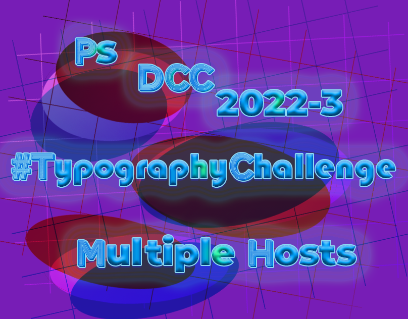
Behance
PSDCC 2022-3 #TypographiyChallenge Mutiple Hosts
I have posted Ps DCC 2022-4 project to Béhance.
https://www.behance.net/gallery/142154783/Photoshop-DCC-2022-4-host-Wade-Acuff

Thank you Ted ❤️
Gave +1 Creative Carma to @eternal mica

Creative Encore - Fancy Text - This was actually the very first challenge I tried and participated in close to 6 months ago so I already had that action created. I did an entirely different take this time around...

Here's my first upload for this challenge a.k.a. my very first upload here at Discord 😀

Mixer Brush with Jesus Ramirez. I learned quite alot doing this. Using the bevel and emboss as suggested brought the painting to life. My notes are extensive! I discovered the need to place a wild color underneath the final image (cmd,shift,option,E) to find all the places missed, which were lots. Thank your for this opportunity!


I finally finished my Behance portfolio, getting it in just before we go to the next series. It was great working with @slender juniper on his initial Ps DCC stream. I want to thank him for presenting so many new perspectives for us to add to our tool boxes. I hope he's invited back real soon. https://www.behance.net/gallery/141065959/Photoshop-DCC-Ma-28-Ap-8-2022-Wade-Acuff

Gave +1 Creative Carma to @slender juniper
The starter file link for todays challenge is not working
Starter file for today.

Compositing Typography with Wade Acuff. I made up the name, Brueck's Burgers. The name seemed fun. I've been at this since the stream trying different brick walls, brick corners, bricks in general. Nothing seemed to work. Hope you feel this does. Color range is something I feel I am familiar with now. Thank you for the opportunity!

Skateboard with Wade Acuff. The Symmetry Tool is a unique tool. I quite enjoyed it. I did my best to freehand draw the pieces. Thank you for this opportunity!

Hey, quick heads up for anyone trying to do the Creating Custom Brushes challenge (2nd challenge) that I hosted. It seems that the latest updates to PS 23.3 - 23.3.1 may be causing an error with the custom patter>script>place along path functions as it gives the error that I posted. I did test this in a prior version of PS and it works fine. So if you're getting that error, that may be the cause. Thanks @tropic knoll for making aware that this is now an issue.

Gave +1 Creative Carma to @tropic knoll
Day 1 - My burned ID logo

@hollow yarrow Franck, you never cease to impress. This looks awesome! Love the style of the logo too. Great texture, great contrast, really nice piece.
The design from today's stream! Burned Text Effect.


Day 1

@last mica 👍 🤩 💯
Thanks 🎁
Gave +1 Creative Carma to @gentle pasture
PS DCC 2022-5 Challenge #5 Burned Text Effects 4-25-2022

Really neat!
@hollow yarrow 👍
Challenge One. Feeling fiery this morning


Challenge 1: Burned type and shape. I did this rotated shape as well to see how it will turn out along with the text. I have got this cutting board image from Adobe stock. The board was already burned. I liked Sam´s method how to work on colored edges using magic tool and selecting edges, then expanding, feathering of the subject edges and then deleting on other layer.

Ps DCC 212-05 01 Burned Text


I tried this out, taught me some new methods and how to better use tools

Tweaked the GIF a bit

Day 1 Burned Text

Day 1 Burned Text

Challenge 1

Ps DCC 04.25.22 - Burned Text Effects - Pixel Gulch. :)
You are all killing it, these are looking so good.
PSDCC Burned Text Effects Day 1 So I chose to do what I would be put on a piece of wood.


@tropic knoll Your compositing Type on the round brick wall is cool. The BM and color range look great in fading the text and bringing the brick texture out. I would suggest you can push the perspective warp a bit more to create the rounded impression in the type. beautiful symmetry design. The colors a re spot on for a skateboard. The desisgn is very complex to create in a symetry fashion. Well done.
@hollow yarrow I dont know what this world is coming to. The FIRST design on the FIRST day is posted by Mon Ami!!!! WOW. Very solid work on the burn effect. The offset letters are enhanced by the little shapes you added in the corners, to create a super interesting design. The singe effect around all the elements looks very realistic. The wood texture you selected adds good interest.
@bleak fossil Your design has one super interesting aspect. There are areas of the text that looked burned into the wood, and yet, there are other areas that look almost 3D. Fascinating.
@gentle pasture I love the font choice. Love the execution. You captured all the different color elements exhibited in the stream into your design. Very well done. The one tiny tweak I might suggest is to see if a darker tone for the drop shadow and outer glow might add more realism to the "burn" vibe. Good job by you.
@last mica You nailed this. The texture of the BG showing through the "burnt" text is so well done. The blue tint adds a strong vibe of realism. Tiny tweak I might try is to make the drop shadow/glow a bit less uniform around all the letters so as to add even more realism. Very well done.
thanks, Ted.
Gave +1 Creative Carma to @eternal mica
@wary swan Good work by you. All the layers and shading create a sense of depth to the design. I might try a curves adjustment layer on the central text to see if I can add some contrast, making it more the focal point, without destroying the vibe youre trying to create.
@tropic garnet Hey, Nick, great to see you back. Very interesting approach to the text burn effect. Its almost as if you have a fabric overlay on the text and the text is burning through the fabric. The multiple texture layers is a great look. Solid execution.
Thanks! It’s good to be back, lol. I got super busy studying for finals.
Gave +1 Creative Carma to @eternal mica
@quiet ridge Earlier today, someone in the Discord chat gave me a huge belly laugh. Youre GIF is the second one today!!! I love it. First off the design is so well done, The effect looks solid. Then to apply it to a GIF, how cool is that. I might tone the Gaussian blur just a tad to make the text a bit clearer, but that could be personal preference.
@copper moss Beautiful piece of work. So many excellent elements. The coloration inside the text is spot on. The design in the middle is terrific. The object layers and shape are realistic. I think the text perspective warp is a bit off, but thats tough on rounded text. Very well done.
Thank you @eternal mica I had fun making it & am still playing around. It was a fun challenge
Gave +1 Creative Carma to @eternal mica
Im certain 2 posts for a single exercise is not all you'll submit. I normally wait until youre done, but this one was so much fun, I figured Id jump right in.
To be honest I am making myself cut donw on my Ps play time these days
@ebon imp Welcome to the Ps DCC Discord chat. We're happy to have join the party. if you need help with anything, give a shout. We're here to help. Nice work on the Text Burn design. The overall vibe is very well done. There are no rules for these challenges. You create what you feel you'd like to. If you wanted to emulate what Sam demonstrated, one suggestion I'd make is to have the shadow effect on the large text surround the text as opposed to be more of a drop shadow effect on one side. Of course, if thats not the vibe you wanted, than forget what I said. The smaller text is spot on. The vignette is well done. We look forward to your future posts.
@sudden geyser Welcome to you as well. I repeat what I just texted above to you. Nice effort with the design. The coloration is very interesting. If you wanted a "burnt in" vibe, I might suggest a thin shadow inside the text edges to create more of a sense of depth in the text, rather than a protruding 3D look. But that may be the vibe you were trying for.
@compact pecan Very well done burnt text. The coloration in the text gives off a very realistic vibe. The blue tones really give off the charred wood vibe. The inconsistent drop shadow adds good realism also. Nice work all around.
@red yacht Welcome to you also. Please scroll up and read my welcome comments to a couple of other new comers. If we can help you in anyway, give a shout. Your design has an interesting reverse effect. It has the feel that the letters were burnt into the surface from the reverse side forward. The coloration works very nicely to give off the "burnt wood" look. I might try a bit less blur on the letters, just to see how it looks.
@haughty gale OOOH, using this BG texture is wild!!! Your inconsistent application of the text works so well on such a intricate BG. The way you varied the burn effect on different letters adds so mush realism. The one tiny tweak I might suggest is to lower the saturation of the BG texture to create more contrast with the text. Very well done.
@sterile berry Nice job by you. In a general sense, the depth of field you created is a great touch. When I enlarge the image, the sign looks as if I can touch it!!! The charred burn effect in the text looks solid. The font is so interesting. The subtle drop shadow adds to the burnt in look.
@visual pelican You nailed it. The charred effect in the logo shape is spot on. The depth you created with the shadow is realistic. The soft inconsistent drop shadow adds realism. Nice vignette shape. Good effort all around by you!!
Thank you! Your mentoring has helped me improve so once again thank you!
Gave +1 Creative Carma to @eternal mica
@naive cove Welcome to you too. Ive already welcomed a number of people above, and I extend the same welcome to you. Nice effort on todays challenge. Its a crisp clear straight forward application of the technique. I would suggest scaling up the font so as to allow me more space to possibly add layer styles and additional effects inside the text. And the canvas can surely tolerate a much larger font. But of course, thats just personal preference.
Thanks, Ted. I was going for that branded look but it also had to look weathered and worn by the elements. Not sure I totally got there but I think I came close.
Gave +1 Creative Carma to @eternal mica
PSDCC Burned Text Effects Day 1 Extra.

Thank you for the advice, I will take note to add a the thin shadow. I was following along with the tutorial, but somewhere it went wrong. And the colors are off, I should have done a darker blue. In the end I accidently made a 3D look when I copied all the layers. Which isnt what I was going for but kept it cause I thought it looked cool.
Gave +1 Creative Carma to @eternal mica
I know exactly what you mean. When I was looking at the close up, I started to think that, but then it would play against the depth you created
Is today the first time you watched a DCC stream? As you can see from the variety of the posts, you're not obligated to create using the exact step by step of the stream leader. A bit of advice though. If you intend to replicate the stream, rewind and match the steps one by one. If you get off track, retrace your steps. Once off track, more times than not, you will not get the same result as the stream leader.
Yes it is my first time watching a DCC stream. I do see all the post above and some are pretty close to the tutorial and some are very creative and different. Yeah I should have reminded during the shadowing and blurring parts more. That is where I think it went wrong for me.
I decided to do these to learn how tools work and learn techniques.
Dont worry. You did fine. You can always go back and tweak your work and repost. Or just move on to the next design. Thats exactly what we're all here for. If youre like most of us, youll find its a great place to learn new techniques and to learn new ways to apply "old" techniques.
I gotcha, just got to keep learning by practice and using tools over and over again with new ways of using them as you learn.
@sterile berry Loving this design! The background setting is an excellent idea and the sign and text design fit really well with this theme. Was this a single background image with the blank sign or did you add that in? The coloration and texture of the text works really well with this image, well done!
@haughty gale I really like this style with the outlined branded look! The irregular edges give it a really natural organic look too, it makes the burned effect more convincing. I also really like how the cracks and contrast of the background texture act as leading composition elements to point inward to the text. Very nice!
@red yacht Very nice sense of dimension on the text effect! I like the dings and dents you made in the wood, it gives a nice irregular look which feels natural. I'm thinking that lowering the opacity of the highlight layer a bit (assuming it's on a separate layer) might give it a more realistic look, of course that all comes down to personal preference. Nice work!
@compact pecan Digging the addition of the hand graphics on the side! The orange singe on the edges is looking good. I almost feel like maybe the text could be blurred a pixel or two to give it a more natural look, but at the same time it almost looks like it was branded by a precision machine or laser cut or something, which is also a cool look. This came out well!
@quiet ridge Very cool, it's always neat to see you taking these challenges and getting creative with them, the animation is looking good! My main suggestion might be to lower the opacity on the blue layer and/or even desaturate it just a touch to give it a more subtle look. Very nice work!
@sudden geyser Very nice, that's great to hear! I like the color contrast between the cool and warm tones in this, it really helps the orange singe effect pop. My one suggestion is I feel like the burned effect might look more convincing if it was a bit darker overall. Branded wood often looks nearly black, and the text feels a bit light in comparison. Just a thought of course, nice job! 👍
Thank you @bleak fossil I have been thinking about how to tone down the blue some . Working on version 2 now
Gave +1 Creative Carma to @bleak fossil
@ebon imp Hah, I love it. This is a great idea for this challenge, and the technique came out really well too. The font style choices compliment each other very well, this has a really convincing look to it. Nicely done!
@visual pelican Very cool, and very on brand for your name, hah. I really like that design and it works well as a branding symbol. The orange singe and subtle blue looks good. My only suggestion is that the wood background might look better if it was cropped with a hard edge instead of the soft airbrush you used to create that shape. If you erased or masked out the edges with a hard brush instead you could probably even add a bevel/emboss effect to the background wood shape to give it a sense of dimension like a wooden plaque would have, if that makes sense. Well done!
Always enjoy a @bleak fossil workshop 🙂

Version 2

@vague swift Whoa, you're killing it! I love that highlight on the left edge of the text, it pushed the dimension of the bevel/emboss effect even more. Kind of makes it look like it's been branded into treated/varnished wood. The glare effect and texture is on point as well. Looks excellent!
@eternal mica Nicely done Ted! I really like that rustic wood background texture, and the font you chose works really well. I also like the addition of the symbol/logo in the middle. My main suggestion would be that it looks like you lost some contrast in the middle B symbol. It looks a little washed out compared to the other words. This is also a subtle one, but I think the blue line highlights could be cleaned up a little so that they're not breaking outside the edge of the text so much. This is looking good!
@copper moss Very cool idea, perfect application for this technique! I like how you took on the additional challenge of making it a sort of mockup with the angled cutting board. The burned technique looks really good, though I think the graphics could be pushed in perspective a touch more. It feels like the graphics are facing us slightly more than the board is, if that makes sense. Of course that's just me getting really particular with the subtle details. Looks good!
Hey, Sam. Thanks, bud! There are basically four [4] layers: the sky, the ghost town, the sign and the text effect; that was the build group. When I finished editing, I copied the group, merged it all and ran it through Camera Raw to adjust light, shadow and color balance. That tied it all together. Thanks for the inspiration! Great challenge. I had fun!
Gave +1 Creative Carma to @bleak fossil
@tropic garnet Very cool take on this challenge! I really like the texture you got within the text, it definitely gives it some strong focus. The background linen-looking texture is also really interesting, kind of like fabric that's in the process of igniting. Nice work!
@wary swan Cool style to this! Correct me if I'm wrong, but it kind of looks like you were going for the effect where all the space around the text was burned inward, so that the text is raised above the burned space around it? If so, it might help to have the top part of the text a bit brighter to more closely match the bright color of the wood texture. It would give it a lot more contrast and look more like the negative space around the text was burned. If you were going for the original design of the burned text, it might help to have the inner part of the text darker. Nice work!
@sterile berry Awesome, thanks for breaking that down! You obviously did a great job with it because it's easy to believe it was all one stock image. Very cool.
Gave +1 Creative Carma to @sterile berry
Thanks. I used some custom brushes along with a couple of the Keith Haring brushes.
Gave +1 Creative Carma to @bleak fossil
@last mica Very cool, I like the contrast between the blueish and warm orange tones, it gives it a lot of pop. The color of the blueish glare is looking good too. My only suggestion is I don't see the depth of the bevel/emboss effect coming through which really helps sell the dimensional aspect of this look. It might help playing around with the lighting direction and angle until you find one that has a good sense of shadow near some of the edges. Just a thought of course. Nicely done!
@gentle pasture I like the style of this font! It works nicely with the branded look. Really nice job with this technique, the texture with the glare inside the text looks great, and there's a nice strong sense of dimension with the bevel/emboss effect. I think a more gradual vignette might help the realism, basically a lower flow and larger brush, but that's a minor nitpick really. Looking good!
@tropic knoll This skateboard design is looking good! I love the bright, bold colors and the sharp graphic designs you added to it. This is a really subtle thing, but I'd be curious what it might look like with the designs scaled up a bit, and bit more visual hierarchy between big, medium, and small shapes. Maybe if the skull/leaf was scaled up even more to be a stronger focal point, to the extent where the leaf moves past the edge slightly, then the pink flowers at the top and the turtles at the bottom being enlarged a bit, and then the top flowers and bottom center design could stay their current size and be the smallest elements. I would just be curious to see the designs "fill the page" a bit more, but that's totally up to personal preference in the end. Very nice job!
@naive cove Very cool! The burned effect came out well. It could look good to darken the text down a bit overall, but at the same time it kind of gives it a lightly burned look, rather than a deep, more intense burn. Nice work 👍
@bleak fossil thank you! was fun!!
Gave +1 Creative Carma to @bleak fossil
Thank you for the feedback, I will definitely look into that. I found your tutorial helpful and I learned a lot! 🙂
Gave +1 Creative Carma to @bleak fossil
Thank you for your kind words about most of my design. You are an incredible discerning eye. One of these days, I'm going to figure out how to get one of my slip ups by your all seeing eye!!! When I made the middle logo, I turned it into a smart object so as to have the B and the shapes together. I didnt realize that, for some reason, once I did that, the rest of the techniques you applied in your demo would not work on a smart object. I had to try to come up with some work arounds to get the same look on the logo as I did on the text. Im open to your suggestion as to why that happened and how I can fix it.
Gave +1 Creative Carma to @bleak fossil
Never expected to struggle so much on this one...😓 Not really happy with the emboss effect but it's late and I need to sleep (to avoid a burn out)....


I'm digging the other wood background choices people chose
I got slightly thrown off with one of the layers he worked on, but time for me to pass out as well
Thank you! I will work on your suggestion.
Gave +1 Creative Carma to @bleak fossil
Sure, Sam. I'll try it out.
Thanks for the feedback Sam, I will see what I can do to get a better contrast, I made the effect with a brush I was thinking it look but now I don't rember how I did it or wat settings I used.
Gave +1 Creative Carma to @bleak fossil
Thanks for the feedback Ted, I did this a brush I got so surprised so I forget to check what settings I used, lol.
Gave +1 Creative Carma to @eternal mica
Thanks, Sam! I used for the first time the magic tool in this manner and expanding and feathering the subject´s edges and further deleting unnecessary piece on the texture layer. Thanks, I have learned much today from you. I will improve in giving more touches and giving more perspective on type you have mentioned.
Gave +1 Creative Carma to @bleak fossil
Thanks, Ted! I rotated the ZigZag shape I found from custom shape tool just for decoration. Yes, the board was already sort of burned. So I did burning color on the type and shape the same as on the board.
Gave +1 Creative Carma to @eternal mica
PS DCC 2022-5 Challenge #5 Burned Text Effects 4-25-2022 version 2

Font family: Bungee
Font style: Shade


hi - where do i post the image? just attach it here or...?
@naive marten Yes, to be part of the DCC group, you just post your images here. You can drag and drop it, or click the + icon on the left, select your file, and add some text to your post.
I tried for a freshly branded, still red hot & smouldering look. This was fun.

@hollow yarrow I love the font, the BG, the textures. In reviewing all of the submissions, I think Ive seen a recurring issue with a lot of the posts. It seems folks had the most trouble creating depth in the burned in look. Many seem to end up with the text looking elevated on the BG as opposed to depressed into it. I think this post also has this look. I went back and looked at your first post. It doesnt have as pronounced a B&E effect, so it looks flat on the wood, not depressed. This one looks raised. Perhaps using the Select>Modify>Expand to create a more pronounced dark shadow inside the text would create that dark edge I'm trying to describe. Just some thoughts.
@abstract cloud Welcome to Ps DCC Discord chat. Great to have you join in. If you need help with anything, give a shout. Good work on your design. You created strong contrast between the BG and the focal point of the design. The font fits the message, strong, bold, hard. I would suggest toning down, softening the drop shadows and outer glows, as they convey more of a raised text than a depressed burnt in effect. Also creating more of the dark inner edge to the text might also enhance the depth. Good work by you.
@grim ermine Welcome to the Ps DCC Discord chat. Its been a loooong time since you visited. Hopefully, this time you'll be able to hang around. Your design is very interesting. I think it starts with the font choice. Very eye catching for an exercise like this. The vignette and drop shadows create a strong light source. One tweak Id suggest is to get more of the shadowing on the right side of the letters to create more depth there and more realism. Very nice job.
@bold frigate Welcome to our Discord chat. We're happy you decided to join the party. If you have any questions, give a shout. We're here to help. You did a cool job with the burnt text. The contrast, coloration, shadows all look good. There are some areas where you really got a dark edge inside the letters to create real depth. (top of B; inside R; lower inside E e.g.) I think if you extended that look throughout the text, it would add a solid sense of depth and realism to the design.
@near knot Really interesting interpretation. Strong overall vibe to the design. The coloration, light source, and texture direction of the BG work so well with your object. It all draws the eye upwards. Nice. The font is very interesting. The blue tints you added work really well to create the burnt impression. One tiny tweak Id be curious to see is, despite the light from the bottom, more dark edges inside the bottoms of the arms of your shape. It might create more depth to the burn effect. Good job by you.
@vague swift Strong effort by you. The distressed BG adds so much to the design without distracting from the focal point. The wisps of smoke are a super touch. You did a wonderful job creating depth in the "burn in", and in allowing the wood texture to show through the charred areas. Very well done.
You're totally right Ted! Last one was made following Sam's technique step by step... I struggled a lot trying to get embossed effect... I will probably give an other try on first one (personal layerFx settings) to get more depth... Thanks for commenting!
Gave +1 Creative Carma to @eternal mica
I also ran into trouble following @bleak fossil step by step. I created a logo icon with text and shapes and converted those layers into a SO. For some unknown to me reason, I could no longer use the techniques Sam used on that SO. I fought through it, trying work arounds, but Sam's sharp eye called me out on it. 🤷🏻♂️
Ps Daily Creative Challenge Apr 25th: https://www.behance.net/gallery/142498523/Ps-Daily-Creative-Challenge-April-25th-2022


Second Try!


I'm liking this one. The interior is truly scorched. I 'believe' it.
Thanks, I appreciate!
Gave +1 Creative Carma to @sterile berry
Here's the Paper Cutout Effect from today's stream!

Oops. Exported the wrong one! heh
PS DCC 04.26.22 - Papercut Effects. "Rocky Mtn Moon Papercraft" - I recently created the design for a different purpose. That was made in Illustrator. I brought the shapes over to Photoshop to create the paper textures and shadow effects. The design seemed to lend itself well to this papercut theme.


Here is my first pass at challenge #1

Papercut Effect with Sam Peterson. This was fun. I never knew you could use the Elliptical Tool with the Shift key to create effects. Neat! I look forward to your comments! Thank you for this opportunity!

Wow, very nice @plain sable !
Thanks @tropic knoll
Gave +1 Creative Carma to @tropic knoll

This is great. Instead of the text "papercut effect" you should put something like "sailing away..." or "ride the wave" or something that goes with the subject matter. Just a thought. :)
#challenge - Burned Text 🔥

Day 2

day 2

Challenge 2: Papercut effects. This was a very useful and beautiful session today. Thanks a lot!

Wow! Great result. Engraved effect looks so realistic! Impressive!
Great take! Nice design, love the idea of silouhette on foreground. Quite challenging to get this result with dark colors, isn't it?

Thanks, bud! It was tough to get that "construction paper" look with dark foreground. On the "blues" it seemed to work pretty well.
Gave +1 Creative Carma to @hollow yarrow
Challenge 1

#challenge - Papercut Effects 🤩 I really like this one - THANK YOUUUUUUU, @bleak fossil

Had some trouble with the pen tool but just need some more practice.

Challenge Two


😀

If you want to write in french, instead of "coupe de papier", write "papier découpé" don't forget the accents
That's a great idea! Thank you! I was concentrating on that shadows and getting the effects.
Gave +1 Creative Carma to @sterile berry
It's from a french person so
Just go Bahstin on it.. "Cud de pay-pah!" :D
PAYPAH CUTTAH - Two weeks off and on Day One I get sent to the Principal’s Office - LOLOL
Yeah but you're getting a two-for-one with this one, apparently. How do you say "win-win" in Francais? :)
Gagnez la victoire 😎
Let's set sail! Thank you, @sterile berry for the inspiration!

Gave +1 Creative Carma to @sterile berry
@eternal mica thank you Ted. thanks for the awesome comment!
Gave +1 Creative Carma to @eternal mica
Challange #2 Paper-cut effect

Thanks @hollow yarrow
Gave +1 Creative Carma to @hollow yarrow
Thanks for the tip! Appreciate it 🙂
Gave +1 Creative Carma to @eternal mica
Welcome @abstract cloud feel free to reach out if you need help or have questions...
Day 2 Torn Paper


@sterile berry I think this design works perfectly with this papercut technique, very cool! It looks like it was already set up very well for it, I really like the added dimension it adds in a shadowbox sort of way. I also really like the paper texture and more illuminated look the clouds have in this version. Nicely done!
@plain sable This is looking great! The color and contrast of the design is working really well and the texture adds a lot to this effect. Very cool graphic design with the tree too, it fits this challenge nicely. Well done!
@arctic comet Nice job with this burned text challenge, the orange singe, and especially the subtle blue highlight is looking really good! This circular logo definitely fits that branded feel nicely too. 👍
@hollow yarrow You knocked it out of the park with the second branded design! I really love the cool sheen inside the burned area, and the texture is looking good. Really great contrast and the bevel/emboss effect really sells that sense of depth. The first one looks good too, but the second is a step above. Very nice!
Thanks @bleak fossil its fun to have time to participate in this DCC
Gave +1 Creative Carma to @bleak fossil
@hearty quiver I like the blueish sheen and texture within the text. The shadow around the edges adds some nice depth too. I think a bigger brush size with a lower flow might help you get more gradual gradients around the edges with the vignette. Nice work!
@timid crest Loving that text design! Really cool take on this challenge with how the text looks like it's currently burning/made of embers. The sparks are a great touch too. This is a detail oriented nitpick, but it might be nice to have the center of the sparks be glowing a bit more as opposed to a flat color. 3 ways to do this come to mind. You could try boosting the brightness with a Levels adjustment on that layer, and masking it out around the edges of the canvas to keep the brightest ones in the middle. You could also manually paint over them with a Color Dodge layer which is often good for boosting brightness. Or you could double click the layer to open layer styles and add an inner glow. Not sure which might work best for your document. Just an idea of course, very nice work!
@compact pecan Ooh, this is cool, I like the way it looks like it has different types of paper in it. Kind of like thinner craft paper mixed with thicker construction paper. I really like the way you masked the figure towards the left to be overlapped by the bottom layer but overlapping the upper layer. The only thing that seems confusing visually is the figures in the middle that are overlapping the orange seam, but still have the punched in bevel/emboss effect. It seems like those would use the drop shadow effect to give them the overlapped look, if that makes sense. Nicely done!
@lost helm Ooh, excellent depth in this Paper cut challenge! Those bold shadows are working really well. I love the strong contrast between the colors and the texture on the paper, especially the dark blue part. This feels really tangible, and the yellow color accent works very well too. Well done!
@tropic knoll Super cool, I like the concept of this idea with the ocean waves! The addition of the sailboat was a great idea and really gives the design some character. The shadows are all working really well to sell that sense of depth.
@quiet ridge I really like the scene you created here! The addition of the personal in the middle is a nice touch and focal point. My only suggestion is the shadows don't look completely consistent between the clouds and shape layers below. I'd try increasing the darkness of the shadows on the land/text shapes to push the depth a bit more, while easing off the opacity of the clouds since it's currently so dark it almost reads as a black graphic outline. Just some thoughts. Really nice job with all the shapes and layering in this 👍
Thank you @bleak fossil For your kind words and input I will play around with it some more
Gave +1 Creative Carma to @bleak fossil
Thanks, Sam. I appreciate!
Gave +1 Creative Carma to @bleak fossil
I think I got @bleak fossil tweaks right. I had forgot to turn off the Styles that had been used on the shapes & text.

I wanted to try another edit to add text and try to make those clouds look more like tissue paper. (Light, wrinkled, semi-transparent paper is kind of difficult to get right. :)

@sterile berry

Thank you, Sam! This was a fun challenge!
Burned Wood with Sam Peterson. Twenty attempts later and I feel I may be onto something. Do my letters look like they're burned in? Not sure why this challenge was trying for me, but I wasn't about to give up. Thank you everyone for the inspiration and confidence building! The art coming is through is fantastic!

thank you, @sterile berry!!
Gave +1 Creative Carma to @sterile berry
Belle coupe de papier! 😉
Well done!
Merci Beaucoup Beaucoup!!! 🇫🇷
Great sense of depth! Love the texture and colors. Nicely done... as usual!👍
Beautiful night time “ blue hour” colors!!! 🥰
Thank you! I appreciate you. :)
Gave +1 Creative Carma to @quiet fern
I had to go back to the office just to make another version of mine 😁
Paypah Cuttah... reminds me of...

haha
I worked in a print shop and the paper cutter we used you had to use both hands to make the big huge guillotine blade come down and then anytime you felt a pinch anywhere you had to count your fingers 😳

Exactly
I worked in a print shop too at one time. There were some serious cuttahs in there. heh
All the Old School stuff… Linotype, Ludlow, C&P, Miehle Vertical, magnetic ink everywhere…

@digital pike Very nice, the depth is looking really good on these shapes! The text especially reads really well. My only suggestion might be to brighten the whole design up a touch with a Levels adjustment, as it appears a bit on the dark side right now. Nice work!
@naive marten I like the background photo you used for this burned text challenge, it adds some really nice context to the design. This is looking really good, my main suggestion would be to add a wood texture clipped to the text layer so that the inside of the text looks like wood too, at the moment it looks a bit smooth. Nicely done!
@paper shadow Very cool, the effects are all looking good on this. The dark text has some nice contrast and the orange singe around the edges is working well. My only minor nitpick might be to lower the opacity on the bottom glare layer just a touch, it almost seems a little too reflective for wood at the moment. Of course that's up to personal preference. Nice job!
@tropic garnet I like the style of this Cut Out challenge! The bold shadows are working well, and it's interesting to see the effect applied to that kind of wild shape. That along with the texture almost gives it a sort of laser cut feel which is neat. Nice work!
@red yacht This looks great! Really nice job with the shapes. The pen tool can certainly be a bit odd at first, but once you get a feel for how to make it work to create the shapes you want, along with a few of the keys to modify the handles, it becomes a quick and useful tool. This turned out well and has some really nice depth to it, well done!
@quiet fern This is looking great! Loving the color scheme and the textures you used for the paper. There's a really great sense of depth to the whole thing with the shadows you added, nicely done!
@vague swift Really cool idea and theme to this design! I love the cow shape and coloration. Really nice job with the shadows, though I wonder if they could be increased on the moon and paper airplane? Though I understand if the paper airplane wouldn't have a strong of a shadow if it's supposed to be further away from the surface of the rest of the paper. Either way this is look great, nice job with all the shapes!
Thanks!
Gave +1 Creative Carma to @bleak fossil
Thank you for the feedback , hadn't really got the hang of the desired final look so your specific input really helps .
Gave +1 Creative Carma to @eternal mica
Thank you@SamPeterson art.
Thanks @hollow yarrow
Gave +1 Creative Carma to @hollow yarrow
thanks so much @bleak fossil
😀 @bleak fossil Thanks for the input!

Gave +1 Creative Carma to @bleak fossil
Thank you @bleak fossil - the Bg picture is mine as well, and the text has a deeper (personal) meaning connected to that picture. , I did have the wood texture inside but i guess it isn't showing enough. Where can i find the 2nd challenge ?
Gave +1 Creative Carma to @bleak fossil
hi- anyone can tell me how to get to the 2nd challenge?
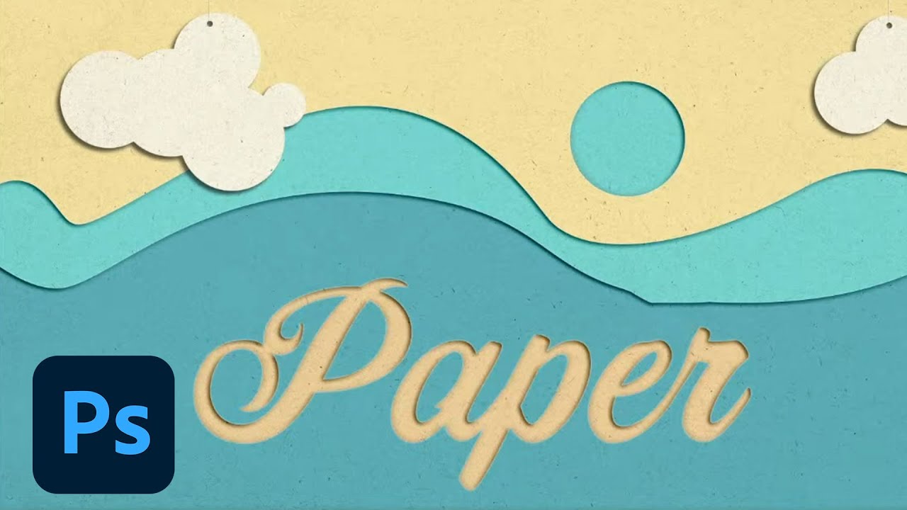
CHALLENGE: Create a layered papercut effect using shapes and text by adding texture, shadows and highlights.Get your starter files here: https://adobe.ly/3JEVzV7Join your host Sam Peterson each morning at 9:00am PT to learn how to approach each challenge using Photoshop. Get your questions answered, see what the community is creating and get fee...
I posted the wrong link the first time
I had fun with the burned effect. 🙂

well, better late than never right, 😅

i thought it was either burned fx or paper cut for the day 1. so the paper cut is the 2nd one ? ok thanks
Gave +1 Creative Carma to @tropic garnet
No problem. 🙂
It has been quite a pleasure watching your progress!
I think I’m following what you’re saying. I masked the layer styles for the bottoms of the figures, trying to create the illusion that they were cut-out and laying on top, so then they’d be “above” the other layers. To me, it looks like the bevel is “up”, meaning the shapes are slightly convex at the edges. Maybe I’m completely backwards… I guess that’s why these effects are illusions? Haha. Thanks for the feedback - always very helpful!! 😬
Gave +1 Creative Carma to @bleak fossil


Day 2

this is my first time doing creative challenge :)

Challenge2 paper cut

SamPetersonArt — Thanks for your suggestion regarding Challenge 1. Here is the updated version. you wrote
@hearty quiver I like the blueish sheen and texture within the text. The shadow around the edges adds some nice depth too. I think a bigger brush size with a lower flow might help you get more gradual gradients around the edges with the vignette. Nice work!


Typically, you wait until after the DCC Live Stream where the techniques are presented. However, I like that you took the initiative to create/post an image. Looks cool! :)
thanks
Gave +1 Creative Carma to @sterile berry
Day 1 - Redo - @bleak fossil The 3D effect was missing as I'd messed up the distance to 0. @eternal mica I did try adding more burn effects - but it's a bit too tricky for me, my layer's using saturation.

Thank you @tropic garnet
Gave +1 Creative Carma to @tropic garnet
Paper cut effect #1

Paper cut effect #2

Paper cut effect #3

Paper cut effect #4

Hi Sam. I posted my Skateboard Re-Do image on the past-challenge page. Thank you for your continued guidance and support. I really appreciate it!
Gave +1 Creative Carma to @bleak fossil
The ORCA brings back memories. My first day of PDC 🥂 Thanks!
Gave +1 Creative Carma to @hollow yarrow
using leather rather than wood was a great idea! Your burned text effect turned out well. it looks realistic! Well done!👍
Ps DCC 2022-5 Challenge#2 Papercut Effects + tear paper effect with special brushes paper texture brush and tear paper brush.
Something get wrong with the upload with the top image was a grey area that not was in the original image but now is it correct


I loved doing this challenge!

Thanks Sam and Codi
Just got back from Thailand. The beach is still fresh in my mind. 🙂

I really like how some of the other text really pops out in the other images. I think background color maybe conflicts with the sea reducing/eliminating the effect from the text.
Inspired by other members here I changed the sky color and text color. I think this works a bit better.

This is my first time in the creative challenge, that i've discovered yesterday, so I'm still in the burned text effect

Today's challenge! The Freezing Photo Effect

😀

PSDCC Papercut Effects Day 2

#challenge - Frozen Hands 😉 Yes - I KNOW his face should be highlighted from the icy arm in front of it

Hi everyone! This is my first in this challenge...Day 3... I will try to chatch up...

Second Try at the cut-out effect

Challenge 3: Freezing Effect. That was a very interesting session especially spell effect and so on. Thanks!

Day 1 Burned Text Effects take 2. I think this is kind of what you had in mind.

Really nice! Shadows are spot on, strings look realistic and your "2 levels" stars are simply awesome. Love the way you tackled this challenge! 💯
Challenge #2 first pass

@bleak fossil cheers Sam, will have another crack at it.
Welcome, and glad you found the Creative Challenges! Your burned text effect looks really good. I like the image you chose for the wood surface, and the extra decoration is a really nice touch.
What a great theme! I really like the plants, and the jellyfish positioning really give the idea that they are slowly “swimming” upwards. I think your choice of color palette is really great. Nice work!

You have lots of time - after the 2-week challenge, the livestreams are re-aired as “creative encores” to give us time to catch up, re-try, edit our original work. I think your frozen effect looks pretty good!
Thank you. The challenges are every 2 weeks again :)
Gave +1 Creative Carma to @compact pecan
Thanks @compact pecan
Gave +1 Creative Carma to @compact pecan
@visual pelican The Burned Text revision is looking good! I was originally referring to something more like this, but that works really well too. It has a convincing and solid look to it. Nice job 👍

Here are the settings I used in case you were curious

Thank you. It looks great! the settings do help.
Gave +1 Creative Carma to @bleak fossil
Awesome soft felt texture!! looks great!
PSDCC_Freezing Photo Effects Day 3


Day 1 Burnt image. Took me awhile to figure out what I wanted to do. Figured you can't go wrong with your initials lol

Day 2 Paper cutting. My favorite place ever. I really like this look. It reminds me of scrapbooking.

Day 3 Ice man !

my first photoshop creative challenge in a while

version 2 :)

I tried hard to find an other picture to make something different than Sam's one but after 1 hour lost I decided to make a copycat... @bleak fossil I really struggled painting the magic effect (you are the master of magic Fx) I went for a slightly different color grading trying to make the picture more dramatic... What do you think?

@paper shadow Nice work with all the different shapes in this design! I especially like the subtle depth to the shadows in the text design. The texture on the top white layer adds a nice paper feel to it as well. 👍
@visual pelican Very nice, I like the texture in the icy arms! I'm not sure if you used the same technique for the magic effect, but if so it might get better results if you push the darks and lights in the gradient for some more contrast. Looks good!
@vague swift Really liking the magic effect, the gradient colors are looking really good! I like how you varied the effect between the different hands too. I especially like the almost vein-like texture in the forearm, and the bold blues are working well. Nicely done!
@plain sable This turned out great! I really like the color palette and the way you used it to separate the different groups of shapes. Great composition with the big, medium, and small shapes of the jellyfish too, very nicely done, all these shapes look great and the depth of the shadows is working well too.
Thank you @bleak fossil
Gave +1 Creative Carma to @bleak fossil
@copper moss Nice job with this technique, I like the addition of the blue glow on the face! I like how you played around with shapes of the magic effect too. The coloration of the whole image is looking good and fits together nicely.
@tired turret Very nice, these are all looking really solid! The Burned Text challenge has a great contrast to it, and the blue sheen and texture in the letters is working really well. Great depth on the Paper Cutout challenge with the shadows, and the texture really sells that paper effect. Great job with the various shapes as well. Really liking the texture you got with the ice effect as well, nicely done!
@red yacht The bevel/emboss effect on this Paper Cutout challenge is looking great! That along with the paper texture adds a lot to making it look convincing. I also like the combination of the colored shapes without the effect, it creates a nice balance in the design. This is a tiny nitpick, but it might be nice to have a bit more breathing room around the top of the design so the circle isn't hitting the edge of the frame. Very nice work!
@hollow yarrow Very cool, I think you nailed the magic effect. I really like the saturation and the texture you got within magic blast. The shape you got within the rings add a lot of interest and the particles are a nice touch too. The contrast looks a bit dramatic with how suddenly they turn to black, but it also gives it a slightly stylized almost comic book-like feel which I think works for this sort of superhero type of effect. Looks great!
@potent dirge I think the brightened effect of the arms and magic beam work a lot better on this second version, nicely done! The beam especially works really well with that more white center and the blue outer glow. Nice job with the ice effect 👍
thanks @bleak fossil
Gave +1 Creative Carma to @bleak fossil
Thanks Sam! Really looking forward to the rest of this week and next!
Gave +1 Creative Carma to @bleak fossil
@winter root Very cool, glad to have you back! I really like the color shift between the blue of the character and the more purple background. The magic effect came out great, the gradient on the beam looks really good, and the rings and particles add a lot to it. I like how you added it to the back arm as well. Nice work!
@quiet fern Cool to see you using another image with this challenge, the icy arm effect turned out great! I really like the way it has an inner glow to it, that works especially well against the dark background. It could be really cool to use a masked Hue/Saturation layer to colorize the red cast light on his shirt into a blue color to match the magic effect. And like you mentioned, a bit of light on his face could look great too, I often like to use a Color Dodge layer for that. Well done!
@digital pike Really liking the texture in the icy arm effect! The magic effect turned out really nicely too, the particles make for a cool style and give it a strong frost-like look. I also like how you pushed the color contrast between the background and the figure. Nicely done!
@visual pelican The Papercut Effect challenge is looking good, the shadows are working well to sell that sense of depth, and I like the scene you created. It could be nice to give the trees a bit of a drop shadow to push the depth on those too. Looks good!
@valid matrix That's great, welcome on in! Glad you're joining us. Really nice job with this technique, I love the designs you created along with the text, it gives the whole design a lot of interest. Really liking the background texture you chose too. My only suggestion might be to clip a texture layer to the design as well on a Multiply layer or something like that, so we see the wood texture with the burned text as well to really sell the realism. Very nice work!
Burned Text Effects | Photoshop Typography Challenge

@young karma Very nice! I definitely think the updated challenge works a lot better. I think there's a few major ways to get the text to really pop, one is with bold shadows on the Bevel/Emboss effect, and the other is color contrast, and the yellow contrasts much better against the blue. The way you separated the value between the sky and water works really well too, the whole design has a nice read to it now. I love all the shapes you created, especially with the palm trees. Looks great!
@near knot You nailed this challenge! Glad to hear you enjoyed it. I love the way you layered the shapes with the stars and clouds to give it additional depth. Really nice variation between big and small shapes to give it a visual hierarchy and focal point with the yellow circle shape. Nicely done!
@blissful wolf Glad to see you joining us! The ice effect and magic beam are looking good. I like the color focus you gave to his eyes as well. There's a hard edge right above the arm, I'm not sure if that was something that was supposed to be masked out or part of the magic effect, but figured I'd mention it. This came out well, nice job!

CC1: burnt Text effect

Burn effect challenge

Thanks, Sam! You have taught yourself how to make magics. I have learned new techniques from this session . 💙
Gave +1 Creative Carma to @bleak fossil
@bleak fossil Thanks 😄
Gave +1 Creative Carma to @bleak fossil
@bleak fossil Thank you for the feedback!!
Gave +1 Creative Carma to @bleak fossil
Thank you very much Sam!!! I will check on that...I love your fantasy, scify challenges :)
Gave +1 Creative Carma to @bleak fossil
Thanks Sam!
Gave +1 Creative Carma to @bleak fossil
Great one! Love the blue flames on fingers of his left hand. Darkened background adds a nice focal point! 👍
Thanks for your comment. I appreciate it!
Gave +1 Creative Carma to @vague swift
Thanks @bleak fossil
Gave +1 Creative Carma to @bleak fossil
Day 3

Great! I like you tried this effect with less blue 'cause ice is not blue. Light beam glow is awesome and you did a great job with color gradding on the left side of the face. 👍
You nailed it! Ice effect is spot on, transitions between icy texture and skin are nice and smooth. Your power light beam is simply awesome (power rings and particles are so cool). Darkened background adds a nice touch. Great work!👍
Challenge 3. I tried using my own background. I think the perspective is ok, but the color match still doesn't seem right. I think the warm tones in the figures face may be throwing it off a little. I tried cooling the skin tones, but I think it could use more work.

Thank you ! Really appreciate your feedback.
Gave +1 Creative Carma to @hollow yarrow
Good work, I really like your frozen effect on the left arm and the little cercles around the Light. Good job.👏
@hollow yarrow Nice work! I like the vignetting and the additional contrast you added to your image. I think you did a great job with the magic effect.
PS DCC 04.27.22: Freezing Photo Effects - "Icy Magic" - I had to veer off in a different direction and try my own comp for this. :)

@sterile berry So cool! You totally nailed the magic effect, I love the texture of the cloudy outside part of the magic beam, that along with the subtle particles gives it a fantastic look. The light around her face is a great touch too. It might look good to brighten the glow up on here face just a touch since it's closer to the magic than the rest of her body, and it might draw a little more focus to her face and balance out the stark contrast of the magic too a little. Just a thought of course. This looks great!
Yes. Thank you! Good ideas. :)
Gave +1 Creative Carma to @bleak fossil
Thanks for your kind words!
Gave +1 Creative Carma to @dark granite
Ps Daily Creative Challenge Apr 26th - Papercut Effect https://www.behance.net/gallery/142657329/Ps-Daily-Creative-Challenge-Apr-26th-Papercut-Effect/modules/805968319

Behance
Ps Daily Creative Challenge Apr 26th - Papercut Effect
hello introduce my work and my social media, warm greetings to all greetings...
https://www.instagram.com/rahmadhimawan_photography/
https://opensea.io/collection/best-landscape-asia
https://twitter.com/HimawanRahmad


OpenSea
Copyright Photo by : Rahmad Himawan
Resolution photo : 6000 x 4000 Px | DPI : 300
Available RAW + Jpeg ( given when the purchase is complete )
I'm trying to make a photo gallery about the natural beauty of Indonesia with the best moments that I managed to capture with a limited edition 1/1 and if later there are photos that are sold, some part...

#SustainableConcrete Professional Winner GCCA 21
For My portfolio, link in my bio
IG FB : rahmadhimawan_photography
Website : https://t.co/2weJ8AUzRi
Followers
418
Tweets
1198
Thanks @bleak fossil I was thinking the Circle W Ranch, a fictitious place in Texas and my mind when I built it out.
Gave +1 Creative Carma to @bleak fossil
Here's the design from today's Underwater Photo Effect challenge!

wouldn't the lion be less clear, because the water is thick and dense, and bluey-green
this type thing

😀

Challenge #1 - Burned Text Effects - Late start this week even if I've been watching the live stream almost every day. I've been working on another project. Anyway here are my first challenge. I've been tired all week too and I'm not sure if I'm happy with this or not. I like it but will have to work more on another one to see if I can get the effect I want.

Challenge 4: Underwater Effect. It is far from perfect, just a try. I liked how Sam showed the positioning of layers in this composition and also how to desaturate layers to match each other and also using masks on them to make finishing touches. Great professional hints!

#challenge - UndahWahtah

Oh no. That wave, though. "Swim Fluffy! Swim!"
At least no one will bust my CHAWPS for sticking his face underwater 🥰
Dah-gee paddul.
Dawgee Paddill 🤣
Apr 27 Challenge - Ice Super Power: https://www.behance.net/gallery/142676941/PS-Daily-Creative-Challenge-Apr-27th-Ice-Power/modules/806082059

Behance
PS Daily Creative Challenge Apr 27th - Ice Power
thanks @hollow yarrow
Gave +1 Creative Carma to @hollow yarrow
Fooling around and thinking about Noorsh and his giant squid

This one sure was a challenge 🙂 took me 2 days to finish. But sure was a good learning curve!!

Really nice effect @hollow yarrow I sure had the same issue with photo. took me about 3 hours to find one 🙂
Today's challenge


getting the waters edge, pretty hard! need to play more.

Day 4 Underwater pictures. This was a challenge. Still not sure if I like this one or not

Better

What lies beneath… #✂challenges-feedback

PSDCC_Underwater Photo Effects Day 4

🙂 couldn't resist lol

Papercut challenge

Day 4. Tried to follow along every step, still ended up looking strange😕

Time = Quality! Really impressive work!
Love the frozen effect on the hands (texture and transition with skin are spot on). Your "Power beams" are awesome! 💯
Thank you so much @hollow yarrow I really appreciate that.
Gave +1 Creative Carma to @hollow yarrow
PS DCC 04.28.22: Under Water Photo Effects - "Partially Submerged" - I think the most challenging aspect of this exercise is creating the proper amount of refraction (i.e. showing a slight separation of the subject below the water from the portions that are above the water). I gave it a shot but I'm not sure I got all the way there. :)

Challenge 4. I started with an image of mine of a 15th century home that I was going to put underwater. I quickly realized that the different perspectives of the images and the little details in the fence was going to be quite challenging. I decided to hang that up for now and go back to doing the Lion. A fun challenge nonetheless.

Papercut Effects | Photoshop Illustration Challenge

Ps DCC 2022-5 Challenge#3 Freezing Photo Effects 4-27-2022

Ps Dcc 2022-5 Challenge#4 Underwater Photo Effects 4-28-2022
I used my favorite filter Flood2 instead of the water images

@wary swan I like this a lot! I think this may help solve my issue with the other image that I wanted to do the water effect with.
Thanks Yann, I bought my first Flood filter for nearly 20 years ago, Flood 2 filter is now a 64 bit filter, ther is a link to the filter if you search on Adobe completable plugins and filter.
Gave +1 Creative Carma to @dark granite
Day 3

Under Water Effect

Day 4

Today's Slimey Text effect challenge! 🤢

Here is my first pass at challenge #3

very pretty!
Freezing Effects with Sam Peterson. Very interesting getting to know the different Filters. Plastic Wrap is cool. I used the same Gradient on the background that I created for his arms. Seems to work nicely! Thank you for this opportunity!

PSDCC_Slimy Text Day 5

DCC Day 5 Slimy Text. This was so much fun. Thank you @bleak fossil

Gave +1 Creative Carma to @bleak fossil
day 2 challenge

Challenge 1 - Burned Text Effects

Challenge #4. Cute lazy cat in jungle bath 🙂

#challenge - Slimy Text 😉

Challenge 5: Slimy. I will do this exercise again as I went bit wrong in layers. I liked that Sam showed all layer style functions so thoroughly with exact parameters. I liked the final touches with brush smashing the mass all over the type. Thanks!

Hi, I'm Sniffles. This was Lots of Fun! The last effect, the slime, makes the image come to life! hahaha! Thank you All for this opportunity!

Day 5 Slime text. There are only 3 things that come to mind with slime... kids television, toxic waste and Ghostbusters.....

Took the challenge in different direction... Bloody instead of slimy. used same effects on hand unless no fill color. Love to learn more 🙂

@bleak fossil . I wanted to take a moment and say how much I appreciate you setting us up to succeed. Your streams are amazing, precise and very inspiring. Thank you for all of your efforts. I really appreciate all you do for us artists!
Gave +1 Creative Carma to @bleak fossil
PS DCC 04.29.22: Slimy Text - "Chemical Sludge" - First attempt. Might have to try this again. :)

Today's Challenge!!

I am adoring the concept❤️ I'll try to give it a try once I can composite the iceman
@quiet fern Hello, I noticed that you blocked my reactions on Discord. I fully understand that my remarks may have been perceived as aggressive and I am sorry for that. it was not the intended purpose and it may have offended you and I sincerely apologize. I hope that in the future we can exchange advice and reviews on next challenges. But if you still block me it is ok. Good week end. Natalie.
Day 3

Day 1

First attempt??? Perfect!!! 😎😎😎

Thanks! But I think I can make it better.
Gave +1 Creative Carma to @quiet fern
Here is my underwater attempt...

Day 4

Wasn't feeling the slime so I tried this, not sure about the result...


😀


Day 5

Day 2


really need to do this one a few times to understand everything, 1st attempt

Playing catch up

I absolutely LOVE the shade of green you got on the water and water line! 🥰


I think you should create an animation with one of the pictures using after effects
Probs like a kitkat one or somth
k
thanks
Ever made an animation before?
yeh may be
one
Well you can attempt to try something new
u k how to make animation plz
I suggest you post these in #📝project-feedback as this channel is for posts and chat that are related to the Photoshop Daily Challenges.
ok SoRRy bRo


 DCC Day 5 - Slimy Text

Day 1 😀

Challenge #1 - Burned Text Effects - I wanted to make another one for this challenge. Now I'm very happy with the result.

Challenge #2 - Papercut Effects - Had a little fun with this one.

Challenge #3 - Freezing Photo Effects - Oh boy this took some time. A lot of selecting and trying but I thought that this image was perfect for this effect.

Usually, we put the dollar sign in front of the number, e.g. $1000 :)
This is so cool! (pun intended but also cool in the other sense as well.) :D
Challenge #1 - Burned Text Effects - April 25, 2022

Yes I know but I wasn't putting enough attention to the shape I used to see that the $-sign was misplaced. But now when you've put my attention to the error I had to correct it, to the version I will upload on Behance 😄 Thanks!
Thank you @sterile berry. I had to go through many pages with pics of stretching arms before I found this one. It was worth the effort 😄
Gave +1 Creative Carma to @sterile berry

@wary swan Det är väl Öresundsbron? / It's the "Öresundsbron" - The bridge between Sweden and Denmark.
yes
the photo is original only ad the text, had to wait a long time to get right ligting on the bridge
The light is really great!
struggling with the paper cut effect, especially with the text, does not look believable.

previously done it here: https://www.behance.net/gallery/121684235/randomness
maybe the solid structure aids it more? shrugs

LOL ..


lllll
encoded?
Lol, I guess. Or just a pocket text
Thank you!
Gave +1 Creative Carma to @bleak fossil
@hollow yarrow I am a big fan of your work, (not in like a Kathy Bates way) so your positive feedback means a lot. Thank you!
Gave +1 Creative Carma to @hollow yarrow
Thank you for the advice. I'm going to redo this challenge - I feel like I need to work on the depth.

Hey all! Here's today's surreal Galaxy Portrait Composite challenge.
We're going all Sci-Fi this week for May 4th 🚀

@bleak fossil May The 4TH Be With YOU!!!
Day 6, the experience was really surreal 😶🌫️

I noticed you are not a member of the Ps Discord chat, so your name doesnt come up in the search. Why not join? Your Burnt text design is an interesting variation on Sam's technique. You might enhance the impact of the image if you increased the contrast between the text and the dark BG.
PS DCC: 04.29.22 - Slimy Text - "Alien Sludge" - Second attempt/version 2 of my "sludge" image from last week. Going for that old school, campy sci-fi vibe. :)

Challenge #4 - Underwater Photo Effects - Wanted to find a special image for this and I think I found it.

@dusky swallow Very well done Burnt text design. You achieved good depth in the text. The blue tints add realism to the text interiors. The BG wood texture is interesting. The vignette is solid. Nice work all around.
@quiet fern Your Burnt Text design is well done. The drop shadows you added enhance the realism. The sharp contrast between the text and the BG wood looks great. One tiny tweak, I might increase the kerning between the letters to give a bit more breathing room, especially with the text on the diagonal.
@last mica Very playful papercut design. Beautiful color palette. Nice depth created with the layer styles. Consistent lighting effect. Interesting texture for each layer. I might add a texture to the clouds just to be consistent. Well done.
@dusky swallow Beautiful color palette for the Papercut design. Very nice depth created with the layer styles. The font fits the design so nicely.
PSDCC_Galaxy Portrait Composite Day 6

@copper moss Such an interesting application of the Papercut theme. The paper textures sell the design. Nice work with the shadows. I might choose a different font for this design, but thats just me.
Thanks! Appreciate very much. I will play with some other font.🌼
Gave +1 Creative Carma to @eternal mica
Challenge 6: Galaxy Composition. I liked very much this session. I have learned magnificent tricks. Here I did 2 versions. In the 1st gradient´s yellow color do more light effect.


@gentle pasture You really took on a big challenge with your Papercut design. There are so many angles you cut out. Bravo for the effort. To enhance the consistency, I might have pushed the shadow effects a bit more on the text, and pushed it more to the right side of the letters. Good work by you.
@lost helm Really well done Burnt Text design. Very strong sense of depth in the "burnt" text. Nice work on the shadows of the medallion. I might blur the BG to bring the viewers eye more to the focal point of the design.
Thanks @eternal mica and sure a good point. I will revisit
Gave +1 Creative Carma to @eternal mica
@golden acorn Its not too late. The challenge posts can be added any time in the 4 week stretch of that series. Very nice work with the Papercut design. The layers tyles added realistic shadowing. the texture looks great. The shading on such a thin font is especially well done.
😀

@fierce otter Very nice work with the Burnt Text design. The depth you created in the text is realistic. The drop shadow effect is well done and consistent. The vignettes/gradients you applied give the leather a lot of interest. Nice work all around.
@bold frigate Lovely Papercut design. Solid work on the shadow effects creating nice depth. The paper texture looks great. Nice work by you.
@hearty quiver Very holiday spirit Papercut design. Definitely has the holiday card vibe. I think the shadowing you added creates more of a raised paper look than a cutout paper look, but thats fine. To get the depth of the cutout look, I think you would need to add shadow along the entire cutout figures.
#challenge - Alien Galaxy - I have to be different - I did mine totally opposite from the get-go 😉

challange 6

@hollow yarrow The Papercut designs are awesome. #1 looks more like raised paper than papercut, but the other 3 are terrific. The consistency of the layer shading is excellent. I might brighten up the innermost purple layers for #2, as those layers lose some contrast. The trick you applied of merging the letters to the papercut in #3 is a great touch. Excellent shadowing. #4 is superb. The depth on even the tiniest elements is incredible. Thank you for creating.
Gave +1 Creative Carma to @hollow yarrow
Challenge #2 April 26, 2022 Papercut Effects

@blissful wolf @compact pecan Im not sure, but I think the model has been modified. The last DCC did not have a two week replay week. Instead, there were archival streams from all different leaders. That may be the new program.
Challenge #6 🙂

@compact snow Interesting idea for the burnt text. Im not sure you intended it, but I think the lighting creates more of a raised text effect than a recessed look. If you wanted the recessed burnt in look, you might want to switch the edging from a brighter edge to a darker one.
@misty lantern Nice work on the Burnt Text effect. Interesting BG image adds to the interest. You might want to add a multiply BM to the burnt in text so as to allow the wood texture to show through.
@bold frigate Very well done Freezing Photo effect. The textures you added to the hand and arm look great. The intense coloration of the beam is great. The ring shapes and particles add intensity.
@young karma Terrific work with the Freezing Photo. I think youre correct about the color match. The BG has a purplish tint while the model is blueish. You might also want to add some shadow to the model to get some perspective and avoid the pasted on digital look. The ice beam looks great. Repeating the effect in the other hand also looks great. The textures in the arms are very spooky, adding awesome sci-fi vibe.
@timid crest Lovely work with the Papercut design. You got great depth with the green layers. Adding the paper animals gave the layers more realism. it might be a cool idea to do the same with some of the trees.
Drifting Away.....happens sometimes

@digital pike Really solid work with the Underwater design. The compositing is spot on. The blurring of the different layers adds awesome depth perspective. (The only thing missing is a little guy underwater!!) You nailed this.
@eternal mica 😄
@halcyon current The burnt wood looks great. You got good texture in the burnt areas. The blue tint looks solid. Nice work with the vignette. One tiny tweak, I might push the drop shadow around the edge to get more of a singed edge to the text.
@copper moss Fun interpretation to the Underwater Photo. Good job "muddying" up the water from the runner. I might tone down the blur on the above water model. You really cant run that fast when youre underwater.
@quiet fern HAH, this dog is in trouble!!! Cool work compositing the layers. The underwater effect looks good. You might want the underwater more blurred to jive better with the idea of roaring surf above the waterline.
@timid crest Terrific Freezing Photo design. Adding the exploding light behind the model gives the design serious oomph. All the sparkles do also. Your fading of the ice light into the skin on the arms is spot on. All the energy shooting out of the arm is great. One tiny nit pick, the splash of light on the face could fade out more gradually. Really well done!!!
Challenge 6 - Galaxy Portrait Composite

@arctic rover Great water fantasy composite. I might feather the hard water lines and maybe show at least the blurred squid body beneath the water line.
@lost helm It was worth the wait. Your Freezing Photo is so cool. The beams look great. The intense centers with the softer colored edges look great. The energy rings are cool. Since your BG has so much overflow glow, I might add a bit more overflow glow to the model from all the light in front of her. But that could just be me.
@potent dirge Two very nice underwater efforts. The subtle lion below the murky water really works for me, as does the clear water and the squirrel. The perspective in each is well done. The coloration of the green design is spot on.
@vague swift Solid effort with your hippo underwater design. The coloration of the composite layers is spot on. The murky water looks so real. The blurring of the BG is well done. One tweak Id make is to blur the hippo as it moves away from the front of the image, and for the parts that are under water.
@tired turret Super fantasy image for your underwater composite. The colors are awesome. The blurring of the different layers creates realistic perspective. The underwater looks solid. I might tweak the size of the dolphins for better perspective with the BG. They seem way too small. Theyre not that far away.

Ya I thought that too after I uploaded and looked at it. Kinda wondered where you were hiding yourself. Thanks for the feedback as always!
Gave +1 Creative Carma to @eternal mica
@dense yew Wow is this spooky. The calm serene look on the face is so contradictory to the design, it sends chills up my spine. Very well done composite. The layers are blended beautifully. The colors blend perfectly. The waterline is well done. I might create more blur on the underwater dress to create more sense of movement. Very well done work by you.
HAHA, you thought you'd sneak that by me??? (Just like I thought no one would notice I wasnt around. I should have known you'd catch me!!!)
Gotta keep you on your toes! 😉
Thanks, I will give a look!
Gave +1 Creative Carma to @eternal mica
@visual pelican Good effort with the underwater design. Nice work compositing the layers. The waterline effect looks good. You might feather the edge of the lions to create depth and eliminate the pasted on look. I also would increase the blur on all the underwater elements.
@chilly hawk Very pretty papercut design. Im not sure you intended it, but aside from the bird, the shadows you added create an embossed 3D look rather than a cut out depth design. That still works. Its just different.
@potent spoke Strange? It looks great. Your underwater design is spot on. The layers are composited beautifully. The way you changed the water coloration is great. The underwater and BG blurs look great. Very well done by you.
Thank you. Just one question. How do I feather the edge of the lions?
Gave +1 Creative Carma to @eternal mica
@sterile berry Daniel, I love your underwater design. Wasnt there a movie poster or Caribbean Island ad campaign with a design just like this??? Your compositing is great. The waterline looks so real. The underwater gradient is great. I think the only thing you need play with is the blurring of the edges of the underwater model. The rest is spot on.
Try a soft edge brush and gently stroke the edges the lions.
Thank you.
Gave +1 Creative Carma to @eternal mica
Looking Good! even though there is no face, looks like the chic from Halo 🙂
Thanks! Not sure about the ad campaign. I found this image on a stock media site. My problem with this image is that there should be some refraction, i.e. where objects above the water line appear shifted/separated from objects below the water line. I attempted to create this illusion in my image but I didn't quite get it right. I need to study this more and go back and revisit it in a version 2.
Gave +1 Creative Carma to @eternal mica
I understand what you're striving for. I know you won't quit without giving it a serious effort.
Galaxy Portrait with Sam Peterson. Great idea! Great fun! Thank you!

@eternal mica 😀

Now I feel better!!!
Thanks for the feedback
Gave +1 Creative Carma to @eternal mica
Day 5. Found this one quite challenging especially the multiple layer effects wasn't quite grasping why what but made notes and followed along.🤔

Challenge #01 - Burned Effects

S DCC #02 - Papercut Effects.

PS DCC #03 - Freezing Photo Effects

PS DCC #05 - Slimy Text

DCC Day6 - Galaxy Portrait Composite
I share 3 versions of the same design... Curious to know which one is your favorite, 1, 2 or 3?


@young karma Your Underwater design is super. The compositing of the layers is seamless. The color adjustments for the water bring all 3 elements into synch. The blur for the underwater effect is realistic. The Lighting on the lion makes it clearly the focal point of the image, and draws the eye immediately. The BG blur is very effective. Very well done by you.
Top one 🥰
@naive mulch Nice effort with the Papercut design. A number of folks have opted to go with the 3D paper cut design rather than the cutout design. Yours definitely has the 3D look. The clouds look great. You might want to enhance the shadow effect on the wavy layers to get more depth into the image to create the layered effect. Good work.
I love the monochromatic vibrant vibe of #1.
@wary swan 2 really good designs in the Freezing Photo and Underwater effects. The first has a consistent cohesive coloration throughout. The tint on the model's face and the glow behind the model add realism. Its very interesting how you brought the power beam deep onto the arm instead of just out of the fingers or hand. The one tweak Id make is the texture on the arm seems to run over onto the shirtsleeve. You might want to clean that up on both arms. Your Underwater design is also very interesting. The compiled layers blend seamlessly. The waterline blends into the lion beautifully. The reflection on the rippled water looks great. The one tweak Id make is to blur the squirrel to add perspective, and maybe the BG also just a tad.
@dusky swallow Your Freezing Photo looks great. The starbursts are a smart addition. The coloration fits the design story. The lightning is powerful. Very good work by you.
@timid crest Lovely interesting Underwater design. The lighting is well done. The compositing is strong. Did you intend to leave that white line across the top?
@dusky swallow I like your Underwater design. The lighting on the lion makes clear immediately what the focal point of the image is. Its a nice contrast with the lighting on the BG and the underwater layer. The compiling of the water layers is well done. The blurring of the underwater and BG is consistent and realistic. Very strong effort.
Thanks for the feedback I'm not sure if I did the right thing here I've adjusted the opacity and the distance!

@plain sable What a powerful beautiful design your ballerina is. Such a creative interpretation of the challenge. Having the delicate model create the sci-fi effect with her arms creates a real tension in the design between the expected and what one sees. Great. The detail is terrific. Super effort by you.
Thanks @eternal mica
Gave +1 Creative Carma to @eternal mica
@tropic knoll Good work with your Freezing Photo. Your effects are cohesive and consistent. The energy rings add power to the design. I might have played with the tint on the model and the BG area behind him to effect some of the overflow glow from the light being generated by the two hands. Just a thought.
@visual pelican Nice gooey slimy slime design. Good work with the liquify and with all the layer styles. The text has a neat GhostBusters glow to it. I would play with the ...(what is that?) to make it blend in more with the image. It has too digital a look . Good work all around.
@oblique bolt Very well done slime text. The text has a 3D gooey shiny look. The layer styles work beautifully. The extra brush strokes you added at the end are a terrific touch. It looks like the slime is floating in a pool of water. Very well done.
i was busy for a while, but i will try to keep up

@coarse portal Lovely papercut design. The cutouts look so delicate and real. The paper texture looks great. The color palette is solid. Nice effort.
@young karma Interesting application of the burnt text effect to a 3D design. I like the layer styles you applied to the text. You created a good metallic look . I think you might want a dark drop shadow rather than the light one you have now. Just a thought.
@lost helm Very well done Underwater design. The compositing is solid. All 3 water elements blend beautifully. The synchronization of the water coloration is spot on. The blurring and lighting of the underwater is well done. Good work by you.
@quiet fern Cool idea for the slime text design. Your liquify and layer styles are well done. The slime has a gooey feel and gloss. The contrast to the BG is well done.
@copper moss Very cool first effort. The liquify is well done. I like the gooey end brush strokes.
@tropic knoll Helloooo Sniffles!!! I agree that the gooey brush strokes Sam dropped in right at the end make the design really pop. Your blob shape is terrific. The layer styles you applied to it give a luminescence and glow that make the design really work. Your liquify work is well done. Nice effort.
@tired turret I used the GhostBusters reference right off the bat in reviewing these designs. How can one not??? Your liquify and layer styles create a translucent bright vibe that is really interesting. The brush strokes amplify the gooeyness of the design. Solid work by you.
@lost helm Creative approach to the slime challenge. I love the idea. I assume you want a dark bloody vibe to the design. I still think you can make this work with a more saturated luminous approach to the text. Give it a try see what you think.
you dont make it easy lol go with number 1.
Thank you @eternal mica for your insights and suggestions. They're very helpful!
Gave +1 Creative Carma to @eternal mica
"lost in space"!!! mind you i always preferred "The land of the giants" or the "time tunnel"

@sterile berry This is super cool, I really like the choice of the black background and texture, it gives it a bold contrast and somewhat spooky look. I love the 90s video game/ 80s/90s D movie cover look it has to it, really cool vibe. The slime around the outside looks great too, love it!
@halcyon current Such a great photo and idea for this challenge! I love the lighting in this image and how it looks like it's coming through an opening in the trees above the water. The background image and faded contrast compared to the boy and elephant works really well to make them a strong focal point. Excellent job with this technique!
@naive cove This looks great, I love the paper texture and the shadows on all the different shapes, it really helps push that 3D feeling of layered paper. The text doesn't quite have the same feeling though, it looks more like it was printed on the paper, unless that's what you were going for. Otherwise it might help to boost the darkness of the shadow for more dimension. Nice work!
@naive mulch Nice job with the texture and shadows on these various shapes. I like the sort of bubble sticker look the clouds have to them with the soft shadow around the edges, very neat. One small suggestion might be to extend the string of the middle cloud all the way up to the top of the frame so it doesn't look cut off. Looks good!
@hollow yarrow Always love seeing design variations, very nice job! I personally like the middle one, I think I like how there's a little bit of shifting between warm and cool tones which makes for a nice contrast. I like the shape you created for the face, especially the curve around the cheek. Great job!
@dusky wave Really nice job, great to see you tackling all these challenges. A couple small notes, it seems there's no wood texture within Birthday, though there is for Happy. I also think it might help the Slimey challenge if you darkened down the background a bit to create some value contrast since they're both such a similar brightness. It might help the text pop a lot more. Very nice work with all these different techniques!
@potent spoke Yeah, this one gets a bit advanced in terms of all the multiple Layer Styles being stacked on top of each other. The trick is all the layers with the Fill at 0 allow you to stack various layers and shine/texture effects. Hopefully it just shows you the potential of Layer Styles, but they get a little more familiar the more you deal with them. But this looks great! The dark shadow around the edge really helps give the text some contrast, and the slime layer around the edges came out really well. Nice job!
@digital pike Hah, I like the addition of putting the portrait underwater, very nice idea. It could even add an additional layer of depth to put the bottom mossy layer on top of the portrait layer to make the portrait feel even more in the scene. I'm not sure if the portrait is above some of the layers that darken down the lion and add the blue tint but I think pushing that a bit more on the portrait could look good too. Nicely done!
@tropic knoll This looks great! Very nice job with this technique. All the elements came out very well and the masking around the figure as well as with the pen tool shape looks very nice. Well done 👍
@paper shadow Nicely done! The water surface and seam effect came out well, and the darkening down under the water looks good too. The main suggestion I would have would be to soften the hard edge around the lion's back. The Refine Edge Brush tool is great for that when masking, to capture that out of focus part of the lion, but you could also make the lion a Smart Object, and apply a blur, then mask it on the smart filter so the blur only effects the edge of the lion's back. Just an idea of course. Nice work!
Many thanks for the feedback here's my updated challenge

Gave +1 Creative Carma to @bleak fossil
Gotta have some slime in your slimer!! Fun fact… I messed up on a color and when I corrected?!? it I ended up with this look… happy ending totally!
PS DCC: 05.02.22 - Galaxy Portrait Composite - "Psychic Vortex" - I'm still trying to wrap my head around this challenge. :)

@vague swift This looks really cool! I like the coloration you gave the whole image, and the addition of the astronaut adds a really interesting sense of scale to it. I wonder if giving it a warmer coloration may fit it in with the rest of the image a bit more? Great job with these techniques!
@young karma Cool take on this challenge, the stars within the portrait integrate it well with the rest of the backdrop image. Looks good!
@arctic rover Cool design! I like this take on the challenge and the surreal look to it. I wonder if giving the body a slight cooling color grading might fit it into the background of the image a bit more. Though the color contrast is nice too. Well done!
@lost helm Super cool image, really liking your take on this challenge! The background creates a lot of interest, and I love the way you masked the rings of the planet through the head. My only suggestions might be to darken down the top shadow of the inner head shape even a little more, and even giving the overall portrait a bit of a boost in contrast in both the dark and light tones with a Levels adjustment to make it stand out from the background a touch more. Nicely done!
@hearty gale This is so good! I love the design you created for the Papercut Effects. Excellent design, but also great execution of the layering of all these different layers. It creates a lot of depth with all these overlapping shapes, and the shadows have a nice convincing look to them. Great design with all these different elements, very well done!
@coarse portal Very nice work, you really nailed all these techniques! The face masking and backing shape came out really well, and I like how much contrast there is between the warm skin tone and the cool colors of the background. Looks good!
@quiet fern So cool, I love the direction you went with this one! The background is a great choice, and I really like the way you gave the clouds a glowing look to them while darkening down the lighting on the portrait to create some really strong contrast. The brightness of the inner galaxy shape makes for a really strong focal point which works very well. Loving the colors too!
@digital pike Very nice job with the Galaxy Portrait Composite image, you nailed all of these techniques! The masking around the face came out really well, and the overall composite looks really clean. Nice work!
@last mica Hah, very nice work! The masking around the face looks great and the composite came out really well. The skin tone has a nice contrast with the background and I like how the color of the galaxy in the head fits in nicely with the coloration of the rest of the portrait. Nicely done!
@copper moss That's awesome and great to hear! I'm glad you liked it. Really cool to see you doing two different versions of this design. I think both work well, and I like how you pushed the colors of the first design. Both have really nice color contrast between the color of the skin and the galaxy shape within the head. Very nice work!
@visual pelican Great job with this challenge, all the techniques came out well and the design is looking good! The portrait contrasts nicely with the back blueish background took. Very nice 👍
Thank you for your feedback! was all over the place trying get this right but kept re-watching noting values and redoing the layers till it looked like it 😀
Gave +1 Creative Carma to @bleak fossil

Thank you for your always fun and interesting Challenges - very thorough and you’re awesome at explaining steps! 😎
Gave +1 Creative Carma to @bleak fossil
Thanks! ☄️
Gave +1 Creative Carma to @eternal mica
Very glad! Thanks a lot! You manage to show amazing tricks in 25 min. ☄️
Gave +1 Creative Carma to @bleak fossil
Ok, I will blur more on the above. That was fun to do it against the law of physics. Thanks!
Gave +1 Creative Carma to @eternal mica
Thanks so much @bleak fossil I wil give it a look 😊
Gave +1 Creative Carma to @bleak fossil
thanks @eternal mica i sure wil do. It could need a darker tone
awesome 😊 thanks!
Gave +1 Creative Carma to @eternal mica
@bleak fossil Thanks for the input. You make it all possible! 😄
Gave +1 Creative Carma to @bleak fossil
Has anyone got a link for the feedback session with Sam?

you mean the last session of the set on Friday ?
Today's Challenge

Yes !
My version of the Galaxy Portrait. 🙂

@eternal mica Thank you! I appreciate the feedback!
Gave +1 Creative Carma to @eternal mica
@gentle pasture The Community Day? It will be posted in the announcements on Friday.
O' Sorry I was thinking it had already been recorded, so this friday!
Really nice Daniel! Hole effect is awesome even if you took a model shot almost from face (more difficult...I think). Love the contrast of blue colors on the model with warmer tones of the spiral. Subtle glow around the character adds a nice touch. Well done!👍
Thanks @quiet fern @eternal mica @vague swift @bleak fossil for your feedbacks! I appreciate!👍
Gave +1 Creative Carma to @quiet fern
@sterile berry Solid effort on your Sludge slime design. The liquify effects are subtle and effective. The layer styles work well. The contrast t the BG is sharp. the additional gooey strokes give significant realism to the design. Good work by you.
@potent dirge Good work with your slime design. The font you used lends itself to the drippy slime you created. Good work with the liquify in creating the ooze. I might have pushed the layer styles to create more saturation and brightness within the text, but thats just me, and also difficult to achieve with a thin font.
@last mica Good effort with the Freezing Photo. the effects you added are well done. I might suggest the beam have a more transparent variable texture to it. The fade of the ice effect on the arms can be softer to create a better merging of the two layers. Good effort.
@untold kindle Welcome to the Ps DCC chat. we're happy youre joining the party. If you have any questions, give a shout. We're here to help. Solid effort with your Burnt Text. the darkened areas have a lot of the underlying texture showing through, creating a realistic vibe. The subtle drop shadow also looks good. You might want to try adding a dark inner font edge to create more depth into the wood. Good work by you.
@gentle pasture Very well done Freezing Photo. The energy field created is well done. Effecting both hands is a good touch. I like the soft way you merged the "ice" into the arms. The blue eyes are a cool touch. Good work.
@plain sable Lovely composite Underwater design. The water layers came out solid. The cohesive water coloration is spot on. I would make two tweaks. I would blur the below water flamingoes a bit more. And there are a couple of spots on the flamingo legs where you might want clean up the masking.
@last mica Your Underwater design is very well done. The cohesive coloration of the water is solid. The light rays below the water look great. The below water blurring is well done. I think the wave in the water is a bit out of place for the serenity of the scene, but that may just be me. You may want to add a highlight to the side of the lion's face to add pop and create a strong focal point.
@plain sable Hah, that "slime" works. The goo looks realistic. You might want to give it a bit of shadow to add to the realism, and maybe a highlight or two somewhere in the ooze.
@digital pike Your slime looks great. the liquify is very well done. The layer styles add depth and consistency to the slime. The highlights across the top are effective. The gooey brush strokes are super. they add so much to the design. Solid effort by you. And thanks for adding my buddy underwater!!!
Gave +1 Creative Carma to @digital pike
@last mica Awesome Slime design. I love the gooey bubble shapes you added at the end. They add so much to the slime vibe. Good work with the liquify and with the layer styles. You created awesome "drop" shapes on the letters. The layer styles add lots of interest to the text. Well done.
papercut ( learnt you can copy fx styles and also it needs another one added lol )

@untold kindle Nice effort with the Papercut design. The image a lovely soft vibe about it. The depth on the text looks good, though I think you could push the cut out look by making the shadows along the edges a bit sharper.
@paper shadow Good work on your Freezing Photo. The texture and layers you added to the arms look good. I might try a more subtle fade into normal skin. Also the color of the energy beam is a bit inconsistent with the coloration of the rest of the design. You might want to play with that.
@vague swift Id say your slime is pretty good, even if you call it your 1st attempt. The liquify looks solid. The layer style work created a very gooey viscous vibe for the slime. The gooey brush strokes at the end are a good touch. All in all, I like it.
@quiet ridge OH WOW, your freezing Photo is awesome. I love it. The gradient coloration is excellent. The energy fields you created are great. The textures added to the arms looks great. I might push the spots in the eyes just a bit more to make that effect bolder. But thats a tiny nit pick. Super work by you.
@eternal mica thanx Ted
@coral cloak Cool work on the Papercut GIF. The shapes look awesome. I love the vibe you created. You might want to try to up the interest by adding some of the effects Sam demoed in the stream to the shapes. Your slime design is wonderful. Very interesting approach. Ive always thought of "photography" as being exact and clear. Its cool to see it represented in this way. You got good results with the liquify and with the layer styles. I especially like the highlights you achieved.
Thanks for the feedback and your suggestions Ted I will look at it next week
Gave +1 Creative Carma to @eternal mica
thanks
Gave +1 Creative Carma to @eternal mica
@gentle pasture I really like the underwater design. The compositing of the water layers is beautiful. The coordinating of the water coloration is very well done. The underwater effects are realistic, with the fading of the lion adding significant depth and perspective. The highlight on the lions right side is a great touch. Very well done. Good work on the slime text also. The liquify is well done, with a lot of interesting angles. The drops look great. The gooey brush strokes are great touch. I might darken the BG to create more contrast. I think it will make the design pop even more.
@hollow yarrow Cool work with the slime design. You created realistic drippings and interesting text shapes. The layer styles created a realistic gooey vibe. the brush strokes across the letters look great. One tiny tweak I might look at is creating more contrast between the text and the BG. What do you think?
@digital pike Nice work on the burnt text design. You achieved a good depth in the text. The dark coloration of the text looks great and lets the texture of the wood show through.
@halcyon current Nice batch of posts. Your burnt text is really well done. You achieved a wonderful depth on all the darkened areas. The texture of the wood shows through. On the Papercut, I think the shadow effect on the text creates the look Sam going for. On the other shapes, I would push the shadow effect more to create more of the effect. Your Freezing Photo is terrific. Very creative concept. Applied very well. The compositing is well done. The energy beams are great. The overall cohesiveness is solid. Good work all around by you.
@hearty gale Well done burnt test design. Very interesting font choice. Good depth on the charred text. Good work with the drop shadow effect. One thing you might try is to allow more of the wood texture to show through the darkened text. Did you apply a multiply BM?
@wary swan Interesting BG for your slime text. Beautiful photo. Good work with the liquify. Did you use Bevel and Emboss on the text? For added realism, you might want to fade the reflection as it moves away from the source.
@vague swift Youve achieved the effect in a lot of the text, in the right side of the big butterfly, the small butterfly, and the small cloud. If you repeat what you did in those areas, you will have the look youre driving for.
Thanks, Sam! It was fun.
Gave +1 Creative Carma to @bleak fossil
Thanks a lot, Franck. You know I like to try my own images and push my challenge images in different directions. I know you appreciate what it takes go veer off the trail and go into the weeds. Haha. And I appreciate your kind words. Cheers.
Gave +1 Creative Carma to @hollow yarrow
Thanks, Ted. "Gooey" is the right word! I was really trying hard to make the goop look as gooey as possible. Haha
Gave +1 Creative Carma to @eternal mica
@eternal mica 😄
@eternal mica @bleak fossil 😀

@digital pike I'm not sure @bleak fossil is in on the joke. He was serious about how you added your icon. I love it!!!
RE-Do Freezing Photo Effects. I added highlights to his face, hair, glasses, shoulders. There is a subtle shadow behind him which seems to enhance the smaller hand. Thanks, @eternal mica, for the insights! I really appreciate your input!

Gave +1 Creative Carma to @eternal mica
Nice
Thank you @eternal mica for you kind word and input.
Gave +1 Creative Carma to @eternal mica
Not related to any specific challenge, but I just posted a small exploration of recoloring effects using Photoshop Hue/Saturation Adjustment layers: https://www.behance.net/gallery/142753111/Photoshop-Object-Recoloring-Exploration
Ps Dcc 2022-5 Challeng#6 Galaxy Portrait Composite 5-2-2022

Thank you Ted 😇
Gave +1 Creative Carma to @eternal mica
Thank you again I really appreciate feedback 😎
Today's challenge for the Sci-Fi Display! Here's my design as well as the HUD graphic I created for it.


@onyx field Where have you been? We miss you!!! I guess it took slimy politicians to motivate you to rejoin the chat!! Good work with the liquify and layer styles on this one. You created a gooey oozy vibe. The brush strokes at the end to create the top goo sealed the deal. Nice work.
@young karma Good work with the slime design. Your text has a bright glowing slimy vibe to it. The top layer goo is well done. One tweak Id make is to move the text to 2 lines so I could scale up the design and fill up more of the canvas.
@near knot Very cool work on the slime design. The liquify effect created nice interestingly shaped droopy text. The layer styles added cool gooey aspects throughout the text. the final goo brush stroke hit the spot. Good work by you.
Slimy text, a new use of layer style, great! Thank you @bleak fossil

Gave +1 Creative Carma to @bleak fossil
@last micaGood work on the Galaxy Portrait. The compositing is well done. The color palette is cohesive. The cutout face shape looks especially good. One tiny tweak, i might have tinted the hair to make it fit in with the rest of the design coloration.
@sterile berry Daniel your slime design is well done. The text has a thick 3D vibe. The liquify makes the text even more interesting. The layer styles add good highlights and shadows. The brush stroke goo is probably the best part of all. I might have used a final curves adjustment layer to add more contrast against the black BG, but thats just my preference.
@halcyon current Really creative approach to the underwater design. Super job compositing all the layers. The water layers are blended beautifully. The underwater looks very realistic, especially the murkiness of the water. You created a nice consistent light source for the entire design. One tiny nit pick is that the light stream might be a bit off between the trees and the underwater rays of light. Perhaps move the underwater rays a bit more to the right. But thats a small nit pick. Well done.
I do my final adjustments in Camera Raw but thanks for the suggestion :)
Gave +1 Creative Carma to @eternal mica
Understood. But you underrstand my point.
@visual pelican Good work on the Galaxy Portrait. I like the skin tone matching the coloration of the galaxy shape. The face rim is nicely done. You chose to whiten the hair even more than the original with a slight tinge of the purple at the roots. And you really colored the ear. I wonder what it would look like if the galaxy glow effected the hair as well?
@copper moss Two very cool galaxy portrait designs. The face rim is well done, as is the compositing. I think the first one has a bit of inconsistency in the way you applied the yellow light. It seems the light on the right side of the face and neck wouldnt be effected by the yellow light inside the face. They would be more in shadow. But who knows. This is sci-fi, right??? I really like the second one. I think the lighting and coloration on this one are more consistent and cohesive. Good work.
@digital pike Good job on the galaxy portrait. The compositing is well done. The coordination of the color palettes is solid. I like the purple coloration you added to the right side of the face and body. Nice work.
@quiet fern Totally different is good!!! Very nice work compositing all the elements. The face rim is well done. I like how you have your light source coordinating with the body shadows. The one tweak I would suggest is to add some greenish overflow glow on the right side of the model from such an intense light source. Maybe even a rim light. Very well done.
Actually, I wouldn't really use "Curves" to add contrast across an entire image. The final edit, I use ACR to apply WB, Exposure, Highlights, Brightness, Saturation, and a slight vignette. I squeezed more range out of the image before it started clipping in the darks/shadow regions. If you're attempting to do this sort of thing using "Curves" you should learn about Camera Raw. :) As you can see, I didn't have much room since it was already really dark and saturated.

@coarse portal Nice effort on the galaxy portrait. I like the overall cohesive coloration. The face rim looks good. I might have gone with a little thicker stroke to have it show better. But thats personal preference. I like that you pushed the shadows on the right side of the model. Good work.
Im not sure I understand everything youre explaining. I'll have to take some time to study it. I guess my point is, even the slight change you made on the right I believe enhances the design.
No big deal. In a nutshell, Curves only allows an adjustment of RGB (or R, G, B separately) while Camera Raw has many other ways to tweak and color grade the image.
@hearty gale Wow, what a beautiful application of the papercut challenge. Youve created so many layers with depth variations. The color palette is beautiful. The paper texture adds realism. Super effort by you.
@eternal mica - Definitely check out Adobe Camera Raw (launched from Bridge) or Camera Raw as a filter in Photoshop. You'll love it.
Thank you for the advice. Yes I do use it. But I guess not as often as I should.
Gave +1 Creative Carma to @sterile berry
Galaxi Portrait, nice tip to get the bevel of the face... Fantastico!

@lost helm Really impressive galaxy portrait. Great image to apply the technique to. The compositing is very well done throughout. The coloration is great. One tiny nit pick is I might blur the space ship a bit to give it some perspective, similar to the planets. Its a bit distracting.
Challenge #5 - Slimy Text - Here is my result of this fun challenge.

@eternal mica 😄
Thank you @eternal mica I wasn't too happy with it. I didn't get the effect I strived for. I'll look to it again with your suggestion in consideration.
Gave +1 Creative Carma to @eternal mica
Thank you @bleak fossil. That was what I thought too about the light coming through a opening in the trees. I'm very happy with the outcome.
@naive cove Good effort on the Freezing Photo. You did a nice job fading the "ice" effect into both arms. It might be cool to play with the skin tone of the model's face to have it blend in more with the coloration of the rest of the design.
Thank you @eternal mica for all your kind words. I'll look to the papercut effect once again as I think it needs something more. Maybe your suggestion will do it.
Gave +1 Creative Carma to @eternal mica
Thank you @eternal mica I appreciate all your feedback as I always do. It means a lot to me. I kind of thinks that myself too about the placement of the underwater rays. I'll see what I can do.
Gave +1 Creative Carma to @eternal mica
@gentle pasture Cool job on the galaxy portrait. Good selection for an asset image. Nice work compositing the layers. I like the way the skin tones blend so beautifully with the coloration of the sky and stars. The color you added to the shadow side of inside face cutout looks great.
@eternal mica 👍
Yes, I will improve my clipped gradient´s yellow. It went bit more over the face area. Thanks a lot, Ted!🦄
Gave +1 Creative Carma to @eternal mica
Challenge 7: Holographic display. I loved every trick in this session and I have listed them for myself separately by hand on the paper. During 25 minutes there has been done and shown quite a lot of tricks. I will find the layer with the border of the reflection from display. It seems here not seen. Thanks a lot, Sam.

Sci-Fi Display

Thank you for your advice. I am not sure what BM stands for ...
Gave +1 Creative Carma to @eternal mica
I apologize for using initials. BM = Blend Modes BG = Background
Thanx Ted .. ( yeah i just got overload and now i've got overload again but went heh what's relaxing and fun then : yay DCCs! )
thank you!
Gave +1 Creative Carma to @eternal mica
ahhh Blend Modes - it is so apparent after. I think yes, as the instructions used a couple.
challenge 7

😀

I can't make up my mind warmer or colder?? Great Task!


Thank you Ted. I will give it a look. 😄
Gave +1 Creative Carma to @eternal mica
My Assets for today's task

thanks Sam, will have a crack at it 🙂
Gave +1 Creative Carma to @bleak fossil
Messed around the challenge #4 & #5 and first pass at challenge #6


Thank you. I'll work on that.
Gave +1 Creative Carma to @eternal mica
Thank you.
Not sure I got the depth look quite right. It might be that the white didn't work.

Day 6 Galaxy


Had a lot of trouble ,but I completed it. so here is PS DCC #07 Sci-Fi Display.


#challenge - Holographic Display Screen - I “stayed inside the lines” this time 😎

Day 6. Enjoyed this one !

Thank you!!😃
Gave +1 Creative Carma to @eternal mica

Today's challenge

Thanks @eternal mica! I really appreciate the constructive feedback. I agree moving the text to two lines helps enhance the image.

Gave +1 Creative Carma to @eternal mica
PS DCC 05.03.22 - Sci Fi Display - "Samsung Digital Paper" - My "sci fi" display is a wafer-thin, wireless LCD screen powered by body heat. :)

Nice Display design! Holographic effect is nicely done. Great perspective distortion. Light adjustments on the model sell well the effect. Nice job!👍
@potent dirge Beautiful work on the galaxy portrait. The color coordination is spot on. I like the gradient on the inside of the face rim. The work on the hair is a nice touch that brings it into harmony with the lighting of the rest of the design. My one tweak would be to increase the depth of the stroke on the face rim to give it a more distinct look. Good work by you.
Awesome!!!!! Reflection of the hand on the left is maybe a bit intense and she should wear sunglasses😎 but this piece is simply AWESOME!
thx
Gave +1 Creative Carma to @eternal mica
Thanks, Franck! You're right. Some of those items need a little adjustment. You know how your artistic eye starts to weaken after you stare at something for too long? I had to set it down a for a bit. Maybe have to revisit it. :)
Gave +1 Creative Carma to @hollow yarrow
@young karma Very creative approach to the Galaxy Portrait. The compositing is awesome. Creating the face in the wood grain is out of sight. The cut outs for the eyes are so well done. What would you think about adding a bit more highlight/saturation to the front of the object just to draw more attention and create a more distinct focal point? Really solid work by you.
@onyx field Very nice work on the Papercut design. The frayed edges on the shapes is a neat touch. You might want to extend the shadows to create depth around more of the shapes.
@wary swan Really solid effort on the galaxy portrait. The coloration is consistent. and interesting. The face rim is well done, with a nice defined edge. Good work with the gradient fill in the face rim. Nice job all around
@dusky swallow Nice slimy text design. The layer styles created solid highlights. the liquify is well done, creating good droopy text. There's good contrast to the BG. Good effort by you.