#🎨-theme-development
1 messages · Page 20 of 1
 deft niche
 clear siren
f8break plugin is useful for inspecting tooltips, but you have to find them in the dom tree yourself because inspect button clicks through them due to pointer-events:none
deft niche
Ahhh alr
 dark dragon
You might need to add interactive-widget=resizes-content to a meta tag in your html to keep that consistent. Some browsers can be weird https://developer.chrome.com/blog/viewport-resize-behavior#viewport_resize_behavior

 edgy sentinel
[class*=embedWrapper]:has(a[href^="https://tenor.com"]) {
    display: none;
}
 lunar hamletBOT
 summer adder
https://github.com/MadelineMaid/themes/blob/main/twitterverified.css
summer adder
https://github.com/MadelineMaid/themes/blob/main/twitterverified.css
**twitterverified.css: **
/**
* @name Twitter Verified
* @author Madeline
* @description Everybody in chat is now verified!
*/
:root {
    --twitter-verified: url(https://upload.wikimedia.org/wikipedia/commons/thumb/e/e4/Twitter_Verified_Badge.svg/15px-Twitter_Verified_Badge.svg.png);
}
.username_d30d99.desaturateUserColors_b72bd3.clickable_d866f1:after {content: var(--twitter-verified);filter: saturate(0%);display: flexbox; padding-left: 5px;}
absolutely no idea if anybody made that yet but hey i made it
clear siren
someone made it replacing the nitro badge, when the nitro badge experiment appeared
clear siren
so yeah fun fact, latest vesktop made oklch() match the spec apparently
I used 1 for the lightness value for a few colors that made them be the max brightness for a given saturation, but now 1 for lightness is just white regardless
summer adder
clear siren
someone made it replacing the nitro badge, when the nitro badge experiment appea...
ahh
well there’s my version, badge is gray and it doesn’t need the nitro badge experiment
 terse dew
so I want to make User profile popout (the bigger one) to show more info at once, like to go all the way down to connections, etc... but I don't really see how I can make it go further down.

 gilded cloak
terse dew
so I want to make User profile popout (the bigger one) to show more info at once...
gilded cloak
terse dew
so I want to make User profile popout (the bigger one) to show more info at once...
Select the inner thing with css not the outer one
The size of the outer one is probably determined by the size of the inner one
terse dew
I saw a punch of classes include inner but most of them effected the smaller popout
let me try that
clear siren
oh yeah that's the big 'actual profile' popup, I thought it was the other one lol
but I still don't understand why it's cut off or limited in height in the first place
oh I get it now actually
terse dew
ok so after trying to increase the height of every single class in the popout
I realized that the connections and user info are not linked.
clear siren
yeah it's not the easiest thing to get working right but I can try to cook later
terse dew
so is it possible
clear siren
it's possible
 deep bane
terse dew
so is it possible
deep bane
terse dew
so is it possible
I can probably try it but I'm not on PC right now
terse dew
when will @deep bane get the snippet developer role
deep bane
when I make an useful css snippet
terse dew
you made the hover connections and probably some other things that I wasn't here to see.
deep bane
I made centered user popouts
they're kinda cool
but useless for the most part
I guess that's what css is about honestly
summer adder
hey wait i did that one!!
deep bane
?
terse dew
summer adder
hey wait i did that one!!
you mean this?
.userPopoutInner_f545a3 .bannerSVGWrapper__3e7b0:has([id*='uid_']) circle{fill:black !important; cx: 62;}
.wrapper_edb6e0.pointer__4360d.avatar__445f3 {position: absolute;left: 223px;}
.badgeList_c193e3.containerWithContent__7e98f.container__5bda1 {position: absolute;top: 3px; left:-145px !important;}
.userProfileModalInner__7c87d.userProfileInner__8065b.userProfileInnerThemedWithBanner_d5f991 .topSection_dfb73b .header__7da4f .wrapper_edb6e0.pointer__4360d.avatar__445f3 {left:222px;}
.additionalActionsIcon__33de0 {position: absolute; top: 4.5px;right: -28.5px;}
.relationshipButtons__5efdd {position: absolute; left: 250px;}
.clickable__35918.avatarWrapperNormal__0bddb.avatarWrapper_f77579.avatarPositionPremiumBanner__1e83d .avatarHoverTarget__3a360 {position: absolute;left:4px}
.svg__7900e.avatarDecorationHint__03e0b {position: absolute;left: -4px !important;}
.userProfileModalInner__7c87d.userProfileInner__8065b.userProfileInnerThemedWithBanner_d5f991 .topSection_dfb73b .header__7da4f .headerTop__6628b .badgeList_c193e3.containerWithContent__7e98f.container__5bda1 {position: absolute;left:270px;}

GitHub
Contribute to MadelineMaid/themes development by creating an account on GitHub.
summer adder
terse dew
you mean this?
```css
.userPopoutInner_f545a3 .bannerSVGWrapper__3e7b0:has([id*=...
no 💀
summer adder
deep bane
GitHub
Contribute to im-h/css-snippets development by creating an account on GitHub.
 terse dew
/**
* @author Madeline
* @name Stylized User Panel
* @description Centers the User Panel while blurring the background, enjoy!
*/
.accountProfilePopoutWrapper_af829a {left: 708px; top: 50px;}
.layerContainer_d5a653:has([class^="userPopoutOuter_"])
{ backdrop-filter: blur(10px) !important; }
.accountProfilePopoutWrapper_af829a {
    animation: 0.5s ease-out slide;
}

@keyframes slide {
    from {
        transform: translate(0, -1600px);
    }

    to {
        transform: translate(0, 0px);
    }
}
this part of the code?
summer adder
terse dew
```css
/**
* @author Madeline
* @name Stylized User Panel
* @description Centers...
thats quite literally just the entirety of it
terse dew
oh, I mean it is completely broken for me, the animations.
deep bane
also blurring background 🤮
terse dew
blurring background is not exactly great for looking at 2 things at once.
deep bane
no
 summer adder
whats your resolution
deep bane
@summer adder

 terse dew
summer adder
whats your resolution
terse dew
summer adder
whats your resolution
the normal desktop size
summer adder
terse dew
the normal desktop size
there are many normal desktop sizes you're gonna have to specify
 summer adder
weird, mines 1920x1080 as well and its centered
deep bane
other peoples popouts arent even changed
terse dew
summer adder
there are many normal desktop sizes you're gonna have to specify
1920 x 1080
summer adder
deep bane
other peoples popouts arent even changed
because its focused on the account setting modal
terse dew
@deep bane what do you have there?
 deep bane
what?
 sweet lark
terse dew
the normal desktop size
sweet lark
terse dew
the normal desktop size
💀
deep bane
 sweet lark
every single res is normal desktop size
terse dew
sweet lark
💀
don't question me, I don't remember numbers
deep bane
1920x1080 is honestly the normal desktop size
sweet lark
deep bane
1920x1080 is honestly the normal desktop size
its the most common sure
terse dew
so you have vencord dev install?
sweet lark
terse dew
so you have vencord dev install?
message logger is built in? lol
deep bane
yes
sweet lark
u dont need vencord dev to use themes either
terse dew
a weaker one
summer adder
sweet lark
u dont need vencord dev to use themes either
that too
deep bane
i have enhanced
terse dew
sweet lark
u dont need vencord dev to use themes either
I meant the third party message logger.
deep bane
terse dew
some of them seem new
 sweet lark
terse dew
a weaker one
sweet lark
terse dew
a weaker one
it doesnt have useless features the other one has , doesnt mean its weaker
 terse dew
sweet lark
it doesnt have useless features the other one has , doesnt mean its weaker
terse dew
sweet lark
it doesnt have useless features the other one has , doesnt mean its weaker
no, like having the ability to detect every single message deleted is a bit more...including?
either way I just prefer the ability to log ghost mentions easier.
sweet lark
terse dew
no, like having the ability to detect every single message deleted is a bit more...
normal message logger has the same tho?
what?
terse dew
it doesn't log messages in unopened channels
terse dew
wut
deep bane
@terse dew can you try this
.accountProfilePopoutWrapper_af829a {
  transform: translate(300%, -50%);
}```
 deep bane
its meant to center it
terse dew
center this right?
 terse dew
 deep bane
well does it center it?
deep bane
yes
terse dew
 deep bane
try
[id^="popout_"]:has(.userPopoutOuter_d739b2) {
  position:absolute !important;
  top:17.5% !important;
  left:43.5vw !important;
}
seems to work.
 deep bane
i cant really tell since youre only screenshotting the element itself and not most of the screen/discord
but ok
 deep bane
This is alright i guess @summer adder
[id^="popout_"]:has(.userPopoutOuter_d739b2) {
  position:absolute !important;
  left:43.5vw !important;
  top:25% !important;
}```@deep bane after doing a fool test I found out that it breaks reviewdb scroll.
now you can't scroll all the way to the end of the reviews.
deep bane
¯_(ツ)_/¯
 solid ore
anyone know if its possible to extend the clickable part of the connected account buttons to the actual text/logo
as in be able to click the underlined part as well as the arrow

or just make the whole container clickable
deep bane
 grand surge
why would u want it in the center anyways
grand surge
why would u want it in the center anyways
ask madeline
grand surge
may as well make it pop out on a new tab
deep bane
solid ore
as in be able to click the underlined part as well as the arrow
.connectedAccountContainer__23f00 .anchor_c8ddc0 {
  margin-left:-238px;
  padding-left:220px;
}```thank you!
deep bane
solid ore
thank you!
its from my css snippet https://github.com/im-h/css-snippets/blob/main/Centered-User-Popouts.css
GitHub
Contribute to im-h/css-snippets development by creating an account on GitHub.
 devout elm
deep bane
```css
.connectedAccountContainer__23f00 .anchor_c8ddc0 {
margin-left:-238px;
...
devout elm
deep bane
```css
.connectedAccountContainer__23f00 .anchor_c8ddc0 {
margin-left:-238px;
...
not the most pretty looking but this should work n wont depend on width
.connectedAccountName_f0a294 {
  position: relative;
}
.connectedAccountName_f0a294 a {
  position: absolute;
  inset: 0;
  z-index: 0;
}
/* reposition arrow back to the right */
.connectedAccountName_f0a294 a svg {
  position: absolute;
  right: 0;
}
thank you! this helps a lot
i decided to make the whole thing clickable, but am having trouble with repositioning the arrow svg to be centre height
.connectedAccountContainer__23f00
{
  position: relative;
}
.connectedAccountName_f0a294 a
{
  position: absolute;
  inset: 0;
  z-index: 0;
}
/* reposition arrow back to the right */
.connectedAccountName_f0a294 a svg
{
  position: absolute;
  right: 0;
}
.connectedAccountContainer__23f00
{
  background-color: rgba(255, 255, 255, 0.05);
  border-radius: 8px;
}```.connectedAccountContainer__23f00
{
position: relative;
}
.connectedAccountName_f0a294 a
{
position: absolute;
inset: 0;
z-index: 0;
}
/* reposition arrow back to the right */
.connectedAccountName_f0a294 a svg
{
position: absolute;
top: calc(50% - (18px / 2));
right: 6px;
}
.connectedAccountContainer__23f00
{
background-color: rgba(255, 255, 255, 0.05);
border-radius: 8px;
}

18px comes from the arrow's original height
devout elm
yw :3
solid ore
i tried calc(center) 💀
devout elm
😭 centering in position absolute can be a lil strange its okay
u either run a calc in the top thing
or do like top: 50% then margin-top: -9px
devout elm
ofc
solid ore
complete :)
/* CLICKABLE CONNECTED ACCOUNTS */
[class^=connectedAccountContainer__]
{
  position: relative;
  border: none;
}
[class^=connectedAccountName_] a
{
  position: absolute;
  inset: 0;
  z-index: 0;
}
/* reposition arrow back to the right */
[class^=connectedAccountName_] a svg
{
  position: absolute;
  top: calc(50% - (18px / 2));
  right: calc(2%);
}
/* give buttons a background on hover */
[class^=connectedAccountContainer__] a:hover
{
  background-color: rgba(255, 255, 255, 0.05);
  border-radius: 8px;
}``` glad urchin
web vs vesktop
is there a certain reason why fonts when bolded look blurred on vesktop? or is it only me
 plain kelp
Have you set the appropriate @font-face for the bold variant? Otherwise the browser will synthesize its own shitty bold
glad urchin
plain kelp
Have you set the appropriate @font-face for the bold variant? Otherwise the brow...
this is how i used to set the fonts
/* fonts, by ven */
/* :root {
    --font-primary: "Inconsolata Nerd Font Regular";
    --font-primary: "Iosevka Nerd Font Regular";
    --font-display: "Iosevka Nerd Font Regular";
    --font-headline: "Iosevka Nerd Font Regular";
    --font-code: "Iosevka Nerd Font Regular";
    --font-code: "Iosevka Nerd Font Regular";
} */```

this is what i changed to
```css
* {
  font-family: "Iosevka Nerd Font Regular" !important;
  font-weight: normal !important;
}```obviously this breaks bold
but on browser using dark reader, the font looks better
im not sure how to import bold fonts either, Iosevka Nerd Font Regular works but Iosevka Nerd Font Bold doesnt
glad urchin
plain kelp
Oh, you're using a system font, not a @font-face
oddly, Iosevka SS03 works fine
nvm im dum dum, fixed it by removing the regular
i have lost my days of patience attempting to fix this 
clear siren
glad urchin
is there a certain reason why fonts when bolded look blurred on vesktop? or is i...
browser is using cleartype here but vesktop is not
cleartype is easily broken by css
and I don't know what browser you use but firefox and chromium have very different font renderings regardless
glad urchin
ungoogled
it was defaulting to the "regular" variant because i forgot to remove the "regular
glad urchin
i do haveanother issue but it seems to be less of a css issue
solid ore
is there a way to do smthng like
width: calc(fit-content + 10px)
plain kelp
Maybe with some margins and padding
solid ore
oh tru
deep bane
solid ore
is there a way to do smthng like
`width: calc(fit-content + 10px)`
did you try width: max-content;
deep bane
what are you trying to do
solid ore
/* make code blocks' size dynamic */
[class^=codeContainer__],
.shiki-container
{
  width: fit-content;
  border-radius: 8px;
}
[class^=markup_] code
{
  padding-right: 24px;
}```what are you trying to achieve*
solid ore
just adding some space for the copy button
deep bane
theres already space for the button
solid ore
it overlaps the code
 deep bane
i meant the shiki one
deep bane
.codeActions__43b2e {
  top:unset !important;
  bottom:8px !important;
}```ig that works too
solid ore
it could still overlap tho, ima stick to my version
thanks for ur help tho!
deep bane
Which one's better? (Mutual Friends)

 clear siren
1
glad urchin
1
 tiny wing
1
deep bane
i dont think this looks good
 clear siren
I mean depends on the rest of the theme
 deep bane
.avatar__6337f:has([fill="#80848e"]) .wrapper_edb6e0 {
  box-shadow: 0 0 4px 1px #80848e !important;
}
.avatar__6337f:has([fill="#23a55a"]) .wrapper_edb6e0 {
  box-shadow: 0 0 4px 1px #23a55a !important; /* Change to 1px to 3px if you have square avatars*/
}
.avatar__6337f:has([fill="#f23f43"]) .wrapper_edb6e0 {
  box-shadow: 0 0 4px 1px #f23f43 !important;
}
.avatar__6337f:has([fill="#f0b232"]) .wrapper_edb6e0 {
  box-shadow: 0 0 4px 1px #f0b232 !important;
}
.avatar__6337f .wrapper_edb6e0 rect {
  display:none;
}
/* .avatar__6337f .wrapper_edb6e0 {
  border-radius: 0;
} Uncomment if you have square avatars*/```wait fixed
Mutual Friends status shadow/glow
.userProfileModalInner__7c87d .listScroller__92e1a .listRow__60937:has([fill="#80848e"]) {
  box-shadow: 0 0 3px #80848e;
}
.userProfileModalInner__7c87d .listScroller__92e1a .listRow__60937:has([fill="#23a55a"]) {
  box-shadow: 0 0 3px #23a55a;
}
.userProfileModalInner__7c87d .listScroller__92e1a .listRow__60937:has([fill="#f23f43"]) {
  box-shadow: 0 0 3px #f23f43;
}
.userProfileModalInner__7c87d .listScroller__92e1a .listRow__60937:has([fill="#f0b232"]) {
  box-shadow: 0 0 3px #f0b232;
}
.userProfileModalInner__7c87d .listScroller__92e1a .listRow__60937 rect {
  display:none;
}```doesn't line up with circle avatars by like 1 pixel
too bad im not fixing it
Better version for square avatars
.avatar__6337f:has([fill="#80848e"]) {
  box-shadow: 0 0 4px 2px #80848e;
}
.avatar__6337f:has([fill="#23a55a"]) {
  box-shadow: 0 0 4px 2px #23a55a;
}
.avatar__6337f:has([fill="#f23f43"]) {
  box-shadow: 0 0 4px 2px #f23f43;
}
.avatar__6337f:has([fill="#f0b232"]) {
  box-shadow: 0 0 4px 2px #f0b232;
}
.avatar__6337f:has([fill="#593695"]) {
  box-shadow: 0 0 4px 2px #593695;
}
.avatar__6337f .wrapper_edb6e0 rect {
  display:none;
}```shi i forgot about streamer mode done
terse dew
I think it already exists but does anyone know how to make text in spoilers still show even when not clicked
so I could make it blur instead of be completely invisible.
.hidden_f44e41 {
  background: transparent !important;
  backdrop-filter: blur(3px);
}
because it seems that you need more than just the spoiler box to be invisible to make it be seen
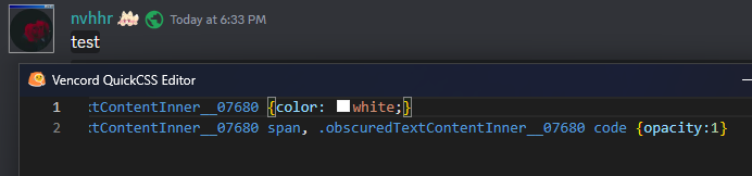
clear siren
||test||
.obscuredTextContentInner__07680 {color:white !important;} .obscuredTextContentInner__07680 span, .obscuredTextContentInner__07680 code {opacity:1 !important;}
also, you want to use filter, not backdrop-filter
 clear siren
well yeah it should work without them too
as I use the same selector as discord but qcss is loaded after
I just !important it for good measure as I know vortex is using a theme too which might do something to spoilers who knows
summer adder
ahh true
summer adder
trying to make a mention animation but the top of the mention isnt the way i want it
@summer adder
i want the top to be the same red
but i cant figure out how to do it
code i have is css .mention {border: 2px;border-style: solid;border-top-style: solid !important;animation: pulsate 2.5s infinite ease-in-out;background: transparent;color: var(--yellow-360)} @keyframes pulsate { 0% {border-color: transparent} 25% {border-color: rgba(255, 0, 0, 0.255);} 50% {border-color: rgba(255, 0, 0, 0.500)} 75% {border-color: rgba(255, 0, 0, 0.255)} 100% {border-color: transparent}}
 vestal field
i have custom border radius in my theme but it seems like the top edge is just smaller for some reason
summer adder
weird
maybe making the border 1 px will work
nope
ill fiddle with the border radius
vestal field
@vestal field test
wait i think it has to do with line height actually
if you set line height to 2 then its fine
but the normal line height cuts it off
vestal field
you probably dont want to change line-height for all messages though
summer adder
yeah no im only working with .mention
vestal field
if you set line height on all mentions then the entire line with that mention will be taller
summer adder
ah
teestttt @summer adder
yeah thats a bit crappy
okay so
i made the line-height to 1.5px
so its less interfering with the chat
vestal field
summer adder
i made the line-height to 1.5px
u mean the border thickness?
summer adder
nono, line-height
i DID also change border thickness though too
changed it to 1px
vestal field
line-height 1.5px does not do anything
 vestal field
so just 1.5
vestal field
oh yeah thats like barely larger than default
summer adder
nice
vestal field
.zalgo__39311 .messageContent__21e69 {
    overflow: visible;
}
.mention {
    display: inline-block;
    position: relative;
}
.mention::before {
    content: '';
    top: -2px;
    left: -2px;
    right: -2px;
    bottom: -2px;
    display: inline-block;
    position: absolute;
    z-index: -1;
    animation: pulsate 2.5s infinite ease-in-out;
    border-radius: var(--roundness-xs);
}
@keyframes pulsate {
    0% { background: transparent; }
    25% { background: rgba(255, 0, 0, 0.255); }
    50% { background: rgba(255, 0, 0, 0.500); }
    75% { background: rgba(255, 0, 0, 0.255); }
    100% { background: transparent; }
}```you probably need to change my roundness-xs variable
vestal field
mine is on like 10px because mentions have 8px border radius in my theme
summer adder
ahh alr
vestal field
you can make it look more like a border by setting a solid background on mention
wait i think it still gets cut off by line height
lunar hamletBOT
summer adder
https://github.com/MadelineMaid/themes/blob/main/fancymention.css
**fancymention.css: **
/**
* @author Madeline#3336
* @description Makes the mention in chat look nicer.
* @name Fancy Mention
*/
.mention {border: 1px;border-style: solid;line-height: 1.5;animation: pulsate 2.5s infinite linear;background: transparent;color: #dbdee1;}
.mention:hover {animation: none;background: transparent;color: #bf861f;}
@keyframes pulsate {
    0% {border-color: transparent}
    25% {border-color: rgba(240, 177, 50, 0.255);}
    50% {border-color: rgba(240, 177, 50, 0.500);}
    75% {border-color: rgba(240, 177, 50, 0.255);}
    100% {border-color: transparent}}

vestal field
cool
lunar hamletBOT
summer adder
https://github.com/MadelineMaid/themes/blob/main/fancymention.css
**fancymention.css: **
/**
* @author Madeline#3336
* @description Makes the mention in chat look nicer.
* @name Fancy Mention
*/
.mention {border: 1px;border-style: solid;line-height: 1.5;animation: pulsate 2.5s infinite linear;background: transparent;color: #dbdee1;}
.mention:hover {animation: none;background: transparent;color: #bf861f;}
@keyframes pulsate {
    0% {border-color: transparent}
    25% {border-color: rgba(240, 177, 50, 0.255);}
    50% {border-color: rgba(240, 177, 50, 0.500);}
    75% {border-color: rgba(240, 177, 50, 0.255);}
    100% {border-color: transparent}}
of course the bot didnt update it
/**
* @author Madeline#3336
* @description Makes the mention in chat look nicer.
* @name Fancy Mention
*/
.mention {
    border: 1px;
    border-style: solid;
    line-height: 1.5;
    animation: pulsate 2.5s infinite linear;
    background: transparent;
    color: #dbdee1;
}
.mention:hover {
    animation: none;
    background: transparent;
    color: #bf861f;
}
@keyframes pulsate {
    0% {border-color: transparent}
    25% {border-color: rgba(240, 177, 50, 0.255);}
    50% {border-color: rgba(240, 177, 50, 0.500);}
    75% {border-color: rgba(240, 177, 50, 0.255);}
    100% {border-color: transparent}
}```
jovial vault
Is it possible to theme user tags?
terse dew
clear siren
||test||
works perfectly
clear siren
so yeah @clear vigil
something like this should be the way to select them
.messagelogger-deleted:has( + .messageListItem__6a4fb[data-author-id=xxxxxxxx]) where xxx is the bot's userid
that will select any deleted message that has(message by specific bot) directly following it
 clear vigil
this doesnt seem to be valid css
clear siren
yeah quickcss thinks that because it's not updated for :has()
clear vigil
 clear vigil
clear siren
yeah quickcss thinks that because it's not updated for :has()
clear vigil
clear siren
yeah quickcss thinks that because it's not updated for :has()
oh ok
but it works still
clear siren
should work unless I screwed something, I have nothing to test it on
clear vigil
well it didnt 🤔
clear siren
and the userid is correct?
clear vigil
it seems the +messageListItem__6a4fb would be correct... where is data-author-id located
clear vigil
clear siren
and the userid is correct?
i put the webhook id, is that not it?
clear siren
oh wait hold on
oh yeah
you need to enable themeattributes plugin
then you will have the author ids in the messages
clear vigil
right
this sucks now because after restart the deleted messages are no longer cached, i gotta find some new test messages now hang on lol
clear siren
hah yeah
clear vigil
ok i can see the data author id in the inspector but the css doesnt seem to work
clear siren
hmm
clear vigil
wait nvm it was just that the id needs "" around it
clear vigil
i am not too sure how many different webhooks pluralkit creates tho, it might be one per server?
so i guess ill have to do that for every server people use it in
clear siren
I have no idea, I don't really even know what it is
clear vigil
yea i will try it and see, thats fine. thanks for your help
clear siren
np
deep bane
Which one's better

 clear siren
depends on the rest of the theme
deep bane

clear siren
if your design is flat then 2, if it has other shadows or gradients then 1
deep bane
what about css snippet that makes the profile popout centered
clear siren
you could also just make it an outline without blur
clear siren
deep bane
what about css snippet that makes the profile popout centered
I've followed the development of that and it looks nice
deep bane
clear siren
you could also just make it an outline without blur
im sorry but this looks considerably worse
 clear siren
that's fair
deep bane
im gonna stick with the line because it looks better if someones offline
clear siren
I should rice up all my statusindicators too but not sure what style I want to give them, I will probably use an outline or shadow
clear siren
deep bane
im gonna stick with the line because it looks better if someones offline
I mean I would have nothing if they're offline
deep bane
clear siren
I mean I would have nothing if they're offline
updated the centered profile popouts to have this via a variable
:root {
  --offline-visibility:1;
}```
defaults to 1, type this in your quickcss and set it to 0 to hide offline statuses (it will still show all the other statuses)cool, I'm not using the centered popups though
deep bane
didnt ask
clear siren
I'm gonna write my own style when I get around to it
deep bane
its still a good feature
clear siren
I agree
 tepid sandal
--
deep bane
tepid sandal
--
.iconItem__8e3b8[aria-label="Create Invite"] svg{
  display:none;
}```oh well
deep bane
.children_a486f8 .iconItem__8e3b8:first-child svg{
  display:none;
}```made this one because im pretty sure create invite is always first
deep bane
deep bane
```css
.iconItem__8e3b8[aria-label="Create Invite"] svg{
display:none;
}```
but this one is more fool proof
tepid sandal
I see thank you for the fix
solid ore
deep bane
made this one because im pretty sure create invite is always first
isnt it the only child??
 solid ore
oh yeah tru
tepid sandal
deep bane
```css
.children_a486f8 .iconItem__8e3b8:first-child svg{
display:none;
}```
Oh it still has icon in the vcs
First one hides it but second doesnt
solid ore
aria label is better anyway
deep bane
theres a chat in vcs i forgot
solid ore
unless u dont use english disc
tepid sandal
yeaah
deep bane
discord at its finest
 solid ore
thats prob ur centered css
deep bane
nope
solid ore
¯_(ツ)_/¯
deep bane

 vast delta
possibly my last contribution here
ever had the issue like in the thumbnail when using nitro themes? thats because discord puts their background on a billion different random things even if something else already has that background and it does not change anything, thank you discord
this snippet fixes that (hopefully) [ill test it in my other tabs where it should be applied]
/*nitro background fix v1.1*/
.layer__2efaa+.layer__2efaa
,.standardSidebarView__1129a
,.contentRegion__0bec1
,.contentRegionScroller__86c79
,.sidebarRegionScroller__1fa7e
,.page__0b66e
{
    background: none;
}
.container__10dc7 {
    background: none !important;
}```
hardcoded colour alert
 clear siren
vast delta
possibly my last contribution here
ever had the issue like in the thumbnail when...
clear siren
vast delta
possibly my last contribution here
ever had the issue like in the thumbnail when...
possibly my last contribution here
wha
clear siren
 vast delta
clear siren
vast delta
clear siren
 clear siren
I don't know what to say but I hope you do stick around still even if inactive
vast delta
ill probably upload stuff on my github instead of here (and on a private server with just me lol)
glad urchin
 summer adder
```css
/**
* @author Madeline#3336
* @description Makes the mention in chat look...
summer adder
summer adder
```css
/**
* @author Madeline#3336
* @description Makes the mention in chat look...
decided to add support within my theme
of course this required me making the colors in my original code to variables but hey, worth it
/**
* @author Madeline#3336
* @description Makes the mention in chat look nicer.
* @name Fancy Mention
*/
:root {
    --mention-color-1: #bf861f;
    --mention-color-2: #dbdee1;
    --animation-color-start-end: rgba(240, 177, 50, 0.255);
    --animation-color-middle: rgba(240, 177, 50, 0.500);
}
.mention {
    border: 1px;
    border-style: solid;
    line-height: 1.5;
    animation: pulsate 2.5s infinite linear;
    background: transparent;
    color: var(--mention-color-2);
}
.mention:hover {
    animation: none;
    background: transparent;
    color: var(--mention-color-1);
}
@keyframes pulsate {
    0% {border-color: transparent}
    25% {border-color: var(--animation-color-start-end);}
    50% {border-color: var(--animation-color-middle);}
    75% {border-color: var(--animation-color-start-end);}
    100% {border-color: transparent}
}```which episode are you on
summer adder
currently watching 4
deep bane
seems like blocking with extra steps
mildly inconvenient window buttons 
.wordmark__0d178 {
  left:25vw !important;
}
.titleBar__01af6 {
  justify-content: space-between !important;
}```what are those colors
very specific alpha values lol
clear siren
also old syntax on the colors
vast delta
@celest ridge #🎨-css-snippets message i love it, good job!
 celest ridge
i feel like i didnt make that
celest ridge
lmaoao
vast delta
in my defense, your profile pictures look identical at 1 in the morning
@vestal field you are the correct person to ping
vestal field
vast delta
<@508863359777505290> you are the correct person to ping
thanks
summer adder

sweet, it works
/**
* @author Madeline#3336
* @name File Blur
* @description Forcefully blurs all picture and videos until you hover over them.
*/
.imageWrapper_fd6587.imageZoom_ceab9d.clickable_dc48ac.lazyImgContainer__68fa8 img {
    filter: blur(6px);
    transition: ease-in-out 0.2s;}
.imageWrapper_fd6587.imageZoom_ceab9d.clickable_dc48ac.lazyImgContainer__68fa8:hover img {
    filter: blur(0px);
}
.imageWrapper_fd6587:has(.cover__0b3cf.active_f0dd2f) {
    filter: blur(6px);
    transition: ease-in-out 0.2s;
    }
.imageWrapper_fd6587:has(.cover__0b3cf.active_f0dd2f):hover {
    filter: blur(0px);
    }
.imageWrapper_fd6587:has(.imageAccessory__64ab2) {
    filter: blur(6px);
    transition: ease-in-out 0.2s;
    }
.imageWrapper_fd6587:has(.imageAccessory__64ab2):hover {
    filter: blur(0px);
}```this achieves nothing with this little blur tbh
summer adder
sadly too much blur makes it not look good
sweet lark
summer adder
sadly too much blur makes it not look good
i dont think looks are the goal here tho
if ur blurring media ur prob doing it for a reason
summer adder
ill try 20px see if it works better
deft niche
summer adder
https://files.catbox.moe/5gq6lp.mp4
What is bro hiding 😭
summer adder
deft niche
What is bro hiding 😭
nothing really, those are just my things in my css workplace
new version
/**
* @author Madeline#3336
* @name File Blur
* @description Forcefully blurs all picture and videos until you hover over them.
*/
.imageWrapper_fd6587.imageZoom_ceab9d.clickable_dc48ac.lazyImgContainer__68fa8 img {
    filter: blur(20px);
    transition: ease-in-out 0.2s;}
.imageWrapper_fd6587.imageZoom_ceab9d.clickable_dc48ac.lazyImgContainer__68fa8:hover img {
    filter: blur(0px);
}
.imageWrapper_fd6587:has(.cover__0b3cf.active_f0dd2f) {
    filter: blur(20px);
    transition: ease-in-out 0.2s;
    }
.imageWrapper_fd6587:has(.cover__0b3cf.active_f0dd2f):hover {
    filter: blur(0px);
    }
.imageWrapper_fd6587:has(.imageAccessory__64ab2) {
    filter: blur(20px);
    transition: ease-in-out 0.2s;
    }
.imageWrapper_fd6587:has(.imageAccessory__64ab2):hover {
    filter: blur(0px);
    }
.imageWrapper_fd6587:has([aria-label="Image"]) {
    filter: blur(20px);
    transition: ease-in-out 0.2s;
}
.imageWrapper_fd6587:has([aria-label="Image"]):hover {
    filter: blur(0px);
}
.embedWrapper_c143d9.embedFull__8dc21 img {
    filter: blur(20px);
    transition: 0.2s ease-in-out;
}
.embedWrapper_c143d9.embedFull__8dc21:hover img {
    filter: blur(0px);
}```if u want to make a css that hides something you cannot just make it easily recognisable if you squint your eyes, so you need to have ALOT of blur
or maybe even just add the spoiler thing to every image
Bad media blurring css
[aria-roledescription="Message"] > img,[aria-roledescription="Message"] video,[aria-roledescription="Message"] .imageContainer__04362{
  filter:blur(20px);
}
[aria-roledescription="Message"]:hover *{
  filter:unset !important;
}```
oak plover

 deep bane
oak plover
<:WHAT:1082407334510350368>
deep bane
oak plover
<:WHAT:1082407334510350368>
what
 sweet lark
oak plover
i checked and the app crashed when i right clicked on this gc
sweet lark
oak plover
i checked and the app crashed when i right clicked on this gc
ive heard of right click crashes with the favorites experiment, idk if its in any way related but thought i would let u know
oak plover
yeah i think that was it i was testing favorites v2
sweet lark
yeah disable it its broken from what ive heard
oak plover
iirc v1 works fine
sweet lark
dunno about v1
oak plover
idk i've had that one on for like 2 years i think it's fine
yeah just tested it again v1 works fine
sweet lark
good to know
i know near nothing about experiments tbh but yeah i have heard about favorites v2 crashes in #🏥-vencord-support-🏥
oak plover
tbf v2's a lot newer
only been a thing for a couple of months i think
and they've probably already caught this issue
glad urchin
does anyone have a functional snippet for coloring the background of roles? i found one in #🎨-css-snippets but its outdated
 solid ore
glad urchin
does anyone have a functional snippet for coloring the background of roles? i fo...
solid ore
glad urchin
does anyone have a functional snippet for coloring the background of roles? i fo...
/* Role pill background */
[class*="role_"] [class*="roleCircle_"]:before,
[class*="actionButton_"][class*="role_"][class*="justifyCenter_"]
{
  border-radius: 5px; /* standard discord is 3px */
}
[class*="role_"]
{
  transform: translate(0);
  border: 0;
}
[class*="role_"] [class*="roleRemoveIcon_"]
{
  margin: 0;
  left: unset;
  transform: translate(50%,-50%);
}
[class*="role_"] [class*="roleRemoveButton_"]{
  position: static;
}
[class*="root_"]>[class*="role_"] [class*="roleCircle_"]:before
{
  content: '';
  top: 0;left: 0;
  z-index: -1;
  width: 100%;
  height: 100%;
  box-sizing: border-box;
  position: absolute;
  background: inherit;
  border: 2px solid transparent;
  opacity: .4;
}
[class*="roles_"]
{
  color: var(--text-normal);
}```not mine btw***
glad urchin
and nothing
 solid ore
it was in #🎨-css-snippets and updated
glad urchin
i found one in 🎨-css-snippets but its outdated
solid ore
works for me

 solid ore
check ur theme
solid ore
do uhave theme attributes plugin? idk if u need it
 solid ore
do u have that class changer plugin
 solid ore
its 3rd party
solid ore
glad urchin
try changing roleCircle_ in the cnippet to roleDot_ maybe
glad urchin
still nothing
glad urchin
not sure
solid ore
is ur vencord up to to date
glad urchin
im using vesktop
 solid ore
¯_(ツ)_/¯
 glad urchin
weird
solid ore
i j opened vesktop and it has the same classes as vencord
clear siren
yeah no idea why yours are different
glad urchin
different on web too

it works using stylus ?

works with stylus, but not on vesktop. ??

 clear siren
discord a/b testing something on you 
clear siren
what, I tested that with the plugin on and it was the same
glad urchin
settings?
clear siren
ohh yeah if you enable the popout thing it does that
glad urchin
and still broken

unless i disable the plugin entirely
which i guess i will do for now
clear siren
did you restart between changing settings
glad urchin
yes
clear siren
hm
 clear siren
should be easy to do
or, you can just make the css work with the plugin enabled
then you retain the plugin's color copying feature if you ever used that
but otherwise it's easier to just make the pseudoelement for the dot on usernames
glad urchin
yea
clear siren
you can either create the dot using a circle unicode char which is the easiest way
or content:"" with a width and height and borderradius and background:currentColor
glad urchin
yop
good enough

yeah nvm the unicode one is way better

/* fix role dot */
.username_d30d99, .username_d272d6 {
  margin-left: 27px;
}
.username_d30d99::before, .username_d272d6::before {
  content: "●";
  position: absolute;
  width:fit-content;
  height:21px;
  margin-left: -27px;
  padding-left: 3px;
  padding-right: 3px;
  padding-bottom: 0.2px;
  border-radius: 8px;
  color: currentColor;
  background-color: var(--background-tertiary);
}```@vestal field am i allowed to host your hover animation snippet on github and link you?
vestal field
sure
deep bane
glad urchin
```css
/* fix role dot */
.username_d30d99, .username_d272d6 {
margin-left: 27...
what was happening for you to make this
glad urchin
deep bane
what was happening for you to make this
BetterRoleDot breaks colored roles
had to disable it and make a css-version instead

 bleak gust
It's the "both simultaneously" part
solid ore
ohh
deep bane
glad urchin
BetterRoleDot breaks colored roles
how
glad urchin
deep bane
how
different classes
deep bane
glad urchin
different classes
how
glad urchin
see above
 magic cove
QoL stuff
 glad urchin
interesting banner
deep bane
cat truly is qol
magic cove
yes
 formal fox
magic cove
QoL stuff
formal fox
magic cove
QoL stuff
What theme is that?
 brittle juniper
blur 😭
deep bane
brittle juniper
blur 😭
 clear siren
blur is best
magic cove
blur is fun
magic cove
clear siren
blur is best
thanks for the help 
clear siren
clear siren
I have blur, shadows, gradients, all my homies hate flat design
 deep bane
i love flat design
 lilac swallow
clear siren
I have blur, shadows, gradients, all my homies hate flat design
lilac swallow
clear siren
I have blur, shadows, gradients, all my homies hate flat design
small question, is that a transparent window or just a blurred image?
im trying to set up transparency to work with vencord atm
clear siren
just a background image in discord
lilac swallow
i've seen transparent discord windows done in the past and they look incredible (there is no way to overstate how good that stuff looks)
but so far i've only seen it on BD
which i dislike due to performance issues i've had with it
clear siren
haven't looked much into making discord transparent but at least vesktop can use acrylic to make a blurred seethrough window
then you just need to get rid of a ton of backgrounds from elements or set all the background color css variables to transparent
lilac swallow
clear siren
then you just need to get rid of a ton of backgrounds from elements or set all t...
i did, unfortunately its not as simple as that
it would be pitch black if I were to just do that
clear siren
yeah that's where vesktop comes in
lilac swallow
clear siren
haven't looked much into making discord transparent but at least vesktop can use...
from what i've heard vesktop is much lighter
than discord+vencord
clear siren
 deep bane
 clear siren
it has none, mica, tabbedmica and acrylic
deep bane
i would use vesktop but you cant have push to talk
clear siren
yeah I can't get the transparency to work on vesktop
lilac swallow
i can't find the menu lol
i found vesktop settings but i don't have an option for transparency
clear siren
what os are you on
lilac swallow
windows 10
clear siren
hmm should be there on win10 I think
I'm on win11 but I can't get any of the transparencies working even with 'mica for everyone'
clear siren
yeah but there is acrylic option too
clear siren
yeah I'd like to see if anyone can get transparency working tbh
deep bane
clear siren
yeah I'd like to see if anyone can get transparency working tbh
give me a team fortress 2 key and i'll try
clear siren
no :3
deep bane
clear siren
no :3
im gonna flatten your theme
 clear siren
D:
magic cove
could i have ur theme nvhhr?
deep bane
magic cove
could i have ur theme nvhhr?
5 dolla
deep bane
magic cove
could i have ur theme nvhhr?
are you on vesktop or vencord
magic cove
both but i main vesktop
deep bane
ok then ask him
clear siren
oh sure
magic cove
tyty
clear siren
magic cove
tysmmm
clear siren
it's not in the perfect state at the moment, rewriting parts of it etc but do whatever you want with it
summer adder
lilac swallow
it would be pitch black if I were to just do that
:root {
    --background-primary: transparent;
    --background-secondary: transparent;
    --background-tertiary: transparent;
}```thats just basic transparency
deep bane
@clear siren Frick you flattens your theme
 magic cove
lmao
clear siren
:<
magic cove
is there anyway i can make
uh
the banner on the user profile fade

it looks a litlte goofy
ive tried before but havent been able to
deep bane
fade how
deep bane
fade how
bleak gust
svg masks?
magic cove
idk how to explain it
😭

idk if that does anything
its just so it fits with the theme
ive tried alot but struggled alot
deep bane
magic cove
😭
.bannerPremium__42693::before {
  content:'' !important;
  background:linear-gradient(0deg, transparent, rgb(25 25 25 / 0.75)) !important;
  position: absolute;
  width: inherit;
  height: inherit;
}```.bannerPremium__42693::before {
content:'';
background:linear-gradient(rgb(0 0 0 / 0.8),transparent 99%);
position: absolute;
width: inherit;
height: inherit;
}```reversed version
.bannerPremium__42693::before {
  content:'';
  background:linear-gradient(transparent,rgb(0 0 0 / 0.8) 99%);
  position: absolute;
  width: inherit;
  height: inherit;
}```you can also fade any element to transparent with this mask-image: linear-gradient(transparent, white);

 deep bane
 clear siren
might be vesktop only


 clear siren
I mean whatever works for you
 deep bane
i have a way just give me a minute im doing something
magic cove
alright
tysm
i did know how to do this but i really cant remember so i appreciate the help c:
clear siren
remove text-decoration and use border-bottom instead
there is also text-decoration-color you can use
but a border might be easier to style how you want
magic cove
how would i make it work with border?
clear siren
    border-bottom: 1px solid red !important;
}```note that the border is full width but that can be changed if you want
clear siren
add display:inline !important
 clear siren
you mean not have it curve up like that when using border-radius, but the top of it would be straight
clear siren
uhh, it's possible but not super easy
deep bane
.eyebrow_f53856.headerText__94c22 {
  background-image: linear-gradient(red,red);
  background-size: 100% 3px;
  background-repeat: no-repeat;
  background-position: left 1.25vh;
  padding-bottom: 5px !important;
  margin-bottom: -5px !important;
  display:inline !important;
}```yeah that works

 deep bane
@magic cove
.eyebrow_f53856.headerText__94c22 {
  background-image: linear-gradient(red,red);
  background-size: 100% 3px;
  background-repeat: no-repeat;
  background-position: left 1.25vh;
  padding-bottom: 10px !important;
  display:inline !important;
}
i dont think i can round that + i tried the var() colour and it didnt work
deep bane

.eyebrow_f53856.headerText__94c22 {
  background-image: linear-gradient(var(--button-danger-background),var(--button-danger-background));
  background-size: 100% 3px;
  background-repeat: no-repeat;
  background-position: left 1.25vh;
  padding-bottom: 10px !important;
  display:inline !important;
  border-radius: 100%;
}```border-radius: 1vw;works pretty well
magic cove
im tryan round it like this
 gilded cloak
I would do something with ::after
::after
Content: ''
Height 0.25rem
Left 0
Right 0
Border-radius 1rem
Then you just have to fight with css to get it placed right
So something like position relative on the main thing and absolute on the pseudo element
magic cove
yea yea i get ya
will mess abt wit it 🙏
is there anyway to have uh
the user popout banner not interfere with the user profile thing
 magic cove
the gradient on the user profile
rounded because I rounded the banner on the user pop outs
magic cove
I know
magic cove
magic cove
the user popout banner not interfere with the user profile thing
The eight side of the screenshot
The banner is Rounded when I didn’t want it to be
I only wanted the user profile pop out banners to be rounded
deep bane
you dont want the popout to be rounded but want the banners to be rounded?
summer adder
clear siren
```.eyebrow_f53856.headerText__94c22 {
border-bottom: 1px solid red !importa...
nvhhr first time not using css in coding?
magic cove
deep bane
you dont want the popout to be rounded but want the banners to be rounded?
Yes
I think
deep bane
thats just gonna look ugly
summer adder
i highly assume not, but is there a way to make this twitter verified logo either
- be the color of a role the person has
- be the color of the persons set status (online, dnd)

heres its code if you need a reference to go from to help me
/**
* @name Twitter Verified
* @author Madeline#3336
* @description Everybody in chat is now verified!
*/
:root {
    --twitter-verified: url(https://upload.wikimedia.org/wikipedia/commons/thumb/e/e4/Twitter_Verified_Badge.svg/15px-Twitter_Verified_Badge.svg.png);
}
.username_d30d99.desaturateUserColors_b72bd3.clickable_d866f1:after {content: var(--twitter-verified);filter:saturate(0%);display: flexbox; padding-left: 5px;}```twitter verified logo?
summer adder
deep bane
twitter verified logo?
just a lil something i made one night at 1 in the morning
(hence why its so messy of code let me fix that rq)
deep bane
why are you using a var for the logo
summer adder
Honestly? i dont know ask 1 am me
and also why did i display: flexbox
💀
heres 9 PM me fix code
/**
* @name Twitter Verified
* @author Madeline#3336
* @description Everybody in chat is now verified!
*/
.username_d30d99:after {
    content: url(https://upload.wikimedia.org/wikipedia/commons/thumb/e/e4/Twitter_Verified_Badge.svg/15px-Twitter_Verified_Badge.svg.png);
    filter:saturate(0%);
     padding-left: 5px;
}```yes 9pm
summer adder
yes 9pm est
deep bane
 summer adder
i highly assume not, but is there a way to make this twitter verified logo eithe...
summer adder
summer adder
i highly assume not, but is there a way to make this twitter verified logo eithe...
so anyways now that im actually awake and fixed the code to be less of an eyesore, any way for this?
huge reason im asking is because im curious if it'd require javascript/typescript coding or not
deep bane
if you want you could make a selector for every possible hex color and put it rthrough this https://codepen.io/sosuke/pen/Pjoqqp

Added License 2022-07-15; this is retroactive for whatever help that is. 0-clause Free BSD License Permission to use, copy, modify, and/or distribute...
summer adder
im just gonna put them in comments for storage
/**
* @name Twitter Verified
* @author Madeline#3336
* @description Everybody in chat is now verified!
*/
.username_d30d99:after {
    content: url(https://upload.wikimedia.org/wikipedia/commons/thumb/e/e4/Twitter_Verified_Badge.svg/15px-Twitter_Verified_Badge.svg.png);
    filter:saturate(0%);
     padding-left: 5px;
}
/* online: filter: invert(51%) sepia(62%) saturate(550%) hue-rotate(93deg) brightness(89%) contrast(85%); */
/* dnd: filter: invert(36%) sepia(37%) saturate(3929%) hue-rotate(335deg) brightness(96%) contrast(99%); */
/* idle: filter: invert(85%) sepia(9%) saturate(6652%) hue-rotate(337deg) brightness(103%) contrast(87%); */```i MIGHT be twitter verified

 deep bane
do you want it to be role colored or status colored
summer adder
lets try role colored
deep bane
ok pretty sure that would be impossible so no
summer adder
alright, what about status?
deep bane
actually role color might be possible
summer adder
oh?
deep bane
nevermind
deep bane
probably possible
summer adder
any clue how?
deep bane
yes
summer adder
im looking through the radial status in chat code as that uses platform indicator as a base
deep bane
summer adder
im looking through the radial status in chat code as that uses platform indicato...
that is what i was trying to do
summer adder
ahh
summer adder
yippie
deep bane

 deep bane
.username_d30d99.desaturateUserColors_b72bd3.clickable_d866f1:after {
content:'';
background: url(https://upload.wikimedia.org/wikipedia/commons/e/e4/Twitter_Verified_Badge.svg);
padding-left:20px;
margin-left:4px;
background-repeat:no-repeat;
}
[id^="message-username-"]:has(svg[fill="#23a55a"]) .username_d30d99.desaturateUserColors_b72bd3.clickable_d866f1:after{
  filter: invert(49%) sepia(34%) saturate(906%) hue-rotate(93deg) brightness(98%) contrast(91%);
}
[id^="message-username-"]:has(svg[fill="#f0b232"]) .username_d30d99.desaturateUserColors_b72bd3.clickable_d866f1:after{
  filter: invert(64%) sepia(85%) saturate(412%) hue-rotate(355deg) brightness(125%) contrast(88%);
}
[id^="message-username-"]:has(svg[fill="#f23f43"]) .username_d30d99.desaturateUserColors_b72bd3.clickable_d866f1:after{
  filter: invert(57%) sepia(5%) saturate(561%) hue-rotate(327deg) contrast(190%);
}
[id^="message-username-"]:has(svg[fill="#80848e"]) .username_d30d99.desaturateUserColors_b72bd3.clickable_d866f1:after{
  filter: saturate(0)
}```had to manually edit dnd cause i was getting dogshit results from the converter
idk if platform indicators shows streaming
also i made the symbol better/bigger
summer adder
sweet, thanks
deep bane
also replied messages are gonna have the default blue color
summer adder
ill make sure to credit you in the comments of the code
deep bane
and also if theres 2 platform indicators the colors have priority like this: Offline>DnD>Idle>Online
summer adder
noted
/**
* @name Twitter Verified
* @author Madeline#3336
* @description Everybody in chat is now verified!
*/
.username_d30d99.desaturateUserColors_b72bd3.clickable_d866f1:after {
    content:'';
    background: url(https://upload.wikimedia.org/wikipedia/commons/e/e4/Twitter_Verified_Badge.svg);
    padding-left:20px;
    margin-left:4px;
    background-repeat:no-repeat;
    }
    [id^="message-username-"]:has(svg[fill="#23a55a"]) .username_d30d99.desaturateUserColors_b72bd3.clickable_d866f1:after{
      filter: invert(49%) sepia(34%) saturate(906%) hue-rotate(93deg) brightness(98%) contrast(91%);
    }
    [id^="message-username-"]:has(svg[fill="#f0b232"]) .username_d30d99.desaturateUserColors_b72bd3.clickable_d866f1:after{
      filter: invert(64%) sepia(85%) saturate(412%) hue-rotate(355deg) brightness(125%) contrast(88%);
    }
    [id^="message-username-"]:has(svg[fill="#f23f43"]) .username_d30d99.desaturateUserColors_b72bd3.clickable_d866f1:after{
      filter: invert(57%) sepia(5%) saturate(561%) hue-rotate(327deg) contrast(190%);
    }
    [id^="message-username-"]:has(svg[fill="#80848e"]) .username_d30d99.desaturateUserColors_b72bd3.clickable_d866f1:after{
      filter: saturate(0)
    }
/*CREDITS TO 'callme_h' ON DISCORD FOR MAKING IT STATUS COLOR CHANGING!*/```there's probably a better way to make it change colors but this was the laziest
summer adder
lmfao mood
devout elm
summer adder
i highly assume not, but is there a way to make this twitter verified logo eithe...
u could pass the svg as a mask-image potentially? then set the background-color as currentColor
deep bane
better online color i think filter: invert(45%) saturate(900%) hue-rotate(300deg);
.username_d30d99.desaturateUserColors_b72bd3.clickable_d866f1::after {
content:'';
background: url(https://upload.wikimedia.org/wikipedia/commons/e/e4/Twitter_Verified_Badge.svg);
padding-left:20px;
margin-left:4px;
}
[id^="message-username-"]:has(.vc-platform-indicator [fill="#23a55a"]) .username_d30d99.desaturateUserColors_b72bd3.clickable_d866f1:after{
  filter: invert(45%) saturate(900%) hue-rotate(300deg);
}
[id^="message-username-"]:has(.vc-platform-indicator [fill="#f0b232"]) .username_d30d99.desaturateUserColors_b72bd3.clickable_d866f1:after{
  filter: invert(64%) sepia(85%) saturate(412%) hue-rotate(355deg) brightness(125%) contrast(88%);
}
[id^="message-username-"]:has(.vc-platform-indicator [fill="#f23f43"]) .username_d30d99.desaturateUserColors_b72bd3.clickable_d866f1:after{
  filter: invert(57%) sepia(5%) saturate(561%) hue-rotate(327deg) contrast(190%);
}
[id^="message-username-"]:has(.vc-platform-indicator [fill="#80848e"]) .username_d30d99.desaturateUserColors_b72bd3.clickable_d866f1:after{
  filter: saturate(0)
}```removed the no repeat so you can pay elon hundreds of thousands of dollars
summer adder
deep bane

padding-left:1600px;
even better online color filter: saturate(80%) hue-rotate(295deg);
devout elm
devout elm
u could pass the svg as a `mask-image` potentially? then set the background-colo...
/**
* @name Twitter Verified
* @author Madeline#3336
* @description Everybody in chat is now verified!
*/
.username_d30d99:after {
  content: '';
  -webkit-mask-image: url(https://upload.wikimedia.org/wikipedia/commons/thumb/e/e4/Twitter_Verified_Badge.svg/15px-Twitter_Verified_Badge.svg.png);
  -webkit-mask-repeat: no-repeat;
  width: 15px;
  height: 15px;
  background-color: currentColor;
  display: inline-flex;
  position: relative;
  top: 2px;
  left: 4px;
}
u could do this much better prolly but ya if ur still interested that mostly works
 summer adder
deep bane
devout elm
```css
/**
* @name Twitter Verified
* @author Madeline#3336
* @description Every...
problem with this is if u put height above 13 it messes with positioning
atleast for me
devout elm
.username_d30d99:after {
  content: '';
  -webkit-mask-image: url(https://upload.wikimedia.org/wikipedia/commons/thumb/e/e4/Twitter_Verified_Badge.svg/15px-Twitter_Verified_Badge.svg.png);
  -webkit-mask-repeat: no-repeat;
  -webkit-mask-position-x: right;
  width: 18px;
  height: 14px;
  background-color: currentColor;
  display: inline-flex;
}
this works a bit better i think
the spacing is strange
i only put 15px cus of the link saying 15px to be real 😭
13px slightly cuts it off
deep bane
this is a better image https://upload.wikimedia.org/wikipedia/commons/e/e4/Twitter_Verified_Badge.svg
i think if this didnt mess with positioning it would be better
but for now i think mines better
devout elm
im not sure wat u mean by positioning
wait
ohh do u mean the names being shifted down a bit
deep bane
.username_d30d99::after {
  content: '';
  -webkit-mask-image: url(https://upload.wikimedia.org/wikipedia/commons/e/e4/Twitter_Verified_Badge.svg);
  -webkit-mask-repeat: no-repeat;
  padding-left:20px;
  background-color: currentColor;
  margin-left:4px;
}```fixed
now pay 50000$
this is better than the animation
devout elm
u love the group collaboration for a silly verified checkmark
i was just about to say 😭
 deep bane
nuh uh
summer adder
deep bane
now pay 50000$
what do you take me for, verbalase?
deep bane
madelase
deep bane
ok pay up
summer adder
what if i pay you in an image of women kissing
 devout elm
summer adder
what if i pay you in an image of women kissing
devout elm
summer adder
what if i pay you in an image of women kissing
thats overpaying
summer adder
is there a problem with overpaying?
deep bane
.vc-platform-indicator::after {
  content: '';
  -webkit-mask-image: url(https://upload.wikimedia.org/wikipedia/commons/e/e4/Twitter_Verified_Badge.svg);
  -webkit-mask-repeat: no-repeat;
  height:20px;
  width: 20px;
  background-color: currentColor;
}```mess with this code if u want status color or something idk
devout elm
i still dont get why chrome doesnt support mask-image yet
such a minor annoying thing
unless thats just the version of chromium/electron watever used by vesktop :p
bleak gust
@grand surge if you're wondering about why that thing happens to jitter it around it's because the circle border adds to the bounding box
grand surge
bleak gust
<@456226577798135808> if you're wondering about why that thing happens to jitter...
aaa
i see
thank you
o
you fixed it?
bleak gust
I don't right now but I should
 glacial gulch
could anyone help me out by writing a small css code to make the read all notification button soft edged and centered inside?
 clear siren
devout elm
i still dont get why chrome doesnt support `mask-image` yet
clear siren
devout elm
i still dont get why chrome doesnt support `mask-image` yet
but it does and so does vesktop, only discord's electron version needs the webkit prefix
devout elm
clear siren
but it does and so does vesktop, only discord's electron version needs the webki...
i tried it earlier when i was doing that n mask-image didnt do anything
hence why i sent -webkit-
clear siren
are you on vesktop?
 clear siren
works for me though as you can see from previous conversation
devout elm
what the
clear siren
grand surge
is there a remove all nitro garbage css?
grand surge
solid ore
https://d3sox.me/complementary-discord-theme/hide-nitro-upselling.theme.css
thanks bro, you saved me
clear siren
saved you? from the temptation to waste money? 
grand surge
clear siren
saved you? from the temptation to waste money? <:gon:1072988281752526949>
saved my parents wallet
 jagged hull
Hi
I need help
How can I put my button there? To the left of the mute button
 clear siren
what button
jagged hull
I want to add a button here
clear siren
well if it's not a button already present in the UI you can't do it with css, you're gonna have to make a plugin probably
jagged hull
I already have a button with my plugin but I can't put it where I want ; -- ;
clear siren
I guess #🧩-plugin-development is the place to ask tbh
jagged hull
Ok
clear siren
SURE
whoops caps
#🎨-css-snippets message this is a good one
there are other ways to achieve it too, one easy way is .sidebar_ded4b5 {resize: horizontal;} that makes it resizable with a grabber at the bottom
deep bane
anyone knows why in my css (@import url('https://raw.githubusercontent.com/im-h/css-snippets/main/Connections-Hover-Glow.css');) if i have .connectedAccountContainer__23f00:hover .connectedAccountNameText__00810 { color: currentColor !important } when you hover over a connection, first the color changes to black then the color its supposed to be, but if i make a selector for each specific connection the color changes to the one its supposed to be without changing to black first?
clear siren
because you have a transition set
before hovering they don't have a color, then you hover, and they get a color but you have a transition first
deep bane
would there be a more efficient method of making it change to the proper color first?
clear siren
wait..
I'm not sure I'm seeing the behavior you describe, I don' have them turning black
vestal field
idk if this is the issue but always set the transition and whatever property you're changing in the normal selector, and then change the property in the :hover selector
clear siren
vestal field
idk if this is the issue but always set the `transition` and whatever property y...
yeah this is a very good practice to follow whatever you're transitioning
vestal field
clear siren
I'm not sure I'm seeing the behavior you describe, I don' have them turning blac...
you can see it a bit on youtube connections
it transitions towards black and then back to red
deep bane
you can mostly see it in custom domain connections
clear siren
yeah set the colors on .connectedAccountContainer__23f00 without :hover
they have no color when not hovered
deep bane
.connectedAccountContainer__23f00 .connectedAccountNameText__00810 {
  color: white;
  transition: color 0.1s ease;
}```i think the issue is that you're setting the color on the container instead of the actual text
clear siren
vestal field
i think the issue is that you're setting the color on the container instead of t...
I mean it's kinda both, the container also needs it for the glow the way it's written
vestal field
try css .connectedAccountContainer__23f00:hover:has([aria-label="Facebook"]) .connectedAccountNameText__00810[aria-label="Facebook"]) { color: var(--facebook); }
clear siren
but if the text :not(:hover) would be white and container had the color even before hover it would be correct
deep bane
vestal field
try ```css
.connectedAccountContainer__23f00:hover:has([aria-label="Facebook"]) ...
the second aria label selector is useless
deep bane
exactly
before when i was making it i had both one for the border and text
and it worked perfectly
but as you could imagine
it basically doubles the amount of text/code
so i was asking if theres a more efficient way of doing it
deep bane
that is what i am doing right now
clear siren
lol I was thinking 1700 lines what a fix
vestal field
.connectedAccountContainer__23f00 {
  color: var(--interactive-active);
  transition: box-shadow 0.25s ease, border-color 0.25s ease, color 0.25s ease;
}
.connectedAccountContainer__23f00:hover {
  border-color: currentColor;
  box-shadow: 0px 0px 10.9px 1px currentColor;
}
.connectedAccountContainer__23f00:hover .connectedAccountNameText__00810 {
  color: inherit !important;
}
replace the middle part with this
wait this is shorter
alr i edited
@deep bane
deep bane
because its bright
vestal field
.connectedAccountContainer__23f00 {
  color: var(--interactive-active);
}
.connectedAccountContainer__23f00:hover {
  border-color: currentColor;
  box-shadow: 0px 0px 10.9px 1px currentColor;
  transition: box-shadow 0.25s ease, border-color 0.25s ease;
}
.connectedAccountContainer__23f00 .connectedAccountNameText__00810 {
  transition: color 0.25s ease;
}
.connectedAccountContainer__23f00:hover .connectedAccountNameText__00810 {
  color: inherit !important;
}```ok you could do this
but the downside is that there is no transition out for box shadow and border
deep bane
same thing
vestal field
it shouldnt flash white though
deep bane
it does though
vestal field
where
deep bane
box-shadow/glow
vestal field
are u replacing the right part of the code
deep bane
yes
vestal field
it does not flash white at all for me
deep bane
nevermind i was using all instead of box-shadow and border-color
but at this point im just gonna use the first method of creating 2 selectors for glow and text
because after all i dont think the performance is gonna get a massive hit from this, and this is all about looks after all
vestal field
@deep bane one last attempt
ok fuck discord and the auto file thing
but i think if you use a variable it works?
not sure
deep bane
vestal field
<@233940323334750209> one last attempt
while this is not the cleanest solution it does seem to work
V1: @import url('https://raw.githubusercontent.com/im-h/css-snippets/main/Connections-Hover-Glow.css');
V2: @import url('https://raw.githubusercontent.com/im-h/css-snippets/main/Connections-Hover-Glow-v2.css');
summer adder
hey, whats the default value of the variable --custom-message-attachment-spoiler-blur-radius?
bleak gust
summer adder
hey, whats the default value of the variable `--custom-message-attachment-spoile...
44px
deep bane
--custom-message-attachment-spoiler-blur-radius: 44px;
summer adder
thx, couldnt find it anywhere
deft niche
summer adder
hey, whats the default value of the variable `--custom-message-attachment-spoile...
Yk you can just click on the variable right? 😭
summer adder
trying to improve my file blur snippet but theres something wrong with the gifs
code i have for the gifs is css .clickableWrapper__64072 { filter: blur(44px); transition: ease 0.2s; } .clickableWrapper__64072:hover { filter: blur(0px) !important; }
but the gifs wont unblur on hover

 vestal field
its painful how many wrappers there are around image attachments and embeds lol
vestal field
summer adder
but the gifs wont unblur on hover
seems like clickablewrapper just does not detect hover for some reason
u might need to use the parent wrapper
summer adder
so imageWrapper_fd6587?
vestal field
.imageWrapper_fd6587 > .clickableWrapper__64072 {
    filter: blur(44px);
    transition: filter ease 0.2s;
}
.imageWrapper_fd6587:hover > .clickableWrapper__64072 {
    filter: blur(0px);
}```that works perfect, thanks
grand surge
hello, can someone make these spotify controls, shufftle, pause, back and forth brighter becuase its barely visible for me, if possible can you also make the progress bar color customisible. thank you
 glad urchin
progress bar snippets exist in #🎨-css-snippets
summer adder

/* Ignore */
.vc-spotify-button {filter: brightness(200%) !important}
/* Progress Bar Color Primary */
.barFill__30e17 {
    background: red !important;
}
/* Progress Bar Color Secondary */
.bar_e58961 {
    background: blue !important;
}```@grand surge
summer adder

grand surge
 dark dragon
the alignment on that handle is the worse
dark dragon
The handle on the progress bar
grand surge
is there a way to change the color of this without affecting the text color? im sry thaat im being annoying i just cant deal with blue
