#🎨-theme-development
1 messages · Page 9 of 1
oh thats my v2 code
or maybe even v1

GitHub
shiggyshiggyshiggyshiggy. Contribute to coolesding/shiggycord development by creating an account on GitHub.
i think that one
yeah exact same link
have you noticed lags with that version?
no not really
especially scrolling up and down the serverlist
no shit's smooth as hell
jo ppl have someone a snippet to remove super rections on this container under messages ?

interesting, i heard a ton of issues with box shadow being super laggy
use your dev console
dev tools? guh i dont remember the name
i cant my ds is crashing instant if i use the element arrow

lol
currently making radialstatus box shadow version
yes its an entire rewrite, no, i dont care and yes i have enough time to waste
I also can't use devtools much atm, vesktop keeps crashing on me constantly in various ways when trying to inspect things
and why you dont think to work together mit @exotic scaffold ? (radial status dev)
gibbu dont know me, i dont know gibbu
lol ?
well then here we go ?
oh i just realised you pinged gibbu haha
i have went big brain and used other servers for css snippits
well essentially what happened was:
i tried using radialstatus in vencord
didnt work
looked at code
didnt understand a thing
made it myself in a way that i think is like 100 times better
shared it
like this?

the og radialstatus code is disgustingly complicated, i think what its doing is taking the little moon or green dot and change its shape into a circle around the profile picture, which is why it doesnt allow different roundnesses
half of this server is on 10 different discord modding servers for css snippets, you are not smart
box shadow is a different way to make a border around the profile picture, from what i heard its worse for performance

a
oh
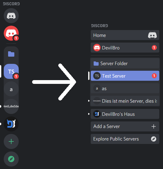
oh wow discord improved the server list a lot i guess
its definitely not lagging at all
my server list whas never lagging ?
even on BD mit devil bro memory leak plugins

when scrolling around quickly
in any case, my performance tests tell me that its definitely better since the update lol
try that one
replaces your variables and your old radialstatus code
you can play around with the variables, though size, roundness and borderstyle dont do anything
alr
kinda missed that box shadow version haha

i liked being able to change the ring into a rounded square tho
box shadow is goofy
box shadow is what you have been using buffoon
isnt that the glowing part of it?
i feel stupid and ik i am
box shadow is the property with which the ring is made
your glow variable is what makes it glow
ohhh
box shadow has that gradient feature, border doesnt
i used border in my performance one, which was, from my experience, always better in performance
ok
can someone help to remove this button ? super reaction it looks kinda skufed to me in dev tools

you asked that before, use dev tools, if they dont work, deal with it
i mean they look identical

im in the browser
what are you trying to hide
you silly
you didnt see that
i just want to remove super rections but keep the normal one
literally have the difference in big letters
aria-label="Add Super Reaction"
[aria-label="Super-Reaktion hinzufügen"] {
display: none
}
do it correctly silly
but if i list with this is shold donst do it because my one is in german not english or not ?
will only work in your language
1 dont give it to others with localised selectors
2 dont list low effort snippets anyways
yeah and what whas again the method that works on all language?
maybe
you just need a message that have a rection thats all
like this

i just want to hide the Add button not the reactions entirely
it work instant lol nice
i whas thinking it will look something like this 😅
.button_afdfd9:has([d="M16.886 7.999H20C21.104 7.999 22 8.896 22 9.999V11.999H2V9.999C2 8.896 2.897 7.999 4 7.999H7.114C6.663 7.764 6.236 7.477 5.879 7.121C4.709 5.951 4.709 4.048 5.879 2.879C7.012 1.746 8.986 1.746 10.121 2.877C11.758 4.514 11.979 7.595 11.998 7.941C11.9991 7.9525 11.9966 7.96279 11.9941 7.97304C11.992 7.98151 11.99 7.98995 11.99 7.999H12.01C12.01 7.98986 12.0079 7.98134 12.0058 7.97287C12.0034 7.96282 12.0009 7.95286 12.002 7.942C12.022 7.596 12.242 4.515 13.879 2.878C15.014 1.745 16.986 1.746 18.121 2.877C19.29 4.049 19.29 5.952 18.121 7.121C17.764 7.477 17.337 7.764 16.886 7.999ZM7.293 5.707C6.903 5.316 6.903 4.682 7.293 4.292C7.481 4.103 7.732 4 8 4C8.268 4 8.519 4.103 8.707 4.292C9.297 4.882 9.641 5.94 9.825 6.822C8.945 6.639 7.879 6.293 7.293 5.707ZM14.174 6.824C14.359 5.941 14.702 4.883 15.293 4.293C15.481 4.103 15.732 4 16 4C16.268 4 16.519 4.103 16.706 4.291C17.096 4.682 17.097 5.316 16.707 5.707C16.116 6.298 15.057 6.642 14.174 6.824ZM3 13.999V19.999C3 21.102 3.897 21.999 5 21.999H11V13.999H3ZM13 13.999V21.999H19C20.104 21.999 21 21.102 21 19.999V13.999H13Z"]) {
display: none;
}```uhhh let me think, nope
this hides all reactions if there is one super reactions lol
oh god this is so hard to fix
[class^=reactions_]>div:has([class^=burstGlow_]) {
display: none
}```probably works
works
confirm +1
if i use this one its back
mfw my margins on my theme broke and have no clue how to fix
what theme?
solana
?
never heard of it, just wait for the creator to fix it
using my own fork as the dev that makes/fixes it cant fix it
so many good themes abandoned
nah theyre busy with life
your css removes super rections completly under messages the target whas to just remove the "add super rection button" what i mentioned early
they are all dead now :O
i fixed all classes myself i just dont know how to fix the margins
yeah i get it, maybe ill have to do the same someday
"what i mentioned early" you have not mentioned that before
but guh, give me one second
this one seems to work
as somehow i restarted my discord once and now some things are broken like transparancy and margins across the whole thing
what are you trying to do now
is it from the new update
yeah
guh
[class^=layerContainer_]>[id^=popout_]:has([class^=burstReactionTooltipInner_]) {
  display: none;
}```well at least there was a second update on ptb yesterday
im on stable though
wrong reply
no there was a second class change in some areas iirc
you didnt "remove this button"
yeah i changed them on my theme
but margins across whole discord are not the same as before
the reaction itself is a button, you can find out by clicking it and it does something, just like a button
and i cant look at class names
because my discord crashes the moment it open the inspector
thought this was fixed
you need your browser sadly
apperantly not
are you on vencord?
yeah
i think bd mightve fixed it
newest update and everything
either way vesktop and web have worked all along
ill switch to vesktop i guess
vesktop is very nice
vesktop best
yes
this whas my target thx

ok am on vesktop and inspect works
idk where to look for the offsets though
i can send screenshots of what its supposed to look like and what it looks like for me if anyone wants to help
sure
what its supposed to look like

what it looks like for me

normally i have transparancy on so thats why the background is just black
so basically rounded corners are gone and the outside margin is gone
oh
well and transparancy ig
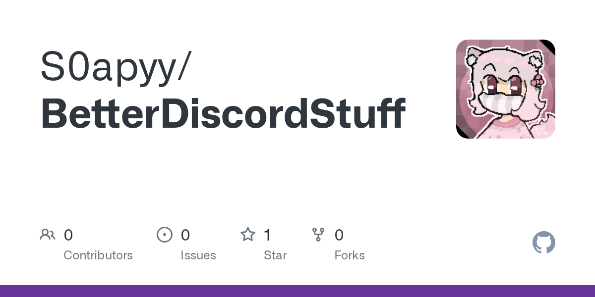
if needed u can get the base theme here https://github.com/S0apyy/BetterDiscordStuff/blob/main/Themes/Solana/Solana.css
GitHub
Contribute to S0apyy/BetterDiscordStuff development by creating an account on GitHub.
kinda strange how the theme doesn't have much margin between panels
wdym
like between server list, channel list, and chat
yeah thats normal
yeah
i have everything slightly transparent on my personal version
wich for some reason broke
anyways if you want to add outside margin just try adding margin to elements in the inspector
go up the tree
one of these

try adding padding or margin to one of them
try putting the code in here https://syndishanx.github.io/Website/Update_Classes.html
nothing changed
ye idk then
you have to wait for the theme dev to fix it
they cant
for another few weeks
im the only one actively trying to fix the theme for everyone using it 💀
doesnt seem to have the effect as showed in screenshots
padding just gives padding only to the server list on the left side
and margin only messes with chat text
i could send the theme entirely ig
try adding margin on .appAsidePanelWrapper__714a6
it works
any way it only applies to top right and bottom?
nvm figured that out
now to have it in the theme
huh
seems to cut off litterally everything
these layers seem to have changed wich is the cause of the issue
idk what they have been renamed to though
alright margins are fixed
now for background
ok cool fixed the theme
yippee
just loaded the newest one you posted today for the Radstatus and thank you for hardwork you done this ver looks good and so far runs nice
anyone know if there's a good way to differentiate the toolbar buttons without using aria-labels?


:has(>svg>[d^="something")
Said it a few times today but you're the best! (Nevotic from Github)
lol
ah thanks
/* /////////////////////////////////////////////////////////////////// */
/* Username Background */
.username_d30d99::before {
  content: '';
  width: calc(100% + 0px);
  height: 100%;
  border-radius: 5px;
  background-color: currentColor;
  opacity: 0.3;
  position: absolute;
  margin-top: 0px;
  z-index: -1;
  margin-left: -3px;
}
.headerText_f47574 > span {
  margin-left: 3px;
}```
If someone wants to use this 🙂 turns background behind user name to role color they havebtw ive only started doing theme stuff for discord this week
That's mad lmao
most of the fixes ive done was by using a converter so meh
some other classes had to be done manually because the converter hadnt added those yet
btw anyone know how to remove this weird text on vesktop? #🏥-vencord-support-🏥 message
i wonder if this will affect perf

try lol
can't really tell because vesktop is too good lol
try it on vencord normal edition
[href="https://support.discord.com"] for help button
oh yeah
anyone know this though?
its weird
i think there's a setting where you can make it just say vencord
but rn its a bug that its showing behind the window buttons
you could just hide it for now
but probably a vesktop bug
go make an issue on their github
it doesnt happen on my machine
oh
use my version of solana theme
and make background transparent ig
only then the issue seems to appear
link?
oh god uh

GitHub
profile bar is no longer transparent: servers and folders in the dock are not centered anymore: the normal chat window also doesnt have rounded edges anymore and the text bar where ur supposed to t...
go to the bottom of that issue as im just keeping the theme working
and it just creates mac os titlebar ig
im not running mac os myself
ohhh thats why
if its just fake then you gotta fix the css lol
guh it only appears on vesktop though
does it show up to the right of the window buttons on other clients?
and i have no clue why it happens as its only when using transparent background
wdym
the text?
yeah
wait so how is it not broken on other clients
only vesk top
i think vesktop hides windows titlebar behind the ui when you actually disable it in settings instead of just removing it entirely
nvm i dont have transparent bg
enable it
its just renaming initial to transparent and enabling some sort of transparancy option in vesktop settings
i dont have it, i guess it's win 11 only
and when reloading/relaunching vesktop it temporarely dissapears and then just appears again
damn
guess ill use vesktop for inspecting for now
^
not my issue
it appears behind the "titlebar" with transparancy on
it doesnt show the actual windows title bar
just the text that would normally update when changing servers and channels
wasnt able to find it so far i have my old one but its broken atm. did u find a fix?
if anyone can help me fix whatever is changed to get the spotify above the vc ill be very thankful


hey, are @imports different or is this one just broken?
@import url(//MarkChan0225.github.io/RoundedDiscord/src/roundeddiscord.css);
you're missing the "https:"
oh so I can't do // anymore?
because some of my imports still work like that with //
yeah it did
I like it
shorter text
ok looks like the code is just not updated for the discord update
they're still using classes with - instead of _
ok time to wait 5 months for all the devs to fix their @imports
its been a day you can't expect all of them to react immediately
wait my theme literally does the exact same thing lol i can give you a snippet
not exactly the same since i seperate the member list too and don't give the server list it's own box
oh cool
the classes update website worked
might as well contact the guy
@rose geode hey, I fixed your Rounded Discord snippet, want the CSS?
here's what my version looks like

yeah it's a bit different,the one I use has the server list in a different pill
maybe i should do that as well
Ofc, let me see first

very hard to believe. Source?
now that is stuff i can imagine slowing things down (tho idk).
i heard (from Ducko here) that animations are like the worst offender
mhm here’s the lonk for the clickin
https://syndishanx.github.io/Website/Update_Classes.html
i think this should be pinned
as well as, ofc:
yo does asnyone have the selector for this bullshit in the DM List

[href="/shop"]
thanks
One message removed from a suspended account.
One message removed from a suspended account.
I would not recommend removing those since they may cause weird issues within chat
I had it months ago and it completely ruined chat experience for me
what do you mean? clicking issues or what
the scrollbar thumb would just get stuck in the middle for me with no option for jumping to present, I had to scroll down manually every single time

One message removed from a suspended account.
I thought the scrollbar was a separeted thing but idk
the issue only got resolved after i removed all the display: none for dividers and separators
and when i managed to scroll down to the bottom sometimes the scrollbar thumb would just jump up again
discord might have fixed it, but i don't really know for sure
One message removed from a suspended account.
too late I already had the other ones
fyi

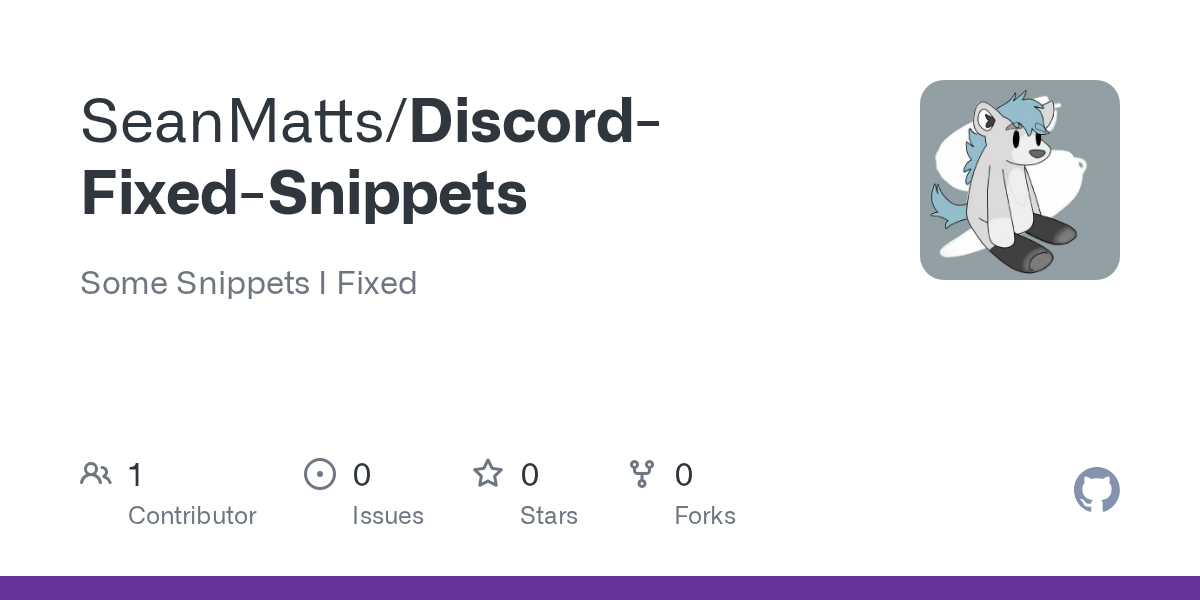
was bored, fixed some stuff, dm me if you see your snippet and want credit for the original or if you want me to take it down
https://github.com/SeanHarmanis/Discord-Fixed-Snippets/tree/main
GitHub
Some Snippets I Fixed. Contribute to SeanHarmanis/Discord-Fixed-Snippets development by creating an account on GitHub.
also, can someone help me make the emoji panel or whatever it's called be aligned with the Chat area?

wanna ask for the font family
wdym?
what is your font using
JetBrains Mono Light
btw the emoji panel should be aligned in original
nono that's a whole different thing from your snippet
actually lemme delete it it's just too jank to be left aligned
Interesting approach to the chat bubbles element
Yeah I have a 27" monitor really close to my eyes and I don't wanna move my head around so I keep it on one side
very rounded layout also
Yes I love roundness
in compact mode, how can i make the timestamp line up next to the message content like so?

i tried with inline blocks but i couldnt
has anyone made a css snippet to permanently remove those two buttons (nitro + shop)

[href="/store"],[href="/shop"]{display:none}
I hate

partly fixed

the class change tool didnt recognize some of the selectors used here
any reason why this works in everything but vesktop?
what the f is that
channel icon colors
just want to know whats so diff with vesktop to stop this but stable/ptb/canary and browser all have no issues

hmm ya it seems to be now


i want to finish fixing the theme quickly
but i keep dancing to Trance music in the background
help


now cut it down to one 
is css really making perf worse
real
yes

this will definitely test your pc's power
mfw my theme

my poor cpu then
it does for me
how strong is your cpu :3
and im only fixing this theme not actually developing it

I think most things are fixed atm
running idle with browser and vscode open

inspect element still crashing and logging you out on normal vencord?

suprisingly

I have too much bloat stuff installed
average commit change

real
https://cdn.discordapp.com/emojis/998735830359216189.gif?size=48&name=MenheraCheer2&quality=lossless

go go aoi
channel favorites are great
@sweet tundra can you test this for me:
@import url(https://raw.githubusercontent.com/SEELE1306/Modular/release/modular.theme.css);
where do I put this
yes css can impact performance, mostly by using bad selectors
at the top

in your quickcss file
very
i will have to put a big red disclaimer at the top to not use with weak systems LOL

yep just as I thought
grrr now I cant use it
i can help you with that
no support for discord vencord
oh yeah typing is kinda always choppy, but it does get worse and worse the more theming you have
now I wanna write a native client with your cute theme and layout
for vesktop you on ptb/cancary? by any chance as on stable that css code i posted up breaks but when switch to the others it works not sure why this is
imagine, discord c++
rewrite it in rust
lets rewrite discord in minecraft data packs


lets remake discord in minecraft redstone circuits


done, i can go to bed now


great theme, just a few things

this looks a bit weird

will look into those tmr
aoi rn:
so true
aoi rn:
:c
im overworked
i was fixing another theme yesterday wich took until 3:20 am
i know this is a big theme but it still lags a bit on my 13600k
discord performance is just unfortunate
i didnt start fixing it at 1 am or anything
me when non-European time format moment
AM and PM sucks sorry
oh yeah lmfao
didn't even notice
idk if its possible but maybe move the scrollbar to the edge of the box instead of inside the padding?

also some padding between names and message would be nice

real
is that a scrollbar next to the headers?


how did you mod the taskbar
does it add both the dock and the macos titlebar?
title bar on windows is impossible sadly
so is the titlebar just a homescreen widget
oh u mean the thing on top?
yeah the bar at the top
theres an option to hide the taskbar completely when the app is open

you can also add system temps and usage on the top bar
ah nice
only thing thats not possible on windows is that you cant replace the titlebar of every app with one that looks similar to mac os
you can however replace the volume slider to mac os or ios

go eep

real
you can use Rainmeter with the skin Droptop Four to replicate a macos bar
i've used rainmeter before
theres a free version of the app on github somewhere thats a few versions behind so if you want to try it try ig
nah i actually dislike macos navigation i was just interested in what it does
ah


imo 1. fits in better since it's more consistent with the rest of the panels
it used to be 2 but i recently tried out 1 and some people told me it looks ugly
damn
is there a way to add margin on the left side as well as the right?

padding-left would probably be better
fair
it just adds it on

this cuts it
ohhh is the box just a psuedo element
try left: -10px;
think so
or margin-left: -10px
changes nothing, i think it's a hard limit
padding doesnt move, margin gets cut
ok this works:
.username_d30d99::before {
  content: '';
  width: calc(100% + 10px);
  height: 100%;
  border-radius: 5px;
  background-color: currentColor;
  opacity: 0.3;
  position: absolute;
  margin-top: 0px;
  z-index: -1;
  margin-left: -5px;
}
#app-mount .header__39b23 {
  overflow: visible;
}```thank you!
I know everyone has their own preferences and opinions
But this is the wrong opinion, in my opinion

someone an idea of css snippet to swap the old logo back to the vencord toolbox ?


idk you could look at the commit to see if you can find anything
@south sapphire
[class^=wordmarkWindows]
thanks bro this channel wasnt on my list
hi
how do i get this pill
to show
it shows in the big user popouts
not the small one


You must have hidden it somewhere in your css
By default there should be a black pill
what is the pill thing?
bcs uh
oh wait
hold on
that didnt work
what is the pill element thing?
bcs i cant inspect bcs discord crashes
I'm not on PC right now, you could try using Vesktop which actually supports inspect elements
vesktop best
^
^
got it back
".profileBadges__7a7cb{
background-color: var(--profile-body-background-color);
}"
how do i get this to be on the left? i got it to the right side and idk how to get it to the left

give right a negative value


okay
or the chat element margin bottom
no
how do i do it for the message bar again
I'm on mobile right now
okay
fixed

also fixed


add a ; at line 8
what's the point of webkit properties?
oh
can you post that css please and thanks..
i cant post in #🎨-css-snippets
no because its reserved for cute people only
ya i did a css and cant so psoted it here i asked someone who could, if they can but ya just post it here bud
post it here and hope that someone approves it to post it there
okay
hold on
/* fancy typing indicator */
:is(main,section)[class^=chatContent] > form > *:last-child[class^=typing] {
top: -24px;
margin-right: auto;
width: fit-content;
border-top-left-radius: 8px;
border-top-right-radius: 8px;
background-color: var(--background-secondary-alt);
border-radius: 8px;
-webkit-box-shadow: var(--elevation-stroke), var(--elevation-medium);
box-shadow: var(--elevation-stroke), var(--elevation-medium);
}

a previous version of this is already there in #🎨-css-snippets
oh okay
my bad
well its here for ppl to use then ig
i had a feeling it was already done but i made it myself lol
the first selector is copied from F53's snippet
you have barely changed anything lol
the selector only needs like [class*=typing_] and line 6 7 10 isnt needed
maybe line 4 too
before I even try, is this possible to do with css alone? https://betterdiscord.app/plugin/DisplayServersAsChannels
BetterDiscord
Displays Servers in a similar way as Channels
exists iin #🎨-css-snippets
o wtf

how do i bring back the inner colour borders on the nitro profiles (like the outer padding)

I dont see any problems there
my CPU works fine with vencord and other opened windows

you have a much stronger cpu
how do I inspect element this, f8 doesnt work for some reason

and focusing states also did nothing
have to pause via devtools
use #📜-js-snippets message (paste in console)
if you want to do it manually

thank you very much 🙏
is there a snippet to hide the events thing? i cant find one but j checking

use devtools, click the events thing, give it display:none
what about break on f8 plugin?
aoi i got a little present for you

@lunar folio 
whenever i do ctrl+shift+i my discord crashes, im on latest desktop version
this plugin didn't work for me when I tried to freeze it with the search options open, but the snippet with the timed freeze did the job #🎨-theme-development message
not sure why, but this has always been the case even a few years ago when I used betterdiscord (tho i forgot how I dealt with it then)
use vesktop or browser discord
try vesktop
the behaviour is a little weird, from my testing you have to be focused on the app for it to work
this
kinda like this

doesnt work
check the thread, i j updated it
check the thread
where can i see css selectors?
is there anyway to move vencord settings to the top of the settings view?
in settings of the plugin that named "settings"
probably yeah
ill check, probably just a oneliner
you need theming attributes plugin i think
is there any way to make these folder icon not show up in the sidebar?
plugin: better folders

yeah, folders get an extra class when opened if i remember correctly
display none i guess(?)
didnt test, but [class^=folderIconWrapper_]:not([style]) {display:none} should work
nevermind lol
hmmm
anyone got a luffy theme? rlly need it
luffy?
ye?
what is luffy
i dont have to ask you again if you said luffy, i can read your message twice if i need to
nvm i found an img to css converter
meant one piece
the funny one piece guy
well if you wanna have a luffy image as your background, i got a treat for you
hm?
GitHub
shiggyshiggyshiggyshiggy. Contribute to coolesding/shiggycord development by creating an account on GitHub.
whats that
so do i paste whats in the github into themes
you paste the raw link into online themes
ok ty
bruh
?
codeblock jumpscare
what
those are variables you put at the top of quickcss to change things about the background
o
btw
do i paste whats in the github
you then get the link of the image you want and replace "unset" in the --bg-main line with url(LINK)
into the css editor
tell me if you find issues
i kinda didnt get it. do i add the :root thingy or the github
you say it panniku
coz the theme us ent is js making sparkles
its snow, the default configuration is just as an example
*trying to write from phone because vesktop is dead
you put the theme link into online themes and paste the variables into your quickcss
o ok
replace link with the image link
@wispy flame
@import url("GITHUB URL");

COPY PASTE THAT CODEBLOCK HERE
.
question. Do i add root into the online themes or the raw
you can also have a settings background but youd have to import another link for that
in link replace that with your image link
copy the codeblock i sent
COPIED
then you paste it into quickcss
does it work
and either use @import like panniku showed to use the theme or put the raw github link into your online themes section
its really not hard
ok
its my first time using the vencords themes. i js used apparence w fake nitro before
understandable
yes, because currently nothing has a background
what happened

OH
you have to add some background
you probably didnt replace the link with your link, did you?
ok vesktop is back
well i need a css background right?
wrong
not a css background
just a image link
o ok

this is what it should look like, just with your link instead of https://raw.githubusercontent.com
GitHub
GitHub is where over 100 million developers shape the future of software, together. Contribute to the open source community, manage your Git repositories, review code like a pro, track bugs and fea...
o
and then at the end of the link you close with ) and tell the program to go the next line with ;
ight
thats the basics of changing a variable to a link
wait a min. do i copy image address or link address?
..
hm?
image address
kk
whatever gets you to the image file, not the webpage that contains the image
@vast delta where

not necessarily compatible with themes
finally it worked but.. its kinda showing multiple images.
interesting
can you show your quickcss
;-;

its kinda long
at the end?
best would be right below your variables
kk
do i need transparency
like this?

yes
yes
base64 encoding an image and putting it into your quickcss isnt really a good idea because its annoying to edit but it works
didnt fix
didnt fix?

i can send full img of my quickcss but its gonna be like 1-2 imgs
thats not the issue


oh
you can also copy the code into your quickcss if you have it being updated
wait what the variable doesnt work
?
i gave you the wrong variable LOL

replace --bg-main-overlay with just --bg-overlay
OH
kk
i had it wrong in my quickcss and didnt notice because i never turned the snow off

and remove the other two dashes
---- -> --
you only need two dashes
if you want a version for your settings i can send you that
didnt quite understand what u meant by tht
@vast delta is there something wrong with this
:root { /*Backgrounds*/
  --bg-main: none;
  --bg-overlay: url(https://wallpaperaday.files.wordpress.com/2021/05/wallpaper335.png?w=1024);;
  --bg-settings-background: unset; /*Change the main background colour*/
  --bg-settings-overlay: unset; /*Make an animated overlay like the default example*/
  --bg-settings-overlay-animation: unset /*Advanced: Add an animation to the overlay*/;
}```the same thing but for your discord settings
so they posted this css snip but its classing with another css and making the typing go in the middle any way to have it ignore the css causing this and still have it go to left side?

yeah use --bg-main as your main background
ight
overlay is for something like transparent gifs, just like i have it with the snow particles
which also means you can have a red background and those snow particles

is the quality bad coz its a disc theme? in google its rlly good
Is it possible to @import a local file within QuickCSS? I tried dropping a CSS file into AppData\Roaming\Vencord\settings next to the quickCss.css and importing it, but it just did nothing. Does it have to be served via web?
again, try turning off all themes
i dont rlly want particles
is the quality bad coz its a disc theme? in google its rlly good
there is a local themes section in your settings under themes
? i wasnt talking to you
just an example

i js did it to get ur attention
the quality is bad because you put in an image of smaller resolution and basically made it bigger until it fits your screen


if you want a better resolution, the image you use should have a higher resolution
o ok. any way i can find out what resolution do i need
like how much?
you are using the link to the webpage, not to the raw file :3
WHAT
bigger=better
Excellent, that did the trick, thank you.
hmm does 1024 x 768 sounds good
no in github silly
i dont rlly know what resolution do i get
try it
you probably have 1920x1080 on your monitor
i guess this is not possible cause of the other css that move jump to and new messages eh

well you would have to find out what is causing the issue and remove or edit it manually
good job!
well uhh 😓

oh you're a laptop user
not really i got a pc but its specs and ram is rlly bad
if you want it darker i can add a filter variable to add a brightness value
so i use lower resolution for better performance
then thats your thing
nvm removed the code and its still doing it
so i guess its this bugging it
i think ima go with 1024 x 768 ig
that just makes your resolution worse silly
then what should i do
use a higher resolution IMAGE
your bottleneck is your image quality, not your monitor or your settings
how high we talking abt
1920x1080
whatever you want

JPG to PNG Converter
Resize Image to 1920x1080 Online for free by using our Resizer tool. Just select and resize image to 1920x1080 dimensions.
just use htis and converted
wont work
hm
do you not understand how digital images work?
every image has a resolution, which basically means "how many pixels is the image high" and "how many pixels is the image wide", if your image has a low resolution, it will look garbage (unless it is supposed to have a low resolution, for example pixel art)
If you want a good looking image, you have to get an image that was made at a high resolution, you cant just take an image, stretch it out and it magically gains more quality

if you have a 100x100 pixel image and stretch it to 1000x1000, you will still have the quality of a 100x100 pixel image, just bigger
that image will always look bad when you are trying to fit in on your whole screen
with the screenshot
that makes it worse
hm
you will have to find an image that was made at a good quality
its like taking a photo with a bad and a good camera
^
if you take a photo with a bad camera, you can print it as big as you want, it will always look bad
i dont think there is a high resolution img. i js searched for liek 5 mins and i cant find a high res
send the site link instead
im using google img.
if you take a photo with a good camera, it will look good at about the resolution it was taken in, but when trying to print a normal size image on a house wall, it will still look shit from up close
then you probably copied the preview link, not the real image
i see. anw to fix that?
google shows you previews of images and not the real images so it doesnt have to load 198498124 8k images when looking for them, since those images are big and expensive to store
you go to the website where that image was uploaded and copy it there
so do i have to serach in a website?
yess
o ok

Pinterest
Apr 24, 2022 - This Pin was discovered by サン. Discover (and save!) your own Pins on Pinterest
ehre u go
nvm ill just find the high qual. for you
i am a slow learner btw ;-;
we noticed
the image you found was probably made at this low quality, which means that you wont find it as a high resolution image anyways
welllllll
internet is slow so its still loadinng

what is back
i see
send fr
time to reset vesktop :(
skill issue
https://i.pinimg.com/originals/53/1b/f2/531bf28ee274611ab3b887c9c301d88a.jpg
question: how can i edit the author and the description for a local theme


get usercss
https://cdn.discordapp.com/emojis/998717599963680768.webp?size=48&name=MenheraAngel&quality=lossless

Updated the css for:
- Removing the user profile popout "Notes" field
- Removing the user profile popout "Notes" and "Message" fields
- Removing the user profile popout "Message" field
These are the 3 variants:
/* Hide user popout notes */
.userPopoutInner_f545a3 .section__6f61e:has(.note_ba0c31) > h2,
.userPopoutInner_f545a3 .section__6f61e:has(.note_ba0c31) > div {
  display: none;
}

.userPopoutInner_f545a3 .section__6f61e:has(.note_ba0c31) {
  padding: 6px 0;
}

.userPopoutInner_f545a3 .section__6f61e:has(.messageInputContainer__768e6){
  padding-top: 0;
}

/* Hide user popout notes and message fields */
.userPopoutInner_f545a3 .section__6f61e:has(.note_ba0c31) > h2,
.userPopoutInner_f545a3 .section__6f61e:has(.note_ba0c31) > div,
.userPopoutInner_f545a3 .section__6f61e:has(.messageInputContainer__768e6){
  display: none;
}

.userPopoutInner_f545a3 .section__6f61e:has(.note_ba0c31) {
  padding: 6px 0;
}

/* Hide user popout message field */
.userPopoutInner_f545a3 .section__6f61e:has(.messageInputContainer__768e6) > div {
  display: none;
}

.userPopoutInner_f545a3 .section__6f61e:has(.messageInputContainer__768e6) {
  padding: 6px 0;
}
Can these be added to the #🎨-css-snippets channel and the old broken one removed?
/* Consistent Typing / Older messages */
.typing__6fd1d {
  border-radius: 0 8px 0 0;
}
.jumpToPresentBar__0ff7f {
  left: 0px;
  border-radius: 0 8px 0 0;
}
.chatContent__5dca8:has(.jumpToPresentBar__0ff7f) .typing__6fd1d {
 border-radius: 0px;
}
.chatContent__5dca8:has(.typing__6fd1d) .jumpToPresentBar__0ff7f {
  margin-bottom: 32px;
  padding-bottom: 0px;
}
/*  */```
to fix #🎨-css-snippets message
i can send in the channel , but idk if i shoukd
@dusky hare ^
And this removes the "Notes" field from the user panel
/* Hide user panel notes */
.userPanelInner_eddf4c .section__6f61e:has(.note_ba0c31),
.userPanelInner_eddf4c .divider__2bbbc:nth-child(5) {
  display: none;
}

hm
please refrain from using the spacebar selector with elements that exist a lot of times
the spacebar selector
the what?
Hey, can I have permission to send messages in #🎨-css-snippets. I'd like to post this small css that makes embeds look better
.embedFull__8dc21 {
    border: 2.5px ridge;
}
no color?\

also, #app-mount is not neede
oh?
you're right, it isn't needed. ty
np
what does this fix?
see the screenshot
looks like it fixes the color to match if so this was posted few hours ago bud from someone else
unless im wrong but not sure
it places the "old messages" bar on top of the "typing" bar
compared to the split one, or the one above from the author
so this would be better to run when not running any other css that move them bars ya?
you can use this #🎨-css-snippets message with mine
just make sure to remove the width property from theirs
.class .class
it can quickly cause performance issues


then that is your issue :P
You could try switching to Linux
https://tenor.com/view/mujikcboro-seriymujik-gif-24361533

💀 what, ok maybe in some obscure cases but rn? I doubt it's an actual issue, but if it is I'm willing to see those performance issues that you're talking about 
I use it a lot in my css
otherwise I would have to write out the entire tree
which is probably why it is lagging cutie
there is always a way around, i have not used it once in my code before
My web dev prof has yet to mention it 
yeah sure I can nest it like a > b > c, do you prefer this?
is this correct

as long as its working there is no incorrect
they must be trolling
say you need the element f from a tree called a
but he uses space selector 
it isnt
it's obviously better to write .a .f then .a > .b > ..... > .f
in some occasions its alright but for example doing html class is entirely useless and makes the code worse for no reason
I agree
when discord does .theme-dark .class then its fine because the space selector is required for functionality
if you are writing more code than you'd actually need, the file would simply go up in size and affects performance
then it is incorrect lol
nesting should just fix the space problem
I'll take a look to rewrite it but I stand by the fact that this is not an issue here, you're just making it harder than it should be
i am not saying you need to do that
order does not work here, even with important
if it's required to be able to post it in #🎨-css-snippets I will
definitely not
what exactly are you trying to do?
also show actual benchmarks how a space vs an entire tree of code would cause performance differences
I'm curious
move counter below fav
im not saying an entire tree of code is much better, but i think its always better to try and not use that selector because it can quickly https://cdn.discordapp.com/emojis/1104534573313962175.gif?size=512&name=explod&quality=lossless

exactly what I was thinking
what counter and where?
red box. below star.
WHERE? WHAT RED BOX

it's either that, or you will risk not specifying your selector enough and affect unwanted things, or your performance will suffer from the long ass selector
what about when you need more specificity
i write a lot of #app-mount .class, would that affect performance?
I did a quick google and all I could find was this: https://stackoverflow.com/a/29761447/19235593

Stack Overflow
Given the following HTML:
<ul>
<li>
<a ...
For the same set of declarations, which one of these two rule sets would be more advisable to use taking their performance into