#🎨-theme-development
1 messages · Page 5 of 1
wrong
give all existing servers an order of 1 
if just flex reverse the guild list

Css is the best language
he’s got a 
Fr
css stands for cool scenic scripting
Css stands for counter strike stylesheets
counter strike source
computer, start shigging
I have no idea what to do next with my current layout
running out of ideas already
css block for blurring all images in chat
    filter:blur(20px);
}
img:hover
{
    filter:blur(0px);
}
.mediaAttachmentsContainer-1WGRWy, .nonMediaAttachmentsContainer-3s1dgm {
filter:blur(50px);
}
.wrapper-2PSQCG[img],.originalLink-Azwuo9[img],.wrapper-3kah-n[img]{
    filter:blur(0px);
    border-radius:50%
}

.embedImage-2Ynqkh, .embedThumbnail-2nTasl, .embedVideo-2ixt5A
{
 filter:blur(50px);
}
.container-2sjPya[img] {
filter:blur(50px);
}
.clickable-LksVCf[img] {
filter:blur(20px);
}
element.style {
filter:blur(0px);
}
.chat-2ZfjoI.container-ZMc96U[img] {
    filter:blur(20px);
}

.contents-2MsGLg[img] {
    filter:blur(50px);
}
video{
filter:blur(50px);
}
video:hover{
filter:blur(0px);
}```That's not how you use |=, it searches for your that attribute followed by a hyphen. You'd just need this [id|="imageContainer"]
Also img isn't an attribute but a element, I'm not sure what you're doing there
Try just this
.imageWrapper-oMkQl4 {
    filter: blur(5px);
}

.imageWrapper-oMkQl4:hover {
    filter: unset;
}
maybe make everything like 1 or 2 px smaller
and try making the icons smaller than the text, see how it looks
Also, ik this is a plugin, but I want some opinions on the UI I've been working on from a design standpoint


looks like the android theme selector kinda
#🎨-css-snippets message where did these percentages come from

it was the best way to incorporate many (up to 4) colors
I also took the design from Discord's appearance settings

Even shorter with :not(:hover)
How are psuedo class selectors evaluated though? If it searches for :not(:hover) first that'd be a bot worrying
I had a quick look but I only found a stackoverflow post with 1 answer and no source. The answer does say that the regular selectors come before the psuedo class selectors though, so here's hoping
anyone know how to make those things not look bad on mac

step 1: switch to Linux
step 2: buy a new computer 
i once asked in the clearvision discord how to remove the circle behind the avatar that would mess up the theme all the time because it "couldnt be moved" and they said it was impossible and that they had already tried doing it. this is what it took css .bannerSVGWrapper-2CLfzN>mask>circle {display: none;}

gigabran
tessie w

doing anything in scss is pain compared to doing it in any other language
no idea how all that works, i just do css and thats it haha
it's like python syntax but with brain damage
you have my interest, vee

i have 3 computers but i wanna use discord at school
||during school||
its not impossible, I did it with some code I had saved from somewhere, I think from dablulite or something on the bd server
/* background behind the avatar */
.bannerSVGWrapper-2CLfzN circle {
    cx: 50%;
}
it has some bugs in some parts

so good, instead of paying attention 
also this is the full thing if someone wants https://zeylogger.github.io/snippets/centeredprofiles.css
i sent you one part of like 100 lines cutie, of course its not gonna look right
the circle is supposed to be gone
oh im stupid lol
hahaha
anyways, i've been updating my radialstatus snippet and i now added the profile popout to it, i might even add the full profile to it as well

are you recreating radial status or something?
i already had
but only for chat and side bar
also, its more efficient, easier to read and has more, useful variables
(and still gets updated  )
)
the original still works, has like some bugs i guess, but yeah not very good when you look at the source
"some bugs" like the entire functionality of the snippet not working
idk I just saw like 2 or 3
ive spent some time with that radialstatus thing and let me tell you
A: If a user is online with their phone, they are ALWAYS shown with Green
B: Every user that is offline is shown as online
C: The little phone looks bad and is badly positioned
D: As you already mentioned, the entire snippet is badly optimized and hard to understand/fix
yeah the first one its like a variable or whatever, kinda lazy
idk about the second one but the rest its true
and now i present you, radialstatus v2 css @import url(//raw.githubusercontent.com/xdcoolesding/shiggycord/v2/Files/Radialstatus.css); :root { --rs-online-color: #43b581; /* default: #43b581 */ --rs-idle-color: #faa61a; /* default: #faa61a */ --rs-dnd-color: #f04747; /* default: #f04747 */ --rs-offline-color: #636b75; /* default: #636b75 */ --rs-streaming-color: #643da7; /* default: #643da7 */ --rs-bot-color: #5865f2; /* default: #5865f2 */ --rs-spacer-color: transparent; /* default: transparent*/ --rs-small-size: 0.85; /* default: 0.85 */ --rs-small-roundness: 100%; /* default: 100% */ --rs-small-thickness: 2.5px; /* default: 2.5px */ --rs-small-glow: 0px; /* default: 0px */ --rs-small-spacing: 4px; /* default: 4px */ --rs-medium-size: 1; /* default: 1 */ --rs-medium-roundness: 100%; /* default: 100% */ --rs-medium-thickness: 2.5px; /* default: 2.5px */ --rs-medium-glow: 0px; /* default: 0px */ --rs-medium-spacing: 4px; /* default: 4px */ --rs-large-size: 1; /* default: 1 */ --rs-large-roundness: 100%; /* default: 100% */ --rs-large-thickness: 2.5px; /* default: 2.5px */ --rs-large-glow: 0px; /* default: 0px */ --rs-large-spacing: 4px; /* default: 4px */ }
try this beauty
it 100% works without any themes installed, if you have an issue, tell me about it
yes ill post it in css snippets in a bit
but first let me advertise for it
Now, the INNOVATING technology that radialstatus V2 is based on is way different and way more modern, instead of changing random, preexisting circles to fit them around the avatar, I (with a little starting help by Aoi) have made this snippet with the BOX-SHADOW property, which is MADE to make a shadow around the avatar
well, around stuff
i also added tons more variables, like bot color (because bots are not acknowledged as their own type) and a glow effect for the ring, which makes it look pretty, though it might look a little weird with a spacing above 0, i would always recommend changing that to 0 if you put a glow in
okay, enough of that, how do you like it zey?
I mean its pretty cool that it uses a simple thing like box shadow, looks nice with glow
from what I see it shows offline in chat, maybe because I removed platform indicators, and idk whats this that shows in my profile and some others, but seems to work

what the hell the code its short
you ALWAYS need platform indicators, sorry i forgot to say that
it hides them though
IKR haha
should be fixed
oh I guess platform indicators are also the reason bots show as online, but anyways
definitely turn them on, i'll actually make a variable to turn platformindicators off an on
but yeah, for some things i needed to refer to the platformindicator symbol because there was nothing to identify the state on
because discord, in their only time they shined, actually made most places the profile picture appears in with a tag saying "Name, Status"
so for example i have aria-label="coolesding, Idle" on me right now
thats also what i use almost all the time
as you can also see, i ignored the streaming thing because no one streams so i cant really work with it
I don't know if there is a better way to do that, but I have seen that aria label
what thing? the status?
yeah the streaming status has its own colour but no one streams :(
wait
you also need moreusertags i guess
because i identifry bots by their user tag
because again, there is no better way to do that
the tag i use on other users is just online for bots
I thought discord already had some way to distinguish bots from users
not for css i guess
there might be somewhere but i did it like that and it works
well I have no problem with just bots, but I say it because of some data-tag I saw on the code, I guess thats part of the plugin
yeah data-tag is that plugin
dashless w/ some fixes for threads and invisible channel mentions
(i can't post in #🎨-css-snippets so i'm posting it here)
[data-list-item-id^="channels___"][role="link"], /* channel list */
.children-3xh0VB:not(:has(path + path)) .title-17SveM, /* channel top bar title */
x.channelWithIcon:not(:has(path + path)), /* channel mentions in chat */
.channelNameContainer-4pFmC-:not(:has(.parentChannelNameClickable-YXl967)) .channelNameText-2q3Lge, /* channel search results */
.parentChannelNameText-3kDeNS, /* thread search results */
.autocompleteRowHeading-3EcwU6 /* text channels matching # */
{
    font-family: "Dashless", var(--font-primary);
}
thank you for this! 😍
pro css tip use // terminated with a ; for comments
invalid syntax is simply ignored 
uniornically viable
because if you use /* ONCE then you cannot comment out that entire block anymore
its so stupid
uh? I don't get it, aren't you supposed to do */
He's saying that you can't have comments within comments doing it that way. If you highlight a block with a comment in it and try to comment that block out the space between the end of the original comment and the end of the block will be uncommented
does anyone have a css snippets or urls for getting plumpy icon pack in vencord?
oh I think that happened to me one time
Looks like no one converted it yet?
force @tame shore @graceful vapor to make
kek
i just realised whatever css I currently have matches your request lol

Glad you like it :3
:0
.contents-2MsGLg .avatar-2e8lTP {
border-radius: 25% }
for the avatars
#🎨-css-snippets message for chat bubbles
Was it not more about the icons?
That seems to be flowercord. They were asking about specifically the icon pack for it I think, if you look at the image under the Plumpy heading it's got non-standard icons
im still using an old version of this with borders
Oh I see now
Totally missed out on the new icons
I didn't notice it when I first looked at it either, it took me far longer than it should have considering they said icon pack
I was trying to figure out why there was 3 sets of the same images
I find it funny that for the chat messages statuses, the last platform indicator will be prioritized

so that if a user is online on pc but idle on phone for some reason, it will show up as yellow instead
yeah idle gets put over online because people on phone are called "Online On Mobile"
and when im filtering for the world "Online" that just makes it worse if i dont prioritize over online
I don't get why Online on mobile has to be a separate status
i dont get why it has to include the tag "Online"
call it "Mobile"
imagine, the tag would say "Idle" "On Mobile" so it would fit together with each status
but discord employees arent that intelligent


bd jumpscare
hi i changed my github name to coolesding so if you use my imports you will have to change from xdCoolesding to coolesding
my eternal quest to save single bytes in css

GitHub
…horter, dont need to pr this
also might have broken it (HOW AM I TO KNOW BD SUCKS SO MUCH THEY DONT SUPPORT //)
because
it
is
LESS BYTES
i have 9 different imports active right now and they all save 6 bytes without the https:
you can't Ctrl click on the link
its literally 54 bytes less memory
That's your issue
i own the rep, its the first thing i see when opening github
import less
should i export?
just copy paste the code into your css
my quickcss after doing that: https://github.com/mwittrien/BetterDiscordAddons/blob/master/Library/_res/0BDFDB.raw.css
GitHub
A series of plugins and themes for BetterDiscord. Contribute to mwittrien/BetterDiscordAddons development by creating an account on GitHub.
Beautiful
i might actually make a reworked version of settingsmodal that isnt shit lol
What modal
that makes the settings a little window instead of a whole new page
also, the settingsmodal snippet doesnt work on vesktop so another reason to make it
actually, brb ima make it
lmao devilbro is a genius

wait what it is correct on github but if i copy it it breaks
lol done

that looks so pretty i need this
how do i call the (here highlighted darker) edge around the settings window?

wait i just noticed its not centered OMG IM GONNA DIE
fixed
i really need help naming my variables lmao
this sounds so ugly

my idea is a short "tag" for the snippet it is for, for example for the oneko snippets i have "oneko-" and id like to have that for my settingsmodal snippet as well, maybe "sm-"? that would be unintuitive though i think
i have rs- for radialstatus but that one actually works imo
FloatingModal or whatever
wtf these borders look actually epic

border: 1px solid transparent;
border-image: linear-gradient(to bottom right, #b827fc 0%, #2c90fc 25%, #b8fd33 50%, #fec837 75%, #fd1892 100%);
border-image-slice: 1;
so gamer
// isn't the issue. You can't import raw files on BD, you'd need to enable pages and use that link
Still wouldn't recommend formatting your imports that way, it's ugly if nothing else
lol you removed only 1 https in import line instead of remove like 128 https in dist.css
they should shrimply support gitub raw
It'd be nice, but Zere seems pretty set that he doesn't want to
there is no argument against it
only arguments for it
other than github tos but
- abusing pages as cdn is also tos im pretty sure
- who gives a fuck
Yeah I'm pretty sure that's his only reason. He said that thing about it not working in the future, but I don't know what he meant by that
I'm a dummy, but I can't seem to see anything in their acceptable use policy forbidding it anyway

It doesn't work for mobile if I do that
feels like something you'd see in a forum

I think I know why
Lol no I don't, I'll get to it when I'm home


Change this to calc(var()/2)
I made it half the border radius because then its more intuitive
0% is no roundness at all, 100% is full circles
But with css 50% is already a full circle and then nothing changes as you go up
Actually, I can fix it
Get your import reloaded, it should be fixed
all good now

I didn't notice this because when making it I was only looking at 0 and 100% lol
also fixed for the large one
np
Yeah I saw that one didn't have it as well
add this line
.avatarHoverTarget-1zzfRL, .avatar-3QF_VA {
    background: var(--profile-body-background-color);
}
I removed the circle on purpose
to improve visibility
I can make a variable for that though
just use the default discord variable
also i set all the avatar scales to 0.85 like my orginial snippet
1 is just too big lol
i just knocked half of the variables of my theme
I don't want it to become another ClearVision theme
actually looks good now

maybe i will move the online members somewhere else
but too lazy/busy
--rs-avatar-background: red;
You can change it to anything (yes, even PICTURES)
worth the starboard

I love variables, I think a theme can't have enough, maybe it should be a little sorted though
I used to think having 50 variables for a theme was good
until it become too much of a mess without a clear direction
For example I could make a :root for categories and put a comment over them so you can click the close button on it that no one probably uses
I'll make what I just said later haha, I think that could actually make the experience so much better

yeah but I cant be bothered
I was forced to use hsla to support normal discord
But then I thought fuck it
Color-mix was way superior
also advert for vesktop
vesktop best
You best
I'm blushing.
:3

Because you are invisible, idiot :3

ugh okay, noted


Yeah I'll probably make a minified version for each of my plugins and one where I put everything together so I only have one import

is there a way i can replace clydes check mark icon and ai text?
css can change the check mark
how
i know a decent amount of css but
idk how to replace an svg with an image
opacity 0 on the svg then an :after object that has the background of your picture
You can't add psuedo elements to replaced elements. Your best bet in that case is just replacing the path as that svg doesn't have a wrapper of its own. Something like this
.botTagVerified-2KCPMa path {
    d: path("<path>")
}
An alternative is adding a mask, something like this
.botTagVerified-2KCPMa {
  mask: url('data:image/svg+xml;utf8, <svg>') center/contain no-repeat;
  background: var(--white-500);
}
@vast delta Sorry for the ping.
It shows idle but on profile shows online.
Also for me every circle shows offline in the chat until I click on their profile then it shows the real status.

The last one is just a bug with the platform indicator plugin, I can't fix that
Hm that's weird, I'll check later
I think I know what's the reason and I think that I might not be able to fix it
Is it also a platfrom indicator issue?
That looks like either an issue with my snippet or a you problem
discord default css contains some horror


fire
why not just object-fit? wtf
discord is weird
they use ancient vendor prefixes for browsers that won't even be able to run their js
So they fix a small detail for a scenario that will never be able to occur? Typical discord efficiency
Someone should make a plugin to deactivate all native CSS so we can just do it ourselves
Yeah true
Aoi you'd probably be down to collaborate on that, right :3
I'm serious about that btw
And maybe discord will actually use it if we make it public
No
fy
You'd make all the variables hsl anyways
Ain't no way I'm making all that
Yeah you love insensible colour coding
You want more red? Well fuck you, open your browser
Hex is literally rgb
Imma change to HWB then
Hex is actually more complicated for normal human beings than rgb since it uses base 16 which we aren't used to (but should be)
I don't even wanna know how this works
what the fuck is HWB? hue w Brightness?

That's hsl silly

Lch Looks good ngl
Still, you can achieve all this using hex/rgb since that is literally how you display pixels
Hmm supposing we do embark on this project, how blank a slate are we thinking?
Just yeet Discord's stuff and use browser defaults, or go full nuclear and reset even browser?
You too could look this good

God this is worse than arch linux
as an arch user, i agree
Why is Arch Linux bad
arch isnt bad, its just that you have to install a lot of packages to have something functional
yop
i wrote this ages ago so now I can speed run arch install in 5 minutes
i just made a silly pacman hook to keep a list of installed packages https://github.com/Vendicated/fotdiles/blob/arch/pkglist.txt
then when u reinstall you can just install all of them at once

No swap?
i usually just use a 2gb swapfile at /Swapfile
can just make that any time, I think I went like a year without
Why is that a skull lmao
You shouldn't use swap partition on an SSD, zram works way better, a swap file makes way more sense
wtf
plain html discord
hi anyone remember the custom super reaction snippet? yes? well, i made it only work for https://cdn.discordapp.com/emojis/1024751291504791654.gif?size=64&name=shiggy&quality=lossless reactions

epic css

thats not css cutie, thats a status
i manually made it so that the stock discord css isnt loaded and it now loads from vencord in a file on my computer, i love how its broken for some reason haha
i unminified discords stock css file

no questions asked

discord devs are monkeys using typewriters

i understand the unused classes
i mean, its still wasted isnt it?
Discord use css modules which makes their code smth like this
Button.module.css
.button {}
```**Button.tsx**
```jsx
import Classes from "./Button.module.css";
<button className={Classes.button} />
So to remove the css class they also need to update their jsx
so out of laziness they might just leave empty classes
still stoopid
correction: the issues were caused by my beautifier (L in chat for that website)
still, it has a bunch of empty selectors (and code for objects that probably havent existed for years
I believe Ven was saying he went a year without swap of any sort. That's why skull
you don't need swap
I don't want no processes killed is my issue
can i use variables as fallback for variables or do i have to do some janky stuff to do so?
just like it does if --variable-two is a number like 41px
in this case, YkUktl is shown, even though the fallback of --variable-two should be chosen

oohh this is my fault, sorry
the fallback only gets chosen when variable one isnt set at all, not when set to an invalid value
i got the answer to my issue for the next person that reads this and needs it
the fallback only gets chosen if --variable-one is either not set at all OR set to "unset" , so only in this case OR the case the line defining --variable-one is removed entirely, will ykuktl be set to --variable-two, which means "none"

ah yes, i forgor
welcome to the fun zone
fun bun
what do you mean by test build? do i have to make one my own or can i just use it?
you have to use the devbuild because it's a PR still
how do i get?
do u have the github cli installed
github cli?
okay got it
anyway yes this was my small attempt at doing it
it just contains all of the skins and makes it into a dropdown
have u got a dev install as well
LEWI I DO CSS NOTHING ELSE
FAIR ENOUGH OKAY
well then lets do this
u write usercss
i load it
i show u whta it does
oh god no, please let me do it live haha
send me what i need to know to do it myself
git clone https://github.com/Vendicated/Vencord
gh pr checkout 1700
pnpm i
pnpm build
pnpm inject
oh cutie, tell me that earlier
this will install the devbuild with usercss support
so you can have fun with it
then u can use the writing usercss guide from stylus to help
it should work now, gimme an example to prove it
WAIT DO I HAVE RNG NOW????
FUCKING HELL YES
I NEED RNG
oh its a select thing
well, anyways, thank you, its working fine
ah no rng sadly
that'd be a funky thing to add though
maybe we can add some proprietary extensions one day
but yes, if you encounter issues or u get stuck, feel free to ask
i shall
i think i've written so many test cases for this now i breathe usercss
and i immediately will
in the user.css you sent, is there also a way to make another box where you can put in custom links? this is what all my oneko stuff is about :P
being able to make your own skins, use custom ones or even higher resolution ones
also, does usercss work in the quickcss or only in themes?
only in themes, theres no quickcss compiler
and yes! you can just use a text for that
and can i "hotswap" themes in vencord, so just edit the file while its loaded?
oki nice
unfortunately there's no validation, its not part of the usercss spec, but you can get users to put urls in like that
and yes, they should recompile when you edit them
nnnnot really
it's either vanilla css, uso (which is just css but it uses comments as variable placeholders), less, and stylus
so you can use extensions for the latter two but the former are just vanilla

change the text :P
* marks this as the default option
so Default* just means an option named Default which is the default
if you wanted to you could rename it to Oneko* and then it'd be called Oneko
hm this is weird, im trying to make two boxes, one where you can select a skin and one where you can put one in (i know theres probably a better way but i wanna play around with it a little until i feel comfortable) and its only showing one, why is that?
do you wanna dm for this?
oh sorry, my randomize file names beat ya :3
oh because i didnt make a default text
IM GETTING IT
IT MAKES SENSE
I UNDERSTOOD SOMETHING
ITS PROGRESS
oh yeah if you open devtools
whenever it fails to parse something
it should throw a warning
usercss runs in a "if there's errors it'll ignore them and try its best" mode
i see haha
i was missing a : when declaring a variable and it took me a good 5 minutes to find it
boom, look at this beauty
you can choose a default skin OR you select custom as a skin and then put a url in the box
now that i got this its time to add some cooler features :)
isnt it literally set right above it? WHY DOES IT SAY "unset" FOR --custom-skin????

my idea is that oneko-skin gets set to unset when choosing the custom skin, so that you can use a different skin in the --custom-skin variable
oh nvm i just had to put the second variable in another var()
WHY
im done with it!
this is the usercss theme for customizing oneko,
you can now change the skin to one of the many default ones
use your own skin as a link
change the resolution for skins that need a higher one (MISMATCHING RESOLUTIONS WILL BREAK THE ONEKO)
wait i called it onekohomeicon LMAO
Took me like half an hour to figure out how to change the "Server Profile" thing in the context menu from that new plugin to "Server Info" because I got it confused with edit server profile. It was only 1 line of code ;─;
lol
impressive
@cobalt haven you are revolutionary
how is there already a v2 api
I can't wait for v20 this December
np love

I'll integrate that into my v2 shiggycord
https://github.com/MiniDiscordThemes/SettingsIcons (@edgy sentinel ty for plugin that makes this possible)
GitHub
Adds icons to Discord settings, for use with Vencord plugin ThemeAttributes. - GitHub - MiniDiscordThemes/SettingsIcons: Adds icons to Discord settings, for use with Vencord plugin ThemeAttributes.
I don't get it, I am supposed to import the original settings icons theme alongside this one and the plugin right? but when I do that it doesn't work as intended

try not doing that
I put it in quick css but it shows no icons, like the options get a bit to the left but thats it
I mean right
do you have the new theme thingy plugin active? I don't remember it's name
it's something called theme
it adds new data you can use with themes
yeah
I have made le epic mistake
odd
theme atributes
gimme a min
did you bind it to your user id?
I thought that plugin was useless, but I probably read the description wrong
oh no problem
I did a dumb

should be fix once the github pages refreshes
oh well, just a little oopsie
GOD DO YOU HAVE FOUR INTERNAL IMPORTS??
you do know you can put in their path so you don't have to import
I used to do that, but error rate goes up if I can’t easily preview the svg
L
I mean you aren't going to remember exactly every single path of the svgs
yes but you can add a comment lol

red messages pog

LET'S GOO
hmm, vencord should have some way for authors to share themes
like a channel or on the website 🤔
Hey, does anyone Have CSS to replace the discord Logo with Shiggy? (Maybe animated)
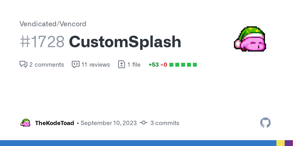
I made https://github.com/Vendicated/Vencord/pull/1728 but it does seem you can use CSS :P
GitHub
I tried to ask whether this is something that would be merged but it wasn't too hard to develop anyway :3
god I don't understand anything of what's going on in that scss salt
however i think my plugin might make discord load slightly faster since it waits for the animation to end lol
Now it is possible to align self messages to the right
you will see it pop up soon
could make discord into a material messager app with that
if its a snippet / import
most of it is creating a "map"* of data-tab-id : svg-filename and looping through to make the actual selector and rules
why do you even use css variables for the urls
wouldn't it be easier to just skip the variable entirely and inline it
semi-customisable if anyone cares to use other svgs
i doubt anyone will want to do that ngl
but sure, valid
I need to try the theme later, not on pc rn
basically just me in case I ever do finish the entire fluent icons theme
I look into the scss and question myself if this is even css
at this point not really, it would probably be less pain to use an actual language

A channel here would be ideal I think, it's forseeable that putting it on the website might look too official and cause theme support qs in the wrong place
not sure where you'd draw the line between snippets and themes though
I'd say a them has to have a cohesive design, but that'd rule out all those anime themes and I'm not sure we'd have much left
snippet fixes something or adds something minor
theme changes every color variable in the css
probably something like that
snippet smth minor that u can comfortably fit in one message
mini theme bigger thing that adds one specific feature like settings icons
theme something that changes the look of the entire client
all the people posting things in snippets that are just @imports:
that's not great since the links could stop working
At least half of the variables aren't used in the desktop client for whatever reason, so that one's out
There's some pretty big snipets nowadays
 they still presumably only change a small part of the ui
imo a theme is a full package that basically changes everything about discords design
a snippet is just an addon, something you could imagine as a switch in the settings, for example bottom server list or settings window
does anyone know what the color used here is #🎨-css-snippets message for the text that says vencord
nvm figured it out
can someone help me make this look better

here is it before

cant tell which i like more
- remove discord logo
why do u want a proper titlebar lmao
idk
im gonna try to make discord look like vscodium
anyone know where i can find more css snippets? like in other servers or something?
better discord
betterdiscord and clearvision are my usual goals
im thinking about opening a dedicated server for discord css stuff so its easier to collect stuff and work together
it would be cool, okay
every shiggycord v2 link has been changed to remove Files/ please fix your quickcss
also, all oneko variables have been changed and should be updated according to either
https://github.com/coolesding/shiggycord/blob/v2/shiggycord.theme.css or
https://github.com/coolesding/shiggycord/blob/v2/shiggycordadvanced.theme.css
Making a theme is kinda fun ngl
I used to hate css
Do y’all make your theme in quick css and then put it in a css file?
local themes hot reloading
its much better to do that, or maybe on vscode, but never use notepad++ like me, awful autocomplete

white
whats that
im trying to get it to look like vscodium on modern dark theme

idk who uses the default theme in vscode but anyways
it could be good so people can help you, but tbh I get it, it can be a little akward (I guess) if your code its terrible
i mean i could clean it up
well thats another option I guess
no lol, I mean kinda, but like probably basic knowledge

any plugins or css for making black usernames a different color for better contrast with dark themes?
.username-h_Y3Us[style="color: rgb(0, 0, 0);"] {
background: rgba(255, 255, 255, 0.5)
}
aoi? are you sick?
do you need something? cuddles? food? tea?
since when do you know a different colour system than hsl

help
Does anyone here know a css and create a new configuration on discord?
type appearance and profile settings
im always sick
time to do CSS In school
to read🙆🤓
speak english
speak binary
00010001 00010110 00011000 00010001
is this better

Mac user...
i use linux too
it's definitely not my taste, but I don't see anything wrong
...arch Linux?
oh shit the typing thing is so annoying
no but i was gonna start
and then i got lazy
i installed it
but
i didnt have time to set it up before school started so
💀

ngl it would be kinda funny to replace someones discord with a image of their discord
root and theme things? isn't that unnecessary?
can someone start typng rq
no
ty

I won't start typing for you. that would be an act of submission for you.
would you submit for me then
German
I would be submissive for you all day
I will set my language to Suomi instead
(you are booster, please give me money)
i dont have money
do English UK

do it

I donated to Ven :3
someone type pls
insufferable
css
see esc esc
I would say that human beings are actually a very wasteful product and they should be converted back to atoms so they can be reused to form cats
except shiggy... is shiggy a human?

ohhh, shiggy is fish
shiggy is shiggy
or chainsaw
is this canon?
shiggy is a cannon
SHIGGYCANNON???
death is a cannon
anyone know why my css order property isnt working? everything has display flex fixed
can someone type
yayyy
the parent element should be flex, the others dont need it i think
just try adding order to everything
also did you make sure nothing has display absolute?
(from the things you want to change the order of)
Does anyone know the css of the icon in the top right? Been looking and can't seem to find it

selector ??

I've found it under .wrapper-2PSQCG > svg but can't move it or change anything about it. I believe that my routing is incorrect tbh because there's 4 different paths to it
apparently its cuz its used as a mask

yeah i fixed it thanks tho
That's the wrong svg, there should be another in .wrapper-2PSQCG > .upperBadge-1d6YsW and that's the one you want.
You'll probably have to select it by the path which is kind of a pain, something like .upperBadge-1d6YsW svg[d^="M11.383 3.07904C11"]
.homeIcon-FuNwkv {
    background: url('https://external-content.duckduckgo.com/iu/?u=https%3A%2F%2Fsteamuserimages-a.akamaihd.net%2Fugc%2F965350806526295356%2F993A37B5716D4492C48AB57EE789286027D38BCB%2F%3Fimw%3D450%26impolicy%3DLetterbox&f=1&nofb=1&ipt=b648b4868baaae50006df08ac20975403e779ba97c90c33b887bf43f064192ac&ipo=images') center/cover no-repeat;
    min-width: 60px;
    min-height: 60px;
}```this doesn't work
why are u using the duckduckgo thumbnail
anyone got some other sort of CSS that works?
```css
/* css code here */
```
HOW?
show me a more cursed css
skill
```css
/* css code here */
```
the \ in question:
.homeIcon-FuNwkv path {fill: transparent}
.homeIcon-FuNwkv {
    background: url('https://external-content.duckduckgo.com/iu/?u=https%3A%2F%2Fsteamuserimages-a.akamaihd.net%2Fugc%2F965350806526295356%2F993A37B5716D4492C48AB57EE789286027D38BCB%2F%3Fimw%3D450%26impolicy%3DLetterbox&f=1&nofb=1&ipt=b648b4868baaae50006df08ac20975403e779ba97c90c33b887bf43f064192ac&ipo=images') center/cover no-repeat;
    min-width: 60px;
    min-height: 60px;
}
So I have to escape every single one, but I think I tried that out once and failed, maybe I used the wrong slash or whatever.
Thanks!
Only thing that can rival that is SQL code.
file too large
does anyone have a replacement for this, please?
.homeIcon-r0w4ny
ohhh lemme try
ddg allows proxying arbitrary images
petition to stop using the randomized suffixes in ur
Tried that and failed.
yess
stylesheets

```
/* css code here */

this is a little cursed but it works lolol
most of the backslashes i wrote out of habit i just escape anything that has markdown meaning
wdym
clean theme!!
thanks! you want the CSS?
yeah actually
try escaping ` inside inline code
whats the plugin for the more user things in the typing

hi\` bye
trolled
HOW
the backslash isnt doing anything but

Skill issue on my part then.
@safe python some of the @import just fucking tank the performance btw
then remove them
you can use double ` to do inlines
horror
console.log(`this is ${real}`)
IT'S NOT
idk they might just tank it on my shitbox
doing some trolling
u can kinda use them
like
```cursed template ${String}` ``

because it truncates the final spaces
but it thinks u want a codeblock so u have to press enter with ur cursor at the start of the message
😭
I managed to split the container .container-2o3qEW into two separate containers, but the member list one is overflowing and hence there is no border radius at the bototm
any way to fix it?

I love red and everything, but MY EYES.
red is for highlighting the problem only
Oh, thank God.
If you want your eyes to bleed, check out legacy cyan's source
7k lines of pure hell
this list has 3 containers you can make use of
hide the overflow on the topmost
i'm using .members-3WRCEx .content-yjf30S
wait
the membercount is split already

hmm
try splitting using pseudo backgrounds
whats a pseudo background
just using pseudo elements as backgrounds
something like this?

yeah, something like that
just hide the actual background behind the list and the indicators, then add pseudo elements that act as their backgrounds
would be a bit hard to realize for the memberlist
since it will end up with this ugly mess

pretty

something like this

wuh how
#vc-membercount::before {
    content: "";
    background-color: rgb(0,0,0,.5);
    position: absolute;
    top: 0;
    left: 0;
    width: 100%;
    height: 100%;
    border-radius: 8px;
}
#vc-membercount {
    position: relative;
    height: 50px;
    align-items: center;
    margin: 5px !important;
}
.members-3WRCEx {
    position: relative;
}
.members-3WRCEx::before {
    content: "";
    background-color: rgb(0,0,0,.5);
    position: absolute;
    top: 60px;
    left: 0;
    width: calc(100% - 10px);
    height: calc(100% - 70px);
    border-radius: 8px;
    margin: 5px;
    box-sizing: border-box;
}
.member-48YF_l, .members-3WRCEx {
    background: none;
}
very weird code, just to fit the default discord
change it how you see fit
hmm this is weird

Does something like this not work?
.container-2o3qEW {
    background: unset;
}
.membersWrap-3NUR2t {
    margin: 10px;
    border-radius: 10px;
    overflow: hidden;
}
.members-3WRCEx {
    background: unset;
    overflow-x: hidden !important;
    overflow-y: overlay !important;
}
#vc-membercount {
    background: var(--bg-overlay-chat,var(--background-secondary));
    border-radius: 10px;
    padding: 10px;
    margin-bottom: 10px;
}
.members-3WRCEx .content-yjf30S {
    background: var(--bg-overlay-chat,var(--background-secondary));
    border-radius: 10px;
}

nope, overflow

Do you need the scrollbar? You can just
.members-3WRCEx::-webkit-scrollbar {
    display: none;
}
to solve that
don't hide scrollbar if this is supposed to be a public theme
yeah why the fuck do people hide scrollbars 😭
use overflow overlay
I just realize I can already show people's online statuses directly in messages
no need to open member tab
so i can avoid styling that for now
Hey, that scroller doesn't work properly on servers of this size anyway. We should be able to hide it
vban @spice aurora scam
Done! 
Can't believe you stole everyone's free nitro like that
vban @balmy torrent I wanted free nitro
Done!
sad
ah yes, who needs settings

nobody
L
why? lol
idk, you made it probably
it's not my settingswindow snippet lol
actually, have I released it on CSS snippets yet?
I have not.
no you didn't
and I was trying to remove the payment settings part using the same shit salt made with the icons in settings, there was something for that but it also removed the friend request tab and I didn't wanted that, it just left the category but I didn't tried too hard to remove it
use the theme attribute plugin
i think it adds an aria label for it
if it's personal for you, it doesn't matter
yes I have that plugin, and I didn't tried with aria label so maybe I should
just look at the object and find whatever is distinct from all the other settings lol
and if you have to use :has, who cares
I don't understand, but at least devtools doesn't crash at an instant like before
use vesktop


do max-height: 4px for ultimate compact mode
whar

Do it
i could make a banner at the top of the screen when you have my themes that tells you to subscribe to vencord premium
you need vencord premium to get all the themes features
Then someone makes a plug-in that tricks vencord that you have premium
sounds like fake nitro
fake premium
Was told I should suggest this here. #🏥-vencord-support-🏥 message
I'm thinking this still might need some JS backing and not strictly CSS, but I digress.
I'm basically looking to get rid of the nitro gift icon and have all the rest of them in a "drawer" so they are nice an out of the way, maybe on hover of emoji it shows the rest, and scales the chatbox accordingly so I can reclaim space.

so much wasted space.
gets even worse when I have the member list visible
I only have this much space!

I believe there's a snippet for that in #🎨-css-snippets
Could you perhaps link? lotta content to scroll through. I'm doing so to trick out my client of course, but if you happen to know who posted it or etc
I'm a stupid and a lazy, but give this a go
.buttons-uaqb-5 .button-ejjZWC:has([d^="M16.886 7.999"]) {
    display: none;
}

.buttons-uaqb-5 {
    width: 40px;
}

.buttons-uaqb-5 .expression-picker-chat-input-button:has(.emojiButton-3FRTuj) {
    order: -1;
}

.buttons-uaqb-5:hover {
    width: unset;
}

.buttons-uaqb-5:hover .expression-picker-chat-input-button:has(.emojiButton-3FRTuj) {
    order: 1;
}
I found the one Aoi is referring to, but will take a look at urs as well
button[aria-label="Notification Settings"] /* Notif Settings in toolbar */
{
  display: none;
}
Any idea why that's not hiding the notifications settings icon on the top toolbar?
borrowed from #🎨-css-snippets message
a[href="https://support.discord.com"], /* help button */
.nowPlayingColumn-1eCBCN, /* active now sidebar */
.newChannel-3q3LPr, /* the "NEW" text thats next to channels */
.vc-toolbox-btn, /* VenCord's Weird Toolbox thingy. */
button[aria-label="Send a gift"], /* send gift button */
button[aria-label="Notification Settings"] /* Notif Settings in toolbar */
{
  display: none;
}
nvm, it needed div.
not button
Should be div[aria-label="Notification Settings"] or preferably .iconWrapper-2awDjA[aria-label="Notification Settings"]
Yep, realized after I posted.
Any fun way of moving the inbox icon to the left with others?
try
.search-39IXmY {
    order: 1;
}
Worked, Thanks!
I will find a way to fix this area again, there has been too many bugs since I first implemented the idea

aoiaoiaoiaoiaoiaoi
how do i change the scrollbars, like colour, border radiues and stuff
i forgorr
please send me whatever you have done to the message bar colour wise
(if its variables, please send me their value so i can convert hsl to hex)
i would like to include that style into parts of shiggycord
(if you consent of course bbg)
var(--background-modifier-accent)
color-mix(in srgb, var(--modular-accent-color) 40%, transparent)
    --modular-hue: 0;
    --modular-saturation: calc(var(--saturation-factor, 1)* 0%);
    --modular-lightness: 16%;
    --modular-accent-color: #b18e9e;
    --background-modifier-accent: hsl(var(--primary-300-hsl)/var(--modular-transparency));
    --modular-transparency: 25%;
    --primary-300-hsl: var(--modular-hue) var(--modular-saturation) calc(var(--modular-lightness) + 36.00%);
i knew it
thats all i can find for the message bar
its allllllllllllllllll hsl
userfriendliness
I suppose these three parameters also represent HSL

and I am more familiar with them than rgb
lhc yes
There's a bunch of different bits that go into it https://developer.mozilla.org/en-US/docs/Web/CSS/::-webkit-scrollbar
The ::-webkit-scrollbar CSS pseudo-element affects the style of an element's scrollbar when it has overflow:scroll; set.
oh god no reading
is this also related to css development

i cant wrap my brain around anything you've made, ill just make it myself :P
it has CSS
i guess?
let me explain it to you
oh dont worry!
so, the default color for the message bar is var(--background-modifier-accent)
when the message bar is hovered or focused, it takes the color mix between var(--modular-accent-color) (defined as HEX) and transparent
are those default discord variables?
background-modifier-accent is
modular one isnt
but I modified how background-modifier-accent behaves
which should be this section

too much hsl
i made the 36% up
but yeah thats how discord made its variables
oh wait no
I remembered copying it from someone else here
and ended up changing all the lightness values
i got an idea for my color variables
if one of them doesnt work because discord also has it, ill just use the british spelling on all of them haha
tolerable how?
salmon

i actually like it ngl
just the text might be a little dark haha
idk, just less buggy than the one I currently have
what do you mean by buggy?
im loving this!!!!

dont ask me why, i love the box-shadow glow
maybe merge the message bar with the bottom of my panel

and place the typing on top of it
I will get to it sooner or later, but I have work to do
wait, so you want the typing message above the messagebar, okay i got that
but what do you mean by merge with the bottom of the panel?
ooohhhh
while making the message buttons a bit more compact (i. e. hiding them all and only show on hover)
pretty hot ngl
i actually made that in my old shiggycord, i can send you it if you want
pls do
do you remember the name of the hide nitro theme?

.container-YkUktl:has(.avatar-1EWyVD[aria-label*="Online"]) {
    border-bottom: 3px solid var(--rs-online-color)!important;
}
The aria-label syntax has changed, and now they have their discord names in there, my CSS-fu is weak, How would I just simply look for the "Online" portion in that label, or etc.
someone hasnt heard of my radial status snippet

GitHub
shiggyshiggyshiggyshiggy. Contribute to coolesding/shiggycord development by creating an account on GitHub.
I'm using it, actually
ooh
well the way you have done it works, but it will also always be true if someone is on mobile
I am actually borrowing ur var to change another snippet that adds a border around profiles too
and you cant filter that because it says "Online On Mobile"
maybe ^= does what you want, youll have to look up exactly how it works
add a border around profiles?
oh you mean the entire profile thing
Mhm

uwu

yes uhm, what you do about it is... runs away
nuh uh come back
oki
tbh changing 255px to 60% also works

variable opinion?
idk, i dont deal with v1 shiggycord anymore
It's divs all the way down

i dont think i have much of an option
i could do one less div and replace it with a wrapper-Nh
i cant select the empty div otherwise though, unless i use first-child but i isn't that just the same?
or is there a performance difference?
Why not style the link rather than the weird div?
because its not about the link, its about being inside of .selected
it themes the selected channel

its not supposed to be a specific channel and it isnt supposed to be just that object
.selected .link ?
link would absolutely work
If it's a one-time use of >div>div then ig not too bad
afaik thats the worst way to select it when it comes to performance because it then goes from every single channel up to the end of the tree searching for .selected
i got it as that now
oh also it shouldnt be the link one, it should be the empty haha
my bad