#🎨-theme-development
1 messages · Page 1 of 1 (latest)
h
REAL
thank you overlords
hi
ello megu
can someone test my code
* {
    display: none;
}
:3
you can on vesktop
megu can u move this channel below #🧩-plugin-development
kthxbai

you will

my fault
yes
thank u
https://github.com/DaBluLite/DiscordColorways I need some colors for a shiggy colorway
yo how do I change the reply color in the css editor? Like what in :root does that? Also how do I change the color of the message box and notifications?
This is what I have rn:
/* IMPORT CSS */
@import url(https://clearvision.github.io/ClearVision-v6/main.css);

/* Import fonts */
@import url('https://fonts.googleapis.com/css2?family=Mukta:wght@800&family=Work+Sans:wght@300&display=swap');

/* SETTINGS */
:root {
  /* GENERAL */
  --background-overlay: linear-gradient(to bottom, rgb(0, 0, 0), rgba(107, 26, 139, 0.6)), url("https://i.imgur.com/qJ7oMPD.jpeg");
  --background-position: center center;
  --background-size: cover;
  --background-contrast: 120%;
  --background-saturation: 120%;
  --background-blur: 5px;

  /* THEME COLORS */
  --main-color: #ff00bf6e;
  --hover-color: #ff00f2;
  --url-color: #ff00f2d0;

  /* FOREGROUND TRANSPARENCY */
  --foreground-opacity: 0.9;

  /* CHANNEL COLORS */
  --channel-color: rgba(255, 255, 255, 0.555);
  --muted-color: rgba(116, 116, 116, 0.5);

  --reply-color: #ff00f2;

  /* MODAL BACKDROP */
  --backdrop-overlay: rgba(0, 0, 0, 0.8);

  /* USER POPOUT BACKGROUND */
  --user-popout-blur: calc(var(--background-blur) + 3px);

  /* USER MODAL BACKGROUND */
  --user-modal-blur: calc(var(--background-blur) + 3px);

  /* Font */
  font-family: 'Work Sans', sans-serif;
}
Actual Question ^^^^
How do I get the font to work and how do I change the default popout background (like when you click on an image and stuff)
change font-family to --font-primary
👍
the background highlight

some of it works but it does not work for messages


try --main-font then
oooh yeah
discord now looks like 30000 times better what
test reply
it's --background-mentioned
k
note that the value you put in also should be transparent
hmm not really working
wdym
I have --background-mentioned: rgba(189, 4, 206, 0.562); in :root but it's still broken
i love css
add !important between the rgba() and semicolon
why do themes have priority over quickcss

There's some PR for that

--background-mentioned: !important rgba(189, 4, 206, 0.562); Like that? (It's still not working 😢)
between the
rgba()and the semicolon
--background-mentioned: rgba(189, 4, 206, 0.562) !important; lol still doesn't work
also how do I keep my background from repeating at the bottom so it's centered properly. I know in normal css it's easy but it's not working
This is what I have @safe python
/* GENERAL */
  --background-overlay: linear-gradient(to bottom, rgb(0, 0, 0), rgba(107, 26, 139, 0.6)), url("https://i.imgur.com/qJ7oMPD.jpeg");
  --background-position: center center;
  --background-size: snap;
  --background-contrast: 120%;
  --background-saturation: 120%;
  --background-blur: 5px;


lmao they hardcode it


if I turn off or on clear vision it works for like 5 frames and then goes back
test reply
this channel was long overdue idk why i didnt make it earlier
Wtf new channel
horror
"How do I keep my background from repeating" try background-repeat: no-repeat
just do background: url() center/cover no-repeat;
oh yay now i dont have to use the betterdiscord server for css help
whar
@nilmod {
    /* There is no id field. The filename defines the id of the mod. */
    name: "NilExample";
    description: "An example mod for NilLoader.";
    authors: "unascribed";
    version: "${version}";
}

entrypoints {
    /* premain is the only entrypoint defined by NilLoader itself. */
    premain: "com.example.nilexample.NilExamplePremain";
}
forgot to download CSS for minecraft im gonna get purple textures 😭
Im happy about this channel made, i was really stuck at css about highlighting mentions.
Anyone using materialdiscord theme?
I'm trying to add mentioned background color but when messages all in together this happens. (No problem at single message or quoting messages though  )
)
I'm adding this because on this lovely minimalistic theme i cant see who mentioned me from full of walltext discord chat channels, so i scroll fast until i see highlight 

Previously i made highlighting unread channels and I made it work  , can share if anyone using same theme

6800 lines 
I kno right, painful to search something 
are all 6.8k lines one single theme
or seperate snippets
I mean... the theme css is
https://capnkitten.github.io/BetterDiscord/Themes/Material-Discord/css/source.css
if its seperate i reccommend making a repo to store them in a single file
then using @import url(); to import the raw css file
Oh i copied the theme on to quickcss
to make editing realtime
After i done i was thinking to do what you suggest later 
are you using some sort of chat bubbles
No, only using material discord theme and some kind of plugins not related to theme

Yup, can you quote this message?
quote?
Reply i mean, like you did
okay then
If its work on reply message mentions
oh yes
it works on single message

The main problem when someone mention by @hot cedar and in same message bubble it gets messier
@hot cedar
like that

try pinging me multiple times in a message


that has something to do with Material Discord itself
yeah.. when messages all in together its connected to keep minimal textwalls
thats too advanced for me
No problem altought, i'd like to do some brainstorming and find a way to make it work
(Thats how combined messages bubbles are)

Could you post that message bubble theme?(if not private) maybe i could make it seperate when someone mentions on same message content top on top

finally a good channel
whats wrong=
idk this name feels weird
css-programming
custom-css like the BD server
Did you put it at the top of your quick CSS


Weird
it works if i put it in here


Why is the first line empty
Imagine that's the problem
was moving things around
it actually doesnt seem to apply any CSS

Check if you have it enabled lol


Double skull skeleton
or wait
hold on
it does
triple skull
im sorry for my severe brain damage guys
😭
💅
💅
probably a stupid question, but I was wondering if it was possible to remove this thing, I am trying to remove that and center the profile picture, but I think it may not be possible

[class*=bannerSVGWrapper-] > mask {
    display: none;
}
I though I had to like mess with the banner, thanks
looks amazing, I just need to move badges and other stuff lol
Can someone help me improve on my OCD?
Trash code below
/* Popout Fix */
.popout-15UxD6 {width:147.49% !important;}
Images on what it does


HEY, it fixes it on every even zoom level okay
I tried rem and it was like 59.08 or something
wait why u even doing this 


CSS
scss soon
geniunely annoying at sometimes
or im bad at css

most
😭
good enough™️
oh boy have you done some weird things
this makes me want to scream some really bad things
ky-
this made me feel extreme rage, sadness and pain at the same time
me when transition on my themes
dont need to censor it, just say it
me when Mutual groups are not translated

no, I shall not tell people to unalive themselves just because of css
yes you shall :3
do you know how to make the serverlist be aligned at the bottom without breaking alignment
i tried changing the horizontalserverlist css (originally alignn top) to align bottom
but it goes below, and adding margin/padding makes resizing look weird
also, how to remove this tooltip

[class*=layer-][class*=disabledPointerEvents-]>[class*=tooltip-] {
    display: none;
}


awesome
almost got the DisplayServersAsChannels plugin to work within css
dont know how to fix this mess

the full raw broken horror css
/* .scroller-3X7KbA {
    /* width: 100px; */
    /* margin-right: 100px; */
    /* margin-right: 1px; */
/* } */
/* .scroller-3X7KbA > div > div > div > div > svg,
.scroller-3X7KbA > div > div > div > div > div > svg,
.scroller-3X7KbA > div > div > div > div */
/* { */
    /* background-color: red; */
    /* width: 10px;
    height: 10px; */
    /* height: 24px;
    width: 24px;
}  */

/* this works */
.link-1_kTxV::after{
    content: 'test: ' attr(aria-label)  'd';
}

/* !!! padding */
.base-2jDfDU {
    /* padding-left: 148px; */
}

.guilds-2JjMmN {
    /* background-color: red; */
    width: 240px;
}

.guilds-2JjMmN > ul > div > div::after{
    /* content:"fun"; */
    background-color: black;
}

.listItem-3SmSlK {
    display: flex;
    width: 100%;
    background-color: gray;
}

.listItem-3SmSlK > div
{
    /* display: inline; */
    position: relative;
    padding-right: 168px;
    /* content: attr(aria-label); */
    /* content: ''; */
}

.listItem-3SmSlK > div > div[class*="blobContainer-"]::after {
    content:attr(data-dnd-name);
    padding-top: 100px;
    color:white;
    padding-left: 100px;
}

.listItem-3SmSlK > div[class*="wrapper-3XVBev"] {
    /* content:attr(data-dnd-name);
    padding-top: 100px;
    color:white;
    padding-left: 100px; */
    /* background-color: red; */
    margin-left: -100px;
}
wrong server in image but oh well
horror


Sanest BD themeing experience
For align messages sent by yourself to the right Iike an actual Messaging app


was that snippet meant to bruteforce
no idea
all I know is that they should have vscode deleted by the police
and their pc wiped
they are dangerous
as long as it works, it works
no
I do not take "barely works, needs steroids to work" as working
What I do take as working is not half baked, fully implemented, not buggy
and thats why I ditched the idea of Whatsapp like chat bubbles


YIPPEEEE
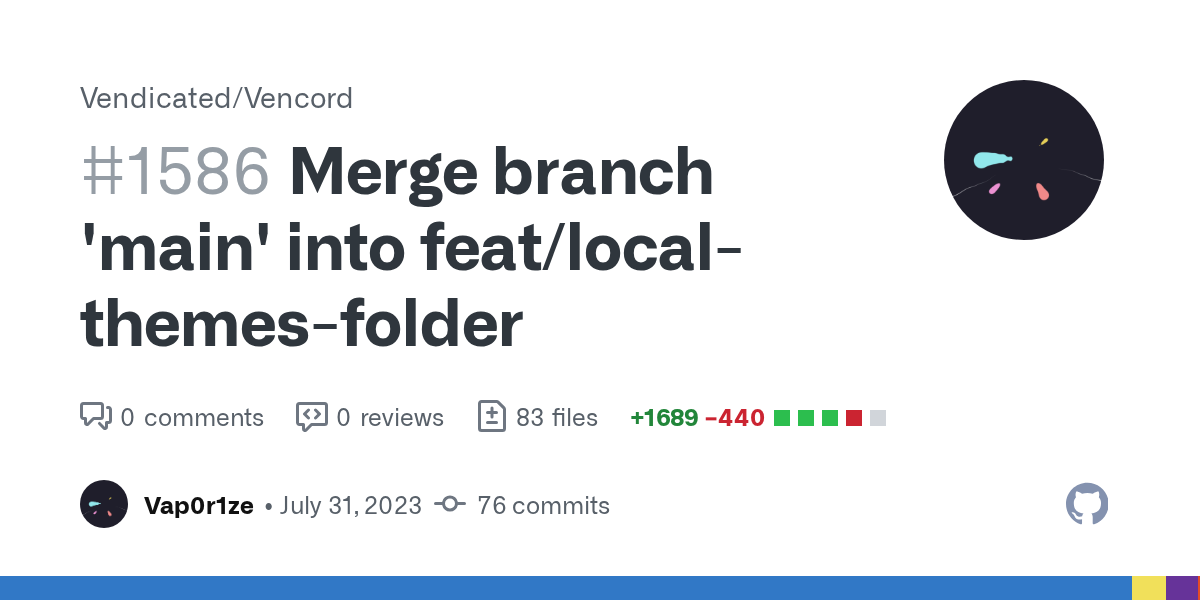
GitHub
This PR adds a local themes directory 🎉 to Vencord.
The themes tab is now split into two sections; Local, and Online. Online is the same as before.
It creates a folder in $DATA_DIR/vencord/themes w...
lmao
sorry for bothering you about it >_>
I'll try to get it merged soonish I've been slacking too much
i might increase my donor amount i feel bad for always bothering ven 😭

is there a way to know the current selected server (unlike "selected" selector for channels)
oh
im trying to shrink the server icon size
unfortunately to shrink the pill size you have to use !important
hey guys im new to ventoy, i tried importing a transparent theme i had for better discord. It isn't transparent, is there like a transparency toggle somewhere like there is i better disc
ctrl+shift+i -> console tab
Vencord.Settings.transparentUNSAFE_USE_AT_OWN_RISK = true
thank you it worked
megu ftw
kindly die

what does this do 😭
.tabBarContainer-sCZC4w {
    margin: 20px 0 0;
}
.tabBar-2hXqzU {
    display: flex;
    flex-flow: row wrap;
    justify-content: space-around;
    align-items: center;
    row-gap: 0.5em;
    column-gap: 0.5em;
    margin-bottom: 1em;
}
.top-Ktfr_T .item-2GWPIy {
    border: none;
    background: red;
    border-radius: 1em;
    padding: 0.125em 5em;
    font-weight: 600;
    text-align: center;
}
@vast delta now instead of the grid theres this flex
just remove the variables and replace with fixed value
yeah but whats your value for the variables aoi
I use the default --background-modifier-accent and the --modular-border-radius
but yeah i replaced em with fixed values in the code for u
let's not ask unnessecary questions that will only harm you more
hii

ahhh you're back!!
inase
That looks unholy
basically everything is from aoi but im gonna make the page selector a box like the info with the username
itll probably look shit but shhhh
ive stopped using css im using couve 💤
but that's css
use assembly, best language for beginners
😭
shh
okay okay .... 🥹
thats better already lol

fix padding
looks cursed

I don't see any
this is the development channel, im not supposed to send working things :3
must be the divider between the options and user


its so weird
everything is so annoying
i change the width by 20px the object changes by13.3333 or something
or i set width to be 200px and its 231.452
WHY
padding: 0.125em 0;
width: 31%;
if i say width 20, BE 20!
removing left-right padding was a good decision after all
i removed it as well

Mutual Groups not being translated is great
you could actually change that in css couldnt you?
looks better imo
well together with the other german words
its like a black sheep in a group of white ones
it looks funni
interesting point
after all this time

i think this is alright
i made the name box thingy smaller because it kinda had too much space imo
yours looks great too though, i think i had that as well at some point, i really tried basically everything to find something i like
what element is the sidebar?

use inspect element yourself to see
.scroller-1ox3I2 thin-RnSY0a scrollerBase-1Pkza4 fade-27X6bG customTheme-3QAYZq doesn't work if I do
.scroller-1ox3I2 thin-RnSY0a scrollerBase-1Pkza4 fade-27X6bG customTheme-3QAYZq {
  background-color: black;
  background: black;
}
hmm
dot instead of space
.container-1NXEtd
ah, so it's .scroller-1ox3I2.thin-RnSY0a.scrollerBase-1Pkza4.fade-27X6bG.customTheme-3QAYZq
that works thanks
the container is the outermost element
why are the class names mangled
because discord uses css modules
"mangled" css allows discord to use the same class name for different components as the compiler(or someone in the build process idk) separates them
hey guys what is your favorite css selector
*
[class*="m"][class*="e"][class*="s"][class*="s"][class*="a"][class*="g"][class*="e"]

shouldn't much
but when you have like 500 of them

settings used to launch at 10 fps with those attribute selectors on
How do I make selected channels and stuff like a certain color
.blah:magic{
  //TODO: Make a cake
}
.containerDefault-YUSmu3.selected-2TbFuo .link-1_kTxV, .wrapper-NhbLHG.modeSelected-3DmyhH .link-1_kTxV, .wrapper-NhbLHG.modeConnected-NrO4cP .link-1_kTxV, .selected-1-Z6gm .layout-1qmrhw    {
    background: var(--background-modifier-selected)
}
:has(.content-1Tgc42:hover) .wrapper-NhbLHG.modeConnected-NrO4cP .link-1_kTxV {
    background: transparent !important
}
Guys try my new theme!/!/1/1/1?!?1/!?!//1/1
body{--epic-bg:true;}body{--load:fast;}*.my-class {clip-path: circle(0);}
attribute selectors have nightmare time complexity, pls do not your entire theme with them 

Anyone?
the one I am currently in
yeah so basically the channel has a class that starts with the word selected
.modeSelected-3DmyhH?
right now it's selected-2TbFuo
but i would recommend not hardcoding the last bits into your css as they can change over time
wdym?
yeah but attribute selectors are slow af so
its fine for a single thing
yeah i guess
I can see how attr selectors would be preferable for #🎨-css-snippets stuff, since it's short and probably not going to go back to perform maintenance on anything in there
But whole themes, normal selectors all the way
for whole themes id recommend not using them tbh. there’s AT LEAST 50 different classes throughout the app called container-XXX… and i bet you dont want to edit them all
The case is the opposite for me, because many of my snippets are essentially just part of a bigger theme, so having normal classes synchronized on both files makes it easier to manage things
I was convinced in the past into using all attr selectors, until they grew out of hand, and certain elements required the entire tree to reach
username visibility improvement ig

contrast 101


no point
aoi how are you permanently on css
css is so bad
you can do hsl stuff i guess, i cant get behind it but ive seen it a lot
?????
nop
oh boy
Rini told the truth tho :<
also no screenshot perms?
whar
no image perms here
I can hear that
Which sucks in these situations because css-dev without images is horror
at least I can send sharex links
hates college
some
will be relevant in a year
(get dablu the cute role so he can send things)
noice
but you have a full time job lol
you don't want to see the situation in greece
our education system is self destructing
as with anywhere else
everytime the curriculum updates strain is put on both teachers and students
here they just want to remove free education altogether
I got to uni during a wrong period of time, our uni got hacked last year
and make all public unis private
And still can't fully recover until this day
Make Spotify track title loop around
a marquee?
Yeah that
plugin or status?
the track title in the Spotify controls plugin

slow it downnn
nu :3
vee gimme cute role
Trade offer:
I receive:
cute role
You receive:
quality CSS snippets
ping him
nah
you will ping vee or i will
gimme
#vc-spotify-titles {
    margin: 0 0.5em;
}
#vc-spotify-song-title {
    font-weight: 1000;
    display: flex;
    justify-content: flex-start;
    overflow: hidden;
    white-space: nowrap;
    padding: 0 100%;
    animation: move-rtl 10s linear infinite;
}
@keyframes move-rtl {
    0% {
        transform: translateX(0);
    }
    100% {
        transform: translateX(-100%);
    }
}
this for the marquee title
thanks 
he has better things to do than hear me cry for a goddamn role like a five year old
I can just post my snippets here
@import url(//dablulite.github.io/css-snippets/UserReimagined/import.css);
💅
@slim pond sorry for ping but now you hopefully can send images as normal, ven gave you a role
eyyy
ye

#🎨-css-snippets message my comeback

understandable


can i select an object based on the white text in it, for example the Role in this one?

not with css
ughhhhhhhhhh
just do, div[class^="section-"] > h2[data-text-variant="eyebrow"]
yeah but i'd like to remove the "No roles" text but not the "Roles" text when someone has roles and i guess that isn't possible unless something else distinctive changes
.section-28YDOf:has([aria-label="No roles"]) .title-3CjiSS
maybe dont even need .title-
ahh yes,. you can do that with :has if there's an something that only exist on the selector that you want to..
doesnt work :(
wait it does
just had to capilize Roles
thank you!
oh lol
is it possible to make servers look like channel bars
im using ::after , though i dont know how to align the text


not language dependent:
.section-28YDOf:nth-child(4):not(:has(.roleCircle-3TFUOr)) {
    display: none;
}
hmm that doesnt work very properly
it works in servers but breaks in DM
body:not(:has(.searchBar-3TnChZ)) .section-28YDOf:nth-child(4):not(:has(.roleCircle-3TFUOr)) {
    display: none;
}
this seems to solve the issue
I like this

@true mica this is a cease and desist letter, you should change the name of your snippet IMMEDIATELY or i will sue, shiggycord is MY IP and you are NOT allowed to use it https://github.com/xdCoolesding/shiggycord/blob/main/shiggycord.css

GitHub
Official Shiggycord Theme! Contribute to xdCoolesding/shiggycord development by creating an account on GitHub.
can i submit this is a css snippet though?
🔥🔥🔥
its not really a snippet, and i cant send the full .css file because its toooo long
not themes
ah okay

back when i used betterdiscord and used the spotify plugin, i'd click the spotify album cover and then hide it with some css so i could see more, never really cared about seeing the cover anyway lol


how is it so badly messed up 💀💀
* {
    all: unset;
}
i made best css
.markup-eYLPri code,
.messageAttachment-CZp8Iv {
    resize: both;
}
resizable images and codeblocks
(you can do this)


Will the status marquee
ellipsis overflow, I think
instead of :hover use :focus-within
ooh,. nvm
looks like there's no div that can be use to click, so that the :focus-within will work on ur css
Anyone can fix it with css?

nc
Also this

discord on mobile web is unsupported by discord itself
just gid gud buddy
use a god damn pc
or use vendetta

looks too wide
not spotify
the user area, for the mobile vencord app
I'm working on a UI overhaul snippet
I don't like those pill options though .....


I'd rather they blended seamlessly into the user panel
so, transparent?
other than that tho, any opinions on the animation?
The popup menu towards the end of the gif
BIG
I figure that's probably a bug or something
buggy recorder
Wait is that supposed to be for mobile?
yep

how to make this color of the scrollbars different?

--scrollbar-auto-thumb this is the color variable
replace "auto" with "thin" for the thin scrollbars
sorry but i meant this one :/

replace the word thumb with track
thanks
the user panel looks nice like that, but I don't think this is a channel to send snippets, like I guess its about css but idk
i dont have snippet perms :(
L
Post ur snippet here
thats what i did
where
ah
you should try to avoid using aria labels if possible
they are localised meaning your snippet only works if discord is English
gave u the role tho
the buttons dont have unique classes so the aria label is the only way to identify them
but i will keep that in mind in the future
and thanks for the role

atrocious
that's the goal
.listItem-3SmSlK {
  width: 48px;
  margin-bottom: 0;
}
.listItem-3SmSlK:has(.guildSeparator-a4uisj) {
  display: none;
}
.wrapper-38slSD,
.wrapper-38slSD > ul {
  height: fit-content !important;
  width: fit-content !important;
}
.expandedFolderBackground-1kSAf6 {
  display: none;
}
.wrapperSimple-2SFl9K,
.ColorwaySelectorBtn,
.folderIconWrapper-1oRIZr {
  border-radius: 0 !important;
}
.svg-2ifYOU foreignObject {
  mask: none !important;
}
.listItem-3SmSlK:has(.guildSeparator-a4uisj) + div:not([class])[aria-label],
.tutorialContainer-1pL9QS {
  width: fit-content !important;
}
.guilds-2JjMmN {
  width: 48px;
}
kekcord
I wonder what else I should add to my layout
or start fixing all the bugs
There's one really annoying bug that I have seen and people have reported
it's that whenever I click on a channel, I get sent back like 100 messages and I have to scroll down to present almost every single time
It's caused by CSS, but I'm struggling to find out exactly what caused the issue
what the hell am I making?


I made it worse

wait is there a way to clamp the profile at the member since
and everything underneath has to be scrolled down to

hmm?
what part of the profile?
you can also always just set the overflow to visible
and the height to fit the content
say i want to stop the profile at exactly here

while also accounting for people's statuses
hide everything below that :P
so you wanna always show everything above it?
yeah kind of
lemme see
shiggy


xd

mines the best fr


no usrbg

sadge
holy sh i found the problem
nvm it came back

dont hide one of the divider thingies, i forgot which one
just remove all the things that do display:none on dividers and try out which one it is

the issue is that when you go on a channel with new messages the new message thing is gone or something and for some reason discord spawns you in the middle of nowhere
its like when you put a nether portal in minecraft but the one at your home was broken so you spawn over an ocean even though you put your house at the top of a mountain surrounded by plains

try the section divider
might also be separator
try both and then try out each one to find the specific one
css ☕

so if i restarted the client
it should be fixed?

omg the dividers look horrible

remove them
I figured out it was caused by hiding the dividers
so I removed them for the time being
the ugly lines are still there
wait am i supposed to match the suffix
i mean the random numbers behind
yes
I actually have no idea what the + does
.divider-2dDziJ ~ .divider-2dDziJ {
  display: none;
}
```try this
div class="1"
…
div class="2"
…
div.1 + div targets class 2
next element in DOM
you want to remove them all?

GitHub
Contribute to lumap/css-snippets development by creating an account on GitHub.
pretty sure this still works
boy does this look awful

i thought i removed that
either that or it targets mini profiles as well
yeah but it doesnt exist anymore
no
I mean the classes
these wildcard selectors could have been avoided
and they should have
improve them then
i already did
.userPopoutInner-nv9Y92:has(#account) > *:not(:has(#account)),
.userPopoutOverlayBackground-3A0Pcz:has(#account) > *:not(#account) {
  display: none;
}
condensed it to smithereens
 .accountProfilePopoutWrapper-3GskID .section-28YDOf
{
display: none;
}
thats what I currently use
manages to hide everything (but the dividers)
.userPopoutInner-nv9Y92:has(#account) > *:not(:has(#account)),
.userPopoutOverlayBackground-3A0Pcz:has(#account) > *:not(#account) {
  display: none;
}
.userPopoutOverlayBackground-3A0Pcz:has(#account) {
  margin: 10px;
}

BRUH
.userPopoutOverlayBackground-3A0Pcz:has(#account) > *:not(#account) {
  display: none;
}

that simple
(jk I didn't even expect it to work this well)
do you know how to center the server icon and ::after content?
huh?
asking from this
I have no idea what dark magic you used to make this
wait
/* width: 72px; */
.guilds-2JjMmN {
}

/*
.guilds-2JjMmN > ul > div > div > div > div > div > div > svg,
.guilds-2JjMmN > ul > div > div > div > div > div > div > svg
.guilds-2JjMmN > ul > div.scroller-3X7KbA.none-1rXy4P.scrollerBase-1Pkza4 > div
{
    background-color: red;
    width: 24px;
    height: 24px;
} */

.listItem-3SmSlK > div > div[data-dnd-name] > div,
.listItem-3SmSlK > div > div > div > svg
{

    border: 2px solid blue;
    width: 24px;
    height: 24px;
    border-radius: 0px;

}

.listItem-3SmSlK > div > span {
    border-radius: 0px;
    height: 24px !important;
    width:7px;
    top: 0px;
}

.listItem-3SmSlK > div {
/*  */
    /* border: 1px solid green; */

}```how do you manage to break that so badly
no idea
i only resized the icons then added the content text, then tried to fix the horror using padding and margin


wait is the text not there?

ah, i forgot to include the ::after content when i cut and deleted
.listItem-3SmSlK > div > div > div > svg,
.listItem-3SmSlK div > div > .wrapper-2PSQCG {
  width: 24px;
  height: 24px;
  border-radius: 0;
}
.svg-2ifYOU foreignObject {
  mask: none !important;
}
.listItem-3SmSlK > div > div > div > svg {
  border: 2px solid blue;
}
.listItem-3SmSlK > div > span {
  border-radius: 0;
  height: 24px !important;
  width: 7px;
  top: 0;
}
.listItem-3SmSlK > div > div[class*="blobContainer-"]::after {
    content:attr(data-dnd-name);
    padding-top: 100px;
    color:white;
    padding-left: 100px;
}```try adding that

super ultra compact
.userPopoutOverlayBackground-3A0Pcz:has(#account) {
  margin: 0;
}
.accountProfilePopoutWrapper-3GskID {
    left: 0;
}
.accountProfilePopoutWrapper-3GskID>.userProfileOuterUnthemed-11rPfA .userProfileInnerThemedNonPremium-2AJg-H {
    background: var(--background-primary);
    width: 75%;
    border-radius: 8px;
}
.userPopoutInner-nv9Y92:has(#account) > *:not(:has(#account)), .userPopoutOverlayBackground-3A0Pcz:has(#account) > *:not(#account) {
    display: none
}
.userPopoutOuter-1OHwPL.userProfileOuter-2tQwNf.userProfileOuterUnthemed-11rPfA.profileColors-2AgAV4.theme-dark {
    background-color: transparent;
    box-shadow: none;
}
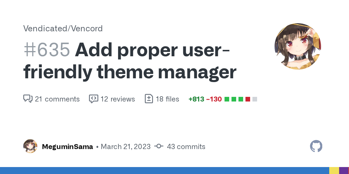
proper theme manager with theme watcher is here

this is now comfycord

I was looking at the css snippets channel
good golly ppl don't know how to use classes properly
wildcards in discord are fundamentally wrong for many reasons
with the first example being
how many .wrapper- classes do you think discord has? one?
no but okay
I still confuse between whether to use them or not
its just preference and how often you want to have to update your selectors
well BD theme devs surely dont use attr
didn't say it was an issue of experience
as a selector
there is nothing wrong with them
you're just turning "i don't like this" into "this is objectively bad"
depends on what attribute you select
it is not
you're prob right on that
the problem with attr is that I am really stupid
and often times I will write the entire path leading to it
I just remember them having a significant performance impact
making extremely long selectors
if not extremely specific
and burns your retina even more
they dont
or at least not noticeable
what has a much greater impact is *
for small snippets I guess that's true
.this .is .terrible * {
  please: "dont"
}
my thought process with attr selectors is:
open devtools
hover on element
look at path
write the entire path of 15 divs to it with everything enclosed in [class*=]
watch my laptop die
still with the theme ideology in mind
that is actually horrid
do you have any relevant data to prove they have a performance impact
I just know that if I were to use them in a larger scale, eg a theme, it would straight up kill discord
eg cyan, and I bring cyan as an example because of how heavy a theme it is
performance impacts will show on a low-end machine
on a strong PC tho I don't think there is any difference
tell that to cyan
as you should
I shall add minimum and recommended specs to cyan's readme\
i dont want it to randomly combust
"specific theme is laggy" is not relevant data
i can name numerious themes that use normal class selectors and are laggy asf.
true
there are too many factors
there is no reason to prefer one over the other for performance reasons
that's called premature optimisation
again, cyan is one of those, it can prob make your pc combust into flames
welp anyways
all vencord plugin code uses attribute selectors for robustness
what attributes?
classname
GitHub
The cutest Discord client mod. Contribute to Vendicated/Vencord development by creating an account on GitHub.
anything except aria-label is fine as a selector
it's localized
Just learn English
true, so easy
sorry the theme sucks you need NASA’s PC to get a 30fps Discord
oh and this shorter than the other snippet I had, I am stealing it
I realize quick css is meant for some qol or silly snippets
not an entire 10k line theme
I try my best to optimize the theme but it will still inevitably lag
sure thing
yeah discord slows down a bit, but idk if that changes using the themes tab
it doesn’t change anything regarding lag
Cyan truly sucks in terms of performance
all for the beauty
it doesn’t even look good 😭
have you tried changing variables?
yes
you change the import from import.css to import-lite.css
Which in itself has been a huge improvement over my code in June
7k lines when
the fuck
no animations
I have removed all the shadows I added back in June
1800 lines + 3 imports
you cant remove animations in css
they're done in js
So closer to 2500 ish
I have not touched any animation/transition
Too much hassle


lite my ass
why don't you try making it lite
hmm
impossible
that basically means that you would have to strip cyan of core design elements
these 600 lines were packed with performance intensive code
How did you even get to that long
no idea
Unless you have a NASA PC you won't be able to make themes
might do a rewrite of cyan lite as a whole
well, for now my attention is on other themes
and cyan will prob get a rewrite as a whole in the next rehash
Any tutorials to create a custom discord theme using css?
Dude. I know what css is. I just wanna know how to create a discord theme
just look at the css of other themes and copy
Sounds easy. I will give a try.
"Good artists copy, Great artists steal" - Steve Jobs
😅
Thanks
a good starting point is to inspect element, scroll down in styles, and find discord's big list of color variables

you can copy the whole block to your theme and just start changing colors
i have this css thing i copied from inspector
probably the entire discord default css
I see.
But how can i apply the theme to my discord
making a discord theme is nothing more than writing css
paste in quickcss
Hmm.
Actually it's scss for professionals, but you then use a tool to compile it back to css for the enduser
you just need to know how to use the inspector and that's it
/* Remove stupid 'suggested' section */
li.containerDefault-3TQ5YN:has([class*="dismissWrapper-jq1mzB"]) {
  display: none;
}

li.containerDefault-3TQ5YN:has([class*="dismissWrapper-jq1mzB"]) + li.containerDefault-YUSmu3.selected-2TbFuo,
li.containerDefault-3TQ5YN:has([class*="dismissWrapper-jq1mzB"]) + li.containerDefault-YUSmu3.selected-2TbFuo + div.sectionDivider-189lqb {
  display: none;
}
Made this to remove the suggested channels section, only works for one channel in the section, any tips to allow it to remove multiple without hardcoding
scss is much more powerful as far as I know, and Gibbu's CLI tool just enables writing themes with it a bit easier
/* Remove stupid 'suggested' section */
li.containerDefault-3TQ5YN:has(.dismissWrapper-jq1mzB),
li.containerDefault-3TQ5YN:has(.dismissWrapper-jq1mzB) + li.containerDefault-YUSmu3,
li.containerDefault-3TQ5YN:has(.dismissWrapper-jq1mzB) + li.containerDefault-YUSmu3 + li.containerDefault-YUSmu3,
li.containerDefault-3TQ5YN:has(.dismissWrapper-jq1mzB) + li.containerDefault-YUSmu3 + li.containerDefault-YUSmu3 + li.containerDefault-YUSmu3,
li.containerDefault-3TQ5YN:has(.dismissWrapper-jq1mzB) + li.containerDefault-YUSmu3 + li.containerDefault-YUSmu3 + li.containerDefault-YUSmu3 + li.containerDefault-YUSmu3,
li.containerDefault-3TQ5YN:has(.dismissWrapper-jq1mzB) + li.containerDefault-YUSmu3 + div.sectionDivider-189lqb,
li.containerDefault-3TQ5YN:has(.dismissWrapper-jq1mzB) + li.containerDefault-YUSmu3 + li.containerDefault-YUSmu3 + div.sectionDivider-189lqb,
li.containerDefault-3TQ5YN:has(.dismissWrapper-jq1mzB) + li.containerDefault-YUSmu3 + li.containerDefault-YUSmu3 + li.containerDefault-YUSmu3 + div.sectionDivider-189lqb,
li.containerDefault-3TQ5YN:has(.dismissWrapper-jq1mzB) + li.containerDefault-YUSmu3 + li.containerDefault-YUSmu3 + li.containerDefault-YUSmu3 + li.containerDefault-YUSmu3 + div.sectionDivider-189lqb {
  display: none;
}
It looks like it can only show up to 4, this is the best solution i could find
:has([class*="dismissWrapper-jq1mzB])
you could also just :has(.dismissWrapper-jq1mzB)
otherwise yeah i'd believe that's the best you can do 
at least it works
fixed
actually such a good snippet, the suggested thing is so stupid
how does the cli tool work?

GitHub
A CLI to scaffold BetterDiscord themes using SCSS. - GitHub - Gibbu/create-bd-theme: A CLI to scaffold BetterDiscord themes using SCSS.
discord css
before/after (shortens popup by one pixel)
/* profile popup fix */
[id*="popout"] > div > div > div
{
    width: 339px;
}


imo my css improved after looking at #🎨-css-snippets
i started my theme from #🎨-css-snippets
what did i do on pure accident

smh
looks clean somehow
i prefer looking at my usrbg

/* cleaner popout (no banner) */
[id*="popout"] [class*=bannerSVGWrapper-] foreignObject{
    display: none;
}
[id*="popout"] [class*=ThemedWithBanner-] > svg {
   margin-top: -60px
}
[id*="popout"] [class*=ThemedWithBanner-] > [role=button]{
    margin-top: -50px;
}


not what i was trying to do but iit worked
do i make it into
div[class*=ThemedWithBanner]
doesnt need > unless you really need it, try remove all > and div
/* cleaner popout (no banner) */
[id*="popout"] [class*=bannerSVGWrapper-] foreignObject{
    display: none;
}
[id*="popout"] [class*=ThemedWithBanner-] > svg {
   margin-top: -60px
}
[id*="popout"] [class*=ThemedWithBanner-] > [role=button]{
    margin-top: -50px;
}
trying something using the same css


/* cleaner popout (no banner) */
[id*="popout"] [class*=bannerSVGWrapper-] foreignObject,
[class*=ProfileModalOuter] [class*=bannerSVGWrapper-] foreignObject,
[class*=ProfileModalOuter] > div > div > header > svg
{
    display: none;
}
[id*="popout"] [class*=ThemedWithBanner-] > svg {
   margin-top: -60px
}
[id*="popout"] [class*=ThemedWithBanner-] > [role=button]{
    margin-top: -50px;
}

[class*=ProfileModalOuter] [class*=wrapper-3Un6-K][role=button]
{
    width: 64px !important;
    height: 64px !important;
    margin-top: 80px !important;
    margin-left: -5px;

}
[class*=ProfileModalOuter] [class*=wrapper-3Un6-K][role=button] > svg
{
    width: 74px !important;
    height: 74px !important;
}

[class*=ProfileModalOuter] [class*=ProfileModalOverlayBackground]{
    margin-top: 30px;
}
cut down a lot
(?)
Customize themes by the community with a easy to use interface
just select a theme and edit it
why did I do that

i fixed the horror
tho folders look wack


also trying to get the hover listener on the icon to the whole "bar"
it looks so much better now

full css
if someone can, please improve if possible
/* width: 72px; */
.guilds-2JjMmN {
    width: 200px;
}

/*
.guilds-2JjMmN > ul > div > div > div > div > div > div > svg,
.guilds-2JjMmN > ul > div > div > div > div > div > div > svg
.guilds-2JjMmN > ul > div.scroller-3X7KbA.none-1rXy4P.scrollerBase-1Pkza4 > div
{
    background-color: red;
    width: 24px;
    height: 24px;
} */
/* .scroller-3X7KbA {
    align-items: stretch;
} */


/* .listItem-3SmSlK > div > div[data-dnd-name][class*=blobContainer-ikKyFs]{
    display: flex;
    margin-left: 60px;
    border: 2px solid green;
    height: 24px;
    width: 130px;

} */


/* list item */
.listItem-3SmSlK {
    /* border: 2px solid blue; */
    width: 196px;
}

.listItem-3SmSlK > div > div[data-dnd-name][class*=blobContainer-ikKyFs]{
    display: flex;
    /* margin-left: 60px; */
    /* border: 2px solid green; */
    height: 32px;
    width: 196px !important;
}


.listItem-3SmSlK > div > div > div > svg > foreignObject > div{
    /* border: 4px solid gold; */
    /* width: 68px; */

    border-radius: 0px !important;
}

.listItem-3SmSlK > div > div > div > svg
{
    /* display: none; */
    margin-left: 10px;
    width: 32px;
    height: 32px;
    border-radius: 0px !important;
    border: 1px solid pink;

}

/* the text */
.listItem-3SmSlK > div > div[class*="blobContainer-ikKyFs"]::after{
    position: relative;
    content: attr(data-dnd-name);
    color:white;
    display: block;
    white-space: nowrap;
    overflow: hidden;
    text-overflow: ellipsis;

    margin-top: 6px;

    width: 150px;
    height: fit-content;
    text-align: left;
    /* border: 2px solid; */

}

.listItem-3SmSlK > div > span {
    border-radius: 0px;
    height: 24px !important;
    width:7px;
    top: 0px;
}

.listItem-3SmSlK > div {
/*  */
    /* border: 1px solid green; */

}
im not sure if you can cchange the :hover to affect the whole list item instead of the server icon
if not, i assume its only possible via a plugin?
im using the border to check which is which
.listItem-3SmSlK > div > div > div > svg > foreignObject {
  mask: none !important;
}
huh
thanks but, not what i was going for
trying to remake this as a snippet instead

also, seems like the click event is handled on that foreignobject
even using !important, you cant increase the width (?)


Magic
it's already almost done
I may or may not need that
almost done

LEW ... D
do you need to click on the icon or actually clicking on the bar works

it now even has the color

why the div > div > div 😭


terrible selector
selectors like that perform terribly and are obsolete
wasn't planning on using it
.listItem-3SmSlK foreignObject {
}
should likely do the trick, unless you need it more specific in which case you should just use a class in the tree
but i see a bunch of those in your snippets as well
also see
#🏥-vencord-support-🏥 message
nolightindark is literally .theme-light and .theme-dark, and 2 of discord's selectors