#📝project-feedback
1 messages · Page 35 of 1
its fun experiment
thank you for sharing me the psd
Gave +1 Creative Carma to @glacial grove (current: #70 - 29)
slightly different would you go with first or second one?


Stuck to blocks of info but unsure of my hierarchy


The goal is to make a PSA poster, (2) one only using helvetica and another using a contrasting script font… (idk which one I wanna choose for the second poster just yet…) but here’s the first poster (the 3rd draft of it)

Great!
I would try to distribute the repetitive lines evenly.

The final saved designs


Ahhhh let me adjust them! Thank you
Gave +1 Creative Carma to @bleak echo (current: #7 - 1142)
Is there a reason you are alternating the brightness of the lines of text?
If each line got progressively fainter as you moved down it would suggest that something or someone is fading into the depths.
I originally did that but to me I didn't like how it looked. The current way I have it is simply a stylistic choice
I did do it a bit for the 2nd poster but faintly
Der zweite ist etwas unlesbar
Love the layering effect of the text behind the hand. The gradual fade on the reflected text fits well the theme.
I recommend avoiding the use of a drop shadow (or dark halo) around the word “drowning” and sticking to solid colors only (which you can select from the image below using the Eyedropper tool to ensure consistency).
Text block under reach out is really too small (it's useless if we can not read it). I would suggest you to increase font size...

@gritty zinc :Expecting a feedback on AI generated stuff?
It would be a good idea to correct the few generation errors.

Ok! Thank you for this 
Gave +1 Creative Carma to @bleak echo (current: #7 - 1146)
I’d add some noise or grain to this for depth it’s a pretty nice graphic!
Both of them are CLEANNN
Thank you 
Gave +1 Creative Carma to @worn wadi (current: #396 - 4)
does this look good or nah i need feedback its my first thumb XD

It’s a good start

Solid Start!
Blur Background and Subject size and placement look nice... A bit too blue I think. I would apply a color balance like this to match the colors with background ambient light.

Few ideas/tips to explore:
- Adding outer glow and rim light around the subject is a technique frequently used to draw attention to the subject (Worth a try)...
- Increase the text size (you can stack words on two lines) - Your title must be "Loud"
- Use a dynamic shape for your arrow - It brings life and movement to your design - I used the image below (free) https://stock.adobe.com/ca/images/set-of-curved-black-arrows-different-arrow-icons-with-bends-in-different-directions-cursor-collection-of-vector-arrows/682934563?prev_url=detail
- Try to use the power of Layer Fx to add interest to your Text layers
- Create a vignette effect (darker edges) to put the focus on the main elements of your composition

Stand still draft

Hey everyone, I’m currently experimenting a bit with Photoshop and would love to get some feedback on my graphic for an counter-strike esport social post :)
What would you have done differently, or is there maybe something missing? Feel free to let me know! I appreciate every response 
P.S. This isn’t anything official, just something I made for myself.

🔥 🔥
❤️
Maybe more contrast?

Hi! I can help!
It's called a gradient map.
With some grain and a blur


Here's an example I made!
Maybe you should mention the user... Otherwise, the reply might not be read...
I'm not sure messages that are forwarded from one thread to another notify the users...
@frosty hare
Forgot to add the blur effect

I used the smudge tool/ Maybe you could use Motion Blur or something.
I like your idea with the background! Thanks 👏
But i dont like the glow from the „gameday“ so much
Gave +1 Creative Carma to @glacial grove (current: #69 - 30)
thanks
Gave +1 Creative Carma to @thorn trout (current: #1039 - 1)
I like the vision👏 definitely gonna try this later
another version


The effect is so cool, how did you come up with that?
^
Gradient Map
and smudge
Sick
thanks!
Gave +1 Creative Carma to @glacial grove (current: #68 - 31)
is this thumbnail good

What's up with ya boy's arm? Also, is this character from a game or something?
yes vito from mafia 2
Can't we find a better shot of him?
i mean i trd bur the others are kind of ass XD

Gotta try to fix that arm though... And match him better to the background tones.

Here's just the guy if you want to use that in your layout....

thank yoou mate
Hi @chilly comet
Have you read the good explanation by @bleak echo ?
#📝project-feedback message
Because Vito is still 'to blueish' IMO
Honestly, I would approach this whole thing differently... He needs to be more menacing.

Use a Rule of Thirds style layout and put his face right at the one of the main points in the RoT grid.

Then consider what text to include. I'm not sure about the "1911 Only?" text. Does that mean something in the gameplay that people will understand? Because I don't get it, really. He only has a 1911 .45 in the game? :)
no I'm going to do like a challenge I'm going to beat the entire game using the 1911 there are multiple guns in Mafia 2 so basically your place which to another weapon I would have to restart the chapter
Just some ideas but I would make the guy more menacing, the text bold and the message clear. Just my opinion. Also, since the official branding is red and white, I would mimic that in the text.
Use any of these ideas if you like.

how long did it take you to do that ?
I just did now since we've been discussing this. 20 mins?
This isn't my first rodeo. I've been doing this for a long time. :)
3 years ?
A lot longer than that. heh
I did this 3 years ago... https://youtu.be/Iou6mw_Di6E?si=QB6lq6J7JqHMwfhp
I’ve been building out my personal website and I’m trying to improve it as much as possible.
I’d really appreciate any feedback — design, layout, ideas, or anything that stands out (good or bad).
I’m open to changing anything if it makes it better.
Here’s the site: https://www.luca.cam/
Thank you 🙏

Electrical Engineer with a passion for creative tech. Explore my projects, skills, and goals.
Very good job, I like the UI design
Hey, thanks for sharing! It looks clean and visually consistent, nice color choices and overall vibe.
I checked it on mobile. I know it’s better on desktop but right now 80% - 90 % views are usually mobile. Maybe consider making your main message and key projects more visible right away, so it’s easier to understand what you do.
Strong base, just needs a bit more clarity 👍
Gave +1 Creative Carma to @blazing yarrow (current: #1039 - 1)
If I understand well bird origami is a part of th Paper Tree store logo and Whale belongs to obb.design. Right?
yes
something simple that i made

Just ideas... What if you:
- use a more classical sans serif font for the link (Acumin Pro, Helvetica...etc) to fit the font style used in the design,
- Reduce the logos size (This such a huge size distracts from the main design, which should remain the focus)
- use the main design square frame as reference to distribute logos.

You also can try to use the whale line-art logo...

it was initially a lineart
but i inverted it to fit the paper tree logo
Understood... But generally, it is best not to alter the original logos (unless the legal owners give you permission)...
I think the main issue with your original design is that the bottom area (the logos zone) is too crowded and distracts from the main design.
You need to establish a hierarchy of the most important messages and elements and ensure that your design reflects this hierarchy... If you want to keep the logos very large, you’ll need to reduce their visual impact by lowering their opacity, for example...
In any case, I think alignment correction is mandatory if you want this design to work.

thanks
Gave +1 Creative Carma to @bleak echo (current: #7 - 1150)

looks quite distracting
i am bored share me some designs i will give feedback
literally this
everything is placed nicely
nicely composted. The origami needs some time to figure out
thats how i felt
lets see what others will say

its fine i guess
is it worse?
no
i like this

Not worse at all...
Did you try a version without the white rouded corner frame?
I,
i did it before you told me
Yes, we posted at the same time 😉
I like this one but I would keep some empty space all around...
Simply remove the frame from the previous one.
Sometimes, leaving empty spaces can help your design to 'breathe'.
In short, it's the empty space that will frame your design...

noice noice
i am bored to death
share some designs i will give feedbacks
ty
Gave +1 Creative Carma to @warm crater (current: #244 - 7)
hello chat good morning
i am doing this practice project to learn photoshop better
can anyone tell me if its like OK for a beginner level? 🙂
(i just started 2 days ago)

its not finished yet though i kinda feel like somethings missing...
can yall recommend what to add?
oh yeah and this projects for my club
Perhaps the most important point: never scale icons or logos out of proportion!
Your left icon is only slightly distorted, but the right one is extremely distorted. Also, the two text fields at the bottom are much too close to the edge.
Ouh..🙂
I see
Thanks for the feedback!
Could i ask you for some tips?
Oh yeah and i finished it just now
This is the final product

Hmm…
I’ve never been good at design myself (and I never will be). But I don’t find your final design very cohesive. There are too many different font styles, and overall it’s too symmetrical—yet not symmetrical. The eye wanders back and forth across your poster, unable to find a focal point or a clear line of sight.
Even though this criticism might sound a bit harsh, these are exactly the thoughts that went through my mind when I looked at it. Sorry
I see..
Could i then ask you for some improvements?
Oh yes and please dont need to be sorry for saying that..
I believe everyone is bad at something when they start..🥲
I just started 2 days ago
I will try my best to improve!
I agree with what @gentle horizon said (too many different fonts, styles on the same page) but it's normal to make mistakes after just two days...
Learning is a long journey, and patience is the key to success...
First, you said this is for your club... How do you plan to use this image? (social media, print...etc)?...
The size you've chosen (2100x1500) doesn't seem to match social media standards... Are you planning to print it on A4 paper?
I'm about to leave for a few hours, but I might be able to help later.
Few questions to help us to guide you later:
- Is all the information included in your design really necessary? => I like "Plant today, breath tomorrow" tag line but not sure the Green earth/Green life thing brings something new...Too much information can obscure the message, so if you can remove it and still convey the message clearly, don't include it.
- Do you want to print your design to spread your message? Choosing a plain green background and using many colors may lead to a disappointing result. And even if you plan to post exclusively on social media, you should stick to a limited color palette...
@mellow pumice
additional to the good suggestions by @bleak echo
maybe a bit more like that??

or perhaps

lil old school compositing thing (first time doing this), no ai, need feedback overall and which cc is better


Ahhh i see..
This basically is literally a made up project i invented in my mind and created it to practice making posters with photoshop
This is NOT the finals product, NO ones seeing this. I just made it the f up for my own practice💀🙏
Woahh and you say you will never be a professional designer?
This looks 100x better than mine
I like both. Can you provide some context?
my first design, what can I improve?

I read it as bo-
second one, the color grading is better
second one looks more vibrant
Very good
Hi @mellow pumice You misunderstood me.
Of course, I can claim to be a professional. But my strength isn’t creativity — it’s my knowledge of and ability to use various programs, as well as my technical execution. I know the most important design rules and can apply them. Unfortunately, I don’t have the “creative streak” I’d like to have. That’s why, while my own designs are solid, they often lack that “certain something.”
That’s just one of those skills — either you have it or you don’t.
Yes. The same elements from this post #📝project-feedback message
It’s just arranged differently and focuses on the key elements. But it’s just a poster design—the kind you can find by the dozen.
change the background color
make it more visible
I tried replacing the branch with a finger, how is my shading?


like to add more contrast?
or just because it does not fit
more contrast
should i be looking at the first or second one?
first one has transparent background, so probably the second one
a little more shading ig
the hand looks like a factory worker
I probably should start learning perspective
good luck

I rly thought you drew it yourself 💀
Solid work!
I prefer the first image; the warm tones and tilt-shift blur create a nice post-apocalyptic effect.
The blur effect could be toned down a bit on the two vehicles in the foreground. They’re blurrier than the red vehicle in the background.
The second version is a little cooler, but it's still really great!
Really great work!💯

Ahh i see i see
Also if youre literally replying to me then why mention?🙂
Since you asked. And since you asked for help. And just so there are no misunderstandings.
😉
I see
Alright then
how do i make this work? it looks unproffessional but i think it's promising.

@mellow pumice you said you wanted to give feedback on projects right?
I didnt want to give but wanted to take feedbacks on MY projects 🙂
but no way in hell i will be able to make this type of artistic masterpiece without literally copying it 💀 🙏
i thought you said you were bored and wanted to give feedback on stuff
mb
ty 😭
Gave +1 Creative Carma to @mellow pumice (current: #1039 - 1)
buddy
you did NOT think that my bozo ahh which basically zero to no experience on graphics designing and art gonna rate that 💀 🙏
chill
i am the last person u wanna ask for stuff like these 😭
stop malglazing against urself twin
you're goated on ur own
wait this aint available in google it says..
what did u mean? 🙂
i am sorry i am really new to english
i made it up on the spot lol
it's not a word
bro wha
:))
talking bad about yourself
oh
you know glazing right?
oh wait im just being honest about my exp lol
you speak better than most ngl
the add word -mal
i didnt know you could make up suffixes like that 💀
anyways back to topic
yes please judge my works ill post them here
did u see my last work?
i uploaded here
scroll up
i need feedback
that one person really hated it 😂
sure
wait you were not that person
mb
photomaxxer was the name
oh thx
@green pewter
alr
no nitro 💀
send the pictures from dm
the pictures you used to make this


wait did u mean all the pics i used to make it?
look at my stream
🙂
That's a lot of red. Any particular reason why?
the model is red. i'm trying to keep the colors as limited as possible. it's both a challenge i give to myself and sort of a general rule to not use many colors
It's just that you have red overtop of red which makes certain elements less visible.
i adjusted it a bit. let me send the current version in a bit
@wooden oak

not really a good typoghrapist
This artwork is for my school Graphic design course, the theme is people and places and we were asked to use our own photography. So I cut out buildings and added them to the ground to give the idea they are sunken, the art is supposed to have a eerie and misty feel to it so the slight blur in the distance is intentional

i took this photo i had taken last weekend and tried to edit it to make it more nostalgic (this is the original)

the edited photo

how can i improve it ?
Not a pro or anything but I like how you’ve matched the colors on it more
Oh wait nvm sry the bottom one’s the original isn’t it
Nope the top one is the original
I like what you've done thus far, unifying the tones a bit. It works.
Well ye what I said originally then
I was trying to make it more nostalgic but I feel like I overdid it and became too grey
I think it’s good tbf like I said the colors are more matched
I'm not fond of the slight rotation and I would try to straighten it out. Also, I think the Light/Shadow/Contrast balance could be a little better. However, these are personal tastes and only minor adjustments. It doesn't change what you've done overall.
But idk I think of nostalgia as rly vibrant n stuff
@mellow pumice
I really hope you're not talking about me…
yoo bro i was just joking CHILL 😭 🙏
I'm fine. But that was a really bad joke! Sorry for helping you.
yoo bro i am REALLY sorry if i offended you 😭
i didnt mean it that way sir
please forgive me
I accept your apology. There’s a saying: “Don’t bite the hand that feeds you…”
i am sorry again..
i meant it as a means of respect since u didnt hold back knowing that the feedback might sound harsh
I was trying to make it more nostalgic but I feel like I overdid it and became too grey
Any tips on how to fix that ? And make it more nostalgic?
@wooden oak
Any tips on how to do that whit the original one ?
i am truely grateful
"nostalgic" is going to mean something different to each person.
i meant more warmer
For some people, nostalgic might mean "vintage" or even something like this:

godam
that looks cool
how did you do that ?
Easy. Its a Camera Raw Preset. In the Video > Creative Group....

You could also refine it after applying it
Yeah I’d probs up the vibrance rather than the saturation and add a slight purple tint to it I think that would work
you know what i like you guys
Working on a vintage compass, any suggestions or edits are always appreciated
turn down the shine a little so you can see the numbers

Do you like pop style?
Yes
is it AI?
The patches around the edge need to be a bit more subtle... currently looks like it was handled by a coal miner.....
Maybe add a few imperfections to the face ...

You can set how subtle it is:

I added this, with an 'overlay' blend
https://thumbs.dreamstime.com/b/powerful-steel-background-rough-metal-texture-dark-vintage-metal-texture-dirty-iron-background-101586064.jpg

good job james!
oh, switching to a multiply and inverting the colour can give you brown/dark scratches too:

How do I create the glow effect and the ring of blue around the blue? I want to created a glow effect with the reflection in the water

Damn the image is cool. The glow
Try not to flood the chat with a lot of different projects. If many people commented on all nine images, it would monopolize the chat. One or two at a time please.
Okay I'll keep that in mind in the future
nice editing on the last one
yess I'm trying to do the same
Of all of them my favourite by far is the gas station one
I see good luck
I think you should use different glow Fx for the reflection...
Make one around the baby Shape and another around the reflection...

Can you show how you made the reflection? I'm having trouble understanding how you did it
They cloned the person... then literally flipped and squashed them...
then applied a mask with a gradient over the top
No Ai, whole things made from scratch
Here is the psd file if you want to explore...

I see what you mean, I’ll definitely tone that down a bit. I also really like the scratches idea on the face, I’ll get right on that, thanks!
Gave +1 Creative Carma to @novel comet (current: #5 - 1199)
Wow that colour dodge makes such an impact!


Nice 'synthwave' colors. It makes the scene a bit more interesting.
i was trying to make the original less dull and more vibrant
Mission accomplished

Good job
Good job
Amazing
watermark

GD REFERENCE????
just a 5 minute adobe stock design, is the lighting ok?

yes a gd thumbnail
Amazing!!!!!
I would like to see your stuff
my advice you mean?
comparison is the killer of fun
thanks!
Gave +1 Creative Carma to @glacial grove (current: #64 - 33)
no, what are you designing currently?
this is decent for a beginner!
nothing much, I'm just practicing
thanks :D
why are you doing bad?
huh
you said that in your rant
huh

okay.
hello beautiful people. i would like some feedback on this. business card for a private tutor.

I like it, but I suggest putting paper hats on them instead of normal ones
nice
what type of paper hats? each animal’s hat carries symbolism - the silly goose has a clown hat and the wise owl has a graduate cap. i believe the paper hat would destroy the symbolism and i don’t want that. but if i misunderstand please correct me.

ohh , k makes sense
the halftone on the owl is kind of hard to see right?
Yeah I know. It was just an example
I have tried using some online tool to mash up Kanye and Xi Jinping


Aand this one is a flag i made for a friend's fictional country
"Sealistan"
Its 'bout seals... yeah
My color palette was yellow red green and blue and he wanted stars in i
When i was done it looked mediocre soo i did some more and
That's how it turned out

Any feedbacks?
Its not centered damn
Centered

i dont think the uneven ratio colour space thing is doing it justice
yeah, the blue and green need to be the same size
easy fix
and the little white square in the top left corner needs to go
AYO I THOUGTH I ERASED THAT ONE SEC
What do u think of this so far? I will add stuff lower down ofc

@lime quarry what do you think? I added the stuff down the side
I'll add stuff below tomorrow
Looks even better now.
Yo... sick af..
Are the shoe renders blurred or is it just me?
it's not dw

Looks good so far!
no. i didnt mean that the blue/green sizing was off (it was) but the ratio between large width/small width isn't particularly nice to look at. bad execution.
or at least i dont like it
it feels cropped horizontally
also if the east/west seals are mirrored you might as well make one of the north/south seals clockwise
Nice.
i like your style haha
seems like the leg is cuttung off thought
It’s like that
i was wondering how im doing on this?

I was trying to make a spell for a game I'm making
Very nice job!!

Thoughts?

how can i improve?


make the person darker and the text at the bottom right, brighter
Maybe add a glow or stroke to the shoes


yess love it
thank you
Gave +1 Creative Carma to @prime rune (current: #396 - 4)
i am open to any suggestions
40% more dark on the shadows
more dark shadows
feel like my main subject adn the backgound is not working together
first go at product packaging design no clue what to do ahh


Good job
Maybe add some noise to the text
Better
thank you !
Gave +1 Creative Carma to @glacial grove (current: #62 - 34)
Nice!
the difference is the placement of font 1 or 2


1
i see
I would go with #1
How does this look so far? Its far better than the previous version, It is still wip and I'm not sure how to create a wider range of glow around the water. These are a few of my reference pics.


I'm really proud of the design so far, I made the image from scratch and this is my 2nd project in ps
slap some noise textures and ur good
love the 3rd and 4th ones
somehow resonates with me
i m trying something new


tuff
I recommend to add a bit of a shadow or maybe some stroke around the shoes and make it look more realistic but it’s really nice work. I love it.
For the water part, draw where you want the blue in a light blue/white color, add a bunch of Gaussian blur, then change the blend mode up a bit. Vivid light, linear light, maybe even soft light. Mess around with it, but that should create a much broader glow effect that your looking for
Change the font on the top out, or at least all caps. I agree with a very subtle drop shadow around the shoes too.
Could use some improvements, otherwise nice job.
I'll be perfectly honest, IMO I don't think red serves well the design... Is that a required color?
I would: stick with shoes' pattern colors, reduce the shoes size a bit and play with highlights and shadows to bring back some details.
Subtle shadows could help to make the design to be less flat, and I would try to reduce the visual intensity of the white shapes and add some texture for the streetwear vibe...
A quick draft to show you what I mean... But really I would stay away Reds...

Alright and for the dark eerie effect, should I change the saturation?
Oh geez tysm, how did you add that shadow and that rough effect on the images? I actually did change the text last night, so it didn’t use the outline effect
I’ll see what I can do
I’ll stick with the reds, coz it’s for a project at college and I can’t redo all the post production stuff to suit a new poster, but I’ll take ur advice abt the shapes, text and shoes 🙂
I tried adding glow but it doesnt look right, I'm thinking to go in with the blur tool, would that work?

I'm so confused on how to do this haha, can someone help me?

Does this look better?

^
Tysm!
Looks clean! Do not add another stripe 😉
Thanks! I won’t 😂

very good job
make the blue screen glow more
"I'm drawn".. should be larger
drag it under the star and mae it take up the whole width.
I'll make a demo for you.


somehow its feeling dull
I like the soft glow effect you did.
Did you specifically want an old CRT display? Perhaps an lcd monitor would help the bizarre 🙂
maybe.
give me this version, i'll help out
photoshop file?
just the .png


😇

Wow!!
Shadows are made with large and soft paint stroke on several layers with blending mode set to Multiply.
You can pick colors used to paint your shadows directly on the image to keep everything consistent or choose any color you want...
Tip: Avoid use of solid black but Greys or ultra dark Color values. In real life shadows are never full black.
I would suggest you to add a Highlights and Shadows Adjustment layer to bring back details in both bright and dark shoes areas..

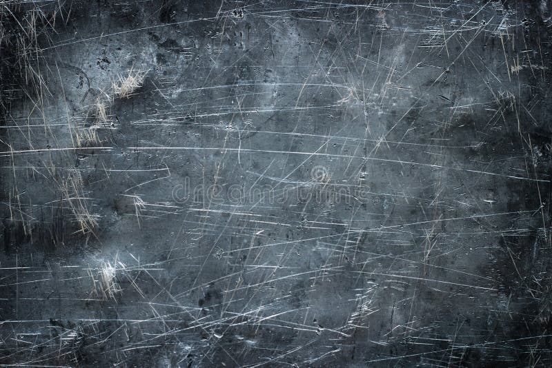
For gritty texture I imported Black & White Grunge texture and used them to create a layer mask. I used the channels Panel to load a selection then used this selection to create the layer mask.
Ok tysm man, I posted the final product a bit up in this chat, using some of ur advice 🙂
I can’t change the whole colour scheme at this point, but I’ll definitely keep it in mind for future projects l!
How did you stretch the shadow?
I just adjusted the highlights and shadows off of the shoe layer, how do I use an adjustment layer on photoshop?
Yep, Better.
I catched you must keep red and I understand why...
Actually, I think the word "vision" is clear enough that we don't need to add the lines in front of it.
You could also add some texture to the background...Just an idea!
Like this!
Paint a flat soft shape on its own layer > Set blend mode to Multiply > Transform it! (shortcut: CTRL+T)
Ohh yea that’s a good idea, I’ll probably use something like that in the future!
Tysm 🙂
@muted heron : "how do I use an adjustment layer on photoshop?"
=> Go to image/Adjustment/ select "Shadows/Highlights..."
Note: It's better to turn your layer into a smart object before to work non destructivly (doing so you'll be able to change Adjustment parameters afterwards)...

Perfect tysm!
@muted heron Last point: Avoid using Solid flat colors only... Try adding textures that are more or less subtle (I admit my example might seem a little too grungy for some people), some grain, or subtle gradients (even when these elements are very subtle, they make a difference).
Now I'll leave you to work in peace...
A nice improvement either way!

Alrighty tysm! Have a great day
I had no clue you could adjust your brush like that to make it more oval!
VHS effect I did.

Yes that's usefull sometimes... You can also change Brushe's roundness settings in the Brush settings panel.
i tried my best not to literally bombard the human eye with an overload of information
this is a banner of a competition
please judge my work without any hesitation

i would love to have your opinion on it!
and please also suggest parts that i need to fix/change
(also those logos at the top right are of my institute, im in a club 🙂)
Hello guys, I have to recreate a game poster/cover in Adobe photoshop as homework, I choose the fnaf 1 one and I would like to know what I could do to improve my current version. The task is to work non-destructive and using no pictures from the internet, so only pictures of things I really have.
This is my current picture vs the original


Its far from perfect but I really don't know what to do for Freddy
You could add a gradient in the background for some depth
Are you allowed to use images of Freddy?
I would also try to find a better image, I’m sure there’s some out there
And the text seems a bit too bold
Also, make sure to add that red drop shadow behind the text
Ohh I see
Unfortunately not..
This is just from some plush I found
So it looks realistic
Thank you!
Gave +1 Creative Carma to @muted heron (current: #663 - 2)
it's shoulder has been cut off, which is an issue
np! 🙂
Made this as a first tshirt design

nicee
No pictures from the internet? Where did the photos of the bear and the microphone come from?
If you get the subject from a video game screenshot I would try to make another one in a more interresting angle than full front.. And if possible without any texture on it...

seems a bit harsh no? the internet is kinda crucial to get those images, maybe the task is to remake the poster but with other objects irl, like a teddy bear or a dog? idk lol
i just doubt the teacher would make them go in the game and take screenshots
I've been working on this compass icon. Are there any noticeable issues or lighting/shading problems?
Ive tried different ways to add scratches but none of them are feeling great to me. Any suggestions or ideas would be greatly appreciated


so far this whole thing has been made from scratch, so I don't want to rip any textures or assets from google
added some texturing to the everything
Good job.
Didn't want to be harsh at all... It sounds weird to ask someone reproduce a game poster/cover without "no pictures from the internet"...
This rule is not from me it's from the design brief...
From a front view like this you could go with a dramatic crop... For freddy I used your reference image => Camera Raw Adjustment + Curves Adjustment layer... Clipped some layers to Freddy and paint Highlights and Shadows. A dark background with a subtle glow... The Konami logo is from the internet, but you could reproduce it if internet access is prohibited. The distressed text is made from a solid font masked with a grunge texture (stock image). If you cannot use a texture image from the internet, you can create your own using a photo of a concrete wall, for example. Alternatively, you can use a distressed font directly (if it's allowed).

Good luck!
Good job.

i rlly like that
any feedback is appreciated on this thumbnail


Ko-fi
A high-quality 2026 calendar featuring original fireworks photography captured across Gozo.
Designed for A3 printing, this calendar combines vibrant ...
Any place for improvement (I feel like there is but I just cant tell)

Also this one. Today is my 5th day on the software and this one is the one im most proud of

Pls can someome dm me? I wanna grow together
I feel like the shadow is a bit too gray, and sticks out a bit on the front
Yeah I did actually struggle with the shadow placement
Thumbnail designs

the word best is barely visible and the main subject shoes its appearing to be so dull
will fix that
yo guys rate out of 10

1- Avoid White for "Best" and pick a color from the main 3D shape,
2- Try to vertically center align "New Arrival",
3- Try to create a more realistic shadow (narrow and darker where the shoe touch the ground, larger softer and fadding on the right)


If you want to make the shoe appear to be floating in the air, it's the same concept but put shadow further

This was really constructive and detailed. Thanks alot man
Gave +1 Creative Carma to @bleak echo (current: #6 - 1162)
can u also give feedback for my football one above?
I have a meeting in a few minutes, so not right now... Sorry.
But I'll take a look at it later today.
arteta being black & white seems a bit out of place, and the black background on the left ruins the light colourful feeling of the poster
apart from that I like it!

aight
Thanks. I was actually following a tutorial but I will consider that next time
Gave +1 Creative Carma to @muted heron (current: #396 - 4)
What do we call these type of design? Are there tutorials online for it?
i am not sure
Do you know the name of the style?
i dont
i just made it based on my feelings
aight no problem. Imma use this as an inspiration
haha sure
which one?


honestly both
Pretty simple name tags, added a slight border around it for a subtle 3D effect


If you really want it to look 3d, depending on which way the light is coming it from, make the edge a lighter blue or darker blue
Ok, I’ll give that a try, thank you!
Gave +1 Creative Carma to @mystic plover (current: #136 - 13)
First one, but change the font on the bottom or at least add something to it, it feels to flat and perfect and doesn’t match everything else
I won't give it a rating now, but I'll offer some suggestions for improvement:
1- I would try to invert "HARAMBALL" and "Derby" to leave enough space to bring back Simeone's shoulder... IMO fade doesn't work well here.
By the way, I love the fonts you chose! Condensed font works well for "Haramball" => What font did you use?
2- Color treatments of 3 subject are too different from each other... Try make color gradding the same on the subjects (or at least for the 2 coaches..)
3- This shape doesn't bring something new to the design and what's worse, I think it's a distraction that takes us away from the main subjects.
I like logos in circles, even though personally I'd prefer to stick with the original shapes (shield shape)
Can't wait to see your final design...

Looking for constructive criticism on the composition and overall design of this poster. The maps and text are placeholders. The poster will present an urban area analysis.

some of the text on the coloured circles is too big
Tnx for pointing it out!
I like the overall design tho
Tysm!
Yea didn't take much time for grammar, just put focus on the design for now lol
all good
gaming thumbnail. Hows this?

which one is better?


Everyone is liking the second one
It’s good
Second
Wait which one is the second
The one without clouds?
Yes it’s better
For now second (without cloud) is better... However, if the clouds were rendered more realistically, I might prefer the first one.
1- In reality, the further away objects are, the more their colours fade and the less distinct they appear.
2- White balance and tones of your clouds don't match the rest of your design (clouds are really "white" comparing the warm white balance of the overall design)
So to be honnest with few adjustments,I think I might actually prefer the first one... The clouds would add a touch of poetry and surrealism...
This would be more in line with the title and tagline...Worth a try.
Difficult to give an opinion... I don't know the game involved, the characters, what does 1000+HRS mean ...etc.
The visual composition looks good, but isn't there a title missing from your thumbnail? (except if 1000 +HRS means something for those who see it).
I'm not sure if swapping the positions of "Haramball" and "Derby" is linguistically correct, but visually it helps to better position the characters and the text...I also tried to apply the same color effect/treatment to all three subjects to maintain a sense of cohesion.
I took the liberty of offering my own interpretation based on your original design to make sure what I was saying made sense...
I think that might work...

how is it possible to edit someones poster like that? without the file
pretty impressive
I just created something new based on the original post with stock images found on the internet... No file needed, just references 😉
ooo cool
Thank you. Your feedback would help me a lot.
Gave +1 Creative Carma to @bleak echo (current: #6 - 1163)

add a glow to "spider lillies"
This is tuff. How did you 'blend' the haramball and coach?
@loud lynx Are you talking about that?

Technique known as "Layers Sandwich"... Pretty simple to use once you know how to cook it.
In layers panel the coach layer is the Ham and text layers are the bread slices
Put the Coach in between two copies of the Text layer. Text layer under (bottom bread slice) is 100% fill with color of your choice, Top text layer copy is 0% fill with an inside stroke set to the same color than the Bottom text layer.
0% Fill and stroke colors on the Top text layer are essentials

such a useful effect
id appreciate any Comment/like or any feedback
https://www.behance.net/gallery/247830073/Essence-Skincare-Brand-Identity
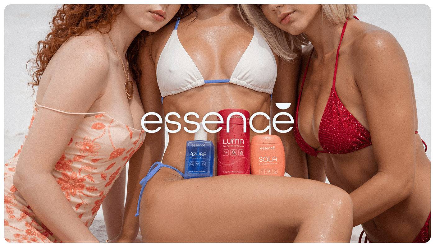
Essence® is a conceptual skincare brand developed as a complete visual and strategic system. The project explores a trio-based approach to skincare through protection, treatment, and internal support, expressed through a cohesive identity, packaging, and ...
Yes it's!
yeah
defintey using it again
Yes it's a technique you need to have in your toolbox..Use sparingly, but this can be useful when you want to display large text behind a subject while maintaining readability without obscuring the main subject.


Good job
The colors and composition are really good.
hey guys
first time ever made a sport team graphic can i get thoughts?

it’s a team collab for a sports division
it's a good start
any thing i should do to fix or change?
Make it just a little darker, put a glow effect on the text
You should attempt to use equal margins around the outside of the layout. Having different sized margins on each side makes the layout appear a bit sloppy.

Approx. 64 pixels around the outside edge...

Good job.
I know this is a "Photoshop" server but are photoshop tutorials applicable to afifnity suite software? They are almost identical and that is what Im using till I start getting freelance jobs (or I might keep using it)
You're completely wrong.
That's not just any "Photoshop" server. It's the official Adobe Photoshop Server.

Questions about third-party programs should be posted on their respective platforms.
how can i improve this one i need honest feedback or criticism

I don't know and can't tell you if this technique is doable with Affinity but since it's very simple I assume any layer based Graphic application with "Stroke Layer Fx" feature can reproduce it.

hmmm
🤔
How about

If it doesn't fit, enlarge the image. That's what I did in the example.
Ik
just make the same with your images
This is probably due to the poor image quality and pixelation. (As there may be a copyright issue with this image, I am simply showing an example of how it could be enlarged and improved using an upscaler.)

The logo is fine. Perhaps a little smaller and positioned slightly higher. In return, ‘Why is succeed’ should be significantly larger and more eye-catching.
@wind swallow
Post your attempts here and wait for feedback. Anyone who has the time and inclination will get in touch.
😉

The hand is quite small make it big. The hand on the right.
@warm crater ight
Add a glow to “manifest”
Sure
Pardon?
They’re saying “ok”
He said ok to my feedback 😭
I thought he wanted to say something else

A good start
Anything you think I should add?
Play around with the bottom text
I was thinking about removing the second part and keeping only the first one then adding some more items to it
Break and anger should be larger
I tried that but it ruined the hierarchy
Good idea
Maybe feelings should be in red?
The top text is inspired from “break in case of a fire” for the fire alarms in companies it’s usually a red box with white text so I kept the same vibe
At first it was supposed to be purple but after getting the sigh of disapproval from my friend a bunch of times I made it red😭
Ok
Try it out, I’m curious
Thank you for your feedback tho I’ll create diff variations with it and see which one looks best
Yes


I think the glow was supposed to be for the text
It didn't feel right. The glow for the text
Second one is good
Not sure for the added sort of glowing effect on the second one... It's perhaps too intense... You might try to make it more subtle...
I think refining the shadows (under the statue, flower on the head, body...) and highlights could help. (see before and after below)

I need advice on what to do with this poster

I feel like the text is maybe a little too blurry and close to the composition's edge. :'O I do really like the direction though!
Thank you, I really appreacite that
Gave +1 Creative Carma to @weak lake (current: #1041 - 1)
No prob! :3
In your oppnion where do you think the text should go?
Here is a visual! I tilted the image a little, so it gives the text a little breathing room when moved.

Thank you
It does make a huge difference
Gave +1 Creative Carma to @bleak echo (current: #6 - 1168)
This is really good
How do you know when you are "ready" to start freelancing as a newbie?
thoughts on this thumbnail?


it's good
looks rlly nice but the red behind the 'state' looks weird cause its not the same as the bg
Main elements are there but they need love.
1- Text is a bit too flat... try to take advantage of layer Fx to give it depth and interest
2- Use camera Raw filter to remove noise/artifacts subjects and sharpen them.
3- You might reshape Growth chart a bit to make it more obvious and interesting
4- Adding a glow effect around the subjects could help to increase the interest...
Honnestly that a great starting points few changes could make this thumbnail awesome!
franck cooking with the help as usual 🔥
lol... I'm trying to do my part 😉
@outer swift: here is an example of what I meant about the growth chart... Making some peaks visible add a lot (in my opinion)

Camera Raw filter on subject adds a nice touch...


Glowing effect arouns subjects too...

Finally, layer styles help to make text more appealing.

amazing feedback man thank you so much ❤️

i also made these if you want to take a look on them


Here is the psd file if you want to explore more deeply how I made it...


I got to leave for few hours but I'll take a look at it later tonight...
thanks man u went above and beyond appreciate it
For "Secret Monopoly" one:
I really like the concept of the cracked icons an the money pile!
I would make the "King of the Hill" concept more obvious by reducing the icons sizes (Keep Google ones slightly bigger than others) and create an "olympic podium" Hierachie...
I think I would try to make Google logo looks like is on the top of the money pile (Cyan Note)

Add light beam glow and some shadows for a dramatic lighting then ceate a vignette effect (that's the classic way to put emphasis on the center of the image).

Here is what I mean

@outer swift : don't want to influence your title design choice but a "Monopoly Game" sort of header could be a fun addition.
Original logo uses "Kabel" font but if you use "Neue Kabel Medium" from Adobe Fonts (Free with your CC or Photoshop subscription)
you can create something pretty similar (note: the slanted Y foot cap is hidden in "Glyphs panel")...

I’m working on a gameday graphic for lacrosse, it’s the woodchucks vs the patriots and I’m making it for the woodchucks
This is my first photo manipulationish style and I need ideas on what I should add, and where I should put the text like game details
Any feedback and ideas would be greatly appreciated

1- You might have to use a dark backgroud to get a nice flame composition (F;ames blending modes work better over a Black or really dark backround rather a light one),
2- Try to make the arrow more obvious,
3- To match the flame concept, I would try to burn the Viber's icon rather crack it...
Just few ideas...

Hi I’m pretty new are we allowed to send any of our photoshop projects for peer review here??
yes, as above, post a pic and your request to review
I like it. However it does seem a little dark in the foreground. I appreciate its backlit but a little bit of poetic licence would be ok 🙂
I know this isn’t the place but any feedback is always helpful to me
I’m working on branding for a eco friendly water treatment company, here’s some of the branding. Custom types and a logo of a water droplet in motion, fitting in with the idea of eco stream. Anything I could do better?
Made 3 different versions of the logo keep, any I should choose from or expand on the idea, or scrap?


Perhaps make the e in stream look like the e in eco?
Perhaps have a droplet falling from the r. It does look a bit like a tap 🙂
Just for your info you also can ask on Adobe illustrator Discord Server.
There is a "Project Feedback" there, too...
https://discord.com/channels/634884897185595412/637037444834787341
Most logo and branding specialists use Adobe Illustrator for their work... You might get some valuable feedbacks there, too.


The first image looks cool; I like the background; it has a lot of visual interest. However, I feel like the text is getting lost a bit in the background. Maybe it would help of it were brighter, more bold, all caps or simulated caps. You can still add overlays and effects to it. Just an idea.

Project: Tire Branding/Automotive Social Media Post
Goal: Working on a premium and bold look.
Feedback: How do you feel about the lighting and overall composition? Would love some expert thoughts!

I like it, but move the text on the left over more, it's way to close to the tires
yeah
^
make make the tires like 20% smaller.
This visual for Neboson (?) has a great vibe thanks to the yellow-and-black contrast.
The Background with the tire marks is a good idea and the orange and yellow hues added on stack of tires add a nice touch.
However, the current hierarchy is a bit confusing: the eye wanders all over without knowing where to stop.
The tires are really big, and all the other parts are more or less equally "loud"... Try assigning them different weights depending on how much importance you want to give them.
- The title, "It’s now time to Run the City," should be much larger and perhaps in bold... You might try a sans-serif uppercase letters to convey a sense of power and momentum (unless you prefer a serif font).
- Supporting text: Shorten the explanatory paragraph. People don’t read much on social media posts. What if you condense the message: “Neboson: Drive with confidence and elegance.”
- You might place Contact info/social media post at the bottom right (Z pattern) that's where we usually finish our reading ( good place for Call to Action elements)...
- The Logo: The "Tires Logo" (which appears to be a generic) should be sharper. Make sure there is enough white space around it to give it some breathing room.
fonts are bad. the thin font is too thin and the thick font is not thick enough. bad contrast.
i disagree with supporting text. there really isn’t that much. no need to shorten the length of it.
i agree with the last point
though i understand you didn’t place contact info at the bottom because maybe you couldn’t figure out a way to make it look nice. i think it can work at the top but there are bigger issues to work on first
You disagree but you tell to shorten it...?😶🌫️
So you agree. Right?😉
Also, I challenge you to find good social media ads where contact and/or Call To Action elements are in the top right corner... that's a design non-sense.
no need to shorten it
Whatever you (he) like(s)! 🤷♂️
Just so you know, by 2026, the average attention span for an image or piece of content on social media will be extremely short—estimated at around 1.7 seconds...
I'm just providing some basic information and guidelines on graphic design for social media...
Rule #1 . Keep it short and scannable
Social posts aren’t essays. Aim for a few words or a short phrase. If someone can’t grasp it in 1–2 seconds, it’s too long.
Rule #2 . Increase contrast:
Headline: bold and large / Subtext: smaller, lighter /**Supporting text: **minimal
....
But after all, everyone is free to do as they please.
Good luck with it!
Hello ! I am a photographer and I would like to get critics on what could be changed I know these are photos but still... Thanks !
https://www.instagram.com/alexziphotography?igsh=dW42ZWlpM2YyNmdq
(By the way i hope you don't take it like I want +1 follower, I am not trying to promote)
I really like what you have! I love how they're all visually cohesive in visual balance and color pallet (despite being various subject matter). My main critique is I wish there were more. 🙂↕️
Yo mandem, this is a documentary-style thumbnail. Please rate out of 10 and tell what to improve

the quality is slow
really love this one

Great thanks !
You're welcome.


rate out of 10

The hair looks a bit iffy, try to make that a bit better 🙂
Holy..Yeah I just saw it now. Thanks!
Gave +1 Creative Carma to @muted heron (current: #286 - 6)
I would rate it "Good start"
Points to improve
1- Use the good aspect ratio (most common for thumbnails is 16:9 - 1280x720px for youtube)
2- Fix the text. The word "HUAWEI" is currently partially obscured by the subject's head and lacks enough contrast against the background. Shift the subject a bit and try to add a Stroke or Shadow to enhance contrast,

3- Add a subtle texture or gradient in background,
4- Brighten the Subject, Make the globe "vibrant" and add more obvious glow effect to increase drama,
5- Remove unwanted Fx such as the red band at the bottom of the image...
Thanks alot bro 🙏
Gave +1 Creative Carma to @bleak echo (current: #6 - 1169)
Just a Before/After to illustrate what I meant...

Step by step animation...

Does this look like a real magazine cover?


Bro I dont deserve this much love and kindness 😭🙏
Thanks alot man. Lemme fix it and upload it here again
How did u make his face whiter and the earth glow?
1- Camera Raw filter with this adjustment to increase details while keeping everything relativly "soft"

2- Make a selection from the foreground subject, create a new layer over the subject, fill the selection on this new layer with any color then set Fill to 0% and apply an Inner Glow layer FX with these settings.

3- Earth Glow is made from 3 layers with different Fx and blending modesinvolved... I made this short video to show you
the structure and different settings... I hope it will help
what do you guys think?

Is this meant to be a YT thumbnail design? I would keep working at it. Refine the "AI SLOP" heading so that it has more impact. Perhaps add a sub-heading to reveal more about the video's purpose. Personally, I think using newspapers seems a bit out-of-place for a high-tech subject. I would perhaps make the world on fire. Or at least a data center. Maybe both. These are just suggestions. Feel free to use any of them if you like. Or disregard them completely.

It's a start. I would keep at it. The aspect ratio is wrong for VOGUE. Typically magazines like that are 3:4 aspect. VOGUE pays a ton of cash for professional photography so I highly doubt they would apply filters. Rihana's management team probably wouldn't let that slide either. They'd insist on the best clear photo. There would probably be a month and year on it somewhere. You'd most likely have secondary story titles on either side.
A few ideas...

It looks like you've lightened the image and cropped it. I probably would've went the other way. Approached it from a Rule of Thirds design, with the pup's head landing near one of the intersection points in the RoT Grid. Then use Generative Expand to get more of his tail in there. I would use a Camera Raw filter for Light/Shadow/Contrast adjustments. And since its an outdoor photo on what appears to be an overcast day, I would push the colors to the cool/blue side of the spectrum. (As opposed to the warm/yellow side.) Those are my thoughts.

Honestly? That is kinda cheesy. So I would lean into that. heh

I see
Thanks
Gave +1 Creative Carma to @wooden oak (current: #2 - 3326)
any feedback or suggestion on menu design


Thank you very much, I’m new too all of that stuff and I only used my phone and some free apps cuz I don’t have access to to ps 😩
Gave +1 Creative Carma to @wooden oak (current: #2 - 3327)
The first one is great
The second one, maybe space themed out more since there isn’t much on the bottom
yo I see potential in this pic but I don't what the final will look like. How will you guys finalize it?

Im thinking of maybe leaning to the recent Messi's purchase of an entire football club and write something clickbaity like "$2.3 BILLION??" (the actual price is 2.3 MILLION)
But I still don't know how to end it, maybe you guys could help with inspiration
Here's a little demo I made.

You could do something like this.
exaclty what I was thinking about too
Maybe just change the font? then it wil be okay
I’ll redo it, yes
👍
Which font do you want?
Is this good?

Need any changes?
yeah this looks way better including the messi's glow
Imma try work on it more to add more thing to the story. I just can shrg off the feeling that just messi and a background is knda empty
Here's my .PSD file!
Should make things easier.
Thanks alot broski
Gave +1 Creative Carma to @glacial grove (current: #60 - 36)
Hi guys, any thoughts?

Are you asking about retouching the image only, or the composition as well?
Anything could help
I had a couple ideas but they change your composition and intent a little bit... The notion was to make the lighting more a character in the scene. Both artificial and natural light. I've also used a bit more saturation because that sunset seems like it should be more striking. Just my opinion.

Interesting, it's kind of cool! I did like the shadow u added to the foreground
Foreground is generally a lot darker than midground and background.
Yeah true, it has a contrast
I'll try to add that
It's always fun to experiment with different lighting scenarios.

humann this is amazing how long have you been using ps?
A very long time. heh
your very skilled nice job
Nearly any composite is possible now. Only limited by imagination at this point.
no wonder your in the official ps server
I think I understand why you’re using the golden room and the soccer field in the background... The opulence and excessive wealth—but perhaps you could find a more dramatic way to convey that message... A pile of dollars, for example...
Also, Messi really has a goofy face in this picture... I'm not sure it serves well the message you're trying to convey... I would try to find a more 'pretentious' expression (or at least a less goofy one)...If you can use NanoBanana, that would make it pretty easy.
You also need to make the text more appealing.
is this good as a second varition of my original poster?
Im very new to making 3D objects lol, but i dont think it looks bad.

Ill send the inspo in a sec
yeah ok ill sack that off, I cant find the inspo
but the shadow was pretty much the same
I also like the text above the main
@loud lynx : just to illustrate my previous thoughts...

This is good.
That's a good start... I would suggest you to make shadows softer and less uniform (especially on top—in real life, shadows are darker and sharper where objects are close, and softer and more blurred when objects are far away)

Also when you make objects from shape try to add a subtle grain to match the stock images used.
ahh ok ty
Gave +1 Creative Carma to @bleak echo (current: #6 - 1172)
its my photography 🙂
Oh! Did you take the photo of the shoes yourself?
I did indeed
Nicely done! I had no complaints about the quality of the photo...
My point for the grain comment was, when you create 3D things from vector shapes in photoshop they alway look "Flat"...


Any picture taken with a camera has 'grain'. (more or less visible) Adding grain to your 3D shapes can help make your design more cohesive.
ohh i see, tysm
Playing around with Gradient Map and Grain.


Yayyyyy way better. NOW this is more like a thumbnail

Nicely done!
I’ve been experimenting with Photoshop to create some theatrical musical theatre posters for my portfolio, I’ve been experimenting with different effects and techniques in and out of Photoshop to create the 3D text, and then use Photoshop for the layering, composition, and final tweaks of colour, lighting and design, thoughts so far?
Ultimately I’m creating some posters/marketing projects, based off real productions or fake to build my portfolio for this niche that I’d like to work in as freelance eventually.


These are my best examples so far.
A few ideas:
Visual Cluter
- Fade or remove the background pattern further (lower opacity),
- Increase line spacing between items slightly. 2nd page has lot of free space, use it to let your design breath
- Make item names bolder than prices.
Colors
Orange works well but it's overused - Use it only for section hearders and/or key highlights.
Keep item text in dark gray/black for readability - Not sure the orange menu header serves well the design and text under menu is hard to read.
Veg/Non-Veg Indicators
Sure there are veg items in others sections... consider to use a small icon to indicate them rather create a separate legend...
The chrome effect is really good here, nice job!
^
I like both 🙂
Personally for the robin one I would either lighten the background or put more diffuse highlights around the rim of the hat to make it stand out more.
Great shout. Thanks for the suggestion.
Gave +1 Creative Carma to @raw wadi (current: #26 - 97)
Hey im making a logo for a youtube channel that uploads apple-style edits, something along the lines of that lol
I cant decide between the white or black background, any thoughts, or suggestions for changes/improvements as well?


go for the white bg, black logo
I'd pick a secondary colour to go with it.
Although I'm unclear what the Gothic style has to do with "Apple Style Edits" - In fact I don't know what "Apple Style Edits" means either?
Since it's presumably to do with video editing, can you not bring an element of 'video editing' into it?
Perhaps that star could be a 'play' button?
Or those 'viewfinder' corners you see on videography/photography?
e,g...


Sounds good, I'll take this into consideration. Thank you!
Hi! I made a Roblox GFX as a practice, and I was wondering if there are any areas I can improve in this ^^

Any thoughts on what else I could add to the blueprint or change?

I'm not a Roblox player or a fan but I think this has an interesting quality to it. Is this a YT thumbnail design? If so, I would maybe frame it a bit differently. Using a Rule of Thirds layout and locate the character more in the vertical center of the comp and a bit to the right. Then perhaps put text on the left. But this is just spit-balling...


I would maybe just highlight diagrams of the lacrosse stick and ball. And leave off the other things. Or maybe stick, ball and cleats/shoe. Just my opinion.
What do u guys think?

Yellow is the original image, this is an older project, I have much newer stuff now but this is my first post soooooo i figured I would start simple


this is really cool
Nice cyber-punk/Vapor wave vibe!
Maybe boost the shadows. Otherwise, good job.
very good job

Can someone help me remove the microphone from Beyonce's face?

Content-Aware Fill is getting a little wonky.
Here's my .PSD file.
Here is the updated one.

Good job.
maybe add an outline to the girl, more shading on the bottom background.
I wouldsuggest you:
1- Sharpen your image a bit,

2-Turn your image more into a night scene... My example is perhaps a bit more intense than what you want but you need to add more contrast between the overall image darkness and the light of the car,

3- Add shadows and lights according the light source.
Just few ideas...

damn ty so much, i thought i did well but theres so much i could have done to make it better. thank you for the suggestions i appreciate it.
Gave +1 Creative Carma to @bleak echo (current: #6 - 1173)
No problem. The lighting and shadows are crucial for making a composite image like this work.
Last comment: the direction of the monster's shadow should also be adjusted to match the light source (the car's light).
But don't worry, it was a really good start...

Can anyone help with my Beyonce image
The various elements clash and prevent the viewer from focusing on the essential element...
I think the main attention would go to the player but intense white and scale of the blueprint background take over...
I would reduce the weight of background elements and add a subtle Player drop shadow on the blueprint area to create a sense of depth.

I'm also wondering about the overall layout/format of your design... I would use Rule of third and try to place the subject along the vertical guide and scale its original image to be able to place the player head at the intersection of Vertical and Horizontal lines

Wow you give really sound feedback!
He really does give great feedback

I made this for a uni project, trying to replicate an infographic for the conversation on instagram, how can i improve this desing

amazing job
Thank you!
Gave +1 Creative Carma to @glacial grove (current: #60 - 37)
You're welcome.
this looks sensational. extraordinary. amazing.
yo rate out of 10 gang

If the cards in the background are important then I dont like the vignette
Have you considered using a grid?
1- You should add inner margins to your design and avoid placing elements too close to the edges to give your design some breathing room.
2- Three lines of text with the same font size/weight look a bit "bland"... You might want to consider condensing it into just two lines and adding some visual hierarchy...("Human and Lightning" => all caps and bold Vs "a phenomenon..." lower case and lighter)

Yeah they are important. AIght i will remove it
What I meant by margins...

By all means leave the vignette but only on the background, not the cards 🙂
It would be great to get some context... Maybe it's just me, but (since there's no title) I didn't understand what this thumbnail was about.
The thumb looks really fake... And the message is a bit ambiguous... Does that mean the icons/apps are OK, or is it pointing to the clock icon?
Please don't post the same message in several places on this server.
This type of post is best suited to the #💬chat-general....
I second that!
yeah actually without a title/context you cant really get a clue. It is a generic self-help thumbnail
But I thought projects were meant to be posted here?
peak?

I don't think this message was meant for you... Unless I'm mistaken...
It was for someone trying to hire a designer by posting the same message on multiple discussion threads...
oh aight
There are a lot of elements competing for attention, which makes it hard to read...
In my opinion, way too many boxes and frames...
I suppose the box containing Michael Olise is meant to use an incomplete image. However, I'm wondering about:
- the relevance of the boxes labeled "Today" and "8:00 PM",
- The purpose of the black border with a thin line... In my opinion, it's not necessary
- Why the club logos are in a box and partially hidden...
That's just few ideas...It's up to you whether you take that into account or not. Enjoy the game!
Thanks gng
Gave +1 Creative Carma to @bleak echo (current: #6 - 1175)
BUt you think its decent?
La imagen está buena pero el brillo del celular es demasiado alta. Algo así sería la reacción de la mujer cada vez que enciende su telefono haha.
It's perhaps decent enough for a 24-hour story post... but don't put it in your portfolio 😉
How is this related to Photoshop?
I used it to create the thumbnail and a lot of the art related to this movie. But also you gotta do what you gotta do to get your name out there ig. No harm done I hope
This channel is for feedback on work created with Photoshop. Not to get clicks/views.
Sorry didn’t intend any hassle
opened up photoshop for the first time in a long long while and made something for a “niche” alt pop group i was able to work with. (not for design purposes i just work in radio lol)
i really struggle with text. wanted to play around with skew because i figured out that was a thing lol. but i didn’t think far enough and once i started laying everything out i think it looks kinda cramped. but i like it overall :)

I know this isn’t the place to ask but all feedback is good
Im working a type and logo for a tech start up with a focus on water treatment solutions, here’s the new one I came up with the. A lighter and more readable modern type with a logo that should convey the idea of a stream, keep in mind its two alternative logos they’re not supposed to be together.
And the second one which is the old type and logo
It’s definitely not finished I got more ideas on logos I wanna try out and maybe add something to the type to give off a more water/eco friendly feeling. Let me know what I should add or improve or scrap


<@&548221840750018590>


Strong design!
The layout follows a strong hierarchy that immediately communicates the most critical information...
Great use of grid, Fonts choice fits well for a Digital Design Service and negative space around lets the design breath.
IMO, a Call to Action (CTA) element is missing...While it says commissions are open, a direct instruction on how to order (e.g., "DM to Order" or a website link) would further improve conversion.
But, Wow! That's a solid Work!💯
Aesthetic used fits well for Aternative music band...
Love the Grunge/Zine look and vertical split.
You might try to match the brightness of the four individual shots ( the two in the middle are way more dark than top and botom ones)...
Good job anyway!
I think you should up the contrast a little, otherwise, nice job!

Some Rihannas I designed.


👏👏
Thank you!
Thank you for the thoughtful reply, agreed on the CTA, going on it now 💛❤️🔥🙏
Gave +1 Creative Carma to @bleak echo (current: #6 - 1177)
💡

Adding socials and contact methods
kinda wild that all of these headers are from like 7 years ago haha
@bleak echo @glacial grove
Nostalgia
thank you!! i thought so too but i had already worked on this for an embarrassingly long time
(damn near 4 hours lol, i wonder if that’s how long designing rlly takes or if im just slow)
next time around ill play with adjustments layers to make it more cohesive!
Gave +1 Creative Carma to @glacial grove (current: #57 - 38)
Yeah, designing can take that long sometimes.
I also like the skewed text thing you did with the people.
Maybe add the yellow glow onto the left text as well?
good idea! might try that. i’ve always wanted to make these sort of grunge posters so im generally surprised i was able to pull it off with what i already knew about photoshop
You're doing well!
thank u! i really like designing. i actually managed to get a small design gig for a non profit so it’s forcing me to use photoshop a lot more. thanks for the advice and being so kind lol
I love design!!
Oh, that's great!
Got any more posters?
I'd love to help out!
im embarrassed to share but yes!


Here's some stuff I do.


the fourth one has a major typo (spelled vague wrong smh) but the photo is actually my own photo i took when at a museum in washington DC! that one was my first “cohesive” body of work i guess
the textures are really good
i like this!! definitely liking the colors which is something i want to do. i think i struggle with that too because i tend to add gradient adjustment as i go then add one for the whole project which changes the colors. i never went into a project knowing how i wanted the color scheme to look which is why i think the contrast in my first project i sent is off
textures are lowkey my favorite part . sometimes i look at this meme to remind me not to add to much

I'm good with gradient maps!
a few different ways actually.
-
easiest way. there’s plenty of free assets online. i search up either photocopy , grain , and add it on top of my file then play around with blending modes, opacity. sometimes i add texturizer and film grain in the filter gallery for more of an effect. maybe a basic black white gradient adjustment depending.
-
displacement maps via the free assets online. save the texture as a psd file. i don’t do it often because im still figuring it out.
ive paid for a few textures through other designers because thats how much i like collecting and playing w textures lol. i buy them even tho i haven’t used photoshop in a while
cool.
i make my own textures sometimes too by using either an slightly off white , or black solid (or honestly any color depending on what i want to do) and adding noise and playing around with effects in the filter gallery. then i add on top of my photo, then play with blending modes again.
Good job.
I like the inverted colors on the 4th one
Just made this.

Halftone effect, outer glow, smudge tool.
that’s cool! did u make the shape yourself ?