#📝project-feedback
1 messages · Page 32 of 1

Free advice
Im studying graphic design as a profession in highschool and we just learnt it now
Art is an expression of one's self it coincides with the world around you in a great monolith
bad art, good art, whatever art is still apart of the greater picture and even you can't draw good, art is an expression that anyone utilise
take a quick look
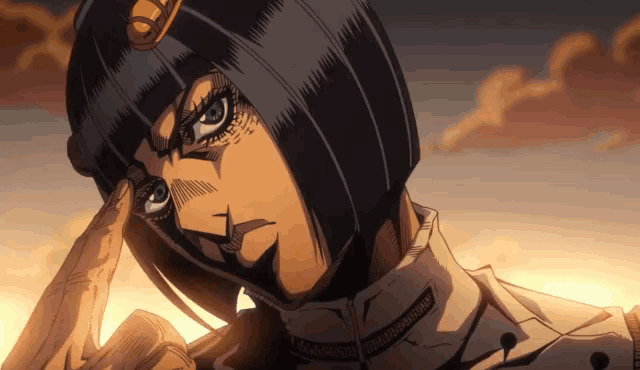
Well, I am learning how to, using Jojo as a reference art for anatomy.
most sigma build for your reference 🤣

not this
idk if I can post drawings in this chat
that's nice at least I hope you actual get some useful knowledge
My introduction to graphic design is just a short 3 month course and I got professional certificate
It's cool and depressing, knowing it'll be replaced by AI at the time I graduate university probably.
Anyways, gotta go. Thanks for the talk, fellow Jojo enjoyer.
arrivederci joe-bro
is this good?


Heck yeah, i think that looks a lot better
u rite Charlie
Have you experimented with different text fonts and colors?
early version

Very Gritty I'd say I think it looks good now that I'm seeing it again
Tried going for a gothic font
Yeah that was the one that caught my eye initially

honestly just because it's smiling friends 🤣
you rite the only thing is that I'm also impatient so I went with the best looking font at the time I think the one I chose blended together with that sense of fashion with the male model because it's a dude in a fit
but I think it did take away some aspect of horror or that grittiness for going with a simpler font
So im making a poster for the play Almost Maine, it's a series of short stories played by multiple actors where each of them find love. The play is set in the peak of winter in maine. Northern lights are a huge part of the play.
This poster is in very early stages and i'm wondering how it looks so far? I'm not sure about the "By John Cariani" font, is someone wants to give me suggestions feel free!
Also I want some suggestions with the snow, what to add, changes, etc.

The snow will have the show info, dates, QR codes, etc*
were you going for more horror or thriller?
idek gangy 🤓
but fr I'd say more thriller had an idea to make a story then complete this because I was actually thinking of making him a ghost
ooh cool
someone there who isn't there in the rain
get it like echo rain
so this is the aspect I use ai for is generating a quick title or something
so were you trying to make him transparent or translucent in some way?
He walks alone through the soaked cobblestone alleys of East London, where every shadow whispers a secret and every raindrop echoes a memory. No name, no past — just a coat stitched with stories and a hat that hides more than his face.
They say the rain started the night she vanished. That the city hasn’t dried since. Now, he’s back — not for justice, not for revenge — but for something deeper. Something buried beneath the bricks and silence.
This isn’t a crime story. It’s a reckoning.
dope
yh kinda I more so just wanted to have an excuse to give him a light glow
one that made sense as well
cause again this was just me merging two images together then developing a story after and narratively making design choices based on it
In like a day or so
Because all this is literally just fun for me to create something spectacular so every piece I make is at the best of my abilities at that point in time
funny enough I'm happy with my work but not satisfied completely as immediately after one long project with hours of work and effort is finished I'm over it and it's onto the next
For me it's selflessly trying to use all my potential, skill and creativity onto a canvas that can handle it, weird thing to say but if you saw the paper I drew on you'd understand
so for me it's always the next big thing but it doesn't mean I don't appreciate my work I just know that every good piece of work I have ever made has never been my full potential
i feel that
I started learning photoshop in high school and I became kind of obsessed with it, and I was too poor to pay for an actual subscription so I used free variants like Gimp and Photopea. And I started watching a bunch of youtube tutorials on it and I got better and better, and then one of my roommates in college was really into film like I am and I made posters for him and I'm happy with how they all (mostly) turned out. But it has been a while since then and I haven't really had many actual projects to do, but I still gotta scratch that itch cuz I love working in photoshop
Also I pay for actual photoshop now
For a couple years now
being financially stable enough to pay for a monthly subscription is a big W
My challenge is getting work where people just skim pass my work and go for someone with more experience tried applying for companies and even freelance work but I'm just someone who wants to just do the work just do good work but unfortunately it's been an uphill battle as I have every I need to be a great designer I just don't have good networking
yeah a lot of people don't realize good networking is often the biggest factor in getting recognition and good jobs and gigs
I'd suggest starting locally, if there is a shop or a school or some small business around where you live, don't hesitate to reach out to them and offer your skills, even if they pay very little or dont even pay at all
do you mind if I try my hand at it? I'm curious to see if I can get some sort of spectral effect cuz I haven't really done that before
what do you mean why you asking for my permission just go for it
look the stock images


also this one thst didnt make the cut

yh I've tried that for months but making a living off that is way too difficult
it's just a local shop with a good friend and between people paying and wasting my time I couldn't besides doing those projects I take have the profit from someone who needs it more than me
this man got 8 kids nick name cannon🤣
yeah the only money I have made from photoshop so far is my friend paying me like 15-20 for every poster, which was only a few
The beauty of being a designer😭
but thankfully I don't do this for the money
@unborn sparrow

I like it I'm impressed how much more progress than me
honestly if possible, Ithink the only change you could with this is bringing the text down but I think the text at this height adds its own unqueness
wish I had the know to add certain elements to spruce up a design be more creative
Um... my quick knock-up feels like the book cover you'd see on a kindle library for a book on special 2.99 offer.

damn how'd you colour him so good?
Neural filters > Recolour image... then tweak colour balance.
What can i change here for better result?

I would work on the curve and placement of the text so that it follows the curve of the bubble a bit more.
I used to think about it, i ill change
I put the text at the top cuz otherwise the top just felt kind of empty, but i added more color cuz i felt that the blue was overwhelming in the first one

Gyat Damn Charlie
Brother you need to teach this
I know it could just be a basic erase with the soft brush but still damn I wanna be more creative with my work and implement these design choices into them
what yall think

Bro if this wasn't the name of Josuke's stand 😭 🤣
Looks cool. Can you provide some context?
just came to my mind at 3am yesterday
I ask because I’m debating whether you need the soccer ball
if the soccer ball is the subject i think it could be lit better, i didn't see that it was a soccer ball until i zoomed in
yeah it is
i tried but this is the best can do
just got around that bottom text you took that from some movie subtitle
I saw Jasom Mamoa was in this😂
@frigid slate why don't you try your hand at this and see what you can do
🫡
@unborn sparrow

I may have strayed a little far from the basic design
i got carried away
Gyat Damn
gotta link that subtitle at the bottom for me to practice with
matter of fact

Hello everyone, after long time finally I had chance to work my own personal project which is done with using Photoshop, Illustrator, After effect and Figma. Please take your time and check, I hope you will enjoy. Please share your feedbacks and comments and dont hesitate to like 🙂 ofcourse.
https://www.behance.net/gallery/239533585/Delicious-Match-Match-3-Game-player-interface

Welcome to Delicious Match, a kitchen-themed Match-3 case study where I challenged myself to design almost everything directly in Figma.From components to animations, my goal was to create a production-ready UI package that developers can plug into a rea...
FNAF poster I made for a kid on another server

Looks good.
Personally I would...
- Darken the shadows within and around the title to increase the contrast
- Brighten the animals a little while still keeping the deep shadows
Anyone know how to do the text in photoshop?

What can I improve on this thing, its currently just something I made for fun, I might show it to my client for an instagram post or something

What do you mean by "how to do the text"?
How to useText tool? How to create text color effect?...etc.
Your question is pretty vague...
There are lot of texts on your sample... Could you clarify?
Nvm i figured it out ty anyways
Gave +1 Creative Carma to @bleak echo (current: #7 - 1008)

I think it’ll be better if you reverse the video

I’ve only been using Photoshop and doing design work for like two weeks 😎🙌
Mind giving me some feedback on these visuals?


Guys, let me know your thoughts about this thumbnail

This looks great. The colour and contrast are extremely eye catching.
I feel there is perhaps a little too much dead space. Personally I would try increasing the size of the character to fill more of the left area.
I feel like your highlights are too dark. See the lack of data at the top end of the histogram in the first image. The second image shows how brightening the highlights with a Curves adjustment layers stretches the image data to the top end.


Thanks a lot for the detailed feedback!
I really appreciate you taking the time.
I’ll try reducing the dead space by scaling up the character on the left, and I’ll also work on brightening the highlights using Curves to get better data in the top end of the histogram.
Thanks again — your explanations really help me improve 🙌
Gave +1 Creative Carma to @abstract oxide (current: #13 - 271)
Thank you. I’m impressed by the quality of your work given how new you are to Photoshop. Best of luck with all your future designs.
Gave +1 Creative Carma to @solar swallow (current: #1027 - 1)
The Thumbnail itself looks Ok. maybe you can look at the Face and isolate it or replace it with a more natural.
any feedback on this?
making a fictional studio ghibli movie poster for my wife for christmas
does it look decently authentic?

(i did actually draw this, not from chatgpt)
Looks great!
Small text on the bottom of the page is very close to the edge. Generally, good design dictates space between the text and the edge of the page. It should never get too close.
will make that adjustment, thanks!
i remember you helped me out with some PS stuff quite awhile back
Gave +1 Creative Carma to @wooden oak (current: #2 - 3199)
Happy to help if I can!
This looks fantastic. You’ve got some amazing drawing skills.
I'm wondering if the house and dogs at the bottom are overcomplicating the whole design?
Thumbnail for client thoughts?

hows this ferrari 458 shirt design

Hi I’m new here
It looks strong. Good design.
I’m not sure about blurring the text.
so im trying to cut out an image but its kind of complicated, can i get a hand?
Can you post some screen captures showing your entire screen?
blurring the text was intentionally so the main focus goes on the subject
Sad that ChatGPT is forcing a justification from the talented, or those who took the time to practice, fail, and learn and improve…
Please don’t pollute these channels with ads. This is NOT the place for that, read the rules!
Hi! Please se the #❓ask-a-question area for this.
How can i make this music video thumbnail look better ?

Font feels pretty old fashioned.

I just thought some color and slight weight variations could make it nice
thats really just the opposite end of the spectrum
Yeah. Course 🙂 - it completely depends on the goal/subject matter etc. Good luck with the project
P.s. I just saw your pfp - so I can guess what you mean about opposite end of spectrum.
What are u on about
how much should I charge for one? i'm thinking of $60-100

Well said
I honestly don't know what I'm doing 😆 I keep trying to make thumbnails and they end up looking pretty bland

That was iteration #1, here's iteration #2

does it look too busy?
I would like some feedback 🙂
I also tried playing with color, contrast etc

Good composition.
Personally I would brighten the shadows a little to show some detail in those areas. Currently it feels like you have big blobs of “nothing”.
i fw it personally


Fiverr.com
For only $5, Strahagfx will create premium y2k chrome text effects for branding, titles and designs. | Looking for high-quality Y2K chrome text effects that stand out instantly and boost the aesthetic of your designs?I create premium, glossy, futuristic chrome text styles | Fiverr
Hi guys, any feedback ?

Please, no advertising here. You’d better take down this message.
It’s clean and legible, interesting colors!
Thank u so much 
Gave +1 Creative Carma to @jade inlet (current: #12 - 333)
Hello, im new i have only 1 year of photoshop exp but not like grinding so hard bc i have other stuff, do u think this level is on the right track or im slacking off alot, any feedback will be appreciated tho, thank you.


They look very good for only one year of experience!
Only one very small typo in the last one: to your dreams, not “yours”
thank you i needed that
Gave +1 Creative Carma to @jade inlet (current: #12 - 334)
I like it. Nice update.

Feliz e abençoado domingo para todos. Aqui partilho este projeto pessoal, onde podem ver a imagem final e os temas utilizados para a publicidade.
https://www.behance.net/gallery/239983373/COCA-COLA-MERRY-CHRISTMAS-SANTA-IN-THUNDERBIRD
Thanks!

Coca-Cola — Santa en ThunderbirdProyecto conceptual de manipulación de imagen publicitaria. Concepto y prompts generados con ChatGPT y Gemini Nano Banana Pro; edición y composición final en Adobe Photoshop. JONATHAN ESCALONA | Diseñador gráfico publicita...
Hello !
Some of you have feedbacks to improve this composition ? 🌹

Hi, composition-wise, I’d add some breathing room, more space around the front and top of the place, to make a more dynamic image.
There has to be an interesting element that the thumbnail is focusing on, right now your thumbnail’s just a description of what the video is about which should be in the title. Try to make everything have a purpose, every element should tell a story. I’ll be honest, that isn’t a very interesting video so it’s hard to make an interesting thumbnail on it, make them on a video with a good climax to practice
can someone rate this?

Damn I'm still a beginner
Whats it for?
im beguinner myself i have 1year of exp but this is exactly how i started just combining deffrents elements and try to make it look cool
try to watch someone work and copy what he is doing ofc that after u watch a guide for how to use photoshop so u understand what the other person is doing
Badge for a game

Which one is the best?


3.5 bg good but the front elements is a no go
yo i had sent this image a while ago in the server for some feedback on my cover for my shortfilm so i did some tweaking today what do y'all think


I think these look great. Beautiful work.
I like the washed out look of the image on red. I also like the bold black text. However, I don’t think they quite work together.
Ye ig I should try some different background
Like the reddish
It seems Little too bright maybe
Perhaps make the black text a very dark grey or a dark red. Perhaps add a little texture to it to match the other content.
Desaturating the red could be a good move
Umm
Ok
I'm certainly not trashing what you've done which looks great. These are just suggestions.
No worries. Happy to help.
Is this better?

Yeah I realised revealing the time on the thumbnail might remove intrigue
Hope people might want to click now, "Will he be able to beat his goal"
I don't like it
But to be fair, I'm not your target audience
and I have no idea what it's talking about
I don't really know who my target audience is but I would assume speedrunners
Are you saying....
"I’m doing a GTA III speedrun that avoids dupe glitches. Can I beat my personal best and get under 1 hour 30 minutes?"
Yup
without giving away what time I actually got
I guess the thumbnail won't really be that interesting as I don't have facecam
ok, and is the 'Dupless' thing an important thing to mention in the main title? - Do a lot of people 'cheat' it?

yeah, I don't think that's a major issue. - I think a better title would help...
Clean + Broad Appeal
How Fast Can I Beat GTA III Without Major Glitches?
GTA III Speedrun Attempt — How Fast Can I Go?
Pushing GTA III to Its Limits — A No-Glitch Speedrun
My Fastest GTA III Run Yet
A Full GTA III Speedrun… Faster Than Ever Before
Challenge-Focused
GTA III Speedrun with No Mission Dupes — How Fast Is Possible?
No Major Glitches. No Shortcuts. Just Speed.
A Clean GTA III Run — Faster Than You'd Expect
No Dupes Allowed! Let’s See How Fast GTA III Can Be Beaten
Beating GTA III Legit… But Still Stupidly Fast
Nah it's a category extension / not a main category but people basically challenge themselves to beat it without abusing glitches
ok. Cool. What's the wonky 'PB' mean? Personal Best?
I recon drop the PB and insinuate that in the title....
Maybe the title could be "It took me 8 months to PB | GTA III Dupeless Any% in 1:29:21"
I'm just thinking...
or "How I DESTROYED GTA III"
I like the 'police chase' element to make it sound like you're literally blasting around the map, instead of what I presume is using a bunch of shortcuts and cutscene skips
well, there are minor glitches like something called a megajump
yeah, cool. - I assume you'd need stuff like that to do it in under 2 hours 🙂
a megajump is basically when you mix two animations together and it causes you to move an insane amount
however, the more risky megajumps I did not attempt
I wanted to save my skin, not swim with the fishes 😆
Another major timesave is using the Dodo, which in gta 3 feels like it was never designed to be flown
that was another point of my narrative. "Facing my Fears"
or seeing whether I could tame the metal death trap, or would I end up swimming with the fishes in Liberty City's harbour
... I'm not convinced by my own suggestion to be honest. - Like I say, I don't know the lingo.
Key things to highlight though....
@short zodiac
- any sense of 'speed' must surely be good thing to make it look exciting...
- Pick out key words in a different colour to help them stand out.

Damn that's pretty good
but pink doesn't match the aesthetics of gta iii
that's more fitting for vice city
Of course. - I could be any colour
Honestly I thought that might be too much text
and also wouldn't "pushing it to the limit" imply World Record or something?


did you use things like drop shadows, outer glow etc
from watching videos youtubers recommend using effects like those to make things "pop"
No. Neither of those things. - I think they would look too corny and amaturish on a thumbnail.
Also to add sense of speed I would add blur or something?

the black, and red?
You make one 'thicker' than the other and put it at the back
Are you sure outer glow etc makes things look amateurish?
I guess what it comes to creating a thumbnail I should look at box art and use that to get an idea for color palette
but sticking to 3 colors and 2 fonts probably
can anyone give feedback, idk if the words are in a good spot, i cant figure out how or where to put them

... None of these use outer glows around text


Whatever is done in a thumbnail has to be intentional
oh wait! - Proved myself wrong!
surely outer shadows are good
"finally" does below! - and to be fair, it looks alright! - I take it back!
Only thing I'd do is pick which is the main headline. - And make it bigger...

Yeah. I agree. I'm too old and miserable to like this style of thumbnails. - but I'm not the target audience for speedruns and gaming channels.
Based on the feedback you've given me when designing a gaming thumbnail. 1. Use game logo, 2. Incorporate video title into thumbnail, and 2. Maybe some subtitle text?
Also using colors that match whatever game
if anyone can help, i need this done asap
I reckon so. - The other thing on your version, is that I can't tell what the main title is meant to be.... - Pick a main title and a subtitle.
I understand my niche within the gaming realm is speedrunning, but you see I don't know how to differentiate / stand out! Or even how I'm supposed to edit speedruns into digestable videos
I watched a video once where they mentioned having an "hierarchy of visuals" and yeah I can see what you mean about my thumbnail
The problem I have though is figuring out the proportions / positioning of elements on a thumbnail because YouTube have things that block stuff
e.g the video duration thing
I suppose I'm clearly biased on the current thumbnail style that appeals to me on my own youtube 'wall'....


(Light simple, solid text - No overstimulating text effects, no silly shocked faces)
the subject's too small, you'll this see in product marketing where the subject very large prioritise the important parts on the design just like how the basket ball hoop cuts off maybe you can try that as well with this subject as he is priority but also it's what he's doing, the ball and where it's going is the priority if you wanted to go a step futher, can you send the image of the guy with the ball and the hoop so I can give a visual representation?


Something like this

even somethin like this for now I'm just showing what you orientate it

i see, thanbk you
me personally I'd do something like


humans read in a F of Z like pattern
so seeing the text on that left side is very conveinient
best thing to do is create somethig simple and cohesive that's easily understood you're not complicating the process for this piece it's just man about to dunk put emphasis on the important parts his hand holding the ball about to dunk is the important part even the rest of the man and the hoop aren't as important as they're neccessary and complimentary elements for this action of dunking to be complete
and when working with text you should use rulers or rather grid lines to text properly and effectively personally I put my grids lines in
also think in the context of where this will be display as physical and digitals designs require special care as you need to bring the text closer to the center of the design for digital and raise it up from the bottom of the edge
physical flyers and even stuff like book covers, due to the nature of the print, you get more lee-way with how close you put the texts along the edge

in this example I want you to look at the bottom text it's pretty close to the edge but not in a way that makes it misaligned or takes away from the greater design
did this a while

you won't see the full design process but take a look at the text
i see what you mean based on the text and stuff, but i cant crop the man in too close because of the quality so i think the one with him being bigger and then the main title on left and subtitle on right looks best, or the main title then sub title under it
peep this

i like the idea because the closer you get the more you'll see the low quality
but it's not as damaging as you'd think because since the the most important parts are with his hand with the ball then yo can get away with others parts like his legs and right arm which aren't as important
so you can leverage that because a digital flyer is isolated in a sense because it's on the screen, it's a controlled factor being digital and able to be nitpicked from a screen as opposed to almost anybody looking into every detail and with your piece you're not just slapping that image just as is you're adding lighting and a glow to the subject, highlights to give emphasis
when designing you should do it with purpose and reason don't have to but should as for a piece like this, that stillness in bloom it's like a stair case coming down big to small and another continuing from small to big even "ANY SOUND," isn't accidentally placed lower as the percieved misaligned was intential so it'd be notcied and add to the text "silence speaking louder than ANY SOUND," with my subtle hint
even the text being directly next to her eyes was intential and placing Vogue's text logo behind the model to add emphasis on the subject because she, her beauty is the main focus
I think that's enough yapping though😅
have a concept of what I'd do but even though it's blurry you can paint the glow over him easier then shrink him later I added a tiny bit of light on the hoop but I think this encasulates what it should look like also I forgot to mention I kept rotating the subject to the right while increasing the size so it has a bit more room to be emphasized

but the ball might be a little too close to the edge and the subject might be a little too high up looking back 😅
what font did you use?
Inspired by you, thoughts?

I didn't want to directly take your thumbnail because I want to learn myself
I should be a teacher… fix the word “beauty “ (and don’t stretch fonts)
Hi everyone! 👋
This is one of my latest photo manipulation projects 🐬✨
Would love to get your feedback on composition, lighting, and overall storytelling.
Any suggestions to make this portfolio-ready are super welcome! 🙏

Imma be honest, speedruns won't get you views unless its WR. Posting speedruns on yt isn't for clout, it's for having them as proof for the speedrun websites (from what I know). It's just very boring to watch, i don't think even speedrunners will watch. And as I was saying, unless it's a WR I don't see how you could make a good thumbnail. It requires a climax for it to be potentially good in the first place
you should learn visual hierarchy for where to place your words. What I don't like about this poster is that the light isn't coming from anywhere, the man and rim are just randomly glowing. Everything must mean something and express an emotion in posters, not just look good, maybe I'm missing something
I spent several hours editing the video, adding sfx etc 💀
Guess that's a lesson to me 😆 no matter how much effort you put into editing, speedruns just aren't entertaining. Unless there's a lot of excitement or it's WR
I suppose Joshimuz can get away with that because he's been making videos for ~10yrs and he's the biggest San Andreas speedrunner
speedruns are niche, and i think it's more about runs itself than editing
i watched few raw videos of speedrun
and i think those are better uneditied
just my 2 cents
he doesn't only post speedruns and the speedrunning era is over it might have worked for him but still barely cause only 100k subs after 10 years is awful
don't take this as hate, it's just an outside opinion
if you do speedrunning out of enjoyment keep doing it, if you're doing it for views stop it
I do speedrun for enjoyment 🙂
I guess if I want to just keep uploading my personal bests to my channel without worrying about view count
Feedback? Its in dutch 🇳🇱

Original pic btw ⤴️


Finished this the other day!

Hi everyone! 👋
This is one of my latest photo manipulation projects 🐬✨
Would love to get your feedback on composition, lighting, and overall storytelling.
Any suggestions to make this portfolio-ready are super welcome! 🙏
here is what NanoBanana 3 can do for a crappy image original from camera image 1 selection all , image 2 after NB3 prompt "Make image sharper"


Is that what he actually looks like or is NBP hallucinating his appearance? :)
I'm not really remember, but if you look carefully on the original the man have mustache and glasses, but no matter it is the contests how is important here, a ranger educates abut the park area, this photo is taken in Devils Garden Campground at Arches National Park Utah, USA 2006.
I don't think this method had been any good for a family photo there you know the person well.
To give some good feedback can you tell us how you intend to use it and what it is for?
Its a badge for someone's game
This will work really well as a badge due to the relatively simple design and bold contrast and colour. Nicely done.
Some of those edges look a little jagged/pixelated. I would recommend cleaning those up.
plz telll me How to complete this portfolio wise this is a images manipulation

Im lowkey proud of it

Ayo two designs a day
Before: (Just a quick sketch to dont forget it)

After:

Believe me i dont know HOW MANY TIMES I TRIED TO NOT MAKE THE TEXT NOT BLURRY


I actually tried to add some texture and lower the brightness and increase some contrast
today's project


Nice design.
You make multiple references to "pretty". I wonder if the contrast in the focused region is too strong? Personal preference of course.
Actually I thought the contrast is too high


So pretty
Thanks
Gave +1 Creative Carma to @radiant rivet (current: #1029 - 1)
Very good job!
feedback on the business card design


@mellow leaf - Please just share the image if you want feedback. You've already posted the link in #🎧spotify-playlists. We you don't need the link again here.

Just a little crappy background I made for myself based on a yellowcake video


Hi 👋, which one guys u like more ?


I prefer the version with the more dramatic sky. It seems to fit the rest of the composition better. IMO. Also, the cropping is better in that one.
Thanks bro , I totally agree with u the grey sky it’s more dramatic and gave it a nice look
Gave +1 Creative Carma to @wooden oak (current: #2 - 3203)
hi I start again this time with this Piece, what do u guys think ? any recommendation

Interesting composition. I like it!
https://strahagfx.gumroad.com/l/GeEIJ
FREE CHROME TEXT FOR YOU !!


Love it!... Perhaps reduce Background saturation and increase a bit Vibrance of the main subject.... But honnestly it's already great like this!

Ok... Discord compression went wild with the pink here...
Thank u so much 🙏, I really appreciate ur feedback
Gave +1 Creative Carma to @bleak echo (current: #7 - 1027)
Hey I am pretty new to Photoshop and decided to edit myself in a Minecraft style for my first actual project, here is the original and edited, wanted to get some basic feedback. Much appreciated ❤️


Good composition.
To completely sell it, I recommend some more work on the shadows. The person casts a shadow at an angle, the objects cast a shadow directly down and the clouds/sword don't cast shadows at all.
Great work. Looks cool.
 thank uuu
Gave +1 Creative Carma to @abstract oxide (current: #13 - 272)
im still working on the text tho
This looks awesome and I like it the way it is.
The building and suit are similar in colour. Perhaps you could adjust one of those colours if you want to better separate the foreground and background.
You're welcome
If I were to critique anything it would be that single word in the lower right corner
yep that's what im working on
Okay thank you, I'm going to work on the shadows a bit
Gave +1 Creative Carma to @abstract oxide (current: #13 - 273)
Cheers

does anyone think this is apealing to maybe like middle school-high schoolers that are interested in minecraft? (i wanna be able to make stuff appealing for kids around my age since im a freshman with freshman humor 😭 )


It's kind of all over the place, my eyes are overwhelmed and I don't know where I should be looking
Try taking the background screen shot in F1 mode or even using a replay mod to try and find more dead space for the text to go
also, make sure the text contrasts more against what is behind it
hahaha funny i like it
Hi @forest nova
How about a little more contrast and a wider tonal range?


i agree
you did well
this was the final version i ended up using when i uploaded the video last night

because i had the emphasize the sucks
because all i knew to do was break trees and craft wood
Did you edit the video in Premiere Pro?
no, i deleted premiere because all the editing i was doing in my videos in premiere i can do 10x faster on capcut pc
it's definitely easier to read
keep practicing bro
Ty ty
Effects are good, just make sure you use them with taste. Consider using a replay mod or something to get better assets, and you could definitely make something cool out of it

You can even see on my work that the shadow colors are muddy
you could try also premier on mobile
maybe
good luck
Any thoughts


Could someone please give me some feedback. Does this make for a good thumbnail or is it too busy and confusing?

is this good?

what do we think about this edit ?
|| My first lightroom edit 😭 ||


Good job for your first attempt
how can I improve
I would change the blue color just a little bit using "hue/saturation" on the left side to make the ear cup more visible.


thanks for the advice
Gave +1 Creative Carma to @lime quarry (current: #32 - 73)
thoughts

looks cool
Hello Everyone! it's been decades I haven't done any photo composite, anyone have thoughts and any feedback for my work to make it look more realistic? the model in this photo has tan skin color tone and I want to highlight her skin tone yet preserving the winter vibe of this image and maintaining realism.

Thats good maybe you could work more on the shadows
which shadows?
Hey guys, any feedback?

is it ai generated ?
Yeah it is AI, I mixed it with some manipulation techniques
For this one I used gimini + adobe firefly
I like it. You got a little robot-shanty town and this cat is like... "TF is goin' on here?" - haha
tried some chrome effect

Hey Fery! Long time no see... Great composition!
I understand you want to preserve the skin tone but I think the luminosity of the subject doesn't match the background well... I mean the main subject seems too bright compared to the rest of the image. For shadows, I think @north sundial was referring to the shadows on the subject's left leg and dress... Don't forget that the subject is sitting on a sphere, so the contact shadows must take this into account...
I made a quick gif animation to illustrate my words... It's up to you to decide if that makes sense to you. In any case, you've done a great job!

Yes that’s what i was referring to, sorry i didn’t reply back to your message
Great job actually
oh, thank u so much
Gave +1 Creative Carma to @north sundial (current: #496 - 3)
Hey Guys 🙂
First time posting here, I just started PS a few months back a took a break (since life got busy). I thought of hopping back on it today and made this. Thoughts?

Apply a camera raw filter for a final touch 🙌🏼👏🏼
You are doing good actually
Keep up the hard work 😎
Thank You! Means a lott! I was just experimenting with with yt tutorials and pinterest inspo's. Means a lot :))
Its a good poster for someone who started just for few months i think 👏🏼
No problem thats the first path you must take in the beginning
No problem!
Hi! Looks nice! Here’s wondering if you shouldn’t warp the dress/cape so that it follows the volume of the ball.
any ideas / thoughts on how to further improve this custom typography logo?

Hello,
We are growing our team to strengthen our creative capabilities. We are currently bringing on skilled video editors, translators, voice-over artists, 2d&3d animation & logo designers. This expansion allows us to offer a broader range of high-quality creative services and better support your projects.
We look forward to the opportunity to collaborate with you on upcoming work.
Best regards,

I would probably put all of the text on left side and use bigger font size and different color as this yellow is hard to read on this background
oh yeah great idea, i probably should have given the background a greener tone
How does it look?

what do yall think of this poster, is it too cluttered?

<@&548221840750018590>
Image spam across the channels
Hello, I am very new to the world of adobe but I have alot of expeirnce in canva, canva taught me alot of design technqiues and the mindset behind it so i understand what looks good and waht does not, but i do not understand the tools and what they do in photoshop, does anyone have any tips or ideas for me?
This is good, the transparency effect on the back of the porsche symbol on the rear of the car adds a interesting navigation for the eyes but I think that the side images, or gradients that you have make it hard to grasp the full backround and thats what I think makes it cluttered
Looks good, have you thought about motion design?
A Zoomed in photo would probally fit that typograpghy and layout that you have, maybe if you zoomed in on his face more and had like a fishbowl effect...maybe
i think just experimenting and trying out random things in photoshop will get you started
Thanks!!, nope i don't really plan on learning that anytime soon
Gave +1 Creative Carma to @crystal wagon (current: #1030 - 1)
The Bugattis in the background are too distracting imo
If they were a little bit more faded they would look better imo
Overall amazing work
I did this brutalism poster today any thoughts


Hmmh.
I would suggest the same as with your last project.
#📝project-feedback message


Hi @meager meteor
Please do not violate the server rules! Please do not tag members of the Adobe team or moderators unless it is absolutely necessary.
Thoughts


I truly respect your rules, but I just want to know the answer.
A very late christmas post

Esta interesante tu concepto navideño y muy chulo, solo una duda no deberia haber suelo o algo?
Supongo que es cierto, no hay suelo propiamente dicho.
mirar

I did this before and wanted to create something similar

Es para mí curso de Photoshop que os parece?
It's for my Photoshop course, what do you think?
you wanna fade a xenomorph in the background to make it more spooky scary?
scp related project artwork, featuring a customized version of the researcher font, made by me

i'm quite happy with it personally! i like it, despite being my first attempt at a "custom" typography
No thanks, it was for an example of minimalist signage.
Gave +1 Creative Carma to @unborn sparrow (current: #659 - 2)
hey i just made it for my local team does anybody can give me any ideas/feedbacks about it cause i feel its like simple and good or just too much simple.?

reworked slightly


Just finished this poster while watching the movie lol

Marty supreme promo poster fan made


Ooooo, liking the style!
How is this poster and where can I upload this to earn money


the red messy font under ruins the modern vibe
I would really like some feedback on this thumbnail

This is mission impossible with help of Nano Banana 3 Pro, Photo 1 original take on the road from Denver Int Apt.
Photo 2 is same as photo 1 after Nano Banana 3 Pro done it's wonder. The prompt I used is file name I even spell skakning wrong trl: stabilize scan blur, but I meen stabilize camera shake (stabilisera skakningsoskärpa).


This is mission impossible on high level and the traffic sign is correct, in this case i think Nano Banana 3 taked help from Google Maps to solve traffic signs, that is the only explanation I can see to get this result. IMG 1 Original IMG 2 Nano Banana 3 Pro. I can only say WOW to this result.


Hi, any thoughts?

Bruh(Ignore the sloppy masking Im really sorry). How is it though

The concept is cool, but the two moments blend a bit. The lower part of the standing Messi feels too flat under the front figure, so it’s not always clear where one ends and the other begins. Some extra depth separation could really help I think.
Hey! I was looking for some feedback on some recent album cover designs I was doing (I am very new to photoshop).


how it is ?

looks good. But, I would make the subject more visible and detailed.
How it is?
I wanna change font on "Carrera" What can recommend?


looking for some feedback on a couple photos i took recently 


yup plz change font
hola amigos i need some feedback on this 1

anything i should add/chane/remove? i also dont like that empty space ive got there any ideas?

Hey everyone,
I’d like to share my latest portfolio piece: Star Wars: Project Raxar, a fan-made RPG mobile game concept. I have used AI, PS and Figma for the whole project.
As a big fan of KOTOR and the Jedi series, I wanted to design something set in the Star Wars universe I love. The project is built around a custom story inspired by the Old Republic era, with strong influence from droids and Force-based technology.
I spent a little over four weeks on research, planning, and design, focusing on accessibility and adapting RPG gameplay for mobile. Diablo-style gameplay was a big inspiration, especially when shaping the combat and progression systems.
Star Wars has always been one of my dream IPs to work with, so this project was very personal for me. I hope you enjoy it, and I’d love to hear your thoughts. Thanks for taking the time to check it out.
https://www.behance.net/gallery/241339433/STAR-WARS-Project-RAXAR-UI-Visual-Identity

UI Visual Identity for the fan project Star Wars: Project RAXAR.This UX/UI study explores how the Star Wars universe could be translated into a mobile RPG experience, balancing visual fidelity with device constraints and usability requirements.
cook or not

definitely cooked bro
thanks!
Gave +1 Creative Carma to @pure mesa (current: #1031 - 1)
here's final

OMG its really good 🙌 🫠
thanks
Gave +1 Creative Carma to @pure mesa (current: #659 - 2)
wish i had converted back to 4k x 4k cuz the details were so much better lol
yes absolutely
The structure gives the poster something interesting. Two things bother me a little personally:
- the identical pair of eyes ‘clashes’ with the keyword ‘asymmetry’
- the overlapping of text and the almost identical colours of the numbers in the background
making my first attempt at swiss need helpful recommendations

ooh thanks
Gave +1 Creative Carma to @gentle horizon (current: #14 - 265)
Can you explain what you mean by "swiss"?
Hey, just posted a new design. Would love your honest feedback.https://www.instagram.com/p/DTCdwYwifqo/?utm_source=ig_web_button_share_sheet&igsh=MzRlODBiNWFlZA==
Where discipline meets desire.
Every lap is a statement.
#photoshop
#posterdesign
#graphicdesign
#photomanipulation
#cinematicdesign
#sportsdesign
can someone help me design a logo icon to be put above this pls

guys, what can be changed for the better here?

Perhaps u can change the text opacity or change blend mode, I feel it’s too strong related to the mood
The whole image feels very dark. I appreciate that this is likely a night scene given the stars in the sky. However, could you brighten the highlights in some areas to add a little contrast and life to the scene?
You can manipulate shaddows and lights to add more volume.


The position of the title text is a little inconsistent. Some parts touch the edge while others don’t. Personally I would add a little space around the text and push the icons in a little from the edge.
True, that border is big.
hey i'm new on this server i made this recently i'd like to have some feedback, thanks !

Unfortunately, the text is almost illegible due to the low colour contrast, the blend mode and the overlaying pattern.
Could you provide some context?
yeah you're right i should make it more visible i intentionnally hid it but it would be better if it wasnt
it's an illustration i made to replicate what i have seen on psychedelic experiences
all using pictures i took with my friends and some patterns like fractals
the text in the bottom left is the lyrics of Love by Che (i'm obsessed with this song)
when you see this logo, what business do you think its associated with?

this is amazing.
It gives me some fantasy vibes
what about now

do you think graphic design
or digital products
does it work well
Yeah i think it works well i was thinking about this type of company like prints, design etc
I think the "vidpage" letters could be a little bit bolder to match the A


i think the highlight of the bunch is the first one with the halftone effects
i might have found a sample of it online
but your touches were good nonetheless
the pink tone gives a retro vibe which is nice
well the rest i'd say you should work on your layout and also font selections
ay thanks
Gave +1 Creative Carma to @sick ore (current: #1032 - 1)
Thank you
Gave +1 Creative Carma to @outer fractal (current: #239 - 7)
How exactly?
Screen tone brush


ig


I'm glad you like them!
I also have this

good job on what you made
Thank you!
Gave +1 Creative Carma to @north sundial (current: #213 - 8)
Everything should be fixed now.

that looks good congrats
Thank you.


Please don't post same message in multiple channels.
Not sure what your intend with those experimental backgrounds are. They look all the same, but only with different colors. It depends on which project you would use them as texture or background.
they're an artpiece
That looks more like a digital glith from encoding the image/video.
Well, I do not have any Anaglyph glasses laying around so then its art as it is 😉 Enjoy.
Just finished this today, I like the looks of it but it feels too red, should I think about adding another colour?

What about just removing the colour in a section? I did this using a Hue/Saturation adjustment layer with a gradient mask.

Is the glitch showing up in multiple photos?
Also tried a gradient variant


do you want it that way or maybe ad some kind of border?
. . .

The before last one looks like rivers on a map.
Your change is very subtle. Weren't you concerned about too much red?
Ended up talking to other people and did not seem to be an issue so I let it be. Did another one, planning to make more in this style


Perhaps a vignette to add some visual variety?

Hi! I'm new here 😊
Would love feedback on this edit! ✨
Whats the context behind this
I don't know, I'm not very good at working with graphics 🙁
Cuz i was looking at what u’ve made and i was trying to get whats the concept about
make a bright and exciting picture
I can't work with text at all. 🥲
There should be always a meaning behind ur designs
Just wanted to share my process here with you
@hasty zodiac - You can't link posts from other servers. If you want feedback here, you'll have to post the files here. No cross-links. Not allowed. Sorry.
Need genuine improvement ideas.

My initial impression is that you have used too many fonts 🙂
ah, excluding the top header
there are only 2 fonts
and the logo too, exclude that
I guess what really catches my eye is the 2026 in a gothic font. However this is very subjective and you may have a reason to use it.
the actual gta san andreas game uses a similar calligraphic font in this manner
Yes 🙂 I see your connection now as you have explained it. Will your audience - the engineering students get it?
For sure. I am pretty sure 95% or more of the students know the franchise, if not the game itself
Great! I'm more of an Assassins Creed fan 🙂
Interesting fact: I live in Dundee - the spiritual home of the devs of GTA
Oh, really?? Thats fire man!
Yes, I got my degree at the same college as David Jones aka Mr Lemming and then GTA
We''ve chatted on occasions although I haven't seen him for a few years. I still chat with Denki Colin who did the music and originated the car radio stations.
Woah thats really cool!
Good luck with the symposium 🙂
👍🏻 thanks for the help!
Gave +1 Creative Carma to @raw wadi (current: #25 - 95)
feedback on this solo piece of art i completed recently

hi
Quick work for practice, any thoughts?

Yeah. They don't let tourists down onto the tarmac or runways anymore. :D
Positive 👌🏼
Kind of an interesting scene. Just not sure I completely understand it. You said "quick work" so I imagine you're just playing with ideas.
Yeah, exactly, I just made it with no specific reason or reference 😅
start from scratch using AI and some adjustments, took about 30min
so its not a full project or something serious, that's why I said "Quick work."
Any suggestion for improvement

I like a little image overlapping text but I think you might have pushed it a little too far here.
Are you familiar with the Rule of Thirds?
This is an example of what it would look like with your characters at those third positions.


Having said that, I do like your original composition.
Yeah of course, I’m familiar with the rule of thirds and all kind of photography rules, but for this one I thought the rule of thirds won’t fit the scene cause I want it as a wide cinematic shot, I’m not sure if u noticed I used anamorphic lens bokeh just to make it standard movie format 16/9,
u know sometimes u should know the rules to break them hah 😆
Absolutely. Gotta know the rules and then break all of them 🙂
There are a lot of arrows on that fence 😉
That’s true, I need to remove the other 2 arrows
Or at least get them pointing in the same direction !!
Holy fck, I wanna be good like this
As mentioned there are too many Fonts (should only One and One extra for the Logo itself).
If thats a Poster or Flyer the important infos (what, where, when) should be a little bigger/more prominent visible.
Also look that the effects for the Texts is the same and that all Text is clearly visible.
Partner Logos, other Details could be placed at the bottom.
Hello
Do you want to make the logo?
No, why?! They are there.
I want to help you
Oh I think you ment to answer Omega.
Omega?
Please look at who I replied to here. I didn't create the flyer. I only gave a few tips on its design.
Yeah
What do you do?
klick on the blue "M" beside my name. Have you any other Photoshop related question about your project? Otherwise I'm out here. Have fun.
I would like to be your friend

how could i make this better?

Embarrassing 😆 🙈
Honestly it's good.
Any recomendation on how I could make this look better kind feel weird about the dimensions of the people

What do you mean by "dimensions of the people"? Do you mean their size relative to the overall image?
Personally I would work on the area where the mountains meet the water. You have solid detail everywhere else except for here which is a fade.
All of the individual elements are good but there’s a lot going on. Do you really need two backgrounds on top of another background?
I like how the SUPER BOWL SUNDAY text flows with the ribbon. I suggest doing the same for the titles of the 2 packages.
You can add some overlays and more volume using shaddows I think.

thoughts?


The text could be more readable, imo.
Otherwise it's really good, I like what you did with the eyes and colors.
Yes
Like so isn’t should fade the area where the mountains meet the water?
You have strong detail at all depths within the image including the foreground and background. Based on that logic, does that fade make sense?
I'm OK with the size of the people. To me the composition makes the people feel dwarfed in comparison to their surroundings.
Heyyy Happy New Year everyone 🤠! To kick off 2026, what better way than with a little illustration? Here's my latest: A plant balloon dog and some quality watering. I'm open to all your feedback hehe, and if you're curious to see the process, it's available here: https://www.behance.net/gallery/241785489/Topiary-Dog-Illustration

Topiary DogThe goal was to master composition based on the golden ratio while creating a surreal illustration where oversized plant sculptures coexist with unexpected elements.I challenged myself with a composition-driven approach, using the golden ...
Thank you
Gave +1 Creative Carma to @glacial grove (current: #321 - 5)
yeah that's how the client told me to make it. He said he loves it, but i dont know where exactly to put his contact information
So it'll look the same
Oh I see. I will think on those, and try to improve, thanks! What do you think of the overall composition?
Gave +1 Creative Carma to @normal spoke (current: #20 - 116)
The overall Composition its Ok. I personally would get rid of that "do not cross" Tape-Thingys, because it says "you are NOT welcome" but you want someone to come in (=quite the opposite). That also would give a more cleaner look. Also when it s a technical Symposium it also could show a little in the Background. Some Computers and cables or whatever the talks are about.
What do you guys think about the colors .. ?

Just got a new PC and monitor, this is my first attempt at reconciling older work built on $50 monitors..
colors going brrrr


Should be brighter/more contrasting.
your artworks always go brrrr
love them!
I’m sure I’m not the only one who would like to see the original components of one of your compositions. A layered Photoshop file without any blending modes or adjustments layers perhaps?

3rd poster iv made, what would you guys do better

Photoshop and AI go hand in hand for rapid creative ideation imo (although a lot of people haven't realized it), if you can adopt AI into your workflow early, you will be able to create / learn at a much faster rate than I ever could when I was teaching myself as a teenager .. this era for digital art is about constraints falling away, I use both in parallel with each other because it allows me to really speed up and optimize my workflow .. 😄 I think it's a good start, it's still a little too early to tell what you're going to do with it 🙂 What's it going to be for .. ?


😅😅 wow made mine look like leftovers,
What did you use to create these what AI, and was there anything that you added on top of AI.
Right now I’m just messing around and trying to create different styles of design, just trying to learn but the aim is to build a portfolio
I used Gemini, just upload your image and describe the changes you'd like to make, for example, the second image I asked for a dark sleek background, and the third one I asked for a tropical ad .. ! 😄
Played around with it abit

Hey that's great to see. Thanks for sharing.
Gave +1 Creative Carma to @gaunt ruin (current: #321 - 5)
😄
Ok, I hear you for sure. The tapes are not a good idea - just thought they symbolized the whole "GTA" theme.
Although Im not sure of the technical part
I just want to see what an expert graphic designer would make of the theme and info, because I feel like I just havent done a good enough ideation
Intro and finale to a graphic series I did of a flower being woven together. It is on Facebook in standard definition @Salty Jahn, the rest of the series is available there as well.


I just focused on the what can be done on the Image itself part better. The "Theme" is another story!
Ask yourself why you want that GTA Style? What should this say and tell? I have done a LOT of those events as a normal user, Moderator, Teacher, Educator, etc.
First of did you attend other Symposiums? If not search for other images e.g. images.google.com for "technical symposium flyer" and look at the REAL Ones not at the instagram and whatsoever. Than you will see that the content matters. The Event Highlight should not be all the Topic, but more like "The First Class Educator and Book Autor xyz tals about how to get startet with Python" or "Principal Mama - Workshop on how to structure my studies" and so on. Only 2-3 Highlights.
If the students will learn about Game Programming than the GTA Theme might be Ok, but most Students would maybe prefer a cleaner look. Maybe the Background of the venue or some engineering Props. Dont forget the big W's: What is it, when is it, where is it who is there. Have fun.
guys i need a help with a logo for my school project : the logo is for an arabic homemade food by womens and the name is DADA in arabic it spells دادة....at the end i came up with the version but im still not sure about both of them


Cool design. The poll of the umbrella is nearly lost against the yellow background. Perhaps some shading to increase the contrast?
Your design is great. Very creative.
I think you have a problem with the face. The areas you've got as light really should be dark.

Thank you very much, I will take those into account and make a poster accordingly!! Thanks for all the help!
Gave +1 Creative Carma to @normal spoke (current: #20 - 117)

Hey, looks good. but you might want the focus to be on the perfume. You can make the Surround a bit dark But you have to add some light behind the perfume to add some contrast and make it look more good.
Iike, make the perfume lighter?
More bright I mean
And the background a little darker?
Also
Can I dm you my other designs, I just really need a feedback
I agree with @lime quarry. You need to dramatically increase the brightness and contrast on the bottle. Currently the 3D objects draw the eye, not the product.
This is really rushed, but perhaps something a little more like this?

Woww
How long did it take you to make that?
You know what
I'ma try and recreate my designs
So far I'm having a hard time with the lighting and shadows thing
Thank you. I did most of this quickly by using Curves Adjustment Layers and selectively painting on their masks. This is how I created the vignette which darkens the edges.

Gave +1 Creative Carma to @stuck dune (current: #1033 - 1)
It's really good
I'ma do more and send it here
Cheers mate. Good luck. I'm keen to see what you create.
Made this poster for my friend, anything i could change or improve?

Cool design. I like the black/white/red colour scheme.
The high contrast edges where there is a little white halo could use some clean up.

first poster in a long time, any improvements or critiques yall got?

I think your white frames are too perfect. Perhaps roughing them up and messing with the opacity a little in places will better blend them with the overall composition.
A little texture over the top of the text in places could also help create a more cohesive composition.
Wowweee the new monitor really helps me reign in my colors a lot better .. was using 2x ~$50 monitors for the last decade


Playing with Gltichbeast by StudioAAA for these effects .. could be quite cool for when I start modelling scenes to use in my content

I would say if you’re going to keep it simple. Vignette the sky or brighten the bottom, it will really close off or open up the piece
Handmade all of this, I built if effectively like a sculpture, it’s called I Am A Bear

wip


ive never seen anything like it, this is really good
can anyone give me a quick vote on which design i should go with. theyre all pretty simular. 2 are slightly different designs and the ones on the right are the different designs but with no triangles in the bottom corner. cant tell which looks/flows better and the cleanest
i cant tell if 3/4 feel overcrowded with that very top image

I appreciate that you are asking which is the best but are you open to a bit of an overall redesign? 3 of the images are nearly identical. I would remove 2 of them and dramatically increase the size of the remaining one.
honestly didnt notice that, ill swap out one of them and remove another and see how it looks, as for 1vs3 im assuming the 1/2 is better? as it has less images and focuses more on the main 2 images
To be honest mate all of your designs feel a little cramped... to me. Your images, graphics, titles and text are all pressed up against each other. Personally I would introduce a little space to give your elements a little breathing space.
I do like that you cut out one of the cars. The overlap looks really good.
defenitly understandable, i have some more minimilstic designs but for this certain set that I have with the photo collages its super hard to have all the images, text, etc have a little space. ive tried downsizing things and making them smaller so that its more roomy, but when printed on a shirt some things are just too small to see or read from a viewing distance. so im constantly struggling to find that perfect size and positioning for everything
thanks! the drop shadow changes how it looks durastically
Gave +1 Creative Carma to @abstract oxide (current: #13 - 274)
I totally understand. I've been in many situations where I have to get a bunch of stuff into a design with limited space.
like these 2 solo designs are spaced out pretty decently I think, not as crammed but at the same time theyre different design concepts with different elements


rip buddy got hacked
ill find the sweet spot someday!
Good luck mate 🙂
Thanks for mod shout
2 of my latest project with photoshop


well um....im still learning but, yea...

yea..
i feel like the text can be better but let me know
hm ..

Text is someting that takes a lot of time to learn, are you cool if I play with this a bit and show you what I'd do different .. ?
sure, yes
im just really wanting to learn, its my first time making that
This was what I mainly noticed at first, I thought that you have a nice stage, so you might be better off using it to help lead the eye to the text quicker by using your central focal point / stump .. then I also used a blue background to help with color contrast and brought the colors in using camera raw filter !

@stuck dune
camera raw filter?
jesus christ it seems i need a lot more to learn
also i noticed you changed the color of the grass by maybe using hue?
and the sky
i have not thought of changing it to blue because i planed to make it to a sunset lol
But that looks great wow!
New Facecam overlay

update

can someone tell me if this is nice or not for a beginner (and tell me if something's wrong or not x) ) ? 😅 🙏

I love bright colours and stark contrasts
😅

Looks 🔥🔥🔥
Fr
ops ?


what should i learn


Both patterns and subtle and exaggerated textures, both would help feed the style you're building !
maybe try not to overlay Text over Bodyparts. Also take a look at the person you wanted to cut out and remove the previous Background. The edges are rather poorly defined. Some of the text (bright red on brown background) is hard to read. Here you can choos another color or try an Outline or shadow. Also ony use ONE singe Font per Image/Flyer. Have fun.
It’s been a while since I last used Photoshop, but this is a photo of a plush wearing a custom-made hat (not made by me) with a red and orange backdrop. I’m open to any constructive feedback. Thanks!

hi! making a backprint design for a shirt,,,,please need some feedbacks, cuz i dont wanna waste this file 😭

felt pretty off

The only change I would make, just because I like it when the colors are perfectly opposed, then the eyes snap to the middle logo faster


Looks sick af
Too much or not too much – that is the question here.
😅

how do you guys think my graphic could be improved?

I would avoid cutting Max's head by moving or modifying the diagonal stripes a bit...
What if you make the Belgian Flag Stripe larger and create an overlaping effect with Max's head...
Just an idea...

thanks for the tips, how can i do the overlapping effect?
Gave +1 Creative Carma to @bleak echo (current: #7 - 1047)
Hi @zinc hound
You could do something like that, for example
thank you!
Gave +1 Creative Carma to @gentle horizon (current: #14 - 272)
Hello guys, any thoughts?

I would probably retouch/remove the bike rack and also arrange the pedals/feet in a more plausible way. Otherwise, it's a great idea.
😉

<@&548221840750018590> image spam
thoughts?

The yellow line feels a bit off. The Forl-Logo is a little small and "Belgium" feels to big.
because of the b/w person it is not so high in contrast to the dark marble background. maybe try some white outline, shadow, etc.
Helmet overlay is ok...You could add a soft shadow on the yellow band to increase the sense of depth.
As said by @normal spoke , adding a soft glow effect around Max on the right can help ... I would also add a soft dark shadow on the left.
For light glow use a large,soft and low flow brush and paint with a bright color(white or close to white) on a layer with a blending mode set to "Screen"
For shadows use the same brush but set the color to a very dark one and paint on a layer with a blending mode set to multiply...

thanks for the tips I'll definitely give that a go
Gave +1 Creative Carma to @bleak echo (current: #7 - 1048)
Hhow can u get the flow that faint? im trying and its a lot stronger

this is what ive done, what do you think? @bleak echo

There are different technique to get a glow effect but I would go with low flow soft brush on a layer under the subject.
Here is a short video to show you what I mean
You also can add subtle Hilights on contour adding a clipping mask layer and painting softly on the edges...
Love the dark shadow on the left... Glow on the right seems a bit too obvious... Perhaps you might play with opacity value
yeah that looks much better thanks

Gave +1 Creative Carma to @bleak echo (current: #7 - 1049)


Thoughts?

good cover ?

fin

without the "TL" overlay it could be a nice background.
Well, its a start. For what this should be a cover? Try maybe less crowded and ony one Font. Also stay on one or two colors.
Capcut? You mean Photoshop 😉 hint
good start. Maybe try to extend the light over the eyes also to the side.
It's a cover based on the energy of this beat
LT
i just don't want it to get stolen
i think i went to hard on the grain but there isn't really any going back now
Well, its distracting and the "TL" (thats how it looks) does not add any value IMHO. But those discussions are going on for decades 😉 Anyway.
Well, if you build that image yourself you always can use less grain. artistic freedom is your choice. Have fun.
Before / After


What do yall think bout this?
Would it be a good thumbnail for some bs video?

I made it with capcut and enhanced its quality with ai enhancement tool

Yoo thnx, it's much pleasure to hear 

What do yall think bout this one
I like the colour and the contrast. However there is a lot going on. My eyes dart around with nothing strong to settle on.
Does the character need to be dark?

Fury
@fleet heron Just a quick concept to illustrate what I meant in the #💬chat-general
I would emphasize more on the “Super Delicious,” the price, and the call to action element. ( I think the image is clear enough that BURGER is not really necessary)... Also subtle BG elements and vignette effect could add a nice touch.

Dollar signs belong to the left of the price: $4.99
Sorry! I have kept my French habits.😔
@wooden oak Is it OK like this?
Thanks for bringing this to my attention.

Gave +1 Creative Carma to @wooden oak (current: #2 - 3224)
Yeah. That's how it is written here. $[PRICE]
For a cheap food ad, they would probably just round up to 5. In a starburst: $5 or if written out, they would probably use "JUST 5 BUCKS!" or similar.
Hello! I’m creating a movie poster and could use feedback on its realism so far.


It looks like you've mirrored a copy of the ground. I suggest removing or altering the most obvious features that give away the copy.
thank you so much. where do you get these backgrounds from?
Gave +1 Creative Carma to @bleak echo (current: #7 - 1052)
hi 👋🏼 , any thoughts?

I made a pattern from Text layers...
Then I applied it over a solid color layer, reduced opacity changed the angle and scale...

Tysmmmmm😭
Here is the pattern I made (you are free to use it)

and a 1000x1000 psd file of the design if you want to explore it

Great demo
i can see what you mean, ill fix it up! Thank you!
Gave +1 Creative Carma to @abstract oxide (current: #13 - 275)
Cheers mate. Happy to help.
How do I make my posters feel more professional


Kind of like this along with skeuomorphism neumorphism and general frutiger aero


While I need to do little break to learn react, I decided to publish one more portfolio piece. I designed the whole FUI from real time data, I research about the posible interstaller technologies and equipments from NASA and ESA to shape up something cool. I hope you will like it, this is more of a dashboard than the fancy design.
https://www.behance.net/gallery/243058909/Interstellar-Navigation-Flight-Control-FUI

A fully functional interface concept for a sub-light interstellar spacecraft, focused on trajectory correction, predictive autopilot logic, and long-duration mission oversight. Inspired by real aerospace instrumentation and engineering systems, the design...
Check my work guys give your feedback please 😋https://www.instagram.com/vichitrastudio0?igsh=aThzZnlkMnV0dGNh

126 Followers, 81 Following, 29 Posts - See Instagram photos and videos from Vichitra (@vichitrastudio0)
You're quite creative !! Followed you !
#Fineart #Chicago #Infrared
Please like and follow, my dream is to make it as an artist.
I am wondering what people think about the color editing
Ops on the recent addition of ASCII .. ?

That is a lot going on!
Yep ! Any constructive criticism .. ?
Sorry, I would but it isn't really my preferred style.
lol ight
FYI for people wanting feedback... Please just post your image here. Don't ask people to go off to other websites, follow you, all of that to give feedback/suggestions on your work.
^
Just my opinion but I somewhat prefer the previous version. Adding this on top makes the design a bit more... muddy. Like a cloud or mist over it. Also, I'm not sure that will translate well when this is reproduced too small to see the characters in there.
Video coming out today on this poster design! 🔥
https://www.youtube.com/@himgabrielsouza


YouTube
Helping amateur designers level up into elite pros, from design skills to mindset to entrepreneurship.
You're right about that friend ! I was honestly thinking about keeping it as a variation but keeping the previous artwork as the canonical version. Thank you 🙏
Gave +1 Creative Carma to @wooden oak (current: #2 - 3228)
Well done
Here is my last reel guys it went a bit viral: https://www.instagram.com/reel/DT8BLagCIe3/?igsh=MXdodmFwNjVqdzdwYg==
If you don’t know this scene, keep watching.
If you do know it, it still hurts every time.
A penguin leaving everything behind,
walking straight into the vast Antarctic nothingness.
Werner Herzog captured something deeply unsettling here.
#madewithphotoshop #surrealart #montains #penguin #wernerherzog
Likes
8418
Which ones better 🤔


Second one
make the subjects brighter
i prefer first 1

That is always a matter of perspective and everyone sees it differently. At the end it will be YOUR choice. The difference is ONLY the color of the bold Text and the shadow behind the skull.
I think the in the One with the yellow shadow its not so contrasty and the bold Text has also no color. in the One with the redish shadow the shadow does not look right, because it only looks like a "blop" of paint. Also the bold Text has no grain/structure from the background as in the other pic. the angls of the upside down architectual structure also do not match with the skull. maybe try to soften the edges of the text and the skull so that they more match the complete idea of the Image.
how do you guys think my graphic can be improved?

While there are certainly many times something like this is perfectly suitable, to me it feels like you have a poster within a poster.
make the grey text more readable
I just made this and I feel like I should add something else?

Can you rate it? I don't know if it turned out well. Please give me some advice.

Possibly make the title and logo larger. Perhaps add a day/date.
Do you have some text that you could add at the bottom? The kind of text that magically turns a graphic into a movie poster.
It's already looking great by the way
Looks great but I agree @abstract oxide the title diserves to be a bit larger...
Tweaking the contrast, the bright red of panther (Vs the purpleRed of the rest)and adding a subtle rimlight on the subject (light comes from the moon) could also help...

Nice edits
what about now?

rate

Can someone tell me how I can make this photo better?


Thoughts


I'd lean into the angle a bit more. Perhaps also adjust the highlights, shadows and contrast. Just my opinion.

The photo is cool. It might be interesting to experiment with other colors. For example, using a Gradient Map....

Oh yeah I wanted to keep it simple for now still experimenting with RAW
I was just playing around. Complimentary hues seemed to look cool. Just ideas. Good luck with it.

Are you doing a comparison here? You're wondering which color works better or...?
Also with the PS crome extension I can't use it because I have firefox what do I do?
kinda yep
Uh... You'll have to install Chrome if you want to use the Ps Chrome Extension.
i tried green too but uk it doesn't mix up well
Damn 😭
I kinda like the yellow one. Maybe try what I suggested to OriginalMoose. Maybe experiment with Gradient Map
Waiting to hear your thoughts from all of you


I like them.
Lofe it!
But I think you should isolate the house
😭 thnk uuuu
I think something like this could work better for image 1.

The first thing you see is the house.
show me
This the one thing that inspire us to create new things. Love your idea.
I also done this once and share with the client and the client want i bright and joy so no black and white.😊
It's not all about what we do. It's all about what our emotion on it.
fair

89 Followers, 2,815 Following, 20 Posts - See Instagram photos and videos from Dalisha Victorin (@dalisha_victorin)
Wow W i followed
Thank you.
Gave +1 Creative Carma to @radiant rivet (current: #660 - 2)
Maybe we could collab one day? We basically do the same thing.
Made for @uriiblurry_ !
@madewithphotoshop @adobe adobephotoshop #graphicdesigner #graphicdesigning #chopperlife #onepiecefan #onepieceedit #jojobizarreadventure #female #artworks #retrostyle

New post from me.
True we should
Is for beverage client, share some feedback

I like the Composition itself. maybe try to get a little more 3D/Perspective into the Text parts by adding shadow layer, etc. also the "Coca Cola" Logo and bottle is Copyrighted (just in Case you would want to share it online... 😉 ) I marked in greed the part where is unused empty space that could be used and the black arrows where the light is coming from different angles. That should help.

Would anyone click on a vid with this thumbnail?

I am awaiting feedback for that poster. The client is a night club owner.

I really like the art style
And where do u find clients
Thoughts


so it is ok?

Make him brighter
Otherwise yes
Good job
Thanks
Gave +1 Creative Carma to @glacial grove (current: #284 - 6)
I really like the graphics.
I'm not a fan of the text covering the face.
Heyyy! Here's my latest project. I imagined what a collaboration between Adidas and my style would look like. I think it's a great match and I'm really excited to hear your feedback!! The full project is available here: 🥁 🥁 https://www.behance.net/gallery/241802513/Adidas-x-MelcGraphic?platform=direct

This collaboration between MelcGraphic and Adidas illustrates the meeting of two complementary visual universes: on one side, Adidas' colorful and inclusive design approach that celebrates differences; on the other, MelcGraphic's personal graphic world wi...

I work with Dreamweaver and just now I do a make over of my homesite, just now part of translated from Swedish to English with help Copilot. Now I work on a Travel journal from my trip in USA 2006, 19 days in USA.
I work with follow Adobe Apps DW, Ps, Br, and Fi, I use NP++ as a note book. That is the background to what I will share with.
I use Photoshop to re-edit my images, some the photos I shot was of focus or shaky, with that said. Then it come to this images have I discover than Nana Banan Pro 3 fix some of that and save my shots so I can use them to tell a story. No to the images I have fixed to day, with NB Pro3, first of all I always write my prompts on Swedish. In this image does I shot from Farview Curve Viewpoint Rocky Mountain National Park. So first Prompt is ( I did som spellin mistakes but that no mater for NB Pro3)// utsiik från Fareview Curve Viepoint Rocky Mountain National Park, öka skärpan i bilden//
“Utsikt från Fairview Curve Viewpoint, Rocky Mountain National Park”
→ “View from Fairview Curve Viewpoint, Rocky Mountain National Park” IMAGE 3
Next prompt is: Svenska:
“I det ljusgröna gräset i övre vänstra kvadranten går en älg och betar. Träden döljer delvis älgen, lägg inte till extra träd som inte finns i bilden.”
Engelska:
“In the light‑green grass in the upper left quadrant, a moose is grazing. The trees partially hide the moose; do not add any extra trees that are not in the image.” IMAGE 2
IMAGE 1 is the original image from the camera. It is nerly 500m to the creek 0.28 mile both length and hight I stand 3091 m over the sea abut 10.200 fot over the sea (Google Maps)
The problem was to get the Moose in focus then I shot the image, but I culd see the moose then I used binoculars, so now nearly 20 year´late with help of NanoBanana Pro3 it saved my and I got my moose shoot. No matter if the moose was exact this place then saw him.


Very funny desing 😉😎
Haha I’m sure Alex hanold could still climb that lol 😂
If I add more design, will it be able to scale? 🤣