#📝project-feedback
1 messages · Page 20 of 1
The warehouse seems a bit dusty 🙂

It is, it's been here for years, there's a faint light source from what looks like an opening or vent in the ceiling, casting beams of light.
The space is filled with numerous metal storage units of varying shapes and sizes, stacked haphazardly beside powered down metal machines, all you can hear is the electricity buzzing from them, suggesting they've been abandoned for quite some time..
Some have markings or labels on them, suggesting organization within this place..
GASP WHAT DID YOU DO TO THE QUALITY
can you make it look shadowy? dark and gloomy all around?
WITH QUALITY IF THATS POSSIBLE
🤭
🤌
It was just a suggestion done quickly. Easy to do with a reflected gradient with transparency. For dark and gloomy invert the selection and adjust. Have a try 🙂

PERFECT THANK YOUUU
Gave +1 Creative Carma to @raw wadi (current: #28 - 76)
Oops, forgot to say I added a blur to the layer mask on the gradient

I like the concept of presenting the plant in full, vibrant color while the background image is toned back. I think that's effective. A few suggestions to tidy up the design a bit:
- The placements of the "Birthright" logo and the name of the plant feel a little arbitrary and at odds with the rest of the layout. I would center the logo over the text.
- The image should be more important than the name of the plant. I would move the image up and put the name below the plant, and center it with the image.
- Consider dropping the word "balance" to the bottom line so that the bottom line of text is not so short.

Please don't SPAM the channel.
If you have a specific work that you'd like feedback on, just post one and wait for replies. We can't have every person in the server posting every image from their Behance page.

The white text on the busy background is hard to read. Consider darkening the background behind the text.
ok bro


A couple of suggestions…
- Remove the white line surrounding the pile of money.
- Remove the fade where the pile of money meets the logo and bags. Have a hard cutout around the actual borders of the wads of cash.
i made this silly thing


Looks cool. Nice work.
I recommend brightening the cat so its highlights better match those of the shirt.
I would possibly also bring down the highlight a touch on the collar.


Looks good.
Personally I would do something where the Facebook ball meets the hand. Perhaps a blue glow on the hand if the ball is a light source. Or perhaps a little shadow where the two meet if the ball is a solid object.
The non-smooth outline of the head needs some clean up
You did a great job cutting out the hair.
You need to do a little more clean up around the hands.
The hands looking backwards and kind of odd position. maybe try to integrate some more details.
any feedbacks ?

Wrong server?
🤔

That seems much, much better to me.
❤️
i like glow on these apps - usually i see people add it too much
but you can place icons like they are behind money
like

its just an example - you can place indesign logo a bit higher

but cool idea
First ever attempt at doing an album type graphic, really appreciate any ideas/feedback

any feedbacks?

I like it but for me “album” means vinyl and its 12 inches square 🙂
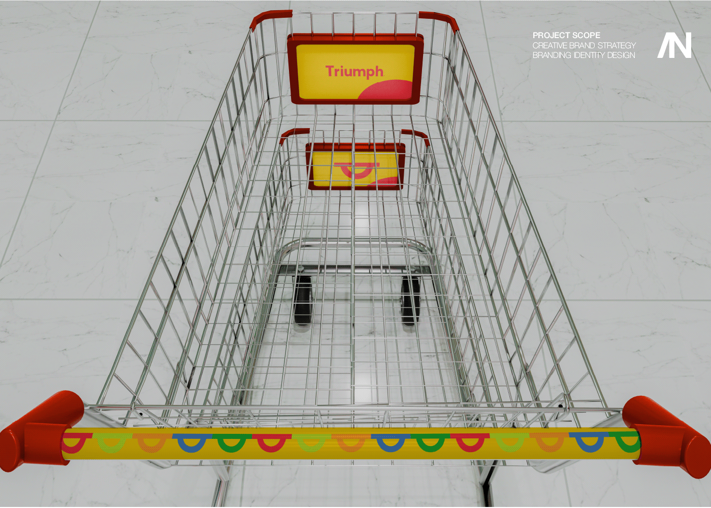
https://www.behance.net/gallery/206315269/Triumph Just see the Strategic DesignThank u.
hey, one of the ops advised me to do some work during the day, but it's not that easy - camera raw saved me - about 1.5 hours, so quite quickly


🌳 Our Planet Home is secretly ruled by an animal species that often goes unnoticed in our lives . To add the cherry on top , this animal species is also one of the most vigorous and merciless killers to ever step on our planet. 🌳
---------------------------------------------------------------------------------------------------------------------...
Any suggestions for the backgrounds and the art in general?
Im looking to improve


anyone can provide feedback on how to make this look cooler. For a football team logo


I would mask the red shape a little to have the heads in front
You’ve posted a lot of images. Are these all yours? Are you looking for feedback?
The “WHY SO SERIOUS?” text is a little hard to read.
i am looking for feedback
Please stop posting the same images repeatedly.
Really good for kids, you did this all in photoshop?
I use photoshop to design/draw everything ,after effects to animate and premiere pro to put it all together
im trying to aim for all audiences
Its really cool, i see many similar channels doing this getting tons of views because they put it on repeat for kids (cause parents know better than to keep them scrolling)
You should explore some AI voiceovers, those ones that sound full of enthusiasm (not saying your voice is bad) its just used a lot for these type of videos, it just somehow fits in way more better
There is potential if you aim at a younger audience, trust me
Not disagreeing but i want to cover more complicated topics
Im just holding back for a bit since i wanna put some "easier" videos first
I see, do you script write these things yourself from scratch?
Yes everything
Well done man
Appreciate it ❤️ ,its only gonna improve
No problem, remember dont throw everything on your own head because it might get too much at times, use the tools that is available to you to make your life easier.
What tools could those be? I dont see AI voiceovers being the way to go
how long did it take to make the entire video btw
It does take a while ,since i didnt know neither photoshop nor after effects at the beginning
you can use chatgpt to find interesting facts for ants for example, create scripts for it, there is many tools other than AI of course.
I see :0
ChatGPT doesnt sound like a bad idea for interesting facts
I do prefer to create the script myself since im imagining all the animating when im writing
Wish you knew how much it meant to me for this , thanks so much for your time

lame

mine is better
Please provide positive/constructive feedback. This is a community of people; if you can't be civil then you won't be welcome here.
lame
Choose your next words wisely.
i dont like your logo you want a new one?
yours is just not good
like who tf is this guy
💀
do you think this brand will be sucessful with this design?
https://cdn.discordapp.com/attachments/548246314383835146/1289635745736294462/image.png?ex=66f98a62&is=66f838e2&hm=f4c20fb81a67e4b6638005c8f47b89a328f80d9863f902f7ab00b300d83379b5&
What can I improve?

So I know it says, "Sniper" there but is that supposed to be some sort of gun in the angel's left hand? It doesn't really look like a gun. Shouldn't it be more like a sniper rifle given that you use the word Sniper there? Also, on a more philosophical note, why does an angel need a rifle? I'm not really sure I get the connection or the intent of this.
The text is not the point
I want to know what I can improve
The text is not the point... It takes up a large portion of the design. Also, I've already mentioned a few things. First off, that doesn't really look like a gun he's holding. The text outlines are covering portions of the guys face which looks a bit odd to me. You've also asked "will this brand be successful" to which I replied, "I'm not really sure I get the point of the design given that its an angel holding a gun."
Furthermore, what's in the other hand? Is that a book? If these objects are important to the design, then I would suggest rendering them with more clarity so that people don't struggle to understand what the items are.
Also, "Jesus with a sniper... tough"... Is that a typo because grammatically that doesn't make sense either.
Lastly, Jesus isn't really depicted with angel's wings because he's not an angel (according to Christian dogma) so that's a bit off as well.
Idk I think it looks good
But other then Jesus the design is good?
The design doesn't really make a lot of sense. Sorry.
If I would replace the text end everything
Don't mind the sense I'll fix it but the design it self have potential?
I don't know.
I probably wouldn't be a customer.
Its one thing to make an angel with wings and a rifle. To make it "Jesus" with wings and rifle doesn't make sense. Neither does the text "Jesus with a Sniper. Tough" And then put heart icons on the other side. The entire thing seems confused.
If I have a good idea for what? That type of shirt? What is the purpose of this? What is the goal? To sell t-shirts?
yea
If I were trying to sell t-shirts with Jesus on it, I would just make it "Jesus" without the gun and without the other nonsense. It would probably sell more. You go putting Jesus on a shirt with angel's wings, a gun and the word "Sniper" (multiple times) and it doesn't make any sense.
but its kinda boring just jesus without anything
so do you have any other idea for a shirt desgin?
Just make it an angel. Why bother confusing the issue by using Jesus given the reasons I've already mentioned.
so you do like the idea
No. Not really. I wouldn't wear a shirt with an angel holding a gun but maybe someone would.
And if he was without?
If you even don't like the idea of the design I'll love to here your ideas
Bec for now the problem to me is the ideas
Please don't ping me. When I have time to answer, I will answer.
I really have no ideas on what t-shirt would sell. You have to find a topic/design that a lot of people would like and would want to wear. Honestly, I think a t-shirt that said "COFFEE!!!" would sell more than a Jesus-Angel Sniper holding a blob that doesn't really look like a gun.
Sorry
So I'll do couple of designs and send to you
Ok?
I'll try to change the design I already did a bit
No. Don't send them to me directly or ping me. Just do your design and post it here for feedback. Other people might have ideas for you as well.

what do you think?

Looks good. However, you can't really sell t-shirts with someone else's face, logo and intellectual property on it. Kobe Bryant's estate and the Lakers would likely take issue with that.
Good luck with it.
But you know it's kobe bryant I'm not the first one that uses he's face
People sell his face
OK. Consult an attorney. Good luck.
Thx


Need feedback please .

I find the green edges of the oranges distracting.
There is a grey line at the top right - is that intentional?
A small shadow border in front of the mint leaves could create some depth.

and otherwise good ?
If you add different orange slices instead of duplicates of a single slice, then yes.
This is a very good and convincing result for a beginner. Keep up the good work!
 👍
👍
Yes sirrrr

I assume you are saying that graphic design is fun, but the word order reads, “graphic is fun design“.
i feel is more unique to put it in a non linear order
It is definitely more unique, and if you are making an art piece, that is fine :). But graphic design is about effective communication. If your goal is to become a successful graphic designer, strive to make your communication clear and precise.
I'm a complete beginner and this is the second poster I've ever made. I'm quite proud of it and would like feedback on how to grow my following and get my work to reach a wider audience. (my insta is on the poster as a watermark)

also would like feedback on the work in general forgot to mention that lol
Great work. maybe try not to "cut" Text and People (faces) that disturbs the design/Image to much. maybe place that colored line thing more to the bottom or in the background.

Can you tell us what you are trying to achieve and/or show the original image ?


Okay I will implement that, thank you
Gave +1 Creative Carma to @cosmic brook (current: #356 - 4)
Appreciate the feedback.
I would want to give the image a more like eerie or "old photo" look
a decent start
full camain


how did u do that effect to the 'SLOW'
its cool but images arent visible because of color from the left
but i like it still
duped the layer then added motion blur to the duped layer on an 180 degree angle and distance 300 then put it behind the main layer
WHAT DO U THINKhttps://www.instagram.com/znation.studios/

Hey My Portfolio Website Is almost Completed - https://energetic-messages-895218.framer.app/
Do check it out
Made with Framer
Its 60-70% Completed
Sorry been busy. You can get an eerie look with coloration - say green and suitable lighting or old photo by distressing the image with dust / scratches / contrast.
https://www.adobe.com/creativecloud/photography/discover/add-vintage-aesthetic.html

I dislike how green gets along with red.
Anyone dislike or sees anything else that is bad?
Thx, i will try that
@plush rose - Please only post images that Discord can display natively.
I've already asked you not to do that.
@plush rose - Please provide an image that Discord can display natively, like JPEG or PNG.
Do not post files with no file extension as it looks suspicious. People aren't going to download that.
@plush rose - Do you understand what I'm saying to you?
bro i understand but not working That's not my fault 🥲
You need to add a file extension on the end of the file. If you're exporting the image to PNG, save it with .png on the end of the filename.
File > Export > Export As... PNG. Give the file a name: image.png or something like that.
need feedback please !

🤣 lol
I'm not sure the burger would stay assembled if someone threw it in the water. The parts would all be floating around on their own.
okay
feedback please !

I like the Design and the vibe. The Text is a bit overcrowded and not consistant (some text in front, some in the back). also not sure why there are so many can's in different sizes in the Image. Maybe try the one big can and then some people doing some wintersport and drinking a Pepsi or so. Just a quick reminder that since this features a brand name and logo, it is certainly not being published in any kind as advertising and is of course for training purposes only.
My Tipp for using some branding: use Adobe Firefly, Adobe express or any other AI based tool to make your own brand to work with. have fun.
okay thank u 😁 i try my best
Gave +1 Creative Carma to @normal spoke (current: #21 - 96)
feedback please !

Hello nice too meet you. What are we going for about your design. I need a bit of details what your aspect of your design is about and then I would be happy to help with feedback more. Please share.
beginner 😄


Trying to get that vintage magazine look. How did i do?

How about making those parts more darker, I think it could add more to the picture since your light is coming from the horizon right?


Thank you! In first picture i'll propably check it but im not sure about second
Gave +1 Creative Carma to @scenic jacinth (current: #936 - 1)
Oh the second image was just to show where the lighting is coming from yk
@ripe canopy
Update me please if you should apply some changes 👍

For a clothing design contest. Any feedback on the design? (The text and the blue stains, not the mockup or background)

What should I add/change/remove to the design?
Looks really good. If you want to sell the grunge look perhaps drop the saturation and/or brightness of the text near the top.
Looks fantastic. Great work.
Getting super picky here... The thin, sharp, black line around the photos seems slightly out of place to me.
Really good work. Your tone and colour choices are excellent.
Can you provide some context for this piece so we can give you some constructive feedback?
bro i try to make thumbnail and i m beginner
i try to make poster please feedback guys !

Ahhh i definitely know what you're saying
Unlike the text, i did not add soms blur to it so there's no "gritty" effect going on in the finished product
Let me know your views about my New Portfolio - https://ershadesign.framer.website/
I'm a self-made, passionate who always stops at billboards to ask myself how I can make Them better. Looking at a very well-structured design always brings a smile to my face. That's why I wanted to get into design - to put smiles on people faces.
The red lightsaber at the middle right looks at the wrong scale 🙂
Whats specifically was the Photoshop content please?
I am Just Taking Views of Others What Other People Think About my New Design Portfolio so That if i am lacking somewhere i will Resolve it asap
Take 3 on trying to make vintage things, this time a movie banner. Any critiques on the texture, overall design, and/or other things?

alright everyone I just made a (random movie) poster so just wanted to get a feedback from all of you as I am still learning haha but yeah would love to hear your feedback 🙌

share your feedback plzz
Really good, maybe the man in the top left you could add some more smoke/clouds so its seems more realistc.
Another great piece.
Would they, or even could they, do a fade on a photo like you have with the side of the tree?
Really appreciate your feedback @white charm I'll make it more good and make it look more better of course thanks again ✅
The man in the top left looks funny now lmao
Gave +1 Creative Carma to @white charm (current: #605 - 2)
Yeah the planes are really good tho
appreciate it man 🙌
What do you mean by they?
Actually after taking another look, i find that the tree looks too big and out of place since I'm planning to add actors to the poster and it would be too small
What should i do? Feeling stuck right now
The idea/design I find very good. But I think back in the days they did not use so many different Textfonts and also the Text looks a bit to "clean". Also Image and Text would not overlay. That looks a bit inconsistant. But the Layout overall looks good.
Very Nice. maybe try not to place random things like an Astronaut floating in the sky or other thinks. The Text at the bottom should not be distracted and clearl readable. Also try maybe that the "Face" s a bit more visible. maybe some Light or a read-ish eye glow or something like that. Have fun.
When I said "they" I was referring to the people who would have been making such things "back in the day".


On ipad
Not computer
I need someone
Thanks guys chat gtp help me
For feed back


What can I do to make this more "complete"? I feels very empty to me

these planet are moving?
If so I recommend duplicate layers and use motion blur or radial blur
Looks cool. Nice colour and contrast.
For me the duplicated balls are very obvious.
These look great.
Personally I would move the mojito slightly to the right (Rule of Thirds).

Raising the highlights a little gives the whole image more pop

how could i add a eagle here? client is good with the logo, just needs a eagle somewhere

Maybe replace one or both stars with the eagle. otherwise there is not much space left. I also would add some space between the letter T and E.
thanks! will do


Thanks for the advise ❤️
Gave +1 Creative Carma to @ripe canopy (current: #259 - 6)
Got it and thanks ❤️
No worries. Thank you.
Gave +1 Creative Carma to @lapis python (current: #938 - 1)

Any changes ?

I think they look great. If there was anything, in the second one with the croissant, there are four but its two duplicated. I wonder if just using the two different ones would show off the food better? Just my opinion. You may have other reasons to have four. 🙂
Ah yes, I got the point. will do something about that. Thank you for your advise
Gave +1 Creative Carma to @raw wadi (current: #26 - 78)
I forgot to ask, is that in Kandy, Sri Lanka? I had a great visit there 40 years ago!!
Yes its kandy, Sri lanka & srilankan
Also im from Sri Lanka
I would change gradient to more light color
gradient here looks good imo
but not make it harsh make it smooth
What about this one ?

you used 3 fonts here?
Yes
when im doing typography i use 2 fonts but boldness is important
so
if lets drink smoothie has the same font
box of text and stay tuned could have the same but box can have "light" and stay tuned "bold"
to make contrast
its mainly typography rules
font poppins is free for commercial use and has a lot of type of boldness
btw Ilike your style
Thank you for your advise, much appreciated
not a problem 😅
but remember that 3 fonts are allowed
but I would make it with more text like newspaper
to make more contrast but its kinda difficult to match fonts right

it looks good in typography - main text is bigger small text is readable i see its old style- i would try check if serif font would match better for box texts like Times New Roman but its not necessary
it has 3 fonts but these are placed really well
I would make it in illustrator btw
or indesign

Here's a controversial thought. A lot of food wrapping gets thrown away. (particularly tourists coming to see the tooth!)
You could add a note asking people to dispose of it thoughtfully.
You could also add details of how to find Cafe Serenity.
The two notes together would help sales and suggest they are environmentally conscientious 🙂
any feedbacks?


who want me to make tutorial for that kind of effect on a text.
the wavy things.
previews;


Really appreciate your opinion @normal spoke 🙌
104X36 INCH Wall sticker, Paid work, Soldier on the up representing a logo of GBL - GBL is a Toy Gun shop and RC Jeep represents a Logo of One-click - One lick is a Toy shop

Fala galera, blzau?
Mais um projetos internacional lá no Behance, quem puder dar uma moral lá. #Tmj

Coach Luís is a personal trainer working in Saudi Arabia, focusing on high-performance weightlifting and CrossFit, either individually or in groups.The symbol was inspired by the buffalo, a very strong animal loyal to its herd, followed by the horns tha…
Hey guys, I Need help to get a balance in this panoramic post anyone can give me ideas?

any suggestions? first attempt at making a gameday poster with photoshop so any criticism is welcome 👍

hi everyone, i'm an aspiring freelancer that edits images for people. any suggestion on how i can make my upwork project standout from the rest? here's my link and go check it out: https://www.upwork.com/services/product/design-adobe-photoshop-background-removal-photo-manipulation-retouching-and-more-1838965857675048551?ref=project_share
any constructive criticism will be appreciated, much love!💓
what can I do better?

thoughts?

2024 Motion Designs: https://www.behance.net/gallery/209588091/2024-A-Year-of-Dynamic-Creations-and-Shared-Success

2024 - A Year of Dynamic Creations and Shared Success
rate this, the best i have done till date so far( i have done 3)

I think person should have the same level of light or a bit brigten in compared to object next to him
Oi, Bom dia!!! Compartilhando com vocês mais um projeto concluído. Trata-se da identidade visual de um ministério cristão com alcance global, que realiza campanhas evangelísticas em várias partes do mundo.

any feedbacks?

anything to improve?


Yummy.
Just one small sidenote: the cucumber slices and the salad could look a bit greener (fresher).
Two things: I would have made the fade between top and bottm follow the line of the stadium. The shadow goes across the whole pitch making him seem enormous:-)
The shadows need some work so the boxes don’t look like they’re floating.
Opinions?


bro did you make all of that in photoshop?
Yes
Photoshop and Lightroom
really good work
i'd love to see it on a t-shirt
I would Wear it😅
Thank you dude
Gave +1 Creative Carma to @ripe canopy (current: #218 - 7)
Film Poster Jalaldine : https://www.behance.net/gallery/209682789/Jalaldine-Movie-Poster

what lightning u suggest that i can add for the character i think i need like more lightning to give more focus on the character

Thanks for the feedback bro I'll work on it
Gave +1 Creative Carma to @gentle horizon (current: #41 - 46)

you don't have a lot of light sources but maybe a soft glow on the left since you have a torch over there, put the glow near the subject...?
Love Mo! Agree with Euan and bring a soccer ball in heading for him to add to the lower right. Cool idea!

I like it very much. Since you describe it on the second pic as vintage racing, perhaps an old distressed font would suit the first image footer better 🙂
https://stock.adobe.com/uk/search?k=distressed fonts
I need some advice on my render, what could I change in post processing? Everything I try to add makes it look worse 💀

didn't you recently ask about the sand? Looks like you changed it?
I did yeah, I ended up simulating it in houdini
looks better (the sand) tbh the background seems over exposed or just really bright
true, its quite bright, I'll work on that

Welcome back to Instagram. Sign in to check out what your friends, family & interests have been capturing & sharing around the world.
Has the creature only just popped out through the sand? If so, I would expect to see a lot more sand kicked into the air.
It's hard to get a sense of scale. Is the creature supposed to be large? If so, perhaps you could add something to the scene that we intuitively know the size of. Like a person.
you're right, I simulated this sand in houdini but I can't really add too much as I'm already at like 20million particles and my pc does not like it. I hope the focus is on the serpent enough to not matter too much
for the scale it is supposed to be large, I tried to scale down the environment a lot but I also want to avoid adding a person, since its kinda just a showcase render for my 3d model of the serpent I want the focus to be on that
I totally understand regarding the number of particles and rendering from my work in Blender. Perhaps you could render a second, independent cloud and composite that in Photoshop. Or even just build you own cloud.
and layer the clouds up to make it look larger?
watch the movie Tremors; they make some pretty huge sand clouds 😄

Hi everyone. That is the first thing I have ever made in photoshop and I’m pretty proud of it…but I don’t know how improve it, but I know it needs improving.
Project breakdown:
-
I tried using the sidemen font for the names at the top to keep the fonts linked but it didn’t look right.
-
I tried to stretch the ‘sidemen’ but it never looked right and I even tried the shorter version of ‘SDMN’ and it didn’t look right either.
-
I used some black boxes around the logos at the bottom and the text so it wouldn’t be ‘too bright’ or ‘too white’ if that makes sense.
-
I know negative space is a good thing…and it can be powerful when used correctly although I have no idea how to do that 😔
-
I have never used photoshop before. I want to be a graphic designer but I have no experience. Tips and advice please?
how'd you make this if it wasn't PS? Only suggestion I have is that some of the faces seem a little bright along with the person's tongue sticking out (on the right) FWIW tone down some of the light?
I did make it in photoshop, it’s the first thing I’ve ever made in it
@bold peak also, the lighting isn’t something I can control…the photo isn’t mine, it was taken from sidemen clothing cause it was the best one I could find
ah yeah there's not a ton you can do, but you definitely can do something w
Well, sand particles made larger and more of them, sky is less blinding, ignore the firefly artifacts but otherwise I feel like it's lacking a "wow" factor, it just looks a bit generic 😦

ok that's not bad! But the mountain and ground blend in too much with the creature
IMO
sky is perfect, could be slightly lighter, not much; just a hair
appreacite the feedback, im looking at starting a clothing brand, inspired a bit from I love ugly and crookedsupply, Thinking the name Only.One.Era
I feel like there should be something in the top area of the poster. Any ideas?

its simple yet, it looks a bit disoriented, what can I do to improve this, in addition to that, what should i add?

holy, you're amazing dude
what's your end goal for this poster?
sometimes less is more; add nothing?
bet.
would love some feedback on all of this :D


Nice updates
You could do some painting with light. Add adjustment layers to lighten and darken. Set the masks to black. Choose a nice soft brush. Lower the opacity and paint on the masks. This example is rough but hopefully illustrates the point.

Perhaps a silhouette of a plane high in the sky with a white contrail. 🙂


@gray imp


I've seen that movie 😉
https://www.imdb.com/title/tt0080736/

ok my turn, opinions? Likes, don't like? Only thing I changed is I added the dog, lighting is wrong but I don't think I can fix that

suggestiions


Perhaps if you tell us the aim / use of the work we can suggest improvements?
any suggestions? it feels too "picture-y" if you ask me but its a first time (in this style) doing album covers


😍😍😍😍
thanks but i need feedback 😭
Gave +1 Creative Carma to @raven elbow (current: #939 - 1)
that is feedback, tbh I think those are pretty good idk what else I'd change
i created this banner for Halloween. Any suggestion what can i improve in this?

Depending where it will be used don’t have the pumpkin sitting on the bottom edge 🙂
no witch?! 😛 j/k but what's your end goal, what are you using it for? I see its an ad, but do you need it to look more spooky, darker? (IMO I'd either make the background darker or use a darker background.
also where did you get the halloween overlays? (cat, house, jack o lantern?
it will be used as banner on gemstone website
ah ok, fwiw its probably good enough but idk IMO more contrast needed between the gems and the background
but your overlays are quite dark so they might blend in too much if you made the background too dark
otherwise its a good banner
if you wanted to have a little fun, see if you can find witch smoke font for the text 😉
okay , i'll try
you don't have to, just an idea
yeah, i am trying to improve it. after the completion it is looking little odd to me i don't know why..
that's why i posted it here if anyone can have good suggestions
from a freepik img and seprated the objects using tools in photoshop
I was thinking something like this as a font; but this is an image 😦 https://www.istockphoto.com/search/2/image?mediatype=illustration&phrase=smoke+fonts
Choose from Smoke Fonts stock illustrations from iStock. Find high-quality royalty-free vector images that you won't find anywhere else.
ah its called sky writing
just a basic work. What do you think about that?

imo needs more contrast, your script font blends in too much with the background

this banner is for price category , will be used on a gemstone website.

o ya way better IMO
though the pumpkin floating in the air with the tree sprouting out of it?
oic that's cool! The pumpkin is on a branch
JMO but you can ask others here; hopefully they will chime in.
eh idk to me they're ok but I'm not that good at this stuff
it would be nice if others would comment though I'm sure you'd like to hear from others
i have created 2 banners for the gems website (both have same context). Open for your suggestions also rate which should i finalize


my last thing i did . how is it


These look great. Very professional.
Personally I would have more of the front of the car sticking out of the 8 and less of the back sticking out of the R.
Perhaps drop the opacity of the front gems just a bit to make them look semi transparent.
or give them all some form of opacity depending on which ones are more dense and not (some are more opaque than others)
that's a good idea Micahel 😄
The Reflections on the stones seem not to match the background/rest of the picture. Also the "float" somewhere above the ground and/or have different shadow allignements. The Text above does not look like much here also can be done a little more. Try to make them more "engaging" and interesting.
In both banner?
yes.
updated a little bit, what do you think? is it looking better..

Hey guys. Pretty new to Photoshop and Premier. This is an MP4 with the smoke blowing out of the shells. I've been trying to get our logo ("C" with the bullet) to look etched on the center casing so it looks curved to match the shell. I've been playing with the Warp tool for a couple hours and can't get it to look good. I feel like the Wrap Tool makes the bullet in the center to fat. Do you all have any advice or input? Is there a way to do it in Premier? Thanks!!


its getting better. But again you have highlights on the stones, but the edges are dark. Also only some of the stones have the highlights and not all. maybe try the same style of photography for the stones and the background (not so much illustration style).
I would not so much warp the Logo around. Logos should be clearly visible. The one in the first picture looks much clearer.
what exactly do you want to look like? That seems to be a mockup for some car advertisement. It look Ok for me so far. Maybe some kind of slogan on the back of the van, but overall Ok. Also the name could be put on the front.
NEW POSTER what do you guys think?

On the back there is missing the Logo 😉 you also could ad a QR Code if that is wanted.
this is better than the last time; did you change the brightness of the stones? Cuz before it was kinda bright, the dark one is still nice too
but I see what he means by the shadows don't match, its like having more than one light source
am I missing something? I don't see their photo/project on here
I think the Image was deleted. @toxic dome why did you delete? Right now it is hard for others to help.
Hello, everyone! everyone, I have done UI/UX design of Banking Mobile App, please view and appreciate my efforts)
Your feedback and comments on my new design are invaluable to me 🎉
https://www.behance.net/gallery/209948671/Hydrogen-2-Bank-Mobile-App-UIUX

Hydrogen 2 | Bank Mobile App | UI/UX
Has anyone got time for a quick help?
Basically, what I wanna do is:
-
on the left - change the socks to white.
-
On the right - make the socks way shorter but I don’t know how to like…edit his legs in? Idk

might wanna ask in #💬chat-general or #❓ask-a-question fyi
Gave DCC #1 a shot. What fun!

Do you guys see what I'm trying to do here? Having a hard time with making it look like a shape if that makes sense. Any suggestions on how to make it more realistic? I might just be overanalyzing, but let me know any suggestions.

I'm a bit rusty at photoshop 😅

what's DCC?
you'll likely get the answers you need here #❓ask-a-question but can also ask here #💬chat-general , as generally you're only going to get feedback here.
Looking for feedback
oh I thought you were needing help, shape looks good I guess; IDK what are you planning on using it with? You've got a massive shape that's transparent... err wait is it transparent? Or did you on purpose put that checkered pattern?
The Design overall is solid, no question. But for some ad for a Banking App I would try to make it a bit more interresting. The first Photo shows a Smartphone screen on some rock. First I thought of something for buying milk and sugar or a sports app that counts calories. But should be unique about a BANK App. The next three images are more or less generic and also not showing anything emotional or interresting. Maybe try to some happy people buying cloth in a store or travelling and buying some exotic goods or so, showing how easy it is. Not sure what the "user flow" part should show the mostly non-technical user and the "problems ..." would indicate that there are problems within the app alread?! Also not a good marketing move 😉 Here maybe show some happy programmers or so that make the App better and happy to do so. The AI and card part at the bottom would in m perspective be more valuable at the top as selling point for such an App. The UI Design itself also seem to be solid, but also a bit generic. Here I would like to see some individual Design like a App Logo (H2 looks by itself a bit boring) and the AI Asistant part could be very interresting in Terms of UI Design 😉 Hope that helps as first impressions.
I thought the rock was snow... LOL
Always look from where Lights and shadows come from. the photo part and the "Illustration" part around with the shadows seem to have different directions. That is a bit distracting.
Thanks! I will work on that
Gave +1 Creative Carma to @normal spoke (current: #21 - 97)
keeping it simple

The thing is wher does the Light come from and where do the shadows fall. If you want to be unrealistic and kind of comicy than thats fine. But for more realistic stuff maybe try to look how the Light in the eys is directed and the shadows around fall of.


I don't think it needs FB... show off! 😛 ❤️
Why not?
tbh it looks great as it is; idk what else I'd add to it
Came back to this to make it a bit better for our game. What do you guys think?

Hey ya, feel like i got a good base but how could i add small details to improve this? couldnt figure out how to make the highlights & shadows maybe someone could guide me in the right direction

Highlights:
Think about where your light source is coming from. The areas closest to the light source will be the brightest.
Use a lighter color or a soft brush with low opacity to gently add highlights to the areas that catch the most light.
Areas to focus on for highlights: edges, tops of objects, and places where surfaces face the light directly.
Shadows:
Opposite of your light source, shadows will be the darkest areas.
Use a darker color and a soft brush with low opacity to build up shadows gradually.
Consider the shape and size of your objects to create realistic shadows. Pay attention to where objects overlap and cast shadows on each other.
Blending:
Use blending tools or a soft brush to smooth the transitions between highlights, midtones, and shadows.
Avoid harsh lines unless you’re going for a stylized look.
Layering:
Use multiple layers for different parts of your image. This way, you can adjust highlights and shadows independently without affecting other parts of your work.
I love what you have so far!! I'm here if you need me!
Thank you will try
Gave +1 Creative Carma to @tropic rain (current: #939 - 1)
Your very welcome!
i have created this Halloween banner, open for your suggestions..!!

I love it!!!
I know this isn't adobe Fresco but can someone give me feedback on my drawing please and thank you?

(You might need to turn down your screen brightnes to see the colors)
this is way more fun to look at! You turned the stones into different shapes of halloween themed characters 😄
decided to piece together this creature and I want to make the image itself seem a bit scarier, any tips?

Guys what should I add for dis photo

Maybe try to change the background if you want.
Background:
Change or enhance the background to make your car stand out. An urban setting, a scenic road, or even a racetrack can add a dynamic feel.
Lighting Effects:
Add some dramatic lighting or lens flares to give your car a more cinematic look.
Details:
Accentuate the details by highlighting the car’s features, like the wheels, headlights, or body lines.
Motion Blur:
Apply a motion blur effect to the background to create the illusion of speed and movement.
Text and Graphics:
Add some text or graphics, like a cool logo, a slogan, or racing stripes to give it a unique touch.
Filters:
Experiment with different photo filters or color grading to enhance the mood and style of your photo.
what can I do better?

personally IMO make the I a little more visible in Evil; reduce the brightness on the left face, the nose area is kinda over exposed? the right face is not bad I can't really make out the rest of the stuff to give more advice but that's JMO for what I can suggest
thank you!
Gave +1 Creative Carma to @bold peak (current: #123 - 13)
that brown looks weirdo


did you apply the color to the whole layer?
glad I'm not the only one making giant animals in compositions
no i used camera raw and I used color grading for it
maybe it was a mistake but colors match i think (the other think is that colors dont look good)
wait... camera raw adjusted the lighting and highlights and all that?
I used a lot of adjustment layers but after that i made a new layer with these adjustments
and I used camera raw
idk how to do color grading myself
ah ok
the brown overall is kinda interesting I guess
I'm going to be honest, I love the brown.
Please give me feedback! (All hand drawn and photoshoped) Took me 8 weeks to finish.

Nope.
''Cold'' Palmer, i aint pretty much satisfied with the shadows but meh


What
This looks like Dall E. And certain decisions that were made were not made by a human being.
Explain please if you think that.
oh its so easy dude... you had me fooled at first
the license plates, the crowd for starters
LMAO
^^ That is also a clue
It’s clearly not hand-drawn. And a person would not choose to do some of these things. Like this ridiculous car with six wheels and the markings on the ground. There are myriad issues.
You figured it out. in another server i was in everyone belived it somehow lmao
the rendering style looks like Open AI / Dall E, anyways.
hahaha
the worst part IMFO is you claiming it as your own
KREW LMAO
This ain’t my first rodeo. I’ve seen billions of generated pixels.
🫣
Oh wowww
Any insane ones?
lol
That's right.
Some of the most obvious ones:

Yall are smart.
well aside from that... I just knew hand drawing that many people esp not in 8 days but this was before even said it took him "8 days" just that many people, who'd draw all those by hand?
Having no license plate isn't a pure giveaway
That would be crazy
Improvement from before?

way better 🙂
getting better.
sweet
Creating a manhole cover for me and my friends discord server icon, any suggestions?
Just my opinion. If this were a real manhole then the crosshatched area is the highest point and would be more like bare metal. The lower area you have grey would be the rust layer as it would have no foot traffic wear.
I'm trying to work on the text for this advert but i can't figure out what layout i should go with. Here is what it currently looks like but to be it looks a bit weird. Any tips on what I can do with the text (im open to taking an entirely different approach with it, im still not sold on the current look of it)

hi how can i make the text look more interesting for next time

I made this for Halloween

Add footprints on the snow
feel free to give feedback and any suggestion

Personally I would try the text top right
I would make text bigger and add fog behind car and Road which will be "attacking" car
feedback?


besides what Euan said There also seems to be some kind of hole or recessed handle missing with which you could open the lid. Since stones or other objects sometimes fall on it, there are also no small marks or dents. Overall, I like the design quite a bit.
im trying to create Elon musk in an old game as playable charcter ( a skin for a 3d player character ) this is the current skin with his face, any ideas for his body? this is the default body skin.

Please give me a feedback, started photoshop not so long ago, what are the wrong things you can spot what would you change? Thanks if you do give a feedback! ps.: my rank isn’t intermediate i have must missclicked

If it’s Elon, the body should be soft, pale and a little plump.
you can change your role anytime you want, unlick it 🙂
I'd put the white text behind the head, use masking layers for this, there's no real "wrong" way to do PS at all
the red text looks great where its at 🙂
Also you may want to use your own images if you plan to do something more than personal with it
The whole text behind the body or just the head? and btw thank you so much ill just go change it
I'd definitely do the whole body; but try behind the head first? Up to you
JMO, doesn't make it right or wrong but if you want to leave it that way you certainly can
I have to give it to you it does look better behind, ill do the details and we will se how it looks
WHAT DO U ALL THINK?


woah this is sick
looks good, did you take it from the Tshirt or apply it to the tshirt?

i made the design in a separated file and applied it on my mockup
cool 🙂 looks great
for the ferrari one you should include the same sort of grime that is on the other text in the photo
How is the lighting? Trying to find inconsistencies before I do the rest

pretty cool!
Thank you! Trying to get better at lighting 😅
Gave +1 Creative Carma to @bold peak (current: #93 - 19)
I know lighting is tricky; there's lots of tuts on it but it's not that simple as just changing the direction/color, etc
idk if I'm right about this but I'd point the light more to the side than from the top (talkinga bout the trees, the eye is fine)
if you look at the catchlight on the eye iris and pupil you'll see its to the right and up a little; well... I guess maybe you have it right, not sure though
nonethless, the improvements look good
Thanks for the advice, I'll try and tweak a few things to make it match better
I'm not as good as you, I could be wrong
With the green around it works better and better. Now from my point of view there are only minor details you want to work out.
In my sketch you see the "big red Light source" that casts the Light and also the shadows. The red beams and areas the light hits objects are very good. the orange ones are hard at the fence, because the intensity is to shallow or to thick. For something quick and dirty on Insta or so nobody would recognize those.
The blue areas I would try to fix! As you can see in the reflections in the eye THAT Light source came almost from the front. But all the Light and shadow come from the side. So THAT would people notice. Also that you have that really dark shadow at the bottom of the eye that would may not sense at all 😉

Thank you so much, this helps a ton!
Gave +1 Creative Carma to @normal spoke (current: #21 - 98)
Light and Shadow Trick
Here is a little Trick for everybody that is new to that and/or wants to understand it better. Just took as I show here some round object that could represent an eye or other objetcs and hold it as shown against the lightsource you have. Then you can see how the Light and the shdow falls on the object and the surroundings. Also you see how intense or less intense the shadow and light falls when parts are further away from the lightsource then other parts. Also you can see how diffuse light and harsh light would illuminate the object diferently. Enjoy.

I got rid of the glow in the eye a bit ago so that there would only be that light source on the side, keeping it simple while I learn
best way to learn with my Tipp is with different Lightsources from different angles. Then you will see.
I saw that if you have access to blender, you can also see how light sources play with subjects/objects
looks good?


I know the shadows are bad, but what do you think?

Thoughts?

I need a title for this poster

Hi everyone! so i made this protein bar wrapping design so do share your feedback so I can improve more thanks 🙌🍫

any advice?

There is a lot of blank space at the top, is there a plan to fill that area?
how is it guys and how can i find clients for social media product designs


im planning to do a phone background and so the time and date etc is defaultly there
That explains it! Pretty cool phone background
if I draw with the regular brush with my drawing pad, some areas are sharper while others are less, I want it to be even
not sure which brush settings to change?

you probably want to turn off the pressure setting for your brushes, its on the ribbon kinda to the right of the middle the white icon with the circle and brush/pencil whatever
thanks
that work?
it did, yeah
I had this banner for my facebook group (left) where people are saving things from trash. We started from vintage furniture we took form trash, but later we moved more to giving away everything which is not needed anymore from home. The mission is about saving planet by consuming less. Old banner was misleading pleople. What you thing of a new one? I did that but I am not sure if it is not too much chaos on it and makes people distracted. I want them to make community and cooperate. I am afraid that this strong colors will stress people. What you think?


I kinda agree the right is a bit "loud" or strong colors as you say, maybe mix the two styles?
any feedback ?

hello everyone, when i was creating this image, i wanted to make it so the basketball is hitting me in the face, and i made this, do you think it's good? i think it's fine but i just feel like it's not conveying it though

Hi, it is very good but this place where ball hits I would change. What you think of this yellow element instead of pink?

Hi! What is a purpose of this graphic?
You are right. And people will not think it is a different group. I will look for something in between. Thank you!
highlights are still hard for me to do, but this has lighting from 3 different directions; that made it hard too 😛 whatcha think?


one has smaller dog, this is realistic/normal; horizon matched.
The other one is just Giantized
Great job! I am not the biggest expert in this area by all means but here is my opinion:
I would focus on not only workling on the "highlights" but also the shadows and the darkest areas. For example, the middle of the dog especially the bottom/front area should be very dark
If you add a simple shadow on the table, it would make it slightly more realistic as well
Also, if you notice that even though the pumpkins are lit up on from the inside, the light is very localized and doesnt project outwards too much. Hence why their fronts are practically pitch black. You could probably alter the light spread and add some "rim light" effect on the edges of the dog
there is a shadow under the dog on both of them; the shadows are almost non existent if you look at the pumpkins, there's a slight shodow so I tried to replicate the same
so like reduce the highlight spread... yeah the light doesn't throw very far
that's perfect! how did you do that?
Oh, I just did quick selection with polygonal lasso and filled it with pure yellow. Then I added stroke. You can see it is done very quick, not to accurate 😅

they just made a new shape and made the basketball a new layer so that it could be fit in between the two
I did it more unpro, your way would be the best 🙂
Haha, no worries.
thank you so much guys, yeah that was the thing I was missing, I'll post my own one now a bit later
yeah what you guys think of this? @pallid zealot

Added a little more realism here

you are progressing though!
that looks so cool and really accurate
All I did for that was just use your source and modified with Firefly
feedback


kinda goofy

depending on content written in place of placeholder text, it may be hard to read
feedback in terms of what? When it comes to a design, much of the criticism is opinionated. Are you looking for feedback in a certain area?


any feedback?

text to small and font is not good looking
looks good..
Did you just take a picture of the sweater in Photoshop and put the picture on top of it?
I would go for maybe a softer red or other color background, one that does not blend so easily with the lid
I'm curious to know why there are leaves. The packaging doesn't give any indication that there is a mint or herbal componant.
im guessing because it ultimately came from a coffee bean plant originally
The shadow does not match the lights on the botle or the blurry leafs on the side. Also the objects to the side have some motion blur, but the Nescafe has no motion at all. Also the brown lines (not sure if that should be chocolate or coffee or something else) has some splash motion, but no motion around the glass. also the color seem to be inconsistent. The background seem to be a bit boring. maybe try to be consistant with the kind of motion the Image should transport. Also ad some kind of slogan or what exactly the thing with Nescafe is the new thing that wants to be sold here 😉 Have fun.
I have a quick tip
if you are using motion blur or similar you can duplicate layer and add this blur to the down layer and blur it but front layer blur a bit
and move down layer in the direction you want
I would Wear this but maybe graphic should be in back of the sweatshirt? it can be my opinion not fact but I usually see more cool stuff at the back
to make highlights better you can add "levels" or "curves" or "Brightennes and contrast" adjustment layer UNDER highlights layer
some areas should be way too dark you know
I will try that on another project, I didn't know you could adjust the highlights on another adjustment layer, I for sure did that within the highlight layer.
ty for these tips 🙂
Gave +1 Creative Carma to @ripe canopy (current: #194 - 8)
when I start adding elements i usually start by making photo darker a lot after that colorize a whole image and then i make highlights
make image darker >colorize it >add highlights > other stuff (not necessary but sometimes)
yeah but how much darker? you don't want it too dark otherwise you have to do the work to lighten it back up, or when I'm done I'll use the neural filter to match to the final image/background
how do you add adjustments to your work?
are you using masks?
@median parcel
Really good how you have removed the unsightly colour overlays. I like the beautiful black and white result.
😇
so you need to make them darker and depends it on position and light source
in everytime you can change level of dark
yeah but HOW dark? Almost pitch black?
what changes can I make in this?? This is a poster for some college

Thoughts?

What do you think?


this is so 2016 esque
what does thatr mean
lot of blending and overlap with the turquoise you chose, other than that maybe a few issues on the side of the cans. Otherwise looking good!
it means clickbait galore
the people that ask me for those are always online gurus
water is just a tad darker than i would expect given the lighting conditions
I see, are you trying to improve your skill set?
I see, i was going to say, shadows: that’s a simple one click thing. Go for complexity, be creative
it really deoends on position
at the begininng it xan be difficult
I have a 1 rule about it
or you make object quite dark and you paint shadows on it (corners are lighter than middle of objecg so these are highlights) or you can make object too dark and paint strong highlights
send me psd dm
ill help with it
oh its fine, I'm done playing with it 🙂 I'm working on new projects
btw usually you should are between these 2 option
I hope i will help
😅
everyone has helped including you 🙂
Can I get some review on my thumbnails I am kinda new:

I have also another one:

BTW these are from my youtube vids
It's good but it'll be more better


What do you think about this Christmas card? It’s for a charity.

I really, really like it.
Perhaps the font could be made a little more "playful". (But that's "complaining at a high level").
Thanks you
guys, I need a professional help
what should I change to make it look professinal? this is my "stage" project to see if I will get accepted or not

you can tag me for an answer please
Resizing the BnB icons and the call one.
Second one
make them smaller?
Yes
besides that?
Placing them nearer the bottom is good too
wait I'll show you my previous try, and my supervisor told me to do some changes and you tell me please what more to do
this is my 1st try

and he said the following
Fk
I forgot to hide the num xD
anyways
It's okay
The message is not visually clear.
And for the colors, stick to the brand's color palette.
so I did this one
I think what he meant is changing the icons to match the brands colour palette. You can do so in site you downloaded them or download an outline version of the icon and then changing the colour in PS.
Using outlined icons is better.
And also adding more text about what you are trying to promote.i don't understand the language but if you could add more about it
Which icon site are you using?
I think placing the logo to your left is also a good idea. And pushing the texts more to the right. And don't forget the rules of design... don't mix your fonts and colour too much
sorry to bother you again, but for the house, it's fine to keep it like that or the colors of it are not good?

how do i make the spacing even so its lined up
without pressing space bar hundred times
I think it's okay. The colour is a shade of the logo
I don't mind.
But brighten it up a bit. The shadows that is
I mainly use icons8.com and choose outlined. Before downloading, I change the background colour to white then import it to the file and adjust the colour using colour overlay.
Any tips or criticisms?

The text is too long at the bottom and I am new so review it with other people as well
try to avoid placing text close to ends of the graphic - make text a little smaller
and put it a little higher
Hello everyone! 🎨✨
I am a graphic designer and artist, and I'd like to share some of my current work with you. I'm always seeking to improve, so any criticism, advice, or ideas you have would be greatly welcomed. 😊
Thank you in advance! 🙌


Been working on this lil poster. Im having a bit of trouble filling the space where the Puerto Rican flag is. I'm not happy with where it is currently, anyone have any ideas on where to put it?

what do you think about this youtube thumbnail i made

I would change the text color so people can see it better
yeah i made the text look like this and added 2 more base images to choose from


Hey!
Im making a vintage tshirt design and I made this but Im wondering if it looks to modern.
Can I have some input on this please?

??
The font has a 1970s vibe. I do that the text at the bottom should fit the curve of the white container. 🙂
I think the colors but a bit too modern

Just my opinion of course
if you want to stick to more 1950s retro; go with pastels (you didn't say what vintage years so I presume 1950s is typically "vintage" 70s is classic I guess idk I don't make these up
so either pastels or subdued/faded colors perhaps
any feedback?

The text says established 1978 🙂
oh heh; well technically that's still in the classics so "loud" colors were a thin in the 70s and 80s
ty for pointing that out, I missed it 😉
Gave +1 Creative Carma to @raw wadi (current: #26 - 80)
On the bottom there is to few going on, to many different Fonts used. Besides the B/w there should be only one "effect"color like the yellow-greenisch color. The orange loks a bit of. Also maybe try to dial down the opacity of the background image a bit so that the face is more present. Hope that helps.
(WIP)
Anything I can fix on my project so far? Ignore the light bulb, I'm bad at lighting so I need a reference 😅, and I still need to do the nature on the other eye.

weird how you have a lightbulb unless this is a 3D app the lightbulb can't throw light (would be cool if it could!)
looks great tho 😄
What do you mean?
I mean like if this was in blender, you could see an active light throw/emissive onto the objects
Oh yeah, I wish
exactly what I was saying; wish could do that in PS
That would make things so much easier
ain't it so! One can dream 😦
Been working on this for a bit; what should I put in the space near the bottom? Idk what to fill it with.

nothing, its already filled 🙂
But that lil spot, needs something to be there
Could put an individual cigarette there or smt
any feedback?

not always
looks good 🙂
🤍
text can be not visible
I dont recommend using the same color of font and background
white text could be better and it will match color perfectly
I figured if its readable it looks good, but I guess you have a point, if you don't want to change the text color I'd put a solid black shadow behind it
dark purple/black with cool blending mode - multiply or something could work here
just black can be bad idea becaue its light and purple graphic
again, true; idk what I was thinking... but you defintely want some kind of contrasty color
ive heard and Im almost sure that you can check if text is readable based on background color
on website
sure, black on black is no good; but it would be ok if the purple is light enough
really dark purple would be hard to read for sure, add some yellow highlights to it can work but I don't think it would match that theme, a very light off white/pastel pink could work too

we can use blue tones
in this case
because these would be related colors
close in color wheel
and colors like blue and purple are close in photoshop does it?
at my work you can see it
yeah, purple and blue are next to each other
<@&548221840750018590> i dont think it is safe
you can mix 2 colors its often used but mixing blue and purple its the best idea to add second color "slightly" we can use orange also which is in front of purple to make contrast but using orange for small amount of elements i wouldnt use that

buh that was supposed to be a transparent PNG guess transparency doesn't copy so well
PNG works well with transparency.
The trick is: Never use C&P on a PNG (the clipboard destroys the transparency).
Always save the file and then open it in PS.
tada

yes the CP unfortunately doe destroy the PNG but it works fine on PC, I did it on iOS is why it did that
I have it on my website if you need a better quality and TY kindly
Good day, any suggestions to make the lion even better. Im kinda 50-50 with the background design that I choose

brighten the lion? What background, there's none 😄
Sorry I did not specify, I was talking about the color of the lion WAHAHAH
The color is actually a background photo that I just found but im kinda in the 50-50 situation if its nice or not
I don't know how to react to it since the face is hidden . You should definitely try out halftone effect as well.


hello guys, any feedback for this? 🤔

sick
Thats looks really great, did you made this overlay?
tq man
left side is cool
but blue box has some problems : i would put black text to avoid touching it with corner
and you can put 5 under 2 in straight line
i think you thought leg will cover it but you can use for example puppet warp to change position of his leg
aaaa i see i see thanks for the feedback dud 👍🙏
ayy thx man 🙏
Gave +1 Creative Carma to @sacred eagle (current: #451 - 3)
you should try fading the 26 in the background from the edges since the crop cuts it off
yea the only issue is the cropping its cutting off the name of savinho along with the boxes edges on the black text
otherwise its crazy
aa i see, i get wat u mean 👍 i appreciate the feedback 🙏
Criticism on this one?
How can I make this look better?

It looks like a good Design. maybe try not to have s much empty space, to much and to small Text, put some more context to the Design elements on the right. When it should be a website look also where the Navigation Elements will be and include some more descriptive Elements.
who can create a banking interface? it is paying 50€ after the sending of the image more info in private
can i get ideas or tshirt designs ??


you should pay a bit before starting work - its the standard in graphic design industry

still wip

feedback plz
looks good, maybe give the shapes some kind of shadow definition?
eh idk


fire
Thx my first project (at home I’ve done 2 at school before)
Gave +1 Creative Carma to @grand portal (current: #942 - 1)
nicee
Hello! I'm a newbie and I want to know how to improve these pictures better like lighting, exposure, and such. Any advice and suggestions would be appreciated. Thank you 😊


nice
Perhaps the dentists working lights should be switched on 🙂
I did wonder about that... we got cool assets for that! 😛
If your dental hygienist is wearing a Chanel suit while cleaning teeth, you're probably being overcharged. Just saying...
only at upscale dentistry! $100k per tooth! 😛 That's a real tooth fairy 
I would prefer NOT to have the green fringes on my face.
🥴
whats the sort of message with it
is it more about the job or the person in the photo
part of the reason why I don't go; had enough of that... and "ahhh open wide!" *** that!!!
<@&548221840750018590>
Thanks!
HAHAHAHA Your comments are so valid! Unfortunately, though, this is just what the client gave me, and apparently, she wants to look boujee with it. 😅
Uhh.. she's the dental clinic owner just wants to promote it.
ok its just weird seeing a "dentist" in a suit... idk how that's going to go well for her marketing efforts other than people will definitely think its weird
putting her in scrubs would make more sense, you can probably do that without having to re take her photos but at least for the dental part, her sitting in the chair in the foyer or whatever looks great I guess and ADD some "lights" to the photos with the dental light in the picture 😄
I would suggest to have some kind of MakeUp Artist ready or at lleast some Oilpaper to get rid of the glossy cheeks. From the lighting perspective I would try to have not so prominent Backlighting (its to bright). The Background Wall with leaves as ornament is too confusing. For Posing try not to cross arms in front of the body. psychologically, this shields the viewer. In the photos taken in practice, the face mask is distracting. It is black and covers the face. If they were meant to be stock photos, then it would still be OK. The outfit with the thick brooch and the feather thing on the arm is very distracting. The best I would like the Image with the curtain in the Background.
Perhaps make the face mask white rather than black. It would look less threatening and much more reassuring 🙂
I think you should've kept it separate
You should've taken photos of the staff doing operations instead of the owner
The owner should've just been well an owner
Yknow professional at a desk
anyfeedbacks?


did this on mobile long ago 😂

go a bit easy on the eyes imo
bakugo for example
anya as well
probably denji too
naruto was the best one
Hello, hope everybody is doing well. I was requesting some feedback on this. Thanks in advance 

kinda cool i like yellow orange and blue its good proportion of light but red is kinda too much - you can add white color on overlay mode to make light better
This is looking really good.
From a logic point of view, the grass around the feet suggests that he has held that position for a very long time.
Perhaps give some thought to the direction of the shadows. Is the primary light source supposed to be behind him?
Cool concept
Did you draw these?
what ya think, lighting is not a factor on this one; was meant to keep simple

its so bad
Not particularly helpful there @halcyon dust . - Anything constructive you can provide?
may we get some context whats it for? ||buying women 0_0?||
feedback Please !

on this design no
its my 3rd day on photoshop so still figuring stuff out...hows this?


you should be particularly silenced if you're not interested in being constructive
as I said its a good start; you'll want to learn how to use warp tool that way your design follows the shirt's unevenness.
wtf bro 3rd day?
it looks like at least 3 month

hi guys
Im new to this
I was just wondering if you guys could provide constructive feedback on my latest photoshop halloween manipulation piece
Btw I'm a beginner
If anyone is intrested in helping pls reply to this and I will send it
screenshot?

tbh its really hard to see some of the characters, obviously its supposed to be dark/spooky so not sure how I'd fix that
I'm also curious about the lighting on the person with the red striped shirt... where is the light source coming from? Looks like he's holding something in his right hand? Flashlight?
Thats freddy krueger his hands are made of blades and the light source is supposed to be the lamp above, I see where you are coming from as some of the characters are very blended into the background
ah I know Freddy K! Classic movie!
ok so the light source is a bit too bright IMO on him, make it less and more to his right (your left if you're facing it)
the character next to him is perfect IMO
Good colour and contrast.
I suggest working on the shadows and trying to get them on a consistent side of the face for all of the heads. This would better sell the idea of a cohesive composition.

tryna learn how to edit did this for a school project but i want to make it darker like the sides and bottom
guys could I also get feedback on this fan poster - I'm a beginner

looks GREAT!
yes
looks great
u srsly gunna copy me? 😛
but yes
🙂
j/k
damn thank you
Gave +1 Creative Carma to @ripe canopy (current: #180 - 9)
thank you guys!
😘
Bro I'm lacking inspo right now - i rlly wanna be like benny productions 😂 🤣
How can I improve this business card design? It is for a n Optometrist

That looks really good
Can anyone give me any challenges or ideas for a photo manipulation or photoshop in general? I really want to practice (Maybe a christmas one if you want)
Thank you do you have an suggestions on how to make it better?
Gave +1 Creative Carma to @analog light (current: #943 - 1)
don't be, be yourself and yeah Benny is cool but tbh I don't like the way he does his videos, he's too fast
Thank you!
do you have any ideas for me
idk make what you like; here's what I did earlier...

nah don't ask me why I picked those colors; just leave me be
thats really cool tho! Damn i acc really like that. The pink pumpkins tho 🤣
knowing what I make tho do you have any ideas
no I have no idea what you make 😉 idk man just grab some random idea and run with it?
this is the original before I changed the colors ^^

Perhaps since this is for an optometrist and people with sight problems, the text should be bigger so they can read it 🙂
add a turkey lmfao
[i have never tasted one]
doesn't need one, no where to put one
just for comedic purposes
maybe like a
cooked turkey behind the thanksgiving text
and then like
overlay the text onto the turkey
idk if u understand what i mean since im probably not using the right term
yeah could probably do the turkey behind the text if I knew what font they used
oh yeah... lemme see hang on
gave me 6 possible font options... lol certainly not helpful
try all 6
narrowed the search for u atleast

lol good luck NOPE I ain't got time for that
if ChatGPT can't be that accurate then its obviously not worth it
💀
brooooooo
im actually stuck
i need ideaassssssss
btw sorry its off topic but is anyone on here good at blender vfx or knows someone who is as I would really like to learn
make shrek kiss black widow, make it for valentines week
this is all offtopic let's move to #💬chat-general
i am into leaning 3d as well
thanks i work on it