#📝project-feedback
1 messages · Page 19 of 1


nice or not

For me there is a bit to much in the image happening. What soud be the main element? Also overlays seem to be a bit tu much and to many. maybe try to use one main Image and lay 2-3 descriptive background images underneath.
I think it is minimalistic and you can work on that. maybe try not to use blurr and smudge brushstrokes and only use hard lines. have fun.
looks promising. Not sure about the Text itself. Is it two words or one (you must decide). Also the glowing minimalistic Text does not match with the paper like "SF" Logo. Also try the Logo on light and dark backgrounds and see if they work. Enjoy.
Hey, Im a surrealist photographer and need some help on a project I call Packmule. Struggling with where to start editing. Lmk if youd like to help.
Im more of a video editor and am struggling a lot atm
photoshop the best app for it
i have PS and most of the adobe suite
ik very basic things but nothing much
ive heard about surrealism years ago but its like photomanipulation but other a bit
nah im more of a practical effect kinda guy
i havent really edited my photos using manipulation yet. Only really retouching and colors
its not a problem i wont tell you boring theory
the one i did today "Packmule" needs some tho
on a youtube you have a lot of channels
for example Benny Productions (my favorite) but the most knoeledge tou can search for
Nour Art
or Encreate
I studied from them and im sure you will get better
but you should feel comfortable With photshop
to make that type of works
I will take a look at them
im just more stuggling about how to make something look more of a certain way and I dont know what its called
there is an end result I want
there are some tools not a lot but mixing them you can make everything
you need to practise to see how to make something
I use 5 adjustment layers (sometimes more) and I know how to put images and its all to make my works
Thats sick!!!
Behance: https://www.behance.net/gallery/193978291/Logo-Packaging-Box-Label-Design
Hello guys. Lets me know your thoughts on the logo and packaging box label design.


Thanks i will sure do thanks for the idea!!!
Gave +1 Creative Carma to @normal spoke (current: #22 - 93)


rank my thumbnails?


I need to remove one for my thumbnail test. The name is "Sinfernal Gaming | The Satanic Predator"
IDK I might make my own wrapper API for YT studio
to do my own thumbnail test
because their method is so bad and only lets you set 3
You only see the watch duration not click through rate
Which at times the watch duration difference is minimal. Or could be that the viewer expected better content due to the quality of the thumbnail(which had a high click through rate) and clicked off immediately
The overlay of the zoomed rear of the car makes it look a bit cluttered and busy. What is the aim of this piece, does it highlight an important detail?
nope
ok, so it’s a stylistic choice so very subjective 🙂
Also the light leak or whatever looks like you just dotted with a brush. Could be better blended if going for a light leak or reflective desgign
what do you guys think about my thumbnail
which one should I remove
@native urchin what do I do here?
2nd and 4th looks the best
I like it good work!
only in first graphic i would make everything darker because its a night you know
and shadows could me more visible
@split crown I could not see that it was an office chair and coffee unless I zoomed in. Maybe make it bigger or change layout?

I recommend making logos in Illustrator however i like it
looks professional for me
ye it was for fun
i didnt want to mess with vectors
idk im literally newbie on illustrator
Been working on this today but gonna log off and go back at it in the morning, but was looking for any immediate feedbacks so when I wake up, I could fix/re-evaluate! This is my first time attempting an infographic, here's a few things I want to add tomorrow.
- More Visually Appealing Border (Black 1px was just a placeholder)
- Changing the Star
- Adding dropshadows and adjusting the text
- league logo at bottom middle
- my signature at bottom right
Few Personal Concerns:
I tried really hard to make things proportional to each other without being dead set in rows and columns, like idk maybe it's just me being a critic but even with all the guides/direct numbers, part of me feels like I messed up something, my biggest question is if the layout is messy or should be changed, please be honest, I'd love to see any suggestions.
Goodnight and thank you to anyone who replies, I'll check in the morning 

As to the border, I’d use some sort of simple scroll work, like the lines you have with beside runes, skill order and core build. Not sure what you mean by changing the star? Do you mean the asterisk type bullets to the left?
The layout looks clean and tidy to me 🙂
I think these look great. Especially the UI. Nice shade of green.
Personally I would lose the bevel on the logo.
A little curve on some of the foliage could be nice.
thank you!
Gave +1 Creative Carma to @abstract oxide (current: #15 - 145)
How is this thumbnail rate me 10/10

that looks cool
@wraith magnet
What does 'MASRTER' mean?
Otherwise an appealing design.
👍
error text @gentle horizon
Ohh, then it was probably a spelling mistake after all.
It should probably be Master Thumbnail?
CRAZY composition skills
Its still SO impressive
Thanks!!
No worries. Cheers.
Hey, any advice on how to color grade this correctly? (PS/LrC)
2nd picture is my attempt (little bit dreamy in the sky) but i feel like its not clean at all...


I like the colour grading. What catches my eye is the shadow on the further away person. It doesnt seem to fit - too big 🙂
Oh, actually? I made sure to fit it as good as possible in my eyes
So it's just overall too lengthy?
Too long and too wide. It's more like the shadow that would be cast by a nearer light source rather than diffuse sunlight. I'd also change the angle so it's closer to that of the other shadow ie head end of shadow further down.
alright I'll get into it thank you very much

Yes, a lot better 🙂 Perhaps just make the head part of that shadow a little smaller
this shadow doesnt look right
alright thanks a lot
Gave +1 Creative Carma to @raw wadi (current: #29 - 72)
should I tilt it more to the left?
maybe make it softer or lower the opacity
and a bit to the left aswell
okay thank you
think i nailed it now

and this should be better too now
the most important to place someone in the image is to make the darkest and smallest shadow

if you do it correctly it will be perfect
and one leg has strangee placement
I recommend puppet warp
but its not necessary
appreciate it
but actually
the other person is placed there
the one with the back to the camera is in the original
ah wait
i know what you mean now
lol
my bad
how would you put the right leg then? more to the left or more to the ground?
gonna leave it like this now
oh its good my bad i didnt see everything😅
no problem
made from poster colour


yeah
im trying to maximalize it as much as possible
but i feel like its not blending perfectly
i wll change colors if I were you
there s too much iit
blue and red for example so green shouldn be here you know
and character more blue or red with blue highlights
write DM if you want
I will tell you more if you want
need feedback


Hi Adobe Community 👋,
I'm thrilled to share my latest project: Flayes Brand Identity! 🎨I’d love your feedback on the design. Your thoughts on the creative direction and any suggestions for improvement would be super helpful. 🙏
Thanks so much for your support ❣️
Project Link: https://www.behance.net/gallery/206302007/Brand-Identity-Flayes

what can I possibly change to make it better?

hello Im designing this book cover and Im struggling with the title the name of the book is "The Art of Change: Despair to triumpuh" but I dont know where should I put the text or even if you guys to know how to possibly make it any better I would appreciate it

and its not done yet so the middle part is empty for now
it is a nice clean layout. I imagine you will add the author’s name to the front cover. First, Don’t hyphenate the text on the back cover. The cover text feels heavy. Try an option with the subtitle slightly smaller. This will give room for the author name. Also, the front cover should be on the right, the back cover on the left. Hope this helps.
I would agree with @deep flame and add that I don’t think the brownish 3D extruded text works here 🙂
Thank you so much for your feedback I really appreciate your suggestions. I’ll make sure to adjust the text as you recommended
Gave +1 Creative Carma to @deep flame (current: #348 - 4)

Hello I m new designer just recently finished my 1st year at academy for graphic design i would love to know what u think about this design

Looks cool! Did you use graphics tablet?
Looks cool for me This style with noise and threshold is beautiful
https://www.behance.net/gallery/206315269/Triumph Thanks for watching
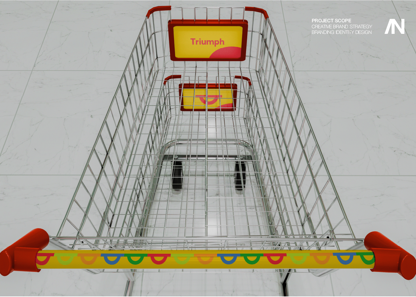

I like everything about what's going on in the middle circle. There are 2 n's in fiction.
I'm making this and would really appreciate any constructive criticism

can i get with this,
i wanna make soemthing like that first design. its a poster for a literary society. any design help, like what kind of text to use where text. (there's only a QR to be added more other thaat everything is already in pic)..


btw does somenow know
why my psd files takes up so much space??
this is the document size. with just a single image the size is aournd 200 MBs

I like it. It has a fine retro / 50s look. If there was one thing I might make the sun / planet more graduated through the colours 🙂


I think photoshop is not good programm for it
but you can try
if I were you i would use textures to make it
like Benny Productions
ye I was going to do that, it's still a wip
before & after the head:

I need to finish more the cloth part
I like so much how it's looking the head 😩
What do u guys think of this poster

its cool
strangee but in good way
is it photoshop ?
Illustrator and photoshop. I got the inspiration from exsisting movie call 「Fantastic Planet」and im making the poster of them with different styles, whuch is Pschedelic, Newyork design, Surreism etc.

This also my work
its so cool i love creativity
i would like to get these types of ideas
one thing i would change is to have margins
but it still cool
Thanks for your feedback apriciate you
reference (14.15), mine on 14.16, something is off but idk what (besides not using the icons in top right), im really struggling with laying things out, the ways things sit on the reference in terms of the red box and "TIER LIST" looks better, but im glad i was able to recreate all the elements


when i post it on discord i also see a little glow on the text i forgot to add
another thing to note is mine is 1920x1080 and the reference is like somethingx480
i took my time with this. what do you think and what do i add?

Solid design.
Perhaps you could try adding a vignette (darken the edges)?
You’ve done a fantastic job. You should be proud.
Perhaps a little contrast boost for your graphic in the upper right

I Made smth like this

but i can darken the edges

Made smth like this
man I wish I could print this and put it on the wall as a poster🥲
Yeah that's looking really cool. Nice work.
its not a problem juist rework it in illustrator
its cool but you will need to remove haze but im not sure
nah it's alr
thx man
Gave +1 Creative Carma to @abstract oxide (current: #15 - 146)
yes its cool but for print im not sure
i meannnn
that haze is a imag
wait how to i say it
Great poster, love it. What if you move the names, one above the BA on the left and the other above the AN on the right? Then make March 31 larger and in the same font and color used for the ? Hope this helps
WHAT DO ALL THINK


Hey, I made a Harry Potter poster 🤠
80 adjustment/effect layers
14 objects/photos used


Wrong second version😅

Poster for my asian friend:P

Thanks mate
Gave +1 Creative Carma to @hoary wren (current: #214 - 7)
Great poster, awesome job!
That video showing progression is as cool as the poster itself
Needed to make a Logo. Any constructive criticism is welcome as it will only help make it better whenever I update it.

such a subtle but amazing difference thank you
Gave +1 Creative Carma to @abstract oxide (current: #15 - 147)
Thank you. I'm happy to hear this will help. Best of luck with all your designs.
Gave +1 Creative Carma to @mossy ocean (current: #929 - 1)
I would wear this


Check my ig page
: znation001
Is this your work? AI?
Yes sir


Cool design.
Have you tried a version where the two main characters don’t fade at the bottom? I’m asking because I’m not sure about them fading into other people in the crowd.
you mean on the ferrari one? (the one with the black and red suits)
Yes
uh the design is fine but personally i think its slightly being off centered and the text being side to side is kinda hard to read you can prob put the prince of monaco ontop and monza below instead

and if possible i think you should find a higher resolution image for both pics and recut the driver instead cause its sorta blurry and the white outline is distracting
I am trying to make a utilitarian styled ad for a rock to serve as a paperweight. how can I improve this? aesthetically, typographically, copywise, etc

personally i think a good way to start off is by finding a good clean sans serif font and incorporate bigger and smaller text elements and see how it is
@latent path said it well. A simple, clean font might be the move.
Tried to make an antique vintage newspaper page and tried to make it look as authentic as possible. Thoughts?


I think it looks great. The only thing I can think of is perhaps considering the effect of how it was stored over the years from 1928, that might cause someone amount of fading or staining. 🙂
i agree but i think for a newspaper it has a surprisingly low amount of texts overall
Definitely.
I completely agree. Well when i first started it i wanted to make it a Flyer/pamphlet but ended up with a newspaper 😂
i think you can lower the heading size just a bit a increase like few increments of tracking because from what it looks like there are a few letters stuck to each other
or that was what you were trying to go for
Low quality printing machine error!
ah alright then
Looks really good. - Maybe add a bit of staining and you're good to go!
Set the opacity to your preference 🙂
when you cut something you should use masks and watch objects which you cut
left red one has grey line
in photoshop when you click on a mask and you opened properties you can see "select and mask" button
check this out this is very powerful to cut perfectly
especially in this case move the edge could work
second tip is to use camera raw on these people
for more contrast itp
Looks fantastic

Clean composition. But I would prefer it if I could read the core message "water waste" better.
On a side note, why are you using the Volvic layout in conjunction with the water waste theme? Is this a criticism you are directing specifically at this company?
🤔
Please be brutally honest

What's it for? - I mean, subjectively, I don't like it but I don't think I'm your 'audience'. - From a technical point, looks fine 🙂
It’s just a poster, the poster is mostly based off these 2 pictures.


And I was going for a mix of surrealism and comics
Latest Artwork

how is this? what can I do to keep improving it?

and does the slogan/headline seem "sticky" ad/marketing wise?
tuned down the gradient

I hope this doesn't sound too cheeky. Can you find another rock image. For me sitting in the UK the one you've used looks a lot like a baked potato!
I made some changes, especially to the colors. Is this better?

sadly I am kinda stuck with the rock image. how does this look?

Love it. Try making Rock and Paperweight text size larger, reduce the other text slightly. I actually do use a rock for a paperweight. Great job
You could always color the rock to look more like a desert rock?

Hue and Saturation Squad.
Lemme tell you something, lemme tell you something!
Always go for similar coloring (almost monotone) if you want something that eyes will like.
Make that books and paper yellowish (take color from rock - brown - yellow dust color), add some texture over it too.
Tone is important.
Most "Epic" Wallpapers are made from 2 colors the most.
You will find violet and pink in cyberpunk style, add third and you got problem (maybe not, if it's yellow light or any small detail).
Of course, including neutrals.
Typo coming what u guys think

does anyone know why these black dots show up whenever i take panorama shots? would be really helpful for my photos please give me some advice thx!


I try to clean my lens and my camera sensor every day but even with manual exposure and a high shutter speed they keep coming back i have issues to resolve this problem
making folder of classic fantacy art from the old times
i wish i could make the folder shadow more engraved
dont knoe how
like this one i found

the tab show up more
thoghts ?

He played for 5 different teams and the national team and sum of the scored goals is 900 for all of them during 23 years
So you should mention every team's period
Final result

Any feedback?

I would use camera raw on these people
especially for contrast
because it looks a bit flat for me
-working more on the lighting
- a better camera angle
Hey everyone! I just posted a new project on Behance. I'd appreciate it if you could check it out and give some support!
https://www.behance.net/gallery/207061365/Social-Media-Agronegocio

PT: Design Social Media (Posts para instagram) para Agronegócio, Agro, Agricultor, Fazenda, Plantação, Fazendeiro.EN: Social Media Design (Posts for Instagram) for Agribusiness, Agro, Farmer, farm, Plantation, Farmer, Agroindustry.

Dedicate a lot of time into this guys
Let me know what you think in the comment section
This channel and #1110544577850511401 are for people to post Photoshop work. How is this related?


I think maybe he did that animation
RPG project


Visually this looks really good. Nice work.
A technical issue. Unless I am mistaken, your X axis and Y axis appear to be the same axis.
Thanks, yup I see my X-axis is wrong Ima fix it. Thanks!
Gave +1 Creative Carma to @abstract oxide (current: #15 - 148)
https://youtu.be/AXtNUgEWgQI?si=T8UUqIoMgUh1C85d (this was my first time using photoshop)

My favorite joke to tell, or rather a retelling of the retelling of the most poorly told joke.
The story of this joke was told to me directly from someone who was there to witness a friend's mother struggle to tell this joke. As far as I know, it was a true story and this joke was truly fumbled in a similar fashion.
___ Credits ____
Horse, Dog...
any tips?


Thank you. Happy to have helped.
Gave +1 Creative Carma to @lament dock (current: #930 - 1)
Can you be more specific? Photography? Processing? etc...
i used iso 100
yeah photography
I cleanead it multiple times still dirt
yeah
Try and get important vertical and/or horizontal lines square. This can be easily done in Camera Raw or Lightroom.


i would make character more blue to match them
you can use color balance for example
before vs after, how does this look?


i feel like the clouds look a little artificial but i'm not entirely sure how to get them looking a bit better
i'm quite new to ps so any advice would be appreciated
You took it the wrong way, the first image is the original image, the second one is the edited one
That's before and after
Looks pretty good
I think it would look better if the clouds looked smaller and higher / further away 🙂
I think that was my favourite AC game... - the multiplayer was amazing.
Orange looks over-saturated/fake - but still nice 🙂
Mine was AC3 and I have played till AC Valhalla, not touched mirage yet
And i place Assassin's creed always on top in my gaming list

hey, is there a way to have an adjustment layer that blurs whatever is below it?
I cannot blur an image - it has to be a 'blur' layer specifically
tilt shift maybe?
but im not sure about that
is there Any adjustment which can blur?
I would convert into smart object


The goal is to make maybe 1000 'whipped edge' carpets by simly laying an 'edge' texture over an existing carpet, and allowing the core colour to show through, but not the texture of the capet itself
This would allow me to simply use an action to swap out every 'back layer' and the 'border' would then kinda match the carpet colour

oh bugger - I posted all this in #📝project-feedback ! Oops
First one. What to improve ?

Hey guys, I wanted some feedback from you about my new post on Behance about the visual identity of the studio I work in. Opinions and reviews are welcome ❤️

Paint with Layer Style technic I have learned this technic from Jessica Johnson https://www.behance.net/creatorscouture/livestreams
http://creatorscouture.com/


Behance
Creators Couture
Photoshop brushes, photoshop layer styles and other tools for Creatives!
Hi, I will appreciate experts feedback on my portfolio www.behance.net/abuzahidbintu

My feedback is that you should be careful posting things like this. Do you have permission to use this person's photo? Their name? Are you slandering someone without proof? You could end up with legal troubles.
It all falls within fair use
This individual has a history of interacting with children and promoting his NSFW photos to them. As well as abusing animals
They've been convicted of crimes? They have a criminal record? Or you're speculating?
I have video evidence
You're a citizen of the United States? They are also a U.S. citizen?
yeah
Heh. Better consult an attorney.
he tried to dox me and said he was going to unalive me
He can try and sue me if he wants but its not gonna work. People make these type of videos all the time. Just because my thumbnails and video are more morbid
They are still all allegations
I posted thumbnails on this individual and you have reviewed them before
My advice is that you don't slander people without proof. You're not a news organization. You could have legal exposure. And wouldn't that be ironic. You're trying to expose this person and they end up taking you to court and winning. heh
Ok thank you
My first thought is that its a bit complicated for a logo. Also, its important that logos work as one-color and without effects like glows and blurs. Even if you simplified this, I'm not sure this works in one-color...

Logos are stylized well-defined shapes. Think NIke, Apple, etc.
any feedbacks?

rate my thumbnail

Yo guys check this out just made this gojo banner "Through out the heaven and earth this banner is alone honored one

I believe this thumbnail violates Adobe's privacy and other policy and does not belong on this channel.
png: handle 16 million colors.
png-8: up to 256 distinct colors, GIF up to 256 colors
dont post satanic things


i like blue more because space is knows more as a blue-purple stuff
which tool you used to cut this planet?
nice
I didn't cut out the black hole, I just turned on the screen overlay mode and slightly removed the edges of the picture
Well, if you're a beginner, I think you're moving in the right direction, I personally studied videos from YouTube and filled my hand for a long time to finally learn how to do this. But even considering my current result, I am not one centimeter closer to the results I would like. I would like to become a professional in creating such ART
Perhaps it would help ..., but I am a beggar and stingy, and besides, a schoolboy

By the way, here are some more of my works


thanks !
Gave +1 Creative Carma to @hexed lava (current: #350 - 4)

HAND DRAWN TYPO


fire, idk why but i prefer the one on the left, looks sick
Much love g
Interesting, that was not you how posted the image!!
Moderators is the any way you can delete a post how references to a deleted post, it get out of context rater fast if the post not ad something new.
What seems to be the problem, @cunning pollen?
That's not a big problem but it will be easier to navigate the channel if you delete post with broken link/reference most of the time this post will not give any new information or if the original post is deleted you have no idea what they talk (write) about. As web designer I always try to delete or relink broken links/reference.
So in other words there is no problem?
Just leave if you can't quickly discern out of context posts
And certaintly not the traits of someone who can be even mildly proficient in photoshop
Ughh there's this problem I'm having in photoshop let me just complain on discord
😂
@cunning pollen
Why is this broken link I keep on clicking not working
bro can't read this message has been deleted
right above the message
Alright. Knock it off, please.
HOW IT IS GONNA BETTER IF THERE IS TIP

Nick Crowley inspired?
Is this meant to be a movie poster?
Yea just starting
The image needs "tension" to make it suspenseful and give it visual interest. Perhaps show a bit of the sea monster breaching the surface of the water. I would make the movie title larger and more imposing. Probably more of a contemporary font. Here are some of my ideas...

What the heck
Just some ideas. I have no idea what your sea monster is supposed to look like. ;)
Yea
How many year you are doing ps
A very long time. :)
That great
Thx you for your feedback
Gave +1 Creative Carma to @wooden oak (current: #3 - 2357)
This is a little farther along and how I set up my project...

Yup, Loch Ness I think 😉
When someone says "sea monster" my brain goes right to Nessie. :)
Hasn’t been seen for years. Nessie dorma as the opera tells 😉
She's living in Lake Champlain these days and goes by "Champ" now. heh
any suggest for this web design?


Too much empty space in the background maybe make the icons take up the entire screen. Or have the background be a blurred photo(from same photoshoot) that slowly interacts(slight movement whereever you move your mouse) in the backgroun
ok bro ty
Gave +1 Creative Carma to @native urchin (current: #932 - 1)
I would recommend you break this into two steps
first one you get a selection of the border in question. Then with the selection you go to select > color range... then select the pinks
then it should give you a selection of the colors or a mask? Just add it to a masl
mask
then you can do selective color again except on the whole image removing the pinks
just mask out the border and subject
put that mask under the first fine tuned mask
@leaden python

Any chance you could post the picture so we make suggestions about how best to tackle the issue?
how do people make this

First of all what's the message? Is all for sale at 30% off, if so place the picture with 30 % to the left, place the 2 left pictures on the second row to right side of the 30% picture on the first. What I can see itis all some type of tables. Place the picture with the armchair down to the second row to the left, so all the chairs is on the same row.
Now adjust all the pictures so you geta a balanced page of furniture. You can try to expand picture armchair on the right side, so you get little more air for the armchair. This will make the the bigger picture to first choices and smaller 2nd choices.
Like this

Which one should i choose ? what should add to it or remove ?
I actually found someone to edit the image for me. sorry I responded late
I prefer the last one, stacked version, for the logo design. Consider spacing out the letters WATCHES and the font slightly larger. Also try an option without the second line above watches. Or perhaps a shorter line.
i will try that right away, thank you so much
Gave +1 Creative Carma to @deep flame (current: #286 - 5)
I do have a thought as to the bonsai. In logo design the brand name as well as any image must work independently, for example, the crown is indicative of Rolex. The image element, if you use one, should indicate the quality, status, of the product , company. Hope this helps.

something like that
Try a sans serif typeface, for WATCHES, and about 70% gray, just to see.
what is "sans serif typeface" sorry for the questions, i am still learning
Sans serif typeface is plain, like Arial or Helvetica. Serif is more decorative and have”feet”

ERA is sans serif, but decorative.
so i should change "watches" to sans serif
Just to see if it works better. However, I like the serif typeface you are using, so perhaps slightly smaller size and gray. 🙂
The two typefaces seem to be fighting each other slightly. Trying the sans serif may help.

in this photo the watches is not bold

I like the first best. Now, try adding a little space between the bonsai , line and ERA. Shorten the line so it fits from the middle of the E to tip of the A. Make sure the spacing between all elements , from top to bottom, is even. Hope this makes sense
what do you think about the black background on watches or should i remove it

Had to get off my OLD ipad an onto the computer. Here's what I was trying to convey, but your idea is good too. I made the bonsai less dominant. I shortened the line and then used sans-serif for the Watches. Your idea of the band is a good idea too, but then I would take out the thin line above, and make the bonsai slightly smaller. what do you think?
i like your idea, its cool, i just need to change the font of watches so its sans-serif and i will try to do the line
I am glad you like it. 😉 You are on the right track in your design and the option of the band with the Watches in white is also an option for the logo. You may want to also try a horizontal version. When I create logos, I give both stacked and horizontal, depending on the type of advertising the company will be doing. Good job!
Also, remember spacing needs to be consistent. Adding more space between the elements makes it less "heavy" feeling. 🙂
🙂

thats cool as well
If you play around with your elements you will come up with what the client is looking for... enjoy the day!
thank you so much ❤️
Gave +1 Creative Carma to @deep flame (current: #255 - 6)

what would u say about that
Ty so much bro
Gave +1 Creative Carma to @cunning pollen (current: #12 - 164)
Nice. Good work, the edges of letters look rough, so be sure to have sharp text for final
this is the final
Great job!
thanks ! do you like it, is there something i should add or change ?
Gave +1 Creative Carma to @deep flame (current: #214 - 7)

I like it
okayy, thank you so much for the help
You may want to redraw the bonsai, or use a higher resolution of the image,, as it is a little fuzzy, otherwise, the logo is great
okay
Went for a dark rainy feel, what should I change/add/remove?

Coool!
tysm
I think it looks great. If there was one thing I'd adjust the kerning on ERA. My eye notices the larger gap between the R and the A. Perhaps also expand the WATCHES to align with the edge of the E amd the A. 🙂

I really wish people who have never coded a website in their lives
would stop giving advice to people asking for website advice.
Hi guys, I just finish my poster of dunk low and I wanna know if I can change something or its ok

like this ?
Yes better :-).
I think that the capital A still needs to be nearer the R.
Please have a look at this guide to kerning
https://www.canva.com/learn/kerning/
Do try the fun kerning game on that page !
Also the alignment of WATCHES

Can anyone review my SAAS Launching page

FluxAPI - AI-Powered Image Generation API | GPU-Hosted Models
FluxAPI offers a seamless API solution for generating stunning AI-driven images with minimal setup. Powered by cutting-edge models like Flux 1.0 and Stable Diffusion, and hosted on high-performance GPUs, FluxAPI ensures fast and efficient image generation for enterprises, creatives, and developers alike. Customize models and enjoy a streamlined ...

Great Job!
The missing element depends on what you want to achieve.
I - personally - would add one high contrast color ( Yellow or Red ) and add a bold quote, name, word or even brush strokes. You could also just color one small thing with one of those colors to make it pop
Just my opinion, great job
this was a almost 2 years ago i honestly didnt really think of anything but to add a bottle off in the sea that is filled as its a "waste" volvic is justy something i chose as i always baught this brand of water growing up, this was a college project
any feedbacks?

DELEVERD BUSNESS LOGO DONE FOR ONE OF MY BEST CLIENT! 😊 ♥️ 🔥
If anyone needs any kind of design and animation for websites, YouTube, Twitch/Kick at a reasonable price, Feel free to DM ME and get your work done with unlimited revisions! 📩 🤝

I would suggest not putting the red Pinterest logo over such a strong red background.
Really nice work.
Personally I would lighten some small areas on the face, chest and arms.
does that say subway in arabic
sensational
"Visual feeding"
I recommend changing the font because the text might be difficult to read on smaller screens
yt channel banner > is good ?

hello can anyone help me by giving your opinion on my design for my school's event? there will be my school logo on the top middle, but ill hide it for my privacy.


Hi, name is DeAndre and I'm a graphic designer. I'm looking to improve as much as I can. Here's some design I've done recently I would love feedback. Thank you!


Really nice work. Congrats.
You could try adding some more highlights and hotspots to the gold text to make it look extra shiny.
Is the first image your final composition while the second image contains the original elements?
If so, fantastic work.
In case you don’t know, YouTube channel banners are pretty big.
2560 x 1440 pixels
I dont really understand how that works as sometimes there is stretching or shinkage if it's not formatted correctly
like if on mobile vs pc for example
its different dimensions
In my experience, there is never any stretching or distortion. On a desktop, for example, most of the top and bottom of the image is hidden, thus giving the appearance of a banner.
ok that is good to know. Just didnt know how YT handled the different resolutions for devices
I haven't made one, but now I might
Is there an overlay for the safe margins?
@abstract oxide
for the different devices
But still good?
I haven't personally seen one. It can be tricky building something that looks good full size and after 80% has been trimmed away.
tried to make a deftones themed skateboard deck

how could I make it better
this is my first time doing any type of graphic design
How to improve this book more ?

Also I faced a problem with shadows in small bolts in the typography
Is there any suggestion ?
Can you describe what the context of the book is and the black graphic at the front?
I want to design a book says in Arabic ( your university journey starts with us).
And the black shape below is the most famous mark in the university of KFUPM, wich is its tower.
So the idea I gkt was about combanition of the tower an space
However, how to improve it more?
Idk
A quick note before addressing the design itself, you need to make sure that the perspective of the letters are aligned with the book. You can use the Edit > Transform > Perspective tool to achieve that. This way, the letters and words wont look out of place

What would the book contain? Is it a journal, a catalog, a story..etc?
It is just a book cover poster, there is nothing specific inside it
Does thus photo look photoshopped? Any feedback

Probably a bit heavy on the blur here...

(Also, please don't post the same question multiple times.)
It seems like a design made for school, which seems like exactly what you’re going for. It’s not the most insane artistic groundbreaking design I’ve ever seen. But for what it is, it’s done very well and looks very professional, great job
Yes, the jawline and arm on the guy look wrong. The arm is too smooth, almost like it was painted with a soft brush, and the jaw kind of melts, which the discernible shadow. Try to add highlights and shadows to both the face and arm. The highlights are probably fine but you could add hints of soft yellow light to the left of the nose, and maybe even the sunglasses, but super super subtle, (like 10 percent opacity, 10 Gaussian blur, soft light). For the shadow, multiple ways to do that, but use a dark brownish-red-orange and change blend mode to hard light, and Gaussian blur it after by about 30 -60px. If this project is needed to fool the world, you have a lot of work ahead, but if it’s just for a joke between friends then this is good enough.
This is great. You nailed this one perfectly. Are you using filter gallery, or is it textures with a blend mode on them? This goes super hard. Absolutely zero notes
Make your fave a bit brighter as it’s hard to fully make out the subject, and give the text a slightly darker blue hue to better blend into the poster. Other than that the background comp is super well don’t and it looks really really good
Quinn as in Michael Quinn?
Quinn as in Quinn Davis, sorry
Is it Good , i was just messing around]


i would make monument more red-orange
because strong fire affects that
you meanthe effect of light on the monument
yes
strong highlights becaise fire is very strong
even too much
but highlights are neccesary in this case
ok, thanks
Feels like OSHA may have some concerns....
how to make this more realstic ?

not about the card design itself, but I mean about the whole combination between this badge and laptop
pls any hlep
Hello! Looks good, but I would make it straight and some more shadow on the left since computer has light on it from right.
Do you suggest to add shadow on the lef edge? Or left to the stright light on the badge?
Also I feel like there is something wrong in the manipulation, I can not determine where it is exactly


It is not perfect, but look at this. I would try to add shadow on the badge on the left. And I tried, and I think adding a light edge to the badge helps. I made all badge straight but still there is a problem with perspective.

It looks better than mine
I think the main problem in perspectice is name Nasser.
I would fix this with adding aslo some design at badge, it looks very flat
Thanks for helping!
tried 433's style ( those who follow 433 on ig know )


the defocused feet seems odd to me but overall composition feels good [ i am a beginner who has watched a lot of benny production and phaserunner]

@rancid patrol if you turn it white-black everything will be light
but
back of first character and front of second should be darker a bit
you made highlights so its good that you thought about it
and I really like composition
My first art in Photoshop

i dont know how to fill space

What do you guys think


@lusty lintel
Which of these is the ‘egg’ and which is the ‘hen’?

going to use this as an inpiration for next project any suggestions ?


Very interesting vibe. What kind of project would you like to do?
something mythical
i have some ideas
that in the sky there would be a bright light which would shine through the silhouette of a human shape onto a man who is injured and is feeling healed, add something if you have something better, i would appreciate it😁
hey, i am currently working on this image, but after adjusting brightness, contrast and saturation it doesnt really fit into it (i know that the themes are totally different).. Does anybody have an Idea on how to get that last bit of inclusion? :D

How does this image look? Im open for feedbacks


honestly it looks clean like that
looks like average picture in bible
but I like it a lot
That's good tho you just need to practice glow more
Making an album cover, any suggestions or feedback would be greatly appreciated!

The cigarette personally looks lit wrong but I can’t figure out how to make the lighting on it better
you need some kind of a background
maybe make the letter sit on a table

this is just a example
ofc adding text would make it a lot better
im going for an avant garde look, similar to this cover by pierre bourne

the background you created compliments the design well, but i'm going for a stark contrast with only the subject in the design. In any other project i would agree with you though
ahh right, how about making different stamps
any suggestions on what i could change about this?

you could maybe replace the font to make it a little bit readable, and maybe play around with the 2nd photo (Mclarens back) just because it stands out a lot
alr messed with some different things not the best but its something i think

Change the font in the bottom left as it feels unprofessional. You could either try all caps or perhaps just call it a day and slap Helvetica on there. Solid design, though, maybe try and darken the background with a slight black gradient just so the McLaren logo stands out more
alr thanks
Gave +1 Creative Carma to @mystic plover (current: #353 - 4)
alr made last iteration for today. could be changed tomorrow.


Well the the text is obviously very hard to read, I have no idea what it's supposed to say or mean, the red 'Cherry' word is a bit of a sickly red colour, the contact shadows of the cherries is too harsh.
Each of the drop shadows behind the text all seem inconsistent with each other.
I suppose a bit part is that I just don't know what it's supposed to mean, or the message it's getting across.
What's that question about evoking feelings about? - Was that the question/prompt for making the poster set by a teacher or something?
No just for me practice I’m trying to get into photoshop
Have you found any nice free courses on youtube? With practice files to follow along with? 🙂
https://www.youtube.com/watch?v=M888EFXvhsQ
egg is left hen is right
Then: Wow - very well done.
👍
(Only the clipping on the flowers on the left could be optimised a little).
Thank you
Thanks! I used textures.
Gave +1 Creative Carma to @mystic plover (current: #288 - 5)
I have some mixed feelings about this one but can't point it out at anything...


left.
The blue one?


Really good work.
I feel like the food could use a little contrast kick.


hey - i want to make an effect of an underground city under this hole, but it just looks super flat and doesn't look like it's deeeep underground. What can I do to improve this?

was taking a picture for the poster, but... lazy😊


man, its good looking, don't chase perfection
Thank you! I appreciate that 🙂 but still I’m practicing and want to get as best as I can so I would appreciate all the advice 🙏
Gave +1 Creative Carma to @simple gust (current: #216 - 7)
My recent work. Black Metal font in photoshop
https://youtu.be/EamtXBw89P4?si=Y7_mdRT24fZ4UZRF

Tools;
- Macbook Pro
- Adobe Photoshop 2024
- Download REDEYES font here : https://www.behance.net/gallery/206770343/(FREE-FONT)-REDEYES-BLACK-METAL-FONT-VOL-12
Music from #InAudio: https://inaudio.org/
Metal Wars
#deathmetal #logo #metal #blackmetal #band #apparel #horror #tutorial #merchandise #death #black #art #font #metalfont #me...

Looks good. Perhaps make the skull less symmetrical.

been pretty uninspired lately but i randomly made this for my gf
the sun could def use some work, this was a 2 hour project that i didnt take 100% serious.
This is what I made with Canva I just need some suggestions and basics of how to make it better on Adobe Photoshop


These are some of my previous work on Canva. Which obviously Adobe Photoshop is an upgrade I just need to know how to do better.
Any tips

Why would you recommend doing that?
not a bad attempt
if the city looked like it was further away it be quite realistic, throw in some branches, rocks and vines so it fits in with the enviroment

Maybe try to optimize the sizes from the moon to the objects in front a bit. Also the Lighting could be optimized more. The objects (statue, flowers) are very bright, the moon is bright and the mountain is very dark. That does not match. Also the statue has no legs ans the flowers seem to have no purpose at all for the composition. maybe also try to match the color of the moon light to all the objects.
Canva aka Adobe Express and Adobe Photoshop are very different Tools for different purposes. First of all you can definitly sharpen and denoise the images of the cars in the background. The matching of the colors you can do in Adobe Express easily (not sure if Canva has an Eyedroper where you can pick up colors from your Image and put it e.g. in the shadow of the Text). Then there should no Typical's that should read as Typical I assume. That "Beamm Design" is a little to prominent for such a nice image IMHO also the "neon" color does not match the Project.
For the Photoshop part itself: only open the Image/Layer with the Car in Photoshop. Try to denoise it a bit, sharen the image and maybe lay a small vignette over it. Then go back to Adobe Express / Canva and put the Text over it.
thank you! the branches etc will be the last step
Gave +1 Creative Carma to @stray flint (current: #288 - 5)
good work keep it up!
does anyone know how to delete the shadow from the pyramid? I've been trying to do magic with curves for the last hour but I just can't do it. Trying the "delete the shadow" prompt in generative fill doesn't work either:(

Just a thought, maybe it would be easier to copy and mirror the front face of the pyramid?
I tried it but it gets obvious that it's just a copy paste because it looks exactly the same. Perhaps I will try to take a piece out of different pyramid picture
Perhaps using this method will give you the results you want 🙂
https://youtu.be/XHaZKt4MF7k?si=XBEDbcwRS8nyPZ3C

Learn how to remove hard, extreme, and complex shadows with a super simple technique in Photoshop! Without creating complex masks, in this lesson, we'll learn how to entirely erase the shadow, even out the skin, and fix the color in the shadow area. With the power of Blend If, Curves, and some amazing Photoshop filters, we'll discover how the ne...
Thank you
Gave +1 Creative Carma to @normal spoke (current: #21 - 94)
Any feedback? Mostly just drawing and then using Photoshop for masks + potentially color overlays


The goal is to convey insanity and isolation, followed by presence
How do you do the custom letters
I draw on Adobe fresco


Tried it, didn't work, I gave up, but thank you a lot haha
Gave +1 Creative Carma to @raw wadi (current: #29 - 74)
I like the black and white Theme with only Line Art Drawings and the person in it. Maybe try to draw more exact the lines to the person so that the pen strokes end/start exactly. Also the bluring, bright vignette, glowing around the person for me it has a more dreamy, positive, heavenly vibe and not so much al the other themes you wrote. Also try to make the Images bigger so that it can be seen better. Have fun.
that means youd have to get rid of the shadow on the ground too
Yes what you have created is clearly an artistic interpretation of a skull. But making one tooth slightly bigger or making the curve at the top of the eyes dip slightly differently makes the whole thing look a little more “real”. I'm talking about the kind of changes that only someone with a keen eye would notice.
is this similar to something you wanted?

what can i do to make it better?


I think it looks a bit strange with NO shadow, when the one on the floor is so strong. - Without them BOTH, the whole image looks flat... - I think a compromise is just lightening both bits:
BEFORE

AFTER

TOO EXTREME

shouldn't the shadows match with the other shadows in the image? so when you look at the other buildings, they basically tell you how the shadow has to look.
missed the first request forget everything i said xD
in my works i like editing eyes, in this case you could fill space for eyes with some glow for example
How did you get rid of the shadow :O
Photoshop Generative fill... then I reduced the opacity of the new gen filled layer by perhaps 60%
damn thats really good result

heyy, yes! Thank you a lot 😭 did you just copy the front?
Gave +1 Creative Carma to @stray flint (current: #258 - 6)
generative fill lol
woooo !! that's also amazing, how did you do it?
do you remember what was the prompt?? I just don't know how to talk with this ai thing at all 😭
damn guys, I should start using that generative fill feature for real, do you remember what prompt did you use??
I think I wrote "no Shadow" or something 🙂
But Gen fill is half the job. - It's often used with a bit of extra brightening, curve adjustments, masking etc
so what i did. i removed the the bright side of the pyramid, got generative fill to make a new one, once it made the new side I placed it onto the shadow side and fixed it up with healing brush
@novel comet @stray flint Thank you both for your help. I will try to do this on my own now with your instructions and share the effects soon 🙂
Gave +1 Creative Carma to @novel comet (current: #5 - 997)
A few thoughts:
- Add some breathing space around your margins. Some of the elements (text and logos) are crowding the edges.
- A business card should make it clear what the business is. On the one for Yadosh Jayathil there is nothing on either side of the card indicating what the business is.
- Typically a business card would have a person’s name.
- The rigidity of the grid pattern on the Bloom Flowers card clashes with the curves of the rest of the imagery. It seems unnecessary. On the other side of the card you’ve used a dot pattern. Maybe play around with that instead of the grid.
- I made a few quick adjustments to the Arila card to demonstrate some of these ideas. One more point of finesse; the “@“ symbol in most fonts is almost always too big. I always downsize it a little.


all good, let us know how it goes
Gave +1 Creative Carma to @cosmic brook (current: #448 - 3)
I'm not hating on him because I like his videos a lot but there is just no way you could honestly call that an easy trick.
It's an easy trick compared to his previous method is I think what he's implying.
However his tutorials range from simple to more involved. This one is for sure more demanding 🙂
Yeah, and also when you can always go back and reference the video that also lightens the load
Exactly, some take a few viewings !!
I'm working on this and I know I'm gonna make some changes just don't know what yet. This is definitely the foundation of what I want. Some feedback and any constructive critisicm is super welcome. It's for a challenge on threadless supporting the upcoming American Vote. I specifically would really like to know if you thought of space/nebula when you saw the flag background or if it just looks like a distorted flag.

any feedbacks?

This music artwork was created from scratch with Adobe Photoshop. It exceed buyer expectations because the buyer was soo excited with the final outcome. What do you also think about my work guys 😊
https://discord.com/channels/547473772727238676/1286656894366384148
Hi! What is this for? Will this be posted somewhere with a specific purpose or is it more of an artwork?
It's for Threadless.com. You can upload designs and they'll put them on shirts and if it sells you get some $. This is for a challenge loosely themed around the upcoming US election.
@flat plinth - This channel is for feedback on projects. Not self-promotion.
Personally I would push the text in a little to keep it from the very edge of the graphic
Hello, I rented a vintage design of recent. It was created from scratch with photoshop. What do you think about this guys ? 😊

Definitely has a retro vibe. The horizontal lines above and below “classic timepiece” are different. I think they should be the same. I personally prefer the bottom ones that fade out at the outer ends. But that’s your call. Also, the bottom lines with the little oval thing in the middle looks like it’s offset to the right. I would center it with the classic timepiece text and the lines above. So the little oval shape at the bottom would align center with “of the” at the top. And it looks like the watch dial was put in the center of the round background shape. The watch shadow and chain being on the right makes the watch optically appear to be slightly too far right. I would nudge it to the left until it looks centered. And one question: why does this watch have both a wrist strap and a chain? Chains are generally found on pocket watches.
I like the vibe overall and the colors. The text looks a bit flat and boring. There you could maybe ad a bit Texture and another Font. Also the chain is a bit irritating, because it is a wristwatch and not a pocket watch. also the watch is not centered in the circle. with a bit tweeking the Design can look real good. have fun.
Thank you for the corrections. and as for the question. Buyer requested it to be that way..
Thank you 😊
Gave +1 Creative Carma to @normal spoke (current: #21 - 95)
really well made poster by a guy in here, any critiques or praises for him? nothing stood out immediately for me, i really enjoyed it!
OP: @ Bayat

hey guys im not a graphic designer, also i dont have money to hire GD to create my product posters so i done on my own, please give me feedback on how can i improve this design,


Which one of these four composites I made is your favorite?

Guys how is it , need feedback back ,
5 diferent fonts imo id change the large text one

Should I make same fonts to all ??
Stick to one font, consistency is the key, have a one colour background, also high quality images would make it better, also instead explaining in paragraph have bullet points because sometimes a lot of text may put viewer off :) hope it helps
Sure, Thanks for the detailed feedback, I'll fix it
Gave +1 Creative Carma to @stray flint (current: #217 - 7)
good work keep it up, and dont forget to share result :D
Okk I'll share once I done that 🫶


@shy vale
You have a hard edge below the wrist for the hand on the left.
any feedbacks ???


any feedbacks??

anyfeedbacks? and which one is better ?


Which one is better?


left or right?


LEFT
I kinda prefer right 😭
BOTH ARE GOOD BUT MT PERSONAL PREFERENCE IS BRIGHT AND POPING COLOURS
DO A COLOUR BOOST ON RIGHT ONE IT WOULD BECOME BETTER I THINK SO
@north kraken


I'm thinking of priting this on a shirt and giving it to my friend because its his cat and birthday

he's a big fan of deftones
right one is goood, you did great in removing those firecrackers from the bottom i didnt saw them at first but when i noticed, it was looking bad😁
Quick question, are these to be web pages? I ask as in the third image the detail text is very small 🙂

i like this a lot 😍
Can anyone rate my level in thumbnail design? Beginner - Intermediate - Professional

any feedbacks?

I am a photoshop action script specialist. Please let me know if you want an automatically process for image.
hi guys im professional photo editor and let me know if anyone needs know any tips to tricks or tutorials
Just one more "custom" made LrC splash screen, any suggestions to make it more appealing?

I think the text should always be in left right form even if you roatate the shape dont you think, also i dont like the red glow effect behind the AI text , very cool apart from that, also why his neck so red
guys how's this poster i created it for a tech event at my college

this looks fire
thankx bro
Does anyone know how I can remove the background of this image in photoshop? I want to leave just ''4M''
use the pen tool and trace around it then make the selection into a layer mask
you can use the cntxtual Taskbar and choose "remove Background" and maybe refine the selection a bit. You can choose the pen Tool as wiggie said or the magic wand and select your object. Because of the blur it will be a bit work to refine the selections. Have fun.
The Image itself looks very cool. But if that should be a Poster it is a bit overwelming with infos and images. When, where and what should be "bigger" and clearly seen what the event is about. Right now the eyes must look around and find the necessary infos. Try maybe a bit less dots, unecessary Text, etc.
Your overall vibe is cool, but there are a few things that are confusing and some details that can be cleaned up:
- "Together we transform" - This phrase is vague. What is being transformed?
- "Leading the change in innovation" - Did you mean, "Leading the charge…"? Also, no need to break this onto two lines. Put it on one line and create a little vertical space.
- The image of a city feels futuristic, but it doesn't really say much about driving or cars.
- "FUTURE" could be dropped a few clicks so it's not so tight against the image above.
- The text at the bottom is hard to read in all caps. Also, try to clean up the rag (the right edge) so it's not so uneven and make sure the last line is not just one word. Also, you use the word "blending" but you don't mention what "cutting edge technology" is being blended with. You could probably change "blending" to "and".
- "Ice to EV" - I don't know what this means. Is ice being used as a fuel source?
- Bottom right, the "transforming — journey…" part - it's a little awkward with the uneven lines and spacing and breaking onto two lines. Maybe if you simplify the rest of the poster you could have that on one line along the bottom.
Just a few thoughts. I appreciate the amount you tried to squeeze into the poster. Just needs to be tidied up.
hi, i want to make this look better. can i get feedback please?

thankx for the suggestion bro
will use these next time for sure


You could ask Adobe Firefly for some help/inspiration?
Maybe then combine the favourite bits from each?
- I took the 'hands' from image 3 and placed them into image 4.

ITS AN CAMPAIN ADD


GUYS DOES THIS LOOKS SATISFACTORY
I
ITS AN EXOTIC PLANT BRAND .
its quite low quality but the 1st one is a good concept, but the colours in 3rd look amazing too
3D LOOK ??
THNXX

What does Steve Harvey have to do with Adobe After Effects?
youtubers arab that dont show their face use the famous actors in their thumbnails , the text is shortcuts of ae btw !
they used the light from the logos around him on his face (after effects probably?)
and overall an ai voiceover explaining or whatever could work
tysmm bro ❤️❤️❤️
I thought maybe he got fired from the Family Feud and started working in visual effects. :)
yeah fr
😃
you definetely have a lot of options, good luck with your video!

None of them... legal.
You cannot use a famous person's likeness, image, voice, etc for your own commercial purposes. No. Sorry.
There will be copyright strikes, takedown notices, lawsuits if you make any real money.
dayum
Try to use a song on YouTube without proper permission. It will be removed by the record company/copyright holder, etc.
@wooden oak ...
I read it.
oh ok
Regardless, you can't use a famous person's likeness, image, voice without permission. Maybe you won't get caught or no one will complain.
ok bro
and can i ask a question ?
About?
when can i know that i am proffesional in thumbnail designs and i can learn a something new like (football poster - social media designs-anime hedader , etc..)? and when can i know tha i am proffesional in everything in photshop and can i use an another program of graphics (like xd and ai etc..)
the quesion is too long 😀
I don't understand the question. "When can you know that you've reached a professional level in thumbnail design?" Probably when you can consistently get hired to do that job. Generally, "professionals" are paid for their work but that isn't the only criteria.
i meaning can i learning all Areas of photoshop in one time or should i be profesional in a specific area to moved to another something (anime header , and etc...) that i meant
This applies to the other question as well.
@wooden oak ...
Sorry. I'm busy right now.
I think you will continue learning Photoshop over the longer term. Most people become "professional" but they never stop learning new things, new workflows, smarter ways to do things. Professionalism is a journey. Not a destination.
: 👍
you should know how to design and be professional in 1 specific area or more (but not too much)
you cant be good in everything
hello wonderful people! SO i am trying to make a stain glass image out of this picture of a character in a video game. However. When i try to give it the stain glass look, it comes out weird. I wanted to know if there was any way to make some of the stain glass peices larger and others smaller?

This is what the image looks like normally, and I want the stuff closer to the eyes and wings to be smaller, but the legs body and crown to be larger.

anyone know how I could potentially do that?
So I want to make clothes to sell, can I get some suggestions?


what do we think it's my sec poster

One option would be duplicate the layer and apply the stain glass effect to both layers but with different settings. You could then mask away parts of the top layer to combine the two.
Looks cool. Personally I would brighten the person a little and definitely the face.
ty!
Something like this

Cheers
OH THANK YOU! I'm taking a photoshop class and I'm not sure how to use curves yet 👀 but I definitely see the difference
Gave +1 Creative Carma to @abstract oxide (current: #14 - 149)
Thank you. Plenty of ways to brighten. Curves can definitely be a lot for a beginner. Just make sure you apply a second "thing", like an adjustment layer, to change the brightness. Don't apply any changes directly to the layer as destructive changes can be hard to reverse later.
Gave +1 Creative Carma to @worn helm (current: #935 - 1)
Best of luck with your Photoshop class
they are nice. did you use ai? where is adobe firefly
Firefly is a separate adobe app that’s all AI generation
oh thank u
Ok I'm here.
So my question was this --> #❓ask-a-question message
Which was
||I just needed help with changing the lighting color for my Youtube thumbnail today, I can't seem to figure it out just yet.||
I was just trying to make the lighting a bit more yellow or the blues to yellowish lighting but I can't seem to get it right or figure it out.

I don't know I guess my lighting was not the best either, I should have gone more on the yellow lighting. But I'm trying to work it in photoshop now.
Ah lemme know thanks.
Click the Adjustments tab on the right side and toy with the different color, saturation and so on tools.
Or, duplicate your layer of choice you want to adjust the colors for, then convert the duplicate to a Smart Layer, go to Filter > Camera Raw Filter, and adjust the colors that way, including the temperature.

Oooh ok ok thank you yes I'll mess around with those thank you.
Gave +1 Creative Carma to @spark meadow (current: #935 - 1)
Shut up, Not you this bot.
Dam this stuffs hard! I think it's because of my outfit, I'm literally wearing way to much blue one and I didn't get enough yellow lighting..
Dang.
Is there like a brush way to do it to though? Is that what i'm supposed to do?

Cause this ain't workin.
Would you be kind as to DM me the project file with the background image and (I assume) you as 2 images so I could demonstrate?

Ahh you mean you'd like my file?
Yup. Just export the background with text and all as one image, then yourself as another image. I think that works better than the whole project file.
Interest
I am interested. But don’t do DMs.
I respond in:
Servers, @‘s, and Replies Only
What are you talkin about I have everything in folders.

See?
In Photoshop, just export the image without you, so it's the background and text, and disable that layer, and export it with yourself so I have 2 images to work with demonstrating how to fix the coloring problem.
You mean you want the picture of just me right? Cause I don't need help with the BG
I'm using the background as reference for how the lighting should be. But either is fine.
Mmm I mean I wouldn't mind if you tested on my image cause that IS what I need help on.
How about I just send you the whole file? Cause why not right?
If you'd like.
What channel can I do that in?
I guess here, then delete it after a few seconds.
No I just tried in the --> #🙏🏼challenges-questions it works but then it dosn't cause my file size is to big..
Discord and there weak ass boundaries :/
Then send just you, standalone.
Huh? Oh me single crop out image? Ok
Ok here it is? How's that?

Lol I look like a spoon
I think the best way to describe lighting is if your object is in something like the direct sunlight or in a desert, make the lighting warmer (more yellow/orange), if it's out where it may feel cold like inside a test lab or in the snow or stormy weather, make it cold (more blue)
Oh interesting you did opacity there. Yeah I did find those tools too, I guess I'll at least mess with those as well.
No no let me show you I was just trying to get my blue shirt really to turn yellowish tan like the rock dwayn jhonson in this video mobile game:

Do you think I can turn that shirt tan? That's what I was tryna do.
Oh and I forgot to send you the file instead not the png...
AHH It won't let me the file size is to big.. Nevermind.
It's alright, I got it.
Is there a paint brush tools way of changing *just the shirt color only?
I'm not exactly too knowledable on that, but I did do a little bit of a complicated "workaround".
I'm just looking through it right now actually.
If you want something more in-depth then try to look on YouTube how to change color of something. I just did the overly-complicated route.
Change Color of Anything to Anything in Photoshop! Learn how to selectively use the Hue/Saturation Adjustment Layer to Target and Change Colors easily.
Hope this video helps you. Thank you for watching :)
► CHECK OUT PIXIMPERFECT PRO: The Ultimate Course to Master Photoshop from Start to Finish and Beyond: https://piximperfect.com
► DOWNLOADS...
Oh wow yeah interesting not bad at all, I am looking into a more select and brush option so I think I got that atm. But thank you very much for showing me this to.
Gave +1 Creative Carma to @spark meadow (current: #605 - 2)
No problem!
Im trying out this one atm. @sleek maple is supposed to help me but he ain't here... So I gotta use the mouse.
https://youtu.be/eO8NNJMhLFM?si=Ng4heFVWxTsvJeKf
In this Photoshop tutorial, learn how to make your Portrait photo "pop" & look more 3D (using several 'Subject Separation' color grading effects!)
***MASTER Portrait Photography & create stunning photos in only 21-Days: https://go.justinlaurens.com/
Chapters:
0:00 Intro
0:43 Initial Adjustments
1:38 'Subject Separation' Overview
2:07 Backgrou...
Whao I don't know why but whenever I'm duplicating layers it seems to be breaking the greens in my Backgrounds

Darn.
It's just my last thumbnail was way better I think and that's just because my lighting set up was more correct but also cause I had a white shirt on. Which made it easier on photoshop for editing and having the colors match.
That's the issue i'm having here so far I believe.
My bad lighting or wrong outfit of choice just makes my whole thumbanil feel all out of place.
I'm going to look up more brush or selection options
Omg I found it:

cursed tool
Yeah
I know Its Small and I Am Changing It Design and Make it Visible
That will help legibility. Readibility would also be improved with non italic font 🙂
Yeah you are right 👍
I will improve it no worries
Once I finish it i will share It 🔥
Great, I'll look forward to the next version. Tag me so I know 🙂
Yeah For Sure
It's a logo for a music label. 'Rainy Records'

does this image look good? I want to take reference or use some object cutouts from it T-T
wait what

wrong link mb
any suggestiond

I think since the palm is the important subject, I'd make it stand out more - perhaps brighter 🙂

Really nice work.
There is a white line surrounding the plant. I think you need to be a little more aggressive with your masking at the edge.
The shadow at the plant base doesn’t quite match the plant.
What do you mean?
@tough wadi would you have any idea what's going on with my background here when I duplicate the image layer of me it breaks the BG and turn the greens into greys #📝project-feedback message
It may Be a Software Glitch
Have you Updated your photoshop
Yeah it is I can't continue with this issue because of it. Just not sure what to do about it.
Have you seen the Same Problem After extracting the png of that Thumbnail
Oh that's interesting i'll try that.
Ah it's still all grey.

Takes all the green out and I'm not sure why.
from duplicating layers.
Hm 🤔
Can you Send me a Psd File so That I Can Check it out

Discord is to weak for file sizes..
Drive link ?
Drive link? Are you reffering to google drive?
I mean you Can Upload into google drive and U Can share psd files so easily
Yes
Oh ok sure thing.
Ok i will check it by tomorrow because i am Not in my studio right now
Would love feedback, i'm not really into logo design
Yeah, ticks all the usual boxes. Not too complicated, looks unique, works in black and white, works when used as a tiny thumbnail.
ONLY issue I see in that the N looks like a H.
RAIHY records.
I understand why though. H and N can look pretty similar.
Oh the bugger already left the server. - Wish I'd have checked before I made the clip

"In this episode, we'll uncover the awesome techniques that I use in Adobe XD to really make my wireframes pop! I'm Kevin Hart and I'll be your host on this fabulous journey into GUI Design!" :)
I think perhaps you should choose characters that are more believable. Using images of famous people in these thumbnails is somewhat misleading but it also seems amateur.
a believable character like who? and I repeat my words again that Arab YouTubers who do not show their faces put actors in their videos and thumbnails.
Like someone else. Someone who is not a Hollywood movie star. It looks a bit ridiculous to feature him there. You're posting in the feedback channel. That's my feedback.
Ok but aside from that what do you think of the thumbnail in general, what should I improve on?
Thanks mate
Gave +1 Creative Carma to @novel comet (current: #5 - 1006)
First, I don't know what the text says so its difficult for me to judge what this is even about. The "design" of the text seems fine. Again... Kevin Hart seems to be the main focus of this thumbnail; he takes up most of the image. If you removed him and put another person there, would it still work? Or is your design totally reliant on Kevin Hart being in the image?
The text is( professional XD)
Professional XD? So what is the video about? Is it a tutorial? What is the tutorial about? XD and User Experience Design is a huge topic.
advices, and i am not a creator content btw
And? I assume that you're posting here so that you can learn how to be effective at thumbnail design. Is that correct? Then really imagine what this thumbnail would be if it were being used on YouTube and design for that.
yeah but i see its good to used on yt tho.
OK. Good luck to you.
YALL
This project of mine had various concepts
And I absolutely LOVE the final result and what it's become, WHICH ONE IS YOUR FAV


(There are too many versions of this place so I've just put out the first two and last two)
😁 😁 😁
Bottom right with the skylight - more interest.
Last image? TYTY