#📝project-feedback
1 messages · Page 3 of 1
Ohh yes I could, thanks!
Gave +1 Creative Carma to @knotty pendant
so bassically what u should the camera pov look like it should the guy should be a resized so the camera is behind him but closer
can u give me a tutorial on how to do this chrome effect?
@urban hinge sr for the ping but is this what you want me to do?

I googled something like "chrome effect psd" and downloaded one of the first links I found.
In all honesty, I didn't even pay attention to how the effects were applied, I just grabbed all the effects and chucked them over my own image and let photoshop do its magic...
https://youtu.be/3Xnw0PctxX4 - ah here you go. Link in the description.
Hello friends. We're back today with another great free Chrome text and effect. In this very short video, I will show you how you can easily turn your text or logo into this realistic Chrome style with one click.
Download PSD:
https://hyperpix.net/text-effects/chrome/free-chrome-text-effect-vol-7
More Text and Logo Effects:
https://hyperpix.ne...
Also, does the scarf look realistic? Is it clear I added it in
thats so fire HOW u do that though the red pinkish text ontop looks off cus no font

Rate new pfp

I'm designing some car posters for my friend and I was wondering if this looks nice?
the sides need some cropping - and I'll probably swap some of the statistics around

maybe some accent colors?
ahh yeah, i was thinking that
just got an idea 👍
what about something like this?


different colour? different shape/location of shape?
not too creative myself. i just think it looks good but incomplete.
ahh okay, i thought that too
i had these posters in mind for inspiration

i'm just going off what my friend tells me as he's obsessed with cars 🤷♂️
ok 🙂
am i too outclassed for this discord? feedback on these?


No one is "out-classed" - we are all learning. People are in different places in their overall 'creative journey.'
nah man i mean if theyre 0.5/10 at best them im clearly not good enough for this place lol
where can i find an editor
basically wondering if this place is for complete pros or if random idiots like me can use this discord
This place is for everyone who loves being creative, making cool images and loves using Photoshop.
All skill levels. People using the apps for varying purposes, e.g. photo-editing, graphic design, drawing/painting, etc etc.
Welcome aboard.


SEE MORE OF MY ART HERE! https://www.behance.net/secretvet
new art style speedart
probs wont get any views but thats alrighttt
tell me if u want to see any more speedarts and give me some ideas in the comments!
new style im trying out


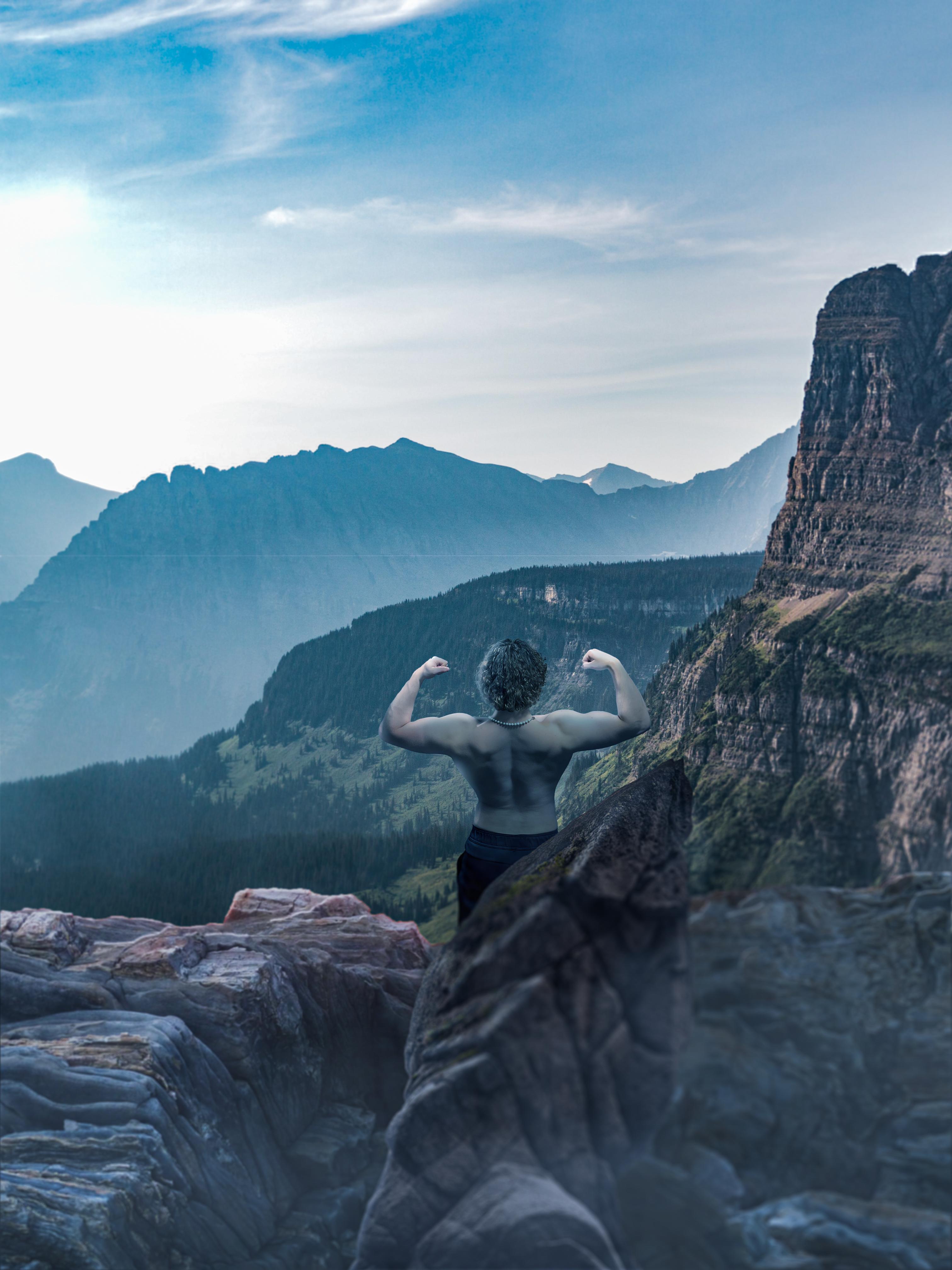
first thing that comes to mind you could make the biggest character peak up behind the mointain...so the mountain could serve as a mask for that figure

it's quite difficult to see the face
Was intended- but do you think it is important?
not really 😅
i was trying to think of something to say :)
I think it would look cool if JUST the skateboard was in full colour. - Help bring attention to the branding.
Also, like @dusk igloo said, it looks like the face/neck has literally been removed, not simply 'angled away from camera.
Ok, I could outline the chin/nose to make it more significant but can’t see much of the face in the original photo anyways 😂
Ok thanks , good idea
Gave +1 Creative Carma to @novel comet

Maybe make it so his fingers are around the axe instead of behind?
It looks fantastic, I don’t agree with adding colours maybe change it to yellow. Just I think using one colour is cool, and yeah when you try to look attentively you can’t see a face and it’s strange))
Id like to know what story will be, bc it’s important for searching background, and I am just interested in hearing. Yeah picture is cool and medieval👍👍❤️
His hands do look MASSIVE though.

I thought Wednesday was allergic to color... :)

Yeah I think she isn't happy about this one
Enid’s masterplan
this is my first ever composition with photoshop

What could I do to make this more realistic? Currently hesitating between the gift texture and the rock texture.


Shadow on the snow below & shadows and highlights acording to the sunset

Scribble text style maybe

can anyone give me some feedback on this?

its inspired from this

its a new style i was willing to give a try and i want some good brutal feedback, my feelings wont be hurt if you be harsh
is that one better or this one?

Is this too cluttered?

too be honest, idk what too look at 🤷♂️ what is your goal?
The center, but id like it to move from one hand to the other
if the blue flower is the main attraction you should get rid off some off the others, its so much too look at
imo
ok
looking for some feedback on this kinda abstract piano piece im working on

i like the composition but i think it really needs something else
or completely color shift idk
looks good, but are you going to continue with the stripes/notes? idk how much real looking you are going to do it, maybe try to get it white and the brown notes too black. just make a copy and try change the color, or just duplicate the layers.
otherwise you could try too make it have more angles, and maybe try make a lid or it show open lid and the inside off the piano. all depends how complicated you want too make it 🤷♂️
im trying to keep it simple....its a riff off of this other design i did for a flyer

i really love how this came out but this piano one looks like....idk...super basic lol
but simple/basic can be good too, not everything needs to be complicated too be good. and that picture looks good too, its have special colors so it doesnt look "real" but it looks nice for a magazine or book
yeah im not going for realism really
Hi
i have created a monstrous combination of AI generated art and a real life image

its unholy and i want to make it worse
Hey guys, I made this as a sort of rough draft. I'm a super beginner so I don't really know what I'm doing... I'm just wondering what I can do to make it better? I feel like the cat doesn't blend in with the forest scene nearly enough. If any of you guys have the time to give me some advice on what I should do that would be great

Hello!))
Your job is great for a beginner, okay I have a piece of advice for u.
1 - you should not only add colour (how did u do with green, just painted its and changed mode), you need to change colours of the photos (cat, forest and the room) that it blends to each other.
2 - do better cutting of subjects, you can use automatic selection, or for superb accuracy use stylus in ps. Of course you can also use a rubber.
Then I’d like to tell a small piece of advice. Add blur to forest it will look like focus of a camera on the cat. Modify perspective of the picture of the forest bc in the room a camera looks quite down, but in the forest it looks straight ahead (it makes this photo unconvincing). About cc (colour correction) black colour must be everywhere the same, if you add something, you should make its black similar to original photo (not darker, not brighter. Your cat has two colours of the black, its tale and body).
I want to end it up with motivation for you, try it, do it, it’s art and it’s beautiful))
Your picture is nice😁))
It looks fantastic, u’ve chosen wonderful colours. But I think a transition of text to clouds not well done bc clouds are luxuriant by smoke but your transition is not that why it doesn’t fit perfectly (in reference uses too contrast cc that borders went quite right and it looks like the text contains some clouds). Your the second picture would have been great if you had chosen another font for a text or maybe make it like background, kinda it will work
thanks! ill keep that noted
Gave +1 Creative Carma to @distant wigeon
I would love some feedback on my latest album cover design if anyone has a sec! I plan on turning this in as part of my final in my 2D design class. What do you think?

Look pretty dark, I like the brightness of her left arm
being honest, I really dislike the choice of font. - but that's just subjective anyway 🙂
Same
Hey there I am a beginner design and am wondering if I could have feedback on my latest poster I make football match day banners so this poster is like a banner for the England v France game thank you!

It's always best not to stretch images out of their original proportions
the bloke looks stretched.
Yep would I need to like resize him or
I think it's best if you try and focus a poster on a few key colours, let me find some examples.
-background feels a bit too busy to be honest.


Yep
I use ms project so not #📝project-feedback

I pressed something by accident sorry lol
So would I just search football in Canva as that’s sort of like where I put everything all together for the final display or?
lol. I didn't even know that was a thing 🙂
Canva is just a template/builder tool. It's nice for ideas/inspiration but if you're trying to learn photoshop, I wouldn't focus too heavily on it too much
Yep
well I kinda tried to do some lens dirt and light effects on this one

here'd the original

any tips to make it better or smthn?
Looks great
One thing you maybe could change is the brightness of the car body
I cant really decide if its day or night lol
use eye candy its not this much bright (u can do it urself) its has 30 days trial has cool effects
Hello!!))
For these three days i've got relaxed, so i'd like to share you my emotions...

title of the back -> kaif
how did you make the background?
I used radial blur
ok thanks
howdy yall i accidentally shrank my artboard down to a tiny square
oops wrong channel sorry
i'm designing this poster for a friend - as i'm worried the proper one i bought might not arrive in time
the blue version is what i originally did but darker-green is his favourite colour
does this look nice? anything i should change?


https://www.instagram.com/reel/CmE0ti2j87F/?igshid=YmMyMTA2M2Y=
Ive created this reel for brand identity design project. I'd like to get some feedback on this project.


Looks great!
Thanks
Gave +1 Creative Carma to @thorn ridge


Someone got an idea on how to make the Logo lettering more appealing?

add texture
I just made this how can I make it better and what font could be better in this position

my first photo composition

used three photos: background, a sleigh and leight beam
any feedback?
I'd maybe continue to work on the layout a bit more. Perhaps try some different fonts and different placement.
Congrats on your first comp. I think the sleigh is a bit too large when compared to the road. Also, the shadow under it seems a bit too dark. Snow will relfect some light and so the shadows would be lighter and in a more "blue-ish" hue. Look at the shadows on/in the snow along the edges of the road.
ok
what if i outlined the player?
and added stroke and made it white?
Maybe. Try it out.
ok
hey @wooden oak I decided to do i new one what can i improve here

what Can I IMPROVE AND ADD
The first one was better imo
okay
Yeah, what @wooden oak said; The sleigh is a bit too large, and the shadow under the sleigh is too dark! But very nice for a first photo composition!
It looks like a streetwear clothing line logo, I'm working on that right now! I am currently working on the packaging for the clothing for a school exam 🙂
is this better than the first

personally I still prefer the first one
which would do better on youtube

Feedback?
Every same room between, same space: Dashboard, Profiles, Organization, Department and Settings


cool edits : D
I'm a beginner at photoshop and after watching Benny Productions I really wanted to try and make something with my friends pic. The product isn't final because I kidna gave up, but I was wondering on how the lightning is supposed to look in this pic since I'm pretty dumb on how lightning works but it looks pretty wrong to me lol https://i.imgur.com/PCYEDVF.jpg
🙌
Thanks
Gave +1 Creative Carma to @tidal fern
Amazing!
Give me some feedback!

I love the Michael Cane image, but not so sure on the big black text.
Looks good. Nice clipping. Good use of the blur effect, the wonky frame and I live the orange.
Whoops - I've already printed it and wrapped it 😬
I tried copying one on etsy - that never arrived :( (it didn't have a picture though)
I like it. I think the blur might be a bit too "heavy" but that is personal preference.
Ah it looks nice. - I'd maybe leaned into the colours/gradient a bit more and done something like:
- but nice in general 🙂

Hi, this is an edit of mine from the Croatian national team. How do you like it and what would you improve?

Come check this 🔥⬇️
my happy birthday

happy birthday ^^
looking for things that should be added, so I can apply them to future projects

happy birthday
Integrate the steam lighting from the train with the shade of the cloud more maybe, but keep it light around the portal?
i cant find the original
what can i do to make it better

thank you
Gave +1 Creative Carma to @surreal tide
thank you
Ohhh yeah - that works nicely :)

I like it
so uhhhhhh
working on this fake game cover but my text looks awful, how do fix?

too many fonts, too many colours
usually try to start with plain colour font, then if it works try to add an accent colour (could be taken from the general vibe of the cover, in this instance the green has really nothing to do)
font positioning and choice: you now made two block, divided by the woman head
which makes me wonder if the name is concept, racers, or concept racers
for titles usually you want to go sans serif, more readable and impactful
for image: you can clearly feel how the woman and the car are detached, that's because they don't share colours and atmosphere
if you colour balance her and blend her in it will be a good improvement
.... Yeah. What @wild igloo said 🙂 @flint void
Remember that pretty much every computer game has a 'logo title'. - and it's not just written out in basic text.
Even the simple ones like blur have a logo/style of sorts:


feedback?

I'm trying to make a fake The Batman 2 poster or art showcase, don't know, is there something that you would change on it? (before and after)


Max Verstappen // @redbullracing @Max33Verstappen @F1 #MaxVerstappen #F1


Wow
Please feedback. I am beginner. 🙂

Baboony walmart worker

I‘m done for this year, I‘ll shut down for a few days after tomorrow. Here‘s my last project with 3D-experiments: https://www.behance.net/gallery/159373033/End-of-2022-personal-3D-experiments

I like the compositions
But maybe when it comes to the colors make sure the darkest black is the same everywhere
The contrast on the leaves is way lower than on the person
Looks a bit off
looks absolutely great, considering that you‘re a beginner… 👍
Thank you 😊. I didn’t make the style of this “sci-fi image” but I make YouTube thumbnails which are different.
Gave +1 Creative Carma to @north ravine
I really need to start sharing more, I want to be a part of this community


anyone watch dragonball/play dokkan battle? I am the thumbnail artist for this dude called Tiger Uppercut Media
my goal for this next year is going to be to work on my portfolio outside of these thumbnails though and that will require me to make a lot more mockups and challenge myself with different genres, styles, techniques, etc. Hope I'm able to share this journey with some creators here on discord!
made a skill icon


maybe add a bit of bloom, feels a bit too flat imo
beautiful, i have no negative feedbaxk
very random but uhh
mess around with color grading in the camera raw filter for the elephant and planet
very well made, the only thing i have to say is the car feels a bit too big
very very good

also another thing, it feels really desaturated for some reason
also i made a new thing

pfft like im one to talk about correct saturation LOL
Just had her funeral yesterday. Could someone help me fix my grandma's wedding photo. It's above my skill level right now. Thank you.

I don't have long... let's see what we can do though 🙂

Thank you so much. I have been working on it for days and just can't get it to look right. Watching videos going through my text. I just want it to be really nice for my family. It's the only picture that exhists. It means so much!

Thank you for trying. I appreciate it!
Keep asking around though. I'm sure I someone on twitter who helps out with these sort of things.
I imagine you get a much better response when it's restoring photos of loved ones - and not a picture of someone trying to improve the look of their tinder picture.
I hate even asking I need to learn it I think I just care too much it's been tuff to focus.
This is how far I've gotten on my own so far

Any feedback would be appreciated

hi

If you're a fan of Charlie and the Chocolate Factory, then this video is for you. I'll be recreating a version of Willy Wonka's Candy Shop in Photoshop by using some of my favorite techniques and photo manipulation
any feedback ?

Ive lost so much when I havent used photoshop for over 6 years
Im fully aware what this is. Layer with pictures with some simple effects added
So no need to roast that bit

Thanks
Gave +1 Creative Carma to @versed gazelle
I could give it a shot tomorrow :) - I mainly use Photoshop to restore & colourise my old family photos
@dusk igloo thank you I would really appreciate it! I'm still working at it but struggling. I am definitely learning a lot though haha
Gave +1 Creative Carma to @dusk igloo
my pleasure :)
For a moba ?
What do you think?


Lovely, but the scale is a bit off. The guy is a bit too big 🙂
oh wow yoshikage kira
thank youu 🙂
Gave +1 Creative Carma to @versed gazelle
yes, thank you for feedback
Gave +1 Creative Carma to @glad jackal
did you hand draw it?
https://www.behance.net/gallery/159864065/i-thought-you-might-be-mine
https://www.behance.net/gallery/159864065/i-thought-you-might-be-mine
https://www.behance.net/gallery/159755321/floory-youtube-banner


need feedback on these
@everyone critics please

yuup, i'm edited it

i love the colours vibe
thanks
Gave +1 Creative Carma to @rugged locust
thanks
i dont really like this one but i spent too much time on it not to share

its ight

the glowing ring makes the profile picture look way cooler
esspecialy when u put it on
other movie poster

doing alot of illustrator... photoshop is a new world for me :D:D:D trying out mockups...

can you rate how well done is the composite of the object near the phone?

the concept is very cool, i would watch some tutorials on advanced masking though
this spikes my anxiety for some reason


If you was DIO, I would have been more scared))
IT'SO COOL!!! I'd like to be in jojo))
u gota filter the body with the enviorment then it would look good.


tf
Hey everyone! I was working on this character render and I wanted to share it for feedback! Im not sure about the lights and shadows here.. but yeah all constructive feedback is appreciated 😊


Yeh it’s really cool, but when you bring it closer, you see a lot of strange things. E. g. Your glass sphere on the stick, I think you need more (maybe it’s your style but try to add some more) and some pieces of clothes don’t bland, make this bland and your work become better))
Maybe u need a background
With colour I like more)
thanks
Gave +1 Creative Carma to @distant wigeon

Does it look cool tho?
I'm not sure that the ship in the background really matches up with the rest of the elements or the overall theme of the image.
https://ibb.co/Ch6pqdK honest feedback on this, i feel like its missing something i just dont know what.


album cover for my friend

social media graphic for a fake blog business

I think the text is getting lost in the montage. It might help to darken the background which will help to make the text stand out a bit more. Also, you might want to work on the design of headline. Perhaps try some different font choices. This is just a quick mockup. If I were actually doing this, I'd probably spend more time working on the design of the lettering...

Album covers are usually square, i.e. 1:1 aspect ratio. Have you tried your design at 1:1 to see if it still works? I think you'd have to make some different design and spacing choices at those proportions.

maybe some chromatic aberration
oh alright ill try that
hihi, which of these versions works the best? and is there any general feedback on the poster itself? much appreciated!


got it 👍 i have a hard time choosing fonts that work together lol
We all do. The struggle is real. :D
3rd one looks best
The biggest problem you’re having in all of the designs is contrast.
You can’t see/read the top text because you have a dark background. Change the text to white.
The background itself is dark, I would probably lighten it a little because the design is just too dark in my opinion. I want more information about this design. What’s it about? What are you trying to sell? Who’s the target audience?
You want me to make it a phonk album cover?
cause all i do is make phonk album covers lmao
How can I put the arms a little brighter? Or you think I look good like that?

select them, put them into a new layer, and then use the brightness/contrast filter and make it brighter
u could give tips if u want (dm me)
it also would be more realistic if there was a visible ground bc rn it just looks like he's kinda floating
and add highlights
Why if I add the new layer it is like this?

right click on it and click "remove layer clipping mask" or something like that
hullo, thanks for the feedback! i was looking to keep the top text rather invisible, hence the dark colour. but i should lighten the composition itself, thanks for letting me know! also, i'm a newbie to photoshop lol, so just making fun stuff for art's sake. i'm trying to learn more :)
Gave +1 Creative Carma to @shut garnet
recreated in photoshop


Also this i made

like wdym overlay?
how did you do this
i think she used noise
no like the white speckles
they are more prominent than the grain

Ohh?
Yea
I used this and put it over all the layers then i put the opacity down. also i used particles

thanks
Gave +1 Creative Carma to @iron plover
npnp
happy new year yall
does it look good? give some creative feedback please. i was supposed to make a newyear post but i forgot

looks nice
thoughts?

updated

My first time using photoshop
my 2nd edit

Looks clean af
inspired by yours haha
how this edit look

thanks ❤️
Gave +1 Creative Carma to @iron plover

haha nice
I like how u made the light effects and the glowing sword
yeah i followed a tutorial for a glowing moose horn but i didnt really get the results i wanted 😭
its what ever lmao
🥲
its outline of youtube thumbnail, the title says we became korea's nightmare
what do u suggest to modification guys?

You have blue text on a blue background.
Maybe it's a bit busy with text that's too small and hard to read?

Why did Adobe raise the price of Photoshop?
It seems the same as it was last year.
Also, no one here can really discuss pricing. You would have to contact Adobe Sales/Support for details about individual plans.
So I made my first ever painting in Photoshop, as a beginner I was wondering if their were any resources yall may know of (Like youtube videos or articles) that could help push me in the right direction? Any feedback is appreciated!

What would you guys have done with this?

I like it a lot
looks kinda like dassle
I like the icey style though

probably a white outline on the guy in green
ok will try that
I made this minecraft wall paper from stiching screen shots together from replay mod

Take away the red eyes. just looks weird.


Some emotes and stream art I made for twitch? What do y’all think and what kinda feed back do you have? ❤️


I am very open to positive and negative feedback and don’t get butthurt!
They look fine when they're big, but remember that they're gonna be really small in the twitch chat, so try to make them really small and think if one of your viewer will recognize what it
I’ve posted them in their respective channels and they look decent in chat! I have a good awareness of the sizing but don’t have an artist brain
^
i dont think they need such a level of detail,the texture on the F of the heart is never gonna be visible when its downscaled
It’s more because I sized down his logo that it has such detail!

Just makes it look not so flatt


Big fat W
Please, don't treat random tweets as any form of information or advice. Instead, spend 4 minutes and read the actual facts: https://helpx.adobe.com/manage-account/using/machine-learning-faq.html
Please read what exactly does Adobe analyze and why.
Also, calling any form of automation an 'AI' should be considered a red flag for opinions like this
Please post this sort of thing in the #💬chat-general channel. This channel is for people requesting feedback on their work. @upbeat nova
Out of interest, are you utilising the mixer brush tool in your paintings?

I assume you are.... but if not..... try it out!
No but I will try it

ay i really hope this is a coincidence
Hi everyone, I'm newbiew. I had made some project hope you can give me some feedback

Behance
thank everyone
Learning to make YouTube Thumbnails for my Channel.
Anything you would do to make it better or more clickable if it popped up on your feed?


my prewive

I love the glow!
das ist gut
Any good tutorials for learning to do that @arctic ivy ? I think Im in a similar niche
самый простой способ - нарисовать мягкие линии мягкой кистью
ой
the easiest way is to draw soft lines with a soft brush
I appreciate the feedback - thank you!

Yes
Increase brightness and contrast
add big bright out lines to the photo
and make sure the text pops out and use YELLOW alot more. its the most eye attracting color.
...
If your target viewers are children then go with those tips


Like the grit?
- apart from that.... good effort 🙂
If so, then yes. Thought I would do something different… also I had low quality images so that was another reason for the noise

Yeah.
I'm new to compositing. Can someone give me tips on what I can improve?

Sure, make the vechile fall off the mountain ( this is just a cool thing you can do to really make the audience hooked )
and alos, use this image and put it in the castles window

here ill make it transperant for you

This is just my opinion, so don't be offended or mad.

you can also add this

and in the image, the background should have Kamikaze planes crashing into some Ships down there


Have a good day, @swift stream
it looks a bit odd here as the castle is just floating - it looks like there's not a castle but instead a massive board standing up to me
and i'd use a harder brush where the castle/rocks meet the water on the right hand side

also something about this looks odd as the rocks are blue, plus there is a harsh line where the ground suddenly gets lighter -maybe the water is going on top of the rocks?

Look, if you're doing a YOUTUBE thumbnail this is perfectly fine nobody will notice it.
plus put this image in the castle

and then his head is peaking out from the castle door

You already posted these things above. Its not necessary to post them again.
ok, sorry.

THAT TOOK SO LONG TO MAKE, HOURS OF NO PRIME QUEUE! 2b2t is fun, INTRESTING AND HILARIOUS. I MEET SOME GREAT BRILLIANT PEOPLE, I HOPE YOU ENJOY! MINECRAFT IS SO EPIC AM I RIGHT LADIES AND GENTS? I usually do Hypixel videos, so don't expect these types of videos from my channel. have a great rest of ur day:D
👍 Can we get around 30 likes?
🔔Turn on...


What did the original look like? Was it your photo too?
lotta stuff you can improve upon, altho I appreciate ur effort, especially since it's ur first time
-as ellis already mentioned, the castle looks out of place (poorly masked)
-picture isn't color matched with the background
-the fog of the mountains in the background is missing near the castle
-the dirt road is poorly merged onto the concrete path of the castle
-lighting and shadows are kinda off, especially on the upper part of the castle
-the reflection on the car windows don't match the picture setup (tree reflections can be seen even tho there aren't any trees in the final work)
-perspective is off (could probably be fixed by shifting the castle a lil behind, and the mountains further behind, with size reduced)
that's about it ig, don't mean to offend you in any way, and I'm not a pro myself so you should take other people's views into consideration as well
this is original from video clip of Youngboy new song

I assume it's not the exact frame, but it looks like you....
Extended the floor
Extended the sky and recoloured it
Added some light on the headlights (hopefully you did this using blend modes in the layers panel)
darkened the shot properly **without **simply adding a black 20% opacity over it
For some reason you added a reflection in the floor?
Added the creased paper texture
A* for effort 🙂
This was just for fun! Huge Bo Burnham and "Inside" fan haha let me know what you guys think!

I like the wooden texture around the edges
did you make the clock yourself?
woah

Idk if you can help but i asked a question on #❓ask-a-question
any suggestions?


heyy, tried to start with character posters. Any advice? i'm thinking about making a series of these


Nah I went to google images, typed in society6 clocks, made a layer mask then slapped it in there haha
AA?
Ahh
Layer mask for the clock or image?
Anti aliasing, basically the jagged lines toward the tip
hey anyone recommend me overlay pack for dreamy spooky kind of edits
Nice. Body copy is too small, but to be honest, I'm not sure why an advertiser would have that much to say anyway. - Just cut the lorem ipsum down to half that and make it a bit bigger 🙂
Search for Urban, grime 'textures' perhaps.
Have someone tips to improve?

the wire which by the beastboy looking like character is joined to the ship seems bit of of lighting
improve lighting on wire
hope it helps
and light of explosion would be much more widespread like there is no light on the cockpit area others things seems great
great job
heyyyy, finished a second in the series. Any advice??

like u made the hand stick out in this one
srry forgot to turn off ping 👀
Spent about an hr and half doing this

First time making a banner
Did it for my LinkedIn profile
Any tips to improve?
imo it may be more with less of the duplicated logos
If you want to box it in somehow you could use solid colors instead. But i think the background is good enough, there is no need to cover it.
If you really want the logos in, maybe put them on the left?

I agree with Karazas. Duplicating the same 4 logos over and over again doesn't look great. - Don't overcomplicate it.
Also, if it's a linkedin banner, I imagine that text on the right will be almost too small and low resolution to read won't it?
note.... bigger text, focus on your name and title... - don't worry about the details since if they can see that below in your LinkedIn profile text anyway

Alright
I’ll make the changes and post it in a bit
should i like make the logo 4 big ones instead?
to the left

an improvement 🙂 - yeah!

Why is your face so small? Lets get that bad boy bigger 🙂 🙂

Bare in mind that recruiters are.... sometimes..... idiots.
They may be looking for someone that codes in html but they won't recognise the '5' logo
that said.... it will be in your profile below anyway.
I wish i took a more professional picture

I dont really want to enlarge it tbh cuh its not that good a picture
plus my linkedin as me in it anyway s


First time doing it on my own. I think it looks pretty good, but there is always room for improvement!

I'm doodoo at photography is this passable for instagram?

The shadow is a bit off, maybe reduce the opacity a lil, just my opinion haha might not really be a good feedback idk
pretty good stock photo even

Yh
reminds me of dumbledore transformation in that "youre a wizard Harry" video
cuz of the arms 😅
haven't seen it ;-;
this is kinda my fav edit rn

not the original aspect ration cause discord wouldn't let me send it
thanks<3
only thing that my eyes would slightly disturb is the shadow of the player. Its either way too present so it had to be a bit lighter or you dont need it at all.
Dont know how they usually look like tho

amazing blend
Looks lovely.
Looks great, nice idea

damn, noice, it's smthn I've been thinking of doing in a while
Nice idea
just haven't found ideas for what kinda environments to blend
pretty cool without the text, altho if u could make it look like it's inscribed on the forehead, it'd look great imo
Reminds me of this

Hello guys, how can I improve this design?

keep white areas white
take the anniversary text to right
Roses kinda old fashioned
If I be u, u could change the ground
@mild parrot thanks very much for the feedback. Lemme make the adjustments.
Gave +1 Creative Carma to @mild parrot
thanks, I would be happy to see after
Any suggestions for grounds I could employ in the design?
modern, slight gray tones.
I think that you should make whichever picture of the couple you want as the main focus to stand out, I didn't even notice the smaller photo
You could maybe make some of them a bit darker? Anything to differentiate between them like how the ones in the background are faded
@hushed bear Very cool! I have two minor suggestions. 1) Would be to scale up the whole center part of the design with the figures to have them fill the space a little more. It feels like it's just slightly too "zoomed out" with a lot of empty space on the sides. 2) Would be to maybe airbrush/mask out the bottom part of the top figures, to give the background faces of the middle figures a bit of a softer background, and to draw more attention and contrast to the faces. Just some thoughts!
@weary merlin I like the cat's expression, seems to fit it seeing a glowing jellyfish well. Could be cool to color the lighting on the cat to a soft purple to make it feel like the glow from the jellyfish is affecting it, and tie them together a bit more.
@gentle sun Very nice! I think you did a good job with this. I'd maybe fade off the opacity of the shadow a little, particularly near the top to make it a little less distracting and more subtle. You could even make the shadow a bit cooler (more desaturated cool tones like blue or purple) to play with some nice color contrast against the orange. But being subtle is key. Nice work.
@swift stream I think having the warm light from the explosion affect the right side of the character would help fit them together a bit more, and shining through the windows of the ships too. Nice work!
i edit photo my frend

I don't know if I ruined the whole thing. Hahaha.
Am I getting there?

I think that it's probably a bit overcomplicated. You're showing 3 copies of each person.
The text is a little hard to read over the busy background too
Hahah
I think simpler is usually better? - This is my 2 minute attempt,

I need serious class maybe. Hahahaha
(I love his blue jacket by the way.... I wish I could pull that off)
I'd suggest you check out others for inspiration. - starting a design from complete scratch is really hard for anyone.
Canva.com is a good start:

Note the complete lack of 'comped together vignette' photos. I think this is a bit old fashioned these days.
Also.... so many colours! - Maybe try and keep to a smaller palette
Hahahaha my final touch.

I like this one

what.... is it meant to be?
anyone got feedback? i am new to photoshop and made this. Can someone give some tips on how i can make this look better


wow
my previwe
nice
I know this won't matter, or mean much to some people - But I'm really proud/happy with this recent task 🙂

I got given this p*ss poor, TINY signature that a client wanted to use on for a big poster/signature.
Image Trace, FTW!
more than that. The original trace looked awful.
It was Upscayled twice, pulled into photoshop, the levels adjusted:
...and then traced.

oh...and then the paths were 'simplified' a bit more too
Why don't you do a video on it and post it somewhere? :)
Me? Make videos?,... not my style
I've used the Astute Graphics plugins to clean up vector art. It works pretty good but they aren't cheap apps.
I think they're in your part of the world.
Hereford - yeah, not too far 🙂
They have some nice tools for Illustrator. Things that would be a pain in the neck to do by hand.
Anyways, good work on the clean up!
first time using Photoshop - any suggestions or feedback?


Rate guys

what is it for
rate?

Highlight, shadow and more things needed
Use some overlays
Add some glow on moon
Remove the butterfly behind the moon
okay okay
It’s cute! I love the hat! Good job.
need thumbnails for my gigs, first image isn't getting a lot of clicks, i just made the second. what do yall think? (this is the second time i use photoshop so feedback is welcome)


do i throw something else together?

this is good
is that scout from tf2 lmao
thoughts?

Nice and creative
yes
i tried something


I put some visualizations for you attached to this comment. You should align your elements and not let them float around the design. The date information can be aligned with the end text of GAMEDAY. The green line is where you should align your bottom text to. you can also bring the matchup element a little higher to not let it be too close to the date info.

these thumbnails are being used for which application? youtube? your own site?
fiverr
is it for a client or for your own?
mine
@toxic dome okay so first off, i would recommend deconstructing the word CLI as for people who are new to coding like me dont know what a CLI is.
the first thumbnail is good in my opinion i think there's room for improvement im pretty sure that someone will catch that but for me it's good. just deconstruct the word CLI. you're not getting clicks because it's life lol, you won't get fame in seconds. it's all about time and patience, you'll get your moment when it comes.
the second thumbnail, basic, i recommend making it more interesting like the first one where you have an image. something that catches the viewer's attention.
thanks for the feedback, the word cli is command line interface ill try to deconstruct it but idk if its worth the time
Gave +1 Creative Carma to @shut garnet
usually people know these stuff when ordering
Oh yeah true since it’s on fiverr so yeah keep it like that, unless you’re putting on yt then deconstruct it
thank you 🙏
Gave +1 Creative Carma to @shut garnet
hello lovely people ♥️ hope you doing great !
I wanted to share with you my illustration , I started it longtime ago but just got the chance to finish it.
Find the full project on Behance : https://www.behance.net/gallery/161410217/Brain-Storm
thank you for your lovely feedbacks ♥️


Hello guys... Any feedback for me?
It's a Birthday social media poster.

I really like it!!
Hey everyone, I took this photograph last night and I was wondering what you guys think. So far all ive done is change the saturation, but I feel like it could be better so Id appreciate some feedback.

Hi folks
I'm trying to emulate that illustration style above
and I had a lot of references for drawing those flower-vases
and I also tried to copy the composition from that picture on the left
maybe there are lots of wrong things I don't really know
it's my first try

trying to make a superbowl poster for a brewery, any suggestions to make it look better?

looks good; perhaps a colon between mode and on?
thank you my friend , oh yeah you are right , i didn't pay attention xD
Gave +1 Creative Carma to @wraith kiln
👍
youtube thumbnail for a travel channel. brief is that it has to have a lighter/softer look and featuring a woman


It has sort of a "paper cutouts" or "papercraft" sort of quality to it...
yh I tried masking out the stuff
New York Train coming to Narnia haha looks legit!
First time dodging and burning. I used curves adjustment layer masks. Let me know how I did!


The thing and main thing I noticed is that the sky has too much of it in my opinion, and then it goes away by the trees' edges which gives them a glow
If you want to have that much effect on the sky I'd fade it out before it escbes the trees' edges :)
I see what you mean. I guess what I want to know is when I'm editing for landscapes, how do I know when it's "ready" or "looks good"?
You’ll know when it “looks good” when the picture is pleasing to the eye in comparison to the original. Put both versions of the picture side by side and compare if the new one looks more natural than the original. Your edit is good but as @dusk igloo mentioned there’s a glow around the trees, that’s unnatural so you’re going need to fade it out.
A little tip, try not to over saturate your work because if you do, it won’t be print ready. What I mean by this is that on certain print jobs, designs need to have an ink limit to save money of course. When you over saturate your design, you’re telling the printer “hey put more ink in that area” and you don’t want that. I’m mentioning this because the water might be a tad over saturated, especially in the black areas.
But of course this isn’t for print so don’t need to worry
is there any feedback for this?
is this for a specific video or a series?
no its just a course project with a brief
ok so when i think of lighter/softer look, i dont think of that kind of green/blue color. i think of a brighter color. the headline "Travel Hacks" can be improved by making it smaller and changing the font to a modern font. making the headline smaller will give the viewer a chance to look at the background at the same time. changing the font to a more modern look, what i mean by that is sans serif fonts, will feel more relaxed. Right now, it's a good approach however, the scriptive Travel doesn't feel soft since it's big. I think it would be nice if you leave the city to its own color and not making it monochromatic. It will invite the viewer to look at the thumbnail longer and possibly take a look at the video. That's all i see right now.
it's big, very big, text wise. how will this design be displayed? on a flyer? on a poster? on the wall?
yea i had a hard time fitting the script text with the sans serif. the reason i used green blue was cuz i was using the blue and yellow gradient map so i looked up on adobe color to see which colors would work with that but i could try maybe pink or smth. also wouldn't taking away the gradient map on the city make it less soft/light? its also why i used a script with sans serif.
this was the original pic btw

Flyer
try to group content more meaningfully, the colors dont match each other, line.height is different on all headings, there is too little padding/bleeding to the edge
also the beer and football dont look good they are missing shadows and the color of the glass seems off on that background

this is seriously a beautiful picture. this would be a great presentation if it was a background by itself. so dont take out the gradient map, but change it to another color.
for a beginner, great start, it's only the arm of the woman that bothers me. feels a little stretched for me and distorted for me. i circled the area im talking about. but everything else is good for a start.

agreed
yea i literally just learned yesterday haha
but i can show some examples of how its supposed to look cheesy and stuff
in the original pic, shes throwing dice so thats why the arm looks like that, but thats an accurate cutout
its accurate but doesnt fit
Thank you very much, if you don’t mind can you tell me what “padding/bleeding to the edge means”
Gave +1 Creative Carma to @upbeat nova
I tried to add shadows but they just didn’t work the way I wanted em to
it just means the text should not be that close to the edge, give it some space to "breathe" ^^
also try to not to use too many fontfamilies mixed, I also would remove the stroke/shadow of the text in the center, my tip is make everything in white text and group the text in 3 blocks and then see how it looks
in this case, it's margin, padding would be more for website building. margin is the safe area where no text is placed to make sure the text doesn't get cut when you're trimming your design. bleed is for the area outside of the work space, this is mainly for printing purposes. when you add bleed to your work, you print the design and you cut out the bleed.
Ok thank you very much
not photoshop, but this is a logo i made in illustrator. It's supposed to say "Doctor Midnight". Everyone who I've shown it to passively dislikes it and I don't really understand why because I'm quite happy with it. Any advice?

Do Ior Midnight?
I can see why they dislike it. It says Do Tor Midnight. Not the name your viewer wants to see. I encourage you to make more concepts to this logo.
The fact that you have to clarify what it says in the description probably tells you all you need to know.
so clarity i guess?
Also, it's not very 'compact', so if that was put into a box only 200 pixels across, you probably wouldn't be able to read it.
ive never heard of this metric. can you explain a little more?
if i were to size it down you mean?
Yes
Sizing it down and reading it at 100% view
Do you have other concepts?
not really. i have ideas, but its pretty loose. its kind of supposed to be a bond kind of thing, but its satire
So what's it for anyway? that might help with concepts...
its a joke spy movie. this is the title card
in the past ive had people tell me they find my logos and designs to be too bland? but i think ive gone over the top. i dont really know where the line is between interesting and confusing
ok, so you can probably afford to go a bit more complicated than usual...
This is interesting because of font choice, but also confusing because it reads something else other than Doctor Midnight
I was about to suggest something like this... until you said it was a satire/joke theme
actually... no I wasn't - that's not a logo
I was about to say lol
But yeah @umbral canyon look for YouTube videos on how to make a memorable logo
yeah.. i will
That 007 is a perfect logotype. It goes well with the design and the movie itself. Having the pistol next to the 7 makes it look like the 7 is part of the pistol. Pretty neat stuff
yeah it looks good
i think that if i simplify the logo a little bit it might be more striking
remove the moon
just find some cool type and work with that
MELCGBTTSTIM? Never heard of that brand. :)
It's all the rage
Or make the moon as an icon. 🤷♂️
MJ?
next to the text you mean?
Also... when I think of 'midnight', the moon isn't the first thing that comes to mind.
I'd probably be thinking the face of a clock?
I'm a having a think/play 🙂
It's really difficult to offer suggestions, since we don't know anything about the theme. I played with this - but it looks NOTHING like your original idea, which gives off more a darker nior vibe.

Yessir
@umbral canyon this is a subjective thought, everyone has their own opinion on what they first think of when they see “midnight”

yeah thata true haha
This is a nice concept, I like modern design. The only thing is that I would either choose the clock or the man, not both or else it’s too much imo
I agree, I was just sticking them both in as two alternative ideas. - Again though, such tiny details go against the idea of a 'logo'
@umbral canyon it’s for a movie right?
yeah
Live action or cartoons?
ok, I'm bored now 🙂

live action
Idk what word is not allowed in this channel/server
oh, the filter works in mysterious ways!
@umbral canyon go for something like this, modern, and stay away from the cartoon like logos like the one you made
No problem, by any chance do you have a portfolio?
@novel comet you too, do you have a portfolio?
why?
Nope, I don't usually do design/logos anyway. I work as a Digital Production Manager.
To see your other creative work if you don’t mind. Don’t need to say yes lol
Ok cool
But you don’t have a portfolio right?
no
Oh ok
do you have a portfolio?
I’m building it because I’m applying for an internship soon
Thank you
Gave +1 Creative Carma to @umbral canyon

For this one it was a screenshot - ignore the thing near lips
Is it just me or does yellow not work on white?

I agree, maybe making the line the same texture as the border around the title along with the gradient
.
Did that in 2h, first time using photoshop
A friend of mine needed that for an event
I'm curious to know your thoughts on it ?

It's a lovely 1st attempt, we all have to start somewhere... - but if I'm being critical, I think you have too many fonts and text styles going on. The dark background and the 3d fonts aren't a great combination either.
Exactly what I needed to hear, honesty, thanks

FULLERMOE
A combo pack from my best selling 90s Pro Wrestling series. A total of 30 unique presets for your next hard hitting design. This download contains: Pro Wrestling Text Styles Pack (Vol. 1) I called upon the gods of wrestling to help me with this one. 90s Pro Wrestling Text Styles Pack contains 15 presets that instantly
anybody know how to get text styles like this for free?
I'm sorry - I can't read the language - is a poster for a nightclub event or a quiz night?
Exactly yes, it's actually a poster for a music quiz
It's all subjective, but if it were me....
- Pick a more impactful, simple font
- Find an image which covers the whole poster
- Put a colour cast of some sort over the image to avoid it making the text on top too hard to read
- Focus on using just 2 or 3 KEY colours (instead of your 6 or 7)
- Decide what you actually want your heading to be, and focus on that.... I'm not sure what your main heading is above.... the bit at the top or the middle
- Make the secondary details much smaller. - If people are that interested, they'll move closer to the poster or 'zoom in' and find the info they need.

Wow yeah that's actually what I'd want to achieve one day, that's beautiful
thanks for all the advices
Cool. There is nothing in that poster I just made (in 10 mins) - which is technically advanced.
I probably spent more time finding/sourcing/generating the background image than making the poster
Wow you actually just made this, I'm amazed
Where and how did you learn all your skills in design if I may ask ?
Learning photoshop: - Just trial and error, with a few youtube videos thrown in when there is a specific thing I want to to
Design: Just experience from seeing what others around me do (I work in a design agency)... and looking at what others have done.
Nothing that can be done without school or university or anything ?
Instead of just staring at a blank sheet of paper and wondering... "what can I design then"... look online, find someone elses work and think "how could I take a design like that, and make my own version of it?"
e.g. You may start by trying to replicate this, by the time you're done, you'll have learned and tried out:
Typography, positioning, sizing, scaling, colouring, making shapes and working with layers

I didn't study a single design or photoshop course when I was at school, college or university.
very instructive, thank you very much
Then just grab another poster... (maybe mine above) - and see if you can figure out how to replicate that... - then you'll increase your skills in gradients, opacities, 'strokes' in shapes, maybe grouping objects, 'justifying' objects to help ensure everything is central.
I may actually try to do it, sounds like a challenge, I love challenges
Let me know how you get on 🙂 - Everything is easier when you have a GOOD image to start with 🙂 - Check out unsplash.com
Will do ! Thanks you again
Gave +1 Creative Carma to @novel comet
Tried something new, mostly to improve my skills
Is it a little better ? @novel comet

its better but the colors dont match i feel, make the text just white or use a color which fits better, line-height is too big for the first two lines, I assume first two lines belong together so decrease line height, you can have then a little more space to the third line
Alright will do it tomorrow, thank you
no problem
FYI - the line height settings are here:

Thanks :)
White doesn't really work well I think..
So I thought maybe this is better

definitely better
you could try white and add a large dropshadow that would also look good I think, personally I still dont like the font types though
My question would be... what are you doing with the image once done? Is it to go on a website, social media or printed and put on the wall?
Both on social media and printed
Thanks for the advices 
Gave +1 Creative Carma to @upbeat nova

I'm still a beginner in Photoshop but I want to add this to my portfolio

In comparison to the previous design, it's an improvement. There's a problem with hierarchy in this design and it has to do with the **date **being **bigger than the actual headline which is supposed to be Quiz Musical. ** Switch it up and make the Quiz Musical bigger than the date you want the viewer to see what it is first and not when it is first. The bottom texts can have smaller line height and you can play with the font because using italic/cursive font for details about an event will give the viewer a hard time reading it thoroughly. Try using a regular sans serif for that.
I have a feeling that you will run into problems when you will be printing it out, unless it's from a standard printer like a HP printer
Thanks for the advices, will try improving it tomorrow
Gave +1 Creative Carma to @shut garnet

I forget the clocks name on the shoulder, but I'd try to make it look more like it's on his shoulder, bring it in front of Loki's hair maybe? This would also look cool animated. You can use the PS timeline view and rotate the back orange TVA logo (tossing out ideas)
Thanks
Gave +1 Creative Carma to @wet rivet
Probably the best thing I ever made for a project in college almost 2 years ago.
Please bash it and give me feedback.

It's supposed to be a Saw poster based off Saw 3's posters
(If you do give feedback please ping me)
I like it I probably would have added some red to the blood splatters ^^
Hey y'all, I've been working on this really basic graffiti-esc bubble lettering but I feel like it's missing something

Y'all got any suggestions?

feedbacks

Personal preference. Adding colour would make the poster more inviting, but leaving it black and white is fine because it works well.
UI/UX design would go more in the Adobe XD server. The link you have posted does not work. Send another one
Hey folks, I uploaded a new shot on Dribbble. Do support. ❤️
https://dribbble.com/shots/20445350-3D-Website-UI-Design-Rish-Designs

Dribbble
any idea what to add??

you can add a motobike
or a car
Does anyone has any phtoshop ideas?
You could do a challenge https://www.behance.net/challenge/photoshop

Daily Creative Challenge


I prefer the darker grey background. It makes the elements stand out a bit more.
Alr thank you 👍
changed a few things but not sure which one looks better. also do you think the fonts look good together?


i think the text is easier to read on the top one, but i think it could be better if the background was yellow like the bottom one instead?
i updated the super bowl poster for the brewery, how does it look? The black border is not part of it btw, just had to do that to compress the image enough.

something feels off about the "game" part but i cannot put my finger on it

i think that the gradient for game isn't distinguished enough from the crowd
in terms of especially the fade into black being a fade into the crowd if that makes sense
Make the words “the” and “game” both a solid color, maybe black. I think everything else is fine, get some feedback from your friends and family and see their perspective.
Actually try white color because I think the word game will get lost if it’s black @supple tapir
If you want audience attention. I will suggest you use 1st one and change the hacks font
@tidal fern
I'd make the text bigger/stronger - The diagonal spit is fine, but I'd probably add a keyline/stroke down that line.
Yeah, I agree that the shading for 'Game' could be improved. - the bottom half is being lost in the background,
trying out the 365 days poster design, any inputs on this one?

Only thing I'd do is maybe mask out the text over the ladies face...
e.g. - like this

(I don't know what the "365 days poster design" is, so this might go against whatever you were going for)
nice photo from tutorial🤪
everybody has a starting point
or just something they want to do when they are struggling to get ideas
Original

Remake

Hello friends, I have made this design seeing it and have made some changes in it, please give me feedback on it.
what's the changes I should to in this design in this and this is not my project, This is my practice work only.
thoughts?

only large concern i think is the stock bg w/ the visible lines
looks good to me
maybe make the beard growth oil text have a black stroke also?

Reference Video : https://www.youtube.com/watch?v=xLNSH0zWQHc&t=343s

In todays video I'm briefly showing you how you can use #Photoshop to turn your handdrawn sketches into #Glow edits! It's quite easy, so watch along and learn! I usually don't make #Tutorial s, so don't get used to it too much ;)
Follow Linus (Paradox) on instagram YouTube:
►►https://www.instagram.com/artwork_paradox/
►►https://www.youtube.com/...
I like the bolder text. The background is somewhat busy so the thicker font works better to make it stand out more.

a decapitated body with the ball being its head instead
?
You asked how to make it look great.
I said, add a body without head and make the ball as the head of the body without it

do u think it'll be attractive?
yeah well i dont know what you looking for really
what feeling you want people to have looking at it
Can you comment this

Hey guys what do u think clear or advanced version, I draw it in PS and add some extra lights at the end

is this cool or stupid lol
I think it looks cool. Is there some reason or purpose for the smoke inside the icon? I'm not keen on the white fringe around the outside edge. (Looks like leflt-over pixels.) I'd remove them. :)
both really cool, I don't think I could pick!
I go for first one with stars, stars are good for people 😂
hi im looking for some feedback on my logo for an etsy store
It's lovey as a graphic, but not so much as literally a 'logo'
If it's an etsy store, I imagine you'll have to put that logo into tiny little box, maybe 100px square... will people be able to see the text at that size? @drifting wagon
Thanks. Ye maybe I'll extend the sides and put sure more pictures in and turn it into more of a banner?
Gave +1 Creative Carma to @novel comet
Make it lighter, i see theres a gradient or darker area you used. It needs to be more clear
Personally i dont like the gradient idea.
I would make 2 versions of it, one without gradient.
And one with gradient but not as dark
Lower the opacity
Here is a more simplified version - i tried to "export as" (512x512) looks ok but exported as 100x100 looks awful 🧩
looks like i will need to change the name... that is already taken
hello , i made these postcards/ Posters, it was my first time creating postcards ; the theme was the color of the year viva magenta . Do you have some feedback for me ?


Etsy
When uploading images to your Etsy shop, follow these guidelines:
File type requirements
Image size requirements
How to resize images
Listing image best practices
Check out our Ultimate Guide to Pr...

it's perfect dude!! 😎 but some nails isn't blending((
I really love texts DIO and your attractive highlights))
what have i done

Could I get some feedback if there’s anything to help improve/integrate the elements for my videos thumbnail tomorrow

i mean, Video Thumbnails, if they are for YT, are kind of not that important to look "good". Most people wont notice the hard aged on the guy on the right probably.
You could work on make it more appealing by scrolling by the video on the site.
i cant stop making these

maybe just make the face overall a bit darker?
or make the rest brighter
Thanks! I agree I think I will make it all brighter as to still be a clickable thumb. I appreciate the feedback!
Gave +1 Creative Carma to @versed gazelle
is this fine or is there something else missing?

the line feels a bit smooth
i can't stop

an ad for a car i designed
feedback appreciated

reference video : https://www.youtube.com/watch?v=6mm28NAxaXA&list=WL&index=1&t=5s

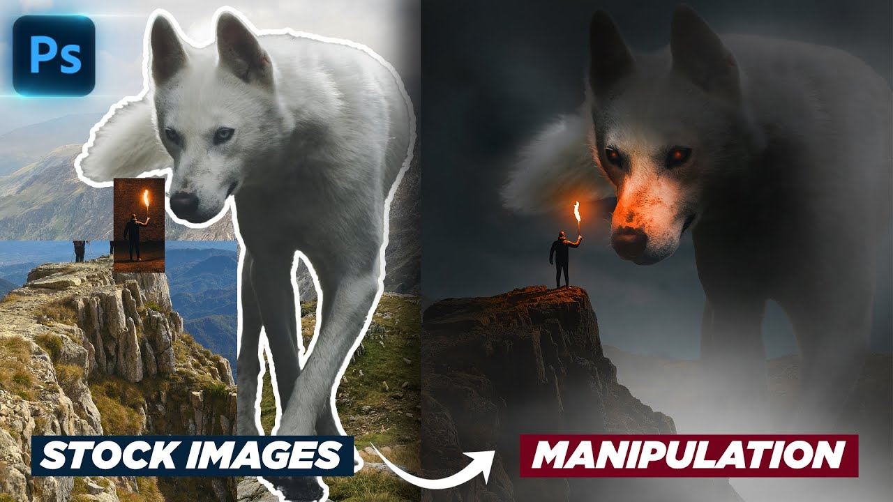
Learn how to turn a bunch of stock images into a photo manipulation with a touch of mystery.
📂Project files on Patreon
https://bit.ly/3j7LzIP
📸 Free Images I used:
Dog: https://unsplash.com/photos/n3qWOO_WO3E
Explorer:https://unsplash.com/photos/5DIFvVwe6wk
Cliff: https://unsplash.com/photos/zjaOb2kOk_8
Mountains: https://unsplash.com/photos/v...
i think it looks good
the middle picture brightness in the leaves kind of throws it off though in my opinion
what should I change to make it better

hmm, the hashtag? make it big like BRODO
maybe add a gradient background but if white is what ur aiming for then you do u
and i cant really see the text behind the shoes
it's the tagline "Live Epic"

maybe it should be infront but only outline no black fill
this the typa things i wanna do, how do u make these?
I gave up


ask me in dms in a few hours
i don't have time rn
working on a heavily godzilla-inspired logo and just looking for any and all input/criticism

nice!
Looks like an "Aztec-inspired" rendition of Godzilla. :)
Thoughts on this repaint I did of one of my creatures "Cash Garb"? The first one is the remake in Photoshop and the second is the original made in Illustrator


thoughts?

I only have positive feedback, bro it's cool and perfect)) 😁
Hey guys I'm new to photoshop and I need to make a brochure for an assignment could you help me give some feedback on what I could change or work on

maybe add a subtle gradient map over the pic of the woman?
the lines also look a little weird

What do you mean by gradient map?
if you go into the adjustments window and click on the one that looks like a gradient
it's a good way to get a duotone kind of look
if you mess with it you'll see what it does
Alright will give it a try later
worked on this some. think am done in next sitting

i think im finished with this one


looks very nice, text is a bit dark though
almost didnt notice it
but everything else is perfect
very well done
.
Feel free to stop by, I'm doing this as a new hobby and of course I'd be happy about a purchase
u drew the temples n stuff?
@tropic marsh maybe add a glow, change the colors to be brighter, or add a curve/brightness on it also add black glow behind it
i played around with a few things from adjustments whatcha think about it

can someone rate my work?

looks good
Anything else you would say I could improve on?
Sorry if I'm being to critical, but since you asked for feedback:
- The QR code doesn't have enough contrast to scan properly, it's also squashed
- The dark text is too hard to read on that background
- Assuming that's meant to be a DL leaflet (a4/letter folded into 3 bits, making x6 'sides' - the headline is too large and reaching into both edges
- The ladies face is right across the seam/fold
try removing the thin blue lines, adding a duotone effect on the lady, and making the text stand out more
The thin blue lines is just the page divider of the brochure
Appreciate the feedback will make the changes
My approach would probably be a little more like this:

Or perhaps...

If you have some kind of Graphic device to use, it makes layout and design so much easier...
inside:

Woah this cool
Thanks for this actual display will try out something like this
I was clueless in the beginning when it came to layout and colour

could someone please pick specific works and give feedback to them? trying to get better at this funky style, kinda need feedback for it

Behance
Nice will have a look at those brochure samples
After looking through your pieces:
This is your strongest (best) piece: https://www.behance.net/gallery/162503313/Chill
This is your weakest (not as good as the rest) piece: https://www.behance.net/gallery/161086837/peace-of-mind
I will start with the weakest piece and why I feel it isn't as good as the rest. The main reason is that it doesn't match the rest of the designs. Almost all of your designs have this kind of abstract out-of-the-ordinary vibrant type of design where you played with effects and distorted the texts. Whereas the piece of mind design, it's simple and clean and because it's simple and clean, it's not flowing with the rest of the projects.
The strongest piece is the Chill design because first of all, you're showcasing your typography. Now I'm not saying that the other designs aren't showcasing some sort of typography, I'm saying that this particular design is what I would see on a published project or on the streets. Secondly, you're continuing your style with the abstract vibrant theme so it matches with the rest of the pieces. Lastly, it's standing out from the rest of the designs. I look through your projects and the Chill is the design that I keep coming back to.
Those are my thoughts. Keep up the good work. You have lots of skills with photoshop, I suggest you start looking into creating mockups and photo editing because that's where the power of photoshop really comes into play.