#📝project-feedback
1 messages · Page 1 of 1 (latest)


The trees trying to blend into the sky looks a bit unnatural
kind of
channel mask
oh ok
anything else which can be done better
or new tricks to make it better
the moon needs to be repositioned i think
to match the shadow
Ok there's a small problem in the pic,
The grass and the trees in the first pic look more clear and natural, however in the edited one those grass and trees are blurred(Idk u did in purpose or it;s coz the discord's limited photo res)
true and the Moon doesn't seem blended in to the sky, the moon looks it suddenly appeared
yepp
definitely me
i used the brighten tool
i forgot the name
ohhh ok
the opposite of burn
ok
it kinda blurred it i think
yep
AH, found a detail
so it was an effort from my side to get a shadow
after editing, y is there still a light at the grass area
ok
yea i noticed that 💀
u can darken that area
ok
ill get better
ok
yea ik that, once experienced those times
oh and btw, where is that place? The view is quite good ngl
Ohhh ok
i took the pic
ok
thanks for your time man
And I think u created that shadow for ur mum purposly right?
np
yea
needs to be sharper i think
how u did that? By brushing that area using black color?
burn
ok
If I didn't forget, I think u can copy ur mum into a transparent image, and turn the brightness to darkest. Then rotate and use that darken image as shadow
ooo
and i can warp according to my need and angles then right ?
thanks man
i havent been editing "Humans" for a while. I usually edit objects more than humans
with a bit of transparency
yes
aha
Maybe decrease the fill and opacity
hmmm thanks, will take in consideration next times
and the outline of the mountain could be a bit darker and thiner, the attractions went to the mountains more than ur mum or the sky
ooooo okayyy
i seee
@flint compasshey one more thing
after using quick selection and masking
the left tool bar doesnt show the other options
like edge refining tool
oh yes, u can see more functions by clicking at sth everyone is different. Screencap ur photoshop toolbar and I'll know where to view more. And coz I am using 2021 so I am different, just screencap
oh, ummm how good is ur PC?
i5 4th gen
ok
It looks like you struggled with her shadow. - try something like this: #❓ask-a-question message
how about now ? @novel comet@flint compass

thnx
Hello everyone, Haven’t do any DCC projects for long time.
Here’s what I do recently https://www.behance.net/gallery/147840053/365-Days-of-Creativity-1

Third Attempt of Sam's July 19 Character drawing @vivid dragon I kind of went free style here.


https://www.instagram.com/p/CgWU59JvSkv/?igshid=YmMyMTA2M2Y=
Feedback please!


what is it for


Both of them look great my favourite has to be the speed one.
me personally would probably place the text above or below the car, which I think would also increase readability
I disagree - I think the word over the middle is the right way to go. - You're picking aesthetics over accessibility - which for a graphic/visual is fine 🙂


I feel like the bottom picture is too dark. Given the vibrant colours of the product, there needs be more lighting.
Thanks for the feedback
Gave +1 Creative Carma to @olive dawn

Change the gradient to something appetizing
Like the middle of the gradient could be better maybe. ??
That's just my opinion
The brownish middle of the two colours make it a bit dead imo
Yeah I think the same
At this moments they feel more like cutouts from another picture maybe


Old packets were better imo
Thanks for your opinion
Gave +1 Creative Carma to @sleek marten
👍👍
I didn’t cancel the old packets
Noicee

Exactly


I've seen so many of these images on this discord, I'm starting to think they ARE an ad. - @sand furnace works for the company and trying subvertly trying to get the branding seen my as many people as possible....
🙂
Thanks
Gave +1 Creative Carma to @flint dew


Sorry for posting so many designs

any ideas on how to help this be better {its college football graphic}

any tips on how to make this look more realistic?

i am removing my friend from the original image

It looks pretty realistic already. I don’t think the average person would ever question that you removed someone from the photo.
You can see some artifacts from using probably the clone tool to remove him
Maybe select those areas and add a slight Gaussian blur to soften them?

That looks awesome. But currently the whale shark is going straight towards rocks maybe you could flip him horizontally to make his trajectory go out of frame, or make the rocks look like they are lower than the whale shark.
woah didn't notice the skeleton thats dope.
I'm just saying this as constructive criticism I could never make anything this awesome.
The idea was that the rocks are at the bottom of the water but the water is so clear that you can see them.
i can see that it's just that the whale shark looks less clear than the rocks do

I see what you’re saying about the shark looking less clear than the rocks. Thanks!
Gave +1 Creative Carma to @whole hedge
I started following along with Paul Trani's livestream on Behance, then got creative and end up with something whole different.
There wasn't a plan for this, just some fun.
I would love to hear your thought on it! 😄

Looks nice
No idea what I am doing, photo manipulated, Pexels was my sources for the photos


I’m surprised this place isn’t filled with these edits with the challenge going on. Haha great job! Here’s mine!

Well, because I kinda started a little late
So, I am not going to join the challenge. Maybe the next one, when there is one.
I wanted to create an iPhone wallpaper from 'remastered assets' of my favourite game. (Beyond Good & Evil)
Something feels off, any feedback is appreciated 😄


any tips on how to improve the neon to look more realistic? or improve the image itself? DM me if you want also. thanks
Happened to me last time, so I did it just for myself
Neons have white inner glow and coloe outer glow, try to play with those in blend if menu
thanks i have been got some tips earlier

Looks better now
ty

I wonder if there are any further adjustments i could make to this image.. should i re-add a slight poster effect? or are there better filters i could try
I would play around with light and shadows.
The bottom of the cassette player could be 'blend' into the whole image by adding some darkness and shadow. Also adding a bit more colour lights on the top of the player (shiny reflections of the neon letters) might do a lot. Good luck with this project!
@turbid bloom
just saw your message but i added some purple to the floor which makes more sense

"The bottom of the cassette player could be 'blend' into the whole image by adding some darkness and shadow."
do you mean something different than whats already there?
not sure what u mean
and thanks 🙂
Before and after
I'm pretty new to photoshop and I would appreciate a bit of feedback.


Here's my attempt at the spray paint effect on a person

Made a Logo for my Fictional Private jet Company
Editied it in a diff mood


What I mean is: left bottom side of the casette player, there's a sharp edge between the gray casette player and the dark floor. If you add more shaddow on the player (so this edge is less sharp) the casette player will blend in better in the whole image.
That definitely does a lot.
Also: here's a nice tutorial on what I meant by 'colour lights/shiny reflections' (didn't know how to describe that good enough)
https://youtu.be/yUPIChL7_x8

The first 1000 people to use this link will get a 2 month free trial of Premium Membership: https://skl.sh/bennyproductions
In this #tutorial I'm showing you exactly how I create my #highlights using #photoshop . Please do not expect this to be a regular thing. I do not enjoy making tutorials at all.
The links to the images for the 2nd example...
I think the example at 6:50 will apply to your work best.
Any feedback on how to make this better? I'm kinda new to Photoshop


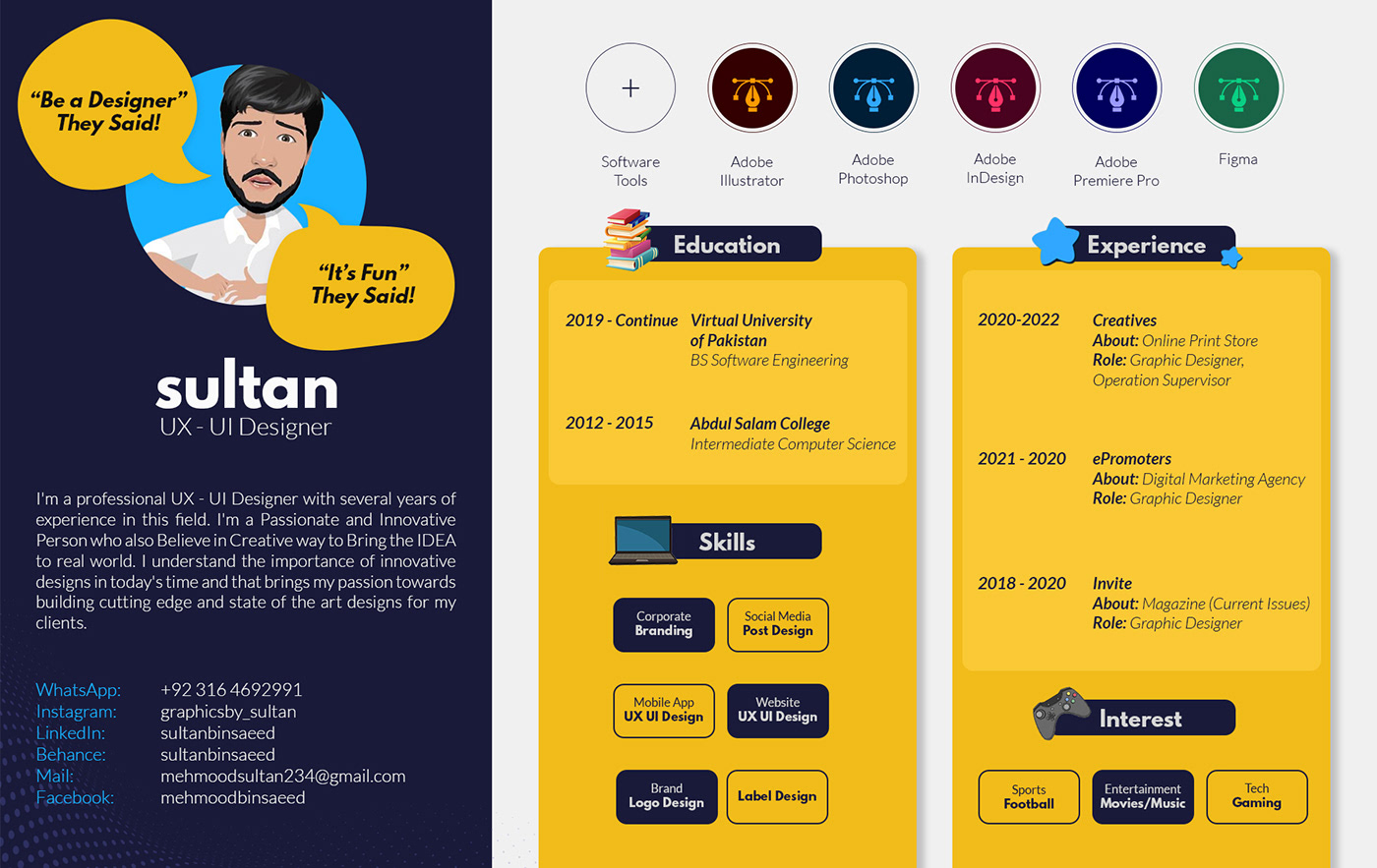
Hi hope @everyone is doing well. I am a professional UX UI Designer looking for work. If you are interested DM. Plus if you need any kind of help or suggestion I'm happy to help, Also here is the link to my portfolio, check it out and let me know what you think.
Peace!
https://www.behance.net/gallery/148498663/Portfolio-2022-Sultan-Mehmood
Is it me or is that wrist bent around the wrong way? Looks painful!
Also, I think the nose here should be covering some of the goggles, apply a bit of a layer mask on the left edge:

I'm not a huge fan, simply because I don't know what the big curve is meant to be. - It takes up a lot of real estate on the canvas.
A spraypaint effect I don't think would usually be that detailed would it? Maybe check out the posterization effects to simplify the photo of soldier boy.
Or drybrush, or cutout?

Like some sort of Jet Trails
I could change it later
This what I meant - This used the 'cutout' filter with the sliders nudged around a bit...

Omg that looks so good thank you

I will check out that tutorial thanks
first impulse is colors and brightness of the butterfly dont match the environment
I’m trying to get better and building an atmosphere and depth in my work. To blend the mountains I used Color Balance, Exposure, and Curves adjustments as well and a color fill layer set to screen. My goal was to make some of the mountains appear distant and hazy. I somewhat achieved that but not as much as I wanted to. Any tips?

Thank you
Gave +1 Creative Carma to @upbeat nova
Was it only the cutout filter you used? And what were your slider settings just trying to get reference
Wait I think I got it, I had my displacement map still on that's why

I tried something different. So, here is my first 2D artwork.

CHIKEN


cute chicken, how did you do that i may ask?
I’m not entirely sure if this is the correct channel, however my ‘challenge’ for someone would be to add a belt in the red square.

A similar/same belt as the others.
For the record, you should never wear a belt with a vest
Suspenders is the way to go incase you have to use a vest
That guy is the only correctly dressed one
Logo I made for a friend.


Absolutely perfect, can I send you the whole photo?
Yeah go for it. If you're the wedding photographer though, I assume you'd want it redoing PROPERLY on a much higher resolution image?
I didn't realise that you could make it a higher resolution.
my quick little 2 minute attempt was done on a crappy low res image. - it's going to look awful if you somehow take that low res image and whack it over the top of your proper image?
If you want it done properly, you'd need to supply me with the high res image. If you're the photographer, I'm expecting you to have one at least 20+ mb?
Yeah I should have a better image, I’ll DM it to you.
@novel comet It's too powerful for discord, can I email you it?


I made update to my masterpiece!
Hard critisim only!


This is not a submission, but I still wanted to do something with the terraforming robot stock. What do you think?

I need to make an independence day post for my club. Now, we both know this looks ugly; how do I make it better lol
TYIA

A novelty typeface I've been working on, I'd love some input on some changes I could make, Specifically looking for some input on how I might change the S, the Z is a lot more clean, but it doesnt quite workout with the S to reverse the direction. I believe I'll make changes currently to the j and t, (removing the extra 'dot' on the j and extending the stem of the t
I realize its not the most legible typeface, it is strictly novelty


WIP

Can i get the plp flie if u finished?
trying to make animated pixel art..

It takes years
almost done btw..
What about this one?

Hey I need to conduct a research for my new app and website, Please help me to conduct this survey to be a part of this. Your participation will be appreciated👏 link of the survey - https://docs.google.com/forms/d/e/1FAIpQLSfRWNcoPAcqkvFzkCTY0a935jrI7CJd55ZtRitaI-6Vl8wWow/viewform?usp=sf_link

Google Docs
Your Participation will be appreciated.
Hows it looking?
In all honesty, - I know you said it's more a novelty font, but I genuinely cannot read it. - I only know what it says because it's the usual 'Quick brown fox...' quote...
One Piece

what should i do to make the sky popup more ?

idk man.. it looks kinda flat since i dont have any idea how to animated the guy on the project..

Personally, I think it's maybe It's a tad too dark?
orite.. ill try it on different tone..

w8 lemme send u something..
nice though. I wouldn't have a clue how to draw something like that.


which one do you prefer?
ummm
I kinda like the more natural friendly earth tones of the top one. - bottom one feels a bit stark/miserable...
oh okok.. maybe ill try to make it a lil bit lighter.. thx for the feedeback..
personally i like the bottom
my cosplay and work,Like it

My UX UI Design Portfolio, will update frequently.
https://www.behance.net/gallery/149716113/Mobile-App-UI-UX-Designs
Feedback is highly appreciated.

Hey guys! How can I imrpove this poster? (I know that the statue has watermark)

Hey i added a new collection in my portfolio click the link if u want to see it tomorrow teddy gamer logo will be added
https://drive.google.com/drive/folders/1oWgN9Na4ZJK8UCSvyKrpZORqTgYWVdzF
better leading align text properly, black on red is a terrible color choice
@upbeat novau r right he should change the color
make the text a darker white and the statue black n white
bottom
boost the contrast, maybe add a sun lens effect
lovely i just hate the watermark text on the bottom
literally cant read anything
i can count the pixels
thanks, the watermark is my instagram name
Gave +1 Creative Carma to @grizzled parrot

Its looks really awesome

looks good, but looks like it was rendered in a low quality. maybe try exporting it with bigger dimensions?
OH nevermind haha nice


Was bored so decided to make a new profile picture for Discord. This works when the picture is so small, but I wondered if anyone had a good way to make cleaner cuts?

Love everything about this!  The neon colours energetic and the balance of the banner is good. The only thing is, depending on where this banner is placed, the social media handles can be hard to read but thats really the only thing 😄
This is a great recreation of acid paintings! At first glance it seems rather simple, but the more you look at it the more interesting it gets. The colour combination is well done and the noice is a nice touch. The only thing I would change is the burnt (white) area in the bottom left corner as I think it demands too much attention. It could be a nice contrast to the purpleish tree 😄
I like the speed of the design 🏃 , and that you've made the fighter go "through" the S. I would look a little more at the space around the title, fex. theres very much space on the sides of the &, and very little between the lines and the fighters
Thanks 🙂
Gave +1 Creative Carma to @wise condor
Thanks !
Gave +1 Creative Carma to @wise condor
Hey! Hello, ok, I'm a beginner editing images and I tried to do this, I don't know, I see it well, but something doesn't convince me. If you have some to tell me or advice me, I will be so grateful, even if it's criticism, be rude :D

maybe the purple/pink clouds don't match with the rest of the environment?
so maybe make the colors match with the clouds 🤷♂️


mh... okay, I will keep it in mind, thank youuu :D
Gave +1 Creative Carma to @astral sandal
np!!
looks very clean
Thx
not done but people want to buy it the orginal picture will be out soon

how much would you buy it if it was you just asking
Like?

can you help me @arctic ivy
I need some feedback on this. This is a ticket design for an event.


idk sir.. personally i think the background is kinda too flat
Made something in photoshop today I want to improve tell me what I can improve on in this and Iam learning photoshop

looks pretty good
Try to blur and mosh tge edges between ur head and the clouds maybe add some effects and shafows

Moriah

I've used this image before for some other edit. Anyways. My goal here was to brighten things up and add some vibrance. This is in Lightroom my first attempt


How did you make those backgrounds in fact how are backgrounds made in photoshop
thoughts?

pretty cool, I dont like the blurred bottom half and the blue dots and it seems a bit weird that the doggo is so bright compared to the rest
also the reddish part at the top doesnt fit the green/blue of the rest
i tried to make little gaps of light to make the blur look far away
maybe overlay everything with some color
this is the og pic

thats not the original is it?
it wouldnt make sense that the foreground is blurry but the rest not I think?
hmmm you make a point there
not sure if its correct what I say obviously you could take a foto where something obstructing the lens is blurry
I guess
xD
yeah the grass wasnt focused so thats why
I am struggling to find a way to bring this logo to life and actually look like it's good for a business any feedback appreciated

not sure if I wanna go for a hybrid type logo or a purely text one

POSTER FOR @danielricciardo @McLarenF1 @F1
#danielricciardo #F1

Youtube There Are actually pretty easy to learn and recommended for beginners

What do you think?

could I get some feedback here please?

Its hard to get a feedback here, but I will say that the logo looks pretty standard, in other words....good

makes me think of an eye of a cat
or yeah reptile eye didnt see that xD
could I use this on a personal t shirt design?
Logos are generally a lot more simple in design. Thus, the version with the hand looks more like an illustration than a logo. The text-only version is a very plain, sans-serif font. Aside from the name, there is nothing that really makes it unique. Maybe try some different fonts and see if you can get some different styles. Also, I'd ask in the Illustrator Server. You can probably get more traditional graphic design help there.
Alright thank you very much
Gave +1 Creative Carma to @wooden oak
Cat/reptile eye, yin & yang, half and half, coffee bean, boiled egg sliced in half. It's hard to tell what it is without the name of the brand which could provide more context

Sure! Make sure to tag me on Instagram with the t-shirt, I would love to see it


the text of the first and the logo of the second (personal opinion)
btw that corner is kinda weird

I would move the duck to hide it
what is ur @?
oh

@bitter ravenga.alin_
allright
: D

https://files.fm/u/y4reahhmm can u make comment my retouching work? does skin seem artificial or its good? (it is upload link, this file is big so i cant upload it here)
I think you overblurred a bit
i wanted them to disappear but i cant

what should i do? should i blur more to disappear them or let them stay i got confused
Changes?

Blur just enough as i told you..
You should pick a nice spot
Thats it
okay but if i decrease blur, they will still show up, it is okay them to show up?
😩 that is for you decide, its about what you are trying to achieve
It s not difficult to erase them without making it look un natural
i am asking how to do this
Just duplicate the photo, blur it just enogh so they don t show up at %100
Mask it, make the mask black
but you say you blur too much. even now they are still showing
And paint with white
okay thank you
Only those parts
It pains me to link to tiktok... BUT... it's pretty good to be fair:
https://www.tiktok.com/@ronyjanseeno/video/7103289914640436481

TikTok
Remove skin blemishes#madewithphotoshop #photoshop #ShortTutorial #logosix#tutorialsvideos #graphicdesigntutorial #digitaldesign #photoshopexpress #visualstyle #creativityfound #graphic_arts #designingartz #creative #designthinking #brandingexpert #photomanipulations #photoshop2022 #designinspirat#designinspiration #businessofdesign #photoshopma...
i am using frequency separation technique. after what stage should I do this?
thanks for help
AMAZING
OH MY

^^^^^ so this u ?@severe sand
https://easyupload.io/q3ypg4 Do you have any feedback on it (retouching work)
Changes?


looks good damn
But r there anything to change like the fonts?


I just checked it. The skin has an artificial look and doesn't look real to me at least. You can go ahead and use clone stamp and healing tools for this. Otherwise later on if you feel the ambition then apply frequency separation method.👍
I already used healing brush tool but I guess I used blur 2 times for different purposes. I think thats why skin look artificial
I am already using Frequency Separation technique, are you saying I should use another technique?

Well, then try to adjust the blur because it might has been overdosed in the respect of final outcome.
holy
moly

dope
is it a merch?
Nice
okay, i will try to adjust blur thank you
Gave +1 Creative Carma to @soft pollen
Thank you
Gave +1 Creative Carma to @sleek marten
This is so beautiful


Thanks bro
Gave +1 Creative Carma to @upbeat sandal
Yoo epic

Feedback?

so i have a school class logo project. the theme is inspired by gucci/hermes/LV logo. any advice to make it better?

i think this channel is the right place to ask this
I think its looking pretty good
YOOO how did u get the smoke there could u please tell me?
what should i do to make the logo better?
I think its pretty done tbh
i am not satisfied about the logo
just the logo?
tell me what font is tht?
ill try to make one
and see if i can make it better
hmm
the dollar font is
georgia
and the n
is rolls royce font

Download Rolls Royce Font from here by a single click that includes free font, Newburgh font, visa font, famous logo font, souvenit gothic font, & typeface.
there it is
ok
does the image look good?
ahaha thanks!
It's like my third time ever
well, I just searched "smoke png"
then found a good one
whats that?
Oh thanks!

damn!
ok thanks. i hope you find a better design of it
i cant move the n to a ceratin place so ill just leave it u can fix it just a minor deatail tht i added
look dude now
im no logo expert yet
but i tried to change the color pallete
i thgink the colors look better now
are you using the font that i give to you
no i said u can
the color and fx is very nice
ty
sorry what font is that?
the color is The torjan colors golden
great but its not my cup of tea sorry
trajan
it was just selected for me
but wait
just selcted for me

should i send u the code for it?

The human's face is a bit dark, maybe brighten a BIT

sure
@wicked escarp wdyt?


Cool
awesome, how did you do it


Yooo this is fire
Heyy
Ok
So first I played with levels and darkened it
The i made a path around the lines
And stroked them with black
Then added colors
Then gradiend
The glow
Epico
Im a begginer please don't hate

- The text doesn't look natural enough
- The yellow icon in the middle doesn't match the texture and the color of the red shield
- The plant surrounding the icon is a bit weird to be in the picture
But what is this actually for? Maybe I can give u some ideas
This is for Clash of Clans logo in my discord channel
Ahhh
ok
- You can add a Baibarian face or the Clan Wars double sword int the middle.
- Maybe you can use a wooden texture for the shield
And also add ur clan text maybe below the icon (I mean the middle stuff, idk what will u put)
ill show u why I choose that soon in your dm let my phone charge hold a min
@flint compass
hmm ok

nice rust art
I feel like the lumin text sort of ruins it though
Ik it is just my name since people love to steal my stuff and just put there name over it
oh true people do that lol
They litterly take my stuff snip out the name and then sell it
I guess its inevitable but I'm sure you can sue them if they actually sell it
actually nvm I think there's more to it than that but yeah
that sort of stuff happens and I guess you can't do much about it
except like add a bunch of watermarks


typography looks too compressed imo
try changing the font but keep it the same style (sans serif)
Ok alright


I am on the mega noob territory but does anyone have feedback for this?


@sharp grail As far as I know, you could have used the refine edge tool in "select and mask" feature or you could tweak the value of shift edge in the same section. But anyway, it's a pro work!👌
text is horrible
To begin with, I did not ask for opinions.
it litterly says design feedback for the channel name
are you dumb
all you did was add bad text over it
Not sure if it fits in here but it's made in react. What would you change on it ? https://cdn.discordapp.com/attachments/1005779133609017374/1007651508352991293/unknown.png

?
Because that's how the posters are, that's how the movie is, it's suspenseful and terrifying

I mean design wise. Font's etc..
Here's a photo composition I made:
https://www.behance.net/gallery/150502925/Photo-composition

Been trying to make a correctional center patch (prison) for a friend that enjoys haunted house acting. This is my most recent version, I feel like it's missing something.

honestly, i personally think that it looks good,its a logo so no need to be full of things
@dapper herald is correct. This channel is for receiving comments on projects you post. If you don't want feedback on your projects, you should just post in #🎨share-your-work-archive.
Generally, logos are created as vector graphics so they are resolution independent. Typically, those sorts of graphics are created in a tool like Adobe Illustrator. You may want to consider that if this artwork needs to be flexible in terms of usage, i.e. print, screen, web, shirts, embroidery, etc. Regarding the design: it does look like an actual insignia for a correctional facility. I don't think it necessarily needs any other elements. You might want to decrease the size of the scale to add a bit more space at the top and bottom. Currently, it looks very close to the lettering which makes it look a little crowded. The space around the inside edges of the shield and space between the main elements should be similar. That might help to balance it out.
made this design for a small clothing brand, what do y’all think?

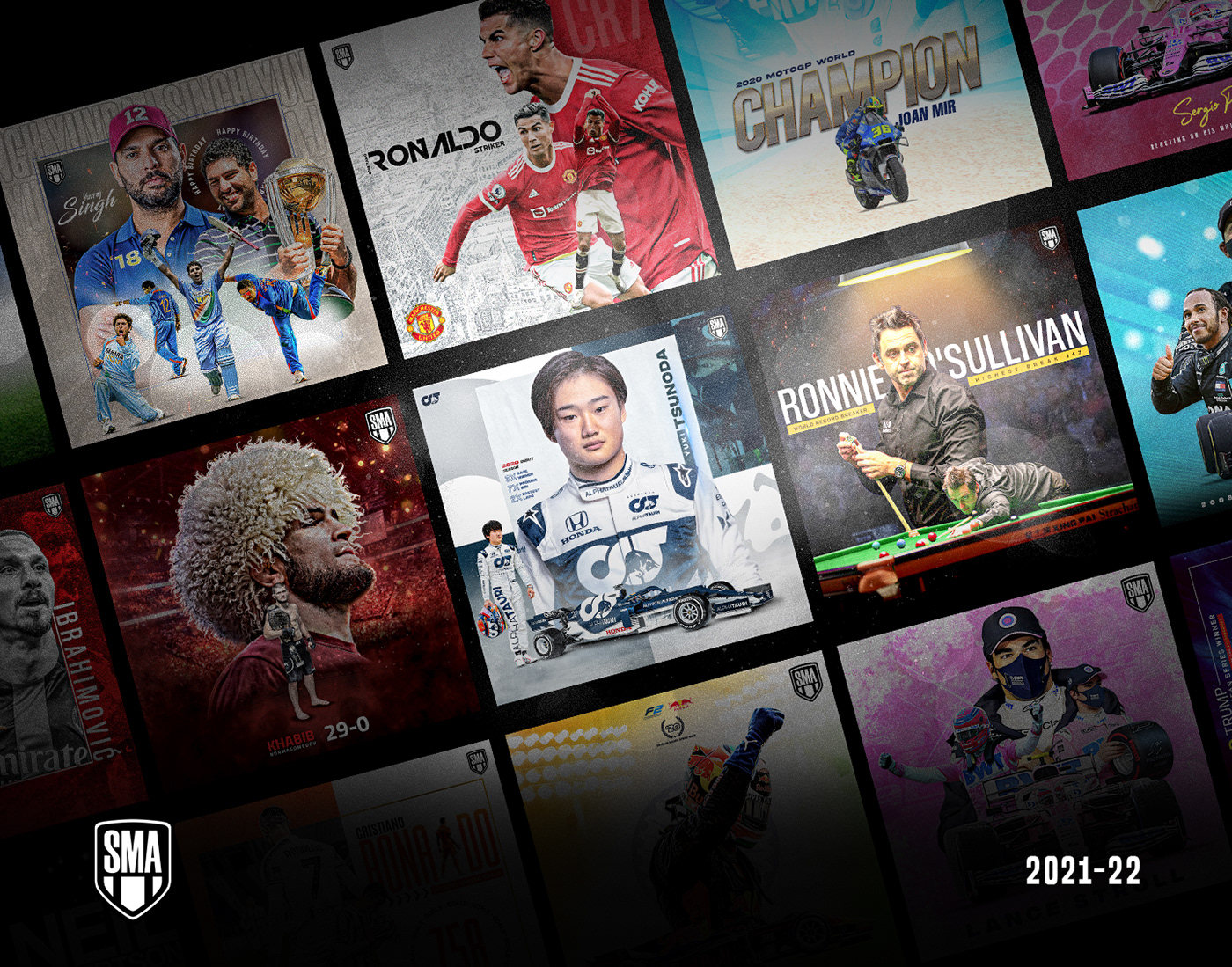
Check out my Sports Media Design Collection on Behance
#sportsdesign #sports #media #f1 #mma #football #cricket #basketball
https://www.behance.net/gallery/150521663/Sports-Media-Design-SMA
@devout crystal looks super nice
maybe if bottom letters were just a bit lower
that's what's off, imho
@sleek marten you like Photoshop
yes :D
I made the scale a tiny bit smaller. Any better? or more?

It looks better. Not as crowded.

Bored edit lol

Noice
Behance
An identity to showcase the art and understand one of The most versatile and influential pop-artist from this generation. By developing Brand identity, Clothing line, and Application based solutions for the services of drake's project.
Guys do check out my new project and let me know your views on the same!
Hey guys! I don't like how my "projects" section looks on my portfolio website. What would you guys reccomend?

Thank you
Gave +1 Creative Carma to @sleek marten
lol

What do you think for my 2nd attempt at using PS??? (left google image of the footy top, right my attempt from PS To fivem)
Made for a friends server


Hahaha. The summer update brushes are fun


Hey just jumping in hope that's OK. Caveat: I don't know anything about what this will be used for so maybe others can advise on that 😉 Things that I like about this design: Elements are not overcomplicated. Good contrast between dark/light and variation in texture.
My note#1: is the placement Lock down the design before you do anything with colour/texture/fonts.
If you're not already doing so, make a layer for each element.
Hide all layers except the shield and one graphic element the wreath and use transform controls to balance out the negative space (i.e. the shape of the space around and inside and between things). This is probably the most important step of making a good design. Then show the lightning bolt and adjust so it has a good positive/negative shape against the other two. Try resizing/overlapping elements (and changing layer order) if you don't like the results.
Note #2 Then turn on the circular text layer and align its curve with the shape of the wreath. Resize it very small - can you read it? I think this is a pretty good font for readability, but if you want to change, now's the time.
Then resize the image very large and adjust the spaces between the letters (read up on kerning for more advice on this -- type design is a deep dive and there are whole books on the subject).
Note #3 Can you reduce the number of colours? 3 is plenty (I count 5 here). If you sample the most important colour, you can use the slider wheel to adjust hue, individual RGB or Saturation/black levels. But adjusting just one or two levels on a base colour, you can make some very pleasing color schemes. View in greyscale to check if there's good contrast between light/dark.
Note #4 resize it very small again and squint your eyes. does it still look good? Can you tell what it's supposed to be?
If you make revisions, please post! I'd love to see where this goes.

Nothing was really that complicating to do that but looks alright

Thanks, Never in my life have I used photoshop tho so was pretty proud hahaha getting confused with other stuff now tho and it’s annoying me


You don't need 8 hrs to learn this. There are 5 min tutorials on yt
About 8 seconds if you use a preset. Not throwing rocks. Just sayin' :)
its for fiverr
Ikr
people on fiverr deliver these types of photos in 2 days!
Well this isn't fiverr
Yeah but you're posting in a Photoshop User Group with no explanation of what that is.
i just posted
Yeah. Now you did.
dumb az ppl
Be civil or you can leave.
blah blah blah
Final warning
bye bye
Adios!
Very good work maybe reduce the wave texture a notch maybe very small amount of gaussian bluer
Thankyou kajrov 😆 but everything after that I have no clue as to what u mean as it’s literally my second time using PS so at the minute it’s literally like 🤯
It's look like his is wait for Santa to com, well done
The particlish stuff on top like form a square shape, so I think it’s better to just spread out and randomise it a bit
Thoughts?

Somewhat a beginner to photoshop, did one of the recent daily challenges. Thoughts?


Hello Guys, could you give me some comments for this poster, I make it for a night of worship.

And here is the logo that I created for the alcohol branding. Our target customer is the normal people with common salary in VIETNAM. The main core value is to bring the connection and the memory when they taste and drink our products.


Hey there, the layout seems pretty basic to me. Try playing with the typography so that the poster catches the eye of the viewer and attracts more attention. And the CTA button is too small in the corner, make it stand out
As for the logo, I won’t say too much as it’s the client’s decision to make changes or not, just that you’re aware, logos are created in Adobe Illustrator or any vector graphics software, so if you want feedback on logos, this photoshop server isn’t technically the place to go for.
part 1

Thank you for your feedback
Gave +1 Creative Carma to @shut garnet
Where are you from?
Canada
Zombieland X Left 4 Dead

Hey, I'm beginning to get back in the flow of making things again, trying to make fake album covers has worked so far, wanted to see if anyone had any major critiques they could give me for a design like this

with or without bottom text?


Thats sick bro
Thats awsome!!
I rrly like the colour Pallette
And rule of thirds being used 😮💨
Kinda
sick
any feedback for this?


Challenge im doing for another server, thoughts?

Poster for @Charles_Leclerc @ScuderiaFerrari @F1
#charlesleclerc #F1

I'm new In PS but after following a tutorial I made these.


PS: The "NOPE" one is based of the movie "Nope"

Deffo a nope from me it was shockingly bad 😂


Hi! I'm looking for feedback on ficitional YouTube Thumbnails and it's variations. Title: Giving Away $10,000 to the first stranger I see Brief: Along the same vein as Mr. Beast’s big giveaway videos, this video features a man on a mission who has decided to film his giving away $10,000 to the first stranger he sees at his local park. He wants the thumbnail to really command attention


It looks like a thumbnail from a scam or clickbait channel to be honest @mossy heart
What can I do to change that?
maybe you can just use simple photos of a person holding a money with some effects on it
also the font looks confusing
some thick some thin
also it is overwhelming with texts
yes try something minimal and attractive
The video title in the brief was "Giving Away $10,000 to the first stranger I see!".
if u don't mind can ya take a peek at #❓ask-a-question I need a lil help


before and after


I don't usually do this sorta stuff but i tried


Cool! Also, what are you feeding that dog? :D
well he'll be feeding on human flesh
those r da flames coming out of his mouth
I wonder why no one has repositioned the dog onto a skyrim canvas and make him Alduin
like put him on a building
my Neon Edit The sims


WIP

rip
last one looks good
scar face

Dio

Any feedback regarding this?

Hey. What do people think of these two alternative rulebook covers?

I'm helping out a fellow discorder here and they can't decide 🙂
the top one has a modern vibe, matching with the style of the logo. The bottom one compared to the top one is toned down and safer but the logo feels out of place while it fits just right in the top one
hi, i'm just finish my art, thanks 🙏

awesome, how do you edit?
hmmm? wdym
i mean, how do u make your art?
ohh sorry, my brains not responding rn. I just did multiple layers of multiply and overlay of seaweed, a wave, horizon, and plopped it on a beach
I can prob put the file in a Google drive and send it to u if u want
I have adjusted it a little since then tho
I also like the top one, James! There is more interaction between the background and the title. All the areas are better distributed without making the cover to look busy.
Thanks
A colourisation assignment I did. Any feedback? Thanks

I'm following a brief so I'm aware of the long title but I'm looking for feedback on fictional YouTube Thumnails.


I'd go with the second one, to remove a little bit that long title impression, you might consider blurring the background 🙂

try matching the fonts https://fonts.google.com/knowledge/choosing_type/pairing_typefaces

Google Fonts
Once we’ve spent all that time and effort choosing a primary typeface for our project, we get to do it all over again for a secondary typeface.
i would make the number 2-3 times bigger and the outline too so contrast is better
Hello, would you please tell me your opinion and what to improve
https://www.instagram.com/p/CiQo_5_sdFr/?igshid=YmMyMTA2M2Y=

Personal opinions: - sorry they're all criticism/constructive!
(Generally nice though!)
Make the number a contrasting colour to the background. Not green on green.
obviously one of those hands is flipped, making all the money backwards (no biggy)
having left aligned text with a random central aligned line is weird and jarring
too much green. That first one looks like an ad for a landscaping company
Nice. But too many different fonts, that red splodge in the middle makes it look like the guy has a painful skin condition. The yellow bullets aren't aligned properly and kind of look like 'o's... FREE TRIAL is too small. The bottom right splodge is kind of wasted space. Maybe turn it purple and put the '25% off' headline in there.
Also... instead of making BODY and expanded stretched font, just make the word 'body' bigger/deeper.
Maybe also put 'stay fit not still UNDER the logo not in front of it. More like a tagline.
Nice work. Out of interest, did you manually 'colour it in' or use the photoshop auto colourise feature?
Thanks. I used the hue satueation + levels and curves to get the colour
Gave +1 Creative Carma to @novel comet
hehehe no prob, thanks
Gave +1 Creative Carma to @tall wave
I'll try this! Thank you!
Gave +1 Creative Carma to @sleek tiger
I will try it that! I've been looking at it and making so many changes but something always looks off. Thank you!
No no I really appreciate this! I've been deprived of constructive criticism so I welcome it! I tried to get a different shade of green than the grass since it's money but I guess it's just not working. Not sure about the flipping. The random central aligned line is it the $10,000 you're referring to? LMAO@Landscaping company That made me laugh. I just can't get that look to work it seems lol. I'm in luck if I try for a landscaping company though. 😅
How can I better pick the bottom left text to make it seem more fitting. I feel like its off but im rly bad with typography

Well done look great to me, special the gold paint

Hi everyone 👋 I Just published a new project with experimental CGI-images, finally edited in Photoshop ... https://www.behance.net/gallery/151859359/metallic-3D-slices

First project of a new course.

.
@novel comet @upbeat nova @sleek tiger I made some changes according to you guys suggestions. I made a few variations. How does it look now?


Why did you post the same image three times?
They are 3 different variations.
What variations? They look entirely the same.
Slightly more blur in the background?
They're not. There is slight paint effect and reduced opacity on another. Is it not allowed?
Its allowed. But with an image like this, I'm just making sure that the intent is actually for feedback and not to spam some clickbait to something.
Ok then. I'm not spamming. I'm looking for feedback that's why I directed at it them since they suggested changes to my original project.
I think the one with the darker background makes the text stand out more, which I assume is the point of this image. The blur gives it a depth-of-field look and slightly darker pushes the text forward in the design.
That's what I think too but I didn't want it to look...too dark. The brief was to show a park so I couldn't decide on the effect.
My new @LAThieves project is out now on my website and behance!
@100Thieves @CODLeague
#LAThieves #WeThieves #CDL2022 #CDLChamps


damn this looks dadaist i like it


I'm redoing a brief for a YouTube Thumbnail. I followed the brief previously and now I want to remove the long title from the thumbnail. Title: Giving Away $10,000 to the first stranger I see Brief: Along the same vein as Mr. Beast’s big giveaway videos, this video features a man on a mission who has decided to film his giving away $10,000 to the first stranger he sees at his local park. He wants the thumbnail to really command attention. Not sure which direction to take...I kind of want the "Welcome to AlderShot Park" to stand out. Not sure how to execute that.

Dribbble
Hi @abstract musk very nice dark mode! You might post it on the Adobe XD server which is dedicated for UI as well 🙂
heheheh thank youuuu 🙂
Gave +1 Creative Carma to @worthy heron
Feedback on that? Like what can be done better or how I can improve work

That guy in the front is way too bright
he's gotta get darker 🙂 - Then you can make the torchlight more dramatic
also, look at the waves in the water, the boat wouldn't have a reflection like that
In regards to making the light look better, check out how the artist here uses the blend effects to improve the look of the lighting....
https://www.youtube.com/watch?v=sL8I55b6Qpg
@swift fulcrum
Thanks, going to sleep. Will check out tomorrow. :)
Gave +1 Creative Carma to @novel comet
JoJo novelle

Why does it say dio?
I don't think its Ronny James Dio. (of Rainbow in the Dark fame)
I know it's delayed but....
For a poster, the text is too small. I like the font! - if you actually try to print it on normal inkjet/laser printer, i think you will be very disappointed in how the bright green and orange will display.
yes,i am

Hi guys, If anyone had any feedback on potential improvements, I'd love to hear them
I like the big chunky font!
how did you apply the gradient on the letters?
did you intentionally avoid the gradient 'spilling across' onto the next letter?
So I used basic white text, then added a grain overlay I had ready, and used MBL plugin for brightness
said overlay

Looks nice , just wanted to say you could try a slight and sharp bevel just on the "hearthless" that would match it s shading to rest of the composition which feels cold and gloomy, not sure how it will look tought
It could also make it worse by decreasing the general contrast of bg and text, you gotta try and see 😄
i can use some critique (project is not finished)

(i know the second text is not centered)
YouTube Thumbnail. What can I do to improve it or am I heading in the right direction?

hey. 🙂
There isn't a title anywhere, it doesn't really make much sense as a thumbnail
ops pls?
Looks good. nice use of colour, lots of effects without it looking like you've gone bonkers with the effects panel. - that background grid looks a bit low res,
Maybe consider making 'GOLOF ONE' a big bigger so it's the same width as the line below it.
Check out Shutterstock and Canva for youtube thumbnails and pick some favourites... then try and style yours the same sort of way. - Trying to just do it 'from scratch' is always more needlessly difficult than it needs to be. 🙂
thxbeside makeing the points a higher quality i wanted to add some particals or mabey some lightning and some small tech stuff u think it will work or should i let it like this
Check out https://www.shutterstock.com/search/partical - and see if anything catches your eye perhaps.

Shutterstock
Find Partical stock images in HD and millions of other royalty-free stock photos, illustrations and vectors in the Shutterstock collection. Thousands of new, high-quality pictures added every day.
You probably know this already, but if you grab a nice abstract image, pop it in, and then play with the blend effects in the layers panel (and opacity), you should be able to add a few nice effects quite easily.
Thanks mate hope u have a wonderfull day
I'm new to photoshop, but I tried to edit this raw photo I took at a festival.
Just some color correction, sky replacement and an iris blur.
Feels grainy still, might be because of the photo quality.
Got the raw photo and sky background if u wanna check it out yourself and try to recreate, just DM for dropbox link.

roof feels too dark
Looks like a tiltshift 🙂
Ye kinda does. Must be because the lighting reflecting on people's faces and the iris blur(?)
well, it's just due to the extreme out of focus shots at the bottom and the oversaturated colours
(neither of which is a bad thing!)
actually tried to make it brighter from the raw photo. 😩
I tried to go a bit overboard on saturation as it was a DNB festival, hence the crazy sky replacement. 😄
Only thing I'm not satisfied with is probably the tent itself.
well technically I don't imagine the tent fabric is THAT opaque, I imagine much of the light should shine through..

That does look better. did u isolate the tent cover and increase something?
its was one of those plastic rain covers, so it didn't let any light pass
im curious how the origianl looked
The original photo before @chilly hornet played with it? - You'll have to ask him/her to post it... or maybe just google DNB festival
i can dm it i think, too big for post in this channel
please do
look at the layerpalette of the screenshot
brightness/contrast
Ah if in doubt, just screenshot it 🙂
yes screenshot would be fine
yeah, you can see my mask in the layers panel...


got the dropbox link for it if u wanna work with it
maybe not a great photo to begin with 😄
it kind of has a weird vibe I have to say ^^
alien abduction vibes
guess you could swap the tent with an UFO and it would make more sense
xD

This project is all about my emotions. I will be happy to get experts feedback
No, Liquicity festival in netherlands.
I wouldve work on highlights and shadows and some curves adjustments to make it more realistic
Yeah, i think that is what is missing right now, looks too artificial. Although i have to learn how to do shadows and curves from a guide first!
It's an assignment for a lesson to use Photoshop so it's basically creating thumbnails from scratch.
#📝project-feedback message This is the brief along with the thumbnail but I settled with the above after making a little adjustments.
You can still build from scratch... but follow a nice style or colour scheme
That was my effort from following my lesson.
i recently made this for a school task, but what should i put down here? it feels boring

What exactly it is?
BATIK "COUTURE" , BATIK "STRONG" , BATIK "PASSION" , BATIK "INLINE" , BATIK "ARISE" , BATIK "INFUSION" ... some prompts for you to work from.
My high-school crafts teacher told us to make a mock up of something on a shirt
We're supposed to use the school computers, but I'm using my own since they do allow working on our own laptops
What it looks like rn

Thanks
Gave +1 Creative Carma to @fringe belfry
Made my own concept of Lightsaber, i use some parts of Darksaber as well


Hi anyone could rate this helmet

I am planning to make a body as well But hows the face? I am planning to try as a pngtuber
8/10
thanks
I tried with a body

Tbh it feels like it doesnt fit but how is it? Which part can i improve on?
This is still a rough drawing
Should i add black outline on the helmet?
Then add the white light to the clothes as well?
how is this guys i created in photoshop

This is a great banner. Nice design work. I like the color palette as well. Nice work!
which one better added a photo filer on these


The bit of color adds a different quality to it but I like the greyscale one as well. I think its personal preference.
yeah ❤️
I really like the first one a lot
thankyou mann
which one would yall click on? 🤔


Honesty is key so: not any of them
Because the design dynamics aren’t very good
What feedback would you give to make it better?
sick
u can make this more better like u can spead the image from corneers it will look like a zoom out image


They're lovely!
Nice work!
lower
thanks for feedback
Gave +1 Creative Carma to @verbal wren
like the top one just feels confusing but the bottom one makes more sense
Thank you, been shooting for roughly 3 years now… last 2 more serious than the 1st
Gave +1 Creative Carma to @novel comet
Appreciate it!
Take your angles from a closer viewpoint

Hey all, I'd appreciate some feedback over this church tract-back I designed. Its as if its missing something to me and I'd appreciate some advice so that I can improve upon it.

Also btw ignore the missing media info I removed it
make background bit more blurry for clearer reading
Got it its so much better now, thank you
Attempting for constructive feedback on a YT thumbnail as a beginner in Graphic Design. I'm not supposed to be using templates or anything as it would defeat the purpose of color theory or learning how to create from scratch. What can I do to improve it?

What can I improve?

I recommend changing the text purple to a different color so it stands out more. Make it more vibrant and eye catching instead of muted. Maybe a good green representing money or blue since it's the most attractive color for the eyes. You could bring down the text to fill that open space so you can further emphasize the money in the person's hands.
I prob wouldnt rotate the text and make it a lot bigger and maybe even remove the background as it doesnt add much
That too ^


@timber hound What do you want feedback on specifically?
I had thought since the park sign is dark greenish-yellow to go with a purple but I guess it doesn't look obvious anymore. I'll try those suggestions. I was using this picture below hence why I went with purple as not to have green on green. Also thank you for suggestion on text placement it does look quite empty.
Gave +1 Creative Carma to @languid knot

Thank you for the suggestion. I've actually been trying to incorporate the background as the giveaway brief states it's held at a local park. Okay I thought rotating the text would look a little more appealing since the sign board is straight but it does need to be more bigger, thanks!
Any tips/help on this? I need better ideas for backgrounds instead of just a solid color

@languid knot @upbeat nova Trying to do what was suggested. Is this better?


Hello friends!
What do you think about this website banner?
I look forward to your comments and suggestions
Made with Photoshop 💜
💜

guys please💜 🙂
I am new and inexperienced regarding photoshop but hey, looks good to me...
personally I would align the text to the bottom right and make the first line of the text bigger so it aligns left and right flush to the second line and colorize one line differently, then I would overline the background with a purple overlay and make the anonymous guy on the right equal in size to the guy holding the money

Oh 😍 , thank you for your comment
I have 3 years of experience working with Photoshop, but I just found the Photoshop server
Gave +1 Creative Carma to @lean swift
- Dont call me dear xD and 2. this was a 5min draft as an example for someone else here...
Is there something else planned for this bottom area? There is a lot of empty space there.

I would try to use the empty space a bit better. Make the headline and subhead larger. Slide the button down. Maybe even put a Call-to-Action in the middle region.

Also, the text on the button is really "crowded" and margins are uneven. I would put an equal amount of space (margins/padding) around the text: 'Are you ready to invest?'
ok
Yes, according to the customer's request, this place is empty and something will be placed on the site
Thank you for your help, I will fix the design problems💗
Gave +1 Creative Carma to @wooden oak
They were just sending it via whatsapp
the font is handwitten
it's actually a combination of Tordesillas (the place where it is) and Freestyle
so
Torde-free
Thank you very much for the example! It's very helpful! Much appreciated! I'm not so sure about the bright purple for the park sign. So the anon guy is equal not smaller? But the $10K is definitely getting the point across, really helps seeing examples! Thanks again!
Gave +1 Creative Carma to @upbeat nova
@upbeat nova Like this? The anon dude's ? is being covered up by the fonts....

yeah I think the font is better, you are right about the anon-dude, you can definitely lose the questionmark but I think you can recognize that its a person
Closer to this but without covering most of the hands/money/silhouette. Actually, how necessary is the silhouette in this thumbnail? Unless it means there is a surprise guest? Is it supposed to be the person receiving the giveaway?
If it's the giveaway then try leaving the silhouette out. It'll open up more space for you
The title is meant to be "First stranger I see!" so that's why I'm keeping the anon silhouette. "Giving away $10,000 to the first stranger I see!" So to leave room for guessing who it is. In my latest attempt, mostly his hands and a little of the money and tad bit of the silhouette is being covered...
Is it a bad move to use the ? this way... Does it look right having the silhouette be as big as the main dude?

imho you read it as "10k?" which is probably not what you want
@upbeat nova Is this better or just better the ? is gone altogether. I think it now doesn't question if it's 10K but more like a $10k giveaway? ...not sure if it's better.

Maybe instead of the question mark, you have a small text saying "stranger" with a curved arrow pointing to the silhouette? @mossy heart
Thank you! I'll try this! I'm finding designing so difficult. Literally been at this one thumbnail for several weeks now. I started to run out of ways to think till you and @upbeat nova and another two helped me out. Just never looked right with the changes I made. Very much appreciated!
Gave +1 Creative Carma to @languid knot
@languid knot It looks like now I can push "$10K GIVEAWAY" further to the right. How's the positioning of "STRANGER" and the arrow, I think it looks okay.

Stranger is hard to read, try making it the size of the "Welcome to" and you can make that one at an angle to create more interest. I suggest putting it in the middle under the "ot Pa" part, and resizing the $10K to be much smaller, like just above the size of the current giveaway text because it seems too big for me right now
Have you looked up video thumbnails for similar giveaway topics?
Maybe finding reference will be more helpful for you to see what the competition is doing
That's the very first thing I did. Since the brief followed along the lines of Mr.Beasts and his thumbnails have no words I kept getting told to keep it with no words and have this same look of shock and cash with no words.
I did my own take at it a little but I don't quite know what I'm actually learning doing this.

Ok got it
So one thing I notice is that he's relying on shocked expressions, rule of thirds, and some form of payment being held in someone's hand from the first person point of view to create that shock value. No mention of location or any kinds of words. That's what the title is for
So maybe what you can do is remove the $10k giveaway text, keep the stranger (+small stranger text), but make the Aldershot Park text a lot smaller since it seems to be one of the first things you read
Yup and I was told not to go with this (no words thing). His older thumbnails have words but his newer don't but his audience seem to go for this type of look. Should I create a thumbnail similar to Mr.Beast?
My comment isn't photoshop related and it's absolutely not a dig or complaint about anything posted above.... but god I hate all the stupid clickbait 'shocked faces' on YouTube thumbnails.
So do I . But it's what is getting views and millions of views at that, it's one generic look to it. That's why I'm questioning whether I'm actually learning anything if I follow the same trend/look since the people who do these YT thumbnails are usually not learning or doing Graphic Design. Over the years it seems like what appeals to the generation is less words/no words and more pictures.
@languid knot Stranger placement looks busy? I made "$10k GIVEAWAY" smaller, looks emptier on the right to me?

Yeah. Please don't post those clickbait videos in here.
Furthermore, the constant posting of this banner with the 10k giveaway is starting to seem less like you want advice and more like you're promoting clickbait.
To be fair - I don't think that they're trying to promote a video somewhere - I don't think the video even exists since I remember the OP saying it was a brief/assignment for school.... - That said, I am so horrifically sick of seeing it posted here.
That's fine. I have no idea what motivates people or how honest they are about their motivations. Regardless, they've posted it dozens of times. Gotten lots of advice on design and direction. They can make endless variations and it's not really changing that much.
If this were an "actual" ad campaign, you'd make several variations and run them all. Then use your analytics from Google AdWords (or whatever service) to determine which one(s) had the best click-thru rate.
You could make a hundred of these and ask a hundred people which ones they thought were "appealing" and "which ones would they click on." (You'd probably get 75 different answers.) But that would be a different type of design study.
Im looking for some constructive criticism for my thumbnails im making

The images are from Unsplash and Pexels and if it were to be clickbait, it would actually be on YT long before. This is the second time you have implied something other than seeking advice for Graphic Design. I wouldn't know about actual-ad campaign as it doesn't exist. My next assignment is a YT thumbnail for Watercolors, is that going to get called out for promoting a non-existent channel and being clickbait as well? Really don't make sense. If you wouldn't help and someone kindly offers me help and you take issue with that.
1.) I don't know if its spam for a video or someone's clickbait scheme. I can't research every post that is made here. People are constantly trying to spam all the time. Most often, it's clickbait-y things like this, i.e. discord offers, crypto, scam-jobs and offers of money that are never going to be paid. So it looks suspicious. Sorry that you don't understand that. If you're legitimately just seeking "graphic design" help, then I apologize to you.
2.) I did offer you help... Weeks ago. I told you what I thought. They were 3 thumbnails that looked almost the same. I told you which one I thought was the best and why. You've posted at least a dozen other designs for the same thing. I didn't provide any suggestions on those because other people have given you feedback on them.
3.) After reading all of your posts, I'm still trying to understand what your "goal" is with this. You're questioning what you're learning from all this. So am I. If its not real, will never be real, then what are you hoping to take away from this exercise? It has been almost a month since you started posting these thumbnails. You've been given feedback on many designs and from many people. Perhaps, you should post up 3 or 4 of your best designs and see which ones people find the most compelling.
You don't need an "ad campaign." That was a real world example of what you would do if you were actually trying to determine what "works." However, you could set up a straw poll and ask people to vote on the designs. Then perhaps you could get some meaningful data on which design works best or is at least the most aesthetically pleasing.
Hey @mossy heart! It's great that you're making a lot of iterations for this project. That is an important part of creating. I understand that you're trying to do the best you can for this assignment, but it seems like it can be mistaken for spamming. You should keep creating multiple versions, but if you're looking to improve it would be better to finish the project and ask for feedback afterwards. I feel like you're getting into the details (which is good!) but the changes you're making are very small, and unlikely to affect the whole piece. By posting your finished work, you can get pointers on what you can improve on your next.
Focusing on the details is good, but don't get lost! It's sometimes better to end the project and start another one.
How could I improve this?
