#❓ask-a-question
1 messages · Page 54 of 1
or maybe it's film distortion, not a lens one
Color Grading...
okay, i was just wondering if there's a specific name for it
How do I remove the little drop shadow in the gold area of the R?

Did you create the text and the shadow or you're trying to remove this from a flat image?
Yes I created the text and shadow. Its also Rasterized
All I need now is to just cover that dark area. With gold
Rasterized? As in, the effect has been flatted and its no longer editable, correct?
The effs can be edited.
Does Layer Mask Hides Effects help?

CMYK (jpeg prolly, it accepts various formats, however SmartCUT only saves in PDF, and unless there is a way for me to split print friendly my image in Photoshop I don’t see it happening. My PMS/CMYK colors need to be spot on. Oh and if I open the pdf then in Photoshop it opens in Grayscale and it only opens 1 of the 4
Can someone tell me when I pick the eraser tool, and then select a different brush type, it automatically changes to the brush tool. Why can't I select another brush for my eraser?
I have a huion kamvas 13. Pressure sensitivity isn't working in photoshop but works fine with other software. Please advise
Many brushes have Tool-specific settings.
In the 'Export As' window, what does 'Embed Color Profile' mean/do? should I leave it checked off?


Hey does anyone know how I can fill the empty layer with content aware fill tool
so that the only thing you can see down the body of the statue is the "New York" letters.
Can I see the actual image of NYC, by itself, without any editing done to it?

The goal is to just isolate Lady Liberty correct?
no basically im trying to turn the statue in the the new york letters
I don't know what this means.
so like all of her body under her neck to be just those letter "New York" and everything else to be filled in with content aware tool

like literally everywehre you see the pixels for it to be filled with content aware
but idk how to do that ngl
"Everywhere else to be filled with the content aware fill"... You realize that Content-Aware Fill uses pixels in the image to fill other areas. So basically you make a selection. Add a new Layer. Then, with the selection active, you go to Edit > Content Aware Fill... And the CAF GUI should pop up and allow you to select segments of the existing image that you want to use for the "the fill"
More info on CAF including a tutorial: https://helpx.adobe.com/photoshop/using/content-aware-fill.html

So you kind of want to "see through her" to the background and reveal the skyline of New York, yes?
yess pretty much
I would separate her from the background first. Then use her shape as a selection and try to use "GenFill" to fill in those areas that you can't see behind her. Although, mileage may vary on the results you'll get.
You could also get a different image of the skyline and use that instead. Then do the Lady Libery "New York" text effect. And put it on a layer above the skyline image.
Then you don't have to CAF or Gen Fill anything.
guys my channels thing is gone xd what do it do?

In current versions of Photoshop, it should look like this:

imma update it then ig
That photo is already edited and not a realistic view of what Manhattan looks like from that angle. If you look at Liberty from that angle, you wouldn't really see Manhattan behind her so it seems like you can take whatever "artistic liberties" you want. (Pun intended.)
hey ! just want to know that if i open a image in photoshop from my external ssd/hard disk without copying it to my desktop what will be my scratch disk my nvme or the external ssd ?
Whatever device is set up in the Preferences as the primary scratch disk.
ok,
Please don't post the same question multiple times/in multiple channels.
In response to your other question in chat:
Performance should not suffer that much if you use the spinning disk over solid state. While its better if scratch disks are set up on SSDs, it shouldn't matter as much when editing. RAM is likely going to be a bigger factor.
@river otter - Please don't DM me. If you have questions about Photoshoo, please post them here.
Hey guys, ive installed PS just today but it is saying this. Any way i can fix this? I would really love any suggestions.

Where did you get this installer?
I just installed it off google
So you think its a good idea to turn up at an official Adobe server and ask for help with cracked apps?
Whats a cracked app?
I was just asking if anyone knew how i could fix it
A pirated version of an application.
We can't help you with that. Sorry.
is this not how i install it?

I use it at school but am trying to access it from home
You'll need to go to your plan administrator and have them give you access to your Teams Account, if they can.
You cannot just take any installer from the web and install it. Also, you're taking a huge risk by doing so.
If you can sign in to your Adobe Account and download an installer directly from Adobe then try that.
But you said you "installed it off goggle"

OK. Download the Creative Cloud app first. Then after that is installed, open it and sign in to your Adobe Account.
When you're signed in, try to install the apps.
it still says the same thing

It might let you or might not. If not, you'll need to speak to the Teams Admin at your org.
Make sure no other installers are still running. You might need to reboot and try it again. Otherwise, contact the admin at your school to see if they allow that.
Also, if you tried to use some rando installer from the internet, I would probably scan the computer for malware and viruses. Just a suggestion.
What did the disk manager list?
I think you mean "Task Manager" (?)
Disk Management is something else. :)
Indeed, mixed them. A bit tired after a long digestive walk…

why do my layers tab not show up anymore on photoshop startup?
Did you close it? Window > Layers...
i just gotta open it each time with F7
Open it. Save your work. Then restart Photoshop.

Try saving a custom Workspace.
how do i do that
Open the Layers Panel. Dock it in place where you want it. Window > Workspace > New Workspace... give it a name.
still not fixed

Hi, i am currently working on a project and i am looking to create a brush that creates this type of vein for drawings (My intent is to draw/write on a rock-like texture making it seem natural). What's my best way to do so? would working on the brush (i am thinking like the procreate way if it can be done) be really hard?

You can try resetting the Preferences
how do I create the shadows that are in the corners of this thumbnail??


In this Photoshop tutorial, learn how to add vignette in Photoshop. Using the camera raw filter, you can add a vignette to any photo in Photoshop. You can also apply it to any smart objects in Photoshop. This Photoshop vignette technique is completely editable and nondestructive!
Check out my Photoshop classes on Skillshare 👉 https://pxlbr.link...
If I'm understanding you properly, you might want to design a brush that looks like "scratching or etching"... since that seems like what you'd have to do on a rock surface.
thank you!!
Gave +1 Creative Carma to @ripe quest (current: #3 - 2015)
Is there a way to make the black background not auto appear when pasting a image with a transparent background its so annoying
Drag it from Chrome down to the desktop first. Then drag/drop it into Photoshop.
(Copying/pasting PNG with transparency won't work.)
I thought it used to not do that sorry for the trouble, I may as well just continue saving them cuz im on windows most the time.
It's kind of a pain that it can't be copied with transparency but having that file on the desktop has been convenient a few times in case I needed to go back to it.
I usually just clear the desktop of stray files later on.
oh yeah i save them to pictures, my desktop is mostly just game shortcuts i never use lol
Yeah. I was going to mention, it could be a hassle if you're someone that stores a lot of stuff on the desktop. :)
i applied a gaussian blur around my face on layer 1 but when i want to apply a smart sharpen in the center of my face, it only does it on the gaussian blur part which makes sense but if i put a layer above layer 1 to make a smart sharpen then the gaussian blur goes away. How do people do this?

how do i get back all the tools? D:

the rest is in the 3 dots  ? resetting didnt work
ok nvm, i forgot to reset the window itself lol
i figured it out, I forgot to make it a smart object, (edit, nvm it didnt work)
When I try and use brush tilt it flicks from angle to angle(occasionally working as intended). I haven't any other programs that I know of to test it otherwise. I went to the huion website and download the most up to date driver.
does anyone know what to try to fix the tilt brush if it's not working?
hey guys, does anyone know how i can make a diagonal image collage like this?

yeah i do
first start off with some just normal rectangles and turn them diagnoloy
wait hmmm
actually i need to think about this
i know kind of a long way but i have an idea i can send a tutorial maybe
that would be perfect, I tried searching for it but didn't find anything 🥲
how? can you show me please
What is your pen tablet?
hmmm
well that sucks
i can still tell you
so first grab a picture of a brick wall
then make a second layer of it
with that second layer erase the part till it is like a little corner
with a straight line
just hold down the eraser
and move to the next part and when you click the erase again click shift
so it is straight
after that you can go to filters and find camera raw filter
with that just play around and make some fun colors
continue doing this till the image is full
hopefully that helps
to clarify on the eraser click one of the corners you want to erase
after that go to the opposite corner and when you click the erase hold down shift
ohh ok, that works!! I'll try, thank you! ❤️
Gave +1 Creative Carma to @upper wing (current: #336 - 4)
np
Nvm, I reinstalled some of the drivers and now it seems to work. Thanks anyways!
Gave +1 Creative Carma to @serene coral (current: #7 - 862)
Oh, glad to hear you got it back to work!
So two things could work. First, after you apply the art to the rock, set the opacity down so it blends in with the rock surface. You can also use a rock texture and set the opacity down. Just look on Google for a cool rock texture. After that maybe add some grain and it could work well.
Does anyone know how to create a selection inside of this outline I have? The only thing in the layer is the black outline, and using something like the quick selection tool only selects the black itself. I can fill it in with a paint bucket, but I can find a way to gather a selection for it. Does anyone have a solution? Thanks.
hey yall does anyone know how to make the shaded part in this on illustrator or photoshop. I know how to do like the writing part but notice how theres a darker green behind the writing which is the look im going for but not sure how to do it.

That's a stroke i think
how do I do that
like make it
im starting my clothing brand and im rly tryna get something like that
is this a shape layer?
nope not a shape just pixels
how to add stroke? you can use the stroke layer style on your text. notice that on the reference you sent, this stroke is slightly off, it's not even on each side. to achieve this, I would right click the layer style, make it a separate layer and use the liquifying to make it uneven
have you tried the wand tool? 
Works.. well enough. Thank you
Gave +1 Creative Carma to @serene coral (current: #7 - 863)
remember you can adjust the tolerance at the top, in the options bar
is there any chance you can tell me how to do that in simpler terms I'm just starting and everything is still new to me
can you please screenshot the whole app window so I can see what you're starting point is?
@honest horizon
hi all.. I’m a newbie to photoshop trying to learn pen tool. How do I get my line back straight after making a curve point? Is there a button I should press because it keeps starting out curve. Thanks!
you can alt-click on a point to make it a sharp edge.
https://youtu.be/5kAQUNFZJXY

► SUPPORT THE CHANNEL & GAIN PREMIUM ACCESS: https://www.patreon.com/piximperfect
► RECOMMENDED SOFTWARE & GEAR:
✅ My Graphic Tablet: https://pix.live/wacom
✅ Recommended Budget Tablet: https://pix.live/wacomlite
✅ Try Photoshop for Free: https://pix.live/photoshop
✅ Artificial Intelligence Photo Editor: https://pix.live/luminarai
✅ Unlimited Ph...
Is this bug with resizing contents of smart object?
It gets cut out of nowhere.

The more I transform (shrink), the more it gets cut.

It's while using perspective warp.
It works if my smart object does not have transparent pixels.
can you list your steps? I'll try to reproduce
Do you actually need perspective warp for this? - can you not just hold ALT and drag the corners around?
(or is it CNTRL?)
I feel your pain! - Keep with it.
Awesome thanks guys. Figured it out. I have lots to learn 🙏🏻
Gave +1 Creative Carma to @serene coral (current: #7 - 864)
I do need it. It is just example how it happens.
Sometime I can't avoid using warp.
On the subject of Rosie's question, is there a way to ADD handles back in?

e.g. I alt clicked when making the line below, to make the sharp corner near the top.
but would like to have a handle where I've dropped in the purple line...
if I play with the handle above, it only effects the line ABOVE the point, not below it.
--
@rustic granite - https://bezier.method.ac/

A game to help you master the pen tool
you can alt-click-and-drag from a point to 'redo' the handles. in your case, you'd then have to set the incoming path the way you want, let go of alt, press and hold it again and set the outgoing handle the direction you want and let go of mouse click
im trying to do some pixel art in ps, is there a way for me to get rid of these lines that appear?

view>show>pixel grid
thank you
Gave +1 Creative Carma to @serene coral (current: #7 - 865)
If you want to choose between two lines/handles that are exactly on top of each others, in Illustrator I would use the isolation mode, but as far as I know that wouldn't be possible in Photoshop
What I would do is select the top one, CTRL/CMD +X (to delete) do my thing on the bottom one, and place the deleted one back in place (don't zoom in or out!)
Or just hide the relevant layer?
I didn't try the first option though, just something I would try if I had to.
I mean those paths aren't on layers, but it would be worth turning them into shapes temporarily, so you can retrieve the path when deleted...
I want to import one of my old pixil art used from the website https://www.pixilart.com/art/items-lol-sr2077ad3ca14aws3?ft=user&ft_id=1649677
But when I download and drag the image into photoshop, it is hugely scaled. Why cant is just import and pixel size

Pixilart
Pixilart, free online drawing editor and social platform for everyone. Create game sprites, make pixel art, animated GIFs, share artwork and socialize online.
What is the size of your canvas on Photoshop and what is the size of your artwork when extracted from the site?
Sometimes websites where you upload artwork to, resize your original upload for space reason, and also to prevent stealing. Meaning that you'll never get your original back
I figured that my art work is 276 x 256 in the website editor
it must export it differently
It happened to me 🙂 (the maximum I was able to get from a hi Res artwork I produced when I tried to download it was 2000 px wide, which wasn't sufficient to print a poster)
If you can find a bigger size, then all good, but you'll always be restricted by what the website offers
Just to clarify, when I mentioned 'above', I didn't mean like Z layer above... Sorry, I meant higher up on the page/screenshot.
Sorry, I need reading glasses 🙂
So you need to reunite the two handles, after having separated them with alt?
With the convert tool, maybe?
No, forget it
My bad!
What happens if you release ALT, and move the handle with clicking on ALT again? It's supposed to be a toggle command
@vapid flume

some combination of shifts, alts, cntrls and use of direct selection tool seemed to get me what I wanted 🙂
Not sure of it, but wouldn't have solved it without your suggestion @vapid flume - thanks
Gave +1 Creative Carma to @vapid flume (current: #8 - 613)
There is a KB shortcut for everything! Even if sometimes you need AI hands!
how can i replicate this pencil line effect


check in the filter gallery, under "sketch" > pencil lines
Be mindfiul of what your foreground and background colour are as they have an effect on the result
You can also test other filters if you want, ie: in the brush strokes section etc...
thanks
Can I ask here questions about Indesign too?
If yes I wanted to ask how I can add visible cut and Safety lines So I dont have anything cut off
Lord have mercy with me.
5000 Flyers printed.
300 listings, but 2 prices are wrong.
Im crying 
I def thought I checke it 3 Million Times 
it always has to happen at least once in your career.
I think the illustrator discord server might slightly be better to ask, but I think this one will help
https://helpx.adobe.com/indesign/using/printers-marks-bleeds.html
So basically, you should have a "trim view" (not necessarily the InDesign terms) which allows you to toggle on/off the visualisation of the bleed and margins
said bleeds and margins should be set up prior, in the document set up.
It's been a while I haven't used InDesign so it's from memory
That happens. But if the client signed it off (as in signed off the project after seeing the PDF) basically that was their job to check the price. Of course, unless you made the mistake. In that case, you should practice your best puppy eye so you can convince the printer to give you a discount!
Personnaly I think it also helps having someone who is absolutely not invested in the project to double check things. Once I handed over my business cards to my husband and he found a typo on it 😱
I act checke it like 20x, even my best friend checked it :(
And also the colors are very off, but that's on the printer.
But eh he sadly does not want take it.
100 bucks down the drain 
If the printer is acknowledging their mistake in having printed the colours off, and that you acknowledge your mistake in setting the wrong price, maybe you should agree to split the bill with the printer?
yo, i heard there is a bug in 25.9. my question is what happened to 25.8 😵💫
I haven't seen a bug yet, maybe it will come!
yeh it seems it only happens in certain cpu's, just reading stuff in the ps forum
it looks like they skipped the intermediate version. it happens!
Maybe they decided to correct more stuff in one go and go directly for the next one!
i think it is best to wait for me lol, they are talking about releasing another version
You can still try and go back to the last version when you want (in the CC app)
sadly they said its in their terms of service that the colors can be slightly different. In that case less saturation
Will try again in some days with another CS Person, maybe i get some luck
Did they provide a soft or hard proof?
Soft
so it could also been my screen, but hm, i act bought a really expensive one bc of that
Yes that's tricky, but also understandable given the print run
maybe i should use their inbuilt designer, she said the results are usually better. (which i dont rly get but anyways)
Did they give you a colour profile, is your screen calibrated? (No matter if it's cheap or expensive, it needs calibration)
im glad i only lost the printing xD
Maybe at least they use the right profiles for their machine, which would be the minimum as they're in-house
Yeah its def calibrated. i do it like at least once a month
Like Adobe recommends 👀
But do their colour profile realistic?
Because it's difficult to proof without that one
Inks, papers and machines vary
i will def have another call tomorrow to get it explained
maybe i did smth wrong on my end? idk. We will see.
Glad it was just 50 bucks haha.
He wanted to order 5000 Flyers, i said, no lets order a small amount so we can improve it if you have feedback
Smart move!
So i wanted to recreate this https://www.youtube.com/watch?v=QQjPxJ71Sl4&t=647s but in the video he uses a quite old 3d editor from adobe photoshop (what he does at 6:43 until 19:15), which i cant use anymore. So my question is is it possible to do this in a different software like the substance 3D software?

Check out another of my videos: "BREAKDOWN: Select and Mask vs. Refine Edge - Photoshop CC"
https://www.youtube.com/watch?v=DTw78XQNjAo
-~--~-~~-~-
Written Photoshop tutorial: http://bit.ly/doom-logo-photoshop
Download the font here: http://www.dafont.com/amazdoom.font
Exact texture I used: http://iddqd.ru/doom/textures/dhtp_23.07.2015/bi...
im trying to apply a smart sharpen layer above the gaussian blur but when i do the gaussian blur goes away? i feel like this is a really simple fix but idk how to fix it. i want the 2nd filter (smart sharpen) to be directly on the face while gaussian blur be around the face but it always deletes one or the other.

Hello, any help please?

Where is logic behind what you are trying to do?
-2 + 2 = 0
idk how to word it or say it correctly, but i want a gaussian blur around the face and smart sharpen center of the face. idk how to do it. cause the layers just overlap each other but idk how to fix it.
i feel so dumb because i know its an easy fix i feel like
Put non blured layer down, blured layer above that, and on mask use soft brush or gradient (rounded/circle) to transparent.
You're complicating it for no reason.
Try Filter > Distort > Wave
I'm new in PS, so I would probably needs more navigation, is there maybe any video tutorial? 
doesnt work

i finally fixed it.

I have this some what pixelated text and I want to colour each of those rectangles (those are rectangles, not squares!) coloured in differently, like a pixel art, but the whole image and text is in higher resolution. How could I do that more quickly other then selecting each rectangle and coloring it manually?

Hey I have a question if anyone can help, I got this car but the license plate is blurred from too much light is there any change photoshop and sort this out?
you did not have to zoom in heavily to do that, could you provide me with a little zoomed out view so that i know which tool is best for you to use and guide you to get fastest and accurate results.

is the lines there by default?
if you could get rid of those lines you can change the entire text color in a few seconds!
so please do tell me if you have a version without that
I marked the different rectangles that I would need coloured in differently with the rulers. those lines are the rulers
But I also have the text only

so each rectangle in the letter should be of different color?
Basically yeah
Well here is what you can try:
Apply Gaussian Blur
Add a Mask
Duplicate the Layer
Apply Smart Sharpen
Adjust the Mask
If it does not work, or something is wrong or hard to understand please do tell me
Bit of an odd question - Has this picture been edited does anyone know?

by photoshop
like the license plate
I'm trying to pick a different color but it keeps picking the color on the behind canva or wtv its called-(where u see the reddish color rn) how can I fix this?

Alright so you can try this, magic wand tool along with paint bucket tool
I think the steps could go about like this if the selection (etc etc goes well)
- Select the Magic Wand Tool (W) from the toolbar. Set the Tolerance to a low value, such as 1, to select only similar colors.
[should be in "Contiguous" as that is crucial]- Create a new layer above your text layer
- Fill using Paint bucket tool
[Other way is use color overlay and set on normal, this can be accessed via blending options]- If that goes well for certain rectangle columns, then you can proceed with each. **This process might take long but not as long as individually **
ahh, I gotta go for now, but I'll make sure to reach out when I'm back and I try it. Thanks.
No, honestly judging by the rest of the stuff on the picture the camera is just bad, and also the lighting is causing way too much blur not only on the number plate but on the truck near it.
If you take a look you cant even see the trucks corners well or even the headlights or anything! So the answer is NO it has not been edited
No worries, take care.
Hey, did you get your answer yet?
i didnt add a mask before in the gaussian blur layer and only used the smart filter, i am new to this, so right now i am learning a bit about layer masks and smart filters.
No, please follow here :c #1243213052170600448
Oh alright, sorry too much info can be annoying and demotivating, also i just saw your message claiming to have fixed it.
Can we do it here? It is very simple I don't think it requires a new thread.
yeah ik, i try to simplify things but that annoying problem i just didnt understand and didnt know how to break it down. I understand noyone likes looking at a long message.
Thank you anyways
i mean we can, no problem
Well yeah no one does, thats why i try to break my message and make it seems as readable as possible to help people out anyways, take care!
yeah ima keep it in mind from now on 😄
Alright so to start of
- The bubble outline seems like a shadow, to create a shadow of pink color go to blending options and set it to these, it should give similar results

As for the dotted line, for starters you know anything about the pen tool?
I'm kinda in hurry so if anyone could help out w this rq😭
Thanks! I'm actually the worst with pen tool, I always get confused and mess my thing up :c
Gave +1 Creative Carma to @native shard (current: #168 - 9)
just click on that icon to switch it
I do but it keeps changing the colors there when I change from main palate, its kinda annoying
i just clicked on ur instagram, and just wanna say you do amazing damn art. keep it up
Well for starters, you would need two things the pen tool and custom brush settings. So keep those two ready.
Sorry to hear that, then just click on the individual color and put it as what you want? Honestly i have no idea i never dealt with that issue
Thanks mate
Gave +1 Creative Carma to @iron sedge (current: #880 - 1)
oki:)
first ever Thanks, lets go
Gave +1 Creative Carma to @fluid crane (current: #203 - 7)
oh oops
I actually tried that, but it seems that Contour doesn't make that thing as it's on screenshot

I will try to keep it simple although you might read a lot, anyways so:
Start of by clicking on the Pen tool, begin with drawing a curvy path incase you didn't know this is done by clicking on dots
anchor points in photoshop terms. You will NEED to click and drag to create smooth curves between anchor points.Select the Brush Tool and click on the tool's settings, you will see an option called Brush Tip Shape you must adjust the size according to how much the gaps between each dot must be. Then just save that as a setting lol
Select the path in the Paths panel
select the curvy path. Right-click the path, choose "Stroke Path," select "Brush," and uncheck "Simulate Pressure."Adjust, btw you can even add shadows on that so hopefully you can get the same effect even on the dotted.
Well of course this might get complicated cause i tried to make as short as possible, i just said whatever i could remember, if something is making you stuck tell me exactly.
Yes, there are different contour's, you must click on the drop down arrow icon and select the straight downwards line as shown in my screen shot.
thanks, ill try it:)
Gave +1 Creative Carma to @native shard (current: #155 - 10)
i dont have those contours as you have on your screenshot :x

It is there as default, its not something you download externally
So i will need to download it somewhere

i want to put the texture at the bottom inside the letters (within the white lines), but it only going until the square edges. Anyone know how to do that?

No, i just told you, these are there by default just click on any of them you will see the differences it causes for each shadow
Sorry could you get more detailed? Which parts are you referring too? Highliting them or drawing circles around could help.
this texture is what im trying to put inside the letters

But i want them to go until these green highlighted edges

Oh alright, well to start of that is NOT how things are done. What you must do is a pattern on a text
Yes just select only those parts, and then after that you can duplicate the layer of that text
@pine spade Do you know anything about patterns? Just want to confirm so that I know from where I can start by giving you the steps mate

is there a quick and dirty way to delete the text off a image but save the gradient colours behind it?
I tried to select the part of the E where i wanted that texture, i duplicated it, but still i didnt know how to really get the texture inside that space of the E
i understand, but it seems like it's something with brush and pen, because it doesn't work anyway :c I just got shadow, but even i tried every contour it's still not that "bubble" thing
how could i remove the text without loosing the gradient?

Are Photoshop Express files compatible with the regular PS? I want to storyboard and do light work on the go with an android tablet then use the files to do the main art at home.
hi, curious what the best method would be in changing the skin color here to white? to match the 2nd pic


& the grey hair to white also if possible 
Replace colors with selected: Image>Adjustments>Replace Color that will replace all selected color with a different one.
what if replace color is greyed out
I can't remember 😭 I just wrote it in my PS notes sheet. But do a little research on the function, because that will automatically do it. It's useful to use for anime because the colors are flat so it changes it all
np im checking stuff rn
Hi, make sure your image is in 8bits RGB color mode. (Image>mode)
Hi, did you try the remove tool?
funny, got this ping as soon as i hit the same tip in a vid tutorial lol
it works tho ty
do you have a tutorial on how to do it? preferably a write up? lol
Is the texture a pattern? Make a rectangular selection of the repeating tile, then go to edit> define pattern. For quick and dirty , you could then try to select the white with the magic wand, low tolerance, on the 1st letter, then shift click on the other ones, then edit>fill and select your pattern.
Hi, the contour will control the gradation of the blur, not its outside shape. I would duplicate the text, convert to a path then stroke the path with a round brush with a large spacing.
Did you search the help files? https://helpx.adobe.com/photoshop/using/tool-techniques/remove-tool.html
the texture is just a png file that i got from google, i can try what you said, see if it works, i got it done a little bit nowe by selecting the area where i want the texture and duplicating it.
Then open the png, select>all, edit> define pattern. You can then use it as a pattern, or in the layer styles.
Hi, This was supposed to be fixed some time ago. Open the windows>Color panel and make sure that the foreground well is selected.
If you use the eyedropper tool, alt+click to fill the background well, you could try to see if it targets the foreground. If nothing works, reset preferences might come to an end. https://helpx.adobe.com/photoshop/using/preferences.html
@hushed niche thank you very much, way easier then what i was originally trying to do
Gave +1 Creative Carma to @hushed niche (current: #20 - 98)
Hi, the magic wand should select each letter, doesn’t it? https://helpx.adobe.com/au/photoshop/using/tool-techniques/magic-wand-tool.html
Short answer, No
@pine spade Hey sorry i got caught up in something, do you still need help?
is there any websites where you can yoink pictures from 3d object models with adjustable light
No worries, ive gotten it to look like this. I think it looks fine for now, as i am no photoshopping genuis and the tutorial i am trying to follow is from 2016 and has 3D features that dont exist anymore. If i need more help ill get back to you!

https://www.youtube.com/watch?v=QQjPxJ71Sl4&t=387s this is what i tried to follow, but i wont be able to do the 3D like him
Check out another of my videos: "BREAKDOWN: Select and Mask vs. Refine Edge - Photoshop CC"
https://www.youtube.com/watch?v=DTw78XQNjAo
-~--~-~~-~-
Written Photoshop tutorial: http://bit.ly/doom-logo-photoshop
Download the font here: http://www.dafont.com/amazdoom.font
Exact texture I used: http://iddqd.ru/doom/textures/dhtp_23.07.2015/bi...
Oh btw, what you can do is make that pattern seamless Seamless means more accurately something that doesnt have any lines that can make viewers distinguish and it looks like one big picture instead of multiple in one
you get me?
The 3D part is very easy, just duplicate the layer, put it below the original layer and yeah put it downwards using free transform
yeah i get you, how the guy did it was the same photo copied like 9 times besides each other
ait, ill give that a try
Alright, tell me if anything and ill make it simpler if you got anything else
yup, thanks!
np
how do I copy my effect to \another layer?

can someone tell me how i can make an oval look imperfect?
im trying to make sort of doodles but i dont want their shape to be a perfect oval so i want to add imperfections,i dont know how to though
Yes, it does, but that's not what I need
Does anyone know how this effect is achieved? or the name

anybody available to help ?
Help with what exactly? You want to learn how to do something? Or you want someone to make something for you?
Try Posterization or a Posterize Adjustment Layer.
Yo, @ripe quest , I've made around 4 thumbnails. I think I'm ready to freelance. uk how to get clients?
Not following, do you need each pseudo pixel in a different color, or each quarter of the image?
Hi, alt, drag.
Hello! Is it a shape or a selection that you want to fill? If selection, draw an oval, then use quick mask, you can then use filters to distort it.
Hey! If you mean the black or white conversion, either posterize or threshold adjustment layers. For the knitted pattern, see: https://youtu.be/zgFLJEKO3ws?si=wRdb54qLey69wM5P
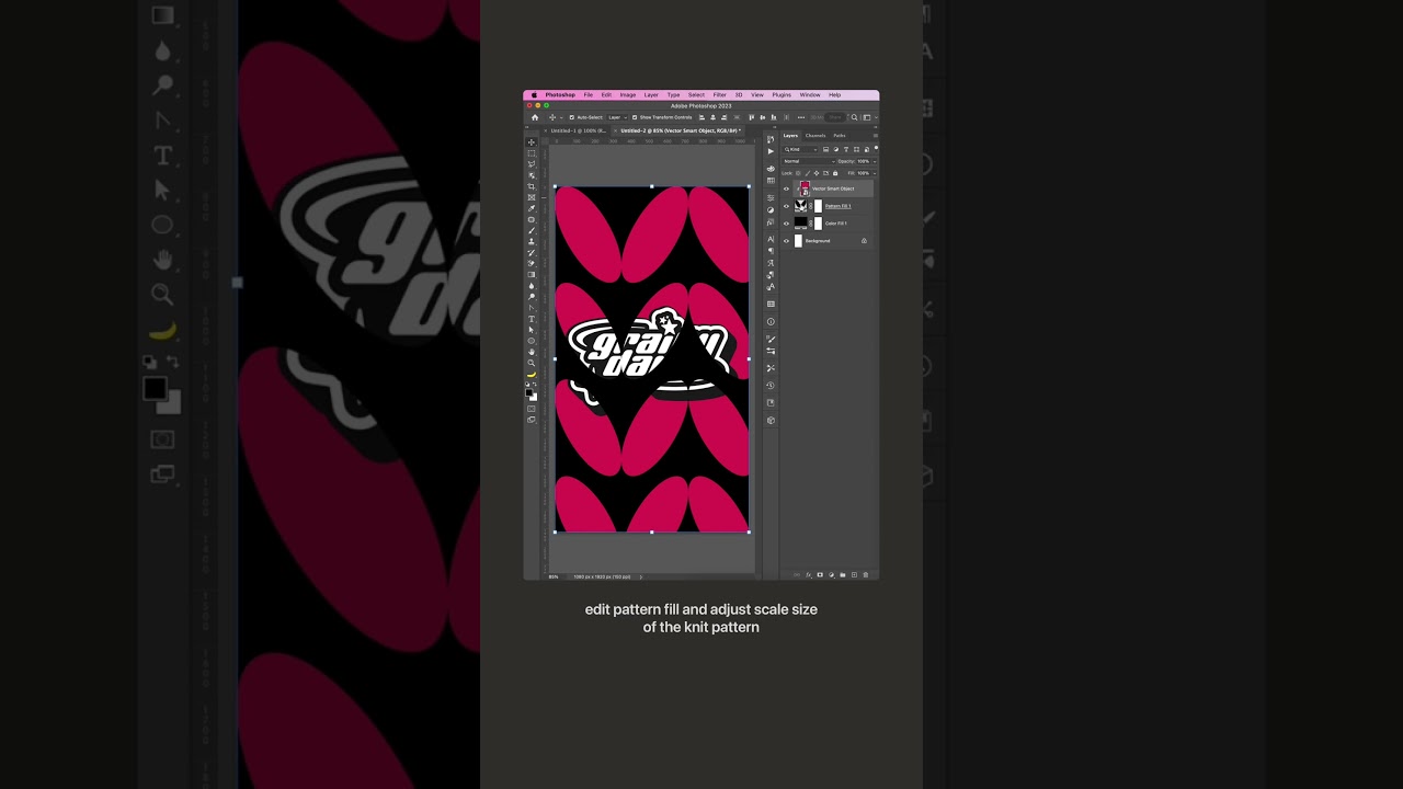
Follow along with Julie Wieland as she breaks down how to create fun knit effects in Photoshop.
Follow Julie on Instagram: https://www.instagram.com/juliewdesign/
Subscribe to Adobe Photoshop: https://adobe.ly/3vWtAiy
Learn More About Adobe Photoshop: https://adobe.ly/4bUzQbh
Try Adobe Photoshop: https://adobe.ly/3womKm8
About Adobe Photo...
its a shape,i dont mean colour though
Is it a vector or pixel shape? If pixel, did you try liquify, or the smudge tool?
Is killer pack safe?
Vector vs pixel: https://www.photoshopessentials.com/basics/vector-shapes-vs-pixel-shapes-in-photoshop/ .
.
Liquify: https://helpx.adobe.com/photoshop/using/liquify-filter.html .
.
Smudge tool: https://helpx.adobe.com/photoshop/using/tool-techniques/smudge-tool.html

Learn the important difference between vector shapes and pixel shapes! Now fully updated for Photoshop CC (Creative Cloud).
I am printing this design on a tshirt
but when i print it, it shows a random white outline on things
how do i remove that
(i put a white outline to show what i am talking about)

is there any way, Using actions or such to see what was all edited in a photo? is that possible to see what all went into it? probably not huh?
I want Korean text but when I copy something in Korean it always shows up like that… doesn’t matter what font. How can I copy and paste different language without getting those black cubes. I couldn’t find any tutorials online.

does anyone know a fast way to get a grey inner shadow like that

There are some sites, not sure if they are accurate : http://imageedited.com more info: https://shotkit.com/image-photoshopped/
imageedited: Is your image edited?
Are you wondering if that photo you saw online is real? In this guide, I’ll show you 15 different ways to tell if an image has been Photoshopped.


Hi, do you have a font that has Korean characters ? A quick online search gave me many links for free fonts. There is also this help document : https://helpx.adobe.com/photoshop-elements/using/asian-type.html
No I have not. From the few things I've heard online it was possible to apply Korean text to basic / legacy photoshop fonts. But thank you very much! I will try them out.
So what you gonna want to do is right-click on your font layer or image layer depending on what you want, find blending options, and scroll down to where it says bevel and emboss. After that, you will see a little drop-down menu for Style and go to emboss. It should add the effect you want. Then scroll down till you see the black color and make it grow to give the effect you want.
so i got a font pack i think, vector bubble alphabet. but its AI/EDF format, how would i import it as a font to text?, or do i need illustrator to use it?
trying to use something called Fontforge and inkscape to create a useable font pack, but its not working
can I use this emoji in Adobe Indesign somehow?

Hey guys another question
I've got this whole block of text but for some reason the spacings arent even and I dont know how to fix
Pls if somebody knows the solution pls tell
Thank you all for your help in advance

See the third paragraph
the text is very bunch together and isnt pleased to read if somebody knows how I can have even spacing pls tell me
I need help!! I'm have made a gray scale image and I'm trying to make it so that the whites(highlights) are a different color, but photoshop only selects the blacks
Pressing select object only selects the blacks and want it to select the whites
It appears you have set the text alignment to "justified" which changes the word spacing to make the block perfectly flat on every side.
anyone know how to fix the weird ness where like if I wand the middle of the hair - it still lets me brush OUTSIDE of it?

Like it's legitimately infuriating
I hope someone understands lol
i dont understand...
wand?
as in you are selecting transparenxy between the hair with the magic wand tool
?
Hey I've got a question.
So how can I get my drag and drop to start working again in Photoshop?
Cause It's not working for me.
can you specify what exactly is not working? what are you trying to do?
hello. i am just wondering why there is a difference in quality in my two different canvas thingys?you can see the blue one seems a bit more pixelly while the other one seems abit more crisp


the red one is at 66% zoom while the blue one is 200%
oh i see thanks
anybody here can help with trying to get something from photoshop to nuke?
for osme reason its coming like this in nuke when its only supposed to be the lifeguard stand

it looks like this in photoshop

you are importing this image as...?
PSD
im importing as psd and then doing a premult on it
nevermind i got it i think... i was supposed to delete the crop nodes : P
sorry for the quality of this video I found but I believe you're trying to do something similar...
https://youtu.be/H1g8qasl7ZU
notice this guy flattens the layers before moving to nuke - I have no experience with nuke but it could be that layer masks are not seen correctly. Try applying the layer mask (so it's not a layer+layer mask but a transparent layer)

thanks for this!
Gave +1 Creative Carma to @serene coral (current: #7 - 866)
This just selected the whole letter...

I need the little rectangles of each letter colored in differently. I marked them with the ruler, but I need to colour them in and I don't want to select, fill, select fill which takes ages, is there an easier way to do that?
did you use magic wand tool? not object selection
and what settings was your magic wand tool?
You can set your rectangle selection tool to a fixed size

if you know the size of each of the square, it will automatically create a selection of that size. So all you have to do is place the selection where it should be (use M as a shortcut to choose the selection tool, and mouse to move the selection around)
Don't move the selection with the move tool as it will move the content of the selection. Then Fill (ALT+Del for the "fill with foreground colour shortcut".
So for maximum productivity, put all your colours in a swatches group, so you can choose them easily, and then select, fill, move selection, fill, rinse and repeat...
The thing is that they are rectangles and they don't have a fixed size, ones are 21x21, others 22x22 and others 20x20
you'll have to select all of them manually then. the rectangular selection tool  will snap to guides
Is there a font for Iphone Emojis?
ahh... I knew it snapped and stuff, I just thought there might be an easier way to do that, but as I see no, thanks anyway
I would like to use them in my design
This was very crucial man....you should have specified that... the method i provided was something that would go if it was all the same sizes. Anyway's sorry seems like you would have to do this manually, unless the pro's here say otherwise.
Yes Photoshop doesn't know what you want to do instinctively. If the sizes are not the same, you'll have to do it manually. That said, if they're all square, you can choose "fixed ratio" instead of fixed size, set it to 1:1 so it saves you a bit of tweaking
emoji's font? could you specify more details?

GitHub
🍏 Apple Color Emoji Font - Original converted font - GORAlexComp/AppleColorEmojiFont
U r a saint Thankyou
I literally googled 'apple emoji font'
I didnt find it
I hope its compatible with Indesign
bro I got websites where u can copy them off
but they dont work in photoshop
that's because they are unicode characters, not font
Bullet list, first indent, picture explains all, why?

yea nvm that
Just ty 4 the font
Gave +1 Creative Carma to @serene coral (current: #7 - 867)
how was this bullet list created?
I just typed "1.", i wanted to do it manually, but Photoshop started adding 2., 3. and so on.
trust me, it will be much easier if you make 2 separate type layers, one for the numbers and one for the content
cant download the font :/

Wanted to avoid aligning haha
that's not really a problem, just make sure the font size and spacing are the same. if you alt-drag the text layer and hold shift when moving horizontally, it will align just right
sorry but I have no idea what this error says? looks like windows problem
The requested file is not a valid font

GitHub
Python scripts to backport and theme Apple Color Emoji font. - PoomSmart/EmojiFonts
try one of these
none is working
I am pretty sure this one will work
https://fonts.google.com/noto/specimen/Noto+Emoji?query=emoji
Maybe it's not 100% the apple one
Google Fonts
Noto Emoji is an open source font that has you covered for all your emoji needs, including support for the latest Unicode emoji specification. It has multiple w
Mind the file formats when you download fonts
.ttf, and .otf are sure file formats. All the others formats, it can be a hit and miss
thank you! it does exactly what i need!!
Gave +1 Creative Carma to @hushed niche (current: #20 - 99)
How do I make text glow
Thx
whats the beta squad role? i see there is a channel just for them lol
how come i dont have access?
😔
I'm sure this is something you choose when you go to id:customize
Also it's for people who use the Beta version. Is that you?
No idea 😂 , was just curious about it lol
I am sure if you "browse channels" in the Channel& Roles channel, you'll find even more stuff you didn't know existed 🙂
for some reason i am remembering a quote that says "ignorance is bliss" 😌
ill just stick to this channel and ask/answer lol, stay safe! 😎
pretty ironic considering your input in #🎧spotify-playlists
No idea what you talking about mate
Cringey, hey?

Please stop spamming please!
ban him
They're already banned!
What do you mean by base? Do you mean a template for a design like this?
can someone link me a video that shows where light should come from and how it shows up on a persons face or a object?
so i know how lighting works in photoshop and how to make realistic lighting in editing.

Learn how to draw highlights in Photoshop CC 2022. I hope you enjoy my video & don't forget to hit that LIKE button :)
- My premium course (Photo Manipulation Ultimate guide!) ** Limited time discount** :
https://nourdesign.teachable.com/p/photomanipulation-guide
- WhatsApp for any Questions: +201098351575
----------------------------------...
thats the one i was actually just now watching lol
Thank you
Gave +1 Creative Carma to @vocal shale (current: #89 - 19)
need help, how to do the c shape thing but with rounded corner in ilustraotr

How do you create this effect in photoshop?


kind of random question, but what consistency (like in %) can i expect from generative ai if want to generate background for multiple photos using reference image?
Is there an easy way to make this text have even spacing between lines? I am sure I can do it manually, line by line, but I was wondering if there was a standardized way to do it.

Consistency as in "Will all the backgrounds look the same"?
Actually yes
yup
In my experience, not a ton of consistency. I have not found photoshops generitive AI to be that great with creating full blown images, and even with refrence images everytime I run it, it is slightly different. I normally use Bing Image Desginer for my AI creations, bring them into photoshop, then use photoshops generative AI to make adjustments. Do you not have photoshop to try for yourself?
I have ps, but didn't try it in this context yet
Hey, there is a perfect video for this, here you go:
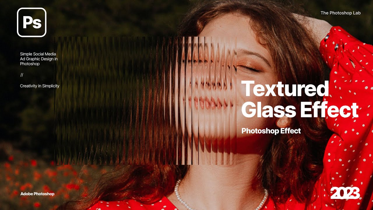
In today's Photoshop tutorial, we will learn how to create our own glass patterns using these simple steps in adobe photoshop 2023!
Thank you for Watching!
► Be updated for new tutorials and free resources:
Follow me on Instagram:
https://www.instagram.com/the_photoshop_lab/
Support our...
its called the glass effect, there are a bunch of tutorials
Btw, side note if you are getting deep into photoshop you would really be using this a lot for professional design and looks, so yeah good thing you doing it
@vapid flume Heya, you there?

In this tutorial, I'll guide you through the step-by-step process of blending objects into backgrounds using Photoshop. Whether you're a novice or an experienced photo editor, these techniques will take your skills to the next level.
If you learned something please leave a LIKE and SUBSCRIBE for more videos.
► SUBSCRIBE For More Photoshop Tuto...
Please pay attention the both the exposure layers he creates in the video, they are crucial.
If anything and you happen to practice this alongside, and something is making you stuck just ping me and ill try to respond if im online. All the best!
Anyway to get photoshop to auto-close layers?
Can you expound on your question?
Are you talking about Smart Objects?
This furry base I'm coloring in, won't wand properly because it's - as far as I can tell - unclosed shape or whatever
No. You'll have to either modify the selection or just paint over the gap.
the layer itself is unclosed/ like Idk how to correctly word it
You're speaking about shape that has a gap and so you can't select and fill it, correct?
Feel free to show me a screen shot and I can probably suggest something.
this is what it looks like in the layer panel

To explain more on my question, this is one chunk of text, the leading is set to auto right now which leaves inconsistencies between the lines because each line has a different sized text. Setting the leading to a static number also gives inconsestencies between lines of text because I believe it is calculated from the top of a line of text, so the text size effects it.
it does ahave convert to smart object available though
This doesn't tell me anything.
I don't see anything in that layer, are you working with a path?

If you are working with a path, click the path tab next to layers, that will show the path. You can stroke the path to make it raster.
You should locate the gaps and just paint to close the lines.
With it selected, nothing is tehre under paths
NM, ignore me
I just didn't see anything in the layer tumbnail, the second screenshot helped
thumbnail*
What D. Humann said, you are gonna just need to zoom in and look for gaps... I don't know an easier way to do it.
so while it's selected, just paint the thing? thing is, it's not gonna actually HIT the layer of issue though I think

No. It should not be selected to transform.
You should just paint in the gaps with a brush of a similar diameter.
brother
You said you are trying to use the wand tool... what is your overall goal with using the wand tool on this layer?
I'm trying to get it so I can wand it
Color in.
I'm uising a damn MOUSE
like paint bucket?
Yeah, like a paintbucket
Yeah, I really think the only way that is going to work is to fill in the lines, just the outer diamiter, is it all on one layer?
Yeah, that's just one layer
To make things easier, you can use the rectangular marquee tool and just select like an eighth of the drawing, then fill in with the paint bucket, if it over fills you know where a gap is and you can undo, fix the gap, then fill again.
I was gonna suggest soomething but idk if it'd work
If you can put a white background on it and send a screenshot again I can show you what I mean
pen tool a gap closed (seems to be the neck bit) then merge that and the other layer together
Yes that would work
aaand brush took doesn't restrict it to inside so tehre's another gap...
test brushing jut to show basically, I'd want it inside, (left and right side visually) but not in the non-body bit

Can you show a full screenshoot of that, I can't tell wha the non-body bit is


Did you have the layer selected (Marching ants around the lines) when you drew the thick black line?
Yes
you ever feel dumb as hell?
Thats how I would do it
Like I went and used the ACTUAL paint bucket (thta I forgot exists) and it worked fine
What... what were you trying to use? lolololol
Happens to us all bro
Well I have a fix for it now lol Just gotta take all the layers and do the dupe trick to thicken the "stroke" but - thank you man for thixing this lol
fixing* lol
hello there, does anyone know the best way to get character illustration lines to look like this?
a bit more organic looking rather than smooth?
i'm trying to figure out where to start... procreate brush? or is it drawing regular in photoshop and add a filter effect on the lines (e.g. ripple)?
any tips on where to start much apprecaited. thank you


Yea, I'm actually a UX/UI Designer, and I wanted to add this to my eCommerce project that I'm mocking up.
Thanks for the help btw!
how do i delete the recent files from here?

ik how to delete recent pictures but not these document files
I don't think you can "delete" those.
bruh so the ones i made that i dont need will just stay there.
oh well.
thank you anyways
Gave +1 Creative Carma to @ripe quest (current: #3 - 2016)
You can always use the legacy "New Document" interface if you want that instead. Edit > Preferences > General.... "Use Legacy New Document Interface" - Then restart Photoshop.
You can get brushes that are "rough" for photoshop too. That's what I'd use for this. Choose ones that have some "jitter" in it, which is a setting in the Brush menu (F5)
Most vendors who provide brushes for procreate, do for Photoshop/Fresco as well
and one more question, is it better to leave these options on "Faster" or "More Stable", Whats the difference? Does it affect the image or something in anyway that will make it look worse?

Free with your photoshop sub!
https://www.adobe.com/products/photoshop/brushes.html
Create and enhance your photos, images, and designs with Adobe Photoshop, the world's best imaging and photo editing software.
Still trying to figure this out...Is there an easy way to make this text have even spacing between lines? I am sure I can do it manually, line by line, but I was wondering if there was a standardized way to do it. (I.E I want the space between the bottom and tops of each lines to be equal). The leading is set to auto right now which leaves inconsistencies between the lines because each line has a different sized text. Setting the leading to a static number also gives inconsestencies between lines of text because I believe it is calculated from the top of a line of text, so the text size effects it.

Leading is based on the font size and is measured from Baseline to Baseline; auto is the default for that font size. Thus, when you change the font size the leading is going to change. There's no automatic way to do when you're constantly changing the font size.
If you want them evenly spaced, then you'll have to separate that block into individual lines and then use the Align and Distribute tools.
oh wow thank you so much, super helpful. i wasnt really sure where to start
Gave +1 Creative Carma to @vapid flume (current: #8 - 615)
You're welcome!
the runny inkers ones are great. i'll search for similar for procreate... byt chance anywhere you recomend where to look for procreate too? that same style?
Yeah, I was hoping there was someway to do spacing between baseline to headline... oh well. seperate text blocks was my next move anyhow. Thanks!
Gave +1 Creative Carma to @ripe quest (current: #3 - 2017)
Not sure, but I know that retro supply co does some, (I don't use Procreate, I use Fresco so I can have the same brushes on Photoshop and Fresco with the same settings)
https://www.retrosupply.co/

RetroSupply Co.
Analog-Inspired Brushes, Textures, Effects, and Fonts for Procreate, Photoshop, Illustrator, Affinity, and Clip Studio Paint. Premium digital tools for designers, artists, and creatives.
will check it out, thanks for the tip
Procreate probably has a Discord server, I guess you'll have more answers there (I now they have a Reddit at least)
How do I delete search history
Search History where? What app?
https://google.com - Enter: "Delete Search History"
That... thats an odd photoshop question
why cant i se the 3d tap?

so i just need to change version?
You will have to roll back to 22.x. That page discusses it.
thanks
Gave +1 Creative Carma to @ripe quest (current: #3 - 2018)
if i want to repaint a texture for a 3d object is there a way i can get the UV map to overlayed so i can se were to paint?
Oh I'm just trying to drag and drop images into my Photoshop. But I did get the scratch disks is full again and I forgot how to deal with that as well.
I want the arrow to face forward but when I flip or do anything it will flip the words what do I do 

I need it like this

uh just like cut into a new layer the text, then cut into a new layer the rest of the arrow, flip the arrow layer then blend it your best together
you could ask the AI to help you
Hey y’all, I’m trying to create a picture like this in photoshop, and already took the photos but have a couple problems- the camera would slightly move between each photo, and the camera was on autofocus so each focus is different. I’m wondering if I should redo the shoot or if y’all have any advice for the best way to go about the edit.
I also added a pic from the shoot, we basically reparked into every spot but again the framing isn’t identical between all the pics


Another problem I’m running into is shadows, I’m just feeling like this whole thing is gonna be pretty hard to pull off
Unblur parts of picture? Yo I so I blurred a photo with the filter, but how do I unblur parts of it? I tried the eraser but it doesn't seem to work

Hello my photographer friends. I have a questions about photos watermarks in lightroom. What's their your options for a smooth/nice watermark. Neither too visible but neither transparency.
Thanks uu
hello, i want to be able to clear this shape so it can like erase the white part so the background will be visible instead

dm me i can help
hey
oh yea it wont let me dm you either, are you trying to make it so only the green shows?
@unkempt drift
yeahs like cutting it
youre not allowing any dms, only from friends
double click the layer you want to make transparent, if it is multiple u might need to make a layer mask
then in the blending options you can blend the whites to make them disipear
make one with the logo then double click the layer
it should show a menu pop up on your screen


oh make a hole but keep some of the white and delete the black?

you can make a layer mask on the layer that you want the hole to be
and then you can delete the black patern area

how can i do that
like this i want the black sign there to be turned into a png whole

select the layer and click this button
you can delete and get back all the stuff and it wont actually destroy your work
you will need to select all the pixels from the black logo to delete it from the white and green

yes like that then go to the white layer and u can delete the logo off the white so its transparent
it looks like u have a lot of layers with white in that space so u might have to do it off multiple layers
oh nvm just "breh" should work
uh what did u press
you press delete or backspace and then just command D or i think ctrl D for windows
make sure you have a selection of the pixels of the logo though
thanks :3


man i want photoshop cc so much
is that the one for videos?
wdym?
wait...
photoshop cc can edit videos?!?
im not sure what the cc means
i can edit videos on this photoshop just nothing advanced
adobe premire would be the best for actual video editing
isnt photoshop cc like the new version
i have cs6
i am not sure but i have the latest photoshop available

i might get adobe premiere sometime because i would like to learn video editing but at the moment i am just doing surrealism pictures
did you pay
no probs
is it possible to crop a subject out and put it on a different layer
like this for example how the first picture of the guy is on a different layer than the background

anyone know how i can remake the backplate behind the text ? the text looks somewhat 3d on top of a plate ? lmk please

u see heres another

could you show me what you wanna remove exactly?
happen to know my problem ?
you want the text effect/font?
yes i want it exactly like that if u know how
from what i think he used free transform and right clicked on warp
and which font do you know
most likely a basic arial font, something bold
i wanna add a picture between the subject and the background

is the subject here the man in blue?
im confused on this part
not even seeing the warp option anymore
oh i did what u said and it did nothing
im a bit slow lmao but ye i did it
it jus brought the options for me to warp it but idk what to do ,like how do i get the back plate behind the text , the text itself in those pictures look 3d
Follow this, if anything is unclear do tell me:
Object selection tool, if you need to add more stuff hold shift to drag while selecting more, if you need to remove a part of the selection incase its selecting something else other than the subject then hold alt while selecting to remove that
Once you see your desired subject selected within the lines properly, press CTRL+C and then CTRL+V it will be pasted as a
new layeron top of this layer. Consider this new layer as Layer 2Go back to Layer 1, and click on "Add new layer" now you have a transparent layer between these both layers, put whatever you want and it should give you the desired outcome
could you show me the exact text you want?
I cannot help without much context
i want it exactly like this with the black background behind the text but i have no idea how to do that

if u look at CKP in jackpot u can see that its like 3d kinda
you want the background?
Yes, that's what the warp tool does
okay so , you see how in jackpot central, behind it, its like a black border or something behind the text, i want that
i just have no idea on how to do that
im stuck here and i want it looking exactly like that one

yes i understand now, so there are two black there actually
- Drop shadow of the original text
- a black rectangle plate
can you send me the text png file here pls,

Yes
Okay so you do this as the first step, follow this screen shot

That gives you the first black layer
tysm
it worked
actually i just noticead there is a little drop-down

do this and make the distance on "6"
great to know
okay got it

its not done yet, we havent reached the warp stage yet
this is just putting a black rectangle below it

after that make sure its one layer

then use warp tool on free transform, you should see these dots
after that

and yeah

Only thing left is to make "JACKPOT" and "CENTRAL" in different blending colors
@vital plank got it?
i think this would look a little better with the black rectangles

of course, it indeed does
👍


yea how do we do that
its the shadows, that is focused below, you dont see shadows on the top
ohh
right so i just copy what u did or
yes just copy the shadow part which i showed you, although i think make the "size" 6 only

that was just me trying to make it similar to the reference picture, choice is yours on how curved you want it
oh so then why isnt the text got the shadows like in that picture
thats because i made two layers, but you said you liked it without the rectangle so...
no no i was still using the rectangles
i was just using it a diff way then how you were

i still want my text 3d


you didnt put any rectangle there mate
i know but yours looks perfect how do i like
copy it or something or did u not do that
did u jus drag
draw

copy/paste this, make it black color
then just put it below the layer of text
like i showed above in the steps via screen shots
when free-transform, hold shift to adjust and make it shorter or longer without making the other side change
that way you can adjust the rectangle to reach till any letter of the text you want
its alr i came up with something tysm fr
ok
I rarely offer critism to be honest. Not my strong suit, you're the exception probably.
This one's OK, no obvious light quirks. The background seems extremely sharp compared to the foreground - which looks a bit blurry - particularly the non-descript machine, simple enough to fix.
Anyways, I'm working today, not intended to comment unless there was an emergency, so I'll go back to work swiftly!
You probably never heard this before, but i really appreciate your critic for all the pictures so far, it really helps a lot!
Alright, thanks!
Gave +1 Creative Carma to @vapid flume (current: #8 - 616)
In that case, this is something I would do in InDesign or Illustrator. With InDesign it would be very simple to create a template for anything book, magazine, or brochure related. Photoshop isn't great for setting up these spreads because it's a pixel based program, this is better to do in vector.
Any way to make the college football logo higher quality?

It was the best i could find
I see thank you for the information
Gave +1 Creative Carma to @sweet field (current: #24 - 83)

Can someone explain to me how I create such a background?

What do you mean by background?
The color behind
This will depend on your needs. Either you have a smaller watermark in one spot on the picture or something that covers a bigger area so it's harder to remove. Something like this with your name on it tends to work

The white?
Not, the pink one

like thiss

but i dont know if it's too much seeable
You should be able to do that by finding a brush that's preset to add grunge to images. Try searching for grunge brush pack and opening the .abr. And then with that brush you can add these shapes, set them to the right color, and maybe even add glow to make them pop out more.
It's definitely not too much. If you're sharing this with a client before payment is approved, I would add a bigger watermark. Otherwise, it's really easy to remove and then you don't get paid.
Okay thank you
Gave +1 Creative Carma to @sweet field (current: #24 - 84)
i work for a festival and its ok for the payement. They just told me i can @ me, so i did that. But i'm afraid that it catches the eye too much..
Oh in that case you should be okay. However unless you have a specific reason not to, I would add a real name as a watermark instead of using a handle. It's more professional and longer lasting. In a few years you may choose to change your handle, but a name is harder to change so it would be good for longevity.
And if they're posting this on socials, they can also @ you on the post, so adding your handle to the image as well would be unnecessary
I completely understand your point of view. But I'm afraid when people put my first and last name on the watermark, they won't find my Instagram. Or on the contrary, if I do, that I'll use too many different watermarks and people will get lost. Because at the moment I use either my signature for personal photos and my pseudonym for public photos so that people can find me. The idea of a first name and surname is a good one, and I'm thinking about changing my pseudonym. I confess I don't know what to do.
That's why your handle needs to be your name :) Maybe +photography at the end. Pseudonyms are great for artistic ventures but unless you're doing avant garde photography that you would rather not have attached to your name, I would stick to using a real name.
Yo, how do you unblur parts of a photo? I used radial blur

idc about the goofyness of the pictue just messing around with it
Are there any ways to make the subject (Middle) fit more into the background,
Are there any ways to decrease the quality of a asset?

i might played around with the brushes too much
are we allowed to upload effects that I've created even though its a website link and its paid?
wowzers, be careful adding yourself to a picture of O-Block 😅, I don't want you to get in trouble, not sure if you're not from 63rd 😉 but yezzir, there are multiple approaches to dirtying up a pic to make it blend better. In this case I would actually go in the opposite direction of blurring, which degrades the image by softening, whereas the degradation in this image is a result of compression artifacts which tend to make things oversharp and blocky. Look at the guy in the orange hat, at his skin around his lower neck just above the tank top, or on the bicep of the arm he's holding up, see that blockiness. The jpeg artifact degradation look can be created using a combination of heavy sharpening/light noise reduction in a camera raw filter, as well as adding grain, noise, or mosiac filters. Just don't go overboard, it's about subtlety. There is some overall blur from the camera quality, the compression artifacts happen after the fact. Think in terms of "the camera lens that the picture was snapped with made it blurry, but the compression of the image after it was taken made it overly sharp resulting in noise and artifacts. So you should operate in the same order, first softening your image, then sharpening and artifact-ing. If all else fails you can always do it the old fashioned way by uploading your original image to some side like facebook or somewhere and then upload/download/upload/download a couple times, which is literally what happened to cause this. if you wanted to truly authentically degrade the photo the same way the Wiiic city one was.
Truthfully, you did a pretty good job though, it took me a second to notice the composite! Everything else you need to finish it is just some good old fashioned fundamentals. Matching luminosity, saturation, lighting, etc.
The first dead giveaway is the shoes. I know you wanna look extra fresh, take a step back, those are the brighstest shoes in the entire squad! You've got to darken them up a wee bit. Not to dirty them up, just to lower overall exposure to match the rest. remember, you're surrounded by a ground, everyone in the, and the building, and environment are all casting shadows. use everyone else in the shot as references. notice your left shoes is as far back as the heavyset guy next to you's left shoe. Look at how his left foot is exposed, look at how your left foot as exposed. That's a good reference point.
Next, it's clearly an evening shot, little past golden hour, little before twilight. Notce how everyone's white tank tops have a subtle blue tint to them, because the building are obscuring the sunset, so there's gonna be a blue cast on everyone. You did a pretty good job on your white balance, but the blue cast on everyone else tells me you are very close but not spot on and a tiny be undersaturated, as the color cast on your white shirt is a bit more grey and not as blue.
Finally, think about shadows. The mad lad in the orange shirt should be casting a very subtle shadow against you. and also the shadows around your feet.
I want to introduce you to a concept that I learned when I began studying 3D animation, and it's called "ambient occlusion" (Google it, and also check out examples on google images). It's something that seems very subtle but was an absolute GAME CHANGER for compositing images. In the simplest of terms, it's "contact point shadows". Very very very small and subtle shadows. 90% of the time when I see a composite that a newer student can't seem to find the finishing touch for, it is those contact point shadows. Those shadows should be especially visible on brighter shoes. for example, look at the guy on the far right wearing the light tan sandles. look at the front of his foot on the one he has turned sideways, see that slit of black acros the bottom of his foot? that is the dark shadow of where his foot is making contact with the ground. Had a think dark slit of shadow across the bottom of your feet in the same way, really study all the other feet in the shot for reference. You will do that tiny little thing, stand back and go "WOW, THAT DOES MAKE A HUGE DIFFERENCE 😲". Really study everyone in the shot, what SUBTLE effects happen as a result of someone standing in front of someone else, or someone standing close enough to someone else that their clothes are practicly touching. You should be casting a subtle bit of shadow on the arms of the guys on you r left and right. What you need to make your composites PERFECT isn't anything big at this point, you're already doing a great job of handling the big stuff, it's all about addressing the small and the subtle. don't make big heavy handed moves, make many small gentle adjustments. Hyper focus on the big 3. Hue, saturation, and luminance. Reference them, then you, back and forth. You're 95% of the way there already, keep going!
I promise, you're on the right track. Or should I say... "On King David, you're on the right track". 😆 hehe, not bad for a middle aged saltine from Washington right? I was young once. Hope all this helps, I'll be around again in the future if you have more questions. Take care.
when ever i change inner shadow or inner glow nothing changes
How to do something very similiar like this? Help please

Create a rectangular shape on top of the background, duplicate it until you have it looking like the reference. Then add another image (like the one of the man) on top of that, and create additional shapes on top of him. That's most of it. Other than that you can then also cut out or mask the shapes to get the effects such as the text being negative space.
Why is this text here when I didn't even write anything here, when I want to mark the given area where I want to write, this much text appears, please help

That's because that's placeholder text. You can write over it at any time. And the reason it's that big is because the font size is at 75, which you can adjust down. I'm guessing around 20 will look good on that page.
not its size
when I select the area this text appears

I selected the entire area here and I didn't post it here
hi does anyone know how can i strech gradients

i would like my gradient to fit my shape
more
Thank you so much for the amazing read, i'll try to do the shoes and learn about shadows, realised how much of a difference they can make
how down shift while you transform. or go click the little lock icon on the top bar between height and width.
shift will toggle the unlock, unlocking will .... you know... not toggle. just straight unlock.
good call
Check your mode settings that you don't have the layer (or effects) set to multiply or screen or something. make sure you are applying to a layer with some alpha channel there you actually have an edge for the effect to come in from. if your image edges expand beyond your canvas you may not even see the edges, select crop tool and click on your screen to find out if the "edge" of your picture isn't actually the "edge" of your picture. possibly try setting back to default (the buttons at the bottom of layer effects, don't accidentally create a default though lol.
I'm sure it's something small and easy to fix. photoshop stuff usually is. 90% of the problems I have in photoshop end up being the most "did you make sure it's plugged in" type issues.
I just want to make sure you mean what I think you mean. let me send a video just to clarify. one moment.
use the "scale" slider. sometimes you can't get the gradient big enough using a layer effect (scalability is limited) in which case, draw the gradient on with the gradient tool (options to chance colors and make it radial will be in the top bar of photoshop) or apply a gradient adjustment layer. then double click on the actualy layer preview window itself to open up the options menu.
I still got you @master that was just a quick one to answer.
ok, so THIS is stretch. is this what you wanted to do? I don't think it is. but it's good to learn terminology anyway, so this is beneficial to know. THIS is stretching.....
What I think you are wanting to do is SCALE. Let me know if I'm correct in my assumption. THIS next clip is scaling....
It's called lorem ipsum. you can shut it off in preferences if you don't like it. Lorem Ipsum is essentially nonsense filler text. some people don't like to start out with blank text box or just a blinking line, they may want to find a font they like, or create a style or look BEFORE adding text. especially when you have clients that want to you create something but haven't sent you the text to put in yet. so around the mid 20th century typsetting developed an "official placeholder" text. and adobe recently integrated it into photoshop. though again, if you go to edit>preferences>type and uncheck the "Fill new type layers with placeholder text" box, you won't see it anymore. but you can learn more here if intrigued.
https://en.wikipedia.org/wiki/Lorem_ipsum

In publishing and graphic design, Lorem ipsum () is a placeholder text commonly used to demonstrate the visual form of a document or a typeface without relying on meaningful content. Lorem ipsum may be used as a placeholder before the final copy is available. It is also used to temporarily replace text in a process called greeking, which allows ...
I have this picture of my recently deceased cat and was wondering if somebody could photoshop a halo on top of his head. I would do it myself but have never used photoshop. I would really really appreciate somebody doing this.

I dont have access to that channel
Project requests should be posted in #💬chat-general. This channel is for help with Photoshop
Ahh okay, Thanks!
Just click the link and read the post please.
Hey man, I know what it's like to lose a pet. Never a good time. Please allow me. I will take care of it for you. What was the little fellas name?
Please take this to DMs
Gotcha
That's fine. I don't normally do requests. I am pretty strict about that stuff. but c'mon. guy just lost his little guy.
If you're going to work on this, you can have your discussion in DM. It doesn't belong in this channel.
of course, that's no problem.
Thank you.
Gave +1 Creative Carma to @zenith zinc (current: #881 - 1)
@master, if scaling is what you wanted, with the james bond layer highlighted/selected hit ctrl+T on your keyboard and the layer will go into transform mode (cmd+T on mac) and you can adjust the scale of the image by pulling on the side handles. if you hold down shift while pulling the handles it will STRETCH. hope that helps. gotta go hit my DM's. tah tah for now.
For feeback and suggestions, please post this sort of thing in the #📝project-feedback channel.
Oh I see my bad
Hi, how can i make picture high resolution
picture is like that, i want to make exactly

Make a new document at the size you read. Then import this image in to use as a template. Sacle it up to fit. Then you can trace the shape with the Pen Tool and fill it with the desired color.
my computer has 4 ram, can i make it in photopea?
I have no idea. This is the Photoshop server. You'll have to ask in the Photopea server.
there is no Photopea server 😢 . thank for answer
Well, you can consult the Photopea documentation: https://www.photopea.com/learn/
thankss 🥰
Is there a way to do blending options to a selection in PS?
You will probably want to separate it to its own layer. Then apply the Blend Mode (to the layer).
Ok thanks
Hello! as you can see I have this outline id like to "fill" with another color But I don't want to rasterize the layers to do that. I'm keeping them as shapes so I can easily adjust the thickness, etc. of each line later. is there a way to easily produce a shape that san sit behind these lines that will act as a fill?


You can turn the path/shape into a selection, make a new layer and then fill the selection with the desired color.
thanks for the reply, ill try and figure out how to do this
Give me a moment and I'll show you.
Open the "Paths" Panel. Window > Paths... Then select the Layer with the path and in the Paths Panel, use "Load path as selection" at the bottom of the panel.
If you can close the Shape, you should be able to assign a fill color and a stroke to the shape. That would probably be easier.
You're welcome!
due to the complexity of the shape ill do it the first way
Sure. Whatever works best for you.
If the goal is to do this as vector art, it would probably be more effecient to use Adobe Illustrator but that has a serious learning curve if you're not familiar with that app.
ill eventuall vector it

Select the object layer and use Edit > Transform > Distort... You can try that.
Hi. I want to make a background for repeated use in social media posts. I'd say I am advanced beginner level. I can create the final look. I am looking for guidance on how to set it up as a template so later on it is very quick and easy to make changes. I thought I could just seperate things into multiple layers and but more complex then I thought. What I want is a section for 1) Background shapes. e.g. p;olygons. 2) Transition e.g. light to dark 3) Colour e.g. target colour = green 4) Text Box e.g. "This is a short title". What I found is that I couldn't seperate my shapes from colour for example. I know there are usually 10 different ways to do something on photoshop but this seems like a problem that has been solved. Any guidance on tutorials or your own experience or examples would be appreciated.
hey steve! the best way is to piece it out instead of painting somthing in. so that each part of your backround can be adjusted
I have 4 layers. 1-Gradient, 2-Colour, 3- Shapes, and 4-Text. In layer 3 I am using the polygon lasso tool to draw a triangle.(marching ants) Then Filter-Blur-Average. Error "Could not complete the average command because the area is empty. I want each triangle to take on the colour and gradient below and then have average blur. I plan to draw many triangles filling up the space. Each one will have different average colour because of he gradient. I suppose I need to select other layers for the filter or create a mask but need some instructions that can be followed by a 5 year old.
A constraint is that I do not want to merge the layers. The reason is so that this psd can be modified for gradient or shapes or colour or text by keeping the layers.
convert the layer to a smart object. now any time you want to make a change to it you can open the object, make changes inside it, save it out, and it will automatically update in the main document. Then you can duplicate the smart object. (changes made inside smart object will be updated in all the copies of the smart object inside the main document. Now with the copy, use a layer mask if you want to cut shapes out. layer masks will allow you to cut up the image non-destructively. you can also add average, or any other blur for that matter, or almost any other effect, and it will apply as a smart filter, which means not only will it not merge the layers, not only is it non-destructive editing, but with smart filters you can re-open and adjust them again and again just like layer styles.
give me a moment and I will demonstrate on this self portrait.
I'm working on this texture and having trouble with some very uneven shading I clearly did. Is there an easy way to blend it so the shading is smoother as it's a little too late unfortunately to undo it all without remaking it from scratch

yeah, easy. but I made the video. it's uploading now. so give it a watch. it'll either help you now or will be useful stuff to know for future reference.
background is hard black so it just be super easy to select and mask. Then you can duplicate and unmasked copy and apply it as a clipping mask to the masked layer, then use the smudge tool and smooth everything out.
I know those instructions have me sounding like xzibit on pimp my ride saying "we heard you like masks, so we put a mask on your mask so you can mask while you mask." but honestly it's pretty easy to do. I use this trick all the time to get rid of halo-ing with extractions. like I'll cut a person out of a picture, and if I'm seeing a tricky bit of white halo around them, just duplicate, apply as clipping mask, then smudge out the halo. and the layer you are smudge is constricted to the clipping mask so you can smudge the edges without distorting the border.
hold tight, I'll make another video. it's super easy.
Watch this video while I work on the other one. the second one will be shorter. https://youtu.be/CDirGfUmk2s?si=MGLwMe6daLy7Z1Km

lol alright ty I'll watch it
second one, bout to start upload now.
this second one should solve what ya need for sure.
I tried watching the one you sent first and I honestly have no idea whats going on lol
Why is AI gen fill so inconsistent with removing pedestrians out of shots?
I select and try "remove" "delete" or just leave it empty, but it keeps generating NEW people instead of removing them from the shot
hahahaha, might need some commentary. on this second video you should be able to follow the steps you see visually. expect one thing, ctrl+alt+G creates clipping mask. (cmd alt G on mac). That's the only thing I so as a keyboard shortcut. everything else I do believe you can see me do on screen in menu's. I do apologize as I'm needing to wrap it up on here for the evening shortly so I might be moving a little fast. But I will have time, tomorrow and in the coming days if you need help getting your head around everything. Once you learn it you'll quickly see how easy it is.
sometimes it works but not consistently
any tips?
@mystic trail
I'm in a closed group with world class professional adobe instructors. Every single person in the group has bare minimum half a decade of experience, and you have to be in the adobe experts program to even be in the group. and I kid you not, they are literally talking right now about how the AI gen fill just "isn't quite there yet" because it's unable to fill "CONSISTENTLY". which really makes it a lost cause on video composites since every frame is just not quite like the last one.
I DO HAVE ONE TIP TO HELP YOU THOUGH.
As far as still image, here's a little tip about generative fill. It looks at the surrounding and creates a file based on the surrounding pixels. if it sees other people, it will maybe generate other people. But, GENERATIVE FILL RESPECTS MASKING. In other words, if I have a women in a pink sweater standing in front of a green wall, and I keep trying to remove a picture frame on the wall, but it keeps generating pink smudges on the fill because of her sweater, if I quickly apply a junk mask and just mask her sweater out and then apply the fill, it will ignore her sweater. It'll respect the mask and work correctly. then once I get a successful fill, I just delete the layer mask. done.
might need to grab the pen tool and just quick and dirty mask out the people on the sidewalk and other elements so that the fill can just focus on filling the sidewalk with sidewalk.
Here you are. remember, ctrl alt G for clipping mask (cmd alt G on mac) that's how I make the top layer clip to the bottom layer.
https://youtu.be/cRL9wgzBpDM?si=LuLCyR8CMYUj3o5f

I can provide further clarification tomorrow. but I'm outta here for tonight.
alright thank you again for the help!
I'm more of a premiere and ae guy (a psd noob). How do you mean mask out the person you want AI gen fill to ignore?
Doing a mask selection on the person to ignore first, then doing another mask where you want to delete a person, on the same layer? (that just gives me an "error" message box)
"you haven't selected any pixels" something like that
I can show you real quick. that's one thing I can do before I disappear. will only take me a second.
sending a clip or? 😅
If I were to apply generative fill on a chunk of the sidewalk in this picture. There is a fairly good chance that I will end up with chunks of people being generated. I'll probably get some little bits of red dress, or some briefcase. you know what I'm sayin.

BUT
If I do THIS FIRST, with a layer mask, and THEN start applying generative fill to patches of sidewalk, it will come out clean with no chunks of people.............

the once I get the sidewalk clean, I just delete the layer mask and I'm good to go.
oh yeah, I guess I dont know how to do this part, getting rid of that layer mask without hitting ctrl Z and also undoing the gen fill
you can mask out things that you want the generative fill to ignore.
right click on the layer mask and select 'delete layer mask'.
quick question around 1:25 u do something im not sure what though could u explain that
man gen fill is hilarious, removing this woman


that pic I just sent. button creates layer mask. make sure you have the layer mask (not the layer, but the layer MASK selected) painted black makes it disappear. painting white makes it appear. grayscale alpha just like in after effects. so like, 50% grey would make it 50% visable/see through. you get it.
then delete mask when done using fill

ctrl+i (cmd+i on mac) i is for invert. works on all layers. if ya ever wanna make your white black and your black into white, select the layer and hit ctrl+i. you can get a photo negative look on a regular image. or you can, on a layer mask, where white makes things visible and black makes things invisible, use the ctrl+i which will make what is visible turn invisible, and what is invisable, turn visable. and so I'm just demonstrating what is selecting and how it is reacting by inverting the layer several times.
ohh okay tyvm i couldnt figure it out for the life of me


Thanks for helping out, Impala.Drive
Gave +1 Creative Carma to @zenith zinc (current: #569 - 2)
No problemo. I gotta talk to someone about adding me to the community expert tier on here. Maybe you could point me in the right direction?
Yeah. Let me see what I can do. Technically, I can do it but I think I have to wait for Sil or one of the admins. We'll get you in there.
Awesome, I talked to @mossy niche today. we had a good hearty laugh that he's in experts for photoshop and I'm not (he despises photoshop). He said he'll take care of me on the video forums, but said I'm on my own far as the photoshop one. I really appreciate the help.
We can notify an admin, double-check and then they can add you to all of the servers at once.
I dunno if I'd say I despise it. It despises me 😉
LMAO, it's a karmic balance. it's simply that you and photoshop are on two different wavelenths with incompatible energies.

the screenshot thing is gonna be a mess. because I would be helping like 5 people at once lol. so I start with one person, then help another person, double back, then while a video is uploading help two other people, then send video. the screenshots I'll need to upload to the experts site are in a folder right now looking like video editing pre-computer era. just a big box of film. gotta break out the scissors and tape and start cutting it all together in chronological order so it has a cohesive narrative.
*me preparing my screenshot submissions.

alrighty, have a great night yall. thanks again for the guidance and assistance.
To be pedantic, there is no alt key on Mac—it's called the Option key, and the graphic symbol which corresponds to it is the horizontal mirror image of the graphic symbol for Alt.
In all honesty you're not wrong for pointing it out. Pedantic to the well informed, but teachers have to be mindful of the comprehension of students. For me, it slipped my mind, and among other pro's I'd flip a smart mouth remark about mac users and call it a day, but to someone that's trying to learn something new and foreign to them, that could be a critical oversight.
long story short, I'd hate to be the poor s.o.b. out here trying to learn a new skill and end up spending an hour driving myself crazy trying to find the alt key on a mac keyboard. So I actually appreciate you pointing that out.
sorry, my finger slipped, What I meant to write was "go back to your soy latte mac boy!" (lol, just kidding)
Hey everyone. I'm a complete beginner in the photoshop software by using wacom one tab so would you please like to guide me step by step on how do I activate my smoothening brush option? I'm using adobe photoshop 2024 version


Looking for a photo to be touched up will pay $7 dm me
All the brush options are in the brush settings
You need to hit F5 to open the panel
Once there be sure that all the settings that can be contrled with your graphic tablet are turned on, and depending on your tablet the method for the input
Pressure, tilt, etc
But by default smoothing doesn't have a particular setting, it's either ON or OFF


Smoothing in the top menu (as you point) is related to the drawing aid (less wobbly if your hand isn't steady) that you can set up with a keyboard shortcut. That keyboard shortcut can be controlled via your graphic tablet you have express keys/ a roller (just check your driver to learn how to set these up)... It would be ALT+ the number you want (ALT and quickly 7 then 5 if you want 75% smoothing) however you will still need to access the keyboard for the numbers (ALT/OPT can be set up on the tablet)
It MAY be possible to set up that % with the roller, but honestly I've never tried.
Please follow the guidance in this thread if you want to commission someone for a project
https://discord.com/channels/547473772727238676/1042476087642423369/threads/1042833042378592329
Discord
Discord is the easiest way to communicate over voice, video, and text. Chat, hang out, and stay close with your friends and communities.
does anyone knoiw why my path with a stroke of 8px creats this suuuper long line?

It's because of the mitter settings

Put it to "round" and it won't happen. You don't have further settings, whereas in illustrator you can set the mitter threshold. The lengh of that line depends on the angle, the sharper the angle, the longer this line is