
#❓ask-a-question
1 messages · Page 35 of 1
Maybe add a simple 'add watermark' action and include it here in the 'Run actions' section.
Exactly.
anybody have the slightest idea of how to achieve something like the figure in the middle of the composition?

the circuit bent kind of effect
you my boy. are an amazing human. thank you for much for your help! ❤️
Gave +1 Creative Carma to @sly hawk (current: #7 - 806)
Thanks for your help! I'll have a look into 'Image Processor Pro' extension a little later. Adding the "open" command has fixed the issue for me. And thanks @torn condor for your suggestions. 🙂
Gave +1 Creative Carma to @sly hawk (current: #7 - 807)
Could someone tell me what type of design is this?
Hey guys i am new in Photoshop and still learning basic skills. But i have a question. Want to remove This standing person lef from the Card. And the Board behind the person should be same like the Board right from the Card. Do you know a solution for this that i can learn ?

badge, circular, pin... unless you mean something particular about the design?
you could try the remove tool or generative fill. if it fails you'll have to use regular methods like clone stamping
generative fill everytime produces new random "people" oder robots 😄
not removed this
Nope, just the category
quick question, so when making prints should i print them with the textures (paper wrinkled, paper fold)
I would remove him using Gen fill, and then if it looked a mess on the board, I'd eith 'recreate' the two boards. or at least nick the one from the right and place in the left side....
Like this in fact....
does anyone wanna hop in a call and show me how photshop works
i used canva bef for about a year and i jus got ps soo i wanna see how it works and stuff
'By prints' you mean designs specifically to be printed on paper?
I've seen designs with a 'texture' printed onto paper and it looks fine.
you know the plastic posters
anyone?
just experiment with the app try to make something
and try to design
if you are stuck or want to do an effect you dont know how to do
just search
@sly hawk
No.
Unless you mean Foamex/Foamcore?
Which is usually covered in a vinyl print or printed direct to sub
its like a thin sheat of paper made of plastic
ik jus wanted to see is there anyone chill that would want to hop in a call and make some designs and show me how it works?
but overall on any type of paper should i print the textures?
It depends what your end goal is really and who's printing onto plastic for you?
a print shop
Have they sent you a print spec/details?
i am going there today to check

i mean the paper wrinkle
or a paper fold
plastic wrap effect

Yeah. Anything like this can be printed onto a board. Lots of commercial designs follow it.
oh ok
thanks!
In fact I'm in the middle of prepping for a photoshoot/project that uses this texture/style:

The resulting posters and wall graphics will be printed onto huge columns, around a rugby stadium.
this works perfectly but the only problem is that now it isnt transparent in the middle so i cant use it as a overlay for my stream
no my posters are just room prints for decoration
So please help me with it
Yeah, that's still fine. 🙂
That video features a 'transparent' centre?
This is what i have right now

When i do it it isnt
It is just white
Change the FILL opacity to 0%
...watch the video 🙂
Thank you man
Gave +1 Creative Carma to @sly hawk (current: #7 - 808)
Btw the first rectangle i make will that be the red or the cutout in the middle
you only need ONE rectangle
What's your end goal anyway? A nice screen/template for streaming?
How did you open layer style
Does it need to be a PNG file? 1080 x 1920?
I wanna have like a corner glow around the stream i think it will look cool

It is the same what type of file it is as long as it works as a photo file
Gave +1 Creative Carma to @sly hawk (current: #7 - 809)
You want it to be PNG then. a JPG won;t be transparent.
Also, as an FYI - https://www.canva.com/create/twitch-overlays/ @cloud star
Thank you man there is so many new things to learn, im only 15 and wanna learn to get experience and maybe make it a job or a hobby!
Yeah, that's awesome.


one moment
do me a favour. I can't tell if you suggenly put yourself in quickmask mode!

click this and if that doesn't work, change the colour to blue

Thank you here i think i did it right

This is how its looking thank you alot for the help

Hi, kinda new to PS.
Quick question, i'm making a fan art for a game and i was wondering how do i put these blue lines on photoshop? Those blue lines i did were made thru paint 3d and it was quite a hassle doing it manually.

Just use the **pen **tool
Do you have Illustrator? I would always do that in it using the APS file as a places reference then bring the AI file in to PS
hello
When I make a selection this option doesnt appear how do i make this appear?

So I was photographing a car earlier today and the car was a bit dirty. What's the best to clean the spots in ps?


Google 'remove blemishes photoshop'.
Thank you
Gave +1 Creative Carma to @sly hawk (current: #7 - 810)
Gave +1 Creative Carma to @sly hawk (current: #7 - 811)
So to remove blemishes I created a group with all textures stuff to clean the blemishes. Is there a way to copy the exact settings for another picture?

Unfortunately i dont have it. Might consider installing it
thx mate this video helps a lot to learn how to manage it THX!!!
Gave +1 Creative Carma to @sly hawk (current: #7 - 812)
I much prefer it to using PhotoShops pen tool but many are happy with it.
I'll take note of it, thank you
Gave +1 Creative Carma to @stark wharf (current: #851 - 1)
Follow up question, how do i resize an image that I have already put on the canvas? For example the logos that are on the chart.
All at once? Are they on a single layer or multiple layers? You can use Transform tool and do it manually or key in %. Hopefully they are separated as it will shrink overall positions too
sorry for how dumb this question is and its probably easy to figure out, but how do i send a layer to the back?
Not all at once, the logos are separated from each other.
You can scale them in position then, you could create an action to do that for multiple logos if scaling by same amount
If it’s a layer just drag it below others in the layer panel
so idk if its relate to PS but how i can create logo using Adobe sofware?
How? You use the tools to create graphic images. In this instance, a logo.
Or is this some sort of trick question? heh
Typically, logos are defined, stylized shapes created using vector graphics. Thus, Adobe Illustrator would be a better choice than Photoshop to create professional logos.
thanks
im trying help a freind of mine create logo for his business so i want to learn basic and maybe help him for free
Yes illustrator should always be first choice for logo work. You can then place into any other application
pen tool, made one in photoshop.
You'll want to learn what makes a "good" or "professional" logo, e.g. strong, defined shapes that are coherent and easy to read if words are incorporated. There are lots of tutorials on YouTube that discuss this.
and fill it in the path with white
You do t really want to do that for flexibility
It’s why designers study for years… and don’t really stop studying.
Logos are designed for a specific purpose, to represent a brand, convey a message, etc. Randomly drawing some shape and calling it a "logo" isn't what professionals would consider "logo design."
And because you have the software, it doesn’t do it for you, you need an appropriate idea
yeah ofc the sofware wont do it for me but i wanted a direction on what to focus
you can make logo with Paint does its mean its good? no
but yeah i will watch youtube video and try basic
see if its work for me
thanks eveyone
You should study up on what makes a good logo first. Then attack the problem from a creative perspective.
hey photoshoppers , i have a question how hard would it be to warp this image using 5 point perspective/fish eye lense plus editing him so it looks like he’s laying on the ground with his big eye facing the camera all exaggerated and cool looking , is there anything i can do to achieve this or no

First, "5 point perspective"? To be honest, I can't even understand what this is that I'm looking at.
spherical perspective
something like this
Hello, I'm new here.. Nice to meet yall
anyways, I'm trying to remove this background without erasing the guy but when I use CAF it comes out werid
any tips?
^ uhh yes before you say this is a group project soo..


its a guy can you not be obtuse and try to help man
i showd you whats there i showd you what five point perspective was
i’m just asking for a little help here
I don't think I can help you. Sorry.
ok
alright, but I do have a question hold on for a sec
any way how I can make this more realistic? I kinda want the back renders glowing from the fire

Is there a way i can bind the text and the image into one single layer? So i could just move them around as one instead separately.

You can merge layers but text will be rasterised and not editable
This is much better to do in Illustrator
You can group everything as a smart object which may be better for you, select all the layers you want to create a smart object. It will then all move together
You're in the Adobe Photoshop Server. If you have a question about how to do something in Photoshop then feel free to ask.
so im trying to make that ball above the text and photoshop wont let me (im starting to hate adobe applications with every passing second) and also too, why cant I move all the seperate texts all at once? I already put them into a group? so why is it when I try to move them it keeps moving them individually?

hey all. im trying to move the red down below the black, while preserving the shadow, but im having a lot of trouble. first i tried to select the bit i wanted to be gray, fill it with gray, and then make it a "hue" blend mode. this preserves the shadow but doesn't match the gray color at all. i tried to do a duplicated layer with Luminosity blend mode under it and that did nothing. i appreciate any tips or help.

is there a way to make this drop shadow?

i'm talking specifically about the joined corners
can i open a merged layer like i could with a smart object?
No. If you've merged the layers, they are one thing. Its not like a Smart Object.
oh alr
If this is all one flattened layer, if would be easier to remove that thing and redo it so they are separate layers.
Its difficult to suggest something based on this description. If the ball is on a separate layer, then you activate the Layer (by clicking on it in the Layers Panel). Then tap V to activate the Move Tool and then you move the object.
yeah i thought about just doing it over, its all one flat layer. but i figured there might be just some easy way i wasnt seeing to just move the red down. thanks for the tip
Do you do fivem chains and packages
yes
Yes but not a single click. - Using photoshop at least,
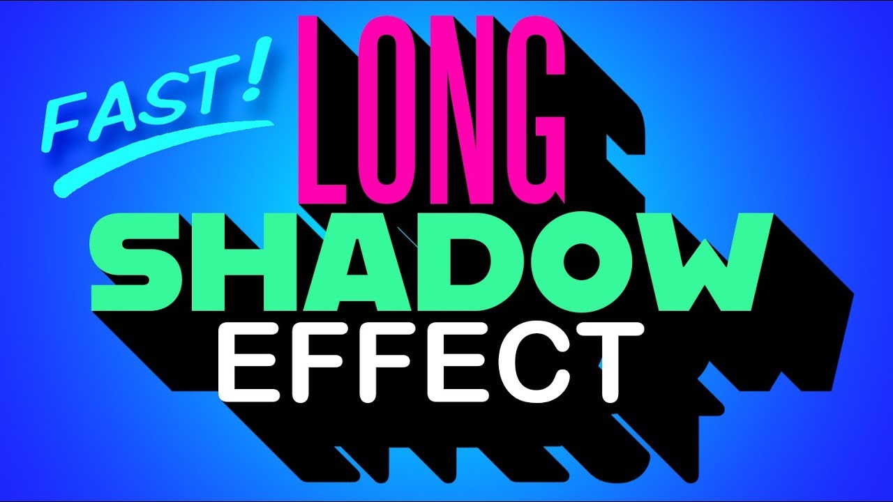
Photoshop CC 2019 quick tip tutorial showing the quickest and easiest technique to create solid, long, drop shadows for text, logos and icons.
➤ Get 15% off BORIS FX OPTICS! - The BEST special effects plug-in for PHOTOS in Photoshop! Go to https://bit.ly/3aDnh4A and use my special code: bltv2020
Royalty-Free Music provided by http://www.beat...
thanks! i'll check
Gave +1 Creative Carma to @sly hawk (current: #7 - 814)
anyone know how to put a image over a mask like this? i want to put a texture over the white, but idk how

What do you mean, "put an image over a mask"? Please share a screenshot of the entire GUI with the Layers Panel open.
Layers can be "masked" by using a Layer Mask. Are you saying that you want to add another layer and use the same mask?
How I can add guides on all sides with same distance from the edge on faster way then 1 by 1?
for example 100px from each side.
PC company? lol
Why does not align text work in openned Smart Object?
I used Shift + Enter for a new row of text.
Luckily I have some logic and found that's the case.
Use guide layouts. View>Guides>New Guides Layout. There you can specify the margin for each side
can you clarify?
I pressed Shift + Enter while typing text, thats why it did not align to center.
Ty
Hi, just joined this discord. Is there a place to make photoshop requests?
So, is the "__R__emove JPEG Artifact" option just.. complete trash?

where is this?
Thank you!
Gave +1 Creative Carma to @serene coral (current: #6 - 827)
It's in the reduce noise menu
Filter > Noise > Reduce Noise...
If you don't get the desired effect you can use Camera Raw's noise reduction or JPEG Artifact Removal Neural Filter
Oh? Where are those options?
In the Camera Raw, denoising is part of the Detail section. You can find Neural Filters under the Filters tab
I've been attempting to make a collage just like in this photo, whats the easiest way to import images, crop and center them on a background? Everytime I attempt to crop it crops the background as well, which is not what I want to do
there is a number of ways you can crop images in Photoshop and the one I would recommend to you would be using layer masks. Make a square selection of the area you want visible and click the mask button  at the bottom of the Layers panel. This will create a layer mask with its position attached to the masked image. You can press the chain/link icon next to the layer mask to unlink it and freely move your image while the mask stays in place
I'm attempting to paste the masked portion to a different photoshop document, however it brings the background layer with it. So when I try to make it move to a specific location in the other document, it simply moves the mask and not the image itself
I don't mind if I lose the area thats cropped out, thats kind of what im trying to do
You can ask in #💬chat-general , you'll have more luck in there!
Gave +1 Creative Carma to @vapid flume (current: #8 - 532)
Yo is it possible someone can help me dm's with an image I'm currently trying to fill in? I'm not very smart 😭
Same as above 🙂 The right place to ask for that kind of things is in the #💬chat-general channel!
Will do thank you!
Gave +1 Creative Carma to @vapid flume (current: #8 - 533)
in fact, you can find the full explanation here https://discord.com/channels/547473772727238676/1042833042378592329
hi guys so i have a black and white image that i want to print on a black t shirt. on My image i wanna make all the black colors transparent so theres no black printing its just the visibility of the black fabric, how would i go about doing that?
There are multiple ways to do that, but the main thing is to determine what will be the process used to print your tee-shirt (as the files need to respect certain standard for the printer)
It can be done using duotones (where you assign specific colours to a channel instead of the standard RGB/CMYK)
It could be simply done with a mask that hides all the black parts and the file stays in RGB/CMYK
I'm assuming it won't be printed at home (since white ink is a bit hard to come by)
Gave +1 Creative Carma to @vapid flume (current: #8 - 534)
What does the printer asks?
asking him right now
The choice of printer and type of printing needs to come early in the process, as it drives how you will have to work on the file
I forgot to also state that some ways of printing will require you to process from a continuous tone (for example what you are ssing when you print at home) to half tones (Like if you use silkscreen printing or Risography) that a whole other thing to consider.
If you have them printed in a place that does Print-on-demand (Tee public etc) then it's most likely continuous tone (they're heat transfered from a printed sheet), so any method will be good
On the other hand if you have a one colour silkscreen print, then you'll have to process all your mid-tones (all that is neither full black, or full white) into halftones, in the same way that photos in newspapers used to be printed (with little dots.)
ok ill ask him what type of printing hes gonna do
OK, feel free to update here!
thank you so much
No problem 😉
so he said itll be direct to film
type of printing
i asume thats heat transfered
Not necessarily, it could be a type of offset printing /lithography
That's a strange way to put it
Do they have a website?
Let's be honest, in the context of tee shirt printing, that's most likely a heat transfer system.
So you can design the artwork exactly how you'd do it if you had to print it at home. Just make sure you follow their instructions regarding file format (like PNG or TIFF) and resolution.
thanks so in this case what would be the best way to delete all the blacks and have white only
Gave +1 Creative Carma to @vapid flume (current: #8 - 535)
I'd rater work non destructively and just mask instead of erasing.
You can do with creating a mask either with the select>colour range menu (and choose shadows in the drop down menu) And create mask from this selection
What you need to keep in mind is that the mask has to respect the mid tones (the greys) if there are any, that means you'll have some semi-transparency in the mask (part of the mask will be grey)
of course if it's a stencil-like artwork, with only pure whites, than there's no issue
What I would do is put your artwork on a separate layer with the background made black (or even on top of a photo of a plain black tee shirt) and test your options and see what works best
https://www.youtube.com/watch?v=QAGgeLmTaa8
and
https://www.youtube.com/watch?v=Ni4dJs3kthA
hope it helps!

In this video, Julieanne demonstrates ten essential shortcuts for working with Layer Masks including how to add, delete, invert, move, reposition, copy, target, disable, change the density and add a non-destructive feather to soften the edges of a mask.
Additional tips, tricks, and tutorials from Julieanne Kost can be found on her blog: https:/...
Learn all about masking and why it is such an awesome feature of Photoshop (and basically every creative app out there!) and how to create masks from scratch and from selections in Photoshop.
💰 Support the Channel and use WP Engine to host your website! → http://bit.ly/3Yoqgpu
📸INSTAGRAM → http://instagram.com/theNathanielDodson
Adobe Stock u...
yeap your right there are some greys on the image
So in that case you just need to remove just the pure black? No need to faff around if you're sure the tee shirt are very deep black
yea thats what im thinking just to remove the pure blacks
It depends if you need to print on other colours later. If it's just black, then it should be all good with removing all 100% pure white (or masking, way better!) with the magic wand or something similar
I like to use the calculation menu in "image" because it gives a lot of control over how the masks are built, although in your case it may be a bit overkill, but it's always a nice skill to have
https://helpx.adobe.com/uk/photoshop/using/channel-calculations.html
thanks sandrine
where s mirroring in photoshop
Free Transform -> right click in Free Transform -> Click option "Flip horizontal/vertical"
depending on however you want it to be flipped/mirrored
Can someone help me quick?

I wanted to delete something but the square is visible
How to create that mesh to cover it?
I'm attempting to paste a masked portion of an image to a different photoshop document, however it brings the background layer with it. So when I try to make it move to a specific location in the other document, it simply moves the mask and not the image itself
I don't mind if I lose the area thats cropped out, thats kind of what im trying to do, how can I go about achieving this?
There is a padlock symbol between the layer and the mask, just activate it
?
Like I deleted something under this blue square
And I want to cover this
Square, because now it’s visible
Like I want to do this ble mesh
On the left side of the picture there is blue but meshed, how can I do this?
Like mesh this blue square
To cover it
select overlay part, copy, paste
Yea that’s good idea, I will try, it was so simple and I didin’t event think about it. Thanks
I am using the pen tool but not getting the options to curve the line how can I change this?
click and pull
thanks 😊
Gave +1 Creative Carma to @mental kiln (current: #92 - 16)
And if you want to change / delete the curve alt+left click on the anchor point. If you just click the curve will disappear and if you click and drag you will be able to change the curve.


click pull hold alt

can train your vectorization here

A game to help you master the pen tool
is the airbrush the same as the soft round brush?
thanks 👍
Gave +1 Creative Carma to @mental kiln (current: #90 - 17)
Not sure what you mean but in order to simulate an airbrush you can use a soft round brush with Build-up setting checked
i mean if they mean the same thing, because i've seen people call it an airbrush in photoshop but i don't have a brush with that name
No they don' t mean the same thing, a round soft brush is a brush tip shape, not the brush itself. A brush is a collection of settings + a brush tip. A brush preset using a soft round edge does not necessarily simulate an airbrush
However.. people may assume they are the same considering their similarities. Nothing wrong with that I suppose
I have a couple of photo's, is it possible to make it a collage?
Where photoshop randomly assigns the photo a position or something like a arrange feature?
PS does not have a native feature that randomly creates a photo collage, but there are templates in adobe stock i suppose
btw you can try contact sheet if a grid layout is fine

Yes. You'll need to switch to RGB mode.
thanks!
Gave +1 Creative Carma to @ripe quest (current: #3 - 1744)
I am new to Photoshop and also to this discord server. However, it is a different matter that I had joined this discord server long before joining Photoshop. So the issue is that now when I close the document and reopen it, a text layer is showing in the timeline but not in the canvas. I need help.

The Opacity for that layer is set to 0%.

is there a way to change facial expressions ?
still facing that issue

You mentioned "Timeline" - is this animated?
pls have a look.
Could be an issue with the font. I really don't know.
What version of Photoshop is installed? Main menu: Help > About Photoshop...
v-25.0.0 (1990-2023). but thanks, problem solved. text was off canvas. and this must have happened before adjusting opacity.
Cool. I'm glad you got it sorted out!
I would like to ask one more thing. To use Devanagari font, do I have to download it separately from the internet? I am asking this because even after selecting this font, it is still being typed in English as before. (So I have taken the help of online g translate and copied and pasted the texts)
I'm not familiar with this font. Generally, you can automatically activate fonts from Adobe Fonts (https://fonts.adobe.com) or you can download fonts from elsewhere. If you download fonts, they would need to be installed in Windows. Right-click on the font file and choose "Install."
If Photoshop is open when you install new fonts, then you probably want to restart Photoshop after installing.
Does someone have an idea on how to remove frowns from people's faces ?
hello, i need help to achieve this kind of noise, where the pixels pattern are noisy but have long line paterns, if you know what i mean


i am close on achieving this style, but the noise is what i make kinda wrong


i start with those textures as a base and further edit them
how can i better achieve this style

specifically this kind of noise
long stripes of noisy textures, instead of every single pixel looking noisy
This is just a quick idea. You'll probably have to experiment with settings but perhaps a process like this...
hmm, i think it would work better if you used a lower res canvas, because mine is pixel art
OK. Well, I'm just presenting an idea. A possible way to get started. If it works for you, great. If not, sorry. heh
ok thanks
What text effect is this

but im supposed to ask a question here
They don't control the prices of the apps.
i know but maybe she can tell me why it's costy
You can ask a questions and when someone is available to answer, they will reply.
okay ill redo it then
why is photoshop so costy :(
how I delete ping
if I delete ping will the red thing be removed from eridanika screen?
Because software developers, data centers and operating a global business are expensive.
Might I recommend you use a rendered fibre soft overlay?
Arrange 2-up vertical inphotoshop used to be easier to access back in the day, but in CC 25+ etc I have to do 3 steps to toggle to it for split screen is there a way I can get it back in the top level of my UI to access vs having to do 3 steps every time to switch to it
i have no idea what that is
Would you like me to show you what I mean real quick?
sure
it will be better if you used this
Window > Arrange > 2-up Vertical... is one step.
Window > Arrange > 2-up Vertical <-- I count 3 here
They are not steps. You are only clicking one menu option.
I'd like an icon I can click and see visably on the ui vs having to go to sub menu to switch to it as I switch to split screen many times a day while comparing images
figured I'd ask if possible if not will keep doing what I'm doing but yeah ..
Please post this feature request on the Photoshop Community Forum: https://community.adobe.com/t5/photoshop-ecosystem/ct-p/ct-photoshop?page=1&sort=latest_replies&lang=all&tabid=all
https://community.adobe.com
Master Photoshop with the help of our global community.
Also, if you need quicker access to them for your workflow, you could define custom keyboard shortcuts for these operations...

Create one shortcut for 2-up and another for Consolidate All to Tabs... That is probably faster than a button. :)
hello, anybody knows why is my drop shadow doing this?
this looks like a really old version is it cs 6? I am not sure what is causing it but it could be a gpu problem.
no it is photoshop 2020. I kinda figured it out
it had to do with the group
when I removed it from the group
it stopped doing that
and worked normally
strange
is anyone else having connectivity issues with adobe rn
specifically adobe. internet is fine but adobe stock images won't download and prompts won't generate due to "high volume"
Adobe stock works for me. I was also able to download a previously licenced asset.


Does anyone know how i can get this menu on photoshop?

Filter > Camera Raw Filter...
Glad you got it sorted out!
i can't choose a good color any suggestions

I'd darken/blue the sky and pick WHITE text,

I was gonna say, it's because it's group/folder... 🙂

Not bad, but I'd change the sky to make the white stand out a bit more
Can I configure photoshop so that it quickly outputs a compressed 4k x 2k png of the 20k x 10k file I am working with whenever I need?
You could create an Action that does that.
Could you explain? I tried setting up export preferences but it doesnt have anything for resolution
Kind of in the middle of something. Please see: #1052597652287664248 message (and https://helpx.adobe.com/photoshop/using/actions-actions-panel.html)
can someone remove the background of this pls

fixed it i think

I'd still change the sky slightly, but either way - it's a lot nicer than the red
Hey guys, I'm looking into this artist for my GCSE project, and I want to recreate a rotospect as my final piece but using this kind of technique. Any ideas on how the artist made the lines look like they were drawn using a crayon? Is it a brush or did they use some kind of filter? Ty

It looks like just lots of NOISE that has been added?
yeah i thought so too but then actually tried it and it looked horrendous
maybe i should have a go at it again
how can i achieve this texture effect?

Which bit?
it kinda simulates a scanned effect if i'm not wrong
The grainy feel?
Maybe like this?
https://youtu.be/YsDVK-H9l74?si=KsaF46V2aITskJd0

Grab the FREE screen pull texture here: https://www.retrosupply.co/pages/free-screen-pull-texture-download-8eabfdj
Then follow the tutorial to learn how to add textures to your work in Photoshop using channels and layer masks.
or you could just try adding noise and a gradient map

thanks! i'll try
i was also wondering how could i make the grain in certain areas lighter and more concentrated

like that
what are yalls thoughts?

Did this server used to have an UI UX channel ?
No but there is a server for Adobe XD (the GUI design and prototyping app from Adobe)
However, given the uncertain future of XD, that server isn't very active these days.
Ah okay, that makes sense, thanks
Gave +1 Creative Carma to @ripe quest (current: #3 - 1746)
is anyone knows how to make this kind of halftone effect?
hi guys, do anyone knows how to make this kind of halftone?
/ask

I know the regular halftone but this halfone style is quite different, maybe some of you guys knows this? can you help me? 😆
How is called that tool that can resize/scale while keeping saved selection untouched
you want to change something without changing it?... is transform mode (ctrl+T) what you're looking for?

Getting back into Photoshop with the results of the latest experiments in the lab! The question: How can we create noisy, grain-shaded Gradient Map Adjustments in Photoshop? The answer: A little bit of Adjustment Layer alchemy...
Download the 5-Color Gradient Presets here:
https://texturelabs.org/tutorials/grain-shaded-gradient-maps-in-photosho...
basically this, just apply it to your halftone workflow
Ty. found it, content-aware tool.
Can you help before I start project of many banner pls.
I need 470x150cm banner, should i just put such size and images printed will look ok?
hello, use the free transform tool
ctrl+t on the image you want to extend
if you want to extend in just one side and not increasing the side, then click on the "ratio" button
or just shift key while changing the object size
to extend it horizontally only or vertically
if you have images that will match the resolution of the project then go for it
I have to strech but they are still ok 😄
so your images are not big enough to match the resolution of the banner
yeah, i can't find that big.
its for walls shop decor
wont let me upload original, ehh. big size.
so what is your question? what exactly do you need help with?
just about size because my output is...
moment
13232x4252px
when i put 470x150cm
when i convert 13232px on internet it says 350cm
do you know the dpi of the print? that's quite important in this case
sorry, let me rephrase - do you know the resolution the banner will be printed in?
nope. they just want banners for walls that will look nice
and you are just sending your client the design?
need help
any one know how to create a good efect

this but look like good
like neon efect
If you need just the glow, you can add a glow effect in the layer styles
Let me show a screenshot
okey
and play with the options. But a "real" neon effect is a little bit more refined
You got a good tutorial here
https://www.youtube.com/watch?v=3JxCbwn-6bQ


In today's Photoshop tutorial I'm going to show you how to create a vibrant visual effect by adding neon lights to a photo. This popular art style often incorporates simple shapes or text for the neon lights, which are illuminated in bright colours. I'll explain how to use Photoshop to draw a custom shape and give it a vibrant glow with the help...
this one is good too, if you want to reproduce the aspect of the tubes as well
https://www.youtube.com/watch?v=5MTGYjpmphs

Easy-to-follow tutorial to create a beautiful Neon Light Text Effect in Photoshop!
You will learn about the new Materials in Photoshop 2023 and Layer Styles to create this amazing effect.
I hope you enjoy this Photoshop tutorial! 🙂
🎯 SUBSCRIBE to get more amazing Photoshop tutorials!
► https://hi.switchy.io/Subscribe-to-PTC
📘 INDEX - Photosh...
how would i go about warping this image into the shape of the drawn piece of paper?


The easiest way would be to use the edit>transform>warp command on the layer that holds the piece of paper (you can also gp CTRL+T to enter transformation mode, and then right click on the canvas to choose "warp")

once there, make sure the settings are set to "custom" (should be the default) and use the handles to distort the paper

You can also try any of the other options, like "arch" if the distortion is very "mathematical"

Just make sure your paper image is a smart object before starting 🙂
it worked! thank you :)
Gave +1 Creative Carma to @vapid flume (current: #8 - 536)
why does it need to be a smart object?
It doesn't need to be, but will make your life easier. If you warp from a standard layer, once you commit to the transformation, you can't tweak the result unless you transform from your already transformed layer. It creates artifacts and reduce the sharpness to transform repeatedly. It's also good practice in general to achieve "non-destructive" editing, which is always something to aim for (particularly if you do this commercially)
Like it's known that clients always change their minds 🙂 (and you don't want to start from scratch when they change their mind)
It also means that once you've done your warping and masking... you can later swap out the image later! 👇
@fierce spear
thank you, I want to learn like this sample I have

Gave +1 Creative Carma to @serene coral (current: #6 - 828)
ok, have you watched the video? do you know the halftone workflow in Photoshop or have your own method?
Sorry.
I am working in company.
They changed plan to do some flyers so I went off.
I did it in 72. 🤪
yes I already watched it and learned that halftone, thanks
but its still different halftone on what I have here sample, but anyways thanks, I hope someone new this kind of technique 😆
Gave +1 Creative Carma to @serene coral (current: #6 - 829)
https://www.youtube.com/watch?v=vkxLtiuxW8Q im following this tutorial although can't workout how to get my layer lines to flash same way it is at 4.08 mark

Welcome to Hamza Creative Studio- Your Ultimate Destination for Creative Design and Photoshop Mastery! 🚗🎨
Are you ready to take your graphic design skills to the next level? In this in-depth Photoshop tutorial, we will show you how to create jaw-dropping, realistic car, van, or vehicle mockups that are perfect for showcasing your brand or produ...
is there a way to add a vanishing point filter or two point vanishing point filter? and then to be able to draw along it with assisted drawing?
Hey guys.
I'd like to have some suggestions, or ideas for my new project.
I'm not sure if my following text fits to it, because it's very hard explaining everything.
That's my idea;
I want to have 2 faces who appears, then hands touching each other, from left to right. one hand left, other person's hand from right to left.
I decorate it with a little text and the animation around it.
Problem is, I'm too stupid to find any examples.
Got only 2 years of experience and made my stuff so far all by myself.
The problem is, I'm limited.
sequence length, xyz width, length, high. [Discord banner + profile picture]

when I click on make selection I show the following error message; Warning: no pixels are selected can someone help me please?

Hya. Is there a way to automate Warp / Free transform?
I'm trying out some different rugs in my livingroom, so I took a picture, cut out the "foreground" etc, and warped a rug the correct way. I got 15 other rugs my wife wants me to try, but I was thinking that there must be some better way to do it rather then warping everything by hand
the images of the rugs are all the same resolution etc btw.
have you double checked that you selected the correct layer?
so I just finished my trial period with Photoshop, but i can't buy the subsciption because of my region through the adobe website.. is there another way i can buy it ?
I just used the pen tool on one layer and then tried to make a selection but for some reason isn't working
need to be using pen tool on the same layer you want to make a selection from
(ignore how awful it is - for a worthless school project) On the dark grey piece, how can I insert a texture there? I know there's a way to do it but forgot + google isn't helping me

Want to have a pavement texture which has the right perspective
hello how do i use gausian blur without causing transparency? like normal mode in gimp
ps wont let me change the hue help

What version of Photoshop is installed?
You probably have the wrong layer (or no layer selected/activated) in the Layers Panel.
can you help me
Photoshop isn't a 3D app so you'll have to place the texture into the Photoshop doc and Transform ( DIstort, Skew, etc) or use Perspective Warp or Vanishing Point filter to put into the correct perspective.
oh right, this was my backup plan ! thanks
Gave +1 Creative Carma to @ripe quest (current: #3 - 1747)
I don't know how Gimp works but when you Blur the edges of something, there is going to be a certain level of transparency at the edges...
dont know what software im thinking of then ...
wym hue
everytime i try to change the color it stays white
Yep. One min. I'll show you how to do it.
how are you changing the colour
hue slider
try double click -> colour overlay
wont work as not a live shape in ps
double click the layer
and then colour overlay
its an external png right?
yes
try what i said
Nah. There is an easier/better way... Create a Solid Color Fill layer and "clip it" to the object layer. Like this:
i love you
your ps looks way different than mine
I have a custom Workspace set up (for my workflows)
he changed the menus and the size of them
You could also use a Layer Style. There are many ways to get the same result.
Here is an alternate method that nomoremosport suggested. Layer Style > Color Overlay...
is there an easier way to fill the space with bricks or should i just cmd j

thank you
Gave +1 Creative Carma to @ripe quest (current: #3 - 1748)
Ctrl click on the Layer Thumbnail to select the pixels on the layer. Then Edit > Define Pattern... Then you can fill with the Pattern.
However, how well that works will really depend on if the image will tile/repeat.
Select All (Ctrl A). Create a new Layer. Then Edit > Fill... choose Pattern and select the new Pattern that you've justed defined.
thanks
Gave +1 Creative Carma to @ripe quest (current: #3 - 1749)

I am on layer I drew with the pen tool but still wont let me make a selection

can you ss me your paths window?
Doing this again for something else, define pattern is greyed out?
You need to make a Selection of something and be on the correct layer.
I did


I did cmd + layer preview, edit -> and its greyed out
I want to make this
but not sure how to make the pattern stop inside the dog, and the faint outer glow
anyone want to help out? 🙂
not a ps expert but for the pattern rasterise it and just remove the pieces in the dog manually
or do a layer mask

And the faint blur or glow effect outside?
no clue but i would do a layer mask and with the brush have it on 0 hardness
and do it manually
can you try making the selection using rect marquee?
will try now
also try creating a new document from scratch, maybe directly opening that image and selecting the whole canvas with ctrl + a, i am just throwing random ideas, not sure what is causing your problem
that seemed to work, but now it wont let me select the whole canvus to fill....
tried to select it manually with rect marquee and with ctrl a but doesnt like it
fill is greyed out
very odd
first time running ps on mac is going very well...
try this, it will be easier
also, i know it is awful, its just a quick thing for a pointless school project, but how can i make this more realistic

i cant get the windows right
someone here will probably have a ramble at you about the legalities of that
just to warn you
true
i would but i am very busy rn sorry
how can I make a single colour transparent?
Make magic wand tolerance 1 and click on it
Then hit delete (on a regular layer, not bg)
oh i did it through colour range
Hello guys i am new in Photoshop and Adobe and i want some tips, Someone Know you you can do this things (its a Video)


What is it that you want to do? You want to create a silhouette?
Can i send a Video ?
As long as it doesn't violate the rules and is SFW content. :)

Im happy to finally announce the return of the Wooper Troopers. We are participating in CGL's PC Division in the open tier and we're here to dominate the world. Our first game is tonight at 8 EST so tune into the stream on my twitch channel.
Join the Discord: https://discord.gg/yUgwYUJXHJ
Team:
TANKS
Aceman
Blizito
PankakeTNT
DPS
Talon
Demigo...
No its a Youtube Video
So i want to do something like that
but i want to know how you can take the Caractere and change the color like the picture
Creating something like these animations is going to require skill and probably an animation and visual effects tool like Adobe After Effects.
Then you should probably start by doing the tutorials that come with Photoshop and After Effects. I would start there.
You got the link ?
They are right inside the app. For instance, in Photoshop, on the Home Screen... Click "Learn" or go to the main menu: Help > Hands-on Tutorials...
There are similar things for After Effects.
Ok thx

View > Show > Pixel Grid...
thanks
If you want to use it quickly, you'd likely have to create your own custom keyboard shortcut.
is this an appropriate channel to ask for help with ideas?
If you have a project and want feedback, then we have the #📝project-feedback channel. If not, you can post here. :)
thanks
Gave +1 Creative Carma to @ripe quest (current: #3 - 1751)
I made a youtube channel and the initials of the name are UN and ive been in photoshop for a while trying to figure out an idea but im having trouble, this is what Ive come up with so far but I dont if It looks fine

It looks fine. I guess my question would be checking it to see what it looks like very small. Some of those pfps on YouTube can be rendered tiny. You would want it to be legible when its rendered small in the corner of a video, for example.
got rid of the black border, and changed the grey to a pink (I think it goes better with the blue let me send of pic of what It looks like on youtube

this is the what it looks like on youtube. It does look a little distorted, how might you suggest I change that. maybe just resize?

hey question how do you make the flag semi transparent like in this image but also keeping the saturation of the colors (like in this image)
hey guys can someone please help me with text? im sure its not hard i just cant figure it out, thanks
im trying to make the text in this look like the text of the logo but i cant figure it out


Hi everyone, I want to ask, usually whenever we're resizing some objects in photoshop (CTRL + T) the size of the object changes proportionally right
but recently, somehow it becomes distorted whenever I tried to resize, so I have to hold down SHIFT for it to be changed proportionally
I would probably still want the letters to be larger but that's just my opinion.
You can try to use Select > Color Range to select the red tones. Then use a Layer Mask and fill the selected portions on the mask with midtone grey to make them transparent. But I think regardless of how much transparency you dial in, it probably won't be as saturated.
It looks pretty close. In the example, it might have 3 separate Layer Style > Stroke effects. One stroke that is solid black. One stroke that is a gradient. And one that is solid white. Also, it might be that those are separate objects and not Layer Styles. I'm not exactly certain.
how do u think he did it
You can toggle this in Preferences. Edit > Preferences > General... Use Legacy Free Transform.

I already turn on & off the Legacy Free Transform, but still nothing changes

any other cause?
Might be a glitch. Save your work and restart Photoshop.

can someone explain to me how to make your image stay in the center of your screen in photoshop when using the wheel on a mouse everytime i try and enlarge or make it small it goes all over the screen it wasnt doing that before did i click something by mistake?
say for example i wanted to take the background out of this photo, is the best way to do so using the polygonal lasso tool and manually doing it? or is there a more efficient way? the magic wand tool never works for me


What I do is that I use the left/right drag of the mouse to zoom. just select the zoom tool (Z keyboard shortcut) and left click and drag on the right to zoom in, and drag on the left to zoom out. it will always stay centered.
]in regards to the scroll wheel, it centres from where you put the cursor first, so it should (AFAIK) zoom in/out from the centre if your zoom cursor is in the centre.
You can check all the methods to zoom in and out here:
https://www.adobe.com/products/photoshop/zoom.html
Hi, I need some help. I try to remove a background with color range but I can't. I'm trying with color range and if I set the Fuzziness to 75 than it removes everything. But If I set it lower than it makes white and gray boxes around the picture. Here is the picture.

If you'd want to only keep the dolphins then maybe the colours are too close to the sea to register properly, you'll have to do it manually (I'd recommend the pen tool) if you want to keep the sea but not the solid grey part, then a magic wand should work if the colour range doesn't. In that case since it's a solid colour, the sample size (the equivalent of fuzziness) should be as low as possible
OK< I just checked and it's not a solid grey. You will need to, whatever the tool you are using to make the selection, zoom in closely and add to the selection manually. The grey is in some places very close to the white foam around the dolphins
I just want to remove the gray parts and the white part on the top
You add to the selection by holding the SHIFT key while you're clicking to select, and ALT to remove. Same in the colour range with the eyedropper+ and the eyedropper -

Yeah but it removes the splash parts
In my humble opinion, given the non linear nature of that grey, whatever method you choose to create the selection, it will only be a starting point. Those foam bits are just tooc lose to the colour grey
Once you've created the mask with the primary selection, you'll have to modify the mask with painting white or black on it (reveal or hide) with a small brush
Personnally I would do it with the pen tool as it would take me less time than rectifying the missing bits for the magic wand or the colour range.
There is absolutely no way Photoshop knows which bits you want to keep and what you want to get rid of if they're the same colour.
Oh, thanks a lot. I'll try now.
For me the closest result (but there would still be corrections in the mask) would be to use the "continuous" tick box, with a high tolerance and sample (see the settings on the screenshot)

and click on each grey bit while holding the SHIFT key to add to the selection. See how the selection bounds (the marching ants) seem more accurate that way
I guess i'm doing something wrong


sorry but working with halftones in Photoshop requires some general program knowledge. The workflow itself uses advanced techniques. Also, are you sure you want to do this in Photoshop? Are you preparing such design for a print or just for digital art?
Yes, there can be a lot of corrections, that's part of the task. to get a satisfactory results on small areas I had to zoom in quite a lot. That's why I said I would personnaly use the pen tool, but I understand it's not everyone's cup of tea. But @native shard came here with the REAL help 🙂
oh come on, you helped so many before me, i am just a new guy 😂
Wow, my god its amazing. Thanks a lot
Gave +1 Creative Carma to @native shard (current: #322 - 4)
what exactly do you mean by background here? everything except the person? or just the greyish color?
You're too kind!
taking the whole background out and leaving the character, cross and thing he is sitting on
there is a easier way, just use object selection tool
its this option

drag and select everything, and then hold alt and deselect the section that you dont want
then just ctrl+c and then open a new document of same dimensions, and ctrl+v
and confirm
after that....idk whatever you wanna do with the image you can proceed as it is.
if anything else just ping me incase you are not getting it.
hey, in order to get "TRIGUN" style, first check your font,
- Currently it seems your current font is not as sharp as the font you are trying to copy
- The color contrast and effect on "TRIGUN" is having a lighter to darker shade of red going downwards
- As for the spots and metallic stuff, i think that depends on the blending option and how you set the depth and style and other functions in Bevel and emboss
Hey, I'm designing two thumbnails for a podcast, one for Youtube and one for Spotify, and i'm doing both of them on the same PSD file using different artboards. I have some text layers and image layers the are repeated on each artboard, which need to change every new episode. is there a way to change one of the layers (an image layer for example), and it'll take effect on appearances on the artboards? Thanks!

Hello everyone, I would like to ask you a question today. My Bridge has been unable to open recently. How should I solve this problem?
Edit > Find and Replace Text...
Make sure to check "Search all layers". For the image, use smart objects
Yes. You can use Artboards and smart objects for this.
(Ignore the last 30 seconds! - My PC was being slow and I was being impatient)
when i click on path and make a selection after using the pen tool I'm getting the following message Warning: No pixels are selected. why s this don't understand

Curious as I havent been into the PS game for a bit now, but has Firefly Image 2 released within Photoshop yet? Seems like its been a long time since its initial web release that I would've expected it to be by now.
so how do you extend images with the the generative fill ?
it is probably becuase your topmost path is in the substract mode
see all of your paths are merged, select your path on top using the direct slection tool and look at the options bar

yes, you simply make a selection and use the button on the contextual task bar
for example, there is a generative expand option in the crop tool settings

I understand how to use Firefly in PS, I'm asking if the Image 2 model has been implemented within PS instead of the v1 model.
oh sorry, im afraid i do not know that
I use my computer and tablet to edit tho why can I not use the cloud anymore to work on my pieces?
This isn't really cool 😭
Also when I take things off the cloud to my external 80% of the time the file fails
No. Model 2 is still only available in the Firefly GUI. I have no info on when it will be making its way into Photoshop.
Hi, I would first try to hold down Cmd+Option+Shift (Mac) or Ctrl+Alt+Shift (PC) as soon as you start it.
Do you get an error message? Is it up to date? Are you on a PC/Mac? Did you try to start it from creative cloud/photoshop/its icon?
Basic Generative Expand Workflow
Hey i have question for poster designers, i have some designs and i want to know what is the best type of paper i should use and which type of printer should i use
I spent an hour redoing the outline with pen tool now it allowing me to select the outside although isn't removing the midels part like handles, window etc why is this can anyone please help me thanks in advance for your time

This seems a lot more complicated than it has to be. If you're trying to add graphics to the van, why not just try adding the layer, then adding a Layer Mask to the graphics layer and paint on it to remove those portions where the windows are, wheels, etc. Work on each portion individually... as opposed to attempting to get one perfect selection that contains "everything."
@craggy sigil - Please post questions in this channel. You could use a combination of Generative Fill, The Remove Tool as well as [possibly others like] the Clone Stamp, Healing Brush, etc.
can I activate artboards even though i didn't choose that option when creating the doc ?
I don't understand what you mean what I am attempting to do seemed pretty simple on the youtube video I watched https://www.youtube.com/watch?v=vkxLtiuxW8Q&t=263s I believe I am trying to create a layer mask
Welcome to Hamza Creative Studio- Your Ultimate Destination for Creative Design and Photoshop Mastery! 🚗🎨
Are you ready to take your graphic design skills to the next level? In this in-depth Photoshop tutorial, we will show you how to create jaw-dropping, realistic car, van, or vehicle mockups that are perfect for showcasing your brand or produ...
It seems like you've been trying to make the same selection for a couple days...
There are various different ways to approach this. Some may be dependent on the artwork you're using. However, I just think you don't need to be as concerned with the selections or selecting all of it at one time.
Thank you so much! WIll do 🙂
Gave +1 Creative Carma to @ripe quest (current: #3 - 1755)
I'm not trying to overlay a graphic but make it a smart object so I can add graphics like primary logo, text logo, contact number, email address, website etc as my mother is getting her van wrapped for work purposes. I found free mockups online but they're different shape then her van so I wanted to apply the stuff to here specific logo.
*specific van
What you shown above wouldn't allow me to do that
Whether you make Smart Objects or not is inconsequential to creating this.
But that's fine. Good luck with it.
@ripe quest I wasn't trying to agrue just think I am not understanding how I can achieve results with what you suggested.
I don't understand what you mean by is not inconsequential to creating this
You said, "I'm not trying to overlay a graphic but make it a Smart Object..." Overlaying a graphic is exactly what you're trying to do. Next, whether or not this is a Smart Object doesn't really matter at the initial stage of this project. It can be made a Smart Object later. Regardless, I don't have time to dig into this further as I have other things to attend to ATM which is why I said "good luck with it." Hope you can figure it out.
say i have a black and white image where the darkest pixel is like 10 instead of 0 and the brightest is 210 instead of 255, how could i normalize the image so the brightest and darkest pixels become 0 and 255 without messing the contrast?
cause if i manually adjust the brightness and contrast its just eyeballing it, if the contrast is too much then i lose information since all bright pixels will be 255 and vice versa
hey, are you new to photoshop?
you seem to be choosing many difficult ways to go about your project, just like d.human suggested there are other ways
dont worry, like he said earlier you can easily convert to a smart object, it literally takes a click.
:))
does this make sense?

the first ones the original image, the darkest pixel is brighter than 0, the second is what i want, the third is what i get if i turn up the contrast too much
is there a thing that does that automatically?
levels ?
think thats it thanks
ik, its illustartor butcan someone tell me how i make rounded corners?

Check the stroke settings. - They're known as 'end points' - same place you'd set it to be a dotted line etc.
i got it thanks :)
How do I perfectly center text without rasterizing it? I want to be able to perfectly align it but also edit it
& :My PC Spec :
- Display : 15.6" IPS FHD 144Hz
- Processor : Intel Core i5-11400H
- RAM : 16GB DDR4 3200MHZ
- SSD : 512GB, NVMe PCle Gen4
- GPU : RTX3050 4GB
- Graphics Tablet : Huion Ispiroy RTP-700
& :Are These Configurations Enough For Digital Art ??
It should be fine for general usage. If you need to work on large, high-resolution docs, you might need more RAM and storage for Scratch Disk use.
how much resolution i can efficienty use ??
Hey how do i get out of this stupid mode back into the normal editor?

I don't know. Its going to depend on the size of the document, amount of Layers, effects appliedm etc. Many factors go into determining performance.
@twin bronze i asked you a question about scaling a pattern awhile back. You made a video and i didnt save it wondering if you have it saved still?
Window > Workspace > Reset [Workspace Name]
can you suggest me a link where i can learn about all these things ??
You can read through these pages:
System Requirements: https://helpx.adobe.com/photoshop/system-requirements.html
Optimize Photoshop Performance: https://helpx.adobe.com/photoshop/kb/optimize-photoshop-cc-performance.html
Perhaps these pages will help you to understand it better. I don't know.
ty ur amazing
Gave +1 Creative Carma to @ripe quest (current: #3 - 1757)
Hello?
i need help for softening edges
one sec lemme give context
this is my image and there is a slip of the same image but with different colour settings. i stacked them together but this border is coming

any way i can soften the edges
both are the same image
Lot of ways you could approach this, but I would say - find the layer which is the sharp rectangle (mask?) - duplicate it and hide one of the layers (so you can go back to the original) with the layer selected go filter>blur
tbh depends on how you've set the layers up, feel free to DM me with the PSD
okie wait lemme try this
will send after i try
i have a layer with a vector mask and a drop shadow, i wanna duplicate it a few times but replace the image used. please be patient with me

@ Sub Jodge helped me for an hour and their help REALLY made a big difference
real props to my homie <33
how do i rep
yeah noone seem to be online
but i refuse to do it manually so ill just wait for help :p
no sorry
I don t remember what it was really
why does the default color setting make my image look desaturated

whereas monitor color is normal
How do you combine adjustment layers Like Hue/Saturation with a normal rasterised layer?
I've always seem to find a way to do it, but this time I'm stumped..
I just want to apply the effect of the adjustment layer to the layer below by combining them
if you want to flatten the adjustment into the layer you can select both and press ctrl+E. Alternatively, you could clip the adjustment layer to your image layer if you goal is for the adjustment to only affect one layer. This will keep the adjustment editable
Oh! Thank you. I'll try that.
Gave +1 Creative Carma to @serene coral (current: #6 - 830)
Sometimes the merging layers options is greyed out and I'm not sure why.
Even though the layer I'm trying to combine the adjustment layer with is rasterised
oh, your free transform tool you must have mistakenly clicked on the "ratio" part
click on it again to basically maintain aspect ratio
or just hold SHIFT to size it properly
so its solved now yeah?
yes
alright
what do you mean? srgb is small compared to other color spaces and it is expected to be saturated less than other spaces. or do you mean cmyk being saturated less than cmyk?
its not desaturated when its in premiere tho
instead of vector layer masks create a new square shape with rounded edges, add the drop shadow and clip  you image to this layer
closing Photoshop should do the job, if not manually clean the temp folder
https://diskanalyzer.com/ use this app to find out where the biggest files are, and what you can delete
Official WizTree web site. WizTree is the fastest disk space analyzer available for Windows. It reads the Master File Table (MFT) directly from the disk, bypassing Windows and gaining a huge performance boost.
Yeah, I "TreeSize" (Free edition)
Gave +1 Creative Carma to @mental kiln (current: #87 - 18)
and was it caused by Photoshop?
Usually you have at least 24 frames per sec in video, if this was in 4k that’s probably why
Also all filters and adjustments are kept in file
So, I have this big events, n I'm pointed to be the head of design, n I'm lil but confused cuz this is my first time, I'm setting only 3 main fonts to use on all over design, should I keep it like that, or i keep 1 or 2 fonts and let my staff do their things?
cuz one of my staff complained about the 3 fonts that I already sets
You have a big event, and you're the head of design? - but this is the first time you've designed a document?
hey man, honestly from what i can see you will get frustrated later on
so dont make the decisions based on your opinions mainly, let your team have more than 50% of the say
cause if they are complaining about it, maybe its because they have done something similar making documents like these, so its best for leaving the design upto their liking after all they have more experience
and they are the ones doing the main work
(i am kinda concerned for this company/program or whatever it is on how you become a head of a big event like this)
Yeah, I agree with Wawzen. A typical designer would stick to a consistent style across the document, with a smaller set of tasteful fonts and colour palette.
Your document looks like it was designed by 4 or 5 different people, each with their own preference over titles, colour schemes, fonts etc.
(It's still going to be better than the Glasgow Willy Wonka event here in the UK)
I told u I was lazy workin on it
bro chill I'm still an hs
Yes, I wasn't sure, when you "Lazy" it was a translation issue, but I'm guessing not.
I think I'm more concerned about your design than you are, so I think I'll step back and leave you to it. - good luck.
Hello guys I'm new here, I have a question: does anyone know why when I try to resize an image (Ctrl+T), when I just move the object without actually make it bigger or smaller, if I'm zoomed out and click confirm the quality deteriorates?
thanks, hfft I'm not used to design like this, I usually just chillin makin poster n trying a different style
Thanks for the criticism I really need it 😭
Gave +1 Creative Carma to @sly hawk (current: #7 - 818)
LOL 
not the first time our childhood memories get ruined by some renovated events/movies
bruh okay np 

The student council appointed mee 😭😭, cuz I can use PS
lets say the original picture has around 100 pixels [meaning limited set of colors and quality]
- you open a 500 pixels [more set of colors and quality] document and put the 100 pixels document
- you resize the 100 pixels document to cover the entire 500 pixels, what do you notice?
you would have to manually do something such as adding more colors, there are some online tools but most of them are paid
there are some tutorials, but its long to explain the multiple methods, you would have to watch the videos
I know I know its getting streched! But its not what I'm asking
can I post screenshots here? So I can show you?
sure, post it here
So you're simply moving the image, not resizing, and it's getting worse?
yes, only when I'm zoomed out.
Can you share the PSD please
Isn't that normal?
@tranquil niche
lets say we are working on a normal window size (Alt+scroll)

And if I duplicate the layer for about 10 times moving it 1 pixel up and one left to make it look 3D
in the same windows size looks like this:

but if I zoom out like this

and try the same binds (ctrl+j and ctrl+T, exactly the same steps)
it does this:

When I use the arrows on my keyboard to move the text image by one pixel, its like, it moves the image by one pixel of my screen and not by the project resolution
I don't

is there any brush that instead of just changing the value for darkening selection (burn brush), change all the 3 (hue shifting, value, saturation)
because you know, when you want something darker you move closer to blue and saturate it more
also the oposite for brightening parts
Use a Hue/Saturation Adjustment Layer and then adjust the Layer Opacity Level and/or paint on the Layer Mask for the adjustment to either show or hide the effect of the adjustment.
hey all, a newb question for sure - previously the magic wand would allow me to have the option to fill a specific part of the layer i've selected, but it no longer shows as an option when i'm using the magic wand tool. i'm sure there's something wrong with my settings but i can't figure it out. any advice appreciated!

The Magic Wand only makes selections. It doesn't "fill" anything. Once you have an active selection, you can use Edit > Fill... and choose a Fill Type (and other options).
ahhh thank you! i swear it used to show as an option when i right clicked but doesn't anymore. the edit hotkey for fill and option in the drop-down still work
Gave +1 Creative Carma to @ripe quest (current: #3 - 1761)
Perhaps you're thinking of the Paint Bucket Tool or something like that.
I want to make my whole project into two parts split in the middle, since i want to make half of my image black and white how do i do that
So i know that promoting work and services in general can be hard. I figured that as i started making some money i should invest that money into promoting myself, or into other things that are indeed gonna make me more popular for my work. The only problem is I do not know how. I've tried tiktok promote and it just doesn't get you real custommers, same this with instagram and the rest of the platforms you can't just get ranodom followers if you're not popular already.. You got any sugestions? like i am willing to invest good money in this
That really depends on the Layer Stack that you currently have. The Layers, any effects applied, etc. Feel free to show a screen shot of the project in Photoshop with the Layers Panel open. Include any other information or explanations that might help us to understand your project.

i want to split my screen in the middlle from the bottom to the top and i want to make the left side grayscaled and not the whole image
So its just one flat image then? No layers or what is going on here?
oh the skin in the middle is a layer aand the both pictures on the sides and the money in the background
You can try just adding a "Black & White" Adjustment Layer as the top/uppermost Layer. Then use the Layer Mask to hide half of the Adjustment...
bro thank you so much, ill try it! and sorry for interupting i dont really know that much about PS
You're welcome. You didn't interrupt anything. This is the place to ask Photoshop questions and get help when you're stuck using Ps.
Anyone got an answer to this? 
hello, why can't I merge down this generative fill layer ?

I tried to rasterize it but not working too
It wont let me download photoshop. Like It will let me download any other program in Creative Cloud but photoshop. it keeps on giving me this orange ! and says retry
how much gb of storage do I need for photoshop?
Select two layers. Then "merge layers"
oh nice thank you
Gave +1 Creative Carma to @ripe quest (current: #3 - 1762)
Why do my gradients get reset every time i close photoshop and how do i save them
is there anywhere that I could find them i made like 30 gradients lol
2 of the folder i made a few months ago are there but the ones i made yesterday are gone this is like the 4th time now
Window > Gradients...?
The tab is still there just my gradient folders are gone
i see the basics and colors
and 2 folders i made before
Ps Version?
2023
is there a file to check which gradients you have?
now that im testing it it's working... i had a folder with 8 subfolders each with 4 gradients I think it might just be a lot
Not sure what went wrong there. I do a back-up of mine periodically. Select some gradients in the panel. Then hit the menu in the corner. Export Selected Gradients. Save the file somewhere.

Then you can actually delete all of them. And drag/drop them back in at any time.
(P.s. You can do the same for any of the custom items that you create, e.g. Brushes, Shapes, etc.)

Blur it
inbetween the bright green and black
but then it makes it... blurry
would i copy the layer, blur it, then overlay on the original? @ripe quest
You could always try repainting this yourself with soft brushes.
Gave +1 Creative Carma to @ripe quest (current: #3 - 1764)
If you don't like it pixelated and you don't want to try and soften it with a blur, then I'm not sure what else to suggest ATM.
no worries, thanks for a quick response!
You could try some noise reduction in Adobe Camera Raw....

that looks so cool :3
what setting do i do to make the text stick to the sides like in this credits scene

thank you! whos your main in apex lol
Gave +1 Creative Carma to @tribal bloom (current: #851 - 1)
no idea B)
i still suck at the game :3
who do you like playing as?
bloodhoud :3
another example

is there a way to close all folders with a shortcut or smth
This is the justify text alignment. Make sure your text is a paragraph, not a point, and make the box as big as you want. Creating a new line will make words fill the space available
Ctrl click on the arrow to close them all, alt click to open all the folders within the clicked folder. Works both ways and you can also ctrl+alt click
Oo
I think for the sake of simplicity, I would create 3 text layers for each side in this case
Thanks
I don't have PS open at the moment but it should be CTRL+ALT+ Click to close one folder (the little traingle) and all the folders should close
Sorry I didn't see @serene coral answer! Duplicate!
design a book with great graphics and then facebook ads? i personally dont trust fb ads, a person i know uses it for clothing sales and had a very bad month some time last year, though they still use it

If you mean the pixel gread you have to go here.

ty brodie


hi, how can i make an inserted image blend in better with the background?
like the body on the left here

is there a way to automatically make the colours match?
Unmesh has a good tutorial on the topic: https://youtu.be/XJxPZdlJVRU?si=4IC3ZIZ__jm5pmmm

Simple Techniques to Blend Images and Color Match Elements of Composites in Photoshop! Learn the building blocks of Photo Manipulation, and the in-depth step-by-step process of using Curves, Hue/Saturation, Special Effects, Filters, and several advanced techniques to match the color, tone, and lightness of the image. But is that enough?
In this...
Colin smith has 5 methods: https://photoshopcafe.com/combine-different-images-blend-layers-photoshop-5-ways/
How to combine images and blend layers in Photoshop.
hey, do you know how I could fake lightning behind these windows ? Like if it was nightime

hello everyone
i've been wondering how could you make this effect of the white overexposed effect in photoshop or after effects. if anyone knows please help out. i use after effects mainly.

anyone know why i cant auto-allign these layers?


I've moved a few brushes around in the brushes menu to reorganize. Is there a way to save it? Thus far I can only make a new workspace. Is there a way to save on top of old workspaces? I'm not seeing the option.
how do i get this type of effect on my desings


is there some type of filter? or is it done manually
what is the name of the effect on text the one at the edges?

I'm trying to make this type of effect for my logo where the text kinda sinks into the logo. Is there a method for doing that on Photoshop?

also I'm not sure if sunken in is the best description I'm not the best with words but I want to get a similar look to this logo
pretty sure thats motion blur
watch video glowing effect
its just basically masking the subject into a new layer
and another dupe of that layer
using blend modes
to create the glow
and color saturation adjustment i think
to change the color of glow
thanks g
Gave +1 Creative Carma to @little warren (current: #404 - 3)
yo do u guys know how u would draw like a line with shading?

like this thumbnail, idk how to do the line at the top

yeah, just make the font the same color as the background lol
and increase it so that the first letter and the last letter of the text touches the corners/edges
simple
well the easiest way is to just create a new layer and make this, and then add a drop shadow downwards
and then keep it above the 2nd pic you posted
to make it look like that grey line
uhh wdym can u show an example? thanks
Gave +1 Creative Carma to @native shard (current: #261 - 5)
so basically, this thing right here
just create that image
okay you know what
@river otter do you have an example of where you wanna keep the grey line?
that way its easier to guide you
It looks like it's the ofl icon for the properties panel, But I can't remember how it was before (now it looks like a lego 🙂 What heppens when you open a document (even empty) and click on it?
Also if you "detach" the icon from the bar, you can see it it a bigger form


uhh I mean I kinda want it like the same as the photo, I'm trying to recreate the whole thumbnail
Definitely done manually!
okay, so open a new document with the same dimensions as this image

just the top part
This looks more like a motion blur (filter>blur>motion blur) on a duplicate. And place that duplicated layer below the main one, and opacity reduced.
so like this?

nah
thats the whole thumbnail, thats for the final step
im just talking about the top part
basically this
@river otter

@vapid flume heyy
i kinda need your opinion on something
go ahead!
for some reason i was making this product photo banner, but after finishing it and looking it again and again using fresh eyes, i feel like something is off
this is what i made

i used midjourney to create this, and this is the perfume bottle of the original model


so basically i applied the original model of the perfume bottle into the AI generated image, but i dont feel good for some reason
I think it's good. The only thing slightly off (but I wouldn't balk) is how the light falls on the bottle (given the light in the scene and how it falls on the adjacent flowers on the right) the text on the bottle should be as defined/contrasty. Also, I find that the bottle is slightly too sharp. But it's difficult to say for the first part as the liquid is opaque (compared to the first one)... It's not a huge deal, but that's what I see
if it's a AI image, it's also possible the the DoF is not realistically applied at this stage. I find the strawberries on the table to be weird in that regards. Maybe it's why I think the bottle is too sharp?
so should i focus more on more lighting? i will admit the original color of the bottle is not as golden as the one in the final product photo
hmm
idk
Well it depends the colour of the lighting in the source (the AI image) since the lighting source is in the BG, the BG drives the grading
The light sources seems to be strongly yellow for me in the BG, so it should be the same for the bottle.
But most of all, I feel the BG in itself isn't 100% believable, the bottle is OK
On a Photographic point of view
i think in the AI image, the sun comes from top left

This is what bugs me in the BG image
Unless the table is 12 metres long and the lens is a 350 mm, there shouldn't be that much difference in DoF as there is in this image in real life
particularly the difference between the glass and the raspeberry on the left
And it makes your bottle "too real" almost
As I said, it's not a big deal. And if we want to pitpick (which I am definitely doing here) you should match the reflection of the new bottle

that's the additional notes
concerning the light on the bottle, I feel but double check that, if the light source would come from the top right, diagonnally, we should see the transparency of the thickness of the glass, as in the part that has no liquid. It's lost here
we can see it better on the other side
To be honest I would struggle with the same background to exactly reproduce the light. I feel that I would try to reproduce the same (or similar) bottle in 3D and have the 3D software analyse the light scene and see if I can at least make an approximate "light sketch" so I can reproduce in Photoshop. Because here there is not only ONE light source, there are several.
If you look at the highlights on the objects you can see it's coming from all over the place

AGAIN... I am really nitpicking! 🙂
@vapid flume thanks a lot
Gave +1 Creative Carma to @vapid flume (current: #8 - 542)
really, this is what i was looking for, i wanted to get notes like these basically
in order to make even better product pictures
Im facing difficulty trying to turn brown/blackish hair to white.
Perhaps partly because not only do they have hair, but also a stubble. stummble have skin between the dots and therefor usually its difficult to affect the hair without affecting the skin.
Any ideas how I can accomplish this?
thats true btw, i totally forgot to change the original reflection of the bottle in the image
lol
oooh will try it thanks a looooott
Gave +1 Creative Carma to @vapid flume (current: #8 - 543)
yeah, maybe this time i shall focus more on prompting the lighting style when generating an AI background
lighting does a lot
Since your BG is overall very dreamy, maybe you could overcome this by making it more surreal overall. Looking at this image, I feel like it would have been taken in a greenhouse or conservatory. with a glass ceiling, so for me there would be tiny light specks all over, like highlights and tiny flares. Maybe I'm pushing it there 😂
lol, its fine
i have yet to show it to the client tho, i think once im done with slight touches such as perfecting the drop shadow bottle which i didnt do i will show it to him
glad i asked your opinion tho, i needed a pro's opinion, thats the only way i can get better.
anyways cya  😎
😎
Good luck!
You can't link to other servers. Sorry, @bitter ore