#❓ask-a-question
1 messages · Page 5 of 1
do you have youtube tutorials of it?
You right click on the layer you want to modify and select layer styles
And you'll have a bunch of options
Search on youtube "photoshop layer styles tutorial"
You will find so many
Okay, Thanks
This could be done with any lens. But better would be some Macro lens, because you get the more close up shot and get nearer to the object. More important will be to get the right Lighting. Have fun.
could this be a display difference? does it look the same when on the same display? also, is there any reason you're working in 32bit?
That's **not **simply a layer style. They've literally used a texture with the golden texture/shine and then probably masked it into the shape of the letter P. The inner shadow IS a layer style though.
The right camera is half the battle - plus of course lots of lighting - They're then they're clipped out of the background with reflections etc added afterwards.
Just in case you're unaware, pixels can be 'partially' selected. - like with feathering.
Try making a red to blue gradient, and then use the colour selection tool to pick the BLUE colour. - You'll see that it will select a 'gradient' of blue, but when you look at the 'line of ants' selection line, it will look like a very 'black and white' straight line. - You can't see from that, but you'll find that it's selected pixels OUTSIDE that range
This is a GOOD thing, since otherwise selections would look awful - See example below:
@proven aspen I don't know if you read my (comprehensive 🙂 ) answer yesterday.
Regarding the lens: I said a 80 mm would do, because you can close in on small objects (not too small) and avoid distortions. That's the same usual lens people use on potraits. The thing is, since you want to be close enough to the object, you can either opt for a macro lens if they are real small (a close up of the medaillion for example) or opt for a lens that can focus on close to the object. This is called "minimum focusing distance" and you need to check on the lens specs (it's written also on the barrel of the lens for DSLRs, I think)
This is why it's a bit tricky to use a zoom lens for these (irrespective of the focal distances covered) because they generally have longer MFD, while prime lenses (a lens with only one focal distance) will generally fare better.
BUT, if you got a large enough focal distance, and you won't mind the blurred background (or if your background is irrelevant, like it clearly is in your case), you can use a larger focal distance than 80 mm and/or use a zoom
See this exemple from my work samples

In the file info, you read
Nikon D5, taken with a 24-120 mm at f/4 and 1/125 sec (so while a tripod is useful, you can do without in this case) at ISO 100 so there is no noticeable noise
Keep in mind that it's a proper studio setting with hella lots of light flooding in, hence why the photographer could achieve f/4 at 1/125 sec. If you buy a light tent, reasonnably priced, like I told you yesterday, then you'll have to 1- get a tripod and lower the speed, and/or 2- increase the aperture and be VERY minute about the focusing
The rest, white background and reflections are obviously done in post production, with Photoshop
typical before/after

If may suggest also @proven aspen , there is the possibility of using focus stacking in PS to get very sharp focus across small objects.
https://www.youtube.com/watch?v=Aty0Ds1pgUo
How to focus stack: Have you ever needed to use this function in Photoshop (or similar software)?
I’ve had a lot of members asking me what focus stacking is, when to use it and how to focus stack images in Photoshop.
In this article you’ll find the answers to all those questions and learn how, using Photoshop, you can get the whole of your ima...
Yes, and that too! 🙂
Can someone teach me how to make the black background ?

Do you mean the black behind the numbers?
No worries 🙂 Just follow the step by step
So first create a selection of the size of the shape, do that on a new layer

Then fill it with black go to edit>fill>black in the colour drop down menu

that's what you get

Now deselect (select>deselect) and apply a motion blur filter

be sure the angle is at 0 if you want it parrallel to the edges and tweak the distance so it does the effect you want
Now, lower the opacity (see on the layer panel) and possibly change the blending mode if you have a background as in the exmaple. "multiply is a good starting point, but you can experiments with the others)

then you can add your text
You can also add a little standard blur if you feel it's too neat like in my example filter>blur>gaussian blur

In the filter menu
top bar

You probably need to get acquainted with the basic interface first, I suggest you have a look at the hands-on tutorials within the software
You need to understand where things are before starting a new project

But I should have indicated the path as well, my bad! It's filter>blur>motion blur
In the hands on tutorials, you have the basic stuff, but you can also type what you need to do and in some instances, Photoshop gives you the step by step directly within your window, hightlighting the tools to use and the menus to open. It's very good!

What is too small? You have to determine the size of your selection according to the text in the first step, if that's what you mean...
So if you need just that blurred shape to use as an overlay for a video for example, you need to create a new Photoshop file with the exact size of your video so you can accurately size things.
It's a lot of speculation of course because you didn't tell exactly what you wanted it for
No problem.
If that's what you wanted to do (overlays for video)
The best bet is to design the whole thing in Photoshop, and export each element separately, so you are sure everything is sized correctly in the end result.
Search for "export layer as file" in the help, and you'll get what you need
You're welcome!
is it possible to recover ?


Hi everyone i hope you are well !
I have a quick technic question about a pattern
I am designing a jersey and i saw on this reference the dot pattern.
I am looking to make it the same but i don't really know how to do it,
It's look like a size based gradient on a dot, but i am very confused
Thank you for your help in advance,
Have a great day

Not sure, but I would always save as a TIFF file (with all the layers) so you can have a second option, just in case.
You can also do a file>export>export layers as files, so you will have all the layers saved separately as individual documents. You'll be able to to re-build the file, discarding the corrupt layers this way.
There are probably other solutions, maybe someone have a better idea?
Unfortunately I can't open the psd file...
It would be a halftone pattern, where the pattern takes the cue from a black to white gradient to adapt the size of the dots
In Photoshop it's done through filter>filter gallery> Halftone pattern
Oh Damn i totally forgot about filters, thank you very much it makes sense !
Gave +1 Creative Carma to @vapid flume
However I think for this kind of printed material (given it would be a full jersey given to a fabric printer) I feel it should be done with Illustrator instead.
The best bet would be to create the gradient, turn it into a smart layer, make sure your foreground and background colours are black and white (the filter use the default colours to work)
Yes, dont worry about is, i am making it in photoshop first to make a creative feedback to client, as i am more comfortable in PS, approved version will be done in Illustrator
With the smart filters you'll be able to change the details after applying the halftone
Excellent, makes sense!
Yes i get it ! the filter is pretty straight-forward,
Thank you again
You've already posted in #📝project-feedback. Please don't post the same question(s) multiple times/in multiple channels. You'll have to wait until someone has time to respond.
you're right, i'm sorry won't happen again
We just want to make sure we're using everyone's time properly. Thanks!
Gave +1 Creative Carma to @inland creek


Can someone remove the horizontal shadow ?? Plzz

@oak nest - Please post these sorts of requests in #💬chat-general
Is it possible for me to get this text effect with the bobble thing surrounding it in photoshop

Please describe "this effect" to clarify. The text? the border and shadow around it? Those are easily accomplished with Layer Styles.
yh exactly that
How do I export my psd file into a vector?
I don't know how to though. Is there a documentation that explains it or can u just make a quick description I should try it out right now. If I get to any problem I'll update u quickly
export as svg?
if that then it's on the options for export
It only gives me jpg png and gif
hmmm. In mine if I click files > export > export as
on the top right there is a format option
svg is uder it
You know what I just opened it in illustrator and saved it as svg there, thank you 😊
Maybe something like this, using Layer Styles and Smart Objects...
Simply choosing SVG format doesn't necessarily save the art as vector shapes. It will depend on how the artwork is constructed.
SVG also allows embedding of raster graphics so you might want to check into that.
Oh okay thank you I will look into that
If they are raster graphics (pixel-based images) and you want them to truly be converted into vector shapes, they will have to be "traced" and converted. This is a slightly different process.
Thanks. but wait after I'll try it out now
Gave +1 Creative Carma to @ripe quest
works. Thanks a lot man. already using it well
Gave +1 Creative Carma to @ripe quest

decorative edge scrolls
What's the best/most efficient way to clean this up? - I need the shape to take that of a circle, the spirals to be more artfully shaped in terms of thickness and like they were drawn with a clean hand rather than a computer mouse. I'd also like to change the angles of the spirals. The concept I'm going for is that all the spirals are originating around the central lettering and branching outward to create the world. I have the adobe suite, I'm not so well versed in Photoshop, my sons been doing most of the drawing, I've paid him in Pokemon cards but he's going to mutiny if he's at this any longer. On an unrelated note, this is for my private practice as a psychotherapist, If anyone reading this is capable of improving the preexisting work (have the original .psd) I'm more than happy to trade free professionally administered therapy for the assistance.

If you’re up for trying yourself, you might find that Adobe Illustrator makes it easier to draw those smooth lines you are looking for. Or try the pen tool in PS.
Are there no more Daily Creative Challenges for PS and ILL? 🥲🥲
I think you would be better off finding an image which is already sort of half way there and modifying it accordingly.
What is the logic behind the globe/circle and the idea of 'psychotherapist'? - I only ask so better help you with your logo idea.
Also, I noticed your logo just says HC, would it not include a reference to "psychotherapist" or "treatment", "services" or "support?"

Google Docs
Dear Participant,
You are invited to take part in a research study about the impact of Artificial Intelligence (AI) on Digital Arts. Before you decide to participate, it is important for you to understand why the research is being done and what it will involve. Please take time to read the following information carefully.
Purpose of the Study:
A...
Im looking for artists to answer a quick survey on the impact of AI in Digital Arts
it would help alot for my final project
Maybe something from here as the basis?
https://www.shutterstock.com/search/spiral-globe

Shutterstock
Find Spiral Globe stock images in HD and millions of other royalty-free stock photos, 3D objects, illustrations and vectors in the Shutterstock collection. Thousands of new, high-quality pictures added every day.
The original image was done that way. Its already been modified and painted over.
I run a growing Instagram page that hosts a number of other practitioners. We all operate with similar principles under the same umbrella.
So the "HC" is enough for the audience to know what it's for?
The HC is an abbreviation of the domain and social handle
so im working on a game and i am wordering if i can use adobe stock images for my textures and if i need to sign up for a trial or anything?
Obviously I don't know your aim, intent, brand etc, but from an outside/designer perspective, If it was for a group of people to communicate and discuss psychotherapy, I'd have gone for some kind of speech bubble brain concept....

It's a collective for medical professionals who are hollistically oriented
(sorry, I know you're asking for help on creating the logo you already designed, not someone suggesting alternatives)
I just happen to be the psychotherapist in the puzzle
Adobe stock requires some kind of paid subscription, yes.
thanks, are there any alternatives i can use without a subscription you know of?
Gave +1 Creative Carma to @sly hawk
Unsplash is good.
thanks
With 60 minutes of your original question? - It seems not.
Hello
is anyone there to help rn
i want to erase the outline of the moon here. but i have to do it manually, is there a way i can create a circular ruler so that the process is way cleann


I might control the "glow" another way. One way might be to use a Layer Style...

But I don't know what your goal is.
the glow is not made in photoshop. i have captured full exposure shot for the moon and its behind the actual layer
for the effect

Hello.. has anyone experienced this problem? Sometime it happens and I don't know what caused it. The object is not displaying properly. The object layer is inside a group with a mask. The object needs to be dragged into the visible part to display properly. Any help is appreciated thank you. I'm using version 24.5.0
while this definitely is an unwanted behavior, it has a low level of impact, with the fix probably being pushed away in time by the team. Ps saves resources by not rendering what's outside the canvas + transform mode only rerenders transformed objects when you're finished repositioning them and applies effects, antialiasing etc when placed. you can avoid this problem really easily by using the move tool  instead of transform mode. It shouldn't have this problem + is much faster and lighter on resources
I was actually moving it with the move tool..
sorry, I messed it up, it's the other way around. does the culling happen to you when transforming? (ctrl+T)
It does display normally when the object enters transform mode. Which I do usually do. I just wondered if there was a solution with the the regular move tool. Thanks for the help btw
Gave +1 Creative Carma to @serene coral
any retouching tips that dont take an hour for each pic? for example piximperfect has a one minute way of doing it on photoshop. Theres also the option of using portraitpro plugin or neural filters. Any other quick retouch recommendations?
unfortunately, this is just how it is now. However, I encourage you to follow the instructions in #🪲report-a-bug to report this problem
can you share more details? what are you retouching? how much time would you like one image to take?
portraits.... the quickest method possible😅
If you watch PixImperfect then I'm not really sure what more would you like to know. If time is the problem then I'd invest in retouch4me plugins and run them as an action as Unmesh did in one of his videos. Otherwise, I'd get/make a frequency separation action to streamline the workflow
wait thats awesome! this isnt the first time ive heard about people wanting to go into med but focusing on the holistic approach.
came across this video hoping to find a way to animate filters in photoshop, and it seems this 'animation' only works because the object is moving. does anybody know of any resources in which i could use something like distort->wave or distort->zig zag, but animate it so that the filter is moving/changing ontop of my video?
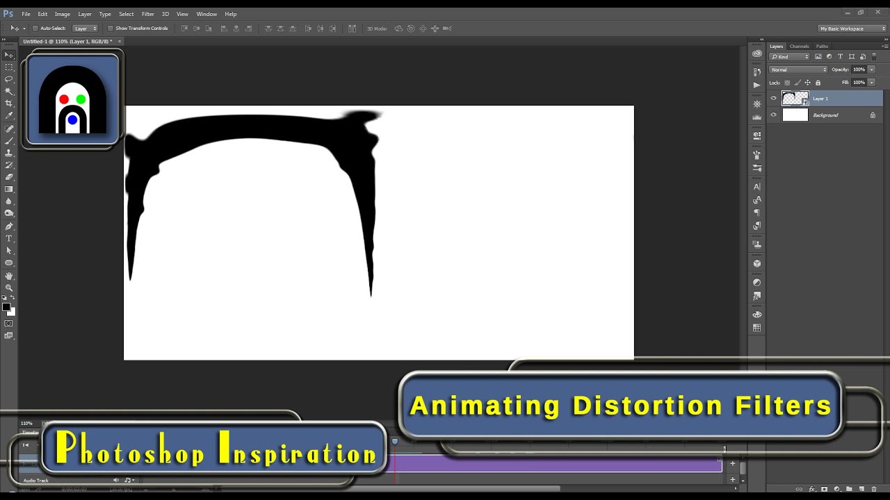
There are so many functions in Photoshop that go unnoticed because new users (and some seasoned ones as well) are afraid to try new things. Other times, it might not be blatantly obvious when you can use use one function, effect, or tool with another seemingly unrelated one. In this video, I am hoping to show you that there are many reasons to...
i was hoping premier pro worked similar to photoshop, but i can't find a filters tab in premier like there is on photoshop
Echoing wertos - There isn't a silver bullet else we'd all be using it. Give it another 6 months and there will be an AI plugin that makes everyone look equally plastic at the touch of a button - we're just not there yet.
Most importantly, learn to prioritise based on the requirements and output size. Go for the big wins first.
Making the action does sound like a plan. thanks @serene coral i guess I was wondering if there s something out there that does work better, faster, harder, stronger
Gave +1 Creative Carma to @serene coral
@stiff trail thanks! yep, thought that AI plugin mighta come out and I had missed it in the noise of all the updates. I usually do a natural retouch, but that effect of pores evenly showing, that magazine style grade, thats what im looking to learn- but trying to figure out how to do it in LRC or RAW.
No, LRC isn't the tool for that.
As soon as you need to touch pixels you're off to Potatoshop
Depends what it is 😄
@graceful lark If you want to even out the skin and limit it to LrC, you can try to move the "texture" slider (the one that is next to details) into the negative. If the model has only slight pimples it might work, you can also add grain (the LrC/ACR grain is way more realist than the Photoshop one IMHO, I generally use that one only when I need to replicate film grain)
But agree that I would go to Photoshop. I generally work with a mix of ACR for grading, grain etc, and frequency separation for the retouch proper
can i dm you bro?
Also there are skin retouching presets in LrC (notably in the plugin section of the CCapp) but if you reverse engineer them, they generally work with the texture slider.
@stiff trail
But it's always good to reverse enginneer presets anyway
No, just ask the room - if someone can help they will.
If you can get more than one advice it's always a bonus! 🙂
Then everyone can learn 🙂
THIS!
Heyaaaa Sandrine
I suspect LRC will add "AI" skin smoothing at some point - it'll be interesting to see how they fit that around LR's procedural model.
oooooh this sounds really interesting, are there any tuts online? Links pretty please?
oh wait i meant to reply to Sandrine
NGL, if there was a generic solution I'd bloody love it - however I'd much rather they focus on fixing backdrios and not skin!!
*Backdrops
Yes, probably, the remove noise option was a nice addition. I still use LrC mostly for myself (with the odd client request here and there) and ACR when it's client work...
I use masks to select backdrops and clean em up with texture. I hate getting out of raw/ LRC
If I showed you the kind of thing I'm talking about, you'd see why LR isn't an option 😂
Sandrine if theres any tuts on this, I would be ever so grateful
ok I mainly use it to clean up footprints on backdrops or seamless backdrops that have a stray ripple, fold, badly-ish lit
CC app >stock and marketplace > plug-ins >Lightroom classic

ooooh
What's your target output resolution? I've never had satisfactory large output from dragging healing brush masks about.
But I never used any, I really retouch "by hand". I tested a few once someone sent me to review, but while nice, not really what I do
insta🫣
theres so many styles out there indeed... havent found mine yet, I just know im not the happiest with my own yet. Sometimes I think all I really need is a color grade instead of further skin retouching. but i guess thats something i gotta take a call on as I figure it out
To be honest, it's driven by the client requests, I don't do portrait photography myself, so I don't have a style. I know that people who hire me prefer very natural retouch, so it became my style by default, if someone asks for a Kylie Jenner retouch on a spotty adolescent model , and that they pay nicely (they exist!) then I would do it, but indeed, I would hate it 😂
I shoot a lot of people on backdrop, and due to the nature of it, there's always a lot of backdrop to clean up 😐
If there was an AI button I could push to do that part of the job, oh boy

Does this explain things?
https://youtu.be/k4oKYCyQepk?si=03A9XBuKCDy7pAKp

How to create Planar Masks in Substance Painter? | Lesson 13 of 25 | Substance Painter Full Course:
In 3D applications, its quite frustrating when you apply textures to flat surfaces because it can’t stay on planes accurately but in the substance painter, we can easily apply those by using planar masks, so let’s learn How to create Planar Masks ...
I don't think I ever seen any tutorial on this, I looked at some presets I tested, try to reproduce what they did to create my own, but I really never saw a tutorial
Maybe try the Lightroom Queen? There's always some nice info on her website
There's a colour match tool that'll do it ? there's also website's that'll rip the LR settings if they've been left in the metadata.
well either a generative fill or a content aware fill might be good and fast enough
Sadly not.
I do leverage CAF a lot, but so far, bah.
Retouch4Me backdrop cleaner knocked a few minutes off, but when there's shadows on the floor it gets in a pickle
It works well for me, but I never do big selections, I always do by smaller chunks of even-ish areas
I would never expect to get a one click solution
It'll come... I hope it'll come 😄
I would say BG fix takes maybe 3 minutes per image. If I could get that down to a 30s compute step, I'd be so happy.
(I operate in bulk)
Well, in that case that makes sense!
yes, I operate in bulk as well, therefore the search for better skin retouch options
May I see? If its NSFW, feel free to DM.. sorry if thats a no go and Im not supposed to ask 😅
I'll pop you the insta 1 sec
ok I just read this again, this is what I do indeed minus the grain. I actually added grain just this morning and couldnt decide if what I was doing made sense or not. The auto mask of people part bby part is such a help but not always exact. still, it works
That would be a great addition to Photoshop, but since I can use it in ACR it really helped me greatly (mostly for grading in my case). Of course there's still some manual painting on the masks, but they are generally pretty accurate. My retouches takes between 20 minutes to 1 hour generally , because I do portrait but not always (they're mostly products) so I am not overly concerned by 10 sec gains of productivity, but in the case of bulk editing, it makes all the difference indeed!
The bulk of my retouches would be targeted grading, heavy cleaning (for products), remove creases and stuff for fabric, working reflective surfaces and a good dose of compositing to assemble multiple shots together...
Hah yeah if I had a budget I'd be less demanding 😂
But I get paid $15/image, so gotta go fast.
@supple wind what did you mean by reverse engineer the plug ins
I'm freelance, plenty of downsides, but the upside is that I get to say the price 🙂
(Shoot and retouch)
I'm freelance too, but more than that and nobody pays :/
Guess it's cos the standard isn't up there.
you take an image, you apply the plug-in, you check on the history, waht have been done, and then you test every sliderto analyse what it does. Then you try to either reproduce on a new photo or tweak the preset to make your own
I used to do bulk retouches/cut-outs earlier in my career (if we can call it that) but that was at a time when we didn't have much in the way of automatisation (select subjects etc). I had jobs when I had to cut out glass ornaments with the pen tools and there were 100s of them. It's tedious and boring. But since automatic solutions have became more viable, then every one and their uncle can do a decent job cutting out someone from a background, so I had to change gears a bit, otherwise I would have had to compete on unfair grounds (gear to buy by myself as opposite to be employed by silo farms, bills to pay, you know, things that normal people do). It wasn't easy and since it was a gradual change, the first years were hard, but it became easier right during the lockdowns. Maybe I don't earn much larger amounts of money but at least I don't sweat 12 hours per day and I can actually take some time to answer here 🙂
ah yes got it... did that with some after effect plug ins to figure out the hows! makes sense!
never knew the term 🙂
And more importantly I get the time to improve my techniques and marketing (still getting there though) meaning that I can try to aim even higher
After effect is out of my league 🙂 I tried, I failed!
Yeah my issue isn't cutouts - that would be sent to Indonesia etc. My problem is editing studio images for customers who can't/won't pay more for the result.
same story pretty much... I use all of my free time to try to learn but theres SOOO MUCHHH to learn and either I have ADHD or the description of being a gemini is true, but Im all voer the place and Im oscillating between being disciplined and not
The budget isn't there to outsource it, but the automation isn't there to do the job either 😐
I basically need wealthier, more discerning customers who are happy to pay more 😄
That's the real aim! Really... we don't need more work, but wealthier clients
For real 😐
My breakthrough was when I started working with agencies. They generally have some budget that the direct clients (for example photographers) don't have.
You can be the go-to retouching person, with some luck, and be integrated in a bigger marketing budget.
Some marketing agencies have budget that are crazy. And the real hurdle is sometimes to price with their expectations. Once I got contacted, and apparently I quoted too low, they didn't trust me.
Now, I learned my lesson, I spend more time analysing the whole picture (usage, final client reputation etc) than really sweating about quoting for the work I produce. It's about finding the right balance, really.
And I'm still winging it somehow...
And it's not because the client is more prestigious that the work is harder. far from it.
I wish I had more of them 😂 (they're also VERY demanding clients, but I don't mind)
UK too!
South East
Ah, the monied bit 🙂
I'm in the sticks unfortunately.
But in the sticks and terrible at commerce.
It's not a great combo.
I wouldn't say monied as a whole. I live nearby some estates and there is indeed some real poverty. It's extremely divided though.
If I was better at commerce and networking I'd be living in the sun (and an early retiree 🙂 )
Me neither 🙂
My retirement is a cardiac at 58
That's rough!
Hello everybody! I've been trying to make the background of this image transparent, but there are too much details and photoshop isn't able to do it the easy way. I've tried using Select>Color Range but then I don't really know what to do after selecting the color I want to get rid of with the eye dropper tool.
Could somebody please halp me?
Dankeeee

If you got a good result as a selection, then I would use it to create a mask from it
What colour is it going to sit on top of when its in its final resting place ?
that way you can hide the background and even retouch a little with a small brush
click on the icon at the bottom of the layers panel to create a mask from a selection

Some kind of clearer beige
I'll give it a try, thanks!
Gave +1 Creative Carma to @vapid flume
Also for lineart it's almost always worth looking at the K channel after a Max GCR CMYK conversion. as the basis point for a selection.
Not always, but it's worth a quick look.
is it the + sign?
It's the black rectangle with thewhite dot
Sandrine linked the button graphic, too 🙂
No worries 🙂
Is there any recommended resources/tutorials that focuses on portrait edits for on-site shoots? Not really looking for retouching edits but more so "effects".
I've been playing around with gradients, adding lighting effects such as spotlight, rim light to the model, sun/len's flare. i'm hoping to learn more edits that focuses on effects and enhances photos but not to the point where it changes the environment too much. Hoping to enhance a photo and keep its environment not too overly edited.

https://www.upscale.media/upload
the AI option of this upscale is crazy good. most useful resource i know of.
Upscale.media
Upload your image and choose between 2x, 4x, or simple artifact removal. Use our super-resolution tool and bring new life to your images.
You can also do it this way:

You could then turn it into a smart object, use the object to make a selection and then create a perfect MASK.
THE. MASK. not a mask. THE PERFECT MASK
thanks for letting me know 😆
Umm... I think I overpromised slightly... take a look 🙂
Thank you so much! I'll definitely check this out
Gave +1 Creative Carma to @rapid obsidian
omg loved your work on Behance Kosel just showed off

oh thank you!
Gave +1 Creative Carma to @graceful lark
"who" are you? (woo woo woo woo) I get confused by all those usernames 🙂
Hi, brand new here. I'm using PS for clean plating VFX shots. Unfortunately we work with 32 bit float EXR's and it doesn't seem that PS Generative Fill supports this yet. Does anyone have intel on when this will be available? Open EXR images are the standard in feature film production, so until this is updated I'm not sure how I can really take advantage of the new AI features in my professional work...
maybe not exactly the answer to your question but here some valuable figures in the current AI image generation world had a talk about this: https://github.com/comfyanonymous/ComfyUI/issues/572
the main problem is the training data that is 8-bit-only + some tech limitations. My wild guess is 1-2 years from now this will be a thing, not now unfortunately

GitHub
Hey hey, Is it possible to add export of PNG16, DNG or EXR? Memory intensive, but would be huge!
depending on your workflows you could simply treat a GenFilled image as an 8-bit image you have to put onto your exr. still, bit depth would be a problem
Right on, I figured it might be a ways out at this point. Thanks for sharing.
Gave +1 Creative Carma to @serene coral
maybe @ripe quest knows more about this? 👆
...i still dont know how to fix that
does anyobody know how to make this like blue shadow?

oh, i dont need help now
i figured out

i said that i figured out, but thanks
also problem was in other thing
in opacity

i just... accidently clicked "rainbow circle" when was trying to find just an rainbow gradient

im sorry i didn't mention it right away
okay, now that buddy needs help
I'm trying to make my image width exactly half of a specific area, so like this

how can I go about that?
Heey, hi everyone, i know this is a channel just for phothoshop, but can someone help me with a little problem on premiere pro?
Probably best to ask in the Premiere Pro discord https://discord.gg/adobepremiere
You could use the rulers to check the sizing, you could use cropping, you could use canvas size. Lots of ways 🙂
I have rulers active, how do I check the exact position of a certain pixel?
WHen using AI, how would I generate a backround and use that exact same backround for every photo I have? I am trying to put all photos of my candles in the exact same backround.
You can read the position in the ruler bar. Pull out a guide from the ruler side, place it in the position you want and take a look.
I'd suggest you generate the background you like and then put it into a lower layer than the your cut out image of your candle.
Like this 🙂

yup seems to be working perfectly thanks, only thing is how do I snap to a ruler? Using shift also enables free transform and I dont want to stretch my image
Make sure View > snap to guides is switched on. Then when you make a selection it WILL snap to the ruler guides 🙂
its turned on, but in free transform mode it doesnt seem to snap
Hmm, it does here. Try a rectangular selection of the region, then CTRL T or ⌘ T
Hi!!! I need help asap!
works thanks, other question - I'm trying to texture a 3d model with photoshop and I need 2 images tiled together, whats the cleanest way to get rid of the seam?

does anyone know how to make this blue shadow?

Hi!!! I need help!! MIXER Brush won't let me do Color Dynamic in ANY brush!! Normal brush let's me use it, but I want the Mixer to allow that too. What's happening?!

See https://jkost.com/blog/2015/01/how-to-create-a-seamless-pattern-tile-in-photoshop.html
and use remove to fix any seams that you see. ( or just try remove tool to start )

In order to create a seamless pattern in Photoshop open the desired image and choose Filter > Other > Offset.
doing that right now but the offset moves my image which I can't have (the right seam would break as well), and remove tool gets rid of the brick pattern and it becomes weird
Post the image you need to tile so I can see

So I'm puzzled. This is already a seamless image.
yeah, the problem I have right now is my UV map to apply the texture to is not that big, so putting this one inside of it tiled will result in the bricks being gigantic, putting 2 of them next to eachother eliminates seams but then the bricks are too small
So, you'll have to play with some scaling with the tiled result.
yeah I end up putting 2 of the same image next to eachother, one overlapping the other a bit, which gives me the seam
Helloo I have a question how can I make this green smoke effect in photoshop ?

I'm sure you could find a custom brush that creates smoke like strokes
The Mixer Brush doesn't work the same way as the "standard" brushes. When those settings are greyed out (disabled) that means that tool is not capable of using those features.
Ah... But I saw Rhadso use it with the mixer brush
I don't know who or what that is. Generally speaking, when those items are disabled, that means that the tool (or mode) is not capable of using those settings.
Oh great thanks
Gave +1 Creative Carma to @lucid crane
Lemme give u link to how he uses it maybe you catch glimpse of something I didnt
I worked on this my style last 3-4 years and finally glad to introduce you my video tutorial ((23 min) on russian with english subtitles) about my digital oil painting technique - IMPASTO.
Compability only with Photoshop (ver. 18 and higher) and not for beginners, i guess.
It's my first full video tutorial, it was hard. Hope you find it useful.
...
Sorry. This video doesn't really reveal anything specific. They are using a combination of tools here, such as the Brush, Mixer Brush, Clone Stamp, etc. The portion that shows the "Color Dynamics" selected, they are using the Standard Brush tool.
The Mixer Brush doesn't have the "Symmetry" options.

Some inspiration here > https://speckyboy.com/free-smoke-brush-packs-adobe-photoshop/

Check out our collection of high-resolution and free smoke brush packs for Photoshop, and download and use them in your own projects.
Thank you that helps
Gave +1 Creative Carma to @lucid crane
Ok! Thanks for bothering!!
Gave +1 Creative Carma to @ripe quest
Hey everyone question to people who watched Adobe Max. Did anyone else get an email from someone at Adobe about the AI webinar and learning more about it? The email seemed legit, the address was from @ adobe. I just wanted to know if anyone else got one
I didn't get that. However, I didn't sign up to receive anything about it. Did you? Also, are you positive the sender address is from the Adobe domain?
yeah i checked, it was from adobe, i even looked up the person sending it and found their linked in profile i think.
Hey y'all, have this lil manga guy, I wanna change his coat from this orange to a blue, how would I go about doing that?


like that
A little bit darker and yeah I'd love to learn how to do that

i just selected the orange parts and made a mask
then applied hue/saturation filter
heres ur file

Hey, how do I apply a stroke to the outside of an image without it being cut off when I export it?
If it's OUTSIDE the canvas, it will never export out.
Try adding your stroke INSIDE the shape instead
fact
Dang. Can I expand the canvas to meet the outside then? If I add it inside, it covers too much.

Yeah, you can expand the canvas. No problem
Do you know how wide your stroke is?
It's just 2 px. Not a big deal but I'd rather have it on the outside, if I can.
By 2px right? Just the size of your stroke?

Image > Canvas Size
then if you want a simple 2px stroke all the way around, just add 4 pixels to the height and width
literally typing +4 into the box works
How come it's +4 and not +2?
I'll show two options. - Route one is a bit complicated but quicker....
i think mine was easier lol
option 2...
(I tried the colour range picker, but couldn't get a good selection of JUST the orange)
@astral horizon
Thank you so much!
Will be trying these when I get home
It's weird because typing +4 for me will add 2px to the width and the height doesn't change
sent ur file
But if I type the actual size change it will
i wanna see what ya mean
yeah, you need to add +4 in the WIDTH
AND +4 in the HEIGHT
(I'm guessing they only filled in the top box (width) and didn't adjust the height)
...it's all good though!
That did it, thank you
Sorry I thought it was supposed to automatically distribute 2 pixels across the width and height when you typed +4 just in the width's field
Maybe if you had ratio locked
Maybe 🤷♂️
You just need +2 on the left and +2 on the right (width)
and +2 top and +2 on the bottom (height)
so that's +4 height and +4 width
If you want some smoke in your own image, you could just grab some existing stock image and place it in your own.
Thanks again! 🙂
Gave +1 Creative Carma to @sly hawk
@iron prism
@dusk tulip - Please ask questions here.
@forest condor -> The Contextual Task Bar is part of Photoshop. It will hide itself temoporarily when you move the main window around. Or are you asking about the Firefly web app?
No yeah didnt realize I was clicking on canvas
any idea though if theres a way to make it generate in a higher quality?
At this time, GenFill generates in 1024x1024 blocks. If you fill areas larger than that, Ps will generate the pixels and upscale them. The larger it has to scale them, the quality will degrade. I'd advise you to work in 1k blocks.
ah I see, thanks. Yeah it was bigger than that
oh yeah much better thanks
Gave +1 Creative Carma to @ripe quest
how do I draw a straight line without the line tool (that puts the line on a different layer
You can draw straight line by using brush tool.
Hold shift key and click at the position of points.
You can draw on same layer or different layer.
If this is what you were asking.
thanks a lot, didnt know about the brush straight lines
Use the Line Tool. You can either draw in Shape mode or Pixel mode....
One of the benefits of "Shape" mode is that it is a vector object and the attributes of the Line can be adjusted after its been drawn.
As suggested above, you can also paint lines with the brush and using shift you can connect the lines effortlessly. That offers a bit more 'freedom' in creation of the lines but might make them more difficult to edit after.
Try all of them and see what works best for you. :)
thanks, also, how do I add a transparent layer? So I don't have to start from a solid color and paint on that
Just click the plus button at the bottom of the layers panel 🙂

@grave fossil - Please don't ping people. You can ask questions here. If someone knows the answer and are available to help, they will probably reply.
Anyone would know how to add a writting to a paper that is crumpled? You know to follow those crumples in the paper
Like in this photo

You can try using a Displacement Map technique. See this tut: https://youtu.be/LJ7DVOFf1Ro?si=4i1zLXRBfTsNHKc1

How to use Displacement maps to warp anything to a surface of texture in Photoshop. Displacement maps can warp anything around any surface and are great for wrinkles and adding graphics to clothing and more.
► Free Photoshop add ons: https://photoshopcafe.com/vault
► THE GEAR I USE: https://www.amazon.com/shop/photoshopcafe
► THE MUSIC I USE...
Thank you. I'll watch it
Gave +1 Creative Carma to @ripe quest
How to make edgy, sharp, or round paint drop and similar transition between colors like in these examples?


InDesign: I need the Sample Buttons And Forum category thing shown below but i cant find it anywhere

hi, does anyone know how to make guides like this? I dont remember how to do it 😭

Just drag then in from the ruler
is there a specific option for it? someone showed me a way to do it by 1 margin with 3 sections
Or this....

Kinda like paper cut. Is there a fast way, or pen tool long way is only possible?
Still don’t get your question lol
Just paint it with a brush.
any help? im new to ps

im in the middle of a project and i want to add something at it says this
- Clear Your Scratch Disk: You can free up space on your scratch disk by deleting unnecessary files from your hard drive. Photoshop uses your hard drive as a temporary storage space for data that doesn’t fit into your computer's memory.
2.Change Scratch Disk Allocation:
Go to Photoshop Preferences (on macOS, it's under the Photoshop menu, and on Windows, it's under the Edit menu).
Select 'Scratch Disks' and choose a different hard drive with more free space as your primary scratch disk.
You can also check or uncheck drives to add or remove them from the list of scratch disks
2 options
Kind of a dumb question but how would i go about making A simple Explosion particle like just a glowy circle
smth like this but a fullc ircle

@scenic mason explain more
so uhh
this is a 2d image
its like
a circle
with bloom
its like
a explosion 2d particle?
just not animated
but you see how its like a circle and then there are layers
like bloom

do outer glow first

i have no idea im very new to photoshop
will you be able to send me it with transparent background pls?
thank you
Hey I’m a procreate user tho when I save a photo (34x34) it goes blurry and I’m not sure how to fix it. Can anyone help?
@thorny seal


Ik lmao
bruh
I’m sped ok
lol
dawg
what are you trying to fix?
34x34 would sure be blurry.
You can paint all shades of same color into one solid color
for example if there is a bunch of red pixels and they are different hue/saturation
just choose one of them and paint others same.
or 2 colors' scheme.
for a vinyl record player cover design should i make it like a old fashion way or new way?
that's your own design choice 🖌️
It depends on you first.
And if you are trying to sell.
Depends on customer's choices.
ohkk thanksss
I never used procreate (I'm a Fresco user!) but I'm sure there are Procreate discord servers or reddits
For what I see the software is radically different (both in UI and in concept) than Photoshop is, so, while there could be the off-chance you find someone who use both, it's still unlikely.
so, i know i posted this already here, but i am trying so hard to get this exact text effect here, the green one, but i cant. i played with the layer style effects all day and i still cant get it can someone explain to me in detail what effects do i need to add? also i cant pinpoint exactly which font this is

For font use Whatthefont named website but it may not work since half of font is already covered. So you can just search fonts.
Other than that I can just guess what effects are applied.
1)First is color gradient overlay.
2) Bevel and emboss.
3) Outer/Inner glows.
4)Metal texture overlay or Noise.
I need some help, My color pallet wont pick up the color I chose with the eyedropper tool

Just press I and pick it?what's happening
So when I do that, it gets stuck on the color it was before
As you can see I picked darkblue but its still on purple
I did
Multiple times, I even restarted my pc
Tried to close tab and reopen the color tab but no luck
maybe press X to switch colors then pick one
Didnt work
This is a known issue. Try dbl-clicking inside the color block. Then single click to select the color.
both didnt work
I didnt quiet understand it.. sorry
The Color Panel. The image you posted. Double click inside there.
I did
Win 11? The latest version of Photoshop?
Yes
It seems to occur for various users. You can report the bug to the Photoshop Community Forum.
Include your platform, Ps version and any other relevant details.
https://community.adobe.com
Master Photoshop with the help of our global community.
I never encountered such issue.
And I've said that its a known issue.
can someone make this with a trransparent background or teach me in a more specific way how (im very very new to photoshop)
guys, how do i deform arrow to look like this? or i need to create it with this form? anyone can help?

this is kinda of editing question
how to i put border on a image
ok so i cant send the picture here
I would probably look up the shape online and use it. If you want to create one, I'd suggest either using pen/shape tools or creating one in Illustrator
okay, thanks
Gave +1 Creative Carma to @serene coral
use layer styles. right click a layer > blending options > check "Stroke"
you dont get it..and i cant send the picture here
have you verified yourself in id:customize ?
i meant to say its nsfw image
so im doing 3d work and theres a plain clothing on the character
the underwear part is complete black color
i want to make it look like celvin klein underwears
that elastic logo part
ok and what about the image border? how is it connected?

i want to make this under white border part

this portion
this is my characters stomach part

i want to put this white border...just the border not the text
looks like you could literally paint it with the brush tool and then refine with a layer mask. I'd go with a wide white rectangle, make it a smart object and add logos repeating inside, save and close the smart object and use warping to bend the shape so it matches
how would you make it look like this bottle has liquid in it? I have tried a few different things but nothing looks realistic...

is there a way i can change the image format while the project is open, like kind of resize
You could try using Generative Fill...

You can change the Canvas Size (dimensions and aspect ratio), if that's what you mean.
where do i go to change it?
Image > Canvas Size...
tysm very helpful 
does anyone know why under the windows dropdown for extensions (legacy) it's greyed out?
Edit > Preferences > Plugins... Load Extension Panels (perhaps also, Enable Generator and Enable Remote Connections) are enabled? If not, you could try enabling, then restarting Photoshop and see if that changes the situation.

consider downgrading to 25.0
it seems they fixed it in 25.2 beta, im also waiting for that version
It's still greyed out unfortunately, do I need to have a extension* installed in order for it to open up or should I already have that access?
Because I don't have any installed at the moment
Well, if there aren't any installed, that could be why the sub-menu is disabled. There is nothing in there to select.
hello, i have another question, how can i cut out the cup from the background?

when i click select and mask it cuts out but when i click ok it turns me back here
i wanted to remove the bg from the cup thats what i meant
The easiest should be:
1: make selection
2: click "Layer" in the top bar
3: Choose "new layer" in the drop down
4: Choose "new layer via cut" in the second drop down
5: Remove the layer containing the background in the layer stack in the bottom right corner
right click, invert selection and delete
or that 😛
😛
I tried my best 
on the background or cup?
and here I was thinking I at least had the basics of photoshop down 
right click , cut into new layer would work too
i only could move the cup out of the background but im not sure what to do next, do i need to create a new layer?
You can select the cup with Object Selection and then Ctrl J to jump it to a new layer.
Hmm I did install one and it still doesn't show, or it's still greyed out
select the cup then right click and this

Your so close lol
Just command+i
The delete key
Or you can use a mask for non destructive if needed
Its possible the plugin isn't compatible with the version of Photoshop you have installed. If it is, you might need to check where your Extensions reside. You can check this post to see if it applies to you and if you're still having problems, post there and see if one of the Ps team offers a solution. https://community.adobe.com/t5/photoshop-ecosystem-discussions/extension-legacy-greyed-out-help-plz/td-p/12996615

https://community.adobe.com
My extension (Legacy) menu is not showing anything, it just shows in grey without any further action. Please help me i want to use it, My OS is Windows 10 and i am using the latest versions of PHOTOSHOP. and thats my System info : Adobe Photoshop Version: 23.3.2 20220503.r.458 d8a9c44 x64 Numb...
i cut out the bg from the cup but now i cant find the text layers

it only shows these 3
Generally, don't delete things. Always work non-destructively if you can by using Masks.
Cuz you deleted it
yeah i didnt know, it was my first time cuttin something 😅
Can u help me
Undo and try it again. This time use a Layer Mask.
Still gunna remember the text
It looks like it was combined
Not layered
This is why you use a mask. Pixels that were hidden can be painted back in using the Mask.
Check the #💬chat-general channel where you originally posted.
For more information about using Layer Masks, see this post: https://discord.com/channels/547473772727238676/1045711257178738760
thanks
Gave +1 Creative Carma to @ripe quest
Anyone knows a better way to add this?
Or do I need to seperate those white flares from the bubbles somehow?
Hi everybody, how can I achieve this shape

I’d use a circular selection to subtract from a square 🙂
Alright, I'm new to photoshop but, I'll give it my best shot!
hi i need help with this picture how do i remove the the number 60 in front of me on the first picture i have 2 other pictures to be used fro reference


I would make one "bubble" object. Convert it to a Smart Object and then duplicate it and position it as needed.
I would try to remove them with GenFill first. Then touch it up after that...

I've got a selection going, what should I do now?

crazy thank you
Gave +1 Creative Carma to @ripe quest
But what difference would it make if it's a smart object?
Then if you need to edit it, you can just edit one instance of it and it will update all of them.
Yeah that's true, but question is how do I make it so that it doesn't become grey
Right now I overlay the text onto the bubble, the green part becomes green, but the white part becomes grey
Does anybody know what this shape is called so I can search for a tutorial on youtube?
I don't know if it has a specific name. You can draw that with the Pen Tool or use Shape operations to create it. Both might be somewhat difficult if you're not familiar with these tools/techniques.
I'm here at the moment.
I've created the shape and made a selection.
I would need to see both items separately and perhaps I could suggest a workflow.
One moment...
In this image, it looks like these shapes are just "overlapping" but what you're saying is that you want to create this separately?
Yeah, I want to include an image like the people hugging and have that shape overlap in that way.
What I did so far is place logo over bubble, set logo to "hue" and add a little drop shadow
Perhaps something like this. Simply creating rectangles and rounding one corner of it...
Seems to be what I'm looking for, thank you for the visual representation.
Gave +1 Creative Carma to @ripe quest
@frank topaz what about this? (ignore the bad cutout i didint feel like trying)

Any particular reason that you're using "Hue"? Why not choose a different Blend Mode?
i jsut set it to screen lol
i just set the screen and this time i lowers opacity

this

Instead of Blend Modes, you could experiment with Advanced Blending > Blend If... Tip: you hold ALT to split the handles.

Thanks! I'll try that out
Gave +1 Creative Carma to @ripe quest
It kinda is 😆
I think this is the best I can do, thoughts? If there's any way to fuse the logo into the bubbles better I'd like to hear them. If not then I think I'll just go with this

You can put the K behind the bubble and adjust its Blending and/or opacity. However, I don't really understand what your intent is with the layout so... :)
To me, it seems like the K is more important than the bubble but I could be wrong.
Send the .psd and we can look more lol
It's just for a little news paper I'm writing, something like this

Then I think its fine. :)
I made the character with MidJourneyAI, made a bunch of characters, just trying to add a little of our company theme onto them
Thanks! I think it looks pretty good for what it's supposed to be 😁
i managed to get the backround right but i cant get the lighting right and a part of the arm is missing

You can run GenFill a couple times. It might take more than one try at it. This was how I masked it.

Here is my example PSD if you want to use it/play with the file...

thank you appreciate it
Anyone know how to make this or can give me a yt vid like doing the texture it looks like carbon fiber or some sort of texture


anyone know whats the easiest way to remove the background of an object and replace it with a solid color? the object isnt too detailed so there wouldnt be any tiny spots where the background isnt gone. thank you!
would you say i blended the smoothie all right with the background? like the shaddow and the highlight and stuff

not an expert by any means, but imho the place were its resting on the table is a bit unrealistic
from farther away though i wouldnt have noticed
shoeld i move it closer or further? my perception of things is not that good xD
Two things I see. For the lighting in the scene, the shadow at the bottom right edge of the bottle is incorrect. The straw should be sharp and in focus like the glass top its in line with (z space)
i wouldn't know. my perspective is from a non-expert lol
Can anyone tell me if their brush settings pallette keeps collapsing when they reload photoshop ? 25.1.0
Just noticed it after update today.
I honestly can't remember if it did before, but someone else mentionned it the other day so it might be something new. (I have my usual brushes in a folder at the top of the rest, so I very rarely feel the need to wade through the insane amount I have 🙂 )
It definitely hasn't done this since the rubbish v20 bugfest
@vapid flume hello there! I'm here to ask my Lightroom question if you don't mind. 😉
I'v ereset prefs too, irrittatingly
you can file a feature request here:
https://community.adobe.com/t5/photoshop-ecosystem/ct-p/ct-photoshop?page=1&sort=latest_replies&lang=all&tabid=all
(click on ideas at the top)
https://community.adobe.com
Master Photoshop with the help of our global community.
Fire!
I could also go outside and scream at the clouds.
Which I feel would actually get me further than dealing with that void.
7 years I've been hounding tech support over a lr issue.
No biggy, just 7 human years.
I used it for Fresco, and actually believe it or not, someone answered to all my feature requests and one even have been implemented 😉
IDK if I've the energy to pursue a second issue.
So, in LR Classic, I've set up several export presets, in most of the i have the export location set to "Choose folder later", but the thing is, recently when LR opens that explorer window for me to pic the folder, it always goes to the same specific folder, instead of starting from the last folder I exported to. I have a feeling this was the way it was working in the past but I can't be sure.
Wouldn't it be more logical this way? Instead of always starting in the same folder and making me click a bunch to get to what I want?
Is there any way to set this?
I need to check because actually it's been a while I didn't export from LrC (generally I export to Photoshop for the final touches, so export from there)
Bear with me
By all accounts I used to have a special export for instagram (+ a print preset with a neat frame to cater for square posts) and indeed it did create a specific folder, every time I exported using this)
I believe it opens the same location.
It always bugged me too. It's laughably primitive compared to C1's export tool 😦
out of interest which folder is it selecting as the starting point for "Choose folder" ?
I'm not even looking for that level of complexity @vapid flume , I'm just trying to click less things when I'm reving an album for a client and getting some specific photos I didn't export when I first designed it.
For every instance in which I export, maybe one or two photos, I have to go through the whole clicking to get to right folder because the starting location is always the same when that window pops up. (And I have no idea why LR is starting from that specific place).
I just tested it, and it di create a new folder named as I told it to, by applying the preset.

but I don't have "choose folder later", I can't remember seeing this

OK then, sorry, I never used it!
What folder does it start you in ?
It starts me in a folder from a specific wedding of this year. I have no idea why...
and that's why I think this wasn't working this way before. I don't remember this happening last year.
OK, Used it, and it starts with "document" for me, which is not useful (There's nothing in there)

Starts me in my LR's catalog folder
ok, but try exporting a photo to the location of your choice, and when it's done go back throught the process, is the open location the same that you exported the first image to?
I have just reinstalled, though.
But I can't tell you if it was the same before, as I never used it. I mostly use LrC for personal work and I tend to export just for socials and the odd print page
And incidentally LR is STILL a slug on a Ryzen 7950X with 64Gb RAM and a completely clean installation of Windows.
IDK why people tolerate it.
just tested it and yes it did
I still have to click once on "choose" and then it's recognised
So why isn't that happening on my LR? I had the feeling this is how it worked for me before.
No idea, but with each major update my LrC get screwed a bit, so I have all my presets and stuff saved in a safe place for me to load again.
Doesn't happen with Photoshop...
And don't get me started with a new catalogue after each update 😂
Honestly I've never had an issue with catalogue updates. And I have separate catalogues per year since 2016. I've just updated them all to the latest version when I get prompted and everything's been fine.
This thing I'm complaining about is just a bit bothersome, more so because I feel like it was working logically before and not now. 😂
Actaully I just put a giant post it note on my tablet that says "sort Lightroom" in fat big letters and that's what I will be doing tomorrow morning 🙂
I'm the one catalogue for everything kind of girl 🙂
Obviously not for the rare cases where I have work for clients in LrC (it's very rare) and in that case I create a catalogue just for them. Apart from that, it's one big catalogue for my personal photos (there aren't tons of them to be honest, I pretty much gave up photography now)
I have a RTX2070 so not new or crazy by any means, and Lr is surprisingly smooth and also very quiet (I'm looking at you Substance 😒)
I used to be one catalogue (my 2016 one has pics from 2009 until 2016) but when I started getting more wedding work it became easier to sort stuff by year. Makes it easier to find if needed too. 😉
Yes that makes sense if it's work.
Any photoshoppers for hire?
well I'm gonna keep digging into this detail, see if I can find info on it on the interwebs
Try your luck in #💬chat-general , but be aware that we don't have a job board here so it's pretty much a lucky dip.
otherwise you can have a look at https://www.behance.net/hire
Discover, connect with, and hire the world’s best design talent on Behance
You can also check on the community forum
https://community.adobe.com/t5/lightroom-classic/ct-p/ct-lightroom-classic?page=1&sort=latest_replies&lang=all&tabid=all
If I find anything tomorrow, I'll update here
https://community.adobe.com
Connect with fellow editors in our Lr Classic community.
I'm going to bed now though 😁
👋
What do you need and when? 🙂
4070 here, and the UI is just awful.
And this is quite literally a 1 day old windows install.
Fresh LR, fresh catalog, and the UI just ... ugh,. It's so laggy.
when I hold SHIFT to make a perfect straight line it's faded how do I FIX that
Which tool?
the b Rush
If you're using a mouse, do you have simulate pressure ticked ?

See above.
it's a pen
oh i can just use my mouse
the simplest problems cause me to much suffering
thanks anyways denyEr
You#ve got me wondering what's causing it though
On a mouse, simulate pressure would achieve it
With a pen though...
it's just like that by default... draw a box's creator had the same problem when he held shift to make lines
it's annoying
check dms
Now here's a Q
Windows Ink and that stupid radar splash when you tap
I've disabled "Visual effects" in the pen settings, but it's still going at it.
Can someone make a jouch head with a human body with abs
often when I press space for the move hand right after zooming in I get this popup, how do I disable it

Press Alt one time ig.
Anyone know how those Instagram reels make time lapses of their designs on photoshop? Like do they legit take screenshots of every single step and stitch them together or is there an easier way
DO you mean like fast forward time lapses?
Where you show 2-3 hours of work in short video
Do you guys know how I can get this kind of effect on photoshop

Easiest way would be AI art.
If you want to do manually, draw this whole from start to end. It is a lot of work.
I meant like the design of the jersey should I use a specific brush or is there another method
alr.
is there a way to make photoshop load faster? most times when i want to make something quickly or edit something quickly i'd use a different program even though i'm paying for photoshop cause i know it takes ~5 seconds to load and i do not have that kind of patience lol
brushes, patterns, plugins etc can slow down the launch time. next time when launching try to see what takes more time to load
you can either simply record your screen while working or open the same document in another window and record that to keep the image still
Yeah, some people do full on time lapses where it’s screen recorded but I imagine that would slow computer performance a lot, but some people show like 10 different stop motion type images of progress as they go through
Oh word
https://www.instagram.com/reel/CyHCPfiL810/?igshid=MWw2bGVyeXJkcXZ3bQ== this is kinda what I’m going for
„Scavenger” Poster Process
This is the poster which I have made during one of the weirdest days I had in the previous month. I wanted to prove myself that you can do something nice even if you don’t feel like you are able to
Make sure to SAVE & FOLLOW if you liked
Thank you for all the support and for 1000 amazing followers ❤️
#graphicdesign...
Likes
519

this reel shows the layers of the design appearing one by one. you can easily do it after the design is done, given your workflow allows this
That’s what I was thinking too but wasn’t sure
Seems easier too to just take a bunch of screenshots at the end of different layers appearing and then you can fit it in a shorter reel
can't see the reel because i dont have active instagram rn but a slideshow of images may seem simple but is boring.
If you still want that then download capcut and use a transition effect called 3D zoom.
Additionally there are other better transitions available too.
What i see most people doing is.
While you work, record short clips.
For example 2-3 seconds after drawing finished(show drawing final line).
Then start and end of coloring.
Then adjustments.
Anything you do, just keep in mind Do not fast forward like 100x times.
Good 2-3 seconds of everything are better. You can speed up to 3x if you like.
Keep things simple.
Most people watching videos watch them for satisfaction. They look satisfying.
If you take it to the level where it gets hard for them to do, they will not be able to relate.
For example a drawing WIP gets more likes and comments than a completed project on twitter.
Because most people are learners, and they Love to see what They can achieve.
The point where it gets beyond what they can do.
They will feel it just like a stock image.
Never turn it off lol.

Does anyone know what these numbers are in?
Milimeters?
Pixels?
Percent?
ah nevermind
I found it
Edit>Preferances>Units and rulers
Check there
There are things beyond your machine specs that can help. When Photoshop loads, if you pay attention you will see what takes time, it can be presets like patterns, so you need to limit those presets to the bare minimum you want to work with (or either learn to load them only when you need them). I say patterns because that the presets that tend to be huge since they are pixel based, but it can be anything you have in large quantity, even if individually they account for nothing: ie: brushes. When Photoshop loads, it will tells you what it is loading. I know it shows very quick, but try to keep an eye on it and take the necessary measures.
Hey, this might not be exactly related to photoshop but, why does my saved image lose its colour after saving a copy? The format is CYMK because, I'll be printing it. I have tried both a .JPEG and a .TIFF however, to no avail.
Is this just the thing with CYMK?


(the brochure was made in photoshop)
(right is saved, left is screenshot from photoshop)
CMYK is a process that fits the printing process (the 4 colour printing process) where CMYK are inks. The screen works using light (RGB) so the colou reproduction is entirely different.
If you want your images to llok more or less like they would in CMYK, when printed, then you need to "soft proof"

Both are screenshots though.
I should add that I took the right side in word.
Wouldn't the same logic apply? Or does the processing of CMYK happen before printing?
ie: tell your screen to mimic CMYK colours, now if your images are intended for printing, and your printer asks for CMYK, that's how you do it (and if you want to properly mimic the colours you'll need more than "working CMYK, you'll need your printer's colour profile)
Word is not a colour calibrated workflow
In fact very few common software take any notice of the attached colour profiles of a picture
Makes sense, just happened to be the most straightforward way to include two images of brochures in a PDF. 😅
You want circumvent that by exporting in PDF and make the necessary adjustments in PDFs. CMYK colours will always appear dull on a screen (as a general rule, not 100% always 🙂 )
So, if I tell my screen to mimic CMYK colours then, I can edit the colours the way I want to see them?
(and they'll be mostly similar when printed?)
Yes, that's the spirit, just keep in mind that printers machines vary, so to have the best outcome, you must
- Have a calibrated screen (you need to use a device for that, I use Spyder)
- ask your printer their colour profile (as a general rule always ask your printer for info before the design stage)
- load the profile into photoshop
- use the soft proof function to mimic the CMYK according to your printer's profile

Colour profile take the ink, the paper and other parameters into account. So if you plan to print a banner and a leaflet of the same design, you'll have to tweak according to each of the prints. If that makes sense
can we download a free photoshop version (crash cersion) in macbook air?
If I'm understanding the words in the brackets, then no
oops okie, that means we have to purchase it no other options!
There's always the free trial, but be careful not to exceed the trial period or you will be charged. Your school, college or work may be able to offer access 🙂
@old elm if you're a student, know that certain schools and universities offer a team account to their staff and students. And even if that's not the case, students get an unbeatable discount, and you can even use the app to earn a living while a student, so that's a great deal!
Thanks for the info✌
Cheers, thank you!
Hi guys!
You're in the Adobe OFFICIAL discord channel... You know that?
So I'll have to delete your question
Hey, I'm trying to automate opening an image and converting it to 300/72 ppi (trying to make both work)
I made an action and added it to the events manager, but for some reason only the automated files (as in not the ones made by me clicking the action myself) turn out way heavier than they should? a file that would be a couple megabytes is 1.7 gb

i thinkj this is why
If you changed the resolution without changing the pixel count (without interpolation) then the size should be the same wether 72 or 300 dpi
if that makes sense 🙂
OK, you answered your own question 🙂
Do you know you can do that automatically either in Bridge or using the "image processor" script in Photoshop?
That way you don't have to set the output folder in the actions
oh there's an app for that didn't know that
I'll use that i guess, seems easier than automating
That's in Photoshop
and in bridge you can have the same menu or use the export function

that's in bridge

or the export presets (in bridge too)

you can resize from there?
Yes, you can
You can even indicate if you want a set size for the bigger lengh, in case you got both landscape or portrait images
for future reference, how do I resize in photoshop without the file becoming huge?


understandable
But that's a common mistake, it's probably there by default so we tend to click OK and not read things 🙂
is there an option to keep original dimensions and just change resolution?

nvm it's right there
i need t o read better
You're forgiven... Have another coffee 🙂
is there a way to vertically center text in a text box?
see the top menu where you'll have the center text icon

select the text first
You can also see that in the character panel (in view>character)
isn't that horizontally
i need it to be centered vertically tho, like I draw a text box and paste something in, i'd like it to be entirely centered in the text box
You mean a rectangle shape or a text box. (The text box is the box you got when you create a new area text
In the case of a shape you can use the align option
that you got when you select the move tool

you need to select both the shape and the text
long story short... https://community.adobe.com/t5/photoshop-ecosystem-ideas/p-center-text-vertically-in-bounding-box-like-indesign/idi-p/12248615/page/2#comments

https://community.adobe.com
Allow text to be aligned vertically in a bounding box for text This is the corresponding tool in InDesign
it's been requested back in 2019 and we're still waiting. My solution is to just use point text and center it manually by selecting both layers and using alignment buttons
saw that when i looked this up, was this guy re-agreeing with himself every few days?!
i wanna meet that guy
you mean feedback community member? I believe that's a placeholder for an anonymous user of a retired forum/community
shape would be kinda defeating the purpose of it being done easily and automatically, ig I'll just move the text box after finishing my business in it
they're all the author
or maybe it goes by username
so they're different people but it still says author
yeah, I would love a Figma-like approach to texts inside of shapes too
They added the EM box function in illustrator which makes it easier to align text by bypassing the baseline alignment, so I guess they will add it in Photoshop as well?
not ideal but...


just adjust the bevel&emboss settings if you want it exactly the same
if by 'funky' you mean the effect on k, you have to either separate the shapes and mess around or do it properly in Illustrator
Gave +1 Creative Carma to @serene coral
Hi does anyone know what these are? and what they do when selected? they are at the top of screen in photoshop


They are settings for when you are using an airbrush ( ie tablet )
As is usual in Photoshop, if you hover your mouse over these things, it will display a tooltip describing what it does 🙂
Oh ok thank you!
Gave +1 Creative Carma to @lucid crane
how can i edit photos to achieve a similar effect to this?

If you mean the head, then perhaps try Filter > blur > motion blur or lens blur.
If you mean the text then layer styles is worth a try and then some editing to put in the streaks
yeah thats what i mean
im getting something that resembles my example
i think they used a special photographing technique though
Yes, it could have been a still taken with a slow shutter and a head shake.
yeah i think so
the music video featured similar graphics
another question, how can i make a blur brighter?
i got 5 dots that i want to turn into a really long blur
but the longer i make the blur the fainter it gets
Quick try:

Hello, is there a way to get rid of this dithering ? Its a photography of a manga back cover. I want the dithering to be gone completly, not only on the yellow background, but on the rest aswell, but keep the rest sharp if possible.
I thought, maybe photoshop is not ideal here, but maybe there is an AI to fix it?

sorry for reposting, I thought this belongs here instead of chat general
You might be able to try this type of technique. Scroll down to the answer marked as "Correct" => https://community.adobe.com/t5/photoshop-ecosystem-discussions/removing-newsprint-pattern-from-photos/td-p/7645875
https://community.adobe.com
Have some old photos, some with newsprint patterns. ?Any way to remove the ink-dot pattern?
The key to the answer by @ripe quest is** part one **of the instruction re scanning.
If you have the original manga back cover, you could try taking the photo at an angle and see if it helps the interference effects you are seeing. NB. this is not easy.
@gritty galleon Then if this is really important to you there are advanced tools such as:
https://ft.rognemedia.no/
NB. again - not easy

Photoshop Pattern Suppressor
Free plugins/actions to easily remove periodically repeating patterns 😃.
thanks ! I'll try that
Good luck. You might like to try generative fill for a stylistic approach 🙂

There are other AI workflows that can do this. However, they are complicated, require special software (and knowledge) and are beyond the scope of this server. :)
"and are beyond the scope of this server. 🙂 " and us 😉
hello, i am trying to write text in photoshop using an imported font (raleway). however, the letters 'i', 'z', and the number 4 seem to be thicker than the rest. does anyone know what i can do to fix this?
I could probably do this with SD and ControlNet. However, in the time it would take me to set it up, I could just paint it out. Honestly, if it were me, I'd probably just flip on the tunes, stretch out my wrists/fingers and start painting. haha
Hmm. Not really. Maybe find a similar font?
oh, for some reason the semi bold version of it is weird. i put it in medium and it looks normal. thanks tho!
Gave +1 Creative Carma to @ripe quest
Better solution. :)
when I draw on my mask gigantic transparent squares appear, whats happening? A restart didnt fix it
I tried this but its so complicated >.<
not getting to good results
Sounds like a GPU issue. Check: Help > GPU Compatibility... and see if any issues or errors are reported there.

What version of Photoshop is installed?
Help > About Photoshop... @light tendon
Try: Edit > Preferences > Technology Previews... "Older GPU mode (pre 2016)" - Mark that checkbox and restart Photoshop.
seems to work, its strange since I never have that issue except for now
other problem, I cant select my mask to paint on it anymore for some reason

I would be sure to keep my GPU drivers up-to-date. That is an older GPU now.
Looks like you're in Quick Mask mode. Tap Q to release that. Then select the Layer Mask to paint on it.
oh wait maybe the issue I had before is also only in quick mask mode
Hey, I'm kinda nitpicking here, but is there a way to make rtl persist between text boxes? font and font size already do, but they're in character, so idk how to make the same thing in paragraph...

can i still get help with this?
how can I make a mask for curves from a depth map

so i'm trying to make an adjustment layer and i want to use hue/saturation, yet it's not opening or working for me
like, i can't click on it
can someone help?
how do i make an electric like glowing effect to eyes
anything
im just like
really new to photoshop
someone did show you yesterday
yeah but like
idk how to do
the things he did
.
have u photoshop opened rn
maybe before doing anything
watch for some tutorials for learning the interface
ill trybut i thought its better to come here because idk if ill use it that much so something basic like this wont require me to learn the entire interface
i know how to add fill circles etc but idk how to make bloom and stuff
you know how to make a gradient map
nope

but if this is what i need then ill look into it

right here you got a gradient and you gonna make the fire aspect
so it's like a gradient of orange values
click the stuff i've circle
how could I go about making an image of metal more metallic looking? Like more shiny

how did you add the color

the white point on left
yeah I cant use pbr textures so I'm stuck using a color map
ok i see
and you can put any squares you want
so you add one by double clicking the bar
not double clicking sorry
clicking one time and down of the bar

you gonna have this setup
you understand what i mean
yep


wait im still on the first thing
how do i delete a square
close the gradient and delete it, i feel like it's too advanced for you
you will never remind it
we gonna do something easier
aight

so to just create a solid black color?

ok
you know how to do that right its right here
done

done
change hardness to 0%
done
after that close that little panel
done
make sure you're still selecting the empty layer you've created
yep

done

done
