
#✂challenges-feedback
1 messages · Page 129 of 1
Thank you, the cat image was a random project, but after the DCC challange, this vintage comic book look, was actually better than the original idea
Gave +1 Creative Carma to @bleak fossil
Thanks Sam 😊
Gave +1 Creative Carma to @bleak fossil
Thannks!
Wow, that was a tough one. Tbh, been a while since picked up mixer brush. I think I really need to get a stylus & pad. I didn’t like how the chrome filter worked with my mixer settings. I was trying to make it look like foam. Need to play more with the adjustments. Again, my goal was to complete it in 30 minutes. (And sorry, @slender juniper , I didn’t use an amperSAND! 🤣

Wow, this is fantastic, and I also have a concept like this: "water effect text blends with waves." The design is finished, and I intend to send it after work.
@tidal fjord Really awesome creativity in your Day 1 design. The idea of the hat giving light rather than shade is so cool. The double exposure is well done. I might suggest you bring the turtle above all the other the layers to give it more of a 3D effect. It might add a lot of pop to the design. But thats just a thought. Great work.
Awesome! Looking forward to seeing your version! And Thank you for the compliment 😊
Gave +1 Creative Carma to @tidal fjord
Day 2 Hand lettering. Found this one quite difficult, had to tweak and change it several times till it looked some what like the original.

@bold frigate That looks great! Wet is especially well done. Did you use a stylus or mouse for this?
Thanks. I had considered it as well as the possibility of creating the illusion of broken glass on the hat's top. That's a good suggestion, and I appreciate the advise. 😁
Gave +1 Creative Carma to @eternal mica
thanks, I used used an old really wobbly Huion stylus
Gave +1 Creative Carma to @glossy bane
Challenge #2 - Hand Lettering 💦 😅
🇬🇧 Wet & Wild = 🇮🇩 Basah & Liar
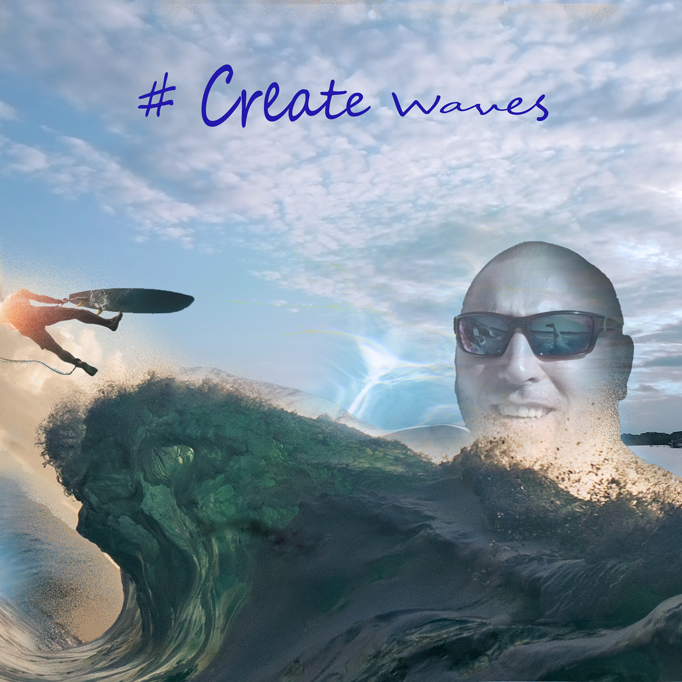
#CreateWaves

Hello everyone
Challenge #2 - Hand Lettering


That looks incredible! Great job 👏
PSCC03:Complete! This is from today's underwater adventure. Sealab2022?👀
I went back and used some pre loaded actions from the Textures set to add a little flavor.

This turned out great! I might would use a tilt shift blur (from the blur gallery) on the type and start to blur only the top part of the word hope for added effect. No worries about not using the amperSAND, I'll only deduct a few points. 🤣 😎
Ooh, Liking this subtle effect. Nicely done!
PS DCC 06.21.22 - Sorry. Still fiddling with 'Wet & Wild' :)

Tweaked This one more time… The last time, I promise… Ha Ha Ha

The last tweak!!!

Always love it when the upload comes in as unsuccessful when it actually posted!
Day 3 #createwaves

😀

Day 3 #createwaves
Actions are not easy kkkkk but is awesome

This turned out nicely! Actions can be tricky. Are there any particular issues with actions that you might need help with? Let me know and I'll try and help!
Challenge 3: Actions underwater mission.

#challenge - Actions Tutorial

Challenge #3 - Actions Made Easy - Oh this was fun @slender juniper . This image is also containing stuff from both Sam's (magic spell effect) - the lights -and one of
VooDoo Val's REEFMANTAs that she shared last year. I haven't forgotten challenge 2 - it comes when it comes 😆

@sterile berry Don't worry Daniel - I haven't even started that one yet - I went straight on from #1 to #3 - Have to do the 2nd one another day. The text looks ok when opened up; not that clear when only looking at the preview. But I haven't seen the video yet so I really can't decide weather you're fulfilling the challenge or not - I can only judge the visibility of the text itself. I like your idea for the challenge 🥰
I'm playing around with challenge #2 I have two version not sure which way to go with the color of the text...


So you're judging the image based on the preview? Its not meant to be viewed at the Discord Preview Size. View the actual image and you are seeing it as I intended. (The original is even larger but I'm not uploading a 4k image to Discord.)
Second, in regards to "fulfilling the challenge" I created the design(s) that I wanted to create. I don't want to just replicate what Wade created. I want to try my own ideas and create my own images. As far as I know, that is still allowed. Thanks for looking. :)
I like the top image better - both are great though 😎 The gold text on that delicious green wave is scrumptious though
@sterile berry You’re right I should always open the preview to view bigger but I find the preview good enough many times. But I always open up an image I find very interesting or if it has anything that bothers me. Right or wrong - I don’t know but that’s the person I am. I too downsize my images for the web.
At least I got you to click on it! My evil plan is working! lol
@sterile berry … and you always should create your own images. You’re really good at it. I’m sorry I have had a dark mood lately so I guess that I couldn’t behave myself like I use to. I’m trying very much to get the words right even more so in English - I use Google Translate quite often even if I know it isn’t perfect . I often erase my replies if I can’t get it right.
Don't worry about it. I know you don't have any ill intent. :)
Lol that’s perfect 🤩
Thanks now I can sleep well 🤗😴
Gave +1 Creative Carma to @sterile berry

Day 3 Actions. I made an action to "select subject" and then "mask". Then, I imported several images with the various sea creatures, and with each one, I just had to select my action and the animal was selected and the rest of the image was masked out. The action really made it quick!

Thanks @quiet fern I'm leaning that way as well...
Gave +1 Creative Carma to @quiet fern
Day 3 - #createwaves - Actions

Day 1 #createwaves Double Exposure
Hi all. Been a minute or two since I was here so I thought I'd catch up on this weeks challenges.

PSDCC Day 1 Double Exposure Effects #CreateWaves

@quiet fern Really nice, I like the various layers you created here to give it some really nice depth! The color contrast makes for a nice bold look too. I think it might help to increase the contrast (specifically the dark tones) of the middle blue layer, and decrease the dark tones of the city. Atmospheric perspective is even more pronounced under water and that basically creates an effect where the further off something is the less contrast it has in the darkest tones. These thumbnails give a very simplified idea of that effect. Very nice work!

@turbid fern Really nice color contrast between the text for the mixer brush design! I like the variation in texture between them too, and the colors of the background you chose work really well to make the text pop. The only nitpick I might have is the "Create" text seems to have a much higher contrast than the "waves" text. Maybe giving it a drop shadow like the other text has would help balance it? Very nice work!
Thank you!!
@visual pelican Hah, cool combination with the double exposure design! I wonder if scaling up one or more of the elements to leave a little less empty space might be a good look. Just an idea of course, nice work with these techniques!
@tired turret Very nice! I really like how naturally the colors of the portrait fit in with the colors of the rest of the scene, the purple/yellow color scheme works really well. Maybe having more of a gradual fade between the black corners and the rest of the image could give it a more natural look? Of course that's really up to your personal preference. Nicely done!
@pine wraith Whoa, great job adding all these elements together! I like the color scheme, everything fits together quite nicely. This is a minor suggestion, but there seems to be a tangent between the front of the watercraft and the dome, perhaps scaling up the watercraft a bit so it's more clearly overlapping the dome would give it some added depth. Also, it could be nice to add a subtle underlighting to the watercraft to make it fit in with the underlighting of the rest of the scene. I often like to use Color Dodge layers with darker colors for that. Just a thought! Very nice job.
Thank you! I thought about that but I wanted to express how empty the ocean would look if we don't take care of it. 🥰
Gave +1 Creative Carma to @bleak fossil
@copper moss The challenge 3 design is looking solid! The B&W makes for an interesting look and unifies everything together nicely. This is a bit of a nitpick, but I feel like the turtle seems to have less contrast than the diver, even though it's closer to the camera. Perhaps giving it more shadow underneath would help match the lighting closer to the diver and rest of the scene as well as popping it out from the background a bit more. I often like to use Multiply layers with clipping masks for this, and I also used a Levels adjustment on this example as well as fading the contrast of the background for more of an atmospheric perspective effect. Maybe something like this? Great job!

Here's a still image instead of the GIF.

Challenge Day 1

Good Morning , thank you for your feedback @bleak fossil i will store your tips/suggestions in my mind...
Gave +1 Creative Carma to @bleak fossil
I see exactly what you mean… it honestly looks fine on my desktop, but much lighter in Discord… if I save the .PSD file I’ll try tweaking it tomorrow 📸😁
@quiet fern Sorry, I think I mislead you with a typo! I meant to say "Increase the contrast (specifically darken the dark tones) of the middle blue layer, and decrease/lighten the dark tones of the city" to push the atmospheric perspective. Here's a quick example I did with a couple of Levels adjustments to help explain it more clearly.

Here's them side by side rather than the GIF.

@bleak fossil okay, not only in mind 😄 had to do this ;D and i think its a great diffrence to the 1. one by doing such an small step .... thank you

Gave +1 Creative Carma to @bleak fossil
@quiet fern Here's a version just showing the values which might make the difference easier to see

@pine wraith Very nice! The watercraft looks excellent now. Really fits in with the scene and makes for a nice focal point.
@compact pecan That's great! It's always cool to discover methods that save time. Nice job putting all these together, it's looking good. My only suggestion is I feel like everything is a bit too bright for being an underwater image. I wonder if a gradient (so it's darkest at the bottom) with a desaturated blue color set to Multiply would do the trick. Just a suggestion of course, nice work!
@turbid fern Very nice work with the PSCC03 challenge! I like the idea of that city hidden behind the rocks, and the color contrast is working nicely. It could be interesting to play with a blur on one of the elements to control a sense of focus. Either the rocks being a bit blurry as if the camera is focused on the city, or giving the city a subtle blur due to being underwater and further away from the camera, since things tend to be less sharp under water. Looks good!
@plain sable Looking good with the Challenge 2 design! I think the yellow text has better contrast, but the blue text has a bit more of a cohesive feel with the color scheme. Perhaps the best of both worlds might be going with the blue text but giving it some more contrast. Maybe a Levels adjustment to boost both the darks and lights a little, and/or trying something with a bit of a drop shadow under the text. Just some ideas. Nice work!
@halcyon current Very cool! I like how you're incorporating elements from various DCCs. Nice job with the masking of the coral around the vehicle, and I like how the manta ray in the background has a bit lower contrast to appear like it's more off in the distance. Nicely done!
@normal gale I really like the textures and colors in this Day 1 design! Very clever way of compositing the images together too. My only suggestion is it seems a bit dark overall, perhaps a slight brightness boost using Levels or Curves could help? Looks good!
@noble dragon Definitely a cool new tool to learn! Very nice design, I really like the depth you created with the way you layered everything, both with a background and foreground. The bold color palette makes for a cool stylized look too!
@digital pike Ooh, interesting image, compositing the person onto the water makes for an interesting surreal image. I wonder if lighten the contrast and saturation of the hot air balloon juuust a touch might help it feel like it's further off in the distance, since the person in the foreground isn't quite as vibrant or high contrast. Great job with all these different elements!
@last mica Very nice job with the masking, the composition of these layers/shapes works well together too, and the color contrast is really interesting. Nice work!
@marble umbra Hah, that's the story of my life, "Just going to make this one last change, wait, one more...". Nice job with the double exposure effect and blending these images together. I like how the lighting from the water above matches both the dolphin and the portrait. 👍
You’re right! I was saying to myself the city is already dark enough good thing I got tied up with other stuff and I didn’t even have a chance to look at it I’ll look at it tomorrow, oh wait it’s already tomorrow I’ll look at it during the day 😎🥰
The reason I made the city dark is because during the tutorial Wade says to punch up the darkness in the city that’s why I did it just following directions - LOLOL 😁😎 i’ll just go back and work on that middle layer to make it stand out more I know what you’re getting at and I think I know what you’re getting at too at 4 o’clock in the morning ha ha ha
Challenge 3: I improved contrast of the turtle in front. Thanks, Sam, for great tips and support. I did sun races to give some light to the atmosphere. Originally it was in RGB-mode, but I decided to try in B&W. Thanks to Wade for this wonderful session. We are learning a lot.

Welp, I went way off the brief & didn’t do a duotone. Got hung up the composition & layering atmosphere, bubbles & light. I didn’t even get time to play with my favorite adjustment: curves. I’ll pop my composition on here anyway. (Most assets from Envato since I already pay for that sub.) Let me know if you have any comments or questions 😊

And everyone’s duotones I’m seeing are looking awesome! Great job 👏 😃
Ps Dcc 2022-7CW Actions Made Easy 6-22-2022

Day 1: Double Exposure - "My son and the ocean"

Day 3 Actions

Thank you @bleak fossil for your feedback! It means a lot to me!
Gave +1 Creative Carma to @bleak fossil
Here is another swag at challenge #2

Challenge 04 - I would love to actually visit these places! Be sure to use the #createwaves tag if you post these to your socials.

Wet and Wild. This is one of my images of a living barnacle. I have videos of the pink tuft reaching out for food. This challenge took me some time to figure out. So much learning going on. Lots of fun! Thank you for this opportunity! On a side note, think about this. We made a flat word look like Water!! Holy smokes! How cool is that!

@tropic knoll Wow! Great job with this challenge and that barnacle is fascinating to look at! Digging the sparkles coming through the "wild" on this too.
PSDCC Day 2_Hand Lettering For Beginners .

@visual pelican Nice variation on the theme! I do think the "=" sign is getting lost in this image. Making it more prominent by adjusting the size, color, or rearranging the composition could a bit could help that stand out.
#challenge Edited - Before & After 😉


Day 4 Classic (retro) travel postcard

Day 4 #createwaves


Thank you. I wondered about the and sign. lol
Gave +1 Creative Carma to @slender juniper
does this look better?

Thank you, Wade! Your kind comments mean alot!
Gave +1 Creative Carma to @slender juniper
Challenge #1 : #CreateWaves Double Exposure Effects

Challenge #2: #CreateWaves Handlettering Effects

Can definitely see the "=" sign better!
lol Thank you. Thank you for your nice words and I love your videos, they have been so helpful to me.
Gave +1 Creative Carma to @slender juniper
Thanks, @bleak fossil, I added a gradient like you suggested, and I think it looks better.


Gave +1 Creative Carma to @bleak fossil
For sure! Nice work!
These look great!
Challenge 1 double exposure effect

Challenge 4: classic travel postcards


This is fun, thank you @slender juniper
Gave +1 Creative Carma to @slender juniper
Thanks, Wade! It was really fun 🥳
Gave +1 Creative Carma to @slender juniper
I like the vintage texture feel added here. It does look like we're starting to loose "surf city" to similar contrasts in the waves. It could help to increase the contrast and slight thickness in the outline, or even add a drop shadow. Alternative to that, you could increase the contrast in wave image to make it darker where it overlaps the type. Just some thoughts. Also liking the desaturated vibe here. Nicely done!
Ah, nice image combo here! Would totally 100% visit! Well done!
Challenge #3

#challenge - Postcahds!!! Wikked FUN!!! And yes, it should prrrrrrrobably be “Oceanographic”, but I’m not changing it 😉 @slender juniper


Fabulousssss!!! 😎😁
#challenge - OK - I lied - I had to fix it 😉 LOLOL

I started dancing to a different drummer, but had fun playing!

Challenge 4: Postcard from surfing travel. I did 2 of them. I used here Cyrillic alphabet just for experiment.

This is a psychedelic sort of postcard. "Screenshot from surfing".

Does this do the trick @slender juniper? I think the text definitely stands-out better. I also brought up the levels of the fish/coral image to help make it stand-out a bit more too.

challenge 1 self portrait ocean


Koh Tao is a famous tourist location in Thailand, which is the country I was born in, so I decided to use it for this postcard challenge 🙂


Day 3 challenge. Photos taken from Unsplash. Underwater picture by Lino Thaesler, robot in background by Sebastian Kurpiel and robot in foreground by Taiki Ishikawa.

Greetings Postcard. This is an image of mine of clown fish taken while visiting the Monterey Bay Aquarium. I couldn't figure out how to get the stroke to cover the right side of the text. I tried several different angles. Thank you for this opportunity! Sure had fun learning more about the Warp! Never used it this way before.


Day 3 Challenge

@turbid fern Very nice idea, these designs are looking good! I like the color variation behind them. I think they both work well but I especially like the strong value contrast between the text and background in the first design. Nice job with the masking techniques!
@worn venture Cool to see the breakdown of all the images you used in this design, nice work! Did you use a different blending mode with the water image clipped onto the shell shape? If not, I wonder if it might maintain the lighting and shadows of the shell a bit more, but then again it might not give you the texture you want. Nice job with the double exposure effect!
@pine wraith Very cool, nice job with the textures within the text in this Day 4 design! It might help the bottom text read a bit more clearly on the second design if you separated the values of the text from the water a bit, perhaps a bit of a drop shadow could help do this? Loving the bright, fun style of the first design, really great colors on that one too. Looks good 👍
@compact pecan Niiice, that text change on the Surf City design makes a big difference, much more readable now. The colors are also working well to give off the retro feel. The change to the underwater Create Waves image is looking good too, both separate the values nicely. Looking good!
@copper moss Great designs for Challenge 4! I like the variety between them, and the texture masking with the text turned out well. I think it's working especially well on the first design due to the clear contrast between the text and the background. Nice work!
@dawn umbra It's always great to take these challenges and make them your own! I really like the composition of this design and the way the text flows with the pod of dolphins. The text has a nice strong contrast against the dark background and the texture within it adds a lot of interest 👍
@quiet fern Very nice designs for the Postcard challenge! Both have a nice clear read to them. The textures within the text are looking great, and the white stroke and drop shadow of the text gives them a strong contrast against the background. I like how you have both an underwater and above water image. Well done!
@lone narwhal Very cool design for Challenge 3! Nice work with the masking, the layering and faded contrast of the background image gives the design a lot of depth. Very nice composition on this design too!
@oblique bolt Really liking the color contrast on these images! The orange/yellow and blue make for a strong read on these designs. Both of these locations are pretty close to me too, so that's really neat. I was just saying the other day how I need to visit Venice Beach again soon. I especially like the colorful image you used within the text for the Santa Monica image, great texture in both of these. The double exposure technique came out really well too!
@umbral perch Very nice work with these designs! The double exposure effect came out well and blends nicely into the image. I feel like the Hand Lettering Effects image is a bit on the bold side, almost a little intense to look at with all the colors being so bright and saturated. It could be interesting to try a version where the background is darkened down, or a version where the background is desaturated just a touch to see if that makes the text pop a bit more. Of course it's really just up to your personal preference. Very nice work!
@tropic knoll Very cool, I've been to that aquarium too! Really neat to see you using your own photo for this challenge, I really like the colors in this. The blue text against the red, as well as the yellow stroke, gives the whole design a nice contrast and read. Well done!
@raw smelt Ooh, really cool idea! I really love the framing and composition in this. The overlapping shapes add some nice depth, and the camera angle has a lot of drama to it with the low viewpoint and sort of over-the-shoulder shot of the foreground robot. Really nice color grading to make everything fit together too!
@tired turret Very cool image for the Day 3 challenge! I like how well the photos match in terms of perspective/camera angle in this design. My only suggestion is it might look more realistic in terms of atmospheric perspective if boosted the dark tones of the foreground rock on the right side, and lightened the dark tones of the building on the left. Maybe something like this? Nice work!

@visual pelican Really nice job on the Water=Fun design! I like the variety you got between the two styles and textures of the text. The updated = symbol looks a lot better I think, more centered and more prominent. My only thought is the pink kind of seems out of place in this design. Perhaps using a color found elsewhere in the image would unify the whole thing a bit more? Maybe the light yellow/orange from the sand on the left side? Just a thought. Nice work!
@last mica Ooh, great colors on these Day 4 designs! They have a really playful and bold style which is really neat, almost reminds me of something you might see on something like Nickelodeon. The textures within the text are really interesting and are working well too. I especially like the blue/orange color scheme of the bottom one. Nice job!
Gave +1 Creative Carma to @bleak fossil
@bleak fossil done ... thank you for the feedback, really looks better now

Gave +1 Creative Carma to @bleak fossil
Challenge 4

I love the glow of the jelly fish in this. It's really effective 👍🏽
Thank you.
Gave +1 Creative Carma to @bleak fossil
Day 4. Found it difficult to control the warp tool chose a preset.


Ps DCC 2022-7 Challenge#4 Classic Travel Postcards 6-23-2022

Wow, I missed 2 episodes, because I was making content for my youtube channel. OK, I'll send the third challenge... 🖌
Challenge #3 - Action 🍾 😅
#CreateWaves

Challenge #2 - Hand lettering

Packing for my vacations so I'm a bit less active than usualy... Here is my day1 contribution.
I went slightly out of the box using neural filter and gradient maps...

Hi @bleak fossil Thank you for your feedback! This aquarium is a fun place! It's cool to know you've been there, too. There's so much to see. Thanks again! Good weekend to you!
Gave +1 Creative Carma to @bleak fossil
😀

You know I just couldn’t figure out what was wrong last night. It was bugging me 😂 boom Sam for the win! Thanks Sam.
Gave +1 Creative Carma to @bleak fossil
Day 5 Social Media Graphic

Thanks, Sam! 
Gave +1 Creative Carma to @bleak fossil
Challenge #3

Day 5 Social Media Templates

This is great! Liking the little saying and thoughts in the tiles/panels.
@slender juniper thank you very much
Gave +1 Creative Carma to @slender juniper
Hey... so I was tweaking here and there and then i changed this and that because i liked it better and now it looks completely different lol
Anyway... how's the lighting on this version? I think it meshes better.

PSDCC Day 3_Actions Made Easy


Gloriousssssssss!!! 🥰🥰
05 Challenge - A personalized social media post for the #createwaves campaign.

Amazing!!! 🥰🥰
Kewl beans!!! Will jump on this one tomorrow!!! 😎😎
I think larger text/shorter words with white stroke like yours is the winner!!! 😎😎

PSDCC Day 4_Classic Travel Postcard

Day 4 Postcard My favorite place ever!

I might have used a different blending mode on the waves in the shell but I can't remember. I did use a blending mode to put my face in there so it could be seen. I'm having an issue where the pictures on here and on my ps are not as vivid as the ones that are posting on insta or in my home page on ps. Someone suggested checking the working space to adobe 1998. I'll tag you on it so you can see how vivid it is there.
Thanks so much for the critique!
Gave +1 Creative Carma to @bleak fossil
Challenge 5: Social media Template: The Arctic Sea council consists of 8 Arctic States: Canada, Denmark, Finland, Iceland, Norway, Russia, Sweden and USA. Here I concentrate on Eurasian northern part as a representative of this area. The task was demanding in getting color harmony between images. I did in soft ocean pastel tone. Thanks to Wade! It was full of new things to grasp.

Thanks a lot Sam! I have grown up here under your guidance. You, all hosts, have taught me a lot. 👏
Gave +1 Creative Carma to @bleak fossil
thanks !😃
Gave +1 Creative Carma to @quiet fern
PSDCC Day 5 Social Media Templates

Social Media Template. These are my images taken while visiting coastal beaches. This was alot of fun. Thank you for the memories and opportunity! I really appreciate it!

Ps Dcc 2022-7CW Challenge#5 Social Media Templates 6-24-2022

#challenge - Had fun with this one too! THANK YOU, @slender juniper for this past week - I learned something new every day!!! 😉 - FYI - GREAT mini-series on NatGeo - “Secrets of the Whales” - HIGHLY recommend it!!! 🐋

Gave +1 Creative Carma to @slender juniper
Yes, thank you @slender juniper ! Loved this week's challenges!
Gave +1 Creative Carma to @slender juniper
😀

My Day 4 challenge result.

DAY 3 Challenge

DAY 4 Challenge

My Day 5 challenge

DAY 5 challenge

PS DCC 06.23.22: Classic Travel Postcards | 'Aloha from Surf City' (v1.1). I think this is my final version of the comp. Thanks for the inspiration, @slender juniper.

Gave +1 Creative Carma to @slender juniper
Hello! has anyone else had issue with broken Dropbox links when trying to access really old Daily Challenges?


I can't choose which format. Pls✌🏻, let me know your thoughts.


Sorry for being so late. Day 5 #createwaves 🥳

Wrong link to todays challenge at https://www.behance.net/challenge/photoshop shall be https://www.behance.net/live/videos/16935/Stylized-Illustrations-From-Any-Source-Photoshop-Illustration-Challenge?tracking_source=to_replay&from_row=Adobe_Live_Schedule

Daily Creative Challenge

Join us right now to get inspired by leading creatives. Get your questions answered and share your work with the community.
@slender juniper, Hi Wade! Question! Does the order of the styles effects (Filters) on a layer matter? In your example in the stream today, there were 5 or 6 styles effects (Filters) for one layer. Does it matter which style effect (Filter) is first, second, etc? I hope my question makes sense. I'm thinking that individual layers need to be placed in a certain order to achieve a desired art. Is the same true for multiple styles effects (Filters) on one layer? Thank you for all you do!
Gave +1 Creative Carma to @slender juniper
Realized that I don't have single ocean related pic of my own...Photos used are not exactly what I would have liked .🤔 😒

The real challenge is I am yet to make a proper illustration. @slender juniper If I use an illustration that's lacking in terms of values - would it do? [Otherwise, I'll have to first work upon my value skills] 🦾
Hi! You could certainly try, but you could also use a photo? Use https://stock.adobe.com/free if you can't find another source.
Adobe Stock
Stunning, diverse collection of free Adobe Stock photos, vectors and videos. Free to download, cleared for commercial-use, royalty-free, no credit card required.
Here's the example we created from the stream. I would love to see some variation on this so I do encourage you to find some unique imagery. @eternal mica asked if I could share an image to use for this challenge, so I am including a little robot illustration just for that. 🙂


Thank you. That's great, Wade. Im sure lots of folks would love to play around with this image.
Gave +1 Creative Carma to @slender juniper
Challenge #4 - Classic Travel Postcards


I like how the palm fronds go in front of the letters (and the C goes behind the trunk). Nice touch. :D
Ha, nice touch! Well done as always!
Thanks! I hope people don't send you mail there. It's Adobe's Corp HQ. haha
Gave +1 Creative Carma to @slender juniper
Ooh, I really like the globe/elephant combo with the "connect to the divine" quote. Very ethereal.
@tropic knoll So for today's challenge (challenge 06) the order does matter to a degree. For the base, create in this order: shadows/highlight (if needed for your image), camera raw x2, filter gallery (if you want any filter adjustments), end with oil paint filter to keep edges smooth.
This is just a suggestion as well. I recommend turning all of these off or on to see what works best for you. Be sure to try out other filter/effects/layer blend modes and see if you can create your own look.
Ok, great! Thank you!
Gave +1 Creative Carma to @slender juniper
FYI: The discord? link for Wade's DCC 6 challenge (Stylized Illustrations) under creative ~ challenge - watch video ~ isn't working. ty.
Yeah. Its not redirecting to the correct location. It should be this: https://www.behance.net/live/videos/16935/Stylized-Illustrations-From-Any-Source-Photoshop-Illustration-Challenge
Whale Stylized. This was very enjoyable. My notes are extensive so I can remember how I did this. Wade, you make it look so simple! 🙂 Thank you for this opportunity!

Social Media Template.

Made a stylized version of one of my senior homecoming pictures 😄


#challenge - Stylized


Stylized Illustrations. Ballerina.

LOVE the black outlines!!! 😁😎
😀

PS DCC 06.27.22: Stylized Illustrations From Any Source - 'Bushido v1.0'

Robot Stylized. I had a lot of fun doing this challenge. Color.adobe.com helped me with the color theme. So many colors to chose from! Thanks for the Robot image and thanks! for the opportunity! Lots of fun going on here!

After sharing with my family and friends, I got some requests to do one for my little brother and one for my dance team, so I made these as well. Loved this challenge!


PSDCC Day 6_Stylized Illustrations From Any Source

@turbid fern These are great, really cool to see you running with this challenge! I think these simple two tone color schemes are working really well to create a cohesive design. The simplified shapes of the graphics are working really well, and I like the background texture you added in the homecoming design. Cool to see this applied to a group image too. Well done!
@tropic knoll Cool to hear you used Adobe Color with this! The blue/orange color scheme is one I use a lot, and I like the orange/pink gradient across the right side of the robot. Gives it a cool sense of lighting and makes it really feel like a part of the background. I also like how the drop shadow behind the robot makes it feel like it pops off the background a bit. Very cool!
@sterile berry This came out great! That effect works really well with this image and design. This is really interesting because the samurai has a simplified, graphic look while still keeping a lot of details in the armor. The background graphics and text add a lot to this design, and the color scheme works really well!
Thank you! @bleak fossil
Gave +1 Creative Carma to @bleak fossil
Thanks, Sam. I was trying to keep some of the detail. Its a delicate balance. :)
Gave +1 Creative Carma to @bleak fossil
@digital pike I like the blue and yellow contrast in this design! Nice job with the graphic shapes too, the light and shadow read really well. It seems like perhaps the contrast of the image could be boosted just a bit, particularly the brightness, but that's really just personal preference. Looks good!
@umbral perch Really cool graphic shapes in this! The three tones in this Stylized Illustration work well, and the yellow and red contrast makes for a really bold look. I like the bit of texture within the figure too 👍
@visual pelican Very nice, the graphic look of this image turned out well! It could be worth trying to use an even darker tone for the darkest part of the gradient to give the whole design even more pop. You could even try going brighter on the brightest tones to push it even further. Just a thought of course. Nice job!
Thank you.
Gave +1 Creative Carma to @bleak fossil
@quiet fern These are great, I really like the clean graphic shapes of the first design, the yellow and purple have a really bold contrast to them. The lion image is really neat too, with it being more detailed. That light blue and gold are an interesting look, kind of a cool color temperature lighting effect to it. Brightening up the highlight tones might give the statue even more reflective look, but it just depends what you're going for, this has an interesting softness to the light as is. Well done!
@umbral perch This came out really well! I like how the light and shadow on the earth in the center has a nice contrast to all the photos. The grid came out well and the photos works nicely together, I like the color scheme too!
@tropic knoll I love this whale graphic! Really interesting shapes, and great contrast, both in the values of the whale and the colors between the whale and background. The background texture adds a lot of interest too, well done!
@lone narwhal Super cool, really liking the bold colors and textures within the text on this Miami Beach design! That along with the drop shadow against the more subdued colors and values of the background give this a really nice read. I like the subtle overlap of the "Greetings from" text over the main text. Very nice!
Hey @bleak fossil I've been gone a while. What do you think? I wish I'd left more black when adjusting the threshold, but couldn't find how to go back and adjust it. I copied Wade, but my adjustments didn't show up in the layer under the image icon. Is there a setting somewhere @slender juniper ?

I experimented with outer glow and emboss. Not sure what I think about them.
Thank you!!! The first image went so smoothly, but that second lion image was horrendous for some reason… and it wouldn’t let me change the lightest color or the background for anything… I’ll try again tomorrow 😁😎
Gave +1 Creative Carma to @bleak fossil
Day 6 Stylized Illustrations
I'm thinking I want to do a 3rd section on the rose itself... liking the look of the skull. May find something different to try tomorrow. Something less me... 👼🏻

Thank you, Sam!!
Gave +1 Creative Carma to @bleak fossil
Ps DCC 2022-7 Challenge#6 Stylized Illustrations From Any Source 6-27-2022, this is absolute final edit for this challenge because ther are original psd edit, Photoshop crashed


Thank you, Sam!! The background texture is an image I took of the clear turquoise waters in Hawaii while leaning over the railing of a tour boat. I couldn't get a good pic of the whales. When they breached, seeing their size and mass compared to our tour boat made me jumpy. 🙂
Gave +1 Creative Carma to @bleak fossil
Day 6 Challenge

@tropic knoll Very cool! That's great you were able to use your own image. And I bet, hah, that's got to be a pretty crazy experience.
@halcyon current Great idea with the masking of the palm tree over the text! It's a great effect and adds some nice depth and interest. I also really like how the bevel/emboss of the text along with the texture gives it the effect of a swimming pool in a way. I feel like the "Greetings from" text could stand to be a bit more prominent. Perhaps making the drop shadow a touch darker, maybe even more blue too. Or even using the yellow/green color from the palms instead of white? Just some ideas. Very well done!
@bold frigate I really like the sort of soft, bright, somewhat pastel color palette you got here! I think the photos all fit together quite well, and I really like the irregular shape of the center earth graphic you used. Creating a stroke around it gives it a nice clear read and the shadow is a nice touch of depth. Looks good!
@last mica Loving this design! You created a lot of great energy with your corner text designs, and I like how they both direct the eye to the center. It gives the whole design a sort of dynamic diagonal composition to it. The overlapping shapes also give it an energetic feel and tie everything together. I like the bold colors too!
@gentle pasture Very interesting effect! I personally like the more vertical format. It feels a bit more natural to see the subject in that orientation, and I also like how the image seems to have more focus with only two figures as opposed to 4. Really cool colors and textures in this design!
@normal gale Digging this color contrast and textures! The graphic shapes of the octopus turned out really well and I love the bold style of the colors you chose. Very strong composition with a lot of interest too, nicely done!
@wary swan Very nice variations with these designs! Sorry to hear Photoshop crashed, I hope you didn't lose much work. I like how you tried a couple different images and color variations. I really like the gradient colors from the middle image, especially the turquoise shadow next to the orange head. I'd be curious to see that design with a flat color like the one with the blue background, I wonder if it might balance out the bold colors of the figure. Just a thought of course. Very nice work!
@tired turret Yeah, sometimes it can be good to come back to design with fresh eyes too. This is looking really cool! I like the colors and shapes you got with the skull image. I think I can see the rose at the bottom of the leaves? It could definitely help to recolor that part, and even maybe give it a bit more value so most of it doesn't fade into black if you want it to be more prominent. Looks good so far, nice job!
@hushed spade Welcome back! These look good, the blue/orange color scheme give the design a lot of contrast. I especially like the figure on the right, the contrast between the light and shadow tones gives it a strong read. If you right click your figure layer and convert it to a Smart Object you'll be able to go back and adjust the Threshold option in the layer panel by double clicking on it.
@normal gale Day 1 and 2 are looking really nice, really liking the colors in both of these, especially that strong warm/cool contrast in Day 1. I really like the style and textures you got in the text for Day 2, though it might help to brighten up "Wet" a bit to closer match "Wild" since it's currently a bit over powered due to much less value contrast. These came out really nicely 👍
@sterile berry Whoa, you killed it with this Surf City postcard comp! The drink, table, palm, and palm shadow all add so much to set the stage for this design. I love the addition of the handwritten note to Wade in this. Was this something you actually wrote out by hand and photographed to composite in? Excellent work with this design and fitting all these elements together in a seamless way.
Thanks a lot, Sam
Gave +1 Creative Carma to @bleak fossil
Thanks for the feedback Sam, I'm only lost psd files for the images in this challenge.
Gave +1 Creative Carma to @bleak fossil
Thank you !
Gave +1 Creative Carma to @bleak fossil
Thanks!
@bleak fossil Thanks 😄
Gave +1 Creative Carma to @bleak fossil
Challenge 6: Stylized illustration. We did a lot things in half an hour. Thanks, Wade!

@bleak fossil 😀

Thanks, Sam! I was trying to give the impression that I was at the location. Maybe sitting at a table, having a cocktail and writing to friends on the postcards. I actually wrote the note in cursive using my Wacom. It was a little difficult trying to get the correct look and feel. It took quite a few attempts to make it legible. Haha
Gave +1 Creative Carma to @bleak fossil
Cursive 🥰😎
Its a lost art. Like eye contact, common sense, corporate ethics and general manners. Haha
Amen to all the above 😁😎
The link to todays challenge on https://www.behance.net/challenge/photoshop is wron correct link is https://www.behance.net/live/videos/16937/Speed-Up-Your-Workflow-Photoshop-Foundations-Challenge?tracking_source=from_replay_to_replay&from_row=Adobe_Live_Schedule

Daily Creative Challenge

Join us right now to get inspired by leading creatives. Get your questions answered and share your work with the community.
Thanks, Sam! Have a great day!
Gave +1 Creative Carma to @bleak fossil
Thank you @bleak fossil I used Blend If on the blue channel for the overlapping leaves of the palm tree. I agree with you and changed the color of the "Greetings from" text to yellowish and added the same color for the stroke effect on the paradise and beach text layers. I also moved/resized those two layers to fit a 60px marginal on left, right and bottom edges.

Gave +1 Creative Carma to @bleak fossil
Thank you @sterile berry for your feedback!
Day 6 #createwaves - 1

My Day 6 image 2 has been deemed explicit 😭 So, back to the drawing board.
Day 6 Stylized Illustrations


#challenge - Stylized Illustrations Take Two 😉


Let's just say, not my best task.

Finally, Crossed the explicit-bots!!! 🥳 🥳
Gave +1 Creative Carma to @slender juniper
You guys are rocking it!!! I am still stuck at the three value zone.
Keep at it… I found I had to really watch the screen because my Camera Raw is not the same as Wade’s 😎🥰
Your water looks really good.
Day 6 #createwaves Fingers crossed . @slender juniper Thanks for the challenge #myfirstfiguredrawing (part-digital).

I don't know. I start getting black spots all over the image, if I try 70-80%
PS DCC 06.27.22: Stylized Illustrations From Any Source - 'Bushido v1.1' - Made a few mods. Pretty sure this is my final version. :)

Actually my kanji calligraphy doesn't match up very well. [kicks rocks]
How about using the swords' lengths as your anchor for the text size/length?
No. I'm not talking about the dimensions. The "style" of the calligraphy is not consistent.
Challenge #5 - Social Media Posts - I live by the sea and my hometown is sometimes called "Lysekil - The City By The Sea" All photos are shot by me!

Up close I can see that the two are of different strength brushes. But I think, the image looks cool in whole.
Thanks for your kind words! I appreciate it. I'm fixing it and will probably repost later.
Gave +1 Creative Carma to @last mica
Challenge #4 - Classic Travel Postcards 🏝️ 😅
#CreateWaves

Challenge #5 - Social Media Templates 📱 😅
#CreateWaves

I like 2 ladies in horizontal design! Beautiful!
But is it your final form! Well done!
These are looking great. Really like the collage approach on challenge 05!
Nice original photography!
Thank you @slender juniper for your kind words.
Gave +1 Creative Carma to @slender juniper
Challenge #6 - Stylized Illustrations From Any Source - Oh this was a very nice effect. I made two. The first from a stock photo from Adobe Stock Free and the other one from my own photo showing a kind of statue made by a local stonemason ages ago.


Thanks! "Almost" the final. I noticed a few other things that are bothering me about it. Working on it still. :)
Gave +1 Creative Carma to @slender juniper
These are both great! Might be fun to add a crisp shadow of the image (from a mask selection) behind the stylized image? Could even introduce a new color. Just a thought. Might try it myself. I see you did add a soft shadow on the the second one. Well done on both!
Used Batch in Photoshop to apply the same gradient map onto the images I've made over the past week

Thanks Sam. Sometimes you just gotta know when to close the screen for the night 😂 definitely a good idea about the rose.
Gave +1 Creative Carma to @bleak fossil
Day #6

I made a droplet to add a vintage effect to some wedding photos. Then I spent two hours making one look truly vintage, I hope! Any pointers?

How can I make the inside corners of a rectangle curved, in addition to the outside ones?


Workflow Challenge. This image was created with the Droplet batching. I used Texture, Sunset. Once the images opened and I saved them to the proper folder, then I changed the Blend Mode of the Sunset layer to Difference. This was quite an exciting challenge! I still have the rest of the stream to finish. Onward I go! Thank you for this opportunity! yes, these are our kitties. 🙂

very cool
Thank you!
I didn't realize my caps were on. I like what you did!. nice. yw.
PS DCC 06.27.22: Stylized Illustrations From Any Source - 'Bushido v1.2' - I think I've finally got the kanji right. :)

Batch Workflow. I created an EdgyAmber Action for these images. Photoshop continues to surprise me with all it can do! All images are mine. We had a young hawk come sit on our fence so I included it in this Batch. Thanks again for this opportunity!

@copper moss I like the repetition of the purple shapes throughout the design, the purple and yellowish tone contrast nicely. I kind of feel like the yellow background could be a bit brighter to separate the values of the colors more. It might also be nice to give the text some of the same dark shadow tones the rest of the shapes have. A drop shadow that matches that dark purple could work nicely. Looks good!
@last mica Really cool graphic shapes with the manta ray! I like the pop of yellow to contrast the purple, and the texture is an interesting touch too. Nice job!
@bold frigate Loving the color in these Day 6 designs! Both designs have a really nice color contrast and the solid color backgrounds really give the more detailed images a lot of focus. The graphic shapes came out really well and have a lot of interest with the shapes they create and the strong contrast between the light and shadow. Very nicely done!
@quiet fern Really cool contrast between these two designs! I like how you're trying out different ideas for this challenge. It's interesting to see the more simplified shapes of the statues vs the more detailed look of the lion. The lion feels like it could be a graphic t-shirt or something like that. Well done!
@gentle pasture Super cool, I love the way the "Wet" text blends in with the water environment while still standing out due to the drop shadow. I think the gradient and style of "Wild" is looking cool, but I think this design might be even stronger if you made both words in the style of "Wet". Kind of like they're made up of bubbles under the water. Currently I think the bold black color of & is standing out a bit too much. You could make it the same color too, and maybe use a bevel/emboss layer style to make it look like it's dug into the sand under the water to give it a bit of a different style. Just some thoughts of course. Very nice work!
@tropic knoll Very nice, it's always great to find new tools and workflows that speed things up. The coloration action works really nicely for all these images, kind of a vintage look. Good job!
@stone steppe Very nice job on both these challenges! The Wet and Wild text came out nicely and has a neat look and texture to it. I feel like perhaps the Wet text could be brightened up a bit, and maybe a cooler tone to better contrast the sand? Very nice job on the coloration and layering of the underwater image. Looks good!
Thanks Sam👍
Gave +1 Creative Carma to @bleak fossil
@hushed spade Very cool! The lowered contrast and texture help a lot to push that vintage feel. Perhaps to push it further you could play around with blur a bit? Make it overall less sharp just a tiny bit, or maybe around the edges or background. If you were trying to make the corners of the photo part in the center rounded you could create a rectangle with rounded edges and clip (clipping mask) the photo to it. Nice work!
@pine wraith Really interesting styling to this! The sort of outline the red shapes create makes for a unique look. It almost has a semi abstract look to it. Nice job with this technique. 👍
@turbid fern Nicely done! It's neat to see how the gradient map affects all of these images. Definitely gives them all a uniform style.
@halcyon current These are great! I really like the stylistic variety between the two. The first one has a really bold color palette and look to it, the second has a bit more of a calm feel to it. Really solid work on the graphic shapes for both of these designs, the strong contrast between the shapes gives them a really strong read.
Thank you @slender juniper for your feedback! I haven't thought of adding a dropshadow on the first image. I'll test it even if I really like the lack of dimension in that image. It's different with the other image where I already had a soft drop shadow added before I applied this effect on it.
Gave +1 Creative Carma to @slender juniper
@bleak fossil Thx 😄
Gave +1 Creative Carma to @bleak fossil
@tidal fjord These are so great! I love the aged look of the postcard, really nice color and contrast too. And the mockup image of the social media template has really nice lighting and depth to it. My only suggestion might be to scale up the designs a little bit to fill the frame a bit more and better show off the design. I really like the shadow you added from the heart earth, but it might be nice to try adding a shadow behind the design on the sand too, so that it's casting a shadow in the same way. It might also be a nice way to pop the light frame of the design out from the light sand. Very nice work!
@last mica Awesome to see you fitting in a figure drawing to this! I like the texture and color contrast you got with the background in this image.
Thank you @bleak fossil for your feedback! It was a conscious choice to make the second picture a little more toned down because I think the feeling in the second picture is calmer while the feeling in the first picture is much tougher and therefore it fits better with a bolder color scheme.
Gave +1 Creative Carma to @bleak fossil
Thanks, Sam. @bleak fossil This was my first attempt to render a figure drawing. And, my first try to draw clothing as well. Can you please recommend a course/training that might help with clothing?
Gave +1 Creative Carma to @bleak fossil
I could not get the wild brush to look like the wet text, but I feel it is vastly improved on the first version. Thanks, Sam.

Gave +1 Creative Carma to @bleak fossil
Thanks so much !
Gave +1 Creative Carma to @bleak fossil
Thanks for the feedback as it has given more good thought to improve. I added shadow to the snowboarder to replicate some dynamic movement and drop shadow to the type. Yes, I have given more light yellow tone on the background color. Thanks, Sam! 😀

Vintage Postcard.


Challenge 7: Batch things : Challenge 7: Batch things. I took advantage of the same hull of the frame and I did it by heart this time. Implicit way of creating frames than in Ai. I used simple actions. This is a hell of a small scaring monster creature under the sea but beautiful.

Day 2: Mixer brush typing

Day 3: Oceanic collage (action for frames and gradient map)

Ps Dcc 2022-7 Challenge 7 droplet Speed Up Your Workflow 6-28-2022 my own photos


Ps Dcc 2022-7 Challenge 7 Batch Speed Up Your Workflow 6-28-2022 my own photos. The fast way


Day 4: Postcard

Social media template.

Nice!
From todays stream
https://bezier.method.ac/

A game to help you master the pen tool
Thanks @slender juniper and @eternal mica - This sure was truly addictive 🤣 but a really good practice 👌
Gave +1 Creative Carma to @eternal mica
I like the outcome except i couldn't get it to look very old timey.

Day # 7 ..... I guess something went wrong !?!? 1 droplet , 1 background , 2 pics , 2 versions of the shadow ....

Challenge 8: From sketch to logo. I devote them to men. Left could be for barley beer brand e.g. and the second natural (used skin color) perfumer scent for men. I imitated Wade´s sketch by pen tool in Ps. The right shapes I did in Ai. Branding sort of things are done in Ps using layer style.

Challenge #8 - Sketch to logo - I need some more work on challenge 7 so sending in todays challenge instead. I tested to use the tracing tool but the sketch was too poor that I used the pen tool from scratch instead. I'm also adding the sketch.


With a little change of the tile 9:

Logo made from this odd little ufo-like sketch I found in my sketchbook from a few years ago and the custom shape tool in Photoshop 😄


😀
Ps Dcc 2022-7 Challenge#8 Create A Logo From A Sketch 6-29-2022

a bad sketch

#challenge - Batch Process

Challenge #6 Illustration from photo. Photo of Marc Bolan, by Masayoshi Sukita.

@queen aspen Really great color palette on the postcard design! I especially love the change you made on the last tile, the "relaxation" reflection in the water gives it an extra level of immersion which is really neat. I really like the arrow curving around the earth. Great job with this technique!
@halcyon current I really like that you included the original sketch with this! The Pen Tool definitely seems like the tool for the job for this one. I like the simple color scheme and the way the off white and red are both repeated in the design. Great job with the pen tool!
@copper moss Very nice work with all the graphic shapes! They have a nice clean look to them, I really like the job you did with the wavy lines as well. 👍
@pine wraith Which step did you run into an issue? Is it the texture on the right image you're having issues with? Most of the effect comes from adjusting the Threshold to get the shapes you think look best and define the figure the most. And the preliminary steps help smooth the image out to get cleaner shapes once you apply the Threshold effect. The colors in the gradient map and background make for a really bold color contrast in this design. Nice work!
@digital pike Cool combination of shapes here! Very nice work with the pen tool. I like how they appear to be overlapping, it could even be interesting to give each one a subtle drop shadow only on the letter to the right of it to push that feeling even more. Of course that just depends on what you're going for, hah. Nice job!
@turbid fern Very nice, it's always cool to be able to use past sketches and ideas for these challenges. My only suggestion is the edges of the shape look a bit rough, it might be worth editing the anchor points after using the content aware tracing tool to clean it up. But that’s up to your personal preference, of course. Nice work with the background shape too!
@stone steppe Great design! I really like the font you used and the text contrasts the background really nicely. If you want to get it a more retro look I'd try reducing the saturation and maybe even the contrast in the dark tones. Maybe giving it a bit of an aged photo/dusty texture overlay as well. It could even be worth adding a sepia filter/overlay and lowering the opacity until it's the level you want. Just some thoughts. Very nice work!
@gentle pasture This is looking good! Nice job with the stroke/grid and arranging all the images. I like how you used the red as an accent color that you repeated throughout the design. Nice job with this technique!
@queen aspen Great job on the Day 4 challenge, I really like how you're pushing the blue/orange color scheme from the photo into the text. It stands out nicely against the background too!
@wary swan Very cool to see you applying this to your own photos! It can definitely help when you have a lot of images that all need to be adjusted in a similar way. Nice job!
@wary swan Really cool to see the difference between the sketch and final! I like how you gave the swan's neck a bit more of an S curve, I think that adds a lot to it. Nice work!
@quiet fern Very cool, I really love how cohesive all these images feel! They work really well together as a series, both in subject matter but also with the strong contrast and color. Nicely done!
@raw smelt Great job with the graphic shapes in this! The background shapes fit nicely with the styling of the guitarist. I also like how the guitarist has the strongest value contrast to really make them the focal point. Looks good!
@queen aspen Great designs! I love the colors in both of these, especially the first image with that strong yellow/purple contrast. I really like how the text appears like sunlight is passing through it. My only suggestion might be to boost the contrast of the text a little more, especially in the darker tones so that it reads a bit stronger against the background. Very nice work!
@copper moss Nice job with the actions for challenge 7! It's cool to see the different color variations for these, the gradient mapping one has a bit more realistic look, and the hue/saturation version has a psychedelic look to it which is neat. Well done 👍
@gentle pasture Both of the vintage postcards have a neat look to them! I like the bold simplicity of the text on the second one, but I like the sort of warm/cool color contrast of the first one. I wonder if changing the green to more of a deep purple might help push that natural color contrast a bit more with the yellow, but that's just up to your personal preference. Also, the updated Wet and Wild design looks great!
Thanks @bleak fossil 😄
Gave +1 Creative Carma to @bleak fossil
Thanks @bleak fossil
Gave +1 Creative Carma to @bleak fossil
thanks for the feedback Sam
Gave +1 Creative Carma to @bleak fossil
thanks for the feedback Sam, that is not often I use a sketch as a reference I mostly use a photo and PureRef appen so I can mowe the reference wher I will have it , same app as Maddy use
Gave +1 Creative Carma to @bleak fossil
Thanks, Sam! I have been using all skill I have learned here in DCC . 👍
Gave +1 Creative Carma to @bleak fossil
Very glad for your feedback! Thank you! We are having here wonderful mentors and instructions to guide us. 🚀
Day 8 -Logo from sketch. Would have liked the outline to be smoother...pen tool skills need work !🤔
Anyone can help me remove the black background and make it transparrent? DM me if you actually did it. Thanks.

@young karma you want to have it as a shape of a circle
yes
<@&548221840750018590>
<@&548221840750018590>
???
ROSE Logo from a Sketch. These two roses were made with the Content Aware Tracing Tool. For the yellow rose, I used the same yellow/white gradient with no stroke. For the red rose, I changed a couple of the gradient colors. Even though the lines appear choppy, the rose came out pretty good. I have never even heard of this tool before. I'm impressed! Was lots of fun getting familiar with it. Thank you for this opportunity!
Day 6 Stylized illustration

And steps... The final step is the blending of the original image with a combination of all layers after applying the Gradient map.

Check masks...or layers
masks?
What do you mean "remove"? So you can see what is underneath?
Also, this probably more suitable for #❓ask-a-question - This channel is for the Daily Creative Challenges.
i wanna see her tiktok username
yh?
This channel is not for anything like that… 🤦🏻♀️🤦🏻♀️
#challenge - Sketch to Logo 😉
Wow, these are great! Glad you, your fam, and friends are liking this process. It's always cool to see these challenges get some use out in the world. Thanks for sharing!
Gave +1 Creative Carma to @turbid fern
Hi! Nice vintage look you have going on here. The only pointer I have is to be sure and keep enough contrast in the image to be able to see shapes and define edges. As is, there are a few areas that get lost and become a mass with no defined shapes. Make sense? I don't think it would take much to adjust either. Nice work!
Hey @slender juniper - @copper moss has a question about today's challenge. If you could take a look in #❓ask-a-question that would be cool. :)
Wow, wrapping up these challenges are always bitter sweet! We still have our wrap up tomorrow and really looking forward to showing everyone all the work that has been goin on over here on the Discord. This has been a fun (and educational?) couple of weeks for me and I hope has been for you too! Leaving you with the last few days of challenges 07-09 (7&9 are a combo). There's a little bflat logo? (Still not sure what that is?) And the spread for the ttrpg project with images made from the 07 droplet.


I Want challengue a person
My friend is similar a "baby horse", my friends calls a this person "el potrillo"


I need someone to edit this photo so my friends looks like a horse
<@&548221840750018590>
I heard “spreadsheet” and I ran like Forrest Gump 😬
Wade is going all data science on you this week. Actions, Batches, Spreadsheets, Variables.
I want to see his standing desk setup 😁😎
Wrong channel. This is for the Daily Creative Challenges on Adobe Live. This isn't where you challenge random people or get them to do work for you.
Noooo siiir xd
I thought it looked like a SITAR 😁😎
DCC 6

Day 7: Automate the process. I used "batch process" with Painterly Photoshop action (Nuwan Panditha). With Droplets, it doesn't work ("droplet couldn't communicate with photoshop" problem).


Not to brag but I have an awesome standing desk. :D
100% all the time?
Not. Its motorized so I can change the height. It's a sitting desk sometimes. :)
This is a great design! Color choices are fire.
Love the painterly style you achieved here!
Used variables to show all the images I made for the Create Waves campaign

That works!
That really is nice. - So many people (including me) struggle to make a nice vector style, posterised image like that.
Oh, I saw a clip/post about 'variables'. Glad to see you got on well with it. I still need to check that out.
Haha @slender juniper ! I JUST read what you said about not getting my vintage photo too blurry. I also JUST finished fixing it with a blur effect that @bleak fossil suggested, as a way to push the vintage feel. Oh well. I guess in the end it is, as you say, "to taste"! Thanks so much for presenting these two weeks. The icon one yesterday was exactly what I needed! I hope to post that one soon, as well.

Gave +1 Creative Carma to @slender juniper
A little too much drop shadow? It looks really thick.
This is the wrong channel for this… you need to be posting these in the ASK A QUESTION channel
Here's the logo from sketch challenge. It's for a group involved in rescuing children from dangerous or abusive situations. I used puppet warp to bend the type around the foot and to smoosh the "e". Wish I had more time to play with other fonts. I have been wanting to know how do do this for a long time, so was excited to try it. Taking a picture of my drawing with Capture set to "shapes" worked really well. Just selected "open in Photoshop" and, boom, it was there waiting for me. Very slick! Thanks, @slender juniper !

Gave +1 Creative Carma to @slender juniper
That’s a great cause! Very cool
Hey! Thanks so much for participating in the challenges! This turned out great btw! Always listen to Sam! 😀
Gave +1 Creative Carma to @hushed spade
Thanks, @turbid fern and @slender juniper !
Gave +1 Creative Carma to @turbid fern
Another attempt with the Logo from a Sketch Challenge. I used the Content Aware Trace Tool and the Curvature Pen Tool. My goal is to create different colors of roses and attempt to do the Variables challenge. Thank you all for this opportunity!

Nice!!
Thank you!
Thank you, Wade! Thanks for a Great! two weeks. It's been fun and oh so educational!!
Gave +1 Creative Carma to @slender juniper
^Yes, thank you! @slender juniper
Gave +1 Creative Carma to @slender juniper
Day #8 --- Create A Logo From A Sketch

From a simple Mona Lisa dabbing - to a new logo for me

Thanks
Gave +1 Creative Carma to @sterile berry
In the beginning i had some trouble with PS, because for somewhat reason, camera raw and filter gallery did not work 😆
A little tip to challenge 9 Using Variables in Photoshop . If you live in Europe, is the standard for CSV separation [;] not[ **, **] that is reserved for decimal separation. You have to convert it in a text editor with help of search and replace and your CSV file shall be completable with Adobe's apps, the same with @ you can't begin with like @XYZ you must us [ ' ] before @ like '@XYZ ,in Excel and it will be correct in CSV-filen.
It appears I'll be ending this PDC, 3 entries short.
If you'd like feedback on various work, please post in the #📝project-feedback channel. This channel is for people who are participating in the Adobe Creative Challenges to post their challenge images.
Tracing a charcoal sketch with Content-aware... tool. Doesn't work 😦
Day 8 : Dedicated to my neighborhood dog 

Sounds very ambitious! The variables challenge was a bit overwhelming to me. I hope you post your results here. I’d love to see them!
@slender juniper You said the variables example you showed in the challenge is “very rudimentary”; could you please describe some examples of more common or advanced uses of the variables feature? Thanks!
Gave +1 Creative Carma to @slender juniper
I got this message Could not parse the file contents as a data set. The name
WTextVariablel' is not a variable in the current
document.
Hi Guys, I am noticing that if try actions, and if the action doesn't succeed. My right bottom panel (Including Edit> adjustments/Layers>New adjustment layers goes grey. Any way to undo that?
Worst still (😵💫 The image I used goes uneditable? Any solutions😅 > Retrieved the image
Note: and it gets a name "index"
@hushed spade Hey! That was a comment on how simple I was trying to keep this document and it's variables. In this case, I was referring to the number of variables being relatively low and few interactions. More complex examples could include data sets made from data sets (known as internal variables) and turning on and off variable visibility.
Hi Meade. Often, these challenges are usually over the top of my head. They can place me on overwhelm, too. Just when I feel I'm getting the hang of PS, another exciting stream comes along and my roller coaster ride begins anew! Thank you for your kind comments!
Gave +1 Creative Carma to @hushed spade
Just finished Challenge 9. WoW! Still finding 7 a bit challenging... But, I'll definitely be returning to 7 and 9 again n again.
@slender juniper Thanks for the challenges! 🎁
Gave +1 Creative Carma to @slender juniper
hello can remove the pixels of my photo so that you can recognize it better


I just want to make the pictures bigger but so they are always pixel-like
Kindly try in Ask A question. Here's the link. https://discord.com/channels/547473772727238676/548246314383835146
Day 6 Stylized Illustration

Corrected files Ps Dcc 2022-7 Challenge 9 Using Variables in Photoshop 6-30-2022 page 5/5 and PDF, but now I saw ther is a missing row in the pdf, how was on the original psd same as the the png her under. I think I will fix some hyphens the I'm is not so tierd and before I post it on Behance.

Ps Dcc 2022-7 Challenge 9 Using Variables in Photoshop 6-30-2022 update ad one more page change type for block text to Montserrat Regular vs SemiBold, new pdf


Pdf to post above, had to edit the PDF
So I stepped back and this is what happened. Thanks for always being so upbeat and supportive. (Newer than older version)


Gave +1 Creative Carma to @bleak fossil
changed the photo to him in psg


Logo which i recreated from the one I drew but didn't upload for my grandson's art book. Not sure which one looks better Duel tone, gray tone or transparent?


I think the 2nd one stands out more - great job!!! 😎😁
Thanks @sterile berry
Gave +1 Creative Carma to @sterile berry
Challenge #7 - Speed Up Your Workflow - Oh boy this sure was a challenge that almost drove me crazy for not working the way it worked for Wade in the stream. He used PNG files while I tried with jpg files. It worked but I had to click OK on EVERY file I wanted to run through the droplet / batch process. The only way I got it to work in the same seamless way as in the stream was to use the Image Processor. Then it worked like a charm. But there were a couple of challenging hours today 🥴 I added a new layer and a white stroke on 5px and changed the BM to soft light. Then I changed the canvas size with 250px on both with & height. Then I added a black stroke of 1px. Now on to the last of Wade challenges for this time around. All photos are shot by myself.


I'm still working on my set. Looks great! Congrats!
Happy 4 July ADOBE employees, mods, mentors and Discord members./ Wishes from Sweden
The four gentlemen at the bottom: Benjamin Franklin, John Adams, Roger Sherman and William Livingstone.

Glad you were able to get this to work. These turned out great especially w/orig photography. Nice work!
Thank you @tropic knoll . I'm looking forward to see yours.
Gave +1 Creative Carma to @tropic knoll
Thank you @slender juniper I like a simple white frame around photos like this almost like a thick white passpartou.
Gave +1 Creative Carma to @slender juniper
Challenge #9 - Using Variables in Photoshop - Finally done with all of Wades challenges. This was a bit tricky at first. Made dinner and got back to it after dinner and then it worked like it should do. I used the same images except 1 of which I didn't knew the name of) that I created for challenge 7 (I created more than the ones I presented). I can see some good use for this techniques. Thank you @slender juniper for all the challenge you presented for us. I've learned a lot.

Gave +1 Creative Carma to @slender juniper
Challenge 1 Double Exposure Portrait with ocean theme. What do you think would make it better?

Finally have a chance to catchup with Challenges #3, #4 & #5


I think the dolphin and the face in the bottom-left seem out-of-place... for my taste, less is better when it comes to double exposures. I think the portrait would go very well with the ocean image if you associate the hair waves with with the waves
Thanks, Hugh! Will give it a try.
Gave +1 Creative Carma to @compact pecan
@compact pecan Is this better? How would I make the hair more blue?

I think it looks much better! You could add a layer with “color” mode and then just paint with the sampled color that you want. That’s the easiest way I can think of.
PSDCC Day 8 Create A Logo From A Sketch.
Look great Anki love the slate background. What type of data file cvs or tabbed txt? I couldn't use csv in my challenge 9, tabbed txt fine after I deleted all ["]. Variables work fine in but static in Photoshop not so dynamic as in Illustrator.
Thank you @wary swan . I got errors at first but googled for a solution and got it to work. I started in Excel by putting all the data in the columns just as in the video and then I copied all the information, pasted it in a Notepad document, I changed the extra spaces between each column created in the spreadsheet to a comma and saved the textfile as a csv file. You can do that even if you don't see that choice by just changing the .txt to .csv in the saving dialog. Here is the link to that YouTube video: https://www.youtube.com/watch?v=JAWvOTH5Pq8&t=113s

Fix for the issue:
Could not parse the file contents as a data set. there were too many variable names in the first line of the text file.
solution for Could not parse the file contents as a dataset
This Fix should work if you try everything and it's still not working, then you are in the right place.
Fix was tried on:
photoshop windows 10
ph...
Gave +1 Creative Carma to @wary swan
Hi @plain sable. Is the image of GG yours? Great shot! I need to tell you, Charish is spelled with an e, Cherish. All of these look great!
Yup @tropic knoll a friend of mine is a pilot he took me out a few years back. I'm trying to talk him into that trip again :). Thanks for the typo catch.

Gave +1 Creative Carma to @tropic knoll
That's awesome! I hope you get to go! I will wait patiently to see another pic! Congrats!
Challenge #6 I'm playing around with a couple of things


Ps DCC 2022-7CW & 2022-7 + Bonus project posted on Behance https://www.behance.net/gallery/147608545/Ps-DCC-2022-7CW-2022-7-June-20-4-July-Host-Wade

Behance
Ps DCC 2022-7CW & 2022-7 June 20- 4 July Host Wade
There is only one problem with Anas Box she has only captions for the images, I have a hole text wish is formatted with [,] in the text. It's therefore I use tab separated text file and can use csv file. you can look at my text file so will you understand.
@hushed spade Hah, yeah, it's always up to personal preference. It's always worth looking at actual examples of vintage photos, what I noticed is the subject often is in focus while the background usually seems softer, but it also seems like it varies a bit depending on the photo. Nice work 👍
@hushed spade Nice, glad you were able to use a new technique! The different values of pink help give the text a clear read over the logo. I could even picture this working well by having the logo a bit smaller above the text since the white background and simple lines lend itself to that simple/clean design look. Nice job with this!
@turbid fern Great use of the designs for this challenge! Always interesting to have a tool like that to quickly modify a layout/design. Nice done.
@queen aspen Very nice, I've tried that same painterly Action before. It looks really cool with these landscape/building photos, great way to apply it to multiple images. Looks good!
@coarse portal I really like the strong contrast of this dark shape against the light background for the DCC 6 design, it has a very strong silhouette. The graphic shapes of the figure came out really well, and I like the design you created in the background to really frame and highlight it. Nice work!
Challenge #5

@quiet fern Really nice job with the shapes on this Sketch to Logo design! The shadow and light is working well and it's interesting to see how cleaned up the final design is. I think the 3 different sized stars was a good compositional choice too 👍
@tropic knoll Really cool idea! That would work nicely with the variables techniques. Really great job transforming this sketch into an illustrated image, the gradients within each petal give it a lot of depth and I like the range of colors you got from yellow to red. It almost gives the flower a sort of inner glow which is really neat. Nicely done!
Behance
Photoshop Creative Challenge | June 20 - July 15


which challenge is it? After looking at your composition, I want to retry.
Can you kindly delete your post 🥺 This stream is for PS Daily challenge
Mb
No issues. You're welcome if you want to submit a Daily challenge composition of your own. Mods here are really good. 🎁
Idk I am new in photoshop but this Photo not clear
you can submit it here - https://discord.com/channels/547473772727238676/601848427541692447 They are good at feedback.
Sorry my friend are you talking to me? My work is as stated in first post colouring with gradients by Wade Acuff.
No Brother je is talking to me
Challenge #7 I created an action for the border and then used the steps in sandpaper to give some texture. This was fun 🙂


@plain sable Very nice job with this technique! It works really well for numerous photos, especially ones that work in a series like these flowers. The border adds a nice neutral frame to the images, and the texture is a really subtle yet interesting touch. Looks good!
@gentle pasture Really interesting color palettes in this design! I love the graffiti look to the second design, and the purple/yellow color contrast makes for a really bold look. I especially like the value contrast of the one with the black background. Great colors on the first design too, I really like the almost neon look to it. Great textures too!
@pine wraith Very nice work on all these designs! Very cool to see them all together. I especially like the color palette and style of the Day 5 design, nice job with all these different techniques 👍
@unkempt field Great job with the grid for the Day 5 design! I like the blue and orange color palette you have going on. It might be nice to see the orange elements in the design a bit more prominent. Perhaps by scaling up the size of the "explore" graphic on the earth to make it more readable at a glance, and maybe making the & symbol in "Enjoy, respect & Be kind" the same shade of orange in the top left design. Just some thoughts of course. Well done!
@wary swan Great to see another set of challenges from you in this Behance project! Very nice variety on all the different techniques in this one, You really nailed these. I especially like the "Actions made easy", "Classic travel postcards" and "Happy 4th of July" images. These are looking good!
Thanks @bleak fossil we went to Berkeley botanical garden last week it was fun to work with those photos. I'm working with them on challenge 9...
Gave +1 Creative Carma to @bleak fossil
@bleak fossil thanks for sharing your thoughts I will make the adjustments. I clicked on the orange but for some reason it’s a different shade on the & symbol. I’ll double check the color code. Thanks again!
Gave +1 Creative Carma to @bleak fossil
@bleak fossil Thank you for your feedbacks. helped a lot. @slender juniper Thank you for these challenges , the tips and ur feedbacks ... this was my first creative challenge and i'm looking forward to the next ones 😄
Gave +1 Creative Carma to @bleak fossil
thanks for the feedback Sam
Gave +1 Creative Carma to @bleak fossil
Finally all caught up... Challenge #8

Challenge #9 decided to use this for a Instagram story, still working out the typos 🙂

What do you think? I had so many ideas for this that didn't work. Had to remind myself the purpose is to have fun and learn rather than just to complete a project. I have ideas for a couple remixes of this one, too. That's a sea anemone inside the "grand" by the way.

Thank you for taking part in these challenges, looking forward to the next ones too!
Gave +1 Creative Carma to @pine wraith
Hi! I think it is looking pretty good! I really like the idea of remixing this postcard challenge. It's a simple swap of images, a changing of the fonts, and you get a whole new look with very little redesign work. Plus remixing is part of the "fun" you mentioned. 🙂
Hey @slender juniper, as long as you’re on, I want to know where you hail from. I hear a bit of a southern twang now and then. Deep South somewhere? Texas?
Can someone help me with a rlly basic photo shop I just need a date changed off a image
Thanks, Sam. I didn't expect a such cool painterly effect. It is really amazing!

Day 8: Logo from sketch
@turbid fern The shapes and color palette are looking good! I like the balance between warm and cool tones, and the large-medium-small arrangement of the squares makes for a nice composition. Nice job!
@hushed spade Great colors and contrast in this design! I really like the photo you chose for this one, it works really nicely with the arrangement of the text. The purple image within the "Grand" text definitely has a bold look to it. The diver within the Cayman text is a really nice touch too. Nicely done!
@plain sable These came out great! Challenge 8 come out really well, you kept the same shape but it's neat to see how clean it turned out with the pen tool and texture. Great color contrast in that design too. Also a very nice job with the series of images in Challenge! They work very nicely as an image set. 👍
@queen aspen Really nice gradients in this Day 8 design! They have a really cool sort of anodized titanium look to them with those colors. The deep shadows give it some nice form and really help it pop from the background. One super minor suggestion might be to scale up the center shapes a bit to better fill the canvas space. Great background texture too!
Thanks, Sam! Any suggestions for improving it?
Gave +1 Creative Carma to @bleak fossil
Thank you!
@hushed spade The only real thought I have in that regard is the color and contrast of the purple "Grand" text overpowers the "Cayman" text. Two ideas. 1) You could lower the opacity on the purple anemone image a little to make it more subtle, or 2) Increase the shadow that we see on the left side of the Cayman text to be a bit darker and maybe closer to the purple of Grand to tie them together a bit more and balance out the contrast. Just some thoughts of course.
Thanks, Sam
Thanks @bleak fossil this was a really fun DCC
Gave +1 Creative Carma to @bleak fossil
@bleak fossil Like this? I actually did a little of both. Took the Grand image down to 98%. I wanted a different color for the shadow on Cayman, but when I sampled in the anemone, it came out wrong. Had to wing it on the color. Thanks, Sam, for your advice.

Gave +1 Creative Carma to @bleak fossil
Here's my remix. I wanted the chunky text to look like sand. A clipping mask would've been simpler, I think. I was thinking of toning down the whites a bit. What do you think?

Hello? My feed appears to be stuck.
Stuck?
Ok. Apparently not. Good. Just surprised there was no activity for three days.
https://twitter.com/BrownyGaming/status/1547693330309320706 Me and another streamer did an Art War stream. Pretty proud of the stuff we did in just 2 hours. U can see both of our artworks in the comments
Big thank you to @MashedMotato for the awesome Art Stream today, the first of an Art War series. The artworks from the stream are in the comments! Vote on which one is your favourite!
#photoshop #digitalart #twitch
Hi. This isn't really the appropriate venue for this. This channel is used for the Photoshop Daily Creative Challenges on Adobe Live. For general stuff, you should post in #💬chat-general. If you're looking for thoughts/feedback on images you've created, you could post in #📝project-feedback.
How could I make the drop shadow on Cayman look like it has a hint on the anemone that’s in Grand?
Right now the shadow is created with layer styles. (I think that’s the right name— the place that lets us add strokes, bevels, textures, etc.)

hello um can somone please make me a youtube pfp with the letter A please in caps i whold aprecate it alot
please !
Please don't post the same thing in multiple channels. :)
soz g
@sterile berry where is everyone? This is really odd to have the channel so dead, isn’t it? Did I miss something?
Its a replay week so if people have already done those challenges maybe they are doing other things.
Custom skateboard deck 😄

Deck Design

Symmetry Challenge... styalised representation of blood flowing through your veins... feedback appreciated.

This is a light, abstract response.

@wet sparrow thanks for the challenge thats what i did

Gave +1 Creative Carma to @wet sparrow
Simply skateboard

Paul's profile file link
https://photoshop.adobe.com/id/urn:aaid:sc:US:d0d75f48-3fc4-4c03-a2e3-9ac3c50d4674
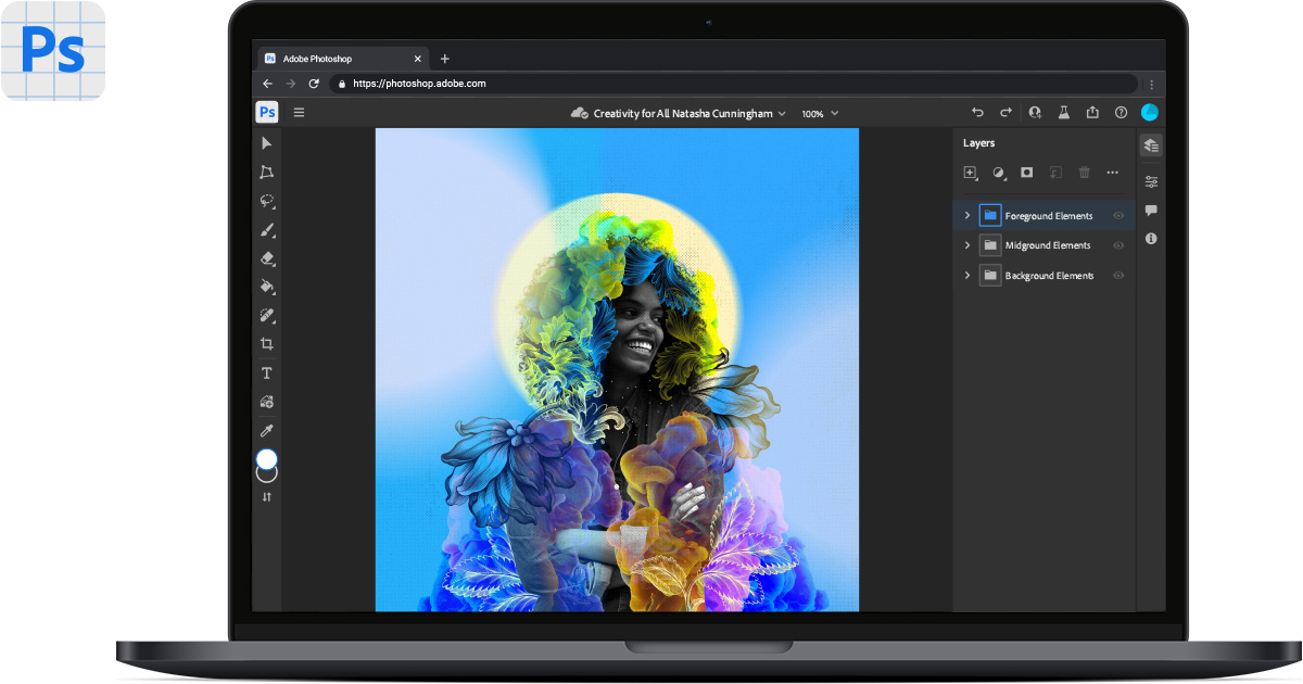
Photoshop is your best photo, image and design editing software.
@heavy crescent Your post is inappropriate for this chat.
@heavy crescent Posts in this chat should only be for the current Ps DCC series challenges. Thank you for respecting the rules.
Day 1 Before and After.
The "after" seems a little bright after compressing for the post


I adjusted the highlights.

@compact pecan The last one is very nice. Good call!
thanks, @hushed spade!
Gave +1 Creative Carma to @hushed spade

Photoshop is your best photo, image and design editing software.
Before and After. The link to After in CC Documents. Its open to any and all comments, so go or it.
Traditional jpg save

#challenge - Photo Editing - Before & After... WELCOME BACK, EVERYONE!!! 😉 Zoom in to see my edits… removed flyaways, removed grey hairs in beard, dodged eyes, Clone Stamp Tool at 38% for under the eyes…


@compact pecan Well done. I like the work you did around the eyes. Leaving in the freckles and beauty marks enhances realism. I might bring down the highlights just a bit more to get more of the skin tones in some areas where its still washed out, but thats just personal preference.
@quiet fern Beautiful work. The edits are so subtle, but so impactful. (For those who want to really appreciate them, open the original files one on top of the other and flip between the screens.) Your After has such a warm soft feeling that is nowhere in the original. Awesome.
Thank youuuuuuu!!! Part of the FUN is switching back & forth between the images to see the changes 😎🥰
Gave +1 Creative Carma to @eternal mica
We've done this exercise before with Paul T. And I totally agree that the most fun is when I see an image that at first blush I react with "wait, what did you change???" Then I start flipping images and pick up all changes that are so natural theyre hardly noticeable, but dramatically alter the image impression. Yours is a great example of that.
Do a little fade animation in Photoshop. A BEFORE / AFTER (.mp4) :D
I do ALOT of Retouching… mostly men too… Firefighters, Law Enforcement & Teamsters 😎🥰
Just left the office… maybe on the morrow 🥰😎
Before and After


@turbid fern Nice work. The skin looks smooth and natural. Good work around the eyes. The softening of the highlights looks good too. Good job.
Thank you!
Gave +1 Creative Carma to @eternal mica


@hybrid kettle I was relieved to see your note about the order😂, because I thought the first one was best! Nice job!


Hello guys i have a problem with some photo need to corect eyes can somebody help me on dm pls
Wrong channel. Try #❓ask-a-question
@hybrid kettle Welcome to the Ps DCC Discord chat. Great to have you join the party. If you have any questions or need help, give a shout, we're here to help. Nice work on the Day 1 challenge. Your touch ups look great. The resulting image looks natural. I especially like the work you did with the lighting and on the right side of the face and the shape of the eye.


@young karma Welcome to you as well. As I just said, if you need help finding your away around the DCC or Discord, feel free to ask. We're all here to help. Very solid effort on the Day 1 challenge. The warmer skin tones are great, very natural looking. Your work on smoothing the skin is spot on. The tweaks are not noticeable at all. Paul makes one point in his stream that you may want to consider. Some of the birthmarks might add character to the model's face, as he says about his scar. You might consider leaving a few of them in. Of course, that is 100% personal preference. Good work.
Thank you 😂
Gave +1 Creative Carma to @hushed spade
@gentle pasture Cool look to your submissions. In the self portrait, I might lower the saturation a bit, as the skin is a bit too red. And in V2 Final Edit, i like the texture on the model's right side. The left side is a bit washed out. Both points, just personal taste. Good work by you.
Yayy! It's @ Paul Trani 💪 But, I've fallen sick 🤒 Sorry Guys!! Cannot (Might not) be able to participate 😭
I am gonna miss this session. Best of luck to you all guys.🛹
@last mica Ugh, I hope nothing too severe. If you miss this series, we will miss you. Speedy recovery.🤒 🤒
🥰 🎖️
Photoshop Daily Creative Challenge#01

Thank you very much
Gave +1 Creative Carma to @eternal mica
Hello! Finally able to participate and hopefully for the full challenges!


Day 2 - Text. Words by John Lennon

Ps DCC 22-08 02 Beautiful Text Effects

My first swag at challenge #2


Did you intend to spell WORLD that way?
Yes it was intentional
#challenge - Crazy Trippy Wild Colorful Bendy Warped Spacey Text 😉


PSDCC_Beautiful Text Effects day 2

Photoshop Daily Creative Challenge#02

Ps DCC 2022-8 Challenge#1 Photo Editing & Sharing
https://photoshop.adobe.com/id/urn:aaid:sc:EU:d5c3e029-9b5c-4c1b-9dd3-987da19523b1
Photoshop is your best photo, image and design editing software.
PsDCC2022-8 original

Ps DCC 2022-8 Challenge#2 Beautiful Text Effects 7-19-2022

Challenge #1 - Photo Editing & Sharing - This is a self portrait with a white sheet as background and a remote control in my hand. The photo is 11 years old so there are a lot of more grey hairs on my head and I have also gained pretty much weight since then. After & Before


I tried to comment on your PS Web document but it gave me an error… I think select-and-mask might help with the edges of your hair and beard when masking out the background
I think this looks fantastic!! All your edits are subtle and look very natural. The best portrait edits are the ones nobody can tell you’ve made - exactly what you’ve done here. Great job!
@tardy talon Good work on making Paul look "better". The overall lighting looks solid. The skin tone is natural. The work around the eyes is really well done.

Thank you 😍🥰
Gave +1 Creative Carma to @eternal mica
Hey Ted, cheers for the feedback. We must have our screens calibrated differently. As mine is not blown out in any of the high lights, I can still see skin texture, and the warm tone is not so red. It's a look-up colour filter [3DLut] called "soft warm" or something? Thanks for your support. Screen calibration is an interesting topic as I know very little about it.
Gave +1 Creative Carma to @eternal mica
Thank you @compact pecan for your feedback!
Gave +1 Creative Carma to @compact pecan
Thats always the case when we're viewing images on monitors. We each have our monitor settings for whats comfortable on our eyes. Whenever Im doing a hard copy print, I always do a test run before final to make sure the hard copy has the look I want. The monitor image is too unreliable.
Coincidentally, I used a color lookup on my BG image for my text submission yesterday. I love using them.
@simple idol Very cool work on the day 1 challenge. The skin looks smooth and natural. The lighting is improved subtly and nicely. Just curious, did you convert the image to a smart object before resizing it? The AFTER looks a little more blurry than the BEFORE. You can usually avoid that by converting to SO before resizing.
@compact pecan Absolutely awesome quote!!!! I love the text effects. The image is so surreal. One tweak I'd suggest, use shades of the colors from the text as fill on the second and third lines. I think that would add a cool sense of symmetry to the design. Very well done.
@plain sable I was mesmerized by the new space images. I had already started thinking how I could integrate them into an upcoming design. Bravo to you. The image really stands on its own. Your subtle text is perfect. I might make one small tweak and give the lower text the same layer effect as the upper text. The font is great. Whats it called?
@turbid fern Beautiful image for Day 2 challenge. Nice work with the text, layer styles. I might suggest you enhance the contrast of the text to the BG by making the top text fill a darker color, maybe the grey from the clouds?
@hybrid kettle Nice effort with the Day 2 Text challenge. The font fits the message perfectly. I think the top text is a bit off center, you may want to adjust that. And as a general rule, using misspellings is a tricky concept. Unless the design clearly indicates the misspell is intentional, most viewers wont get the idea.
@quiet fern Haha, you went to town on this. I guess you checked pretty much every box PT had in his stream! I love the cohesive look of the color palette. The text manipulation is very cool. The BG brush strokes work really well. Good work all around.
@young karma This is so cool. The image and the text blend so perfectly together. The hat is a great touch. One tweak Id consider is the shadows from the objects are on a higher angle away from the objects than the text shadow is from the text. You might want to align the perspectives of the two.
@visual pelican Hey, welcome back. Nice effort with the Day 2 text challenge. Youve definitely given the text layer styles that convey the message of the rest of the design. One tweak I might make is to integrate some of the bright red into the BG (maybe with the UFOs?, the question marks??) to create some more cohesion in the color palette.
@tardy talon Very nice work on the Day 2 challenge. Great to see youre feeling well enough to stick with the challenges. Nice work adding layer styles and effects to the text. Also, adding the floating notes adds color cohesion to the design. Good work by you.
I posted my comment on your cloud file.
@wary swan Cool interpretation of the text challenge. Good work on the layer styles and effects added to the text. One tweak I might make is to lower the intensity of the glow below the text so that the text is the focal point and not the glow.
@halcyon current Very nice work on the Day 1 challenge. The AFTER skin tones are smooth, clean, clear and natural. The subtle changes to the lighting also look solid. Good work by you.
Thank you @eternal mica for your feedback!
Gave +1 Creative Carma to @eternal mica
@fallow lake Welcome to the Ps DCC Discord chat. Great to have you joining us. If you have any questions or need any help, just give a shout. We're all here to help. Wow you really jumped the gun. Is it Halloween time already??? 🤣 😜 Nice work with the composite. I would suggest you use a curves/layer adjustment layer to add contrast to your text to give it more prominence in the design. And you might want to think about the overall lighting of your composited objects relative to the BG, maybe make them more cohesive and consistent. I look forward to your future posts.
Thank you. It's nice being back. You were right like always adding a bright red/pink to the ?? marks did make it more cohesive .

Gave +1 Creative Carma to @eternal mica
Thanks for the feedback, Hugh
Gave +1 Creative Carma to @compact pecan
Thanks for the feedback Ted I will look into that
Thank you! 😍
Gave +1 Creative Carma to @eternal mica
You’re right - I applied everything he went through - I thought it might be overkill after the fact, but I wanted to make sure I didn’t miss any steps because I always learn something new every day with these challenges 😁😎
Thanks @eternal mica I added the layer style to the bottom text (smaller version) and the font is Changeling Neo...

Gave +1 Creative Carma to @eternal mica
With as much stuff as PT throws against the wall, thats a serious challenge in and of itself!! As always, good work by you. And just for the fun of it, you can take today off, because the challenge is a Space Composite, and youve already done one!!!
I get a kick out of how PT is always singing during his challenges too 😁😎
Each presenter has his/her own style, but PT is definitely unique in so many ways. When I started, I was so intimidated by his streams.
You are exactly right. Each one of them has a definite style And presenting personality which makes it even more fun I think 😎🌞
Ps DCC 2022-8 Challenge#3 To The Moon! 7-20-2022

#challenge - Text Challenge from Tuesday - this was playing with GLYPHS - I love Glyphs 😉 The font is "LHF Old Iron"

Ps DCC 2022-8 Challenge#2 Beautiful Text Effects 7-19-2022 version 2

#challenge - Space Comp (not unlike Space Camp) 😉

PSDCC Day 3 To The Moon

Today’s challenge - moon composite

Enhancing the contrast a bit definitely helped. Thank you for the feedback!

Gave +1 Creative Carma to @eternal mica
Ps DCC 22-08 03 To The Moon


This is really cool, it looks like the hand is pulling back a curtain or a blanket to reveal the space behind it 😎😁
Thanks. I was thinking its the hand of Man reaching out to Deep Space to connect with whatever is out there.
Thank you very much
Gave +1 Creative Carma to @eternal mica
This is the collage challenge of the day. I used the shadows technic with curves explained by Sasha!

Day 3 - Lost ... in ... Spaaaaaace!!!!!!

How did you do that with the text? It the same texture/style as the yellow parts of space in the image, it looks really good but how was it done?
Did it, wanted to add the text thingy Christelle did so I made an attempt lol

@bright yew Did you watch the stream from yesterday on how to manipulate text?
Didn't get the chance to, twas busy with work
Starting at the 10:00 mark, the stream has many excellent techniques for text manipulation. I suggest you watch it.
Awesome, I've been needing something like this. Thank you
Result for today's Challenge

Hello friends! Carved out some time. So happy to participate.

Photoshop Daily Creative Challenge#03

Thanks @eternal mica I actually converted to a smart object. I’ll make some adjustments. Thank you for taking the time to give me feedback. It’s much appreciated.
Gave +1 Creative Carma to @eternal mica
@bright yew Great job with the masking, this is looking good! I like the shadow from the moon on the thumb, and the layering gives the image some nice depth. I think it might look good to darken down the hand a bit, and cool the colors a little more to make it look like it's backlit at this twilight hour. It could also look nice to brighten the text or give it a bit of a drop shadow to make it pop out over the moon a touch more. Or even move the text down over the dark rocks at the bottom, which might look good compositionally. Just some thoughts, nice work!
@tardy talon Very nice work masking all these different elements! It might help add a little additional depth if you mask the thumb more clearly behind the moon, which would also help avoid the tangent in that area. This is looking good!
@simple idol Very cool, I really like the colors and contrast in this design! The dark purples and bright yellows work really well. The yellow lines and warped text give it some really nice energy too, nicely done!
@dusky wave Really cool style to this design! The very pale and muted colors gives it an interesting mood and feel. Very nice job with the masking , and the deep shadows of the hand fit it in nicely with the rest of the image. 👍
@vagrant rapids This is looking great, loving the color palette! Very cool style and cohesive look to all of it. Very nice job with the masking as well. There's also a really nice compositional balance with the values between light and dark, it really helps the earth stand out as a focal point.
@compact pecan Ooh, great colors! Really love how you arranged all these elements, everything is looking clean and the composition is working well. My only suggestion is the hand seems like it could use some more contrast to match the deeper shadows of the other elements in the scene, and to more clearly separate it from the background. Maybe something like this?
(Click the image and click Open Original for better quality)

Thank you so much! 😍❤️🙏
Gave +1 Creative Carma to @bleak fossil
@bright yew: this text is orange f77e59 in Color Dodge opacity and I clipped a layer on which I painted white highlights in dissolve mode.
It works because the background of the text is the sky like a gradient ("left?" is darker, because the background is darker) - 🙂
And you did great 👍 Good job !
Thanks so much for your feedback @bleak fossil !
Gave +1 Creative Carma to @bleak fossil
Result for Challenge #02

Thanks for the feedback! i'm gonna apply these and see how it turns out
Gave +1 Creative Carma to @bleak fossil
Thank you!
Day 3 challenge

Folks, I know you dont need me to tell you how awesome @brittle slate livestreams are. But today will be special. Paul is going to get into color matching. If you really want your composites to soar, theres probably no more valuable technique than this. Log in at 12:00PM EDT and participate in the live stream.
@wary swan Nice work on your Day 3 challenge. The color palette looks great. The compositing is interesting. The highlighting and shadows of the arms are interesting. I might have enhanced the perspective by having the moon rest more in the fingers. and mask the fingers onto the moon in certain positions. The thumb on the left hand can use tighter mask. Good work.
@quiet fern I love that font. So much personality to it.
@quiet fern Awesome Day 3 challenge. The color palette has a wonderful consistent vibe throughout. The compositing is very well done. Good work creating perspective with the shadows from the hand. I definitely could see this as an album cover. One nit pick I might make is to add a bit of blur to the back objects to enhance the depth perception on them.
Thanks for the feedback Ted
Gave +1 Creative Carma to @eternal mica
I think this fits into todays challenge. Also for the Art In Space challenge. Parking Space.

@visual pelican Very creative Day 3 post. I like the composite work. The moon in the hand looks great. I would sell the "energy field" concept more by adding it around the hand as well, much like an exercise I know you did with Sam in an earlier series. Also I would add depth and perspective by adding a Gaussian blur to the other objects youve add (maybe not the rocket ship). Good work.
@unkempt field Cool GIF. Nice work on all the compositing. Its always fun to see the challenge taken to the next level. Good job by you.
@turbid fern Love the tweak.
@turbid fern Very cool work on the Day 3 challenge. The color palette is consistent and natural. The compositing is well done. I might want to sell the hand a bit more by adding shadows from the fingers onto the moon. One tiny tiny nit pick, which may just be my personal phobia. Theres a little gap between the middle finger and the moon. To me thats distracting. But that just may be me. Very well done.
@vagrant rapids Awesome Day 3 design. The color palette is terrific. The cohesion is great. The masking is very well done. The skull looks great. The hand, especially with the shadows, is great. One tiny nit pick would be to add perspective to the dinosaur by giving it a slight blur. Wonderful design.
@compact pecan I love this Day 3 design. So much going on, but it all holds together beautifully. The consistent cohesive color palette is the glue. @bleak fossil subtle tweak would really make it pop!!!
@bright yew A belated welcome to the Ps DCC Discord chat. We hope you hang around and get involved. If you have any questions, give a shout. We're here to help. Nice work on your Day 3 submission. Sam already gave you quite a bit to think about. I might add, if you havent watched today's stream, Paul has tons of tips on how to color match your composites to really make them realistic. I look forward to your future posts.
Thank you. So here is the original one I did. I finally got it to load to discord.
Gave +1 Creative Carma to @eternal mica
I didn't notice it at first, but after you mentioned it, I was bothered by the gap between the middle finger and the moon as well, so I adjusted the hand positioning a bit. I also tried to add some subtle shadows on the moon and the fingers. Thank you!

Gave +1 Creative Carma to @eternal mica
Woo hoo! Made it to Day 3!

Super tweaks. The finger shadows have given the moon a glowing iridescent look. Isnt weird how such a small thing can make such a difference!!!
@dusky wave I love the color palette on your Day 3 design. Such an outer space vibe. Solid masking work. The finger shadows are particularly well done. One tiny nit pick. The planets on the right have different light sources. The top ones dont jive with the rest of the image. Flip them?
@simple idol Good effort with your Day 2 text design. When I first saw it, I thought it might also be your Day 3 Space design, then I saw you have a separate submission for that. Good work with the layer styles. The streaks all add cool sense of motion to the design. Just a suggestion, liquify some of the text towards the planet to increase the sense of speed and motion. Your Space composite Day3 is very well done. The compositing is solid. You might want to add some finger shadows on the planet to add a sense of depth and perspective. And maybe play with the highlight skin tone to have more of the overall tint of the design impact the arm/hand.
@tardy talon Good effort on the Day 3 space design. Nice work on the compositing. I might want to move the moon further into the hand and mask the thumb to add perspective. Try adding some finger shadows on the moon. Flip the planet so the light source fits with the rest of the image?
@dusky wave Solid work on your Day 2 design. The consistent color palette really looks good. The text layer styles look good. I might try to use a curves adjustment layer on the text to increase the contrast with the BG.
@hybrid kettle Very interesting Day 3 Space composite. There's a very surreal vibe to the design. The right side planet and hands are well done. Good shadows add good perspective. The hands in the center could use the same shadow treatment. Very well done by you.
This one looks better.

Challenge #2 Beautiful Text Effects - Here's what I created for Challenge 2.

Thank you
Gave +1 Creative Carma to @eternal mica
Here we go for Challenge 4... Thanks Paul for the fun & the learning!!!!


#challenge - Space Composite Edit


This is back on the Day 3 moon challenge. I moved the text and added some drop shadow also did color lookup. This is the result @eternal mica

Solid tweaks. Text looks much better. Color palette much improved. Could still use some finger shadows on the moon to add depth/realism.

I wasn't intending on doing this challenge but Stoney asked me some questions about it. A half hour later and here we are...
PS DCC 07.20.22 - To The Moon! - SpaceX (In space, no one can hear you Tweet.) haha

"Ooh you're right I'm gonna add some". Didnt you know Im **ALWAYS **right????? 😜 🤣 😜 🤣 😜
Back to challenge #3, I really enjoyed it

Rate it guys

Day 2 Text first version

Day 2 altered

Day 3 Beginning


Day 3 altered The last being my favorite


@edgy spoke Thank you for your post. However, this chat is reserved for postings related to the Ps DCC. If you'd like to post your work for review, please use one of the more appropriate tabs from the left. Thank you.
Gave +1 Creative Carma to @edgy spoke
@tired turret Nice work on the Day 2 and 3 challenges! The masking on Day 3 is looking good, and it's cool to see you trying out various versions on both of these. I like the sharpness of the text in the first version of the Day 2 challenge, but it might be nice to see what it looks like with sharp text and a slightly blurred background. Nice job on these!
@edgy spoke Cool design! Though I'd brighten up the skeleton a bit to give it more contrast, because currently the background is reading more strongly due to having more contrast. You could even blur the background a bit to give the board more focus. Also, if you're posting designs not related to the current challenges then #📝project-feedback Is the best place for that. Nice work 👍
@paper jackal Cool idea! Reminds me of The Creation of Adam by Michelangelo, hah. I really like the colors in the background and the strong contrast of the moon makes for a nice focal point. Looks good!
@sterile berry Hah, it's hard to avoid once ideas start going. Very nice job, the coloration and masking is looking solid, and the added shadows are a very nice touch. The text really gives it that clean poster aesthetic, nicely done.
@bright yew Great changes! The composition looks so much more balanced with the text at the bottom, I like the sort of triangle it creates with the moon and hand. Very nice!
@stone steppe Nice job with the text effects! The color gradient and warping are both looking really good. The wavy text fits nicely with the theme of the title, well done!
Thanks, Sam. Its fun to play. :)
Gave +1 Creative Carma to @bleak fossil
@quiet fern Very nice, loving the colors in this space scene! I really like the shadows you made on the Earth from the hand. My only critique is that the light is coming from two different directions which affects the realism of it. The hand is lit from underneath, and the Earth is lit from the top right. I'd keep the Earth as is, just rotate it so the light spot is in the bottom left. Though you might need to rework the finger shadows for that. This is looking good!
#challenge - Matching Colors - I couldn't really think of what to add to this image... ;-/

True, but then if I rotated the Earth to make the highlight match the direction of the highlight on the hand, the Earth would be all topsy turvy, which it pretty much is anyway 😎😁 I guess there’s light coming from all different directions, because it’s not really real anyway, so I can play Creator of the Universe, right? PS - the “realism” of it is what is killing me on these Challenges, because none of it is real… I see what happened - when I deleted the text layer, it got rid of the Quasar that was throwing light on the back of the hand 😉
@eternal mica Haha, I remember you telling Paul to attach the tentacles to the alien, so I like how you went and made that yourself. Truly unsettling creature, I love it. My only suggestion might be to lower down the brightest tones of the tentacles to match the rest of the scene. They don't quite sync up with the brightest tones of any other aspects of the scene so the contrast looks a bit mismatched. Hopefully that makes sense. It might also help to blur the cloud layer to soften the edges a bit. I love the smooth blending of the tentacles into the alien, nicely done!
@marble umbra Hah, super cool idea, very nice! The colors are all fitting together very well. My only suggestion would be to more closely match the contrast of the aliens to the landscape in the background. Currently the aliens have really deep shadows, but if they're that far off they would be more affected by atmospheric perspective, which causes the shadows to not be quite as dark. You can see that in the hills, the further back they go they lighter the shadow tones become. You don't need to go too crazy with it, but a little contrast fade might help, though that's just an idea of course. Looks good!
@halcyon current Ooh, really cool idea! I like the branding direction you took. There's a nice balance to this design which can be tough when all the colors are so bold and saturated. I think it could be due to the balance between the sharpness of the text and foreground, and the blurred background. There's also a good balance of the colors throughout the design. Very nice!
@visual pelican Ooh, very cool image. I like all the planets you added and all the starry texture in this design. It might look nice to brighten up the arm a little overall to make it more visible against the background, perhaps a little more so on the top side so it looks like the moon is illuminating it a bit. Nice job!
@simple idol Woo! Very cool, I really like the bold colors on this design. The red and green make for a nice contrast, and you did a good job of making the Earth a strong focal point with the value contrast of it. Very nice work compositing all these elements together, there's some really nice depth in this design, and I like the dream-like feel of it.
@turbid fern Very nice design, the shadows are looking good! There's a nice composition between these shapes and I really like how the texture of the background contrasts the focal point of the hand and moon. Great colors in this too, the hand matches the scene nicely!
Thank you! @bleak fossil
Gave +1 Creative Carma to @bleak fossil
@ruby panther Hah, very nice Shawn, I like this concept. 👌
@hybrid kettle Cool concept! Very nice job compositing the hands and earth together, that works really well and the shadows are looking good. The main suggestion I would have would be to use something like the Elliptical Marquee tool when masking the earth to get that clean rounded shape. It also might help to brighten the center/right of the earth slightly to have the lighting match the face a little more. Nice job!
@dusky wave Very nice texture on this design! The colors make for a really interesting style too. I like the warp effect and shape you got in the text. It almost gives me the impression of a malleable material in some kind of liquid. Really cool, nice work!


Thanks Sam!
Gave +1 Creative Carma to @bleak fossil
Day-3

Thank you very much
Gave +1 Creative Carma to @bleak fossil
Photoshop Daily Creative Challenge#04
