#✂challenges-feedback
1 messages · Page 127 of 1
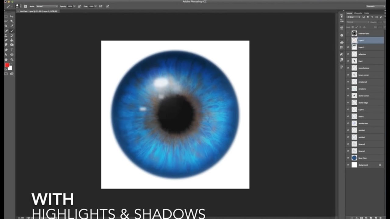
@halcyon current Really well done slime text design. The liquify created interesting shapes out of the text, and realistic drops at the bottoms. The layer style created good depth, highlights, and shadows. The gooey brush strokes are applied in an interesting fashion. Nice job.

@copper moss Yes, Sam packed in a whole bunch of stuff into this session. It was like 2 challenges in 1. Nice work creating the hologram and incorporating it into the image. I think you did a fine job creating the overflow glow on the model, given the intensity of your hologram. Very well done.
@dusky swallow Very good work on the sci-fi display. The lighting you created throughout is well done. You created an interesting hologram. Good job
@coarse portal Really nice work on the sci-fi display. You created an interesting hologram, using so many of the elements Sam suggested. The overflow glow onto the model is very well done. Good work.
Thank you 😻
Gave +1 Creative Carma to @eternal mica
@digital pike Good work on the sci-fi display. The hologram is interesting and incorporates a lot of the ideas that Sam presented. Theres good cohesiveness to the coloration of the design. The overflow glow onto the model is well done. Good work.
@gentle pasture Good asset selection for the sci-fi display. Good work creating the hologram. I think I like the cooler look. The face lighting look better to me in that one.
@plain sable Wow, it took me a minute to figure out what was going on with your galaxy portrait. Very creative approach. Well done compositing. The fill in the cut out is so interesting. The face rim is very well done. I love the lighting on the gorilla. One tweak Id make is to move the fill in the cutout to make the blue line less distracting. But could just be personal taste by me. Really well done.
Thanks @eternal mica 😄
Gave +1 Creative Carma to @eternal mica
@stone steppe Nice job on the papercut design. Very pretty color palette. I think, because of the placement of the shadows, the objects float on one another rather having the depth of a cut out. But thats fine, if thats the look you were going for.
how to get "Art Squad" role
@tired turret Really well done galaxy portrait. The face rim is well done. The lighting inside the cut out is cool. (Im not sure about the shadow on the lower right.) The coloration on the model blends her beautifully into the design. I especially like the way you handled the hair and the fade on the bottom.
Awww ☺️ thanks! May the fourth be with you my friend! 😉
Gave +1 Creative Carma to @eternal mica
@paper shadow Really awesome gooey slimy slime text design. I love the thick scribble slime but I would mask some of it so more of the text is legible. Good work creating the gooey oozing vibe.
@dusky wave Good effort on the sci-fi display. The lighting and coloration are consistent. You created an interesting hologram with a lot of elements. I might reposition the hologram to be more in the sight line of the model.
@hollow yarrow Terrific hologram. So many elements. By having the square lines around the man, it looks like a hologram inside a hologram. Very well done reflective glow, especially as you applied it to the clothes. One tweak Id suggest is to tone down the glow effect on the skin, both on the wrist and the finger. It looks too intense.
@quiet fern Very well done sci-fi display. The hologram is well done and the perspective in the image is well done. The overflow glow is handled well. Good job putting all these elements together.
PSDCC_Sci-Fi Display Day 7

@potent spoke Very nice work on the galaxy portrait. The cohesive coloration looks great. The face cut out and face rim are well done. Since you have the bright light source inside the face cut out, you might want to consider creating more light in the darkened inside area.
@onyx field Cool sci-fi display. The hologram is well done. The over flow glow is handled nicely. Good job incorporating all the elements Sam presented in the stream.
@potent dirge Interesting approach to the sci-fi display. I like the ide of the robotic eye. I would suggest you resize it to better fit the socket of the model. You also might want to lower the intensity the bright light source behind the hologram, to enhance its visibility. Sam demoed this in this stream.
@sterile berry Daniel, super concept for the sci-fi display. Great execution as well. I'd suggest two tweaks. The glow's intensity on the skin seems too bright for the light being generated by the "Digital Paper". (And, knowing Samsung, it will make your battery run out too quickly!!!) And I think the light is too white for the blue tinted hologram. Perhaps more of a blue tint?
Thank you @eternal mica I worked a bit on the drops to get them pretty realistic so I'm happy that you think they are 🙂 I really liked this challenge.
Gave +1 Creative Carma to @eternal mica
thanks , but i cant watch the live, have any video?
Gave +1 Creative Carma to @eternal mica
Challenge #6 - Galaxy Portrait Composite - Trying to catch up with the rest of yall. I wanted to use other images and to unite them with a hue&saturation layer at the top. Someone mentioned in the chat something about working hard on details not at all showing up in the end result and this is just like that. I worked hard on masking the hand holding the globe and well you see almost nothing of the hand... 😝 😂

@near knot Wow, awesome galaxy portrait. I love the concept. The coloration is excellent. The face cut out and face rim are very well done. The tattoo look is great. I think the image you placed in the cutout would look better if it were positioned at the back of the cut out rather than front. What do you think?
@visual pelican OOOH I like this sci-fi display. I like the extra heft you added to the hologram. (Is that Yoda I see there on May The Fourth???) The placement and overflow glow are well done. Good work by you.
Ah this is just so perfect @sterile berry 💯
Thanks, Anki. I have an updated one will I post soon where I've implemented changes based on all the critiques. haha
Gave +1 Creative Carma to @halcyon current
Mods and mentors invite folks who have been involved in the chat, supporting the chat, and active over a period of time to join the art squad.
Thank you. It's Grogu aka Baby Yoda. I couldn't resist lol I even used Mandalorian text/language (as best as I could).
Gave +1 Creative Carma to @eternal mica
What do you mean you cant watch the videos? Its on replay on demand any time you want to watch it.
I need to catch up on my Mandalorian. I only watched season 1.
You have time lol season 3 hasn't come out yet. Did you watch Boba Fett?
hey, is that a dig at me???😟 😟
No, is it good?
can u send me the link of the replay pls
Nah. I'm just joking around. Franck said the same thing. It's too bright. This is what happens when you write code all day and then work on photo composites afterwards. My brain is fried. Hence the subject matter :)
I think so, but then I like the Bad Batch, The Clone Wars, and Star Wars Rebels. Yes I'm a Star Wars Fan. lol
Dont you know where the Ps DCC landing page is? https://www.behance.net/challenge/photoshop

Daily Creative Challenge
You need to hook up with VooDooVal and General Kenobi!!!!
thanks a lot
Gave +1 Creative Carma to @eternal mica
Thank you @eternal mica - I'm going to give it a try.
Gave +1 Creative Carma to @eternal mica
That might be a good thing. lol
Sci-fi Display. This was a fun challenge and for me, had some solid compositing techniques to take away. Thanks @bleak fossil!

Gave +1 Creative Carma to @bleak fossil


@eternal mica thank you for the kind words! I have been having fun with these challenges. It has inspired me to do things with my photography I hadn't originally considered. Perhaps this edit highlights the subject better?

@near knot This is really cool. I really like your version with the storm. Well done!
"Samsung Digital Paper" - An updated version based on the various critiques. haha - Thanks, @eternal mica and @hollow yarrow for keeping me on my toes. :)

Gave +1 Creative Carma to @eternal mica
Also, @hollow yarrow since you commented first, you're now the patient. :D

I like it better. Do you? I would even push it a drop more.
Daniel, be careful. If you start naming folks, everyone's going to want one like you did with the islands!!! 😜 🤣 😜
If anyone wants a personalized "brain scan" they can DM me. haha
Do I need to have a brain to qualify for a brain scan???
Nah. That's what Photoshop is for. We can work miracles. :D
Thank you so much @young karma ! I appreciate the encouragement 😊
Gave +1 Creative Carma to @dark granite
Some references for today's stream!

🤪 Is everything OK with my brain... Sometimes I have doubts so I need an expert's eye...
We're still crunching the numbers. We'll get back to you. :D
Glad! Thanks! 😈
Gave +1 Creative Carma to @eternal mica
The designs from today's Alien Eye challenge!

I do like it better. I may have taken it to far when I was trying to adjust the tones and saturation for a more seamless blend with the background. On the second edit I was basically reducing the tone adjustments I had previously made to bring back the brightness and saturation.
It is usually a good idea remember to create contrast between your focal point and the rest of the design, especially the BG. You always want to direct the viewers eye to the focal point. I dont think you did the last DCC with Wade Acuff. He had one session on the Rule of Thirds, and the Golden Rule, where he discussed creating strong focal points. If you have time, you may want to go back and watch it.
Yes, that's right. I only discovered the daily creative challenges last week. I'll go back and take a look at Wade's stuff. Thanks @eternal mica!
Gave +1 Creative Carma to @eternal mica
Thank you Ted, I added a Horrorblue Colorlookup but canged the belning mode to Lighter color and it came out like that, I though it gives a metalic look that I found alien... 😇
Gave +1 Creative Carma to @eternal mica
Thank you 😇
Challenge 8: Alien Eye. That was full of wonderful tricks again. I loved all. Fascinated. Thanks again!

😀


#challenge - The Eyes Have It... Really need that "Messy Brush" @bleak fossil used!!! 😉 PS - I added a Radial Zoom Blur to my Texture Layers...


Alien eye, so much information and so fast..... I think I would need to do it again to be able to get it all....

Hi Sam, have you posted the brush link? I have always difficulty in finding the texture brushes... I know there are many, but "the one you need" you know, I wish I could organise them better. Great challenge, by the way, I am really enjoying it, thank you
Same here… I have zero kewl brushes, so I skipped several steps 🤷🏻♀️
Challenge 7. final and base picture. Made hologram dashboard in illustrator.


First Photoshop Challenge! Thanks for the amazing instruction!
You may want to post a JPEG so people can see your image. :)
Thank you! I just finished researching why it posted as a file 👍
Hopefully this works?🤞

Challenge #7 - Sci-Fi Display - Here's my result of this challenge. Wanted to find another image than the one included in the download and thought I had one until I was almost finished and decided I didn't like the result. I had another image that I masked and added with some minor adjustments.

Day 7... always a day behind everyone lol

May the 4th be with you!
Empire Propaganda Poster!

I mentioned I'd share my brushes, so here they are:
Sam's Brushes: https://drive.google.com/file/d/1obXET-vlmHz5TTwRnvp6p-wXRvC1tVOW/view?usp=sharing
Google Docs
I use the first 3-6 the vast majority of the time for painting. The Messy Brush was the one I used a lot on the Alien Eye designs.
You are a Rawk Stah!!! Thank you!!! 🥰
Gave +1 Creative Carma to @bleak fossil
Thanks Sam
Gave +1 Creative Carma to @bleak fossil
Day 8 Eye see you!

Thank you for the brushes, Sam!
Gave +1 Creative Carma to @bleak fossil
I did this eye ball poured on with toffee illustration with VooDoo in Game time session. I liked the session very much.

I wanted to put the eye in a three pronged pewter holder, but I couldn't find a good image. Definitely a fun challenge.

Ps Dcc 2022-5 Challenge#7 Sci-Fi Display 5-3-2022

Today's Challenge :)

I had so much fun torturing these two (evil laugh😈)


Ps DCC 2022-5 Challenge#8 Alien Eye 5-4-2022
Brushes can be downloaded from OBSIDIAN DAWN
http://www.obsidiandawn.com there is also a tutorial how to use the brushes https://youtu.be/ZxQ52eEIzD4
https://www.facebook.com/ObsidianDawnDotCom/
free download for non commercial use if you give credit or link to the home site.


Obsidian Dawn Resources - Photoshop & GIMP Brushes, Tutorials, Images, Patterns, and more!
This tutorial will explain how to use ObsidianDawn.com's Iris Parts brushes (http://www.obsidiandawn.com/iris-parts-brushes-for-creating-eyes-in-photoshop-gimp) to create realistic looking irises for eyes. Great for both paintings and photos!
Obsidian Dawn, Tampa, Florida. 5,403 likes · 1 talking about this. Obsidian Dawn is a website for original Photoshop & GIMP resources. Commercial licenses are available for only $3 per set!
Thank you for sharing.
Gave +1 Creative Carma to @bleak fossil
@copper moss Beautiful work on the alien eye. The coloring is great. The iris shape is unique. The textures are well done. One question. It isnt clear to me that the highlight layer is on top of the iris layer. Is it?
@digital pike Both eyes look great. I especially like the rainbow iris you created on the alien eye. The pupil textures on both are well done. Very cool job by you.
@gentle pasture Very well done eyes. The cloudy texture you created on the human pupil is a good touch. Your alien iris and pupil are very interesting. The cloudy black texture is a good addition.
@quiet fern Sam did add the brushes after you finished your design. The contrast between the blue/brown on the human eye is very well done. You alien eye is awesome. Very interesting coloration, iris, pupil textures. One tiny tweak, I might lower the glare a bit to take away some of the white rim and allow more of the "shine" to show through. But thats just personal preference.
@dusky swallow Wow, your human eye almost looks like an alien eye. Great!! Both eyes are super. The alien iris is interesting, the coloration is cool, the pupil textures and fill are well done. One tweak, Im not sure the highlight works colored in as you have it. The feathered edge of the human eye is very realistic. The pupil textures are also. Very well done on both.

Human and Alien Eyes with Sam Peterson. I learned quite alot today. The Symmetry Tool lets your imagination flow! Thank you for this opportunity!

Challenge #8 - Alien Eye - Caught up sort of as I've only had time to make a human eye.

Today's challenge for the Space Colony Composite!

Challenge #8 - Alien Eye - Here's an alien eye too. Soo fun. I could sit forever to paint the alien eye 😄

PSDCC_Alien Eye Day 8


Thanks, Kajrov for this information! 👏
Gave +1 Creative Carma to @wary swan
Yes, the highlight layer is on top. But I do not have those needed brushes for the time being.
@eternal mica Thanks
Gave +1 Creative Carma to @eternal mica
😀

Scroll up through yesterday. Sam posted a link to them.
@copper moss Sam's Brushes: https://drive.google.com/file/d/1obXET-vlmHz5TTwRnvp6p-wXRvC1tVOW/view?usp=sharing
Google Docs
Great! I will install. And make for myself human eye as well. 😀
Ted, I will check my highlight. Now I am doing the planet composition. Thanks a lot for help.
Gave +1 Creative Carma to @eternal mica
@lost helm Great concept on the sci-fi display. The hologram you created has lots of interesting shapes and colors. The perspective you gave it in the design is well done. You have nice overflow glow. My one suggestion would be to add some pop by brightening the hologram and increasing the overflow glow .
@cunning plank Welcome, youre catching us just as we finish this series. You can go back and watch the replays of the previous streams in this series and still post your works. We wont be starting a new series for a couple of weeks. I believe there will be streams from the archives over the next two weeks. Your eye designs are both beautiful. The pupil and coloration of the human eye are very well done. The texture lines you added look super realistic. Your alien eye is great. The iris looks great. The symmetry texture lines in the pupil are so well done. I like the purple rim you have going around the top of the eye. Very nicely done all around.
@halcyon current I love your sci-fi design. The new creature is perfect for the exercise. Your hologram looks interesting. You worked hard on it. Why not give it a bit more of a tilt in the perspective so the display can be seen in greater depth? Im not sure what color the alien should be, but I would give it some more overflow glow of the blue from the hologram.
@tired turret Good idea to go with the green hologram. The design looks interesting. I think you can do more with the size and the perspective to display the hologram itself. Good work masking out the window. and on the overflow glow on the model.
@lethal prism Hey Nick, how are you? We miss you.
@radiant relic Super alien eye. Your variation on the highlight is great. The iris looks great. The blur adds realism. The swirl texture lines in the pupil is a great idea. I like the BG also. One tweak Id suggest, it appears as if there is a metal ring around the eye. Im not sure if you intended that or not.
@copper moss Definitely extra credit for your toffee eyeball!
Thanks! I try to catch up with the Star War designs sessions, which are going on. 🐎
Gave +1 Creative Carma to @eternal mica
@young karma Whats a three pronged pewter holder??? The alien eye is cool. The iris shape is interesting. The soft edges look good. The pupil coloration and texture lines are well done. Good choice for the BG.
@wary swan Good work on the sci-fi display. The hologram looks solid. The perspective is well done. The overflow glow is well done. One tweak, the color of the overflow glow on the model seems too green. You might want to play with that.
@potent dirge Very interesting alien eye. The colors are great. The iris shape is very interesting. You might enhance the realism by feathering the edge to help it blend into the pupil. The texture lines in the pupil are really cool. Very nice job.
@near knot Do I see a JR Adobe Banana Crew logo? Very Planet of the Apes, "future meets present meets past", vibe to this. Great concept. I love the angle and perspective and contents of the hologram. I would suggest, even though its daylight, there could still be significant overflow glow on the cavemen and the surrounding area. You might also increase the depth of field by playing with the blur of different areas of the asset image. Solid effort by you.
Challenge #9 - Space Colony Composite - Finally I've managed to catch up unless counting on the feedback for my last two sends. Will get to that tomorrow.

@eternal mica Thank you Ted!! This was a great introduction to the software, excellent staff behind this process, I'm so glad I discovered it when I did! Best kind of practice for the summer months. I'm so grateful for your feedback, thank you for taking the time to look at it. It is certainly encouraging when I am brand new to this!
Gave +1 Creative Carma to @eternal mica
Challenge 8. Eyes. Time consuming and I sure will revisit this challenge later on. Had fun with it!!


Thanks Ted. I will take a closer look 🙂
Gave +1 Creative Carma to @eternal mica
@onyx field I really like both of these eyes. The textures you added around the human iris and pupil are so good. The blurred highlight looks great. The pinkish drop shadow adds realism. The alien eye is excellent. The iris has terrific shape and texture. The brush strokes in the pupil are so realistic. The wide soft ellipse edge and blurred highlight are great touches. One tiny tweak, Id feather the edge of the iris to help it blend into the pupil.
Thank you @eternal mica. I'm not sure if I understand what you means with "more of a tilt in the perspective". I understand that it needs some change but now in which direction... probably a language barrier. I use Google Translate whenever there is something that I don't quite understand but it's not perfect and this time it couldn't give med a good translation...
Gave +1 Creative Carma to @eternal mica
Whatever your level of Ps expertise is, my experience here has shown me time and again, the DCC process is instructive, creative, challenging and fun. If youre looking to up your skill level, youre in the right place. And you will meet the friendliest, most encouraging, talented, creative people from all around the world (Im not one of those, 🤷🏻♂️ ). Take the time to scroll down and browse the landing page. There are archival links to all the previous streams. And if you really get into it, let us know and we'll link you to with a spreadsheet from @wary swan that is a treasure chest of streams.
Hahaha! I was thinking of a stand with three supporting "fingers" or prongs as I called them 😆 that would be attached to a base. The idea of course was to make it look like the alien eyeball was resting in something instead of just floating there. I imagined something that might hold a crystal ball or the end of a wizards staff holding a crystal. I had imagined something made of pewter would look kind of neat.
Thank you for the feedback! Not knowing what would go well with my eye color I used the Adobe Color app to find a complementary BG color.
Gave +1 Creative Carma to @eternal mica
real quick and dirty to show what i meant.

Good! Today I tried too, I did a great job,I liked so much, but... My house energy failed so everything in my house went off, I lost the project 😔
@wary swan The human eye is stunning!! The realism is off the charts. The texture you created in the pupil are beautiful.. The iris looks incredible. Super effort by you. 💯The alien eye is also well done. All the elements look great. I might lower the blur effect a bit.
UGH. terrible. Thats why we always say SAVE SAVE SAVE. Anyway, you can recreate it mush more quickly the second time around.
I ll wait for next challenge bcz Im new in here and I want to try something diferent every time, so I can have the experience of very things in here! But thanks
@wary swan Thank you for posting that link. Youre always looking to share with the group. You are THE BEST 🏅
Gave +1 Creative Carma to @wary swan
@onyx field Good effort with the burnt text tool. Nice work integrating the blue tint throughout. Did you use a multiply layer on the text to allow the wood grain to show through? Maybe lower the opacity of that layer.
You neednt wait. The next series doesnt start for two weeks. You can watch the current series streams on the landing page by clicking "watch video"
@tropic knoll Great collection of eyes. They are each well done. The lower right is especially good. The iris is interesting. I might feather the edge to help it blend into the pupil. The pupil is beautiful. Great brush strokes, great color great shadow. Awesome work on all of them.
todays challenge

@halcyon current Very well done human eye. The blending of the iris and pupil looks great. The texture lines in the pupil are beautiful. the cloudy white texture for the white area is realistic. Good job by you.
Ted, what u think of my art in #📝project-feedback
@eternal mica Yes this has been a blast! I will definitely look at the landing page and previous streams. And I will never turn down an opportunity to learn more, I would be so grateful for anything you recommend!
I have so many pieces to review here in DCC, I dont have much time to visit other tabs. if you remind me next week, after the live streams are done, I'll try to take a look.
Okok
Im doing ok. Glad to be here!

Space Man with Sam Peterson. I really enjoyed this. Getting the perspectives correct for the screen was tricky for me. I used Fisheye in Warp to create the bulge in his eyes. Thank you for this opportunity!

Hi Ted. Ah, yes, I see where you are referring to. I'll soften those edges straight away. Thank you! for everything!
Gave +1 Creative Carma to @eternal mica
PSDCC_Space Colony Composite Day 9

I started following the tutorial this morning until my computer froze, I was so upset, but then it took a completely different direction. Suddenly my brain went full StarWars mode for Revenge of the 5th, after following my instinct this is the end result! Thank you Sam for the assets and idea!

thanks Ted yeah when i went back to it this morning some of the effects werent even showing ( ie when hide them no diff ) .. so started again
Gave +1 Creative Carma to @eternal mica
PS DCC 05.04.22 - Alien Eye - "Sci Fi Eyes" - Human, Alien, Droid. Sorry. Been busy. Trying to catch up. :)

That Droid one is Wikked Kewl!!! 😎
Thanks! Appreciate it. ;)
Gave +1 Creative Carma to @quiet fern
All three of these! Dang! They are incredible 👏 Great job
Thanks! :)
Gave +1 Creative Carma to @cunning plank
@visual pelican Very cool! I like the idea of the ice planet, and the additional planets in the background are really cool. It might be nice to try out some different blending modes for the blue texture assuming you used the original planet underneath to show the lighting information and give it more of a 3D look. If it's only a texture, you could actually use Multiply and Color Dodge layers to give it a little shadow and form. If you're interested I could actually show a quick example on your image tomorrow on the review stream, but if you'd rather I didn't on stream I totally understand. Very nice work, I like the color contrast in this!
@sterile berry Wow, these look great! You really nailed the texture in these, the iris and alien eye look extremely realistic. The shine and reflections came out really well too! Very cool to see all these variations. Loving the pupil shape on the android eye. Well done!
Challenge #09 - Space Colony Composite

@cunning plank Oh no, that's always frustrating when that happens, but really glad you ran with this and got a great design out of it! Loving the perspective and depth in this scene with the way you arranged the ships and bubbles getting smaller in the background, there's a great vast look to this. It might be interesting to add a little motion blur to the back of the closest X-wing to see if that gives it more energy and sense of motion. This looks great!
@tropic knoll Haha, wow, you took this to the next level with the character you created, really cool idea. I like the color gradient on the character, it makes them fit the lighting really well. Though I wonder if adding something like a cooling filter to the skin tone might make it fit that cool lighting a bit more? Great job on the screen and graphic, it looks excellent and the perspective is working really well. Looks great!
I would love it if you could show how do that please! Thank you I have learned so much from your challenges and feedback. I can't wait for your next ones!
Gave +1 Creative Carma to @bleak fossil
@coarse portal Loving what you did in the background for this image! It adds so much depth to the scene and a really cool sense of scale. I really like how you kept the background planets all around the same cool color tones to really let the orange of the main planet pop. Really nice job layering and compositing all these elements together, you did a really great job with these compositing techniques. 👍
@lost helm Ooh, I love the idea of a cross shapes pupil, very cool idea. I feel like that would be a scary eye to see, hah. Nice job with the reflective highlights on this, and the color and pattern variations are looking solid. This is definitely one of those designs that can take a lot of time depending on how in depth you want to go. Nicely done!
@halcyon current Very nice, this Space Colony challenge looks great! Really nice job with these techniques and compositing everything together. My only suggestion would be to darken down the road a bit where it meets the bottom city since that's the darkest area of the planet's shadow. Also maybe darkening the middle curve of the road just a little bit since it's starting to get close to the edge of the planet where it's a little dark, but that's a bit of a nitpick. The contrast currently just jumps out to me a bit in that area. Great work!
@digital pike The Spacy Colony challenge came out great! Really nice job with each step, I like the big bold shapes and color contrast is working really well and everything fits together nicely. Looks good!
@visual pelican Very nice work on the eyes designs! I really like the design and color variety between the two. The alien eye definitely reads as an alien, hah, both the pupil and the eyeball texture have that alien feel. I think giving the iris of the human eye a slightly shadow around the edges with a Multiply layer or something similar might give it a bit more depth and contrast to separate the iris from the eyeball. Well done!
@dusky wave Ooh, both cities being dark and at night gives this an interesting look. I like the color contrast of the planet against the cities, but it might balance out the design to boost the brightness of the cities a bit, even if it's just the brightness of the bubble a bit. Currently the planet feels a bit visually dominant. Just an idea of course. Nice job!
Thank you. The human eye gave me more "trouble" than the alien eye did. lol
Gave +1 Creative Carma to @bleak fossil
Thanks, Sam! Glad you like them. I used some cool brushes for the human and alien eyes. With the droid eye, I felt the iris needed to be a mechanical shutter... like a camera. I was hoping folks would appreciate that. :D
Gave +1 Creative Carma to @bleak fossil
My take on today’s challenge… I learned tons!! I have Adam’s arm, being the reason the reason the city is in darkness… #challenge

Challenge #08 - Alien Eye

Hi, Sam! I never thought about doing a cooling filter. I'll give it a try! Filters are another avenue I need to explore! Thank you for your kind words and suggestions!
Gave +1 Creative Carma to @bleak fossil
 DCC Day 9 - Space Colony Composite

Tanks for the feedback Ted, that is the result of Obsidian eye brushstamps I know that I had miss something on the alien eyes, thanks for you show it to me. One thing I learned about eyes is that the shadow is on the top of the eye and the reflex bump in the eyeball and com out in the bottom in the eye, that had I not think on before. I saw now what you mean with lover the blur but I cant do it its a effect of liquify and something happen then I saved all got on one layer.
Gave +1 Creative Carma to @eternal mica
Sam thanks for the brushes I have not yet test them but it will com.
Gave +1 Creative Carma to @bleak fossil
Space Colony with Sam Peterson. I am quite mesmerized with the setting. The sky is so clear and the planet vibrant! Wow. I would love to see something like this through my telescope! Wishing us all ~ clear skies ahead! Thank you for this opportunity!

Ps Dcc 2022-5 Challenge#7 Sci-Fi Display 5-3-2022 version 2

Thank you, i really love these sci-fi challenges 🤟
Gave +1 Creative Carma to @bleak fossil
thanks Sam 😊 agree on that!
Gave +1 Creative Carma to @bleak fossil
@bleak fossil Thanks 😄
Gave +1 Creative Carma to @bleak fossil
Galaxy Colony challenge

@hollow yarrow Fantastic composite! I really like all the little details you added to your colony. The clouds and greenery around the city really help sell the image.
Inventory of the brushes is here I have got from Sam. There are over 20 of them. Now I have got that messy brush that I will use to make edges loose. His chain brush is better than mine. Brushes can be used for many purposes of course. Would be nice if some add for what purpose some of the brushes like butter, chainmail, sampled and body hair (human hair?). I am armed with excellent collection more for special techniques in future DCC. Thank you, Sam!

Ps Dcc 2022-5 Challenge#9 Space Colony Composite 5-6-2022

Today's Challenge

Day 8 ..Found the drawing painting part very difficult to do with mouse and just couldn't select the right brush for the texture..😞

Challenge 9: Space Colony Composition. I have used here soft brushes in masking. And I did an ocean using Sam´s messy brush in its edges. This was full of manipulations, tips and usage of tool and layer styles. And I liked color ranging in masking of palm trees shore to add to the outskirts of the day city. Sam prepared clean rich material of images in addition to be used. Thanks a lot!

Thanks Yann!
Gave +1 Creative Carma to @dark granite
Day 7.

A question : How to make a straight line using pen tool i.e. when clicking one pt. to the other how to ensure alignment , holding shift doesn't work ?
I'm assuming you mean 'after' you've just drawn a smooth curve and now you want to draw a straight line... (?)
Because if you just click to set a point, move the mouse, click to set a point, etc. that will draw 'straight' lines...
If you mean straight lines that are aligned with the sides of the Canvas, holding Shift does work for that. (And also between two anchors.)


How do I install the brushes Sam shared? I know it should be something I am meant to know🤯 .
It's easy. Open up the Brushes Panel. (Window > Brushes)
Click the icon in the corner of the panel... Slide down to "Import Brushes" and locate the 'Sam's Brushes 2022.abr' file on disk.

Thanks so simple!! you're a dude.
Gave +1 Creative Carma to @sterile berry
Thanks holding shift is doing the job ! I don't know why that didn't work earlier may have released the shift key too quick 🤔 😒
Gave +1 Creative Carma to @sterile berry
I am still three challenges behind. 🙂
Thank you @eternal mica. I hope it looks better now.

Gave +1 Creative Carma to @eternal mica
Thank you so much @bleak fossil. Here is my adjustment of the Space Colony. I hope you like my adjustments.

gonna try to catch up on a couple of these challenges.
so heres my take on the space colony challenge. but i wanted to go even further so i took some images in the public domain and laid them on top of my "final" result, then i stamped the final image and played around with the camera raw filter

The weekend is almost here. Hopefully, you'll have time to finish them up!
@visual pelican Here's the example of what I meant by adding in shadow (and a little light with Color Dodge) with Multiply onto the planet.

Hey, great job on these challenges, @bleak fossil . They were fun. Thanks for all the tips and tricks!
Gave +1 Creative Carma to @bleak fossil
Thank you. I will work on it and submit it.
Gave +1 Creative Carma to @bleak fossil
@bleak fossil is this more like what you were talking about?

challenge 8


@eternal mica Here's my updated Papercut challenge. I pushed the shadows a bit more like you suggested and I also added some more punch to the text cutout, and I also added a paper texture as a final touch to the creation.

#challenge - Space Colony Noo Boston - So much fun!!! Thank youuuuuuu, @bleak fossil 😎 PS - I need to replace the orange planet with a tennis ball… that’s all I keep “seeing” with the roads added in 🙂


I just wanted to tell everybody the last two weeks and actually all the time really kicked some Adobe butt and put out some phenomenal work. Thank you to all of the instructors and thank you to everyone that shared your work and knowledge with everybody. Happy Mother’s Day y’all 🥰💐


Day 9. Finally completed all , yayy !

I wanted to recreate the eye of our (not any longer though) senegal parrot. I'm pretty happy with the result but it will take some practice to get it 100% right. First image is my parrot, second the eye itself and then with some parts from the outer parts of the eye.

Awesome @hollow yarrow I really like the edge of the water and little detail like the light you added.
Your starting point is pretty creepy. Amazing how you made it even creepier!
I love that you go so "out of the box" for the challenges ! Awesome work!
Another one for Challenge #9 - Space Colony - I got an idea yesterday that I had to follow today and this is the result 😀

An updated version of my 'Icy Magic' image from the "Freezing Photo Effects" challenge...


Another eye for challenge #8

Update looks great @sterile berry
Thanks!
Gave +1 Creative Carma to @vague swift
Thanks!
Thanks!
Thanks, Anki!
Gave +1 Creative Carma to @halcyon current
I've been working on a script to generate those fractal-like symmetries, @halcyon current. Getting close to a viable solution. :)

Great improvement Daniel! Love the contrast fog in the sky and how you tweaked the magical effect! V1.0 was already nice but V1.1 definitively reached the next level!👍
@eternal mica I finally did it. Had an idea to do this with the Slimester and got inspired by Brady from texturelabs for the style.

Oh these are beautiful @sterile berry Very interesting! Let me know about the further development of that script 😀
Thanks, Franck! Love your "underwater" image. You really went wild on that one. Great work!
Gave +1 Creative Carma to @hollow yarrow
Great job on this one @shy nimbus. It's interesting to follow the development of a creation like I did with this one (even though only for 1½ stream sessions) 😀
Thanks Anki for your interest and participation, it is very much appreciated!😁
Gave +1 Creative Carma to @halcyon current
@shy nimbus - I find it very nice to work "together" with someone else besides me on the other screen almost like if we were sitting in the same room. Someone with the same interest as me 😀
Great one Umakorn! Love the style, textures and credits!👏
Thanks Daniel! I appreciate!
Gave +1 Creative Carma to @sterile berry
Another one for Challenge #6 - Galaxy Portrait Composite - Ursa Major

My attempt at Day 8's "Alien Eye" that looks a lot less extraterrestrial and a lot more feline

I'm loving the blood-shot effects!
this is SO GREAT! It's such a realistic movie poster, I can imagine it hanging in a movie theater as a coming attractions. Fantastic work!
I was waiting for someone to make bloodshot ones 👍🏼😎
PHAHnomenal!!! 👍🏼😎
Ou of this world!!! 👍🏼😎
Day 6 Galaxy Portrait. Reducing the fill by 100% then applying a layer style is a super pro-tip! I don't think I would have ever discovered that on my own.

Masters of the Hughniverse. Very cool. :D
Thank you! :)
Gave +1 Creative Carma to @quiet fern
Aw Thanks Hugh🤓
Gave +1 Creative Carma to @compact pecan
@quiet fern That was almost the first thing I thought of when we got this challenge.
Thanks Frank, your work is amazing as always!
@quiet fern Aw thank you so much for your kind words. I had tons of fun with this one.
Gave +1 Creative Carma to @quiet fern
Thank you @compact pecan. It was almost the first I thought of when we got this challenge.
Cool eye @compact pecan The first thought I got when I saw this was that it looks like a kiwi fruit 😁
Very good work @compact pecan. If I would do something here I would have warmed up her colors a bit since the background has a lot of warmer colors but that's my own preference.
Your imagination is soo great @hollow yarrow I love what you do. Thank you for inspiring me 👏
Gave +1 Creative Carma to @hollow yarrow
Oh I like these eyes @sterile berry Specially the middle one.
Nice one @quiet fern You mentioned a tennis ball and now I can't get it out of my head. Have to do something with it 😁
Thanks for your kind words Uma!😍
Gave +1 Creative Carma to @shy nimbus
😍 Thanks you're too kind! Honored to be inspiring!😉
#challenge - Tennis Ball Galaxy 😉 @halcyon current

That’s a great point, @halcyon current. I really struggled with changing her colors. Nothing looked right. I started off with using the harmonization neural filter. Maybe if I turn off that filter it might make it easier?
A kiwi? That’s not what I intended, but if I tossed of all the PS stuff I did that didn’t turn out as planned, I would have very little stuff. 😬. Finding a good brush was kinda challenging for me on this one.
@compact pecan I noticed yesterday that the Harmonization filter wasn't showing up after clicking ok and it wasn't until I saved the file it showed up. Very strange. But test to disable it to see if the image looks better.
@compact pecan Brushes are fun but also a bit confusing sometimes. I just love brushes and have tons of them... so many that I don't know or remember what they do. It is often like that for me that I get a result I didn't had in mind before I started. It lives it's own life after a while 😆
Well done @quiet fern Now I have to do something related 😁
Thank you Sam, Too bad I missed friday session... 😩
Thank you Ted, I just thought that as it is alien can be free of boundaries so I gave a color highlight to the eye, could be that it has greenish plasma?😉
Gave +1 Creative Carma to @eternal mica
Challenge #9. I made it in the and. Thanks @bleak fossil for fun and challenging challenges 😄

Gave +1 Creative Carma to @bleak fossil
Final challenge project. Thank you @bleak fossil it has been fantastic

Gave +1 Creative Carma to @bleak fossil
Yay! I finally had some time to play... Sam's Challenge 1 Burnt Text....

You had to do it, didn't ya? haha
PS DCC 05.05.22: Space Colony Composite; "Elysium: Phase 1" - I had to go my own way on this challenge but I tried to keep to the theme. :)

Hi! Catching up....

@blissful wolf Looking good! Nice work with the blue sheen and texture within the text. The bevel/emboss has some nice depth to it too 👍
@sterile berry Loving this take on the Space Colony challenge! Really cool idea and excellent execution. The structure, city, and framing around the glass all look on point in terms of their perspective. The lighting looks great and consistent as well. If I had any nitpick it might be to scale up the whole structure of the city to make it read a bit stronger as the focal point, but that's really just up to personal preference. Very well done!
@marble umbra Very cool design! I like that red stained wood color, and the text has a nice sense of depth to it with that bevel/emboss effect. The font choice works well with design too, kind of looks like it could be a tavern sign. Nice work!
@dusky swallow Very nice! I like the additions to the background with the planets. The water being added onto the landscape of the city is a nice touch too, I really like the coast you created with the palm trees there. Very nice job with all these techniques!
@lost helm Really cool idea for this challenge, I like what you did with the road too, you created some really interesting winding shapes. I like how much you ran with this concept. My one suggestion might be to boost the contrast (particularly the dark tones) on the child to make them fit the contrast of the planet and background a bit more. It might make everything mesh together a bit more naturally. Looks good!
Thanks, Sam! Yeah. I'm kind of at the phase where I'm debating on where to go with this. I'd like to add more detail and changes to make it a strong piece. Thanks for the suggestions!
Gave +1 Creative Carma to @bleak fossil
@quiet fern Hah, love this idea! I really like the bold shadow and lighting you created on the tennis ball planet and the way you composited the landscape into the bottom. I like the bit of rim light on the left side of the planet too. Very nice job with all the masking in this design, well done!
@compact pecan Really cool idea! I like the contrast between the blue figure and the warmer color galaxy behind her. Great job with the masking and backing shape of the face, I like the stars passing through the hole. I feel like the planes could use a little more contrast, I wonder if creating a Levels adjustment to boost both the darks and lights (but just the planes, not the smoke) might help them stand out a bit more from the dark background? Very nice work!
@compact pecan Let's split the difference for the eye design and say that it's an alien cat, hah. I like the reflection you created, and the texture on the iris has a nice look to it. Nice job!
@halcyon current Ooh, really interesting take on the Galaxy Portrait Composite! Great job on the masking around the bear's fur, and the shape you created inside the bear is looking good. It's a minor suggestion, but I feel like the darkness of the shadow inside the hole/backing shape of the bear could be boosted a bit to be a bit darker and contrast the background a little more. Very cool design!
@shy nimbus Haha, really cool idea for this Slimey Text challenge design! I love how you created a whole cover design out of this one, I hear that author is excellent 👌 The background image and Slimer image all fit together really nicely. If anything, I think maybe the brightness could be boosted a touch in the text to give it a little more contrast to balance out the Slimer image. Very nicely done!
Thank you Sam!
Gave +1 Creative Carma to @bleak fossil
Updated version of '"Elysium: Phase 1" - Going for that "under construction" look. Not entirely happy with it but we'll stop here for now. :)

Thank you Sam
Gave +1 Creative Carma to @bleak fossil
PSDCC 2022-5 Cover image

I have post my project Ps DCC 2022-5 on Bëhance now
https://www.behance.net/gallery/143397947/PSDCC-2022-5-425-55-host-Sam-Peterson
Thank you @bleak fossil for your feedback. I have learned so much during these 8-9 months I've been here from you and your fellow mentors. I do agree with your suggestion. I also adjusted the mask as I didn't use the pen-tool when making the selection for the hole so I had a kind of jagged edge and wanted it to be "perfect".

Gave +1 Creative Carma to @bleak fossil
I wasn't able to join the daily challenges last week. So here is my first challenge from the encore presentation from yesterday. Thank you @bleak fossil for the lesson!

Hello! Challenge #5 - Slimy Text. Here is my result of this fun challenge. Thank you for lesson

Day 3

I've allways liked fractals, any information will be apreciated....
The paper feel is very beautiful @blissful wolf ! The only feedback that I would give, I think you can add drop shadow inside the word "Dream" to make an illusion that is cutout instead of just being there
Thank you! I will try your suggestion, makes sense..
Gave +1 Creative Carma to @lucid plover
What I'm doing, they're technically not fractals. They are fractal-like in that they appear to be repeating patterns but they really aren't. Also, these designs are... designed... to be symmetrical. I'm still working on it. When I have something that is easy to use, perhaps I'll release the script into the wild.
👍
This was LOADS of FUN! Thank you!


Thank you!!! @bleak fossil
Had some fun with a paper cut. A great two weeks!!! Thanks again Sam & slowly working my way through each challenge!!!

Yet another space colony composite and I was kind of inspired by @quiet fern who used a tennis ball as a planet. I used an orange instead and one thing lead to another and this is my result. I'm having soo much fun!

Sooooo kewl!!! 😎
Attack on Planet Sunkist. :)
I just wanted to give a grateful shoutout to @wary swan for assembling such useful spreadsheets of Ps and Ai challenges that include video links, instructor names, and video synopses since Jan of this year. Truly, you have made my learning curve a much more seamless experience because of the time and effort you put into these documents - for a complete stranger like me! Thank you very much @wary swan! I owe any potential success an a digital artist to you and the amazing crew behind the livestreams. You guys rock!
Gave +1 Creative Carma to @wary swan
Sun Kissed - get it? 😁😎
Is such named spreadsheet available to the Masses? 😎
Another idea for the Colony Planet Challenge - Bowling Ball planet, Duck Pin buildings for the Cities 😎😎😎
I tried Day 8’s challenge using Adobe Fresco on my iPad. No symmetry tool, but the recent update has pucker, bloat, and other liquify tools

Day 8... EyeBall

Hand-Eye coordination? 😂
This is great. That would make a great bowling ball design. :D

I LOVE THE TARDIS!!❤️
Thanks Katie, I'm happy the spreadsheets have help you, there is older challenges than January 2022 the spreads go back to one of the first challenges with Kathleen 2018 but this only Video no starter files and only on YouTube for this year-
Gave +1 Creative Carma to @cunning plank

A quick follow up on the Paper-cut Challenge... I had some fun with this! Thanks @bleak fossil

Gave +1 Creative Carma to @bleak fossil
Lol @sterile berry I remember Sunkist from when I was a kid here in Sweden. Some kind of orange juice in a kind of triangle package like the one on the added image. Your mention of Planet Sunkist made me remember it 🥰 I googled and saw that Sunkist still is a brand name for orange juice but I guess it's far from the same we had when I was a kid lol.

Absolument le plus cool!!! 😎🥰
Merci!
Okay, another day & another challenge! YAY!!! Ch 3 Freeze Effects... Thanks again @latent talon Peterson for a fun challenge!!!!

Gave +1 Creative Carma to @latent talon
Lol. I got completely involved in this one. Took me the whole day and I started it before the encore. Lots of fun. I was having trouble with the magic effects because of how light I made my background so I improvised on that one. But I think it came out really good. Always interested in everyone's thoughts. Thank you for everyone's support. I love this community. I so wish I was able to get here more often. Going to try harder. Day 3 Freeze effect thank you @bleak fossil for another amazing challenge.

Day 4


Freezing Photo Effects | Photoshop Photo Editing Challenge

Hello, this is my first Photoshop challenge here. thank you so much @bleak fossil for a great tutorial!

Gave +1 Creative Carma to @bleak fossil
Photoshop Daily Creative Challenge - Alien Landscape Composite.


Awesome job!!! 👍🏼😎
Thank you!! 😊 🤩
Gave +1 Creative Carma to @quiet fern
Paper-cut challenge

Okay Challenge 4 recap... Spent a few hours in the jungle!!!! Ha Ha Ha Couldn't quite get around an underwater lion so I replaced him with a frog & a turtle... What a sea turtle is doing in a jungle river, I have no idea!!!! Ha Ha Ha

I really love this! Great Job on your paper cuts!!!
Hey @quiet fern! Here's a Bowling Ball planet as you suggested 😎 😁

This one is super @dreamy pumice
Papercut Effects challenge

Love love love it!!! 😎🥰
@dreamy pumice Your papercut challenge is amazing!❤️
@dreamy pumice your papercut challenge is amazing! ❤️
@dreamy pumice Your papercut challenge is amazing!❤️
Hi, here the first half of Wade's challenges, so here challenge 1 (Compositing Typography)

challenge 3 (3D Made Easy)

challenge 5 (Frosted Glass Effects) in and out


challenge 7 (How To Color Your Illustration)


challenge 9 (Create A Custom Skateboard Deck)


Sam's April PDC-7

Finally catching up here is challenge #7. I can not tell a lie, this display I created in Illustrator for my class last semester 🙂

My chimp is monitoring the space station

Space Colony Composite

Sam's April PDC 8 First attempt

I was missing the eye brows :)😆

Yaaaayyyy! Finally... PDC 9. Sorry for the elongated cities 🙂

challenge #8

The Eye of Sauron? :)
@sterile berry Nope, I just modeled it after a crocodile eye and decided to do a composite with a shot I took in Utah and a image from nasa.gov. But now looking at The Eye of Sauron it looks a lot like it...
Challenge #3 April 27, 2022 Freezing Photo Effects

Day 5 Slimy Text. This is a really cool effect, but wow, it was difficult to replicate without going step-by-step and copying the layer styles exactly. Just a slight deviation made a big difference and didn't look like slime.


Day 4 underwater photo effect

Nice! And a perfect piece for Mer-May. :)
@sterile berry Thank you!
Gave +1 Creative Carma to @sterile berry
Now have uploaded my challenges to Behance. https://www.behance.net/gallery/143797413/Photoshop-Daily-Challenge?tracking_source=for_you_feed_user_published

This is such a great layout, @lost helm !
I'm new to photoshop ish, i've joined a bunch of groups on instagram so I can learn stuff and I have so here's something I made
even me


my suggstion is chang back ground
The entire background? Like what part of it?

Unlock the Amazing Power of Check Layers to Precisely Match Color while Making Composites in Photoshop! Whether you are into photo manipulation or simply changing backgrounds, Check Layers allow you to accurately blend the images by matching the color, saturation, and lighting, by looking at the different parameters of the image separately.
In ...
full background
i think this can help u
he teachs intresting lessons
I'll take a looky look at it, I need absorb as much as possible lol
ya ty ur best good luck
Much obliged
ok
Thanks so much 😊😊
Gave +1 Creative Carma to @compact pecan
Hi
is there any thing to know to make a palette like this

I want to make my own one

Just draw guides and use the Rectangle tool.
or do you mean the color palette itself?
Because you can use Adobe Color, take a screen shot and chop it up. :)

And also save the Color Palette in your Adobe Account. So it might serve two [2] purposes at once.
ok
Anyways, good luck with it


finally finished the challenges! Here is #9

This looks awesome!
thanks @compact pecan
Gave +1 Creative Carma to @compact pecan
Somebody make the most cursed smurf possible for me please
Burn Text. Not loving the burn effect I have. Not sure if it just looks like a weird glow behind the text or if it looks okay. But I'm excited to go through the text challenges. I was hoping someone would do that.

Day 9 Space Colony

Amazing!
Where do I get the files for the lion underwater?please 🙏 thx
@versed umbra you can get it on the behance/challange/photoshop page search for the underwater challenge
@versed umbra you should see a get started button
Do u have a link, please?
@versed umbra here is a link to the challenge page https://www.behance.net/challenge/photoshop & the asset link is https://assets.adobe.com/public/f768a83f-253c-46c4-4640-bbdbd6bbe659

Daily Creative Challenge
What am I supposed to do with this ? Nothing here.

No worries I will figure it out tomorrow.thx
@versed umbra You download the file, it's a PS file
@versed umbra you should see starter_4.psd if memory serves should see 3 dots select them to download the file.
You get the files under the Video to the challenge:
https://www.behance.net/live/videos/16061/Underwater-Photo-Effects-Photoshop-Photo-Editing-Challenge?tracking_source=from_replay_to_replay&from_row=Adobe_Live_Schedule

Join us right now to get inspired by leading creatives. Get your questions answered and share your work with the community.
Hi! A question does the daily challenges have a hashtag on Instagram and or Twitter ?
I don’t see one on IG when I searched, but on Behance it’s #pscreativechallenge or #psdailycreativechallenge. I’m not on Twitter, so they might be there, IDK
@teal badge might know the answer.
my burned text in creative Ps challange

btw. Hi! I'm new here and I joined creative Ps challange 🙂
Welcome aboard!
IM BAAAACCCCKKK!!!! I was a away for a while, taking some time to refresh and recharge. But you guys cant get rid of me that easily.😜 😜 😜
Welcome back, @eternal mica
@sterile berry Thank you Daniel. Believe me, it was difficult to stay away. But I needed the break.
Gave +1 Creative Carma to @sterile berry
@lethal prism Hey Nick, was your Republic poster for a specific challenge?
These 3 eye look incredible. The highlighting and texturing are so realistic. I especially like the multiple highlight areas in each eye. The irises you created are interesting, especially the Android one.
Thanks, man! The Android eye has a "mechanical shutter" for the iris (like an old school 35mm film camera). I was hoping someone would catch it but nobody has. :D
Gave +1 Creative Carma to @eternal mica
very cool idea.
I'm still diggin' Franck's "Flood" image. He went all out on that. Love it! #✂challenges-feedback message
Havent gotten to it yet. If youre saying that, Im impressed. But I would need a whole disc drive to store all the "Franck"s I love. He's my idol!!!
@dense yew Very cool interpretation of the space colony challenge. Even though you created the arm's shadow on the top of the planet, you might also consider that the light source is coming from above the arm. Therefore, the bottom of the planet would also be in shadow. It might add depth to the image if you added shadows to the lower portions of the planet, and the bottom city.
@eternal mica thanks! I did not think of that aspect at all!!
Gave +1 Creative Carma to @eternal mica
@dusky wave Your alien eye has such a flat look to it, its as if the eye was made out of wood!!! So cool. I think you might feather the edges of the pupil and iris to add more realism. Well done.
@hollow yarrow Really interesting space colony composite. The textures on the planet are great. The atmospheres you created are a solid addition. There is one part that confuses me. Is the landscape you added to the top inside or outside of the bubble? It could use some blur for depth and and maybe feathering of the edge. The bottom city/bubble looks awesome.
@remote vessel Hah, your alien from 7 is creeping into 9! I love it. Very nice work on the compositing. The lighting and shadows look great. The fading shadow on the bottom into the city looks especially good.
@queen geode Super cool idea for the Underwater Effect challenge! Great job compositing all these different elements together, it makes for a really interesting image. One small critique I have is that because the back of the mermaid more or less meets up with the "seam" of the water, it's almost not as clear as it could be that she's submerged in the water. It almost reads as if she's right at the edge of a wave or something. Having more depth/space behind her where we can see the water might help. Not sure if that makes sense, but here's a quick example of what I mean. Great work!

where can we watch the questions from friday??
@vague swift If you're looking for the recap stream you can find it here: https://www.youtube.com/watch?v=r0gVEdaXitE
Join this community livestream as we celebrate your work with live Q&A!
Join your host Sam Peterson each morning at 9:00am PT to learn how to approach each challenge using Photoshop. Get your questions answered, see what the community is creating and get feedback on your work!
Share Your Work: https://Bit.ly/PSdiscord
Find More Challenges: ht...
@vast sphinx This is a really interesting effect with this style font, very cool. The bevel/emboss effect adds some great depth and the blue sheen is excellent, subtle but effective. I like the subtle orange singe too, nicely done!
@compact pecan Looking good on the Space Colony design! I like the addition of the astronaut to the foreground. Nice job with the planet as well, I really like the reflective highlights on the dome over the city. I feel like the bright tones on the astronaut could be boosted a bit to match the stronger lighting we're seeing on the planet. It might balance out the image a bit overall too. Nice job!
@dull lava Nice job with all of these techniques in the Burned Text image! If the orange singed effect looks too much like a glow you could try toning down the saturation a touch, maybe darkening it down slightly, and/or even lowering the opacity a little just to make it more subtle. Just some ideas that come to mind. Nice work!
@plain sable Whoa, love how far you took this image, the triple intersecting dome effect makes for a really cool look! I really like the contrast between the city and the forest-like biome. Really cool concept and great execution with all these techniques!
@compact pecan Loving the display graphic you made for the Sci Fi HUD challenge! Really nice variety between shapes and sizes, this looks great, I like the graphs you created too. The perspective is looking good in the final design, though I wonder if giving the graphic a bit more glow and brightening up the light on the pilot might help integrate them together more. I even wonder if toning down the saturation just a touch on the display graphic might look more realistic with the rest of the image. Just some initial thoughts. Looks good!
@lost helm Excellent work! Really great presentation on this Behance project, and it's great to see all your designs together. Very nice work with all these designs and the various techniques throughout all of them. I missed a couple of these before, I love the Bloody text design, it has a really great sense of depth to it. The background works really well with the text design too. The Sci-Fi HUD image looks great, the graphic came out really well. I'm sure you're already done with it but it could be nice to see a bit more brightness on the front of the astronaut to really feel like the screen is right in front of them. Loving the underwater cat image too, hah. Great work with all these!
Thanks @bleak fossil it was a really fun challenge.
Gave +1 Creative Carma to @bleak fossil
um, sort of. It wasnt one of the traditional challenges that comes up. It was an Adobe Photoshop Behance Video just like the regular ones but it wasnt one of the challenges. It was for "May The Fourth Be With You" on May 4th. A video about how to make "Propaganda Posters"
Thanks so much @bleak fossil It is never to late to update. I will give a closer look!! And lot of thanks to for fun Challenge! 😄
Gave +1 Creative Carma to @bleak fossil
Freezing Photo Effects

@young karma Nice work on the space colony challenge. The compositing looks solid. The light/shadow on the planet looks good. The extra planet is a cool addition. You might consider lowering the saturation of the planet to have it blend better with the atmospherics of the rest of the design.
@wary swan Very well done Space Colony. The overall vibe is solid. The bubbles look great, especially the shadow on the bottom . The addition of the greenery is cool though I think you could feather the edge to create less of hard stop to it. Well done.
@potent dirge Very interesting approach to the Space Colony. Your coloration of the planet is a great touch. The light/shadow on the planet works well. The odd shaped bubble adds a lot of interest. The extra objects are also cool. Very well done.
@bold frigate Beautiful work with the Alien Eye challenge. Both are very well done. You did a super job feathering the edges of the shapes to create solid realism. The brush strokes in the alien eye look terrific, as does the odd shaped iris. The highlight in both eyes looks great. Nice work.
@copper moss The overall cohesion of this design is excellent. All the objects and colors in the composite come together seamlessly, realistically (for a space fantasy, anyway). Adding your "ocean" is a nice touch. One tiny nit pick Id make is the bottom bubble seems to have a glow on it despite being on the "dark" side of the planet. I might lower the saturation on that.
@bold frigate Very good work on your Sci-Fi display. The hologram you created has lots of the elements Sam demoed. Good perspective also. The overflow glow looks solid. I might add more of the glow to the right side of the model's face, as it is coming from the front as opposed to either side. That will also jive better with the glow on his body and space suit.
@gentle pasture Beautiful Space Colony design. The consistency of the the composited objects is great. They all come together nicely. The bubbles look good. I might add some more shadow and lower the saturation of the bottom bubble to blend better with the shadow on the planet and the dark BG.
@winter root Hey Eric, welcome back. Interesting effort with the Space Colony. I like the addition of the space ship. The bubbles look good., with nice variation between light and dark. One not pick. Its a space fantasy, so its difficult to define perspectives, but the planet/bubbles/space ship relationship looks a bit off. You might want scale up the planet and blur the space ship to add more depth and perspective.
@coarse portal Your Alien Eye is awesome. The iris is interesting. Good work feathering the edge to add realism. The cloudy smoky textured retina is a great look. The highlight is spot on. Good work.
thank you
Gave +1 Creative Carma to @eternal mica
@quiet fern LOL, I agree, every planet looks like a tennis ball. Thank you for changing the road!! Really awesome Space Colony. Solid work compositing the elements. The BG is great. The bubbles are well done. I might add some more shadow to the bottom bubble to blend with the planet's shadow, and darken the city a drop. Good work.
Gave +1 Creative Carma to @quiet fern
@worn venture Good to see you. Its been a while. Good effort with the Freezing effect. The energy fields look great. The fire in the lower right corner is super cool. The blending of the texture into the arms is very well done. One tweak I'd suggest is to add overflow glow throughout different areas, especially to the face, to add cohesion to the design.
@hollow yarrow Super creative interpretation for the Underwater Photo effect. @sterile berry warned me about this design, telling me how awesome it was. He was so right. Great application of the concepts Sam demoed. The merging of the different water lines is great. The underwater look is spot on perfect. The streetlight effect below the waterline is soooo good. One tiny nit pick Id think about is the coloration of the water. It has an almost tropical ocean tint (I just got home from a week in the Caribbean, so maybe its just me, LOL), when a more slimy urban flood tint might look better.
@bold frigate Congrats on completing all 9. Good job all around. Try creating a Behance portfolio and posting your work there. Your Space Colony is well done. The compositing is well done. The green area you added is a good touch. You might consider pushing the shadows to create more of a "dark" side on the bottom of the planet and the bottom bubble.
@halcyon current I normally dont take time to comment on submissions after the first effort, but I had to say something about your 2nd Space Colony. Great concept. Great execution. The overall design is awesome. You integrated elements from different challenges we've done these past few months. Terrific job by you.
@untold kindle Very interesting application of the Galaxy Portrait challenge. Nice work creating the cutout. You might want to add a stroke to create a little depth, especially where the rim meets the hand. Good work masking the galaxy inside the cutout. Since you have the green glow projecting all the way down the model, perhaps increase the glow inside the cutout, where the light would be most intense.
Wow Daniel, these are fantastic
@shy nimbus Your Slimey poster is incredible. What a super creation. The details you added for the poster effect are spot on perfect. You put tons of creativity and work into it, and it shows. I agree with @bleak fossil comment about the brightness of the slime text. The overall contrast in the design could do with a boost. Great effort. 💯
Thinking about doing a stream that demonstrates how to make those.
If you do, please DM me so I dont miss it. I'd love to see it in action.
@compact pecan Good effort with your alien eye. The iris looks good. I like the overall coloration. The one tweak Id make is the highlight perspective doesnt seem to follow the curve of the pupil. Perhaps just move it to the top?
@compact pecan Thats what makes @bleak fossil Sam. He comes up with these techniques that create such fantastic looks. And he exhibits them in a such a detailed presentation, theyre easy to understand and to follow. Super Galaxy Portrait. The cutout you created is very well done. The compositing is solid. I might tweak the blue tint on the skin. Its a bit to even. Perhaps if you applied it with a gradient?
@quiet fern I guess you decided to take the Tennis Ball concept full tilt!! 😜 🤣
@sterile berry Your space colony is awesome. The compositing is incredible. I agree with Sam's point about scaling up the planet to make it the focal point. (Not that Sam or you need me to agree with what he suggests.) Great job by you.
@wary swan Good job on your portfolio. You did good work throughout the series. The works look great together.
@queen geode Great that youre catching up with what you missed. Your contributions to the group are always a big plus. Good work with the burned text challenge. You might want to increase the multiply layer effect on the inside of the text to allow more of the leather texture to show through. And add an inner dark stroke to emphasize the "depth" of the branding.
thank you!!!
Gave +1 Creative Carma to @bleak fossil

I used challenge one skills and applied it to a different texture for a popping scenery for my dad. Really liking the light bouncing off of the right side creating a more shadow darker side on the left and then having the name in the dirt and really looks like it is in the dirt there.

thanks for the feedback Ted
Gave +1 Creative Carma to @eternal mica
@bleak fossil Thank you for the critique. It is a brilliant idea that you have for my mermaid to look more submerged. I will do that. Thank you again and it was a super cool challenge.
Gave +1 Creative Carma to @bleak fossil
@eternal mica Thank you for the idea!
still struggling with this one... choke and jitter - need to google this 🙂

question - the last finishing touches that give a liquid bubble effect is it the underlying layers that make that possible or just that final layer? maybe in future challenges we could create inflatable creatures using this effect 🙂
shrugs

Hi and thanks! Boy there's been a lot going on. That is a very good idea. I didn't even think that deep about it. I appreciate you pointing that out so i can make myself think more about lighting.
Gave +1 Creative Carma to @eternal mica
I think your mucus is looking good! The liquid bubble effect is mainly created by one of the layers that has 0% fill and an inner glow (If I’m understanding what you mean by bubble effect). Then the top layer with 0% fill creates the highlights/reflections that really helps sell the effect. I think if you round your corners a little bit more and make the “drips” a little rounder you’ll have the full effect.
Cheers, Ted. Hopefully, this meets your approval.

LOL, My approval? Its your approval we need to get. How do YOU like this version? (BTW, you have my approval, 😜 )
Tons of thank you @eternal mica. I had so much fun with that one and all of the other of Sam's challenges. I'm looking forward to next challenge series.
Gave +1 Creative Carma to @eternal mica
Thanks @compact pecan !!!
Gave +1 Creative Carma to @compact pecan
how to open challenge no 1
Click on the “Get Started” tab, then tap on the elipses (…) and choose either Copy to Files or Download (your preference) then open the file in PS.
Realize, though, that a new challenge starts on Monday, so if you are looking at the windows directly underneath “Unlock the Challenges,” those files aren’t visible yet because they are for the next two weeks. Scroll down and you’ll see all the other challenges, including the one that ends today.
Hope that helps!
I'm trying to go through some past challenges here (https://www.behance.net/challenge/photoshop/5f31764141b38), but all of the starter files appear to be missing? Does anyone know where I might be able to find them?
@pallid sonnet If you click the Get Started button for any of the challenges on the home page, the starter files should be available for download to your computer. If youre having a problem with a particular challenge file, please let me know.
@eternal mica Thanks, but unfortunately, that's exactly where I'm running into issues. Clicking the Get Started button for the challenges in the link above goes to a screen like this.

Gave +1 Creative Carma to @eternal mica
@dreamy pumice Cool interpretation of the slime text challenge. The text loks awesome. Great job applying the BM and Layer styles to create the depth and highlight. The gooey brush strokes and bubbles also look great. I would suggest adding shadows and feathered edge to the snail to create more realism.
Are you on the correct landing page? https://www.behance.net/challenge/photoshop ? Which individual challenge are you having the issue with? Give me the name.

Daily Creative Challenge
All of the challenges listed here: https://www.behance.net/challenge/photoshop/5f31764141b38
Daily Creative Challenge
Ok. I will report that and see if we can figure out why the links are not working.
If you give me the particular challenge you want to work with, I have most of the asset files downloaded. I'll share my file with you.
Would it be okay to have the starter files for all 9?
From which series?
All of the challenges listed here: https://www.behance.net/challenge/photoshop/5f31764141b38
Daily Creative Challenge
- Moodboard
- Emblem Design
- Mockup
- Photo Compositing
- Onomatopoeia
- Calling Card
- Super Powers
- Promotional Image
- Poster Design

Give me a minute. I need to reboot my computer.
Im sorry. I have been advised that the links to some of the older asset files have been lost and are not recoverable. That is why you are getting the error message. As well, the technique Adobe used to distribute the asset files was not as streamlined as it is currently. It was changed in October 2020. So I do not have the particular asset files youre looking for saved as separate files. I do have the files starting in 10/20.
@blissful wolf Very lovely Paper Cutout design. The shapes are well done, The color palette is clean crisp cohesive. As @lucid plover suggested, enhancing the depth perception with an inner stroke/drop shadow will sell the concept even more.
@queen geode Terrific work on the Paper Cutout design. The imagery is beautiful. The color palette is lovely. The one comment I'd make is to move the shadows to the inside of the shapes to create more of a feeling of "cutout" as opposed to "pasted on".
@quiet ridge Hey Cork. Good to see you back up and running. On your slime text, you did nice work with the liquify, creating the dripping vibe. Your font choice is cool. I would ratchet up the BM and layer styles quite a bit to create a lot more contrast between the text and the BG. But thats just my personal taste. Your Galaxy Portrait is cool. You might want to make the edge around the rim sharper and more defined, as opposed to having it fade into the lower left cheek. The Sci-Fi display is solid. The perspective you created looks great. The display has interesting shapes and designs. Maybe push the overflow green glow on the model a bit more. Your human eye looks great. Maybe try feathering the edges of the different circles for more realism. Good work by you.
@marble umbra Nice combination of cutout and pasted on shapes in your Cutout Paper challenge. The shadows you added give good depth to the design. The shapes are interesting. The paper texture looks solid.
Im not sure if anyone ever answered your question about the spreadsheet. If not, and if youre still interested, give me a shout and I'll get you connected.
@compact pecan Good work by you, stretching your skill set with the Fresco/iPad Alien Eye. Nice work. It looks like anything but a beginner.
@hollow yarrow Awesome Alien Eye design. The textures added are great. The consistency of the lighting is super. The feathered edges on the iris and pupil make the design so realistic. And the setting you created is great. Another super job by you.
Thank you ! I will keep it in mind
Gave +1 Creative Carma to @eternal mica
@vague swift Solid effort with the Space Colony. The light/shadow delineation looks great. The highlight difference between the top and bottom of the planet looks great. Cool touches that add interest with the floating objects. Good work by you.
@marsh musk Very interesting interpretation of the Space Colony challenge. Creating the magical butterflies is cool. Their overflow glow looks great. You might want to be a bit more consistent with your other light sources in the image, and how they reflect off the astronaut. Just a thought. Nice work.
@marble umbra I like the work on the Freezing photo. The energy fields you created look cool. The blending of the textures on the arm look good, and fade nicely into the regular skin. I might add more of an overflow glow to the model's clothes and especially face to give the freezing aspects of the design more pop. Nice work.
@queen geode This could definitely be the cover for a romance novel on the book rack at the supermarket checkout. The ice cold vibe created by the color palette really supports the freezing effect you created. Nice application of the overflow glow to the model. Your font fits the subject, and it has awesome gradient fill. Solid effort.
@blissful wolf Very well done underwater design. You merged all the elements nicely. The clouding of the underwater looks very realistic. Blurring the BG enhances the focal point. You made a point to create a strong highlight on the model's face. I would suggest extending that to the water, and maybe even some rays of light below the water line. Good work.
@vague swift Very cool concept for your Sci-Fi display. The hologram looks great. Lots of interesting shapes and designs on it. Good glow effect applied to the ape, and faded nicely. Im not sure it matters, since the hologram can be floating anywhere, but how would the design work with the hologram perspective reversed? Might the eye of the viewer flow through the design more consistently?
@naive mulch Cool interpretation of the Freezing photo effect, no pun intended. One tweak Id suggest is to create more overflow glow around the freezing areas to create more of an "energy field" vibe.
@timber finch Welcome in to the Ps DCC Discord chat. We hope you decide to stick with us for this challenge and for future ones too. Your burnt text design is well done. You created good coloration for the seared parts of the wood, and good exposure of the wood texture through the coloration. One tweak I would suggest is to add more of an inner shadow to the text to add more of depth and sense it is depressed into the wood. Your wood BG looks good, with a nice vignette.
@naive mulch Good job compositing all the elements in your Alien landscape. It has a cardboard cutout vibe. You can try adding some perspective to the design by adding shadows to the different layers of the design.
@dreamy pumice Very nice paper texture to your Cutout design. The different layered colors give a good sense of depth to the design. You can sell that look even further by making the shadow edges starker. Very nice work.
@marble umbra I guess a sea turtle makes as much sense as a lion!!! You did a wonderful job blending the layers and getting the different water lines and colors to look realistic. Your blurring of the turtle and the underwater objects sells the underwater effect nicely. Blurring the BG makes the frog the clear focal point of the design. Good work.
Now I know you guys are nuts!!!! 🤣 🤣 🤣
@umbral perch Lovely effort on the Cutout Paper challenge. The paper texture really comes through in this design. The clouds look great. To really sell the the cutout look, you might want to make the shadows crisper, and add internal strokes so as to create the depth effect.
@acoustic pulsar Nice effort on the Sci-Fi display. The hologram has cool shapes and designs. The perspective you created looks realistic. You did a good job masking out the windows. Theres a nice blue glow effect on the astronaut. Very solid job by you.
@plain sable Very cool Sci-Fi display design. Ok, so you used Ai. Nothing wrong with that. Its great to see the interplay between the Adobe apps. The hologram is really well done. Lots of good shapes and designs. A couple of tweaks Id make to your design, Id have some of the orange from the hologram also give some overflow glow on the ape, and Id change the perspective of the hologram to give it more depth . Very good work by you.
@delicate dockv Awesome job on the Space Colony challenge. Lots of cool elements in the composite. The masking of the main elements in the bubble are great. The additional planets and objects are a cool touch.
@acoustic pulsar I didnt know Alien Eyes had to have eyelashes and eyelids, but what the heck do I know. I guess they do!!!!! Your human eye is awesome. The coloration and shading is spot on. The feathering of the iris and pupil add so much realism. The Alien eye is cool. I actually like the one without the eyelid better. I think the cloudy texture of the pupil and the interesting shape of the iris are terrific. Very nice work.
@acoustic pulsar Your Space Colony is well done. The elongated bubbles work fine. I might just extend the shadows on the bottom of the planet a bit more onto the city buildings where appropriate. The added planet is a cool touch. Perhaps blur it a bit to give some depth to the design.
@eternal mica Thank you for your kind words and thoughts
Gave +1 Creative Carma to @eternal mica
@plain sable Im sure most of the folks here dont remember the movie Close Encounters of the Third Kind, but this sure does have that vibe. Great concept. Great execution. The eye has tremendous depth and character. I love all the energy fields around it. The feathering of the iris and pupil is incredible. Great color palette. One tiny tiny nit pick is Id make a lot more overflow glow from the eye onto the landscape. Super effort.
@hearty gale I love your Freezing photo. The overall vibe created by your coloration of the design is IMHO great. I love that you made the model's skin and clothes fit the tint of the rest of the design. The ice particles you created in the energy field look great. You blended the texture of the arm into the real arm very nicely as well. The eyes are super spooky. Solid effort.
@compact pecan I think @bleak fossil did a great job laying out the layer style levels he used for each effect, because I agree with you. The slightest variation, and the effect is completely different. You did a great job getting the texture, and highlights of the slime. Your liquify effects are well done. The gooey brush strokes are very effective. You might want to increase the saturation of the text just a drop to create additional contrast with the BG. Just a thought. But maybe not.
@compact pecan Keep trying with your Freezing photo. Sometimes it takes a "step away" and a relook after a bit of time to rethink. I think the concept works. Maybe more emphasis on the energy fields and less on the multiple textures of the arms. And I think the BG coloration clashes with the design concept.
@lost helm I love your Behance portfolio. The works look great together. And you did a super job with the presentation.
@compact pecan Nice effort on the Sci-Fi display. The hologram is well done. Lots of good designs , shapes, and coloration. You gave it good perspective in the design. The overflow glow is well done, as is the masking of the window. Good effort all around.
@plain sable Excellent effort on the Space Colony. The coloration of the image is so cohesive and beautiful. Having a bubble around the planet itself is a cool touch. (Im trying to figure something out. Do the small bubbles fall within the large bubble or does the large bubble fall within the smaller bubbles??) The texture and lighting you added to the planet is great. The light/dark contrast you created between the two bubbles is well done. I would suggest you add shadows to the lower left of the planet to blend with the lighting of the left bubble. Great work by you.
@dull lava In addition to Sam's comment, you might want to lower the opacity of the multiply layer to allow more of the wood texture to show through the burnt text.
@dreamy pumice WHOA, awesome Freezing Photo design. You really nailed this one. The overall lighting of the design is spot on with the freezing energy fields you created. All of the waves, shapes, sparkles look great. The effects on the arms of the warrior are great. My one tiny nit pick would be to tone down the stark white text and make it less dominating in the design. It is a bit distracting.
@compact pecan Cool work on the Underwater design. You blended all the water layers nicely. I think you can ease up a bit on the blurring of the BG to have it blend in better with water's edge. Im not sure if you blurred the fish above the water or if thats the asset, but it looks a bit odd to have the fish below the water less blurry than the fish above the water. Solid work on all the designs in this series.
@vague swift Its looking great. The liquify looks great. The depth of the layer styles and BMs look great. You might use a curves adjustment layer to increase the contrast on the text. See if that gets you the look youre searching for.
Thanks Ted for all your comments! I appreciate them!
Gave +1 Creative Carma to @eternal mica
I wonder why you doubted on us @eternal mica I mean with this totally funny and wonderful community it's hard not getting a little bit crazy sometimes 🤣 🤣 🤣
Thanks so much @eternal mica
Gave +1 Creative Carma to @eternal mica
thanks @eternal mica
Gave +1 Creative Carma to @eternal mica
Thank you!! 😁🙏🏻
Gave +1 Creative Carma to @eternal mica
Give me points
I published my Behance project for the last few weeks' challenge. A big Thank You to Sam for a fantastic series!
https://www.behance.net/gallery/144246233/PS-DAILY-CREATIVE-CHALLENGE-APR-MAY-2022

Behance
Photoshop Daily Creative Challenge with Host Sam Peterson. The Challenge aired from Apr 25 - May 6, 2022.
Not really one of the challenges but I was inspired by the space challenges and seeing Dr Strange multiverse of madness. I created vacation portals 🙂

Here is my complete body of work for @bleak fossil DCC, Thanks Sam for some good photoshop fun. https://www.behance.net/gallery/143887183/Adobe-DCC-wsampetersonart

Gave +1 Creative Carma to @bleak fossil
Did you do Sam’s challenge when he did one specifically on portals?
https://www.behance.net/live/videos/13315/Photoshop-Daily-Creative-Challenge-Portal-Effect

Join us right now to get inspired by leading creatives. Get your questions answered and share your work with the community.
Yes @compact pecan I did.
Here comes the link to my Behance project for the latest challenge period just right in time for the new challenges. I had so much fun @bleak fossil Thank you once again for all you teach us.
https://www.behance.net/gallery/144294965/Photoshop-Daily-Creative-Challenge

Gave +1 Creative Carma to @bleak fossil
Great job on your challenges @plain sable
Great job on your challenges @compact pecan
Thanks @halcyon current
Gave +1 Creative Carma to @halcyon current
Thank you, @halcyon current! Your Behance project looks great. I like the transitions with your comments on each one. Great stuff!
Gave +1 Creative Carma to @halcyon current
Thank you @compact pecan for your kind words.
Gave +1 Creative Carma to @compact pecan
Day5

@eternal mica Thank you again for taking the time to give me the CC's on my pieces. Solid advice. I will definitely apply it to my other work. Thank you again.
Gave +1 Creative Carma to @eternal mica
Day6

I feel like I have a general idea on how that was made
Mask out ladys face, added the red then lowered opacity so we see background, made a hole with mask so we could see background. Then placed the solar system there and lowered the opacity on that as well
Thats my guess
Thanks for your feedback !
Gave +1 Creative Carma to @eternal mica
Hey I’m new to discord and Behance. Can someone help figure this out? Where’s this weeks challenges?
Hi, check out #✍how-to-discord and #📣creative-challenges channels. New challenges start today https://www.behance.net/challenge/photoshop

Daily Creative Challenge
I want to join the challenge for the first time. When will the requirements be available
How do I get permission to follow for updates

@deft bronze The new series of challenges begins today at 9:00AM PST. Check the announcements>creative challenge tab for the link and registration instructions. A new challenge will be released each weekday from today through June 3 (except Memorial Day). if you have any questions, give a shout.
@pulsar tulip Please read the post just above this for instructions on how to join and participate.
@bright yew You neednt guess. Just watch the Ps DCC challenge from the last series called Galaxy Portrait Composite and @bleak fossil will give you a step by step to create your own version of the same challenge. And you can join the new series of challenges beginning today at 12:00 EDT and create a new design every weekday for the next 2 weeks.
you need to have the needed permission on the server you want to hook it to
Challenge #01 - Mood Board Made Easy my result.

so I knew it was moodboards and watched anyway
I did learn 2 new things that I wasn't aware I could do one of which I'm a bit confused about cause I can't get it work with me
it was the rounded corners on rectangles now I know I don't often used reounded squares but who knows could someone just do a quick slection guide x-y-z-1-3-4 type thing so I know what I'm doing should I need it in the future
@viral spruce Click and drag the spot I have circled in red

Mood Board Challenge

Just drag on those little dots and you can reshape the rectangle.
I think @quiet ridge and @arctic rover explained well how to round corners of a rectangle shape don't hesitate to ask if you need more infos...
You can also use the "❓ask-a-question" section .
Hi all, brand new to this, my first attempt at a mood board!, I'm looking forward to the next challenge!

@viral spruce Make sure youre on the shape layer and you have the shape tool selected. Then, just as @quiet ridge showed you, drag one of the corner pin marks in.
@rough gust Welcome to the Ps DCC Discord chat. Great to have you join in. If you have any questions or need any help give a shout.
@viral spruce Ted B is correct I forgot to circle the shape tool to show it was active
@eternal mica thank you for pointing that out for me
Gave +1 Creative Carma to @eternal mica
@quiet ridge @viral spruce More times than not if Im trying something in Ps and Im not getting the result I expected, Im either on the wrong layer or have the wrong tool selected. Even during the streams, many times the leader gets stumped why something isnt going as expected, until he/she comes to the "aha" moment of wrong layer/wrong tool.
@eternal mica been there and seen that
Thank you, excited to be here!
Gave +1 Creative Carma to @eternal mica
Ps DCC 22-06 01 Mood Boards Made Easy. Say hello to my new toy ... my Huion Inspiroy Q11KV2 tablet. This is the first challenge I completed using a tablet. Thanks to @jolly quest for making it a perfect challenge to use a tablet on!!!

Gave +1 Creative Carma to @jolly quest
Challenge 1: Mood-board with frozen glass effect. This effect I have learned from Wade. Image is from Adobe stock free. Further I will do animation on those frames with the images played on opacity.

Day 1 Moodboard

Challenge 1: Mood board 🌿🙂

I wanna make one, these look pretty
Challenge #1. Mood-board. I think I could have gone to far know... 😄 Multi artboards in this style to get it ready for Behance. Never use multiple artboards in Photoshop.


so unsure of the brush 🙂

Mood Board with VooDoo Val. This was fun!

So, are you going to try creating your Behance project using PS artboards Instead of Ai?
If all the images will be the same size and use similar elements, Layer Comps might be a better choice. :)
@dusky wave Very realistic mood board. The theme works, the colors work, the fonts work. Your main font is interesting. The camera shutter adds a splash of color to a basically monochromatic presentation. Good opening efffort.
@arctic rover Good take off of todays stream, where VDV used the phrase often. Very lively color palette as the base of the mood board. The BG shapes are very interesting. Id suggest adding a few more fonts as potentials for usage during the rest of your project.
@rough gust Very nice effort. The color palette is strong . The shapes, the shading, the textures all look solid. One minor tweak, the smallest of the fonts is a bit difficult to read. I might suggest adding some darker brush strokes behind the text for added contrast.
@copper moss I always enjoy seeing how you incorporate so many different techniques youve learned during past challenges into your designs. VDV hasnt really defined yet what the mood board project is going to be, so its sort of a free form exercise at this early stage. Your BG image may not be viable as we move forward. Im curious to see if this option works. You also might add in some color swatches as the basis for you project.
@compact pecan Haha, a very Paul T mood board, if i do say so myself, flowers and skulls!!!! The fonts you selected are all very interesting and unique, and presented well. I hope you decide to use these as we move forward in the series. Your color swatches are presented in an interesting lively format. The multiple textures in your curvy BG design look good. Good start for you.
@grizzled tapir Welcome to the Ps DCC Discord chat. Great to have you joining. We hope you stick with it for the entire series. Very lovely design. The color palette is solid. Very cohesive, with a splash of contrast added by the blue/grey. Your BG design works well. The leaves add interest and pop. It would really work for a cover design for a Behance portfolio. (If that makes no sense to you yet, let me know, and I'll explain.) As the mood board, I might suggest you add a few more font samples, a few more color swatch samples, which you can build off of the colors you used in your BG and on the leaves. There are going to be 8 more design in the series. It would be hard to use only the 3 color swatches for all your work going forward. Nice start. Im looking forward to your upcoming posts.
Dont be a bystander. Join the party. Its lots of fun. If you have any questions, just ask. We're here to help you along.
@lost helm I made up a couple of my Behance projects using multiple artboards in AI, but never in Ps. Im curious to see how yours comes out. Nice effort creating a lot of interest in the mood board. The color swatches are interesting and have a nice mixture of dominant green colors for a main base, with a few splashes of pop from the additional 3 swatches. Using those additional colors in shapes works well, and adds cohesion. I like the texture you added with the scatter brush. Good start for the rest of the series.
@tropic knoll Cool concept to jazz up your mood board. The heart shapes for color swatches pushes your theme. The color palette is cohesive bright and lively. The lock transparency effect looks great in the rectangles. Your fonts are crisp clean and direct. The BG is subtle and effective. Good start.
Challenge #1 - Mood Board 🎢 😅

Hi @eternal mica. Thank you!
Gave +1 Creative Carma to @eternal mica
Challenge #1 - Mood Board. thx for the class VooDoo Val 🙂

btw I had to google "what is a Mood Board" to understand what is used for.
Alright I made an account and got myself setup to get notifications for the challenges
Hopefully this improves my PS skills, this is gonna be fun
OK, this is my first time using PS. Since I have no skills, my expectations are low.

Thanks Ted! Maybe I will change some things around. But I decided to do animation later playing with this frozen glass together with my own images as if switching with opacity. Sure I will add color palette to it later depending on images come later. Thanks, Ted! Always clever you are!
Gave +1 Creative Carma to @eternal mica
Yes. could be worth the tey?
Thanks @eternal mica It is called a "challenge" so sometimes we need to take it 🙂 And yes I normally do this in Illustrator.
Gave +1 Creative Carma to @eternal mica
Thanks @sterile berry not sure what "Layer Comps" are but need to take a look at it!!
I can’t remember why I stuck with Ai vs PS for Behance projects. I think maybe the background didn’t work the same and was easier to use Ai. 🤷🏻♂️
@tidal fjord Awesome work on the mood board. The color palette is excellent. The various font choices are spot on. The masking of the script is well done. The color swatch shapes is such a cool idea. The rectangular shapes, their content, and the transparency lock brush strokes all look great. There's real motion in the design created by the BG slope, the gradient, and the fades in the right rectangle. Beautiful job.
Day 1 Moodboard

@radiant yew Super effort on your mood board. I get your confusion on the "mood board". When I did my first one, I had no idea what was going on. And this challenge was more abstract since VDV didnt explain yet what theme the mood board should be created for. But you nailed it. And one of the best parts of these DCC series is the designs can be modified as we progress in the series. Your color palette is beautiful and applied so well across the design. The transparency locks are well done. The one minor tweak I might try is to increase the legibility of the small text by adding contrast to the BG behind it.
I have no idea what Ps skill level you are now. When I started I was a raw beginner. From my own experience, I can assure you one thing. If you stick with the DCC, no matter what your start point, your skill level will increase rapidly and dramatically. You will learn, have fun, and interact with an amazing group of people from around the world.
Welcome to Ps DCC. We're happy youve decided to learn Ps by participating in the DCC series. I can assure you, as a beginner, you will be able to create amazing designs right out of the box. If at any point you have a question of any kind, or need help, please reach out. We're here to help you. My first piece of advice, raise your expectations!!! Youre going to be shocked how quickly you will be creating complex designs. Your mood board is well done. Your color palette is giving you lots of flexibility for the upcoming projects. One thing you might try which is simple but will add a lot of interest is to use the transparency lock effect on the 3 rectangles to add textured brush strokes. VDV demoes it at the 20:00 min mark in the stream. And anywhere along the way feel free to tweak a design and repost it.
@rancid pelican Beautiful mood board. I love the pastel color palette. The shades you selected look great together. Youve done a great job with the brush strokes throughout to add visual interest and motion. I especially like the transparency lock work on the rectangles. Good work by you.
Updated Moodboard. A little more "controlled-chaos"

Creative Challenge: Gradient Maps

you seem a bit ahead of the game!
I just couldn't wait 😂
In many ways I agree. To use them in combo is nice 😄
Hello friends. Here is my first attempt at Day 1

Gradient Portrait

DAY 2 Gradient Maps

Nice concept and well executed!👍
Nice! We missed your designs Fery! Great color palette and style!
Love the dynamism of diagonal line (breaking the vertical ones) and how you played with blur on spheres, it adds a great sense of depth.👌
Challenge 2: Portrait with gradient. Seeing everything in pink.

Where do we find the new Challenge?
#📣creative-challenges @candid axle
I tried to think a little outside the box with todays challenge around gradient maps, enjoyed it!

Great! Love how you played with gradient maps to get different levels of details. Texture looks great too! Nicely done!👍
Wow really appreciate that feedback, thank you @hollow yarrow
Gave +1 Creative Carma to @hollow yarrow
thanks!
Gave +1 Creative Carma to @hollow yarrow
The Ps DCC landing page is https://www.behance.net/challenge/photoshop You can find the two challenges released so far for the current series, as well as a history of all the prior challenges. A new challenge will be released each weekday for the next two weeks , excepting Memorial Day. You can also register on the landing page to receive reminders and other announcements. If you have any questions, give a shout.

Daily Creative Challenge
would imagine that the link for the image used would be in there

Adobe Stock
Transfira a Fotografia do Stock woman in 90s clothes with headphones e explore imagens semelhantes no Adobe Stock.
I have zero experience with Adobe Stock, but looks like this one isn't free
I think you're right... You can try to do a search on free section with "woman with earphones" keywords. You should get around 45 pages of 100% free pictures to use for the challenge.
Not exactly the same but I'm pretty sure you can find one which fits for this challenge... You can also use the preview (it 's free but it will be watermarked)... Hope it will help you.
@smoky oyster have you clicked on the Get Started button on the Behance Ps DCC landing page? The asset file will be available to you there.
@smoky oyster My apologies, the asset file is already worked on VDV
yes, the downloaded psd only has the flatted finished result file, can only imagibe that part of the challenge is finding a suitable image
@smoky oyster Not normally, but in this case yes, VDV selected an image tht is not in free section. But as @hollow yarrow has pointed out, you can select from thousands of other images from free stock, or you can use any other free image database you want to locate a file of your choice.
This is available in Unspalsh

right, nvm, i tought I was just helping out provinding the link at start, doesn't seem to be the case. I'm familiar with Gradient Maps, altought not in this use case, was just trying it for fun but probably not the best time for me as real work is in the way
I actually had to put one together so ere goes for a client... Thanks @crystal aurora

Gave +1 Creative Carma to @crystal aurora

I think I did this right
I have the blend mode as a soft light

Original image ^
Had to make my own gradient there, I was going for yellow/orange/red/black. Left to right in that order, cause I saw the fog and was thinking smoke so I built off that
tadays challenge 2

Ps DCC 2022-6 Challenge#1 Mood Boards Made Easy 5-23-2022

Ps DCC 2022-6 Challenge#2 Combine Gradients With Portraits

Photoshop Daily Creative Challenge#01

Day 1 C1

Challenge #2. Following mood colors 😄

such a nice idea en really well executed @simple idol
Day 2 Re-Do

Day2 C2

Day 2 - i feel drippy somehow

Thank you so much! I had no idea what the purpose of a mood board is, so I'm happy to hear I was headed mostly in the right direction. 😅 Thank you for the suggestion about more fonts and color swatches! I'm excited for the upcoming challenges! 🙂
Gave +1 Creative Carma to @eternal mica
Hi, my name is Intty, and I am a student at University of Idaho studying Virtual Technology and Design! I just started my summer break and found out about these challenges, so I am hoping to develop some Photoshop skills this summer 😄


Day 2 Challenge. I wasn't sure if we were supposed to continue with our color palettes from yesterday, but I had fun experimenting and getting out of my comfort zone. ☺️

Day 2 attempt! So much fun! The original photo was quite vibrant, but this version also works for me.

Challenge #2 - Gradient Maps 🎤 😅

The best thing about these challenges is that it;s all up to you. You can continue with a theme or change it up completely each day. Whatever sparks your creativity is game. I really like your added illustration elements that really accentuate the flautist’s hair. The colors all work well together, and I like that you used lighter versions in the background that really helps your subject stand-out. Great work!
Challenge 2 - Gradient Map

🤩 Love this "RetroWavePunk" Style!!!!
Great gradient map use and I really like the graphic elements added. Texture adds a nice touch. Impactful design!👊
Gorgeous! Love the "solarization" effect on the face and the contrast you gave with the simplicity of hair and body. Pen strokes a great visual interest and grainy texture is spot on. Impressive work!🤩
DCC Day2 - Gradient portrait effects.

Challenge number two PSD CHALLENGE

Here's a better Day 1, I changed it

I'll do day 3 tomorrow, my day 2 was kinda I don't know garbage
Thank you very much Franck!
Gave +1 Creative Carma to @hollow yarrow
Thanks 💚
I am digging you design !!
Blowing gradient bubbles

Nice Biola! Love choice of colors and how the gradient map was applied. Your background with curly shape and texture looks great too. The only nitpick point I would have : you lost details on the face... Maybe it's because there is no details on original but if not, I think your image would be improved by recovery of subtle details on eyes, nose contour, and lips on the dark side...(just an idea). Great work!👍
Andri, I love in your design choice of yellow joy with the spot light in the shape of "v" and fabulous vibe atmosphere added by brush touches. You are progressing. Great work and thought well.
thanks so much !
Gave +1 Creative Carma to @eternal mica
Moodboard

@compact pecan Re your tweaked mood board, just my personal preference, but I think a bit less busy design would allow the elements in the board to be more easily discernable.
Challenge #1 - Mood Boards Made Easy - I wasn't in a creative mood yesterday or the day before when this challenge aired but today it's a bit better. The ground for the colors in my mood board comes from something I played with yesterday evening not knowing what to do. Today I thought it would be a nice foundation for challenge 1.

@muted robin Welcome to the Ps DCC Discord chat. What an awesome initial post. Besides the gradients looking so exciting, your use of the diamond pattern to amplify the effect is so creative. I have one comment. Im not sure if you intended all of the black squares to be in gold or if you just picked random ones. I think the symmetry and cohesion of the design would work better if all were treated the same. But thats just my personal preference. Great effort.
@simple idol I love your mood board. The BG shapes and textures create a wonderful canvas to display the various elements. Interesting color palette. Your transparency lock on the rectangles looks good. Your fonts do also. You might consider scaling up the fonts a bit as you use them in upcoming exercises.
@lucid plover FERY is back in the house!!!! We missed you!!!! Interesting interpretation of the gradient portrait. The shapes add a lively vibe to the portrait. I hope youre back to stay.
I really hope so, thank you for that
Gave +1 Creative Carma to @eternal mica
@compact pecan Seeing your mood board elements applied here in design 2 looks great. The color scheme fits the challenge and your design perfectly. I love the consistency youre trying to apply to the challenges. The gradient is design so cool. The colors you applied add a whole new dimension to the photo.
@copper moss Very solid effort on day 2. I love the color palette and the colors you used for your gradient mask. It all looks so cohesive. Theres good contrast between the model and the shadings around her. Good work by you.
@rough gust Very interesting interpretation to the gradient challenge. Cool asset selections on your part. They offered you wonderful opportunities to play with the gradients and yet keep a consistent muted monochromatic vibe to the design. Solid work by you.
@marble umbra Did the client like it? Did it help you in your work? I love the color palette. Your color swatch presentation is very interesting. The transparency lock shapes are all solid. I love the dog out the window element!!. Great touch. I would make 2 suggestions. The shapes above and below the cartoon probably should be the same. It looks odd for them to be so similar, yet different. And as a general rule, I prefer staying away from hyphenated text.
@bright yew Im happy you decided to join us. Im sure youre going to have a wonderful experience. Nice effort with the gradient design. The colors you selected created a more powerful vibe than the original photo, while keeping the photo realistic, and not losing any of the detail. Good effort.
@eternal mica The client loved him and it always helps to give them a visual. Those are a page break and I think you’re right I should probably be put them together rather than on the side of the image. I was just showing the different sizes depending on where they go on the site. Thanks for the suggestion
Gave +1 Creative Carma to @eternal mica
@coarse portal Oh Wow, this is super. This has such a 50's nightclub vibe to it. The gradient application to the skin tones is awesome. The extra pen strokes really add another dimension to the design. The BG lighting works so well with the design. Great effort.
@wary swan Robert, two lovely designs. The pastel color palette for the mood board works so well. The swatches you added all look great together. The addition of the designs to the rectangles gives a real sense of how the mood board is going to play out. Your gradient is awesome. The gradient colors and application are spot on. I might have added one bright almost white color to the gradient to amplify the highlights just a bit more. The pen strokes you added give a sense that the BG lighting is coursing through the design. Very well done my friend.
Thank you 💚
Gave +1 Creative Carma to @eternal mica
@tardy talon Hey Afroja, lovely effort with the mood board. The color palette you created is cohesive with nice variations. I like the cloudy brush strokes you added to the BG to give the whole board a nice soft flowing vibe. Good work.
@quiet ridge Cork, this mood board is wonderful. I love the color scheme. Your use of white to offset the other dark colors is really good. I love how you applied the lock transparency to the rectangles, especially the splashes of white. The texture brush strokes throughout the BG are great. Really well done!!!
@lost helm Great utilization of a great asset image. The BG design adds so much to the visual. You kept a solid realism to the gradient application. I might tweak it by adding one really bright color to my gradient to see how it impacts the highlights in the design, but thats just my personal preference. The pen strokes are really cool.
@compact pecan Very solid re-do. Your gradient here amplifies all the highlights and shadows. Well done.
@quiet ridge Cool interpretation of the gradient challenge. I like the colors you used. The pen strokes are cool. I might suggest adding a gradient to the cow as well.
@elfin remnant Welcome to the Ps DCC Discord. I dont believe youve posted here before. Good job applying the gradients. The color palette is solid. You accented the highlights and shadows nicely. The outer glows really work well to create a sense of motion in the design. Good work by you.
@turbid fern Welcome Intty to the Ps DCC Discord chat. The DCC and this supporting chat are an excellent place to enhance your Ps skill level. If you have any questions, please feel free to ask. We're here to help you. I would make one suggestion. You may want to utilize the library of prior streams, where you can access all the prior DCC challenges. That way you can do the current challenge and simultaneously move at your own speed through past challenges. Solid effort on the gradient challenge. You selected a great asset photo to work with. One suggestion Id make is to use a wider colors i your gradient to create more contrast, accessing the highlights and shadows of the asset more strongly.
@grizzled tapir There are very few rules. You can rely on your mood board for inspiration or create a whole new theme, as youve done. Totally up to you. Beautiful gradient design. I might have used a broader range of colors on the gradient to create some sharper highlights/shadows, but thats just me. The BG layering, shapes, textures, all look great. Nice effort all around.
@simple idol Your day 2 works for me too!! You can enhance some of the original photo's vibrancy by playing around with the colors on your gradient map. By adding some brighter more saturated colors along the line, the highlights and details will be picked up here. Unless, of course, you dont want that vibe. In any case, I like your subtle interpretation.
@tidal fjord This is AWESOME. This definitely works as an eye catching Rock Concert poster!! The range of colors in your gradient picks up all the highlights/shadows/details of the asset photo. (BTW, it would be great to see the original asset photo. Why not post it?) Your text treatment is terrific. The pen strokes really add tons of pop to a design which was popping anyway!!! Great effort by you !!! 💯
@young karma You sure know how to pick your spots to post. This gradient design has such a cool vibe to it. The color palette oozes cooool. You applied just enough gradient to emphasize the highlights and shadows while blending them into the overall soft vibe. Very well done.
@eternal mica Thank you for your input and suggestions they are always helpful
Gave +1 Creative Carma to @eternal mica
@hollow yarrow Real summer vibe to this gradient design. The blue and pink color palette has so much pop. Your white pen strokes adds even more pop to the blue. The texture throughout adds realism. Solid work by you.
@naive mulch Very nice work compositing the gradient design. Your gradient is applied well. You captured the shadows/highlights. One small tweak Id make is to soften the vibe of the red circle so as to keep the focal point on the model.
@bright yew Dont be hard on yourself. All of these designs are works in progress. I always joke around here that the first two posts are free; Adobe only charges after the 3rd post!!!😜 😜 😜 If you dont like something, or think of something you'd like to improve, make the change and repost. I like the colors in your mood board. I might add another swatch to be used for contrast, unless you're going for a monochromatic vibe. Your dissolve texture looks good throughout. The lock transparency on the rectangles looks solid.
Thanks @eternal mica Eyes see better than eye. I sure will give it look! 😄
Gave +1 Creative Carma to @eternal mica
Thank you! One problem I came across, when I was using the color grab tool and I would choose one of the eclipses. It wouldn't give me that color for some of them, it would give me some different one
Thanks so much @copper moss yes maybe I am getting a little touch for the software 😄
@arctic rover Your gradient is on fire!!!! The BG blends right in with the scaling of your gradient map on the model. Nice touch. The bubble adds a nice soft floating contrast to the power of the colors in the design. Well done.
Portraits😀


Make sure which layer is active when using the eye dropper tool. And make sure which color the tip of the eye dropper is on to make sure you are selecting the color you intend. its is very sensitive.
@gentle pasture Very exciting mood board. The pastels alongside the rainbow gives a tension to the design. I like the lock transparency work in the rectangles. Theres one little tweak Id make. To create contrast, Id add a splash of color behind the white ampersand extending over the white of the curved BG.
@halcyon current These challenges are never intended to create stress or anxiety. To the contrary, theyre intended to be fun. Sometimes, walking away and taking a break is the best solution. And we're always here to give support and inspiration. The color palette of your mood board is cohesive and lively. The dissolve texture adds interest to the BG. The lock transparency on the rectangles looks solid. The floating shape is very interesting.
@digital pike Nice work with the gradient design. Your application is subtle and effective. You added depth to the original photo. I would maybe make one tweak, by softening the blue circle behind the model.
PS DCC 05.24.22: Combine Gradients With Portraits/Mixed Media Style - kdoan v1.2.

@sterile berry Very well done gradient map on the model. The colors you applied amplify the highlights/shadows. I really like that you used some white to make the highlights pop. Your pen strokes on the sunburst BG is a neat touch.
Thanks! Still pondering different color treatments. :)

Gave +1 Creative Carma to @eternal mica
I like this a lot better. The sunburst and gradient map are a lot more cohesive.
Lighten the Circle😀 @eternal mica

Add some soft brush strokes to it with dissolve BM and see how it looks.
Ps DCC 22-06 02 Gradient Portrait

Thanks for the feedback Ted, I appreciate it very much my friend. 🤩
Gave +1 Creative Carma to @eternal mica
Hi friends. Lightened up a bit.

Thank you @eternal mica 😍
Gave +1 Creative Carma to @eternal mica
Great tweak
Gradient and graphics Voodoo Val Task

@eternal mica 😀

I wasn't stressed over the challenges @eternal mica. I've been tired lately and a bit restless and that's why I wasn't in a creative mood. I'm also having problems with getting my Wacom & the new Huion pen display work well together. I don't know yet weather to keep it or return it back to Huion. I have 30 days from the day of the order to decide) Thank you for your kind words om my creation.
Gave +1 Creative Carma to @eternal mica
Thank you and @hollow yarrow for your suggestions and feedback
Gave +1 Creative Carma to @eternal mica
So weird. I just was telling Steve in chat how happy I am with the new Huion I purchased. I returned the first one and upgraded to a wireless model. Im enjoying learning how to use a tablet.
I am very happy with it @eternal mica it's only that I'm "in love" with my Wacom drawing tablet and not being able to use it without hassle makes me feel a bit down. But I will sort it out and go on and will soon be back to myself again. Having the challenges and you people here makes me feel good 🥰
Thanks @eternal mica for the suggestion around the line break samples... I like this version better & I don't think my clients even noticed them when we went over their project...


Gave +1 Creative Carma to @eternal mica
oh wow thank you 😊
project reveal..

Gave +1 Creative Carma to @eternal mica
This is a cool "behind the scenes" comp. :)
thanks brother 🫂
Gave +1 Creative Carma to @sterile berry
Here is my concept for Val‘s challenge two. I am having such a great time and it’s so much fun just to Play!!!

WOAH! I love your approach to the mood board background. NICEEE. I'm living for that orange!
@rough gust I would never guess that this is your first attempt at a mood board. It's awesome! The colors are so great. It feels like ice!
Ohhh you got a Huion! That's epic! I hope you are having fun with it! I like your use of sharp and blurred elements in your mood board!
That frozen glass effect looks so cool here. Well done!
Your mood board background shapes are SO smooth! Nice!
Loving your pen tool shapes here! You're a pro with it! Also loving the natural vibe
The multi artboard spread view looks so incredible though, the way all your pen tool shapes fit into place. I'm seriously considering trying that myself! I love it!
These colors are to die for! Borderline delicious. I'm so glad you had fun with the mood board!
@tidal fjord WOAH Love the mood board. It does a great job of showing your plan but also looking totally like a stand alone graphic for a case study! Nice touch making the colors into roller coaster seats! The color choices here are some of my personal favorites!
YESSS These colors are excellent! It's bright, it's bold but it works! Nice job with this mood board!
First time using Photoshop, huh? I'm so happy you came to join us! The first time I used photoshop I gave up, and here you are with a whole project done! Well done, friend and welcome to the photoshop community! Keep it up!
your mood board is so cool! Your use of the noisy texture brush is so satisfying to look at 👩🍳 chef's kiss 👨🍳
This Gradient Map challenge entry is FIRE 🔥 🔥 🔥 Your use of different maps separated into a pattern is awesome! Well done!
The mountain you have illustrated in your mood board is so great! I honestly wish I though to do that! Did you use a clipping mask for the light and dark sides?
NICE! The blur you have used in the Gradient Portrait really gives it some awesome depth! Did you add the red lines as well? I really love this.
that little dog hat is 10/10!!
your Gradient challenge entry looks like a Vaporwave album cover. If I saw this on a shelf, I would buy it!
This gradient poster! NICE! The map looks so great on your chosen balloon image and I love that you added a more subtle map for the background elements. Well done!
Thanks VDV. Im just starting out, but having fun already. Its way easier to draw with than a mouse.
Gave +1 Creative Carma to @jolly quest
Great color combos on the mood board!
Ps DCC 22-0 03 Hovering Tile

The colors in your challenge 2 entry are great! You can never go wrong with orange and blue together but the atmosphere you've created here is especially cool
your concept for the gradient poster is so powerful!
THIS. POSTER. I would hang this on my wall. SO awesome!
The colors you have chosen for the gradient maps challenge are so nice. Just really smooth and classy. Well done!
Your mixed media pieces are so great. The colors in each variation are so great! Really love your creative approach to this challenge
Challenge 2 - Combine Gradients With Portrait - I'm having troubles to save this and keeping the gradient effect like the way I see it. It doesn't matter if I save as jpg or png, or apply the gradient map to a smart object or as a adjustment layer. The effect is the same. I'm attaching the flattened image with the gradient, without the gradient and at last as a screenshot with the effect I see in my psd-file. The gradient is rainbow-colored. Can anyone help me with why this happens and how to avoid it? @jolly quest @eternal mica @bleak fossil


Thanks, Val! :D
Gave +1 Creative Carma to @jolly quest
If you are not seeing the same colors from your map when you save it, make sure you are viewing it in photoshop at 100%. This happened to me and I was super zoomed out of the file to see it all and it didnt look the same when I saved it out. View the file at 100% zoom and edit the gradient map that way. Try also working in RGB
Thank you @jolly quest You're right I noticed the same effect when viewing it in 100%. Will work on that tomorrow as it's bedtime here.
Gave +1 Creative Carma to @jolly quest
Thank you
Gave +1 Creative Carma to @jolly quest
Thank you Val! Yes, I used a clipping mask with a soft round brush in dissolve mode. 🥰
Gave +1 Creative Carma to @jolly quest
Challenge #3 🙂 Still trying to stay at mood color 😄

Ooh that's sexy I Iike that a lot
Thank you so much!
Gave +1 Creative Carma to @compact pecan
Thank you!!
Thank you! It's been great to get your feedback so far! 🙂
Thank you!
Gave +1 Creative Carma to @jolly quest

Day 3 Hovering Tiles

I really like the Pop-Art/Cartoon-ish effect on this one. This is great!
Day 3. I think I did it right, nothing like the others i've seen. I'm pretty sure I got the general idea of hovering tiles, only thing i'm seeing rn is I can feather out the drop shadow somehow, and have tbem more emphasized

Challenge 2 - Combine Gradients With Portrait - Thank you @jolly quest for your explanation to the gradient map effect. I also realized that it was due to the dissolve blend mode. I tried to add noise in but I got a similar effect. I know that you can avoid banding in gradients with a small amount of noise in the picture. But I really liked the effect I saw when the image was zoomed out a lot so I skipped the dissolve blend mode on the brush and adding noise after. I still see a small color change from viewing it 100% versus fit screen but it's a difference I can live with. I really learned a lot today 😁

Gave +1 Creative Carma to @jolly quest
Yes I did Val!
#thanks so much @compact pecan
Day 3 challenge!

Day 2

Thanks, VooDoo! I like this pool and everything what is going on and shown by others.
Gave +1 Creative Carma to @jolly quest
Thanks very much, VooDoo! I appreciate so much your wish. Glad!
Ted, thanks! 🚀
Gave +1 Creative Carma to @eternal mica
Wonderful work, maybe it would be a good thing to add some shadows underneath her
Challenge 4: Binding grid and shapes.

in honor of our upcoming annivsary , my challenge for #02

Hover Goddess challenge.... more about gradient than hovering I'm afraid...

Nice shot! Great choice of colors and your pen strokes are neat. It gives a great sketch effect and the use of texture on the background adds a nice touch. 💯
Thanks for sharing this! We can better understand how you made this great piece and all the work behind👍
Gave +1 Creative Carma to @tidal fjord
Wow! you went wild with gradients Anki! Great result!
ID Card Tile Task

Thank you @hollow yarrow. I like that combination of colors and this was a fun way to use it 🙂
Gave +1 Creative Carma to @hollow yarrow
PS DCC 05.25.22: Dynamic Hovering Tile Effects - "IRIS ID Design Concept v1.0"

@gentle pasture Beautiful color palette on your gradient design. The gradient highlights on the model are well done. You created a good mix of colors on the skin tones. Theres good cohesion between the gradient and BG layers. All of the additional objects in the design add interest. (I cant figure out what the object on the model's shoulder is.)

@marble umbra Vibrant interpretation to the gradient design. You generated nice highlights and shadows in the gradient, and still kept most of the details visible. I might try a little pure white along my gradient to see if it adds even more pop. The BG works well with the design.
@lost helm Spot on design with your hovering tile design. So far, Im also trying to stick within the constraints of my original mood board. Well done in all respects. The gradient map looks terrififc. Two suggestions. I might add more contrast between the title text and the rectangle to add some pop to the text. And I might use some element to exhibit the blow out of the name tag from the smaller version.
Gave +1 Creative Carma to @eternal mica
Just a note, it would help for you to identify who's work your commenting by either using the reply or by adding the person's nametag to your message.
@turbid fern Nice effort with the hovering tile. The color palette has an awesome spooky vibe to it. I would enhance the contrast for the hanging tile and for the text to give both more pop. You can do that any number of ways. I would try a curves adjustment layer clipped to the respective layers.
@compact pecan Awesome hovering tile design. I like that your keeping the consistency of your design theme. Your gradient map looks great. One minor tweak, I'd enhance the hovering vibe by adding a drop shadow to the blown out name tag.
@bright yew Cool interpretation of the hovering tile design. The lock transparency effects look great. The color palette is so excitingly vibrant. Im not sure I get what problem you were having with the drop shadows. You can enhance your effect here by adding a drop shadow to each rectangle. If you double click the drop shadow line in your layer style window, you will be offered about 10 different elements of the drop shadow to manipulate in order to get the effect youre looking for. For feathering you can play with spread, noise, and maybe even a BM.
@halcyon current Great that you were able to try so many different solutions to a problem and arrive at the result youre happy with. This last version is absolutely the on I like best. Such good contrast and vibrancy in the image. The skin tones look great. the additona you made all add interest to the core object. Very well done.
@grizzled tapir What a lovely application of the hovering tile effect. The design of the tile is lovely; the border is beautiful; the soft drop shadow works. The bright blue squiggle and pink flower add pop. The overall color palette fits the design perfectly. Wonderful effort by you.
@bold frigate I really like your Gradient design. The soft application of the gradient map enhanced by the neon like pen strokes gives off a lively vibe. You did a good job balancing off the gradient with the natural highlights. Theres a good sense of motion to the design created by the the pen strokes. The BG fits the design beautifully.
Thank you @eternal mica I had fun as usual and I like this combination of colors. Btw. I'll keep the Huion tablet. I'll get use for it in one way or another. It's not that bad having to install/uninstall whenever I want to use it.
Gave +1 Creative Carma to @eternal mica
@copper moss I know Ive seen that face somewhere!!!! 🤣 😜 Such a creative application of the hovering tile design. The design is lively and creative. I might add a drop shadow to the rectangle to give it more of the hovering vibe. (I know English is not your natural language, so I hope you dont mind me correcting your spelling. "effrot" is misspelled.)
@dusky wave Happy Anniversary. How many years?? Good application of the gradient map. You retained the skin tones yet added the effect you were looking for. You may want to try using some brighter colors (maybe white) on your gradient line to get more pop into the gradient. Especially because its a joyful design, I would push to enhance the saturation and contrast of the whole design. Good work.
@arctic rover All you need do to increase "the hovering" is apply some depth to the large ellipse. Give it a drop shadow, and in this case, maybe some outer glow. Nice coloration and gradient for the overall design.
@gentle pasture Solid hovering tag design. Placing the rectangle along the left edge is a cool touch. The gradient map looks great. The pop out rectangle is well done with interesting shapes, objects lines. The line created to direct the eye to the clipboard works well. The texture gives this a beautiful aged vibe. I might push the drop shadow to enhance the hovering effect a bit more, but thats just me.
Hi Ted, and thank you for your feedback on my mood board; you always hit the nail on the head in your critique, but unfortunately, I forgot to save it as a layers file, so I can't correct my design flaw. My gradient portrait is a bridal image I took some time ago, and the lump you see is veil netting; yes, it is confusing when using this gradient map, so I've done a second version. Thanks for your excellent work.👍🏻
👌🏻
@sterile berry You love this model. He's the guy from Wade's exercise, isnt he? Very cool hovering tile design. Its so cool how the slight blur makes the focal point the blowout eye. This could most definitely be a full page magazine add. Good work by you.
@gentle pasture OOOHH I really like this design. The double BG both within the circle and the rectangle is great look. Your gradient map has nice highlights and shadows. Very well done
i just found out about this challenge, so am starting from the beginning ^^ i have never in my life created a moodboard before but i do see how it can be useful c: thank you guys for making challenges like these for us to learn and improve from <3

Yes @eternal mica I kind of knew about the text contrast 😄 and also wander about "element" to blow it up. I need to give a thought 😄 Thanks !!