#✂challenges-feedback
1 messages · Page 74 of 1

@magic edge This is great! Loving the clean design and light colors of this image! Really great contrast and read to all the shapes as well, and the texture in the top shape is a nice element of interest!
@cold oyster Really nice seeing you add the logo to various object, I like how added a little curvature to the logo on the water bottle too! My only suggestion is a darker background or gradient might look nice to better contrast the shape of the white shirt and some of the lighter colored objects. Maybe a sort of neutral blueish gray? It might give the whole design a lot more of a solid read. Nice job!
@thorn geyser These look great together! The bold saturation of the backpack fits nicely with the rest of the image. Really nice job on the shadow as well, though I think angling the direction down slightly to better match the angle of the cup's direction might help. Though honestly that's a really minor nitpick. I like the sandy effect on the backpack too, very nice!
@tranquil moth This is really cool, great effect! The arrangement of the cups is looking really nice. My only suggestion would be to clean up the table's surface a little to get rid of the shadowed areas. You might have some good results with the clone stamp tool or even content aware fill might be worth a shot. Nice work 😄
@gilded flame Really cool feel to this Day 3 challenge! Kind of an elegant fantasy look to it with the bold red. The white area with the text is a really nice contrast to balance out the red. Really liking the textures and designs at the top as well. This is totally personal preference, but I feel like a dark neutral bluish tone in the circle behind the dice could be a nice effect to add a little color temperature contrast to the design and make the die stand out even more. Very nice work!
@vital oxide Hah, great idea! Really nice job on the masking of the doors. It could be a really cool touch to give the area near the doors a subtle pink tint with a large soft round brush to color the light passing through. A blending mode like Color, Overlay, Screen, or Soft Light might work well, and then just lower the opacity so it's not too strong. Just an idea, looks good!
@valid ibex Very nice! The castle shape in the background looks good. I like the color scheme in this, but I wonder if the castle might look better as a gradient rather than a solid black shape. It might really help that happy/light mood Disney usually has. Maybe a gradient from dark purple to a slightly lighter pink? Or purple and blue? You could still keep it as a dark shape just with a bit more color. Just a thought. Nice work with this!
@astral hedge That's great, it's definitely the kind of thing where the more you do the more techniques you pick up, and the more your train your eye. The graphic shapes are looking good, it might be interesting to see a gradient in the middle shape. Something to liven it up and create a focal point. Good job 👍
@tropic knoll Space birds! Really cool combination of images. It's interesting how as soon as you add the shapes on the planet it drastically changes the sense of scale so that the planet looks like a small model or something. Really cool effect, the stark contrast of the birds matches the background image well!
@unkempt field Really nice colors and textures in this Day 3 design! There's a nice harmony to everything. I really like the idea of the book pages in the background but I think the value and busyness of it all competes a bit with the shapes and text on top of it. I wonder if blurring the book pages and background text might be a fitting effect to help the main text and camera equipment stand out? Just an idea. Nice job 😄
@young karma This is fantastic! Really flawless integration of the two images together. The masking on all the objects is looking on point and and cast shadows are working really well to sell the effect. Impressive work, the theme and feel of the room along with the logo looks great
@eternal mica I definitely know that feeling. Great that you're still able to join! If you want to take this image any further creating a little shadow beneath some of the top dice could be a nice effect. Maybe a little shadow via a multiply layer to separate them a bit and give it a bit more depth. Or even just a vignette to set a focus on the center. Really nice collage of dice!
@gleaming wigeon Very cool! Nice sense of motion to these. The drop shadow is looking good, it adds a nice element of depth. I feel like perhaps the text could be scaled up a bit? Just depends on the look you're going for really. Nice work, the masking is looking really solid!
@soft arch Very cool! So you manually created all these color variations based off the blue dragon? Really nice job with the patterning in the two versions on the right! These look great, some really nice variety between them.
@digital pike Really cool logo! I really like that texture and color of the shape behind the eye. I think it might look nice to brighten up the highlight on the eye even more to really push that specular highlight look. Could be interesting to try applying the logo to the side of the car or something. Might help to tie it together thematically. Looks good!
@buoyant nova I really like the effect with the hat and binoculars being partially buried in the sand! My only suggestion would be to increase the darkness of the shadow directly below the hat where it's currently a little brighter. It almost makes it look like it's hovering above the sand a bit with that light area peaking through. Also a little bit of shadow on the sand beneath the lens on the left might look good, like that lens is casting a bit of shadow too. Nice effect!
@gritty violet Nice work, I like the staggered formation of these! I think it might help to make the cast shadows a little more consistent between all of them. The one in the back left looks very realistic, both in terms of shape and the hardness of the shadows. I think this modified rectangle shape could be fairly easy to sort of trace with the polygonal lasso tool, and fill in with a solid color on a multiply layer. You could then put this under each car beneath the car's layer and it should look quite good and consistent. If that makes sense. Nice work, cool to see the variations 😄
@blazing quail Loving the blur effect! Adds a really dynamic feel while contrasting the bigger dice in the front really well. Looks great!
@young karma Oooh, really cool! This seems like a lot of involved work, hah. I really like the contrast between the two colors, it definitely helps with readability. The size variation adds some visual interest too. Nicely done!
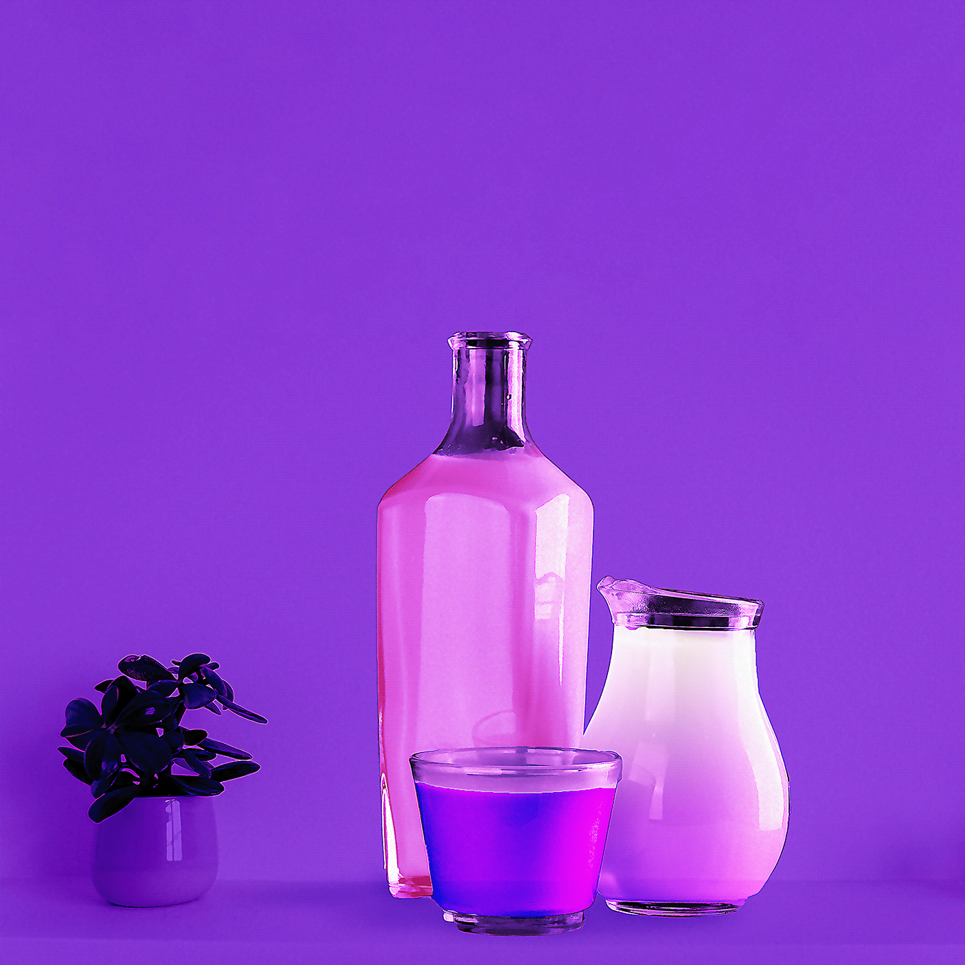
@fresh yarrow This is awesome! Really great composition and sense of perspective on it! Really liking that monochromatic cool blue look. Really gives the image a distinct feel to fit the flavor of the drink. My only though is it might be nice to see a bit more contrast on the drink itself to really make it pop past the background. Maybe a simple levels adjustment to boost both the darks and lights like this?
@south adder These are great! Really nice compositing work on both of these! Really great fantasy themed images and very well put together! My only suggestions if any would be to increase the contrast of the center of the image a bit on the first one to strengthen the focal point towards the center which appears slightly washed out. And on the second one, perhaps increase the contrast on the book slightly. Currently the girl has the most contrast which is great, but almost to the point where she doesn't seem to match the rest of the image. Increasing the book's contrast might be a nice visual bridge between her, the midground of the book, and the background. It’s pretty minor, but here’s an example for one. Really nice work on these!
(Gif quality turned out poorly, but hopefully the idea shows)
Day 4 combining images- Fish bowl photo is by Daria Shevtsova from Pexels.
@fresh yarrow This is awesome! Really great composition and sense of perspective on it! Really liking that monochromatic cool blue look. Really gives the image a distinct feel to fit the flavor of the drink. My only though is it might be nice to see a bit more contrast on the drink itself to really make it pop past the background. Maybe a simple levels adjustment to boost both the darks and lights like this?
@bleak fossil For Sure Thank You!
Both of them are looking great @thorn geyser! Loved the work with the shadows and how you blended the backpack to the sand. Just a suggestion: You might brighten the right area of the backpack on the second version, you can use this wood piece on the right as a reference 😉 Awesome job!
@coral stone Thanks for the feedback! I have brightened up the right side of the backpack now. 😄
Day 4_Combining Images
@thorn geyser try adding some green tint to the shadow of the glass
@weak bolt The glass was already in the photo, I didn't add it! All I can do is perhaps see if I can tweak the backpack shadow to match the colour of the glass shadow a bit better.
Day 4 Challenge
@weak bolt Thanks 🙂
Gave +1 Creative Carma to @weak bolt
I figured I should merge the Illustrator and Photoshop dcc's into one big project. Hoping to add in some XD goodness as well.
AiDCC was to make a business card. I still want to do something cooler for it...idk, going to have to properly concept out this logo.
PSDCC is Product placement. Photos of the tools and seeds are mine and then added my designs and the phone. 💣 boom
Any feedback is appreciated! 😁
Challenge 4. I went retro with my advert.
Thanks @bleak fossil 👍
Gave +1 Creative Carma to @bleak fossil
Thanks @bleak fossil hopefully this looks better
Gave +1 Creative Carma to @bleak fossil
Hey there, here is my work for the challange 4, hope you like it 😬
@coral stone you got me over there😋 i will try the stamp tool, it still new to me
@weak bolt can you be more specific? thank you 🙂
Gave +1 Creative Carma to @weak bolt
@bleak fossil Thank you!:) yes i had some trouble to fix this part 😫 i will go over it again
@weak bolt
oh yeah thanks
@weak bolt i just wonder what is it mean for you 2nd and 3ed cup donr go well
@weak bolt oh ok it is just your personal opinion, thank you anyway :)😋 👍
Gave +1 Creative Carma to @weak bolt
No problem @tranquil moth. Let me know if you need any help 😀
Day 4: Combining Images
Hey, @sage verge I'm doing the AiDCC too - I love your concept of developing both challenges into one project. Good Luck!
@young karma This is fantastic! Really flawless integration of the two images together. The masking on all the objects is looking on point and and cast shadows are working really well to sell the effect. Impressive work, the theme and feel of the room along with the logo looks great
Thank you .. @bleak fossil
@sage verge Looks really good 🙂
Day 4
@bleak fossil , @coral stone - just curious, what does this post mean ?? ➡️ @dire kite
Gave +1 Creative Carma to @warm oasis
@soft arch Very cool! So you manually created all these color variations based off the blue dragon? Really nice job with the patterning in the two versions on the right! These look great, some really nice variety between them.
@bleak fossil Thank you. Yes, I jumped between color balance, hue and saturation, gradation curve and selective color (is this the right word?) to find out, which colors I could apply. This is all the blue dragon 😃 , but to keep the structure of the wings, I had to take a bit off in the mask.
@coral stone,thank you for the suggestions. Yes, I agree. 👍
@slow stirrup Cool!
Thanks, @young karma !!
Gave +1 Creative Carma to @ashen ibex
Now I have to prepare myself a Martini 😀 😋
Day 4
@tropic knoll Youre welcome. You as well.
@bleak fossil Thanks for your critique. I have not yet been able to "click in" with this DCC. The overall theme hasnt worked for me. And there havent been any really new interesting techniques to spark my limited "inspiration". Let me see what today brings.
Gave +1 Creative Carma to @bleak fossil
day 3: I created a playing card with invented text (don't know, if this exists)
@young karma beautiful work! Loved how you worked with the shadows and the colors. Great job!
This looks awesome @ruby panther! The textures and colors enhance the retro stile of your composition really well! I loved the shadow you added to the necklace and how it helps to guide the eyes thought the elements. 💯
@soft arch very nice, Monika! I like the subtle illustration on the background and how it doesn't create distraction allowing the text to stand out. My only suggestion is that you might play with some size of the text, I believe that just increasing the You found... text will help it to get more attention and create more interest to the next paragraphs. 🙂
Thank you! @coral stone
Gave +1 Creative Carma to @coral stone
Challenge day 4
@coral stone Awesome ! Thankss 😀 And you do great job supporting everyone !!! 👍 👍 👍
@ruby panther Love this art....Really, really cool! 👍
Gave +1 Creative Carma to @ashen ibex
Cool job @tender field! I like how you masked the background and how you managed the text contrast. Well done!
@ruby panther Not as good as yours but thanks a lot! 👍
Gave +1 Creative Carma to @ruby panther
@soft arch very nice, Monika! I like the subtle illustration on the background and how it doesn't create distraction allowing the text to stand out. My only suggestion is that you might play with some size of the text, I believe that just increasing the You found... text will help it to get more attention and create more interest to the next paragraphs. 🙂
@coral stone hello @coral stone thank you, this is a good idea, I will do so 😃
#4
@strange lava Point Break?
was working on this before i saw the challenge for today 😅 def misunderstood day 4 and ima start over bc its very rushed&messy but i need some feedback on this first so i can have a better idea of what i gotta fix up 🤔 im kinda stuck rn and dont wanna upload it yet if i dont rly like it lol
@thorn geyser These look great together! The bold saturation of the backpack fits nicely with the rest of the image. Really nice job on the shadow as well, though I think angling the direction down slightly to better match the angle of the cup's direction might help. Though honestly that's a really minor nitpick. I like the sandy effect on the backpack too, very nice!
@bleak fossil Thanks for the feedback! I made some adjustments to the shadow to better match the cocktail shadow 😄
@safe linden You could try to add a gradient map to the cooper to get some of those blues like the other two cars.
I would still stick to Tesla though 😉 😆 (like I can afford any of those)
I would also suggest reading some ads and play with your message a bit. It could be nice to not try to discourage another brand but things to consider with these brands. I don't know anything about these cars but maybe it's "100% European Luxury, 100% Electric"
@sage verge actually I was thinking more inline with a Car and Driver article, where they often use headlines like this, as opposed to an advertisement, which wouldn't really feature a Porsche, Jaguar, and Mini Cooper.
Thank you @bleak fossil and @coral stone I have taken your suggestions along with @weak bolt and moved the objects, changed the background and added some shadows.
Gave +1 Creative Carma to @bleak fossil
Only just got around to completing Day 3.
My entry for day 5
@sage verge actually I was thinking more inline with a Car and Driver article, where they often use headlines like this, as opposed to an advertisement, which wouldn't really feature a Porsche, Jaguar, and Mini Cooper.
@safe linden
You're thinking more of an article layout. I'm pickin up what you're putting down! You should maybe stylize it, add some context. It could portray editorial design more than an ad. Just my three cents 😅
Thank you @bleak fossil. Each challenge for me is quite an eye opener. I really appreciate your insights and feedback. Best to you in all of your endeavors, too.
Gave +1 Creative Carma to @bleak fossil
DCC8 05 200626 Mockup of Covid Swag Box. Thank you @jolly quest for DCC, even if it was abbreviated. Please stay longer next time!!!
Gave +1 Creative Carma to @jolly quest
Day 4 Combining Images. More crochet cloths. I have managed a theme for the week for the first time!
Challenge #5 - I want more!! lol
@magic edge you can do the old ones. You will find them on YouTube. Just post to "past-challenge" as you work through them 🙂
@eternal mica Lots of color there. Only comment is that the mask is too small and out of proportion. Might want to make it a bit bigger in comparison to other items.
@primal fulcrum Thanks for the comment. I will work on that over the weekend. As I worked through this, there are several things I did I realized afterwards I did "Bass Ackwards. I need to rebuild it to make the elements more accessible.
Gave +1 Creative Carma to @primal fulcrum
Mockup
Day 5 Mock up
@thorny sedge super cool mockup, Stephen! If you want, you might apply some iris blur to the logo on the areas where the box starts to blur, as Val did on the stream. Also, you might apply some contact shadow where the glasses are touching the surface, just to increase the effect that they are really on the scene. It’s a darker and small shadow that you can do with the brush tool. Well done, Stephen!
@blazing quail very impressive work! I loved the blur that you added and the shadows on the dices as well. 😉
@fresh yarrow wow another awesome work! I loved the emphasis in the areas of the t-shirt, this would give a great project! 💯
Loved the crochet theme, @barren ice! Just one point of feedback, you might apply a contact shadow to it (occlusion shadow) just to enhance the fact that the cloths are really on the ground. This shadow is very small, darker, and is placed on the area that the cloth is touching on the ground. You can easily do that using the brush tool 🙂
Very nice @buoyant nova! I really like how you played with the logo on the left. My only suggestion would be to apply a sharper shadow instead of a blurred one, you can use the ones from elements on the left as a reference. You can also apply some iris blur, as Val did on the stream, just to create that softness effect as the shadow is getting distant from the box. Super cool job, Susan! 🙂
This is looking great @magic edge! Loved how you played with some variations of your logo! My only nitpick would be to apply the blur on the text and graphic as well, since they are in the same area, the blur amount should be similar. This will increase the realistic look of the mockup even more 😉
Great adjustments @cold oyster! The shadow and the products now separated are looking great! About the mockup, I like that the gradient you added to the logo, it gives the impression that it was a UV printed. My only suggestion would be to work on the perspective a little bit more, the left area of the logo looks a bit tilted to the right compared to the left edge of the book. You can use the edges of the book as a reference for perspective. Well done!
Super cool work @hot thicket! I like how you matched the levels of blur of the box to the logo. I also like that you added some shadows to the dices. Nicely done!
Okay, thanks @coral stone
Gave +1 Creative Carma to @coral stone
@fresh yarrow wow another awesome work! I loved the emphasis in the areas of the t-shirt, this would give a great project! 💯
@coral stone Thank You! I did end up putting this weeks challenges on a behance project! https://www.behance.net/gallery/99606039/Photoshop-Daily-Creative-Challenges-June-22-26

Behance
Photoshop Daily Creative Challenges June 22-26
final #PSDCC #5 logo placement
Day 5: Mockup. I've used yesterday's image as a street billboard (from Adobe)
Loved how your logo worked great with the box @safe linden! If you want, you might apply the iris blur to the logo, like Val did, on the blurred areas of the box, just to increase the realistic look. Great job!
Very nice work @forest aspen! The image fits very well in the mockup! 👍
You’re all rocking the challenges! Well done everyone.
Day 5
@digital pike cool!
How much? I’d book!
@digital pike very nice work, Gerard! Really how you worked with the shadows and the logo on the car. My only suggestion would be to increase the scale of the car just a bit to look even more proportional. Nicely done!
Awesome mockups @thorn geyser! Loved the composition with the table 💯
I did this for a recent contest. Didn't even make a mention. Oh well. We had to use a given set of images to do it. This is 3 backgrounds, Rhino, elephant, bird, lion (his mane is the tail)
combining images challenge
Loved how your logo worked great with the box @safe linden! If you want, you might apply the iris blur to the logo, like Val did, on the blurred areas of the box, just to increase the realistic look. Great job!
@coral stone I did put an Iris blur on the logo, just not as successfully as Val. I also put one on the equipment, again, mixed results. Practice, practice, practice I guess. Thanks.
Here is the link to my DCC for this week. Please check it out. Any and all comments are welcome. Have a terrific Independence Day (for the Americans) vacation week. Hopefully we'll all get together here in about 10 days for our next DCC. https://www.behance.net/gallery/99301857/Photoshop-DCC-8-June-22-July-3-2020-VooDoo-Val

Behance
Photoshop DCC 8 June 22 - July 3, 2020 VooDoo Val
Day 5
This weeks work https://www.behance.net/gallery/99365855/Photoshop-Daily-Creative-Challenge-June-22-26

My Mockup using my business card file, and some cool art that I found on pixabay.
Travel Trinket box....I tried to work on the shadows, let me know how they look.
Well done with the shadows with the small objects but you forgot to add it for the box.
Remember that we would be able to see a small amount of shadow.
@gritty violet
Shadow back of the box
Great looking after the even tonned shadow @gritty violet 👍 👍
@weak bolt Thanks for the advice...It does look better
Gave +1 Creative Carma to @weak bolt
@unkempt field Nice attractive colours.
Also can I get a cup put in that bag,
Daily Challenge 200626 - MOCKUP
Photoshop Daily Creative Challenge - Mockup - Day 5
Daily Challenge - Day 5!
@hot thicket The blur and perspective are looking great on this! The logo is looking really solid too! Great texture and the design has some really nice contrast. Nice work with the shadow effect on the dice as well, everything looks really nice and cohesive!
@plain sable Great job adding in the bottles to this image, they’re looking really natural and the masking is looking really nice. There’s a slight perspective different that could likely be tweaked with the Warp function but it’s super minor. Really liking how you warmed up the lighting of the background too, it makes for a great mood to this design!
@tender field Very cool! Really nice work on the masking on this design, these objects are all working really well on the table. The only thing I think you’re missing is a shadow on the objects on the table. All the other objects in the scene have a hard dramatic shadow from the direct sunlight, you could create this effect by creating a mask from the shape of the objects on a multiply layer and transforming it to fit the length of shadow that you want. Maybe even adding in a super subtle blur so it’s not perfectly crisp. Nice work!
@neat shale Great colors in this image! A couple tips to help these bottles fit in the scene better might be to flip them horizontally since they seem to be lit from the left while the original photo is lit from the right. Also adding shadows to them to mimic the shadow from the plant/vase on the left side of the image might set them in the scene a bit more as well. Nice job, looking good!
@thorny sedge Nice work Stephen! The perspective of the logo is looking good, and the glasses are a nice touch. I think an Iris Blur on the far end of the logo would help it better match the focus of the box. It might also help to move the shadow of the glasses up a bit, or the glasses down a bit, since currently the glasses appear to be floating slightly. Good job with this one 👍
@barren ice Nice work, I like the crochet texture of the background. The overlaid shapes in the top logo are looking nice. I like the soft look to this whole design and wonder if marketing that top text white instead of black would help reinforce that feeling more. Though I’m not sure if white would stand out enough or not without seeing it. Either way nice job!
@blazing quail Really cool logo, and nice job matching the perspective to the box! I feel like the iris blur could be pushed a bit further, particularly in the top left (further back) area of the logo, though that’s a bit of a nitpick. Giving the text a bit of a black stroke could also be a nice way to make it really fit in with the logo. The cast shadows from the dice are a nice touch and are looking good!
@trail bone Great colors! Really liking the deep colors and contrast of this. Though I do wonder if the black of the design would be a bit lighter, currently it looks a little unnaturally dark. Perhaps a subtle gradient across its surface to lighten it slightly might look good? The perspective on the logo and text are looking good. Really nice job on the iris blur too!
@small ingot The mock up is looking really nice! The texture and logo look good together. Really great job on the logo by the way! There's a really nice graphic read and sense of dimension to it.
@young karma Cool idea for this mockup! The objects on the table are looking really nice with that cast shadow. Gives them a really natural feel. I kind of feel like a slight shadow effect behind the lid onto the tin might help add a bit more dimension too. Really great focus on the objects on the table with that blurred background, looks good!
@bleak fossil Thanks for the feedback! I'll give the gradient a try. I'm trying to go for a felt/suede look but not quite sure how to make it look "natural"
Gave +1 Creative Carma to @bleak fossil
@bleak fossil Thanks For Your Feedback
Gave +1 Creative Carma to @bleak fossil
Since I joined the last day. I'll submit a pile of works. Please don't hate.
logo design
Information card
Combining images
mockup
@young karma the combine looks good. Try adding some (small coloured balls (i dont knlow wat they are called)) to the donut
@unborn prism your mockup looks awesome. My eyes glued to that diamond.
Gave +1 Creative Carma to @fossil belfry
Challenge 5. Sticking with the Art Deco style mock up.
@ruby panther Nice one
Thanks @weak bolt
Gave +1 Creative Carma to @weak bolt
Day 4 updated with occlusion shadows. @coral stone Thank you. This looks much better.
Gave +1 Creative Carma to @coral stone
My Day 5 Mock up. Thank you to @fresh yarrow for the inspiration for a label.
Gave +1 Creative Carma to @fresh yarrow
My final project on Behance! Very blue as usual, I might expand my colour palette for future challenges! 😄 https://www.behance.net/gallery/99486457/Photoshop-DCC-22nd-June-to-26th-June-2020
Behance
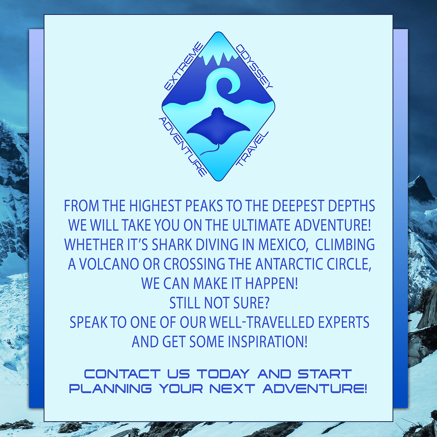
The Photoshop Daily Creative Challenge from 22nd to 26th June 2020. Creating a logo, merchandise, an information card and brochure mock-ups for a fictional adventure travel company.
Daily Challenge 200626 Mockup - with shadow revision per suggestion from @bleak fossil
Image sources include AdobeStock, Pixabay, Flickr Commons, and paper from PixelSquid. Plus the logos from the prior challenges.
Challenge 5. Sticking with the Art Deco style mock up.
@ruby panther very nice illustration, was it from RawPixel?
@young karma your mockup is very good.
But take a close look, the box has lighter shadows but thr die has a stronger shadow
Thanks @bleak fossil I was being a little lazy with the one bottle, I should have re shot it, I didn't think of warping it I'll give that a try...
Gave +1 Creative Carma to @bleak fossil
Oh dear, so little time now to work on this. Day 4... haven't even looked at 5! Rush jobs are never satisfying are they?
@young karma they will be more satisfying of you colour match all the objects
I compiled this week challenge in behance. Have a look. https://www.behance.net/gallery/99632815/Photoshop-Creative-Challenge-with-VooDoo-Val

Day 5 - Mockup
@buoyant nova u forgot to add the shadow that the lid would cast
@young karma they will be more satisfying of you colour match all the objects
@weak bolt That is a VERY good idea!
@weak bolt The shadow the lid would cast at the front would be covered by the shadow that is there from the box already. There is shadow from the lid at the top right of the box
Upd8 with colour lookup - I like that it is suddenly more atmospheric. Thanks @weak bolt for that input.
Gave +1 Creative Carma to @weak bolt
@young karma looks better
Day 5. I would be happy if I could reduce the size of the Cattails on the box, but I didn't put it on it's own layer when using Vanishing Point, so I'm stuck and therefore, done!
Very cool @barren ice you can also put a drop shadow to the tag to make it look more realistic!
The shadow the lid would cast at the front would be covered by the shadow that is there from the box already. There is shadow from the lid at the top right of the box
@buoyant nova - I think what RejectedPiece was suggesting without giving away how to do it was something like this.
@young karma Ah right, thanks
Day1 - I'm working during the weekend 🙃
Gave +1 Creative Carma to @warm oasis
Some milk in mockup😊
so little time to be creative... Day 5... in a rush again.
I did try to 'park' it in a street but the mismatch of studio vs daylight was too hard to overcome in the time I had.
Cheese was truly the answer.
Have put some shadows on the box from the lid. Thanks @young karma and @weak bolt
Gave +1 Creative Carma to @warm oasis
@buoyant nova Hi. This is just a thought. When the sun shines on an object, the shadow is darker, closer to black,gray. Perhaps add a tiny bit of gaussian blur. Your lighthouse and star looks fabulous. That color looks great! You are an amazing artist! Congrats! Oh, question. Are there one or two ropes on the left. If one, perhaps consider making the shadow underneath fainter and blurry.
How do I tag my work on Behance, so it would show on the challenge gallery?
@tropic knoll I did the shadow darker originally but it didn't look right. Valdair said to match it the same as the shadow from the lighthouse. I can't take credit for the background image, it is from Adobe Stock. The box is a separate image. I agree the rope shadow should be a bit lighter, will try and do that. Thank you
Gave +1 Creative Carma to @tropic knoll
@bleak fossil thanks for the advice!
Gave +1 Creative Carma to @bleak fossil
How do I tag my work on Behance, so it would show on the challenge gallery?
@slow stirrup I add #PSdailychallenge to my images in mine and to the project overall. Other than that I assumed they were out there on Behance anyway. You might try posting your enquiry on ask-a-question tho and get a better reply than this from someone who is sure.
@young karma thank you so much!! I've been waiting for ages...
Gave +1 Creative Carma to @tame gorge
Day 5 Challenge
Day2 - Product Photography - I took the pink camera and change the colour for all
heres my updated mockup to fit the scene better and just touched up better in general 😆 https://www.behance.net/gallery/99664311/625-626-Photoshop-Daily-Creative-Challenge-Days-4-5
Behance
Originally made a mockup on day 4 then saw day 5 was a mockup so I just mixed it together instead.
Actual job, label
anyone on?
day 5
Day-4
@young karma Thanks, No, it's from the Rijksmuseum in Amsterdam.
Gave +1 Creative Carma to @warm oasis
Day 5: Mock-up for Australian Wildlife Rescue.
@covert loom - The dice are clear, but you have shadows coming from all directions. It's hard to know where the ground level is as they are all floating.
Challenge: Day 4, I added the sea animals to the beach image 🙂 tried my best to create shadows
Hello, Is it just me or have the past challenges disapeared from the main Photoshop Daily Creative Challenge Page (https://www.behance.net/challenge/photoshop) ? I used to go there to find past challenges and now they are all gone. Just wondering.
Day 5
Was going back through and saw old #📣creative-challenges #💎past-challenge from @fierce valley and made these
@young karma Thanks, No, it's from the Rijksmuseum in Amsterdam.
@ruby panther Thanks, found it..
Pattens
@covert loom nice one.
You went more creative with the pattern rotation feature. 👌 👌
My complete challenge on Behance:
https://www.behance.net/gallery/99684417/Photoshop-Creative-Challenge

@normal basalt Its not just you.
Thank you @jolly quest for an awesome challenge! Thank you Rummu Amin for the picture of the box for mock up. The game and game pieces are from kickstarter board game "Gnomes at Midnight" by David van Drunen. Speaking of Kickstarter, did I see the amazing dice used in the tutorials on Kickstarter a while back? i may or may not have a board game addiction. This image is packed with all the challenges for this week, showing an exercise in recoloring, logo, product photography, an information card/social media graphic, and mock-up
Gave +1 Creative Carma to @jolly quest
Hi @normal basalt not sure why they aren’t appearing. But as a temporary solution you can search for the videos on the Adobe Creative Cloud YouTube Channel https://www.youtube.com/c/AdobeCreativeCloud/videos

YouTube
Adobe® Creative Cloud™ brings together everything you need to create your greatest work. One simple membership gives you and your team access to the very lat...
my project on Behance https://www.behance.net/gallery/99418515/PS-Daily-Creative-Challenge-with-Voodoo-Val-June-2020

Behance
PS Daily Creative Challenge with Voodoo Val June 2020
@young karma These are great! I really love the mix of classy/elegant and playful with the donut logo. It works well and has a nice contrast to it. The gold texture is a really nice touch too. I really like the sort of depth of field effect you got on the information card with the blur, though I think it would help sell the effect if the far edge was blurred slightly too instead of being sharp. Might help sell the effect a bit more. Really great work on these, the logo on the bags is looking really nice and the lighting on coffee mug looks great!
@covert loom I like the color variations on your mock ups! The color and lighting really can change the mood and feel of these images quite drastically. I think the iris blur on the logos could probably be pushed even further to match the focus of the box, and the dice might look good with some shadows to match the cast shadow of the box. Nice work on these!
@unborn prism This looks great! The clean elegant look of the logo works really nicely with this mockup. Nice work with the perspective!
Thank you very much Sam! @bleak fossil
Gave +1 Creative Carma to @bleak fossil
@autumn granite That 3D text is looking awesome! It sits in the scene very convincingly with the lighting and color. The cast shadow looks really natural with that lighting as well, though I think maybe it could be even darker to get a little closer to the shadows of the people and the pier.
Really liking the effects in the baseball image too! It gives it a lot of energy and movement. It could be nice to see the flame effect wrapped around the baseball itself a bit more. Really nice work on these images!
@soft arch Really great work on these challenges! Day 5 looks really cool, I love how intricately designed the box looks. Both the top image and the gold designs on the side look really nice. I think perhaps the shadow/reflection of the dice could be a bit longer and more to the left to better match the reflection of the box? Just a thought. Really great job with this mock up and all the other designs as well!
thank you @bleak fossil 😃 😊 I will check this.
Gave +1 Creative Carma to @bleak fossil
@bleak fossil thank you for this amazing feedback.
Gave +1 Creative Carma to @bleak fossil
@bleak fossil Thanks Boss. Really great advice. Will help make my work more beautiful.
Gave +1 Creative Carma to @bleak fossil
@coral stone I think I fixed the perspective now.

Behance
6.22.2020 Photoshop Daily Creative Challenge - Logos and Branding
@bleak fossil I moved the flame level up to help make it look coming from the ball/hand.
I think, you are right @bleak fossil the shadow goes to the left, I will change it, but I have to change all shadows, because I positioned them all to the right 😃 😅
Hey everyone! Just a heads up that since there's no challenges this week I thought it would be fun to try a little session on Shadows here on Discord. I'll be jumping into the mentor-feedback voice channel tomorrow and sharing my screen to talk a bit about how I typically use shadows in Photoshop. If anyone might find that helpful feel free to come hang out!
Last two days of work for the crewing company i've been working for is with a thing called World of Dinos. Spent today loading Hugeasaurases and Tinysaurases onto wagons. Took a pic and immediately thought the TOONACTION.
Just being silly really.
and I probably should have posted it in 'Past Challenges'
@bleak fossil Will it be available as a recorded message afterwards? I'll still be dino wrangling at that time?
@young karma I was considering recording it and then uploading it to my Behance page along with my live streams. I've seen people upload time lapse videos there so I assume it's possible.
It would be brilliant if you managed. Of course if you can't it is equally brilliant that you thought of doing something anyway 👍
It shouldn't be an issue. At the very least I could just go live and have it stream the recorded video. That way it will at least be saved.
Thanks @bleak fossil
Gave +1 Creative Carma to @bleak fossil
@young karma Hah, very cool! The perspective of the photo really works well to give the image a dynamic feel as if they're running out the center of the image. Currently the background has a very similar value and color range. The main thing separating the dinosaurs is the black lines around them. Perhaps darkening the background a bit, or separating the hues or saturation could help give them a bit more pop? Great idea for this design 👍
@midnight dirge Looks good Nehal! I think for the size of the image you created having the logo be a contrasting color could help it read better. Even on the zoomed in image it's hard to see at a glance. Maybe something more in the blue/green range? Also nice work on the cast shadow, the dramatic lighting of the toy fits the lighting of the scene well. Though flipping the toy horizontally might help it match the scene a bit better since the lighting appears to be coming a bit more from the left. Nice work!
@autumn granite Nice, its definitely got more of that effect now, looks good!
@bleak fossil I hope you meant June 30th.
Hey guys, i am not sure if there are new challenges...🙄 but here is my mock-up creation 😆
Ah how can I find the work jut from the product shot session
Oh no! Yes, I meant June 30th today. facepalm @eternal mica
@bleak fossil Di I eed do anything but click on the mentor-feedback icon?
Do i need do anything besides click on the mentor feedback icon?
@bleak fossil Have you started the stream?
Just about to
Will be going over shadows momentarily. It's not a stream, just going to be screen sharing through the metor-feedback voice channel
Oh okay haven't done that before
Yeah, I've done it once. Figured I'd try it out again
If anyone wants to join you can find us in the mentor-feedback voice channel. And if you want to chat I think the #💬chat-general text channel will be a good way as to not flood this channel.
@eternal mica I don't see his screen
Hi @bleak fossil I missed out most, is there re-play please on 'shadows' talk?
@cerulean beacon - I think he said he would try to post it on his Behance acct/channel in a day or two.
Correct! I'll try and upload it soon and I'll post the link here after I do.
Hi @young karma, thanks. I hear it just after I sent above message.
Gave +1 Creative Carma to @warm oasis
@young karma Very nice! We'll be starting the new set of challenges this coming Monday on July 6th. Really cool incorporation of the logo! I like the sort of illustrated look with the tree too, it makes everything blend into each other quite well. This is really just personal preference, but it could be a nice effect to emphasize the glow of the light bulbs if you were to darken down the entire section of leaves with a multiply layer just a bit, and then erase/mask out the areas of the multiply layer with a large soft round brush to give each blub a sort of glowing effect. Might add some nice mood to the image. Nice work!
@cold oyster Looking good! Very nice to see this logo applied to various different objects and use in different applications. Nice work on all of these!
On the book image I think the lines of the side of the logo could be matched a bit more to the lines of the side of the book to really match that perspective. Really like the glossy look of the logo on that, really separates it nicely from the book!
@bleak fossil Cool! Thank for the tip! Aaand for the info 😊
Gave +1 Creative Carma to @bleak fossil
@bleak fossil You were right! 👏 👏 👏 Thanks ! 😀
Gave +1 Creative Carma to @bleak fossil
Day 2. Product photography.
@west nest I love this!
@covert loom. Your art with the tree and waterfall is stunning. Thanks for sharing.
Gave +1 Creative Carma to @covert loom
Hey everyone! New to this channel, so excited at the fact that I have access to so many talented graphic designers in one place! Awesome!!! Can't wait to grow my skills doing these challenges with you all! Cheers! 🎉
Thanks Adobe Cloud
Hello @bleak fossil have you posted the link for your stream of yesterday? I missed it and would like to watch the replay.
@cerulean steppe Not yet, but I hope to do so soon. I'll make sure to update everyone when I get it up.
@fluid wharf Very nice work on these! The cup is fitting into the scene quite nicely in the first image. I think you could probably push the effect even further by darkening the shadow a bit (especially around the base of the cup to give that ambient occlusion effect) with a multiply layer and making the shadow a bit more towards a cooler blueish tone to better match the shadow from the vase. Also adding a bit more shadow to the left side of the cup with a soft brush and multiply layer might help it fit the lighting closer to the vase as well. I attached a GIF to show what I mean.
The perspective of the logo on the second image looks great! I think doing the iris blur effect on the far end of the logo to match the focus of the box would look good. Also some subtle cast shadows on the dice to match the cast shadow from the box might look good too. Nice work on both of these!
thanks Sam for feedback
Challenge 5
Hello @bleak fossil. I just want to say Thanks. Your insights inspire me. Happy, safe and good fourth to you.
Gave +1 Creative Carma to @bleak fossil
@sharp niche Ooh, love the idea for this mock up! The semi-buried-in-sand idea is really cool. Really great lighting on both the box and and background too! Very nice work fitting the design into perspective on the box! My only suggestion is that the dice in the sand on the right side could be darkened down in the areas in shadow to make it match the lighting of the background more. I think you could get a nice effect with the lighting hitting only part of the dice. Here's an example, I used a multiply layer to darken down the shadowed areas of the dice. Nice job!
Oh wow, that GIF quality came out pretty poorly. Here's a still image.
@potent cove This came out really nicely! Both the glow and shadow effect are looking really solid. The texture and gradient on the background does a great job of making the whole image realistic. Look good 👍
@covert loom I really love the idea of the tree image with the waterfalls behind it, very cool! I think it could help sell the effect even more if you sharpened up the edges of the opening in the tree. You could even composite additional bits of moss and leaves on the edge of the opening so it's a clean/sharp edge, which would really help the effect that there's a sudden opening and keep a very organic and natural look. Looks good!
Playing with the Mock up. Challenge 5
This is for something else but it fits the challenge. I left the people in the building because I found it more appealing.
This is the logo that is shadowed on the street.
@bleak fossil Thanks for your advice. Contemporary opinion.
Gave +1 Creative Carma to @bleak fossil
@vale sandal the work is beautiful. Personally, I wouldn't have noticed the shadow on the street, if you hadn't pointed it out..
@slow stirrup I wanted the shadow to be subdued. Thanks for the feedback
Gave +1 Creative Carma to @slow stirrup
Lady Gaga's cromatica on the moon surface manipulation. How's it guys? I have used my own color LUT in this manipulation.
@tidal bloom The shadow is the logo not the skater in the sky. I left the people in the side of the building because it was visually appealing to me. This wasn't exactly for the challenge.
Bit late for last week's challenge but I didn't have much time. Here is Day 1 - Day 5... Day 1 - Logo
Day 2 - Color Change
Day 3 - Information Card
Day 4 - Combining Images
Day 5 - Mock Up ... The dog is definitely not proportionate and looks a little off. Anything I could do to make that look more realistic??
Hi everyone! Am new to this channel, and am really glad to have the access to chat along with so many talented graphic designers in one place! am so so happy💝
And here is my First Post Here
Tried another mock up. What do you think?
@north ridge Nice work!!
Really cool @tardy heart !!
Hey guys. when will the live broadcast?
Hi @vague knot. Adobe Live comes back tomorrow (July 6th). You can check the schedule here: https://www.behance.net/live

Join us right now to get inspired by leading creatives. Get your questions answered and share your work with the community.
DCC 7 #💎past-challenge
I'm really excited for this challenge as I love books and read a lot, so this is perfect! Can't wait to see whats in store!
DCC09 200706 Having Paul again is so awesome. Im sure this is going to be an awesome 10 days.
@fluid wharf super cool job! I really like how you aligned the texts to the left! I wonder if you could decrease the background brightness just a bit, so the words will be able to pop a little more with contrast 😉
@worldly barn very nice job preserving the contrast! The distribution of the words are looking great. Nicely done!
@eternal mica I like how you kept consistency using the colors of the Ps logo. My suggestion would be to avoid placing the text in front of the logo, maybe aligning it to the left and playing a bit with position and scale will help you to reorder the hierarchy of the informations. Great to see you are back for this set, Ted!
Hey, @gilded flame it's not exactly Day 1. More like Day 0...😉
@slow stirrup ah ok 🙂
Hi everyone, this is my cover project !
@sudden hawk Great image choice for the background, Manal! Really like the font that you used, my only point of feedback would be to apply a subtle shadow on the text and/or darken the background a bit, to add more contrast, making the text stand out a little more! Well done!
This turned out great @vagrant rapids! Loved the edits on the background, and the spacing looks really nice. Very nice job!
This is looking super cool @gilded flame! I like how the second option seems to have more contrast between the text and the background, although I think that if you lighten the word Photoshop would make it stand out a little more. 😉
@slow stirrup great job on the contrast and the font choice, looks awesome! 💯
Here's my DCC cover Photo asset: Photo by Eugenio Mazzone on Unsplash
@coral stone Valdair, great to be back with you, @bleak fossil , @brittle slate and the whole group. I made quite a few changes, including uncovering the logo from the text. I even (reluctantly) switched over to the new Ps logo. How does this work?
Beautiful work @plain sable! I like that you played with blend modes/transparency on the Ps logo! My only suggestion would be to apply the same bright color of the text from the top to the dates on the bottom, I believe it will help it stand out a little more. 🙂
@coral stone : Thank you for the feedback 🙂
Gave +1 Creative Carma to @coral stone
@eternal mica nice improvements! One thing that you can do is to reduce the opacity of the 9 in front of the logo, so the Ps letters can have more readability becoming easier to identify, that's just personal preference, of course 🙂 I like that you played with overlaps on it!
@eternal mica nice improvements! One thing that you can do is to reduce the opacity of the 9 in front of the logo, so the Ps letters can have more readability becoming easier to identify, that's just personal preference, of course 🙂 I like that you played with overlaps on it!
@coral stone OK. I specifically went for this look, but as always, I'll give your advice a go. I'll change it when I apply it to tomorrow's challenge and see how it looks. Thank you for the critique.
@eternal mica I think your new one is much better, than the first one.
@slow stirrup Thank you. I do too. 😊 😊 😊 . I love the font in yours. It gives the image a very relaxed feel. I would make one suggestion, maybe spreading the letters out a bit more. They look a little cramped to me.
Gave +1 Creative Carma to @slow stirrup
@eternal mica, is this better?
Thanks @coral stone
Gave +1 Creative Carma to @coral stone
@slow stirrup I apologize, my suggestion wasnt clear. I meant the horizontal spacing, not the vertical spacing.
@eternal mica, like this?
@slow stirrup Oh Yes!!! I like that much better. Do you?? Have you tried the character panel to spread out the letter spacing?
@eternal mica, No. I used the transform dots, to pull it sideways. I know that's not the way, because fonts can get distorted, but in this case, it worked..
Thank you, @eternal mica, for your help!!
Gave +1 Creative Carma to @eternal mica
Please advise as this is my first PS challenge.
Loved the 3D look of the text @rocky kite how did you made it? It looks amazing! My only suggestion would be to darken the background and fine tuning the color of the text on the bottom (Summer Reading) so it can have a nice amount of contrast and be more readable. Can't wait to see more of your works! 🙂
Both of them look great @brittle condor! I guess the book version is my favorite. Loved how you played with the background color and the splatters. Well done!
Cover Photo
@brittle condor I like both versions. Some could see the top one as too busy, too crowded etc. but i see the top one as balanced. I see the top one as simple and effective.
@coral stone appreciate the feedback.@modern halo I too like the simplicity of how it looks without the books. Thank you both 🙂
Gave +1 Creative Carma to @coral stone
First creative challenge.
Can someone point in the direction of the daily challenge, sorry if its obvious & I don't see it. First time here.
dais
@mystic knot you can find the Photoshop DCC at https://www.behance.net/challenge/photoshop. The daily challenge gets unlocked each weekday morning at 11:00AM EDT. You can watch the live stream at 12:00 PM at that link by clicking on the watch live button. Alternatively, you can also check here in Discord. In the panel to the left click on Announcements Read Only> creative-challenge. You will see a link there to this mornings video.
Day 0 - Welcome
Behance Project Banner
@ruby panther Great design, the masking is looking good! I like the subtle purple/yellow contrast between the design and background too 👍
@vale sandal Really interesting style to this design, I like the muted colors! The shadow makes for a really interesting bold graphic shape. Nice work!
@tight goblet Looking good! I like the simplicity of the color gradient, and the bold colors give it a really interesting sort of neon look. The face and text against the dark background do a nice job of pulling focus too, well done!
@north ridge Very nice! I like the soft colors to this design. The only thing is I'm not 100% sure what the 3 lines are in the middle? If it's just a graphic element then perhaps a bit more of a smoother/uniform shape using the pen tool or something similar might give that effect? Or even something conceptual like little paw tracks could be nice. Just a thought. These designs are looking great! The information card's background works really well with the color and text, and the perspective, lighting, and focus of the Day 5 one is on point. Nice job with the curved perspective to fit the logo on the bottle too. Nicely done!
@hybrid chasm That's great, welcome in! Glad you could join us. Really nice glowing effects on this! The background has some really nice color and texture as well. Just a heads up if you want to post any more personal work not associated with the challenges feel free to use the #📝project-feedback channel. Really great contrast of the skull against the background on this image too by the way!
@potent cove Solid looking texture and drop shadow on this text! I wonder if it might look a bit more natural with some more shadow on the side areas of the text? Nice work 👍
@tardy heart These came out really nicely! Digging the somewhat retro vibe of these designs. Loving the texture of the first design. On the second design I wonder if toning down the texture, or even softening just a bit might help? It's intense enough to the point that it almost starts to pull focus from the cameras a bit. Just a thought. Really nice work on the perspective and focus of the mockup too!
@rocky reef Really cool mockup for this challenge! The graphics look great and the application of the image works really well 👍
@eternal mica Glad to have you back again! Really nice improvement on the cover image! I think you could probably even darken down the background a touch more if you wanted. Just to give the text a little extra contrast at a glance. Nice work!
@gilded flame Very nice, that reads much better! Really great contrast and read now. Really great effects around the PS logo!
Thank you. @bleak fossil
Gave +1 Creative Carma to @bleak fossil
@north ridge Very nice! I like the soft colors to this design. The only thing is I'm not 100% sure what the 3 lines are in the middle? If it's just a graphic element then perhaps a bit more of a smoother/uniform shape using the pen tool or something similar might give that effect? Or even something conceptual like little paw tracks could be nice. Just a thought. These designs are looking great! The information card's background works really well with the color and text, and the perspective, lighting, and focus of the Day 5 one is on point. Nice job with the curved perspective to fit the logo on the bottle too. Nicely done!
@bleak fossil
The image in the center is supposed to be a river or "brook" since the name is Brookside. The lines were supposed to help achieve the water effect. The lines didn't come out as smooth as I would have liked but I've never been very good at freehand drawing 🤷 I'll keep working on that. Thanks for all the input 😊
Header for the challenge. 😊
@bleak fossil Hey Sam, Im happy to be back. I appreciate your critique. Ill give that a shot today.
Here is my banner for Day 0. What do you all think?
Where did everyone (well nearly everyone!) get the Ps logo from? I saw that @brittle slate had all the adobe logos in his library tab. I did a search but nothing turned up. Is this free to get from somewhere?
@barren ice The easiest thing to do is Google "Photoshop New Logo" and one will pop right up! The Library I showed is an internal thing. Thanks!
Gave +1 Creative Carma to @barren ice
What do you guys think
@velvet kelp Doctor Who?
@slow stirrup I don’t understand?
@velvet kelp, never mind.. Your work is really nice. The letters are very clear and readable.
@slow stirrup thank you
Gave +1 Creative Carma to @slow stirrup
Thank you valdair for feedback .... here the header after adjusting the brightness and removing the drop shadow
PS Daily Creative Challenge Header. My image of the old books was provided by Stephanie Harvey on UnSplash.
@covert loom very nice work Mahedi! Really like the green theme of the cover. I wonder if turning the Hosted by... text to white could bring more contrast against the background. You can try other brighter colors as well, just a suggestion 😉
Beautiful work @young karma Loved how you managed the contrast in an awesome way! Lovely work on the fonts as well 💯
@winter tinsel, very cool!!
Cover Image. What do you think?
Nice job @barren ice! I like that you played with Paul's name on the left. This is totally optional, but if you want, you can play with different font for the Photoshop or the Daily Creative Challenge text, just to create some hierarchy and to see how it looks 😉
Woow this is super creative @velvet kelp ! Really like how you played with the letter O and how you managed the text and background contrast really well. Great job!
@buoyant nova, it's really beautiful and bright. Personally, I think, if you're using this size of a bg, then the word should be larger.
hey, i'm new here. can someone tell me where the topic for the challenges are announced?
Hi @dry sable the challenge #1 will be announced on the #📣creative-challenges channel in a few minutes 🙂
oh okay, thank you.
@velvet kelp I assume you placed the face in the O intentionally. To me its distracting and a bit weird. Takes the focus away from the message the banner is trying to convey. Very nice work with the font. What is it called?
Woow this is super creative @velvet kelp ! Really like how you played with the letter O and how you managed the text and background contrast really well. Great job!
@coral stone Thank You @coral stone
Thanks for your feedback @eternal mica the name of the font is Emirates group fonts
Gave +1 Creative Carma to @eternal mica
@cold oyster super cool work! I ike how you played with the perspective very well and how the words have a subtle glow on it, kind of creating a technological look for it. The words in perspective remind me of a Photoshop feature called Vanishing Point. It's a great way to place elements in perspective. I'll give you the link in case you want to check it and learn more about it. https://www.youtube.com/watch?v=zHRDv1Q7hmU https://www.youtube.com/watch?v=qMU-bRTpByY Great job! 🙂
@velvet kelp if @coral stone says its cool, and I say otherwise, go with Valdair. He knows what he's talking about, I definitely dont!!! 😊
@slow stirrup Thanks, I agree, will do it larger
Gave +1 Creative Carma to @slow stirrup
Thanks @slow stirrup for the advice
Gave +1 Creative Carma to @slow stirrup
Yes, @buoyant nova, it's much better!! (in my opinion..)
@brittle slate Thank you. Now have the logo saved.
Gave +1 Creative Carma to @brittle slate
Great job blending the words and the logo to the book @winter tinsel! The textures are a nice touch to increase the realistic look! 💯
My project cover with all the infographic and data visualization books that I loooove 😍 !!!
Daily Creative Challenge 200706 - Project Cover
My Goodness. How Awesome is @queen dew!!!!! All of that in Day 1. Wow. Now I need to catch my breath and rewatch the video a few times
Here's another. In a DCC coming soon I'll show how to turn a photo into a painting.
i like how you explain things @queen dew but man you really move fast. hard to catch for non-english people 😅
Thanks @quartz sedge ! My handle is @brittle slate. And today was pretty ambitious. Tomorrow's will be simpler. Thanks for tuning in!
Gave +1 Creative Carma to @quartz sedge
added the PS logo
I def have to watch each ep several times. 😀
potrait of Mugal Empress
Header
Nice @sturdy vault !!! You have the right logo too. 🙂
That looks great @short mica !!!!
Thank you @bleak fossil
Gave +1 Creative Carma to @bleak fossil
Day 1 Challenge
Day 1 Challenge
I know its very simple but I am completely new to Photoshop and hope to learn a lot from this challenge. The font might look strange but since this is the July reading challenge I thought using the Dyslexic font would be a nice touch.
@zinc coyote Looking good! The slight blur of the background helps the text read quite nicely. I wonder if a subtle drop shadow behind the text might help it pop even more? Nice work!
@young karma I love this! Really great contrast with the text and logo against the background, and the light dream-like look of the background looks awesome. Really like the repeating elements of the books too, the size variation adds some great depth and perspective!
@rocky kite Very nice! The 3D text effect is really cool. I feel like the contrast of the text could be boosted up a bit overall, especially in the darks. Boosting the dark tones on the inside and side of the text might help it pop out a little more and not be overpowered by the contrast of the background image. Maybe giving the small text at the bottom a subtle drop shadow might help it read against the background a bit more too? Nice work!
@rocky kite This is a really cool portrait painting for this challenge! I think it might help if you replace the face with one that's at a bit more of a similar angle to really get that sense of believable perspective. Cool idea!
@sturdy vault Looking good! The sharp text reads well against the softer background. 👍
@short mica Really nice contrast between the portrait and the text! The text over the face gives it a bit of a mysterious look, and the slant of the text gives it a sense action, like this could be thriller/action movie. My only suggestion is I think the Refine Edge Brush Tool could give you a bit more natural of an edge on the hair. Really nice texture in this!
@quartz sedge Really cool idea with the negative effect within the text! It also contrasts really nicely with the background. Nicely done!
@plain sable This came out great! Really nice job with the wrinkles on this, they seem to fit very naturally on the portrait. I really like the blending mode for the text too. Very readable and bold, but still puts emphasis on the portrait. I think the second one could be really cool if you had the greyscale portrait but the areas within the text could be colored. Well done 😄
@young karma Very nice, I really like the boldness of blue of the second image. The first design is looking really nice too, shapes are looking good. I think brightening up the text overall, especially around the letters in the center of the image might help it read a bit more strongly against the background. Nice work!
@somber token Nice job Josh! The portrait and text have a nice balance to them. I think it might look good to scale up the portrait a bit so the edges of the shirt match with the edges of the frame. I think you could also use a levels adjustment to boost the contrast of the portrait a bit more, especially to darken the dark tones, to closer match the contrast of the background. Lastly the Refine Edge Brush tool might help clean up some of those jagged edges around the side of the face. Just some thoughts! Really nice size variation and alignment of the text!
@pure wigeon That's great, welcome in! Glad you're joining us. That's really cool, I wasn't even aware there was a font for that. There's a nice balance to this image with the books on the right being counteracted by the weight of the logo and text on the left. Nice job!
project cover for Behance. Yes same frog I used in a DCC with Jesus
Banner day 1. Shelf was a bit bowed so I used puppet warp and liquify to straighten somewhat.
@barren ice The easiest thing to do is Google "Photoshop New Logo" and one will pop right up! The Library I showed is an internal thing. Thanks!
@brittle slate NOW I see this. After I did a screen grab from Adobe.com and found it was too small. So then recreated it myself.
Gave +1 Creative Carma to @barren ice
Thanks @bleak fossil is this what you meant with the gray scale version???
Gave +1 Creative Carma to @bleak fossil
Since I am a book cover designer, this was an awesome project. Thanks for the inspiration. The image is from Tom Morel at Unsplash.
Day 1 with Paul Trani
@bleak fossil Open dyslexic is a open source font. Daughter's class has started to produce a lot of her class work in it. I now uses it for most work as it helps her and myself read things much easier so it will probably be popping up a lot
Welcome to the forum @pure wigeon
@bleak fossil Played around a bit more with the color bit
Ok 😅 this is my second version and its much better
@plain sable Hey! look really gooddddd
Thanks @tranquil moth
Gave +1 Creative Carma to @tranquil moth
hi guys I was trying to do the challenge when I got to camera raw this came up in photoshop I can't move it to continue
Hi @astral hedge try to press esc to see if it disappears 🙂
ok
Adding in the broken mirror for extra effect (trying anyway) 🤣
Thank you so much
Challenge #1 The Picture of Dorian Gray...as a female. Should I call her, Doria?🤨 Hmmm? (The image of the hooded young woman is by Jyotirmoy Gupta on UnSplash.)
Day 1 - Took ages and I would still like to spend more time on it! 😆
And a mock-up book
I didn't have to do anything to make myself look old! The younger me, that was a challenge! 💀
Interesting exercise.
DCC09 01 200707 Ah to be that young again ... to be able to make all new mistakes!!!!
@primal fulcrum Very nice job with the color contrast! I really like how the words have nice readability and the left alignment of them, giving the frog space to breathe. Great job!
@sudden hawk wow! super cool work, Manal! I like the drama mood in your work. The typefaces were a great choice especially the serif one from the bottom. If you want you can position the By a little bit closer to the author’s name, proximity will help the viewers to relate even more the words. Awesome job!
Very nice improvement @tranquil moth! Really like how the “old side” is more visible now! My only suggestion would be to lighten up the black areas of the Dorian word a bit more, so the cut effect will be more visible and the word more readable. Well done, Mayan!
@coral stone
Thank you very much for your feedback🌸🌸
Gave +1 Creative Carma to @coral stone
@solemn pike This turned out great! Loved how you mirrored the subject giving the contrast on the edits, this was an amazing strategy to make people want to read the book. Also, the font choice was great, what’s the name of it? Excellent job
@hot thicket great to see you’re back for this set! I like the subtle contrast of the before/after look. The name of the book on the bottom right side looks nice as well! If you want, you can play with some displacement maps just to see how it looks. Great job, John!
Challenge Day 1_ Dorian Gray. Still haven't totally got this, but practice, practice, and more practice...maybe eventually.
Hi there, this is my welcome work...
@ancient lark woow super cool approach to the challenge! Loved how you managed the perspective. My only point of feedback would be to enhance the contrast between the text and the background with a very subtle drop shadow on the text, the cover will have even more contrast, especially on the “the” area. Awesome job Andrew!
@winter tinsel! Amaaazing work! Loved the animation. This could be a great way to promote the book on social media! My only suggestion would be to maybe lower the text just a bit or apply a subtle drop shadow so the “By Oscar Wilde” area might be able to pop a little more from the background. Impressive work!
@astral hedge great job! Loved how you played with the blend modes! The subject position on the cover looks nice as well! Nicely done!
@coral stone Thank you so much! 🙂
Gave +1 Creative Carma to @coral stone
@haughty cape you did an amazing job on the hair masking! I also like the overlaps you made on the text in the background! The blending is looking great as well. 💯
Loved the edits @thorn geyser! The way that the clothes seem to be blending to the background looks great as well. Just an optional step, if you want, you might create an overlap between the Doreen Gray and the head, similar to the techniques that the magazines use to create the overlaps between the model and the name of the magazine on the cover. Amazing work as always!
Awesome edits @sacred field! Loved the contrast from the edits! The detail on the mouth and the eye makes it looks very unique. Great job!
Thanks, @coral stone. I used Akula regular and DecafPlease medium for the title and author name.
Gave +1 Creative Carma to @coral stone
Loved the work on the frame @loud mist! My only suggestion would be to decrease the text size just a bit so the other images can appear more. Super cool job!
@eternal mica really like the work on the text kind of giving a double exposure effect! I also like how you played with some textures! Well done!
@cerulean steppe I loved the fantasy look of the your work! The font adds a pretty nice context to it as well. Nicely done! 💙
@hasty oracle, very nice contrast on the edits! I really like the attention to the details you had, especially in the mustache area. Well done!
@coral stone Thanks, Valdair! I appreciate it! 😃
Gave +1 Creative Carma to @coral stone
Hi @blissful wolf great to see you’re back! Loved the header, the blur on the text area adds a very nice contrast to it. Nicely done!
@coral stone , thank you very much! I'll try to keep in track....
Gave +1 Creative Carma to @coral stone
@coral stone Thank you for your comment. I need more practice on getting the content aware colors to blend before I proceed to a more complicated interpretation.
Gave +1 Creative Carma to @coral stone
Gave +1 Creative Carma to @bleak fossil
@brittle slate, Thanks
Day 1 0 - Portrait Touchups
psdcc cover
Day 1 - Soooo happy to be back at the challenges. This one posed heaps of problems around how to make the image and the text equally visiable. Would love to hear your thoughts on if you feel I've achieved it or how It could be improved? Used some puppet warp on the wrinkles and liquify to give the appearance of hand pushing back old face.
@coral stone Thanks for the encouragement. PS is still a battle for me, but I will keep trying.👍
Gave +1 Creative Carma to @coral stone
Here is my Day 1 🙂
Went all crazy and purposely grainy.
PSDCC #2 I look like her. Painting is by Leonardo da Vinci.
Challenge 1. Portrait Touchups. Stopped and started the replay several times. This Select and Mask is a mystery to me. I drew in the second nose because I have never used the bandaid healing tool. very cool. I wish I could figure out this masking method to get the hair. I must be missing something. Will keep trying. Thank you for the opportunity! Left side ~ older. Right side ~ youngster.
DCC09 01 200706 V3 I made up a second version more in line with Paul's tutorial.
First Adobe Challenge. I feel like I played it too safe mental note for next time. Feel silly that I didn't realize we could use any photo to age...
@solemn pike Very cool! There's some really nice color contrast between the two images with the lighting. The texture of the portrait and masking of the hair and face are looking really nice too 👍
@hot thicket Nicely done John! The texture on the portrait seems to fit quite nicely with the painted background texture. The gradient of the text is looking good too, has some nice contrast to it against the darker shirt!
@tranquil moth Cool effect with the text! I think it might look good to scale up the portrait a bit so the bottom if flush with the edge of the canvas. It might also help to utilize Select->Modify->Contract when making your selection on the portrait to get rid of the ring around the outside if you want. Really nice look and texture to this design 😄
@ancient lark Really cool effect with the shattered glass! I like how the eye on the right side is framed by the glass and has some extra contrast. The texture on this design looks great, and the title text contrasts really nicely against the background. Nice work!
@winter tinsel Really cool idea to see this animated! I like the gradual animation of the face through several frames, looking good!
@astral hedge I really like the boldness of the color of the text across the portrait. Both elements read very nicely. I think if you used the Refine Edge Brush tool within the quick selection tool for the portrait you might be able to get a more natural soft edge on the head in the areas where it gets a bit jagged. Nicely done!
@haughty cape Great transition with the texture of the face! The wrinkles and details are looking really natural too, very nicely done. This is a super subtle detail, but if you need to touch up any of the areas of the edge of the hair after masking where they get a bit light and look a little grey I sometimes like to attach a multiply layer as a clipping mask and darken the edges and light strands of hair down a bit with a soft round brush to give them a more natural look. Really like the way you masked the title behind the portrait, and the texture of the text from the background. Looks great!
@thorn geyser Really nice work with the wrinkles and details in the face! They're looking quite believable. The transition between the two sides of the face looks good, and the split in the hair color is a nice touch as well 😄
@warm marlin Awesome, welcome in! And no problem, we'll have a lot of challenges so you can go as far as you want with them. This looks great! Really nice visual hierarchy with the size and contrast variation, it really helps lead the eye around the design. The masking with the text is a nice touch as well. This looks really nice, glad you could join us!
@young karma This looks great, like it could be a movie poster! I really like the sort of monochromatic blue look this image has, it gives it a very distinct mood, but the pop of warm color from the face works great to create a focal point. This is a nitpick, but it might help get a more natural soft edge in his hair if you use the Refine Edge Brush tool within the quick selection tool to clean up the spaces between hairs. The double exposure effect is looking really cool too!
@bronze thorn This turned out great! Really impressive work with the shadow beneath the hand to really make it look like it's masking contact with the face. The way you handled the wrinkles is also working really well and has a convincing effect. The readability of both images in this particular image can definitely be tricky, but I think you got a nice balance. Both images read quite well, and while all that detail can get a bit busy I think it works in this image, it adds a certain amount of energy/intensity to the design. Really nicely done!
@sacred field Really cool! Loving the detail and texture of the left side of the face. The eye and teeth are a really cool and creepy touch. I think the eye could use a little bit of a gradient, and the teeth might look good if you add a bit of shadow from the lips using a multiply layer. Perhaps a softer transition between the two sides of the face might look more natural too? Maybe something like this? Really nice masking job, great mood and feel to this design!
Thank you @bleak fossil appreciate your feedback.
Gave +1 Creative Carma to @bleak fossil
Here is my version of the Dorian Gray cover with the Portrait Touch up and aging.
The young man much younger and the old man made much older. Color matched and the eye-color made the same. Great challenge!
@valid jasper Nicely done. I actually like the pic in the back for some reason.
@young karma Nice work with the blend mode. But the text on the face could be more whiter so that its easier to read
@weak bolt thanks for the feedback, I will try that 🙂
Gave +1 Creative Carma to @weak bolt
Text now more readable
Perfect
Challenge 1.
Challenge 1.
Very nice job @valid jasper! I like the font that you chose and how the red tone adds some drama to it. The contrast between the before/after is looking nice as well!
@neat sparrow cool job, Anastasia! I like the transition between the edits. My only suggestion would be to fine tune the left side of the beard, maybe recovering some details, this will help you sell even more the effect. Well done!
Woow @young karma I loved the way that you positioned the subjects, the look on their eyes creates a super cool visual interest for the cover. Great job on the text as well!
@ruby panther awesome work, Shawn! The masking and the text are looking great! I like that you created a smooth transition on the face. The text with low opacity on the subject was a nice way to keep things consistent. Well done!
Thank you! @coral stone
Gave +1 Creative Carma to @coral stone
This is looking preety nice @young karma! I like the placement of the subjects. My only suggestion would be to refine this area just a bit more, giving it more a organic shape like the other edges, you can easily do that using layer mask and the brush.Well done!
@haughty cape Great transition with the texture of the face! The wrinkles and details are looking really natural too, very nicely done. This is a super subtle detail, but if you need to touch up any of the areas of the edge of the hair after masking where they get a bit light and look a little grey I sometimes like to attach a multiply layer as a clipping mask and darken the edges and light strands of hair down a bit with a soft round brush to give them a more natural look. Really like the way you masked the title behind the portrait, and the texture of the text from the background. Looks great!
@bleak fossil great tip, thank you! I’ll give that a try!
@bleak fossil That does look better! Thanks, Sam!
Gave +1 Creative Carma to @bleak fossil
@atomic echo in yesterday's tutorial, Paul ran out of time before he was able to blend the skin tones to make the wrinkles and other changes to the face blend with the base image. Whats the best way to accomplish that?
@coral stone thanks 👍
Gave +1 Creative Carma to @coral stone
Hey there! so here it goes my first time doing these challenges.
instead of making a photo look older i used one of the photos provided to make it look younger instead! i learned a lot from this challenge bc i didnt realize the spot healing had different modes to lighten/darken some spots! i also changed the color of the grey hairs lol https://www.behance.net/gallery/100293235/7720-Photoshop-Daily-Creative-Challenge-Day-1

Behance
Photoshop Daily Creative Challenge - Portrait Touchups. I used one of the photos provided to look younger instead. Then I did some extra steps to change the hair color too. (Then I added a watercolor effect just because I thought it looked cool!)
This is my first challenge. I am fairly new to Photoshop. I did not have to do much to the "old" side, but the younger side was a b***h!
Cover Image with some changes
@bleak fossil I think this is a little better. I'm still not happy with the transition on the face, but I didn't use a smart object when I applied more, Blur.
@slow stirrup very nice work! Both versions are looking great. I like how the name of the book seems to have more contrast against the background in the second version. The before/after in the first one is looking super cool! Well done!
Welcome @left phoenix! Loved the way that you applied some blend modes on the text. The effect on "Dorian Gray" turned out great. Can't wait to see more of your works!
Thanks, @coral stone
Gave +1 Creative Carma to @coral stone
Day#1 PSdcc maybe writing a book about it😃
@hasty oracle i can't believe how good you made him face young! wow really good !
@coral stone Thank you! yes i agree with what you say, your reviews allways apriciated its a big help💪
Gave +1 Creative Carma to @coral stone
@bleak fossil totally ! i was afriad it will pixel it becouse it a small pic, will try tho 🙂 Thank you 🤗 🤩
PS DCC #1 Portrait Touch-up
My Dorian Gray cover (that's me in the pic by the way!) ... loved this challenge @brittle slate, really had a lot of fun !!!
The colors worked out great on your work, @neat shale I loved the textures on the background and the orange tones on the text. I also like the painted effect that the mustache and the eyebrows have. Great job!
@coral stone thank you so much!!!
Gave +1 Creative Carma to @coral stone
@sweet fern I loved the expression! The frame is a nice touch for the cover as well! My only suggestion would be to change the top text into lowercase preserving just the first letters in uppercase. Script fonts tend to connect to each other when they are set in lower case, this will help to enhance the balanced look of your cover. Nicely done!
Day - 1 - Portrait Touch up
Latest book!
Portrait Challenge
Header
sorry im new to this and didnt know this is where i should be posting everything
Day 1 Challenge
Day 2 Challenge
@coral stone Thanks for your feedback on my Dorian Gray cover. Much appreciated.
Gave +1 Creative Carma to @coral stone
@weak bolt Thanks for the feedback. I just showed my work to my husband. He said the picture in the back freaked him out. LOL!
Gave +1 Creative Carma to @weak bolt
@young karma Very nice work. I love the two perspectives of the faces and the shadow of the older on the younger. I agree with @coral stone about the need for more organic edges at the bottom of the DOR in Dorian, but am thinking that the straight edge is perhaps due to the edge of the original image you used cutting off her hairline. I would try maybe seeing if there was another version of that same image with the complete upper hair line, or maybe even using the lasso (or Pen) tool to create a selected area above where it would seem like her hair would go and using content aware fill to fix the flattened hairline.
@tacit condor Love the book mock up! Great job on the editing of the photo, the texture in the old is wonderful, right down to the hand. Nice job on matching the skin tone to the background. Also love the grunge work. I feel like the hair needs some touches of gray in the old side to distinguish it from the young. You can add highlights to the hair by adding an adjustment layer, changing the blend mode to screen and then using the mask to brush on the highlights.
quick poster i made before work will probably make another one tonight that i'll actually upload to behance 😂
The Lathe Of Heaven, PSdailychallenge. Day 2.
Challenge 1
Day 1 - Portrait Touchup
@neat sparrow cool job, Anastasia! I like the transition between the edits. My only suggestion would be to fine tune the left side of the beard, maybe recovering some details, this will help you sell even more the effect. Well done!
@coral stone Grand merci!)
Challenge #2 Photo asset taken while on a hike with our 10 year old Great Dane. With much sadness we had to say goodbye to him last week. This community is helping me through... Not sure which version I like better.
A new book Cover Idea...
Day 2 Challenge
Day 3 Challenge
Day 2
Thank you @coral stone for the addvice, i like it more now!
Gave +1 Creative Carma to @coral stone
This one was a fun! kinnda trippy👀
Twisting realities.
DCC09 02 200708
@eternal mica, I applaud your choice!!
@plain sable saying goodbye, though a most normal part of life, is never easy. But thats what memories and pictures are for. I think the second one has a bit of an ephemeral look to your dog. One small comment, the cloud in the letter L looks strange for some reason. Is that intentional?
@slow stirrup Thank you. I read it many many years ago. I started off with Paul's asset, then realized I had a NYC sunset skyline pic that was real similar and then it hit me as great for that title.
Gave +1 Creative Carma to @slow stirrup
@eternal micaAWESOME!!
This is better
Day 2 where will my dreams take me
Thanks @eternal mica Yes I was trying to mimic some of the movement of the clouds in the letter L, it needs work I think.
Gave +1 Creative Carma to @eternal mica
Day 2 challenge, with the text
Day 2
Challenge #2 again 🙂
Comic / Film creation, can you see the hint for mankind in the poster?
The Dangerous Summer by Ernest Hemingway
@plain sable As an owner of a dog that is getting on in age, I feel your pain in losing your family member and send my deepest regards. I thought the first image, with the dog in the front was the better choice for me. Also, when I noticed the cloud in the letter L, I assumed a spiritual intent, if you will.
Challenge Day 1
Challenge Day 1
@outer spire Poor Spalding.... so much talent lost at sea.
Consider this your intro to Murakami....if you haven't already been there.
Challenge Day 2- Distorting Text. This was fun, it is kinda better than Illustrator because you can go back, be it a bit awkward with the not being able to see what you are doing when warping the text after it is converted to a smart object. But I got a lot of practice with it, so now I understand (I think)
Thanks @sweet fern Our boy was a big part of our lives... I'm not sure what I was going for with the 'L' in the end I turned off the layers. The second version make me kinda sad so I'm on the fence on witch will be the final. Thanks again...
@gilded flame very nice blending, Nadia! I like the effect that the text created on the image. My only suggestion would be to position the text a little bit higher to see if the By Oscar Wilde will be able to have more contrast, you can also consider to scale up this text. The distortion on day 2 looks great! Loved your color choice for the text. Well done, Nadia!
@quartz sedge super cool distortions! I really like the images clipped on the words. Nicely done!
@primal fulcrum awesome cover, Sig! I like how you kept the consistency of the colors applying a dark green tone to the title. My only nitpick would be to reduce the Bevel & Emboss effect on the author’s name a bit, so the letters can be more visible and readable. Great job!
@neat shale I absolutely loved the pastel colors on the background. Awesome font choice and distortions as well! 💯
@sacred field very creative job playing with the perspective, Marc! I like that this effect made the words have some nice movement flow. I also like how you played with the silhouette of the subject. Just a teeny tiny nitpick hah, the author’s name seems to be a little bit more to the left, you can easily center it by pressing ctrl+A and selecting the move tool and the text layer and, by the top bar you can choose to align to the center represented by this icon 👇 Another great job, Marc!
@buoyant nova super cool job! The before/after worked out great on the image. I also like the effect that the text created by blending with the background and preserving the contrast! 💯
@prime temple awesome work on both versions! I like how the text on the second one has more contrast and the effect seems to be more realistic. My only suggestion would be to apply the thin stroke on the By Oscar Wilde text so it can enhance the readability of it. I loved your second idea as well, you nailed the font choice. Great job! 🙂
I’m so sorry @plain sable 😦 you did an impressive job, I like how the silhouette of the dog and the ambient creates an interesting mood for the cover. I like the colors on the second version and the dramatic black tone on the first one. You can keep both options if you want 😉 About the cloud in the letter L, I had the same impression as @sweet fern. I like it 🙂
@safe linden very nice cover! I like how you placed the elements on the image. My only nitpick would be to align the bottom text to the center, the eye tends to create imaginary lines and align them by itself on the compositions, especially with texts, this will help your cover look even more balanced. Great job!
@charred oasis cool work! I like the distortions you made and how you played with opacity and blend modes on the abstract distortion. Well done!
@coral stone Thank you very much, I was just doing my best to make it seem like a dream
@outer spire nice job with the distortions, Hugh! I like how they give kind of a movement to the words. My only suggestion is a personal preference: Since you have the Winner of the… you might give some emphasis to this information, kind of a sales strategy. Maybe creating a horizontal rectangle from the left to the right and place the text on it and align it to the top or bottom, or you can create a ribbon or a stamp to give this information. I’ll give you two references 👇 to show what I mean 🙂
Super cool improvement @tranquil moth! I loved the colors that you chose for day 2. The distortion effect on the word heaven looks great as well especially on the fill!
@sweet fern very nice effect, I loved the contrast between the two skies. I also like the flag warp that you applied to the title. Well done!
@eternal mica you took to the next level using the 3D feature. Very nice job, Ted! My only suggestion is that you can remove this dark part in front of the author’s name, so it can appear more and don’t distract the viewers. Super cool work!
I really like the way that you made the elements subtle on the cover @hot thicket! Well done!
@fluid wharf lovely works! You managed the effect on day one very well! Also, the distortions seem to fit nicely especially on the second version of your day 2! Great job!
@narrow dust wow! Very impressive work! Loved your attention to details especially where the raven silhouette is overlapping the word. This book would definitely catch my attention on the bookshelf. Great job!
@thorn geyser Fantastic work! Loved how his hands' position has the same kind of shape as the Heaven distortion. Awesome job with the colors as well!
@slow stirrup nice job replicating the shining effect on the quote from the middle. My only suggestion would be to darken a bit the yellow tone of the gradient fill of the title, just to create even more contrast against the background. Well done!
@ancient lark loved the dark mood of your cover. The font choice for the Alien word worked out very well!
@cunning rain super cool work, Jeffrey! Loved the window frame of the cover and the color choice for the title, it adds a great context to it. Nicely done!
@coral stone Wow, thank you so much. I also wanted to delete that dark spot. But I have no idea how it got there or what is causing it. I'll keep playing with the different layers and see if i can figure it out.
Gave +1 Creative Carma to @coral stone
@tropic haven very nice cover, Jessie! I like the liquid distortions of the shape! My only suggestion would be, if you want, you might increase the opacity of the title to 100% so it can pop a little more from the background. Well done!
No problem @eternal mica it could be something with the 3D rendering. Let me know if you found out what was 🙂
@arctic rover spectacular job Jude! the colors and the red and white fill on the title are a great touch for the cover. 💯
@coral stone That's what happens when you get old! I never even noticed it! Thanks!
Gave +1 Creative Carma to @coral stone
Very nice @hasty oracle! I like how the distortion created a kind of a liquid effect on the edges of the word heaven. The background looks super cool as well. Keep creating! 💯
No problem @sacred field hah you did a great job!
@tranquil moth Thank you for your kind words. It seems like it is a lot easier to make someone look younger than older, so I started with an older looking face to begin with, that made it easier. 🙂
Gave +1 Creative Carma to @tranquil moth
@coral stone It seems its part of this grid pattern in the 3D layer. I thought it would close itself down when I saved the 3D rendering. I dont know how to turn it off.
@eternal mica that's the ground area of the 3D space. Since you have the 3D layer selected it's normal for it to show, if you create a new layer and select it or select other tool like the rectangular marquee it will disappear. About your issue: Looks like the ground is casting a shadow on the Ayn Rand. To adjust that: Select the move tool (the 3D layer must be selected on the layers panel) > click on the Ayn Rand part > it will appear some handles > click on the green one (Move On Y Axis) and drag up to position it above the ground. The shadow should disappear then 🙂
The handles will look like this:
Let me know if you need any help
Challenge 2
@coral stone YESSSS!!!! I did it. Wow. Awesome. Thank you again.
Gave +1 Creative Carma to @coral stone
Day 2 with stroke to Author and Series name.
A bit late getting to this today, but here it is. I took one of the pre-made covers from my site and added a bit, as it fits this title perfectly.
challenge 2
I know I'm late on this one, but if anyone has any constructive feedback that'd be great!
day two!
Portrait Touch-up Challenge #1 #✂challenges-feedback #📣creative-challenges #
Challenge #2 #DistortingText Played with the liquify settings for "Lathe" with emphasis on Heaven, clouds, and light.
Day 2 - distorting text challenge - and I ask myself how many layers is too many? It's getting to be sort of like what fashion stylists say "get dressed then take one thing off before you leave the house!" lol... Finally got to use 'EdgyAmber' LookupColor so that's a relief. Let me know what you think 🙂
Portrait Touchup Challenge
Daily Creative Challenge 200708 - The Lathe of Heaven
@charred oasis The dramatic contrast of the text and the greyscale portrait gives this design a really interesting mood and feel! The wrinkles, especially around the eye area are looking good. The two hard edges around the top right look a little out of place to me, not sure if that's an intended effect. If so, repeating it a bit more might help, if not then softening it up with a soft round brush could do the trick. Nice work!
@gilded flame Really nice job on the wrinkle effect! It seems to match the shape of his face nicely. The dramatic contrast in the blending mode for the text is a cool look too. Looking good!
@quartz sedge I really like the dramatic warping of the text in this one! There's a nice swirling effect going on. My only suggestion is "Heaven" in the top right corner is drawing a lot of focus due to its contrast against the dark background and pulling attention away from the center title. Perhaps warping it more to fit the level of the rest of the background text as well as lowering the opacity slightly could help balance out the design. Maybe even a subtle drop shadow on the main text could further separate it from the background. Really cool colors and blending mode effects to this image!
@primal fulcrum Really cool texture effects on this one! The shift in the hair is a really nice touch too. I also like how you matched the color of the text to fit within the color scheme of the background. I'm not sure if the right side of the face had that same bubble water line where the face meets the water, but if so, editing that back in a bit on the right might help the transition in the water look a bit more natural. Nice work!
@neat shale Great text on this one! Really cool playful shapes. Really matches the feel of the background gradient nicely, very cool!
@sacred field Nice Marc, the gradients are looking good! I really like the warm/cool contrast with the colors of the text against the background. The diagonal lettering gives it a dynamic feel as well. Nice job!
@muted valley Really liking the simple color scheme of this! The contrast really allows the text and face to read very clearly. The wrinkles are a really cool second read, almost gives it a bit of a creepy scary movie poster type of feel. Nicely done!
@buoyant nova Very nice! The difference between the two sides of the face is really noticeable, really cool effect! The blending mode of the text seems to work really nicely laid over both the face and background. Good job 👍
@prime temple Nice work with these designs! The first image with the red tone has a really dramatic feel. The darkness of the eyes almost makes them look fully black which kind of gives it a creepy effect. You could always mask off the eyes with a soft round brush to allow the original eyes to show through a bit if that's not the look you were going for. It could also be nice to separate the text a bit more from the background, maybe brightening it up even more could look good. Just some thoughts! Really nice job masking the hair!
The Ava Greene cover looks great too, really nice use of texture and contrast with the text!
@plain sable Really sorry to hear that Sno 😦 Though I really like the second design. The bright light and color across the silhouette give it a really nice happy feeling. I really like what you did with the text in this one, great work!
@safe linden Nice work! I like the dramatic silhouetted shapes throughout this design! The repeated use of the word red for the design elements gives it a nice unity as well. 👍
@gilded flame Great design! A really interesting look, kind of reminds me of a mix between a psychedelic look and something a little more sci-fi looking. Really nice warping effect on the dark text. The title reads really nicely and clearly against the background which makes is the dominant focal point even in this complex design. Very nice!
@outer spire Nice job with the text warp! The warm color gradient in the character's silhouette really makes him a strong focal point. Nice design!
@tranquil moth I really love that texture within the white text! It could be really cool to push that a bit further into the rest of the text. Nice job with the warp effect too!
@sweet fern That warp effect on the title text is looking great! Really nice smooth curve throughout the text. Really nice colors on this design too, though I think if you used a larger soft round brush on the bottom yellow area you could get a larger, more natural/gradual looking gradient. Nice job 😄
@young karma Really great effects and atmosphere here! I love the warbling effect of the text. The more subdued colors/contrast of this almost gives it a somewhat retro look. Really excellent job blending these images together, the city within the orb catches the eye nicely!
@bronze thorn This turned out great! Really eye catching and dramatic contrast. The dark background text looks awesome, really liking that texture. Yet the white title text still makes for a strong focal point without being distracted from. This looks like it could be a professional cover, I could definitely imagine seeing this in a bookstore. Great work!
@potent cove Really great neon lighting effect! Very convincing. The lighting against the walls looks great too. Though I'm not sure if this is for the current challenges? If not it might be best to post in the #📝project-feedback section. Nice work 👍
@valid jasper Very cool, I really like the lighting in the image! The cloudy effect around the text is really cool too, though I wonder how it might look with the cloud effect behind the text. It might give the text a bit more dark contrast against the lighter background to give it some more punch. Though I'm not sure if it'll loose that soft cloudy feel that way. Either way, really nice job, the red tones on the character really help him pop out!
@dim frost Impressive work with the two sides of the face! They both look really natural, very nice job on the wrinkle effect. The focus on the eyes gives the image a really dramatic feel too.
@young karma Really nice idea and effect with the lettering in this one! The diagonal positioning of the letters gives it a bit of energy too. It might be nice to brighten up the area of the sky directly in front of the figure to pop them out a bit more to balance the intense contrast of the text a bit. Nice work!
@night lotus The texture and wrinkle effects are looking really good in this! They have a very natural look to them. My only minor nitpick is the eye on the left side seems to have more contrast than the eye on the right. Making the contrast between the two eyes match a bit more might help further unify the design. Looks good!
@sudden hawk Loving that sort of ink/watercolor effect with the background and raven! The text fits the rest of the image really nicely as well 👍
@solemn pike Great colors! The background gives it a sort of interesting almost sci-fi feel. This is subtle, but I feel like the contrast of the figure could be boosted up, specifically the dark areas to better match the deeper darks of the background. Really loving the colors and textures within the title text. Great effect!
@chilly hawk Really nice job on the wrinkles for this challenge! They seem to match the shape of the head in a nice, natural way. The picture frame in the back is a nice touch! This is super minor, but it could look good to add a slight shadow under the hat using a multiply layer, just to push the realism a touch further. Maybe something like this? Nice job with the title text too!
@bleak fossil thank you so much for your kind words. It would be my dream job to design book covers 😀
Gave +1 Creative Carma to @bleak fossil
Challenge 2.
@bleak fossil @coral stone Thank you for your feedback, much appreciated 🙂
Gave +1 Creative Carma to @bleak fossil
@bleak fossil Thank you for your feedback. I was trying to warp the text into clouds, ended up changing a brush to make clouds and stroked the outline of the text.
Gave +1 Creative Carma to @bleak fossil
@young karma Really great effects and atmosphere here! I love the warbling effect of the text. The more subdued colors/contrast of this almost gives it a somewhat retro look. Really excellent job blending these images together, the city within the orb catches the eye nicely!
Thanks @bleak fossil
@bleak fossil thank you and no the hard edges weren't intentionally done I just didn't know how to get rid of them, thank you so much for the tip!
Gave +1 Creative Carma to @bleak fossil
@bleak fossil Thanks, Sam! I really appreciate your feedback!
Gave +1 Creative Carma to @bleak fossil
Hey, I'm Little bit behind the schedule for day 1 plz checkout the design and give me your feedback
PS DCC #2 Distorting Text (Pt1)
#PSchallenge2. My submission to this great challenge. 🙂
I know I'm late on this one, but if anyone has any constructive feedback that'd be great!
@night lotus Maybe age the hair? Otherwise this looks fantastic!
Thank you guys!!! @bleak fossil @coral stone
Gave +1 Creative Carma to @bleak fossil
Challenge #2 Distorting Text. I found out quickly that distorted text needs some good skills to keep it legible. I’m going to continue to work on this. Lol
It's my mom's birthday so I made this liquid text and added my balloon effect on it 😁 probably gonna make another poster before i finally upload my challenge im having too much fun 😂
Day 2 - Distorting Text. What do you think?
@buoyant nova I like how you made the eye stand out against the city, and how the text resembles a book cover. I would suggest maybe lowering the warp effect on the word SLEEP, and maybe making the word BEFORE stand out a little more against the background.
@neat shale Happy Bithday mom. I think its a great idea, but the font you chose doesnt lend itself to that treatment. In the balloon effect I find it too hard to read. Too much of a good thing. Maybe try a simpler font.
@ruby panther very impressive work, Shawn! I like the texture you applied to the text and how the clock edits feel very balanced. The color palette is looking great as well! 💯
@vestal lantern nice work! I like the dark mood of your cover and how you managed the contrast of the text pretty well! Nicely done!
Great job adding the mockup @tacit condor I loke how the cover continues through the spine. Great job with the contrast 💯
@wraith sierra super cool work! I really like the distortions of the words. My only suggestion would be to position the author's name a little bit lower, so it can have even more contrast against the backgrtound. Well done, Marianna!
Thanks again! @coral stone
Gave +1 Creative Carma to @coral stone
@narrow dust Thanks, will give that a go 🙂
Gave +1 Creative Carma to @narrow dust
I usually read 2-3 a month. Lathe sounds interesting and I'll look for it. I read this one in 5th grade and loved it.
andddddd here are all mine put together 🤗 did the melting one last playing around with liquify and added a slime effect just because 😂 https://www.behance.net/gallery/100363125/7820-Photoshop-Daily-Creative-Challenge-Day-2
Behance
7/8/20 Photoshop Daily Creative Challenge - Liquid TextI had too much fun with this challenge that I did multiple different versions and added my own effects to the type as well!
thank you @coral stone
Gave +1 Creative Carma to @coral stone
@primal fulcrum awesome cover, Sig! I like how you kept the consistency of the colors applying a dark green tone to the title. My only nitpick would be to reduce the Bevel & Emboss effect on the author’s name a bit, so the letters can be more visible and readable. Great job!
@coral stone I hadn't noticed that. I didn't use emboss, but inner glow and for some reason the base color on this was white not gray and too large for type. Fixed that & fluorescent green patch
amazing what you don't notice sometimes.
@primal fulcrum Really cool texture effects on this one! The shift in the hair is a really nice touch too. I also like how you matched the color of the text to fit within the color scheme of the background. I'm not sure if the right side of the face had that same bubble water line where the face meets the water, but if so, editing that back in a bit on the right might help the transition in the water look a bit more natural. Nice work!
@bleak fossil thanks. Yeah the water was a different color there but I hadn't noticed that it turned almost flouresent - Finally figured out how to fix it. You'll have to see if it looks a bit better.
DCC 1
Day 2 - Distorting Text
Day 2 - Distorting Text
Day 3 challenge
Thank you @coral stone and @bleak fossil for the feedbacks 🙂
Gave +1 Creative Carma to @coral stone
Creative Challenge #2 #📣creative-challenges #✂challenges-feedback
Does anyone know how to break image into something like this in Photoshop? Need help! Thanks in advance
hey paul i tryed to select subject for a mask and came up short ,what am i doing wrong ,your callange mentioed that photshop can now pick up hair .
why doesnt the detail come out like in your challange example?is my brush setting incorrect ?
Day 3 - My first go at this. So fun!
I hope this beautiful young lady would forgive me for what I've done to her portrait!
@sacred field, don't worry! We won't tell, and she won't recognize herself... 😉
Just kidding. Your work looks fine!!
@slow stirrup Thanks, Beccy!
Gave +1 Creative Carma to @slow stirrup
I tried.
challenge 3
@wraith sierra super cool work! I really like the distortions of the words. My only suggestion would be to position the author's name a little bit lower, so it can have even more contrast against the backgrtound. Well done, Marianna!
@coral stone Thank you! I am going to change it, as you suggested, and will play around a bit because I like this challenge 🙂
Day 3
Day 3
Brushes Painting
@sacred field I felt the same way about mine except, mine is my son and his wife. One of their engagement pictures I took.
@sturdy vault Yours looks great! 👍
@sacred field thanks.
Gave +1 Creative Carma to @sacred field
Day 3 - Photo Painting
Challenge Day 3-Photo Painting. First time ever trying this, lots more practice needed, but practicing is fun. Tough to know when and where to quit.
Never could paint but photoshop makes me look like an artist 😆
Thank you, Sam. I added the shadow. I truly appreciate your feedback.
Day 3
DCC09 03 200709
PS Challenge Day 3
@eternal mica The white symbol, on your logo, stands for nine?
@slow stirrup Yes. In one of the early DCCs I participated in, @sterile bane had us make up a logo and add it to each challenge we submitted. I really liked the idea. Each DCC since then, I try to create a logo and a theme for my Behance portfolio. I added a number as a count of how many DCCs Ive participated in. This my 9th. Hence the 9.
@eternal mica Ok, because it also looks like the Hebrew letter פ, which is the starting letter for Photoshop...
@slow stirrup Thats true. I speak Hebrew fluently, and speak it all the time. Maybe my next logo will be פש.
Challenge 3 - A little late but here goes
Challenge 3 Before.
First attempt. I've never picked up an artist brush before so this is brand new.
Challenge 3 After. She looks out a stained glass window. There is also a window to her side. I tried to match the lightings. This technique is quite unique. I played with the brushes until I found something that made me smile. Thank you for the fun and opportunity!
DCC 3
I'll ask this in ask a question but here too.... I am trying to combine images and when I drag one into the existing image and try to transform (make smaller) the original image stays there as well so I have two pictures on one layer and I can't get the old one to go away... this is since "new photoshoP" did I miss something.
photshop challenge -photo painting
Nice transitions among the brush strokes @quartz sedge! I love how you created a wonderful movement with the painting. My only suggestion would be that since the author’s name is placed on a white background, a very subtle drop shadow on the words would create more contrast on them and make it stand out a little bit more. Great job!
@dim frost super cool effect! Loved how you placed the image in the center of the word and how the lights and shadows created a kind of a vignette on the text. Well done!
Hi @tribal sapphire not sure if I got your question right. It seems like the separated elements could be in a group and a ctrl+T (free transform) was pressed with the layer selected and the warp feature was enabled (right click > warp). Feel free to give more details 🙂
@visual spade the brush painting tuned out very well on the image! I loved how the brush strokes have some kind of a texture on its edges. Nicely done!
Haha @sacred field I’m sure she would forgive you and even buy a copy of the book 😉 I really like the way that you enhanced the depth of field. My suggestion would be to position the author’s name a liiiitle bit lower so the C and H could be placed on a lighter area of the background. Also, If you want, you might paint a little bit more details on her hair, playing with some darker and lighter tones, just to create even more depth to the composition. Beautiful job, Marc!
@sturdy vault, you tried and nailed the effect! I’m a super fan of the details that the brush created on the hair. The lighter vignette enhances the romantic mood of the composition, at the same time as it creates some key spaces for you to place the words. My only nitpick would be to place the prejudice word a little bit higher so it doesn’t touch the man’s hair, giving a little more space 😉 Awesome job!
Super cool frame @sudden hawk! I also like the results of the painting effect. Just a personal preference, if you want, you might apply a very subtle texture on the background, maybe an image of some bricks (from a castle), some images related to the royalty mood or just some another texture image hah with a very low opacity might work. Just an idea, of course. Great job, Manal!
That’s the spirit @queen dew! I like the way that you played with the distortions and the frame in the day 2, my only suggestion would be to enhance the contrast of the text a little bit more especially on the Explore and Create. One thing that might work is to lighten the images clipped to the text, if it doesn’t work for the word Create you can play with the position of the image. For day 3, I absolutely loved the watercolor effect and how you managed the brush strokes in a super way, the textures on the version two are looking awesome as well. Keep creating Paul!
That was a super cool approach @hot thicket! I like how you created kind of an organic frame to the image. The background area is looking great as well. My only thought would be to make the words more visible so they could be able to appear more through the composition. Another super cool work, John!
@thorn geyser what a cool job! Loved the details on the font of the author’s name, how did you do that? Is it from the font? Looks great! I loved the consistency of the direction of the brush on the background. Well done!
@wraith sierra super cool improvements, I like version two as well! It reminds me of the double exposure effect. Nicely done!
Hello! Distorting Text Challenge
@prime temple wow what a wonderful job! Loved the work on the text and the effects on the image. The textures are looking great as well!
@unkempt field lovely work! I like how the painting effect has kind of a texture on it. My only nitpick would be to refine the lips area just a bit more, using its original color, this will help the lips to be separated from the background. Nice job! 🙂
@hasty oracle This turned out great! Loved the work on the hair! My only suggestion is that if you want, you can position the text a little bit lower, so the J won’t overlap the face, this will help to enhance even more the focal point. Another great job!
repost as the author's name is visible now.
Day 2
@ancient lark hah that’s super cool! I like how you created kind of a splash to place the text on. The brush strokes look very consistent and the way that you managed the shadows and highlights of some areas like the hair looks awesome. Very impressive work!
@slow stirrup nice job! I like the painting style of your work. My only suggestion would be to smooth the transition from the shadow area of the forehead to the lighter tones.
@warm marlin this is looking super cool! I loved the expression on her face and how it adds a complementary context to the background and the fonts. Great job!
A little space makes a big difference.
@coral stone thanks. A little space goes a long way.
Gave +1 Creative Carma to @coral stone
This is looking very interesting @eternal mica. I like how the strokes created kind of an abstract look on your image. If you want, you can smooth some transitions of the strokes and colors a bit with the mixer brush, so the tones could be able to blend a little bit more 😉
@weary frigate this turned out amazing! Loved how the brush strokes seem to flow very naturally and the subtle shadow on the text adds a nice contrast against the background. Excellent job!
@tropic haven love how the painting looks like it was created from scratch! If you want you can paint the arms and place the title of the book, just an idea 😉 Cool work!
I absolutely loved both versions @fluid wharf! The details on the first one look amazing, especially on the hair, and the strokes on the watercolor version looks so smooth with a very nice transition! 💯
@tropic knoll this turned out great! Loved the new background. My only suggestion would be to add a little more contrast on the text so it can be more readable. If you choose a lighter tone you can apply a subtle drop shadow to make it stand out from the background. Nicely done!
I hope you liked it @sweet fern! Awesome work with the long brush strokes, they had a nice movement feel! Keep creating, you're doing great! 💯
@coral stone super idea! 😍 . I like it ♥. Thank you for your feedback. Finally what's your opinion?
Gave +1 Creative Carma to @coral stone
I loved it @sudden hawk, amazing work! 😍
#PSchallenge3 I used the oilpainting filter, I think it works well.
My day 3.... not that happy with it, but I have spent way too much time on it
This is looking very interesting @eternal mica. I like how the strokes created kind of an abstract look on your image. If you want, you can smooth some transitions of the strokes and colors a bit with the mixer brush, so the tones could be able to blend a little bit more 😉
@coral stone
Thanks @coral stone for day 2 feedback, I'm leaving the 'L' mods on the text
Gave +1 Creative Carma to @coral stone
Photo painting challenge
Thanks @bleak fossil for day 2 feedback. I'm leaving the 'L' mods on the text
For some reason the wispy hair would not select like in the video even though I did everything like in the video. Any ideas? But had fun smoothing her hair except for her braid.
Challenge 3 Re-Do. Thank you @coral stone! The yellow text also comes from the stains in the window. I tried to clipping mask the background to the text bit it came out wild and not so visible.
Gave +1 Creative Carma to @coral stone
Challenge 3. Re-Re-Do. The red text is a shade lighter than the stain in the window. Seems to work ok. Thank you @coral stone for pushing me further.
I struggled with trying to match the color of someone else skin to mine but I got creative with lowering the opacity so it blended it. Fun Fact I used wrinkles from a photo of my grandfather under my eyes.
Daily Challenge 200709 - Photo into Painting
distorting text
Challenge #3 Photo Painting. Thank you to Chris Blonk on UnSplash for the original image.
@rocky reef Really nice distinction and detail between the two sides of the face! I really like the intensity of the contrast of the left side, it gives it a lot of pop and the texture seems to fit nicely with the heavily texture background. It could be interesting to see the contrast of the right side boosted up to match, but with the softer textures/details. Nice work!
@young karma The contrast between the background and the text is looking good! I really like the cloud textures going on in this design. Nice work with the text warp effects too 👍
@hollow yarrow Loving this Day 2 design! Really fantastic contrast, and the placement of the doorway with the portrait works really well. I also really love the textures and color gradient you have here, really nice balance to the composition!
@quartz sedge Very nice! I like that there’s some smaller strands in with the big soft areas of the hair too. It could be nice to get a few brush strokes in the face, even if it’s fairly subtle, just to unify the image style a bit more. Looks good!
@dim frost Really liking the texture for the Day 2 challenge! The warping effect is looking nice too, well done 👍
@tribal sapphire You’d really just need separate images of all the different elements and have them each on their own layer so you can stack and arrange them how you want. Though this might be better suited to the #❓ask-a-question section. Though let me know if you need more clarification!
@atomic lion and @winged terrace Are both of you updated to the latest version of Photoshop? If you alt+click the mask after you do “select subject” you should be able to see if it got all the soft edges. Though you may need to be up to date for that.
Edit: I now see Marcos asked this in the #❓ask-a-question section. Let me know if you still get that issue after updating.
@winged terrace I think even without separating the layer you could still use the mixer brush to blend the edge of the hair where it meets the background. It might give it more a natural soft edge that way. Really liking that texture in the background!
@vestal lantern Really cool textures with the brush you used! I like the sort of impressionistic look to it. And I think this is definitely one of those challenges where a tablet comes in handy. Though with a mouse you just have to be methodical with the brush strokes. Cool style!
@winter tinsel Very nice! I like the softness in this, both in the lighting and the brush work and texture. It really gives it an interesting feel without being too heavy handed for the mood of the image. Looks great!
@chilly hawk Really nice, the flow of the colors in the hair are looking great! There's a very nice uniform level of the painterly feel too through the entire design too. This came out very nicely 👍
THANK YOU @bleak fossil 😊
Gave +1 Creative Carma to @bleak fossil
@brittle condor Really cool to see you using your own photos in this way! The placement of the wrinkles is really nicely done and looks very natural. The skin tones also match very nicely so good job on that. Really nice clean compositing with these images!
@wraith sierra Very nice! The oil painting filter has some nice flexibility with all the different settings to really fine tune the look. I've even used it in combination with the mixer brush to get the best of both worlds. Really interesting hard edged texture to this! Almost kind of looks like a mural on a stucco wall. Nice work!
@charred oasis I like the sort of abstract softness you got here! Really gives the image a bit of a mysterious look, I think the text placement over the eyes adds to that as well. Kind of hints at a watercolor look which is really cool too. Good job 😄
@young karma This is great, I really like how you took this a step further with the background! The painterly effect is looking nice and uniform throughout both images. Nice balance and composition to the image as well, reads nicely 👍
@tropic knoll Really great soft look to the whole thing with the painterly effect! I really like what you did with the background as well, and I think the change to the red text adds some nice contrast while still mirroring the color of the background. I like the soft edges in the hair, looks good!
@rocky kite Really cool effects going on in the distorting text challenge! The fiery colors in the clouds certainly give the image a dramatic look. Nice work on the warping text, though I think perhaps reducing the opacity on the 4 "lathe" words at the very top might help the main title read a bit more strongly. Nice work!
@somber token I think its looking good! There's definitely a ton of flexibility and freedom with this technique. I like how painterly you went with the background, and overall how painterly some of the edges turned out. he simplicity of the background also helps the figure read very strongly as the focal point. Very nice!
@thorn geyser what a cool job! Loved the details on the font of the author’s name, how did you do that? Is it from the font? Looks great! I loved the consistency of the direction of the brush on the background. Well done!
@coral stone Yes, the font is JohnDoe! 😄
Challenge 3. Small oil strokes. Tough for a non painter.
@coral stone, is this better?
Day 3 Ps Painting - used yesterdays clouds as well. Did the brush painting thing then decided it wasn't 'painty' enough so added filter Gallery 'Sumi-e' + 'Dark Strokes' + 'Splatter' - then added texture set to multiply and same texture set to soft light (both with masks) was trying to make the area below text darker... then finished off with a vignette and of course a colorlook up 'Crisp warm'. Appreciate any feedback. Cheers R
Tried painting my daughter. She had wild cotton candy hair at the time of this photo. I'm pleased with the way the hair turned out. I like the texture in the hair (thanks Kyle for the brushes), and I like the background with the tree. I worked really hard on trying to get her face right. I didn't like the texture and the hardness of the colors. I tried to get shadows and shading right in the painting, and added some to the hair line to soften the harsh line between her skin and hair. Her forehead and down by her hair to her ear is woah - pasty! Could not get the colors to blend right on that part.
@coral stone, is this better?
@slow stirrup very nice, the smooth transition is feeling more natural 💯 great job!
Usually i pick an original pic, but this time i really loved this one!! thank you Paul for fining it 🙂
Day 3 - Photo to Painting
@tranquil moth nice work - same here - usually source my own photos but Paul has been supplying such great photos I haven’t felt the need too. This photo was especially lovely. 👍
Day-3
@young karma This is great, I really like how you took this a step further with the background! The painterly effect is looking nice and uniform throughout both images. Nice balance and composition to the image as well, reads nicely 👍
@bleak fossil ----😃 😃
@bronze thorn