#✂challenges-feedback
1 messages · Page 66 of 1
@lethal mural the instructions in the "Invisible" challenge just don't work for me. First of all, I can't see where you are clicking on the video...you click too fast and move too fast. When I get a layer mask, mine looks different from yours, it's just all white. No matter what I try, I don't get the black with outlined white image. I hate to give up, but that's a key pivot point, and everything after that depends on that image. I've PMed you already on a different question, but you have not responded. Tell me why I should continue to follow your DCC.
@grave thorn I am trying to understand your issues. Many people here are happy to help you and anyone who are having problems completing the challenges. Please be more specific and we will help you out.
Challenge 2 - The hardest part was finding an image with a perspective that worked with the background, how does the perspective look? I know the lighting does not match between the two images.
I get halfway through the video...I've content-filled the skater, and then Jesus says duplicate the BG layer, OK, move the content fill layer below the copied layer, check, then you can create a layer mask on the copied layer. His layer mask is black with a white skater. Mine is all white. I've watched over and over again, and my results are the same, over and over. Jesus starts painting on the image to erase the skater again, but I can't.
@grave thorn this video may help https://www.youtube.com/watch?v=yQsYziKvx9c&list=PL7JpMMpENaD3KL_lvmw4eS5U5AD746yKB&index=4
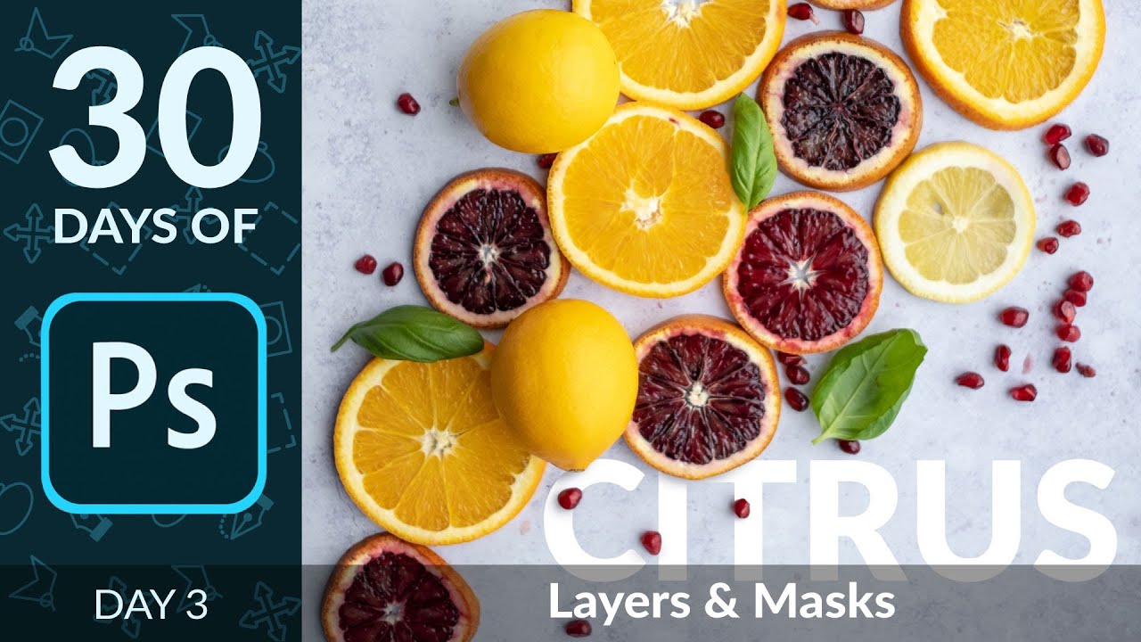
In day 3 of 30 Days of Photoshop, Aaron covers two of the most important tools in all of Photoshop – Layers and Masks! Learn about how Photoshop projects are organized and how to combine multiple Layers and elements together to create a dynamic final image.
Download the Sampl...
@grave thorn it sounds like you have not selected the skater before creating the layer mask
I've tried it both ways.
Doug you need to have the skateboard selection active for the mask to fit.
My problem is that I have the impression to see a shape around my character, even if it's invisible. Maybe because I didn't enlarge my outline enough in the selection.
move the content fill layer below the copied layer, check, then you can create a layer mask on the copied layer.
you need to make a selection of the skater between these two steps
OK, I have it now...Jesus didn't mention the point about making sure the subject was selected in the content aware layer.
Now I have a layer mask with a subject in it.
@grave thorn I had the same problem. But after playing with I figured it out. Don't give up. We are all here together to help each other.
Cheers.
Can anyone please help me...my text tool in photoshop seems to be having some problem. Everytime I type anything...the mirror image of the text appears. It is working in inverse.
its going from right to left.
DAY 4 - Invisible objects
...so now, I'm painting black on the duplicate layer, and nothing happens...no invisibility.
@grave thorn may be you have changed the blending mode in the brush by mistake
It's on normal, 100% opacity.
sigh OK, It's bedtime for me. I'm done with this challenge. @lethal mural you talk about details that are irrelevant to the process (clone/stamp and healing brush tools), and you speed through the absolutely relevant details without clarification or enough time for people to see what you are doing (actual mouse clicks on icons). Just some, hopefully, helpful critique. I would have said this more privately, but you did not respond to my private message, so... (I hope I haven't violated any rules here.)
Challenge 2 - The hardest part was finding an image with a perspective that worked with the background, how does the perspective look? I know the lighting does not match between the two images.
@mossy prism the lighting issues - nothing a levels adjustment won’t solve mate.
Invisible Bane
Surreal portrait
Challenge 04, I had an issue with using the patch tool to copy the fabric for some reason. So I ended up using fill colors.
@tidal bloom I tried levels and see that it could be tweaked some more to get a better match. But I was speaking more of the direction of light is different in the two images.
@lethal mural the instructions in the "Invisible" challenge just don't work for me.
@grave thorn not jesus but I can answer some of that. First off go to YouTube and rewatch the recording. Then you can stop it and back up and you can watch it full screen. Now you can start with a white mask, no problem. Just hit alt-i to invert. OR hold down the alt key when you click on the mask icon and it will come up black OR while on the white mask, go to your properties tab and click invert.
Can anyone please help me...my text tool in photoshop seems to be having some problem. Everytime I type anything...the mirror image of the text appears. It is working in inverse.
@odd gull I can't even click that option but see if yours is checked. If you have a NA keyboard and PS in English, you should have that default option checked and the rest grayed out
@grave thorn if you hold down control and click on a layer, it will automatically select what is on that layer. If this is a subject on transparent it is great. If you have a mask, be on the mask layer and hold down control and click on it and you will select what the mask shows.
#3 Surreal Portrait - Break On Through...
@tame breach if the arm is invisible would you not see the robe instead of the trees behind the arm?
My second attempt at challenge 4. These exercises are really challenging me to experiment and try new tools.
Day 4 - Invisible Objects
@grave thorn hey if you need a black mask it's alt or option then clikc on the mask button, it's the white box with a black circle
Original Picture: Marcos Paolo Prado - Unsplash ( https://unsplash.com/photos/nIz3Er4bk3U )

photo by @tio.mp - Tennis Serve. Download this photo by Marcos Paulo Prado on Unsplash
@thorn geyser beautiful How did you keep the water droplets??
@delicate flint Thanks! Most of them weren't removed when I made the man 'invisible' with content aware fill and some got copied with clone stamp later
Gave +1 Creative Carma to @delicate flint
Great job @thorn geyser! I like how the arms and legs replacements feels so natural on the background. 🙂
Nailed it @hollow yarrow. The vignette and the increased contrast help the image to look way more interesting, your attention to the details like the bottom part of the shirt and the racquet makes total difference. Impressive work, Franck!
@south lodge, it’s always great to see different approaches with the challenges. The textures and the blending are looking really great. Very nice job!
@mossy prism that’s awesome! The more you do and challenge yourself the most rewarding it is 🙂 Very nice on this one!
Very creative @young karma! My suggestion is to position the apple lower to where the mouth area used to be 😅 You might also use the clone stamp tool to create some parts of the hair at the back of her head and darken them a bit. Nicely done, Valentina!
@coral stone @young karma Valdair's advice is bang on the money. If you don't want full hair in the back, maybe place it at 35-50% opacity so it's semi-transparent
@thorn geyser Overall, I like it! To nitpick, some of the masking around the chin strap area isn't quite correct. But you've done a great job replacing the body parts with the background.
@hollow yarrow Colour grading is fantastic! The background blur is an added bonus. Well done!
@tame breach Not bad overall - the see through hand in the middle of the guy on the left's body is kind of odd though. For the shading in the uniforms, I would suggest choosing colours more closely related to the shadows in the folds that are already there. The black shading just looks odd to me. But, overall, interesting concept!
Day 4 Invisible Objects
Awesome job@thorn geyser ! Bravo!
@hollow yarrow Colour grading is fantastic! The background blur is an added bonus. Well done!
@pliant geyser Tanks, I appreciate!
done with day 3 https://www.behance.net/gallery/97192227/Photoshop-Daily-Creative-Challenge would love to hear your thoughts?

Rate it for youtube art ?
@muted coral nice , do you use edit > fill > content aware ?
@muted coral I like that you fixed the shadow too 🙂
Day 4
Original
@coral stone I brought more of his legs and hand in to focus which I think helps. I noticed if I bring too much in it looks like I just pasted his legs on there.
Challenge #4 Invisible Objects using a beautiful image by Olga Kuchina on UnSplash. 😊
DCC5 04 Mt Rushmore. I had so much fun with Friday's challenge, I decided to try it on a grand scale.
Original photo. Credit to Stephen on Unspalsh
@grave thorn if you hold down control and click on a layer, it will automatically select what is on that layer. If this is a subject on transparent it is great. If you have a mask, be on the mask layer and hold down control and click on it and you will select what the mask shows.
@primal fulcrum Thank you. This is what @lethal mural should be saying in the initial video. I did not know that...now I do, and I appreciate the information. 🙂
@chilly hawk nice job on your day 3 perspective. I especially like how you masked the branches
@young karma I really like your day 4. Creative concept
@cold oyster nice job. I think the player's naked leg is replaced by his own sock instead of the uniform of the player behind him. You might want to fix that.
Can you guys give some feed back? thanks
@grave thorn I am pretty new to Ps and definitely new to doing anything on the level of these challenges. I started a number of weeks ago. What works for me is what was suggested to you a little while ago. Watch the video in replay with your finger on the pause button. Watch it as many times as necessary. Go slowly step by step. Its all there. I make sure my screen mirrors the instructor every step of the way. There will always be a click or a switch in tool that maybe the instructor doesnt mention clearly. If my screen doesnt match the instructor, I replay until I catch what I missed. Sometimes I use my Ps knowledge to guess at whats missing. And most of all, reach out here in the chat. Everybody here is learning and having fun. Ask for help. I have found the people I have met here to be incredibly willing and helpful. Stay with us. Enjoy.
@tidal bloom yes I think I agree - thanks for the feedback.😀
Gave +1 Creative Carma to @tidal bloom
Did everyone use a brush to remove the person? Is there any way to do it with the pen tool?
@coral stone thanks for the pro premiere invite, just figured out how to find all mentions & found your message 😁
Gave +1 Creative Carma to @coral stone
@primal fulcrum wow maybe its a good thing I can't explore channels hahahah I tend to get distracted easily lol
@primal fulcrum thanks for the info about the run time of the challenges if I didnt already. Also I wanna check out if the Bot gives Carma everytime I thank someone 🤓
Gave +1 Creative Carma to @primal fulcrum
Day 4 challenge, just a bit of fun
@winter tinsel Nice job. I liked how you vanish the head. Just I want to point some repeated patterns on the head area. If you remove those parts it will look way better.
@oblique sinew Amazing job. It's obvious you really focused on the work to get the perfection :)
@worn yew thank you so much for your kind words, means a lot
Gave +1 Creative Carma to @worn yew
@unborn rock Very well done. Your color and texture choise for the tshirt part you add is just perfect. And the wall behind head part; I even don't think there was a head before :) Bravo!
@inland kiln I think your image choice is totally fit with this challenge thanks to its blurry background. You perfectly clone patterns and made a great composition at final. 👍🏻
Gave +1 Creative Carma to @inland kiln
@muted coral Haha really well done! This lady is not existing anymore. Maybe if you keep lady's shadow as its original, the composition may look more interesting :) Good job 👌🏻
Challenge 5 Invisible player
@thorn geyser I think I should say yours is one of the best example for the challenge. You clearly remove patterns and replace almost original textures from image. And that tiny marks you add to the shoes. Bravo! 👏🏻👏🏻
@hollow yarrow This is another perfect example for the challenge I think. Again I can see how helpful the blurry background for cloning and repleacing patterns on :) Well done !
And there she was...gone! I found "Content Aware Fill" wasn't very "Content Aware" so I had to resort to a photo with less detail and background going on.
challenge#4
@primal fulcrum Thank you for the suggestion. the settings were okay as set like you showed me...but still the inverted text is coming...from right to left. like
muspi merol.
Gave +1 Creative Carma to @primal fulcrum
@unborn rock nice job. good job with the back of the shirt. Did you consider filling in the back of the hat?
@brisk flower Good job, especially with jacket neck. Curious, why did you delete the stockings?
@odd gull I use Hebrew type from time to time. There is a setting in the text toolbar to switch the text orientation L>R to R>L. Check yours out. You may have unknowingly flipped the orientation
@unborn rock You could use the pen tool to define the area you want to replace, and save it as a vector mask. That's about the only way I can think of to use the pen tool for this task.
@young karma Excellent! You repeated scarf in the back, which is great attention to detail.
Invisible objects- thanks to Rachael Crowe from Unsplash
And here it is. Spot healing brush did it for me.
Attempt at the Gilded object. Feel like I need some help with making more metallic color?
hey @young karma you did pretty well job with hands and legs but in face you can do more realistic work. because it currently look like statue face try to clone from windows to make it look more better.
@lime jetty depending on the lighting of certain images, the metallic effect is a little harder to make. One thing that you can do is increase the contrast of some areas of the model or try to use the apply image more times. You can also work with duplicates applying different values on them, and mask some areas later to create some balance of the shadows and highlights 🙂
Nailed it @hollow yarrow. The vignette and the increased contrast help the image to look way more interesting, your attention to the details like the bottom part of the shirt and the racquet makes total difference. Impressive work, Franck!
@coral stone Thanks for your comments. I appreciate!
Day 4 invisible objects
@young karma awesome concept. terrific execution. The pavement is filled in perfectly. I looked at the image over and over, questioning if it would work better if you cropped out less of the top of the image. But I think the way you have it presented is spot on.
@hot thicket nice job with the sleeve and the neck in the 2 t shirts
@hot thicket nice job with the sleeve and the neck in the 2 t shirts
@eternal mica Thanks
@eternal mica thank you dear, that original image, agree with you it need more headroom like 50 - 70px but it look good now 😁😉
Gave +1 Creative Carma to @eternal mica
Challenge 4
Thought this would be easy, ha, this was tough. Who wears flip flops to a wedding. I have included the original.
Thought this would be easy, ha, this was tough. Who wears flip flops to a wedding. I have included the original.
Day 3 . Not sure if is good enough..
@pliant geyser Wow, this turned out great! Really nice job creating the backing area of the clothing. Those hair (tentacle) wraps seem especially tricky and you did a really nice job with them. Very cool!
@young karma I think it works really well even without being centered. Great awesome contrast and lighting in this, it adds a lot of interest. The colors really helps add to the mood of it. The effect turned out really well!
@round geode Awesome to hear it, congrats! I think sometimes it takes a handful of challenges to get familiar with the program and get in the groove. This turned out great! Really clear effect and nice contrast to everything. Really nice natural blends between the two images as well. Great work!
@subtle crypt Nice work on these ones! I especially like the robot face effect, really natural looking edit. Kind of gives it a gritty sci-fi movie look with the grainy background. Very nice!
@fierce umbra I love it, Day 3 challenge turned out great! Really awesome contrast and texture to this one. Gives it a really striking look and feel, very well done!
@brisk flower Very nice to see you playing with different versions on this challenge! The hand effect came out really well. I think it could look nice to add a bit of a vignette to the black and white one. Even pushing the contrast more (specifically by boosting the darks) to really push the dramatic feel you often see in black and white images. Nice work on these!
@young karma Really cool! The double exposure effect definitely adds to that surreal effect. The hand effect and sort of warping this image has is looking good too! I wonder if making this black and white, or color grading it to a desaturated single color might help that surreal “trapped” theme you have going. At the moment the colors look kind of happy and bright which seems a bit unfitting for that theme, just a thought. Really nice work!
@cerulean beacon Looks good, however would you not see the inside of the hat and dress if the person was invisible?
@bleak fossil Thanks so much for your comments. I really tried to make this a somewhat believable effect. At least now I know I’m pointed in the right direction!
Gave +1 Creative Carma to @bleak fossil
@worn yew thanks I couldn't decide to leave it or not. Turn it back on is easy.
Gave +1 Creative Carma to @worn yew
Gave +1 Creative Carma to @mossy prism
Does anyone else here use a drawing tablet / iPad combo or does everyone use the mouse for painting/drawing?
@pliant geyser i use my mouse unless it involves something that i can't really do well with a mouse (like sketching), then i switch to my tablet
I'm not sure why but i'm no longer getting notifications from discord. Sorry if I've not responded.
@young karma Yeah, I get it. I do most of my selections, paths etc with the mouse... then switch to the table for anything brush related. Works for me!
Finger mask Donned. Better late than never. Stay save - mask up !
@cerulean beacon Very cool! Interesting to see this effect on an illustration. I think it would really help to sell the effect to edit in the "back" areas of each object. Like the hair, and fill in the areas of the clothing where the arms covered to really sell the look like Jesús did. Nice work filling in the background area!
@hidden flame Really cool concept with this Day 3 challenge! I think it's looking pretty good, and there's a nice sense of motion with the two sets of hands. I like how the highest contrast is still in the eyes which makes for a nice focal point. Looks good!
@vocal cairn Ooh, really nice! Really solid work on creating the back area of the shirt. It could be nice to see a little bit of the back part of the sock on the right too, though that's a fairly minor detail. Nice work!
@sturdy vault For sure! I think this one can be really tricky just due to creating all the areas of the image that don't exist. You did an awesome job on it though, the back areas of the clothing are looking really natural and the shading works very well. Great job, this turned out well!
@modern halo Nice work Willi! This effect is looking good, the backing area of the shirt turned out well. It could be nice to see a bit of the back of the right sock but that's a fairly minor detail. Good job!
Thanks @bleak fossil. Did u notice i left the guys bracelets. Im sure im not the only one.
Gave +1 Creative Carma to @bleak fossil
I did! Hah, I like that subtle detail
@hot thicket Really cool to see this with multiple figures! Really nice job willing in the background, especially with the chain link fence. It could help to fill in the further back pant leg of the person on the right where the shoe originally was overlapping. Nice effect!
@young karma Ooh, great idea! I like the way the image is cropped to focus on the reflection as well. Nice job with this effect, the shoes and background asphalt looks nice and natural 👍
@lime jetty Nice Meg! Do you have the original picture for the gold effect image? Sometimes it can just be the lighting of the picture doesn't work quite as well, but the way Jesús repeated the effect more than once can be a big factor, as some images need the effect applied more than others. I also selected specific areas like the arm that needed the effect applied more than the rest. Not sure what happened with the arm on the right, but having all the edges nice and sharp really helps this effect too. Nice job 😄
@young karma Very nice Geri! Really nice work with filling in the textured background of the grass. Looks really natural. It could be nice to fill in the face area with a dark hair color as if there were no face there, though the way you have it is kind of an interesting invisibility-like effect on the skin as if it mirrors the surrounding area. Nice work!
@young karma You nailed this one! Especially the effect with the dark shadows where the face would be under the hat. Great job on the boots as well, this one looks really convincing, well done!
@brisk flower Nice! This came out really well, nice work on the back part of the hoodie. Yeah, content aware fill isn't always perfect, so some photos definitely require a bit more manual touch up. Really nice work!
@young karma Very nice! If you just added in the back area of the shorts the way you did with the collar of the shirt I think it would really nail down that effect. Looking good!
@oblique sinew This is a great photo for this challenge, the before and after video is great to see too! Really nice job on the shirt and editing out these areas to fit with the background. I think it might look good to see a little bit of the inside of the sleeve on the right side and help push this effect even further. Really nicely done 😄
@pastel spade Love it! Reallllly impressive job on that hat and shirt, they both look really natural which can be tricky. Nailed it 👍
@cold oyster Great image for the Day 4 challenge, looks really good! The only suggestions I have would be that the top sleeve looks a bit soft and cut off, but I think with the quick selection tool or something similar you should be able to get a nice crisp edge. Also, I wonder if we'd see into his shoe with the angle that the top foot is at. Maybe seeing into the dark shadow of his shoe could help, though that's a really minor one. Looks good!
Posted 3 & 4. Wouldn't mind some feedback on challenge 4 if anyone has a moment. Backfilling the shirt I wasn't satisfied with.
@bleak fossil Thanks for the feedback.
Gave +1 Creative Carma to @bleak fossil
Just catching up from the very beginning—Gilded Object
Starting this challenge with the latest, Invisible girl. original photo is a stock photo from Pexel. Photo credit Photo by Nathan Salt from Pexels. This is the original Photo.
Here is my Invisible Edited Version. Please enjoy, and critiques are welcome ^..^!
@bleak fossil thank you 🙏🏻
Gave +1 Creative Carma to @bleak fossil
@cerulean beacon Looks good, however would you not see the inside of the hat and dress if the person was invisible?
@mossy prism Thank you 🙂 agree 👍, will re-work.
@cerulean beacon Very cool! Interesting to see this effect on an illustration. I think it would really help to sell the effect to edit in the "back" areas of each object. Like the hair, and fill in the areas of the clothing where the arms covered to really sell the look like Jesús did. Nice work filling in the background area!
@bleak fossil Thanks for the great comments! 🙂 agree! 👍 I will re-work on it.
@muted coral looks great. Love the detail in the straps
@eternal mica Thank you for the suggestion. I checked it out. It is set to L to R only. So the problem is still there. If I type 'abc'...it is still coming out as 'cba'.
Gave +1 Creative Carma to @eternal mica
Just trying
Day 3: Surreal Portrait.
@bleak fossil hey i appreciate the feedback, thanks 👋 this next challenge I will focus on detail a little more
Gave +1 Creative Carma to @bleak fossil
Posted 3 & 4. Wouldn't mind some feedback on challenge 4 if anyone has a moment. Backfilling the shirt I wasn't satisfied with.
@young karma that's a challenging image for the day 4! I like how you have reconstructed the top of the shirt, my only suggestion is to brighten up a bit to avoid it blending with the dark tones from the background. 🙂
Looks nice @primal vault! I loved how you worked on the text and built the background with the light and texture. Great job!
Cool job @solemn spear! My only suggestion is to create the shape on the left sock to look even more like it is empty. You can use the exact same technique you made with the shorts. Great job removing the subject! 💯
@young karma very nice! I like the dark tones you applied on the background and how you played with scale on the duplicates.
@vernal ice wow great job with the overlaps on the frames. I also like how the background is not 100% black and the texture makes it look super cool!
@coral stone Thanks for the feedback, I'll certainly go back and give that a go. I kept it dark hoping it would not draw too much attention but the opposite is worth a try as you say.
Gave +1 Creative Carma to @coral stone
No problem @young karma! You can keep the adjustment subtle so it won't compete for attention 😉
@bleak fossil thanks for the compliment. Hardest part was filling in the hands on Tim, the big one. First question was what should it look like.
Gave +1 Creative Carma to @bleak fossil
Rate it for youtube art ?
@potent cove this thread is for the current PS daily challenge. There is a thread for other designs and one for a portfolio review.
There ain't no subtle with a banjo in the frame! But here goes.
Did everyone use a brush to remove the person? Is there any way to do it with the pen tool?
@unborn rock you can use the pen tool to make a selection and then paint on the mask. The quick select worked fine for me and was faster. But each image is different as to what works best. That is why we have so many methods and tools to do the same thing.
@young karma hah very nice! I loved the quote you added 😆
@young karma hah very nice! I loved the quote you added 😆
@coral stone cheers! Like many things in PS there is more than one way to skin a cat hence the added detail 😉
Colour or black and white?
@fathom holly Both look good but it looks like you forgot to clip the hands to the face so they don't extend beyond the face. Having them stick out on the sides looks a little odd.
@primal fulcrum Thank you for the suggestion. the settings were okay as set like you showed me...but still the inverted text is coming...from right to left. like
muspi merol.
@odd gull the only other reason I can think of is if you are putting text on a path and you have the direction of the path backwards. I tried but couldn't get my text to go backwards. You might contact PS customer support.
Attempt at the Gilded object. Feel like I need some help with making more metallic color?
@lime jetty The trick seems to be to start with a faily contrasty image. Or see if when you turn it BW, you can adjust the sliders in CR to make it a lot more contrasty. Did you do the apply image x2? I did those on separate layers and then blended. 1 time wasn't enough but 2x was too much for my image.
Day 3 . Not sure if is good enough..
@hidden flame I think it is charming and a nice story
Challenge #4 sailor
@cerulean beacon this would be a challenging photo to work with. You would see the dress behind her arms, not the wall when you removed her arms.
Does anyone else here use a drawing tablet / iPad combo or does everyone use the mouse for painting/drawing?
@pliant geyser I have a tablet but usually use my mouse. I have tweaked the settings on it so it is very responsive. I pulled out the tablet recently but I'm not as good with it and hate how I have seem to struggle to get it to start where I want it to.
Here is my Invisible Edited Version. Please enjoy, and critiques are welcome ^..^!
@solemn spear it was a low contrast picture to start with so the clothes get sort of lost without her. I would maybe recolor the clothes and shoes so they stand out from the background.
@cerulean beacon this would be a challenging photo to work with. You would see the dress behind her arms, not the wall when you removed her arms.
@primal fulcrum Yeah, thank you 👍 will re-work on it totally 😅
Challenge 04 invisible objects
Challenge #4 Invisible Objects (Revised) Thank you @worn yew for your feedback, I made the corrections to the background I think it’s much better! Again, a big thank you to Olga Kuchina on UnSplash for this image!
Gave +1 Creative Carma to @worn yew
I wasn't happy with my original attempt so I scrapped it and started over. I think this one came out better.
@winter tinsel This is a masterpiece 🙂 Bravo!
Day 4 - Invisible Objects
I could not resist to make this one... Game Over!
Original image https://unsplash.com/photos/wRXJuof2eD4

Download this photo by Jeff Cadestin on Unsplash
Image did not load properly the first time I tried to post it. Beach Ghost. this was a interesting challenge. I definitely need more practice with this to get the patching and matching to work better. Ach.. not sure why the image is not showing up, as it is just over 7mb.
@young karma Your concept made me smile too much 😄 Just few feedbacks; The ground seems too dry to make reflection. Maybe you can add some puddles or wet effects on it to make more realistic. And the furthest clone will make higher distance with his reflection also. But rotating object for every clone and blurring them according to their distance is just fantastic 🙂 I loved it!
@sand lichen great job maintaining the lines consistent. My point of feedback would be to create an empty effect on the right sock just like you did with the shorts. You can also darken the inside part of the shorts to create more depth and the impression that the lights are gradually decreasing as it goes inside 🙂
@hollow yarrow Brilliant 😂
@hollow yarrow Brilliant 😂
Thanks@buoyant nova !
@tired solstice In PS, go File>Export As and in the pop-up box, type in 1600 pixels on one of the sides. This will help uploading for the web.
Challenge 4, invisible objects
invisible with @lethal mural . Feedback are welcome
Thanks for the tip @ruby panther !
@bleak fossil thanks so much for your review, I´ll take your advice
Gave +1 Creative Carma to @bleak fossil
Thanks for the feedback @bleak fossil
Gave +1 Creative Carma to @bleak fossil
@hollow yarrow great job with the shadows. Love the CSI outline.
@eternal mica deleted the stockings to increase the effect that there was somebody not there (if you get what I mean)
Image did not load properly the first time I tried to post it. Beach Ghost. this was a interesting challenge. I definitely need more practice with this to get the patching and matching to work better. Ach.. not sure why the image is not showing up, as it is just over 7mb.
@tired solstice I think it needs to be under 2. Go to export/for legacy web - that will get you a jpg with the smallest file size. It only needs to be 72dpi at a fairly high compression rate for online. Also you can change the size here and it will not effect your original image but make it a bit smaller if you still need to lower those KBs.
Excuse!! I had forgot one leg of my ghosts´ weding
@primal fulcrum Using the tablet definitely is taking some practice... mine is Gaomon - in the set up interface you can tell it how you want it work with your main screen. I have it set so that the touch surface is locked directly to the entire screen. If you hold the stylus 1/4" above the surface, it behaves like a mouse, but as soon as you touch down it's the same a clicking on a mouse.. Kind of neat.
@buoyant nova Thank you
Gave +1 Creative Carma to @buoyant nova
@pliant geyser yeah, it just always seems that I need to reach higher up than the tablet to "catch" the pointer. I know, I give up before I practice enough to get it. I'm planning on trying to use it more. I mean I bought the stupid thing, I should use it. right? LOL
I should have put this up sooner
@young karma Your concept made me smile too much 😄 Just few feedbacks; The ground seems too dry to make reflection. Maybe you can add some puddles or wet effects on it to make more realistic. And the furthest clone will make higher distance with his reflection also. But rotating object for every clone and blurring them according to their distance is just fantastic 🙂 I loved it!
@worn yew Thank you so much! I appreciate your suggest! I'm going to reworking on it!
@primal fulcrum ok...thank you🙂
good morning, all andn nice to meet you, jesus! I'm so behind but i followed your direction! thank you! super cool!!
Evening all from The Wirral UK
@coral stone and @primal fulcrum Thank you both so much for the feedback I will try to rework it today or tomorrow and repost if that's okay? ^..^
Gave +1 Creative Carma to @coral stone
I think i failed in the gold. What's going wrong?
Could be better... Could be worse..
Challenge #5: Fancy Text
DCC. Fancy Text - I added a slight Blur to the Lens Flare in the back but not sure if its still too harsh. 😕
You say bling. I say bomb.
daily challenge
Day 5 challenge, always wanted to try this
@cunning needle Love the gilded beetle!
thank you x2, @pastel spade 🙂
Gave +1 Creative Carma to @pastel spade
Gave +1 Creative Carma to @coral stone
@coral stone and @primal fulcrum Thank you both so much for the feedback I will try to rework it today or tomorrow and repost if that's okay? ^..^
@solemn spear you can do the challenges and post at any time. If you do them before the 25th and they are from this series of challenges, you just post them here. If it is after the next one starts on the 25th, you can post to "past-challenge"
I think i failed in the gold. What's going wrong?
@round perch A bit too yellow. Also did you use a gradient?
Here's what I've done so far, would love some feedback https://www.behance.net/gallery/97192227/Photoshop-Daily-Creative-Challenge
@primal fulcrum @eternal mica The problem is finally resolved. I clicked multiple reset buttons and one of them just did the trick. But I still don't have any idea what caused it in the first place. Thank you for helping.😀
Gave +1 Creative Carma to @primal fulcrum
So great to see you are back for this one @cunning needle I loved the gold effect and how metallic it looks, great job! Your day 2 looks very nice as well, just a suggestion, you might try to mask the ground where he is standing and create an impression that he is actually with the hands on the table and the phone 😉
@round perch I agree with @primal fulcrum, Nathan. To achieve the metallic gold effect you might fine-tune the Bevel and Emboss and mainly the stroke layer style. I'll give you the HEX codes that Jesús used for the linear gradient on the stroke to help you get started but feel free to adjust and change with whatever values you like 🙂 #6e4e00 ; #e09218 ; #c68804 ; #693e02 ; f6dda6
@mild solar Looks super cool. I like how the shadow in the bottom created more dimension to the gold effect avoiding it to look flat. I also like the blue flare that you added and how it gives a technological look. Nicely done!
@dim brook very nice effect, Ceci! I like how you played with the "i" dot. The metallic green stroke is looking great! Well done!
@ocean pine, wow I loved your typeface choice. The high contrast between the transitions made it look so fancy. I also like the script text, my only nitpick is not using uppercase on all first letters, this will help it to look like they are a continuation of the word Diamonds 😉
@arctic rover, super fancy Jude! The tones of the hat and the stroke create a nice consistent look your work, well done!
@daring dock well done, Shuja. I like how the flares have a nice size without creating any competition for attention. If you want, you might play with some inner shadow to separate the stroke from the image even more. It doesn't need to be so harsh, it can be subtle 🙂
@kind sentinel great job putting a background. My only suggestion would be to darken it a bit so the glow of the text might appear more 😉
@coral stone thank you x2! 🙂 If I translated right your suggestion, I will try it! Thank you for your suggestion. always. 😉
Gave +1 Creative Carma to @coral stone
Here is some glow for tonight. Didn't add the lens flair effect, couldn't make it seem natural so just applied a bit of drop shadow in yellowish color.
Figured tacos was a worthy word to make gold, couldn't quite get the shadow right but I'm pretty happy with how it looks
Here is my Ch-5.
DAY 5
Hi All, the Topic today was effect on text, I would like to take this opportunity to invite you to see my work for 36daysoftype there is a lot of photoshop work... appreciate your opinion and comments :)
https://www.behance.net/gallery/97299321/36-Days-of-Type-2020-36DAYS-36DAYSOFTYPE-Typography

Behance
36 Days of Type is a project where you let me express my ideas and techniques that I am learning.I knew about this activity a little bit late, at the first I did't understand the activity so well but it was so much fun and challenge when I come each day …
Hello. Here is my schnazzy text...
Probably should've done some kerning on the B and G. I just blasted through the exercise trying to get the effect w/o thinking much about the text.
Still a latecomer trying to catch up. The skater's skirt was sheer fabric so I wanted to see the phone through it so I edited the mask by selecting that area in the channel with the RGB channel visible and filled with 40% which allowed the phone to show through. Small trick but effective.
Challenge 5. This isn't as easy as it looks. At least not for me. I kept going until I got it. Creating a new pattern took a minute for me to grasp, too. Fun challenge. Thank you!
Hey Guy's Myself Aniruddh Kumar Fron Delhi India. Curruntly I am A Student at Maac South Ex Delhi as the ADVFX Corse.
Not quite bling... but had fun with it... Thoughts, anyone? Photo by JJ Shev on Unsplash.
Nice work @young karma, I would like to suggest one thing, the pattern is so small, it can not appear in scene
Day 5 💎
This entry is todays challenge 05-18-2020
Invisible Objects challenge
Here is my #PSDailyChallenge. Not happy with so many flares. I will probably work on it a little more to pare it down and maybe resize one to be the Poppa Flare.
@thorn geyser Great job on the reflection!
@young karma Not bad, but I feel it would be more "believable" if the "Lamplight" got a bunch darker as it gets farther away from the light bulb.... Nice concept overall!
@young karma Not bad, but I feel it would be more "believable" if the "Lamplight" got a bunch darker as it gets farther away from the light bulb.... Nice concept overall!
@pliant geyser Ok, I have tried to darken it with an estimated 'bunch' as suggested. Thanks very much for the feedback.
@eternal mica Interesting, but the font choice makes it VERY difficult to read. Since it's obviously for a lady, might I also suggest more of a script font? If you want it really legible, maybe consider Bebas Neue or Montreal Bold?
@young karma Much better! Maybe not quite as dark on the left, but you definity got the jist of what I suggested. I think the highlights on the lower parts of L and A need to be a bit "less bright" as well, considering they are father way from the bulb.
@pliant geyser Thank you for the tip. Are those Adobe fonts? Neither is in my list yet.
Gave +1 Creative Carma to @pliant geyser
@pliant geyser If I wanted to change the font, do I need to start the project over from scratch?
@pliant geyser If I wanted to change the font, do I need to start the project over from scratch?
@eternal mica Did you make the text a smart object or anything like that? If so, you will more than likely be able to make the font change as long as the layer has not been rasterized. You will need to make the same font change on all duplicated text layers.
PS Daily Challenge 5.18
Very creative @strong lake! If you want, you might put some diamonds with the flares to look like they are the source of the flare. You can also try to place some in different areas along the lines as well. Nicely done!
@oblique sinew beautiful project! I love how you made the dividers, they are a great to differentiate, and create even more interest in the project!
@young karma super cool effect, Geri! I love how the gold stroke creates a nice impression of neon/metallic gold. My only suggestion is to brighten up a bit the top area, especially on the O and W letters, to keep the effect even more consistent. Well done!
@dense wadi Looks very nice! About the shadow, the process is a lot of fine-tuning and see what works best and what doesn't. You might check the opacity and blend modes of the layer styles, sometimes they can be helpful to adjust the effect. Great job!
day 5, it is a bit tacky
Great job on the texture @worn yew! I like how the blue text and the shapes seem to be blending with the background. If you want to create the same blending effect on the white text, you might play with the Blend If sliders, if you are unfamiliar with the tool, I'll give you this link for a quick tutorial. I loved the pattern you apply to the DCC, you are doing a great challenge, Tunc! 🙂 https://www.youtube.com/watch?v=yAMXBYx0r5g
@young karma Much better! Maybe not quite as dark on the left, but you definity got the jist of what I suggested. I think the highlights on the lower parts of L and A need to be a bit "less bright" as well, considering they are father way from the bulb.
@pliant geyser Thanks for the constructive ideas, obvious when its pointed out 😆 - I'll do it but I won't post a third time, just improve it for my own satisfaction.
PSDCC #5 Fancy Text
@tacit condor Cool idea... Now to make it that much better, put an "X" over the "BL" and put a K in before the ING.... Good job!
PS Daily Challenge, Day 5, Extravagant Text Effects
Thank you @pliant geyser for the advice. I think this is a much more suitable font
Gave +1 Creative Carma to @pliant geyser
Nice silver metallic look @zinc elbow! If you want more attention to the text you might darken a little bit the background and add some flares to some corners of the letters. Nice job!
@eternal mica Much better! So much easier to read! Now, add in a drop shadow to the lower right to really make it sing!
@sterile berry great job! I like how the reflections reinforces the fancy look of the whole compositions. Also very nice job applying some blur to it 💯
@coral stone - Thank you
Gave +1 Creative Carma to @coral stone
D5 Text, trying to make a story around the Camel..I'm still not managing to get smooth outline around the cut objects, tried Mr Ramirez's instruction ended up with bad edges! any other hints that could help me?
Like that??
@eternal mica WOOP WOOP! See how the shadow makes the white highlights on the bottom of the letters really stand out? Good job Ted!
@pliant geyser Thank you so much. Your tips were spot on. I love this chat!!!
Gave +1 Creative Carma to @pliant geyser
@primal vaultFantastic work and great attention to the details! 💯 Thank you so much for sharing the trick with us 🙂
Gave +1 Creative Carma to @primal vault
@tropic knoll looking pretty good, CK! I like how the Bevel & Emboss have different levels on the stroke, it creates a very interesting effect. My only suggestion is, you might adjust the space between the T and the other characters. If your text is still editable you can place the cursor between the I and the T and press alt (win) or option (mac) and then the left and right arrow keys. It will adjust the kerning (space between the letters) of your text. You can also do that by using this option from the properties panel. Nicely done!
First time messing with PS that much with all the different styles. Look forward to showing my students this one in the fall.
@cold oyster like your 2nd invisible project.The smoke is a really cool effect
Challenge #5 Good challenge for me today, it's or 29th wedding anniversary!
@coral stone that totally makes sense to add diamond and then glow thanks
Gave +1 Creative Carma to @coral stone
@pliant geyser very nice water effect on the text! My suggestion would be to work a bit with the Coming Soon text, especially on the letter C, maybe reducing the amount of bubbles on the area and/or darken the background a bit. It looks like you have a hard edge on this bubble on the right side, you can easily remove it by playing with its position and rotation. Nicely done 🙂
@young karma Nice job. it would be a cool play on words if your post said fast cat instead of car.
Beautiful pattern @foggy iris! I loved how colorful your work is! If you want, you might apply some inner shadow to separate the text from the stroke, but that's just an optional step 😉
@bleak fossil thank you for your feedback it means a lot to me ( Day3)
Gave +1 Creative Carma to @bleak fossil
@pliant geyser how did you make the font like that? did you warp each letter?
@primal fulcrum thank you so much.. for your feedback ( day 3)
Gave +1 Creative Carma to @primal fulcrum
day five! i dont think the glares are in the right place :/
@eternal mica Well, made text a smart object, then applied a custom water pattern (render clouds, Filter Gallery - Chrome, Filter Gallery - Plastic Wrap, apply colour/hue), warped the text to approximate shape, then used the liquify. Adjusted layer effects and ta-da!
Challenge #5
@cunning needle These are all so good! Loving the sort of golden glass look on the beetle. The colors and way the monkey and the ground break the frame of the phone look great! Great designs on the hand effect image too, all very well done!
@round perch Really nice Nathtan, the diamond effect looks good! I think the gold doesn't quite read because it needs more contrast. The step where Jesus adds the gradient on the stroke around the letters as well as the bevel/emboss effect are what is really going to sell that look. You want to make sure you have some fairly deep darks that ramp up to some nice bright highlights like he did. Nice job!
@mild solar Very cool! Some really nice contrast to this, definitely makes it pop. I like the blue shine effect too, adds some interesting color contrast against all the warm yellow. 👍
@dim brook Hah, really nice effect with the dot of the "i". The green color is a really interesting effect too, works with that money theme. This came out well, nice job with the shine of the green area and the flare behind the "i" works really nicely!
@ocean pine Looking good Tracy! I think the lens flare in the background is soft enough, it doesn't read as too harsh to me. I like the subtext at the bottom on this one, it contrasts the boldness of the text at the top and creates a good balance. Well done!
@arctic rover Looking good! I like the texture and sort of rose gold color you got on the stroke. I think you could probably push the gradient effect further into the separation of the darks and lights to really push that metal sheen look. The photo is nice touch too, nicely done!
@daring dock I like the sort of gritty texture against the shine of the smooth metal looking edge on this. The little pop of orange color is really nice tool! 👍
@bleak fossil thank youx2! 🙂 Google translate, please! No I'm okay. hahaha
Gave +1 Creative Carma to @bleak fossil
@blazing quail Nice work Ant! The background color adds a lot of interest to this, I like the dynamic sense of movement with the diagonal lines and blurred look draws focus really nicely to the letters. The metal and diamond look came out well!
@young karma Really cool font and texture inside of it, I like it! I feel like maybe the stroke around the letter could even be a touch brighter to contrast even more against the dark background? Looks good!
@oblique sinew These are all looking great! Really cool to see you doing multiple designs for some of these challenges. The skater/phone effects turned out really well, I especially like how the one in the white shirt contrasts so well against the really dark background. It could look nice to blur the left side of the skater in all black a bit to match the focus of the background photo a bit more. Paul did a challenge with this sort of effect on the last set of DCCs. Really nice job on all of these! https://www.behance.net/live/videos/5215/Photoshop-Daily-Creative-Challenge-Blur-Effect
@tardy ridge Naaailed it! Really great job with the backing part of the clothing as well as the brick wall behind her! My only suggestion which could be a bit trick would be to to add a bit of extra shapes to the sweatshirt on the edge where her head was covering. Currently her arms has a bit of a cutout shape where the head was, but if you added in some more natural shapes to what you think that edge of the sweatshirt might look like that could really help push this effect even more. Just a quick paintover, but maybe something like this? Super minor since you did a great job there, but just a thought. Really nice work!
@coral stone Valdair what a terrific YouTube by Jesus. Thanks for bringing it to our attention
Gave +1 Creative Carma to @coral stone
@plain sable Happy Anniversary. Wishing you many more
@primal fulcrum ll do it again.
Thanks for the help.
@coral stone Thanks, the values ll help me a lot
Gave +1 Creative Carma to @primal fulcrum
Thanks @eternal mica
Gave +1 Creative Carma to @eternal mica
@bleak fossil thank you so much, I'm going to try blurring it
Gave +1 Creative Carma to @bleak fossil
Challenge #5 Fancy Text
Fancy Text
The most important thing in life
fancy text challenge
Challenge #5 Okay I just can't leave this alone make is closer to the colors of the wedding.
Challenge 5 Re-Do. Thank you @coral stone for the tip!
Gave +1 Creative Carma to @coral stone
Yes you did it , congrats🥳
What about now?
@delicate flintNice job with the composition on the background! I am also a fan of the warped text! Just an optional suggestion: You might play with the gradient colors of the text. You can achieve a nice depth effect by creating a subtle transition from light to dark tones, maybe placing the light tones on the top and the darker ones on the bottom (or even creating kind of a vignette by using dark tones on the top and the bottom and let the light tones be in the middle). If you lose contrast and the focal point you can adjust it by darkening the background a bit so the eyes can go to the text first 🙂
Very nice @round perch! I loved the new tones 🙂
Gold is orange.
rsrsrs
Nooow i knoow
looks so much fun. im about to start! super cool!!!
Daily Challenge 200518 - Fancy Text - Images used from Pixabay and Adobe Stock
Seems like this challenge is fun .
I am also going to create one.
Challenge#5 Fancy Text - Thanks to Magda Ehlers from Pexels for background peacock feathers.
@pliant geyser very nice water effect on the text! My suggestion would be to work a bit with the Coming Soon text, especially on the letter C, maybe reducing the amount ....
@coral stone Oh crap... I didn't even notice that. Great catch! Thank you so much!
@regal mica The peacock feathers really set it off... the purple on the lower left is excellent - complimentary colours can really make something like this rock!
Thanks for the feedback @pliant geyser I was thrilled with the result ... such a simple but really effective thing to create... Not sure how I retain this knowledge for future use though 🥴
Gave +1 Creative Carma to @pliant geyser
Fancy Text = Challenge 5
@regal mica To retain knowledge, I would suggest you do the challenge several times, from total scratch. Use different images instead of the diamonds, make your own custom patterns etc. Then good to go!
@pliant geyser agree, just got to find the time. 👍
Challenge 5 in the books. These two weeks have been really fun so far. I think my favourite series so far!
Not so fancy😁
Today I'm golden
Hi everyone! I'm new to the Creative Challenges. Very excited to be part of this community!
Ohhh, love the reflection @rain bear
I have been making the invisible man for 2 days, creating clothes is not easy
Challenge 5 This was really fun.
Here is my final for the Fancy Text Challenge... "Diamond-encrusted Bling."
Hey thats nice!
Here is my attempt at "Invisible Objects" from May 15th... "The Invisible Levitating Man"
Challenge 4, Invisible
3D Balloon Text 🎈
Day 2!
Bling bling
@winter tinsel This came out really well! The border and inside have a nice unified look with the color but the texture separates them nicely. The metal effect looks great. Nice work with the shines too!
@sturdy vault Looking good! The effect came out really nicely, I like the smaller contrasting text below too. It could be nice to get a subtle gradient on the lower text too, not as intense as the top text, but a bit of a sheen could add some interest and tie the two areas of text together nicely. Good job with this challenge!
@calm jay Great job on the golden statue effect! It came out great, really nice metallic effect with those bright highlights, very cool!
@steel ore Haha, I love it. I really like how the colors fit the theme so well. There’s a nice gradient going on but not too metallic or shiny looking which really fits with that coffee color palette. Some great shadow in this text too, nicely done!
@muted coral Very nice, hah. This came out really well. I love the addition of the reflection. It could look nice to give the reflection just a touch of blur as if its reflecting off a shiny floor rather than a perfect mirror, though that depends on what you’re going for. It could also look good to boost the overall brights in this image with an adjustment layer just to push that “pop” of brightness in the shiny gold a bit more. Nice work!
@plain sable Very cool! Really interesting textures going on in this one. The interior of the text is really interesting since it’s made up of diamonds but almost has a rustic look at first glance. Great color contrast between the text and background too. The “Anniversary” text seems a bit cramped in there as it currently is, maybe making a bit more room down below would give it some more space to be positioned normally? Really just depends what you’re going for though. Looking good!
@tropic knoll Nice job CK! Some really nice shine with the gradients on this. I really like the gradient on the interior diamond area, gives it some nice depth. Very nice!
@round perch Nicely done! I like the faded image behind the text, reads very well without distracting from the text. The metallic effect on the letters is looking good as well. My only thought is maybe the outside edge of the text could be toned down, currently it looks a bit cramped without enough space between the letters. Solid work!
@young karma This is looking really cool Vickey! The background texture and logo are working really well. I really like the simple color scheme of this too, looks really nice and cohesive. Nice job!
@regal mica Really cool effect, I like your take on the challenge with this color scheme! The background works really well with the level that you faded it into darkness to, very nice!
@jolly kite Oh wow, you nailed this effect, really nicely done! Great sense of dimension, and the drop shadow really makes it look real. Even the outside stroke resembles the sealed area of a foil balloon. Really impressive work!
@restive wyvern Looking good! I like the offset color effect on this one! My only thought is that it could help to separate the figure from the background since they’re both a very similar value. Maybe darkening down the background slightly could help him pop a bit more. Either way this effect turned out very nicely! 👍
@grim granite Really nice job on the masking and filling in the background! It’s looking really nice and natural. It kind of gives her an interesting camouflage effect with the shape of the arms and face still being there. Looks good!
@sterile berry Really impressive work with the invisible effect challenge! Excellent job with the shirt collar and shoes, and the hat is a really nice touch. Looks great 😄
@pastel spade Loving how this looks like a fancy textured metal at a glance. Really cool idea! I tried it and it works, hah. Really nice metal effect to the shine too 👍
@modern halo Very cool Willi! Liking that color gradient you added to this. Interesting effect with the diamonds too! My only suggestion would be to fix the spacing of the letter a bit. The way the B and L and the N and G touch seems a bit out of place with the spacing of the middle letters. Making it all more uniform spacing may give it a more consistent look. Looking good!
@bleak fossil thanks for the feedback I like your suggestions.
Gave +1 Creative Carma to @bleak fossil
@bleak fossil Thanks for the Feedback😊
Gave +1 Creative Carma to @bleak fossil
Challenge 5. May have gone overboard with this one....
Thanks @bleak fossil appreciate your feedback.
Gave +1 Creative Carma to @bleak fossil
@coral stone I didn't have much time last night so i did rush the challenge. Thank you for your suggestions they have really improved the effect, i I've added the flares and darkened the background and decided to add a reflection too.
Gave +1 Creative Carma to @coral stone
Day 4: Any details I'm overlooking? Should the ribbon be redone without a shadow?
@vernal ice is have to say yes remove the shadow. Why would there be a shadow? No one there to cast it lol 👍🏻
Day 5
@honest glade gorgeous
@tidal bloom thanks 😍🙏🏻
Gave +1 Creative Carma to @tidal bloom
@young karma This is looking really cool Vickey! The background texture and logo are working really well. I really like the simple color scheme of this too, looks really nice and cohesive. Nice job!
@bleak fossil - thanks
Here is my final for the Fancy Text Challenge... "Diamond-encrusted Bling."
@sterile berry this is superb. Great depth on the jewelled area.
@ivory garden I really like the semi-transparent stroke on the Pearl version... The second one is harder to read with the background you chose. All in all, well done!
@zinc elbow Definitely an improvement with @coral stone 's suggestions. Only thing I could add is make the reflection fade away the farther it gets away from the word. Good job!
Thank you@pliant geyser
I should increase the stock
Gave +1 Creative Carma to @pliant geyser
@rain bear welcome, enjoy. DCC is tons of fun, and this chat is a significant part of it. Very nice entry. The shadow is well done. Maybe it should be extened a bit. Nice touch on coloring the sparkle
@sterile berry nice job with the shadow
@vernal ice It's a great work I think. I notice the little repeated grass textures from background and it needs a little bit color correction also. Bravo 🙂
@ruby panther I think your muted color choices are so cool and catchy. It made me stop while I was scrolling. And the lens flares you apply according to your light source are looking so realistic. Great work at the end. 👍
@thorny scroll Nice play on words... But I'm wondering if you could add another layer of beveled edges on the text to make it a bit more dramatic by giving the text some more depth?
@pastel spade what does @atomic echo mean "i tried it and it works"?
@jolly kite This is looking so real! We've bought some balloons for some reason once and those were exactly looking like yours 🙂 With your background gradient, your reflection fits well with the light source. Perfect work. 👏
@pliant geyser Thank you!!! It was more dramatic until my computer decided to be dramatic too and crashed.....i have no time to do it again, but a learned a lot!!!!
Gave +1 Creative Carma to @pliant geyser
@bleak fossil Thanks. I will have to play with it not sure how to add a gradient to the thinner type face, however it is something I will work on. I knew it needed something but I wasn't sure whtat it was.
Gave +1 Creative Carma to @bleak fossil
@thorny scroll this is beautiful. The type face works and looks retro classy. The diamond looks very realistic. Great job.
Day 5, trying out 3D for this challenge what do you guys think?
Day 5 - Fancy Text
👍
@hot thicket The playful color palette that you used looks pretty nice! Well done!
@brisk flower super fancy, Matt! If you want, you might create a frame around the image of the girl and apply some layer styles like stroke and bevel & emboss, just like the text 😉
@worn yew Thanks for the nice feedback and stopping!
Gave +1 Creative Carma to @worn yew
Day 5 - Fancy Text
@worn yew Thank you
Gave +1 Creative Carma to @worn yew
@buoyant nova the gold stroke looks amazing! My only suggestion is on reflection. You can create a faded transition from the area that is touching the type to the bottom of the image. You can use a layer mask with a linear gradient (black to transparent). This will hide the flare reflection and enhance the focal point straight to the "i" dot, kind of like this 👇 Great job Susan!
Ok, thanks @coral stone
Gave +1 Creative Carma to @coral stone
so much fun with psdcc #5 a logo for my son’s music group 😉
@bleak fossil I did the Makeover. Overkill?
@hollow yarrow Great job playing with the position of the type, it creates a very balanced effect to the overall image! I loved the background you have applied. My only suggestion would be to brighten the nearby areas of the type a bit more (like a vignette effect) so the background can be more visible and it will enhance the impression that the lights are coming from the text. Awesome work! 🙂
I make greeting cards so decided to play with something I could maybe use. I made the vector seamless pattern using clipart. Lots of fx divided into layers. Still much harder than in Corel and took a lot of "hand work". But it is closer to what I want so I'll keep trying.
Very nice effect @pale grail! The pattern and the colors are looking so neat! 🙂
@coral stone thank you! 😀
Gave +1 Creative Carma to @coral stone
@primal fulcrum @eternal mica The problem is finally resolved. I clicked multiple reset buttons and one of them just did the trick. But I still don't have any idea what caused it in the first place. Thank you for helping.😀
@odd gull So glad you got that fixed! That would have drove me nuts. Sorry I didn't know the answer for you
@hollow yarrow Great job playing with the position of the type, it creates a very balanced effect to the overall image! I loved the background you have applied. My only suggestion would be to brighten the nearby areas of the type a bit more (like a vignette effect) so the background can be more visible and it will enhance the impression that the lights are coming from the text. Awesome work! 🙂
Thanks for the feedback @coral stone.👍
I will try this soon.
DAY 5 fancy Text
Decided to do another one to try to get a more metallic look for the outline
Hey Guy's Myself Aniruddh Kumar Fron Delhi India. Curruntly I am A Student at Maac South Ex Delhi as the ADVFX Corse.
@brittle widget nice to meet you but this this thread is for your results from the daily challenge. If you look on the side, there is a place for introductions.
@young karma Nice job. it would be a cool play on words if your post said fast cat instead of car.
@eternal mica I think the idea was that a Jaguar is a fast car LOL
What about now?
@round perch Much better! great job
Hi everyone! I'm new to the Creative Challenges. Very excited to be part of this community!
@rain bear Nailed it! WOW super job
3D Balloon Text 🎈
@jolly kite really nice job at making it look puffed up
Day 5, trying out 3D for this challenge what do you guys think?
@hot thicket I'm a little confused. If it were concave, then wouldn't the H be in the middle and have no depth on the side? You have side depth on the left on the W but on the right on the other letters. Also you shadows don't agree.
Day 5 - Fancy Text
Updated version following comments from Valdair.
@coral stone :hope you will be satisfied 😜
8am and today's file is up. Go to the side at the top where it says "Announcments/read only" and click on "creative-Challenge" for the download link
Day 5 Challenge
@coral stone does this look better?
Fancy Text 1
Fancy Text 2
Thanks @eternal mica I just felt the second one worked much better.
Gave +1 Creative Carma to @eternal mica
day 5 sugar challenge
Yesterdays challenge. I love anodized metal which is why I chose the gradient for the metal.
Day 5, fancy text, comments welcome.
@coral stone does this look better?
@buoyant nova Very nice, Susan! 💯
Great job @hollow yarrow 💙
Great job @hollow yarrow 💙
@coral stone It's your fault! 😜
Tahnk you so much !
@eternal parrot that's fresh! Looks like a real album cover...
@tidal bloom Right? That’s what I was thinking. Easy fix, thanks for the note!
Gave +1 Creative Carma to @tidal bloom
@worn yew Thank you! I’ll take another swing at the grass, it was particularly challenging.
Gave +1 Creative Carma to @worn yew
Hey Everyone! YouTube dropped me on the last few minutes.
Just in case, you missed it. The last step was to create a Hue Saturation Adjustment Layer on top of everything else, and click on Colorize. Then Adjust the Hue and Saturation to colorize your coin! That's it! 🙂
Thanks @lethal mural
Gave +1 Creative Carma to @lethal mural
I can see I still have an opportunity for my text effect to post here rather than in past challenges:
Could be better but it’s a start 🙂
#5 challenge with some improvement .
My entry for today - By Vandam Dezigner | 10 Years Old
Heads or tails?
Challenge#6: Custom Currency - Tough dealing with that dog hair, but it was really tough trying to do my own pic... too many shiny spots, etc. that I didn't have time to clean up.
@odd gull Really liking this take on this challenge! I like the almost bioluminescent look of this text, almost like it's glowing against the black background. The little designs around the letters kind of add to that feel. Very nice!
@young karma Very cool! I really like this take on the letting challenge. The interior texture of the text adds a lot of interest and makes for a nice pattern. I feel like perhaps the areas of shine could be a bit brighter to read more as a highlight, but that's a minor note. Liking the uniform size of the two lines of text too, looking good!
@soft maple Really nice effect! It has a sort of refined look to it. Kind of looks like a high end brand without being too flashy due to the more subdued colors and brightness. It might look good to have the gray and black of the background fade into each other a little more gradually for a cleaner look. I like that sort of embossed look the background texture behind the letters gives the image. Nice job!
@autumn granite Really nice job, the coin and portrait effect looks good! It could be nice to give the text the same sort of engraved look the circles have to really make it fit. Nicely done!
Day 5: Fancy text. I didn't really care for any of the patterns I made, so I ended up place each gem set individually over the sapphire pattern. Both the sapphires and diamonds are from AdobeStock.
A little behind but catching up. Off to the coin. Peace
Gold and Bold
@brisk flower looks super cool, Matt! I loved the way manages the adjustments of the subject really well. If you want a little more saturated gold tone, you can darken the overall coin a bit, it's just a personal preference, you don't have to do it 😉
@dim brook how cute! I really like how the dog's hair has a nice texture on the coin. My only suggestion would be to reduce a little bit its scale so there could be more space between the coin's edges and the dog 🙂
Beautiful work @forest aspen! I really like the dark blue tones in the middle of the letters, if you want, you might apply some flares on the highlights to create the shining effect, well done, Marie!
@twilit shore very nice! My only point of feedback would be to brighten the word a bit to create more contrast against the background and make it pop, something like this 👇 Good job!
@odd gull Nice job Helena, I like the texture you applied to the coin. My suggestions would be to reduce the highlights to recover some details like the ornaments around the edges and some areas of the subject. Also you might try to balance some color tones if that's the effect you are going for, of course. 😉 Well done, Helena!
Me as a coin
@brittle widget I loved your coin and how you applied the bevel and emboss layer style, my only suggestion is to apply it to the "10000Rs" as well to look consistent when compared to the other elements. Great job!
@coral stone Thank you very much for your feedback. I'll give it a shot and repost.
Gave +1 Creative Carma to @coral stone
How can I edit the type I created in the path along the shape in my coin?
@eternal mica with the type tool selected place the cursor nearby the text and click to edit your text. If you need to adjust the path you can use the Path Selection Tool under this group:
Challenge 6
Photoshop Daily Challenge, Day 6. Custom Currency
Day 6
Challenge #6
@young karma cool job, Lince! My only suggestion would be reduce your opacity (That's weird 😂) just a bit, so the textures on the background might be able to appear more and enhance the blending. 😉
@coral stone Thanks for a tip, I will do this!
Gave +1 Creative Carma to @coral stone
@daring dock beautiful coin! I like how you matched the color tones of the subject to the ones from the coin. 💯
Challenge 6 Custom Currency
How can I edit the type I created in the path along the shape in my coin?
@eternal mica sometimes it is easiest to double click on the T in the layers panel and that will select all the text on that layer
Watch as I make this glass disappear........
"I'm sorry..... we ran out of glasses."
This one was fantastically frustrating. I will be playing more with it but was struggling with some of the tasks. The struggle was due to my Photoshop greying out certain design options.
I reached a point where I could not Apply filters or the Apply Image command unless I merged the image. But here is the current iteration of my 3 Dollar coin.
DCC5 06 200519 In honor of my father
Super late as usual these days... Still trying to catch up.. but keep hitting some squalls on the way.. Hoping for smoother sailing for the reminder of the challenge.. Here is my attempt at the Perspective challenge as I hope the sailing season opens soon..
Re-blinging
Day 6 Challenge - I had some trouble with this one. Is there a better way to fix the teeth area? My computer wouldn't let me do the second/better method. I couldn't get the channel to show up when I did the lightning effect, so I had to stick with just the emboss effect.
Day 6: No matter what I did, I could not make the created channel show up in the 50% gray layer for lighting effects. I wish we had been able to see Jesus's finished product. So far this challenge, I feel I've been doing a lot of work and spending hours of time for something that doesn't work very well or look good. I've been disappointed.It looks like many people are having trouble making the coins look realistic.
@forest aspen I had the same issue
I like this one better, but it is still not metallic enough for my taste.
@sacred field nice work on the color tones! I like how consistent they are 💯
@rich swan super cute dog, is it yours? Nice job creating different versions 🙂
@thorn geyser Loved how you applied the silver look and achieved a great consistency with the light direction. The highlights areas looks great! 💯
@plain sable This is the best coin I've ever seen since now. The circle made of little paws, dog's metallic texture, and whole color lookup 🙂 Perfect!
I totally agree with @worn yew, @plain sable! Looks amazing 🙂
Very nice @muted coral! I loved how you played with the branches and the position of the text. My only point of feedback would be to darken a little bit the highlight area, so some details might be able to appear more. Just a very small adjustment. 🙂
I'm sorry to hear that, @left willow. Let me know if I can help you on #❓ask-a-question. Lori has similar issues, maybe some of the adjustments I said might be helpful, I'll give the link for the message https://discordapp.com/channels/547473772727238676/548246314383835146/712412175221653534
Also nice job with the colorful coin 🙂
@coral stone thanks
Gave +1 Creative Carma to @coral stone
@fallen pebble you can use the ctrl+shift+alt+E to merge the visible layers as a copy, in this workflow you can merge different parts of the coin and apply the effects always with a backup. I like the adjustments you made on the second version, these kind on effects is a lot of fine-tuning processes. Keep going 😉
@eternal mica Loved the tribute, Ted! My suggestion would be to reduce a little bit the amount of circles and working on the space from each other. Also you might position them a little bit more inside the coin. So you won't have any cuts on them 🙂 Well done!
Loved your perspective work @tired solstice! Looks awesome 💯
@coral stone Thank you. I saw the overlap when the coin was completed. I'll see if I can figure out how to get back to that layer and move the shapes in a bit.
Gave +1 Creative Carma to @coral stone
@eternal mica No problem! 🙂
@coral stone Thanks, Valdair! 🙂
Gave +1 Creative Carma to @coral stone
day six! its... oof lol
@forest aspen sorry to hear that 😦 I posted a video on #🔨resources that might be helpful on the highlights technique. Let me know if you need any help as well 🙂
#psdailychallenge Challlenge # 6 - This is a pic of me and my sister when we were likkle lol 😝 @lethal mural I've never used lighting effects to create this look - kool challenge
@haughty cape try to reopen Ps and apply again the technique. For the teeth area you can use a small brush in a new layer and pick a sample of a gray tone from a nearby area > choose a low opacity number and paint on the super bright areas. It will remove the distractions and make them more subtle. Be careful for not losing details 🙂
Day 6 Challenge - I had some trouble with this one. Is there a better way to fix the teeth area? My computer wouldn't let me do the second/better method. I couldn't get the channel to show up when I did the lightning effect, so I had to stick with just the emboss effect.
@haughty cape I had this same issue - until I realised the "height" in the filter settings was at zero - once i changed it to 6 it popped out
Challenge #6 Version 2 - corrected some of my bevels and hopefully made it more metal like
Challenge 6. Prince William on a $50 coin.
PSDCC #6 Custom Currency
My Challenge #3 - "Surreal Portrait"
Two birds with one stone. My son's birthday tomorrow so I have minted him his own coin.
@coral stone Thanks I definitely struggled with keeping a shinny look and keeping detail. I probably went way overboard but here is what I came up with for a redo. Also added color
Gave +1 Creative Carma to @coral stone
Well, here goes nothin'....
my first challenge... hi everybody😃
#psdailychallenge Challlenge # 6 - This is a pic of me and my sister when we were likkle lol 😝 @lethal mural I've never used lighting effects to create this look - kool challenge
@kind ibex I showed this to my sister and she said she wanted us closer together lol...so here is my edit...
@coral stone Thanks again for the critique. I modified the edges for what you suggested. And I worked up with a much better image for the interior. I like this much better.
Gave +1 Creative Carma to @coral stone
My day 4 Invisible ( I’m really sorry to be so late)
PS Daily Challenge 5.19
Challenge #6 I’m still playing with the contrast....
A bit late but here's my take on the fancy text challenge
Day 6 - Coin
Here is my attempt at today's Custom Currency Challenge... "The Lebowski Dollar"
I might go back and work on the Dude's shapes. I have a newfound appreciation for the people who design and cut the reliefs that are used on coins.
@sterile berry Well, coins are now sculpted in bas-relief (using clay) by true artistans in a much larger format - like 2 feet across. They are then laser scanned and then converted to CAD images, which are then scaled down to regular coin size and moulds are cut on C&C machines.
@soft arch Not a bad first challenge... I think you need to fade out the reflection though - the farther it gets away from the source it needs to get steadily less sharp and fade away.
Here's what I made for the fancy text https://www.behance.net/gallery/97192227/Photoshop-Daily-Creative-Challenge
Presenting 'The Jeff' newly minted One Million Dollar gold coin 😂
Thanks @worn yew
Gave +1 Creative Carma to @worn yew
Invisible Objects - "Peaky Blinders"
@young karma Yep! You're welcome to post any of the current challenges during the 2 week duration of the current DCC. This looks good, really liking the texture you got here. The subtle background face adds some interest as well. I feel like the outside stroke of the text might look good if it was a bit brighter to pop off the background even more, but that just comes down to personal preference. Nice work!
@ivory garden Ooh, really great take on this challenge! I love that interior texture of the text. I wonder if blurring the background would help draw more focus and attention to the patterning in the text, just a thought. Really liking the colors of this!
@silver trench Very cool Vandam, really liking the 3D look to this one! The portrait effect came out nicely too, nice work!
@eternal parrot This is a great photo for this challenge! Really nice job with the socks and legs of the shorts, the subtle lighting looks great. Really liking the album cover idea too, nicely done!
@brisk flower Really cool effect with the engraved look! The text and border of the coin turned out great! I feel like perhaps the portrait area could have a bit more contrast in the dark tones to read a little bit more clearly at a glance. Really like gold sheen to this one!
@south adder Looking good Neil! I like the subtle color gradient to the outside stroke of the text. The diamond pattern turned out nicely as well. I think if you wanted to push the metal effect of the outside stroke getting a bit more contrast between the darks and lights so it ramps up to a bit more of a highlight in the gradient could help. Well done!
@hidden flame Looking good! Really nice job with the clothing, especially the inside area of the collar. Nice strong contrast in this image too, good job!
@eternal mica Really nice Ted! The engraved and embossed effect is looking really good. I like the geometric shape to the coin as well! I feel like a gradient across this coin to add a darker area that ramps up to a brighter area could really help that metallic look. Nice work 😄
@kind ibex You nailed it! Really nice work on this, I love the silver and gold contrast. The whole thing looks really realistic, the texture, the shine, the border pattern, the drop shadow and background, very impressive work!
@soft arch Awesome, welcome on in, glad you could join us! Really loving that inner texture of the text, there's a really great sense of dimension. The shine and gradient of the outside stroke of the letters works really well, and I love the subdued reflection in the ground. Really great color scheme and contrast in this!
@pliant geyser Hah, loving the two tones of this, and the geometric edge is a really cool look. Really nicer work with the shine and depth in this one!
@sterile tinsel Very nice, the two tone effect adds some nice interest! I think getting a little more contrast, especially on the highlights of the portrait and text could really help it read a bit stronger at a glance. The embossed circles around the edge are looking solid 👍
@soft maple My initials! hah. Nice look to this, really interesting heavy texture to the coin. Some nice contrast and shadow to these shapes too. I think a bit of a gradient across the coin could help sell that metallic effect a bit more. Looks good 😄
@muted coral I like it! I like the grainy looking metal texture you added on the coin. There's also some really nice contrast going on between the raised areas and the rest of the coin. It gives it a really nice read at a glance. Very nicely done!
@winter tinsel Ooh, really nice take on this challenge! The ol' wooden nickel. The grain and cracks of the wood are looking really nice, cool effect!
@young karma Very nice! That effect came out really nicely! Really liking the sheen across this coin, and the texture of the portrait looks really good. Nice work on the text and border embossing effect too!
@bleak fossil thanks
Gave +1 Creative Carma to @bleak fossil
@limber birch Looking good! I really like the light and overall softness to this image. The hand effect turned out really well too. Great contrast in the eyes, really nice focal point to this image. 👍
@tacit condor The texture is looking really good in challenge 6! The embossed effect of the portrait worked nicely, there's some nice contrast between the portrait and the background too. Looks good!
@tropic haven The golden embossed effect turned out really well here, the texture and shine of the gradient really helps sell it nicely! Nice work with the border pattern and text as well!
@clever stump Really nice work applying this effect to so many figures! It works really well with this image. It could be nice to add in the backs of the collars to really sell this effect, but that would also be quite a bit of work, hah. Currently they kind of have that Predator camouflage effect which is kind of cool on its own. Nice work on this!
@regal mica This looks great, really liking the addition of the background element which adds some nice interest. Really nice form and lighting across this coin, the text is looking really solid too!
@oblique sinew Very nice! I like the two different interior patterns your tried for these words. I really like the intensity of the lens flare too, some really nice contrast going on in this image. Well done!
@strong lake Really liking the patterning you added on this coin! Very nice design, the embossed effect came out really well. It could be nice to see a little more contrast in the portrait (specifically in the dark tones) to strengthen the focal point but the whole thing is looking really nice. 👍
@young karma Hah, I love it! Really impressive work with that shield and all the design elements you added in. The texture is looking really solid too. You really nailed that engraved effect and it fits in really well with the original image. Awesome work!
@sterile berry Haha, this is great. The embossed effect and sheen are really helping sell this metal coin look, and the drop shadow is a nice touch. This should be the official currency of Lebowski Con.
Thanks@bleak fossil
Thank you for your feedback @bleak fossil
Gave +1 Creative Carma to @bleak fossil
@bleak fossil Appreciate the feedback! That would add so much more to the image, definitely something to play with.
Used the diamonds from the fancy text challenge to decorate my coin
@sterile berry Love this concept, also the wear and text details. Dude's shapes- maybe more depth if you can, but it looks great as is too.
Day 5: Just a little frosting.
The value of a dollar after 50 years: 16 cents
thanks @bleak fossil appreciate your feedback.
Gave +1 Creative Carma to @bleak fossil
Alright then, I can post the past days here, I am trying to catch up! Here goes my invisible man
Playing with perspective
And the golden boy
@bleak fossil Thank you for your feedback
Gave +1 Creative Carma to @bleak fossil
This was tougher than what I expected. Challenge 6. In Pac-Man we Trust!
wow the creative challenges started since Feb 2019😍
Day 6: Would like to redo the rabbit with the second work flow. In the Properties panel while the Lighting Effects step, the rabbit wasn't visible when using the portrait layer I created. Any advice?
Hi @vernal ice after choosing the Portrait channel, make sure that the Height slider is not at 0.
Fancy Text
Day 5 - Smile 😊
@young karma Hah, I love it! Really impressive work with that shield and all the design elements you added in. The texture is looking really solid too. You really nailed that engraved effect and it fits in really well with the original image. Awesome work!
@bleak fossil - Thx
What a great application @young karma Well done!
@pastel spade Thx
@pastel spade you really got a great relief effect on this
DCC - Custom Currency Challenge
@bleak fossil Sam, thank you for that advice. How is this???
Gave +1 Creative Carma to @bleak fossil
I struggled with this one. I had it but the solid coin bugged me. With no detail it was more matt looking. And when I added a more hammered effect, I lost the goldness and the shininess on the helmet. I decided to go with this.
Great job combining the challenges @narrow pendant! I also like how you used a blackletter font to enhance the style.
@vernal ice Day 5 looks awesome! I loved how you played with lights and the flares. The background that you added is a great complimentary choice for the composition. Nicely done!
@mighty linden Very nice job! I like how consistent the colors of the subject and the coins are. Well done!
@young karma you did an awesome job with the challenges, Loved that you played with some textures and an aged look on the invisible effect! My only suggestion would be to fine-tune a little more on the gold effect, maybe recovering some details especially on the shadows. Great job! 🙂
@ruby panther This tuned out great! I loved that you played with different colors like the 2 euro coin hah. The textures, the details, and text are all looking very nice. Amazing job, Shawn! 💯
@jolly kite wow loved the gold tone of your coin. The thin strokes and the ornaments are a great touch for the wealthy look. Great job!
@covert loom Day 5 looks very nice, I like the flares that you added on the updated version. It might be nice to darken a bit the background to let the text pop a little more. Well done! 😉
@coral stone Thank you!😆
Gave +1 Creative Carma to @coral stone
@hidden flame Great job on the fancy text! My suggestion would be to increase the space between the L and the E, so the strokes don't overlap. You can do this by using the selecting the text with the text tool and position the cursor between these two letters, then with alt and the left arrow pressed, increase the space. Also you might increase the brightness of the diamond to add more contrast between it and the background. Nicely done, Monika!
@ocean pine very nice! I like how the coin looks like those commemorative ones. The leaves around the edges are a nice special touch for the composition. Well done!
@primal fulcrum The metallic effect looks great. Just a nitpick, you might increase the tracking of the 2020 just a bit so the numbers don't overlap with each other. Nice job, Sig 🙂
@primal fulcrum awesome looks realer than real.
thank you 😀
@bleak fossil , appreciate for your feedback🙂
@haughty cape I had this same issue - until I realised the "height" in the filter settings was at zero - once i changed it to 6 it popped out
@kind ibex Thank you, thank you, thank you! That was it!!
Day 6
custom currency, i wonder if there is a way to blend the figure better on the edges
and the other side
i think it works better, to take the cat up, still not convince
Day 6 challenge
i love it @inland kiln
@primal fulcrum The metallic effect looks great. Just a nitpick, you might increase the tracking of the 2020 just a bit so the numbers don't overlap with each other. Nice job, Sig 🙂
@coral stone good point. The emboss seemed to visually bring them closer together.
@primal fulcrum awesome looks realer than real.
@eternal mica thanks!
custom currency, i wonder if there is a way to blend the figure better on the edges
@young karma soften the edges of the mask. You can do this with gaussian blur or the blur tool run along the edge, or you can use a gradient with black to white on the mask.
Better late than never. Invisible Objects challenge.
Day 6 challenge
@inland kiln really nice job! love all the line detail
@primal fulcrum Thanks
Gave +1 Creative Carma to @primal fulcrum
My starcoin! Ch-6
@primal fulcrum thanks.. I woul try it
Gave +1 Creative Carma to @primal fulcrum
Day 6 - Custom Currency
Not as easy as it sounds...I didn't expect to get stuck like this...
Not proud of the final result but...I need to stop right now 😤🤬 🥵 (it's a mental health case)
#psdailychallenge Challenge # 4 still catching up... @lethal mural
Challenge 6. Mallard Swim Center. If there is a business called Mallard Swim Center, I am unaware of it. I made it up. More practice to follow on this concept. Thank you for the opportunity!
Good morning. Re: Custom Currency from yesterday... I went back and re-worked the relief, tweaked the weathering and lighting a bit more. Here is my version 1.1 layout. I'm calling it quits on this and moving on to the next challenge.
Anybody know where the previous Photoshop Daily Creative Challenge videos are stored? - I started doing one the other day (a sketch by Voodoo Val) and can't find it again!!! (Yes, that is what bookmarks are for) Thanks
Coin looks bad, but the mini is still a never ending fun to drive 🙂
Indeed, the whole list for each set of 2 week challenges are below the current challenges, you'll just have the find the dates of the DCC you were looking at @brisk flower
trying to catch up the recent challenges, coin is not finished, but so far it is like this
Anybody know where the previous Photoshop Daily Creative Challenge videos are stored? - I started doing one the other day (a sketch by Voodoo Val) and can't find it again!!! (Yes, that is what bookmarks are for) Thanks
@brisk flower You can find them on youtube - i just found a really cool one on making a nebula!
Gave +1 Creative Carma to @brisk flower
My try at Fancy Text. Not really a "bling" theme, I wanted to try something different.
@coral stone Thanks for the tip, will add that keystroke combination to my arsenal. Learning a lot from these challenges, especially the shortcuts and keystrokes for things that always seemed to take too many steps. Like I never knew about alt-J before yesterday's class.
Gave +1 Creative Carma to @coral stone
Anybody know where the previous Photoshop Daily Creative Challenge videos are stored? - I started doing one the other day (a sketch by Voodoo Val) and can't find it again!!! (Yes, that is what bookmarks are for) Thanks
@brisk flower you can search on Behance, but I just go over to YouTube search for Adobe. Then click on the Red CC link, hit the video tab and look at all your choices.
Gave +1 Creative Carma to @brisk flower
The video Jesús mentioned on Stream https://www.youtube.com/watch?v=OlQj-EyyDhg

Photoshop CC tutorial showing how to use the displace filter in Photoshop.
If you have any questions please leave them below
or head over to this tutorial's page on our website:
https://photoshoptrainingchannel.com/compositing/
Subscribe + Like + Share + Comment = More Vide...
@bleak fossil you type faster than me!!!! LOL
Challenge 7. Sucking up to Adobe!!!😆
dang @ruby panther u turned that around quick!
@ruby panther Wow Shawn! You're quick, hah. That looks great. Really liking that subdued pattern in the back. The stripes look good too, nice balance with the white text.
@ruby panther sucking up is always worthwhile!!!
@ruby panther One miiinor thought, adding a tad bit of perspective on the logos near the top so the top corners are more narrow to appear as if they have a bit of perspective on them to go along with the slope of the upper chest might help it make it that much more realistic.
@bleak fossil Thanks, you are so right. Looking at now, I can see that. Easy fix!
Gave +1 Creative Carma to @bleak fossil
@kind ibex You nailed it! Really nice work on this, I love the silver and gold contrast. The whole thing looks really realistic, the texture, the shine, the border pattern, the drop shadow and background, very impressive work!
@bleak fossil thanks Sam 👍
Ver 2 Challenge 7. A bit of perceptive warp on the top logos.
Hi! Just wondering if anyone can help. I can't see the number to licence the Sports Jersey and the .psd file I downloaded has Adobe Stock watermark. Does anyone know the number or where to get it from? I've searched but I can't find it. Thanks in advance!
#✂challenges-feedback Feed back please
DAY 6 - Not too happy with this but better than not attempting it!
DAY 7 - Come on you baggies!! 😆 had to be said. We were doing so well this season and then ... lockdown!
Fancy Type...
Great challenge again! I ran into a situation (when don't I?) where it appears the watermark is doubled. I went through each layer and played with it, but that just messed up the actual image. So here is my first attempt (I am going to look for a non-watermarked shirt to work with) and since the Buccaneers don't use stripes, I didn't add any. On my next shirt, I will add highlights. And maybe a logo from my website, instead of the Buccaneers.
Still at the coin challenge:
Challenge #7: Sports Jersey... That was fun, but definitely challenging!
Attempted to make the coin image more gold like. Still not happy with it but practice makes perfect...
before version again
@tired solsticeI followed the challenge gilded objects and applied it to the coin
I had a big problem, when I wanted to do the second way to create the metallic interior through the created Portrait layer, it made my photoshop crash.
@delicate flint Have you tried it more than once? Not sure if it crashes repeatedly or just the one time. That effect was glitched for me at first but worked fine after I updated Photoshop. Not sure if you're using the latest version but if it's crashing repeatedly with that effect that might be worth a shot.
I tried several times with the latest version of Photoshop and it always crashes. I very sad.
Challenge 4!
I'm not sure I would want to wear it, but at least if I did I would stand out in a crowd!
Can anyone help me out? My image does not lok as crisp as everyone else's, is there something wromg in my settings? Any advice is appreciated.
PSDCC #7 Sports Jersey
@lethal mural @bleak fossil My work seems pixelated, what am I doing wrong? If you look at my image compared to the rest they are smaller.
Fancy Text challenge
Day 7 Challenge
DCC5 07 200520 The One, The Only, NY Yankees. UGH Do I miss baseball.
@tired solsticeI followed the challenge gilded objects and applied it to the coin
@soft arch Hi Monika I partly did for the second attempt. I went back to Grey and a used higher res JPG copy before gilding it, to get this version. I'm happier with how this one turned out. Thanks for the help !
FORCA BARCA 💙❤️
I had a big problem, when I wanted to do the second way to create the metallic interior through the created Portrait layer, it made my photoshop crash.
@delicate flint My PS has been crashing a lot since the last update. I saw this morning that there is a new update available so maybe that will fix it. I heard others say that theirs crashed and on one of the lives, the teachers crashed.
Can anyone help me out? My image does not lok as crisp as everyone else's, is there something wromg in my settings? Any advice is appreciated.
@zealous halo When I click to see yours at full size it is the same size as here. Did you try to resize this drastically? That might be responsible if you did.
Day 7 Challenge
@haughty cape Super cute. I think I would use dodge and burn to add in some folds to make it a bit more realistic looking. I'm thinking they are showing up as much on the plain white since they are more visible on the shadow side.
@primal fulcrum That is the challenge that I was working on. All I did was save it as a jpeg, even when I was working on it in Ps it looked pixelated.
Perhaps this color to help?
Photoshop Daily Challenge, Day 7. Create a jersey.
Indeed, the whole list for each set of 2 week challenges are below the current challenges, you'll just have the find the dates of the DCC you were looking at @brisk flower
@bleak fossil Thats where I found them! - thanks, brain dead here sorry.
@lethal mural I had already Subscribed to your YouTube channel! 😉
Day 7. Not really a football fan so did a scuba diving design instead!🤿
Oooh, some cool shirts already! Here's mine. I wonder if I've fully grasped this technique.
t-shirt with my digital painting
@brisk flower hah very nice! I like the warm tones you applied to the background. My only suggestion is to reduce the scale of the circle just a bit, so it can have more space between it and the edges. Good job, Matt!
@tacit condor awesome graphics! I loved the sleeves. My only thought would be to give the T-shirt some fabric textures to increase the realistic look! Great job!
@green loom great job warping the text! I also like how shinny it looks. I wonder if you could increase the space between the letters just a bit so the strokes don't overlap each other. Nicely done! 🙂
Here is my attempt at the Sports Jersey Challenge... "The San Jose Photoshoppers" 😀
Fancy Text
Play with Perspective
Day 6 - Custom Currency
@haughty cape Super cute work and the new color looks very nice. Just a nitpick: you might refine the mask to hide these white edges that are appearing on the right side and a little bit on the right top. Well done!
Thanks @coral stone - I did see that but thought it was part of the Adobe mark. Better get that. Thank you!!
Gave +1 Creative Carma to @coral stone
@haughty cape no problem 🙂
@eternal mica Day 7 is looking very nice, Ted. If you want, you can apply some fabric textures on it to give more realism. I believe that there are some parts of the stripes the top are, you can easily hide them with a layer mask. Cool job Ted 🙂
Thank you Valdair. I noticed that. I tried warping the shirt like Jesus showed us two months ago. I must not have done it properly. It moved the whole shirt and misaligned some of the lines.
Super fancy work @tired solstice! I loved the metallic look of the car and the type!
No problem @eternal mica, it happens 😉
@viral mirage these graphics look awesome! I loved the colors that you used and how they create a nice blend with the texture. My only suggestion is to brighten up the dark tone of the word Rakuten, so it can have a good amount of contrast, especially on the stripes area. Nice job!
Wow @prime temple awesome job! I loved the color palette that you used and how you kept the details of the T-shirt. Impressive work!
@sacred field well done, Marc! The elements on the sleeves are looking very nice, I also like how you applied the displace effect, especially on the letter O. My only suggestion would be to darken a bit more the bottom right part of the A, the area where it is, seems to be darker than the others. This subtle adjustment will help the effect look even more realistic. 🙂
@thorn geyser I loved the pattern, the warped text looks great as well! Impressive job 💯
late. I was strugling with the glass and stone, Hope that it works
Gave +1 Creative Carma to @coral stone
@coral stone Thanks, Valair, I’ll do that!
Looks very nice @young karma! I really like how you played with the scale and the position of the dragon.
Woooow @young karma impressive work! Loved how you managed the highlights of the T-shirt. It really builds a realistic effect to the whole composition. I wonder if you could scale the t-shirt up a bit since you have some empty areas around it. Amazing job, Lince!
Very good job @sterile berry! The colors are looking very consistent and the details are really nice!
Very good job @sterile berry! The colors are looking very consistent and the details are really nice!
@coral stone - Thanks for your kind words.
@young karma I loved how the red metallic stroke is very cohesive in the context of your composition. The wheels pattern looks great as well!
@coral stone - Thanks
Gave +1 Creative Carma to @coral stone
I guess the bot doesn't give carma points unless I just say "thanks" hah
Very creative work @scarlet falcon! My only suggestion is to adjust the perspective of this piece to have it in the same direction as the others. Right now it looks like it is going a little bit downward. Good job 🙂
@wispy compass The metallic look of your coin is looking very nice! My only point of feedback would be on the text circle, you might adjust it a little bit down so it doesn't overlap the subject area. Well done!
That's a very interesting composition @young karma! Good job 🙂
hope interesting means good. Thanks @coral stone
Gave +1 Creative Carma to @coral stone
It really does @young karma 😄
@coral stone I used the burn tool, to darken the leg of the "A". I appreciate your suggestion! 🙂
i really appreciate the effortnthat you all put in here, It´s so useful !. Thanks @coral stone , @bleak fossil , @primal fulcrum . I´m learning a lot. tks
Gave +1 Creative Carma to @coral stone
@coral stone At some point I converted all the layers I made the stripes with into a smart object. Once i saved the file, is there a way I can reduce the smart object back to all the underlying layers?
@eternal mica if you are working on the CC2020 version you can "ungroup" smart objects by right click on the smart object layer and choose Convert to Layers. Photoshop will bring back your layers inside of a group.
I tried that. The msmart object was released, but I did not retrieve the layers.
@eternal mica I see, that's because you might have merged them and then converted into a smart object. In this case the technique won't be possible since it was just one layer when you converted.
sorry attached wrong version
Thanks for the advice @coral stone!
Gave +1 Creative Carma to @coral stone
Yes, I did all of that. I drew a few lines, then I Ctrl J a number of times, then I merged and Ctrl J another number of times. In order to try and warp the shirt, I merged all the layers. When that didnt work, I made a smart object. Well, I get your point. I will be more careful next time.
No problem @eternal mica! One thing that you can do is to select all the lines layers and convert into a smart object, it will merge all of them in a 'non destructive way" always allowing you to go back and convert into layers again 😉
@coral stone Yup, I realized after I did it, that I didnt do it correctly. Thats why youre the teacher and Im the student. Thank you for all your time and attention.
Gave +1 Creative Carma to @coral stone
@coral stone thank you for the feedback...I was trying for an ancient effect....perhaps it missed the mark ...it’s unreadable but meant to look so...
Gave +1 Creative Carma to @coral stone
These are beautiful @strong lake
Daily Challenge 200520 Sports Jersey
Daily Challenge 200520 Sports Jersey - Composite
I was still on the coin 🙂
@coral stone Thanks for your help! 😊 and I increased the space between letters. the space still seems uneven and tried to fix by selecting that parts but it won't work well tho. what do you think?
Gave +1 Creative Carma to @coral stone
@green loom Looks great! There is no problem if the spaces are a little uneven since the letters have different shapes, it's more like an optical adjustment for the eyes 🙂 You did an awesome job!
This one was hard! 😅 Already behind one day. 😰
@rain bear - Nice. I like the dings, pits and scratches in the surface.
PS Daily Challenge 5.20
day seven
i think i need to clean up the edges a little bit and i had to mess with the overlay layer's blend mode because it was making the logo come out insanely light
Final ver. of the Sports Jersey design....
Challenge 7.
Challenge 6. Re-Do. I've tried for two days to get the shine on this coin. I am thoroughly puzzled. Onward I go. Thank you for the fun!
Day 7 - Sports Jersey
Illustrator Team
Day 7 - Sports Jersey
Day 7 - Sports Jersey
Choose your weapon
Great work, @hollow yarrow
Someday...
⚽ 🏃♂️
Hi! Fancy Text. I use Pink Tourmaline, Ruby and Emerald
@calm jay Really nicely done, the skateboarder image is looking good! Nice job on the reflection. I think adding a bit of blur to the reflection might help it look more like it’s reflecting on a wooden table rather than a perfect mirror which might help the effect. The effect with the hands is looking great too, very nice work!
@prime temple Nice! Cool to see you use this challenge to create a whole image design around it. The text seems to fit the look and feel of this theme really well. Really nice work, that strong contrast in the beveled edge of the text works really well!
@zinc elbow These are looking great! I like how the coin has a sort of mirrored finish to it, makes it look really polished. Really nice contrast against the more textured, darker portrait too! The jersey looks great! The logo works really nicely and the displacement effect of the vertical lines came out really well!
@round perch Looking good! The graphics on the jersey are looking nice! I’m not sure if that outline is working really well in my opinion. It seems a bit rough and kind of confuses the edge of the shirt. I think just making the background a separate value or color to contrast the blue of the shirt would look fine. You could even brighten the are behind it if you feel like it doesn’t have enough pop without the outline. Nice work, I like the faded portrait in the back! Seems like that could be a player portrait or something. 👍
@compact pecan Hah, very cool. It’s always fun to see people take the technique of these challenges in a different direction. This is just personal opinion but I think the text could look nice with a darker background red, maybe something like a burgundy. Might look more “serious” and contrast the white/gray of the skulls even more. Nice work with this pattern!
@soft arch Awesome, loving the engraved look of that peacock! It’s working really well, looks a lot like textured gold. I think if you got a bit of sheen across the surface of the coin that could add a bit more dimension. Just a general gradient to add a bit more shadow and highlight across the surface the way they edge seems to have. Really nice work on the emboss and bevel effects!
@tired solstice The engraving effect is looking good! I think a bit of a gradient across the surface of the coin to give it more of a sheen effect could help with the overall coin look. Nice work with text and bevel effects too!
@fallen pebble Hah, interesting, when I think pirates I usually think stripes. This looks good! The logo fits nicely. Not sure why the watermark would be doubled if you’re only using the base image once, that’s odd. The only thing I notice here is the odd bright red in inner part of the sleeve on the right side, and a little on the left sleeve too. Super minor but figured I’d mention it. Nice work, would be cool to see those other designs too!
@dim brook Hah, very nice! I like how you combined these two challenges together. The stripes and text are looking good, they have a convincing graphic print sort of look. Nice job!
@mighty linden Very nice, this Jersey is looking good. The color scheme with the repeating red in the logo and sleeves/collar gives it a nice uniform look. 👍
@soft maple Cool concept for this Jersey! I could see this having text on it as some sort of Nike shirt or something. It could be a nice touch to add a little shadow effect via a multiply layer around the edges of the ball slightly. As if the shirt is overlapping the ball and causing a slight shadow near the edges. Just an idea. Cool design!
@jolly kite Looking good Div! I really like all the additional design elements you added here. Really cool color scheme on the Jersey as well. I feel like it could be nice to boost the brights a bit via a levels adjustment on the jersey, currently it seems a little dark compared to the rest of the design, though that's a fairly minor note. Really nicely done!
@hollow yarrow Always awesome to see what you're coming up with Franck! I really like how distinct you made the looks and color schemes of these two jerseys to contrast each other. I also really like how you seemed to choose a natural element (water and fire) for both. Really great eye catching designs, impressive work!
@chilly hawk Very nice, I really like the additional crystal looking design elements you added in this one with the butterfly and rose! The text came out really nicely! The diamond texture is looking good and the golden bevel has a nice gradient to it to give it that reflective metal look. Very cool!
Challenge #7 Sports Jersey
@tropic knoll Aw, I love the engraving effect on this one! The duck border around the coin is great too, hah. I think a lot of that nice shine/gradient is had with some of the lighting direction effects. Though I think creating a gradient layer and using different blend modes (like multiply to darken, or color dodge or screen to lighten) could give you a nice sheen across the surface of the coin. Really nice effect, it came out great!
@stable ravine Nice design on this! The shirt graphics are looking good, nicely done. I feel like a slight gradient and a bit of a levels adjustment to boost the brights of the shirt could give it some nice dimension and make it pop a bit more. Good job!
@sterile berry This is great! Really liking the color scheme and design on this one! I think all the designs (text and pattern at the bottom) fit really naturally with the curvature of the shirt, but the PS logo seems like maybe it could bow slightly, just so the top and bottom lines aren't perfectly straight. Though that's a minor nitpick. Really nice design!
@unkempt field Great take on this design! Everything works really well and looks really natural on this shirt. Really great design elements too, did you create these yourself? Either way this turned out very well and looks extremely natural and convincing. Great job 😄
@winter tinsel Awesome to see you taking this design so far, as well as including the back view! The tiger logo graphic seems to deform nicely with the folds of the shirt. Cool design!
Thanks so much @bleak fossil I made all the designs using shapes except for the butterfly
Gave +1 Creative Carma to @bleak fossil
Here is my Fancy Text ^..^! It wouldn't load earlier on here xD
Currency Challenge xD This one was hard!!! omgsh! xD
Day 7: Liking it as is, BUT! I'm sure it could be punched up a bit, so any ideas? Also is the label too distracting? I like having it as a realistic detail, but being all black, is it drawing the eye?
@solemn spear $ Hard, but you got it! Looks great!
@chilly hawk The jewel butterfly takes me back...all those bejeweled insect bobby pins in my tweens ❤️ .
@rain bear Love the worn texture on your $! I'm behind too!
@vernal ice Thank you!
Gave +1 Creative Carma to @vernal ice
Something simple. Feedback is appreciated
Great challenge today.
Thought if I made a good enough one I would submit it to the Lights FC if people like it! ^..^!
They have a design our jersey. So this challenge was fun!
My two favorite team in the same jersey
Thank you so much for your comments @sterile berry and @bleak fossil. I appreciate.
Gave +1 Creative Carma to @sterile berry
Gone, but far from forgotten
My two favorite team in the same jersey
@delicate flint GO Habs Go!
it's a little Frozen themed...
@bleak fossil - Thanks
Gave +1 Creative Carma to @bleak fossil
The displace didn't work as I had hoped. Might revisit it. Thanks for the feedback.
DCC - PS Sports Jersey
#6 One Pound 😷
Custom Currency
For those of us that haven't go it
Day 6 - Custom Currency
PSdcc#7 made the initials in AI
@rain bear yes it is. I am still trying to get it. I tried to follow video several times and end up witn eh.
Daily challagne 7
Here is my jersey for day 7 hope you guys think Chess is a sport 😁 thanks so much for all your support
@solemn spear both of them looks great! I loved the texture you applied to the word. Good job!
@vernal ice loved the colors that you used. I can see that you applied some numbers around the 72, you might try to make them more visible. Also I don't think that the label is distracting, it helps the dress look more realistic 🙂
Beautiful work @young karma! I like how the orange graphics contrasts really well against the gray shirt. Great job!
@wet thistle, well done! Love the metallic look of the subject and the details around the coin are looking great as well!
@forest pelican great job on the background! The texture, the shadows, and the highlights are looking very nice! Well done!
Cool job @delicate flint! The displace effect turned out great on your work. I also like how you preserved the details like the wrinkles on the bottom part. 💯
Lovely colors @brisk flower! Good job on the textures as well!
@odd gull super cute! I love the stripe on the sleeves and the subtle gradient on the front. Great job!
I've changed background and uploaded again. Ch-7 - Displacement Map.
@ocean pine Awesome work with the three options. The graphics on number three are looking great!
@bleak fossil Thanks, the stripes on the actual uniforms are on the side of the pants. I think when I selected the mask, I caught a couple of spots of background, which is why I am getting the bright red... digging through my photos to find a good shirt photo to mess around with.
Gave +1 Creative Carma to @bleak fossil
@cerulean beacon, your coin looks very nice. I also like how you played with the highlights of the subject, creating kind of a rim light on the left.
Thank you, @bleak fossil. I will give those blend modes another go around. 😄
Gave +1 Creative Carma to @bleak fossil
Nice job keeping the colors consistent @young karma, the details around the coin edges look great as well!
I wanted to create something with chocolate, thats why I chose brown, but it did not work, so then I started playing with this butterfly... I had several problems: 1: I did not know, how to make the attacus so small for the chest, that it does not fall into pixels? 2: I have very few experience with fonts and do not like this font, but could not find a better one. Which one could be used for jerseys?
This is very creative @inland kiln! Nice to see different approaches with the challenges 🙂
@soft arch that depends on the resolution and the document size you are working with. You can also try to convert the attacus into a smart object before applying any transformations on it. About your question about fonts, there are the Font Packs on the Adobe Fonts website where you can search for different packs to see which one fits better on your composition. Here's the link to it https://fonts.adobe.com/collections. I also encourage you to search for some references and analyze the fonts, this will help you to get started 🙂
thanks @bleak fossil great advice as always!
Gave +1 Creative Carma to @bleak fossil
Perhaps this color to help?
@haughty cape the folds do show up better with color. But with a bit more work, you could make the show on the white too if you prefer that.
thank you @coral stone for the help, I will search for the references, I turned the butterfly it into a smartobject, but it fell in pixels, will look for the document size now
Gave +1 Creative Carma to @coral stone
Yes, I did all of that. I drew a few lines, then I Ctrl J a number of times, then I merged and Ctrl J another number of times. In order to try and warp the shirt, I merged all the layers. When that didnt work, I made a smart object. Well, I get your point. I will be more careful next time.
@eternal mica instead of merging like that, go to the top most layer and do a copy merged and paste as new layer (I have an action for that since I use it all the time). Now make adjustments to that top layer to try out things. Your originals are still available if needed. Some times I will go grab one of them and drag it on top of my merged copy and then use blend modes.
A bit behind - day 6 Fancy Text
Challenge 6. Re-Do. I've tried for two days to get the shine on this coin. I am thoroughly puzzled. Onward I go. Thank you for the fun!
@tropic knoll shine is a matter of contrast. Don't be afraid of white. Most shiny things reflect white areas. I used some of the techniques from the gilt challenge that we had at the beginning to get the shiny effect on mine.
Gave +1 Creative Carma to @tropic knoll
@haughty cape the folds do show up better with color. But with a bit more work, you could make the show on the white too if you prefer that.
@primal fulcrum Thanks very much! I will work on it 🙂
@eternal mica instead of merging like that, go to the top most layer and do a copy merged and paste as new layer (I have an action for that since I use it all the time). Now make adjustments to that top layer to try out things. Your originals are still available if needed. Some times I will go grab one of them and drag it on top of my merged copy and then use blend modes.
@primal fulcrum Thanks for the advice. You just taught me a very valuable lesson. I am in the habit Ctrl J at the start of a project to save my original. But I never realized, I should duplicate all along the way and save so that my work up to that point is protected. Your advice is an easy solution. What got me confused was I was trying to transform>warp the shirt. I should have gone back to the tutorial by Jesus when he taught that. I took the lazy way out and it caught me. My mistake.
Day 7 - Rash Guard Design
@eternal mica it happens. I've had to trash things and start all over before. That coin was one. I had tons of layers and the more I played with it, the more messed up I made it LOL But that is what these challenges are all about, I think. Trying out different things -tools and techniques and learning new shortcuts.
@primal fulcrum 👍 👍 👍
Challenge #7
Where can i download a shirt profile without copyright?
@primal fulcrum Thank you. I'll give that a shot. Appreciate the tip.
Gave +1 Creative Carma to @primal fulcrum
challenge 7 sport😜 t-shirt
I am back by a couple challenges, trying to get in time between today and tomorrow, we´ll see. I really had fun with this one, although not sure with the outcome:
I hope you enjoyed today's challenge!!!
nice job ,even it went faster then i thought
Very nice 🙂
@cerulean beacon, your coin looks very nice. I also like how you played with the highlights of the subject, creating kind of a rim light on the left.
@coral stone Thanks for your help ! 🙂
enough farina ma lady..
i make this for my team mates so we can play soccer after all this end , and we get back to our normal life 😩
i think i forget how the out-world looks like 🤣
xD @lethal mural always have the most funniest challenges
gilden object
@bleak fossil I'm still on the jersey from yesterday and wondered what the difference is between layers/adj/levels and adding a levels adjustment from the icon on the layer panel. I know the panel gives you a separate layer but he didn't say WHY not to use that way. So how are they different in practical usage? How do I know which way to use when?
@primal fulcrum You can create an adjustment layer from the tool bars up top as well as the icon on the layers panel. Two ways of doing the same thing. If I understand your question correctly. Either way it creates an adjustment layer
@primal fulcrum an adjustment layer allows you to work nondestructive. You can make them through the new adjustment layer icon or the adjustment layer panel. They give you a layer mask so that you can selectively reveal or hide the effect.
If you have a smart obeject and going into Edit > Adjustments will also allow you to work nondestructively but you will not have s dedicated layer mask for that particular adjustment.
Without a smart obeject you'll permanently change pixels. And of course, no adjustment layer
@lethal mural thanks!
Gave +1 Creative Carma to @lethal mural
challenge 7
oooh @junior nymph I love your use of color and symmetry in your last one. It catches my attention for so long. So much to see. Great job 👍
❤️
Not sure I make a very good woman, nor - indeed - a very good Pope
Tunicius Budaccio! Ch-8
PS Daily Challenge 5.21
Challenge#8: Roman Sculpture
Custom Currency
Day 7: Shirt mockup. Baby outfit mockup from AdobeStock. The yellow shirt in the top image was done following the many destructive steps in the instruction video. The blue shirt in the bottom image was done using masks, color overlays, and text/image layers using mostly multiply blend mode at a bit less than full opacity. I like the blue one best.
1 of my designs that never sold. I guess "flow" and "fire dancers" was too narrow of a niche. I couldn't seem to get the color of the shirt dark. This was 3 color fill layers blended in order to get it dark enough. I see that I hit the R with the liquify - oh well. someone else usually makes my mockups 🙂