#✂challenges-feedback
1 messages · Page 61 of 1
"Ups & Downs"
;Day 09 🎵 😄
3D Effect ...... I'm in the picture 😂
Day 6 Finally! Before and after: Chicago-henge 2019
Day 6 Final: Chicago-henge 2019
Day 7. Catching up.
@chrome current Really cool way of playing with the text matching the perspective of the ground, great job! 💯
@jaunty nimbus Very creative way to play with the text! I like the way that the 3D effect helps to build the edge structure of the car, well done!
@uncut grove Good job on your day 7! The colors are awesome! If you want a special little touch you can apply some textures and play with the blend modes and opacity of them! The cat is super cute ❤️ Maybe you could soften the edge a little bit of the one with the teal background 🙂
@clever stump Nice context of your day 9! The 3D effect makes it looks like the car is moving up and down in a fast way 🚙
@granite pasture I like the blue to yellow transitions on the sky and also how vibrant the colors are on the buildings, nicely done!
@grand grove I loved the glitch effect 💙 ! My suggestion is to give a little bit more space between the text and the edges, it will help to balance even more your work also I believe play is misspelled 😀
Starting to catch up. Here's my Day 8. I found some different tigers (including a white tiger) for some variety and I applied the previous lessons about brushwork and gradients as well. Thoughts?
@young karma wow, loved the vibrant colors and the halftone on the background! Maybe you could apply a little bit more the 3D effect maybe on the model's edges. Great work! 💯
@untold gust Great work on your Day 8, I like the way the tiger in the front is getting the first attention and how the others are subtle on the background. The colors help to build a nature mood. Nicely done!
@proper fiber wow, great job straightening the photo, I also like the cyan that you applied to the sky! Good job 🙂
@golden badge the torn paper effect looks really nice, feels like it's a collage from magazines! My suggestion is to adjust just a little bit on the overlaps, maybe put the beak in front of the text and position the text a little bit up 🙂
@coral stone I appreciate your opinion 😍😍 actually I made that but it was for the challenge of day 9 and I work just with the clipping mask 🙂 when I have time I will take it to after effects to make a little bit camera motion to give the 3d effect, you can see my 3D effect above. Thank you 🙏🏻
Gave +1 Creative Carma to @coral stone
@young karma you did an awesome job! Feel free to post here when you finish the animation, I'd love to see 😃
@coral stone indeed, wish you a creative 🕰
@coral stone Thanks for the feedback. The green and orange colors came right to mind when searching for the tiger images and finding all the good ones in the jungle. The tint on the white tiger was what I gave the most thought to, making sure to give it enough color to stand out but still keeping the image in the background so you stay focused on the front tiger.
Gave +1 Creative Carma to @coral stone
My First 3D Effect...😀
hi all, I missed the livestream for the last 2 challenges and want to catch up now, however when I click on the replay of Kathleen's videos, I get taken to the next Photoshop challenge instead of catching up on the one that just ended. Anyone know how I can get to the recent challenge, specifically 8 and 9? Thanks!
@craggy lake go to this link below and scroll down the page, under Explore Past Challenges you'll see the April 13 - April 24 (Kathleen's) then you can move right untill you find the 8 and 9, there'll be the link to the video and the starter files https://www.behance.net/challenge/photoshop

Daily Creative Challenge
Thanks so much @coral stone I just want to say that I came upon the whole Adobe challenge thing by accident and the PS challenges with @sterile bane have been fun, inspirational and a genuinely rewarding way to take my mind off the current global tragedy we are enduring. Thanks to all Adobe people for making these challenges happen. I will be taking a deep dive into my areas of interest over the coming weeks, love it! 😛
Gave +1 Creative Carma to @coral stone
Day 6 Pen Tool. Just some random colors, fun using the pen tool. Now i just have to get smart on the coloring.
Fun challenge! Always am learning then forgetting new things.
Day 7 final. Thank you @somber moth the challenges have been fun and very helpful. The peacock was very nice to work with.🙂
Gave +1 Creative Carma to @somber moth
I'm highly appreciate to your visit my behance and looking forward to hear your opinion and advice 👇
https://www.behance.net/gallery/95372097/cover-image-Challenge-april-2020

@bleak fossil I took your advice and made the left side pop more. by adding the effect, gave the letters some pop too. Thank you, again for your feedback.😃
Gave +1 Creative Carma to @bleak fossil
@chrome current Awesome job on challenge 8. I really love the colors and the way you were able to get the lions face on each of the separate pieces almost like an ancient puzzle. Incredible!
Challenge 9!
3D effct challenge by @somber moth . What do you think?
My First 3D Effect...😀
Very nice@silver sierra !
Thank you.☺️
Day 8
3D thanks @sterile bane
Gave +1 Creative Carma to @sterile bane
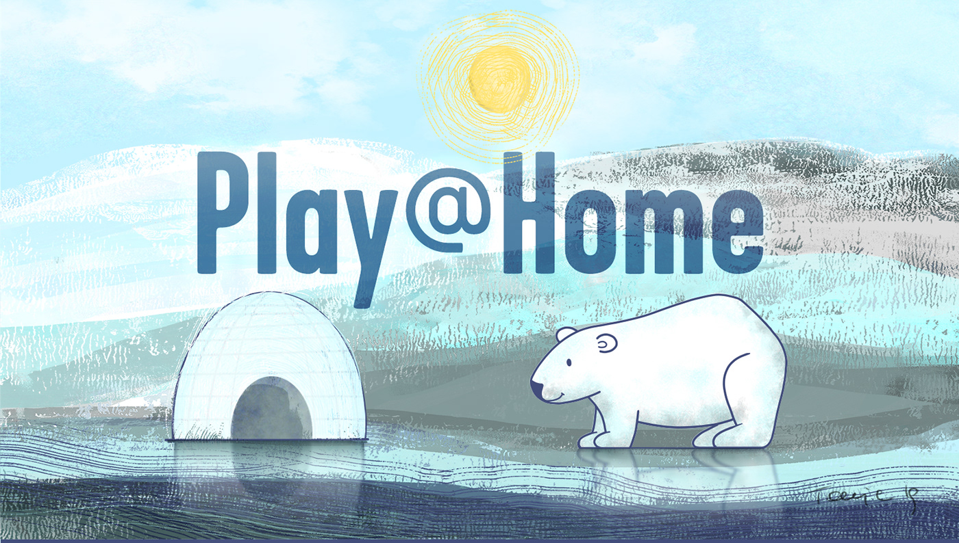
Day 9 Challenge using a photo of my toddler niece. Since the image is on the lighter side, even in Black & White, I put a stroke around the Play @ Home logo. Thoughts?
day 8 final
Day 9. Kept it fairly simple. It's been great learning through all these challenges!
Painting by photoshop😁my first attemp
just for fun...not my final choice...just playing with colour.
https://www.behance.net/gallery/95418191/Daily-Creative-Challenge @young karma hopefully this one works, thank you for pointing that out 🙂

Gave +1 Creative Carma to @gritty dust
@buoyant nova it's work and it's so awesome, I recommend guys have a look on that work 🙂
@twilit shore thank you!😀
Gave +1 Creative Carma to @twilit shore
I hope you will visit my project for the Challenge on Behance and offer your feedback. 👇
https://www.behance.net/gallery/95464705/Photoshop-Creative-Challenge-April-13-24-2020
Thank you, @sterile bane for leading us through a fun challenge.

Behance
Photoshop Creative Challenge April 13-24, 2020
Gave +1 Creative Carma to @sterile bane
Challenge 8
Tried to set the bird on fire. definitely need more practice with the brushes, but it a fun thing to do! Please let me know your comments. Hopefully I didn't abuse your art too much @sterile bane
Day 9 - All caught up and ready for the next challenge!!
Thank you @sterile bane - you are making my lockdown brighter
Gave +1 Creative Carma to @sterile bane
Day 9 just in time before day one starts tomorrow.... so much enjoyment in these challenges over the past two weeks..... @sterile bane
@golden badge that’s so nice 👍🏼
@golden badge that’s so nice 👍🏼
@young karma Thanks Mustafa... Looks a tad blurry to me but at least I've managed somegthing 🙂
@young karma thanks
Gave +1 Creative Carma to @gritty dust
Day-9
Challenge 8 layer styles
I really like Kathleen's teaching style. I didn't think I would ever have a use for doing something like this but there were a bunch of useful tips + I'm going to listen again to her videos. great job. I started one way with this then ended going a different way and didn't have time to move it all but:
The eye is from dallas shows big brother watching us. the print on the far left is from the inside of a jail cell. NYC free downloads of prints showing hunger and mom wiht babies at home in bottom right.

https://www.behance.net/gallery/95605221/PlayHome-Photoshop-Daily-Creative-Challenge
Thankyou @sterile bane for the challenges
Day 8 - or dydd wyth seeing as the writing on the wall in the main image is in Welsh.
DCC - my try on day 9 challenge 😄
hello all - here is my finished challenge! please take a look if you have a minute! thanks so much 😀 https://www.behance.net/gallery/95493271/PS-DCC-April-2020
... and here are the thumbnails!
that's so cool and clean @obtuse topaz - love the interaction with the 'play'
great collection of work @untold gust
This was a fun run of challenges with Kathleen... https://www.behance.net/gallery/95329741/Adobe-Creative-Challenge-413-425-2020 Have a look see if you can

@young karma Thanks Mustafa... Looks a tad blurry to me but at least I've managed somegthing 🙂
@golden badge The blur works for the kind of image you used. The blur with the 3-D looks surreal and makes the photo stand out
Gave +1 Creative Carma to @gritty dust
Day 9. Late but done.
@golden badge it L👀K so nice 👍🏼 keep going mate, important you knew now the technical skills and in future you can implement that in other artwork 😉
I still didn't manage to make the 3x3 grid... but here's my behand of the challenge https://www.behance.net/gallery/95374017/April_challenge_2020 Thanks @sterile bane for this challenges, I have a lot of fun and learned different ways to use some tools and some new things too. 🙂

Gave +1 Creative Carma to @sterile bane

Catching up. Only 1 more to go before the next challenge tomorrow. Let me know what you think.
My day 9
Trying to catch up before new challenge, your opinion about my collage
Day 9. Thanks @sterile bane for the great lessons and making PS one of my favorite programs now!
Gave +1 Creative Carma to @sterile bane
Merci pour la semaine/Thanks for the week @sterile bane
I call this finished. Lesson 2 wasn't the best for me, but i enjoyed working through these challenges! Let me know what you think! https://www.behance.net/gallery/95839005/PLAY-HOME-Daily-Creative-Challenge-April-2020?

Behance
PLAY @ HOME Daily Creative Challenge April 2020
Challenge 8, my collage
Three more to go, but I just wanted to share the work I have done so far https://www.behance.net/gallery/95975587/Play-Home

@oblique sinew love it Looks like lite painting with a camera.
@potent gazelle I love your masking and the use of colors in day 9. I saved it to use as inspiration on my next try. Very cool.
@potent gazelle the challenge for day 9 with the woman’s face.
Glad you like it! it's already a great image to begin with @fading peak
Day 7 challenge with brushes! It's fun to experiment, but how do you remember which brush you used when you need to add some more of a particular effect?
@paper chasm I especially like the how the lighting and colors look real yet surreal at the same time on the child and city scenes. I don't know what the collage challenge is yet but there's a nice balance of color and black-and-white. Congratulations on completing the challenge!
DCC - my try on day 9 challenge 😄
@obtuse topaz Great choice of picture... Works very well for 3D effect and I love the way you played with text... Super Cool!👍
@young karma very interesting concept and nice execution
@granite pasture I love your CHI piece. The way you handled the sun is very realistic, especially the way its gradiented into the purple buildings.
@buoyant nova Beautiful portfolio. Thank you for sharing it.
Gave +1 Creative Carma to @buoyant nova
@light cipher I really lke the blue effect on the tiger piece. It really gives the animal a whole different perspective.
@heady nimbus Very good portfolio. I enjoy your work.
@hearty wharf Your portflio has such a beautiful feel and consistency. So serene. So comforting. Well done. 🌟 🌟 🌟 🌟 🌟
@plain sable Your portfolio is so creative.
@paper chasm I like it.. Well done
@heady nimbus Very good portfolio. I enjoy your work.
@eternal mica ♥️Thankyou♥️
@silver sierra Very cool, looks good Lalit, nice job! I like how the color effect almost seems to add more tendrils to the jellyfish. I really like the dramatic contrast of the white text on the background. This is just personal preference but it might look nice to boost the brightness of the jellyfish a little with a levels adjustment, or even hit it in the center with a subtle color dodge layer to add a little bit of a glow effect. Might give the image a little extra pop. Looks great!
@untold gust This is looking really nice! There's some great color and size contrast pulling focus into the center tiger. Some really nice textures too! I like the nice 1-2-3 read of the different tigers, looks good!
@chilly solstice Nice work Paz, I like the colors in this! You might have a bit of an easier time using the polygonal lasso tool for any geometric/hard edges objects like these signs. It can be a really easy way to get crisp lines and edges. I like the texture in the background 👍
@desert raven Very cool! I love how at a glance the lines just read as a graphic element but the figure with the umbrella changes that as soon as you see them. Really cool concept, also leads the eye into the center with the effect very nicely!
@young karma Really cool Lori! The repeating vertical lines of the pillars add a really interesting feel and work well for this effect. I think perhaps the text at the top could be a bit brighter as to draw a bit more focus? Nicely done!
@golden badge Really nice! The 3D effect adds a lot of interesting graphical shapes with the elements in the photo. Cool text effect too, kind of looks like shadow falling across the text. Looks good!
@potent gazelle The Day 8 challenge turned out great! The torn paper collage look works really well, and that drop shadow on the paper is really nicely done and adds some great dimension. The color shifts and composition of the different shapes looks great!
@chilly solstice The weekend is always a great time to catch up on any of the challenges, really nice work! I like what you did with the masking of the text. It could be nice to emphasize the color of the 3D effect a bit more, whether that would be boosting the saturation or brightness. I think perhaps it’s because the background is also fairly bright, which lessens the effect of the 3D colors which are also light. Perhaps darkening the background would help boost the colored effect as well as the text which could be a good look. Well done!
@plain sable Wow, these are great! A really nice visual consistency throughout a lot of them. Really great colors too! Really nice to see them all together, great work!
@hearty wharf Very cool Tan! Awesome to see all the challenges together, very nice work! I really like the illustrated feel a lot of them have. It gives the whole set a nice stylistic consistency. Really nice work 😄
@obtuse topaz I love what you did with the masking for the Day 9 Challenge! This whole design has a really great stylistic look with the lines. Very graphic and minimal, works really well with this 3D effect. Really nice balance compositionally as well. Very cool!
@paper chasm This is just a great image for this effect! Kind of acts more like neon accents on this picture. This is a small nitpick, but it might make more sense for the text to overlap the legs since all the further back objects are out of focus, so the crispness of text makes it look forward in the scene in focus like the head of the bug. I think keeping the end of the E masked out still looks good though. Nicely done!
@cloud kernel Really cool! This is really nicely done, some great texture too! You can always organize your brushes into different folders, click and drag them to change the order, and name them to keep track of them better. That helps me at least. Really nice work making the flower such a strong focal point too, looks really nice!
@oblique sinew That's awesome Gwen, really nice work on all of these! I especially like the framing challenge design. There's some really nice visual variation in these, nicely done!
Ok ..thanks...I will try it...👍
Day 6 - Bluebird Theater Denver, CO - My hometown
@paper chasm This is a small nitpick, but it might make more sense for the text to overlap the legs since all the further back objects are out of focus, so the crispness of text makes it look forward in the scene in focus like the head of the bug.
@bleak fossil Thanks for the feedback! Totally makes sense!
@paper chasm I like it.. Well done
@eternal mica thank you!
Tiger Lad
glow added...how is it now ? 🙂
@eternal mica Thanks Ted, looking forward to the next challenges
Gave +1 Creative Carma to @eternal mica
In honor of Paul Trani's Masterclass and him hosting the upcoming Ps DCC, here's my cover.
😍
@eternal mica thank you so very much for your comment and looking! 😃
Gave +1 Creative Carma to @eternal mica
@bleak fossil as always - thanks for the feedback sam, always love reading your comments!
Gave +1 Creative Carma to @bleak fossil
I noticed when I resized the first image, it messed up the shape. So this is the correct one.
@oblique sinew your project looks great
@chilly solstice Looks great Paz
@plain sable Project looks great
This is my DAY 9 🙂 I can't choose between my 3 images. What do you prefer ?
@young karma I like all of them 😄 but the 3D effect on the hair of the woman looks super cool. Great job on all of them 🙂
@young karma this background looks amazing! I like how the 3D effect and the geometry created an interesting mood for your work 💯
Tiger Lad
@craggy lake Great job! I like the font you used on your work, it has kind of a movement that combines to the tiger's context. Maybe you could add a texture or a subtle element on the background, it will help to increase the depth of the image 🙂
@young karma To me, the upside down text is distracting. I dont see the reason for it in image #1, and definitely not in image #2, so I'll pick #3. But in #3, you could use a bit more of the red tint. I like the way it effects the whole head of hair, not just the edge.
Hey everyone! ✨
Here is the link of my complete challenge of the past weeks. I hope I can get some feedbacks ☺️
I wish a happy week to everyone and lots of creativity for next challenge 👩🚀
https://www.behance.net/gallery/95393863/Photoshop-Daily-Creative-Challenge-April-13-242020

@eternal mica Thank you for the comments. Much appreciated!
Gave +1 Creative Carma to @eternal mica
@coral stone Thank you for the comments. I was pleased with the Chicago-henge image (Spent WAY too much time on it - fell terribly behind!)
Gave +1 Creative Carma to @coral stone
Thanks @bleak fossil
Gave +1 Creative Carma to @bleak fossil
how do I unlock the April 27 Paul Trani photoshop challege?
I am new to the challenges (and Photo Shop for that matter) how do I get started?
@sand lichen the first challenge will be unlocked tomorrow at 8am PT on #📣creative-challenges. In 20 minutes we'll have the welcome stream feel free to join the stream here: https://www.behance.net/live

Join us right now to get inspired by leading creatives. Get your questions answered and share your work with the community.
@coral stone thanks where would I have found this link? Or only here in Discord by asking?
Gave +1 Creative Carma to @coral stone
@sand lichen when you access your behance there is a live tab above near the discover 🙂
@supple phoenix feel free to register for the challenges here: https://www.behance.net/challenge/photoshop In 15 minutes Paul is going to do the welcome stream. Feel free to join us here: https://www.behance.net/live

Daily Creative Challenge
Join us right now to get inspired by leading creatives. Get your questions answered and share your work with the community.
@coral stone thanks
@coral stone thank you so much for the help!!
Gave +1 Creative Carma to @coral stone
@coral stone I think I have registered as I have access but don't know if there is anywhere else I should be looking. I have an adobe signon as I use photoshop and lightroom. Or maybe it is only knowing about Discord and Behance and the rest will become clear once I am doing the challenges.
@sand lichen no problem, feel free to tag me if you need any help 🙂
Wow I have never seen a challenge where so many people posted the links to their Behance instead of the image! What is up with that? I wish everyone would go back to just posting the image and the number or name of the challenge. I see so many that I don't see any resemblance to the thing that was taught. Never saw this on the other challenges I've been in.
Hi @sterile bane I am finishing up the photoshop challenge from last week and couldn't figure out how to configure the photo grid to be 3x3 on Behance, instead I just have a single line of images. I would be stoked like a coal fire if you or anyone could give me a tip? Thanks!
Gave +1 Creative Carma to @sterile bane
@primal fulcrum I believe that's because the previous challenge ended and people want to show it as a whole. This might be normalized as the new challenge begins 😉
Lost my WiFi connection during Paul's video 😩
@lavish venture ours was out most of Saturday. So aggravating. 1st world problems LOL
"When you tear out a man's tongue, you are not proving him a liar, you're only telling the world that you fear what he might say. - Tyrion Lannister
@lavish venture ours was out most of Saturday. So aggravating. 1st world problems LOL
@primal fulcrum I think I'm back! Even my data on my phone was struggling. Could only get on discord.
My Challenge Cover for this DCC
Day 1 Photoshop daily creative challenge April -May
@silver sierra I really like that change personally! I feel like it gives the whole thing a lot more pop and adds to that sort of ghostly look of a jellyfish. Very nice.
@balmy drum Really interesting! The more subtle use of the colors gives it a more realistic effect while still adding some very colorful interest to the image. Really nice work with the masking!
@craggy lake Hah, very nice! I like the way the text gets cut off a little with the torn paper effect. The text also adds a nice pop of color to the design. This is a minor nitpick, but you might be able to get an even more refined and natural looking edge on the tigers fur if you use the refine edge tool. It really helps make those soft edges look more natural really quickly and easily. This collage effect is looking really good! https://youtu.be/c2I7X92IVGk
Thank you again for your feedback...🙂
@bleak fossil thanks Sam. This Adobe Challenge universe is rapidly becoming my happy place!
Gave +1 Creative Carma to @bleak fossil
This is my first Photoshop challenge and i am glad to join this challenge..................
Ah, that's great to hear! @craggy lake
@ruby panther Looks great Shawn! I really like the illustrated style to this design. And the warm cool contrast between the different colors looks really nice. Nicely done!
@young karma This is great, always cool to see people trying multiple iterations of a project. I feel like 1 and 3 capture the theme a bit more in my opinion, but I also really like the intensity of the effect on the 2nd image. Great job!
@young karma Great boldness on this 3D effect! Interesting how it sort of transforms into more of a graphic design in the background shapes. Really nice masking on the text, it adds an extra element of interest and depth. 👍
@brazen egret Woo, that's great! Welcome on in, we're happy to have you. Really nice job! This is a really interesting effect, like the text is being projected onto her face. Nice work on the warping of the text to fit the form!
@honest gorge Very cool Carla! Really great to see all these challenges together. I really love the high key contrast look of the Day 4 challenge, the dark hair works really well to pull contrast up into her face. Really liking the text masking on Day 9 and the colors on Day 8. Really solid work!
@rain dew These are looking great Deia! Awesome sense of contrast and color, all these designs read really well. This is really just personal preference, but I think the Day 8 challenge with the torn paper effect could possibly have a better read if you reversed which image is color and which is black and white. Currently it seems like the focal point should be the tiger's eyes, but since the most color and contrast is in the other image it pulls the focus away a bit. If the tiger was color and the background was black and white it might make for a powerful focal point. Really nice work on all of these, well done!
@south adder Very cool, this is definitely a really interesting effect. Super interested to see the next few challenges and the techniques they'll use. Nicely done, really dramatic feel to this one with all the deep darks.
@plain sable Oooh, very nice, great texture on this cover. It could be nice to darken down the middle juuust a touch to get a better read on those quotes. Really like that perspective effect on the text 👍
@rain dew These are looking great Deia! Awesome sense of contrast and color, all these designs read really well. This is really just personal preference, but I think the Day 8 challenge with the torn paper effect could possibly have a better read if you reversed which image is color and which is black and white. Currently it seems like the focal point should be the tiger's eyes, but since the most color and contrast is in the other image it pulls the focus away a bit. If the tiger was color and the background was black and white it might make for a powerful focal point. Really nice work on all of these, well done!
@bleak fossil thanks for the feedback!!! I'll give another try on Challenge 8! ☺️
@calm jay That 3D effect is looking really nice! It reads well. I like the masking of the text, but it could be nice to see a little bit more of it to get a better read. Maybe if it came out the right side a bit more it might be more legible? Nice work 😄
@split pier Really interesting collage effect with the Day 8 challenge! I like the dramatic lighting and contrast of all the images you used, it makes them fit together quite nicely. There seems to be a lot of intense contrast on the left side of the image which makes it feel a little unbalanced, perhaps brightening up the strip over the tigers eye would help balance it a bit, while also giving the tiger's face a bold pop of contrast which could make for a nice focal point. Just a thought. Very cool!
@upbeat mirage I love the light contrast look of this image with the 3D glasses effect! The text fits in really nicely with the texture of the rest of the image too. Great mood to this design, and the masking of the text is a nice touch!
@cerulean steppe Very nice! I really like the depth you got in this collage challenge with all the overlapping shapes. The horse in the center being the largest also makes for a nice focal point. The only suggestion I have is that the paper tear effect might look a bit more natural if the shapes were a bit bigger. All the really small jagged shapes almost read more like a pixelated effect if that makes sense. This turned out nice, I like the cohesive warm color palette too!
@paper chasm This is great, really nice visual consistency and contrast between the two elements of this design. The composition and arrangement of these shapes really gives the design a dynamic feel. Currently all the newspaper text pulls attention away from the title in the top left a bit. It might help to slightly fade the contrast of the rest of the text to make the title read more at a glance, unless that effect of it all blending together is what you were going for. Well done!
Thanks Sam, I'll give it try...., and work on remembering the balance. Cheers
Thanks @bleak fossil I did brighten up the text but I think I'll try your suggestion thanks again
Gave +1 Creative Carma to @bleak fossil
@bleak fossil @lucid radish hey guys, is there an after effects equivalent to this forum on discord? I'd love to try some AE challenges and join that community too, thanks!
Gave +1 Creative Carma to @bleak fossil
Here is my revised DCC cover
I made up 2 versions. I like the one without the displace. (I'm not sure I got it exactly the way Paul described. But here they are
This is the displace
Challenge #0: That was interesting... can't wait to see how to fine tune the text.
@eternal mica nice job! On the displace effect image my suggestion is to darken the background, so the text can pop a little more. The shadows can be more subtle, maybe reducing the opacity and position a little bit closer to the text, and if you want to blend with the subject feel free to play with the blend modes. 😉
@coral stone Thanks for the comment. It really pumps me up. I watched an old DCC that VooDooVal did on texts, and I loved her effects. So I tried it here. Only after I was all done and converted to B&W did I realize, the image was what I wanted for the color version, but not good for the B&W>Distort version. Your suggestion is dead on. I'll get back to it tonight.
Gave +1 Creative Carma to @coral stone
C
Here's my first challenge in Photoshop.
Hey everyone, 1st time trying the PS Challenge. I hope everyone is doing well. I look forward to checking out other creatives and getting inspired. 😃
So is the challenge that everyone is doing today, the same one we are doing tomorrow? Or was it just a little trial challenge?
Here's my first challenge in Photoshop.
@rain badger I love the way you blended the text to the subject and the background! My only suggestion would brighten up just a little bit the eyes and nose areas of the subject, it will recover some details. You did an amazing job 💙
Welcome friend @sick mauve! Glad you joined us 🙂
@coral stone Thank you for your feedback 🙂
Gave +1 Creative Carma to @coral stone
So is the challenge that everyone is doing today, the same one we are doing tomorrow? Or was it just a little trial challenge?
@ionic maple today was just a sneak peak for the challenges 😄 I believe Paul is going to show us the details on the next following days
Hi @sterile bane I am finishing up the photoshop challenge from last week and couldn't figure out how to configure the photo grid to be 3x3 on Behance, instead I just have a single line of images. I would be stoked like a coal fire if you or anyone could give me a tip? Thanks!
@craggy lake I am in the same situation. Did you figure out what to do to get the 3x3 grid? Also, I never saw a tutorial on making the cover image, but it looked like there were mentions of it in the feed. Please let me know if you found any information or have any advice! Thanks!
Gave +1 Creative Carma to @sterile bane
Thanks @brittle slate !!
Gave +1 Creative Carma to @brittle slate
@floral frigate Wow, nice image choice! I love how the effects on flames and the background are matching. Well done! 🔥
With Vlad's input, I like it much better
sounds cool
Cool image @languid pelican! My only suggestion is to reduce a little bit of the horizontal and vertical scale o when you apply the displace effect. If the text is still a little difficult to read, consider choosing a sans serif font, you can also blur a little bit the displacement image like @full warren said on the #❓ask-a-question channel. 🙂
Day5 - Image by Airam Dato-On
Displaced. First attempt with Will Smith.
Displaced text portrait. 2nd attempt with Robin Williams. (upon reflection, I feel displacement can be a hit or miss depending on the image, in this case the portrait. I think it might need to yield enough information such as contrast, mid-tones, and/or highlights, for Photoshop to pick up peaks, valleys, dips and rises in a person's face for it to work well, but I don't know...)
My attempt at 1st challenge. I didn't understand the Clipping instruction. He went so fast I couldn't catch what he did. Any advise would be appreciated.
@sick mauve, turned out great!
To create a clipping mask, just move the layer that you WANT to take on a certain "mask" or shape, above that layer. Holding (windows) "Alt" and then go in between the two layers, and watch your hand cursor change to an "arrow" pointing below. Once you see that, just click on the mouse, and you should have a top layer "clipped" to the layer below, taking on its shape/mask properties.
Here's short video I found. Hope this helps. It uses a simple graphic "clipped" to a text layer, taking on the shape of the text.
https://www.youtube.com/watch?v=u51dt8HWEZQ

In this video, you can learn how to create a clipping mask in adobe photoshop cc 2019. Open the image, then type any text, unlock the background layer then apply Clipping mask option of Photoshop.
https://www.learneasycode.com
#AdobePhotoshop #ClippingMaskPhotoshop
@peak sentinel Definitely the second one...and maybe make the text less white?
👌 thank you @fathom gull 👍
Gave +1 Creative Carma to @fathom gull
@granite pasture @craggy lake she quickly mentions in the final challenge video that behance wont make a 3x3 grid. Her way around that was to make 3 "grids" of 3 images each. So you'll upload three images into a grid, then add a new grid and add the next three images, etc. I had to delete my original grid to do this. Does that make sense?
@granite pasture @craggy lake Adding on to @fathom holly you can then change the spacing in between the three grids so that they appear as a cohesive unit.
Thank you @fathom holly & thank you @fathom gull, I will give it a try! I'm still working my way through Day 8, so haven't gotten to the Day 9 Challenge yet.
Gave +1 Creative Carma to @fathom holly
Displaced text portrait. 2nd attempt with Robin Williams. (upon reflection, I feel displacement can be a hit or miss depending on the image, in this case the portrait. I think it might need to yield enough information such as contrast, mid-tones, and/or highlights, for Photoshop to pick up peaks, valleys, dips and rises in a person's face for it to work well, but I don't know...)
@patent estuary Nice images, Jhonny! 💙 Here are a few tips that can help you to increase the effect. On your displace file (the one you select to apply the displace effect) desaturate the image and apply a little bit of Gaussian blur, it will help the effect identify the peaks and valleys of your image (you can play with the contrast as well). Also there is a cool tip that Tim posted on #🔨resources with the equalize option, (https://discordapp.com/channels/547473772727238676/562325745024892958/636598208776241172). When you apply the effect sometimes you have to fine tune the values of the horizontal and vertical scale until you find a nice amount preserving the text legibility. 😀

Discord
Discord is the easiest way to communicate over voice, video, and text. Chat, hang out, and stay close with your friends and communities.
My first attempt. Could not get the displace filter to work
@coral stone, thanks dude. I'm still playing around with it, but will apply the technique mentioned in the link, "equalize" and give that a go.
Thanks!
https://media.giphy.com/media/JJR2n3I7vVisE/giphy.gif

Gave +1 Creative Carma to @coral stone
@digital dirge Did you convert the text layer to a smart object? Won't work without doing that.
how or where you guys got the quotes?
@pure fractal you can search for quotes online
i did, the ones i found were with background, i'll keep searching thanks @peak sentinel
Gave +1 Creative Carma to @peak sentinel
@bleak fossil Thanks for feedback 😊
Gave +1 Creative Carma to @bleak fossil
Very new on photoshop- i'm glad i'm doing this
#💎past-challenge Day 9 - 3D Effect. Can't believe how simple that was.
@tropic haven The 3D effect is looking good Jessie! It might be nice to see a bit more of the text to get a little more readability. Liking the style of the text too, nice contrast to it all!
@dim brook Ooh, very cool! I'm interested to see too, hah. It could look nice to try and push the contrast on the text and face a bit more. Maybe darkening down the background (or even giving it a slight out of focus blur as well) could help the text draw a little more focus and attention. Nicely done!
@rain badger Very cool Erika! I really like how the text makes up the figure completely and then blends into the dark background. I think brightening up the text toward the upper half of the figure and have it gradate a little darker towards the bottom might be a nice touch to give the image more of a focal point. Great effect!
@floral frigate Oooh this looks great. I really like how well the glow from the flame works in this effect too. Really nicely done!
@pure fractal Very cool! Welcome on in, I'm glad you joined us! This effect works really well with this photo. It does seem to get a bit heavily warped in places, and a little bit more uniformity in the text might look nice, but overall this looks really cool. Nicely done!
@wispy compass Nicely done! The text effect is nicely mapped and makes for an interesting effect. I think using the refine edge brush tool for the masking around the hair might help for a more natural edge since the black background makes the edges so apparent. This video might help if you're not familiar with it. Nice job! https://youtu.be/c2I7X92IVGk
@bleak fossil Thank you for the kind words.
Gave +1 Creative Carma to @bleak fossil
@patent estuary I love the way you offset the images in this Day 9 challenge! The offset along with the 3D glasses effect makes for a really nice visual. Really great contrast between the red and blue, looks great! The text effects are looking really solid too, I especially like the contrast of the one with Robin Williams.
@digital dirge Like BigEvilDoer said, it might be the step where you have to convert the text to a smart object. If it still doesn't work after that let me know. Would definitely be interesting to see how the text reacts with this image 👍
@peak sentinel Hmmm, really interesting. I think the version where the text is only covering the person draws a bit more attention to the effect overall! It could also look good to maybe mask the text so it's brightest and most apparent around her head and face to give the design a bit of a focal point. Nice work 😄
@craggy lake No After Effects DCC/Discord yet, but we are having our very first week of the Premiere DCC. You can check out the challenges and Discord at https://www.behance.net/challenge/premiere
@sick mauve Yeah, today's stream was a bit quicker and more general due to it being the intro stream. Around the 8 minute mark in the stream what he does is brings the photo layer above the text layer, and then clips the photo layer to the text layer. If you right click the photo layer when it's directly above the text layer and select "creating clipping mask" it should work. Essentially only revealing the photo on top of any pixels containing text, if that makes sense.
@coarse flame Awesome colors in this Day 5 challenge! Really gives it a lot of interesting contrast. The saturation contrast of the text box is a really interesting effect as well, draws some nice attention. Looks great!
@languid pelican Really interesting image, definitely a dramatic feeling with that contrast and colors. I think Valdair gives some solid pointers. A lot of time with these types effect fine tuning the settings and variables of the image can really be what determines how effective the results are. Really nice image!
@eternal mica I think a lot of the time this text effect will be most effective if you have a large wall of text fairly close together without many gaps, so that the text has more area to show the form of the picture, and if you make a clipping mask like Paul did it also sort of becomes the picture. This is also somewhat unrelated to the effect, but you might be able to get a cleaner more natural looking edge (especially on things like hair) if you make use of the refine edge brush tool within the quick selection tool. Here's a quick video on the subject if you're not familiar. https://youtu.be/c2I7X92IVGk
My first challenge in PS 💙
Didn't know what portret to use, so i picked one that my friends associate me with... @brittle slate didn't know how to make a pattern of the quote I picked, so i used Illustrator to make a pattern. How is this done in PS?
@nocturne lantern Very nice! And your first challenge? You’ve done a great job! I love the colors and how you’ve let the text extend to the edge of the canvas. Well done!
@paper chasm LOL I love it!
@pure fractal I’m glad you’re doing this too! I find the distortion on the face very interesting! Nice job!
@digital dirge Let me know if you are still having trouble with the displacement step! I can walk you through it!
@peak sentinel I like the second one! The distortion is nice and I like how it only covers the subject and not the background. It would also look cool to have text extend around her, but set that text to a dark gray so it stays faint! Well done!
thank you @jolly quest i'll try doing that + what @bleak fossil suggested 👍
Gave +1 Creative Carma to @jolly quest
Thanks boss @brittle slate. Seeing your class encourages me to work in Photoshop. There is so much to learn from your class. You really are a great teacher. Thank you very much Hope you give us something new in this short time class. Special thanks to you. @brittle slate
Gave +1 Creative Carma to @brittle slate
@covert loom nice! Loving the rough texture to the text!
@patent estuary if you aren’t getting the displacement effect you want, you can always play with the Levels of the image to make the shadows and highlights more dramatic before applying the displacement.
#photoshopdailychallenge - Day1
@floral frigate the flame looks great! Loving the difference in color of the text to accentuate the flame! Well done!
@young karma Oooooh! I love the colors! The distortion of the text in places like the eyes and lips is especially cool. It almost looks like a textured brush stroke until you look close. Nice work!
@jolly quest Thank you so much ☺️
Gave +1 Creative Carma to @jolly quest
@young karma I would even like to see you experiment with overlaying gradients, just as a fun experiment! I bet it would be fun to try different colors
Very nice!
Looks like it could be an ad for a beauty product
🙂
@rain badger I love it! I think the visibility could be improved, however, if you brightened it and experimented with smaller font size so that the details come through a little more.
@jolly quest I already did! But the lighter one it's the one i prefere.
@rain badger I tryied with smaller font and it's going to be very distort and noisy text, I don't know why
@young karma oh wow! These are so cool! Yes I think I agree with you. I like the lighter one best as well! It’s nice to see a few different color versions. I was just curious to see!
Thanks boss. You really are a great teacher. @jolly quest
Gave +1 Creative Carma to @jolly quest
@covert loom thank you!
Gave +1 Creative Carma to @covert loom
I will be able to learn a lot more from you in the next class and get a better idea about the tools. Thank you. @jolly quest
Gave +1 Creative Carma to @jolly quest
i got stuck behind with the previous challenge #8!!..i know it may be a bit cruel image but that s what is in nature isn't??...it look one of those science magazine cover page lol!!
@digital dirge Did you convert the text layer to a smart object? Won't work without doing that.
@pliant geyser Yes but it only half worked. I think it has to do with my image sizing. I am very new at this so trying to push myself. I am an amateur photographer so this is very much outside my comfort zone but lots of fun
@digital dirge please what challenge is this?
My take on todays challenge, inspired by a bit of Dylan Thomas "Do not go gentle into that good night, Old age should burn and rave at close of day;
Rage, rage against the dying of the light."
@digital dirge please what challenge is this?
@soft ledge Daily Creative Challenge It started yesterday but was mainly an intro - the first day is today
Hello everyone awesome work😍
Unfortunately I have not been able to unlock the challenges.
@soft ledge Daily Creative Challenge It started yesterday but was mainly an intro - the first day is today
@digital dirge Is there a video?
Hello everyone awesome work😍
Unfortunately I have not been able to unlock the challenges.
@clever crescent I believe they open up at 8am (USA pacific time)
Perhaps I signed up too late, I joined this morning 9AM (BST)🥺
Perhaps I signed up too late, I joined this morning 9AM (BST)🥺
@clever crescent Not at all You can going at anytime The class will be live at noon (New York time) I usually watch on the Adobe Youtube channel but you can watch within Behance. I'm just not as good finding it here
@inland kiln Great job! I love how the serif font matches the mood of the composition 🙂
Nice one @digital dirge! Glad you joined the challenges 🙂 Just a few points of feedback: Make sure that the displace file (the one that you choose when appling the displace filter) is black and white and a little bluried (filter > blur gaussian blur). The file should be the same as the image you're applying the effect, so will work precisely. For the scale horizontally and vertically you can play with the values to see that suits better for what you want to achieve, preserving the readability.
@bleak fossil Thanks for the help. I was directed to that video a couple of eeks ago. Ive watched it a few times. I really like what it shows. I need to take the time to utilize it next time Im working with edges
Gave +1 Creative Carma to @bleak fossil
Nice one @digital dirge! Glad you joined the challenges 🙂 Just a few points of feedback: Make sure that the displace file (the one that you choose when appling the displace filter) is black and white and a little bluried (filter > blur gaussian blur). The file should be the same as the image you're applying the effect, so will work precisely. For the scale horizontally and vertically you can play with the values to see that suits better for what you want to achieve, preserving the readability.
@coral stone Thanks Ill try that
@inland kiln Very powerful. Maybe the darks are a bit too dark?. Would you like it a bit brighter so the image stands out a bit more.
@clever crescent They are not unlocked as yet. Maybe another hour or so
@inland kiln Very powerful. Maybe the darks are a bit too dark?. Would you like it a bit brighter so the image stands out a bit more.
@eternal mica Gave it a go but I think you lose some of the impact
@clever crescent An easy way to join the live chat is from here in Discord. On the left menu panel go to Announcements>creative-challenge. There will be a link there to each day's video as it is released. (There is also a link there to yesterday's video. I dont believe you will find yesterday's video on YouTube.) The challenges get released one day at a time, starting this morning @ 11:00 AM EDT and can be seen live @ Noon EDTon Behance.net/challenge/photoshop.
@inland kiln I like the lighting on the second one. It seems to me the man's "smile" stands out in the lighter one, which I agree, works against the message you seem to want to send. So much fun to see the various messages a single image can send.
not happy with this one. Should have found more text so it could be smaller. 4th try to get Discord to take this. Guess it doesn't like it either
@digital dirge thank you, really helpful will try the YouTube route
Gave +1 Creative Carma to @digital dirge
@buoyant nova oh awesome! Thank you ✨
@eternal mica so helpful, thank you , was quite lost for a second 😂
@bleak fossil thank you! I will work to refine the edge...there seems to be a lot if noise in the text...I noticed another person had the same problem...is the text too small or should it be in all caps?
Gave +1 Creative Carma to @bleak fossil
Quotes from Sun Tzu, on a self portrait taken a few years ago.
@pliant geyser That's really cool!!!!
@pliant geyser, your distortion worked out really well. I can see the peaks and valley of the texts.
Gave it a try as well. Very new at this so I pretty much have no idea what I'm doing... just following the video....I'm amazed at what you can do in so few steps!!!
@patent estuary I love the way you offset the images in this Day 9 challenge! The offset along with the 3D glasses effect makes for a really nice visual. Really great contrast between the red and blue, looks great! The text effects are looking really solid too, I especially like the contrast of the one with Robin Williams.
@bleak fossil, much appreciated dude. The most challenging one so far has been the displaced, but I may have to do a bit more of prep work on the image prior to taking it to displace, such as adjusting contrast, or whatever is necessary to differentiate, so my text may form better on the surface of the portraits.
I choose Robin Williams and Will Smith because they are both great actors, and I've had many fond memories watching them when I grew up, and hope to share that same experience with my son.
It is unfortunate that Robin Williams is no longer alive, but will live on through his work.
Again, thanks. (air high five)
https://media.giphy.com/media/kd8ZuMhSJAhDq/giphy.gif

@junior rapids, love how the text flows, calmly like the sea (sea of text), until it hits land/rocks, and creates shape and forms, such as when the text forms into your face. Nice done.
https://media.giphy.com/media/ZiHVfHBpoULkc/giphy.gif

@junior rapids @patent estuary Thanks guys... I made sure the portrait was high contrast before applying the distortion. If your image's tonal range is too flat it does doesn't work out. I also converted the distorted text to a mask, which I feel is pretty cool. Everything outside of the text is solid black, except for the spatters which I added later.
Gave +1 Creative Carma to @junior rapids
Welcome day Challenge.
@pliant geyser Thanks a bunch for the tips! I'll go play around with the masking idea....
Gave +1 Creative Carma to @pliant geyser
Everyone is doing such an amazing job already! Wow. Yesterday was just a preview. 🙂
So When I clipped the text to the color layer it wouldn't let me drop in a background color on a layer underneath, I have no idea what is going on, so I just turned on the b and w version as the backdrop, I actually kind of like it, looks like the text is being projected onto the subject.
with candlelight color lookup
@brittle slate we are excited 😄
@brittle slate, and you did a great job as an instructor.
@daring slate nice job 😃
@young karma Thanks 🙂
Gave +1 Creative Carma to @gritty dust
Creative 😍
Wow @young karma! Feels like a movie poster. Great job on the text texture 🙂
@pliant geyser Great to see you back here again. As usual your post is top notch.
Nice
Nice ones @daring slate I like the style of the text on the candlelight version 💯
@brittle slate Is there a way to constrain the quote/text to the image size. If I copy/paste a formatted quote it gets pasted into PS as only 2 lines of text without breaks.
@eternal mica Thanks bud! Glad you like it!
Gave +1 Creative Carma to @eternal mica
@brittle slate when do you go live for today's Photoshop challenge?
@arctic rover When you're ready to paste your clipboard onto the text layer, using the text tool, marquee your entire image area, then paste.
Hi here from Aruba
Hello from Nepal
@supple phoenix he is live right now 🙂 here's the link: https://www.behance.net/live/

Join us right now to get inspired by leading creatives. Get your questions answered and share your work with the community.
Hi @white pebble and @open kettle 🙂
@coral stone I must have been on the wrong page...i'll try that one! thank you so much!
Gave +1 Creative Carma to @coral stone
From Curacao also tuning in!
Made today. You like?
Very dope
Love it\
It`s great
where can we watch the replay of the live stream?
nvm found it
Challenge: Learn how to touch up your selfies with content-aware tools and make them pop with gradients.Get the starter file here: https://bit.ly/psdcc4-27-1Join your host each morning at 9:00am PT to learn how to approach each challenge using Photoshop. Complete 9 challenges ...
Will the quote overlay in the welcome stream be explained more or is that just a quick thing for the first day?
@balmy summit It was just a quickie. Paul did say he has it covered in detail later in the Challenge. But you can always rewatch the video as many times as you'd like and just follow step by step.
@coral stone Thank you so much, it was just a quick work, there is a message in the face of the lady, did you saw it ? 😉
Gave +1 Creative Carma to @coral stone
Day 2, Selfie challenge with gradient Final.
Here's mine today.
@young karma CREATIVE? 😄
@coral stone 👍
Well done @young karma 🙂
Day 1 - My masking SUCKED. But, I got some ideas out of this for selfies and portraiture!
@covert gulch, nice! I get a "They Live" vibe from it.
https://media.giphy.com/media/SK8iBYgTXAEjm/giphy.gif
https://media.giphy.com/media/3og0IUd5D9Y77EXtRK/giphy.gif
https://media.giphy.com/media/iyRg4TeoSamLS/giphy.gif


First challenge! Hard to do hair refining with curly hair haha
@odd spear, great start. If you're taking it with your camera phone, I recommend seeing if someone can take it with the back camera (depending on the phone you're using) as it yields much better quality. Keep at it dude!
@haughty cape, great masking, especially on the outer perimeter of the strands of hair! You can see the layer below, through the strands.
Great job guys!
https://media.giphy.com/media/em4i0bDs9Hm2Q/giphy.gif

Thanks @patent estuary
Gave +1 Creative Carma to @patent estuary
Very cool @covert gulch and @young karma ! I like your experiments!
@brittle slate Ive never thought of this, so it's cool to start. I'm not as creative as @covert gulch , which are really cool!
@haughty cape Great hair masking actually! I love that image!
It looks like you're having fun though @young karma ! That's what I love about yours!
🙂
Today's challenge
Thought a composite combining 3 selfies and a life long tall ship interest might be cool.
That's really cool
@haughty cape Masking is well done. Good stuff!
@cold oyster I really like your displacement text #2. Don't think anyone else in this forum has done anything quite like it. 👍
Photoshop Creative Challenge, Day 1. 😉
I kind of love that this is how I get to introduce myself to discord! Awesome lesson today Paul
Todays selfie
I was all set to turn this one in today. Oh well ...
here's my try. Had fun doing it.
Here is the daily project....I was going to go without the hat.....but I was getting to much Shine off the dome
Trying the welcome challenge and displacement text. Very unhappy. This was a second attempt. I'm guessing the type of photo you choose this means a lot. Any pointers?
Here's the original
This one didn't work out at all. Would love to know what to look for when choosing a photo
HI! This is my work from yesterday .... I don't know if anyone has the same issue, but the letters lost sharpness, in the one made by Paul you could see the text really well and sharp....
Here's my try for day one
First time really trying to manipulate things in PS - big learning curve for me.
Day 1 attempt - any good? Took ages because all my menus are in a different place!
@young karma This looks awesome! Loving the dramatic lighting on the face and how it disappears into the black background. The subtle blue tone adds a lot of mood too. I think it might help to make the white text at the bottom a little bit darker to fit in with the looks and feel of the rest of the image. It seems a little bright in my opinion and breaks the mood a bit. This turned out great!
@daring slate Ooh, I really like the result on this one! Especially the one with the candlelight color lookup, it has a really great effect and the way the text is most prominent on his face and center part of his body works really well. I'm not sure if you were trying the same effect Paul did, but I believe he clipped his photo image to his text image, so that the photo only showed up on the areas with text. But either way I think the effect you got looks great!
@ruby panther Really interesting effect with this welcome day image! The text also starts to look like a bit of paint on her face, kind of gives the image some more texture. Looks good!
@junior rapids Very cool! This is an interesting take on this challenge, really like how you handled it. Very effective read to this image, and it has a really nice composition to it. The gradient adds a lot of interest as well. Nicely done!
@pliant geyser You nailed this one! Turned out really well. I love how well the values of the form still read while the text is still pulling the most focus and attention. Really awesome colors and texture as well, great mood to the whole thing. Masking is on point as well. Awesome work!
@primal fulcrum Hah, really cool image for this one! I think having denser text as well as a photo with more of a value range (more dramatic lighting with more pronounced form) might help the displacement effect since it works off the lights and darks of the image. Nice work 👍
DAY 1 - Been raining here all day after 2 weeks of sunshine so I needed something to cheer up my spirits, hence the rainbow!
Having fun! added texture to give it more detail ..
@inland kiln The displacement effect came out great on this! I do like how the brighter version puts a bit more emphasis on the face, but the first one had an interesting look with the focus being drawn to the eyes. Overall I think I like the brighter one a bit more, personally. Really great work!
@south adder Very cool Neil! I like the contrast in color between the background and the portrait. The portrait has some nice bold colors against the softer background. Some interesting texture effects in the portrait as well. Looks good!
@fallen gate Really nice work Eric! The masking is looking solid, though I think the hair area could benefit from the refine edge brush tool to get a softer, more natural edge. Here’s a quick video in case it helps. The color contrast between the portrait and background looks good! https://youtu.be/c2I7X92IVGk
@covert gulch Ooh, such great colors on this one! Bold colors but they all work together nicely. I especially like the image with the portraits in the background, the deeper contrast on the front portrait balances the image well. 👍
@odd spear That's great to hear! A lot of times the "select subject" option does a really good job, but there's a lot of careful refining you can do with the quick selection tool, especially with the refine edge brush tool to clean up the edges, especially around hair. Not sure if you used that but that should be able to give you a pretty clean edge. Nice work with the gradient! Might be nice to use the burn tool or something similar to get a little bit more contrast in the iris and pupil area to really help the eyes act as a focal point, which is often the most striking area of a portrait. Nice work!
@haughty cape Awesome, welcome on in! This looks great! Really nice visual hierarchy and read to the images with the receding contrast as they go back. Great colors on this. Nice work with the hair! That can definitely be tricky when there's a lot of texture/detail in the edges. 👍
@cold oyster Really cool, I like the two vastly different looks you got in these images. Both work really well, but have totally different moods. I think softening the outside edge of the one with the white background just a bit might look nice. Just enough to take away the jagged look. Really nice work!
@young karma Hah, really cool effect on this Day 1 challenge! I like the size variation you got between the different faces. I think using the refine edge brush tool on the hair might help you to get a softer, kore natural looking edge, though the hair in the bottom left looks pretty solid. Nice work with the different colors and texture effects 😄
@supple crater Really interesting illustrated feel to today's challenge! I like the color variation and the portrait has a nice contrast against the background. Nice graphic read to the whole image!
Never enter in a contest before hehe
Gave +1 Creative Carma to @coral stone
@bleak fossil I did use the select subject and refine edge. My background is a gray wall that I took my selfie against, so that probably did not help. I also did not spend much time on it, since I am still working my day job. But, it was a fun practice, and I think you brought up a good point on the eyes. All I did was the radiant tool, brightened and sharpened. But, the dodging would be a good pop. I saved the layer as a SO and file as a PSD, so I may go play some more. Prob do a deferent selfie. Set up the Nikon, lights, and update my Bumble and Tinder profile! LOL
Daily Challenge 1
Here's another...because I had an idea off my first entry
Rock Album Cover is RIGHT! Haha
DCC4 Challenge #1 I never thought Id be putting up a pic of me in Ps chat, but what the heck!!!
@lavish venture
Trying the welcome challenge and displacement text. Very unhappy. This was a second attempt. I'm guessing the type of photo you choose this means a lot. Any pointers?
@lavish venture Hiya... the photos you're choosing do not have high enough contrast for the mapping to work very well. On the first one, I would suggest either doing a whack of dodge and burn on her face in the BW version - that's important, as the map is applied to the BW. Really make it contrasty to make the text map pop.
@lavish venture
@lavish venture Hiya... the photos you're choosing do not have high enough contrast for the mapping to work very well. On the first one, I would suggest either doing a whack of dodge and burn on her face in the BW version - that's important, as the map is applied to the BW. Really make it contrasty to make the text map pop.
@pliant geyser Thanks so much for that. I was trying to figure out how to even make a B&W in photoshop. I am pretty new to it. Use illustrator more and following along a tutorial with Ps.
The dodge and burn we used today, right? Lightens areas.
Thanks again for your help.
One thing you can do is make a copy of the picture on a new layer, mess the contrast using levels or curves. That will give you more displacement and then you can delete the adjusted layer and use your original picture
@lavish venture #8909. I took your original photo and did some super quick levels and dodge/burn to give you and idea. As for making an image BW, go to the "Adjustments" palette, add "Black and White". Then save your image as an RGB PSD file.
One thing you can do is make a copy of the picture on a new layer, mess the contrast using levels or curves. That will give you more displacement and then you can delete the adjusted layer and use your original picture
@vale sandal on which file? The B&W saved on or the main one? Thanks 🙏🏻
Gave +1 Creative Carma to @vale sandal
@lavish venture #8909. I took your original photo and did some super quick levels and dodge/burn to give you and idea. As for making an image BW, go to the "Adjustments" palette, add "Black and White". Then save your image as an RGB PSD file.
@pliant geyser ah you're as good! Thanks so much. I'll give it a go and see what it looks like now.
hello all - here is my day1!
Good afternoon, sorry guys, just a quick one, how can i find out/join the current challenge?
I really cannot see where i can find the challenge lol, and i was so excited about it.
Samantha ShoushtariToday at 15:54
Welcome @everyone to Challenge #1 of the Photoshop Daily Creative Challenge.
Today's challenge is: learn how to touch up your selfies with content-aware tools and make them pop with gradients. Starter File: https://bit.ly/psdcc4-27-1 is this the one?
@surreal fractal Here is the video as well that talks about today's challange: https://www.behance.net/live/videos/5203/Photoshop-Daily-Creative-Challenge-Spectacular-Selfies

Challenge: Learn how to touch up your selfies with content-aware tools and make them pop with gradients.Get the starter file here: https://bit.ly/psdcc4-27-1Join your host each morning at 9:00am PT to learn how to approach each challenge using Photoshop. Complete 9 challenges ...
@surreal fractal This is from the left panel Announcements>creative-challenge. It gets an update every weekday morning ay 11:00 AM EDTToday's challenge is: learn how to touch up your selfies with content-aware tools and make them pop with gradients. Starter File: https://bit.ly/psdcc4-27-1
Tune in with your host @brittle slate on https://www.behance.net/adobelive at 9:00am PT as he shows you how to tackle the challenge of the day. Good luck! 
Missed the live stream? Check out the replay here: https://www.behance.net/challenge/photoshop

Join us right now to get inspired by leading creatives. Get your questions answered and share your work with the community.

Daily Creative Challenge
bloody hell, myself as a model, thats one hard task lol
Wanted to complete day 0 quotations project before starting on self-portrait. Reasonably happy with the result
My cover for new challenge
I used my husband as a model. I'm not totaly satisfied. Is it possible to fade the main picture just a little bit but so that the other pictures don't shine through?
One of the rare images of me on this. I usually use someone else...
@lavish venture #8909. I took your original photo and did some super quick levels and dodge/burn to give you and idea. As for making an image BW, go to the "Adjustments" palette, add "Black and White". Then save your image as an RGB PSD file.
@pliant geyser Not a huge difference. This I just need a better photo for it. Thanks again.
Revised Displacement. Thanks @bleak fossil for the suggestion, I think it looks better with the softer edges.
Gave +1 Creative Carma to @bleak fossil
Was the first day an actual challenge? I thought we were doing to do it later on. I made my quote sheet "waiting for it"
@lavish venture #8909. Try reducing your font size to maybe 65% of what you have now. You'll likely need to paste in a bunch more text to fill the space. Just a thought.
@eternal mica I thought the same thing. I'm not growing old gracefully.
day one down lets goo
practice one😎
Revised Displacement. Thanks @bleak fossil for the suggestion, I think it looks better with the softer edges.
@cold oyster this one looks pretty good I like it nice work.
Gave +1 Creative Carma to @bleak fossil
@hearty wharf loved the gradient and the texture! It has a nice transition from dark to light. Well done 😃
@digital sigil Loved the duotone effect, specially on the Paul from the back, can't wait for this album to be released 🎸
@eternal mica another cool work, Ted. If you want to play a little bit with depth you can reduce the scale of the subjects on the back, it will make the one in the front to be a little closer to the viewer. Good Job
@vale sandal wow, super cool! Love the repetition effect, also how consistent the saturation of the colors look awesome! Great job 💯
@supple phoenix Awesome! I like how you preserved the details on your image with the effect, If you want, you can add nice gradients to give some colors to it! Great job 🥳
@bitter zodiac cool edits MJ 🙂 My suggestion would be brighten up a little bit your photo, it will enhance the focal point of your composition. I like the shadow/overlay you made, really nice!
@sand lichen Very well done
@sturdy vault Given whats going on around the world today, growing old (gracefully or not) is the better option!! 😉
@sand lichen the displace effect looks awesome! I'd darken the face just a little bit so the text on the light areas could appear more, well done!
@spiral shadow you can fade it by using opacity. You can also play with the blend modes experimenting different ones and creating other effects that you might like 🙂
@sturdy vault beautiful image of your cover! I like how the quote text has a nice contrast compared to the background 🙂
@coral stone thanks for the compliment.
Gave +1 Creative Carma to @coral stone
Not a selfie! Day 1 Challenge. Here's looking at you babe.
@lavish venture loved the gold halo around her, great job! If you want, you can have a copy of the original model on the background, so the details on her can be more visible. If it's too strong feel free to play with opacity. 💯
What a fun way to get us to show each other what we look like. Thank you for this exercise, Paul. I did some things that I have rarely done before, I think this is only my third selfie ever. I also really like the Import from iPhone trick; without that I may have not attempted this challenge.
I have also been trying macro while self isolating and thought I would use a computer chip image as a background. I used the Make Pattern in the Library window to make the pattern fill layer and added a zoom filter for the blur. Have a great day everyone. Rick. 📸
Gave +1 Creative Carma to @coral stone
@bronze bluff Really love how that came out!!!
I know I need selfies with full shoulder with but it's a start! 😀
Day 1
Day 1 - Playing around with gradients, Would love to know what you think?
@gaunt geyser Quite the sunburn on the forehead! 😆 Masking isn't bad, but could use a little more refinement. Otherwise, well done!
@thorn geyser You've definitely got the idea of the challenge. I would suggest doing something with your photo though - it looks relatively flat and lacks mid-tone detail. All in all though, decent!
Day 1 - Redo
@pliant geyser @coral stone Getting there! Starting to really like it, much happier now thanks to all your suggestions. Happy if you can add to it. I can only get better and better 🙃 😀
Gave +1 Creative Carma to @pliant geyser
Day 1 - new to photoshop. Had fun playing around!
Beautiful work @oblique mortar, the rectangle added a great contrast to the colors, awesome job!
Amazing job on your day 1, @normal basalt I love the way that the background you added and how it has the same mood as the selfie 💯
Day 1. New to PS
I made a cover for this new DCC using the “Distort” and “Displace” filters Paul used on Monday. Are the details difficult to see?
@thorn geyser nice edits! Great to see you back on the challenges 🙂! My suggestion would be just fine tune on the light areas, maybe brighten up just a little, so the details can appear more, especially on the green tones on hair!
@gaunt geyser Loved how the left and right models are looking at the model in the center. That's a great technique to create a focal point, well done! 🙂
@lavish venture If you really want to muck with the shape of the words, Convert the text layer to a smart object and Edit > Transform > Warp --- you can add split points and really fine tune the shape of the letters.
@winter tinsel Love what youve done there!!!! Wow!
Thank you @brittle slate for your excellent workshop earlier. I'm amazed at how easily I was able to get the background out of my curly hair... a task I thought would always be tedious... but not this time! Really enjoyed learning all those tricks to manipulate the images. Looking forwards to tomorrow!!!
Gave +1 Creative Carma to @brittle slate
Challenge 1. Paul enjoying another cup of coffee. My goal is for Paul to appear like he's doing a selfie in a highrise with the sun to the left. I did the shadows on his face with the CRF ellipse. Thank you for the tips!
@tropic knoll Not bad at all. To make the effect that much more realistic you need to put some light shining on the top and left of his hair and on the shoulder. Pretty solid!
@lavish venture If you really want to muck with the shape of the words, Convert the text layer to a smart object and Edit > Transform > Warp --- you can add split points and really fine tune the shape of the letters.
@pliant geyser Cool. Starting to have real fun with it now. Thanks so much for you help! Really appreciate it.
Thanks for the feedback @pliant geyser @coral stone I appreciate it
Gave +1 Creative Carma to @pliant geyser
thanks so much for feedback @coral stone 😁
Gave +1 Creative Carma to @coral stone
My attempt at today's Daily Challenge. Some of the techniques were new for me, so I'm happy to have figured most of this out.
oooh, @coral stone - just realised you are officially mentor now, well done!!! 👍
Thank you so much @hearty wharf 😁
Gave +1 Creative Carma to @hearty wharf
First ever Challenge and Post! new to PS. #✂challenges-feedback
Day 1 - Spectacular Selfies
Day 1 - Spectacular Selfies
@cold oyster WOW love this so much!
Day 1 - new to photoshop. Had fun playing around!
@white pebble Nice colours...
@coral stone Appreciate it thanks
Gave +1 Creative Carma to @coral stone
Well here goes played for ages there are so many mistakes to make 🤣 but I got somewhere in the end ...
Day 1 - Playing around with gradients, Would love to know what you think?
@gaunt geyser Really like your Day 1 upload!
Seeing everyone's multiple images, thought I needed to do one.
OMG...definitely took longer than I should have but so much fun!
Cool technique!
Day one!
@fallow frigate so good you final work 👍🏼
Well done @white pebble. I like how the gradient map effect preserved the shadows and highlights of your image 🙂
Day 1
@young karma Super nice the sepia tone on your image, you might fine tune a little bit with the refine edge on the hair area like Paul did 😉
Welcome to our community @opaque mango I like the way that you placed the selfies, well done! My suggestion is to play with the refine edge tool on the hair so it can be more smooth on these edges. If you need help feel free to tag me on #❓ask-a-question
@cold oyster wow, I loved the mood of your work, great job!
@golden badge hahaha it happens. Good job, I like how made the selfies in the background more subtle so the attention can go straight to the center one 🙂
Hi everyone!
Challenge 1 Re-Do. Thank you @pliant geyser for the tips. Is this what you are referring to? My skill level was pushed to the limit trying to figure out to do those highlights. 🙂 I do see a big difference in the reality. Thanks again!
Gave +1 Creative Carma to @pliant geyser
Here is my Day 1
@desert raven Love It!
Had so much trouble for this one. can’t get ride of the edge of each pic.
from the welcome video.. the texts seem really messed up around her hair (too curly?) and eyes. Not sure how to fix it.
@obtuse flint beautiful work! The background color looks really good it matches the eyes' color. My consideration is that you might fine tune a little bit on her edges, you can get remove the blue and white halos by selecting the layer mask then pick the brush tool and then paint with black on the edges, just some tweaks. 🙂
Challenge #1
Did some colorful layers. What you all think?
Name this rockstar?
@pliant geyser Hah, I like it! Really cool concept, makes Paul look like Poseidon or something. I really like the variation between the darker portrait on the right, and the other two, but it could be nice to separate the value of the middle and left portrait in the same way. That way, perhaps the middle one could be the focal point and give the image a bit more of a natural 1-2-3 read in terms of contrast. Just a thought, looks great!
@sacred field Loving the color effects on this! Really interesting stylized look. It could be nice to see the pink of the face gradate and blend a little more softly into the hair as the edge fades out. It might look a little more natural to the fairly hard edge it has now. Really cool!
@keen hound Great colors on this! Hah, love the portrait and the dragon graphics. I'm digging the whole soft contrast feel of this portrait. Though it could be interesting to add just a bit of additional contrast to the center of the face/eyes to act as a focal point, perhaps with the burn tool or a masked levels adjustment layer. Just a thought. Welcome into the Discord by the way!
@zinc elbow Very nice, I like it. The gradient definitely adds a fun feel and a lot of interest! Not sure how many colors you selected in that gradient, but I'm mostly seeing the yellow, orange, and red. It could be nice to get some more of the cooler temperature colors, or perhaps the gradient was elongated too far for those to show much. Either way, really great effect!
@lunar mango So cool Austin, loving these colors! The colors and subject matter definitely make me think Val would enjoy this one, haha. The texture definitely adds some great interest, really awesome image!
@young karma Ooh, trippy. Is this from a previous challenge? That neck effect seems very familiar, hah. Really liking the balance between symmetrical and asymmetrical designs in this. Great colors too!
@restive parrot Awesome, welcome on in Chester! Glad you could join us. This image blend is looking really cool. It could be nice to try and sharpen up the edges and add a bit more contrast around the focal point/the eyes of the portrait and cat. Might give it a bit of a stronger read if you controlled the contrast in that way. Cool effect!
@uncut grove I like the three different levels of exposure you have on this one! Cool effect. If you ever have issues getting rid of the green in the hair even after using the refine edge brush tool I often find that a color layer, or sometimes a multiply or color doge layer can help in refining things manually. Looks really good!
@blissful wolf Really nice use of color and contrast in this one, the frontmost portrait reads nicely against the contrasting background. The various angles add some nice interest too 👍
@balmy summit Really interesting, I like how this turned out! I think the displacement effect has some limitations on how it handles images since a lot of it seems automated, though I believe Paul mentioned it helps a bit to blur the photo image just a touch for better results. Personally I kind of think the texture difference between the hair and skin adds an interesting texture contrast. It might also look nice to give this a slight boost of brightness in the face/eye area to give it a bit more of a pop in the focal point. Perhaps with a masked levels adjustment and a soft brush or a color dodge layer, or even the dodge tool. Nice work on this!
@bitter zodiac Really interesting colors and tone in this Day 1 challenge, very nice! It might help to brighten up, and add a bit more contrast overall to the eyes and face area to give the image a stronger focal point at a glance. Maybe something like this? Nice work 😄 (Gifs get oddly compressed on Discord, so here's a still image as well)
@tropic knoll Really cool effect CK! I like how the warm light of the sun seems to be passing through the more transparent portraits of Paul. It really gives the front one a nice focus. If you wanted to push it even further I think this could be a really cool opportunity to add a warming filter to the center portrait to match that warm lighting feel of the rest of the image, or even add a multiply layer to give him a cool shadow and add a warm glow around the outside to mimic a rim light. Perhaps with a color dodge layer on a clipping mask with a round brush. Just some thoughts! Maybe something like this? Nice job on this! (1 is the original, 2 is the warm photo filter, 3 is the multiply and color dodge layer)
My first time using Photoshop ever! Getting used to the interface. So useful to be able to re-watch parts of the video.
went for the soft vaseline lens look
@hybrid mantle That's awesome for your first time! Photoshop is a huge app, but don't be intimidated. The more you use it, the easier it gets.
Hi! First challenge selfies.
@clever wraith thanks so much for the encouragement, means a lot! I feel like a lot of the things I didn't register today will come up again later and I'll learn them then. Looking forward to more playing!
@vague swift very creative! love it!
Gave +1 Creative Carma to @clever wraith
@bleak fossil, thank you!
Gave +1 Creative Carma to @bleak fossil
challenge 1
@bleak fossil Thanks for the help, Sam! I don't think this is what you were talking about, but it's better than my first submission!
Gave +1 Creative Carma to @bleak fossil
Well I tried. #✂challenges-feedback #Selfie
Thanks @bleak fossil , yeah I clipped the text and it worked as long as I had the checker board transparent bg, but whenever i dropped a colour in the bg it made the clipped text disappear... I don't know if maybe my machine just is having a hard time, its an old laptop and it can't always run photoshop, but it did mystify me, when I put in the b&w image used for the displacement map as the lowest layer/bg, everything 'worked'. I tweaked the clipped ayer and the text layer with blend modes so that probably is the problem.
Gave +1 Creative Carma to @bleak fossil
@loud locust yours looks really good, the colours all balance with eachother and the edge of your selfie sit nicely to the bg, nice!
@bleak fossil I messed around with the last attempt a bit. Cleaned up the background and made it lighter. I think it looks better now. Also, here's my Day 1 challenge pic!
Kinda late to the party! Messing around with colours
@balmy summit Really awesome color contrast for the Day 1 challenge! Really great read to the whole image, looks great! As for the text challenge, I kind of liked the dramatic lighting you had with the dark background. But I meant maybe something kind of like this? Though it really just comes down to personal preference. Nice work!
@fathom holly Nicely done! Great colors in this and I really like how there seems to be a nice 1-2-3 in terms of the contrast of each portrait, gives the whole thing a really nice visual hierarchy. Great job on the masking as well, very cool!
Thanks @coral stone I tend to go to the darker colors, so even those colors were pushing it for me.
Gave +1 Creative Carma to @coral stone
Interesting challenge.
Great to learn new tricks tools while having fun. Grabbed the first unedited selfie I had to use for this. Look forward to learn and practice more PS skills during this challenge !
Original
Edited and Gradient Map
@modern halo It's cool to see someone in Orange after our Kingsday yesterday! 🙂 Haha
First Challenge😄
Thank you @young karma i just wanted to do my high school colors.
Gave +1 Creative Carma to @peak obsidian
Also that selfie is over a year old.
Photoshop Daily Creative Challenge #1
Challenge 1
Post run photo. I hate selfies, but here goes. (Also new to Discord, so hopefully I don't mess this up). Original first.
Edited. Touched up and gradient mapped bg.
Ok, let's do this!
I tried a little of each technique from Day #1.
Challenge #1
Challenge #1 I’m throwing quotes on everything. 😊
Day 1 Spectacular (Not a) Selfie. I've been l=playing around with textures a lot lately
Great feedback. Thanks so much!
@proper vapor what a beautiful child! Very nice work. I really love the texture and the use of more than one version of the images
@crystal stream nice! The design reminds me of a third eye!
@tired solstice great! I would even love to see you fill the empty space with some experimental photos! Very cool!
@upbeat mirage I really like the element of the cutout around the eyes!
@modern halo great job! Thank you for posting the original. I always like to see the starting point!
Gave +1 Creative Carma to @modern halo
@ripe peak very unique style with the color slice! I like it!
@tame jacinth nice! Love the black and pink! I think you could Improve it by cleaning up the edges of the mask with a sharper brush. If you are using a mouse, try turning up the smoothing to get a smoother stroke
@unkempt field great using more than one picture! Looks cool! I also love that the center image retains for of the original colors
@clever wraith I like that you applied the map to the background! Makes for a nice style!
@pastel spade using 3 photos and making the ones in the back more abstract was a nice touch! Loving it!
Hi @bleak fossil !
Heya Val! Fancy seeing you around these parts
Hahaha
@stable ravine Really nice colors on this, gives the images a great mood! The texture separates the portrait from the background nicely. Perhaps reducing the opacity of the texture on the person might make it look more like a gritty photo texture rather than dirt or splatter? Either, very nicely done, great contrast in this one.
@pastel spade Haha, heeeey Chad, awesome to see an image from you in here. Great colors and loving those expressions :D
I tested out lots of solid clipping masks over gradient bg, and one or two gradient over gradient. Any hints before I add additional faces to the image? #spectacularselfies
Solid over gradient. Thoughts before I add additional faces? #spectacularselfies
Thanks @jolly quest
Gave +1 Creative Carma to @jolly quest
Thanks @bleak fossil
Hi there, here's my Challenge#1 file.. was super fun just trying to figure out how to take the selfie photo from my phone lol .. interesting effects here, not sure I mastered it more like just kept mucking round till I got what I liked. Thanks @brittle slate
Gave +1 Creative Carma to @brittle slate
Fun! I don't understand layers and clipping masks though.. wanted to try a different background color to the people.
I played around with building a custom gradient
Reto creativo #1 📸
@pliant geyser @coral stone Thanks for the feedback! I have brightened it up quite a bit now! 😀
Gave +1 Creative Carma to @pliant geyser
Here is my self portrait in my Yukata from Japan. We had hoped to return for Tokyo this summer, but that was canceled. I wanted to pay homage to the movie, "Hot Rod", and place my spirit animal, "The House Cat".
https://www.youtube.com/watch?v=BcJuY5LqIjI
Gave +1 Creative Carma to @patent estuary
@patent estuary Thank you, I loved They Live 😆 I wanted to quote the "chew bubblegum" part in appreciation but the bot deleted it because it has the word a** 😂 Really enjoying the Hot Rod reference - Cool beans!
@brittle slate Thank you for the feedback!
@young karma Thank you, I like your use of different expressions and textures
Gave +1 Creative Carma to @patent estuary
First challenge 😏
Challenge 1
@bleak fossil Thank you for your feedback, you are right that it was only really half a rainbow. Ha Ha! I've added more colours this morning and do like both.
Gave +1 Creative Carma to @bleak fossil
Had to use my wife's photos. Challenge 1.
Todays challenge
Challenge 1, let me know what you think please. Works great by the way to use Lightroom mobile to make a photo and immediately import them from your mobile device into PS on Windows, love the Adobe cloud 🙂
Great fun playing with the graduations
@coral stone thanks for your feedback, image with clipping mask
Gave +1 Creative Carma to @coral stone
@bleak fossil I messed around with the last attempt a bit. Cleaned up the background and made it lighter. I think it looks better now. Also, here's my Day 1 challenge pic!
@balmy summit really nice
v2 is probably a little better visible and tried to add some effect on the right pic.
Hello from NZ! I posterised the background gradient which I thought was a bit fun
I couldn't work out how to delete background, it seems my version of photoshop doesn't have this option?
@nocturne shuttle it’s only available on CC 2020 version
Remembering Irrfan Khan (1967-2020)
Day 1 - Introduction #✂challenges-feedback Feedback appreciated. Thank you! 🙂
@coral stone Thank you!
Gave +1 Creative Carma to @coral stone
Day 1 - Introduction #✂challenges-feedback Feedback appreciated. Thank you! 🙂
@rose salmon brilliant idea love this!
Gave +1 Creative Carma to @rose salmon
Thanks @golden badge much appreciated 🙂
Gave +1 Creative Carma to @golden badge
Looks great @rose salmon
Thanks a lot @buoyant nova 🙂
Gave +1 Creative Carma to @buoyant nova
DCC - here is my try on day 1 challenge! Went for that rock album vibe 😄
@ivory garden Thanks for spotting that mistake. Here is fixed version. Tell me if I got proportions right this time 😄
Gave +1 Creative Carma to @ivory garden
👍
@obtuse topaz New proportions definitely work better and I like the moody vibe of the image
My first effort, I believe I will improve
Day 1 effort.
I always try to do something good.
@restive parrot this isn't a contest of any sort. This is a place for you to post what you made from watching Paul's daily challenge class. You can get feedback on what you did to help you improve your skills. That is what the daily challenge is all about - teaching you a tool or technique that maybe you're not familiar with or haven't had a reason to use before and the teachers try to show you how you might use the information they gave you. In this case, the lesson was on retouching and gradients.
@spiral shadow sure, hit control and click on the layer mask to get a selection then add a layer under and fill the selection with white or gray or black and then lower the opacity or change blend modes and it will blend with that solid color.
@tropic haven you can take a large soft round brush and paint in black on your mask around the edges.
@inland kiln I really like this. Great job
@nocturne shuttle I think remove background was in the CC version that came out a few months ago. I know it is in a really recent one. If you are on CC, then just jump over and get the update. You will find it in "properties" when you click on a layer. I added the properties as a tab behind my layer panel so I can get to it easy and it is out of the way.
@rose salmon I think you did a great job with the type. Love the effect and it is very unique.
@inland kiln I really like this. Great job
@primal fulcrum Thanks
@barren ice maybe if you add a layer copy that might make it stand out a bit more. Then play a bit with the blend modes maybe darken or multiply.
Well, here it is. I'm fairly happy with the way it turned out. I was painting on the wrong layer mask and ended up masking out the BW adjustment on the texture but liked the little bit of warm color it let through so left it.
@whole lotus Interesting concept on yout day 1, really nice! Feel free to tag me if you have any questions about clipping masks and layers 😉
Nice colors @calm bane! It looks like a double exposure effect, great job!
@ruby panther I loved the Lightning Storm behind the images, super cool!
@coral stone Thanks!
Gave +1 Creative Carma to @coral stone
@inland kiln wowww loved the colors and the effect you created, feels like an album cover, nicely done! 💯
@paper chasm I like how the 3 images have different moods, well done!
Thank you so much @primal fulcrum 🙂
Gave +1 Creative Carma to @primal fulcrum
@sullen willow, very nice effect! I like the nostalgia feeling of your work and on the subject face expression as well 🙂
@covert gulch. I like the "sugar skull" look of the zombies.. Cool effect!
Challenge 1
@obtuse topaz Really nice green tone! The proportion looks fine now as @ivory garden said, good job 🙂
@coral stone Thanks!
Gave +1 Creative Carma to @coral stone
@covert gulch, no problem and..
https://media.giphy.com/media/1yMzoQdF1dLYB9pM1E/giphy.gif

@honest glade, great masking, and subtle gradient background.
@bleak fossil thanks Sam!
Gave +1 Creative Carma to @bleak fossil
My Challenge 1
Attempt #2 at Day 1 challenge.
@primal fulcrum , Thank you for your help. Now I know why my edges were still there because I kept using the Eraser tool, it didn’t work.😀
Gave +1 Creative Carma to @primal fulcrum
@honest glade Nice! First thing that popped into mind due to the "do-rag" - the "We Can Do It" Rosie the Riveter poster from WW2.
@jolly quest Thanks! 😃
Gave +1 Creative Carma to @jolly quest
@rose salmon Terrific concept
@coral stone Thanks for the feedback. In the image, I attempted to use the refine edge. I think I was a bit timid with it, so I'll go back and try again. 🙂
Gave +1 Creative Carma to @coral stone
Challenge 1
Day 1 - new to photoshop. Had fun playing around!
@white pebble good start!
@ionic maple niiiiicee! I like the rectangle overlaps and with a more saturated color, it gives an interesting mood to the composition, well done!
day 1
@barren ice I like the transitions from warm to cool colors on your gradients. I also like how the effect built kind of a drawing style, nice job!
Gave +1 Creative Carma to @coral stone
@coral stone Thanks!! The photo I had wasn't the best quality so I roughed it up a bit more. I need to tell myself to stop playing with it.
@ionic maple the sky's the limit haha
Thank you @bleak fossil for the GIF and the how-to's.. That was spectacular of you to do for me. I'm beginning to 'see' more clearly now. Thanks again!
Gave +1 Creative Carma to @bleak fossil
HI All #📣creative-challenges 1 i think album cover 😂
playing with channels in layer style
Day 1
hard to stop playing ... clone anyone?
Totally new to Photoshop.... took me agggggeeessss... but thank you @brittle slate
Gave +1 Creative Carma to @brittle slate
Day 1
Challenge 1 - Spectacular Selfies #✂challenges-feedback. Appreciate a feedback. Thanks! 🙂
Hey guys! Day 1.
Hi, guys. Here is my Day1 selfie.
Day 1 - Spectacular Selfies
I tried hard make something spectacular with my poor quality cell phone images 😓
Lot of gradients and touchup technics used here...
Freely inspired by Magdiel Lopez artworks
Cool stuff, Franck!
Day 1 - Spectacular Selfies
I tried hard make something spectacular with my poor quality cell phone images 😓
Lot of gradients and touchup technics used here...
Freely inspired by Magdiel Lopez artworks
@hollow yarrow Cool effect, gonna try it one of these days
day one!
@hollow yarrow Nice man.
https://media.giphy.com/media/3o6Zt7mutmbv76m0ko/giphy.gif

429
@hollow yarrow Nice man.
https://media.giphy.com/media/3o6Zt7mutmbv76m0ko/giphy.gif
Thank you @patent estuary!☺️
@hollow yarrow I aspire to be as good as you! Your work is incredible!
I am a little late to post but #✂challenges-feedback PS Daily Creative Challenge 4/27/20
@past reef Nice keep it up
I went ahead and added the other two animals from the Hot Rod. (great, funny movie, nostalgic of 80s vibes) Added a dolphin and eagle. Refer to the video.
Here is version 2, and I like it better, especially since it balances out the lone cat (original).
https://www.youtube.com/watch?v=BcJuY5LqIjI
Challenge 1 "I 👀 You" 😄 Thanks Andrey Zvyagintsev
I went ahead and added the other two animals from the Hot Rod. (great, funny movie, nostalgic of 80s vibes) Added a dolphin and eagle. Refer to the video.
Here is version 2, and I like it better, especially since it balances out the lone cat (original).
https://www.youtube.com/watch?v=BcJuY5LqIjI
@patent estuary Epic
@rose salmon, great masking around the beard. It held the details of that really well, and gave you a great mask too.
This is my poster look like Love Paul Sir from Nepal
Day 1 - Spectacular Selfies
better late than never, as I'm watching the next challenge! 😀 Day 1 - Spectacular selfies
Thanks @patent estuary 🙂
Gave +1 Creative Carma to @patent estuary
DAY2 #photoshopdailychallenge this is ME, MYSELF and I (cit.)
Made today. I hope everyone has fun and learns something new!
I had to rewatch some parts, so my piece will come later
Great job Paul!
where do you get the plastic bag pic?
OMG that's so compex lol
What's the youtube link to this video @brittle slate ?
@supple phoenix it’s included with the “get started” file in Behance
@pale grail thank you!
Gave +1 Creative Carma to @pale grail
thanks for another great tutorial @brittle slate ! I look forward to do this challenge later today and see what you have in store tomorrow !
Gave +1 Creative Carma to @brittle slate
@young karma https://www.behance.net/challenge/photoshop here you have the files and video links

Daily Creative Challenge
@tender crane thanks
Gave +1 Creative Carma to @tender crane
@young karma I usually watch the stream live, and then work on the project the next morning bit by bit while rewatching the video.
@barren ice That works too, yet here it's 12:38 PM already lol
So ive got plenty of time to work today 🙂
@young karma ah, ok, its 5:40 pm here. Nearly time to get my dinner!!
Day 2!
This one was tough, but I learned some new things!
I used another practice lesson through Adobe
@young karma the element in the background creates a super cool concept on your day 1, well done!
@young karma I loved the intensity of the gradients, and how the yellow tones creates an interesting effect, good job!
@pale grail, nice effect, it gives sort of a plastick effect on the skin, well done! My only suggestion is to fine tune a little bit more with the refine edge tool on the hair areas 🙂
Having some fun with a Nano block Titanic I built, perfect challenge for it!
My Day 2 challenge
thank u very much @coral stone 😉
Gave +1 Creative Carma to @coral stone
Day 1 selfie challenge! Advice and tips please! 🙂
Hello! I’m a couple of challenges behind but here is my attempt at the day 1 challenge
Today's challenge: my first time blending images! Will get more creative with it soon
@hollow yarrow I aspire to be as good as you! Your work is incredible!
Thank you so much for the good words @ionic maple! I'm sure you can be better than me.
I just tried to add a sky behind a broken wall
Very fun refresher on blending modes. I want to work on my masking skills, from lasso, to pen. Paths and selections. I enjoyed this today, @brittle slate , thanks!
Gave +1 Creative Carma to @brittle slate
i will appreciate some feedback 🙂
Day 2, Blending images. Final.
@south adder This is beautiful. I like the rays coming through the bottle.
Did something simple
Challenge #2 Petra in Colorado
Original
Additional photo used by Max Bender on Unsplash.
Did something simple
Simple but efficient! Well done @young karma
Thanks @hollow yarrow
Gave +1 Creative Carma to @hollow yarrow
Have seen this type of thing done before and have always wondered how to go about doing it. My version of an island on the back of a giant turtle.
Original photos
i will appreciate some feedback 🙂
Well done@serene fog. Maybe add brightness on right handle for more contrast (?)🤔 Nice job!
Have seen this type of thing done before and have always wondered how to go about doing it. My version of an island on the back of a giant turtle.
@ionic maple Cool!👍
@vale sandal Nice Keith! If these images not related to the challenge you can always post them to #📝project-feedback just as a heads up. This looks really nice, it could look good to brighten up the waves in the cup to give it a little more contrast and focus at a glance. Might also help it match the lighting of the photo better.
@pale grail Hah, perfect. That plastic bad turned out really well, fits perfectly with the image! Giving the Titanic a cooling photo filter or something similar to cool the colors down might help it look a little more natural with the rest of the image. Nicely done!
@blazing quail Ooh, so sad, great concept though! The values of the fish definitely give it an effect like it's behind a layer of plastic. The plastic bag effect blends into the image nicely as well. Looks good!
@haughty cape That's great to hear! It's all about picking up new tips and techniques here and there which definitely adds up. This effect came out really nicely! Good blend between the images, well done.
DAY2 Blending
@latent pendant Ahh, I like your take on this one! The combination of the iceberg with the plastic bag looks good. You got some really nice depth by overlapping them and having the bag more faded out. Really dramatic feel with that sky and the color grading of the image too!
@wooden quest Very cool! Loving those bold colors. Really great job with the masking of the hair as well. Not sure if I have any specific advice, but I think it could be nice to bring the focus into the face just a touch more by controlling the contrast. For example, what I might do is darken down the bottom part of the shirt a little, and brighten up the face a bit. You could also strengthen the deeper darks of the face in the eye area and such. I often use multiply layers, color dodge layers, and masked levels adjustment layers to shift the values and focus where I want the eye to go. I think doing that in a subtle way could look nice, it doesn't need to be super heavy handed. Just some thoughts 😄 This looks great!
@dusky schooner That looks great Pippa! We're actually only on the Day 2 challenge so you're right on track! The color contrast between these images looks really nice, and the blending mode gives it an interesting blend between them. Very cool 👍
@daring dock Awesome work, this turned out really nicely! I love the bold colors and clean graphic read of her against the background. There's some great harmony with this color palette and you did an awesome job on the masking. Looks good!
@young karma Wow, I love that piece. Thats a real movie poster!!!
@daring dock Awesome work, this turned out really nicely! I love the bold colors and clean graphic read of her against the background. There's some great harmony with this color palette and you did an awesome job on the masking. Looks good!
@bleak fossil thank you so much
@hybrid mantle That's great Camille! I always love the compositing challenges we do for these DCCs. This turned out really nicely, well done! This is really just personal preference, but if you're pushing it any further it could be nice to fade out the bright tones on the bottom most parts of the bag. Kind of giving it that effect as if less light is reaching it the deeper under water it gets. Great job!
@young karma Hah, very cool! I like the sort of 80s/90s vibe from this design. Really nice work with the layer of images, and the filter you have on these unifies the style nicely. I wonder if a really soft, subtle cast shadow on each layer of the portraits could add another nice element of depth. Just a thought, nice work!
@jaunty cedar Ooh, I love these colors. Really great style and effect with the bold colors and the way you layered the additional portraits in the background. Reads very well!
@open kettle Haha, I like it! Very sci-fi looking. Looks like Alien Paul, or since the middle photo has the eyes uncolored it kind of looks like he's wearing face paint. The way you handled the text gives it a really interesting feel, kind of like a movie poster. Very cool!
@young karma This turned out excellent! Really loving that dramatic feel with the lighting and colors. Really nice balance compositionally between the different elements in this design. The text works really well too, makes it look like an advertisement for a movie or something. Well done!
@eternal mica Thank you so much, am so glad that you like it 😉
Gave +1 Creative Carma to @eternal mica
Challenge #2
@patent estuary Haha, that's awesome. You're killing it. Great movie, it was one of those ones I just happened to watch without expecting much and found it to be surprisingly good. Loving the composition of this design, really nice balance and the graphic element in the background really ties it together. The text is a great touch as well!
@past reef No problem! You're welcome to post any of the challenges that we do throughout these 2 weeks. Really great work on these colors! It definitely gives the image a really interesting stylized look. The faded portraits in the background work really well to keep the center portrait as the focal point. It could look cool to get some of that pink tone around the thumb and index fingers. The color contrast might help pull the viewer's focus into the eyes. Looks great!
@sterile tinsel Nice Steve! I like the color and subtle texture of that background. It contrasts nicely against the warm lighting of this photo. Photo looks good, nice work! I'm not sure if you used the refine edge brush tool on this already, but it might help to get a softer, more natural looking edge, specifically on the left hand side of this image on the cheek where there's hair. You only really notice when you zoom in on this image, so not a big deal, but just a thought. Here's a quick video if you're not familiar. Good work! https://youtu.be/c2I7X92IVGk
@odd spear This turned out really nicely! The colors match well. Really nice seamless blend between the two images as well. Good masking is definitely a bit part of compositing I think. My go-to tool for masking is definitely the quick selection tool and with the refine edge brush tool. Of course all the tools have their strengths for sure. Nice work!
@ionic maple I like it a lot. Blending of images and colors really works
@bleak fossil I am really appreciated that, do you have any advice to improve it or any weak point you saw it and will be better to avoid it in future?
@eternal mica Thank you 🙂
Gave +1 Creative Carma to @eternal mica
@young karma Nothing really comes to mind, I think it's looking solid, there's a nice balance to everything in this design. I'd just suggest to continue doing what you're doing. Keep designing, keep trying new things, and keep challenging yourself with each design. If I have any suggestions for any future designs I'll make sure to let you know!
@serene fog Looking good! You got some really interesting dramatic contrast between the area above and below the water. I think it balances pretty well since the top is much brighter, but it's also much smaller which balances the whole thing visually. Could be an interesting chance to give some subtle light ray effects through the water's surface, but that's just personal preference. Nicely done!
@south adder Wow, really impressive work! I love how each section of the bottle has an interesting visual. Would be really cool to see all the images you used in this challenge. This is a bit of a nitpick, but it the fish in the bottom left is kind of creating a tangent with the bottle. It could look nice to either have the bottle overlapping the fish a bit more, or the fish overlapping the bottle a bit more. Kind of hard to tell which it is and making that more clear might add some nice depth. Really fantastic work!
@plain sable Really interesting colors on this! It might look more natural to tone down the brightness a bit on the areas underwater to get that obscured underwater look, unless you're kind of going for this radioactive sludge look, because that's kind of the vibe I get at a glance, like it's glowing. Really interesting color on the top of the iceberg as well, really interesting effect to the whole image. Cool stuff!
@tender crane Ooh, cool effect! Gives the whole thing a really interesting texture. I think you could probably push that initial read a bit more but darkening down the wall portion, and maybe even giving the sky a bit of a glow effect between the cracks if that makes sense. Maybe something like this? Just a thought, really cool idea!
Day 1 - Selfies
Photoshop Creative Challenge. Day 2. Planet or Plastic.
@plain sable another winner of a piece
Thanks @eternal mica
Gave +1 Creative Carma to @eternal mica
@tender crane Ooh, cool effect! Gives the whole thing a really interesting texture. I think you could probably push that initial read a bit more but darkening down the wall portion, and maybe even giving the sky a bit of a glow effect between the cracks if that makes sense. Maybe something like this? Just a thought, really cool idea!
@bleak fossil Yes you are totally right, thought about it but didn't have e nough time today, I just created a bright/contrast adjustment layer to add the lighting effect, and just noticed that I deleted it by mistake. But yeah add the darkening of the wall makes a great effect on it all. Will do that Thank you so much for your comment
Blending Images challenge, thought it was a very cool idea 😆
this company makes boards out of mixed waste plastic here in the uk ...!
First challenge, not the best attempt. But the daily inspiration and exercise will definetely help to improve, next year i'm on your level then. 😄
Day 1 Selfie. I always have problems cutting out my hair. This time it was super easy!
Day 1 Selfies.
Erased part of back handle of the bag, so it looks like the berg's in the bag.
daily Creative Challenge
#PSdailychallenge Day 2! Blending Images
How's it looking? Added a couple of filters to give the green/blue effect in the water/air.
Here's my attempt at today's challege
My 2nd image in photoshop. This was not easy but had fun again, I really like what I am learning 🥰
New to this challenge and here's my shot at yesterdays, now to work on todays
This challenge was a fun one.
@bleak fossil thank you so much for the suggestion! Will definitely try it out!!
Gave +1 Creative Carma to @bleak fossil
@bleak fossil thank you 👍
Gave +1 Creative Carma to @bleak fossil
day two
i was kind of looking to change the background to something oceanic but wasn't too sure on how
@young karma Cool idea - I really like it. May I suggest you change her colour mode to Multiply so that she takes on the highlights and shadows of the bottle? Then maybe do some dodging and burning to lighten and darken where necessary? Again, way cool idea... how'd you like to find that in your fridge? 🙃
Day 2 - I tried adding some more trash to the bag.
@young karma Maybe start by isolating the bottle and then placing it over a water background? You can select the light values inside the bottle using the layer style panel Blending Options > Blend If > Adjust the sliders to blend the light values.
@pliant geyser thank you! ohh okay, i'll try that! that's a good idea! oh dear to be completely honest i would probably be terrified if i found that in my fridge
@clever wraith okay! i think that'll work as well, i appreciate the help! thank you!
Gave +1 Creative Carma to @pliant geyser
selfie challenge day 1
Blending images challenge very fun!
@azure barn Great idea 💡, I like how you blended the fire with the lightbulb. Just a thought, you can create a overlapping with the frame and the hand, great job!
@hearty wharf another cool work Tan! The effect you created on the text gives a nice sense of texture! 🙂
@celest crypt, Good job, Andre! The face blending with the bottom of the iceberg looks really impressive. I like how you made the bag's texture on the face, it helps to give a realistic touch to the composition. Keep Creating!
@steady lily Day 1 looks super cool! I really like you color's choice, well done 🙂
@next pagoda Nice one Peter! The selfies seems to be coming from a starting point on the bottom, you can enhance this effect by cropping this empty bottom part, great job, Peter 💯
@sacred field very creative work! One thing that you can do is to give the bag a little bit more opacity so it will help to build the effect that the iceberg is inside it 😉
@daring dock. Good job adding a text to your work, it looks like a magazine advertising! I also like that you used the text in a nice way so it doesn't cover the plastic bag giving some breathing space. Nicely done!
@honest glade woww 😍 I like how you made a high contrast plastic bag, it gives a dramatic mood to the composition, You might darken just a little the bottom part of the bag. As it goes deep in the ocean the elements tend to be darker. Awesome job blending the plastic bag with the iceberg 💯
@brisk flower, nice one Matt, the green tones gives sort of a movie poster kind of feeling, like there's a dark place below the bright and sunny surface. 🙂
@random sinew well done! My only suggestion is that you can apply a subtle blue tone on the white areas of the plastic back so the transitions of the colors can seem more natural. Good job, CJ 😉
@white pebble Cool work on your day 2! The blue tones from the plastic bag are consistent to the ocean's colors. My suggestion would be to place the dark spots on the surface near the handles of the bag and brighten these spots just a little bit so it will create a nice transition from light to dark as well as the ocean image. Well done!
@daring dock. Good job adding a text to your work, it looks like a magazine advertising! I also like that you used the text in a nice way so it doesn't cover the plastic bag giving some breathing space. Nicely done!
@coral stone Thanks @coral stone
@normal yew, nice day 1 effect, feels like a thermal camera 🙂 . I like how you made the selfie from the center more intense than the other two.
@compact pecan I loved the displace effect you made on the plastic bag, great job! You might play with the opacity or blend modes to give more a realistic look. Amazing job, Hugh 💯
@pliant geyser, Loved the name hahah and the composition as well, very creative work!
I loved the blue and red tones on you challenge fun @wispy frost haha. I get that mysterious mood coming from it. Well done
@young karma Loved your idea! In addition to what @clever wraith and and @pliant geyser feedbacks, I'll give you the link for a similar project for the DCC back in July fron Jesús Ramires, he teaches how to mask transparent objects, maybe this can give you some insights. https://www.behance.net/live/videos/2999/Photoshop-Daily-Creative-Challenge-06

Challenge: Design a water bottle advertisement using masking techniques.Get the starter file here: http://bit.ly/psdcc7-22-6https://www.behance.net/challenge/photoshopJoin your host each morning at 9:00am PT to learn how to approach each challenge using Photoshop. Complete 9 c...
Day 2 - I was trying to put a patch of garbage as well to look like its floating in the distance. Does that look good or is there a better way to make it look farther away?
Nice idea @sturdy vault! The trash near the handle looks super cool! I love the idea that you made it half in the bag and half outside of it 🙂
My submission for Blending Images Daily Challenge.
https://www.youtube.com/watch?v=n3NniavNOIM Jesus Ramirez is on youtube on how to do a bottle. The Photoshop DCC was the one I was looking for but couldn't find. Now I can save it.

In this Photoshop tutorial, you will learn how to extract glass from a white background using blending modes.
This video will teach you the best way to select and mask glass (or transparent objects) in Photoshop. We will work non-destructively and all your adjustmetns will be...
@coral stone Thank you. I tried.
Gave +1 Creative Carma to @coral stone
Day 2 thanks @brittle slate !!
Gave +1 Creative Carma to @brittle slate
This is my attempt for Day 2, despite I'm not totally happy (specially with the hands not fitting nicely in the frame). Feedback welcome!
My own picture with the blending
@steep cobalt that's beautiful! I wish i could come up with that idea!
Day 2!
@steep cobalt would it be possible to make the swimmer a little smaller. The water will be smaller also however you can clone to add to the sides of you need to.
@gaunt geyser It dows look like it is in the distance. They wouldn't all look the same if you flipped or twisted them. You could also use the warp tool like Paul taught today on each individual bag making them different.
@tired solstice great! I would even love to see you fill the empty space with some experimental photos! Very cool!
@jolly quest Hi VooDoo_Val thanks for the input ! I might just do that.
@sturdy vault Thats a great recommendation, Thanks. I really like yours, with the detail inside of the bag
Gave +1 Creative Carma to @sturdy vault
Here is yesterdays challenge.
@young karma I like how it looks like the bag is rotten. Thats a cool effect
Daily Creative Challenge 2. (version 2)
@gaunt geyser thanks
Gave +1 Creative Carma to @gaunt geyser
@steep cobalt That is so cool. I dont really notice the hands unless I look super close. I love how the swimmer is centered in the road.
Day 2 - Blending images
thanks so much @coral stone !! 😃
Gave +1 Creative Carma to @coral stone
Day 1, my selfie with some modifications
DCC - here is my try on day 2 challenge
DCC4 02 200428 Iceberg Defiled. Credit for the manatee photo to NOAA and the Starlit Night to Sam Willis, both via Pexels.com. Thank you to each of them.
Day 2! Challenging for sure!
@obtuse topaz I love how you added marine life into the picture.
Here's my take on Day 2 of DCC
Daily Creative Challenge 1
My attempt at blending images feedback welcomed
!rank
 Shuja Graphy, this command is disabled in this channel
#currentchallenge Day two -Blending images. New to PS and loving learning about blending. Went with the tutorial image to practice and learn more.
@manic edge That's very nice. It looks like the cover of a book or something.
@manic edge That's very nice. It looks like the cover of a book or something.
@balmy summit haha thanks
@daring dock You can do that in #🤖bot-commands
Blending Challenge. Looks like I'll have fresh tomatoes very soon!
Todays project was fun but challenging. I had a hard time keeping the texture of the bag. What you guys think?
@pliant geyser @clever wraith @coral stone i was sucessfully able to change my background, and i think it turned out better than my first one! thank you for the help!
Gave +1 Creative Carma to @pliant geyser
Here is a starter version of Challenge 3 for me. I am trying to go for the night sky like the Titanic hit a big pile of garbage disguised as an iceberg.
Blending Images!! #✂challenges-feedback
cool, you could've added shadows to the person.
Thanks @bleak fossil I think I was going for radioactive grunge... I think I'll try toning it down see how it goes.
Gave +1 Creative Carma to @bleak fossil
good idea
@manic edge Magical piece. The colors are blended beautifully, the images fit the colors. Such a serene look to it
Day 2
@wispy frost Nice tones on the highlights on your day 1!
@coral stone DO you know if the PS Masterclass Distorting type also has a dropbox file with the psd files in it? 🙂
@cold snow I loved the two fishes looking at the surface, they created a nice storyline to your work, well done! 🐟
Hello @young karma I believe there aren't dropbox files for this one but feel free to experiment using free stock images or you own photos 🙂
@coral stone I will do so 🙂
Those libraries that you can use, are only there in the 'full' adobe package right?
I'm not sure @young karma, I know some Adobe Subscription plas has at least 100gb of cloud spacing 🙂
I advice you to check your current adobe plan
in my photography plan i have 20GB cloud space, but i can't acces the libraries with backgrounds for instance.
I made 3 versions of blending, the bottle idea was stolen from this thread.... but good to learn different options about blending. Let me know what you think