#✂challenges-feedback
1 messages · Page 51 of 1
the other layer has the blend mode set to normal and has no glow
and when you combine them, you can't see any stars in the dark parts of the planet but you can still see them behind the glow
@short mica
The mask was created via the ellipse tool by carefully placing the selection. Luckily those planets are always round 😉
My first challenge.
Challenge 5 & 6 - Nebula Composite
Here's my planet. It's not quite as I had hoped. What do you suggest? @jolly quest I used that image here.
@glacial path I think I forgot the mask part, painted right on the planet ☹️
Day 4
@bleak fossil Thanks Sam.
Gave +1 Creative Carma to SamPetersonArt
@glacial path thank you very much for the help - I’ve never used either filter before. Hopefully I’ll make the Thunderbirds flying in space look “realistic” 😜
Gave +1 Creative Carma to evil
3 NASA images. One was a planet map I sphereized onto the planet in the back left. The moons were invented.
PS DCC #6 Compositing (Elements Used)
PS DCC #6 Compositing — Final (Earth NASA Image • Nebula from previous challenge)
@glacial path Ha ha, that's the expression I was going for, I was very tired at the time 🤣 Thank you for your advice, I've changed what you recommended and made a couple of extra adjustments, hope you think this one is better, many thanks.
Gave +1 Creative Carma to evil
Day 6 - Compositing - Space Scape
I won't @vague shuttle 😀
Day 6 Challenge - Compositing - My Space-Scape #✂challenges-feedback @jolly quest 🙂
dcc-6 i added filter poster edge at end so all objects have same look :]
Day 6
Day 5. Took a few attempts. Glad I got there in the end
@bleak fossil Thank you for the help. I used curves, one highlight and one shadow, to create the lighting on the planet. Next time I will use an exposure mask to get it darker.
Gave +1 Creative Carma to SamPetersonArt
Challenge 6 Compositing using my Challenge 5 Nebula and own Planet.
Images used to complete composition.
Challenge day 5 and 6
Day04 Out of time -was so fun! :)
DCC6-VV6-120220
Challenge 6 Ver.2.
Challenge 6 - Compositing
Space Composite
Here's my space compositing for Day 6 🙂
@deep mango Nice work. You may want to mask out the line that goes through the moon. I think it is the photo edge from the satellite photo. Use a black brush on the mask layer and paint over it.
@deep mango Nope, it's on the large planet layer. It goes across the whole photo.
Challenge 6 #✂challenges-feedback
It's all fixed, thanks @ruby panther 🙂
Gave +1 Creative Carma to Shawn K
@craggy lake i hadn't seen anyone else's uploads and just saw yours after uploading 🤣 great minds think alike, great job. Love the purple planet looks so good!!
Cloud
@young karma thanks 😄 My first choice was something like your planet 😄 What was the chance to use the same picture 😄 I am shocked.
Gave +1 Creative Carma to Luke Smith
@cerulean mantle I like it! Really nice subtle texture on this badge challenge. The dark bevel with the shine is a nice effect too. The whole thing has a nice 3D feel with a hint of a sheen across the surface. Really looks like it could be a team logo or something. Nice shapes too!
@cold cedar Ooh, I like it, really nice sense of perspective, movement, and composition with that orange ring/trail. There's also some nice size variation in this image. My only suggestion is that the planets on the left side almost seem to be blending together a bit. It might help to show which shape is in front of the other but sharpening up the edges a bit. Looks good!
@unkempt field Looking good! The nebula is looking really cool and planets are looking clean. My only thought is it might help to lighten the background behind the satellite so they black panels read a bit better, but that's a small nitpick. Nice work!
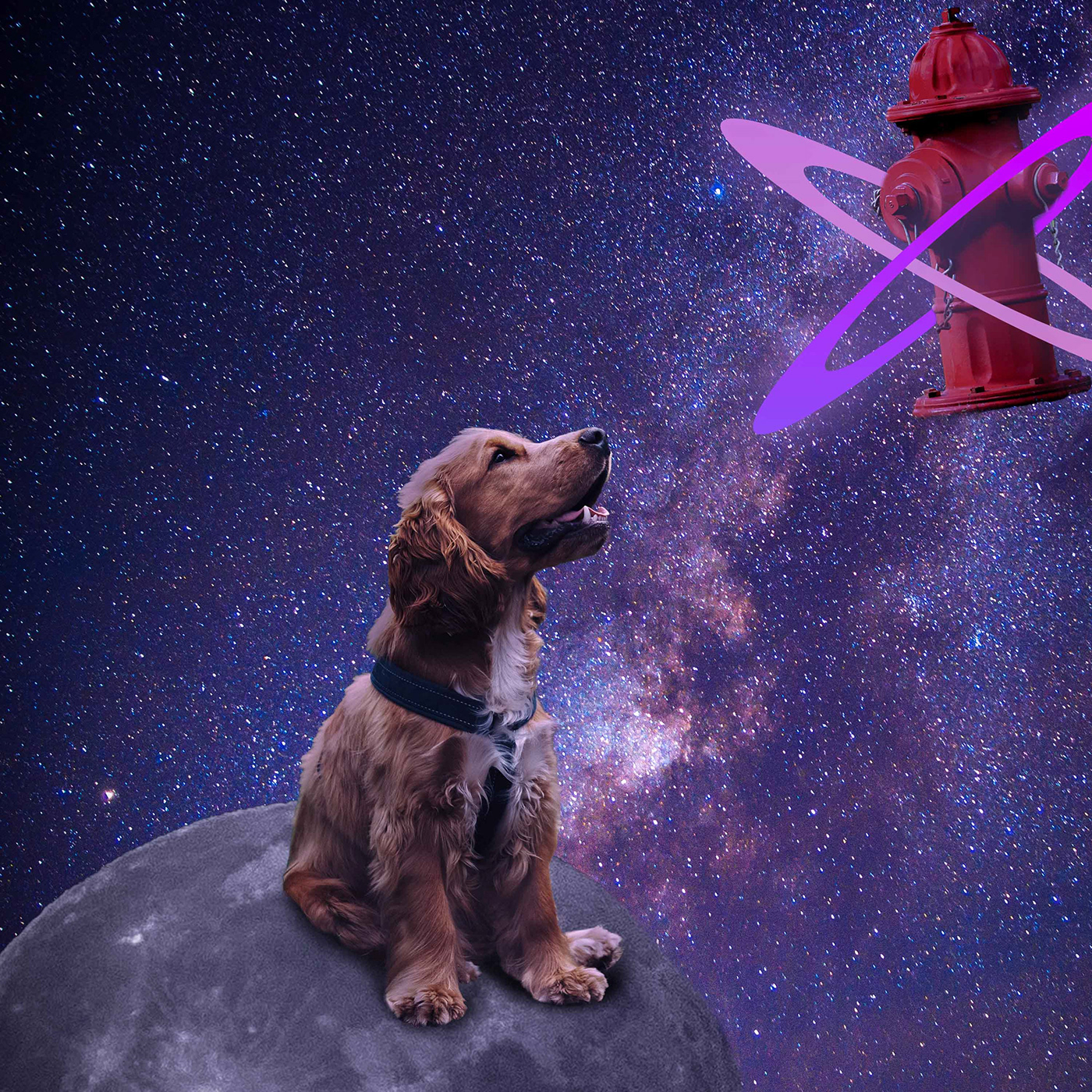
@remote kelp Welcome in, glad you joined us! Hah, nice work on this, there's some really nice focus contrast wise on the dog, and the background fits nicely. Looking good!
@high ice Very cool, I really like the effect on this Challenge 5 image! I think you could even scale up the ship and C-3P0 to get a little more focus on them. The ship also looks a little cloudy as if it's behind the nebula effect? I think putting it on the top layer, or increasing the contrast with a levels adjustment layer might help it read a bit more strongly. Nice job!
@fallow bough Very cool Ken, it's always neat to see multiple challenges put together like this and watch them develop. I think this is looking really solid, but I think perhaps the robot could be a touch darker. Specifically towards the bottom are at least, currently it just looks a little too bright compared to the ground around it. These have been looking great!
@blissful wolf Hah, the Day 4 challenge is looking good! Cute robot, I like the colors. I kind of wonder if it could use some sort of shapes or designs around the body area since it’s such a large area with no design. Or even some metal texture to push that robotic feeling a bit more. Just some ideas, though I think the cartoony look you currently have works too. Nice work!
@restive wyvern Challenge 4 and 5 are looking really good! I like the robot, some really nice shapes and a good balance of detail. The nebula effect is looking really solid too, really nice colors and values!
@oblique anvil Nice work putting all these elements together! There’s a nice sense of perspective with the shapes receding back into space from right to left. The shooting star adds to that nicely as well. Looking good :D
@uncut verge I really like the intensity of that fiery effect on the planet in the left corner, really cool. I like the way the nebular almost seems to be trailing off from it. I think it could help to make the fiery planet bigger, and maybe make the planet at the top a bit smaller. Currently they’re kind of competing for size, and making the fiery planet larger might make it a stronger focal point. Nicely done!
Thanks @bleak fossil! The ring is a NASA image I turned sideways.
Gave +1 Creative Carma to SamPetersonArt
thanks for your fine detailed eye
Day05 need to work on it ikr >.<
Hi @bleak fossil Is this better?
@bleak fossil , thank you for the tip, I will try that 😀
Gave +1 Creative Carma to SamPetersonArt
Here's my spaceship.
DAy 7 challenge
That was really tough challenge but I think I managed to tackle it, so here's my first 3D spaceship 🙂
@bleak fossil thanks! 😊
Gave +1 Creative Carma to SamPetersonArt
@cold cedar So great! What is that texture on your ship? I love it
This is a crazy build of every element over the last 7 challenges.
Day 7 Space Ship
@bleak fossil Thanks for the suggestion. Along with darkening the robot, I used camera raw to decrease the sun's highlight so color came through and then added a bit of sun's hue to robot.
Gave +1 Creative Carma to SamPetersonArt
Niceeeee
hello all - here is my rocket! i know there can't be flames in space, but i had to add them anyway ...
WOAH TAN!! YESSSS
Space scape of a new planet. It's so new it's still cooling off.
thanks @jolly quest - so loving the challenge!!
Gave +1 Creative Carma to VooDoo_Val
Hi everyone! I've been seriously MIA since Christmas, missing out on all the fun here. My PC died🙁 (for now) everyones work looks fantastic! Miss you all, still popping in now and then to give you some thumbs up. Xoxox
my first entry for the spacing guild....round 1. I'm not sure it blends just right, but what do you think of the ship/robot sidekick gone rogue combo?
Thanks @jolly quest. That is a NASA image pia23533.jpg that I clipped to your spaceship.
Gave +1 Creative Carma to VooDoo_Val
is this better?
This is my final composition for today's challenge, the combination of the elements gives an interesting and incredible style when adding textures, I loved knowing this tool and experimenting with it. 😃 
@deep mango Nice work Dorina! It’s looking good, I like the cool temperature lighting on it. I do think it could use a little more contrast to stand out against the dark background. Maybe a levels adjustment to boost the light tones and even a multiply layer or something to add a little more shadow towards the bottom? Maybe something like this? Really cool design!
Sorry the GIF quality is so bad. Here's the edited version.
@fast moth What an awesome environment! Did you make that? Really cool texture and details. The ship and environment fit together very well stylistically. The only nitpick I have is that I think the far wing of the ship is in the wrong perspective, it seems like it’s pointing down. Maybe something a little more like this?
@young karma Really nice work on Challenge 6! There's a nice sense of story in this image, and it all looks very nicely composited together! I wonder if it could look good to get just a sense of that warm lighting from the planet on the persons face to contrast the rest of the cool lighting in the ship. It might unify the image a bit more. It's super subtle, but maybe something like this?
Poor GIF quality again. Here's the edited image
@fervent kindle Very nice! The combination of the illustrative looking rocket with the more realistic textures is a cool look! I wonder if making the background a bit more bright and colorful may add to that cartoony/stylistic look. Perhaps something like this? Just an idea since it’s really just personal preference, nice work!
Thank you @bleak fossil. I had appointments all day today. I hope to get back on track tomorrow.
Gave +1 Creative Carma to SamPetersonArt
Challenge No 7 - Flying Saucer
Day 7- 3D Spaceship
@bleak fossil
Nopp, stock image,
Had difficulty with the wing, now I know how to do it.
thanks Master
Gave +1 Creative Carma to SamPetersonArt
@bleak fossil v 2.0
Just because all those ships need a place to park. Rough draft.
had to play 3D more...
Thanks for the advise @bleak fossil, it looks much better now 🙂
Gave +1 Creative Carma to SamPetersonArt
that's freakin' beautiful @deep mango
Thanks @vague shuttle 🙂
Gave +1 Creative Carma to Abraham (aka Wordsmith Hero)
Challenge 7. 3D. This was a ton of work.
Day 6
Day 7
DCC7-VV7-130220
Day 7 Challenge - 3D Workspace - My first attempt with 3D in PS #✂challenges-feedback 🙂
These are the shapes I created for my Spaceship.
Nebula as a branding asset based on the song Written in the Sand by Old Dominion, which asks the question, are we written in the stars, or written in the sand? The base image is the lead singer standing on the side of a mountain playing guitar at the far bottom (base OD photo: Mason Allen). Does it tell a compelling story?
😀
my ship design added to a combination of challenges.
@cloud edge The photo is very small which makes hard to see, even when you click "Open Original". Maybe try a larger size.
Day 6: Compositing
I used these images
And I made the planets using shapes, brushes and textures
Art deco rocket.
hello all - here is my v2 with the pattern from day 3 applied!
Hello! I am way late to the game, and I might not have time to catch all the way back up before it is too late, but I wanted to throw my content in here! I wanted to give the badge like an intergalactic jade look? I'm happy with how it turned out, simple as it may be 🙂 Good to be here!
I gave challenge 8 a go. We'll see if I need to make any changes.
present
That's awesome, @hearty wharf
Superb @hearty wharf
... my day #5 - Distort Filters
Nice Nebula!
@vague shuttle Very cool! I really like the photograph combined with the illustrated elements! I like the sense of depth and perspective you got with the size variation and overlapping shapes. I feel like the transition from the photo into the background would be a bit more natural looking if it was a much softer more gradual transition (with a bigger soft brush) or if you had a really sharp clean hard edged mask around the buildings. Though I imagine the first option might be a lot less time consuming. Looks good!
@mighty beacon I like it, very nice! Some really cool color contrast between the planet and the background. Really interesting texture too, looks kind of alien all around. Nicely done!
@hearty wharf Looks great Tan! That fire effect is excellent! Really nice work putting all these elements together, and there’s a nice focus on the spaceship!
@fallow bough Ooh, that looks great! The color matches very nicely. Really nice changes!
Really nice work on the rocket too, the lighting and color really fits well.
@thorn geyser Hah, really nice job on the Day 7 challenge! Really great cartoony style to this one all around. Nice use of shapes too, looks good!
@high rock Nice job, it’s always great to see people combine their challenges together! Perhaps the rocket could be a bit bigger to serve as the dominant visual focal point? It also looks like part of the badge on the ship may have gotten cut off where the red area shows through? Nice job fitting all these elements together!
@cold cedar Excellent work on the spaceship! I really love that texture you added. At first glance it almost looks rustic, but then you notice a cool pearlescent look. It might help to change the window to something different from the background to really make it pop. Maybe a green or red or something. Really nice work!
thanks so much @oblique anvil 😃
Gave +1 Creative Carma to KieferCreative
@young karma I definitely think it’s looking good so far! I really like that green glare effect. Kind of as if you just spotted a space ship coming into view or something. Nice job!
@safe mirage This looks great! I really love the transition from the planet to space, and these elements all look very well composited together. It could be nice to pick one element as the main subject and focal point of the scene. Currently each element is very similar in size to each other and compete for attention a bit. I think making the astronaut or satellite larger could work nicely for that. Well done 😄
@chilly salmon Looking solid! That spacescape looks great and the astronaut has some really nice strong contrast. Very nice job putting this together!
thanks for your comment @rose salmon
Gave +1 Creative Carma to Nuruddin Bharmal
Here is my decal from today's lesson! I am coming in late to the game on this challenge, so I added a pattern to try and combine some of the past lessons with this one. I also added some sheen to my badge to hopefully give it some extra pizzAZZZZZ! It is nice to meet you all 🙂
yay - thanks @bleak fossil ... 🚀
Gave +1 Creative Carma to SamPetersonArt
Here's my badge with the added text for Day 8 🙂
here is my challenge for today ... again, re-used a lot of my previous assets!
@hearty wharf this badge is aweome, I love the texture and how organic everything looks 🙂
thank you @deep mango - loved your space ship!
Gave +1 Creative Carma to Dorina Boneva
Thank you too @hearty wharf
Gave +1 Creative Carma to Tan_2019
Welcome
Challenge #7 3D
super appreciate the great feedback @bleak fossil
I know it's cheesy but I couldn't help myself.
Day 8 Text
Thanks @bleak fossil iam gonner work at
it later! 🖖
Gave +1 Creative Carma to SamPetersonArt
Because of a new job, only just got to do Day 2
@sleek tulip So nice! simple and clean! love it!
Nice 😄
@jolly quest thank you!! 😛
Gave +1 Creative Carma to VooDoo_Val
Decal made from challenge #2.
Day 7
Thank you @bleak fossil. As VooDoo Val, suggested, I started looking at NASA images and found that one. I will take another shot at the window.
Gave +1 Creative Carma to SamPetersonArt
@fallow bough. LOL. I love it! I remember have a yellow submarine sticker on my toy sewing machine. Oh my goodness!
Here is my Day 5
super nicely done @wet thistle
space ship with the pen tool. thanks for the tips on how to use it. @jolly quest although it still scars me lol "scares me"🙃
Gave +1 Creative Carma to VooDoo_Val
Belated Day 7. Not my best, but it "flies".
Day 8 Challenge - Text path
Day 6
Coat of arms
@plain sable Very cool, Challenge 7 turned out well! Really cool colors in the space background. My only suggestion is you could punch up the brightness of that fire a bit I think. I think a masked levels adjustment layer or quick swipe of the brush on a color dodge layer could do the trick. Maybe something like this? (quick color dodge edit for brightness boost then screen layer for glow)
Better quality still image example because GIFs hate gradients.
@blissful wolf Hah, very cool, I like the underlit alien! Really cool colors in the space background too. I noticed the two planets off to the left seem to have a dark ring around them, almost like a drop shadow, but the rest of the planets don't. It might help to clean those up for consistency’s sake. All the shapes appear to be the same size more or less as well which results in the image lacking a definitive focal point. It might be nice to choose an element like the alien and make them bigger so they’re the focus of the image on first read.
@dire glacier Cosmic wisdom to live by, hah. I love the badge you made on the Day 8 challenge, the orb in the center with the space design looks so good! Really nice 3D effect with the shine. This all reads really nicely against that dark background too, well done!
@supple canopy Looking good Lynn! The ship almost kind of reminds me of a paper cut out animation/cartoon or something. I really like the look of it. The background looks awesome, great color and texture!
@bleak fossil Thank you!
Gave +1 Creative Carma to SamPetersonArt
I present my work for the eighth challenge, use textures and lights to achieve a pleasant enough extil, also not being able to decide between my two sentences, I decided to add both 😋
I loved the final result 🚀
Day 8 Photoshop Stormtrooper Space Badge
@wet thistle This came out great! I like the subtle texture on the rocket, and the lighting is looking really solid! Great fire effect and smoke too. I wonder if blurring the smoke ever so slightly might sell that soft cloudy look a bit more (specifically around the edges where it's a little sharp) but that's a tiny nitpick. Looks really nice!
@mighty beacon Nice addition to this badge Jim! I really like the texture in the middle too. I wonder if making the text a darker blue or something might give it a stronger read against the yellow background. Nice job!
@sleek tulip Really nice design, works as a logo very well! Good use of simplicity to give it a solid read without a ton of detail.
@blazing quail Glad you were able to join us either way Ant! This is really cool, I love the texture of the back badge shape and text. Almost like wet asphalt and metal text, cool look. The rocket seems 3D, but seems to be lacking the contrast the rest of the design has, maybe using a levels adjustment to boost both the darks and lights might help fit it in? Really cool sense of lighting on this design!
@fallow bough This is great Ken, hah. Love the lighting on the center submarine logo. Nice job turning this into a badge type design!
@thorn geyser Day 8 is looking solid! I like how the upside down text kind of fits the theme of the content of the text, kind of disorienting and uneasy, hah. Really solid read against the background, the center logo works really well!
@proper cave Looking good! I really like that center logo and the text is looking good too. It could be kind of nice to get rid of the bottom "the cylons were created by man" text and adjust the size of the text so it repeats and reads together seamlessly. Just a thought, nice work!
@hearty wharf Still a big fan of the crab badge, hah. The text works and reads really well, nice job!
@kindred kernel Text is looking good Gerard, nice job with the curve. I wonder if the star might work a bit better if the top and bottom spike has a different color to separate it from the background? Mike strengthen its overall shape. Nice work!
@deep mango It's cool to see a challenge wrap text around a more complex shape like this! I think the background might work well as some sort of midtone shape. Something lighter than the text but darker than the badge. It might help the whole light color of the badge read a bit more as a silhouette. Just a thought. Well done!
@inner echo Hello! Welcome in, glad you could join us for this challenge. I really like that sort of marbled texture you have on the center badge, very cool. My only suggestion is since the text and overall design is such a light color it might look good to put the background as a darker neutral color to give the whole design some strong value contrast. Really nice work putting these together!
Ok so I re-did a new badge for Challenge 8. An an oldie re-vamped slightly that popped into my brain when I did my Flying Saucer yesterday. Added a background from composite of last 3 challenges.
space sword
@rare flower Hah, gotta have the sci-fi sword. I think the bevel option that we used in the previous badge challenge would be perfect for this! The bevel would act as the blade’s edge and you could get a nice metallic look as well. Nice work 😄
thank you so much for your feedback @bleak fossil i will work on for sure
Gave +1 Creative Carma to SamPetersonArt
Sticker madness
Day 8 challenge
dcc 7 - i should have made a simple spaceship 😅 don't feel i got the perspective right but it was a good try.
DCC8-VV8-140220
Many thanks to @bleak fossil for the constructive feedback, I think it's a lot better
Gave +1 Creative Carma to SamPetersonArt
Day 9 - Spaceship Decal - Text
dcc - 8 text ufo
Day 8 Challenge - Text - HAPPY VALENTINE'S DAY TO ALL #✂challenges-feedback
Day 8
as always, thank you for feedback @bleak fossil - much appreciated!
Gave +1 Creative Carma to SamPetersonArt
PS DCC #7 3D Workspace
@bleak fossil thank you for the feedback! I totally agree. Working on this now 🧐
Gave +1 Creative Carma to SamPetersonArt
Thanks @bleak fossil for your input!
Gave +1 Creative Carma to SamPetersonArt
Taking Sam's advice. Adding a darker background to make my lighter design pop a little more. I used the star background we made in challenge 5 🙂
thank you @bleak fossil for your feed back.
Gave +1 Creative Carma to SamPetersonArt
Hi, I went off script slightly here and created a "Space Force" recruitment poster instead. I Mean, I'd join, wouldn't you @crystal aurora
This is my 3D workspace flying saucer image so far. I haven't really mastered color and surface in 3D and then out of it. I made my shape in Illustrator because I wanted to add shapes and that's easier for me in Illustrator. I'll try to add some detail and surface interest to my space craft.
PS DCC #8 Text
Thanks for the shout out @jolly quest for some reason the live chat wasn't active today at my end.
Gave +1 Creative Carma to VooDoo_Val
Day 9 Warping through space on a Sunday afternoon in my woody.
this has been such a blast - thank you @jolly quest ... loved the cosplay today! can't believe we are finished ...
Gave +1 Creative Carma to VooDoo_Val
Took the liberty of adding a little pilot silhouette and control panel to the cockpit. Loved these challenges! Thanks again Val. Absolutely psyched to be learning more about this powerful program. ONWARD AND UPWARD!!!!!
@hearty wharf That's so scary I do NOT want to meet a flock of birds that can survive in the cold vacuum of space....🥶
ha ha - no, you are quite right ... scary ice crows!! @inner echo
Hardest past was masking the viewscreen image from Disney
PS DCC #9 Blur & Liquify
Blur and liquefy
Added reflection of Hans, Leia and Chewie. Might be a bit too busy though.
I forgot the glass effect here it is.
Added reflection of Hans, Leia and Chewie. Might be a bit too busy though.
@fallow bough Love the reflection! I find it helps with the busy background, gives the viewer someone else to focus on - great touch/element!!
Day 9 - My flying saucer going FTL!
day 9 - create this journey through hyperspace through the Millennium Falcon
Day 8
@hearty wharf I have really enjoyed seeing all your work,love your detail in each challenge.
Happy Valentines Day
Happy Valentines Day all. I rarely post so because I love you all, I made you something using most of the skills from this run of challenges.
@plain sable loved the Pig In Space lol
Thanks @coral stone
Gave +1 Creative Carma to Valdair Leonardo
Thanks @bleak fossil for the input...
3D spaceships are harder to make than Val let on 🙂
Be careful who's following
Challenge 9 completed. Not sure about the shine on the glass, but enough fiddling for now.
Daily Challenge 9 - Blur & Liquify - #✂challenges-feedback
@supple canopy thanks so much for your kind comment - i did have a lot of fun! yours are looking good - love the colour scheme on your challenges!
Gave +1 Creative Carma to lynn
@nova swan it can be a bit fiddly, but you did a cool job on this! 😂
@plain sable i'm totally speechless ... this is awesome. i need a pig space ship right now!!!
Day 10 Challenge - Star Wars hyperspace effect
I think I got what you mean @bleak fossil, here is the updated version of my challenge for Day 8 🙂
@cloud edge The photo is very small which makes hard to see, even when you click "Open Original". Maybe try a larger size.
@ruby panther Thanks Shawn! Will do, thank you!
And we're jumping into hyperpace with Day 9's challenge 🙂
How do I shrink the file?
First challenge for me, BUT #9 for everyone else. Only parts of the interior were stock, but the rest were all me 🙂
Day 8
Updated day 8 Challenge
@plain sable Marvelous!
Day 9
As good as it gets.
thanks @hearty wharf I had fun with the "Pigs in Space" ship and I loved your sidekicks...
Gave +1 Creative Carma to Tan_2019
Catching up with Day6
ha ha - thanks @plain sable and your legendary space pigs!
Gave +1 Creative Carma to sno.e
Challenge 7
Challenge 8
Challenge #7
Challenge 9
My finished project! https://www.behance.net/gallery/92283691/PhotoShop-DCC-February-4-14th-2020-Space

Behance
PhotoShop Daily Creative Challenge 4th to 14th February 2020. Space Themed.
Poster a day Challenge!
Day 9 challenge
DCC9-VV9-150220
Catching up (again.) Here's my Nebula
Compositing from Day 6. First go with warping so I branded up my satellite. (all images pulled from NASA)
Day 7 - 3D Workspace.
Day 8 - Text Challenge
Finally Day 9 - Blur & Liquify. Really happy with this 😀
hello all - hope you are having a good weekend! here is my updated behance project, please take a look if you have a moment! thanks 😁 https://www.behance.net/gallery/91874769/Photoshop-DCC-with-Voodoo-Val-02-2020

With the last challenge I got a little bit carried away....😄 I @jolly quest thank you for hosting again!
Gave +1 Creative Carma to VooDoo_Val
Challenge #8 Thank you @jolly quest for this space theme challenge. I had a lot of fun working on it👍
Hyperspace image with cockpit HUD.
Challenge #9
Day 8 Spacecraft with decal
wow your space craft has turned out really good! @oblique anvil
got around to finish dcc-9
Challenge 9 - Blur & Liquify
@hearty wharf Thank you; it's been fun. Your challenge entries were awesome. Onward and upward 🤖 !
Gave +1 Creative Carma to Tan_2019
Gave +1 Creative Carma to KieferCreative
thank you @oblique anvil - yes, got really carried away with the space challenge! might not have time to do the next one, but i’ll pop in sometimes! have a good week 😃
Challenge #8: Trying to get caught up on a couple I missed...
Thanks for this challenge, first time I've tried any 3D stuff!
New challenge starts tomorrow! YAY!
@sterile bane this is my first challenge. Where do I find the details for each daily challenge?
@silent linden Welcome! Here's the landing page where the challenge will be posted every day: https://www.behance.net/dailycreativechallenge
Since you're already in Discord, you can also keep an eye on the #📣creative-challenges channel. We'll also post the details there each morning 🙂

Daily Creative Challenge
@sterile bane thank you!
Gave +1 Creative Carma to Kathleen
@sterile bane thank you
Gave +1 Creative Carma to Kathleen
@sterile bane are you doing the next challenges?
@plain sable yep!
okay you wonderfully delicious creative peeps, here's my go for today... it's meant to be a ship exiting HP. call it a redux. how's it work?
that's superb @whole tangle
thank you @oblique anvil - yes, got really carried away with the space challenge! might not have time to do the next one, but i’ll pop in sometimes! have a good week 😃
@hearty wharf thank you very match
Gave +1 Creative Carma to KieferCreative
@supple canopy that's awesome just gotta say...
@fallow bough Very cool Ken! The cockpit looks good, great warp speed effect too! Though I wonder if boosting up the brightness of the warped stars might give it a little more of that glowing white feel? It almost seems a little dull/dim at the moment. Great colors in the background!
@buoyant nova Looking good Susan! Really like metal sheen and texture on the badge. This is completely just personal preference, but it could be nice to see the bevel of the badge repeated in the background gradient circle shape. Just a thought. The curved text looks nice!
@deep mango The hyperspace effect looks great, I really like all the colors in it too! Great work on the dashboard as well, I like all the little controls. Nice work!
@mighty linden Haha, very cool, I love the more tie fighter style cockpit. The Deathstar dice is a great touch too XD. Nice work on the warp speed effect!
@whole tangle I really like the perspective on this, it gives the whole image a really nice dynamic feel! The lighting adds a lot of interest too! This looks really solid, I like the orange glow on the bottom of the rocket too, really nicely done!
@dim brook#2218 Hah, really nice bevel and texture on Challenge 8! The design has a really nice contrast with the dark background. Nicely done 😄
@young karma Really great effect with these lights, the colors look really nice! I think you could mask out the bottom right area of the pink ring as if it’s disappearing behind the blue light. It could also look nice to give the red ring a bit of a brighter outline like the blue one has. Really great style to this!
@tawny bronze Ooh, I love the elaborate dashboard setup on this, it’s a really cool effect. The warp effect is looking really solid too, the colors look good!
@chilly salmon Looking good! The warp effect is looking really nice and the dashboard and window shine are looking solid too. Nice work!
@nova swan Ooh, loving the background effects! I think spaceships definitely can be tough, there’s so much design involved. I like the robot in the window, hah. I feel like the spaceship could be quite a bit bigger to be a more dominant focal point in the scene. It also might help to get a little bit more of the lighting effects from the scene on the ship. Maybe something like this?
Those GIF colors got so compressed D: Here's the normal picture
@bleak fossil Thanks Sam, will give that a go
Gave +1 Creative Carma to SamPetersonArt
@tawny bronze Ooh, I love the elaborate dashboard setup on this, it’s a really cool effect. The warp effect is looking really solid too, the colors look good!
@bleak fossil thank you Sam.
Thanks for the feedback, @bleak fossil 🙂
Gave +1 Creative Carma to SamPetersonArt
Challenge 9. A bit late but still current.
@bleak fossil I this what you mean? Thanks, Susan
Gave +1 Creative Carma to SamPetersonArt
Ready for the next challenge.
Thank you @bleak fossil
Gave +1 Creative Carma to SamPetersonArt
Gave +1 Creative Carma to SamPetersonArt
Thanks for your feedback @bleak fossil
A Poster a Day! Day 05!
Is the information about the whereabouts of the party clear? or should it be more prominent?
smooth ❤️
Day 1 Do you like the pattern I added to the text?
Had fun with the Tron influence and tried those cut and paste tips Jeannie Huang shared, thanks for these great lessons!
I have gone a little bit wild and tryed something in a polaroid vibe. I hope the text is clear enough ^^
Day 1
just following instructions 🙂
Challenge
Day 1
For Photoshop Birthday
@simple peak wow, love how you really took the inspiration and made it your own! my only feedback is that the location/time information is a difficult to read since it's similar in color and value to the background
Challenge 1 updated
@restive wyvern very creative use of type using the T for both words! the horizontal party info at the bottom is really clear, too.
@woven flame you definitely nailed the polaroid vibe! nice colors. i think the script-y font you used for PHOTOSHOP TURNS looks nice, but it becomes a bit strange when it's used for smaller copy (Adobe HQ, 2.18.20, etc.). What if you used the same font for that as you used for "30"? It might read a bit better at a smaller size. Thanks for uploading!
Gave +1 Creative Carma to Falindir
I found an image from PhotoShop Ver 1.
@bold valley nice job getting creative with the pattern! I also like how you toned back the background image. It helps the works read better... I should do that with my design! As for the pattern choice, it feels a little "organic" compared to the hyper-digital vibe of the rest of the design. What if you used a more graphic pattern, like pixels or a halftone? That might help mesh the styles a bit more
@ruby panther ha! love it!!!! I wonder if you could integrate the party details (location/time) into the menu bar text? Or the title of the file?
@sterile bane Great idea! I did not think of that. I was just happy to find this with some research. I will edit it tomorrow and repost it. It's getting late here. Thank you!
Gave +1 Creative Carma to Kathleen
@ruby panther i'm super impressed that you could find that image 😆
@ruby panther - thought of the same idea .. currently working on it
day1
Thanks @sterile bane Good idea.
Gave +1 Creative Carma to Kathleen
Daily Creative Challenge_Blend Modes
@hazy badge nice! I love how the 0 interacts with the PS mnemonic. How did you add the slight glow to the edge of the icon?
@sterile bane thanks! 😊
Gave +1 Creative Carma to Kathleen
Daily Creative Challenge Day 1
@sterile bane Ty yeah I actually liked to keep it simple so it could be easier for eyes to caught. I just copied it, used gaussian blur and then merge it with normal and and put it on "screen" mode so ink flows should be visible
Gave +1 Creative Carma to Kathleen
Day 1 🙃
d@y 0n3
Worked traditional flower (amaryllis) and gift (pearls) for a 30th anniversary 😀
Exploring Ideas
beginner here 🙂
@dusty pond love to see the exploration 🙂
@sterile bane Thank You, I'm still a rookie lol
Gave +1 Creative Carma to Kathleen
Followed directions. Now to get creative! 🤪
@dull tundra Yes, once you have followed the directions you can advance your design by bringing in your own unique ideas 🙂 . First of all you did a great job with the color palette. Using a monochrome palette is absolutely a legitimate design choice. I like the dark look of the tool palette on the left - nicely done 🙂
@sturdy pulsar Well done! The glowing confetti is a really cool addition to the design. There are however some weird tangents in the background like this one here:
have you used another image for the glow that happens to end exactly here?
@dusty pond Nice job 🙂 - Textures and patterns are a great way to spruce up the background. Just make sure the colors don't clash with the foreground objects. The blue of the photoshop title seems to clash with the vibrant red of the 30 behind it. Perhaps you can pick less contrasting colors 👍
Hello chat, i am done with my day one challenge. I didn't make an event invitation card, but a simple post card. Let me know what you think about the composition. I was not too sure, about it.
@valid kayak The blend modes look great! I just would swap the "30" and the "turns", otherwise this post reads "Photoshop 30 Turns" 😉
@glacial path ok, I was going with the lazar effect with the photoshop text. But I see what you're saying
@jaunty nimbus Oooooh what a great photo! just make sure to leave some contrast for the text. Red on red can be difficult to distinguish (have a look at the big 3) 🙂
Happy Birthday PHOTOSHOP!
@kindred kernel great contrast 😄 - I really like the slightly darker design with the cyan-blue-magenta color scheme. I would suggest moving the "Photoshop" so it doesn't line up with this grid line 🙂
@zenith wave I like this font, it looks very retro and unique - also reminds me a bit of the early computer fonts 🙂 . I would suggest leaving some space between the S and the edge of the frame
@young karma Great use of the outer glow effect! You will probably have some problems with people who have vision problems and therefore can't read low contrast text, so I would suggest lowering the background color slightly. This circle also seems to be very soft, perhaps you can use a shape for this circle instead of a selection 🙂
oh i c
@glacial path any better?
@sturdy vault Yeeees! Always great to see a different background instead of the template 😉 - at first I thought: shouldn't we see a mirrored version of the reflection, but you're actually right! The reflection would indeed look like this - props to you!
@dusty pond the lighter color looks better, yes 🙂
@glacial path Thank You, I'm just a rank amateur lol
Gave +1 Creative Carma to evil
@dusty pond I wouldn't say that, we're all here to learn new things 😄
@glacial path thanks. I tried several different things and this one looked the best. I enjoyed using text to path though.
Gave +1 Creative Carma to evil
@glacial path I'm still trying to learn the tools. I've been doing this a couple of months and basicially have been learning PS through this platform. I'm enjoying the experience but it can be tough sometimes lol
@dusty pond yes it can. You can do this.
Loved the style @young karma
@young karma wow! Is that a font? This looks super cool 😄 The rectangles in the background in combination with the subtle grain and half tone patterns is just too good!
@lusty crypt Ha, that's actually a pretty cool idea - the logo however is very dark, I would suggest using a brighter color instead 🙂
@short mica Really like the chisel effect you used for the Photoshop title. The noise around the "mega celebration" title seems to be a bit too much. If you're going for confetti I would rather use a real photo or a render of some confetti 🙂
@cosmic thunder Nice job! I love the part where the text turns into an outline version of itself, really clever way to solve the design problem! I also like the muted colors in the low poly background, they work nicely with the off-white color in the foreground 👍
Really cool challenge will submit my work a little later I'm from the netherlands and it's here 23:00 already ☺️ so night night 🙂
@simple peak Oh boy, now that's what I call vibrant 😄 . Weirdly enough, I would say it still works. The yellow text in the upper right could be a bit hard to read but apart from that everything is clearly legible despite the super saturated colors. Well done 👍
@ruby panther this is too good! Kathleen was right, integrating the text into the menu bar is a really clever idea 😄 . For a more difficult challenge, try completing this challenge by only using the features present in the first version of Photoshop 😛 - so no Layers, no Undo, no vector text etc.
@woven flame How cool is that! I can totally see the inspiration and your submission really has the old polaroid vibes 😄 I would just suggest also aging the text a bit. If the image is grainy, maybe the edge of the text could look a bit beat up too. Great job 👍
@glacial path Thanks, but I couldn't figure out how to do that since it was on a Blend Mode, so I instead made the rest of the image brighter 🙂
Gave +1 Creative Carma to evil
@sterile bane Thanks for the feedback. I'll mess around with this some more.
Gave +1 Creative Carma to Kathleen
Day 1 Different texture.
Design is NOT my thing, much happier with photo editing but this is a fun way to learn Photoshop 👍
Day 1 - Blend Modes
I used Kathleen's text, but added a gold metal texture, fractal planet and perspective grid from Pixabay. Lots of lending and color layers to get things to match.

first submit - altered colors 😄
@warm oasis like the brightness
thanks @bronze helm
Gave +1 Creative Carma to sai
@magic hedge - Really liked that background with your glowing font for Photoshop 😄
Here is my very first submission to the Creative Challenge! Is the monochrome colors appropriate or should I use varying colors.
@dire glacier Really like the galaxy effect of the background that seeps into the text. Seems a bit busy with all of the icons overlapping the number "30".!
@patent trellis thanks. And yeah, I ran out of time before a class meeting. I may play with it again later.
Gave +1 Creative Carma to Und3rWat3rShrk
@restive wyvern I love love love! the denim texture that you played with. Is that done with just blending modes as well!! only thing I see is that maybe adding a drop shadow effect to the text can help it stand out as it gets a little "washed out" within the denim texture itself. Super cool concept though! Feel like it could be on a beach-side billboard somewhere.
@glacial path Thanks but I think I will pass trying this Challenge with Ver 1 PS. I am not skilled enough, yet. Thank you this was fun!
Gave +1 Creative Carma to evil
@magic hedge The script font is a nice formal invitation to a grand even that I haven't seen a lot. The words "photoshop" and "turns" has a nice contrast. Only suggestion I have is that the number "30" and the location information to be in a little bit more heavy font. What I mean by heavy is bolder and thicker is that they get lost and hard to read. Great work!
@patent trellis Thank you!I appreciate your suggestions😊
Gave +1 Creative Carma to Und3rWat3rShrk
@warm oasis Thanks!
Wooh! Got it in just a little after midnight. Day jobs make this hard. 🙂
@ember tangle I hear ya on that one brother lol. You hear as a newbie or looking for suggestions? Happy to Help!!
Somewhat new! I've done a little training and such elsewhere. Gareth David from Tasty Tuts has an incredible course on photoshop on YouTube, which I completed. I honestly just want another challenge to learn some nuances. Hence why my image wasn't really creative. Also...I'm so tired. I'm just so glad I had time to do it before hitting the hay! 🙂 Thank you, and I'll be sure to reach out with questions. I love the positive environments artists create!
Oy...just look at how I didn't capitalize Photoshop...
Artists power unite! together we shall make the world a more colorful place!!
Also @ember tangle look at my submission and take a look. Just scroll up a ways and you will see it. Haven't gotten one yet and would really appreciate it. I know the feedback will come but let's just say I am design antsy lol.
I enjoy the monochromatic nature of yours! Also, I love, LOVE the way you balanced the size and somewhat round nature of "30" with the design on the left side of the project.
Total amateur. Learning Photoshop and Lightroom so decided to take part in the challenge.
You've definitely got the blends down! Good job!
@fickle pelican Great start! No fragments that look distracting. Been using photoshop for a while myself and one thing I encourage a lot of people to use is different background images. Gives the overall composition a unique feel. I found this while not wanting that "Adobe Stock" watermark in the background since I am not subscribed to that service. That is the suggestion for the next challenge for ya!
Thank you @ember tangle @patent trellis for the feedback!
Gave +1 Creative Carma to ChristopherRussell
Swapped out the background for a different vaporwave looking grid. Also took the text to a more round option, but not sure how I feel about it.
@autumn turret The ghosting effect of the "30" give the whole thing a sense of depth!! Really feels like you are running past the text from the bottom to top. Thumbs Way Up There!! Have you worked with layer masks before?
Hey guys! I did it! first time doing any challenges. Not sure if I like the colors but will try different blends next time. Also, I was not sure what the color fill was for. I did not understand that part but I used it.
@fervent moth How I understood the color fill was to give the overall final composition a cohesive color. To bring it all together. Do you mind sharing what color you used? Its also important to know that the blend mode of that color fill is important to if the piece feels too busy.
@patent trellis Thanks! I thought the 30 gave it a nice bit of depth as well. I don't remember what blend mode I used, but lowering the opacity gave it a cool look. I've used layer masks before briefly, but for this one I stuck to blend modes.
Gave +1 Creative Carma to Und3rWat3rShrk
@autumn turret Sounds fair. Only reason I mentioned it is that where the toolbar icons meet your "30" the color of them changes so a simple layer mask on the "30" layer then painting the color black on that white layer mask where the icons overlap the number will get rid of that blue color so that they don't stick out like a sore thumb. If it sounds to complicated I do get that. Also don't know how to take screenshots to show what I am trying to explain so hope that all makes sense.
@patent trellis I used some sort of teal color for the color fill. I will write it down next time. I did use different blends in all layers just to play with it but not sure if I liked the end results. I was not sure how to trace back to my work to see what I have done to the layers already.
Okay well the teal color I do think would work @fervent moth. I don't know how the interaction would work but give me a sec to see what it would look like. With my understanding of Blend Modes you just might want to use the last group of Blend modes that starts with the "Hue" option I think.
My first work on my first challenge 😀
@fervent moth This is what I came up with. I really like the concept of the blues. Maybe even darker than this to pop out the contrast. Thing that I may suggest is that the "30" is in a darker color as well. So it doesn't get lost within the white background once the color fill is applied. Then I think this is a really cool psychedelic concept. Hope this helps!!
@warm oasis The green looks good, kind of gives it a bit of a retro game feel. The brightness of the whole images reads really nicely too. Good job 😄
@bronze helm Nice job on this! I think you could possibly make the date and location even bigger to give it a more prominent read since it’s fairly dark. Just a thought. Looks good!
@light swift I like the red color scheme! It definitely gives off a different mood than the blue. Maybe the horizontal lines on the ground could be toned down in terms of brightness a touch, and the text could be brightened up even more? It might give it a slightly more clear read. Nice job!
@ember tangle Nice! Challenge 1 is looking solid! A really nice clean read to all the shapes, and the blend mode where it overlaps the 30 adds some nice interest!
@magic hedge Ooh, really liking that background! It adds some nice depth. I wonder if the text could be a little more unified. There seems to be a lot of font and color changes. It might help to stick to maybe 2 different font styles, and maybe have the date and location be a more straightforward font to make that information easily readable. Though I think the Photoshop text looks really cool as a script. Really nice design!
@fickle pelican Welcome in Jennifer, glad you joined us! These challenges are definitely great for practice and picking up new techniques. I like the pink text for “30”, it adds a nice color accent to the design. Looking good!
@dire glacier Really cool, I like the alternate format you went with! The background from the previous DCC is a nice touch. I think the text for “Photoshop turns” could have a little more contrast against the background, and I wonder if this design might work better without all the icons on the right side. Though I see what you did and I like it conceptually! Maybe they could even replace the UI elements on the left? It just seems like currently there’s no place for the eye to rest on this design so it becomes a bit busy. Really nice work!
@patent trellis Very cool! I really like the graphic elements an designs. I think the monochromatic scheme works well, you just have to be careful to not have the background designs overpower the text. Maybe you could tone down their brightness, or even try shifting the hue to separate it from the text if you wanted to try different colors. Even just more of a green shift would still keep that monochromatic look. Just some ideas. Solid work!
@autumn turret I really like the effect you got with the 30 in the background. The way it interacts with the mountains is really cool as well. I kind of wonder if a less rounded font (like the rest of the text) might fit a little bit more thematically. Really nice colors and contrast, great design!
@fervent moth Welcome in! Glad you could join us. Really cool colors on this design. I feel like the 30 could read a bit better at a glance. Currently it’s light yellow on light yellow, but maybe shifting it the green or purple color would give it both a bit of a darker value contrast as well as a color contrast against the background to help it read. Really nice texture in this design too!
@bleak fossil Here it is with the Green Shift!! Think it looks great!! Any opinions anyone.
Ohhhh, I really like it! Gives it a really clean read too. @patent trellis
@bleak fossil Just wanted to mention that I used #adobecolor online to help find a complimentary color that would work. Green from the original blue. Mind Blowing!!!
But goodnight all!! Have to put this creative mind to rest for now.
Night-owl-Neko signing in for the first challenge.
I'm not sure if it's missing something or if the layout needs adjustment. I'm also not sure if my blend for the original Photoshop logo fits or if it should be brighter or maybe more faded since it's the "old".
Inspiration came from the traditional 30year anniversary gift being pearls. Wanted to add a bit of modern creative twist with the colors while still paying homage to our beloved software.
@coral stone thaaank You 🙃 🌷
@glacial path big big thanks! 🙌 😊 yes, this is a font called "Rig Solid", last weekend I found out about Adobe Fonts packages, which one can activate at a time for 180days. I LOOOVED that, so I found Rig Solid font amongst other really cool fonts in a package named "Spark Font Pack". Also I followed your "realistic grain tip" - so thanks again!
Gave +1 Creative Carma to Valdair Leonardo
@young karma I like how you created the light around your graphics! looks great!😍
@glacial path thank you Tim I'll do that
Gave +1 Creative Carma to evil
@glacial path Thanks for the feedback! Never really thought of it in that way (that some people might have trouble reading it). If I use a shape as circle, do I just apply the texture layer on it and set it to the desired blend mode? So no selection at all?
Gave +1 Creative Carma to evil
@young karma Thank you!! 🥰
DCC1-KM1-190220
Daily Challenge 1 - Blend Modes - HAPPY BIRTHDAY PHOTOSHOP #✂challenges-feedback @sterile bane
@bleak fossil thanks for the feed-back !!
Gave +1 Creative Carma to SamPetersonArt
@bleak fossil Thanks! I started with a cloud render in the background, then decided it was too busy/boring and swapped to the nebula. I ran out of time while playing with color/blend and positioning. I may go back and work on it, if I run into time.
Gave +1 Creative Carma to SamPetersonArt
#📣creative-challenges Day 1!
a bit late on the upload but here's my Day 1
Day 1 submission
Day 1 Challenge
DAy 1 challenge
very cool, Camilo
Ver 3. I went more traditional this time.
my very first attempt at Photoshop. please educate this noob 😆
Hello All, just joined the new challenge with limited past PS knowledge. And through the challenge discovered discord. Not sure how this works, so don't throw anything at me!
Thank you very much @bleak fossil
Gave +1 Creative Carma to SamPetersonArt
Day 1
@pure herald I like it!
@dire glacier yes much better!! Good changes!!!
^_^ Thank you @somber kestrel
Gave +1 Creative Carma to Und3rWat3rShrk
Always easier to fiddle for better effect when I'm not running into a class meeting for school :-p
Here's my Day 1 Entry! Happy Birthday Photoshop!
Happy Belated Photoshop
Thank you @glacial path , I did use another image
Gave +1 Creative Carma to evil
Challenge #1: Blend Modes - Design an invitation with overlapping elements using Blend Modes.
this my take

Instagram
8 Likes, 3 Comments - Aborigen Aka Krol (@aborigendsgn) on Instagram: “Happy Birthday 🎈 #photoshop30”
Happy Bday PS iloveyou!
is the effect nuanced enough? or should I go even lighter?
PS DCC #1 Blend Modes
Played around with textures and other effects.
Challenge 2.
My entry for today's challenge 🙂
@sterile bane Trying to get my color fills set up like you had yours. Can you share your settings that you used to move from grey to blue for the 3 fills?
@jaunty nimbus let me take some screenshots 🙂
@jaunty nimbus specifically for Gradient Overlay:
Day 1 - Blend Modes - HAPPY BIRTHDAY PHOTOSHOP
@sterile bane The template we downloaded for the lesson has all the books in grey. When you started the lesson they were already blue.
Yep! I pre-edited it a bit.
I can upload my edited version if you want to play with it
@sterile bane the pages of your closed books still look white but mine look blue. I want mine to look like yours but not sure how to do it.
@sterile bane Thanks I think we all could use that file.
Gave +1 Creative Carma to Kathleen
To achieve this look, I applied some solid color fill layers and changed the blend modes (like we learned yesterday :D). From there, I masked out the pages so they would stay white. Here's the PSD so you can take a look:
@sterile bane Awesome. Thankyou.
yep!
Thank you @sterile bane !!!
Gave +1 Creative Carma to Kathleen
Day2 - (with my attempt at recoloring the books)
Day 2 - (With Kathleen's awesome edited version)
@sterile bane I asked the same question about the templates on the 'ask question' part of this server; then, I realized you just shred an edited template. I notice you added a color fill to edit the book stack. how did you do that?
Day 2 - tried making an A,B, C's cover using all these magic filters ya'll been teaching us about. Do you think the text is washed out? Tried using pastel gradients.
b beautiful colour @severe tartan
sweet design @lone hare
my attempt at a Unique Invite to PS BDaayyyyy...is it blendy, or what?!
Fanart in photoshop 😉
I made the masking of books and background added the blue tones.. the lettering, but i really really struggled with colouring, since somehow the image looks so fake.. especially the bottom part where there is supposed to be pages and their texture . 🤷♀️ . Anyway - i am happy to have learned something new about bevel and emboss
@young karma oo i love the dainty lines in your letters! I agree that the image looks fake.. but i don't think that's your fault 😆 i believe the template is a 3d rendering.. maybe we'd have better luck if we used a photo of a real book? i might try it!
@fervent moth Hey Lessita! In the Adjustment Layers menu, select Solid Color and choose your color. Then, change the blend mode of the layer so that you can see the background image through it. Multiply or Overlay might work well. From there you can mask out the pages of the book so that they remain white. Hope that helps!
illustration drawn by me, I used only one image (pigeon) for art composition
Day 2 challenge
Day 1 - a bit late 🙈
Day 2 - I did one without the black dots over the icon but I think i like this one better
Thank you @vague shuttle !
Gave +1 Creative Carma to Abraham (aka Wordsmith Hero)
day2 done
If today's challege was embossing, then what was I watching with the blue jacket and the glowing PS logo?
Still working on this. Not sure about the clouds in "SHOP." I think there might be something better.
Day 2
Little late entry of day 1
@young karma better late than never 😄 - I love the font you've used! I would just rework the spacing between the three lines on the left. Bring them a bit closer together 🙂
@split pendant That's a great use of blendmodes and mockups 🙂 . I would suggest using a slightly brighter color for the deep blue - the book in the middle actually looks great! Or perhaps a similar color to the spine of the top book.
@oblique anvil yeees! If you use really big and bold fonts, you're almost always on a good path. Unless it happens to be a handwritten love letter 😛 - anyway, the texture inside the fonts works really well and the lens instead of the "o" is a perfect substitution. I would just do something about the background. Gray is way too neutral for this bold design 😉
@zenith wave Well done! If you ask me, I would ever so slightly tone down the saturation of the red to increase legibility of the text - but that's just a design choice 🙂
@cobalt sail I would ask myself what those black dots represent. Why are they covering the logo? To highlight a certain part of the history? I would also recommend not using pure black for the book cover. Usually you want to see at least some of the original paper/leather texture. Pure black however drowns all that texture and leaves an empty black void 😉
you could use a black-to-dark-gray gradient instead 🙂
or a simple paper texture
@young karma haha, only slightly late - you can still catch up! Great job with those colors. It can be tempting to combine a bright pink with an equally bright blue in the background but it would most likely result in clashing colors. This dark blue however has just the right brightness to still contrast with the pink without being obnoxious. Also, the combination of cyan and magenta (where the "photoshop" is overlapping the "30") turning into white is extremely pleasing 😉
@fast moth Love the gradient and the smaller rectangles in the corner! Perhaps you can adjust the brightness of them to match the larger title of the book. I feel like the attention should be on the title instead of the "30" and the "PS" 🙂
@sand zinc this is for the book cover, right?
@young karma woah, that colored bevel/emboss effect looks awesome! Yeah, the book mockup doesn't look super real but like Kath said, that's not your fault. 🙂
day 2 entry
Thanks @bleak fossil ! I changed the font to match "turns". Thank you for your feedback)
Gave +1 Creative Carma to SamPetersonArt
Thanks @glacial path I agree; the background needs work. It's looking a little muddy to me now.
Gave +1 Creative Carma to evil
It's Late, but Completed. 🙂 Hola! everyone.. I'm New to this Discord. This is my very 1st Work in Discord.
Day 2
I ended up taking the time to select each of the books and the background separately so I could make them all a different color with solid color adjustment layers. I'm surprised the template maker didn't do that.
Day 2 -
Challenge 2
Challenge #2
Photoshop turns 30. Blend modes. Not quite what I want but can't figure how to make it better. Suggestions?
embossing a book cover with texture - is it easy to read the letters?
@cold cedar Thank you!😊
Gave +1 Creative Carma to ValentinePierce
@cold cedar. Thanks.
Gave +1 Creative Carma to ValentinePierce
Here are my final Day 2 Submissions!! Any feedback is appreciated as this is new and uncharted waters for this man!!
V 2—Got rid of the dull sky background. May have gone too far. 😀
PS DCC #2 Layer Effects
I couldn't figure out how to change the colors of the rest of the books (new to Photoshop...I know nothing).
I also couldn't figure out how to screenshot this. I have a PC so I used the Snip tool, but if anyone knows how to screenshot please share. I tried for 30 minutes. Thank you!
@wet thistle Hah, very nice! The color scheme is nice and cohesive, and I like the slight art deco flair to it. Nice work!
@lunar mango Really nice concept on this Austin! It's crazy how far the software has come when seeing the first versions. I really like how you handled the pixelated look of the cake image, fits very nicely, great design!
@hardy lagoon Really great style and take on this challenge! The colors are working really well and I like how conceptually it almost has a color wheel effect going on. Really nice work!
@high rock Looking good, I like how the "Hey Photoshop" almost seems to mimic the texture of the fish which is a cool effect. I think the text might work better thematically in a more traditional layout, currently it almost makes me think of caution tape or something, but that's really just personal preference. Nice work with the blending modes!
@dim brook Very cool Ceci! I really like the color contrast you got in this challenge with the center figure! The text having a more green tint really helps readability too. Nicely done 😄
@tacit condor Nice work, I like how you have the green of the text repeated in the background a bit. I also like how you integrated the date and time into the 30. Mockup looks solid too!
@simple peak Very nice! The colors are so bold but there's also a really nice balance to them. Really nice designs and composition to this challenge, the mockup looks good too!
@crimson sun Nicely done, the textures add a really interesting effect! I think perhaps the “Photoshop turns” text could have a bit more clear of a read at a glance. I think brightening it up a bit and/or shifting the hue to be cooler or warmer could help separate it more from the “30” text. Really nice job!
@sturdy vault Nice job, the emboss effect is looking good! Though the whole image, specifically the design seems like it's a bit dark. Maybe a simple levels adjustment could do the trick. Nice work 😄
@silver trench Great work Vandam! This design works really well on the white background. The emboss effect reads really well too!
@fathom moon Really solid design work! The background is really interesting, but still allows the graphic elements to have a really clean and clear read. I also really like the yellow/orange accent of color on the text and triangle which mirrors the background a bit. Nicely done!
My work from today.
@dire glacier Ooh, I really love the contrast and richness of the edited version for Day 2! It seems to have a lot more of a textured look. I really like the colored emboss effect!
@raven delta Really nice! I think the pastels work really well with the theme of the book. I don’t think the text looks washed out, it seems to have a nice color contrast and some pretty good value contrast to make it read quite well at a glance. Nice work!
@vague shuttle Some really cool effects with the blend mode on the "30" text! I'd just be careful about adding in too many elements to avoid it feeling a bit crowded. Perhaps having the date and time in the same color and style as one of the other text elements might help that? Since at the moment there’s 3 different colors/styles which can cause that feeling of disjointedness. Just a thought. Really liking the colorful starry background!
A little late to the party but here it is.
@oblique anvil Hah, I really like the colors! There's a lot going on but it still has a nice cohesiveness to it. The text pops out quite nicely from the background. Nice use of textures!
@plain sable Very cool! I really like those colors, they go nicely with that sort of 80s looking grid. Really nice perspective in this design too! The mockup is a great touch as well, nicely done!
Anyone got any suggestions for my Day 2? Im seeing a lot of great things here!! if i nailed it then so be it!! 😆
Getting it in with 15 minutes to spare! Okay with the result, I think book design in general is something I'm not too great at. But it did spark a desire to want to learn more about cover design and typography layouts 🙂
Looks and feels a little bit better when seen on a mock up - pretty neat. Never used mock ups before but can see myself using them more often now.
Really diggin the variety in cover designs today - very cool to see where everyone ended up!
@patent trellis My one note would be on the first one to line up all the text as it looks like PHO TOS HOP rather than one word broken up. Really cool font choice though!
@split pendant I like the simplicity of this. The logo and the 30 gets me intrigued and wanting to see whats inside!
@bleak fossil - thanks for your feed-back !!!
Gave +1 Creative Carma to SamPetersonArt
@glacial path thank you, I tried to add some final touches to add soft difference in light and shadow, but then i was OK. Enough is enough 😄
Gave +1 Creative Carma to evil
Day 2 Challenge - Layer Effects - Book Cover #✂challenges-feedback
@bleak fossil thank you! I like the colors of the edited one too.
Gave +1 Creative Carma to SamPetersonArt
@autumn turret I really like the texture feel
@bleak fossil thanks. I will try to lighten it up.
Gave +1 Creative Carma to SamPetersonArt
@bleak fossil thanks for the suggestion. I fixed levels on the overall image and separately on the word Photoshop. I also took the opacity of the background down.
Gave +1 Creative Carma to SamPetersonArt
Thank you @bleak fossil
Gave +1 Creative Carma to SamPetersonArt
updated per feedback - thank you @bronze helm
Gave +1 Creative Carma to sai
Day 2 - Layer Effects - HAPPY BIRTHDAY PHOTOSHOP
Day 2 challenge 🧐
@fiery matrix love the font and mate texture you picked.
Thanks @bleak fossil
Gave +1 Creative Carma to SamPetersonArt
Day 2 Challenge - quick bilingual design
😆
Challenge #2
Hello everyone! 😀 I'm a bit late with this post, but I'll definitely try to make up and follow through with the challenge. I am wondering if the invitation is too monotone and simple. Does anyone think it needs more decorations?
"Manual" Symmetry - Challenge #3
In a very little time on the mobile. Acceptable?
@red garnet I think your design is strong and has a nice variety of sizes and density. I wonder if we could figure out how to make the "30" more prominent? It falls to the background, but it's a part of the main phrase "photoshop turns 30" so i think it needs to be a little more bold. Hope that helps! P.S. I love the dot pattern you used in the background.
I choose to go simple on this one. Really nice challenge, I totally discover the symetry and rotation tools, thanls @sterile bane 🙂
@woven flame very creative
Here's my go at challenge 1. Sorry so slow! Too much drop shadow? I'm unsure of where to go.
@woven flame your fireworks are very dainty & clean, love the different lengths you used!
@whole tangle you're just in time! since your background is so geometric, the softness of the highlight and drop shadow feels a little bit disconnected (from the background). Perhaps shrink the size of both highlight and drop shadow and add a bit more contrast (or 'crispness'). Nice job with the "photoshop turns" text!
@dim brook I'm impressed! Did you hand draw the fireworks?
Ah, I get it! Thanks @sterile bane ! I will try that.
Gave +1 Creative Carma to Kathleen
Day 3 - Had fun with some lightning brushes I have. (And dissolve blend mode)
@sterile bane Thanks! I had fun with it. Did one set with mandala instead of radial, just because.
Gave +1 Creative Carma to Kathleen
@wicked sand thanks for posting! I think both designs are strong. The red and green in the mandala design feel like they don't fit with the blue hues of the background and text. Perhaps you could push the green closer to turquoise and the red close to purple so the colors feel more analogous?
Gave +1 Creative Carma to manisha
@sterile bane Thank you for the feedback. Would make the suggested changes 🙂
Gave +1 Creative Carma to Kathleen
@safe mirage woo! love seeing how you used the entire template to bring your idea to live. no rush on catching up 😄
Challenge 2 for 30 years of fun Photoshop has produced. 😂
lol! @jaunty nimbus it's nice to see a more comical take on the 30th birthday
Thank you Photoshop for 30 great years! 😄
Tomorrow is my friends birthday, so it is gonna be a SoMe postcard for her wall (in danish says something like congrats) this tool is actually really powerful - thanks for reminding of it!
Hi! I got inspired by Magdiel Lopez SOOO MUCH!! I tried your tricks and tips on this one ! THANK You for doing these Adobe live streams Magdiel ❤️ !! I would love to hear some feedback too !
I cant upload high resolution on discord . heres the HQ https://www.behance.net/gallery/92600387/Inspired?

@young karma AMAZING
@young karma wow, that was fast
The problem with so many blending options to explore is that you never know when to stop? I may have stopped in the right place with this and I may not have. We will never know 🤨
atm
Here's my thank you, in symmetry. Now to catch up.
Beautiful! @cold cedar
I couldn't figure out how to rotate the envelope and card without rotating the background. 😦
Day3. As easy as the challenge was, it was tricky coz you really had to think out of the box to be different.
Day 3: Card
Challenge 3
@dusky burrow Hey! That might be an awesome opportunity to try content-aware fill to extend the background. First, rotate the image 90 degrees to the right (Image > Rotation > 90 degrees clockwise).
Then, activate the crop tool (C is the hotkey) and extend the edges to the right and left (as shown in the screenshot). Make sure "Content-Aware" is selected in the top bar. Hit enter and voila!
^from there, you can crop it down again if needed.
My take on the symmetry tool and totally inspired by Magdiel Lopez 🙂
Made a snowflake with symmetry, then created a brush using the snowflake.
@normal frigate lol! This is awesome! I would love to see more work like this where you take lyrics literally 😄 . I believe you could also introduce some smaller snow flakes in the background. They wouldn't even have to be actual snowflakes, they could rather be small dots representing snow flakes. The placement of the text seems to be a bit off - one way to solve it would be to center the text horizontally.
or you could keep those two margins the same
@fringe thicket Nicely done! The different overlays work really well to break up the larger shapes. The center of the symmetrical overlay could be placed on a more important element of the head though. perhaps an eye? an ear? the mouth?
@dusty pond the fireworks looks awesome, the colors look consistent and I like the placement of the different bursts. The background looks pretty uneven though. You probably used a spatter brush to mimic the stars. Instead I would recommend Voodoo Val's method from the last Daily Creative Challenge. That method would create a uniform night sky. https://www.youtube.com/watch?v=5t96RMKl6cU

Challenge: Design a space nebula background using brushes, gradients and Distort filters.
Get the starter file here: http://bit.ly/psdcc2-3-5
Join your host each morning at 9:00am PT to learn how to approach each challenge using Photoshop. Complete 9 challenges by Friday, Fe...
@forest aspen Well done! I love the warm colors and the font choice 🙂 they go really well together. The smaller dots in the background feel very ambiguous to me. They look a bit like ink stains but also like very big stars or smaller fireworks. Perhaps that could be something you can address 🙂
Thanks @glacial path , I tried placing the center on an eye, or between the eyes but that didn’t work. Might try the mouth, didn’t think of that! 👍
Gave +1 Creative Carma to evil
@zenith wave yes! You have to be different to stand out - and I think you did a fantastic job! My idea would be to also use the same technique for the text. Just add some sparkle to it to make it stand out (unless that's too "disney" for you 😉 )
@fringe thicket I see. To be honest, those were just the first facial features that came to mind. Instead you could also use the symmetry to pick a center point 🙂
@zenith wave you can create this effect by adding a layer mask and using the text to reveal that layer. then you can paint with a smaller spatter brush to create those dots
Thank you @coral stone.
Gave +1 Creative Carma to Valdair Leonardo
@glacial path will take a look at it in the morning, and post a new version here 🙂
Let me know what you think of the dashed line. I took it to the extreme in bevel and emboss and thought it was interesting. Couldn't seem to change the background color, though.
@cold cedar haha yes, the dashed line is very extreme indeed. In my opinion it stopped looking like a dashed line and more like and abstract pattern if you look at it in full-screen mode. Honestly, I don't mind that - it still is an interesting pattern and I would keep it. I would however tinker with the Layer effects of the purple text. It looks very transparent which can make it hard to read. The glow in combination with a shadow is also usually not a very common design choice. The glow should technically eliminate the drop shadow 😉 . Even though it might be less fun, I would suggest going with a clearer design language that will look less playful but would have increased legibility 🙂
Symmetry tool
@prisma raven Beautiful work! You have a good eye for colors and placement of the compositional elements 🙂 . The whole scene feels very balanced and self-contained, your typography is on point and the star looks awesome 😄
Challenge 3- Fireworks are a challenge.
BOOK STACK v1 does this work? any suggestions for background?
@glacial path Yeah. I kept it because it no longer looked like a line but a texture. I was just testing the extremes and decided I liked it. True, the purple has issues. I couldn't seem to get a good feel for it. I'll try your suggestions and see what I come up with.
@terse sierra Love it 😄 - the rotational displacement in the center is such a cool design element! If you look at Magdiel's work, he almost always fills in those spaces to create a hollow look and to add depth to his composition. Perhaps that's something you could incorporate in your work 🙂
@vague shuttle Great design, I really like the depth of the "30" at the bottom. I wish the extruded areas had some texture instead of that solid dark gray 🙂 - Also, when showing your work via a mockup, try to keep some of the original lighting and texture. The white of your cover looks too bright if you compare it to the rest of the scene 🙂
@young karma again, you're welcome to share work which is not related to the Daily Creative Challenge, but please share it via the #📝project-feedback channel 🙂 - I believe your submission isn't part of the DCC
@plain sable Fantastic work! The added smoke behind the fireworks really adds a lot of substance to the design 🙂 - and the warped text with the color overlay is super whimsical 👍 . Just be careful with the purple smoke, it looks like part of it got cut off 😉
sometimes it helps to create an adjustment layer to check for those tiny mistakes... errrr I mean Happy Little Accidents! because we don't make mistakes here 😉
@safe mirage absolutely, sometimes you could just keep going and going and going. Before you know it, your entire canvas is covered with rainbow layers 😉 - My suggestion for your submission would be to allow some of the color bursts to overlap. Right now they're all neatly tucked away in their respective corners. It doesn't matter if they are stars or fireworks, don't be afraid to let them overlap 🙂
@sterile bane @glacial path What I can't figure out is how to color the books and the background. Suggestions?
This is as far as I could get todau with my Magdiel lopez inspired thank you card! used the symmetry brush on the design behind her head
I might return to it later and add more stuff
I think her head is a little big but I'll noodle with it another time
Version 2.
@zenith wave - I love the sparky look. Was it a blend mode (dissolve), or a brush?
Challenge #3
Work has been crazy this week, but trying to get caught up!🙃
Daily Creative Challenge - Day 2
Thanks @glacial path I think I solved the happy little accident 🙂
Gave +1 Creative Carma to evil
PC app
Here is the suggestions from @autumn turret from Day 2!! Thanks so much!! I does look much better!
Gave +1 Creative Carma to Nathan.FromHighSchool
@cold cedar Very nice! I like the consistent colors scheme of this design. I think perhaps it could help to use a multiply layer or something to add a bit of shadow around the sides of the books. The whole thing looks like it could use a bit more contrast and depth. Maybe something like this?
Thanks @bleak fossil. I will give that a shot.
Gave +1 Creative Carma to SamPetersonArt
Is this better @bleak fossil? I also added some color to the background.
@glacial path thank you. I'll try that
Gave +1 Creative Carma to evil
@dire glacier thank you. I used a brush
Feel Like this is a little intergalactic. Who says space can't have fireworks too!! Photoshop you are certainly out of this world!! Tried some perfect horizontal lines to get this feel. Too much?
@plain sable Really cool with the curved lines of the fireworks instead of them being completely straight. How did you get that effect?
@magic hedge Those colors are great!! Also really enjoy the script font. This card looks 'posh' lol.
@patent trellis thanks😀
@dusty pond The "spray-painted" background makes for a very intimate yet celebrating feel to the whole of the card. The fireworks tend to get lost a little bit I feel. Adding more rotations or changing the color of the copies may help them stand out more.
@magic hedge I kind of struggled with some of the effects so went for a total 'out-of-the-box' concept. Any different ideas?
@patent trellis It’s hard to pass on fireworks😀I like “crayon” effect on yours👍
@magic hedge Awesome!! Thanks!!
Gave +1 Creative Carma to Natali
@cold cedar Looking good! That adds a nice sense of lighting
I LOVE symmetry. Wow, this tool is gonna be fun. Had no idea it existed 😄
Also messed with the mandala option for symmetry and oh baby. This was v quick but can definitely see myself messing with this more - in a more meticulous way. Very fun!
Day 3 - symmetrie tool
@jolly quest Like it! I would probobly lighten up her left arm, it seems too dark now. Your idea in chat to make a Madiel-inspired work for the dcc made me get into this dcc, wasn’t planning on participating this round 😆 but your idea was too tempting 👍😇
Day 2. Did I get the emboss and gradient correct? @sterile bane
Day 3 challenge
Day 3: Thank you Adobe!
Day 3 Challenge - Symmetry - Thank You!
@glacial path thanks for the feedback Tim. I see what you mean 👍 I’ll have a go at a rework shortly
Gave +1 Creative Carma to evil
DCC2-KM2-200220
Okay I did this quickly before work. I might give it another try this weekend!
@sterile bane
Rework done. a little more "In Your Face" this time @glacial path ?
Hello everyone, here is my Day 1 challenge. Any feedback is welcome.
Hi! Here's my second version of yesterdays challenge. Would love to hear feedback.
Thanks again @glacial path for the feedback! And thanks @jolly quest for the idea of making a dcc inspired by the work of Magdiel Lopez!
Gave +1 Creative Carma to evil
@safe mirage your latest firework version has really good pop now 😄
Little bit too much color perhaps?
@wet thistle - I wouldn't say too much color, but I'd poke at the Thank You text to help it show against the firework on the right that's brighter. Maybe an outline, or a drop shadow or similar?
Gave +1 Creative Carma to Carry
This challenge was a lot of fun! Can't wait to try other uses for the symmetry tool!
@dire glacier Thank you, I will try that!
Gave +1 Creative Carma to Spennig
Do you think the colors mesh well?
wow
PS DCC #3 Symmetry Tool
I think I peed a little when I took this photo.... Challenge 4. Have a good weekend!
how's this iteration @glacial path ... retooled 3D as per your excellent suggestions. This one is such fun that I am forced to keep working on it...
lol @ruby panther great bomb
Underwater photobomb 🙂
Thanks for a fun lunch break... Is that Chip or Dale who photo bombed our family photo? @sterile bane @bleak fossil
Gave +1 Creative Carma to Kathleen
At disneyland
@queen surge ha! so cute
PS DCC #4 Smart Filters
Technically, I guess only one is a photobomb but all three were fun to make.
Running behind on my uploads. All feedback is welcome.
Day 3... belated. This Thank you note goes to PS for this challenge and the participants. Great to see everyone’s own interpretation. Learning tons
@vague shuttle Great job on the 30 and the inside page
@static coral my cat used to be like that. Mouse in front of him, not seeing it. Well done
@sterile bane @bronze helm yes the warm gray of the seagull blend well with the background
Fred and Barney visit the old neighborhood.
Day4 - Smart filters - first try
Day3 - Smart filters - second try with multiple levels of blur
Dino photobombs Fred and Barney visiting the old neighborhood.
@queen surge I love it! You can try to do an adjustment on Dale to remove the color cast and make it more believable. You can try a Hue/Saturation adjustment layer, Levels, or Color Match (Image > Adjustments > Match Color...)
I would love to get a feedbacks on my day 2 and day 3 pieces to see how I can improve 🙂
hey @bronze helm ! I see your thank you card upload. thanks for sharing! can you describe your vision behind the design? i'm having a hard time understanding how the mugs and legs connect to eachother. thanks!
Gave +1 Creative Carma to sai
@sterile bane yes of course! the 2 mugs represent gathering of friends having coffee (PS challenge gathers people that lead to chat), the legs represent the jump/evolution of our skills through this challenge, and the thank you for PS team to organize these.
Gave +1 Creative Carma to Kathleen
@sterile bane Thank you so much for your feedback 😀 I changed number 30 and I hope it's better now. I've also been working on the second challenge and I'll post it in the next message. Thank you once again and if you have any additional advice I'd be glad to hear it 😀
Gave +1 Creative Carma to Kathleen
Hello! As promised I'm posting the second challenge. This is my second time working with layer effects so I'm not sure if I did it right. I am really looking forward to all your comments 😄 😄
near Jackson Square in NOLA
Got the first images of the challenge up on Behance. Take a peek. https://www.behance.net/gallery/92657277/PS-30-Years

oops I'm on Bourbon Street
@rancid vale Hope you had a good spot for the parade earlier. Now to get uptown for tonight's slew of krewes.
@red garnet I remember the days of user manuals for EVERYthing. Whew. So much easier with videos.
Ps Day 3 Symmetry Tool. Your feedback would be much appreciated bcuz am new to Ps 😉
@jolly quest Very cool Val! I like the combination of the graphic shapes and photos. Really liking that symmetry tool design too.
@plain sable Cool effects! I like the different colors and the smoke effect you have going. I feel like you could probably even brighten up the center of each explosion a little bit. Maybe with a touch of a color dodge layer or something like that. Might also help to arrange the text in a more symmetrical or deliberate way. It almost looks a little cramped like it just ran out of space. Maybe a more centered U curve across the bottom? Just some thoughts, nicely done!
@dusky burrow Very nice work on the mock up! I like the look of the script font, has a playful feeling to it. This is more just personal preference, but I think if the background color was a more neutral blue/cool grayish tone it might help the red of the design pop out a bit more. Nice work!
@ornate hound Looking solid! Really nice design, the text reads really clearly and I like the texture of the cover. Great mock up!
@magic hedge This looks great! Really great colors and style to this. I like the sort of graphic read to these fireworks as well. Really nicely done.
@sturdy vault Nice work! I think it might help sell that firework effect if you added some sense of lighting with a glow at the center of the fireworks. I love using color dodge or screen for that kind of effect. It almost might help to choose and element to be more dominant. I feel like everything is fairly small and none of it is a clear focal point. Maybe increasing the size of the fireworks and adding a glow would help that? Looks good 😄
@rustic linden Looking good TJ! I like the consistent and simple color scheme of this. Looks like it could be a decorative party napkin or card, hah. Perhaps the firework off to the right could use a little bit more brightness in the center? Really nice design!
@vague shuttle I think the background works pretty well as a sort of neutral tone to contrast the design. I’d suggest having a bit of a gradient on the white cover for this mockup though, it looks a little too stark white and doesn’t quite match the lighting. Cool textures on the text!
@patent trellis Very nice! It rides a really interesting line between a spacey look, a fireworks look, and some fancy kind of Art Deco design. I really like it, it gives the whole thing an interesting feel. I really like the 3 different sizes of the starbursts, really gives it a nice visual hierarchy. Looks good!
@terse sierra This is great! Really awesome job with the masking, that makes for a really interesting effect. Some really great contrast too with the colors and greyscale image. Really nice design!
@safe mirage Hah, very true. A lot of times I’ll select a blending mode, then just use the arrow keys to quickly scroll through them and see all the effects. Some really nice texture and colors going on in this design, nice job!
@young karma Really interesting effect! Nice work on the masking, it adds some nice depth. My only suggestion would be to maybe amplify the lighting in a certain area depending on the look and mood you’re going for. Currently the whole image is a bit dark, but maybe lighting up the upper torso/face area, or wherever you want the focal point to be could help a bit. Really cool image!
@kindred kernel Looking good Gerard, nice balance of colors and some interesting textures! Gives the whole thing a very festive feel 😄
@young karma Looking good! I like the size variation between the shapes and the subtle background splatter texture balances really well with the rest of the image. The firework effect is looking really solid too, nicely done!
@warm oasis Nice job 😄 I like the overlapping shapes and sort of glare effect you have going on. I really like how you varied the size, but I think perhaps the two bigger starburst shapes could be varied a bit more so there’s a more clear big, medium, and small shapes. Just a small nitpick of course. Looks good!
@bleak fossil Thanks for the suggestions. I didn't really like the fireworks and wasn't sure what to do. They aren't as easy as it looks. Once again, I appreciate all the help I can get.
Gave +1 Creative Carma to SamPetersonArt
@bleak fossil thanks!!
Gave +1 Creative Carma to SamPetersonArt
@bleak fossil that is exactly what i was going for. Lobe that pushing the boundaries is paying off! Thanks!!
Gave +1 Creative Carma to SamPetersonArt
@bleak fossil Thank you!😊
Gave +1 Creative Carma to SamPetersonArt
I am not a fireworks maker but I am trying.
Day 4, smart filters photobomb
@sturdy vault Ah, but they look like sparklers, so that's good. Should have seen mine, LOL.
DCC3-KM3-210220
Pool side guest!
Finally got round to doing this one again
Just joined the challenge !! got a bit of catch up to do.............
Ver 2, Challenge 4. This is fun.
Day 4, smart filter
Day 4 Challenge - Smart Filters - My friend in Ferrari Theme Park directly from the Beach.... Lol 😂 #✂challenges-feedback @sterile bane
@ruby panther I loved his face expression 😂
@sudden hawk cool context! My only suggestion is to reduce the amount of blur of the dolphin. 🙂
@coral stone Thank you. I used puppet warp to get that look.
Gave +1 Creative Carma to Valdair Leonardo
@cold cedar. Thanks. This is my second attempt. Figured fireworks are not part of my future.
Gave +1 Creative Carma to ValentinePierce
Day 4 challenge
@cold cedar Oh definitely, youtube is a life savior and we're so lucky to be a part of this experience. 😃 I've actually just started design school and believe it or not I have to go through a really boring user manual. All text and a few photos. I completely agree with you! 😃
@coral stone
Nice catch, thanks 😊
Gave +1 Creative Carma to Valdair Leonardo
I just wanted to get to say Happy Birthday and Thank You
Project 2 Embossed Book cover
Here is my Day 3 - I couldn't get the same settings in the brush, it doesn't look so realistic to me...
Baby Tiger Photobomb Starter Files
Baby Tiger Photobomb Final. This little tiger cub can't believe that some guy is loving up on his mom. His face just looks so shocked and I can audibly here the "EWWWWWWWW" in his little voice as these to show affection for each other 😄 . Does the color match between the two pictures merged together?
More Day 4!!!! More Starter Files!!
So here is a mere pigeon who aspires to be the greatest of all. He wants to be an elite. How do you become one, you ask, well you have to fly with the best of them!! Ace Pigeon yells, "I SHALL BE GREAT!!!!" 😆. These were super fun but my one critique is that are the blurs pronounced enough?
Challenge #4
Day 3 Smart Filters
@plain sable Nice work 🙂 ! To blend both images together I would increase the magenta content of the skin tones to match the color composition of the background
Also don't forget to blur the edges 😉
It can also help to brighten up the edge of the skin tones 🙂
@blissful wolf you don't have to edit out the watermark by the way 😉 - but great work! The colors of the subject match the scene well and the blur is on point! The second submission looks 100% natural, the third definitely uses more creative freedom. The fish wouldn't actually have this bright orange color, but I would say it is more important to use this vibrant color than having completely natural colors.
@magic hedge Yes, your editing looks fantastic! 🙂 The overall image is slightly underexposed in the lower right corner. All the bright pixels are in the top left corner, which naturally guides the eye away from the main subject in the center. My suggestion would be to equalize the tones by using an adjustment layer with a gradient mask.
@patent trellis Oh dear, this bird would be in real trouble if it got in the way of the jets in the background. I have a small improvement for your mask: because of the original background, you can still see part of the blue sky shining through. You can use the matting effect in Photoshop to remove this fringing. This is how it would look:
Here's how:
The expression of the tiger cub is the best! Just be careful with the placement of that layer. The edge is barely touching the fur of the bigger tiger, thus creating a tangent. Usually, you should avoid those tangents by either overlapping the two layers or not letting them touch at all. 🙂
@subtle briar Love the embossed look and the realistic textures 🙂 . I have a sneaking suspicion that the perspective of the text is off. Fortunately, it is very easy to check if that's the case.
select the perspective crop tool
and set the four corner pins
Cutting out animals is tricky! A few obvious edges with the birds, might keep at it this evening or try cutting out other things
@subtle briar then you can apply the crop, and yes indeed - the perspective is slightly off 😉
My suggestion would be to design the cover entirely in a separate document and warp it as a single smart object. This should fix the perspective 🙂
@ @glacial path, thank you for the advice, I didn't know that it was wrong to clean the pictures for practice purposes... I just didn't have in mind any of my pictures to fit the project... About the fish, I will try to bring the orange down...
Gave +1 Creative Carma to evil
lol, I kinda knew it was but I coudn't get it to go the way I had wanted, and yes its because i added it after the fact, I will fix it tomorrow and repost. Thanks.
@glacial path I did the minor changes as suggested and they look even better!! Thank you so much for the input!! I would've never thought of these on my own. Super realistic yet funny! Plus Plus!!
Gave +1 Creative Carma to evil
Challenge 4
Hello everyone, here is my Day 2 challenge.