#✂challenges-feedback
1 messages · Page 13 of 1
@urban berry Very nice! I like the red and gold, works well. Kind of a nitpick, but I think making the like red part of the gradient a little darker could give the gradient a more transition. Looks good though!
@tall quiver Awesome textures with those Rosie! I especially like the paint texture on the white background, really cool look to it.
@jolly quest @bleak fossil @glacial path #📣creative-challenges #✂challenges-feedback 😅 😓 My Challenge 8 - Project Title 😰
@tough rose Nice work, really like the wavy almost psychedelic pattern around the outside of the letters. Really fitting pattern inside the letters as well!
@crystal aurora @bleak fossil @glacial path Challenge 8 - Project Title - Halftone #📣creative-challenges #✂challenges-feedback 😰
@dapper basin Very cool AG! I think maybe making the gradient shift from top to bottom instead of left to right could be interesting? I like the effect you currently have, like a fire is happening inside the letters, but the V seems strangely dark compared to the rest of the letters. Maybe match it to the brightness of the O next to it?
@proud isle Nice job on these! I like the cast shadow you added, and their facial expressions are a nice fit to the monsters being there, hah.
@pliant stone Wow, great job on the Rat Pack image, very convincing. Well done!
@young karma Nice work! I like how the brightness of the center of the text matches the brightness shift of the background gradient.
@rain monolith Very nice, I really like the pattern you chose. Very consistent effect throughout all the letter. Looks good!
@opal plume I really like the pattern a color effects on this one. Seems to fit the font choice nicely too. This is just a small suggestion that is really just personal preference, but it could be nice to try making the strip of light across the center a bit thinner. Almost like more of a strip of light through the center of the letters. Just an idea. Nice work!
@carmine musk Very well done Lenek! Really like the composition of the whole thing too, very nicely thought out. And of course the matching lighting really makes it work so well. Nice job!
@buoyant pendant Hah, very cool. Really nice work. If you want to push it even further I think some use of the multiply tool, as well as color correction to unify the whole image could really help. Here's a rough example. I mostly used a multiply layer to try and match the lighting a little more, and added more of a shadow to your left side. I also added a photo filter to unify the colors a bit. I also tried to soften yoda’s deep shadows with a hard light layer so they seemed less out of place with the rest of the lighting. Can be tricky to match photos when their lighting is too different like Yoda with all his hard black shadows on the left side. Hope that helps. Nice work!
@bleak fossil Thanks for the feedback! Nice call on the gradient. When I tried a smaller line I could see that the first version was kind of washed out. Here's the update.
hehe thanks @bleak fossil 😊
@jolly quest - Challenge 7: Again Thanks so much! super helpful - never used these techniques - Love the quick selection tool - awesome challenge - Defs worth making the time for!!
original
@wild carbon Nice job on the skin tone matching, looks awesome 😃
@glacial path yeah the orange part is the original photo, and thank you very much for the hint!
For the drop shadow on the text I'll surely try that! 😀
Yeah I added the grain, and gosh, I did't think about that, thank you again!!!!
@peak warren thank you very much, yeah I think I had to have that layer with less opacity... I shouldn't do those things at night 😅
@winged vault @bleak fossil i have removed the dropshadow which gave this glitch. I scaled the layer to remove the line. The dots are more pronounced . I added a b&e on the text to give it more contrast and depth. What do you think ? Need more tweaks or modifications ? Thank you for your advice.
@young karma what it looks like ?
You picture inside the typography is still not readable, over all it's way better
@winged vault i’m afraid I don’t understand what you mean by readable. The clipping mask is a pattern. So what am I missing here? 🥴
Check the visibility difference, what is more readable ?
@winged vault OkI have to remove the gradient then thx
@rotund lark Sick dude! 😎
THis should do the trick I think ??
Amazing submission@rotund lark 😊👌
@agile ruin Thanks
@rain monolith very nice 👍 the second version is definitely my favourite love the contrast 😊
@young karma better and better, I see you removed the 2D stroke effect Well done !
hehehe yeaah really, so thanks for feedback 😄 @agile ruin
@winged vault thx, I'm going to let it rest a bit an get back to it later thaxnks heaps have a nice day
@peak warren I just did that photo quick and dirty before I went to bed. I'm fine tuning right now to get rid of the harsh edges. The lady is just a stock model.
@loud zephyr Understood.
@loud zephyr I am not up on celebrities, is why I mentioned it.
@peak warren That makes two of us. I feel old cause I don't know who did what to what Jenner or Kardashian.
A little more refined.
Before and after
One down and Last project to go...
@loud zephyr love this, so cool. Maybe turn down the saturation (I think this would be right) on the lady as she looks a little "poppy" compared to Deadpool.
@magic rampart Okay changing now
Day 8 challenge, because it's been "on fire" 😃
Thanks for the feedback @bleak fossil!! I using this challenge to get out of my comfort zone using colors and fonts that I usually don't use 😂. I made the adjustments 😄
Challenge 7.. Original
Challenge 7. new "squad"! Tried to warp Elephant foot to be flat on her leg but just could not do it! 😳
😀
PSDAILYCHALLENGE Day 9 - My animated GIF
@bleak fossil Thank you! great feedback and suggestions. Maybe I'll tinker with it a bit more this weekend, I'm trying to keep up with the challenges this week as best I can, which has been a challenge in itself!
@bleak fossil Thanks Sam 👌🏼 😅
Didn't do any half tones but here is my version of challenge 8
Not sure if this is how Val will do it later, but here's my day 9
@glacial path Thanks for the feedback on my png and jpg versions... I will play with them during GIF time today.
I'm not sure if this will be the final result, but it's a start. Looking forward to seeing some animation ideas!
@buoyant pendant well done! I like the gold/purple color combo 😃 Don't hesitate playing around with different textures 😄
thank you for the awesome animation @magic rampart - you could lower the text slightly, to center it 😃
Hi @glacial path @bleak fossil Thanks for the feedback! Is this better? I see left of him a little white edge. I merged the photo so I do not have a mask anymore. Could you tell me the best way to handle this?
@wet thistle you nailed it! well done 🙌
@wet thistle but yeah, always try to keep the layers. I would only merge them if it is absolutely necessary
@glacial path Thank you 😊 Do you mean the April inspiration or the thanks for watching?
oh sorry. yes. the "April Inspiration"
@glacial path thought so, just wanted to check. Will do, thank you.
🙌 👍
@raven meadow fancy fancy! I wish the pattern would move continuously 😃
@glacial path lemme see what i can do
@thanks @glacial path I learned my lesson.... no merging anymore!
alright, need some feedback on this. i want to turn it into a sticker for my sister, but i feel like something is missing. i think oogie boogie seems too flat, even with halftone added in some places for shading.i tried to add a texture layer, but then it seemed to overwhelm and then not blend with the txt.
@surreal lichen this is fantastic! I'm a big fan of the green "drop shadow". But I would totally also make the "Let's get" slanted, just like the "CRAZY"
@young karma Look for reference images online! Of course I wouldn't copy them pixel by pixel, but they can certainly guide you
My first ever GIF!
ohhh yea maybe highlights and smooth shading instead of halftone texture. 🤔 Going to try that. Thanks @glacial path
@glacial path that was the reference i was given LUL
@young karma A Nightmare Before Christmas "Baby on Board" sticker. Hmm. You should be able to find some drawings online. I know Jack Skellington abounds. As for the sticker itself, I would put some room between the character top (head?) and the top of the sticker. And I may notice this more than most, but the display font you use looks weird when the B repeats in BABY. The hand-drawn effect is negated. Is there an alternate B in the character set?
@peak warren good points. ill move the character down a bit. there won't be a background, i plan to have this die-cut, the dark color is just to show what it would potentially look like over a tinted window. i don't think there was another option for the B, i'll look to be sure. BUT, i might be able to even try and manipulate the B to make it look different from the other. thank you!!!!!
@glacial path The animation I made longer. But it seemed to mess up the transitions . Any ideas?
@glacial path I did slow it to .05
okay , I played around with the halftones, looking forward to animating it !🙌
I loved the background @exotic swan!!
@coral stone Thank you!!
This is the other I wrestled with . I like the colors on the other one, but I like that halftone pattern on this one, still deciding which one to go with for the last challenge
Very Fun 9 Day Challenges and I learned sooooo much! Thank you @jolly quest
Still Learning about Gifs. But here is my starter
Warming up by trying out the puppet warp tool for Day 9 because I have never used it. I like it. 😄
rustic textures
rustic
metal textures
And I finally found the Frame Tool ... 8 days later. Now I can do challenge one!!!!
@jolly quest @glacial path @bleak fossil #📣creative-challenges #✂challenges-feedback Upgrade Squad, It was a very difficult challenge for me. (Content-aware fill tool and others things) 😅
@glacial path AARRGGHH, I've left my master file at work, I'll have to go back to it on Monday 😦
@robust vector wow! I am very impressed with your latest work 😃 This is a fantastic use of the Puppet warp tool 😄
@robust vector not sure about this part though, it is a bit too gray 🤔
@exotic swan it is really great to see all the different versions in one gif 🎉 ! The colors are super playful - love it 😃
@dapper basin lol. seems like someone is SUPER impressed with the things the other person is saying 😛 I think you matched the colors and the shadows very well 👍
@dapper basin if you can perfect this part of her hair, the illusion would be seamless 😃
@glacial path Thanks Tim !!! @glacial path 🙈 😅
@kindred gate hey Jackie! Now that's what I call a squad 😮 I would just take some more time with the selection around the hair (I know it can take some time). But it will be worth it!
@proud isle I really like it! Maybe you can fix the edges between the textures by blending them together or using the spot removal tool 😃
@coral stone awesome job with the dented texture 😃 Just one quick tip: you can make it look even more real by using displacement maps (check the #🔨resources channel for a quick tutorial)!
Amazing 😍 @glacial path. When I arrive home I’ll make the adjustment. 😄
sweet!
Thanks 😀
@robust vector Idiomatic and chilling metaphor framed for our times. Picasso would have heartily, strike that, lustily approved.
@upbeat laurel omg Wonderful
@glacial path thanks Tim for the observation, I'll work on it.
Original
New creation, Challenge 6
All done! See you guys next time! 😎
Needs work on timing but calling it quits for now. Also need to increase the pallet size. Reduced pallet to avoid 3MB file but lost most of the smoke color.
Ooh man i am gonna miss the challenge 😩
Thats my gif i put all the projects i made for the challenge in it and made it as a finish photo for the project hope you like it and please tell me if you have any feedback
PS : i am going to put it on a white BG any way so i made it transparent
The full behance project
https://www.behance.net/gallery/78403897/Photoshop-Daily-Creative-Challenge-1

Behance
My submissions for the Photoshop daily creative challenge from adobe live
@glacial path here's my work with the Displacement Map effect
@coral stone nice! I think you can reduce the displacement a bit
Can I reduce using the smart filter mask?
(Step 10)
😛
you could use that effect to do so 😃
Great! Thanks for the tips @glacial path 😄
Upgrade your squad challenge. This is a banner I made for my daughter's bball team, one player moved and one player moved up, so I had to replace the old girls head with the new one. Can you tell which one?
Just playing around.
Day 9 project
@mighty vessel give me a shout on behance when you finish it off. @coral stone @rain monolith @fresh salmon @night isle @unkempt field @slate bramble @young karma @magic rampart @loud zephyr @peak warren As I received other few private messages please feel free to contact me on Behance.net/kladi or on social media @printmysoul if you need further feedback / tips or you want to work more on your challenges submissions ❣
Thanks @agile ruin 😍😍 I’ll send you a message 😃
@agile ruin Will do! Already following you on Twitter.
♥️
I'm new to this wonderful community and I've just followed you on Behance acc
alright 😃 @agile ruin i'll send my work to you 😄
Day 9: Make a GIF
Super stoked to learn this! I didn't know Photoshop had this capability! 😄
i think i figured it out!!!
Day 9 - Halftones GIF video
finally lastly 09 #✂challenges-feedback check this out 😄
Day #8 Behance Titles
@agile ruin thank you very much i most certainly will. Also thank you all for your marvelous and inspiring work you all do here. Have a nice weekend
@robust plank Stellar
Final challenge!
@young karma Thank you.
Day 9 -Frame tool Gif
@bleak fossil Thanks for the advise. Had a hard time finding a good picture to use.
@young karma nice. Almost seasonal
@mighty vessel Hi, the gif is such an interesting way to present, how did you make it ?
My day 4😁
And my entry for the final challenge. THanks @jolly quest for everything that you thaught me. Also thanks to all the people giving feedback in this channel 😃
@strange bronze i put every design in a layer and followed what VooDoo did in the live yesterday
Finally got this done. Not great but will keep trying
Hey @robust plank A+ color matching! Just one thing: the dolphins look like the stop existing below the waterline. but as you can tell from the person, you can still see things even when they're underwater 😃
Hey @strange bronze I think you forgot to dye some hair there 😄
Photoshop Daily Creative Challenge April 2019 windup.
@glacial path here is the original picture. How would I add the tail under the water? I can't see the tail in the water here.
@robust plank the angle of camera-to-sun is different in the two images. That makes the water more of a mirror in the dolphin photo. I don’t know how to make dolphin refractions with wave distortions, though. Maybe you could place the guy in the dolphin photo, and remove him below the waterline.
@glacial path Thanks for your feedback. I lighten the color for the edge of the hair to make it much natural.
😊
09
!rank
ZHOU TING, this command is disabled in this channel. 
Thanks @young karma ! As I had not much time and certainly wanted to excersize, I’m not so pleased with the images I used, that can much better, or at least I hope I can 😄. But I thought better to do the excercize anyway, so I later can remember how it works (or have a better chance to remember after doing it once) 😄🤪
@tulip fern I like how you put your letters GO CREATE, special the title without background is great, it looks stronger without white background (I think). But may I ask you a question, how did you do to put your letters big-small-higher-down... did you do that letter per letter, or is there a filter to help you doing that?
@peak warren Thanks,, I will try that.
First time designing 😄
emmmm...should you upload it on Xd channel ? So there will be much more friends to give feedback.
oh, okay thanks 😄 @strange bronze
@peak warren I tried it this way but not sure if it is going to work. but will keep trying
Challenge 8.... I know the challenge is over 😳 but so excited I got them all done and learned so much. Thank you all, that was such fun!
Challenge 9 👏
@robust plank ha! I guess the perspective is quite different. In that case, I underestimated the reflectiveness of the water 😮
Paint over photo😀 😂
Great work @glossy crystal!
!rank
transkis, this command is disabled in this channel.
@young karma thank you for your feedback 😃 I converted the text to shape. Not sure if I followed the right path but I selected the Text layer in my layers panel and than a right click to open the alternate menu. From that menu I selected "Convert to shape". Once you do that you can individually select the letters as shapes with the path selection tool (key A). However the Text tool will not work not the text anymore.
Thank you brother!!!! @coral stone
Hi guys! I'm so far away but here is my work for day 7 😋
Before:
After:
Before:
After:
@peak warren How is this. I took the other animal out of the picture
wondering about how convincing my photoshop editing skills are, can you guys tell what I changed in this photo? and also how do you think it looks? ^^
@robust plank that looks good. Note: I am on a phone, so I’m not at super hi res.
@wet river looks like masking at the edge of the model’s hair. Or something else with a soft round brush, especially at the top of her head.
That said, I like this image a lot.
@wet river Nice. I like the blue check on her dress, and the makeup changes. The stray hairs are the hardest to mask. Did you try “focus area?” Because this a shallow DOF image.
Also, I know this is a PS thread & not fashion, but the blue check is a better look. 😂
I've made the layers so that I can change the dress and hair into any color with a few clicks!
I like this color scheme a lot too!
@peak warren what do you mean by "focus area"?
@wet river The focus area is part of select menu. See below
It doesn't work that well on this image. I can't get her hair selected and the BG deselected.
oooh, right okay. I masked with a path!
I don't know if there might be a better way to get fly hairs when using a pen tool?
@wet river The hair in that image is not very contrast-y vs the background. And the background has a repeating pattern, like a fence, plus bokeh. Makes it hard for me to think of a good way except pen work. Ugh.
I mean I was using the pen, haha. I think the issues of the edge can be fixed better with lighting and other tools though. ^^
@wet river +1
@magic rampart Day 9 challenge marred by vestiges of hair in trees and shoes on railroad ties, also misalignment of running rails. Liked concept overall. Could vertical narrow framing confining transition within gauge (distance between running rails) of the tracks and clever overlapping of a tie closer to the camera that is unoccupied by the shoes?🚇 ?
@magic rampart Day 9 Character walking away
@latent lion Thank you for the advice, the animation was from my submission from day 1 (frames) which is below, and is supposed to be the transition between the frames, so the errors are supposed to be there. I like your suggestions though, so I'll do another one if I get chance, many thanks.
@wispy compass again lovely. Really really like it! 😊
Thank you so much @tulip fern ! I'll certainly will try that!
@latent lion Can I ask how you did the walking away figure? Was it puppet warp or some tool I've not seen yet (or wizardry?) 😁
@glacial path I've lowered the "April inspiration", hope this looks better. Had to re-do it, forgot to save it as layers 😦
@magic rampart aw man... classic... - thanks for posting the improved update ^^ I like it
@glacial path Thank you 😃
Day 9 - Gif Animation #📣creative-challenges 🖖
there is little bit AE here, don`t mind it 😃
also this, This was Fun 😃
All Challenges
@fallow bough that’s a very cool recap!
Replaced with less compression. Color mapping sad in smaller file
@agile ruin Thanks. Wish Photoshop allowed more colors or at least more control of colors used in Legacy Web export. Years ago in the days of dial up connection I used to play with pallet in another program to get the best look with the smallest file.
Hello everyone ! I didn't post any of my project I believe but I did most of the challenge (exept day 9) but I didn't have time to do the prez 😄 so if you want to give a look 😄 (take in consideration that i'm neither a graphic designer or an illustrator) https://www.behance.net/gallery/78403677/Daily-PS-Challenge
These are from the IG template challenge. This is one template I came up with. What are your thoughts??
Any favorites?
Amazing stuff! @slate bramble I really think you have nailed Day 5 😍 1,3 my favourite
@agile ruin Thanks for the feedback Kladi! Appreciate it!
@slate bramble i love the textures and geometric shapes! so cool
@slate bramble I love them too, my favorite is the second one, but I like them all
Drill waiting my feedback 😅
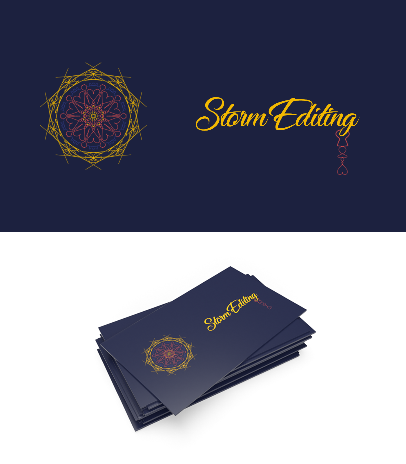
@winged vault thanks for sharing! For the frame tool challenge I'd love to see it without 'stormediting' on it - could be even more crisp! Bravo on the memes, epic Twitter banner (did you do the illustration?) and very nice symmetrical illustration!
you did a great job mastering those challenges 😃
@uncut ginkgo Hey tbh I'm so bad at selecting fonts that's why I selected a random one and put my own name on it 😄 (yeah basically a helvetica guy)
For the twitter banner the character is from a game (but it's a skin hard to recognize it) and I did the rest, I may work on it later to really work with the typography (not just a rectangle)
For the symmetrical work, I spend 95% of the work doing the 3D (lol...)
What do you think about project title ? (I didn't do for each challenge cause it would require so much work lol)
#📣creative-challenges 9 Please comment. Thank you
My first 3D model walking the train tracks from an earlier submission. Thanks to @latent lion for putting me on the right "tracks" for this 😃
@fair hollow Very partial to the Chicago frame, since that's my home town. Nice work!
@magic rampart Good start. Videography 101. This old railroad worker found the broken rails disturbing on the before effort. Looking forward to forthcoming 3D tools in development by Adobe. Load it up on your Behance profile.🚇
@glacial path @sterile bane I made all the changes you suggested, except the dress. I scoured google and adobe stock and every time I resized a dress it got blurry or didn't look right (I tried at least 10 before I gave up). I guess people don't upload high-rez dresses online.... @agile ruin What do you think?

Behance
Website ui design for businesses, freelancers or any type of person or business who wants to show their (creative) work, apps, services or stories in an elegant, design-driven & professional way.
Hi all -
I did a small quick project on choosing a brand and creating a beauty branch out of it that they would release.
https://www.behance.net/gallery/79128105/What-if-Silk-had-beauty-products-Packaging

Behance
A quick small branding project were we have to choose a brand that would not think of releasing a beauty product since it already form a large target consumer. I choose Silk because I do enjoy milk alternative and was wondering what would they do with the…
what a cool exercise! this is a great example of a successful personal project 😄
Thank you @sterile bane I also think it's a great exercise! The fun (& patient) part was white paint-spraying the products from the dollar store and taking pictures 😊
I started this Gif from these two photos
@hardy kayak I like this idea. Nice mockups. That said, I think the font you choose is too contrasty. The "Almond" in Silk's Almond Milk is a very low contrast font. The one you chose starts to disappear when zoomed out. See, for example, the Ys in Body Spray. Me personally, I like contrasty fonts, but it doesn't work that well here. Also, it isn't similar to their typography on the milks.
@young karma Now I know how to say Happy Easter in Flemish. 😃
@peak warren I truly appreciate your feedback, thank you so much! 😃
@peak warren yes Vrolijk Pasen to you and to everybody here! 😄
Still not moving on from PS challenge. Try to complete all 9. So challenging.
@remote nebula That’s quite good! I really like that.
thanx @peak warren
This is how I spent my Easter afternoon. Finally getting to Day 9 of the Photoshop Creative Daily Challenge. It's not animated text ... but almost all the same steps were used to create this. Sit back and enjoy a cold one. The weekend is almost over and a new work week about to begin.
@proud isle congratulations!! Happy (belated) Easter 😃
@jolly quest @sterile bane @agile ruin I really tried hard to find a dress and this was the best I could do. I hope that this is an improvement from the last post... What do yo guys think?
nicely done @loud zephyr ! for the dress, are you using a blending mode?
@uncut ginkgo Thank you. I had to use a few things. Blend Mode Overlay, Hue/Sat, Levels adjustment masks because the dress was dark royal blue. I think I had to use color selection (mask) as well.
Any tips on how I could make this bunny blend better?
Hi @vocal wind you can use the dog as reference.
The light is coming from the right, so you can create a levels or curves adjustment layer to make that for the bunny and also for the shadows, you can use the layer mask to create the lights and shadows ponts.
I think the bunny's perspective is a little off , it seems to be a little up, above the ground, compared to the dog, maybe you can try to lower a little bit.
You can create a cast shadow to match the perspective and give a more realistic look, also you can use the dog's shadow as a reference.
I hope you can understand my English 😄
I am working on designing my twitter header. I came up with this idea to mimic the adobe premiere timeline. Thoughts? Feedback?
@last mortar looks nice💯 , but your text/type shows pixelated, wouldn't it be better if you use vector base text?👍 😃
Yeah. How do I use vector based text?
right click the text layer and convert it to shape, try that way
Whoa! That looks a lot better. Thanks
Behance
This project came to me because I have been wanting to work on my typography and layout skills. With limited resources, I was able to figure out the paragraph tool in ps to align my text within the page. Additionally, I tried having less in order to speak…
worked on formatting and type
just finished my second packaging project please tell me if you have any feedback on it
https://www.behance.net/gallery/79498185/Autuman-products-Branding-packaging

Behance
Branding & packaging design for "autuman" a man products company
Hi @mighty vessel I like the style. Nice presentation. Good colors throughout. Not sure I approve of "man products" as a title, but that's a comment about gender, not Photoshop.
My wife competed in Seattle Dance-o-Rama yesterday and today. I was photographer & videographer. This 4 panel view is shots of her feet during one dance heat. Matched the exposures with adjustment clipping layers, so all 4 views of her dress looked the same. (Lighting on the dance floor was ahem challenging.)
@mighty vessel As branding it raises questions. "AUTU" would be interpreted by the brain as "AUTO." The mind automatically corrects any mistakes in its effort to comprehend. So why "AUTU"? Is the difference rooted in language as a composite of "au" and "tu"? Your usage of the Maple leaves in your letter A could be enhanced by lowering the leaf so the points of the leaves are not so close to the outer edges of the "A" - even spacing surrounding the leaves.🚇 @peak warren liked dance pix. As a grid it seems slightly off center maybe a flip horizontal of the lower left image would balance the grid.
What do you guys think about that color correction and the foto shooting in general?
im impressed by this in general. i just zoned out on it for a minute and i really like it. i dont know enough about to color correction to comment on that, but this is really eye catching for me
Ty 😃
yw 😃
@chrome atlas I like the image. It has good detail in the darks. And I like the monochrome treatment, or nearly monochrome. I do wonder about two things. First, the tail is out of focus while the rest is in focus. Is that intentional? Second, the wing (?) overlaps with the tail, but just a bit. The negative space it forms is interesting, shaped kind of like a crown. But I'm not sure you want the overlap.
Also, is this your origami? I know this is a PS Discord, but that is nice paper folding.
- No it was not on purpose, im not good at photographinh 😄 2. I guess not overlapping wouldve been better im not sure tho. i didnt even notice this
And sadly not my origami 😄 The school gave us few of these
@chrome atlas Were you using a tripod? If so, you can set smaller aperture/ higher f-stop, for better depth of Field. But if that is not enough, you can take multiple images at slightly different focus settings, and do focus stacking in PS. It is a super feature, but it needs tripod to work so that the images align well.
this is from a while back..just have time now to complete it...challenge 8 last PS daily
this was fun fun fun!!
So I took Rufus's advice and I separated my Behance profile to personal (with Photoshop challenges) and a business profile where I only show my composite work. You can see all my composite work if you search for BlackCeriseDesignStudio. Here is my latest work inspired by the movie SHAZAM!

an eye series 😃 @tepid sierra
My take on the day 1 challenge before the live video
Created during today's session PSdailychallenge #✂challenges-feedback
hey, I really am trying to do more photo editing, but I usually post drawings like this!
that was so fun! I can't wait for movie poster day.
@coarse abyss wow! amazing job!
@versed bobcat nice job! You picked up that skill super quick!
thanks! I did it along with him.
@neat shale Nice job! Could be really cool to combine that effect with the ones covered on todays stream. Would really push it into that comic look.
@versed bobcat Well done! If you're comfortable with other aspects of Photoshop it could be cool to see a more bold color replaced in the background to really give it more of that comic look.
@eager barn Very nice Poki, 99% of my work in Photoshop is drawing and painting too 😄
@coarse abyss Wow, very well done! Really cool look to this, I like the bold colors too, really fits with that comic/graphic novel look.
Thank you for the feedback. I'm a beginner, so I'm uncertain how to modify the background color just yet.
Thanks for sharing, this is a cool effect, thanks guys!
I'm completely new to all of this; this is my first time using photoshop. here is creative challenge #1. what do you think? how can I improve?
First attempt... https://www.behance.net/gallery/79613289/PS-Daily-Challenge-May-2019

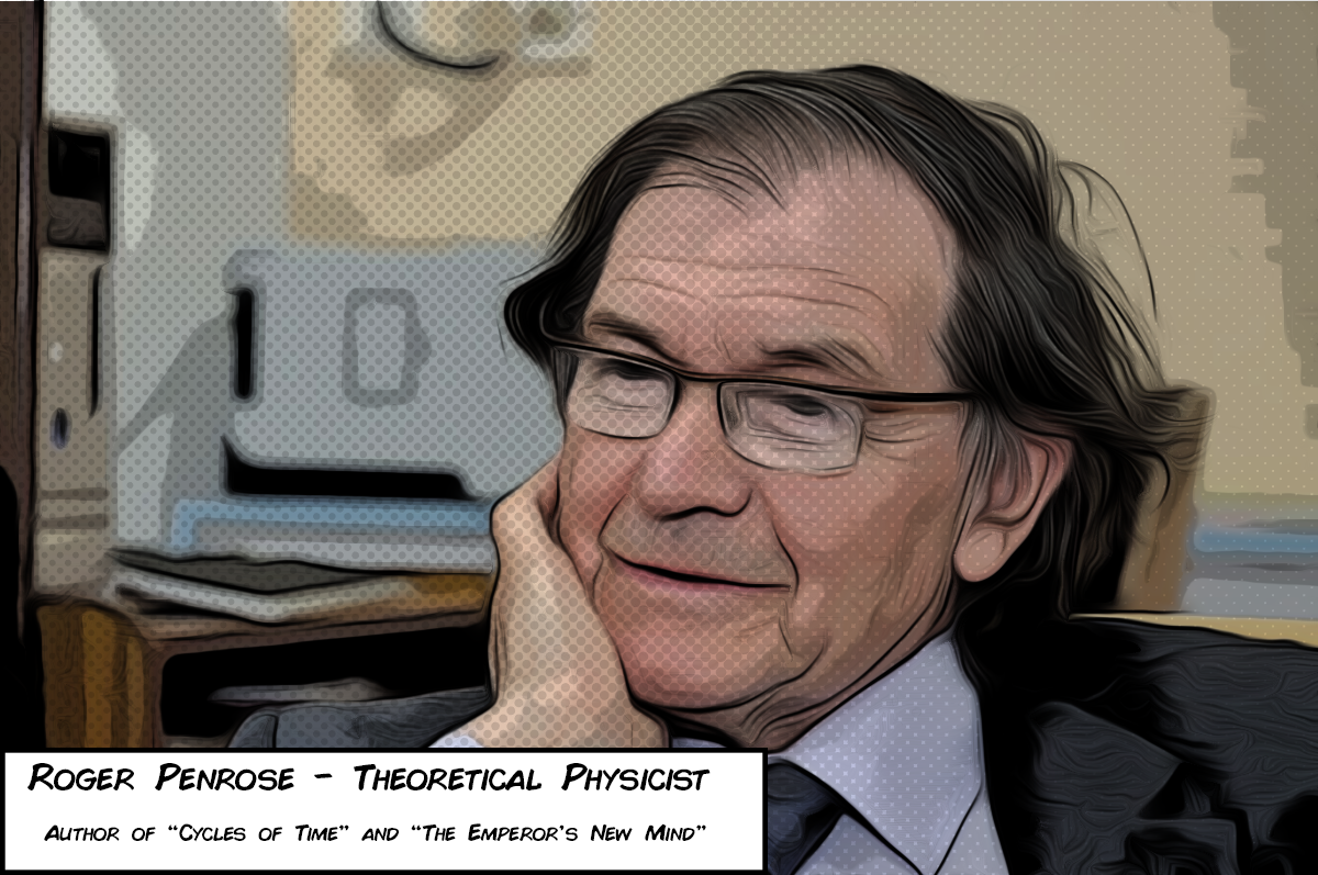
Roger Penrose, Comic Stylized, Halftone Brush Added
I'm sure there's a way to stagger the size of the dots with a gradient and a filter but this is the lazy version
The filter is a combination of smart filters, it's Oil Painting, posterize to limit colors, and this is across 2 layers one set to multiply for the lines
@magic vapor
it was today's behance/photoshop daily project
Think they wanted to know how you did the half-tone brush effect
@young karma very nice, I was wondering about the doted effect is that a filter?
No that's a halftone brush, Now I'm pretty sure there's a way I can jerry rig a radial gradient and apply the halftone effect that would stagger the size of the halftones to make it look more natural, i just havent gotten around
I made an extra layer, put the brush on top, lowered the opacity so it blended more naturally
@magic vapor That's looking awesome! Have you thought about also experimenting with some background textures?
@young karma I see, I just need more exploration, I'm very new to PS
@jolly quest great idea I will try to play with BG
Yeah it takes a lot of experimenting, photoshop is large. Not After effects large, but still the big large.
@magic vapor I bet you could apply the same features to some cool textures and place it in the back!
Looking awesome so far
Is that you in the photo?
Day 1 : PS daily challenge ( first attempt after the stream)
@remote nebula Very nice!
PS Daily Challenge - Day 1
@wispy kindle Nice job! Very subtle texture but it has a nice feel!
Day 1 : Comics PSdailychallenge Hi everyone, i try with a composite image i made early this year ( french guy, so sorry for my english)
@young karma This is awesome!
I would also love to see the "Before" images so we can understand how transformed the image is
If you want to share, that is
@jolly quest yes it's me
the original image quality is not the best
@magic vapor That's okay! You don't have to share if you don't want to. I was just curious
hay 😀 thanks
No, I like to share my work, I used my image since I need to upload one to my behance profile. No I have a good one! thanks
Day01 PSdailychallenge #✂challenges-feedback .
Photo of my cat in the garden
Day 1 : PS daily challenge ( try to blend it with texture)
@dreamy drift cute. Looks like cut out art.
@remote nebula Yes I like the added texture!
@dreamy drift Very cool entry looks like a graphic novel/comic page for sure!
This is my exercise of the day. I think it could be even more comicy not?
thank @jolly quest ..:D
@jolly quest thanks,this is the composite and the components
@young karma WOW
@young karma like it. Look so cool.
fun little design
Wow! All of these are so awesome!
@jolly quest i'm a beginner so thanks a lot
@young karma Nice! Is that you?
thank you very much @remote nebula @jolly quest I do not know how I will integrate the whole movie theme of the challenge and my cat, but I will solve it😅
Heyyy @jolly quest whats up!
This image is from a comic / graphic novel I've been working on for almost 10 years. It's called 'The Girls From T.N.A.' I'll put a link below. This scene is from the prologue for Chapter 6. The characters are created in an app Called Poser Pro 2014, and the forest in the background was created in Vue 10 Complete. Hope you don't mind my shameless plugs. LOL
The Girls From T.N.A. by Rod Shelley
I didn't take any 'detours' and used the same procedure as Jesus did. I like it a lot.
@timid pasture beautifull, and i love the light between the girls
Hi everyone, here's my Super Dog 😄
hahaha! That is so funny @coral stone
@young karma Thank you! That light is from her staff - the girl in the center is a Fae..
@coral stone Love the 'SuperDog!
Thanks @timid pasture !!
@eager barn NICE
This is for the First Day Challenge!
wowowow that is awesome @loud zephyr
Hi, I´ve uploaded the project on Behance with the tag PSDailyChallenge and it is not appearing on the gallery, what should I do? Thanks a lot
Here is my DCC submission. I have been obsessed with mushroom clouds lately 😄
@eager barn Thanks. I had to find a work around for the oil filter which I don't have.
Thank you for your feedback! 😀
@fathom osprey Love it!
cool @fathom osprey !
@loud zephyr Good to see you again! Loving your entry too!
@jolly quest @eager barn Thank you!
@tawdry glen I've been having the same problem - over 2 previous challenges. Not sure what's up with that. Jesus said to make the PSD in uppercase, but Behance seems to insist on making all the letters upper case.. Any ideas out there??
Full color Cyber Punk! Just in Time!
@loud zephyr NICE!!
For anyone who wants to add the halftone to their Project, Check out this Addon, it's extremely useful and very easy to use, give props to the creator, it's 100% free. https://www.adobeexchange.com/creativecloud.details.13159.html

Zoom Line, Speed Line, and Screen Patterns for Comic Artists
@jolly quest Have you seen the trailer for Ep - 9 yet? Looks like it's going to be epic.
@jolly quest thx, i’m afraid not
@timid pasture Yep! Paco put it on in the studio for me the day it came out haha
@timid pasture I thought that this could be the problem, but behance converted everything on uppercase. Anyways I´ve wrote PSD in uppercase.
@jolly quest I'm going to send a link in a few - something you'll get a giggle out of..
@jolly quest I saw this on Renderosity yesterday and just about fell out of my chair: https://www.renderosity.com/mod/gallery/star-girls---the-price-to-be-a-skyhopper/2873322/?p

Renderosity
Star Girls - The price to be a Skyhopper by Edheldil. Renderosity - a digital art community for cg artists to buy and sell 2d and 3d content, cg news, free 3d models, 2d textures, backgrounds, and brushes
LOL
@timid pasture That is hilarious! We ought to move it over to the #💬chat-general channel though since this channel is for feedback on stream!
Tried a flower. My graphics card doesn't like Oil Paint.
@bold valley That looks awesome!
@dusk crown great! Also love the addition of the "Meanwhile" comic box!
totally feels like a comic!
@jolly quest Thanks! 😄
Cover with Illustratiomn
@tawdry glen I am really loving those colors!!!
Thanks! I´ve added a gradient to my picture @jolly quest
Awesome!
@dusk crown what font is that?
@dusk crown I like it!!
nvm i think i found it
@versed bobcat great job! Tomorrow I'll talk about background replacement. Maybe you can add a different background and make it even cooler!!😊
@lethal mural I can't wait! It's gonna be awesome!
@coarse abyss OMG! I love cats! Lol great work! I love the details on the fur. Consider licensing the photo. Then you can remove the watermark and upload it to Behance! It's a really good piece!
@tawdry glen In watching the video again, he said to just make the PS uppercase and 'dailychallenge' in lowercase. But I still can't get Behance to stop making the whole thing uppercase. I'm going to post this in 'ask-a-quetion' and see if anyone has an answer.
PSdailychallenge
@carmine musk Fantastic idea! I love how the fish is "breaking out" of the comic book effect. Not much to say besides great work! Make sure you upload it to Behance! 😊
thanks @lethal mural this challenge was so cool!
@undone sapphire good work Maria! My only suggestion would be to adjust the hand to get a few more dark lines in there. But the rest looks great! Let me know if you update it. I would love to see the results! 😊
@timid pasture Yes! I saw on the video chat and I could change it, thanks for notifying me! 
Final Version https://mir-s3-cdn-cf.behance.net/project_modules/max_1200/b20fd379616849.5cc8b71452ec2.png
I don't have the oil painting filter in my gallery.....
@proven barn great job for the first using Photoshop! Definitely better than my first project. My only suggestion would be to keep adjusting the filter control sliders to improve on the result. Maybe add a bit more Treshold? Let me know if you update it! Thanks!
Amazing @young karma!
Wow, already so much awesome stuff!!! Great work everyone!
😀
@eager barn did you draw that yourself?
@timid pasture good job! I would suggest getting more dark outlines. In the Poster Edges filter make the lines darker. See if that helps!
My laptop crashes on the Oil Paint filter and doesn't show the Select Use Native Operating System GPU Acceleration option so have to live with the hard pixelated edges.
@lethal mural Thanks good sir! I'm loving playing with these effects.. Love your PTC channel!
@young karma fantastic work! I love how you added the halftone pattern to enhance the effect! It really makes it stand out. Not much to say besides great job!!!😊
@pastel spade yes I did!
thank ye much, i think the halftone completes it
@magic vapor awesome work! I would suggest that you fine tune the poster Edges filter or the threshold to get more detail on the edges. The lines are a bit thick. Try it and see if it helps. Let me know if you update it. I would love to see the results. Thanks!
@remote nebula Great Job! My only suggestion would be to darken the white in the image to try to get more details in the comic effect. Much like I did in the final part of the stream with hair. Overall you did an amazing job!
Day 1 - Not sure I got the dark lines prominent enough.
I like this one better XD
@dreamy drift this one came out great! I love the grass! I don't have much to say but great job!!!
i ended up moving away from any color, but this is really fun.
wow cool @turbid vapor !
😀
@young karma awesome work! I love how the wings came out. Good idea on using a previous composite.
Okay, no idea if this looks cartoony or not, fun to mess about with though.
Thanks @lethal mural
I already uploaded it to my behance 💪

@lethal mural thanks, i try to cover a lot of fonctions in orer to improve myself
@MLuckett#6822 Nice job! One thing I would suggest would be to adjust the filters to decrease the details and get larger blocks of color. See how that looks! 😊
😀
Father of a good friend of mine.
Although I am not so sure about the oil paint effect. Somehow I do something wrong I think.
Had another dash, like this better and realise that finding a decent pic to begin with helps. 😃
Here, I effectively 'doubled' the effect giving this image an even more 'cartoony' feel. This is Ranpha descending a staircase in a very large yacht.
Removed some of the detail and increased line width on character. Original is composite of grandaughter's face on 3D character laid over an alien background.
@fallow bough NICE! Looking great - I'll bet your granddaughter loves it! Which 3D app are you using?
Not my own. 3D model from image I found online.
Well, you did a fantastic compositing job on it! 👍
Thanks. Can't wait to work on it on new PC when it comes in. Laptop crashes PS on the Oil Paint filter.
A new machine is always a treat! Congrats!
@lethal mural thanks for the feedback!
edited this for the daily challenge, any tips on how to make it look even more like an old pin up drawing?
New to the Discord thing. Here's my comic art- I added the halftone filter to give the comic book dotted look, used Luminosity to blend. https://www.behance.net/gallery/79618839/2019-Photoshop-Daily-Challenge

challenged. I'm waiting for feedback!!
Here is mine!
Messed up the chin area and in-front of the noise a bit but didn't have the time to fix it.
One last experiment for the day (or at least for now.. 😀 ) Another model from my archives with a little more aggressive lines in the poster edges filter.
@severe flame I think this looks perfect. Just the right amount of line work. Great job!
@wet thistle i like it a lot
@knotty charm NICE! Very intense and perfect for this GOT character!

Here's my submission for the daily challenge. Really enjoyed it!
https://www.behance.net/gallery/79619613/Photoshop-Daily-Challenge
This really works well with my architectural window images.
I didn't like the oil paint filter on this one, so I used the graphic pen set to vertical for this line layer.
Some Amusement park photos I took, comic style
Very cool @upbeat cosmos
That's really cool @upbeat cosmos. Do you mind sharing the original or a side by side? I'd love to see exactly how you changed it.
I worked on a few images today and this is my fave...i think. I don't like the backgrounds and it was hard to get a nice effect in the faces without wrecking the rest.
And this is the one I had the hardest time with. The detail in the background trees gave me some serious grief so I just blurred them in the original...
My take on day one
Day 1 - Miss Emma
I can't remember where the sky came from, credit to the artist!
different dragon, guess I am on a theme today
Here's a picture of my cat being a nut.
@timid pasture thanks !!!
@mental glade Nice execution of the effect 😃 Just one thing: If you like to credit an artist, I would make the watermark more subtle. right now it almost is the first thing I'm looking at. I thought the text was referencing something in the image and that I would have to read the text to understand the image. You know?
@glacial path thank you 😃
@snow palm Hah, cute cat. Nice work! Currently I almost get a painted feel from this one, I think if you tweaked the oil filter settings bit to make the stokes appear to have less dimension it might strengthen that comic colored feel a bit more.
@mental glade Cool effects on the texture of the Tiger! I think if you played around with the settings to make the edges a bit harder and more crisp, it might push it away from "painterly" and make it a bit more graphic and comic like. Either way it's got a cool look to it! Nice work.
@upbeat cosmos Really love the effect of your fire breathing dragon! Very nice use of the dot texture. The whole effect works really well on this image, especially the buildings, definitely gives of a sort of detailed inked/drawn feel.
Thanks, I'll give it a try.
@upbeat laurel Cool to see you applying your architectural window images to this challenge. Interesting effect. I think for the second one, and in general, pushing that line layer Jesús did is pretty crucial to give it that inked/line drawing look that really can push that comic book feel.
@weary steeple Oooh, nice effect on that. Very cool retro vibe, looks good! Also great avatar, hah. My girlfriend and I just finished watching through the entire series a few weeks back.
@worldly wadi You did a great job with that image, definitely feels more graphic and comic-like with the effects. The text boxes are a great touch as well!
@timid pasture Well done! I think the more aggressive lines can definitely help the overall comic effect for sure. I think adding a more colorful/bold gradient in the background could really help push that comic feel as well.
@upbeat cosmos GREAT effects! Im inspired! i will make another entry!
@wispy compass Ooh, cool effect on this one! I kind of feel like some sort of color pass/photo filter on could be a good look at push the colors more towards something that feels like it's out of a comic. Maybe a cool color pass or something.... just an idea. Nice work!
@cedar radish I am a beginner so maybe I don’t have any advice, but I just wanted to say how amazed I was when I saw this!! It looks so cool, just like an old fashioned flyer from the 50s or something!!!! I hope to be able to get this advanced at some point! Good job!
@midnight frigate this is awesome!!! We both used animals for our challenge!! Yours looks way better than mine though that’s for sure!!!
@grim mantle Really great work on this one, very well applied effects. Really love what you did with the background and the dot texture. Well done!
@snow palm lovin’ the cat!!!!! Good work 😃
@loud ferry Nice work! I think (on the image with the little girl) simplifying the background in an image like that might be the best solution, keeps the focus at the front. Did you apply the oil painting filter to the lines at all? Currently they look a bit rough, that filter used like Jesús did can give them a nice hand drawn look. Nice job!
On the girl in the beanie: Nice! I think some images can definitely be tougher than others. I think a key to this effect is getting that nice outline around the subject of the image.
@red thunder Hah, great picture. Really cool look to this one! I love how the lizard looks, but I think if you masked out the background and blurred it or simplified it more somehow it could give the image less of a realistic look and push that comic look even more.
Hi @lethal mural /Everyone,
So glad PS challenges are back!
here's my submission for Day 1....please do provide your feedback. Cheers!
Original
@robust plank Very cool! Nice strong outline around the figures in this one, looks great. I think if you were able to get rid of all the texture in the couch, and maybe even replace the white background with a stronger color if could push that comic look even more. Looks good!
@knotty charm Looks great! I think if you could simplify the colors even more with the Poster Edges effect, and make sure "lighting" is checked off when you run the oil filter over it the image might look less painted/detailed and more simple/comic looking. But even as it is right now it has a really cool look to it on its own. Nice job!
@severe flame Nice job! Some really cool effects going on here. One suggestion to push the comic look more would be to make sure the lines are crisp and hard edged. Sometimes when the edges (like it in the black area of the bird's head) get softer they can start to look more like a painting. Also if you're able to simplify the background more into areas of color without so much detail I think that could push the comic look as well. Looks good, nice work!
@sharp pier The half tone filter looks great! Did you use the line and color effects Jesús showed in the stream today? If not, I think those effects could push the effect even further. Nice work!
@bleak fossil Thank you so much for the feedback!
@cedar radish Ooh, great take on this challenge! Definitely gives it more of that vintage illustrated pin up look. Great job! The only thing I can think of to push it further (if you haven’t already) is to lightly apply that oil filter effect like Jesús did on the stream to soften up that edge shadows in her arm and legs… might help, but it looks solid as is to me.
@fallow bough Very cool! I think maybe simplifying the background somehow could help. All the crazy detail draws a lot of attention and comic backgrounds are usually more simple to let the characters pull the focus. For example, I think the far background on the right looks great. A simple shape with a simple outline, but the background closer behind her has a ton of detail I think could be simplified. Just an idea, nice work!
@bleak fossil is on 🔥🔥
😉
@mild karma Nice work David! I think righting the right images for the effect can definitely help a lot. I think the key to getting this comic effect to work is getting a nice inked looking outline to the image, and simplifying the colors like Jesús did with the effects he used on his two layers. Right now the man in the hat has a lot of complex detail in his face and beard and running the effect over that so simplify the colors, as well as add an outline could really push it to look more comic-like.
@wet thistle Looks good! I don't know if you mean the oil effect when applied to the lines? It looks pretty good to me, but did you make sure to have "lighting" checked off? I only wonder because the lines in the background have a bit of dimension, which make it look more painted. I also think simplifying the background so all the detail is in the person might make it look more comic-like.
@kindred kernel Hey Gerard! Good to see you in another DCC! Nice work, Maybe try playing with the saturation in the person's face (in the plane image)? Comics usually have fairly bold colors so that might help push the effect a bit if the colors a bit more saturated. You could also play with a levels adjustment on your photos to brighten up the image as a whole
@raven meadow Really cool effects on this, I really like how you pushed the colors as well! Also great subject choice, Hook was one of my favorite movies growing up 😄
@bleak fossil ....something like this?
@young karma Very nice! Really well done blend of effects here. Great simplification of the background, lines around the character look awesome, and the texture and speech bubble add even more to it. Looks awesome!
@mild karma that's the point to have fun and mess around! Great job!
@raven meadow great job!
Maybe something like this? @wispy compass I applied a "Cooling Filter (80)" at 25%, and a filter (Filter-pixelate-color halftone) and set it to 50% opacity. Just a suggestion, but gives it a bit more of a comic look to me.
@kindred kernel job job! I would add the Oil Paint filter to smooth it out a bit.
@bleak fossil ... ok..thanks !
@turbid vapor Fantastic job, you really gave this one an illustrated look. Well done!
@wet thistle Great work! I would darken areas like the hand to make the fingers stand out. Much like I did at the end of the stream with the hair. But great job overall!
@mild karma yes it does help! Good job. Did you apply the Oil Paint filter? You don't have to if you don't want. But I was just wondering.
@timid pasture you certainly doubled the effect! It looks great!
@fallow bough looks great! Good job!!! 😊
@cedar radish excellent work! It looks great!
@sharp pier looks pretty good! Fantastic job;. I would maybe add a bit of the oil paint filter to make it looks less like a photo.
@severe flame I think you did a great job! My only suggestion would be to maybe adjust the width of the black lines. Just to see if you can get more detail on the bird.
@knotty charm great job! No spoilers!!!
@worldly wadi great job! Definitely a great photo for this effect!
@weary steeple great job! I like the pattern you added to it. It adds to the effect!
@upbeat laurel really good job! I love how the flowers look!!!
@upbeat laurel That's great! I'm glad you improvised with other filters!
@cinder vessel good job! I would maybe increase the threshold or the posterazation to make it look a bit less like a photo. But fantastic work overall!
I used a picture of my daughter.... 😀
One more before bedtime! I used the overlay blending mode on the 'line' layer for a little different look...
Day 1. With halftone applied to the central figures, and the background blurred & darkened.
Day 1: Just got home from work and remembered that this challenge was happening. I love this effect and I can't wait to learn more from you guys!
This was not something I would have tried on my own. Definitely cool playing with these filters! Me looking like a wannabe tough guy...
Day 1 - Comic Art. I use a picture of my friend I took a few years back.
First time trying this. Was able to learn something new very easily today and look forward to the rest of the challenges. Had some issues with too many lines on my subject's faces, but messed around a while and think I figured out how to minimize them. I lowered the threshold more until I was happy. Is that what you would have done? (adding the original in the next post...)
Original version for comparison.
Whattaya think?
Here is mine!
@dark quiver Thanks!
@sonic ermine Also love it. Nice incorporation of illustrations!
@leaden granite I give credit where it's due 😉
liking yalls too ❤
Sure. It seems you
you're playing around with filters. Try "Filter Gallery" and play around a bit more with those. Especially Cutout.
Might be some cool effects there that'll boost the "comic book" effect.
Also just play around with the program, and TastyTuts' tutorial on Youtube is a great start to learn the program in and out.
Gotcha. TastyTuts' tutorials are great. If you have Skillshare, another awesome choice for Photoshop tutorials.
Dip your feet in as much as you can. Play around with ALL the tools!
My 23 year old Cat, passed away 5 years ago
@bleak fossil thanks a lot for amazing opinion!!
PSchallenge #1
PSdailychallenge #1
Hi Everyone, here we go again! #Nottoday #Gameofthrones #GOT #✂challenges-feedback #VixPS
@cerulean bay Do cats live that long? 😯
@cinder vessel normally no. Usually the get 16 years old
Used a friend as a model and an image taken for another friend who make the skirt shout out to Zombie Designs. i would appreciate you feedback its my first time here.
Hello from the Philippines 👋
Photo by Austin Wade on Unsplash
Photo by Christian Lunde on Unsplash
Photo by Ayo Ogunseinde on Unsplash
Tried it out on a scenic shot. The sky has gradations from the posterisation though. Could someone please recommend the best approach to remedy this? Thankyou for the challenge today. 😎
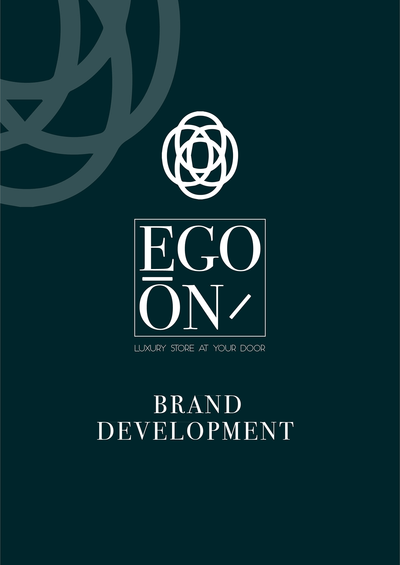
Hello all , i want you to review my last project with #calarts and #coursera here is the Link https://www.behance.net/gallery/79551727/EGO-ON-BRAND-DEVELOPMENT
thanks in advance
😀
@sour ingot cool effect loving it, did you use half tone and oil pain effect?
@blazing quail I love the airplane photo. It really does look like something from a 1930's comic book! Great Job! Keepin' it 100
@severe flame Great job! The oil paint on feathers and fur looks fantastic! Great job!
I'm pretty bad at staying the course.... but i highly recommend exploring the liquify filter..... here's where mine went (not exactly comic book, but WHOA the liquify tool is AMAZING!!!! possibly my new favorite thing!) https://www.behance.net/gallery/79615927/photoshop-daily-challenge-043019

@turbid vapor WOW, this one is cool. I like it! 😃
@vivid wadi I think the gradations in the sky are a natural side effect of the posterization. If you want to minimize them, you have to do some alteration, like selecting the sky and filling it with a single shade of blue.
@vivid wadi I like how the poster-edges works on the white part of the dome. Really good effect. Is this the Duomo in Florence (Firenze)?
@gentle siren I think the edge effect is strongest on the first image. I like it a lot. The bottom image is good, but making a black edge on black hair or halter doesn't really show up. The image ends up just looking posterized. There are some subtle lines around her nails, but not as vivid as the other images.
@sour ingot Great image. So much that I like here, but especially the hair curls on the R side, the eyes, and the shading of the lips. Any idea why her (your?) t-shirt doesn't get a poster-edge on the shoulder?
astronaut comic effect, hope you all like it
abstract astronaut comic effect
secret garden comic effect
Hi @lethal mural @bleak fossil Thanks for the feedback. I removed the background and used a gradient instead. I did not like the lines in the background either, I thought that was because of the oil effect @bleak fossil. I did try to darken the area, but I still need some more practice I think...;)
Comic Art
Cartoon with adjusted levels...
Original Picture
This one has no level adjustments - not sure which looks more cartoon-ish.
Comic Art. Fairytale.Thanks for the tutorial. @lethal mural
Here is a different - one. I am having trouble making the shadow areas not look hairy or speckled. Any ideas?
Cartoon version
Original version
Comic Art. This is the princess in my comic, thanks for the tutorial !
Comic Art. She is the modern girl in my comic fairytale. Thanks for the tutorial!
Here is my first challenge. Thank you Jesus for your tutorial!!
Got the opportunity to learn something new! Thank you @lethal mural
@lone hare NAILED IT!
Thank you @turbid vapor It was fun
@lone hare OMO! this looks superb!
Did you do it with the same technique Jesus learned?!
@silk wigeon Yes with a few tweaks of my own
Daebak! (cool!) Could you share those tweaks? I was planning on using this style for my new portfolio site. But never found the exact appearance
espesially with the background
Day 2 challenge Lets see where this goes.
@silk wigeon I applied the same filter adjustments as @lethal mural did (you'll have to mess with the sliders until you get the style you want) I then you used blend modes and a gradient to change up the color. Then overlaid a falftone pattern. Its a whole lot of messing around with these details that got me to my end result.
@lone hare ahhh! Thanks for the tips!
@silk wigeon of course, once you can recognize what details need to be in your composition you mess around until it feels right. 😃
@bleak fossil Thanks for feedback. Tried a background with less detail. Have the problem of my laptop crashing PS on Oil Paint filter so had to do much work on outlines to make work.
Thank you @lethal mural
My project for yesterday. Turns out my computer can't run the Oil Paint filter so I had find a workaround. Feedback greatly appreciated.
My first submission for PSDC'May19. Jesus thank you for making it fun. https://www.behance.net/gallery/79648705/Comic-Hero-Phantomish-look

Giving a selfie a new look.
quick one, some Feedback would be nice;-)
https://www.behance.net/gallery/79649111/May-2019-Photoshop-Daily-Creative-Challenge-Day-1 So I made 3 because I found too many photos that would look great with this. Also mixed what I did before the live and what was taught in the live. Also oil paint doesn't work on my laptop sadly 😦 so I improvised and used fresco on the line layer and gaussian blur on the color layer

Behance
I did a bit more than what was in the live video oops except for the oil paint filter because it doesn't work on my laptop :( I used fresco filter on the line layer to replace oil paint and gaussian blur on the color layer.

PSDailychallenge Day 2 https://www.behance.net/gallery/79649701/Album-Art-The-Cars-City-Limits
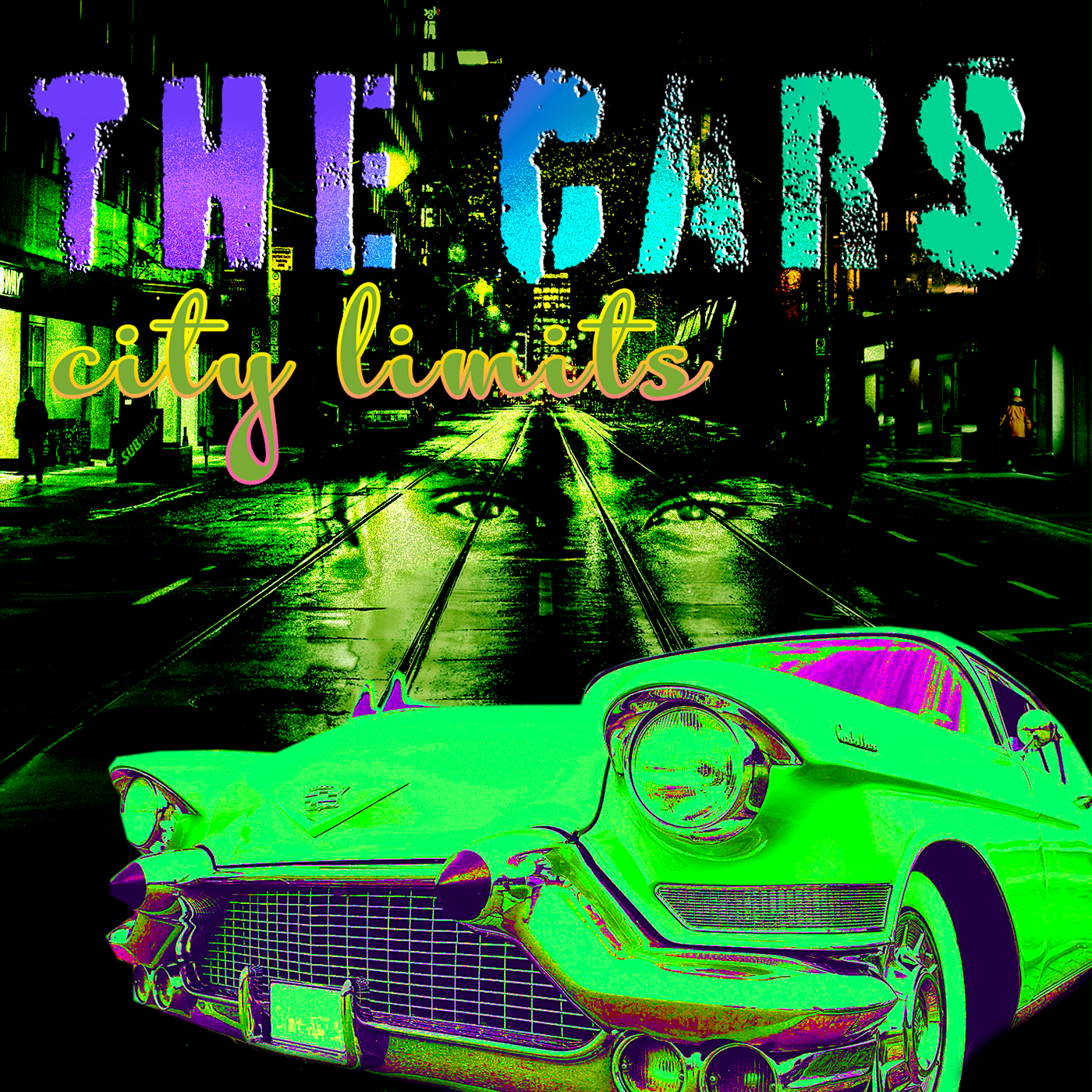
PSDailychallenge this is the image for your review
#PSDailyChalleng day #1

PSDailyChallenge 1
@lone hare very nice
Day 1

Photoshop Daily Creative Challenge #01 https://www.behance.net/gallery/79650559/Photoshop-Daily-Creative-Challenge

Hi all! I'm new to Discord but have been watching Jesús Ramirez's YouTube channel for a couple of years. Here's is my rendering of the first challenge; it's the lead singer in my band, behind her is the bassist.
Thank you! @warm kestrel
Did todays challenge. https://www.behance.net/gallery/79650899/May-2019-PS-Challenge-Day-1?share=1

@vale burrow Really love how you showed the before and after - great job.
photoshop challenger day 1
i was trying to follow along with the video but idk if i was able to get the same effect as he did
I'm just having fun now!
Final....I'm getting addicted 😂
These are looking great! what a fun effect!
I had a go at the Album Cover challenge before the stream: https://www.behance.net/gallery/79653269/PS-Daily-Creative-Challenge-Day-2-Album-Cover 😃 🤘

Behance
PS Daily Creative Challenge Day 2 - Album Cover
Day-1 -Comic Art
@warm kestrel oooh! I love how you've added the speech bubble in the lower right corner, even though there would be enough space right next to her. But since that would block the action, you did the right thing 😃 . I also like the font 😛
Hey, guys, just a day behind, here's my comic book art submission 😃
@deep mango that's awesome! I really like the color contrast between the teal in the background and your shirt+hat in the foreground 😃
Thanks TIM @glacial path
Thanks @glacial path 😃
@dusk crown woooah! That typography is really cool 😄 Great use of the 3d effect in Photoshop. Did you render the image? It looks like you took a screenshot of the preview version. There are still some aliased corners
@wet thistle great job combining the double exposure and comic book effect 👍 - I also like the overall look, the yellow and blue play nicely together. But maybe you can find an image, that has some connection to the instrument?
or music in general
@obtuse haven Now that's what I call a winning smile 😁 . I think you could make this image better by removing some of the distractions, like the two objects here
@obtuse haven you could crop the image or you could use content aware fill to remove them 😃
I could use some assistance on mine wasn't able to get the same effect in the image
@glacial path Thanks! No, I don’t think I did, it’s literally my first time with 3D stuff. I exported the whole image as a PNG, how do I render it? 😃
I think I found it: 3D > Render 3D Layer, right?
Thanks @glacial path! Those are great tips!
Man, my CPU is not having a fun time rendering, haha. It’s at 97%. 😅 I’ve rendered a couple of things in Blender before though, so it’s not super disconcerting.
@dusk crown yes! and yeah, it will take some time to render 😉
@thorn dove thank you for submitting, that's a very cool (and probably very emotional) photo 😄 - The effect is very subtle, I think you can easily increase it ^^

@glacial path It's rendered now, and I see what you mean, it does look smoother: https://www.behance.net/gallery/79653269/PS-Daily-Creative-Challenge-Day-2-Album-Cover

Behance
PS Daily Creative Challenge Day 2 - Album Cover
Thanks for the help 😄
Comic Art - Savannah and Manda
That's cute!
Here's the result of today's daily challenge! Let me know your thoughts. 😄
nice one @plush marsh
@plush marsh Lovely design!
Thank you!
Day 2 #PSDailyChallenge
@glacial path You are right , I could not find a better photo yet....he plays a lot of campfire-ish songs, I will look further 😀 A lot of what I did could have been for day 2 also...haha...
My Album Art exercise. Very 90's feeling.https://www.behance.net/gallery/79655151/Photoshop-Daily-Challenge-Album-Art

This one is my favorite...
@sharp pier pretty cool, Dit you use one gradient on the whole image (back + foreground) or did you play with multiple gradients for fore + background?
Ooh I love the colors @storm sierra
thanks
Arawen is playing fashion model again.... And yes, she can sing! LOL
I got a signed copy ❤
My first album cover. #PSdailychallenge.
@silk wigeon Amazing! I like the way that the rose is integrated with the background
Maybe you could put the "Roses are fine" a little up
i also really like the image of the flower and background, but the text is working against the design as is. I would suggest sticking to one font. and i agree with valdair, the "roses are fine" text could be pushed up to not cover up the flower petal. looks fantastic though. 😃
Im very new at this so be gentle please
@lone kestrel That looks great!
@sour ingot Loving the GoT theme! It's looking great. Nice adding the text in the back there!
@unique skiff Nice touch adding that nebula/galaxy to the astronaut helmet!
i agree with nathanadains. great image. the second word over the figure is hard to read completely tho. i also really like the thin white halo around the figure.
@mental glade - I think that text is the Adobe Stock watermark.
it is the adobe stock watermark
@fast moth I see that Stormtrooper and I approve! Might even be cool to mess with the Levels settings and make his armor a clearer stark white!
or we can just go with "Ock"? sounds like a pretty hardcore rock name?
lol
@vale burrow So great to get to see the before and after in your portrait piece! lookin good!
@wet thistle Very interesting piece, adding that second image into the shape of the man! Looks awesome with the filters! great work
@warm kestrel Nice Day 1 Challenge! the filters make it look totally like a painting. great job
@warm kestrel nice touch with the speech bubble too!
@coral stone DJ Grandma Rocks is my new favorite album
Hippy Hits from the 1960's from Hit artist Flower Child. She's so hot right now LOL! Zoolander @brittle slate
@light nebula I love that album cover you did.
Nice @loud zephyr !
@jolly quest Thanks!
Thanks @jolly quest 😆
Day 2-
I continue the challenge using my beloved cats as inspiration and models 😅
@dreamy drift Bonus Track: "He Screm"
😂 @jolly quest I love!
hahaha yesss
am i the only album with parental advisory? haha
@lone kestrel A very nice touch haha I noticed that!
My day2 inspiration- classic interpretation !
@young karma Very classy!
This was a fun one. Thanks for the lesson. PSdailychallenge
Niceee!!!
what you think?
Looking great in the mock-up!
My version of an Album Cover
Awesome @storm sierra
@blazing quail Very nice!
@storm sierra and @jolly quest i would be interested on learning how to do a mock up? can you point me in a good direction?
am first i am not good at english sorry
second there are a lot of free mockups on internet
@storm sierra Where did you find the file for the mockup?
Like plugins for photoshop or
I usually find free files
in my case
they are fun!
an image
because this mockup i think is paid

Envato Elements
Download Vinyl Record Album Mock-Ups Graphic Templates by Kheathrow. Subscribe to Envato Elements for unlimited Graphic Templates downloads for a single monthly fee. Subscribe and Download now!
@jolly quest thx! What can i do to make it better?
@lethal mural Thanks for the feedback, appreciate it 😃 yes i used the oil paint filter, think i need to mess with the settings some more.
@young karma I think you could experiment with the font/text a little bit! I wonder what it would look like with white text?
@bleak fossil Thanks for the feedback Sam, i will experiment with it, love these challenges 😃
@young karma GREAT
@young karma I would love even to see each of them in a different color just to have a variety
@young karma nice!
@jolly quest going try colors 😉
I posted this way early. PSDailychallenge Day 2 https://www.behance.net/gallery/79649701/Album-Art-The-Cars-City-Limits
like really early
@raven meadow very cool 😃
._.
wow @foggy sentinel, this is great! I loved it ❤
fantastic @foggy sentinel
@foggy sentinel Heeeyy! Very unique design! Loving it!
Blue & Purple !! 😉
@native pebble Awesome!
@young karma Ah! love that color variation!
@young karma So cool! Is that you?
@jolly quest lol nope. that's the husband 😃
Awesome!

Behance
Pls be kind, trying the daily challenge
Bringin' back the glitzy girl bands of the '80s.... 😉
@jovial moss Looks really good. Very professional layout.
@placid trout on your Space Lord cover the pronounced blue in the eye socket makes the death masque asymmetrical/ On the maks the same blue at the nostril and neck could be toned down. Maybe puppet mask the corner of the mouth to make the "LORD" sneer enigmatically on the one side.🚇
hey everyone,this is mine !
😀
@jolly quest Red version 😉
Too many drugs in the 60-s.
Here is mine. I feel like I just can't get the colors right
@brittle slate Kristaul 4eva
My submission for challenge #1 - Comic Art
PSdailychallenge #2
PSdaily challenge 2
Posting mine again, as Paul & Kristine started just below mine when they started reviewing, so hopefully they'll see this. 😃
@dusk crown awesome! the rendered version looks better 😃
@glacial path Yeah, thanks for that, it was my first time doing 3D text, so thanks for the tip! I agree it looks better. 😄
Modified it slightly. A bit happier with the colors but I'm still not convinced :/
@sharp pier Thank you
@dusk crown love the 3d!
@timid pasture Love the font
Hi guys, I made the adjustments with the font and I also added some noise to give an old look. Please feel free to comment 😄
@glad hamlet I love your design! 😱
thank you @dusk crown 😃
You're welcome! I also think we used a similar font. Great minds think alike. 😉
Love your design as well @dusk crown yes great minds think alike.
Thank you! 😄
Day 2 album cover.
Day 2...liked the other examples with cover mock-up so tried that as well.
Going through my photo archives, I couldn't resist this one... I used a bit of the oil paint filter just for fun. 😁
Went for an older moody look, using yesterdays cartoon 😃
@brittle slate Took your advice from live channel. This one's not as hard on the eyes.
I changed the font. I think it's better 😆
@vale burrow Fantastic work! Looks amazing!!! Love the colors and details!!!
I'm really struggling to find a perfect matching font lol
Am
I'll try to find another one 😄
@warm kestrel great job in the speech bubble! I love the details on her jacket!
ok one moment
I will find some references online
@placid trout great job! Definitely looks like an album cover!
@plush marsh I think that you did great! Love the color choices and the placing of the text is excellent! Not much I could suggest 😊
Thanks @storm sierra 😃
@young karma great job! Very vibrant. I would suggest working on the text a bit. I feel like it might be a bit too thin and it gets lost. But overall I think that you did a fantastic job!
Can I get some thoughts, feedback on this? It’s a school project I’m doing. I have to create a book cover. Many thanks !!
@sharp pier Nothing wrong with the 90s! Great job on the color choices. The text gets a little lost so I would suggest a larger font size or a different font.
@arctic delta so the margin of the text is too small
Thanks! I’m still playing around with font 😬
@silk wigeon great job! The rose and the effect look excellent! The placing of the text seems a bit off. Maybe move the top line up
@lone kestrel fantastic job! Thus is almost ready to print!
Behance
@lethal mural Thanks for the feedback, I will try this challenges again tomorrow. I''ll keep this advice in mind. 👍
@storm sierra I made some changes, I chose Acumin, moved the text and added some quote lol, what do you think? 😃
Good day or night to everyone! 🙃
am if this is for print there are problems with the text.
the bold text is too big and it can be cutted while printing. And for the light text there are no contrast. So try making the big text a little bit smaller, and put shadow to the light text or change it to regular idk
@coral stone
Sure, thanks @storm sierra
Exactly 😀
i like the grundge effect
Thank you so much
hah i have to thank you
i am learning graphic design from 8 months and to give advices and to have somebody to listen to me is 😍
if you are interested here is my portfolio

Behance
here is my instagram where i started posting daily logo challange

143 Followers, 134 Following, 24 Posts - See Instagram photos and videos from Samuil Slavchev (@sami_slavchev)
And here is one of my web projects
I am interested in web design because i am programmer

A prototype made with Adobe XD
all done.. my first work complete. feel free to comment
that's nice!
@obtuse haven thank you
@buoyant fractal that looks amazing! Nice work!
thanks @uncut ginkgo
Album Cover Day 2
@glacial path thanks the picture was a photo I took of my dad for a previous school project any tips on what I can do to increase the effects?
Day 2 – Album Cover
@jovial moss this is fantastic! Great use of the halftone overlay 😄 I would just reduce the saturation of the blue frames 😃
@mental glade Cool flare effect in the center 😄 How did you make that?
lemme double check the name of the filters
Plastic wrap?
thats it
no thats another filter to make the black in the center
lemme check those lol
i also used neon glow
and one other i cant remember
oh i used stained glass on another one that came out cool looking
@glacial path thanks for the feedback. Is this what you mean?
woah that looks cool!
yup! Now it's more balanced 😃
Thanks @glacial path , I see what you mean now 🙂
@undone sapphire Hey! Inverting the colors, but only on the suit - that's super creative! The only problem is, the suit is now very saturated and bright. IMO it's fighting for my attention and distracts the eye from the face and text. So either you could add some POP to the face and text or you could tone down the suit (which I wouldn't do, because I like the flashy colors)
@jovial moss thats nice
Didn't know this awsome place existed until today 😃 dropping off day 1 and 2 😋
And Day 1
I have this so far, and still working through more of it.
@obtuse haven looking dope so far
Thanks! I'm trying to get the font more legible. How does the darker green look?
looks better in my opinion
@obtuse haven yeeees! I like the new version a lot 😄 - but the old one wasn't too bad either 👍
Thanks! Got any suggestions?
If you're trying to make the text stand out more, why not try to add a drop shadow or stroke to your text?
@abstract crag heya! Thank you for sending your work 😃 - I like the thin font and you did a great job with that comic book effect! Maybe you can move the "Fish & Stars" text slightly more up. currently it feels a bit too close to your (?) hair.
lol for some reason discord is not letting me upload my image. Says im saying something explicit.
Ye I saw it later and moved it a bit higher
@abstract crag and the white lights at the top feel somewhat out of place. I guess the light is leaking through the leaves?
@glacial path yep those are leaks through leaves i felt the top part was pretty empty and wanted to give it some texture
got any other idea?
hm. I think you should connect the bottom image with the light at the top. then it could work. How about something like this ?
you would have to play around with blending modes
@obtuse haven yes, IMO the "another Font" is a bit too close to the right edge
Thanks!
Day 2 - Album cover
That’s nice @wispy compass
nicely done, @wispy compass ! I like the gradient map you've used 😃
thanks!
I live the guitar hero guitar!
@wispy compass but take a closer look at the script font.
ok...what do you suggest?
I feel like the letters should connect. They almost do:
aahh...ok
@wispy compass to change this, tweak this number
Day 2
tried to change it to something different (the other light leaks didn't look too good as well in my opinion) so tried a different approach