#✂challenges-feedback
1 messages · Page 4 of 1
Intro to Photoshop | Photoshop Bootcamp
Selection with help of Camera Raw Filter and change of color.

fun!
thanks
Intro to Photoshop | Photoshop Bootcamp
This is also use of Camera Raw Filter and masking, and change of color. If you compere CRF with Adjustments layer so do i think CRF is a winner special if you will change color, but in comparison with the normal selections tools is so is selections tools a winner. Shall you select a subject for change a color is CRF best of the two because you can change the color without change of the tool.

Photo Composition | Photoshop Bootcamp

Ps_B_Camp_MagCover

Nice. On the right path as far as layout but feels like too many fonts in use (and maybe it's just two but lot of styles?). A good thing to keep in mind is when pairing fonts, esp. script ones, make sure they capture the context of a sports magazine. And consider maybe a serif paired with a sans serif font (Sorry am a bit of a type nerd!) I think the bright green "ranking" is also nice and sticks out a lot in a good way, maybe consider it for "Sports" or Top Climbers instead? Let me know if you have any questions or want to chat more!
Yo, I got Ya. Your tipping be top ranked. Let that nerd ooze out, like that good green. Thanks for the feed back and I'm always open to better understanding.
Gave +1 Creative Carma to @gusty arch
composition Ps-B-Camp


Thanks! 😀
Gave +1 Creative Carma to @wary swan
I did also this Coffee set in Fresco and try to use purely geometrical forms. I published into my Instagram as well. This design is under work yet. I did this design under influence of Adobe live with Cody Bear, which I have watched recently. I liked the way how Cody arranged her objects on the stage.

Is there a link for this one? 😁😎
Hello everyone! Here's my DCC 1 (Magazine Cover) project... I tried to make a futuristic style

My work in this challenge for now: (font pack for ch#4 is Wellness Studio Pack)


@copper moss These are looking good, really liking the illustrative style to the coffee set designs!
@chrome mango The composition tent image looks really good! I really like how much contrast the scene outside has to really draw the eye. I wonder if the edges of the bags and things in the tent might be getting a subtle warm color tint to them from the sunset outside? Could be a nice effect with an adjustment layer with a really soft mask. Just a thought of course.
@wary swan Really interesting effect with the tent image for the Composition bootcamp. My only suggestion might be to increase the contrast by deepening the darks in the outside image, so that the trees don’t look quite so washed out compared to the strong contrast in the rest of the design. Nice work with the other designs too!
@quiet fern Really liking the mockup design and the strong contrast in the lighting and gradients. It kind of has a glossy look to it which works really well. The blue and orange gibes it a really nice contrast too, and the perspective is looking solid. Well done!
@quiet fern Very nice work on the Retro Icon design as well! You got a really nice, strong value contrast which really helps sell that shiny/reflective effect. The highlights help push that even more and the color contrast adds some nice pop to the whole thing.
@queen aspen These are looking great! Really nice cohesive look between them. I like the pop of orange in the Challenge 2 design to add some contrast, really cool item in that box, what is that? My only suggestion is I think you could push the light vs dark contrast on the Challenge 1 design a bit further to strengthen that reflective/chrome effect a bit more. Nice work on all these!
@cunning yoke This Magazine Cover design is looking good! I like the clean color scheme of white and green, and there's a nice balance to the size and fonts of the text. The subtle masking of the 8 is a nice touch too. I also like how the title text has a bit of shine to it for added focus. Nice work!
@narrow forge Really cool design, I like the texture going on in this Monarch Butterfly image! My only suggestion is I feel like it might help to have a bit more contrast put into the butterfly, currently the yellow shape behind it is a bit more visually dominant due to higher value and sharpness contrast. There's likely a few ways you could do this, but just a thought. Looks good!
@naive mulch Really cool to see you doing the previous Sci-Fi display challenge I ran! These are looking good, nice job with the graphic designs. It might help to give the hologram a little bit of an outer glow around the edges to sell the effect even more. And perhaps an adjustment layer, photo filter, or color lookup on the first few portraits could help to give it more of a bluish tint to look more like the light of the hologram is affecting it. Nice job!
@tropic garnet Really interesting design with the Challenge 1 image! I really like the spiral shape and the rustic sort of texture you got within it. The analogous color palette is working well, and the pop of green creates a nice focal point to balance it out. Cool effect!
Thanks
Gave +1 Creative Carma to @bleak fossil
Thanks a lot!😊
Gave +1 Creative Carma to @bleak fossil
Thanks, @bleak fossil
Gave +1 Creative Carma to @bleak fossil
Thanks for the feedback and suggestion Sam.
Gave +1 Creative Carma to @bleak fossil
Photo Composition | Photoshop Bootcamp version 2
I had not save the original so I masked the background and make adjustment on the png file I uploaded.

Many thanks for the feedback I'll do that and give a try!
Gave +1 Creative Carma to @bleak fossil
thx for the feedback @bleak fossil ! i agree about the butterfly being low contrast. i wasn't sure how to make it pop more.
Gave +1 Creative Carma to @bleak fossil
does this look better @atomic echo ?

Couture Magazine Cover inspired by VooDoo Val and Howard Pinsky. (I made up the name.) I really tried to get the Fonts proper and the colors to coordinate. All three images of this chick California Towhee are mine. The blue background is the Original. I, personally, like the Blue the best. I look forward to your comments! Thank you very much for this opportunity! (Hopefully, the spelling errors are corrected now. Thank you!)


Feb 2021 Kaleidoscope Stamp

nice!
thx
Gave +1 Creative Carma to @lean harbor
Photo Composition | Pinksy's Photoshop Bootcamp

#challenge 3 - Animation - Let's see if this works... 😉

Hi, here some challenges from Voodoo Val's dcc (january 2023), so here challenge 1 "Chunky 80's Chrome Icons"

challenge 4 "Font Pairing With Purpose"

challenge 5 "Retro Photo Editing"

challenge 7 "Custom Pattern Brushes"

Is there a link to this lesson? 😎😎
Yes, in the pinned spreadsheet PSDCC Spreadsheet at #🔨resources the Bootcamp with Howard BC/WS 2023-2#3 you will also find a link to the starter file YES underline https://www.behance.net/live/videos/19287/Photo-Composition-Photoshop-Bootcamp?tracking_source=from_replay_to_replay&from_row=Adobe_Live_Schedule

Join us right now to get inspired by leading creatives. Get your questions answered and share your work with the community.
Thank youuuuuuu!!! I’m like three weeks behind on everything… 🥰😎
Gave +1 Creative Carma to @wary swan
Challenge 01: Hand lettering.

PSDCC_Handlettering Day 01

Why won't my mixer brush leave behind any color? It' as if it were loaded with white. Thanks.

Nothing shows up unless I start my stroke outside the edge.
you need to select the top layer to add your brush strokes to.
and make sure the layer is not hidden
@copper moss Beautiful central design. Did you use symmetry tool to create it? The shadows you added throughout give good depth to the design. The spacing of the brush strokes on YES definitely give an ephemeral cloud like vibe. And the coloration with the clouds adds cohesion. One small tweak, I would use the alignment tool to center both the shape and the text, but thats just me. You may have intended to have them off center. Good work.
#challenge Font Pairings 😉

@visual pelican Good job with you brush text. The blue/black color palette look great together. I would make two tweaks. The spacing for Pack and Together are quite different, one spread out, one really close together. i would coordinate them (unless you intended that). I would add some depth to the wolfpack by adding shadows and maybe on overlay layer to give them some depth and atmospheric perspective. Strong effort.
Thank you. I was using a mouse and have a hard time writing with it. I will work on the shadowing and spacing.
Gave +1 Creative Carma to @eternal mica
Yup, writing script with a mouse can be challenging, especially when it comes to spacing. And you may have a lag with your computer that may make it even more challenging.
That or just really bad handwriting lol 😅 Thank you for the encouragements you have given me.
Gave +1 Creative Carma to @eternal mica

Day 1 with Voodoo Val. Mixer brush and written text. This was fun.

This is a different rendition using a texture of concrete.

BE kind

Beautiful as always Franck.
@tired turret Im not sure which rendition I like better. Im not sold on the cracked concrete for this message. But I love the color, shading, highlighting you created with the mixing brush. The brighter BG in top version looks great, as does the color palette. The swapping of the layer styles for the regular text is a neat touch. All in all, love the project.
@hollow yarrow You pulled awesome neon like effects out of the mixing brush. Beautiful. Very cohesive color palette. The BG really puts the focus on the handwritten text. The shadowing gives the text real pop. There's one little touch I really like. The off center BG blob is very eye catching. Solid effort by you. Why am I not surprised.
PSDCC_Handlettering Day 01 updated

Thanks Ted! Ya I like the first one the most too 😏 I thought texture might add to it but not sure it wad the right one.
Gave +1 Creative Carma to @eternal mica
Maybe this time less is more
I agree wholeheartedly 😁
Good tweaks. IMHO the text looks a lot more "relaxed". What do you think?
It does look so much better. lol Thank you for the "shove" to keep trying. I needed it. 😆
Gave +1 Creative Carma to @eternal mica
Shove? I barely "nudged". 🤪🤪🤪 It's all you!!!
I was thinking of putting "A swift kick in the backside" but I thought "shove" was nicer. 🤣
Challenge 01: Hand Lettering. Object is centered. Yes, I used mirroring. I was thinking about peace and understanding on the planet. Central shape can be a candle or lyra. I used the cloud brush to good purpose we did with one of the hosts Sam or Wade here.

Thanks, Sam! I always watch live things. I like also Kyle T.Webster sketching in Ps and Fr. But I cannot download his brushes even if I have purchased Fr+Ps on iPad with creative cloud with 100 gb, which I will dissolve. Anyway, everything is great! 😀
Gave +1 Creative Carma to @bleak fossil
give this man a extinguisher he's on fireee 🔥 🔥 🔥
love the displacement!
Hand Lettering

Hand Lettering version 2

@tired turret : love your mixer brush handlettering! The blend on cracked wall looks realistic. Great job!👍
Mixer brush I cheated with the freestyle hand movement and used a type selection as a stencil.

@candid cape Lovely design. Did you composite the elements or is it a picture you used for the BG? As Its slightly different in the 2 versions, Im guessing you composited it. Nice work with that. I like the color palette and overall vibe of the 2nd one. The colors are more cohesive. I think the blue bucket is a bit too strong a presence in the first one. It dominates the text. The second looks great. The rainbow is a good touch to tie all the colors together. You might want to touch up the letters just a bit where theres some overlap. (Bottom of the B, the 2 Ls). Good job by you.
@gentle pasture "cheated"??? Thats being creative!!! Cool interpretation. I might have gone with a slightly broader brush so that SPARKLE could stand out more from the BG. The top text is stealing all the thunder. Maybe add a shadow to also help give it more prominence?? I would realign the K and the L so the merge is cleaner. Very well done.
Todays Stock Image

Adobe Stock
Download Studio portrait of shirtless woman with braided hair Stock Photo and explore similar images at Adobe Stock.
Challenge 02: Creative Minimalist Portrait. Used spot healing brush to even flash on the face and also used VooDoo texture on the shirt. Thanks for materials and inspiration!

Thank you so much!
Gave +1 Creative Carma to @hollow yarrow
PSDCC Creative Portraits Day 02

Day2 - Creative Portrait
Busy week at the office... I'll miss some live streams next days but I will enjoy the replays and try to keep posting...
Temi Coker inspired (but not even close his talent 😉 )

@copper moss What an awesome job with this design. Did you use the Displacement map on the shirt? You did a great job with the shadows and highlights. Doing the exercise in B&W is such a creative move. The different designs and patterns show up beautifully even in the B&W. Great work by you.
@visual pelican Solid effort. You got in all the elements of the exercise, which isnt easy, there are so many of them today. The shirt patterns are well done. The tat designs and lines are cool. I might lower the opacity/ blur the background to create more contrast between the the character and the BG. Good work.
@hollow yarrow Love the lady, esp. the hair. I guess you got a new computer? Or SSD?
Thank you. I should have thought of blurring the background (smh) 😅
Gave +1 Creative Carma to @eternal mica
@hollow yarrow Awesome effort, again. The design jumps off the screen. The patterns are seamless. The shadow you added to the blouse is a wonderful touch. I think it could be applied to other areas. The entire BG is terrific. Great work by you.
A.M.A.Z.I.N.G! Wow!
Mixer Brush with VooDoo Val. It took me forever to do the letters and Lighthouse freehand. But now I can say proudly, I did it! I like the mixer brush. It's alot of fun! Thank you for this opportunity!

PSDCC Creative Portraits Day 02 updated

Thanks Ted! The backgrounds are similar pictures from abobe stock. I added the butterflies to the first version. In the second, I used sky replacement for the rainbow. Will try touching up the text.
Gave +1 Creative Carma to @eternal mica
Creative Portrait

Ps DCC 2023-2#1 Handlettering
This quotes of Ingvar Kamprad funder of IKEA ( Ingvar Kamprad Elmtaryd Agunaryd. Elmtaryd are there he grove up and Agunaryd are the parish).


Really nice! Love the face paints and zebra tattoos. T-shirt design turned out great with allthese différent patterns. Just to nitpick: Zebras look a bit "too" black for real tattoos...Trying different blending modes or the Blend if feature might be worth it. Anyway you did an awesome job!👍
Great job! Your "spiral" stroke for the lighthouse body is impressive! Nicely done!👏
Challenge from monday, handlettering

super tweak.
@tropic knoll It was worth the effort! This looks beautiful. I especially like the thickening brush strokes as you worked your way down the lighthouse. The mixer brush blending of the colors created a consistent light source effect on the right side of the lighthouse. Great. The color palette is so soothing. The text looks terrific. One tiny tiny nit pick. How about adding some soft light glow beams emanating from the lighthouse? Solid effort all around.
@candid cape Well done exercise #2. The patterns create a lively "dress". The enhancements you made to the model are a wonderful touch. I might bring the necklace down on the left side just a touch to rest on her neck. The BG enhances the design with strong contrast and brings the viewer's eye to the focal point of the design. Good work.
@wary swan Ah, a blue and yellow mixer brush design! Of Course!!! Wonderful quotes. I would suggest a more contrasty BG color for the Yellow design to help the text standout more, a darker yellow, maybe a shade of blue? Scale up the name to enhance legibility. The drop shadows are a good touch. The stroke on the red design looks good.
I miss you guys 😭 😭 😭
@opal river This design has a such a soft cuddly vibe. The color palette wroks so nicely. The way you nestled the baby in the clouds is super. One nit pick, I'd try to space out the letters in "welcome" to give them similar breathing space to "Lily".
@last mica Jump in!!!! The water's fine!!!
Thanks for the feedback and suggestions
Gave +1 Creative Carma to @eternal mica
Ps D´CC 2023-2#2 Creative Portraits

Thank you.
Gave +1 Creative Carma to @eternal mica
Thank you.
Day one, Val makes hand lettering look so easy!

@frigid barn Very well done. The color palette looks great, the design cohesion is strong. The mixer brush strokes have a nice blend of colors in them. The gradient BG adds a lot to the design. Just my personal preference but I would scale up the middle text to enhance readability. The space can handle it. Good work.
Thanks, Ted! I did not use displacement map. I do not remember in what order I went to use VooDoo´s wonderful texture. I applied white solid onto the shirt and then other things. I tried to use all of textures, but it went bit crazy, so I applied only one. 😀 👍
Gave +1 Creative Carma to @eternal mica
Creative Portrait

Thank you, Ted! I appreciate the encouraging words and nit picks. I chose to do a .gif. I couldn't decide which beam of light to use in a permanently set position. One of my many struggles. 😄 Thanks again!
Gave +1 Creative Carma to @eternal mica
PEACE Lighthouse. I wasn't sure how to do the beam of light in a permanently set position so I decided to do a gif. Hope you feel this works. Thanks again for this opportunity!

Thank you, Franck! 😄
Challenge #1 - Handlettering - I have never been taught to hand write in this "old fashioned way" so I had to cheat a bit by first use a script font and write the word "photograph" and then I used it as a template when drawing with the mixer brush. The quote is by Ansel Adams.

#challenge5 - Retro Photo Coloring 😉

Day 1: Hand Lettering with Mixer Brush

Thanks very much, Ted, for your comment and suggestion. I've enjoyed this challenge a lot. Had fun adding makeup and creating the jewelry!
Gave +1 Creative Carma to @eternal mica
Creative Portrait Updated I fixed the necklace and replaced one of the patterns.

Very nice @tropic knoll!
@eternal mica Thank you! You are right about text!😁
Gave +1 Creative Carma to @eternal mica
I am still struggling with the pen tool. Getting a bit better.

@wary swan Nice work on the creative portrait. The fabric shapes you created have a nice symmetry to them, and the pattern fills are interesting. The necklaces are a good touch. The outlines look good. Solid effort.
@humble grove, wow you took this in a whole different direction. Good for you. Im curious to see the asset so as to better understand your manipulations. The deep red facial additions get the exact reaction I guess you were shooting for. I would definitely not mess with this lady!! Very well done.
@halcyon current Thats not cheating. Thats adapting, creating. And you deserve credit for figuring a way. Any quote by Ansel Adams is dear to my heart. Being a pre-digital photographer, he was one of the photographers who touched the nerve in me way back when that evolved into a life long passion for photography. His work still moves me. The two fonts you chose work beautifully together. The mixer brush strokes have good highlights worked into them. The BG texture is well done. Very good effort by you.
@hushed spade Lovely effort with the mixer brush. First off, the handwriting is excellent. The color palette you created/sampled resulted in a lively colorful series of brush strokes. I need to check the "rule" book. Im not sure you can use a pattern from exercise #2 in your design for exercise #1 !!! 🤣 🤣 🤣 The BG really looks great. Wonderful effort by you.
@stone steppe I find the pen tool is definitely one that needs quite a bit of practice to really master. It has so many different tools within the tool to learn. But once you get it down, it can be a super creative asset in your tool box. And you deserve credit for doing "the uncomfortable". Thats how we grow. Your effort here with it is terrific. The shapes look very realistic. The patterns you added are interesting. The halo shape is well done, it fits the design. Good work.
Thank you, Meade! Your kind words mean alot!
Gave +1 Creative Carma to @hushed spade
Thanks for your feedback Ted
Gave +1 Creative Carma to @eternal mica
Ps DCC 2023-2#1 Handlettering variant 3

Awesome!!! 😎🥰
very impressive tweak!!!
Thanks Ted
Gave +1 Creative Carma to @eternal mica
Thanks Sekbaavi
Gave +1 Creative Carma to @quiet fern
Thanks @eternal mica ! Though I have to admit I traced a font (sort of) for “Believed”.
Gave +1 Creative Carma to @eternal mica
@hushed spade A number of folks have used tracing or some other method to create the text. It all works.
Today's asset file free from Adobe Stock. 257635631
I love the stained glass pattern n
Day 1 - Handlettering
Hi guy !! can give me the feedback. i will keep it and improve it. Thanks

#Challenge 6 - Liquify & Texture 😉 Thank you, @jolly quest for your contagious energy & enthusiasm!!!

Thank you so much @eternal mica for your kind words. I always enjoy your feedback very much. I had fun!
Gave +1 Creative Carma to @eternal mica
Challenge #2 - Creative portraits. I used a photo from AdobeStock Free and the patterns used are collected from over the years. The background is created by the brush "Soft Spat 1" from Kyles brushes Summer 2022. The original photo is attached with it's number.


Day 2 Creative Portraits. I'm not sure this is exactly what we were going for but I enjoyed working in the different tools that I honestly should play with more. Symmetry tool especially!

Day 3 Defining Hair brushes. I have an assortment that I have created for different projects. Now including one!

Day 4: Neural Filters. The one on the right is obviously the orig. This is an actual photo from my dad's youth. Not bad. I may run it a couple of diff ways to see if it turns out clearer.


This is so great! What I would do to improve the quality of the over all filter is experiment with levels and curves BEFORE applying color. I think if you improve the values of the image first, the color applied with feel more natural and photoshop will probably detect areas to color better
So many different textures!! I love it!
I think as long as you had fun and learned something, it does not matter if you make exactly what I made or not! If you improve and spend some time in Ps getting more comfortable, you completed the challenge and I ALWAYS encourage you to go off on tangents anytime to participate. Well done!
Love the side by side comparison. Also, is that second image Indiana Jones? Whoever it is, it looks awesome! I love the smoke and colors
Nice work Anki! The selections here, especially around the hair, are SUPER CLEAN! Love it
Thank YOU for joining me! I love what you’ve done here and I’m so glad you enjoyed the challenges!!
Gave +1 Creative Carma to @quiet fern
Honestly I don’t think I would change anything! You could always use gradient maps to experiment with colors but that’s just an idea, not a critique. This honestly looks like something polished enough to add to your portfolio. WELL DONE
Nice!! I love to see the sample of the swatch too. I find it really interesting to see what the mixer brush was loaded with!
The pen tool can be a tricky one. I suggest doing what I started experimenting with recently. Using the curvature pen tool and then switching to the regular pen tool afterward to edit the shape and add the sharp corners. I find my shapes are always well made that way but it DOES take some getting use to
The colors here are so good! It almost makes me hungry for candy haha.
That’s a really great tip! Not everyone writes in cursive so using a script font as a template is a really good tip! I wish I had thought of that to suggest during the live! So clever!
Ohhhh very nice! I love the concept and the addition of animation makes it even cooler!
Nice! She’s like a vampire!
I promise you I practiced writing words to warm up before I went live. My cursive hand lettering is not always so smooth! Really love what you have created. Especially the long tail at the end of AIR
Brushes

Nice! Love the concept here! Would love to see you try it with a brush that is more place to highlight the power of the strokes! Keep up the good work!
YEEEESSSSSSS THESE ARE SO GOOD!!! Omg I love it
Awww sweet baby! I love how you have created something so precious with this skill. Nice color choices!
Again I REALLY love to see the swatches you make for the mixer brush!
Omg LOVE! The pose it amazing. I’m digging the texture/pattern in the back and I am LIVING for the hair
Thank you, Val. Your streams are wonderful! Very inspiring!
Gave +1 Creative Carma to @jolly quest
I’m so glad you have enjoyed them! It is an honor and a pleasure to show you things in photoshop!
Thank you. The second one is a cowboy and his horse. I enjoy your challenges you make them so much fun! 😄
Gave +1 Creative Carma to @jolly quest
Neural filters

Thank you @jolly quest for your kind words. Using templates in this way is a good way to learn to draw/write. That's practically what we did in school when we learned how to write 🙂
Gave +1 Creative Carma to @jolly quest
Neural Filters

So long since the my last challenge... I really miss them, anyway, here is my first submission of this wonderful 2023 year. Hope doing great


@jolly quest Thank you! 😅 Practice practice practice!
Gave +1 Creative Carma to @jolly quest
Playing catchup with the challenges this week... Challenge #1

Challenge #2 Went to the Conservatory of Flowers last week decided to spice up these little Pitcher plant s...

Challenge #1:

PSDCC_Repeating Patterns Day 05 I thought I would get out of my comfort zone with the background colors.

#challenge 7 - Custom Pattern Brushes 😉

Ps DCC 2023-2#3 Custom Brushes
Free braid brushes added


DDC 3 Hair brushes

Thanks for the feedback Val
Gave +1 Creative Carma to @jolly quest
DCC Day 4 Neural Filters

#challenge 8 - Pen Tool Poster 😉

Day 5 Patterns: Pattern number 1 Sping!


Thanks Meade!
Gave +1 Creative Carma to @hushed spade

Thank you for the braid brushes
Gave +1 Creative Carma to @wary swan
Ps DCC 2023-1#4 Neural Filters

Ps DCC 2023-2#5 Repeating Patterns


The pattern becomes a further iteration.

New version of challenge #1

New version of challenge #2 forgot to doodle...

Challenge #3 played with brushes good fun. Put some bevel & emboss on the brush layers for some texture.

challenge #4 had fun playing with some b/w shots at Harley goat farm


Thanks @jolly quest for a fun week... Haven't beenable to spend too much time with creating DCCs! #5 is the one I choose to mess with... see what you think...


Gave +1 Creative Carma to @jolly quest
mixer brush challenge


Challenge 1-Handlettering

Pen Poster, I ran out of steam. The type didn't suit the warping.


#challenge - Handlettering 😉

#challenge - Creative Portraits - Before and Aftah 😉


Here is my go at challenge 4. adding color with neural filter.

Ps_DCC Quote

Ps_DCC_Portrait

This is what you do at 5:53 AM and you can’t sleep… 🤦🏻♀️🤦🏻♀️


Repeating Pattern. Base pattern on top and it being repeated on bottom. I look forward to using this when I have more time to experiment.

Ps_DCC_NeuralFilter

Thank you Ruben for a fun DCC today... I'm looking forward to your week!!! Bobble Heads RULE!!!! Ha Ha Ha

PSDCC_Bobble Head Portrait Day 06


Ps_DCCRepeatingPattern

PS_DCC


@noble linden Really well done hand lettering design. The multiple fonts work well together. You got nice coloration in the mixer brush strokes. The BG is interesting. I think I might make a couple of tweaks. I would make the L more pronounced, so that its more legible. And, for extra credit, i might weave the mixer brush strokes in and out the text to give the design more depth.
@halcyon current Fun design for the Challenge 2. Thanks for posting the asset. Thats always a big help. You did a cool job with the patterns, and filling the shapes. Good work
Gave +1 Creative Carma to @halcyon current
@visual pelican Your Neural filters designs are both very well done. You selected colorations that enhance the original images. I remember that cowboy asset from one of our exercises last year. You gave it a whole new interpretation. Well done.
Thank you.
Gave +1 Creative Carma to @eternal mica
@tired turret Wonderful submissions for the three exercises. The vibe on the creative portrait is solid. The symmetry shapes fit in so nicely. I love the light floating vibe on the hair brush exercise. It has a very professional feeling to it. The coloration of the old photo is really a super idea. If you really want to take it to the next level, try what VDV did and isolate the people into separate layers, then treat each one individually. You'll get a lot more control as to how each person looks, and I'd guess some wild results.
@gentle pasture It looks like you combined all 3 exercises into one for your brushes design. Great concept. I love how you created 3 very different looks to exhibit your new brushes. I'll bet you'll be using these in the future. Very well done.
@gentle pasture Your neural filters designs are terrific. In #1, I wish you labeled which filters you applied to the asset in each case. The BG texture adds to the ephemeral spooky ghostlike vibe of the design. #2 has a Warhol-esque look. The hair looks awesome. The texture of the sweater has really been highlighted. And your BG shapes and designs are good additions. Solid work by you.
@dusky swallow Great to have you back. Wonderful effort on the Creative portrait. I might suggest a curves/levels adjustment layer to play with the contrast between the subject and the BG, especially on the right side, where she gets lost into the darkness. And you might play with a blend mode for the on face painting to allow some of the skin texture to show through the makeup. Very well done.
@plain sable #1: Great quote. And good interpretation by you. I like the way you handled the SS. The BG adds good contrast and strength to the design. #2. I always enjoy when you use your own photography as assets. Your patterns look great. I might add a curves/levels adjustment layer to the plants to get more highlights and contrast to let the designs show brighter. But thats just me. Wonderful effort.
@queen aspen Really nice work with the handwriting design. I like the gradient BG. The layer styles you added to the text pick up from the light source of the BG. The mixer brush strokes have a nice flowing coloration to them. One note. The person's name is Norman Vincent Peale. Good work.
@visual pelican Wonderful example of the utilization of the pattern preview technique to create an awesome design. I love the color palette. This would make a terrific wrapping paper. Good work by you.
@quiet fern Challenge #7??? Are we up to that already? Nice work creating a brush and applying it in different sizes and in interlocking patterns. There's a real sense of motion to the design. VDV would be proud of your Dissolve BG. I love the shadow for depth. I cant wait to see what you do for the real Challenge # 7 when we get up to it.!!😂
@wary swan You, like a number of others, combined a few of the challenges together to get this really colorful Brushes design. Great idea. The braid looks especially good. Very good work by you.
@dusky swallow Very nice brush work. The different styles are a cool way to practice and develop your feel the technique. Good job.
@dusky swallow I love the way you utilized the neural filter. Did you use different filters on the different areas of the asset image? You really got tremendous depth and texture out of so many of the rocks. And the compositing of the text looks great. Very well done.
Thank you!
Gave +1 Creative Carma to @eternal mica
@tired turret Very well down pattern preview design. And I love how you did a mock up of it onto the bedding. id love to see you the Displacement Map techniques that we've done a few times in the past for the mock up. Also, I might add a curves/levels adjustment layer to areas of the bedding to tone down the washed out spots. Very nice work.
Hahahahaha! Awesome Caricature! 🥳 Thank you, I'm glad you enjoyed it.
Gave +1 Creative Carma to @marble umbra
Nice! 😎
@tired turret Your pattern preview design makes a wonderful Valentine's Day gift wrapping!!! There are so many cool patterns in this design. I think the subtle BG pattern you added is a wonderful touch. The texture in the gold heart adds some contrast to the other designs. Wonderful effort by you.
@wary swan I love this neural filter design. The colors you achieved are wonderful. The design really has pop. Your repeating pattern is also well done. I like the edges you gave to the different shapes, adding a depth to the design. Good work by you.
@gentle pasture Terrific idea for the repeating pattern design. I like how you had some of the shapes overlap to break up the repetitive nature of the pattern. The blue dots are a great look. Wonderful effort.
Thanks for the feedback Ted
Gave +1 Creative Carma to @eternal mica
@plain sable I liked the color palette on V1 of the text design better. More contrasty. The doodles on #2 are wonderful. Your brushes for #3 are terrific. Such a soft relaxing vibe to the design. The blurred BG is perfect, as is the brush border. The one suggestion I might try is to scale up the brushes a bit to show more of the texture of the brush pattern. #4 is so playful and fun, very much out of your comfort zone. Good for you!! (Your photography is always so good.)
@marble umbra I love the shape you created. I would have made it the overwhelming focus of the design by not having such a busy BG. Id try something a lot more nondescript. And Id consider removing the black from in between the the legs to show the BG through. But those are my personal tastes. I think your design is awesome. The second design is fun. Its interesting how scaling down the shape and adding it in this BG changes how one sees it. Great concepts by you in both designs.
@gentle furnace Wonderful quote!! The color palettes you used for the two mixer brushes work nicely. Both have good variations of color. The BG gives good contrast to the text. Having the red/blue come together in name gives the colors added cohesion. Good work.
@queen aspen Thank you providing the original asset. You did a wonderful job on this portrait exercise. The detail you added to the necklace, earrings, and the trim on the "dress" are terrific. The bright patterns you merged all look beautiful and even cohesive. Excellent work!!!
Gave +1 Creative Carma to @queen aspen
@young karma Ha, I love that quote, and I love how you handled the text. Did you composite the lemons or are they the original asset? I like the difference between the fine modern looking font and your bold yellow handwritten text. (One note, its LIFE not LIVE.) well done. Your creative portrait is very well done. The patterns you merged and the coloration all look very realistic. Good work developing the hair brushes. When applied to the "women", both look realistic. very nice work all around.
@quiet fern Great quote, and awesome work with the mixer brush strokes to display it. You got strong highlights from the brush strokes, to contrast with the dark undersides. And its consistent throughout, creating a light source feel from the top of the design. Very cool. I like the textured BG too. Your Creative Portrait is fun and lively. The pen strokes are so good. Really good work on both designs.
@stone steppe Very ET vibe to the green eyes. Good work controlling the neural filter effect.


Thank you for the feedback.
Gave +1 Creative Carma to @eternal mica
Thanks Ted
Gave +1 Creative Carma to @eternal mica
@chrome mango Good work by you in your hand lettering design. The message is a strong valuable one. The mixer brush strokes you created as borders really worked out nicely. The handwritten text might be more legible if the letters were not all connected, but I see what you were going for. You might enhance the legibility by adding a stroke or a drop shadow, especially to the fill text. Give it a try, see what you think. The creative portrait is well done. Youve added some interesting patterns to the dress shape. I think the brush strokes on the BG are good touch, though Im not so sure having them on the model is a good look. But thats your call. Its your design.
@quiet fern Where can I get me some of those Threads!!! I love your creative portrait design!!! You did an excellent job creating shapes and filling them with patterns that all work so well together. I could see this on the Red carpet at The Oscars!! The jacket folds show through so strongly, did you use the Displacement Map?
@gentle furnace Lovely color palette for your pattern preview design, and very interesting shapes. I agree you'll be using this pattern again somewhere down the road. Good work.
@chrome mango Im curious to see your asset image(s) for the neural filter design. Can you post it/them?
@marble umbra Super work on the bobble head. You created a fun design without going overboard on the distortions. I especially like the difference in the eyes, it creates a real eye catching point in the design. The BG is also really well done. Good work.
@visual pelican Whenever I see a liquify alien I ask myself is that really a distortion or is that what an alien really looks like?? Your alien is my ideal of what an alien REALLY should be. Super work. The distortions are just enough without being too over the edge. Did you composite the BG or is that from the original asset? Good work either way.
@gentle pasture Adorable bobble head. Adding the smile to the distorted design fits so perfectly. Shrinking the body to enhance the blown up face emphasizes the distortion even more, but fits the design. It all comes together very nicely. And the selfie looks great also. Is it OK if I say it hardly looks distorted?? is that a good or bad thing??? 🤣 🤣 Good work by you.
@chrome mango Nice effort on the pattern preview design. The dark one is really interesting. i might brighten it up a bit just so more of the details in the pattern could be visible, but thats just me. Your design; your decision.
@hollow yarrow Your asset image is so right on for this design. The sweater is tacky enough to absolutely fit with the distorted bobble head!!! The varied distortions on the arms and legs gives a 3D vibe to the design. The character is jumping off the monitor!! Thanks for the animation and process gif. You frequently add these touches to your posts. They add so much to the chat community to be able to see your evolution to final image. Great effort as always!!
Gave +1 Creative Carma to @hollow yarrow
Wow, thats a super thank you!!!! Youre very welcome. Do I need critique it??? 🤣 🤣
Thanks @eternal mica for your feedback. I was thinking about taking the black out also and it seems to be getting busier the more I look at it ha ha ha so I really appreciate your feedback. Thanks again.
Gave +1 Creative Carma to @eternal mica
Bobble heads rule!!! Thanks @eternal mica
Thank you. The BG is from Adobe stock.
Gave +1 Creative Carma to @eternal mica
Well done Tatiana I love the colors and the necklace, I see you also used Liquify nice, that dress/top look real
Thank you @eternal mica
Gave +1 Creative Carma to @eternal mica
Challenge #6 - Bobble Head Portrait - My husband was kind enough to let me use a picture of him for this challenge 😆 I'm lucky that I'm the only one in the family that can makes stuff like this 😂

So I tried a different picture for the BW Neural Filters. I'd like your input on it. It's AI-driven art I was creating for a story I am doing the art for. This is the original which wasn't supposed to be B/W but I figured I'd work with it.

Here's where I'm at with it. Excuse the lack of a shirt. So @eternal mica Thoughts?

+Ted B on it like, the million dollar man. So on the money with the brush stoke over the model, my bad. lol Thank you for the feedback I'll look at that Shadow added to the fill, thanks.
Gave +1 Creative Carma to @eternal mica
I don't understand. i used the colorize and landscape filters . I applied them to the table.
yup yup, I got ya.
Leafy Typeface Fusion! Less leaves more flowers! Happy Candy and Roses day!

PSDCC_Leaf Text Effect Day 07

Layer Blending Modes 😁😎
Okay @eternal mica I like this version better... Thank you for the feedback.... 2 slightly different versions


Gave +1 Creative Carma to @eternal mica
@halcyon current Youre brave to ask him to be the subject!! Good work with the liquify. You distorted the image just enough to have an interesting effect without making it comical. The BG works well. The overall tint of the of the design is very cohesive. Good work.
I dont get your question. The monotone is your asset. Youve used Neural Filters to create the second image. What is it youre trying to resolve?
Can you post the asset image you used before making any of your edits? That will enable us to see how you altered the image.
@tired turret Really solid idea for Ruben's leafy letters. I love the color palette. I think Id look at 2 areas to tweak. 1. The blue circled area looks really truncated, not in balance with the rest of the overflowing design. and 2, the black circles show areas that seem to have the letter showing through the flower. It might be the opacity or a BM you used . I would eliminate that.

Wow great catch! I'll check and see what happened.
@visual pelican Super effort on the leafy text. Powerful color palette. And you really went overboard on the overflow leaves. You seem to have the same issue as @tired turret above. The masking is a bit off in that the edge of the K is showing through the leaves in several places. Im not sure of that might be opacity or BM.
@marble umbra IMHO, taking out the black makes a big difference. Solid tweaks.
Thanks….
Gave +1 Creative Carma to @eternal mica
I'll have to redo the whole project. Somehow PS lost my project even after I saved it. GRRR oh did you notice the little surprise in the leaves? lol
WHAT???? That's terrible. Yeah I thought there were two eyes staring out at me!!!
Well it gives me a chance to do things even better ( I hope) and yes there are eyes looking out of the leaves. 😄
It was the drop shadow. After tweaks! Better? I think so. Also... on the Neural Filters one... I just wanted your opinion that the filtering worked better this time. I had to add a bunch of stuff to the cowboy so I figured it would be good to get an opinion on the colors etc. Just curiosity. Thanks for the feedback as always Ted!

Gave +1 Creative Carma to @eternal mica
Solid tweaks. I really love it. I'll take another look at your cowboy later tonight or tomorrow morning .
You're the best Ted! Happy Hearts and flowers day!
PSDCC_Leaf Text Effect Day 07 take 2 lol I had to redo the project because I some how lost the 1st one.

Text Effect... No leaf just grass and soil 😉

@tired turret I think the neural filters did a very good job coloring the image. There are deep rich browns and blues, which create a great color palette. There are two comments Id make. One thing Id tweak is the difference between the face skin tone and the body skin tone. The face seems to be a rosier red tone than the rich browner skin tone of the chest. Id try selecting the face and color adjusting it just a bit to make it more cohesive with the chest. Secondly, the color and intensity make the top side of the hat the focal point of the image. If thats not what your shooting for, Id adjust the intensity down to match the intensity of the jacket. I hope my 2¢ helps you. If you need anything else, just give a shout.
@visual pelican LOL, I think this is better than the lost V1!!!
@hollow yarrow Very cool interpretation of the the leafy (grassy) text design. The depth perspective and texture you created in the grassy text is well done. The dirt BG has nice color gradations. The edging is a cool touch. And the ladybugs are an addition that is all you!!! Well done mon ami.


@wary swan Very soothing color palette for your leaf text design. You did a good job masking the leaves. I would suggest you remove the stroke around the R as it works against the idea of the leaves growing outside the letter shape. Very cool interpretation of the bobble head. The sense of motion you created with the blur effects is well done. The liquify effects are just enough to distort the model without making it too weird. Good work by you.
Thank you. Did you notice the 2 surprises?
Gave +1 Creative Carma to @eternal mica
Yes, of course. Very cute!!! Harder to find than the V1 because of the cohesive color.
I was trying to get them to blend in. lol thank you for all of your help.
Gave +1 Creative Carma to @eternal mica
they are 3d models not images, sorry, but they are plain at start. This the original render. I did it in stager with a closed off room and lights off.


Thank you Ted. I will try your suggestions, sure
Gave +1 Creative Carma to @eternal mica
Thank you, it is actually a photo I took using ND filters. I played with different areas masking the blues to have them be black and white and colorised the rest. It came out quite well
Gave +1 Creative Carma to @eternal mica
This was fun. Ive never tried the pattern window or tool. I will go back and play with it some more. Here is my go at the design in the challenge.

Solid tweaks. Do you like these versions better?
Wow, what a difference. Do you like this version? To me, the new version is so much livelier. Theres so much detail that didnt show up in the first version. Good work by you.
@stone steppe Nice work on this design. Interesting shapes and cool color palette. The pattern preview can be a fun tool, creating very unexpected results. In order to add even more interest to a design, you can rearrange the gradient lines so that the tiles blend more seamlessly into each other. Play around with it, you'll see what I mean and get a feel for it. One other tip. Try using the symmetry tool with the pattern preview. You'll blow your mind.
Thank you @eternal mica for your feedback!
Gave +1 Creative Carma to @eternal mica
Thank you!
Challenge #03

Day 5 Pattern


Photo Retouching with Ruben. Applying colors isn't my strong suit. I hope you feel this works. Was loads of fun and very informative. Thank you for this opportunity!


Aww thanks! I see exactly what you mean.
Gave +1 Creative Carma to @eternal mica
Can someone please check the DCC Questions Channel? Thank you!!
?

Ask-a-question?
yes sir.
no doubt about it. Thank you for pointers.
Gave +1 Creative Carma to @eternal mica
#challenge 3 - Custom Hair Brushes 😉


Leaf Type Fusion

Clyde will not let me post the Retouching project!!!!? How annoying.

Shame I could only get a screenshot of my efforts in this project.
Ps DCC 2023-2#7(3) Photo Retouching 101
Img 1: starter Img.2 edit img 3 orig.


Retouching 101

Who is Clyde???
Some kind of Bot that has a filthy Algo-rhythm.
Yeah. That bot analyzes the pixels and sometimes it thinks its a "nude" or something. It is pretty annoying sometimes.
That's crazy. I've had an issue once or twice in the past where I couldn't post a perfectly normal design. It's a Discord issue. Not much we can do about it. Very frustrating.
This is Adobe's Bot. Clyde completely disallows any image it deems as "inappropriate." It's not perfect but they have to be paranoid about it, I suppose. Given how many spam attempts there are here. :)
I love your tweaks. You did an especially fine job with the BM on the red makeup. The skin texture really shows through, and even some of the highlight. The contrast is a lot better also. What do you think?
I had the same problem trying to post the Retro 1950's DCC too... weird ;-/
Feb 2021 DCC - Surreal Landscape

#challenge - Neural Filters - Original & 3 variations 😉


PSDCC_Custom Website Header Day 09

@queen aspen I think your challenge 3 could be a combined 2 & 3. I love the shapes you created and the patterns you filled them with. This definitely looks like it could be a real blouse!! The haor brush looks solid too. The style you created is very realistic. The bow is a cool touch.
@dusky swallow Good work on the pattern preview design. I like the mock up too. I like the variations between the couch and the wall and the pillows. One suggestion is you might want to make the edges of your design more seamless so that the definition of the canvas is not so stark.
@tropic knoll Very well done photo retouching. The new version has smooth bright glowing skin texture. I like the way you toned down the beauty marks, but left them visible. The earring is a cool touch.
@quiet fern You really went to town on the hair brush design. It looks great. You achieved very good detail. The spacing of the brush strokes lets the variation in each design stand out. Good work.
@gentle pasture Nice group of posts, even if one got blocked. The leafy text looks wonderful. Your masking is spot on. The color palette is super, very refreshing natural vibe to it. The BG and texture are definite plusses. Even via screenshot, its clear how well you handled the photo retouching. The model has smooth natural looking skin tone. The second retouching is also very well done. The revised model is bright and has lively coloration.
Thanks Ted😊
Gave +1 Creative Carma to @eternal mica
@wary swan Nice work on the retouching designs. The coloration of #1 is very strong. The way you salvaged #2 is terrific. All the detail lost in #3 comes through. Good work.
@quiet fern Great asset to use the neural filters on. The coloration you achieved in the eyes of the bottom 2 versions is awesome. And the varied fur coloration in the top one is very well done in a totally different way. So cool. Good job by you.
@visual pelican I absolutely love this design. You touched all the bases. The embedding of the animal images is especially well done. I might make two small nit picks. I would try to realign the main text so that the central image shows better. I cant really see it, yet I think it could be a powerful addition to the visual message. And I would do the same with the 501(c)(3) text, perhaps move it under the donate button. It doesnt need that prominent a position on the page. Either way, very well done.
Thank you, Ted. That's means alot!
Gave +1 Creative Carma to @eternal mica
Thanks Ted for the feedback, Image #3 was shot 2015 in Karlskrona Archipelago in Sweden near the University.
Gave +1 Creative Carma to @eternal mica
Thank you. I'll work on making some changes. Your "nit picks" help me improve.
Gave +1 Creative Carma to @eternal mica
PSDCC_Paper Layers Text Effect Day 09

Thanks for a wonderful week Ruben... Here is my flower text version....

#challenge - Repeating Patterns - F U N!!! 😉

Yes - the 2nd one down was the “automatic” coloring by the Neural Filters 😁😎
#challenge - BubbleHead - Fun!!! 😉 @amber nexus

Thank you, @eternal mica
Gave +1 Creative Carma to @eternal mica
Challenge #04

🤪
Crazy
Ps DCC 2023-9(#4) Custom Website Header

Ps DCC 2023-2#10(5) Paper Layers Text Effect

Paper Layers

Ps DCC 2023-2#10(5) Paper Layers Text Effect version 2

#challenge - Leaf Typeface 😉 @amber nexus

#challenge - Retouching - Original vs. Retouched 😉 @amber nexus


Amazing! 🥳
Too lazy... Just one letter 😉

Love this!!! Is this a DCC or a separate one? I’m still catching up 😎☕️
Yes! Based on last PSDCC by Ruben
https://www.behance.net/live/videos/19443/Paper-Layers-Text-Effect-Photoshop-Typography-Challenge
Join us right now to get inspired by leading creatives. Get your questions answered and share your work with the community.
This week is it Bootcamp 9 AM PST and ProTip 10 AM PST both this will be extra interest, so you will have time to catsh up with DCC
Thank you! I’ll be able to get caught up on the DCC’s then 😁😎
Gave +1 Creative Carma to @wary swan
If you open this PSDCC spreadsheet and bookmark in your browser so will you all streams. https://bit.ly/3BfI7WT, and extra streams

Google Docs
2023
Date,Time,Host / Guest / Speaker,Creative Challenge ,Starter File,To Do,TypOfStream #,Discord,Video Behance,YouTube ,Tools and technic,timestamp (fr. 2023-1)
1/9/2023,9:00 AM PST
5:00 PM GMT
6:00 PM CET,VooDoo Val,Chunky 80's Chrome Icons
Photoshop Illustration Challenge,YES,Transform flat ...
Thank you! I’ll have to do this when I’m in the office again tomorrow - only on my cell phone right now 😁😎
Gave +1 Creative Carma to @wary swan
work on your phone also it's a Google doc most of the time will I update the doc on the weekend


Thank you! I just do not open or work on any docs or Adobe apps on my iPhone - screen way too small for me! I’ll grab it on the iMac in the office shortly 😁😎
Gave +1 Creative Carma to @wary swan
#challenge - Website Header 😉 @amber nexus

#challenge - Paper Cut Text 😉 @amber nexus

@jolly quest Challenge-1

If there are corrections needed on the spreadsheet? The last 2 Photoshop DCC’s by RubenC do NOT have Starter Files 😁😎
Tried the Paper Cut one more time… I cannot get the Lasso Selection Tool to make smooth lines, so I used the Pen Tool and then changed the path into a selection and did it that way for most of these at the beginning ones it was just the lasso selection tool it’s all jagged for some reason 🤷🏻♀️😎

Thanks for remind me about it, then I do the updates of the spread I copy what are adverts in Adobe Live and if ther is a link I copy that link, there can be a starter fille or not I do not know that before the stream had been broadcast. I usually update the starter file YES or NO once a year because the video are active longer on YT or Behance , than the starter fil is on the file shearing program .
Gave +1 Creative Carma to @quiet fern
Wow that looks awesome! 👍
Nice! Just watch out for your contrast and readability when working with background image and text on top. Other than that looks fire!
#challenge - Patterns and PaperCuts 😁😎


From Reuben's Week

Val's Week hair, neural filters, & patterns + original photo adobe stock.


Retouching Challenge

I knew this was yours - even before I saw your name. I am in awe!!!
Here is my go at leafy letter. It was a challenge. But got there.

Bobble Head

My try at the Leafy Typeface challenge.

Yo! this sea animal pattern is too live. I love it. The "G" is gangsta too, but that sea pattern is on it. 5 Stars.

Challenge 1-Handlettering
Hi folks, this is my drafting challenge-1 of voodoo val lettering art.

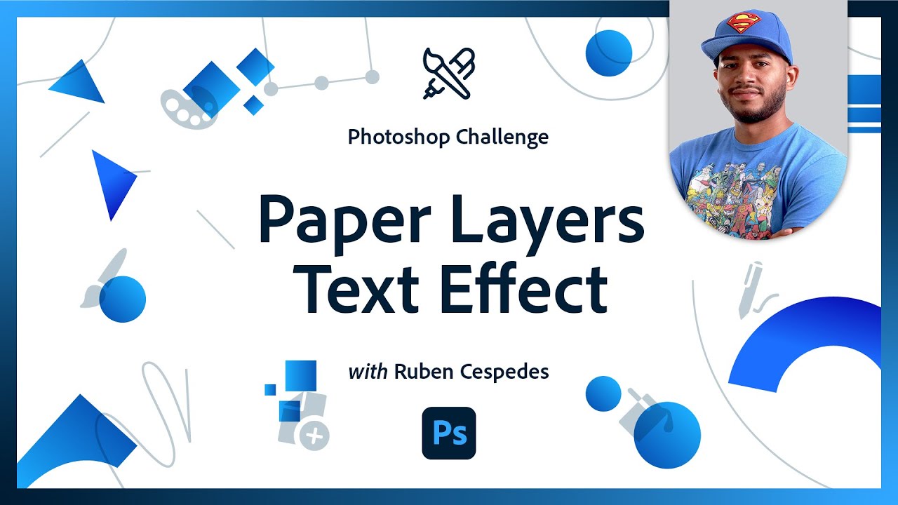
Bending Type to Your Will | Photoshop Typography Challenge
CHALLENGE: Break some typography rules by using smart objects and distort filters to create unique and distorted type.

https://www.behance.net/gallery/160292935/PS-DAILY-CREATIVE-CHALLENGE. Finally I've updated my projects.

Many thanks for the feedback here's my updated challenge

Gave +1 Creative Carma to @quiet fern
Here is the paper word challenge.

#challenge - Paper Layers Text Effect @amber nexus
And of course I had to add clouds… just because.


Challenge: Add dimension and movement in a flash by creatively using Path, Iris and Field Blurs with layer masks.

You're a bit ahead 😉 ...Well done!
Thanks
Wow you are fast @elfin remnant !!! Great work!
Here's the Path Blur example with the strobe set to 6 (like creating 6 copies of the person)

Nailed it!!
Thought i added some little Light there aswell just for fun. Mine is actually inspired by taking Photos with a Camera while they move. By adjusting the setting you can get the same effect even without editing. The Area you want to keep off the blur must stay in the focus while the area that is moving is being blurred like this. Pretty cool.
Yours reminds me on like the Cyberpunk 2077 anime, there they sometimes move just like the strobe effect. Real nice, good job.
I really like the look of tilt-shift with the strobe. Thanks for the tips Paul!

Ps DCC 2023-3 Blur Magic and Motion

I found I was struggling to remove all the colors and once I tried to erase them, it'd delete part of the model too. Using the sharpen edges, the hair would sometimes fade to be nonexistent. How would one fix that
Playing with the path blur is fun. Thanks @brittle slate for the stream and the great tips!


Gave +1 Creative Carma to @brittle slate
Challenge #1 Blur Magic and Motion

Path Blur #challenge with @brittle slate . This was my first PS challenge! Learned lots

Ps DCC 23-03 01 Blur Magic

I like the sports usage, but not a fan of how awkwardly his legs get cut off. Like the eye movement with the text though
I agree, but the image is what the image is. I really wanted the concept. I could play around with the bottom portion, but I didnt think it was that significant to the blurring exercise. In fact, in real life the legs are virtually motionless.

Oh, blur wise - it's a nice effect. I meant more so if it were to be posted to social media
#PSChallBlur


My first attempt. Thank you for this exercise enjoyed learning new skills

Blur Gallery with Paul Trani. Starting with one of my painted flowers, I took my time today to understand the differences between each blur filter. Then I created a pattern from my flower and applied each filter. I now have a better understanding of each Blur technique. The pattern is with the Radial Blur Filter. Fun afternoon! Thanks for this opportunity!


Day 1 - Blur

Day 1 - Blur

@elfin remnant You're ahead of the game, very nice work! I like how you added multiple figures to this, with the background figures being smaller to really add a believable sense of depth. Nice job with the different blurs, and I like how you kept the most focus in the faces. Nice work with the background blur too!
@tough vessel Nicely done, the subtle blur really adds a nice sense of motion, especially around the back. Nice work with the clean masking too, the blue background is a nice choice to contrast the warm tones of the figure. Looks good!
@wary swan Nice work masking all these different figures! I like how you played around with different levels of focus, which gives it a sense of depth of being focused more in the middle of the image. You could push this effect even further by making the foreground figures the largest and the background figures the smallest, of course it just depends on the effect you're going for. Nice job!
@old bolt Hah, clouds always add a nice whimsical feel. I'd be curious to see it with just the white cloud layer, to see if it adds a bit more contrast to the whole design. The paper technique and texture is looking really good, nicely done!
@stone steppe The paper word challenge looks great! You did an excellent job with the shadows and the texture adds a lot to the paper feel. I really like the strong clean contrast of the white background. 👍
@oblique bolt Really nice work with both of these designs! The blur is working really well, and I like how you pushed it a bit further on the right image around the back and the hand. Definitely adds a lot of movement to both of these while still having a strong, clear focal point. These are looking good!
@halcyon current Very cool, I like how you put some thought into the blurs for the skater and the skateboard. The flip blur is a great touch and adds a lot of believability to it. The textured background is a nice touch too, nice work with the masking!
@graceful trellis That's great, welcome in! Glad to have you, and very nice work with this challenge, glad to hear you learned from it! Nice work with this effect, the more spaced out images almost give it a sort of slow motion blur if that make sense, hah. I think a tighter blur might give it more of a sense of speed but it just depends on the effect you're going for. Nice work!
@eternal mica Nicely done Ted! Nice work on the masking, and that gradient fits this design well. I also like the blur on both sides of the bat which gives it a sort of vibration feeling as it impacts the ball. I think I like the second version, partially because the faded masking of the legs draw the eye less and partially because the small pop of warm color of the field’s dirt.
@paper shadow The masking and blur effects are looking good! The solid color background adds a lot of contrast to the figure too which is working well. I almost feel like the blurred images of the legs could be faded even more so they're a bit more faint, but it's really just personal preference. Nice work with this design!
@stiff sierra Very cool, welcome in! Glad to hear you learned from this challenge, and nice work on the blur effect! The masking is looking really good too, and the figure contrasts nicely against the darker background. Nice job!
@tropic knoll Really nice to see you using your own painted flow for this, very cool! Also great practice to see how all these different blurs compare side by side. I think the Spin Blur works really well for a pinwheel type of effect, though it might help to mask it out on the part of the stem directly below the flower. Great work on these blur effects!
Thank you Sam. I always appreciate your discerning eye. Baseball season is ready to launch, so I thought the image would fit the exercise. It was a good opportunity to focus the blur on a small part of the image, but the most dramatic part.
Gave +1 Creative Carma to @bleak fossil
Yeah, I like how you focused where all the motion would be rather than applying it evenly to the entire body. Really helps the eye have a focal point too.
Thanks. We've done these exercises before, so I wanted to try something a bit different
Gave +1 Creative Carma to @bleak fossil
@naive mulch Great work on all these designs in your Photoshop Challenge project! The Bending Type to Your Will design is looking good too, I like the sort of liquified effect and bold colors on that one. Nicely done!
@wraith zinc I like the contrast you have in the hand lettering challenge between the warm and cool tones and the shape and style of the text. The background texture adds a lot of interest too!
@quiet fern Really liking that almost 90s sort of style of the paper cut out designs, really fun look to those. Also did you make that "thank you" image? Super cool design to the text in that one and excellent style too. Nice work with this past challenge designs!
@hollow yarrow Loving that paper cutout B design! Great colors, really nice layering and shadows, and I love the extra shapes you put on top, almost a sort of paint drop look to them. Really excellent contrast with the simple background and great sense of depth. The paper texture is a nice touch as well.
@candid cape Loving the style and look of the Bobble Head design, really nice job with the masking and large head came out really well. I really like the way you had the leaves break the silhouette of the N for the Leafy Typeface challenge while still keeping it legible. Nicely done!
Thank you! Actually that “thank you” is from a coloring game that I’ve had for several years, but it would make a very cool DCC wouldn’t it? 😁😎
Gave +1 Creative Carma to @bleak fossil
@hollow yarrow Nice idea to apply the blur effect to the text on the design in addition to the figure! Really nice sense of motion overall, and the background gradient compliments the rest of the design really well.
@fallow loom Nicely done, the blur effect came out well! You also did a nice job with the masking, it all looks really clean and works well against the clean background gradient you added. 👍
Hah, definitely. Reminds me of a retro text challenge I did once. Always a fun style to play with!
I think I remember doing that one, and I made the word BAZINGA! 😁😎
PSDCC_Blur Magic and Motion Day 01

Hi Sam. Thank you for the advice. It was a pleasure to be able to sit down and study the different blur options. I really learned alot. PS is amazing! Thanks for all you do for me to encourage and inspire me.
Gave +1 Creative Carma to @bleak fossil

Haha, that's the one! Lot of the same effects as the Thank You image. I had fun with that challenge
Gave +1 Creative Carma to @quiet fern
I might have to revisit it 😁😎
Nice!
Thanks! I was actually going for a slight twist on the project... instead of speed, it was more him seeing himself heading down the run before he actually does.
Gave +1 Creative Carma to @bleak fossil
day 01.

Thanks for the feedback Sam
Gave +1 Creative Carma to @bleak fossil
Blur Magic and Motion | Photoshop Photo Editing Challenge. CHALLENGE: Add dimension and movement in a flash by creatively using Path, Iris and Field Blurs with layer masks.

Hello, I will join this challenge. 🙂 Added a lens flare to sparkle the picture

@bleak fossil Thank you so much for your feedback! It means a lot to me. I searched for an image that had more than the jumping and thought it would be cool with this guy with a skateboard. The twistblur idea actually comes from an Illustrator tutorial that I played with the other day.
Gave +1 Creative Carma to @bleak fossil
Ch #1

I had to do another one for @brittle slates Magic Blur and Motion challenge. The background image is the original one - I only erased the original jumping rope was almost invisible so I created a new one in white to get a better contrast.

Blur Challenge

I mentioned a wonderful tutorial by @bleak fossil on shadows using round objects. Several folks asked for the link. https://www.behance.net/videos/48e9e392-eadc-4c68-aaa6-712852ccae32/Photoshop-Mentor-Session-Shadows

This was a recording from a Discord live stream I did in the Photoshop Discord on June 30th 2020 on the subject of shadows. I discuss how I use drop shadows, cast shadows, and generally how I use multiply layers to achieve shadow effects in photo compositing as well as painting. If you are unfamiliar with the Photoshop Discord or Daily Creative ...
Enjoy.
😍
Woooo! Always a fan of shadows
@bleak fossil I can't count how many times I've passed this link along. You're the Shadow King!!!
Photoshop Daily Creative Challenge#01

PSDCC_Creating Realistic Shadows Day 02


DCC 2 Shadows. This was more challenging, but still great and fun! 😅

Photoshop Daily Creative Challenge - Creating Realistic Shadows Day 2


Challenge: Discover new techniques to create the perfect shadow and combine it into your image seamlessly!

Creating Realistic Shadows Day 2

OMG I struggled a lot...and it still looks so fake.
Really harder than expected 🥵 ...


Ps DCC 2023-3#2 Creating Realistic Shadows

Shadows.

Photoshop Daily Creative Challenge#02

Shadows. Difficult to make realistic ones

I'm in my dystopian period (lol) But, tried your suggestion and I do love it. Have to have a new name for this period... perhaps it's blue. 🙂


Ps DCC 2023-3#3 Melting Effects

Melt. Really liked this one 🙂

Challenge #2 - Creating Realistic Shadows - I got into my head to create my own figure for an image I also had in mind that I shot almost 10 years ago. The morning light created shadows that covered the street and I called that image "The Zebra Street". I got that little creature created yesterday in Substance 3D (7 days left on the trial) and when I took it into Painter and got it dressed I thought it almost looked like an easter chick and "BOOM" now I had to redo that mouth and give it a beak instead but that had to be done today. I also changed the arms & legs to look even more like a little chick. That's the story behind this image.

Photoshop Daily Creative Challenge#03

PSDCC_Melting Effects Day 03

Well done Afroja!🤩
Creative Challenge #3 Melting effect... and Love! ❤️

I didn't get the text in, but I love the style and will return to this project as it created so much fun. Thank you, Paul.

Ps DCC 23-03 03 Melting Effects

Here's my version.

Amazing Patrick!!
Here is mine dear coworker @brittle slate 😉

@gentle pasture Liking how you varied up the blur direction with all these different figures! The masking is looking really solid and there's a good sense of motion in these!
@halcyon current Really cool to see you recreating the jump rope in this, it looks good! This is a great image for this challenge and I think the blur direction is looking really natural. I especially like how it looks on the motion of the rope. Nice work!
@queen aspen The blur is looking good with a nice focus still on the face of the figure. Really nice job with the masking and the background gradient as well!
@young karma Ooh, great picture for this challenge! The angle of the photo helps add a dynamic feel along with the motion blur. The blur looks great, it adds a lot of movement and along with the colors gives the image a somewhat dream-like feel. Nicely done!
@naive mulch Nice job George! The masking and background gradient is looking really good. It might help to add a bit of blur to the "outside" of the image, those faded "duplicate" images of motion blur really helps sell that effect. It might also help to mask the blur off the face just a touch to give the image a bit of a focal point. Just some thoughts of course!
@eternal mica Looking good Ted, nice job with the melting effect! I like how some of the drip shapes appear to be in shadow with the darker colors, it gives it some nice depth. It might be nice to fade the bottom right corner like you did with the other parts of the hair to avoid those hard lines. I’d also be curious to see a version with the “woman” text in all pink to see if that unifies the design a bit more, but that’s really just personal preference. Nice work!
@gentle pasture Really cool style to this design, I like the background text and warm/cool color contrast between the portrait and background. The jagged shapes make for a cool effect and the darker colors give it a nice sense of being in shadow. Nice job!
@oblique bolt Really nice sense of depth with the Melting effect! I like how the shadowed drips push that sense of dimension. The colors are looking good and the clean background gradient contrasts the portrait nicely. Text is looking good as well!
@visual pelican Nice work with masking the text and portrait on the Melting Effect challenge! I like what you did with the sense of lighting, but It’d be interesting to see what it looks like with the shadow masked off on the front of the face a little bit to sort of match the lighting on the left side of the background gradient. Looks good!
@tardy talon Great job with the Melting Effect design! Really nice sense of depth with the shadowed parts of the drop shapes. The dripping effect turned out really nicely too, though it might help to clean up the bottom drips where pieces get disconnected since that makes the dripping effect feel a little less strong and less like liquid. Though it really just depends what you’re going for. Nicely done!
@halcyon current That’s really cool that you had this image and 3D model to work with! It’s really cool to see how far matching the lighting of images goes. The shadow looks great too, really nice job matching it to the rest of the scene.
@young karma Ooh, really liking the style and colors on the Melting Effect challenge! It has a really fun look to it, and the background adds a lot of interest too. Nice job with the dripping effect and liquify shapes on this!
@wary swan Really interesting effect to this Melting Effect challenge! The image along with the jagged looking shapes gives this a sort of unsettling feeling which is really neat. I like how you applied the effect to both the image and text to unify everything. 👍
@paper shadow Nice job with the shadow challenge! My only suggestion is I think the shadow could be more to the right side, and maybe a little bit less opacity. If you look at the shadows in the background image for reference you can see they’re more directly to the right based off where the sun is, and they’re a little bit lighter in value. Just some thoughts of course!
@old bolt Ooh, I like the change to the cloudy image, really nice contrast to this!
@young karma Shadow challenge is looking good! Shadows definitely take some practice, but I think one thing that really helps me is referencing shadows from the original background image to match the lighting direction and value of the shadows. Maybe the shadow could be a touch darker to better match the part of the truck shadow on the asphalt? Nice job!
@tardy talon Nice work with the shadow challenge! The figure really feels planted in this image, nicely done!
Thank you so much! 🥰
Gave +1 Creative Carma to @bleak fossil
@gentle pasture Nice work with the shadow challenge techniques! My only suggestion is to maybe lower the opacity on the shadow a touch so that it matches the background shadows a bit more. It just feels a little too dark around the base of the figure. Just a thought!
@wary swan Cool to see you fitting the figurine into this image, the lighting fits nicely and the direction of the shadow is looking good with the rest of the image! My only suggestion would be to put the shadow layer on a Multiply blending mode to have it look more natural. That should also help darken it a bit so it more closely matches the value of the shadow we see under the van in the background.
@hollow yarrow Shadows can definitely be tricky! I really like how you tried more than one image, and the masking of the figurine behind the truck adds some great depth. In the first design I’d try to unmask the shadow a touch to darken it a bit more so it more closely matches the value of the truck’s shadow in the background. I think the “arm” shadow could be a little bit less faded too. The shadow right under the feet is looking on point though!
@fallow loom Very nice work on the shadow challenge, the direction and value of the light is looking really on point! My only thought is the end of the shadow looks a bit too big, as if the perspective got warped a bit. I think the head would be a bit smaller overall, just a thought. Nice job!
@elfin remnant Nice job with the shape and direction of the shadow. I think the figurine’s shadow matches the building's shadow nicely, but I think you might want to darken it a bit to more closely match the truck’s shadows, at least around the base of the figurine, since you can see the shadows under the cars are a bit darker.
@junior ibex Nice job with these two shadow designs! The shadow techniques are looking good. I think for the second image you could create a directional shadow like you did for the first, if you look at the shadows of the building and truck tires to the right you can see the values and direction of the lighting. Nicely done!
@oblique bolt Really nice work with the shadow techniques! The direction and value of the shadow is matching the background image really well.
@visual pelican Hah, I like the masking of the figurine behind the car! The eyes are a fun touch too. The direction and value of the shadow are looking good!
@tardy talon Really liking that circular motion blur in the blur challenge! Very nice job with that gradient, I like the sunset feel of it, and it also creates some nice warm/cool contrast. 👍
@hollow yarrow Digging the style of your dripping effect challenge! Very nice work with the dripping effect, and the shadow side of the drips/figure really give the whole thing some nice depth. This works especially well on the hand and shoulder area. The color scheme looks good too!
Thank you. I thought the white eyes was just a bit too boring. lol
Gave +1 Creative Carma to @bleak fossil
Thank you. I made the adjustment you suggested and will repost it.
PSDCC_Melting Effects Day 03 adjusted

Thank you Sam! 🥰
Gave +1 Creative Carma to @bleak fossil
Thank you! ☺️🙏
Thanks for the feedback Sam, that image was complex to select there 4 diffrent selections of the girl and i made separate liquefy on all pieces include text.
Gave +1 Creative Carma to @bleak fossil
Thank you @bleak fossil I thought it was a good image to use for this challenge and knew that I had to recreate the rope.
Gave +1 Creative Carma to @bleak fossil
Thank you again @bleak fossil for your feedback. I knew what image to use already while Paul was streaming this challenge. It was a bit tricky to get the right colors and structure on the shadow.
@bleak fossil Thanks for the tips Sam. I masked the lower right. When I first had all pink text, it looked too flat. I added a bevel and I think this works.

Gave +1 Creative Carma to @bleak fossil
Thank you so much for your precious feedback @bleak fossil !
Gave +1 Creative Carma to @bleak fossil
Thank you for your feedback. This challenge was tricky. @bleak fossil , I watched your stream on shadows btw; very interesting and usefull! 🙂
Thank you so much @brittle slate !
thank you so much !
Gave +1 Creative Carma to @bleak fossil
PSDCC_mapping patterns Day 04

Ps Dcc 2023-3#4 Mapping Patterns onto Photos

Photoshop Daily Creative Challenge#04

Had some fun trying the meltdown on the other picture. Looking forward to watching the other challenges! Day 3

Pop Art Stamp Feb 2021


Creative Challenge #4 Patterns and displacement map... "you get the idea!" 😉

I at least got 1 of Paul's DCC shadows done . I would like you to meet my pet dragon. She is hatching her eggs on our garage 😂

@eternal mica The bevel works nicely to add some dimension!
@quiet ridge Cool idea for this Shadow challenge, hah, I like how you used your own images for this. The shadow shape and value seems to fit the background really well. The reflection on the egg seems a bit intense for the lighting of this scene, but that's not really an issue with the shadows. Nice work!
@oblique bolt Nice job with the Pattern and Displacement map design! I like how the pattern on the portrait is a bit bolder to not compete with the lighter contrast of the background. Looks good!
@tired turret Really nice job with all these challenges! I like the shapes you created with the Liquify tool on Day 3, and the blur, masking and colors are looking really nice on the Day 1 challenge. The lighting looks great on the Day 2 challenge, I'd just suggest having the shadow be one single layer set to a Multiply mode. That way you'll get a more realistic value on both the light sidewalk and darker asphalt. Right now the part of the shadow on the sidewalk looks darker than the part on the asphalt which is reverse of how it should be if you look at the shadow of the truck in the background on the right side of the street where it's shadow touches both the sidewalk and asphalt. Hopefully that makes sense, nice work with these designs!
@bleak fossil Thank you I used a toy I have printed with a 3-D printer I had. I have been looking for something I could use one of them on and this seemed to work
Gave +1 Creative Carma to @bleak fossil
@narrow forge I remember this Pop Art challenge! Love the color contrast in this design. The shapes and composition work nicely as well!
@compact anvil Ooh, I really like how well the text and image fit together. The bold lighting and pose of this portrait work well with this concept. Really nice job with the liquify dripping effect!
@tardy talon Really nice job with the patterns in the Day 4 design! The added shadow behind the portrait creates some nice separation from the background. 👍
@wary swan Nice work with the pattern creation in this Day 4 challenge! It could be interesting to see the pattern applied to the figure separately at a different size to separate the figure from the background a bit more, but that just really just depends on the look you're going for. Nicely done!
@visual pelican Really interesting texture for your Pattern challenge! Kind of gives her the effect like she's made of stone or wood. I like how you made her a bit darker than the background to separate the two textures a little bit. Nice work!
Thank you. It was an interesting task and a new skill to master!
Gave +1 Creative Carma to @bleak fossil
Thanks Sam! I'll take a look and see what I did... I'm wondering if I have it on the wrong blend... It's def two layers... The blur was fun but the liquify... is one of my favorite tools to play with.
Gave +1 Creative Carma to @bleak fossil
Day4 - Mapping Patterns
Call him "Bills" 😉

first try

Thanks for the feedback Sam, I was out for this look there the girl nearly disappear in the background, so I blended the girl with a separate pattern with pattern in the background.
Gave +1 Creative Carma to @bleak fossil
Ps Dcc 2023-3#4 Mapping Patterns onto Photos variant 2 and 3 in version 3 have I applay the pattern with a random fill on a empty layer and then clip it to the girl , I have also apply 2 displacement mask to the image the contour is ther but very subtle


Thank you so much ❤️🙏
Gave +1 Creative Carma to @bleak fossil
haha thx! i've been doing some of the older challenges to practice my skills
Many thanks for the feedback here's my updated challenge with a different image.

Gave +1 Creative Carma to @bleak fossil
Here's my pattern example.

I just watched the challenge and made a tweaked version of the lesson example and then my own!


Day 2 Shadows - I'm late... yes, there was a tantrum involved.

The melting effect challange

Day four new post: Feedback from my grandkid showed me something I hadn't caught so... for the last time... here we go.

Is this all there is in the default pattern menu?? It seems so limited 😥

You can load the legacy patterns as well as get free patterns from Adobe Stock and other places. Here are instructions on how to get the legacy shapes, gradients, and patterns. https://www.photoshopessentials.com/basics/find-missing-shapes-gradients-and-patterns-in-photoshop-cc-2020/

Missing the classic shapes, gradiients and patterns in Photoshop CC 2020? Here's where to find them and how to load them!
A-mazing! Thank you 🤗
Gave +1 Creative Carma to @tired turret
is this doesnt qualify for challenge
I like it.
thankss
@tired turret Interesting to see the combination of the topographical pattern along with the flowers. Also interesting how it seems like the displacement map gave some of the flowers an almost frosted glass effect. Nice job with the pattern creation!
@coarse portal Ooh, I love the effect of the sunglasses melting whereas the rest of the face (aside from the bottom) is untouched, really cool look to it. The metallic Sun text also makes for a really cool look. Nice job with this technique!
@old bolt Hah, there's no true art without a tantrum involved. This shadow looks great! Really nice job matching it to the value of the rest of the shadows in the scene, and the really subtle fade around the end of it. You nailed it. My only minor nitpick is the angle of the shadow goes back in space a bit when you can see from the truck and telephone pole on the right side that the shadows are actually coming towards us a bit. Of course this is a minor detail and this looks great regardless. Well done!
@broken atlas That's a great way to do it! It always really helps practice a technique when you do it once to learn the basics, then try and run with it on your own. These look great and I like the style and color variety between them, the blend between the pattern and portrait on the second design makes for a really interesting look. The portrait in the blue image is so subtle I didn't even notice it at first, hah, cool effect!
@naive mulch The updated blur challenge looks great, really nice sense of motion. I especially like the directional blur on the foot which really gives her leg a swinging effect.
@wary swan Nice work with the two designs for the pattern challenge! I like how the pattern size separates the portrait from the background. It could be interesting to see if there's any blending modes that work for the portrait pattern on the second design so that some of the form/lighting from the portrait shows through. Just a thought. Nice job!
Mapping Patterns with Paul Trani. I created the flower pattern and text pattern - Be the one you Love. There are three displacement maps. Hair, Face and Body. I feel I have a better understanding on how Levels works to create the dark and light areas for the bending of the patterns. Exciting! Then I Liquify'd! Fun! Thank you for this opportunity. Oh, there is a slight shadow off to the right side. I hope you feel it's enough. Let me know. 😄

Thanks for the feedback Sam, I think you mean like this

Gave +1 Creative Carma to @bleak fossil
As a wrap up of this awesome week I made this piece using path blur, random fill patterns, displacement map and mapping techniques.


Thank you so much for the feedback! 💖
Gave +1 Creative Carma to @bleak fossil
Catching up with the challenge. Nr 1 Blur

Gave +1 Creative Carma to @bleak fossil
Thanks again Sam, I really do appreciate you for taking the time to make me a better photoshoper 🙂 And of course I had to try again.... (also I want to continue with @brittle slate 's challenges - may I post them here tomorrow, or somewhere else? thnx)

A little bit late, but here is my day 4

Gogeous!
Your shadow is on the point and perfectly matches the truck's one. Well done!👌
thanks Franck !
Gave +1 Creative Carma to @hollow yarrow
Here's my pattern tryout, day 4


PSDCC_Dodge & Burn for Portraits Day 05

Ps DCC 2023-3#6(1) Dodge & Burn for Portraits
My version

here is my go at the melt challenge.

Day 1 - Blur Magic and Motion

Did this by mistake while adjusting black in the neutrals panel, but thought it made an interesting effect.

Here's my "real" one. I've never done this before. Any suggestions for improvement?

And this one. I dodged the building and trees in the background, too. I wanted to make her outfit match the red in her hair, but didn't like what I ended up with. Any suggestions?

Oooo. Her skin looks green now that I've posted!
PSDCC_Selective Color Day 06 I put the originals on the left so you can see the changes.


PSDCC_Selective Color Day 06 I isolated the horse and used selective color on it. Here is the original and the finished one.


PSDCC Day 6 Selective color Original and the adjustments


Ps DCC 2023-3#7 Selective Color for Portraits
I use both methods of Content aware fill . Method one only available version 24.0 [ shift + backspace ], method two ther normal way to use the tool [edit/content aware fill] and I use both polygonal lasso tool and lasso tool to get a good selections.
Method two work best then you will remove a item near your object her will not method one work so go because you can´t select where to sample, with method two can you select the area to sample with the brush.
Image 1 : Red (c-23, m+0, y+2, b+14) Yellow (c-36, m+9, y+11, b+21), Black(CMYB +24) Neutrals(c-10, m+4, y0, b+24)
Image 2: Red(c-33, m+12, y+6, b+11), Cyan(c+4, m+14, y-1, b+19), Yellows( c-30, m-16, y-2, b+33)
Black (c+2, m-9, y-6, b-2), Neutrals ( c+12, m+4, y-14, b+14) I masked hair in Black and Neutrals because otherwise the hair got washed out.


CC: Selective Color for Portraits (Basically Simpsons)

Day4 Patterns with Paul Trani - Never ever have I used Displacement Maps before ... and then, with that, there was Free Transform, Puppet Warp and Liquify. I was going for a Predator movie vibe. A lot of new and exciting stuff!

Another interesting effect while maxing out in the neutrals panel.

Felt like I was constantly struggling with skin tone. Did I get it right?? Also used a neural filter to smooth her skin. The blue wrapping around the main subject combined with the atmospheric white seems to give it a sci-fi feel.

PSDCC_Color Lookup Day 08 The original is on the left. I used Photo look up- 35strip.look, Fuji F125 Kodak 2393 & TensionGreen then used Selective Color Red to lower the reds in the picture.


This is stunning!!
combined the burning/dodging and adjusting colors challenge on a picture of my racing son


Playing with all the tools: dodge/burn, selective color, color lookup. I went too heavy on the light on her face, but the sunlight was strong enough to be pretty tricky.

@paper shadow The Melting challenge is looking good! I like the bold, stylized colors to this challenge. The use of soft edges in the dripping effect gives it an interesting smoky sort of look. Not sure if that’s what you were going for, but a hard edge brush might look more like liquid drips. Cool effect either way!
@tired turret The selective color challenge looks good! It makes a clear difference without being too heavy handed. I really like how it increases the natural blue/orange color contrast of this photo. Nicely done!
@visual pelican Nice job with the masking on this Selective Color challenge on the horse! I like how it brought out some nice contrast and bit more color on the horse, and the wolf image with the background has a cool cinematic look to it.Very nice!
@buoyant nova Hah, good image for this blur challenge. The repeated image effect definitely gives it a sense of motion, and the further spacing and hard edge between each image always makes me think of a slow motion blur type of effect. Looks good!
Thank you! I like this new skill!
Gave +1 Creative Carma to @bleak fossil
@stone steppe The Melting challenge is looking really good, I like the colors you have in this design. Really nice job with the dripping shapes, my only minor nitpick would be the sharp edge on the drip coming off the wrist looks a little out of place. Nice job!
@wary swan The dodge and burn challenge is looking good, nice contrast all around on this one. It might help to have the before and after side by side to see the difference more easily, but this came out nicely!
@hushed spade Really cool effect on the first Selective Color image! It looked like a digital painting to me at first which is a really interesting look. The second image looks great, it really brought out the warmth in the skin tones which I think works really well for this image. For the third image, what did you mean you wanted the outfit to match the red in her hair, did you want to change the green outfit to red? As far as her skin looking green, you could always adjust the red tones within Selective Color, and maybe even the yellows if need be. Nice work on these designs!
@visual pelican Nice work done for the Dodge and Burn portrait challenge! There's some good contrast and focus going on in this. 👍
@compact anvil Excellent work with the shadow in the Day 2 design! I really like how you made note of the color, value, and direction of the background shadow to match your shadow to. It looks really believable. My only nitpick is the figurine looks a bit blurry compared to the background, so it looks a bit out of focus. Not sure if you scaled the figurine up to fit a large background image rather than scaling the background down, or if something else occurred, but I figured I'd mention it. Very nice work!
@compact anvil Very cool, I love the soft look of the pattern over the portrait and how the blending mode you chose retains the form and lighting information of the portrait underneath. That along with the shadow you added separates it nicely from the background, looks good!
@young karma Great job with the patterns on the Day 4 challenge! These are looking really good and the shadows you added help separate the portrait from the background. I also like the positioning of the yellow flower on the eye to create a nice focal point in the image.
@old bolt The shadow is looking solid, nice work with this revision! Also feel free to keep posting Paul's challenges in this section, it's still part of the same two week challenge segment, it's just being split up between two hosts.
@compact anvil Really interesting effect to the blur challenge! Kind of a wispy dream like feel to it, and the bold background colors help push that feel even more. Nice work!
@hollow yarrow Always love to see you take these challenges and make them your own! The money portrait looks great, really excellent job clipping this texture to the portrait but also having it break off from the silhouette in key places. Really liking the depth you got with the shadows in the background layer of money in the head, and the focus of the eyes works really well too. Well done!
@tropic knoll Nice work, the text pattern seems to lay across the portrait in a convincing way, nice job with the displacement map and liquify. I really like the color palette of this and how you varied the saturation and contrast between the portrait and background. Looks good!
Thank you, Practice, practice! This technique seams to be easier for me.
Gave +1 Creative Carma to @bleak fossil
@arctic rover Nicely done, this brings some nice attention to their faces! If you are doing the dodge and burn on separate layers you could always play with the opacity if you feel you went too heavy on anything, that's usually when I end up doing. Nice work!
@compact anvil Really interesting effect with the cycling image! It's always great to see people using their own photos, this color adjustment really adds a lot of focus to the figure, and I like the bit of shadow and highlighting you did with the dodge and burn. Nice contrast in this!
@visual pelican Nice job with the Color Lookup image, the added contrast adds a bit more of a cinematic look.
@hushed spade I think a lot of the time it really just depends on what you're trying to do with the image, colors, where you want to create contrast, etc, but I think the skin tones are looking really good! Everything has a soft, natural look to it which I think works well for this image. Nice work!
Thank you. I thought I would try it out on subjects that I usually use. I'm glad it turned out well.
Gave +1 Creative Carma to @bleak fossil
@old bolt Hah, I'm definitely getting some of those camouflaged vibes, I like how the front side of the portrait has more contrast so it almost gives the effect that she's emerging from the background. Between displacement maps, liquify, and all those tools it gives you a lot of flexibility to make the pattern feel natural across the form of the body, nice job on this!
@elfin remnant Hah, it definitely has a stylized look to it which is interesting. You could always play around with the red and yellow tones if you wanted to offset that, but it just depends what you're going for of course. 👍
@wary swan Nice work with the Selective Color designs! I think it's working really well for the first image, though the red tones might be pushed a bit too far in the second image? Thought it's really just up to personal preference. Looks good!
Thank you @bleak fossil for the kind feedback. I kept changing the spacing but did quite like the further spacing as you say, it looks like a slow motion blur
Gave +1 Creative Carma to @bleak fossil
This is such a great combination! I like how he stands out more from the background
I agree this gives a sci-fi feel to the image! I also think you maintained the skin tones in the subject as well. What do you feel like was the hardest part of editing the skin tone? Did you use selective color while editing the skin?
I think this looks beautiful! I really love the color toning on the image. I’d suggest to continue to play around with the selective color and maybe go into the blacks. See if you come up with a color for the shadows that you like
I was in fact in doubt how sharp he had to be, guess I went a bit too far blurring him. Thanks for the feedback
Gave +1 Creative Carma to @bleak fossil
Thank you! 😍
Thanks, @green escarp and @bleak fossil for your encouragement and suggestions. I hope to give them a try soon. I love these challenges!
Gave +1 Creative Carma to @green escarp
@bleak fossil On the yoga lady with the teal outfit: she has some red in her hair, so I thought it’d be fun to make her clothes the same color. I selected the teal using color selection and painted the selection with the red from her hair, but it looked flat and not shiny like her clothes, plus, I had missed some of the highlights and shadows of the teal, so the teal showed through. How could this be done realistically? Thanks!
Gave +1 Creative Carma to @bleak fossil
oh, thank you Sam, I spent so much time on this and questioned myself at the end. As always.
Gave +1 Creative Carma to @bleak fossil
Actually, I used some LUTS, and then did color selection on top of that. Pretty complicated, I suppose. By the end, there wasn’t much wiggle room before their skin became obviously yellow, green, or magenta. So then everything started to look wrong. I think my eye was fatigued. I’m glad to hear what I ended up with was good! Thanks for the feedback.
Gave +1 Creative Carma to @green escarp
I will keep on posting. Thanks Sam for the encouragement 😁
Excellent suggestion about the opacity on the dodge/burn. Thank you!
Gave +1 Creative Carma to @bleak fossil
Day 3 - Melting effects

PSDCC_Hue & Saturation Day 09


I'm catching up on challnges. Here is number 4. I have 2 versions.


Thanks @bleak fossil - now on to the next challenge. Hoping for a rainy days, the perfect weather for tea, biscuits and Photoshop 🙂
Gave +1 Creative Carma to @bleak fossil
@stone steppe Ooh, I really like the color contrast on the second version of the Day 4 challenge! The dark background to the portrait pattern really helps push that contrast even more. Nice job with the pattern creation for these!
@visual pelican Interesting to see how much color and saturation can affect the look of an image, nice job with these two designs!
@buoyant nova Very nice work on the dripping effects! I like the bold, stylized colors you went with this. It could be nice to see you pull some drips down on the bottom of the shoulder a bit more on the right side to balance the composition even more, but that's really a personal preference nitpick, hah. Nice job with the masking of the text too!
opps sorry clicked on the wrong one. 😅
Gave +1 Creative Carma to @bleak fossil
Thank you. I'm enjoying learning new ways to use Hue & sat.
Thanks Sam. I kept changing it lol. Agree it would look better
Gave +1 Creative Carma to @bleak fossil
PSDCC Day 9 Hue/Sat. Left are the assets. Right is the combination of Hue and Sat used to change the car, make the shadow and adjust the water and sky!


this is the same one with Camera Raw added.

Beautiful! Where is this location? It’s so stunning. I also love the clouds in the bottom shots
I love the transition of the color of the car! Great use of hue and saturation for the sky/water as well
Thank you. These are Adobe stock photos but the top one is Mt Hood in Oregon. I don't remember where the other one is. Sorry.
Gave +1 Creative Carma to @green escarp
Thanks! I love doing that to clothes and autos.... making them unique. Great tool!
Gave +1 Creative Carma to @green escarp
Thanks for your feedback Sam, I can agree with you on the second image Sam I will see what I can do
Gave +1 Creative Carma to @bleak fossil
Ps DCC 2023-3#7 Selective Color for Portraits version 2 Image 2
Red( c+11,M-1, Y+13, B-71) Cyan (c+1, M+14, Y-1, B+19) Yellow( C-30, M-16, Y+2, B+33) Blacks( C+2, M-9, Y-6, B-2) Neutrals( C+9, M+1, Y-12, B+36)

Ps DCC 2023-3#8(3) Color Lookup for Portraits
usede 2 diffrent LUT and Seletive Color Cyan and Neutrals
Image 1 original Image 2 My edit


Thanks. I really liked the dark one too.
Gave +1 Creative Carma to @bleak fossil
PSDCC_Sky Replacement_Day 10


#challenge - Blur Magic 😉 I had tried running through this tutorial yesterday, and nothing seemed to work, so I went back at it today, and it was fine 🤷🏻♀️

#challenge - Shadows, and of course I can't leave well enough alone - LOL 😉 I know I faded the right side of that shadow a little bit too much but at least I know what I did

Went for the tattoo effect

PsDcc 2023-3#9 Hue & Saturation for Portraits


#challenge - Melting...

PSDCC Sky Replacement: Orig on left.... dramatic rendition on the right


Love the tattoo effect! Did you do the blurring or was that part of the photo before? Nice job!
This is so cool! Love the font used and the fact that you didn't take out the blemishes on the face. Natural beauty is dreamy!
Thank you! I’m actually probably going to go back and hide the letter A more behind her to see the drips on the face 🍀☘️
Gave +1 Creative Carma to @tired turret
Really cool edits! I love how you played around with the color of the background and clothing to create kind of a graphic look.When you are editing the skin see if you can aim to not make the skin look too orange or too red. I love the skin in the image of the girl sitting in front of the curtain. I think you maintained her skin tones well there! Great work!
I love this sky replacement! Completely changes the feeling of this location. Great work!
Thank you! I love beach scenes they are so fun to work with.
Gave +1 Creative Carma to @green escarp
Hue and Saturation Challenge I did a bit of retouching to get rid of the wires.

Great challenge @green escarp ! I hadn't used selective color before.

Color Lookup Challenge

Thanks for the feedback Idara
Gave +1 Creative Carma to @green escarp
Selective Colour Task

Colour Lookup Task

Dodge and Burn Task

Dodge & Burn Challenge

#challenge - Mapping Patterns 😉


Just a little extra

*** Does anyone check in here any more, or only when there are current DCC's occurring? *** 😉


Daily Creative Challenge - 03-06-23 - Blur Magic and Motion
I haven't used PS in a while but trying to get back into it. I added some backgrounds I had saved.


Double Exposure Effect. CHALLENGE: Create stunning portraits by using blending modes and layering photography.


#challenge - Dodge & Burn - Before & After... the changes are very subtle, but they are there 😉


Mapping Patterns onto Photos | Photoshop Photo Editing Challenge. CHALLENGE: Transform your photos by mapping patters onto objects, walls, or other elements in your composition.

Photoshop Daily Creative Challenge - Dissolving Portrait. CHALLENGE: Transform your portrait in a snap by using texture brushes, masking, and the liquify tool to create a dissolving portrait effect!

#challenge - Selective Color - Before & After 😉


#challenge - Selective Color 2 😉 Before & After...


selective color challenge. I only removed the rod on the left but left it lighter because liked having the sense of the light source.


Hello all! Welcome to a new set of challenges, I'll be doing the Photoshop Challenges the next two weeks and giving feedback here in the Discord. Today's first challenge was Removing A Figure from a scene!


Ps DCC2023-4#1 Removing A Figure


PSDCC Day1 - Remove a figure or more .


PSDCC_Removing A Figure Day 01

@visual pelican Nice job with these techniques! This one can be tricky. My main suggestions might be to give the bottom edge of the fabric a slight "outline" to make it look a bit more solid. and perhaps the seagulls could be darkened down a touch to mimic the shadow and backlighting that we see on the people. Looks good!
@oblique bolt Love that you're trying this out on different figures in the scene, really great practice for this technique! These look great, really nice work with the clone stamp technique! The cloth looks great too, and that can be tricky. Well done!
@hollow yarrow Love the fade animation! You nailed this technique, the cloth looks flawless, great job on the arm too. Looking good!
@wary swan Hah, I like this take on swapping a figure into another figure's spot! The main issue that stands out to me on this one is the legs of the figure you moved are a bit rough. If you clean up the background first and put the figure on top of it second you should be able to get a clean mask of the figure and his legs over the water background. Also, getting a clean and semi-sharp edge to the bottom of the cloth I think would help it look a lot more solid. Currently the soft edge looks a bit cloudy/smudgy. Nice job with these techniques!
Thank you. I will say that this challenge was a challenge! I'll make the changes you suggested.
Gave +1 Creative Carma to @bleak fossil
@gentle pasture Well done! The background is looking really clean and the cloth has a believable look to it. That bottom edge line of the cloth really helps sell that effect. Nice job with these techniques!
@vast tide You were quick with these, impressive! Really nice to see you doing a couple different versions, these came out really well. Excellent job, especially with cloning out the splashing water from the figure on the very left. Looks good!
PSDCC_Removing A Figure Day 01 update @bleak fossil I hope the changes improve on the original.

Remove a figure... Invisible runner

Thanks for the feedback Jack.
Gave +1 Creative Carma to @bleak fossil
Perfect, Franck!!!
Photoshop Daily Creative Challenge - Retro Comic Graphics. CHALLENGE: Make your design POP! by using shapes and type tools to create a retro, comic book text effect.

thanks for your valuable feedback Sam! 🙂 Working on the cloth can be tricky.
Gave +1 Creative Carma to @bleak fossil
https://www.behance.net/gallery/160855535/PS-DAILY-CREATIVE-CHALLENGE. Here's my Past challenge Hosted by Sam Peterson I decided go back to the previous challenge and complete it.

Behance
This series of challenge have helped me a lot to showcase my capability and improve my design skills to the next level. Up to now I'm step ahead I Nev that one day I'll muster the Photoshop skills like this.Thanks for watching and I'll keep you up to dat…
Photoshop Daily Creative Challenge#01

Here's today's Day 2 challenge, Matching Values and Contrast!
Ps Dcc 2023-4#1 Values & Contrast

Here's Challenge 2, Matching Values and Contrast!

#challenge - Hue & Sat - Orig & 2 versions... 😉


PSDCC_Values - Contrast Day 02

@visual pelican Ooh, very nice, you nailed the contrast and values of the figure! I really like that foreboding fog you added around the castle. My only critique would be that the dark tones of the castle look a bit too deep for the distance it's at compared to the nearby landscape. This is looking great, and I like the overall color grading you added to the image. It ties everything together nicely.
@quiet fern Really cool, I really like how different you went with the color schemes for each version. They both work, while having a completely different look and mood to them. Nicely done!
@wary swan Looks good, both of these elements seem to fit in very well with the scene, and the color of the castle fits nicely as well. I like this take on the castle being a bit more close up towards the midground. Nice job!
@tardy talon Very nice work with removing the figure Afroja! My main suggestion would be that it looks like you might have used a soft brush to paint in the mountain and sand? I think Content Aware Fill might be good to try first, but after that touching it up with a Clone Stamp brush might help you retain the texture and harder edges of the original photo. Nice work on this challenge!
@naive mulch Really cool to see these challenges again! Nice job on this project and with all the different techniques in these challenges. I like the subdued colors in the Retro Comic Graphics image to push that aged look. 👍
@hollow yarrow Whoaaa, killing it with the Invisible Runner image! I really like the overlap between this and the first "removing a figure" challenge. You absolutely nailed the backing shapes for all the pieces of clothing. The sleeves, headband, earbud cord, all extremely well done. Very nice attention to the values and colors of the rest of the image to make those look convincing. Impressive!
@visual pelican Very nice changes to the Removing a Figure challenge! I really like how you even gave the seagulls a bit of a rim light on the edges. Looks good!
Thank you. I guess I did go a bit heavy handed on darkening the castle. 😅
Gave +1 Creative Carma to @bleak fossil
Thank you. I really appreciate your encouragements.
Thank you so much.
Gave +1 Creative Carma to @bleak fossil
PSDCC_Values - Contrast Day 02 updated @bleak fossil does the castle look better? I took some of the darkness off.

Thanks for the feedback Sam
Gave +1 Creative Carma to @bleak fossil
Here's the Day 3 Liquid Text challenge images!


PSDCC_Liquid Text Effects_ Day 03

DCC day 3 Liquid Text Effects. This was fun


This challenges seem appropriate for us Californians 🙂

DCC Pt #1 Remove a Figure

Ps Dcc 2023-4#3 Liquid Text Effects
A rainy day is it time for pancakes and maple syrup

Ps Dcc 2023-4#4 Ghostify Effect

Values & Contrast task

👍🏽
Here's today's Ghostify Effect challenge! Hope you all have fun with this one.

Liquid Text Task

Ghostify Effect Task

PSDCC_Ghostify Effect Day 04

Good fun removing the figure...


PSDCC Day 2


Ghostly image was good fun again thanks @bleak fossil

Gave +1 Creative Carma to @bleak fossil
My image asset is of the burn scar from a fire in our hills last summer...


https://www.behance.net/gallery/150220193/PS-DAILY-CREATIVE-CHALLENGE. Here's my previous project with Val.
Behance
The Challenge was very fun and interesting with Voodoo Vall, She is the brightest navigational star in the constellation of Lyra, widely described as the most important star in the sky after the sun? 💫 Her magic is out of this world, she unlock the potent…

finally catching up. Challenge #2

PSDCC #3 Liquid Text effects


@plain sable Great to see you using your own image for this challenge, I really like the otherworldly coloration to the sky and landscape with these adjustment layers. Nice job with the ghost effect too, the soft edges really help that look.
@gentle pasture Ooh, creepy eye effect for the ghost image. I also really like what you did with the ghostly fog, it kind of has a magic feel to it. The blur, grain, and everything is looking solid. Nice job!
@pine wraith Nicely done, these elements are fitting together really well in the Day 2 challenge. The contrast on the castle looks great, though I think maybe the dark tones of the person could be boosted a bit to match the contrast of the deep dark tones we see in the landscape around him, though that may be a bit of a nitpick. Nicely done!
@gentle stream Nice job with the contrast adjustments on the day 2 challenge! These elements are looking good together. I'd say the main thing that stands out to me is the figure looks a touch too bright overall, but that's a fairly minor note. Nice work!
@plain sable Really nice work with the Remove a Figure challenge, that cloth can be tricky! I really like the addition of the fading animation too, hah. It could be nice to see the still image version too since GIFs sometimes get compressed a bit on Discord. Very cool!
@visual pelican The ghost effect design is looking really good! The color and brightness of the ghost is working really well, and I like the color contrast between it and the background. The extra ghost face is a nice touch too.
@gentle pasture Very nice work with the Liquid Text effect, both of these are working well. I especially like the specular highlights on the water text and the big chunky font you used. You could always copy the layer styles of the second two water layers to get the same specular highlights on the syrup image. Nice work!
@gentle pasture The contrast on the Values and Contrast challenge came out well! Both the castle and figure seem to fit in with the surrounding areas of contrast, looks good!
Thank you. This one was fun and challenging too.
Gave +1 Creative Carma to @bleak fossil
@wary swan Nice work with the Ghostify effects, the coloration of this figure adds for a unique look. The blur and transparency is looking good, though perhaps fading out the leg/feet area a bit might help push that effect more? Nice job 👍
@wary swan The liquid text challenge is looking good! I like how you combined them into a single image. I think a font with more rounded edges help sell this effect a bit more, but I think the highlights, and transparency all came out really well!
@pine wraith Very nice work with the cloth on the Removing a Figure challenge! The cloth can be really tricky, and this is looking good. The texture in the background is also blended really nicely. Well done!
thank you. 🤩
Gave +1 Creative Carma to @bleak fossil
thank you, okay i will keep that in mind and boost it after the challenge.
Gave +1 Creative Carma to @bleak fossil


Here is my ghost for the challenge.

Challenge 04 in April 2023: Ghostify Effect. I used bubble and bohken particles on the bg to give some mystique. I did the ghost more vivid as if she is from some national legend. I will try to catch up the previous challenges.

PSDCC # 4 Ghostly Effects


Amazing - scared me !
Thanks @bleak fossil here is the image with the guy gone...

Gave +1 Creative Carma to @bleak fossil
The particle image in today's stream is adobe stock 480666230
Here's the challenge from today's stream, Anything Glows.

Thanks Ted! Here's the link to the stock image https://stock.adobe.com/search/free?k=480666230\&search_type=usertyped&asset_id=480666230

Thanks Sam for the feedback
Gave +1 Creative Carma to @bleak fossil
 DCC Day5 - Anything Glows

PSDCC_Anything Glows Day 05

A Bit late to the game. Here is DCC 1

DCC Day 3 - Liquid Text

DCC 05 - Glow


Ps Dcc 2023-4#5 Anything Glows
Nordic light make it glow

Here's the challenge from today's stream! ** Fuzzy Text**

Here is my brush set in case anyone wanted to use the hair brush I created. The one I used on stream was "Hair Brush 1".
You can also find my "Cloud Brush" from the Ghostify Effect challenge we did on April 6th. It was what I used to create the fog/mist effect around the end.
Here's a Google link to download my brush set:
https://drive.google.com/file/d/1rNjb7tKnwE4DOKl_-zC_whdVAMjUtgxo/view?usp=sharing
Google Docs
PSDCC_Fuzzy Text Day 06

Ps Dcc 2023-4#6 Fuzzy Text

Hello, hello, starting late with day 1

DCC Day 6 - Fuzzy Text

DCC- Fuzzy Text

PSDCC #5 Anything Glows .... I´ve tried to let glow the red+white parts of the feathers in a decent way ...

Challenge 05: Anything Glows. Also I added by smoke brushes glows around the reindeer.

Challenge 06: Fuzzy Type. I tried to do sort of inside. M with 1,5 px and e and х in 3 px.

Fuzzy Type with Sam Peterson. Firstly, thank you, Sam, for setting us up for success! Your amazing! I experimented with different rounded fonts, tolerance levels and backgrounds. I had alot of fun learning this technique. Masking out the tips of the brush upon creation is genius!! Thanks for fun afternoon! Thank you for this opportunity!

Fuzzy fun with fur...


Here's today's challenge from stream,** Action Movie Explosion!**


PSDCC_Action Movie Explosion_Day 08


Ps DCC 2023-4#7 Action Movie Explosion


Here's the Surreal TV Screen challenge from today's stream!
I added the foreground foliage with Select-Color Range, and added a little bit of clouds with the cloud brush from my brush set. I also used a Levels adjustment layer on the birds and foliage to match the lighting to the scene more.


PSDCC Day1 - Remove a figure
and I removed an arm as well, lol

Thx for the challenge. loved to play with the pictures. 🙂 and the brushes @bleak fossil


Gave +1 Creative Carma to @bleak fossil
PSDCC_Surreal TV Screen_Day 09

Wow! Really great job! Love the yellow parrot flying out the screen and the way you made the waterfall visible through the glass vases. If I had to nitpick, you might mask the tail of the blue parrot at the junction with the couch (It looks to be in front and it doesn't match with the position of the bird) ... But it's a small detail you did an amazing job!👍
These are awesome, you guys are killing it!
