
#✂challenges-feedback
1 messages · Page 1 of 1 (latest)
challenge #2 Beautiful Text Effects

challenge #4 Color Matching

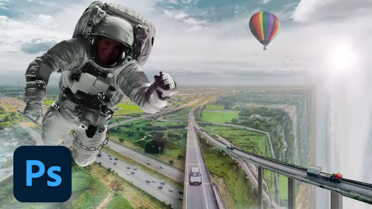
challenge #3 To The Moon!

@covert loom nice idea but you forgot about part with stand alone finger. When I zoomed in it looked not really fancy. But I believe you can improve it 😉
Thank you @bleak fossil I started with the text "Space Invaders" but when I saw the effect of the gradient I changed my mind as it reminded me of orange soda. The process changes along the time.
Gave +1 Creative Carma to @bleak fossil
Challenge #3 - To The Moon - Here's what I created for Challenge 3.

PSDCC day 04 Color Matching Photos

Right
Fab-Stract Portrait

Matching

Challenge #3

Challenge #4 with a hidden Smurf coz why not

#challenge - Space Comp Revisit - is this better r/e the lighting direction? 😉 @bleak fossil

PSDCC Day 5 'Fabstract' Portraits

#challenge - Matching - Photographer's Nemesis (railroad tracks) - The alien was hungry and came down for some big ole space crabs 😉 JUST PLAYING 😉

Day 5 here are the other styles I did


#challenge - Fabstract Portraits - I like the DIFFUSE GLOW & GRAPHIC PEN the best under the FILTER GALLERY choices, and the Neural Filter options are kewl too!!! 😎😎


Day 4, finally There are 5 different images here.

Challenge #4 - Color Matching Photos - I went my own way with the provided photos + a space ship if you can see it behind all the tentacles 😁

DCC #2

Please have a great and safe weekend, everyone - STAY COOL!!! 🙏🏻🌊


Fabstract portraits 😄 used a portrait of myself from about 3 years ago. I think the oil painting one on the top right is my favorite

Compositing challenge. I was trying to make the rocket a tattoo. And would have preferred for the arm to have more light on the right side of the arm then the left but couldn't do it.

Daily Creative Challenge Day 5 "Fabstract" Portraits. This was my first time participating in a creative challenge. I used some Neural Filters, and some Mosaic, Grain, and Water Texture Filters as well!

there you go!

where do I find the challenges

Daily Creative Challenge
Day # 1


Day # 5

I love how bright her eyes look in the edited version!
DCC #4

Ps Dcc 2022-8 Challenge#4 Color Matching Photos 7-21-2022

Ps Dcc 2022-8 Challenge#5 Color Matching Photos 7-22-2022


Photoshop Daily Creative Challenge#05


Daily Creative Challenge Day 4 "To The Moon" Color Matching Photos

Love the pixel art style given here. Great job👍
thx
Day #2

My Result for Challenge #05 - Fabstract Portraits - (not really a fan of these type of challenge but useful.)

Playing catchup Challenge #01 - Photo Edit & Sharing

So cute! Love how you enhanced the eyes. Great editing👍
To The Moon. I could not make the glow from the moon. It just looked like white lines.

Color matching challenge

Fabstract Portrait challenge

My Challenge #5

thank you so much
Gave +1 Creative Carma to @hollow yarrow
Day #3 ...

DCC #6

#challenge - Dual Color Lighting - SO MUCH FUN!!! 😉 Challenge image plus one more from Adobe Stock...


Sorry to have missed the live session today! Thank you Jesùs for a fun Challenge...

Ps DCC 22-08 Fabstract Portraits

A reason to wake up early. I am currently 6 challenges behind 💪
PSDCC_Day 6 Dual Lighting Effects

Thanks @bleak fossil for your shadow suggestions... I did get a little carried away with my shadows! Ha Ha Ha Much better with the shadows hazed & brightened.... 👍

Gave +1 Creative Carma to @bleak fossil
Ps DCC 22-08 06 Dual Lighting

Challenge #5 - Fabstract Portraits - I had a lot of fun here. First a composite of 6 different styles and then the original.


@turbid fern Nice variety of styles here! I like how you tried out varying techniques and looks. The top right does have a nice, subtle painted look to it which is cool. Nice work!
@young karma Very interesting effects for challenge 2 and 3! I especially like the text warping in challenge 2, the way the text sort of shifts out of focus on the edges along with the flowy shape makes for a really cool style. I like the color contrast in that one too, nicely done!
@coarse portal Very nice job on the compositing in this Challenge 2 design! Everything has a nice unified look to it and I like the radial composition you created in the background with the rockets. Looks good!
@halcyon current These elements are all fitting together really well, very nice work with the contrast. If anything, you might want to fade the contrast even a little more for the tentacles in the background behind the trees, so they match the faded dark tones of the trees a little more since they're further back than the other elements. Very nice job with all the masking in this challenge!
@wary swan Challenge 5 is looking good, I like the balance between the photo and graphic elements. It has an interesting style to it. Challenge 4 came out well too, I like the creeping aliens sneaking up behind the astronaut. The coloration of everything is fitting together well. Nice work!
@coarse portal Very nice work with challenge 4! The color and contrast adjustments of all the elements are fitting together well, and the masking is looking good too. This is a bit of a nitpick, but I feel like you could increase the dark tones just a touch on the figure running since she's closest to the camera, and it would strengthen her as a focal point too. Looks good!
@winged pumice Cool pixel art style for the day 5 challenge! Kind of reminds me of some of the older games that used pixelated photos for their art assets. This came out well 👍
@pine wraith Nice job with the cropping and photo edits! It could even be nice to give the image a bit of a Levels adjustment to boost the brightness just a touch. Well done.
@humble shell Very nice, welcome in! Really cool combination of effects here, I love the colors that you got in this design. The portrait reads really well against the background too, looks good!
@stone steppe Great job on the masking, and I like how the moon appears to be casting light onto the palm of the hand. Making the rocket tattoo is an interesting challenge, but the main thing I'd say you would be to darken the rocket overall since it's in the shadow of the arm, and the fire area wouldn't be that bright if it were a tattoo and not actually emitting light. Nice work!
Dual Lighting Effects: First one is from the tutorial and the second one is a photo of me


Ps DCC: 07.25.22 - Dual Lighting Effects. Slight divergence from the tutorial. Changed blending modes, bumped up the saturation and finished in ACR...

Ps DCC 22-08 Dual Lighting Effects V2

@halcyon current Whoa, loving the variety in these portraits! You did a lot of variations and they all have a distinctly unique look. I like the varying levels of abstract and illustrated styles between these. I especially like the top left and bottom right ones, the top right has an almost engraved look to it too which is neat. Great job really pushing this challenge!
@eternal mica Cool style to the Dual Lighting challenge with the flat background! I do wonder if the Refine Edge brush tool could give the head/hair a bit more of a natural softer edge when masking? Kind of the same with getting less of a black outline around the edge of the face and back of the neck. Though that's just me finding something to nitpick. I like the added contrast in the second mirrored version you posted. Looks good!
@eternal mica The portraits are looking good, nice variety of styles here. The Style Transfer version definitely makes for a really unique look, and I like the digital looking style of the Color Overlay design 👍
@visual pelican Very nice, the lighting effect is looking really good. The background choice and the way you faded the top of the head makes for an interesting look too. Very nice, strong contrast in this image!
@marble umbra The dual lighting portrait image is looking really solid, I like how the blurred background brings a lot of focus to the portrait both in it's lesser sharpness and value contrast. The lighting effect came out well!
Thank you.
Gave +1 Creative Carma to @bleak fossil
Sam, thanks for taking the time. I definitely should have taken more time with the masking. It wasn't as important with the black BG. Once I decided to go with bright BG, I should have reviewed my masking.
I had fun playing with all the variations on the portraits. I love using the less common tools in crazy combinations.
Gave +1 Creative Carma to @bleak fossil
Here’s the result of my attempt at the Dual Color Lightning Challenge! I used an Avengers photo of Black Widow and I love the way it turned out almost as much as like the photo ! This was fun!

@quiet fern Nice to see you trying this technique on multiple images. Really interesting to see the contrast between the two, one being much softer than the other. Very nice job with the colors on this technique!
@coarse portal Cool use of subtle color in this Challenge 6 design! The muted tones still have a clear warm/cool contrast between them which works well. I also like how much the face pops out from the black background, very dramatic contrast. Looks good!
@pine wraith Hah, very nice idea with the alien hand in this Day 3 design! It looks like you created that from the original hand asset with liquify and color adjustments? Great idea. The masking is looking good too. My only suggestion might be to add some subtle shadows on the moon where the fingers are touching. Nice work!
@wooden bloom Nicely done, the stylized effect and shapes it created are looking good. The background gives it some really interesting color contrast too. Well done!
@gaunt wagon Nice job with these designs! I really like the variety of patterns you got for the portrait image. One suggestion for the color matching challenge might be to lighten the dark tones of the aliens a bit to more closely match the value of the trees so they fit together a bit more. Currently the aliens have much more contrast than the environment. And to create a glow for the moon you could double click the moon layer to add an Outer Glow in the layer styles, or you could make a new layer a use a soft round brush or a blurred circle shape to try adding a glow with a blending mode like Color Dodge, Screen, or Overlay. Just some ideas. Great work on these!
@dusky wave Interesting effects with the fabstract portrait image and while I having seen the original of the Day 1 challenge the contrast and colors are looking really good. Nice job 👍
@pine wraith Nice job with the Day 2 text design, it's cool to see a soft warp effect on text with a hard looking texture, it makes for an interesting contrast. The colors are looking good too!
@turbid fern Both the masking and colored lighting are looking really good on this design! It has a nice bold look against the black background. Though I wonder if realistically we would see the red lighting on the parts of the ear that have highlights on them? I like the subtle color and lighting on the second version of the challenge, nice work!
@sterile berry Very cool effect, I love the bold color and contrast and that shift between the purple and blue colors of the lighting, it adds a lot of depth to it. Very cinematic feel to this image. Looks great!
@humble shell Ooh, cool photo for this effect! The blue/pink contrast makes for a really dramatic stylized look, and I like the pink in the sky too. The transition from pink to blue has a nice smooth look to it, and works especially well in the texture of the shirt on the back side. Very nice!
@humble shell Loving the day 4 challenge too! You did a really nice job of pushing the aliens into the background behind the trees and keeping the strongest contrast on the astronaut in the foreground. I love how heavy and stylized you went with the fog. Really fun look to this design!
@winged pumice Really cool textures in this Day 3 challenge! I love how the starry textures on the hands give them this "hands of the galaxy" sort of feel. And the moon still has the most contrast which makes for a nice clear focal point. The reflection in the water is a great touch too!
Thank you so much for your advises #1 - #3 . Yes its the original hand 😄 Have a lot to do this week but i did some notes and will edit every work before i load it in the new CC folder on Behance ...
Gave +1 Creative Carma to @bleak fossil
thank you 💚
Gave +1 Creative Carma to @bleak fossil
Thank you! I added some red to the ear. Thanks for pointing that out 😄

Gave +1 Creative Carma to @bleak fossil
I think I screwed my gradient maps.

Thank you I appreciate that! It was really fun to make and play with colors
Gave +1 Creative Carma to @bleak fossil
Thank you so much! 😁
Thanks for the feedback Sam 🙂
Photo Composition - DCC #3


Ps Dcc 2022-8 Challenge#6 Dual Lighting Effects 7-25-2022

@bleak fossil Hi Sam, thanks for taking your time. I appreciate your feedback. 🙏
Gave +1 Creative Carma to @bleak fossil
 DCC Day6 - Dual Lighting.
Before/After


Thanks @bleak fossil
Gave +1 Creative Carma to @bleak fossil
challenge #5 Fabstract Portrait. I made a short GIF for all them 😉

challenge #6 Dual Color Lighting. Another short GIF

challenge #1 Photo Editing. I almost forgot to upload the first one! I think that the eyes and baggy eyes came out nicely; maybe even a little too much, same as with the red tones. What do you think? Thanks for your feedback


Here is the extended stream Jesus did on bending landscape perspective. https://www.youtube.com/watch?v=yCA2xZoJ1tU
Tune in with Photoshop Training Channel’s Jesús Ramirez on Adobe Live and learn how to create an impossible world using Adobe’s stock images and Photoshop. In this two-part series, Jesús will be photo compositing surrealist urban and nature landscapes. Learn how to use masking techniques, color matching, color grading, and photo manipulation to ...
Another fun day... Thank you Jesùs!

Updated copy as I saw I forgot the reflection for the end of the world boat...

My Caribbean Cruise Ps DCC 22-08 07 Perspective Bending

PSDCC Perspective Bending Day 7

DCC #7 version 1 an 2


#challenge - Perspective Bending... sooooooooo kewl!!! 😉 2nd image just playing...

On this second one I made the front facing bend a little lighter to show the difference between the sides better 😉


Thanks 💙
Gave +1 Creative Carma to @quiet fern
Love your two concept . 2nd Looks awesome but on the 1st one I think you could try Harmonization neural filter to match colors of foreground with space background.
Great job!👍
Sailing on the edge!... Be careful! Edge line gives a realistic effect! Nicely done!
I did dual light but included the background as well just because I personally think it looks better with this image in particular

challenge #7 Perspective Bending

This is my matching challenge image. It was a struggle.

@turbid fern The red on the ear makes a big difference! Really sells the effect. Very nice.
@young karma Really cool surreal feel to this one with the pink color of the water! Really nice job with the foggy effect too. There's a few ideas that come to mind that could maybe push this design even further. It could be cool if we see some bounced light from the pink water into the underside of the body of the boat. It might also be nice to mask out the fog a little bit so we can see a small bit of the edge of the waterfall to make the effect more clear/obvious. It also might help to give the birds a blueish tone a bit darker than the sky rather than black for a more realistic look. Just some thoughts, really nice work on this design!
@bright yew Really interesting effect, the red draws a lot of attention to the face. I also like the smooth gradient between the colors, and the cool/warm colors make for a nice contrast. Nice job!
@quiet fern These are looking great. I especially like the first image with the sunset, that adds some really nice color contrast to the otherwise blue scene. The second version with the lighter side of the water adds some really great depth too, and feels a lot more 3D. Very nice job with these techniques!
I went a different route from the video. I find it easier in my opinion. I would apply a solid color layer, use a basic black/white gradient on it so I can make it visible in some places. And finally soft light blend mode
Also Thank you!
That method works too! And no problem 😄
@visual pelican Cool idea, nice job with this technique! I like how much the boat contrasts against the dark black background. Nicely done!
@stone steppe Very nice! Compositing can always be a bit tricky, there's a lot to keep in mind. Nice job matching the lighting and contrast of these different elements. Though I think the alien could use even less contrast, specifically in the dark tones. It might help to make the dark tones more closely match the dark tones of the tree it's behind for a more realistic look. This is looking good!
@eternal mica Ooh, cool photo to use for this challenge! Nice job with this technique and the highlight on the edge of the water. I also like how you faded the contrast of some of the further off birds. When placing that many birds it might be worthwhile to break some of them up into different numbers/arrangements so the "stamp" of the group of birds doesn't become noticeable as the same layout. Nicely done!
@marble umbra Nice job with the corner and highlight of the water transition, it has a convincing look to it! The rounded edge makes for a more natural look which is nice. The birds add some nice interest to this image too!
@young karma The photo retouching changes came out nice! Subtle, but still a noticeable difference, which is usually the balance you want for that sort of editing. The editing under the eyes looks great, and the brightness makes for a nice boost. Well done!
@young karma The GIFs are a really cool idea and came out well! Great job creating a variety of versions for both of these challenges. I especially like how the dual color lighting designs create an effect like only the lights are changing. Looks good!
@hollow yarrow Great photo for the dual lighting challenge, the cool and warm tone makes for a nice contrast. It might be nice to increase the saturation of the cool light to be more noticeable blue, it almost looks desaturated instead? Of course that entirely depends on what you're going for. The glitch effect is a nice touch as well, well done!
@wary swan Really cool effect with the dual lighting design! Those two bold colors make for an interesting and intense style to this image. Having a more gradual transition between the two colors might look more realistically how light behaves, but this is kind of a dramatic look in its own way too. Nice job with this technique!
@unkempt field Great job with the texture and warping effect on the Great Unknown design, and the portrait edits are looking good. I like how you warmed up the image and it has some nice brightness to it, but it might look good to boost the dark tones a bit with a Levels adjustment, so we get a little more contrast, especially in the eyes, facial features, and hair. Giving the text a subtle drop shadow in the Great Unknown image might help the text read more strongly as well. Just some thoughts of course. Nicely done!
@gentle furnace Great photo for the dual lighting effects challenge! Those colors work really nicely for a strong warm/cool color contrast. The black background gives a really strong read as well. Nice job with this technique!
@stiff bough Very nice job with the masking and layering for this photo composite design! The coloration seems to match nicely too, My only critique might be that the house seems to have its shadow on the left side whereas the planet and landscape appear to be lit from the left, so their shadows are on the right. It's a small detail, but it might sell the realism even more if the house's shadow was on the right side instead. Just a thought. Very nice work!
@crisp arrow I like the colors! I'm not sure exactly what you were trying to do with the gradient maps, but it looks like you were painting in the mask of the gradient map? You could always clip the gradient map to the figure if you cut her out from the background, or select the figure and then use that to mask the gradient map so it only applies to her. But it all depends on what you're going for. 👍
@coarse portal Ooh, great concept for the Day 7 challenge! Both of these work really well, but I especially like the one with the galaxy background, it really pushes that surreal feel. I wonder if it might look good if you cooled down the colors with Color balance to better match the cool tones of the background, and maybe even increase the contrast of the farm layer? I got carried away and tried it out. Maybe something like this? I also tried adding a shadow to the left side. Very nice work on these!

Sam, thank you. I used my own photography for this exercise. I composited my cruise ship pic into my pic of the beautiful Caribbean. I agree I should have altered the birds. Good point by you.
Gave +1 Creative Carma to @bleak fossil
Thanks @bleak fossil I always appreciate your input and suggestions to help me improve my work.
Gave +1 Creative Carma to @bleak fossil
Thanks. I will keep working on it.
Gave +1 Creative Carma to @bleak fossil
Thanks @vast gate
Gave +1 Creative Carma to @vast gate
Thanks @bleak fossil it has been fun & quick as I am super busy.
A fun edit to celebrate my birthday 😊

Thank you. I'm enjoying these projects and putting to good use the skills I've learned from them.
Gave +1 Creative Carma to @bleak fossil
Day #4

Thank you for your feedback! You are absolutely right, I'll fix that, thanks!
Gave +1 Creative Carma to @bleak fossil
Used a picture from a local popular sightseeing destination.

Thanks for the advice, now i see why something in the picture annoyed me yesterday 😆
Gave +1 Creative Carma to @bleak fossil
Here's the fixed version, I also cropped the image a bit. Do you know some good tutorials on the basics for these photos compositions?

5

6

Well done!
Mine for perspective bending...

Happy Birthday !
Thjanks for the feedback and tips, Sam
@bleak fossil Hi Sam, thanks for your feedback. They are really appreciated! You are right about the fog, as I was doing it I saw that I had gone a little too far. I will try your suggestions! Thank you very much 🙏
Gave +1 Creative Carma to @bleak fossil
Thank you @bleak fossil for your feedback. I agree with you that it would look better with a faded contrast on the tentacles in the background. I'll do the changes.
Gave +1 Creative Carma to @bleak fossil
Thank you @bleak fossil for the feedback on the Fabstract portraits! Those two mine favourites too. The top right on has the "Filter Gallery - Plaster" filter applied. The top left is the Neural filter - Style transfer using the first, top left, image among those to choose between. I used the pen-tool to create the different parts of the portrait in the bottom right and had a lot of fun. I really like using the pen tool. One reason is the clean selections you can get 🙂
Gave +1 Creative Carma to @bleak fossil
Well done. Great color grading too (color lookup?) and Happy birthday 🎉🎊🎂

Ps Dcc Challenge#7(2) Perspective Bending 7-26-2022

Thank you!! ❤️ @onyx current @pine wraith @hollow yarrow
Gave +1 Creative Carma to @onyx current
thank you!
Gave +1 Creative Carma to @bleak fossil
challenge #8 Create custom light rays. After trying all the tricks Jesus showed us today, I finally chose to apply all them subtly because I think it gives a realistic appearence. What do you think? Thanks for the feedback

@bleak fossil Hi Sam. As mentioned before, here is a new version with your suggestions. Thanks man!

Gave +1 Creative Carma to @bleak fossil
I love these colors and the satin effect. Congrats!

#challenge - Perspective Bend 😉

#6

PSDCC_Adding Light Rays Day 8 I tried all three technics on two of the photos and only one on the wolf cause I didn't like the results of the flare & circle ones.


DCC 8 after and before


#7

#challenge - Light Rays... we call them "God Rays" when we see them in the clouds & sky 😉 Yes, I’ll fix the placement of the rays on the 2nd image tomorrow


Followed along with the tutorial for the first one and then tried using those effects on a photo of myself 😄


Ps DCC 22-08 08 Adding Light Rays


challege #6

DCC Day 7 - Perpective Bending

That would be an interesting day at the beach. :)

@turbid fern This technique is looking really good! I like how the pink color is present in both the water and sky, the whole design has a nice color harmony to it. The particles in the sky make for a nice stylistic look to it. Nicely done 👍
@pine wraith The design for Day 4 is looking solid! I really like how you masked the tentacle and alien behind and around the trees. It might help to lower the contrast, specifically in the dark tones just a touch for the alien and tentacles so they more closely match with the shadow tones of the trees they're behind. But that's a bit of a nitpick since they're pretty close already. Nice job compositing in all these different elements!
@gentle furnace Very nice! Is this your own photo? The people in the scene add a nice sense of scale. This would of course be a lot more work, but it could be really cool to see a version where all the people on the left side of the photo are removed, as if that edge is really sort sort of cliff. Just a thought of course, nice job with this technique!
Thank you!
Gave +1 Creative Carma to @bleak fossil
@stiff bough Very nice work, the shadow edit is looking good! No specific tutorials come to mind, but I'd say your best bet would be searching things like "photoshop compositing tutorial" and "photoshop compositing basics" on YouTube. YouTube has so many videos and tutorials there's certainly a lot to learn there. Channels like Piximperfect, Phlearn, and Photoshop Training Channel all come to mind, and there's many more. Those are a great way to pick up new techniques and methods. And of course we often have guests on Behance that do photo compositing and you get to see their workflow and commonly used tools/techniques.
@crisp arrow Cool take on the perspective bending challenge! I like the sort of abstract look this technique creates on this particular photo, lot of interesting shapes and contrast.
@bronze bluff Very nice job, I like the subtle color shift across the face in this portrait. The black background really helps the portrait pop and gives it a dramatic look. Nicely done!
@eternal mica Cool to see you trying these out with different images! I like how the light rays on the first paned window image are a bit sharper, it makes it look like the wooden parts of the window frame are causing them. And the lighting in the second image looks more diffused which would make sense. Interesting to see you varying the warmth of the lighting in each image. Nice job!
@turbid fern Great to see you trying the light ray challenge in different images and contexts. I like how you matched the saturation and contrast so the ray fit in realistically with each image. Looks good!
@quiet fern The light rays are looking good, I like how you played around with the sharpness and softness of them in the different images. Nice work!
@hybrid kettle Really interesting to see this mirrored technique on architecture, kind of starts to give it an almost abstract/geometric feel. The colors on the Dual lighting portrait are looking really nice too, they have a nice warm and cool contrast. Though perhaps the transition between the colors on the cheek could be a bit more smooth? Cool look to these!
Thank you Sam. I always appreciate your input.
Gave +1 Creative Carma to @bleak fossil
Fabstract Portrait

Dual Lighting Effects


Adding Light Rays…almost caught up. Dual light was quite a challenge for me. I’ll need a lot more practice on that technique.

DCC Day 7 - Perpective Bending - Design #2

Okay, thank you. I tried to let it look like the flash from a camera 🤣
Gave +1 Creative Carma to @bleak fossil
Day # 7 Perspective Bending

@coarse portal Nice job with the light rays/glare effect, the brightening of the sky looks good too. Are you going for a look where light is glaring/reflecting off that metal object hanging from the roof? I wonder if increasing the brightness of the glare, particularly in the center might look more like a metal specular highlight? Nice job 👍
@visual pelican Really great to see you trying out different methods on different photos, that really helps to get a feel for how everything works, and in what situations each look best. I love the warm glow you got in the 2nd and last design. I wonder if using a different blending mode, or brightening the glare layer up a bit for the wolf design would help? Currently it looks like you're using a blending mode that's washing out the image a bit, and not bright enough to read as light. Really nice job with all of these!
Thank you. yeah I struggled with the wolf one, I think I kept playing with it so much it washed out the image like you said. I'll keep working on it. Thank you for all of your feedback it has really helped me improve, and not get discouraged. lol
Gave +1 Creative Carma to @bleak fossil
@quiet fern Ooh, cool take on the Perspective Bend challenge! I really like the desaturated and stormy look of it, and the clouds and sky work especially well with this design. The shadow on the left side adds a lot of depth too. Looks good!
@visual pelican Glad to hear it and happy to help any time!
@hollow yarrow Ooh, cool take on this challenge! I love the scale of it, and the way the lines lead the eye into the edge of oblivion. The softened/faded edge of the water looks really good, and I like the bold contrast of the figure and the warm/cool gradient in the water. Really neat idea!
@violet bone Great image for the light rays challenge! The light rays turned out really well and the dark room gives them some really nice contrast. There's a nice subtlety to the lighting as well. 👍
@hollow yarrow Killer job on the Perspective Bending image. Great photo choice with him looking down, and I really like the texture you used for the cliff’s edge showing the different layers of earth. That along with the shadow really help make this a convincing effect. Well done!
Thanks! 😄
Gave +1 Creative Carma to @bleak fossil
Day #8

Hello for light rays challenge.

Ps Dcc 2022-8 Challenge#8(3) Adding Light Rays 7-27-2022

Light Rays Challenge

Yes, this is my own photo. It’s from Hitachi Seaside Park in Ibaraki, Japan. When I get some time, I may try to remove the people and see how it looks.
You should cut out the background with pen tool
@hollow yarrow Your two Perspective Bending images are sheer genius. The first one is overwhelmingly beautiful. The lighting on all elements of the second is so real. Great creativity on both. Great execution on both. 💯 💯
Thanks for the feedback. 😊
Thanks Ted! I appreciate!
Gave +1 Creative Carma to @eternal mica
To The Moon Task

#challenge - Light Rays Edit 😉

Jesus 40 minute stream on Blending Modes he discussed in the stream today.
https://photoshoptrainingchannel.com/blending-modes-explained/

In-depth explanation of how Blending Moes work. No more scrolling through all of them to find the right one!
Thanks, Ted for share the link
Gave +1 Creative Carma to @eternal mica
day # 9 - Increasing Contrast ..... I've Taken the Tutorial one ...


PSDCC_Increasing Contrast Day 9 the 2nd pictures were done with levels & the 3rd ones were done in camera raw.


Challenge #9 was really timely. I was on a fishing boat in SF bay on a gloomy morning. This shot was taken at 6:30am from the boat, I didn't think I could do anything with it. I played a bit in lightroom (love enhance) and today added a curves layer and it turned out better than I thought it could.


challenge #5 I played around with another photo from the fishing trip. A bit of work in lightroom and neural filter fun in photoshop


challenge #7


Great work by you
Thanks @eternal mica taking good pictures on a moving fishing on a gloomy morning didn't yield many good ones... Today dcc has given me more tools to enhance a few more of the birds
Gave +1 Creative Carma to @eternal mica
Camera Raw

Challenge 6 - Dual Lighting Effect

Challenge 7 - Perspective Bending - It's one of my own photos

Challenge 8 - Adding Light Rays - Another one of my own photos

Challenge 9 - Increasing Contrast - Yet another one of my own photos - After & Before


Stunning job @hollow yarrow I love it!
Soo cool @hollow yarrow !
Before and After


@turbid fern Well done, the increased contrast really gives it a much stronger visual impact. The colors have a nice vibrancy to them too, without being too much. Looks good!
@halcyon current These are looking great! That's a really great picture for the Day 6 challenge, I like the color contrast between the two light sources. The Day 9 design makes a huge difference and really transforms the image, also the light rays on the Day 8 design gives the image a lot of energy and makes for a nice focal point. I feel like adding some clouds into the sky on the Day 7 challenge could help add some visual interest and depth, but that's really just personal preference. Nicely done!
@eternal mica Very nice adjustments on all those images, I especially like what it did to the color of the water in the swimming image. Makes a big difference!
@plain sable Nice job with both of these techniques for the Day 5, 7, and 9 challenges! The brightness in the Day 9 design makes a big difference and Day 7 creates some really interesting shapes with that effect. 👍
@visual pelican Great to see you trying both methods for these photos, the added brightness and contrast makes a big difference. I think I prefer the image of the wolf done with Levels, it feels a little more natural while still having some nice contrast and brightness. Nice job!
@bleak fossil I like that one also. I really liked the camera raw version. I liked the pattern also. I pushed it to have the photo have a POW. It's one of my favorite personal photos.
Thanks @bleak fossil #5 & #9 we're timely because I'm going through several challenging pictures...
Gave +1 Creative Carma to @bleak fossil
@pine wraith Nicely done, the increased contrast came out really well and the colors are looking good too. 👍
@gentle pasture Really nice treatment of the lighting and coloration in the To The Moon image! The I really like how you unified everything with that and the grain effect. Really nice composition too, the shapes and colors all create a lot of interest. My only nitpick is the lighting is a little inconsistent between the hands and planets. The hands all appear to be lit from the top/left while the planets are lit from the top/right. But that's just something to consider, image still looks great, nicely done!
@gentle furnace Nicely done, the light rays are looking good! I almost feel like this image could use a bit of a contrast boost to deepen the dark tones a touch, but that's just personal preference. This is a good image for this challenge, nice job!
@wary swan Cool idea for the light ray challenge with the stained glass, that makes for a really interesting effect. Very nice!
@crisp arrow Very cool, these light rays have a sort of stylized look to them which is interesting. You seem to have a bit of an outline around the flower and butterfly when you masked it, unless this was intentional. Otherwise you can go to Select-Modify-Contract to shrink it in a pixel or two, or even try using the Refine Edge Brush tool within Select and Mask and see if that helps. Just some ideas of course. Nice work!
@pine wraith Very nice job on the Light Rays effect! That's a great picture to use for this challenge. This is a bit of a nitpick but it might help to give the rays a bit of a gradual spread so they're not all completely parallel. Kind of having them "widen out" into more of a cone shape as they enter the window, if that makes sense. Just a thought, well done 👍
Thank you. I'm not comfortable with camera raw partly because it doesn't always work on my system, but mostly because so many things to adjust lol.
Gave +1 Creative Carma to @bleak fossil
Thank you
Gave +1 Creative Carma to @bleak fossil
Yes , thank You , i made this one and a lot more in a Lost Psychiatry in Berlin . Tomorrow i will edit every work ive done in this challenge and load it up in behance . Thank you for every advise.
Gave +1 Creative Carma to @bleak fossil
Used the various techniques in today's challenge.
- The waterfall picture uses the untouched curves adjustment layer and Linear Light mixing mode
- The fountain picture uses the levels and curves.
- The gazebo picture uses the camera raw filter.


Thanks, Sam for the feedback
Gave +1 Creative Carma to @bleak fossil
Ps Dcc 2022-8 Challenge#9(4) Increasing Contrast 7-28-2022
Before (1) result from the jpg original after (2) 2nd C3 adjust curves no Auto with Camera Raw


original C3 Canon Raw image open in Photoshop whitout any edit only convert to psd and png

Original C3 after Auto in Camera Raw I thik Auto do a great jobb with this image but I think vesrion 1 with only curves is better

@wary swan Wow, huge difference, cool to see how much can be done with an overexposed image. I especially like the version done in Camera Raw. The colors and contrast are looking really on point, nicely done!
@unkempt field Really nice job on the Perspective Bending challenge! The drop-off gives me some anxiety, so I'd say you pulled the effect off nicely, hah. The clouds are a nice touch. Also very nice work with the clouds on the Increasing Contrast design, these are looking good!
@gentle furnace Nice to see you trying out different methods for each photo! The color and contrast adjustments make a nice difference, especially on the second image where it really helps the focus and clarity. Nicely done!
Thanks for the feedback Sam. All my photos that day got overexposed I forgot that I had incresead iso to 2500 and this was a very sunny day I was lucky that I chot both JPG and RAW so raw save my day
Gave +1 Creative Carma to @bleak fossil
great photos and edits it look like the photos is taken in the north of Sweden
Thank you @wary swan It's shot close to Munkedal at the viewpoint "Nisses kulle" at Maltes Stig. Here's the GPS coordinates "58.435810, 11.684857". The sunrays image is shot close to my home and the bending perspective is shot at "Ramsvikslandet" close to Kungshamn/Smögen. 😀
Gave +1 Creative Carma to @wary swan
I love it. Sweet how colors come to live. Nice job. Congrats!
Thank you @bleak fossil I've used that image (#6) before so it's really a good image to use over and over again. He got a green nose as I used a mask with blurred edges and the two colors got an overlapping effect where blue + yellow = green 😎 Editing photos like the one for #9 is what I do pretty much every day and it's very satisfying to get a good result when the starting point is pretty lame. #8 already had that feeling of sunrays in it so I only enforced it with the light rays. For #7 - I understand your viewpoint and I might try that. Thank you once again for all the feedback. It means a lot to me. It sure evolves my creative vision and my creativity 🥰
Gave +1 Creative Carma to @bleak fossil
#challenge 9 Increasing Contrast. Couldn't stop just with the contrast... so I tried to improve the image as much as I could. Here's a gif (this is a bit longer) so you can see the changes. I appreciate your comments and feedback guys. Thank you 🙏

Dual Lighting Effects

Here is the Adding light rays challenge. I enjoy so much this one! I realy tried to add subtlel and realistic light rays + lens flare, like I could do to add more life to a picture I shooted.

Thanks!
Gave +1 Creative Carma to @halcyon current
Here are the increasing contrast challenges - I never used curves like that. Here I tried to do something ethereal... finishing with a color look-up in strip-2 💙


Great job!
Thanks @hollow yarrow 😊
Gave +1 Creative Carma to @hollow yarrow
Perspective Bending

Light Rays with Jesus Ramirez. I painted the rose from my sketch that we did with Wade Acuff. Thank you all for this opportunity!

If anyone would like to watch a full Jesus Ramirez stream on Changing Seasons, this is the link to the one I reminded him of during the stream today. Thank you @wary swan for your amazing spreadsheet.
https://youtu.be/2fN7vdwdw1Q

Challenge: Transform a summer photograph into a winter scene using Adjustment Layers and Blending Modes.
Get the starter file here: https://bit.ly/psdcc7-20-6
Join your host each morning at 9:00am PT to learn how to approach each challenge using Photoshop. Complete 9 challenges by Friday, July 31st and you’ll be on your way to sharpening your s...
Gave +1 Creative Carma to @wary swan
Challenge #4 Hiking earlier this week on Pleasanton Ridge, to my surprise, the fire we had a few weeks back had come closer than I thought. It was sad to see one of my favorite places scared.


Challenge #8


@plain sable So sad to see the destruction. But very good use of the photos by you.
@eternal mica Thanks the photos were good assets to work with. This was where they contained the fire, I either hike from the right or the left, that day I wend right and got out of the burn scar quickly... Next week I'm gonna head left, hopefully it's not to bad on the ridge line trail.
Gave +1 Creative Carma to @eternal mica
#challenge - Contrast Before & After


#challenge - Contrast Before & After - LEVELS


#challenge - Contrast Before & After - CURVES - I think I like the CURVES Adjustment better 😁😎


McVay Rock State Recreation Site July 24, 2022 Something is happening behind this rock.

@quiet fern Very nicely done, the added contrast in the waterfall image makes a huge difference, and really helps make the image pop. I think the Curves version of the second image is working better too, it pushes the contrast a bit further which I think is looking good. Nice job!
@plain sable Really cool use of your own photos! Sorry to hear about that area getting damaged by the fire, but hopefully it'll grow back soon, and in the meantime it made for some cool image designs. The sky replacement you added on the alien image makes a huge difference. The light rays are looking good too, great idea for that one. Well done!
@frigid barn Cool idea, I like the colored light rays! Also appears to be more than one light source which makes for an interesting question of what could be behind the rocks. Nicely done!
@tropic knoll Very neat to see you combining challenges with this design! The light rays give the design a lot of energy and a bit of a dynamic feel. Nice job 👍
@covert loom Ooh, great job on this technique. The face on the sail and the foreground shapes on the left make for a really interesting mood, along with the color grading of the image. Looks good!
@vagrant rapids Yeah, I usually use Levels myself, but Jesus had some great tips with curves. Very nice changes to these images, they have an interesting stylistic effect. Nice work!
Thanks for your feedback @bleak fossil!
Gave +1 Creative Carma to @bleak fossil
Thanks @bleak fossil
Gave +1 Creative Carma to @bleak fossil
Hi Sam! Thank you! You're feedback always inspires me to keep going. I wish you the best in all of your endeavors as well!
Gave +1 Creative Carma to @bleak fossil
@plain sable Smiley face for your work, sad face for the destruction.😀 🙁
@bleak fossil Thank you!
Gave +1 Creative Carma to @bleak fossil
Perspective bending Challenge! So delighted with this new technique 🎉

Thanks @frigid barn
Gave +1 Creative Carma to @frigid barn
I’m not entirely sure if this is the correct channel, however my ‘challenge’ for someone would be to add a belt in the red square.

A similar/same belt as the others.
Sorry, thats not what the "challenge" of this tab is about. This tab is for the Ps DCC Challenge. If you have designs you'd like help with, please use one of the more appropriate tabs on the left. Thank you.
Gave +1 Creative Carma to @stiff locust
I thought so, which channel would you suggest?
Thanks Boos @bleak fossil
Gave +1 Creative Carma to @bleak fossil
try design feedback or ask a question
Challenge #6 I'm not sure this photograph worked...


@plain sable I think it could work, but I think your treatment of the light is confusing. There seem to be multiple light sources, one on top and left of palm and arm, and one on top right of fingers. You treated those two sources distinctly. I'm thinking, maybe give them the same treatment, and make the shadow a different color. Also I might lower the intensity to allow more of the skin texture to show through. Just some thoughts.
Ps DCC July 18 - August 12 https://www.behance.net/gallery/149351685/PS-Creative-Challenge-July-18-August-12
Paul's July Day 1:

Phil sorry for being late.


Weekend Creative
So, no one told you that photography would require THIS much paperwork, did they? If you waltzed into photography thinking it would consist of gorgeous photos and lots of money, you weren’t necessarily wrong… but you did miss out on one super important fact: you need to be able
todays customizable proposal deck
@sick tapir I like the color palette in this! There's some nice warm and cools between the sailboat and water, the rainbow is a nice touch as well. Nice work on this technique, the highlighted edge is looking good. It might help to soften the parts of the cloud with a hard edge. I think when working with clouds a soft brush is the best tool, and you could soften those hard edges by lasso tooling them and selecting blur-gaussian blur if you want to. Nice job!
@last mica Nicely done, the retouches are looking good. Everything has a natural look to it and the brightness/contrast is looking good too. 👍
@pine wraith Very nice job with the Behance project! Great work on all these different challenges and techniques, it's nice to see them all together. Well done!
@plain sable I think this duo lighting image has a really cool stylized look to it! The bold color contrast makes for an interesting look, and the black background gives the whole thing a really strong read.
@vagrant rapids Glad to hear it! Really nice job with the highlight and softening the edge of the water. I really like the clouds and how the colors of the sky fit in really well with the sail and reflection in the water. Looks good!
The two i liked most from multiple portrait challenge. I had a lot of challenge with the cutout one with masking as usual.


Paul's Text Effect Challenge

Two challenges in one. Lightrays and contrast. Here is my before and after


Thank You 😄 🥳 💋
Gave +1 Creative Carma to @bleak fossil
Paul's July Day 2:

Challenge #7 - Perspective bending - I totally went my own way with this one and had a lot of fun but also frustration. I mirrored the sky/clouds in separate layers to get them hanging together. Now I think I'm done. The image itself is a panorama I created over the harbour of Gothenburg.

Colour Matching Task

Fabstract task

Dual lighting Task

Perspective bending Challenge 🎉

Perspective Task

LightRay Task

Workshop/Bootcamp with Weekend Creative day 1, 8-1-2022


Dual Lighting Effect

Perspective Bending How do I get rid of that pinkish line in the sky?

Thanks @bleak fossil I tweaked it a bit more, made the blue a bit more subtle. Also I couldn't figure out the blue bit between the pinky and ring finger, it's the thumb so I mask that. Think I like it better.

Gave +1 Creative Carma to @bleak fossil

Contrast Task.

This is the latest image from the incredible James Webb Deep Space telescope. I thought it was worth sharing.

This Cartwheel Galaxy is 500 Million lightyears away

@gaunt wagon Nice job with the dual lighting and perspective bending challenges! To get rid of the pink seam you could use the Clone Stamp tool and sample the blue of the sky, or the Patch tool could be good for that too. You could even select that area and use Content Aware Fill.
@gentle pasture Very cool image and idea for the Light Ray challenge! I like how you created some specular highlights on the car, and the general lighting of the car image works well with this effect. The technique for the perspective bending challenge also came out really well. The clouds create a nice framing and unify the image nicely. Well done!
@paper shadow Nice job with the coloration and contrast adjustments of these assets! My main suggestion might be to use selection tools to mask out the ends of the tentacles and alien where they meet the tree to make it look like they're coming from behind the tree. Nice work!
@sleek agate Hah, nice job with the Perspective Bending challenge, I like how you got creative with this. My main suggestion might be to warm up the colors of the minions hanging from the tree to match the warmer tones of the ones in the raft. Nice job with the reflections on this. Looks good!
@gentle pasture These are all looking really solid! I really like the wide variety of styles you tried in the Fabstract portrait image, then the color contrast in the Dual Lighting challenge is looking good. The Contrast adjustment image came out well also, it gives it a nice boost. Nice work!
Isn't it scary that the galaxy used to look like this before 500 mil years
And we are seeing it now
💀
Challenge Three

Thank you so much for your feedback... it's help me alot and i will work on it 😄
Gave +1 Creative Carma to @bleak fossil
Paul's July Day 3:

Paul's July Day 4

Workshop/Bootcamp with Weekend Creative day 4, 8-4-2022
My contribution to the workshop.

Workshop/Bootcamp with Weekend Creative day 4, 8-4-2022
This is what I wrote about in the stream Paint with images with mixer brush with diffrent brush tip shape

Paul's July Day 5 - Post 1

Jesus's July Day 1

my design

Light rays and Removed the pink streaks


Jesus's July day 2

on sale for 20 dollars

4
Jesus's July day 3

Jesus's July day 4

Jesus's Day 5


i feel like this should be a jigsaw puzzle. This was from Paul's challenge 3.

Not bad at all for a first time😉

That's pretty impressive for a first project! You can still see a white outline on the bird, mostly around the right wing however
I couldn't cut the bird perfectly
@young karma @pseudo lion --> Please post various work in #📝project-feedback or #🎨share-your-work-archive. This channel is used for/by people who are participating in the Daily Creative Challenges on Adobe Live.
Okay
I'm giving a hard challenge: First write MCI and do the words orange,white and green: Draw a neon frame and add a cool background
The hardest challenge ever
@simple saffron @young karma ---> As stated above, please move these discussions to #📝project-feedback. This channel is used for/by people who are participating in the Daily Creative Challenges on Adobe Live.
@pseudo lion Welcome in! I'd try darkening down the bird in the back with a Levels or Curves adjustment just a touch to make it fit the lighting of the rest of the image a bit more. Also just a heads up that any designs not related to the Photoshop Challenges are best posted in the #📝project-feedback channel. Nice work!
@worn venture Super cool! I could definitely see this being a puzzle, the bold colors and contrast would work well. I really like the graphic feel of all these shapes and the sort of abstract/surreal look of it. You got some really interesting effects with the blending modes and way you overlapped things. Looks great!
Ok
Here's the design from today's stream! I added a Color Lookup to it to unify the colors a bit.

If there's any steps or things that were missed due to the poor connection of today's stream let me know and I can clarify!
@bleak fossil What would you think about adding a shadow to the top tear layer?
Thanks! Of course i went in and started messing with it more . Lol
Gave +1 Creative Carma to @bleak fossil
😀

Challenge #1 I recently did a night shoot with a Mikes Camera group at the Palace of Fine Arts in San Francisco. It was fun to use the tear technique with these shots. My camera was set to black & white with the file type set to raw and jpg , so I got a black and white .jpg and a color .nef (raw) of the same shot.

Not sure which Challenge this is numerically.... Sam's challenge for 081622... Thanks Sam, I always love messing with the perception of our universe!!!

Day 1 Surreal Sky.

Ps Dcc 2022-11 Challenge#1 Tear In The Sky Effect 8-16-2022

Sam's day 1:

Ps DCC 22-09 01 Tear In The Sky


Adding a shadow to the big tear? Where at? Do you mean beneath it on the grass, or somewhere else?
Yes, maybe following the shadow from the alien. Or maybe a drop shadow.
@eternal mica Gotcha, that could be an interesting element to fit it in the scene more. I'll give it a shot!
That's what my mentor taught me😊 😊
@eternal mica It's pretty subtle but I think I prefer it this way. Thanks!

Gave +1 Creative Carma to @eternal mica
Now that I look at it again, it might be worth darkening both the alien shadow as well as the tear shadow to more closely match the darkness of the shadow under the tree in the background.
It's a bit of an odd problem bc the inside tear shadow is from a different light source than the objects outside the tear, like the tree and the alien.
@eternal mica Yeah, though I imagine everything casting a shadow in the grassland background is being lit by the sun in that scene. Here's a version with deeper shadows.

I like it
@eternal mica Whoa, creepy! Hah, that's definitely a portal I want to avoid. The shadow under the big tear adds some nice depth. Though the right side of the tear seems a bit blurry which is a little visually confusing. If it had a hard edge like the rest of the tear it might seem a bit more solid. You could even use a hard edge brush, or the clone stamp to create an edge on the right even if the stock image doesn’t have one. The coloration of the aliens fits nicely with the background image. Nice work!
@last mica The tear effects are looking great! Really nice job on the masking around the edges. Everything is looking really solid, and I like the color lookup/color grading you did, though I think perhaps the image could use a slightly brightness boost as it looks a touch dark. Nicely done!
@wary swan Really nice job on the masking in this design! Everything is looking good and the alien fits in nicely with the image. It looks like you might want to hide the original alien layer before the Harmonization effect, since you seem to have a doubled up layer around the right edge. The shadow under the tear might also look a little more realistic if you desaturate it so it's not so purple. Very nice work on this challenge!
@compact pecan Ooh, cool take on this challenge! Very creepy, hah. You could even maybe fade the color/contrast of the window image a little more to fit it in with that light glare we're seeing in the forest. Nice job!
@marble umbra Haha, I love the bit of motion blur on the alien, really makes it look like it's moving towards us rapidly which is very unsettling. I also like the perspective of all the smaller aliens in the background. Nice job with the masking in this!
Lol, I was "torn" between the hard edge, and the blurred edge created by the light streaming over the paper edge, sort of hiding the paper.
@plain sable Really cool idea for this challenge! It's great you were able to use your own photo, I really like how that strong blue/orange color contrast makes for such a strong focal point. Looks great!
Ahh, gotcha
@atomic echo I thought you would get a kick out of this…
@digital pike Nicely done! The coloration of the background and the alien fit together really well. The masking on both the alien and tear are looking really good. Nice work!
@last mica The designs for Jesus's Day 5 designs came out really nicely! The day to night image looks great, and the moonlight layer really helps sell it. I also love that image you chose for the color isolation. The red makes for a really bold focal point. The Day 2 design looks great too, I really like the softness of the background and how the clouds look like they could be mist from the waterfall. Nice job!
@gaunt wagon The light rays and sail boat images came out really well! I like the yellow warmth to the light rays, and the cloudy mist around the waterfall adds some really nice atmosphere. 👌
@blissful rapids Really cool design and effect! Though it might be nice to crop out the white on the right and bottom to not draw attention away from the focus of the rest of the design.
@wary swan Great job with the Weekend Creative images! Really nice to see what you did with these. I really like the style you got in the brush strokes.
@last mica Day 3 and 4 are looking really good too! Nice to see your work on all these challenges. I really like how much clever masking you did on the Day 4 image. It really creates some great depth and makes the creatures feel like they're a part of the scene.
@tropic garnet Whoa, really interesting effect! I love the colors and the shapes created by that effect. Really interesting surreal look to it. Nicely done!
Thanks! Probably one of my favorite designs I’ve done.
Gave +1 Creative Carma to @bleak fossil
I kinda did this one as like a tear from the Bioshock games. This is a famous sightseeing spot that has Baby Blue Eyes in the spring and Kokia bushes in the fall. I had to alter the perspective of the fall picture because while they are of the same hill, the pictures are taken from 2 different vantage points and didn't line up exactly.

Great photo and creativity with the challenge
Thanks for the feedback Sam, I forget to merge the alien after Harmonization I got always a copy the I harmonization because of the smart object, and I forget to make a paint grass over aliens hands. I will try to use the clone stamp to the grass, but I did as I said with the shadow and used blend mode linear burn to make the shadow.
Gave +1 Creative Carma to @bleak fossil
Ps Dcc 2022-11 Challenge#1 Tear In The Sky Effect 8-16-2022 version 2


Thanks @bleak fossil
Gave +1 Creative Carma to @bleak fossil
Photoshop Daily Creative Challenge#01

Hi Guys, my images with "Sketch" are all black and green. Any suggestions? No issues - Resolved!! 🙂
Sam's Day 2

I'm attempting the photocopy filter line effect. Why is she green and red instead of black and white?

Oh. I had green and red as my foreground and background colors. Makes sense. Hope this helps someone else!
Good tip for those who are not used to working with filters. The foreground/background colors will be how the filters are displayed .
Sam's Day 2... Had to rush through this one... I am always impressed with how much all of our presenters get accomplished in their 30 minutes!!!!

Theyre fast and super accomplished, but they also have put in lots of time to prepare, and they Martha Stewart some of the more detailed steps. We Mortals go step by step and take much much longer to get to FINAL PRODUCT.
So true @eternal mica & I'm still impressed & glad to be a mer-mortal!!! Ha Ha Ha
Every once in a while I "catch on" to a challenge that I can blitz through. But most are labors of love that I put lots of time into. And I love every second of them.
I do too... a great break from client work...
Sam's day 2 with and without the alien from day one... This was great. Thank you @bleak fossil


Gave +1 Creative Carma to @bleak fossil
Sam's Tear In The Sky Effect_08-16-2022

#challenge - Tear in the Sky 😉

Ps DCC 2022-11 Challenge#2 Illustrated Composite Effect 8-17-2022


@wary swan Nice effort. Good work masking. I like the vignette. You might consider giving the lady image a bit more space against the margins of the notebook to make the drawing look more realistic.
Here's the Challenge from today's stream! Illustrated Composite Effect

The Master of Multiply Layer!!! It looks great here, as it lets the lines from the notebook show through the pencil drawing areas. Very cool touch. The pencil strokes texture over the pencil area also adds realism. Vignette looks good. Harmonization is right on.
DCC 2

#challenge - Illustrated Composite 😉

PCC_Illustrated Composite Effect _Day 3

@visual pelican Very nice job on the Illustrated Composite design! The addition of the text with the hatching lines is a nice touch. I like how the perspective of the horse image makes it look like the head is coming forward off the page. Looks good!
@quiet fern The illustrated composite is looking good! Nice job with the pencil/pen effect and the masking 👍
@coarse portal Hah, very nice idea, I really like how the raccoon seems to be coming out of the image in that perspective. The lighting and color of everything is matching very nicely too. Great job with the shadow beneath the raccoon. Well done!
@wary swan The drawn effect and masking between the two styles came out well in the Illustrated Composite design! Nice work with these techniques.
@quiet fern Ooh, I like the glow around the alien in the Tear the sky challenge. The way you positioned the alien gives it some really nice depth and sense of perspective. Nice job with the tear effect and masking as well!
@visual pelican Really cool idea with the Tear in The Sky challenge! I like the depth of the overlapping ships. My only suggestion is the Star Destroyer in the background looks a bit blurry. Maybe trying a sharpening filter could help? It might also help to boost the dark a bit so the shadows aren't such a light gray. Just some thoughts. Nice job with this technique!
Thank you. This one was fun & a new skill.
Gave +1 Creative Carma to @bleak fossil
Thank you. I'm not sure how I missed that. I'll have to go and fix it. I had a lot of fun doing this one.
@oblique bolt Hah, it took me awhile to find the alien, very subtle. Great job with the drawing effects, I like how you kept one sleeve in that style. My only nitpick is the very left of the TV isn't fully masked out on the table. Nice work with this design!
@marble umbra I like the addition of the extra portrait sketches on the notepad, very cool! It's a small detail, but the hair looks a little sharp/jagged, using the Refine Edge Brush tool might be able to give that a more natural, soft edge. Looking good!
@last mica Very nice job on the sketch effect as well as the masking between the two! If you go to Select and mask and make sure to check Decontaminate Colors it should help remove the green tint around her hair. Alternatively you could probably quickly remove it with something like a color layer. Well done!
@tardy talon This alien design came out really well! I like how it looks like the tear shifted the color of the sky partially, it gives it a more dramatic feel. Nice job on the masking and shadows!
@buoyant nova Hah, I love the alien peeking out of the tear in the sky. Nice job with the masking and color grading 👍
@gentle furnace Really cool idea! I like how you synced up the same landscape from different seasons. The color contrast is great and is really eye-catching. The shape has a really interesting look to it too, very nice!
Thanks for the feedback Ted
Gave +1 Creative Carma to @eternal mica
Thanks for the feedback Sam.
Thank you, was planing to make an image where a dog or a racoon is reaching for something is reaching for food in a cafe, but couldn't find the right image 😄
Gave +1 Creative Carma to @bleak fossil
Tried to make something that was leaping off the page.

Love this concept and final look is awesome! Great job!! 🎯
Thanks Sam
Gave +1 Creative Carma to @bleak fossil
Thank you Sam! My bad for the TV masking. I missed a spot... gonna fix this! 😆
Gave +1 Creative Carma to @bleak fossil
@gentle furnace Ooh, loving the depth of this image, this was a great photo for this effect! This is probably a nitpick, but I wonder if lowering the brightest tones ever so slightly on the horse image might fit it in with the lighting of the sketchbook scene a bit more. The lighting on the horse and rider seems a bit more direct and intense compared to the softer lighting of the sketchbook environment. Just a thought of course. Nice work with the pencil/pen effect!
DCC - Day 2

Anyone have any ideas why my photocopy filter it turning out like this?

Wikked kewl!!! 😁😎
Check your Foreground/Background colors before you enter the filter… set them to default first 😁😎
oh Thanks @quiet fern
Gave +1 Creative Carma to @quiet fern
Wow @quiet fern that was it! I was messing around with this forever!
We ALL have done it… so now you know how to make it look completely different maybe for another purpose 😁😎
Make sure your foreground/background colors are black and white as opposed to white and black.
Thank you so much! 🥰
Gave +1 Creative Carma to @bleak fossil
Absolutely @quiet fern I was thinking the same thing...👏
A bunch of variations from today's Text Portrait challenge!


Challenge #2 I learned a very important lesson thanks to @quiet fern take note to you foreground and background colors 🙂


Gave +1 Creative Carma to @quiet fern
Wow! Everyone's work looks AMAZING!!! Sadly haven't been in the Ps Discord in a bit.. I was working on a painting when Sam was streaming today, which was VERY cool @bleak fossil BTW! inspired me to see how my little bird friend would look with this effect.. Could use some work laying some more text down.. but wanted to give it a try. I preferably like the solid color one best.. Will def' continue to find other ways to use this effect! Thank again Sam!

Gave +1 Creative Carma to @bleak fossil
I will have to try this one again... was trying to do this during a work conference call 😉 LOLOL

Tear in the Sky w/Sam Peterson. This challenge was chock full of learning curves. I hope you feel the lighting and shadows are proper. The alien coming from the night sky has teeth. Thanks for the fun! And this wonderful opportunity!

Sam's Day 3


DCC1

sorry to have missed today's live session!!! Been tweaking yesterday's with a new plugin ~ Artscene Artbox... a wonderful plugin if your into the painterly look... Does use quite a bite of your computer assets... see what you think...

Another attempt at the second image -

An idea from the Ottawa design stream!

Open Notebook w/Sam Peterson. I learned many valuable lessons today. One especially, when in the Filter Gallery, it makes a huge difference on what your Foreground and Background colors are. Set those first! I studied Sam's screen forever before I figured out what I was doing incorrectly. Funny! I'm so happy! Thanks for all of the inspiration and opportunity! Wow! This technique is so cool!

Hi. Your image is really nice. Inspiring! Thanks for sharing.
Gave +1 Creative Carma to @last mica
Reminds me a lot of the OOB images we used to do… Out Of Bounds… let me see if I can find an example 😎😁
I have not had very much to photoshop lately and I have been very bored. So if anyone wants to send me a photo or video and their requests for it I can do it for free
Called an OOB or Out Of Bounds effect 😁😎

Very cool
Kind of similar to the Illustrated images I think 😁😎
Agreed
I had fun hunting down assets to use for this challenge!

Very cool!


@torpid wraith Very cool! I really like the way you masked the arm and knee to really push the sense of depth with the knee being further back. That works really well to make this look like it's jumping off the page. Glad you had fun with it!
@tropic knoll Sorry about the confusion, I forgot to mention that important point. Glad you got it sorted! Great job with this effect, it definitely looks like shes coming off the page. The sketch effect came out nicely, and I like what you did with the colors!
@last mica I like the variety of styles and designs you're trying out for the Day 3 images! The last one has a more elegant feel with that style of text. It might be nice to see a denser grouping of text towards the middle of the face, but it just depends what you're going for. Almost has a sort of mysterious feel at the moment with the faint visibility of the face. Nice work!
@marble umbra Very cool! That definitely gives it an interesting style and texture, I like the framing too. My only thought is that the stylized look makes it a bit harder to read the effect of the pencil/photo transition, but it's a cool look regardless. Nicely done!
@coarse portal Hah, very nice take on this challenge. Wherever there is unwanted food, a raccoon is close by waiting. I like the addition of the galaxy background, it makes the raccoon look very majestic XD. Nice job with the masking on this technique!
thanks
Gave +1 Creative Carma to @bleak fossil

Thanks a lot, Sam 🙂 I'll try to add what you said. But, it will take me a few days. When I try increasing text in the center, sort of white areas pop out over the face, I don't know how to deal with them.

Gave +1 Creative Carma to @bleak fossil
Can’t wait for today’s challenge! I love watercolor!
Glad to hear it! Should be fun playing around with a few different techniques.
Thanks, Sam! I really enjoy your streams! When I look at images now, I ask myself - Can I do that? Sometimes, no but sometimes, yes! How exciting! Thank you very much for all you do!
Gave +1 Creative Carma to @bleak fossil
Some of the designs from today's Watercolor Effect challenge!


Ps Dcc 2022-11 Challenge#3 Text Portrait


Ch4 Watercolor... Thanks @bleak fossil for another wonderful challenge... having a blast this week!!!!

Gave +1 Creative Carma to @bleak fossil
Started a typography class this week so I thought I'd stay in that vain for the Text Portrait challenge...

Day 4 Watercolor. This looks a little better, I think , but I still can't quite get the right look


SOOOOO fun! Excited to try it on other photos. Thank you very much @bleak fossil I love this challenge.

Gave +1 Creative Carma to @bleak fossil


The mostly gray sky version is closer to the original image. The blue sky was done with me painting it in on a new layer with the watercolor brushes.


@gentle furnace These are both really neat and have a convincing watercolor look to them. I especially like how the edges around the trees feel very watercolor-like. The texture and masking around the edges came out very nicely too, well done!
@hushed spade Really glad you enjoyed this one! Great to see you trying this out with different images and subject matter. The effect came out really nicely, the second design of the landscape especially looks like watercolor. Very nice job with the texture in these!
@last mica Solid work! The brush strokes around the edges with the pooled edges looks great, and the stylization came out really well, especially around the face. Very nice job with this technique!
@compact pecan Very nice! I think the blur and edges of those interior shapes are looking good. It just depends on what you're going for, if you're not quite hitting the look you want I have a few suggestions that could possibly help.
-I think you could go a bit brighter in the colors. Of course watercolors can be dark too, but I think boosting the brightness could help a bit.
-Try out some of the watercolor brushes around the edges for the masking. Especially those brushes I showed that have a bit of that "pooling" effect around the edges. The brush you used feels a bit more rough in texture which you don't often see in watercolor. Feels more like an oil brush.
-Try using a watercolor paper texture instead of a canvas texture. The canvas makes it feel more like oil or acrylic. And it helps a lot if we see the texture of the paper on the white background, not just the image.
-The background feels more photo-like, did you apply the effects to the background as well?
Anyway, those are just some random thoughts that pop into my head, not sure if you think any of those might help get the look you're going for. Nice work!
@plain sable Very cool, it's always interesting to see the challenges applied to something like that. I like the colors and overall shapes you got in this design. Very interesting look. Nice job!
@marble umbra Loving the softness of this image! The light pink background fits in nicely with that image, and the texture around the edges has a great watercolor look to it. Well done!
@wary swan Loving the color variety between these Text Portrait designs! They definitely give the images a different mood and feel. The stylized colors of the last one especially have a great visual punch to them. I really like the balance between the bold colors and the strong contrast of the black and white. Very nice job with this technique!
Thanks for the feedback Sam, I used one of the seldom used blend modes Hard Mix on the gradient map layer I did one more with Soft Light wish was the blend mode used on the ProTips stream with Anna same set up as the hard mix image.

Gave +1 Creative Carma to @bleak fossil
Ps Dcc 2022 Challenge#4 Watercolor Effects 8-19-2022
Image 1: Mitt photo shot 2013 in Copenhagen, 2: Filter effect 3: Painted with mixer brush.


#challenge - Watercolor... the Massachusetts Fallen Firefighters Memorial is one of my photos, then I created an Action for the Wolf image... I think I like the Wolf image much better 😉 I think a coffee ring/coffee stain brush would look cool with this effect too… THANK YOU, @bleak fossil for awesome challenges as always!!!


Re-do of Day 4 and one using the new action


My @queen dewtrani masterclass challenge Taylor Swift's Fearless music poster/ cover version! I hope it looks good 🙂


Day 3: Text and Masking


Been wanting to play with this challenge... "Who knows what evil lurks in the hearts of men... THE SHADOW KNOWS" A fun project... thanks @bleak fossil & @slender juniper

Gave +1 Creative Carma to @bleak fossil
I also wanted to see how this image did more as an oil painting rather than a water color...

Okay, this is it for the day... just having way too much fun!!!! This is the SKULL version....

trying to improve my photoshop skills my own version of the challenge: Create a stylized portrait by using text effects and masking

Watercolor challenge... still noodling around a bit with this.

I just did PS DCC #01 - Tear in the Sky Effec. so I took it in another direction but still using the same techquies.

Here is my submission for PS DCC #02 - Illustrated Composite

Day 1 of Challenge.. Photoshop after a long break , warming up.🙂

Photoshop Daily Creative Challenge #04

Here's today's Neon Text challenge!

Watercolor w/Sam Peterson. I enjoyed this process! In both images, I did color touch ups with watercolor brushes. Each brush a learning process in itself! So much fun! Thank you for this opportunity!


Thanks, @bleak fossil for demonstrating today. What would you suggest for improving this effect?

Gave +1 Creative Carma to @bleak fossil
Ps DCC 22-09 02 Illustrated Composite Effect

Day 5 Neon Sign

#challenge - Neon Effects 😉

We can dance if we want to
We can leave your friends behind
'Cause your friends don't dance
And if they don't dance
Well, they're no friends of mine
Ear Worms for Everyone!!! You’re welcome 😁😁
Is there a simple way to create the cast glow from the sign onto the bench? I've explored some approaches, but feel there has to be an easier way.

IMO, the bench is pretty far away and the neon sign wouldn’t be bright enough to cast a whole lot of light, but a soft brush with low opacity to give the top couple of rows a little bit of color would probably look OK. You could also combine the sign layers into a SO, then flip vertical and place it over the bench, apply blur, then mask out the parts that would not be visible. (but I think the sign needs to be closer to the bench)

Thanks, @compact pecan . I did try the copy, flip, blur, reduce opacity option, but ran into trouble trying to make the various colors look like they belonged. The more I tried to fix it the worse it looked. I think I need a better understanding of light and shadow. Gently painting just the top two rows is very appealing after that!
Gave +1 Creative Carma to @compact pecan
@tropic knoll That eagle is beautiful!
Neon Lettering w/Sam Peterson. Watched Top Gun: Maverick. Was inspired. This challenge was fun! Thank you for the opportunity!

Thank you! The eagle was sitting in our tree out back! I was thrilled it sat long enough for me to grab my camera!
Gave +1 Creative Carma to @hushed spade
@hushed spade Loving this design, very nice! The composition of the elements look really good together, and the colors give it some nice variety. If I were going to add some cast light I'd first try clipping a Hue/Saturation adjustment layer to the bench. Find a good color that gives it a nice red tint from the heart, and then fill the mask with black to hide it all. Then use a really big soft round brush to paint white it the mask with the very edge of the brush so you only get a subtle tint of the color showing on the bench. If Hue/Saturation doesn't look good, I'd then try Color Dodge, Linear Dodge, then Soft Light and Hard Light. Whichever looks best.
It also might help to scale up the neon sign just a touch, so that it doesn't have to compete with the bench as much for visual dominance.
Thank you, @bleak fossil Will try that!
Gave +1 Creative Carma to @bleak fossil
Neon Text
Could be a splash screen for a stream😉

PSDCC_Neon Lettering

Logo

I am still figuring out how did Sam got those line stroke and fill bars with Pen tool. 🙂

neon text challenge

Fabulousssssssss!!! 😎🥰
Thanks! I appreciate!
Gave +1 Creative Carma to @quiet fern
Great work Ted! Love the out of bounds effect and the subtle scribble texture added at the bottom. It adds a nice realistic touch! Well done!👍
Thank you Mon Ami. Having you critique my post is a pleasure I always appreciate
Gave +1 Creative Carma to @hollow yarrow
Well achieved effect CK! I like the way you traced the plane shape, it looks like real bended neon tube and the bright areas where tubes are overlaping add realism. Wires look great too. Impressive work!
Ps Dcc 2022-11 Challenge#5 Neon Lettering


I would suggest you to darken the overall image with a level adjustment layer and reveal the center to create a "vignette" effect. Then, on a seperate layer blend mode set to screen, paint on edges of the bench with a soft brush (you can pick colors from your neon with your eyedropper). The key is to add darks to reveal lights 😉

Thank you @hollow yarrow! I always enjoy your animated responses. Does"reveal the center" of the adjustment layer mean I put a mask on it first? Or did you have something else in mind? Everything else seems to make sense. Thanks for the input!
Gave +1 Creative Carma to @hollow yarrow
Here's the design from today's challenge, Miniature World!

Well done @bleak fossil . I think this challenge is going to generate many interesting posts.
Yes I added a Level adjustment layer and I slightly maked the center with a large soft brush (low flow) to reveal the neon sign and the top of the bench.
After that I added lights on the bench on seperate layers set to screen... (I made a layer for each horizontal bar... You keep control on opacity and you can fade the effect as you want)... I can reduce the file of the psd and share it with you if you want to see the details... Let me know.
Neon Challenge, I think the cord is not quite right...

@hollow yarrow Yes, please. Thank you!!
Gave +1 Creative Carma to @hollow yarrow
I DM you the psd file... Hope it will help!
Thank you, Franck! It took some time to figure out what I was doing. Your kind comments mean alot!
Gave +1 Creative Carma to @hollow yarrow
Today's challenge went pretty quickly... Neon on the other hand keeps growing!!!! Ha Ha Ha... Thanks again to the whole adobe team for creating this wonderful environment!!!!

Looks fabulous
Thanks Susan!
Gave +1 Creative Carma to @buoyant nova
Okay, have to take a break from this Challenge!!! My OCD is killing me... here is a start after 5 versions washed out. Not done yet, just have to live with it for a while... Don't have the neon lines in yet either....

Ha Ha Ha, I already see changes...like reduce the opacity of the glows behind the text
Surreal World. I took the photo of the Bluebells in our local woods

Ps DCC 22-09 03 Text Portrait V1 & V2


PS composite image..

Ps DCC 22-09 04 Watercolor Effect. This is the design I used to create all the effects I wanted.

This is the design I used to create the Actions

This is the design I created using the Actions.

I created these using my tablet, which Im still pretty new at, but enjoying working with, and getting better at ( I think, 😊 😊 ).
my mini world challenge 7

Wow. Nice!
Great work Ted!
Thank you
Gave +1 Creative Carma to @tropic knoll
Thank you so much. I enjoyed the challenge. Watercolors are not my strong suit. And working the brushes with my tablet made it even more fun.
Gave +1 Creative Carma to @hollow yarrow
Still having fun with the Typography Challenge... ✨

I had quite a few missteps. But here is challenge 1.


Whoops. After opening my post it reads way darker than on my PC. Here is a crop of the image until I get the edges to read
A better crop.

Day 6

My Result for Challenge - Neon Lettering

Wow! Great interpretation of this challenge! Love the constrasting colors and how you added the sense of depth with your initials in front. The fact you placed few of your name verticaly looks like dripping paint... You nailed it! 💯
my result for challenge - Text Portrait. I think I am missing something but not sure what it is. thinking of using it in a tribute video but need to nail it down more (any help would be appreciated).

Ps Dcc 2022-11 Challenge#6 Miniature World 8-23-2022


Ps DCC 22-09 05 Neon Lettering

A little tweak

Water color effect - somehow just could not achieve the effect on the cat texture getting either too smooth or too blobby 😕


With the thumb

PSDCC_Miniature World

Designs from today's Caricatures for Beginners challenge


Did some edits on my iPad & I’m liking the direction the image is taking on… no pen tool on the iPad version so didn’t had the neon connecting tubes…

For the caricature challenge. Rick and Marty from The Curse of Oak Island. Did this a while ago. Could use some tweaking.

PSDCC_Caricatures For Beginners


The last guy almost looks like the tick lol
I don't know who that is. lol
neone glow

Ps DCC 22-09 06 Miniature World


oh a super hero. he does kind of look like him. wow and I did that totally by accident. Thank you for showing me a picture of the Tick.
Here is mine for day 2.

My Text Portrait challenge
https://www.behance.net/gallery/151153221/National-Teams-Text-Portrait?


miniature project

Miniature World w/Sam Peterson. Lizard came to watch me garden in my pumpkin patch. Ballerina strikes a pose along side Lizard. Perhaps I have over-blurred the image. I look forward to any suggestions to make this work. Thank you! And thanks to all who make this opportunity possible! I really appreciate it!

Ps DCC 08.24.22: Caricatures for Beginners. "AOC & the Green New Deal"

@sterile berry Whoa, you nailed this one! Really love how you kept the likeness, as well as combining this challenge with some really solid compositing. Really digging that stylized, somewhat illustrated look too. Very well done!
@tropic knoll Ooh, great to see you using your own photos for this Miniature World challenge! I love the look of the ballerina and the way she fits in with the color of the environment, but it might help to try and make her contrast more closely match that of the lizard to unify them some more. The lizard has some really deep dark tones in the shadows, even though the ballerina has a sort of magical aura to her, it might help to boost her dark tones to match their contrast a little more. Great photo too!
@bronze bluff Very nice job with the tilt shift blur, and the foreground mushrooms are looking good. Nice work with the masking as well 👍
@quiet sierra Very nice! It's great to see that you did a whole series of images with the Text Portrait challenge. I love the stylized look you got with the color schemes, and the variety between each design too. I especially like the portrait of Messi with the strong contrast of the white background, very clean look. Well done!
@crisp arrow Nice job with the liquify tool in your character edits! My only suggestion is to get a more natural look and avoid "jagged" edges like in the collar of the shirt, It might help to use a larger brush to get bigger/smoother movements. Nicely done 👍
@eternal mica Haha, very fun image for the Miniature World challenge! I like how many figures you fit into this design. It looks like you added the train in, and I wonder if using the Free Transform tool would allow you to skew the train to match the perspective of the background image a bit more. Also it might help to darken the shadow you added until it more closely matches the value of the shadows we see in the background under the truck on the left, or the blocks on the very right. Kind of warm toned, dark shadow. Nice work!
@coarse portal Loving this! Really great use of this challenge, and excellent illustration of the cat. I especially like how you used different colors to make up the cat, but repeated the colors to keep it cohesive, very nicely done. The soft background glow adds a lot to the image as well. Looks great!
@visual pelican Great to see you trying multiple edits and styles for the Caricatures challenge! Really nice job with the liquify tool and really transforming these designs. My main suggestion would be to use a larger brush to get bigger/smoother shapes and avoid the "wobbly" edge look. The less "brush strokes" you can warp the shapes with the cleaner the finished product will look. Of course that just depends on what you're going for. Nice work!
@reef shadow Very nice, you warped them enough they definitely read as a caricature, but still have the likeness about them to make them recognizable. Looks good!
@marble umbra Very cool to hear you're using the iPad for this challenge! I like the inclusion of the center design. I'd be curious to see this design with a bit darker of a background in the center, to see if it really helps the text pop. Too much brightness in the center can start to lose the impression of a glow, and almost read more like a spotlight. The text having a subtle drop shadow could be a nice way to add more contrast too. Just some ideas of course. Nice job on this!
@visual pelican Great image for the Miniature World challenge! I really like how the white from the horse pops it out from the background and makes it a strong focal point. The mushrooms in the foreground add some really nice depth too. If I had any nitpick it might be that the tilt shift blur on the bottom of the image is a touch sharp. One of the sliders allows you to adjust that if you want. Well done!
@last mica Ooh, I like the addition of the blue mushroom, it gives it a sort of magical feel and a bit of narrative to the image. The foreground mushroom and warm color overlay are a really nice addition. Looks good!
@bold frigate Great to see you trying this watercolor effect out on multiple images! The effect is looking good. These types of effects can often require a bit of tweaking to suit each image differently. If you're able to get ones that's too smooth, and too blobby, are you able to put the settings somewhere in between those two extremes? Either way, nice job with this challenge!
@eternal mica You nailed the neon sign effect in this challenge! The dark background gives it a great pop like it's glowing, and the font works really well for this effect. I love the contrast between the red and blue in this design too. If you're going for a glowing window light effect, it might help to use something like the polygonal lasso tool to make straight edges from the window, and then blur/mask the bottom to soften it and give it a gradient. Here's a quick example. I used a Linear dodge shape for the window light, and a color dodge blob for some extra glow/brightness. Very nice work!

thank you
Gave +1 Creative Carma to @bleak fossil
Day 7 Caricatures. Liquify tool isn't that easy to control 😬 alien effect ended up looking more wacko....


Running late on the challenge. Watercolor effect with a self portrait. This technique is so cool, thanks for sharing tips and tricks! Actions are fun to play with! 🙂


my result for the neon lettering

Ps Dcc 2022-11 Challenge#7 Caricatures For Beginners 8-24-2022

Thank you! I was trying for the "noodle" arms look. Guess I didn't quite get it right. lol
Gave +1 Creative Carma to @bleak fossil
Thank you. I'll check out the sliders on the tilt blur. thank you for your "nitpick" as you called it. It does help me learn.
Thanks, Sam! I wanted an "environment" with grass, wind turbines and a sky filled with contrails. I thought it provided an interesting narrative base to support the caricature. :D
Gave +1 Creative Carma to @bleak fossil
Neon Effect . Used Calibri font but that didn't workout for the desired tube shape.

Easy and fun caricature challenge... I forgot my self esteem to do that!😉

hahaha @hollow yarrow! Good one!
Here's the Digital Makeup designs from today's stream!


Nice! I'm glad you didn't push any harder; it may have popped. :D
Ps Dcc 2022-11 Digital Makeup 8-25-22022

#challenge - Miniature

DCC6

Thank Sam. The window effect was one of those things that I thought of as I moved along. The building just looked too dark. I didnt have a really good plan as to how to add the light effect. Your tip is a terrific idea. I'll definitely keep it in mind for the next time.
Gave +1 Creative Carma to @bleak fossil
Yes, there are three elements in the design, the train, the large blocks, and the playroom BG image. Im not sure why, but when I made a SO of the design, the shadows lost a bit of their impact. I'll look at that again. As always, thank you so much for your input.
challenge 4 text portrait


PSDCC_Digital Makeup


Thanks @bleak fossil for a great 2 weeks!!! Sorry that I misse3d today's live & tomorrow's... A crazy time for me... Here is a quick study for today's Ch9...

Gave +1 Creative Carma to @bleak fossil

Remember that tomorrow is the review stream!
I'll be covering designs from all of you, but if you have any general questions on Photoshop techniques/effects, or things you want me to clarify from any of the challenges definitely let me know. Feel free to tag me here and post any suggestions. I can make notes of anything like that for tomorrow's stream. 👍
Ok, I'll try that! Thank you, Sam!
Gave +1 Creative Carma to @bleak fossil


This is my attempt at a caricature of jesse pinkman

Great pieces ! First one is cool but 2nd is simply awesome. Love how you used the effect to reveal the football player and the sense of depth given by the hands and ball over the S. Nicely done!👍
Nice Job! Masking around the eyes is on point and the displacement of the flag on the face is nice. I like how you kept the grain of the skin visible. My only suggestion would be to retouch your mask around the face with a large soft brush (low flow) ... Contour should be more subbtle and soft near the hair and the cheeks...
Just an idea. Anyway you did a great work!
Digital Make up . Wasn't able to apply union jack warping went haywire.


Tear in the sky.

Illustrated Composites.


Text Portraits.


Water Colour Effect.


Photoshop Daily Creative Challenge#08

Thank you !
Gave +1 Creative Carma to @hollow yarrow
I ran short on time during the stream, but for my demo about matching contrast to the scene and atmospheric perspective, here are my examples. I made a quick little GIF too. The steps for the frames of the GIF are: Harmonization and blur, Using a Levels adjustment to lighten the dark tones, a Hue/Saturation to boost the saturation, a warming photo filter, and a Color Dodge layer to paint in some light.
(For best quality click the GIF, and click "Open Original")


Hey guys, I hope it's not too late, here's my watercolor effect 🙂

Never too late! Nice effect!
Thanks @hollow yarrow 🙂
Gave +1 Creative Carma to @hollow yarrow
#challenge - Caricature 😉


#challenge - Face Paint/Makeup - I like the white face paint the best 🥰🥰


PSDCC_Text Portrait


Tried Displacement Mapping for Face Painting 😎


Thanks for the feedback Franck, I used warp and puppet warp to the flag and blending modes.
Gave +1 Creative Carma to @hollow yarrow
NeonText

Miniature Comps


Caricatures... My wife didn't like how I made myself look in this one!

Digital Make-up. I will try again and be a bit more creative.


PSDCC_Watercolor Effect


Day 8 Applying Makeup


#challenge - Face Painting Before & After - sooooooooo much FUN!!! 😉 THANK YOU, @bleak fossil


Gave +1 Creative Carma to @bleak fossil
I applied Photoshop makeup and a background to my own photograph. The black & white adjustment layer worked great for the white makeup, and I applied the flower shape with an overlay blending mode which gave it just the right touch.

Great job!!! Are you a Fellow Bostonian? 😁😎
Thanks! If you consider a Cape Codder a Bostonian... 🙂 I like to visit the city, but I couldn't live there. I enjoy my peace and serenity too much.
Gave +1 Creative Carma to @quiet fern
I’m just South of the city, it’s always just easier to say Boston 👍🏼😎
Have a great weekend! Happy Photoshopping!
You too! I hope we get some more much needed rain!!!
Yes, we need more than a dumping. We need a long steady rain!
Photoshop Typography Challenge

Here's my digital makeup 🙂

Wikked Kewl!!! 😎😁
Thank you!
Gave +1 Creative Carma to @quiet fern
I had some fun with the tear in the sky effect.

Neon Text and Other Effects


The excellent watercolor challenge from @bleak fossil


The miniature World Challenge was really fun! Thank you!


A "little" miniature world fun...

Challenge 01 - Tear In The Sky Effect - I've been busy with genealogy for about a month and that's why I haven't been online here. Here is my result of the Tear In The Sky challenge.

Miniaturized beach (flagler florida)

Back home wishing I was at the beach

My friends dog being embarrassed b/c needs to wear silly hat.


Farm Chicks (watercolour)
and ghosty watercolour
Neon Lettering | Photoshop Typography Challenge


Here's my Tear In The Sky Effect. I tried to make it look like he passed through a dimension before landing in the field.

Illustrated Composite Effect. I finally saw someone above posted why that green stayed in the image. Didn't have time to redo.

Hi everyone this and next week is it Boot Camp 11:30 AM PT I have list the Boot Camp this week with link to Video on both Behance and YouTube in the Challenge spreadsheet https://discordapp.com/channels/547473772727238676/583687068123791381/762297296745660456.
Here is a direct link to the spread: https://docs.google.com/spreadsheets/d/18yZ97YFHwl-PZEIrMpLut-jqIqhyxR6hEERIrGhoCaM/edit?usp=sharing make sure you bookmark the link in your browser. I use the same link then I update the spread.
the same for AI, XD and Pr This weeks host will be Alex Lazaris. you can post you work here that is related with the Boot Camp
Discord
Discord is the easiest way to communicate over voice, video, and text. Chat, hang out, and stay close with your friends and communities.

Google Docs
2022
Date Host/chat live,Date E :With live chat,Host,Creative Challenge,PSDCC-#,Starter File,To Do,#,Discord,Video Behance,YouTube ,Tools and technic, etc.
1/3/2022,1/17/2022,@VooDoo_Val,Welcome Day,2022-1,NO,Kick of PSDCC 2022-1 Post(er)-a-day,0,
Day 2 Illustrated Composite effect.


Neon lettering !

Ok so I admit.. I have been really busy doing life things that I totally missed out on the challenges but I figure it's better late than never. So... here's day 1 Tear in the Sky

Day two.... Illustrated Composite Effect
This was fun trying to find just the right background to go with it.

Day three is a favorite1 Text portrait... Not exactly sure I have the right idea in the first one or the second one but I like the look!


Day four Watercolors! This was fun!


Day five Neon!!! So much fun... the cords are always the biggest pain IMO.

Day six Miniature world. Honestly... kinda suck at doing these but this one wasn't so bad.


Caricatures For Beginners with a twist... poor doggo. I blame Sam. 😆

So it's been a while but decided to start doing the challenges again...It's always a lot of fun and keeps me busy...Here are my first two challenges...Tear in the Sky and the Illustrated Composite Effect. Would love to get some feedback. Thanks


/

Here are my text portrait challenge images. Is it bad i enjoyed the scary ones more. They need cropping.


@swift cove
Loved both of these @tulip token
Thank you...About to post Challenge 3 and 4.
Gave +1 Creative Carma to @glacial minnow
Here are the next two Photoshop Challenges, Number 3 and 4...Would love some feedback


Here's my caricature and the original image from Adobe Stock 🙂


Here's my Challenge 5...Any Feedback? Thanks


Hey everyone! I was out last week on a backpacking trip, but I'm back and will be continuing to give feedback this week.
@paper shadow Nice job with the masking in the Illustrated Composite Effect! It might be nice to mask off the edge of the TV a little bit with a softer edge near the binding of the book for a more natural look. It could also be neat to see a bit of that pencil drawing effect on the figure, though that just depends on what you're going for. Nice work!
@marble umbra Really liking the presentation of these face paint effects! And no problem at all, always great to see you posting in here! Really nice to see two different versions of the makeup with the subtle and more bold face paint. This is a tiny nitpick, but I feel like the green on the cheeks and maybe the foreground could be desaturated just a touch for a more realistic look. Very nice job!
@gaunt wagon These are great, I really like how the fur of the dog looks like brush strokes with this watercolor effect, and the color contrast with the bold orange background in the Text Portrait makes for a really interesting look. Well done!
@tulip token Very clever use of this neon challenge! I love this idea and you did a great job pulling it off. The masking of the sign behind the curtain adds some great depth, and the dress gives it a really interesting look. If I had any feedback, it might be to mask out the green glow where it overlaps the purple lights. It turns the purple lights green in that area, which isn’t how light would work. Kind of looks like the text has a green glass interior that way, unless that’s what you’re going for of course. That’s a really subtle detail though. Very nice work!
@inland iron Great design! Was this for one of the challenges? If not it might be best to post it in the #📝project-feedback or #🎨share-your-work-archive sections. I really like the balance between the out of focus elements and parts of the design in sharp focus for the pizza design. Looks good!
@deep mango Hah, I like it! The face and head have a fun shape to it. Nice job with the illustrated looking technique as well!
@tulip token Really liking the direction you're taking all these challenges! The text portrait looks great as a magazine cover, and I really like how the figure blends in the with the text on the right side near the arm. It might look good to mask out the very bottom of the image with a soft brush so the image blends into the text more and avoids the hard line cutoff, but that's really just up to personal preference. The watercolor effect came out nicely as well!
@stone steppe Hah, I'm the same way, I think this Text Portrait challenge lends itself pretty well to creepy images. I especially like how the values of the skull image fade a little bit more gradually into the black background. Great to see you trying out various color schemes and images for this design!
@undone fern Very cool image! Was this done with something like Midjourney? If you're posting designs unrelated to the Photoshop Challenges they're best posted in sections like #📝project-feedback or #🎨share-your-work-archive
@tulip token Very impressed with the thought you're putting into all these concepts! The iguana and desk image fit together nicely. If anything, I think you could darken the cast shadow under the iguana a little. And perhaps the lady in the B&W image could use a bit more of an increase in contrast? Particular in the dark tones, to better match the contrast of the car. Love the addition of the tire tracks, very nice work!
@tired turret Hah, love the caricature! Surprised I haven't seen anyone use an animal image until now, great idea. I love how you created a whole new creature with this one, I feel like it could almost be some Jim Henson critter or something. Cool idea, and nice use of the Liquify tool!
@paper shadow Cool take on the Text Portrait challenge! I like how the text seems to be masked under the glasses, or at least appears to be since it's lost in the dark color of the glasses. It could even be interesting to mask out the text where it falls off the left side of the jaw, would make it look like the text is actually on his face. Of course it just depends what you're going for. Nice job!
Thanks for your input...I agree with pretty much everything you pointed out in the challenges...still have a few more to complete...I love doing these challenges...It's fun and strengthens my understanding of the programs. Thanks again.
Gave +1 Creative Carma to @bleak fossil
Thanks @bleak fossil for the nitpick- it’s those little details that make all the difference!
Gave +1 Creative Carma to @bleak fossil
Here is the watercolor challenge. I did the male portrait first. Then i tried it using a photo of mine. Looking at it now i might the color a bit on the lower left.


Challenge 01 - Tear In The Sky Effect -
I am totally enjoying these challenges we hope more from you guys
Here is my result of the Tear In The Sky challenge.
@bleak fossil

@civic zephyr Very nice, glad to hear you're enjoying these! Nice job with this technique. My only suggestion is it looks like you're losing some of the alien in the masking, it's a bit transparent on the arm, leg, and head. I like the dark purple of the alien, nice job!
@stone steppe Ooh, very nice job with the watercolor challenge! I really like the edges you got with the masking around the image. Especially the portrait where you can really see those spots where the water pools around the edges of the brush marks. Nicely done!
@tired turret These are looking great! I really like the texture you got in the watercolor designs. The wing designs in the neon challenge came out really well, and I like the layering you did with the mushrooms in the Miniature World challenge, it adds some great depth. Very nice!
@tired turret No problem, I totally understand, life gets busy, glad to see you knocking out so many of these challenges though! I like how you turned it to a night scene for the Tear The Sky challenge. The text portraits have a really cool look to them, and the Illustrated Composite effect came out well too. If I had any suggestions it might be that giving the paper tear image a harder edge on the outside part of the mask might help give it a more realistic look, but that's all up to personal preference. Nice work!
@hearty blade Nice job with the neon sign! The dark background really helps the glow pop. The red and green make for a nice contrast too, looks good!
@bold frigate Great job with the sketching effect in this Illustrated Composite Effect design, it came out really well! The masking and transition between the two images has a really solid look too. I like the version with the warm tint to it, well done!
Thanks, Sam! I missed it honestly. Felt good to turn out some things for fun! Hope you had a nice vacation.
Gave +1 Creative Carma to @bleak fossil
Thank you sam❤️
Gave +1 Creative Carma to @bleak fossil
PsDCC 2022-8 Cover Image for Behance

PS DCC 2022-8 Project is now posted at Behance
https://www.behance.net/gallery/152198223/PsDcc-2022-8-718-812-W1-Paul-Trani-W2-Jesus-Ramirez

Behance
Different workflow in Photoshop 2022
Day 2 - Illustrated Composite Effect - I absolutely love this challenge and Sam explained it step by step clearly. However, the Adobe photoshop Sketch filters do not work on my computer?! I wanted to create this so much I used MobilMonet app on my iphone to easily convert the hawk to a sketch. I read on line that sketch is no longer supported on photoshop because of Fresco? I couldn't get Fresco to work either. Oh well, I still love the effect and possibilities - I'm going to try to create a few more images with this technique.

Here's my illustrated composite effect for Day 2 🙂 It was super fun, I've wanted to learn how to do that for ages so thank you @bleak fossil for this awesome challenge 😄

Gave +1 Creative Carma to @bleak fossil
There was an app called Photoshop Sketch that Fresco replaced. But if you have the current PS (desktop), this technique should work with no problems. The PS app for iPad doesn’t support the filter gallery. Are you using the iPad version of PS?
@deep mango Great photo for this Illustrated Composite Effect challenge! The photo along with how you masked it works really well with the perspective of the table, really makes it feel like it's coming off the page. Nicely done!
@frail ice Very nice image! Hmmm, I don't think I've encountered the issue you're describing before. Do the filters not show up in the Filter Gallery menu, or do they just look odd? I forgot to mention in that stream that the foreground and background colors you have selected will affect the look of the sketch filters. So you want to make sure black and white are selected. But it sounds like that isn't the issue you had. Either way, great job with this challenge. The wings and tail coming off the page look great, and the shadow adds some nice depth to the effect 👍
@wary swan Great job with the Behance project, Robert! Really nice to see all these challenges together.
@gaunt wagon Ooh, cool idea with the Tear in The Sky challenge! It might even be neat to apply a radial motion blur to the stars in the black part of the window to really give it a convincing effect. Nice job with the masking and shadow of the alien in this! Thet sketch effect in the Illustrated composite effect is looking really good too. Perhaps the dark tones in the the photo part of her could be darkened a touch to more closely match the contrast of the background photo? Though that’s a bit of a nitpick. Nicely done!
@naive mulch Really cool variety of styles and colors in the Neon Lettering challenge! The shapes and text is looking good. Perhaps pushing the outer glow on the first image could give it a stronger glowing effect, but that just depends on what you’re going for. Nice work!
@safe ledge I like how you’re using a lot of your own images for these challenges, these came out well. I especially like the texture you got in the watercolor challenge, the image of the dog is great! Really liking those colors too. Nice job with all these techniques 👍
@halcyon current Glad to hear you still have some time for these designs, I hope your studies are going well! Really loving how you took this to the next level to warp the alien’s leg so it looks like it’s stepping out of the tear. Nice job with the masking too, the alien really feels like it’s a part of the environment with how the grass is masked around its hands and feel. Looks good!
Thanks @bleak fossil I was wondering what to do to make it look more convincing
Gave +1 Creative Carma to @bleak fossil
Thanks for the feedback Sam
Gave +1 Creative Carma to @bleak fossil
for challenge : Create a surreal landscape with a tear in the sky revealing another world.

Thank you @bleak fossil for your kind words. I thought it would look even better if it looked like the alien was crawling out of the tear. I had fun creating as always.
Gave +1 Creative Carma to @bleak fossil
@finite blade Interesting effect and take on the Tear in The Sky challenge! The sort of bubble looking effect is really neat and gives it a unique look. Nice job with all the different elements in this challenge too!
@torpid wraith Cool idea for the miniature world challenge! The masking and fitting the figure into the background image is looking really good. My only suggestion would be that it seems like the figure could be brightened up touch to match the lighting of the mushroom and background image a little more. That along with maybe adding a bit of shadow (maybe with a multiply layer) on the silk cloth right below the mushroom might make it even more convincing. Just some thoughts. Very nice work!
@hearty blade Awesome to see you doing multiple designs for the Miniature World challenge! I especially like the first design. Perhaps the mushroom in the very bottom right could be darkened down a touch to better match the lighting of the background image? Nice work!
@hearty blade The watercolor challenge is looking great too? Nice job trying this out on various images. The texture is looking really good, especially around the outside edges with those watercolor brushes. I think it works especially well for the Take Them To Sea image. Nicely done!
@torpid wraith Nice job with the Neon Text and Tear the Sky challenges! I really like the job you did with the shadow in the tear in the sky, it gives it some really nice depth. Perhaps the contrast of the alien insect could be increased, particularly the dark tones, to better match the contrast of the background image. Looks good!
@deep mango The Digital Makeup image looks great! Really cool picture for this, and very nice job on the masking with the white face paint. The star graphic came out nicely, and I like the subtle color of the eye shadow too!
@torpid wraith Super cool image for the Text Portrait challenge! Great colors, and I like the interesting shapes created by the text on the top and bottom edges 👍
SamPetersonArt - That was it! I had not set the foreground and background colors to black and white! Sketch works great! Thanks for straightening me out - I look forward to using this Filter more often now! Thank you for your response and your inspiration!!
Gave +1 Creative Carma to @bleak fossil
Hey everyone, here's my neon lettering for Day 6 🙂

PsDCC 2022-11 is now posted on Behance
https://www.behance.net/gallery/152406397/PsDCC-2022-11-8816-826-host-Sam-Peterson
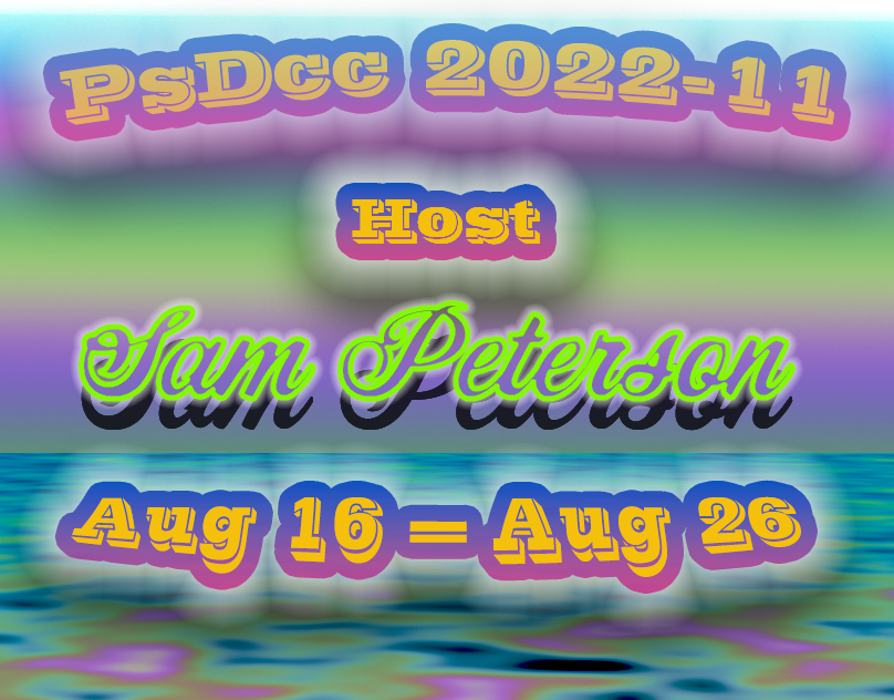
And here's 3 versions of my text portrait for Day 4 🙂


Hey everyone! Related to the first challenge, when Val said about the timeline, here's a super quick visual demonstration: when you go to Window > Timeline and the timeline does not appear, only an empty panel with a button, just click Create Video Timeline then you're good to go 😉

Also, if you see position instead of transform, make sure the layer is a Smart Object 🙂

Still catching up with last week's challenges that @bleak fossil lead us through, here's my miniature world for Day 7 🙂

Just now getting to Day 4 of @bleak fossil challenge text portrait. Love this lesson!

DCC01 today's challenge

Wow you took challenge 1 for the next level! The animations look very consistent and I really dig the way my eyes follow each shape very similar to the Trim Paths effect in  . Shading and texture are looking very spot on! Bravo
Awesome way to send to someone a happy birthday card! The blurred words gave a cool depth of field look. Well done! 🙂
Beautiful work, Dorina! 🥰
Thanks ❤️
Gave +1 Creative Carma to @coral stone
PSDCC - Day1

PSDCC_Animation Challenge_Day 1

Always lovely to see your works, mon ami! Great sense of movement and I loved the way you made the transition between highlight and shadow and vice versa, I think that is an excellent details. The final animation look very similar to the Netflix animation, can’t believe it’s all made in photoshop. Awesome work (as usual) 😊
That’s a nice animation, @visual pelican! Gives me some stop motion impression. The only point of feedback I would have is that you might brighten the letter K just a little more, so the middle part could be more visible, and enhance the sense of depth created by the shadows. Well done 👍
Gave +1 Creative Carma to @coral stone
Thank you. I see what you mean. I'll go back and work on that.
No problem 😉
PSDCC_Animation Challenge with changes. I lighted the K

Excellent improvement @visual pelican 🙂
Thank you. Your feed back has helped me improve and see where I need to make improvements.
Gave +1 Creative Carma to @coral stone
An other animation ... I used mask animation to achieve this effect instead of technique Val shown us... I found it works great for simple shapes ... What do you think?

Obrigado Valdair! I'm far away of the original animation but Photoshop animation have some limits (and me as well) but I appreciate your kind words!😉
You're doing more than great, Franck! Ps logo is stunning! Loved the high contrast between shadows and highlights suggesting a metallic surface. Great job 😄
day 1
Great approach playing with the opacity when the V exits the scene, there's a concept in animation which is anticipation, it's an excellent way to keep the viewers interested, I could see this concept when the V gets an impulse to leave the scene! The final animation was also very spot on. Keep it up!
Challenge 1 - Animation in Photoshop. I first forgott to remove the layer masks on the layers that I resized down & up and couldn't understand why it behaved strange. But I think it was a good mistake as I really learned why it happen 😎
Looking very nice, Anki! The shading established a great background/foreground sense. Also the weight contrast with crossbar of the A. These little mistakes that happens makes the design to become unique. Well done! 🙂
@paper shadow I really like the style of your image, especially the movement created by the swoosh. My point of feedback is about the perspective, you might make the top area a little thiner, so it can match more the perspective of the table, 👇 and if you want more of a sand look, you might consider adding more texture, but that comes to be a personal preference.

@paper shadow to illustrate what I mean about perspective, here's an example:
The Horizon Line is always the viewer's eyes level, everything above the horizon line you'll see the bottom area (the cube from the top), and everything below the horizon line you'll see it's surface. That's why I suggested the top surface a little thiner. Let me know if you have any questions 🙂


Thanks so much for posting here!
Above, I wrote some feedback to you 🙂
PSDCC_Blur Filters_Day 2 I created my own hour glass using the curvature pen tool and I used the path blur. Ok I used a premade debris brush, but I did tweak it a bit. lol

#challenge - DCC Animation - NOT for the faint of heart! Yikes! 😉
Yay! Curvature Pen Tool for the win! You did an excellent job with it, especially because of the level of difficulty that the symmetry brings. The sand is looking great as well, I loved the variations and the particles you created, very nicely done!
Thank you. I have a better time using the curvature pen tool than the regular pen tool, but it does take a LOT of work to get the curves just right. lol I learned a lot today.
Gave +1 Creative Carma to @coral stone
It came out great, @quiet fern! Timeline and Frame animation are really tricky in the beginning, I remember freaking out because I never saw the little arrow to change it lol. You did a very nice work with the animation and creating the highlights and shadows. Keep it up and if you need any help you can count on us! 🙂
Thank you, I just get absolutely frustrated and it’s my first creative challenge of the two weeks. If I were a beginner, and I’m definitely not a beginner, I would run for the hills to be honest. 😁🤦🏻♀️
Gave +1 Creative Carma to @coral stone
Oh yeees! Especially the double click trick lol, that's an amazing way to create curves or straight lines, definitely one of my favorite tools in Ps. 😄
Happens to all of us haha, I bet that you'll never forget about it haha
Animation with VooDoo Val! I did not realize changing a layer to a Smart Object was so significant. Wow! I had so much fun with this! Thank you for this opportunity!


@tropic knoll super cool work, you really took it to the next level, great timing, great attention to the details, excellent execution! Bravo @tropic knoll! (Also great to see your works again) ☺️
Aww, you made my day, Valdair! Thank you very much!
Day 1 - Motion
Is there a separate tutorial for this? Very kewl!!! 😎😎
I dig that spot light area, my friend, it gives a great theatrical atmosphere. Animation is very solid and consistent, especially the speed that each part of the H arrives. Can't wait for the next Hughflix show hah 🙂
I just googled "Animate layer mask in photoshop" and found the video linked below... It's a bit old but well explained... I hope it will help you to understand the principles used.
https://www.youtube.com/watch?v=OdMDySEPzUo

#animation #adobe #photoshop cc
How To Animate Layer Masks in Photoshop
- Add Type
- Create Layer Mask
- Animate Layer Mask
This video is long for me.: Almost 4 minutes. Sorry.
But, learn to Animate in Photoshop and you will go far in life 🤓.
- Add Type: Type Tool (T)
- Font Used Anthology Outline Demo
- To Ali...
Thank youuuuuuuu!!! 😎👍🏼
Gave +1 Creative Carma to @hollow yarrow
My pleasure to help!👌
DCC - Day 2
I went a bit wild on this...

Sooo much easier! I have been using it a lot lately to help select subjects lol
Beautiful work @hollow yarrow! I loved the way you played with the title, did you convert the letters to shape? Loved the shading, very concise and goes very well with the textures, awesome work 🥰
No Valdair, no shapes for the title. I kept the text editable... Font used is Filmotype Maxwell (lot of glyphs to play with).
Thanks for your feedback!👍
Gave +1 Creative Carma to @coral stone

Adobe Stock
Download Subtle grain texture. Abstract black and white gritty grunge background. Dark paint spray particles on paper Stock Illustration and explore similar illustrations at Adobe Stock.

Adobe Stock
Download terrazzo floor or marble beautiful Black and white texture, polished stone for background Stock Photo and explore similar images at Adobe Stock.

Adobe Stock
Download Perfect black brick wall as background or wallpaper or texture Stock Photo and explore similar images at Adobe Stock.
Woohoo Thanks for sharing @eternal mica 🥳
Gave +1 Creative Carma to @eternal mica
Day 2 ; Found this one was quite difficult couldn't quite get the effect 😩

You did it very well, @bold frigate! Great sense of movement, either for the sand or the element around the hourglass. I also loved how you made the overlap stand up adding a cool sense of depth. Excellent work with the textures as well!
I adapted this Animation challenge into my own. First time doing this thang 😄

Thanks @jolly quest for a wonderful week so far!!!!

Gave +1 Creative Carma to @jolly quest
Cool animation. You might want to check the spelling. I think you mean "jewelry" shop... (?)

Loved the color palette, @lean harbor! I can totally see it in the Essentials Graphics panel in Premiere, it would work out great as an intro. The only point of feedback I'd have is to increase the readability time by allowing the texts to last on screen a little longer. Well done 🙂