#feedback-discussion
1 messages · Page 168 of 1
 unborn sandal
 mint star
145 damage, more than half the cycle time of a spark or martini henry, and a really fast reload less drop, for $70
 rustic timber
Velocity?
 lime yoke
compared it to martini henry, the only meaningful disadvantage is lower velocity
its like 60m/s difference
mint star
340
rustic timber
Jeeez.
 lavish parrot
340
lime yoke
MARTINI
 lavish parrot
its quite a nice gun
mint star
medium ammos drop less than long ammo
lime yoke
CARBINE
 mint star
supposedly
lime yoke
i actually have no idea what were they thinking
mint star
yea what were they actually thinking with this weapon
lime yoke
also remember its 90$
lavish parrot
i only have a problem with the UI
lime yoke
this weapon is 90$
 faint linden
i get kicked out of every game at start.
rustic timber
Same imi
unborn sandal
Once people get to that point on the pass all we’re gonna be seeing is that carbine
mint star
this just makes the springfield, sparks, martini, centennial (it can use levering though) mako... like so many weapons just dumb?
faint linden
rustic timber
Same imi
is it easyanticheat fake shit or why
lavish parrot
im still seeing krags and mosin the most
lime yoke
feels a bit quicker than centennial from trying it real quick
unborn sandal
I’ll bet they give it hv too because that’s the direction they’re heading
 unborn dagger
The UI team that worked on the original one just seems to have fuckin vanished
unborn sandal
lavish parrot
im still seeing krags and mosin the most
Well every single player in the game has a deal Krag damage challenge
rustic timber
Imi.. try to delete the attribute file in hunt folder.. worked for me
 pure musk
Entire south edge of the map by Graystone Pit drops me from smooth 60 fps to 7 fps
mint star
unborn sandal
I’ll bet they give it hv too because that’s the direction they’re heading
maybe thats why they made HV do less damage now? but even still
unborn sandal
And it’s still the most powerful long ammo rifle in the game hands down
lime yoke
rustic timber
Imi.. try to delete the attribute file in hunt folder.. worked for me
got a better solution
 rustic timber
Does hv do less damage now? Whaaaat?
mint star
145 for medium ammo with a cycle time as fast as most single action revolvers is way way way too high
lime yoke
wait what? really?
unborn sandal
Yeah it’s just spitzer now
mint star
 lime yoke
they added HV to the drilling right? whats the damage on that, anybody knows?
mint star

 sick parrot
"we at crytek aim to reduce redundant tabs"


 floral nova
I have that gpu and everything is fine
 manic dock
the new process to equip hunters with gear is over engineered and wastes time compared to how it was set up previously, if it were up to me it wouldnt take you out of the tools screen(for example) when you choose to equip a melee weapon. I'm far from done at that point, I still need to equip medkit, choke bombs, etc, please stop defaulting me back to the previous page immediately after equipping a single item
floral nova
try setting everything to low and grow from there
mint star
manic dock
the new process to equip hunters with gear is over engineered and wastes time c...
can we even call that engineered?
 abstract wyvern
floral nova
try setting everything to low and grow from there
abstract wyvern
floral nova
try setting everything to low and grow from there
id doesnt work
manic dock
mint star
can we even call that engineered?
compared to how they had it previously, they probably had to go out of their way to design it to do that, otherwise it would still work the same. so yea i think over engineered is accurate, too much effort in a useless direction
lime yoke
WHO THE FUCK looked at this and said
 lavish parrot
they said that the UI was made for make it easier for console players
lime yoke
you know what that looks bad
lavish parrot
and they even hate it

 sick parrot
like someone said a few hours, this ui feels like it was made by the marketing team
 naive turtle
ERROR INFERNAL
 lavish parrot
the old UI was more simple
sick parrot
the original gritty look of the ui is gone too, its so clean and slick
pure musk
Like you can't tell me it's not a mobile/touch UI, it's designed for side swiping
It was made by a mobile designer clearly
lime yoke
lavish parrot
they said that the UI was made for make it easier for console players
first mistake
 stoic portal
Seriously, please fix the blinding effect a player has while ADS while on fire you literally cannot see
sick parrot
it reminds me of the chrome future episode of spongebob
sick parrot
they are slowly stripping this game of its character
and going to the same boring ass modern gaming model
sick parrot
one of the reasons i love this game so much is because of how unique it is
unborn sandal
COD: Showdown
sick parrot
the advertisements are so in your face and aggressive
i probably wont spend another cent until they fix this
 sick parrot
4 tabs to spend your money is ridiculous
mint star
aight
 rotund condor
message notification in top right and I can't access it >.>
 jade epoch
UI being designed by marketing could actually be legit - It looks like CoD hq, it looks like Netflix, it looks like a mobile game UI.
floral nova
abstract wyvern
id doesnt work
hmm. Maybe try deleting the shader cache from adranalyne
jade epoch
We shouldn't be worse than UI designs from 2005 guys.
Functionality, please.
MW2 (2009) is peak
Should not be going backwards
 flat fog
+1
jade epoch
Even Crysis 1 functions superior
 pure peak
🇫 🇮 🇽 🇹 🇭 🇪 🇭 🇺 🇩
 crystal shore
I cant be the only one who feels like the UI is overcrowded with bullshit and the old UI was alot more easier to navigate
 chilly hill
W T F happend to my game. This is so FREAKIN complicated to find anything or even equipping a hunter.
 mossy bough
curser on screen while in game fix?
 jade epoch
The new UI looks good for marketing cause it looks like every other games UI/UX - That's about it
floral nova
restart the game
lime yoke
crystal shore
I cant be the only one who feels like the UI is overcrowded with bullshit and th...
most people feel this way
 wide yacht
Map is awesome, definitely needs some optimization around the mines as the lag can get bad. But overall I love the terrain.
The UI for the menu is a straight up L on PC though. It feels clunky and fragmented unfortunately.
pure musk
jade epoch
The new UI looks good for marketing cause it looks like every other games UI/UX ...
Not really, it looks like mobile games from 10 years ago
jade epoch
Really does
abstract wyvern
floral nova
hmm. Maybe try deleting the shader cache from adranalyne
it didnt work
 jaunty nova
the new ui looks simple but look like take more steps to use it
 torn crow
Nice people complains only about the UI ... Game is great appart from that 🙂
jaunty nova
torn crow
Nice people complains only about the UI ... Game is great appart from that 🙂
yeah
 jade epoch
We were meant to have less clicks, and instead we got something worse than EVE
 devout aurora
Why can't I see KD or see what my teammates are using before starting the match, that is very stupid decision
chilly hill
old game i needed 2x6 clicks to equip a hunter with tools and stuff now i need 2x16 clicks...
jade epoch
I can navigate EVE blindfolded
torn crow
Now it need a serious perf optimization
abstract wyvern
jade epoch
We were meant to have less clicks, and instead we got something worse than EVE
yes you are damn right ć
 sullen quiver
the UI is kinda mcnasty ngl
jade epoch
You shouldn't be more annoying to navigate than EVE guys, c'mon.
torn crow
lol
mint star
chilly hill
old game i needed 2x6 clicks to equip a hunter with tools and stuff now i need 2...
that and 19 menus
jade epoch
That shit is a spreadsheet
 floral nova
abstract wyvern
do you have older amd gpu
floral nova
abstract wyvern
do you have older amd gpu
no, I have 7900xtx
if you tweak the gamma value does it change?
the shadows should get brighter
sullen quiver
feels very much like it was made for console and not pc
abstract wyvern
floral nova
no, I have 7900xtx
damnnn
rotund condor
Please change Necro to give us full hp when self reviving. Why the fuck does it state "Trigger Full Health Restoration Upon Revive" yet I came back up with less than 50 hp and died instanly. Great change
jade epoch
Not even for consoles, it's worse on consoles
sullen quiver
really?
abstract wyvern
floral nova
if you tweak the gamma value does it change?
how do you do that
floral nova
in the graphics settings
 storm pendant
@upbeat slate Only if you could disable it, I have a disability tht makes it almost impossible to play on night maps as it stands, having zero light would be even worse. I wouldn't want something like that unless I could opt out of playing on it
devout aurora
Anyone else's game crashing when they try to open the map?
jade epoch
You'd have an easier time navigating Destiny on console when you load her up after not playing for two years, bombarded with 20 menus about store related crap
The new Hunt UI on console is worse, I can guarantee you this was not designed for any platform but a phone
unborn sandal
 graceful lagoon
How
storm pendant
jade epoch
You'd have an easier time navigating Destiny on console when you load her up aft...
Okay look as someone who used to play destiny the current UI is poorly thought out and not well designed but that's just plain not true. D2's UI and navigation is some of the most confusing shit I've ever had to learn in gaming
 slim fjord
I would like the option to have the grid view default for hunters.
And the loadout screen really needs to have the complete loadout on one side and the equipment on the other, rather than the current pick a slot, scroll through all the options, pick what you want, get booted back to the loadout screen, rinse and repeat 6+ times
jade epoch
I dunno, I can deal with Destiny, and navigate EVE with my eyes closed, and not be overcome with frustration
sullen quiver
I kinda wish they'd make a legacy version of the UI
 errant roost
The new UI is a war crime and whoever made it has now officially committed more war crimes than a very specific Austrian artist
 formal kettle
The new UI is a war crime and whoever made it has now officially committed more war crimes than a very specific German leader
jade epoch
I'm not defedning Bungo with Destiny, that UI/UX is abysmal, but we went from something which just worked to something straight outta BlizzCon with an out of date april fool's joke
 stark gazelle
update is pretty cool but please go back to the old ui this is the worst change youve ever made
unborn sandal
The new UI is a war crime and whoever made it has now officially committed more war crimes than a very specific Argentinian resident
 dense ivy
I'm literally getting lost in the menus
storm pendant
unborn sandal
The new UI is a war crime and whoever made it has now officially committed more ...
That's maybe excessive but yes the UI is really bad, it takes 5x the amount of effort to do the same things, information is not presented in an easily readable manner and feels cramped
And they try to force you to look at the microtransactions every single chance they get
dense ivy
Still no drag and drop to change slots too 😂😭
 obsidian ginkgo
Hi.
To be a bit constructive about the UI: It is just a lot less intuitive then the old UI and that's the problem. I work a lot with GUIs and UIs as a Sysadmin and while some companies like to make weird UI changes there is usually always something intuitive that makes me find everything I want effordlessly. And if not, there is documentation. But both things are not the case here. I needed to actively search with friends after specific information, the display is overloaded and some menues do not even load correctly sometimes or overlap. The goal should be to minimize time in the menu so that you get to playing but if you really want to look at something in the menu you are just lost and even if you do find the information you are looking for it's complicated, at least in comparison to the old menu where I could reach everything with, oversimplifying here, three mouse clicks.
I am not saying that was the case but it really does look like someone asked a Marketing Department what a good UI would look like and they came up with this.
sick parrot
why is there a dot here
 storm pendant
jade epoch
So like a gacha game
storm pendant
jade epoch
So like a gacha game
Feels like it yes
dense ivy
Nah, I've played gachas with menus less confusing
storm pendant
dense ivy
Still no drag and drop to change slots too 😂😭
Are you serious?
devout aurora
Hey developers, can we have the option to revert back to previous UI, or be able to choose which UI we'd prefer please???
storm pendant
I feel like I want to make a YouTube channel just to go into detail about everything that stinks about the UI
dense ivy
storm pendant
Are you serious?
Yeessss
jade epoch
SirTorbit coming in with actual feedback that may get buried, but I commend the effort
graceful lagoon
unborn sandal
How
From the bounty hunt menu : click space > Inspect Equipment
graceful lagoon
space is the action menu. its literally a shortcut to things
 hot vigil
storm pendant
Are you serious?
hot vigil
storm pendant
Are you serious?
Things we wanted:
- Drag and drop
- Better overview of legendary hunters
- easy bar respec
We got like 1½ of that lol
storm pendant
hot vigil
Things we wanted:
- Drag and drop
- Better overview of legendary hunters
- easy ...
Did... did we get any of that?
graceful lagoon
unborn sandal
On your keyboard?
yes
unborn sandal
hot vigil
Things we wanted:
- Drag and drop
- Better overview of legendary hunters
- easy ...
We got half of that
storm pendant
Bar respec is still a pain, the overview of legendary hunters is cramped
obsidian ginkgo
jade epoch
SirTorbit coming in with actual feedback that may get buried, but I commend the ...
I mean you read it and someone else gave a thumbs up. That's two people. So two more then I thought I would reach. Lol
unborn sandal
Respec is maybe slightly better
jade epoch
True
storm pendant
Fuck it, I'm gonna make a video and go into excruciating detail about why the UI elements suck, see you fellas in 2 weeks
unborn sandal
They’ll “fix” it and make it even worse so you gotta update it
hot vigil
storm pendant
Did... did we get any of that?
Respec is somewhat easier, but still... yeah
The grid overview of legendary hunters is there, but getting to that menu is a hassle
 rancid plover
I've been black screened since the update came out... anyone in the same boat?
 final cypress
I hate to do it to 'em, but I had to
rancid plover
all I have is a cursor and a black screen
final cypress
 storm pendant
hot vigil
Respec is somewhat easier, but still... yeah
The grid overview of legendary hun...
storm pendant
hot vigil
Respec is somewhat easier, but still... yeah
The grid overview of legendary hun...
The grid overview is also cluttered and very cramped
unborn sandal
rancid plover
I've been black screened since the update came out... anyone in the same boat?
Do you have an amd cpu?
rancid plover
unborn sandal
Do you have an amd cpu?
intel i7 11700k
1070ti
Windows 10
 coral nest
what I can recommend is to go leave a honest review on their store page
unborn sandal
Idk then
hot vigil
storm pendant
Fuck it, I'm gonna make a video and go into excruciating detail about why the UI...
Please point out how SO many of the menus is like 4 boxes, where as the arrow just slide to the last box, which could have been in frame if they just moved the UI 1cm to the left where there is nothing anyways.
rancid plover
updated my graphics drivers done loads of stuff been trying to troubleshoot it for hours
jade epoch
That looks like what consoles had to deal with since launch. You running Hunt on a HDD?
sick parrot
who thought this looked good?
 unborn sandal
The games been very unfriendly to amd CPU’s I’ve heard
unborn sandal
sick parrot
who thought this looked good?
No one
storm pendant
hot vigil
Please point out how SO many of the menus is like 4 boxes, where as the arrow ju...
Send me all of your grievances in DM for me to focus on. I'm taking a look over the feedback channel and collecting points to look at.
rancid plover
yeah I've heard the same with the shaders etc
jade epoch
Have we entered the shader compliation realm of trash with Hunt
hot vigil
storm pendant
Send me all of your grievances in DM for me to focus on. I'm taking a look over...
https://www.reddit.com/r/HuntShowdown/comments/1dggz1g/new_ui_a_pc_guys_personal_opinion_mixed/#lightbox
This guy poinred out all the issue months ago

Reddit
Explore this post and more from the HuntShowdown community
jade epoch
Look at that and tell me you don't see CoD
coral nest
HUNT TEAM GOT TORE UP ON TWITTER ABOUT THIS UI AND STILL WENT THRU WITH IT THEY REALLY DONT CARE ABOUT US
jade epoch
That is literally CoD since 2019 and they looked at that crap and thought it looks appealing
coral nest
Freely you know what the cards we designed for right?
rancid plover
does anyone else have the black screen issue? seen it all over the steam discussions but no one is mentioning that a lot of the player base can't even see this bad UI cause we're locked in black screen & cursor on start up
chilly hill
Even if its COD.... i can ignore how it looks like.. its just a hell to navigate
unborn sandal
coral nest
HUNT TEAM GOT TORE UP ON TWITTER ABOUT THIS UI AND STILL WENT THRU WITH IT THEY ...
They’re full of themselves and think all their ideas are perfect. They don’t really care what the community thinks under this new lead dev’s direction
coral nest
Console players.
they made things into cards to easier navigation on console for the folk that have a IQ lower than a to navigate
 lime sand
Hunt showdown really really likes X3D cpu's now
chilly hill
Look at the freakin Teamdetails at the end of a round... now you need to scroll... why. The old one was perfect
coral nest
Someone in here called it Menu Showdown earier
jade epoch
But this shit is even worse on console, my guy. Ain't nobody on console praising this UI change, it was better before
lime sand
coral nest
Someone in here called it Menu Showdown earier
I saw Hunt Sit Down
lime sand
jade epoch
But this shit is even worse on console, my guy. Ain't nobody on console praising...
and it was bad before
hot vigil
@rustic timber the damage loss of HV is 5% it is not a whole lot
coral nest
jade epoch
But this shit is even worse on console, my guy. Ain't nobody on console praising...
im not saying its getting praise. im saying they are following the lead of cod and fortnite beacuse they think the mainstream works
lime sand
Honestly, get a consultation from a company that does UX
unborn sandal
hunt was good because it was unique
jade epoch
Oh, it was terrible. It was slow, wouldn't function right, constant "Something Went Wrong" when you used the search function, and I still would rather have that
lime sand
unborn sandal
hunt was good because it was unique
I mean, its basically the only non zero sum shooter
unborn sandal
They’re taking away all the uniqueness and leaving the jank
coral nest
I mean the only real way of fixing this is putting an honest review on their steam page.

 fallow gale
mythical disappointment, too many issues to let this go into production, also it says battepass on every screen, that is the first thing i wanted to buy before i even logged in but i wont if you try to subtly influence me into buying it. Really trying to treat the customers like idiots, who in the office comes up with such dogshit ?
jade epoch
Marketing
If you get bombarded by MTX and BP shit from every menu? It was designed by marketing
You either get pissed off enough to piss money away, or delete the game
coral nest
They have already lost 20k players since peak
 tired pivot
coral nest
I mean the only real way of fixing this is putting an honest review on their ste...
tired pivot
coral nest
I mean the only real way of fixing this is putting an honest review on their ste...
wait, where did you find this?
coral nest
 coral nest
tired pivot
wait, where did you find this?
coral nest
tired pivot
wait, where did you find this?

SteamDB
Hunt: Showdown 1896 is a new era of the addictively unforgiving extraction shooter. In corrupted backwaters lost to history, fight back alone – or with friends – against timeless evil. Twisted monsters and other ruthless Hunters stand between you and your Bounty. Risk everything as Hunt consumes you
Hunt: Showdown 1896 Steam charts, data, update...
rancid plover
tired pivot
wait, where did you find this?

Hunt: Showdown 1896 is a new era of the addictively unforgiving extraction shooter. In corrupted backwaters lost to history, fight back alone – or with friends – against timeless evil. Twisted monsters and other ruthless Hunters stand between you and your Bounty. Risk everything as Hunt consumes you.Take rich bounties and kill anyone that tries ...
Price
$23.99
Recommendations
163931
Metacritic
81
coral nest
rancid plover
or here https://store.steampowered.com/app/594650/Hunt_Showdown_1896/#app_review...
That doesn't go as in depth as steamdb
makes steam look like a joke
jade epoch
I'm waiting for what General Sam thinks of the new UI when that guy couldn't navigate the old one to save his life
coral nest
under their own API
obsidian ginkgo
jade epoch
If you get bombarded by MTX and BP shit from every menu? It was designed by mark...
I mean we don't know that for sure and speculating is not something I usually do but I had my fair run in with marketing departments and I find it funny that my initial thought was that it indeed looks like they (Marketing) either suggested or designed it.


 jade epoch
@obsidian ginkgo It's the only thing to which makes sense. Nobody with experience would design something which aims to annoy you, purposefully.
fallow gale
marketing calling the shots in a game like this, the devs must be without any backbone whatsoever
coral nest
UX team did this with gun to the back of their head or they hired the most underqualified person that would be a yes man
jade epoch
The average dude on Reddit with like three months of design experience could haphazard something superior in roughly 20 minutes.
floral nova
coral nest
120 on a 4k
it's not 4k
unborn sandal
floral nova
I have an i9 14900k and a 4090 and at max settings on 4k I was getting about 70 fps. I lowered some of em so I would get 120
obsidian ginkgo
idk I want to be fair here. It could also be that they threw in a lot of ideas from different people and that's why you have, as an example, three separate sub menus on the Home Screen: You have the information windows and what not on the left side, the top side with Home, Hunters etc and the upper right corner with your settings and lobbys and all that.
And the lower section of the main screen with the play options. That's just too much...
jade epoch
With a 4090 I would expect you pulling in at least 150+ frames
floral nova
abstract wyvern
how do you do that
you got my settings here https://discordapp.com/channels/350201607788429323/367785159933689857/1273773462267101245
obsidian ginkgo
A normal side menu with a sick animation or Hunt Showdown graphics on the right side with "Play", "Hutners", "Armory/Gear", "Store" and maybe a news window at the side. Like, having one menu from where you go where you want to be.
floral nova
jade epoch
With a 4090 I would expect you pulling in at least 150+ frames
well that's arbitrary
unborn sandal
before on completely maxed settings I rarely dropped below 140
obsidian ginkgo
and now if I press one button by accident on the home screen I might land in one sub menu of like... 13 different sites and menus I can/need to access from the home screen lol
jade epoch
True, true, but the dude has a 4090 - That shit is so overpriced and so overkill that it's a terrible purchase, and he should be annihilating everything, anyways
I dunno about 4k though
floral nova
unborn sandal
before on completely maxed settings I rarely dropped below 140
it was a game from like 6 years ago 😄
jade epoch
Yeah, we went from the least amount of clicks to navigate to having more clicks than your average EVE session
obsidian ginkgo
jade epoch
True, true, but the dude has a 4090 - That shit is so overpriced and so overkill...
Yeah right. Who would buy a 4090 for that price. Cries in 4080 SUPER for the price of his soul
unborn sandal
I was playing on a 6 year old laptop so I wanted to treat myself
 errant bronze
i wonder if they tested this build before launch it to public acess
unborn sandal
Also it wasn’t all that expensive
errant bronze
bro, this is heavy bugged
hot vigil
coral nest
I mean the only real way of fixing this is putting an honest review on their ste...
I'M FREEEEEEEEEEEEE, FREE FAAAAAAAAALLING!
jade epoch
CryENGINE still nasty for the CPU right?
obsidian ginkgo
errant bronze
i wonder if they tested this build before launch it to public acess
I know that the UI already got critized when they first showed it. But that's about it. I liked some of the things I saw and I still like them. The Hunter Overview is way nicer. Traits as well (even tho I miss the large icons since they looked cool) but again: The main bad thing is that the main menu is just overloaded and not simple to navigate...
jade epoch
Regardless, you running a 4080, 4090, 7900 and whatever, I would expect you to have a flawless, glorious, orgasmic session of video gaming.
unborn sandal
I haven’t seen anything with the ui that I thought was a positive change
errant bronze
obsidian ginkgo
I know that the UI already got critized when they first showed it. But that's ab...
overloaded, with delay in response
 undone crypt
Title: I HATE THE NEW UI
This new UI is straight garbage and belongs in a COD lobby not on hunt.
I've gone from one click to start a game to it being buried through 3+ menu clicks. Who thought this was a good idea? Whoever designed the new UI should be FIRED!
And seriously, what was wrong with the old UI? It was great, it didn't look like every game ever made, it had it's own look and feel and not I swear I expect to suddenly hear squeakers screaming racial slurs followed by the cod announcer calling in an air strike. FIX IT!
Also a Battlepass!?!?!? Seriously? WHY?!? Why do you have to copy games I HATE HATE HATE HATE HATE!?!? I seriously hope this was a late April Fools or at least gets fixed quickly.
obsidian ginkgo
jade epoch
Regardless, you running a 4080, 4090, 7900 and whatever, I would expect you to h...
I played 5 minutes after the Update, got killed meters away from the just killed new boss (did not even see him in full action) and afterwards our matchmaking was broken and we couldn' queue again. I lost one friend in the labyrinth of the Menu Screen, we went in with a search party but still can't find him.
so we stopped trying for today.
jade epoch
Maybe this was by design. We would focus so much on the garbage UI/UX that we would ignore everything else that's wrong with the update, like performance.
unborn sandal
Or weapon balance
jade epoch
That, too
unborn sandal
Or this new wild target. In an open area it fucking sucks to fight
You’re pretty much guaranteed to lose a few bars
jade epoch
I kinda dig the budget Arch-vile, though
hot vigil
unborn sandal
Or weapon balance
Honestly I like the balance changes.
Like fire is gonna be an issue down the line, but let us see how long it takes for people to realize that
unborn sandal
hot vigil
Honestly I like the balance changes.
Like fire is gonna be an issue down the li...
Have you looked at the Spencer carbine
Spear is still busted
Krag is still the best long ammo by a large margin
storm pendant
hot vigil
Honestly I like the balance changes.
Like fire is gonna be an issue down the li...
So funny thing, we actually had hellfire bombs that were very similar to the buffed ones. They were OP as hell, every sweat had 2 in his inventory. Impact nade meta is back again and I promise it's gonna be a problem
jade epoch
To be fair, there's really not much else to play that isn't already trash, anyways. Realistically, what else even is there.
Tarkov
Hahaha.. ahhh..
unborn sandal
dark and darker
storm pendant
Singleplayer indie FPS's are the future
storm pendant
unborn sandal
dark and darker
I mean yeah but that's not really the same niche
If you want to try an awesome game that shares some DNA with Hunt, try CULTIC.
jade epoch
Cultic chapter 2 when
storm pendant
jade epoch
Cultic chapter 2 when
Soonish
undone crypt
They either fix the UI or I'm likely just going to drop the game and go back to Elden Ring,Once Human and really anything but this, I HATE COD, they need to reverse direction on trying to turn this into COD
storm pendant
jade epoch
Cultic chapter 2 when

Welcome back to the unintentionally annual CULTIC dev log series!
We're going to recap everything that's happened since last dev log that I can think of, and give a quick look at some of the new content coming in Chapter Two!
You can get regular updates on CULTIC's development on my Twitter, or by joining the JasozzGames Discord!
https://x.co...
jade epoch
Oh shit
storm pendant
jade epoch
Oh shit
Probably not this year but early next year
jade epoch
That's fine
hot vigil
unborn sandal
Have you looked at the Spencer carbine
That is true the Specter Carbine seems really strong guess Crytek assumed the low muzz was good enough downside.
That said, when the old maps rolls back in and people fights at longer ranges it might not be as universally good. Rn people don't know the map and fights tends to get close.
Spear, yeah true
Krag seems good too, that said, Berth got a silent buff with ammo total now being 21!
jade epoch
I've got Fallen Aces to schmuck around with, and Selaco to do the same
unborn sandal
This map has longer angles than the other maps from what I’ve seen
hot vigil
storm pendant
So funny thing, we actually had hellfire bombs that were very similar to the buf...
I just gonna congaline fire beetles with my trio.
Or even stalker beetle now they deal 50 damage lol
storm pendant
jade epoch
I've got Fallen Aces to schmuck around with, and Selaco to do the same
I don't like fallen aces tbh
storm pendant
hot vigil
I just gonna congaline fire beetles with my trio.
Or even stalker beetle now th...
I liked doing that before, now it's going to be even scarier
unborn sandal
hot vigil
That is true the Specter Carbine seems really strong guess Crytek assumed the lo...
Why the fuck did they give the berthier more ammo
hot vigil
unborn sandal
Why the fuck did they give the berthier more ammo
:))))))))))))))))))))))))))))))))))))))))))))
storm pendant
unborn sandal
Why the fuck did they give the berthier more ammo
Pick rate low, therefore more ammo, I'm guessing
I love the berthier but it really did not need more bullets
It just needs a faster bulletgrubber reload, that's literally it
 little ether
I think the New UI is inferior to the old UI in ervery way possible
but i Love the new Map
unborn sandal
It didn’t need anything
hot vigil
Also Winnie loses bullets with HV, not sure if its balance or a bug lol
unborn sandal
The Krag needed a nerf
storm pendant
unborn sandal
It didn’t need anything
Ehhh you gotta admit the bulletgrubber reload is way too slow
unborn sandal
hot vigil
Also Winnie loses bullets with HV, not sure if its balance or a bug lol
Everything does
Hv loses you ammo
And damage now
hot vigil
unborn sandal
Everything does
I know it was true for spitzer, but also HV?
Honestly not too miffed about that.
jade epoch
Realistically, likely just gonna finish reading Roadside Picnic, play Hunt, when the framerate gives me a headache, probably play Elden Ring, or get punched in the face by GAMMA some more.
unborn sandal
I don’t know why the martini got hv and not spitzer
storm pendant
jade epoch
Realistically, likely just gonna finish reading Roadside Picnic, play Hunt, when...
That's a good book
pure musk
Frames on the map are SOO unstable it's insane
Shouldn't be getting like 60+ frame dips
storm pendant
unborn sandal
I don’t know why the martini got hv and not spitzer
Yeah the only differrence is spitzer gets more pen now
obsidian ginkgo
wrote an UI idea in the #game-ideas :) Maybe up or downvote?
jade epoch
It's likely better than what we got cause you don't work in marketing
storm pendant
Alright folks, DM me your grievances with the new UI so I can look at them, I'm compiling a bunch of things and making it into a short presentation. Please don't just DM me "undo UI" because that is really not helpful
hot vigil
unborn sandal
I don’t know why the martini got hv and not spitzer
Guess bc it was only the martini enfield that could house spitzer rounds
hot vigil
jade epoch
Speaking of GAMMA - Stalker has a better UI
Bc it is a PC game made with PC menus
jade epoch
By big daddy modder chads
hot vigil
unborn sandal
Don’t try to tell me crytek is going for realism
It is a coin flip, sometimes they stick to weapon realism sometimes they don't.
unborn sandal
Hunt has a much bigger pc population than console
unborn sandal
hot vigil
It is a coin flip, sometimes they stick to weapon realism sometimes they don't.
They only stick to realism when that royal armouries guy complains about it
 craggy hazel
I have a verry hight end pc, and this is what the game tells me when I max all graphics.
So why in hell does the game struggle to go past 60fps? (checked its not capped)
 storm pendant
craggy hazel
I have a verry hight end pc, and this is what the game tells me when I max all g...
storm pendant
craggy hazel
I have a verry hight end pc, and this is what the game tells me when I max all g...
Very poor optimization
unborn sandal
Neither my graphics card nor cpu are chugging and I only get 70 frames
 frank hedge
Anyone finding tunnels and compounds to have washed out blacks? Before in the shooting range the tunnel and prison had great contrast but now they look very washed out. I have an OLED and it's like going back to my IPS
storm pendant
I wonder how many days it'll take before we get any official acknowledgement that there's a problem
storm pendant
frank hedge
Anyone finding tunnels and compounds to have washed out blacks? Before in the sh...
Do you have an AMD CPU/GPU?
There are a lot of visual and stability bugs on AMDs
frank hedge
No it's Nvidia
storm pendant
frank hedge
No it's Nvidia
What about your CPU?
craggy hazel
unborn sandal
Neither my graphics card nor cpu are chugging and I only get 70 frames
I manage to get 120 fps on maxed out RDR2, so lets be honnest, Hunt,even updated, should be able to run at at least 125 fps lmao
frank hedge
storm pendant
What about your CPU?
Yeah it's a 7800x3d
 crystal plume
craggy hazel
I have a verry hight end pc, and this is what the game tells me when I max all g...
crystal plume
craggy hazel
I have a verry hight end pc, and this is what the game tells me when I max all g...
Because that is the indicator for amount of VRAM used, not how much if your gpu performance is used
frank hedge
Outside it's fine and blacks look great but it's like there's a layer of fog in the mines or compounds
 signal briar
FPS DROPS AT BOSS LAIR
storm pendant
frank hedge
Yeah it's a 7800x3d
That's an AMD, could be related
craggy hazel
crystal plume
Because that is the indicator for amount of VRAM used, not how much if your gpu ...
Checked task manager in game, none of it is struggling.
If i can get 120 fps on RDR2 max graphics,Hunt,which is comparatively much less of a game in general,should go at at least 180 fps,but for some reason its not.
My fps isnt capped I checked
frank hedge
storm pendant
That's an AMD, could be related
So you don't have that issue? My friend who has an intel chip is saying the same thing
storm pendant
frank hedge
So you don't have that issue? My friend who has an intel chip is saying the same...
In the one game i played, a lot of the greys are washed out and it's hard to see people, but honestly I'm more focused on the micro-freezes during shootouts and crashing
I've dropped the game until there's some hotfixes to make it playable
I feel bad for the people who took off work for this
hot vigil
storm pendant
I feel bad for the people who took off work for this
I've gamed for enough years to know that is a fools errand to do.
 karmic tulip
i really like the update but to put skins on the weapons is a mess make it all one page or the old style were you swipe across
 gritty light
You guys at Crytek 100% deserve the review bombing for prioritizing a shitty console UI over your PC playerbase
 zealous totem
It specifically overheats my ps5 very quickly as well
 timber tangle
UI is awful, wp crytek, UI console wp wp
 inner quiver
Guys they're actually fucking listening, the hunt news section got nuked from the home page :D either that or my menu is bugged
keep up the complaining
frank hedge
storm pendant
In the one game i played, a lot of the greys are washed out and it's hard to see...
Yeah that's it, it's a very washed out grey.
Yep, my mate with AMD had to turn it off, completely unplayable.
It ran fine for me other than one disconnect and when I reconnected I spawned 50 meters in the air and fell to my death without necro 😂
Sucks for people who just bought it and will turn a lot off it
storm pendant
craggy hazel
Checked task manager in game, none of it is struggling.
If i can get 120 fps on...
Estimating what you 'should' get is a bit of a slippery slope, RDR2 is a singleplayer title made on a totally different engine w/ a totally different framework. Yes, Hunt has awful performance rn though
craggy hazel
storm pendant
Estimating what you 'should' get is a bit of a slippery slope, RDR2 is a singlep...
Even intensive games like Rust and ARK get 100 fps on maxed out graphics, Hunt had 170 fps before the engine update
And i doubt that the minor graphics boost bumped it down by 70%
hot vigil
gritty light
You guys at Crytek 100% deserve the review bombing for prioritizing a shitty con...
Well seen reports that console people having issue with it soooo
sick parrot
feels like theres more sway
hot vigil
sick parrot
feels like theres more sway
scopes seems to sway more
mint star
the suppressor is invisible lol
 storm pendant
mint star
the suppressor is invisible lol
storm pendant
mint star
the suppressor is invisible lol
Stuff derendering randomly, especially equipment is a big problem rn too
sick parrot
i get invisible knuckle knife a lot
zealous totem
Yes console ps5 specifically for me has bad lagging type issues , messed up dark sight at times, black out areas plus makes the console itself overheat within 45 min
sick parrot
hot vigil
scopes seems to sway more
aim just feels off
good news! reconnecting is MUCH better
hot vigil
sick parrot
aim just feels off
There is a lot of micro stutter for a lot of people (including me)
might be that
 prime epoch
This new map is just insane, i really hope they do ajustement on other old map because we gonna cry when gonna play on it
storm pendant
If anyone has footage of the old UI please sent it to me
 sonic ivy
the menue is awefull... takes like 10 times longer to get ready for a match.
storm pendant
The things I'm looking for the most are equipping weapons, inviting people to games, navigating between menus, etc
 grim saddle
Did we get any official feedback about the UI situation for now?
 warped valley
Not gonna lie, I didn't it was possible to make the UI worse, kudos
We can't even see our teammates equipement anymore / perks in the lobby ad well, rip
 rapid ermine

 shrewd sleet
anyone find a fix for the blackhole shadows?
rapid ermine
 unborn sandal
sick parrot
good news! reconnecting is MUCH better
unborn sandal
sick parrot
good news! reconnecting is MUCH better
No it’s not. Friend dc’ed and tried reconnecting 4 times to no avail
sick parrot
i got it no problem
its better than before, i didnt even get any noise issues
for me at least
timber tangle
Can't we get back to the old UI ?
sick parrot
honestly, i feel like every page of the ui was made by a different person, this is so inconsistent
 flat oar
This UI is a Joke, when they revealed it in the trailer everyone said it was gonna be bad. but we thought maybe they would have changed it by the point of release.
This UI is a insult to the playerbase. "easier" my ass.
zealous totem
Ui aside , makes ps5 overheat and has stuttering, and graphic issues
Very disappointing 😞
hot vigil
grim saddle
Did we get any official feedback about the UI situation for now?
devs are german, they eepy now.
Assume they gonna look at data tomorrow and have meeting on monday and then maybe tuesday we gonna hear something.
hot vigil
flat oar
This UI is a Joke, when they revealed it in the trailer everyone said it was gon...
It that "this is shit" meme all over again
flat oar
they have removed so much from the game with this, no more after match card system. nows its just a bland end game screen, along with the removal of the library just to shove 13 separate notifications for the battle pass. we have devolved so far from the base game to the point where it feels more like warzone or fortnite.
timber tangle
it's a mobile game now !!
 hazy torrent
one of my issues is the hunter selection menu, can we have it defaulted to grid view or at least persist grid and sorting
shrewd sleet
flat oar
they have removed so much from the game with this, no more after match card syst...
couldnt agree more man
flat oar
to unequip a tool, you have to enter a different menu to do so.
hot vigil
flat oar
they have removed so much from the game with this, no more after match card syst...
there is one, just hidden away in another menu lol
 sonic kettle
??
 hot vigil
sonic kettle
??
hot vigil
sonic kettle
??
But hey! 120 fps1
sonic ivy
The UI is so bad. It takes ten times longer to start a single game. Every change to a hunter, weapon, or trait is tangled in a labyrinth of inconsistent windows, each with its own clunky design. The interface is so deeply nested, it feels like it's on the verge of collapse. When equipping a hunter, there's no way to see your existing gear without jumping to an entirely new screen for each individual item, be it a weapon, tool, or consumable. The UI is grossly oversized, wasting valuable screen space and forcing players into a frustrating loop of menu hopping.
Match statistics are a mess—you can only view them once before the button becomes useless. If you dare to check a hunter's details in the match stats, a massive box takes over a third of the screen and can't be closed, trapping you in UI hell.
After sinking thousands of hours into Hunt Showdown and spending hundreds of euros on Blood Bonds, this update has extinguished my love for this game in just a couple of hours.
flat oar
hot vigil
there is one, just hidden away in another menu lol
bro there is no way.
i have to track down the damn Ui system
grim saddle
Old UI you could see which perks you can choose with your perk points left. To expensive perks would be grayed out...Now you have to check every perk and the costs.. I have the feeling they took all the good points from the old UI out and tried to make it as bad as possible.
rapid ermine
so everyone agrees to keep the old UI and get rid of that dog sht new call of duty one?
keep the map and graphics
ty
timber tangle
rapid ermine
so everyone agrees to keep the old UI and get rid of that dog sht new call of du...
yeah pleas anyone tell them
 exotic ore
Nah I like call of dooty
Best game evare
I like the gun that goes brrrrrrrraaaap
Chugga chugga
Keep the ui
timber tangle
👏
 unique quarry
rapid ermine
so everyone agrees to keep the old UI and get rid of that dog sht new call of du...
unique quarry
rapid ermine
so everyone agrees to keep the old UI and get rid of that dog sht new call of du...
I'm willing to pay for a DLC called, "Old Hunt UI" so that I can just easily do my loadouts again.
rapid ermine

 gaunt anchor
please Hunt fix your game the menu is horrible and ugly
sick parrot
rapid ermine
thats an insult to the goofy dragon
north star is still west, game is unplayable

 hoary mauve
UI is unintuitive and not easy accessible for PC, it is brain damaging, not to mention that u can't access last mission report.. release PC UI DLC, i'll buy it
hot vigil
 brazen owl
just dropped 100 frames looking at a compound
brazen owl
just dropped 100 frames looking at a compound
Just wanna drop this quote from an interview:
this is our most polished map we've ever shipped
exotic ore
I just farted n me knickers are fookin soaked
brazen owl
am i dumb
mint star
LOL when a teammate picks a trait, it closes your menus in game
hoary mauve
u mean bottleneck?
hoary mauve
brazen owl
I opened my map while vaulting and my game crashed
ofcorse, never do that again
grim saddle
Is there a way I can see my Hunter in FULL size? Not only the upper part because the big boxes are blocking the lower body?
I want to see the FULL Body? how?!
 obsidian sorrel
Game crashes on map open sometimes.
UI is absolute trash.
Framedrop on entering new compounds, but its not consistent.
Suggestion; Fire the corpo asshat who decided to change the game this much and semi-revert the UI.
 velvet grotto
I agree, until they change something I'm probably out for the count. 3500 hours of hunt and an immense amount of support to cryteks team but this is ridiculous. It's honestly disrespectful at this point to the community.
hoary mauve
u ask a teammate for share screen XD
storm pendant
Holy shit, the spencer carbine deals 145 damage, it's objectively better than the martini ironside in almost every way except for damage falloff over long range
mint star
yeah, they were smoking crack with the spencer
grim saddle
Just watching this video and I have to laugh.. We want to make the new UI more user friendly hahahah
https://www.youtube.com/watch?v=W9t3367gKTA
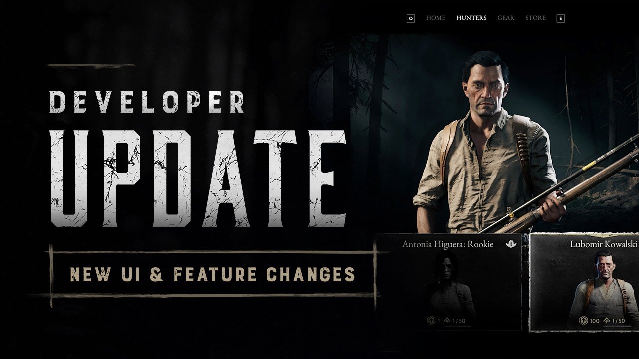
The first reveal of our upcoming UI/UX overhaul is here.
For this week’s Developer Update, learn more about the changes and features of the new UI in our latest video. 🎨
00:00 - Intro
00:12 - Why The Change?
01:22 - Designing For Console Players
02:21 - Features: New and Old
03:56 - New UI Features
05:45 - Actions Menu
06:12 - Health Bar Respe...
timber tangle
anyway we can contact devs ? or rachta ?? or whoever
grim saddle
timber tangle
anyway we can contact devs ? or rachta ?? or whoever
Feel free to write an E-mail or a review on steam or a feedback
storm pendant
timber tangle
anyway we can contact devs ? or rachta ?? or whoever
Please do not harass streamers.
 timid tiger
i just had like 10 of my hunter slots deleted due to dismissing random hunters that replaced my lvl40-50 hunters, im hoping its just a visual bug and a re-launch fix's it
timber tangle
storm pendant
Please do not harass streamers.
there is a gap between harassing and " contacting " ??
storm pendant
timber tangle
there is a gap between harassing and " contacting " ??
What on Earth could you possibly want to contact him about in regards to the update? He had nothing to do with it
 night tree
The thing that bothers me a lot more than the modern CoD UI is the modern music while Im in the menus.
Hunt should never have modern music
timber tangle
c'mon it's common knowledge he plays hunt with devs, maybe he can politely ask some questions
gaunt anchor
timid tiger
i just had like 10 of my hunter slots deleted due to dismissing random hunters t...
omg wtf
 little fulcrum
@frank hedge did you turn on HDR in game? if HDR is on ingame and your monitor isn't doing HDR properly you will get washed out color.
storm pendant
timber tangle
c'mon it's common knowledge he plays hunt with devs, maybe he can politely ask s...
Yeah no, don't track down a streamer to try and get him to ask questions you want him to ask. Please do not harass streamers.
timid tiger
gaunt anchor
omg wtf
if it doesnt fix im just gonna have to make a ticket
night tree
The ONLY music that should ever be in Hunt should be from the Port Sulphur Band
timber tangle
storm pendant
Yeah no, don't track down a streamer to try and get him to ask questions you wan...
Yeah no, there is a gap between harassing and " contacting " ??
unborn sandal
timid tiger
i just had like 10 of my hunter slots deleted due to dismissing random hunters t...
They were the hunters you got from prestiging and overflowed your hunter slots. You didn’t actually have those hunter slots
night tree
It breaks my heart, but I had to mute the music
timid tiger
unborn sandal
They were the hunters you got from prestiging and overflowed your hunter slots. ...
I only had 22 slots
 spring bridge
Steamers arent your personal mailmen to the devs, send in a support ticket, or reach out to official accounts to provide your feedback. If I was a streamer and someone bugged me to talk to the devs I'd ban them from my chat like that.
storm pendant
timber tangle
Yeah no, there is a gap between harassing and " contacting " ??
What you're describing is harassment. Please use official channels, like steam reviews or the #feedback channel. Community managers come through and scoop up feedback regularly
 dreamy gazelle
hello kings, where could some feedback be seen by Crytek? Is the feedback channel the right place?
this is my feedback
https://www.reddit.com/r/HuntShowdown/comments/1etae15/with_the_general_cleanup_and_adjustments_to/
Reddit
Explore this post and more from the HuntShowdown community
night tree
I also have no interest in filling up hunter slots now. I do not want to scroll through them forever
storm pendant
dreamy gazelle
hello kings, where could some feedback be seen by Crytek? Is the feedback channe...
Feedback or suggestions-ideas
night tree
Imma just do one hunter at a time now
spring bridge
night tree
Imma just do one hunter at a time now
Thats how i've always done it NGL
 visual forum
Nice, lots of bugs, and the performance heavily downgraded. Now God know if i'll ever be able to farm the event. GJ Crytek
timber tangle
storm pendant
What you're describing is harassment. Please use official channels, like steam r...
It is absolutely not, and that's kind of serious accusation. Telling something to a streamer is not tracking him down and talking to him is no harassment, you live in a very strange world.
unborn sandal
@little fulcrum teammates items don’t get grayed out anymore they just disappear when used
spring bridge
So I managed to get my FPS kinda close to where I want it. Greystone pit or the quarry (whatever its called) is 100% tanking my FPS. I go from 119ish to the mid 30s, its wonky
night tree
spring bridge
Thats how i've always done it NGL
I liked to have a few qued up in case I got free upgrade points from the Dark Tribute. Now its not really worth it. I want to be able to just glance at my roster
little fulcrum
unborn sandal
<@658685123549593601> teammates items don’t get grayed out anymore they just dis...
they don't dsiappear when used.
timid tiger
does anyone know how to make a ticket?
unborn sandal
night tree
I liked to have a few qued up in case I got free upgrade points from the Dark Tr...
Speaking of dark tribute I collected mine and got no pop up or nothing. Dunno if I actually got nothing or got something and don’t know what it it
spring bridge
timber tangle
It is absolutely not, and that's kind of serious accusation. Telling something t...
If not harassment, then its presumptuous that a streamer will listen to a random chatter they've never talk to just for the sole purpose of providing feedback. Official platforms exist for the sole reason of compiling feedback from the community.
If a streamer told me (source I work in the industry) "someone in my chat said this" I'd look at them like they were crazy.
spring bridge
night tree
I liked to have a few qued up in case I got free upgrade points from the Dark Tr...
oooh smart, never thought of that LOL I just keep going til I die
storm pendant
timber tangle
It is absolutely not, and that's kind of serious accusation. Telling something t...
Streamers are not your personal mailmen
 stiff matrix
Is anyone else having a connection problem besides me?
spring bridge
stiff matrix
Is anyone else having a connection problem besides me?
Nothing so far, what servers are you on?
night tree
Just join a streamer's chat conversation and be polite. The streamer will give whatever feedback they want to the devs.
But, if you do that, at least be polite and give them a follow
stiff matrix
@spring bridge brazil
@spring bridge He won't even let me switch to another one, he says there's a connection problem
spring bridge
night tree
Just join a streamer's chat conversation and be polite. The streamer will give w...
The rule is, just be normal and dont bother people you dont know because you're too lazy to reach out on official channels
dreamy gazelle
storm pendant
Feedback or suggestions-ideas
thank you
timber tangle
spring bridge
If not harassment, then its presumptuous that a streamer will listen to a random...
So now if you ask something to someone is utter harassment. And it is presumptuous. 😂 yeah ok good talk dude thanks you for the insight
storm pendant
dreamy gazelle
thank you
Yep
spring bridge
timber tangle
So now if you ask something to someone is utter harassment. And it is presumptuo...
Exactly, be normal and just contact the hunt team directly
storm pendant
dreamy gazelle
thank you
Hey man, please don't like your own suggestions, it's poor form. Also, your post contains some misconceptions (such as crossbow 1-hit killing to arms and stomach)
dreamy gazelle
storm pendant
Hey man, please don't like your own suggestions, it's poor form. Also, your post...
i didn't know, I will remove it, why do you downvote it, don't you think it should be passed on a per weapon basis and not globally?
timber tangle
spring bridge
Exactly, be normal and just contact the hunt team directly
stop harassing me please.
dreamy gazelle
storm pendant
Hey man, please don't like your own suggestions, it's poor form. Also, your post...
crossbow does one hit kill on stomach and arms
storm pendant
timber tangle
stop harassing me please.
This sort of behavior is the exact reason we don't want people chasing down streamers to try and make their inane feedback "go further" or whatever you think it will do
spring bridge
Theres a literal feedback section in this server but theyre gonna go to the effort to play telephone with a random streamer lol
storm pendant
dreamy gazelle
i didn't know, I will remove it, why do you downvote it, don't you think it shou...
Your post has some misconceptions, additionally no I don't think they should. Slugs are all incredibly strong on every shotgun, being expensive on all of them is fine.
 craggy oxide
Does anyone know when UI will be fixed? I haven't had a CRT monitor for a long time, and the resolution isn't 800*600, I can afford to fit more than 3 buttons on the screen space. And also, earlier, to view the equip setup, you didn't need to go to 10 different menu layers. "It's Evolving, Just Backwards". ¬.¬
dreamy gazelle
storm pendant
Your post has some misconceptions, additionally no I don't think they should. Sl...
What are the misconceptions? because I can re-look it
 neat raven
Maybe it's because I am fairly new to the game but there are only 50 levels in the battlepass and 2 of the only 3 skins are basically the same skin? AND a decent amount of the levels are just "story unlocks"? This is worse than Overwatch's battlepass and that is saying something...
spring bridge
craggy oxide
Does anyone know when UI will be fixed? I haven't had a CRT monitor for a long t...
My biggest issue with the UI is that it feels disjointed. Like they tried to create some kind of hub, but you end up in weird side menus and whatnot.
I play a lot of WarZone and this UI style is 100% on brand for the CoD HQ. But its a bit messy and the flow isn't there. Its a decent first step, but feels messier somehow
storm pendant
neat raven
Maybe it's because I am fairly new to the game but there are only 50 levels in t...
More isn't necessarily better, but yes the skin content is a bit lacking. Thankfully you get most of your BBs back
Overwatch battlepass is nowhere near better than Hunt's lol
spring bridge
storm pendant
Overwatch battlepass is nowhere near better than Hunt's lol
OWs battlepass is horrendous.
90% of the items are sprays or icons Im never going to use.
neat raven
storm pendant
Overwatch battlepass is nowhere near better than Hunt's lol
That is not true whatsoever man. I dispise Blizzard and what they have done with that game but saying Hunt's battlepass is lacking is a big understatement.
storm pendant
neat raven
That is not true whatsoever man. I dispise Blizzard and what they have done with...
ah okay I got it, you're ragebaiting
Have fun with that
neat raven
storm pendant
ah okay I got it, you're ragebaiting
lol grow up dude
spring bridge
neat raven
lol grow up dude
you're getting a little heated dude, maybe you should take a break.
craggy oxide
spring bridge
My biggest issue with the UI is that it feels disjointed. Like they tried to cre...
it's terrible. Before, to start the game, I had to go into 2!!! tabs. Now I have to go into... Lots of tabs. And buying items... What the hell is with switching from menu to menu? Why is there still no sorting by availability in the armory, and why do I get this damn message "HOORAY! YOU HAVE AN EXTRA $19" when I sell EVERY item?
 spring bridge
craggy oxide
it's terrible. Before, to start the game, I had to go into 2!!! tabs. Now I have...
spring bridge
craggy oxide
it's terrible. Before, to start the game, I had to go into 2!!! tabs. Now I have...
I want the sorting for my traits to persist throughout my experience, like why do i have to manually sort every time I want to sort by cost
old UI was like that too, but I could do it from the same menu.
sick parrot
old ui sucked for new players because of all the useless tabs, new ui just sucks
its just plain bad
craggy oxide
spring bridge
I want the sorting for my traits to persist throughout my experience, like why d...
In short, instead of improving the old interface, which literally lacked a couple of features, they made a new one, completely non-functional. But it looks cool, I agree. But it is completely non-functional.
spring bridge
craggy oxide
In short, instead of improving the old interface, which literally lacked a coupl...
Im a little more used to it, but it does feel slower.
 agile idol
Yup. Love switching trough 15 different menus to ready my hunter. Seems modern.
unborn sandal
dreamy gazelle
crossbow does one hit kill on stomach and arms
Does on stomach
craggy oxide
agile idol
Yup. Love switching trough 15 different menus to ready my hunter. Seems modern.
and most importantly, it's much faster than what was before!🌚
 fresh dust
you gotta fix the new map night time, on oled you can barely see infront of you
spring bridge
Its wild too cause even CoDs which is kind of a mess isnt nearly as bad. Its so weird.
fresh dust
its pitch black
unborn sandal
fresh dust
its pitch black
That’s a glitch
Most people don’t see it that way
I had a night time map that looked normal
fresh dust
you have an oled monitor?
agile idol
craggy oxide
and most importantly, it's much faster than what was before!🌚
not for me. I don't use controller. 😉
spring bridge
agile idol
Yup. Love switching trough 15 different menus to ready my hunter. Seems modern.
You can either hit this button, or you go back to home, hope youre on play and go to the queue. There shouldn't be 2-3 different ways to achieve the same thing.
 craggy oxide
agile idol
not for me. I don't use controller. 😉
craggy oxide
agile idol
not for me. I don't use controller. 😉
Me too. That was sarcasm. As far as I know, console people don't like the new UI either.
spring bridge
I should be able to slap ESC 3-5 times and just eventually end up on the base play the game menu.
agile idol
craggy oxide
Me too. That was sarcasm. As far as I know, console people don't like the new UI...
I know bud, just kidding
spring bridge
All that being said, I think review bombing because the UI is goofy is insanity
fresh dust
imo i dont have an issue with the UI, it could be better.. But the gameplay is what really matters
and its flawless sofar, other than the night time on oled screens
applying skins could be easier tho
spring bridge
fresh dust
imo i dont have an issue with the UI, it could be better.. But the gameplay is w...
Its bad, like really unintuitive, but yeah once in the game its still the same good ol hunt. People acting like a bit of confusion (that you can eventually get used to) ruins the entire game.
craggy oxide
spring bridge
All that being said, I think review bombing because the UI is goofy is insanity
The developers won't understand it any other way. They were told that the interface was "not very good" even at the first showing. They didn't understand it then, so they'll understand when the game's rating drops.
agile idol
UI needs work. Old one. As @craggy oxide said, they threw away perfectly good ui who just needed tweaks
spring bridge
craggy oxide
The developers won't understand it any other way. They were told that the interf...
Thats what boggles me lol.
I didnt think the first look was all that bad, but the instant dislike was pretty obvious
I wanted to wait until I got in, and yeah its pretty ass lol
 craggy oxide
fresh dust
and its flawless sofar, other than the night time on oled screens
craggy oxide
fresh dust
and its flawless sofar, other than the night time on oled screens
on my monitor night is not much different from day. We often joke about how it used to be real night and you needed a flashlight. Now there is not even a flashlight, they cut it out) ahahaha
fresh dust
craggy oxide
on my monitor night is not much different from day. We often joke about how it u...
ill show you a pic of mine tomorrow, you obv know how oled works, well they made most pixels black around the edges and in the distance
so its pretty much full black
if someone is 20m away
you are not seeing them
its fucking awful lmao
 formal hatch
just FYI, this "console friendly" UI change is not that console friendly. it makes me miss the cursor
craggy oxide
fresh dust
ill show you a pic of mine tomorrow, you obv know how oled works, well they made...
Yes, I suppose the IPS matrix simply illuminates all colors well, including black. Well, I play with increased brightness in the game.
 faint osprey
This UI SHOULD BE IN THE TRASH
formal hatch
along with the twitch mobile app ui. (it is not my intention to whine but come on, the U in UI stands for user not third party focus group)
craggy oxide
formal hatch
just FYI, this "console friendly" UI change is not that console friendly. it mak...
Got it. This is a mobile interface. Just preparing the hunt for release on mobile devices XD
spring bridge
I feel bad for the dev team launching this update at the end of the week meaning theyre gonna have to work the weekend to fix shit
 white fulcrum
they could have scheduled it for a monday
 rotund yew
Crazy how people keep feeling bad for the dev team, stg that logic doesn't work for any other job
it's like y'all think they do this for free
formal hatch
in my line of work i get pissed at the devs for not doing what they are told
and then it dawns on me that the devs really dont know what the things they develop are used for most of the time
and that pisses me off even more
spring bridge
rotund yew
Crazy how people keep feeling bad for the dev team, stg that logic doesn't work ...
It's called empathy. Developers, the people making the game, dont typically override designers or production team. So yeah I feel bad for them.
If a dev makes something and its bad, its because they were directed to. They're not off doing their own thing.
If its bad, then whoever is in charge of managing that team should be constantly testing whats being made to ensure the final product is good.
formal hatch
you are right.
rotund yew
no one knows, they coulda had great management, but devs dropped the ball, or could be the other way around
either way I'm sure they get paid well
craggy oxide
spring bridge
If its bad, then whoever is in charge of managing that team should be constantly...
Here's a team of developers, and has no one thought about what kind of nonsense they're doing? Like, no one said, "Johnny, don't you think this is all nonsense that just makes everything more inconvenient?"
craggy oxide
rotund yew
either way I'm sure they get paid well
Well, we don't know about that... There were rumors about salaries being delayed for half a year... But that was a long time ago and it's not true.
 vestal gyro
Navigating the new menu with keyboard is confusing, why are some menus Q and E to scroll and others A and D? why cant you queue from the main menu? (i know you can hit F but there was a clickable button for 6 years)
brazen owl
It feels like playing a brand new game
craggy oxide
vestal gyro
Navigating the new menu with keyboard is confusing, why are some menus Q and E t...
Why? BECAUSE. 😄
formal hatch
navigating the new menus on console is also confusing. you push the back button expecting to get up one level but instead it brings you to the last menu you visited (like going back in a browser)
 silver sentinel
does anyone know where you can find your mmr rating in this current ui
timber tangle
feels like 200 years of experience in user interface design 😂
formal hatch
silver sentinel
does anyone know where you can find your mmr rating in this current ui
only place i have seen it is in the match summary
silver sentinel
i dont understand why they tailored this new ui around console,,arent they removing console support???
craggy oxide
timber tangle
feels like 200 years of experience in user interface design 😂
you don't have to be a UI designer to understand how bad this is...
timber tangle
craggy oxide
you don't have to be a UI designer to understand how bad this is...
totally agree 😂
craggy oxide
silver sentinel
i dont understand why they tailored this new ui around console,,arent they remov...
Old consoles. PS4
silver sentinel
i feel like the ui wouldnt be as bad if you were able to equip weapons and gear without having to go to a seperate screen every single time
to much clicking...
formal hatch
the same pains you have on PC we have on console as well
the only difference being PC has an additional means of using the menu, being the cursor
silver sentinel
the old ui was plain but it made up for it in extreme efficiency. you could come out of a run throw on a new kit and go back in match making in a matter of 20 seconds
 ember whale
Textures flicker after updating on anti-analyzing SMAA 1X and without it. With SMAA 1TX and above there is no flickering, but very blurry and gray picture. Before the update fixed flickers with game startup command +sys_spec_light = 1 but now does not help. Could you tell me if someone has solved this problem?
formal hatch
how do you think it feels when you have an 65" 4K TV with HDR and the entire screen is 4 buttons or empty space
how is that "user friendly"
 clear thistle
w update
formal hatch
it feels like im playing on my IBM 5153 from 1983 and is limited to a display size of 13"
silver sentinel
formal hatch
how do you think it feels when you have an 65" 4K TV with HDR and the entire scr...
are you a console player?
not asking out of hate just genuinely curious
formal hatch
where buttons HAD to be huge so you could actually make up what you are looking at on your 320x160 resolution
rotund yew
craggy oxide
Well, we don't know about that... There were rumors about salaries being delayed...
The devs haven't lost their jobs, they're on a salary, the only ones that lost money are probably the investors and the players, the devs still have a job, ur acting like the devs are some poor defensles slaves lol
I'd feel bad if their pay is being held up for sure tho
That's lawsuit worthy
formal hatch
@silver sentinel yeah i play mainly on console (although i have it on PC as well)
craggy oxide
Eh, they could have added something really useful, like tabs with weapon statistics and MMR for the year or the last month...
 hoary umbra
partition to revert the UI/UX design
silver sentinel
formal hatch
<@405204526732279815> yeah i play mainly on console (although i have it on PC as...
how was navigating the old ui on console?
unborn sandal
fresh dust
you have an oled monitor?
Yes
 marsh trout
Well my game freezes and crashes every time y look at the map 👌
formal hatch
not bad, we had hotkeys for most things so selecting a loadout or a hunter from the lists was not so clunky as the developer made it seem (in my opinion)
craggy oxide
clear thistle
w update
Wow, why is it so dark? >.>
formal hatch
on top of that we had the cursor, which at launch was.. not that great. the cursor speed was limited for quite a while
craggy oxide
Maybe I'm too used to playing with 2x brightness
formal hatch
the new UI has added TONS of button clicks for console players just to do stuff that was relatively simple before
new players wont notice this ofc, since they have nothing to compare to
mint star
have the people with the AMD issues checked their settings to make sure HDR didn't get turned on somehow? some of these lowkey looked like dogshit HDR not working correctly
formal hatch
and removing the cursor, like that was the bane of all UI existence on console, there are plenty other games that use the same principle on console.
Destiny 1/2, Remnant 1/2, Apex legends etc.
silver sentinel
has anyone also noticed that a lot of your hunters in your rosters kits have been removed
 latent sonnet
silver sentinel
latent sonnet
silver sentinel
ohhh i see that now
they gave like 10 lol
you have to individually equip consumables and items
 bronze dirge
this new UI feels so bad there are way too many menus
silver sentinel
bronze dirge
this new UI feels so bad there are way too many menus
everything takes 1 second to load when your going in between menus....that time really adds up
unborn sandal
It took maybe 15 clicks to equip a hunter and ready up with the old ui. Now it’s more like 60 or 70
craggy oxide
It's actually so sad when a new cool boss, a beautiful map, new cool mechanics were added to the game... And all these good changes were destroyed by the interface. 😕
silver sentinel
its way to simple...there was something nice about all the icons and little details...a good enxample is when your looking at the weapon stats and it showed all the lil data points next to icons so you kind of had an idea of what it was trying to tell you without having to read a whole submenu
unborn sandal
The only person that might find this ui easier to navigate is a toddler
formal hatch
i dont understand why they went with horizontal lists for some things
it uses so much screen space and is so inefficient
 loud ledge
I love having to open up 2 menus ingame to see my teamates weapons
 regal mantle
PLEASE CRYTEK FIX THE EQUIPMENT UI BEFORE ITS TOO LATE
silver sentinel
formal hatch
it uses so much screen space and is so inefficient
thats my main question
like vertical was so nice cause then they had all the equipment details on the otherside
formal hatch
yeah
faint osprey
Junk UI
formal hatch
does anyone else get the impression that you are using a browser and clickling links in the UI? like going "back" takes a while for the menu to load ?
 analog crypt
this ui SUCKS
formal hatch
it feels sluggish sometimes
bronze dirge
where the hell do i check my mmr now
silver sentinel
formal hatch
does anyone else get the impression that you are using a browser and clickling l...
i think thats what this is
formal hatch
@bronze dirge i have only seen it in the match summaries, was unable to find it anywhere else
silver sentinel
every different menu is a different instance and you are loading and unloading the different instances as you go into different menus
bronze dirge
ok thats what i thought too but i felt like it had to be somewhere
storm pendant
@sacred epoch That beartrap fist is dump, but the right kind of stupid. I like it
formal hatch
@silver sentinel closing the "my team" menu ingame, closes the entire menu for a brief moment with some loading time, then it reopens the "game menu", so you have to close that as well
makes it feel clunky by being thrown out to game and then back into a menu.
not to mention that seeing "your team" instantly instead of the "game menu" affects teamplay significantly
it is not user friendly to have to fiddle with menus in game just to see what your team has equipped
faint osprey
go back to the old hunt showdown you guys faild!!!!!!!!!!!!!!!!!!!!!!!
 sacred epoch
storm pendant
<@227831245797588992> That beartrap fist is dump, but the right kind of stupid. ...
sacred epoch
storm pendant
<@227831245797588992> That beartrap fist is dump, but the right kind of stupid. ...
ayy
 ocean field
Tittle : The game is too dark
I'm using an AMD graphics card and our game is very dark. We tried all variations at low and high graphics settings but it had no effect.
storm pendant
ocean field
Tittle : The game is too dark
I'm using an AMD graphics card and our game is ver...
Wrong channel
You're in feedback-discussion, not feedback
grim saddle
 unborn sandal
ocean field
Tittle : The game is too dark
I'm using an AMD graphics card and our game is ver...
unborn sandal
ocean field
Tittle : The game is too dark
I'm using an AMD graphics card and our game is ver...
Check your hdr settings
craggy oxide
the community has never been as united as it is now.
silver sentinel
formal hatch
<@405204526732279815> closing the "my team" menu ingame, closes the entire menu ...
i feel like what might have happened with this menu is similar to why there were issues with fallout 4 vr when it first released. i think either the devs/qa testers were using small aspect ratio monitors. hense why you see some icons which should reasonably fit on your screen have to be toggled to the side in order to properly view them
unborn sandal
craggy oxide
the community has never been as united as it is now.
We can only be united in rage
There can be no unity in peace times
silver sentinel

 stuck mica
The UI feels bloated and not at all intuitive as the classic version. Please give PC the option to use the classic interface. Fun game none the less.
craggy oxide
grim saddle
Sorry boy, we were so hard on you... When people said "improve this interface" they didn't mean make a worse version so that what was there before started feeling like the best solution in the world...
 elfin anvil
bring back the old engine with the new map but the new engine is full of laggs and issues
craggy oxide
silver sentinel
i feel like what might have happened with this menu is similar to why there were...
??????????

 cunning cloak
its like scroling through netflix
formal hatch
every 4 hours you will get a popup in hunt asking "are you still playing?" /s
craggy oxide
 lean estuary
Or just bitchin
lean estuary
Or just bitchin
Second.
 north oyster
revert the UI back to the old UI this one is impossible to navigate
craggy oxide
The only thing I would like to discuss is adding aiming marks to sniper scopes. Dots or lines, I think.
 unborn sandal
No
craggy oxide
Yeah, it's not "historical", but damn, not being able to adjust the aiming range isn't exactly historical either.
lean estuary
I think you could do a simpler version with much fewer degrees
craggy oxide
lean estuary
I think you could do a simpler version with much fewer degrees
yeah. Just dots or something like that. I dropped an example so it would be clear what exactly I'm talking about.
 raw vessel
.... cant we just revert everything and get the good old original hunt back? 
hot vigil
raw vessel
.... cant we just revert everything and get the good old original hunt back? <:H...
Naw, I like the HV nerfs and drop changes :V
New map is good too!
raw vessel
I cant even play because of the vsync makes the camera turn super slow.... and I need vsync otherwise screen tearing
lean estuary
craggy oxide
yeah. Just dots or something like that. I dropped an example so it would be clea...
Like I think the old scopes were just wires, maybe etched glass? I don’t know, but a determined 1890s person could put more reference marks in for sure!
lean estuary
raw vessel
I cant even play because of the vsync makes the camera turn super slow.... and I...
Whoa..
hot vigil
raw vessel
I cant even play because of the vsync makes the camera turn super slow.... and I...
Huh, what screen do you use?
unborn sandal
We don’t need any demarcations on scopes. This update is too much of a scope buff already
mint star
true and real
hot vigil
Deadeye buffs yippie!
lean estuary
Eh I don’t hate scopes as much as you
lean estuary
unborn sandal
We don’t need any demarcations on scopes. This update is too much of a scope buf...
What did they buff?
 austere thistle
the new UI is more bad than the old UI and for the PC players navigate is hard !!!
craggy oxide
raw vessel
I cant even play because of the vsync makes the camera turn super slow.... and I...
so old?)) I remember when the first tier hunters had only 100 hp... 😄

 hot vigil
lean estuary
What did they buff?
hot vigil
lean estuary
What did they buff?
Deadeye no longer have movement penalty :>
lean estuary
hot vigil
Deadeye no longer have movement penalty :>
Ooooooo
lean estuary
craggy oxide
so old?)) I remember when the first tier hunters had only 100 hp... 😄
Man those nights looked awesome!
unborn sandal
And now at range if you have irons it’s incredibly hard to fight back because you can’t aim below your irons effectively
formal hatch
making pistol duels at long range quite challenging
hot vigil
unborn sandal
And now at range if you have irons it’s incredibly hard to fight back because yo...
Eh, Mosin have a drop start at 145m, that is enough for 99.99% of the engagement.
And many other rifles follow that stat
 tacit scroll
Nintendo Switch cloud version. Of the game
 wheat rose
this freaking UI makes me wanna 🤮
tacit scroll
I need a Nintendo switch cloud version
craggy oxide
By the way, has anyone checked whether the bullet falls logarithmically or in a straight line?
lean estuary
hot vigil
Eh, Mosin have a drop start at 145m, that is enough for 99.99% of the engagement...
Damn that’s pretty good
 thin remnant
gawddayum feedback discussion is active
Pistol drop is just as worrying as I anticipated.
It can be toned down a bit imo, but then I'm happy
everything else is great
lean estuary
thin remnant
gawddayum feedback discussion is active
Latest Update is also a party
thin remnant
lean estuary
Latest Update is also a party
da hypeee
winchester feels amazing, good job crytek
hot vigil
thin remnant
It can be toned down a bit imo, but then I'm happy
Dunno we went from 15m shown in the previews to 65m that seems fair for a side-arm
lean estuary
thin remnant
da hypeee
I wouldn’t call it hype hahaha
thin remnant
High damage, high ammo medium ammo gun that feels amazing and sounds amazing at the cost of a slow reload and velocity?
MWAH chefs kiss
feels like a cannon
 tall peak
wow messed this one up
thin remnant
new menu song is a VIBE
hot vigil
thin remnant
High damage, high ammo medium ammo gun that feels amazing and sounds amazing at ...
It is in a weird spot rn bc it seems REALLY strong, but I feel as soon people learn the new map and the old maps get put into the pool, it gonna be "worse" as people will be fighting at longer sidelines compared to now where we kinda running in close and confused.
thin remnant
hot vigil
Dunno we went from 15m shown in the previews to 65m that seems fair for a side-a...
what gun are you using? cause i tested the pax in the shooting range and it is NOT 65m
lean estuary
thin remnant
new menu song is a VIBE
I don’t really like the electric guitar songs, feels like the wrong game for that
unborn sandal
hot vigil
Eh, Mosin have a drop start at 145m, that is enough for 99.99% of the engagement...
Drop doesn’t start there. Thats when it drops 1 head height. Drop can affect you as close as 80 meters if you’re aiming at the mouth/chin
thin remnant
hot vigil
It is in a weird spot rn bc it seems REALLY strong, but I feel as soon people le...
it's only strong until you take velocity into account imo.
hot vigil
thin remnant
what gun are you using? cause i tested the pax in the shooting range and it is N...
Used the LeMat.
thin remnant
hot vigil
Used the LeMat.
lemat my beloved
maybe the pax is just a terrible gun for drop
hot vigil
unborn sandal
Drop doesn’t start there. Thats when it drops 1 head height. Drop can affect you...
Literally not what the text say but okay
thin remnant
the pax trueshot hv felt pretty good for drop
if the average is 65m that's amazing!
hot vigil
thin remnant
it's only strong until you take velocity into account imo.
Yeah that was my point, it is strong rn bc people don't know the map and we end up fighting way more CQC.
unborn sandal
hot vigil
Literally not what the text say but okay
All those ranges are when the bullet drops 20 centimeters. That’s literally what it says
thin remnant
hot vigil
Yeah that was my point, it is strong rn bc people don't know the map and we end ...
it's still and will be one of my favourite guns though
im a sucker for low velocity powerhouses especially when they feel this good
craggy oxide
lean estuary
Like I think the old scopes were just wires, maybe etched glass? I don’t know, b...
in general, it would be nice to see custom scopes... 😂
 lean estuary
I’m thinking like…6-8 lines, no numbers
thin remnant
is fsr working for yall?
lean estuary
Nothing as fancy as that inage
hot vigil
thin remnant
it's still and will be one of my favourite guns though
im a sucker for low veloc...
Yeah, need to unlock it still (next level), but looking forword to test it, as a martini main, I feel like I can work with it haha
 hot vigil
unborn sandal
All those ranges are when the bullet drops 20 centimeters. That’s literally what...
hot vigil
unborn sandal
All those ranges are when the bullet drops 20 centimeters. That’s literally what...

Like
thin remnant
hot vigil
Yeah, need to unlock it still (next level), but looking forword to test it, as a...
my man
hot vigil
unborn sandal
What are you not understanding then
It literally says that it goes out distance in meter
at which a projectile drops
meaning the range the bullets goes out and THEN starts dropping
thin remnant
new shotguns are actually crazy
formal hatch
that is not what it says
thin remnant
hot vigil
at which a projectile drops
roughly a heads height bro are you trolling
read it again.
put on your glasses lmfao
formal hatch
it does not state when the drop starts just at which range it drops below 20cm from the aiming point
it can be translated to "at this range, the bullet has dropped 20cm below from where you aimed"
in other words, below that range a headshot aim will most likely result in a heashot (unless you aim at their adams apple)
(which is more likely a part of the throat in most people)
hot vigil
thin remnant
read it again.
Ah fuck, I was remembering the old textbox from the pre-view.
Sorry, I'm insomania ridden atm
That said
unborn sandal
All those drop range stats in the weapons and on the bottom right of your screen are the point at which the bullet has dropped 20 centimeters from true
thin remnant
hot vigil
Ah fuck, I was remembering the old textbox from the pre-view.
Sorry, I'm insoma...
lmaoo
thin remnant
okay yeah lemat certainly isnt THAT bad
hot vigil
literally a non issue
unborn sandal
So that’s only a headshot if you’re aiming at the top of their scalp
 slow vector
thin remnant
slow vector
thin remnant
i think the pax is just horrible for drop and i picked a bad gun lmao
unborn sandal
in reality it’s about 2/3 of the drop stat
thin remnant
also is the lemat thicker for anyone else?
no im not using the haymaker
[lemat shotgun is actually good now btw[
hot vigil
unborn sandal
So that’s only a headshot if you’re aiming at the top of their scalp
Nope
You can still aim center head
thin remnant
guys its time to test uppercut fmj
this is what ive theorized to drop like a crossbow
 fluid osprey
thin remnant
guys its time to test uppercut fmj
fluid osprey
thin remnant
guys its time to test uppercut fmj
sparks pistol fmj
thin remnant
fluid osprey
sparks pistol fmj
thatll have way less drop
formal hatch
the nitro drops like a crossbow
the spear drops less than the nitro it feels like lol
fluid osprey
formal hatch
the nitro drops like a crossbow
nitro explosive is done for LOL
thin remnant
it doesnt even drop that much haha
bullet drop actually feels pretty nice
hope all the people who were hating on it agree
[pistol drop might be a tiny tiny bit dramatic but its fine]
inner quiver
did shotgun crosshairs change?
thin remnant
inner quiver
did shotgun crosshairs change?
both the crosshairs and the accuracy.
shotguns [particularly noticeable on lemat] are like 1.5x more accurate now
some even more so
 weary fox
inner quiver
did shotgun crosshairs change?
weary fox
inner quiver
did shotgun crosshairs change?
They giga buffed shotgun spread lmfao
You should see the Romero
weary fox
thin remnant
honestly might have overbuffed it
I'm pretty sure they did compensate by reducing dmg per pallet, could be wrong though
thin remnant
weary fox
I'm pretty sure they did compensate by reducing dmg per pallet, could be wrong t...
the ohk range definetely seems increased..
lemat carbine my beloved has gotten gigabuffed and i love it
the shotgun is actually really good now and its an anti-bullet drop weapon
 errant vortex
Everyone who worked on the UI this update should be fired, it's so unbelievably bad that you should be blacklisted from all sofware development forever.
weary fox
Imo only Lemats needed the gigabuff lmfao. All other shotguns were fine, don't know why they gigabuffed pallet dispensers across the board
thin remnant
errant vortex
Everyone who worked on the UI this update should be fired, it's so unbelievably ...
quit overreacting lmao
weary fox
errant vortex
Everyone who worked on the UI this update should be fired, it's so unbelievably ...
It needs QOL updates, visually it looks fine lol
thin remnant
it needs work
weary fox
It's just a new UI, everyone needs time to get used to it
thin remnant
but its not that bad
weary fox
100% with mammons guy
thin remnant
anyone tested the new trap placement?
weary fox
I'm not saying new UI is perfect they just need to add QOL changes, then we're good to go
thin remnant
is it just me or did they massively nerf conc mines??
weary fox
thin remnant
anyone tested the new trap placement?
It's so much better now, I can freely place traps anywhere
thin remnant
weary fox
It's so much better now, I can freely place traps anywhere
yeah its nice
weary fox
thin remnant
is it just me or did they massively nerf conc mines??
You mean the lethality? Or?
errant vortex
It's worse than bad, they had finally learned not te to put every individual thing in a sub tab after the 1.0 UI and now there are even more tabs than that.
thin remnant
weary fox
You mean the lethality? Or?
the amount of conc
errant vortex
Otherwise great update
craggy oxide
weary fox
It's just a new UI, everyone needs time to get used to it
If I need 30 clicks to do something that I used to do in 15 clicks, I won't get used to it.
weary fox
craggy oxide
If I need 30 clicks to do something that I used to do in 15 clicks, I won't get ...
That's QOL lol
errant vortex
Just fire the entire UI team and anyone who approved their work.
weary fox
That's literally a QOL issue
 vocal cradle
anyone know a fix for this fucking stuttering
weary fox
thin remnant
traps 100% got nerfed.
Darn
thin remnant
probs to account for the placement buff
vocal cradle
i got a beefy pc this shouldent be happening
craggy oxide
weary fox
That's literally a QOL issue
"QOL" It's not when they make things worse.
weary fox
thin remnant
probs to account for the placement buff
I've seen concertina bombs explode with less wires too
thin remnant
vocal cradle
anyone know a fix for this fucking stuttering
go into video and find super resolution
and change it to one of the performance modes depending on your device
 queen jungle
weary fox
It's just a new UI, everyone needs time to get used to it
queen jungle
weary fox
It's just a new UI, everyone needs time to get used to it
IMO it is simultaneously visually busy and insufficiently information dense. That's not an improvement.
thin remnant
weary fox
I've seen concertina bombs explode with less wires too
the poison cloud from poison mines seems smaller but i might be hallucinating
errant vortex
The UI is so bad it's like if a construction company used 3rd graders with Elmer's Glue to build a bridge instead of welders.
weary fox
craggy oxide
"QOL" It's not when they make things worse.
Idk chief, the new UI is usable, just inconvenient. If a change is made for convenience sake, it's QOL
It's not like the new UI is actively blocking ur ability to play Hunt
formal hatch
so they need a QOL update to their QOL update
weary fox
errant vortex
The UI is so bad it's like if a construction company used 3rd graders with Elmer...
Ngl this is funny to read
weary fox
formal hatch
so they need a QOL update to their QOL update
Yes 
formal hatch
the devs in my line of work have a saying:
"If we make it perfect from the start, we wont have anything to do tomorrow"
weary fox
They somehow made QOL worse with the QOL changes
thin remnant
are you allowed to reference other games here
weary fox
The biggest problem rn imo is super res causing Myopia
thin remnant
weary fox
The biggest problem rn imo is super res causing Myopia
what
errant vortex
Had 50 hunter slots unlocked, now 17.
craggy oxide
weary fox
Idk chief, the new UI is usable, just inconvenient. If a change is made for conv...
Previously, to enter the game I had to use two tabs. Now there are about 5. This is not quality of life. This is a deterioration. We have a terrible solution for mobile phones, much worse than what was before. I bought myself a 2k monitor not to see 3 buttons on it instead of a full interface.
formal hatch
i feel like the hunter selection is confusing as heck
weary fox
thin remnant
what
Blurry ass game
vocal cradle
formal hatch
i feel like the hunter selection is confusing as heck
at least u can play the gmae my game is unplayable im lagging all over the place
weary fox
Why wasn't this put onto the test servers
 true torrent
This main menu hud is So bad please bring back the old one
formal hatch
from what i understood there are no test servers anymore?
 knotty pine
true torrent
This main menu hud is So bad please bring back the old one
knotty pine
true torrent
This main menu hud is So bad please bring back the old one
100%
weary fox
Why doesn't this game do a public test build or sum shit
formal hatch
they could have beta tested it for sure
 magic saddle
the servers are lag city right now
 chrome oyster
@ivory ledge you can play on Linux and with the SteamOS
weary fox
formal hatch
they could have beta tested it for sure
They have test servers, could've just pooped this onto the test servers and take in feedback
But they decided to release this to the LIVE GAME
vocal cradle
weary fox
They have test servers, could've just pooped this onto the test servers and take...
they did it cuz they wanna make money now lol
true torrent
knotty pine
100%
I CANT stand the way the hunter menu is this is 1000x worse
 rotund obsidian
thin remnant
traps 100% got nerfed.
rotund obsidian
thin remnant
traps 100% got nerfed.
are they frfr
knotty pine
true torrent
I CANT stand the way the hunter menu is this is 1000x worse
Seriously, the checklist-like way they had it was great
I know some dudes saying that the older one had more clutter
rotund obsidian
knotty pine
Seriously, the checklist-like way they had it was great
someone at crytek is apparently obsessed with horizontal scrolling
knotty pine
And I am genuinely baffled by this statement
wide yacht
GUYS! IM LOST IN THE UI! SEND HELP!!
true torrent
Its so ass man
 pulsar pasture
where is the LFG section?
thin remnant
weary fox
Blurry ass game
is that why my games so blurry lmfao
knotty pine
rotund obsidian
someone at crytek is apparently obsessed with horizontal scrolling
I don't get why
Was there a Console following to this game before the update?
I mean as in at least a Vocal one enough that they decided that this current UI was great
weary fox
thin remnant
is that why my games so blurry lmfao
try without DLSS or FSR or any upsampling. It got rid of the blurriness for me
rotund obsidian
thin remnant
traps 100% got nerfed.
ok seems like they reworked poison so that different sources have different damage per tick, and poison traps SAY 5 (but its actually 10). I think it used to be 13? poison bomb says 6 on the stats
 ivory ledge
chrome oyster
<@1273807795828953142> you can play on Linux and with the SteamOS
ivory ledge
chrome oyster
<@1273807795828953142> you can play on Linux and with the SteamOS
do you know how? after the new update I can't get it to launch
craggy oxide
weary fox
try without DLSS or FSR or any upsampling. It got rid of the blurriness for me
I love these slogans "press a button and your fps will magically increase by 3 times" 😄
weary fox
craggy oxide
I love these slogans "press a button and your fps will magically increase by 3 t...
Idk how the hell did DLSS and FSR get fucked this hard in Hunt. Any other game Ive played with FSR is fine
vocal cradle
weary fox
Idk how the hell did DLSS and FSR get fucked this hard in Hunt. Any other game I...
dlss makes it so much more worse
chrome oyster
ivory ledge
do you know how? after the new update I can't get it to launch
GitHub
Compatibility Report Name of the game with compatibility issues: Hunt Showdown Steam AppID of the game: 594650 System Information GPU: AMD Radeon HD5700 Driver/LLVM version: Mesa 20.2 Kernel versio...
happy hunting!
craggy oxide
weary fox
Idk how the hell did DLSS and FSR get fucked this hard in Hunt. Any other game I...
these technologies were created for the good, to increase fps on, for example, 8k monitors. But the developers decided that these are great technologies to get 60 fps at 1080 resolution when they screwed up with optimization. (And now I'm talking about the entire industry in general)
 median zephyr
thin remnant
like buckshot got buffed spread but did db?
median zephyr
thin remnant
like buckshot got buffed spread but did db?
i havent tested it, but id assume not, DB has always been not great, at least for winning
craggy oxide
thin remnant
like buckshot got buffed spread but did db?
The Specter began to ignite with a probability of 90% at a distance of up to 40 meter
thin remnant
craggy oxide
The Specter began to ignite with a probability of 90% at a distance of up to 40 ...
you sure?
damn
maybe they just forgot to give the db buffs to lecarbine
median zephyr
Also question, i have a LOT of feedback for the now update, should i do a big post in the feedback channel? a bunch of small posts? space them out so its not spammy? i want to give feedback, but im unsure how much or how i should go about it
craggy oxide
thin remnant
you sure?
We tested it on dummies. Also, the flechettes can do damage, I think, at a distance of 100 meters.
thin remnant
craggy oxide
We tested it on dummies. Also, the flechettes can do damage, I think, at a dista...
this is all on first shot?
rotund obsidian
yeah shotgun pellets keep going up to 100m now, instead of fizzling out of existence at 40m
craggy oxide
thin remnant
this is all on first shot?
No, there's a spread. Try testing it on dummies. I think it's 50/50.
rotund obsidian
at least for long/med barrel?
thin remnant
craggy oxide
No, there's a spread. Try testing it on dummies. I think it's 50/50.
ah so youre saying it takes 2 shots
?
craggy oxide
rotund obsidian
yeah shotgun pellets keep going up to 100m now, instead of fizzling out of exist...
dragon breath - only 40)
rotund obsidian
interesting
thin remnant
craggy oxide
dragon breath - only 40)
dragons breath needs some love dude wth ;-;
im talking about the range at which it sets fire
not where it does damage
craggy oxide
thin remnant
ah so youre saying it takes 2 shots
for flash games - yes. Randomness decides there.
rotund obsidian
nah fuck db, fire is already strong as shit now i dont need even more burning
weary fox
rotund obsidian
nah fuck db, fire is already strong as shit now i dont need even more burning
you should see the new burn speeds

 royal turtle
weary fox
try without DLSS or FSR or any upsampling. It got rid of the blurriness for me
royal turtle
weary fox
try without DLSS or FSR or any upsampling. It got rid of the blurriness for me
is that the anisotropic setting? i dont have fsr or dlss on but the game is blurry asf for me. it feels like im playing in a 2d plane. i struggle to see shit, things look like roblox from a distance sometimes
craggy oxide
thin remnant
dragons breath needs some love dude wth ;-;
The dragon's breath flies 40 meters, and it sets fire to all 40 meters. Test it at the shooting range. We were surprised ourselves today)
rotund obsidian
weary fox
you should see the new burn speeds
i am aware, its fuckin nuts. 125 to 0 in 50 seconds lmfao
thin remnant
rotund obsidian
nah fuck db, fire is already strong as shit now i dont need even more burning
but now its literally a choice of kill them or start slowly killing them
at the same range
weary fox
royal turtle
is that the anisotropic setting? i dont have fsr or dlss on but the game is blur...
reduce ur antialiasing
thin remnant
db used to have the advantage of more value at range
median zephyr
thin remnant
but now its literally a choice of kill them or start slowly killing them
this has basically always been the case, thats DB
thin remnant
craggy oxide
The dragon's breath flies 40 meters, and it sets fire to all 40 meters. Test it ...
must just not be the case with lecarbine D:
rotund obsidian
lemat carbine dragonsbreath is just dogshit, it always has been
fails to ignite at like 10 meters lol
thin remnant
rotund obsidian
lemat carbine dragonsbreath is just dogshit, it always has been
D;
IT'S TRUE BUT I DONT WANT IT TO BE D;
craggy oxide
thin remnant
must just not be the case with lecarbine D:
No, we only looked at the Specter.
royal turtle
all the other shotties have been buffed. has the lemat shotgun gotten buffed too?
ivory ledge
chrome oyster
yes! https://github.com/ValveSoftware/Proton/issues/3898#issuecomment-2292576233
THANK YOU SO MUCH!!!
rotund obsidian
royal turtle
all the other shotties have been buffed. has the lemat shotgun gotten buffed too...
yes, significantly. both pistol and lematc
thin remnant
royal turtle
all the other shotties have been buffed. has the lemat shotgun gotten buffed too...
for buckshot, yes.
median zephyr
with the power of belief, you too can ascend to lemat C db running
rotund obsidian
lematc will oneshot at 12m, lemat pistol at like 10-11ish i think?
weary fox
thin remnant
but now its literally a choice of kill them or start slowly killing them
Ive always seen dragon breath as more of a crippling ammo type, fuck their healthbars so theyre more likely to die to other stuff
royal turtle
only buckshot? not slugs?
thin remnant
median zephyr
with the power of belief, you too can ascend to lemat C db running
been there done that
lemat c incen + db
true chad pyromaniac
royal turtle
but still 12m range is massive now, thats at least double/triple of what it used to be
rotund obsidian
lemat carbine was consistent at about 7-8m before, occasionally killing up to maybe 9ish but it was super rng
rotund obsidian
lemat PISTOL used to do fuckall, wouldn't do shit even at like 5m
rotund obsidian
carbine was bad but like, it was usable, pistol actually was about as effective as pennyshot derringer rn
royal turtle
they said that they tightened the accuracy for levering guns- but i dont know if they did that with the terminus
faint osprey
Fix your ui wtf
rotund obsidian
probably not, there's no hipfire inaccuracy with terminus
weary fox
royal turtle
they said that they tightened the accuracy for levering guns- but i dont know if...
they increased levering rof for winfield lol
its crazy
rotund obsidian
it just got tightened spread since it's a shotgun
royal turtle
weary fox
they increased levering rof for winfield lol
yeah and for mako too, mako fires as fast if not more than old winnie. and i iamgine winnie is basically just like fanning now
raw vessel
hunt is literally the only multiplayer I enjoy playing, and now I can't even play just because my monitor doesnt have high enough refresh rate to play without vsync on, which is not working since the update 
rotund obsidian
yeah lemat carbine shottie kills at 12m now
median zephyr
royal turtle
they said that they tightened the accuracy for levering guns- but i dont know if...
they said they did
raw vessel

rotund obsidian
specter compact kills at 11m as well. guess crytek wanted pretty much every shotgun to have about the same oneshot range
romero oneshot also still about 12m, occasionally 13m kills tho
weary fox
rotund obsidian
specter compact kills at 11m as well. guess crytek wanted pretty much every sho...
they changed the cool ass names of handcannons to shortys now
Im sad
 lime tree
Made this to capture just how confusing this UI is. This is only one of the MANY new screens added to the game this update.
This is a UX nightmare.
 formal hatch
streamlined ui is streamlined
 unique hedge
The new UI is basically a copy of MW3's UI.
vocal cradle
lime tree
Made this to capture just how confusing this UI is. This is only one of the MANY...
im so suprised they did this after all the hate cod got i feel like they did this on purpose why else would they do this
lean estuary
raw vessel
hunt is literally the only multiplayer I enjoy playing, and now I can't even pla...
Same, it’s like the only game I play
weary fox
formal hatch
streamlined ui is streamlined
it is very streamlined