#🎨-theme-development
1 messages · Page 70 of 1
ok i think its this, gotta turn it on

yep
I never do, but I mean
eventually if they reroll class hashes there is a very small possibility the old hash gets used again

they should make up their minds
they have to show potential buyers that they're working on their platform
true lmao
god what a switch

oh sh!t I got round icons back
that's a sad sight
this is how my theme looks like its pretty simple and nice to use (i dont own the theme)

now I just need one more thing
we might have found a competitor for Blade
I had css for spacing here, I need to retry new code or old code but I can't find either now
I forgot the naming
is that a theme creator or is that a theme
how do i get my switches back?

between the app launcher and the send message button?
old snippet worked lol omg

I've fixed both of my issues now, damn I was sweating for a moment there
uhh, i think you are missing display: none; on .separator_aa63ab
looks like a simple
.buttons__74017 {
  gap: /* set anything less than 8px */
}```who?
you
oh
why not?
because I don't know what I'm doing I guess
good thing ctrl+comma opens options because at one point I hid all the buttons, couldn't click the gear
I'm not into development, I'm just a user trying to get his sh!^ back the way it was, but I never had the separator removed before
you don't have to remove it if you don't want to
true, but I got curious how it would look and if I'd like it or not
sadly havent had this blessing
in fact all of the class updaters break my theme more
i guess its time for manual
github exists
to me its just looking like my variables being in .visual-refresh, .visual-refresh .theme-darker isnt cutting it anymore
😭
that is exactly the issue
wildcard fixes like 99% of it
not oing that though
wildcard is too broad
what's a wildcard
oh
[class*="classname"]
no, literally just *
that's less broad than a wildcard
you're using * as a selector?
so * { }?
truly insane behaviour
what's the diff between that and [class^="classname"]
pretty sure its contains
why do u have no support here too
wdym
read from there
oh
i see
- is contains, ^ is starts with, $ is ends with
does it work if you dont put anything before the equals
so [classname=""]
oh
so it's the exact same as using .classname
yeh
so pointless
np
noice

server list revert is also borked
sorry
it hasn't been updated yet

yes it has
imagine if discord did that design to begin with instead of 9 diff tabs
use this instead
unless your theme is using attribute selectors
then use this
#🎨-theme-development message
open your text editor and paste it in a new file
then replace with regex and paste it back to discord
the built in editor has regex replacement support

and it worked now
just confused that class updater has a commit that says it updated but like nothing changed
there's a built-in editor?


im NOT theming the settings modal rn
i cba
it'll stay unthemed for like
forever
until i eventually do
lmao
yea it works, never used it once
me neither

but it looks identical to vsc
yep
real, same goes for the server ones
can someone give me a good font?
discord should theme discord to look like my discord

jetbrains mono
comfortaa
i use cabin font on mobile
it's easy on the eyes
Whitney is almost as horrible as comic sans imo

I use that on my coding stuff I forgot 😭 thanks :)
no thanks
though you should definitely use this font
whitney is fine
its the old discord font
use ultrakill font
best discord experience

exactly, GG Sans was such an upgrade
it's the same font except the g looks weird
horror
beauty
i dont really like fonts that force capitalisation ngl

why would you want your text to be all caps
using the caps key or shift and only using it at the start of a sentence and nouns etc

smh the joke flew over your head
mb I'm slow
this is whitney

OH
did you really just get that now

me no no like, tho come to think of it I think i was over exaggerating with how bad I said it looked

what kind of font did I find lol

this is horrid
comic sans my beloved
i like me some Outfit every now and then
why am i showing on mobile?
this is the most readable font

¯_(ツ)_/¯
totally

because Discord is good at providing accurate info
are the typing indicators normally that small on your theme?
invis status forces you to be online for a split sec when you open the app so it might just be stuck on that on their end
yeah
i purposely did that
it got in the way otherwise
unreadable
LOL fair enough

love me some good Wingdings
yeh I always find that stupid when I get a random ping from a sleep tracking channel
alien tech
i loaded your theme cause i cba to deal with the guild bar madness and that was something that threw me off lol
i love meloso but its a bit big
I had a snippet which turned all codeblocks into that

so pretty 10/10 + bonus point for readability
seems nice but i dont liek the spacing
shore
meleoso has always look3e pretty on discord imo
i like what catppucin uses idk what its called though

that looks nice
also i love the new switches discord added

@import url('https://raw.githubusercontent.com/Krammeth/css-snippets/refs/heads/main/Codeblocks.css');
enjoy


allriiiiiiight
wonder what went wrong

LMAO
at least i can read
😭

oh right this is midnight catppuccin

well at least i can understand what this is

these are horrible fonts
25 scaling


found it, it's figtree
https://fonts.google.com/specimen/Figtree
this looks like greek
i cant even get this to work on discord
idfk why
prob a skill issue tbh
meloso?
yeah
rip
i remember trying to find one woth less spacing back in bunny and that was the best I found
idk the only thing that seems to look right for me on discord is whitney
i mean figtree also looks good
but i dont typically touch the font on desktop
fair enough
also I think meloso characters might just be too wide to begin with
bruh they reverted it
classname_fgy7g8t544h -> a8s7d09a87s0dh78s-classname -> classname_fgy7g8t544h
thanks
Hi! I scrolled back a tad but there's a ton of messages and I can't tell if this has already been answered. I have my own custom theme installed, I made it with theme editor a while back and now idk how to fix it. My vencord is updated and repaired, and the theme is technically active. I tried the links suggested in the support channels for fixing the .css file but none works.


Send a screenshot of how the theme file looks


no ide...
Lmao funny seeing you here kell, i'm having the same issue 😂
You'll have to wait for the original theme to be updated
Those are only imports
So you won't have any effect on them with the updater
Also, why is it importing the same titlebar snippet thrice?
no idea 
so, another question... what if I don't remember what the original theme is
thanks
Np
also updated the BetterFolders fix
 .vc-betterFolders-sidebar~section.panels__5e434 {
  left: calc(var(--custom-guild-list-width)*2  + var(--space-xs));
  width: calc(100% - var(--custom-guild-list-width)*2 - var(--space-xs)*2 ) !important;
}```hey Tryfle could you share your quickcss? besides the font the ui and icons are nice 😄 mine are broken since latest discord update 😭
my qcss is like 90% commented out
and my font is not apart of it
nor is my theme
my qcss is stuff like spotify modal and shit for my nameplate

GitHub
my discord theme, actively maintained. Contribute to Tryflle/tryfletheme development by creating an account on GitHub.
ty 😄
anyone know why my server icons are like this? is the old ccs for the icons broken?

the old one is broken yeah
they just used classupdater on the old
i did that and it like 90% works

folders are just fucked
and i have no idea how to fix that
whats that?
i did that and it didnt fix it
if I want to change the purple color back to the default discord one "ashes" what could i edit from your quickcss? I love that all icons and ui is so proper to read and the purple is very fancy but after all i would like to keep discord a bit more natural in some occasion ^^ ty
uhh... open the theme up in vsc and just remove any variables with the aforementioned color i guess
I'm having a hard time finding the parameter in dev tools to align the profile popup shown when I click on my avatar on the user area. Is it possible at all?

not a theme developer, but all who are, yall are angels for dealing with the fucked update. that is also a given for vencord developers
.layerContainer__59d0d>.clickTrapContainer__59d0d>.layer__59d0d[id^="popout_"]:has(>.fade_faf9c0>.popoutContainer_ce8328) {
  left: 10px;
}```
note that it might also affect other popoutsthis theme is actually pretty
points for it not being amoled slop either
discord finally broke this 
its pretty simple theme
.jumpToPresentBar__0f481 {
  margin-right: 8px;
}```For some reason it does not have any effect. I've managed to move it with this code, but it does affect all popouts.
div[class*="user-profile-popout"] {
    left: -7px;
}```ill try it out thanks
works on my machine so idk
oh wait I forgot to add the !important
.layerContainer__59d0d>.clickTrapContainer__59d0d>.layer__59d0d[id^="popout_"]:has(>.fade_faf9c0>.popoutContainer_ce8328) {
  left: 10px !important;
}```there you go
for those trying to fix themes, here is a tutorial:
open visual studio code or similar (though this is for vsc
and paste this in find: \.([_0-9a-f]{6})[0-9a-f]{10,11}-([A-Za-z0-9_\-]+)
and paste this in replace: .$2_$1
in the tutorial i remove \. from find
and . from replace
to update class selectors as well
if anyone was wondering as well,
basically just add _ to the end of a class, then paste the first 6 characters of it to the end, then remove everything to the left of the dash, including the dash
Also the online class updater isnt up to date as of writing, so it will not work.
sorry
oh lol, yep that fixed it, thanks!
np
it works, much obliged
:D
no clue if this is the right spot to ask, but smth in my frankenstein of custom css code had this part of the sidebar be above the title bar, but it broke and im not. sure where in my hodgepodge that code is? and im not sure if it can be fixed but i figured id see if anyone knows abt it here apologies for th brighter background lol

if needed i can prolly find an older screenshot of what it USED to look like somewhere in a server of mine
aHA i did find an older screnshot mwahaha

i think its smth to do w th guildbarrevert import i have if i had to guess
Yes, multiple people asked about it yesterday
ahh gotcha okay
is there a list of all css classes in the client?
i have a patch to fix that horrible shit in my snippet
lemme see if i can extract it
thank you soso much if you can its p much the only thing bothering me
minus the image attachment icon being uncentered but ill live
snagged some code i saw to revert th icon back to th older one, but its kind of off center n nothin i tweak in my code does anything that im aware of

why revert that icon tho ?
dunno, i like th lil circle more
plus th new one is also off center for some reason
shrug its not that much of a bother for me
the change is so minor for me that it's not worth it to put energy changing it
the guild header sucks tho and makes experience worse
so that does make small energy to fix worth it
yeah nods
UI should always serve UX and not the opposite
the modern world has started to forget it tho...
yeeeahhh, which sucks a lot
alright this should be it @plain mango
[class^=container] {
    > [class^=header_] {
        border: unset;
        padding: unset;
        > [class^=headerContent] {
            > [class^=guildDropdown] {
                padding-left: 16px;
                padding-right: 16px;
                height: 48px;
                width: 100%;
                border-radius: 8px 0px 0px;
            }
            > span { display: none; }
        }
    }
    > [class^=headerEllipseBackdrop] {
        left: 0;
        right: unset;
    }
    > [class^=headerEllipseForeground] { border-radius: unset; }
    > [class^=headerGlass] {
        opacity: 0 !important;
        width: 100%;
        left: unset;
        border: unset;
        [class^=bannerVisible] > & { height: var(--custom-channel-header-height); }
    }
}
it's as minimal as it can be
tried it, doesnt seem to work w me, but it may be my own frankenstein coding breaking it, lemme try it on its own
try it on its own yeah
maybe i should release it as a snippet if people want it
You want to move the whole section up?
oh wait
no only you want the shape, but it also being on top of the top bar ?
yeah p much
Like this?

ik its some part of the guildbar revert i have set to import but its not updated w discords current stuff they broke
Ignore the searchbar thing
nooot quite let me get a better sc hold on
my snippet only fix the shape
i can look if i can just make it go higher
doesn't seem that hard
yeah, that sounds right to me

but since discord love to fucking use absolute everywhere i can imagine where it descend into madness
this was p much waht it looked like
Very simple
.sidebar__5e434 {
  grid-row: top / end;
}
didnt work for me scratches skull
idk from where that come, but that class doesn't exist
and this wouldn't work anyway
Huh
tried this w/o my current css n it also didnt work
Look
yeah no it will not do the move on top of the top bar
push comes to shove i can wait till the import is updated, just not sure when itll be updated


sidebar is not a thing
sidebarlist is

Maybe this has to be included:
.vc-betterFolders-sidebar-grid {
  grid-template-areas:
    'guildsList betterFoldersSidebar channelsList titleBar'
    'guildsList betterFoldersSidebar channelsList notice'
    'guildsList betterFoldersSidebar channelsList page';
}

.sidebar__5e434 {
  grid-row: top / end;
}
yes OBV
this is how you'd modify it
The sidebar is needed aswell tho
yes maybe
mm, nope still didnt work, even w/o th css i usually use
Does exist

I said it's the whole thing
make sure to rest when you can
they need to change base
grid-template-areas
"guildsList channelsList titleBar"
"guildsList channelsList notice"
"guildsList channelsList page"
What is your css?
its a nightmare collection of random bits n pieces lol
and then sidebar
not sure if i cna send it properly
and it should mostly work
lmao bruh swapped to discord from devtools and it broke

my god
i hate discord
Nice haha
you can see the titlebar, libvencore being moved
Sometimes it also randomly breaks for me
right after where the sidebar should be
Yeah
yeah discord loves to jus break things for fun
ive come to notice
anyways let me see if i can try n send my css hodgepodge
if you want my best tip, it's very simple
learn CSS yourself
genuinely
you're the person which is the most likely to do what you want
CSS isn't even hard
its smth ive been workin at slowly, i just suck w reading stuff lol
dealing with discord bullshit is
also there's no need to overcomplicate things
be as simple as you can
and do the least changes you can
noclue if thisll send right 
oh it did
colour me surprised
i should preface i just grab random bits that i see around, so if theres a lot of doubled over stuff yeah i just threw in stuff to make it work
Oh boy, love opening discord to everything being broken.
yeeep they changed some stuff again, iirc th classes ?? or whatever theyre called
thats all i could gather anyway
So was there a workaround for the revert user area? Trying to find a way to make it smaller again as I can't stand it covering servers.
ive seen a few around, mostly in th threads of #🎨-css-snippets
You also have modified grid templates
It overrules i think

nods
Thanks, gonna look there for something.
yeah that would make sense, i pretty much just copypasted diff bits of css floating around th server so
some stuff is bound to be outdated
since i mixed it w some older css i already had
Now it works and it broke my discord lol
discord pushed an update yesterday that changed the css classes

oh lord i have no clue
oh man my icons are just . Gone. so thats dope i dont know what to do with that
so this didnt work? #🎨-theme-development message
That works, but now my discord looks really weird
(It's the css)
Looks like this now

me when i can just switch back from [class*=] back to [class^=]
people be wild for not having done like me
Do you use the folder plugin?
and if it's a full theme sure use ids, but then you have the id migration thing
i dont think so ??? let me find my current plugins hold on
Okay
I do use it, so it looks a little different for me then for you
Just so i know
nods, yeah i dont have it enabled so
oh yeah i should also state im trying to keep the inbox at least, it helps me w navigation and whatnot
Like this?

YEAH like that


oh i have no clue
thats not on my stuff so idk
unless smth busted on my end which is possible
It is your snippet
oh then smths tweakin i guess
You had 10px bottom padding important with a height of 4 px
discord seriously go back to the old style of classnames AGAIN???
Yes
will they make up their mind lmfao
Use this ^
i use attribute selectors so i have to go it differently anyway but thank you
I'll send you the css back and you can take a look if it is better for you now
Oh ok
alright !!
I also placed the second import url you had on the top instead of halfway the css file
It's 1kb smaller then you sended
 it works !! thankyou so much ur a life saver lol
Your welcome
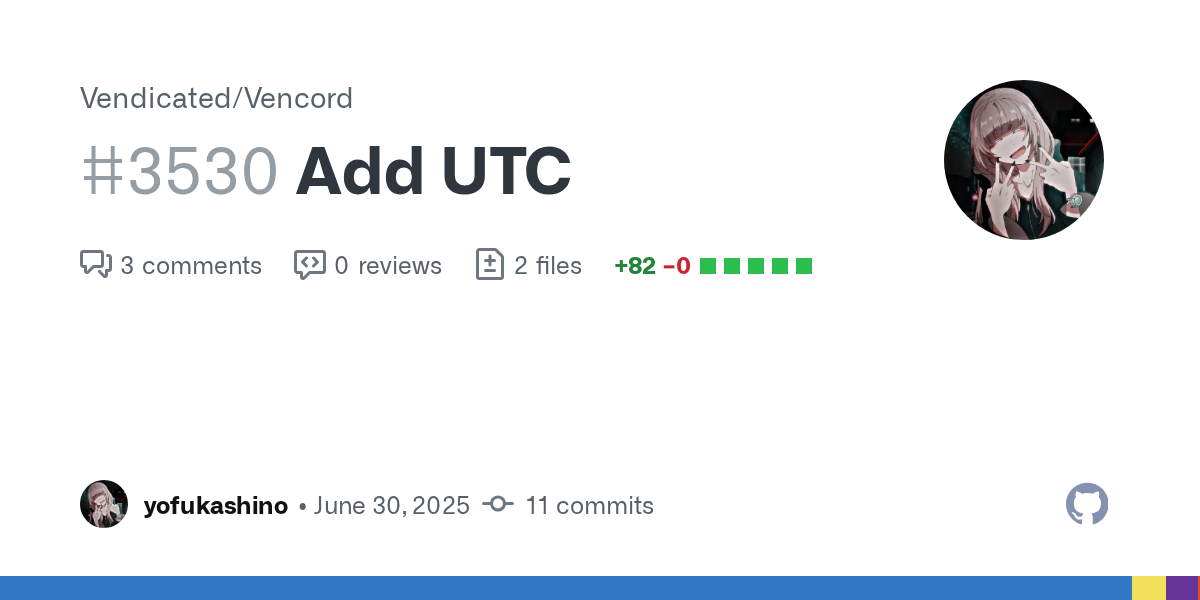
why is everyone still fixing stuff just use utc
oh they did more than just change the classnames it seems
oh my fucking god discord
WHY THE FUCK ARE THEY USING THE 32BIT INTEGER LIMIT TO MAKE A FUCKING BORDER ROUND

GitHub
Adds UTC (Universal Theming Classes) that appends stable class names [For example utc_xyz] to elements, so theme devs don’t have to worry about class rerolls, only structural changes.
Helps with th...
i assume because BD doesn't have this + nor would unmodified
ye got to build from scratch
available for equicord to build too
can add to moonlight and is in replugged
whatever
Discord fucked up the classes again, didn't they T_T
wait so now they're back to how they were before they got fucked before?
Or are they just messed up again
oh cool so I can just switch back. That's nice at least
patiently waiting for oldcord to update
@neon snow Use this to update your classes.
i dont get why people dont just use utc
like the regex is
const getName = (i) => {
const classNameRegex = /(\w+?)([\w\d$]+)/g;
const classSuffixHashRegex = /[_\d$]/;
return utc_${classNameRegex.exec(i)?.[1]};
};
oh cool it worked
i mean i did realize they essentially just reverted it
the old one worked
Yeah
like it went from .channelTextArea_f75fb0 to .f75fb00fb7356cbe-channelTextArea and now back to .channelTextArea_f75fb0 😭
minor question on this is there a way to make the user area go back to being more squished and small again? if not thats chill honestly i can live w it, it being wide and covering the sidebar is just a bit annoying
my apologies  css is a nightmare for my brain to comprehend lolz
also just noticed the folders get busted woops

You mean the server icons are of center?
It's not the icons. it is the background btw
Let me see
aaaah, yeah i noticed everything got smaller n it messed w some stuff
sorry for bein a bother lol, im just way out of my element here so help is v appreciated
I think i fixed it now
This works again now
But you might want to lower the chat bar and or userpanel
ahh yeah i can see why you mentioned that, top n bottom seem a lil squished on my end but its fine honestly
jic you need to see what i mean, honestly this is fine lol th bars n minor gradient at th bottom doesnt bother me too much it at least works thats all i care abt lol
yknow jus realized that image sucks . hold on
okay thats. better. my bad again, like i said b4 these r no issue tbh jus figured id point em out in case

th bottom orangey red is my windows search bar dont mind that snorts
You want it all the way to the top?
yeah, unless it busts smth in which its no biggie
all th way to th top all th way to th bottom was how i had it, but discord loves to just break
as per usual

hrm, is there a way to make it flush with the bottom again or would it just be easier to keep it floating? i can work w it floating no issue, th rest looks great actually
You just want it at the bottom?
Yeah, i made it a variable so you can change the margin yourself
OHH i didnt see it if its in th one you sent recently
my bad i cannot read css anything for th life of me, not that well anyway lol
The last 2 variables in ":root {}" that start with --

ohhh okay, tysm !! genuinely ur a life saver lol
ah i am blind . lol good to know snorts
You can just change the pixels and it would work
ahhhh okok, nods
dont suppose anyone has a minimal ish user panel that works with the new variables

https://i.imgur.com/Lwl6IEZ.png
Mine looks like this, via a combination of
and
with the "compact-user-area" setting turned on
I assume it works with the new stuff because I just updated lol
Depends what you mean by minimal
im using both of those snippets funnily enough i just dont have the compact-user-area enabled
i did however just fix the Simplified Panels Area snippet
i did manage to get it back to this but tbh i think i just need a snippet that makes the buttons smaller and just "cleans" it up

simplified and cleaned up is the easiest way i can put it
idm the size n shit just the big ass buttons
I made a bit more of a user friendly guide for how to use the regex
might be good to pin?
You can do this in quickcss or vscode (or some other code editor)
press ctrl+f to open find
press the .* symbol or alt+r
paste \.([_0-9a-f]{6})[0-9a-f]{10,11}-([A-Za-z0-9_\-]+) in
press toggle replace on the left (ctrl+h)
paste .$2_$1 in
press replace all (ctrl+alt+enter)
-# regex from #🎨-theme-development message

im making a plugin to add better dev tools to discord anyone intrested
wdym better devtools?

like alt click to copy class names?
what are the utc classes
is that from equicord?
stable classes plugin
custom equicord plugin
alt click to send info to console
you mean you made it?

try this @prisma stirrup
try the class updater in my bio
I tried with your class updater and it didn't work
Also I got 0 results when using this
use class updater in my bio it works

U gotta make a GitHub repo to replace that import link
gimme a bit
Abd on left sidebar put those files in the GitHub repo and replace import links
or just use the imported css in your quickcss without importing it
So just to make sure
I should create a github repo, create the CSS exactly as the one from this link, and import it from my repo instead of this repo link?

Use the code in the desktop sub tab
yeah
that one is already updated
copy frostedglass.css into your quickcss
Gotta replace import link though
Look at your image theres a desktop.css sub tab
that snippet is already updated. i checked the imports
Main file needs no update through
I checked earlier no updates to it
Oops, did an oopsie I think
Discord became unresponsive
On pc
okay let me try again
Okay I've uploaded the updates .css on github
like this ?

Thanks now it works
does a theme based on the Cinnamon DE exist yet?
how does one start making a theme?
https://learntothe.me/ its outdated but can still help you a lot

Learn To Theme
A step-by-step guide to creating Discord themes, from beginner to advanced.
ty
i wonder if the buttons from this conversation #👾-core-development message might be related to my theme's buttons only being colored in vencord components but not discord
had fun theming the update notification and modal :3
looks cool
ty 
i wanna post css snippets but it doesnt let me since i dont have the role
also my css is prolly bad LOL
anyone know what could possibly cause these random movements in the channel/category list

if it helps that all my CSS but none of it should mess with the category/channel names tho
Are you using one of my buttons snippets?
Yeah it might be due to the channels one
It happens when you change size to the invisible elements at the top
the improved and compact button snippet?
did discord revert this back
like we cant be deadass right now i have .name__hash instead of like the ._hash-name on all my elements i think
thanks ily

yeah discord reverted back to .name_hash
btw, two underscores are just because the hash has an underscore
oh i see
I think the longer hash might've been causing lag or something?
i never really understood the change anyway, what was wrong with the shortened hash
ig they were worried about a shortened hash conflict?
idk why they put the hash at the start though
i guess that could make sense
it's 6 with i think 17 characters?
which would be 1,419,857 possibilities i think?
although it seems like the underscore can only be at the start of the hash
so idk
Yeah
Hello, was wondering how to change that green to gray i cant figure out the class

also i can not make these persistent for the life of me

.pointerEvents__44b0c {
    fill: #555; /* green */
}

.icon_c9d15c path {
    fill: #555; /* new color, e.g., red */
}
this is what i got rn
pointer events is for online offline etc and .icon... is for the playing icon or listetning etc
I don’t update the site every time there are class updates, the changes come from a separate repo that I update every few days btw
just use class updater in my bio
whats that exactly
damn that fixed my theme
ily
out of curiosity is it up to date now?
@tranquil whale stop advertising your vibe coded class updater please
you already got automodded once
Lol
Yeah
It is
U mean vibe coded with ai right xD

it's alright
my favorite discord feature


I had to disable MPO on my PC for this to stop happening
remove back Forward Buttons
  display: none;
}```
I actually like the arrows, they help with navigation
or turn the experiment off dev://experiment/2025-08_back_forward
you can use alt + left/right arrow
True, but I’m also lazy
i feel like most mice got forward/back buttons nowadays
as to be expected, hsl makes the placement awkward

I think they were referring to the two buttons on the side of most every mouse made nowadays

where do those even show, i tried enabling, but don't see them
top left corner
i guess my quickcss automatically get rid of them
am i the only one to want role icon urls in themeattribute ?
it'd be so neat

whats the setting called help
it's not just a setting unfortunately, have to disable it through regedit
also it might not even solve the issue, it did for me but it might not for you since MPO is an Nvidia thing first off, so if you're using AMD or so on
noticed this DM list border issue, only happens if the person has a long status

the issue is part of your compact button snippet @pure cairn
it might be something I added because I removed scrollbars on my end
I don't remember honestly
yea I think it's this part

adding min-width: 0 here seemed to fix it on my end

nice one discord

average
me when i split my css into 5 thousand files and i can't be arsed to figure out the order of any of it
Thank you! This worked for me to get the guildbar (mostly) back to the way it should be. I think the server folders might be a touch wonky, but I'll take it!

Discord css trying to decide which direction to rotate the arrow in
not sure where to put the arrow now, it rolled out to me
put it in the display:none
Real
yeah already did that
just thought i could perhaps make use of it
can someone fix https://scattagain.github.io/VencordStuff/css/GuildbarRevert.css pretty please
@mental stirrup i think this is yours?
it is
unfortunately I do not have access to my computer and can't push any changes to the GitHub, you can find a fix on the thread (#1354502862390038528 message)
been tryna figure out how to get rid of this little yellow spot, any1 got any ideas

cant figure out the class its got
it's .mentioned__5126c:before
you can set --icon-feedback-warning
actually that's used in other places
there definitely used to be a specific var for this
there is, it's just not used there
but do .mentioned__5126c::before { background: blue; } or something
works
you mean for the background? --message-mentioned-background-default?

i'm pretty sure there used to be a variable dedicated for the bars too
there used to
oops
actually maybe not
does anyone know how i can achieve transparency on discord similar to the attached image? cant seem to find any themes that have transparency but don't significantly alter the way discord looks

turn this on
and then use/make a theme

i already have that on, i don't have any experience with css so i just wanted to ask if anyone knows/has a theme that doesn't modify anything other than making the window transparent
only ones i could find were either broken or have a significant amount of modifications
BetterDiscord
Allows you to use a Background Image without greatly altering the basic Layout of Discord
replaced the background "url" with rgba(0,0,0,0) and it works, is it possible to apply a frosted/blurred look akin to the bottom half?

WIP - no external imports, no online themes, all from scratch and only 200 lines with comments so far. Still messing with the trailing cotnainer's style to get it to fit properly and then I nee to do a pass on all the titlebar variants. Using anchor positioning to eliminate all of the hacky padding, simplifies the compact header to just:
[data-fullscreen="false"] {
  &>div[class*=bar]>div[class*=leading] {
    anchor-name: --vc-anchor-leading;
  }

  &>div[class*=bar]>div[class*=trailing] {
    anchor-name: --vc-anchor-trailing;
  }

  [role="button"] {
    -webkit-app-region: no-drag;
  }

  [aria-label="Channel header"] {
    position: fixed;
    position-anchor: --vc-anchor-leading;
    top: 0px;
    left: anchor(--vc-anchor-leading right);
    right: anchor(--vc-anchor-trailing left);
    width: auto;
  }
}
(note: this isn't finished so it has problems seen in the screenshot)

this is spotify ?
not sure how
I've never used transparent window before
I'm pretty sure I've seen it but not positive and not sure where
apple music client named Cider, though i am on a version that is not publicly available yet
ah ok, thanks regardless
why is the update and toolbox icons so small for me

wait i just noticed i have the same with the update button despite my CSS

wtf has discord done
because they forgor
overflow: visible;
guys i got a neat trick to push the saturation to 100
filter: saturate(2147483647%);
you can thank me
here's my css related to the top bar, feel free to yoink
[class^=bar] {
    z-index: 3001;
    padding: unset;
    > [class^=leading] { display: none; }
    > [class^=title] {
        position: relative;
        padding-left: 4px;
        > [class^=title] {
            gap: 4px;
            > [class^=icon] {
                height: 16px;
                width: 16px;
            }
        }
    }
    > [class^=trailing] {
        gap: unset;
        > [class^=clickable] {
            height: 16px;
            width: 16px;
            padding: 3px 12px;
            margin: unset;
            &:hover {
                background-color: var(--interactive-background-hover);
                color: var(--interactive-text-hover);
            }
            > [class^=badge] {
                height: 5px;
                width: 5px;
                bottom: 4px;
                right: 13px;
            }
        }
        > [class^=button] {
            height: 16px;
            width: 16px;
            padding: 3px 12px;
            margin: unset;
            &:hover {
                background-color: var(--interactive-background-hover);
                color: var(--interactive-text-hover);
                > [class^=icon] {
                    background-color: unset;
                    border-radius: unset;
                    > path { filter: saturate(2147483647%); }
                }
            }
            > [class^=icon] {
                height: 16px;
                width: 16px;
                overflow: visible;
            }
        }
        > a[href="https://support.discord.com"] { display: none; }
        > [class^=winButtons] {
            gap: unset;
            > [class^=winButton] { width: calc(var(--custom-app-top-bar-height) * 2); }
        }
    }
}
Sure, i'll use it
anybody knows why this happens and how to fix it? dims the space behind the panel over the channel section whenever i scroll up and the server banner becomes visible, seems to also happen to the summary bar
probably would need your css to figure that out
filter: blur(25px);
you mean backdrop-filter, but it probably won't work on a transparent window
at least when I had glass discord on windows it wouldn't work at all; on linux it works kinda
oh shoot
i guess then the only option would to use a semi transparent frosted image as background
that wouldn't blur it though
does anyone have the snippet that makes server icons round
looks like a selector issue of some sort?
Check the shine theme by blade0
It has it in the code somewhere
cause shit loading and unloading i'd guess
humm i’ll try to figure out but prol has to do with the transparency there
I use this
.folderPreviewGuildIcon__48112 {
  border-radius: 50% !important;
  font-size: 6px !important;
  line-height: 16px;
}

/* Round and animated server icons */
.blobContainer_e5445c foreignObject:hover,
.blobContainer_e5445c.selected_e5445c foreignObject,
:is([data-list-item-id="guildsnav___home"],
  [data-list-item-id=guildsnav___favorites]
).selected__6e9f8 .childWrapper__6e9f8,
:is([data-list-item-id="guildsnav___create-join-button"],
  [data-list-item-id="guildsnav___guild-discover-button"]
).selected__5bc7e,
.stack_dbd263>div[style="opacity: 1; height: 40px; transform: scale(1);"] .selected__6e9f8>img {
  border-radius: 27% !important;
}
.blobContainer_e5445c foreignObject,
:is([data-list-item-id="guildsnav___home"],
[data-list-item-id=guildsnav___favorites]) .childWrapper__6e9f8,
:is([data-list-item-id="guildsnav___create-join-button"],
[data-list-item-id="guildsnav___guild-discover-button"]) {
  transition: border-radius 0.2s linear;
  border-radius: 50%;
}```why did they change files
it looks so weird

also it broke copyfilecontents :(
and the scrollbar

F discord
doesn't seem to be working anymore? At least it definitely doesn't work for the thread/notification settings/pinned messages/show member list, which are at the top right
Yeah, that selector would need to be updated
Try this
/* Remove annoying gaps between buttons (vc, text inputs, etc) */
div[class^="buttons"] {
  gap: 0!important;
}
i was wondering which should i use?
path[d="M18.09 1.63c.4-.7 1.43-.7 1.82 0l3.96 6.9c.38.66-.12 1.47-.91 1.47h-7.92c-.79 0-1.3-.81-.91-1.48l3.96-6.9Zm.46 1.87h.9c.3 0 .52.26.5.55l-.22 2.02c-.01.16-.17.26-.33.23a1.92 1.92 0 0 0-.8 0c-.16.03-.32-.07-.33-.23l-.21-2.02a.5.5 0 0 1 .5-.55ZM19 9a1 1 0 1 0 0-2 1 1 0 0 0 0 2Z"] { fill: #f9e2af; }
or
[class$=icon__2ea32] path[d^="M18.09 1.63c.4"] { color: #f9e2af !important; }
.icon__2ea32 path[d^="M18.09 1.63c.4"] {
    color: #f9e2af !important;
}
is it possible to move the download button from the menu next to the change language and view whole file buttons, or replace one of them?

not with css
idk if there's smth wrong with my computer or maybe with vesktop, but discord seems to have switched the placement of this from the right to the left

is there css to fix it if possible
or is it an experiment that i can find in settings
or smth else

Yes you can fix it with one line of CSS
I'll share it tomorrow
how come when doing it this way you use color instead of fill
is it cuz of the class (the .icon__ is a class right)
oh yeah i'm having it too

oh wtf the sticker is as wide as the message for some reason
.clickableSticker_abd7a8 { width: fit-content; } is probably what julien meant
ty
unfortunately still not working for the upper right ""channel"" icons aka thread/notification settings/pinned messages/show member list (not sure about other icons because I have the 0 gap in other css snippets that affect them already)
add .toolbar__9293f to the selector with a comma
so ..., .toolbar__9293f {...}
I have 0 coding knowledge so I have no idea which part is the selector, sorry 
ok nvm, found
(for reference if anyone else is as noob as me, it becomes like this:
```css
div[class^="buttons"], .toolbar__9293f {
gap: 0!important;
}
btw thank you so much!
how do you mess this up and then roll it out live

why is the hole sticker selection stretched through the whole message
Ig?
Nvm I can't read (shocking news)

you are now officially a discord user, congrats
Lol
since it's been asked multiple times i created a #🎨-css-snippets for now
#🎨-css-snippets message
is there a way to do this with less :has selectors?
CSS /* Swap Clan Tag and Role Icons */ [class^="headerText"] { display: inline-flex; & > span:has([class^="roleicon"]){ order: 2; } & > span:has([class^="chipletContainerInner"]){ order: 3; } & > span[style="display: none;"]{ order: 4; } & > .vc-message-decorations-wrapper { order: 5; } & > span:has(> [class^="newMemberBadge"]){ order: 6; } & > span:is([class^="botTag"]){ order: 7; } }
why are you using an attribute selector for classes instead of just using the class selector?
wait why are you using :is there?
both span[class^=“botTag”] and span.botTag would work fine (and actually probably faster)
can you send example HTML or say where in discord this is? document.querySelectorAll(’.headerText’) didn’t find anything
it swaps the icon role and clan rag
usually the clan tag would be directly after uname
right ^=, thanks
also it wasnt me who made it so no idea why its using certain things
i think it was @pure cairn
appropriate name, lol
nope
I don't do :has horrors anymore

just found the post as u sent it lol
im pretty much tryna reduce the amount of :has as possible whilst keeping the features
okay technically this should work, but it's significantly less readable and more brittle than just using :has
```css
/* Swap Clan Tag and Role Icons */
[class^="headerText"] {
display: inline-flex;
& > span[class=""]){
order: 2;
}
& > span:not([class]):first-child{
order: 3;
}
& > span[style="display: none;"]{
order: 4;
}
& > .vc-message-decorations-wrapper {
order: 5;
}
& > span:has(> [class^="newMemberBadge"]){
order: 6;
}
& > span[class^="botTag"]{
order: 7;
}
}
why?
reduce the lag i have
yeah removing :has isn't the way to go (at least here where you really need it)
lol I don't use classes I love :has
(to be clear I use classes for vencord bc discord's html is set up to use classes, I just mean in my own projects I just make the html semantic enough where I can use other selectors instead of classes)
yeah but I used to do weird stuff
oh?
.card__39ec2:has(> .header__39ec2 > .headerText__39ec2 > .platformIcon__39ec2[style="mask-image: url(\"/assets/f6833ce4dd20c1fb.svg\");"])
things like this

nowadays I try to use :has() only if there is no other way to properly select something specific
Has is now also faster than *= and if you limit the scope it's only checking within that scope which has huge performance impact.
oh good to know thank you
Things like this are why browsers continue to eat more memory though - they are basically keeping a hashmap of all of each element's potential matches to accelerate CSS, JS etc. This obviously gets very big, especially in projects with hilariously bad DoM optimization like discord. (They could really do with less nesting.)
We've got like 12 layers of nesting on chat messages, of which there are potentially thousands. That's not ideal.
aint gna lie to u idk what u talking abotu
.headerText_c19a55 instead of [class^=headerText] etc
i think some part of my frankensteined copy pasted css has decided to add a weird space between my name and the text i send when they used to be flush one on top of the other scratches skull ruh roh

ah nope nvm found th issue n fixed it
i need help with fonts
```css
@import url("https://teeenoob.github.io/themes/fonts.css");
::-webkit-input-placeholder, body, button, input, select, textarea {
font-family: "runescape_uf";
}
you're not importing the runescape font
(also see How To Ask Questions The Smart Way (archive))
oh wait you are give me a sec
eh?
the code didn't load for me for quite a while sorry
I'm a bit snippy tonight — you're all good
okay! 🙏
also just made sure and it's the only font that somehow doesn't load
i might need to replace the file
I mean maybe try replacing the file in case it's corrupted?
I checked the http response and the mime type is correct
and the css syntax is correct as well
oh wait that's weird
i'll update on situation soon
yeah
you're not importing it inside a selector right?
i dont think so
hmm
if it works elsewhere it shouldn't be a file issue
you don't have it downloaded locally do you?

GitHub
Repository of the themes I use/made. Contribute to Teeenoob/themes development by creating an account on GitHub.
it's all here
I'll take a look at it tomorrow (is there a reminder bot here?)
No currently running reminders.
Ok, reminding in a day: check Teeenoob's code <@1239734818489499670>
Ok, reminding in a day: <@1239734818489499670> estrogen
how do i set my name to be rainbow in messages like a custom role color applied by theme
do i use has selectors or what
Use the ThemeAttributes plugin and use [data-is-self="true"] or whatever it's called in the selector
or you can use your id

Idk how xD
attribute selector
[data-author-id="683171006717755446"] .username_c19a55 {...}
that with my id
color
Ill tinker
```css
[data-author-id="683171006717755446"] .contents_c19a55 .username_c19a55 {
color: red !important;
}
Thx
why aint this working
[data-author-id="1173155162093785099"] .contents_c19a55 .username_c19a55 {
color: linear-gradient(to right, #ff0000, #ff7f00, #ffff00, #00ff00, #0000ff, #4b0082, #8b00ff, #ff0000);
background-size: 200% 100%;
animation: rainbow-slide 5s linear infinite;
}
@keyframes rainbow-slide {
from { background-position: 0 0; }
to { background-position: -200% 0; }
}
this does not work either
@echo frost can you pls help me 🙏
i thought you did css
look in devtools and see what the problem is
i dont use dev tools
thats my one downside
use it
i remake existing snippets

Without knowing how they work
You should learn the basics first
test
went into the rabbit hole

jesus
How can you not use devtools
Certainly! Here is a modified version of your CSS snippet, which fixes the gradient not showing up. I've also added helpful comments to each step of the process. Let me know what you think! 😊
anyone know how i can make typing indicators look nice with softx ?
what is happening with my channels lmao
please define "look nice"
Rofl
Not sure if this is the right place but I made some alternate colorway Vesktop icons (due to my fragile masculinity) in Icon Composer for macOS, figured I'd share them here in case anyone else would find them useful.


pink is peak
are you by any chance using one of my compact snippets?
because iirc it's one of the minor issues it causes
heres the original if u desire
the typing indicators on profiles is broken for the softx theme, so i was looking for a way to fix it on my own hopefully
no idea I'm using some random theme my sub sent me that I've modified a bit
the issue has stopped though, just very weird
discord scroll panels...
yeah it happens whenever you change size to something in a scroller
am i tripping or did they randomly just make glowing names and the nitro nameplate animated?
they were already animated

did u find a fix
@tight nimbus, reminder from <t:1770005147:R>: check Teeenoob's code <@1239734818489499670>
@tight nimbus, reminder from <t:1770005246:R>: <@1239734818489499670> estrogen
it recently stopped doing it for me, so i can not pinpoint the issue
@river pecan I have no idea what's going on — did you end up trying reuploading the file?
nope, not yet. instead just uploaded diff similar font
weird
sometimes you just see the wildest stuff

broken platformindicators patch is causing this iirc
looks more like ipod video
hello! does anyone know what the tag for the edit message box is ? ive got 2 themes that when enabled move the box outside of the window