#🎨-theme-development
1 messages · Page 55 of 1

just use the copyfilecontents plugin
it's in the aria label

wowie
ig you could use this so it'll select all of it on a single click
probably better to just use the CopyFileContents plugin though
(this current selector makes it apply to all code blocks btw)
.hljs {
  user-select: all;
}
vp copyfilecontents
Adds a button to text file attachments to copy their contents
Authors
Obsidian, Nuckyz
yes better use copyfilecontents thx
????


why is it 1px less wide????
I love sizing
oh the user container has a -1px left margin???
why 😭
probably because
the border
discord doesn't like to use box sizing border box fsr
discord fucking up with 1px borders
remove all of them and you get sensible numbers
cut and does not include "read all" and no border.

@chilly knoll decided to try it with the aria label and i finally hidden the dm wallpaper button
[aria-label="Set DM Wallpaper"] {
  display: none !important;
}```

i need to start looking at those labels more oftenyeah didn't do read all, but shouldn't be that hard to implement
wait what why did I have 2 ghost pings here
Does anyone know how do I fix the issue caused by the below css snippets?
/* edited text */
[class*="timestamp_"]:not([class*="timestampInline_"],
[class*="timestampVisibleOnHover_"]) time::after {
    content: ' (' attr(aria-label) ')';
    color: var(--text-muted);
    font-size: 0.625rem;
    font-weight: 400;
    line-height: 1;
    -webkit-user-select: none;
    -moz-user-select: none;
    -ms-user-select: none;
    user-select: none;
    text-transform: capitalize;
}

[class*="edited"]:not(.message-translate-indicator) {
    display: none;
}

.containerDefault__29444 {
  > div {
    padding-left: 0.5em;

    > div {
      display: flex !important;
      place-content: start !important;
      flex-direction: row-reverse !important;
    }
  }
}

you can disable ReplyTimestamp
do you want the replytimestamp to have the today at, or do you just want it to be unchanged by the css
testr
[class*="replyTimestamp_"] {
    display: none !important;
} ```?
Yeah
which one
?
i don't think that's even a real class
that's not what i asked, but that does help
dont need "today at" in replytimestamp
sry for misunderstandings
Replace it all with this
it's a slightly edited version of #🎨-css-snippets message
/* "(edited)" text timestamps */
span[class*="timestamp_"]:where(:not(.vc-reply-timestamp)) time::before {
  content: '(' attr(aria-label) ')';
  font-size: 0.625rem;
  font-weight: 400;
}

/* message header timestamps */
span[class*="timestampInline_"] time::before {
  content: attr(aria-label);
  font-size: 0.75rem;
  font-weight: 500;
}

/* header-less multi-line hover timestamps */
span[class*="timestampVisibleOnHover_"] time::before {
  display: none;
}

/* hide the old timestamps */
span[class*="timestampInline_"] {
  font-size: 0rem !important;
}
span[class*="edited_"] {
  position: relative;
  right: 95px;
  color: transparent;
}
Thanks
Hey there. I was using this for complete transparency in discord but it just disables the close, maximize and minimize button. Like I can't click on them. Any idea?
.visual-refresh .theme-dark {
    --background-primary: transparent;
    --background-secondary: transparent;
    --background-secondary-alt: transparent;
    --background-tertiary: transparent;
    --bg-base-primary: transparent;
    --bg-base-secondary: transparent;
    --bg-base-tertiary: transparent;
    --background-mod-subtle: transparent;
    --background-mod-normal: transparent;
    --background-mod-strong: transparent;
    --background-base-low: transparent;
    --background-base-lower: transparent;
    --background-base-lowest: transparent;
    --autocomplete-bg: rgb(58 58 65 / 70%); backdrop-filter: blur(20px);
}```The problem is that sticky and other things don't work and I don't know what to do
It works for this element but for the "read all" button
yeah because i didn't do the read all button
but it should be almost the exact same to do
.vc-ranb-button {
  position: sticky;
  top: 54px;
  z-index: 1000;
  background-color: var(--app-background-frame);
  padding-bottom: 10px;
  margin-bottom: -10px;
  border-radius: 0;
}
add that for the read all button
finall .css for this element + button "read all"
/* Always visible Read All plugin button + Discord DM logo */

.vc-ranb-button {
    position: sticky;
    top: 54px;
    z-index: 1000;
    background-color: #000000; /* Black background */
    padding-bottom: 10px;
    margin-bottom: -10px;
    border-radius: 0;
}
.tutorialContainer__1f388 {
    background-color: #000000 !important; /* Override background for the section with the logo */
}

/* End visibility of DM logo + Read All */
?
i already made it for the read all
and is that ai
and why are you using black instead of the normal background color
The background for the button (discord logo) for the dm was missing
no it wasnt

yeah it's working in that screenshot
before

not my own
?
tell them to try with this then
.tutorialContainer__1f388 {
  position: sticky;
  top: 0;
  z-index: 1000;
  background-color: var(--app-background-frame, red);
  padding-bottom: 10px;
  margin-bottom: -10px;
}
if it's not working, it should be red with that css i just sent
?
this area was annoying me, reduced the gaps and added a new separator https://i.imgur.com/sgNWjDw.gif
mind tossing me that
/* Toolbar fix */
.trailing_c38106 {
    gap: var(--space-4);
}
.trailing_c38106::before {
    border-left: 1px solid var(--border-subtle);
    content: "";
    display: block;
    height: calc(var(--custom-app-top-bar-height) - var(--space-12));
    margin-right: var(--space-4);
}
.toolbar__9293f {
    gap: var(--space-4) !important;
    margin-right: -16px;
}
idk if it's gonna work properly for you, cuz i made it based on my set up
what class are these in? I can't seem to find it and want to shift them over so their right side is in line with the right side of chat

"toolbar__9293f"
ty
how do you find that? for future reference, I was just hacking my way through my theme
idk i just selected the button in the dev tools and just went up the class from there


ctrl+shift+i?
yeah doesn't open it for me
could be another program intercepting the keybind, common culprit is amd
@onyx mesa perfect thank you

Updated:
[class*=isExpanded__] [class*=folderGroupBackground__]{
    background: var(--background-mod-subtle) /* Og bg when opened */
}
[class^=folderPreviewWrapper__]{
    background-color: color-mix(in srgb,var(--custom-folder-color),transparent 60%); /* Color of the bg */

    [class*=folderPreview__] [class*=folderPreviewGuildIcon__] {
    opacity: 0;
    }
    [class^=folderPreview__]::after,[class^=expandedFolderIconWrapper__]::after{
    content: "";
    position: absolute;
    transform: scale(0.9) /* Changes icon size easier */;
    width: 24px;
    height: 24px;
    top: 60px;
    left: 12px;
    background-color: var(--custom-folder-color,var(--bg-brand)) /* Color of the folders */;
    clip-path: path("M2 5a3 3 0 0 1 3-3h3.93a2 2 0 0 1 1.66.9L12 5h7a3 3 0 0 1 3 3v11a3 3 0 0 1-3 3H5a3 3 0 0 1-3-3V5Z");
    transition: opacity 0.2s ease;
    }
}```btw i have this kind of version of it it un blurs when hovering you can also remove the blur and have it similar to yours

Eh i dont really like the blur personally but i only made this when the simple folders plugin broke  didnt know you had one
also pretty sure the folders plugin has been fixed
yeah this here is what i have you can change the opacity on line 18 to 0 to have a plain folder with no blur and it will show you still whats inside the folder on hover
/* Plain Folder Icon Size Pastel */
.expandedFolderIconWrapper__48112::after,
.folderPreview__48112::after {
  content: "";
  background-color: #fff;
  width: 24px;
  height: 24px;
  top: 60px;
  right: 12px;
  position: absolute;
  clip-path: path("M20 7H12L10.553 5.106C10.214 4.428 9.521 4 8.764 4H3C2.447 4 2 4.447 2 5V19C2 20.104 2.895 21 4 21H20C21.104 21 22 20.104 22 19V9C22 7.896 21.104 7 20 7Z");
  transition: opacity 0.2s ease;
}
.folderPreview__48112:hover::after {
  opacity: 0;
}
.folderPreview__48112 > .folderPreviewGuildIcon__48112 {
  opacity: 0.5;
  filter: blur(2px);
  transition: opacity 0.2s ease, filter 0.2s ease !important;
}
.folderPreview__48112:hover > .folderPreviewGuildIcon__48112 {
  opacity: 1;
  filter: blur(0px);
}
.theme-dark .hiddenVisually__27f77[aria-expanded="false"] {
  background-color: #000000;
}
.theme-light .hiddenVisually__27f77[aria-expanded="false"] {
  background-color: #777777;
}```uhhh its not supposed to do that
what client are you using
or did u add that spacing yourself
what is it not supposed to do? I'm using the midnight theme and it broke a little bit a few days ago so I decided to just brute force things back to where I wanted them to be
try reinstalling the theme from github
not supposed to make such a huge gap
its supposed to only do that to make space for the window controls
it looks like it was broken by having a snippet to hide the title bar
have a decent handful of snippets so I'll just keep using them to put things back where they should be (imo)
I literally opened up this server to see if anyone had posted a fix for the folder icon alignment yet, and voila, this is the first thing I see here! Thank you! 
yeah lol i fixed that 🙂
why do you need a snippet to hide the titlebar thats built into the theme 😭
I swear it wasn't hidden when I added it
can someone tell me how to get a link like this for a decor? ty
https://cdn.discordapp.com/avatar-decoration-presets/a_656d8fd0b54767e784e0463a85d04b60.png

when you select the profile picture with the inspect tool in devtools

yes, but you need to select someone that have it
maybe works in the shop too, I don't know
i know someone that has it
i sitll don't get how to select it
I'm really sorry
which action log?

in devtools ctrl+shift+i
OH OKAY
im so sorry for asking help again
but

i'm still a bit confused
i can't find <li id-"
use this (top left) and hover on the pfp and click
I'm sorry I feel so stupid

I still can't find it
inside of this

OMG THANK YOUUU
@manic flume
ty
Hey, does anyone know how you would make the gradient role colors (new discord feature) always move in chat not matter if you are hovering or not?
I tried a few things but the way they have it seems a bit funky so it never "worked" in a sense?
Why is that a thing
There's probably a :hover somewhere, or perhaps discord being discord and they add a class on hover
its the second one
upon hover the inspect changes for the message
i can record that too
    animation: gradientUsernameAnimation_e5de78 1.5s linear infinite;
}```i was using animategradient in my testing so that was probs why
but yeah that works
😭
thanks
is there any way to set that kind of animated gradient colors on ur user outside servers? (so only you can see it, but it's cool)
i don't see why not
I actually found some1 that made a plugin about it ForceRoleColors
BUT, it doesn't work on my machine 💔
The mail icon and dev tools icon are on top of each other, how can this be moved?

either change padding of the css you used to put those thing down there, or hide that useless bug button
have you tried updating it
its an import so it shouldve auto updated
@import url('https://discordstyles.github.io/RadialStatus/RadialStatus.css');

:root {
  /*
    * Spacing
    */
  --rs-small-spacing: 2px; /* Gap between avatar and status for members list/dms | MUST end in px */
  --rs-medium-spacing: 3px; /* Gap between avatar and status for User popout | MUST end in px */
  --rs-large-spacing: 4px; /* Gap between avatar and status for User profiles | MUST end in px */
  /*
    * Widths
    */
  --rs-small-width: 2px; /* Thickness of status border for members list/dms | MUST end in px */
  --rs-medium-width: 3px; /* Thickness of status border for User popout | MUST end in px */
  --rs-large-width: 4px; /* Thickness of status border for User profile | MUST end in px */
  /*
    * Shape
    */
  --rs-avatar-shape: 50%; /* 50% for round - 0% for square */
  /*
    * Colours
    */
  --rs-online-color: #43b581; /* Colour for online status */
  --rs-idle-color: #faa61a; /* Colour for idle status */
  --rs-dnd-color: #f04747; /* Colour for dnd status */
  --rs-offline-color: #636b75; /* Colour for offline status */
  --rs-streaming-color: #643da7; /* Colour for streaming status */
  --rs-invisible-color: #747f8d; /* Colour for invisible status - Note: this will only show for your own invisibility */
  --rs-self-speaking-color: #57d39b; /* Colour for speaking ring in the bottom left while in a voice chat/call */
  --rs-phone-color: var(--rs-online-color); /* Colour of the ring & phone icon  */
  /*
    * Others
    */
  --rs-phone-visible: none; /* Visibility of the phone icon next to a users avatar. | block = visible | none = hidden */
}```technically im using this
even using that still broken
mine works perfectly fine
#app-mount .wrapper__44b0c .mask__44b0c > rect[x="14.5"] {
  width: 32px !important;
  height: 32px !important;
  x: 0 !important;
  y: 0 !important;
}```mine didnt have that
that fixes it
is that the thing that helps?
forgot that i had that snippet
yep
ok :/
ty
Is there any CSS to make these buttons larger? If you hover over them, you can see the clickable area is almost twice as large as the actual icon, I'd like the icon to fill that whole space if possible. I took a look through #🎨-css-snippets but didn't find anything like that. 😔

I guess with transform: scale(x) or scale: x on the svg
lalinux
@stray prism here
/* Bigger Buttons */
.visual-refresh .button__74017,.buttonContents_e6e74f:not([class*="enabled__67645"]) {
    transform: scale(1.25) !important;
}
.visual-refresh .spriteContainer__04eed {
   transform: scale(1.1) !important;
}
.attachButtonPlus__0923f {
  transform: scale(1.25) !important;
}
.folderIconWrapper__48112 {
  transform: scale(1.50) !important;
}```
best way to train for discord theming is this
https://csshell.com/
if you complete everything, you can basically deal with any bs discord throw at you
15 puzzles for the masochistic CSS fiend.
note : having MDN and w3school next to you will likely be helpful
🤔
Sounds interesting
also additional challenge, try to do it in the least amount of properties
at least one step can be done with no property at all
how can I hide these mentions?
looking for a css code
I'd also like to hide these nitro stuff in the profile editing


tbh, someone good with plugins should try to port ublock's element zapper
how do you even have that many mentions


just makr it as read
what about the nitro?


#🎨-css-snippets message well someone beat me to it
Thank you very much
have u finished ur custom icons yet?
custom icons?
yea for the settings n shit
i think it's pretty much done, thought about adding some animations and stuff but i think I'll keep it more simple
fair
I'm using this, so only on the browser it doesn't show. It removes it on the desktop app too, why? This didn't happen before till today.
@import url('https://raw.githubusercontent.com/surgedevs/visual-refresh-compact-title-bar/refs/heads/main/browser.css');
what's the best way to inspect element the hover labels on the top bar
ctrl shift i then click this button at the top left of the inspect panel
thats how i usually do it at least
but im not sure what buttons ur talking about
I'm aware but it only exists if the mouse cursor is over the icons at the top

appears u can click ctrl shift c instead of having to click on the button itself
tbh ublock origin could just be loaded the same way react devtools are loaded
not much need for much else from uBo right? unless you use the filter lists to block ads in embeds (instead of aguard plugin) or phishing links
i mean blocking youtube, potentially could also be used to do the sussy site prevention
tbh ubo would be overkill
Hi can someone helps me with my css not working with new member display (I think its due to the TAG introduce)
I think its my css :
/* TransitionSSS */
.username__5d473 {
    width: fit-content;
}
[class^="memberInner"]:not(:hover) [class^="username"] {
transform: translateX(0);
transition: all 1.2s linear;
}
[class^="memberInner"]:hover [class^="username"] {
transform: translateX(calc(80% * -3.8));
transition: all 4.7s linear;
overflow: visible;
}
/* set respective widths */
.username__5d473 {
    width: fit-content;
}
.roleName_a930f1 {
    width: 100%
}
/* main stuff */
.memberInner__5d473:not(:hover) .name__91a9d,
.roleNameContainer_a930f1:not(:hover) .roleName_a930f1 {
    transform: translateX(0);
    /* time to get back to original position */
    transition: all 1.2s linear;
}
.memberInner__5d473:hover .name__91a9d,
.roleNameContainer_a930f1:hover .roleName_a930f1 {
    transform: translateX(-100%);
    overflow: visible;
    /* time to scroll through */
    transition: all 4.7s linear;
}```

css I have idk if its related :
svg[class^="favoriteIcon_"] path {
  d: path("M16.44 3.10156C14.63 3.10156 13.01 3.98156 12 5.33156C10.99 3.98156 9.37 3.10156 7.56 3.10156C4.49 3.10156 2 5.60156 2 8.69156C2 9.88156 2.19 10.9816 2.52 12.0016C4.1 17.0016 8.97 19.9916 11.38 20.8116C11.72 20.9316 12.28 20.9316 12.62 20.8116C15.03 19.9916 19.9 17.0016 21.48 12.0016C21.81 10.9816 22 9.88156 22 8.69156C22 5.60156 19.51 3.10156 16.44 3.10156Z");
  transform: scale(1.1) translate(-1.5px, -1px);
  transition: all 0.2s ease-in-out;
}
[class^="wrapper_"][class*="selected_"][data-list-item-id="guildsnav___favorites"] svg[class^="favoriteIcon_"] path { fill: #F62B30; }
[class^="wrapper_"][class*="selected_"][data-list-item-id="guildsnav___favorites"] [class^="childWrapper_"] { background: var(--background-primary) !important; }
[class^="wrapper_"][class*="selected_"][data-list-item-id="guildsnav___favorites"] [class^="childWrapper_"]::after {
  content: "";
  width: 20px;
  height: 20px;
  opacity: 0.4;
  filter: blur(10px);
  position: absolute;
  background-color: #F62B30;
}

:root {
    --favorites-name: 'Favorites';
    --favorites-banner: url(https://i.imgur.com/BRckiwS.jpg);
    --favorites-guild-icon: none;

    /* category icons */
    /* Duplicate each group for additional categories (Up to 10), then replace both numbers. */
    --category-1: '';
    --c1: url(XXXXXX.png);

    --category-2: '';
    --c2: url(XXXXX.png);

    --category-3: '';
    --c3: url(XXX.png);

    --category-4: '';
    --c4: url(X.png);
}
.favoriteIcon__91c06 {
    min-height: initial;
    min-width: initial;
}
.favoriteIcon__91c06 path {
    display: block
}```
Anyone know if its an issue from my css or discord ? (on people I ignore I get a hearts such (as favorite) (cf image 1/2under)
Pic1 its one I have in fav
Pic 2 its one I have ignore/blockedPing me in reply plz
what might i be doing wrong here? i added a .svg link for the icon but it didn't work


said .svg link - https://www.svgrepo.com/show/498846/message-processing.svg
https://files.catbox.moe/twt1cs.svg
this work?
you can use .disabledPointerEvents_da8173 { pointer-events: all !important; } so you could hover over them
also you can use setTimeout(() => {debugger;}, 2000) it will pause discord after 2 seconds, it helps a lot with these type of elements
lemme see
yeah
it does
i tried to upload the file for which the link i'd shared to this service to then use that for the dms icon and realised that that is exactly what you'd done :')
Thanks a lot though!!
do you know why the link i shared wasn't working?
when i open it on a browser, the icon does show up
svgrepo might not allow third party loading of their content (hotlinking)
Hotlinking can use A LOT of bandwidth, so unless you're trying to make an image host service, generally a good idea to restrict it
wait so does me adding images this way (only 2 though, 1 for dms icon and 1 for background) affect my discord loading time and stuff like that?
like, significantly
Hotlinking doesn't have anything to do with YOUR bandwidth or loading.
thanks for answering me!

anyone please
just mark the pings as read?
This should work for the nitro thing though
.floatingNitroUpsell__39749 {
  display: none;
}
vey windowsy window controls
well my friend is asking for it to not show I don't have issues with it but Imma tell him your idea
also ty for the nitro thing I tried this one earlier but idk the difference
div[class*="upsellContainer__0b69f upsellContainerShadow__0b69f upsellContainerFloating__0b69f floatingNitroUpsell__39749"] {
    display: none;
}
div[class*="container__8279f"] {
    display: none;
}
div[class*="premiumBackground__65c15 background__65c15"] {
    display: none;
}
div[class*="premiumFeatureBorder__65c15 featureBorder__65c15 tryItOutSection__9d295"] {
    display: none;
}
@import url("https://jAba65.github.io/Discord%20Theme/jAba.css");
:root {
    --app-bg: url(https://i.giphy.com/PLJeLzh6gfL2LhUIW0.webp);
    --blur-bg: 80px;
    --brightness-bg: 0.35;
}```

Why does [this theme](https://vsthemes.org/en/skins/discord/68455-animated-glass.html) not work?well I can see now that yours only removes one of them
didn't use attribute selectors if you're using the whole class names
just use periods like this
.class1.class2.class3
where are the others?
oh ok


huh
are you talking about more than just the floating thing mine hides?
Those are different
You specifically wanted the floating nitro upsell hidden
So that’s what you got
yeah I'm talking about every nitro thing in there
I already made one (a bit messy but still counts)
this should do it
.upsellContainer__0b69f {
    display: none;
}
.container__8279f {
    display: none;
}
.premiumBackground__65c15 {
    display: none;
}
.premiumFeatureBorder__65c15 {
    display: none;
}
true, but I like them and the theme in general
might
did discord get rid of some symbols cuz they don't work anymore on my channel names atleast on PC, but on mobile they show fine XD
like emojis?
if you're on linux, you dont have noto-fonts installed, likely.
no like these

on PC they just look squares
(also settings icons by someone broke too lmfao)
is this a theme issue? is this issue gone if you disable themes/quickcss?

if you are on linux, install noto-fonts.
I'm not :(
they are squares due to the font not supporting those unicodes
damn u discord for ruinin things
they worked fine earlier b4 update
but yeah ik, mby discord just removed compatibility or somth
because it likely was falling back to the font defined higher up in the root
with you either overwrote or it was changed

if discord's window cannot be resized while transparent, how are yall able to use discord with tiling managers?
we dont care, and resize the window anyway

komorebi just doesnt see discord as an app for some reason

On my box discord has absolutely no say in whether it wants to be resized or not
Same here
I ended up using the console to basically freeze the DOM in its current form to inspect it
unfortunately it doesn't seem there is any way to stylise them individually because there's nothing unique about each of the tooltips except for content and position which changes with window size
how do I use JavaScript with vencord cus I think that's the only way
resizing is possible, its just that it doesn't want to resize it 
I wrote this to animate new messages but it does it twice with my own messages. I thought it was fine at first but it's getting annoying. not sure how to fix it, I believe it has something to do with discord showing a local version first then replacing it with the server side version of the message. any advice?
.messageListItem__5126c {
  opacity: 0;
  transform: translateY(10px);
  animation: slideFadeIn 0.3s ease-out forwards;
}

@keyframes slideFadeIn {
  to {
    opacity: 1;
    transform: translateY(0);
  }
}
test
exactly what I was saying to myself when trying to fix it
test x3
your intuition might be right, that is how discord does it
I thought maybe I could display:none the local version but exists for a split second and seems to not have any unique so I'd need to take a different approach
i think this fixes
i think this fixes (i actually have the css uncommented now)
.messageListItem__5126c:not(:has(.isSending_c19a55)) {
  opacity: 0;
  transform: translateY(10px);
  animation: slideFadeIn 0.3s ease-out forwards;
}

@keyframes slideFadeIn {
  to {
    opacity: 1;
    transform: translateY(0);
  }
}
idk if there's any way to avoid using :has()
using :has
test
test
I don't think that makes a difference but finding that is progress. thank you for your help
this fixes it for me
I'll try restarting on the slight chance that does something
test
oh wait it actually does work it just displays the local one without an animation
well that's definitely less annoying
thanks once again
test
how'd you manage to find that btw
send the message then instantly f8 break
ok thank you
is there any easy way to disable this gradient in usernames?
actually wait i think i can d this
okay its fucked apparently its as background image and user data has no primary color data
everything i can find on internet is on how to get it instead on how to remove it

/* remove gradient glow on in chat (messages and replies)*/
span:has(.twoColorGradient_e5de78) .username__703b9::before,
span:has(.twoColorGradient_e5de78) .username__703b9::after,
span:has(.twoColorGradient_e5de78) .username_c19a55::before,
span:has(.twoColorGradient_e5de78) .username_c19a55::after,
div:has(.repliedMessageClickableSpine_c19a55) .convenienceGradient_e5de78::before,
div:has(.repliedMessageClickableSpine_c19a55) .convenienceGradient_e5de78::after {
    display: none !important;
    content: none !important;
}
/* remove gradient glow on user list */
span:has(.usernameGradient_e5de78) .nameGlow__703b9 {
    display: none !important;
}
this code removes gradient username glow effect both in chat and user list
i dont think theres option to fully remove gradient since discord doesnt have fallback color for usernames
and you cant really extract color from already existing objects different property
whats stopping you from using --custom-gradient-color-1
idk it just doesnt work
i would love to average all gradient colors into one but i dont think its possible
what is up with this

the color-1 is the base color
averaging them out doesnt make sense
compatibility thing
compatibility with what? 😭 class selectors??
is it accessible in quick css to use?
color-mix(in lab, var(--custom-gradient-color-1), var(--custom-gradient-color-2))?
your snippet can just be done like this
.threeColorGradient_e5de78,
.twoColorGradient_e5de78 {
  color: var(--custom-gradient-color-1);
  background: none;
  -webkit-text-fill-color: initial;

  &::after {
    display: none;
  }
}
also .nameGlow__703b9
before vs after


its background behind user list
i dont know css very well i took it briefly for like a year in school 
ok so
/* remove gradient glow in chat and user list */
.threeColorGradient_e5de78,
.twoColorGradient_e5de78 {
    color: color-mix(in lab, var(--custom-gradient-color-1), var(--custom-gradient-color-2));
    background: none;
    -webkit-text-fill-color: initial;

    &::after {
        display: none;
    }
}

.nameGlow__703b9 {
    display: none;
}
that looks different from regular text mostly because background clip behaves differently than just normal text (you will see gradient names still be a bit more bold)
this works for me
.threeColorGradient_e5de78,
.twoColorGradient_e5de78 {
  color: var(--custom-gradient-color-1);
  background: none;
  -webkit-text-fill-color: initial;

  &::after,
  &.nameGlow__703b9 {
    display: none;
  }
}
how does & work?
& refers to the parent selector
there the parent selector would be .threeColorGradient_e5de78 and .twoColorGradient_e5de78
MDN Web Docs
The CSS nesting module defines a syntax for nesting selectors, providing the ability to nest one style rule inside another, with the selector of the child rule relative to the selector of the parent rule.
ok i think i get it
I keep all my snippets contained within a single root selector so people know exactly where one snippet ends and another one starts
i kept the fres' color mix tho, from what i see it looks more natural
.threeColorGradient_e5de78,
.twoColorGradient_e5de78 {
    color: color-mix(in lab, var(--custom-gradient-color-1), var(--custom-gradient-color-2));
    background: none;
    -webkit-text-fill-color: initial;

    &::after,
    &.nameGlow__703b9 {
        display: none;
    }
}
can i submit it as mine anyway
im not fres 😭
If you credit me and maintain it (as in fix it when it breaks) sure
its ur nickname wdym
it would be possible to include color 3 for .threeColorGradient_e5de78 in the color mix
they are all called fres as a joke... fres is our god... fres is our creator...
never judge a book by its cover
ah
ill try to maintain it
its just updating the class names when they break once per decade
yeah it just takes me some time usually max couple days
(it would take 5 minutes)
i dont always have free time thats what i meant
i couldve used class[*=] but ill just fix it in future if it breaks well

@iron smelt rate

why does the channel list even has a scrollbar
why wouldn't it
i just feel like the channel list is never that long to need a scrollbar
can just hide it btw
You have never been in a babelian-type-server
haven't had the pleasure of it
it's not available in all servers only some, it also requires boost levels
        --brand-360: var(--accent-2);
        --brand-500: var(--accent-2);
        --blurple-50: var(--accent-2);```
whats the color alias or whatever its called for the seekbar's circle thingy
midnight theme is seemingly outdated, no clue how to get this manually
found it, --brand-560.
anyone tried to solve the problem with the area: minimize, close, full screen.
that at the edge you see the cursor changing to resize the discord window?
and instead of minimizing the discord you resize it?
anyone knows how to put a scroll bar on long accounts
similar to the way it is in the user panel profile preview


ty in advance
I also tried to remove the message bar in the profile preview
div[class*="container_a99829 channelTextArea__74017 inlineContainer__74017"] {
    display: none;
}

feel free to improve it (I know it's not good)
how do u remove the server member list nameplate thing?

that snippet makes discord very laggy, even worse when you are trying to type
ahh is it? ty
tf who pinged me
Literally how 💔
no css conflicts, its in root?? I do not get it bro


variables are often set in .visual-refresh or .theme-dark or stuff like that
will override root
always add your variables in .visual-refresh #app-mount for extra specifity unless you are making a theme, then either .visual-refresh, html or :root works
does it really?
yeah for 2 weeks i was trying to figure out why then when i started clearing shit out 1 by one that snippet was the main cause
ill try to remake it
oh
now i get it my discord is laggy too but not because of this
ah it's a canary link that's why it wasn't working on mobile
#🎨-css-snippets message
nvm still not working
ill try doing the same and check why its lagging too
wait it's still not working on computer?
was the message deleted?
what's the css
kind of thought it was this one, but it's a different link

but it most definitely is laggy
i thought this was issue with my code but discord by default has this inconsistency.. awful.

oh wow it really was this that was this laggy
yeah was quite annoying lol
yeah idk how they managed to make that
.dm__972a0>div>[style^="background: linear-gradient(90deg"],
.nameplated__91a9d>[style] {
  display: none;
}
here's not css
yep no lag with that one
yeah now discord is definietely less laggy
how can onne even create monstrocity like this 
but what snippet is this?
because it's not the link of the screenshot i sent
it did link to a hide nameplates the other day
wonder if discord doing stupid shit
maybe they deleted their message
if that was the case the message link would popup a dialog saying you don't have access to this
hm weird
pretty sure it was deleted
because on computer, it's not just taking me to the bottom of the channel like it was on mobile
it's taking me to a message without highlighting that message. so I assume it's taking me to the closest message
probably yeah

Remember that foo bar selectors are slow, prefer foo > bar whenever possible
How much > is too much?
Because I used quite a lot of them for a couple selectors in a snippet
(I would assume overusing it will also affect performance)
it shouldnt really since its only going "downwards"
> selectors are cheap, they check only one element


is there even point in using > there?
like inside the brackets
first one at least

dunno, that's why I was asking
they are direct children of the parent element in any case
then you dont need >
If you don't write > it becomes the much slower space selector

Most of the class names are unique though, no need to mention their whole ancestry
i'll add one parent class at most if it uses the same class name

I may have overdone it
It's not like their lineage is particularly impressive, they're dirty commoners the whole lot of them
that made me chuckle ngl
my general line of thought was
if css is processed RTL, then the more specific my selector, the faster it should be
but then again, too long = slower to process?
Adding an extra parent that in practice always matches is a waste of several cpu cycles
noted
so, knowing if a class is unique enough is just a game of trial and error, I guess?
for class names and not attribute selectors, of course
Though on the other hand, it's possible that the perf hit is small enough that it's worth the extra readability by the nesting
kinda, i sometimes find that the same class is used somewhere else much later
wait fr???
i mean in discord optimization kinda matters
Yes, space is slower than >
When are custom themes processed at client startup?
Just so I know if it's worth spending my time and effort editing the startup screen at all
Also because I don't know how to pause the client at restart to grab the class names I need
I tried with a console command but I'm pretty sure I messed it up and didn't work
i don't think it lets you use the console until discord is fully loaded

you might be able to grab them quickly while it's loading
doesn't seem to be that deep, it's under "app_a3002d"
Might've been able to with my older laptop, since it was way slower kek
you mean when the discord logo is spinning and all?
Yes
Iirc the spinning icon class is something along the lines of ready_
If it hasn't changed, that is
i could give you the whole HTML element
of the loading screen
<div class="container_a2f514 fixClipping_efbae7" data-fade="true" style="--connecting-container-fade-duration: 200ms; --connecting-content-fade-duration: 150ms;">
  <div class="content_a2f514">
    <video autoplay class="spinner_a2f514 ready_a2f514" playsinline data-testid="app-spinner">
      <source src="/assets/7ba7fcf2c4710bb7.webm" type="video/webm">
      <source src="/assets/7c5b005481eed9fc.mp4" type="video/mp4">
      <img alt="" src="/assets/209a4acf5023c4c3.png">
    </video>

    <div class="text_a2f514">
      <div class="tipTitle_a2f514">Did you know</div>
      <div class="tip_a2f514">
        You can type / to view bot commands and other built-in commands
      </div>
      <div class="body_a2f514 contentBase_a2f514"></div>
    </div>
  </div>
this is like the main part of it
Thank you very much
  <div class="problems_a2f514">
    <div class="problemsText_a2f514">Connection problems? Let us know!</div>
    <div>
      <a class="anchor_edefb8 anchorUnderlineOnHover_edefb8 twitterLink_a2f514 links_a2f514"
         href="https://twitter.com/discord_support"
         rel="noreferrer noopener"
         target="_blank">
        <svg class="icon_a2f514" aria-hidden="true" role="img" xmlns="http://www.w3.org/2000/svg" width="16" height="16" fill="none" viewBox="0 0 24 24">
          <path fill="currentColor" d="redacted"></path>
        </svg>
        Tweet Us
      </a>

      <a class="anchor_edefb8 anchorUnderlineOnHover_edefb8 statusLink_a2f514 links_a2f514"
         href="https://discordstatus.com"
         rel="noreferrer noopener"
         target="_blank">
        <svg class="icon_a2f514" aria-hidden="true" role="img" width="14" height="14" viewBox="0 0 14 14">
          <path fill="currentColor" d="redacted"></path>
        </svg>
        Server Status
      </a>
    </div>
  </div>
</div>
there's this too for the text at the very bottom
but it's not showing up for me
Because there are no connection issues rn?
i guess
Try unplugging your internet and restart discord, it will probably show up
yeah it only shows up when there's connection issues
I'm probably looking for the first class here
Time to play around with it ig
nope, it wasn't .container_a2f514
could you send the whole html element? it's probably a few divs above that one
well, it didn't do anything
.container_a2f514 {
    background-color: red !important;
}
i did this and it did change the background color
I was probably missing the !important
ok it works, kind of
what the hell is this lmao

why does that even load before anything else
oh it's the chat overlay thingy
when it's loading
im guessing this screen is just used to hide everything load up
if I were to choose, is header.title_f75fb0 faster than just .title_f75fb0, considering the class name is unique?
Its in root, and i want it to be bg-brand not like separated from it, tried with visual refresh and theme-dark doesnt work
The only reason i seperated it was bc root didnt work 💔
Didnt work, plus i dont wanna overwrite root, i just specified it bc it didnt work in root 🥀
Idk its just weird, none of my css overwrites this and its not the only one that bg-brand doesnt seem to be working in... just kinda confused -- only thing that COULD be conflicting with it, although doubtful, is probably my force dark theme plugin ? But like I said, I kinda doubt that,,,
.container_eff079 :not(.textArea_eff079) {
    transform: translateX(-1px) !important;
}
why is the textArea class still moving
when i telling it, not to move it
You are telling every single element that is inside a .container_eff079, except the text area (but including its children) to move
ok how do i make the textArea and it's children to not move
im trynna move everything inside ".container_eff079" except ".textArea_eff079"
So, ```css
.container_eff079 { transform: translateX(-1em); }
.textArea_eff079 { transform: translateX(1em); }
i mean yeah but i thought i could use :not() for it
Sure, if you want to match every element except .textArea
for some reason my script gets fucked up when i use > in some places
how can I hide the separator in here
I only want to hide 1 separator not all of them
you can see that menu by right clicking a message

you can try using nth for it
.scroller_c1e9c4 > .separator_c1e9c4:nth-of-type(1) {
    display: none !important;
}
would be something like this, just change the nth number until the separator that you want disappears
I tried to use it before bec I saw it in a snippet but I didn't know how to use it
Imma copy paste this for now
it works tysm
i had css class in school for like a year but i didnt really pay attention in pseudoclasses
i can see effects now
learning doesn't have to stop at school
whenever you got time on your hands you can learn it at home
I tend to learn languages by just doing it and then turning to stackoverflow, github and chatgpt for help
yeah i learned majority of C during my summer break
almost no going out just doing cs50

(i forgot 80% of it)
is it better to do >div> instead of space?
#🎨-theme-development message
attempting to make a css thing that hides the GIF and sticker buttons in the chatbar, and I've figured out how to hide them but I need to also fet rid of the awkward empty space, any tips?
here's my current css:
[aria-label="Open GIF picker"],
[aria-label="Open sticker picker"] {
  display: none;
}```

and here's what it looks like:
I'm still fairly new to putting my own css stuff together but this task doesn't seem too complicated
thats strange
doesn't happen for me
oh wait it was cus of my theme
hold on lemme do some stuff
.expression-picker-chat-input-button.buttonContainer__74017:has(
  button[aria-label="Open GIF picker"],
  button[aria-label="Open sticker picker"]) {
  display:none;
}
using :has isn't ideal due to performance but this does work
[class^="expression-picker-chat"]:nth-child(12),
button[aria-label="Open GIF picker"],
button[aria-label="Open sticker picker"] {
  display: none;
}```ok yeah good call
use that instead
should be more future proofed too cus class names are subject to change
wait no that still leaves empty space
this works
glad it helped
the second one doesn't for some reason though
not super concerned about the performance though so this is fine, thanks for the help
yeah it becomes more a problem when you have like tons and tons of css
my discord is stylised af so I gotta be pretty conservative with what I do with it going forward
yeah fair
might wanna use direct descendant selector for the :has and also not use aria-label since it wouldn't work on non-english uis, would have to use descendant selector till the svg's d attribute
just as a little tip when you notice an issue like that it's usually a good idea to move up to its parent and target that
true it depends if it's for personal use or not
I have a good amount of css that only works in my context
I just found out you don't have to url encoded data uri svgs
you can just use utf8
oh oops i forgot to send it
/* url encoded */
filter: url("data:image/svg+xml,%3Csvg xmlns='http://www.w3.org/2000/svg'%3E%3Cfilter id='dark-reader-filter' color-interpolation-filters='srgb'%3E%3CfeColorMatrix type='matrix' values='0.333 -0.667 -0.667 0.000 1.000 -0.667 0.333 -0.667 0.000 1.000 -0.667 -0.667 0.333 0.000 1.000 0.000 0.000 0.000 1.000 0.000'%3E%3C/feColorMatrix%3E%3C/filter%3E%3C/svg%3E#dark-reader-filter");
/* utf8 */
  filter: url('data:image/svg+xml;utf8,<svg xmlns="http://www.w3.org/2000/svg"><filter id="dark-reader-filter" color-interpolation-filters="srgb"> <feColorMatrix type="matrix" values="0.333 -0.667 -0.667 0.000 1.000 -0.667 0.333 -0.667 0.000 1.000 -0.667 -0.667 0.333 0.000 1.000 0.000 0.000 0.000 1.000 0.000"></feColorMatrix></filter></svg>#dark-reader-filter');
i found it out while doing the filter (also you need the id of the filter at the end, i was stumped on that for a while), but usually i use normal svgs with content when doing that
yeah I was only aware of doing d: path()
like this
--censored-server-icon: url("data:image/svg+xml,%3Csvg xmlns='http://www.w3.org/2000/svg' width='120' height='120'%3E%3Crect width='120' height='120' fill='%2326232b'/%3E%3Ctext xmlns='http://www.w3.org/2000/svg' x='50%25' y='50%25' fill='%23dbdee1' dominant-baseline='middle' text-anchor='middle' style='font-size: 48px'%3E-%3C/text%3E%3C/svg%3E");
and then I can replace any image with that if I want to censor it
but i can switch that over to utf8 to be easier to use
aren't you able to do all of this with properties anyway
like d: path()?
I mean like
that only works for replacing the path of an existing svg
you're assigning stuff like height, width and color
this you can add anywhere with a pseudo element or replace a bitmap image
of the custom svg
you can do that with separate properties
you mean like .class { width: 10px; }?
not with custom svgs like that
they can't even use discord's variables
well you probably could, but you'd need to add a <style/> inside of the custom svg and that's pretty much the same thing
you're able put the svg data itself in path()
yeah, but that only works if you're replacing the path of an svg
oh yeah
you can't do that on a pseudo element for example
I see what you mean now
or an img that's a png or something
I worked around it by display: none'ing the svg then setting the background image of the parent to the other thing I wanted
might have to redo that so it isn't jank
opacity: 0% even
yeah, and then you can use a data uri inside of the background image
that's what you'd use this for
the theme you sent even has that

so you can flat out replace the svg with a png if you like?
yeah
that's cool
I'll definitely have to redo it
then I don't have svgs sitting there in ram doing nothing
might be a bit scuffed though and mess up spacing
but you could replace it with an svg that contains a png
honestly the css file is so long I never noticed
idk why bro is targeting the original data as the tag tho
because it's easier to store the image in the file rather than have a link embedded somewhere else and hoping it displays properly
o l d

but you don't need a data uri to do that
I mean like
a data uri just prevents you from having to store the image on github or something and use the url to that
[d^="M15.293 1."] {...
most of those are because the updated icons only use 1 color and not 2
that's generally a pretty good way of selecting paths
mhm
it just gets a bit long and unreadable
discord also only needs to change a single pixel and it's broken
that said tho it can happen with anything you select
is discord known for making changes which break css and scripts?
sometimes
not a single pixel, a single point in the path
but if they do that, they probably changed the entire icon
[aria-label="Pinned Messages"]>svg {
  background-image: url("https://cdn.discordapp.com/avatars/215249358608662528/e58abb2e50ef652181e4e71db7e1cdab.png") !important;
  background-size: contain;
  >path {
    display: none;
  }
}
hence I try not to rely on it too much
class name definitely is
but classes are easy to fix
there's a class updater
hey that's my pfp!

wait that was the way I was doing it
.recentsIcon_c99c29 svg {
  display: none;
}

.recentsIcon_c99c29 .button__85643 {
  background-image: url('https://i.ibb.co/Z1YVgrvR/mentions.png');
  background-repeat: no-repeat;
  background-size: contain;
  background-position: center;
}
for reverting inbox icon to the old mentions icon
I grabbed it from the old discord apk 👀
it only really works with my theme tho cus of the scaling and colour
yeah
and then you don't have to convert the svg to a png
and for that, you can just modify the d
I converted it
guys, is this still working for you?
think that only works if you have a specific experiment enabled
if you mean this dev://experiment/2025-03_enhanced_role_colors then I have it enabled
I need help modifying this snippet to work a little better with my theme based off ClearVison -- the glow around the text box doesn't extend behind the typing indicator

here's the snippet as it appears in my quickcss:
    --custom-channel-textarea-text-area-height: 48px;
    .form_f75fb0 {
        margin: 0 8px 6.5px 8px;
        padding: 0;
        --chatbar-border-color: var(--border-faint);
    }

    .channelTextArea_f75fb0 {
        margin: 0;
        border-color: var(--chatbar-border-color);
        transition: none;
    }
    .base_b88801 {
        top: -25px;
        left: 0;
        right: 0;
        background: var(--bg-overlay-4, var(--channeltextarea-background));
        padding: 0 8px;
        border-radius: var(--radius-sm) var(--radius-sm) 0 0;
        border: 1px solid var(--chatbar-border-color);
        border-bottom: none;
        transition: none;
    }
    .clipContainer__841c8 {
        top: -25px;
        left: 0;
        right: 0;
        background-color: var(--chat-background-default);
        padding: 0 0px;
        border-radius: var(--radius-sm) var(--radius-sm) 0 0;
        border-bottom: none;
        transition: none;
    }
    .clipContainer__841c8:has(.container__841c8) {
        .replyBar__841c8, .threadSuggestionBar__841c8 {
            background: var(--bg-overlay-4, var(--channeltextarea-background));
        }
    }

    .stackedBars__74017,
    .threadSuggestionBar__841c8 {
        border-color: var(--chatbar-border-color) !important;

    }
    .form_f75fb0:has(.base_b88801) {
        .channelTextArea_f75fb0 {
            border-radius: 0 0 var(--radius-sm) var(--radius-sm);
        }
    }
    .form_f75fb0:has(.channelTextArea__74017:focus-within) {
        --chatbar-border-color: var(--border-subtle);
    }
    .scrollerSpacer__36d07 {
        height: calc(20px + 8px);
    }
    .scroller__36d07::-webkit-scrollbar-track {
        margin-bottom: calc(21px + 8px);
    }
    .bottomBar__0f481 {
        margin-bottom: 25px;
    }
}```(here's about what it should look like)


@proud token this message is kinda confusing to many users on BD/Vencord who don't understand that it comes from their theme and instead think it refers to the mod itself, could you please improve it
a better message would be
ClearVision v6 (the theme you are using) is discontinued. Please remove it and download ClearVision v7 from https://betterdiscord.app/theme/ClearVision
Whar
anyone else having these weird ractangles next to image/gif embeds

never seen that before
changed this from 0.1 opacity to 0.11
--background-message-hover: rgba(0, 0, 0, 0.11);
and it disappeared

💀
rgba(r, g, b, a) instead of rgb(r g b / a) 
On the edges of the discord window even in full screen mode, cursor swaps to resize the window

it's not in full screen mode there?
also that
it's changing to that cursor because you can resize the window
that css is old, don't pay attention to it
I already did
I will never not point out legacy color syntax
hmmm just found out about this (haven't tried it though) is it actually good
https://developer.mozilla.org/en-US/docs/Web/CSS/anchor
MDN Web Docs
The anchor() CSS function can be used within an anchor-positioned element's inset property values, returning a length value relative to the position of the edges of its associated anchor element.
also has devtools felt really laggy to anyone else lately?
hmm i don't think it's working
oh wait it is
[aria-label="Hide Member List"] {
  anchor-name: --button-yes;
}
.vc-toolbox-btn {
  position: absolute;
  position-anchor: --button-yes;
  top: anchor(top);
  left: calc(anchor(right));
  bottom: anchor(bottom);
}
i think they might need to be sibling elements though
i tried to move the inbox button but couldn't get that to work
O think there was a snippet that made the entire connected account box clickable instead of just the small arrow and it used this
is enabled, but it doesn't change anything you can still change the size of the @echo frost
just tried searching, and only snippet i found using it is https://discord.com/channels/1015060230222131221/1354203100872835123
nvm it was the class name

I read about it and did a bit of testing on it some time ago but ultimately found no use for it yet
I've also had firefox devtools fail to load recently but closing and reopening they work fine idk
Yes, idk what they're doing but it's cursed
one use for position-anchor is turning text buttons into icon buttons with tooltips

Oh wow
do you know something about it?
Does anyone know how to add and customize afterwards (black bar added) to make it not transparent?

im trynna remove the background from these buttons, mostly the gaps between them
but it's just not working out
how can i make in css a theme that changes the settings icon to something else
@upper isle I'm trying out your dracula theme, and for some reason when I use it my inbox button disappears. Note that my environment is setup to not show the title bar (for example, I don't see Minimize/Maximize either, by choice). Maybe your theme is forcing the inbox button to the same area, that is not displayed by my gtk theme? Without using your theme, Discord/Vesktop correctly moves the inbox button next to the search bar

oh huh
can you make an issue on gh for that
it looks like they might be using the css that gets rid of the titlebar thing
pretty sure discord/vesktop does not automatically move the inbox button
must be some snippet
no i can reproduce the issue on my hyprland setup
im not sure why the inbox button dissapears
this kinda looks ugly

It's very busy
i have it in a different way, lemme try get it
yeah, tried to make as compact as i could but it does make it kinda cluttery
I would start hiding the mute/deafen buttons and have them slide from the right settings one, with the spinning cogwheel to match the movement
That already frees up a bit of space and lets the bottom area breathe
Increase the "Voice Connected" element padding/margin and move the krisp/disconnect buttons up
Then widen the cam/screenshare/activity/soundboard buttons

that would just look like the default
I would hide this whole line behind the phone icon hover, and move the phone icon up to the same line as Voice Connected, letting the hover effect cover up the text when expanded. Gets rid of almost all the icons unless they're needed. Makes it more compact & visually simple.

I'm not entirely sure if that whole line has one div it can be manipulated with tho, Discord is such shit for css
this is how I have mine as

i managed to make the two buttons take up the height of the vc status instead of taking too much space
looks good, i might come back to mine and see if i can make it a bit more appealing
also wtf happened here

i can give you the snippets if you'd likr
when you try to hide the title par by using position absolute (no clue how it is actually working)
i can't find any unique divs for that channel to move it
and yeah sure
/* move the call buttons */
.visual-refresh #app-mount [class*="voiceButtonsContainer"] {
  flex-direction: column;
  margin-left: 0;
  margin-right: var(--gap);
  > button {
    margin: 0;
    width: fit-content;
    height: fit-content;
  }
}
/* let the user area buttons breathe */
[class^="panels"] > [class^="container"] {
  height: unset !important;
  align-items: unset !important;
  padding: 6px 8px !important;
  flex-direction: column-reverse !important;
  gap: 2px !important;
}
[class^="avatarWrapper"] {
  margin-right: unset !important;
  margin-left: unset !important;
  padding-left: 4px !important;
}
[class^="container"] > [class*="buttons"] {
  justify-content: space-evenly !important;
}
```i got the user area button thing from somewhere in [#🎨-css-snippets](/guild/1015060230222131221/channel/1028106818368589824/), dont remember, cant bother to findthis is how they look like with the snippets, but issue is that the hover state is squashed in the x axis for vc buttons, not sure how to make it look better

fixed it, replaced the return button with just an icon too


Whoops
That seemed quite familiar to be honest
oh that looks nice, is that the whole snippet?
for the panel
this is probably the worst way i could have compacted the toolbar


really just needs more right padding to center align it. looks fine otherwise
Sorry if this is the wrong place to ask but.. how do I get rid of this box being huge like this and the hover highlight? I tried searching but... discord is bad with that https://i.imgur.com/lNUJomN.png

Enable the F8break plugin, restart discord, open devtools, click on the chat again and hover the element, press F8, use the element picker to get its class
You probably want to reduce its padding/margins, as for the hover highlight, there's a small button with :hov on it, click it and select the :hover state to force it
Again, using the right element and class
And in case this was too mumbo jumbo for you, give me a moment
I'll do something when I get back to my pc
I see. It was "fixed" in a theme but this latest update said seeya to it.
.popoverReactionHoverBar_f84418 {
  &:hover {
    box-Shadow: var(--shadow-low) !important;
  }

  .hoverBarButton_f84418 {
    padding: 0;
  }
}```huh, the highlight is still there
is the size fine?
size?
you said it was huge
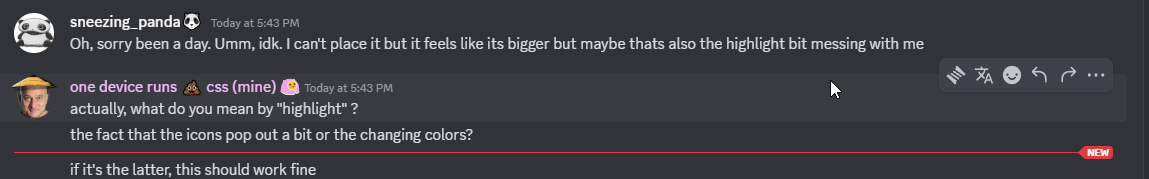
Oh, sorry been a day. Umm, idk. I can't place it but it feels like its bigger but maybe thats also the highlight bit messing with me
actually, what do you mean by "highlight" ?
the fact that the icons pop out a bit or the changing colors?
if it's the latter, this should work fine
.visual-refresh .popoverReactionHoverBar_f84418 {
  &:hover {
    background: var(--background-surface-highest);
    border: 1px solid var(--border-faint);
    box-shadow: var(--shadow-low);
  }

  .hoverBarButton_f84418 {
    padding: 0;
  }
}```changing color. https://i.imgur.com/DYb8WcK.png
oh
so you meant the message highlight, not the buttons
aight, gotcha
give me a sec
little of a little of b, my bad. But yes
what theme are you using?
Uhh "Ash"
well that's weird, I don't have the message highlight with the Ash theme enabled
and it's not due to css snippets or other themes on my end
Interesting.. I just double checked by temp disabling all mine and I still have it so same..
funny
currently hovering on your message

what could be causing this
have you also disabled your quickcss, just to be sure
Yea, did both
idk tbh, try with this
.cozy_c19a55.wrapper_c19a55:hover {
  background-color: transparent;
}```very basic, I don't even know if it'll target the right element
no D:
try now
nope
well, according to what I've seen in your screenshot, it should've worked
since it includes not only the message but the avatar and username as well
Searching on here I found a "--background-message-hover: var(--message-hover);" but idk how relevant or even how to use it since css is not my thing
yeah
I believe that was for the Midnight theme
frig
sorry for bothering you, but do you also have the messages highlight on hover?
highlight on hover?
like this
because I don't have it and my themes are disabled
I'll need to check
thanks
you're 1000% sure you don't have other themes or snippets somewhere
not even online themes
I completely took out the snippets by copy pasting them into a txt file, and disabled both themes I have enabled (that I'm not sure do anything anymore) and 0 online ones
well, for now this should reduce the size of the buttons when you hover a message
.visual-refresh .popoverReactionHoverBar_f84418 > .hoverBarButton_f84418 {
  padding: 0;
}```as for the background highlight, I genuinely have no idea since I don't even have it
what is gone
The highlight lmao

It was gone before I applied that so.. wadduheck
did you restart or refresh your client in between?
nice
I did when enabling that f8, it did nothing, then again when I disabled it and that also did nothing.
But it was doing that even after all those

Like thats the only thing that actually tilts me with this UI. I have everything else fixed
i dont have one like that in my stash lol, do you need one now?
No, what I meant was
Do the messages get highlighted as well when you hover over them on your device?
Because on my end, they don't
But on theirs, they do
With no themes or snippets enabled
nope
aside from a random snippet that turns every element that is hovered to a text colour of white, it doesnt get highlighted when i hover over it
Cool, so I'm not the odd one
Well, the highlight is gone on their end as well now
But we don't know why

¯_(ツ)_/¯
[id*="chat-messages"]:hover {
  background: rgba(255,255,255, 0.1)
}
```this should be the simplest snippet for itbut not sure why that happens
Why background instead of background-color? Just asking
I usually go for background only if it's not a specific color/var but something like an image
But are there other advantages in using it instead of background-color?
idk
just use whatever you want
background is a shorthand property for setting multiple things, its like transition with its transition-property, transition-duration and so on
Oh
so background can be used for anything like images, colours, gradients etc
That actually makes sense
MDN Web Docs
The background shorthand CSS property sets all background style properties at once, such as color, image, origin and size, or repeat method. Component properties not set in the background shorthand property value declaration are set to their default values.
i took a look and dont really wanna figure out the problem
just reeenable title bars
or if you're on vesktop enable the "Discord Titlebar" setting
ugly but it works, thanks
i designed the theme with the window buttons in mind
toolbar buttons are fixed in place as are the window buttons so it would require a custom css override snippet
idk why the inbox button dissapears in the first place
i have a snippet like this #🎨-theme-development message for the message action box
is it just me or message edit history could benefit from a little CSS revamp ?

i'd imagine an horizontally scrolling bar with all the times
or smth like that
or if it's a grid, for it to be aligned or smth
can someone help me flip the cross button with the minimize button
because that aint mac
if they are in a grid or a flex, just use order
i mean unless you used AI or copied smth that exist without thinking, you should have learned enough to do what i said
tho the rules would let me think you don't really know exactly what you are doing
not exactly
Anyone have a code to hide the "send" button on chat bar?
it's an option in settings > accessibility, but if you really want to: .buttons__74017 > :is(.separator_aa63ab, .container_aa63ab) { display: none !important; }
Click the (edited) tag {fake edit}
Yes
cool, that explains it
I thought having all the previous edits inline was a waste of space so I squared it away in a popup
it makes sense
pretty sure you can hide in in discord settings
you can actually do it by just right clicking the text area

interesting

I don't have that. How odd
might be a plugin or something
Huh, i uninstalled vencord and I still didn't have the option so it's something with base discord itself
maybe it's from a plugin that i have idk
try going through the settings then

how do u guys know what tags do what like for background images :root {
background-image: url("") !important;
background-size: cover !important;
}
i seen this was meant to change the background image but its not working
is this for some kind of theme?
nah im just messing with the css
im using beautifuldiscord and just tinkering with the css
but im curious on how u guys know the tags names is there a cheat sheet with them on it or something?
That did it. Thank you
what you mean by tags?
like the .wrapper__6e9f8 for the home icon
like how do u know the names of the objects

what would be the css you would use for that?
get to that using Ctrl+Shift+I
I wonder if there's any CSS snippet that can fix the aligning on all the badges, since like for example the partner badge, verified badge, community badge, boost badge are all like slightly misaligned
@chilly knoll found a new icon for you to make something for 😉 server tags

done

bigger than i was expecting
kinda seems like anything to do with nitro features if you remove them they just make discord lag like crazy lol
its that has selector causing the lag
ah
Yessir
why not an svg
the message that one replies to shouldn't be laggy #🎨-css-snippets message
hello, what do i do abt background images on clearvision? every single theme i have of clearvision has a broken photo now
and i cant get it working
the wallpaper is for some reason only visible throught the user popout

i literally typed in icons clicked first website typed in tag and copied the first one
she scale on my vector till i graphic
anyone elses discord gets super slow with dev tools open?
devtools has been very slow for me recently, but only devtools itself. it doesn't make using discord normally significantly laggier for me
yeah
and devtools being awfully slower than usual as well
guys im so tired of updating the css can someone help me from what I get I should replace the :has() to reduce laggy chat
and the icons are still eft up after refresh
this my current css and if someone has a similar one that they are going to maintain or have can you please point me there T-T
this is taking longer than i expected

is this just to hide names or something?

it suppose to hide everything pretty much
you can use the flow circular font to nuke all text
idk how to do that
@import url('https://fonts.googleapis.com/css2?family=Flow+Circular&display=swap');

:root {
    --font-primary: "Flow Circular";

    --font-display: "Flow Circular";
    --font-headline: "Flow Circular";
    --font-code: "Flow Circular";
}
I thought it wasnt loading hence the sob
Yeah, but i mostly do it not for themes/css stuff and I frequently use search there
how do i change the background here? cant find it in the css

on the midnight theme
.tree_ef3116 {
    background-color: rgb(0 0 0 / 0.11);
}
do i js copy that into css of midnight?
you can put it in your general custom css
ah okay
you should be able to change the server list background color to whatever you want
ty
how do i make it transparent tho
?
the color changes, but the transparency doesnt
@onyx mesa
wym?
i can change the color, but when i change transparency it doesnt make it transparent, just closer to the original discord color
heres one w no transparency

and this one w some transparency

Discord often has multiple overlapping elements with bg
i made a cool snippet i would like to share with the community, where should i post it?