#🎨-theme-development
1 messages · Page 53 of 1
I just copied the raw code and found all the horrible icons and removed them

paste this instead of @import
preferably at the bottom of the document
because there are 500+ lines
how can I do the same thing

[mask^="url(#svg-mask-status-online-mobile"] {
    mask: url("") ;
    -webkit-mask: url("") ;
    mask-size: 100%;
    height: 18px;
    mask-repeat: no-repeat;
}
data:image/svg+xml;base64,PHN2ZyB4bWxucz0iaHR0cDovL3d3dy53My5vcmcvMjAwMC9zdmciIHdpZHRoPSIyNCIgaGVpZ2h0PSIyNCIgdmlld0JveD0iMCAwIDI0IDI0Ij4KCTxwYXRoIGZpbGw9IiM0ZTUwNTgiIGZpbGwtcnVsZT0iZXZlbm9kZCIgZD0iTTExLjk0NCAxLjI1aC4xMTJjMS44MzggMCAzLjI5NCAwIDQuNDMzLjE1M2MxLjE3Mi4xNTggMi4xMjEuNDkgMi44NyAxLjIzOGMuNzQ4Ljc0OSAxLjA4IDEuNjk4IDEuMjM4IDIuODdjLjE1MyAxLjE0LjE1MyAyLjU5NS4xNTMgNC40MzN2NC4xMTJjMCAxLjgzOCAwIDMuMjk0LS4xNTMgNC40MzNjLS4xNTggMS4xNzItLjQ5IDIuMTIxLTEuMjM4IDIuODdjLS43NDkuNzQ4LTEuNjk4IDEuMDgtMi44NyAxLjIzOGMtMS4xNC4xNTMtMi41OTUuMTUzLTQuNDMzLjE1M2gtLjExMmMtMS44MzggMC0zLjI5NCAwLTQuNDMzLS4xNTNjLTEuMTcyLS4xNTgtMi4xMjEtLjQ5LTIuODctMS4yMzhjLS43NDgtLjc0OS0xLjA4LTEuNjk4LTEuMjM4LTIuODdjLS4xNTMtMS4xNC0uMTUzLTIuNTk1LS4xNTMtNC40MzNWOS45NDRjMC0xLjgzOCAwLTMuMjk0LjE1My00LjQzM2MuMTU4LTEuMTcyLjQ5LTIuMTIxIDEuMjM4LTIuODdjLjc0OS0uNzQ4IDEuNjk4LTEuMDggMi44Ny0xLjIzOGMxLjE0LS4xNTMgMi41OTUtLjE1MyA0LjQzMy0uMTUzTTcuNzEgMi44OWMtMS4wMDYuMTM1LTEuNTg2LjM4OS0yLjAxLjgxMmMtLjQyMi40MjMtLjY3NiAxLjAwMy0uODExIDIuMDA5Yy0uMTM4IDEuMDI4LS4xNCAyLjM4Mi0uMTQgNC4yODl2NGMwIDEuOTA3LjAwMiAzLjI2Mi4xNCA0LjI5Yy4xMzUgMS4wMDUuMzg5IDEuNTg1LjgxMiAyLjAwOHMxLjAwMy42NzcgMi4wMDkuODEyYzEuMDI4LjEzOCAyLjM4Mi4xNCA0LjI4OS4xNHMzLjI2Mi0uMDAyIDQuMjktLjE0YzEuMDA1LS4xMzUgMS41ODUtLjM4OSAyLjAwOC0uODEycy42NzctMS4wMDMuODEyLTIuMDA5Yy4xMzgtMS4wMjcuMTQtMi4zODIuMTQtNC4yODl2LTRjMC0xLjkwNy0uMDAyLTMuMjYxLS4xNC00LjI5Yy0uMTM1LTEuMDA1LS4zODktMS41ODUtLjgxMi0yLjAwOHMtMS4wMDMtLjY3Ny0yLjAwOS0uODEyYy0xLjAyOC0uMTM4LTIuMzgyLS4xNC00LjI4OS0uMTRzLTMuMjYxLjAwMi00LjI5LjE0TTguMjUgMTlhLjc1Ljc1IDAgMCAxIC43NS0uNzVoNmEuNzUuNzUgMCAwIDEgMCAxLjVIOWEuNzUuNzUgMCAwIDEtLjc1LS43NSIgY2xpcC1ydWxlPSJldmVub2RkIiAvPgo8L3N2Zz4=
the svg ^
that wont help lol
did you delete the import line?
that makes these beautiful icons.
if i get rid of the import line then all the icons will go back to stock lol
and if i copy what u sent then the mobile icon goes back to stocl
To get the stock icons back I removed the lines from the import, so I need to delete the import and insert what I have.
you can try doing as I did, I just deleted large segments of code until I observed a change
and each time he decreased the radius of removal
so I found icons I don't like.
just follow the link in the import and transfer the code from there directly into the quickcss file

i dont want the stock icon tho lol
i wanna fix the solar one
then you can't use the css I edited.
xd i know
im gonna make custom status icons bcuz i want the filled style not outline
does anyone know how to change the colour of the white bit on switches

kinda stuck
Try fill instead of color
cant seem to get it to change
do what i told them to do
why are you using base64 for the svg instead of just url encoding it
would i not need to download the svg then upload it somewhere
I don't know what you told them.


so you mean you want to do something completely different to what they wanted to do?
no
so you want to change the icons depending on if the popout is nitro themed or not?
wait nitro themed
I want buttons with integrations without opening the full profile
or are you just trying to open devtools
oh
that's a plugin
title!

thank you
if i add
.iconContainer_c1e9c4 .icon_c1e9c4 path[d^="M19 14a1"] {
    display: none;
}
itll stop showing that icon in the server dropdown menu only right?

its the + icon that shows on invites and new event
ok afaik it does
well if any other icon has that path it'll probably hide it
just use #guild-header-popout
so it'll only apply under that
so like #guild-header-popout path[d^="M19 14a1"]
and you might want a bit more of the path than that
that's not very much
wait use this #guild-header-popout-invite-people
i used
#guild-header-popout-create-event path[d^="M19 14a1 1 0 0 1 1 1v3h3a1 1 0 0 1 0 2h-3v3a1 1 0 0 1-2 0v-3h-3a1 1 0 1 1 0-2h3v-3a1 1 0 0 1 1-1Z"] {
    display: none;
}
its where the new event icon is i want it hidden for
thanks for the help
i added the full path, its short anyway
yea idk why i deleted the message

fixed the styling for MemberCount, the width actually changes based on the content!

idk why the gif is green
i’m so confused what i’m looking at
does anyone else feel like popup menus are inconsistent af? some have a shadow and some have borders
i removed borders from mine
it's also cuz some of them use border: and some use box-shadow:
for the outline effect
yeh kinda weird imo
is there anyway to remove/hide these reaction.

why does discord use the var they use for hovers for a header 😭

--bg-mod-subtle
it themes a bunch of hovers
#message > div > .wrapper_f563df {
  display: none;
}
just replace the header var
emm it still there.. its from this button

there's no way the menu's for right click and the "more" button are different
even discord wouldn't do that
i see thank you!
nvm. im just stupid
.wrapper_f563df {
  display: none;
}
this should remove from both of them
thank you very much! ❤️
yeh i will
do u guys make ur own variables for ur themes
i have some custom vars for my member hover snippet
so you could change the animations speed or colors on some stuff etc.
ahh
just wondering if people do that a lot
finally themed vencord shiki codeblocks lol
dont suppose anyone has a snippet to bring back the quest tab since ive removed the discovery button
ik u can see it here but theyre eventually gonna remove it eventually

don't think that's possible with css, you'd need a plugin for that most likely
thought so
if yk how to get datatabid's get me the openasar one and ill add an icon for it
wait what

/* Icon Pack */     @import url('https://mudaranrhiod.github.io/DT/vencord/solar.css');
/* More icons */    @import url('https://mudaranrhiod.github.io/DT/vencord/solarmoreicons.css');
all the icons come from there
anything i use it just other peoples stuff
div#openasar-item.item_b3f026.themed b3f026::before
thats from inspect
not sure if thats what u were after
does it have this

idk if itll be the same as what u sent
thanks
ill add an icon for that so its not a box
ty
the tick looks centred right?

Looks good enough
wb turned off

i think its too much to the left

this looks fine right?

I would also make it like 5 pixels longer
been doing my own thang

urs kinda looks better ngl
Yah
why
I haven't styled it yet the way i want, been just adding the icons one by one
are u gonna make the css actually readable lol
cuz i didnt and i hate myself for it
yeah, im using vars for the svgs
of course
ll
@onyx mesa btw if u ever figure out how to change the reviewdb arrow icon lmk pls
that’s fair
same @onyx mesa
cropped out the blank space from the SVGs and got so much bigger

nice
yeah it's probably a bit more efficient that way
but only if you use = instead of ^= which it doesn't look like you're doing
More travel for the icon
the icon isn't very centered though

that's zoomed in so when it's probably more like a difference in 1 pixel or something 20 obviously
should i use = instead then
eh
ooof
whats the best way to measure if smth is alligned correclty
yeah
especially if you're already using the full path
no point in using the full path if you're still using ^=
i use this thing, but it the pixels it shows are screen pixels which are different size than the pixels in like width: 100px

didn't know powertoys has that
i use sharex color picker
ah yeah forgot about that
but i think i like sharex one better
fair, i just use powertoys cuz its installed so might as well
well i use sharex for screenshots too
and short recordings
(and longer recordings even though it's not meant for that)
(too lazy to use obs)
it be like that lol
Oh i think i know why i use sharex color picker instead of powertoys one
the powertoys one doesn't actually freeze the screen
but this is kinda nice that it opens a big popup when zooming

sharex's one is like this

i never understood sharex
ive tried it so many times
but win shift s exists
and it does the same job as sharex for the main features
same job as sharex but worse
and sharex is more customizable
and better
like you can draw on your images easily

u i can do that same thing with win shift s
yeah ig you can after capturing
i just have to click on the ss noti
some of it
wait can you not choose custom colors

yeah same
but for how much i screenshot, sharex is so much better than win+shift+s
but if you only screenshot a few times a day, it's definitely good enough
so much better than just the old snipping tool you couldn't even activate with a shortcut key (i dont think so at least)
yah
yea they added it randomly towards the end of win10 lifespan
another reason i dont like sharex is just the ui
my whole system is as “Fluent” as possible just coz i like the win11 aesthetic
sharex is like win7 type thing
nitpicky reason but yea
Could anyone help me fix a css-snippet?,
I've been trying to make it work, someone helped me and it was a step on the right direction but it still has an issue (It's meant to be a collapsible server list)
The issue is that when reappearing, it doesn't move the content again to the right. So the serverlist ends up on top of the channels
This is the CSS on its current state: https://paste.helpch.at/itetulafum.css
sharex is stuck in german for me

u_u
🟫🟧🟧🟧🟧🟧🟫
🟧🟧🟧🟧🟧🟧🟧🟧🟧
🟧🟧🟧🟧🟧🟧🟧🟧🟧🟧🟧
🟧🟧🟧🟧🟧🟧🟧🟧🟧🟧🟧🟧🟧
🟫🟧🟧🟧🟧🟧🟧🟧🟧🟧🟧🟧🟧🟧🟫
🟧🟧🟧🟧🟧🟧🟧🟧🟫🟧🟧🟧🟧🟧🟧
🟧🟧🟧⬛⬛⬛🟧🟫⬛⬛⬛🟧🟧🟧🟧
🟧🟧🟧⬛🟫⬛🟧🟧⬛🟫⬛🟧🟧🟧🟧
🟧🟧🟧🟫⬛🟫🟧🟧🟫⬛⬛🟧🟧🟧🟧
🟧🟧🟧🟧🟧🟧🟫⬛🟫🟧🟧🟧🟧🟫⬛
🟫🟧🟧🟧🟫⬛⬛⬛⬛⬛🟫🟫🟧⬛⬛
🟧🟧🟫⬛🟫🟫⬛⬛⬛⬛⬛⬛⬛
🟧🟧🟧🟧⬛⬛🟫🟫⬛⬛⬛
🟫🟧🟧🟧🟧🟧🟫⬛⬛
⬛⬛⬛⬛⬛⬛⬛
.visual-refresh [class*="guilds_"] {
    position: relative;
    width: 0;
    transition: width 0.3s ease;
    overflow: hidden;
}
.visual-refresh [class*="guilds_"]::before {
    content: "";
    position: fixed;
    width: 15px;
    height: 100%;
    background: transparent;
    z-index: 1;
}
.visual-refresh [class*="guilds_"]:hover {
    width: 74px;
}
something like this?
it's wonky


why would you do that to blue shark
Blahaj death
you spelled it wrong so the wrong thing dies
do i have to add the sidebar class to everything?

had to add the sidebar class so it wouldn't target these buttons

nvm if i remove the mask from ::before it works fine
hi, i'm currently using these root settings for font, but i wanna edit font-feature-settings for --font-display specifically. is such a thing even possible?
:root {
  --font-primary: "Suisse Intl", sans-serif, "TwemojiColor" !important;
  --font-display: "Def Sans SemiCondensed", sans-serif, "TwemojiColor" !important;
  --font-headline: "Def Sans SemiCondensed", sans-serif, "TwemojiColor" !important;
  --font-code: "Azeret Mono", monospace, "TwemojiColor" !important;
  letter-spacing: 0.02em;
}```what do you mean by font-feature-settings?
the font i use for --font-display has an OpenType font feature that i want to enable SPECIFICALLY in case of --font-display, like so
i want this font feature to apply everywhere that --font-display is used
font-feature-settings:"ss01" 1;
```https://developer.mozilla.org/en-US/docs/Web/CSS/font-feature-settings
MDN Web Docs
The font-feature-settings CSS property controls advanced typographic features in OpenType fonts.
i don't quite know if that's possible like so, or if i have to do that a different way
ive never ever known thats a thing
oh, huh
Would there even be a way to get BetterActivities to support AcrylicPopups

how popups usually look

why would there not be
progress, finished putting in all the icons, including the ones for server settings

it's the material pack by google
not all of them but majority
welp i've ended up just doing it manually wahooey
right, finished the settings icon snippet
i know little to none about CSS
looking through the styles.css and im trying to make sense of it 🗣️ 🔥
@chilly knoll loving those buttons


thanks to @onyx mesa i was able to change em
im still going through all the css an trying to find the main cause of sluggish typing lol, i deleted stuf test readded test
disable everything then enable each thing 1 by 1 and see when the sluggish typing happens
maybe
@chilly knoll mind if i toss yeah a DM?
@chilly knoll should definitely colored them like the mac buttons, at least on hover
just remembered why i love aero

omg what theme is this??
custom one
im probably not gonna release it publicly since half its code is adapted from 7.css
oh
Has there been a snippet written to remove the role circles and make the whole role rectangle tinted the color of the role?
I swear I've seen that somewhere before..
or maybe it was old discord?

that did exist before...
ah so it was just old discord huh
dang 
no as a snippet
yes but i could prob update it
here's the original
.role-2TIOKu {
    transform: translate(0);
    overflow: hidden;
    border: 0;

    --transparency: .4;
    border-radius: 5px;
}
.role-2TIOKu .roleRemoveIcon-387wKV {
    margin: 0;
    left: unset;
    transform: translate(50%,-50%);
}
.role-2TIOKu .roleRemoveButton-17oXnT {
    position: static;
}
.role-2TIOKu .roleCircle-3TFUOr:after {
    content: '';
    top: 0;
    left: 0;
    z-index: -1;
    width: 100%;
    height: 100%;
    position: absolute;
    background: inherit;
    opacity: var(--transparency);
}
I see both are broken unfortunately, the latter one still has the role dot too but Thanks
yes, because removing the role dot makes it impossible
impossible to remove the role?
no, just impossible the theme it with a role-colored background at all
ah, I see
Old ahh class names
Jumpscare
idm idm
if u got pics send those too
ill see
ive never liked that ui but that theme looks so well mase cuz i legit thought it was windows7 lmao
does anyone here use mac? send screenshot of the window action buttonplsss

yes, if you're fine with the chat jumping up and down whenever someone starts typing
what
i dont have the code for it
u asked if it was possible
i dont even know what snippet you're using to move the typing in the first place
im assuming its the one i made
i don't really want to dive back into that mess
yeah i have no clue what that is
 .sidebarRegion__23e6b {
  flex: none;
}
.contentColumn__23e6b, .customColumn__23e6b {
    max-width: 100%;
    min-height: 100%;
}
.accountProfileCard__1fed1 .mask__68edb mask circle {
  display: none;
}
.avatar__1fed1 {
  top: 115px;  /* Change px height to your preference */
/* Vertical Heights: 115px @ 80% Zoom - 92px @ 90% Zoom - 80px @ 100% Zoom */
/* Horizontal Heights: 342 @ 90% Zoom - 300px @ 100% Zoom */
}```can someone test this snippet and then look at their voice and video settings and tell me if the page just starts expandingshould look something like this if its fucked like mine

@vestal field how did you make the preview image for https://github.com/refact0r/midnight-discord ?
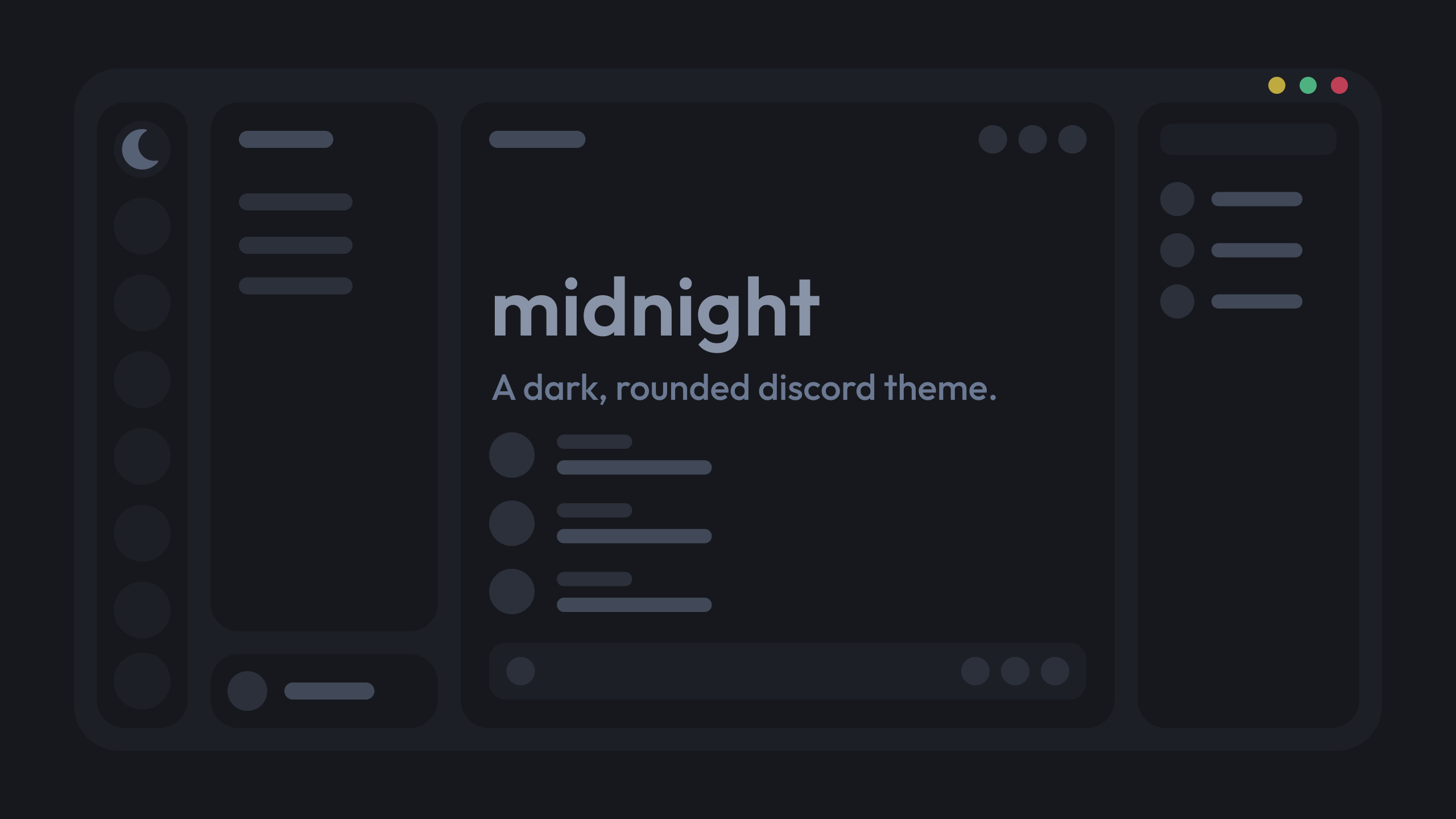
GitHub
a dark, customizable discord theme. Contribute to refact0r/midnight-discord development by creating an account on GitHub.
yeah that one
imagine he used photoshop
i cba to buy adobeshit
inkscape
gimp

??
gimp is good
it's like photoshop but free and open source and not cringe adobe product
and it has a cute icon


(except flash player because i need that for ninja kiwi archive)
(i should probably uninstall it next time it pops up because i haven't played nk archive for like half a year)
There’s just a massive learning curve that it takes to learn how to use gimp
is there not one for photoshop?
i'm really bad at gimp, but usually if i look it up, there's a tutorial or something
I tried using gimp in 2018 but couldn’t adjust to how god awful the ui was
Idk if they’ve changed it since then or not
for this kind of thing why would you use gimp
if i was smart i would've used figma
||Plus just ||🏴☠️|| photoship like most of all people||
Figma’s a godsend for layout
i think they have

I feel bad for people that used photoshop to make layouts cause that shit sucks
krita my beloved
I had to use gimp in my old job and it was torture
what was that?
even better: make css to showcase your theme that looks like your concept image
my job? I worked at a car factory and one of my duties was to make and maintain work instructions which included images and had to overlay some text and arrows and circles and even that was painful to do
figma always seems weird to me
like i've seen videos on like "redesigning youtube ui" or discord ui or something, and then it's just in figma
like why not just do it in css instead
sharex my beloved
because
- most people suck at css
- its still faster to do it in figma even if you're good at css
but it doesn't mean anything if you do it in figma imo
idk i'm not a designer
well we only had software approved by it dept and installable via a software center thing.. so options were limited
its like so much easier to copy a figma design rather than try to create a layout in your head and implement it directly with css
how do you even draw arrows/lines in gimp
exactly...
made a layout in photoshop, hated it
downloaded figma and now i like photoshop even less
help i accidentally got rid of the panels

(i have no idea what you mean that gimp is annoying to use, it's perfectly fine for me)
whoa i found it
somehow enabled "hide docks"
which doesn't even seem to have a keybind so i have no idea how

Yeahh!!, basically!!, thank you so much!!!!
figma balls
figma kinda sucks now
@blazing dock what are you using instead of figma
penpot
there's a fork called photogimp that makes it like photoshop
do they follow the colour of a discord var
does gimp have svg editing tools
ive been using inkscape. its pretty good but drawing and erasing? so bad
don't think so
it's not for vector graphics
ahh
I barely even use gimp
I have to look up everything I want to do in gimp pretty much lol
i used to use it back when i riced windows to catppuccin adn wanted catpuccin window app icons lmao
i think inkscape is the best free option for vectors
whats the bestpaid one
would be adobe illustrator but i think affinity design is better
cuz adobe is like $60 a month while affinity is $60 as a one time payment
who even pays for adobe
Corporations
i mean yeah i guess you could just sail the seas for adobe stuff
remember kids, always sail the seas
but sometimes the fish will try to swim up you
Eat them
Found the issue of what was causing typing lag it was because of the hide nameplates snippet
that's because it uses has: which is horror code
ok why are some of the icons just gone

Discord moment
the github links are working perfectly fine
ok now the ones that were gone appeared again
now different ones are gone

not sure if it’s just me but this icons look pretty big
can someone check if it's just my connection
they were fine last night for me but i aint on pc rn
i'll be adding custom vars for the icon sizes
sick
no
now i truly see how bad has is
send link for them ill try
@onyx mesa should i use the colours it uses ir make them follow a discord var
whatever vars give the same or similar colour ofc
could use the vars for online, offline etc
not a bad shout
fine?

i used the --status-[status] vars
dont think they theme shit so shouldnt be bad for themes hopefully
only problem is the hover for close lol

should i just add hover: somecolor to the close one
ok that doesnt even work nvm lol
correct screenshot*** lol

yeah thats the windows red color lol litterly the only button on any title bar that goes red when hovering
shouldn’t it be yellow green red
apparently not
apple r backwards i guess
so i cant change it?
they always have been
don't think so since its windows making the hovering red
same thing with any program

this here is steam
true
ahh
i can change the colour of it tho so i assumed it wasnt
you should be able to remove the hover effect
is that regular steam or a theme?
looks like the fluent theme on millenium
.winButton_c38106:hover {
    background-color: transparent !important;
}
should remove them
yes its fluenty by the millennium team
not fluent its fluenty
fluent is by opuro which is complete garbage he keeps adding features but not fixing bugs an broken UI
yeh removes the hover for all 3
is there a way to change the colour of the close icon when hovering
i can make it follow a white variable or sum (so its visible and doesnt have bad contrast)
.winButton_c38106:nth-of-type(3):hover {
    color: red;
}
that doesnt seem to do anything, tried with !important too
how does it look on macos
it should be working
deffo doesnt for me lol
what about the transparent one above
yeh that works but all 3 of the hovers go boink
ah
can you send me your css of the windows buttons
.winButton_c38106:nth-of-type(1)::before {
  content: '';
  width: 25px;
  height: 25px;
  background-color: var(--status-online);
  mask: url('') no-repeat center;
  mask-size: 100%;
  -webkit-mask-size: 100%;
}
.winButton_c38106:nth-of-type(2)::before {
  content: '';
  width: 25px;
  height: 25px;
  background-color: var(--status-idle);
  mask: url('') no-repeat center;
  mask-size: 100%;
  -webkit-mask-size: 100%;
}
.winButton_c38106:nth-of-type(3)::before {
  content: '';
  width: 25px;
  height: 25px;
  background-color: var(--status-dnd);
  mask: url('') no-repeat center;
  mask-size: 100%;
  -webkit-mask-size: 100%;
}
.winButton_c38106:nth-of-type(3):hover {
    color: rgb(38, 255, 0);
}
forgot this bit
.winButton_c38106:nth-of-type(1) svg,
.winButton_c38106:nth-of-type(2) svg,
.winButton_c38106:nth-of-type(3) svg {
  display: none;
}
i see the issue
.winButton_c38106:nth-of-type(3):hover::before {
    background-color: rgb(38, 255, 0) !important;
}


looks cool
i think on mac it either gets darker on hover
or i think the icons inside are invisible until hover

nah i think this is a better option
damn
the one you did rn i mean
whoch colour for popups is better?
the 2nd one uses the same colour as the channels list and lots of other major backgrounds but its also more consistent with my bunny theme than first


yeh i liked that one more
looks pretty good like this aswell when you hover over it
should match with this, for consistency

oh i can change that
i always keep that the same colour lol, it uses a diff var or i themed its class so couldnt be assed changing it just for the screenshot xd
the darker one seems better for the eyes
got these mixed up the 1st one is what the message is talking about lol
i have a darker version of this theme anyway
its what i use
view raw
wasnt sure what else to use
demo?
glorious


this?

hideous
stop playing my mother bro
rude
fair enough i guess


is activity meant to be all the way here or do i have css messing with it

who knows what the fuck discord is doing to the app
honestly so true
i cant get over how zoomed in ur discord is
im too used to 80% zoom
i tried zooming out but ew
i use a vert monitor
didnt like shit being so small
i need the extra space
i was about to say big-small screen syndrome but that res says otherwise
🔥
ignore andor

yo anyone got a snippet to get rid of the white dot and change it so the channel icon turns white instead

allg for me

yeh cuz theres other tabs
discord fucked with it ig

would tell u but idek how u get favourites
cant find the plugin for it guessing it doesnt include the word favorites
its an experiment
ye
ah
dont ened this anymore, was having issues which seem to be rooting from vencord
idk if the favourites is a good feature or not
i havent used it since like begining 2024
i just keep it bcuz
idk
its been an experiment for fuck knowshow long now
It’s existed since 2021 in some capacity
exists on mobile too tho they messed up the experimen
jeez
why havent they rolled it out what is wrong with discord
It’s the same thing with the mobile account switcher
real
There’s an experiment for it and it works perfectly fine. They just won’t roll it out
favourites server is amazing
*favorite
screw americans
anyone here can help me fix this,is not working anymore.
/* Plain Folder Icon Size Pastel */
.expandedFolderIconWrapper__48112 svg {
  display: none;
}
.expandedFolderIconWrapper__48112::after,
.closedFolderIconWrapper__48112::after {
  content: "";
  background-color: var(--bg-3);
  width: 24px;
  height: 24px;
  position: absolute;
  clip-path: path("M2 8V6.25A3.25 3.25 0 0 1 5.25 3h2.879a2.25 2.25 0 0 1 1.59.659l1.531 1.53L8.659 7.78a.75.75 0 0 1-.53.22zm0 1.5v8.25A3.25 3.25 0 0 0 5.25 21h13.5A3.25 3.25 0 0 0 22 17.75v-9a3.25 3.25 0 0 0-3.25-3.25h-5.69L9.72 8.841a2.25 2.25 0 0 1-1.591.659z");
  transition: opacity 0.2s ease;
}
.closedFolderIconWrapper__48112:hover::after {
  opacity: 0;
}
.closedFolderIconWrapper__48112 > .guildIcon__48112 {
  opacity: 0.5;
  filter: blur(1px);
  transition: opacity 0.2s ease, filter 0.2s ease !important;
}
.closedFolderIconWrapper__48112:hover > .guildIcon__48112 {
  opacity: 1;
  filter: blur(0px);
}
.theme-dark .folder__48112[aria-expanded="false"] {
  background-color: var(--bg-3);
}
thats what i like to hear
so true
mine is slighlty modified but it still works

looks good ngl
thanks
can share yours?
its on my github under the file colorfull.css look for the label Plain Folder Icon Size Pastel
tysm
btw you misspelled my name in your readme 
yeah lol just noticed
should be updated there now i was half paying attention when i first typed it lol

not sure what i contributed, but whatever 

i know i took something from you but cant remember so i have you there
ah think its this an something else

reminder that stuff in my css_snippets file are not made by me
dont have anything in my list that does that lol
oh no its the new leaf
i need to make a better regex for this link, this looks too cluttered
theres also the new leaf aswell
whats the difference between normal radial status and urs? just disabling the phone?
new leaf?

¯_(ツ)_/¯
that green leaf when new users join a server
i never did that lmao
you sure?
do a diff idk
considering how it was extremely unorginized like a week or so ago i probably got stuff mixed up it used to be all in 1 file and was gettign annoying on me to find what changed what lol
photoshop is still nice to use 

I know this is sorta an old message but uhh, can you continue it's development? if it isn't already as a downloadable thing.
the theme is impossible to make due to how stupid discord's html is
best i can do is a non functional mockup
@half crystal stupid idea
discord amity theme
Uh
Hm
bit irrelevent but i never really liked draculas colour palette
that's so mean
nuh uh
lots of people like it, i just dont im not calling it shit or anything xD
It's really dependant on the month for me XD
meanwhile gimp enjoyers : 🤣
GIMP 3 on top btw

i made --background-modifier-accent use a very specific colour for a good reason but im trying to remember why i did that cuz its causing borders to be the wrong colour

its called deprecated but discord still uses it?


@iron smelt also discord use ur oklab and lch
Maybe it's the color to use for deprecated texts, rather than the color being deprecated
Who knows
dracula is meh as well for me, its either catppucin mocha or nord
like ill use it, but have a super preference to nord
yeah those 2 are nice
rose pine is super underrated too
it has one of the best light mode themes imo
the background colours are very warm so its easier on the eyes. nord doesnt have an official one and catpuccin latte is horror
frappe?
no latte
have you tried catppucin latte?
yes i dont like it
the colours dont even feel like pastel colours lol
the dark flavours are great just dont like latte
i meant to ask whether you tried frappe
oh lol
ive tried all catppuccin flavours including unoficial ones like voidpuccin and chadpuccin
used to be a catppuccin addict xD
damn im a nord addict now
lol
im currently addicted to an old aliu theme
decided to port it to 3 diff apps

is nord a theme?
Nord is a color palette
ah
then so is catppucin
it is

that kinda sucks.. I'll take the mockup I guess
yeh...
is this a good icon to use for the quest wraith icon lmao

i literally cant find a good one to use ugh
#1164b4
u can get the colour with the vcotd cmd
The cozy of the day is green blue! (#1164b4)


a what

that's not green, that's entirely blue
what icon pack do you use for everything else
could use something like this for it

i use solar for everything
i have all these

could use the medal one, i think
Nudl 7 is possible
theyre all medals 😭
should i use a paw

its cute
i meant these ones

oh right
7 uses like no capsulation of list elements 👍
it does????
6.0 doesn't
only 6.0
e
Egg
is you of retardation
gimp is like actually unusable
actually i havent tried gimp 3
has it gotten any bit better
or is the ux terrible as always
i highly disagree
photoshop
solar is good apart from the fucking windows buttons
this shit is fucking ugly
take away the colours n circles n im fine with it
or you can just change them yourself, personally
that requires me to download the css and remove the icons and ngl im way too lazy for that shit
no, you can just overwrite their svgs with your own
or just make a patch snippet
well it depends
could i technically just take this and swap out the icons i dont like with my own ones and leave the ones i do like? https://github.com/mudaranrhiod/discord-iconpacks/blob/master/vencord/solar/moreicons.css
/* Window Control Fancy Buttons */
.winButton_c38106:nth-of-type(1) svg,
.winButton_c38106:nth-of-type(2) svg,
.winButton_c38106:nth-of-type(3) svg {
    display: none;
}
.winButton_c38106:hover {
    background-color: transparent !important;
}
.winButton_c38106:nth-of-type(1)::before {
    content: '';
    width: 25px;
    height: 25px;
    background-color: currentColor;
    mask: url('data:image/svg+xml;base64,PHN2ZyB4bWxucz0iaHR0cDovL3d3dy53My5vcmcvMjAwMC9zdmciIHdpZHRoPSIyNCIgaGVpZ2h0PSIyNCIgdmlld0JveD0iMCAwIDI0IDI0Ij48cGF0aCBmaWxsPSJjdXJyZW50Q29sb3IiIGQ9Ik0xOCAxMi45OThINmExIDEgMCAwIDEgMC0yaDEyYTEgMSAwIDAgMSAwIDIiLz48L3N2Zz4=') no-repeat center;
    mask-size: 100%;
    -webkit-mask-size: 100%;
}
.winButton_c38106:nth-of-type(2)::before {
    content: '';
    width: 21px;
    height: 21px;
    background-color: currentColor;
    mask: url('data:image/svg+xml;base64,PHN2ZyB4bWxucz0iaHR0cDovL3d3dy53My5vcmcvMjAwMC9zdmciIHdpZHRoPSIyNCIgaGVpZ2h0PSIyNCIgdmlld0JveD0iMCAwIDI0IDI0Ij48cGF0aCBmaWxsPSJjdXJyZW50Q29sb3IiIGQ9Ik0xOCA0SDZjLTEuMSAwLTIgLjktMiAydjEyYzAgMS4xLjkgMiAyIDJoMTJjMS4xIDAgMi0uOSAyLTJWNmMwLTEuMS0uOS0yLTItMm0wIDE0SDZWNmgxMnoiLz48L3N2Zz4=') no-repeat center;
    mask-size: 100%;
    -webkit-mask-size: 100%;
}
.winButton_c38106:nth-of-type(3)::before {
    content: '';
    width: 25px;
    height: 25px;
    background-color: currentColor;
    mask: url('data:image/svg+xml;base64,PHN2ZyB4bWxucz0iaHR0cDovL3d3dy53My5vcmcvMjAwMC9zdmciIHdpZHRoPSIyNCIgaGVpZ2h0PSIyNCIgdmlld0JveD0iMCAwIDI0IDI0Ij48cGF0aCBmaWxsPSJjdXJyZW50Q29sb3IiIGQ9Ik0xOC4zIDUuNzFhLjk5Ni45OTYgMCAwIDAtMS40MSAwTDEyIDEwLjU5TDcuMTEgNS43QS45OTYuOTk2IDAgMSAwIDUuNyA3LjExTDEwLjU5IDEyTDUuNyAxNi44OWEuOTk2Ljk5NiAwIDEgMCAxLjQxIDEuNDFMMTIgMTMuNDFsNC44OSA0Ljg5YS45OTYuOTk2IDAgMSAwIDEuNDEtMS40MUwxMy40MSAxMmw0Ljg5LTQuODljLjM4LS4zOC4zOC0xLjAyIDAtMS40Ii8+PC9zdmc+') no-repeat center;
    mask-size: 100%;
    -webkit-mask-size: 100%;
}
``` here's minemuch better
think my file is getting a bit big
might just have to start importing everything
i say that but it cant get bigger than cyan file
idk just compile everything into an repo and use one import line
most of ur stuff is just ur own tho right?
depends how much you wanna reduce the size of it

yeh u could
idm u forking my repo and doing that (so u can pull updates i make)
OH SHIT
i didnt realise u were the guy who makes solar
feel bad now
just shitting on ur stuff
meh idrc, we all have our own opinions and thats completely fine
also its not like i designed the icons lmao
hello, is there any way to use a file rather than an url as the background image in clearvision?

no
what's wrong with a url
sad
was just about to ask lol
theres some wallpapers i cant get an url of, so js askin
download them and upload them somewhere
ah
thanks
@half crystal that looks demented on a vertical monitor lol

uhhhh i paste the url and it doesnt work
send the url
right click on it in imgur
thats not an image
https://i.imgur.com/1MK0Avh.png is
and copy the image link
should it give a link which ends with the file extension
it has to end in .png, .gif etc.
uhhh
i dont get the png or gif
i js get the imgur link
ah i had to add on my own
i added the .gif to the link but it uh, is js a still image


give me the imgur link for the wallpaper you wanna use
oh it's a video
do i need to convert it or sum
isnt it a gif
i can but its just a still image, not animated

Is there an update to this?: https://mwittrien.github.io/BetterDiscordAddons/Themes/ServerColumns/ServerColumns.css
Or just a different way to resize the guild list since that's all I use it for?
      /*Server list fix */
  --guildsize: 57;
  --columns: 1;
Server list is just too small
Currently that CSS makes the last folder in a server get cut off
well the green and yellow should be switched, macos has the minimize and maximize buttons switched for whatever reason which is why the colors are in that order. but green should always be maximize, yellow always minimize, and red always exit
the order doesn't matter, but the colors should map to the right button
green maximize, yellow minimize, red close
so then i need to swap maximise and minimise then
i dont think swapping the order of the buttons is a good idea, would be weird to have every other program on your computer have the same order except for 1
can someone help me get the classname that lets me change the color of this please

specificly the blue
yeah i cant get it to change
_details.scss: Lines 46-85
// Switches
// Literally a single switch doesnt have the parent control_ class... so annoying
// div[class^="container_"][style*="opacity: 1; background-color:"]
div[class^="control_"] > div[class^="container_"] {
  background-color: #{$surface2} !important;

  > svg {
    > rect {
      fill: var(--white);
    }
    > svg > path {
      fill: #{$surface2};
    }
  }

  &[class*="checked_"] {
    background-color: var(--brand-500) !important;

    > svg {
      > rect {
        fill: #{$crust};
      }
      > svg > path {
        fill: var(--brand-500);
      }
    }
  }
}

// Vencord custom switches
div[class^="vc-addon-card"] > div div[class^="container_"] {
  --primary-400: #{$surface2};
  > svg > rect {
    fill: var(--white);
  }

  &[class*="checked_"] > svg > rect {
    fill: #{$crust};
  }
}
surface2 and --brand-500 are toggle off and on backgrounds respectively
thank you
all i wanted to do lol
[class*="checked_"] {
    background-color: var(--mc) !important;
}```
Give it a specifc red color i like to match the red in other placesso guessing like this
/* Switches Color */
div[class^="control_"] > div[class^="container_"][class*="checked_"] {
  background-color: var(--mc) !important;
}
div[class^="vc-addon-card"] > div div[class^="container_"][class*="checked_"] {
  background-color: var(--mc) !important;
}```you dont need to important the venniecor
also can nest the container checked into the control > and vc addon > div
oh wait
no
wait
I'm dumb
misremembered the structure
im happy now hopfully im not missing any other discord blue stuff been changing it to this nice red color

if you want the proper animation youll define both ends and ease them like i did for catppuccin
youre also not styling the checkmark
think thats from the solaar icon set from mood

hm okay weird
not sure whats styling the checkmark
https://github.com/madmaxgrey/Vertical-Spacious-Refresh/tree/main/vencord
you can take a look through the 4 files if you want
its in the snippet i sent
&[class*="checked_"] > svg > svg > path { fill: var() }
oh
just use the snippet and remove what you dont need
made that to make the switches apply to your theme
the colors are hard coded in the style=
that probably explains why it was only showing element style somethign somethign along with the extra stuff below it
lol a new annoying button has been added to DM's lol

discord broke this plugin how can i fix it with css


disable that plugin for now an use this may like it better
/* Plain Folder Icon Size Pastel */
.expandedFolderIconWrapper__48112::after,
.folderPreview__48112::after {
  content: "";
  background-color: #fff;
  width: 24px;
  height: 24px;
  top: 60px;
  right: 12px;
  position: absolute;
  clip-path: path("M20 7H12L10.553 5.106C10.214 4.428 9.521 4 8.764 4H3C2.447 4 2 4.447 2 5V19C2 20.104 2.895 21 4 21H20C21.104 21 22 20.104 22 19V9C22 7.896 21.104 7 20 7Z");
  transition: opacity 0.2s ease;
}
.folderPreview__48112:hover::after {
  opacity: 0;
}
.folderPreview__48112 > .folderPreviewGuildIcon__48112 {
  opacity: 0.5;
  filter: blur(2px);
  transition: opacity 0.2s ease, filter 0.2s ease !important;
}
.folderPreview__48112:hover > .folderPreviewGuildIcon__48112 {
  opacity: 1;
  filter: blur(0px);
}
.theme-dark .hiddenVisually__27f77[aria-expanded="false"] {
  background-color: #000000;
}
.theme-light .hiddenVisually__27f77[aria-expanded="false"] {
  background-color: #777777;
}```Did you enable the fast follows experiment or is that on rollout
Actually nvm I think it affects folders anyway
that just blurrs it witch isnt what i want
well its an option until they fix the plugin
also you can just change the opactity aswell
change this to 0

Here's a small snippet to increase the
which part of thr switch is this for
@copper flame
wait why is she on timeout lol
idk after this update
the nameplates randomly become always visible
their classes did not change so idk wtf is the problem
in where? direct message thing?
oh i thought in direct message thingy.. u need to hover it then you can see the nameplate..
the experiment also broke
u mean the dms list or smth else lol
ya dms list
which one looks better? 1st is the current colours


it's getting fixed
#1354502862390038528 message
my ops
the whole switch
can i just copy paste the snippet and change it to my own colours then
ok nvm
how do i theme the white part that the checkmark sits in
that worked thanks
but everything else of my theme is broken
:c
atleast this is still fixed 💔
cuz tf is this?
its scss so youll have to adapt it but yes
the > svg > svg > path { fill }
yeh got it, thanks

Are there any CSS themes that return Discord pre-visual-refresh UI (remove the top bar, make the bar under profile smaller, returns old servers list, etc)?
you can find snippets that do all of those things in #🎨-css-snippets
completely reverting to old ui is not possible tho
In this channel are many other snippets not connected with things that return Discord to old UI
Can you send me links to the messages with snippets that return old UI step by step? I'm going to use all of them
no do it yourself 
and getting 100% there is impossible and will become increasingly more annoying as discord changes more stuff, just use the new UI
mobile discord had this same issue
people constantly complaining over ui change
Mobile doesn't have new UI
No. It's bad
Yes, it does
It was released last year
And people kept whining about it for months, just like the desktop visual refresh

it does tho?
visual refresh didnt even change the layout and people still complained its honestly annoying
and all the weird sizing and unalignment issues can be fixed with css
some aspects got changed, e.g parts that were iconic
I used to hate the visual refresh tbh, but now I just chill with it as I finally have a pitch black theme
lol
like
User area
yep
isnt it just longer lol
It's massive
Compared to the old one
Takes up way more space on both servers and channels list
hell I even have a plugin to just size that shit down
i can see why people wouldnt like the new one but thats such a small issue imho. like again css can revert it so easily
That's because you assume regular people would use/know css
If the modded discord users is a minority, people who use custom css aside from prebuilt themes is even smaller
well people in modding communities know about css and themes. or most do considering how many have asked how to revert it in this channel lol
guh
Yes, in modding communities
and this is vencord, precoded plugins and themes
What's the % of people who use modded clients compared to the total discord users though?
idc about non modding communities bcuz the ones im in dont care enough to complain xd
probably ~18%
(guessing)
Even if that was the case, that means around 72% of users have no way to easily change the new layout
And so they complain
hm
That's the point I wanted to get to
yeah, not everyone wants to install vencord
albeit safety concerns, privacy concerns etc
So now, take that guessed 18% and see how many know and/or use css snippets aside from themes
🤏
And that's fair tbh
DISCORD STOP BREAKING THINGSSSS

i dont even see what they changed so i dont know how to fix this 😭
just beauty

love updates
lol everything breaking for everyone but mine still looks perfectly fine lol
Do you have the link to that snippet?
i made it :3
i can give it to u
I said "(guessing)" right after
isn't accurate
just might be close
Yes please 👉👈, I've made one before that centered the numbers a bit but it got broken with the latest update
i worked on it like 3 hours
to get pixel perfect centering
.visual-refresh {
    .users__260e1,
    .total__260e1 {
        display: flex;
        justify-content: center;
        font-variant-numeric: normal;
    }

    .users__260e1 {
        padding: 0 7px 0 3px;
        margin-left: 1px;
    }

    .total__260e1 {
        padding: 1px 3px 0 0;
    }

    .wrapper__260e1 { border: none; }
}
even this gets correctly centered

Thank you so much!
wouldn't this be enough?
.visual-refresh .wrapper__260e1  {
    border: none !important;
    .total__260e1 {
    padding-top: 1px;
    }
}
no
doesnt work for all cases
and its off
it works fine for me
its neither centered
nor is the font normal
nor is the padding/margin 100% symmetrical
i guess it depends what you got in your custom css


how do i remove this

the font is kinda ugly
:3
it's the default font for me
what do you want to remove exactly
this 1h 24h etc

mine looks very different

how is it bad exactly
it make me so angry
why would you not want an option for how long a status should last tho
well idk how timed statuses can make you angry but okay
cuz if you remove it the statuses will always just last 1 day
i have to press more buttons
are you serious
how did u get that


are u using the md3 icons or md2
it's material from google
finished the server settings page completely too

this one right?

yeah, i use this site tho https://icon-sets.iconify.design/
i love that site. i get solar from there. i asked the dev to add stroke for the 3 styles which dont have them and he added it
like what a nice person
yeah i use the first pack on that site
sorry


can someone help me remove this dot for remove role and the tooltip having a hard time getting it

Why is my theme not working? (CSS code:
.visual-refresh .container_a4d4d9 {
  padding-top: unset;
}

/* keep unread button from overlaying on top of the call/game ui */
[class^=unreadMentionsIndicatorBottom] {
    z-index: 2;
}

/* make profile button use the entire space on the bottom left */
[class^=avatarWrapper] {
    width: -webkit-fill-available;
}

/* round server banner */
[class^=animatedContainer] {
    border-radius: var(--radius-sm) 0 0 0;
    width: 100%;
}

/* adjust banner image width to fit */
[class^=bannerIm] {
    width: 100%;
}

/* align personal profile properly */
[class^=accountProfilePopoutWrapper] {
    /* tested on various screen sizes */
    left: -5px;
}

/* fix dms in dms list width */
[class^=channel] {
    max-width: unset;
}

/* fix spacing of the typing and slowmode indicators below chat bar */
[class^=typing] {
    bottom: -8px;
}

/* remove coloring that would mess up rounding */
[class^=layer_] {
    background: unset;
}```.theme-dark.theme-dark.custom-theme-background.visual-refresh .form_a7d72e {
padding-top: unset;
}
/*
make sure call and current active game ui is properly rounded
and make server list bottom padding space transparent to match theme
*/
.custom-theme-background .container_adcaac,
.theme-dark .panel_bf1a22,
.theme-light .panel_bf1a22,
.visual-refresh .wrapper_fea3ef {
background: transparent none repeat 0 0/auto auto padding-box border-box scroll;
}
/* revert channel icon size */
.visual-refresh .wrapper_c5f96a,
.visual-refresh .svg_c5f96a {
width: 48px;
height: 48px;
}
/* ugly border for no reason at send message thing */
.visual-refresh [class^=form] {
border-top: unset;
}
/* fix spacing of the typing and slowmode indicators below chat bar */
.visual-refresh .form_a7d72e {
padding-bottom: 16px;
}
/* add proper coloring */
.visual-refresh [class^=channelTextArea],
.visual-refresh [class^=form] {
background-color: var(--bg-overlay-1,var(--background-secondary-alt));
}
/* fix color scheming with themes */
.visual-refresh [class^=privateChannels],
.visual-refresh .sidebar_a4d4d9,
.visual-refresh .container_ee69e0,
.visual-refresh .scroller_c47fa9 {
background: var(--bg-overlay-3,var(--bg-base-tertiary, var(--background-secondary)));
}
/* remove left-side padding so unread badges fit the corner */
.visual-refresh [class^=appAsidePanelWrapper] {
padding-left: unset;
}```)@valid cradle toss it into this and update the classes see if it fixes it
https://syndishanx.github.io/Website/Update_Classes.html
Is there some snippet to like fix the misaligned server badges
https://cdn.discordapp.com/attachments/1354502862390038528/1367618552474898505/image.png?ex=68153d88&is=6813ec08&hm=7b74ebe71f0ff571779332bd1924cdef8acd5f9fdbaf37f659b0b07577378da2&
https://cdn.discordapp.com/attachments/1354502862390038528/1367618555037745263/image.png?ex=68153d88&is=6813ec08&hm=d4829963984653cc3491778f3dc53944c0b30220e585547d2ae9e68646e45ebb&


real (real)
how to make categories and roles title having capital letters and different font (as before)?
new UI -> old UI


text-transform: uppercase
Where do I put it in custom CSS?
If I put
  text-transform: uppercase;
}```, then all the channels would be "uppercase" too, but not roles
Also, do you know how to remove this blurry part?

Open DevTools, select the element picker, click on the category name, find the right class and copy it, paste it into the quickcss and add the property
<div class="layerContainer_da8173"></div>?
:is(#channels, .members_c8ffbb) .header__13cf1 {
  text-transform: uppercase;
  font-weight: 600;
  font-size: 12px;
}
You can adjust the font-weight and font-size
I don't remember what they used to be exactly, but i think this is right?
Thanks, I already fixed this (using:
    text-transform: uppercase !important;
    font-size: 10.5pt !important;
}```)yours will also apply to other headers btw
I know (for example for roles in server members list)
mine does too
Also, thanks for font-weight: 600; option, now these headers have bold font as well
didn't you say you wanted that?
Yes, I did
but it'll apply to others you didn't say as well
That's ok
ok
Btw, do you know how to remove badges? they're annoyung in last updates?

(to make them not shown)
badges or nameplates

I use this to show them except when hovering for nameplates
.nameplated__91a9d:not(:hover)>[style] {
  display: none;
}
remove the :not(:hover) if you never want to see them
does browser discord use different classes? on the app the channel list and server list are different colours but on discord.com theyre the same!
edit: nvm i have that thingy experiment on the app
Do you mean a server's icon in the server list?
Why would you want to do that
yes i want to hide it from server list
for some reason
But then you wouldn't be able to click on it
Why not just leave the server
or do you want to anonymise it or something
If I get out of it I can't find it again.
yes
so like change it to this?

Does the name disappear too?
if you hover over it?
yes
There's no way of hiding the tooltip of only a specific server
You can change it to anonymise it for all server tooltips though

Why do you even need it to hide the tooltip too?
@pine drum ^
I don't need to hide the name either.
put the server into folder then use this snippets? #🎨-theme-development message
I thought you just said you do
I thought you wanted it anonymized so you can't tell what server it is
here's the css. replace the 1015060230222131221 with the server id you want to hide (it's currently set to vencord)
and if you don't need it to be hidden from folders, you can deletew the , .folderPreview...:is(...)
:is(
  [data-list-item-id="guildsnav___1015060230222131221"]
) img,
.folderPreviewGuildIcon__48112:is(
  [style*="icons/1015060230222131221"]
) {
  content: var(--censored-server-icon);
}
/* Anonymize all server tooltips. delete if you don't want */
.guildNameText_b1f768 {
  -webkit-text-security: disc;
}

:root {
  --censored-server-icon: url("data:image/svg+xml,%3Csvg xmlns='http://www.w3.org/2000/svg' width='120' height='120'%3E%3Crect width='120' height='120' fill='%2328282d'/%3E%3Ctext xmlns='http://www.w3.org/2000/svg' x='50%25' y='50%25' fill='%23dbdee1' dominant-baseline='middle' text-anchor='middle' style='font-size: 48px'%3E-%3C/text%3E%3C/svg%3E");
}
and if you want to add servers, do this (obviously replace [SERVER ID] with the server id

does this do what you want @pine drum?


