#🎨-theme-development
1 messages · Page 52 of 1


:)))
where are those located?
ima gonna fix all these rn cuz ill deffo forget
wdym
i don't see a bike icon anywhere on my end not sure what section that is
i havent pushed these still what is wrong with me
its in the emoji section
the all-seeing eye seems unchanged

don't worry im forget full aswell
im still trying to find whats causing the textbox to be sluggish from the theme i put together from snips
most of these seem unchanged

@chilly knoll btw lemme know when to refresh so i can check if the icons are there
@half crystal i give up on the new event icon
discord adds a plus icon used in that same menu so i cant fking hide it
and i struggled to make a custom icon
oh i never join vc so i forgot all about ths

i did vc icons but most are lottie idfk how to change them
so are the mute/defen icons butyou chnaged them
where
have someone an idea to properly make the account panel higher (background inclouded to make the suff behind invisible) ?

yep icons are there now

im thinking of making a proxy link through cloudflare to my theme
for better caching and latency i think
worth?
I have no idea what that means or entails, but sure 
Anybody know the correct way to select embeds? I'm trying to force a width and background color, but I can't seem to find the right thing to change. When I pause and select a test embed element, it comes up with this:
<article class="embedWrapper_b7e1cb embedFull__623de embed__623de markup__75297" aria-hidden="false" style="border-left-color: hsla(0, calc(var(--saturation-factor, 1) * 0%), 100%, 1);"><div class="gridContainer__623de"><div class="grid__623de"><div class="embedTitle__623de embedMargin__623de"><span>TITLE</span></div><div class="embedDescription__623de embedMargin__623de"><span>DESC</span></div></div></div></article>
I think I need to do something like???
article[class*="embedWrapper_"] { width:80%; background-color: var(--background-secondary); }
??? but idk how to actually use CSS so it doesn't work :p
Try !importanting those rules
how did u make the bottom bit transparent
Why is/was there thread variants of all the custom content channels

lol the X button isn't in the circle

thank god

i cannot remove this black bar
even element picker cant pick it

Maybe disable horizontal server list, then use element picker on it
Still nope
.visual-refresh .guilds_c48ade {
width: 64px;
}```
this probably?that did not do anything
but i did found a workaround
instead of 1 big gap on the bottom
i moved the server down a bit and now its even

still cant find a way to enable the native titlebar but with close button
Using vesktop? Update or use git build
@chilly knoll why did you not variableize your solar theme 😭
Was hoping to use it as a base for my own iconpack but gave up when I viewed the code
oh yeh dw i regretted that myself too cuz i wanted to make another iconpack with solar but a diff style
idfk how ima do that 
Uhh CTRL+f the original svgs and then make a custom var for each??
Search for them in devtools
omg thats so helpful
@quick shell might be useful for u too xD
is there a version without changing the activity icons?
ask @chilly knoll
What’s the theme ur using?
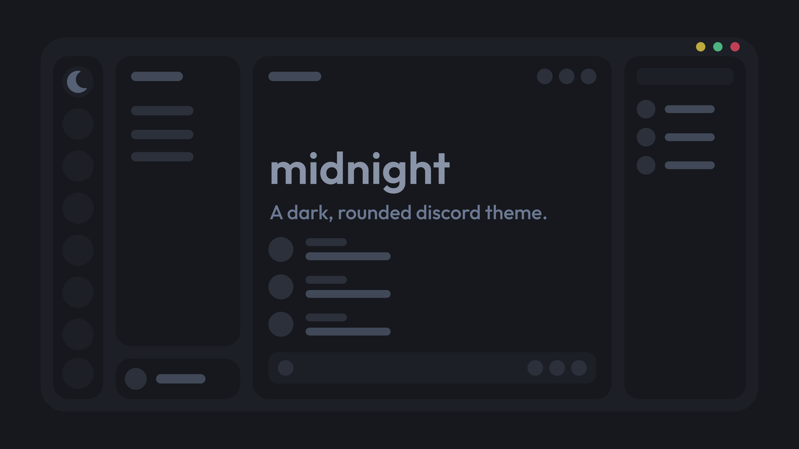
GitHub
a dark, customizable discord theme. Contribute to refact0r/midnight-discord development by creating an account on GitHub.
I customized it for me.

How do you customize it?
there are variables?
this is my config, using midnight's nord flavour with some slight tweaks

Do you need to customize through css?
obv 
Oh alr
thx
what's the css/plugin??? for status
radial status + gradient member list
ty
you can check them out in https://nspc911.github.io/themes/vencord
I already did.
oh cool
no there isnt sorry
I solved the problem another way

I just can't find the gradient member list.
No, I wanted the stock ones.
o
@half crystal and me wanted to make a theme based off NUDL 9 (what that is isn't really important rn), guess why it's not going to happen based on the design

how to paste this
copy the lines
ahhh I thought I needed the link itself, thanks ^^
why this reminds me of youblue theme (the theme i made for mobile that im porting for desktop) 😭
the colors don't change no matter how I change them.

should i release this

oh you aren't using English, so it won't work
what does that have to do with anything?

aria-label ( )
you have to delete a couple of lines with the word status in them.
I tried to do it myself, but it didn't work.
sorry
how can i make it not repeat

did u find a fix for this?
no
try ig
?
would you mind if i can take a look at your css for customization?
thanks
unironically looks kinda cool
simply fixing my autistic issues

so many borders
borders are yummy
mind you, the theme uses discods built in radius, so you can just change with root
oh nah, its just on quarter of my ultrawide
the search bar is a bit long on top of the channel
yeah, i plan to make it view-width based but there are still a few weird issues i need to fix first

i got a snippet for a collapsible one
appreciate it, but i like to do it myself, attempting to steer away from direct class names to minimize discord breaking it every update
The humble discord class updater:
lets hope discord atleast keeps the direct names
Eg div[class^="animatedContainer_"]
which reminds me i didnt show off this
much appreciated
that's super nice, do you have the snippet for this?
    /* Banner & animated container transitions */
    div[class^="animatedContainer_"],
    div[class^="bannerImage_"] {
        transition:
            filter 0.5s ease-in-out 0.2s,
            transform 0.1s ease 0s;
    }

    :not(div[class*="bannerVisible_"]) > div[class^="animatedContainer_"] {
        opacity: 1 !important;
        transform: translateY(0) !important;
        height: 46px;
        transition:
            filter 0.4s ease-in-out 0s,
            transform 0s ease 0s;

        div[class^="bannerImage_"] {
            transform: translateY(-20px) !important;
            filter: blur(2px) brightness(0.5);
            transition:
                filter 0s ease-in-out 0s,
                transform 0s ease 0s;
        }
    }
@supple jacinth i believe that should be it
change the transitions to how you see fit, it seems to work differently depending on a few things
for me it sort of flashes my theme color when i scroll down
what do i need to change?
im not entirely sure
i changed the code and now it has a cooler effect lol
the bannner comes on the screen smoothly from up
👍
made it even smoother ez
thanks for the code btw 
all good 🙂
thanks
what is here transparent ?

alr thanks

is making a theme using vast majority of discords vars a good idea
yes
less work
more snippet-compatible
ok ima do that then
do i put everything under :root { still
yes, unless if woking with light/dark
This is just stock discord?
fuck lazy-rendering
okay i’m maybe (definitely) being Extremely stupid about this but how do i change the background color of this it doesn’t want to cooperate with me </3 where exactly do i need to be putting the color values in this little block here
    /* */
}```background-color: red;
it’s not working with hex codes is my issue
it won’t accept background-color: #5289d1; and i can’t tell if i need to be adding more to the code for it to work or if i’m just putting it somewhere wrong. before the /* */ or after? or somewhere else entirely 
your selector is wrong then
you are a godsend lmao
thank y’all! i haven’t messed with CSS in years so trying to relearn for vencord is a pain in the ass
to up specificity you can also add #app-mount in front of the selector
or just a parent class
i have ooone more question for y'all and then i'm done i swear but do we know how to recolor the itty bitty symbols? like the checkmark in the popup here etc
i mean just find it in devtools and change whatever property is coloring it
how do i make just the background of the guild bar transparent, without making the folders or icons transparent. same with the settings, about me, friends list, and inbox
i was able to (struggle) and find out, but i just need to figure out how to make this one thing transparent now (there's an image behind it that will let me rest peacefully tonight). i've tried a few ways, different classes, but it just looks weird. scrolling down looks weird too, not on the right side tho. i'm really confused

ddex4 is on the BD theme store now
Yippee
They gave my old 2fa-locked account the theme-dev role 😭
least laggy CSS moment /j
(i'm doing this while i dev cause i can map the selector to the DOM better and then i optimize stuff away)

super clean

just spent 2h on fixing the tiniest thing ever
anyone know how i can just like change the sides of this?

so that it appears on the other side of my user not at the back

display: flex; flex-direction: column; maybe
and then give it an order
for the single elements
oop thx
how did u even get the flag there though?
did u just replace the username with the flag?

nop
that was form a other serv
to show the guild and a discord tags and sille thingys
was just for ref its a role i got in a serv
need to be extremely precise
My fucking scale options in DDEX4:
ah yes, my monitor supports displaying 0.0001 pixels


i love theme development
pixel accuracy important, else discord becomes unusable
is there any themes that only change the borders/outlines
if u want to change border color its like 2 variables
if i put --background-surface-higher under :root { it wont change context menu bg but if i put it under .theme-dark,
.visual-refresh.theme-dark,
.visual-refresh .theme-dark
it does. anyway to make it work under root?
i did try !important
im having a hard time trying to figure out how to change the colors of this icon
im using refact0r.github.io/midnight-discord/build/midnight.css in online themes and the css file is in my quickcss
also the corner text doesnt work :c

corner text isn't an option that exists in the theme file
not sure which icon u mean but if u want to change the status indicators then there are --online, --idle, etc. variables
it worked before
when
it has never worked for midnight v2
i changed those, i mean the one that's still green
then its probably just unthemed
because its a plugin
idk exactly but i think a few months or weeks ago
so like before visual refresh came out
the corner title doesn't even exist as an element anymore


thats the left aligned like server name
the old fixed title element doesn't exist anymore
i could add it as an option i guess
but most people will probably use the option for no top bar
I readded it manually in ddex4 lol
k fixed
thankuu ^^
I think it's much better and there's no mirroring bugs.

Is there any way to remove these black panels from the theme? I don't understand this and just want to make myself a custom theme like before the update.
black panels?
How can I do the same but with my own theme? I don't understand CSS
just open your theme file and change the colors there and change the on/off values according to your preference, also you can insert url to pictures where you can, there are hints on the right, if you want to put a picture on the background then insert the url here, put "on" and make the window color transparent.


I can give you my theme to customize it for you.
To be honest, I don't understand this at all. Before, I just found a theme, downloaded it and used it. For me, it all looks like ancient runes that I don't understand.
Your theme doesn't work for me
she doesn't work
try enabling this plugin and restarting ds

It seems like it did
and check the location where you saved the theme
@cinder valley you should have screenshots in your CSS repo like this cool guy has
most, if not, all, of my snippets are likely outdated
:3
too much work 
and its just a random collection sorted in no order anyway
it really doesn't matter
but thanks!
i meant that as a suggestion and not like a command or anything by the way lol
just would be nice because i was interested in it was all
mb, i might do it if i am free
That guy is indeed pretty cool!
is it possible to have a theme like this but instead of having an image behind it it's just transparent?
kind of like this

i cant, you can ask refact0r to do that for you.
should I ping them?
at your discretion
sorry for the ping @vestal field , would this be possible?
stupid question, what even happened to the background thing the badges used to have?
for example they had some square surrounding it, which was darker than the rest of the profile
thought i'd share what i've been working on.
I love pywal
yes
there's a vencord setting for background transparency
idk why you're asking me though
you tried wallust? its basically faster pywal
https://codeberg.org/explosion-mental/wallust
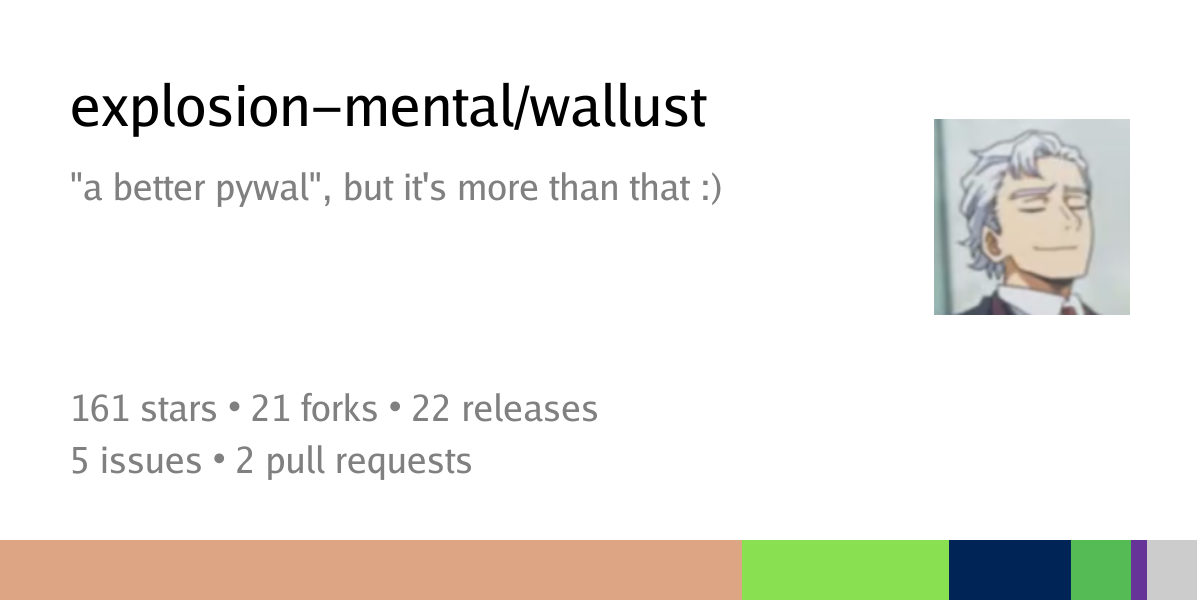
I've heard of it
But I have everything configured to pywal already
Never really had any issues with it's speed either despite it being python
Only minor annoyance I've had is with transparency. In the templates I append a hex value for the alpha. So like {color4}99.
@onyx mesa that snipped u gave me to recolour the app controller icon has been so useful for me for completly diff icons lol
i replaced the checkmarks using .permissionCheckmark__50a54 { background: url(https://mudaranrhiod.github.io/discord-iconpacks/vencord/72e4439bf318b5c5.svg) no-repeat; }. this is fine ya?

or is there a better way
doesn't work for me, i was told you to ping you about making a theme using it
???
why would i make a theme for it
plenty of themes work with transparency
it does work tho
either your os doesn't allow it or your theme doesn't support it
has anyone ever updated the old https://github.com/nanoqoi/vencord-theme ?
nvm, i found it
could i have the css for this
.public-DraftEditor-content > div,
.public-DraftEditor-content > div > div,
.public-DraftEditor-content > div > div > div {
    height: inherit;
    overflow: hidden;
}
is there a better way to do this
what is it for
the search bar content wasn't being aligned properly because the height of the inner items was fixed for some reason
which searchbar
i really dont see the issue with it
i officially have a personal vendetta againsr this var: --background-surface-higher
dumb thing themes too much stuff
REAL
addding --white to the list lol
@quick shell yk how it themes lots of stuff on discordrn? same for this lol
could u posssibly gimme them??, and can i just add them to the quick css??

yes
iirc the two main ones are --border-subtle and --border-normal

gotcha ty
you could at least do this i think
.public-DraftEditor-content>:is(div, div>div, div>div>div) {
    height: inherit;
    overflow: hidden;
}
discord is drunk, the border isnt pink

wat
try looking at computed
so it would b --border-subtle-color:[insert-color] ???
can i just put any color code
or iss there a way im supposed to specify
yo anyone know how to theme the nitro perk texts

How i can make these centered / any better way to do this ?  I fear this css will be the end of me
Edit bc i forgot to add rest of the code cry </3
/* MOVES SIDEBAR AND SERVER LIST UP */
.visual-refresh .base_c48ade {
    grid-template-areas:
        "guildsList channelsList titleBar"
        "guildsList channelsList notice"
        "guildsList channelsList page";
}
.visual-refresh .content_c48ade,
.visual-refresh .sidebar_c48ade{
    grid-row: top/end;
}
.sidebarList_c48ade{
    border-top-left-radius: 0 !important;
    border-top: 0 !important;
}
.visual-refresh .privateChannels__35e86{
    border-right: 1px solid var(--border-subtle);
}
/* fix lack of padding on server container*/
.tutorialContainer__1f388 {
    padding-top: 0.66rem;
}
/* Makes it so that the sidebar and channel name bar match height */
.visual-refresh .container_f37cb1,.visual-refresh .header_f37cb1 {
    bottom: 5.6px;
}
.primaryInfo_f37cb1{
    margin-top: 10px;
    justify-content: center;
}
/* MOVES DMS UP */
.visual-refresh .searchBar__35e86{
    left: 60%;
    top: 3%;
    border-bottom: 0;
}
.visual-refresh .scroller__99e7c{
    bottom: 10.5px;
}
/* Fixing banner */
.visual-refresh .bannerImage_f37cb1, .visual-refresh .bannerImg_f37cb1,
.animatedContainer_f37cb1, .bannerImage_f37cb1{
    height: 86px;
}
[style="height: 84px;"]{
    height: 34px !important;
}

/* DM button css */
.channel__972a0:not(.dm__972a0),
.friendsButtonContainer__35e86 {
    display: inline-flex;
    flex: 0 0 auto;
    align-items: center;
    justify-content: center;
    width: 25px !important;
}
.channel__972a0:not(.dm__972a0) .link__972a0 .content__20a53{
    display: none;
}
.channel__972a0:not(.dm__972a0) .avatar__20a53{
    margin-right: 0 !important;
}
/* Hides new icon in nitro */
.visual-refresh .textBadge__2b1f5{
    display: none;
}
/* Compact search bar */
.searchBar__35e86 .sizeSmall__201d5{
    top: 7px;
    width: 0px;
    min-width: 0px;
    background: none;
    border: none;
    right: 10px;
}
/* Just makes a search icon */
.searchBar__35e86 .lookFilled__201d5 .contents__201d5 {
  color: transparent !important;
}
.searchBar__35e86 .lookFilled__201d5 .contents__201d5::before {
    content: '';
    width: 23px;
    height: 25px;
    background: url('data:image/svg+xml;utf8,<svg xmlns="http://www.w3.org/2000/svg" fill="rgb(168, 175, 201)" viewBox="0 0 20 20"><path d="M10 2a8 8 0 105.293 14.293l4.707 4.707a1 1 0 001.414-1.414l-4.707-4.707A8 8 0 0010 2zm0 2a6 6 0 110 12A6 6 0 0110 4z"/></svg>') no-repeat center;
    background-size: 15px;
    background-position-x: 3px;
    position: absolute;
    top: 50%;
    left: 70%;
    transform: translate(-50%, -50%);
    border-radius: 7px;
}
.searchBar__35e86 .lookFilled__201d5 .contents__201d5:hover::before{
    background-color: var(--bg-overlay-selected,var(--background-mod-subtle)) !important;
}```
I'm using windows 11, i have mica for everyone on, and i have no plugins
how it's supposed to look vs my discord


how am i supposed to help you with that 😭
Are you sure that theme isn't outdated and broken?
i've used 5 themes so far
all of them either don't work or have an image
realisctly 98% of themes are broken
when I change the image to a transparent png it just turns into a black like amoled sorta theme
does it have options for the transparency effect?
it supports transparency
u just have to add transparent background colors and then turn on some options
alright am trying rn will update
(just realized i replied to this message instead of the one right below it)
Yeah, so it's probably broken
it was last updated a year ago

alright
I've installed it, what do I have to change?
i have the file on my text editor rn
u need to change the background colors to have some transparency
and u also need --remove-bg-layer on
what should i set that to? sorry my css knowledge is pretty bad
something like this

imma be honest I tried to ask mistral to write that in but I don't see a difference could you please send a css file with that change in it
...
GitHub
a dark, customizable discord theme. Contribute to refact0r/midnight-discord development by creating an account on GitHub.
use this but set --remove-bg-layer to on
you probably might want to lower the alpha values from 0.7 tho
thank you
this is my current revision and it doesn't work :( i changed the alpha values down to 0.3
ok so then the issue is vencord transparency
or mica for everyone
try without mica for everyone
ok ill uninstall it and see what happens
cant u just like disable it or something
oh true, i could have
no difference unfortunately
unless i have to restart my computer?
yall how do i fix this?

you need to restart vencord at least after u turn on/off transparency
is ending the progress on discord and then opening it again enough?

how do i like make this box non existiant?

LMAO
where is that
i didn't enable that setting
unless it's what i had to do in the console
vencord settings??
do i need to end the process and re open or restart my computer
is that what they mean by full restart?
doing both rn and the first doesn't work
sorry for wasting your time it works perfectly now
thanks

tyty looks amazing
also uhh why wont my folders that are open show the servs im in?
breh
basially what i did is open a serv folder and it doesnt show the servs
akaa the servs are not visible

are u using a theme
i tried disabling em all
thats caused by betterfolders plugin
@vestal field sorry for the ping (again) but does your theme disable dragging or am i doing something wrong again
idk
alright np
yall is there a way that if i wanted to use chat gpt in discord all id have to do is click on a chat gpt button next to inbox or help then it would open a small window with chat gpt?
yall want discord to act like a browser
I hate discord so much
Use discord on your browser and enjoy the feature called ✨ bookmarks ✨

nice
not really
just bc im bored
so im lookin for useless themes for discord lol
cannot be a theme
just install the chatgpt app and set a keybind?
so it opens up when u hit that keybind
you'd need a plugin for that
is it possible to change the colour of this lock icon? been trying for ages

I think the icon is a link so you could either hue shift or replace the image with an identical one that uses a different color
how would i do the 2nd one? tried doing it but nithing i did worked lol
.lockIcon__2666b {
    filter: sepia(60) hue-rotate(-10deg) saturate(120); }
^ this works for the hue shift thing but getting the exact colour i want is hard
@vestal field Hello! I have a problem with theme. what do i do to fix blinking?
sorta
use content:
idk
probably not a theme problem tbh
gpu-death lookin bug
I think your pc is fucked
someone make a makima theme
what lines should i add to my theme in order to change the opacity or colour of the background of spoilered text
nevermind fixed it
how can i make the mobile status icon display cprrectly

[mask^="url(#svg-mask-status-online-mobile"] {
    mask: url("") ;
    -webkit-mask: url("") ;
    mask-size: 100%;
    height: 18px;
    mask-repeat: no-repeat;
}
this is the code im using rn
why are these 2 separate grids joined as a vertical flexbox wtaf discord

does anyone know how to zoon this in 😭
i want larger emojis; changed root variable to achieve that, but these are 2 separate grids
1 row grids
:root {
    --custom-emoji-picker-constants-emoji-size-medium: 55px !important;
}
``` root variable to increase spacing scale: 100% !important;
}```size increaser (ofc you can use height/width thats why i have !important here because height and width are inline otherwise)
because if discord knew how to do CSS, it wouldn't be funni
like fr 😭 i just wanted to increase emoji size but i guess i need js for that </3
article[class*="embedWrapper_"] { width:100% !important; background-color: var(--background-secondary) !important; }The background-color works with !important! Thank you!
but the width doesn't. Is it inheriting the width from somewhere else? I can't at all figure out how it's setting the width on embeds.
I'm trying to prevent this jank, where embeds are as wide as the text/images inside, with a maximum width set; instead of a steady specific width regardless of text/images.

Did discord change something? All the normal stuff is overlapping text now

i'd wait it out, discord accidentally made things right align to the status
probably related to that
How long should I wait?
you're asking a question nobody has the answer to but Discord devs capable of pushing fixes
Fair enough
Is there a way to change the "[Person] is typing" text to smth else, say "[Person] is yapping"?
Weird question but I'm doing this for a meme
Also I'm asking here and not in plugins bc I feel like it would be a css thing, but feel free to correct me if it's not
You could always do a pseudoelement
but that would be person is typing yapping
Ah
So I'd need to find out how to get it to work with a plugin
Hooray time to vscode until I die inside :(
what’s vscode i just use notepad
remove 'is tapping' entirely and just use 'is yapping'
not even notepad++
.visual-refresh .text_b88801 {
    font-size: 0;
    > * {
        font-size: 12px;
    }
    &::after {
        content: " is yapping...";
        font-size: 12px;
        font-weight: 500;
        color: var(--text-secondary)
    }
}
yeah but how do you get their name
wym get their name
you dont need their name
can you type
im typing so hard
oh the name is in a <strong/>

I love you
that breaks when multiple people are yapping
I think this might work with multiple people and have the right grammar?
and the 27px looks the most correct to me, but idrk where it comes from
.visual-refresh .text_b88801 {
  font-size: 0;
  > strong {
    font-size: 12px;
    line-height: 27px;
  }
  >strong:last-child:first-child::after {
    content: " is yapping...";
    font-weight: 500;
  }
  >strong:last-child:not(:first-child)::after {
    content: " are yapping...";
    font-weight: 500;
  }
  >strong:not(:last-child)::after {
    content: " and ";
    font-weight: 500;
  }
}
Epic
.visual-refresh .text_b88801 {
  font-size: 0;
  >strong {
    font-size: 12px;
    line-height: 27px;
    &::after {
      font-weight: 500;
    }
    &:last-child::after {
      content: " is yapping...";
    }
    &:last-child:not(:first-child)::after {
      content: " are yapping...";
    }
    &:not(:last-child)::after {
      content: " and ";
    }
  }
}
adjust the line-height if necessary
and the font-size if you have another snippet that messes with it
sorry, i sent the version that's is typing fixed
Nah I can quickly edit that- oh
Yippee!!
Finally, I can live up to my title as the Ultimate Yapper in another server
i set it to is typing to make testing to see if it's the exact same easier
made a #🎨-css-snippets post
I don't have a Grabable bar
use -webkit-app-region: drag;
on the element you want to be draggable
idk if i like this
i have a big spacer between the bottom message and typing bar now


@kindred cliff help does this look okay

is anyone considering making a thingy to have displate ?
the metal posters?
do you mean nameplates?
how do i get the it to position correctly while still animating, i feel like i've tried everything and still cant get this to work (red is the text area)
[class*="channelTextArea__"] [class*="buttons__"] {
    transform: translateX(calc(100% - var(--space-32)));
    transform-origin: center;
    transition: 0.6s cubic-bezier(0.16, 1, 0.3, 1);
    transition-property: width, transform;
    &:hover {
        transform: none;
        [class*="buttonContainer__"]:has([class*="emojiButton__"]) {
            order: 9999;
        }
    }
    [class*="buttonContainer__"]:has([class*="emojiButton__"]) {
        order: -9999;
    }
}

guild tags?
i dind't take a ss, but discord made a pop up and said this could be colored

Nameplates
maybe !
Well, what do you mean by "a thingy"?
the whole black part
yeah those are nameplates, you buy them in the shop
A plugin similar to USRBG/Decor to get nameplates without Nitro?
A css snippet to do the same but locally?
is anyone planning on making smthg for it yet? like decor and profile color
i dont know the difference, so probably both ?
The difference is that with a css snippet only you will see it
With a plugin, everyone that has it enabled will see it
well I'd say plugin so everyone can have it too ?
since everything seems to be plugin ..
Haven't seen people talking about making one yet, also because you wouldn't be able to use discord original assets for them (just like Decor can't) so you'd need someone to create new nameplates first
Plus plugin request are closed so it's not even possible to make an issue there
If anyone likes the idea, they'll pick it up and try to get it merged to the main client, but that might take a while


Np
I barely know CSS, but whenever I enable any CSS my client is super slow, especially in #🎨-css-snippets which can sometimes be seconds per frame or update. I've tried to eliminate what I can. It's not a hardware issue because once I disable CSS it is smooth even with a lot of plugins.
https://pcpartpicker.com/user/BigFlubba/saved/VW4TP6
My Main PC - AMD Ryzen 9 5900X, Radeon RX 7900 XTX, NZXT H9 Flow ATX Mid Tower
seems to be the @import url("https://aushevahmad.github.io/awesome-css/modules/compressbotmsgs.css"); snippet that causes lag for me
That helped just a tiny bit
Yeah that sure is a lot of :has
So I found the biggest cause. I would like for that CSS to work but I won't use it if it will make Discord unusable. It is a lot better now but I feel like some of my CSS is trash and could be improved. I just don't know how. #🎨-css-snippets message
any way to fix this?
/*Better Member list*/
.visual-refresh .membersGroup_c8ffbb {
    padding: 20px 0px 0 16px
}

.visual-refresh .memberInner__5d473 {
    padding: 5px 0px 5px 0px;
}

.visual-refresh .member__5d473 {
    max-width: 224px;
}

.container_c8ffbb, .container__7641b {
    --custom-member-list-width: calc(264px - 20px);
}

.member__5d473 .layout__91a9d {
    position: relative;
    z-index: 1;
    width: auto;
}

.member__5d473 .name__5d473::after {
    content: '';
    top: 0px;
    left: 0px;
    opacity: .15;
    z-index: -1;
    width: 224px;
    height: 100%;
    position: absolute;
    background: currentColor;
    translate: -8px;
    border-radius: 8px;
}


not sure what exactly you want to fiz
im guessing this part of the code isn't working anymore

yeah discord decided to set currentColor on another element which broke old snippets
like the first image
try "nameContainer__703b9" instead of "name_5d473"
looks like that's where the color is now
looks horrible and already tried
Can I just remove the icon [And not the whole draggable thing]
yes

is it possible to make it brighter
https://x.com/__alula/status/1915203445511934152
Discord light theme has been memed forever for blinding the users using it.
So I've just made a theme that is significantly BRIGHTER than the default "Light" theme - using HDR white color.

Does anyone know how to do glassmorphusm
just have a white transparent bg and add some backdrop blur and have a thin border
* {
  background-color: white !important;
  background: white !important
}
perfect

hmmm yes
thanks
What I have vs my ideal setup, is there a way to move the mute/deafen/settings buttons below the username/status area, and/or a way to move noise suppression and end call to the side (or below) the call information? Currently using #🎨-css-snippets message minus the betterfolders sectioon


guys how do i make the other buttons not trigger the hover https://i.imgur.com/Dons3JK.gif
it seems like i have tried so many things but nothing works
/* Profile Popout button hover */
.wrapper_da5890 button:not([aria-label="More"]) {
    opacity: 0;
    pointer-events: none;
    transform: translateX(10px);
    transition: all 0.3s ease;
}

.wrapper_da5890 button[aria-label="More"] {
    opacity: 1;
    pointer-events: all;
    transform: none;
}

.wrapper_da5890:hover button:not([aria-label="More"]) {
    opacity: 1;
    pointer-events: all;
    transform: none;
}
current code for it
oo im nabbing that once u finish it
anyone know if its possible to make it hide the decorations everywhere but in the shop?
[class^=avatarDecoration_]
{
  display: none !important;
}```any possible way to get this "discord" logo back onto the top left of the title bar?


i have a snippet for that, one sec
e
many thanks from yhauron 👍
Not made by me but just replacing column reverse with just column, the rest should just be height: blah blah
[class^=panels] > [class^=container]
{
    height: unset !important;
> [class^=content], &:not(:has(> [class^=content]))
    {
        align-items: unset !important;
        padding: 7px 8px !important;
        flex-direction: column !important;
        gap: 0px !important;
> [class^=avatarWrapper]
        {
            margin-right: unset !important;
            margin-left: unset !important;
            padding-left: 4px !important;
            ~ [class^=flex]
            {
                justify-content: center !important;
            }
        }
    }
}```

```/* For the call icons */
[class^=container] .horizontal__7c0ba>.flex__7c0ba:last-child {
    display: flex;
    flex-direction: column;
    gap: 0;
}
/* Fix for buttons */
[class^=container] .lookFilled__201d5 .contents__201d5{
    overflow: unset;
}
[class^=container] .button__201d5 .contents__201d5 .buttonIcon_e131a9{
    transform: scale(1.5)
}```nvm guys i fixed it

also does anyone know how i can add some speed to this so i can make it look smoother?
/* Collapsible Message Actions */
[class^=buttonsInner_]:not(:hover)>:is(
  [role=button]:not(div:last-of-type), [class^=separator_]
) {
  display: none;
}```what does this even change
yk when u have the actions when u hover on a message
it changes that so u have to hover on the 3 dots
if you want a fade in effect use opacity

I had a similar snippet
.inner_c0bea0.biteSize_c0bea0 .wrapper_da5890:not(:hover) div:not(:last-child) {
    display: none;
}```
try adapting thisoh i just removed the pointer-events from the wrapper until it's hovered and it seemed to fixed the issue
that also works
share please
like this?
https://i.imgur.com/lVVJCJd.gif
exactly
Message Actions Hover
@import url('https://raw.githubusercontent.com/lithwack/Vencord-Repos/refs/heads/main/Message%20Actions%20Hover');
Profile Popout Actions Hover
@import url('https://raw.githubusercontent.com/lithwack/Vencord-Repos/refs/heads/main/Profile%20Popout%20Actions%20Hover');
@tidal heron @halcyon crypt here they both
let me know if the message hover works properly with extra buttons
goat
the alt menu is so fucking back
hi, anyone have a recolor thing for whatever this is called please?
is there some custom css to put a bit more buffer between the message box and the most recent message?
what color you want them as
gimme css snippet for making the "discover" and "add group" buttons always stay there on the servers' sidebar the way they are here plis
eww
why would you want that...
Beauty is in the eye of the beholder, I guess
😔 😔 i wanted to try it out for a while
nvm
but is there a snippet for expanding server folders by hovering over them though? that's reasonable, right?
there's a a little bit of space on the left of the ••• button when the extra buttons are enabled
thanks!!
i think that's cuz of the quick emotes
mine doesn't do that no matter the size of it
https://i.imgur.com/qavmICV.gif fixed mine to work with the expanded version
i used margin to make the animation, couldn't find another way
does width not work?
it didn't wanna change at all while using width or height for some reason
💔 💔 couldn't find the option to disable it
i use this experiment

pretty sure there should be a snippet for it tho
if not i'll add my own
ouh
experiments are like for advanced users though, right? i'm not one of them 😔
guess that's pretty evident by the fact that idk css
it worked! :))
you just need to enable the experiment plugin
i did, then I selected "Not Eligible" for the Reaction Frecency Algorithms, and relaunched discord, but nothing happened. The quick reactions are still there. :(


but oh well, i don't mind them that much I guess

i'm just a boy
select one without the (retrigger)
it worked 
i see the problem why it's like that with the quick emotes
it's this seperator
i'll fix it
my laptop is a potato, the one without animation would probably be better for it
the processor is
intel celeron
i made the snippet as lightweight as i could
Intel(R) Celeron(R) N4020 CPU @ 1.10GHz 1.10 GHz
Q: got any snippets to remove 3 emoji here?

let me guide you Rick_cool_smug

enable the experiments plugin from the vencord settings menu, restart discord, then search "experiments" in the discord settings search bar, then look for "Reaction Frecency Algorithms" (the one without "(Retrigger)" at the beginning) and set the "Bucket Override" to "Not Eligible"
that also changes the style though right?
the experiment for disabling the quick reactions? i don't think so, atleast I didn't notice any change
thanks. it was experiment things.


here's some css if you don't want it to change styles
[class^=hoverBarButton_][aria-label^="Click to react"], [class^=separator_] {
  display: none !important;
}
i fixed it https://i.imgur.com/RRZNlRP.gif
was this for removing the quick reactions? if not, adding the snippet to the css theme seems to have done nothing :(
yes it is
it works now, hooray!
maybe it has something to do with my theme then
oh what language do you use
i appologise for having to leave when i was the one receiving help, but i need to go have lunch. bbye peeps!
it'll need to be changed depending on your language
i just added a flavour of a custom css theme i found on better discord
midnight adwaita

language, not theme
[id^="message-quickreact-"] {
    display: none !important;
}

[id^="message-quickreact-"] {
    height: 0 !important;
    margin: 0 !important;
    padding: 0 !important;
    overflow: hidden !important;
}```

is this better one to remove the emoji from right click menu? (message)well first of all, you can delete this since it's already being display none'd


yeah
but that won't fix it
You need to hide the element that the buttons are in
#message>div>.wrapper_f563df {
  display: none;
}
might be a better selector you could make, but probably fine
yes! tysm! work perfectly.
im automating your bench script to use chrome remote debugging instead of having to run manually @vestal field love?
sad
English, US

will me sharing the css file after adding in the snippets help you identify what's happening?
yeah
what? i had the following things -
- the experiment set to "not eligible" to remove the quick reactions
- your snippet for the non-animation hover-over-message-to-expand-options
- your extra snippet for, what i thought was the purpose, bringing back the rounded style in the message options that went away after 1
my extra snippet hides the reactions
so you can turn off the not eligible to keep the new style of the actions
got any css to show nameplate on direct message? i think discord change it to hover (u can see the nameplate)
it worked cat_happycry

Don't think css can do it because it modifies the html directly, but you can switch modes on the experiment
switch it to this i think

i tried that, doesn't seem possible with CSS solely
tried that looks like not working.
yeaa i think so.. hmm
oh yeah that doesn't seem to be working anymore
unless it needs a restart
i thought that worked before, odd
yea it work before..i guess something wrong with it.
last request, i promise :')
is there a snippet for expanding server folders by hovering over them?
that can't be done with css
the most you could do is after actually opening them, have it so they only show when you're hovering them
so the folders would actually all be open, but they won't look like they're open, and you'll only be able to see the servers in them by hovering over the folder icon?
right, so once everyday
mmm i guess i'm fine with the way the folders are rn
thanks though!!
So I already have this and it looks great, but is it possible that the color can change according to the folder's color? Or would I have to manually do it for every folder?
/*outline to folders*/
.expandedFolderBackground__48112 {
  box-shadow: 0px 0px 8px 5px rgb(0, 0, 255);
}
/*get rid of border when folder is collapsed*/
.expandedFolderBackground__48112.collapsed__48112 {
  border: none;
}
you could for each color of folder by using [style="color: rgb(12, 34, 56);], but you'd need to use :has()

wait what's the bottom part for?
Remove the outline when the folder is closed
Lol yah its old css but i removed it
Don't know much about css so all I do every update is update classes
any chance i can get a copy of this???
indeed
Anything else for now ty, I'll choose a color later

my theme is named eye candy
made the border move along the member list, i think it looks better than it just being overlapped
https://i.imgur.com/s5cWGna.gif
Nice
I'm guessing there's no way to remove this. CSS doesn't work. ```css
.inviteButton_f37cb1 {
display: none;
}
yeah

How do I remove this extra padding?
/*Hide "Help"*/
.button__85643[aria-label="Help"] {
  display: none;
}
use negative values in the padding
if that doesn't work instead of padding use margin
margin usually works better with negative values
Ah thanks
is there a way to make the search bar not be moved right when a thread is open in split screen view? it causes this pretty bad looking cut in the search bar (see 2nd image)
doesn't seem to be broken for me


been trying to remove borders from most elements, why does discord use border in some and then box-shadow in others
how can i change the icons for window titlebar icons? been trying for ages now

i'll DM you it.
ppouts

Hello! I got this css snippet from somewhere, it highlights a members rolecolour on memberlist
span[class*="username"] > span[class*="desaturateUserColors"]::after {
  content: '';
  top: 0;
  left: 0;
  width: 100%;
  height: 100%;
  position: absolute;
  opacity: 0.125;
  background: currentColor;
  border-radius: 5px;
}

[class*="nameAndDecorators-"] {
  z-index: 0;
}
[class*="member-"] [class*="container-"] [class*="selected-"] ::after {
  border-radius: 4px;
  background: white
}
[class*="membersGroup-"] + [class*="container-"] {
  margin-top: 5px;
}``` and after a update it stopped working, also it looked abit odd with nameplates so is there a way to disable the colouring when there's a nameplate
would anyone help me fix this? thx :)like this (this is an old image from someone else)

so u wanna be able to see nameplates but they cant be coloured? or r u saying u want to remove nameplates?
I wanna see the nameplates
but with that snippet (when it worked) overlapsed with the nameplates
and looked weirdo
i'd say use Z-order
and put it behind nameplates
or put nameplates higher
whatever works best
I have zero knowledge on css
unfortunately but discord put the color inside a different class which broke the snippet, don't see a way to fix it with just css at the moment

yo
anyone have a solution to
theme something on profile popup
but only when its on dark color
themes nothing on light color
prefix your find with .dark-theme

use .user-profile-popout.theme-dark
because .theme-dark also is in :root
thx it worked
oh btw is there a key that only theme when no profile color?


like this?

:not(.theme-dark)

you did it wrong
do this, not what you did
hmm

btw i found that i can add .user-profile-popout.theme-dark so it'll only theme when they have profile color
wc
i mean .custom-theme-background
automated benchmarking of selectors 

does that use the thing in the performance tab?
nop
it's based on refact0r's script that extracts selectors from css and runs querySelectorAll
i automated to run it via chrome devtools protocol so i don't have to copy paste the script+css iinto console every time
querySelector isn't how css selectors work though
and this exists which actually measures it
and it'll do it for all your themes
unsurprisingly most of the worst performing selectors are from discord and not from themes
loll
hm
interesting
i wonder if its accessible through the devtools protocol
i doubt its worth the effort lol
aren't i supposed to be able to interact with discord while doing the profiler
yes?
it just freezes when i do the profiler
yeah
i cant do much except scroll
ig that's it then
i don't think the profiler is very accurate because of it freezing discord
this snippet is so laggy

yeah lmao
without it, while typing discord uses like 8% or something of my cpu
with it, it uses 30%
maybe more like 20%
i'm trying to round the chat bar but the scrollbar goes out
is there a way to apply margin to the scrollbar

::webkit-scrollbar probably?
tried already
yeah the elapsed time doesn't always seem right
according to those numbers the selectors shouldn't have much performance impact
So I want to lock the channel bar width (so it can be symmetrical with the member list). How can this be done?
wait do people not use their own variables when making themes?
/*hide current running activity*/
.panel__5dec7 {
  display: none;
}
(this message was for a different user)
yo wsp
no attribute to use, so cannot sadly
its hardcoded
alg
if you want
#1360578191017640087 message
i already made my own, just been wondering if anyone got same problems like me
oh, well not anymore 😄
btw that class got more uses than just in dms as i remember, i wonder what else you removed

I looked at some close buttons, I use a class for button that starts with closeButton__, the one in settings is closeButton_ (one underscore), the one in the image view starts with button_. Maybe I find one missing somewhere, or maybe I was just lucky 😄
The second underscore is part of the module hash
It's not part of the actual class name
ohhhh, the truth is, I don't really know what I'm doing 
I just saw other snippets and was like "if I change this to this, it does what I want"
would it be better to add the whole hash then? so if it changes maybe in the future it's easier to update?
I always use real class selectors, since they're an order if magnitude faster
would highly recommend messing around and learning about devtools
whole hash is a lot better for performance, but it means you need to shove the code through a class updater once in a while
how can i change the total member count icon? managed to change the online counter

i cant change total one for the life of me lol
you should be able to do it the same way as the online one?
neither of them are svgs
they're both just styled spans
tried that at first but didnt work
what are you doing for it?
.vc-membercount-total-dot {
    mask: url('https://mudaranrhiod.github.io/discord-iconpacks/vencord/solar/custom/status-online-bold.svg') no-repeat center;
    mask-size: 100%;
    width: 6px;
    height: 6px;
}
uh that's not working for me
this is what i used for online
.vc-membercount-online-dot {
    mask: url('https://mudaranrhiod.github.io/discord-iconpacks/vencord/solar/custom/status-online-bold.svg') no-repeat center;
    mask-size: 100%;
    width: 12px;
    height: 12px;
}
it works
oh that's for total
the total counter no no
yeh lol
.vc-membercount-total-dot {
  mask: url('https://mudaranrhiod.github.io/discord-iconpacks/vencord/solar/custom/status-online-bold.svg') no-repeat center;
  mask-size: 100%;
  width: 12px;
  height: 12px;
  border: none;
  background-color: var(--color-total);
}
mask just masks part of it
so it needs to have a solid background
@chilly knoll
wait why are there so many people named gulf of something
thank u :)
i cant even remember, there used to be more lol
lol
there was time where a lot of people were named [number] [things] runs something or something like that
idk if i remember that im sometimes forgetful l
i think it was probably around a year ago
i think it was around the time i joined
i was nicked to 32 duotrigintillion devices for a while
ahh yeh i wont remember then
what's husk about that
i only changed it a few months ago i think
lol
why husk though
idk tbh
not as fun as 7
32*10^100
why is it the one time i want a slowmode channel i cant find one. i remembered i didnt change the icon for it
32000000000000000000000000000000000000000000000000000000000000000000000000000000000000000000000000000
ok so it's 3.2*10^100
oh yeah
10 duotrigintillion it 10^100
So duotrigintillion is googol?
googol is a cringe name because it's not illion
True
i wish illion names were standardized
duotrigintillion isn't even standardized i think
like officially
but i think it's the only at all recognized 32nd illion number
only up to vigintillion is in dictionaries
Depending on context (e.g. language, culture, region), some large numbers have names that allow for describing large quantities in a textual form; not mathematical. For very large values, the text is generally shorter than a decimal numeric representation although longer than scientific notation.
Two naming scales for large numbers have been use...
and centillion
but that's a gap from the 20th illion to the 100th illion (10^303)
wtf it was just named by a 9 year old https://en.wikipedia.org/wiki/Googol#Etymology
A googol is the large number 10100 or ten to the power of one hundred. In decimal notation, it is written as the digit 1 followed by one hundred zeros: 10,000,000,000,000,000,000,000,000,000,000,000,000,000,000,000,000,000,000,000,000,000,000,000,000,000,000,000,000,000,000,000,000,000. Its systematic name is ten duotrigintillion (short scale) o...
(yw for my off topic googology rant)
(it should be named illiology)
wait what was i thinking. illionology is way better
(or something like that)
(illion is far superior to googol)
Large numbers weren't meant to be given names
is there anything other than :has that doesn't cause lag?
Imo anything you do with :has is better off with a plugin
how come :has is so bad
any way to easily replace :has with other options that won't break?
oh
depends on the specific case
generally, no
>
hm past week been trying to find the main cause of the sluggish typing
> is completely different than :has()
i did remember it from this
good to know how it functions
a:has(>b) is more efficient than a:has(b) right?
i'm pretty sure just by logic, but you might know more about it
because it checks only its direct child, not further down the dom
Correct
only one of my snippets has some :has cuz i couldn't find another way
i absolutely hate how css doesnt have upper sibling selector or parent selectors
how hard would it be to implement that
true, haven't been able to do a lot of stuff solely cuz of that
need to make a petition for it
you can do it with has
only down side is has
the best part is that has exists
the worst part is has exists
wait if i used "a:has(>b)" instead would that help with performance
thats literally the question obsidian asked #🎨-theme-development message

well more so confirming it
how to check lag
If it's laggy then it's laggy, if it's not it's probably not, but not certain
i will never know because of how sensive is my laptop 😭
lowend my beloved
nvm found really quicky
am i stupid or does someone keep putting something in #🎨-css-snippets then deleting it?
coz there seems to be a noti for it everytime i look at the server lol
have css that reverts the boost timestamp change cus bored lol
/* Revert the unnessary boost timestamp change */
.content__235ca {
  display: flex;
}

@spiral moth yo the message u deleted can i see the illustration ur talking about (i have message logger)
YOP
its actually so dumb
anyone know what this is supposed to target
something in guilds list

acronym is for guild items without an icon
idk what the rest is
iconsizemini is the collapsed folder icons

if u dont set a custom folder color then itll show the mini icons probably
Can someone vc and help me make a theme
nop
theming tutorial is linked in channel topic
i dont have one set
hm
how do you hide your search bar to be only icon?
can i have the css?
/* Expandable Member List */
@import url('https://raw.githubusercontent.com/lithwack/Vencord-Repos/refs/heads/main/Memberlist%20Hover%20VR');

/* Expandable Member List Settings */
:root {
  --hover-animation-speed: 0.6s;
  --nametag-fade-speed: 0.6s ease-in;
  --nametag-fade-speed: 0.6s ease-out;
--icon-custom-color: var(--channels-default);```thats for the member list
/* Hide Search box */
@import url("https://raw.githubusercontent.com/lithwack/Vencord-Repos/refs/heads/main/Collapsed%20Search%20Bar");```thats for the search icon
^
ty
ty @onyx mesa~
ok so im not stupid
discord is just broken apparently
last post i can see if from the 24th
but by chance i searched for something and it showed a post from yesterday
was sleeping but yw
is there any way to make the discord window have a semi transparent acrylic background similar to windows 11 system windows
something like this -

enable transparency in vencord then use a transparency supported theme

.visual-refresh .wrapper_ef3116 {
    background-color: red;
}

you can change the color to anything
The original status and platform icons are much better looking


no conflict with the phone icon plugin

i still cant fix it on my iconpacl
I can give you the edited raw code.
i like the ones i use for solar more
you still haven't fixed it?
no lol
send idk if itll be of any use