#🎨-theme-development
1 messages · Page 50 of 1

if people actually used my theme i wouldnt mind changing rhe dnd colour
go sleep
Nah
oh yeh that reminds me, is it possible to change platform indicator icon colours
Personal opinion, it should just be pure red, pure yellow like the platform indicators are
ill see ill see
is this fine? not sure whats going on with mobile icon 💀

background-repeat: no-repeat
``` might make it not tile like thatay but the phone chains kinda goes hard
coming soon to a #🎨-css-snippets near you (when i can get the minmax buttons to fucking work)

oh aero neat
we have a similar theme made for steam aswell

don't have it so can't help you with that
Is there any css snippet or plugin that shows the notes assigned to that person next to the nickname?
css snippets cannot add information that isn't already present
so this is impossible with css/theme
and no, there isn't a plugin and this would end up in the same boat as usermessagepronouns, where you have to click on the user for their note to load
There is an endpoint to fetch every note you have assigned to anyone though
But using that probably flags you as a third party client or similar
Nope
there is no risk in getting /users/@me/notes
idk where smth related to what im gonna say but
would it be possible to just like have some theme that hides disabled emojis, stickers, and soundboards so it doesnt overbloat the damn emoji picker
/* Collapse the chat buttons except when hovering */
[class^=chat_] [class*=textArea_] {
  margin-right: 32px;
  +[class^=buttons_] {
    position: absolute;
    right: 0;
    &:not(:hover)>:not(:has(> [class^=emojiButton] )) {
      display: none;
    }
    &:not(:hover)>[class^=container_] button>div {
      margin-left: 8px;
    }
    >:has(> [class*=emojiButton_]) {
        order: 99;
    }
    >:has(> .app-launcher-entrypoint) {
        order: -1;
    }
  }
}```does this remove all of the shitty nitro ads in the emoji picker
that collapses these icons except when hovering

I have a snippet that does that though
oh nice, yeah please send that, I'd love to debloat my emoji picker (for the days when I don't have Nitro)
Might be a bit laggy because I made this before I realized how laggy :has() and attribute selectors can be
/**
  * @name Better Pickers
  * @author obsidianninja11
  * @description Makes the soundboard/emoji pickers better and less intrusive.
  * @authorId 683171006717755446
*/

[class^=lockedEmoji_]:has(+[class*=emojiLockIconContainer_]),
[class*=categorySectionNitroLocked_] [class*=emojiItem_]>img,
[class*=soundRowNitroLocked_] [class^=soundButton_] {
  filter: grayscale(1) brightness(0.75);
}

[class^=emojiLockIconContainer_],
:is(#emoji-picker-tab-panel, [class^=picker_]) :is(
  [class^=upsellContainer_],
  [class^=nitroBottomDivider_],
  [class^=categoryItemLockIconContainer_]
), [class^=picker_] [class^=sectionFooter_] {
  display: none;
}

#emoji-picker-tab-panel [class*=categorySectionNitroLocked_],
[class^=picker_] :is(
  [class*=sectionContainerNitroLocked_],
  [class*=soundRowNitroLocked_]
) {
  background-color: transparent;
}

#emoji-picker-tab-panel [class^=closeButton_] {
  padding: 16px 16px calc(100% - 106px) calc(100% - 40px);
  margin: 0;
}
[class^=picker_] {
  >[class^=container] [class^=closeButton_] {
    padding: 16px 16px calc(420px - 106px) calc(100% - 40px);
    margin: 0;
  }

  [class^=buttonOverlayActions_] {
    padding: 0;
  }
  [class^=secondaryButton_] {
    padding: 8px;
  }
}

#emoji-picker-tab-panel, [class^=picker_] {
  [class^=nitroTopDividerShadow_],
  [class^=nitroTopDividerLower_] {
    visibility: hidden;
  }
  [class^=nitroTopDividerLock],
  [class^=nitroTopDividerLower_] {
    background: var(--background-accent);
  }
}
huh
?
YOOO IT REVERTS IT TO THE OLD GRAY EMOJIS
BADASS
yeah
oh idk if it works in soundmoji picker
ok yeah seems like that picker is like the exact same as soundboard
you mean this?

Ye xD
I had to leave that in otherwise it messed up the spacing
Oh damn
well it could be invisible, but then i think it would be worse, because then there's just a larger than normal gap
aint there like a css thing to make it still there, just not visible
I remember learning about that when I was being taught html n css in school
Ohhh yeah
either way yeah, im happy the lock icon over the mfing emojis is gone cus like idk why its needed
you could remove the lock so it's only a line

fair xD
add this if you want to (don't forget the comma)
.nitroTopDividerLockCircle_b3fb5f

I mean just lemme know if you ever improve your thing then I'll just apply it onto my quickcss
cus like I have a ton of display: none; for alot of the nitro ads on the platform
for example the "Try Out Nitro!" thing
didnt work
what do you use to display the SVGs
probably just replaces the path
[mask^="url(#svg-mask-status-online-mobile"] {
    mask: url("") ;
    -webkit-mask: url("") ;
    mask-size: 100%;
    background-repeat: no-repeat;
}
had to get rid of the url cuz characater limit
oh you're using mask, than it should be mask-repeat i think
instead of background-repeat
theyre an odd size now but it did work

lol
how do i change the lottie sticker gif and emoji icons

über-cursed method but eh, works
.sidebar_c48ade {
    display: flex !important;
    flex-direction: row;
    width: auto!important;
}
div[style*="grid-area: betterFoldersSidebar;"] {
    order: 0;
}
.guilds_c48ade {
    order: 1;
}
.sidebarList_c48ade {
    order: 2;
}
tysm :3
i did!! size is odd but i did it

ok nvm i dont got it idk tf just happened
is this the channel where i can ask for help with themes? or is it solely for developing them

both
ok then i have a question. in clearvision v7 how do i blur the background image? in v6 there used to be a uhh. idk what to call for it. for that. in new one i check and theres nothing regarding blur
add css --background-filter: blur(8px); to the root
ofc you can change the value of the blur
uhh. srry if im dumb but. where is the root
oh wait got it
it worked thanks!!
no problem
how can I remove the nameplate background in the members list?
there's this snippet, but it doesn't work
wouldn't it be just this:
.container__4bbc6 {
    display: none;
}
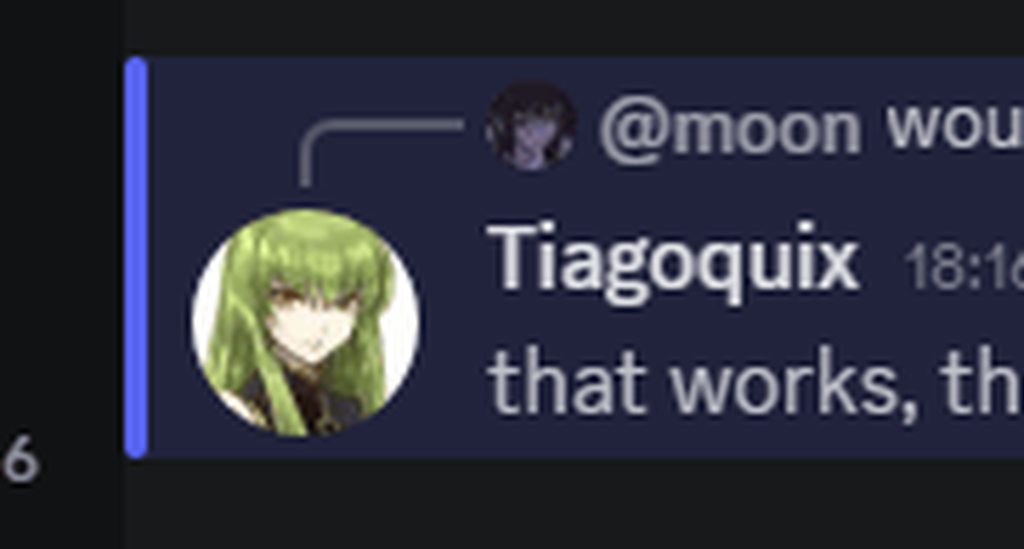
that works, thanks!
@chilly knoll thats kinda hard to see

other wise than that the icons are looking good
yep
hey out of curiosity, are u gonna publish that theme or is it ur private one? 
which theme the custom icons?
@muted knoll add this to your css
@import url('https://mudaranrhiod.github.io/DT/vencord/solar.css');
ah ok :) ty
or online theme section
those icons just pulls everything i have done to make discord actually feel refreshing on a vertical monitor
just ties in so well

mmm gradients


the import didn't work but I just made it into a file and added "locally" (if it's ok)
(mby cuz I use BD)
yeah I know 
(I tried without my main theme too)

works fine for me

yeah I said might be cuz I'm on BD
does BD even get updates anymore lol i felt it became a dead platform 2 years ago
an vencord doesn't?
i just find BD weird want one plugin but nope to use that plugin you need this and that plugin to get 1 to work
come to vencord same exact plugin just enable an restart
you've set hover's border-radius :D
might just keep it curved and than make it thicker on hover
oh u mean the library plugins?
dats y I don't use devilbros plugins
and tbh I've gotten used to BD so kinda hard to change
but could try vencord again someday...
awhat now XD
yes steam

what theme is that

oh, you can mod steam too lmao
my fluenty looks a lot different

installs similar to vencord gives you new options


ic ic
fucking hell were on 1.7.0 now lol
you don't
pay 5 bucks once download cancel the sub an your good for an entire month if any updates comes out
we were gonna do a 50 copy giveaway but people started coming in being racist and pinging fluenty members an staff for a free copy so it just killed the mood for the giveaway
what XD
shows how bad some people are who cant affrod 5 bucks 🙂
alo forgot to give you the link
https://steambrew.app/
Steam Homebrew
Apply themes/skins/customization the new version of the Steam® Client. Steam Client Homebrew is a community focused on extending Steam's base functionality. We've developed Millennium, commonly known as Millennium for Steam, that lets you add new features to your Steam Client.
..yeah
XD
tyty
even though millennium is open source its not free to run rougly 1900 dollars in costs through out the year
im being sarcastic
an fluenty covers it
couple months ago firebase went from 600 to 800 because of increase traffic cause of positive pressure on youtube and tiktok
I mean there's some donator perks iirc too
guys what is the var for the discord blurple accent
some plugins have their own dbs but i doubt anything on vencord requires actual significant costs
just use devtools
there are a bunch of different ones depending on the place
@crimson skiff do you have 1 file for your Visual Refresh Seamless Chat Bar and Chat Related Alerts at Top snippets

long story short I'm using the Arc Borders snippet from #🎨-css-snippets and I want the window border radius to match the chat bar radius
if my stupid ass is right if I can define --radius-md in my QuickCSS it should work on other stuff I wanna round out too

Am I on the right track at least?
try using
root {
  --radius-md: 25px;
}```
change the 25px with your desired valuehm lemme see if everything I wanted to be changed changed
mhm
yes that's good, though I think there's other --radius-[something here] variables cause like when someone types the corners are sharp again on my chat bar
it's kinda hard to capture it with the quick selector whatever button on the top left of the dev window
right now specifically I'm trying to change the radius of this chat bar WHEN SOMEONE IS TYPING, last screenshot was of the bottom corner of the window but --radius-md did it

hm
yeah and I don't know what I should do to make it rounded
lmao
like all I need is the class
are you using another theme?
no, only my stupid custom CSS but as far as I have checked nothing is overlapping
because it's not looking like that on my end, even after adding the Arc Borders snippet to my quickcss
because for example, my typing indicators are below the chatbox
hm
weird
lemme see again
I might have missed something
yeah no I don't think I missed anything
are you using the ClientTheme plugin?
no I just disabled it
then you are indeed missing something
hm weird
I had another plugin enabled
I didn't remember the name
lemme see
nope
I do have a chat bubbles snippet yes but I'm not tryna round those out
I can see it in the screenshot you sent earlier
jesus christ
yeah it's
jank
I'm really not good at CSS and I kinda brute force it when it works
alright
lots of disabled stuff in it lol
yeah I'm just too lazy to go through it and see what works and what doesn't
can someone keep typing for a bit, thanks
uh
this is so janky omg
ok you can stop
yes
this is what i did so far from all the avaliable snippets and old stuff that still works
mostly for vertical monitors

do you want all of the corners to be rounded?
thats neat im trying to figure out how to just make it fully sqaure an not floating
yeah
soooo
--radius-sm
yes I am correct now that is rounded too
then replace everything after border-radius: with 30px
oh I just defined radius-sm as 30px as well
don't edit global variables if you don't know what they're going to affect
I'm gonna keep in mind
so in my quickCSS I should replace every mention of radius-sm with 30px
just
.form_f75fb0:has(.base_b88801) {
  .channelTextArea_f75fb0 {
    border-radius: 30px;
  }
}```no
like, there's no need for you to
oh
lmao okay
do this and let me know if it's doing what you want
if it's not I'll leave it to my future self because I'm going to sleep
lol it's not but I'm gonna try to figure this one out by myself as well
cool

@chilly knoll exit needs a bit of work unless thats how you made it look

thats how it should be but i was thinking iof making the entire icon be the same size as the circle around it if thats even possible
bcuz it looks weird with a filled icon then a circle around it
hm
did this https://i.imgur.com/KvOJUmp.gif
wish the icon wasn't jumping around like that but i couldn't find a solution for it
it's just a slight annoyance anyways
i use to use a snippet of that before the new UI broke it kinda miss it
yeah same, decided to just make one myself for VR
ahhhhhhh :has() detected
wtf why does visual
refr esh get automodded
oh
basically the same thing yeah
That is it. I just did my best to update it.
deadass only needed to add right: 0 https://i.imgur.com/noZSCsa.gif

couldn't find it when i was looking for it
and now i wasted time doing it myself

update: I did quite a bit lol
I may be stupid
anyone got a class for the BACKGROUND of this top bar with the channel name and shit? I wanna make it blurred so the text behind it is visible but blurred
I know how to do the blur part I just need the class

hm weird
oh dam mind sending me the snippet would like to have that back
yeah I'll make a repo for it in a second
sweet
wym 1 file
they are available in my repo
^^ just use this
anyone working on a theme that will bring it back to something more readable?
i've sent a few people the combo of snippets i have that turn the UI into this, if you'd like to take a look! all of the original snippet creators are linked in the doc, since none of it's my work, but if this combo can be helpful to anyone, i'd like them to have it 

What could be the reason for the bigger space between the gif button and the emoji button? And is there any way I could fix it? I'm trying to get the default theme how i'd like it and then use custom themes. it shows up the same on those too.

dumb question, I wonder if theres a way to revert the server badging so it just shows the boost badges or the partnered/verified badges
always wondered that for a while now
Hey, I have Better Folders and I was wondering if there was a css accessible trigger for the folder opening and closing (or at least a way to get the total width of the server list when the folder is open and closed). I'm trying to put the user profile bar in the same place as the channels list when the folder is open and closed.
how robust is this CSS snippet? i hate how they Title Case everything in the visual refreshcss [class*="header__"] { text-transform: uppercase !important; font-size: 8pt !important; // this is optional ngl }
i noticed that after heading to the friends tab 😅
old icons css?


ok
so for some stupid fucking reason Stylus (browser extension) wont read import lines in css files
mentioning this here because i want to apply my vesktop themes to my alt account on the firefox browser but i had to cut and paste the entire file for it to work
anyone have ideas on why
make sure they're at the top
(hi ery, you still havent answered my issue in your dms)
the top of the file? bc it was the only line in the file
that's odd
i blame (intentionally) outdated firefox
no worries tho it's not like i edit it often enought to care
does stylus have security rules for imports or something maybe?
i have a vc background problem

bro
why its blue now?
oh i forgot to send it
.callContainer_cb9592 .gradientBackground__11664>div {
  background: black;
}```worked but gradient background makes my discord lag
?
yes the blue gradient makes me lag
oh wait this is better
.callContainer_cb9592 .gradientBackground__11664 {
  display: none;
}```should be less laggy than with the gradient thing too probably
works
so you were still lagging with this?
its gone
were
past tense of are
so old icons css? mine isnt working

this looks like the same icon to me

i mean the old discord icon
idk what the old discord icon is, but this is the one i remember it being even before visual refresh
anyone knows of a good theme (or way with css) to make all icons square (pfps, server icons etc)? basically like in old comfy theme:

@cobalt echo What theme is that
I'm looking for anything to remove all this blank and duplicate space, I hate padding
comfy theme but it won't work anymore since experiments VR is gone
Ah, knew it too good to be true
does compact in settings not do the trick for you?
Not even close
but yea im not a fan of this shit either
I'd pay money for this to be fixed it hurts me so much
We can't complain in here, only in off-topic
snip to remove all the ugly unnecessary 1px borders on everything
.visual-refresh [class^="container_"] {
  border: 0px;
}
.visual-refresh [class^="chat_"][data-has-border=true] {
  border: 0px;
}
.visual-refresh.theme-midnight [class^="container_"] {
  border: 0px;
}
.visual-refresh [class^="sidebarList_"] {
  border: 0px;
}
.visual-refresh [class^="sidebarResizeHandle_"] {
  border: 0px;
}
.visual-refresh.theme-midnight [class^="content_"] {
  border: 0px;
}
.visual-refresh.theme-midnight [class^="subtitleContainer_"] {
  border: 0px;
}
.visual-refresh [class^="channelTextArea_"] {
    border: 0px;
}
.visual-refresh [class^="sectionDivider_"] {
    display: none;
}
the sidebar resizer is still usable, it will appear when you hover over the channel list side
who got this css to remove this app icon?

you can use commas
and also :is()
.visual-refresh :is(
  [class^="container_"],
  [class^="chat_"][data-has-border=true],
  [class^="sidebarList_"],
  [class^="sidebarResizeHandle_"],
  [class^="channelTextArea_"]),
.visual-refresh.theme-midnight :is(
  [class^="container_"],
  [class^="content_"],
  [class^="subtitleContainer_"]) {
  border: 0px;
}

.visual-refresh [class^="sectionDivider_"] {
  display: none;
}
button[aria-label="Apps"] {
    display: none;
}
also google massgravel
thank youuuu
.channelAppLauncher_e6e74f {
  display: none !important;
}
that hides the button inside of it, it'll mess up the spacing
so why is my icon looks different?

dude its looks different its doesn't looks like that
i think thats just what the icons look like (this screenshot is from completely unmodified discord)

it looks like this

mine is Minecraft ripoff


love how annoyingly wider the user list is to fit the name plates

tried to figure out a way to resize it, but it looks like discord plans to do that anyway, atleast based on the variable they used for the width
what i don't notice any difference
i'm pretty sure it's the same size
idk why they'd expand it for nameplates
does anyone know of a theme that has a scss build process
why?
Hello, simple question, which class is related to displaying amount of users in VC? I want to repair this misalign
how's it misaligned?
* { border: 0px !important }
```[.](https://cdn.discordapp.com/emojis/1142688693447037020.webp?size=48&name=joe_shrug)
might as well get rid of a few other things too
* {
  border: 0px !important;
  padding: 0 !important;
  margin: 0 !important;
  background: none !important;
}
(that's surprisingly almost useable)
okai I figured it out
how do you guys test themes
CSP is so annoying
I can't figure out a way to import a local uri through custom css
why do you want to import a local uri
my theme is built by sass with --watch
this has to be a shitpost who thinks of this
"today I will put 1px borders on everything"
wait I just realized
I wanna avoid that if I can
i just have a dev script that updates a theme file in the theme folder when changes are made
huh
or maybe have a stupid simple script that just copies over from the built dir to the vencord/themes directory every sec
Can't you just, tell scss --watch to put it where you want it
yea
yes but then I would be hardcoding my vencord path into src
u can have it import from .env
ehh
Just unset the border radius on .sidebarListRounded_c48ade?
let me try
.visual-refresh {
  .sidebarListRounded_c48ade {
    border-top-left-radius: 0px;
  }
}
works if I edit in devtools manually, but not from quickcss
did I miss something

Try an !important maybe
nvm quickcss wasn't updating
worked
I had to reopen quickcss editor and paste the code back in
works without !important
thank you
guh symlink works very weirdly
it detects it and managed to parse the file header
but the loaded source is empty
watcher issue probably
what is this????

You mean the height field?
I think it's basically set to number of users * element height
To get the scrollbar right

me neither xD
i guess it works
  .textArea__74017 {
    left: -10px;
  }
}```try this
right now i have
/*Chat Related Alerts at Top*/
@import url(https://nspc911.github.io/themes/vencord/ChatRelatedAlertsAtTop.theme.css);
:root {
    /* Set to 1 if you want them to float  *\
    |*      Recommended while using        *|
    \*      Midnight/Rounded Themes        */
    --craat-popout: 0; /* Default = 0 */
    /* Change the border radius *\
    \*      for the alerts      */
    --craat-border-radius: 16px; /* default: 16px */
}
/* Visual Refresh Seamless Chat Bar */
@import url("https://nspc911.github.io/themes/vencord/RefreshedSeamlessChatBar.theme.css");
:root {
    /* change padding of the bar */
     --rscb-chat-box-padding: 8px; /* default is 8px for alignment */
}
``` when i say 1 file just one @import or online theme link lolyeah that should work?
what was wrong with it?
this is some visual refresh css i made if anyone wants to have it
.visual-refresh {
  /* removes top bar (im on hyprland so i dont need buttons)*/
  .title_c38106,
  .bar_c38106 {
    display: none;
  }
  --custom-app-top-bar-height: 0px;
  /* makes the corner not rounded at the top left */
  .sidebarListRounded_c48ade {
    border-top-left-radius: 0px;
  }


  /* message bar */
  /* removes the massive gap between the buttons */
  .buttons__74017 {
  gap: 0 0;
  }
  /* make message bar smaller and remove margin at the bottom */
  --custom-channel-textarea-text-area-height: 36px;
  .contain--custom-chat-input-margin-bottom: 12px;

  /* remove gap around attach button */
  .attachButton__0923f {
    padding-left: 10px;
    padding-right: 0px;
  }
  .slateTextArea_ec4baf {
    margin-left: 0px;
  }
  /* remove gap on the right */
  .scrollableContainer__74017,
  .themedBackground__74017 {
    overflow-y: hidden;
  }

  /* server list */
  --custom-guild-list-width: 60px;
  /* removes random 5px bar below the list */
  .sidebar_c48ade::after {
    display: none;
  }
  /* small useless gap between the scrollbar and the list */
  .scroller__629e4 {
    margin-right: 0px;
  }
}
looks like this currently, undid some of the stuff but not all yet

How to get a transparent in the middle part?
it does but they all said theyre part of your new seamless suite so im guessing youll make more? i would love for them to be combined into 1 file lol
soon™️ but i havent found more stuff to make seamless
those are the stuff i thought off, i dont know what else to make seamless
Only some of the elements took for me, like the voice box is still overwriting the server list

oh I see, the voice box uses a separate CSS
Can't get to inbox
But so far, still better otherwise
how do i move this to the other side
aka where u can deleate messages and allat
aka like
how do i move this to the oppisite side when i interact with my messages

and when i interact with other peoples messages it stays the same

I don't think you can import twice...
it only picks up the first one
happening to me right now and I can't figure out how to make it work
you can import any amount of times
its just that your import links must be before any actual css code, ie @import statements must always be the first line
Put both at top
its just how css works
you got a idea on how i can make this the oppisite side when i interact with my messages but stays on its norm side when i interact with others aka it will be on the right for my messages and on the left for others messages

trynna add support for the MemberCount plugin https://i.imgur.com/LQLL1f9.gif
i replicated those pills to the channel categories some icons are weird

.messageListItem__5126c[data-is-self="true"] .buttonContainer_c19a55 {
    right: auto;
    left: 0;
    .container__040f0 {
        right: auto;
        left: -24px;
    }
}

same works on my end


how do i theme this server name popup? ctrl+shift+c just selects whats underneath it

it has pointer-events: none that prevents ctrl+shift+c from working
you can temporarily use .disabledPointerEvents_da8173 { pointer-events: all !important; } to enable them (may break quite a bit of stuff, so definitely don't leave it)
awesome thanks
is there anything similar for popup menus where f8break doesnt work on? (like the pop that appears when u click search)
hi, is there any option to make padding in right click, and overall if someone made css snipped to make whole discord less padding-y, it especially hurts when i right click
run this in console, then cause the element to appear (will pause after 2 seconds)
setTimeout(() => {debugger;}, 2000)
can't you force enable it with react dev tools ?
i'm currently abusing them
i found a desktop visual refresh toggle
the entire code is not yet gone
looks a bit more fancy https://imgur.com/DZM8Rub


how can you change the unread number badge on the message requests? i'm trying to select it in dev tools but i can't find its exact class
send me one
sent one
i have thrown together a couple quick-css scripts together and now whenever i scroll past a image i havent scrolled past before, the scroll jumps back to the image once or twice if i scroll past it, anyone has any idea what might cause this?
bad CSS, bad combination/outdated broken CSS
makes sense, was hoping somebody knew of smth concrete thats known to cause that issue besides the obvious 
Well we'd need to see it to know
fair, 1s, its 2.6k lines long
Ideally you narrow it down
Lmao alr that's the issue then
That's way too much CSS
kek
It's so likely that smth is wrong in there
thats what i get for trying to reverse this stupid ui update
I mean i'm doing it slowly
I already basically reverted the channel list and the user area
And i have like idk 40 lines top
And that's including my own user area redesign snippet
i dont have any css experience, im basically going in blind with knowledge from c++/python/cuda
I'm gonna publish my whole thing as a theme once ready
I don't have much more experience than you
Mozilla mdn docs are a blessing
using discord app, dont have any idea what what means tbh in the scripts i frankensteined together
MDN Web Docs
Cascading Style Sheets (CSS) is a stylesheet language used to describe the presentation of a document written in HTML or XML (including XML dialects such as SVG, MathML or XHTML). CSS describes how elements should be rendered on screen, on paper, in speech, or on other media.
Ideally the most minimal the better
The more changes you have to do, the more chance it's gonna be wrong or break
Gonna look at it while in the train
i just want to revert the top-side and the server list
ie revert the changes made here

Top side is part of the things i'll change
Just wait till you see smth pop up in #🎨-css-snippets
u also change the server-list?
Obv
thank god
I will revert it
ur a hero
did u get the dm btw
No i'm just a random dude that doesn't like when discord do stupid designs
isnt there already a snippet that removes the bar
I did
I think they want the notification box brought back down
anyone know how to theme platform indicator icon colours?
Look at the plugin code
yeah i think it does that too
i tried and that didnt help
scroll up in the snippets channel
yeah, been frankenstining it, oldcord was the name iirc
no thats a full theme someone made a snippet
You need to change the status colors
const { useStatusFillColor } = mapMangledModuleLazy(".concat(.5625*", {
    useStatusFillColor: filters.byCode(".hex")
});

[...]

    return <Icon color={useStatusFillColor(status)} tooltip={tooltip} small={small} />;
Also you'll need to !important it in your CSS
the status' are themed
    rect[fill='#82838b'] {
        fill: #75748B;
    }
    .status_a423bd[style='background-color: rgb(130, 131, 139);'] {
        background-color: #75748B !important;
    }
    rect[fill='#40a258'] {
        fill: #90b27c;
    }
    .status_a423bd[style='background-color: rgb(64, 162, 88);'] {
        background-color: #90b27c !important;
    }
    rect[fill='#cc954c'] {
        fill: #C3A260;
    }
    .status_a423bd[style='background-color: rgb(204, 149, 76);'] {
        background-color: #C3A260 !important;
    }
    rect[fill='#d83a41'] {
        fill: #C4967A;
    }
    .status_a423bd[style='background-color: rgb(216, 58, 65);'] {
        background-color: #C4967A !important;
    }
    rect[fill='#593695'] {
        fill: #8F669C;
    }
    .status_a423bd[style='background-color: rgb(89, 54, 149);'] {
        background-color: #8F669C !important;
    }
anyone know what bits i have to remove in oldcord's css to remove the changes to user profiles? i don't want to change/remove anything else, just prefer the current user profile design
what i need to change to remove server name from top of my window bar? i cant find it on css snippets
ok afaik i did it
is there any option to see what classes do objects in title bar have?
Same as for any other element
wdym
Devtools
Ctrl shift i
thanks
okay i figured it out
electron's net.fetch doesn't follow symlinks
returns an empty string instead
yay
/* remove title bar icon and channel */
.visual-refresh {
    .title_c38106 {
        display: none;
    }
}

Cutee >~< | UwU *pounces on you*
someone smarter than me, tell me how to change this things background color
i've tried uh
.typing_b88801 {
    margin-bottom: -10px !important;
    background-color: transparent !important;
}```but its not being transparent
rip 2.68 KB 
helpful, thanks
np. any time

GitHub
A Discord theme to compact the new visual refresh title bar - surgedevs/visual-refresh-compact-title-bar
whats this for
i wanted to only remove text
not remove the bar
ah
quickcss and inbox are merged

reload, if it still isnt fixed use the space variable
:root {
    /* controls the space the window buttons get on the channel header, experiment around with this if you get gaps or the buttons overlap! */
    --vr-header-snippet-space: 180px !important;
}
reloading didnt fix, but this does, honestly i should just remove the help button in place for this
i was gonna symlink theme from themes dir to my output dir
turns out net.fetch doesnt follow symlinks
fixed that and found out that fs watcher doesnt work with symlinks or hard links
at that point i gave up and just ended up copying the built theme to themes dir
ended up better i think
oh right
yo, anyone know why these black parts are like that and a way I can make them transparent? I can't find the right class rip

I see most people just remove that thing because it's mostly considered a useless annoyance..
the thread thing, didn't even see the reply bar
was too triggered by the thread thing

yeah i legit never see people make threads in most normal convos

If I'm understanding things correctly, some of the color variables changed, so there are a couple things that have reverted to gray colors, instead of being transparent and showing the background image. What are the new variables I need to change?

the settings page should show a background image instead of just gray
this is clearvision is it not?
They should fix that soon enough, iirc the development, atleast used to be, active
My thought is just that this should theoretically be easy enough to fix by specifying the new variables if I know what they are
but if it's not that simple then ig I can wait for development
oh I would like to do that too LMAO
or just the threads one cause I figured the transparency in the meantime
i keep seeing people using classes with the hash suffixes
don't they change over time??
plus there's that website to update classes automatically (mostly) which is a godsend
purple or red


purple matches the background better imo
full background probs should show this

yeah with the whole pastel vibe the the lighter purple defo matches better
also nice color scheme
thanks
its actually from a super old aliucord theme
is there anything you can do about the new layout killing the res of server icons


this hasn't really happened to me, I think it might be a scaling issue or something in your CSS is doing it
i just stole one of the ones from css snippets that reverted it. i had my own fix but that one fixed a couple of issues with it
it uses scale though so yeah probably but idk what i can do about it
I think I'm using the same one too idk
I've been using attribute selectors in place of raw classes but might change because might have to squeeze out all the performance I can get
theres an experiment you can enable that brings back the old server icon/folder size

yeah but that's kinda a temp solution until they inevitably remove it
this was added this month, post-forcing everyone to use the new layout
its probably a future update to the refresh
or a new accessibility option
i doubt theyll remove it without making it a base feature ngl
ive seen lots of people want the bigger icons
bold to assume discord will listen to anything people actually want
they added the experiment during visual refresh rollout no? cant imagine theyd do that then just never add it lol
but then again this si discord
yo so I remember there being a snippet that would only show the deafen and mute buttons on hover, anyone know how I can recreate that? it hasn't worked in a long while so I wanna try and do it myself but I don't know where to start from
any fix for this?
/* align chat box with user panel */
.visual-refresh {
    --custom-channel-textarea-text-area-height: 56px;

    .form_f75fb0 {
        display: flex;
        flex-direction: column;
    }

    .channelTextArea_f75fb0 {
        margin-bottom: 8px;
    }

    .base_b88801 {
        position: static;
        order: 1;
    }
}
it broke like mid day and now shows typing users on bottom instead top
.visual-refresh {
    --custom-channel-textarea-text-area-height: 56px;
    .form_f75fb0 {
        margin: 0 8px 8px 8px;
        padding: 0;
        --chatbar-border-color: var(--border-faint);
    }
    .channelTextArea_f75fb0 {
        margin: 0;
        border-color: var(--chatbar-border-color);
        transition: none;
    }
    .base_b88801 {
        top: -25px;
        left: 0;
        right: 0;
        background-color: var(--chat-background-default);
        padding: 0 8px;
        border-radius: var(--radius-sm) var(--radius-sm) 0 0;
        border: 1px solid var(--chatbar-border-color);
        border-bottom: none;
        transition: none;
    }
    .stackedBars__74017,
    .threadSuggestionBar__841c8 {
        border-color: var(--chatbar-border-color) !important;
    }
    .form_f75fb0:has(.base_b88801) {
        .channelTextArea_f75fb0 {
            border-radius: 0 0 30px 30px;
        }
    }
    .form_f75fb0:has(.channelTextArea__74017:focus-within) {
        --chatbar-border-color: var(--border-subtle);
    }
    .scrollerSpacer__36d07 {
        height: calc(25px + 8px);
    }
    .scroller__36d07::-webkit-scrollbar-track {
        margin-bottom: calc(21px + 8px);
    }
    .bottomBar__0f481 {
        margin-bottom: 25px;
    }
}
is it supposed to add so much padding on top?
uhhh idk tbh
I didn't make it </3
yes, otherwise the chat will jump up and down
anyway thanks


Nice theme
instead of padding couldn't you make it so its always on top
even if it blocks some words
the only thing i dont like is that voice chat bar , other than that its quite nice
wdym?
the profile thingy?
yeah i dont like how its in its own seperate tab
in the og one it was fused altogether
if that makes sense

i honestly prefer working with the new layout more, i thing the floating thing fits more to the rest of the asthetic, yk
but not stock
the new layout on its own is horrible
why is the title centered? why are the icons a rounded quare and tiny? why does the message sending bar thingy take up my whole monitor?
like wtf

i honestly really hate the profile thingy overlapping with the server bar on the side
and the centered title
but everyone has their preferences
the profile thingy I keep it like that cause I can see a little more of the status cause I often forget to change it
i have mine setup like this

doesn't open until you hover over it
and top title, I wanted to use the snippet in #🎨-css-snippets but one of the things I use is breaking it so I don't bother lol
also it still looks kinda minimalist if that makes sense
if you wanna, you can tell me what themes u use and i can try to fix it
im unemployed asf
nah it's good I got used to it
plus it gives a little more room to drag the window around
plus my theme is a jank fest that I wouldn't bestow on my worst enemy
how do u know what changes what in the css
yeah
well its mostly reading, there are always classnames
those should give you a basic idea
yeah but not all the classnames are obvious
okay
in that case
you turn on the dev console
then elements tab
there you press ctrl and f
and just paste the class name
it should bring you to the element
clicking on it will highlight it
yeah i try that but it doesnt work , i guess oldcord renamed all the classes maybe
what is exactly you're trying to find out?
do you wanna patch soemthing in oldcord?
just tryna changes things in oldcord yea
what r you trying to change rn?
like the server bar is too big
compared to before
so im tryna shrink that a little bit
im talking about like pixels tho its not major issue
but still i want to match to the old one
hmm
i think reducing the individual icon size aswell as shrinking the sidebar should do it
is there a way u can reduce the size of the bar on the top?
yh the issue is i cant find which classes are responsible for them
make it thinner?
or wdym
aight i found some of them ig some are just unique to a server
i dont think so
if you can find 1 similar attribute
that all of them share
you can query them
and style those
Hehe, I made a silly theme and I silly plugin (Theme is a modified version of Discord+ lol)
Suggestions-?
looks kinda dope
Its actually not as hard to see as lots of people would imagine
only suggesting would be a bit of grass on the text-bar on the bottom
Yo I could do dat
Lol, true, I gotchu
also replaceing some elements with frogs maybe?
Ooo true, like what
i got an idea
the + sign to upload files
and when u hover it or click it, it opens the mouth?
I could see how that looks if u want, im tryna stick to a clean sorta ui tho
but I might can make that work
just a suggestion if ud like that, but yeah
looks good
I also have a WIP one thats Galaxy themed @hollow spire
It has a sun and moon that rotates based on the time
Shazam @hollow spire
I started working on it yesterday so I havent done much yet, but I have some other plans for this
sheesh
also the moon is too low 😭
i dont get why this isn't being applied....
.visual-refresh {
  --text-danger: #c29df1 !important; /* Most red text */
}

cuz you are applying the variable on the visual-refresh class
the default variable is being applied directly to the element itself
either select the element or use *
putting it as
--text-danger: #rrggbb !important;```
would be fine rightoh
what am i reading
if you have no reason to be here then dont be here
i addded borders to these little hover popups and i like them sm

thanks
damn, thats nice, would be cool if you could add the same border to that lil triangle too though
and, would u mind sharing the css to that? :3
i tried but i just couldnt lol
ill try tomorrow
this is the darker one
i have a slightly lighter one too

im working on turning the current new theme into a proper layout
like not turning back to the old ui
but fixing whats there
nice nice

this is like the first version
fixing the user profile, title, server sidebar, chatting thing and removing unecisarry icons
thats not how u spell that lol
what about the user profile will u chanege
btw where is inbox now lol
how will people see mentions then lol
and notifs
oh yeah 
ill try to make the theme customizable
like being able to turn off certain features
that would be nice
ngl but appart from alligment and sizing issues i like visual refresh the way it is lmao
Would be dope
nahh
the sidebar is the worst
like it straight up NEEDS to be reverted
the rest is pretty well looking
but also needs adjusting
whats bad about it
@crimson meadow here's a bug with your ui tweak thing or whatever
the whole side panel with channels list is shifted up

are you using it in any combination?
oh i like that
is it possible to add borders to these menus

i think so
wouldnt see why not
if you cant do it remind me to do it tomorrow
im unemployed asf
i tried but couldnt seem to get aanything to work lol
night night
idk what caused it it's gone now 😭
dm it to me as a reminder so i can do it for u
ill improve it tomorrow
so its perfect
awesome
in germany we say tamam bruderherz ich küss doch dein auge 🤝


border
What color is that border? or what var
i love it
probs shouldnt have cropped the images so much oops
the border colour is #696779
awesome
or both? the border is much more visible if i tone down the opacity of the shadow

@chilly knollwhat do you think of this?
[class*=menu_][class*=flexible_] {

    border: 1px solid var(--input-border)
}
like the border around that

but for what tho
like are u making a theme and want to choose the colour for borders or what
just for the right click menu border
trying to decide what color i like
i added ,[class*=fixed_] to this to add it to the server drop down menu

this is the right way to do that right?
if u use --input-border and your theme doesnt change the colour of this then wont it use the colour discord uses
quick switcher??
im planning on a theme to just have blur as the background for any element lol
Does anyone know how can i get rid of this gradient background after joining a voice chat and then hiding peoples without video? The other one mentioned yesterday worked for removing when you're not on a voice chat but this one remains

Anyone know how to get rid of the server title at the very top of the window, and move the buttons on that bar to another one? It's kinda the only thing I really dislike that wasn't fixed by the theme I'm using.
can someone make it so peoples username have a a little shadow so i can read peoples names that have a dark colored role
maybe this?
havent tried it myself yet cause im busy but i was looking into that too
https://discord.com/channels/1015060230222131221/1354203100872835123
could instead make the name turn white when you hover on a message
can u do that?
not sure how that would look but your the dev here so
there was one in #🎨-css-snippets iirc
.message__5126c:hover .username_c19a55 {
  color: white !important;
}
ty

@vestal field how does your theme benchmarking work
https://github.com/refact0r/system24/blob/main/benchmark/benchmark.js
GitHub
a tui-style discord theme. Contribute to refact0r/system24 development by creating an account on GitHub.
paste that thing into console
then run benchmarkSelectors(`paste themecss here`);
then paste the results into google sheets or excel


you forgot the . infront of the class
what does the benchmark do exaclty?
measure how slow selectors are to evaluate
thanks! also how do i get my discord theme colur i wanna get the colur for the new darker or what is called dark now (i still think ash is the main dark theme then the darker is dark theme)
ah okay
o interesting thanks
wtf why are borders 0.691px here

but they're different on browser
and i think on different devices
and on different zoom levels
whoa box-sizing fixes it
(i had no idea what that did before now)
yea for some reason if you set border 1px it isnt actually always 1px
its weird
 i was in here a while back to grab the code for this little popup, but does anyone know the css for the "image copied!" popup as well? or, well. any of them, really. i keep getting attacked with green

Measure how slow selectors are to querySelectorAll (find elements matching selector), which is not relevant to stylesheet performance (find selectors matching elenent)
yea
its still useful tho
wait i just found out this exists 😭

doing
.visual-refresh {
    ::selection {
        color: red;
    }
}```
is apparently really slow, it clocked like a full 4msi think, yes! if there are others you can think of, that’d be great <3
thank you So much <3
is there css that makes the buttons bigger

.visual-refresh .button__74017,.buttonContents_e6e74f:not([class*="enabled__67645"]) {
    transform: scale(1.2) !important;
}
whould i say (not my code btw)
thank
is there a way with CSS to patch out the URL to have a different size ?
[class^=title] > [class^=icon]
<div class="title__85643">
<div class="icon_f34534 guildIcon__85643 iconSizeMini_f34534 iconActiveMini_f34534" style="background-image: url("https://cdn.discordapp.com/icons/1015060230222131221/293146d1fcfcad1e95e6f26094202127.webp?size=20");">
</div>
<div class="defaultColor__4bd52 lineClamp1__4bd52 text-sm/medium_cf4812" data-text-variant="text-sm/medium">
Hatsune Vencord™
</div>
</div>
try with width and height
well no
i don't wanna scale it
i wanna change the image that is fetched
because the rescaling makes it horrible
are you wanting to only change the ?size=20 without hardcoding the url?
I don't think there's a way to do that, but just use background-image like it's doing to replace the url
or content
yeah
yeah don't think there's a way to do that
ThemeAttributes doesn't seem to add the urls for it
thing is i want the exact same URL but with size changed
ig i could do smth where i add stuff with themeattributes so that then i can use attr to rebuild it
i do have this
:root {
    --custom-app-top-bar-height: 22px
}
tried to remove it, but didn't change
it would probably need a refresh, but idk why that would cause it
i'm basically slowly reverting the visual refresh in the most concise way possible
ideally tbh i'd get rid entirely of the icon and the text to instead just put back the old discord logo, but one thing at a time
if it can look clean without doing that, it can save me from writing CSS

oh you're talking about the title icon
i thought it was the one in folders
it's 32 for me
actually 32 would scale fine to 16
not as great as having 16 directly, but better than 20 to 16


i would love that
why only the background? * { backdrop-filter: blur(10px); filter: blur(10px) !important; }


not to the side, but to the top and actually looks nice
#🎨-css-snippets message
which one

not acrylic popups
though they look fire
referring to the form send dialog thing, the full user profile dialong, and other full screen dialogs
oh this?

yesh
instead of making it dim background, make it blurry and not that dim
this doesnt work for me
yeah it's really old
ill see if i can get that working as well
ok checked the thread its broken
.
didnt see that whoops
kinda hate how fr is :fr: like why is it not :bruh: or :no-reaction, fr doesnt make sense for such an emote

why the hell did it trigger fakemoji
thats what theyre called in all the servers im in with these

doesn't make sense personally but whatever
lol
do you also have some good themes for bunny or the DOM~ish for the discord app?
I want a Nord theme, was thinking of making my own, but there isn't a dev tools
im not sure if there is a nord also u dont need dev tools to make discordrn themes
https://mudaranrhiod.github.io/DT/vendetta/darkeyecandy.json heres the one ive been making on desktop but for bunny
shameless advertisement
might recolor for nord then
probs thr wrong hcannel to discuss this but its very easy
still developing themes, who cares
not like ven would pop out of nowhere and say wrong channel
oh
will they
wdym
will they as in will they pop up?
anyways gonna take a quick shower then get back to the blurry bgs and acrylic popups
nice
if i wanted to add icons in places that dont have one already how would i go about doing that? tried looking through this channel history couldnt find anything helpful
::before elements?
i know i found the answer to the problem once, but i kinda forgot where, but how can i before an element while not displaying it ?
technically, i could inject at another place, but then i don't herit of the CSS and need to add stuff myself
also i know i can do tricks with the visibility, the opacity, the width etc, but it doesn't remove the element, it just keeps it hidden, but stuff like hover and clicking on it still trigger
don't hate on ::before/::after
are you actually better off doing a custom plugin and all that
If you want things working properly, yes
If you just want something half-assed but quick, ::before is fine
if it works it works, screw proper, discord theming is supposed to be jank
could try opacity: 0 on the element then do a position: absolute; left: 0; right: 0; bottom: 0; top: 0; on the :before element
That'll give the before opacity 0 too, no?
position: absolute should make it not inherit the opacity
and then you need to like push it outside of the window and then correct the position
Why
Would be very weird if it did that
ngl that doesnt help cuz i wouldnt know what to do for the code
for settings page i found this from anothet theme, is this ok for that
.sidebar__23e6b [data-tab-id].item_b3f026 {
    display: flex;
    gap: 12px;
    padding-left: 12px;
    align-items: center;
}
.sidebar__23e6b [data-tab-id].item_b3f026:before {
    position: relative;
    content: " ";
    width: 20px;
    height: 20px;
    background-color: var(--interactive-normal);
    mask-size: 100%;
    opacity: 0.8;
}
.sidebar__23e6b [data-tab-id="My Account"].item_b3f026:before {
    -webkit-mask-image: url();
}
do like us, improvise