#🎨-theme-development
1 messages · Page 49 of 1
you see how the users panel is missing even tho its on? and the search is half cut

only happens on certain channels

send me the css
ill try something rq
Yea
its probably? possible to fix it though
Oh well there you go
possibly
just take a look
ill try lets see
which one of them is the one to fix my issue? cus i cant seem to find it
ye i couldnt find anything ngl
I’m just trying to use: #🎨-css-snippets message
which one
Click on it
oh hmm
not sure
ive never done that stuff
ive personally never touched it so
idk
anyone else got any like
stuff
ykwim
mmmmm

for the class^=button spam, you could try using :is()
not super well, don't remember exactly how I did it but found a screenshot

ah
interesting 👍


padding
welcome to the box model!

eww you look at that
position: the position of the element (controlled through properties like top, right, bottom, left)
margin: the spacing outside of the element (controlled through the appropriately named margin)
border: the border of an element (controlled through border)
padding: the spacing between the border and the content of an element (controlled through padding)
content: the content of the element (for example other elements/text/images/etc) (controlled through width and height)
yeah nothing is registering changes from that
i am actually not sure how to edit this
ok i think i see what i need to actually change
yeah nvm how do i change this in css

—custom-app-panels-height: [value] !important;
so it should look like this?
you of course have to put it side a block
for variables its most common to use :root (which is always the top most rule set)
:root {
  --custom-app-panels-height: 86px !important;
}
!important won't do anything if it's overridden by a child element
yeah but what possible child element could be overriding it?
The one with the style attribute you posted right there?
well ive come up with a solution
its not a good solution
i just added margin to the sidebar
but it technically does what i need it to

is it possible to display 2 images for an icon at once? im trying to replace one, using a monotone icon as a replacement is easy but i have no idea how to do duotone icons cuz the SVG's contain two paths instead of one
i want these to both display at the same time (right image has transparency, left image is fully opaque)


could probably use a ::before element then set its z-index to be below the icon
or go onto a image editing software and do the reverse mask yourself then use that for it
would a reverse mask add the left image on top of the right image?
reverse mask is a joke, send me the icons, ill give you the 'reverse mask'
haha april fools 🎉
i wanna kms
what i meant by reverse mask is, normally masks cover the image given only at that pixels, reverse mask is when the image is transparent at those pixels instead of containing that image
oh
what like this? left being the original


or am i misunderstanding lol
right image is what i want, the outer background is transparent the 2 lines inside arent
<svg xmlns="http://www.w3.org/2000/svg" width="72" height="72" viewBox="0 0 24 24">
    <path fill="#4e5058" d="m13.629 20.472l-.542.916c-.483.816-1.69.816-2.174 0l-.542-.916c-.42-.71-.63-1.066-.968-1.262c-.338-.197-.763-.204-1.613-.219c-1.256-.021-2.043-.098-2.703-.372a5 5 0 0 1-2.706-2.706C2 14.995 2 13.83 2 11.5v-1c0-3.273 0-4.91.737-6.112a5 5 0 0 1 1.65-1.651C5.59 2 7.228 2 10.5 2h3c3.273 0 4.91 0 6.113.737a5 5 0 0 1 1.65 1.65C22 5.59 22 7.228 22 10.5v1c0 2.33 0 3.495-.38 4.413a5 5 0 0 1-2.707 2.706c-.66.274-1.447.35-2.703.372c-.85.015-1.275.022-1.613.219c-.338.196-.548.551-.968 1.262" opacity="0.35" stroke-width="0.7" stroke="#4e5058" />
    <path fill="#4e5058" d="M7.25 9A.75.75 0 0 1 8 8.25h8a.75.75 0 0 1 0 1.5H8A.75.75 0 0 1 7.25 9m0 3.5a.75.75 0 0 1 .75-.75h5.5a.75.75 0 0 1 0 1.5H8a.75.75 0 0 1-.75-.75" stroke-width="0.7" stroke="#4e5058" />
</svg>
this is the svg code thingy
so you want the message bubble to be transparent but the lines to be opaque right then normal ::before and z-index should be ok
thought you wanted the line to be transparent as well
no lol
how would i writethat?
[d="M10.99 3.16A1 1 0 1 0 9 2.84L8.15 8H4a1 1 0 0 0 0 2h3.82l-.67 4H3a1 1 0 1 0 0 2h3.82l-.8 4.84a1 1 0 0 0 1.97.32L8.85 16h4.97l-.8 4.84a1 1 0 0 0 1.97.32l.86-5.16H20a1 1 0 1 0 0-2h-3.82l.67-4H21a1 1 0 1 0 0-2h-3.82l.8-4.84a1 1 0 1 0-1.97-.32L15.15 8h-4.97l.8-4.84ZM14.15 14l.67-4H9.85l-.67 4h4.97Z
"]::before {
    d: path("m13.629 20.472l-.542.916c-.483.816-1.69.816-2.174 0l-.542-.916c-.42-.71-.63-1.066-.968-1.262c-.338-.197-.763-.204-1.613-.219c-1.256-.021-2.043-.098-2.703-.372a5 5 0 0 1-2.706-2.706C2 14.995 2 13.83 2 11.5v-1c0-3.273 0-4.91.737-6.112a5 5 0 0 1 1.65-1.651C5.59 2 7.228 2 10.5 2h3c3.273 0 4.91 0 6.113.737a5 5 0 0 1 1.65 1.65C22 5.59 22 7.228 22 10.5v1c0 2.33 0 3.495-.38 4.413a5 5 0 0 1-2.707 2.706c-.66.274-1.447.35-2.703.372c-.85.015-1.275.022-1.613.219c-.338.196-.548.551-.968 1.262");
    opacity: 0.35;
    z-index: ;
}
like this?
ah, the glories of non-labeled svgs...

teribly sorry for the late response, i have no idea what that is either
@gusty compass
yesh, that should work, set z-index to -1
also instead of attribute selecting the svg, you could attempt to attribute select the wrapper then ::before that instead of ::before a svg (might not work iirc)
Ill try that tomorrow
Im super new to theming desktop/web discord and ive never really delt with css before so big learning curve 
@smoky fog lurker

Why yes please lol
My plan is to change most of the icons
The iconset im using will match my mobile one 

thats look nice and something new for my eyes!
Love
bunny?
Yah
need to try it, havent used a client mod after vendetta got eoled
Bunny is very good
i will wait when it done. 
yeah i forgot that i tried bunny before but there werent any plugins or themes available on discord so i just didnt use it again ._.
Yessir, might take a while cuz im a lazy fucker lol. I started porting my bunny theme to vencord and didn't finish it cuz lazy 
Can I get some feedback on this fancy version of @ voxel 's snippet? Wish I could make it shorter too,,, thanks in advance!
just realized i also need to make the channels & roles thing also match dang it
/* MOVES SIDEBAR AND SERVER LIST UP */
.visual-refresh .base_c48ade {
    grid-template-areas:
        "guildsList channelsList titleBar"
        "guildsList channelsList notice"
        "guildsList channelsList page"
    ;
}
.visual-refresh .content_c48ade,
.visual-refresh .sidebar_c48ade{
    grid-row: top/end;
}
.sidebarList_c48ade{
    border-top-left-radius: 0 !important;
    border-top: 0 !important;
}
.visual-refresh .privateChannels__35e86{
    border-right: 1px solid var(--border-subtle);
}
/* Fix lack of padding on server container*/
.tutorialContainer__1f388 {
    padding-top: 0.66rem;
}
/* Makes it so that the sidebar and channel name bar match height */
.visual-refresh .container_f37cb1,.visual-refresh .header_f37cb1 {
    bottom: 5.6px;
}
.primaryInfo_f37cb1{
    margin-top: 10px;
    justify-content: center;
}
/* MOVES DMS UP TOO */
.visual-refresh .searchBar__35e86{
    bottom: 11.2px;
}
.visual-refresh .searchBar__35e86 .sizeSmall__201d5{
    top: 5px;
    height: 26px !important;
}
.visual-refresh .scroller__99e7c{
    bottom: 10.5px;
}

/* OPTIONAL */
/* Hide channel name bc why is there two places for the same name ?? */
.visual-refresh .primaryInfo_f37cb1 .name_f37cb1{
    display: none;
}
/* I just think the friends, nitro & shop buttons look better this way */
:where(.visual-refresh) .channel__972a0:not(.dm__972a0),.friendsButtonContainer__35e86{
    width: min-content !important;
    display: inline-block;
}
:where(.visual-refresh) .channel__972a0:not(.dm__972a0) .link__972a0{
    padding: 0;
}
:where(.visual-refresh) .channel__972a0:not(.dm__972a0) .link__972a0 .content__20a53{
    display: none;
}
:where(.visual-refresh) .channel__972a0:not(.dm__972a0) .avatar__20a53{
    margin-left: -41px
}
:where(.visual-refresh) .channel__972a0:not(.dm__972a0) .avatarWithText__972a0{
    margin-left: 63px;
}
/* Hides new icon */
.visual-refresh .textBadge__2b1f5{
    display: none;
}```

how the holy fuck do you remove the hover background, i cant find any reference to how it does it

Isn't that a mere css .clickable__91a9d:hover .childContainer__91a9d { background-color: var(--background-modifier-hover); cursor: pointer; }
 i tried everything bruh how
go into sources tab in devtools
hover over element
press f8 to pause everything
go to elements tab
element picker
click on the element
see classes
No need for f8, just

you are right

i have to be tweaking 😭
Anyone know why discord plus firefox devtools slows the whole browser to a crawl?
Seems to be a fairly recent phenomenon
would you use this snippet or does it belong in the same group as horizontal channel list 
Is the colour scheme nord?
yesh
midnight's nord flavour
https://github.com/NSPC911/themes/
you can get the full list of the themes + modifications here
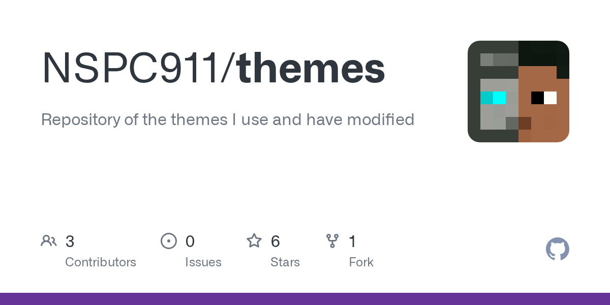
GitHub
Repository of the themes I use and have modified. Contribute to NSPC911/themes development by creating an account on GitHub.
Husk
Sorry, that's cursed
HCL level cursed or nah?
that's actually kinda cool
i'd probably prefer to just do it with the whole member list though
that was my first try, but couldnt get it to work on forums without janky animations, so decided to go this way
Not that much, okay
ok found an issue, this doesnt work if you want to scroll down
back to the rabbit hole i go yipeee
Never knew how good nord with midnight looked
i just overall love nord's palatte, trying to make one for beeper v4
Is there a version of midnight that only has thr UI changes and not colour changes
Wanna use it with my theme without changing anything lol
--colors: off
its dead simple
he made it super modulable
How do you copy all of the discord’s css? Not just quick css
Would be nice if possible
why do you want about 25 thousand lines of css
Why does discord want 25 thousand lines of css, for that matter
not sure
i downloaded the css files a while ago, should still be (mostly) up to date if you dont care enough about having the latest version
ehh from 1 file
I have a goal
And how exactly
devtools ¯_(ツ)_/¯
Is it one big file?
no
This gonna be so ass to do 🥀
16 files @ 145517 lines in total
well whatever you want to do this is not it
you might want to tell us what you are planning on doing
I fear y’all are gonna scream at me #🧊-off-topic-iceman-only message
Btw I do use the new ui
This is just for others who deadass want it
is this happening for anyone else? my member list on some servers doesn't load enough people to fill in the bottom right corner, and I'm not sure if it's because of stuff I'm doing with css or of it's just discord being discord

made the new nameplates fade in/out on hover https://i.imgur.com/jZOnBv7.gif
only after scrolling down the member list a little bit does it actually fill out
its your css im guessing
the logic is tied to the list having the right size
only thing I can think of is that I'm hiding activity status
if you modify the size the logic doesnt work as expected
hmm, yeah looks like that was it
I guess that begs the question is there any way to hide activity status with css that doesn't do that
what are you doing to hide
gotta find it again, one sec
[class*="membersGroup_"]:has([role=button]) {display: none;}
[class*="member"] [class*="container"]:has([class*="badges"]) {display: none;}
try opacity 0

ah lol
yeah no not sure what you could do mostly because they dont show up for me anyway (probably tied to some privacy setting)
the activities are actually just broken, different ones appear on browser/desktop discord
they just work weird
I'm trying out some different css to hide the parent elements instead of the children inside
yeah that didn't do anything either, rip

.visual-refresh .wrapper_ef3116 {
    margin-bottom: calc(0 + var(--space-xs))!important;
}
bro I've been having issues with the fucking embeds
:root{
  --Max-Width: 1000px
}

.embedFull__623de{
  max-width: fit-content !important;
  width: var(--Max-Width) !important;
}
.embedWrapper_b7e1cb{
  max-width: fit-content !important;
  width: var(--Max-Width);
}
.gridContainer__623de{
  max-width: fit-content !important;
  width: var(--Max-Width);
}
.imageContent__0f481, .imageContainer__0f481, .imageWrapper_af017a img{
    width: 1000px !important;
    max-width: none !important;
    max-height: none !important;
}```everything works
besides the fucking img
WHY
forget it I fixed it
.imageWrapper_af017a, .imageWrapper_af017a img{
    width: 1000px !important;
    max-width: none !important;
    max-height: none !important;
}```rookie mistake
remind
I made everything else worse
now every message is massive

help
or they look like this

and my images like this

where do i enter that
you put that in your custom CSS

You put it in your quickcss, available from the themes tab

can you help me with my embed issue? or is it just impossible?(Im new to CSS)
?
@spare mural I'm trying to make embeds bigger because IMO they are to small but I had a issue with the img not becoming bigger so I tried to fix it when I attempted to do so I made all images bigger instead of just the embeded once and IDK how to fix it

can someone help me make this mark as read button a dark grey
btw do yk how to resize this?

there's a snippet in #🎨-css-snippets that makes it only appear over the channel list
if that is what you want
button.barButtonAlt__0f481  {
    background-color: #ff5733 !important; /* button color */
    color: white !important; /* text color */
}
and and here's to change the color when you hover over the button
button.barButtonAlt__0f481:hover {
    background-color: #e64a2e !important;
}
Does no one know a solution to my issue?
aesome thank you @onyx mesa
im slowly getting rid of any blue colors as i can lol slowly building up how i want my discord to look espically since its on a vertical monitor
how do i add more themes to one aka like [class^="children_"]:not(:has([class^="topic_"])) [class^="titleWrapper_"] {
width:100%;
h1 {
justify-content:center;
}
}
[class^="children_"]:has(.topic_bf3bbb) [class^="titleWrapper_"] {
width:50%;
h1 {
justify-content: flex-end;
}
}
[class^="title_"] [class^="children_"] [class^="iconWrapper_"] {
display: none;
}
and
.visual-refresh .wrapper_ef3116 {
margin-bottom: calc(0 + var(--space-xs))!important;
}
quick tip use ` three times in a row to get this showcase
if after those three ` you put css and then press enter and past the code it will get a lovely format like this
[class^="children"]:not(:has([class^="topic"])) [class^="titleWrapper"] {
    width:100%;
h1 {
    justify-content:center;
    }
}
[class^="children"]:has(.topicbf3bbb) [class^="titleWrapper"] {
     width:50%;
h1 {
        justify-content: flex-end;
     }
}
[class^="title"] [class^="children"] [class^="iconWrapper_"] {
    display: none;
}```
ohhh thx
also how do i remove a link from the themes tab on discord bc i entered one and each time i install vencord it gets all buggy and i cant load into settings

like where u can post a github link
instead of entering the css
so i gotta use norm discord to talk rn
where do you wanna put the github link
idk how to explain
that's fine take your time
so yk where u enter the css
theres multiple tabs
one where you enter the code
or where you paste the link
this?

or
this?

or this?
Because if you want to put a github link in a CSS code then that isn't to diffecult
it depends on where and how you want it to be displayed though as I only know one methode
yay fixed
can somone give me a snipper to hide these buttons
I'm not on computer rn, but they should be very easy to find yourself
open devtools then use inspect element
@vestal field midnight is going to break a lot with the better folders fix
this fixes the worst of it, but i have no idea how to go about the user panel at the bottom, as im unsure of the point of the max-width
diff --git a/src/main.css b/src/main.css
index e873828..b39ecbb 100644
--- a/src/main.css
+++ b/src/main.css
@@ -62,2 +62,11 @@ body {
     }
+
+    .vc-betterFolders-sidebar-grid {
+        grid-template-columns: [start] min-content [guildsEnd] min-content [sidebarEnd] min-content [channelsEnd] 1fr [end];
+        grid-template-areas:
+        "titleBar titleBar titleBar titleBar"
+        "guildsList betterFoldersSidebar notice notice"
+        "guildsList betterFoldersSidebar channelsList page"
+        "userPanel userPanel userPanel page";
+    }
oh so they just directly made a new class for it
i have a bit for the discover button but the tooltip still shows up which for me i also hidden tooltips for anything that you hover on if your fine with that i can send it
Take away my keyboard, what am I doing

at that point, just use my snippet #🎨-css-snippets message
I saw it, but that’s not what I’m trying to do
then?
I dont know 
can someone tell me what theme is this on phone/mobile

that's just normal discord, well old normal discord
look up oldcord
there's a couple of different ones that do the old discord look
does anyone here use the , ?```css
body{text-align: center;}
why would you do that
ew that's so bad
You can't say things like that without a screenshot
dont need a screenshot to know its bad
Of course, but hard to tell the exact degree
imagine your text on center
imagine
your texteverything on center
FTFY
Does anyone know how I can change the time's color
I can't find the right entry to use to call it
guh didnt work
unless i did it wrong
/* text channel */
path[d="M10.99 3.16A1 1 0 1 0 9 2.84L8.15 8H4a1 1 0 0 0 0 2h3.82l-.67 4H3a1 1 0 1 0 0 2h3.82l-.8 4.84a1 1 0 0 0 1.97.32L8.85 16h4.97l-.8 4.84a1 1 0 0 0 1.97.32l.86-5.16H20a1 1 0 1 0 0-2h-3.82l.67-4H21a1 1 0 1 0 0-2h-3.82l.8-4.84a1 1 0 1 0-1.97-.32L15.15 8h-4.97l.8-4.84ZM14.15 14l.67-4H9.85l-.67 4h4.97Z"] {
    d: path("M7.25 9A.75.75 0 0 1 8 8.25h8a.75.75 0 0 1 0 1.5H8A.75.75 0 0 1 7.25 9m0 3.5a.75.75 0 0 1 .75-.75h5.5a.75.75 0 0 1 0 1.5H8a.75.75 0 0 1-.75-.75");
    opacity: 1;
}
path[d="M10.99 3.16A1 1 0 1 0 9 2.84L8.15 8H4a1 1 0 0 0 0 2h3.82l-.67 4H3a1 1 0 1 0 0 2h3.82l-.8 4.84a1 1 0 0 0 1.97.32L8.85 16h4.97l-.8 4.84a1 1 0 0 0 1.97.32l.86-5.16H20a1 1 0 1 0 0-2h-3.82l.67-4H21a1 1 0 1 0 0-2h-3.82l.8-4.84a1 1 0 1 0-1.97-.32L15.15 8h-4.97l.8-4.84ZM14.15 14l.67-4H9.85l-.67 4h4.97Z"]::before {
    d: path("m13.629 20.472l-.542.916c-.483.816-1.69.816-2.174 0l-.542-.916c-.42-.71-.63-1.066-.968-1.262c-.338-.197-.763-.204-1.613-.219c-1.256-.021-2.043-.098-2.703-.372a5 5 0 0 1-2.706-2.706C2 14.995 2 13.83 2 11.5v-1c0-3.273 0-4.91.737-6.112a5 5 0 0 1 1.65-1.651C5.59 2 7.228 2 10.5 2h3c3.273 0 4.91 0 6.113.737a5 5 0 0 1 1.65 1.65C22 5.59 22 7.228 22 10.5v1c0 2.33 0 3.495-.38 4.413a5 5 0 0 1-2.707 2.706c-.66.274-1.447.35-2.703.372c-.85.015-1.275.022-1.613.219c-.338.196-.548.551-.968 1.262");
    opacity: 0.35;
    z-index: -1;
}
anyone know how i can mmove this to just be over in the channles and not over my servs?

ok i found another icon (not discor) which has 3 paths wtf
should i just ditch duotone and use the monotone versions
tysm
why does discord feel the need to reinvent position relative by instead using absolute with spacer elements...
converting 7.css into something usable in discord is a fun and meaningless challenge

7 as in Windows 7?
nvm figured it out, adding the !important; tag after sans-serif in the font-family attribute worked
can someone who is good with css help me with 2 small things?
i cant seem to blur the background in my theme, and i also need more padding between guild icons since they are too close to eachother
which theme and what element
clearvision v7
i fixed the hting with the background kinda, but i want the guild things to still be more spaced apart

@crimson skiff
im using this btw to mess with the stuff
``
/* custom guild icon size /
.visual-refresh {
--size: 42; / visual refresh is 40, old discord is 48. */
--guildbar-avatar-size: calc(var(--size) * 1px);
--guildbar-folder-size: var(--g-48);
--g-48: calc(var(--guildbar-avatar-size) + 8px);
--g-19-r: calc((var(--size) / 2 - 1) / var(--size) * 40px);
--g-40-r: calc(var(--guildbar-avatar-size) / (var(--size) + 8) * 55);
--g-48-r: calc(var(--guildbar-avatar-size) * 55 / 40);
--g-56-r: calc(var(--g-48) * 56 / 48);
--g-4-r: calc((var(--g-48-r) - var(--guildbar-avatar-size)) / -2);
--g-4-r-2: calc((var(--g-56-r) - var(--g-48)) / -2);
.folderIcon__48112 > .wrapper_cc5dd2 {
    width: var(--g-48) !important;
    height: var(--g-48) !important;
}
.folderIcon__48112 > .wrapper_cc5dd2 > .svg_cc5dd2 {
    width: var(--g-56-r);
    height: var(--g-56-r);
    top: var(--g-4-r-2);
    left: var(--g-4-r-2);
}
.folderIcon__48112 > .wrapper_cc5dd2 > .svg_cc5dd2 > foreignObject {
    width: calc();
}
.svg_cc5dd2 {
    width: var(--g-48-r);
    height: var(--g-48-r);
    top: var(--g-4-r);
    left: var(--g-4-r);
}
.wrapper__6e9f8,
.icon__6e9f8,
.childWrapper__6e9f8 {
    width: 40px;
    height: 40px;
}
.folder__48112,
.folderIconWrapper__48112 {
    width: 48px;
    height: 48px;
}
.expandedFolderIconWrapper__48112 {
    width: var(--g-40-r);
    height: var(--g-40-r);
    margin: 0;
}
.closedFolderIconWrapper__48112 {
    width: var(--g-40-r);
    height: var(--g-40-r);
}
.guildIcon__48112 {
    width: var(--g-19-r);
    height: var(--g-19-r);
}
.stack_dbd263 {
    height: auto !important;
    padding-bottom: 2px !important;
}
.tutorialContainer__1f388 .svg_cc5dd2 > mask > use:last-child {
    display: none;
}
.tutorialContainer__1f388 .numberBadge__2b1f5 {
    outline: 2px solid var(--bg-base-tertiary);
    border-radius: 50%;
}
.unreadMentionsIndicatorBottom_ef3116,
.unreadMentionsIndicatorTop_ef3116 {
    width: calc(var(--guildbar-avatar-size) + var(--custom-guild-list-padding) * 2);
    padding: calc(var(--custom-guild-list-padding) / 2);
}
}
``
ill see when i get home
alright thanks
what font is this?
MS Pゴシック
MS PGothic
it looks like that because its a font for kanji which needs a lotta detail so its by the pixel
that trait carries over to english font as well whcih is why its so pixely
ohhh alright
for blur, you can just set it with
    --background-filter: blur(0px);
    --background-shading-percent: 0%;
how much spaced apart?
Well i was gonna just like play with it and see what i like but like 8 kr 4 pixels
what is kr
or*
also the ping on discord i had it blue and now its back to red idk why they changed so much in the code for themes
thats the theme i edited and using rn
@crimson skiff ill ping you just in case
omg
Ye i tried meeging the old one with the new one using chat gpt and most of the things worked, but he couldnt do the blur and i couldnt figure it out too so i just blurred the og bg in photoshop and used it like that lmao
Just seems like they changed some names and variables
please dont use chatgpt, actually learn the language
like the ::before works, its just, clearvisionv7 actually gives you the option to set a filter and you didnt use it
I dont know how to code at all, i tried my best to merge them both but i dont have any knowledge about css
My only issue atm is just to change the color of pings to blue and to fix the spacing between the guilds icons and if possible to fit the pings on it too since its offset
Me right now as im porting my bunny theme and iconpack to vencord 
Where can i see the options? I used that one website to make my first custom one but v7 doesnt have that yet afaik
See chat gpt did good for majority of the stuff, the only issues were it couldnt blue the bg and i tried like 3 different ways for it
look at the raw code for https://clearvision.github.io/ClearVision-v7/main.css
in there, there is two :root section. go to the second one, and go past the --hsl-* variables. that should be the ones you can change
you will have to wait for the official update on variables though, this is just found variables
hm i see
its all still very odd cus its new shit
i also saw another person made a guild list code to change the size i might try theirs to see if it works better. i just wanted mine to look as close to the old one as possible
not really sure how the old one looks lol, back to my normal setup with hsl + nordic midnight
i see no difference
i was indeed able to fix it using another code
the new guilds thingy with the new ui is like much smaller than the old one
now i just need to figure how to turn the pings from red to my blue and to fix the little dot next to unread channel to be also blue lmao
is the thing here you mentioned will allow me to do both of those changes?
the blur, yes, the server icon, no
oh i see thank you. i wont need the blur anymore since i did it another way but might help me in the future! and i just finished being able to change the dot and pings :D
thats the last thing i need but would you happen to know how do i make the ping on the channel itself also be white and not blue like the regular ping? first image is my old one and 2nd image is my new one


so you want the channel ping to be like on the left or right? or be like what
on the left image, where the channel ping is white but server pnig is still blue please
i did this but it changes both of them cus like yeah
.numberBadge__2b1f5.base__2b1f5.eyebrow__2b1f5.baseShapeRound__2b1f5 {
  background-color: #2780e6 !important;
  color: white !important;
}
i need a ping, just ping me rq
@crimson skiff
this and the image you showed dont match though
its red for me
yes i know i just changed it to blue using this
/* === Custom Blue for Unread Indicators and Number Badges === */
.unread__2ea32.unreadImportant__2ea32 {
  background-color: #00afff !important;
}

.numberBadge__2b1f5.base__2b1f5.eyebrow__2b1f5.baseShapeRound__2b1f5 {
  background-color: #2780e6 !important;
  color: white !important; /* So the number is readable */
}

.item__58105 {
  background-color: #2780e6 !important;
  color: white !important; /* optional: ensures text is readable */
}
i added it at the bottom of the theme since some elements stayed default and didnt carry the blue color
ping again
here is the whole thing if u want it
@crimson skiff
i just kept marking your ping on me as unread to get the things to pop up so i can inspect them to get the class xD
so like this?

other way around, i want the server ping to remain blue but the ping on the channel itself to be flipped so its readable
like this

ohhh like that
ping me again
yep cus i wasnt able to do it idk if they using a flip colors thing or anything
thank you again and sorry for the hustle


how do i get it :D
.mentionsBadge__933a1 > .numberBadge__2b1f5 {
  background-color: white !important;
  color: #2780e6 !important; /* So the number is readable */
}
/* server */
.lowerBadge_cc5dd2 > .numberBadge__2b1f5 {
  background-color: #2780e6 !important;
  color: white !important; /* So the number is readable */
}```am i allowed to go back to midnight
you are a life saver, thank you very much for all the help
yes thank you lmao
https://media.discordapp.net/attachments/1316216827428208640/1358295318147498004/Photoshop_YunOsHVmtK.gif?ex=67f35297&is=67f20117&hm=1e8ebc67e8f144c2c976fdac8d4d13cff68008dca8499cdb29e0a4800bb3e4c4&= it took me a lot of trial and error to get the colors of the bg to look as close to the old one ngl 😂

Ye this wasnt for the blur it was just to match the colors as close as i can cus it was either too dark or too bright or too blue etc
this doesnt seem to do anything for some reason
it did it correctly before the update, but now it doesnt
not really sure where to post it but the bar for the spotify song is not moving at all with the song, how can i fix that xD

sure that woudl be nice!
does someone know if there is a fixed redial status theme ? i need it to rebuild my theme with v7 clear vision instat of v6
https://discordstyles.github.io/RadialStatus/RadialStatus.css
does anyone happen to know the class name for the green outline around the pfp when talking in vc and the class name for the red "LIVE" button for stream on the old UI? im trying to check stuff but i cant really get the class name
and how can i change the voice activation thingy on a theme from the circle to this cool thing old ClearVision had? thanks in advance

have you tried using f8break?
nop i havent, but i think i need to just wait until they update to theme to get that cool voice activity overlay like the image
.avatarSpeaking__07f91 {
    box-shadow: inset 0 0 0 2px var(--green-360), inset 0 0 0 3px var(--background-secondary);
}```i ended up being able to get it, i just knew that something was different about it and couldn't tell what it was but now i know what it is. thank you tho!
you think it will be possible to turn it to look like the old one did like in the image i sent?
ye they remade it into like V7
so i had to remake my whole theme again
slowly change every element to fit it to my liking etc
i would love to know how its done but im not a coder sadly i just have basic knowledge
do they not have the special avatar speaking thing anymore?
it shouldn't be too hard to do it
looks like just a background gradient, and you can probably look at what was done in the broken css
i was able to almost replicate it but the glow goes over the text and avatar. would you know how to fix it perchance?
see i wish i knew how to find it in the old css 😂
thats what i used to make it btw
.avatarSpeaking__07f91 {
  position: relative;
  box-shadow: 0 0 0 2px #0077ff, 0 0 6px #0077ff, 0 0 12px #0077ff !important; /* circular glow stays */
}

/* Horizontal glow trail */
.avatarSpeaking__07f91::after {
  content: "";
  position: absolute;
  top: 50%;
  left: 50%;
  height: 120%;
  width: 140px; /* how far the glow reaches */
  transform: translateY(-50%);
  background: linear-gradient(to right, rgba(0, 119, 255, 0.3), rgba(0, 119, 255, 0));
  pointer-events: none;
  z-index: 1;
  border-radius: 8px;
}
i did try to have z-index at 0 but didnt seem to change anything
have you searched in the old css?
for like avatarspeaking or something
wait why are you using a pseudo element for the background
and sorry can't help now i need to go to bed
im using chat gpt to make them, he claims that the old theme was using it too i guess lol
i was so close but i just hit the limit 

i mean it really works so far i just needed it to be under the text and pfp really
it can't see the elements, and even if it could it still wouldn't be very good
oh i know 100% but so far it kinda did the job lmao
also there is a rule about ai
it knows more than me thats for sure
what is it
i think it only applies for posting for others, not self use ( id hope)
I think you're fine, but probably don't post much more of it
ill keep that in mind
i think this is what the old css was using to make it
    z-index: 1
}
.voiceUser__07f91 .content__07f91 {
    border-radius: 3px;
    transition: all .15s ease-in-out
}
.voiceUser__07f91 .avatarSpeaking__07f91 {
    position: relative;
    transition: all .1s ease-in-out
}
.voiceUser__07f91 .avatarSpeaking__07f91:after {
    content: "";
    position: absolute;
    height: 1.7em;
    background: linear-gradient(to right, var(--main-color) 10%, transparent);
    opacity: .5;
    transition: all .1s ease-in-out, width .15s ease-in-out;
    pointer-events: none;
    z-index: -1;
    border-radius: 999px;
    border-top-right-radius: 0;
    border-bottom-right-radius: 0
}
.voiceUser__07f91 .avatarSpeaking__07f91 {
    box-shadow: 0 0 0 2px var(--main-color), inset 0 0 3px rgba(0, 0, 0, .5)
}
.voiceUser__07f91 .avatarSpeaking__07f91:after {
    top: -2px;
    bottom: -2px;
    width: 150px
}
.voiceUser__07f91 .username__07f91 {
    color: hsla(0, 0%, 100%, .5);
    transition: all .1s ease-in-out
}
.voiceUser__07f91 .usernameSpeaking__07f91 {
    color: #fff !important
}
.voiceChannelsButton__29444 {
    border: 1px solid var(--main-color)
}
.voiceChannelsButton__29444:hover {
    background: var(--hover-color);
    border: 1px solid var(--hover-color);
    transition: ease-in-out .15s
}
.icon__183c2 {
    width: 18px;
    height: 18px;
    margin-right: 3px;
    color: hsla(0, 0%, 100%, .3)
}
.moreUsers__183c2 {
    padding: 0 4px;
    background: rgba(0, 0, 0, .3);
    border-radius: 10px
}
.containerDragAfter__29444:before, .containerDragBefore__29444:before, .containerDragAfter__29444:after, .containerDragBefore__29444:after, .containerDragAfter_c69b6d:before, .containerDragBefore_c69b6d:before, .containerDragAfter_c69b6d:after, .containerDragBefore_c69b6d:after {
    background: var(--main-color);
    border-radius: 0
}
.containerUserOver_c69b6d:after {
    background: var(--main-color);
    border-color: rgba(0, 0, 0, 0);
    opacity: .1
alright i just copied the whole thing and it worked lmao thank you obsidian man
idk if its just me but does the announcement icon look odd

Seems too big
yeh thought so
massive
be neat to have that
this is what i've been doing for channel icons adding emojis next to them

only down side you gotta do it per server with channel ids
that sounds so horror
it is lol
this is what it looks like

🙂
add a code to resize icon__2ea32 i suppose
@chilly knoll this one works but i think it resizes all of them and not just this specific one
  width: 16px !important;
  height: 16px !important;
  font-size: 14px !important; /* if there is a font icon */
}
default size is 24px btw
Oof
Is it possible to use png's isttead of svg's
Resizing png's is so much easier
in a photo software or code wise? cus i can help you resize the SVG in photoshop if you need
Photoshop is paid right?
Ill use one when i get back home then
my trials has been going for a year

Why would you need ps to resize a svg
photopea

Any old text editor works
i use the jack sparrow version for years 
I tried using that but didnt really get far
Maybe i was just being retarded again idk
It's not the simplest to use, I get you
If its good for handling SVG's idm trying to learn how to use it lol
Good luck and have fun
Thnx u too!
I shall ping u if i need help and u shall answer


i wasnt fully serious lol, i usually just spend Hours on end until i figure it out
@chilly knoll btw will there a be a snippet avaliable once your done making those new channel icons would love to have it better than what i have been doing 🙂
Im gonna make it a full theme
If i dont get lazy ima do all 3 iconpacks
sweet lemme know when you have one of the iconpacks ready like to check it out
Yessir
Ive always hated discords icons 😭
since the new update i've been grabbing snippets an everything to make discord the way i want it espically since im on a vertical monitor

Yeh fair
How did u get the names to appear like that
the colors in chat
/* Username Bubble */
.username_c19a55,
.base_b88801 .text_b88801 strong,
.name__841c8,
.mention.interactive,
[class^="repliedMessage_"] > .username_c19a55,
.member__5d473 .username_d272d6 {
  filter: brightness(1.2);
  background: color-mix(in srgb, currentColor 20%, transparent);
  border: calc(1px * var(--enable-border)) solid;
  /*font-weight: bold;*/
  margin-right: 4px;
  padding: 0 6px;
  border-radius: 6px;
  display: inline-flex;

  &:hover {
    text-decoration: none;
    background: color-mix(in srgb, currentColor 40%, transparent);
  }
}```
Epic
Cheers
figured thats it there
Ill add that when in home
based on role color
ill just toss you my full css file i have everything labled
eventually will have to go back through everything an put credits for the stuff i used
Real
@pure cairn so i tried inkscape again... it keeps ruining the icon when i use eraser lol
acc if i change eraser mode to clip it doesnt do this
maybe i can get this to work
cuz if i cant then rip lock and nsfw channel icons
you are using visual refresh seamles chat bar, why do you have the variables for chat related alerts at top
hm which line?
the last two variables
ah yeah your right think that was left over when i was testing something just didn't remove it
hell yeahhhh

it took me so many hours but i managed to do make the custom icon i need for locked and nsfw channels
wheres goku
those icons looking so good
I ate him (wdym 😭)
:)
I still wanted the duotone style more lol
Ill upload what ivr done so far on Github later
Sweet
will you release the members list snippet?
I found that in #🎨-css-snippets
where bruh
Yeh i didnt see it either lol
Oh nvm I got the channel one from there
I have it labeled in the CSS file just search for members list if you want it
What exactly is it doing on your end
Weird
i check my snippets
Try disabling your theme
ok its because of midnight like normal
Also yeah i've never once used a full made theme I just grab or make adjustments on my own
All the themes available are just over the extreme with transparency or rounded corners
refactor also broke hsl a bit by messing with the sidebar grid template, so waiting for him to fix his theme
if u want
im nearly finished with the channel icons
Sweet check it out when I'm home
i cleaned up and finished my memberlist hover snippet, idk if i should add an icon for the watching activity
haven't seen a card to display that
I don't think there's one for watching, but there's one for "most played / most tracks this week"


@chilly knoll that looks amazing

:)). Btw the icon for id:customize should i invert it so the globe bit isnt green
Or is it fine like that
The globe is supposed to be blue and green isn't it ?
No idea i didnt touch the colours

Green
No i mean like earth is water and land
Oh no the icon is monotone
L49
The first one is the globe the 2nd is the other thingy whatever thats called
Nuh uh
You are green
Should be duotone smh
Well i can do duotone like my mobile but idk how to use 2 paths on 1 icon and using a duotone icon for 1 discord icon would be inconsistent

I mean the fact it's colored seems off to me, all the other are grey scale

Wait are the lock yellow or grey ?
you mean the green and the colors on the locked channels? thats the NSFW tag stuff

Thats me
On this picture on the channels the locks are yellow or grey, i'm not sure
But that's the only icon that maye have color, the rest is grey scale for sure except for the planet
100-line blur/backgound theme, i've outdone myself

every accent are yellow to me
Mine are only coloured cuz of krystal
^These snippets are coloring them
I guess they work well with Mood’s theme
Idk if it's because of bad eyes or dim screen, but i'm nearly unable to differentiate yellow from grey
Well my theme does use awesome sandy gold and reds
I'm only 22 yet my eyes are 80...
And i wish to become a dev
Real shit
the yellow on the picture is very desaturated, so it kinda makes it look grey. Dont worry XD
Prolly mood’s doing with that theme
Is that bad
how tf do you even use that. it take me 2 hours just to read a couple words
fixing text
you will never figure out how (its so fucking cursed)

Real
The blur is so sexy
yay other wallapers work too

So sometime ago i was searching through exteragrams source code for unrelased solar icons and i found a megaphone. I spent hours editing a low quality png version when i had a high quality svg 24x24 version saved
improvment

Idrk, sorry

I feel like they're not properly aligned with the text
seems like progress with snippets have halted
i vote for those who contributed to #🎨-css-snippets after refresh to get a special role for surviving the refresh
cant for the life of me figure out how to change the hover behavior of the "jump to present" button
Me who's still using old UI by patching lmao


the minimum height of the jump to present bar seems to be capped at 42 px
how do i make that not the case
min-height: unset !important
any way i can make thses bigger icons without making my discord bigger like what part of css do i need to target? and im kinda new to css so idk how to not mess with the plain folder plugin

There is a experiment you can try out for that

Sorry, I have bad eyes. I cant read the name for the experiment in the image
what the experiment called?
2025-04_desktop_refresh_fast_follows
thank you!
???


i get two completely different unread badges depending on the server
for reference the one i want is on the right
(trying to make everything consistent to the theme)
if you can get me the SVG path for the throphy icon i can add, haven't seen that one personally
yeah for some reason community servers and non community servers have different undread buttons

path[d="M8 20a1 1 0 0 0-1 1v.5c0 .28.22.5.5.5h9a.5.5 0 0 0 .5-.5V21a1 1 0 0 0-1-1h-1a2 2 0 0 1-2-2v-.48c0-.95.7-1.73 1.5-2.23a5.7 5.7 0 0 0 1.23-1.08l2.3-.7A7 7 0 0 0 23 6.81V6a2 2 0 0 0-2-2h-2.24A2.85 2.85 0 0 0 16 2H8c-1.3 0-2.43.84-2.76 2H3a2 2 0 0 0-2 2v.82a7 7 0 0 0 4.96 6.7l2.31.7c.37.42.79.78 1.24 1.07.8.5 1.49 1.28 1.49 2.23V18a2 2 0 0 1-2 2H8Zm9.29-8.35.17-.05A5 5 0 0 0 21 6.82V6h-2.27a21.75 21.75 0 0 1-1.44 5.65Zm-10.58 0-.17-.05A5 5 0 0 1 3 6.82V6h2.27c.25 1.94.7 3.95 1.44 5.65Z"]
{fill: red;}
it turned out kinda broken, can you dm me the full SVG element instead

anyone know why the search icon doesnt wanna change


i tried adding !important too
the path is deffo valid]
change to what

there's 2 svgs for some reason
change the one with d="M15.62 17.03a9 9 0 1 1 1.41-1.41l4.68 4.67a1 1 0 0 1-1.42 1.42l-4.67-4.68ZM17 10a7 7 0 1 1-14 0 7 7 0 0 1 14 0Z" i think
oh the m17 one is the clear text, m21 is the search icon

anyone know the CSS for shifting the server list down to fill this gap? new to messing with discord's css

Nevermind, found it:
    margin-bottom : 0px!important;
}```i see, that did work so thnx
is the favorites icon too thin


when did it leave
those icons coming along nicely im liking them
it was gone for a while
how can i make this look more centred

uh what is that cat button do?
Emoji
And reactions, i use it for mobile thats why but i can change if its ugly

btw guessing with the import once you update the github it will automaticlly be applied on my end

I uploaded what i did today
oh i like those button just imported the master branch was still using the last link you provided
though not sure why the emoji on the text bar isn't changing unless you haven't done that one yet

oh @chilly knoll what are you using to split the forward and reply buttons so they are not next to each other?
I haven't
Ehhh
Wdym
trying to find a way to split them far apart
If i hover over my own message theyre split if its someone elsed they're together lol
I also need to fix the reply icon being so high
@chilly knoll redesign the update button 🙂

Oh yeah
I haven't seen that yet so forgor
Which link did u use btw
it was a link that wasn't set to the master branch so it was outdated
had to goto your github to get an updated link for the new icons

How would I change every role color on my client to a mixture of a few color codes? Like uhhh names like this.
name1- as color code #FFFFFF
name2- as color code #00000
name3- as color code #FFFFFF
idk why but i made the separator and icon colors customizable
https://i.imgur.com/dGKPdZV.gif
you could have it match the color accent of the current theme
 could i maybe steal the cat code from you?
<svg xmlns="http://www.w3.org/2000/svg" width="24" height="24" viewBox="0 0 24 24">
    <path fill="#4e5058" fill-rule="evenodd" d="M11.75 6.406c-1.48 0-1.628.157-2.394.157C8.718 6.563 6.802 5 5.845 5S3.77 5.563 3.77 7.188v1.875c.002.492.18 2 .88 1.597c-.827.978-.91 2.119-.899 3.223c-.223.064-.45.137-.671.212c-.684.234-1.41.532-1.737.744a.75.75 0 0 0 .814 1.26c.156-.101.721-.35 1.408-.585l.228-.075c.046.433.161.83.332 1.19l-.024.013c-.41.216-.79.465-1.032.623l-.113.074a.75.75 0 1 0 .814 1.26l.131-.086c.245-.16.559-.365.901-.545q.12-.064.231-.116C6.763 19.475 9.87 20 11.75 20s4.987-.525 6.717-2.148q.11.052.231.116c.342.18.656.385.901.545l.131.086a.75.75 0 0 0 .814-1.26l-.113-.074a13 13 0 0 0-1.032-.623l-.024-.013c.171-.36.286-.757.332-1.19l.228.075c.687.235 1.252.484 1.409.585a.75.75 0 0 0 .813-1.26c-.327-.212-1.053-.51-1.736-.744a16 16 0 0 0-.672-.213c.012-1.104-.072-2.244-.9-3.222c.7.403.88-1.105.881-1.598V7.188C19.73 5.563 18.613 5 17.655 5c-.957 0-2.873 1.563-3.51 1.563c-.767 0-.915-.157-2.395-.157m-.675 9.194c.202-.069.441-.1.675-.1s.473.031.676.1c.1.034.22.088.328.174a.62.62 0 0 1 .246.476c0 .23-.139.39-.246.476s-.229.14-.328.174c-.203.069-.442.1-.676.1s-.473-.031-.675-.1a1.1 1.1 0 0 1-.329-.174a.62.62 0 0 1-.246-.476c0-.23.139-.39.246-.476s.23-.14.329-.174m2.845-3.1c.137-.228.406-.5.81-.5s.674.272.81.5c.142.239.21.527.21.813s-.068.573-.21.811c-.136.229-.406.501-.81.501s-.673-.272-.81-.5a1.6 1.6 0 0 1-.21-.812c0-.286.068-.574.21-.812m-5.96 0c.137-.228.406-.5.81-.5s.674.272.81.5c.142.239.21.527.21.813s-.068.573-.21.811c-.136.229-.406.501-.81.501s-.673-.272-.81-.5a1.6 1.6 0 0 1-.21-.812c0-.286.068-.574.21-.812" clip-rule="evenodd" />
</svg>
the icon set is open source btw
I like how the custom icon i made for new thread is better on vencord than bunny


amazing!
i have it set to use a discord var by default

Here's a small snippet to increase the folder icon size:
[class*=expandedFolderIconWrapper__] {
    svg {
  width: 25px;
  height: 25px;
  margin-bottom: 1px;
    }
}```

Anyone know where the docs are for the style settings plugin? I want to make my theme compatible with it but I don't know how.
theme attributes?

that looks so cute 👉🏻 👈🏻
Sorry
for what D:

Mb

apparently doors and login icons are arrows

i really like the top bar icons espcially the search bar

im struggling to theme this lol

btw when you goint o change this to the kitty

kool
booted up discord today an i had to reposition this icon lol it went downwards

atleast its easier to reposition buttons an icons on discord compared to steam

Real
steam

Well i wouldnt know tbh, first time doumf this
also yes you can use plugins on steam aswell
steamdb etc..
its fun doing stuff with steam 🙂

looks horror
didnt even know
afaik i finished conext menus so ill do the chatbox now
Hi guys! So I've tried to figure this out myself, but I just can't...
Is it at all possible to force Discord via CSS to automatically change my user panel avatar .webp size from 40px to 80px? When I switch to my 4K monitor from my 1080p monitor, it automatically increases the resolution from 40px to 60px, and I'd like both to be 80px no matter what.

I was trying to figure out a way to only replace the final two characters of the URL (which would be 40 or 60) with 80, rather than replacing the entire URL (which would require regular maintenance if I changed my pfp) with the only difference being the two numbers at the end.
no
Alright, thank you!
yes you can?
use content: var(--avatar-url-128);
would be 128px instead of 80px, but still higher quality
does themeattributes work on user panel
what attribute does it give?
I'm not on pcso can't check but I don't remember if it works there
i dont see any?
oh this needs themeattributes i think
didn't even know until i looked at the code for it lol
@runic ore
yeah doesnt look like it
patches: [
        // Add data-tab-id to all tab bar items
        // This for examples applies to the User and Server settings sidebars
        {
            find: ".tabBarRef",
            replacement: {
                match: /style:this\.getStyle\(\),role:"tab"/,
                replace: "$&,'data-tab-id':this.props.id"
            }
        },

        // Add data-author-id and data-is-self to all messages
        {
            find: ".messageListItem",
            replacement: {
                match: /\.messageListItem(?=,"aria)/,
                replace: "$&,...$self.getMessageProps(arguments[0])"
            }
        },

        // add --avatar-url-<resolution> css variable to avatar img elements
        // popout profiles
        {
            find: "#{intl::LABEL_WITH_ONLINE_STATUS}",
            replacement: {
                match: /src:null!=\i\?(\i).{1,50}"aria-hidden":!0/,
                replace: "$&,style:$self.getAvatarStyles($1)"
            }
        },
        // chat avatars
        {
            find: "showCommunicationDisabledStyles",
            replacement: {
                match: /src:(\i),"aria-hidden":!0/,
                replace: "$&,style:$self.getAvatarStyles($1)"
            }
        }
    ],
yeah
well it provies the avatar url vars in the avatar
if that's what you mean
or was your question unrelated to what i sent
ahhh typo
can't believe i used the wrong your :(
they want to have better quality avatar in userpanel which isn't possible
without hardcoding the url
the avatar url var is there
I shall give that a go right now, thank you!
I thought it wasn't?
Hmmm, I'm getting conflicted answers here lol
2 no's, 1 yes
i misunderstood what you were asking
i didn't realize those vars were from themeattributes at first
you definitely can with hardcoding
but i'm pretty sure that var from the themeattributes plugin will work
I'm confused, I only started dabbling with CSS like two days ago. Do I need to do the usual Ctrl + Shift + I, find the avatar and then past that into the CSS and add underneath "content: var(--avatar-url-128)"?
A-who-da-what-now?
put this in your quickcss/theme file
.mask__44b0c .avatar__44b0c {
  content: var(--avatar-url-128);
}
it should work as long as you have the themeattributes plugin enabled
there's other sizes too
Do I need to replace the "avatar-url" part?
no
It doesn't seem to be doing anything, and yes, I do have ThemeAttributes enabled.
if you go to the element it should have these vars

try using --avatar-url-4096 and see if you notice a difference then
Still not working, odd...
if you change it to this does it work?
.mask__44b0c .avatar__44b0c {
  content: url("https://cdn.discordapp.com/avatars/338360471998431234/644871e11a885e4fbe589bb5b36b4646.png?size=4096");
}
It's not showing the mask like your screenshot

Nope, theme
did you save it
uh try putting it in there
It worked!
your theme is enabled right?
Thank you so much! 
Yes, it is
I'd rather not since I spent a long time customising the theme
What you sent works, so long as I do it in QuickCSS
sending it wont get rid of it for you
I know
Trying different things and it doesn't work unless I do QuickCSS, that's weird. Literally everything else I've done so far has worked without any issues.
ig if you don't want to share it, you can test if there's an error in it by pasting it into quickcss and making sure there isn't any red things like this

the example error in that is a missing }
Just this

The red at the top is my Windows, not the CSS
This is the only thing that it is squiggled

And I think it's due to it having nothing there, just the label/reference/whatever you want to call it
yeah if you hover over it it should say
it doesn't like empty rulesets

does it work if you add other stuff to quickcss when your theme is in it?

:P
use this .panels_c48ade .mask__44b0c .avatar__44b0c
Nothing...

If I remove .panels_c48ade whilst using the QuickCSS Editor, everyone's PFPs turn to mine. If I leave it in, everyone's PFPs are their own.
This works perfectly as intended with QuickCSS.
yeah
Nope, still doesn't work in my theme.css but it does in the QuickCSS.
Genuinely bizarre.
i meant in your quickcss
Ah, yeah that's what this message was
does the rest of your theme work in the theme.css?
I used the exact URL and also var in QuickCSS - and it worked, I tried the same in my theme CSS - and neither worked.
Yes, I have tweaked things like the position of the magnifying glass in the search box in the top right, and it is all working just fine.
yeah i don't think it not working in your theme is related to what you use in content
what if you move them to the bottom of your theme
Yes! That worked!
Thank you so much for your help and patience Obsidian, I really appreciate it.
huh
what exactly did you do?
This
the magnifying glass and stuff to the bottom?
and then that fixed the thing i made?
Ohhh, no no, I moved YOUR thing to the bottom.
I didn't realise you wnted me to do it the other way around lol
Roughly in the middle.
hmmm
i think there might be something wrong in your theme, and now i'm really curious lol
would sending your theme in dms be better or do you not want to send it for some other reason
I can do DMs, sure
Update: Obsidian went above and beyond. 🔥
remove that?

.title_c38106 {
  display: none !important
}
Or if you want to delete the whole bar rather than only the title, ```css
.visual-refresh { --custom-app-top-bar-height: 0 }
.bar_c38106 { display: none }
Is this the channel where you showcase themes you've made?
No, this channel is for developing themes, as the name #🎨-theme-development might imply
Okay, just making sure
I'm currently developing a theme. Could someone give me tips on how to improve it? I modifed a different theme so there might be some lines I don't need
I could send it here if that's okay
Aight
I'm running this in quickcss
I've heard its apparently superior to loading a theme from a file?
doesn't really matter
its just easier to edit
i see
i cant exit discord now 😭
is this just midnight + some unrounding snippet?
i want to remove this thing

that's what it does

can i just use SQL to remove it??
I used midnight as the base yeah
I'm not sure how exactly you'd use sql for styling
But if you find out, I'd be very curious to know
but removed the colours it added
It's actually the midnight theme a friend of mine modded to change some things and I modded it even further
Isn’t SQL the colour picker?
sql is for databases
Sql is Structured Query Language
ok
also how do i change the clour of the time stamps to white? i cant read them the theme is the darker theme in the new discord ui update

time[id^="message-timestamp"] {
    color: var(--text-normal)
}
that is exactly what i gave
btw did you load this in quickcss?
It doesnt work if you load it as a file
probably need to name it to .theme.css for it to work as a file
not sure tho
and no i didn't actually use it, i just opened the file on my phone
ah okay
I’ll try that

Clearly you're doing something wrong
live with people's identity being visible 
HidePronouns*
* {
    display: none !important;
}
“get rid of the woke” snoppet 🤣🤣
how do i change these lottie icons? (like gif sticker etc)
kinda struggling trying to figure it out
managed to change these thnx to another theme, gave credits ofc

oldcord 2022 css?
its white screen not working
does this fix it? ```css
:nth-of-type(1):after {content: "he/him";}:nth-of-type(2)::after {content: "she/her";}:nth-of-type(3)::after {content: "they/them";}:nth-of-type(4)::after {content: "any";}
does someone have a working import for the old icons from discord ? i need it for a new theme
*optinal the old text font would be nice
They're trolling u, mate.
I'm far away from being a css pro, but this will do it:
.pronounsTooltip__63ed3, .dotSpacer__63ed3 {
    display: none;
}
someone a snipped that moves vencord toolbox in the new title bar ?
it can be possible using position:fixed, but not sure how exactly you an leave it up there and updating while people remove the inbox thing

Yea same, Im looking for one that rounds the icons
are these images?

its the thread channel spine
was able to theme them like this:
path[d="M0 13H2c0 1.6569 1.3432 3 3 3v2c-2.7614 0-5-2.2386-5-7ZM0 2H2V13H0V2ZM2 2H0C0 1.4477.4477 1 1 1c.5523 0 1 .4477 1 1Z"],
    path[d="M6 18V16H9v2H6Zm3 0V16s1 0 1 1-1 1-.989 1.004ZM6 16v2H5V16H6Z"] {
        fill: #f00;
    }

not sure if there is a better way
update @import when
i did
https://raw.githubusercontent.com/mudaranrhiod/discord-iconpacks/refs/heads/master/vencord/solar/solar.css
this one is it?
use this for the iconpack, in case i decide to change where the theme file is stored (sometimes i change stuff)
thank you!
how does one create an import link?
can someone help me fix this so it only hides the tooltip for the discover button
 [class^=tooltip] {display: none;}
 [class*=discoveryIcon_] {display: none;}```
oh the discovery icon isn't pinned anymore hm
Why target the discovery icon instead of the listItem that’s holding it
Then you don’t need to get rid of tooltips cause there won’t be anything to hover on
tried it, hides both add server discovery an dms so if i am missing something please share
.tutorialContainer__650eb + .listItem__650eb {display: none;}
try this
thank you that works
so that section is considered a tutorial ill remember that
the add server button uses the tutorial class, the + makes it so it only targets the listitem after it
Is there a way to only include a specific badge?
.container__8061a > *:not([style*="6de6d34650760ba5551a79732e98ed60.png"]) { display: none; }
Because that was made for when it was pinned
Same reason why I’ve basically discontinued it, because really no reason to anymore
yeah but then you could've just targeted the footer class
I did, but I also targeted the discovery since discord was doing it really weird and it required that
this whole app is weird tbh
.container__8061a {
  gap: 0;
  img:not([src*="/badge-icons/6de6d34650760ba5551a79732e98ed60.png"]) {
    display: none;
  }
}
You had to target both because if you just target a discovery and left a footer, but if you just targeted the footer, then it just left the discovery there
that's really dumb if it was structured like that
they really should've had it contained in the footer
It was that’s why I’m still pretty sure there was just one intern who pushed that when no one was looking, and no one questioned it
lame
Thanks
np
Snippet has been updated
autistic scaling

Thoughts on this expanded folder background adjustment thing?
[class*=expandedFolderBackground]:not(.expanded) {
    background-color: rgba(150, 150, 150, 0.2);
    outline: 2px solid var(--border-faint);
    border: 2px solid var(--border-faint);
    filter: blur(2px);
    background-image: url(https://th.bing.com/th/id/R.26aef1304d6497f579e2876c83c06203?rik=9su6P5N9BtJ2Nw&riu=http%3a%2f%2fmedia.giphy.com%2fmedia%2f10x9zqNh1OdmhO%2fgiphy.gif&ehk=JncPVO0CEBv%2f0oKCwDzBdCl%2bBn0JEO4tPbloKdoMC4I%3d&risl=&pid=ImgRaw&r=0);
}
--background-message-hover
it's pretty easy to get if you use the f8break plugin

you should probably use the actual image url instead of the bing redirect url
https://i.giphy.com/10x9zqNh1OdmhO.webp
(found by url decoding http%3a%2f%2fmedia.giphy.com%2fmedia%2f10x9zqNh1OdmhO%2fgiphy.gif then using the image url from there)
also the :not(.expanded) is completely useless?
i'm 99% sure .expanded is not a class discord uses
also you can use ^= instead of *= which is quite a bit more efficient (but only works when that class is at the start of the class attribute), and maybe should have an underscore ([class^=expandedFolderBackground_])
but it's probably even better to use the actual class name which is more efficient (doesn't make a big difference on one selector, but if you have a big theme using attribute selectors instead of class selectors, it adds up), and a bit more specific (which doesn't matter in this case), but has the slight downside of having to use the classupdater when discord occasionally rerolls the class id's a few times a year
:not(.expanded) was needed so the changes apply properly (for some reason was the case), but testing it now without it worked well. ^= can be done with the underscore.
I realized that only the filter and background thing was needed but it kind of feels too niche in my opinion. I guess it's whatever though.
[class^=expandedFolderBackground_] {
    filter: blur(2px);
    background-image: url(https://i.giphy.com/10x9zqNh1OdmhO.webp);
}
maybe the not was adding specificity
but specificity shouldnt be needed
and you could probably just use important
yeah it would've added specificity
True
suprise comeplete ui rewrite ?
it wasnt a surprise
Made this (kind of scuffed) css to make switches apply to your theme
.control__0d850>.checked__87bf1 {
  background-color: var(--redesign-input-control-selected) !important;
  path {
    fill: var(--redesign-input-control-selected) !important;
  }
}
.control__0d850>div {
  background-color: color-mix(in oklab,var(--neutral-51) 100%,var(--theme-text-color,#000) var(--theme-text-color-amount,0%)) !important;
  transition: background-color 0.1s ease;
}


does anyone know why when i add path[d="M 187 0 L 813 0 C 916.277 0 1000 83.723 1000 187 L 1000 1313 C 1000 1416.277 916.277 1500 813 1500 L 187 1500 C 83.723 1500 0 1416.277 0 1313 L 0 187 C 0 83.723 83.723 0 187 0 Z M 125 1000 L 875 1000 L 875 250 L 125 250 Z M 500 1125 C 430.964 1125 375 1180.964 375 1250 C 375 1319.036 430.964 1375 500 1375 C 569.036 1375 625 1319.036 625 1250 C 625 1180.964 569.036 1125 500 1125 Z"] { d: path("M12.052 2h-.104c-1.68 0-3.01 0-4.052.142c-1.072.147-1.94.456-2.624 1.152s-.988 1.58-1.132 2.67C4 7.024 4 8.378 4 10.087v3.826c0 1.71 0 3.064.14 4.123c.144 1.09.448 1.974 1.132 2.67s1.552 1.005 2.624 1.152C8.937 22 10.268 22 11.948 22h.104c1.68 0 3.01 0 4.052-.142c1.072-.147 1.94-.456 2.624-1.152s.988-1.58 1.132-2.67c.14-1.06.14-2.414.14-4.123v-3.826c0-1.71 0-3.064-.14-4.123c-.144-1.09-.448-1.974-1.132-2.67s-1.552-1.005-2.624-1.152C15.063 2 13.732 2 12.052 2m-3.48 16.512a.69.69 0 0 1 .685-.698h5.486c.379 0 .686.312.686.698a.69.69 0 0 1-.686.697H9.257a.69.69 0 0 1-.686-.697"); } to a theme the mobile icon for plat indicators becomes invisible?
okay i think io figured it out
viewBox/viewPort issue most likely. You can try playing around with transform: scale()
yeh it was afaik
i was playing around with that
I think also just width and height might also do something
i tried that nothing happened
do u ;like giant idle? /s


give opinion pls, should i use filled or outline icons for status'


i can make the outline ones thicker afaik
the filled look weird but itll be the same style as all other icons
Filled looks too weird
something about outline
does this look fine?

Why are they yellow though? Should they match what the actual indicator is?
Idle - yellow, dnd - red
yeh, the moon is idle the sandy red circle line thing is dnd
Either I am colorblind or those icons are the exact same color