
#🎨-theme-development
1 messages · Page 42 of 1
fair enough
Rip didn’t survive 11/04-05 doomsday

why is that?
and why can't I move it on the other side without making it disappear lmao
i haven't made any css snippets in months, i lowkey forgot all about that LMAO.
[class^=biteSizeInner_] is no more
oh is it because discord basically encrypts strings now or is that different?
no, it's just .inner_
really thats the only thing they broke with the snippet?
any idea on this?
.inner_c69a7b.fullSize_c69a7b .body_b9fccc .tabBar_ecc04c {
  position: absolute;
  bottom: 65px;
  left: 5px;
  z-index: 1;
  border-bottom: unset;
  flex-direction: column;
  gap: 15px;
}```it should be on the left side, but it's not
and when I try moving it with a negative left: value, it just goes below the user banner, which has a z-index: -1; lmao
ok so discord basically broke my username symbols snippet for both the popout and the inner profile too, i'll see if i can get to work on those again.
W
i was contemplating using [aria-label="User Profile Modal"] for the easy fix on full size profiles but then i remembered it won't work on different languages.
[class^=inner_][class*=biteSize_] [class^=descriptionClamp] {
  -webkit-line-clamp: unset;
  max-height: unset;
}
[class^=inner_] [class*=lineClamp2Plus_] {
  -webkit-line-clamp: unset!important;
  max-height: unset!important;
}```this should work for the doomsday update
always looking for improvements
not sure if his may affect other elements not related to the profile though
Does anyone have a good compact theme? hiding the server list, server channels, and server member list?
There was a theme made by sam called glide posted a while ago but it's not in #1032200195582197831 anymore
It was a plugin, not just CSS smashed into a file. It had settings, options for minified server lists, member lists and, if I remember correctly, options for choosing primary and secondary colors. All these settings were in the plugin format rather than needing for edits in a CSS file.

Yes, but maybe like a month ago now Sam completely nuked everything on their github to do with Vencord or their fork Toblronecord
So unless you could find someone who managed to still have it, it’s pretty much gone
My WriteUpperCase (#1291571765029376061 message) plugin is a prime example of something they made, but nuked out of existence although I managed to hold onto it and bring it back
So do I but for me it didn’t work anymore so I did have to change it to still work


I mean, it probably doesn’t work anymore and imagine a lot of stuff has changed
Can you send the thing over, i wanna test it out
Maybe even revitalize it
Also
Js for the memes can i get jump to first
You can try if you want
Hi anyone can help me updating my css this :
The link in #theme-support don't help me.
This not woking anymore :
lf video
Shoud do the animation but with the full nickname. is working with role too.
My css not update
.name_d808b0:not(:hover) .username_a31c43 {
transform: translateX(0);
transition: all 1.2s linear;
}
.name_d808b0:hover .username_a31c43 {
transform: translateX(calc(80% * -3.8));
transition: all 3.2s linear;
overflow: visible;
width: 100%
}
Sry for sound I forgot to turnoff sound of video
Ping in reply please

It did show the full nickname
You want it to continuously transition, you need to create a separate animation for it
Actually no like u can see in the video I make
I want to display full nick and role with the animation
So like you don't want to see the ellipses?
??? Don't want to see the '...' (just full nickname / full name role like but with the animation I have when Im over it with my mouse)
Btw whats is ur avatr decoration I can't find it in the shop
random quest
Okay
im still confused on what you want, so you want the role to also do the right to left transition?
/* Transition Nickname */
.username_a31c43 {
    width: fit-content;
}
[class^="memberInner"]:not(:hover) [class^="username"] {
transform: translateX(0);
transition: all 1.2s linear;
}
[class^="memberInner"]:hover [class^="username"] {
transform: translateX(calc(80% * -3.8));
transition: all 3.2s linear;
overflow: visible;
}
Let me try
Work tysm !
♥️
Not for role but for nickname yes
Could u give me a part for lon rolename too?
Whats the value to slower ?
trying, but doesnt seem to work
make the animation slower or what?
Ok thx anyway
Yes cause for big name is going very very fast
Whats the number need to lower
You increase the 3.2s to whatever you want
the member padding is kinda annoying tho
Okay
But its strange (for the firstone)
On name that we fully see the animation is slow, and for long its very very fast
So I don't understand why
The higher the animation duration, the slower it is
Yes but the 3.2 or 1.2 ? whats the difference between two
3.2s is when you hover on it, so you see the username for longer
1.2s is for it to reset to original position (during which you won't glance at the name, so it's faster)
Ok understand
@austere cloak
/* set respective widths */
.username_a31c43 {
    width: fit-content;
}
.roleName_a930f1 {
    width: 100%
}

/* main stuff */
.memberInner_a31c43:not(:hover) .name_d808b0,
.roleNameContainer_a930f1:not(:hover) .roleName_a930f1 {
    transform: translateX(0);
    /* time to get back to original position */
    transition: all 2s linear;
}
.memberInner_a31c43:hover .name_d808b0,
.roleNameContainer_a930f1:hover .roleName_a930f1 {
    transform: translateX(-100%);
    overflow: visible;
    /* time to scroll through */
    transition: all 5s linear;
}
/* give space to breathe */
.roleNameContainer_a930f1,
.roleNameSpacing_e72811 {
    flex: 0 0 357px;
}
.memberSpacing_e72811 {
    flex: 0 0 0px;
}
am and pm dont work
is that made by chatgpt or something?
there's no am or pm class
and also the classes don't use dashes, they use underscores
you are talking about these timestamps right?

why would you want an extra am/pm
yeah
now the code isnt working and i didnt change anything
change your language
now i see 24hr
Switch to en-us then
yeah i use en-uk usually even though i'm from us, because i prefer 24hr time
and that css definitely hasn't worked recently
then the date is month/day/year and i want day/month/year
no way to do that yet currently
We need a plugin to configure timestamp format
Yeah pretty sure there's a pr
but i think @clear siren made one with ai?
but i tried it and it wouldn't build
idk how to install custom plugins
did it ever work though?
why do you even want am/pm?
idk
:(
idk how to install custom plugins is it just making a folder?
no it's a bit more complicated, and i don't think the plugin works

it was just broken yesterday :(
i tried it a few months ago and couldnt get it to work
but didn't put that much time into trying to fix it
hm
but yeah rini made the patch part and had hardcoded format, I used my limited skills with some chatgpt help to add options in it
wait i think im dumb
i was dumb*
definitely very smart and not at all dumb now trust
yesterday it stopped working, I'll see if I can figure out why
i think that's line 183, and i read it as line 17
except there's no line 183
wait now it's building
I think the find broke
think it's this

maybe
Those LT and LLLL tell moment to use locale-specific formats of various complexity
I wonder when discord will stop using moment.js
got a working find #🧩-plugin-development message and updated the gist
how would i change the text in a titlebar when i use a specific theme
(i want to troll someone)
like this titlebar

something like this?
https://github.com/MiniDiscordThemes/Snippets/tree/main/themes/ModTitle
it pains me to help a 24hr hater/ampm enjoyer 😔
but turns out there's a discord experiment to use your system preference

whats the exeriment called?


that shows for all experiments i believe
no
oh nvm
pretty sure you just ignore it
ok but the experment dosnt work tho
to theme developers: if you were to create a new theme today would you use class selectors or attribute selectors?
at one point i was convinced the attribute selector maintainability was worth it but i'm not sure if it really is anymore
I make lots of extremely scuffed small css snippets, and i enjoy making it harder on myself to make the original, so i use attribute selectors
end users are stupid and will complain if it breaks so it is worth it
online themes would fix that
yeah they also complain if the theme is slow though
true
yes
this is why we need a way to do selectors based on the webpack modules they are defined in
I am pretty sure at least one plugin has logic to do this
attribute selectors are also simply more annoying to write compared to copy pasting classes
this
exactly why i usually don't do that (:
it would be amazing if there was something that could go through a class selector theme and automatically delete any unused selectors
unused by discord?
yeah
why would you want it to delete them?
that seems like something you should use the class fixer thingy
oh unused selectors not classes
mightve misunderstood what you mean
I mean not impossible, like we had that selector benchmark js snippet a while ago that also counted matches iirc, but there are selectors that will only appear in the dom under some conditions so automating it would easily say some selectors are not used
attribute selectors for sure
attr selectors themselves shouldn't hit perf very hard but it can be easy to make selectors that check a lot of elements needlessly; even then it's mostly a non-issue if you're not doing something stupid which you can also do with plain classes and wildcards in between
idk man
maybe im stupid
i try my best to have good attribute selectors but my attribute selector theme is still noticeably slower than the older class-based one
perhaps there is the argument for using classes only when you have weird performance-intensive scenarios
maybe
I used to have all attribute selectors but then noticed the performances plummeting
So I went back to just using class names

hmm
Attribute selectors are ugly, imprecise, and slow, and I hate them

Overthrow your tyrannical overlords, join me in .Module__class
some wonky ass reason led this #🎨-theme-development message to break when using attribute selectors, had to use class selectors for it
never
sounds like a skill issue 
shh
🤐
Maybe bad attribute selectors
Idk, I'm not great at using them myself either
attribute selectors is just more of a qol feature imo, not worth it to spam everywhere, but if you have tons of divs that need the same style (which i doubt would be neccessary), it would help
i like using attribute selectors because they add an extra challenge to making the css
real attr selector css challenge: use suffixes only like [class$=_d5deea] to get .cozyMessage_d5deea

That won't work particularly well since suffixes are the sane within each module
oh yeah
Pretty sure they weren't always though, right?
I think so
I'm sure this has been asked but... What's the way to change font size? I find my vesktop feels like it has a smaller font and wish to increase it
Oh nevermind my normal client is 110 zoom level

theme is not broken, i was just wondering if anyone knew if its possible to make softx compatible with the graydot statuses
this is for y'all

It would be cool to have banners at the beginning of threads and channels, taking the first img and display it as a banner. But since that is impossible to do with css (as far as I know) I thought I'd add a generic banner for all threads.
What image could I use as a generic banner? At the moment I'm using a scene from an anime that looked nice.


use the fucking uhh blurple "group chat that's all fun and games" login wallpaper
is it possible to style the quick css window
unfortunately no (unless you're using the browser extension)
well you could, but you'd have to redo it every time you open quickcss
how often are you on quickcss to style it?
are you not on quickcss a lot?
but i like how quickcss looks
this is how you could do it if you really wanted
(remember, you'd have to paste this every time you open quickcss)
better to modify the css in Vencord\src\main\monacoWin.html
style = document.head.appendChild(document.createElement("style"));
style.className = "customCSS"; // you can change this or even remove it
style.innerHTML = ".monaco-editor { --vscode-editor-background: #000; }"; // change this css to whatever you want


i usually test from the inspect pane itself
yeah, i test in element.style or other places sometimes, but i write the theme in quickcss
i wonder if you could modify vencord to automatically inject the css 🤔
speaking of the inspect pane it doesn't seem to open anymore
in quickcss? or discord
it's opening for me in both
hmmm
not as simple as this

oh that was just the wrong one
needs to be in Vencord\src\main\monacoWin.html
hello its possible to take off all of this ?

If discord hasn't changed it, [class^=nowPlayingColumn_] should be its class
Yeah it still is
So
[class^=nowPlayingColumn_] {
  display: none;
}```
Should do the trickwhy did my date format is different?
is this a discord update?

Did you switch to en_us perhaps
whys there a comma though
might be this experiment?

if you're not talking about the comma
Fuckin' finally
the experiment?
They're finally adding 24h toggle after 9 years
What the hell
How long has it been
Watch it just not work on web clients
LOL
it doesnt even work
OH
cooking up some absolutely evil CSS

whys info so weird
can i have the boost bar pls
i dont hate this
feels like compact mode 2.0 for the server bar header
I hate the filled-in #, but the toolbar icons and boost bar are neat
filled in # is definitely evil
I'm just trying to make unread channels both more compact and visible lol
The dot on the left is easy to see but takes a bunch of space
https://raw.githubusercontent.com/Andrew6rant/Discord-plugins-and-themes/refs/heads/main/CondenseNitroFill.theme.css
tanks for your service
this is fucking awful lmao

You do know that elements-matching-selector like in querySelectorAll has completely different performance characteristics to selectors-matching-element which is used for styling, right?
I'm aware
but it's never a good sign when a quick querySelectorAll bench takes 2,000% more time than a different selection method
Is there a way to make this override an import?

I tried !important but that didn't work
whats in the import
if the import doesnt have a !important, !important should work
if it does, you'd have to make a more specific selector
Honestly it's hard to read, but I'm modifying clear vision, this is the import
https://clearvision.github.io/ClearVision-v6/main.css
I tried using control + F but it's very hard to read that
Everything except that is working
format it.
where?
i remember having a userscript for it
Yeah
works for mer


https://greasyfork.org/en/scripts/16111-javascript-css-beautify
use this script then open the page, it will format it
Beautify and syntax highlighting for source code JavaScript, JSON, CSS. From v4.1+, a few more formats are also supported.
makes me think this isn't being loaded
remove the filter
okay
also, unless you want it to match more things, you should put an underscore in that attribute selector so [class*=messageContent_]
but would probably be better to use [id^=message-content-] in this case
I just yoinked it from #🎨-css-snippets
oh that's nice
works for me

on the same theme?
have you removed this filter yet
Yes
can you send ss of what's overriding it
where do I see what's overriding it?
open dev tools, use element picker to select a bold element hi im strong then screenshot the styles part

press ctrl+shift+c
top left button in the tools


not the span, the strong, the outer element

quick css isnt even enabled then lol
Cause it's not in quick CSS
well it does show in the span
I put it in the theme file with the rest of my stuff
did you save your file
when developing, its best to put it in quick css, you can see the changes pretty quickly
is the theme enabled
ah you didn't close the bracket
ah that would do it... what line am I being stupid on lol
vbold test
oh yeah there is a random bracket at the bottom
you dont need it in root
who got css of old date format

scroll to bottom of appearance in settings if it doesnt show theres an experiment for it
yes i did
what experiment is it

i dont think this can be done with css
yeah not possible, what I used to do with css though was cut off the "today at" part in timestamps
is there a way to change this kind of copy paste font to normal text, or do i have to leave the server lol

Just tell them they spelled communtiy wrong
you could probably make/find a font that changes those characters to normal
You could also use some fancy selectors with [data-list-item-id="channels___1134844326933954622"] to fake rename them
But would need some other method for mentions (#🎨-theme-development) and the top bar
i dont need mentions and topbar changed, just the list, ill try figure that data-list-item-id thanks!
oh cool, looks like i could add this other horrible font the same way?
good chance normalize("NFKC") will take care of it, if not then u have to map it manually like i did right below that
modified that irc theme to make it a bit more like old dual-line chatboxes

this worked straight away, thanks!
good idea
I'm back to theme modding

right to left but user section is broght up ig
not right to left, i just switched the flex-direction of a few elements to my liking
thats because of the spotify modal, if i minimize it then theres a lotta space for channels again
where does the member list show up


would still be cool for rtl
i wish i could programmatically translate discord to my language and do that 😔

uneven insane
left by a long shot, having the members list on the right just feels off (the server bar being on the right doesnt even feel weird ngl)
right to left is pretty easy, just need to set some elements to have flex-direction: row and its enough (i can send the snippet if you need)

They're all even when not hovered :3
chat, did I cook?


what theme
most likely Discord+ with some changes
i dont think so
this might help

doesnt that give the bordered stuff?
https://github.com/SEELE1306/Modular this is the theme
GitHub
A theme for Vencord's own client, Vesktop. Contribute to SEELE1306/Modular development by creating an account on GitHub.
the theme looks interesting, i need to check it out
No, it's my own creation Modular
I'll remove it in v2.1.1
I don't like it anymore
pretty cool, but would look better if the inside corner was rounded
although not sure if that's even possible. border-radius might do that, but idk

wait it should already be using border-radius, so i dont think border-radius does that
I'm currently working on it
border-radius does not work because they're all background-images
I tried setting a :before pseudoelement, making it clip the edge, but it didn't work very well
oh is the blue part on top of the colorful part?
i was thinking the colorful part was an outline, but looking closer at your css, doesn't look like it
.connectedAccountContainer_ab12c6:has([src="/assets/9959e35094daa0e6d799.svg"]):hover { /* instagram */
  background-image:
    linear-gradient(#405DE6, #5B51D8, #833AB4, #C13584, #E1306C, #FD1D1D, #F56040, #F77737, #FCAF45), /* left */
    linear-gradient(to right, #405DE6, #5B51D8, #833AB4, #C13584, #E1306C), /* top */
    linear-gradient(#C13584, #E1306C, #F56040), /* right */
    linear-gradient(to right, #FFDC80, #FCAF45, #F77737, #F56040); /* bottom */
  background-size:
    3px 100%, /* left & right */
    100% 3px; /* top & bottom */
  background-position:
    0 0, top, 100% 0, bottom;
  background-repeat: no-repeat;
}```I tried using an outline, but they don't work with gradients
so the only workaround was using a background-image
Why not border-image
wouldn't that have the same issue?
iirc I had border-radius issues too back when I was messing around with embeds
oh i still hadn't taken close enough look lol
didn't even know you could do that with backgrounds
learned that yesterday

I also didn't want to use a border because it would increase the element size on hover, and that looks bad
idk, sounds like a future me issue

I could make the background-image larger and use .connectedAccount_ab12c6's background color to clip it
If only it wasn't semi transparent

slowly getting there


currently trying to remove "Followers" and "Following"
.connectedAccountChildren_ab12c6 .connectedAccountVanityMetadata_a1f026 > *:not(strong) {
    display: none;
  }```
shouldn't this work?
" Following" is not an element
You could however try setting font-size to 0 and then setting it back to something reasonable on the <strong>
yes I did it
.connectedAccountChildren_ab12c6 .connectedAccountVanityMetadata_a1f026 {
  font-size: 0;
  > strong {
    font-size: 12px;
  }
}```

horror, why aren’t they the same size?

forgive me for the necro, but do you have a working snippet for this still?
I'll check when I get home I might have it still, if not I can recreate it
time[aria-label^="Today"]/*cut off "today at" */
 { display: inline-block;
   max-width: 5ch;
   overflow: hidden;
   direction: rtl;
   white-space: nowrap;
   vertical-align: bottom; }
ymmv, with some fonts it might not work perfectly as it's just setting a 5ch width to the element to only show the HH:MM part and cutting off the rest
hahaha thats a funny solution. tysm! sorry for the necro again
no problem at all

how long did it take?
also how did i not notice you were using my profile 💀
Anyone can help me displaying the jumptotop button everytime on (forum ? plz)
<button aria-label="Jump To Top" type="button" class="button_b385c8 button_dd4f85 lookBlank_dd4f85 colorBrand_dd4f85 sizeSmall_dd4f85 grow_dd4f85"><div class="contents_dd4f85 buttonInner_b385c8"><svg aria-hidden="true" role="img" xmlns="http://www.w3.org/2000/svg" width="16" height="16" fill="none" viewBox="0 0 24 24"><path fill="currentColor" d="M12.7 3.3a1 1 0 0 0-1.4 0l-8 8a1 1 0 1 0 1.4 1.4L11 6.42V20a1 1 0 1 0 2 0V6.41l6.3 6.3a1 1 0 0 0 1.4-1.42l-8-8Z" class=""></path></svg></div></button>
Its this
not possible with css
A bit
Kudos to my friend for the idea of using the child element background for it, I wouldn't have never thought of it

Inner gradient is better than border
I tried both, but it's too much colour for the theme I'm using
I'm losing my mind over trying container queries, the more i try using them the more i'm convinced they straight up don't work
Does someone know what i'm doing wrong here? I can't see any visual changes regardless of me adding or removing this in QuickCSS
@container (min-width: 1px) {
    div[class^="buttons"]>div.expression-picker-chat-input-button  {
        background-color: white !important;
    }
}```What is it supposed to do?
Originally i wanted to change a div with two different styles depending on the parent width, but since that didn't work i kept trying simpler and simpler css (which still didn't work) until it got to what you're seeing here
you have to set container-type on the containing element
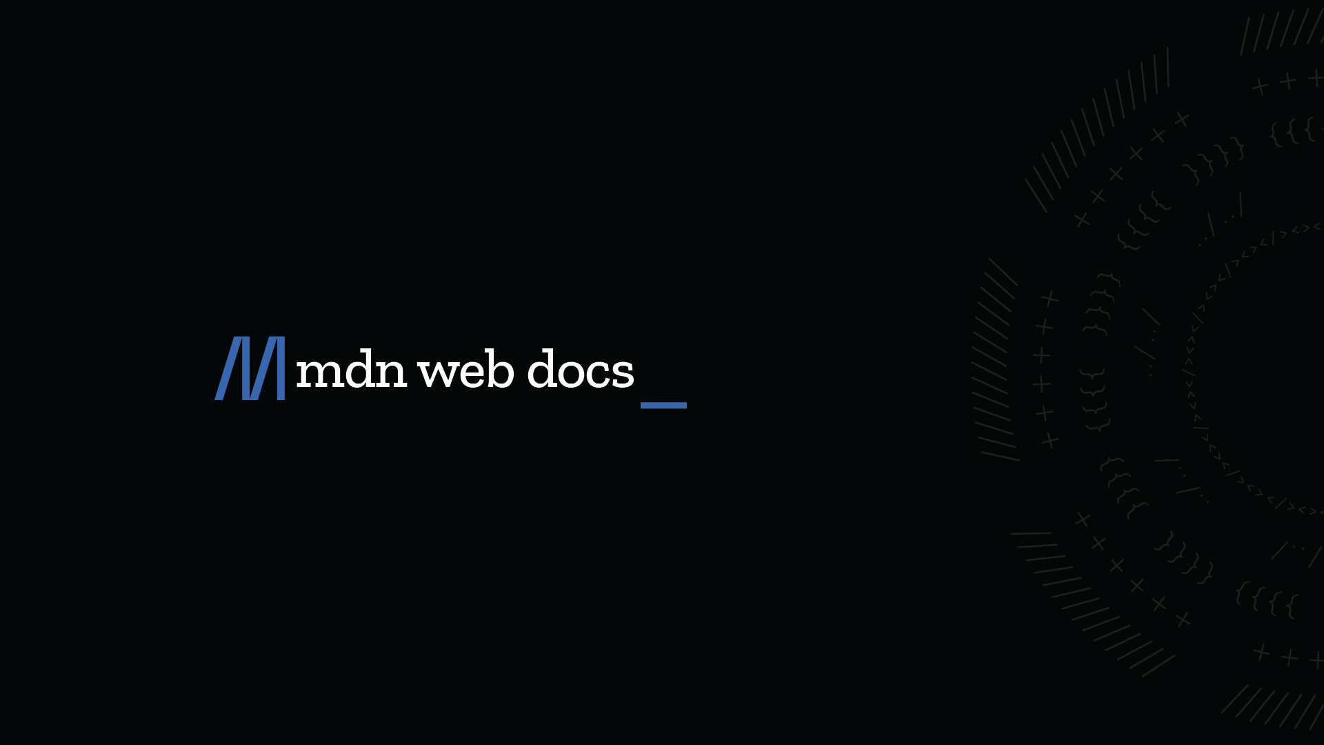
MDN Web Docs
Container queries enable you to apply styles to an element based on the size of the element's container. If, for example, a container has less space available in the surrounding context, you can hide certain elements or use smaller fonts.
Now i tried this
div[class^="buttons"] {
    container-type: normal;
    container-name: testname;
}
@container testname (min-width: 1px) {
    div[class^="buttons"]>div.expression-picker-chat-input-button  {
        background-color: white;
    }
}```
Still had no success...
I tried size and inline-size as well, and just targeting .expression-picker-chat-input-button in the @container, none of those changed the background eithernormal is wrong here
The element is not a query container for any container size queries, but remains a query container for container style queries.
I didn't have any luck with size and inline-size either
you use normal only for style queries (which only works for custom properties or vars rn)
hm
can't test because I'm at work sadly
Aww, alright... Take your time!
In the meantime i guess i'll post a screenshot of what it looks like

And sort of the result i was hoping expect with what i was trying (assuming that the condition is true of course)

have you tried width instead of min-width
dunno if it makes a difference but many examples use (width > 1px)
also according to https://css-tricks.com/css-container-queries/
A container cannot be sized by what’s in it.
Normally, an element’s contents influence its size — as in, the more content in it, the larger it will be, and vice versa. But a container must be sized explicitly as part of a flex or grid layout.
might be relevant here
I found the idiotic mistake
oh?
Both width and min-width work, but it seems like the only times i wrote proper CSS i forgot to put in the unit?
xD I don't know how else to explain it, i'm sure i wrote px at some point, but all of the times i tried something it didn't work
Can anyone recommend me some nice transparent theme?
I've been using this but the Discord update several weeks ago partially broke it and now some parts aren't transparent and all the links are white with no highlight
https://github.com/s-k-y-l-i/discord-themes

GitHub
Discord themes with transparent acrylic mica effect, less clutter and responsive redesign. More aesthetic and simple Discord experience. - s-k-y-l-i/discord-themes
Yes I did update classes and all that
Actually did a fresh install just now in case that'd fix it but it still doesn't fully work as well as it should
The theme hasn't been updated in a while so I wonder if there are any popular ones that I could use to replace this one with which were updated recently
I miss @past bison
i uploaded the latest patch (v2.1.1-20241117) of the theme to GitHub, should be available to everyone now
some poor soul forked it
this is what i could come up with

MacOS....
I wanted to make the tooltip say "Fridge" as a joke, but I have no idea what selectors to use 

because I don't think there's a specific tooltip made just for PlatformIcons
so I would probably have to edit it in the plugin itself
or you could hide tooltips when hovering the icon and create a new tooltip with pseudoelement 🤔
wouldn't that be a nightmare for positioning?
not necessarily?
guys does anyone know how i can remove pings/tags?

because it is very annoying
also this from servers

idk if this affects the channels

where to put that codde and where to copy
vencord settings, edit quick css, paste
ok but send me the codde here 😄
I can't find it here on the server
where is this written
this codde
#🎨-css-snippets and then just use the search bar
oh tnx im blind >3
i love macos
Apple pilled
i genuinely dont know how to explain this

and this

i was using dark+ but it doesnt seem to be a theme thing
also what is stock discord again
oh i havent
tried
no it doesnt
okay i found a fix
i fixed it
i just had to update vencord
lmao

I have my own theme submission to make; I feel that it is worth posting here
/**
 * @name ServerListResizer
 * @author Colonel_Gerdauf
 * @description Changes the server section spacing to be more consistent and readable
 * @version 0.1.2
 * @source https://github.com/ColonelGerdauf/Discord-themes/
 */
@import url('https://raw.githubusercontent.com/ColonelGerdauf/Discord-themes/refs/heads/main/src/SLR.css');

:root {
    --SLR-spacing: 15px;
    /* Font size is exclusive to Vencord ServerListIndicators  */
    --SLR-font: 11px;
}
Before and After:


I am not sure how to snapshot the spacing changes, as it is fairly small and makes a difference in macro.
if the 1st picture is the "after", then the server count is not centered
Anyone got updated class for discover tab? Can't manage to remove it again
use something like this
#🎨-css-snippets message
Thx
any code that can make this transparent?
so only the main theme's color shows?
seems discord got updated and prev code that came here got messed up 😦

like this?

yes yes sire, thank you so much 😦
do you need a selector too?
i think no more needed
ok
I think this should work if you don't want to find a good selector
||css [class^=overlay_][class*=card_] { background: transparent; }||
thank you!
Does anyone know what string can fix the text from going to the left when I expand my Spotify?

That's in the SpotifyControls panel, right?
Yes
check in your quickcss for stuff related to #vc-spotify-titles
does any1 know how to make a theme that lets u use your own images for the background?
like not having to make the theme but like a theme that gives u that option
https://github.com/nvhhr/discordcss/blob/main/snippets/actuallybasicbackground.theme.css this might be relevant to your interests
yeah i think thats it, do i just put it in my css
if you want you can copy the whole thing, or you can put the raw link into your online themes, https://raw.githubusercontent.com/nvhhr/discordcss/main/snippets/actuallybasicbackground.theme.css
then copy only the :root{} part into quickcss to change the background and the toning layer
so i just replace the images part with whatever i want basically?
:root
{ --nvbgimg: url("https://w.wallhaven.cc/full/85/wallhaven-851q5o.jpg");
--nvbgadjust: rgb(0 0 0 / .6); /use this to tone the bg for better visibility/
--scrollbar-thin-track: transparent;
--scrollbar-auto-track: transparent; } copy this root part?

ohh okay
so i just find a image on like discord use open browser and copy that?
yeah except discord image links expire after some time
reupload to imgur or whatever file host you prefer
ok ill do that ty!
looks like my example link is also 404 lol
1 problem is with the code it does not work for some things
like the settings
and other various random ui like the discover tab
yeah I need to add more things to it, as for settings you might be interested in this https://github.com/nvhhr/discordcss/blob/main/snippets/modalsettings.theme.css
do i paste that in too?
yeah or you can use the raw link in online themes https://raw.githubusercontent.com/nvhhr/discordcss/main/snippets/modalsettings.theme.css
helps to keep your quickcss not so cluttered
and you get updates on the css whenever I get back to updating these :D
to be honest i have nothing in css lol
aside from the code u just like sent me
yeah it's completely up to you, so many ways to apply css

not sure what you mean by compressed (having it as a modal window was the point), but the preview definitely shouldn't go past the edge and doesn't do that for me
yeah thats kinda what i meant
also using a imgur link for the background is making it fully grey
my pc is loading the sc give me a minute

is your link a direct link to the image file
rightclick > copy image link or open it in a tab and copy that
yours is kinda wonky, just use
https://github.com/mwittrien/BetterDiscordAddons/tree/master/Themes%2FSettingsModal
I used to use it, but decided to make my own that's way simpler
the main difference of devilbro's version is that it has the close button hack that allows settings to close when clicking outside
and vars to set the sizing
yeah but as you can see here, the profile clips outside
not for me
for some reason, if i disable nocturnal in vesktop settings, it still uses the theme, which is so weird. I have to remove the theme file entirely to not load the theme into vesktop
working on this, which is good, its just has a few quirks with the way i made it

such as

i cant seem to find this unread messages bar in dev tools for the life of me, does anyone know?
<div class="divider_d5deea divider_c2654d isUnread_c2654d" id="---new-messages-bar" role="separator"><span class="unreadPill_c2654d endCap_c2654d"><svg class="unreadPillCap_c2654d" aria-hidden="true" role="img" width="8" height="13" viewBox="0 0 8 13"><path class="unreadPillCapStroke_c2654d" stroke="currentColor" fill="transparent" d="M8.16639 0.5H9C10.933 0.5 12.5 2.067 12.5 4V9C12.5 10.933 10.933 12.5 9 12.5H8.16639C7.23921 12.5 6.34992 12.1321 5.69373 11.4771L0.707739 6.5L5.69373 1.52292C6.34992 0.86789 7.23921 0.5 8.16639 0.5Z"></path></svg>new</span></div>
found it by searching NEW
does anyone know how the highlight color for mentions is calculated
i havent been able to figure out how

(this is for a plugin, not a theme)
discord messed with theme again I see
Do they ever quit
dunno I'd kinda like them to be done soon so I can rewrite my shit
.visual-refresh .channelTextArea_a7d72e {box-shadow: 0 -4px 12px 0 var(--background-base-lower);} is new
the footer of serverbar changed and so discovery icon is back
it is no longer a direct descendant of [data-list-id="guildsnav"]
there is an itemsContainer
then there is now this thing

causing this to appear

friends list now has a tabBody layer as if we didn't already have enough layers of grey backgrounds there
might be an old element renamed
Are the changes only on visual refresh?
yeah

I literally just finished fixing the profile popouts after Discord had butchered them
i love futureproofing

why does that have an exclamation
¯_(ツ)_/¯

whoa
huh
Eh, I'll squash some bugs tomorrow and then get to it
It is a theme for profile popouts
Not to make profiles pop out

?remind 3pm fix spotify buttons horror
Alright @pure cairn, in 16 hours, 31 minutes and 8 seconds: fix spotify buttons horror
rip free smiley dealer 😔
It will be missed
no it won't
yes it will
I watched arcane
the horror in question

i wish free smiley dealer was still with us 😔
real


@pure cairn, <t:1732660132:R>: fix spotify buttons horror

how likely is it for someone to have both spotify and youtube activities at the same time?
Random question
Am I the only one putting comments in my snippets to explain/remember what the various parts are?
Occasionally, but most of them are self explanatory
Yea, just look at this
https://github.com/KrstlSkll69/vc-snippets/blob/main/NSFWtag.css

GitHub
Some of my CSS Snippets. Contribute to KrstlSkll69/vc-snippets development by creating an account on GitHub.
first snippet I ever made too
i still hate it
I've had that in my quickcss since I started using Vencord LOL
i still hate the snippet, but i keep it alive because it’s semi-useful to people
Why do you hate it?
I wouldn't know what to change tbh, besides some nesting
exactly, and i also feel like there is a better way to-do all this

ALL OF THIS
for 'funny hover pink summary'
i love css 😃


why do you have duplicate selectors
nvm saw the topicsPillCarets_ and Caret_ and thought they were the same but they're notg
and you can use some nesting
Instead of blah bluh guh div, blah bluh guh svg, use blah bluh guh :is(div, svg)
Or, yes, nesting
better to do nesting in this case since there's already a blah bluh guh selector on its own
for topicsPillText
i think this should work
mightve typed some things wrong though

oh yeah i have an asterisk on line 9
btw does anyone know why the color for var() and classes and pseudo classes and stuff changed in vscode/how to fix it?

ig there's probably a color variable somewhere, but it's hard to find those
You could also create your own variable if you wanted
no not discord vscode
ohh vscode
anyone else's discord all screwed in latest refresh update?
had to do .visual-refresh .page_a4d4d9 { width: calc(100% - var(--custom-guild-sidebar-width)); }
cringe

someone else had the same issue where part of discord was just cutoff
wait it's still broken
Yeah it's broken for me on forum channels
breaks for me when I make the window smaller and when I change channels but the line I had above fixes it
discord devs what are you doing
username is a bit broken for me now, i have to hover on the name for the background color to be matched with role color

i'm considering changing it from currentColor to something else
what is that theme
hey, I'm looking to remove this border on the profile pop-up, I for one couldn't find the specific class for it

try this :root .custom-profile-theme {--custom-user-profile-theme-padding: 0 !important; }
thanks! it worked
don't actually need the :root there but doesn't matter
I just copied discord's css but since I put !important it doesn't need to be as specific
oh sick
the way I grab my classes and shit I just get the console and press that button on the top left
it doesn't always work but for hiding random buttons it's more than enough
yeah devtools is mostly all you need, and MDN css reference is a good place to learn what you can do when you have a selector, just throw shit at an element and see what sticks, that's how I learned everything I know
yup
discord modding is pretty much all I do for CSS so I may or may not learn some of that

GitHub
A theme for Vencord's own client, Vesktop. Contribute to SEELE1306/Modular development by creating an account on GitHub.
does anyone know the selector to make server icons squares?
this does both servericons and avatars https://github.com/nvhhr/discordcss/blob/main/snippets/squareicons.theme.css
What's the code for moving the spotify player above the channel list?
does this look good?

is there anyway to change channels and user area widht?
share 
[class^=sidebar_] { resize: horizontal; } allows you to resize it by grabbing the edge
or you can set the width to a desired value
there is also a var for it but I think it's only with the visual refresh experiment
that is awesome! i love it
servers banners dont seem to be filling its space correctly when i increase the widht tho
yeah because the height is preset iirc, you need to set height of the element to auto or smth
i had a lot of issues with the banners and channel buttons when making my hidechannellist theme
is there a way to open the devtools in firefox in discord without my computer exploding
if was fine for me last time I did that
works fine for me too
Do chat bubbles with borders work? I've gotten the border to work, but I can't change the background of the chat bubble.

what's your css?
Cancer
I'm building it off what's on https://github.com/SEELE1306/CSS-Snippets/tree/main/Snippets/ChatBubbles

GitHub
A compilation of CSS snippets for Vencord / Vesktop. - SEELE1306/CSS-Snippets
This is what I have for the customizable part
:root {
  --chat-bubble-default: hsl(304, 94%, 56%);
  --chat-bubble-replying: hsl(293, 38%, 35%);
  --chat-bubble-mentioned: hsl(295, 93%, 62%);
  --chat-bubble-automod: hsl(347, 73%, 32%);
  --enable-chat-bubble-border: 1; /* 0 to turn off, default is on or 1 */
}```IF I change the 1 to 0 to turn off the border it just doesn't change anything

Maybe...
I dunno but you have chatbubbles in there twice
Oh damn, I didn't even realize that lol
Better? @clear siren
having correct curly braces might help

idek how that could've gotten there
there's so much duplicate stuff in that waht
I don't see that in the new one i posted
are you adding this online theme and the thing you sent
Local edit
??
I'm manually editing the CSS on my PC using VS Code
oh
I have the file saved in my Vencord theme folder
I think there's something wrong with your local edit
I just used the import and it's working now

Let me try something...
Ok then yeah. It must be my local. I even took out all my quick CSS and it's still not working for me.
Crazy
yeah I can't help much because I'm on phone at work lol
That's okay. I'll be around for awhile if you want to take a look later if you can.
might take a look when I get home in a few h
CAn you post the fil you're using?
why were you trying to edit the bubble one?
how can i make it so whatever message i sent (includes slash command usages) always on the bottom (just above textbar) and fixed
with css
like when somebody sends a new message my message still should be fixed at the very bottom like a sticky note
or something that would block all messages / slash command usages from other people in a specific channel would work too
i couldnt figure out how to select
didn't quite get what you asked
anyone have the css snippet to make read channels dimmer
like this?
css #channels [data-dnd-name]:not(:has(>div>[cl ass^=unread_])) { opacity: 0.5; }
oops that applies to a bit more than channels
#channels [data-dnd-name]:not(:has(>div>[class^=unread_]))
:has([href^="/channels/"]) {
  opacity: 0.5;
}
fixed version
it was applying to categories and stuff
you can change the opacity to be less harsh by increasing it (it goes from 0 to 1, 0 is completely invis, and 1 is completely opaque)
ok think this should be fine
#channels li:has(>[class*=type]):not(
  :has([class^=unread_], [class*=modeSelected_])
) {
  opacity: 0.5;
}
oh niceee it workss
thank you
wait um one more thing if thats fine, do dms have their own thing?
I believe this should work
#channels li:has(>[class*=type]):not(
  :has([class^=unread_], [class*=modeSelected_])
), [href^="/channels/@me/"]:not(:has(>[class*=highlighted_])) {
  opacity: 0.5;
}
well just the current channel thing again oof
ahhh i forgot that
hehe
ok
#channels li:has(>[class*=type]):not(
  :has([class^=unread_], [class*=modeSelected_])
), div:not([class*=interactiveSelected_]):has(
  >[href^="/channels/@me/"]
):not(:has(>a>[class*=highlighted_])) {
  opacity: 0.5;
}```this is so scuffed but it should work
/* -- ROUND EMBED BORDERS -- */
#app-mount .embedFull_b0068a {
    border: 3px solid;
    border-radius: 15px;
}```

can someone help me fix this so the embed borders have the colour all the way around again?
just set border-color to a desired color, presumably there is only a border-left-color set to red and the rest are white
you could just add the color into your border shorthand with !important
I can't make it change per domain anymore?
like border: 3px solid red;
ah, I was missing !important when I was messing with it earlier
oh yeah you can
how
No, the problem is it needs to somehow inherent the color from here

I don’t know why my message sent like that
basically .embedFull_b0068a:has(.embedTitleLink_b0068a[href^="https://vencord.dev/"])
et cetera
That seems needlessly complex
I concur
what do you mean
it was working with all domains up until a few weeks ago
or maybe a bit sooner I wasn't really paying attention

now only one side of them is coloured and the rest is gray
that is how you select it using the domain in the link
but you're not setting a border color at all rn


I'm assuming discord made it only set the border-left-color instead of border-color I guess?
yeah that is what they did
so you'd have to set the border color yourself because there is no way to inherit it from there
so I just have to pick a single embed colour and use that for all domains now ?
or use my above example to set it per domain

GRAHHH ITS OFF BY A COUPLE PIXELS AGAIN

based font
my fellow css enjoyers, could you give me some css optimization tips please? my discord is running at 5 FPS, literally unusable
For what I've read, I tried to replace all selectors like
div[class*="scrollerContent_"] > div[class*="container_"][class*="header_"]
to more specific selectors like
.container_b385c8.header_b385c8
also idk if it has something to do, but I have a lot of snippets + my theme. I appreciate any help 

discord running at 5fps is most likely not caused by selector parsing - except if you're using attributes that discord is animating with js such as the server activity pill thing that has an inline style in it
very hard to say what might cause your fps drops without more info and a bunch of testing, I recommend you didable some css and see if it's fixed, disable other css etc until you can narrow down the probable culprit
very likely for the amount of snippets/themes
j
oka, I'll try
could having all snippets in a single file improve performance?
Maybe
shouldn't matter much
hey all, i have been using this small CSS snippet to hide the dates/times on messages unless i hover over them:
/* Hide Message Timestamps unless you hover over a message Config */
[class*="timestampInline_"],
[class*="timezone-message-item"] {
    visibility: hidden;
}
[class*="cozy"]:hover [class*="timestampInline_ec86aa"],
[class*="cozy"]:hover [class*="timestamp_f9f2ca"] {
    visibility: visible;
}
it stopped working properly since yesterday, where if i put my mouse anywhere in the discord window, it shows the dates
if i move my cursor out of the window, they disappear
any help would be really appreciated :D
chucked it into that autoupdater thingy website and it updated this:
didn't seem to fix anything
why are you using attribute selectors and including the hash thing
not my css
?
it's a test
oh i thought you were going to send something
li[id^=chat-messages-]:not(:hover) [class^=timestamp_] {
  display: none;
}
is that what you're wanting
np
okay
slight problem
this hides the (edited) text too
and it sometimes pushes down the entire message when the (edited) text is shown
looks jarring
fixed
li[id^=chat-messages-]:not(:hover) [class*=timestampInline_] {
  visibility: hidden;
}
Could also use this for an animation
li[id^=chat-messages-]:hover [class*=timestampInline_] {
  opacity: 1;
}
[class*=timestampInline_] {
  opacity: 0;
  transition: opacity 0.3s ease;
}
I'm gonna kiss you
btw, speaking of performance... is there any difference between having the CSS in files or in QuickCSS?
anyway to fix the floating folders side bar width? i tried updating the classes
/* Floating Folder */
.wrapper_bc7085:active {
    -webkit-transform: unset;
    transform: none;
}

[id^="folder-items-"] {
    position: fixed;
    top: 0;
    bottom: 0;
    z-index: 99;
    overflow-y: auto;
    max-height: calc(100vh - 72px);
    margin: auto auto auto calc(72px + 8px);
    padding-top: 8px;
    border-radius: 8px;
    background: var(--background-floating);
    -webkit-box-shadow: var(--elevation-high);
    box-shadow: var(--elevation-high);
}

[id^="folder-items-"]::-webkit-scrollbar {
    display: none;
}

.folderIconWrapper_bc7085 {
    transform: rotate(-90deg);
}

.closedFolderIconWrapper_bc7085 .icon_a64689,
.expandedFolderIconWrapper_bc7085 svg {
    transform: rotate(90deg);
}```
nope
all of them just get thrown into a style element
oh, thanks
no performance diff
the only difference i see is quickcss doesnt reload every theme, it reloads only the quick css, so you can instantly see changes
changing the file makes vencord reload every theme, and it can get slow
/* Floating Folder - Enhanced Version */
.wrapper_bc7085:active {
    -webkit-transform: unset;
    transform: none;
}

[id^="folder-items-"] {
    position: fixed;
    top: 0;
    left: 72px;
    height: auto;
    width: 75px;
    max-height: calc(100vh - 120px);
    z-index: 99;
    overflow-y: auto;
    padding: 4px;
    background: rgba(30, 33, 36, 0.7);
    border-radius: 100px;
    box-shadow: var(--elevation-high);
    backdrop-filter: blur(5px);
}

/* Scrollbar styling */
[id^="folder-items-"]::-webkit-scrollbar {
    width: 4px;
}

[id^="folder-items-"]::-webkit-scrollbar-thumb {
    background-color: rgba(255, 255, 255, 0.1);
    border-radius: 2px;
    transition: background-color 0.2s ease;
}

[id^="folder-items-"]::-webkit-scrollbar-thumb:hover {
    background-color: rgba(255, 255, 255, 0.2);
}

[id^="folder-items-"]::-webkit-scrollbar-track {
    background-color: transparent;
    border-radius: 2px;
}

/* Folder items spacing and hover effects */
[id^="folder-items-"] > * {
    margin-bottom: 4px;
    transition: transform 0.2s ease;
}

[id^="folder-items-"] > *:last-child {
    margin-bottom: 0;
}

[id^="folder-items-"] > *:hover {
    transform: scale(1.05);
}

/* Icon rotations */
.folderIconWrapper_bc7085 {
    transform: rotate(-90deg);
}

.closedFolderIconWrapper_bc7085 .icon_a64689,
.expandedFolderIconWrapper_bc7085 svg {
    transform: rotate(90deg);
}

/* Folder container glow effect */
[id^="folder-items-"]::before {
    content: '';
    position: absolute;
    top: 0;
    left: 0;
    right: 0;
    bottom: 0;
    border-radius: 100px;
    pointer-events: none;
    box-shadow: 0 0 15px rgba(0, 0, 0, 0.2);
    opacity: 0;
    transition: opacity 0.2s ease;
}

[id^="folder-items-"]:hover::before {
    opacity: 1;
}

/* Force visibility */
.folder-241Joy {
    display: block !important;
    visibility: visible !important;
    opacity: 1 !important;
}
ty for ur code, i fixed it to my liking since the positioning and folder item spacing was messed up for me, found out the only thing i was missing was "width: 71px"
/* Floating Folder - Enhanced Version */
.wrapper_bc7085:active {
    -webkit-transform: unset;
    transform: none;
}

[id^="folder-items-"] {
    position: fixed;
    top: 0;
    bottom: 0;
    height: auto;
    width: 71px;
    max-height: calc(100vh - 120px);
    margin: auto auto auto calc(72px + 8px);
    z-index: 99;
    overflow-y: auto;
    padding: 4px;
    background: var(--background-floating);
    border-radius: 8px;
    box-shadow: var(--elevation-high);
}

/* Scrollbar styling */
[id^="folder-items-"]::-webkit-scrollbar {
    display: none;
}

/* Folder items spacing and hover effects */
[id^="folder-items-"] > * {
    margin-bottom: 3px;
    margin-top: 4px;
    transition: transform 0.2s ease;
}

[id^="folder-items-"] > *:hover {
    transform: scale(1.05);
}

/* Icon rotations */
.folderIconWrapper_bc7085 {
    transform: rotate(-90deg);
}

.closedFolderIconWrapper_bc7085 .icon_a64689,
.expandedFolderIconWrapper_bc7085 svg {
    transform: rotate(90deg);
}

[id^="folder-items-"]:hover::before {
    opacity: 1;
}

/* Force visibility */
.folder_bc7085 {
    display: block !important;
    visibility: visible !important;
    opacity: 1 !important;
}```oh I see, thanks
discord updated theme again..
box-shadow went away from chat input (has a border now) but a box-shadow appeared on panels
always talking about visual refresh, right?
always
not like they'd be updating the 'old' theme
visual refresh is the future
I just wish they'd get done with it soon so I can rewrite all my shit
HAH
They're still working on profiles

That looks awful
i actually kinda like it
it doesn’t fit how other icons look
the ones outside a folder are circle until you hover or select them
visual refresh also makes all the server icons more square
without even any change on hover which i don't really like
really?
that’s a downgrade
yeah, for me at leaast

[data-list-id^=profile-]>[class]:not([data-list-item-id$=_edit-profile]) {
  display: none;
}

At this point why not merge it with the bottom part?
it used to be merged actually
luckily i took an ss of this like yesterday

it does sort of make sense having the multioption ones grouped together now though
merge what?
noo 😭
why discord why do you do this
discord has nothing better to do
My brother in Christ, you literally sent the screenshot 2 minutes before
The [Edit Profile] with [Status] and [Switch Accounts], although I would separate [Switch Accounts] from the rest as it's not related to the current account
Just like it was before
I would also move the [Copy User ID] somewhere else tbh
well that would be kinda jank
i think this looks fine

oops caught in 4k with python
please forgive me, it's for school
:(
wtf there's this too
how scuffed is this
[class^=wrapper_][class*=fullSize_]>button {
  display: none;
}```
i don't really like how unspecific it is
Wow they're really going full on bloat on profiles huh
that's not a squircle btw, just a very rounded rectangle
I thought it was a pokemon name 😭
lol
squirtle you mean?
Yeah
my theme is also being more messed up every day :3
Any idea how to fully remove "Download App" button in web version of Discord? It just left name and changing cursor
@supports (selector(:has(*))) {[aria-label="Download Apps"] {display: none !important;}}

I broke my Discord
@supports (selector(:has(*))) {
  div:has([aria-label="Download Apps"]) {
    display: none !important;
  }
}
Nice
How can I reset everything or just themes?
Absolutely no interface

Thx
@vestal blade do this

I go think about how to do it now
:root {
  --disablechanges:;
}

* {
color: var(--disablechanges, red);
}
just found out how to do an if statement in css. this is either a great idea or im about to be banned from touching css ever again
what
basically useless cause you can't conditionally declare the --disablechanges
can you even put another value inside a var()
looks like it should be broken in any case, var set or not
Can someone make me a small snippet for removing this "play again" bs? i dont have any knowledge to "select" this box, but i think its done with "display: none" ig, but idk the selecting-part xd

oh yeah I thought the fallback would come after )
never used fallbacks in var()
wish I could help but I don't have this element on my device so I can't get the selector
is it possible to select a css element by the raw text in it
eg select thing by THIS
<thing>THIS</thing>
no, I don't think so
iirc they wanted to add a :contains() selector but it was scrapped
yep
just disable it

they'll do this but NOT allow hiding the nitro and shop pages (you can technically get to both of those pages in other ways)
of course not, ads arent toggleable
Anammox my beloved -
https://github.com/Kyuuhachi/VencordPlugins/tree/main/Anammox
But yeah, I totally agree with you that it should just kind of be built in the discord
The gift button in the chatbox:
So big you take up two reactions

discord moment
i mean the reaction pfp plugin doesn't actually fetch new users on every update to my knowledge
oh i see
second value is a fallback
yeah