#🎨-theme-development
1 messages · Page 40 of 1
You have to add a more general selector for checking if the memberlist is showing or not
Or, since there's always a button and aria-labels are a thing (I wouldn't use them though, as they change between languages) check for the collapse memberlist button aria-label
Or its fill
mmm... I don't get it, why I need the aria-label of the button? from what I have seen, the member list has no aria-label nor the classes use the same name 🤔
anyways, thanks for the help. I will continue tomorrow (2 am. here)
cool spotify easter egg/fun challenge
This might be cool to make for spotify controls or something
In spotify, it shows for ||star wars songs (not sure exactly how those are determined)|| or you can show it yourself by ||typing THX1138 (case sensitive) anywhere (doesn't even need to be in search box like some places say) (pasting doesn't work)||


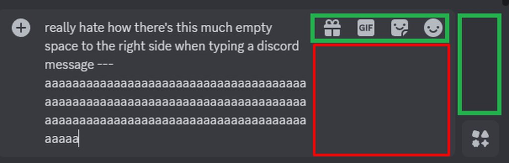
can someone help me remove this gap?
😭
i have to delete the diw to remove it but the thing is idk how to call it
only works through inspect element
Which gap?

here
right where soundboard was originally
the div creates a huge gap
oh on the bottom?
wait no that's not what you're talking about, but there is something wrong here

yes on the right
because when i remove the

yeah pretty much
sure
go to dms
why not send here
what are you asking for specifically
my full theme or just
the part of your theme that's relevant to here
so if that's your full theme yeah ig
can you not just display: none; the buttons?

that's working for me i think
this is relevant
?
LOL
dont question
but yeah this disables a bunch of buttons
unnecessary buttons on ur screen
use div:has(>[aria-label="Open Soundboard"])
also using aria labels does work, but is generally discouraged because they'll (in most cases) break when changing language
oouu okay well its just for me
the display: none needs to target the div because the soundboard button is wrapped there for some reason

> is a child selector, so div>[aria-label="Open Soundboard"] will only select that aria-label if it's a child of a div
and :has() is kind of self explanatory, but when using a child selector in it, it'll select a div that has the aria-label is a direct child to
mdn docs is your friend
oh it's child combinator apparently 🤷
also why do you have display: none and visibility: hidden @hazy tinsel
display: none makes it like the html isn't even there
i thought different properties might have a different affect
visibility: hidden just makes it invisible
yeah i realized that shortly after i think
display: none can be used on all elements, so no need for visibility:hidden in this case
thank you
ill raed the documentation your explanation will help alot lol
ill save that
ya
what does this even do?
@echo frost
oh
idk how i missed that lmao
and also that seems like there's probably a much better way to do that lmao
It is not.

But honestly idk how else with CSS since Discord doesn't make any distinction between suggested channel elements and normal ones.
It should be a plugin.
Plus there's this problem if you go the CSS route.
bruh thank you good work
needed that for a while
well that lags my discord
Have fun using that. I deleted it from my snippet collection because I got too scared of its power. 
💀
It works on my end though.
Now I actually wonder how my other snippets affect performance.
This works:
div[class^="chat"]:has(aside[class^="membersWrap"])
    div[class^="subtitleContainer"] {
        width: calc(100% - 240px);
}

div[class^="content"]:has(aside[class^="membersWrap"])::before{
    right: 240px;
}

aside[class^="membersWrap"] {
    top: -48px;
    max-height: calc(100% + 48px);
}
Also not relying on aria-labels this time.
Except it leaves a 48px gap on the bottom of the list, how did I miss that.
Not anymore.
I will actually use this myself this is nice man.
Goes well with the other snippet that aligns the message text box.

need some reccos on lightweight themes.
I tried a few cool looking ones, but they were all quite resource intensive. while others such as Midnight were too dim to be optimally used in daylight.
are there any cool dusky themes that look pleasing and are easy on computer.
That's actually pretty cool
But where do typing indicators end up?
Above the right end of the message box.
The scroll down is above the left.
It's not actually mine, I found it in #🎨-css-snippets.

it's perfect
thanks!!
jsjs yeah, saw this yesterday, fixed it before going to bed
this one was easy
https://imgur.com/a/t73OicC (taken from https://www.reddit.com/r/discordapp/comments/1fgrmsv/comment/ln48ey7/?utm_name=web3xcss ) can we have a css snippet that moves the chatbar buttons to that green space?
Reddit
Explore this conversation and more from the discordapp community
Isn't that literally what float: right is meant to solve
how to style child element based on his parent or the child element sibling
I got lost after the "or"
same as :has but instead of checking the children, it checks the parent
Like style a child if it has a certain parent?
yup that
can't you just... use the parent selector?
Just do parent child.

if you want to select child1 from parent1 but not parent2
use parent1 child1 and it will not select parent2 child1
p div will style all divs that have a p somewhere in their parent chain.
thank you guys, that what I needed

to check child element sibling u can do :has(+ sibling) or :has(~ sibling)
is there differences between the two?
- is specifically the next following sibling, ~ is any following sibling
ty
Is there a way to hide this code
.cozy_f5c119 .headerText_f47574 > .username_d30d99::before {
  content: '';
  width: calc(100% + 10px);
  height: 100%;
  border-radius: 5px;
  background-color: currentColor;
  opacity: 0.2;
  position: absolute;
  top: 0;
  z-index: -1;
  left: -5px;
}
.cozy_f5c119 .headerText_f47574 > .username_d30d99 {
  margin-left: 5px;
}
from like dm's, but work everywhere else?
add
.content_a4d4d9:not(:has([d^="M23 12.38c-.02.38-.45.58-.78.4a6.97"]))```
at the beginningit checks for the "show user profile" icon, which is only available for DMs

I saw this screenshot in a css snippet. Is this button-ification made officially by discord or is it from a theme?

ah, so it will come eventually, right?
btw what is this "refresh experiment"? I saw this refresh thing mentioned a lot but idk what it is
it's so ugly

and if it goes live, it will kill my precious theme

well this looks cool, and that feature should have been added years ago
THANKS GOD
that’s why i pray to god that it’s an optional thing
1 question what’s the zzz thing
is that just as a decoration or something
man i remember when we could revert the profile changes and then they disabled that experiment and forced it upon everyone
rate this snippet, it does it exact opposite of what my last [snippet](#🎨-css-snippets message) does

looks kinda weird all green
okau imma drop it, since you like it so much
Vp vencordtoolbox
Adds a button next to the inbox button in the channel header that houses Vencord quick actions
Authors
Vee, AutumnVN
np
it’s uh way too green
😭
i like the older version more the add friend button is unique to green making it easier to navigate to it
you should make the blocked button a reddish color
(with midnight Catpuccin theme) How do I make the emoji picker on hover use the same shaking effect as gif picker hover and sticker picker hover, instead of the 360 spin that the emoji picker hover does?
(Tell me if this isn't clear lol)
I believe you would have to find the emoji picker hover and gif/sticker picker hover classes and transform: in your current theme, then open the quickcss editor and apply the same transform: to the emoji one
Maybe adding an !important to override the base theme, in case it doesn't work
i'm trying to make the background of the settings transparent (i.e scrolling settings menu & menu content intact, but overlay bg removed) but i can't figure out how to only remove the coloured part and not everything in the settings :c
background-color: transparent;
Yeah I tried that before and it makes the emoji picker go bigger for some reason
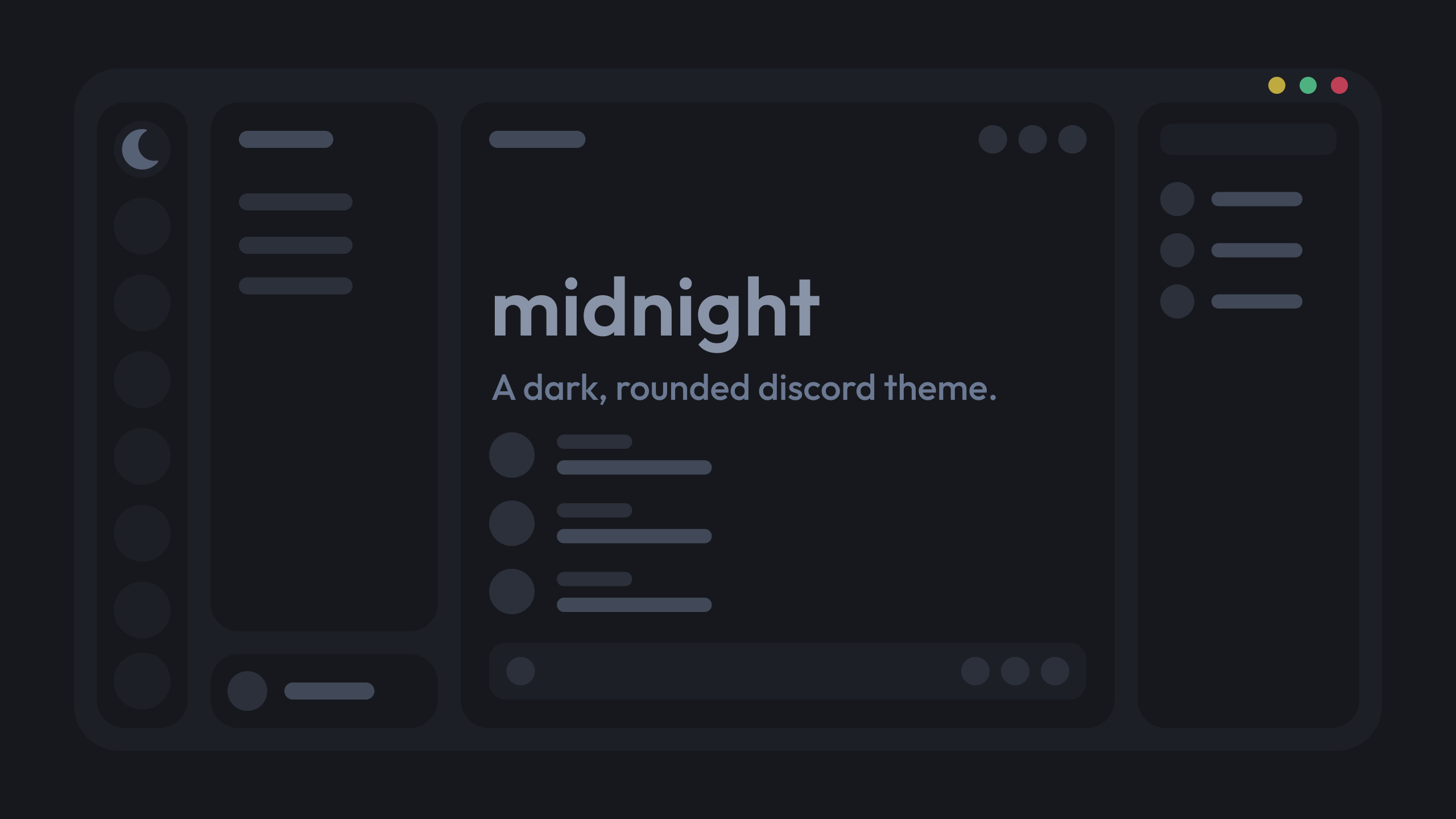
https://github.com/refact0r/midnight-discord/blob/master/flavors/midnight-catppuccin-mocha.theme.css
GitHub
A dark, rounded discord theme. Contribute to refact0r/midnight-discord development by creating an account on GitHub.
Yeah I was confused, the catpuccin is just the color scheme, my bad
No problem
Do you have any other css snippets in your quickcss that could interfere with the theme behaviour?
because I cannot find any animations related to the sticker and gif picker button
.emojiButton_d0696b .contents_dd4f85 {
  transition: whatever the other css does;
}```no, the theme midnight by default makes the emoji picker do a 360
^
And there were no shaking animations when I tried it on my device
the lottie icons animate with js and don't have a name to go with them
you'd need to remake the animation with css keyframes if that's what you're trying to get
idk how to re create the shaking animation from gif picker to put it on emoji picker tho X)
no, when you hover the gif button in the chat box, it shakes
sorry for the confusion
it doesn't on stock midnight catppuccin mocha
idk how that works sadly :/
I can guarantee you that
no the shaking effect is in core discord

I have no idea, I just have it
oh revert icons doesn't have animated icons
they were introduced with the latest icon pack
.spriteContainer_d91a75 {
  transform: scale(1) !important;
}
.sprite_d91a75 {
  transition: opacity .3s ease;
}
.emojiButton_d91a75:hover .sprite_d91a75 {
  animation: gifLottieRemake 1s ease;
}

@keyframes gifLottieRemake {
  33% {
    transform: rotate(10deg);
  }
  66% {
    transform: rotate(-10deg);
  }
  80% {
    transform: none;
  }
}
pretty quickly animated and not perfect but this somewhat does it
it's very similar
oooh nice! thanks a lot :)
np
oh well.. it doesn't work with Midnight x)
raaaaGHH let me check midnight give me a minute
I added !important on every line, but didn't work XD
.emojiButton_d91a75:hover .sprite_d91a75 {
  animation: gifLottieRemake 1s ease infinite !important;
}```that's odd
this is what it does
ah i gotta remove the "infinite" too
forgot to do that
let me see what does the spin
.spriteContainer_d91a75 {
  transform: scale(1) !important;
}
.emojiButton_d0696b .contents_dd4f85 {
  transition: unset !important;
}
.sprite_d91a75 {
  transition: opacity .3s ease;
}
.emojiButton_d91a75:hover .sprite_d91a75 {
  animation: gifLottieRemake 1s ease;
}

@keyframes gifLottieRemake {
  33% {
    transform: rotate(10deg);
  }
  66% {
    transform: rotate(-10deg);
  }
  80% {
    transform: none;
  }
}
okay try this instead
yeaah works now! Thanks a lot ^^
okai unlesss its just me somthinghere broke and i cant figure out what
/*---DM Icon Grid---*/
:root {
  --dm-columns: 4;
}

[class^=privateChannels_] [class^=content_] {
  display: grid;
  height: unset !important;
  grid-template-columns: repeat(var(--dm-columns), 1fr);

  &> * {
      overflow: hidden;
      grid-column: 1 / calc(var(--dm-columns) + 1);
  }
}

[class^=channel_]:has(
  [href="/channels/@me"],
  [href="/library"],
  [href="/shop"],
  [href="/store"],
  [href="/family-center"],
  [href="/message-requests"]
) {
  grid-column: auto;

  [class*="linkButton"] {
      padding-right: 0;
  }

  [class*="link_"] {
      justify-content: center;
      gap: 0;
  }

  [class*="avatar_"] {
      margin: 0;
      width: unset;
  }

  [class*="avatarWithText_"] {
      flex-grow: unset;
  }

  [class*="content_"] {
      display: none;
  }
}

i don't have message requests so it works for me

this^
I don’t know and I’m getting frustrated with something else so I’ll do this in the morning
I'm a complete CSS beginner and everything
I was wondering how I should go about removing a div, specifically container_da1432
It's not a major annoyance, just bulky and in the way ig

.container_da1432 {
  display: none;
}```oh
fair enough lmfao I did that earlier and for some reason it didn't wanna work
but yeah
ty!
You could use a more robust selector as well, but you would have to explore the element html tree a bit to find unique classes
yeah [class^=container_] is too broad of a selector
If the image on the right has /assets/whatever in its URL, you could use
[class^=container_]:has([src$="/assets/whatever"]) {
  display: none;
}```I despise writing css on mobile
It's so clunky
yeah, it does have /assets/whatever
[class^=container_]:has([src$="/assets/7453a66082def5df30a6.png"]) {
  display: none;
}```do the asset names not change?
rarely
more or less often than class changes
Less
Might be wrong but it could have to do with the friend container class that the friends button got placed in yesterday
Hello, is there a way to hide this black circle when hovering the mouse over the avatar? Thanks.

thanks

this is a different kinda of fix ig

yeah that fixxed it


thanks
I was thinking about this idea
Dm me
I wanna shoot more ideas by you and I don’t wanna clog up this channel
in css-snippets they fixed it by adding this
div:has(li) {
  grid-column: auto;
}
under the &> * {...}
which might be more update-proof
ohh i didn’t know this existed
#1230657631543234560 message
be honest I don’t even remember where I got it, that’s why I came here trying to fix it
Hey, so I want to change these indicators
The issue I'm having is that I can't seem to distinguish them from eachother
Also hovering creates the middle one which is annoying
I can separate the selected server indicator
But not hovering and unread messages
The reason I want to target this is because I wanted to change the unread message indicator but remove all the other pills, since I have different indicators for those anyway
If anyone has any idea to only target the unread message indicator, separated from the server hovered indicator that'd be God tier (I think there's JS animating the unread indicators though when unhovered, making them appear for a second when they shouldn't)
I've played with them before, but because their height is set by a js animation that has multiple decimals of precision it can cause lags when you write a selector targeting them by their height..
Yeah, see the height is the only way I could think to differentiate them but I dunno
Can you target things based on their height? I noticed [style=] isn't a thing
I only need to target unread indicators, anything else can be removed since I have alternates already implemented
[style=] is definitely a thing
Hmm
But that matches the style attribute, not the computed style values
Oh shit that does work
Nice, cheers dude
Since I only need unread indicators to be visible I should be able to just make the others display: none
yeah
Stupid Discord JS animations confusing me
yeah they're the worst and there is no other attribute to select unread servers
and using the style*=height attribute causes a lot of waste and can easily make your discord lag
however, when there is no pill, the .item is not there
so you can select the servers having the .item and do :not(:hover) or something
and the selected server has a .selected class on the servericon
do with that what you will :D
Annoyingly there still has to be a compromise doing it this way since the unread messages still change on hover, thanks Discord :^)
yeah
Well its either don't have the custom message indicator or have it vanish on hover
Hmmmmmm
Otherwise though this does let me select it atleast if I do want to make it
I think I'll figure out a way to make them opt in/out in the settings I'll provide in the import css
Since there are some issues with how Discord animates them
But they are fine when left alone
bwah what do I do with this lmfao, I'm trying to remove the Close DM/Leave Group button
I've tried aria and div class but I'm guessing I did it wrong

.closeButton_c91bad {
display: none;
}```yeh already tried that and it didn't wanna work lol =w=
[class*=channel] [class*=closeButton][aria-label="Close DM"],[aria-label="Leave Group"] {
    display: none !important;
}
hides dm close button + gc close button
@tardy flowerhere u go
so many wildcard selectors + aria label
[class^=privateChannels_] > [class^=scroller_] [class^=content_] > [class^=channel_] [class^=interactive_] > div:has([d^="M17.3 18.7a1 1 0 0 0 1.4-1.4L13.42 "]) {
  display: none;
}```svg selectors my beloved
Also I'm pretty sure this works but not as you think
Because if you put a comma after the first aria label without nesting, the 2nd selector is just going to be [aria-label="Leave Group"]
[class*=channel] [class*=closeButton] {
  [aria-label="Close DM"],
  [aria-label="Leave Group"] {
    display: none !important;
  }
}```well you know more in that field either way it still works

for both dms, and gcs
Not languageproof
ehhh it’s not meant for all users
How would you know they were using discord with English language?

You don't
We've seen people using Japanese here already, so I wouldn't rely too much on aria-labels
thats not my problem
this is only if you’re releasing it publicly to which it becomes a concern
well it’s not really a snippet more of a solution to one persons problem not a global
if you plan on posting it though that’s a different story
but as of rn this is resolving ones issues
made the assumption that they spoke English from their bio, the way their message was it’s quite obvious
might not be their first but they have an understanding of it
it’s unnecessary to do all those other things and it’s a time waster too to optimize it for all languages yes it’s better but still
most people you encounter on Discord know the english language there’s only a small percentage that are unfamiliar with it so really it’s not something to have concern of to begin with
And I agree with you on that one
But do all of them use English as their discord language? Nope
I'm just saying, if there's a way to make something more universal, I'd go for it
then they shouldn’t be interacting with this channel to begin with
You're free to do what you prefer
if they don’t know english because how else are we supposed to resolve their issue
??? Why
That's an entirely different thing
they’re gonna be using google translate which is inaccurate
With "English as discord language" I mean the software language
ehhhh really man that’s such a small percentage
Fair, likewise
you should use :is() for things like that btw
shouldn't you use something like this
[data-list-item-id^=private-channels-uid_]+[class^=closeButton_] {
  display: none !important;
}```^ I think this one is a bit better
you need !important
How can I fix spoilered messages from being invisible?
I cant see them ||like this||
Its not that the spoiler color is not there, the actual message isnt there visually, I cant click it, etc. (I also cant tell when someone puts spoiler in there message unless ||test spoiler|| its in the middle of their message)

I simply rewrote their snippet fixing the 2nd selector
open devtools (ctrl+shift+i), ctrl+shift+c then click the spoiler and look at the styles for all the elements for it

What should I be looking for in the styles?
theres this

Local theme & QuickCSS
unless you're changing the color of the current spoiler background, it's not that
it could be that though
-# oops meant to reply to #🎨-theme-development message
if you disable quickcss does it work?
if it doesn't, send local theme
otherwise send both
or just send both without testing
@real night ^
didn't realize the closeButton was directly after the channel selector
huh
it is
but you could also use ~
it doesn't really matter tbh, as there's nothing inbetween, right?
no i dont think there can be
also for some reason I thought the [data-list-item-id^=private-channels-uid_] was provided by the ThemeAttributes plugin, so I avoided using it. I should've probably tested without tbh


test ||test|| test
I feel like it may not be a theme issue?
Sometimes I can click them and sometimes I cant
like I cant click the one you just sent.
why is there a curly bracket here?
and the lines are indented

did you copy it from somewhere?
@real night ^
also unrelated, but use
this link for the image instead of the duckduckgo one https://cdn.donmai.us/original/e5/f0/__sprigatito_and_liko_pokemon_and_2_more_drawn_by_shi_mohaji__e5f0d23bb6e5ba68fd98c1448d526be3.png
ok found out why
Hmm?
Probably not, Someone was helping me with this before, But I also didnt make the theme.
Its just a modified version of it.
Though I did change the background colors there.
idk how you got that extra curly bracket, but delete that and then add commas betwen 20% and 0.4 and 16% and 0.6 on bg1 and bg2
This theme is also broken on vesktop for some reason.. 2 reply buttons..

alr
that's a bug with a plugin
searchreply
Also, Is this only on vesktop?
I combined them so you can put them both in the theme

The quick css and the theme itself?
yeah
oh thanks
background dosent show with it.
the image?
yea
that's weird
does visiting this link work for you?
https://cdn.donmai.us/original/e5/f0/__sprigatito_and_liko_pokemon_and_2_more_drawn_by_shi_mohaji__e5f0d23bb6e5ba68fd98c1448d526be3.png

yea
that's even weirder huh
what if you replace line 91 with this
--nvbgimg: url("https://external-content.duckduckgo.com/iu/?u=https%3A%2F%2Fcdn.donmai.us%2Foriginal%2Fe5%2Ff0%2F__sprigatito_and_liko_pokemon_and_2_more_drawn_by_shi_mohaji__e5f0d23bb6e5ba68fd98c1448d526be3.png%22);
nope
sorry discord messed that up
--nvbgimg: url("https://external-content.duckduckgo.com/iu/?u=https%3A%2F%2Fcdn.donmai.us%2Foriginal%2Fe5%2Ff0%2F__sprigatito_and_liko_pokemon_and_2_more_drawn_by_shi_mohaji__e5f0d23bb6e5ba68fd98c1448d526be3.png");
this?
you should be able to delete quickcss now
mhm
does anyone know why the unread button is different in only one server (not vencord)?
(first is weird and only in one server that ik of, 2nd is normal)


No idea tbh
oh i worded that weirdly
it's not weird in vencord
it's weird in another one
non-community server vs community server
:root {
  --folder-icon-1: url("");
}

[aria-label="Servers"] {
  & > * {
    --folder-icon: var(--folder-icon-1);
    --position-left: 4px;
    --fill: currentColor;
  }
  [aria-owns^="folder-items-"] > [class^="folderIconWrapper_"] {
    position: relative;
    [class^="closedFolderIconWrapper_"],
    [class^="expandedFolderIconWrapper_"] {
      display: none;
    }
    &::after {
      background-image: var(--folder-icon);
      background-size: cover;
      background-repeat: no-repeat;
      content: "";
      position: absolute;
      top: 12px;
      left: var(--position-left);
      width: 24px;
      height: 24px;

    }
  }
}
is there no way to extract color from folder background as a filter?
why does that distinction exist
non community servers tend to be private servers so where youd probably read every message so I guess it's more obvious there?
other than that no clue
The smaller one appears if you have onboarding enabled which there really should only be one variant of those bars
i have
yet another thing
I modified amoled-cord to secondary and tertiary are all black, and not a weird off grey
However, I'd like to have custom border colors for profiles, so that way the user profile doesn't blend into the background if they don't have profile colors


thing is I don't know what to do exactly
A while ago someone showed me how to remove the shop tab from the DMs section, I also want to remove the nitro tab now.
I was given this quickCSS:
[class^="channel"] > div > [href="/shop"] {
  display: none !important;
}```
How can I add the element for the nitro tab to it?I already gave you a resource for this
https://codeberg.org/AllPurposeMat/Disblock-Origin
Just go there and search for whatever nitro-related element you'd like hidden
I mean, you did tell me to come here but thanks.
I also gave you that already though .w.
hi, i'm trying to make the user popout header a gradient with js, but every time I click on a user profile, I get this error message in the console. I'm not an expert on js, does anyone know how I can fix this?


atp we just need a snippet help/request channel
just ignore it
u are caring about something not even related or caused by your code
Either way it works. Thank you.
ah lol, thanks. anyways, the code just works one time, if I open another user profile, it doesn't change. If the warning message has nothing to do, then how can I make it work every time I open a user profile?
throw it in a setInterval probably, or make it execute when you open a profile
I need 2022 client theme please.... 🙏
does theme attributes have anything for the server icons on the server bar on the left of the client to determine if the server is public or private? cause then you can add cool stuff like locks to private servers and globes to public ones
I think you can just select their svg path?
can you send that user pop out css?
Looks clean asf
jsjs thanks, it's part of a theme I'm working on, but yeah, it can be used separately.
notice that only changes non-nitro profiles, and the gradient on the header is something I'm still working on
/* generic profile popout */
div[class*="userProfileOuterUnthemed_"] {
    background: rgba(0, 0, 0, 0);
}
div[class*="SizeInnerThemed_"] {
    background: #00000050;
    backdrop-filter: blur(80px);
}
div[class*="banner_"]::before {
    content: none !important;
}
damn
how would i get it on every profile?

😔
bc this pop out theme is dark (like all non-nitro users) and nitro profiles can be light mode, meaning that those change the font and role colors
so it requires more work, it's possible, but personally I like to see the themed nitro profiles

how would i change the color of the screenshare button?

im trying to change the color

thanks
yeah most definitely im learning as time goes on its definitely different than most languages i know i don't really use it ever besides disabling certain elements
and moving certain things but i noticed i don't even call classes properly
Bro how and why the hell do you have so many buttons
It is because they do not feel fear
most of the buttons are tied to a panel which is not available publicly it’s privately owned and privately developed i can’t really disclose
here’s an idea:
that each button has its own functionality and it’s based off of the icon it has
how ominous
not necessarily no the first button literally rotates me in calls
it’s nothing harmful
No rotation meaning it goes through the selected server list, selected queries and finds me a call that matches the criteria that i set
and then joins that call automatically rather than me looking for another call
and i have options to automatically mute, start a stream etc
So you can just VC gamble?
yeah pretty much i suppose
there’s other buttons, too but i can’t go in to detail about their functionality because that violates their terms here
Their terms!? Who the hell privates what I'm expecting is a Vencord Plugin?
idk really you’d have to the owner they don’t allow certain plugins because of weird people. as for the buttons, it’s not detailed mainly because that violates the terms here i’m not trying to get banned
^
oh you want a border color for the
profile so it doesn’t mix in with background
Yeah
lol I just suck at stuff
Trying to learn things more
You could select the outermost element and apply a border to it
Dunno how you would go about the color
Heya, sorry I hate asking for help but… I'm trying to create a CSS snippet and I just can't find what I'm looking to change despite going at it for more than a few hours now (even making use of advice I sought in the general support channel).
I want to remove specifically the section for commonly used reactions that are shown when you mouse over a message. But I can't find where/how to achieve this.
Here's an example:

Don't suppose anyone would be able to point me in the right direction?
It's just an experiment...
Oh gosh I thought it was but couldn't find it when I looked. So many hours on this...
Thank you!
is there a way to give all profiles an themed thing to a color variant/ gradient of their pfp, modview has exactly this but idk how to transfer that to the profiles


🤪
how would I go about getting an old Discord icon?
I wanna change the thread icon back to the old one
wasnt channelist resizeable for a few weeks or was i lucky
I dunno I never noticed it being resizable
HUSK

broke my 1000~ lines of patches
i need to figure out some new location instead of another topbar
its collapsible...rip to all those snippets

fixed serverlist with grid stuff, made the buttons to match serverlist and the other 2 right buttons to fit toolbar

visual refresh isn't too terrible now
mostly
this cursor margin is messed up
avatars are huge in the chat for some reason?
they forgot to add hover effects to these buttons
the user panel is still pretty fucked up
also i don't really like the big bar at the top, but it is kinda coolish


oh darker is a bit better

oh also folders are kinda fucked up

Yeah those avatars are way too big, and there's too much blank space in channel list
And yeah that top bar is just a waste of space
channel list?
Left sidebar
Looks like there's about twice as much space between channel names as there are in current

I thought you were saying this person who is typing is kinda weird, but I guess both are true

😂
(i can't react, because then smiley dealer doesn't traumatize us)
wtf these colors are hardcoded

fix for buttons
[data-sidebar-collapsed]>[role=button] {
  cursor: pointer;
  color: var(--interactive-normal);
  path {
    fill: currentColor;
  }
  &:hover {
    color: var(--interactive-hover);
  }
}```but discord will fix it eventually
I kinda wish rhis button showed when it's not collapsed to easily collapse it

wtf why is darker so light here

lmao wtf is light mode

Light mode has always been eye-hurt mode, but yeah, lol
but it's grey now
Pink debug mode is better
huh
is there a way to kill the border on the right side

this ss might be better

you see how the server list can infact go until the edge
but the member list got cut off
i just updated
an₫christ
visual refresh got fucked hard
my horizontal server list is broken .

    display:none;
}```kill the new bar
it also kills inbox and help button but who the hell uses those
i guess i wont be having horizontal server list anymore

https://discordstyles.github.io/HorizontalServerList/dist/HorizontalServerList.css
this shit is too complex for me
either that or disable visual refresh
oh hey normal discord looks like old visual refresh now
when you’re a full time discord user, and ignore flaws it’s like apple fanboys saying the latest iphone is good
the visual refresh is awful there’s been good ui refreshes and stuff but this is just awful in comparison to everything else they’ve made
discord lowered their budget they’re trying to make as much as possible they’re planning on going public in the stock market cause they’re greedy for money that’s why they keep creating decorations, and adding new stuff for nitro users it’s all just greed
pure greed and shit ui design.
When have their ui refreshes ever been good?
always.
I like the refresh for the most part

I changed that for myself a long time ago.
is this a recreation of the visual refresh in css?
or is this the real thing
real thing
should i be lucky or unlucky that i haven't gotten the change
maybe i only got partial
i hate the pins button with all of my heart
had to write twice the amount of code i did for all the others just to get this stupid button to not have a panic attack if there is a new pin
everything in red is what i had to add JUST FOR THE PINS BUTTON


what is the experiment for the redesign
its like uhh desktop_refresh or some shit
oh yeah that definitely broke things on my theme
but it worked
it breaks the folders plugin
great
same here

this will break so many themes
i cant wait
might as well start making one with this redesign active before they invetabily force this
i will fight this redesign

trying to amek the sidebar go over this thinger at the top and of course, setting overflow to visible fucks it all


try this:
.visual-refresh .bar_b66418 {
    width: calc(var(--custom-guild-sidebar-width) + 1px);
    background-color: var(--bg-overlay-2,var(--background-secondary));
    z-index: 1;
}
.visual-refresh .sidebar_b66418 {
    margin: 0px
}
.visual-refresh .center_b66418 {
    display: none;
}
.visual-refresh .sidebar_a4d4d9 {
    padding-top: 40px;
}
.visual-refresh .content_a4d4d9 {
    border-top-left-radius: 0px;
}
.container_a4d4d9 {
    margin-top: -40px;
}
still need to make it work on collapse but so far it's workin
i can live with this

that seems harsh
in it's current state, I'd be extremely annoyed if it rolled out now
but I think it has a few nice things, and might have a bit of potential
it has some nice functionality but visually its straight up worse
mainly i have issues with the top bar and the floating user profile
!remind saturday fix better folders visual refresh
Alright @glacial citrus, in 4 days: fix better folders visual refresh
the floating user doesnt make sense because nothing goes behind it
also ive already done this myself
yeah it should just be flat like the rest of the ui
css or changing the plugin
send
its with the weird extending background right?
curious how
the folder side bar should be on the right side, not the left

didnt think that would be possible with css
oh, i use this css snippet for that
but im sure i can somehow figure out a way to move it
well not really broken
well things that were prefectly fine now are visually annoying
.expandedFolderIconWrapper_bc7085 > svg:has(>path[d="M2 5a3 3 0 0 1 3-3h3.93a2 2 0 0 1 1.66.9L12 5h7a3 3 0 0 1 3 3v11a3 3 0 0 1-3 3H5a3 3 0 0 1-3-3V5Z"]) {
    scale: 10;
}
.expandedFolderIconWrapper_bc7085:not(:has([class^="pendingIcon"]))::after,
.closedFolderIconWrapper_bc7085::after {
    content: "";
    background-color: #fff;
    width: 24px;
    height: 24px;
    position: absolute;
    clip-path: path("M20 7H12L10.553 5.106C10.214 4.428 9.521 4 8.764 4H3C2.447 4 2 4.447 2 5V19C2 20.104 2.895 21 4 21H20C21.104 21 22 20.104 22 19V9C22 7.896 21.104 7 20 7Z");
}
.closedFolderIconWrapper_bc7085 > .guildIcon_bc7085 {
    opacity: .5;
    filter: blur(2px);
}
.theme-dark .folder_bc7085[aria-expanded="false"] {
    background-color: #474747;
}
not sure how good this is
had it in my quickcss for a long time
and its an experiment so yeah its gonna be buggy in some way
jesus thats long
im pretty sure i fixed that with just 1 line of css
also i feel like the refresh messed with the fonts in a way that made them more annoying
i just went back to the theme i was already using
idk what yours does, but this just does this to the folders


disable the experiment then
i did
oh mine fixes the expanded folder background being long and weird
like the line that goes behind the servers in the expanded folder
do i see it?

yeah the bottom of the backround isnt supposed to extend that far
[id*=folder-items] {
height: auto!important;
padding-bottom: 5px;
}
that line should fix it
it should also be alot more noticable with folders with more servers
unless they've already fixed this issue
I need help with my theme please
So i have my background all blacked out but certain parts of my theme still have grey as the background (behinf the discover icon on the bottom left and also the activity icon in chat)
I did not make the theme myself i took a online theme but changed the colors myself. I still have that problem tho
My spotify player also shows grey when i want it to use my custom colour
how scuffed is this
I can't figure out a way to change the text and make the width fit to the new text


test <@&1026504932959977532>
is this the most efficient way to do this? i know like next to nothing about css

oh ok yeah thank you that is the whole snippet
If you’re on the redesign just add .visual-refresh to the start of the path you’re trying to change
it's not _ it's -
looking to remove searchBar_f0963d
uhh

nvm forgot i toggled quickCSS off hkgjhfdkgjdfgkj
Lol
a few thingies
how in the world do I make the flex extend all the way, and also, is there a way to move the refresh inbox back to the toolbar instead of the refresh bar
I only need one bar lol

When I have a quest pop up there's something that seems to hide the items on the left side of Discord, what should I look for to fix it?

probably a selector in your theme that is targeting an nth-child() of the channel list
did they just remove the topbar again....
wait this is so different
header is smaller, scrollbar on textinput

What are you using to make things private
I'm curious
72470 pings? How
demonstration, equicor
also found where it went, it got merged with discord titlebar
anyone know what theme this is, or css?

#1275515434786885675 message this one ig
was going through some CSS (dev'd by discord) and found this
lol what teh fock of a value is this

must be using click and drag for editors or something idk
which would explain why discord is so janky, if they do
also, a new development
favorites got its own button now ig
That's 21/22
Probably they use scss or some other preprocessor
They clearly use some preprocessor for css modules anyway
fair
yes, yes, thank you

Hihi
Did you manage to find a solution to your issue btw?
Cross posting from #🧩-plugin-development message
Are there any accessibility plugins i can look at to see how they are structured? If not, i can deal with seeing standard vc plugins. my idea is a font switcher plugin
Kinda pointless to make a plugin for something as easy as a font switcher tbh
css works just fine
is there anyway to hide this emote

change this experiment to Not Eligible
or use the CSS snippet - #🎨-css-snippets message

ah tyvm!
i really do wonder if they use like tailwind, scss or sass or something
how would they use tailwind for this
installing tailwind and then just using normal css 
Hi
can you help me?
I also want to disable suggested channels
this works pretty sure for me it lagged my client badly maybe cause of my transparent theme i’m not entirely sure
Looking for a way to always show the server banner (like the old snippet used to do) in the refresh UI... although with minimal casualties
#🎨-theme-development message
For starters I don't know how to fix or remove the stupid gradient

yes, I removed the scrollbar

also apparently I have a scrollbar in profile DM box so thats something I'll do rq ig

so aparently it's scrollableContainer_d0696b
orr not
two things I need help with dangit

atp i should make a todo list
looking specifically to change the SVG path because I have a plugin that shows typing and swaps the svg out, so conventional methods don't just work

GitHub
The other cutest Discord client mod. Contribute to Equicord/Equicord development by creating an account on GitHub.
eg swaphomeicon by nvhhr won't work
anyway I think thats enough of my
rants
[class*=bannerImage]:before{
   display: none
}``` this worksAlright so the todo (for refresh) is..
- Always visible server banner
- hide profile DM textbox scrollbar
- custom image compatible with homeTyping
andddd - find out how to get the stupid primary color from non-nitro profiles so I can use it as a border color with this code..
.biteSizeOuter_c69a7b.userProfileOuterUnthemed_c69a7b {
  border: 2px solid;
  border-color: #ffffff;
}
.fullSizeOuter_c69a7b.userProfileOuterUnthemed_c69a7b {
  border: 2px solid;
  border-color: #ffffff;
}
fun fact, nitro profiles are background and not border
it appears like border simply due to margin/padding
well yeah
Just im trying to make a border cuz I have a silly amoled theme
for not i just have it as grey
and does anyone know why in refresh the aria labels just don't work
eg
div[aria-label="Start Voice Call"] { display: none; }
div[aria-label="Start Video Call"] { display: none; }
div[aria-label="Add Friends to DM"] { display: none; }
does nothing

add !important or add something to the selector to increase the specificity
visual refresh uses .visual-refresh .iconWrapper_fc4f04 as the selector on those which is more specific than yours and wins
same with a lot of other things in visual refresh, the selectors are prepended with .visual-refresh and 'broke' a bunch of css simply by having higher specificity
yeah i don't think you can set a border as a gradient
you can, using border-image (gradients are images and plug straight into it)
I personally can't wait for Discords UI update where everything breaks and people start spamming every channel in here.
this is the most cursed shit ive ever seen

youre writing a useless snippet buh
switch to canary
they merged those bars
i need to merge more

Said no one ever who's responsible for the vencord repo
this is possibly the most, dumbest, broken, stupid piece of official discord css i have ever seen

ah yes, do nothing
I have similar things in my theme
it actually does do stuff
To make scroll things visible through their header bars
oh yeah
wat this actually could help me here
wdym the bars are merged in canary?
must have changed they layout again i guess
worst advice

yall's automod is fucked up
just got timed out in #🎨-css-snippets for a minute trying to post this shit
.visual-refresh [class^="typeWindows_"] {
  height: 48px;
  pointer-events: none;
}
[class^="bar_"] > [class^="sidebar_"],[class^="bar_"] > [class^="right_"] {
    pointer-events: auto;
    max-width: min-content;
    margin-left: calc(var(--custom-guild-sidebar-width) - 250px);
}
.visual-refresh [class^="center_"] {
    display: none;
}
.visual-refresh [class^="sidebar_"]:not([class^="bar_"] > [class^="sidebar_"]) {
    padding-top: 48px;
}
.visual-refresh [class^="content_"] {
    border-top-left-radius: 0px;
}
[class^="layer_"] > [class^="container_"] {
    margin-top: -48px;
}

[class^="layer_"] > [class^="container_"] {
    height: calc(100% + 48px)!important;
}
[class^="appAsidePanelWrapper_bd26cc"], [class^="layer_"] > [class^="container_"], [class^="subtitleContainer_"], [class^="layers_"]  {
    overflow: visible!important;
}

.platform-win [class^="layer_"] {
    /* NOW LISTEN TO ME ON THIS ONE */
    top: -100px;
    padding-top: 100px;
}
[class^="title_"] {
    padding-right: 110px;
    /* good fuckign luck trying to make this work when the sidebar is collapsed */
}
ohh markdown headers
ah
I hate that they blocked those
so they can see it 😭
🤔
@glacial citrus, <t:1727225187:R>: fix better folders visual refresh
is there a css script to disable this from the right click menu
:nth-child()
[id="user-context-invite-to-server"] {
  display: none !important;
}
#user-context-invite-to-server {
  display: none !important;
}
whoopsies
i will do
cant figure out merging titlebar
i did it


is this css snippets?

ohh i thought its copy id.
ready for something that will piss you off in visual-refresh?
there is a cut off gradient for every single banner


psueod element
sadly still don't have access to #🎨-css-snippets
but I made profile bios not cut off by changing the overflow
div[class^=descriptionClamp] {
    overflow: unset;
    max-height: unset;
}
and of course hopefully to future proof it
you also need to undo -webkit-line-clamp: 3; no?
never noticed because I already yeeted that gradient before :3
id just show the whole thing at that point
/* Unclamps the About Me within User Popouts and Panels */
[class^=biteSizeInner] [class^=descriptionClamp] {
  -webkit-line-clamp: unset;
  max-height: unset;
}
[class^=userPanelInner_] [class*=lineClamp2Plus_] {
  -webkit-line-clamp: unset!important;
  max-height: unset!important;
}
[class^=viewFullBio_]{
    display: none;
}
I will steal that
used to have a snippet that does the same but got broken by new profiles and never bothered to fix
it works nice. You just have a few problems like when it comes to people with big bios such as aagaming’s boi
I also used to have a maxheight for profile poputs and scrollbar so no problem
discord is cooking some deep fried from-the-depths-of-css-mishaps type shit

one of these is a button and one is a div

ghost ping
container display grid
grid template repeat auto fill something
NOT AGAIN
Insanity

anyone got a CSS snippet for removing this from my server list?

[class^=listItem_]:has([data-list-item-id="guildsnav___guild-discover-button"]) {display: none;}
Thanks
adding onto this, if ya want to get rid of the gradient and footer at the bottom as well
    display: none;
}
[class*="footer_aa1bff"] {
    display: none;
}```you should also read, too
wait
did discord just remove every single change they did to the sidebar in visual-refresh

if you're using plain class names, no need to add [class*= etc, just .
This means that
.gradient_aa1bff, .footer_aa1bff {
  display: none;
}```
is enoughokay
quick q
does anyone know that what banner color var is?
for unthemed profiles I mean
am doing something weird
I don't think there's a fixed var for that (?)
yeah :/
I wanna pull the banner color but if theres no var, I'd have to find a way to do like string matching fuckery and thats beyond me
what do you want to do with the banner color anyway?
using it for a color border, and also for the nonsense I did here lol

hmmm
I guess you could set its z-index to a smaller number so it goes below the profile body, and then expand it somehow
no clue
I mean its stored as RGB on the element so it makes it kinda hard to do much with

grah still need to debug this too...

banner wont ever close no matter what
maybe
they modified the default input element and some things in settings

i think you can just disable the button with the global discovery experiment? but they may have changed stuff
has anyone made a snippet to prevent symbols from looking like this [usually their much larger]

good to know, i'm not adept in this at all LOL
Half of my theme is ded 😔 damn those online computer programs getting updated
set clans pilot experiments to not eligible and hide the regular icon instead
or just set this to not eligible instead of doing all that

Unless discord did something yeah, that’s the experiment for it
 huh
huhI do have this though that I’m wondering if it’s a good time to release
[class*=unreadMentionsFixedFooter_]{bottom: 0px !important;}
[class^=footer_]
{display: none; }
idk i already had it committed and ready to post. I just hadn’t actually synced to GitHub. All I did was press two buttons, the one to sync it and the one to post a message.
just realized, in this they reverted the banner stuff
does anyone know how to revert the old Discover button behavior without actually removing it?
(i.e. only appears at the bottom of the server list)
i only love to do it too please help
how would one remove it even
the linked messages in other channels just take to another script different from the discover button
is there a shortcut to missions afterwards?
and thanks
i did this and it did nothing. button still there


oh it's cause i'm on night theme thing
to access missions i can just go to settings - gift inventory
I don't believe it's possible to do with pure css, but you can disable the experiment
it's called Global Discovery

i mean, not much i guess. my guess would be finding it through inspect element right?
amazing, thank you so much you've been a great help
Visual refresh is almost usable now

How can i get rid of the Voice Channel / Server tag without getting rid of the "Connected for..." is it even possible?

yes
best i can come up with
display: none doesn't work because the timer is inside the server text's element
[class^=rtcConnectionStatus_]+a>[class*=channel_] {
  visibility: hidden;
  line-height: 0;
  p {
    visibility: visible;
    line-height: 13px;
  }
}```
nvm
@faint brook


Does anyone know why there's like spacing here?

Know the saying "if it works it ain't stupid." Thanks man. Have a nice day
https://www.youtube.com/watch?v=gmmPmnKFsTQ yo I was wondering if someone can make sum like this (if its even possible)
💫 Try Brilliant for free for a full 30 days: https://brilliant.org/Juxtopposed/
I tried to redesign Discord to add cozier and comfier options to it and help users not get overwhelmed.
Hope you enjoy!
// Helpful links:
touch grass: https://touchgrasss.com
// Let’s connect:
X / Twitter: https://x.com/juxtopposed
Music (support the art...
Yea and no
A lot of it would need plugins
But you could do some with just css
Hey Krammeth, hope you're doing well pal. Wanted to ask you if there's a way to hide your friend list or just the friends who are online. In case you've developed a quickcss.
I dropped the query in the support channel but haven't received a response yet. Plus you're a CSS expert so. @pure cairn
[data-tab-id=ONLINE]{
    display: none !important;
}
This what you want?
[role^="treeitem"]:not(:hover) {
    filter: blur(1.5px);
}
``` any ideas how can i make this better?
ty for telling me this
oh hi
I believe you can only hide the "online" tab button from the main screen, which is what Indi replied you with
Otherwise, you would have an empty screen that flickers whenever you scroll on it because not all elements are actively rendered all the time
Also, I'm no css expert so please don't call me that xD
Actually, there's something you could do that's similar to what you asked
I just realized what I replied with needs you to have Theme Attributes enabled
if you keep the default friends list page on the "all" category and hide the "online" with this snippet, you could add
[class^=peopleListItem_]:has(
    [fill="#23a55a"], /* online */
    [fill="#f0b232"], /* idle */
    [fill="#f23f43"], /* dnd */
    [fill="#593695"] /* streaming */
  ) {
  display: none;
}```
to hide all your friends that are currently online/idle/dnd/streaming and leave the ones that are offlinethat's true, although I personally think it should be enabled by default
there are no disadvantages to having it enabled
agreed
interesting new thing

funny part about using the old icons theme

is there someway I can see all availible css variables like the var(--background-primary)?
tnx
iirc some of the stuff described in it are in visual refresh
hi, could someone possibly make a snippet where the soundboard panel has adjustable size? someone had made something similar for the emoji picker before
I believe you can only hide the "online" tab button from the main screen
What do you mean by that?
cc: Thank you! :) Where exactly is it removed from? @iron smelt
decided to try this today, and it worked wonderfully. thank you for the great and very easy to follow explanation 
yup, but the emojis part i think it's broken with the plugin ShowAllMessageButtons 😔

btw, discord devtools are utterly broken, or it's only me?

same here
though I'm on ArmCord, so its different
it should work if you set it to something else and re set it to dark though
<@&1073655264923881602> ** **
oh
discord is weird
whats up
did that ping you lol?
OhH
theres a silent role
im stupid
I was just trying to break up my words
ANYWAY
i came here to ask if anyone had an existing and working snippet to fix this monstrosity
It hasn't been much of a headache until now, since the GC has decided to start calling a lot

In the 2nd GIF I sent [here](#🎨-css-snippets message), at the top of the page
the issue is there are some things i cant find for the life of me like this ping icon here
yeah
i see
now im trying to find the blue part specifically
so i can change its color
i assume it'd be this
got it
i feel like this would be better if implemented within a plugin, rather than css
😭
every time i look at that code i feel bad for whoever wrote it

does anyone know how to change where the servers get cut off? im very stumped

Check the server list height
Does anyone by chance have a snippet to fix the soundboard last row being cut off
it's really bothering me lol

Love that reply and forward buttons are identical

That's exactly where I would like to remove it from. Do we also need to add user IDs? Because even with the code inserted, I can still see my friends online.
nope, it resets
Discord update broke my CSS again.
yeah
I'm running the --no-sandbox flag so maybe if its running in a sandbox it can store the variable? idek
electron is weird
I'm curious, what did it break?
It might've been broken before tbh.
Since uuh it's in the profile edit section and I rarely go there.
Yea it was my bad, I retract my previous statement.
what does this flag?
it’s good css though
chromium electron is basically in a special environment since its just a website wrapped in an application
so --no-sandbox for electron apps just basically disables safeguards
you can read more about it here
basically,
Electron docs say..
You can also disable Chromium's sandbox entirely with the
--no-sandboxCLI flag, which will disable the sandbox for all processes (including utility processes). We highly recommend that you only use this flag for testing purposes, and never in production.
iirc its used for r/w and RAM protection
but I have a feeling that the environment isn't set right so the actual chromium bits can't save their last state
so thats why I'm wondering if the dev panel can't be set right
LORELEI SIGHTING 🔥
i am so glad i scrolled up to see this
to advanced for my knowledge
but I understand it 
:3
[class^="tree_"] { /* Static home button  */
        --space: 10px;
        margin-top: 60px;

        >[class^=scroller_] {
            >div[class^=tutorialContainer_]:first-of-type{
                position: fixed;
                top: var(--space);
            }
            >div[style="margin-bottom: 4px;"] > span[id="vc-friendcount"] {
                position: fixed;
                top: calc(56px + var(--space) + 0px);
                width: var(--custom-guild-list-width) !important;
            }
            >button.vc-ranb-button {
                position: fixed;
                top: calc(56px + var(--space) + 20px);
                width: var(--custom-guild-list-width);
            }
            >[class^="listItem_"]:has([class^="guildSeparator_"]) {
                position: fixed;
                top: calc(56px + var(--space) + 40px);
            }
        }
    }
Is there a better way to do this so the top values arent hardcoded & leave spaces if the readall or online count plugins are disabled
Lmfao.
Hello hello.
Surely I will be more active here. 
wdym?
try switching back and forth
that fixed it for me
wtf was this removed?
Indeed
Ig its time for someone to make a plugin thats places it back that the bottom of the list where it belongs
Oh i have an idea to make it slightly useable
only show when hovering over itself or add server button
wait then you wouldnt be able to use add server
My sound board, the last row the pill gets cut off slightly, from what I gather discord is using element style to add negative margin, but when I tried to override it with !important and just copying the class id but that didn't seem to work, I'll have another look later
you mean you want these last sounds to not get cut off?
how would that work

or do you mean you want some padding
Sort of, I literally mean the very last ones though, under "discord sounds" if you scroll all the way down, mine are cut off for some reason, but the other CV dev said his aren't so idk wtf is going on. As for the negative margin, yesterday when I inspected it I saw this
element.style {
    position: absolute;
    bottom: -130px;
    left: 238px;
}```It's padding yee, sorry I misspoke my b 
no it's not padding either
What
no
that would be padding-bottom
MDN Web Docs
The bottom CSS property participates in setting the vertical position of a positioned element. This inset property has no effect on non-positioned elements.
Oh interesting
Thank you
Is discord just straight up bullying me if I don't have any custom css targeting that area and the other dev can't reproduce?
has anyone else with nitro tested
Uhh besides the other dev I don't think so. It hasn't been reported in our support server though, so unlikely it's a theme issue, seems to just be me
try testing in an unmodified browser discord maybe
and which element had that negative bottom
Fs a good idea. I think it was .picker something or another, I'll have to check when I get home from work
thanks, but is not workin for me

neither
neither the dark mode nor the language
btw, in terms of optimization... is it better to have all css in one file or separated files? idk if this has any impact

depends if they're making https calls, ideally you want to minimize the amount of calls you're making
also

it happens on the browser version too but yet I can't get anyone else to replicate the issue
I geniunly feel like discord is picking on me bro
yee cuz nitro
<div id="popout_3436" class="theme-dark images-dark layer_cd0de5" style="position: absolute; bottom: 102px; left: 238px;"> I've found the styling again but now it's not negative and I'm so lost bro
oh that's just positioning the whole popout
.listHeight_d53d65 {
    height: 3040px !important;
}```
future reference if anyone else runs into this issue, I had to go down a rabbit hole. thanks for being my rubber ducky method lol
!important overrides style no matter what so yeah
oh interesting, I don't even need to use important if I use fit content
in this case, no
all of that would be local
spoke to soon height: fit-content breaks it lol
well you're right about hard coding a height because like if I leave a server with sounds it dramtically decreases, so like it would be different for each user, so I can't do that but like object-fit: cover, no work, height: auto just disables scrolling? maybe flex-end?
maybe try height: 100%?
bruh how does that disable scrolling
this element is already set to 100% but if I set css .listHeight_d53d65 { height: 100% !important; } scrolling just stops working?

is using margin-top: 1rem safe for everyone or would that break if they have less sounds than me?

Could using QuickCSS to import an entire theme cause client lag?
Such as
@import url(https://example.com/website/assets/css/example.theme.css);
as one single line in the QuickCSS
doesn't matter how css is applied
but if theme is heavy or badly written like mine you will have lag
im rewriting over 2000 lines of css with another 1000 more from an import as one to make it faster
its slowly working
okay, these are just simple css, so they shouldn't be the problem. thanks
anyone here got any improvements for this css for hiding the quest CTAs in the friend activity list? this one hides the quest, but not the separator considering i think the separator before should be removed and not the one after, and also doesnt deal with the fact that it leaves a gap if its the only card in a specific friend activity ```css
/* Hide quests in friend activity (unfinished) /
[class^="nowPlayingColumn_"] [class^="itemCard_"] [class^="wrapper_"]:has([class="promotedTag_"]) {
display: none;
}
@pure cairn
What exactly is the Quest CTA?