#🎨-theme-development
1 messages · Page 34 of 1
ye
im not sure then, seems a bit hard unless you somehow use some complex css to find out which messages are part of a group
i tried messageListItem:has(groupStart) ~ messageListItem but it only seemed to ever select the first message and that's it
Not a css change, the old style is still present if you switch the experiment off

the experiment is gone for me
o shid
its set for me without the experiment

anyway the css still there in discord files right now, grab them while you can I guess
it happened right after i enabled the theme attributes plugin
yeah
i did a little bit yesterday? when the experiment turned off, but then i realized it was still there
how?
Different selectors
idk how to search for that
and i kinda need the html
since you still have it, could you copy it?
can I have the css for it/how can i get it?
devtools, "Sources" tab, in the folder top > Electron IsolatedContext > assets there's 2 css files
bit more than 2


Discord is doing something odd, these are the css files I'm seeing on canary

guys?
As long as it’s from GitHub, I think it’s fine
yay
Anything posted here's going to be buried, open a ticket with #📩-modmail to request permission to post in #🎨-css-snippets
CustomizeClyde (AKA Clyde to Viggy | #🎨-css-snippets message)
I did this because for some reason the original snippet didnt work
@import url("https://doctoon.github.io/css-snippets/CustomizeClyde/import.css"); /* Customize Clyde */

/* Options (Default is viggy) */
:root {
  --customClydePic: url(https://media.discordapp.net/stickers/1217112512374505613.png);
  --customClydeName: "Viggy";
  --customClydeBanner: url(https://media.discordapp.net/stickers/1217112512374505613.png);
  --clydeBadgeWidth: 30px;
  --clydeBadgeHeight: 30px;
  --clydeBadgePadding: 0px;
  --clydeBadgeContent: url(https://media.discordapp.net/stickers/1217112512374505613.png);
  --clydeBadgeBGColor: transparent;
}
credits to the original author puhbu (fake one) i did not create the original snippet i just modified it to be easier to customize/potentially futureproofed too
oki :3
Review the discord account? I don't think that's true
i suck at talking so idk how to not seem like "i wan send snippets in #🎨-css-snippets !1"
what do you want to do exactly?
I'm trying to color an entire message group to a user's role color
sounds beautiful
I can try to cook later today, leaving for work in a minute
have fun!
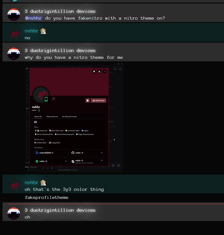
@clear siren do you have fakenitro with a nitro theme on?
no

oh
so far i have something that looks like this: https://transfur.science/fcqionvc
it used to be possible back in 2019, but i remember in 2020 it stopped working and I had believed it to be impossible to fix at the time:

do you still have the css for it?
note that this could update at any time to include stuff like hiding the ai tag or changing the nickname globally, its currently in the same state as the source it came from
Probably not; though i do know it stopped working exactly on febuary 3rd 2020
maybe discord stopped grouping messages for some reason at that time
i commented the entire block out and didn't touch it, so, likely this is what the original working block was:
[class*='cozyMessage-'] [class*='username-']{
    text-shadow: 0px 0px 8px currentColor, 0px 0px 36px currentColor, 0px 0px 48px currentColor;
    filter:saturate(100%) brightness(100%) contrast(100%);
}
[class*="cozyMessage_"] {
    overflow:hidden;
}
[class*="cozyMessage_"] [class*='header-'] {
    overflow:visible !important;
}

[class*='cozyMessage-'] [class*='username-']::before,[class*='cozyMessage-'] ~{
    color:inherit;
    visibility: visible;
    overflow:visible;
    position:absolute;
    width:2000px;
    height:1000px;
    opacity:0.16;
    content:"";
    z-index:-1 !important;
    left:-100px;
    top:-20px;
    background-color:currentColor
}```It still does look very pretty as long as there are no extra messages in a group, lol
oh wait this doesn't work for multiple classes
eg
<div class="totallyRealClass_123 secondClassWow_321">abc</div>
[class^=secondClassWow_] {display: none;}
won't work
[class*=secondClassWow_] {display: none;}
but this will
tried using this but it doesnt seem to work anymore and also hides the top half of the buttons that appear when hovering over a message
yep
this was before the bundler changes that made classes from - to _
so change those first and it should somewhat work
aswell, the ,[class*='cozyMessage-'] ~ needs to be removed
I'm not entirely sure what it was doing back then or how it worked, or if that was a remnant of me trying to fix it
hm.
can you send the css for the fix you tried
[class*="cozyMessage_"] [class*="headerText_"] [class*="username_"] {
  text-shadow: 0px 0px 8px currentColor, 0px 0px 36px currentColor,
    0px 0px 48px currentColor;
  filter: saturate(100%) brightness(100%) contrast(100%);
}

[class*="cozyMessage_"][class*="groupStart_"] {
  margin-top: 0px;
  padding-top: 1.0625rem;
}

[class*="cozyMessage_"] {
  overflow: hidden;
}
[class*="cozyMessage_"] [class*="header_"] {
  overflow: visible !important;
}

[class*="cozyMessage_"] [class*="headerText_"] [class*="username_"]::before {
  color: inherit;
  visibility: visible;
  overflow: visible;
  position: absolute;
  width: 2000px;
  height: 2000px;
  opacity: 0.16;
  content: "";
  z-index: -9999 !important;
  left: -100px;
  top: -1.2625rem;
  background-color: currentColor;
}
looks good :D
it's been four years and i still miss it xD
its a bit broken but i think its probably possible to fix it

btw how can i make it so the message text is colored but not the background
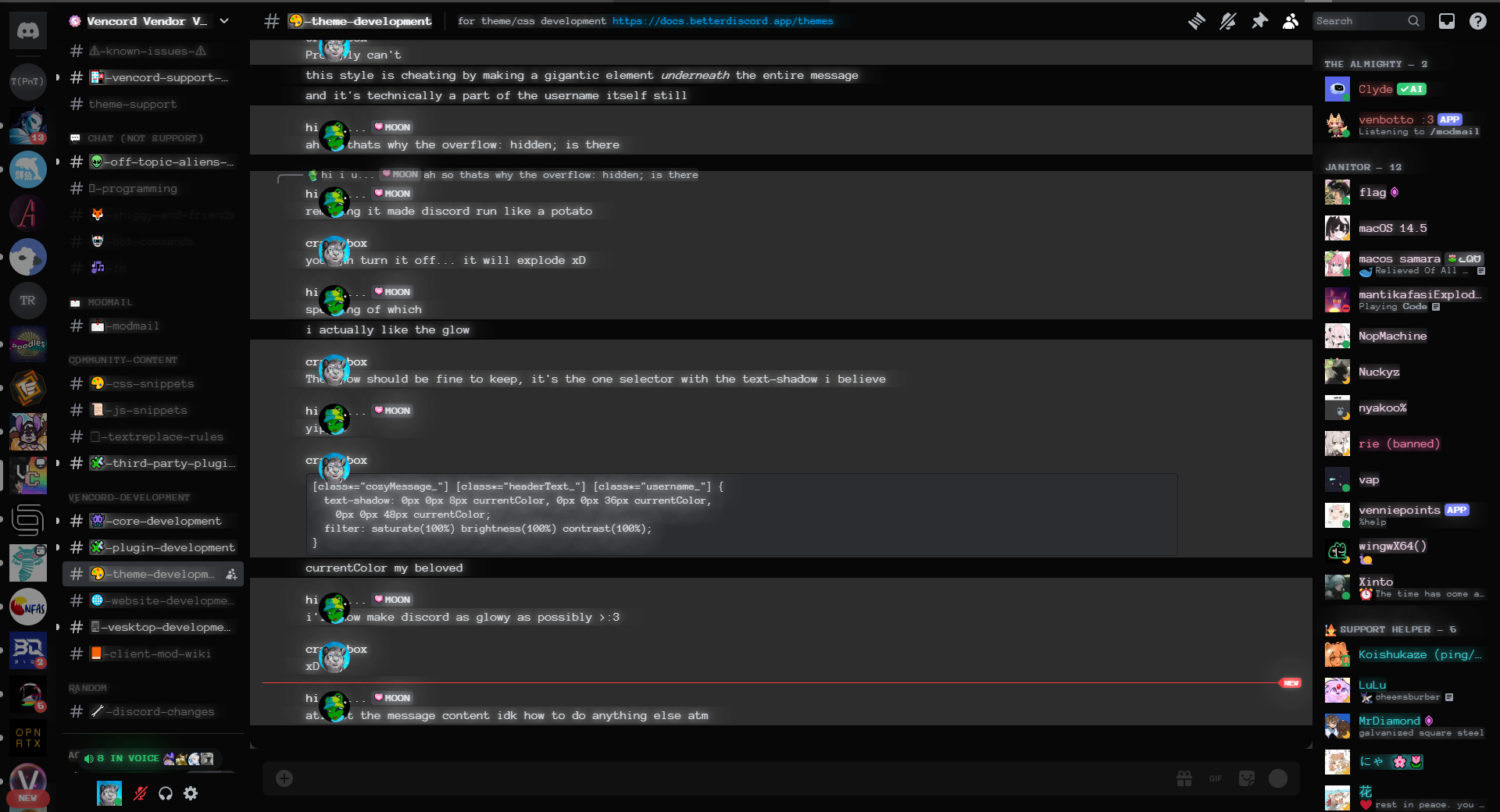
Probably can't
this style is cheating by making a gigantic element underneath the entire message
ah so thats why the overflow: hidden; is there
and it's technically a part of the username itself still
removing it made discord run like a potato
you can turn it off... it will explode xD
The glow should be fine to keep, it's the one selector with the text-shadow i believe
yippee
  text-shadow: 0px 0px 8px currentColor, 0px 0px 36px currentColor,
    0px 0px 48px currentColor;
  filter: saturate(100%) brightness(100%) contrast(100%);
}```currentColor my beloved
i'll now make discord as glowy as possibly >:3
xD
atleast the message content idk how to do anything else atm
its clipping through the text 😨
my discord almost crashed safe to say i probably shouldnt have done that for EVERYTHING
my attempt made discord lag again

heh
I want to group compact messages like normal ones are (first one shows timestamp and user, others don't). Do you know how I might achieve that?
[class^=message_]:not([class*=groupStart_]) [class^=header] > :is([class^=avatar_], [id^=message-username-])
 { display: none; }
might want to also make timestamps always visible or add some padding/margin to the messages or something idk
looks weird but not used to compact mode at all
I guess you wanted timestamps gone too
that actually makes it simpler
maybe something like this
[class^=message_]:not([class*=groupStart_]) [class^=header] { display: none; }
[class^=message_]:not([class*=groupStart_]) [id^=message-content-] { margin-left: 30px; }
Hello everyone! how do i change the dm icon with CSS?
is there a better way to add a fade to the messagebar that doesnt break everything?
[class^="channelTextAreaContainer_"] {
  max-height: 50%;
  height: 7vh;
}

how can i remove the popup when u spam too fast and the messages arent loading quick enough
"enter the chill zone"
pls reply to this message with a ping
gonna do this tmr if someone wont do it by then
Don't spam

write a client side plugin to bypass the server-side rate limits
jk it's probably just a simple display: none on the modal
although the use case is literally not there. if the popup didn't exist, the server would rate limit you and you cannot bypass that
the server rate limits you anyway, the popup is just there to be annoying and/or to be informative
hey, not sure if this is the right place to ask but does a theme like this exist? (discord's new concept #2)

/* Hide the "Enter the chill zone" popup. */
/* Hide the entire container with the "Enter the chill zone" button */
[class^="layerContainer_"] [class^="container_"] button {
    display: none;
}

/* Additional rule to ensure hiding the parent container */
[class^="layerContainer_"] [class^="container_"] {
    display: none;
}
/* Hide The backdrop [to ensure typing is possible] */
[class^="layerContainer_"] > [class^="backdrop_"] {
        display: none;
}
Acrylic Harmony + Smooth harmony is what you're probably looking for https://github.com/s-k-y-l-i/discord-themes

GitHub
Discord themes with transparent acrylic mica effect, less clutter and responsive redesign. More aesthetic and simple Discord experience. - s-k-y-l-i/discord-themes
i had to spam to make sure it works so yeah i hope it works for you :D
ok it seems there is a side effect
i was not specific enough and now it also hides all blurry backdrops behind popups
there is another side effect
you cant close popups
i am going to try to fix this
how dare discord tell us to chill 
yea
i just gave up because no matter what i try it still doesnt work
You might be able to workaround that by using multiple specifity, and with :has … at a guess
even if u have the exact selector u shouldnt hide popups, it messes up the functionality bc ure basically using discord with the popup still there, u j cant see it
does anyone know how to stop the GIF button from swinging on mouse-hover?
same for Sticker button
2024-02_desktop_animated_icons experiment
yeah it lags discord i think if you start spamming and you bypass the popup
cuz its still there multiple times
[class^=message_]:not([class*=groupStart_]) [class^=header] > :is([class^=avatar_], [id^=message-username-]){
  display: none;
  }
[class^=message_]:not([class*=groupStart_]) [id^=message-content-] {
  margin-left: 30px;
   }
Thank you! Went with this combo. Compact mode already deals with the timestamps so all I needed is that little margin. Cheers
oh wait, this just depends on zoom level 💀
this fixes it
[class*=userPopoutInner_] > [class*=body_] {
  overflow-y: auto;

  &::-webkit-scrollbar {
    width: 8px;
    height: 8px;
  }

  &::-webkit-scrollbar-track {
    border: 2px solid var(--scrollbar-thin-track);
    background-color: var(--scrollbar-thin-track);
    border-color: var(--scrollbar-thin-track);
  }

  &::-webkit-scrollbar-thumb {
    background: var(--profile-body-divider-color);
    background-clip: padding-box;
    border: 2px solid transparent;
    border-radius: 4px;
    min-height: 40px;
  }
}```yum
also wtf the big profile has no line clamp
how scuffed is this selector
[class*=userProfileModalInner_] [class*=body_] [class*=markup_] [class*=text-sm\/normal_] {
  display: -webkit-box;
  -webkit-box-orient: vertical;
  -webkit-line-clamp: 6;
  overflow: hidden;
}```it seems way bigger than it should be
(Sorry for going over you but yeah) So been doing these right aligned messages and while it does seem to work as intended, the avatars have different padding which doesnt make sense to me and the only difference is that the messages are bigger/longer... Any ideas how to fix this?
here is the codes im using:
    padding-right: 2% !important;
    max-width: 60%;
    padding: 2px;
    margin-right: 37px;
    text-align: right;
}

.messageListItem_d5deea[data-author-id="657078261494448150"] .avatar_ec86aa, .messageListItem_d5deea[data-author-id="657078261494448150"] .avatar_b211c6 {
    position: absolute;
    left: 98% !important;
}

.messageListItem_d5deea[data-author-id="657078261494448150"] .avatarDecoration_ec86aa {
    position: absolute;
    left: 97% !important;
}```
Someone did make something like this before, but it seems to be broken
#🎨-theme-development message
wait do you only need 1 & for nested selectors?
i accidentally used only 1 & and it works?
i wish

yeah its broken so i made it myself 
I am le giving up
ah
Ping me when discord stops changing everything
but no ideas why the avatar is being annoying?
/* change (edited) text */
[id^="message-content-"] [class^="edited_"], [class="messagelogger-edited"] [class^="timestamp_"] { visibility: hidden; }
[id^="message-content-"] [class^="edited_"]:after {
  content: "(meow :3)";
  visibility: visible; position: absolute;
  white-space: nowrap; margin: .43rem 0rem 0rem -2.11rem;
}
test
Is there a better way to make the clickable area of these higher than this?
[class*=tabBarItem_] {
  height: 41px;
  align-content: end;

  && > * {
    margin-bottom: 6px;
  }
}
[class*=tabBar_] {
  margin: 0 16px 0;
}```
    font-family: "Builder";
    font-code: "Builder Mono";
      --font-family: 'Builder ;

  src: url('https://files.catbox.moe/8u8dak.woff2') format('truetype');
}

body
{
    font-family: 'Builder Sans' !important;
    --font-display: "Builder Sans";
    --font-headline: "Builder Sans";
    --font-code: "Builder Mono Regular";
    src: url("https://raw.githubusercontent.com/ardishco-the-great/catpuccin-with-emojis/main/Terminess%20(TTF)%20Nerd%20Font%20Complete.ttf");
}

[data-list-item-id^=channels___] {
    font-family: "Builder Sans", var(--font-primary);
}

@import url('https://raw.githubusercontent.com/ardishco-the-great/catpuccin-with-emojis/main/Terminess%20(TTF)%20Nerd%20Font%20Complete.ttf');

:root {
    --font-primary: "Builder Sans";```
try itour font changer
i have an idea, a css snippet that makes inline codeblocks look like normal codeblocks (but inline obviously)
like have the rounding and stuff
and possibly the coloring
I use this to make inline code roughly match shiki with rose pine moon theme

as well as a few extra tweaks
Is yours working?
yeah
can you post it so that we can copy it please
well I'm afk now but it's part of my theme that's on my github
anyone figured out hiding unavailable emoji?
[id^=emoji-picker-grid-]:has([class^=emojiLockIconContainer_]){
   display: none;
}```
 is where I stuck and never understood how to fix gap
Kind of not fixable by css since the position is determined by js
this was my best attempt
https://github.com/tom22k/discord-css/blob/main/Snippets/BetterLockedEmojis.css
@balmy torrent ^ idk whom to ping but $50 scam thanks
let's see
well you didn't hide them but it sure look less annoying
yeah u cant actually hide them without having the gap
So I need someone opinion on something which one is better:
/*---Lock Icon Channel List Recolor---*/
.icon_d8bfb3:has(path[d^="M16 4h.5v"]) path[d^="M16 4h.5v"] {
    fill: var(--yellow-160) !important;
    border: 1px solid rebeccapurple !important; }

/*---Stages Lock Icon Channel List Recolor (since they use a differnt lock for some reason)----*/
.icon_d8bfb3:has(path[d^="M16.5 18H16a1"]) path[d^="M16.5 18H16a1"] {
    fill : var(--yellow-160) !important;
    border: 1px solid rebeccapurple !important;
}

/*--- Chat Lock Icon Recolor ---*/
.icon_e44302 path[d^="M16 4h.5v"] {
    fill: var(--yellow-160) !important;
}
or
/*---Lock Icon Channel List Recolor---*/
.icon_d8bfb3:has(path[d^="M16 4h.5v"]) path[d^="M16 4h.5v"] {
    fill: #fffaa0 !important;
    border: 1px solid rebeccapurple !important; }

/*---Stages Lock Icon Channel List Recolor (since they use a differnt lock for some reason)----*/
.icon_d8bfb3:has(path[d^="M16.5 18H16a1"]) path[d^="M16.5 18H16a1"] {
    fill : #fffaa0 !important;
    border: 1px solid rebeccapurple !important;
}

/*--- Chat Lock Icon Recolor ---*/
.icon_e44302 path[d^="M16 4h.5v"] {
    fill: #fffaa0 !important;
}
You mean what looks better or what works better?
looks better, not code wise but looks wise
Extremely based, using rebeccapurple
ong
Could you send screenshots for comparison please, I'm on mobile rn 
Thank you 
this is hard code yellow
2nd one is more noticeable
no they really aren't that different
I would say that it'd be nice to have a dimmer version for muted channels, whichever one is picked
At first I couldn't see the difference in first one, but I have low brightness on my screen lol
But I like this one more
i can look into that later
Yellow is too yellow for a lock
?
If you got a whole coordinate hardcoded colour scheme in mind already, use your colours, otherwise discord's palette is the safer bet
Irl locks are usually more golden-ish, meanwhile the 2nd one you provided is too yellow
If that makes sense
Idk, it's 3:39am for me, I should sleep

gn
no all of other one use var, that is the only one that is hard coded color thats why i wanna switch to var
Ty
ye then switching makes sense
true, ok in your opinion is the var im use a good yellow or should i keep testing them?
use var(--text-warning)
is nice, similar to the previous hardcoded in perceived brightness, would check if it's a similar brightness to the other colours picked as well
thats too orange, i want it to be a gold/yellow
hm
ok, imma keep cooking
idk where you can find such a color within discord so good luck trol
honesty I'm just testing with var I find in other css and from
https://docs.betterdiscord.app/discord/variables/
BetterDiscord Docs
User and developer documentation for using and creating addons for BetterDiscord.
/* change list dots to dashes */
div [id^="message-content-"] ul {
  list-style: none;
  margin-left: 0;
  padding-left: 1em;
  & li:before {
    display: inline-block;
    content: "-";
    width: 1em;
    margin-left: -1em;
  }
}
breaking news show full bio css snippet does NOT work anymor
okay just noticed that hidden guilds are broken. a bit. I have three servers shown, one, last one have twitch sub emotes but the middle one does not.

and I have another server with twitch sub emotes
wait a minute.
Why there is one available emoji I can't still use
Discord want us to pay money to cover up messed up code
I am confused so much
it should only hide servers that have a lock icon
so it's not really your fault
for some reason THIS emote

I see it unavailable
but it's not appearing when I am in the server it comes from
what the fuck discord
i dont have any servers with twitch sub emotes so i couldnt test them
im also not subbed to anyone on twitch anyway
no its not
yeah understandable
it's not your fault at most
personally i j dont like sending little gifs
reasonable
and they don't work with no embed perms
and most of the times people have hyperlink automod to prevent scam
okay, update

this server doesn't have lock
but it is hidden regardless
discord is a piece of trash truly
well anyway, I think I will stick to your code but will disable icon lock hidden thingie
I want to hide upsell tho
i have a bigger theme for all upsell
that covers annoying emoji picker one? please 🙏
it does the same as this one iirc plus much more
I will change it a bit if it's broken like here but it's still good
 thank you!
nice
one thing I disable and it seems great

yeah thats the same thing that wasnt working in the betterlockedemojis
well, devs make it harder to not sell you nitro so
it's still better than seeing all this stuff that I cannot even purchase

is this real or a bug
It's called Russian goverment fuck-ups. Yep, that's a real bug
im on my pc now, can you send me a screenshot of devtools when u select that emote pls?
oh btw this is tom, this is my alt for testing
cus i have nitro on main
screenshot of devtools when selecting this too pls
it seems it's locked as per server boosting level is low
so it's not available anyway

yeah, it's just lock icon in guilds shortcuts were broken
when u say were, does that mean its fine now? if not can u send devtools screenshot of the ones incorrectly hidden/not hidden
Sorry I went outside to buy an external ssd but if you check your guild shortcuts in emoji picker, you probably will find servers with no lock icon despite having nothing avail from there
nope, im in 100 servers on this account

no twitch subs?
^
is it only those servers where u have a twitch sub connection
it reports shortcut valid with this locked emote
if it doesnt have one then it shouldnt be hidden
I have zero available emotes from that server though
but I also have twitch sub emojis from another server and that server have been hidden
it just randomly decide where to put them
and that server has a lock icon?
lemme try to see it from website
nope
it doesn't have one but hidden regardless
can u send a devtools screenshot of it pls
as I said I'm outside
sorry i'm pretty new, but how is the green outline called? to change the color, please
(when dragging someone in a vc)

enable break thingy plugin, press f8 to pause, inspect it
Thank you, worked
I have this snippet, for chat bubbles, but how do I make so images are n the dark area too?
Like this? (idk why but but it push the picture towards the right)

yeah so t hat the image is in the darkeer area too

oh you mean when sending a text with an image?

I see yes, I have no idea x)
hmm.. thought so x)
body::before {
  content:'';
  background: center/cover url('https://github.com/maIwina/stuff/blob/main/GGZKK7HbQAIAPin.png?raw=true');
  width: 100vw;
  height: 100vw;
  left: 72px;
  position:fixed;
  opacity: 0.7;
}
what do i need to do so it always stretches to fill it?

why is your discord squished in the first place
the snippet works fine for me

propably useless to anyone who isnt me
/* hide markdown */
div [id^="message-content"] {
  &[class^="repliedText"] * { font-weight: 100; font-style: normal; text-decoration: none; };
  &:not([class^="repliedText"]) :is(h1, h2, h3, em, strong, s, u, small > span) {
    color: var(--primary-230);
    font-size: 1rem; font-weight: 100;
    font-style: normal; text-decoration: none;
    margin-top: 0 !important; margin-bottom: 0 !important; }
  & [class^="blockquoteDivider"] { display: none; }
  & blockquote { padding: inherit; };
}
you can turn that off btw
also i did make an issue for toggling this per server a while back
don't think it's been implemented yet though
bc i dont have second monitor
Wondering if I should actually finish my old link previews overhaul snippet
if you want :3
how do i hide a server and highlight anyone who's in it/is friends with the owner of the server
this is very specific i know
the latter is not possible with CSS
aw
if you despise a server, why are you in it
im not in it anymore :D
maybe it could be a plugin instead but it would be the most useless plugin ever
You'd need to be friends with the owner or friends with the people who you want to know are friends with the owner anyway
i am friends with the owner and have 30 mutuals
by friends i mean i can dm them when we're not in any mutual servers
not irl friend
yeah thats obvious
Hi, is there a way to invert the colors when selected (like white on purple in this case)?
Edit: Figured it out
::selection { color: white; }

you are now immune to this emoji 
So I have been working on a slightly edited version of the fallout terminal theme, and I was wondering if there's an option I could add to enable active channels to light up a certain color compared to read channels, what would I need to write to do that
by active you mean the selected one or ones people are typing in or what
the ones with unread messages
oh yeah
for example, the top one

.unread_d8bfb3 is the class
hmmm
I'm unfamiliar with how I'd write that in tbh since idk a lot abt coding and this is kinda my first time making a theme lol
got pretty far but idk
could you maybe provide an example?
.unread_d8bfb3 { color: pink; }
wait that doesn't work
here it is btw :3
ohhh alr
.modeUnreadImportant_d8bfb3 .name_d8bfb3 { color: pink !important; }
ok I'll try it!
:3
YES
thank youuu 🙏
it workssss :3
colon three
there's also .modeUnreadLessImportant_d8bfb3 if you use the discord "grey active channels" thing
wut's that ;w;
this thing https://www.youtube.com/watch?v=y25sLgZtEv0

Discord (for the first time this year) has made an actually GOOD feature. Their new notifications system.
Instead of having to deal with hundreds and hundreds of pings from large Discord servers that you joined during a deep down bad state, you can now easily pick and choose what notifications you want. Want to only be pinged when you get menti...
not sure if it's available without the experiment
would there also happen to be an option to have a color border or something on the channel currently being used by the user?
.containerDefault_f6f816.selected_f6f816 { border: 1px solid red; }
Why is it that my changes on .theme-dark .previewContainer_adbea6 Only applies with the DevTools, and doesn't apply with VSCode?
how exactly are you editing the css file
are you editing the css that vencord loads? if so, save it
are you editing the properities on devtools? it wont save
How would i go about reassigning the status colors? from what i can tell it doesn't use any variables
Either that or i'm blind
.avatar_cc54d6 > .wrapper_c51b4e > svg > rect {
    fill: red;
}
wait nvm you probably mean reassigning based on their value
Yop
I mean there's gotta be a variable for it somewhere
I just can't find it for the life of me
could probably just rect[fill="whatever color"]
original snippet by callmeh
/* Avatar Status Glow */
[class^="avatar_"]:has([fill="#23a55a"])
  { color:#23a55a;
    filter: drop-shadow(0 0 5px currentColor) }
[class^="avatar_"]:has([fill="#f0b232"])
  { color:#f0b232;
    filter: drop-shadow(0 0 5px currentColor) }
[class^="avatar_"]:has([fill="#f23f43"])
  { color:#f23f43;
    filter: drop-shadow(0 0 5px currentColor) }
[class^="avatar_"]:has([fill="#593695"])
  { color:#593695;
    filter: drop-shadow(0 0 5px currentColor) }
[class^="avatar_"] .wrapper_c51b4e rect,
[class^="avatarWrapper_"] .avatar_b2ca13 rect
  { display: none; }
[class^="avatar_"] foreignObject
{ mask: none; } /* remove annoying border */```Idk if there's variables for them tho
My css file is saved in my vencord themes files so that when I save it, it applies directly.
And when I edit this specific line in my css file it won't apply.
But when I do it in the DevTools it works
rect[fill='#23a55a'], svg[fill='#23a55a'] {
    fill: var(--online-indicator) !important;
}
rect[fill='#f0b232'], svg[fill='#f0b232'] {
    fill: var(--idle-indicator) !important;
}
rect[fill='#f23f43'], svg[fill='#f23f43'] {
    fill: var(--dnd-indicator) !important;
}
rect[fill='#80848e'], svg[fill='#80848e'] {
    fill: var(--offline-indicator) !important;
}
rect[fill='#593695'], svg[fill='#593695'] {
    fill: var(--streaming-indicator) !important;
}```
I think?Yop that works great, thanks
is this a me issue or a discord issue where the tooltip screenshare preview overflows like that

That definitely seems like a you issue
Wishing for Vesktop be bumped a chromium version or two so that we can use align-content to vertically center items without also needing display: flex
(supported in 123, Vesktop currently on 122) https://caniuse.com/mdn-css_properties_align-content_block_context
@edgy sentinel would this be easily doable or more complicated than I expect?
it already is
just no release yet because i've been sick
if you build from source you get chromium 127 or smth
Ah gotcha, get well soon
probably won't too soon
have to see more doctors
anyway it's fine, just means i've had low energy to work on stuff
I know that feel, take care of yourself first
made a css snippet which will basically blur all connections within the full size profile, once hovered, the connection box will lift, be more clearer with a black glow around the connection box, making the full size profile more bearable and easier to read and less of a distraction.
[class^="fullSizeOuter_"] [class^="connectedAccounts_"] [class^="connectedAccountsColumn_"] [class^="connectedAccountContainer_"] {
  transition: transform 0.3s ease, filter 0.3s ease;
  filter: blur(2px);
}

[class^="fullSizeOuter_"] [class^="connectedAccounts_"] [class^="connectedAccountsColumn_"] [class^="connectedAccountContainer_"]:hover {
  transform: translateY(-3px);
  filter: blur(0px);
  box-shadow: 0 0 5px 5px rgba(0, 0, 0, 0.3);
}```

this theme of mine stopped working
this also makes image/video previews smaller like they were before they added mosaic
which the plugin does not do
so yeah this one just stopped working for like the sixth time
well cause all the classnames are hardcoded, put it in this #theme-support message

:smugattributeselectoruser:
Can you check if everything is working?


yeah i've used them since i started
I tried using them, but I'm not good enough to find strong selectors so stuff would often fuck up

quick question about devtools, is there a way to find a string without selecting a parent first?
because I'm trying to see what .base_d7ebeb .text_d7ebeb strong used to affect, but I can't find the first one anywhere and the filter isn't helping much
👍
How can I make this not move while scrolling and just stay here at the bottom?
I don't understand how it's following the scroll position since it isn't position: sticky;

Sticky is very picky, look at some examples of css that makes it work
https://css-tricks.com/creating-sliding-effects-using-sticky-positioning/

Sticky elements are predominantly used for keeping something shown on the screen throughout scrolling. As cool as that is, we can also hide elements in the
That doesn't use sticky
and i want to remove the sliding effect

What i sent doesnt use stickyt
Oh I misread, You want to remove sticky
yeah, but the wrapper doesn't use sticky positioning so i'm confused
It's probably outside of the scrollable container
Set overflow to unset in scrollable container
Add overflow scroll to the thing that has the button
uh
not quite sure what you mean
how would i make a sliding bar where it shows the people - like on dark+ it slides away so u can only see the pfps unless i hover, how would i implement that into my current one (softX)
anyone know
screenshots/videos might be helpful


Is it possible to increase the forum grid size with just css?
It's really annoying having only a 2x2 list when zoomed in
I cooked
:root { --forumcolumns: 3; }
div[role=grid]
{ display:grid;
  grid-template-columns: repeat(var(--forumcolumns), 1fr);
  grid-auto-rows: 420px }
div[role=grid] > [class^=container_]
{ width: auto !important;
  position: static !important; }
maybe not universally usable and I have no idea if div[role=grid] is used elsewhere
but to answer your question yes it's possible
you can also make it so that it automatically changes the column count depending on window size etc if you so desire
also note that discord lazy loads these too so you'll see them appear/disappear when you scroll
and if you have a small enough grid you can't scroll and they will probably not load at all
why do you format your css so weirdly
habit
I learned css very long ago on my own and decided to format it that way and it stuck with me
also why not use nesting for css div[role=grid] > [class^=container_] { width: auto !important; position: static !important; }
because that's just a prototype
It would probably be better to do it as a plugin then
didn't care to nest it
pls make plugin that stops lazy loading other stuff too like channellist
Perchance
I have a snippet for this, I'll send it later but you'll have to tweak some values since it's tailored to my current theme
Makes pinned dm categories have the default hover color when they're the default color
.vc-pindms-section-container[style="color: rgb(148, 155, 164);"]:hover {
  color: var(--interactive-hover) !important;
}```
Is the hover effect over channels done with javascript or something?
I can't find how the background changes there (and create invite and stuff)

just css, here are the rulesets


I got them with f8break
oh yeah i'd have to be hovering over them to see them
yeah and adding :hover via the contextmenu didn't exactly work for some reason
also this is working

I might have just added it on the wrong elements
oh you did solve it here lmao
fix to my original question about not hiding pings on hover a very long time ago
[class*=iconVisibility_]:hover [class*=channelInfo_]:has(>[class*=mentionsBadge_]) {
  display: block;
}```
well it doesn't even need the hover part actually. just this works
```css
[class*=channelInfo_]:has(>[class*=mentionsBadge_]) {
  display: block !important;
}```weird. this works for me now (with updating new class names)
ig i was doing something wrong then
is there a way to stop this yellow problem
in quickcss and/or vscode (it makes the file name yellow in vscode and it's annoying 😭)

not really, just pray for an update
sad
is
.foo {
  >.bar {
    display: none:
  }
}
the same as
.foo {
  &>.bar {
    display: none:
  }
}```

it seems like it from the tiny bit of testing i did(also did i use foo bar right lmao? idrk understand the foo bar thing)
the & is not needed in this case but it has uses
MDN Web Docs
The CSS & nesting selector explicitly states the relationship between parent and child rules when using CSS nesting. It makes the nested child rule selectors relative to the parent element. Without the & nesting selector, the child rule selector selects child elements. The child rule selectors have the same specificity weight as if they were wit...
yeah
usually i just always use it even when it's not needed
is there a better way than this to match .lockedEmoji_ with a sibling emojiLockIconContainer_?
:has(>[class*=emojiLockIconContainer_])>[class*=lockedEmoji_] {
    filter: grayscale(1) brightness(0.75);
}```[class*=lockedEmoji_]:has(+[class*=emojiLockIconContainer_])
oh yeah that would work
for vscode, in settings:

pog
probably exists for monaco but may have to build yourself
bc can't find any mention of user config files for monaco
that's fine
the main problem was in vscode
bc i try to keep quickcss fairly empty
(usually don't succeed)
oh found my old thing
i was just missing some curly brackets :(
or just having the .channelInfo_...

yay finished remaking my 500+ line misc improvements css snippet
I shortened it by like 100 lines (nvm i extracted a big one and made it it's own theme. i forgot) and made it future proof lmfao
:root
  { --hover-animation-speed: 0.25s; }

.container_cbd271,
[class^="membersWrap_"]
  { justify-content: unset;
    min-width: unset; width: 60px;
    right: 0; }
[class^="membersWrap_"] [class^="members_"]
  { transition: transform var(--hover-animation-speed); }
[class^="membersWrap_"]:hover [class^="members_"],
.container_cbd271:hover [class^="members_"]
  { transform: translateX(-179px); }
[class^="membersWrap_"] [class^="membersGroup_"]::after
  { content:"";
    width: 32px; height: 3px;
    border-radius: var(--avatar-radius);
    background-color: var(--text-normal);
    position: absolute;
    left: -38px; top: 29px;
    margin-left: 8px; }
[class^="membersWrap_"]:hover [class^="membersGroup_"],
.container_cbd271:hover [class^="membersGroup_"]
  { transform: translateX(-3px); }
[class^="membersWrap_"] [class^="membersGroup_"]
  { cursor: default;
    transform: translateX(45px);
    transition: transform var(--hover-animation-speed);
    overflow: visible; }
[class^="membersWrap_"] [class^="members_"] [class^="member_"]
  { left: -6px; } /* fix pfps being misaligned */

/* Membercount Tweaks */
.vc-membercount-widget
  { display: flex; } /* removes counters */
.vc-membercount-online,
.vc-membercount-total
  { display: none; }
[class^="membersWrap_"]:hover .vc-membercount-online,
.container_cbd271:hover .vc-membercount-online,
[class^="membersWrap_"]:hover .vc-membercount-total,
.container_cbd271:hover .vc-membercount-total
{ display: initial; }```as I said, you might have to change a few settings/positions to have it adapt to your theme
is there some css to get rid of these tabs?

try with this
li:has([class^=containerDefault_] [class*=basicChannelRowLink_])
  { &, + & { display: none; } }```
hope it works as intended, as it was my first time working with this type of selectors lolworked thx
Np
anyone know the id for this little separator under the channel/dm header?
sorry for the contrast being so bad
where?
can you send a bigger image of where it is?
switched to light mode as well for the contrast

.content_a7d72e::before
.content_a7d72e::before {
  display: none;
}```
works for mewhat are you trying to do to it
oh nvm I typed 4 instead of 7 lmao
Is there a difference between ::before and :before?
no, but ::before is the correct modern syntax
why?
also same with like using && in nesting
thanks for the help, that little line has been bothering me for months XD
single : is used for different states of a real element, double :: is used for pseudo elements
idk never seen it
just tested, seems like && is simply just the parent selector twice

I guess if you wanted to crank up specificity?
you got one that does the same for the channells?
there are multiple iterations of it on #🎨-css-snippets
just look them up
so vesktop is now on chromium 126, what's regular discord stable at
anchor positioning is now available which is kinda interesting
this is relevant to my interests

idk
i havent updated my discord canary client for ages
i opened it yesterday
it was version 109
still can't use currentColor in relative color source
I did find a better way to do my https://github.com/nvhhr/discordcss/blob/main/snippets/namebrightener.theme.css though
I can just .username_f9f2ca { -webkit-text-fill-color: color-mix(in srgb, currentColor 90%, white); }
dunno if it's better but maybe a combination of that and filter would be the best at keeping the desired color (and not brightening text-shadows which I have)
Do the >*>'s cause lag?
/* Hide New effects in Shop Button */
[data-list-item-id*="_shop"][href="/shop"] {
  /* Hide NEW Badge */
  & [class*="newBadge_"] {
    display: none;
  }
  /* Hide Glow thing*/
  [class*="tideButton_"]:has(>*>&) {
    background: none;
  }
}
/* Hide New Hover Tooltip */
[class*="marketingBadgeTooltip_"]:has(>*>[class*="shopMarketingTooltipContent_"]) {
  display: none;
}```
the whole popup?

i don't have nitro so i can't get that
I'm sure you can write a selector that doesn't use *
so * is bad?
generally yes
I mean you could just drop the >*> entirely, no?
oh but glow thing has it too
ok well i think just removing that does work
i don't really like doing :has() without a > bc then it can do something so high up sometimes
but i think with the tideButton_ and marketingBadgeTooltip_ it's fine
i think they mean this

i would get the selector but im on mobile rn
idt they know how

[class^=burstToggle_]
No, sorry for my bad presentation. I mean the whole pop up
Yeah, i can't get that because no nitro
but i think the way to get that would be to use that id i sent to you at first with a :has() with something specific to the super react thing in it
the toggle button probably gets a different class when it's on
just dont press the toggle then? u shouldnt hide popups in general but this is the selector:
#emoji-picker-tab-panel[class*=isBurstReactionPicker_]
Nah I am a theme dev. I need to change the style of it but I don’t have nitro so I seek for help
Thank you very much
ah okay, j usually ppl ask to hide things
why did my custom css stop working?
.avatar_ec86aa, .avatarDecoration_ec86aa{
transform:scale(1.5);
}
Update classes
.avatar_f9f2ca, .avatarDecoration_f9f2ca {
  transform: scale(1.5);
}```you can also use attribute selectors
[class^="avatar_"], [class^="avatarDecoration_"] {
  transform: scale(1.5);
}
yep

huh, how do you check that?
document.querySelectorAll
in the console?
yes
interesting
any idea about this instead?
/* Username */
.cozy_f9f2ca .header_f9f2ca
  { margin-bottom: 4px; }
.headerText_f9f2ca .username_f9f2ca, /* chat */
.name_e9f61e, /* memberlist */
.repliedMessage_f9f2ca > .username_f9f2ca /* replies */
  { background: color-mix(in srgb, currentColor 25%, rgba(0, 0, 0, 0.25));
    text-shadow: 0 0 5px color-mix(in srgb, currentColor 25%, #000);
    margin-right: 4px;
    padding: 0 4px;
    border-radius: var(--avatar-radius); }
working fine, except for memberlist names, but the classes are correct

cuz names should have colored backgrounds as well
working fine, except for memberlist names, but the classes are correct
but the class is not correct
it's name_a31c43 that has the color
me when
[class^=name_]:has([class^=name_] [class^=username_]) (idek if that's correct lol)

wouldnt it be
[class^=name_]:has([class^=username_] [class^=name_])? bc the 2nd name_ is a child of username_
true
Is there any way to select only certain hover tooltip things?
these things

they seem to all have the same class
ig maybe you could use this style=?
i don't really want to do that though

Does anyone know why the hover isnt working?
.vc-settings-quick-actions-card button {
  width: 100px;
  color: var(--white-500);
  background-color: var(--brand-500);
  &::hover {
    background-color: var(--brand-560) !important;
  }
}```
iirc its :hover not ::hover, not 100% sure tho
oh
well that's just cosmetic, so doesn't matter
idk then, am on mobile rn so cant test
Yeah
::after and ::before are supposed to be double ::
but mistakenly thought it should be ::hover because it doesn't have parentheses
::after and ::before are pseudoelements tho
yeah

salternator explained it well i think
Mhm
well it's a different state of a real element (like salternator said)
My favourite is when I have to add a :hover to a pseudoelement without affecting the original element

how can I recreate something like this with css?
Problems i'm running into:
- opacity (the element has a low opacity which the pseudoelement uses and i can't figure out how to override)
although this actually shouldn't be a problem now that i think about it since when open in browser is hovered the opacity is set to 1well it messes with the transition a little bit
- getting the correct position (can't figure out how to get it in the bottom left of the screen, with position: fixed, bottom: 0, and left: 0, it aligns with the image)

and i'd also kind of like to have it on other things, and it's doing this
z-index doesn't fix it (i still don't fully understand z-index. i should probably look at the mdn doc oh wait i have)

like here
how can I post theme in #🎨-css-snippets ?
You need to have snippet dev role
i'm trying to change the default emoji for the emoji picker, and idk how to change variables that are passed to a div via the "style=..." tag.
i've tried https://imgur.com/a/I49BaQg these two but really i don't know what i'm doing, i'm trying to change the emoji from the class in the second image.


context: the emoji changes every time on hover, and I want it to always stay the same
try adding !important
also you should be able to send images here afaik
make a #📩-modmail
not possible unfortunately
pseudo elements don't have states of their own, i cri
to override anything inside a style="...", you have to use !important on your declarations

Truly a devastating news
On positioning, the modal wrapper uses transform to make that fade-in expanding animation when the modal appears.
This creates a new containing block, which means the wrapper will be used as the root of any positioning you do for its child elements.
To fix, you can do
.modal_aee8c6[style*="transform: scale(1)"] {
    transform: none !important
}
With this, once the modal is fully open it removes the transform so that the whole window is used as the positioning root as usual
mdn explains more: https://developer.mozilla.org/en-US/docs/Web/CSS/Containing_block
This probably does what you want
/* Hoists chat above user panel (z-index 2)
   and new mention bubble (z-index 10)
   so that chat children appear above */
.chat_a7d72e {
  z-index: 10;
}

/* chat links, open in browser links*/
.chat_a7d72e [href],
.layerContainer_cd0de5 [href] {
  &:hover::before {
    content: attr(href);
    position: fixed;
    bottom: 0;
    left: 0;
    z-index: 999999999;
    pointer-events: none;

    /* nonessential styling */
    background: var(--background-secondary-alt);
    color: var(--text-normal);
    font-size: 1rem;
    line-height: 1rem;
    font-weight: 400;
    text-decoration: none;
    padding: 4px;
    border-top-right-radius: 4px;
    max-width: calc(100vw - 240px);
    box-sizing: border-box;
    overflow: hidden;
    white-space: nowrap;
    text-overflow: ellipsis;
    opacity: 0.8;
  }
}

/* remove as containing block */
[style*="transform: scale(1)"] {
  transform: none !important
}
.embedMedia_ad0b71 {
  contain: none;
}
.spoilerContainer_a3d0f7 {
  filter: none;
}
.full-motion .translate_f88ae3.didRender_f88ae3 {
  transform: none;
}
nice, I've been planning on making something similar
i love this but it breaks for embed images

le epic fix above
give feedback on theme pls

make chat content and memberlist taller to align with channellist
make chat input lower so it aligns with panels and memberlist
then you're getting close to something good
also reduce margin on chat content so the gaps are similar with the channellist gaps

yeah that's pretty much what i was going for
ty!
misalicore
qhar

i was referring to the youtuber jan misali
he has a style in his videos where he only uses white or cyan text on a black background

number system videos best
what's this part for?
it breaks right clicking on roles thing


  font-family: 'Gontserrat';
  src: url('https://files.catbox.moe/fcrr8r.ttf') format('truetype');
}

body
{
    font-family: 'Gontserrat' !important;
    text-transform:
}```remove text-transform if not used.

Ok
  font-family: 'Gontserrat';
  src: url('https://files.catbox.moe/fcrr8r.ttf') format('truetype');
}

body
{
    font-family: 'Gontserrat' !important;
}```oh yeah
pretty simple prob shouldve figured that out myself

how could i change this or remove it altogether it's so annoying when hovering over channels or pics - tia

it's controlled by your browser, I don't think you can remove it with css
i wanna cry lol
lmfao
i'm trying to add that with css
and you can get rid of that by using the discord app
(or vesktop)
well since the new 1.5.3 i got a malware since then app is dead so i have no choice but to use the web unfortunately or else i would be in the app...
same thing happened mate so i gave up and deleted the apps for now
you got malware from the official discord app???
no i was on vesktop 1.5.2 when 1.5.3 come out i hit update it did it's thing then the laptop drastically slowed down so i scaned it and found a malware so i deleted it took me a day to get to it anyways so i reinstalled again from scratch same thing i though fk this and deleted everything the main app also
where are you downloading vesktop from?
the second time i did it it was from the official webpage
the first was done by the app it self
first one was when i received the malware
I think either you didn't download the official discord, or you're getting the malware from something else
am not pointing fingers nor looking to cause any issues it could be from my end but all i know is that day all i downloaded or uploaded or updated was vesktop to 1.5.3 soon after i got the malware so it either it was the app or the update triggered something in my system either way i have been here reading and i don't see noone with the same issue so it could be from my end....
did you try downloading the official discord app?
W or L?

looks nice, would you mind sending me the theme?
Sure
GitHub
A fork of the Translucence theme for BetterDiscord and Vencord. - WarFiN123/TranslucenceV2
thx
The installation steps are in the repo
Np
Thnx for starring, appreciate it
If u want to change the accent colour u can tell me and I'll make it suite ur wallpaper
I can write CSS myself, but thanks
Np, btw that blender spacetheme looks great, ima use it myself lol
anyone have scrollbar css for server bar navigation?
random, but whats the wallpaper
GitHub
A fork of the Translucence theme for BetterDiscord and Vencord. - WarFiN123/TranslucenceV2
Tysm
  font-family: 'Gontserrat';
  src: url('https://files.catbox.moe/fcrr8r.ttf') format('truetype');
}

body
{
    font-family: 'Gontserrat' !important;
}```you've posted this before, do you need help or something
I need Help for my font changer
GitHub
Discord css stuff. Contribute to nvhhr/discordcss development by creating an account on GitHub.
this is what I made and use
wdym?
this server navigation sidebar?

yes, I want to add scrollbar.
wtf these don't line up 💀

welcome to discord
[class*=emptyIconFriends_] {
  background-image: url('https://raw.githubusercontent.com/Obsidianninja11/DiscordThemes/main/assets/no_mutual_friends.svg') !important;
}```i tried doing it with data: but it didn't work
the confirm phone number thing still uses a png from 2017, might not even be the worst inconsistency in discord

Stack Overflow
My svgs are specified in css like this:
background-image: url('data:image/svg+xml;utf8,<svg xmlns="http://www.w3.org/2000/svg" width="18" height="15" viewBox="0 0 18 15"><g fill="none" fill-
if you want to inline it, just convert with https://svgencode.com/
SVG URI-Encoder and Base64 Converter Tool.
i dont really like having it in base64
doesn't need to be base64, url encoded is fine
in fact better since it's fewer chars than base64
oh only read the base64 part
how can i fix this?
putting a negative z-index on the typing class makes it dissapear completely

discord broke scrollbar in role selection in id:customize 💀
.scrollerContainer_c6b11b {
  overflow-y: auto;
  &::-webkit-scrollbar {
    width: 16px;
    height: 16px;
  }
  &::-webkit-scrollbar-corner {
    background-color: transparent;
  }
  &::-webkit-scrollbar-thumb {
    background-clip: padding-box;
    border: 4px solid transparent;
    border-radius: 8px;
    background-color: var(--scrollbar-auto-thumb);
    min-height: 40px;
  }
  &::-webkit-scrollbar-track {
    border: 4px solid transparent;
    background-clip: padding-box;
    border-radius: 8px;
    background-color: var(--scrollbar-auto-track);
  }
}```oh they fixed the background being a set color instead of a variable at least
inshallah finally a sane color scheme for Modular

@mortal mantle <3
Hi nvhhr
hii :3

ooo
haii
what the fuck
discord uses overflow: hidden scroll; here
I've seen that in other places, and I thought it worked, but mdn docs doesnt show having two arguments as being allowed
platformindicators are tied to people's names, right?
is it just me or did discord break status selection
like the menu disappears before you can reach it
works for me atm, I'll reload and check
this thing

works fine for me even after the reload

works for me, but it keeps getting cleared (although that might be from a userplugin that's supposed to set default to don't clear, and it's not working for some reason?)
maybe because of the 3 million lines of css?
i have like none and its busted for me


ppl have been complaining about that in the clientmodding stupidity archive
discord moment
does it work if you turn off themes?
its still broken without themes for me
oh
i only have ClientTheme there no css
why is everything so round

maybe profile theme changes things?
bump
I tried moving them around but they won't go outside the user's name box
graahhhh
works for me too
I'm using discord not vesktop
vesktop stable
oh they fixed it
yeah it works fine now after reload
mustve been just yesterday
discord trying not to mess up their own code challenge (impossible) [gone wrong]
any ideas if you can make it so that this is always on top without having to scroll down via css (not as in its on top of the whole thing, its still on the bottom but still shown)? idk if its possible because ive been trying for a while but i could also be missing something

.pageControlContainer_b48941 {
  width: 418px;
  position: fixed;
  bottom: 0;
  right: 0;
  background-color: var(--background-secondary);
  z-index: 1;
}```a bit of a hack
you'd probably have to adjust a bit to fit your theme
i need to fix the background around the spotify modal here and im failing to do so because im stupid and cant get it to change colors with css for some reason, any help please lol?
i'll probably figure it out before someone responds but ig i'll post this here

i notice its tied to secondary but i want to change it directly
i think this works but im on mobile rn so cant make sure
#vc-spotify-controls {
    background-color: red !important;
}
unfortunately doesnt seem to
in that case i can help tomorrow if u dont figure it out by then
alright thanks
tysm! ^^
  background-color: red;
}```

This should work for ya ^^hm

thats what must have been happening previously
oh that worked for me Dx

  background-color: red;
}```

Perhaps this?oh there you go LOL
yeah some themes use !important everywhere xD

good luck ^^!

oh lord LOL
opinions on this? ^^ Its a sort of popout search results rn just trying to see if i can make it so that it doesn't close the members list but i think i remember how -- i just really hate that it takes up space whenever its opened smh

how did you get the blur on the page thing?
  backdrop-filter: blur(var(--blur-popup));}```

Then used :root to change the blur background ^^word wrap turned in on quickcss, and i can't figure out how to turn it off
oh wait reopening it fixed it
weird
what's the --blur-popup var?
doing blur(20px) doesnt work for me
[class^=searchResultsWrap] {
  background: var(--pop-up-color, var(--bg-overlay-3, var(--background-secondary)));
  backdrop-filter: blur(20px);
}```Bc you use root
    --blur-popup: 10px;
}```this doesn't blur it either
[class^=searchResultsWrap] {
  background: var(--pop-up-color, var(--bg-overlay-3, var(--background-secondary)));
  backdrop-filter: blur(var(--blur-popup));
}
:root{
  --blur-popup: 10px;
}```odd bc it works just fine for me and i have no imports that make it work with it
you could try to do !important, might be a theme issue?
oh wait you didn't send me the right css
I was just talking about this part

OHHH i see what you mean, sorry
the css you sent me was for the whole search modal
sorry about that, im heavily sick Dx
  width: 380px;
  position: fixed;
  bottom: 0;
  right: 0;
  background: var(--pop-up-color, var(--bg-overlay-3, var(--background-secondary)));
  backdrop-filter: blur(var(--blur-popup));
  box-shadow: 0 2px 10px 0 rgba(var(--transparencycolor_v), .3);
  z-index: 1;
  border-radius: 8px;
}```

But it works about the samefyi the width is customized to my own so you might need to change it ofc
oh backdrop filter wasn't working right for me bc of opacity
ohhh oops xD
one last question, i made a popout version of the search results bc i hated the way it took up the screen, but is there any way i could make it so that when it opens up, it doesnt hide the members list?
wdym you made a popout version?
and no, you wouldn't be able to preserve the members list with just css
when there's a search, the html for members list gets removed

r u still stuck with this
less typing is always welcome
indeed
nope
aw sad, but its more of a 'popout window' than taking up half the screen like it usual does which is annoying to me xD
do you mean you made it like a modal?
can you send an ss
that sounds kinda interesting
it just looks like this, so its easier for me to copy and paste stuff from it when it usually makes the chat smaller when opened without the css ^^ honestly so far lots of people/friends liked the idea LOL I thought most people would've thought of it already but i suppose not -- ive had the idea for a while but ive only been into css for a month or so i didnt know where to really start until now ✨
it looks like it's still moving chat though
yeah thats only bc i cant change it to not close the members list when opening Dx which really sucks
oh
you could probably make something the same width as members list
also true but it would still not exactly be a popout by that point just wish the damn members list wouldnt close and discord would add keyboard shortcuts to the search like simply using the arrows to go back and forth between pages Dx
everything about the search results design just ircks me
oh god okay i tried that and its way too small imo and i can already tell that long messages are going to look odd with it

ctrl+f opens search
ok i need someone to think of 6 random color
and tell them to me
not including
gold
blue
yellow
green
pink
black
red
violet
cyan
orange
white
indigo
lime
rebeccapurple
grey
gray
#BADA55
rgba(230 24 94 / 0.6)
tan
hello everyone, i'm not sure i should ask my question in this channel exactly but i think it's the most fitting one.
basically i'm looking for modifying that 'LIVE' icon that appears when screensharing in a voice chat on a server. I want it to be white instead of red. Can anyone help me?
not sure if it's important but i'm using 'Midnight' theme with 'Nord' flavor by refact0r.
thanks in advance
thank you very much!
I’ve tried using devtools to find the element like you said and also have tried coding by myself but it didn’t work out. thanks again!
guys new canary update themes broken???
Yeah, but it sure is long to type all the letters and characters to make resilient but precise selectors

horror you weren't lying
such a good thing to wake up too
not as bad as that time i was sitting there developing a plugin at 6am and i reload to see quite literally all of vencord broke
that actually cursed
Also Vscode committed the code correctly for the first time so I don't have to go back through and fix anything
just having to go back through and fix the formatting because my code looks very sloppy rn
actually my brain to cooked for this rn
?remindme 17h Fix the formatting of your snippets
Alright @iron smelt, in 17 hours: Fix the formatting of your snippets
💡 Did you know you can set your timezone with "?timezone set"?
i asked this in the BD css support but have had no response, im sure this is easy for some of yall but i want to have the hover only affect quests that have not been collapsed, this snippet is a minimal quests which show the full quest on hover.
.questsListContainer_f1791d .questsCard_c366aa {
  max-height: 115px!important;
  transition: max-height 1s;
}
.questsListContainer_f1791d .questsCard_c366aa:hover {
  max-height: 323px!important;
}```
https://imgur.com/a/kmWZPbx
this is the gap im talking about when you hover over a collapsed quest (the down arrow on the right corner is how you collapse it)

i found the [aria-hidden] within the headerCollapsedContent_af8856 class which changes based on the card collapsed state somewhere inside the quest element if that helps you.
@viscid tiger I think this should work
.questsListContainer_f1791d .questsCard_c366aa:has(.outerContainer_d7df05[aria-hidden=false]) {
  max-height: 115px!important;
  transition: max-height 1s;
}
.questsListContainer_f1791d .questsCard_c366aa:has(.outerContainer_d7df05[aria-hidden=false]):hover {
  max-height: 323px!important;
}
worked, thanks!
how can i make the red background for just this soundboard button?
so far i tried
:has(:scope > *:contains("CookieEve.EXE")) {
  background-color: red !important;
}
and
element:contains("CookieEve.EXE") {
  background-color: red;
}

i dont think :contains exists
Stack Overflow
I am looking for a CSS selector for the following <table>:
Name
Identity
Age
Peter
male
34
Susanne
female
12
Is there any selector to match all <td>s containing the specific content...
try this
[role=button][aria-label*="CookieEve.EXE"] + div {
  background-color: red;
}
can probably be made more specific but seems to work
yup it works, thanks
Me when discord changes the layout and not just the class names:
that's rare though and if you're not doing super specific selectors with + or something it most likely won't break much
new profiles and stuff like that is something that can break stuff though
(one time while writing a theme, I was trying to select some div called wrapper or something, and then saw the green download button, clicked it, and the entire div I was trying to select is gone)
lol
Not gone but all the class names are gone for some reason. It was <div class=""></div> with nothing inside
How am I supposed to select that gg
new profiles and stuff
https://github.com/puckzxz/NotAnotherAnimeTheme/issues/221#issuecomment-2199915667
GitHub
I've set --small-user-popout-background-image: url('https://i.imgur.com/v1ODdsv.gif'); --small-user-popout-background-transparency: #00000099; --small-user-popout-background-image-posit...
I love (hate) so much
div:empty probably
Perhaps
this surely is a discord skill issue right

looks like a theme issue
@iron smelt, <t:1720812172:R>: Fix the formatting of your snippets
how do i hide all the nitro locked options from the appearance menu?
/* customize icon section in appearance tab */
#appearance-tab [class^=selectionGroup_]:has([class^=shinyButton_]),
/* customize colour background section in appearance tab */
#appearance-tab [class^=premiumFeatureBorder_] {
  display: none !important;
}
this theme i made hides all nitro upsell if u want
https://raw.githubusercontent.com/tom22k/discord-css/main/Themes/HideNitroUpsellV2.css
works with the themes but what about the icons

it should work unless they changed it, lemme turn on my pc rq

replace shinyButton_ with tryItOutButtons_
/* nitro themes */
[class^=presets_][class*=basicThemeSelectors_] + section:has([class^=nitroWheel_]),
/* custom app icons */
[class^=selectionGroup_]:has([class^=nitroWheel_]) {
    display: none;
}
i need to clean this up
great! now i dont have to worry about the icons anymore
they're not there :D
how do i hide the dark-sidebar option?
<div class="container_ed1d57 marginTop20_f7730b disabled_ed1d57"><div class="labelRow_ed1d57"><label for=":raa:" class="title_ed1d57">Dark Sidebar</label><div class="control_ed1d57"><div class="container_cebd1c disabled_cebd1c" style="opacity: 0.3; background-color: rgb(128, 132, 142);"><svg class="slider_cebd1c" viewBox="0 0 28 20" preserveAspectRatio="xMinYMid meet" aria-hidden="true" style="left: -3px;"><rect fill="white" x="4" y="0" height="20" width="20" rx="10"></rect><svg viewBox="0 0 20 20" fill="none"><path fill="rgba(128, 132, 142, 1)" d="M5.13231 6.72963L6.7233 5.13864L14.855 13.2704L13.264 14.8614L5.13231 6.72963Z"></path><path fill="rgba(128, 132, 142, 1)" d="M13.2704 5.13864L14.8614 6.72963L6.72963 14.8614L5.13864 13.2704L13.2704 5.13864Z"></path></svg></svg><input id=":raa:" type="checkbox" class="input_cebd1c" tabindex="-1" disabled=""></div></div></div><div class="divider_b03b7f dividerDefault_ed1d57"></div></div>
#appearance-tab [class^=container_][class*=disabled_] {
    display: none;
}
sending the html doesnt rly help btw bc im gonna test it anyway, so it just clogs the chat
i sent it so you can find the classes easier but ig inspect element's always there anyway
nobody wants to read unformatted html
more useful if someone can't reproduce or something is to take a screenshot of devtools
i agree
not sure what i thought back when i sent the html
wip still need more consistency


and maybe remove this option because people keep saying it looks hella ugly (it enables thick border colors on every element)
1 more week of work, then I have 3 weeks free and I can finish the refactoring of my base theme and make presets and addons
Real
just gonna drop it here if anyone needed, I am thinking of a small Steam like hyperlink note.
[id*="message-content"] [class*="anchor"][title*="(http"]::after{
  content: "["attr(href)"]";
  margin-left: 5px;
  opacity: 0.5;
  font-size: 13.5px;
}
[id*="message-content"] [class*="anchor"][title*="(http"]:hover::after{
  opacity: 1;
}```

*I didn't know you could put like attributes in css rule.*

thats pretty cool
and here is icon style (using chain emoji but probably can put icon or something else)
[id*="message-content"] [class*="anchor"][title*="(http"]::after{
  content: " 🔗";
  color: transparent;
  text-shadow: 0 0 0 var(--text-link);
}```
reason behind this is to instantly spot a hyperlink, for me as a mod I gotta spot fake url
not sure if this has been posted already but if you want to hide your server list when in streamer mode add this to your custom css
:has([class*="colorStreamerMode"]) div[aria-label="Servers"] {
    filter: blur(20px);
}

depends on that top warning bar
sadly yes I coud't think of any other way to do it
I hate to admit that you are right and I know it from experience
There is ThemeAttributes but that doesn't support adding streamer mode class to html where other metadata is added

Usually, when you are into streamer mode, usernames are cut off
Are there no specific classes for that?
Because it would be more reliable
no classes for that
slightly improved that fixes the scrollbar clipping into the pagenav
[class*=searchResultsWrap_] {
  &:has([class*=pageControlContainer_]) {
    height: calc(100% - 54px);
  }
  [class*=pageControlContainer_] {
    width: 418px;
    position: fixed;
    bottom: 0;
    right: 0;
    background-color: var(--background-secondary);
    z-index: 1;
  }
}```Is there a less scuffed way of making the clickable area of these tabs higher?
/* Make the profile tabs clickable area bigger */
/* Aria label check is to prevent it working on old profiles (on bots) */
[class*=userProfileOuter_] [class*=tabBar_]:has(>[class*=tabBarItem_][aria-label]) {
  margin: 0 16px 0;
  >[class*=tabBarItem_] {
    height: 41px;
    align-content: end;

    >[class*=defaultColor_] {
      margin-bottom: 6.5px;
    }
  }
}```
Bummer
Would it be hard to implement new classes for that as part of the streaming mode plugin and use them?

wouldn't probably be too hard to make themeattributes add a class to html
although I am completely lost when it comes to the patching/find/replace stuff
actually not sure if a patch is even needed for that
probably is
won't be able to return to the old layout (second pic) but it looks not bad either


I dislike centered design because it becomes less appealing as the space expands
Mhm, it would be nice
For theming purposes
this was working before. what happened?

:root {
    --channel-width: 240px; //example
}
Did discord change smth

does this look a bit better?

just a quick question:
is there a better "theme browser"/theme site other than https://betterdiscord.app/themes or github?
atm no
how can i enable this it looks so cool :o
Oh nice!
Also I made that one for the bigger modal (centered because why not lol)

I use this for my theme, and works fine. (breaks the bots but I don't really check the bots so it doesn't matter (for me) Also I'm no expert in css, I just started some times ago)
.item_a0 {
    padding: 8px 18px;
    border-radius: var(--roundness-xs);
    height: auto;
    border-bottom-style: none !important;
}```
Oh my bad, you want it clickable on the top part
yeah