#User Interface (UI) / Menus Feedback
317 messages · Page 1 of 1 (latest)
Please revert it back to how it was in S7. New UI isn't pleasant at all.
Or at least make it possible to view crew list and add racer list on the bottom of screen to allow faster choice of racer for ranked.
Please give us the option to revert back to the S7 UI.
Old ui was fine, getting to leaderboard and and swapping characters is painful in this facelift.
Leaderboard should be on the main page not hidden in my rank tab
Clicking on racer should not lead us right on update racer.
The old UI was appealing visually your character standing next to their respective kart you guys had it right with the rotating which encourages customization S7 was the blueprint pls stick to that and change it back improve on that.Also Change the collection menu back as well i like seeing the portrait photos of said collection with crew accounted for.Also ranked mpr progression not being almost hidden on the right side of the screen and the kart and suit tabs being at the bottom yea pls jus change it back thank you.😊
Keep the feedback constructive.
less negative feedback than yesterday
Please bring back the possibility to check the information about racers prior to unlocking them. As someone who works on providing information to the community (5k views of the wiki within a day yesterday), I find it crucial to be able to access this information. There's only 24h in a day, and if I have to grind each character to 5 stars to know how their unique skill changes with each star, I will not have time to bring this information to the community. So far I see 0 without unlocking the character, which means I can bring 0 to the community. Nobody wins out of this, neither the players nor Gameloft.
Please do not use dark patterns in the UI. Upgrade should not be selected by default when we switch racers.
Can't easily change my racer in ranked, can't easily upgrade them or edit their crew, can't see my crew by collection, can't see what skills will improve if I star up a racer... why did you guys made it so hard and removed so much valuable info?
In collection menu, if a racer has enough shards to upgrade, you cannot see it's rarity as the yellow upgrade graphic covers this information. Seeing the rarity is important when deciding to upgrade due to the higher cost of coins required. It would be nicer to have the upgrade banner be less in your face (maybe just an icon in the corner) and maybe green instead of yellow. Yellow is used as epic colour and also the colour of a maxxed racer. I also want to see the shards I have (currently covered up by the upgrade banner) without having to open up each character. Sometimes players don't want to upgrade but still get more shards in the shop or in racer boost and without being able to see all the information at a glance it is annoying. Thanks
I don't like thé New collection view and the pilote selection is not intuitive
For me, the only good feature in this new UI is the possibility to filter the racers by collection, though it has vertical scrolling. The common mistake I committed was upgrading a racer when I accidentally clicked on the button to run but didn't see any visual information that I was in the upgrade action instead. Also, I wouldn't say I liked the button to run on the home page, it's not crystal clear to me what I'll do. The idea of opening the Multiplayer Ranked section was more explicit
- We need a way to see our crew in the collection menu. Adding a shoulder button tap to another screen would work. You can keep the same format but let us toggle at least.
- Changing racers in ranked is too cumbersome. We need the racer bar selector back like it was.
- If you open the collection/racer menu, default to the one you currently have selected. Scrolling down through all your racers everytime is cumbersome.
i agree with basically all the stuff in here, though something i do want back is descriptions for things like suits, kart parts, victory animations, it gave them a bit more charm then just simply small changes, and it was nice to read them, it kinda of reminds me of how with previous smash bros games they had trophies the gave you a little bit of info about them, but then ultimate came around and spirits (basically the replacement for trophies) had nothing, no info, no description nothing,
If the revert back to s7 wont do - please revert, at least, the number of Friends online indicator back. I need to keep on going on the friends page to know whether someone is online or not. Make navigation a balance for PC and console users, and not more touch-friendly.
Bring back the main menu character and kart turntable
-
It's good to have the access to missions on the main menu, but it would be better if we had a direct access from anywhere by pressing a button. For example, If I'm playing the daily events and I want to check the missions, I must go back to the main menu and open the missions menu.
-
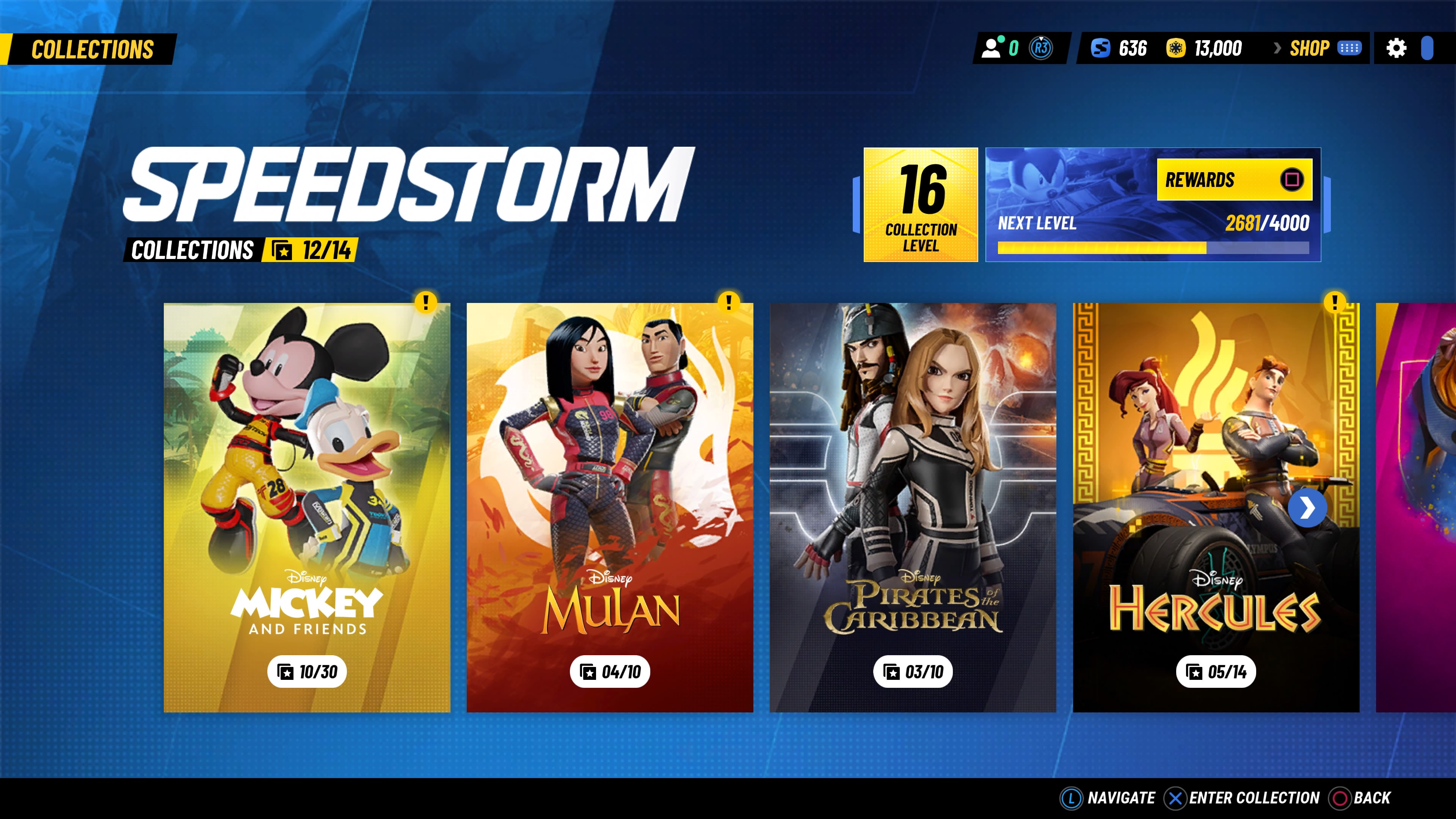
The former collection menu which had the posters for each collection with pages for racers and crew members needs to be brought back and added to the main menu. This was essential to see which collections we have completed, and to see the crew members. It was also beautiful designed and didn't need any changes, even for mobile devices (I had no problems using it on my phone)
-
In the racers general menu, adding the display by collection is a good thing, but the default display should be ranged by level
-
In each of the racers individual menu, the option marked by default should be "choose" instead of "upgrade". The car should be displayed next to the character too. Also, the rarity level of the character should be displayed next to its type (speedester, rare). The code by colours is hidden when you can upgrade the racer (and also think of colourblind people)
-
The special events menu shouldn't include regulated ranked mode. Regulated ranked mode should have a separate menu as it used to be.
-
The two + buttons that appear in the middle of the screen on each side of the character are very distrcting and we don't know what they do until we press on them. There should be a "create group" button like all other menus instead.
-
The play button that automatically starts a ranked race should not start a race but open the menu that we had before in ranked where we could choose the racer, upgrade it or edit it.
-
In regulated ranked mode, in the change racer menu, we have a list with all the racers and we can move left and right to choose one. Here it would be good that by moving up and down we could switch by collection, since the number of pilots is becoming too big.
The UI is very awkward to use, the S7 UI was mostly perfect, i dont really know why you had to change it, its okay to experiment, but probably do it on a beta version of the game with a beta branch on steam or something.
POSITIVES:
- Direct link to missions on home screen
- Direct link to my rank on home screen
- Layout of character screen is much better, except I would prefer the Select button to be moved back to the bottom right.
NEGATIVES: - Ranked multiplayer should not be on home screen. I'd rather it be behind a Ranked MP button.
- There is no longer a bar of racers to quickly change for ranked multiplayer. Now instead of one click, it takes 3.
- There is no longer a way to view crew stats without editing a racer.
Make the font for the coin currency a bit bigger
Likes:
- collection looks great visually
- missions easily accessible on main screen instead of through golden pass menu
Dislikes: agree with everything that has been said already, but just to highlight some
- old version of collection was better and quicker to navigate with shoulders instead of scrolling
- no way to see how many shards you have in total for a racer when in the collection
- no way to see crew and their shard count under collection
- "upgrade" is the default when changing a racer for MPR in the racer menu instead of actually "selecting" them (for ranked) in racer selection module
- choosing the racer for MPR is not as easy anymore and you can't view skills easily as you have to choose a racer and then click on their skills separately to see if they can contribute to your daily or weekly mission attempt; racer selection in solo play modes which remained the same is much better for obtaining cohesive info quickly and effectively
- no cart and racer combo preview on the main screen makes it really difficult to justify throwing any tokens at skins in the shop for one's favourite racer(s) when you can't even actually preview them properly.. what's the point of obtaining skins in ranked, MP box and least of all with tokens when the combined mix-match preview is not visible when you log in and it's not even available in the racer menu - the kart and suit can be chosen separately like before yet the combo preview is only available in season tour/LTE's races before loading the race and not displayed anywhere else 😦 loved the way it looked before with the cart and racer together right when you logged into the game
I was hoping the ranked can get a more visual place. It felt like it was gone. The upgrade button of characters is misplaced. Maybe a warning before upgrading would be nice
I don't dislike it as much as others, but I feel like it is now far too easy to accidentally level up. I understand it is a "me" thing, but I like stopping every racer at the same intervals. 50, 45, 40. Accidentally leveling a character past their post would be very demoralizing. Perhaps I'm misremembering, but in the old system, I could have sworn I had to press X to open up a second little upgrade screen but now not only is the upgrade screen out in the open, it's highlighted by default. One errant button press and my afternoon is ruined. I would very much appreciate leveling up either be isolated back in its own screen or for the default position to be over on racer suit or kart liveries instead of leveling up.
I don't like that when I select a character I am automatically on the "upgrade" button. I've made a mistake and leveled up 3 racers already. It should always start us on the "select" button.
It's also more difficult to view crew. The previous UI made it much easier to scroll through every collection's crew members.
I do like that the missions are in a separate tab and now I don't have to go to the golden pass to look at the missions.
I am not a fan of the "Play" button not making you aware that you are playing ranked. I really liked that the old UI made it known that we were playing ranked if we clicked on it and we were able to see our current ranked emblem more noticably.
Lastly, I feel like it's to tedious to pick characters now for ranked. I don't like that we have to go to the "racers" tap to pick our character. It takes more time this way.
Thank you for hearing me out.
I would like an easier way to edit my characters in the main menu. it´s annoying search my inside out characters to level up until the end of my pilots.
The old UI was quicker and easier to understand. I hate how hard it is to customize and edit characters now. The buttons are now smaller and harder to see, which I think is also bad for mobile users. The old way was better here.
Just selecting your character was easier before. I struggled to find where you change your character in the new UI. It was so much faster and seemless before, now its clunkily behind more menus.
I liked the rotating big platform for the car and character on the main menu, I liked the banners that looked like movie posters for the collections, I loved browsing the collections with all the info right there with models instead of flat pictures.
I think the only change that needed to happen to the old UI was missions was moved to inside the Gold Pass menus which could have been fixed like you did for the redesign. Everything else was fantastic.
I dont think we needed another huge change to the UI, S7s was perfect besides a few small issues.
The interface that was there when season 4 launched was so far the best one. Everytime you change the UI it gets objectively worse. Please stop trying to fix things that arent broken like the UI although the UI is broken and painful to use now so i guess fix the mess you made then leave it alone. There are plenty of things in this game that needed fixing and the UI wasnt one of them. Ranked matchmaking could use some attention before you go "fixing" anything else that actually works fine how bout fixing that and your team mode
While I could list out what improvements the new UI gives, they are minimal in comparison to my problems with it. As stated earlier, the new UI takes information away from the player for seemingly no reason. Being able to see what skills level up as the player does is more difficult. Crew members and flavor information such as where crew/racers originate are no longer visible. I think the best way to describe my distaste is that it is compact. So compact that positive aspects are lost in exchange for, well, nothing really. It's not easier to access much of anything beyond missions, as was pointed out.
Ultimately, if the UI went back to Season 7's (at least for everything that isn't mobile, as I'm assuming that that has part to do with the change), all my issues would be immediately resolved. If you wanted to keep anything from this new UI, it'd be the missions button.
Slight edit: I do also like the visual elements that some of the buttons have! They're cute and suit them. You could likely still repurpose/reuse them in the old UI, given they are on pre-existing things.
I just noticed the timer for season is not on the main menu. Please bring it back to the front.
Add a thing in settings which allows you to use the old detailed hud or the new compact hud.
The new way to get to the racer collections and the way is set up is confusing can you bring back the old layout to access the racer collection please.
I like how the missions are no longer hidden in golden pass, and the individual racer screen layout is nice.
I do think the old collection menu was better than the racer menu. Not being able to see the crew collection is a shame.
It's also an inconvenience to have to use the racer menu to change character in ranked. Having the ability to easily switch characters between match search was nicer
Everything about the new UI is good, however the major problem lies in the fact that you removed the character selection screen from ranked. Having to go into my collection as a makeshift character select is extremely tedious.
Please either bring back the old ranked page or add a proper character select to the homepage.
At least the option to have the s7 menu on console
Much more handy
Please Gameloft! Bring back the old collection.
I get dizzy with this one because the arrows to level up give me epilepsy. There's a lot of information on the screen.
EDIT: What I liked most was the cover of the collection/character world. If you could have a collection tab with just the franchise cover, that would be great.
And you can organize it by level, alphabetical order or classified multiplayer. Only the collection that needs the franchise cover back as it was before. Thank you! Make this dream come true. ✨🙏🏻


Please bring back "My Collection" menu, it was perfect and it could be used to track the progress for racers/crew members more easily.
I'd also redesign the main screen with only 2 main buttons for gaming modes.
-
Single Player Mode:
--- Season Tour
--- Tournaments
--- Special Events -
Multiplayer Mode:
--- Ranked Race:
------ Solo Mode
------ Team Mode
--- Regulated Race
--- Private Race
--- Local Race
Then Play button should be removed and the other elements should be rearranged properly.
Good thing we dont have to go everytime in Gold Pass to see daily missions
I think the default button when you open a racer should be select and not upgrade
I think you should add a crew collection button which takes you to a page similar to the collection last season but just for crew and put it left middle and move solo ranked progression to above the play button so it should go from top left down
Racers
Crew collection
Missions
Top right down
Shop
Friends
Solo race progression
I like the old UI better. The new one is less intuitive and feels like there's extra steps navigating certain things. Also, Racer selection was way easier before in the old mpr UI. In fact, I wish I could just press X (xbox controller) at the home screen and have that racer selection screen pop-up.
- I also wish they had an option to sort/filter by class type (speedster, trickster, etc) so when I need a specific class, like trickster, I can filter out the rest and just see all the tricksters right there together.
The new UI makes us move through a lot more menus for basic things I feel, especially for stuff like MPR progression for each racer which took me a while to even find after the UI redesign, it's really not intuitive to find compared to before
Better interface just find a better solution for selecting racer. Actually the new design is much better. Better filter options. In each update the ui gets better for me. But you can still move the vault pass mini gameplay area to a seperate location. Top most single and multiplayer option can be better. And under multiplayer solo and team mode can be selected. then the real ui can appear just like in other games..
Maybe I’m getting old but i’m finding it really hard to see what part of the menu I’m on and selecting whilst on the Home Screen as all the options are highlighted in white against a very bright background.
The icons are a bit too small, I haven’t play on mobile but they seem too small on both my laptop & iPad. Now this could be an accessibility option for scaling the UI. Which brings me to another visual issue I’m having. I can’t see very what icon I’m on, idk if the light blue that makes white highlight of it hard to see. Being able to change the colour from white in settings would remedy this.
The main page with quick access to things is good but it needs a rework. With collection, I like them as single icons that take up less screen space. Being able to see at less 6 collections on screen before scroll is required, dependent on screen size of course. And you click into, both characters & all crew are available to been seen. Similar to how it was before.
With quick access to ranked multiplayer, I would still like to be able to choose my character. I understand that it to cut down on button press/menus. However it already quite an improvement being able to quick access it from main menu. Also idk know what these newer mpr icons are but I’d rather be able to see class of that character without having click on them to view it.
There is no place where I can see my crew members for locked racers. E.g I didn't unlocked Figment yet but I have some crew member shards and like to see it.
It's so confusing and extremely inconvenient to deal with having to go through tons of pages, especially when similar pages aren't combined.
Here's some ideas to make it better:
-
Add friends to the profile page, and then next to our name on top, display how many friends are online.
-
Put shop back on top next to currencies.
-
special events should be It's own tab, then all events get displayed instead of scrolling between 2 pages. No reason racer boost should be seperated from daily challenge and star chaser.
-
The black bar above PLAY, should be changed to say Solo Ranked, Team Ranked, Regulated, Private, and Local.
Having them split across several pages is messy.
Or switch it to how it used to be, on ONE page.
-
REVERT THE COLLECTIONS PAGE BACK TO WHAT THEY WHERE, PLEASE!!! Like where we scrolled left to right, could see crew, and skills.
-
Selecting characters for ranked should be like how it is for regulated, it's soooo much easier and less out of the way
-
As for the shop, please just combined collections and special together
-
Missions should be accessible regardless of what screen you're on with the click of a button. Like how it used to be in early access.
I miss seeing my dude's kart behind him and making them spin around for minutes at a time.
I think the friends icon is very distracting and does not cohese with the rest of the game's aesthetic.
The giant play button is far too ambiguous as to what exactly it's going to do. Please cleanly demarcate single player and multiplayer modes, as before. On that note it's confusing to have regulated multiplayer as a permanent special event. Some real "peas can't touch the carrots" stuff goin on here
I agree with a lot of the feedback so far. Up until S7, the interfaces were fine.
*I wish we were able to view missions from anywhere in the game besides the main menu and Golden Pass.
*Please revert back to the old interface to check each characters skills. Right now, it's really hard to check which racer's skills DO NOT get stronger when you upgrade their star level, so therefore, it's also hard to check which crew augments the skills you want to POW up.
*I don't like that when you select a racer, it automatically suggests you upgrade them, so you have to be careful not to upgrade your racer if you don't want to.
*I liked the old Collection pages as they were simpler to view racers and crew.
*Is there no way to view your Collection progress anymore or was it completely replaced by the new Player Ranked? Should be a way to view both.
Difficult to find out the racer is want. In order to upgrade level racer.
And some time i forget to click button select, so i have to find again (not enough highlight).
Hope that it has the finding filter racer group by recently using.
Please add the shard counts to the upgrade bar (on all the pages it’s used)

I liked the old collection menu better. Let me see both Racers AND Crew
There's a really worrying issue with the new racer layout when playing with controller. When you select a racer from the list it brings you automatically to the Upgrade button, so if you press A Button again by mistake (Xbox Controller) you will upgrade the racer, no warning or anything. I mistakenly upgraded 2 racers already and I think this should definitely be changed.
it's incredibly inconvenient.. we want the old interface back.. and the collections and everything
I don't hate the new UI but I do miss the old collections menu which included crew. I don't view a collection as complete unless I have all crew. Also when selecting a racer I think the default option should be to select the racer not to upgrade them
Things I like
- New interface looks clean. First impression was very positive and it still is.
- It says clearly what the buttons do. I find "Racers" much better than "My collection" and "Friends" are also better accessible now.
- Accessibility of season missions is much faster and better now.
- I personally like the change that when in "Racers" you click on a racer/press the confirm button, you go to the Edit menu, because that's what I mostly do. However, once in the Edit racer screen, "Select" should be the default option, not "Upgrade", because accidents happen.
Things I would change
- Selecting a Racer: Kind of clunky now. I don't want to browse through my collection to navigate to a racer. Please let me favorite/pin a few racers that are always shown at the top, or add a "Recently used" sorting so I can go back quickly to where I left off. Or put the currently selected racer at the top in a separate, framed window.
- Edit Racer: I miss an option on the main screen to directly go to my chosen racer. Currently there's two options to enter my profile, but none to edit my chosen racer.
- Upgrade Racer (Shards): I'd love to see my unused shard count for any given racer, always. Most of my racers show this yellow flashing upgrade button, because in theory I could upgrade them but don't want to. Maybe an easy fix would be to show it like it is in the shop, say "35/7" shards or something. I'd like this number both in the racer edit screen AND in the racer boost.
- Upgrade Racer (Coins): Please let me see how many upgrade coins I need to upgrade a racer where I currently lack the shards. I often refer to external websites instead, but an in-game option would be appreciated.
- Racer Boost UI: In the racer boost, pinned/favorited racers as suggested above would also help a lot. I could pin those I need to focus on to the top,
- Shop UI: I'd like to see who the crew belongs to (and ideally the stats) in the purchase menu, similar to when you level them.
Ive read thru alot of the feed back, and again the same trends keep poping up. Please play test your content before release. Please stop using dark patterns. The majority of players are on pc or consol. A menu that can be navigated thru easily and intuitively with a controller is whats wanted, not a touch screen menu. As for positives, honestly, im glad i can access the missions menu from the main menu again. Thats it. It feels like every other aspect of the ui is inferior to previous versions we have used.
Remove the dark pattern! Racer should not go straight to upgrade button. I have 3 kids, now they can’t play without me … thanks for that.
There is absolutely no benefit or improvement with the new UI what so ever. It's just straight up bad, awkward and takes longer to do anything. I'm assuming this was designed with mobile in mind but it's not good for people on consoles.
I’m not against ui in fact it’s quiet alright in my opinion I don’t like that we can no longer look at locked racers skills
The new UI looks nice, just not quite up to function. I do like the ability to view missions from the main screen saving a lot of time from the previous season change, and after figuring out the new placement, navigation to areas isn't really much different in terms of events/races.
There are problems for several key functions, such as selecting a racer for play, you have to go to racers than scroll all the way to your desired collection every single time. Inside-out is quite the trek with this system. Either change the "play" button to take you into a similar racer-select section, or branch one below the current navbar.
Additionally, if you want to change a cosmetic for your current selected racer...you have to go back into the racer list and scroll to your collection to select them again. Ideas of resolution would be to allow one more up press (click on selected racer) and allow editing from there. Note: Please return the kart next to the racer here, as it was nice to see your selected racer with all their cosmetics together in one place. (It was really nice to be able to scroll through the collections & see your crew/racers in the old system, would like to see that brought back in some way.)
Overall, S7 seemed way more console friendly while S8 is more touch user focused. Both should feel like it's not a chore to use. Fingers crossed we see a resolution soon!
- The new racers screen is way worse than the previous collection screen, as it doesn't provide a way to quickly check information about the crew members progress. Now if I want to check, for example, what level and how many shards Rajah has, I have to search for Jasmine, then go to her upgrade screen, then open selected crew members, then select Rajah and open his details chart. The new system messes with my muscle memory and makes checking collection progression way more difficult.
- Also, the racer edit screen defaults its focus to upgrade button with a weak outline that causes accidental racer upgrades. The focus should be on "select" button. And there shouldn't be two "primary" (in DS case, yellow) buttons as it causes confusion on what the default/main action is.
- The white button outline works really bad on a bright background like we have from season 7. It's sometimes barely visible and not accessible at all. I understand that you aim at the game being colourful and that's great, but you really should also think about the basic accessibility improvements for the people with any kind of visual impairments.
Hi, I was told to put this comment here. Please, please, bring back the multiplayer rank information. I cannot see where I am at, what prizes I am getting, how far I am from the next rank, and so on. What happened with the update that removed it. Also, how is possible that the team mode mix team in level 40's with other team in the 20's. Things are messed up, you guys can do better.
can you also fix the issue where changing a racer in regulated MP with a party goes with this prompt and has to leave and join again to a part after selecting a new racer? (seems like it is conflicting with the new layout for Ranked MP and since it is going to the old UI for Regulated)

The new UI feels like it’s oriented toward a touch interface. For a stick-and-buttons user, it feels like there is a lot of moving around between selections than before. A slower experience.
Also, it takes too long to get to the Racer details screen for the currently selected racer. I suggest making the racer picture on the main screen selectable and lead to the details page for easy crew adjustments.
Bind the X button to the racer page too.
Big Fat Dislike
no crew overview anymore. It's very inconvenient to look through 5-6 clicks/menus to see the Crew Members, how many shards they have and, above all, what abilities they have. Before buying Crew Shards in the store, I always checked to see if they were of any use to me. That's no longer possible
Just make seperate User interfaces, one for mobile, one for console and pc (the old UI)
Could local 2 player mode have the manual boost and items size be increased please


Also what happened to the collection rewards? Are they gone? I cannot see where I am able to view the collection rewards anymore, I cannot click on the collection in the profile to see them anymore. Seems like the new UI / menu ditched that.
I like being able to get into MPR from the main screen, but it should give you the opportunity to change racers before starting a race. And I miss being able to go from upgrades, to crew, to customize, to kart, etc. using the controller buttons. Also, upgrade should not be the default button when looking at the racer, it should be select. It sort of feels like the interface was changed just to change it. The old way of organizing it was, well, ORGANIZED.
First of all, i know this UI/Menu is more for mobile users but you forget a lot of console/PC players are here too. Now about what you ask:
-I like the fast access to race on ranked amd the change for solo/team mode. Also the personal rank to see my rewards.
I don't like that we have to do a more effort to access to our racers and check our crewmates, also how the upgrade button is selected instead of choice the racer when i try to change it. I think you should say the play button is for RANKED, i know this is for get more people on ladders but is hard at the start to know where to do things. Also please add access buttons to racers and ladder (and make ladder easy to access).
-More easy: Ranked, but needs to clarify it.
-Harder: Ladder, racers, friends (we should know how many friends are online).
-More direct access to racers,crewmates, ladder and friends (shortcut button for all). Also make select racer the predeterminated option instead of upgrade when i choose a racer
- I think the older collection menu was better, but being able to select a character without having to "select" the collection and enter in it is good too
I think this new menu is good, but everything should not be taking that much space being that big on the screen, having only the head of the character shown (as it was in the old character selection menu) would be much better (so, a mix of the old + the new)
-
I would love to have a button to have direct access to missions, because having to go back several menus and "loading" times only to see missions, go back where I was having to make all those steps and loading agains, then come back to the main menu because I forgot one of them... pretty annoying
-
The fact that the "upgrade" button is selected is indeed VERY VERY bad, I lost a very big amount of my coins (which are a rare currency and which I don't possess much of) because it was selected by default (the logical design choice would be that "select" button would be the default one, especially since this is the menu made to select the character for ranked race)
Hey, would be cool if we could select some racers as favorites to have them appear at the top of your character select screen or something
I LOVE that idea! Favorites would be so useful!
I don't really get why we need to separate events between seasonal/limited.
Considering at the moment there are only 6 events going on (and out of those, 2 are permanent ones (daily challenge, racer boost), I think this screen should be redesigned to fit all the events in a single screen instead of always needing to scroll down for it.


—> I like seeing the mpr rank here
—> I like the icon that says new if it’s a new racer
—> I like the moving yellow icon indicating I can upgrade the racer
—> not a fan of the yellow label covering the shards and color of the racer if they can be upgraded. Why hide those pieces of info? Like I can see how many shards I have for other racers, or even racers I don’t have yet, but if I have a racer that can be upgraded I can’t see that info 👎. Also whether it’s a common, rare or epic racer, can’t see that if it can be upgraded, just leave the moving yellow icon if it can be upgraded and ditch the yellow outline and wording that covers up that info.
—> can no longer click into the collection reward progression, was it removed completely? Is it accessible elsewhere, I have no idea 🤷♂️, can’t find it.
—> why not have a way to use ZL or ZR to access crew on this page? Or maybe others have better ideas for accessing crew?

I like ranked mode personally as a new player, I don't mind the UI home screen but allow me to level up characters as it ain't easy to find this and also I'd like to see more easier layout as its confusing for me to find what I want like special events and certain things may need shifting around I feel
Please bring us back the tab to check MPR prizes for each racer.
the fact that selecting a character on the main screen defaults you to 'upgrade' with 'A button' when trying to select a character is about the most unfriendly design element i've ever seen in a video game.
Bring back crew collection tab. Absolutely insane it's gone
In the classification table, the MY COUNTRY section only shows the total RMJ points, it should show the name of the country or geographical region, whichever is the most recommended to identify the place of origin of all the players and thus know their position. occupies The game does not present a menu from which the player can select the country they want to be identified.

For Regulated mode, if you play with friends, you have to leave the lobby and rejoin EVERY TIME YOU CHANGE YOUR CHARACTER. Why is this a thing???
- Collection missing keybinds to move to next collection. (Old feature)
- Character change keybind from main screen missing. (Changing characters is really difficult and time consuming)
- No way to see crew members from collection. (Old feature)
- Change crew member keybind missing. (Old feature)
- It would be nice if racing tab would remember your sorting order instead of defaulting to collection after starting the game.
- It's Hard to see when you are hovering team mode/solo mode selection in main screen.
- Very difficult to see what racer boost character has been completed. (Highlight is the same shade of yellow as upgrade) [The only picture I included]
Racers tab = Bad
My Rank tab = Good
Missions tab = Good
Golden pass tab = Good
World map tab = Good
Limited Events tab = Good
Regulated tab = Awesome
Friendly race tab = Good
Shop tab = Good
Friends tab = Good
Options tab = Good
Most issues are with the new racers tab which isn't very good yet. Especially changing characters should be easier when playing team/solo mode. This could be solved with a button+keybind in the main screen that would open up a character selection.

I probably had it posted in the wrong thread, but I do not like how after selecting a racer, I’m immediately directed to the upgrade page rather than proceeding with the race. I’ve built up a muscle memory of pressing X (playing on PS5) and jumping right into the race. Now, I’m wasting upgrade coins on racers that I don’t want to upgrade.
The worst part is that I just know you guys did this on purpose to make me spend resources. Not a good move. Please change it back.
It's time to make changes to the character select screen for events and regulated. We have over 50 characters and going from the first character on the left to selecting the last character on the right is tedious. Characters need to be separated into categorys like on local freeplay's mutiplayer character select screen. I know there is the "view" option that's less tedious but it's easy to look over the character that you are looking for.
- I like that now the Main Menu looks clearer. Not so manny big buttons on top of background. Is a good direction.
- I like the new ranked race progression system. Good idea for new players.
- The new ranked race progression rewards menu makes absolutely no sense at all, 200+ rewards and you have to scroll like crazy if you want to go to start or end, etc. Absurd!
- It is very annoying that every time you open racers grid, it does not directly scroll to the one you have selected!!
- I dislike that you need to enter the racer to select it.
- I dislike that I cannot access the crews to inspect all of them like before and it's bonuses
- I dislike that in the Main Menu I cannot see my kart anymore, and that I can't see the other members karts.
- I dislike that in the new party menu the "invite" button does not directly invite, but opens the player card and you have to press "send party invite" there(2 steps instead of 1).
- I don't understand the not disturb, and silence players. No info at all.
- The new main menu navigability is awful with console controls.
Small addition to my previous feedback:
- In the (new) racer edit screen I'd also like to see their current skills fast, maybe under the MPR. I'm often looking for something like "a defender with fire skill" for my missions. Currently I have to go into the racer select menu, then select a racer, then go to skills and if there's no e.g. fire, back out. I really don't want to start swapping out crew members either for one mission, that brings me into the next subscreen that's not supernice to navigate 😅
- Maybe the L/R shoulder buttons could get some functionality too in this menu, as in previous/next racer. (if you deliberately want to make that mobile-friendly, they could swipe).
- I'd like to see the number of online friends on the Friends button without having to go into the menu.
- I'd like to see if I have claimable rewards on my Season Pass after I've reached rank 50.
- I'd like to see less random exclamation marks on the Shop button (especially when there are no new offers or claimable stuff at all)
The new UI isn't pleasant at all. Its making me mad on how annoying the switching between everything is now. You need to revert back to how it was in S7. But also, bring back the main menu character and kart turntable.
Only thing I don’t like is now you can’t see how to unlock/upgrade crew members as easily. Please bring it back to how it used to be where you can easily see who you have and who you need by just simply going to the collection
Playing the game from the Gameloft launcher is missing the controller vibration option.
Reiterating this request, there is no longer the option to see all the crew you have or are missing in each collection. Honestly makes me less interested/inclined to try to collect them all because there’s no way to see your crew collection and progress towards each
at the main screen please make it available if possible with r1 l1 change the racer feature.. back and forth.. going to racers opening the racer then select is a way hidden in the ui. think of a way of not selecting but more like scrolling up down or left right..
It would be great, in the limited event section, to move all the completed events to a bottom section, to still have there if you want to replay them, but mainly moved to a completed section to eliminate all the scrolling and re-reading players need to do to look for still open events, especially now you introduced gotcha boxes with repeated playability. The current way you have them laid out is based on when they closed, but You could make it easier by: 1. move completed events down under a completed tab, 2. have the events move in order of the next available to play, 3. have displayed when the next time to play the racer reset event on the icon so you don't have to always open it to check, 4 if the events were re-sequenced in order of the next time to play for players, and not just sequenced by when the event runs out. It would save your players A LOT of time. Thanks
The UI honestly isn't much better at all. It's still really bad imo and a chore to deal with. Short answer, too many pages and with buttons in strange locations.
I do like that we can at least see skills now, but honestly, the collection menu before was soooo much better. We could see all the characters, crew, and skills with less scrolling.
The racers placement is still really awkward. I'd like it so when hovering in the party, that instead of going between two party up options, we can click the racer which would bring the character select. Or at minimum, left to the play button.
Also, again, all events should just be on one pag for much easier navigation.
I'd like if the friends box had a number to say how many are online again.
Regulated could simply be a 3rd tab next to team/solo mode. Or put into friendly race, that way the events button is only one page, instead of 3.
The shop menu, collections and special can easily be combined to one tab named "Offers".
Missions should be to the right of golden pass.
I'd also like to see our character next to the kart in the racer viewing page again.
And I'd like to see how close we're to leveling up in ranked like how we used to.
Add support for Apple Game Center on Apple devices like achievements Leaderboards and SharePlay for FaceTime also if possible Spatial Audio

When the new daily rewards expire, you could replace its icon with a button for the collection menu with the crew members. Right now we can't see how many more shards we need to unlock or update our crew members.
In the season pass screen, I can see how much stars I got for Fear, but not for Sadness, because of the "Exclusive" banner on the icon

The only place where we can see when a character first appeared is on the season tour rewards page. I wish this information was shown too on the charcter's profile since we don't have the collection menu anymore.
-Spatial audio with head tracking on iOS devices
-Haptic feedbacks and a slider option to make them more responsive or less
-Graphics menu on iOS does not exist so please add details menu to tune game graphics as user’s preference and options to improve Lighting and reflections
The possibility to check the skill descriptions is still locked even for the characters I do have until I upgrade them to that Star Tier. This needs to be removed. The skills need to be checked freely.

The updated UI/menus are certainly a step in the right direction, but we are still lacking the small things that made menus special to me. Being able to see all the crew for a collection in one place is greatly missed. There were occasions where I would spend many minutes scrolling through my collection to see which characters could use more shards, or which crew I had yet to finish unlocking. By removing the large sections that previously existed, we also lose the detail of when characters/crew first appeared. Things like these are what I'd like to see improved upon, as the menus are arguably just as important as the game itself.
The UI of the game is beautiful and simple for me
But i have request please add some graphics adjustment options
For example
1.Resolution scaling up and down option
2. Effects off and on options
Bloom effects on and off
Particle effects on and off
Etc.
3. 30 and 60 fps options
4. Motion Blur on and off option
Now that the default button changed on the racer profile it is more difficult to upgrade racers when it is opened via the "Edit Racer" button. Please can you make the upgrade button selected by default in racer profile when opened using the "Edit Racer" button. I think the select button should only be the default button when the racer profile is opened from the main menu (which is where it was easy to accidentally upgrade racers).
Please add back where you can see all the crew you need/have. Instead if having to go to a character just to see if you have a crew member doesn’t help. I want to be able to easily see all the crew from each collection and se did I need them and if I do to be able to easily see how many shards I have for unlocking/leveling up
the pop up ad in between almost every multiplayer race has to go.
Having pop-ups every time I finish a ranked race is annoying and not consumer friendly. Makes me play the game less.
When playing on the mobile version with a controller, I’m able to quickly PRESS SKIP when a race track is done loading in the Season Tour. However, every time I enter a race track in the Limited Events, my buttons are not mapped the same way so the only button I can press at the beginning makes the GAME INFO pop up instead. I don’t think this is a problem on the non-mobile versions so please consider fixing this soon.
It is normal that daily reward button on home screen is removed?
Daily rewards ! should be removed once we claim all and there is nothing new for us. I clicked everywhere and ! still shows
If you know you have all the rewards not much a big of a deal
I'm a completionist and hate any markers on my screen 😬
Keeping this short and sweet because it’s been expressed. Something needs to change with selecting racers. I feel with this update there was definitely a route that’s much longer just to get to the racer I want.
Dear Gameloft and Disney Speedstorm Team,
I would like to suggest implementing a feature that allows us to confirm the level up action in our game. This measure aims to prevent players from accidentally leveling up, which can cause frustration.
My suggestion is to add an additional confirmation before completing the level up, such as:
 Double Action: To require us, players to press and hold the button for a few seconds to confirm the intention.
I believe this functionality will improve the experience for us players. Ensuring that the action of leveling up is an intentional and conscious choice.
Thank you so much! 💛
A couple of things;
First it is a bit annoying to have the daily claim button in the main menu show the exclamation mark like there is something to claim even after you have claimed all 7 rewards.
Second: Maybe I am just stupid but it seems like there is no longer a way to check crew members and how many shards of them you have or what are available without clicking into a racer and going to the change crew menu. This is far more annoying than the previous crew tab you could access in the racer collection prior.
Also, it seems there is no longer a way to check the collection level track, unsure if just obsolete now but if not then it would be nice to be able to check it again like in the past.
UI this Season is terrible, all changes makes things more slow than ever, you can't see the crews anymore and just to move between collection is far complicated
I do agree with the no chat / voice chat ingame but it would be great to be able to send predefined messages to friends / group like "Team up?" "Gotta go" "Hi" etc...
The racer selection screen for events is not convenient for events where all racers are available. Along with the list of racers at the bottom left part of the screen, we should also have a filtered list of "recommended" racers, with only those who are needed to complete missions for the event. For example, here with the Bo Beep event, since there is only one mission with Bo Beep as requirement, I should be able to select her quickly, without having to search through the entire list of racers.


Add Arrows to slide between Racers and Karts when upgrading or customizing them
so it’s easier than have to go back then select other one just to edit it Arrows are so easy to jump from racer to an other or even between Karts
Make UI animations faster in general, especially the node unlocking in the season tour (for example, instead of animating each branch opening individually, animate them unlocking at the same time and make those animations faster)
I miss the old UI where I could switch between all characters freely and see all my crew and had easy access to all the cosmetics. Playing the game has become such a chore because of the UI changes, I play the game far less now due to it. Please consider having an option/toggle for the older UI for those that have played the game since the beginning.
It would be nice to know the maximum shards you still need for a character based on how far you have leveled them up in addition to the number of shards you currently have. Kind of getting tired of "wasting" my season coins on shards when I am already maxed. For example, if I have 76 shards for Belle and I have her at a level 41 (have not leveled her any further yet), tell me how many shards I still need to get her to 50. I don't want to have to look up in the "upgrade table" and tally the amount every time I am considering buying shards for a character.
Can the mobile push notifications stop yelling at me? Please? I'm on the verge of disabling the notifications BECAUSE EVERY SINGLE NOTIFICATION IS SCREAMING AT ME THROUGH CAPS LOCK.
Move completed seasonal events to a completed section. It is a big waste of time to scroll through the events every few hours to find the ones still active to play. Please put the time remaining before the next try for racer reset on the front of the tile
Could the racer boost plz be properly organized? It feels like it’s tries to be organized in one way and then gives up and tries to organize it a different way.
First pic: it has characters from when the game first came out, including the monsters inc racers for season 1, but they aren’t organized by collection in any sort of way at all.
Second pic: It starts to organize them by collection but aladdin, season 4, is there first and then season 2, toy story, and so on. So they kinda gave up on the release order thing already.
Third pic: Now it starts to do mid season racers that are sorta organized by collection but obviously minnie, daisy, etc. aren’t with the other mickey characters. Not to mention the release order stuff. That and it doesn’t even have all the mid season racers there. Also the season 3 characters are just randomly placed after them????
Fourth pic: little mermaid racers are here. Wall-E racers I could sorta get with the release date stuff since I think they came after the oswald racers, but I have zero idea why gaston and hades are just shoved down here ☠️
I know this isn’t really a big deal but this has been bothering me forever cuz it makes no sense 😭


Same for the Leaderboard menu. There doesn't seem to be any ryhme or reason for the ordering of the racers
Like why does it go Ursula, Beast, King Triton, Belle?
Why not order by name, by level, collection or by MPR? Or anything really beside the seemingly random order?

Will the Collection Banners come back? I miss them greatly. Also moving between characters was way easier back in Season 7 and prior. Please revert back to that. Also I miss where every characters 1st appearance was shown on their page. I dont care if it seems useless, I liked it alot! Same with Item descriptions being removed, it gave the parts more love and thought put into their color choices, so put them back too!!
Dear Disney Speedstorm Team and Gameloft,
I would like to express my appreciation for the sets you provide. I am a great admirer of your team's work and always look forward to new releases.
However, I am writing to request that you reconsider a recent design decision regarding one of your sets. The old set had a design that I found to be more attractive and organized, especially regarding the cover.
I believe that the aesthetics of the old set contributed significantly to the overall experience of the product. It was organized and beautiful to look at.
Would it be possible to bring back the cover design, at least in future editions or as an option?
In addition,** I would like to suggest improving the organization of the characters. Sorting them by class, such as Defender, Brawler, Trickster, and Speedster, would make them easier to find and make the experience even more enjoyable and visually appealing.
**
Thank you in advance for considering my suggestion and I look forward to your updates. 

Please can you bring in a menu where you can view crew and also a screen to see all cosmetics you own/do not own for each collection
absolutely hate that the main menu screen is also the enter multiplayer game screen. i dont play multiplayer and now with one accidental click Im thrown into matches i dont want to be in, with people i dont want to play with.
It would be great to have an option to jump to another ranked multiplayer race without going back to main menu.
Is it just me or are ALL animations when characters are standing in the Collection Menu are...gone? Why did you remove/reduce those? They are a way to show more character through the game!! Please don't disgard them and show them more frequently when characters are standing!! Also if the driving animation on the menu is permanent please have the characters use starting emotes more frequently on the main menu!!
There needs to be a confirmation prompt before viewing/purchasing in suits/kart/racer menu. Period.
Also I miss being able to switch between characters easily on the racer collection screens. Hitting left and right to go between characters should have NEVER been removed.
I don’t know if it’s a bug or not but I don’t like that now you can’t see what stat gets upgraded when you upgrade a racer. I also don’t like that now below the characters name it doesn’t say where they were first seen movie or tv show. It’s two small changes, but would be appreciated if they were fixed
I might be in the minority here but the new crew UI is the worst its been in my opinion please just go back to the UI that was used before WIR there was nothing wrong with that UI and you keep trying to fix what wasnt broken and making it worse
Our feedback was clear: most of us wanted to get back the collection menu to see our crew members easily (which ones were unlocked and how many shards we had from each). However, now to see this information we have to open the pilots menu, search for a racer, open its page, go to crew members and open a page for each crew member. This means a lot of opening and closing menus! Please, can we just go back to see the while collection in one page?
And also, please bring back the collection posters and the "first appeared in" information.
Gameloft you are doing a better job since this season has the most voiced racers since the change. You still need to give voice to the previous/current voiceless since the more racers that have no voices the closer people will come to leaving who haven’t left already
Can you add favourite racers as a feature, it makes the organisation of the characters somewhat easier (select a character screen before the race) than just random order (albeit by level, then it doesn’t go alphabetically).
The selection button is once again back on “upgrade” immediately after selecting a racer, causing me to spend upgrade coins I don’t want to due to all the muscle memory I’ve developed playing. You fixed this earlier back during season 8, please fix it again.
Don't like the cart in the main UI screen. I've been playing since Season 4 and I'm disappointed with the change. Please change it back to just having the racer in their racing suit.
Crew selection, show all stat and remove know more.
Can we get the Starter Circuit in the world map to display as completed like the vault tournaments? It bothers me that it doesn't despite it being completed

To reiterate this point, I only have so few upgrade coins at a time and many times I just want to look at a racer and see their stats or choose them for a race. Instead of thinking I’m choosing them for a race I spend coins on a character I don’t necessarily want to upgrade. If you must keep it this way at least add an are you sure you want to upgrade button as a second confirmation. Or just change it back to how it was
Can you please reduce the number of popups or add the option to turn them off in the menu as the offers are for things I already have and slow down the gameplay. The number is about 10 x more this season, almost every time I move to something else in a menu I get a popup. This is on PC. For mobile I understand, but on PC I don't.
Add a confirmation before we spend tokens! Cosmetics purchase can happen accidentally, is this by design and yet another dark pattern?
please add in the option to choose whether you see all characters idle animations when they are standing or when they are in their cart as you have it now. the standing amination is GONE this season sadly
Reiterating this, please bring back the old collection menu. And if you’re utterly unwilling to go back, find a better solution for viewing our crew by collection.
If not, add a toggle or option to switch between racer and crew in the racer collection menu. Then we can view all crew members, including all gold crew, in one place and only 2 button presses from the main menu (Racer->Toggle to Crew)
The upgrade button is selected by default once again, majing us upgrading our racers accidentally. Please change it back so that the default selected button is choose racer instead of upgrade
Make "regulated multiplayer" a limited event to simplify the menu structure.
Clicking "special events" from the main menu brings up a menu with just "limited events" and "regulated multiplayer". This menu could be removed by placing "regulated multiplayer" straight under "limited events". This would reduce one unnecessary level of depth to the menu structure.
The "limited events" menu already contains cups that have an indirect multiplayer component, so adding "regulated multiplayer" would not be out of place. It could be placed under the "limited events" sub-header.
This would also allow the "limited events" menu to be renamed to "special events", fixing the duplicate use of "limited events" for both the menu and the sub-header. I.e. the "special events" button on the main menu would simply lead to the "special events" menu, with "seasonal events" and "limited events" as sub-headers, and "limited events" listing "regulated multiplayer" as one of its options.
I miss the little text u guys used to write when chosing plates for the racers.
Sad to see them entirely gone, it gave some of the plates a context.

Add a timer to the "racer boost" button in the "limited events" menu.
Other events in the "limited events" menu show a timer: "NEW TRIES IN x H y MIN". The "racer boost" menu button should as well. (The same timer as seen in the "choose your racer" menu after clicking "racer boost".) It could even advertise the ability to reset with premium tokens. Something like: "NEW TRIES IN x H y MIN OR RESET WITH <token icon>".
Please Gameloft make a more beautiful collection. Look how it looks on the PS5 now. The old collection was much more beautiful and organized. I loved seeing the poster cover of the collection. Now it's very ugly and disorganized. Please make a collection of beautiful franchises.
Not to mention that there is a lot of information on the screen when there are collections that have more than 4 characters. 
You can't even see the name of the collection as you can see in the photo.

I'm confident this has been asked a million times already, and for good reason: Can we please have a "restart race" option in the pause menu, and a "retry race" option in the race results screen (excluding limited try events ofc)?
I would like to see progress information about the visual items. We need to open each racer to see what is missing from them.
Why do we have 2 different UIs for the stats? Why cant everything be consistent across all gamemodes?
Heres a comparison of the 2
Secondly
There are a number of issues with the crew UI
- you cannot select or remove a crew member by clicking on any of the main 4 crew slots
- You can not see the amount of shards you have (at a glance)
- You can not see the names of crew at the bottom (at a glance)
- Loot bonus is still not on this screen anywhere, it should be.
- You can not see the skill upgrade for a skill that the racer doesnt posses (at a glance)
- (bug) the animation sound effect doesnt play
All this information should be visible somewhere on this screen.
We shouldnt have to click more info to see these simple things


 Please, I would like to reinforce that you bring the old collection back. Or make a prettier one with the franchise covers.
The game was prettier this way. With the current change, it looks really ugly. With so many characters on the screen, there's too much information on the screen.


Add stun and teleport counters to the end-of-race results.
It would be interesting to see some more race statistics on the race results screen after finishing a race. In particular I would be interested in knowing, for all racers, (1) the amount of stuns received (caused by other players), and (2) the amount of clock teleports used. This would give some insights on performance vs bad luck in a race.
Please keep this thread for feedback only.
Show progress for "win the race and ..." type objectives.
Objectives of the form "win the race and ..." do not show any progress during a race. They for example do not show time spent in a slipstream, or number of manual boosts used, when required as a sub-objective. It would be nice if this progress is shown despite not having won the race yet. Bonus points if it triggers the yellow in-race pop-ups before winning the race. This way the player actually knows when to switch their attention from the required sub-objective to winning the race.
I would like to have the collection section of the racers to have a veiw crew member button below their logos and how much racers they got. It would be the same as when checking their racer but i'll be like veiwing how many crew members you unlocked and how many shards you need to collect. the epics will still be for their own racers but the rares and commons are more on all the above.
Please GL, bring back the old way of viewing collections
I wish you guys at gameloft can make all racers available from the start in local free play so that we dont have to wait months to unlock a new racer that we couldnt obtain.
I suggest to add two filtering options in the racers' tab: Class and Stats (as a sub-filter which shows racers ordered by max speed, acceleration, etc in ascending/descending order).
Can we please get the little descriptions back on all the cosmetics? It’s a tiny detail but I appreciated them. I would also love the collections menu back with all the “as first seen in” descriptions. I love little things like that!
There is still no indication in that one has collected max shards on a racer, but has not yet leveled them to 50, when their shards are available in the daily specials shop. This too easily leads one to buying duplicate shards and wasting many season coins.
The ability to see missions (during LTEs and the season tour) on the pause menu during a race is really helpful. However, there’s 2 improvements that I would like to see:
-
On missions that require you to both win and do something else (e.g. win and use 5 charged skills, win and spend 20 seconds in a slipstream) I would like to be able to see my progress on the second part of the mission during the race. So that I know for example how many more charged skills I need to use or how many more seconds I need to spend in a slipstream without needing to keep track myself or guessing until seeing if it got completed after winning.
-
I would like for daily and weekly missions to be visible in the pause menu on races they apply to. It would definitely be easier to remember what they are, what I can work in a given race, and what the progress is on ones I’m working on during a race, than constantly having to go the missions tab to remember what they are or check progress.
Please for the love of all bring back the crew tab in the collections menu. It is soooo annoying having to click into a racer menu to check crew shards. This is especially true if you want to check epic crew because then you have to go into each individual racer's crew menu to check each epic crew since they are racer specific and not visible all in one place. It is incredibly frustrating and is made worse by the fact it is a massive downgrade from how the menu used to work.
Sincerely, please it’s been requested so many times by the community. Bring back the the crew tab in the collections menu (and also fix the last collection’s art visibility since it’s cut off on consoles if you keep the current vertical oriented layout)
Since there is a greater focus on the Daily/Seasonal Missions the game needs to include an easier/better way to access this list.
The current UX is bad. The missions should be accessible from anywhere in the Game - similar to how you can just load the Shop whenever you like.
I generally find that I'm about to start a race and want to check what missions I could complete but hesitate because I know how convoluted the process is and how many buttons I need to press to get back to the list.
The screen that asks if you would like to continue your win streak is an annoying add on (there was already enough stuff to try and skip through after the race), but also needs to include a "no" option (even though the option is there, there's no visual way to see it).
This comes off as really predatory. I can already see plenty of people accidentally clicking A and wasting their tokens when they didn’t mean to which I wouldn’t be surprised if this was intentional. Maybe move this to the main menu on the side after you lose your streak instead so you don’t accidentally click it but you still see the option there

Google translation:
Please make the Season box credits and Upgrade coins
 different colors.
Just telling the official name in a post aimed at newcomers would not get the message across, so in addition to the official name, we called it "Purple coin" and some newcomers misunderstood it.
We apologize for the inconvenience, but please take measures such as making the season box credits rainbow colored or the upgrade coins green.
If possible, all tokens should have a different color scheme.
It's good to give coins cool names, but I think it would be more beginner-friendly if you could distinguish them by color, such as "Red coin".:3
Can the racer selection screen before starting a race be like how it is for Racer Boost or something similar?
I have played this game for 45hrs so far, most of the UI design were good, nice and clear. But there are so problem that I would get bother with.
- On some quest requires WIN + other requirements, try to add a column that specific one of the requirements
- Some spacing problem needs to be fix
- "KEEP STREAK" shouldnt be in a pop up window, we all just gonna click the same key after game finished so we can jump out and back to main page (thats why people could just bought them accidently). Next to "Next" is one of my suggestions which is easy to access and avoid incidents. Could might have a problem for mobile user(misclick) which might need improvement(like click twice to confirm/ Hold to confirm).
Extra:
4.Aimee challenge (turn on and off), button should be gray as "OFF", someone in general chat has address that they thought they turn it on cause they thought "turn on" means already turned on.
https://cdn.discordapp.com/attachments/814205298398462026/1294202600954007674/image.png?ex=670a2799&is=6708d619&hm=da759007dfeaf675cd45f1ecc3e708578acd2de0918ae93955b130dfb6a1606f&


Im not sure where else to put this so here will have to do. On PC, it says in Steam that PlayStation controllers are supported. But everytime I connect my Dualshock 4 to my PC, and try to use it in Speedstorm, it doesn't sense it at all. Only when I turn on Steam Input does the controller get sensed at all in game, and when I use that it turns all the controller button icons into generic Xbox button icons throughout the game. I KNOW Speedstorm works fine with PS controllers and has PS button prompts as the game runs on PS4 and PS5 and shows PS button icons, so why can't this game on PC/Steam sense the PlayStation controllers properly? Why do I have to use Steam Input as a workaround on PC to use them? Please look into this.
Please add a way to report bugs directly in game UI without having to go to your website or discord. I rarely report bugs that aren't catastrophically bad because of the hassle. And it wouldn't surprise me if that is the case with others as well. In the long run this will exacerbate the issues witht he game because more and more bugs go unreported until things become a huge problem. So for the health and longevity of your game; please make it easy to report bugs in game. It is standard practice for just about every other live service game I play.
Please make the new Arbee nodes more obviously visible, people ask about them all the time (how to turn on, why is it suddenly 30+ level etc)
Add a "Do not show again" checkbox to the pop up for buying a streak
Please, bring back the collection menu. I want to be able to see my crew members and see the number of shards I have. It was also nice to see where they made the first appearance.
Nitpicking here but can you fix this image?
Why does it fade so abruptly. Why are the characters so high up? Why are their legs cut off?
Compared to every other collection this one looks weird...

If we talk about collection images, can you please make them proper resolution? They are all blurry even in FullHD, let alone 2k or 4k. The game menu is sharp and crisp because it adjusts to the monitor resolution and the graphics settings, but collection images and boxes are ridiculously low resolution (and before someone blames it on me, I have all graphics settings on ultra).
I believe all these pictures were designed with the old Collection screen in mind when being made, thus why it looks very off screen. PLEASE revert the Collections menu to the old style, it was better looking and much easier to navigate. https://i.psnprofiles.com/guides/18212/f2031d.jpg

Please add the class symbol next to your racers so it's easier to see at a glance
I wanted to expand on this one: here's a screenshot of Meg's collection picture vs. her character render. Those 2 are part of the same in-game screen, and yet the right image is sharp and the left one is from 2000s somehow. I'd like all pictures to be high enough resolution.


to emphasize this, I used to go into the 1-lap special event to get the UI that shows us their class + skills
but they got rid of that event so we can't even access that UI reliably anymore!
We shouldn't have to find specific events to get specific UIs!
how about view by Class too, where it's grouped like by Collection is
the preditory pop up to spend tokens after losing a race has to stop. come on gameloft. You've already preconditioned us to have to spam 'A' after a match to get through your bad ui and pop-ups, makes losing that much worse as not only did i lose a match, but I get a reminder of what greedy game i'm playing.
they told us they were going to stop offering shards for those racers, maybe they should fix that?
Can we please go back to the previous maxed racer UI with the full Yellow scheme.


#info-drops message
If you block Arbee, she won't be able to leave a 👍 to your feedback entries.
Do you guys think you can change the character selection screen in local multiplayer mode to something like this? That way you can actually SEE what the cosmetics change.

Add a timeout to button presses after entering a menu and especially for purchases in the store.
After an accidental purchase, due to a unintentional double button press on my controller, I realized the UI has no safeguards for this type of error. Pressing (A) on a controller to enter an offer in the store, and then again using the same button (A) to purchase the item, makes the system very error prone. Some kind of timeout and in particular for the same button being pressed in quick succession, would significantly reduce the chance of accidental purchases and lower support requests for refunds.
To prevent a potential negative consequence, this change should be combined with the ability to purchase multiple items at once or be limited to only button presses for an actual purchase. E.g. opening a lot of universal boxes in quick succession could be negatively impacted by a timeout.
It would be very helpful on the racers screen if I sort by level it would show me the racers sorted by racer level then MPR level. Rather that the current Level then alphabetical
Please further change the annoying "Winning Streak" window by NOT having the "yes, I want to keep up my streak" choice on the usual confirmation button. If you desperately need to keep this window at all and do not want to make it permanently dismissable, please put the "purchase" at least on the same button as the "upgrade" button in the racer window. On controller, this would be X instead of A.
I would still prefer the option to permanently hide it. At least let us dismiss it for the day. Or for the season. Please. I do not ever, ever, ever wish to spend tokens on keeping up a winning streak, especially since it can happen so easily by accident.
Please GL, bring back the old way of viewing collections
When Arbee challenge is active, the indicator of the next rewards should indicate not only what we are getting but also how many. Right now it says the next rewards is upgrade coins, or X pilot shards, but we don't know how many. Even when we claim the reward there's no pop-up window saying how many we got.
I just noticed that when we don't have enough upgrade parts for a racer, the required amount for the next level is displayed on the card. Why not display it on all cards, even for those which require a smaller amount ? Also it could be good to also have a way to know which level could be reached with the actual shards we have. I'd like to know if I reached the max shards for a racer that I haven't maxed out with upgrade parts yet.


Please bring back the collection menu and the cosmetic descriptions 🙏
The collection menu is cutoff at the bottom for PS5 (perhaps all home consoles?). You cannot see the full art and title for the last racer series (Rapunzel/Tangled) this season
On racer boost, after your race and your rewards, even if you press back (B on Xbox) it still takes you to choose another racer rather than quitting out.
Instead of placing the 70 characters in the same line to choose a racer, moving up and down could move along the different collections. It's tedious having to pass by 70 character to choose the last racer.
When purchasing a crew member in the daily shop, it would be nice to see which statistics they increase on the "purchase" page, rather than go back to character menu, find a character, find the skills, then look up the crew member.
Google Translate:
All attached photos are screens displayed in "Japanese".
Please add the racer's photo to the left of the racer's name, which will appear in the participation conditions for limited-time events such as this.
A racer called "Sulley" was implemented in Season 1.
And "Sally" has joined us this season.
Both names are displayed in Japanese and are also "サリー", and there is no lie in the name itself.
There are cases where the main character's name is also the name of the work, such as Hercules or Aladdin, and the display can easily cause misunderstandings, so if you specify a racer, please attach a face photo as shown in the third attached image. I want it.


I strongly prefer the old format for the daily Racer Boost event. It's way more time consuming having to scroll down an objectives list and just harder to see everyone. There's also no way to show who I've already done for the duration. And please PLEASE reduce the timer from 24 hrs - for obvious reasons.
Hi there! This event is only a temporary replacement, as specified here: #known-issues message
With the old Racer Boost mode returning I'm hoping it would be possible to back out and change racer as long as the try hasn't been completed for that racer, because the interface looks similar to the Racers UI sometimes I might forget and select a racer to view their page but accidentally become locked into their Racer Boost for the day.
When viewing the info screen of a capsule on the objectives screen for a limited event, it shows the items and drop rate but it doesn't show the name of the capsule, for example "Vanellope's Capsule", it would be nice if the name for the capsule was shown as well like how it does for the boxes in the shop.
The one thing I liked about the temporary racer boost was that it showed the event’s bonus racer as the featured reward on the events page. I’d like for that to come back instead of needing to scroll through a long list of character to look for the word “bonus.” Or at least make the background color behind the bonus racer a different color than the others (not blue or yellow) on the character selection screen.
For capsule missions, it would be a major improvement to show that it’s been completed at the end of a race (easier to know which one was completed in racer boost if one of them isn’t). And it may be better to use the word “repeatable” instead of an icon and also not have them included in the denominator of the “completed objectives” counter) since this seems to be a source of confusion for a lot of players. It would also be helpful to view completed objectives for events, both to review the rewards received and to see what they were when talking with or helping other players.
Also non-capsule objectives aren’t giving a rewards screen that shows the rewards, it immediately goes back to the event page. Even duplicates received from this don’t go through that screen despite still being credited. It would be really helpful to bring this back (it used to be there, noticed it went missing last season) to give info on how many of the shards rewards I have/need, what I’m getting duplicates of, and to see the rewards in general if I forget to look at their icons next to the objectives.
For events that give kart customization parts as rewards, it would also be very helpful to have an icon saying who it’s for. It’s often very difficult to tell just based on name or what it looks like separate from the kart/character (especially for kart colors).
The last collection on the racer select screen for consoles was fixed until Moana was added, and now it’s cut off again so you can’t see the full art/title
Can we add sorting by "Top Speed"? It could be even better than sorting by "Class".
How long are these nightmare before Christmas copy rights are still staying in the main screen ?
Can you guys bring back the original collection method when we scroll left to right to see other collections because its very annoying scrolling up and down.
It’d be nice if there was some kind of popup similar to racer unlocks and star ups that let you know you completely maxed out a racer’s shards. It’d be a good way to let players who aren’t keeping track of the numbers know any shards they get in the future will be converted to coins, they could level them up to 50 if they wanted to, they won’t be in the universal box anymore, and it would just be a nice celebratory thing.
A tab in the season tour map to see what mission you have to do that way you don't have to go back for screens to check
I was saying something felt weird about the Kart Body UI and couldn't quite put my finger on it, but I just figured it out.
When on the Wheels, Wings and Plates screens just moving left and right lets you preview the item and then you only press A to apply or purchase.
But on the Body screen it behaves differently, moving left and right just moves the cursor but does not update the preview. Only pressing A the first time updates the preview. Now that alone is fine I guess, though consistency with the other menus would be better. However, I think there is an unintended side effect happening here because now the natural expectation would be that moving the cursor to another kart body and then pressing A a second time should switch to previewing the new kart body, but that's not what happens instead the A button triggers either the application of the first kart body or worse an immediate purchase if you have the required  or
or 
I can see this causing some misfortune for some players who may just be trying to browse and not intending to purchase as well as causing unnecessary traffic to customer care to get refunds.
Helllo! Please do something with the menus at the choice of livery for the car and suit for the character! When I try to look at how actually a not yet unlocked livery looks like, I accidentally purchase other liveries instead of viewing the items I want to! Thank you!
And reacting to VanellopeVnSwtz, no, moving to the next livery and pressing A does not update the preview. The game still prompts me with "You do not have enough currency..." screen for the previous livery. OR buys it for me if I have enough. That is the problem. I would like to be able to look at the liveries, but this way I cannot.
Please GL, bring back the old way of viewing collections
Gameloft cam you make a feature that lets us pick who we want in a race for example i want to have all the wreck it ralph racers race on their track, i want to have all the pirate racers race on their track etc.
I've said this before, but I'll say it again months later since the bugs have only gotten worse over time.
Please add a way to report bugs directly in game UI without having to go to your website or discord. I rarely report bugs that aren't catastrophically bad because of the hassle. And it wouldn't surprise me if that is the case with others as well. In the long run this will exacerbate the issues with the game because more and more bugs go unreported until things become a huge problem. So for the health and longevity of your game; please make it easy to report bugs in game. It is standard practice for just about every other live service game I play and I truly think it would help bugs be seen by the devs sooner with Speedstorm as well.
Hi there! You can report the issues you encounter via the in-game settings as well.
Oh? Has it been changed then? Before it was just leading me from the game to the website which is not what I am suggesting. If It has been changed already to allow bug reporting in game without being sent to the website then i have a ton of bugs to report now.
edit checked and nope, still sends me to the website to submit bugs and customer care. I play on Steam. If I am missing a button that allows me to report actually in game then I cannot find it unfortunately.
Following up on this, I want to thank you for the turnaround on this.
The preview updates on the body screen just by moving the cursor like with the other cosmetic menus. Less risk of accidental unwanted purchases.
Please:
• you recently made the 2D character list start at the selected character instead of the top. This was very helpful. apply this to the 1D character list
• sort the daily Racer Boost 2D character list alphabetically (or let us change the sorting)
• I've been disconnected a few times due to "bad connection" while playing single player stuff, even though I've managed to connect within a few seconds. increase the tolerance for this, if you have to make us stop completely in the race, that's better than us losing the limited chances to redo the race
• let us "pin" daily/season missions to show up on the pause screen in-racers
• for the missions that include "and win", show us the results of the other objective. maybe make the progress bar a different color?
• show when characters have the max amount of shards needed to get them to the max level, so we know when to stop buying shards for a character in the store (better yet, have shards for them stop showing up in the store)
• for daily events that have character-specific objectives, those characters should be first in the character selection list (like how guest racers show up first in regulated multiplayer)
• on Steam Deck when using a controller, almost every time I play the game I have to switch the controller order cause the game keeps changing it's mind which controller (Deck's built in controller, or the real controller) it will use. I'm the only one playing, just let it use any controller inputs
this is so bad that I have to start a single player race before I do any multiplayer race, just to be sure the game is using the correct controller as there's no way to tell outside of a race
• make it easier to turn down/up steering assist when not in a race
• I'd really appreciate if it detected resolution changes on Steam Deck (ie: 800p when undocked, then switch to 1080p/native when docked) without me having to restart the game
I would like for next season to make it so your level 50's can glow on the main menu that you see when you first open the game, because currently they only glow in the menu's for nodes that allow for anyone, the menu's for star chasers and other events that allow for anyone to be used, and the menu in the starter circuit when you are selecting a racer. this would be nice because then it would allow for us to appreciate that we have level 50's even more, I know I would please and thank you.
The starter circuit keeps displaying new, which I almost completed 2 years ago. Can the starter circuit can be locked out if you finished it?
Why do you keep wasting time and resources redesigning stuff like the season pass menu? It looks objectively worse than before and yet you insist in keep changing it
#known-issues message
The new UI is terrible. Nothing else to add. Bad form.
The Oswald Vault still shows as incomplete months later for those that finished it. Cannot redeem the last level of the vault pass.
We still don't have a way of easily checking how many shards we have for crew without needing to open their info page one by one which is very annoying, please either revert to the old collection menu where you could see the crew, or update the current UI so we can see their shards at a glance
Not liking the new gold pass ui. It's more confusing + looks messy + super zoomed in
Pls revert it
Please allow us to view the profiles of players who have sent us a friend request again
Please change the gold pass UI back, it's really clunky to use now and the old one felt so much better
I love that you added the class option when looking at our racers. I was wondering if you could add away for us to mark certain racers as favorites so that we could quickly find the ones that we really want.
can we have the collection screen and the UI from S4 back please. I don't really like this new one, S4 was a much simpler time
It would be great if you could show a banner or any kind of feedback whenever a "Win the race and do something" mission is partially completed, which means that the player has completed the "do something" part of the mission, but not the "win the race" part of the mission. It can be very similar to the "Do something" missions, but perhaps in a different color (not yellow) or anything else that makes it distinguishable from the totally completed objectives.
As a player I often have doubts about having completed an objective or not, and the current game UI makes it impossible to know until the race has finished.
This is especially useful in missions like "Win the race and stay in the slipstream for X seconds", "Win the race and dash into X opponents"...
Update the keyboard settings when redeeming a code with typing. Some games disable certain letters or numbers to not make a mistake. Examples are the letter O and the number 0 (zero) and letter L(l) and number 1. So future codes will only use one of either option.
Instead of Sorting, why not consider about "Filtering"? So we can pick racer depend on collection immidately and filter out racer that "has/nt had epic crew"
This is a dumb suggestion for a sorting system, but how about Heroes and Villains?
Heroes: Mickey Mouse, Donald Duck, Goofy, Minnie Mouse, Daisy Duck, Steamboat Mickey, Mulan Shang, Jack Sparrow, Tia Dalma, Elizabeth Swann, Will Turner, Hercules, Meg, Belle, the Beast, Baloo, Mowgli, Sulley, Mike Wazowski, Celia Mae, Woody, Buzz Lightyear, Jessie, Bo Peep, Lilo, Stitch, Angel, Aladdin, the Genie, Jasmine, Oswald the Lucky Rabbit, Ortensia, Anna, Elsa, Kristoff, Olaf, Wall-E, Eve, Ariel, King Triton, Prince Eric, Wreak-It Ralph, Fix-It Felix, Vanellope, Sergeant Calhoun, Jack Skellington, Sally, Kermit the Frog, Miss Piggy, Joy, Sadness, Anger, Fear, Disgust, Rapunzel, Mr. Incredible, Elastigirl, Dash, Violet, Frozone, Moana, Maui, Sam Flynn, Quorra, Snow White
Villains: Steamboat Pete, Davy Jones, Hector Barbossa, Hades, Gaston, Randall, Jumba, Captain Gantu, Jafar, Prince Hans, Ursula, King Candy, Oogie Boogie, Dr. Finkelstein, Anxiety, Ennui, Maleficent, Cruella De Vil, Rinzler, Zuse, the Evil Queen
I can't stress this enough, I really want the UI from S4, S5, and S6 back. I liked the closeup of the racers, made things special imo. I believe it could still work with the roster we have now and the old rectangle racer profiles could still work too honestly. If the old UI from S4, S5, and S6 could make a return in S13 and be permanent that would be great please and thank you
I would like it if the racer you have up and front on the main menu glowed golden when you max it out just like the character selection
Can there be a separate way when you’re character is still not lvl 50, but you already manage to get some supercharge boost stuff?
Can we get a banner for the calendar? I keep forgetting to click on it daily because it's off to the side
In the daily supercharged event, racers who are not yet at level 50 should also display how many supercharged shards they have.

I would like for you to revert the UI back to how it was in S6, this new UI hasn't looked cool imo, please revert it, also the collection screen was a cool addition too, I don't understand why you removed, please add this back as well, thank you
I will start off with the positive. I appreciate seeing the racer and kart on the main page and not having to go to a different page for ranked.
And although The tournament page looks nice and the racer selection screen looks alright, The ui is a mess!
Maybe you could move friends and player rank to the top by the name.
Also, way too many pages.
I have too many issues with the events page.
Treasure rush, super chargee racer boost, and racer boost (the daily events) should be on the top.
The rest should be on the bottom page.
Regulated should be in friendly race or on the home page.
The season 1 ui was the best hands down.
Maybe the homepage could have the neat and organized mode selection like it did back then?
Shop has way too many tabs as well. What about doing a cosmetics tab and a shard tab only?
Collections tab looked far cleaner and was easier fo navigate back until season 7. I liked how easy and fast it was to go through the collections unlike now.
And I love how it showed what crew you had.
And the gold pass was a lot friendlier and easier to navigate back before tron. Now it's too big, clunky.
I'd rate the overall ui. 4/10
Any chance you guys add latin spanish? Not trying to diss Spain's spanish, but here in latin america we don't call Moana "Vaiana" or the "Nicelanders" "Chachinanos".
If you need a consultant, there are plenty of us living here that can give you a hand. Anything to avoid reading "Zootropolis" if a Zootopia season is eventually coming.
Baymax is too big in this game can you size him down to match the other big racers in the game
Can the racer select screen be a grid instead of one long row? There’s currently 93 racers, that’s one long row to get to the racer you want without using the sort function.
You can press Y to get the grid with sorting options. But the quick racer selection screen should have a way to easily access racers related to the event.
please add a mid-season character filter

I like to have all of my racers be about the same MPR, and I would like an easier way to flip through my racers, to check their MPR from the racer select screen.
You actually already have this in place in the player profile area, where you can review your racers.
Just simply apply the same "switch racer" function to the character selection screen.
That would be great.
Then I could quickly flip to see.. for example.. who is or is not at ~2500 MPR, make the selection, and start a race.


The counting of the “compiling shaders” on the switch 2 is not working well
📢 [Suggestion] Improve Mission UI Scrolling (LT/RT behavior)
In the mission list UI (the “spreadsheet” style view), LB and RB tab between mission categories — which works as expected. But LT and RT also do the exact same thing, even though it’s not labeled or hinted at anywhere.
That’s kind of a missed opportunity.
Suggestion: Make LT/RT act as page up/page down for the mission list, so controller users can scroll through long lists more efficiently. Keeping LB/RB for tabbing and LT/RT for paging would make navigation way smoother, especially during busy seasons.
Thanks for considering it!
Suggestion: When given the option to unlock / purchase cosmetics, please show ON the cosmetic card (or at least accessible via "show more" button):
- if you already own it / if it's new for you (either way works)
- for which character it actually is
Please add an option to have any notifications be on the top right or something, such as "New Tier Completed" or "Tokens Exchanged: 2,000". It can be really annoying when you recieve 3+ notifications and it forces you to keep mashing skip.
There are so many things we have to click through after finishing a multiplayer race could there please be another place or another way to pay to repair streaks that minimizes accidental purchases?
On multiple occasions while clicking through all of the race rankings, team profile and character upgrade screens after a race I've accidentally clicked yes to pay 10+ tokens for streak repair without meaning to. It's really frustrating. I feel like there should be an option to repair the streak either on the homepage before you start the next race instead that actually stands out and doesn't look or come right after all the other screens you have to skip past to get to the next race.
Even just an "are you sure?" pop-up or requiring a more purposeful button like L3 on PS5 that's hard to hit by accident would make a difference.
Or remove unnecessary screens so button mashing isn't necessary to get through all of it. We don't really need to see the winning team characters after a match.
Google Translate
The total number of racers will exceed 100 in the next season.
As expected, the number has increased so much that it is taking time to find my favorite racers or those required for various limited-time events.
Therefore, I would like you to take the following two measures.
-
Favorite Racers
When you add a racer to your favorites, that racer will be displayed in the top left corner regardless of their level.
If you can register multiple people, you can sort the favorite racers by level.
Recently, even racers that are not particularly favorites have often reached the highest level, so we would like you to add them.
We believe that there is no need for any special effects to be added to favorite racers.
If you insist, something simple like putting a star mark in the top right corner of each face photo would be fine. -
Mission Required Racer
When choosing a racer for limited-time events like Star Chaser, there is a row of racer selection boxes in the bottom left.
I would like the order of the racers in that box to be as shown below.
I don't know what kind of programming this game is made with, but I think it could easily be done with something like LINQ in C#.
*The higher the priority, the higher the display will be on the left.
*All are sorted in descending level order.
↑high priority
- Racers with some achievable missions
- (Favorite racers requested above)
- Guest racers
- Other racers
- Racers you do not own
↓low priority
Not sure how, but I don’t like the new interface with tales. Hopefully there can be a UI soon.. Tales is a event, so I think the event page should be reconsidered.
The tales screen could have been integrated with the other limited events (on PS4, maybe next to the star chasers?). Or on the main menu where the calendar was. Where it is now, it makes getting to the other limited events a hassle.
I do like how the number of points you've earned is on the banner so I don't have to search for it.
Could you modify the way the streak maintenance screen appears? The default or selected option shouldn't be to pay to maintain the streak due to the accidental touches that can occur. Also, you've created so many animations for everything that they take too long, and you just want to skip them quickly to continue, generating accidental purchases. I don't like maintaining the streak at all, and I accidentally paid 100 tokens, and it's the dumbest way to lose your savings. Please fix that. You guys already did this once when people complained because you had set the option to level up a character as default when going into character options and people were doing it by accident.
I'd also like to see if it's possible to change the "duplicate" animation. You offer so much of the same thing (in the daily box, the universal box, star chasers of the same characters, repeat cosmetics and rewards, and now even more so with the Golden Pass where you repeat the free character) that the number of duplicate animations has increased too much. It's desperate. Please, just let the reward appear, and without so much movement and titles to reduce the time (I have had the animation of leveling up in ranking appear, then the animation of receiving the 3 rewards, then the animation of losing the streak, then the animation of ascending in player level, then the animation of leveling up in the golden pass, then the animation of receiving the rewards, then the animation of receiving duplicates of any of those rewards, and if there were capsules in those rewards, the animation of opening them, and if duplicates came out, the animation of duplicates again and it is an eternity of animations).
Please, when you offer a cosmetic reward, tell who it belongs to. It's horrible searching through all the characters.
Can you please add a "Claim everything" button somewhere? It can get pretty tedious/time consuming to open up a bunch of events to claim rewards individually
Once upon a race Dale didn't highlight for me until today. The old event was showing so I never saw it. There is no need for a huge banner, tiny scroll, and show an expired event for weeks
What the heck is a “Tier”? Nowhere else in the UI is a driver tier referred to. Also, aren’t they “Racers” and not “Drivers?”. Very confusing

auto claim would be a great feature!
Probably with the amount of characters being added. Would be nice to have a "Favorite" feature to the racers list.
So racers "favorite" will be listed above all the rest. And probably interact this feature with other lists like Racer Boost putting them first in the menu.
Immediately noticed the ui for the store has been changed this season.
Can there please be an option to change the ui of the store back on Playstation so that the offers are not ginormous. It was already tedious before trying to flip through everything now it is a huge process just to navigate to the boxes. Before we could glance at like a dozen offers at once now it's 2 at a time. I can see how this could be helpful for some people with vision problems but magnifying everything like 10x for everyone doesn't make sense.
The event tab also seems rather pointless if all it is is 1 box.
The streak maintenance screen continues with the payment option selected by default. Please understand, this leads to accidental purchases. It's a hostile and unethical practice.
The duplicate screen hasn't improved much. Just remove the option of a title first and then the reward, and have everything appear together on one screen to reduce the time. We're getting so many duplicates with your practices that it's already very annoying.
Please, it doesn't affect you to add the name of the character to each cosmetic you offer. It's horrible not knowing whose it is and having to search for it among all the characters.
The new store menu isn't as fluid on PS5 as it is on mobile. Changing options feels stuck or slow.
"Collect" messages continue to appear even though all event rewards have already been collected.
What’s the point in displaying the normal racer shards in the Supercharged event screen for those racers below L50?
Just display the Supercharged racer shards for all racers, no matter if they are L50 or less.
It’s a pain having to go back to the main screen and go racer by racer checking the amount of supercharged shards…

Stop highlighting an event that already ended. You're doing it again
There's still UI issues that need fixing at a higher piority than reskinning:
• multiple lists start at the first item rather than the selected item. You have to press up/down/left/right to make it scroll to the selected item
• the 1D character selection list is so long that pressing L1/R1 should scroll to the start/end
• the Racer Boost character selection list doesn't let us sort it. I don't know what sorting method it's using, but it's not useful
• the UI flow from getting items, going back to the previous UI, it realizing there are duplicates and going to the duplicates UI needs to be combined into a single UI
• leveling up things like "My Rank", the gacha boxes should exclude things you're full of already (do a check if you're full of each item and remove the ones you are full of. If zero items remain, then give up and give the duplicate item reward immediately). If the point of this is to give us incentive to do more in the game, giving us nothing like that de-incentivizes people. I know I've seen people say that due to the previous UI issue about duplicates, that they wait till they level up "My Rank" multiple times before clicking it to save time
Hello GL team, how are you? I hope so.
I have some feedback about the game feed. I think it could contain more information without compromising attention during matches.
In team multiplayer matches, it could include the team colors and display the player's finishing position in the feed. I made a screenshot of what it could look like.

On the pause menu during a race, could the game display statistics such as number of times you dashed into opponents, amount of air time, etc.? This could help missions where you need to dash into opponents a certain amount of times or to fulfill a different mission. Of course this won’t be for ranked races.
Along with this note, I know the game can't currently show certain missions as completed till the race is over based on certain requirements, but could the color of the mission be changed to a Silver color to show the requirements for said mission has been met at that point in the race and the mission will be completed once the race ends? Would be really nice.
Hello GL team 😁
My suggestion is to add more sorting options.
Now with more than 100 pilots, management becomes difficult.

Vocês estão destruindo o jogo basicamente somos forçados a jogar cmp para ganhar as recompensas, eventos de personagens de meio de temporada péssimo não consegui liberar nenhum PAREM DE DESTRUIR O JOGO E VOLTEM COMO ERA ANTES POR QUE DO JEITO QUE ESTÁ, está ruim de jogar
These popups about time limited MP events, that appears after a race, display the ranking and the number of points we won, but not the current points total. It should be displayed as well since it's often the most interesting value. For example, if an event have milestone rewards up to 2000 points, I may want to know if I reached the milestone without having to go into the limited events menu.

Can we get an ingame notification also of bugs? You cannot ask everyone to join discord and have there information registered here..
I miss the old horizontal collection view of all the racers. Had a better flow imo. Can we go back to that layout!?
This month is the 1 year anniversary of the Win streaks you added to the game 🥳 #📢-game-news message
And It was 1 year ago that players started to begging you for removing the popup to keep win streaks when losing, or at least change the keep button same as the avance button. Since you said nothing about it for a whole year, we can assume that it was intended the existence of a popup that steal coins from players. Please be less blatant when making New strategies for making money from now on 🙏
The shop menu is unbelievably laggy and hard to use on PS4
whos idea to making it blue, its not looking good if its "dark", turn it back

I do think it’s neat that we can see the individual percentages for the amount of shards you can get now, but it would be nice if you had the ability to toggle it to see the combined chance of getting racer or crew shards like before. That and since there’s so many racers/crew now it takes a really long time to scroll through them, at least on console, and it makes the menu seem more bloated than it needs to be.

Chiming in on the idea of making the user interface now being blue, you should add a more black option (even if only by a switch in the options). Black at least on mobile devices can be treated in a battery saving manner. Power saving should at least be an option.
I do like the blue, but there should be the option to turn it black again.
The UI of the festive pass & tales are more aligned now. Feels more integrated
Can something please be done about the UI when you increase your collection level after a race.
It blocks out how many points you’ve collected in other challenges.
Can the collection level overlay be raised above so we can clearly see how many points have been won for challenges?
Funny enough, I was just about to write the same thing here. It's so annoying, these meaningless/useless collection level pop-ups are really annoying. Can't they be moved to the background?
Can we get a "Favorite" feature soon? With the amount of racers we have and coming soon more we can lost in the long list the racers we are working on upgrade or like to play.
With a "Favorite" feature we can have them at the top of the selection screen rather that look into the huge poll of racers we have.
I do second that wish for Favourites on racer selections as well. When going for a race like Treasure Rush, or Season Challenges (30-day, 2 Capsules) the list of racers is sorted by level but then by chaos.
On the big selection screen the "level descending" sorting defaults to "by name ascending" as the second sorting. It would help if both were the same or if favourites were up front.
As another thing, the UI doesn't show the selected racer highlighted but the leftmost. When scrolling on PS5 or Controllers on Switch, the selection jumps to the area where your currently selected character sits. When using touch input on Switch or Android, one is on the front at the highest level characters.
I do like what you did on missions requiring special characters for specific missions. Maybe you could use this for Capsule TLEs as well. It doesn't make sense to start a limited try event with Elsa if you only get tasks completed for using Lilo or Sadness.
I remember and miss the days where I can see how much of a collection I have at a glance, including crew members. Would it be hard to put a "Crew Member XX/XX" where you can click to see who you are missing, including all epic crew at a glance. Completed feels wrong if I am still missing a crew member.

I've just realized that some people and me have problems identifying whether the Arbee Challenge can be completed. I'd suggest not showing the 4th Task unless Arbee is active (on fire). And when it's shown, it can keep the current colouring scheme for completed/incomplete.
Greying out for "impossible" doesn't seem to be obvious enough and the difference to active+incomplete isn't too big. Arbee up top and the Progress bar in the lower middle of the screen are enough to signalize that a Hard Mode is available if activated.

Please make back the cursor going from season pass button to mission button when pressing up

The mid-season character's cosmetics from last season (Carl's, I dont have Russell) should be available for tokens and cosmetic coins this season, and they aren't (like they usually are in the next season the mid-season's came out). Return to being available. I don't know if it's a bug or intended but is terrible


Customizing controls on mobile should allow users to re-arrange the button layout as we see fit.
Also, the look-back button is placed in a very inconvenient spot. Please consider moving to the spot indicated in the attached image.


Please remove the different notifications on the screen. For every single new, upgraded, or exchanged, the screen has to do whole song and dance. This can be annoying because half the time most people, when it comes to tokens/resources and box openings, just spam skip. A skip all would be great!
bring back the old character upgrade system or mix it into the new one to make character levelling quicker
On PS5 when you end a race you click X 3 times but if you lose your win streak it's X to keep it AND costs coins.I just accidently clicked through and it cost me hard earned coins to keep a 2 win streak. Pressing O to bypass after having all the X prior I feel is deliberately tricking users to accidently spend coins. It makes no sense to have the X on that screen
It can be kinda hard to read the numbers when they’re placed on top of each other like this. Maybe you can move your current points a little lower or above the progress bar?

I'm not sure if I should post this on here. Anyway, I noticed that "Dash" to opponents with right stick doesn"t work on Android.
In Brazilian portuguese we have two racers named Flecha (Dash and Flash). Please make an observation in UI to differentiate which Flecha you want us to use. This will be even common in the future if you release new racers with duplicated names in any language

You should add a timer to finished events that feature rewards so we know how long we have to claim them.
After a race when I click on a racer's name a menu appears, and the first selection highlighted is to send a friend invitation. Right under the friend invitation is the racer profile, and most of the time I click on a rival racer's name to see his or her profile. However, because there is some lag when this menu appears, when I press down and hit a button to select the racer profile, my cursor doesn't go down but stays on the friend invitation instead. I assume I am not the only one who has mistakenly sent friend invitations when I merely wanted to see a racer's profile. This also makes it hard to know if someone really wanted to friend me or just wanted to see my profile and sent me a friend invite by mistake, so I'm hesitant to accept any friend invitations. Wouldn't it be better if the racer profile were the first thing the cursor is selecting when the menu is open? Or perhaps putting the friend invite on the racer profile screen itself would be better.
For the multiplayer league, the "demoted" pop up can get annoying, especially if you constantly jump back and forth between levels. I think the bar visual (that's similar to the mp bar) is enough of an indicator.
Can you extend the season and events with 1 day if the errors keep on the first day of release during a new season? We don’t need compensation for this in shards or whatever.
So this is better than numbered levels?

Anyone who has supercharged shards are showing that instead of showing how many racer shards you have when you acquire new racer shards.
First: Thanks for "don't show this again" regarding items we already own!
But changing the numbers to stars was a step backwards in accessibility/usability. Maybe show the stars in the shape of a pyramid or something that's more easy to see/read.
Can we get an in-game news “event checker” including events like non-seasonal tales “Cruella” and non-seasonal grand-prix events?
Can you guys make this scrolling to go more faster on PS5?
And on the characters a option or something to see them in alphabet order
Show the star level like this on the results screen, its a lot easier to read at a glance and lets us see the star fragments too. Could also show the supercharge to the right of it like you already do in the racer menu.

Build up the star fragments like this instead of going round in a circle. It will make it way easier to read how many fragments you have.

I hate the way star fragments looks. It's really difficult to see how many stars you have. I don't have the best vision so having these ridiculous sharp and hard to see shapes is just pure pain. Having clear visible numbers is so much better.
You could even let us choose if we want to see stars or levels through settings. And this current system would be super simple to convert to identical 30 levels total system. Level 25 being equivalent to being 5 stars.
I like the suggestion of a 30 level system. Numbers are much easier to see and understand compared to star fragments.
Can you add a progression feature in adventure mode (for example: drift 2500 meter in ranked with Donald)?
You need to unify supercharged shards and regular shards. This should have been set up this season.

Put the survey in inbox. It popped up once when I didn't have time and I used a QR code that now transpires were linked to player ID. The survey at the start stated inputting id to get reward yet had no option.
The survey adding to the inbox would be no luxury.
Put the friends tab back on the main interface, for example at the top, and bring back the "racers" tab from the profile (as indicated here: #1156871240712212531 message); it's much more inconvenient now. For example, like this:

In the case you decide not to add the Racers menu item back, you could also make that area clickable/link to the racers overview as well.
Also that Racer overview has gotten the old bug back again where it showed only shards sources for some racers (mostly Non-Universal Box by old standards). That bug was fixed last season and it's now back again.
