#art-help
1 messages · Page 11 of 1
 deft citrus
 granite shoal
love the folds in the pants, very detailed
 hard ibex
Thanks!!
 delicate bridge
Very related btw hahaha, anyways, imma try my best to provide what I know!
**PERSPECTIVE: **
Horizon Line - think of as eye-level line; sky meets land (usually the case in landscape art)
Vanishing Points - a point where it's too far to see, things vanish; where the grids meet to a point
Try searching up perspective grids, you'll see what Horizon Line and Vanishing Points look like. Anyways, these parts are the essence of perspective, and when you're drawing something, they help you understand where the object is in the 2D space. Perspective helps sm with making work look more dynamic and sometimes even less awkward because it can be hard to imagine objects getting smaller or bigger depending on the what view it's being drawn in.
What to draw to kinda get the point of perspective quickly: 1.) ROOM 2.) LANDSCAPE WITH A ROAD
^ Just try drawing them in 1-point perspective because if you're new to this, 1-point perspective is more than enough to get you started and making your work more interesting. You can do a lot with it, too just by changing where the point is. This is just to get you to understand how objects decrease and change in size/shape as they reach the vanishing point. There are nuances of course but you'll learn them as you go.
**FORM: ** Seeing 3D Objects in 2D Spaces
This concept is about understanding objects 3 dimensionally, and once again, shapes and lines help a bunch with showing the basics of this. For example, with a cube, we often draw them with a 3/4s view where their front, top, and right or left side are exposed while the bottom, back, and one of the sides aren't visible. Now, imagine that the cube is kinda see-through-- you'll see the true structure of the cube maybe with invisible lines going through to show the rest of it. When you understand the form of an object, you don't have to draw those invisible parts of it.
I know it's kinda boring but start with "geometric forms" aka shapes first to go through the basics of the concept, then move on to "organic forms" aka things that aren't geometric like apple, hands, faces, etc. Even though organic forms aren't geometric in nature, they can be broken down geometrically to ease the drawing process. Which is kind of how this helps with learning anatomy, too (for example, using sphere with the head, cylinders or rectangles for the torso, etc).
I hope this helps! I'm sorry again for writing a friggin novel :dying: I tried to simplify but also explain enough detail to get the concepts across. Definitely search the terms if seeing them helps you better!!!
 blissful spear
help: does it look weird and does it need changes in its overall shape or anything else?

 spring ore
blissful spear
help: does it look weird and does it need changes in its overall shape or anythi...
spring ore
blissful spear
help: does it look weird and does it need changes in its overall shape or anythi...
i think it looks really good and its really hard to say what you should/shouldn't when you are working stylized, but ofcourse it would be better if you add more details and it feels a little bit boring colorwise
spring ore
Here's a fun challenge, complete the drawing! Just a quick scribble will be ok.

 gaunt slate
imma just having fun xD

 astral kernel
delicate bridge
Very related btw hahaha, anyways, imma try my best to provide what I know!
**PE...
astral kernel
delicate bridge
Very related btw hahaha, anyways, imma try my best to provide what I know!
**PE...
thank you thank you thank you its amazing!!!
spring ore
spring ore
Here's a fun challenge, complete the drawing! Just a quick scribble will be ok.

Tried some, I don't have a stylus hehe
spring ore
Anyone here?

 delicate bridge
spring ore
Here's a fun challenge, complete the drawing! Just a quick scribble will be ok.
delicate bridge
spring ore
Here's a fun challenge, complete the drawing! Just a quick scribble will be ok.
This a fun idea actually :0 me like
 spring ore
Absolutely love it!😍👀
delicate bridge
hard ibex
I'm assuming u're drawing him as if he's falling based n his hair flow and body pose. When you're falling though, make sure to indicate movement on anything else that isn't a "stiff" material" like his pants which appear to be cloth rather than metal. Here's my suggestion regarding his anatomy and pose. I changed the legs mainly to emphasize him being mid-air, you know what I mean? Overall, I really like ur character design  It's reminding me of Metal Gear's Raiden !!! Hottie alert ✨
 spring ore
delicate bridge
I'm assuming u're drawing him as if he's falling based n his hair flow and body ...
spring ore
delicate bridge
I'm assuming u're drawing him as if he's falling based n his hair flow and body ...
Yup, saw the previous one too and I guess the main problem is 'stiffness'
hard ibex
delicate bridge
I'm assuming u're drawing him as if he's falling based n his hair flow and body ...
Damn yea I see
Lol (hottie alert)
hard ibex
spring ore
Yup, saw the previous one too and I guess the main problem is 'stiffness'
Yes I realised that later when I looked at him
hard ibex
delicate bridge
I'm assuming u're drawing him as if he's falling based n his hair flow and body ...
Yup he is in the air not necessarily falling but the air sequence is enough to tell me your interpretation is better suited
Thanks!!
delicate bridge
hard ibex
Yup he is in the air not necessarily falling but the air sequence is enough to t...
oooh was he meant to be floating? :0
hard ibex
delicate bridge
oooh was he meant to be floating? :0
He just got smacked up into the air
And was looking down to locate his opponent
I'm doing a YouTube series
So he is in the next fight
Finished the previous one yesterday
blissful spear
@spring ore
 spring ore
blissful spear
<@456226577798135808>
spring ore
blissful spear
<@456226577798135808>
super cool well done !
blissful spear
thx
spring ore
blissful spear
<@456226577798135808>
can i play with it a little bit?
delicate bridge
blissful spear
<@456226577798135808>
For using very-solid style of coloring, it gives such a pop-art feel. I love it  ✨ Personally would've liked it if u kept the same amount of teal from the previous one. Purple and teal are nice together
blissful spear
oh thx, yea that was a last minute switch, i will add more teal bak
thx for the feedback u guys 💜
 delicate bridge
Personally I like the color range of Invarrow's already, it's a slight muted bright colors and that may be their style which fits. It seems like u prefer very high vibrancy/saturation coloration
spring ore
delicate bridge
Personally I like the color range of Invarrow's already, it's a slight muted bri...
yeah i applied color grading to it and ofc we cant say which one is ideal when its stylized. Just wanted to use that that toolset to get better at it 🙃
 spring ore
hey dude even with stylised stuff be super careful breaking basic fundamentals like perspective, it looks super cool but try to ensure stuff like this still "could" make sense. Stylisation is about stretching bounds and rarely about completely breaking them (everything needs to be based on something).

these tires feel like theyre just completely independent of the car theyre attached to
i do love the piece in general though
blissful spear
yea i too noticed that, it was too hard for me to fix on this one as i realized it later when i was about to complete the drawing.
will make sure to keep that in mind while in the sketching phase.
need to work on that part
spring ore
Ay dope good job on the piece. Feels like something that id get printed for a poster or something. Gl on your next piece.
blissful spear
hell yea..thx
 normal robin

 spring ore
sooo good i wanna cry
normal robin
qwq
 graceful cave
WOAH !! nice
 wintry yacht
Hey guysss
I'm new here
Wassup
Yeah so I've made a few portraits
I'd love to get some opinion
 deft citrus
Awesome! Got his likeness really well
Only thing that jumps out to me is his shoulders are very small compared to the head, don’t think you would be able to see the shoulders slope down in this frame 🙂
wintry yacht
deft citrus
Awesome! Got his likeness really well
Haha thankss
wintry yacht
deft citrus
Only thing that jumps out to me is his shoulders are very small compared to the ...
Okay thanks I'll work on that
 spring ore
head seems a tad small
hard ibex
Thanks guys
spring ore
keep going ^^
hard ibex
He is looking towards the sky
wintry yacht

Marylin monroe portrait
Marilyn*
What do u guys think??
Eyes and lips need some work right?
spring ore
wintry yacht
Eyes and lips need some work right?
i think the left eye’s eyeliner can be darkened
but i loveeee it
wintry yacht
spring ore
i think the left eye’s eyeliner can be darkened
Great okay I'll work on that
wintry yacht
spring ore
but i loveeee it
Ah thankssss
spring ore
wintry yacht
A suggestion I always give is to give more time and precision to outline like maybe make grids for help. Anything else comes afterwards
And same pinch for the Artline pencils lol
Check these out I used grids for all
 livid egret
I started doing digital instead of canvas art, and subscribed to sakimichan on patreon for those term-rewards where she explains how she does stuff.
Thought i'd ask here what suggestions for filters/background or any input in general you'd recommend for this elf photo.
Tear me a new one as long as there's constructive criticism included 😄 https://www.instagram.com/p/CQrOGNTF56A/

Swipe ➡️➡️➡️ for the whole painting
🖌️
Finished digital painting of an elf lady in the morning light.
.
.
.

 Instagram


 granite shoal
livid egret
I started doing digital instead of canvas art, and subscribed to sakimichan on p...
granite shoal
livid egret
I started doing digital instead of canvas art, and subscribed to sakimichan on p...
wow this is very pretty!! I love the overall glow that emits from their face and hair and how you made the surroundings a part of the piece. disclaimer: I'm not an experienced artist. maybe the strands of hair coming out on the right could flow more downward? of course this might be intentional design.. also the white reflection thingy (glare?) on the bottom lip is missing on the left side.. and maybe the nose is too small compared to standard anatomy unless you were going for that look
it's better than anything I could do, hope this helps! 💚
livid egret
granite shoal
wow this is very pretty!! I love the overall glow that emits from their face and...
Thank you a bunch 😄 the sketch was a bust, reference photos helped a ton, most of the shiny stuff comes from Photoshop itself, but all things combined it looks much better then expected xD
Even tho i wrote - i started - it was my wives photo and her instagram cause she didn't want to self promote and ask stuff cause she's too shy but i showed her this response and she's thrilled 😄 ty
granite shoal
livid egret
Thank you a bunch 😄 the sketch was a bust, reference photos helped a ton, most ...
no problem!! I'm glad I could help out and your wife is very welcome! 🙂
spring ore
still following tutorials its fun tho
wintry yacht
spring ore
A suggestion I always give is to give more time and precision to outline like ma...
Okay great I'll try that
wintry yacht
spring ore
And same pinch for the Artline pencils lol
Haha same pinch
wintry yacht
spring ore
Check these out I used grids for all
Oml this was so cool
Is*
Real talent you got there
spring ore
Thx lmao just dm your WIPs if you get stuck somewhere
 winged pulsar
hard ibex
winged pulsar
hard ibex
The anatomy looks okay, i suggest draw the feet no matter what, when i was drawing live models during sessions, my teacher told me to always draw the feet, that’s gonna ground your person and make it whole
 hard ibex
winged pulsar
The anatomy looks okay, i suggest draw the feet no matter what, when i was drawi...
hard ibex
winged pulsar
The anatomy looks okay, i suggest draw the feet no matter what, when i was drawi...
Thanks ill remember that!!
winged pulsar
hard ibex
Thanks ill remember that!!
also to have solid lines, be confident with your lines instead of inconsistent ones
It’s mentioned in this video that I watched like yesterday
Ive been drawing for a while i my advice helps

😎 ⋗- - - SAM DOES ART - https://www.youtube.com/channel/UCNNOvB507MRfny7Jcv8MmOw
🦅 ⋗- - - Ahmed Aldoori's class - https://medsmap.mykajabi.com/a/2147489175/kUyGxeBv
👶 Community DISCORD ► https://discord.gg/ethanbecker
🔥 NEW ANIMATION INDUSTRY CLASSES ►https://www.radhowtoclass.com/projects
🦅 START YOUR OWN PROJECT ►https://www.radhowtoclass.c...
Here’s my drawings from a while back


I only started digital drawing like about 1 1/2 years ago when i got my iPad, but its been quite fun and experimental since I already know how different art materials work on paper
Here’s my art acc! Feel free to dm me there :3)
delicate bridge
winged pulsar
https://youtu.be/FqZhb5hRs5g
LMAO i watch him from time to time. he funny
winged pulsar
delicate bridge
LMAO i watch him from time to time. he funny
He’s funny and a lil extreme- like the Gordan Ramsey of art
 still timber
got sum new sketch again for the morning. now i go to slep
 hard ibex
delicate bridge
LMAO i watch him from time to time. he funny
hard ibex
delicate bridge
LMAO i watch him from time to time. he funny
I joined his server
hard ibex
winged pulsar
I only started digital drawing like about 1 1/2 years ago when i got my iPad, bu...
Lol thanks (i see promo hmm)
hard ibex
winged pulsar
also to have solid lines, be confident with your lines instead of inconsistent o...
That I need more practice
delicate bridge
still timber
got sum new sketch again for the morning. now i go to slep
Me likeyyyy  ✨ I like the cig light bouncing on her left jaw. Personally would brighten it up a bit more. I tend to see possible changes of hues and light values by playing with the curves (I use photoshop--dunno what other apps call it)
spring ore
still timber
got sum new sketch again for the morning. now i go to slep
super pretty, love the asymmetry in it!
spring ore

 soft otter
 spring ore
still timber
got sum new sketch again for the morning. now i go to slep
spring ore
still timber
got sum new sketch again for the morning. now i go to slep
Og my god it's amazing
still timber
delicate bridge
Me likeyyyy <:nice:826795256791564288> ✨ I like the cig light bouncing on her l...
thanks Nai!!! Yes I was about to bounce the light even more on her left jaw and cheeks but I did not want to outshine her eyes and other details on her face, but certainly wanted to put more eye catchers. 
still timber
delicate bridge
Me likeyyyy <:nice:826795256791564288> ✨ I like the cig light bouncing on her l...
and she's part of this quicc girl sketches i like to do when i'm out of ideas hahaha
 still timber
spring ore
super pretty, love the asymmetry in it!
still timber
spring ore
super pretty, love the asymmetry in it!
Thank you very much!!! I also love asymmetrical touches to my scribbles, always feels good to put sum. <333
still timber
spring ore
Og my god it's amazing
thank u!
spring ore
you're welcome
spring ore
Oh wow i love colours ✨
 granite shoal
hard ibex
granite shoal
hard ibex
the mask looks a bit plain, maybe try adding some "wave-like" designs, spirals, etc.. although it might be hard given the amount of space you're working with (btw I love the expression on the middle sketch haha)
soft otter
 hard ibex
granite shoal
the mask looks a bit plain, maybe try adding some "wave-like" designs, spirals, ...
hard ibex
granite shoal
the mask looks a bit plain, maybe try adding some "wave-like" designs, spirals, ...
Thanks! I'll be working on them
spring ore
soft otter
wow i love it 
soft otter
spring ore
wow i love it <:7187_kannawave:717699082516430879>
Thanks
I found it on twitter
spring ore
soft otter
Thanks
I found it on twitter
its not yours?
soft otter
spring ore
its not yours?
Sadly yes
But i thought its cool to share it with ya guys
spring ore
yeah its pretty cute, remember to post the links to the artists page if youre sharing their art tho
soft otter
Ok
spring ore
soft otter
Sadly yes
But i thought its cool to share it with ya guys
sadly !!??? its so coooool share more !!!
spring ore
okayy
soft otter

みずみずみ/ イラストレーター / 青と黒が好き🐠🐟🐡 /●✉️→ zumizumi1254@gmail.com 現在新規ご依頼停止中です
Tweets
2400
Followers
74865
 Twitter
 spring ore
so cute!
spring ore
spring ore
so cute!
thank u
 hollow onyx
tryna get into painting lately and this is my first experiment/attempt with it. tips on painting/value/lighting?
 delicate bridge
hollow onyx
tryna get into painting lately and this is my first experiment/attempt with it. ...
delicate bridge
hollow onyx
tryna get into painting lately and this is my first experiment/attempt with it. ...
I think this is a really good start ✨ I love ❤️ I'd say u're going kinda light on the contrast/contour and definition, but everything still works!
delicate bridge
hollow onyx
should i put more values then?
mhm. Also, I think you got a good grasp of how the light radiates, too. Based on the piece, the apple seems to be where light radiates and it rly shows on the hands based on where u put the values
hollow onyx
delicate bridge
mhm. Also, I think you got a good grasp of how the light radiates, too. Based on...
thamk
 covert peak
yall are so good T-T
still timber
forgot to share this with y'all last morning, but here u go. 
 spring ore
still timber
forgot to share this with y'all last morning, but here u go. <:hpspark:840287541...
spring ore
still timber
forgot to share this with y'all last morning, but here u go. <:hpspark:840287541...
love it
 royal fern
should be an art share channel at this point lol
 still timber
spring ore
love it
still timber
spring ore
love it
thank ü
delicate bridge
royal fern
should be an art share channel at this point lol
mmmm true LMAO but ppl still ask for help so i guess it's not NOT an art-help channel ;w;
 upbeat gate
made this on procreate jk it's MS paint. 😭 my ipad went brrrr
 delicate bridge
upbeat gate
made this on procreate jk it's MS paint. 😭 my ipad went brrrr
delicate bridge
upbeat gate
made this on procreate jk it's MS paint. 😭 my ipad went brrrr
beautiful.
 surreal bay
upbeat gate
made this on procreate jk it's MS paint. 😭 my ipad went brrrr
surreal bay
upbeat gate
made this on procreate jk it's MS paint. 😭 my ipad went brrrr
omg cute bunny
spring ore
upbeat gate
made this on procreate jk it's MS paint. 😭 my ipad went brrrr
so cute Bonk !!!!
spring ore
upbeat gate
made this on procreate jk it's MS paint. 😭 my ipad went brrrr
absolutely adorable
spring ore
royal fern
should be an art share channel at this point lol
isn't it already that? but informally :p
 sacred spruce
upbeat gate
made this on procreate jk it's MS paint. 😭 my ipad went brrrr
sacred spruce
upbeat gate
made this on procreate jk it's MS paint. 😭 my ipad went brrrr
BUNNNNNNNNNNYYYYYYYYYYYYYYYYYYYYYYYYYYYYYY THATS SO CUTEE JNDUGSJKBGUDSBX BONK OMG THATS SO ADORABLE OMG I CANT JDOSGLK WHATS THEIR NAME
spring ore
upbeat gate
made this on procreate jk it's MS paint. 😭 my ipad went brrrr
sjdjdkkkejsjnsaahhhhhhhh its so cute bonkkkkk!!!!!!!!
spring ore


 indigo spindle
You're quite talented, pd
 deft depot
sacred spruce
I HAVE ARRIVED
deft depot
sacred spruce
I HAVE ARRIVED
You aree awesomee 😩 🫂 ❤️ luv u dudee
deft depot
indigo spindle
You're quite talented, pd
That's sweet of u but I tryy 
sacred spruce
deft depot
You aree awesomee 😩 🫂 ❤️ luv u dudee
love you tooooo 🫂 youre way more awesome! just like your art
 💜
💜 vast thicket
https://www.instagram.com/_artbyanoushka_/ Hey guys please check out my art account and let me know how you guys like it!☺️
spring ore
upbeat gate
made this on procreate jk it's MS paint. 😭 my ipad went brrrr
omg thats adorable
spring ore
 ocean patio
you are all way too good for me
ocean patio
you are all way too good for me
Not true!
sacred spruce
@obtuse tusk
 obtuse tusk
hey
deft depot
Send it hereee Waitingg
 spring ore
rthat's fujcking fbeautiful
obtuse tusk
so tried not to disturb her
sacred spruce
OMGMGMMGKEKDKWKSKWJSWKSKAJIDIWSIIWIDWKKSIDKE
obtuse tusk
lol
sacred spruce
BABIEEEEEEEKIWIIDISSK
deft depot
OHHH BOYYYYYYYYY ADORABLEEEEEEEEEEE
obtuse tusk
deft depot
OHHH BOYYYYYYYYY ADORABLEEEEEEEEEEE
aww thanks
deft depot
Oh myyy godddddddddddd
sacred spruce
OH MY GOD SHES SO CUTE WHAT
obtuse tusk
Aww so kind
sacred spruce
IF ANYTHING HAPPENS TO THEM, I WILL DESTROY EVERYTHING IN THE ROOM AND THEN MYSELF
deft depot
obtuse tusk
Aww so kind
I hv 7 catssss brooo but yoursss oh goddd i can't ADORABLE💜
obtuse tusk
aWWWWWWWWWWWWWWWWWWWWWWWWWWWWWWWWWWWWWWW, dontttttttttttttt
deft depot
ITSS SOO CUTEEEEE 💜 💜 💜 💜 💜 💜
obtuse tusk
deft depot
I hv 7 catssss brooo but yoursss oh goddd i can't ADORABLE💜
Stoppppppppppppppppppppppppppp. My dad owns a petshop, so i got a cat. She was feeling a little upset. Someone tried to kick her yesterday 😦
Awww yall to kind <33333
deft depot
obtuse tusk
Stoppppppppppppppppppppppppppp. My dad owns a petshop, so i got a cat. She was f...
Ohh boyyy,,,,is shee okaayyy now???? Keep herrr safelyyy
sacred spruce
obtuse tusk
Stoppppppppppppppppppppppppppp. My dad owns a petshop, so i got a cat. She was f...
i will kick the one who tried to kick her. name and address pls.
deft depot
sacred spruce
i will kick the one who tried to kick her. name and address pls.
I will come with youu
obtuse tusk
deft depot
Ohh boyyy,,,,is shee okaayyy now???? Keep herrr safelyyy
Yeah, They just tried too- not actually kick her, but that inhumane
sacred spruce
deft depot
I will come with youu
the more the merrier !
obtuse tusk
sacred spruce
i will kick the one who tried to kick her. name and address pls.
Awww do sweeeet. <33333333
deft depot
obtuse tusk
Yeah, They just tried too- not actually kick her, but that inhumane
Yess why would peoplee doo thatt
obtuse tusk
Tbh, this is just to clarify im not james too lol
 obtuse tusk
awwwwwwwwwwwwwwwwwwwwwwwwwwwwww
 kind cloak
 deft depot
kind cloak
deft depot
kind cloak
Furrryyy babieeeeee💜 💜 💜 💜 💜 💜 💜 💜
 sharp thorn
obtuse tusk
sharp thorn
obtuse tusk
Cute, sending lots of love for her
obtuse tusk
sharp thorn
Cute, sending lots of love for her
awww thank you ❤️ ❤️
 charred hazel
obtuse tusk
charred hazel
obtuse tusk
super cute @kind cloak
kind cloak
Sir Evaristo the cat
obtuse tusk
since it is in art help, someone will draw the cats for us 😂
obtuse tusk
kind cloak
Sir Evaristo the cat<:Roar:837429513133490266>
That has a nice ring to it.
kind cloak
lets talk in general
covert peak
T-T I don't got a cat
delicate bridge
Lmao why r there cats here
spring ore
delicate bridge
Lmao why r there cats here <:mixedemotions:845211323099775037>
cause they're art too 

so tinyyyyy
He used to be soooo small when we found him

omgggggg 😭
spring ore
 eager pilot
And there's my bff who hate cats
eager pilot
And there's my bff who hate cats
Ouch
hard ibex
deft depot
Nice
 ocean raven

I made this picture suddenly but I didn't know how to make his outfit and background. I just want to do it with these colors. Ineed inspiration!
🥺🥺🦋🦋
 outer harness
Yoo I love the horns
 glass elm
I love the colour palette
outer harness
Worked on this demon doin a burnout for 25 hours. Chalk pastels, colored pencils and markers

any improvements I can make to the smoke and the color toning?
 lofty kestrel
this is pretty cool dude! The smoke can have some shadows, and the shade of dust maybe
outer harness
awesome, thank you!
 scarlet verge
smoke and clouds are difficult. for practice, find a picture of clouds you like. Try drawing it without help, then trace a second drawing over a computer screen and compare the differences. Helps a lot with figuring out how light affects surfaces.
car looks great!
for an illustrative style, peter draws is a youtuber that makes some pretty fantastic cloudies
soft otter
outer harness
Worked on this demon doin a burnout for 25 hours. Chalk pastels, colored pencils...
You still didnt finish it
delicate bridge
outer harness
Worked on this demon doin a burnout for 25 hours. Chalk pastels, colored pencils...
Oh my goodness this is amazing
Attention to detail is POPPIN'for this type of subject
spring ore
outer harness
Worked on this demon doin a burnout for 25 hours. Chalk pastels, colored pencils...
oh wow this is damn good
outer harness
scarlet verge
for an illustrative style, **peter draws** is a youtuber that makes some pretty ...
I'll check him out, thanks for all the tips! 😄
outer harness
soft otter
You still didnt finish it
I was gonna work on another car, an R34 drifting this time so I wanted to check if I could improve the overall finesse on the smoke
still timber
outer harness
Worked on this demon doin a burnout for 25 hours. Chalk pastels, colored pencils...
This is so good!
still timber
is there anyone playing apex here?
i got some blóðhundr here and idk if this is a new style i'd like to pursue, idk really
 spring ore
ohh love it
would love to see the line work more refined
love the colour palette though
i said love a lot sorry
 atomic fjord
still timber
i got some blóðhundr here and idk if this is a new style i'd like to pursue, idk...
atomic fjord
still timber
i got some blóðhundr here and idk if this is a new style i'd like to pursue, idk...
this is amazing! bloodhound strong! its really awesome!
 royal plover
yo i need someone who know the basics of photoshop to help my friend copy and paste a crop
hes sufferin rn
 delicate bridge
royal plover
yo i need someone who know the basics of photoshop to help my friend copy and pa...
delicate bridge
royal plover
yo i need someone who know the basics of photoshop to help my friend copy and pa...
Still need help or did @spring ore help u out already?
delicate bridge
hard ibex
Any crits on the design and anatomy?
I been loving ur character designs lately broski
gimme a sec on anatomy and just clothing tips--
delicate bridge
hard ibex
Anatomy:

Clothing:

Sorry i dont feel like typing a paragraph so I hope these visuals help you out or something.
soft otter
delicate bridge
Anatomy:
Great really loved the stype keep it up
But lowet the forehead a little
To make a perfect face
And you made a cool drawing
delicate bridge
soft otter
To make a perfect face
that all depends on the person so I assumed they wanted that proportion for their character's facial structure. "Perfect face" is also very subjective so I'd prefer to keep my preferences to myself with these . I get what you mean, though. The main thing here is to keep their design as close as possible to my suggestions 👌
delicate bridge
deft citrus
why is <@!645369855247384577> better than my uni art lecturers
 hunnie Im learning these from a book made by an anatomy professor but thank you-- I can't take the credit. But still I love u, u kind soul
soft otter
delicate bridge
that all depends on the person so I assumed they wanted that proportion for thei...
Cool and nice idea from you
I respect you man
🙏
still timber
spring ore
would love to see the line work more refined
eyo thamk you! idk ive decided this was just a scribble/sketch break from a portrait i'm doing
still timber
still timber
eyo thamk you! idk ive decided this was just a scribble/sketch break from a port...
 ocean patio
omg... are you art gods guys ?!
hard ibex
delicate bridge
Sorry i dont feel like typing a paragraph so I hope these visuals help you out o...
Thanks! It's a really good explanation
hard ibex
soft otter
Every thing great except head
Too thin and long and the hair need details
Thanks, the head ref is from levius but I see it's a bit too thin, the hair was left like that to see whether it conveys his character but I changed it later.
hard ibex
delicate bridge
that all depends on the person so I assumed they wanted that proportion for thei...
Thanks for sticking with it, yeah the foreheads supposed to be like that

Here's the updates
deft citrus
Loving the new hair!
 delicate bridge
@hard ibex glad i could help
delicate bridge
hard ibex
ngl I like having less effort with hair so I like the first draft if Im gonna keep drawing a character but this is still good, me likey ✨
 golden basin
Mum and me. Any reviews👉🏼👈🏼🍀
 soft otter
golden basin
Mum and me. Any reviews👉🏼👈🏼🍀
soft otter
golden basin
Mum and me. Any reviews👉🏼👈🏼🍀
Fuiyoooooo
I did notice how you did draw the dots on her clothes but after all good drawing
Mabye you should add some details to the skin
Tbh i might be a fan
You gotta work on shadding
granite shoal
golden basin
Mum and me. Any reviews👉🏼👈🏼🍀
the plant in the background seems kinda off-putting, maybe add some darker shades of green and fuller leaves, but overall your work looks very promising!
hard ibex
delicate bridge
ngl I like having less effort with hair so I like the first draft if Im gonna ke...
Thanks lol
hard ibex
deft citrus
Loving the new hair!
TY
hard ibex
soft otter
No U
soft otter
hard ibex
No U
 golden basin
soft otter
Fuiyoooooo
I did notice how you did draw the dots on her clothes but after all g...
golden basin
soft otter
Fuiyoooooo
I did notice how you did draw the dots on her clothes but after all g...
Thank you so much! I really appreciate your markings. It was my first ever try on digital art. Will surely improve subsequently
golden basin
granite shoal
the plant in the background seems kinda off-putting, maybe add some darker shade...
Hey thenxss. Points noted! The plant wasn't there at first place, the since the space looked empty I added it last hand.
hard ibex
soft otter
Ok
soft otter
golden basin
Thank you so much! I really appreciate your markings. It was my first ever try o...
No problem
Eventualy i cant draw cause i left drawing many years ago but i still have some memory of how to draw and stuff
Kept going and you will be even better
Wish you luck
ocean patio
I just need to get my graphics display and open and learn how to use clip studio paint... but I'm already tired and I've only been up for 1 hour.
 soft otter
hard ibex
soft otter
hard ibex
Oooh nice really good drawing
Need some details in the hands and some shading in the hair
hard ibex

A little drawing showcasing my character from my manga.
Timestamps:
Final Product (0:00)
Sketch (2:17)
Ink (6:21)
Realtime: 3-4 hours
Connect:
IG: https://www.instagram.com/syzerialtheofficial_233/
Sounds used: https://youtu.be/jG64aIasFiw
**Hope you like the video, leave a Like, Subcribe and share with all your friends, families and fel...
hard ibex
soft otter
Oooh nice really good drawing
Need some details in the hands and some shading in...
TY lol too late
Thanks for the crit
Ill see to it next time.
 worthy hinge
golden basin
Mum and me. Any reviews👉🏼👈🏼🍀
worthy hinge
golden basin
Mum and me. Any reviews👉🏼👈🏼🍀
the art piece and the art style both r dope but i rly feel that the tree in the background is kinda "ajeeb" i would say
worthy hinge
worthy hinge
the art piece and the art style both r dope but i rly feel that the tree in the ...
i dont hv an alternative for "ajeeb" but i would say its rly catches a viewer's attention which i think is not necessary considering wt the subject is
 pallid vault
any opinions on my concept art guys?
 soft otter
pallid vault
any opinions on my concept art guys?
soft otter
pallid vault
any opinions on my concept art guys?
Woah
Omg im speechless
So many details
If you made the floor normal the drawing would be amazing
And you gotta work on her right arm cause it looks like really really smoool hand
pallid vault
got it i made it for my client who wanted a realistic bg and a an animated character
 pseudo island
I like how you did the dress, the torn pages makes you wonder what happened to her.
The shadow on the floor indicates that there is a hard light coming from the right but almost all of the other shadows/highlights are indicating that there's a main light (top right), a rim light from the back and maybe even more undefined light sources.
There should be a darker shadow on the face and dress unless there really is 3rd light pointing right at her. The foot should be much darker since the dress will cast a shadow
-Choosing 1-2 light sources helps preventing pillowshading/creating random light sources while painting
- A secondary light can be used to make the shadows casted by the main light less harsh
-Shadows can make things readable/interesting from far away.

 soft otter
soft otter
soft otter
Original
soft otter
soft otter
My edit
 torpid sequoia
soft otter
My edit
torpid sequoia
soft otter
My edit
What's the point of doing that?
soft otter
torpid sequoia
What's the point of doing that?
Idk i just wanted to share it
Another edit
 spring ore
epic
soft otter
spring ore
epic
Thanks qwq
torpid sequoia
soft otter
Idk i just wanted to share it
I meant drawing over others' people drawings? As an artist myself I don't think I would like someone else to draw over my art? 😗 But if you got the artist's permission it's fine
soft otter
torpid sequoia
I meant drawing over others' people drawings? As an artist myself I don't think ...
No i like to do that cause some times i imagine the drawing with my touchs so i do it to put my idea on it
Really hard to confess why i like editing
And i dont like editing and saying that i drew the pic itself cause that is stupid so i would put my touch in it and say i edited this man picture
I dont wanna be an asshole and steal other people pics and say their mine
torpid sequoia
soft otter
No i like to do that cause some times i imagine the drawing with my touchs so i ...
Oh okay it makes sense, I understand
torpid sequoia
soft otter
I dont wanna be an asshole and steal other people pics and say their mine
Yup, that's the worst thing to do honestly, but you weren't doing that, so it's fine since you said it was an edit
golden basin
upbeat gate
made this on procreate jk it's MS paint. 😭 my ipad went brrrr
Soo cute book.... Wish I could lend you my iPad. Ahhh.....😭😭😭
soft otter
More editing
Any tips or any stuff that i need to do?
 soft otter
 karmic jay
the white hair part looks a little flat imo
karmic jay
the white hair part looks a little flat imo
Ok but if you dont mind can you check the edit and tell me where is my wrongs?
If you dont mind
soft otter
Is this better?
 normal robin
soft otter
Is this better?
normal robin
soft otter
Is this better?
well if you look at a real bandage
light will most likely shine though
soft otter
normal robin
well if you look at a real bandage
I see the bandage ok
normal robin
and maybe instead of using the air brush on the hair
and drawing single stranded hair
you can select the area
and just play around with the gradient map
soft otter
normal robin
and drawing single stranded hair
I did that and i blended the lines
normal robin
yeah i can clearly see the line still
hair is mainly drawed by block like the artist did in this illustraition
they used patches of color instead
if you look at it
soft otter
normal robin
they used patches of color instead
I noticed that
normal robin
3-4 color is used
soft otter
Like brown and black and dark blue
normal robin
yes yes
soft otter
And dark green
normal robin
so for white hair
you either
white - slight pink shade with low opac
etc.
but i prefer blueish
since the color is cold
soft otter
Ooooooh
Sorry but im kinda tired its 2:45 am here
You mind if you show me how?
normal robin
and since the hair is white giving the back ground a darker color isnt really bad either
normal robin
soft otter
Ooooooh
Sorry but im kinda tired its 2:45 am here
You mind if you show me how?
i just finished my lab report lol im also beaten
wait
soft otter
normal robin
i just finished my lab report lol im also beaten
Oh sorry for interrupting
soft otter
Oh ok
Im doing like 3 researchs
Cause i got some really good ideas and im good at biology and my dad works in the hospital labs so i can try doing my ideas
normal robin
soft otter
Cause i got some really good ideas and im good at biology and my dad works in th...
im just a 2 yr med student
my dad is an it manager
mom is a policewoman
soft otter
normal robin
im just a 2 yr med student
I will be in high school in 1 month
Rip
But i applyed to the 2nd best school in jerusalem for better education
Cause my school dont even teach some important stuff like chemistry
So i will be screwed if i get rejected
soft otter
I finished middle school
normal robin
middle school is just a starter for highschool
soft otter
Im only 1 month away from high school
normal robin
chemistry isnt a joke its hard
normal robin
you dont exactly need chemstry at that young age
soft otter
normal robin
you dont exactly need chemstry at that young age
I do
Educatiom system here really diffrent
normal robin
or better to explain not everyone can comprehend smth like at that age
soft otter
Im 16
normal robin
okay yeah. tf?
soft otter
Look
Here if you take hard subjects you get some bonus marks
Like taking biology will give me like 100 marks or 150
Taking biology with chemistry = 500 marks
normal robin
k
soft otter
So i can get better chances at so many things with good marks
Like a scholar ship
So stuff might be diffrent on your side and i respect that
But i need to study chemistry and biology not only for better life but also cause i love studying
soft otter
Lol
normal robin
i do med cuz its a life long subject
 normal robin
soft otter
Oh nice
normal robin
soft otter
Oh nice
smth like this
soft otter
Oh my god
soft otter
You made it smth really in another level than my edit
You went from 0 to 100 really quick
normal robin
this is called paint over lel
soft otter
Damn i just wanted like a diffrent drawing to see a sample and start practicing but damn
normal robin
soft otter
Damn i just wanted like a diffrent drawing to see a sample and start practicing ...
i mean
just a bit of color theory
goes a long way
soft otter
Ok
normal robin
you need to look at the artist technique
and pay attention to what ever that stand out so much
from ur edit
i can see that you use the airbrush
wich is quite a beginner mistake
you use the air brush usually when you are finishing up
soft otter
Yeah i just was bored and wanted to do smth more than spacing away
soft otter
Ok
normal robin
i just alter my round brush and just blend the end off
soft otter
Oooh ok
normal robin
and slap on patches of color
soft otter
Yeah i noticed that
soft otter
Yeah and the thunder under her eye
You are a pro
normal robin
the thunder was too tough to fix with only my finger
soft otter
Oh
normal robin
a piece on the bangs was also too much
to save
the air brush was thee hardest part to fix ngl
or to paint over
soft otter
You didnt use any pink colour in the edit
normal robin
i did
soft otter
Lemme check again
soft otter
Oh i saw it
soft otter
I gotta practice alot thanks for motivating me
normal robin
soft otter
Really wish you luck in your school and stuff
really? so u werent genuine before
soft otter
normal robin
really? so u werent genuine before
?
karmic jay
soft otter
Is this better?
it's far better now
 spring ore
hi everyone! how to create my portfolio logo without orders? where i can find technical task to make some logos?
delicate bridge
spring ore
hi everyone! how to create my portfolio logo without orders? where i can find te...
are you trying to create your own on a software like Adobe Illustrator or are you trying to find websites to give u free customize logo?
spring ore
I'm trying to create my own in AI, yes
delicate bridge
spring ore
I'm trying to create my own in AI, yes
I think the easiest way to base your portfolio logo on is your name--or anything that you largely identify with. Some people just take their initials and modify the font they used to fit their overall style and move/rotate the letters however way they want. Play around with the Pathfinder tool. Though if u're making a logo out of text, remember to make the text into a shape before using the pathfinder on it (Click on Text > Object > Expand = Text becomes shape so can't type anymore)
spring ore
delicate bridge
I think the easiest way to base your portfolio logo on is your name--or anything...
thank you very much for your advice, I just recently started using the program and know little about it
delicate bridge
spring ore
thank you very much for your advice, I just recently started using the program a...
Oh, u're welcome if you need help on something, let me know. I'll try to respond when i can
spring ore
delicate bridge
Oh, u're welcome <:mixedemotions:845211323099775037> if you need help on someth...
It's so nice of you!
 sly river
delicate bridge
Oh, u're welcome <:mixedemotions:845211323099775037> if you need help on someth...
sly river
delicate bridge
Oh, u're welcome <:mixedemotions:845211323099775037> if you need help on someth...
Hi, do you have anything books about World art history?
delicate bridge
sly river
Hi, do you have anything books about World art history?
mmmm... I personally haven't delved into it as much even tho i got the books:
"Art: The Whole Story"
"Gardner's Art through the Ages: A Global History" 15 Edition
I think both of em have a decent amount of distribution between all arts around the world. Art: The Whole Story is way more equal parts pictures and equal parts text, while Gardner's Art through the Ages tends to show only 1 or 2 large photos and have heavier text (just saying this if it matters to you). I feel like they're p good intro to World Art History 
still timber
Hey y'all, I have some Oyasumi Punpun art. What do u guys think?
I'm having trouble with the background, I think I have to work on it.

 hasty fractal
nice art, keep going!
 errant mirage

 silent gull
I'm opening for free commission right now, for practice purposes, do check it out if u r interested 🙂
https://www.deviantart.com/tubslab/journal/FREE-COMMISSION-Only-OC-and-DND-Characters-885495271
 delicate bridge
still timber
Hey y'all, I have some Oyasumi Punpun art. What do u guys think?
I'm having tr...
delicate bridge
still timber
Hey y'all, I have some Oyasumi Punpun art. What do u guys think?
I'm having tr...
First of all, love that someone's into that manga series. It's kinda under rated and really abstract. Much appreciated. Second, I think the composition is fine as is. Personally, if the lighting Is coming from above, maybe make the shadows starker. And where his clothes meet, make the definitions more apparent. I can see some of his skin kinda peeking a bit though his shirt so I guess go back on that. I know sometimes there is a stylistic choice on how clothes are drawn, so whatever I'm suggesting is all up to you to consider 💚 The wrinkling of his cardigan/shirt are stiff atm tho tbh i wouldn't have a problem if u kept it as is. Idk it works anyway.
lowkey tho, the main thing for me is the texture brush used here kinda hovering over his cardigan-- it ends abruptly. If you wanna play around with the glowy effect, try just duplicating ur layer, using blur (usually gaussian blur) and lower the opacity of the layer. Tends to do the job ;w; tho idk if ure using photoshop or ProCreate

@still timber good job btw, love ❤️ keep the background. I personally love it
still timber
delicate bridge
First of all, love that someone's into that manga series. It's kinda under rated...
Wow, thank you for this Nai.
I agree this manga is underrated. I also agree with how the shadow must be starker, that was what I was trying to achieve but failed apparently. I will surely go back on with the skin. I'm a beginner with the textures of clothing so I gave it a try with this one. I did the clothing having no reference.
YES!!! I was trying to pull the glowing effect on the parts where the texture brush was hovering (that or I just don't want it to look flat hahahaha). I will definitely use all these tips with this work. I'll get back on this piece and I'll show it to you.
Thank you very much, @delicate bridge this was the critique I needed. 💙
 median valley
errant mirage
median valley
errant mirage
dayumm
 bronze plinth
can we guys make an art only voice channel
 sullen kelp
how can art be done in voice please explain
delicate bridge
bronze plinth
can we guys make an art only voice channel
Mmm. Maybe ask one of the mods about it? As s suggestion
 stuck jolt
Helllooo anyone here taking an interior design course? Or graduate of interior design?
spring ore
sullen kelp
how can art be done in voice please explain
i think they mean a voice channel where people sit and do art together rather than general study ^^
atomic fjord
delicate bridge
Mmm. Maybe ask one of the mods about it? As s suggestion <:PEWshrug:798779816308...
Have they replied? I've suggested some things too! but yea dint get any reply
 spring ore

Nonhe wants to kill me
He was hunting me in that pic
Look

the jump jsjskdk
Snuzzle
also that keyboard !! I was thinking about buying it
Thank uu, yeah get it it's awesome , it works better on windows
so tiny 😭
I don't mind the scratching 😂
Ur cute :)
 still timber
yooooo I just finished this one. What do u guys think?
 spring ore
still timber
yooooo I just finished this one. What do u guys think?
spring ore
still timber
yooooo I just finished this one. What do u guys think?
damn love it
spring ore
still timber
yooooo I just finished this one. What do u guys think?
Looks amazing! Keep up the great work!
delicate bridge
atomic fjord
Have they replied? I've suggested some things too! but yea dint get any reply
I haven't personally messaged any mod on it so idk I'm gonna wait for one of them to be on <_<
 signal wren
Can you guys give me tips about basic drawings? I'm thinking about opening a clothing business. So, I need to learn art first
pseudo island
The basics of drawing starts at learning the fundamentals (shapes, perspective, value, etc)
-Learn how to deconstruct an object into the basic forms (sphere, cylinder, box, cone) etc.
Go as far down the drawing theory rabbit hole as you're willing to go. Depending on style and personal preference you can see what you'd like to study about drawing.
 limber vapor
still timber
Hey y'all, I have some Oyasumi Punpun art. What do u guys think?
I'm having tr...
limber vapor
still timber
Hey y'all, I have some Oyasumi Punpun art. What do u guys think?
I'm having tr...
oyaumi punpun peak fiction
my ken kaneki sketch
 hard ibex

Here we go again
Character design-1
Need some crits on design/anatomy
Context: Wave user
hard ibex
limber vapor
my ken kaneki sketch
Noice this is lit.
 spring ore
sacred spruce
one of the nicer pieces ive done
spring ore
sacred spruce
one of the nicer pieces ive done
and you say that you're bad at it, liar!!!! 😤
sacred spruce
spring ore
and you say that you're bad at it, liar!!!! 😤
by art, i meant, drawing. 😂 i admit im decent at journalling
thank you! i find yours to be deep.
the red and black color pallete is interesting
spring ore
sacred spruce
by art, i meant, drawing. 😂 i admit im decent at journalling
decent? you're so fine!!! 😤
Should i post my art here someday? 👀
sacred spruce
spring ore
decent? you're so fine!!! 😤
you overpraise
sacred spruce
spring ore
Should i post my art here someday? 👀
someday? why not today
yay! pls do ping
spring ore
sacred spruce
you overpraise
B-but i really like it T T
sacred spruce
drama is all too well but if you want to, you can! its your work, do what you want /pos con
spring ore
sacred spruce
someday? why not today
I'll have to make one, i don't keep track on them (;´༎ຶٹ༎ຶ`)
sacred spruce
spring ore
B-but i really like it T T
im glad you do. <3
sacred spruce
spring ore
I'll have to make one, i don't keep track on them (;´༎ຶٹ༎ຶ`)
will be waiting for the day i get to see it 👀😳
omg you did? it looks amazing so far
hard ibex
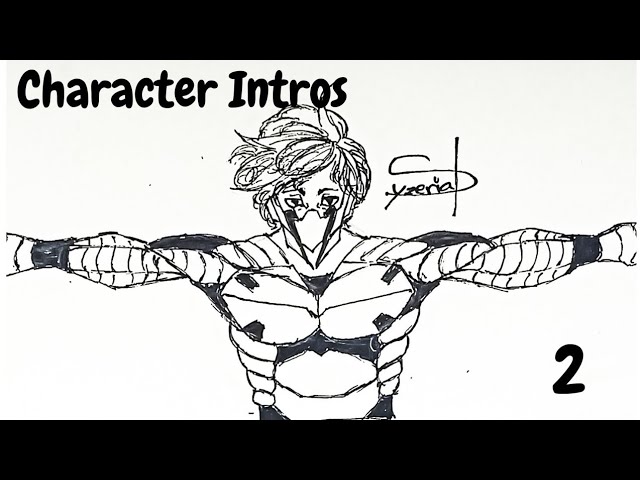
A little drawing showcasing a character from my manga. Where will he be introduced?
Timestamps:
Final Product (0:00)
Sketch (0:05)
Inks (3:59)
Realtime: 1-2 hours
Connect:
IG: https://www.instagram.com/syzerialtheofficial_233/
Sounds used: https://youtu.be/NWIQCDtWyjA
**Hope you like the video, leave a Like, Subcribe and share with all y...
Here we go
Made the vid
astral kernel
hard ibex
https://youtu.be/5hDp9CKBAT4
awesome! he reminds me a bit of shinso from my hero academia
 left nacelle
Hi guys! I've just rendered my first 3D scene.
What do u guys think? Feel free to leave comments~ 😁
 hard ibex
astral kernel
awesome! he reminds me a bit of shinso from my hero academia
hard ibex
astral kernel
awesome! he reminds me a bit of shinso from my hero academia
That, I got a lot lol thanks
spring ore
left nacelle
Hi guys! I've just rendered my first 3D scene.
What do u guys think? Feel free ...
cool
did you modeled everything?
left nacelle
spring ore
did you modeled everything?
yep there are loads of referent pics from pinterest for modeling
 little loom
 spring ore
left nacelle
yep there are loads of referent pics from pinterest for modeling
spring ore
left nacelle
yep there are loads of referent pics from pinterest for modeling
gl with your journey
worthy hinge
little loom
Damnnnn the third one 🔥
little loom
Thnx a lot
 rancid tiger
Covid made me friends with still life 

I really don't know how to draw fabric and I'm messing around with it
 upbeat barn
this is no real link
it says "stearn" and not "steam"

i guess you should not click on that link
oh they already deleted it 
delicate bridge
rancid tiger
Covid made me friends with still life <:Hipster:822842576696115260>
woooooooo!  Always good to hear. I love it ❤️


 worthy osprey
little loom
worthy osprey
little loom
As someone who practices calisthenics, that's a great V-sit lol
delicate bridge
spring ore
Now I'm going to throw some masterpieces (don't take me seriously please)
😩 💕 Truly a piece that'll last throughout the ages. Muah (but fr it's pretty cute lmao)
spring ore
delicate bridge
😩 💕 Truly a piece that'll last throughout the ages. Muah (but fr it's pretty ...
Oh I know how sad it is that there are no painters like me in this era (bruh i love doing this)
 spiral geyser
Can I ask a music question here?
Or is this a strictly painting and sketching (I am not an artist sorry if I get terms wrong or not include them) channel?
 desert turret
just ask I'm sure it's fine :p
delicate bridge
spiral geyser
Can I ask a music question here?
Yes u maaaaay, Music is performing arts so
spiral geyser
Ok simple question but I do not know how to play this.

Like do I single stroke it or roll? Marching snare drum if that helps.
The bpm is 74 and the piece is in 3/4 if that helps
I think I would just play the 32nd notes( I think that is what they are) as rolled 16th notes but I am not sure.
delicate bridge

I'm... gonna ask one of my musician friends if any of em knows
they're the ones who actually get this ; _;
spring ore
 upbeat barn
these are only basic colors and i wanna add some shades later on as well but yee..any tips please? 👉 👈
👉 👈
 pseudo island
spring ore
pseudo island
spring ore
Ooo nice line art, love the way you used thick and thin lines and black shapes to bring form
 woeful niche
normal robin
woeful niche
normal robin
Have you ig page?
 molten frigate
 spring ore
finished this sketch study today.
i was studying/paying close attention to getting the values right, i didn’t expect i’d make it look realistic-ish.
my art ig: www.instagram.com/elisha.artstudio
 normal robin
woeful niche
Have you ig page?
normal robin
woeful niche
Have you ig page?
try to find me
 hollow pollen
spring ore
finished this sketch study today.
i was studying/paying close attention to getti...
hollow pollen
spring ore
finished this sketch study today.
i was studying/paying close attention to getti...
This is really good. It's soft and warm. But I would add some more colours @spring ore
Usually objects aren't monochomic. They have reflexes
Try to use more colours, i think it would look much more interesting

Like here. I mean it's not perfect of course, but colours make it very juicy
Or here

All these objects are blue/purple, but by adding yellow, green, red it starts to look more realistic
E.g.
The leaves are green, tomatoes are red. They need to have reflexes on each other
In some parts leaves should be pinky, tomatoes green
They're complementary colours so don't worry it won't look very juicy
complementary colours are giving grey so by looking far away at your drawing it will stick to more relaxed shades
Btw if the object itself is warm, you can make the shade coolder. It would look more realistic
These tips are not "must-follow", I know not everybody likes use lots of colours, but just my opinion
spring ore
pseudo island
Ooo nice line art, love the way you used thick and thin lines and black shapes t...
thnx dude
little loom

 mossy quiver
Had Made this for a Friend of mine (:
 mossy quiver
limber vapor
my ken kaneki sketch
mossy quiver
limber vapor
my ken kaneki sketch
pog I made a Haise one but its not sketch :3
 normal robin
 delicate bridge
spiral geyser
I think I would just play the 32nd notes( I think that is what they are) as roll...
delicate bridge
spiral geyser
I think I would just play the 32nd notes( I think that is what they are) as roll...
One of them says u're right with this last statement (they're clarinet player but good sight-reader so idk)
One of them said: no marking that says they should be rolled, so either a diddle marking on a 16th note or a written sticking underneath, so they should all be alternating single strokes (they played snare, tenor, and base drum)
upbeat gate
nice..
spiral geyser
delicate bridge
One of them says u're right with this last statement (they're clarinet player bu...
Thank you so much!
 worthy aspen
My practice on Procreate
 still timber
yo, i got some art for this week


the last 2 are master studies
what do u guys think?
(bfore i go back to being ded ahaha)
hollow pollen
that's insane
upbeat gate
HEART KITTY (Ms paint gang 😎 😭 )
 torpid sequoia
still timber
what do u guys think?
(bfore i go back to being ded ahaha)
torpid sequoia
still timber
what do u guys think?
(bfore i go back to being ded ahaha)
Realism is pretty hard, I think you did a great job, your studies are very good
Idk about the lightening source on the first portrait since the background seems too dark on the left side, but that's it
Try to put the ambient light on the beard/shoulder maybe
upbeat gate
still timber
so beautiful. wow❤️
spring ore
still timber
what do u guys think?
(bfore i go back to being ded ahaha)
you're amazing ! keep it up
spring ore
upbeat gate
HEART KITTY (Ms paint gang 😎 😭 )
aww bonkyyy it's so cute 💗
upbeat gate
still timber
i love this one!
 cobalt elbow
upbeat gate
HEART KITTY (Ms paint gang 😎 😭 )
cobalt elbow
upbeat gate
HEART KITTY (Ms paint gang 😎 😭 )
what the hec its so cute bonk


 left veldt
that looks lovely ;w;
 lapis gale
I am a beginner lol.....jsut started my 1st sem in animations and motion graphics!! would love to hear your reviews and suggestions 😅🙏

took it outta this reference image i found on the internet
astral kernel
lapis gale
I am a beginner lol.....jsut started my 1st sem in animations and motion graphic...
wow the perpective is awesome!

 normal robin
normal robin
normal robin
where did i went wrong
astral kernel
normal robin
where did i went wrong
to me it seems like the wrist bending thing is made too long
normal robin
astral kernel
to me it seems like the wrist bending thing is made too long
yeah kinda
astral kernel
normal robin
yeah kinda
but honestly i didnt notice anything until you mentioned it so idk
normal robin
astral kernel
but honestly i didnt notice anything until you mentioned it so idk
perfect
lapis gale
astral kernel
wow the perpective is awesome!
hahaha thanks peeps!!!
delicate bridge
still timber
These are wonderful studies!!! YES SIIIIIR @still timber
Serving it up
They look so complete, so whole, I love em, the compositions to me r everything 
 sacred spruce
august cover page for my bullet journal 😩 @spring ore
 spring ore
normal robin
arm too long?
spring ore
normal robin
arm too long?
no
spring ore
anyone have a tip in creating skin tones?
spring ore

That's my first time making a manga type art
Just a random face.... Drawbacks are warmly welcomed ❤
delicate bridge
spring ore
That's my first time making a manga type art
Just a random face.... Drawbacks a...
I'm not sure what u mean by Drawbacks care to explain? Sorry
delicate bridge
spring ore
anyone have a tip in creating skin tones?
Honestly, just... youtube it or find skin color palettes on Pinterest
 spring ore
delicate bridge
I'm not sure what u mean by Drawbacks <:mixedemotions:845211323099775037> care t...
spring ore
delicate bridge
I'm not sure what u mean by Drawbacks <:mixedemotions:845211323099775037> care t...
If I have to work on it more? How can i make it even better...? Aka feedback doe not drawback my bad
 umbral urchin
dadadada
dadaddadada
d
aa
JA SAM AMIDZAAAAAAAAAAAAAAAAAAAAAAAAAAAAAAAAAAAAAAAAAAAAAAAAAAAAAAAAA
AMIDZ
delicate bridge
spring ore
If I have to work on it more? How can i make it even better...? Aka feedback doe...
Oooooh, I see I see. I gotchu now. Well, let's see if my computer works first 🥲 then maybe I'll try to give suggestions
 stable locust
normal robin
stable locust
normal robin
is this denji and power?
stable locust
wait so its not? XD
normal robin
Its ushijima and my oc
stable locust
ohhh
normal robin
From hq
spring ore
normal robin
Tbh most says he look more like kageyama
Tbh i thought it was kageyama then the eyebrows shouted 'ushijima!!!' but anyway you're so talented yakult omg T T
stable locust
normal robin
U watch haikyuu?
yes but i saw the girl i thought it was from chainsaw haha
normal robin
spring ore
Tbh i thought it was kageyama then the eyebrows shouted 'ushijima!!!' but anyway...
lol XD thank you
normal robin
stable locust
yes but i saw the girl i thought it was from chainsaw haha
lowkey if i added horns it do be like dat doe
normal robin
spring ore
Tbh i thought it was kageyama then the eyebrows shouted 'ushijima!!!' but anyway...
kageyama have a less define face than ushijima
just a funny fact that
that man is 6ft and weight 85kg
and hes in highschool
how hard does puberty hit ones so hard lol
spring ore
Tried 3D animation for the first time (the model is not from me)
There are some mistakes but i find that the result ain't bad

 kind delta
Opinions? Tipps?
 stable locust
kind delta
Opinions? Tipps?
stable locust
kind delta
Opinions? Tipps?
looks so realistic!
kind delta
stable locust
looks so realistic!
Thank you 😊


 left veldt
yooo your works already look so great!!!! 🥺
 echo vault
thankk youu so muchh you made me happy 😊 .
spring ore
cool stuff ^^
left veldt
echo vault
thankk youu so muchh you made me happy 😊 .
awww feel free to post more of your artworks if you have more hehe ❤️
left veldt

been wanting to get back to drawing in my free time and finally had the time to scribble stuff today. i've always struggled with drawing hair and figured it's the one thing i have to work on asap. tips n tricks would be appreciated!!! || also hey i dont normally draw anime so i suck at it (like i heavily used a reference for that one oof) but if you can guess who this mf i drew is then we can be instant bffs 🤝 ||
delicate bridge
left veldt
OOOOH ME LIKEY


 vapid slate
 marble haven
i saw a pic of 2 cats in love & i gotta paint it
marble haven
i saw a pic of 2 cats in love & i gotta paint it
you’re really good at drawing / painting !! ❤️ i like your style
marble haven
vapid slate
you’re really good at drawing / painting !! ❤️ i like your style
thank you!! you're so sweet aahh
delicate bridge
spring ore
Ok so, I think what u got sketched out is a good start. She's very cute ✨ My main suggestion is try practicing more on using guidelines so the features can come out better. Try to also be confident in ur strokes. I used to do the same thing since I always had some hesitation and it would clutter my drawings more than it needs to be. So take ur time with ur strokes as u think about how u want ur drawing to look like. it'll feel slow but eventually u'll get the hang of it that u'll get comfortable and it'll feel natural.
I kinda tried to recreate what I see from ur sketch so I apologize if I got a lot wrong but the main thing to look for is the use of guides and how it helps build facial structures. Definitely use pencil btw, so you got more room for error and also just lighter strokes instead of a permanent pen ink that cant be erased.
Keep it up

delicate bridge
marble haven
i saw a pic of 2 cats in love & i gotta paint it
💕 ✨
delicate bridge
normal robin
So, idk if photoshop got the frames divided right but I'm just gonna assume it did. I picked frame 6 and 7 as the impact point where it may be lacking. Or maybe it was there, it just wasn't exaggerated enough (always kinda go a level higher when there's a movement that needs emphasis--idk how to explain im sorry ). Here's what I feel may help with showing Ushijima adjusting and lifting her up during the process:
Frame 6 - Movement is upwards so objects will be dragged down (example: hair follicles/hair, clothing, etc.)

Frame 7 - Movement is downwards so objects will float or go upwards temporarily (examples: same as above)

Anyways, very cute i like the silly situation
spring ore
delicate bridge
Ok so, I think what u got sketched out is a good start. She's very cute ✨ My ma...
Thanx doe I'll be keeping this in mind
❤❤❤

spring ore
feedback will be appreciated
left veldt
delicate bridge
<:7187_kannawave:717699082516430879> OOOOH ME LIKEY
aaah thank you! it's just that i spend so much time figuring out how and where to start working on hair. i guess i'll just have to keep on doing them again and again until it becomes a lot more bearable for me 
normal robin
delicate bridge
So, idk if photoshop got the frames divided right but I'm just gonna assume it d...
XD perfect exp thank you
spring ore

 silver lion
OMFG PLS
spring ore
silver lion
OMFG PLS
for u
molten frigate
spring ore
feedback will be appreciated
this is sickkkkk
sacred spruce
dandandan!! thank youuu ; imyyyy
delicate bridge
spring ore
feedback will be appreciated
✨ how lovely... Never did any 3D so idk what to say besides how much I love how seamless the rays come through from the sun to where the camera is angled
delicate bridge
spring ore
she cute, through and through
 tepid cove
echo vault
tepid cove
echo vault
hey what software do u use to make such art?
spring ore
tepid cove
hey what software do u use to make such art?
blender
echo vault
tepid cove
hey what software do u use to make such art?
yes it is blender
This was my First project it was soo hard it took like 3 weeks or something

if u guys wanna see in detail u can check my Artstation website
 spring ore
echo vault
This was my First project it was soo hard it took like 3 weeks or something
spring ore
echo vault
This was my First project it was soo hard it took like 3 weeks or something
its not "your" project its just a tutorial followed by you
spring ore
spring ore
its not "your" project its just a tutorial followed by you
its still his project
idk why you felt the need to point that out
sacred spruce
art journal spreAd uWa
 left veldt
sacred spruce
art journal spreAd uWa
left veldt
sacred spruce
art journal spreAd uWa
so pretty! and your handwriting is so nice <33
 quartz oracle
critique harshly plz
 echo vault
spring ore
its not "your" project its just a tutorial followed by you
echo vault
spring ore
its not "your" project its just a tutorial followed by you
yes but it is not "copy and paste" my friend this is called hard work. and also as i said im a beginner im not a pro which means this is totally normal to watch tutorials and do the same thing
spring ore
echo vault
yes but it is not "copy and paste" my friend this is called hard work. and also ...
it seems like copy paste to me. if you change some parts of it or if you get some ideas from more than one source it might be something else but you said that its YOUR first project and if we want to see details we should check your artstation... to me its a huuuge plagiarism
echo vault
plagiarism? lol you are funny this is just a tutorial it must look same haha i dont understand why u feel like that i don't wanna argue with you but thank you for your message people like you always motivate me 🙃
sacred spruce
left veldt
so pretty! and your handwriting is so nice <33
aww thank you sm, kae!
indigo spindle
quartz oracle
critique harshly plz
It looks great!
 limpid laurel
nice


 scarlet otter
I like the first one!
The second one might be a bit hard to implement, but maybe if you change the perspective it will be easier to see what's going on
Like focus more on their faces/facial expressions
scarlet otter
normal robin
Also this looks awesome wtf!
normal robin
scarlet otter
The second one might be a bit hard to implement, but maybe if you change the per...
yeah but like i dont want to lose the atmosphere of her cooking
scarlet otter
Maybe make it into a comic
 scarlet otter
Make the viewer read between the lines
normal robin
but im unsure
scarlet otter
Like first show what she's cooking, then show her standing over the pot, and then a close up of their faces as they look at each other, and then her giving him a taste. F.x
scarlet otter
normal robin
This looks very romantic, I think
Probably easier to get the romance to the viewer through the paper on this picture
normal robin
😂 sound like smth from wattpad
 tepid cove
hey guys, I had a question, would u guys consider using photographs in an art portfolio, no specification is required in it, and submitting it for design and architecture admission, just wanted ur to say on photography and maybe be sims/Minecraft original bldgs?
 tall violet
tepid cove
hey guys, I had a question, would u guys consider using photographs in an art po...
tall violet
tepid cove
hey guys, I had a question, would u guys consider using photographs in an art po...
I'm not educated on architecture at all, but usually photographs are completely fine in a portfolio - it all depends on how cohesive it is with your other artworks(plus how you "justify" its purpose in your portfolio is important). With sims/Minecraft bldgs idk, I think it may depend on the ppl you're submitting your portfolio too - they may or may not consider it as a legit medium because of copyright reasons. Hope that answered your question a bit
So I'm trying out a new coloring style for hair, and I haven't done any digital art in a while, Idk if this portrait looks weird or not so far(?) any feedback would be appreciated 😊
 tepid cove
tall violet
I'm not educated on architecture at all, but usually photographs are completely ...
tepid cove
tall violet
I'm not educated on architecture at all, but usually photographs are completely ...
thx alot
kind cloak
 sacred spruce
kind cloak
sacred spruce
kind cloak
you definitely werent joking when you said its huge 😩
VERY PRETTY THOUGH
I LOVE HOW ITS PLAIN WHITE
deft depot
kind cloak
Ayeeeeeee it's pretttyyyy😩,,,,set it up beautifully
surreal bay
@sacred spruce huhuhu
 sacred spruce
surreal bay
<@!717970269838245958> huhuhu
sacred spruce
surreal bay
<@!717970269838245958> huhuhu
WO O D
smoll and cute
i love it
adorable
10/10
surreal bay
huhuh uwu
surreal bay
yeah its good i have areclinign chair but that gives me back ache
so i use this one
with cushions
sacred spruce
okay thats good then!
deft depot
Oyeeee it's lovely,,,also i see yashooooo here😂 😂 😂
sacred spruce
:unoreverse:
upbeat gate
whaaa?? workspace pics are being shared here
deft depot
 surreal bay
@spring ore
 surreal bay
deft depot
surreal bay
deft depot
pddd thats so coool 
upbeat gate
it's a mess bruh
deft depot
Thee space is under construction,,i wanna add many thingsss
upbeat gate
ahh wait
surreal bay
upbeat gate
it's a mess bruh
lmao js show we dont judge or apply law we are engineering student
upbeat gate
i'm using laptop rn, wait
surreal bay
deft depot
Yoursss greattt tooo,,i just clean mine on a daily basis
ur too organised huhuhu i didnt showed something wait
deft depot
surreal bay
ur too organised huhuhu i didnt showed something wait
Showwww waitinggಠ﹏ಠ
surreal bay
 deft depot
I m soooo many things on my mind that i need to add,,,gonnaa show u guys again after completing my setup
 scarlet otter
Agh I don't have a pic of my new workspace, I haven't finished building my desk
Your guys workspaces look nice thoo
If I remember I will!😊
deft depot
surreal bay
Waaaaaaaaaaaahhhhh
deft depot
surreal bay
huhuh pain Y.Y
Ayeee let me show you guys something😂
surreal bay
deft depot
Ayeee let me show you guys something😂
yessssssssss
deft depot
This is where i keep my books and my cats justttt ರ_ರ
 surreal bay
and two cats girl pmg
deft depot
scarlet otter
They're so prettyy
😂😂😂😂and annoying too
scarlet otter
Also your books are relatively organised tbh, especially compared to how many you have!
deft depot
surreal bay
and two cats girl pmg
The white one is A girl Barbie,,and the onee behind her is a Boy Lucy
scarlet otter
deft depot
😂😂😂😂and annoying too
Noooo they are beautiful only, perfect beinge
deft depot
scarlet otter
Also your books are relatively organised tbh, especially compared to how many yo...
Have tooo,, don't have much space
😂
scarlet otter
deft depot
The white one is A girl Barbie,,and the onee behind her is a Boy Lucy
Barbie is so elegant, I love her head shape

 scarlet otter
deft depot
Have tooo,, don't have much space<:fofaanatiti:718597808118169723>
scarlet otter
deft depot
Have tooo,, don't have much space<:fofaanatiti:718597808118169723>
I know the feeling 🥲 but you still did a good job
deft depot
scarlet otter
Barbie is so elegant, I love her head shape
Yesssss she isss 💜 like this
deft depot
scarlet otter
I know the feeling 🥲 but you still did a good job
Ayeee tysm🫂
upbeat gate
surreal bay
omg thats cool
it's some dell one
scarlet otter
upbeat gate
This
I LOVE the organisation
upbeat gate
surreal bay
omg thats cool
is it? thenks
upbeat gate
scarlet otter
I LOVE the organisation
thanks Eva
surreal bay
upbeat gate
is it? thenks
huhuhuhhuu
scarlet otter
upbeat gate
thanks Eva <:7187_kannawave:717699082516430879>
Yw, I especially love the right side, looks so clean when they're all similar/samt style
spring ore
scarlet otter
Big desks are so nice
i know right-- i really want a big one
i cannot find sahil
scarlet otter
spring ore
i know right-- i really want a big one
They're the best
spring ore
scarlet otter
They're the best
if u check our merve on youtube she has this hUGE ASS DESK AND BEAUTIFUL VIEW I WANT IT
scarlet otter
That's the fkin dream
For a workspace
BIG desk with LOTS of space to work and a beuariflu vuew
spring ore
scarlet otter
BIG desk with LOTS of space to work and a beuariflu vuew
ikrrr
karmic jay
spring ore
Digital art
what do you want to do with it?
spring ore
I use a huion
spring ore
deft depot
This is where i keep my books and my cats justttt ರ_ರ
😮 both the cats and the books raised my serotonin levels, boo
spring ore
still timber
I. Love. This. (Jdhxudvd)
spring ore
rancid tiger
Covid made me friends with still life <:Hipster:822842576696115260>
What painting medium did you use if you don’t mind me asking
deft depot
spring ore
😮<:7187_kannawave:717699082516430879> both the cats and the books raised my ser...
I happy that it did😂 😂 😂 😂 fernnnnie
karmic jay
spring ore
I use a huion
no, I mean what are you going to do in digital art
animation, modeling, painting, editing, concept
spring ore
Concept and painting
I like animation but I suck at it
My favourite animator is obviously sad-ist
Well not obvious but whatever
hasty fractal
Lovebirds
spring ore
goddamn so adorable
hasty fractal
Cool
upbeat gate
hehe, i'm glad you like it
spring ore
Awh
karmic jay
spring ore
Concept and painting

Ctrl+Paint - Digital Painting Simplified
Digital Painting Tutorials for Beginners
a lot of ctrl paint videos helped me, I hope it help you
Ctrl+Paint - Digital Painting Simplified
karmic jay
spring ore
Concept and painting
https://www.youtube.com/channel/UCQEKrHGypQLEdCV0SuTGvfg
this guy is a concept artist, you can search his name and he has some demos on Proko's channel too

YouTube
I'm an artist and game developer, sharing things I'm passionate about and being creative on the internet.
https://www.youtube.com/user/sinixdesign
very cool digital painter that has a lot of good tutorials about pretty much everything there is to painting traditionally and digitally

YouTube
Hello everyone! This is my art channel which I started back in 2006. The first videos were rocky, but I strive to continually improve the content and quality of my videos. Aside from the normal tutorials and speedpaintings, I'm hoping to provide different unique videos that offer people other ways to indulge in their love for art and all thin...
spring ore
karmic jay
https://www.youtube.com/channel/UCQEKrHGypQLEdCV0SuTGvfg
this guy is a concept a...
Oh yeaah Ik this guy
Thanks for da help brudah
karmic jay
you're welcome fren
I hope it helps you
I have some more resources if you want to in the future
spring ore
Will surely reach out
Also rnu on any art servers ?
Ifyou know any good one
Pls dm
rancid tiger
spring ore
What painting medium did you use if you don’t mind me asking
nevermind, it's watercolor on paper
spring ore
rancid tiger
nevermind, it's watercolor on paper
Hmm. Ooo ee ii ooo uuuu….
spring ore
rancid tiger
nevermind, it's watercolor on paper
Thankssss 😊
rancid tiger
spring ore
Thankssss 😊
you're welcome
golden basin
upbeat gate
hehe, i'm glad you like it
i have same birds back at home
indigo spindle
We had one who looked like the right most but with more green
 arctic jetty
What do you guys think?
 deft depot
arctic jetty
What do you guys think?
deft depot
arctic jetty
What do you guys think?
AWESOMEEEEEEEE✨
 finite pike
arctic jetty
What do you guys think?
finite pike
arctic jetty
What do you guys think?
There's more detail on that face than on mine. It's very well done !
 modern garnet
Make sure to keep the art channel for art stuff please:)) this art looks good btw you guys are very talented ❤️
spring ore
Hi guys can someone please explain clipping masks to me
 quiet apex
spring ore
Hi guys can someone please explain clipping masks to me
quiet apex
spring ore
Hi guys can someone please explain clipping masks to me
let's say u have an artwork and u wanna frame it in a circle, simply draw a circle on top of the artwork and use clipping mask, whichever area was covered by the circle is kept
 grand gale
@spring ore I am pretty sure some just color it in, others use the free selection tool to fill
spring ore
But how do they like color out of the borders
But the color only stays in the borders
If uk what I am saying
delicate bridge
spring ore
If uk what I am saying
might be easier for us to see what u mean if u have an example to show like maybe a video u might've watched 👍
 shell hearth
 spring ore
<@&717391911132069929>


 spring ore
coool
 rich fable
First-Person Video:
It took a day to build
I also need help with this tho
What I Need Help With:
One of the wires was fragile and broke apart, I don’t know how to weld it because I don’t have any equipment to do so. I won’t weld it because the car is also fragile and I’m just gonna keep it for show but I’m asking because I will be transporting the car as a whole overseas in my suitcase and if any other wires break I would need to weld it.

 rich fable
spring ore
coool
rich fable
spring ore
coool
Thanks :)
spring ore
rich fable
**What I Need Help With:**
One of the wires was fragile and broke apart, I don’t...
U don't have a wire welder idk what that tool name exactly is? But it's used to weld wires
 spring ore
Itadori. So cool
spring ore
spring ore
Itadori. So cool
Thanx
sacred spruce
omg
hasty fractal
Coooool your pigeon looks like a bird
 viscid relic


 wheat sequoia
 worthy hinge
arctic jetty
What do you guys think?
worthy hinge
arctic jetty
What do you guys think?
cant think, my mind was blown the moment i saw this
arctic jetty
worthy hinge
cant think, my mind was blown the moment i saw this
Me too
scarlet otter
I think I got it now, good luck understanding it
 hasty fractal
Damn
sacred spruce
XD well done
kind cloak
😂 woah nice draw
scarlet otter
lmfao ikr, thanks😆
spring ore
scarlet otter
I think I got it now, good luck understanding it
Eva you're the best T T I'll post one too tomorrow 😩
 ocean lotus
scarlet otter
I think I got it now, good luck understanding it
ocean lotus
scarlet otter
I think I got it now, good luck understanding it
Thanku thanku eva💜 💜
spring ore
@spring ore is the family lawyer
@spring ore the apple lady
@spring ore the vampire who lent us her mansion and is constantly watching over us 😩
 spring ore
Can't beat yours eva 😩