
#📝project-feedback
1 messages · Page 47 of 1
First day in digital painting 🙂


Self-portrait done with a runny inker and conte crayon

guys this is what I made recently, titled "LAST ASSASSIN" what do you guys think about this?

What do you guys think of the quote and background that I just made for my Instagram page? - https://www.instagram.com/p/CbVGogigSAI/
I really like the grainy paper effect. Pretty minimalistic and goes with the overall vibe of my profile
I just finished writing Chapter Five and uploaded it. We’re finally introduced to the heroine in this chapter, so I hope you guys like it :)


WOW😐

colonize jupiter!
So realistic 😍
does this color look good as a background?

feedback?


Feedback?


Hey guys and galls 👋 new here, looking for any advice/critiques on a new photo i just took. Here is where im at with the edit.


How can I make it look less photoshopped?

looks like a lot of dust on the background image so maybe replicating similar effect on the top layer so that they both blend in together
i mean just in these corner areas

Thank you ❤️
Gave +1 Creative Carma to @deep lance
Thoughts on this? Took agessss https://www.instagram.com/p/CbaPNGXg_8B/
Chapter One, Part Two. “Dima continued to follow Jesse to his room, which was at the end of the passage. He knew that as long as he heard her voice through the door, he was safe. But then it happened—deafening silence. The door creaked, and out came Sara.”

Made with Photoshop!
https://www.instagram.com/p/CbaQz8mInCC/
Cat Noir / Adrien Agreste in the style of Danny Phantom! 🐈👻
.
This was a part of a character/style mashup challenge we did forlast week! It was such a fun challenge to do 💗 Let me know if you'd like to see more!
.
Swipe for closeups ⏩
.


Hi guys any feedback is welcome 🥰

thats really cool
My friend gave me 2 min to do something so ignore that it's so bad

thankyou !appreciate
can you help me with my photo , need to remove a person from the background , it will be very helpful if you do so
content isnt to my tastes but respect for the art style

I pretty love it 😄 a clean style + dark ambient
This is a decent photo. I think its a little "flat" (in terms of Levels) and maybe lacking a focal point. I would take this into Adobe Camera Raw and try to coax some more dynamic range out of it by adjusting the highlights and shadows. Also, do a bit of color grading and adjustments to make them "pop" a bit more. You could add a slight Vignette around the edges to bring the focus back into the center of the image. Just some suggestions...
This is just quick. You could take your time on it and really do a good job.

Generally, objects closer to the viewer should appear darker. Objects get lighter the further they are away from the viewer. Overall, the image should have some Level adjustment. I think there needs to be more shadow in the base of the tank and the surrounding area to "sell" this composite. Also, I think the "smoke" you added to this is washing out the dark areas that would be present. I would Layer Mask that cloud/smoke effect and use it sparingly in the lower portion of the composition.
Very cool artwork. It has a strong composition. Also, the attention to light and shadow and how they fall across the elements is excellent.
Cool illustration! Danny Phantom has a very stylized feel that you captured. However, the Danny Phantom stuff looks like vector art. It would be cool to see your character developed further. Perhaps using vector shapes so you can get those super-crisp lines and sharp corners. That variation in the "shape language" really makes the character design more dynamic.

Nice Tiny World design! I like the clouds that touch the mountain tops and extend beyond the cube. Also, the little bits of debris under the cube is a nice touch. Benny would be proud of you! 🙂
Thank You man !!! I'm still learning and lack of confidence. Appreciate yours feedback
Gave +1 Creative Carma to @wooden oak
Believe in yourself. You're doing great!
Thanks for the feedback. I prefer to work in raster programs and I believe I did a solid job at replicating a sharp vectorized look so I won't be revisiting it. And btw I did use vector shapes in the illustration
Gave +1 Creative Carma to @wooden oak
Thank you sir ❤️
Gave +1 Creative Carma to @wooden oak
You did do a good job of capturing the style. I was just thinking perhaps using vector brushes in Fresco so that you could get a hand-drawn look but with that varying stroke weight. In your image, I think the dimensions of artwork (the pixel size) and the size of the brush, some of the detail in the lines is getting lost as the strokes overlap one another. Just an observation.


How is it bois/giils?

What tutorial did you use?

Head to https://www.squarespace.com/bennyproductions to save 10% off your first purchase of a website or domain using code: BENNYPRODUCTIONS
Since a lot of you requested this, in this video I'm showing you how I create my so called Microworlds in Photoshop.
Microworlds are exactly what you’d expect from the name “Microworlds”. They’re little c...
Pp


Oh crazy, I have a fractal I made to show you later, same colors
Feedbacks are appriciated :3


I like the 2nd one way more
thanks
Gave +1 Creative Carma to @subtle hinge
on a jacket tho?
On the jacket the other one might look better, because the second design isn't as wide which could leave too much space on both sides
it is a varsity jacket design
not made by the same person
thats why one has a better mock up
on a jacket second would look better ?
Is it the same jacket?

it is a varsity jacket design though
just take the design you like more,
second one looks more alternative
Snake


Wow
I'm currently working on that edit and I would appreciate feedback because I know it doesn't look the best, but I don't know how to fix it. So I would love another opinion on how I could fix it:)

I tried to make it better

a twitch banner for my friend, LTHEA, a minecraft youtuber

Working on a little Desktop Background. Seems good but i feel i could make it better. Any recconmendations to add or fix anything?

In all honesty @limpid arch, I don't really 'get it'. - but that said, I think you've done a great of of showing the 'glow' of the icons around the rocket. The blue, green, yellow etc.
If I was to be really picky, I'd mention that the rocket is way too bright given that it's flying through the darkness of space. - also, those rockets would have detached aaages ago 🙂


Cool composites, @steel crypt! I like the style of the finished comps.
Cool idea, @azure dust - I would maybe look for a couple images of some ice cream dripping... or even like paint dripping and use that as your mask for the "space drip" and the other dripping area. Might be worth a try.

It's an awesome comp already, but I think what throws me off a little is that the background light goes up from light to dark but the planets and cone are solidly lit and brighter. Give them a nice tinge of blue and match the lighting grade a little more and it'll blend better in my humble opinion. Looks awesome though, and I'm only offering this because you feel like you need to fix it. Hopefully that helps!
@wooden oak thanks
Gave +1 Creative Carma to @wooden oak
Someone please give suggestions on this cuz I need to make a video thumbnail

"Top 5 Games" is a bit difficult to read; it's getting obscured because of the knockout. I'd maybe fill that in and/or make the background slightly darker to make the foreground elements more visible.
Alright, thanks


#2
Same, def #2
The red one ?

@wooden oak thanks
Gave +1 Creative Carma to @wooden oak
Not only is it the strongest design, the oni symbol is the coolest because its believed to ward off evil spirits. heh
Not sure how the snake figures into this but its cool too nonetheless.
I think what also makes it the strongest comp is that you have some actual color definition to it. The others are just line work
I'm currently studying graphic design at college and was wondering if I could get some feedback by some photoshop pros on some of my work I made (I'm still pretty new to photoshop, I've only been using it for a couple months)


I also made this during my own time

Howdy, I've been doing graphic design in the commercial print industry for almost a decade. I think before people give you feedback, it may help to understand what field of design you're wanting to get into, that way you can get some good insight on what to work on.
I preferably want to work on making posters and things for companies but I wan't to improve my photo compositions for making stuff i could get commissions to create.
I wan't to do things similarly to Benny Productions and Nemanja Sekulic
So high res photo manipulation then?
yeah
I would say that getting good at stuff like that comes down more to understanding how the many blend modes and filters work in Photoshop
Also learning your way around the Levels, and Curves tools as well
I see
I have a basic understanding of photoshop but I'm still pretty new so there are still lots I don't know how to do or do effectively
like blending layers and matching the colors/filters to backgrounds
That's alright. Everyone starts somewhere. Generally what get's used a ton are layer masks, adjustment layers, curves, levels, and blending modes
Take this image for example:

Likely he achieved that image by splicing three images together
the Backdrop
Him self
and the DSLR
You can see though that he masked out a small section of the camera to make it seem like it's pressed against his face
it looks really good
from them he added projected shadows from the DSLR to his face to give it depth
Seems like he also masked out the camera to isolate it from it's original image
I would say the only thing I don't like about his image here is that his subject doesn't really project his own shadow
He could have easily made one using the selection of the subject, filling it with black, and then using perspective warp
after that he could adjust the blend mode to make the shadow softer
When it comes down to it, getting good with Photoshop is really about having a solid understanding of how your tools work, and having a good understanding of fine art concepts
I don't know how effective it would be but I have been trying to follow some photoshopping tutorials recently to create effects on images.
That's a good start
I also want to mention that you should temper your expectations
for example
this image most likely was not produced in photoshop alone

This one is likely produced via a mix of photoshop and after effects
Yeah, I noticed some of these tutorials use lightroom and after effects to intense the lighting too
I don't think I have either of those but I am willing to purchase them if they will help in the future but that means learning those too
I'd rather just learn photoshop for now and once I have a good understanding then I can move on
Still a good place to start
I'd also recommend familiarizing yourself with composition layouts like the Rule of Thirds and what not
No sweat. 🙂
if you're going to do that, just get a creative cloud subscription.
Just curious... Why would one need After Effects for this?
I mean to me it looks like they applied some special effects and then touched it up in Photoshop
I may be thinking of a different piece of software
After Effects does special effects for video yes? Or is that something else?
yup
It is for visual effects, yes.
But generally, animated visual effects.
lightroom was probably used too
Okay, just making sure I hadn't gotten it confused with Adobe Premiere
I doubt one would need After Effects for that image. Unless it was animated...
or effects over-top of video.
then lightroom was probably used
lightroom is very effective for that kinda lighting

You don't need Lightroom either. It can all be accomplished with Photoshop.
i guess
He likely has more experience with it than I do then
I work mostly with commercial graphic design relating to Business Signs and digital printing
Lightroom has some useful features, no doubt.
lightroom always annoys me and I go back to photoshop after 3 or 4 minutes
I hardly ever open Lightroom. Not saying its bad. I just use Photoshop and Camera Raw for almost everything.
I guess its probably good for quick edits and send something out. To each their own.


Oo okay ty!
Okay ty
Gave +1 Creative Carma to @wooden oak
class
nice....but too much of blue
It's not my image soooo.....thanks?
I was comparing two images done by the same artist for someone who wanted feedback


Cut owl
ohhh
Awesome design 👍
Thanks 🙌🏻🙌🏻
Gave +1 Creative Carma to @steel crypt
thoughts on what I could do to improve this pixel art sword? I already plan on darkening the edges on the top to give it more contrast

Posting to share, not for feedback
https://www.behance.net/gallery/133441673/Chronic-Silence-Animated-Digital-Painting
Made with 

Which one looks like a better heat stamp logo? I have the original and the other two are edits I did.


Doing fake CD album for April Fools, any ideas how to improve?

I made this design. what you think ?

It looks good and has the 3d effect however I feel the lighting is off as it looks more like CGI than actually on the desk
Anyways, A homelessness book cover I made for my Graphics Class.
Any positive or negative feedback is appreciated


does this look like a brain?


yeah, that's really good! Nice use of shade.
If you still have that as a layered file, maybe just lower the opacity of the original line drawing, just so black the pencil lines don't stand out as much @weak quartz
@valid coral - Is your images saved as a CMYK? or RGB? - The black isn't very 'black' and looks a bit washed out ..... (looks nice though!)
yes I did it. also managed the color curves

it's a homework
(one flew over the cuckoo's nest)
but the spanish title means "trapped, unable to escape"
or "trapped with no exit"
atrapado sin salida
Love it!
thank you 😊
Gave +1 Creative Carma to @novel comet
don't click that

Without Raw Filter
https://cdn.discordapp.com/attachments/957747260274393118/958389576479682560/Glowing_Antlers_Haze.png
https://cdn.discordapp.com/attachments/958363394363252746/958405052182179910/Glowing_Antlers_Haze_Rawfilter.png
With raw filter
I'm just getting into the photo editing aspect of photoshop, please any tips are greatly appreciated


made this for my friend's friend 😄


it reminds me of minecraft swords, so maybe ask in a minecraft texture pack server?
terraria, actually
it's for a mod
yeah ask in a specific server

thoughts?

Got something new for y'all.
Don't forget to like, comment and share! ☺️
https://dribbble.com/shots/17885803-Flight-Booking-App
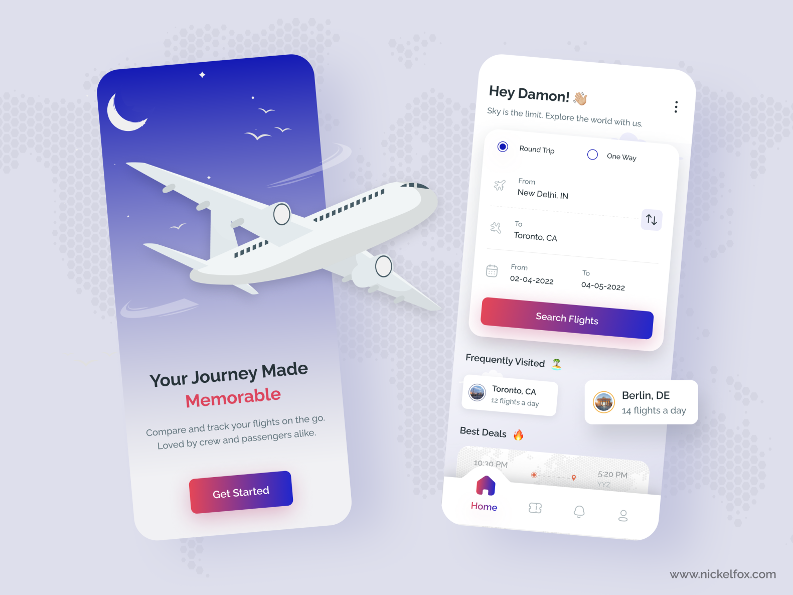
Dribbble
Posting to share, not for feedback
Made with 
https://www.behance.net/gallery/136026429/3-Emoji-Challenge-Character-Design

Behance
Click for a character design challenge project based on 3 emojis + process work.


first try to play with the glow plz say your opinion


Love it! @toxic dome
what do you guys think ?


I'm loving this new brush I made.

What can I do to fix this?

Looks fun and gooey!
I think its the text.
Thanks. That’s a separate effect from the brush (the brush has a sort crow pick feel). But it lends itself perfectly to interesting things like that Tony Harmer and Tim’s recent brush masterclass was fun
Gave +1 Creative Carma to @languid knot
I tried to fix it

I don't think anyone has seen or reacted at least to my edit 😅. So, what do you think?

My first time "trying" make glowing effect.

Amazing, good job 😎
thanks
Gave +1 Creative Carma to @waxen lark

I feel like this door is missing the customary Exit sign. heh

Testing some brush and Fx combinations


what do u think

Opinions?!

Blacks that were washed out was a my choice to add realism
My first time turning a drawing into a "realistic" one, inspired by benny, I need to learn a lot about the warp tool and puppet distortion.

opinions


Iv been enjoying photoshop so tried something new. Tried to combine two different images and work with some color correction and masking. How is it and any tips/feedback to improve my work?


how's this!


Some Product packaging what do you think best regards everyone


How can I make a cone shape using the shapes tool?


Use the Triangle Tool to draw the base shape. Then use the Pen > Add Anchor Points Tool to add an anchor point at middle of the bottom segment. Drag it down and adjust the curve...

About thr packageing or the picture itself because i think the picture would look good with some plants/herb plants in it
Got it thanks for the feedback
Gave +1 Creative Carma to @woven igloo
This is great. Thank you! 😁
Gave +1 Creative Carma to @wooden oak


I Kinda tried, Im new to Photoshop 😅


I really like the mid-19th century aesthetic of photographs

I could've rendered the flower better but
All of the original pictures are from pexels and rawpixel.
I'd love some feedback!


I really dig the style of this. I think that branch is getting lost in there. Plus it is creating a few weird tangents/overlaps with the mountain.
Here’s my red hood inspired photoshop can you guys tell me what I should improve on

Alone


Behance
The following is my project on Thump’s up packaging and visual language.It’s an experiment perceiving the brand identity of Thump’s up.In this, the goal was to advertise in a completely opposite way than it is currently. The visual language was bold and…
Thank you in advance for the feedback.
Yo can you guys let me know what I can improve on with this photoshop I recently made

@exotic dock I would have the animation going up rather than down (up for UP )
yeah nice idea. thank you
Gave +1 Creative Carma to @undone rapids
Your welcome @exotic dock and happy to give my 2 cents lol
haha thank you


Nice but the text is a bit hard to read, I'd suggest you put a dark grey 'outer glow' effect around the text to make immediately x10 easier to read...

I made a new book cover. What do you think?

This is the first version, a new one is coming out soon.
yea thats a good idea


look at this other stuff I've made within the last 4 days
keep in mind these are just screenshots bc the files are so high quality I can't upload them to discord 😂
That looks awesome
thanks
Gave +1 Creative Carma to @sharp fractal


Trying to make Ace combat logo into Top Gun Style in Photoshop hmmm
Looking good @viral scaffold 🙂
A couple of teenie errors 🙂
Guys how i can make letters like this


I wanna learn
@long swallow #❓ask-a-question - I'll respond there 🙂
Sorry
oh i fixed it lol

A couple quick logos I've made past couple days. I'd like to improve and feed would be nice to have from people much better then me
This isn't me being critical, just genuine questions to provide feedback. - What are the logos supposed to represent?
Is that first one literally saying "Will R" with a big gap between the words?
and now,, the full result of the logo earlier

One was meant to toss a quick logo for a robotics team (the bottom one) using the school's logo as a format & the other is a personal logo for a friend
He doesn't want to use his full name is he ask me to put Will R
I'm not a designer @foggy moon, but I like how you've turned the M into something that's presumable either a robots head? with eyes? or a controller? I'd maybe suggest you push it it down one particular route and just go for it 🙂
e.g.

I think the "Will R" logo would benefit from you learning how to use the 'type along path' tool....
I didn't even know that was a tool

Yeah, draw a 'SHAPE' with the circle tool, and then select the text tool and click somewhere on the circle and start typing.
Also, nobody ever comes up with logos without first stealing/borrowing inspiration from google/pintrest/shutterstock first. It's not 'cheating' to check out some nice examples first 🙂
That's where I got the main image from & I just "simplified" it
I'm not sure what that bolt/arrow thing is, but If he wants to focus on just 'Will R', I'd suggest use those letters as the main focus....

I meant use inspiration for the 'end result', not the starting asset 🙂
He wanted me to use a plague doc mask in the design but simplified
give a little detail on the beak?
Doesn't the plague mask really always go with that wide brimmed hat? You may want to include that to sell it in 🙂

good thinking


@foggy moon

hot damn both of those look really impressive
did you borrow these from shutterstock?
um. Google. The second was modified from another logo
Plague Doctor Mascot Logo. A sports and e-sports mascot of a plague doctor, a person wearing the plague mask with black coat and tall hat. A logo for your team, game related and many more
I really wanted to get for myself a unit conversion poster so I have made those and I think of what last things should I refine:

I have a feel it has not enough negative space but the size is A3

You asking for input here? I'd say it looks good minus the end part of the river just looking "brown"
I used the based one that I originally used because I liked that one the most. It looks a lot more cleaner with your advice thanks
Gave +1 Creative Carma to @novel comet
What do you think I should do for the river?
Kind of reminds me of 'Spy vs. Spy'
yeah I can see that
maybe set the occupancy of the brown to 80 so it seems slightly clearer?
That's actually so.e really good advice, thanks!


thoughts?

Thoughts on this one?

cool idea, even though the composition still needs to improve. A good start man, love it.


Floof :3

Lovely attempt, it looks a bit too bright in the centre and not bright enough at the top. The chocolate sauce is so dark that it merges with the background in on that left side too.
I'm only being this critical just in case this is meant to be a project for school/college and you may be getting graded on it @azure dust 🙂
I would NOT suggest you change what you've done, but one thing that might work is where you use the blend modes like this.....

stick a mask over the planet that matches the ice cream and move it into position....

Then go through the blend modes and fill transparencies and see if any of them make it look nice...

Maybe even play around with a hue/saturation layer to change the colours around...


Artistic
Enchanted Golden Apple

I used before the 1.14 one,, Feels nostalgia by just seeing it
Thanks
Gave +1 Creative Carma to @viral scaffold
nice, did you use Kyle's brushes?
Yup


That CGI is great! Look at the reflections in the water, and the lights and sky casting the right light rays onto the car bodies.
Made a fire logo wallpaper (logo is from Pi Labs)


Firstly @toxic dome this isn't the right channel. Secondly, different people have different skills. If you could actually tell people what you need doing, with an image or two.... you're more likely to get a helpful response.
Isn’t CGI only with moving pictures?
I didn't think so... it just means Computer Generate Imagery.... I suppose Computer Generated Animation would specifically be 'moving'?
Please add a screen grab of the wireframe; I'm having a hard time believing this isn't a photo. :)
Dwayne the Egg johnson lmfao
@novel comet I've taken your feedback. What do you think?


Should I do more?
Sure why not lol
i added the first guy into this image
this was my first attempt ever at editing pictures
shadows was hard
how good is it?
https://www.instagram.com/p/CcW-8NYJRnq/?utm_source=ig_web_copy_link
Guys What is u r Rating?
D-09 of 365 [15th April 2022] Know Your Fashion Trend 2022👒👒
.
,
,
Some trendy tags to reach Graphic designers 😍:


those look great, especially the first one
Looks Aesthetic
Where’s Uranus


not happy about the text in the middle (mortal judgement) i feel like it doesn't fit well, any suggestions ?
I added more

I just tried this new style of art for a friends album.


This is my first time doing this style and my first time here sooo.

dababy
I’ll try
I had to give up on it, I can’t find a good space to put him
he do go an odd head


That’s not even photoshop
It is indeed. I started in Fresco and finished it in Photoshop.


Dm me if you can put some photos together for me
Sus person in the middle of the eggs
Jonny sins or Joe Rogan?
Hi there guys! The requirements are to make Car brand advertise page - photo manipulation, car brand logo and catchy slogan. I am not much into cars, but try my best. I will be happy to hear if like it or dont 🙂

Have you looked at Volvo’s ads (quick little google search ota do it) to see what font they use?
That don’t that you use just seems out of place
And was the original picture for the ad having different times of the day?
@strange smelt - I have an idea.... photoshop has 'Neural filters' to show the same scene in different seasons..
Yes, I do look for Volvo ads, they use slab sans-serifs and bold sans-serif fonts. I will look for more suitable fonts. But what do you mean original picture?

That's sounds a lot more situational to the ad. the original is a common good message but it didn't fit the slot
OK I will take note to change the slogan, and find more suitable font
Photo manipulation, Feedback?

Please tell me what I can improve


Looks too good
Would you mind sharing it with me by any chance ?
I am new to this ^^


What do you think about this?


A bit change

3d Art Of spiderman


wht do you think?

How do I make these cod AVI's look cooler?


up the quality and make the background a tad bit brighter not by a lot tho just a tad bit
thx


cooper black
really nice designs 👍
thank you
Gave +1 Creative Carma to @north ravine
the last server i asked for some help in this one dude was extra disrespectful lol so i appreciate it
Wow, now I feel thirsty. Looks really good
Having some fun


Might need to push the text and barcode away from the edge to have a more professional layout. 👀
i'll keep that in mind if i make an actual mag cover
for now its just a school project
Did a random movie poster to stir my creative juices.


Just a little edit, inspired by this image on the google play page of soundcloud


This is amazing
thank you!
Gave +1 Creative Carma to @patent ridge
hm

late night inspiration


👍👍👍👍👍
I'm loving all the purple highlights people.

hey guys, i made this after i took heavy inspiration from my friends sweatshirt (it was a cartoon image of the galaxy coming out of a box)

Practicing my shading with a custom brush made from a Nissan Emblem. Lol


I really like this!!
This is for my short film not done yet but any feedback?

I know about the spelling error of "scool" I fixed it
Thank you
Gave +1 Creative Carma to @viral scaffold
sorry,it’s like a horror movie


Took a couple, a burning car, and a city together and got this. 🙂


Could I pls get feedback on this? Or if someone could help me design a better one? That’d be great

to look back on some day.. my first project on photoshop 💀

YT Thumbnail,, a basic one ig lol

maybe re adjust the warden
and try to color blend jeb
and the allay
also try to add alot more highlight to jeb and the allay
Okay
try to use the blocks behind it to match the perspective
Btw for warden i use the Wiki Pics,, soo like Re-adjust it position?
no, the perspective
how i change this perspective? ,, im still a beginner sorry ;-;

np
send me the background picture
that you used
i'll see what i can do

Okay !!


how come this happens on my blend if (left) but his blend if is smooth (right)
trying to learn different methods by looking at others poster videos, so i can start making my own, but this is an issue i've encountered multiple times. we have the same layer order and masks


jeb in a boat :)


Dang, I love the logo's textures on this!
It looks like he refined it with an air brush. The shading on the bottom one seems to be a big part and I suspect he masked it with an air brush too. It could also be where the stops are positioned on the gradient
Don’t quote me though. That’s from a quick inspection with my phone. Haha
Refined this a bit today. Still more work to do, but it's coming along.


Good?


First time working with chrome in photoshop any tips on how to better this photo?

Nature versus nurture

Not good. It's amazing
Damm bro thanks ;)
Gave +1 Creative Carma to @sand furnace
@sweet widget - That reminds me of an ultrasound - It kinda worries me how that guy got his head in there if so 🙂
@novel comet but does look cool? Lol

Adobe's Discord Leaderboard
The listed users are the ones that have highest experience points across Adobe's product servers.
──────────
• 1st. halfahelix
>> Level :: 42 - 45,620 EXP
• 2nd. wertos
>> Level :: 36 - 35,030 EXP
• 3rd. dhumann
>> Level :: 32 - 26,880 EXP
• 4th. Ted B
>> Level :: 27 - 20,290 EXP
• 5th. Kevin be.net/_khs (DE)
>> Level :: 27 - 19,870 EXP
• 6th. Jeffersonian
>> Level :: 25 - 17,200 EXP
• 7th. naphz
>> Level :: 24 - 15,240 EXP
• 8th. jordandene
>> Level :: 22 - 13,680 EXP
• 9th. Hype Dragon | Justin Roy
>> Level :: 22 - 12,980 EXP
• 10th. Kajrov
>> Level :: 22 - 12,740 EXP
──────────
(1/10)
Made this banner for a school project I think it's good I would like your guys opinions

It looks very 'netflix' 🙂 - Maybe make the text in the middle a bit bigger? and if you're NOT going for a netflix style, maybe pick a different colour?
how bout this, guys? thanks

Im beginner, is the lighting any good?


I like the contrast you are going for. The fact that one color doesn't bleed into another too hard is awesome. How'd you get this effect?
I like the surreal effect you're going for. What was your inspiration?
What was the context of the project? I would've maybe used a slate background...something like this: (second image attached. It would've added some texture to the background and helped break up the edges with a little blur/twist modifier.


with the lighter background you could use dropshadows on each of the single elements and given it some depth
I almost want to add a monster reflection in the shadow...
I created this piece in Photoshop using PNG & 3D graphics. Any comments & critiques are welcome. TY.

This took a lot of time, 128x128 = 16,384 pixels filled by hand

right now, the animals you have put looks like you just placed inside the document, cut it out, and then that's it. Adding shadows to the animals will make it more realistic. Fixing up the lighting on the whole document would help improve on the piece. Those are my revisions 😄
mmm is called surreal effect? oooo i see, mmm anyway my inspiration from my life that it is 🙂
can someone help me figure out the best focal length to use, any other feedback is appreciated it is for a competition

what do yall think

Any tips or help for someone who is new to photoshop?
I have created a photoshop, but I'm not sure if it is good. Would I send it here?
Testing out some shading brushes I’m working on.

Yup, this would be the place to get some feedback. You have any specific questions there is an #❓ask-a-question channel too
How is it

This is my first photoshop (I did this after watching tutorials on the basics). Is it good? ||I know its probably a bad photoshop, but this is my first photoshop||

hey, its really good for a beginner....to be honest this is better than my first one
This really good compared to mine
This is my first time

im relatively new to photoshop but am gradually learning

what u guys think of this shark with legs?
Very Interesting Shark,, But looks so good
do we like the street sign?

have you tried sky replacement option in Photoshop? It might do some work here
do you have any skys that you ting would work well with it?
try built in ones
keep it the way it is then
if you want it to be grey, maybe make the tree or the sign stand out a bit more because i feel like the grey is taking over the whole photo and it's taking away the vibe of the tree and the sign
Should I crop it a bit
i think it looks better
hows this

ready for behance? or do you have anymore recommendations?
I like the sign. It gives the viewer an idea of how large the trees are. Also, the sign and the tree colors are complimentary.
Hi , kinda late on the reply but ok. I got the effect by making an hue and saturation colorize layer and then painted the colors manualy on that colorized hue and saturation layer.
BETTER!!!
I'd probably push the colors harder and add a slight vignette but that is personal preference.
Quick little sketch


Have you tried:


try this site out https://www.myfonts.com/WhatTheFont/
Tips on this tee design?


Hows this? is it good enough?

hi, guys , how bout this? thanks 😄

How IS it?

Me and my friend had photoshop battle of putting this guy on giga chad which one is better


2nd

what do you think?

rate yall (3 hours to make this)


Hi guys. Could you let me know what you think of my latest book art?
Chapter Three. Thoughts. I’ll be posting chapter six today, so keep an eye on Wattpad!
Likes
132

any suggestions

I don’t like this one because images are all over the places, u don’t need ice or lemon. I don’t really see the point and there should be more 3D shaped monster out there.
thanks
for guidance
Erase the bottom white part on the monster
I’d recommend removing the COD thing on it + removing the water mark on the bottom of the can. Also monster doesn’t really scream ice cubes + limes. Maybe take a look at some ads from regular monster and reference off them
ok
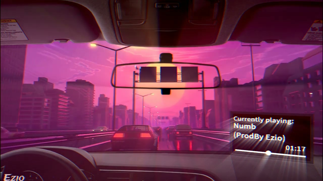
Hi , Back with another R&B type beat. Asthetic.
free for promotional use only.
If u like it plz like and subscribe my channel .
Instagram:https://www.instagram.com/prodbyezio/
@All Rights Reserved Copyright trademark.
Design I'm thinking of putting on a shirt...


yo these are sick! i absolutely love the first one, the trees and fog are very well executed.
Although both are great, in the space art I feel like the fade between the clouds and space need a bit of work (on both sides of the artwork). I don't mind the other parts of the clouds, but the sides look a bit hazy. (it's probably just me who thinks this, idk)
Also, because I haven't learned photoshop yet, I don't know how it would look without the grey fog on the sides, and I don't know if you made the clouds from scratch lol, so i'm not completely sure if my feedback will help.
Tysm for the feedback, the clouds and space part needs some work, it fades off a bit weird. I’m gonna try fading that more in the space and see how that turns out
Alright sounds good, and np :)

kk thanks 🙂
Gave +1 Creative Carma to @foggy moon

Love this planet edit :3

Made this for my Graphics Class as preparation for my exam tomorrow, Was wondering what you guys think and what I could do better? (Was made on a old crappy college PC that has an old photoshop version)


^ original picture

Dam bruv that’s insanely good 

Is there any way I can improve this?

i think it looks good
Its a good composite. The interior is a bit too pinkish (for my taste) against that blue exterior. However, I think it works.
ah ok thanks 👍


This is a cool perspective. Nice lighting as well. You captured a lot of great details in the rock.
Tyvm and the other one by the sea?
Can u dm asset
Because the inside of the room is pink, it should be coming from a light source that is more towards pink, than a contrasting blue.
I do think the interior lighting is really good, but I'd change the interior lighting to a desaturated blue. I don't think changing the space background's color would help though, because space looks great as blue lol.
Correct me if I'm wrong but is the person looking at a window? If it is a window, I feel like there should be a slightly dirtier/reflective texture on the glass. Right now it looks too clear, so it just looks like there's no boundary between the room and space outside.
Honestly, its 'ok' but not great. There are some nice details in the distant rock face but, overall, the composition is lacking. I wish those branches weren't there. You could possibly take it into Camera Raw and adjust the exposure, contrast and maybe crop it to improve composition... but it would really depend on the size/quality of the original image.
I only have 17Mpx to work with on this image I'd rather not cropping
But I can still try
For editing I choose a preset then spend time modifying via Lr then Photoshop

Went from there
Most of detail editing on rock was made by the preset but I had to work 3 hrs on the sky and on rocks
Thanks for the feedback 😁
Gave +1 Creative Carma to @pine jay
Np!

Inspired by Sam Peterson's workshop.


Where was that image taken? I could swear I've visited there as a child... like... 25+ years ago...
What do you think? I tried something new


Lovely. Only suggestion would be to change the text colour to make it a bit more readable.

Maybe close the leading slightly too?
(As in, bring the lines of text a bit closer to one another)
Okay, thanks!
what font ?

Strasbourg, France
Was it there?
It's was the Rue Moll next to a architecture school and close to the train station
I like your collage, really arty!
PART 7

May the 4th be with you!
Empire Propaganda Poster!


Behance
Looks amazing
This looks amazing
Looks cool
😍 thank youuu
Gave +1 Creative Carma to @violet pivot

Behance
thanks
Gave +1 Creative Carma to @worn kite
thank you
Photoshop is your best photo, image and design editing software.
Art I made for my dog that passed away month ago so ye, hope u like it guys!

Star Wars Propaganda


last part ( i think)

I'm enjoying when I see this art
I feel like this composite looks really bad 🤔 Does anyone know how I can improve it?

@devout tulip - It looks pretty nice to me 🙂
Maybe, if you're looking for **specifically **critical bits, I'd maybe suggest:
- Changing the glow from the torch so it's not so strongly defined. A real flame doesn't emit a 6 inch 'glow' like you've got. Maybe just make the glow bigger and with a softer 'edge'.
- The antlers have got a bit too much of a glow/fuzz around the edges of them
- The closest, strongest lightsource in your picture is the torch, but it doesn't appear to casting any shadows anywhere. - the only shadows you have seem to be cast from the moonlight.
That said... I think you've done a pretty nice job in all. If that was my work I'd be pretty proud of it.


You might want to instead put a radial gradient on the floor where the flame would be making the floor look a bit orange...
OBVIOUSLY not this strong or defined, but just to help visualise what I mean....

Thank you 😁
Gave +1 Creative Carma to @novel comet
 still learning, mixture of illustrator too but any feedback?


(my teacher doesnt want the right wall to be filled)

part 1


well done, interesting
Thank you!
Gave +1 Creative Carma to @bitter fog
Trying out the crosshatching technique taught this week by Brady and @toxic dome Hochradel

ive made this banner for a discord minecraft competition, thoughts about it? i wanted to keep it simple and really dont know what else to add.


Is there anything I should change/add to make this look better

give the rocks around the people the same lighting you gave the people

Nice drawing
Thanks
Gave +1 Creative Carma to @upbeat sandal
you are welcome
My 2* realistified . I am still a beginner, 2 months in photoshop, I need to learn more about such things. I made this from scratch with just solid colors and then added textures to each part, I just used the reference image from the anime

Tobi? :3 (i think that's his name)
Yes 🙂
Niice :3


opinions??


uncanny valley
really enjoying your mark making and compositions please keep up the great work.
Thanks! 🙂
Gave +1 Creative Carma to @sullen token
the first image is spectacular, I see so many shapes each one surprises me when they are revealed. I hope you explore more with that style.
Yeah, I’ve always had an affinity for abstract stuff. That first one is actually part of a larger series. I’ve finished three of six (including the one I posted)
the second one has Sandman (the comic book) vibes, and I recommend looking into charcoals and maybe creating your own brushes from crushed charcoal and strokes you make from it. the added dots of dust will really sell the energy of the portrait.

I kind of bounce back and forth between practicing portraiture work (I’m about 60% done with one I’m working on right now, lol) and the more abstract stuff.
Thanks for the tip. I have almost 400 custom brushes. I occasionally do some sketching with some vine charcoal (though I mostly use it to do quick sketches on canvas when I’m painting with acrylics). I’m definitely into your idea.
Gave +1 Creative Carma to @sullen token
Niiiice. Did you do this?

no this is what I'm talking about with Sandman

some inspiration for you


but again, you've got great sense of composition and marks making so I think you should just keep up the great work.
Ah! Sweet. This may be slightly sacrilegious but I haven’t really taken a deep dive into much of Neil Gaiman’s comic stuff. I have a lot of friends that love the artwork that the artists do for it though.
I just made this in Fresco, it's B-Real, from cypress hill's, real name, Louis Mario Freese. When I heard it I thought of this. sort of like synesthesia

Gave +1 Creative Carma to @sullen token
Hell yeah. I love Fresco. It’s my go to for my digital art. Hahaha, I just got reprimanded by the bot for using too many emojis.
that's better than the bot telling me I said something wrong while trying to tell you why I liked that first piece so much but I shortened it
And it didn’t post my message! Lol, three or four paragraphs lost forever in a moment that no one else will know existed. Hahahahaha
pretty much
Lol, I’ve been there. I definitely have to he mindful of what I say on here. Ha
are you saying you're a religious person?
wish discord would tell me what word is not allowed
nude?
demon?
those are like the only nounds
No, I use a lot more “ducks” in my daily speech. Lol
Yeah, it’s interesting what isn’t allowed. I have a few pieces I’d love to post but I’m sure they wouldn’t make it past the bot
greaat job

Before and after edited,, still learning shadows


I was trying to go for an early internet style of photoshop with this. How did I do?

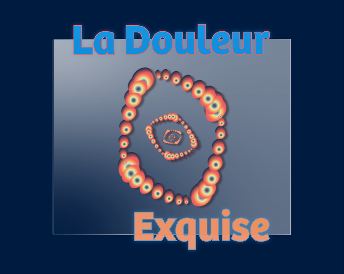
My latest behance project https://www.behance.net/gallery/143450441/La-Douleur
Before and After Edited


love it

good stuff. but there is light on ear and under the hat, it should be dark.
noted


And a process video
https://www.dropbox.com/s/u75q7muia2an7r5/I Hope That You Choke.mp4?dl=0

Way cool.
Ty bro
I would love to get feedback for what I could do better


These look great to me. 👏🏻👏🏻 The one with the black background loses some of the depth on the left side. Maybe lighten up the drop shadow and change it to a cool color (maybe a desaturated color similar to the “CT”?)
Thank you!
Gave +1 Creative Carma to @tawdry falcon
Indeed
can someone help me, what should I add or what should I change or remove?
This is for my last yearbook cover and i want to do my best

da boy uses old PS i see
whats the topic of it anyway. i can see Humans, Fantasy, Romance and Friendship
obv a yearbook so might it be summery of your year on a certain school from your projects?
yes
I just felt the bottom part needs to be filled with something
imo its pretty solid, i might have tried to use a different Background black which is underlaying from the circles in the upper part. i would match it with the Humans & 5 from the 52 color. but its already so many different B&W tones in it that it prolly doesnt matter anyway
"Have you become so fond of humans" makes us sounds like a non-human creature 💀
I think the kerning at the bottom is a bit too tight.

Are the commas on the bottom text necessary? If not I'd suggest to just leave them out
Spanish grand prix race day graphic @ScuderiaFerrari @F1 @Charles_Leclerc #GraphicDesign #F1
https://t.co/pOLkU8Ykg8

Hey, I would love to get feedback on how to improve this. I'd also love to hear any ideas on what I could add since it looks kinda empty to me 🤔

rate?

I have, it looks much better now

he is jacked, but there are suppliment so he is not a true jacked person


This is quite simple, but I made it, so im happy

Created this delicious UI recently. 👀
Please show some love?
Like, comment and share! Thank youu!
https://dribbble.com/shots/18201096-Nutella-a-Product-Details-Screen

Dribbble

yeah
Thank you
Gave +1 Creative Carma to @tame depot
WIP

Before and After


This is my first ever composite art and i still trying to learn photoshop 😅 i would like to have feedback on this. This is the before and after


I like that you darkened the background to give the character more focus but then darkening her face seems like its working against that focal point.
thank you 👌
Gave +1 Creative Carma to @wooden oak
good job


Bruh, this is actually insane. I'm digging it
Super basic compared to the stuff people post in here, but I'm creating a FIFA team with some friends. This is the badge I've made so far. I'm particularly frustrated with the top arch, and can't think of what to do to fill the empty space either side of VIKINGAR

this ghost picture has pretty strict lines, try to make them smoother
nice work, really reminds me style of calligrafuturism by Pokras Lampas


maybe more light to the face? i like background shadows and lighting a lot
Thanks 🙂
Gave +1 Creative Carma to @hallow iris


Top one is too hard to read...
Maybe not if you can read the kanji. :D
yeahh... you got me there 🙂
hmmm, for me this looks like a crime thriller movie
yes
Good design if you can guess the topic of a movie based on the Poster. As always nice work.
yeah
I know the topic of the movie


waaaw cool
usually those things got like a little black outline right?
I would love to do like this


I thought about it but I don't know, it looks too "easy" for me, too clean
yours look more oldish style
to make the black area between, fuzzy like on the example, i would make a mask the image and search for a fitting brush.
I'm struggling to find a "burned" brush
a lot of searching for sure. but i think if you ask for burned brushes in #❓ask-a-question you may find someone that have some sites for it with good ones
Did a new painting with mixer brush technic

That's a cool style, @cunning pollen!
Thanks, used only 2 layers for this painting + reference layer
Gave +1 Creative Carma to @wooden oak
I got supriced how real the head look

It looks pretty good so far...
Try a LUT. Go to: Layer > New Adjustment Layer > Color Lookup....
or perhaps a Camera Raw Preset

my first time dabbling in the element of dark horror! any feedback??


scared 👀
It's very dark and horror-y. Mission accomplished, I'd say

What would you change about this album cover?

really like the (shaded views) design looks sick
maybe i would put this cap on the car instead of this grey thing
this car would look good


Teach me do Realistic Shadow :O ,,, though i only use CS6
(either paint it over in black with a very soft edged paintbush, with your layer opacity set low.... or draw the shape with a pen tool, make it black, and then use gussain blur tool to make it blurry on the edges)
Gave +1 Creative Carma to @novel comet
@viral scaffold - here are two ways... I can't promise either work in CS6 though...
thank u for your valuable tips
Gave +1 Creative Carma to @novel comet
Thanks !
Gave +1 Creative Carma to @novel comet


Mixed technics


thats some big diăo posters ma dude. White Pig appreciates it. Probably getting paid for them.

Here is something little crazy from my pen today...

looks clean
a bit too much filters, but i like the idea
Cute :3
nice
I’m still having trouble with rule of thirds and creating depth while focusing on the subject

these are fire broo
add some shadow to this lad
Thanks, it means a lot fr
Gave +1 Creative Carma to @subtle orbit
Hi, I just wanna if these images look like one?
I tried doing photo manipulation by combining two images in one.
thank you! #📝project-feedback

The all new 2022 Harley-Davidson Salamander. This fully lizard powered bike offers a unique riding experience unmatched by traditional gas propelled motorcycles.


Bring a sense of magic and wonder to your breakfast table with this new age mug! Changing color right before your eyes it brings a sense of fun and curiosity to those around you. Coming in 11oz and 15oz sizes, this mug is the perfect way to enjoy your favorite warm drinks in style! .: White ceramic