#📝project-feedback
1 messages · Page 46 of 1
guy what color should i pick for the nose and rest and should i add that lil hair on his nose and also should i let the color as it is

Together at last! RIP


WIP


Working on mapping light

with text or no ? the grey one is the original


You can create your own. Go to edit and define pattern
where?
In Photoshop Edit > Define Pattern (iirc)


'


hello design people, i'm doing a minimalistic logo approach for my company. any suggestions?


lit
It is my first piece of work

ty mate
Gave +1 Creative Carma to @umbral sphinx
I think if you are going for a minimalistic look: less details will look more clean and modern
Agree
I recently made this let me know what you think

Try Different sizes


Let me know what you guys think of what I made


Thanks!
Gave +1 Creative Carma to @delicate idol

It’s kind of subtle because I have the opacity set low, but in the first one there are strokes on the drips


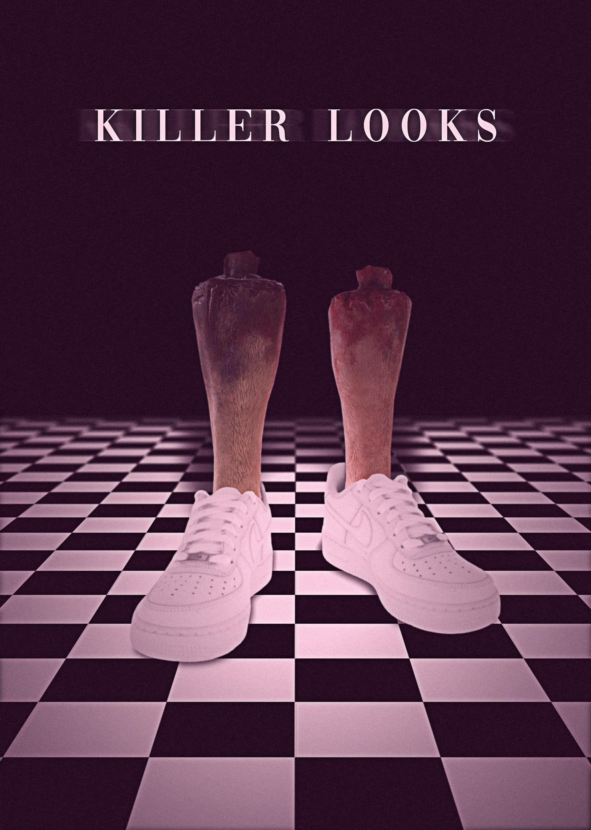
@delicate idol I was just trying to make a cover poster it’s really not that deep I’m not using it for commercial use I clearly took those pictures from the scenes in the show
how to do it? [please ping]


this look really cool but it would be nice if you can add a bit of blue in it
Which is best?


Spider-Man NWH Concept Poster Design

"Bloom Where You're Planted"

what can i do to fill these letter holes also ZA WARUDO!!!


this looks ligit 100%
@compact flume you're writing in the wrong channel 😅
@whole night OOOPS!!!! Thank you for the heads up.
Gave +1 Creative Carma to @whole night
I'm thinking I see what you've done here. If it's what I'm thinking, the subtle change to the background blur and it looks like you brought up the vibrants of mom and daughter. Am I also seeing some correction around the glasses frames?
I'm going to think that we've interacted enough that i can say, mmmmmm not so much on this one. The text is way too fuzzy. I totally get the sentiment though.
What do you guys think of my own custom Money Heist Poster ?

What do you guys think of this design?

I like it. I would just make your model name stand out a bit or put it under INTRODUCING. I would also work on your shadow, adding a bit more of a blur and maybe a slight motion blur so its not so perfect and round
"Sailor"


What do you guys think ?

this one is nice
Thanks!
no problem
looks goood but the credits is not visible and you can make the background a bit dark
Ah yes, you are right about the credit.
Gotta fix it.
good but you can make the red a bit less dominating
🙂
thanks a lot for your advice😊
my pleasurer
It was a Neural filter that made it that way.
okay😁


looks dope
Thank you
@normal sphinx Thank you so much gary for your feedback on my design. This helps me to improve my designs.😄
okay
Personally I think its a little dark, and the "Introducing" definitely needs to be bigger and bolder. Other than that love it!
Love the Black is Black, really stands out whereas I feel the Cluedo bottle is a little lost in the background
What you want me to choose ... not a chance they are all great!
Thanks for your feedbacks ✅ 💯
Hi :D


Thank you
thank you for your valuable feedback.😄
you can change the earth cause it dose not look realestic

its something I am still trying to work on.
And that "Earth" was something that I made in Illustrator...
oh okay'

nice


true dude
this one i like the most

the icecream pic is really nice 🙂
I'd suggest adding an effect to make the title stand out more (perhaps a white stroke would do the trick), currently it blends into the dark shades of the background, making it slightly difficult to read. I'd also suggest centering it between the 2 rows of dots - right now it looks like it's more inched towards the top row
and (optional) I wonder how it would look if you shifted the flower pic up so it's half garden, half white background
thank you....will make it into white stroke, will center it in between the dots also
and will try doing the shifted the flower pic up so it's half garden, half white background
Gave +1 Creative Carma to @coarse hornet
nice photography
thank you
Gave +1 Creative Carma to @terse ruin
Disintegrate

nice
Thanks 🙂
Gave +1 Creative Carma to @elder bear


Mintable.app
into the jungle bored ape #03 for contacting me :https://www.instagram.com/its__btn/?hl=fr
Does this look familiar?

It is the closest font that you can get to the actual one. I believe the real one is trademarked.

But you cannot get a font that is trademarked through Adobe Fonts
Island

Makes sense because trademarks are brand specific. Well strong one, anyway.
The Best Happiness Money Can Buy

A client who requested an American patriotic logo, with a Spartan element. He is a disabled naval veteran and his partner is a retired fire chief. He thought about using an anchor because it looks like a T and a V stacked vertically.

Find your flow is a women wellness company based in australia .


Astro Kitchens is a culinary company that is going to have multiple food trucks, with different concepts around Austin...eventually. They are starting at Tesla's gigafactory and will be offering hot foods like Smashburgers and Paninis, but focussing most efforts towards selling meal prep to the Tesla employees looking for healthy alternatives to the taco trucks currently on site.


TrustSitting is a platform that allows you to make instant bookings of speakers to perform many services that will help you in your daily life and make your everyday life easier.

I love how clean this logo is. And what a great idea of showing the logo as an app icon!
i really appreciate your feed-back ❤️
Blood Red Youth

This is my first try at an edit. I haven't been able to figure out colorsplash. Like, the layers and whatnot. Here's my first shot. All constructive criticism is appreciated. In the second edit, I tried to go with something otherworldly but I know the majentas are kinda jacked and weird. Before:

After:


i got a bunch but we can start with this one,


Tho I feel like this is my best piece!

this to
this :>

try slight yellowish touch instead of magenta

Hey guys I tried editing this product photo but i'm not sure what could be changed/done better. Would love your feedback

its actually very simple yo be frank....you can add so elements
Like what
like things in the backround
it is actually gr8
Can you show me an example
what is it used for
???????????????????????
website photo
okay
is it a product
yes
Like are u try a sell it?
yes
Hm
Sports poster of a college volleyball player here in Canada for the Humber College Hawks.

Skyfire


I think it’s great first shot. Part of the issue with the second one is the masking. You can see spots around the tree edges that should be masked away. Maybe trying refining the edges with select and mask?
Looks like my last cranial fluoroscopy!!! 🤣
If I'm getting sadness from this, is that because money can't buy happiness?
Indeed. The title is meant to be ironic.
I’m ironic

Ohhh!!! I like it alot,specially with the idea of some of the pieces overlapping each other and how each piece is different color. I also like how you used a blur on the background to make it more focused on yourself than the full image, keep up the great work!!!
I made this in 10 minutes right before school, I hope you guys can criticize it 🙂

This one is so dope dude.
Man this is amazing! And you created it in only 10mins! That's impressive

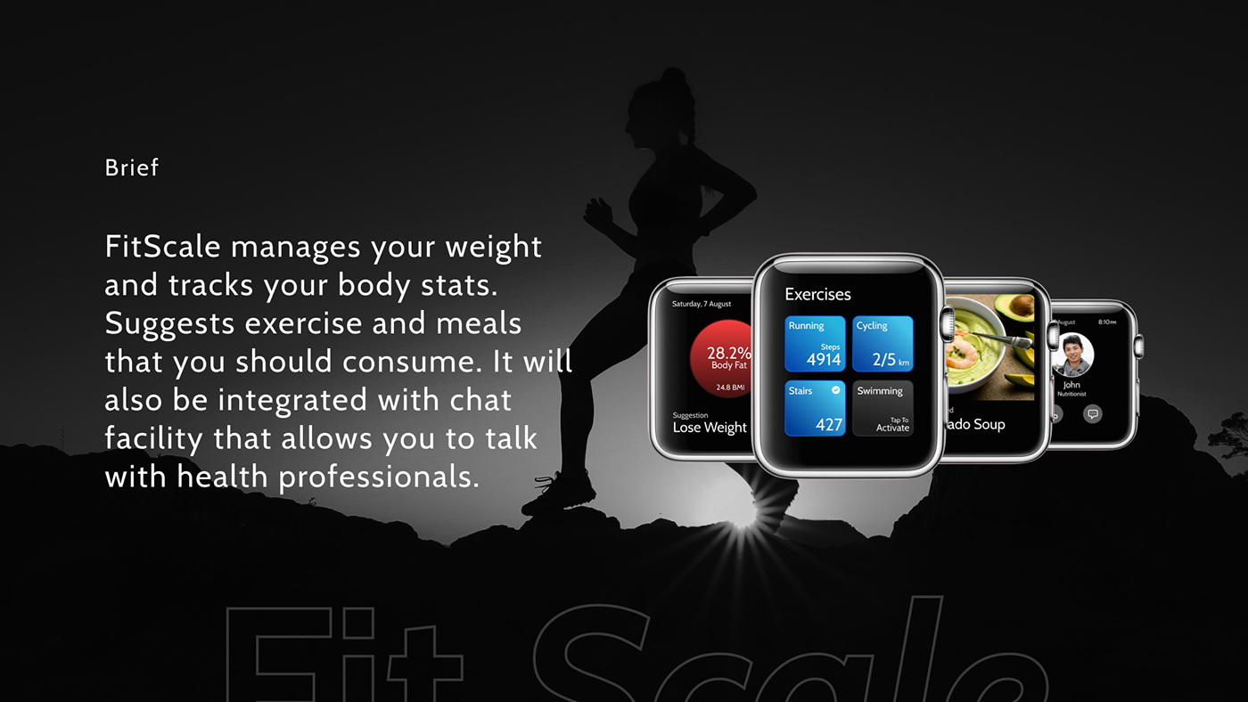
Hello guys. It would be great if you can review my work and provide me with your valuable feedback. Thanks. https://www.behance.net/gallery/135916663/Fit-Scale-watch-interface
Made a Valentine today what do you all think? Maybe I shouldn't have been watching that old black and white western too lol


I had posted a before and after picture of me and my kids i needed to fix before i went and spent money on to restore. Im on a fixed income is why I am trying to do it myself. Please I need feedback


How to do like this?
<@&548221840750018590> or whoever can use admin commands ban the one who sent it and delete the message. WARNING!!! THIS IS A SCAM

nice work! Just be careful with the highlights. it looks like the dress is getting blown out by the light and therefore losing a lot of detail. my advice: tone down the adjustments a bit and you're good 🙂
where could I improve?

idk if its just me but spiderman's edges feel a bit too hard
like his outlines is very rigid
i too felt the same
ikr


What do you think of this one ? I made it in only 2 days

take my input with a grain of salt: 1. I like the dynamic range in there and the composition of the scene, but I would reduce the brightness of the 4 planet shapes by a tiny bit to make it read better from a distance, maybe soften the intensity transition a bit. maybe work on your saturation levels a bit for the 4 planets as well.
Your right, the scene is beautiful, but still needs some saturation repairing. Thank you for your advice
usually under most circumstances I'd try my best not to have pure white on any of the RGB channels as it's really unrealistic (I'd go around 250/255 if I want something to be very bright) but of course this is subjective it depends on your scene.

Hello, what's the best Adobe software for drawing people?
@wooden oak
Do you know by chance?
photoshop
hm
Okay
Photoshop says my scratch disks are full when using several tools within the program, yet I have some space left on my C Drive.

It'd be great if someone could tell me how to fix and, or prevent this.
"Drawing?" Like sketching? Adobe Photoshop or Adobe Fresco. Whichever app you have the most control over.
Sketching mostly, then lineart. Coloring is my biggest concern tho.
What does "line art" mean to you?
Enhancing the sketch on a separate layer, then hiding the sketch layer when I'm done. Along with making it more visually appealing, and easier to color.
So raster/bitmaps. Not converting to vector art. (?) I'm assuming you have a Wacom/drawing tablet. Photoshop (desktop) will probably give you most options. Of course, you have to know how to use the tools. Conversely, I find Fresco on my iPad is a great drawing experience. It really depends on what you're most comfortable with.
I like to sketch with pencil on paper, then capture the sketch with my phone or iPad. Bring the digital copy into Ps to correct problems, translate/scale/warp/liquify, make symmetrical. Then continue sketching there. Hope this helps, @toxic dome.


For me, photoshop work best. But idk how to fix the "scratch disk is full" problem

The Truth About Heaven


This happens to me on my work computer sometimes. What works for me is I close out of the program completely to clear the scratch disks. Make sure you save your work before you do this.
How do you clear them?
Do you mean free up space?
Yeah
hello this is my new scene

yoo
By Request

maybe any tweaks i gotta do in PS, this is my blend?


I finished this drawing this morning. What do you think?

Cool artwork, but could use more hard edges so that the shading dont look blurred
If that make sense
I'm still not very good with shadows and highlights (especially highlights), but I'm still working on it
Just close out of Photoshop completely. When you do that the scratch disks will be cleared by the program automatically.
About Rain

moorning all 🙂 hehe . thanks


Glad to see your new stuff. I hadn't seen any in a while (though I must've just been missing it because you've been posting daily still). How are you doing? Hope everything is good with you dude!
Made in 10 minutes [Before/After]

Created on my mobile device, edited further on pc.

Things are going ok. Been busy with 4 children in the house... I've seen some of your newer abstract stuff too!


Composite using stock photos...space is my new fascination...

That looks great. What tools did you use?
Ranger's apprentice... Halt?


WIP


@compact flume Can I PM you with an image I made with photoshop that the bot will not let me post. I would like to see if you could tell me why it is not being posted
this is the message I get when I tried to post the image.
Woah there! The owner of Adobe Photoshop has requested that Discord block any messages our mostly-accurate robots deem to be explicit, so your message has not been sent.
Could anyone help me turn 2 gifs into a seemingless forever loop? please dm
Sure. But sometimes the Discord bot makes weird decisions. We really don't have any role in it.
It'll Come


thats amazing 😭😭 keep up the good work!!


great work


***** Happy Valentine’s Day to everyone! (No feedback needed) ***** 🥰


cool 🙂
Thx
DAY 1423 — Brief of the Day: Advertise Irons. https://www.instagram.com/_twc_daily/

just got back into ps after a hell of a long time


this is my first ever time using photoshop

my friend drew that
and i turned it to this

how would i make the main subject look 3d
cause it just looks out of place
Can someone check out the wallpapers i made and give me some tips? https://www.behance.net/gallery/127633829/Anatomie-van-letters

The Future is Here

https://www.cagatayberkkocer.com/
just redesigned my website would like to take some comments on it tho!
HII;
i tink your website is very nice i like it!
glad you liked it1!

Heyy guys! I made this in Photoshop CS6, can u please rate this and give me tips how i get the next time better? Thanks for all !

first photoshop I've made would love some tips idrk what I'm doing
Heyy, I think the idea is cool and it looks cool, but i dont with what u have release that but it looks that u have use a mosk and than with a normal brush when u use the pen its defenetly better beside that u have use picture with a low quality and thats not doing well, and i think with more lights and shadows it looks more real otherwise its good.👍🏻
thanks I'll try to use pen more I didn't know that that was useful for masking also sorry about low quality idk why it's like that, I sent it to my phone through Google drive so that's probably why
Gave +1 Creative Carma to @tawdry pilot

I think u would instead of cutting the drawing out of the image, find textures and recreate your drawing in 3d with different images
If you made everything in this piece you are sure talented!
I like this but personally im not a fan of that border effect, it drives away from your main focus imo
okey thanks!
Gave +1 Creative Carma to @teal pine


Wraith from Apex Legends composition from a cosplay image

Scarred


just a lil fantasy in the stars

I feel like the head is little big compared to the body
And selection is a little bit messy
But its cool for start
Thanks,but im also new so had a little miatakes
how about the other one?
Made it retro


amazing
amazing, those rays come from warping ?
the two other ones i really liked them
specially the one with pumpkin head
the highlights are so good compared to being new
it will become great with practice and experience
thanks.. 🙂
Gave +1 Creative Carma to @fickle umbra
omg its so nice
yw
Noicee
thx
Gave +1 Creative Carma to @fickle umbra
hoow did u guys get ideas to do these?
For this I was inspired by encreate and one pic in one of mine photo packs
ok

Ok, I'll give you honest feedback. I think there's gotta be something more
Cause It looks a bit flat
perhaps something flying over there
you know
but still very good!
Thanks, my first attempt at really making something in photoshop. Really appreciate the feedback!
Gave +1 Creative Carma to @shut violet
If it's your first time, I gotta say you are very skillfull
Keep it up!
Any suggestions about this design I made ?


I like the uniqueness of this piece
it has it's own asian touch
We all gotta start somewhere
@elder notch its dope but not lit right
one sec
this is just done in paint as an example

not perfect just showing you the idea
basically your light is that orangey thing in the background so anything not directly lit by it should be darker
you can already see that gives it more depth
Thanks!
no problem 🙂


sick
you should make an intro with the video copilot shockwave pack @blissful mason
sorry what?
My Tribute to global warming or confusion.


this is cool. very collage-esque
Yes they do
I like the concept! It is very contemporary

Play around with Neural Filter, Color replacement and rectangle tool and diffrent blending mode

original file

neural filter is greyed out for me
looks great
Hey guys, trying to have a stamp-like feature, any ideas to improve?

thanks
Gave +1 Creative Carma to @elder bear
Thanks!
Gave +1 Creative Carma to @hoary furnace

This map did I 2005 each color have the own layer, but the program was not Ps, it was Jask PaintShopPro 3.0

Make sure you're signed into your creative account
shadows are wrong
Looking for any feedback to improve

futuristic city

More clouds id say
Thanks for the feedback!
Gave +1 Creative Carma to @frozen jay
My first time at image composition :D, any improvement ideas?


This is hot


3
ok bet
Noice
How did u make taht

i am failing 2nd grade


Tell It please
i have been practicing image manipulation for 7 years already i think this is one of my best ones yet


Looks pretty good, Though, there can be improvement with the lighting, such as adding a sun, to make the reflection on the airplane looking pretty good, heres a little help if you don't know where to start: https://www.youtube.com/watch?v=VZ1YAWDXWFI

Discover the Techniques to Create a Fake Sun with Photoshop! Simulate a realistic Sun by using Gradients and Blend Modes. Besides, we will learn to create a dramatic atmosphere for the landscape to match with the Sun.
In this tutorial, we have two examples to illustrate how to transform your flat landscapes to a dramatic sunset scene. I hope th...
Can i get a tutorial, dam bro thats the best shi I've ever seen
No the basics to make that masterpiece would take 50 eons to teach
I appreciate some comments on this flyer. thanks


yeah
Still new to photoshop. But i did this today

need to learn cc
will give a 5/10 to the mask
Could you expand on this? Or direct message me with some tips. Ive only been using photoshop a week 😂 appreciate the reply
Cc = color correction
You need more experience
100% lol. I will for sure check out some color correction tutorials 😎
That's the spirit 😎
"No One Came"

hey im new !


ive noticed that some of the edges look a little jagged i need to look into how id change this
Thanks very much!
Gave +1 Creative Carma to @analog shuttle
woah you're a fut account
i used to make fut designs
glad to see community is still alive


i tried again with everything i learnt so far im happy with the outcome


Looks insane!
Ouff
thankyou im getting better for sure. loving the learning process
Yeah, it sucks the few first edits and then it just gets so enjoyable when thing finaly work out!
A composition I put together...

this is my course project what yall think

You have quite a few tangents in this picture, check out what those are
👍
hmmmmmmmmmmmmmmmmmm


Did you use Ps? Could you describe the workflow?
i followed this, i love this guy, hes a wizard
https://www.youtube.com/watch?v=t9drS8lsmSo&t=20s
🔔 SUBSCRIBE my channel for more tutorials : http://bit.ly/SafiiClon
Enjoy~
thanks for liking & watching ^_^
Kalau kalian Suka dengan Video ini,
Jangan Lupa SUBSCRIBE & LIKE yaa... ^_^
Silahkan kasih komentar, Kritik & saran yg membangun untuk Channel ini...
-...
Thanks!
Gave +1 Creative Carma to @frozen jay
A Prison Break Season 5 poster. What do think of it ? I am a HUGE fan of the series.

Hi there! This looks amazing! I am also a huge fan! I love how the work remains consistent throughout!
Ah Thanks man, Then we should be good friends >D
Gave +1 Creative Carma to @low goblet
I created a doctor strange poster for the movie coming out later this year!

Awesome!
cant wait for that movie
Yeah me too!
ty
Gave +1 Creative Carma to @languid knot
Amazing! I love the colours and the way you have used the surroundings!
tysm!
I just did a 30-minute challenge for spider-man desktop wallpaper! (4k)


yup
wow your designs are clean
do you know criminalfifa, firefut, simondzn, aquafut, lets.go.fifa?
they carried the fut scene on instagram
idk if they still active though!! i designed from fifa 17 to fifa 20ish and stopped
maybe you could cut this a bit better and use burn tool on the bottom of neck

School assignment representing the freedom of privacy (or lack thereof)
Made entirely with 


yeah i need to edit the CR7 a bit, agreed
yeah, but i don't know lets.go.fifa
does he have any drives?
ahh idk
oh lol

Its a Cool Idea. I love it so much !
Peaky Blinders
Thomas Shelby (Fan-made Character Poster Design)
@ThePeakyBlinder @BBC @netflix
#PeakyBlinders #ThomasShelby #Netflix #Photoshop
#FanArt #Posterdesign #Poster #CillianMurphy https://t.co/N7W0RCvR1K

thanks, I really appreciate it
Gave +1 Creative Carma to @upbeat sandal


perfect 👍
Thanks
wip

This is one of the first manipulations I have done because I am a beginner, I don't know if the shadows and lighting are correct. 🇧🇷


It looks like the lightning on the boats is a bit off, and instead of using a soft round brush for them use a hard round brush. Also the shadow of the person should go a little bit to the left. That might be hard to get right because it’s less flat. But great composition

Thanks, I will try to improve next time.
Gave +1 Creative Carma to @alpine narwhal
I would also focus more on lighting up the subjects more. In the Spiderman one they become harder to see with the background, and with the earlier one it looks more like a silhouette. The repetition and use of blur look nice however, and you could use that more throughout your compositions to increase the focus
Thanks, these tips really help me a lot!
Gave +1 Creative Carma to @languid knot
There is something wrong with it but i do not know what it just doesnt look right.

looks like "the batman" is way too much on the left and not in the middle, that's somehow confusing
ok ill see if that fixes it
and maybe try leaving the bat out of "the batman" and just leave the texture on the font... i mean it looks cool but it could be a bit too much


Maybe a double shadow for other things like the letters and second leaf?
The Ls seem a little weird
Puts a bit of distance with the rest of the letters
It is very clear and concise though
Thanks, I will put the changes immediately
@lime ginkgo I agree with @tight aspen, it looks vert cleas and concise. The points of feedback I have are:
- Maybe you could remove the long shadow, since you're displaying a 8bit reference, the long shadow suggests something more "recent" and newer.
- You also could reduce the horizontal size of the bar below the leaf, it will help you to save some space whenever you need to apply the logo.
- To bring more consistency, you might make the width of the horizontal bars and the letters the same, this way there won't be a lot of differences among the width and make your logo to feel even more balanced
This looks amazing, @devout compass! I'm curious to know how you build that, can you explain to us? Awesome job!

Thanks mate ✌️
Gave +1 Creative Carma to @sleek tiger
Looking very sharp, @glossy adder! I like you choice of colors and the way you managed the lights in the composition. If you're going for a realistic look, you might consider reducing the size of the player, you can use the other people in the scene as a reference, or if you think he'll lose the focus you might bring him closer to the viewer, I like this second idea because it will establish a nice visual hierarchy to the scene, it doesn't matter if you need to crop, of course that it comes to personal preference. Great job with the shadows and perspective!!!
Thanks for the feedback there, I am still new to manipulation so I am trying to improve myself everyday
Gave +1 Creative Carma to @sleek tiger
We shall see what will happen next
@glossy adder My pleasure! Let me know if you need any help!
Started with taking a picture of a sketch mannequin. Then masking images together from Adobe stock. Adding noise and grain. Using camera raw. and adjustments.
Paint & Brushes before & after...


“In the vastness of space and the immensity of time, it is my joy to share a planet and an epoch with Annie" Carl Sagan


Working on a visual representation of the social and historical significance of religions. Polytheism to Monotheism.


I just needed to know platforms where I could promote my work apart from Behance
You can use Adobe Portfolio that is included in the CC subscription to create a website of your work. I'd also recommend social media like Instagram to create a way to connect with potential clients and show your work 🙂
This is my current wallpaper that I just finished making! It's triple-monitor as you can see, any feedback or similar? Thanks


I used blender and photoshop


I think you have to make the shadows more dark and also color grade it a little bit more 🙂
Ok thanks for the advice!


cool
vector drawing and manipulation of an old DreamMachine

very nice
DAY 1439 — Work L̶i̶f̶e̶ Balance. Every time you find yourself here, it’s because you chose to come back. https://www.instagram.com/_twc_daily/

Photo used (unsplash):

Layout Grid/Composition

I think it's super cool, the hand edit as well as the match box change. Also love the use of script on the burning paper to give it that vintage feel. The colours are on point too! Even with the rule of thirds, a part of me wants to shove the Work a smidge to the right haha. Great work 😊
So I made my very first collage on Photoshop and this was actually the first graphic I made that wasn't inspired by a challenge that I found online. This is an original idea and I named it Yellow City. I would really appreciate some feedback.

This is my actual first project after watching a three hour beginner tutorial. It's suppose to be a youtube banner (which I know, it's too big to actually be one). Any tips and tricks would be great, I had trouble blending two images (the character and background)

@sleek tiger as u suggested to try reach out on platform
well that turned out to be a success
That's amazing! 😍
SuperMax 🦁

just keep practicing and discovering new features by watching tutorials.

Created this fantasy art. Feedback please.

looks awesome man, maybe add glow around the edges of the portals(?)


https://i.redd.it/q4x7788p6el81.png hypothetical poster for the song silver soul by beach house, I haven't used illustrator in a while so its a bit sloppy. Any advice?


Thanks
Gave +1 Creative Carma to @languid birch
this is something that I tried on my own, I flipped the picture and changed some of the lighting on it. Just wanted to get others opinion on it.

This is a cool image! I would probably add a little bit of blur to the reflection. And a bit of displacement here and there so that the reflection wasn't so perfect.
thank you for the feedback, I get what you mean about some blur here and there but what do you mean by replacement?
Gave +1 Creative Carma to @wooden oak
Displacement of the water surface, like ripples because even the most still water has some minor displacement of the surface; its often not completely smooth.
Also, often a reflection is slightly darker.
Try making a ripple-like effect
This is a quick example, @civic orchid

i see what your saying just do the blur. I thought you meant replace something. Ill play with it some more
how? what do you mean by ripple effect?

Like this
i dont know how i could do it but ill try im new to this
Not like that. They need to be small lines and subtle over the image.
I tried to blur it a bit with the blur too then i darkend it a bit but idj if it looks right

this one is darkend with the contrast and brightness i think its better hen that one where i used the burn tool

Yesterday I really started putting afford in Photoshop. Today I made this. I kinda like it, it's not perfect tho.

Make the back end of the own a bit blurry
So it looks like it's moving
Something like this?

I was trying to make a book cover, but I can't figure out the best way to blend photos together. Any tips on that?

You can always try the harmonization neural filter. If that doesn’t give you what you want you should mess around with the colors and maybe some shading

yes, neural filter should get you there but if you cant get what you like you can always take a sample from the background and overlay it on the person and adjust the opacity and/or fill to what you think looks good.
Ty !
was asked to do some affirmational posts and posters for a mental health non profit, this is the first one - I want to add a lighter colored stroke around the words and add some texture overall. is there anything else i should try?


not a fan on the 100
its too
well out of shape
keep the 100 all the same size and font
Yeah, haven't really mastered the warp tool
r=that should do
well
try instead of warping
just leave the 100% normally slapped on there
like such

yeahh
just like that
maybe bring in the numbers a slight bit more
and that should do it


i like his neck rolls
xd
What's the font on "Farmers Market" ?
comic sans
Nahh it don't look like it
def comic sans
It's Museo Sans Rounded

Thx
Gave +1 Creative Carma to @chilly scroll
ofc
what do you think of my art? @chilly scroll
He isn't looking down with his eyes.
He's admiring himself in the mirror
as he should
It's def something xD
@faint apex Thanks a lot for helping me out! 🙏
Gave +1 Creative Carma to @faint apex
np
xd


https://imgur.com/RuKVKxd any and all feedback is appreciated!
i am no expert but the shoes kinda look like they are floating?
like the colours a lot though
yeah i had a hard time with the shoes. composition (its called?) is not my strong side hahah
i think because theres no obvious light source or anything its hard to get the shadows right
yeah ill have to work on my shadows in the future
I'm posting a lot here but i like this one

Challenge Five. There are things I hate about it. But I've spent far too much time on this today--mainly because I started with a different idea and it just was not working out for me.

Ha, wrong channel


That dripping effect doesn't make the text very easy to read. I'd maybe make the background a little darker. That might help some.
Cool concept!
What dripping effect?
Thanks!
Gave +1 Creative Carma to @wooden oak
I was replying to the post above yours.
I’ll try it to see how it looks, I would do that by putting a dark screen on it right and making it a dark blend overlay?
There are several ways. You could put layer with a black fill underneath the screen capture and then turn down the opacity on the screen capture.
hello I'm a young graphic designer I wanted to have my work judged, please don't be too bad I'm still a bit at the beginning

looks great
You used Photoshop Right ?
yes
Yeah, looks good
thanks
Gave +1 Creative Carma to @waxen bluff
Oh sorry, This discord chat confuses me
Can i receive some feedback on this(didn't have much to work with)


Interesting concept art. Good job compositing the images. At first, the text appearing backwards on the ice cream truck was a little disconcerting. Also, the thickness of the road seemed "off." However, given the surreal nature of the composition, these things probably fit right in. hah! I like that you considered the light source and painted in shadows on the legs and the truck. I might adjust those elements a bit more so they weren't so bright. Perhaps just a 'Color Lookup' adjustment layer, Day to Night or Moonlight might help to tie the whole thing together. Just something to consider.
lol @ 'essay.' You asked for feedback. No problem.
Yeah thx for the second pair of eyes


How did this come out, any suggestions

thoughts?


Love this dude!

shadow way to rough try doing it with a really soft brush (low hardness) with low flow , also colors are off on the kid don't match, play with color balance some more
That's all i can add
Does this look like a good logo?

@thorny gulch Tried my hand at the suggestions you made and I think it helps a lot, thank you for your input

@hollow grove The image is very dark and a little blurry. If you have the original images, you might try to use Camera Raw to draw out some of the details in the original image. I tried but wasn't able to get much out of this small and compressed JPEG.

Ok tnx. Gonna try to do that later
@wooden oak can I dm u, cuz I dont really know what to do
@devout compass - In all honesty, I'm not a fan. - Logos work better with less colours, not a photograph, the text should take up a larger proportion of the whole thing.
I'm also a bit unsure about what it means. - You have two paint brushes literally piercing through a brain... and is that extra blood on the sides?
@undone rapids there is another - possibly easier way

Try using the Neural Filters


Hello im a beginner in Photoshop. I have created a poster for Jordan 11 Cool Greys. Feel free to give me feedback.

hmmmmm
what if you put the shoes onto a guy in a space suit, that might be kinda cool
I see

Wow looks great what brush did you use for the rough texture?

NP for the feedback. what i would maybe do is add more life to your work by adding someone climbing the mountain it will also help show the scale of the mountain
I used splash brush
Who climbs mountains at night
I think you understood it correctly. It wasnt supposed to be a mind teaser. you may be over thinking it... its a creative design type of thing. I mean I have been studying logos for some time now and I look at things like Hulu and KFC for what is successful and I am confident in what I have made here that it accurately captures what it is supposed to.
@hardy sparrow I feel like it looks great! What do you think?

Your right the only feedback that might help is that you got a spec of white on your "maybe" ginormous flag i don't know i'm just saying that showing how big something is isn't a bad idea
This is original I make it in adobe illustrator

I think its just an image of someone who claimed a mountain taken at night-time. not someone who climbed a mountain at night... I think sometimes people here are a little too critical...
So.i can to add some movement in my design @devout compass
If that is what YOU feel helps it!
just i'm gonna to write the story
oh weird that you posted this, i was just looking at this picture at about the exact same time

Yeah i just felt like i needed to give some feedback for him to give me the name of the brush
I just saw the dead tree that was really small in comparison with the flag so if he really intended for it to be that big maybe add something else to show how big the flag is @sand furnace do with it what you want
Does the flag appear too big؟
I think so but that's because of the dead tree if you do not intend for that to be the center of your piece maybe make the flag smaller or the tree bigger but maybe get a second opinion on it because i ain't no expert
That sounds like some solid feedback! Try to be positive if you at all can in the future!
Np.thanks for your feedback.There will be some changes when I add the animation @devout compass
thx that's great feedback
Gave +1 Creative Carma to @devout compass
@sand furnace did i already tell you that it looks great
Im not sure if you meant this to mean what I took it as... I did not post that... My image was of flamingos.... maybe the response got messed up. I was responding to @hardy sparrow about a logo discussion we were talking about.
Yes @thorny gulch
@devout compass it does look good over the image! I like how it works with that style of that surreal art in particular. Nice job.
You can see the whole image at https://www.behance.net/portfolio/editor?project_id=138969461

@devout compass I think you sent the wrong link, that's from the editor so it's not working

that's the correct one, thanks!


I made my first project on Photoshop, I also had some minor experience in photopea, but aside from that, I think it might be okay for my level. I just wanted to share it because my lord I am so proud of it

Nice! Keep going. Have fun with it. Set a goal to learn a little something new each day.
Thanks for the help, those airplanes wouldn't have got split without you lol
Gave +1 Creative Carma to @wooden oak
Happy to help. Glad you got it figured out.


By order of the, and I'm not gonna finish that cause I'll get muted
Hello, I'd like to have some feedback about this compositing I made. Thank you


very cool
Thanks
darken the sky pls
Maybe later

hahaaaaaaa thats rockin
I know that it is not very good but what do you think?


Noice
@vast whale - don't forget to draw shadows on the floor, take the light source and strength of the shadow into lots of consideration though....
ok thank you. I had drawn them but maybe they are to weak
Gave +1 Creative Carma to @novel comet
That signpost has the sun coming from directly behind it. - If anything the shadow should be coming out of the bottom and pointing down towards the bottom of the pic

nice work though 🙂
thank you for your suggestion!
Gave +1 Creative Carma to @novel comet
@novel comet like this?

👍 - almost!
Giraffes shadow is the wrong direction

(I mean... I AM being super picky about it... but I guess that's kind of the point of #📝project-feedback )
@novel comet absolutely! Thank you very much
Gave +1 Creative Carma to @novel comet
Did these for some school coursework- obviously not the best but any feedback appreciated ☺️


Nice work. So much better than I could do! James bonds eyes look a bit strange.
It looks like you have a nice gradient used on his hands but in comparison his face is all one solid colour.
I think now it's better.


Could i get some feedback on this?


Yeah I’ll have another go at the eyes and face colour when I next get on, problem is if you go too dark on the face gradient he starts to look strange! Thanks!
Gave +1 Creative Carma to @novel comet
Looks cool but u feel like the yellow one hasn’t quite got the right light compared to the grass below it?
@rare raven - to be fair, I've just compared the proportions of the face with the original shot, and it's pretty accurate. - I am awful at illustration, so don't trust me on this, but maybe people who illustrate people in vector/illustration style artwork, usually greatly exaggerate the size of eyes?

anyone know what i should do/add to make it look better? it looks kinda off

😆

I would work a bit more on the shadows to make them more consistent across all of the anatomy.
This looks cool. However, there is an issue that I see. I assume the focal point of this composition is supposed to be the house. (?) Currently the moon is competing for prominence. You might consider changing the green glow to a more neutral color and reducing its size.
Thank you!
Gave +1 Creative Carma to @wooden oak
Also, the moon is a bit too "crisp." Adding a little blur will help to push it into the background more. The overall scene seems a bit dark. You might want to adjust highlight/shadow and white/black levels to coax more range out of it. The final step might be to: Select All, Edit > Copy Merged and paste the merged layer on top. Then apply Filter > Camera Raw Filter to the merged layer for your final adjustments. This is just a quick edit but it sums up my suggestions.

Possibly yes, but it’s pretty much a trace on most parts, may be because there is no pupil/ shine to them and they are quite bright usually

What do you mean by it's not working?
I just dont think it looks good
I would just take out what looks like a lightning streak it would give it more of a clean look. The lightning streak just doesn't seem like it belong. You could also add more to it like another lightning streak on the other side so as to help it balance out.
thanks

Really good i would just lower the pinks a bit

missing some color on the bottom of the flower
Thanks. Was hoping it looked like the rain was washing away the black and white and revealing the flowers bright color. Maybe I should add black and white drips falling off of the petals?
Gave +1 Creative Carma to @frozen jay
definitely
also maybe some rain drops hitting the very yellow parts and washing the color off, hitting it off, idk how to phrase
its a really small picture so its hard to tell
Reupload: previous post was blurry.

was it intentional that you kept the lower part of the sunflower desaturated?
and the saturation on the lady bug is a bit off in my opinion
but other than that it looks clean
Was hoping it looked like the rain was washing away the black and white and revealing the flowers bright color. Maybe I should add black and white drips falling off of the petals?
yes
especially where the rain drops are
some are saturated while some arent

Feedback? ignore the blur

feedback? (ping when you've responded)


is this a thumbnail, if it is you should work on the typography, and make it a more appealing
for a photo manipulation it looks good, but could use some work esp on the color grading
it looks great, but the shape on the bottom right doesnt fit, i'd suggest either making it bigger, or smaller

It’s a advertisement. However this is my first ever one. So lots and lots to learn. I’ll definitely do more on the typographic to make it more appealing. Thanks for the feedback, I need lots of it I feel!
Gave +1 Creative Carma to @obsidian leaf
created album covers for a friend of mine :


my advice for you is to see a lot of posts from Behance, take some ideas and inspiration and apply those on your next design, you will see a ton of improvement overtime
For sure, I’m just really starting to dive into the community and take ideas and inspiration.
yeah good luck!
its a great application, but the tie need a bit work on
on the red one, the text is barely readable on the left side, it would be good to add a gradient from a dark gray of #0a0a0a to deep black


let me know which one looks best
it's just 3 different filters nothing else
about the actual work; I made it from a drawing, you'll understand if you have watched benny productions, it's something like bringing drawings to reality
what do yall think? :))

Freestyler!
here's another one I made


Isn't this just an effect from Illustrator?
@round current Photoshop has filters that will give the same effects as the image Sam posted
@round current there was a Ps DCC a couple months ago that we turned arts of am image into a cartoon looking image


No I was trying some filters in Photoshop and this turned out.

Made this for a friend’s server logo:-
https://media.discordapp.net/attachments/920658084903411772/952863581882421268/unknown.png

Feedback appreciated

version 4


@devout compass I think the colours are majorly oversaturated.
bit it's a lovely little message for whoever it's for 🙂

Well I figured with the content being what it is it would mainly appeal to kids. And kids like a lot of color. But other than that, over saturation is an easy fix.


A wonderful combination of nature and space. Great work
Could someone give me feedback on this. For an esport stream but I feel like my work is much "flatter" and not as "dynamic" as stuff you'd see on the pro stream. Any tips on improving the background especially? I know I added that lined pattern but still don't think it's as strong as it should be.


@uneven lintel - I love it! Seriously so much of the stuff I see on here has too many crazy colours, hue shifts, bevelled effects and over-saturated colours. - yours looks clean, professional and easy to read.
Oops. Wrong person! I meant @arctic maple

I need a feedback on this design.
What are your criticism, analysis and suggestions?
Thanks community
The image looks a little squashed to me.
Also @fiery kayak enquiring is spelt wrong. (unless it's spelt like that outside the UK)
so we're making a banner for a competition and can't seem to know which theme is better, dark or light. any help?


we want something to attract attention across the hall
if we made the banner and our presentation in dark theme would it be visible?
https://twitter.com/andrewbingham_/status/1504123616723709953?s=20&t=LGm9jxosaKmmWXhyn417fg Would love some feedback on this 🙂
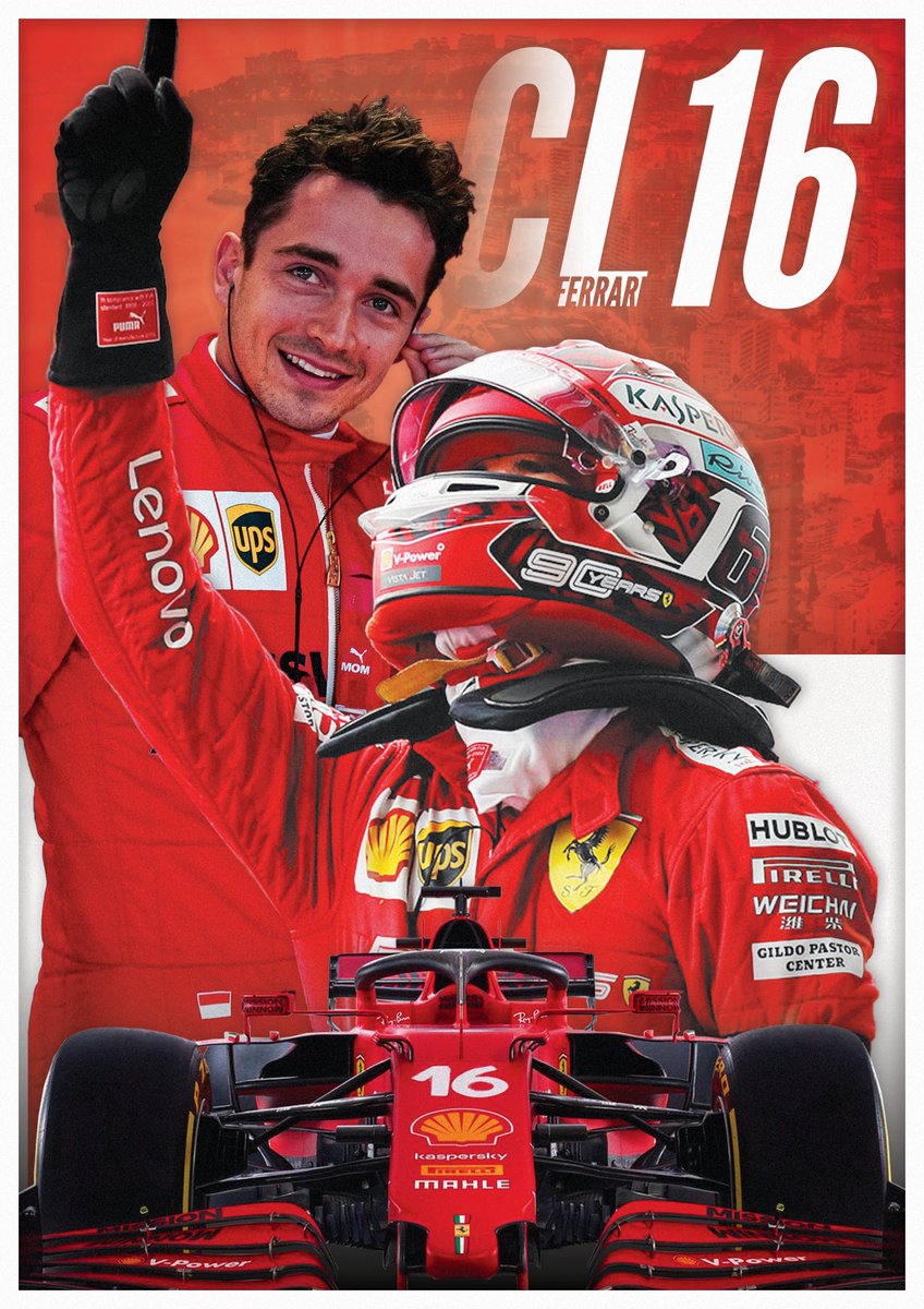
One of the designs I've been working on today. A @F1 poster for @ScuderiaFerrari driver @Charles_Leclerc!
🖥 Check out my portfolio: https://t.co/gYdYPKwU1R
#f1 #ferrari #graphicdesign #graphic #design https://t.co/fzSdIaefb2

i feel like white would fit better


Thank you!
Gave +1 Creative Carma to @novel comet
Definately the first one. Black background with blue text.
Here’s a Netflix inspired photoshop I made of myself let me know what you think

@toxic dome @novel comet now I have two opposite opinions 😂
if its for a competition then i would say the dark is likely to draw more votes
Just in case it helps @elder hull....

Source: https://www.uxmatters.com/mt/archives/2007/01/applying-color-theory-to-digital-displays.php
(I always previously thought that, officially, white text on a black background was easier to read - since it's used in Microsofts 'Accessibility' features)
where did this come from
Edited above
👍
haha
that's why I prefer black also cause our project is about sensory rooms so dark theme is more related in my opinion
that's a good point too,
yet it's a big banner 100*120cm
Still learning, today i learnt how to use mask over a black and white image to add colour to parts of it. The fence was tricky from black and white to colour.

multiverse of madness poster by me (inspired from "US" movie poster)

This is cool! The lighting in the photo is great. I would work on the title. Perhaps brighten it a bit. Not sure about the texture. If it fits with the style of the overall composition.
Thank you for the feedback I will fix those mistakes 👍
Gave +1 Creative Carma to @wooden oak
Nice! Keep going.
Not mistakes. Just suggestions. Something to consider.
made this fight scene as well inspired from the trailer

tried making a layer-breakdown but didnt really look good
Great use of colour masking @oblique saddle. Maybe try doing one of a woman in a bright red dress or something thag really stands out....


Ye or nah? (Still working on it)

middle


This is a side project of mine that I did following a video on Instagram 🙂 I'd appreciate any feedback

looks really good but i suggest u add shadows
gives it a better look
@glossy adder you mean cast shadows?
yes
I've added the shadows @glossy adder thanks for the feedback 🙂

Gave +1 Creative Carma to @glossy adder
pretty cool but does glass like this actually cast that much shadow
Hi guys. It's my first day on this server, so I appreciate all the help you guys have given me with navigating the place!
I am a novelist, and have recently partnered with an amazing digital artist to work with on my novel. I really want to give him as much exposure as possible, because I really do believe that he deserves the recognision.
Here's a link to the first piece he's drawn for my novel. He has only done portraits in the past--this is his first attempt at a different style: https://www.instagram.com/p/CbQfbeEg2-S/
Let me know what you guys think, and I'd gladly welcome comments on the ig post so that he can see the appreciation for his art 🙂
I’m excited to announce that I have partnered withto create the artwork for my latest novel. The idea is that we will have a painting for each of the chapters on, which will bring some life to the characters and scenes. What do you think? Please do spare a second and drop him a follow!

Here's two more examples of his work


suggestions?
