#📝project-feedback
1 messages · Page 45 of 1
Twelve year old me is happy you said that. Haha 🙂
I was just trying out brushes in Fresco. Found a few I liked
I have timelapses of the Fresco part of just everything

That’s what it looked like coming out of Fresco. My work flow for stuff like this is Fresco > Photoshop > Lightroom
never used fresco
I love it. It’s UI is simple and intuitive. They’re constantly adding new features. I like that I can use all my photoshop brushes and basic vector brushes (though I don’t use the vector brushes nearly as often)
kinda like carrying around a pen and notepad or something
Exactly
Sometimes I’ll sketch something with a vector brush first because it feels smoother (no idea if it actually is though, hahaha)
im gunna take a peep at fresco 🤘
fresco not available on PC or Mac.
I use it on my PC

my laptop is touch screen, idk if that helps lol
Not sure. It’s been available on my PC since I started using it
oh pfff uh well yeah duuuh, is it like a chromebook or something?
Nope
its some sorta thing or something
Just a desktop
I got my PC like 4-6 weeks ago. Before that I was using a super old Lenovo laptop
because last time i checked, fresco isn't available on PC or Mac, guess it changed
running fresco on my 4th gen apple ipod
Huh, weird. I've been using Fresco on my laptop/PC since I got my CC sub almost a year ago.
Well, since April-ish. They might've changed it around that time? I know they announced they were phasing out Draw and Sketch and pushing Fresco as an app on my iPhone. I eventually moved to Fresco on my phone and then downloaded it on my laptop
And I do know the app version has features the PC version doesn't (like text)
ok yeah i checked, it's been available since it was released. my stupid friend said it wasn't available
it's not available on Android Devices tho

Ah, that makes sense. It seems like they’re trying to compete for some of the Procreate market with Fresco
I have Procreate Pocket on my phone. But using a phone screen isn’t ideal
i need to get a pen so i can draw on my laptop, i have a drawing pad, im curious how well the laptop screen works
i cant flip the screen around though so it might be weird
i guess i could use my finger lol
finger painting
Yeah, I have a Wacom and I don't know how I worked without it
Some simple gradient layering

Last one for the night

can i get some feedback on a few pictures i made
would be a lot more convenient if you uploaded it in simple jpeg
ik
but these go on a thumb drive and are back up copies of my twitter posts
incase anything happends
so while jpeg or png would be convinent jfif is more for my style of work
i have a few png arts if u want to see them
don't expect too much feedback then. Downloading those and opening is much more hassle than just looking at uploaded jpeg
i have a few png files if u wanna take a look at those
sure
there
are those all drawn by you?
not all at once
i slowly drew them over time
and i posted like 5 or 6 at once on a week
these are posts from my twitter
and you drawn them all from scratch?
yes
but ofc over time tho
i work over night so i can try to post 1 a day or atleast try to
do you like it?
so you steal art?
this is the original author
and you are uploading those here saying it's your own
i never said it was my own now did i
whatever
i knew if i tried to join a comunity id be looked down apon
im tried of trying at life bye
here you said you drew it
lol
then learn some skill then people will respect you
probably

yooo, you should try this program out, its free, i think you might have alot of fun with it
https://www.chaoticafractals.com/
lmao, nice catch bro, respect
Thank you. Sure, it is a combination of different filters, and distort, blur and sharpening techniques to get the shape. Then combining different gradient layers, different blend modes and LUTS to get the color. Lastly doing some dodge and burn techniques. Also lots of inspiration from the artist Retoka. 😊🤙
Gave +1 Creative Carma to @whole night

good evening everyone. I created such a work in Photoshop. what do you think ?

Cool
this was the best convo i read on here tonight hahaha🤣

what's causing it?

yay
Cool


This is cool dude.


That circle a swirl or polar coordinates? I really like using polar coordinates.


Nice
The world is waiting to welcome 2022 and here is an Events Website Concept for the New Year that stands before us, like a chapter in a book, waiting to be written.
Your feedbacks are warmly appreciated.
Don't forget to like and comment. ☺️
https://dribbble.com/shots/17122160-New-Year-s-Eve-Events-Website-Concept

looks amazing
It is definitely eye-catching but is this one image... everything? I'd call it more of a masthead design rather than website concept...

ooh looks good
btw could someone give me tips on how to improve my editing?


(sorry for the spam)
so can u give before and after cause i cant understand what you edited form the stock image
oh u took it form gta 5

Hi there, how are you doing? Thoughts on this one, i'd like to hear you 🙂 Checkout my behance page https://www.behance.net/oalexandreribeiro lets chat!! 👊
u can do photo manipulation on the image
professional design :> it looks good
fake
looks pretty sweet
made aesthetic edit form scratch took 3 hr pls give feedback and if anything i need to improve in this edit

feel like it needs to be a bit lighter and have some highlights somewhere in there
ok thanks for the feedback
Hi please give feedback on this vector I did

its looking great
I was doubting the fingers. Thanks for the feedback
Did you draw it
I vectored it from a photo
might look pretty cool if you make the the red areas like the green area

Thanks will try that
Gave +1 Creative Carma to @delicate idol

cold jay t
everyone like it up now or i will self destruct


https://www.instagram.com/p/CT-MT1zs9lw/?utm_source=ig_web_copy_link link for the design on my Instagram page
^^^^^^^^^^^^^^^^^^^^^^^^^^^^^^^^^^^^^^^^^^^^^^^^^^^^^^^
I made this during my freetime :DDD

Hey everyone, what can I do to make this picture better? (It's my first time working with burning things) Thank you :)

Hello @keen mason , first thing I noticed is that the bills are not burned where the fire is. Check out how this one looks in the picture. The point where the fire is starting, is black and grey and some of it is totally gone. Maybe with a little transofmation tool work and manual brush coloring you can get that effect.


Ok thx I'll make sure to do it (:
Gave +1 Creative Carma to @somber meadow


twitter banner

@simple herald that's really cool man , you got socials ?
i had but deleted
oh klkl

This is a template for bookmark
but the font and color will stay the same
@toxic dome what should i do to it to look good
That's not very nice
@long grotto @toxic dome Please familiarize yourself with the rules of the Ps Discord chat. There arent very many, but rule #1 is to be respectful to one another. Also, all texts must be in English. If you have any questions, DM me. Thank you.
Gave +1 Creative Carma to @long grotto
can we share drawings too here for critiques or not ?
I think, if drawings were made in photoshop or edited in it then yes
Seems like you made an effort
.

Güzel olmuş
eyvallah


Merry Christmas Discord!


I think the red is too bright
hey guys, I would like to hear some criticism from you about this edit, it took me around 25 hours to make it. it s inspired by Wlop s Art.


Hello bzizaki! First of all, I really liked the edits you have done. It's very hard to see any flaws and tell it apart from real or fake. I just want to share my own two cents on some spots that I think can be worked on.
I want to first draw your attention to your left hand holding the owl. The lighting on that hand seems way too bright especially on the edges, and I feel like the thumb is not creating enough shadow on the owl.

Second, if you look at where the tail or the right wing of your owl is dangling down. You can see that the shadow of that wing isn't really shown on the sleeves of your robe. The shadows that's currently there are the robes natural shadows, but if there is an owl's wing dangling over it, I think the shadow will look a bit different.

Lastly, if you look at the bottom of the owl, I don't seem to see where the legs are standing on, so I would assume that you forgot the legs on the owl.

Even if your owl's legs are hidden and small, I think showing the legs will make the image more convincing. Otherwise, it would appear to me as the owl is floating on your shoulder.

But generally, I still really like the edits. These are just some things I saw but I could be wrong.

Hello Hiddensolomon I do really appreciate your feedback and the criticism, you are right all what you said and I will try to make remake again on this details, about the owl legs I just skipped it because they are so small I thought like it will be hiding anyway :d the thing is I liked image so much after I just wanted to finish it 😄 but yeah that made me to miss some details. btw it s my first time to work on something like this , like fantasy edit, mostly I was editing realistic background changes so this one is my second work in fantasy and I am really so much happy that you liked it and told me that it s hard to say that it s fake, you don't know how much that means to me. I m more motivated now, thank you again ❤️
Gave +1 Creative Carma to @chilly wadi
maybe try to mix the color more with the text
water made by brush

ok thanks for the feedback bhro
Gave +1 Creative Carma to @mental vessel

Rough concept


Wow nice style

can u explain me your workflow
like how do you make this type of edits?
Lazyfox - like with this one... I start with making some color adjustments. then I isolated the man on the cliff and made a separate layer of it. Then I went back to the original layer and blurred it a little. so that the background was blurred and the man and cliff werent. Then the rest was basically neural filter and texture from the filter gallery...

oh thank you for sharing the process
working on capturing random cool pictures palettes, need to up my swatch game

anyone have some awesome photos to share?

A WIP


🎅HOLIDAY SALE!🎅 Get a rare 30% OFF the -ART School for Digital Artists- program and everything else in my store 🎓 http://cbr.sh/q8zql0 - until January 1st 2022 ONLY!!
The only COMPLETE art education from home. We've reached 7500+ students so far and that's crazy, when will YOU be joining our awesome community?! ;)
🖌 Get my brushes for FREE he...
Thanks. That’s just the sketch though. I did the inking afterwards.
Gave +1 Creative Carma to @delicate idol
Also, it’s kind of late so I think my last reply might’ve come off…wrong. I’m definitely going to check out the video. Anything that’ll make me better I’m down for
his videos helped me alot
hes got a great one on color

🎅HOLIDAY SALE!🎅 Get a rare 30% OFF the -ART School for Digital Artists- program and everything else in my store 🎓 http://cbr.sh/q8zql0 - until January 1st 2022 ONLY!!
The only COMPLETE art education from home. We've reached 7500+ students so far and that's crazy, when will YOU be joining our awesome community?! ;)
🖌 Get my brushes for FREE he...


Before and After

Gave +1 Creative Carma to @delicate idol
I watched those videos today. Good stuff dude. Thank you
@delicate idol Thank you for posting those videos they are pretty good, I like lol
Gave +1 Creative Carma to @delicate idol
your welcome

Izmir Turkey Gta Sa Style

I made an homage to old school point and click video games today, idk why, but its was fun and I got some xp for it. What do you think? anything cool I should add or change?

maybe like a bird flying around now that i think about it

Needs more cowbell
Perhaps a periscope?
Or ... birds are good too 😉


This is the raw version (unedited version)

And this one is the finished one

what do you think ?
I love it 😍
oh thanks
Gave +1 Creative Carma to @boreal crest
I would fix the framing, side swords are too close to the edge of the poster. the same applies to the text at the top
hmm interesting. I was think about the same think. Thanks man
Gave +1 Creative Carma to @whole night
the result is great though, good job!
thank you man and thanks again for the tip. 😄
Gave +1 Creative Carma to @whole night

😊
i feel like these guys would use those swords 🤪

@upbeat sandal Really nice job on that. You've WOWed the crowd here! The before and after show what a lot of imagination and the tech to support it can produce. Well. Done. You.
lol i agree
thanks, that is so sweet of you😊
Gave +1 Creative Carma to @candid kindle
For the newer of us ( ... me ), how long did your project take? @upbeat sandal
Good morning @devout compass . Curious about the process(es) you used to achieve the overall effect.
The name of the movie escapes me. Is that from the animated movie .... um ... the one with the kid and the shards?
YES!!! Once again you have helped my pickled brain. Now I have to find it. Netflix or Amazon hopefully

Geniusias (plural of genius?) in that company.
jeanersis
hmmm. usually i don't count the hours that my projects took to be done. but i will guess and say about 7 to 8 hours separately.
I really enjoy the nostalgia this envokes. make more!!
i made this a while back...not sure what to think


I took a picture of Boba Fett and masked the background out of it. Moved it over to illustrator and used Image trace. I put the settings for image trace at 6 colors and at about 50% attributes. I transferred it back to photoshop without the white background that it produced in image trace. I used a custom made gradient for the background and then gradient mapping clipped to boba fett him self. Then I used some neural filters and filter gallery to achieve the rest of the textured effect.

This is the second photo I ever edited in my life. This was a realistic photo of tom Holland that I made to look like a painting cause I was bored and bought photoshop so now I am thinking of doing this as a hobby or something to pass the time

really?
tom holland stickers
yeah of course
people love them stickers, you can do a pretty high mark up on them aswell
what about copyright?
idk, hes a public figure
worth a google though
if you can post their face in the news and make money im sure you can sell a sticker
Just playing in Photoshop #killingtime


It looks pretty good for what your trying to do but from a personal perspective I don't like how heavily edited it is. The before is just too bad of quality from the camera that I dont see how you could edit it well enough. If it was taken with a better camera i feel as though editing would be much smoother
a lizard
nerzard nerd+lizard
I can't afford anything more than a Nikon d3100

thats amazing
:)
hell yeah!
👍
im thinking of putting this eagle into some sort of wall art for my father cause he loves eagles
i would drink out of that coffee mug


money
imagine if someone steals my art and sells it. :0
i mean if someone rlly goes and steals it and sells it then it just proves im great at art
what copy right law is for.
that eagle looks awesome


🤎

Wow that's amazing
Thanks. The work of Francis Bacon inspired me
Gave +1 Creative Carma to @rose jasper
a bit similar but still a different style, I like your work even more, keep it up
Wow! Thank you. I just did this while watching Paul Trani's last masterclass. Admittedly, I got a bit sidetracked. I've been paused at the 10:00 mark for like an hour. HA
Gave +1 Creative Carma to @rose jasper

Yup
Lol, I did like 10-15 of them total
But they all build on each other
Wow cool but how?
That one is the culmination of all of them
my work is more realistic, not quite art but quite steep landscapes

Nice!
I dig it
I can do a process gif at some point tomorrow. I started to explain what I did, but there were so many steps. The short version is I kept 100 x 100 patterns from the previous pattern. Stacking those and making another. Then did a row five of those on a 500 x 500 and went down rows rearranging and manipulating those five
All on different blend modes
Lol
I’m actually make another big piece from the one I just posted, lol
This looks like art to me. 🙂
so it's just more work than fun, but I still really like the result and I'm willing to spend time on it
Got ya.
Cool
I have a lot of time to draw. This one I painted for 2 days although there are some that I painted for 2 weeks
I'd rlly appreciate some help with improving this pic to make it look more real

original

not much photo manipulation
the major changes done were the color grading and pic adjustments
any kind of opinion/tip/criticism is appreciated
Nice! I've been drawing like crazy on my winter break. And...before I go to bed here is what I did with the thing I posted previously


Oil Painted Effect

I may be looking too deep here. Is that a person and a rabbit hidden in those brush strokes? Haven't finished my first cup of coffee yet.

lol. No there is nothing hidden in this. It is purely abstract.
Consider me ab-dis-tracted then. 🙂
Whoa...how did you do this?!
maybe some camera noise, def better shading especially around the wheel wells and the light source on the car doesnt look like its coming from the far wall
Oh okay thanks for the tips. There are multiple light sources on top so yeah it kinda doesn't look like it's coming from.the far wall
Gave +1 Creative Carma to @delicate idol
maybe swap 1 out, might make it more dynamic
Transform, warp, blend modes, and whole bunch of stacked patterns
That's dope
hes like the only person that posts abstracts, i been telling him to do videos lol
Yeah, I plan on doing a process gif for the 500 x 500 one I posted. But I’ve been lazy today since it’s my birthday. Lol, plus I’m trying my hand at doing an impressionist landscape today. It’s harder than it looks, lol

Thanks!
Gave +1 Creative Carma to @candid kindle
happy birthday homie
🙏🏻
It's too big to share in the Discord (if you want to watch it without having to click the link it's in the Post-Your-Work channel on ACC server too which has like a 100Mb cap instead of 8), but here is a link to a process gif for Sad News in a Quiet Room. The first part is Fresco, when it "resets" that's photoshop, and the last four images are Lightroom broken down into Light, Color, Effects, and Final (each image has the previous settings too, e.g., Color is Light and Color).
https://www.dropbox.com/s/pnuz1hxs0qx2an3/Sad-News-in-a-Quiet-Room-Process_GIF.gif?dl=0

I'll do one for the other piece in a bit. There were just so many stacked patterns I need to organize it a bit more first.
Happy birthday Nick
Thank you, thank you.
Gave +1 Creative Carma to @halcyon loom
I really didn't do much in Photoshop that I couldn't have done in Fresco besides add a blur to one of the layers. The rest is just blend modes and opacity adjustments.
Oh yeah, and I added a levels adjustment, solid color layer, and LUT I made from a Photograph I took to the "final" image in Photoshop too
I love how raw the emotion is in this pic
Thanks. That’s what I was aiming for. 🙂
Gave +1 Creative Carma to @halcyon loom
Here is the gif for the other one. I started with a 100 px x 100 px file, made and placed each square, then after doing that a bunch I moved them all to a 500 px x 500 px document. So, when you started to see them moving across the top of the square, that's when I started placing them in the bigger document. I may do another video for what I did with that 500 x 500 image to make the third image. But...we'll see. Lol

Each 100 x 100 px square is the pattern shrunk to a 25 x 25 px square and then I did some warping, transforming, and hue adjustments to each 25 x 25 px piece to make the larger 100 px square. And those final curvy pieces are a gradient liquified, then warped and transformed.
Anyway, I'm going to get back to this landscape painting (I'm not a huge fan of landscapes, but...I like to learn about as many different techniques/styles as I can, lol)
happy new year guys :)

happy birthday bro

Thanks
Gave +1 Creative Carma to @long wind
It's ... sparkley
You can see im a amateur designer for misstyping 2022 as 2021...
Need ops tough

That's visually stunning

I played around with a photo I took and ended up creating this interesting texture

Thanks <33
Gave +1 Creative Carma to @halcyon loom
Thats some intresting unique paterns 1st one looks likea bone-like structure
2nd one looks like an intresting wave
and also i fixed the numbers..

Thanks so much
Gave +1 Creative Carma to @hollow shale
Just an idea I came up with...
Able to take a bad photo of myself and turn it into this...


Maybe a big ol 767 landing or flying overhead in the distance?
as in colour correction wise
i dont really wanna add to the photo like that, i wanna leave it as i shot it

OpenSea
We are living in a time we’re our leaders are using Nuclear Powered Weapons as a Chess piece in a game for full control. Essentially, they are playing a game of Chicken with one another and eventually someone stays the course whic
As I said yesterday, Landscapes aren’t really my thing. But I think this one turned out ok.

Also did this earlier

Hello, I made instagram post about me in 2021. Might check it out and if there are any feedback let me know. Thank you
And it’s me. The past few days at the end of 2021 were difficult. Especially on 30 December 2021. Yet, I don’t want it to ruin an entire year. I don’t want to dismiss the fact I struggle and have much of the joy I felt this year.
This is the post where I measure myself in years to show how much I growth in 2021. To remind me that I have to be a...
Likes
221


@tawdry falconyou sweet genius you
Haha, thanks. I wouldn't go that far (at least not in the context of art, lol), but I definitely appreciate the compliment
Gave +1 Creative Carma to @delicate idol
I'm working on a self-portrait using the Keith Haring brushes. So far, it's looking pretty decent

thoughts?
sorry for bad quality, discord doesnt allow me to upload it in a higher qualityh
https://www.behance.net/gallery/134221951/RSU-Interference-Night-Concept-Scene-Prints
Started working on scene concept art/design for fantasy interactive graphic novel/video game
so, going for kinda graphic novel feel but fantasy driven...

thoughts?


The text on the right becomes hard to read when her face is punched out behind it
You could tint or tone the right half of her face to smooth out the competing textures
you could also introduce a faint blue or purple and color wash that side
I think it's also a stronger composition without the opposing corner circles. you already did a great job of creating a bold division down the middle, don't overcook it by pulling emphasis to opposite corners
I might also enlarge the border square so your name is not overlapping her hair. clarity, clarity, clarity! show your name!!! 😊
Overall it's a very engaging and bold design and I like it
Thanks @empty knot ! That helped me a lot! ^^
Gave +1 Creative Carma to @empty knot
You're very welcome!! 🥰
This gave me an idea! thanks for sharing!
Gave +1 Creative Carma to @devout compass
It's very intriguing and beautiful! Reminds me of stuff my dad might do in Photoshop, nice!
That is some chilling imagery
its for a terror track hahahaha
I'm gunna say you achieved your goal. You could maybe try highlighting the tips of the teeth (not the whole tooth) to give them a wet look, the gum line and finally add a pin drop of white to the pupils. Dunno, just thinking that might be even more eerie looking.
you've got to be kidding me
you want seven thousand dollars for a five minute filter job
you should not make art.
that is to say, this is not art. this is churning out images for cash
You don't want design feedback, you want to advertise your NFT. Gross.
No problem
ooh. sick burn 😉 Well @stuck moss I thinking this probably wasn't response you were hoping for 😖
If they wanted design feedback, they would have posted the design, not a link to a sale listing.
Pathetic.
HHAHAHHA
He posted an nft
HAHAH
IM DEAD

Lol My bad
dope
Hello! Looking for feedback on the grass patch


Version 1. I think I like this one more

Just use the grass pattern in phtoshop

thanks :))
Gave +1 Creative Carma to @delicate idol
thanks ^^
alrighty, so for me i would say just a couple of things, the perspective seems to be off, on the cliff, it looks like it should be going out more and it appears to be going up, also with the art style it appears you are going for, personally i would have used less grass and maybe just made it a bit bigger and more stylized, also maybe add an object of some sort on the cliff the give it more character. very cool idea though, very ghibli 😛
Will definitely take the advice into account. Thanks!
Anything i should work on?
I'm not one to comment since I'm a newbie as well but I'd say that the dog's head seems to have a very distinctive outline on it's right cheek
Ohh just noticed that
Might fix that but im lazy xD

Just made something like a fan poster of an ongoing series that I watch. How is it?
yeah 🤣
TBH it looks like a pro DVD jacket. It isn't cluttered. The period and character are easily identifiable. The channel is there. Very nice. Please ship me the boxed set. 😉
are you turkish? my husband is from Turkey!
As for the composition - the horse shadows aren't adding anything. They compete with the hero in the foreground for attention. Ditch them, and also move the wolf head further away from your hero's face. The poster should be all about him, don't include something like a snarling wolf whose head is bigger than his right next to him!
You could make the wolf a lot bigger, moving it to take up the top left quadrant, and put a transparency gradient so that it disappears as it approaches your hero, keeping emphasis on him
it makes the wolf into a focal point but keeps the emphasis hierarchy intact
No, I am not. But I am close, tho. I am from Bulgaria

what does it look like without the transparency on the text

I like the lighter gold of the first one but not the transparency... also the "And Poetry!" is a little close to the edge on the right

better on the spacing
Anime and minecraft. I know a lot of adults here and many of them don't know much about anime and minecraft. But still, I was just bored.

Do you..... Think that adults don't know about anime........
Bulgaria's most popular streamer plays minecraft and likes anime, and he is turning 30 this year 😃

Hello guys. My inspiration was Wlop again, this edit took me around 15 hours around maybe more too. I would like to hear some critic about mistakes if there are any. Thank you 😊


Buzzer Beaten


this one is a bit abstract
you know how art is sometimes


where did the people go?
clone tool
Watching Sam Peterson doing stuff on Behance
He's doing animation and lighting and stuff right now. Good stuff

Join us right now to get inspired by leading creatives. Get your questions answered and share your work with the community.
ok
Can someone rate this? Spend two hours on this...

Good afternoon. If you could be a little more specific on the type of feedback you are looking for. Perhaps the context of where the image would be used? If you'll allow a little humor in my response: It looks like a pigeon. Did you freehand the entire thing. Did it start out and you applied layers and did your fill over those layers? Folks here are VERY helpful and will absolutely give you advice on improvements, technique or changes. But, a little more info from you will go a long way. 🙂
I was repeatedly trying to draw a pigeon (freehand). And it took me like 2 hours. Thats the best what I got. I am pretty proud of my self. I dont think I would ever draw a better pigeon than this master piece. I could also not imagine that someone other would draw a better pigeon than this. Its clearly perfect and you can see of this picture how many pigeons I have already drawed.
drawn*
Well then with that, I would say you nailed it. I easily identified it as a pigeon. The color and texture of the brush strokes on the neck work well in contrast to the solid color fills of the rest. You might try adding some fine lines to add articulation lines for the shoulders, or the wings, but other than that, well done.
I knew it. I think my career as artist has born. I would use these advanced drawing techniques into bigger companys to raise lots of money. Thanks for telling me and giving me hope.
Gave +1 Creative Carma to @candid kindle
Normally stuck in my safe zone doing cartoon stuff and street art things.
First time I decided to do an oil painting / self-portrait in photoshop.

for reference

@sinful tendon The guy on the top is pretty handsome. Not so sure about the dude on the bottom. I guess photoshop doesn't fix everything.
🤣
But seriously, that's a really good painting. Do you paint layers over the photo or start out using a filter and then went on from there? In either case, it is really good.
neither, I straight painted it on a blank canvas
only had the photo open on my second screen

Can i borrow a little of the talent in your pinky? That would give me about 1,000,000,000,000,000 times more than I have ATM.
sure, but I do expect it back by monday 😂
I was bored so i edited my pfp (My username is Nizics is japanese)


text is bad but the effect is cool
improve ur text bro
just made a vector drawing of my pfp because my pfp was not made by me feedbacks ?

also my first illustration or vector
An illustration for a change.


nice
Thanks
Gave +1 Creative Carma to @long wind
np
I like the logo too
thanks
Gave +1 Creative Carma to @tawdry falcon
it has some small issues
I assume your referring to the edges?
yes
try make the hands thick lol
Someone else said something similar.
yeah
I appreciate the feedback
np

lol
Somehow I'm feeling cute and adorable. If you're familiar with the "Island Of Misfits", that's what I'm getting here.
oh
Which isn't to say the I am feeling cute and adorable, but rather that what I feel about the artwork. 🥴
Hey there, this is my first ever digital work. I made this using canva. And also used some references.. I used some shapes to create the mountains and filled them with colours.... And I used an image for the sky.... I really appreciate your feedback on this. 😊

ok fine
im playin csgo so i could not reply properly sorry
it looks great
How may I improve the perspective of the fleet of aircraft?

I wanted some feedbacks 😁 was my second photo manipulation


Does this cloud look any good

Looks fire asf bro
Ugh I love Bebop
they look great
Thanks took me a while to make but came out really good
Gave +1 Creative Carma to @halcyon loom
My first try in the MicroWorld with a top image from Sketchfab (jpg-texture)
the side is an normal 2D image.


Was playing with a blank slate and some brushes and made this...


This sweet dude. I dig it a lot
I appreciate that. I was into doing this sort of thing when I first started with digital art... I decided it looked kinda cool and started playing around with it again.
pls see ask a question
Nice!

album cover right here. I love it!


A happy, playful shark. Not something you see everyday.
what's microworld?
hey guys , i'm new here . i've been learning photoshop for almost a year now and i'd love to hear your feedback on my work

Napoleon ... he was such a dog.
wot
I would add fog

👍
try blending techniques on the campfire

gif made by me
The edges are way too sharp when it's not zoomed out (and lighting.... never looks like that)
Thanks!
Gave +1 Creative Carma to @empty knot

👀
Thanks for the tips, they are real helpful
:33


nice
i deleted 1 ping because it was attached with the album edit i posted
oh
any feedback/improvements would be appreciated :)
reduce some stars maybe

any feedbacks will be appreciated
nah i like the mystical feel it gives to the imag e


You combine images so it will be a mini world in a box form 2.5D (3D) format in Photoshop there the sides is a cross section of the earth's surface you can populated with animals tree, house. look in #❓ask-a-question and #🔥tips-and-tricks there is some post with links to videos
This is my first thing I made in photoshop

How is it?
Renderred then edited in Ps

Super cute frog in space.
What do the words say?
The white squishy character is fun.
anyone?:)
Made entirely with brush strokes...


A picture of my grandmother and aunt that I readjusted...

I love the way this looks. Very professional!


I really like this style you have been doing with your art work
hey guys does anyone like the art? i was aiming to match the style of the Toon deck in yugioh

Thanks! I’ve been in experimentation mode a bit lately. I’m trying to expand my skillset in various ways. I actually bought some art supplies and acrylic paints and am attempting to brach out into non-digital forms.
I did this yesterday. It’s my first attempt at painting outside of the digital realm. It’s far from perfect, but not bad considering the last time I did any painting was with crayola watercolors in elementary school, lol

Gave +1 Creative Carma to @devout compass
Hey, man, that is not bad at all. I did the exact same thing about 6 months ago and my stuff turned out so much worse than that! I especially like the waves in the water! You are an artist. Have you thought of taking any classes and refining your craft at all. Because I have...
I recorded music as a profession for about a decade. I began to develop a sort of general apathy towards the music industry (but not music, I listened to 122,000+ minutes of music in 2021). That apathy coupled with the pandemic made me look for another creative outlet. I’ve discovered over the last year that I had more ability than I suspected.
oops accidentally deleted most of that message. The short answer is yes, I am considering it. Today marks exactly one year since I started my journey with visual arts. I did about 1,000 pieces this year (not all of them homeruns, obviously) and have loved every minute of my art journey.
Yeah. It’s has a lot of personality and character
can u share the process
u hve yt?
Thanks! It means a lot to me:)
Gave +1 Creative Carma to @tawdry falcon
I really enjoy the texture of the water
Thank you! That seems to be everyone’s favorite part. 🙏🏻
Gave +1 Creative Carma to @halcyon loom
Nice. Not as easy without ctrl+z I'm guessing? 😉
Lol, yes. It was a day scene at first. Hahahaha

It was a brush pack that I found online and I just used the different brushes to make grass and trees. Then I put it through a neural filter.
nice goodjob

try throwing a reference photo in with low opacity and just tracing it 😛
i made a drawing and its worse than vector
😂 🥲
its not blending
its good for 1st edit, i also play csgo
add drop shadow
This was the best I could get it to blend in...
The background was made with brush strokes and the paint brush again...

Ir’s not bad at all. The perspective could use some adjustments. My eye is having trouble reconciling the horizon line and vanishing point. It makes the left side seem skewed (at least that’s what I’m seeing). But there are a lot of cool things going on too.
oh nice
then remove the tiger ?

👍
Hello everyone. What do you think could I have done better?

https://www.instagram.com/p/CYfMoHPLsw-/ Working on character design for a character animator puppet. Thinking of using it as a host for livestreaming art.


1b
hey, what should I add here? I have a feeling its a bit empty

should i remove the small lines? (the blue and grey ones.)
this is what it looks like without

okay i may keep this...
is it good or no?

@wooden oak
Maybe turn down the shadow a little bit. It's a little to much in my opinion. But besides that really good design
It looks bulky. I would choose a different font for the dates. The numbers broken up looks like a mistake. Also, perhaps using a different background color in the item ovals will help them stand out more. Last, I might find a light, line art drawing for the lower left portion in place of the vertical line. I agree with Ole that the shadow is a bit heavy, however, changing the BG of the ovals might eliminate the need for the shadow.
Okay


try using opacity to give illusion of atmosphere. cheers bud.
Think it came out ok for the images I had at hand 🙂

Maybe try to fix the lighting a little bit on the baby/child
Yeh, you're right.
I could have matched the lighting on the face a bit better, muffled the colour in the pants and I see now the lighting on the arms is switched.
but .. every time I look at it full screen, I'm still happy with the outcome.
Your's? (the little tyke).
Yep, wearing my sweater as a cape
I think the lighting could be projected from behind them casting a shadow in front of them. Everything else looks great.
#📝project-feedback I was wondering if someone could tell me what I could do to make this better. it was my first job design. She said it was ok but my OCD says it isn't.lol
homie looks stoked!
nerf this!


Had to make it slightly smaller because the file was too big


Hey, here is my school project designed by me. I know the typing indicator isn’t aligned lol


Love this one
Thoughts on how to improve this? I feel like it's too dark, but still want to have a late night feel


I have tried something new in illustrator and its just painting of "face seeing other faces which see the faces that are seeing them"

also im covid+
covid gave me a hug after seeing my vectors
lol
thats soo coool, btw what is this type of art called? i wanna know!
Thanks! Expressionism is my biggest influence artistically especially artists like Jackson Pollock and Kandinsky—though this is more Pollock than Kandinsky. It’s also called Non-objectivism.


i made this for school 2 years ago and now i want to improve it any opinions?
(i made the logo , the can design and the poster )

this is amaIng
It often helps to provide context about the purpose of your design
If you were creating the title screen for a 1990s floppy disk PC game, I think you nailed it
Stellar work on the beauty make-up highlighting
That's an area that is SO easy to over-touch and you did exactly the right amount
made a vector again, give me suggestions and feedbacks :)

Based on what...? We don't know what the design is, or what it's for ?
Practicing with a tool or?
practicing
practicing what
pen tool
in that case, good natural-looking curves
ok thanks

Last night's piece. Only regret not taking more time on the shading.

An exercise I did earlier to improve my brush control for shading. The reference, my light outline, and what I did with a hard round brush (it’s far from perfect the strokes could be better but I was in class and only partially paying attention to what I was doing)


Plz rate 2nd time using PS


I call it 'super neato'. To use the technical terms.
What are we looking at here?
Father-Son outing? Looks like a fun adventure about to start. Nice.
Art
Did you apply the teddy bears to a knee?

Impressive blending skills. 💯
is the ear liquified?
This style Vintage work was done with Illustrator with Heritage Type package applications and finished in Heritage Designer, a very easy to use and free web application.
https://home.heritagedesigner.com/invite/rafaelvalenzuela <<

Thanks, I'm learning. Ha
Gave +1 Creative Carma to @candid kindle
?


I'm really surprised this actually looks really good
Multiple stroke, bevel and emboss and a couple extrusion layers
I've never achieved anything I would be proud of using bevel & emboss. Looks like I should try again
I followed PCT's Black Panther video
gotta look into this, thanks!
Gave +1 Creative Carma to @candid kindle
Certainly.
https://youtu.be/rBUwVrjlyPk
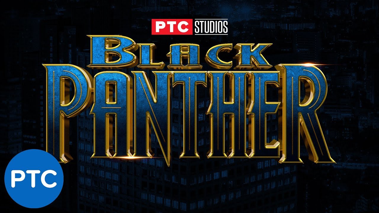
In this Photoshop tutorial, you will learn how to recreate the Black Panther movie poster text effect.
To recreate this text effect we will use stacks of Layer Styles to create the texture, chrome, and other effects found in this movie poster text effect.
Wakanda For Ever!
📘 INDEX - Black Panther Text Effect Photoshop Tutorial
01:06 - Apply...
I'm done for the day. Have a good night.


Bro this is so good
Thanks. Same background and basic process. Except I went “backwards” for the second one. Lol
Gave +1 Creative Carma to @halcyon loom
@tawdry falcon did you look at the DCC for today? I think it's something that you could totally use to 'display' you're creations. They, you, are terrific. I really like scrolling and finding them. I swear I'm seeing a turtle riding on the bill of a duck-billed platypus in the second one. 😉
What do you think

you need to work on making cleaner edges and color matching
Hey, any mistakes you see or improvements that I could make to the design?

Thanks! I appreciate the kind words. I got behind on them this month because the spring semester has been a monster (and I'm just getting to the end of the second week 😫 ). I've been spending what time I do have focusing on bettering my drawing skills. But I do plan on getting them done in the next two weeks. I look forward to seeing what this one has to offer.
Gave +1 Creative Carma to @candid kindle

Hey! New shot is up!
Please like and drop a comment. Thank you! ☺️
https://dribbble.com/shots/17227994-Hotel-Booking-Website

Dribbble


have you ever tried painting in the real, on canvas?
Yeah. I started about a week ago

This is the first one I did. #📝project-feedback message
This template is from Tomasz Biernat from Heritage Designer use this sample to turn it into a coin with some modifications I fixed in Illustrator and take it to Photoshop to give the effect of an old coin. Is Free >>> https://home.heritagedesigner.com/invite/rafaelvalenzuela

i love it
Thanks. It’s not bad for watching a 15 minute youtube tutorial and then diving right in. Lol
Gave +1 Creative Carma to @delicate idol
abstract isnt as easy as ppl think
I agree. They assume people who do it do it because they can’t do anything else. But that’s not even close to true. I mean, everything can broken down into shapes and contrast. So, it’s really not any different.
The main difference is how those shapes and tones are arranged. I prefer to get more creative in my arrangements, lol
abstract is hard
this is really f ing awesome btw
I over-simplified a little, obviously (referring to my shapes comment)
Thanks 🙂
Gave +1 Creative Carma to @delicate idol
That's a good idea


This is a Menu card front page designed by me hope it's good enough check out my other works on my portfolio
https://www.behance.net/7fe24996

Behance
The idea of design, the resulting wars of innocent deaths, greed, organ trafficking, rape, prostitution, slave trade, racism


Try using the multiply mode with the vignette and maybe make your logo the same way as the neon text so maybe it'd blend better


bruhhhh, you should try single line scribble portraits
Not a bad idea. 🙂 I hid the start of the face in the last one I posted. Lol
I want to do one of these next


Looking for a title... any suggestions?

Moonlight demon?
maybe like.... Imprisoned. or something
Grounded
Moonlight Revelation (revealed my the moon?)
You Can't Hide From Your Shadow
i keep thinking of the pirates from pirates of the caribbean
succubus wouldnt be a horrible name
the original idea I had for this one is "No Angel"... but I don't know. Your ideas are making me think of new directions to take the title.
could just give it a number
Just got into learning Photoshop.. Definitely more fun to mess around with your photos.


Misused Adrenaline? Nice.
Thanks.
Gave +1 Creative Carma to @candid kindle
Is there more room to sleep there ? looks really comfortable and nice !


This is right up there to you're usual standards (that's a good thing )
I'm going to take a guess at some of the components, if that's okay.
The trees: Lower opacity, a little bit of blur for depth, decreased sat?
Your picture: I'm seeing some noise, couple layers of dodge and burn. I'm seeing something funky with the blue along the collar line.
The broken window pane: I'm thinking you made that. It looks great. Did you paint the highlights through separate layers or use Fx?
If we weren't in Ps discord and I saw this photo I'd be asking how you controlled the window brake.
I am trying my best ! Please tell how is it ?😊

I can really see a lot of depth and texture in the tree. To my eyes the scratches add realism and are saying oil painting to me. The colors are really beautiful. I wanna sit on my front porch with a nice Merlot and watch the rest of the sunset.
You did pretty good with your observation of my pictures. There were a couple of differences in what I did but I would think you could achieve the same thing doing what you said compared with what I did. The "Window Pane" one was done with separate layers.

Okay. Nooowwwwww you're just messin with my head. 🤣

I need help, is it lacking or do I need to change something? I need suggestions TT
(This was the description given to us)
"Kimzy, an avid Pokemon fan and a vlogger/streamer, wants to REDESIGN the logo so that it reflects the contents for the Kimzy channel. Majority of Kimzy's content is about Pokemon GO and as the game involves moving around locations,, it also has an occasional travel, food, and a skincare/health contents.. But because of the pandemic, travel has been prohibited therefore Kimzy decided to shift to streaming games such as Minecraft, Valorant, and LoL."


Hi feedback Central!
I could really use some advice on a Community Clean-Up project I am doing in my city.
The Organizations Mission Statement is : "To beautify our city and the surrounding areas; Through Community clean-ups, Eco-Friendly Initiatives, and Resident involvement" I have a logo but I could use feed back and suggestions on how to build this into a brand!
And feel free to be honest! I AM a fan of creative criticism!


So I have new name for you: Tommy D. 🤫
Fi-Yah
My new creation ❤ Please do support me in Instagram
Ig name : darkswagger1

so i was making something for a friend

heres my thing
this was my refernce

side by side comparison

Pls give me Feedback


abandoned las vegas

picture editing made from scratch
also the blue and red particles are snow on camara (some artistic element)


UI/UX Design Project with Orenda Junior Entreprise. Hoping for some feedback from creative designers ❤
https://www.behance.net/gallery/135555665/UIUX-Design-DOMI-project

Behance
We make complex applications simple for users. Our designers would be happy to implement your ideas in smooth UI and meaningful UX. Also, we do Branding Design.
is this for a real product or just portfolio design?


you are becoming more powafull
Thanks
Gave +1 Creative Carma to @delicate idol


My new creation
Drawing Credit goes to it's real creator well i don't know who is the real Creator 😅 But i have Remake his art in neon style 😊😊 @everyone

Got something new for y'all.
Don't forget to like, comment and share! ☺️
https://dribbble.com/shots/17306660-Weather-App-Ideation

Dribbble

Neom effect is best effect
https://youtu.be/UQBN8NlAS7s

Hello, I am Ps Neon !
please support me !! share my videos and support me in every possible
.
.
.
.
#neonman
#editing
#editingtutorial
#editingvideo
#editingphotos
#editingapps
#neonediting
#dragonball
#anime
#animeart
#animeedit
#madewithpicsart
#neoncity
#painting
#mobiledrawing
#mobilepainting
#public
#viral
#supportme #su...
ayo guys im new here in photoshop and stuff
i just wanna ask you how to get that fresh images
do you just download images to use them from google as i do or what idk whats the problem all my images are not that high quality
https://unsplash.com/images/stock
https://www.photobash.co/
https://www.shutterstock.com/
https://elements.envato.com

Choose from millions of free stock stock photos. Download HD stock photos for free on Unsplash.

The Ultimate Resource for Digital Artists

Shutterstock
Download the best royalty free images from Shutterstock, including photos, vectors, and illustrations. Enjoy straightforward pricing and simple licensing.

Envato Elements
Unlimited downloads of stock videos, royalty-free music, photos, graphics, graphic templates & more. The only creative subscription you need.

ArtStation
ArtStation is the leading showcase platform for games, film, media & entertainment artists.
you can also use photoshop Camera Raw feature to fix alot of problems with pictures.
also these work good for fixing crap photos if you dont know how to do it the hard way
https://www.topazlabs.com/shop
Image and video enhancement software from Topaz Labs.

needs work on perspective and proportions but its pretty slick idea

In the kindest of ways: Is that a plasticized version of you? When I zoomed in looks like a doll. A verrrrrryyyy cute, adorable and I'm sure total gem of a baby.
it looks like it wants to leap out of the picture at me
I can't decide on which GIF to send ... the one about taking LSD, or the one about day drinking. 🤣
It looks that way because I used the glass filter over the center of the frame. Purposely.
The idea was to make her as smooth as possible...

Kitty Graphics V2.
made a pixel art of television (my first pixel art project)

Lol


Behance
Completed 2D Animation project at Image Creative Education, Kottayam,Under the guidance of Mahesh Sir & Deepu Sir.Story and Animation: Nandu Vijayan
what about this guys


nice one dude
thx
great masking
one hour on this one had to mask the hole wolf with the pen tool cause i could not with another thing

Only thing I used pentool on this one was the guy
oh ok it still look lit
the lad


My Grandmother & Grandfathers Wedding Picture Retouched...


Sorry for your loss dude. Good vibes to your and your family. 🙏🏻
Sorry for your loss, stay strong!
using blender

cool one i use blender too
mhm
idk what else to do to it in ps
this is the blender one
just needs some tweaks in ps idk what tho, something seems off
this one with blender

niceee
yeah thx
how can i tweak it in ps? maybe colour correction?
nah i think it look lit it need an animation or something
mhm
like a youtube vidio intro with those instru
i might make it a gif and make it spin like a loop
nah lmaoo
xd
like a loop spin thing maybe
i think it need some contrast a bit and a less light brightness
mhm
learning how to make good highlights any tips to improve?

ty
Sorry for your loss TommyD. 😥😥 Zoomed in to it. Brushstrokes are terrific. You've done a marvelous job of preserving the photo into a painting.
My condolences buddy.
Agreeing with @delicate idol The character is definitely needing some more of the front fill you have going already. Maybe add a touch of jello orange 😉
maybe change the text a little bit
And the font
little bit of shadow or a little black line
it was black and white i colored it and added some flame on the eyes

guys do u think its better if i fether the lil rectangle edges a bit


cool one you could v changed the women with the pink dress to be white as the others dress
Mother of the bride or groom wears a different color than the bridal party.
Nice deep colors in the BG makes everyone stand out nicely from it.
The green wall color really helps the brass range hood stand out. (You're color choice or actual color?)
I'm sure you tried but there's some discoloration on your mom's dress.
Having the ability to go through and make all these memories more visually accurate has got be a great feeling. When I restore old family pics it makes me kinda warm and fuzzy.
I'd leave the rectangle . Focus on your text because it's not visible, it's blinding and does not contrast well at all with the rest of your design.
Stick with two colors, no gradient. Maybe use the blue or dark purple only.
You need to space out your text and info, everything is together and its not visible or clear.
random quick late night inspiration

Thx alot
Gave +1 Creative Carma to @normal sphinx
Just a quick one 🙂


DAY 1401 — Last car leaves the Netherlands. The bicycle takes now the lead as the new climate-friendly vehicle of the country 🇳🇱🚴♀️ IG@_twc_daily


These are actual colors that photoshops AI put into it! I just made them a little bit more vibrant and took out as many of the imperfections as I could with out altering the people!


Hello everybody, I am a little bit stuck with this project and need some advice to improve...thank you

Hello everyone this is a project we did with our design studio for a software tech company, just published on behance! let us know what you think! its been fun working on this 🙂
https://www.behance.net/gallery/131125633/ACUTECH-acumen-technologies

RIP Grandma W. (You will be missed.)

its a collection of cards ranked from f-S this one is called Lost Boy and ranked S

Made with  ❤️
❤️
Check it out on Insta  https://www.instagram.com/p/CZKVNSypWAL/

^^ It's the 3 emoji challenge, made as a part of a school club prompt!
first time merging and blending different images, please go easy on me 

My grandfather that passed away some years back. Now, my grandfather has his wife with him! 🥲
