#📝project-feedback
1 messages · Page 41 of 1
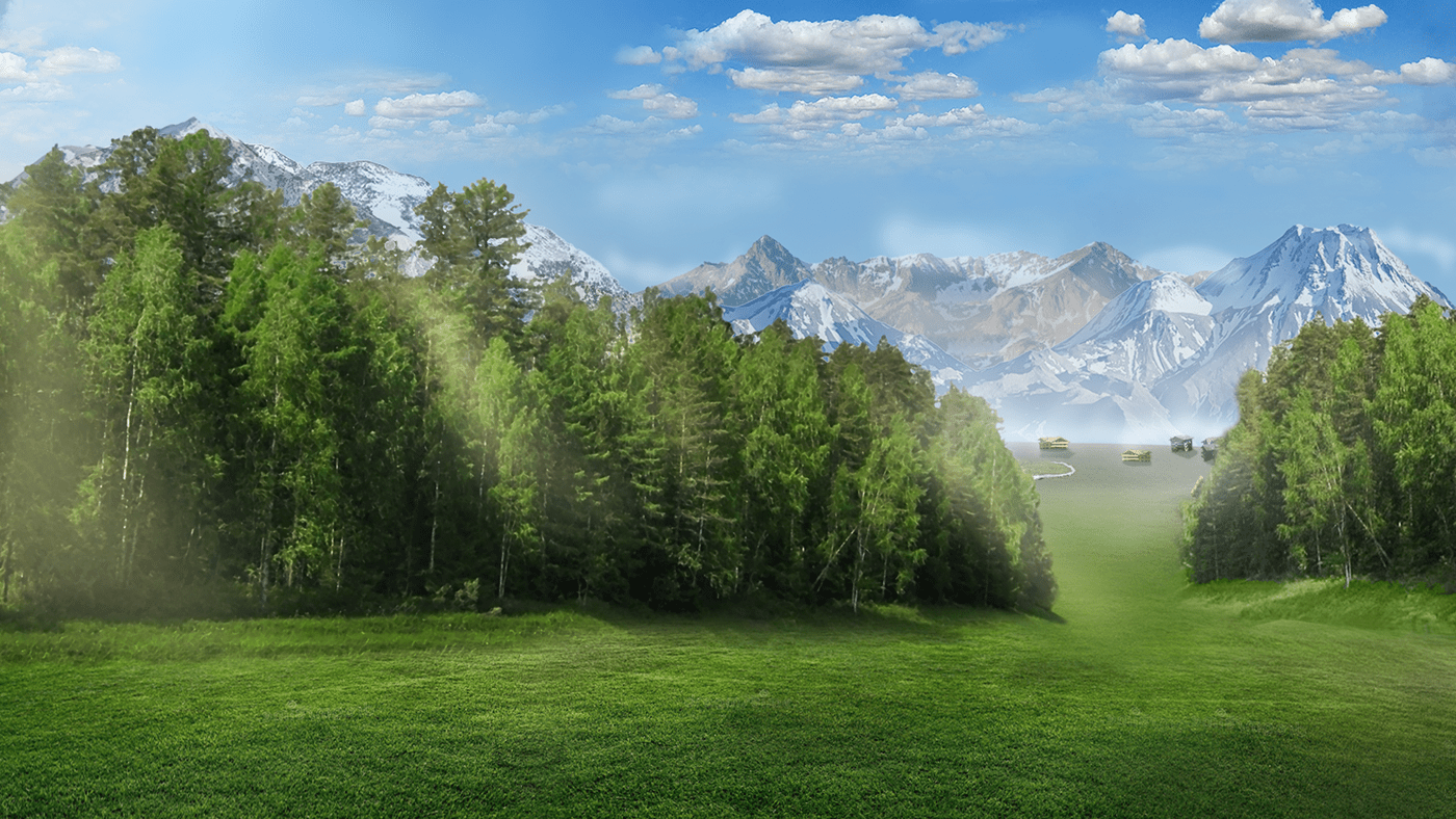
@deep trout I think It's not working well with the double exposure. Try to find a better photo for the background, maybe forests or mountains or photos with a good contrast! But in an overall good job!
Thanks for the feedback. vl work on it
Gave +1 Creative Carma to @sinful robin
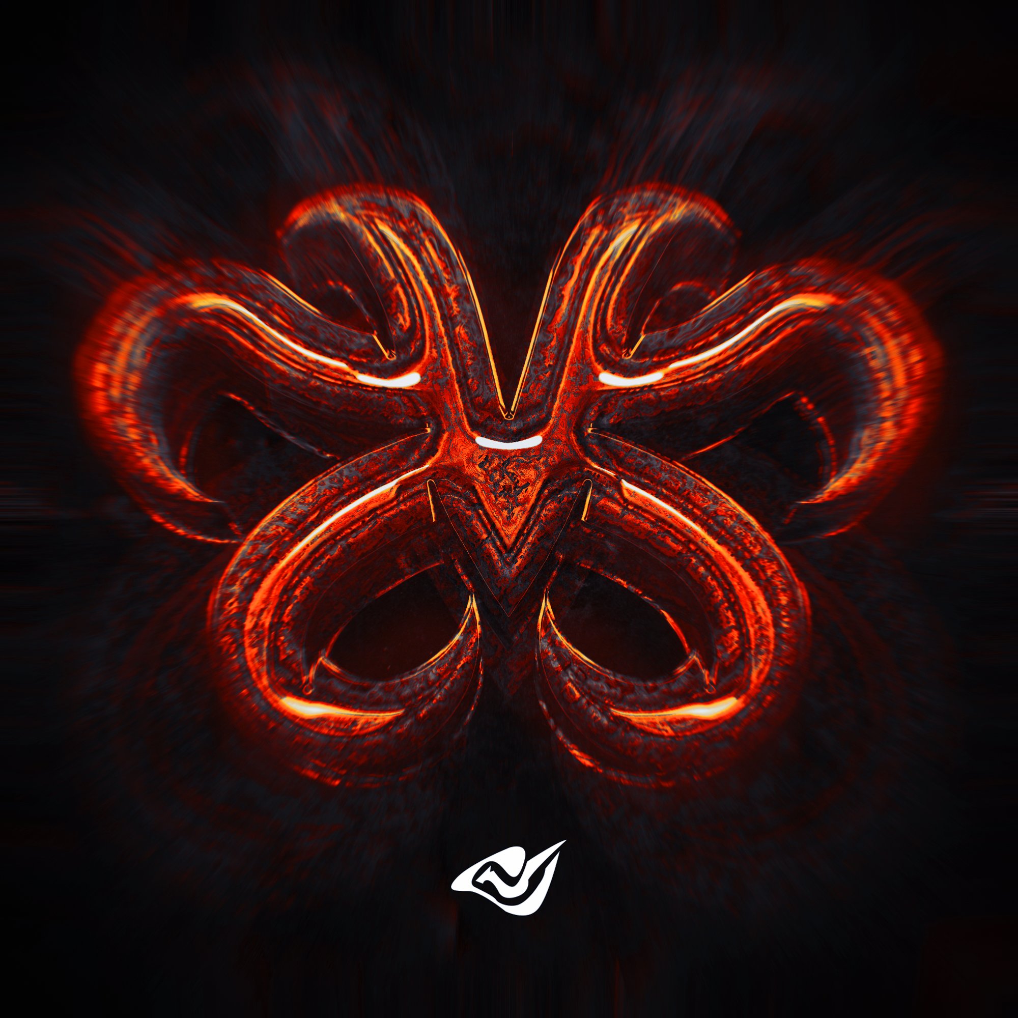
Skull on fire. - https://dribbble.com/shots/14785811-Skull-on-fire
www.upwork.com/fl/abidhafeez
www.pinterest.com/abidhafeez
www.instagram.com/mahafeez
www.facebook.com/concepts.logo
www.dribbble.com/abidhafeez
www.behance.com/abidhafeez

Dribbble
Photoshop Masterclass: Winter Wonderland!
Hey guys I just posted something new on my insta go check it out and give it a like and share!!
worked on this compostion - what does everyone think?
DAY 1000 — Thanks! https://www.instagram.com/p/CI__kHBgu3v/
Creating & Posting 1000 days without a break. Thanks to everyone who followed, liked and commented. 🥳
Photoshop Process
New artwork ⚪️ 🙌 https://twitter.com/julienvdorland/status/1340409794964967424?s=21

Hi everyone, i'm new to the server. Here is some of my work, let me know what u think.
This is cool, I like it!
TShirt5 - https://dribbble.com/shots/14279703-TShirt5
Designed this T-Shirt to showcase work. I hope you will like it.

Dribbble

Wow Great Restoration Job
Hey everyone,
This one is part of a personal project. Some feedback would be much appreciated. Thank you so much! 😄
https://www.behance.net/gallery/110026259/Nothing-Gold-Can-Stay?tracking_source=for_you_feed_user_published


Hair Oil Branding. - https://dribbble.com/shots/14816561-Hair-Oil-Branding
Label design for my client.

Dribbble
@vivid dragon I painted this with the gradient map technique you talked about in your stream on ... Tuesday? Monday? Either way, I was quite excited about it! I'm sure this is nothing to most, but to me, who thought I could only make stick figures and crooked trees, this is HUGE! Heeheehee! Runs around in excited circles Thank you for sharing!
Gave +1 Creative Carma to @vivid dragon
What do u think of this design? Any feedback is appreciated. please tag.
some context: The post is for my IG account specialised in football news. Colombus Crew is an american top flight team that has just won the 2020 MLS league. They've won their second league title, the first one was in 2008.
hello everyone, this is new poster in december, thank you
Any blending mistakes
Hey everyone, I updated my Logofolio on behance. Added 40+ New Logos.
https://www.behance.net/gallery/110265149/A-unique-collection-of-my-Logo-Designs

Hey all, first time posting here. This my recent work, please have look. 🙂
https://www.behance.net/gallery/110173603/Mid-Night-Snack-LOGO-DESIGNING

just finished this piece
DAY 1010 — Impfstart / Vaccination Launch. (PSD + Unsplash) https://www.instagram.com/p/CJZfQhLArTb/
new work, thanks
Wow , I love this concept ❣
Is there any specific names for this kinda design? I'm guessing floral but I couldnt find any such pngs for this design
@deft verge Thanks
Gave +1 Creative Carma to @deft verge
DAY 1013 — The things that made you weird as kid make you great today. https://www.instagram.com/p/CJe3wSyAGqU/
https://twitter.com/JulienvDorland/status/1345108726076895233?s=20 so excited for this collection ill be creating 🌟
Today marks the beginning of a new digital art collection of ''everydays'' and I'm so excited about this✨✨
The art collection will be minted and released as 1/1 NFTs to collect very soon. Stay tuned. Please RT💖
#cryptoart #nftart #art #nft #crypto @withFND


Day 2 of 31
#cryptoart #nftart #art #nft #crypto #everyday #daily


Hey everyone! Im creating a new character series starting with this one, any feedback is welcome and appreciated 🙂 she is called the Scavenger
https://twitter.com/JulienvDorland/status/1345842373687975938?s=20 Day 3 of 31 • Royal Serpent ✨
Day 3 of 31 • Royal Serpent✨
#cryptoart #nftart #art #nft #crypto #everyday #daily


Discover my newest Project on Behance:
Infectious Collection 19
Selected Exhibits from my 1000+ designs on Instagram.
https://www.behance.net/gallery/110609589/A-Personal-Project-influenced-by-COVID-19

Hello Guys, after some time I spontaneously created this futuristic geometric shape poster, I would love to hear your feedback, Thank you. https://www.behance.net/gallery/110674483/Futuristic-Abstract-Poster-2021?tracking_source=for_you_feed_user_published
This is a water effect on glass from Piximperfect
Started making album art before actually finishing an album
can i get opinions on this edited photo
For some reason I feel like it would look even better if the hair didn't have the forest overlay on it, but I'm glad I saw this because it's a really cool design! Nice work!
ill mask over the hair and dm you the new one
Day 5 of 31 • Shamrock ☘️ ✨ https://twitter.com/JulienvDorland/status/1346639101479575553?s=20
Day 5 of 31 • Shamrock ☘️✨
#cryptoart #nftart #nft #art #everyday
@Photoshop


Search laurel wreath award, or something along those lines and you’ll see some more designs. Hope this helps!
I agree that removing the forest overlay from the hair + maybe decreasing the sat just a wee bit would complete this piece - I think it's great! I'm a big fan of double exposure 😃
Day 6 of 31 • Elixer of Faith ✨ 🐉
https://twitter.com/JulienvDorland/status/1346983693596954627?s=20
Day 6 of 31 • Elixer of Faith✨🐉
More work 👉https://t.co/S9pLgYcueY
#cryptoart #nftart #nft #art #everyday


The library guard character, im happy with this design and open to any feedback 🙂
Designed for my friends and family.
my first photoshop creation
hey guys ima be putting together a texture pack of high resolution photgraphs for people who need textures to work with would anyone want a link to it when its done
@mortal lotus Count me in!

ive been gone for a while but im back with a new text in dimension plus touchup in photoshop https://www.behance.net/gallery/110883861/Adobe-Dimension-Test-2

Behance
Test design scene with metallic/plastic materials and lighting effects in adobe dimension with retouching in photoshop.
hey guys! how's 2021 treating us?
I'm Anika! been MIA for a bit. learning a bit more about Illustrator and packaging design these days!
I would love to know your feedback and suggestions for my new branding project - https://www.behance.net/gallery/110661555/Cleste-Coffee-Brand-Identity-and-Packaging-Design
Many thanks 🙂

Behance
Brand Identity and Packaging Design for a fictional coffee brand called CélesteThis project showcases logo variations such as the iconic mark and full lockups. It also focuses on packaging design for coffee bags for three bean flavours namely Original, D…
thanks !
Gave +1 Creative Carma to @bitter fog
One of my biggest projects, around 4 months of planning and like 7 final drafts, this do be the 8th
https://www.behance.net/gallery/110884651/Transcendence

guys, i made a rounded rectangle, then skewed it but now i cant change the stroke color.. it doesnt show in the properties tab .. how do i change the color or width?
I made another design for a t-shirt, please let me know what you think 🙂
I don't really like the font below 'ALIENS' so font suggestions would be nice
Hi, so I tried something new, any further suggestions?
Hello, did you fix this? You should still be able to see the shapes properties in the regular toolbar at the top 🙂
Nope, i will check and update you on this.. thanks
Gave +1 Creative Carma to @pulsar nebula
OIL PAINTING EFFECT. Please zoom in to view the effect. I hope you would like it.
A concept.
@jack.watson this is the project once I was talking about and you said post the link and description of your contribution in the project. I have shared the link of the website where you can see it. Now my contribution in this project was to recreate the doors, window frames, soffits and wall with textues which would sit perfectly in place. Seeming its simple but a lot of work and care needs to taken to complete it. I liked doimg it as it was a lot challenging job.
https://www.bespokeupvcsprayers.
@hardy sparrow
https://www.bespokeupvcsprayers.co.uk/

UPVC Spraying Services with 20 years of experience transforming the appearance of your property and UPVC windows, doors, conservatory or garage.
@ember raptor I was mostly curious if you had done the branding as well as the website design. Looks good, thanks for clarifying!
Gave +1 Creative Carma to @ember raptor
Hmm ok. Thanks.
Gave +1 Creative Carma to @hardy sparrow
Really great collection of designs!!! There are so many good concepts... Awesome job!👍
Thank you. 😊
Gave +1 Creative Carma to @bleak echo
@light thorn so bright!! Makes me miss summertime. A bit gloomy where I live.
Hi all, Please check this logo i just created this. Any suggestion on this
please check & send me suggestion
Everyone is moving out from Whatsapp because of the recent updates to the privacy policy... here is my artwork which I called "Privacy Immigration"

T-Shirt design.
new poster , thanks for feedback 😆
Playing around with a sketch effect from @fair lance on YT.
@ember raptor I think the darker image and shield goes better with the eagle.
Ok. Thanks for the suggestion.
Gave +1 Creative Carma to @sick wren
I already posted this in the Illustrator discord, but since I used photoshop for this project as well, here is the final product of my first packaging design and I am super happy with how it turned out! I want to continue with packaging and label design because I had so much fun working on this project, so I can only improve from here https://www.behance.net/gallery/111531905/Mo-Juice

Behance
Mo Juice is a brand of 100% real fruit juices that originates in Florida.This project was my first ever packaging design, so the process very new to me. I got this idea from a logo I had created a while back "Mo Juice Juicery." I knew that I wanted to c…
Any blending flaws, please point out 🙃
Background concept, hope y’all likeyy :p
Haha thx!
This is really nice..
Thanks! 🙂
Gave +1 Creative Carma to @nimble jolt
Logo #📝project-feedback #Design Be a sport logo, Guys give me your feedback or any suggestion
remove the second hand in the second picture
Hey everyone, just created the first version of a checklist, for those who share work/designs and need feedback.
Let me know what you think and feel free to use it.
Your right! I should .. thx
Gave +1 Creative Carma to @waxen crescent
Any ideas 💡
Wow Awsome
Thank you @shy meadow
Gave +1 Creative Carma to @shy meadow
2 pieces of work i did for mac miller’s birthday

Digital Painting for SARG's Motion Graphic and Video Editing Course. I got an opportunity to teach photoshop and digital painting was one of the topics. This is my way of making digital painting. It took hours to complete. Since this course was for beginners, I wanted to give them an overview of how they can easily paint and draw.
As you can se...
Hope you all love the work 🙂
Wow @lament marsh ! You made a great job on this. Particularly with lights and shadows. Love your "portal" and how you applied light around the astronaut. It gives a nice focal point. Just to nitpick: there is a little perspective issue between foreground and background images but I really nitpick🧐 . Nicely Done
Thank you! Yeah when it comes to perspective I am still learning😅
Gave +1 Creative Carma to @bleak echo
This is sick, love it!
Thank you!
Super happy with how this turned out! BUT it was an awful lot of work using photoshop for every frame. Curious if others have done anything similar? https://www.behance.net/gallery/112130327/The-Last-of-UsTake-On-Me-Fan-made-animation

Behance
The Last of Us, Take On Me - Fan made animation
Cool!
Any flaws or ideas ?.🙃
Looks really good ! , I feel that the glow reflected on the ground can be blended more (like reduce the intensity), idk just my opinion ❣
i thought about that too.. i made it yesterday and i uploaded to most of my social accounts already... when i opened this image today.. i was like.... "humm.. i should blend more the ground lighting and work more"....thanks btw!!
This is my first ever photoshop
i just watched some videos on how to use some of the tools and thought this looked kinda cool
'Sunset Belle' (2021)
Nice compiste! Love the overall color grading and the foreground fish blured... It looks very "realistic" even if it's not. Well done!
Thank you very much @bleak echo
Gave +1 Creative Carma to @bleak echo


For your first project looks really good. Cant wait to see what you make in the future.😁
Thanks man 🙂
Gave +1 Creative Carma to @sick wren
Demon Slayer // New member of Awake @zetta_arts @Team_Awake_RL Congrats Zetta! - Support Appreciated

why is my align functions disabled?
@sinful violet do you have the Move tool enabled?
Looks hella cool !! ❣
Btw what's the font name?
Want some custom lettering?
- RT
- Follow
- Comment Done
I will be giving away 3 custom lettering at 15 RT can you do it?


Client Work @SpoozyRL - Support Appreciated - Lettering Giveaway Results (Coming Soon)


aaaa tanjiroooooo


Thumbnails from today Support Appreciated - DM me for a commissioned thumbnail


A piece I worked on after Paul's Photoshop Masterclass: Seamless Surrealism today.
Thumbnails (3 Client Work) 1 for @TeamMythRL - Hope you Enjoy :) - Support Appreciated


Nice shot!
Thank you, @bleak echo !
Gave +1 Creative Carma to @bleak echo
... inspired by Paul's PS masterclass
Excellent image, @sudden pine! I loved the color and light edits you made throughout all the elements. The grain also helps to unify all of them in the scene.
The only suggestion I have would be to try to find another asset for this shark 👇 , it looks like the asset is blurred or with a low resolution which doesn't make it match with the sharpness from the nearby areas.
The overlaps added a great realistic look to the whole composition. Awesome job!
posted this in the wrong chanel previously
*channel
this is Freema Agyeman as Amanita from Sense 8
@sleek tiger - thank you so much!
Gave +1 Creative Carma to @sleek tiger
... inspired by Paul's PS masterclass
@sleek tiger - another version
Turned out great @sudden pine! Well done!
Very nice work!
@Element_GGs Twitter Revamp - HD https://t.co/lLZ1NLF2gZ - Support Appreciated - Commisions Open DM me for business. Thank You :)

@pulsar nebula - Thank you!
Gave +1 Creative Carma to @pulsar nebula
render I made using this tutorial https://www.youtube.com/watch?v=6E6e9J-miyg&t=1s

Hi Everybody I'm Back with a new Cinema 4D Tutorial and
In this New Tutorial , I’ll show you How To Make a Rock Mountain in Cinema 4D
▼ Subscribe for More Tutorials ▼
Subscribe to newsletter and stay up to date with all latest
e-learning video coming straight in your mailbox: ☛ http://eepurl.com/cNl8Kj
✓ ωᴇʙsɪᴛᴇ ☛...

Two images I did quickly inspired by Paul's masterclass last week. The scale is not supposed to be correct
Hey guys! Been experimenting with Adobe Dimension lately and here's an outcome of a small still life series Ive been working on
https://www.behance.net/gallery/112670847/Still-life
Please check it out, let me know what you think and any tips on how I can improve my presentation and engagement 🙂 thanks in advance 🙂

Behance
Still life 3D. Created 2D artwork in Adobe Illustrator, then transformed into 3D objects in Adobe Photoshop and later on rendered in Adobe Dimension. All the objects in the scenes were created from scratch. (other than the starter assets which were also m…
@dusk narwhal I loved the scenes that you created. The materials, lights, and modeling came out great. Also nice context to the project! 💯
I'm glad you liked it @sleek tiger 🙂 Thanks so much
Gave +1 Creative Carma to @sleek tiger
Love this! Just starting to use Adobe Dimensions! Any tips or tutorials you can pass on - would be appriciated 🙂
I will be going live to do just that @formal quartz you can follow me on behance to get a notification as i am not sure if this is the right place to promote myself for when I stream 🙂

Any blending issues please point it out , thanks !
Another Giveaway this time a Header!
To enter:
- Like
- RT
- Follow
- Comment Done
Results posted in 24 hours
Good Luck
Please give your review.
The Dirty Burger Project is finally finished! So so happy with how it turned out and I hope you all enjoy too😋 https://www.behance.net/gallery/112815175/The-Dirty-Burger

Behance
Looking for some of the juiciest and greasiest burgers in town? The Dirty Burger has got you covered! The Dirty Burger is a modern, retro burger joint where all burgers are made with 100% beef.In developing the brand, I was really wanting to give off a …
Congrats to @AntVFX_ for winning the header giveaway! Tried something kinda new tell me how you like it.


Wow @rose canyon this is awesome! How did you created those textures? It looks amazing
It was filter galery a combo of plastic wrap, andchrom
Excuse my grammar on phone
No problem 😉. Thanks for sharing! The texture fits the colors and the shapes very well, and the highlights gives the depth to sell the effect. Great job 👏🏻
Gave +1 Creative Carma to @rose canyon
I'm opening commissions - here are my prices - If you are't interested its free to RT to support me. Thank You :)


Published a new project on behance.—A personal project that shows 100+ concepts. https://www.behance.net/gallery/112982341/A-Personal-Project-that-shows-100-concepts
👍

Behance
A collection of random ideas and ads from my, daily growing, Instagram account. Discover more designs here: https://www.instagram.com/_twc_daily
Inspired by Paul's PS Masterclass yesterday (5 Feb 20)
Loved the monochromatic tones, @thick pilot! The overlaps add that great depth to the composition and I like the way that you contrasted the fonts and aligned them to the middle creating an invisible rectangle shape with the three lines. Great job! 👏
Thanks, @sleek tiger!
Gave +1 Creative Carma to @sleek tiger
This is a WIP ,need some tips to improve on the blending ..
I do a personal photoshop graphic every Monday for weekly inspiration. A follow for support would be appreciated 🙏https://www.instagram.com/p/CLCFWPrH4VW/?igshid=1kwwgawxtwow3
Have you added any blur filters?
It is stunning though I do not really see what needs to blend honestly
anyone into animation on photoshop? I started animating in photoshop and am really enjoying it, but Im struggling drawing akward possitions of a human, and they dont look how I need, i was thinking of buying a model to help me draw the poses, any advice
I need some tips to improve on the blending
Please help me
I like the under text @clear swift, but one thing that you could do is masking when it starts to get closer to the G descender, to give an idea of an overlap. The gold color worked out great, you might want to replicate the bevels from the text in the sword too.
I mean like this adding kind of an interaction 🙂
I used the same effects for the sword too but it didn't come out the same for some reason
I don't know why that happened
No but I added a slight tilt shift after . Thank you !
Gave +1 Creative Carma to @barren juniper
You can try changing the contour options to another profile (Of Bevel & Emboss)
The jellyfish on the right side seems to have an awkward glow . Also maybe add some brighter highlights to her face . Because rn the attention is going to the moon because of the bright lens flare . Maybe you could turn down the opacity there .
It looks great , these are just opinions ❣
yu-gi-oh Header @dare_rl // @TeamMythRL @FreeZRL @FreeZVisuals - Any support is really appreciated

Hi, i'm trying to make like a carousel post and i feel like i need to add something in the BG, but not sure what to add
the client company is like a community for teachers, doctors etc, that enroll for membership n they get some benefits


Bleach Header - @roxx_rl - Day 2 @FreeZVisuals @FreeZRL - Support Is amazing

The space
maybe this channel help you.

YouTube
I know the name is goofy. Things escalated.
I'm Benny, Benji, Benjamin, whatever you want to call me, and on this channel you'll see all kinds of content surrounding Photoshop. I'm not trying to teach, I'm simply trying to inspire and most of all: Entertain!
Feel free to subscribe if you like my videos :)
Please only contact me via the E-mail ...
Blossom - @SylverArts_ - Day 3 @FreeZVisuals - Support Appreciated - HD - https://t.co/Z5xMEVwt52
https://t.co/yjJhKVPSmy


Please take a look😃 https://www.behance.net/gallery/113425063/STARGAZING?tracking_source=for_you_feed_user_published

Just my personal preference, but I'd like to see more of the buildings (even just slightly apparent) or crop the image so there isn't so much negative space. (again, just my personal preference). I really like the idea and you really convey a "spooky" kind of feel.
This is incredible. Great work. Lighting is spot on
I had a hard time getting the lighting to look "real." I'm still not sure I got it right. Background image is mine, and I added clouds and radial blur with a color layer to create the warp effect. Puppet warp for the girl's perspective. Photo of the girl from PHLEARN Pro.

Depends
Once it took me 4 hours.
Great job! Love your dramatic lighting👍

Nice concept!
Arresting image. Really like how the buildings funnel toward the moon/sun. What were you wanting to achieve/communicate?
Thx you.
you know I'm not someone who think a lot when I'm making a composition, my need of creating something is rarely dicted by any emotions or need to send a message, it can happened but here it was not the case, most of the time I just have a random idea going through my mind and an I just say to myself "mmh what a dumb idea! let's make it a thing on Photoshop" ;)
I hope I answered your question ^^
Gave +1 Creative Carma to @radiant geyser
I want to edit image with cyberpunk style. Where can i learn it ?
And recommend for me ! THANKS !
Hi, @sacred lotus! PhotoshopCAFE made a tutorial last month about it 🙂
https://www.youtube.com/watch?v=k7ilFwHDJis
Learn how to blend layers and colors in Photoshop to make a cyberpunk 2077 artwork. Colin Smith shows you the tools and techniques you need to make digital art in Photoshop. Lern how to create the color and light used in cyberpunk styled digital art.
► THE GEAR I USE: https://www.amazon.com/shop/photoshopcafe
► THE MUSIC I USE: http://share....
hello, 😄 #📝project-feedback
Oh, Thank you so much 🙂
Gave +1 Creative Carma to @sleek tiger

Really creative image! Although I would expect the brain to be more of a gray color (just nit-picking).
You're probably right, thanks!
All I have to say is wow super unique and well executed only thing for me is improve shadows and lighting to give it more realism


feedback on this please


#Everyday

I was playing around in Animate today and started wondering if there is a discord server for it like there is for Ps?

#everyday


sorry I made you all blink


8 Logo


awesome work @thick pilot


Here my Thumbnail about my vídeo, if you want to check in this other group: https://discordapp.com/channels/631179804917628928/631182721913192448/814129532659302490
Check out my video on YouTube and Dailymotion


YouTube
Hey Guys...I miss traveling to the Beach, right? relax that it will happen very soon ...Based on this challenge (https://www.behance.net/live/videos/5575/Pre...
Exploding Sunrise - @ImChaosRL - Day 5 @FreeZVisuals Grind - Like and RT :)


You are coming up with some really nice ideas for composites! In this one, I'm curious why you chose those colors? (not that I don't like it, I just don't see that combo often)
I had an idea a few days ago about "cotton candy sheep" and when i was looking for images of cotton i realised that pink and blue went along really well so i based my palett from that. The inspiration for the bed was the cartoon "steven universe" and his shirt. The yellow/red also had a nice contrast compared to the pink/blue.
Thanks btw
I'm not familiar with "steven universe" but I really like the image! Nicely done.
Day 10

This one is AWESOME!!!
Thank you! It makes me happy to hear!
Gave +1 Creative Carma to @thick pilot
Exploding Shapes Revamp for @FrIz_lol - Like and RT :) Day 6 Grind for @FreeZVisuals


this composite is really 👀 catching i love your work @fallow bough 👍
Did my first ever paid peice of work and laid it all out on photoshop. Feeling pretty proud, what do you all think? https://www.behance.net/gallery/114384087/Van-Wrap-for-Larissa-James

@fallow bough I really like the very subtle difference between the green “light” and the others and how it is protruding a little from the box to show that it’s the green light that is active. The reflection is also brighter, but not so bright that it’s distracting. This is really creative - I don;t know where you get your inspiration, but your ideas are awesome.
Header for @ANTVNYY - Thumb - AVI @char_rl18 @NOFLIPGANG - Day 7 Grind for @FreeZVisuals


DAY 1070 — A roll of thin plastic, coated with a layer of light-sensitive emulsion: used for producing photographic negatives in a camera. (Photoshop Illustration.) https://www.instagram.com/p/CL0B71mA5z3/

@FreeZRL Project Is going to start today, Here is a leak AVI for @veezburger

hello team am sports media and graphic designer.
please check at my Profiles to know more about what i do

Behance
Using the smudge tool with text - inspired by Paul's PS Masterclass on Friday, 26 Feb 21.

Day 12

Built the scene in blender, then finished it up in photoshop...stylized oil paint filter (Time Traveler Todd Enters Small Town USA)

DAY 1071 — Beach ready. https://www.instagram.com/p/CL2pm-Jglr0/

This is something I did based on Paul Trani’s “Elements Of Nature” Masterclass - I think it was a couple of weeks ago.

quick illustration i made yesterday to try out my new graphic tablet

stop! don't make me blushing!


Behance
Crypto Branding and UI by Henry Annan is licensed under Attribution-NonCommercial-ShareAlike 4.0 International. To view a copy of this license, visit http://creativecommons.org/licenses/by-nc-sa/4.0/
I am trying to learn how to be a graphic designer and this is my logo. Do you think that it pops?
This is a logo I made for my friend. If you saw it, would you think that it was a logo for a bakeshop?

Wow. That is SOOOOOOO good! I love it! How did you make it look like it was in the trees? Sooooo goooooood! 👍
Very cool!
This is giving me super Star Wars vibes, and I love Star Wars!
Super good! I couldn't recreate that in a week! (Not flattering, just reporting facts. I tried.)
Never even heard of Blender until your post. Thanks! Also, I love how you did that. Very sci-fi-y! 👍
Gave +1 Creative Carma to @hearty acorn
@toxic dome Yeah, Blender is awesome for creating scenes and rendering out a base image to work with
It essentially gives you free creativity to create original content without using other's images
Also, thanks for the feedback! I appreciate it 🙂
I like it all! My only complaint is that the speakers have a little too much shine on them. All together, it rocks! 😃
When I first say it I thought it was a photo of a real person!
Really cool! Can you give me any pointers?
Some shadows, mabye?
Super cool! Any tips?
Cool mockup!
I think that it should feel premuim and classic, but the target audience should be the average class. I really like the croissant, I think that it has the perfect amount of french touch and I think that the history should not be integrated because I think that the design should be simplistic. How did you make the croissant?
Super cool!
Those effects are so cool, aren't they? Photoshop is just getting more powerful by the day!

I made the croissant in adobe illustrator.
Oh cool! It looks really good. You must be a pro. I wanted to get Illustrator, but I was already paying for Photoshop, so I got Inkscape. It's free. Have you ever heard about it?
I know the name but never looked into it.

Oh, you should look into it. It is a super nice interface and it integrates well with Photoshop.
I like the font. What is it called?
which font?
The "EXIT" font'
illustrator for all things vector
Nice
I don’t need it if I have Illustrator.
Sounds cool! I'll look into it.
🤷♂️

How did you make it look like the stick was actually in the tounge?
Thanks!
I took the stick layer, placed it over the tounge, applied a clipping mask, lowered the opacity and blurred it.
I wish I could do that on my own
Super cool process! Have a nice night!
Same man!

ArtStation
I am right here! by Rafael Monteiro Bicalho on ArtStation.
DAY 1072 — Summer Hat. (Photoshop Illustration) https://www.instagram.com/p/CL5P9sVgDM_/

Sweet! Did you actually sign it (pen/paint) or is that a font? Also, could you tell me what brush you used to do that background paint splatter? Love the design!

give me your opinion is good or not

It’s a signature I found turned into a vector in illustrator.
I use Kyles brushes that you can download from adobe and a set from RetroSupply (used for background/texture)


love it


DAY 1073 — Dreams. (Photoshop Illustration) https://www.instagram.com/p/CL7z4x7gVpW/

front legs are a bit too sharp seeming almost out of the image


ArtStation
The Cauldron room by Rafael Monteiro Bicalho on ArtStation.


YouTube thumbnail concept spec work into real life photoshop version using my own assets for a job interview. Would appreciate feedback, I just got into learning how to add highlights and shadows to match scenes and would appreciate some tips!


I just made this from using one of the tutorials available.


ArtStation
Dragonfight by Rafael Monteiro Bicalho on ArtStation.


Who says Jellyfish only live underwater?

Composite of a tormented Swamp Fairy


This is an very old illustration but figured I would post it. I kinda see why I did it now, I always wanted to make Art that has a story and Art that just is and this just shows both sides of the creative view
https://www.behance.net/gallery/114918671/Glass-View

Heaven is a luxury brand, click the link to see the entire project. Leave a comment if you like it.
https://www.behance.net/gallery/114883837/HEAVEN


Context: Rangers F.C are the new Scottish champions. Their rivals, Celtic, had won the last 10 editions of the Scottish Prem. Currently, Rangers own 55 league titles and Celtic 51. Feedback is appreciated


Behance
Plant UI and Branding by Henry Annan is licensed under Attribution-NonCommercial 4.0 International To view a copy of this license, visit http://creativecommons.org/licenses/by-nc/4.0/
Hello, my latest project 🙂 feedbacks, likes, shares comments are welcome and always appreciated 😄 !! https://www.behance.net/gallery/114387981/Visual-Identity-The-First-Sense

Behance
A visual identity for The First Sense, that resonates with the message and philosophy of the brand, in a region where the culture and art of photography is not as known or respected.
the photos will not fit in the computer screen so make big borders (my view)
i think the smaller the better : )
what do you mean?
😬


She sells seashells on the sea shore in the 80s
Looks like a real deal and I like the simplicity in the font
thanks?
Gave +1 Creative Carma to @quaint breach


This is so cool!
thank you @quaint breach
Gave +1 Creative Carma to @quaint breach
Congrats @Zekerss Sailor moon Header - Like and RT - Grind for @FreeZVisuals Day 6


ArtStation
the great white snake's escape by Rafael Monteiro Bicalho on ArtStation.


the second and third are really strong

Anyone else seen this by @midnight glen I am obsessed!
https://www.instagram.com/p/CMNbSeMlQxu/
trying to update my logo...


how is this banner

More Avis for @Clearnyy @Team_Awake_RL @TeamNixus Day 8 grind @FreeZVisuals - All kinds of support is appreciated <3


Is there no PS Masterclass today, @midnight glen? I don’t see it on the schedule.
I have tried this new style ....


Heya! I've decided to do a complete revamp of my portfolio as i feel that it does not represent me accurately and is in dire need of a rebuild. I started doing some prep work before building the website, this design is not pixelperfect since the spacing of some things might be a bit of. I'm looking for general feedback and would greatly appreciate if you were to give me some!


If only...

I like it!


ArtStation
The Blue Crocodile and the Yellow Rhinoceros by Rafael Monteiro Bicalho on ArtStation.
Inspiring work here!


Behance
This is a CHALLENGE project set by the "Game Changers" On the Water Branding and UI by Henry Annan is licensed under CC BY-NC-ND 4.0. To view a copy of this license, visit http://creativecommons.org/licenses/by-nc-nd/4.0/

Hello I am graphic design student if Anyone can please critique my work I would be very grateful. This is a book cover I design for HG wells Empire of the Ants


🤔


The piece that I did,dedicated to Ted Chin and Shaun Ryken,and also myself
https://www.instagram.com/p/CMcEAQmDuuo/

Great job Fery! Love the lights and concept. Impressive work.👍
Thank You @bleak echo
Gave +1 Creative Carma to @bleak echo
Sharing the vlog of my digital work since Aug. 2020 here https://www.youtube.com/channel/UCAci5GtaRP5XorVVAB8ZIFg

YouTube
Hi! Digital painting with a tablet lets you make art without needing a studio. I live in a tiny space where painting on large canvases isn't practical. I have an iMac Pro with Photoshop, Clip Studio Paint, and a Kamvas Pro 13, but my favorite drawing tool is the iPad Pro and Apple pencil. I tried several applications on iPad that were crashy,...


👍
✌️ ✌️ 😬 , thank you


anyone know where to find the masterclass for creating an animated GIF?

@cedar ledge Hi! my name is Shea James and this is a projection photography project im working on and i thought it fit your surreal nature challenge (:

@gloomy marsh I love it!
thank you so much!! its a version of my senior show im working on right now for my undergrad degree and im really excited about it
Gave +1 Creative Carma to @cedar ledge
Probably would be an awesome motion piece too!
yeah that would be interesting! Right now im doing a mixed media series with printmaking and turning the projected photos into halftone screen prints

your picture isn't clear can you explain what this

yeah, sorry i had to set the resolution to 72 dpi because it wouldnt let me upload the original copy it was too big. This is a self portrait, projection photograph. I collect plants and leaves and then scan them in on a scanner and then i project those scanned images onto a white background and pose myself infront of them and then rephotograph these projections and thats what youre seeing here. thats also why it looks slightly grainy..its not grainy its just the texture of the scanner ontop of my face. (:
I love the blending of it,the color and the luminosity match pretty well,but I think you can add the man's reflection on that water to make it more realistic
Thanks, and also Thanks for the feedback! i appreciate it
I would add a reflection on the water it would make it 10x better


@wicked vapor so cool! love it 🙂

I love it!
Some amazing stuff in here!


@cedar ledge utilizing masking and grouping to create this 'Surreal Nature' photo.

Dope!
@cedar ledge Here is an art I created in a similar technique to how you composite but with a different stylistic approach - love to hear your thoughts on it. Love your work! #surrealnature


@cedar ledge one of my work that I did a couple months ago..


Well done! Love the concept!
This is mind-blowing. Needs a title and will look like a book cover. Love it
Nicely done! I love the colors and the concept. I wish there was a bit more breathing room on the right, but beautiful anyway!
Love your unique technique. Especially dig the last comp.
Thank You @cedar ledge
Gave +1 Creative Carma to @cedar ledge
Thank you ☺️ @cedar ledge
Gave +1 Creative Carma to @cedar ledge

Thank you very much!
Gave +1 Creative Carma to @cedar ledge


@cedar ledge Hi I'm Steve Cossaboom, I was really enjoying (and learning from) your awesome 2-part streams on Adobe Live with Paul Trani! If you get back into the offices at Apple (or are already!) and you know a manager there named Christa Porter, say hi to her from me! I'm in Wellington, New Zealand!

Just happened...

That is my version of face painting.

Moscow City Sky Composition

@cedar ledge my results after trying to learned one of your artwork from the file which you posted in your behance profile #surrealnature

here's my practice study of @midnight glen's Level Up Using Color and Texture

My version of #surrealnature after Sasha's @cedar ledge lesson

whooaaw great job, how ? do u have tutorial? hihihi 😬
love it

Really well done @fallow bough super great masks and colour coordination... fast and furiously cool 😎
@cedar ledge @midnight glen #SurrealNature

Thank you!
Gave +1 Creative Carma to @humble kite
Wow, AMAZING!
Love it, beautiful composition too
Love it, nice colors!
Thank You @cedar ledge
Gave +1 Creative Carma to @cedar ledge
Awesome, I can see you followed the tutorial, it is great!
After watching @cedar ledge Adobe Live in Behance,I trried to make a same concepts with a totally different stock images and I was playing around with some colors until I satisfied with it,and also trying to challenge myself using a pen pressure to create Highlights and Shadows

I think it looks great, @young wyvern! I didn’t see the livestream you mentioned so I don’t know how yours compares, but on its own I really like it! I like the color you included around her eyes. It looks “natural”
Thank you @thick pilot
Gave +1 Creative Carma to @thick pilot

is this the softer, warmer you were seeing @hardy sparrow?

Vintage collage love✨
Beautiful work @young wyvern
thank you @humble kite
Gave +1 Creative Carma to @humble kite
Thank you. Yes. I will improve smth like further with different image.
Gave +1 Creative Carma to @cedar ledge

ArtStation
at last, I've managed to use red and blue together for the first time, and I am happy about that
@cedar ledge Another artwork for the challange hope you like it

DAY 1103 — Create highly precise designs with your fingertips. https://www.instagram.com/p/CNInc5lAvxL/

taking prompts to explore photomanipulation


Helloo 😄 please check out my latest project on behance! Feedbacks, and the support is appreciated! ❤️ https://www.behance.net/gallery/114387981/The-First-Sense-Branding
Behance
A visual identity for The First Sense, that resonates with the message and philosophy of the brand, in a region where the culture and art of photography is not as known or respected.
Photshop pattern from silver convertible car https://www.behance.net/gallery/116726613/Spiral-seamless-pattern-from-image please review and provide feedback

Sky replacement https://www.behance.net/gallery/116723543/Sky-Replacmenent

Did branding/advertising for a headphones brand, would love if people here could check it out and give some feedback! 😄 https://www.behance.net/gallery/116579517/Boom-Branding-and-Advertising


Patterns from hand art work, I have created patterns from my wife's artwork, please review and provide the feedback https://www.behance.net/gallery/116765239/Ramadan-Kareem-Patterns

Nice layout and design
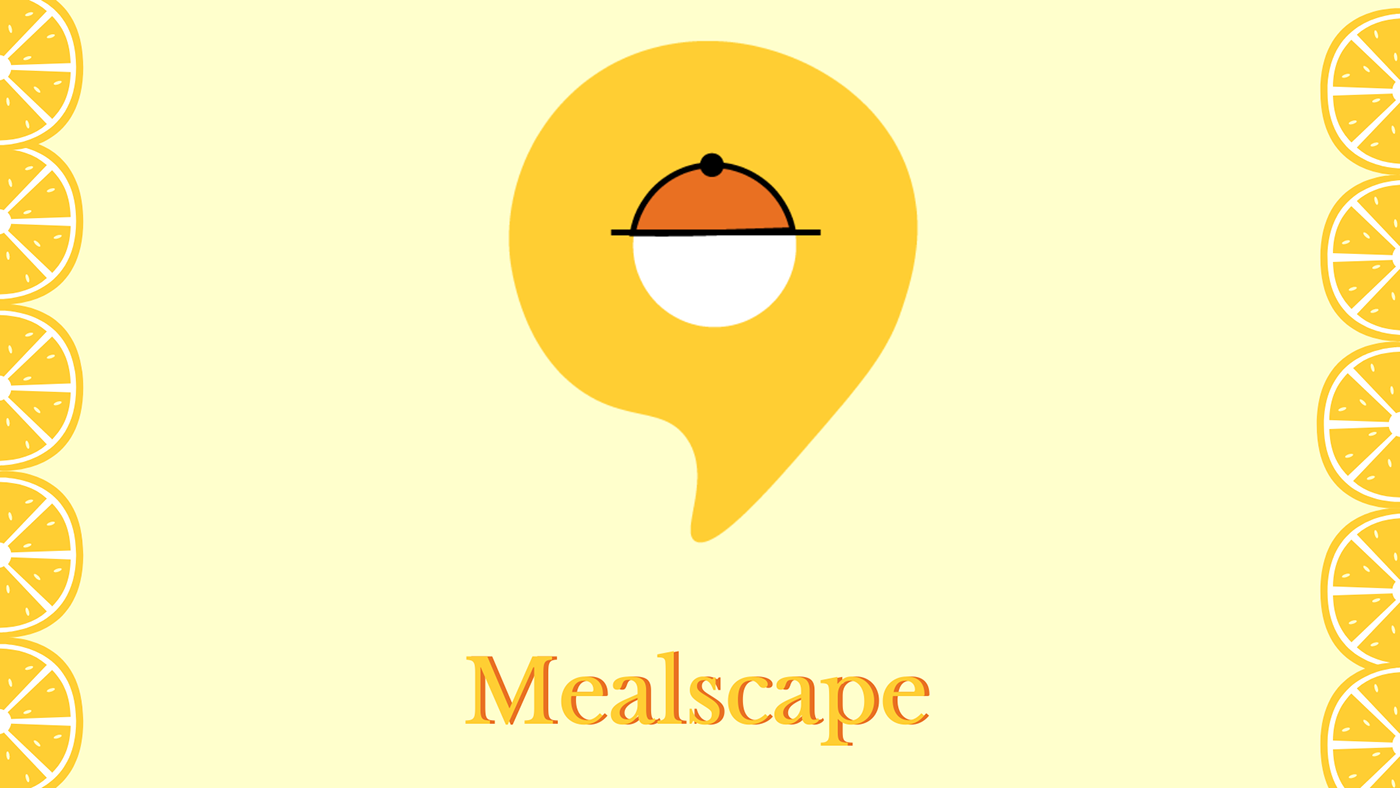
https://www.behance.net/gallery/116415011/Mealscape-Upgrading-food-delivery
i was looking for a review
Hello everyone ... please check out my latest project on behance ... My first logofolio ... would love some support and appreciate feedback !!!!! Thank You !!!!😃 https://www.behance.net/gallery/116756661/Logofolio-vol1

Just a cup 🙂


Happy Easter, lol


To be a surrealist means barring from your mind all remembrance of what you have seen, and being always on the lookout for what has never been.
...Rene Magritte
Stock photo of bg, Stock photo of girl composite of 2 different images.
Petals, water weeds, and iron embellishment photography by me.
@cedar ledge @midnight glen
#AdobeLive #SurrealNature

@cedar ledge thanks for challenge

Gave +1 Creative Carma to @cedar ledge
Photo from Nandu

Digital painting
Friends please give suggestions to improve
I need to place a tribal person in it with a wind effect how to draw a person properly
Anyone please help
https://www.instagram.com/p/CNR7VDKjoeq/
Easter Bunny is popping out from it's egg!


refinements - from the original - can't stop 😉
@cedar ledge @midnight glen
#AdobeLive #SurrealNature


Learned applying neural filters on an image, great features in photoshop 2021. Used a sample image in applying skin smoothness, works perfectly. https://www.behance.net/gallery/116891497/Skin-Smoothness
Thank you everyone who participated in a Surreal Nature contest! I am overwhelmed with the amount of goodness. The winner is Cobo (@jake_pett) with an awesome artwork, but it was a very hard choice. Thank you @gloomy marsh @wicked vapor @sharp crater @gaunt berry @tribal mural @indigo meteor @teal marten @young wyvern @fossil solstice @eternal urchin and all others who sent me their work via instagram

Gave +1 Creative Carma to @gloomy marsh
Next is Queen. My sinking sword generally went good,except I must do my own sword at least one. I want to learn to use RGB channels, shadows like in queen illustration: mid,highlight, make lines smooth in PS illustration.
I I did sword as well. Queen is under project.
suggestions to improve

Hey! There
Guys any suggestions on improving my designing speed.
Btw I am in graphic designing field
Thank you in advance

My version of the hollow earth from Godzilla vs Kong, any suggestions to improve would be appreciated
Creation of a sphere, using the 3d tool, photoshop.

idk if this counts as one

Thank you! 😊
Gave +1 Creative Carma to @robust portal
Hello !! please check out my new project on behance ... would really appreciate support and feedback !!!!!😀 https://www.behance.net/gallery/117023665/Minimal-Typography-Only-Posters

My masking project using Palma Spanien and deer in forest image https://www.behance.net/gallery/117038387/Masking-project-Deer-peeking-through-Palma-Spanien Pls review and provide feedback

Behance
Masking project Deer peeking through Palma Spanien
Made this in Photoshop for 36daysoftype. 'C' ya 😉 https://www.instagram.com/mia_salminen_design/

WIP--This is the first piece that I have been working on for one of my final projects. I plan on making more pieces that include Greek statues with the same style, but including a variety of colors. These pieces will also be used towards a zine I will be working on during the summer.. I am extremely happy with how this piece is turning out! let me know what you think and if there is anything else that you think I should add😋

here is another variation


How can I add short key for 'new gradient layer'???
here are steps u can do https://www.photoshopessentials.com/basics/custom-keyboard-shortcuts/

Learn how to create your own custom keyboard shortcuts in Photoshop to work faster and more efficiently.
Behance
This is a Branding and UI concept of a fictional company by Henry Annan. Credit to:Freepik: Mockup ResourcesUnsplash: Immages
36 days of type. The letter D.
https://www.instagram.com/p/CNaS0EAhZXq/?igshid=1ubfyhk1jr6zh


Am trying to be creative in creating T-shirt designs from music as inspiration.
What your advise and what do u think I should adjust?
Working on it also, not yet Donno.
Taylor Swift fans tell me your fav lines in the title..... Hahaha

Letter E
Day 5
https://www.instagram.com/p/CNeBnlajfjM/?igshid=4g8s5zhocmvl

Hello , here is the link to my first branding/advertising project for an airline company ...please check it out appreciate and give some feedback .... Thank you!!!!! 😃 https://www.behance.net/gallery/117213569/Jetline-Airways

Inspired by yesterday’s #psmasterclass, but I did this entirely on an iPad. (definitely a learning curve!).


Letter F for 36days of type
https://www.instagram.com/p/CNgLyxXDfiq/?igshid=13o6z66nuw9zo


I usually don't sketch comic like images. But as I wanted to get a new insight to lighting and rendering, I started to rework a screenshot from Disney's "The sword in the stone" after I saw some remakes of it. Merlin is my most favourite character from disney btw. Tell me what you think so far (wip)


Overgrown 🌳 https://www.instagram.com/p/CNkBNKWpm5q/

I'm currently in love with vintage collages, here's a new one🥰🥰


Can you see how my edits have been?
https://www.youtube.com/channel/UCTg0V6s_stjzoDOULOwoHSw

Merhaba arkadaşlar umarım videoyu beğenmişsinizdir discord sunucumun linki kanalda ve diğer videolarda var discord sunucuma gelmeyı unutmayın İYİ EĞLENCELER :)

Merhaba arkadaşlar umarım videoyu beğenmişsinizdir discord sunucuma gelmeyi unutmayın İYİ EĞLENCELER :)
Discord Sunucum - https://discord.gg/r8HMp8KVaq

Merhaba arkadaşlar umarım videoyu beğenmişsinizdir discord sunucuma gelmeyi unutmayın orada da editler , tasarımlar ve yazı fontları vs. hersey paylaşılıyor İYİ EĞLENCELER :)
Discord Sunucum - https://discord.gg/r8HMp8KVaq

İZLEDİĞİNİZ İÇİN TEŞEKKÜRLER LİKE ATIP ABONE OLMAYI UNUTMAYIN :)
Discord - https://discord.gg/r8HMp8KVaq
İnstagram - https://www.instagram.com/lodos_desing/?hl=tr

Merhaba arkadaşlar discord sunucuma gelmeyi , videoyu beğendiyseniz like atıp abone olmayı unutmayın :)
Discord Sunucum - https://discord.gg/r8HMp8KVaq

Thoughts? It’s for my next Behance project


A friend of mine cosplayed as Trap Jaw at Power Con in 2017 and ran into a Teela cosplayer. The Castle Grayskull in the distance is my Masters of the Universe Classics Castle Grayskull. The rest are images compiled from Adobe Stock.

Please vote for my Monster Hunter shirt design 🙂
https://community.forfansbyfans.com/m/fan-forge/designs/Monster-Hunter-Fan-Forge/list/id-15326

by rachel gigler
Done!
@crimson canopy My hero!!!\
wallflowers anyone?


Here's an attempt at an isometric fantasyscape...thoughts?


W.I.P, inspired by Paul Trani's Design Masterclass on Animating Graphics, I'm still learning After Effects but want to try and animate some of this once it's done.
I'll try to remember to send more versions or the final piece here once complete.
Thx, Stephen


Tried the 3D tool in Photoshop. https://www.instagram.com/p/CNvNhSEJf4G/

Nice job. I would turn off the shadow or at least feather it more as it looks a little out of place and if you were to turn it off then you could centre the L a bit more, but good work!
It is suppose to look like the L is flying away from a cloud in the sky. But I don't know if it really looks like it 😁 Thanks for the tip 👍
Gave +1 Creative Carma to @silent sinew
Maybe you could feather the shadow then instead to make the shadow less harsh, and if you wanted maybe add speed lines or wings or something else to also signify movement! 🙂
Vintage candy wrapper

Did you make the whole design? It looks great, however if you added the crinkled effect i would personally try to tone it down a little so the image and design is more legible. 🙂 Maybe by adjusting the opacity depending on how you added it.
Thanks, I did make the whole design. I started in Illustrator and then moved it to Photoshop.
Gave +1 Creative Carma to @silent sinew
Epic 😉
Surreal


Something that I painted in Photoshop using some of Kyle Webster's brushes 🙂

Fixed a typo

Cheers fo the luv @young wyvern

Hello ... I have uploaded a double exposure series .... please do check it out and leave a like or a feedback ... thank you !!!!!😃 https://www.behance.net/gallery/117983517/Double-Exposure-Photo-Manipulation
made using free pixelsquid assets,it was pretty awesome and pretty fun even though I rarely use it

Had sone fun with the dissolve blending mode.


a retro futurism study.

Epic work. I'm loving it, really digging the bright colours!
Cheers! Gotta grow With every pixel.
what do you think should I improve here? (The person in the photo is my friend)

I tried this album cover art on photoshop. Can I get some feedback and suggestions on this artwork for improvement?


great motion and perspective and colour @toxic dome
here's yd's practice session: Instagram Bulb


Cool! Maybe the skin saturation is a bit high or vivid to me? The shadow also need a duel casting since you have two light sources. But I like the vibes you created with the colors.
Love the cat
nasty
Make your friend and the bike bigger. You want him as the focal point.
Yeah I agree the perspective could be pushed to show a better proportion line
Unless you want the surreal type vibe to dominant ... Still think its trippy and cool
Heyy guys, I'm new here but just want to show my latest project!!
It's a couple of Twenty One Pilots (band) posters of the new 'Scaled And Icy' era and aesthetics!
https://www.behance.net/gallery/118273695/Posters-Scaled-And-Icy-Twenty-One-Pilots


'U' and a swing, #36daysoftype Drawn with Wacom drawing tablet. 

GIF I FINALLY FIGURED OUT Hahaha

An Ad page back drop or thumbnail sketch area for a new things with my logo

what do you think? Portrait of Lewis Hamilton Formula1 driver!

Is this better for like Instagram stickers?

Hello !!!! please checkout my first editorial design uploaded on behance ... do check it out and leave a like or a feedback ... Thank You !!!!!! https://www.behance.net/gallery/118441091/Cookbook-layout


An initial draft , was wondering if anything's off with the perspective

Captain America looks a bit dwarfed in the perspective of the buildings
Could even scale smaller the object he is standing on maybe ... I like the colors though
Yea , I have increased his size now and it looks fine ig, thanks !
Gave +1 Creative Carma to @barren juniper
Just made from gradients. First impressions??
Pls tell if it's wierd or just ok 😅

Looks cool ! but kinda overwhelming for my taste , but thats just me :)
Yup different styles @deft verge
I am struggling with the layout of this spread, any ideas or recommendations?


Metallic Cloud Word, awesome... great mind to you launch this like a intro video to show who you're.
Just a little mind, ok @rose canyon?
I were in my first college course when I saw the Job's death, was night here in Brazil... I was a little bit shock, but i didn't knew him's health status.
But I want to visit the two Apple Campus in Silicon Valley.
My first banner I did like gift to this awesome event called: "Daily Creative Challenge".
@pure hare all you guys always rock, uh!!

DAY 1133 — Ad Campaign. Coronavirus Restrictions: You need a recent negative test for everything. More slides per visual here: www.instagram.com/_twc_daily
.
.
— 1/4 —


.
.
— 2/4 —


.
.
— 3/4 —


.
.
— 4/4 —


https://www.instagram.com/p/COYf8qohmDn/
I made a new instagram where i will focus on skulls

All together. Ad Campaign. Coronavirus Restrictions: You need a recent negative test for everything. www.instagram.com/_twc_daily

I have made this movie poster on photoshop. Everything is fictional in this. Made everything myself...I just want some feedback and hoping for some followers on my instagram account for more artworks. Insta acc:https://www.instagram.com/extras_with_kaushil_25/


Hey, guys,I've been experimenting with gouache brushes and came up with this concept which is a mix between drawing on the blackboard and a photograph's negative 🙂

Tried to make frame animation.
IMO -- Nice use of weathered paper textures and monochromatic colours @golden crane; type aligns nicely with overall design. curious to see maybe what adding some of the paper texture directly onto the faces would look like? Cool stuff.

Arctic Monkeys
https://www.instagram.com/p/COdUIiQBC4l/?igshid=zndznqh3ni3f


What you can do then you import Chief Architect Home program and Photoshop

Hello everyone !!!! please checkout my recent upload on behance ..... and would really appreciate a like or a feedback .... Thank You !!!!! 😃 https://www.behance.net/gallery/118903807/Brandfolio-vol1

I tried that but it looks bad and kind of taking the charm of the poster. So, i didn't feel like putting that overlay on their faces..Anyways, thanks for the feedback man..very cool
Gave +1 Creative Carma to @humble kite
Cool album dude....I like the way you pixelate their faces and the grunge paper texture overlay onto the poster also looks cool...really good one...I would like you to explore more with the font alignment and try to give some breathing space for the font boundaries....solid album cover..I like it.


SO GOOD!
hi im new, here is my most recent work 🙂

wow,so cool
thankyou!
DAY 1139 — Advertisement. Coronavirus Vaccine: Let the game begin. https://www.instagram.com/p/COlloewDR99/


this was a challenge i worked before


Tried this poster on photoshop .....feel free to leave some feedbackhttps://www.instagram.com/extras_with_kaushil_25/

My latest project of fifteen expressionist pieces. I created them in Fresco and also used Photoshop, Illustrator, and Lightroom Mobile.
https://www.behance.net/gallery/119328203/Neo-Contemporary-Modern-Expressionist-Postisms-Vol-1


Behance
Neo Contemporary Modern Expressionist Postisms, Volume 1. Expressionist works completed using Fresco, Illustrator, Photoshop, and Lightroom Mobile. There is nothing noble in being superior to your fellow men. True nobility lies in being superior to your…
I want to go back to where I belong to
https://www.instagram.com/p/COyR19Xjalo/

I did some CD Stamp mail about a music band... a couple months ago...
like this guy ☝🏻

and this 👆🏻

Hello everyone !!!!! please review my latest upload on behance .... 😃 https://www.behance.net/gallery/119584161/Photo-Editing-Color-Retouching-Oil-paint-effect

Behance
Photo Editing - Color Retouching , Oil paint effect

Minimal Poster Design

I do some drawing for my side project to make myself explore something new...this is one of them for @vivid dragon


ok
I don't do any Ui Ux
ok.
I have started my carrier as a motion & graphics designer and now I have skilled up with UI UX and 3d
You need to include the mustache!


feel free feedback or critic, thanks 😄

Text Profile Photo

Shadows and light test


Soo i was trying to get some futuristic cyberpunkish vibes on the building, but i think i didnt do a great job. Any advice or suggestion? It will help me a lot, thanks
I think you should make all the light source brighter than the light haze and add some highlights,light blooms or light cast on the roads,person and anything which will get hit by that lightsource @balmy rapids
@young wyvern aight, thank you
Gave +1 Creative Carma to @young wyvern
no problem @balmy rapids
This was actually a movie poster challenge from AI, but I did it in PS instead XD


The Gathering

I like the window


Heres some of my creations, im new to photoshop and still trying to figure out how the tools work etc. Its not perfect and i know it can be better, so your advice and suggestion will mean a lot for me.
Noice, idk how animated portofolio supposed to be, but i like it
Please like and share my work
Thank you
Great images, @balmy rapids! The project looks very solid, and I always like that people show the assets used to build their composites, it's great for the viewers to know your creative process.

Great presentations and great concept @steep quail. The context is very well written, and I loved the mockups and your attention to the details, like showing the Pantone colors within the frames and even avoiding the mistakes that people could possible make by distorting the logo for example. Excellent work!
Very nice, I like the contrast between the outfit and the red lines, creating a kind of a neon look and allowing the subject to stand out even more from the background. I'm curious to know what the original looks like if you can please share with us 🙂
@sleek tiger thanks ! 😆

Gave +1 Creative Carma to @sleek tiger
Wow, you definitely changed the whole atmosphere of the image, amazing job!
Great job, but i wonder why half of her face glow
thanks ! i tried to some dark side stuff you know
Gave +1 Creative Carma to @balmy rapids
@toxic dome noice 👌


Behance
SerenityA photobashing composite aiming to deliver a chill, calm, serene feeling to the viewer.
what if she could manipulated fire ?😋


Tried this surreal kind of artwork on photoshop...feel free to leave some feedback


looks really cool bruh how do you guys do this stuff 🔥
thanks bro
Gave +1 Creative Carma to @sinful cliff
this looks cool actually..i really like the shadows and the vibe of it...really cool
thanks


Really cool, but the front body could use more shadow, i think.
Then she can make a barbecue without a grill :D
oh okay i will look into the shadow part..thanks for the feedback
No problem
hope you guys like it, any feedback plz?


Very nice compositions @toxic dome! I like the high contrast of the subject in the second version. The only suggestion I have would be that if you want, you might add some background images of him during the games and play with some textures too as you did on the first version. That you give even more context to the layout. Well done!
Looking very nice, @twin hazel! I like the way that you made the subject still visible on the composition. Double exposures can be very tricky when managing the visibility of both assets. Well done!
Ok Sir
Thanks for you feedback 🙏
Gave +1 Creative Carma to @sleek tiger
thanks so much for your comment, sir 👍
Gave +1 Creative Carma to @sleek tiger

Trying to make the dog look like it belongs more... any advice/tips are welcome

Hi, @granite phoenix! You might use a levels adjustment layer to reduce the contrast of the head of the dog, to match the luminosity values of the body, you can do that by dragging the black sliders (from the bottom) to the right. Although, since the title suggest that the dog is the main subject of the story, I'd recommend that you position it on an area where it might get more attention, like the middle, and play with some overlaps with the title, or if you don't want change its position, you might take advantage of the lighting to drag more attention to it. Well done!

I really like the way you explored the font by putting ER above U but try to decrease the width of letter "E" matching exactly to the width of U letter line
Thank you sooo much every feedback helps me to improve more
Having a nice Saturday, I was looking for some reference and saw a beautiful frame from Lawrence of Arabia and tried my best to capture the essence of it.

Some neat Shape Art i did in Photoshop

I like the vibrant colors, @peak gyro! It doesn’t make the shapes lose their bounds, is it a personal work?
If so, you can start a series with this style
That white space in the middle allow the whole composition to breathe which makes the viewers to spend more time looking at it
Yea, I made this for my mom for mothers day!
Thanks, glad you like it!!!!!
Gave +1 Creative Carma to @sleek tiger
Twitter Header @ZeuxDZN #Z250CON
any kind of support is appreciated ♻️&❤️


I did this montage/collage of pix in photoshop from some of my travels and added some fantasy stuff to make it fun and step out of my comfort zone. The foreground is Rome, the island/castle is Mont St Michel, the background and sky is Scotland and the water is from Lake Ontario near Toronto. Feedback welcome.

That's gorgeous. Great job


I was working on this image this afternoon and I'm a little stuck on what to do to the candle to make it look less out-of-place. Suggestions?

great job,
Very nice, @fossil bear! This is just an idea but you might add some glow to the fire build with words just to sell more that there's a light coming from them, and then you can paint some yellow glow to the candle as well, to make it fit more in the scene. It will also help to add a bit to the sparkles. I like the softness of the shadow you applied, it helps to tell that the candle is floating since it's blurred. 🙂
I was just randomly working on this image , any feedback from you guys will be highly appreciated. Thank you 😃


Its awesome
Its too op bro.
Just a suggestion you can also add sky in this
thanx

Very nice composite, @vivid latch! I loved the sunset sky that you added. The foreground elements look a bit too dark, you might just brighten it a touch adjust to make the assets more visible but still cohesive to the sky. Well done!
Beautiful drawing, @modest forum! Is that for a project or just personal work? It looks great!
Hi @hidden bison! Very good composite! The only suggestion I have would be to enhance the planet as a light source, you might brighten the nearby areas a touch more and the subject, then you can use a color balance layer to add yellow tones like they were coming from the light source and making every asset belong together.
TYVM, Exotic Dog is the band name, Scritchified is the album. I was going for a giant dog lurking feel rather than center piece
@sleek tiger thanks for advice
Gave +1 Creative Carma to @sleek tiger
tried this on photoshop

How is that? I'm still uncertain....

The dog is blending better, but if you want to enhance the focal point by using lights you might play with some curves adjustment layers and layer masks. Here's a quick edit, make sure that when you do it, correct the saturation and colors as well.

I made this a few years ago to help me quit smoking.

for work

Tried photography for the first time. How's it?

Which one is better?

and any suggestions?
How is this ?

Very nice work, @golden crane! Loved the way you matched the colors and also build a dark atmosphere. Great job managing the perspectives as well.
This is awesome, @sand orchid! Great job making the smoke in the shape of the skull, how did you do that? Using liquify? Nicely done!
Thanks @sleek tiger The skull outlines were created with the glowing edges filter and the smoke was imported from images of incense smoke from a shoot I did where I recoloured it. These were layered and masked to produce the final image.
Gave +1 Creative Carma to @sleek tiger
Very powerful! I like that you added a little extra at the top like it's spreading, it makes the work even more dynamic. Thanks for sharing the process! 🙂
Gave +1 Creative Carma to @sand orchid
I like version 2, @tawdry cape! The colors matches the low contrasting areas of the background, like the trees and the foreground , giving the photograph a pleasant look. Well done!

Hi, @jade bluff! You might make the butterfly (I think it's a butterfly hah) a little more visible, so the viewers might be able to identify it easier, and to blend more you can add some noise and some similar particles textures as you have in the background image. 🙂
it is actually a whale XD. But anyway, Thank you!
Gave +1 Creative Carma to @sleek tiger

Hello everyone !!! please checkout my latest upload on behance ....its a travel magazine ... do appreciate or leave a feedback ... Thank you !!!!!!😃 https://www.behance.net/gallery/120815621/Travel-Magazine

Nice color combination
Great piece!
original

my photoshop

a very small touch but I'm confussion.My photoshop looks so artificial.Did I do a good job?

Great job softening the skin @small finch! I like that you kept the texture of the skin and changed just the luminosity, did you use frequency separation for that? Also, a point of feedback that I'd have would be to make a dodge & burn just to enhance the shadows and highlights and add more depth to the subject. You can easily do that with curves adjustment layers, layer masks, and a soft round brush with low flow. 😉
Hello guys! I have not posted anything PS related but today I have finished my shape study using mosty the lasso tool. What do you guys think? I have kept the color palette close to the photo reference but added some of my own things to the composition.

Thats nice @cosmic mountain
Hi Guys,
Brushing up my editing skills. Please let me know how can i improve this


@fathom hollow add some light and shadows, also make mosque and piece of ground a bit darker. Why did you blur space on background? Also get rid of water marks on piece of ground. And what is it?(pic below)