#📝project-feedback
1 messages · Page 39 of 1
Hey - Working on a composition and would like to get some feedback .. can't decide A or B.
feedback 😆
how bout this? thank you 😄 #📝project-feedback
composite
Hey
What do you think about this?
Do we have a Lightroom group btw? I’ve been on the hunt for affordable presets and found them free at creativetaco.com. Also compatable w Photoshop. Photos are so important for branding and the editing always trips me up 😭
Not yet @noble gyro. I can recommend the Photography section of Adobe Live. It will help you to develop your eye for editing photography with lots of hours of great content 🙂 https://www.behance.net/live/replays/creative-fields/73/Photography

Watch videos about Photography.
Ok sweet thank you @sleek tiger
Gave +1 Creative Carma to @sleek tiger
hey guys! I'm done with this drawing and would appreciate all the feedback from all of you 😄 I'm trying to build a portfolio for a character designer job so hope I'm on the right track here.
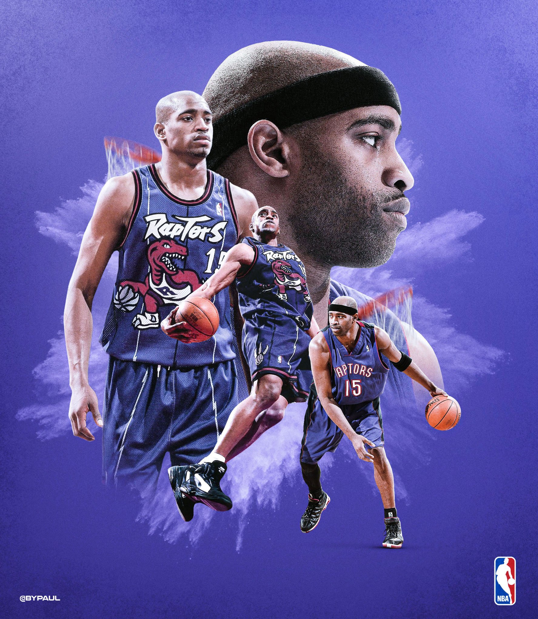
I've decided to pay tribute to @mrvincecarter15 for his incredible career !
So I'm going to create a visual for each team he played to.
#WeTheNorth #Vinsanity @Raptors 1/8

hey guys! I'm done with this drawing and would appreciate all the feedback from all of you 😄 I'm trying to build a portfolio for a character designer job so hope I'm on the right track here.
@sweet marlin Like it. You could have used the "water?" surrounding the staff as a comositional sprial element around the char. I don't know why, but everytime my eye has to focus on the hair.
Sign in & Sign up Bootstrap HTML5 Responsive Templates. What do you think?
https://www.ciucacristi.tk/login/
Hey @slender shard ! Thank you for joining this community. This channel is more for sharing your designs and less for selling them 🙂
Gave +1 Creative Carma to @slender shard
Is it ok?
Is it ok?
@violet nexus it’s okey. Maybe you could use a Blend Mode for the objects in the background to create some sort of realistic perception. Imagine you are diving...the objects far away wouldn’t look so clear. I think it would increase the 3D feeling of your artwork!
hey guys! I'm done with this drawing and would appreciate all the feedback from all of you 😄 I'm trying to build a portfolio for a character designer job so hope I'm on the right track here.
@sweet marlin I can give you a Feedback as a game Consumer - Not Designer unfortunately- it looks cool!!
@sweet marlin It's really cool. My eye goes straight to the staff and water now because it's so much brighter than the witch.
@rigid pebblebalenced have you tried drawing the feathers individually onto the wings? Using a light grey again? Esp with the black feathers. The white ones could just have the subtle shifts in tone painted in without having the feathers drawn in first. Or just block in the colours then work back over it with the white to develop a highlight, then smooth it out?
Hey everyone 👋 What do u guys think about this one
What do you think?
@vast dagger will do great idea!
@rigid pebblebalenced have you tried drawing the feathers individually onto the wings? Using a light grey again? Esp with the black feathers. The white ones could just have the subtle shifts in tone painted in without having the feathers drawn in first. Or just block in the colours then work back over it with the white to develop a highlight, then smooth it out?
@vast dagger
Hello guys please I hope you guys don't mind helping me fill a survey form? It's a task given to me by my mentor. I'm looking forward to 50 responses. Thank you guys. I trust you! https://forms.gle/u5eeJxieTk2VUybW6 that's the link to the form

Google Docs
hello, i just wanna sharing 😬 and thanks
@vivid dragon and @lime magnet please help me because I'm at a loss. I want to make this image more like it came from a comic book. What is your advice?
Did another version
@hoary badger yeah that sounds a good idea, I really enjoyed painting the staff maybe that's why it is the main focus, thanks for your feedback!
Gave +1 Creative Carma to @hoary badger
@toxic dome @ashen moss thanks for both of you! glad you liked it
here is another character painting! you guys can follow me on Behance https://www.behance.net/angykaba5d53 and share your work with me 😄 I love meeting new artists!

Behance
@icy sorrel Very cool! I think the defining element of comic book art for me is the inking. Usually comic book art has bold black outlines for key areas, and currently the deepest contrast throughout this design is a semi-dark red. If you could find a way to give it more bold black outlines I think that would help. I think the way the colors have been simplified helps a lot for that effect currently. I'd try getting some references of comic pages together to really identify the look you're going for. Perhaps this tutorial that Jesus did might help as well! https://www.youtube.com/watch?v=6dtLdjiNg6Q

In this Photoshop tutorial, you will learn the smart and quick way to make comic book drawings from your photos.
For this cartoon drawing effect, we will only use three filters. The Poster Edges filter, Threshold, and the Oil Paint Filter.
As usual, I will explain what ever...
Done in photoshop
I would appreciate some feedback on this image that I created. Thanks guys! 😁 ✌️
@toxic dome great idea! the dog feels a little bit too big. Once you zoom in it becomes more visible. Also the Lion is probably looking too clean on a water surface, there should be some distortion in it. All in all...cool composition
Was testing some of kyles brushes today as a "smudge" tool to turn a foto to something like a painting.
Hey cool people, i made this vector portrait and uploaded to my behance! Gimme your feedback 😁 https://www.behance.net/gallery/96000857/beababoobee-illustration

Behance
Bea Kristi or professionally as beabadoobee, is a Filipino-British indie singer-songwriter.
hey guys !!
I am new to behance and this channel btw
this is a poster about judging people and see the prisoner inside of them
please gimme your feedback
https://www.behance.net/andrewemad3
Hi , just done a photo manipulation design. Have a look
https://www.behance.net/gallery/95756943/Wild-in-the-sky

Love the gif @tall swan
thank you @iron fractal
Gave +1 Creative Carma to @iron fractal
Unfortunately i'm not this far yet, but would love to know how to do all that like @thorn crater did.
Composite on IPad
Unfortunately i'm not this far yet, but would love to know how to do all that like @thorn crater did.
@toxic dome I would say there is 3 key detail you need to pay attention when you do the image composition.
Light
- Define light source
- How is element surface look like when light source land on it. (you may keep observing in your daily life how does the light reflected in various of surface )
Shadow
- Wherever there is light, there is shadow; haha
- Shadow is important to make a thing or element realistic and believable.
Reaction between element
- For my example: I want to put a whale jumping out from cloud sea. So in other to make it more realistic, I put some residue of cloud at the lower part of the whale to make jumping out the cloud more real.
Anyway, practice make prefect. obverse other ppl design and pay attention to the detail because all those small detail will elevate your overall design look. Hope this help . Keep design 😄
3rd team where @mrvincecarter15 played !
#MagicAboveAll #Vinsanity @OrlandoMagic 3/8


your opinion?
for those who asks what programs i used: I used Photoshop on pc and Lightroom on my phone
@tepid mantle THe color is cool, though i'm not a huge fan of the yellow object ot be honest. But, that's my opnion.
Locked down at our homes away from each other
I reach my arms out to you
Hoping you'll hold them just like any other day
Lockdown are our movements and not our hearts
Will see you at the end of quarantine
some art test
A bit of word play for this bit... And my question is "can you have too much texture"

Instagram
Miguel Nogueira shared a post on Instagram: “Drawing of my cat to go on the next board design. . . . #tigerstyle #wutangclan #shaolin…” • Follow their account to see 97 posts.
Welcome back to Instagram. Sign in to check out what your friends, family & interests have been capturing & sharing around the world.


Instagram
2 Likes, 0 Comments - Miguel Nogueira (@menogue) on Instagram: “WIP. Not my favorite out of the skate series done for boardpusher but thought I'd share as sketch…”
Don’t let them make you think you need a rocket ship to get to the moon.
i made this any suggestion
@quiet pasture i am so so impresed by your work can i fallow ur work on behnace
Thanks lot for kind words @glass glade yes u cn follow my work on behance. I like ur projects especially ur illustration of potraots the stylization is nice
Gave +1 Creative Carma to @glass glade
Thanks lot for kind words @glass glade yes u cn follow my work on behance. I like ur projects especially ur illustration of potraots the stylization is nice
@quiet pasture it will be kind of u if u give the adress of behnace ,

Behance
Anyone particpating in the EDC-Las Vegas design challenge?
Made this cover art


here's a little study i did of a foggy river scene!
Had some fun today with blender and photoshop
https://www.behance.net/gallery/96362659/Bottles?

a little like the color of Paul Trani, but thats mostly because im usually underwater. 🙂 Anybody has any tips/tricks to improve?
Lip Closing
@naive ginkgo maybe I'm on a lag of THC but a bit to, mh, colorfull i guess. I would stick with the small hemp-leaf and stay with one font.
finally successfully background removal and successfully tackle fringes from hairs
Photo on the right is an original taken on Potato mountain in the mountains of Colorado. I was asked to amp up the colors and fix the trees on the other mountain side as the pines were dying when the photo was taken. @lime magnet and @warm saffron , you both have really helped me with boosting colors so I'd love your review if you have the time. Thank you!
Gave +1 Creative Carma to @lime magnet
@sleek tiger if you have the time, could you have a look at my picture? I'd appreciate your comments on how to improve it.
Of course @toxic dome 🙂
That would be cool! You're the man!
@toxic dome I saw that you wanted to replicate the effect on the Paul's masterclass thumbnail, you can achieve it more easily by a gradient map adjustment layer. What this layer does is to map the highlights, midtones and the shadows of your image and put colors to them. (you can create more handles by clicking on the gradient and adjust the transitions among them). Analysing Paul's thumbnail you can see that the highlights have some less saturated yellow tones, the midtones has sort of a cyan tone and the shadows have a dark tone of blue. You can use the eyedropper tool to sample this tones from the thumbnail. I'll send you a link for a quick tutorial on how gradient maps work 😉 https://www.youtube.com/watch?v=ewKQ3kTPXm0

Today...learn how apply a Gradient Map to images in Photoshop!
This effect is a sure way to make any image look awesome, we’re not saying you should use it on everything but it’s definitely a handy technique to know! Learn everything you need using our step by step instructi...
@sleek tiger Thanks, Nice! That is gonna be useful, i was trying to get the proper color in the Gradient map. I must say that the Gradient map is a useful, but not easy to master tool i believe...
Gave +1 Creative Carma to @sleek tiger
@toxic dome Yes I agree, the fine tune process can be long. You can use multiple Gradient Map layers and use Blend If like the video so you will be able to limit the affected areas based on the luminosity of your image 🙂
@sleek tiger Cool! I am going to do that now! Thanks for your help so far!
Gave +1 Creative Carma to @sleek tiger
No problem 🙂
This is closer to illustration than design, but I'm pretty proud of how it's turning out. Still a WIP.
I made this night landscape in Blender and Photoshop 🙂
Please let me know what you think...bad or good. Thank You.
how to make it even better, im literally don't know what im doing rn
Made this for the EDC challenge let me know what you think!
@jovial adder cool! I would never be able to come up with something like that!
@toxic dome Thank you! It is based on the neon lights of Las Vegas!
Gave +1 Creative Carma to @cursive sorrel
@jovial adder if you want neon light inspiration watch Tokyo night life
@frank osprey I will! Thank you
Gave +1 Creative Carma to @frank osprey
Np mate😸 👍
@frank osprey Tokyo neon is really interesting it has a futuristic vibe yah know? Before my project I did some visual research just to get my mind going and this is what I came up with
Anyone particpating in the EDC-Las Vegas design challenge?
@jovial adder What's that?
This is closer to illustration than design, but I'm pretty proud of how it's turning out. Still a WIP.
@vale grotto It is so cute!
Please let me know what you think...bad or good. Thank You.
@gritty notch try to blend in your subjects with your background a little more and you're good to go 🙂
Gave +1 Creative Carma to @gritty notch
@jovial adder Loved it!
I wanted to make moon like a sun can I do without cropping?
Ping me if someone know the answer.
@daring junco https://creativitytour.adobe.com/challenges/ps-edc-ls/ Check it out!

Adobe and Live Nation® bring you access to exclusive photos, videos, and designs from artists and festivals.
Can I please get feedback on my company’s social post for Star Wars Day!
Hey guys, I made this for the EDC challenge, and I was wondering if anyone could give me some feedback?😃
@wild sequoia hello my friend
hello :]
my girlfriend and i, used Lil Uzi’s scott pilgrim album cover for inspiration
@shell robin I like the colors you chose and the waves lights coming out of the stage but the Virtual Rave-A-Thon is a bit hard to read good work 👍
Tried to replicate a "papercut" pictureframe from scratch.
dont ask me why i made this but what do you think about it ?
@stuck urchin nice work
It would look better imo if you reduce the threshold value
Cause then you'll retain the fine lines of skin texture
Also increasing the contrast would do good
Hi All, During this shutdown and pandemic we could all use some good music to Work From Home to. This is the very best pop, alternative, psychedelic soul, neo-soul and art rock music from Austin Texas. Some of the best band s in the world. Over 18 hrs of music. ENJOY.
https://open.spotify.com/playlist/2JfpxXW8hr5OYym64EtPIR?si=v1f6u4UGQQqF5iHm-R6Siw

Spotify
Best bands and pop, shoegaze, psychadelic, pop-soul, dream pop, alternative, art rock songwriters in or from Austin, Texas!
hello all - my friend and former colleague paula is doing a little instagram project about ‘the 15 items you can’t live without at the moment’ - it’s fun and really therapeutic! please check it out if you can … https://www.instagram.com/p/B_YIVOSgV18/?utm_source=ig_web_copy_link here are my essential items, featuring fresco!

Instagram
196 Likes, 37 Comments - Paula Zuccotti (@paugram) on Instagram: “What do an orange, a bottle of wine, a kettle bell, kefir grains, a sage smudge stick, a candle,…”
@frank osprey thanks for suggestion it does work well
Gave +1 Creative Carma to @frank osprey
😁 👍

Instagram
Arindam Choudhury shared a post on Instagram: “Devil, clever as the devil and twice as pretty. . . #neon #supernaturaledit #prilaga #neonlights…” • Follow their account to see 99 posts.
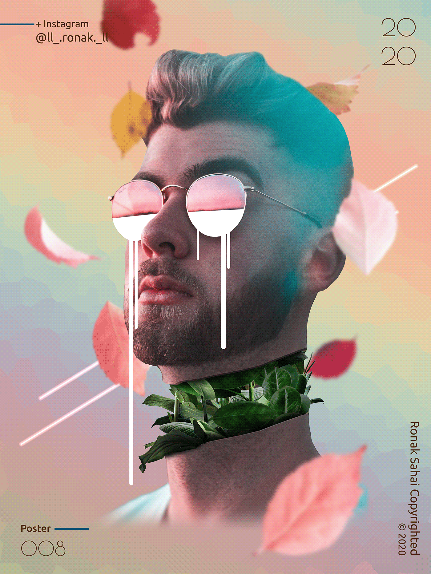
My latest work ^^
Any feedback is appreciated

Instagram
80 Likes, 4 Comments - Ronak Sahai (@ll_.ronak._ll) on Instagram: “#creatingfromhome . Btw, its @jade_weber_official 's body...😁 . . . . . . . . . #design #minimalism…”
@lone quiver it's amazing
I guess it is fragment and crystallize filter combination ?
Hey, i made another vector portrait! Feel free to check it out and give some feedback 🙂 https://www.behance.net/gallery/96361343/kennedy-walsh-digital-portrait


I will like if you guys rate my skills, still working on more....... https://www.behance.net/gallery/96917105/angel-demon
Guys check out my recent project https://www.behance.net/gallery/96923193/Social-MediaWallpapers-of-Players

My doodle for today!
https://twitter.com/mintlodica/status/1259971333905096704 mine from the stream!
doodled whilst watching @byalicelee's new stream doodle therapy! 🎨 lol yes, it's meta:

My super fast doodle of my tomato sprout! #alicelee @byalicelee
wow, these look so great!!! I'm going to share some on the stream tmrw. 😍 and I'll ping the first few submissions (aka giveaway winners :)) re: the stickers giveaway too!
if you want to be counted for the giveaway, make sure to share your doodle here or to social media (tag me @byalicelee anywhere!) before 2:20 PST PM, and tune on tomorrow to see who the lucky winners are!
the point is to have fun and express ourselves with these doodles ("done is better than perfect"), so don't be shy to share 🙂
Hello guys check out my latest project on behance, feedbacks, likes and critics are welcome they help alot. thank you!! 😄 https://www.behance.net/gallery/95643167/Catalogue-Faces-from-Armenian-Literature-Art

Behance
Faces from Armenian Literature and Art is a personal non-commercial project, aimed in recognizing Armenians who helped in improving the Armenian culture overall, summery of their work and professional life is included plus a portion of their work.
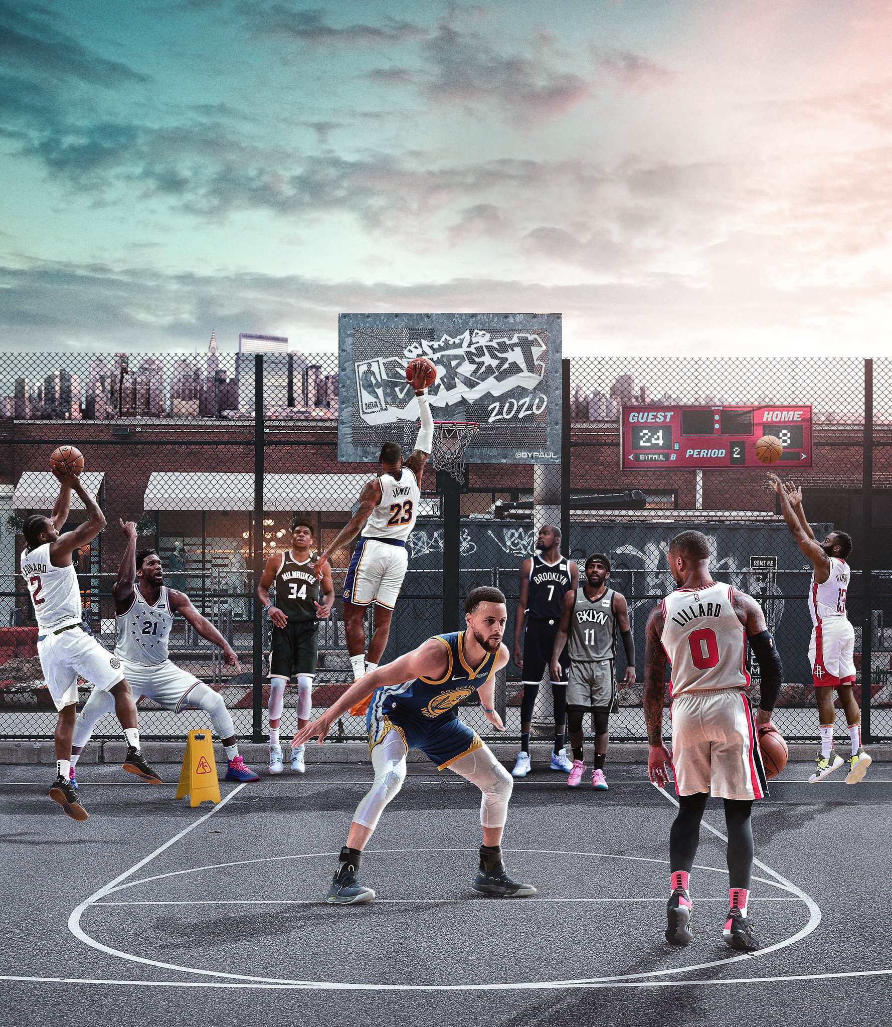
My tribute's series to the career of @mrvincecarter15 is now completed ! 8/8
Check it out here ! https://t.co/OZKMDocXPL
#Vinsanity #smsports

@midnight glen Oh $#!* I just used a built-in gradient for a logo design. Paul, what have you done to me!?
My doodles from yesterday's stream with @byalicelee
Any tips on how to redesign this better?
mixer brush in photoshop
@glass glade thanks for the kind words! we did a sticker pack giveaway this week for the first few doodle submissions. I may continue them in the future! 🙂
Gave +1 Creative Carma to @glass glade
https://twitter.com/__bypaul/status/1260181283541565442?s=19
@frail lintel red 25 is my favourite piece.
My tribute's series to the career of @mrvincecarter15 is now completed ! 8/8
Check it out here ! https://t.co/OZKMDocXPL
#Vinsanity #smsports
Made this. First time using the smudge tool.
@glass glade thanks for the kind words! we did a sticker pack giveaway this week for the first few doodle submissions. I may continue them in the future! 🙂
@proper shale can i have your behance link , i ur work is soo nostigic
hi, world , i wanna share my work, hope enjoy and thanks 😄 #📝project-feedback
Woah! That’s amazing
This is a little project I started yesterday, super proud of the outcome
my new setup
You fly while working?
no i just have long legs
Here's something I was playing around with this morning. I took a daytime city scene and adjusted contrast and brightness to make it night, added the moon and night sky in the background and played around with hue saturation clipping masks and brushes to make the moon look like it's shining. I was going to try to do the same thing with adding lamposts along the street, but that has been a little bit more difficult. Here's what I got so far!
Any ideas for what I insert in the middle of the street to make this image more exciting?
@plucky kettle may a couple or man walking dog
I chose to add Wall-e instead and I lowered the saturation of everything else so he stands out a little bit more. Not sure if I'm content with this composition right now, but it was fun to learn about adjustment layers and making the moon glow!
Someone on reddit was asking how to achieve a similar affect. This is my quick try.
Link to the reddit post:
https://www.reddit.com/r/PhotoshopTutorials/comments/gka1r1/how_to_recreate_this_pet_effect_i_saw_this_online/?utm_source=share&utm_medium=ios_app&utm_name=iossmf&utm_term=link

reddit
0 votes and 2 comments so far on Reddit
what do y'all think of this

Thank you so much for the doodle therapy today, Alice! Here are my landscapes. The first one is based on the sunset to the left. 🙂

Color Study 1 with Alice Lee doodle therapy - I chose a color palette that was already in Photoshop. It's under swatches and is named "Light". I really love these colors. I added a gradient in the background with a blending mode.
Color Study 1 with Alice Lee doodle therapy - I chose a color palette that was already in Photoshop. It's under swatches and is named "Light". I really love these colors. I added a gradient in the background with a blending mode. This one has some blur added for depth.
Here is my "doodle therapy with Alice Lee" piece from today:
Awesome job @uneven flint ! Thanks for joining, and congrats on graduating this week!
Gave +1 Creative Carma to @uneven flint
Thanks Alice! So glad I found your videos (I still haven't checked my mail haha). @proper shale
Gave +1 Creative Carma to @proper shale
Thank you so much for the doodle therapy today, Alice! Here are my landscapes. The first one is based on the sunset to the left. 🙂
@forest phoenix love these doodles
Gave +1 Creative Carma to @forest phoenix
Color Study 1 with Alice Lee doodle therapy - I chose a color palette that was already in Photoshop. It's under swatches and is named "Light". I really love these colors. I added a gradient in the background with a blending mode. This one has some blur added for depth.
@uneven flint Nice colors
Hi @past jackal Thanks! P.s. I'm not seeing your artwork.
Gave +1 Creative Carma to @past jackal
@uneven flint Sry? I didn't understand
Thank you, @past jackal !
Gave +1 Creative Carma to @past jackal
I like the side colour can you make the colour lit dark in down side and light at up (like boom effect) Same goes to middle one.
@mossy tiger
Tried doing a collage. How is it?
😮 😮 😮
Hey All, I would like to invite you to see my work for 36daysoftype there are a lot of photoshop work illustrator and Dimension... appreciate your opinion and comments :)
https://www.behance.net/gallery/97299321/36-Days-of-Type-2020-36DAYS-36DAYSOFTYPE-Typography

Behance
36 Days of Type is a project where you let me express my ideas and techniques that I am learning.I knew about this activity a little bit late, at the first I did't understand the activity so well but it was so much fun and challenge when I come each day …
took what i learned from the may 28th daily challenge and used it to make a banner for my behance profile page
MrXile - here is a sample of my restoration work. This is the original of my Great-great Grandfather, Patrick ODonnell
Here is my restoration work
This original picture was actually imposed on a plate. 4 Generations.
Here is my restoration work - Please, keep in mind, the folks that sent me this pictures via email were poor resolution.
@carmine parrot great work!! Love it!
Thanks, Jaz - much appreciate
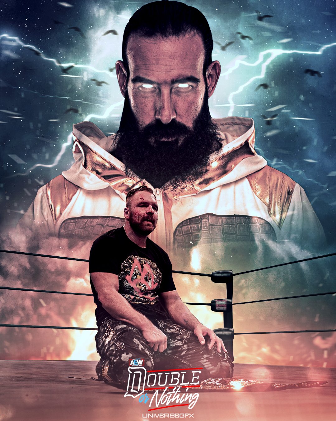
Jon Moxley (C) Vs Brodie Lee - Double Or Nothing poster
@AEWrestling @ThisBrodieLee @JonMoxley
#darkorder #Doubleornothing #champion #AEWDoubleorNothing #moxley #cody #ppv #brodie #wrestling #prowrestling #winnertakesall #visualart #GraphicDesign #design #wrestlingart
i will Try Movies Poster
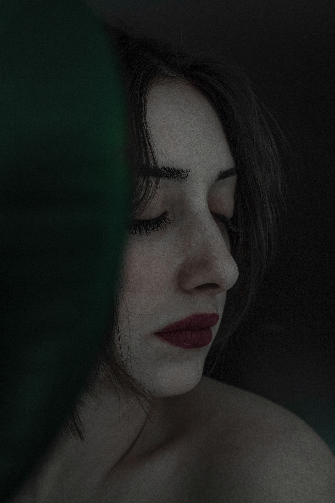
first post here.. I know it's a bit dark..
i will Try Movies Poster
@half magnet Cool
@carmine parrot ah that’s great! Well done! I do enjoy a good restoration! It’s time consuming sometimes, but the outcome is very much worth it.
@half magnet that’s awesome well done mate. I think it would work better without the car personally.
@toxic dome this is a place for learning - not a place to tout for free edits.
@broken frigate Don't worry, it's just that if i wanted to use it myself i'd have to do it in PS, which i did already by the way, so if it would be bigger or expanded it would pixelate. Since i don't have AI, i was hoping someone would offer to help. But hey, you won't hear from me for any help anymore😶
here i ve tried something and i still don't understand what
@frozen sentinel that’s a bit presumptuous of you.... if you’re a designer, design. If you want ideas. Pay me.
Brushes made with Carra Sykes @vale bluff - Thanks Carra!!!
Gave +1 Creative Carma to @vale bluff
i like to hair your thoughts about it
I was asked to redesign that with Red and white theme?? What do you think???? which is good engouh? Landscapp or portrait??? any feedback???? Isn't there too much red?


Fancied a mindflayer today so came up with this..... everything is manipulated stock apart from the mindflayer, that’s hand drawn.
Stocks from Unsplash and Pixabay
I made a mock up business card.
🐯
Hi Creators. Can I get follows/appreciates from you. I need to build my Behance more strong and affective if you can help me and we can follow and learn more from each other. This month is my last to get paid. The Employer did gave me notice a month back... as they can't afford they said due to this COVID19 PANDEMIC. They lose their client and business too. You guys can help me with this, somehow at least with comments/follow/appreciating my work there. Thanks https://www.behance.net/sivadthapa-93

Behance
I wish you luck @astral ermine. This is a very difficult and strange time for everyone. I have been able to use my creative design skills to help small organizations who need to adapt to their business model to the new social distancing reality under which we are all living. Examples include; Covid-19 site plans for submission to local government, signage, etc. In another job I created graphics for lesson plans for distance learning. It challenged my design skills because I’m a “fine artist” I didn’t go to design school. I started using photoshop, Indesign, Lightroom, adobe illustrator out of necessity and as an auxiliary sill to support my art. Someone in your local community might need your help to get out their message during this weird time.
Thanks @rapid copper
Gave +1 Creative Carma to @rapid copper
@red quail is that a Topaz filter?
How's this design for my stream logo?
I'm going for something a little simpler than my current
Or maybe this
@red quail is that a Topaz filter?
@short snow yes
Welcome back to Instagram. Sign in to check out what your friends, family & interests have been capturing & sharing around the world.

Twitter header for a youtuber
Reflection
@red quail then you haven’t created it have you?
@violet nexus I prefer your original one!
@violet nexus i agree with Xile - the original color palette has a clearer hierarchy (my eye knows where to focus because the subject is lighter in value and the BG is darker)
🐟
Hey everyone, I'm experimenting with comics effects and I made these two versions of the effect with a picture of mine but I can't decide which one looks better 🙂 What do you think?
Your first picture gives me a better comic book type feel then the second one. But over all its awesome and i love it
Thanks @barren socket 🙂
Gave +1 Creative Carma to @barren socket
@stable bay no prob
https://www.behance.net/gallery/97954171/Comic-book-caricature-style-photos
Here's a link to my first collection of comic book and caricature style photos that I was working on 🙂

I'm getting better )))
Yes it looks good
@violet nexus
@charred scarab (I'm not a pro when it is about lights and shadows but i think I ll be ablle to give you one or two advice) according to the most illuminated area of the sphere, I think thats the shadow shouldn't be in this direction but maybe a little more towards the bottom of the image, also if you blur a little bit more the shadow I think it can be more realistic.
It still a good job 👍
First collab with the crazy talented @Thomasmeuric
Check his Instagram : https://t.co/vNBs39nfNr
#LakeShow I @KingJames 👑


how could i make better
Is it ok?
@violet nexus that's good, i love it, maybe you can adjust the shadow depending on where the light comes from but this still very good
@stuck urchin maybe you can saturate the colors of the rainbow a little more and reduce the blurry of the clouds, you did a good job on the opacity of the different elements!
here is the link of a video about how to make rainbow using gradiants but yours is a nice one : (sorry if my english isn't great^^)
https://www.youtube.com/watch?v=_-ggTYbW4QU

In this fun tutorial I will show you how to make a realistic rainbow in Photoshop in two different ways.
Enjoy!
➤PATREON: https://www.patreon.com/nemanjasekulic
➤My Photoshop brushes: https://nemanjasekulic...
My work for my new team of designers PRES.
I hope you like it. i am open to every kind pf feedback
Check our page and behance if you can
https://www.behance.net/gallery/97952401/PRES
@lone quiver thank u that is very helpfull
Gave +1 Creative Carma to @lone quiver

@lone quiver the new colors really enhance the night look in the same time some midtones were a bit darkened especially on the areas of the walls. I like it a lot!

My new work
@cedar steppe got me started on this today. I used a screenshot of a tomato and then developed my own "painted" version. Hope you all like it!
@icy sorrel looks awesome!! Love the texture
Thank you @cedar steppe !
Gave +1 Creative Carma to @cedar steppe
Here i ve try something i saw on a video but i'm not satisfied of the result.
first, the perspectives don't seem to match,
second, the colors of the dancer do not match either
and finally, i can't get that neon effect on the portals...
any suggestion on how i can improve this mess ?
she feels seperate
you need to add some lighing affects of her
that would put her in the world
but also the perspective of the portal is not aligned to the street
i agree, @wild sequoia ! good feedback. however, i think the perspective of the portal on the street is okay - doesn't look distracting to me
'An Ode for Love'

I take this in my city
#BlackoutTuesday
@lone quiver What did you use photoshop for on this?
I m not shure i understand the question (because of my limited english), i use hue and saturation to change a little bit the colors, to make it
more pleasant to watch
@lone quiver awesome well done sir.
thx ^^
Amazing work @bleak echo 🖤
Amazing work @bleak echo 🖤
THanks@sleek tiger ✊ 🤍 🤎 🖤
Thirst that must be sated?
@lone quiver please mention people when thanking them
ok thank you @broken frigate ^^
Gave +1 Creative Carma to @broken frigate
@lone quiver thank you too
Gave +1 Creative Carma to @lone quiver
XD
After getting some advice from @vivid dragon about the coloring, I took another crack at the tomato. This is my favorite rendition of my tomato!
@icy sorrel it looks SO realistic! you're really nailing the semi-matte texture of the skin
Thank you @stark saddle It's really been interesting to test out all my brushes and really find the ones that work for me in certain places.
Gave +1 Creative Carma to @stark saddle
@icy sorrel Ooh, I hadn't seen the update yet! Looks great, good sense of form now 👍
hi, everyone 😄 ,thanks
Heyy everyone! Im creating a series of tools characters, and i would love to get some feedback on this one 🙂
Can someone help make my dog look like this meme doge?
I tried the special brush that Kyle T Webster to support the cause.
tried some different layouts with the BLM brush that Kyle T Webster created.
here it is as a gif. I want the message to be LOUD. hence the flashing heart.
Hi creators, I will appreciate you if you guys can check this my new project. Please spare your time to give your feedback/compliment thanks. Keep creating.
https://www.behance.net/gallery/98355455/Branding-Identity-YUVRAJ


Ive been working on using the Camera Raw Filter on  . so i took some photos from Unsplash.com and hopefully made them better. Can i get some tips?
Before
After
Before
After
@barren socket Ooh that is fabulous. It's almost a different photo.
Looking great @barren socket! Loved how the magenta tones work really well with the orange ones form the fox! 💯
Today, and everyday, we stand together with the Black community!
#blacklivesmatter
@sleek tiger Thank you soo much!!😋 👍
Gave +1 Creative Carma to @sleek tiger
@sudden pine Let's make it better "ALL LIVES MATTER"
@toxic dome you’re white right?
todays wip
Fancied a mindflayer today so came up with this..... everything is manipulated stock apart from the mindflayer, that’s hand drawn.
@broken frigate thanks to whomever liked it
@regal merlin That looks amazing!
Before
After
My goal here was to make it look like a completely different time of day
................ That is not a bad idea🤣 🥳

Nice one !
I just made " The Last Dragon" https://www.youtube.com/watch?v=NseUhtC3jx4 give me some feedback please !

In this video you will see how i made "The Last Dragon"
WATCH IN 1080p
Took me about 4 hours to do this one.
You can find me on Instagram :
thanks ahahaha as star was vibes but wasn't inspired ahahaha
@frozen sentinel I like those posters man
@regal merlin Suggestion. Speed art stinks. Call it a workflow video or do an actual tutorial, or just post the picture and ask for comments.
I will thank you ! 🙂
@regal merlin You do great work. Just don’t be a Benny Productions. Be open with your subscribers. You’ve got the skills. Share them.
🙂
@gritty notch That looks amazing and that little dude had done to much work for a pitcher of Orange Juice
@barren socket. Hi...Thanks. 😀 😀

I learned today how to change the color of any animal starting with this lil guy
Did this. How's it?
Thank you @midnight glen 😷 😍
Gave +1 Creative Carma to @midnight glen
Finally got around to doing my own Retro Collage from last week's DCC but can;t decide on the final finish - any suggestions? (I am slowly being drawn to the third) ...and is it me or is the almost level horizon killing the whole thing? (The plan is to do a corresponding version for the 2020s)
@foggy schooner time well spent on the collage! I like it. I'm going to vote for... hell I dunno, now I look again I think 3 too but initially (at a bigger size) I was going for 2 - maybe the greenish tinge on the faces is too strong when I look at it again. The horizon is not an issue for me.


Created a planet from scratch using Unsplash stock. Was fun!
Created a planet from scratch using Unsplash stock. Was fun!
@broken frigate
I then used my newly created planet to make it a bit more sci fi style and this is is the result.
Here is another version of my Blue fox that i did Yesterday
you did the design challenge @vivid dragon !!!
Everyone just loves commenting on others work on here don’t they? Such a loving warm community. #irony
@broken frigate I got some of this jello ok
@broken frigate I got some loose jello ok
@barren socket What?
any tips?
looks EPIC to me the way it is
Niiice @wooden oak Looking good! I like the proportions
Little update on the goblin from yesterday!
@vivid dragon - Thanks!
Gave +1 Creative Carma to @vivid dragon
@vivid dragon - Yours is great! I like the clothing. He's very stylish for a goblin. 😀
On Monday @midnight glen did a session on creating art work for face masks... and I sort of got inspired to create one. Drew zipper, lips, sewing lines and mask outline in illustrator and then moved them into PS to add more effects... Was trying for a sort of Pop Culture vibe... let me know what you think .. Cheers R
I am totally into this @final owl !! So good! Perfect color of green in the background. Well done!!!
Wow... thanks - I'm really stoked that you messaged me.. love your tutorials - and really appreciate your feedback @midnight glen
Gave +1 Creative Carma to @midnight glen
I like these Mr X @broken frigate
@toxic dome Thank you! Appreciate your comment! 👍🏻🤗
Gave +1 Creative Carma to @cosmic cape
Doing a paint piece of my cat...this is very early days.
BrideRedd
Just a basic poster for y'all to Enjoy😉 What do you think?🤔
https://www.artstation.com/artwork/oAXqLw full project finally done ^^

ArtStation
Homework done for Learnsquared, Milan Nikolic's class.
Check the instructor page: https://www.artstation.com/milancho
The course; https://www.learnsquared.com/
Learned a ton on this one. Can't wait for round 2.. and 3, and 4 and so on.
Hi guys can you give me feedback for this ?
@knotty oxide Looks awesome! The only thing I'd work on is the trees. The leaves are blurry but the fence and building are very sharp so it's an odd contrast.
Thank you very much
I feel this one's better maybe
tried working on the trees, but then it didnt look kinda real
What do you guys think about my Quote?🤔 Give me some tips please😩 🤪
@gentle edge I don’t understand what’s been done. Try explaining what you do here.... as it just looks like you’re posting pictures of islands.
@gentle edge the arrows don’t explain anything mate sorry.
Oh you deleted your comment.
Never mind.
The photo with arrows explains everything... I transformed some random island into the shape of Palestine map > @MrXile
Oh you deleted your comment.
@broken frigate I did the quote wrongly that's why 😅
So down arrows say I converted this island into this? Nope. It doesn’t. Words would have helped with the image. Did you get the inspiration for this from Photoshop Hustler on YouTube?
So down arrows say I converted this island into this? Nope. It doesn’t. Words would have helped with the image. Did you get the inspiration for this from Photoshop Hustler on YouTube?
@broken frigate you are right will add some words in the future 👍
Not really sure where I saw the idea for the first time but it was on youtube
@broken frigate nope it was not photoshop hustler
I just checked
Ah right. Seen him do it a few times. It’s fun.
Hello, I’m new to this discord :)
Here’s something I edited earlier today:
Used 3 pictures to photoshop this image:
@toxic dome - Good job! Its a cool composite.
@wooden oak thank you, i tried 😅
Gave +1 Creative Carma to @wooden oak
Lovely @toxic dome ! If I could offer a suggestion, pull some of that purple/pink from the flowers into the glass of the door. The color matching on person is fantastic - great job matching that into the scene!
@severe sand ooh actually that’s a great idea, thanks so much!
Gave +1 Creative Carma to @severe sand
ManAlone
The Greek Freak I @Giannis_An34
.
@Bucks #FearTheDeer #NBA
#smsports #trenchessdh


@frail lintel why not post the full resolution picture here and not forcing us to go to another platform to see it?
@wild sequoia very nice! I almost would like to see more of her form in the highlights though. But overall really cool 😎
Creative Specimens
I made a little poster for a future game
I think you need to take an another background, a simple color
I'm creating a composite piece of astronomy for my father. So far this is where I'm at with it. I don't know about the text color/filters but it's growing on me.
@brave scarab the last one look better
A character concept for a scout fish
Has anyone played with the NEW PS Camera app?!🤩
Guess i can't post the little videos here.
https://www.instagram.com/p/CBkUjzcjudYo54R2ysVIC3rgIOyFELhmxMDD_I0/?igshid=blscd4owbyps
Welcome back to Instagram. Sign in to check out what your friends, family & interests have been capturing & sharing around the world.
Made this with a tuto, can i have some feedbacks
My GCSE exams got cancelled due to lockdown, so I decided to do my Graphics project Final piece at home for fun. I was expecting to make a photomontage of a film poster with the theme of nature & animals, I attempted to use double exposure a bit too! I also have a mock up!
All my own photos 100% original ^^
Some of the animals were through glass as they were in a musuem.
So I had to remove glare etc.
I also like the idea of having a stone face like these sortta things:
Not the same thing but just the idea of a stone head.
Here is the mystery shape for todays DesignOff stream!
Work in progress for the #designoff
Design Off Final
I like to spin things around and make flowers what do you think?
I like to spin things around and make flowers what do you think?
@jaunty sedge Nice use of the shape! 👍
@jaunty sedge my husband and I did some spin art at an art festival and we really had fun. Your work is beautiful.
It is so fun to do, glad you all like it!
my first time making a poster 100% using photoshop exclusively, im really rusty with this.. please dont be harsh on me i promise i will improve!
Hi ,this is new poster ,thanks for feedback 😆
JUNETEENTH
celebrate • educate • reflect
Feedback and suggestions are always welcome.
Hello friends! This a concept art of mine done with PS. I hope you enjoy and thanks for looking! ❤
Imbuedidu Optismius(Reworked)
Design Off Final
@wicked plinth Amazing work
Awesome work @sonic ibex! Loved the colors and the textures you applied 🙂
Try changing the crop for the second image @hot hazel to give more focus to the paintballer(?)
Gill sans ultra bold

Behance
These are some posters I made in my time.Some our inspired from other artists.

What could I do to make this better?
If there is a way to fix it can you eplain to me or send me a YT video of how to do it?
I hope im not asking for toooo much
hey all, I've been seeing these posterized images for sale in the local coffee shop and it got me thinking, I could probably do that! hahah famous last words. So i went on google earth and cropped a street view, posterized it and made this. I have 2 questions: is google earth fair use? and what do you guys think?
Welcome back to Instagram. Sign in to check out what your friends, family & interests have been capturing & sharing around the world.
exploring more of a pop art style 🙂
https://www.instagram.com/p/CBqZNlbHW6T/
@toxic dome post the image here please -
Welcome back to Instagram. Sign in to check out what your friends, family & interests have been capturing & sharing around the world.
@lost yoke - Satellite photography shown on Google are usually supplied by Digital Globe and licensed to Google for use in Maps; they would require licensing for third-party use by you. Street View images are owned by Google and you can get an API License to use them in a project. However, I'm not sure you can reproduce them for sale like you are asking. I would assume "not."
@lost yoke - Just use that image as a reference and make your own version of it.
awesome, thank you for the info, @wooden oak !
Gave +1 Creative Carma to @wooden oak
@lost yoke - A Photoshop composite: background sky, mid-ground mountains, foreground trees and grass... or you could also do it in Adobe Illustrator so its resolution-independent and can be printed crisply at any scale. Just an idea. 😀
@lost yoke google earth is definatly not fair use, they own the copyright on every image taken. I like the colours but i think both the font and its position could be vastly improved.
@wooden oak I have yet to invest in illustrator 😔 once i'm better at design i'll take the plunge! @wild sequoia Thanks for the input! yeah I've been fiddling with the font and it's position on and off all day today and can't seem to get it right- do you have any suggestions for a font that would work better?
Gave +1 Creative Carma to @wooden oak
@lost yoke if you want to edit and re-use high quality photography, use https://unsplash.com/

Beautiful, free images and photos that you can download and use for any project. Better than any royalty free or stock photos.
you cant re-sell the images
but you can use them
and for a font
anything would be better
i just dislike the lack of fill
hahahah alllllright point taken
and it has no reason to overlap the photo
you gotta think about every bit of the design as a choice
why is the font overlapping
ect..
a really great place to find free fonts
I overlapped the font in hopes of it creating depth and cohesion. guess i just didn't do it right 🤦♀️
the overlap just doesnt work
it seems although the text is dropped there randomly
i think the edit to the image
is enough depth
but dont get dishartened
alright cool, thanks
I'm not disheartened! thank you for the feedback 🙂
no worries
you can even use some photography i took if youd like too

A gorgeous Welsh landscape.. Download this photo by Ben Conod on Unsplash
wow! thanks, dude! I really appreciate that
Okay, so i removed the text because I literally could not find one I enjoyed looking at, used the original photo i found purely as a reference. This is my current working image. Are the trees out of place? I wanted something in the foreground. i used the shape tool to make these rather than just painting like I did the other forms, should I x the trees or paint them in or are they okay?
Hi I am working on building a production company with my friend called "wingenious". These are some Ideas we have for the logo. Are there any colour combos that would work well or any other changes?
I actually like the 1st one (white)
I took my first class in digital painting in Photoshop😃 . This is really, what I am looking for. Where can I find more?
@rugged oriole if u go to https://www.behance.net/live/adobe-photoshop there r lot of tutorial of maddy Bellwoar and other artist or at https://www.behance.net/live/adobe-fresco there r artist which works on different projects like protrait or sky

Watch artists & designers livestream from Photoshop. Learn how to use Photoshop from live video broadcasts & tutorials.
Watch artists & illustrators livestream from Adobe Fresco. Learn how to draw, sketch & paint from live video broadcasts.
If u had a title here it would be a perfect book cover @wild sequoia
I took my first class in digital painting in Photoshop😃 . This is really, what I am looking for. Where can I find more?
@rugged oriole https://discord.gg/maddy
hello @stuck urchin thank you, I cannot use Fresco and on behance live I always watch, but yet I found just Victoria. I watched Kyle and others. What I am looking for, is how to use the digital tools, pens etc. although you can always learn, when you draw, I rather want to know the difference to traditional drawing, not how to draw in general. I would like to combine traditional drawing and design, more like Bert Monroy, whom I like a lot.
Gave +1 Creative Carma to @stuck urchin
thank you for the invitation @short snow
@wild sequoia beautiful. I'll echo the book cover. I will say it's hard to read the word "HOPE" i wouldn't have known unless you specified. The letters are just too close together. If you adjust the spacing a little bit I think it would be a lot clearer.
i would imagine
if you read the poem
it would become obvious
its my handwriting
any ops?
i like the collage effect
but why does the text and sticker overlap the square
seems wierd
also id try give the background some sort of texture or pattern
Where issssss the cap and glasses @barren socket .
I miss them
Ill do that next time🤣
Welcome back to Instagram. Sign in to check out what your friends, family & interests have been capturing & sharing around the world.
design variation of a poster 🙂
@toxic dome it’s great but is like to see the image here and not have to go to Instagram. I want to be able to click here and view the image full screen, zoom in on your details. I’m here. On discord. Not over there on Instagram.
the scene is dark, try reducing the brightness of the chick @gentle edge
Say something about this
the scene is dark, try reducing the brightness of the chick @gentle edge
@hasty pewter thank you I'll try to do so 👍
Say something about this
@toxic dome I think it's nice 👍
@gentle edge thank you😊
Gave +1 Creative Carma to @gentle edge
any critic or comment? thanks before
Its good @bitter fog
@bitter fog dont know what it means .. ? perhaps a text would help ? what is it for ? :3
@bitter fog dont know what it means .. ? perhaps a text would help ? what is it for ? :3
@toxic dome hmmm just for title, is that disturb a text on pict it? okeey, i'll remove text tht
revision
im less lost now :3 i like it like that :3
Nice @bitter fog
@bitter fog looks more appealing now.
It could a movie Poster or a book cover too.
interesting idea
but all the images used are extremly low quality
a poem and typeface i made
@wild sequoia its hard to read :c
thats fine 🙂
its supposed to be personal
so i dont really care for its legibility or usablility
ok 😄 so.. aestetically its beautiful :3
@wild sequoia how do you create .. a typeface ? 😮
thats something i want to try too :3
a few ways to do it

With these top 10 tools, creating your own fonts is now a lot easier. These tools to create your own fonts supports Windows, Mac, Linux and major browsers.
theese are some free options
but i used https://www.fontself.com/

Create custom fonts in minutes with Fontself Maker, a powerful font maker easy to use and made for all creatives.
which is an extension for illustrator and or photoshop
ty @wild sequoia 😄 i could have take a look but i put that somewhere in my head .. i keep those links ty again 😄
Gave +1 Creative Carma to @wild sequoia
hey i ve made this for my phone, do you think that it's easy enough to read or does the drops make it a bit messy ?
hey i ve made this for my phone, do you think that it's easy enough to read or does the drops make it a bit messy ?
@lone quiver oh nice 😄
@gentle edge is that Chickzilla?
@gentle edge is that Chickzilla?
@barren socket didn't actually think of the name but... But what you just said makes sense 🤣 🤣
This artwork was a 3 step procces
In between these steps I used the Camera Raw Filter before using the Action Tool
thank you @bitter fog
Gave +1 Creative Carma to @bitter fog
@barren socket It looks very cool, Mainly the blue shadows
Someone, Expert! Please do guide and comment on this. Recently I created this LOGO for the name 'Graphics on Demandd'. The extra 'd' on 'demandd' jus because of to make it not coppied or similar to others, Graphics on Demand' is already taken and used by many designers/IG/Fb. Somehow now, someone did point and pinched me on this saying I cannot use the word "GOD" on the logo.
This is the someone's statement on this Logo of mine.
"You will inadvertently offend 95% of the people in the world who believe in a Higher Power or God, some of whom believe that people cannot write the full name of God and use G-d, or something similar in their own language. Others believe that making icons representing God is not allowed and for you to use this as your logo would be considered disrespectful."
Please give your comments, and What step I have to take, in need of this conversation? and I understand.... I will not be able or allowed to take the copyright for this logo??? Is this so?
@hasty pewter thanks!😉 👍
I ve made this, using this tutorial

This video is a tutorial how to make the logo of rocket launches in photoahop.
If you are looking for logos relating to outer space. you come to the right video. below we share a logo template with a theme of rocket launches. You can change the color of the logo, and change t...
@astral ermine if this design is uniquely made by you, and there is no existing company with the name trademarked. You are free to use the logo and name. Nobody can copyright 'god' not even the church.
@astral ermine if this design is uniquely made by you, and there is no existing company with the name trademarked. You are free to use the logo and name. Nobody can copyright 'god' not even the church.
@wild sequoia Yeah this is purely made by me. The design isn't the issue here but the name. As you said this as well...." Nobody can copyright 'god' not even the church." What you meant to say, I can use the LOGO!
The logo abr. 'GOD' is meant or stand for the 'Graphics on Demandd'. This word has nothing to relate to the 'God' the higher power/almighty. But still someone said this to me.... I cannot use the word 'GOD'
So I can use the LOGO??? and cannot copyright this. So anyone can use this logo? I mean if we cannot copyright it then surely anyone can use this. NO? Please correct me here and explain this to me.
you can use the word god
but people will always assume it is relegious
nothing to do with copyright
The term “public domain” refers to creative materials that are not protected by intellectual property laws such as copyright, trademark, or patent laws. The public owns these works, not an ...
i think you should read this
By Randy Kennedy
Shepard Fairey and The A.P. have ended a fight that erupted from the “Hope” poster of Barack Obama.
theese two website should teach you alot about how copyright works
step by step digital painting 😃
very good job @gentle edge , maybe you can change some of the paint stains so we can't see this kind of repetitive pattern like here
very good job @gentle edge , maybe you can change some of the paint stains so we can't see this kind of repetitive pattern like here
@lone quiver thank you so much for the feedback I actually did it for the black and the green but forgot for the red 🤦🏻♂️
but i like the feeling of this creation :3
@toxic dome thank you 😊
Gave +1 Creative Carma to @covert creek
great good job ^^
I need comments and suggesttion or have a coversation over this.
I want to talk about this, Like being a creator/designer if we have created something (an artwork , logos) jus out of creativity/fun or exploring creativity within us. And We do showcase work on Behance/pinterest and social platform.... does that mean our work is exposed/uploaded on a public domain and anyone can use it jus like that. and we cannot force/tell them to 'do not use this piece, this is my work'..... as I did not protected my work legally/copyrighted it under laws Act!!! Please give your opinion and explain this to me. Even if we did not register/protect our work with law Act, Can we have a ownership to that work/art???
Hey guys! check on my last project for an egyptian antique gallery .

Behance
The branding of "BERWAZ" an Egyptian antique gallery.In this brand identity, we used branding and 3D design.
@astral ermine Maybe use GoD or G-o-D to avoid people thinking you’re referring to a religious entity?
Try putting various moons ( ie Cresent, half etc) around the big boy @simple herald
It will look good
Also this looks great @simple herald
Awesome , the last lighting is very well done👍 👍
@simple herald
From this

#satishvasava #photomanipulation #photoshopcc2020 #photoshopspeedart
Photo Manipulation Photoshop Speed Art | Spread Love Cute Elephant | Full Process | Satish Vasava
- If you enjoy this video, please LIKE, COMMENT, SHARE and SUBACRIBE the channel ...
@toxic dome Nice composition
@hasty pewter thank you :)
Gave +1 Creative Carma to @hasty pewter
@toxic dome I subbed
@simple herald very nice
I've been experimenting with gradients lately, and here is the end result for a youtube video thumbnail
@vernal river nice try... keep practicing on it. Well done
More at https://www.instagram.com/vandorland.art ✨
Welcome back to Instagram. Sign in to check out what your friends, family & interests have been capturing & sharing around the world.
@crystal patrol Excellent.. smooth and nice
Thank you!
hi, how bout this? 😬
thank you @broken frigate ^^
Gave +1 Creative Carma to @broken frigate
@bitter fog I like this glitch effect!
@broken frigate thank you 🙃

Recent project! Support and ops appreciated! https://www.behance.net/gallery/99981181/VIII?

First project I made, any observation or tip it’s always welcome https://www.behance.net/gallery/99950941/Vanguard-Font

@toxic dome Nice
@hasty pewter thank you
Gave +1 Creative Carma to @hasty pewter
Im trying to take out the door in the back, but Patch tool doesn't really do a great job in combination with spot healing. Anyone who'd have an idea on how to fix it properly? lol
@toxic dome Have you tried "Content-Aware"?
@elfin elm hey, yes I did! However then her hair got placed in the destination too!😫
@toxic dome try to separate the subject from the background (select her > refine the selection on the Select & Mask > Output to: Selection > Ctrl+J to create a new layer from the selection) and then apply the content aware on the background.
Hmm, @sleek tiger but then she’d still be on the background image too, right?
yes, but this won't mess with her hair, because she is on a separated layer.
Okay! I will have a look later on 🙂 thanks, will let you know the outcome!
It's like a non destructive way. Since it's a copy, you can play with the original background as much as you need that she will be still the same on the other layer 🙂
NP 🙂
@sleek tiger I think we misunderstood each other, lol
I'm not afraid im going to mess with her hair, but i'm noticing that if i am working on taking out the green door, and i use the patch tool or Spot removal tool, her hair gets used in the 'spot removal spot.'
@toxic dome oh I see. For that I would recommend you to use the Content Aware Fill, so you can adjust the sample areas that Ps uses to replace the selection.
@sleek tiger I'll try again! Thanks, did think of it
Gave +1 Creative Carma to @sleek tiger
Behance Challenge Live Poster
Oh snap^
like it ,whooaa @exotic schooner
Haters gonna hate 🤣🤣🤣
Do hard work and grow up your skills buddy... All the best for your works... God bless you 😊
I'm sorry Satish that this happened to you
@vapid isle People bark when they can't do what we do 😉
This just feels wrong to see. It's supposed to be a helpful community
Like just people helping each other and not trying to offend someone.
@broken frigate First learn to speak, then teach others 👍🏻😊
@vapid isle Did you like his language?
I'm just saying that this is supposed to be a supportive community.
I'd probably wait for a Mod to solve this
<@&548221840750018590>‚ send help.
@vapid isle but what's your opinion being a member of this community here?
Hey friends
@azure brook hello sir
this is a place for sharing your work, providing feedback and learning from and with others
and this is absolutely no place for hate of any kind
thank you for the information. I will be in touch with the person
I share my work. Nothing else. And he sending msgs to me in abusing language
@toxic dome I'll send you a DM in a moment 🙂
Remove him... he is demotivating
@toxic dome I'll send you a DM in a moment 🙂
@azure brook ok sir
@vapid isle thanks for the ping!
Gave +1 Creative Carma to @vapid isle
You're welcome, I just don't want to see hate in a design community
@simple herald AMAZING!!
I found
Almost two years back I started messing around with Photoshop, soon thereafter I came upon Jesus Ramirez and Unmesh Dinda, much of what you see in my composition is as result of their awesome...very awe-some tutorials. I doff my photoshop hat to you both. Thanks!
@gritty notch Man I love this piece
@past jackal Thank you. 😀
Gave +1 Creative Carma to @past jackal

A random range, lemme know how you guys like it?
I had fun trying new techniques
A random range, lemme know how you guys like it?
@toxic dome like pict no 1
@lone quiver it looks fine
Can you share the starting pics too
Hello everyone! back with another new project on behance, feedbacks, likes thoughts are welcome! had fun creating this one! https://www.behance.net/gallery/100309233/Visual-Identity-Anis-Homemade-Sweets
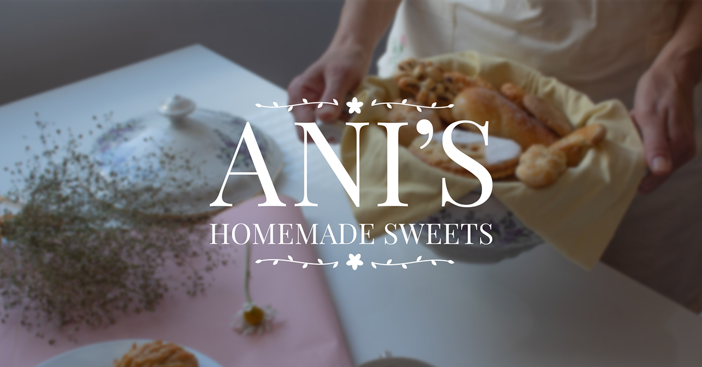
Behance
Ani's homemade sweets is a new local business, in Dilijan, Armenia focusing on pastries with middle eastern flavors and recipes, all ofcourse made homemade, and we created her visual identity from scratch to best represent her and her messege through desi…
Just a little something I made. https://www.behance.net/gallery/100103337/Avatar

Hi Guys i did that design for my Graduation Hoodie
Lemme know what do you think

@lone quiver ohh nice
@cosmic drift perfectly fine. Keep growing
Lovely illustration @inner prawn!
Really like how the spacing between the letters and the alignment creates an invisible rectangle. Well done!
@gritty notch I know the message you made was a wile ago (07/08/2020) but i'm in love with it
hey hey, how bout this? any critic or comment? thanks 😬
very nice work @bitter fog, maybe you can reduce a bit the glitch effect arround the arms and make the hand that come through the portal more scaled with your model
very nice work @bitter fog, maybe you can reduce a bit the glitch effect arround the arms and make the hand that come through the portal more scaled with your model
@lone quiver thank you , alright
Hi. I took a stab at removing the door. I hope it's not an inconvenience.
@toxic dome
Uhm...lemme see, I aint too good with explaining how i do things, but I'll try
1st. I pen selected the offending door, with that selected I masked it out
In that masking some of your fine hair strand were lost too.
So I added two layers beneath the original photo
On one layer I painstaking painted back those strands as best I could. I also used a hair paintbrush in an attempt to mimck the lost strands
On the 2nd layer I painted with a nice uniformly feathered brush the yellowish / mustard colour that is the wall colour. In that way I filled the space vacated by the removal of the door.
And I then just went ahead and done some finishing touches..with a further two layers...mostly using the feathered standard brush, the eyedropper tool for exact colour just a touch of guasian blur.
😀
Gave +1 Creative Carma to @gritty notch
I"m glad you are pleased.
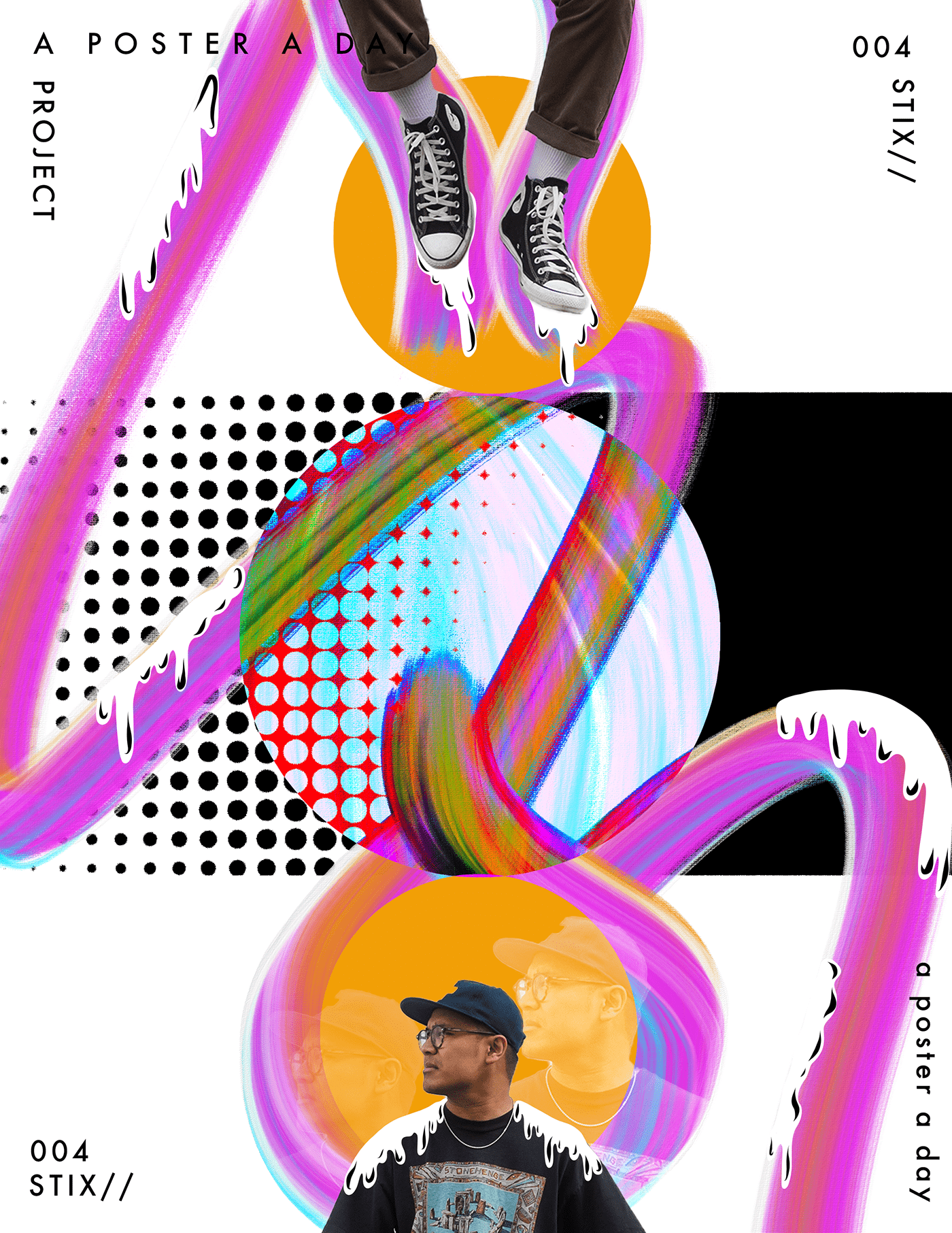
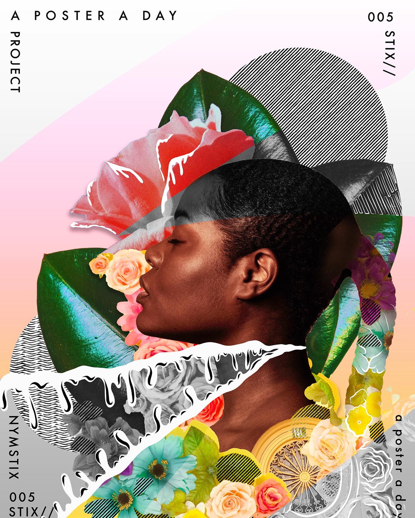
My latest poster for my A poster a day project - POSTER 004 - https://www.behance.net/gallery/100544355/A-Poster-a-Day-Project-POSTER-004

Nice!
Nice!
@pale grove thanks
Gave +1 Creative Carma to @pale grove
Cool!
https://www.behance.net/gallery/100605765/twitch-emotes
I made this one for @Shadypenguinn help me make him see him TAG HIM on the twitter
https://twitter.com/_gabriellb_/status/1282743936159817729?s=20

My first ever Twitch emotes
A retweet 🔁 and like ❤️ would be appreciated
https://t.co/uSGWDdbxzY
I made this one for @Shadypenguinn help me make him see it TAG HIM

https://www.behance.net/gallery/100608927/HIGHGROUND
Finnaly finished with this project, super excited to share it with you, I always found this little thingies on top of buildings aesthetic so I decided to build a project around that 🙂

I normally do gfx work for gamers and content creators so here's a logo I made
nice
Tiger Man
@ancient minnow 🐯
I was told it didn't tell a story. hmmm. This was for a contest. We had to use specific images. This is 3 bgs, and 4 animals
the tail is a lion's mane
https://www.artstation.com/artwork/ZGeJ9x some stuff for photobash practice

hello! sorry it's been a while, i've been doing a challenge on artstation for the past weeks ... please check it out if you have time, here is my behance project for it: https://www.behance.net/gallery/100645881/BOX-WORLD-Environment-Art
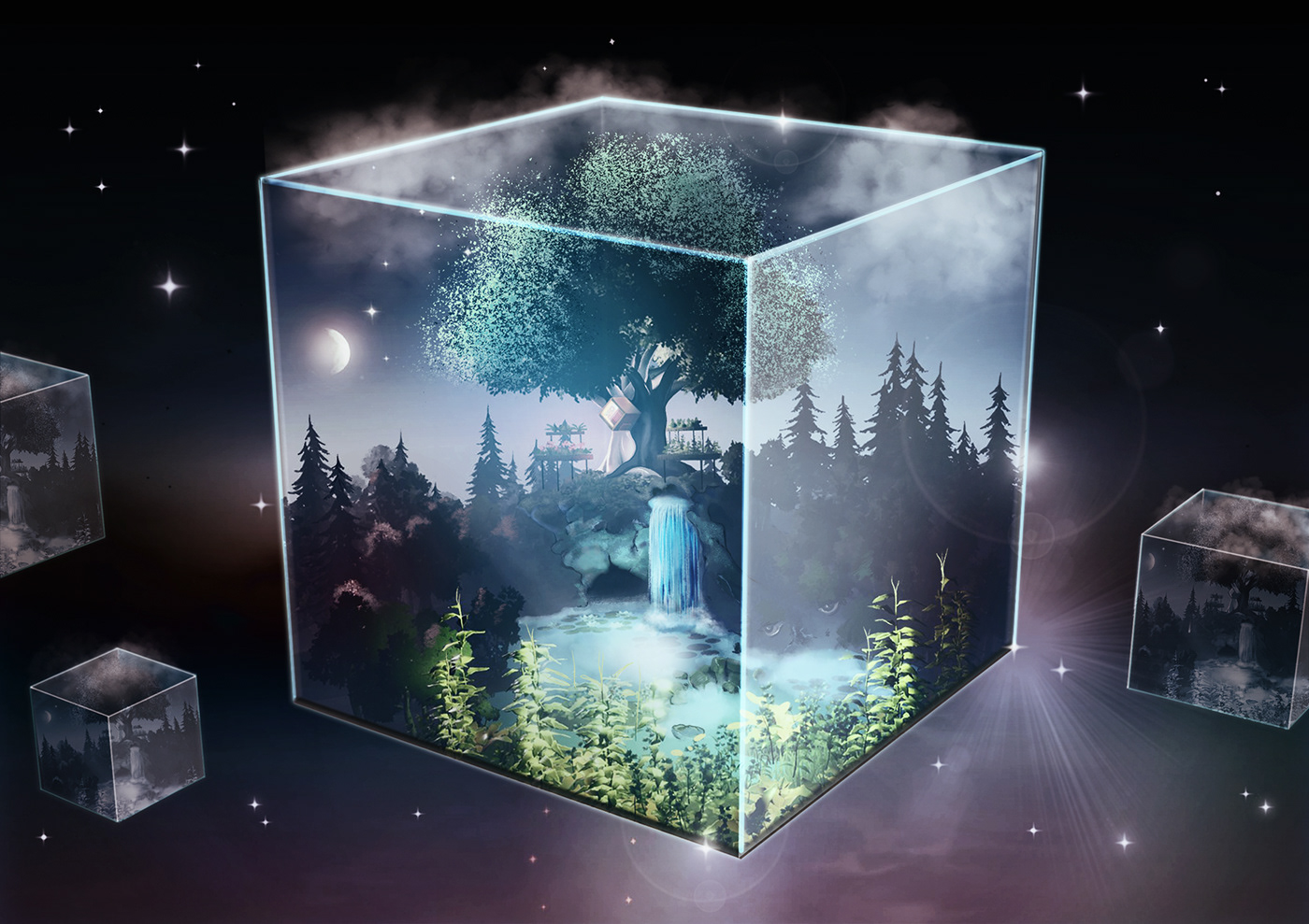
What do you think?
@gentle edge great!! hair selection is very tidy ,like it
@gentle edge great!! hair selection is very tidy ,like it
@bitter fog glad you like it I actually made some more here
Your square is very very bright, yet there is no reflection on the surface depecting that? THe reflection in the humanoid figure is too low lit. The grlitch is pretty harsh, maybe loose the glitch and go with an area blur. Your concept is pretty damn good, just needs a bit of refinement and the details are where you will really shine in your work. pay attention to the details. follow the light and know where the light should be. Great job and many successess I see in your future!
Hello Everyone! My name is Austin Drake and I'm an ecommerce graphic designer.
This is a a blueprint styled detail breakdown of a brand called Fuelworx that the company I work for is partnered with
They're a more premium gas can that are stackable and has a "quick flow system". I made these mainly for Amazon Ads as well as their Amazon Store front that I'm currently working on!
Let me know what you guys think!
Putting some additional polish on some characters I did for a challenge that was due a few days ago.
Any support is highly appreciated
https://twitter.com/_gabriellb_/status/1284135441701240833?s=19
One more new emotes for twitch
This time for @aDrive_tK
Like ❤️ and retweet 🔁 are highly appropriated

An illustration composition idea from my streams yesterday
A poster a day project .... POSTER 005 . https://www.behance.net/gallery/100908827/A-Poster-A-Day-Project-POSTER-005
Challenge28.light
Yesterday night I went to galaxy and bring one star .I put the star on the lamp so that it can't escape.
#blendercommunityindia #b3d #blendercycle#blendershare #blendercommunity #blendercenter #blenderfiftytwo #blender #3d #3drender #3dblender #3ddesign #3...

hey ,how bout this? 😬
This is beautiful @bitter fog 👏
https://www.instagram.com/p/CC3nWLknQ43/?igshid=1av8qrce96tr6
So Close, Yet so Far.
Feedback Appreciated.

Poster Design ❤️
This is beautiful @bitter fog 👏
@lost eagle thank you :)
Sketch Party with @stark saddle
Hey guys, I wanted to share album art design that I got the pleasure of working on... It's for an a cappella album by Amplified A Cappella called "This Blue Dot." You can see the album art here (and even listen to it if you feel up for it): https://amplifiedacappella.com/this-blue-dot
Thanks guys! Also any feedback on the design would be appreciated!
Amplified
@severe sand !!!!! awesome! watching the timelapse now
Behance
Ani's homemade sweets is a new local business, in Dilijan, Armenia focusing on pastries with middle eastern flavors and recipes, all ofcourse made homemade, and we created her visual identity from scratch to best represent her and her messege through desi…
Portrait done on my Behance stream yesterday 😄
Day 2 of the Sketch Party with @stark saddle
@severe sand Color!!!! I like the textured BG - adds some interest without being distracted
Thanks @stark saddle
Gave +1 Creative Carma to @stark saddle
I have been following the daily classes and challenges and decided to try to use what I've learned by helping a friend with her logo and Instagram campaign. My first ever!. So much still to learn. Would love some feedback.
This is a logo I made using my real name and what do y’all think
Henry that is a great start you got there! I would probably experiment with the type face at the bottom, it feels a bit off maybe because your icon is more to the left.
Oh your right I didn’t see it there
@torpid heart Do you have access to the entire Adobe CC? I would suggest going to Adobe Fonts and messing around with different ones too. Keep up the great work
https://www.behance.net/gallery/101232859/Ronin-esports-mascot?
any support is highly appreciated

Does anyone know if there are any othe adobe discord servers? Ai, Ae...or even a general overarching one? Cheers guys
There is one for illustrator and one joint one for video (Ae and Premiere) @toxic dome
Header for @XXiFtv
- Leave Feedback
- Support ❤️+♻️
- COMMISSIONS ARE OPEN ( book through DMS )
Header Portfolio: https://t.co/eRHEwEFI7N

any support is appreciated
Another wallpaper I did ✨
Uhh, wallpaper showcase?
Just want to share me recent architectural illustration project created in Adobe
all support is highly appreciated
https://www.behance.net/gallery/101320485/Egipcian-Wildcat


hey guys! what do you think of this poster for the trapper character from Dead by daylight game 🎮
Another Wallpaper I created, you can always DM me if you would like to have it too, I have a Patreon with many more ✨
My 1st time trying to make a desktop background
Found a black & white character design & tried to give it some dimensions, colors & textures using solid color layers and layer effects
@crystal patrol Wow, looks great!
thanks!
Just an illustration of tokyo ghoul
All support is highly appreciated 😁
https://twitter.com/_gabriellb_/status/1287836812040450050?s=19

one of my 3 composings from my last creative weekend. what do you think about?
opinions on this never did photo composition before
@toxic dome This looks so cool. Love the feeling of childhood imagination playtime during bathtime
Trapped in Concrete: New project in progress
Feedbacks?

@toxic dome This looks so cool. Love the feeling of childhood imagination playtime during bathtime
@eternal nova thank you so much for that response!
was going for a simple double exposure but later turned out like this 😂
Ooh I thought I'd share a little animation I made a while back!
Hello friends! This is one of my recent works... I love making female cyborgs in cyberpunk city environments. I hope you enjoy and thanks for looking! Comments and critics are welcome as always. ☺️
my application of the technique from the last live stream with Jesus Ramirez...what do you think?
this is the stock images that I used for this work
Back To The Future and synthwave music inspired personal concept art work. I hope you enjoy & thanks for looking!
As we are celebrating Eid Al Adha as muslims...
here is my edit for the occasion
Please rate it
Sorry, maybe some bloody, but heavy metal songs made my day)))
A ray of hope😉