#📝project-feedback
1 messages · Page 38 of 1
The subtle texture is a great touch, it looks a bit stretched but IMO that's ok. The overall composition and layout is very pleasing to the eye and the barely visible shapes in the background (is it the spieltimes logo?) add some character to the otherwise smooth background. Well done 🙂
Photo Restoration. Hi, this is a photo of my Sister in law who sadly passed away last February. I'm trying to restore and touch it up for her mom. I could use some feedback. I used all my little tricks, blurred out some noise, whitened teeth, all that kind of stuff. I didn't have much to work with, just an old scan of a crinkled printout. I'm kind of stuck at this point and don't know if its finished or could still use a little something extra. Thoughts?
original ⬇️
@left sonnet I like your soccer player design. It looks cool. The ACM1899 logo could use a bit of a clean up, the mask is a bit rough at spots. Also, for the faded out "ghost players" in the background, maybe mask out the letters that overlap on their faces and t-shirts.
@toxic dome You should probably pick a different font than Comic Sans. You could perhaps use a nice serif font or a more clean sans serif. And I would make sure to align the elements here
The gold effect here looks nice. You could add even more realism by working in a gold texture 🙂
@simple halo Sorry for your loss! For the photo, I think you have already improved it a lot. The contrast seems a bit high though (the black clothing and hair have lost some detail), don't be afraid to keep some of the noise in the image if it add some texture.
This is how I would do it
First, select the black robe and apply the Filter -> Noise -> Dust & Scratches. Tweak the sliders until most of the white dots are gone
Next Apply the curves filter via Image -> Adjustments -> Curves. Click on the Options Button and pick one of these options
Sometimes the Snap Neutral Colors checkbox can also help
We're almost there. Open Camera Raw (Filter -> Camera Raw Filter) and navigate to the HSL Tab. To remove some of the redness in her skin, drag this slider to the right
Drag it until it looks natural and then bring it back a touch
you may wish to adjust the reds and oranges slider in the saturation tab too
Now we can focus on the noise. Use the Denoise filter via Filter -> Noise -> Reduce Noise. You don't really have to touch the Color Noise slider. Just have an eye out for the Strength and Details slider
when you're happy with the result, open the Unsharp Mask filter. Filter -> Sharpen -> Unsharp Mask
Play around with the sliders to see the different effects. I would recommend dragging the Amount slider all the way to the right and messing with the other two sliders to discover how the filter works
then you can dial it back down to a more reasonable level. Finally we will whiten the teeth a bit
Select the Sponge tool
which is probably hidden behind the dodge tool
Set the mode to desaturate and the flow to about 10-30%
With a smooth brush, carefully draw over the teeth. Make sure to not desaturate them completely
If you don't like the sponge tool you can also add a Saturation/Vibrance adjustment layer above the image and mask out the teeth. then you can reduce the vibrance slider to whiten the teeth
You may also wish to add some warmth to the image. I would recommend going back to Camera Raw and adjusting the Color Temperature slider.
@azure brook Thanks Tim. I will pull up the file and try all of that once the monsters are sleeping. I was going to fake a few strands of hair with the smudge tool as well in a few spots to add some depth. I'll be sure to post an updated version. Really appreciate your time and feedback. Thanks again.
Gave +1 Creative Carma to evil
Feedback on my digital painting? Just kinda exploring for my art projects.
@azure brook I started back from scratch and followed your step by steps and got this result. I'm happy with the results, got to play with some new sliders. The real test will be how it looks when I run off a print, who knows what those guys settings are at lol. What do you think? I still want to take off a bit more noise from the robe, and maybe smooth out her skin a touch more.
Hello everyone

Instagram
5 Likes, 2 Comments - Imagine Studios (@imaginestudioofficial) on Instagram: “Live to Ride! Ride to Live! ❣️ In-Shot - @26rohit_rawat Edited with @photoshop . . #Psfantasy…”
Do share your thoughts!
@brave scarab thanks
Gave +1 Creative Carma to PSP
Hi ! you can send about 6-8 pictures, for train me ? I am a beginner
@abstract plover very cool. I like the video you included. What did you use to make that? Nice work.
hello all - oh no, there is no challenge this week ... i'm not quite up-to-date! on another note, one of my projects has been featured in the fresco gallery, thanks so much to you all who have supported me! 😃 https://www.behance.net/gallery/87856803/-not-another-fishy

@simple halo Thank you! The Edit was done on Photoshop and the video on premiere pro
What a beautiful work @tidal bolt! Congratulations 💛
Made another time lapse video, done in Adobe Fresco using the oil paint brushes.
https://www.instagram.com/p/B5TICWSj03s/
aaahw, thanks so much @sleek tiger you are so kind! 😄
awesome oil brush work @vivid dragon - very inspiring!
Hey All! New Post. Share your thoughts and opinion on this!

Instagram
9 Likes, 0 Comments - Imagine Studios (@imaginestudioofficial) on Instagram: “Would you like to live in a Underwater House? 🌊🏠 Edited with @photoshop Srock Images : @unsplash…”
I have shared this before, but incase some of you haven't seen it. 🙂 latest project. feedbacks are welcome 😄
https://www.behance.net/gallery/88271149/Poster-Collection-2
Behance
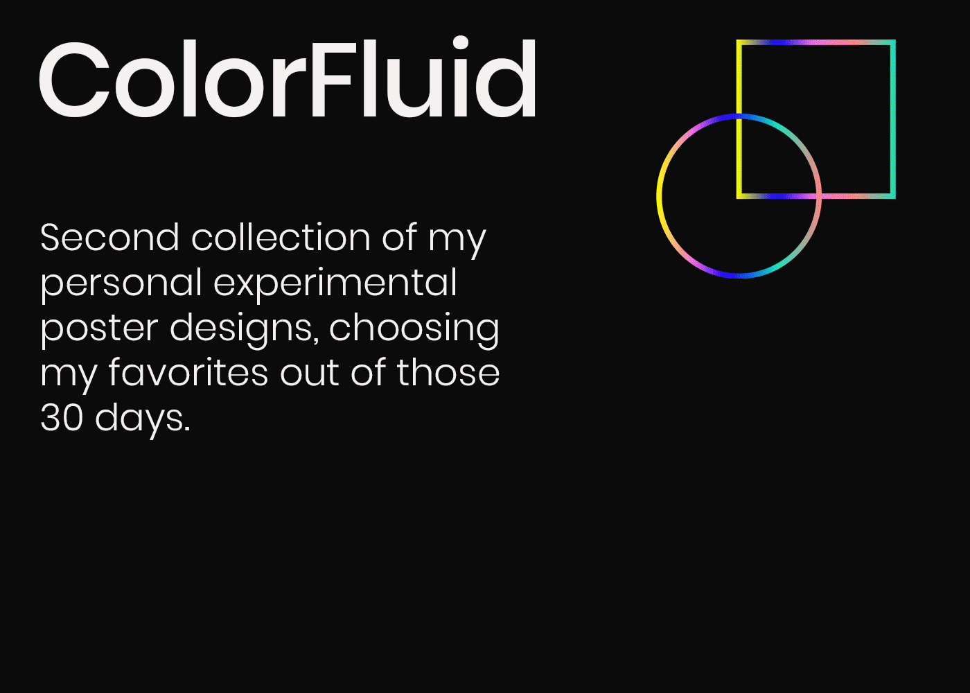
After Part 1 was done, I worked on experimenting for another 30 days and these were some of my favorite results, out of the 30 designs that I created.
hello hello! i know, it's oh so quiet around here ... but i wanted to share my latest project - an early christmas card, created in fresco, dimension and with snippets of aero ... to create even more of a 3d feel ... any comments most appreciated! thanks for looking 😃 https://www.behance.net/gallery/88728349/Christmas-Card


Hi! I have not really talked on this discord server because I was inundated with school work, but this past Thanksgiving Break gave me some time! Any feedback on this? Criticism is really appreciated.
@covert jewel personally i would crop the image to the person and the dog standing there. make The space between the elbow and the edge of the image the same to the right edge and upper edge. If you get what i mean. After that maybe lower the lights a bit as well so the person and dog stand out a lil more then their surroundings
I don't really understand how you want me to crop it, but that is out of the picture, as I made is specifically in that dimension.
I tried to make it look like a poster of something. First idea was Zombir Apokalypse, but I don't know how to add blood on snow.
@forest wyvern
maybe find an image where theres blood on snow already with the same view and mix/blur it in?
i just tried a little
The picture i used
(also im very amateuristic so its just as example )
@covert jewel
good idea, my instince was to fake it.
yw :)
how the label?
There wasn’t an off topic chat or a discord for premier/ae but I was wondering if Premier Pro or After Effects is more similar to Hitfilm. I’m thinking of switching over since I use adobe apps to design and I think it would just be easier. I animate text and my designs, so I’m not sure whether Ae or Premier is better for that and which has a steeper learning curve
Sorry to interrupt these nice designs 😄
wow nice design @wide yacht
AE has a steeper learning curve, I use both Premier and AE. Also, both apps have community run discords. Hit me up in DMs if you have questions, or want links to said discords @gusty barn
Hey hey! What would you guys add to this montage I did to make it go to the next level!? I was going with the retro vibe. Thanks
need coments
@brave scarab Very cool. I like the saturated colors and the boosted shadows a lot! I'm not so sure about the overexposed sky though. Personally I would darken the sky and bring back some of the blue color 🙂
@azure brook to be honest i take this image directly by phone but with pro mode galaxy s10e
@brave scarab There is nothing wrong with using your smartphone to take photos. Those camera modules are surprisingly good 🙂
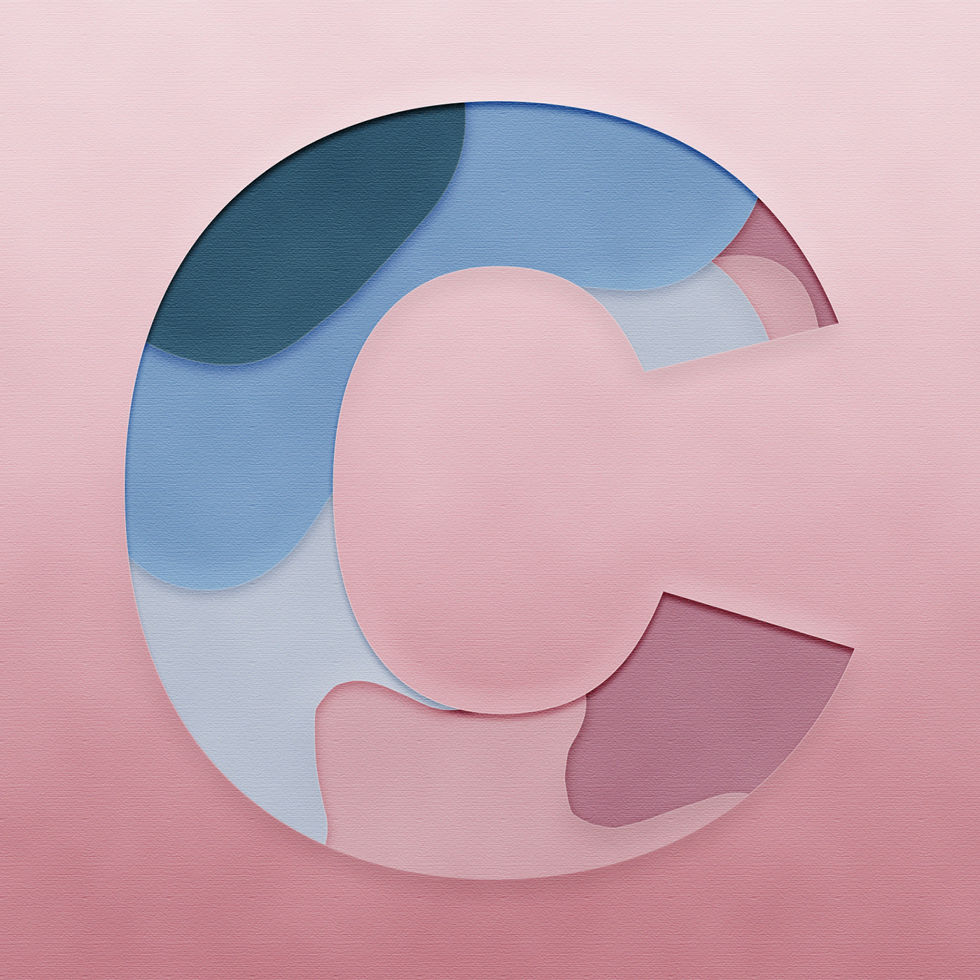
kinda similar to the day 3 challenge this week which is why im sharing it but a few months ago i made this and a few days ago it ended up being featured in the adobe capture category! https://www.behance.net/gallery/85180431/Cut-Out-Letter-C
Behance
Made this first thing when I got access to photoshop again. Used adobe capture for the color scheme.
Thank you 😄

Instagram
108 Likes, 6 Comments - Imagine Studios (@imaginestudioofficial) on Instagram: “The Strongest Ones In The World Are The Ones Who Stand All Alone 🐅🐯 Edited with @photoshop Stock :…”
Share your reviews plz
@abstract plover Great to see some compositing work in here 🙂 The overall look & feel of the photo is really vibrant and intense 🙂 The integration of the logo in the background is a great touch. The magenta color wash of the tunnel matches with the adjustments you have made to the main subject. The camera however appears to have little to no coloration. The highlights are still mostly gray.
I would also think about the composition. Right now I'm not sure what the main subject is. Is this an ad for the camera or am I supposed to look at the tiger? I would perhaps either feature the camera more prominently (you could have the camera filling the frame so we would just look at the screen). Right now the camera and the tiger are fighting for attention.
I like how you have added a shadow to physically ground the tiger to the floor, but the shadow wouldn't actually look like this. There is no light source on the right, the actual light is provided by the fixtures above the tiger. The shadows should therefore be below the tiger, probably a very thin shadow 🙂
Alright, I just saw the version without the camera and it looks much cleaner 👍 . It is still a great composition and now there would even be room for some text
Having the logo embedded in the image without just slapping a big fat watermark over it is actually a great way to brand your work without taking away the immersion, so well done! 🙌
@charred dragon looks awesome, but it's hard to tell with just a screen shot.
@lethal ingot thank uuu
Gave +1 Creative Carma to Aria_Kitten
@glass glade No problem 🙂 Did you need anything?
I really like the colors and line art
@lethal ingot can i have your behnce
@charred dragon Cute lil witch fox!! Love it
@charred dragon I might take the grey shadow off of his muzzle. Other than that, the lighting looks consistent the design looks good. Now he just needs a lush background!
Thanks! @pseudo panther
Gave +1 Creative Carma to Anna Daviscourt
@pseudo panther probably leaving it like this
@glass glade may I ask why?
This was the original photo. Found it on an online website for photoshop challenges and stuff. And recreated the image below... need your opinions please.
that looks awesome and realistic. I would love to make such things look that real
Thanks a lot man :)
a digital birthday card I made for a friend.
@stable ibex Great work !
I just wonder if the dropped shadow is not too large on the right rock.
But the global render is top quality, it blend really well with the background you choose
@stable ibex First of all, great day-to-night conversion! You also have matched the colors nicely to the background. The noise is a bit too prominent in my opinion
I think you should reduce the noise slightly and perhaps use only monochromatic noise
color noise is usually more distracting than monochromatic noise
I also recommend using Camera Raw Grain instead of the regular noise filter
Here you can see the difference (of course you would never apply so much noise, I just wanted to make the difference very obvious). On the left, you have the regular noise filter. On the right you have Camera Raw. Camera Raw looks much more natural because it mimics real camera grain unlike the noise filter
To use it, go to Filter -> Camera Raw
open the FX tab and play with these three sliders
here is a closer look at the two noise filters
One more thing, I know it can be tempting to soften the edges to smooth out the transition, but the rock wouldn't just fade away into the background 😉
To elevate this design to the next level, don't be afraid to apply even more color grading. Some blue in the shadows could look really nice
Hope I gave you some ideas on how to polish your work 🙂
@stable ibex
@azure brook thanks a lot man! I will try and make the changes now
I have never used the camera raw filter as much... Gonna try it for the first time
Gave +1 Creative Carma to evil
Rookie of the year ?
@JaMorant | @memgrizz
#GrindCity #GrzNxtGen 4/30

What do you think ?
🤩
good ?

Instagram
19 Likes, 2 Comments - Imagine Studios (@imaginestudioofficial) on Instagram: “Imagine If we Lived on a different planet!! 💭💭 Edited with @photoshop || Random Ideas 💭💭 || . .…”
share your thoughts on this!

Behance
8 Real Estate Color LUTs created with Adobe Photoshop 2020.Ideal for real estate images. Comes with 8 .3DL files in 1 ZIP folder and 8 .CUBE files split into 2 ZIP folders.LUTs included in package:1. Blue and Orange - Makes blues and orange more vib…
thanks a lot for all your help @azure brook 🙂 🙂 🙂
Gave +1 Creative Carma to evil
hello all, i know i've posted this further up, but my christmas card project has been featured in the aero gallery! please check it out if you have a moment ... https://www.behance.net/gallery/88728349/Christmas-Card

also, i've been taking santa on a trip to the leeds art gallery where he's been posing next to damien hirst's sheep ... just for fun!
👑 King James // 62nd Time Player of the Week
@KingJames | @Lakers
#LakeShow 8/30

Recent Post | Daily Poster design
https://www.behance.net/gallery/89582277/14-King-Priest-Poster-Design-Collection-2019

Behance
14 | King Priest | Poster Design | Collection 2019
I know this isn't necessarily 'in the spirit' but i've been missing photo compositing and wanted to do something kinda creepy. Let me know what you think? Any / All critiques welcome.
@last goblet Photo compositing is the best thing you can do in Photoshop IMO 🙂 . The disintegration effect looks very convincing and the overall mood of the scene is beautifully captured. I do have three improvements I would like to share. The sharpness of the grass doesn't quite match the sharpness of the tendrils below the person.
the original plants are much softer and they also are grainy unlike the tendrils which are super sharp and noiseless
This could be fixed by blurring the added elements slightly (using the lens blur filter, which already has a built in grain generator)
The next thing: If you have a cone of light in your image and the cone is directed at a surface (the ground), you should probably see a bright spot on that surface 🙂
Before:
after
you can tone that effect down of course if you want to draw less attention to the ground
For this effect I have used a light layer. Using a flat brush, draw in a spot like this. Make sure to fill the background with pure black first. Then, set the blend mode to Color Dodge.
Using the Fill slider (not Opacity!), you can reduce the effect
And finally I would adjust the aspect ratio.
Right now you're in a strange limbo between widescreen and portrait. Going widescreen can look more cinematic
or you could go into the movie poster direction
Just slap an epic title on and you're done 😄
Oh and of course you mustn't forget the classic orange & teal movie poster color grading 😛
@slate salmon beautiful work! Just one thing: when you are scaling up an asset (like the statue), make sure to use a high resolution source image or it will look blurry compared to the other assets
@azure brook Thank you so much. I totally forgot about blurring the tendrils. 🤦♀️ I will definitely add the lighting suggestion as well. It didn't feel right so I'm thankful. Personally I like the widescreen better for the empty space. I didn't realize the ratio was weird. Gonna skip the movie poster with the orange and teal though. lol
Gave +1 Creative Carma to evil
heyyy guys, I'm trying to build a portfolio for a character design career so if you have any tips or advises for that or the painting, comment below 🙂 I would love to hear your opinions and thoughts about this
Doing a fun project at the moment. I want to recreate movie posters, this is my second rendition of "March of the Penguins", but I feel like it is missing a lot.
What do you think?
I've been watching a lot of @midnight glen's masterclasses and have been loving his aesthetic with all the pastel gradients and geometric shapes and felt inspired to create something incorporating those things myself.
@raven pendant Wow, this looks awesome 😄 The impossible triangle is an evergreen in the design community. The marbled texture and the dust overlay make it pop! I like how the gradient isn't balanced - the yellow has much more room than the blue at the bottom - or at least it feels like it does. Great job!
what do you think? I feel like something is missing.
Hi i made a happy holidays gif! I also uploaded to my behance page if you want to show some love! https://www.behance.net/gallery/89631899/Happy-Holidays-2019

Let me know what you think! 😄
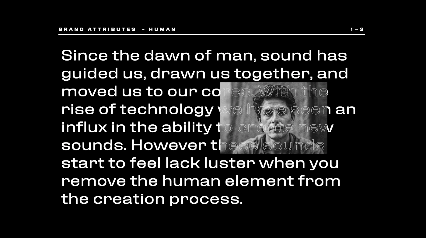
Hey friends! Did this work about a year ago, and finally got it up on Behance. Lots and lots of photoshop craziness going on to make some of these album covers. Lemme know if you have any questions about the work or how it was made, and I'd be happy to show a behind the scenes: https://www.behance.net/gallery/89588183/Dieguis
Behance
Dieguis specializes in the building, recording, packaging and distributing sounds used in some of your favorite shows, movies, videos, songs and more. What separates them from their competitors is that everything the human element in their production. Die…
hello all - has anyone tried the new pattern builder tool (latest adobe capture update)? it is really brilliant and lets you choose shapes to arrange and colour ...
@tidal bolt Whoa, looks super cool! I have to try it!
aah, thanks @spring current - it's such fun! you just have to convert your illustrations to shapes and you'll have gift and wrapping paper forever! 😀
Gave +1 Creative Carma to filipagomes
Mission to Mars — Insta@_twc_daily — Day 636 — #photoshop #adobestock
Adobe Stock
Grid System

Instagram
6 Likes, 0 Comments - Imagine Studios (@imaginestudioofficial) on Instagram: “The Snow is Sparkling like a Million little Suns. ❄️☀️ Edited with @photoshop Stock : @unsplash .…”
looks good
another project featured 😮 https://www.behance.net/gallery/85862055/Balloon-Text-Birthday

Behance
I have been testing out different kinds of layer styles for typography and this is the best I came up with so I had to post it. Colors I got from a color scheme I made in Adobe Capture.
Incredible work @magic hamlet I loved it ❤️
Did a rough logo design using Adobe dimension and illustrator! Can any designers give feedback, it would be greatly appreciated!
I wish a happy New Year to all Adobe users.
Quick logo I created, hope everyone is enjoying their holidays!
Does the right(edited to white) looks real this time? I have tried to make it cool more cool (opposite of warm), but didn't really turned out well imo
not really sure how to cool down the white (of the jacket)
the logo is probably a bit too white, would have to darken it a bit

Dribbble
Hi guys. I have something pretty amazing to share with you today- InfinityUI - Design Agency Website Template Design.
Feel free to share any feedback :)
Full View: http://bit.ly/37quHpo
I am avai...
Hi Everyone. Please suggest me on this. how to make it better?
Or this? or anything you can suggest.
the 3d effect looks cool, well made
but we are in 2020, 3d designs were like 1970, nowdays clean 2d is most of the time the better decision
so I'd prefer the first one
@fickle stone Thanks. Will work it out and check. Thanks for your presence here. Thanks for the feedback.
Gave +1 Creative Carma to 黯然销魂
that's a cool effect, how did you do that
In lightroom with curve
just lightroom?
I add the to picture in photoshop and add some light with huesaturation,color balance and the exposer and in ightroom i just play with the curve and shadows and hightlight
wow, looks really good
also very good, but I'd make his forhead more orange
the face lights are only purple, but you also got orange lights
@warm shadow please post it to the #💎past-challenge channel 🙂
try to add the pattern to a mockup 🙂

Instagram
25 Likes, 6 Comments - Imagine Studios (@imaginestudioofficial) on Instagram: “The World of CYBER PUNK 🤖 Edited with @photoshop . . . #ps_psychedelic #psmasteredits #ps_escape…”
Behance
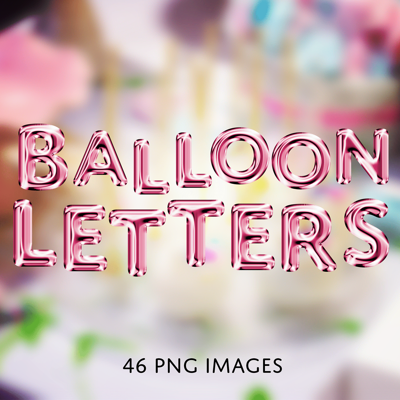
48 PNG Balloon Letter Images created with Adobe Photoshop 2020.These are individual .PNG files to put together NOT a font.Ideal for artwork created for birthdays, baby showers, or parties. All files are originally grey. Edit using adjustment layers, c…
Messing with smoke brush (hair) and compositing clouds. Also used smoke brush to clone clouds over subject.
Same mask with smoke background and overlay.
Hi @everyone please appreciate this and leave comment. Thanks you.
https://www.behance.net/gallery/88493255/ManipulationComposite

My first non- DCC Behance project. Photos and composites of same. https://www.behance.net/gallery/90206607/Jasmine

I finally finished my poster-a-day project and had time to update my Behance project. Would be cool to get feedback ☺️

i recently discovered an interest in photoshop n graphic design. at the time, i was also working as a graphic designer for an event at my school (MUN), thats when i took an interest in this stuff. i know it aint look much, but all these i made within a few weeks, i still got alot to learn. the edgy lookin pic is me in my halloween costume, just wanted to try an make a halloween poster. i really would appreciate feedback. if im garbage, please tell me so
some more pics i found
hello all and happy new year! just wanted to share a couple of projects i've been working on over christmas, looking forward to the new challenge this week! https://www.behance.net/gallery/89742023/Seasons-Patterns


Hello everyone, this is a first piece I've created for a music player. Any feedback would be much appreciated!
Hi! I'm pretty new to both this channel and graphic design in general. I would love any and all feedback on this composite I worked on today!
Here's the stock/original photo:
That's awesome
Hi, I Love vaporwave and aesthetic genre , here's what I did to wish a happy new year

Instagram
38 Likes, 0 Comments - Rohit Jebin (@jebinrohitho) on Instagram: “Show some love to the cutest thing on the internet 😇 . . . . . . . #photomanipulation #photoshop…”
Stock image before adding the effects
@polar flicker i love vaporwave as well thats great!
i had to make stamp designs for a class project back in college 2016. prompt was to make designs relating to different music genres. so im really excited for this challenge and how much i've improved with photoshop! 🤗 https://www.behance.net/gallery/59648075/Musical-Genre-Stamps-(2016)

Behance
A class project for my Graphic Design 2 class in Spring 2016. The assignment was to make 4 stamps based off of musical genres. I chose disco, punk, rock, and classical.
Arco- an Architecture Agency Website Template Design - https://dribbble.com/shots/9357297-Arco-an-Architecture-Agency-Website-Template-Design

Dribbble
Hi guys. I have something pretty amazing to share with you today- Arco- an Architecture Agency Website Template Design
Feel free to share any feedback :)
Full View: http://bit.ly/2umah2k
I am avai...
Impression have own language ......
express your and dont waste your words.....😎
possibly an album cover
had to share the 1 mega byte version, cause discord doesnt allow high quality images
original size - 19.6 MB
The Otter 🦦 #photoshop #unsplashphotos #betterdonethanperfect Insta@_twc_daily
Grid
cool but I think the refelction is too obvious
@fickle stone Thanks for your feedback, it was just a quick composite. — What part of the reflection do you mean specifically? Its just the light, the ripple water (which is very subtle) and both legs of the people (and its covered with blur anyways). — It could be better but I don't agree that its so heavily obvious. (or to strong, to visible,?) — (in the original image all refections are almost Cristal clear and sharp if not 100% visible in opacity.)
Gave +1 Creative Carma to Nugget
@lofty sinew Nice light effect. Have you used brush/wacom to paint it in?
the light is maybe bit to strong sure. but the buildings are in the original pic not edit at all
It's okay, but looks kinda weird imo
I know 😀 what you mean
@fickle stone Maybe not the best photo for it but I don't want to spend more time searching for another alternative, I was looking for a puddle in the foreground in the right perspective for the people 😬
@Hey @light thorn , thank you, yeah as you guessed, i used a pressure sensitive wacom to paint the light :)
Gave +1 Creative Carma to Kevin be.net/_ke
@light thorn : great attention to the grids as well in your composite ✌️👌
Any idea how can i make the wings feat better with the back of my model ?
how to create this effect that has a floor in a "wall"?
I don't know the correct name of this
@lone quiver The thing that throws me off with the wings is that looks like the underside/inside of the wings, so it feels like they're on backward. Is there a different set of wings? If not, you'll want to try and find a way to remove the shadows at the joints so it looks like that is above the rest.
Now that you mention it, yea. That does seem to be a front view of the wings..
to show shading on spread wings from back - they are darker on the inside center, with the highlights where the light hits.
looking for feedback on this, its for a project
is there anything I can change about it to make it more impactful/interesting to look at?
maybe add a frozen peach or two?
lmao
Hey @lyric bolt ! I think I understand the vibe you're going for. One thing that will help a lot is to choose one focal point in the imagery. Right now, my eye doesn't know where to look because there's a lot of movement and many different colors being used. What if you chose one color scheme (the green and pink) and nudged the different color layers closer together so the effect is a bit more subtle?
thanks!
I tried using the rule of thirds to make the guy with the megaphone the focal point, how would you recommend I make him more central to the image
@stark saddle if you don't mind me asking, It seems as though no matter what I do I can't get the color layers to go closer to each other
@lyric bolt how did you go about making the different color layers?
I made 4 smart images of the same picture
and assigned 3 to only include either the colours red, blue, or green
and then used the shear filter to warp each image into a slightly different position
@stark saddle
😮 that's a really cool workflow. but using the move tool and nudging them with the arrow keys doesnt work?
I tried and it didn't seem to make any difference
I wonder if it would work if you rasterized the layers?
possibly, but then I couldn't have all the images flow over and mix the colours like I have
https://www.behance.net/gallery/90492609/BrandingProduct-Design
Hi @everyone Please check this project on behance, done by me. PLease hit likes and coments. Love you all. Thank you. Please follow me and I will follow you all.

Behance
This Project in itself is about the Branding Identity + Product Designing. This Project is "ready to Buy" for the any Bevarages Company that wants to showcase their Brand. Thanks for any details contact the Graphic Designer below.
The Future is on the way. — Insta@_twc_daily — Day 656 — Photos 1x @adobestock 8x @unsplash — @Photoshop @CocaCola @Porsche @creativecloud #Photoshop #CocaCola #compositing #graphicsdesign #VisualArt #Rush #MovingPictures #photography #grid #designer #instagram #cr...


I painted a friends cat using the art mode in Photoshop
not edited, just a photo.
It's a cool effect, taken with P30
I am doing poster a day challange, this is my 11th poster 😄
@fading karma Well done. — How do you decide what to design everyday? Do you have themes or randomly look for inspiration to get ideas for your poster?
@fickle stone now edit it 😄
there is nothing to edit ;/
or at least I am not creative and know what and how to edit
@fickle stone for example, basic edit
but it's too dark, and I took one in daylight, and the lighttrails were way too bright and big
Yup that's the trick, in low light the dark part will be noisy and on daylight you can't do a long exposure 🙂
daylight long exposures don't work?
that's what I got
you can't even see if it's a rear or front light (red or white)
that was the default pic
not edited, and in the sky weren't any clouds or something
it was actually white
If you have time check out my last project. It's my first time with animations so i think some feedback on it might help me improve 😄
https://www.behance.net/gallery/89274181/Branding-House-gaming-company

@fickle stone it's just a exposure problem, but that's photography knowledge
Try your trails at night or close to sunset, you will have better results 🙂
When your exposure is too high it will litterally "burn" the picture, and destroy informations like the trees etc.... look at the sky it has only 1 color white
It depends also what do you want to focus, a good composition, the trails, the background ?
For example in the edit I made I just focused on the trail, and removed the noisy background because, noisy it's alway bad 🙂
Ah ok, so light trails in daylight are almost "impossible" right?
At least good looking
My first design for year 2020 on new year day... early morning🙂
@fickle stone In normal condition yes totaly you're exposing the sensor to too much light
But there is a way !
You need to have a neutral density filter know as "ND" atleast ND1000 or ND 10 stop
For comprehension neutral density filter mean it's a filter which have a neutral density with the color of the scene you want to shot
There are few ND countable by their "stop" 6 stop, 10 stop, 16 stop etc....
Basically it will make your exposure longer (in minutes) without "overexposing" your photos (this is what you're looking for) in daytime!
You may think it's useless because it's a photography stuff but actually drone are using it, I think Huawei have something which "simulate" by software engeneering !
And the next Oneplus will have ND build-in, in their smartphone 🙂
Ah ok
Btw. how did that turned out?
Imo it looks ok, I should remove a bit.glow on the shoes, because the whole shoe is a bit too blue
Well it always depend on the context, for example if it's for instagram it's fine !
You should just put the shoes shadow black 🙂
ye it would be for instagram
Sure for Instagram it's ok :) try to highlight the shoes to make it pop :)
what size do I need to crop it for instagram?
For a square post I would recommend 1080*1080 (even if you want to add a white background)
https://www.behance.net/gallery/90730227/Neon-Party-FlyerPoster
Hi everyone. Hope you all are in great sprit of creativity throughout the week. I jus made this Neon Night party flyer or calll it poster. Please check this. Bit cofused with the Typography. Feedback will be appreciated. Thanks. Love you all.

Hey guys, I'm working on an astrology themed series, hope you like it and comment what you think 🙂 you can follow me on Behance on https://www.behance.net/angykaba5d53

Behance
I did a bit of a poster concept for the upcoming UFC fight for those who are into it.... feedback appreciated 😄
Insta@schmittfazed.visuals
You need a Sign In & Sign Up HTML Template?
Take a look: http://www.ciucacristi.ml/login/
See another web templates: https://www.templatemonster.com/vendors/1913/
Hey @everyone my names Bradley Varndell, I’m 19 years old and a digital photoshop artist!
Nice to meet you all
I'm sorry for reposting on the german discord (no need to give feedback in english)
@minor birch Wow! I am really into this edit 😄 . I have no idea how you have added this glow behind the face and made it look so convincingly real... - if those tears are supposed to be blood I would darken them to make them look less like lemonade 😉 . The grain is very noticeable but I actually don't mind it. Because of it you actually get a lot of the paper texture back, which adds to the overall look 🙂
Hi guys. What do you think about this! Nice?
https://www.behance.net/gallery/90730227/Event-Flyers
Please appreciate this on my profile. Here's my Behance. Thank you.

Album cover by me
@toxic dome Readability is not that good, also don't stretch the font
Text Displaced over an image
@warm shadow Great effect 🙂 I like how you can still read most of the text, but it clearly follows the shape and roundness of the two artists. The Displacement map feature has only one issue. It's really great if you want to map out those details which are clearly lit differently. You can really notice this if you look at the light reflections of the metallic spray paint. The text is clearly warped and stretched. But if you look at the stomach of the guy on the left, the text is almost completely flat even though his actual stomach obviously isn't. Now, this isn't your fault but I think the image could look better if you also manually warp some of the text (perhaps using liquify) to support the smaller details which are already warped by the displacement map.
This would be the point where I show how you could do it but I can't separate the text from the image using your example, so I hope my explanations are vivid enough 😛
Once again, good job 🙂
@toxic dome Wow, what an album cover 😮 ! The overall layout is very nice and the white frame around the text introduces some order into the very busy linework. Personally I wouldn't use this blend mode for the stretched out text, it distracts from the album art in the background 🤔. And unless absolutely necessary, don't stretch a font non-proportionally. It usually throws the balance of the font way off. Instead you could look for a condensed version of the font, which actually is designed for this narrow text style 🙂.
@azure brook I think i get what you mean. I will be working on this more.
@azure brook Thank you for helping!!!! I'll make sure to be able to make better covers! :)
Gave +1 Creative Carma to evil
hey hey, 🙂 feel free any critic about this? thank you
@bitter fog man, thats awesome! i love what you did. The only think that i could say is that you can enhance the edges a little bit.. Thats i't 🙂
@bitter fog Looks good! I'd say add some shadows to the wires so they appear on her forehead. Maybe even make it look like they follow the curve of the forehead a little more. Right now it's flat and floating. But it looks awesome!
@bitter fog I love how you made the skin look like a thin shell on her cheek. you should totally do the same with the eye on the right. just add some shading to the edges. I have used the dodge and burn tool
Perhaps you can also add some texture to the inside of her skull. Could be "organic" like bones and flesh or you could go all digital and less gory
just something to fill in the solid red color 🙂
I would recommend lowering the highlights of the flower stems. The light direction wouldn't really make sense unless the insides of the head were visibly glowing (which could be a cool effect)
I like how you have combined the flowers with the highly technical look of the circuit boards and I can already see that you have color corrected the flowers, well done! I think the highlights could use a tad bit more yellow and contrast
Just to be clear, you are already very, very close! 😄
And finally you could think about removing some of the grain on the skin (or adding some to the hair to balance it out). Right now the hair looks much cleaner than the skin
(and don't forget to match the grain of the added circuit board images with the natural grain of the photo 😉 )
thank you so much @tacit dagger for suggestion
Gave +1 Creative Carma to davedesigns4you
thank you so much @midnight glen for suggestion and alright i'll fix it
Gave +1 Creative Carma to Paul Trani
@azure brook really detailed critics this. thank you so much for recommendation hehehe. 1. it's just my luck when process edit that and tadaa get to what i want. 2. hmm agree, i think i'll changed fill red color to what ur recommend. 3. hehehe, alright thank you 🙂
Gave +1 Creative Carma to evil
Hi @azure brook ! Just saw in the #🔨resources your tutorial on coloring a W&B image. It was just what I needed these days so thank u so much! I have a question though. I quite don´t entirely understand the purpose of spliting the sliders. Whats the effect? I can´t really notice the difference between sliding it all and spliting it. Thank you!
Gave +1 Creative Carma to evil
hello chat, if you have a moment, here is a project of mine that's been featured in the capture gallery - pls have a look! thanks so much https://www.behance.net/gallery/86750837/Illustrations-with-Adobe-Capture

Behance
This is a collection of illustrations imported into Photoshop with Adobe Capture
@weak cradle splitting the sliders will give you a smoother transition between the colors. this becomes really obvious when you're working with smooth gradients.
Let's pretend this is our black & white image
not terribly exciting to look at, but it will do for this demo
Now I would like to color in the shadows on the left
So I add a color layer
And now, to only apply this color to the shadows, I'm using the blend if feature
So the blue color will only be visible if the brightness of the layer below is between the two sliders. (Black and this dark gray)
So essentially this:
The problem is, you can clearly see where the blend color starts and where it stops
But if I split the slider
The transition will become a lot smoother
So that's why I'm splitting the sliders 🙂 @river obsidian
@azure brook that was absolutely clarifying. Now I can see the point. I didn't know this feature in Photoshop but it absolutely becomes handy. I'm so glad I saw your tutorial yesterday while i was wondering around discord (i'm quite new here). Thanks again!! Have a nice weekend.
Gave +1 Creative Carma to evil
@weak cradle you're welcome! I'm glad you're enjoying them - I'm currently working on a new batch of pro tips 😄 so stay tuned! And if you have any other questions feel free to reach out via the #❓ask-a-question channel!
i made this. layes on layers with blend modes on blend modes
@midnight glen #distorting type liquify
Just an info: September 1970, Fehmarn, "Love + Peace Festival"… with Jimi Hendrix
Hello. Good Day. Can I have some feedback on my composite please? 🙂
Figured this might be a fitting place to post this. It's not a design, but I made my first real video for YouTube. Been wanting to get a YouTube going for years and finally got it started. https://www.youtube.com/watch?v=qf1rgidTimk
These are my thoughts on where to get started with drawing for beginners, and how to improve for those who are interested in doing art as a career or in any way where they'd like to improve their skill level.
You can find me on Twitch several days a week:
https://www.twitch....
I just subscribed @vivid dragon. I really liked it, I'll keep watching. :)
I'm kind at the same boat as you haha... I started a Youtube channel either, I just posted a video today.
Actually, the worst part for me is that I still have problems when talking in english :(, which is really bad... haha

This video will show you how to save a PNG file with a single shortcut. One of the easiest and fastest ways to do that. Besides it, you will have a free script avaible and you can even save this cow into this video. like, really, check it out! :)
Hope you like, if so, leave ...
currently i am designing a logo for a library. I also plan on doing mockups for the library however i feel like with this i feel like I am missing a something, any thoughts?
@crude drift nice logo first of all! The yellow and blue combination looks great 😄 . The yellow in the background could perhaps be slightly warmer, more like the yellow of the logo 🙂
I would also think about the alignment of the logo. Find some of the key lines of the text and try to align them to the logo and vice versa.
It also looks like the logo isn't quite symmetric. Perhaps that's one thing to keep in mind 🙂
@olive relic Wow, I love the strong color theme with the vibrant reds and the deep blacks in the background. The swirls add a lot of character - they almost look like swaths of smoke. I would recommend using a higher resolution image for the background. you can see some of the scaled up pixels. I would also keep this planet opaque, you probably shouldn't be able to see right through it 😉
@shut escarp Sorry for the delay, just saw your message. Yes, I'd love to give some feedback! First of all I would recommend checking out the histogram.
you can see how most of the data is on the left. You barely have any highlights, so the image is probably underexposed. I would recommend brightening it up slightly to reveal some of the highlights. You don't have to make the entire image brighter though. Using the whites slider in Camera Raw you can bring back the highlights
I would also focus on this text. It looks really dark and I believe it should be much brighter. The gradient is a great idea - how about a light gray to medium gray gradient? Or perhaps you can sample some of the colors from the main subject 🙂
The mask on her hair seems to be a bit soft, this could be caused by the resolution of the source image (unless you have only shared a scaled down version)
I like the richness of the clouds in the background. That deep velvety red really works well with the overall mood of the image.
Learned from Make it now in photoshop by Adobe Creative Cloud.
Learned from Make it now in photoshop by Adobe Creative Cloud.
hello all - here is a a little project i've been working on, a crab drawing in adobe fresco ... for a bit of colour! please take a look if you have a moment! https://www.behance.net/gallery/91749787/-feeling-crabby

@azure brook Thanks for the advice.
Gave +1 Creative Carma to evil
any tips to make it good ? lol
hey, this is my poster design, any thoughts?
A little gameboy tetris artwork i've made a month ago
Tried something new and different!
@toxic dome nicely done! I love how colorful all the plants are. The plants have a very interesting grain texture which the butterflies are missing. That would be one thing I would suggest to add 🙂 . The background color harmonizes nicely with the more vibrant foreground colors. Great job 🙂
@brave scarab cool glow logo 🙂 Just watch out for any tangents like this one
Text usually shouldn't touch the edge of any other shape unless you are absolutely sure (or the client wants it 😛 )
@vagrant terrace wow that looks awesome! Love the retro textures and the abundance of glowing light sources 😄 - great color scheme and composition 👍
@gritty notch The perspective, placement and overall composition of your submission looks great and I also like the minimalist black border you've used, but I would say the colors need some work 🙂 - The foreground has a lot of red in it which doesn't quite match the background.
that's how I would do it
I have removed some of the red, reduced the saturation and adjusted the exposure
You can do all that with the Curves adjustment layer and vibrance adjustment layer 🙂
Created this composite with 5 images...does this need any improvisation. Would appreciate your valuable feedback. Thanks!
@azure brook Thanks ! 😄
Gave +1 Creative Carma to evil
made this 3 frames composite with the images in the link below
https://cdn.discordapp.com/attachments/648101688741462043/674283326567219210/unknown.png
opinions appreciated
@toxic dome yes
@prime fossil nice work 🙂 The composition looks great! I do have some technical improvements for you: The center image has a lot of color noise. try reducing it by applying the Reduce Noise filter and adjusting the "reduce color noise" slider.
this will greatly improve the quality of the castle 🙂
Speaking of grain and noise, usually it is a good idea to match the grain levels of all the different photos. Otherwise you can clearly tell that they came from different sources. So I would suggest do add some luminance noise to the castle
Then I would suggest to tighten up the mask here. you can still see part of the darker background. Really take the time to finesse the mask - a good mask will take time 😉
the big sun in the background would suggest a really warm image. You could therefore warm up the color temperature of the entire image using Camera Raw
just to get this super warm atmosphere across
@azure brook Thank you so very much for your valuable feedback. I shall surely implement the suggestions provided by you and again post it for your feedback. Appreciate it 👍
Gave +1 Creative Carma to evil
@azure brook I added a color lookup and reduced the Noise and Color Noise as instructed and after that added overall warmth to the entire image with the Camera Raw Filter. Also re-worked on the mask again. Does it look perfect now...please advise. Thanks!
Gave +1 Creative Carma to evil
Anyone wanna give me some feedback? I like how FEED and BRAIN looks, though I'm struggling to figure out what to do for "your". Any input would be appreciated. Thanks 🙂
starting a commission piece for a friend. going to draw each piece individually but what do you guys think of this composition?
@cosmic valve I think that would look pretty awesome. Maybe not have the two images down at the bottom between the words, since my main focus is draw to the large image on top.
like move the images? or REmove the images? I kinda wanted to include those two because Kobe's fadeaway is legendary and Gigi was developing that same fadeaway. Almost a mirror image of father daughter.
Moving them might work better, like move them up above the text, and see how that looks.
sweet thanks! if it also helps, I was thinking them more of sillhouettes down there. maybe minimal highlights to show a bit of form
Ahhh nice, that would look pretty awesome
Did some improvements suggested by a couple people I know. If there's any other ideas or suggestions for improvements, I'd appreciate it 🙂
Got another video up I figured I'd share 😄 https://youtu.be/CkbDYcLH4BM

Another question I commonly get asked on my Twitch stream is in regards to inspiration, motivation and artist's block. I think this is something we all deal with to some degree and I wanted to share my methods to staying motivated and driven. Thanks!
You can find me on Twitch...
It looks like your work is inspired by this piece right here? @dense solar
I would recommend using assets with a higher resolution, so you can zoom in without losing quality
perhaps also add some condensation to the can
a more textured background
and more high res water splashes
It also is really important to take your time with cutting out objects
if possible, don't use the polygonal lasso tool
and try to keep the edges clean 🙂
for the logo in the corner, they actually have a new one
and I wouldn't use a drop shadow below that logo 🙂
definitly looks good! If it should be realistic, I'd reduce the saturation. @toxic dome
Ok thanks
Poster 02.

hello , anyone can critic or fedback this? thanks
@bitter fog Love the glitch effect and how you can still clearly make out the face despite the heavy color transformations and the warped facial features. The color scheme is clean and the masks are mostly clean except for maybe the hair on the bottom right.
to get rid of the white edges around the leaves here
I would recommend using this feature
(or remove white matte)
@dense solar I would recommend boosting the brightness of the player a bit to make them stand out. usually they also tend to boost the clarity for those shots, so that could be an option to increase visual interest. The yellow-teal combination in the background works well and the texture adds some grit to the otherwise clean background. Well done!
@azure brook thank u so much. this is valuable to me. heheh :D. omg so detailed found mistake , i don't know bout that. and never using feature defringe, hmm purpose defringe for remove white edge? thanks anyway. i'll do.
Gave +1 Creative Carma to evil
progress pic of my Kobe poster. Need some input on what I can add in the top section. Do I leave white? Add something? Help me!!!
@cosmic valve what a beautiful design. Maybe you could integrate yellow into the top section? That way, yellow would be integrated throughout the design instead of just the bottom & middle
I shall play with that! Thanks @stark saddle
Gave +1 Creative Carma to Kathleen
hey guys, I designed this splash screen and side bar for a music festival app for a design internship opportunity. However, I don't think I got it 😅 so if any of you have any thoughts or productive feedback about this, it will be great!
@sweet marlin hey angy! aw, why don't you think you got it? that's a bummer.. but there will always be more! I think your design is strong.. the only thing that jumps out @ me is the red on top of the green creates some visual vibration. Perhaps if you used the yellow-y hue for the text in the menu?
@stark saddle heyy thanks for your reply 😄 I'm not sure cz its been a week since I send them my work and still I have no reply 😅 anyways, I agree with what you mentioned about the red and I experimented with colors a little and sent them other samples
like this
@sweet marlin nice! i think the black text will be better for mobile devices. Black text usually reads a little better on smaller screens
@stark saddle I thought that too! thank you for your feedback ❤️ really appreciate it 😄
Gave +1 Creative Carma to Kathleen
So I have fallen in love with this community that I want to post more of my work for others to see!! As always I am a movie buff and this is in honor of my favorite James Cameron film. Always looking for suggestions for different ideas. If you have one I might just fly with it. Just want to show my love for art and creativity. 😎
Hey @short bane you really got it. The effects looks great! I just have some doubts with the eyes (left eye in Morgan) but looks great!
@Angry you're on the way. For the first screen I suggest to use the green one, because the red looks like fire 😱. For the second screen, yes op 2 (lime green with black texts). You can use square icons too (two in a row). Thanks for sharing! 👍
Would welcome critical thoughts etc... - using a combination of analogue ink painting, japanese paper and digital tweeking
Poster progress! Thanks for the feedback @stark saddle here's some yellow for you. lol
Gave +1 Creative Carma to Kathleen
My friend wanted me to make a phone background and I thought it looked good to share.
thoughts?
@visual stirrup nice! For a phone background, I think the overall darkness of the design works well
@visual stirrup like it can do it Ratio 16:9 ? for pc 😦
Kind of a fool around piece from a while back 😁. What I am struggling with is what could this possibly be used for. Yes I am very aware that they "Flaming Zebras." How many other animals would anyone like to see turned into an inferno.
Hey! Can I get some feedback on this design? Struggled to position and colour the map correctly, so feedback on that would be especially great 😄
And yes, I'm aware of the dodgy roation of the text in the red bubble - have fixed that


@frail lintel I don't like him... but great job! lol
Hey! Can I get some feedback on this design? Struggled to position and colour the map correctly, so feedback on that would be especially great 😄
And yes, I'm aware of the dodgy roation of the text in the red bubble - have fixed that
@pulsar bloom ----- For me the shark teeth are interfering with the coastline of the map and making it hard to understand that is a map at all. I would get rid of the teeth and find another way to add the blue for representing the water of the map. (my idea would be to simulate putting the logo/title in its own shark cage, leaving the water outside the cage.) This should allow you to increase the size of the map in the corner and maybe add some text for landmarks to help identify the map. And maybe the color of the land in the map could have that soft yellow that most maps do. 😄 Those are my two cents, hope it helps. Otherwise I think your layout is really well done and very eye-catching. Great job!
Playing with the challenge, but made the fireworks in a different program with particle brushes.
finally done! I'm not super pumped about the faces up top but I was playing with the shadows and highlights forever and just had to stop. lol
I did a painting of Kylo yesterday! https://www.behance.net/gallery/58103467/Star-Wars-Fan-Art

theres also a new Palpatine in there
A New Poster!
Hey guys, I did this today and I’m looking for some feedback, what do you guys thing?
@tardy belfry That is a really cool replacement/displacement effect. One thing that I see is that the background colors are cool but maybe tone them towards darker versions slightly to have the face pop out of the scene a little more. Another concept maybe too is that you can turn the side of the face a different color for more contrast. Using a color fill adjustment layer on that side may be cool.
@short bane okay yes, a ton of people has told me to change the background! I’ll definitely do what you suggested! Thanks a lot!
Gave +1 Creative Carma to Und3rWat3rShrk
@tardy belfry How about a shadow like this to simulate the thickness of the skin?
Perhaps you can also feather the transition of the mask to smooth out the edge 🙂
I really like those glowing circles in the background. I wish they would also illuminate the subject. The glow should still be visible, even if the actual light source is behind the subject
the difference is subtle, but I do believe it adds that extra amount of realism
this is what the glow layer looks like
Okay perfect! I will do that! Thanks a lot!!@azure brook
Gave +1 Creative Carma to evil
Was updating my projects from week one of the daily creative challenges on behance today and felt the need to throw together a cover photo to spice it up a bit. Had lots of fun with this one
I try to make a minimalist painting, but maybe i put too many details? if you have any feedback, don't hesitate ^^
Having too much fun with photos, Adobe Capture & the filter gallery. Here is my new project any feedback is welcome https://www.behance.net/portfolio/editor?project_id=92727201
I try to make a minimalist painting, but maybe i put too many details? if you have any feedback, don't hesitate ^^
@lone quiver wonderfull heheh
@untold haven Hi! Thanks for the feedback 😄 😄
Gave +1 Creative Carma to crc
@crystal patrol I'd love to know how you achieved this final product!
Thats the secret 🙂
No stocks used, everything created by me
@stark saddle
Some more 🙂
@crystal patrol nice! as much as we want to foster a community of learning and sharing workflows, i'll respect your wish to keep your process a secret 😉
I do combine tools 🙂
Got inspired by maalavidaa to create this
she the real god
self portrait with photoshop 🙂
@crystal patrol great job combining the colors, it looks awesome!
Thank you!
Working on those tests, looking for some thoughts about it
Finished out my card project designs and I'm going to be printing drafts, any input is appreciated... https://www.behance.net/gallery/92727201/Blank-card-ideas

can someone please take a look
@dim depot you're really close 🙂 I would just add some pink to the highlights. The light is falling through the pink blossoms, so I would guess the color would be reflected by the person standing below them
but it is actually really difficult since you don't have any reference tones in the picture
@brave scarab Oh wow, this is a super difficult edit since the two photos were taken in completely different lighting scenarios. So to match both photos, you have to adjust the lighting a lot!
And please take your time with the mask. The edge is quite soft and you can still see some of the original color peeking through
Instead you should be able to see the edge of the mask without blurring or removing parts of it 🙂
the question when i remove the background and replaced what i have to do for mask new background
@brave scarab are you working with layer masks?
to adjust the lighting, you can use the curves adjustment layer
thx
working on a book cover. Does the text color stand out enough or is it hard to read?
@azure brookthanks,noted
@vapid abyss in my the title looks good. Author font could be same I think or at least hopefully complements title font in someway
@vapid abyss It's readable but you did some 2D effect with a little drop shadow which make it not clean (on author name also)
Try to desaturate a bit the color and it should be fine !
I like effect on the font like most book covers the text is supposed to look or have that imprinted feel so the effect makes you imagine it's already that way
But instead of the black drop Shadow on the left it should look like the white text outline on the right
a design for a children's book cover 🙂
Concept // Final
Steph is almost ready ! 🔥
#DubNation #WarriorsGround #smsports


hello , how about this? any critics ,thanks 🙂
Tell me what I need to fix
I think the light source of the photo and a bit calibration of the hue and saturation.
What do you guys think of my t-shirt
Hey! :3 I've created a "Diversity Generator" for Photoshop. A free script that allows you to generate random characters, cause we can't choose a person. You can check the entire project and download the script here: https://www.behance.net/gallery/92286407/Diversity-Generator-Free-Photoshop-Script
Hope you all like it. 🙂

Behance
"Diversity Generator" is a free Photoshop Script that promotes the diversity, because I believe that we cannot choose a person.
hey guyz! what do u think of this character design?
@gentle ether I think the people are too big
@sweet marlin That's adorable!
@gentle ether I think you're really close! The masks look great and the lighting looks real. I would cool down the highlights and remove some of the blue saturation on her white shirt and pants.
Here is a before (left) and after (right)
@sweet marlin Hi Angy first of all it's really a great illustration ! I love your pfp !
For the illustration when you upload it please compress it ! uploading a 8391*12788 pixels into discord is not a good idea and it's difficult to watch for the users ! ( What books would have this dimension anyway ? )
I've pointing out some issues I think it looks weird ( blue square )
Why don't you take the illustration to the whole canvas ? you added some little spacing on the botton and the left
I would also suggest to put the clouds ( it looks nice btw, I like the dynamic of it) in front of the castle to make some depth !
You also need to desaturate your colors to make some depth into the illustration (front is saturate > desature in the back) You tried to did it with the grey one, but I suggest to do it smoothly 🙂
For the typography make it bigger, the user need to know what's the story is about, right now the typography is too small, it need to be the first thing the reader look, what is this book about, oh "Drogos" should be a drake story ! but right now it's too small and the illustration takes too much part of it (if you're interested about it, check how our eyes read thing in google)
So I would suggest to make it bigger and do some textures into it, if it's about drake maybe do a drake's skin texture ?
Looking for the improvement ! But as I said I like it, I just give my opinion if you want to improve it as a critique.
hello all - sorry i haven't been round for a while, but i've been taking part in an adobe & artstation challenge ... if you have a moment, please have a look - here is my behance project with some images! have a great weekend ... https://www.behance.net/gallery/93370677/Bug-Tree-The-Art-of-3D-Insects

Behance
Submisson for ArtStation challenge using Adobe Stock assets
Amazing work as always @tidal bolt!
@tidal bolt Great work!
Did anyone see the Magician's episode with the bug man, the man was creepy @tidal bolt work is cool!
@chilly crescent Hiiii there, first of all thank you for your detailed comment and for your advises, very much appreciate it ❤️ so yeah I did some improvements and I really like it now 😄 I understand what you mean about creating a depth but its not my priority to make it real bc its a cartoon drawing. However, I fixed the little stuff you mentioned thx for pointing that out I didn't notice it when I exported it 😛
Gave +1 Creative Carma to SRCXS
thanks so much @sleek tiger 😃
Gave +1 Creative Carma to Valdair Leonardo
@grave compass ooh, no i didn't but i can see where this could go ... thank you so much though, glad it's not too creepy, hah! 😱
Gave +1 Creative Carma to sno.e
I now have to keep going on this journey so...this is for @warm saffron . My little Murdoch actually let me take this photo which is wild because he usually scampers when I bring out the camera. C is for Cat...and for cookie...
@bright egret that's a great design 🙂 ! I like the warm, green colors you used. The blue flower, however, looks a bit out of place, since it is the only exception of your color palette. I would either remove it entirely or add more flowers to the design. 👍
@icy sorrel I wonder, how did you create those brush strokes? They are suuuper crisp 😄 - perhaps even too crisp, to the point where it doesn't match the sharpness of the photo behind them 😛 . My suggestion would be to add a Gaussian blur and set the radius to 0.1px, just to dull down the edges ever so slightly
I was inspired word-wise by my hair salon, but my cat has these very expressive eyes and I wanted to utilize him yet again. This is a photograph I took of him two years ago for a photography class.
Thank you @azure brook I really need to go through my art and hone it with all this great feedback.
Gave +1 Creative Carma to evil
@azure brook I was going to add more flowers, but i was going for more of a jungle look
Currently i challenge my self, create a poster everyday. What do you think about it? For the other (and the future ones) i published everyday on Instagram @hollow spire
@hollow spire very nice! the gradients are very smooth and vibrant! I would just recommend changing the color or placement of the upper left text. the green blends with the green from the background shape, thus reducing legibility.
Still working on the #36daysoftypography that @warm saffron and now @midnight glen mentioned. I actually dreamed about frogs last night and got inspired, but I have no pictures of our frogs! Thank goodness for Adobe stock. I would like some critique because I think I can take this one further.
Gave +1 Creative Carma to Kladi Printmysoul
aww love the cute feet stamp on the leaf! the F contrast looks great while the rest of the letters are a bit hard to read.Why don't you just focus on the letter F? Maybe make it more central? It is quite intuitive that F is fro Frog given the cute shadow 🐸 Let me know if you make any edits and give me a shout I would love to see the development! 👍
Here is a piece that I made hope y'all like it. Feedback accepted 😊
@last stump This is a really great idea - and the execution is also on a very high level. I would only adjust one aspect of the image. The lighting, mainly the shadow of the horse, isn't quite right. If you look at the actual shadows in the scene (like the stairs and the vent), they all have very harsh and downward shadows. The horse however has a very soft shadow, which points to the left and even slightly up. 🙂
@azure brook Thanks for the tips will improve on that 😊
Gave +1 Creative Carma to evil

This was my last poster design. It was drawn in Illustrator then textured and shaded on photoshop. I'll gladly hear any tips and recommendations.
I feel bad that I didn't finish my giraffe yesterday, but super stoked to show you all that H is for hippos.
I did Iguana for the #36daysoftype07 and this was my base image
This was my final image for the challenge.
@icy sorrel Nicely done! I'm guessing the reflection at the bottom should look like water? If so, I believe you could make some adjustment to make it feel more realistic 🙂
this is what I came up with
Okay, what did you do to get that look? I went through several ideas but they simply didn't work for me. I'd love to get a play by play
Haha, I was about to post my workflow 😄
First, I moved the reflection on a new layer
above that layer, I added a new layer with a clipping mask
now I used a black-to-white gradient to create this look
Oof...I didn't think about that.
set the blend mode to multiply, and reduce the opacity
now we can adjust the colors of the water
not every color reflects equally
I recommend looking at reference images. For this example, I will use the curves filter to remove some of the blues and reds:
so with the reflection layer selected, I open the curves adjustment tool
Okay, that's probably where I went astray. I didn't even think to do that but I was trying to look at examples. Unfortunately they were all skyline so it didn't feel like the same level
I increase the shadows of the green channel, tone down the midtones of the green channel, tone down the red midtones and also the blue midtones
now the water looks less... uh... clean
time to add some distortion (aka water ripples)
of course you can always reduce the effect of the color adjustments (or leave it out entirely)
I tried ripples and it looked awful
with the reflection layer selected, I used the waves filter
unfortunately, this filter doesn't have a live preview, so you have to look at the tiny preview window inside the filter
these are my settings
I suggest playing around with them to see what each slider does
by using this filter, we have applied subtle distortions
I could apply this filter again with different settings to get much more complex distortion pattern
but I will use another filter instead.
This is working out much more towards what was in my head.
In the filter gallery, I used the glass filter with these settings
of course you don't have to copy them exactly
see what works and what doesn't 🙂
the pattern might be a bit too regular for your taste - in that case you can try a different texture than "blocks"
Yeah, hopefully tomorrow isn't full of meetings for work and I can go through these and take the critics and ideas.
You and Kladi always give me really good ideas that I like to share with my colleagues.
@warm saffron should that be some cats? 😁
it might not look like much, but it will add depth and texture
I simply used a textured brush and painted some dust
Oooh that's interesting too! @azure brook I is that on Adobe stock?
here is my layer composition
I used the Kyle Webster birds brush
scaled it down, transformed it and blurred it slightly
Okay, really hoping I'm not stuck in meetings all day tomorrow because I would like to try some of these techniques! Thank you so much
It's part of the concept brush pack
which you can download for free like this:
@icy sorrel You're welcome! Feel free to @ me, if you post an updated version 🙂
I shall and thank you so much
Minimalist style art. Learned from the tutorials of @KlarensMalluta
This is my newest illustration
was bored
I started with the ideas @warm saffron showed us yesterday but then really got into the idea of this being something for kids to learn about animals. I really enjoyed developing this one and may use the same focus for future pieces. #36daysoftype07
Hola mi nombre es @real osprey y quisiera consultar si les puedo compartir unos de mis diseños en Ps. Gracias
@warm saffron this is the link to my t-shirt,https://www.redbubble.com/shop/p/45764992.PJQVX i am only 11 so do not expect anything good 🙂

Redbubble
Millions of unique designs by independent artists. Find your thing.
Made this last for #36daysoftype . Comments welcome. ❤


i am so happy with the end result
@bright egret really cool like the glow
Colorizing photos is sooooooo much fun! I'm definitely joining the next creative challenge. COVID-19 shut down my job.... lots of free time.

@paper estuary Cool poster! I like the dark and color color scheme, certainly a great way to deliver the mood of the movie. I think you should however remove the blur at the bottom of the poster. And the dimensions of your poster would be more suitable for an instagram post. A movie poster should be much longer.
You could try to expand the poster
then you could move the title above the character
and give the text more room to breathe 🙂
and I would remove this line, unless it would be part of a real movie poster
@pearl fable could you tell us a bit more about this submission? Is this an illustration, composition or retouching work?
I do think you can smooth out the mask a bit @pearl fable - the edge seems very rough, especially around his head 🙂
thanks a lot ! .. for give me a good points that i have to work on it 😍
you can also place some credits to make it look like a real poster 😄
and don't forget the main actors 😉
@azure brook What font do you use > you can also place some credits to make it look like a real poster 😄
What font was used in this credits?
Font name?
@pearl fable could you tell us a bit more about this submission? Is this an illustration, composition or retouching work?
@azure brook Its retouching
you can also place some credits to make it look like a real poster 😄
@azure brook Would like to know the font used in credits!
I do think you can smooth out the mask a bit @pearl fable - the edge seems very rough, especially around his head 🙂
@azure brook How do I go about smoothening the edges of my mask?

@pearl fable not sure which font this is. It's just an example image from the internet. https://fonts.adobe.com/fonts/bureau-grot looks like it could work, if you use one of the compressed/extra compressed versions
A sans serif typeface with 27 styles, available from Adobe Fonts for sync and web use. Adobe Fonts is the easiest way to bring great type into your workflow, wherever you are.
@pearl fable the credits idea was directed at Islam's poster by the way
I don't think you have to add those credits 🙂
sorry for the confusion
You can smooth out the masks by opening the select & mask workspace
you have to have either an active selection or you have to have a layer mask selected, to open this workspace.
In there, you can use the smooth slider to smooth out the selection
before
and after
@pearl fable you can also simply use a brush to edit the layer mask and paint away the edge 🙂
@pearl fable and if this is photo retouching, then I would make sure to keep some of his skin texture. While you do get silky smooth skin tones by using the smudge tool and moving colors around, it doesn't look very natural. Instead I'd recommend to use more subtle edits
the great thing is, Terry White just did an entire stream all about Portrait retouching! Click here to watch it https://www.youtube.com/watch?v=FzZcSGwrnkY

In this masterclass, Terry will show you how to go from your photoshoot to the finished images to deliver to your clients. You'll see how to roundtrip images from Lightroom to Photoshop and back. Learn which edits to make in Lightroom and when it's time to go to Photoshop. Bes...
And here is another 2h stream with Terry all about Retouching in Lightroom and Photoshop: https://www.youtube.com/watch?v=a7d2QJL5Les
Join Principal Evangelist Terry White on Adobe Live as he shares his full portrait retouching process using Lightroom Classic and Photoshop. Stay tuned for tips and tricks that are sure to improve your workflow!
Terry White is a Photographer and Principal Evangelist at Adobe....
Thank you so much @azure brook
Gave +1 Creative Carma to evil
Hi everyone, please have a look on my new logo work, https://www.behance.net/gallery/93959661/Logo-for-bakery?share=1

need your suggestions for improve my works, thank you.
Hey all! I am going through the previous challenge and the current challenge but I thought I'd share a flyer I did for my dad's company's bbq. What do you all think? I recently got my certificate in web design and I want to start building up my portfolio. Any suggestions would be greatly appreciated!
Photo resto is my passion. Here's my latest. @lyric jungle great job
@pale spindle Thank you! You did great too!
Gave +1 Creative Carma to damn_doc_streams
Hi everyone any suggestions for this👇🏻
https://www.instagram.com/p/B94N6sIHVzE/?igshid=3b1isctnxb3h

Instagram
172 Likes, 57 Comments - Madhav Khaneja | Photoshop (@artist.hut) on Instagram: “Space woman Hello everyone hope you are having a great time. This piece took me a lot of…”
A logo. HG : Hive Gaming
took me forever
@bright egret Cool!
Manipulation using Adobe photoshop
This artwork was a part from an old daily challenge .
full project here : https://www.behance.net/gallery/93718535/PRACTIC-01-30-days-of-creating-

Behance
Practic is a daily personal project, in which i challenged myself to create a different artwork everyday for 30 days. the aim was to enhance my skills through a daily creative practice and to make things a little bit more fun, i based the project on a tot…
Coronavirus-2019 but Awareness & Action-2020. Can I get some reactions?

Behance
The first vol in Arabic calligraphy art, through which I draw some of Arabic names.
All trying something so I gave a go
36 days of type - day 19 "S"
hi everyone, Can you tell me your opinion about this design?
Hi everyone, what do you think about this one? Thanks! https://www.behance.net/gallery/94117869/Acid-Volume

Hello, is there a server like this, but for Illustrator ?
Hello, is there a server like this, but for Lightroom?
@lean mountain yes, click here to join us: https://bit.ly/Aidiscord
@mossy spire at the moment, there is no official Lightroom related discord community. However there might be some Photography discord servers out there, which are run by the community. You can also post your Lightroom work in the #📝project-feedback channel. 🙂
@lean mountain @mossy spire and for questions, we do have the #❓ask-a-question channel. So if you have any other questions, please post them there 👍
Plz tell me about PS daily creative challenges and related video if I want to found some old stuff
Hello everyone. I didn't really know where to post this so i'll do it here. If you consider that it should be in a different thread, let me know.
I saw that many of you use pretty rough colours and since i suppose that there was no daily challenge based on colours i have a recommendation for you (a quick fix, if i may).
When you need to use colours, i strongly suggest doing a bit of research. Don't just throw in a RED colour foe example. There are many red colours and that's why you have a palette.
Whenever i have to create some new content for a new client or even existing one, i use https://colorhunt.co/. Here you can find many colour palettes.
I hope this helps you guys. Have a good one.

Color Hunt is a free and open platform for color inspiration with thousands of trendy hand-picked color palettes
speedart (https://youtu.be/QksGuKTcCoc)

dam bro
Music used
- https://www.youtube.com/watch?v=40bKTWbODIM
- Beat by Talal Qureshi
PEC Discord
https://discordapp.com/invite/2ZR8KGg
Just finished up on this so what do u guys think
@last stump I like your picture because it has that ethereal quality. Possibly change the translucency of the balloons in the front to make them a little more "magical". It's nice how the balloons feel symmetrical and not at the same time.
@icy sorrel thanks for the feedback will make the adjustments
Gave +1 Creative Carma to @icy sorrel
I think the shadows look weird
36 days of type - day 21 "U"
I'm finally caught up with my letters!
So the 36 days of type is keeping me from going a bit wacky with this shelter in place. I finally had enough letters although it's a bit hard to read 😦 #inthistogether
@sudden pine are you doing all of the letters?
@grave compass not yet - but I'm still working on it 🙂
@sudden pine Are you putting your letters in a project in Behance or on your instagram I'd love to see what you've done. 🙂

Behance
@grave compass i will surely upload the pictures to a behance project within the next days and link it here. 😉
Do you like my concept guys?
@toxic dome what is this for? is this a vote?
If so, it should probably add up to 100% instead of 109%. When I look at a vote, I would also expect the bars to represent the percentages. The upper bar is actually at 82% and the lower would actually be at 38%. Perhaps that's something you could adjust 🙂
I'd also recommend adding the description, so everyone knows what the vote was for. The rounded corners are a great idea, but I'd go for proper rounded corners. The one you drew, are in a weird place between rounded and unrounded corners 🤔
But I love the vibrant gradients! They make it look fun and vivid 🙂 . Here is how I would do it:
you could also go fully-rounded
36 days of type - day 22 "V"
36 days of type... The letter V
😔
The "How to" for this composition is on Youtube, submitted by a guy goes by the name 'Rafy'....Are you Rafy?....yungdesigns11
36 days of type - day 20 "T"
Simple technic but still works 🙂
👍
The letter W for 36 days of type
36 days of type - day 23 "W"
@sudden pine I absolutely love that!
Thank you @lyric jungle !
Gave +1 Creative Carma to @lyric jungle
hey guys! I just finished this painting on photoshop. inspired by the nature in the Avatar movie 😛

https://www.youtube.com/watch?v=kE6-sF-clb4
One of my first animations in Photohop from the early days of the animation function 🙂
Fresco! water stitching and oil doodling
36 days of type - day 24 "X"

Behance
Practic is a daily personal project, in which i challenged myself to create a different artwork everyday for 30 days. the aim was to enhance my skills through a daily creative practice and to make things a little bit more fun, i based the project on a tot…
not sure what i was going
@dim depot that looks good!
@lyric jungle thanks
Gave +1 Creative Carma to @lyric jungle
The letter Z #36daysoftype07


36 days of type - day 16 "O"
The Number 0 #36daysoftype
36 days of type - day 27 "Number 0"
@sudden pine cool! what's the story behind this composition? It seems like some sort of commentary about nature and day/night?
@grave compass I think you did a great job of keeping the texture cohesive throughout the design so the viewer really feels the grittiness of the piece. Looking forward to seeing more!
The Number 1 #36daysoftype
@grave compass wow!
Thanks @stark saddle
Gave +1 Creative Carma to @stark saddle
The Number 2 #36daysoftype07
This a landscape artwork i drew a few days back this my very first attempt at drawing a landscape :^)
Looking for feedback here. I've been tasked with creating info slides for the B2B consulting company I work for. Does the composition work? Thanks
@hidden umbra I really like this. It's refined but still catches the eye nicely. The only thing I would change is the color for the "2020 services" because the white on a light yellow makes the eyes hurt a bit because its light on light. I would go with a black or maybe a soft gray since that's the kind of gray you used for the background image.
Thanks @lyric jungle yes, good suggestion.
Gave +1 Creative Carma to @lyric jungle
The Number 3 #36daysoftype
36 days of type - day 30 "Number 3"
My virtual hearts in the window


The number 4 #36days of type
just trying out some character art haha
wait i just checked todays challenge . can i post this for challenge ?
comment ?
nice art work @toxic dome but just a quick question why did you give the character a circular shadow
That's not rly a shadow that's like something random to fill the background lol
Ahhh....Ok
Yeah haha
@vernal coyote what kind of feedback are you lookin for?
Did some retouching and added a few more elements, so what do y'all think 😀
@last stump really nice.
hello .. hope you all are fine 🙂 i'm new to this community. Learning Photoshop, will share my work .. Hope you guys share your review and help me in my learning process . Thank you 🙂
Welcome @gaunt delta I have been participating since July of last year and have learned so much. Did you sign up for the current challenge if not go here https://www.behance.net/challenge/photoshop/ and select the "take the challenge" blue button at the top.

Daily Creative Challenge
The number 5 #36daysoftype

The number 6 #36daysoftype07
A fun surreal I do expanding my portfolio this times. inspired by similar artwork i saw online
hey, I followed a tutorial on how to paint light.
I used the same model (stormtrooper from star wars) but a different background, so I couldn't just copy.
Would like to get feedback :)
this is the after result
it defintily looks better, but it will be harder if I use a model which isn't evenly lit.
Like if I try to use a picture of me, and use a different background
I added those black cinema style bars, because the feet didn't look that good
36 days of type - day 33 "Number 6"
Current progress from today's Adobe stream 😄
hallo world!!. I am didiet. I am a freelance photographer. I am interested with Fashion, Beauty, Interior, Abstract, Fine art, also Stage. I used to live in Madrid for a year to continuing my study of Photography. Being freelance photographer during in Madrid. Paid so well. They appreciate all kind of art. So different here in Jakarta, Indonesia. Ofently, they are not paying you just because the reason; "It's for your portfolio." I need to make a good network from worldwide. To making something. I Work together. Kindly visit my website: https://didietmauludi.myportfolio.com/ thank you

Me as a Human Being who is adoring Art as a Human Artwork.
I love Art and Culture as well as Fashion and Portrait. Because Fashion is represent your personality. Fashion and Portrait really interested me so much. I am a Visual Artist who experimenting with photography (mostly ...
If you Like my work .. please share your thoughts. https://www.behance.net/gallery/94507933/Photo-Manipulation

Behance
Boat in a bottle.playing with some blending modes and layer masking , burn and doge tools
36 days of type - day 35 "Number 8"
Results of the Day 2 stream 😄
An animation I made in Photoshop a few years ago @lime magnet
https://www.youtube.com/watch?v=7wtvgci75BQ

The type marathon is finished here is 7, 8, & 9. I can't believe I created all of the type! #36daysoftype
It was my glass of water.
36 days of type - day 36 "Number 9"
Making t shirts to vent my frustration as a member of the class of 2020
critiques welcome, I want this to be the best it can me. I do more illustration work, so design is a completely new area for me
Have a look at my Instagram account
http://instagram.com/photoshop__images
Welcome back to Instagram. Sign in to check out what your friends, family & interests have been capturing & sharing around the world.
https://www.behance.net/avihubashari just dropped a new artwork - check out my new behance page 🙂
How to paint fur digitally videos work I guess 😂😅😅
My friend made this for my cartoon

Instagram
14 Likes, 3 Comments - Arindam Choudhury (@auro_thebong) on Instagram: “Through the lens --------------------------------------------------------- Combining my passion of…”
First time I've been outside in a month! I was able to capture so much nature and decided to post on Behance. Comments are very much appreciated and if any of it inspires other art then please let me know - https://www.behance.net/gallery/95275369/Natural-Photography

Behance
Using my Olympus camera to get a close up photo of the first bees of the year on my willow tree. I then utilized Lightroom to darken the background and highlight the subject.
@grave compass - here my "36daysoftype"-Project
https://www.behance.net/gallery/95229101/36-DAYS-OF-TYPE-2020

hello folks, how r u guys? i've new design and how bout opinion, guys? thank you 🙂 #📝project-feedback
Great job @sudden pine Here are all of my type https://www.behance.net/gallery/94216409/36-Days-of-Type I can't wait for the 08 project 🙂

@grave compass - nice work your "36daysoftype"-Project.
Thanks @sudden pine it was a fun project
Gave +1 Creative Carma to @sudden pine
#📣creative-challenges #fantasy
Anyone that participated in the #36days of type there is a new ampersand challenge
From April 17 at 00:00 and until April 19 at 23:59, you will have 72 hours to create and share your works and put a cherry on top of this very special edition. As always, we will share on our channels a selection of submissions.
💙 Illustration in celebration of all who help
Hi Everyone! I am a part of the AIGA Orlando Mentorship program, and I wanted to share my Behance project ☺️
I’m up for the People’s Choice Award, and would love it if you could give it a thumbs up to appreciate the project/cast a vote!
https://www.behance.net/gallery/95211527/Rebekah-Rivera-CHROMA
Lmk whatcha think!

Behance
Chroma is a refreshing look at diversity and inclusion that invites everyone to become a part of the conversation.
How’s this....
great!
Something I did using the filters
The Ampersand #36daysoftype07
https://www.behance.net/gallery/94275165/Fearless? ux/ui & more

Behance
Project was created to express style, design, and aesthetic. "Fearless" is described as a brand that includes ux/ui design & more.
Tomorrow @netflix will release a documentary on the 🐐
Who's hype ? 🍿
#TheLastDance #MichaelJordan @NetflixFR

Great work @frail lintel 💙
Thanks @sleek tiger
Gave +1 Creative Carma to @sleek tiger
Can i get some feedback on my poster design pls?
@daring junco I really like the superheros, how they mix in with the text and the color scheme. There is a lot going on and for me the text is a too busy. I think a bold solid color & a block text like Mighty Slab or Impact would be good, but that's just me...
I agree with sno.e
@daring junco I really like the superheros, how they mix in with the text and the color scheme. There is a lot going on and for me the text is a too busy. I think a bold solid color & a block text like Mighty Slab or Impact would be good, but that's just me...
@grave compass
I agree with sno.e
@maiden trench Thanks a lot for the advice 😀
@daring junco try making the background dark
@daring junco try making the background dark
@toxic dome sure. thnks 🙂
Adobe Illustrator Daily Creative Challenge - Gradients
Adobe Illustrator Daily Creative Challenge - Gradients
IMAGE MANIPULATION NEED REVIEW @azure brook PLEASE 🙂
'Dragon's Dance' (2020)
In 2006 I did an acrylic painting on illustration board of the same name and thought it would be cool to revisit some of my old paintings and reimagine them as Photoshop digital composite art. This is the first in a series I'm going to be doing, the goal is to build up my digital art portfolio and maybe sell some prints.
Hi everyone! I'm in a everyday challenge for poster design. I Appreciate your feedback. For more posters Instragram: @hollow spire
Hi everyone! I'm in a everyday challenge for poster design. I appreciate your feedback. For more Instagram: @hollow spire
Hello, i finished my latest project and is now on behance, let me know what you think! likes, feedbacks, shares, thoughts are great! Thank you in advance :)https://www.behance.net/gallery/95643167/Catalogue-Faces-from-Armenian-Literature-Art

Behance
Faces from Armenian Literature and Art is a personal non-commercial project, aimed in recognizing Armenians who helped in improving the Armenian culture overall, summery of their work and professional life is included plus a portion of their work.
Hi everyone! I'm in a everyday challenge for poster design. I appreciate your feedback. For more Instagram: @hollow spire
@hollow spire amazing, how u create design that?
@hollow spire amazing, how u create design that?
@bitter fog All in Photoshop and Illustrator, sometimes if i need 3D object i use Blender
Today's poster 🔥
@hollow spire Nice poster series!! Do you have prompts?
@hollow spire Nice poster series!! Do you have prompts?
@astral skiff thanks, no prompts i've poster only for feedback

Behance
Assembly is a free employee engagement, recognition, and rewards platform.
I love photoshop express for editing - I applied grudge texture, adjusted the levels, added grain, I’m almost done with this photo, and I imported into Lightroom for final edits. This is the before & after. Can anyone tell me if they think it needs to be brighter? Maybe adjust the levels? Thank you
@noble gyro I'm not sure what kind of photo you want to get at the end. But if I were you I'd keep midtones and play with the curves for shadows/highlights. Reducing highlights and a bit sharpening.
Thank you! I’m not sure either 😬 But I know the original photo had too much contrast & too bright. Sounds great will post edits @steady umbra
Gave +1 Creative Carma to @steady umbra
This is my third vinyl record design. How can i improve this photo?
@toxic dome Looks great maybe apply texture & transparency to the face it pops a little too much
got client words, saying "this font is not looking good. Make it look richer"(Pointed to green text only) What that me??? richer??? using Serif fonts?? LOL. please guys/mentors/Sir. Any help would be highly appreciated.
can anyone help me with this. How this video is created and how can I do or learn this? and which is the best for doing such stuff?? aftereffct/rush or any. I need to learn things.
https://www.instagram.com/p/B-lxt5NjJmP/?igshid=1nh6h56ht9l93

Instagram
5 Likes, 0 Comments - Growify Digital (@growifydigital) on Instagram: “DRZYA” (@drzyabyridhi) A home-grown label, Drzya by Ridhi Suri finds its roots in handcrafted and…”
hello all - here is a little illustration i did in fresco and ps recently, please take a look and thanks for your time! https://www.behance.net/gallery/95683713/Birthday-in-Lockdown

Hello All Again!! I'm back again here and even though I am not taking part in the newest DCC I love all the work there. What I want to leave here is since taking on some of the challenges I have taken the dive into the E-commerce World to explore, learn, and hopefully produce artwork that people will want to have custom designed or be as excited about my artwork as I am. Any
feedback is greatly appreciated. To supplement here I would like feedback on my newest idea "Watercolor Animal T-Shirts" for spring!!!!
hey guys! I'm painting this character "sea witch" on Photoshop, if you have any feedback for it so far plz leave me a comment 😄
@astral ermine Try a font with a little more typographic style maybe Monserrat, I think that’s what he means by “rich”, also for the animation: Adobe Dimension for the 3D laptop rendering and After effects for the animation
thanks @noble gyro for your notice and writing me. Marked your tips. Thanks a lot. 🙂
Gave +1 Creative Carma to @noble gyro
@sweet marlin This is such a strong start! You’re going to want to keep in mind your hierarchy where you want the eye to move, by rendering some parts more thoroughly than others. Also I would try a 3 color palette to help move the eye around, put a little green from the background in the water. A little blue/green in the figure
@noble gyro thanks for your feedback! I will share it again when I do some progress 😄