
#📝project-feedback
1 messages · Page 18 of 1
No. I used your "low poly" image as as structural reference. Rendered a new car and a new background. Then comp'd those together in Photoshop.
How'd you render it
An AI model.
Oh ok
so you referenced the photo in an ai model and composite with my original photo
Ok I see
This new image is a Generative Expand with Photoshop to add new areas to the right and left of the image.
Stable Diffusion
You could try to use a Camera Raw filter. Select the background and work on that a bit. Not sure exactly. I'd probably have to experiment with it.
I tried using a gradient filter with the original colors from left to right masked w the background from where the mtns was but I sort of browned it out and ruined it
The distances are different in each photo which threw me off as the haze wouldn't be as noticeable
I ruined this into this.


more cyanish

good job 🙂

any suggestions for my client?


Use photoshop.
🤓
which one is better? (i made em for fun btw)


It would be better if you remove the bats below the second photo
1st one
alr thx
Gave +1 Creative Carma to @vale parrot (current: #914 - 1)
ill try and recreate it
wait really?
yeah
alr man


Second one but remove the bats below
Cause there are already bats in the logo
I would hire you for game poster/art design bro
You're peak
what do you guys think of it and rate the design also

GOD DAMN
sure
wait a minute you know Arabic?
the Lights On The Leaves should be fixed up a little to match the sunset and Environment if you know what I mean
and the glass as well


ye but im pershian
NICE
fix up the Lights and shadows
Thank you for your explanation
Gave +1 Creative Carma to @hoary wren (current: #433 - 3)
np
hi all, trying to work on an old image of my grandmother, any way to really clear this photo up? or at least bring a studio feel to it?

oh lord hdr really ruined that, one sec let me reupload that

you have a really cool grandmother🫡
thank you!!! shes 94 today!
ohhh
i am trying some color grading since sea thru is no longer a thing :/
she looks 30 or 20 in this pic ngl
or 50 or some like that
i thought the same thing! shes always been very youthful, her hair is graying now though because shes at the point where shes stopped dyeing it
cool bro
Tell your grandma I said she's godamn amazing
Thank you!!!!
SAME
👨❤️💋👨
wha
Freaky

Bendy and the ink machine?
uh huh
You're my best friend now
More than friends 👅 💦
AYO
this slaps but it doesn't fit the game (idk if you tryna make it fit the game or nah)
no no no
i made it for fun
Yeah that slaps
Add the horns though
Like one to the very right
And one to the left
How much do you rate this Thumbnail

cant see the body, wayy too dark
Whats neon glow, oniric or you draw linear dodge (add) layer?
Hello, everyone! I've been doing a UX/UI design of a computer application where you can learn courses, etc. Please review and rate my efforts please)
Your feedback and comments on my new design are invaluable to me 🎉

Well its supposed to be dark plus its just a demo
Dont really care how dark and blahblah it is
Thanks anyways 😄
Gave +1 Creative Carma to @odd flame (current: #77 - 23)

graphic design for tshirts, I am launching a brand with this similar design layout
I plan to do mario, studio ghibli, persona 5, sailor moon, hello kitty, and DBZ
each designs will have different color schemes and concepts but same mosaic layout
what should i do to improve this poster (i'm a beginner)

Make it a black and white poster, i suggest making it a paper themed poster
And also the background doesnt match what is happening
Thank you 🙂
Gave +1 Creative Carma to @trail gyro (current: #344 - 4)
Thanks 🙂 I am going to have about 50 of these characters each with a different stylized direction and franchise.
Gave +1 Creative Carma to @hoary wren (current: #344 - 4)


respect🫡
Thank you 🙂
Gave +1 Creative Carma to @hoary wren (current: #280 - 5)
may recive feedback on this project


Went for a comic book feel, what should I change?

bro
this looks like it can be a real menu
is this the cover?
put the comics code on the right side of the cover
and make it abit big
or leave it like how it is
It’s not an actual comic book, it’s a poster that’s designed to look like a comic book cover
ohhhhhhhhhhhhhhhhhhhh
that's nice
Thanks
Gave +1 Creative Carma to @hoary wren (current: #250 - 6)
np
This looks fantastic mate. Great work.
If you are looking for some serious feedback perhaps you could describe more about the character/comic/genre/style/etc…
Really nice work. Very professional. A few thoughts…
- Do you even need MENU/FOOD on the cover?
- I feel like there is a little too much empty space within the menu
- Perhaps remove the boxes around the text to let it breathe
This looks great
Thank you! I'm working on the next ones right now.
Gave +1 Creative Carma to @abstract oxide (current: #16 - 131)
Someone colored it for me.
I mean I can color it too

@abstract oxide @hoary wren @trail gyro
I was going to have the black and white going
But I can just sell both.
They both look fantastic. Again, great work.
Are you building these using vector shapes or is everything pixel based?
The reason I ask is because if everything is vector, Illustrator might be the more optimal place to build these.
Teach me?
I'm using PS
I only know how to use PS LR and actually IL too but I use IL to build catalogs
U can design in it?
Everything is pixel and manually colored with my apple pencil
I have physically drawn the icon shapes. And retouched the colors when sizing because the sizing skews the color.
Wow. You have my respect. I had no idea you were drawing the icons.
So some of them are taken from places but I recolored black and white and stylized them
So here's my dry bones.
Idk why I cared about him so much cause in the grand scheme u won't notice.

Very cool. These look great.
So some of these things have add ons and stylized changes. But when I am sizing the icons they lose clarity. So I zoom in and retouch them up
I spent a LONG time on peach retouching icons.
But she was the first. Not the others will be easy cause I have the icons now.
So for mario I wanna do
About 6 characters.
Nice. Building the pool of assets is often the longest part of the process.
I thought so too but those touch ups were kicking my ass lol
I'm excited to move onto persona 5 those will have the same mosaic concept but stylized VERY differently. Same icon concept though.
If you haven't already, I would encourage you to consider creating these icons as vector objects or sketch them and later convert them. You would gain so much flexibility. You could also then print them at any size.
The Image Trace feature in Illustrator could be very useful for that.
Can you guide me later or point me to a video?
There are many videos on YouTube but a specific one doesn't jump to mind. I recommend doing a search on something like "How to Image Trace in Illustrator".
Ok thank you
Gave +1 Creative Carma to @abstract oxide (current: #16 - 132)
I can like some them and move them into mu outline on there?
Isn't illustrator for my magazine yearbook catalog etc stuff?
I'm an idiot that's indesign
I use indesign light room and photoshop haha
Illustrators primary purpose is for creating vector graphics. There are far more tools available in Illustrator, compared to Photoshop, for creating and manipulating vector paths. While the work you are doing can be done in Photoshop, it looks like it would be more at home in Illustrator.
Perfect thank you 😊
Gave +1 Creative Carma to @abstract oxide (current: #16 - 133)
I will try to teach myself
There are many programs out there that you could possibly use. Just explore whether they are creating pixel based or vector based graphics. It could help save you a lot of time if you later had to convert everything to vector.
I'm signing off mate. You've got some amazing skills. Keep up the great work and best of luck with those projects.
Your welcome pookiebear
I would buy a shirt with this on it
Also reminds me of creepypasta for some reason
You're an amazing chef, marry me RIGHT NOW
That's what I'm creating. Their graphic tees. I'll let u know when I'm done.
💍 NOW
Lol!
NOWWWWWWW!!!!
This isn’t actually a comic book, it’s a poster with a comic book design. It’s a rapper from Brooklyn.
FR


it is
like
im terrified bro are u ok 😭
its 2 am and im gonna have nightmares bro
😭😭
yeah ur giving me demons bro wtf 😭


Which one do you like better
I feel like the Top you can read the IM 16 part better
@toxic dome
Ok
I am so bad at photoshop
Like wtf
I watch Piximperfect all day
and I still suk


need feedback


too much empty space
too much empty space here also
thanks for the feedback
Gave +1 Creative Carma to @abstract oxide (current: #16 - 134)
HAND DRAWN TYPO

Thoughts?

Thanks mate. Happy to help.
Gave +1 Creative Carma to @indigo cave (current: #915 - 1)
I'm exited to share with you my new project on Behane! https://www.behance.net/gallery/204675963/La-Dolce-Vita-Italian-Restaurant


Cohesive design. Excellent work.
"Hidden#0001" stands out the most here (and almost distracts from the rest of it). Perhaps actually change the coffee cup mockup to have an actual brand on it and then dial down the watermark so we can focus on the composite. Just my opinion.
Okay thanks
Gave +1 Creative Carma to @wooden oak (current: #3 - 2218)
Thank you! 🤩
Gave +1 Creative Carma to @wooden oak (current: #3 - 2224)

What do you guys think about this?

Nice, but Triple is spelt incorrectly 🙂
Personally though, I think the red and yellow Background are too overpowering, making it hard to see the burger!
Which colours would you suggest?
Maybe go for more of a darker, radial gradiant?

Just helps make the burger stand out more, and not end up 'hidden' on it's own poster
You could still include your yellow slant/angle if you want:

Triple? I see five burger patties in there. ;)

(triple 'bacon') 🙂
I'm hungry now.
It comes with a doctor's referral for angioplasty. :)


Fire 🔥
Thanks!!
Wait... Benjamin van valen?
My favorite designing youtuber
Mine too XD
I don't know how to tell you do it but the texture of the man, zombies and grave stone are not the same. I struggle with this too. They are cut out really well, I don't see anything around them but the texture and tonal differences are pretty obvious. I would test using the burn tool on the gravestone and see if you can get it to blend a bit better
Also if you have this in layers still then trying using the burn tool on the zombies to make them appear like they are in the distance, also the moonlight is behind them and they are very bright 🙂
burn tool?
I dont have photoshop in english language
but i've never heard about it
Would you like me to screenshot it? Or find a video for you? It's a super useful tool, it can literally burn the shadows, midtones and highlights.
It's helpful in making things look distant, blending them into shadows and creating depth
if you find a video
i will be grateful a lot!
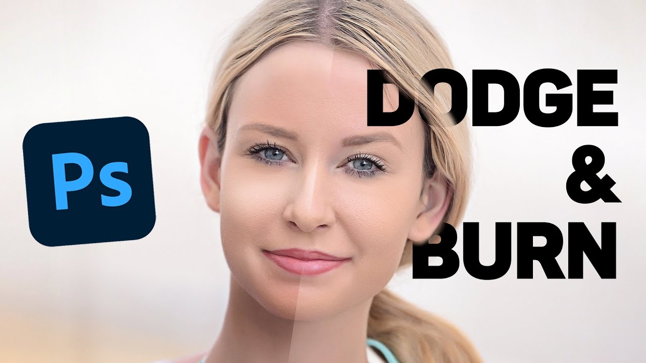
Learn how to Burn and Dodge your images in Photoshop using Adjustment Layers and Layer Masks! Great for Photoshop Beginners, a nice and quick 3 minute tutorial showing an alternate way to edit photos without affecting the original layer.
Thanks for watching, and make sure you subscribe for more tutorials! :D


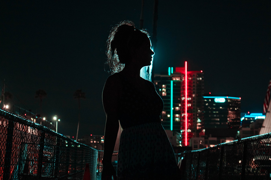
The colour and contrast look great in this. Nicely done. A few thoughts...
- If the person is strongly silhouetted, shouldn't the rocks be as well?
- The shadow of the sticks/skis sticking out of the ground looks off.
A Benny fan I see 🙂 Nice work mate.
You have a strongly backlit scene with some nice dark shadows on the rocks facing us on the left. Elements like the arches should also have similar shading.
do yk how i could fix the skis? ive been trying but it hasnt really gone well lol
yeah i was thinking the shadows of the rocks might be off due to the fact that im really dark, ill change that
Thanks!!!
Gave +1 Creative Carma to @abstract oxide (current: #15 - 135)

Okay Thank you
Gave +1 Creative Carma to @novel comet (current: #5 - 955)
What about this?

the bacon
Great work adjusting the shadows. The whole thing feels way more cohesive now.
thanks for the feedback btw! really helped me
Gave +1 Creative Carma to @abstract oxide (current: #15 - 136)
As for the shadows on the skis, perhaps take some inspiration from the shadow on the person.
That's great to hear. Thanks mate. Keep creating awesome compositions.
Gave +1 Creative Carma to @fleet grove (current: #97 - 16)
thank youu 🙏❤️
Edited the Headlights, I'd be grateful for anything that will help me do better next time.

The overall image is very bright. Editing the image to turn the headlights on... does that make sense in this context? It would be cool if you could do a day-to-night conversion of the image and then turn the headlights on. Just an idea. :)
You are right, that would be cool. I'm gonna try it
Can you post the original so we can compare?

I'm not suggesting that you do this (exactly). This is just a 5 min edit for context... but something like this.

You could really strengthen the shadows and midtones with just a single Curves adjustment.

Thanks, I always avoid that tool guess todays the day I try it out
Gave +1 Creative Carma to @abstract oxide (current: #15 - 137)
Awesome. Curves are such a powerful tool. Best of luck.

How did you darken the image? The shadows are now brighter than than the car.
I did a gradient map and slightly lowered the opacity. I was trying to get it better but my attempts made the car look unnoticeable so I just quit because I really only cared about the headlights


I would probably try to make them a bit more dynamic. Maybe add some action lines, glows. If the text is the focus, push the action toward the text. Perhaps don't put the text so close to the edge of the layout. Give it some margin for breathing room. Just a few suggestions...

@wooden oak what about the second one also amazing design u made ❤️
Here is my example PSD if you want to play around with it, use it, whatevs...

thank you. what about the 2nd one.
could you come call 5 minutes?
i really wanted help on smth for so long and it wont take more than 5 minutes
I actually have to get going. Stop back tomorrow if you still need help.
Trying to edit a DARE style ad, if anyones got feedback real quick that would be greatly appreciated 🙏


Feel like the concept is almost there and there’s a lot of potential, but it just looks like a high school project right now 😭
Idk maybe I’ve stared at it for too long
Heyyya hope yall doing great, was requesting for some feedback on this

why is spongebob there 😭🙏
The design is well done. I'd probably remove Sonic and SpongeBob. They don't add much value to the layout. In fact, they kinda cheapen the design a bit. They are also someone's copyrighted characters, so if this was an actual Olympic poster, you wouldn't be allowed to use those in this context.
he likes having funny socks during races

thanks alot, let me take them out, just thought it would bring a fun aspect to the socks he likes
Gave +1 Creative Carma to @wooden oak (current: #3 - 2227)
OHHH😭😭
Perhaps. Its your design. You can keep them in there. These are just my suggestions.
Color grading seems a little off to me. Maybe reduce the yellows a bit? Its a frozen tundra but the sun is literally beaming. Its going to melt all the snow
Only Indians know who they are 😂 😜

cutting down the forest looks a bit strange lol

That is a GIANT FOX and a tiny ufo.
Oh I see now
I've never seen an ufo
maybe its small 😅
I haven't either. heh
I'm trying to imagine what creature would be the pilot(s) of that thing. They'd have to be like the size of Lego Person.
And the baby fox looks big enough to knock down one of those trees in the background.

Overlay Blend Mode...

or linear dodge
Linear Dodge (Add) will also work in certain instances
or exposure adjustment layer
and hue/saturation
i used here
Benny Productions made a video about highligts
Please stop pinging people.
Yes. You can post here. You have to wait until someone has time to help out.
I'm not sure this image makes any sense.
What is this for?
"Infinite Money" with this emoji. I have no idea what this thing in the middle is supposed to be.
I don't know. I don't know this game and I'm not really a fan of any of this.
Bro nobody is going to steal this xD
If "Infinite money" is the most important thing then it should be more prominent.
And as I said last night, perhaps stop putting the text so close to the edges of the layout.
If you already know everything then don't ask me for advice.
You should make it more hacker like
Stop now or you'll be timed out.
as soon as you look at it
like with a terminal background
or increase the terminal on the right
@cloud lark - At this point, I'm going to suggest that check your behavior. If you continue with that behavior and these belligerent remarks, you won't be welcome here. \
Choose your next words wisely.
I'm doing other things. I don't have time to sit here do this all day.
Learn how to behave in civil society. You've been making belligernet remarks to people for the last two days here.
I might steal it and use it for my yt videos 🤔
notice how the resolution is so bad but it doesnt matter
Hes in the server

I would make this ball bigger
because its a bit boring
I mean
nothing happening
Please rate the following brochure for me.


I think the text overlapping the graphics is hard to read. Personally I would wrap the text around the graphics so there is no overlap.
What should I change? I wanted something relatively minimal similar to the original album cover (2nd picture)


This looks awesome. Very creative.
The blacks are deep and bold on the clothing, particularly near the base. However, the shadow on the ground is very soft. Perhaps try darkening it up.
Good idea, thanks
Gave +1 Creative Carma to @abstract oxide (current: #15 - 138)
I think there are some solid bits there that I like, but some items I don't like...
- I don't like the multiple font colours
- I like the vertical lines beside the text blocks
- I don't like how text appears over the images
Can you be more specific and how do you see the layout?
- I don't like how the text appears to be misaligned.
- Font size seems a little inconsistent throughout

"Grand opening" doesn't work for me either.
Do you think this layout 2 is better?

yes, but I'm not sure about the colour choices. - Products seem a bit randomly sized/placed?
The grand opening is mandatory for me to leave there and cannot be changed. Do you have a better arrangement, cover, or add any words?
Is this coursework/homework for study?
That's right
Cool. - Is the 6pp roll-fold specifically necessary? I'm not suggesting you change it or anything, I was just wondering.
I** do** like the nice big use of this image here:

I have to make Trifold Brochure it is mandatory
So I assume, this makes it the front cover. - I'm not really sure what the main title is, or the leaflets main goal is?

Alert people to a stores new grand opening, and the 3 watches they'll be promoting when it opens?
yes my teacher title just said "Grand opening"
And I pretended to be selling these 3 products, in 1 Trifold Brochure
and that was it
I think it looks better when you focus on one KEY hero image, instead of splitting attention across...
.....7 different images

Thank you. Again, great work.
Gave +1 Creative Carma to @wintry orchid (current: #917 - 1)
Also, pick a nice solid colour scheme and stick to it throughout. - I kinda like orange!


yes i reviewed the question yes
do you think the first layout is ok with that question?
Just because a leaflet is trifold, you don't **need **to make 3 distinct columns on the inside spread.

why haven't i seen you since 3 days ago🥹
(I was on holiday 🙂 )
ok so are you free a lot i will post new layout here later
For a front cover, I'd suggest that "Less is more"!
Perhaps intrigue the reader into opening it up to learn more.
i’ll show u what i added when i home, i think it really helps it
can you give this image with clouds?
Inside can then focus on a main hero shot, with space for smaller secondary images too,,,,
oh my god did you do it or artificial intelligence?
I don't understand the word "Grand opening"
can I use that word on the cover when launching a product?
Didn't you use the words 'grand opening' on your own leaflet?
yes that's right, i mean if we use the word store opening and inside talk about a product like yours is ok, i mean yours is extremely beautiful there's nothing to complain about, the information hierarchy is very good, but i can totally talk about a product in the main content right?
"Grand opening" would mean "Were opening a new store that sells stuff"... it's not specifcally the term I'd use if I was releasing a new product to the market. I'd use words like "Launching", new release or 'introducing'
Yeah definitely.
No customer gives a toss about the literal fact a store is opening. They want to see what will benefit them as a result of the store opening. - in our case... it's the new opportunity to get a fancy new watch!
I understand, because a friend told me:
Yes, the grand opening brochure must show the diversity of the showroom
Ha
And the applicable sales programs
and here are the teacher's requirements
: FINAL PRACTICE EXAM REQUIREMENTS
I. About the topic/content:
The opening/launching event of a brand or product of your choice.
The information content on the design publications must have at least the following parts:
Brand name
Opening program name
Product
Opening promotion
Contact information
Cool. Well I guess you can show diversity on the inside. Maybe include some key other watches, and perhaps on the back, a nice grid of other brands or product ranges.
yes it's a bit hard to figure out what you said because i had to translate it, but ok i get the general idea


I just mean a simple, clean grid showing other brands on the back of the leaflet. - helps showcase alternative options and shows the broad range of products on sale.
?

when i’m home of course!

whatchu think so far

and heres the original cloud image btw
thanks!
Gave +1 Creative Carma to @fleet grove (current: #95 - 17)
I mean for me blue Ball should be bigger a lot
look at highlights on a perskn and on a ship in the right
almost the same
if you put less you will make less mistakes (my math teacher always tells us it)
and it can be accurate
maybe Ball could be closer amd octopus smaller brcause it is far away
you're welcome

this looks decent, in my opinion , but isnt the drop shadow little too much ?
how did you create this something this good in such a short span of time ?
😭
thank you so much, and i love you
but i'm designing a new layout, that layout i've abandoned, i'll post it later for everyone's comments
love to see it
little softer drop shadow would look good
I like your design. I would probably move the person up slightly or scale them up a little to get their eyes on the top third line (rule of thirds).
A couple of quick examples of how you could potentially more closely unify the different images, if you wanted to that is.

I am definitely gonna try that
Excellent 🙂
HELLO GUYS, PLEASE RATE THE FOLLOWING BROCHURE


really love the zoom in going behind the green watch , but why dont blue watch didnt get that zoom in behind it
regardless good design
NEED FEEBACK
I am a newbie, I just started today. How can I improve this? The goal of this design is to be warm and the same energy or vibe as light by wave to earth. Wave to Earth is a korean band. The font I used is poppins, is there another font I could use that could maybe look better? Im just looking for ways to improve this or maybe what I could I potentially add to the bottom right corner near the lyrics or should I leave it blank? Any feedback is welcomed and appreciated :))

Poppins is a good font choice. Stick with it. - Whole thing looks smart.

Maybe avoid the orphan word by making the text box a little deeper
okay thank you!
Gave +1 Creative Carma to @novel comet (current: #5 - 960)

What is the purpose of this graphic? Perhaps add something; some background elements.
im just working on the text atm
the graphic design is for "FiveM"
if you want some other designs to get an idea of what it is please lmk
Mmm. I don't know what "Woo RP York" or "FiveM" is but its a nice effect. The words are legible.
i mean like what can i do to improve the text design? if your unable to help that is completely fine
I'm not sure what to suggest to improve it because I don't really know what it is or the intent of it. The composition seems fine. The words are readable. The effect seems somewhat interesting. I don't know if the glowing/radioactive green rock effect is related to the words but as it is, it seems to work.

dunno
really depends on what u do with ur background
but i like my text not grungy
more clean

What should I change?

Add someone running away in fear of alien abduction?

Good idea
My eye goes right to the lavender shop awning since it’s the only pop of color. It pulls the eye away from the action. I would shift that bit to match the blueish tones of the rest of the composition.
You might also work on the silhouette. He looks a bit stylized, more of a graphic design. Whereas the rest of the composition is more photo-realistic. He may also be a bit large in comparison to the spaceship.

Could you tell me how to make objects ( like humans in image) be like photorealistic painting?

What do yall think of my shirts? started around 2-3 days ago


Can you please post an image that people don't have to download to view. Perhaps reduce the size of it a bit.
You should add more detail to the spider with outlines and cool patterns
how are you guys

bạn có đó không
I think you should make almost everything darker using levels/curves
and add highlights

I would make text white for example
because it would be more readable
thubnails are small so its very important
thanbks
I made some adjustments. I feel like the lighting isn’t great but I’m not really sure what to change about it.

for me it feels like there should be darker areas in the foregrond and on the right side of the picture. Also the "big" spaceship looks like its nearer but its darker. For me it should be further away and a bit blurrier. rest looks nice.
looks like a 3-folded flyer. Nice overall design. On the Frontpage ther is the name of the Opening Store missing, because its a "grand Opening" Flyer. There are 6 watches listed, mit only 4 can be seen. important information such as the date, time, where the whole thing takes place, etc. is not as prominent n the flyer as it could be. The Designelement (grayish bar on the right side) could also be used on te other pages. On the "About Omega" Page there also could be an image of a watch, etc. Have fun.
Thank you very much
Gave +1 Creative Carma to @normal spoke (current: #23 - 92)

try to check blending options with highlits
double click on a layer and in the bottom you have blending options
ik how to blend
and yeah i completley forgot to do that
but im also trying to fix my photoshop
i cant use camera raw filter due to an issue
what does it look when its crashing?
it doesnt crash..

says this when i try to open the camera raw filter menu..
do you have good gpu?
the thing is
i’ve used crf on other projects
only now this issue started
lemme try it
@short hearth
wrong ping
@ripe canopy

how do i reset preferneces tho
just open
preferences
Edit > Preferences
and this button you will see when you open it
and close a programm
im using your work as inspiration [ i hope you dont mind ] how could i improve


"reset all warning dialogs"?
oh wait i got it, let me see if it works
reset photoshop
if it doesn't help
camera raw preferences or performance preferences should be checked
I love it
Thank you first time doing this, I want to get commissions for adverts etc
Gave +1 Creative Carma to @storm mural (current: #919 - 1)
Could anyone see some obvious mistakes for my photoshop assignment. Im given 2 weeks to do this assignment and I’m wondering what I could add/change

use warp to adjust Coke in the bottom

Oh damn I didn’t think about that. Thanks 🙏
not a problem, when I ve done it first time i watched youtube tutorials and i got it from there
theres a lot of bubbles
I would put it on a can
In the past i made some that type of graphics


its an introduction for "photomanipulations" for me
to make good type of that graphic you should be intermediate in photoshop in my opinion
and take care of light sources, shadow etc but not as much as in photomanipulations
check Nour Art youtube Channel for example
Perhaps slightly darken the area below the can and/or add a shadow to show that the can is sitting on something.
That’s really impressive work
Thank you for the examples 😁
Yeah true
This is rough but hopefully illustrates what I’m talking about.


fire
hey tucq
any suggestions?

hello fellow members, please give your constructive feedback. thank you in advance.


It's good but I think that you've added a drop shadow on the object itself that is not really good in this case. And I think the second one is better for the "Delicious" Text , I just think it's more readable like that than the first one
If I were you I could've maybe find a more appropriate render with a different angle for that dish and make it blend it so it's hovering over that green bar
It's just an idea by the way, It may look good or not 🙂
the figure doesn't feel 3D
I think you should a bit of side shadow or smthn
Hey! Someone could give me a good looking orange sky?
"Orange"? Do you mean "sunrise" or "sunset"?
yes
you know what I mean propably
thank you
Gave +1 Creative Carma to @terse jetty (current: #40 - 47)

Thanks!!
Gave +1 Creative Carma to @wooden oak (current: #3 - 2254)
good design, but the shadow should be at the base of the pot, like the pot exists in graphics itself, instead of shadowing behind the pot.
Thanks, for correcting me,I edited it 😊🙏
it has shadow plus u wont see the 3d ofcourse. regarding that its a full black character.
Truly thanking you for giving me inspiration, i love this style of graphics

Thumbnail Concept for video, feedback appreciated

Went for a comic book style poster

looks good


Really good design.
The character feels quite dark and heavy in comparison to the background. I wonder if at least some heavier shading in parts of the background would help unify the two?
Again, really solid work.
The one highlight on the finger is far brighter than any other. Personally I would raise the highlights a little in a couple of other small areas such as the top of the shoulders.
Good idea, thanks
Gave +1 Creative Carma to @abstract oxide (current: #15 - 139)
It’s actually not a highlight, it’s a bandage

That is such a nice picture (and to use)
my partner wants to change OPS text design
any suggestion plz?
it will be concert organization brand logo and OPS should look like from greek mythology

Duudeee I love Blonde, ur design is DOPE
Frank be like "Rare as the feathers on my dash from a phoenix" 🗣🔥‼️
While me out here reciting the lyrics in tears from "It's just a fond farewell" 😭🗣
I did notice that but it is still relatively bright.
No worries. Thanks mate.
Gave +1 Creative Carma to @wintry orchid (current: #590 - 2)
Have you seen the Green/Roman section on the font website dafont.com
https://www.dafont.com/theme.php?cat=204
Archive of freely downloadable fonts. Browse by alphabetical listing, by style, by author or by popularity.
You can also have it preview specific text

you are classy and awesome
I really laughed out loud when I saw you make really beautiful watch products, I really like you
Thank you
Gave +1 Creative Carma to @storm mural (current: #590 - 2)
I want to get into the advertisement business but idk where to start
SO OPEN A PRINTING STUDIO AND DO MORE ADVERTISING
Printing studio?
How much do you rate it ?

Why dont you turn the person on the right into a hot babe
.
10 my brother
the guy is an 11
any feedback on this

promo flyer for a food companhy
Perfect
still waiting on more assets
Add Vignette
to which
Add depth
smart smart
Sides of the Frame So That Focus will be On The Centre
great idea
By The Great Work Brother 🔥

Yeah little Better then before
If possible Increase the size or Change the font of the name of the dishes because its too small And difficult to read it
Or you can Add Some Text box behind it

Personally I’d stick with the green grass look to better match the game theme. I read the white lines like field distance markers. 🙂
thank you brotha

Rate this one !

being picky here but something seems off with the contrast on the Objects to the left
That logo ?
no no the elements to the left
like dogs launching on
i think the red and green go off colour scheme and pop out a bit too much

BROOOOOOO
This is DOPE!! @toxic dome
Love the shading u did on the kraken, the boats & clouds
I think in terms of suggestions, blending the clouds more w/the stuff rising above em would look cool!! Kinda like how I did the portal for my work: #1263649474652143647
Do that w/the corners kinda or just slightly above the clouds' base
OHHH also for the orb, I love that glow u added to it!! I think adding more sparkles & setting the blend mode to something more spacey/transparent could also help!
The shadowing looks rlly good on everything especially the guy's
Except for maybe the tentacles, you could try layering the shadows so it folds on the clouds but it could be rlly hard
I JUST NOTICED u did that for the guy's shadow!! Coolll
social media post design photoshop

thumbnail for you tube { https://youtu.be/dG6MD_3Q7z4?si=agzS_YXzKzhE5j6Z } Welcome to Design Mastery! Subscribe now for a creative journey and unlock your design potential!

where did u get 3D Icons? freepik?
Well, I don't like this job, Sadge

i need ur feedbacks ✅

Hello🌸 I will be happy to help any designer that needs feedback by DM (logo, whole branding, stationery, packaging, prints, etc). 🤍You can also check my Behance portfolio in my bio.
I looked at your profile and thought all your stuff was cool but that Jeep one especially caught my eye

Thank you that’s really kind🤍 I added my Behance account to the message so people can know what type of feedback I can give.
Gave +1 Creative Carma to @hollow marsh (current: #283 - 5)


maybe its too bright and in my opinion i think the transition from night to afternoon daylight its too fast
oh thats it
thanks a lot!
and maybe you put too much sunlight on the mountains, specially on the right one
yea i agree i think it would stand out more if it was nighttime + the moon is already out why so much light in the mountains
it looks good, but you need to choose where does the main light source comes from? the right star is brighten from the left, the left one is brighten from the right, and the ground is brighten from the right
try changing the lighting direction of the right moon
from you tube
hey

I’ve tried puppet warping for the past hour and I’m gonna lose it Istg
not Puppet warp
ctrl + t
click right button of mouse
"warp"
That one felt wrong
Cuz the little grooves on the very end need more points for me to be able to have it contact the whole way
And it just looks kinda funky, but that could just be micro adjustments
thats strangee
Ile never had this problem
search
glass reflection social media post
on a youtube
I mean I’m on a school computer and using an older version so that could be why


write this and you will have an answer
I found short

about this warp i mean not puppet warp ofc
im almost sure you find good video
Not showing up for me
Is your set language on your computer/YouTube English?
If it’s not it might change our search answers
strangee that you dont have it
Which version is better in your opinion?


The blue one pulls me in, evokes a sense of the deep, lonely vastness of space. The big red star in the other one needs some flares or a corona of some kind to make it feel like a blazing star.
Hey im pretty new to photomanipulation so im just looking for feadback of where i should pay attention and improve

car doesnt need to be too dark
look
you made lights so these lights should also be on other places

yeah i tried to play with outer glow but aguess it didnt work out 😉 that well
I prefer make solid color adjustment layer
and with low flow make lights
but about highlights i recommend hue and saturation + exposure adjustment layers
benny productions made video about highlights (this is not an advertisement 🤠)
i'll give it a look

I like both but right all day with the cool purple ring
I am specifically hung up on if I messed up giving the eyes two different colors. I am attached to the two because I was experimenting and just really like the way both turned out. I was gonna replace the spoon eye nut might keep it

I think it would be more cohesive with both eyes the same color.
There's a chance fate might choose for me as it's gonna be a lot more redoing than I thought to even see how they look the same color the way my layers ended up. Does it look off-putting as it is? The table/chair background will be replaced with something outer spacey
It isn’t off-putting. It just feels a little arbitrary. I’m slightly distracted by it which prevents me from appreciating the overall composition. I’ve done lots of projects where I’m adding cool things, but when I step back, I think, “there’s too much going on here. Something needs to go.” Gaining mastery involves not only getting good at creating cool things, but knowing when to take things out. Being able to edit your work is just as important as creating it. But it sounds like this is a work in progress. So leave it the way you want it until you’re finished. Then give it an honest evaluation and decide what to edit.
Definitely taking all that seriously.
you can make shadows at the bottom of that Animal to make impress that Animal is inside of a cup

there but a bit better
This looks cool.
Personally I would raise the highlights in much of the composition.

Interesting. Can you provide some context?

I like setting moon on a "screen" mode
and I recommend you this way
its easier to make light and if you want more dark just use curves/levels
More like...
Where will it be used?
Are you trying to make a particular statement?
etc...


10, 15? Something about 70 layers in total. Not that much actually
Nice composition. A minor adjustment to the white point and contrast helps this pop a little more.

👍
This was my first final version, after 2h of letting it rest I tried to shrink them down a bit and introduce the egg

Also the blending of the waves seemed a bit off here to me
Raw Camera Filter? Up the clarity?
This time I did all final touches inside ps via curves, lool up table, selective color etc. Although by the messed up blending I meant the splashes and masking of the ship (could spend more time on that in the new version too I guess)

Looking good.
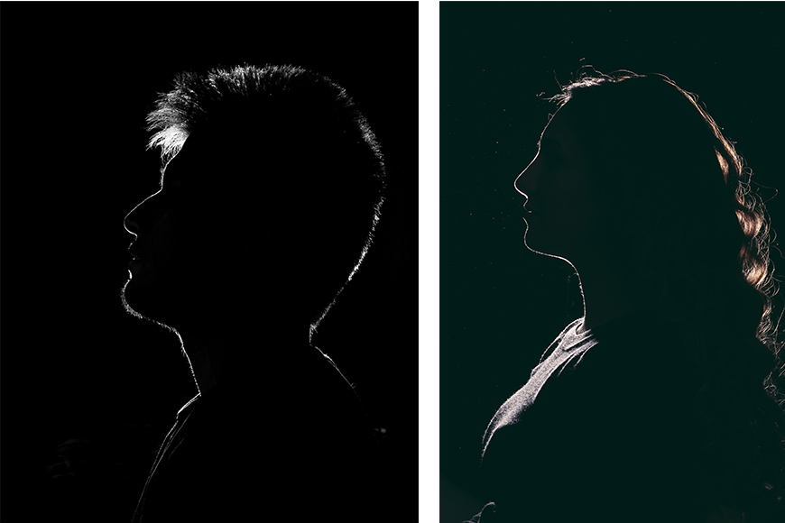
Perhaps a few highlights or rim lighting on the head/neck?

Rate this from 1-10

Hi! So this is a virtual portrait I created for my GTA character, I'd love to know how can I improve it and get some feedback!

One idea. Get an image of some fabric, place it over your image and mess with the blending mode and opacity.

Great idea, I just did it looks great, made the other shadows and stuff match it.
what do u think of this one? its supposed to be social media post for clothing store or so

why i am being ghosted 🙃
I think your designs are effective. The message is conveyed quickly and clearly. Well done 👍
Hey that's awesome. Thank you. Please post your image again if you are keen.
Gave +1 Creative Carma to @lost shuttle (current: #923 - 1)
Ghosted? Not all. It can be hard to give feedback on designs that look this awesome. Nicely done.
Looks really good.
For me the giant brown dot strongly draws the eye? Is this really what you want to be the subject of the design? Personally I would shrink the dot and perhaps make the person larger.
Ofc here is it with the edit.

i want the person to have all the attention so I would shrink the brown dot right away

Rate this from 1-10


It is for Youtube?
yes
Then, this I guess

There's some strange white "smoke" around his hair. Is it has to be there? If not - fix it
And the sclera of his eyes looks like you paint it in "Paint"
Ok thank you
I like the changes. Nice work.
Nice work with the fabric. A little "noise" generally helps make a design look more realistic.
I made this in photoshop for the picture editing, recoloring, filters, etc. And I made the text in illustrator. (minus the liquify on the mortis.) I just got these programs and i really like brutalism


Create Stunning Social Media Posts in Adobe Illustrator | Step-by-Step {https://youtu.be/0QR2cWFrZYw } Subscribe now for a creative journey and unlock your design potential!


#AdobeIllustrator #IllustratorTutorial #SocialMediaDesign
Description:
Welcome to Design Mastery! In this tutorial, we walk you through the process of designing a stunning social media post using Adobe Illustrator. Perfect for platforms like Instagram, Facebook, and more.
🔔 Subscribe for more design tutorials: [ • "How to Create a social medi...
you made my day thanx 😭
The eye moves from left to right. From the dot, to the person to the text, but then back to the person. It is an engaging and balanced design. Also with the person looking down that is where my eye moves.


Hello everyone, I would like to share with you my new project! 😊
https://www.behance.net/gallery/205899621/Maris-Belle-Visual-Identity
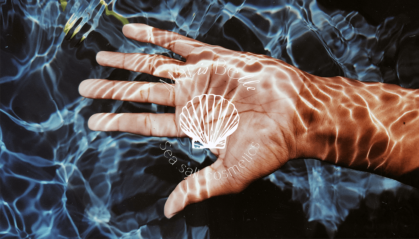
Visual identity for a sea salt cosmetics. Packaging design and Product design.
I don't have any inspiration but I wanted to do something, one person told me that the inscription even works, but I don't like it so there is a version without it


Nice i like the one without text more
I agree. I'd re-do the text if you want to add that into the layout.
its not a must to put a text but thanks for a feedback!

Right. The guy on the left looks like he’s in a jungle which doesn’t sync with the idea of a peak.
thank you
Gave +1 Creative Carma to @deep flame (current: #592 - 2)
Agree! 🔥
The inscription Archer is redundant as the image implies that. You are right, the one without the text is better, and the meaning of the piece is still clear.
However if you want archer text, I would make it small, all caps, sans serif, white with 300 to 400 spacing. Subtle
personally, I would change the font to something more block, very dark and add rim lighting from the moon above
I prefer the red one because there’s more contrast between the shoe and the background
what is "rim lighting"?
No worries. Thank you.
Gave +1 Creative Carma to @remote delta (current: #592 - 2)
Fantastic work
Simply lighting the edges of an object
Usually the dark edges
Tried my hand with some poster composition for my dnd group, thoughts and or criticisms?


Sorry I should have explained in more detail.
https://shotkit.com/rim-light-photography/
Rim light photography has a strong visual impact. If you want to add this technique to your portfolio, this article will teach you everything you need.


👀
Before adding the blur I had a perfect reflection but now after adding the changes the reflection doesn’t sharpen.
For future I want to make the blur more intense further away and almost clear at the start


That’s the before and after
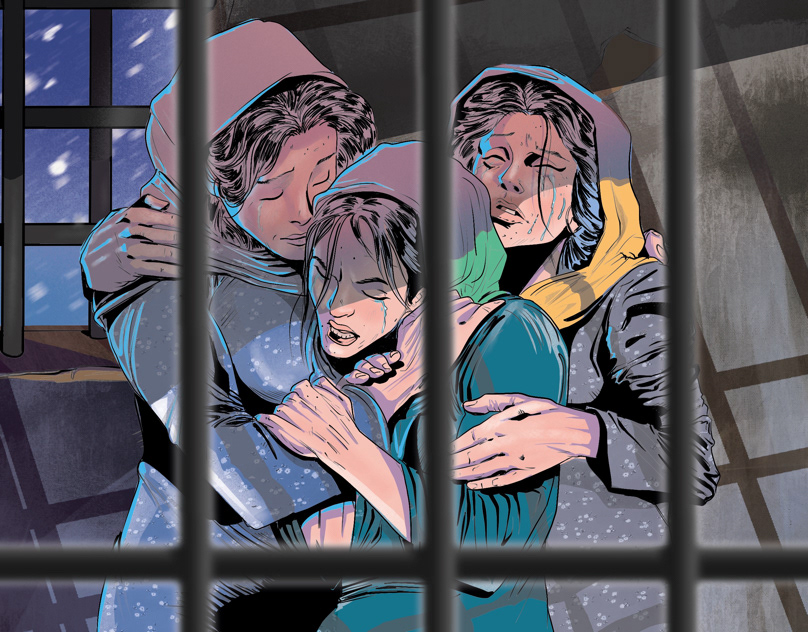
Hi guys i hope all is well! we just finished a documentary it's about Women in Captivity! Please have a look and share your feedback! Thanks 🙂 @everyone
propably i dont understand
but if you blur it wont be sharp
but you can use soft brush to remove some reflection a bit

my work is not perfect (old work one of the oldest)
but you can see what j mean but dont change orientation of reflection like in my work

So much for that lol

Great design. Love the textures and the simple layout! My only thought is currently the water droplets are uniform size and should show perspective to indicate a flat surface. They should get smaller toward the horizon line, try skewing the droplets image.
also, depending on the effect you are trying to make, with the light source on the right, there should be a shadow of the can on the red surface on the left. This light source would affect the droplets too. And if you really want to get creative, the droplets can be more 3D.
The logo on the right image is familiar. It is identical to one used by a contributor/graphic designer on a marketplace site I frequent. So not sure its purpose in the poster.
As for the designs, honestly they do not seem cohesive and complete. But perhaps that is just me.
Try making the poster taller, less square. Also add elements in background, and eliminate the logo. When overlaying images, add shadows to indicate depth and remember perspective, characters in the back compared to forefront. Also try adjusting the arrangement/placement of the characters to see if it works better. Hope this helps
That's cool, I like how you included the original assets as it shows how much you altered things for that cool dark look. If this was a tv show I'd be compelled to watch it
Nice layout. Good design.
For me the droplets on the ground are too big and the shadows are inconsistent.
Thank you for your feedback
Gave +1 Creative Carma to @abstract oxide (current: #15 - 144)
I will change accordingly
Thank you for pointing these things out
looks very poland
#project feedback, In these designs, the products take on a life of their own, speaking directly to customers in a playful and engaging way. The idea is to let the product do its own marketing by showcasing its personality, making it both irresistible and memorable.
I would love to get your feedback on these designs. Do they effectively communicate the concept? How do you feel about the tone and messaging? Any suggestions for improvement?
Looking forward to hearing your thoughts!


i waana write headline from oil how can i do that in phtotshop

its an oil press layout
its an 200 cc advertisement

text add cool yellow texture + liquify
but for liquify filter i would recommend youtube video about it
its not that easy
(for me)
i want to make it more like an realistic oil
i have tried liqify
first i need to convert it into smart object
ofc
how can i write headline in oil or water
ok thanx buddy
is there any ai took can help me
and its the longest part
is i inspied from rajeev mehta vedio
Yes
that's my first poster to design ever, there's problems obviously but the thing is i can't name it 🙂
(NEED HELP)

Could you move the lettering ‘France la rog’ to the left so that the face remains ‘intact’?
I recommend you use grids
to make margins
because text shouldnt touch edges in 90% cases
you know what I mean?
i only used it to fill up the whitespaces
i mean the text, and for the grids yeah i used grids, but as you can see im not the best with it 😅 . i mainly shared the image to get tips about coloring and composition and if there's any edits about the elements im using at the design
like most of the elements are not related if i would say?! or something like that idk🫠
im working on a poster and i feel like the bottom right is too empty any ideas?

Why don't you increase the tracing?
as in?
The bottom text
alright
i guess yea since all the rest of the text is so big
and that part is barely readable
still feel empty

i really like having the badge on the bottom right but im not sure what to add
im going for a brutalism feel
I would like to receive some feedback about my graphic!

what does the  reaction mean lol
I'm not fond of all the "noise" overtop of it. The layout is very well done.
I add the Ps icon to images that I like.
thank you bro, i will adjust the noise, what do you think about the colorway?
Gave +1 Creative Carma to @wooden oak (current: #3 - 2301)
"Colorway" ?

I like the orange; its powerful. However, I almost wish there was a blue or purple to compliment it. (Blue is a complimentary color to orange.) Maybe just make the hexagon background a blue to offset the orange. Just a suggestion.

It could be less saturated as well.

okay thank, now i will work on it, in a couple of minutes i will send the result
Gave +1 Creative Carma to @wooden oak (current: #3 - 2302)
I've made some changes in the color correction,I've also adjusted the saturation

I've also boosted the shadows of the text (Urus)
Looks great!
thank you bro❤️
i really dont know what to do with the bottom and specially the badge

i really wanna use it
i really like the top part but the bottom makes me go 
Thank you and best of luck with your designs
Gave +1 Creative Carma to @warm crater (current: #592 - 2)
I feel like something is missing


I'm not really a fan of the "MXS 1990" font or the placement of it. I might take another look at that. I don't think that really fits with the rest of the layout.
The colors are beautiful and complimentary. I really like that combo. However, I'm not sure of the composition. I'm struggling to understand what the main focal point is in this layout. Also, what is the takeaway? Is it just the tree or is it that the man is discovering a special tree. If you look at it from a Rule of Thirds composition, none of the main elements fall on any of the points in the RoT layout. I might rethink the composition a bit.

Oh I heard about these points from one Youtuber so if i would put tree more right and person will be bigger
it should be better right?
If the tree is the main focal point, I might slide everything to the right so that it falls on the that main point. Then it seems more in-balance compositionally-speaking....

fair i’ll see what i can do about it
Thanks a lot! So these points can increase my composition skills?
I would just do a bit of studying on the "Rule of Thirds" and learn about that. That's one way to approach composition. Perhaps the most popular of the methods.
Centered layouts are OK but for something like this, I might opt for Rule of Thirds. Just a suggestion.
Great design. I would recommend not splitting the word FASHION. Even with the figure over the letters the human brain fills in the meaning, give it a try and see. But good job again, I am really liking your work. 🙂
@deep flame thank you for your feedback ... I will design one without splitting the word
Gave +1 Creative Carma to @deep flame (current: #438 - 3)
Would huuugely appreciate any feedback on this. Things to change, add, anything 🤝


i wanna photoshop on the porsche logo like that, what colour should i use and where do u reckon i should best position it?

Nvm I’m just gonna rock with the blue logo
Banner for my Youtube channel it is a cooking channel just wanted to see what people think. Thanks.

matchday design, wasn't going for something too crazy


I think the timing and nature of cyber feeling cuz it is art Ai generated will not go well with a cooking channel.
At least from a branding POV!
It depends, will your content be Ai generated too?
Anyone willing to give opinion ?

AI generated image with text? pass.
The back of the jersey looks odd to me. I might try to straighten that out a bit...

If "Apartment Cooking" is the name, I might expect to see an apartment in the background... A "depth of field" blur could be used to bring the focus to the cutting board/ingredients in the foreground. Just some suggestions.

Great layout! A lot of visual interest in there.
The logo placement seems fine. However, if its that important to you and crucial to your layout, I would make it more prominent. Additionally, I might get rid of the people in the image. They seem like distractions that take away from the main subject(s) and focal point. Just my opinion...

It certainly grabs interest. Good job
Hey, I'm posting other versions of the work


WHAT DO YOU GUYS THINK?


Thanks and changed it. I actually like yours! Check out my new one thanks.

Gave +1 Creative Carma to @wooden oak (current: #3 - 2305)
Now you've got the kitchen but no food. The photo is an improvement. I'd say, add some food back in. try Gen Fill in that empty area on the right to add some food items to the image. Good improvement, though.
@wooden oak I am using free adobe stock and could not find one with food. I did few with gen fill food and looked really bad. I even did a gen fill pots and pans. Most people watch YT on a phone so they only see the title only and some of the background. Where did you get the background for the one you made? I liked the stock photo you showed. Thanks for feed back. Its nice to have positive feedback.✌️😎
Gave +1 Creative Carma to @wooden oak (current: #3 - 2306)
The image I used was generated and manipulated.
I'd still try and include some food in the image...

Not saying it should be this; this is just a quick idea.
@wooden oak I will keep trying new gen fills. Thanks for your help really appreciate it.
Gave +1 Creative Carma to @wooden oak (current: #3 - 2308)
Thank you for your opinions @wooden oak @deep flame
Gave +1 Creative Carma to @wooden oak (current: #3 - 2309)
Ok so I messed around with curve lighting, hue, and about 5 diffferent gen fills and came up with this.

@wooden oak This is what is looks like on desktop but on phone it is cropped so you only see the title. Only time you will see the veggies and fruit is on a tv.

honestly it looks real more than my works lmao
@ripe canopy Thanks! I was surprised how good this gen fill looked. I had to adjust the hue lil bit, but came out. Most AI looks like its made by a robot on a bad acid trip.😎😂
Gave +1 Creative Carma to @ripe canopy (current: #593 - 2)
That's great !, I love this color combo
hi guys I did this art work how is it
