#📝project-feedback
1 messages · Page 17 of 1
Thanks ❤️
Gave +1 Creative Carma to @meager lion (current: #342 - 4)
I think the only thing I could suggest is maybe reducing the noise on the left pic of Nicki
Yahh ofc!
Ok
It’s my first time putting time into a poster Lmaoo
But even then that's up to u! I only feel that way cuz it kinda "numbs" her face like makes it very unclearish
Whoaaa seriously?!? This is super good for a 1st man! Good work
Love the fonts and lines too!
Thanks, I just been trying to improve my skill
I genuinely thought you probs had an art account on IG
Yeaa ofc man, & you will! Best wishes to ya
You too
Tyyytyyy!
Yea I just started one today, so I can just share everything and also keep track of everything I made
My art account's @ kowkumar on IG if you wanna check my content out! Some of my works are in this channel too (a bit up thoo HAHA) & "THE DREAMSAILOR" in #1110544577850511401
Ahhh I see, yeah good idea!
Oh sweet; I will definitely check it out 👍
Whenever u want to, feel free to share too
Merciii! 🙏🏽🔥
It’s just ghst_designs
Gotchu, yeaa I'll check it out! Ngl it is 3 am for me jus finished up another version of my art, so I'll head to bed soon
But tysm- oh shoot I jus noticed ur follow
Alr
Np Lmaoo
Oo and btw, do yk the best place to find pictures or assets
Ohhh def check out Unsplash
Alr thanks
There are a few other notable sites but they aint coming to mind rn ._. If u search it up on google w/reddit in the search you should find a general list
Hope that helps, and yea no prob!
Oki
But yeee I'm a 😴, later ✌🏾
This might be a good topic of a live stream. (Making a note of that.)
@meager lion

not sure what to add to this, i wanted to add something in the tv screen but idk what to put in there
LES GO! Pls ping me when u start that stream 🙏🏽👀
Hmmm you could try a nostalgic image but honestly the static looks great too*
This might be cheesy, but you could put something that's nostalgic to you! An album cover, pic of a tv show scene, etc
But maybe overlay it
In terms of anything else, I'd honestly only recommend blurring the moon but that's just for realism purposes
You rlly don't need to if this is ur style
i was doing that just now 💀
ig it would look better if u centered the planet in the middle or if u moved the tv to the right, might look more balanced and not as scuffed on the left side also making 1 thing smaller and the other one bigger would give better contrast
i was thinking of adding a pic of me but nothing really fits and i dont really like any of the backgrounds of my pics
Ayyyy dope!
Ahhh I see 👀
originally it was like that but i wanted it to the side to make the shadow sideways

what it looks like right now
i see i see
i kinda think this would look nicer


might be my preference
If u do wanna blur it u think i gotta do it a lot
the pictures i used
Danngg act crazy assets u used to turn into this, nice work man
yes i used the same sky from my ww3 pic 💀
thank youu 🙏
Gave +1 Creative Carma to @meager lion (current: #280 - 5)
Ahhh HAHA ayo I couldnt tell
i might add something tot he other side
but i kinda want the sun on the left
But yeah I think you'd have to do this if u wanna blur (it's also a cloudy sky so maybe add clouds covering it)
oo yeah u right
free upscale tool that u can download

gotcha
whatsthis
why tho
not pixelated
Maybe dont use a gaussian blur jus cuz a view that close to ur perspective would probs be a clear view?
they arent bad quality tho 😭!
ig
It's just the clouds and dusty vibe that made me think it woulda been nice
for the future
thanks u ❤️
np
i was gonna get a dust thing
like
yk
but i cant find a dust picture to use
Yeaaa that works!
and i dont have any brushes like that
Maybe a noise filter tooo
Aww shoot 😭 hmm maybe search up like a dune poster tutorial on yt cuz dune has such a dusty vibe yk
Like they could have assets u'd like
Yeaaa honestly u sent a ss right so
I doubt u needa upscale it 🤷🏽♂️
ohh yeah :ssku

this is a
like
i added dust
but not dust
just made a brush really low opacity over everything and made it an oragnish color
Ooooo the blur does help the composite
Ahhh I see!
hold on ima do what you said and add more blur to the sun
Yoooo it's so fun act
Hope u can do so sometime soon
chat i have to stop editing and go to work ☠️
LORD yeah bro do that don't push requirementss ._. Always sucks tho cuz the editing is 😤🔥
@meager lion ngl i tried making this idea (tv buried on a beach during sunset with soemthing playing on it) a while ago but failed horrendously like it literally looked awful, didnt have any ideas so i tried it again and it looks better now
Ahhh I see! I'm happy about the improvements, like idk about ur original image but this one feels sm stronger as a composite
i agree
first time ive been proud of myself while photoshopping, like seeing genuine improvement
how much time did it take u to colorize ur ui?
Yooo btw 1 thing I noticed about the tv, the shadows would be a lot stronger from that big & close of a moon/planet/sun! U could make the Tv black parrs darker along w/the shadows!
Les goooo 😤😤
I wanted to ask that too! How'd you do the purple outlines? @toxic dome That'd be so nice for me to incorporate
i just downloaded some file and changed the photoshop file
Cuz sometimes I click on the wrong layers n it's jus 😭
i saw an yt tut but thought it would take 30mins or sum
u could do any color pretty sure, my fav is purple so i chose purple
Oooo sick
mine took like 7
Ok I'll try it out
it’s basically just replacing a file
See you!
Anyone help me figure out how to make a yt banner that fits on all devices, cuz when I try and make one it has so much empty space on TV, and is so zoomed in on phone that it looks like crap
Hey everyone. Could you help me?
I want to make my logo be puffed. Like be more 3 dimensional

Could you give some of tutorials of how to make it in Photoshop?
I want to use it on mockup
thx for tip
Gave +1 Creative Carma to @limpid condor (current: #429 - 3)
ill try that
Maybe a drop shadow?
But cool logo!

Ohhh no I meant to the original logo! But tbh idk how to make it look 3D on black merch ._.
Hope u figure it all out tho!
--
Hey guys, I wanted to ask which version y'all think is better about my piece regarding Drake & Kendrick Lamar's beef!


Which one helps support the imagery best?
Or overall feels better as a composite
Inspo's from Temi Coker's A Poster A Day series: S1 #50
Also any suggestions would be great! This is my nxt post for my IG account too, I recently hit 50 followers too!! It went up to 57 the same night I celebrated HAHA 💛
first one is better
He's supposed to be a haircomb!
A beard comb
👀
Tyyy!
ohhhh got it
hello
can someone help me please i spend 1 hour and i still cant figure out why its not working

i cant make custom shape
of the bubbles it wont let me


its only showing 1 eclipse

I still cannot make effect like in the second image


i dont understand how humans do this tbh you want to learn it you follow the video piece for piece and it still doesn't work
It looks like a few of those ellipses are "Paths" and not "Shapes". Change this to "Shape" Mode...

Paths doesn't render. Shapes can have attributes like fills and strokes.
can anyone of you tell how to add soft edges and texture like in that image?
You need to add drop shadow and not inner shadow


The drop shadow effect won't appear on a fully black background
You can maybe change the background color to dark grey
or You can try bevel&emboss options

and how to make edges be soft and puffed
same as texture
ty d humann i firgured somwething out
im just trying to make a simple ass logo and its so difficult for me
like what is this software

im trying to add text and there is infinite text at the bottom that i cannot remove
You seem to be using a Text Box and its inserting some placeholder text. You can remove that in Preferences if you don't want that loaded in by default. Main Menu: Edit > Preferences > Type... "Fill new type layers with placehoder text" (untick that checkbox).
Also, if you just want one line of text, just tap once with the Type Tool and type in whatever letters. Don't drag out a text box.
sometimes i really think i am braindead
You'll probably want to add a Bevel & Emboss as well as a Drop Shadow to the letters...

The reason the "PUFF" example looks so good is because there are nice hefty letters and there is some surface area to really show off the texture. Your lettering is somewhat light and spindley in comparision. Still do-able but I don't think it works as well on these letters.
could you give a template or show me the options you did?
I just have photoshop 2020
Here is my Photoshop file. Feel free to use it...

thank you
The texture is much more visible on thicker letters. On thin shapes, it doesn't work as well.

I saw it
Super. Good luck with it.
what is this

i remove background they take my logos head
can someone show me how to paint in the section
and then i think im finsihed
would appreciate
cabe5a
im trying to drop color with dropper tool no work


@toxic dome I've finished the island for the design , And yeah it was made from scratch and i don't know why

I Feel like wasting time but I don't like using ready to use assets
alright dude u didn’t have to mog me ☠️
it’s really good
well done lol
Thanks !
Gave +1 Creative Carma to @fleet grove (current: #136 - 11)
It was made from those : )


If these aren't "ready to use assets" then what would they be called?
You didn't make them yourself.
I mean like grabbing the assets and blending them in the image and don't change any thing in them
I've changed the shape of the rock even the grass you wouldn't tell that it's from this image if I didn't send it
And yeah you're also right about they are still "ready to use assets" .
I think too many people around here are concerned with "making something from scratch" when I don't think they really know what that means. :)
If you're going to do a photo-bash "from scratch", you should be going out and capturing the photos yourself and chopping them up. Like, you actually create all of the assets that go into the composite.
You think that I'm going to create a 3d model to just make a photo manipulation
: )
No. But don't think you're creating something "from scratch" when you didn't create the images themselves. :)
And i think this is still " From scratch " when I've blended over 4 images and changed the whole shape of them and added textures to create a whole different object
I'm not against using any assets in a composite. But I see a lot of people around here hand-wringing about how things are created. People should worry more about the resultant image. Not so much where the assets come from.
that would be fun
shi i should try
Or this is what " from scratch " means in photoshop
Neither me
u didnt render out the rock urself so that aint from scratch
eitherway
couldnt care less about that
pretty cool idea u got there
I know and yeah you got a point actually
btw u should download some grass brushes if u havent
they look nice af
yk when u blend in stuff
I have but I'm still in the blending process didn't finish yet
gotchu
Maybe one day but I'm still too lazy to do that
but how insane it would be to finish a project like that
Yeah actually I've realized now that it ain't really "from scratch" you're right about that , I should've described it "Original artwork" or "Heavily modified" instead
Thanks for the note guys ! ❤️
nah
I'm not bashing on anyone specifically. However, a lot of people seem to have this purist attitude about image composites and its somewhat wrong-headed. While its respectable to try and do everything yourself, its often not practical to shoot every photo yourself or create 3d models when you only need a small portion of it for an image. The goal is to realize your vision; to think up an idea in your head and then to pull it out of your head and put it into pixels. Also to create something that looks good. You shouldn't be as concerned if some portion of it comes from a stock photo or A.I. generated pixels.
Got your point !
have u made any projects from scratch?
If someone does attempt to do everything themselves, e.g. go out and shoot all the photos, use them as textures on 3d models that they build, set up the models, light them, render them, tweak them in Photoshop, they better look awesome after all of that work. Otherwise it can be extremely discouraging.
I've done some 3D projects where I've attempted to build "everything". Its a lot of work!
Some composites as well.
Nope I'm so lazy to do all of that , I prefer not "from scratch" work 😂
mm
i was wondering what i wanted to learn next
ui or 3d stuff
still havent made up my mind
maybe I'll try to do this one day , But I don't have the power yet
What is your passion ?
just designing ig
what shall i take down or show less off?
Both industries are good but you choose what you like more
ig learning ui would be best for me
Then go for it
alright

Cool image. Was it flipped horizonatlly? Because he's driving on the wrong side of the road. :)
lol uk roads bro 😆
Sorry. Kidding. I'm American. We drive on the right-hand side. :)
u think the car matches the background well?
Yeah. It looks good. Was it not there before?
If you put that car into that road shot, I'd say that is a very successful composite. Good work!
thanks bro
are you an expert on photoshop?
because i want to send you a pic and see what you can do with it
i may or may not deleted the basic photoshop Gradient Maps and i need the transparent one but i deleted it, how can i get the photoshop basic gradient maps
Well, I'm pretty good with image manipulation/photo-bashing. However, I don't really have time to work on something else at the moment. Particularly for purely speculative reasons. :)

Drag and drop this into your Gradients Panel.
Thank you
Gave +1 Creative Carma to @wooden oak (current: #3 - 2158)
am not doubting you bro 😅 i know your good but i want some inspiration on this pic, i want you to add like a portal on this door make it seem it leads somewhere magical!

well not on it but you know what i mean
Looks cool. "Homestead Asteroid" ? "We Flew Too Close to the Sun" ?
You want to cut the door out and put some other sort of fantasy vista in there?
yeah
but i want the entrace to it looking out this word maybe like particules or something
Oh nice name !
I think it might be cool. Its kinda small so whatever is inside the portal will need to tell the story in very slim margins. :)
This is my 5-min idea... Needs a lot of work though.

I've tried to lay down some broad strokes.
thank you so much abt the gradient, it made my poster look 10x better
it looks good bro
It doesn't reaally but you asked what I would do. That is one idea. :)
am gonna do my own one
what drugs are you on
ur either on unreleased drugs or ur just not human no matter ur last name 💀
I'm on a drug called Life. Massive dose.
I wanted to do more but I didn't have time. And I don't want to influence dude's project too much.
yeah fair point
OOOOOOOOO
Maybe call it, "Greener on the Other Side?" @terse jetty
Ooooo those r good too
And whoaaa that's great for 5 mins
Currently working on UI for the spectator view in a game I do some work for. Despite using the same shapes and stuff for this element, I'm struggling to make it look solid and consistent with the rest of the UI so far. Was curious if anyone had ideas on how to improve it a bit?


anyone knows how can i get these font type?

hey guys, what do you think?

The layout overall looks nice. Classy. However, I'm not fond of the font choice for "Cheesecake." :)
hmmmm
what styledo you think would look nice?
I was going for the classy look, however maybe its a bit too serious
Classy is the right mindset for the layout. Did you try other fonts there?

that looks so nice!
I just used the first serif i saw
but that makes a huge difference
crazy
That is Cinzel Bold
There's a slight tweak in Tracking so the letters have some breathing room. Being ALL CAPS.

Just a suggestion.


smas- I mean DAMN that looks tasty
lmfaooo

That's a big ass lake
Just abit the ones with abit of money live their
That's abit of a good observation mate
Why is it so dark there?

Had my settings at iso 100 shutter at 1/200 and it was about 9 at night probs why
And when it came out of photoshop it was darker for some reason
https://www.behance.net/gallery/196733883/Yasar-Design-Studio-Full-Branding
Do share your views and leave an appreciation if you like it, thanks

Hello. This is something i have been working on. Feedback is appreciated. :)


This looks great. Nice layout. Complimentary colours. Solid work.
I think you have too many fonts. Two, perhaps three, at max would be my suggestion.
so im trying some food-cosmetic stuff and need some creative ideas, i did a quick fitting, needs a lot of working but the shape is there
so this is basically just the fitting process, letting the correction and retouching aside, i think fitting the word "brilliance" would be cool, but idk where and whats the best font, any creative ideas would help a ton

broooo check this out

I like it. However, I might frame it a bit differently. Also, she's definitely the focal point in this image so that should be reinforced with the composition and some selective lens blur.


I cropped it to 2:3 and used the Rule of Thirds. We make sure that she hits on one of those points in the RoT Grid.
Just some suggestions.
The obvious location in this layout would be in that empty space toward the bottom of the design. I'd probably choose serif fonts. Something classy that matches the subject matter. I'd darken that area as well so that text stands out against the image.

took some inspiration from D Human, added a tower light instead of that building

im thinking about adding another vehicle to the left or maybe a fence or something to fill that empty space up
how we feeling about it so far chat
I would work on the narrative. Tell a story with the image. Perhaps put something in the spotlight. A person or a thing. Its an intense scene. A dystopian environment. Everything is destroyed. Perhaps irony would work here, e.g. one beautiful flower growing out of the ground. Or a scared puppy. Work the sympathies of the viewer somehow. :)
I also prefer that the lights should be more softer than that
But overall I like it
A flower growing out of a destroyed road , That's a pretty weird suggestions
But I don't know why I liked it
yes so i was gonna go with a armed post apocalyptic soldier either hiding behind another object near the vehicle by the spotlight or him just standing in the spotlight because he got caught
I’ll definitely dabble around with it
That seems too obvious but you do you. :)
think i should do a deeper meaning ?
Thanks. I really appreciate your feedback. I didn't realize I'd used so many different fonts, but I see I've used 5, which as you said, is not ideal. I will get it fixed, and will take it with me going forward.
Gave +1 Creative Carma to @abstract oxide (current: #17 - 125)
hmm
Its up to you. Its your piece. It should be meaningful to you.
I'm just offering suggestions.
What about a sniper guy in this tower aiming for a man standing in the spot light ?
Or you know what , It seems strange when I read it again just ignore it : )

Thank you. Good to hear that might help. Best of luck with the project.
Gave +1 Creative Carma to @torpid crater (current: #904 - 1)


Is it me, or black and white are weird?
Maybe I should do more greyish letters, or more greyish blacks?


This is what I was talking about yesterday, i.e. trying to build a narrative using imagery. Telling a story, establishing visual interest, creating tension, etc.

@wooden oak Tried to do smth similar but I think it's not that good

It looks cool. However, I'm not sure if the environment matches up well with the emoji.
I thought that too , I was going to make the hearts glowing , And with the red light reflection on the ground I think It will be good
I'll be sure to try that when I got the chance
I don't mean the lighting. I mean the visual aesthetic, "the feeling" of that emoji which is bright/happy in that dark and somewhat spooky environment.
Yeah I know what you meant
I was just thinking that It will good when It's weird 🙂
But maybe I'll change the emoji
I think the sad emoji will look good
Or this emoji -----> 😞
These look pretty good. @novel comet is better at design for marketing campaigns and could probably give better advice/suggestions than I could.
Yeah, I've seen you post a few of these in the past - Not bad but I think the descriptive copy below shouldn't be bold like the heading.
@wheat sigil
Also, do you need to show 20% AND the price reduction? - Surely the 20% at this point is kinda obsolete?
Yeah, day looks a bit miserable for such a cute item... - go for the beach!

(preferably without such badly drawn hands!)

Yup I'll try the bright theme , maybe in sand
yes this was the direction i was going
i was already prototyping where the vehicle should be

this gave me a more understanding thou, especially the rocks and rubble at the bottom left great add to make it more immersive of her hiding
question, where do you get your assests from? @wooden oak
Everywhere. I take my own photos, I use stock imagery, I generate imagery using AI. I manufacture assets from all of the above. (Manufacture, as in paint and manipulate pixels.)
Ah AI, did not know it could be used as a strong tool like that
is it an plug in for adobe or you use like midjourney ?
I use every AI tool and algorithm that is generally available to the public. Then also some proprietary tools and utilities that myself and friends have created.
thank you, i was wondering how you was finding some stuff so quickly sometimes
like the car facing a certain way
gonna try some other stuff out and post some more results later on
thanks for the tips
I have a massive library of images. When I don't have something, I will create it or generate it.
If its something that cannot be acquired by any other method, I will try to photograph it myself.
Sometimes I begin with photography that I capture and then manipulate.
sounds good, gonna try out the Generative Fill and some other stuff i found
glad i went this route instead of just copying and pasting the tutorial lol
Tutorials are great. However, its always better to take them in a different direction. You learn more and the results are your ideas and not solely being dictated by the author of the tutorial.
I'm glad you took the initiative! It will pay off as you develop your skills.
They want it like that, discount precentage and old price too.
And it is kinda like fast Gonzales job.
I do like 50 of these daily.
I am trying to get used to dark system of such design, but I think I should stop using #000 and #fff
What are you using to batch process them all?
I save PSDs as I work, and then I use image processor, JPG, 12 quality.
You could build using indesign and create using a datamerge.
e.g. - import an excel document that contains product name, price, description etc
same way companies produce x100 different business cards in one hit.
Interesting. I dont know how that works, and I use InDesign a lot.
It's the way I do certificates when a client needs 200 different names, each with their own award, title and signature added to it.
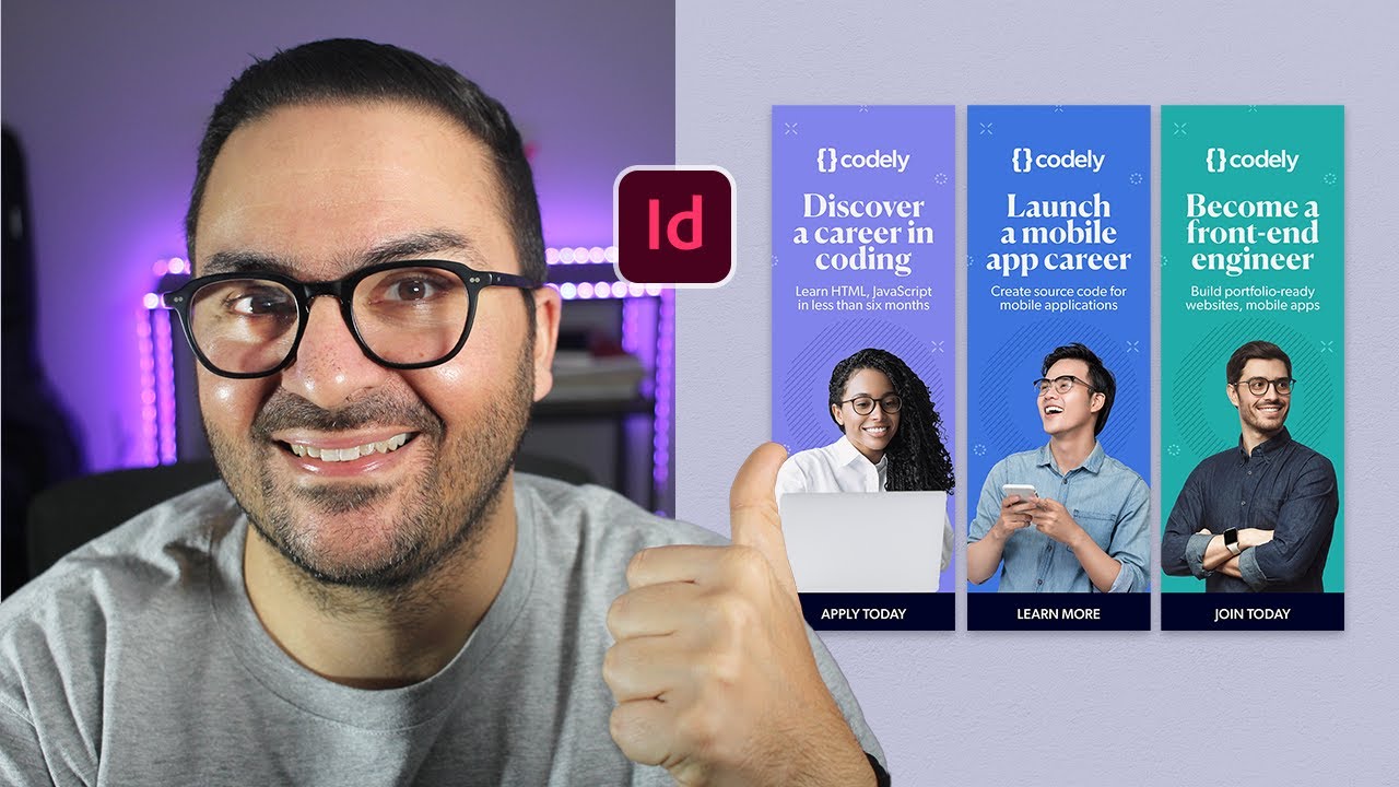
Follow along in this #Adobe InDesign tutorial and #learn how to use Data Merge to import a data source file to a project.
In this video, learn how to:
➡️ Design a digital ad template
➡️ Import a .CSV file from Google Sheets to InDesign
➡️ Create a Merged Document
➡️ Batch export the digital ads as .PNG files for final production
Lesson notes a...
Im going on pc to try this
Amazing.
Just trim transparent pixels on each product image and make it fit the rectangle.
Place image links in csv, specifications and boom.
Thank you for this.
If I am in hurry I will 100% use this.
tysm, darkening the area was a huge tip, my text was not standing out at all
im using cinzel atm like you said a serif font fits like a glove
i like the style, what exactly are you wanting to do? shadows or something more
basically yeah and well, make them look more inline with each other
while still btw using different eye styles so yeah it is more of a creative question than a technical one
and your focus is the robot with glasses? or the far right
Can soembody help me
Can someone give me constructive feedback for this banner i made for my yt channel. its my first time using photoshop seriously and i need some help improving.


Rate my New thumbnail design Guys

I’ve done a lot of anime designs back in the day, the text could definitely use some work, the background is okay but the placements of everything seems off
I’m not sure if I can post links in this channel but I have some tutorials on headers and banners that covers that stuff to get you more head on with the topic
if you need it, feel free to hit me up!
clean! but in my opinion the rocket ship seems kinda small?
i kinda gave up on it because i couldnt find one that i liked, couldnt even find a realistic one
don’t give up on it
trust me, fight through that struggle and finish that project bro! You can replace the rocket ship maybe ? With someone else ? Maybe that robot that be on the moon
Moon equipment
It’s other options for sure
ill probably try it later, thanks
Gave +1 Creative Carma to @next barn (current: #904 - 1)
im very uncreative so i dont think of those things
nah man, trust me practice, practice, practice! you got it! The robot is called rover also!
ty !
The lighting, the quality of the project is clean and good, you can definitely replace that object and finish it , let me know when you’re done ! Would
Love to see the end result
for sure
Hi, any feedback will help me alot 🙏🏻

Clean !
Hi , any feedback will help alot 🙏🏻
Thank you bro , any thing in your mind that will make the design better ?
Gave +1 Creative Carma to @next barn (current: #582 - 2)

Thats insane
thanks bro
Gave +1 Creative Carma to @trail gale (current: #905 - 1)
yeah i feel like replacing the rocket ship gave it more personality
this is my first project of photo editing or whatever u call this
yeah same
idk i think i like the dog better
i love dogs
thats what i was sayin

Photo manipulation ( Composition)
That's perfect by the way
really? thank you
the dog mask gave me some trouble
somehow turned this image into that

One thing that I'd suggest is the back of the dog is more darker than the back of the astronaut
i removed the bg of the image and removed the womans face, and then turned the mask horizontally and warped it to match the shape of the face
Oh that's weird 😂
Bro your literally almost a full on professional
😭
I wish i could do sh like that
nahh im still new
my knowledge capacity maxed out rn
But it turned out to be good somehow ( An astronaut dog )
i watch alot of benny productions
yeah the dog clothing/gear is ai generated though
It's a bit weird when zooming but It's not noticeable on the normal size
yep i noticed that
Good work , Keep it up
thank you!
should i use another vehicle? does the vehicle placement fit? or should i use a military truck instead? going for a soldier / tower theme going on here

Made this thumbnail for my fighting game YouTube channel
?
where its at


it need some work to be honest
Feedback
the simple black text color needs work, the font is okay though, try to add some text styles and effects maybe?
Hate when people say needs work and don’t follow up
dang
can i type it out
i wasn't even finish typing omg lol
you replied 5 seconds after my message lol
anyways
the palcement of the characters seem okay, the "VS" sign with the effect in the back could get replaced
the thumbnail is not very clickable i could say, maybe try a different style, different ways to do it, i made thumbnails back in the day

try to include some glo
outlines and stuff
its many ways and stuff to edit that thumbnail but i hope my info helps
Not bad.
I made this on the iPad. Not sure if photoshop iPad version has it
Thank you . Sorry about my fast comment. Some people are dickheads and just comment / say haterish comments but don’t follow up. Sorry
Gave +1 Creative Carma to @next barn (current: #429 - 3)
This is my first project in Photoshop, can you give me Some feedback?

just testing out if i put a soldier here the image of the soldier was not HD so its just a place holder

It looks cool
for the positioning in the design
But I think the blending needs more work
yeah so i replaced it
i am working on blending a new one thats more high deff

about to work on a better shadow and make him look more defined onto the gound
does he look like hes making contact with the ground? any idea around this?

Technically the light should be touching only his head and some specific parts of the hand and leg
So the shadow feels strange to be that big
Also he should be darker than that I think

Looks nice . Tell me more about it
also added fire, and some light source from the fire that goes onto the truck side and coming from behind the car also, and a puddle on the floor

what i got so far with the project, still need to add something in the spotlight, add some smoke for the fire and around the surrounding area, and need to clean some stuff up, im gonna take a stop here, any feedback i would love to hear ! thank you and goodnight guys ❤️

Any feedback? I went for like a vintage look


clean!
Nice details , And I think this is your first one so good job
You'll be able to blend things better in your next projects , But as a first time that's good
Rate from 1-10

Would definitely cop this! Looks phenomenal
💪🏽🫶🏽
I love the clean design, the color choice really stands out too
solid thumbnail
8
Thanks
Gave +1 Creative Carma to @next barn (current: #343 - 4)
Hey, I am working on a wanted poster for a cosplay. I came up with this, the Grey box indicating on where the pictures should go. Any feedback is appreciated, I want to make this look as good as possible, be straight up with me.

Presumably a star wars / cyber / Mass effect theme?
Yes, the game takes place in sort of a space/fantasy setting, I looked online for some inspiration.
Um, since you're after genunine feedback, I'm not convinced -partly because I know how poor it will likely print out.
What are you going to do with it? Print it and take it with you?
No, it's not going to be print out. Just put up on Instagramm and other social medias.
If you think I've made trash, tell me, but please tell me why it's trash.
Wip update

What do you think of this version ?

Nicer! - sorry had to go to make food for my girls. - I think a huge part will be dependant on the image used too
Like I'd have gone for a slightly different futuristic neo "datapad" look...


Don't worry! I would probably have gone for a datapad based look if I could. This is my first time seriously using photoshop, I think the idea is cool but I am totally lost on how to add depth, will take me some more time to get there :).

Anything else you would recommend I could change given my opportunities ? Once I am done with exams I'lltry to get further into photoshop and editing.
Hello jojo.
This remembers me the frist movie posters i did for indie movies
I can say one or two things that maybe can help you.
Frist- When you add puddles and reflective materials, always remember to make the color and light match, for example that puddle you added, in my opinion could reflect more of the sky, , you can also add more mud and reflectivness, in the floor, then you can also add reflected fire, wich gives more texture to the scene.
Second- The fire, remember that when you have fires, the shadows close to it, will be very harsh and long, it also would help to give a orange bloom to the smoke when you add it.
Third- remember to add shaddows in the soldier, and specialy, the lower vignete, you want the attention on the soldier, so you could add silhouette to it, by expanding the light from the search light, and then, maybe with other fire, or reflected light, you can create a sort of halo only in the upper part of the soldier.
4- The sky, can be a litle more busy, you can add some zeppelins with search lights, a bit like that old batman cartoon intro, or a couple of birds flying away, just to add a bit more texture to the sky
5- you can also add some fire or more damage to the buildings behind the main action
6- the color scheme, being blues and oranges, its a good mix, but you can in some areas turn the blue into a more greenish tint, before fading to black, this can create a better sense of depper shadows in the cold areas
Im pretty sure, you already though about many of these things, as your work is still in progress, and many of these things are steps more for the end part of the edit
Hope it helps
looking for a constructive feedback, thanks in advance

thank you so much
Gave +1 Creative Carma to @tough socket (current: #905 - 1)
this was very helpful
i only knew about the fire having to be wroked on, thank you for everything else though! deff helpful information
will update and see results from all the advice i got
this is okay, but the font at the top is kind of like off to me, the glassy texture square in the middle is that supposed to be there? i cant really see the end of juice under fresh also


15K Followers, 530 Following, 115 Posts - See Instagram photos and videos from GRAPHIC DESIGNER (@znation001)
I saw a cloud coming used ps to try enhance the dark and light but not sure if it’s like banging banging


Any feedback ? Its my first project

I feel like the figure’s shadow is too long. To cast a shadow like that, the sun would be very low in the sky, and the rest of the scene doesn’t sync with that. Good work though. Keep it up 👍
wow IK IT GOOOOOOOOOOOOOOOOD

please share your constructive feedback on designs


Looking for feeback on my website and my products. Looking for opinions on mock ups, product shots and designs

the water on the right top side you can see the edges of the mask
thanks
Gave +1 Creative Carma to @sacred eagle (current: #905 - 1)
also you should make the light point towards the bottle instead of just the entire scene being lit up the same
i didnt added any light anywhere, could u please me to correct it, as i am new
SO nice
I'll try something out in an hr I'm busy rn
no problem, thank you so much for telling me my mistakes
in my opinion, i think it’s solid, straight to it, mockups are clean, and the website is straight forward and easy to navigate through
if you wanna add more you could do like a different selection of clothes, you know like have them organized under “shorts” “hoodies” “shirts” maybe add some more graphics to the back of the white background and blur it out to make it come to life more, overall i like it though
heres a simple addition, but another problem is the actual composition.
the placement of each graphic do not compliment each other very well
viewers naturally read what has the bigger size first, along with reading from top to bottom, so i recommend putting the drink in the center, and changing the size of the graphic in order of whats more important.


also try to match the lighting of the bottle with the background
@sacred eagle Thanks for the reply, with a clarification regarding the design principles, I really appreciate it
@subtle saffron if you can change the ratio of the actual poster to be more height than width instead of it being 1:1 then putting the graphics from top to bottom would make more sense by the way
@sacred eagle I took the size 1080px by 1080px, what dimensions you suggest
@subtle saffron whats the poster used for
I am a beginner, saw the tutorial and tried it, without thinking about all this😔😔
so its just an example
?
if so then it doesnt really matter, but in the future learning about compositions is key if you want to product advertisements
You've got some great elements here and your colours and contrast are great. Nice work.
For me your backgrounds overpower the products. Perhaps make the bottles larger. You could also perhaps replace part of the background with a big block of solid colour.
Rate this

Looks really cool, i really like the colors + fx, nice job.

Thanks for the right guidance, any youtube channel or any book can you suggest to understand the concept of design principle, i am so thankful to you..
Gave +1 Creative Carma to @sacred eagle (current: #584 - 2)
Thanks
I wanted to give the glass frosty background, that y i chose it instead of solid background.
Hey guy’s pretty new to PS, only started about a month ago and Ive just tried to learn as I go only searching a couple YT videos for help along the way. Ive only made some simple thumbnails for a sports podcast I do but I wanted to try something new and make some player edits so please let me know what you all think!


Thanks bro
Gave +1 Creative Carma to @plucky badge (current: #906 - 1)
How much do you rate this one that i made in hurry 😅

No worries. Thank you.
Gave +1 Creative Carma to @subtle saffron (current: #906 - 1)
I think you could still use this background but personally I would make the bottle larger and surround it by something like a large glow to help it stand out from the background.
I like it.
Personally it feels a little busy. I think removing a few elements would actually make this design stronger and more engaging.
Looks cool. Can you provide some context?
Ok, got ur point
For a first project this is amazing. Congratulations.
I would explore some different crops. Perhaps one that takes out a little of the sky.
You might want to look into the “rule of thirds” This is where lines such as horizons are placed along the thirds of an image and main elements are placed at the intersection of different thirds. Placing your character at such an intersection could help strengthen the composition.
Again, great work.
Cool
something like this?

If you are wanting your character at the intersection of a vertical and horizontal third I think you are off a little.

Just a wasted shot I got while doing some pics for farmers field to check for crop destruction just wanted to see what you guys thought about it as I also run an instagram account and only like to put best of the best on it
Any feedback to improve next time?

It’s a great shot.
Vignette size and darkness is an extremely personal choice. For me the upper corners are too dark and fall off too quickly.
Is this the original crop? If not, would you be willing to post the original?
Nice composition.
The moon is very bright in comparison to everything else. I appreciate that this is a night scene but I would raise the highlights at least in a few small areas just to help balance the scene a little more.
An extremely rough example

I see, thanks for the feedback
Gave +1 Creative Carma to @abstract oxide (current: #17 - 126)
No worries. Best of luck with this and your future projects.
Thanks
Is the galaxy ok? I winged it and dont really know if it turned out good
You are obviously going for something artistic here so it’s really personal choice.
Along with brightening a few patches of stars, I would also darken a few patches of sky to increase the overall contrast. Again, personal choice.
I see, thank you
Gave +1 Creative Carma to @abstract oxide (current: #17 - 127)
Thanks again
Gave +1 Creative Carma to @slow sparrow (current: #906 - 1)

I feel like all the clouds should be in the background. There are some in front of the bottle

PROBABLY PG-13 photo. This is for an Etsy someone selling earrings, would appreciate any kind of constructive criticism/feedback

I think any kind of blurring the middle would improve it.
ive also told my client the same thing but he refuses that want to have thumbnail like that haha
Variation #2

If this is an ad to promote juice, the product needs to be the star of the show. I would reconsider it's placement in the composition (the rule of thirds is often mentioned in this channel). And even though the light source is above and behind the product, I would take some artistic license and brighten up the label. You want to viewer to have the image of that bottle etched into they mind. The swirling stream of juice is a nice idea, but think about how you might re-engineer it to avoid running across the front of the bottle. The overall effect is nice. Just needs a few tweaks.
thanx @cosmic brook


I feel your pain mate. We've all been there. Best of luck.
If the distant city is in focus but the cards are not, shouldn’t the faces also be out of focus?
Nice compositing. The shadow where the bottle sits on the ground is nice work.
For me the pieces of kiwi fruit in the swirl should be larger compared to the bottle.
Thoughts on this shot/edit?

Hello everyone! Your feedback and comments on my new design are invaluable to me 🎉
** https://www.behance.net/gallery/204180577/NEOGAMES-Game-Shop-Design **

Sorry, but that was actually my first thought.
😋

on the line?
the cards are falling
i might blur the background as a regular blur, the cards have motion blur tho
Yeah, anything to help feather the edges of the transition in the middle
Is my amateur opinion
nah thats a good suggestion
The Joker and the Jack are different cards. Not the same. :)
ik 💀
it just felt weird to make harley queen and not make joker jack
Using that logic, the Joker should be King though.
This is how I interpret the blurring. The cards appear to be generally blurred which suggests they are out of focus. If you want to create motion blur, perhaps only blur them vertically.
i did.💀
i might change it then
to queen and joker
What filter did you use?
just regular motion blur
put it at 8 intensity
-85 degrees
which is vertical by slightly to the left
One option would be to use an even stronger blur on a duplicate of the cards. You could then use blending and masking to have the blur stronger in particular areas more than others such as the trailing edges.
Any possible thoughts on this? quite new to photoshop and excuse the quality getting downgrade

It's looking good for a new user , The only that I'll mention is that the shadows are too wide in my opinion
I agree
I love the color scheme though
The blur effects on the text in my opinion is kinda throwing me off a little but that’s just me!
Other than that i think it’s solid so far
And one other thing I would recommend is to make the player faded from below instead of this hard edge
I cut out an image of a tomato and edited it on to the cutting board but it feels out of place somehow. How can this composition be improved?

made this graphic shirt design for my friend any feedback?

he wanted the full name but I dont think it fits well
it feels like it’s there
but it also feels flat in a way
yup thats what it is
ill have to figure out how to prevent that
no no that helped
i couldnt put my finger on what the issue was but that got it
feels like a kitchen light overtaking the entire image
then there’s a random shadow that shouldn’t really be there
seems like there’s 2 light sources
but the lighting would still be off if there was
i see what you mean
the shadow is completely different from what the cutting board's casts 😆
hey chris do you think you might be able to help me with a problem I'm trying to solve. Total photoshop noob here.
I may have just been doomed by the cutting board image
the shadow seems too big and too small and too dark and too light no matter what i do


It’s looking a lot better. If it were me, I would add a little edge, highlight on the green stock towards the light source and extend the soft shadow more towards the bottom right hand corner of the board. Perhaps also add a slightly brighter, soft highlight on the top edge of the tomato towards the light. That being said, at this point, it all gets a bit subjective 🙂
Rate?

I like it! If there is one thing that catches my eye, it’s that the background blur is uniform across the whole street scene. if this were a real photograph with depth of field, the foreground would be less blurred and the background further away buildings, more blurred 🙂
can you rate my thumbnail please
Thank you so much, i will definately try that!
Gave +1 Creative Carma to @raw wadi (current: #29 - 68)
bro can you rate my thumbnail or can you give any suggestions abou it
I would personally look into improving the light sources and highlights. + Thumbnails are supposed to be creative and eye catching not realistic, so do what you want and be creative. Unfortunately, I'm not qualified to give advice for a thumbnail design so take it as my personal opinion. That's all that i can give right now, but if i find more flaws then ill be happy to update my advice.
I have no skills in thumbnail design, so not really the person to rate your work.
I've always had difficulty with the text, any suggestion?

the text is good wdym
whatchu guys think

Hey friends! 👋
I’d love your constructive feedback on my latest design. I'm still a beginner, so any tips on how to improve would be awesome. This is just a practice piece, but if it turns out great, I might use it in my portfolio. Thanks a ton! 😊

Very nicely done. You’ve come a long way very quickly.
I like the thin elegant font you’re using. However, I think it might be a little hard to read in the lower left corner.
I appreciate that the discount offer is meant to draw the eye but for me it is too dominant compared to everything else.
Again, great work.
Thanks for the feedback, noted your points, will do the required changes. Thanks once again
Gave +1 Creative Carma to @abstract oxide (current: #16 - 128)
Thank you. These changes certainly aren't "required". Just my friendly personal opinion 🙂 Keep up the great work.
Gave +1 Creative Carma to @subtle saffron (current: #585 - 2)
The red glow around the red text makes it harder to read. Might I suggest a darker "glow", something like black.
thanks!
Gave +1 Creative Carma to @abstract oxide (current: #16 - 129)
No worries
what about this

waiting for my client to pay me
waiting for him to pay me
he said poster type
What do you guys think

It would be helpful to know what the context is here. Are you looking for feedback on the Photoshop aspects of the composition? Are you looking for design feedback? I need to know more about what you are trying to say here, and who is your target audience.
no context = no help :((
This is for my youtube video its a documentary
would u guys click on it? what would you guys critique
Both for photoshop and design
mine is simple and i gotten like 1k views on my first videol
I checked it out
good job
I just got monetized I already made 100 bucks I just need to wait for payday
@vale parrot
?
I checked out your video
Ive been learning a lot
about thumbnails
and photoshop
I am really trying to get good at this. I just watched a pen tool tutorial I am a beast
?
ok?
it was good
thanks
do you edit for other channels
yes for 20$
How long does it take you to make?
thats good it takes me a while to edit videos
I think I just need to practice workflow and shortcuts
in premiere pro
do you like my thumbnail?
should I make the text bigger
Look at the difference a simple camera raw filter did


please share your feedback


personally seeing his body just vanish mid area does not seem right, if it was like emerging out of somthing it would have looked better

personally i would have made one of the 4 images more bigger, and not the same size
im having a hard time trying to read the bottom left text , it might not be same case for everyone
random chain on top and bottom was that necessary?
and the distance between them does not feel consistant

i like this compared to the other one , cant seem to find any fault tho great work
Why is there a pointless cloud in the bottom left
thats a good question
I would recommend flipping it so that the cloud is covered where the time would be on thumbnails
actually, there was an text on center
but i wasnt able to find the right font
so i just gave up, and removed it, filled its place with another thing
but it looks good. I would click it
thanks brother
yes


Rate this thumbnail design that i completed just now

The colour, contrast and individual elements are all excellent.
Personally I would try and simplify the design a little by removing something (if you can).
Both designs look great. Nice work.
I feel like the darker green version is slightly too "heavy". Perhaps raising the mid tones and highlights a touch could help.
I like the black and white look. A few random thoughts…
- Update the Photoshop logo to the current version.
- Perhaps reduce the number of schematics and enlarge what remains.
- Is there any particular reason the head is cut out from the body?
as i said before, i made this design, few years ago
ill fix it recording to your thoughts.Thanks for the feedback.
No worries and thank you. Best of luck with the edits.
Gave +1 Creative Carma to @spring sequoia (current: #908 - 1)

It does not have to be 100% realistic, but any ideas to make it more pop up bit yet havinf these neon glows?
hard higlights
Nice design mate.
Just raising the midtones and highlights a little makes a big difference.

Thanks.
Yes, looks way better.
I was sure I am missing something, tired eyes.
Gave +1 Creative Carma to @abstract oxide (current: #16 - 130)
I know exactly how you feel buddy 🙂
hard to understand
an idea I have would be to show a full pc and then show a pc that's 30% full and put an arrow
With 3 secret ways underneath
Or a file with 1tb to 100mb

Yes
What i need to be remove ?
Nothing specific. Everything individually is good. Just remember that the thumbnail will often be viewed much smaller.
I already tried it on a website where we can see all types large , small and very small but still understandable


Yeah it is, depending on how their used ofc but one thing you might do is make the colouring on the last one match the others more, to me it looks like that ones more on the blue side of purple then the red side of purple/pink like the others
Unless that was intentional ofc
Thanks.
It is good to match as close it can be, but in practice, using camera raw at end is almost impossible to match it well, there is always something that will be different between images, except if you do not use camera raw on full image and take some elements after it is done, what I do for text usually, but still, depending on the background, some products on some images will be darker, more bluish, more redish and so on.
Well, nothing is perfect.
Gave +1 Creative Carma to @slim quest (current: #910 - 1)
COMMERICALIZED USE (made by me)

Yeah fs, that was legit all I could really see, they look really good!
I think there is too much noise in this image. Particularly on the bottle. Usually, with marketing photos, brand managers want the product, the labeling, the logo, etc to be crystal clear.
thanks!
Gave +1 Creative Carma to @wooden oak (current: #3 - 2192)
this way better?

I think it looks better without the noise. Don't you?
You could probably add it to the text if you really wanted but I don't think it adds anything to the composition. Just my opinion.
this is actually pretty good


not too sure if the shadow is coming out right just wanted some feedback
i i copied the image, made it all black, added a layer mask and made it in overlay
Shadow is ok.
Color balance is wrong.
Contrast is wrong.
Highlights should not look like paint.


💀
how do i make it better

optic rays mean light rays right?
like light beams from the sun im guessing?
ooo thanks actually
Gave +1 Creative Carma to @remote delta (current: #911 - 1)
added the blur to the shadow and looks much better

blurry bc its a screenshot btw sorry
you need show highlight in object
I know critics sucks to chew.
At the end of the day, you will find out I am your friend.
yeah i know dw, i’ll take any criticism on my art
you could say it’s awful and i don’t see that as a bad thing
lets me know i’m doing something wrong so i grow from that
i feel like the shadow is better now, highlights don’t look like paint although i’m not sure if they’re good rn, and wym by the color balance
Are you working with mouse or graphic tablet?
First thing is that you have bad photos.
And that is a big no in design world.
mouse
myb for late response
Use gradient map for highlights, you can't be precise with exposure, saturation or linear light adds with mouse.
Thoughts on my highlights/Shadows for my subject. Does it look good? Should I try and remove the left side highlights to make it seem like light is gleaming from the right


also these
I like it , You should spend more time on the light and shadows , also the mirrors
But overall it's not bad
thanx buddy


if you are trying to show mirror image left and right it is wrong, i think just put a normal bottle without the label to show its a mirror image
Hello everyone! 👋
I'm a freelance graphic designer specializing in visual identities and branding. I would greatly appreciate your feedback on my portfolio. Your insights and suggestions are invaluable to me, and I look forward to hearing your thoughts.
Thank you so much! 😊
https://www.behance.net/itslenkadesign

Behance
What should I change?

maybe put the albums list into two lines so it looks less squished
Thoughts on my highlights/Shadows for my subject. Does it look good? Should I try and remove the left side highlights to make it seem like light is gleaming from the right

you already asked this bro 💀
nobody helps me @toxic dome
Relatable
It do be like that on discord man I'm sorry
But you gotta wait
I think you've captured the "creep factor" in the image. I'm not a fan of the text, the design and layout. I also don't really understand what I'm supposed to take away from the text. OK. He's a creep. Got it. What does "Satanist" and "18 year old GF" have to do with the rest of it? There doesn't seem to be any connection between the elements.
Is the name of the documentary "Creep" or "Satanist" or "18 Year old GF" ? If one of those is the main focus, then that should be most prominent. Right now they all seem to be competing for attention.
hes a satanic predator/creep
Sinfernal Gaming | The Satanic Predator
is most likely going to be the title
Design elements should be appropriately sized based on importance... If "Creep" is the title then that should be larger. Other text would be smaller.

"Creep" is a better title "The story of a Satanic predator" underneath it. Just my opinion. Good luck with it.
mate to be honest , the font disgusts me , and i am pretty sure it does to most of others and i have no idea what are you trying to convey.
Its supposed to be a typewriter font. for a scary vibe
like they do for crime documentaries
What fonts would you recommend?
establish a hierarchy!
if this is used for subtitles in video, i kind of agree with your scary vibe, but on the thumbnail? a big no
you have to look it up yourself, mate. I havent worked similar types of work before
i will say one thing tho, this thumbnail need a clean finish

#📝project-feedback ' please give ur valuable feedback on my designs, thanks in advance


Made a fanmade album cover for an artist i used to work with in 2012 but he no longer makes music. It was for a collection of all his tracks. Trying to expand into more realistic/surrealist concepts, but i would like some input and critiques. Thank you in advance. Also, the pictures used are either from png sites (copyright free/free to use) or adobe stock.

thats hot
damn bro this is soo good
thank you 🙂
Gave +1 Creative Carma to @left sorrel (current: #280 - 5)
thank you 🙂

👍
Rate this

Looks good. Is it worth shuffling and scaling things a little to get that logo dead center?
Generally this is great.
The white glow bottom middle draws my eye a little too much.
Perhaps make the product a little larger?
Looks fantastic mate.
Yep, it’s just great.

https://www.myfonts.com/pages/whatthefont - Upload image. Browse results.
Identify fonts with our font finder tool using an image or photo. Upload an image, and we’ll search our collection of over 133,000 fonts for the best match.
hi, i feel like something feels unpolished about my design; any feedback would be very appreciated!

Nope i already tried it
looks great bro
if it was me i would change the font in the bottom and ad some sub - heading kinda ? idk tho this design looks neat , thats all
aahh okay that sounds good
thank you very much
what do you guys think of this design

Tha looks rlly good mashallah
I reckon u should make the footer a little bit shorter
And the Amazon logo seems abit squished not sure tho I could just b bugging idk I’m not the pro lol
Some texture on the text would look good
What do you guys think of this

It’s a logo for a charity but something looks odd idk what
I’m going to change the fonts I think
Any font recommendations?? Something with an Arabic Middle Eastern style but professional
What catches my eye is, all the shadows have a soft feather edge, apart from those cast by the right hand
Yeh I’m not sure how to fix that because the right hand is joined to the left lmao
Well if it was me I’d seperate the hands and build back the left hand fingers under the right, then add back the correct looking shadowing.
Or select the right hand, inverse the selection and then paint in the fingers and shadows.
Rate this Thumbnail Design

done it, i just had to seperate it lol

can anyone recomend a good font for this please
How can I improve the haze in the 2nd photo to match my first


no way, is that midnight racing

Just for fun. :)

What'd u do to the photo
For the elements to stay the same
Tree mtn extension of the road
Or is that a completely new photo
I'm so confused
It's ai I know but
Its misleading. Its actually a few different images. Composited. The car and bg are based on the original.