#📝project-feedback
1 messages · Page 12 of 1

Oww thanks
Gave +1 Creative Carma to @novel comet (current: #7 - 817)
what do i improve please|?


Have a lot more I wanna add but have a tight deadline too ☹️


If you want consistency between your images, perhaps tint the head in the background blue for Milosz Kozak.

thanks will do
Gave +1 Creative Carma to @abstract oxide (current: #21 - 92)
First time using photoshop
tried to make a movie poster out of stock images
What I did:
- edited images to look more cool (temperature wise) & bleak
- added contrast so images would pop
- added a second bg
- tried to show a story
I had difficulties with the man in the chair as to should i removed the background of chair completely?
And I think I should have left space for details in the bottom
What else could I have done?
How could I make it better?
How is it overall desgin wise and How can I Improve?

Now that I look at it the faces should've been a lot brighter ig
Not bad for your first time using Photoshop. Consider using fewer images and keeping the poster minimal. Also, try different fonts that match your poster style
Your poster inspired me to make one too 🙂

+10 points for guessing the movie theme.
(Which would be impressive, since I made it and have no idea!)
https://media.discordapp.net/attachments/1015656273716449370/1216139580919779359/image.png?ex=65ff4d3e&is=65ecd83e&hm=8c63eaae2c586518ef9f486d6451817dc162330eb6af1bcae337cba453e21667&=&format=webp&quality=lossless&width=494&height=279 anyone know how i can make this better?

give us some context, whats it for? and what needs to be included?
Damn i like that, and now this makes me question, whats the movie about, and why the bird lol
its a banner for a discord server related to a fallout country rp, all that needs to be included is the text (the server name) and some type of fallout background

i edited it a bit tho
heres the newer one
is that where your banner is gonna be?

yes
well actually
im gonna be making a separate thing for that
that image is for posting on other servers for adveritsing
advertising
okey, do you know if discord banner allows transparency?
pretty sure itndoesnt
Ooo
Sweet
Noted
I'll try that tomorrow maybe
hey im told the blood on the left looks fairly fake. i was wondering if anyone knows how i could make it look a lot more realistic?

i have some ideas but not sure how to proceed
This actually looks like a really good book cover
you could try to find good Reference Images, try Tutorials like https://www.youtube.com/watch?v=rnbbPcTEykI&ab_channel=EnvatoTuts%2B and work from there on. Have fun.
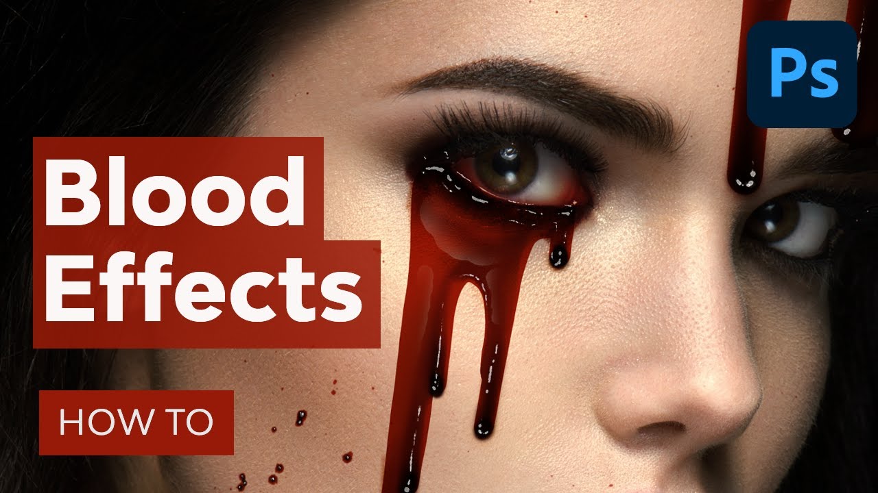
Learn how to make a blood effect in Photoshop! From realistic blood splatter to a blood dripping effect, you'll master three different types of blood effects. ► Or create an instant blood dripping effect with this Photoshop action: https://elements.envato.com/wet-paint-photoshop-action-65JQ4Z8?utm_campaign=yt_tutsplus_rnbbPcTEykI&utm_medium=refe...
Guys give your opinion about this composition
thank you have a nice day

i quite like that, can we see raw version
The Composing itself I like very much! You could perhaps try to adjust the light reflections a bit. The Person in the front (he is very unsharp, maybe try to sharpen) has bright light from one sode with bright highlights on the edges, but the moonlight would not be so bright. Also the plane in the background seem to be way to bright. The green light from that Cristall would be a very small bit visible on the side of the plane in the front/Nose of the plane.
If it should be a more dystopian Theme the Planes also would have more plants grown over them. Great job so far.
thank you for giving your thoughts. im still learning. i got bad judgement regarding light and shadows is there anyway i can learn about intensity of light, reflection, shadows, or any channel in youtube you can recommend to learn
Gave +1 Creative Carma to @normal spoke (current: #22 - 83)
here you go the raw version

opinions on which one looks better?

I would just search for "photoshop composings lighting" on youtube or any other Videoplattform and look how its done. Also look at some Live shooted Images. Also if you search in pinterest or images.google.com for "Iceland Model plane" you find that there is plane laying around on some desert vulcanic land and there are often Photoshoots and it kind of looks similar to your Composing a bit. So you can check those Images as well. Have fun.
As always: It depends on 😉
It depends on where you want to put that "Icon" Image. But also... On the left all edges are pointed. On the right only the nose is rounded, but the other corners are not. Here I would assume that all corners would be rounded, too. Maybe that helps.
yea i just rounded the nose to give it a more humanlike feel, would want to keep the bottom the same so might go with keeping everything pointed
Tp be honest, I'm no a huge fan of either. - What's the icon for?
logo type thing, would most likely be put next to some text
I know I'm being nosey here, and you can of course tell me it's private and none of my business, but what's the brand/name?

There may be a nicer way to represent it than literally 'a head'. - I usually see heads like this if they're talking about mental health and sometimes 'creativity'
supposed to be a personal logo for myself, its arranged next to typography of my name and kind of fills in the blank space since my first name has 3 letters and last has 6
and yea i wanted to make it feel more identifiable than a regular outline of a head, thought abt adding a brain at the top of the head to help visualize the idea of creativity but thought it might be too much aswell.
What could I add to make this feel less boring? It's for some egg hunt thing

you could add some curve to it like this

This was my reference image but unfortunately we were all told to use the egg template shape 😭
maybe add some bees coming out of it?
I have no clue
shape is really important for things like this
I know :( I might scrap the idea and pitch a new one to them. This was the previous one I made which they seemed to love:

that looks good too
ok so thoughts. i feel like it look to fake still, also see on the main building there the dark patches what would you think would be a good idea to blend it

So this is my first time asking for a feedback and also my first time doing this kind of edit 😄 pretty new to Photoshop and stuff, i kinda want it to blend more with background, but also stand out, idk tho? Maybe anyone has any suggestions?


I think you've done a fantastic job. Well done.
I appreciate that so much 😭
This made me hungry
looking for feedback on this one, any critique is welcomed.
last one is great
I've recently started getting into graphic design for an esports team and i am currently working on making discord/twitter banners for the members. What could be changed here to elevate my work?

I’m trying to make a poster out of this pic, anyone got feedback on this gradient mapping and any composition design ideas?


Looks nice. I love the colours and the font choice.
The solid black is a bit dark, I'd pick a slightly lighter shade.
Seems a little pointless having ZxC twice on there
Be good if SIX was a different colour
White background is nice and simple, but a bit more texture wouldn't go amiss
I'd maybe bring in a bit more colour, and make the NAME bigger - perhaps like this?

would love some feedback on this

It's not my personal taste, but that's just subjective. - looks nice.
It may be how you've screenshotted it, but everything looks very close to the edge.,.. Maybe bring it in a little more
thanks for the feedback man much appreciated!
Gave +1 Creative Carma to @novel comet (current: #7 - 827)
love the look of the version you made as well
ill get back to the drawing board with that in mind
yea thanks fr
Gave +1 Creative Carma to @novel comet (current: #7 - 828)
Love it, you could maybe make certain parts pop a little more with a couple red accents
Like maybe the cards are red
i wanted to go with a ghostly blue, you can see it a little bit
well if you look at the section 80 album cover 1s

the cards appear black
so i figured i'd keep a black 8 and black zero
which is why the cards are 8 and 0
I didn’t even know there were cards on the album cover 😭
i could use blue hilights on the bullets and maybe orange on the pills to make the color pop
Wait where are they?
i mean idk ab cards but the little "section 80" text looked like cards to me
Word yea it’s up to you
It looks nice overall. I think its a bit overcrouded with Symbols. I feel there are to much "80"th everywhere. I first thought the band is called 80, the Albumname "Section" and then I spotted Kendrick Lamar. Its not so clear what the main focus of the cover should be. Maybe bring the Elements more in the background and the Text more in the foreground. Also not mix different Textfonts. Hope it helps.
thanks
yea I only used 2 fonts
helvetica is just ultrathin and bold
and Vogue font
will try
theres a lot of 80
should i remove it from the pills in your opinion
ONE Font. ONE 80.
why not 80 up top and on the cards just wondering
the 80 on the cards feels subtle ish
ur right about hierarchy, it's hard to see kendrick lamar first
but they are to prominent in the picture. If yomeone held some cards in his hand as part of a poker scene or so it may work better IMHO.
true
how do i improve this


Maybe the mobile phone should be placed below the vehicles instead of on top.
1405 is interesting. But i'm not sure if there is a message. Not all the time but art usually has some message the artist wants to convey.
1405 ?

Ohhhhhh
I understand what your saying now
This is generally pretty nice.
If you are looking to improve this, review how reflections work with objects at an angle. Unfortunately the good old duplicate and flip doesn’t quite work here.

Any feedback? Gonna add the artists signatures but aside from that I think I’m happy w it

Kreative? I'd use the original spelling creative. Krew is ok if it's hip hop orientated but anyone else might think your english is your second language.
What 😭😭 I strongly disagree with this, plenty of brands use intentional misspelling
Looks like A-typical cd art if you ask me for critism. You should provide some music with the art ;) Otherwise it's hard to connect one image of the band on a couch and the style you have created.
It’s my friends band, they haven’t put out anything yet but are recording their first album rn
Here’s the full pic


Gonna post on ig as 3 slides
Hey. I just worked on rebranding. It was already named by the client.
I don't get what the website sells or offers? Is it just a blank template for someone to buy?
Video production studio
Updated:

would love some feedback

I made this photoshop a while ago, should I remake it?

Pretty, I would remake it with higher quality images so it's not so pixilated.
working on something for football team graphics, is there anything that i could improve on?

Strange to me the "VS TOWSEND HARRIS" isn't aligned to anything in particular. I'd expect it to be aligned left to the date and header, and aligned veritcally with TVF Panthers
okay understood
what could i addon to it?
Why do you feel the need to add on?
I think its missing something i just dont know
updated *

i might just be overthinking
Right now you have 2 levels of hierarchy, you could establish a 3rd
meaning?
cause right now it's GAME DAY and then everything else
MARCH 27TH 2024, VS TOWNSEND HARRIS, and TVF PANTHERS are all equal hierarchy
Nothing to tell me whats the next most important thing to read
Gave +1 Creative Carma to @pale sun (current: #852 - 1)
No problem! Hope it helps. It already looks great
hope you get it to a place youre happy with
tysm
Yeah! If you do, would be nice to see some of the pinks of the subject reflected in the enviroment
The Composing and overall Look I found very good. Maybe try to put some more 3D on the "Game Day" Text itself so that its pops out a bit more. On the right side there is a bit wasted space. There could be some more Info/Eyecatcher. The smaller Text I would space a bit wider so the from a distance /smaller screens it s a bit better readable. Hope it helps.
Yeah that’s what I noticed was missing
But appreciate it


Mind Calling Re-Branding (New Brand Guidelines)
2024?
2023 on your tv image. I would expect to see this on any flyer. The graphic's you used. But it didn't focus my attention much.
I can't read whatever it says. But if it says all 2023 tv on sale and 50% off then I'd find it a catchy add.
It says "Sale is at 22th and 23rd march, prizes are for this period"
Prize, off precent.
would love feedback on this

It has a cool quality to it with the halftone effect and bleached noise (or whatever). I don't have a lot of positive nostalgic feelings towards VHS tape but that is interesting anyway. :)

hi, this is my first time using photoshop for a school proj. i need to make a fake movie poster for a 'production'. i colored over names for privacy reasons. can i get some feedback?

its nice but i’d change the font
like which ones?
all except the one at the top
what do you suggest?
All Font should be the same. The tower of the church should be completely visible and not hidden by the cloud. Maybe try to blend with the Clouds. The rest looks pretty good.
ok thanks for feedback
Gave +1 Creative Carma to @pale sun (current: #549 - 2)
what are your toughts?

ok thank you for your feedback
Gave +1 Creative Carma to @royal coral (current: #405 - 3)

idk how to explain
the gradient map is nice it just doesn’t rly work ☹️
why is she posing in front of all those thrown out monitors? lol
Is it to less contrast?
hard to read. The Image itself I like. The Text should be more clear and visible.
There are some Butterflys, there is some words, there are TVs on a TV and some girl sitting on front of TVs, but ALl these pieces do not match, do not speak together, makes no sense together. If this maybe should be a Album cover or something like this try maybe put the Text also into the big TV. If the Butterflies should be a Theme place them also into the TV but don't let the butterflies obscure the text. That's very distracting. Hope that helps.
The black looks to dark to me, maybe use a dark greyish blue
Group 1 Production, equalize font as big as group.
5 acts in a row, bigger font, condensed.
Based on shakespear above romeo and juliet, half smaller letters then romao and juliet font.
Desarurate green and pink.
More creative background.
Game day above orange bar.
March bigger letters.
Orange bar bigger letters.
As many not considering people gonna read their banners, cards etc. on phone.
Be carefull with font size.
Better oversized on desktop then not readable on phone.
no this is just a poster for an album
the butterflies are her thing
It’s supposed to be for instagram,


how do i make these look liek actual products/movie merchandisewithout trying too hardd?


Looks cool. The displaying in 3D with the shadows for realism is a really nice touch.
This is a great design. Really nice work.
Perhaps make the people larger.
I would also keep the top of the building.
Again, great work.
The addition of a little shadow around the base should help a lot.
You also need to distort the text so that it matches the perspective of the packaging.
Where/how will this be used?
im hanging it in my room 💀
i just make little album posters for fun
this one i decided to make it a joke
yk
the other ones are a little more serious yk


i just make posters that i can hang on my walls and my friends hang them too or use them as wallpapers
Great work. I like your style.
Cheers mate. Keep creating cool stuff.
thank you!
im really new to all this stuff yk
ive been on photoshop since third grade, my dad just sat me in front of his computer and i just scribbled w the pen tool
but i had no idea how to actually use it until around last month or so
cus im only 15 u feel me
That’s awesome. Are you just messing around for fun or are you wanting to possibly do this more seriously in the future?
i mean im just messing around for fun right now
i wanted wall decor and my graphic design teacher (who doesnt rly teach, just supports me i swear his class is just study hall with pcs) has a tabloid printer
so i made the kendrick lamar one idk if i sent it
and then i just made more and i had friends reaching out trying to get me to make them ones for their fav albums
so i have a list of about 50 im slowly doing rn
i do a lot for myself though, doing yeezus as we speak
Nice. Best of luck with all your designs.
thank you!


seeking advice from all of you thumbnail experts, what do you think?

looks pretty good. However im assuming the label in the boxes is the same one? So you need tomfix the way the text looks on the top of the right hand package.
Updated

Looks good.
Personally I would move the guy up or make him larger so that his eyes sit higher (rule of thirds)
I would also move the arrow away from the very edge.
so this is the rule of thirds right? and i basically have to place the more important objects where the line intersects?

Exactly mate. You certainly don't always have to follow it but it is a great guide.
great, really appreciate your advice
Thank you
Gave +1 Creative Carma to @wooden whale (current: #110 - 13)
I think the guy looks good in black and white but I also think it works in purple.

hmm, interesting idea, tho shouldn't the subject be more contrasting?
It’s totally up to you. If the main focus of the graphic is the text, you could argue that the guy is really just a supporting background graphic.
Again, what you've created is great. I just love exploring options 🙂
you think somethign like that would suit better?

I like the bottom fade but I’m liking it a little better without it. Feels a little stronger without it to me.
i think the black and white version + the fade makes a nice combo

Personally I would lose the hint of colour on the money at the top. For me it takes away from your design and I think it's stronger without it (see my example).
It’s looking great mate
I'm signing off. Best of luck with the project.
Which one do y'all prefer?
Any feedback/ideas?


looks good, I would underline “in 24 hours” and make it maybe 5-10pt bigger
other than that looks great
this looks great

I would prefer the one with the colorfull Text in the Background. Nice work.
I like the Head Composition with the Tools and the other people in the Background. The black Text does IMHO not fit so much and do nothing really ad to the Image.
ok ty bro
Gave +1 Creative Carma to @normal spoke (current: #22 - 84)
u think i could participate in this 10k giveaway 🙏
yes but
have u ever seen the life of pablo album cover

I would just try making the which///one smaller and repeat like how the cover does, imo I feel like that composition would work better
Otherwise the depth is super sick
Thumbnail project 3/6, what do you think?

perhaps this silver effect goes better?

Sorry for my late reply, I forgot I shared the poster 😅 I really appreciate the feedback. Luckly, I haven't worked on the poster since, and will keep your feedback in mind. I realize that a washing machine has little connection with the series, and it wouldn't be an effective element to focus on when it comes to marketing. I think I will complete the poster by the sketch, with the washing machine in focus, but will give the series another shot with another poster. I'm going to add more elements that relate more to the series, and will change the colors to fit better. Thank you for your feedback. I'll post the final result when I'm done ;)
Gave +1 Creative Carma to @warm delta (current: #24 - 79)
Well, if you wanted to copy a that kind of composition then you have reached your goal. If you want to do a bit better you have my suggestions for improvement.
hey
i was pinged here
yet i cant seem to find the mesage
Shiny metallic and "ancient" do not go together. I would avoid that combination.
consider something carved?

someone gave me a brilliant idea and i kinda copied it xD

either that or this

You are on the right track. Those are both much improved.

i made it for a streetwear tee......How is it ??

made this for one of the indian fan....
alr cool thanks!
Gave +1 Creative Carma to @normal spoke (current: #22 - 86)
the font doesn't really match the vibe of the thumbnail, and the composition could be more balanced
that's not bad

I would make the guy and the mummy a bit bigger though
rn it feels like there isn't one element that's more dominant in the thumbnail
the guy should cover a bigger part of the screen

Thumbnail Project nr.4. Any feedback?

font is literally perfect wdym?
idk
thats hard ngl
Since the VR text has an outer glow on the outlined text, Id put that on the other text to make it stand out the same
could probably brightin the text a lil bit more
You could use something similar to that

Also I can invite you to a thumbnail design community if you want, it would really help you develop (it has helped me a lot)
Just starting using photoshop and that was something I wanted to make. Took me around 2h (having to find the picture for the background and statue). And I was thinking about posting it but would like to hear some opinions

dude thats awesome
if i was you i would cut the little gray bit here

hanging off
it would make a cool effect
other than that, looks incredible
also possibly stop at the hairline and merge one into another? not rly sure
but thats such a cool idea bro
the main goal is to keep it a rectangle. I will try to chop it and see how it looks.
Thank you very much!
u can try both like ctrl z idk
just figured it might lok cool
I will try that, appreciate it


Amazing
thanks man
Gave +1 Creative Carma to @lean kayak (current: #175 - 8)
fire lighting
yuuh, plus i didn't apply camera raw filter's so with them would be bombastic
thats cool bro
i need to learn camera raw
but at least my posters are getting way better
thoughts? its a celestial/stellar concept... that background is moving

I like it. However to improve the readibility you could perhaps increase the tracking of the text and or make the front or side of the 3D text lighter or darker to improve the colour contrast.
Npp

youtube thumbnail

too basic imo
also try not repeating the title on the thumbnail, rather use text that compliments the title, or adds a twist to it
here are some examples of what I mean

how plase help me i have beg problem with text
Use a different font
would already look better
montserrat black looks really clean
thanks for your feedback
Bold colour scheme. I like it.
It looks like you have horizontally compressed the person.
what abut this thubnail

The horizontal compression of the person immediately jumps out at me again
what is that mean?
You've squashed the people
hahahahah i dont know what exsctly you want to say but thx

??????
Your original is on the left. The image on the right is stretched to show what a "normal" person looks like 😉
I’ve done a lot of work with images over many years so this jumped right out to me. Truthfully I don’t think most people would notice it.
I still think your design is solid
yes yes you right
As a result of this, I have a problem with Photoshop, where when the person changes place, I have to control the body. I hope you have a solution
What do you mean by "changes place"?
When I try to reduce the image of a person without messing with the size of that person in the image, I cannot. Is there another shortcut on the keyboard?
because i use ctrl+t
Depending on the version of Photoshop you are using, do, or do not, hold down the Shift key. When you do this while grabbing a corner when resizing, you can not distort the image.
ohhhh thanks bro i fix it
im new in the adobe photoshop that why i dont know like this things
and i have a lot of qustions
Great to hear. For a beginner you are knocking out some great designs. Keep up the study and best of luck with all your designs mate.
When replying to someone, might I suggest you use the Reply button next to their comment. That way we better know who you are addressing.
i've put my friend at the Anfield stadium, this was made just for fun :))


any suggestions to improve ?

Great. Perhaps make the edges not quite so bright or sharp to composite him in better

thanks for an advice, ill do that
Gave +1 Creative Carma to @raw wadi (current: #55 - 32)
Okay bro
I'm just looking for some quick advice since I don't consider myself even a beginner designer. Would I get away with a seif font as shown in the example or is that a big no-no since I'm using a blocky font in the top left???

Given the design you have going, I would probably choose a different font. Probably sans-serif.
Thanks, but not necessarily the same as the 'Cathy' one???
Gave +1 Creative Carma to @wooden oak (current: #3 - 1795)
I'm assuming "Cathy" is the header and the Example Text is some other data. It might better if a different sans-serif font.
yeah you got it, there will be a bunch of buttons/options there
for example

the bigger text is actually nicer as it stands out more, but that was just the first one I grabbed
Try out some different ones and look at them side by side.
just did this poster for an artist from my country, any feedback?

personally I would even out the tracking on the ALBET and put a small bachground glow around the letters so the E stands out over the trousers.
The Design I like. But try not to "cut Text and/or Face into pieces that distracts from the goal of a poster. Also tray maybe put something explainatory what maybe some songs are about in the empty space.
it's evenly spaced out it says "Albert" but the r is not visible
wouldn't that make the design a bit too cluttered? also i felt like adding those boxes makes the poster more intresting to analize and to look at, maybe it's just me
Ah, best add that black glow around the letters 🙂
just want to check - does the hand icon convey a clear meaning? I'm open to suggestions on how to format this 😄 When the player hovers over the verbs I am thinking of making the words outline in a black.
The squares are inventory slots. The long rectangle is where text is going to appear.

I played around with putting the verbs on buttons but it looked a bit weird next to the flatness of everything else
(ps - not sure why but there are weird pink/blue lines, ignore those, must be some sort of PS glitch)
Hello everyone, this is the Before and the After of this picture, would you guys mind giving me some feedback please?😅, I tried to keep it as natural as possible


I'm not professional in this at all, but in my opinion the hand icon doesn't stand out that much, but it's just my opinion, try to look at what others say too.
would you understand what it implies if you saw it on the screen, though?
what I'm getting at is I'm not sure whether to replace it with text instead....
Looks good to me. Was that done using some of the methogs mentioned here?
https://www.youtube.com/watch?v=mtMBFMBsQqw
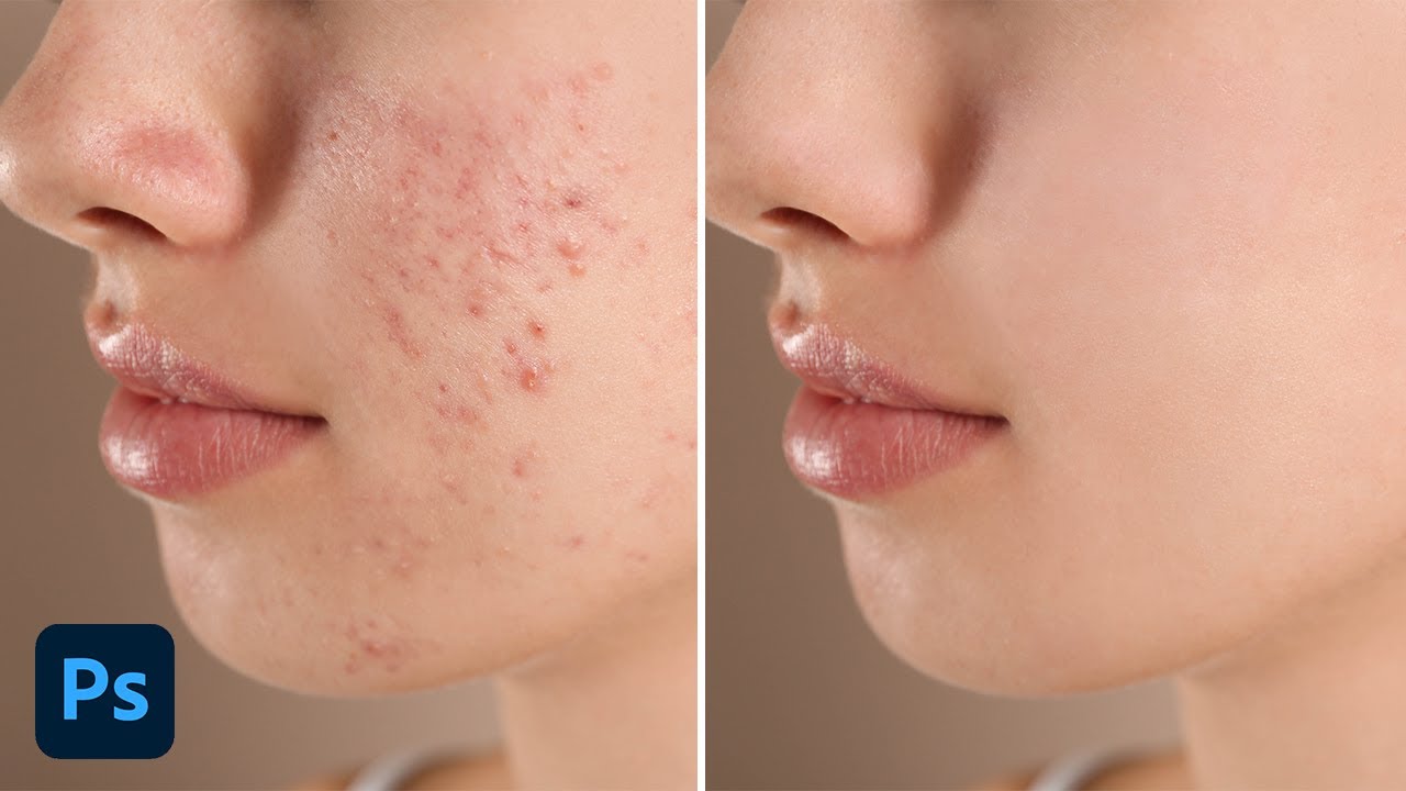
Get My FREE Ebook To Help You Master Photoshop: https://learn.bwillcreative.com/the-photoshop-blueprint-ebook
Learn more about tools to remove blemishes here: https://www.bwillcreative.com/how-to-remove-acne-and-blemishes-in-photoshop/
-----------------------------------------------------------------------...
I kinda think each word needs to be in a consistently sized BOX/BUTTON?
Although, to be fair... it's not that necessary
#SimonTheSorcerer

I tried that before but honestly it comes off as very rigid and too formulaic
great game btw 😄
Your way works whilst all words are nice and short, if they fell out of the 'grid' style you're working with, I'd be more concerned.
yeah I shortened 'talk to' and 'look at' as they really didn't need the extra words
e.g - it would suck if you changed the word PUSH with "INTERACT" since it's too long then!
I just don't want players to try everything except the hand icon. I was going to just have the word 'TAKE' but then it ruins the 4x4 thing I have going on
Oh I didn't realise that the hand was a 'button', I thought it was decorative. - which is probably a problem.
exactly!
so I need to find a way to get that across
there is the added advantage that when players hover over the buttons they will 'light up' so to speak
but yeah if people don't realise that it's a take button then it isn't going to work
so I'm not sure what I could do
No actually I used the healing brush if I recall correctly and corrected it by hand, I know they added the remove button but I prefer the healing brush more
And I didn't try to smooth the skin or anything, this photo was supposed to be as natural as possible

Looks nice honestly
(I'd make it idiot-proof)
😅🤣
Do you have any tips for retouching?
I mean if it's someone under 12 or 9 probably no, but if they played many games similar to it or games in general yeah, like it depends on the audience 😅
Guys what should I try to learn in Photoshop now?, I'm kind of lost
Use the Learning Links IN photoshop 🙂
Thanks 😅
Gave +1 Creative Carma to @novel comet (current: #6 - 840)

Learning photoshop (or many things really) is just learning lots of tiny little simple techniques....
Which can all be learned within a few minutes each
....and then you just bring them all together when doing a project 🙂
Oh this was a previous response to a similar question:
#🤷career-advice message
Well thanks again
Gave +1 Creative Carma to @novel comet (current: #6 - 841)
I did it a bit more, and I think the pixel font works better. I need to put the options button somewhere, and I'm thinking bottom right then leaving the top right empty. What do you think?

I don't know why it ended up looking so horrible (it was my first time doing this)
If we put the button near the talk option and a bit down wouldn't it look good? I'm not professional in this though
It looks so weird I should have watched a tutorial before this
yeah I'm not sure there's much choice like this 😅
It's probably because they don't have any connections and I wasn't sure of what I'm making
What are you trying to do? First thing I always think about is colour palette
the text is too hard to read over that yellow
I was practicing so I wasn't sure of what I'm going to do
I should have probably planned it before executing it
always helps 😛
Haha
with my UI I knew I wanted the character on the left side, and I wanted the colours to match some of their clothes, so I just made a palette with 4 or 5 shades of red. It already had the white and black
the rest I kind of figured out as I went along
You are right the colors don't match at all
I was just playing around
Excuse me but do you have any good tutorials for this?
I've got an idea you can practice with - use this website and only use the colours you generate: https://coolors.co/
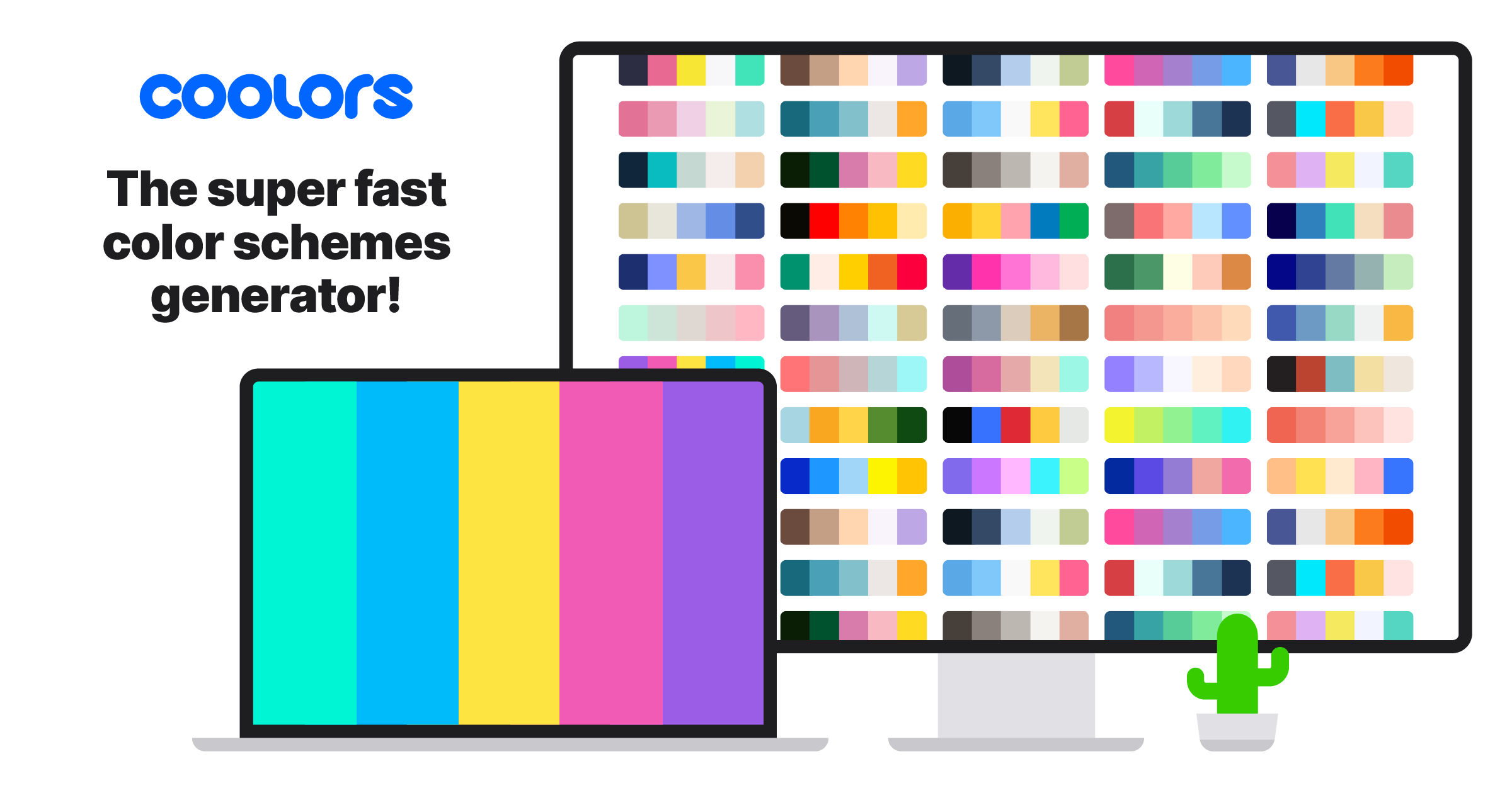
Coolors.co
Generate or browse beautiful color combinations for your designs.
Thank you so much
Gave +1 Creative Carma to @graceful raven (current: #854 - 1)
it's obviously very limited because you'll only have 5 colours but try to make something basic.
I've only ever made art in Aseprite and I usually have about 14 colours in my palette when I'm making items and characters
I understand, thanks for your help
it's already much better, but that text won't work on the right like that


True
You made it look like it's about 5:00PM
What color should I choose for it?
well you'll want something pale to go over the darker pink, but then that will become lost over the white-ish part of the image. For situations like that I just use some kind of shadow or outline effect
I honestly don't know how to do that 😅
I search it wait
you'll get away with white text, I think, just make it bold
Thanks
Gave +1 Creative Carma to @graceful raven (current: #551 - 2)
so like is it good or bad
its done in Lrc
this is similar to yours

Good in my opinion, but it's a bit subjective
Oh yeah
a nice drop shadow would go nicely, tho
yeah I downloaded this software 3 days ago
Sure I try to do that
what changes can I make more so that I can make that photo look good
Sorry I don't know much about Lrc

oh understandable
o_0
Yes? 😅
not-nothh-nothing
did u fr put my name on that o_0
Just a random practice of mine
It's my first time trying to make a poster it's not serious at all
Fun coincidence
lmfao
well I have no idea about photoshop
I just edit my clicked pictures
This is also one of my works in LrC

(I used a brush tool to make it all black and white)
thank you
I want someone to edit something for me if he has time
tyvm
Guys Please give your opinion about this Manipulation
Thank you have a nice day

this one is with atomospheric pressure

for atmospheric pressure: i added some blur, reduced saturation for distant objects. Give your opinion on which one is better


This is raw photo can anyone tell me what should I do in this

The fire in the building on the right , there is green effect, you could have made it matching the fire source
You can do a lot with a raw picture, add it on a persons hand or something, the question is very general, it depends on what you are looking for
oh oh oh
I am a lightroom editor
and I have no idea what to do
This is better in my opinion since it matches the moon light source
Oh lightroom, well im not the guy if you are looking for some good settings lol, you just play around and fig it out..
well I did play around but the photograph is like almost perfect so I have no idea what to do
You sure its raw?
Well lightroom in my opinion is used when the image just does not have the original colour that we see irl, if the image is good its not that necessary you must edit it
yea its raw
I understand that this is the filter that changed the color of the fire to this color
So you keeping it?
I made this about a few days ago, and just curious if there's any need to improve this

feedback about this thumbnail for fiverr thumbnail

This is a really good piece.
Personally I would move everything to the right. Currently a massive chunk of your image is the leg in the lower right corner.
I would also increase the contrast and/or darken the shadows.
Are you advertising your services on Fiverr? If so, nicely done.
thanks for your feedback
Gave +1 Creative Carma to @abstract oxide (current: #20 - 93)
i'd apply a gaussian blur on godzilla, i can tell he's a bit low res and it would enhance the close effect. Maybe a field blur with the blur on his leg to direct focus to the dragon.
Thanks mate. Keep the great designs coming.
Gave +1 Creative Carma to @orchid plaza (current: #856 - 1)
Here is my before/after. First time trying to edit a picture, so ye, what do y'all think


I am using lighroom btw
I like it. I think that darkening the background elements was good choice. It makes the focal point in the center a lot stronger.
yes i do that


Nice work. Are you editing this for anything in particular?
You are using old versions of the Adobe logos
Frankly, I did not care about the type of Adobe logos. I chose it to learn full control of the image using the Warp tool. This is my first design with this tool.
Frankly, I did not care about the type of Adobe logos. I chose it to learn full control of the image using the Warp tool. This is my first design with this tool.
Cool. Be sure to use the current logos when you are publicly selling your services.
broo who will buy my services yes because i use fiverr for 2 year but no one buy my services
broo who will buy my services yes because i use fiverr for 2 year but no one buy my services
No particular reason, I just like taking pictures and was thinking that if I wanted to post them on instagram or wherever, editing them would be better
I believe you will get even more high quality pictures, use ai to enhance it , i just dont think it would be good unless its more crisp
added a field blur and some extra textures on both Godzilla, King Ghidorah, and the planes

This is nice. The depth of field in the image sells the idea of the size of the dominoes very well.
Thanks for the feedback
Gave +1 Creative Carma to @raw wadi (current: #50 - 35)
I wanted to do the same thing with this one but it didn't work out 😔


hi guys just interested to share this stuff, this picture is not yet finished need bit of work.

raw pic without edit

the shirt is screen shot of a 3d model of shirt, and took spiderman mask to cover the face.
Thank you have a nice day
It's because of the composition being very vertical portrait and empty. Also the angle of view doesn't suit that degree of depth of field. Cropping improves it somewhat.

In the case of the caps, a simple blur at the horizon line helps sell the depth and makes the cap stand out

thoughts? this is with camera raw settings applied

Thanks for the feedback
Gave +1 Creative Carma to @raw wadi (current: #49 - 36)
i need some feedback on this

It looks great but the PINK can use other colors to look better
Also see if this video helps you out
https://youtu.be/GL-GmQaZHbs?si=4bJXrcs6eozZ4zJ3
Make Your Images Vibrant and Make the Colors Come to Life Using Saturation Masks in Photoshop! Learn how to enhance colors and still keep it all natural in Just One Minute!
Hope this tutorial helps. Thank you for watching :)
► DOWNLOADS:
Sample Image: https://drive.google.com/open?id=1ZTGSkfEStWmD7mkXufRw6f_aLgp7idpW
► HELP US CREATE MORE FRE...
something for improvement ?
i made this for a clothng brand based in india...


I like it. However you might want to adjust the contrast / brightness / sharpness of the text over the teeth as it looks like he has braces.
The effect looks really good. Nice work.
The text distortion is extremely strong in some places, such as where the shoulder on the left meets the background. You might want to manually adjust it in those areas.
The piece is really cool. Excellent contrast and I like the colours.
The head on the left could use some more highlights to make it better match the others.
The head on the right could use a little more shadow.
With the strong light source behind the characters, I feel like they should have some rim lighting.
The car and the character are both lit by very different light sources. I would recommend trying to make it look like they were lit by a common source.
Personally I would also more closely match the pink in the text with the pink in the car.
Thanks
will surely apply and improve....
Gave +1 Creative Carma to @abstract oxide (current: #19 - 94)

Sheelaa.com Brand Guidelines (Numerologist)


AMAZING for your first try!!! Glad you stuck with it!
This may sound picky but I’d expect the pencil to be the other way up 🙂
thanks so much <33
Gave +1 Creative Carma to @dreamy orchid (current: #195 - 7)
I think they are most appropriate for medical needs and your logo is clever.
how?
Hi...
Ermm, image 1 is a wallpaper, image 2 is the thing I made. It's not necessarily carbon copy but thought let's give the pattern a try. Please give some feedback (ping to reply)


i had to screenshot, cuz the file has 104mb's lol

For future reference: Edit image size, lower image size, save as jpg (save a copy).
like dimensions of an image or?
Sure, whatever makes the image smaller for you to work with when uploading here. That way you don't need to take a screenshot, you can just output straight from PS.
oh alright then, thanks
Gave +1 Creative Carma to @dreamy orchid (current: #164 - 9)
Thank you. I'm looking forward to seeing your edits.
Gave +1 Creative Carma to @rigid raft (current: #857 - 1)
Nice work.
The tough thing about rocks is that you never know if you are looking at a mountain or a pebble. Perhaps the additional silhouette of something like a tree or a person would give some perspective context. This isn’t necessary of course.

I like your composition, contrast, lighting and colour.
I think your splashes could use a little work. The most obvious issue is the repeats.
The baby oranges also look a little odd in comparison to the others.
Oh ok thansk for the feedback though, really helped alot
Looks awesome
Thanks sm <333
Gave +1 Creative Carma to @split crown (current: #857 - 1)


Thank you. I'm happy to hear this helped.
Gave +1 Creative Carma to @vernal ginkgo (current: #857 - 1)
amazing
thanks man, I'm really tryna improve and possibly get a job in sports industry
Gave +1 Creative Carma to @lean kayak (current: #164 - 9)
sounds great bro
best of luck 🙏
🙏

This looks great.
Your chillies generally look the same shape. Perhaps distort a few of them.
Oh alr

nothing special just making a design for a business start-up perhaps any comments or advice ? ( first time on photoshop)
You've got some good elements there.
Things feel a little jumbled right now. You have, for example, pixel based text. However, that is surrounded by a rectangle with a smooth rounded border.
I also feel like it could use a second colour.
yeah that’s actually true, i’ll pay more attention to these stuff , ill try to change the font maybe and try out some second colour
Best of luck. I'm keen to see what you come up with.

Is it a template mock up for a drink product where you add the product name?
The lower text is very obscured, I'm guessing "COOL"
Hey Guys, I have created these posters for our animation club in a college "the objective of this poster is to create awareness around the young age of 18 to 25 who are just kinda bored with the same thing and want to do something new and adventurous in their life by joining our club and discover their hidden talent, I used blue, purple, green colours to give a sense of excitement, so if you have any feedback about this then it will be much appreciated. Thank You 😁

And which is better by the way 🧐
cool idea ngl i like it, 2nd is better imo
I like the green better personally. I would however changes the eyes to a mirror like graduated blue like aviation sunglasses.

@raw wadi @rancid patrol Thanks for your valuable feedback and time😃
Gave +1 Creative Carma to @raw wadi (current: #46 - 38)
I'm looking for feedback for this poster I made today. i'm a beginner (5months) so i appreciate any feedback.

I really like the colors of the gradient background - very warming and inviting. Can you explain the relevance of the mirroring?
Spelling “tranquilly”
felt like ambience wasn’t linear thing but almost reflecting experience. you give it , it gives it back pretty much
also it looks right and not off putting when it’s reflecting
Title: "When Darkness Takes Over - New Poster Design Inspired by Stranger Things season 1 and 2"
My description: Step into a world filled with horror and mystery. A world where nothing is as it seems. Dive into the dramatic world of supernatural forces, evil, friendship, loyalty, and love. In Stranger Things Season 1 and 2, Eleven and her courageous friends come face to face with a supernatural power. #StrangerThings #Darkness #Reigns #SupernaturalThreat” #Friendship #Supernatural

I like your colour choices.
Personally I would separate the title from the imagery a little more. Perhaps darken the background slightly behind the text?
my first ever poster I used pictures of my little cousin please give feedback

@abstract oxide thank you very much for your feedback. It is much appriciated 🤗 🙏🏻
Gave +1 Creative Carma to @abstract oxide (current: #19 - 95)
I am planning on making my own manga, what do yall think of this character design? Also is it a good idea to give the mc hair like that, considering i will draw him often?

progress^^

I drew Honoka Kosaka from Love Live. I just started drawing from the start of February and have been enjoying it. Any criticisms so far?

Thank you Britt. Best of luck with the project.
Gave +1 Creative Carma to @rare lily (current: #858 - 1)
Congrats. You’ve come a long way in a short time.
Are you trying to duplicate the original style exactly? If so, it’s a little difficult to critique your work.
For me the clouds stand out. Their complex shading is quite different compared to the person.
Again, really good work.
Thanks, this drawing was for a friend, so I stayed close to the original. While giving the character different clothes and a background.
Gave +1 Creative Carma to @abstract oxide (current: #19 - 96)
hello guys i need some help

im doing a movie poster for class
how can i make the "FAR GONE" POP more
maybe if it were bigger it could pop more
make it taller also possibly add a white outline and or a shadow

thumbnail for yt?
yooo this is brilliant


you guys think it is well blended?


The compositing is good. Maybe work on matching the skin tones / contrast a bit better.
Looking nice and clean layout. Perhaps move the mouse to the left slightlt to allow space for a text block with the USPs
I like it.
If this is an ad for a product then I think the product should be much larger.
Thanks
Gave +1 Creative Carma to @raw wadi (current: #44 - 39)
Looking for some feedback, only just in the last 2 days been playing around with highlights, shadows etc. Would love hear thoughts + any improvements


This is a composition I made of a human eye staring at the Earth and Sun with some rainbow like flairs shining on the person's face

Without the Sun

Without the Earth

Olá pessoal!
Meu mais novo projeto e estudo! 🇧🇷
.
https://www.behance.net/gallery/195262573/KMbappe-Cursed-Ruins


i was practicing for bussiness card. it is a bussiness card for life style coach. is there anything i can work on in this?


These look great. I really like the second one with the dark vignette.
The one minor issue I have is that the shadow and the spotlight don’t seem to match.
Again, great work.
looking for some feedback on this :) this is my first attempt at creating something for a t-shirt mockup - would love to hear any thoughts and improvements

Thank you sir, regarding the shadow, I was concerned about this. Where should the shadow be? Direct to the right instead of down?
Gave +1 Creative Carma to @abstract oxide (current: #19 - 97)
Is it the design you have done or the mockup itself?
i did the design then just put on a mockup - sorry i should've worded that better
I like it, great work. Reminds me of the type of design you'd have on the back and a small logo on the chest 🙂
Logo

Hi, is the word RUST an acronym or actually referring to iron oxidisation. If the later perhaps make it and the flashes in a rustic red color.
This is not an abbreviation, this is the name of the store associated with the RUST game and the color was originally asked for the style of this site
Ah, that rust. Most usually I've seen it looking like this with this font.

Yes, but at the request of the customer, I made everything more round. Here is an example that he threw to me

Was there any other guidance apart from the image above - some verbal direction or requirements?
Yes, he asked me to make it match the color of this one

In that case, great. I think it's moving in the right direction. Looking forward to seeing the final iterations / result 🙂
thanks
Gave +1 Creative Carma to @raw wadi (current: #44 - 40)
I like it. However I might suggest using a brighter more energetic shade of green to further the idea of wellness


ooh thanks for suggestion
Gave +1 Creative Carma to @raw wadi (current: #43 - 41)
ended up like this

Just repost your Behance link here. :)
Looks good.
 🚀
🚀Thanks mate.
Personally I would reduce the size of the shadow as it grabs my attention.
You could also possibly blur the edges of the spotlight to soften the link between it and the shadow.
Gave +1 Creative Carma to @sour spade (current: #858 - 1)
https://www.behance.net/gallery/195148569/Brand-Identity-Design-for-TruckItEZ-Construction-App
Feedbacks please ?

Brand Identity Design for TruckItEZ Construction App
any and all feedback appreciated

(beginner)
You spelled Porsche incorrectly.
looks good, but the bollow text isnt that visible
Made a simple channel banner using blender and photoshop for my friend. Any advice?

i dont know much but this isnt the size of yt channel banner is it??
it is
Double check that the text and character aren’t going to get cropped on different devices/desktops. You might want to reduce their size a little and move them down so they are vertically centered.
yeah i did that already
what do you think of this when considering sustainibility

please give feedback
going to submit this for a photography competition and just wanted to know in advance if there is anything i could add or make it better
If your thought was to show a discarded can and it's environmental effect, I think its great. My only thought would be to increase the area of brown dying leaves around the can and make the earth there more visible.
Earth there as in?
I thought I saw a small amount of the ground / earth under the can like perhaps a forest floor?
right ok...
Well executed concept.
Perhaps take some of the shine off the can and/or add a little rust
You said this is for a photography competition. Have you checked if the rules allow for heavy image manipulation?
Perhaps not rust as it's likely aluminium 😉

u used textures and sources (pic of the player) are too low resolution - find better or use ai to improve it e.g. gigapixel...
do not use only one colour - at least three ones
and remove outer stroke
@abstract oxide hey, I adjusted a bit What do you Think?

If not rust, whatever this is 😉

I like the increase in color saturation but I also like the less saturated version as well. Personally I would still darken the background just a little behind the title to help make it more legible.
use dark blue bg and light red (as u have) title > use more colors - not only one (red)
not mine - and not best example

in 15 min...🫠🍻

you wasn't in this world when you were editing it...


Yea
:)
Sadly that’s what happens in todays world
why sadly?
oh you talk about the meaning of that edit...
Yea and b the way I found that can on a bush in my community
yea you're right
Which is rare cause no one litters here
well done, finding that! I like the fact that it says do not litter on the end cap! The Coke can is aluminium 🙂


the blending of the natural/artificial is a theme in my photography not necessarily in my compositions
these are pictures from a few years ago that's my excuse at least the second picture is a tad out of focus


I'm concerned we are about to start researching metallurgy 😉 Have a good one mate.
It was more to see if our American friends would call it out as aluminum 🙂 ( what say they in OZ? )
Ah yes. The good old pronunciation debate. Here is Oz we definitely say it correctly 😉
Hello, I was recommended by my friend (Lin'In) to visit this place so here I am.
I was assigned a school project of an poster (it is not finished yet dont worry) and I would ask for some feedback how to make it... appealing for an eye
Its B2 size, 300dpi. Ad poster of the zoo. It contain informations about open-close time, but I plan to add adress.
pls ping me
(uhm... I cant send image?-)

Thank you, friend :)
Okey I think i solved the problem?
What does your new poster look like now then? 🙂
since, for some reason I can't post image here and idk why, Can I send it on your dm?
Go to id:customize and choose one of the options under "Community". Then try to post.
"share my work and receive constructive feedbacks" I have marked since I joined
Can you try again now? In this channel?
Yes, I can send now

Thanks for letting us know about the issue. Sorry for the trouble.
No problem, if you want I can look for other issues. I know how frustrating it can be when common issues are left unnoticed (been managing dc servers before)
If you run into any issues with posting, let us know. Thanks.
Gave +1 Creative Carma to @stark crescent (current: #858 - 1)
Alrighty, you welcome ^^
I have a website portfolio but i decided to make a behance one as well, could anyone give some genuine feedback?
https://www.behance.net/gallery/195541565/Design-Portfolio

(don't know why it shows only the last artboard)
how do i add an aura to his sword? also any tips

Done with it, any tips?

Why can't i post images here ?🧐
Sorry about that. Can you try again now?
yeah thx it worked
Gave +1 Creative Carma to @wooden oak (current: #3 - 1845)
Feedbacks?

the smoke looks very unrealistic at the part it's in front of the players
try smoothing it a bit
The highlights make it look like they have Hyperpigmentation.
I have just finished this logo animation
any edits that i should make ?
Its missing something but i cant really identify what it is

I'm trying to go for a minamilstic look
But rn its too simple
I feel like its missing some sort of illustration so I can follow the "theme"
With something
thoughts?

The layout is interesting. The cut-off work is offputting.
Wb the colors
wb them
What program did you use to create the animation?
my first business card design

i already printed out a bunch and have given out a lot. thinking of ideas already for my second iteration
I really like it. Nice work.
Personally I would make the small text a little larger. I would also close down the gap between the final 3 dots.
Where are you thinking of taking the second iteration?
thank you! yes for sure larger on the bottom text. i noticed it more when i got physical cards. and good eye on the 3 dots thank u.
second iteration itll probably be the same but different color scheme. im going to print them this time on a thicker card with sharp corners. not sure what else ill change about the design i think overall its alright
Gave +1 Creative Carma to @abstract oxide (current: #19 - 98)

Thanks mate. Happy to help.
Good move on printing on thick card. I absolutely understand why people print on cheap, thin card. But nothing says you are a serious designer more than thick, quality card.
Gave +1 Creative Carma to @cerulean skiff (current: #858 - 1)
yes absolutely. first test print with canva so im happy with the reception from people who i gave them too as well! thank u again
Gave +1 Creative Carma to @abstract oxide (current: #19 - 99)
That's awesome. Best of luck picking up some cool projects.
🙏
help

Iam new at photoshop i tried making this how can I improve making stuff like this better
Probably needed ti add more light on the top part cuz the light its coming from above a s the shadows look a bit off everything idkk
For the first time its pretty good. maybe only some minor tweeking.

Here my points to improve: 1) look from where the light is coming and how the light "flows" around objects. On the Top of the Chili/Pepperoni ther are bright white edges that would not be with that lighting. 2)on the Bottle the Light comes from the side. That does not match with the other Lightsource. Also the the bottle heap looks a bit cloudy from the black. 3) the shadows do not match. The shiny spot on the chilli pepper is too shiny and looks unnatural. 4) there is something missing on the bottle. 5) try to match all shadows. Try to look at natural photos or take pictures of your own of objexs were you point a lightsource from the top, from behind, etc. on an object and look how the shaadows fall onto the ground. Hope that helps.
I can’t post here?
How about now?
Nice now I can thanks
Gave +1 Creative Carma to @wooden oak (current: #3 - 1857)


If the triangle is meant to be glowing ie. a light source, then at least it should throw some light on the person at the lower corner.
Im Sorry could you give more descriptions as to where you're referring to
I meant the lower corner of the triangle near the persons waist
Ah yes I got it thanks
Gave +1 Creative Carma to @raw wadi (current: #42 - 42)
Which corner and which person
what could be done to improve this? i planned on having name and role in the yellow circle (this is for an esports team) but im not quite sure what to do in the green circle

@magic frost the lower corner of the triangle
Logo of the game they play?
yeah thats not too bad of an idea
we are a siege team
this is what i just have for now

got some strange smoke effect up there
Works but let me thing
Ooh you could add the members' names
Or the teams names
Or a motto
yeah that should be added hopefully soon
we are still pretty new so we dont really have a slogan or anything like that yet
Well this could be the opportunity to make one
yeah def
Want me to help?
With the slogan I will
And I could review for you too
i dont want it to be too generic but we dont really have a theme for the team
im thinking of things that are like in general
in the future we plan on expanding to other games
we are just beggining pretty much so we dont want too much work
An ak 47 with an axe or a sword
This is perfect then
yeah


COZY🖤
.
Design and lettering by me
.
For @cozyraf
.
Dm for Commissions
.
.
.
.
#cozyraf #99designs #graphicdesign #logotype #typography #typeposter #branding #designinspiration #poster #visualidentity #digitalart #drawingoftheday #thedesignblacklist #typographicposter #designeverywhere #posterreposter #eyeondesign #selectedwork #designeveryday...
This looks great.
Personally I would make the triangle look like the major light source and darken the areas furthest from it.
how can I improve these images?


Make the images blend better together so they do not look like they are actually different images with different lighting, etc.
for both images, or specifically the xbox one? for some reason I struggled thinking of ways to blend the xbox images together
I feel like the ship in the bubble could use some brightening and maybe a contrast boost
Hi guys I need some feedback and what else I should add/remove/change from this design so far. I'm making a graduation poster for my school, and I'm kind of stuck as of right now, I don't know what to do. (Put a placeholder for my schools name because of privacy reasons)

Both
It looks pretty good already. Maybe bring everything down a little to ovoid the empty space at the bottom. The if you want, put a picture of some of the students in a cap/gown in the background.
Should I change the position of the date of the graduation ceremony? It's the "MAY 22, 2024". I feel like it just looks weird positioned up there, I've experimented with putting it in other places but none of them really seem to work. The date is also a requirement for the poster as well. Where do you think I should put it? Maybe the bottom to fill out the space a bit? Should I also add some more caps at the bottom?
I'd put the date at the bottom, but withihn the frame, and maybe put less caps.
Should I lower everything a bit and add some more of the graduation caps at the bottom?
I feel like it'd look really busy and take away attention from the main things thats what i'm thinking right now
It is purely subjective and up to you. But I would have either just one cap at the top, or one large one and two smaller ones. No need for more at the bottom, but you can.
Less is sometimes more. 🙂
Okay, thanks so much!
Gave +1 Creative Carma to @dreamy orchid (current: #105 - 14)
Anytime! Much luck on this important date!!! (In whatever capacity you hold)
@dreamy orchid Sorry to bother again, but i'm in a tough decision right now, i'm not sure whether to choose between this original version, and this slightly altered version (i moved the "graduation ceremony" to the right).


Don't over think it, they are both great! If it were me, I'd go with the second one, the one with GRADUATION CEREMONY centered,
Alright, thanks!
got side tracked adding laser trails to my image lol. does this help or hurt the image? how can I make it better? along with advice about other things in the image

@lyric raven
do you have tips on how to do that?
www.google.com
How do we feel about these new pfps?

My main concern is that they’re recognizable as the object they are, without already knowing.. they’re ||eyeballs||, does that come across well?
Thanks I'm a total beginner (4 days in) and I don't know how to do it so yeah
Gave +1 Creative Carma to @abstract oxide (current: #19 - 100)
I'd go with the first one cuz class of is sidelined and graduation ceremony looks good on the side
That’s insane. Only 4 days in? You should be very proud. Keep up the great work.
design for shop

Thanks
Gave +1 Creative Carma to @abstract oxide (current: #19 - 101)
Anyone 🥺
looks good imo
Bet thanks 🙏
how can i post photos
just drag them to your post 🙂
i dont have permissions
i had them
for one sec
stop playing
Try it now.
it works thank you

made this with the celebration of doja's new music video masc
the thing is
i still have some things to do: textures more drawing on the tv with brushes
but, i wanted to see your opinions about the background
because im not that sure
also im open to feedback even though its not that much
nah, I didn't realise that before seeing the message
would love feedback on this

What is a Contume?
A spelling mistake lol
Ty for making me realize lol
Anytime 😄
Anyone got suggestions to make this more realistic? Ideally it’ll look like a photo, so I could add grain if that would help

Here’s where I’m at, still not realistic but getting better I think

Just gonna 3d model it I can’t get the lighting right
It seems odd/unrealistic (to me) that the wallpaper is also on the floor. If you want more realism, perhaps choose a different texture for the floor.

Venomous Viper: Gaming Streamer Logo Design
FeedBacks Please ?
That’s true, I was kinda going for backrooms vibes but it’s hard to make something look realistically unrealistic 😂
Here’s where I’m at now, looks a little video game-y but I like it more

how can i improve ?

Есть русские, кто может помочь?
i want to improve my typography but i don't know how....
would love some feedback on this gui i made

what do you think?

If the only source of lighting is the same as on the moon ( sun? ) then the astronaut would be darker on the right hand side - no ambient lighting in space 🙂
Can you give some background info on what it is for? some sort of game? age of players? etc.
its for a roblox game, its a tower defense game. is a inventory for multiple things, as u can see in the top, where u select the differed invs
the grey bar lights up depenting on which inv u have open
(Medals open)

Ok, had a quick google of roblox tower defense 🙂
My apologies, old dude here 😉
I think the look fits from my research. It's clean and clear to my eye.
From a UI, user interface viewpoint, I appreciate why you've used the same color to indicate the chosen tab and presumably the square blocks underneath relate to the categories by color?
oh i see
gives the astronaut a weird reflection or smth
im planning to make a design for my school so that it can be made to merch, I already made this, but it looks kind of plain. How can I improve this design?

the square blocks underneath was mostly because it felt empty in the buttom lol
but i could make it the color of the inv thats open
I'm working on a youtube thumbnail about the music artist "d4vd" and i was just wondering which version of the thumbnail you guys like best :)


what do you guys think of this logo?
Part of me wants to "not let perfect be the enemy of good" but part of me doesn't like it

What's the logo for? Because if I'm going off my first impression, I'd think its a company that does "flood insurance."
lol, real estate media, but the name is "Coastal Media"
personally there's a very quick way of improving this logo
look at a reference for how waves would be illustrated and do that for each wave, overlapping waves i cant give an example you'd be better off searching it up
atm the waves are too symmetrical
overlapping waves with certain waves having different heights
could be way cooler
something liek this? this is AI
Does the client like it? Are they willing to pay you for it? Did they provide feedback?
it's my own business
yes but not going outside of the house
still within the parameters
of the house
i could show ya but i cant post anything in here xd
Its a clean logo formation. I don't see a lot that is really "wrong" with it per se. However, the three wavy lines remind me of another pictogram...

lool
ill send it in dms
i'm fine with hidden bacon tbh
Right? Who doesn't love bacon? :)
I think it looks fine. But if you're set on using the three lines like that, you might want to consider making them evenly spaced. Will the name of the business be shown with the pictogram?
you might want to consider making them evenly spaced
tbh I tried for hours to figure out a method to make them perfectly even, i don't think it's possible in affinity designer
or do you just mean the middle line needs to go up a pixel, because that's just a mistake on the draft i can fix
Will the name of the business be shown with the pictogram?
not sure yet
Oh. Well, I can't help you with technical issues related to Infinity as I don't use it. I use Adobe Products.
i can't justify paying for illustrator anymore to use it once every 2 years sadly
I understand
maybe I can just get one month to use ZigZag lol?
is that possible or do I have to pay a full year
I think you can subscribe month-to-month but I honestly don't know about which plans and all that. You'd have to review the website and/or contact Adobe Customer Care for that info.
would love some feedback on this :)

That looks really cool👀
@fiery nymph @wooden oak thoughts?

number one looks good for sure